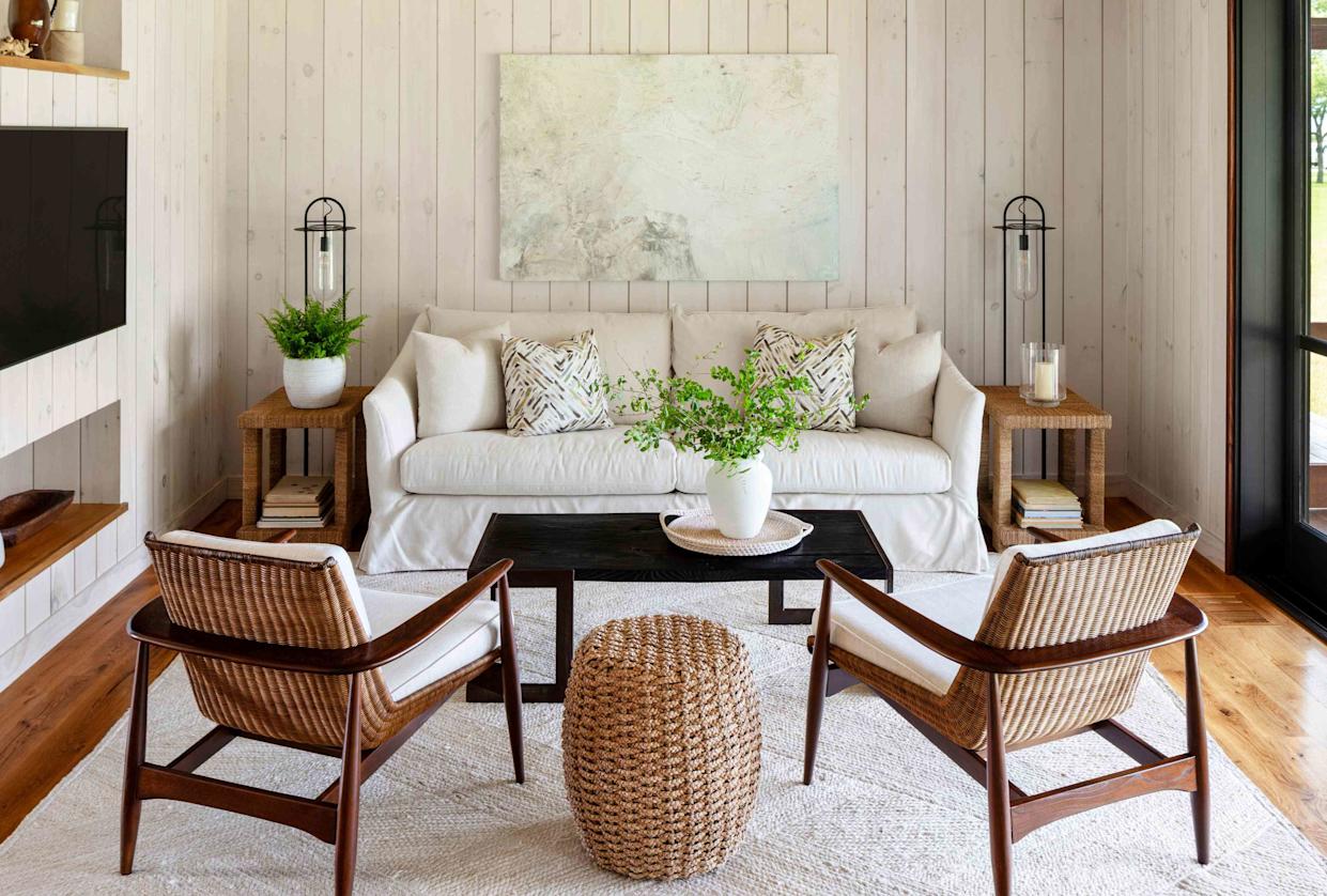
The No. 1 Paint Color to Avoid Pairing with Wood, According to a Designer
This article features an interview with Washington, D.C.-based designer Laura Hodges, who shares insights on color selection, particularly concerning its interaction with wood tones in home décor. Hodges advocates for embracing color in design, suggesting that even small elements like artwork or pillows can introduce color effectively without overwhelming a space. She emphasizes the importance of understanding clients' emotional connections to colors, often delving into their wardrobe preferences, favorite artwork, and even their appreciation for natural elements like greenery to inform her choices. Hodges highlights that when presenting color options, she provides a holistic vision for the space, including furniture, carpets, and window treatments, rather than isolated swatches.
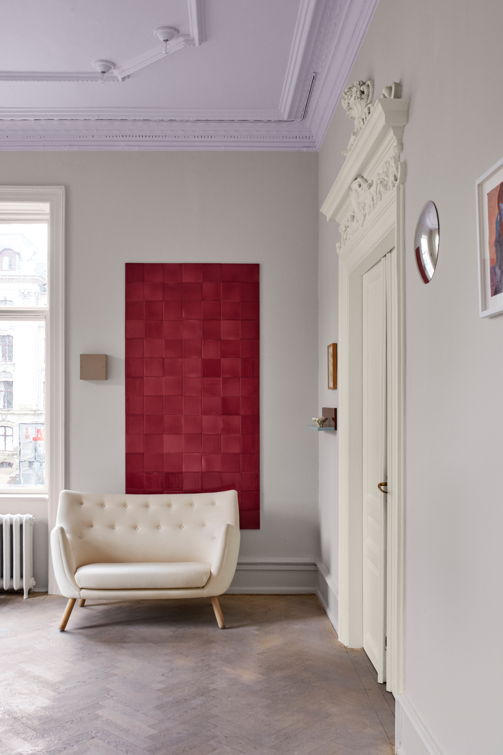
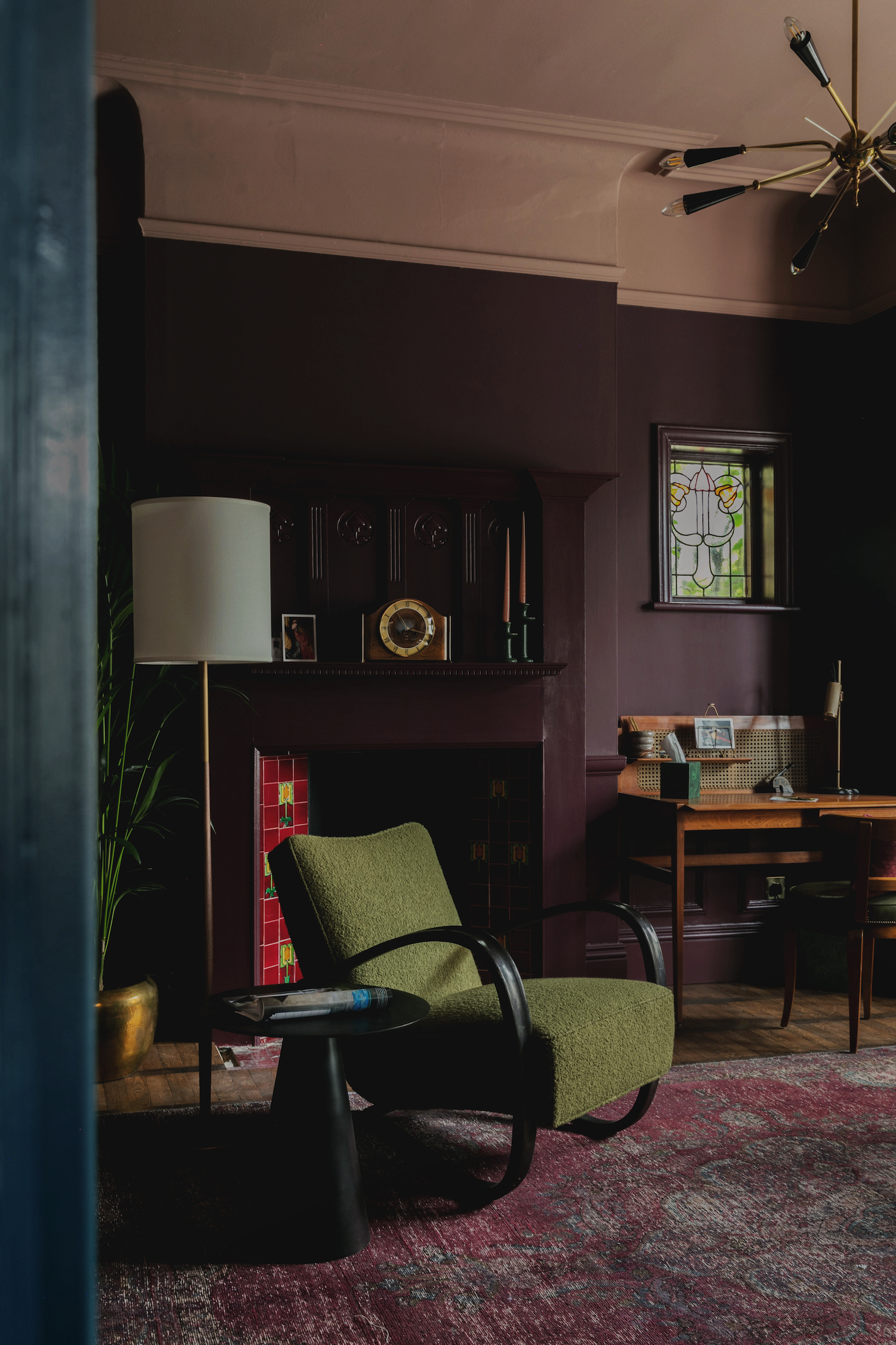
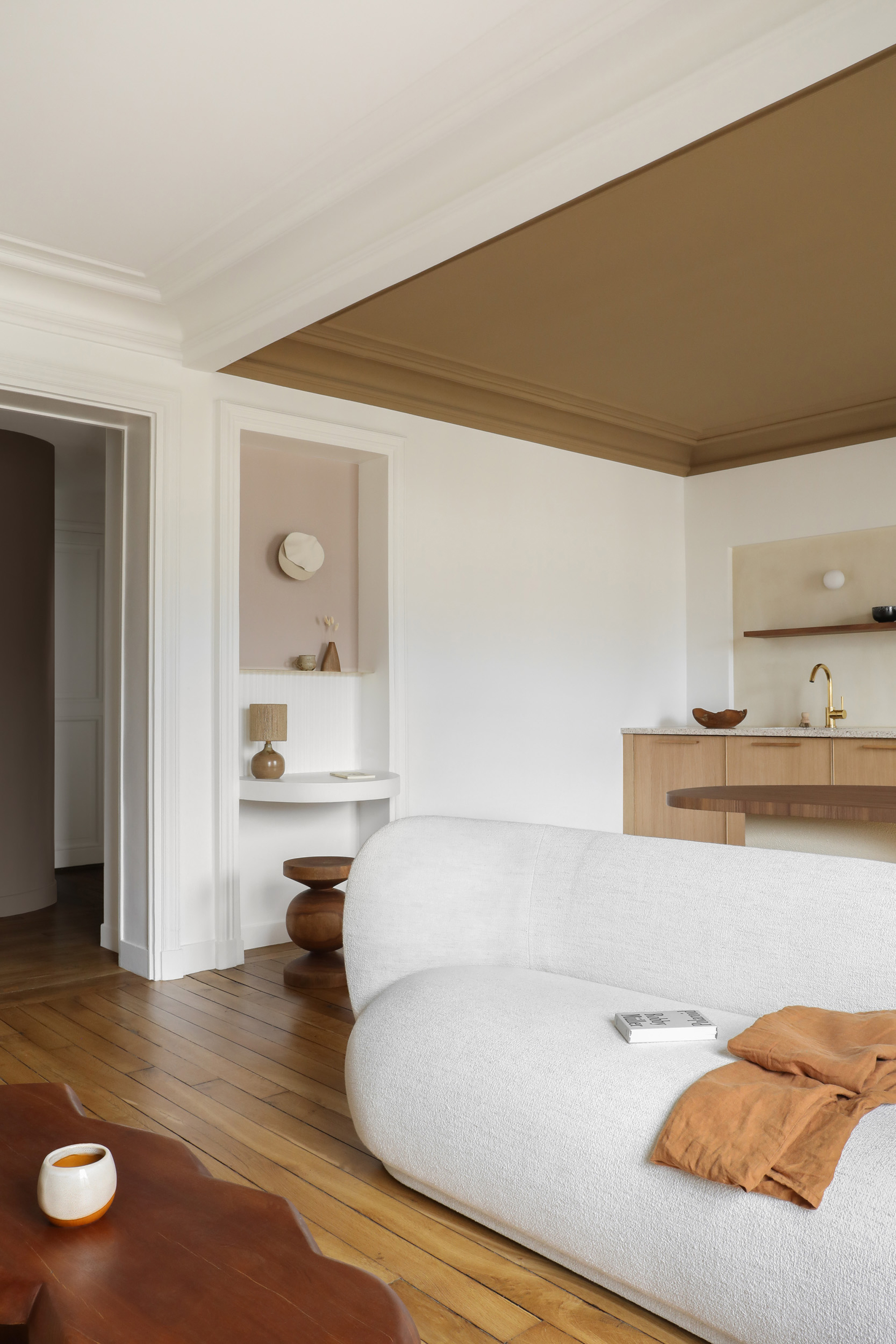
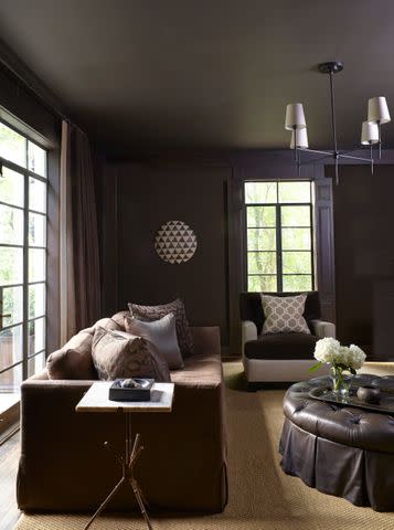
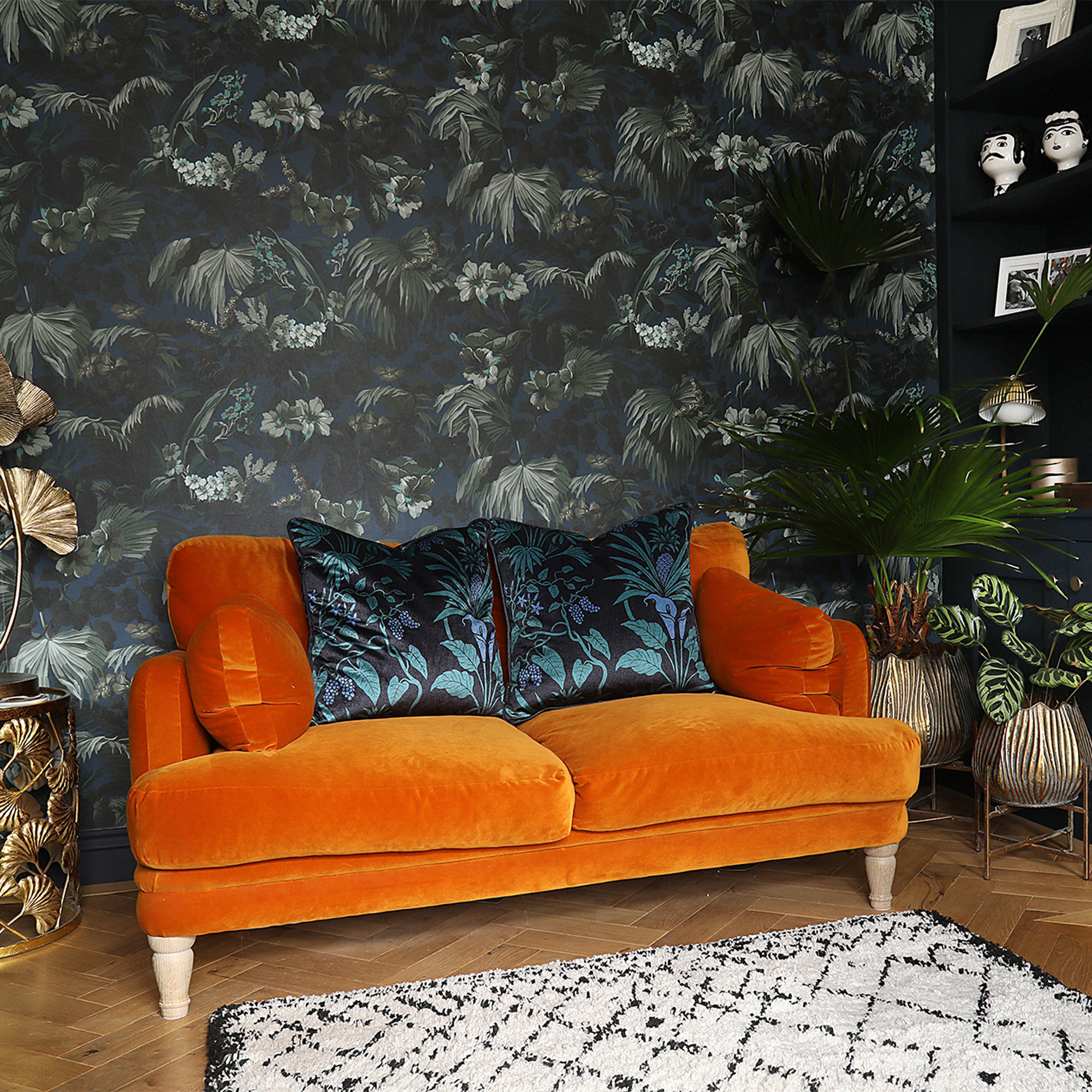
Artwork and accessories, according to Hodges, should evoke emotion and do not necessarily need to match a room perfectly. She notes that these elements, along with throw pillows and rugs, offer opportunities to introduce vibrant colors and patterns in a less permanent and more playful manner compared to larger furnishings like sofas. An unexpected use of color Hodges suggests is painting ceilings. She recounts a project where a client's dining room ceiling was painted a shade of magenta pink, providing a subtle yet enjoyable splash of color within the peripheral vision without being overbearing.
When developing a color palette, Hodges advises starting with a key piece like a furniture item, fabric, or rug, and drawing complementary colors from it. This approach helps narrow down the vast array of available options and ensures a cohesive design. For paint swatches, she stresses the importance of testing them in the actual room under various lighting conditions, including natural light and the specific color temperature of light bulbs, preferring 3,000 kelvin bulbs for accurate color rendition.
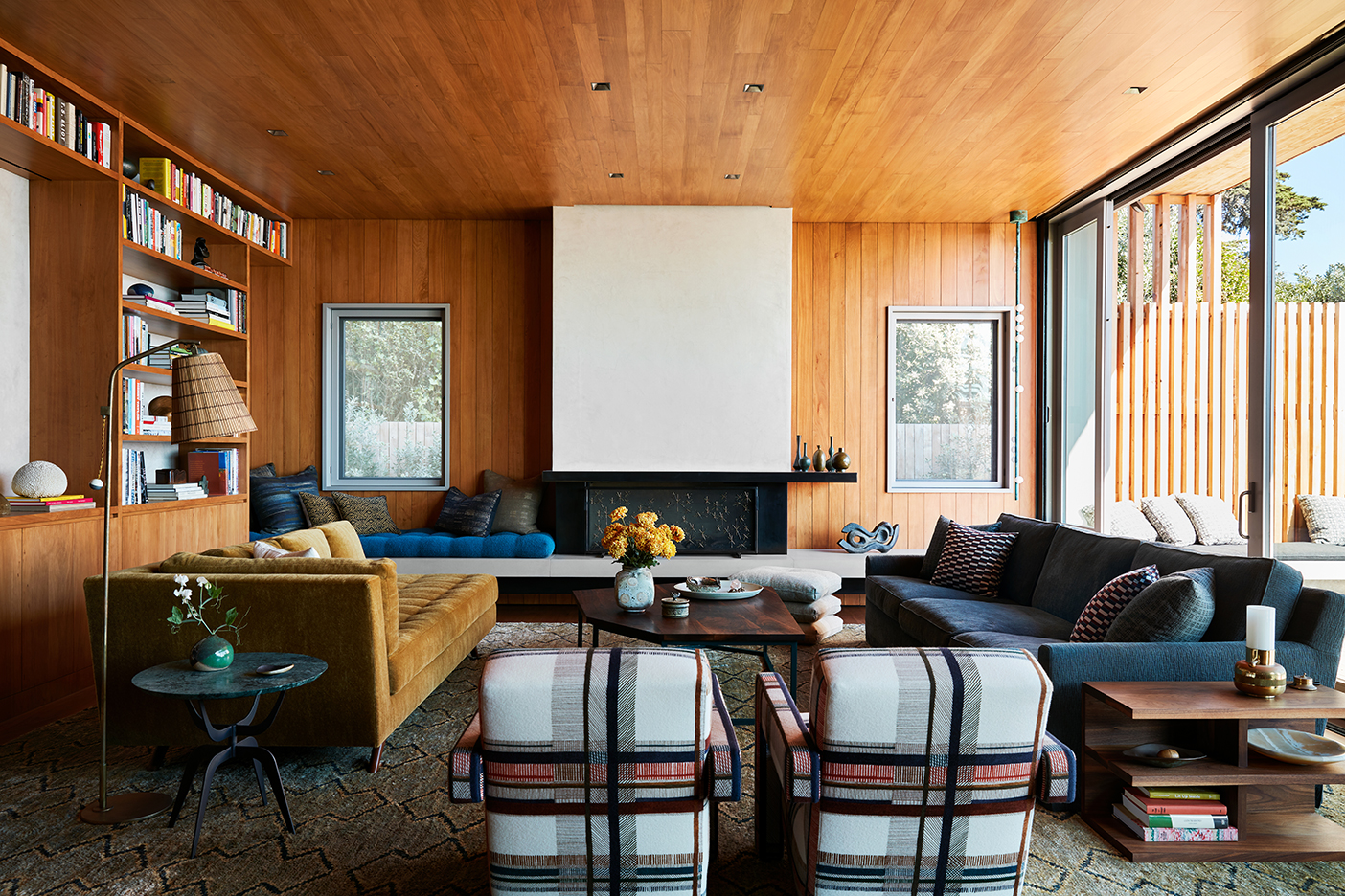
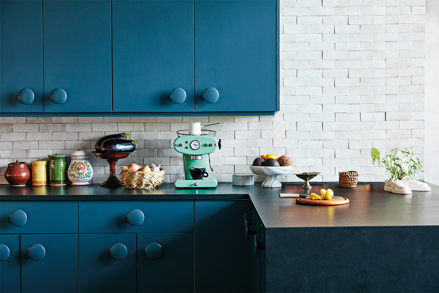
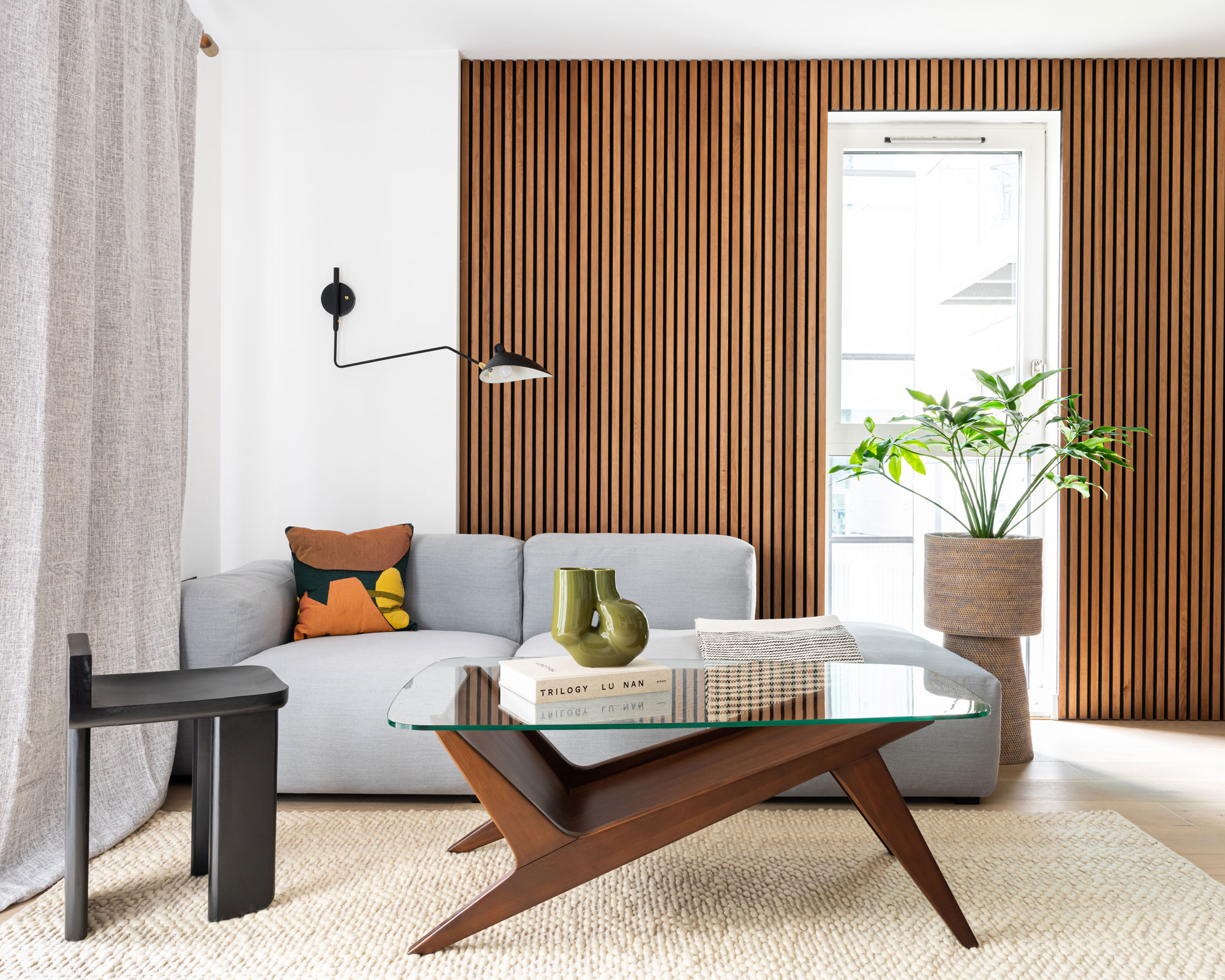
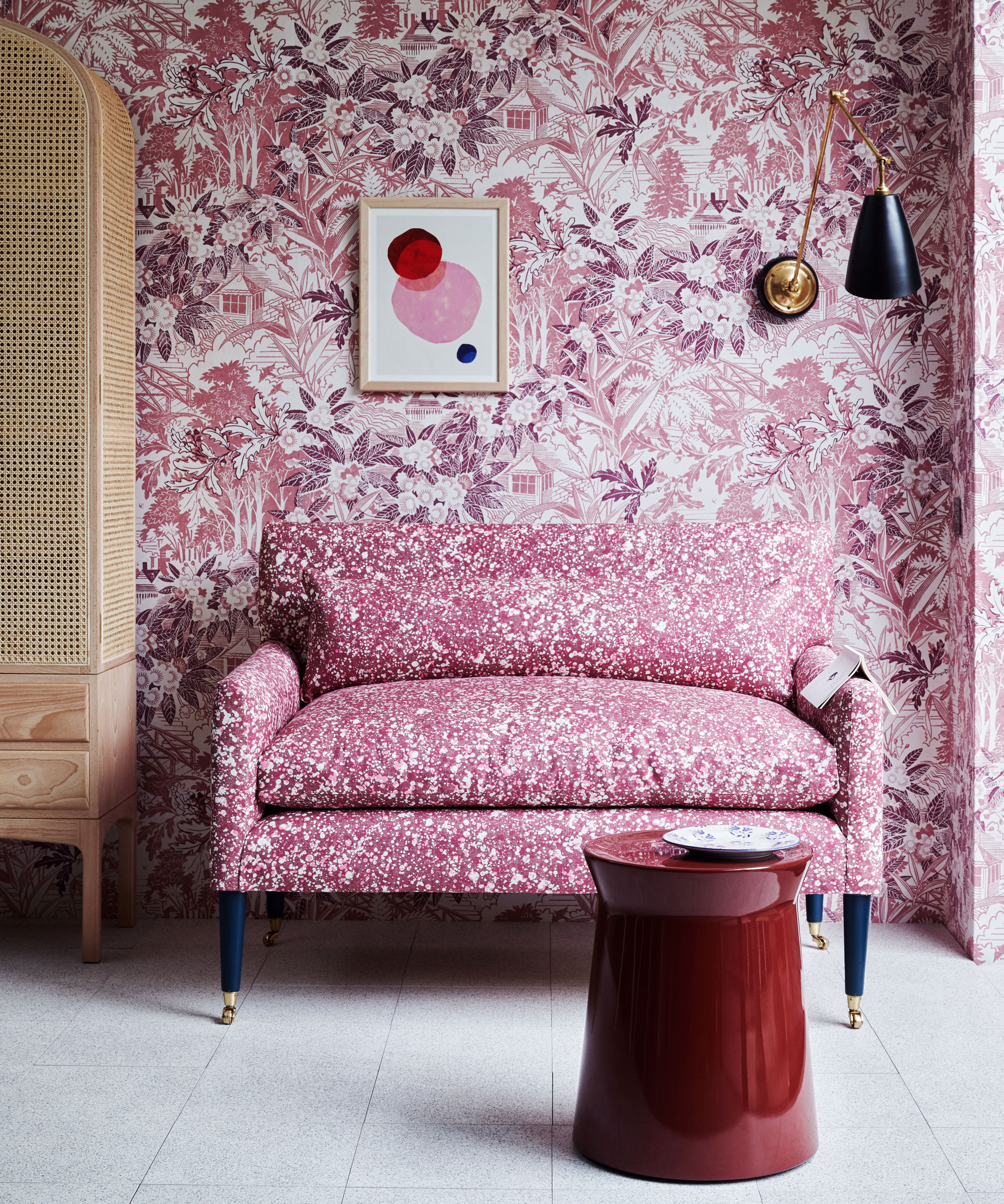
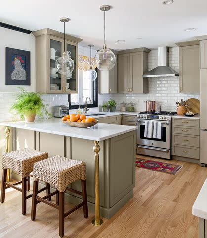
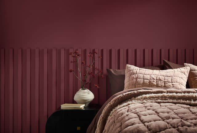
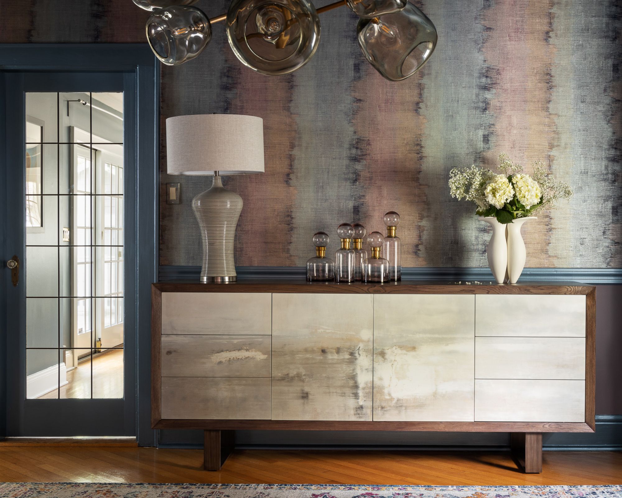
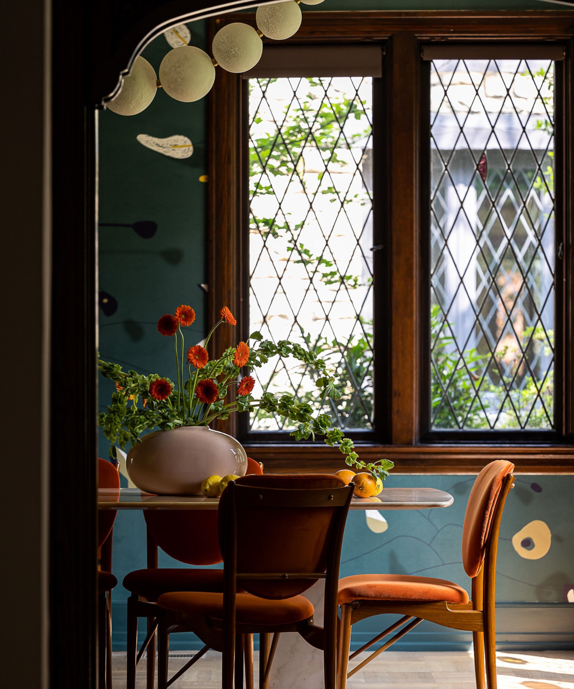
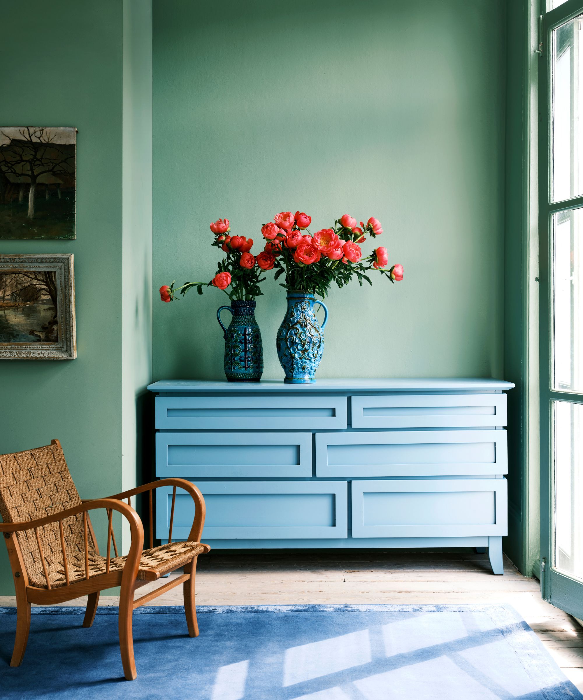
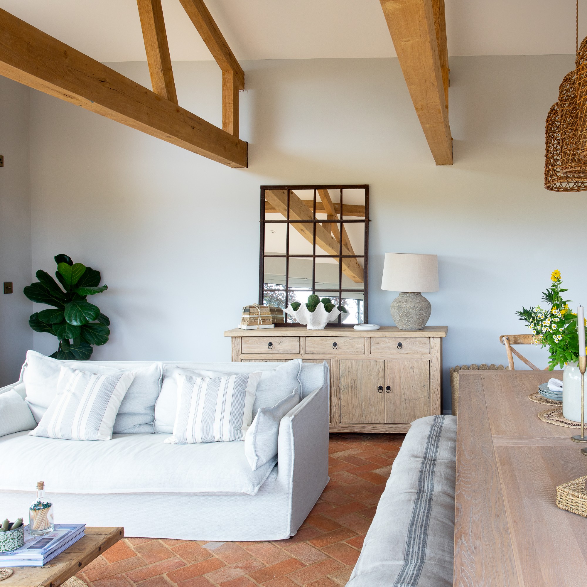
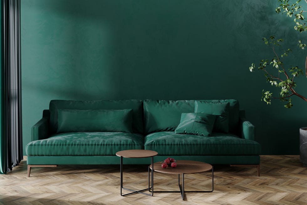
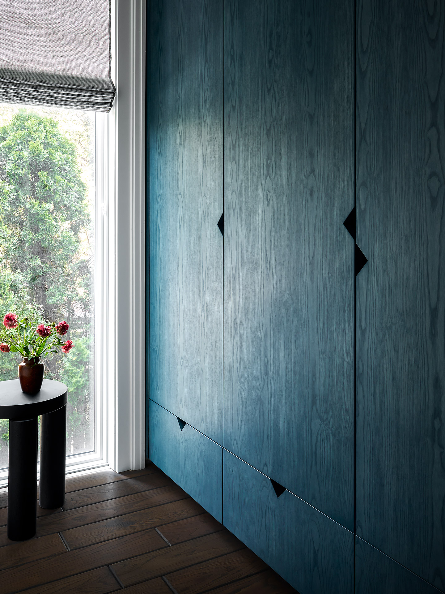
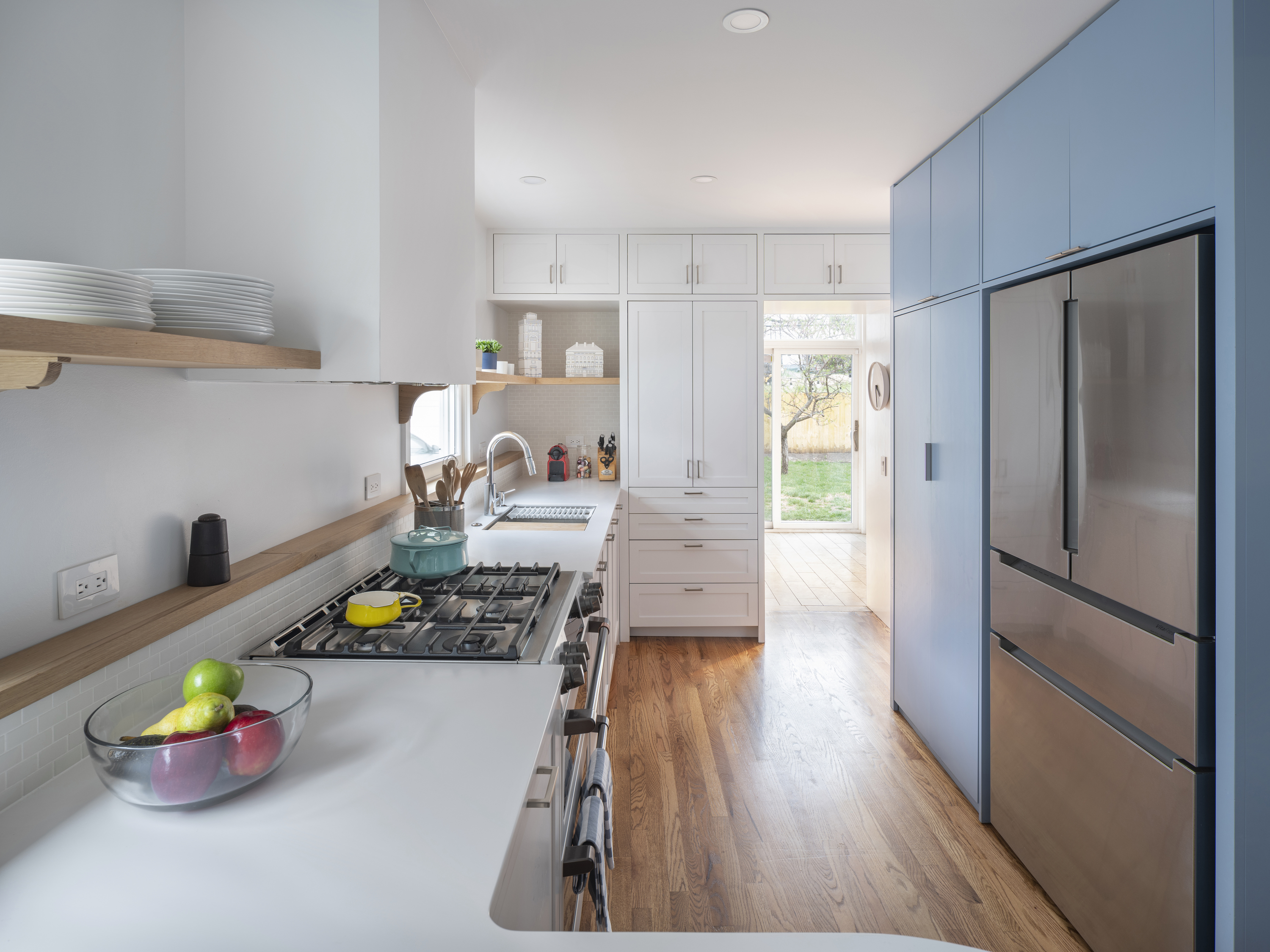
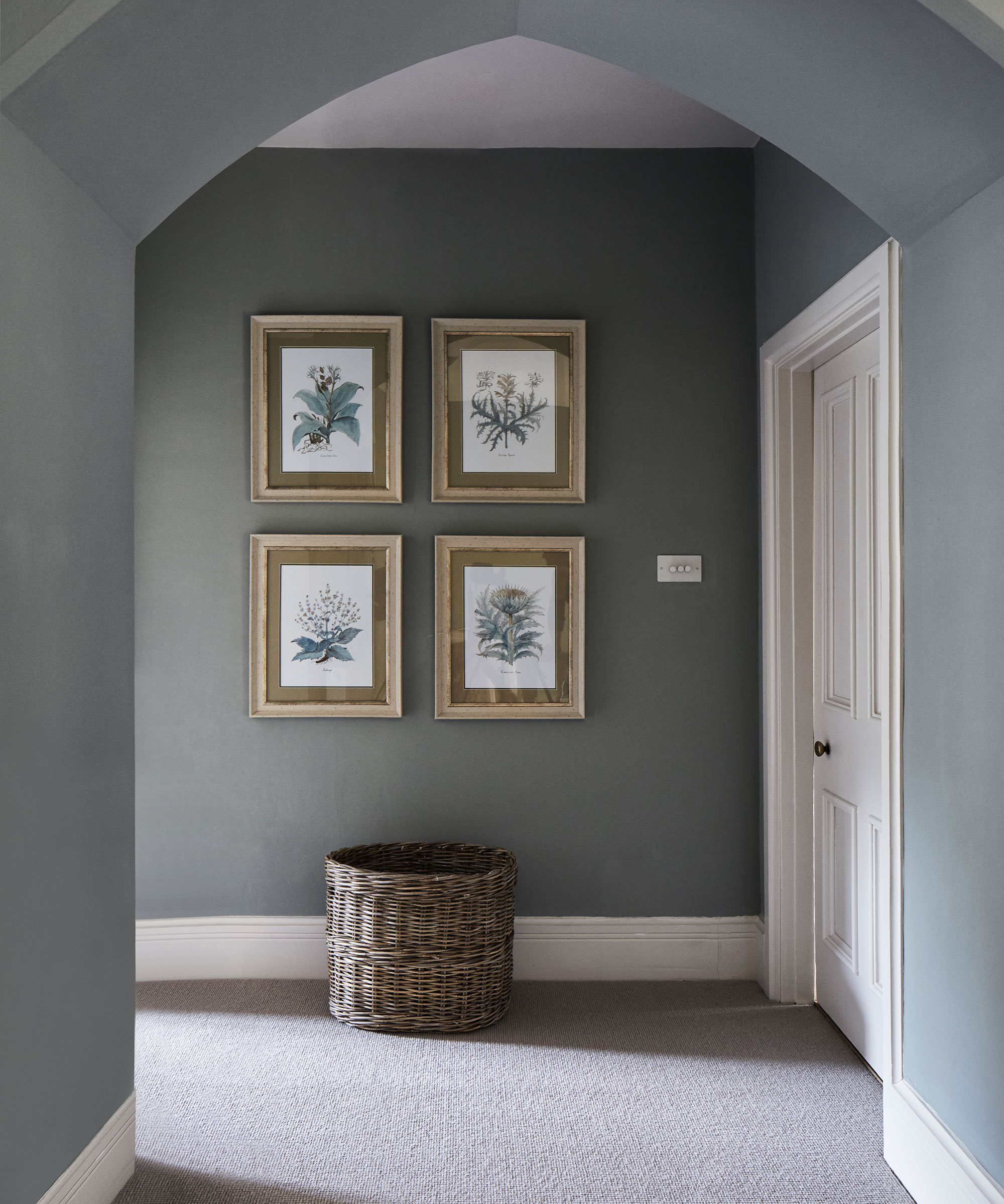
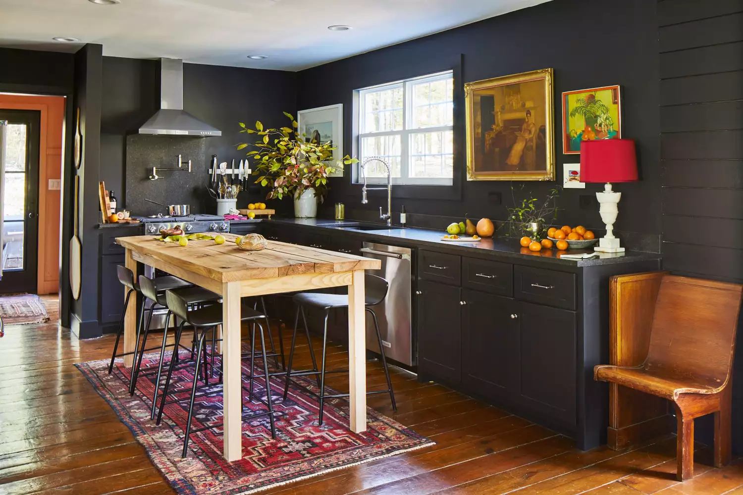
Hodges expresses a preference for warmer, more saturated wood tones, such as white oak, mahogany, or walnut, over grayed-out woods, as they better reflect natural appearances and are inherently welcoming. When pairing paint colors with wood, she considers the wood's undertones. For warm-toned woods like mahogany or cherry, blues and greens are recommended. For neutral or gray-toned woods like white oak or ash, blues and greens also work well, but pink, burgundy, or warm yellows can also be introduced.
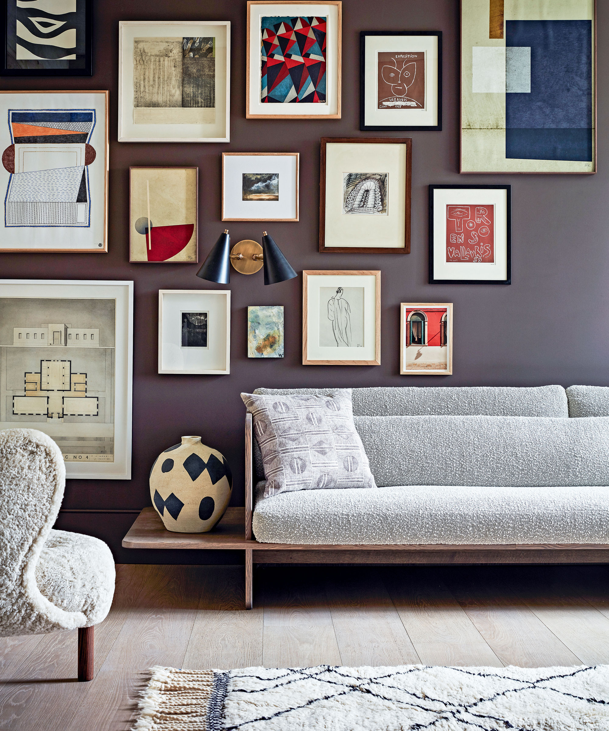
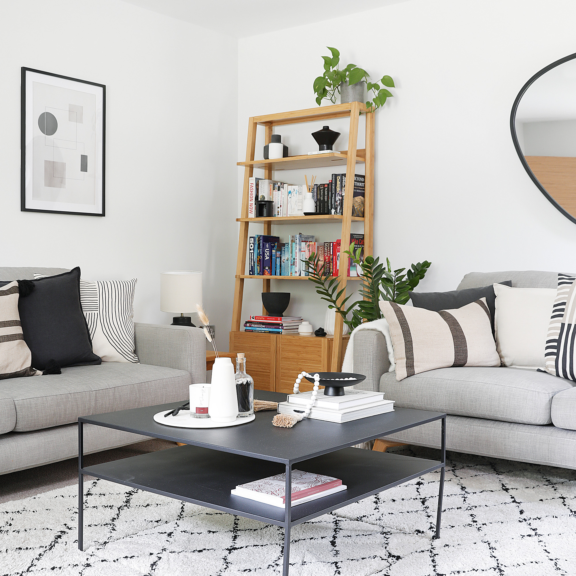
To make white and wood combinations inviting, Hodges suggests using warmer whites with slightly warmer undertones to complement the wood. In neutral palettes, incorporating varied textures through fabrics like corduroy or wool, and elements like shiplap or beadboard, adds interest and warmth. Wood itself contributes warmth, both aesthetically and physically, compared to cooler materials like metal or stone. Hodges shares successful past projects, including a powder room painted in Sherwin Williams Dark Rockwood with paneling molding to enhance its depth, and a condo transformed with Benjamin Moore Snowfall White to create an art gallery-like backdrop for a vibrant art collection. She also expresses a desire to incorporate a caramel-toned yellow into a future project, reminiscent of a pleasant experience in a yellow-painted Airbnb bedroom in Denmark. Her personal favorite paint colors include Benjamin Moore Caponata, Sherwin Williams Whitetail, and Benjamin Moore Quiet Moments, highlighting their versatility and ability to evoke specific moods.
#InteriorDesign #ColorPsychology #HomeDecor #PaintColors #WoodTones #DesignTips #LauraHodges #BiophilicDesign #PaletteSelection #InteriorDesign #ColorPsychology #HomeDecor #PaintColors #WoodTones #DesignTips #LauraHodges #BiophilicDesign #PaletteSelection
0 comment in total
 No comments yet
You may also like
The Color to Never Paint Your Kitchen Cabinets, According to a Top L.A. Designer
You should never paint your hallway this colour, according to colour psychologists

What are the worst colors to paint a room? The shades experts say you should never use

6 Paint Color Mistakes To Stop Making, According To Designers
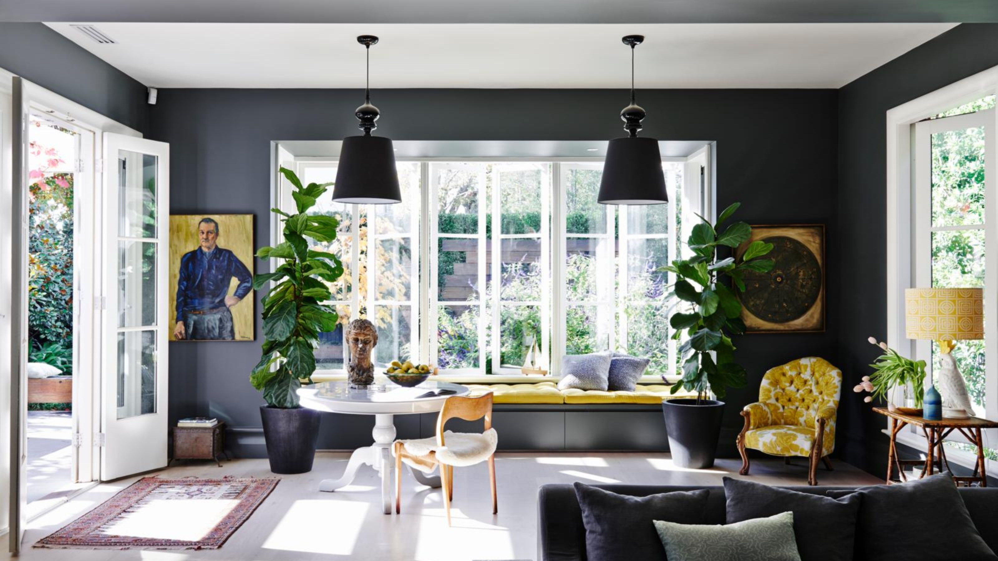
4 Times Designers Say You Definitely Shouldn't Paint Your Walls and Ceiling in the Same Color

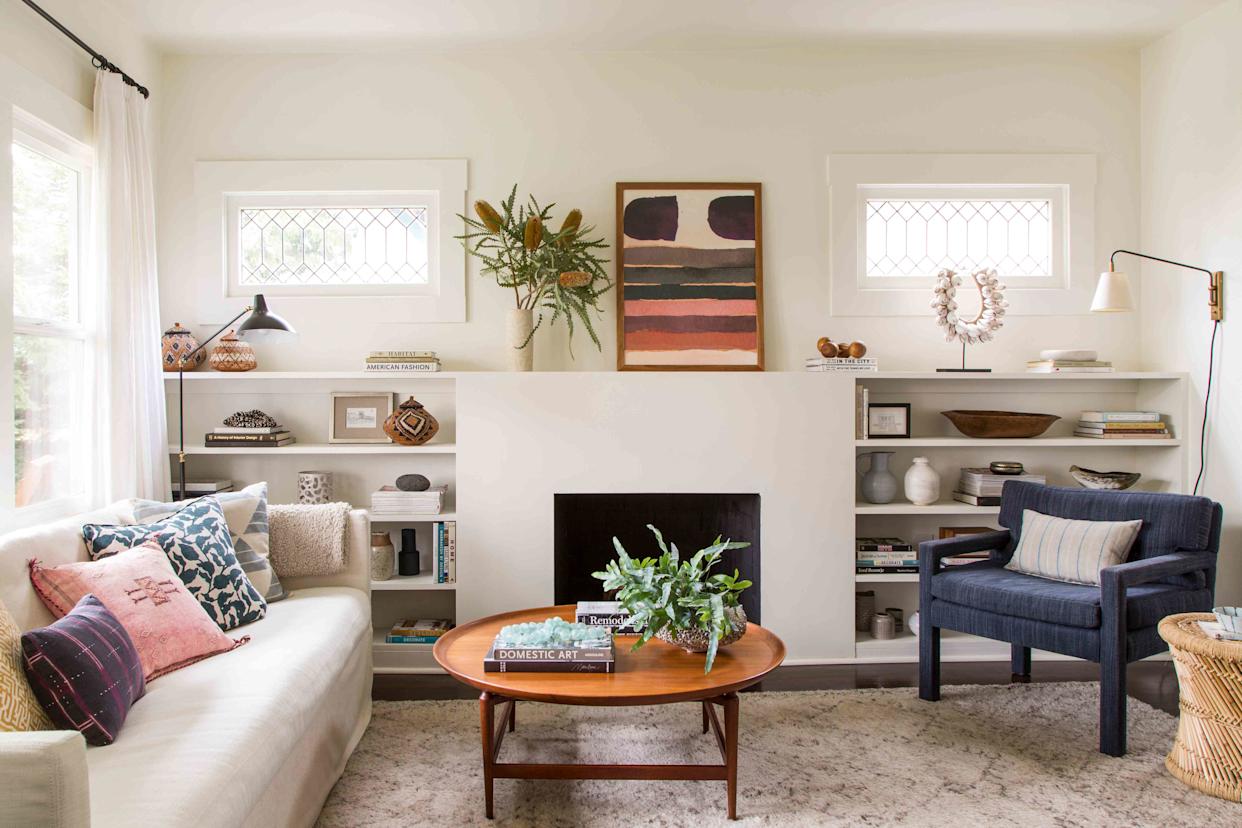
5 Paint Colors That Experts Say You Shouldn't Use in 2025

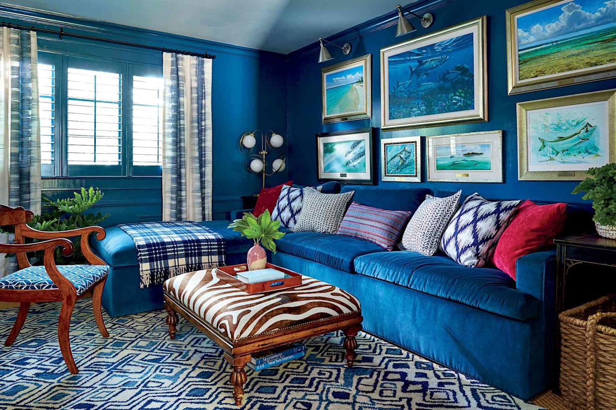
6 Paint Color Mistakes To Stop Making, According To Designers
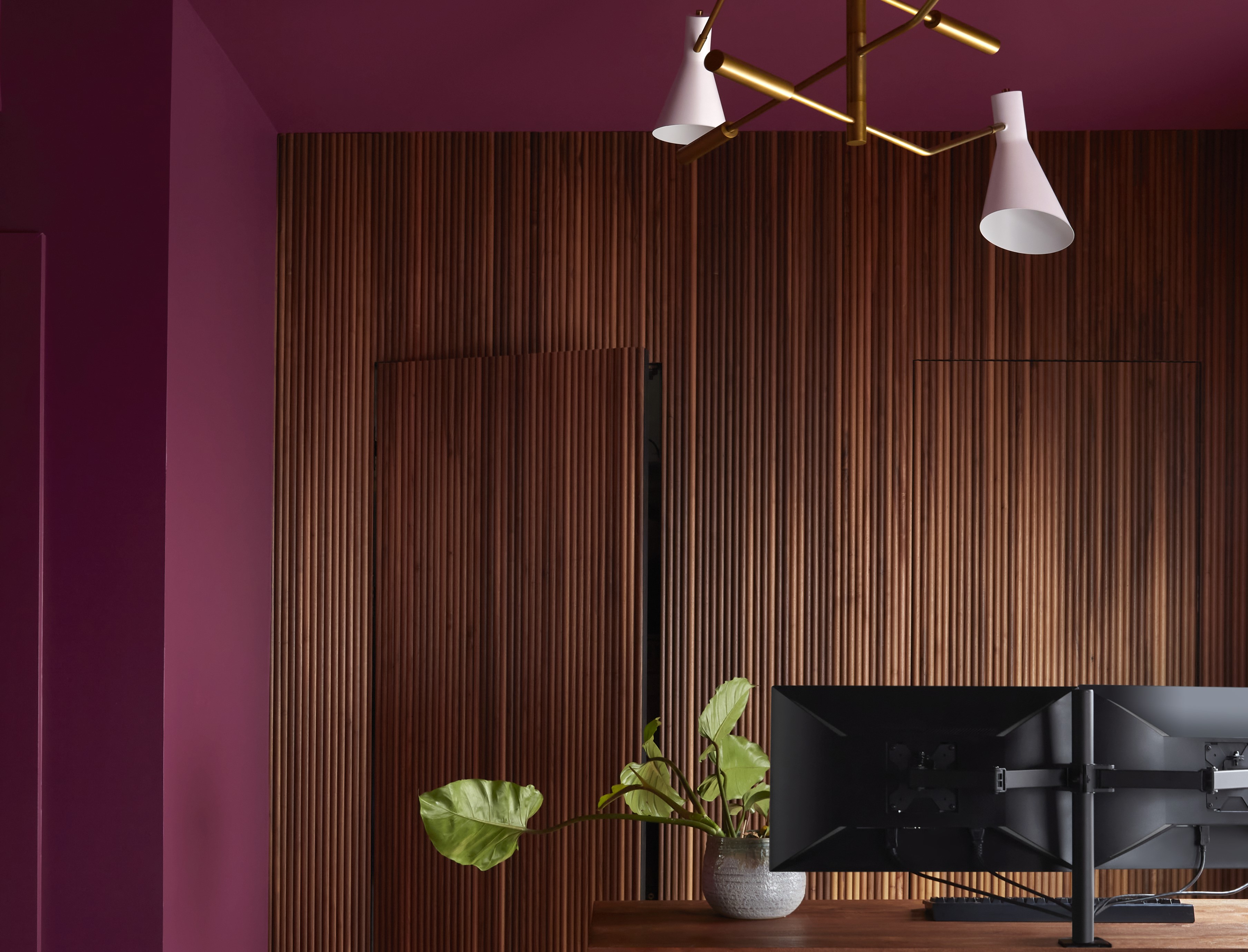
Paint Colors That Go With Natural Wood — 10 Picks That Bring Out the Beauty of This Organic Material

Interior design experts reveal the colour rules you should be breaking
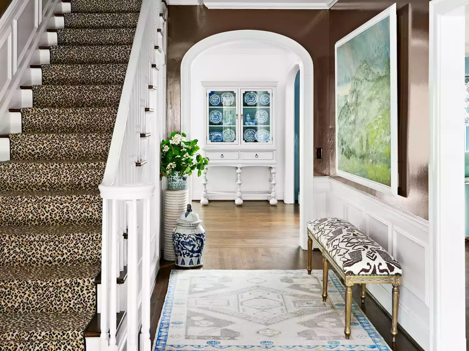
You Should Never Use These Paint Colors In An Entryway, According To Designers
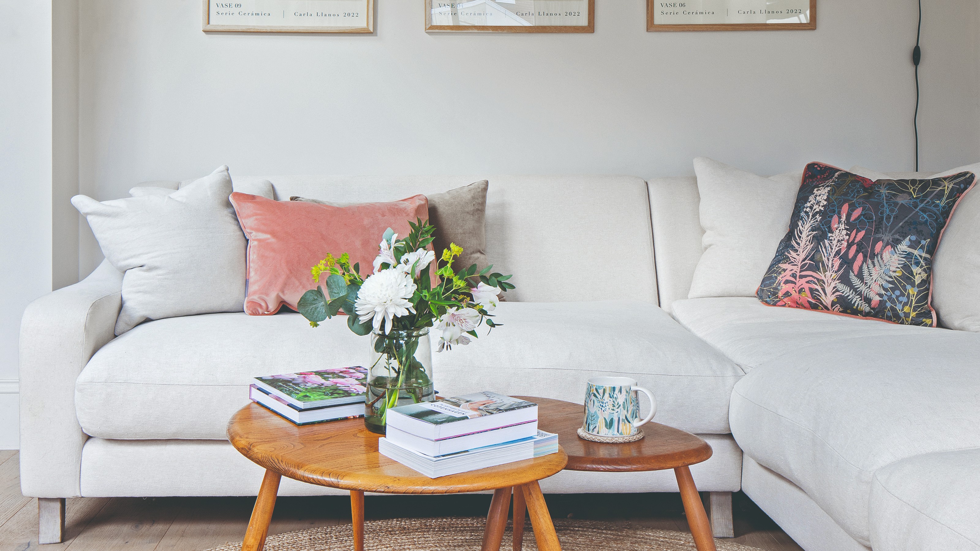
Experts say these are the 3 sofa colours to avoid


4 Outdated Colors Designers say you Should Steer Clear of When Decorating a Living Room
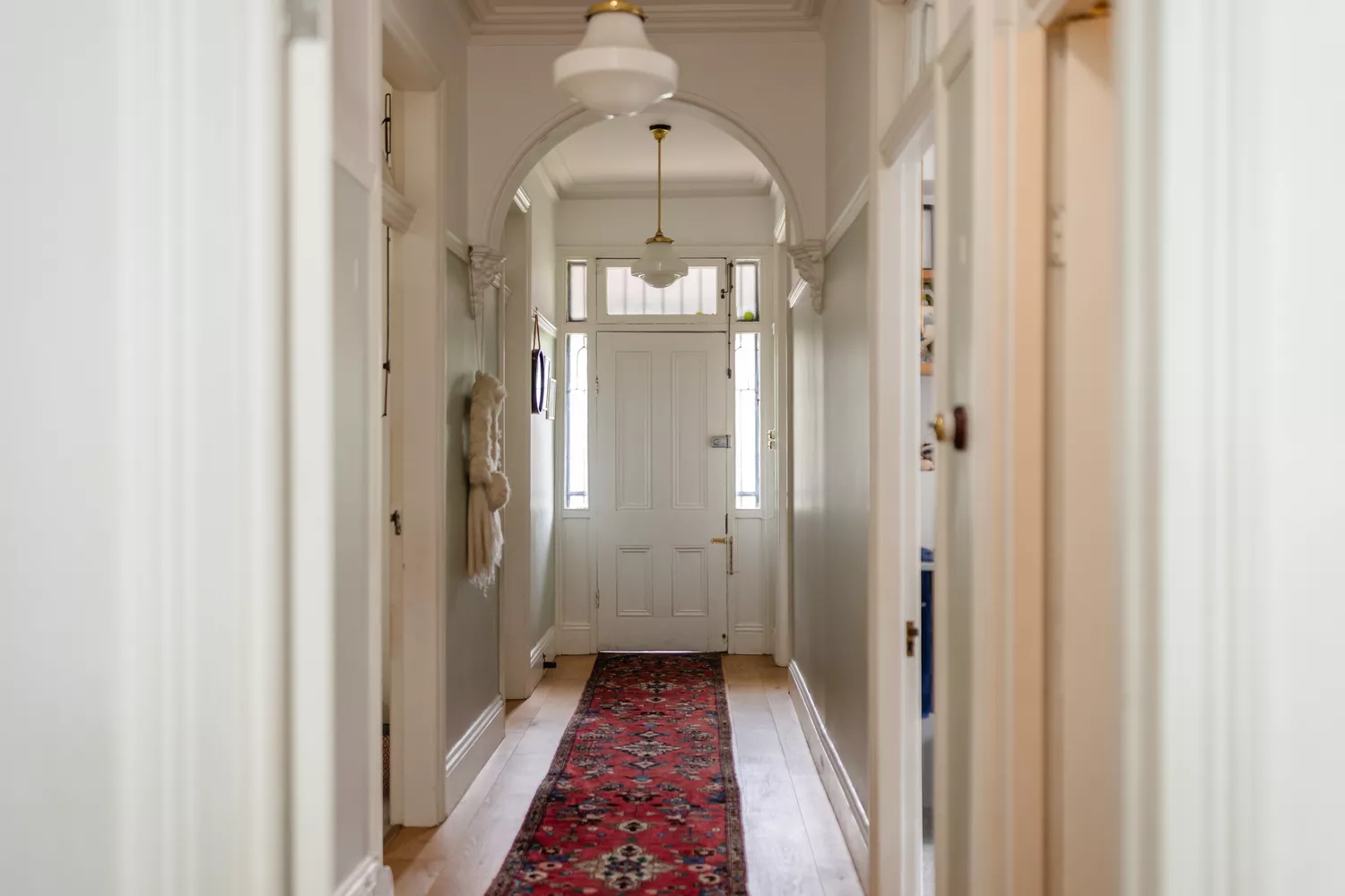
4 Paint Colors Designers Say You Should Never Use In A Hallway
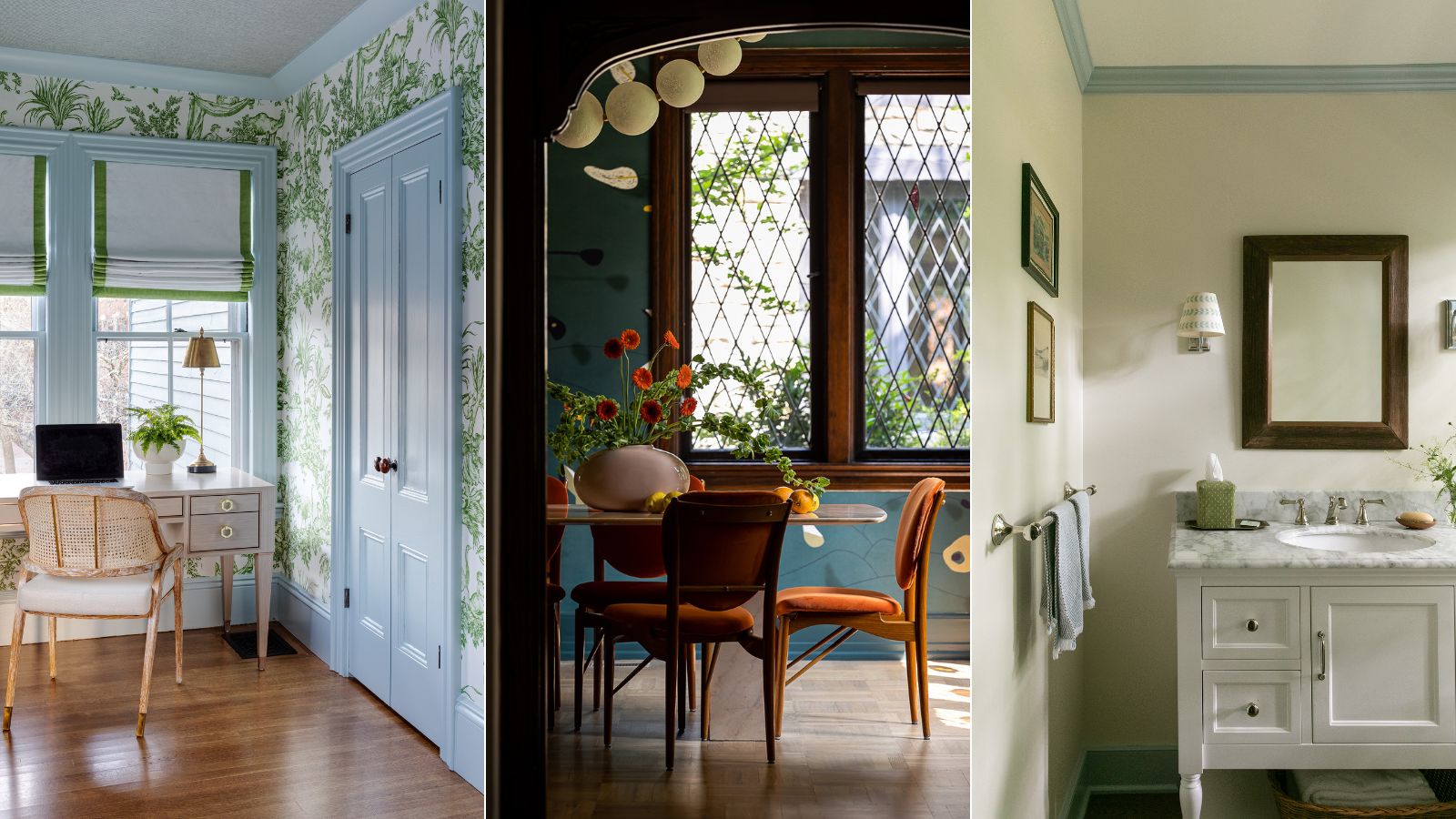
What color should you paint woodwork? Expert ways to factor this small yet impactful detail into color schemes
The #1 Home Trend You Should Avoid, According to Designers

5 colors to avoid painting a landing – and the secret to choosing the right shades
Couch colors to avoid – and what designers are recommending instead
10 mistakes to avoid when painting wooden furniture, according to experts

5 colors you should never paint your entryway – according to interior experts
4 Colors You Should Never Paint Cabinets, According To Designers