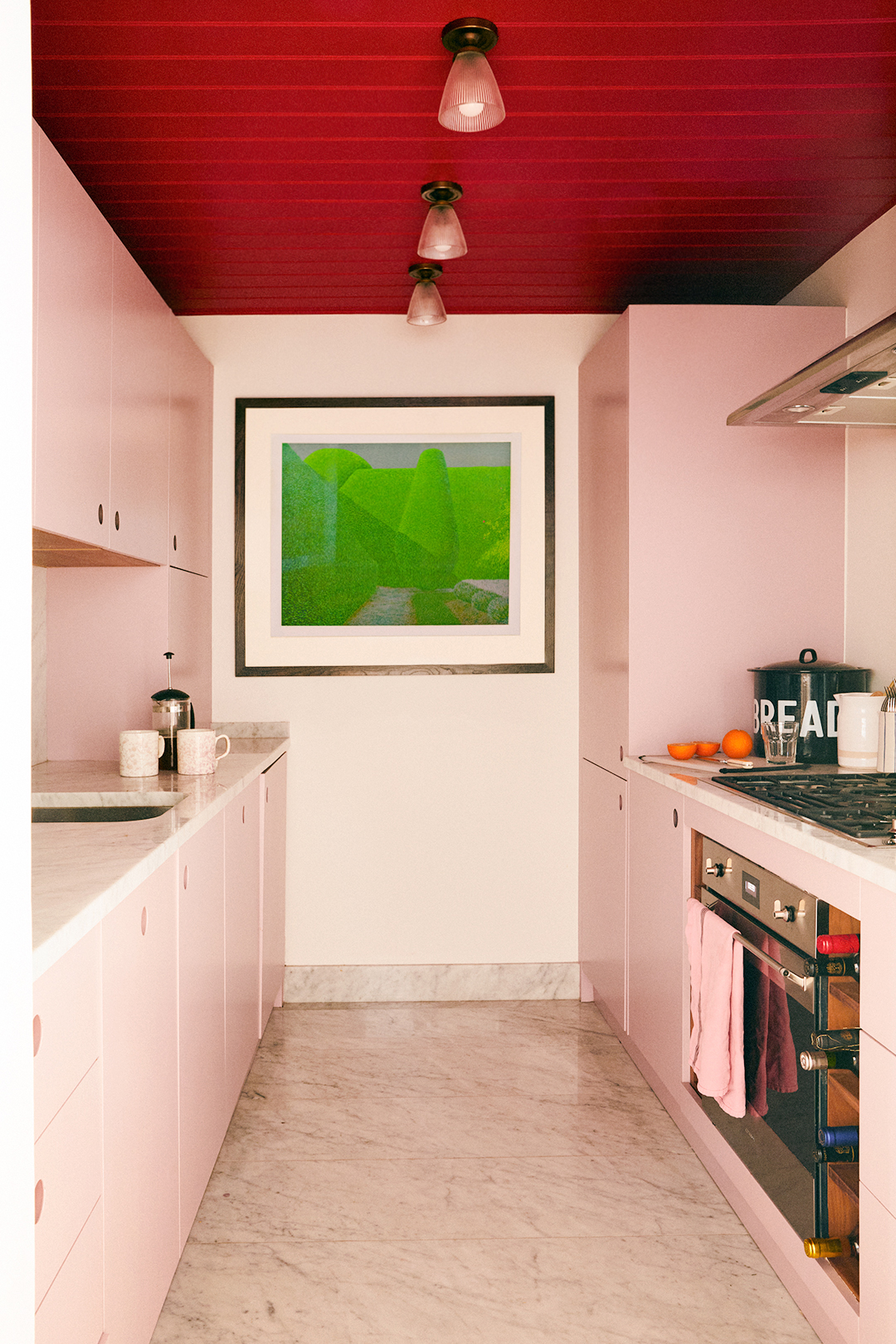
1/3
David Bromstad Is Begging You To Avoid This Popular Color Mistake
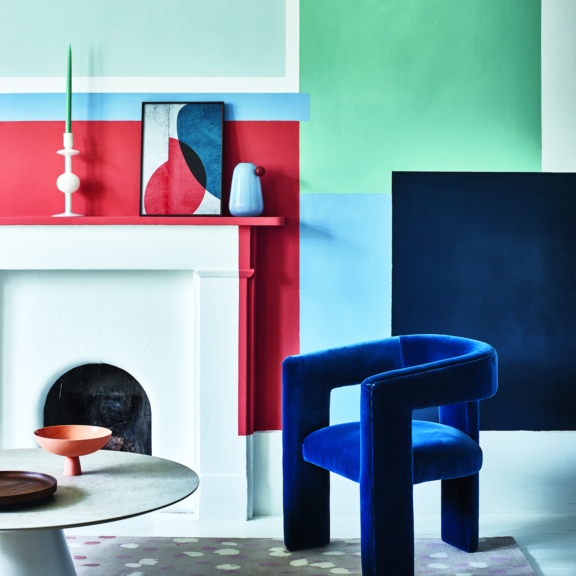
Choosing appropriate colors for home interiors can be a complex process, where even slight variations in tint significantly influence the overall design. Professional advice, such as that offered by HGTV personality David Bromstad, emphasizes a thoughtful approach to color selection. Bromstad, known for his innovative use of color on shows like "Color Splash," advocates against a common error: creating excessively 'matchy-matchy' color schemes driven by a fear of experimenting with diverse shades. While acknowledging the impact of color choices, he suggests that always playing it safe can hinder creativity and personality in home design.
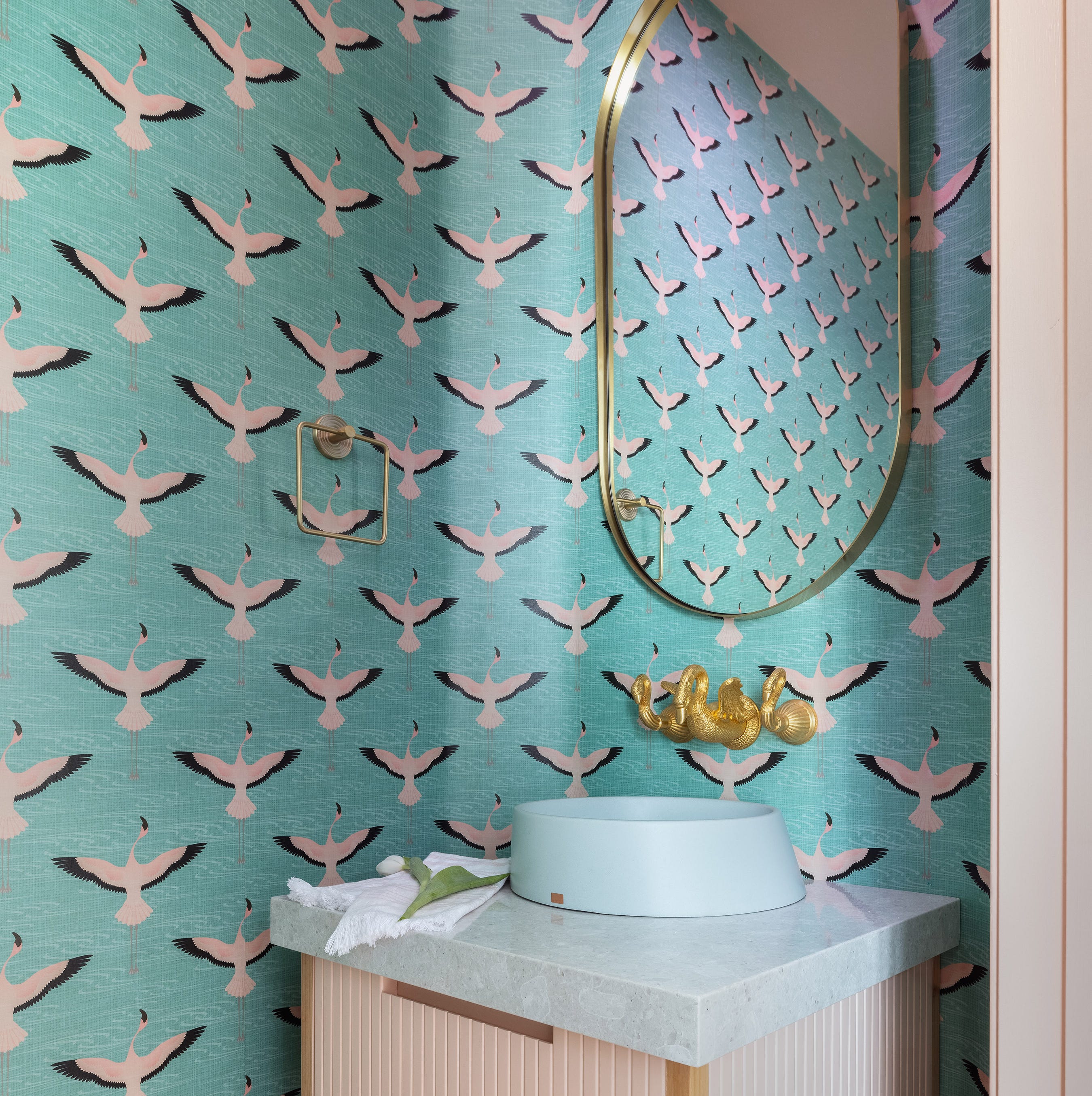
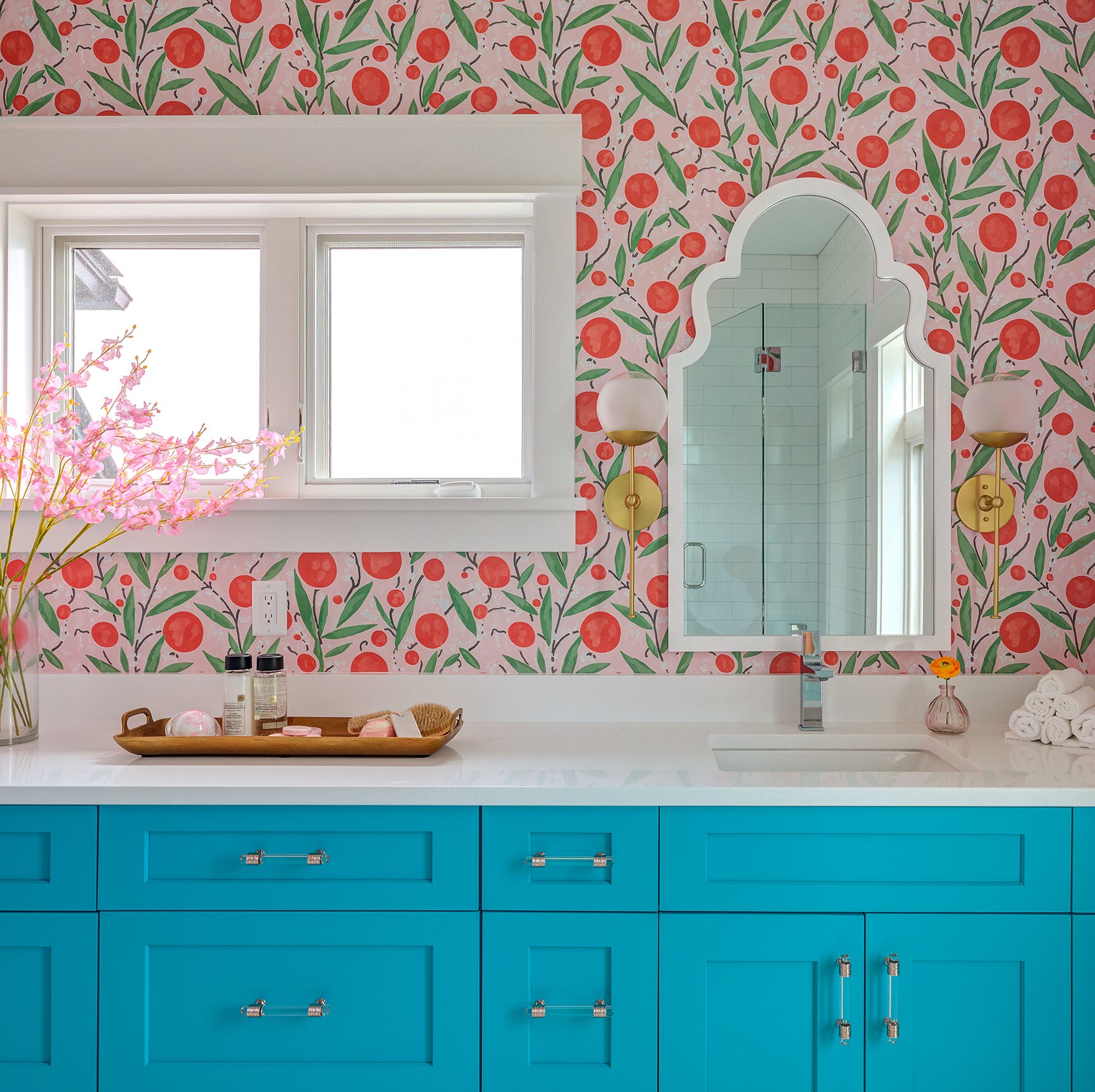
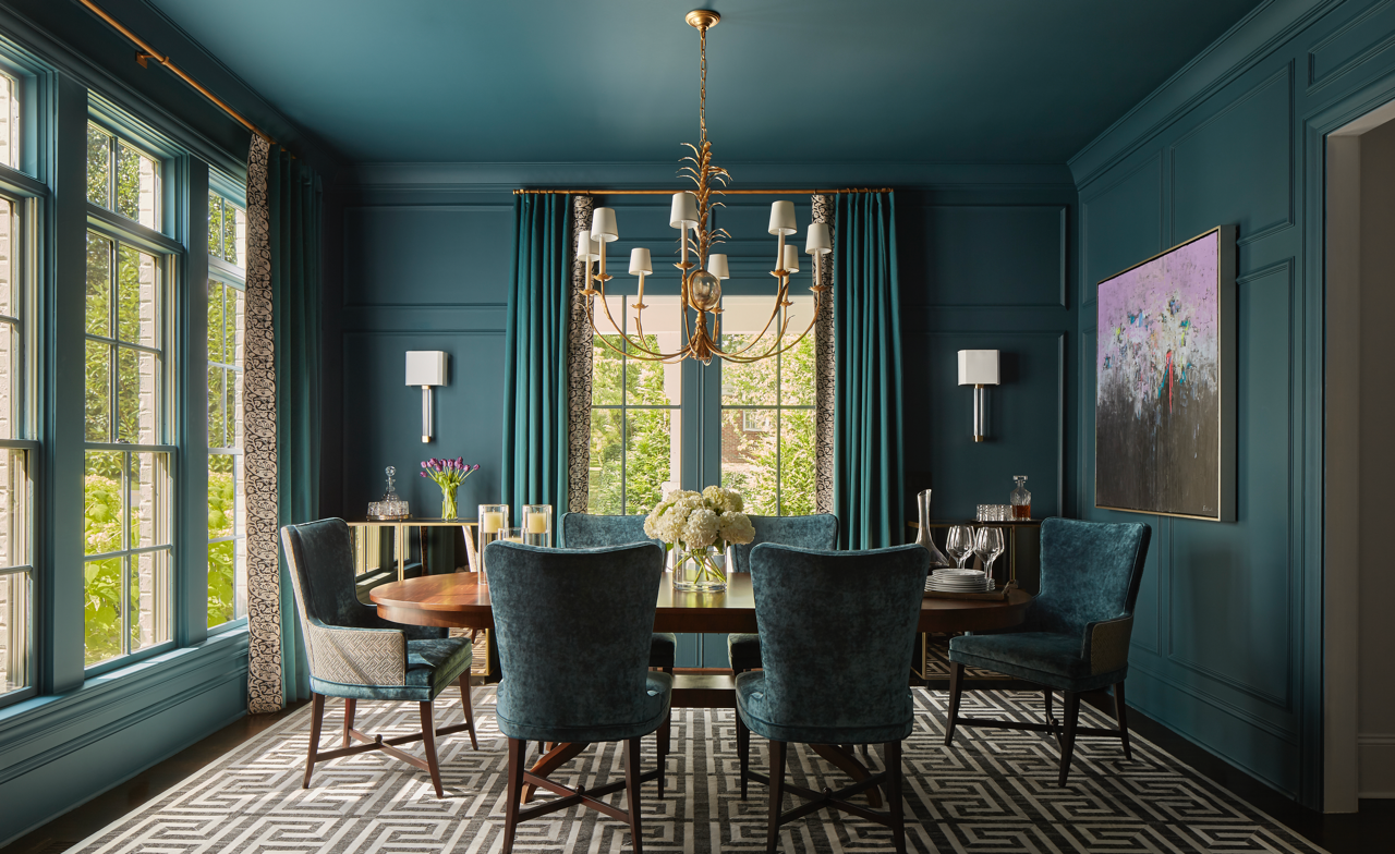
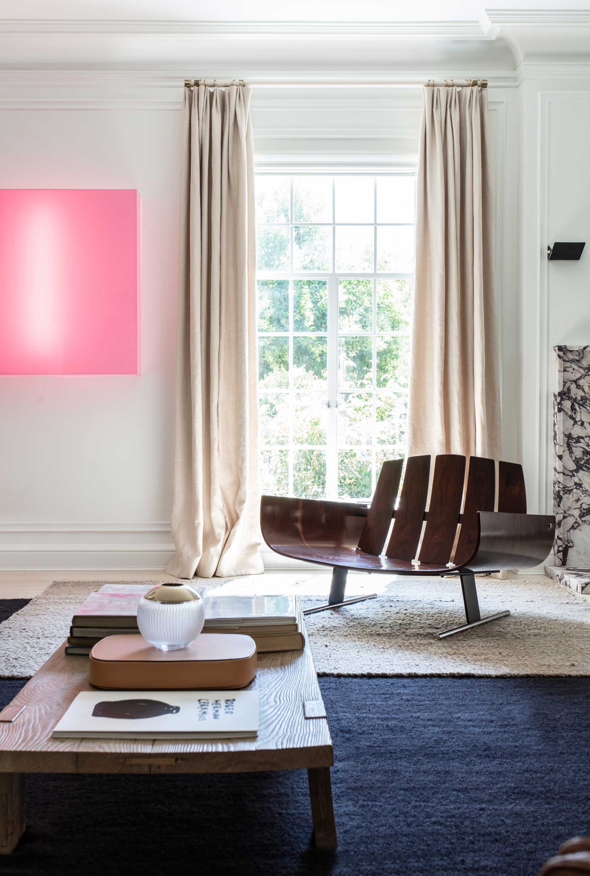
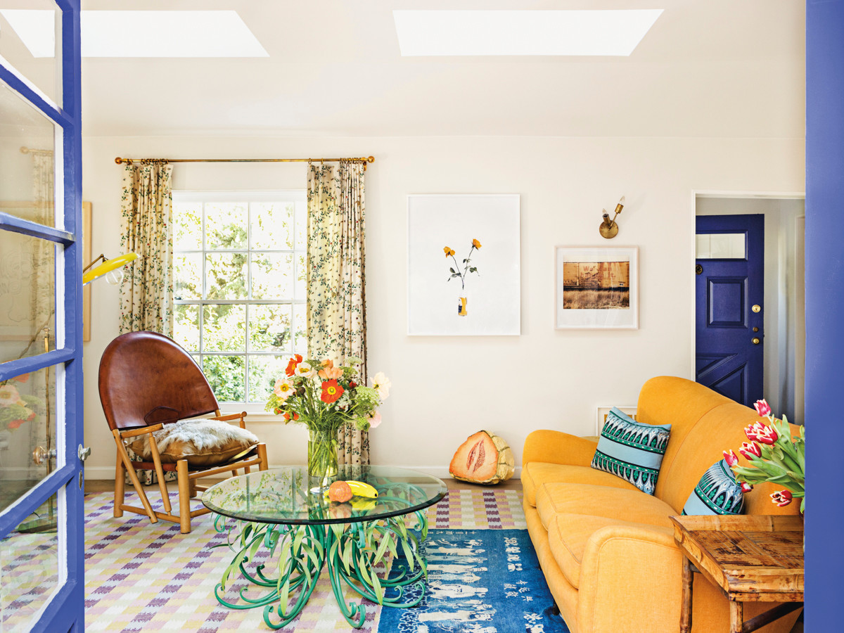
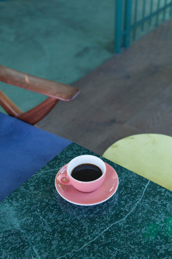
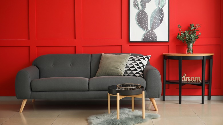
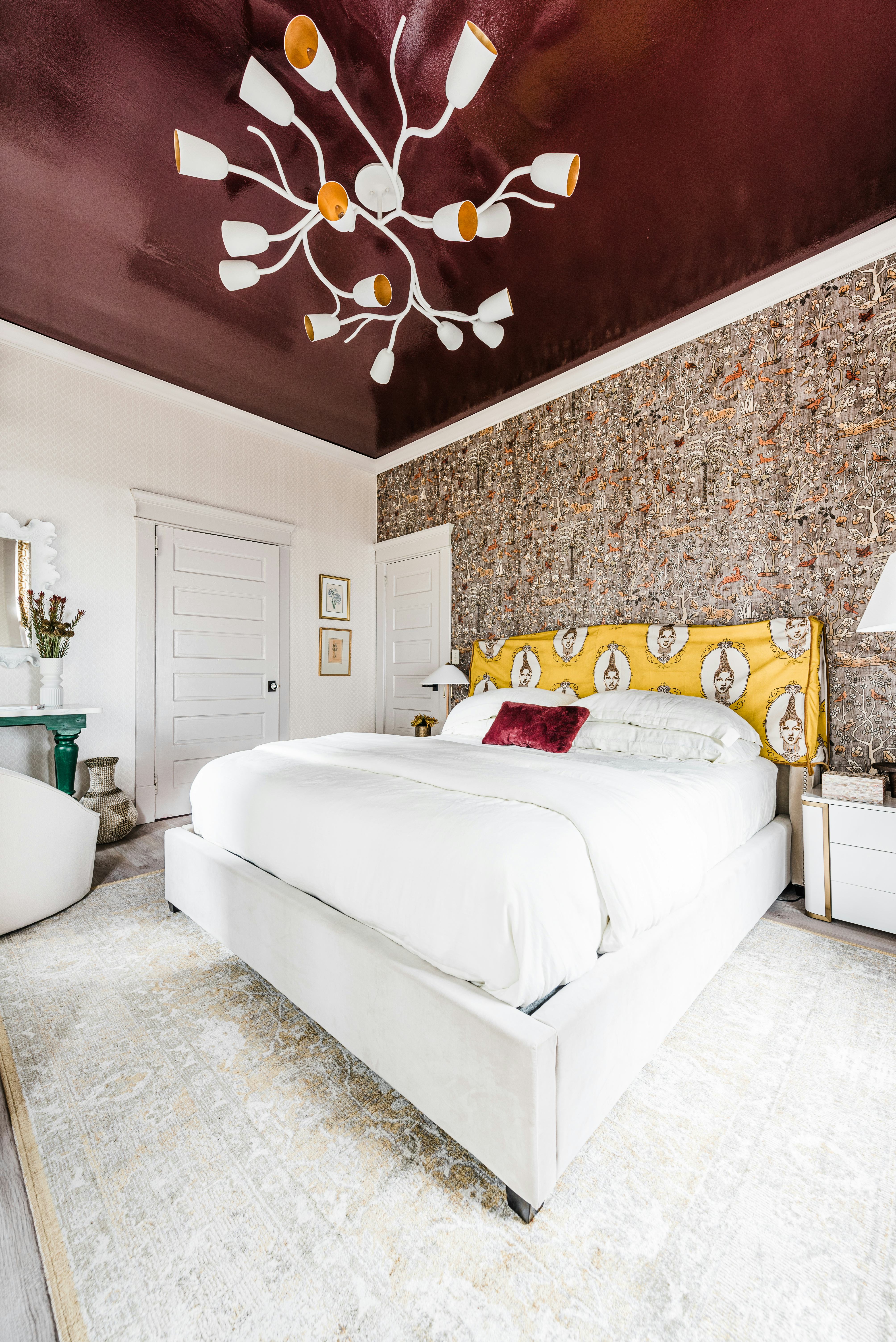
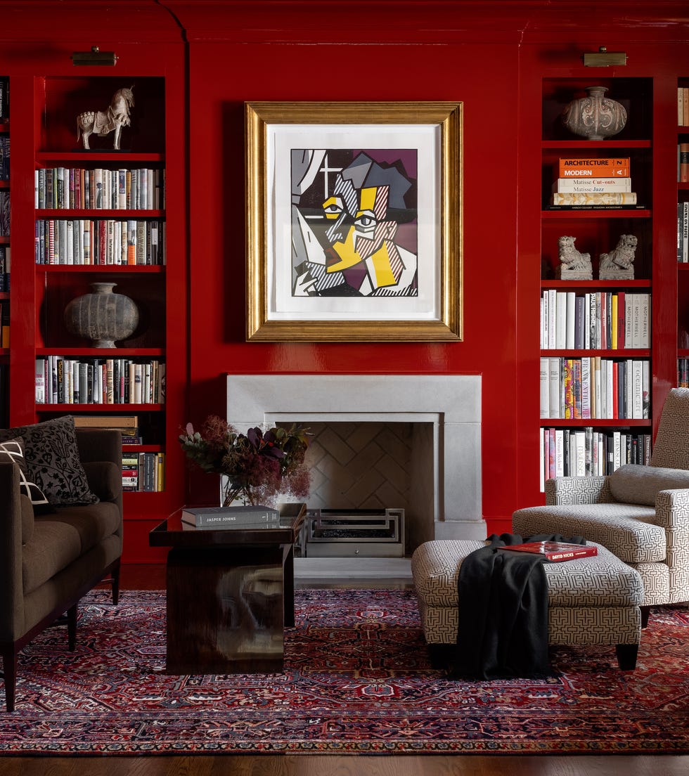
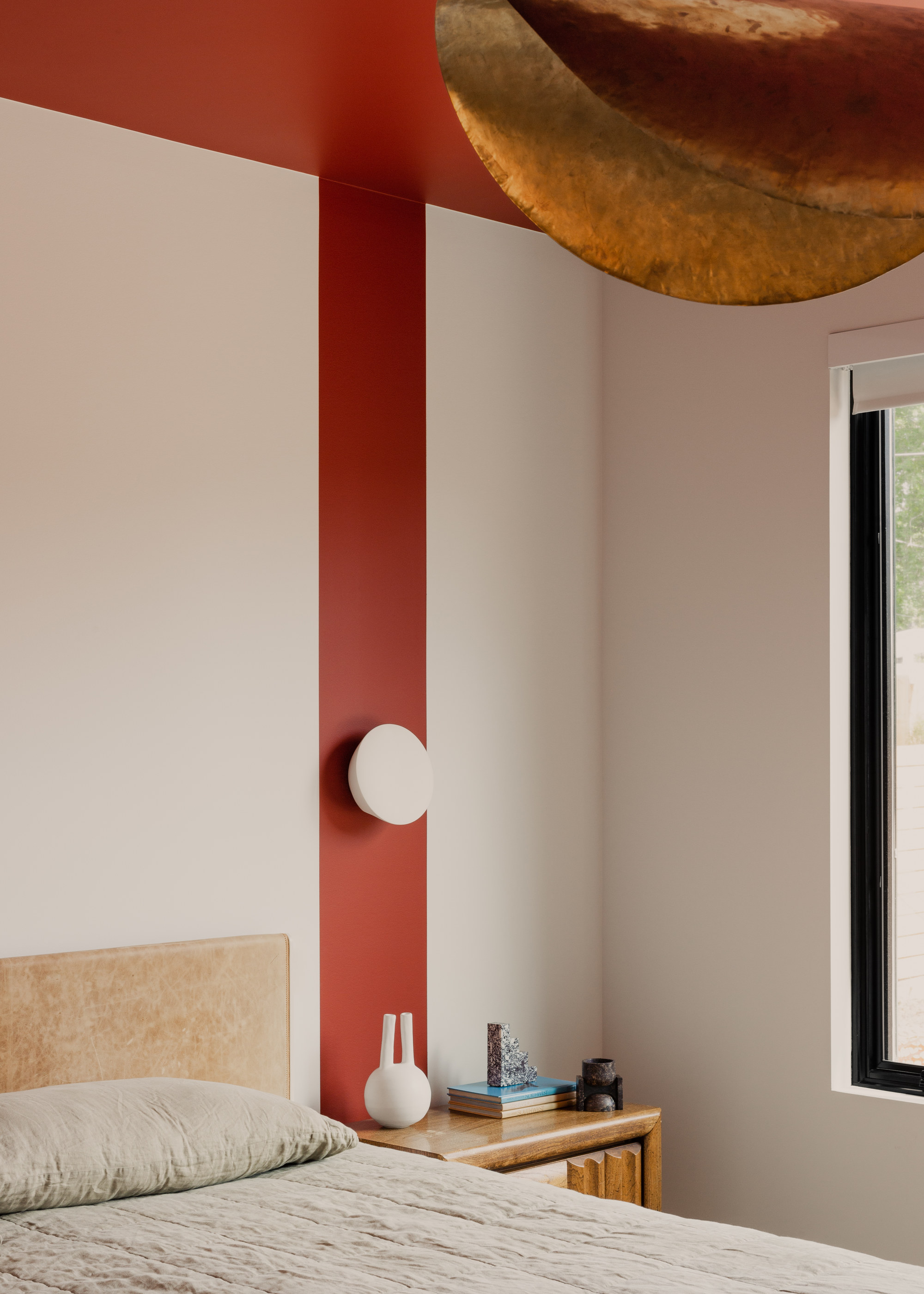
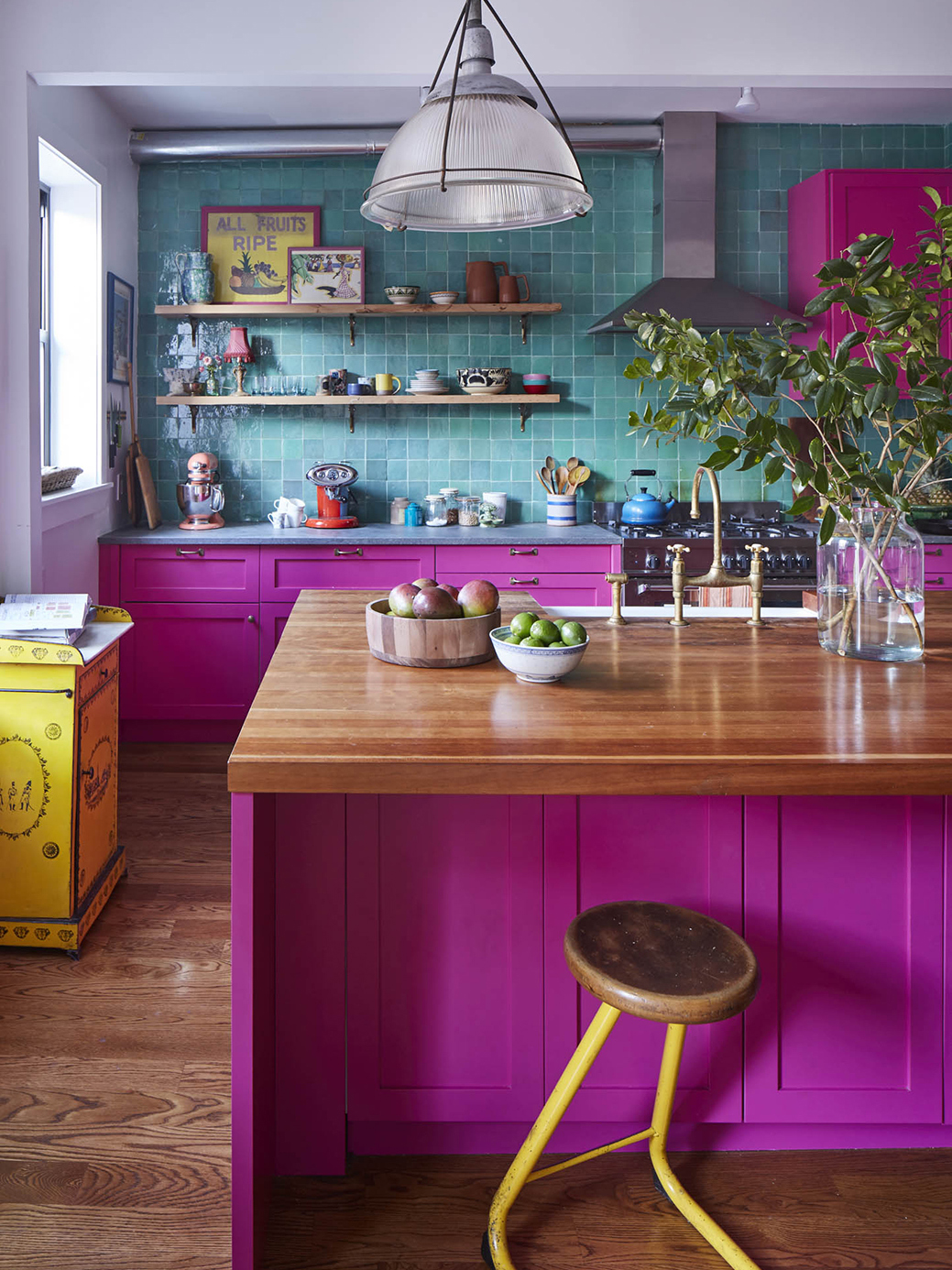
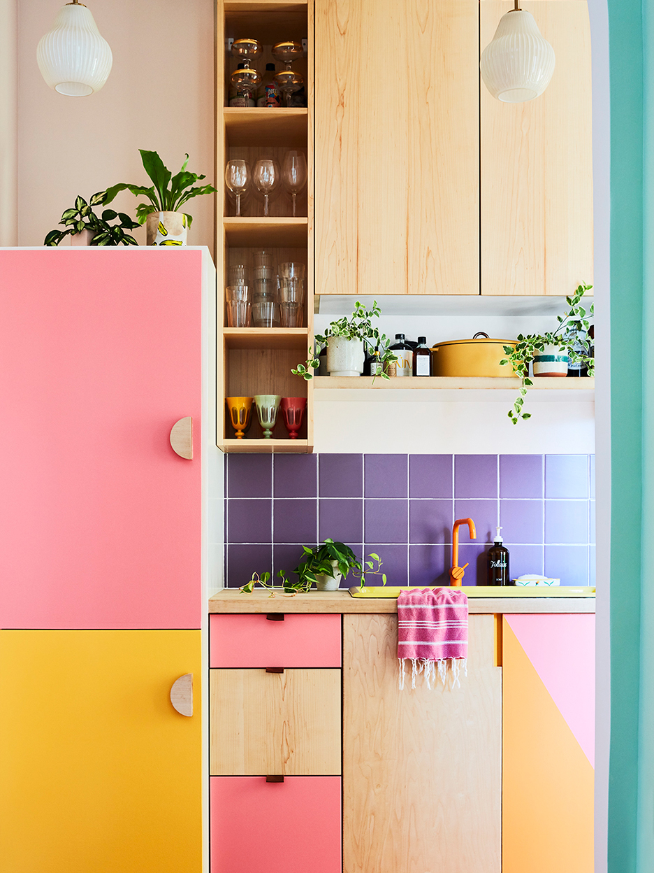
Bromstad and other design experts argue that overly coordinated color schemes often fall short because they lack individuality and contrast. When elements like decor, furniture, and paint all share an identical hue, the result is a one-dimensional, monotonous appearance that can quickly become dated. Bromstad's understanding of color theory, stemming from his college studies, highlights the power of color to define spaces aesthetically and visually. Color theory involves using various combinations to alter proportions, evoke specific moods, and introduce visual interest through contrasting elements. Limiting a palette to a single hue restricts the potential for a design to truly distinguish itself, as there are numerous color combinations capable of transforming a home's interior. Successful designs are not merely matched; they are layered and dimensional, a quality best achieved by broadening the color palette beyond one specific shade.
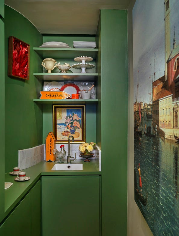
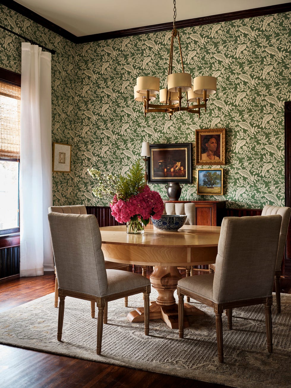
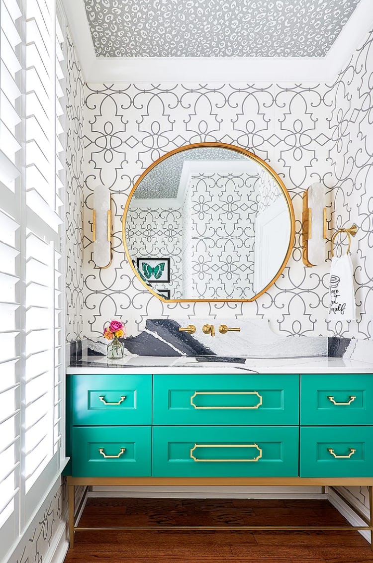
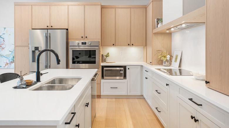
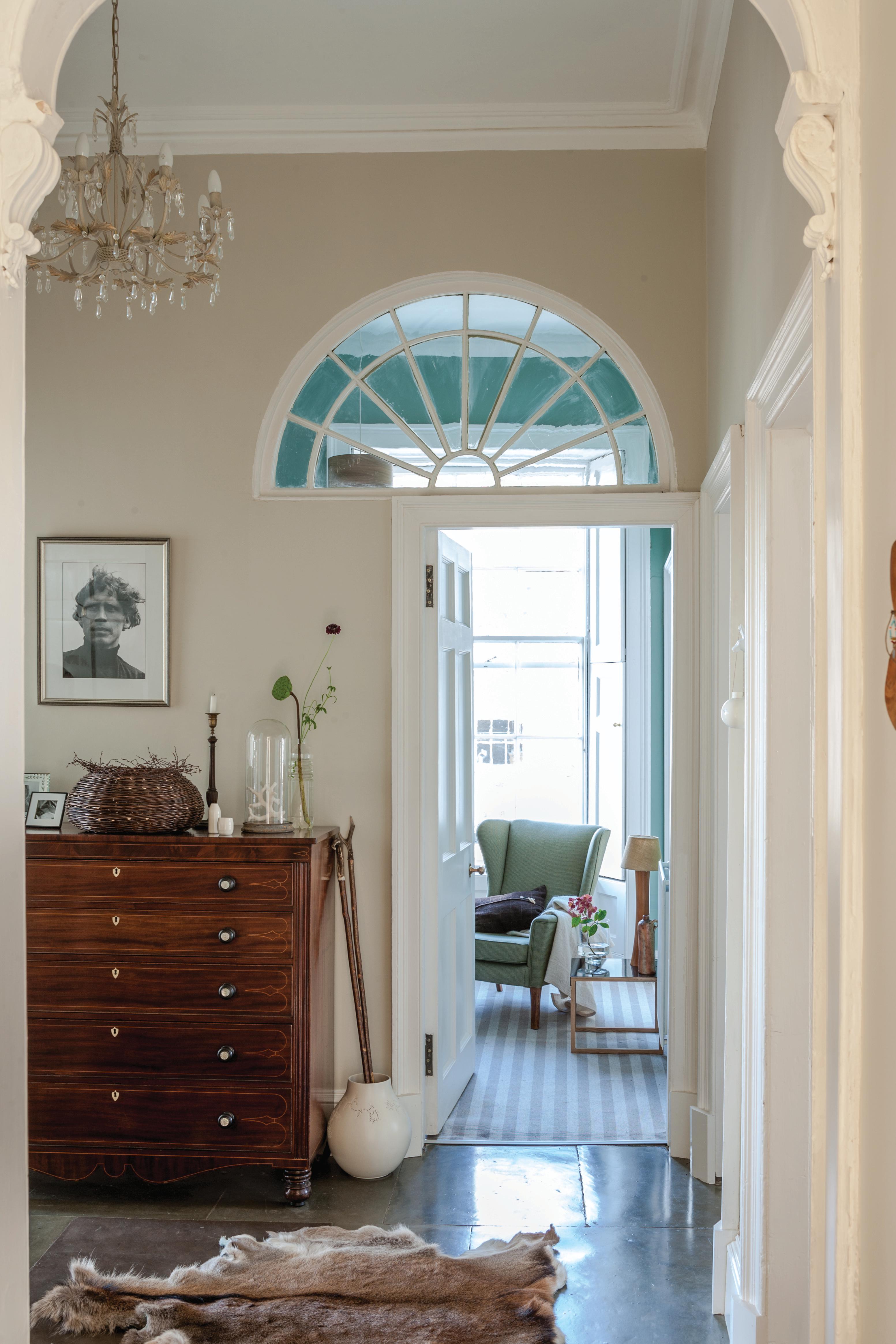
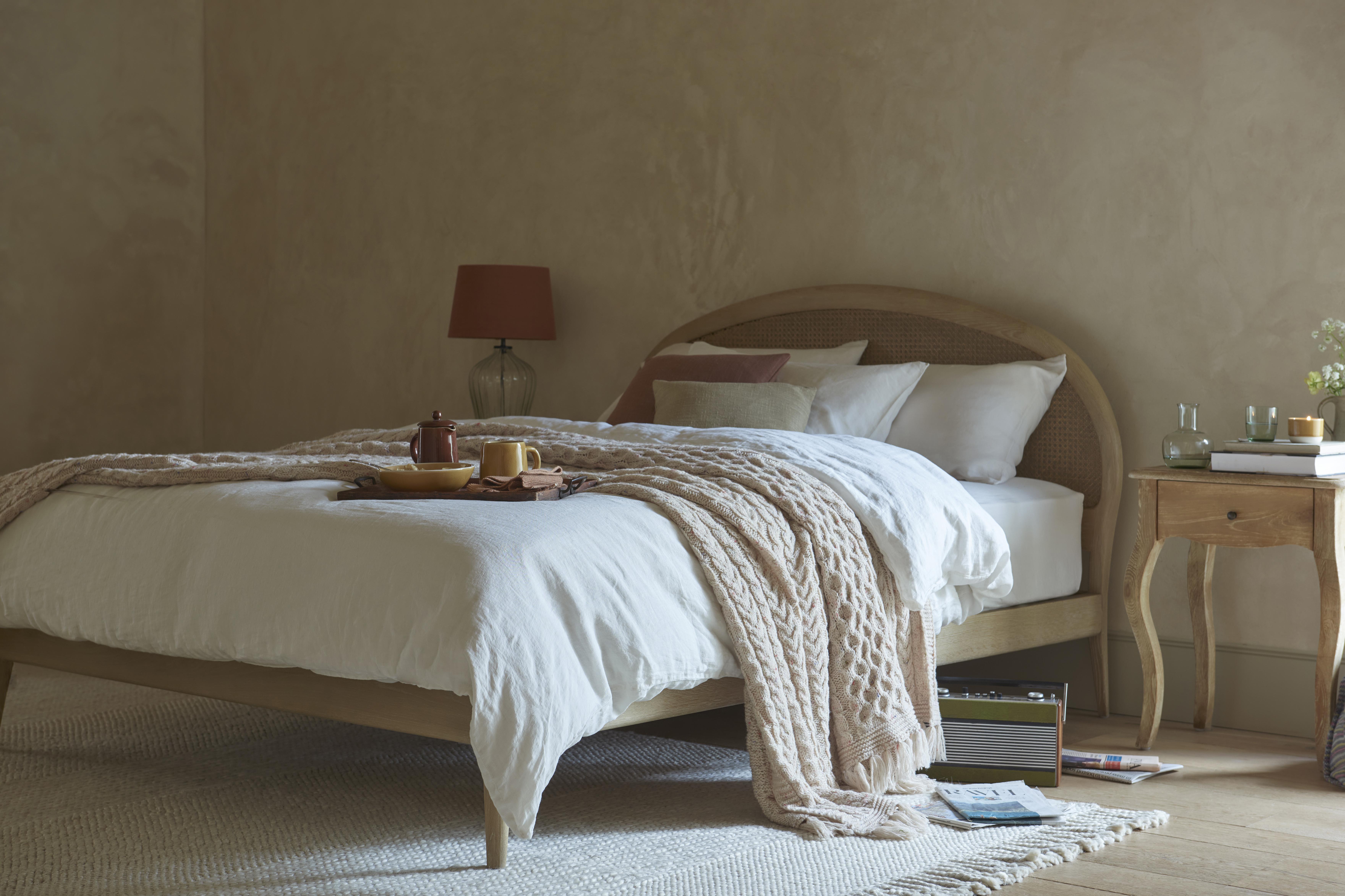
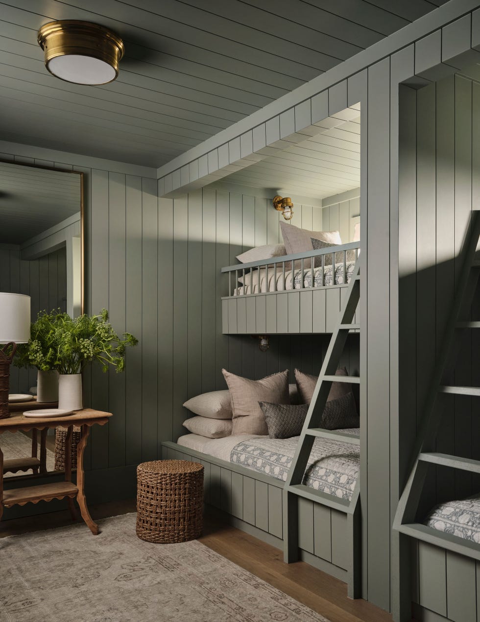
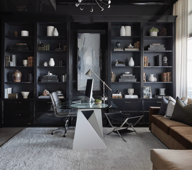
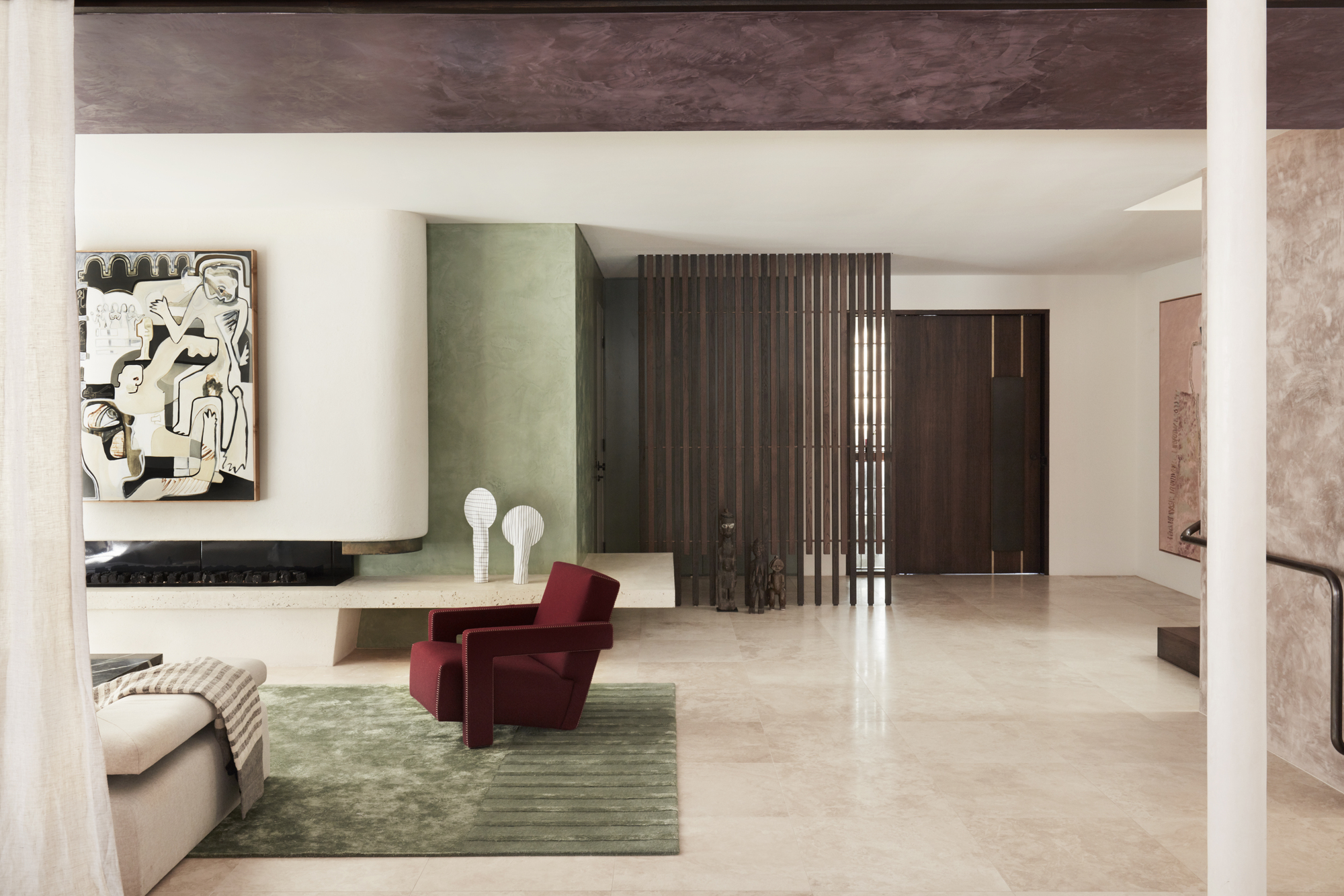
For individuals hesitant to experiment with color, Bromstad advises a gradual approach. He suggests selecting neutral colors for larger furniture pieces and then gradually incorporating more vibrant hues through decorative items or paint. He recommends combining shades with similar tones to maintain cohesion, citing a preference for soft greens with beige undertones alongside muted, dark browns for neutral yet interesting contrasts. Textural elements, dramatic metal accents, and complementary neutral shades can also enliven a neutral color scheme.
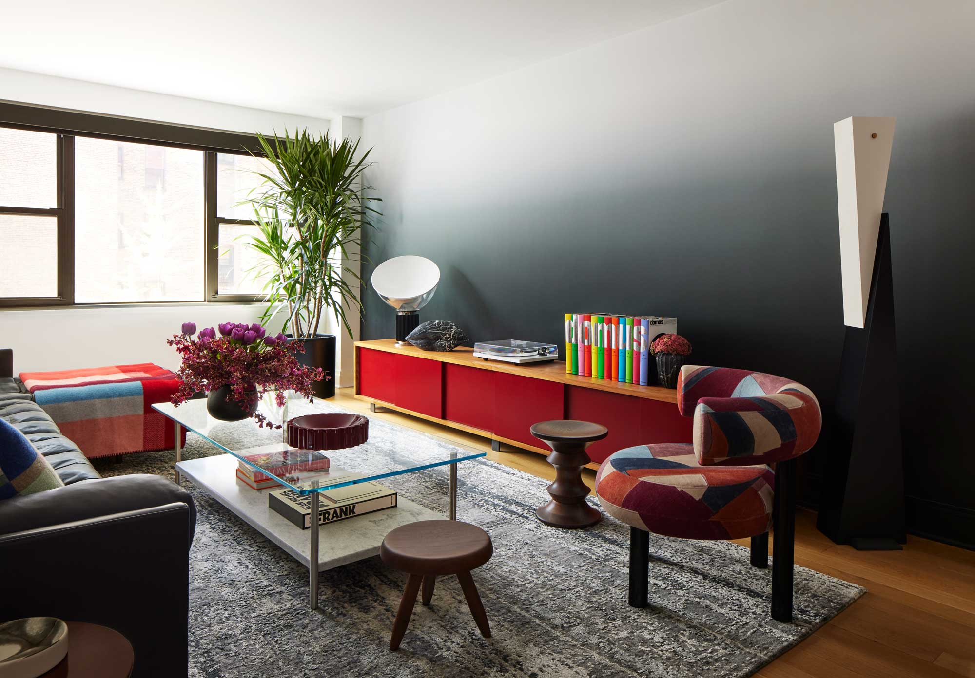
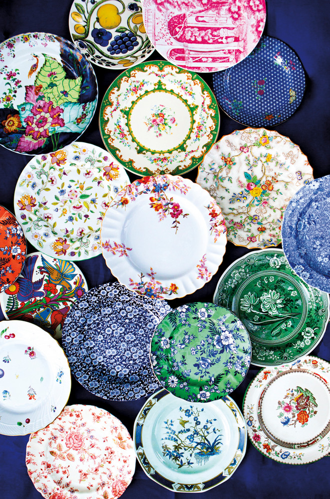
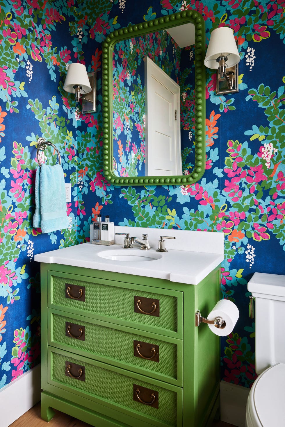
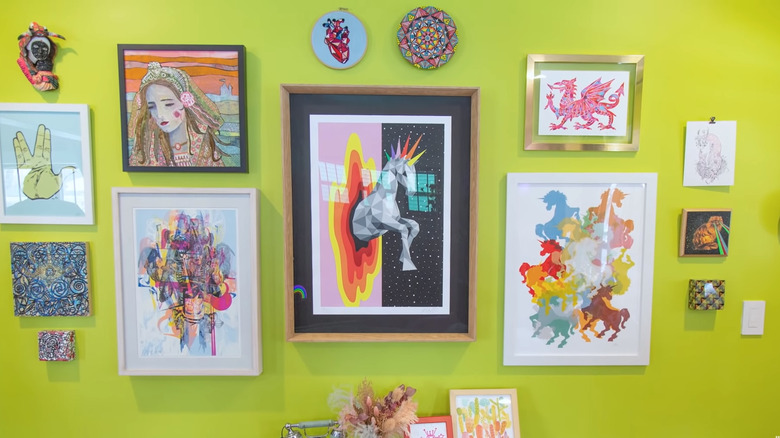
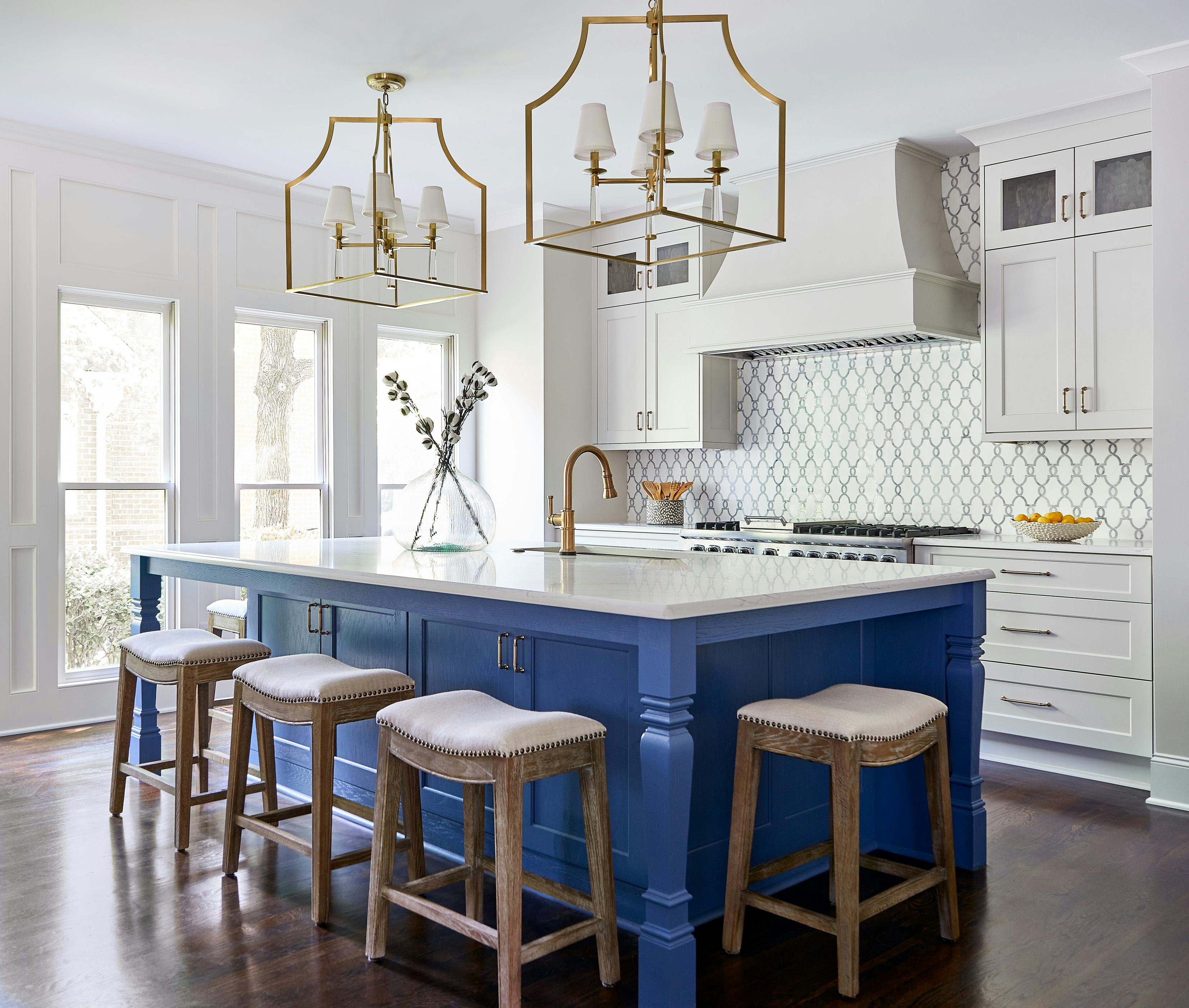
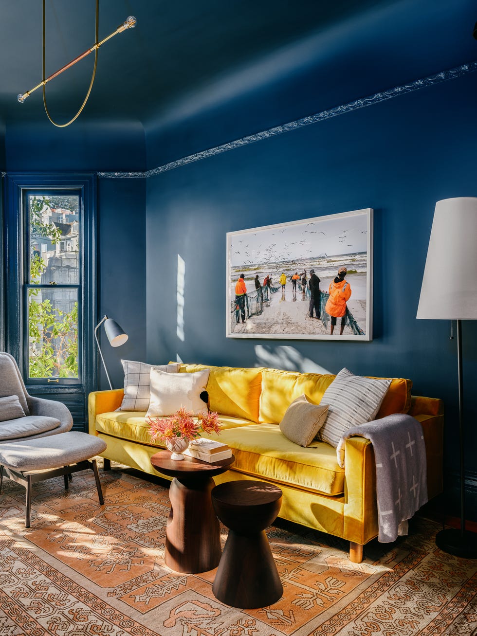
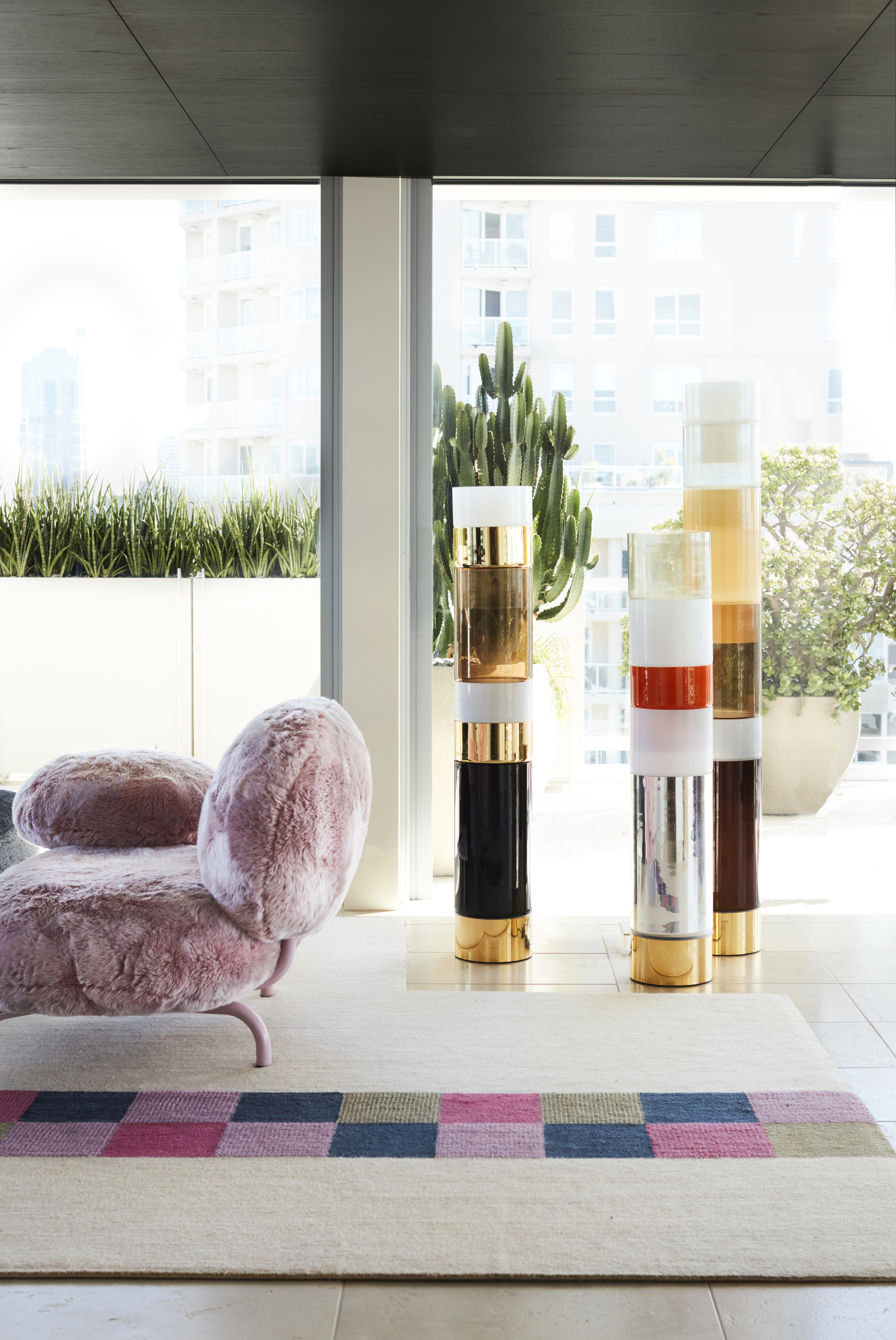
For those who embrace vibrant colors but are unsure how to integrate them cohesively, designers recommend starting with a foundational element, such as a colorful rug or piece of art, to guide subsequent color selections. Once a base color is established, complementary shades can be layered in for a bolder aesthetic, or subtle variations in tone can be introduced for a more relaxed ambiance. To infuse a dramatic splash of color into an otherwise neutral design, incorporating a large, vividly colored piece of furniture that contrasts with the existing neutrals in terms of intensity or tone is an effective strategy.
#DavidBromstad #ColorTheory #InteriorDesign #HomeDecor #ColorPalette #DesignTips #HGTV #NeutralColors #DavidBromstad #ColorTheory #InteriorDesign #HomeDecor #ColorPalette #DesignTips #HGTV #NeutralColors
0 comment in total
 No comments yet
You may also like
This Very "Controversial" Color Is About To Be Everywhere Again

The Color Combo You’re About to See Everywhere
These Unusual Paint Colors May Not Be An Obvious Choice, But Designers Can’t Get Enough
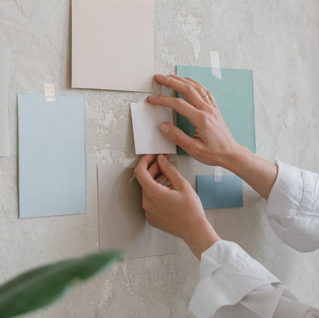
Designers Wish Their Clients Would Stop Asking for THIS Color
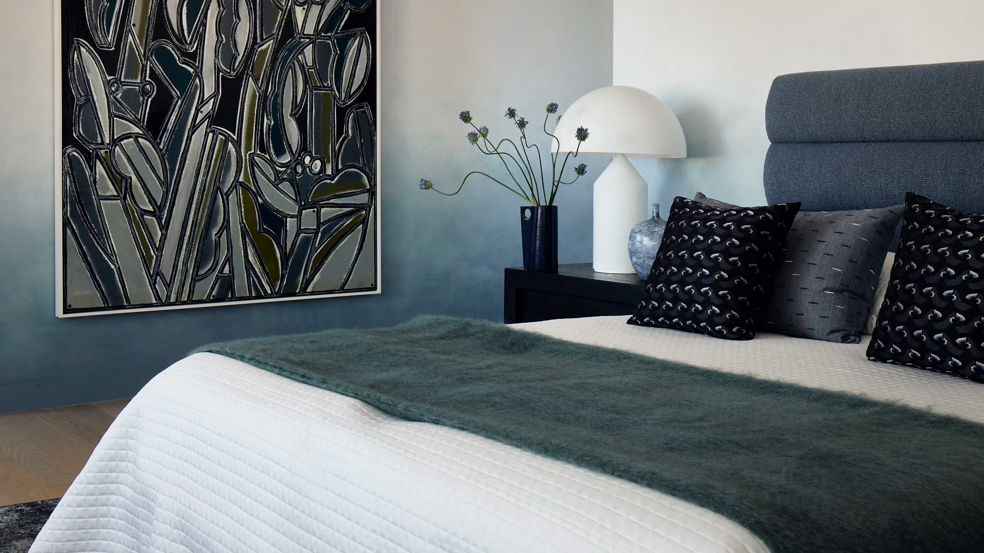
This surprising color trend is having a comeback

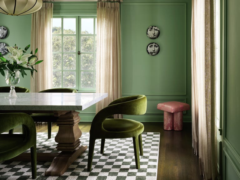
This SURPRISING Color Is About to Be Everywhere, According to Designers


Skip The Paint & Use David Bromstad's Clever Tip To Lighten Up Dark Cabinets Instead
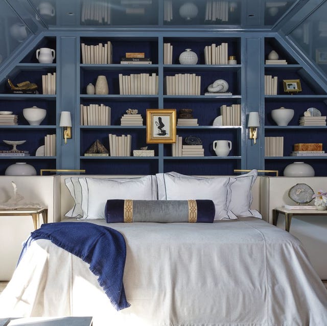
The Color Drenching Paint Trend Isn't Going Anywhere

Interior design experts reveal the colour rules you should be breaking
6 Paint Color Mistakes To Stop Making, According To Designers

I Wouldn't Buy a New Handbag Without Considering This Underrated Color

'The World of Color is Rife With Danger' — 5 Color Combinations That Don't Go Together and What to Use Instead
6 Paint Color Mistakes To Stop Making, According To Designers
Not Beige, Not Black—This Winter Nail Colour Always Looks So Expensive

Creamy neutral paint colours are back — just don’t call it magnolia
Some People “Can’t” With This Cabinet Color, But There’s No Denying It’s on the Rise

Never Make These Closet Organization Mistakes, Warn Experts

David Bromstad-Inspired Paint Rules To Follow When Updating Your Home

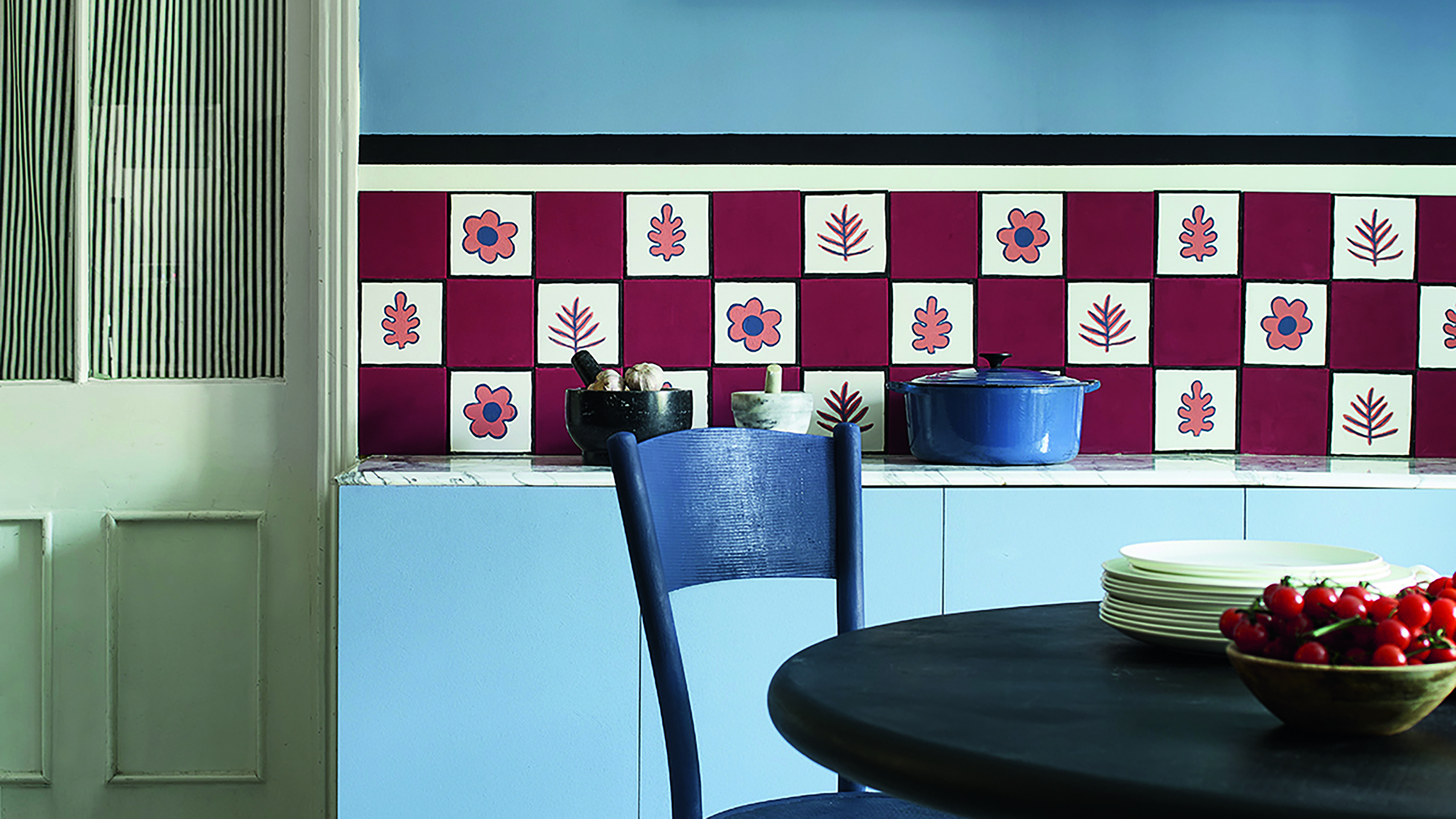
Primary colours are having a moment - but the secret to styling them is through 'unexpected' touches
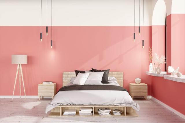
Design Pros All Agree: The Color-Blocking Trend Is One to Try