1/2
Designers Wish Their Clients Would Stop Asking for THIS Color
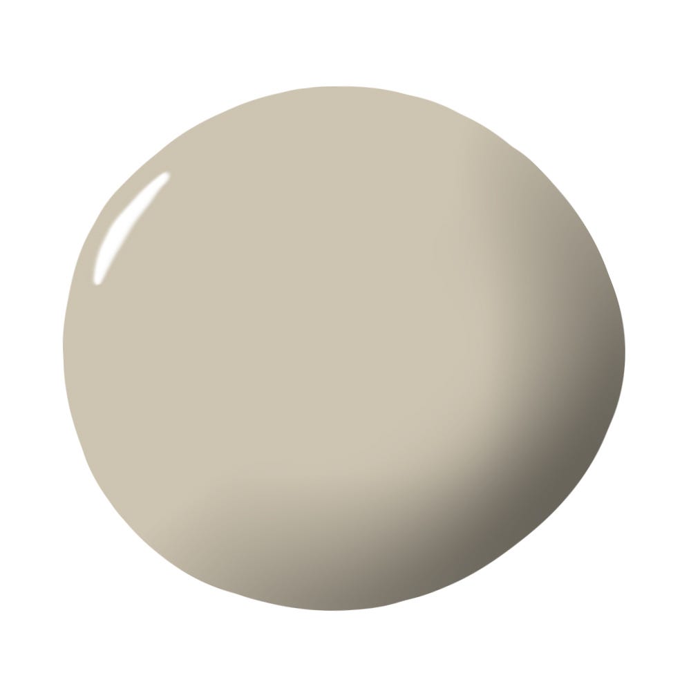
The article addresses a common dilemma faced by interior designers: the frequent client request for gray paint. Jessica Cherner, a design editor, highlights the perspective of Jay Jenkins, Associate Designer at Crosby Jenkins Associates, who expresses his disinclination towards using solid gray tones in residential spaces. Jenkins characterizes middle gray tones, such as Behr's Battleship, as bland and uninspiring, likening them to colors more suited for industrial or commercial environments. He emphasizes that such grays lack the depth and versatility needed to complement other colors effectively, particularly when devoid of green or brown undertones.
While Jenkins generally dislikes the use of pure gray in living areas, he acknowledges its utility in specific contexts. For instance, he suggests that muted grays are suitable for garages, where they can effectively conceal dirt and imperfections, thereby contributing a touch of design to an otherwise utilitarian space. However, his strong reservation remains for its application in residential living rooms, citing its flatness and poor compatibility with other hues.
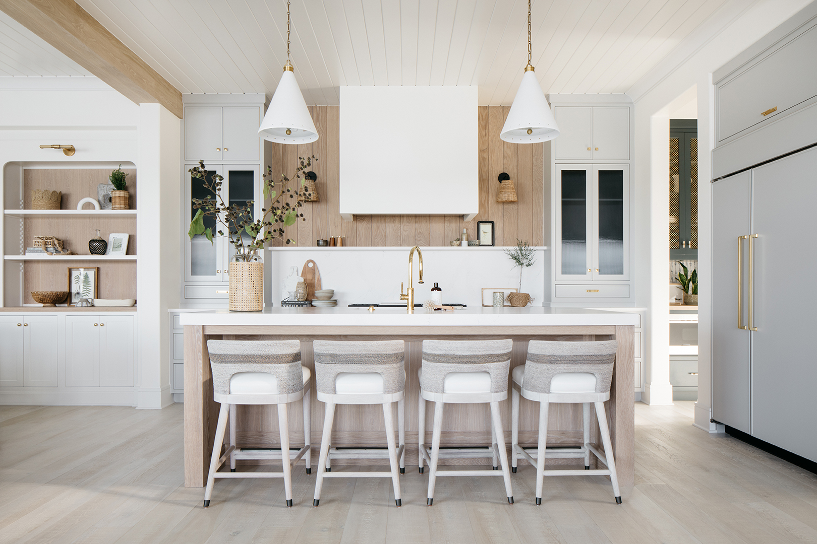
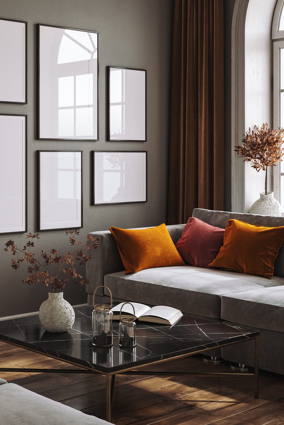
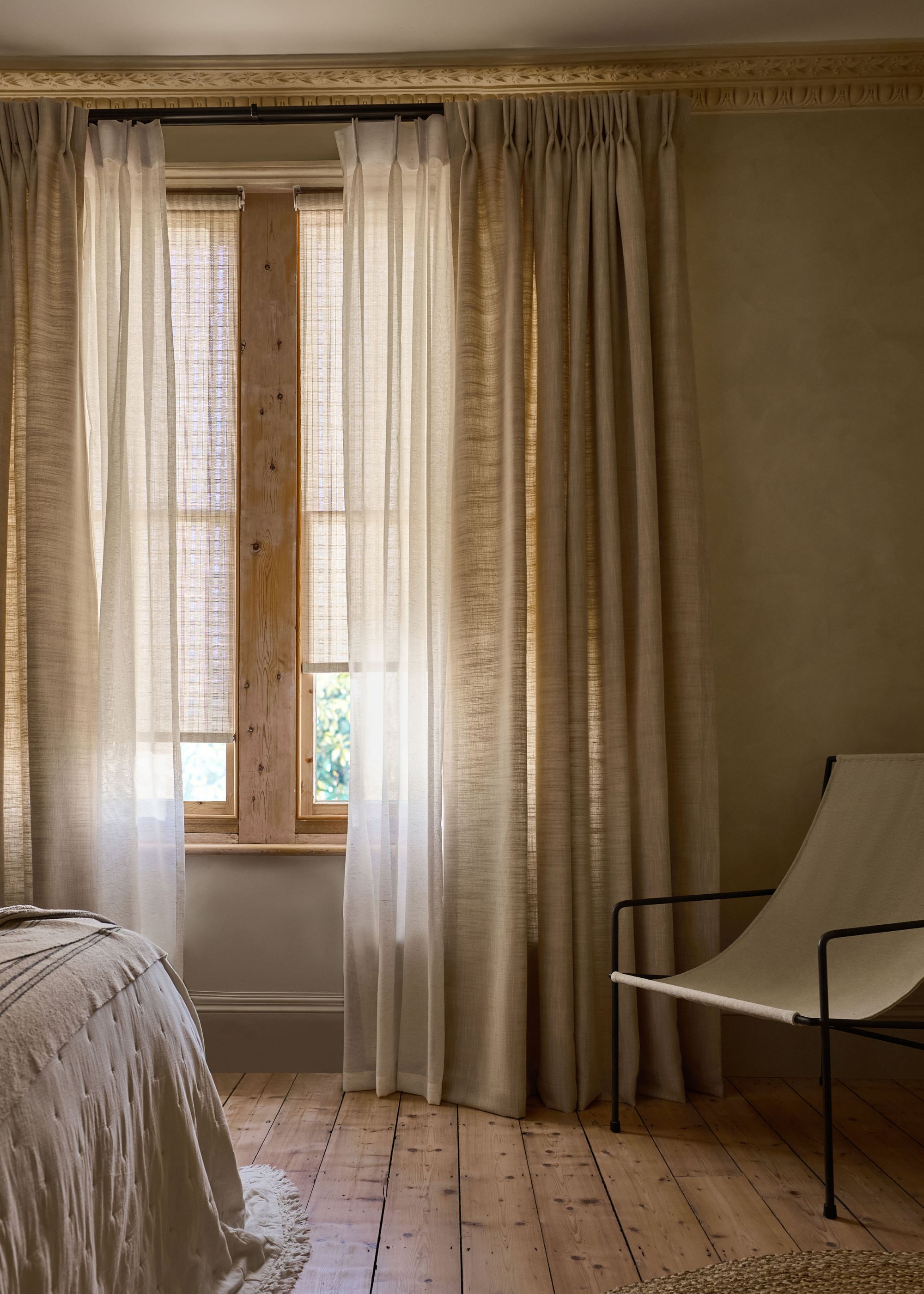
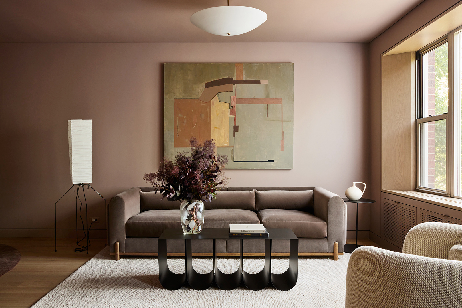
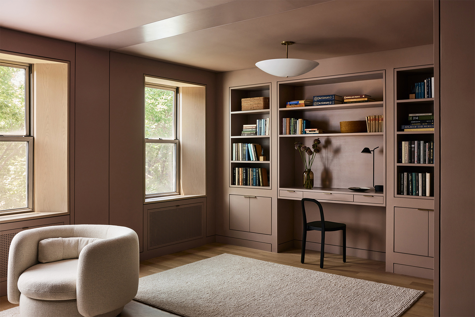
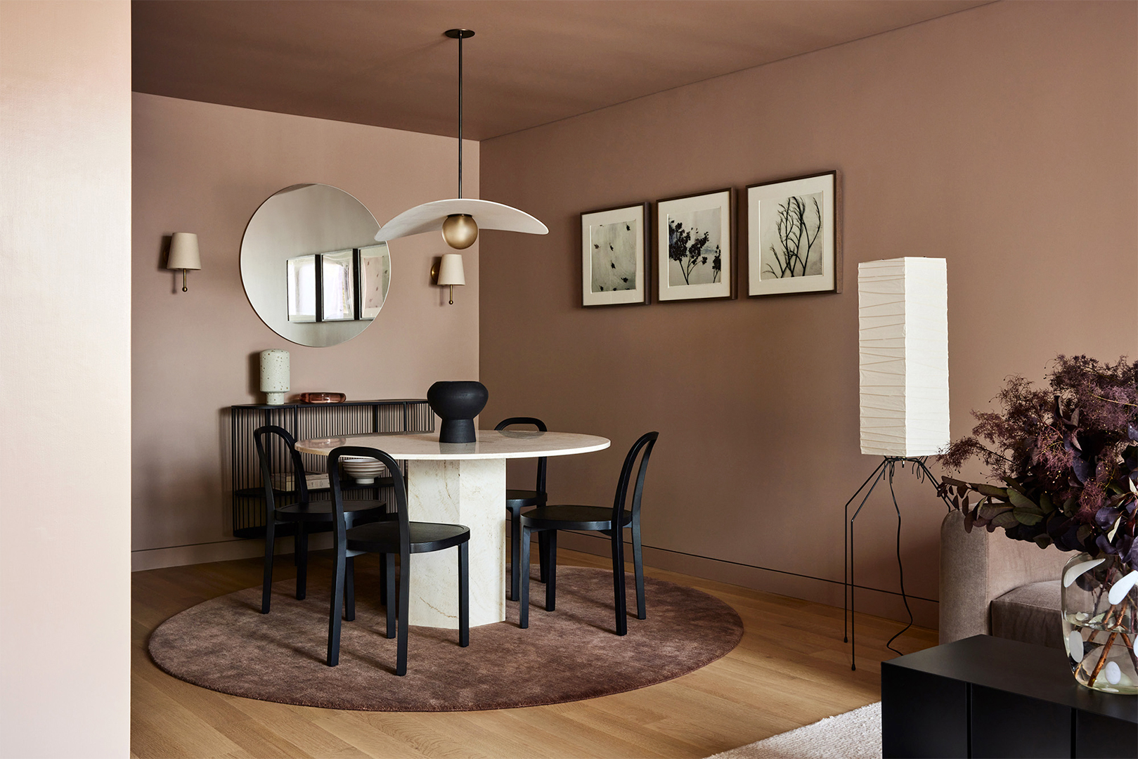
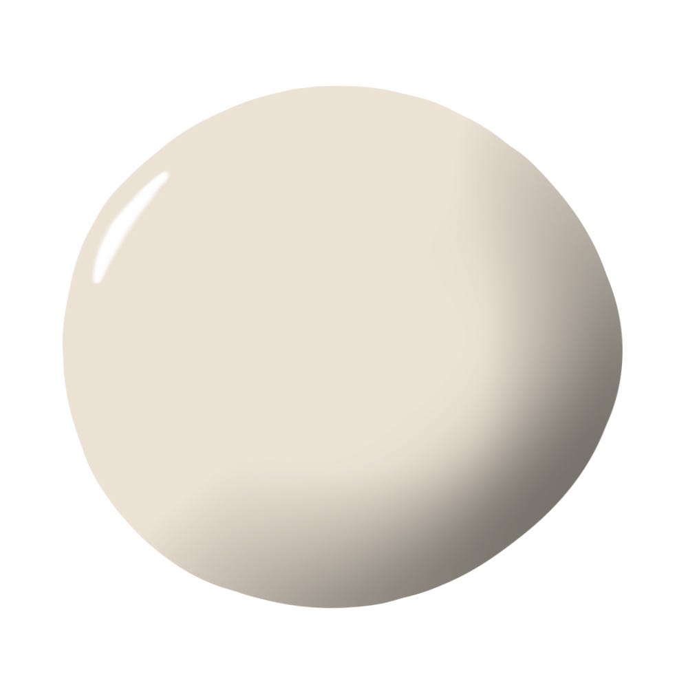
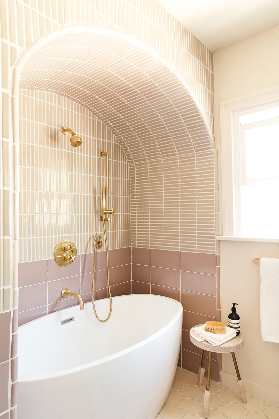
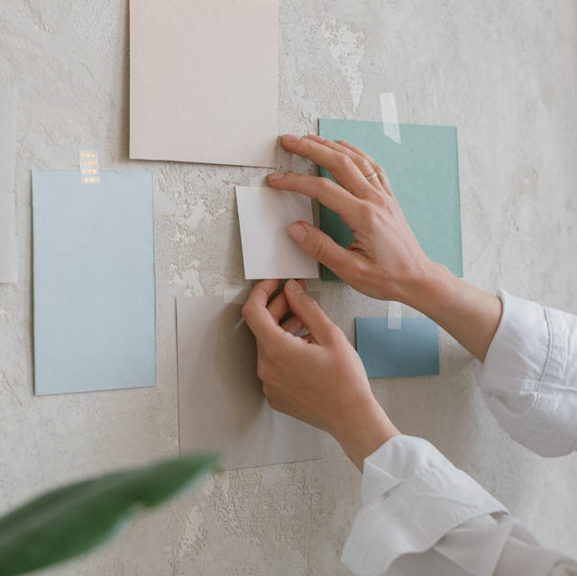
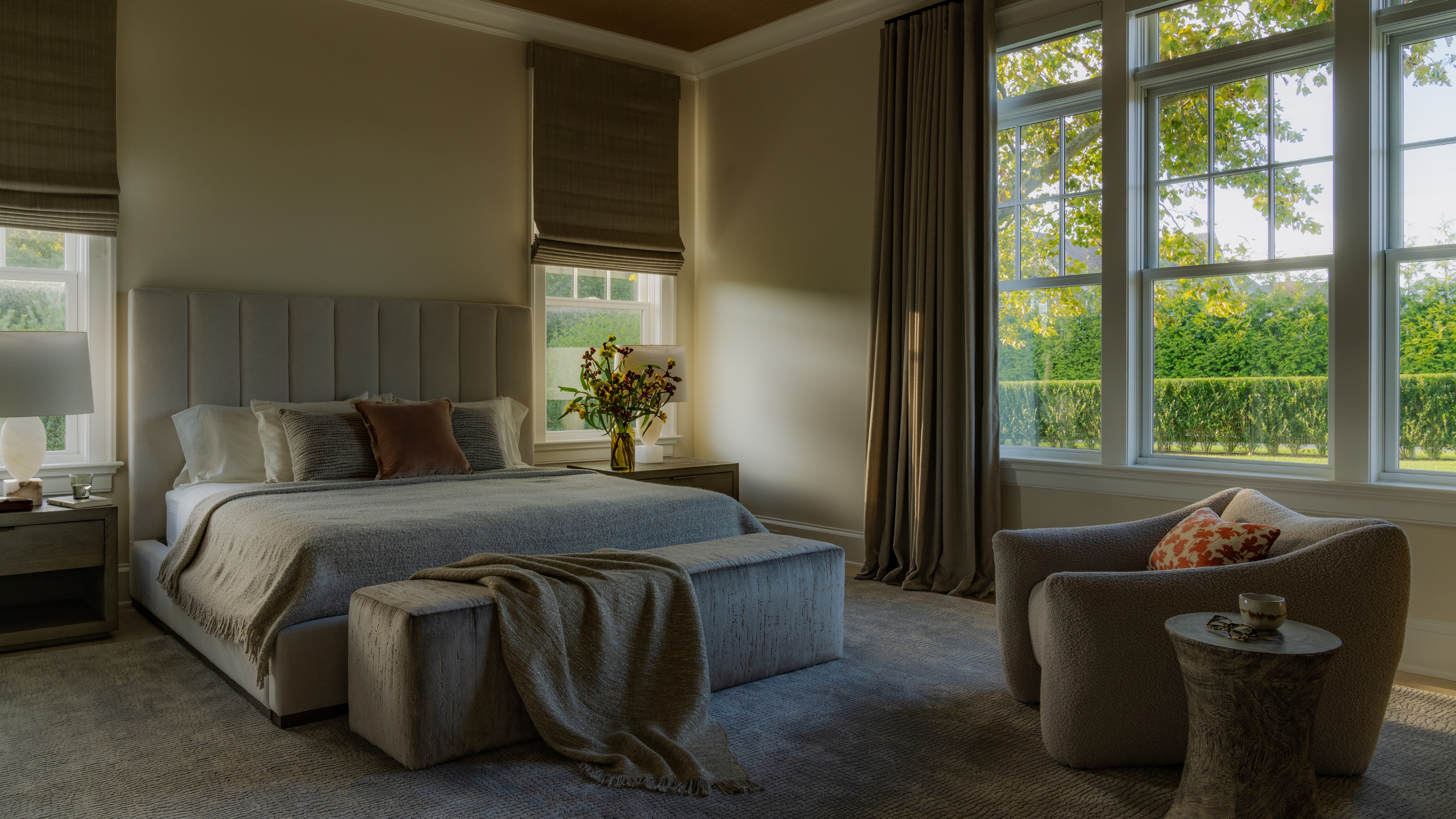
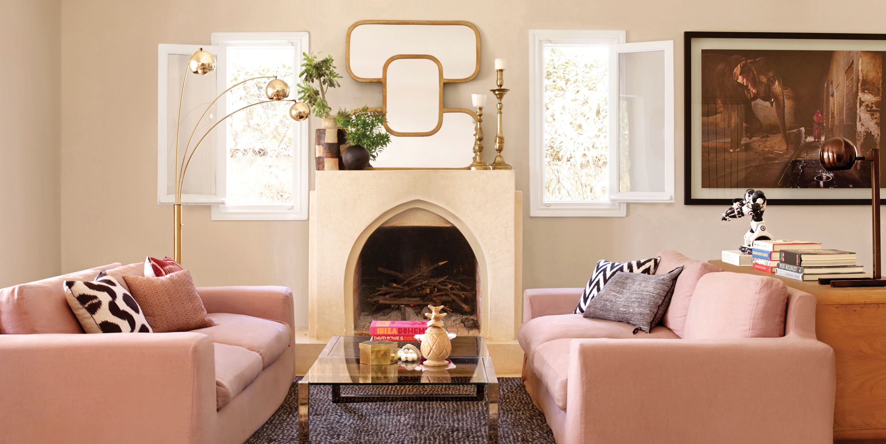
As an alternative to traditional gray, Jenkins advocates for "greige," a blend of gray and beige, which he identifies as his personal favorite. Greige, according to Jenkins, offers a more appealing option because it incorporates green and brown undertones, providing greater warmth and versatility. This preference for nuanced neutrals is further illustrated by the example of designer Leanne Ford, who innovated the color "peige," a fusion of pink and beige, demonstrating how designers creatively combine colors to achieve more engaging and harmonious palettes.
The broader implication is that while gray has been a popular neutral, its indiscriminate use may lead to aesthetically uninspired interiors. Designers often seek more dynamic and complex neutral alternatives that can enrich a space rather than flatten it. The article suggests that homeowners who favor neutral palettes but desire more character should consider options like greige or peige, which offer a sophisticated balance between neutrality and subtle color variation. This approach helps to avoid the monotonous effect of plain gray while still providing a calming and cohesive backdrop for interior décor.
Ultimately, the article serves as a guide for those looking to update their home's color scheme, encouraging a move away from simplistic gray choices towards more sophisticated and undertone-rich neutrals. It underscores the importance of a designer's expertise in selecting colors that bring warmth, depth, and personality to a space, even within the neutral spectrum. The discussion aims to educate clients on why certain colors might be less ideal and introduces them to more effective alternatives that align with contemporary design principles.
#InteriorDesign #ColorPalette #HomeDecor #NeutralColors #Greige #PaintColors #DesignerTips #RoomIdeas #ColorTrends #InteriorDesign #ColorPalette #HomeDecor #NeutralColors #Greige #PaintColors #DesignerTips #RoomIdeas #ColorTrends
0 comment in total
 No comments yet
You may also like
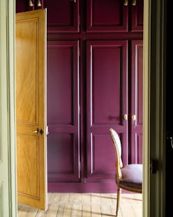
These Unusual Paint Colors May Not Be An Obvious Choice, But Designers Can’t Get Enough
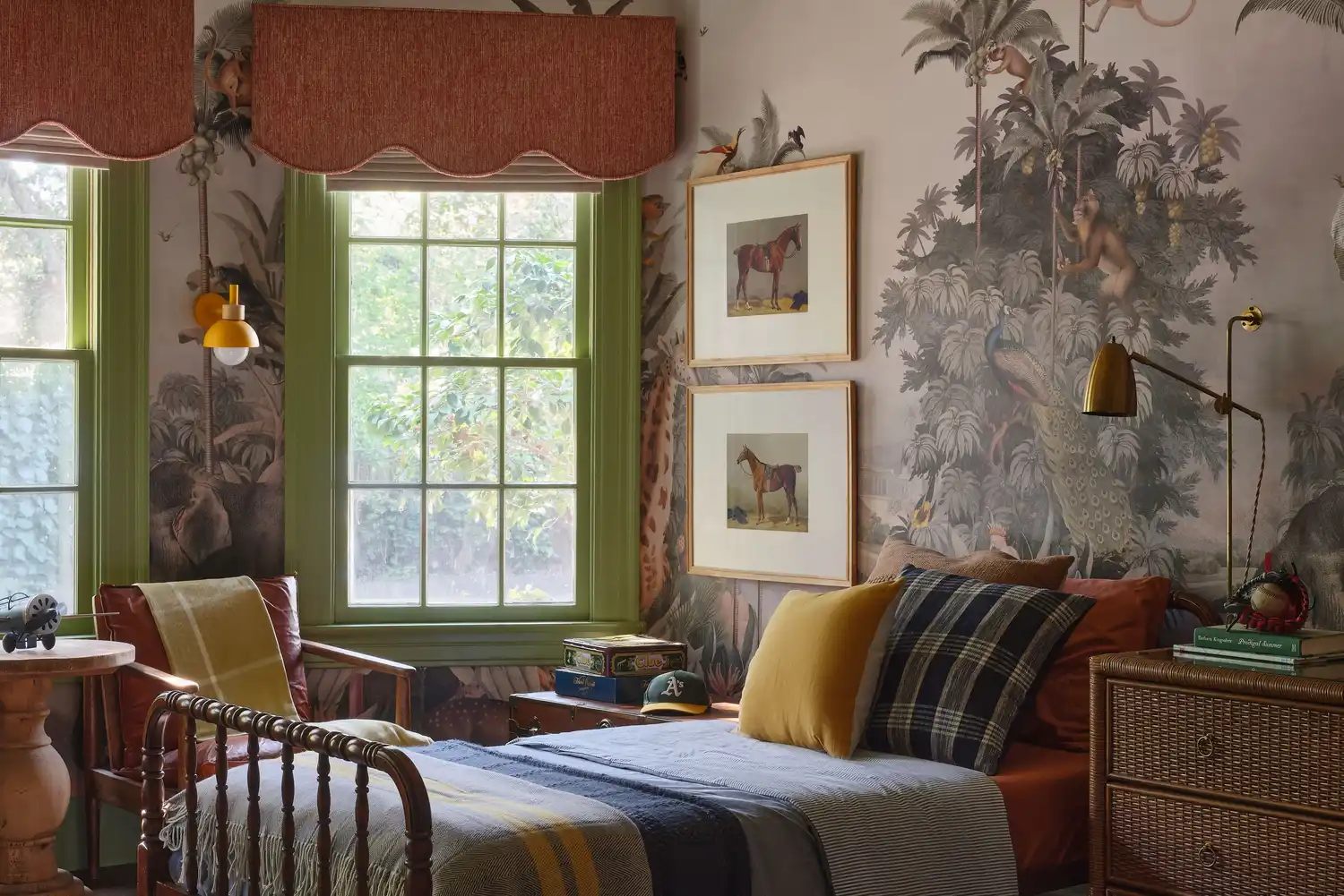
6 Paint Color Duos Designers Can't Get Enough of This Fall

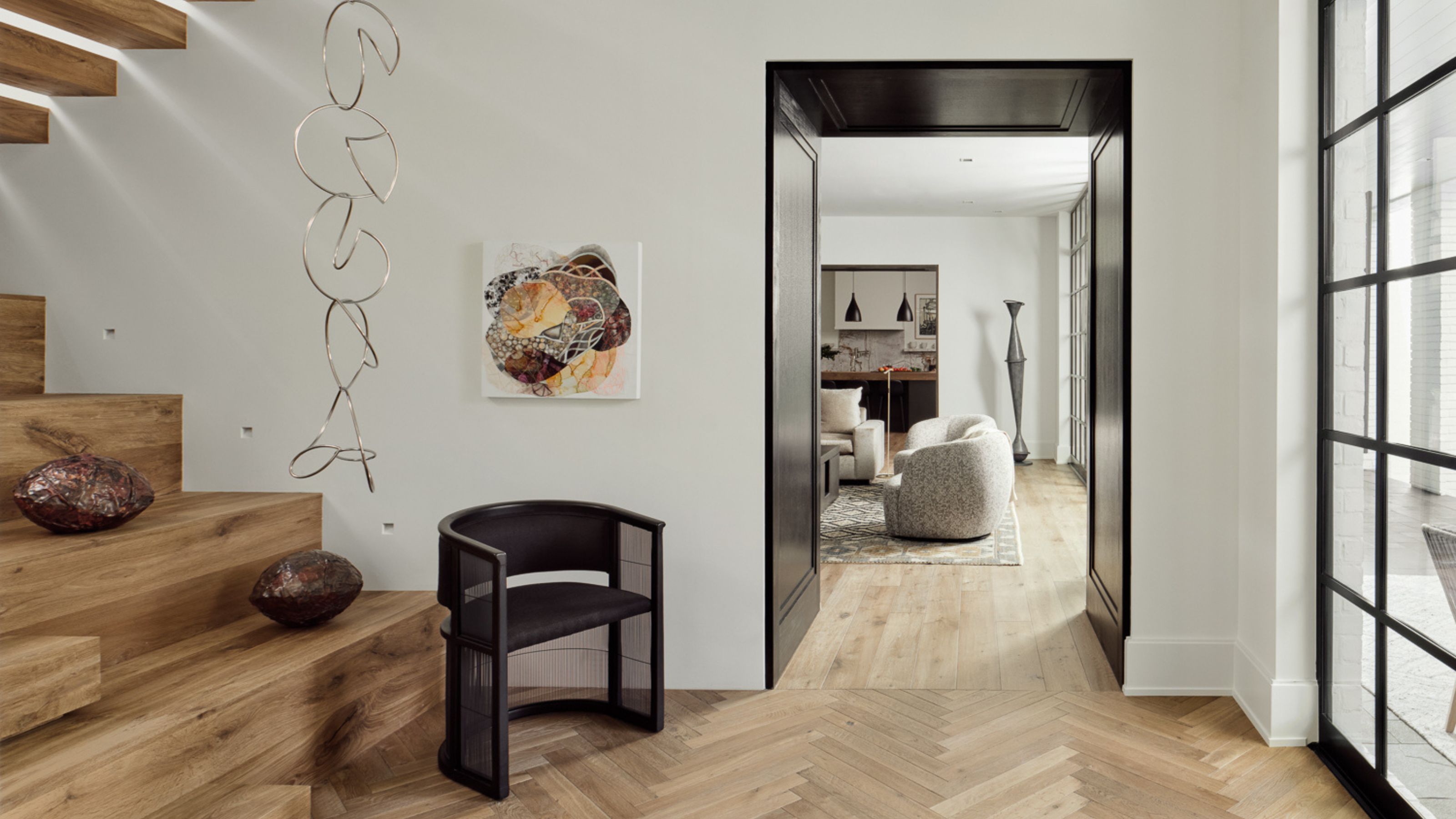
9 Neutral Paint Colors Designers Constantly Reach For — "It's My Tried-and-True"

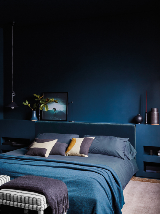
It’s Official: Designers Are Ditching This Once-Classic Color
The Paint Color That All This Designer's Followers Ask About | domino

5 Times Interior Designers Used Colorful Tile Grout That Make Me Never Want to Choose White Again
Designers Hope This Early 2000s Paint Trend Never Comes Back
Why This Hue Is Suddenly Dominating Every Designer's Wishlist—Plus, How to Style It

Rich colors and sumptuous textures are on designers' minds
The Kitchen Paint Color Designers Refuse to Use—And the Shades They Love Instead

When Your Client Cares About Paint as Much as Furniture, You Go Big With Opposing Colors

Here's How Designers Really Feel About Those Rainbow Bookshelves
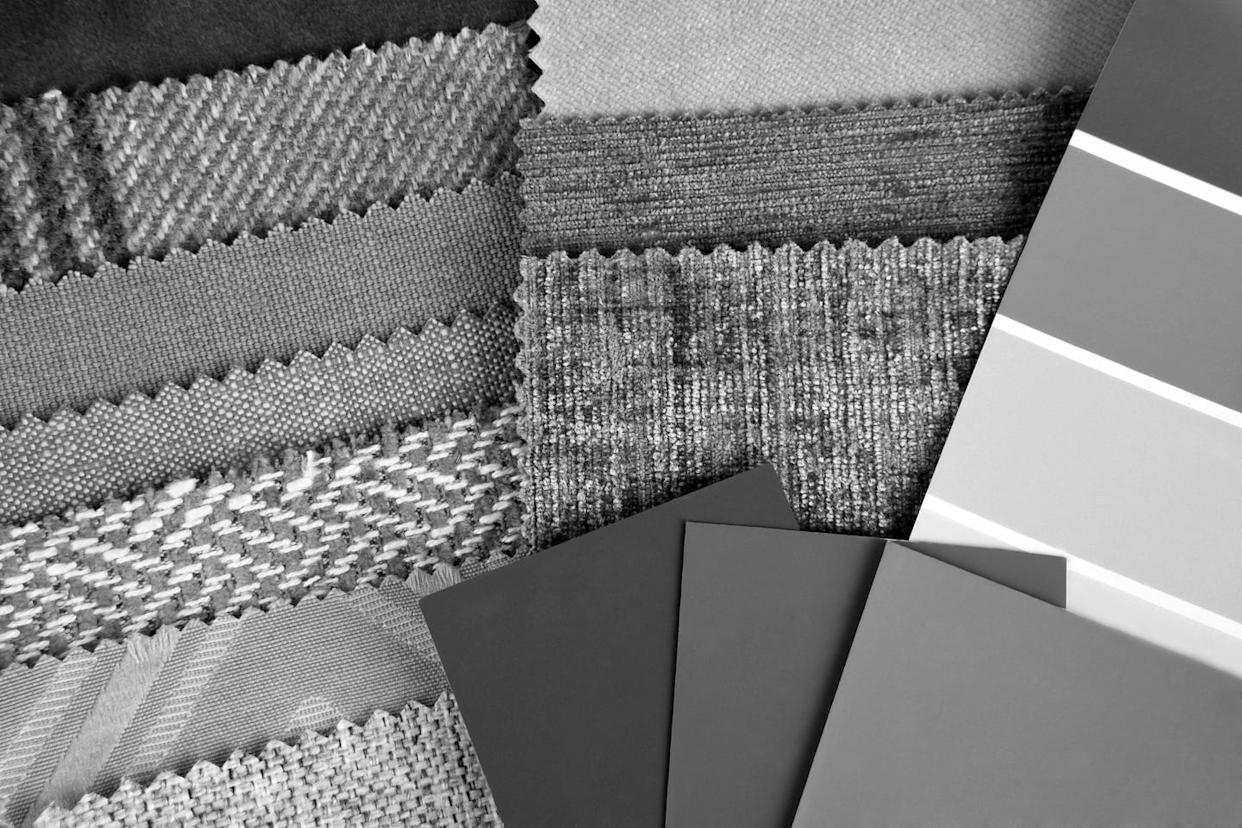
Every Designer I Talked to Said This Popular Paint Color Is on Its Way Out

Designers Say These Vintage Paint Colors Are Back


Interior design experts reveal the colour rules you should be breaking
Designers LOVE Pairing These Unexpected Colors With This Sophisticated Hue

‘I have to laugh when stylists and designers talk about a single pop of color’
No More of These, Please — 4 Outdated Window Treatments Designers Don't Want to See You Using Anymore
These Are the Almond Paint Colors Designers Are Obsessed With
Design Pros All Agree: The Color-Blocking Trend Is One to Try