16 Stunning Japandi-Style Paint Colors for a Calming Home
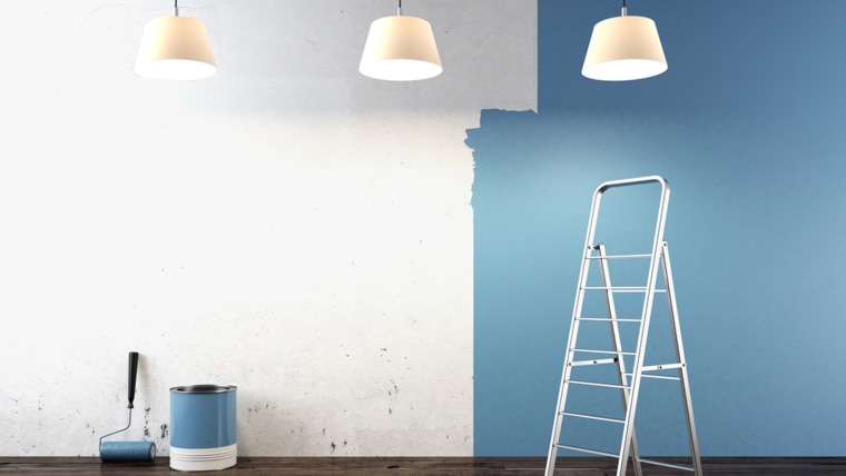
The Japandi aesthetic, a fusion of Scandinavian hygge and Japanese wabi-sabi philosophies, gained significant popularity post-pandemic as people increasingly sought peaceful and comfortable home environments. This enduring trend emphasizes simplicity and tranquility, leading to a growing preference for its soft, calming color palette. Experts from prominent paint brands, including PPG Paints, Sherwin-Williams, Benjamin Moore, Backdrop, Glidden, Behr, Valspar, and Farrow & Ball, offer recommendations for achieving this serene style through specific paint colors.
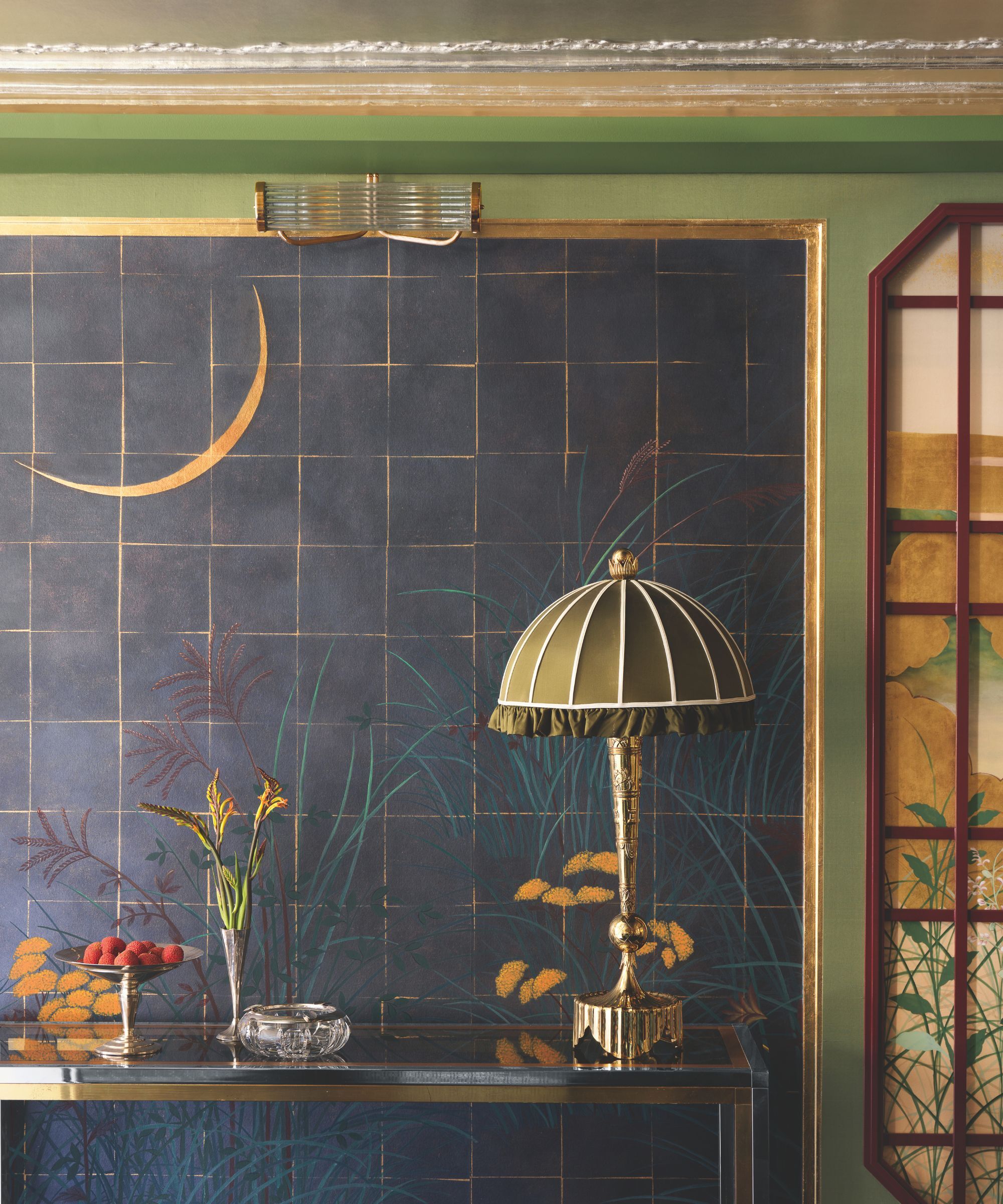
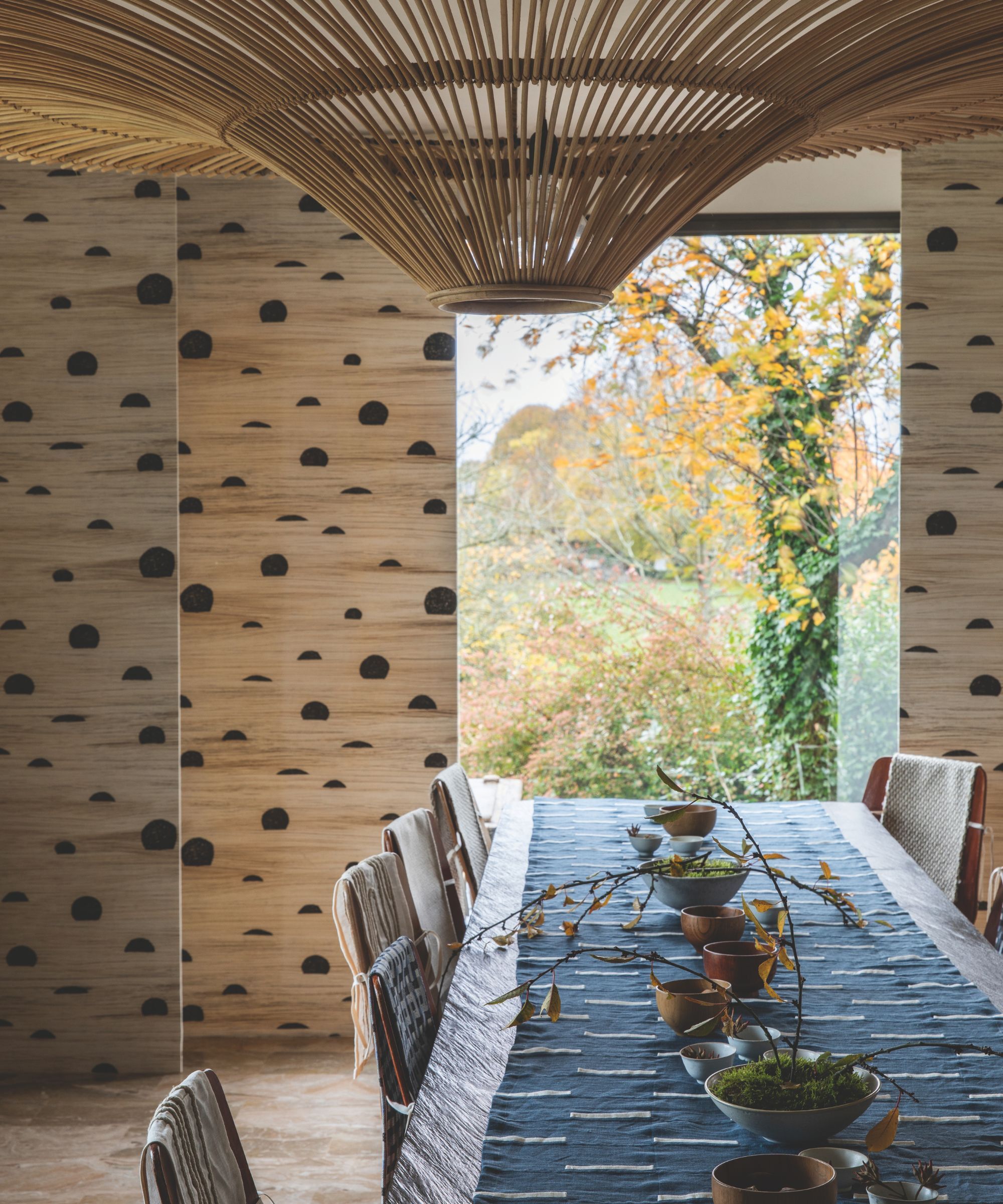
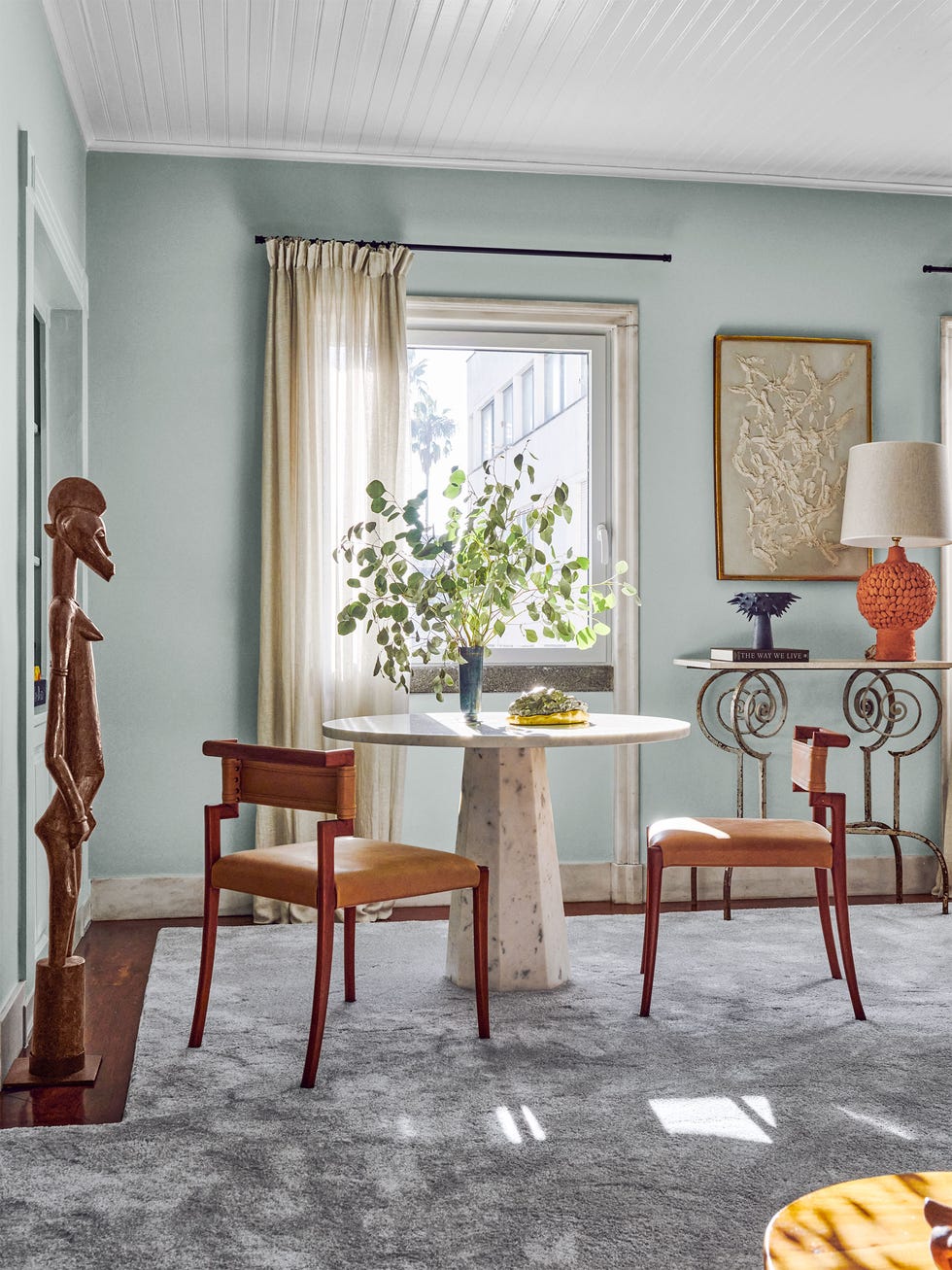
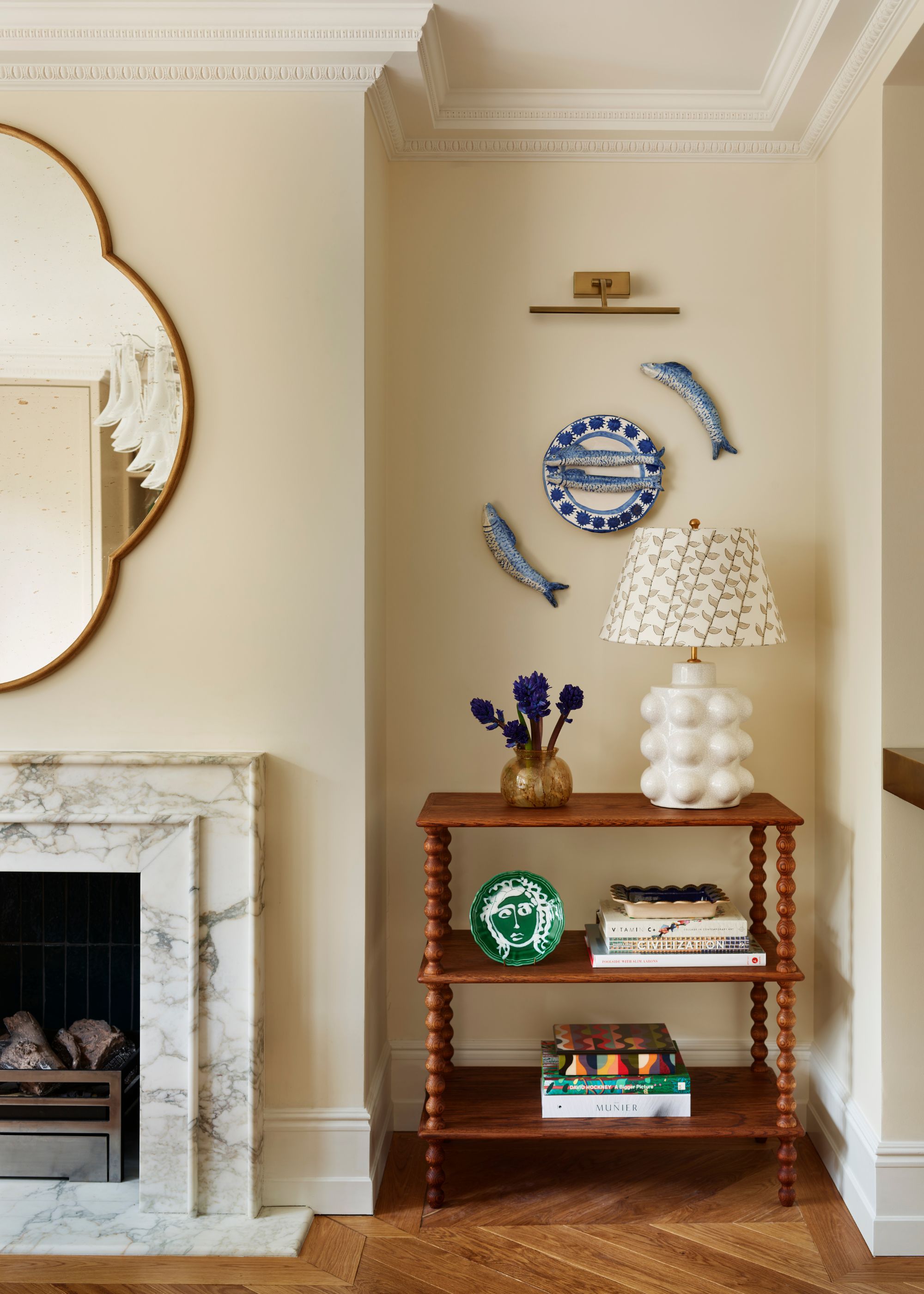
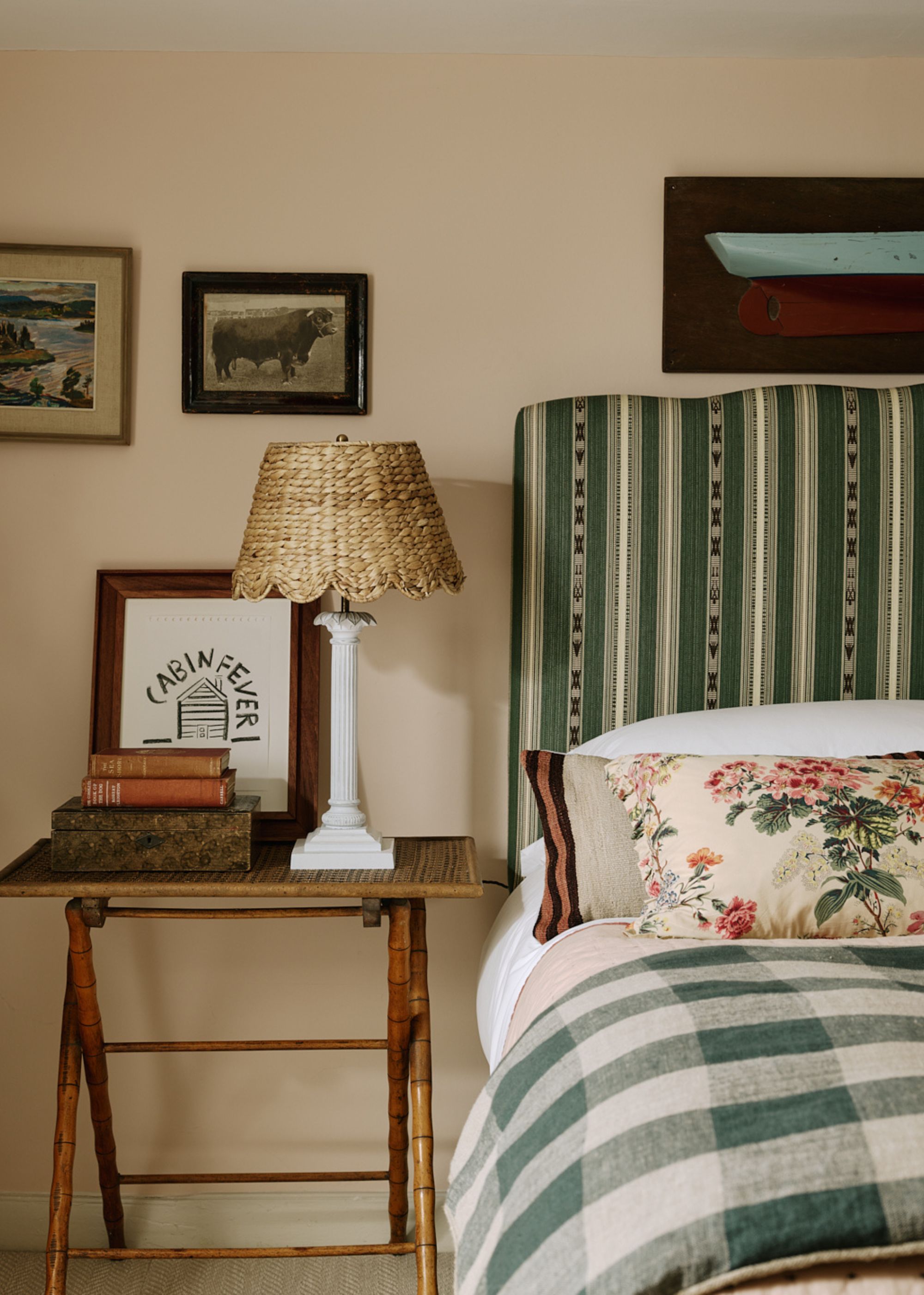
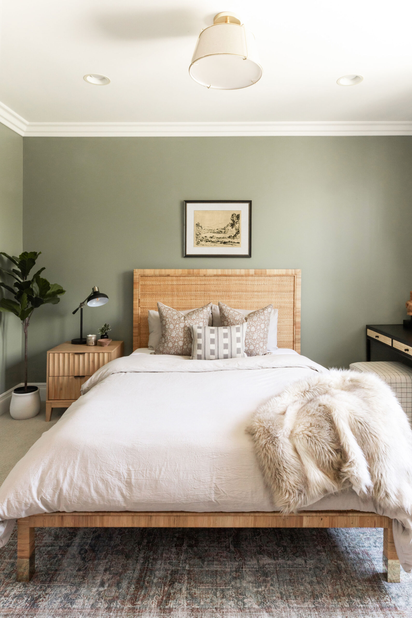
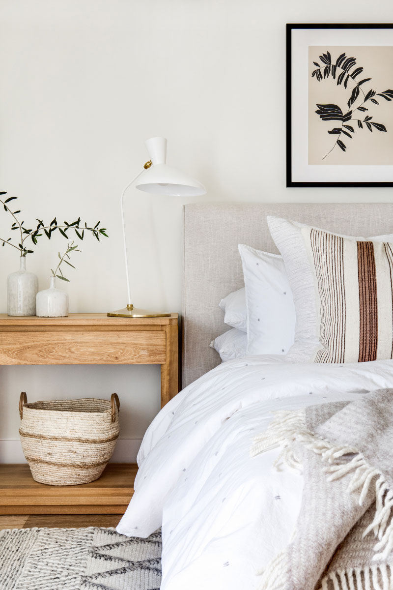
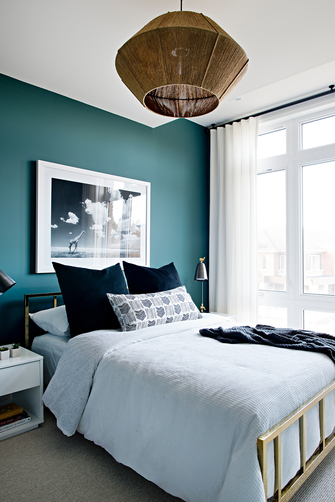
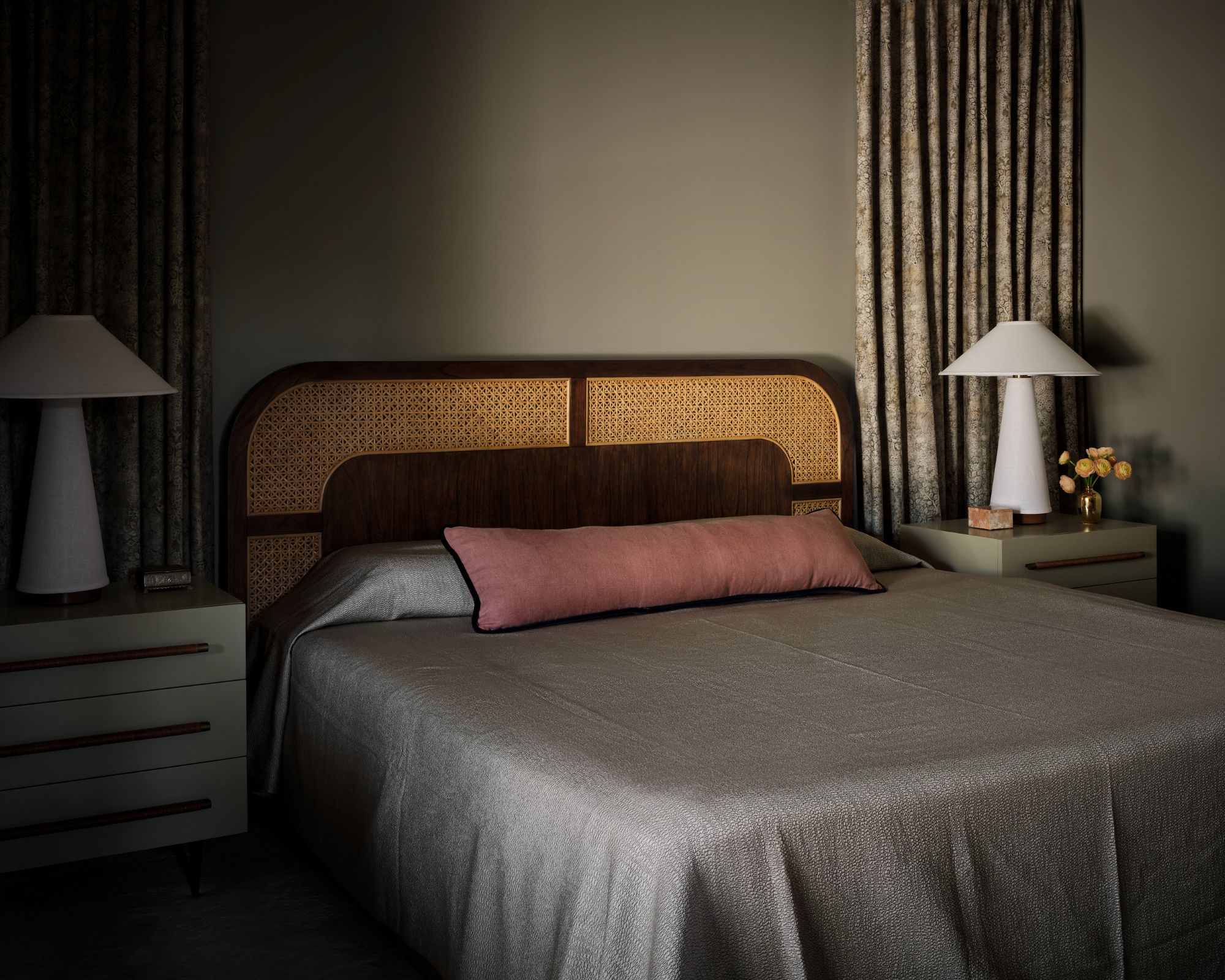
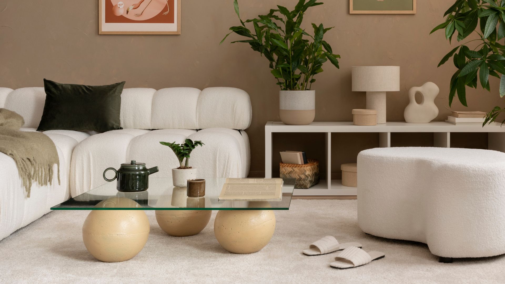
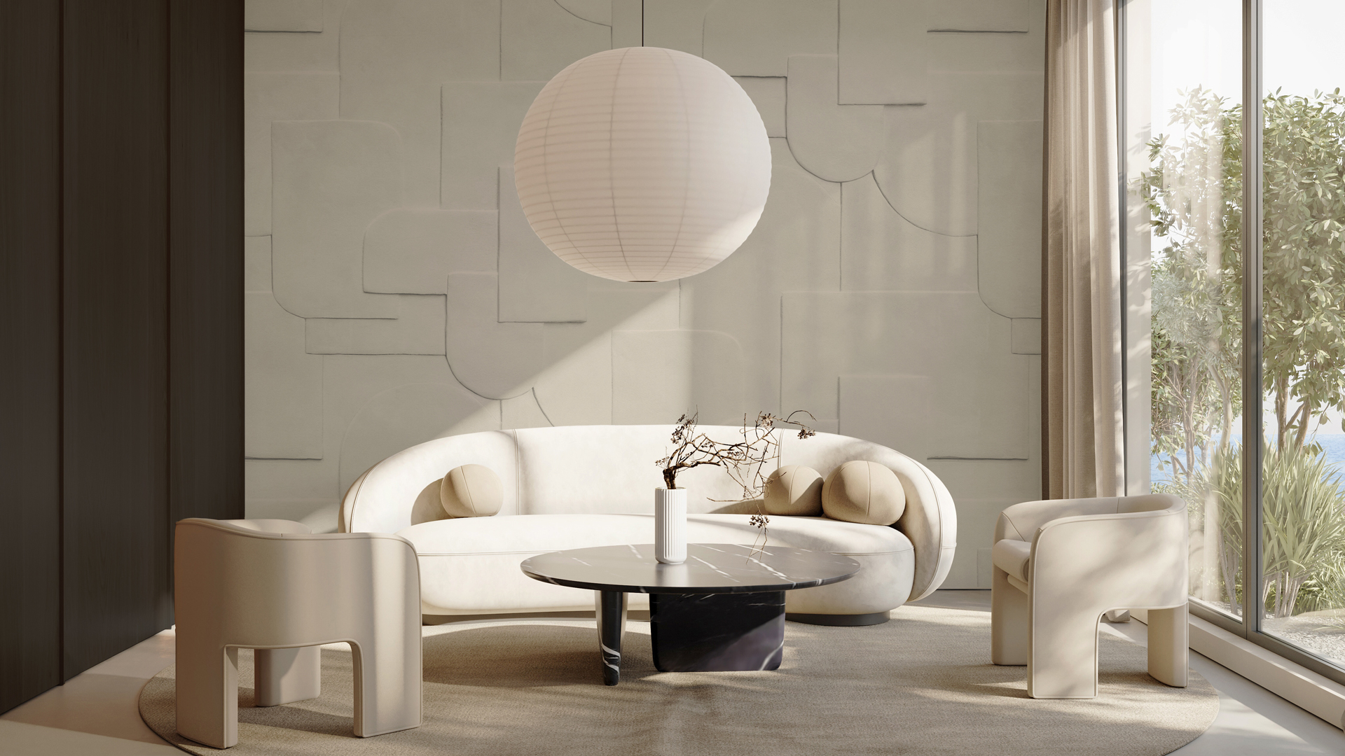
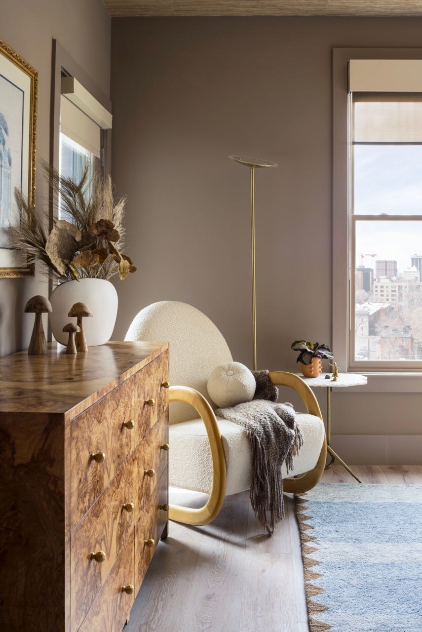
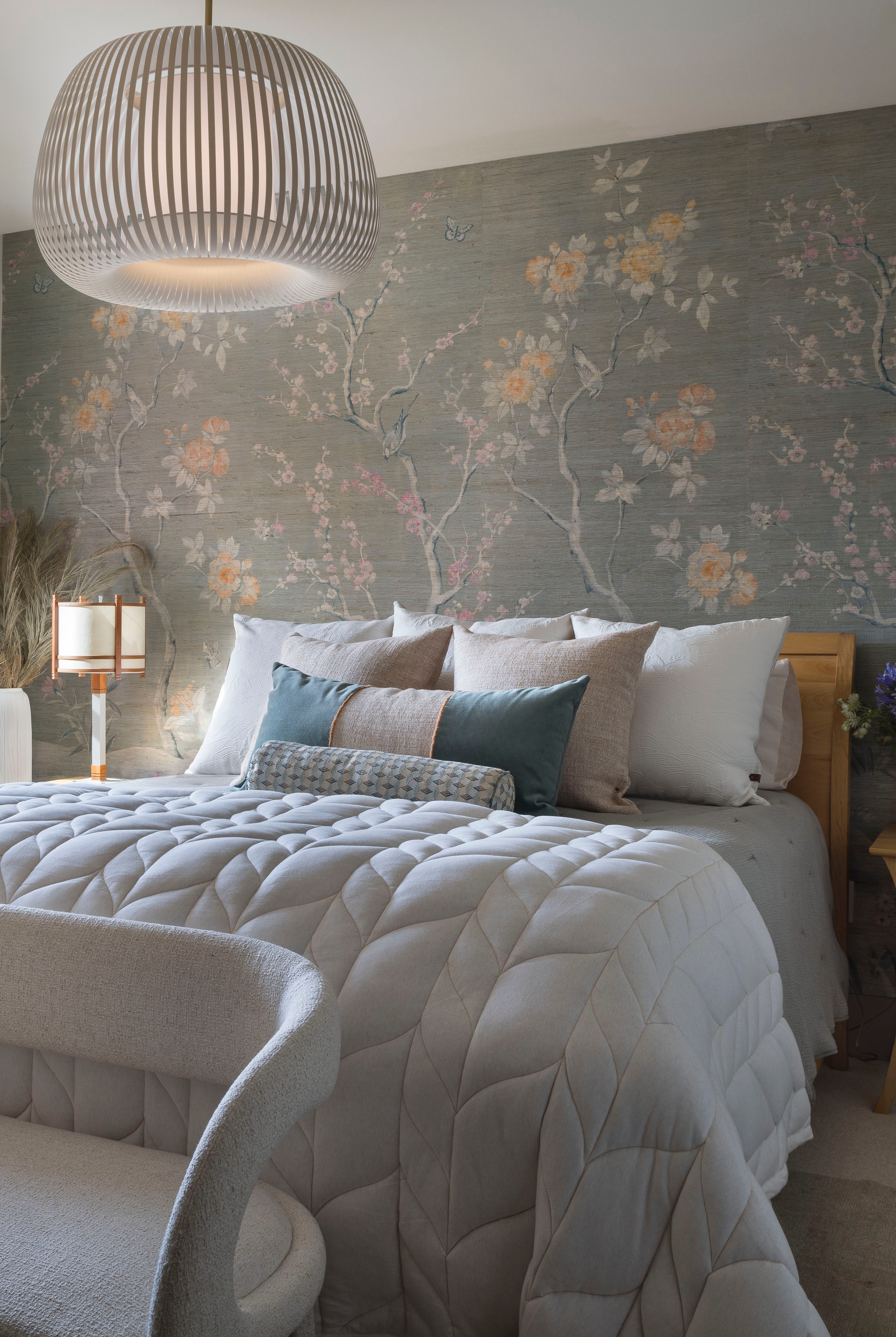
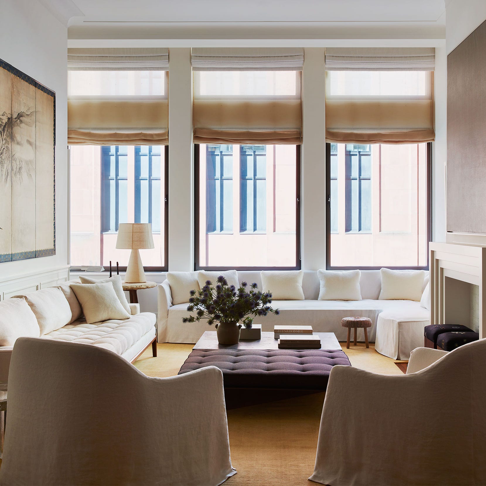
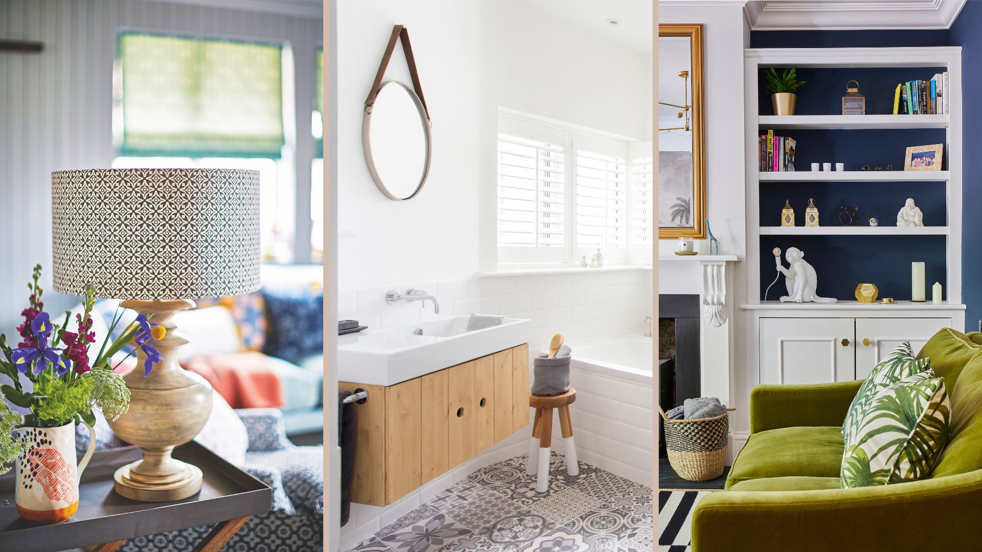
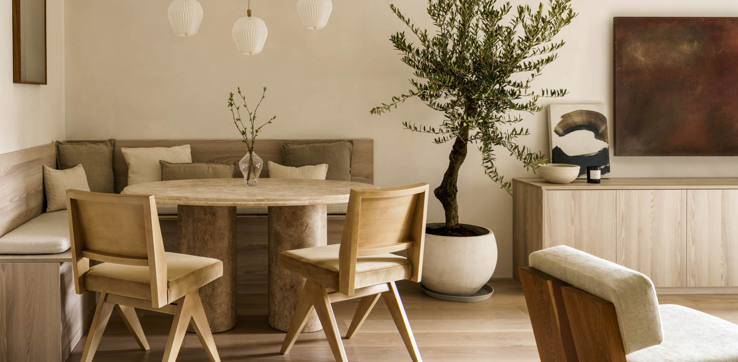
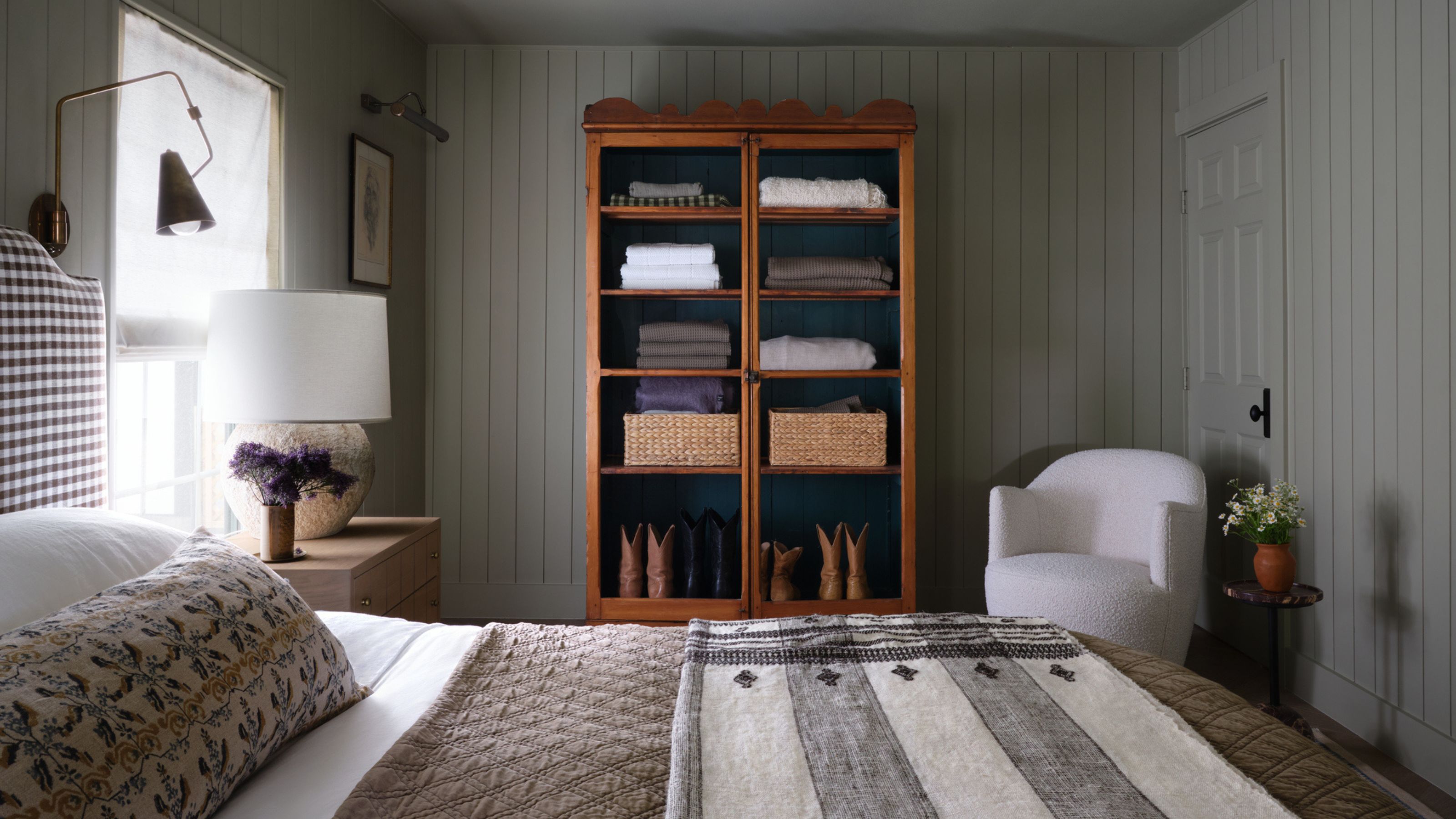
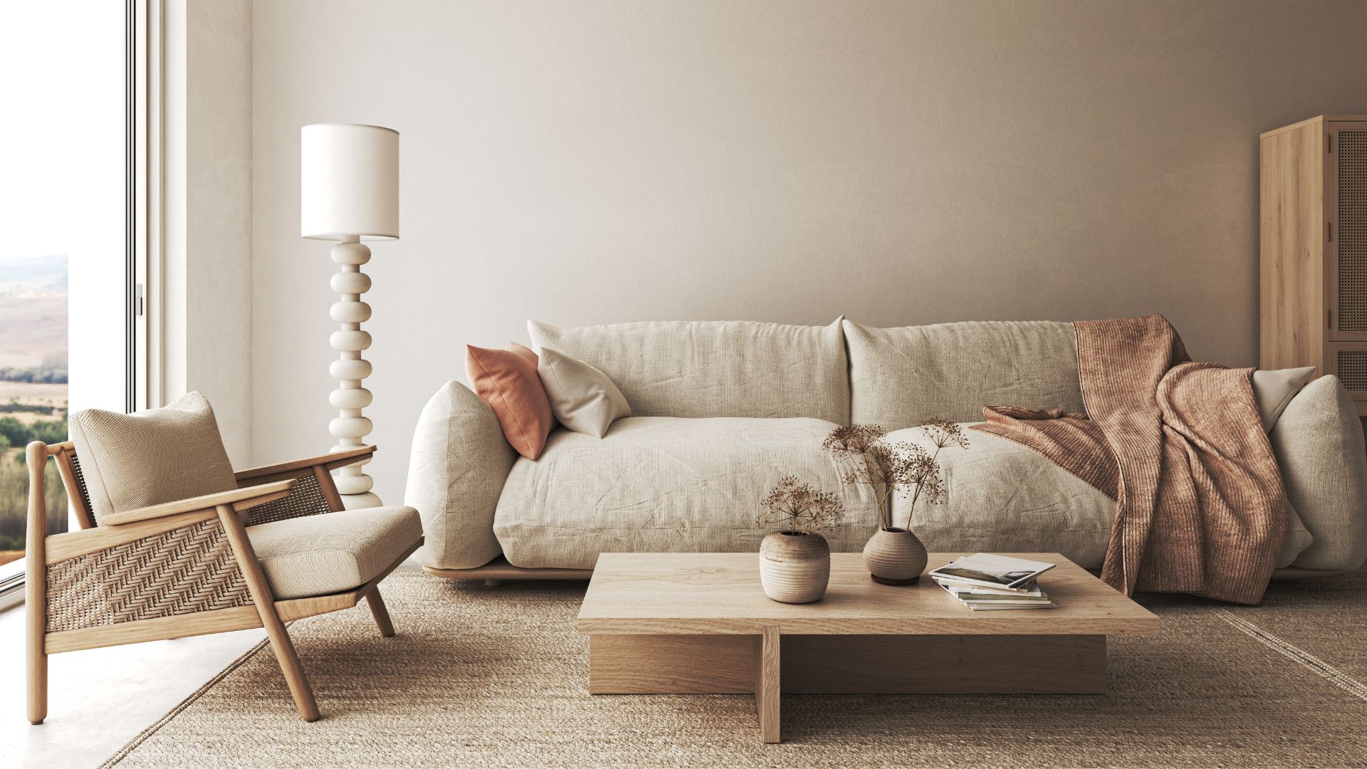
To create a Japandi look, the article suggests focusing on natural materials and muted tones such as whites, grays, and beiges. Amy Donato, senior color marketing manager at PPG Paints, notes that best-selling shades align with this neutral trend. Sue Wadden of Sherwin-Williams advises the use of natural elements alongside muted colors. The recommendations are categorized into airy neutrals, contrasting shades, soothing gray-greens, and earth tones.
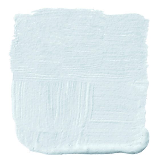
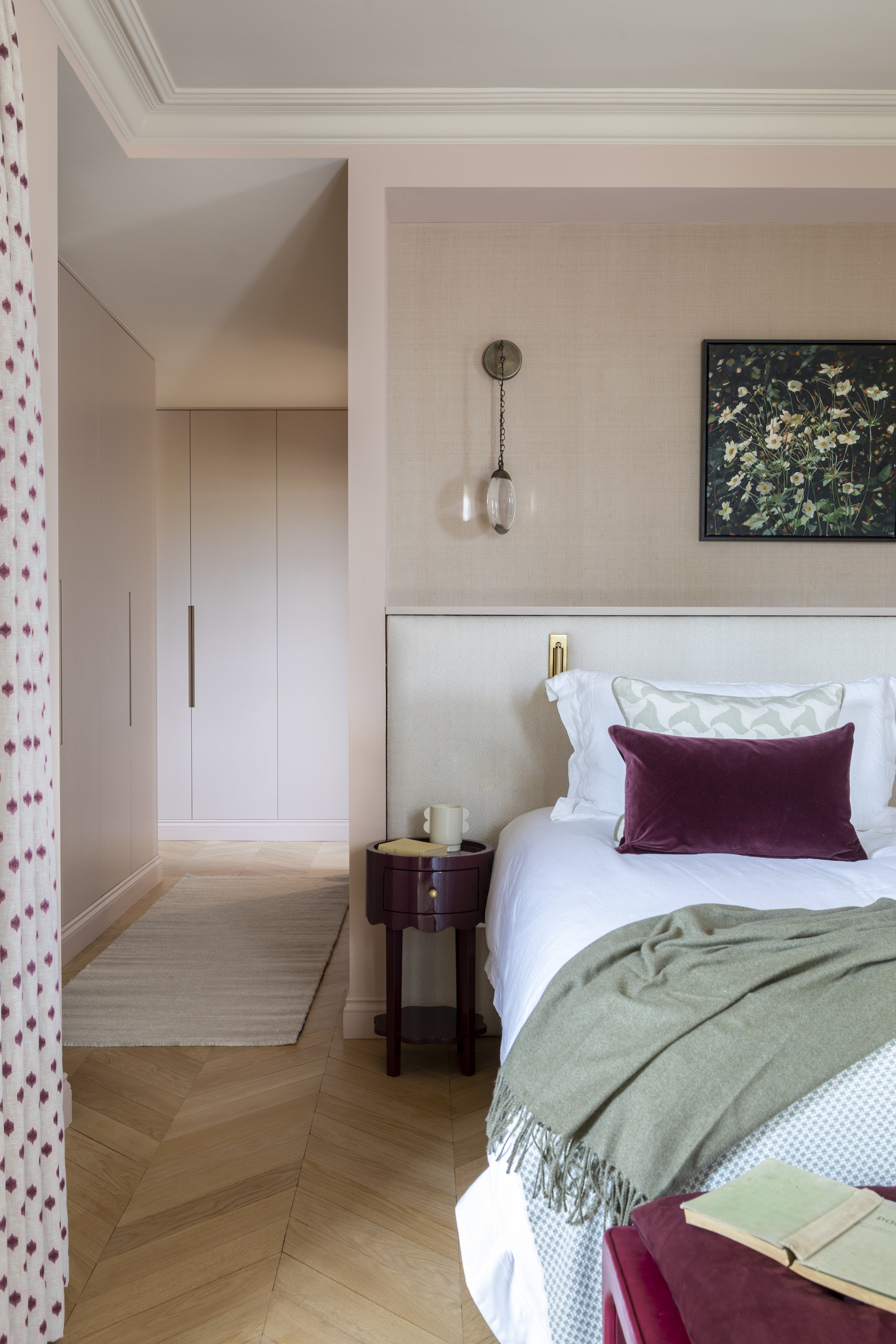
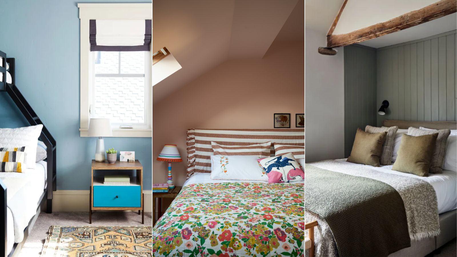
Under airy neutrals, designers frequently suggest Benjamin Moore's Gray Cloud and Swiss Coffee for their clean yet warm appearance, avoiding starkness. Natalie Ebel, co-founder of Backdrop, recommends Supermoon and Moonlight, highlighting Moonlight's ability to blend Scandinavian crispness with Japanese earthy tones. Ashley McCollum, a color expert at Glidden, points to Blank Canvas and Persuasion, emphasizing the current trend favoring warm neutrals over grays for creating a cocoon-like environment. Behr's Blank Canvas is described as a welcoming cream, while Tranquil Gray offers a cooler neutral that embodies Japandi harmony. Arianna Barone of Benjamin Moore adds Ballet White, Gray Mist, Muslin, Jute, and Sail Cloth to this category, noting their ability to let natural materials and clean lines shine.
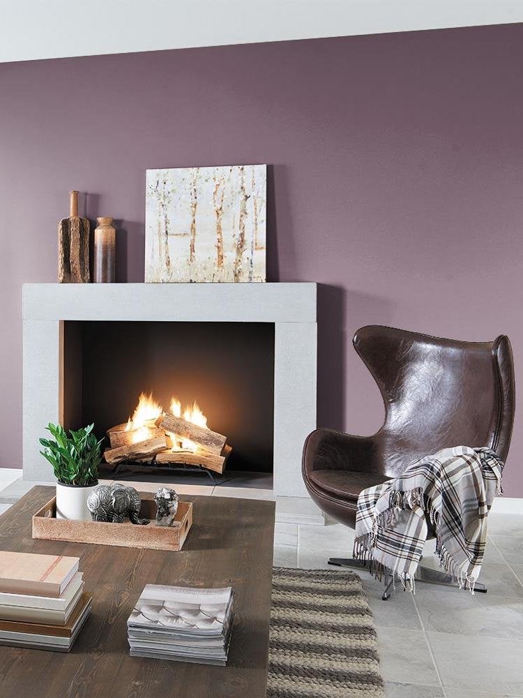
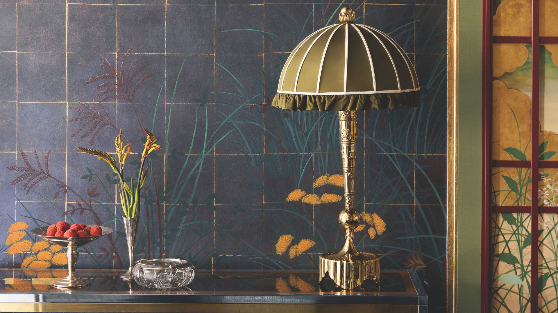
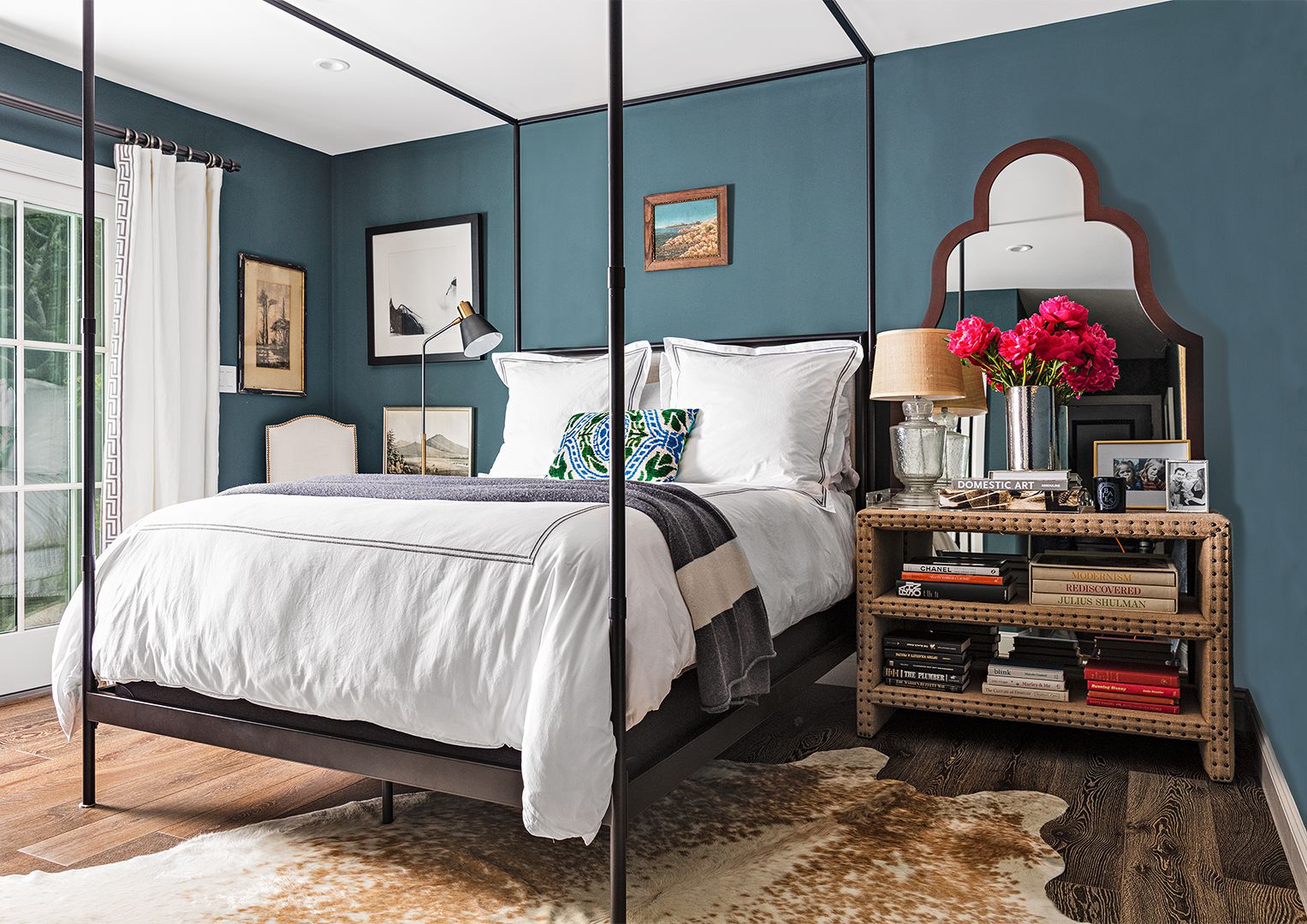
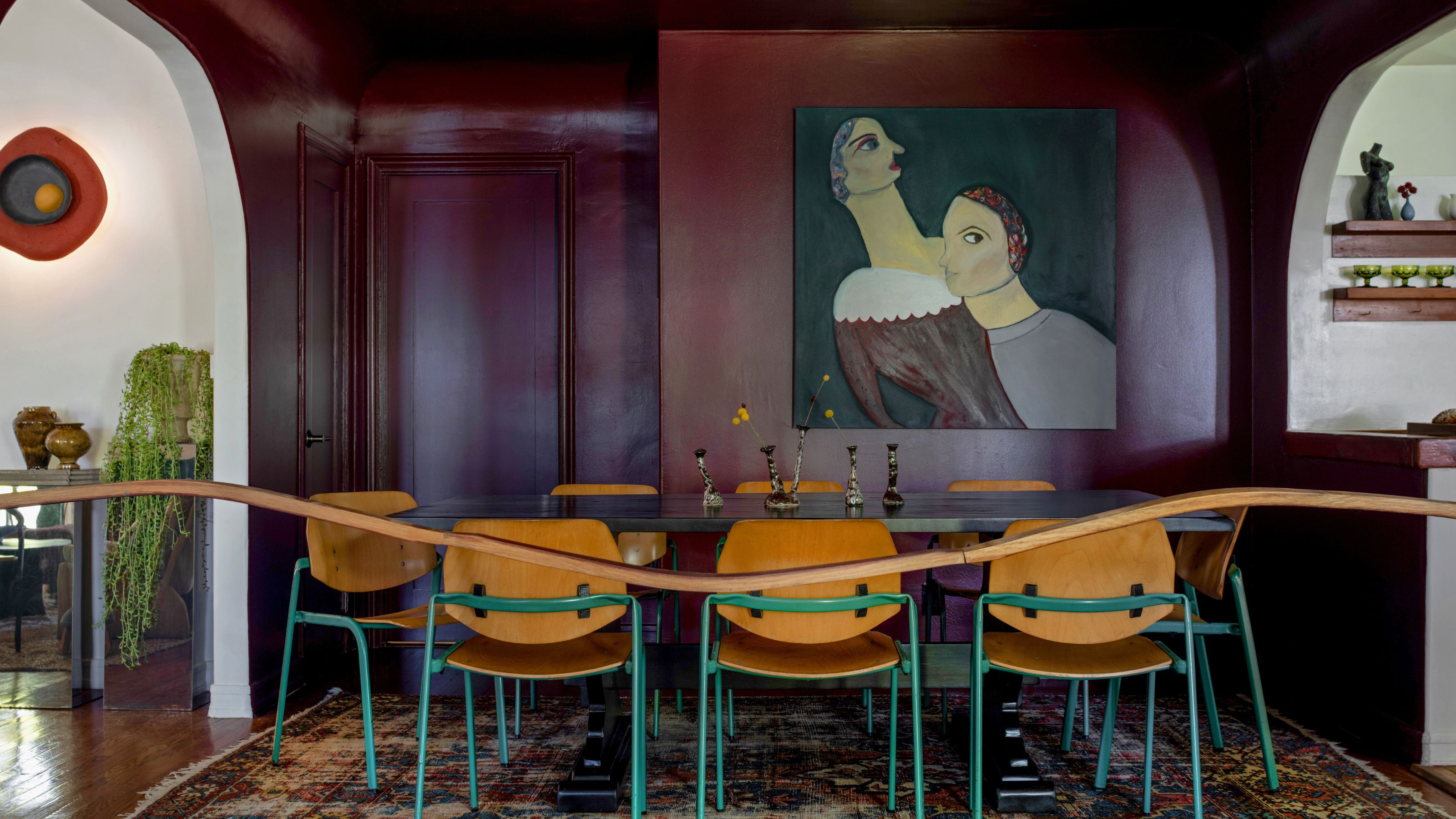
For contrasting shades, Erika Woelfel of Behr suggests Cracked Pepper, their 2024 Color of the Year, as a timeless black that anchors a space and highlights clean lines. Emily Kantz of Sherwin-Williams recommends Foothills, a cool brown, as a softer accent. Sue Kim of Valspar proposes incorporating serene blue tones like Renew Blue alongside warm neutrals such as Perfect Backdrop for added depth and playfulness. Beryl, a designer, favors Farrow & Ball's Tar, an off-black that feels warm and inviting. For exteriors, Ebel suggests Backdrop's After Hours, a charcoal black inspired by the Japanese shou sugi ban technique.
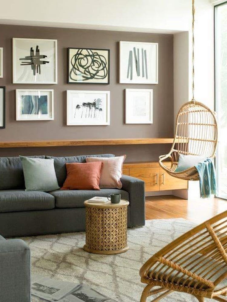
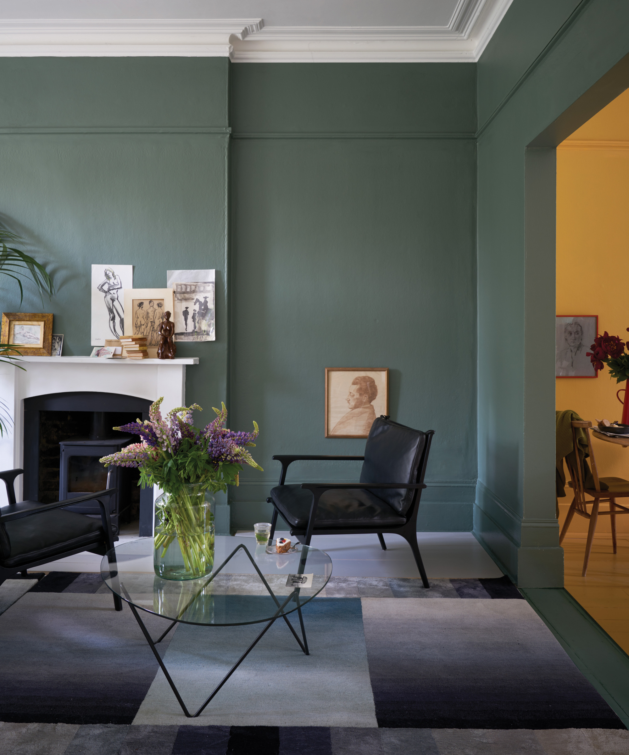
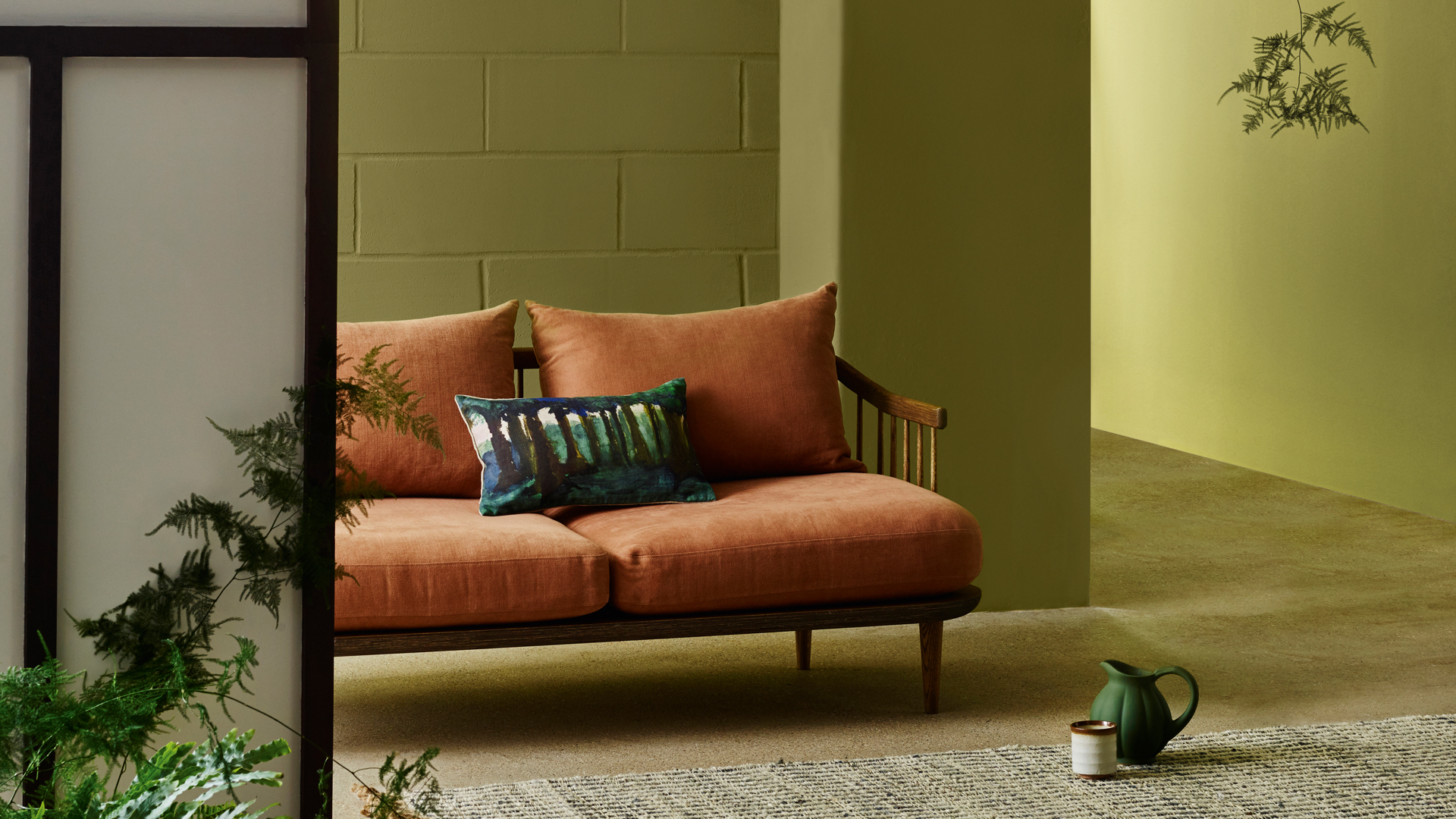
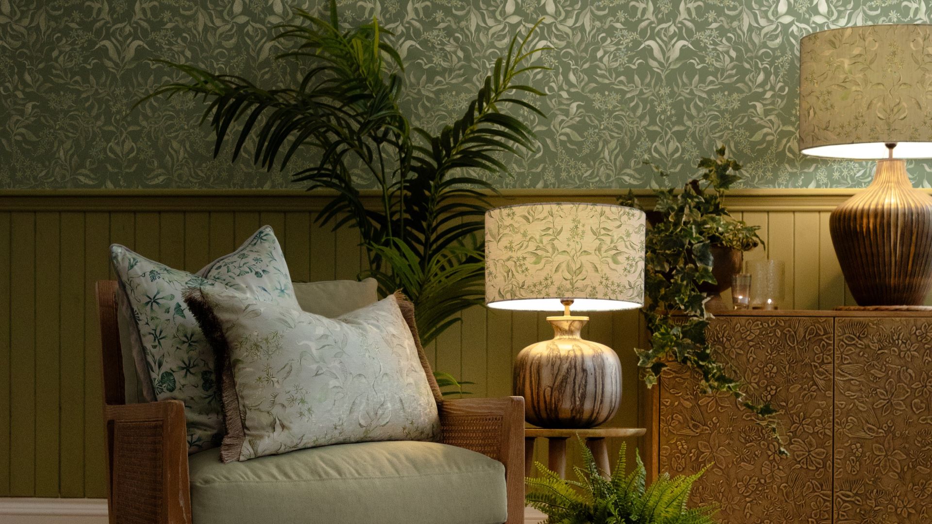
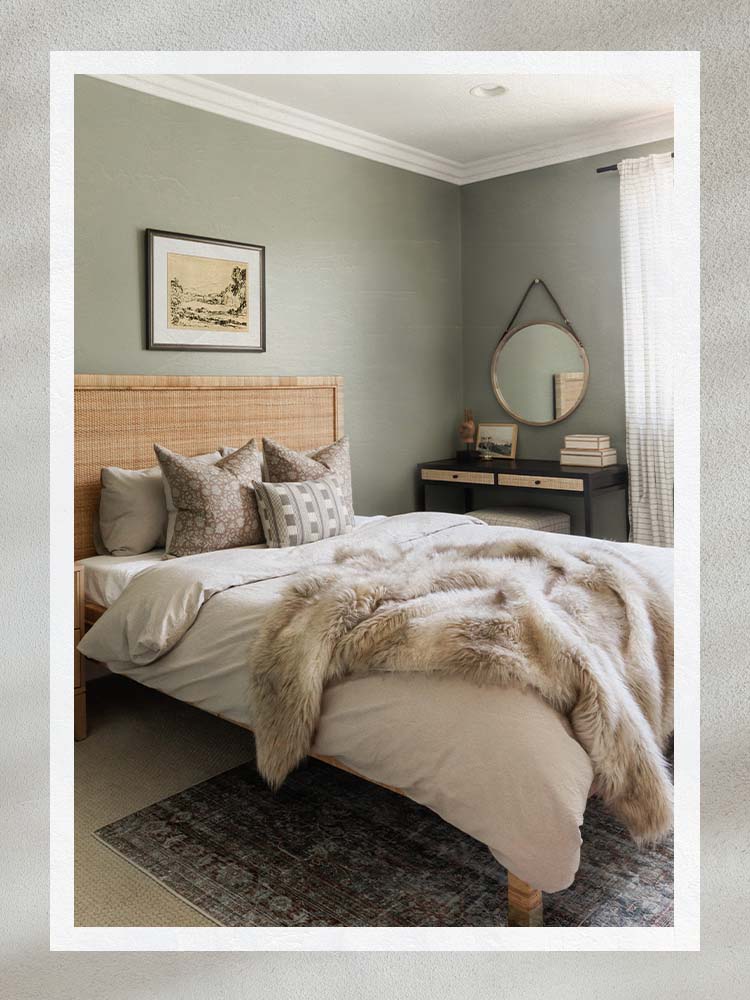
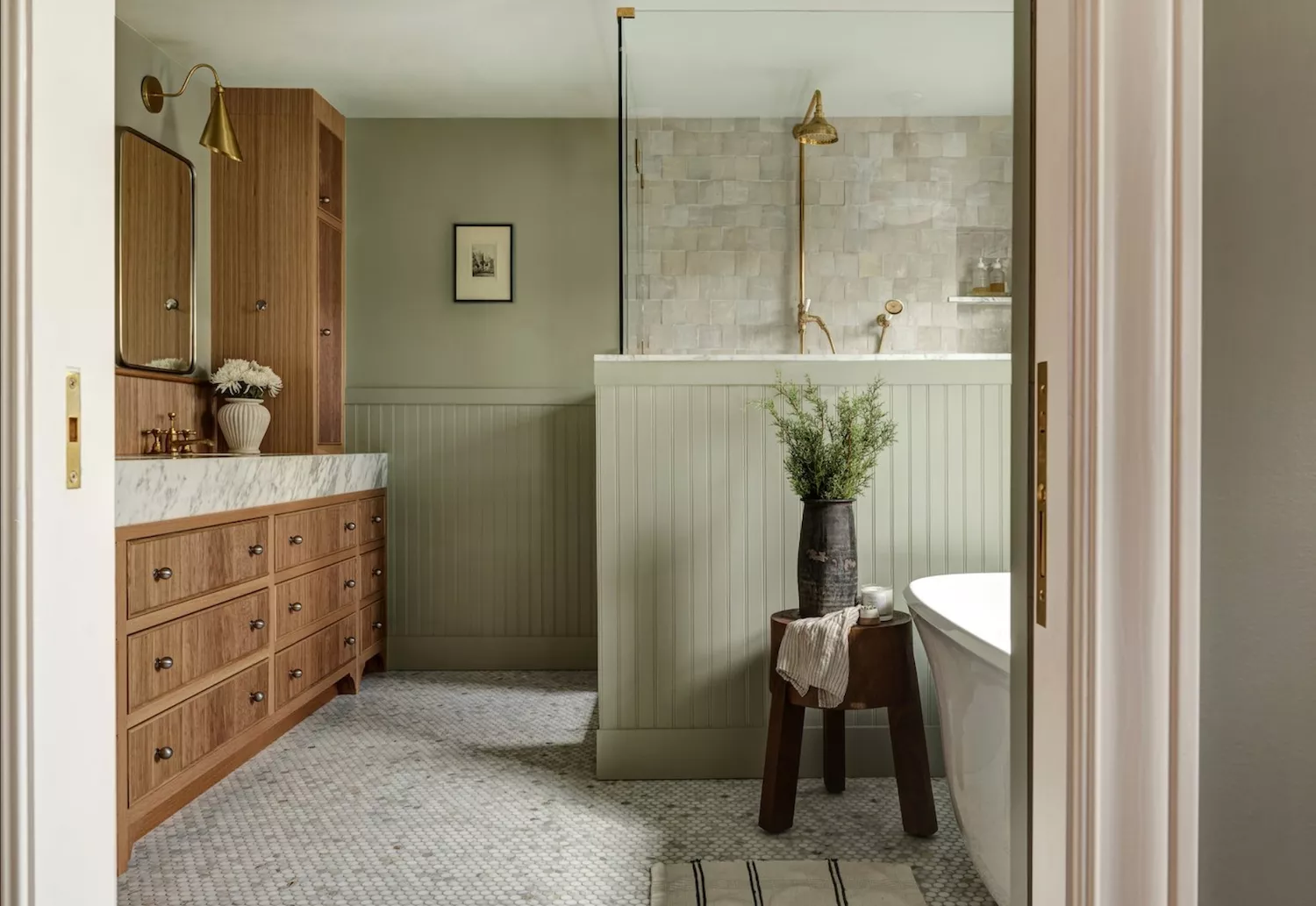
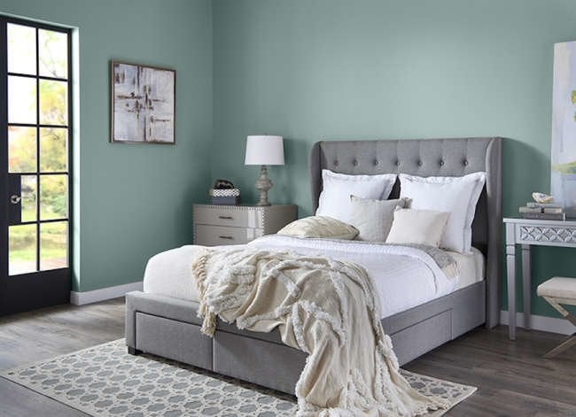
Soothing gray-greens are also central to the Japandi palette, reflecting the integration of natural elements. Woelfel recommends Behr’s Balance Green for freshness and vitality, and Jojoba for a dusty, rejuvenating blue-green. Wadden suggests Sherwin-Williams' Cascade Green for a spa-like ambiance, especially when paired with plants or wood, also mentioning Filmy Green and Create.
Finally, earth tones contribute to the grounding aspect of Japandi. Woelfel highlights Behr's Canyon Dusk, a warm earthy terra-cotta that brings elevated comfort. Wadden recommends Sherwin-Williams' Bona Fide Beige and Morris Room Grey for deeper neutral touches, noting that Morris Room Grey, despite its name, offers a warm and contemporary look. Designer Megan Grehl expresses admiration for Farrow & Ball's London Clay for its warmth. Ebel concludes with Backdrop's neutral gray-beiges, Mojave Gathering and Interior Motives, which are praised for enhancing a zen experience in home interiors.
#JapandiStyle #PaintColors #HomeDecor #InteriorDesign #NeutralPalette #CalmingHome #ScandinavianDesign #JapaneseAesthetics #JapandiStyle #PaintColors #HomeDecor #InteriorDesign #NeutralPalette #CalmingHome #ScandinavianDesign #JapaneseAesthetics
0 comment in total
You may also like
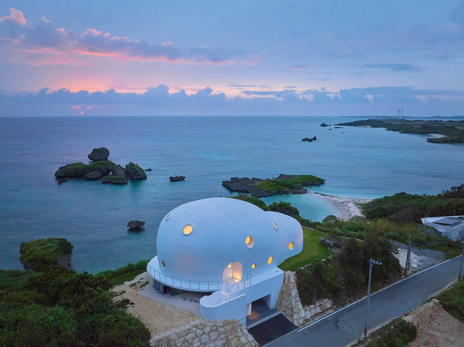
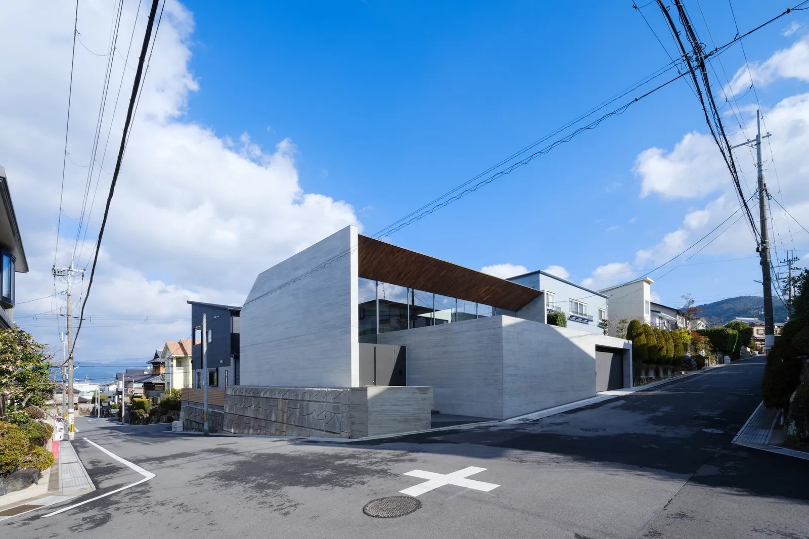
Wallpaper's favourite Japanese houses

The Rise of Japanese-Inspired Interiors: Why Calm, Craft, and Simplicity Are Redefining Modern Design

The Best Bedroom Paint Colors for Unwinding at Night

25 Soothing Paint Colors to Make Your Space Instantly Restful
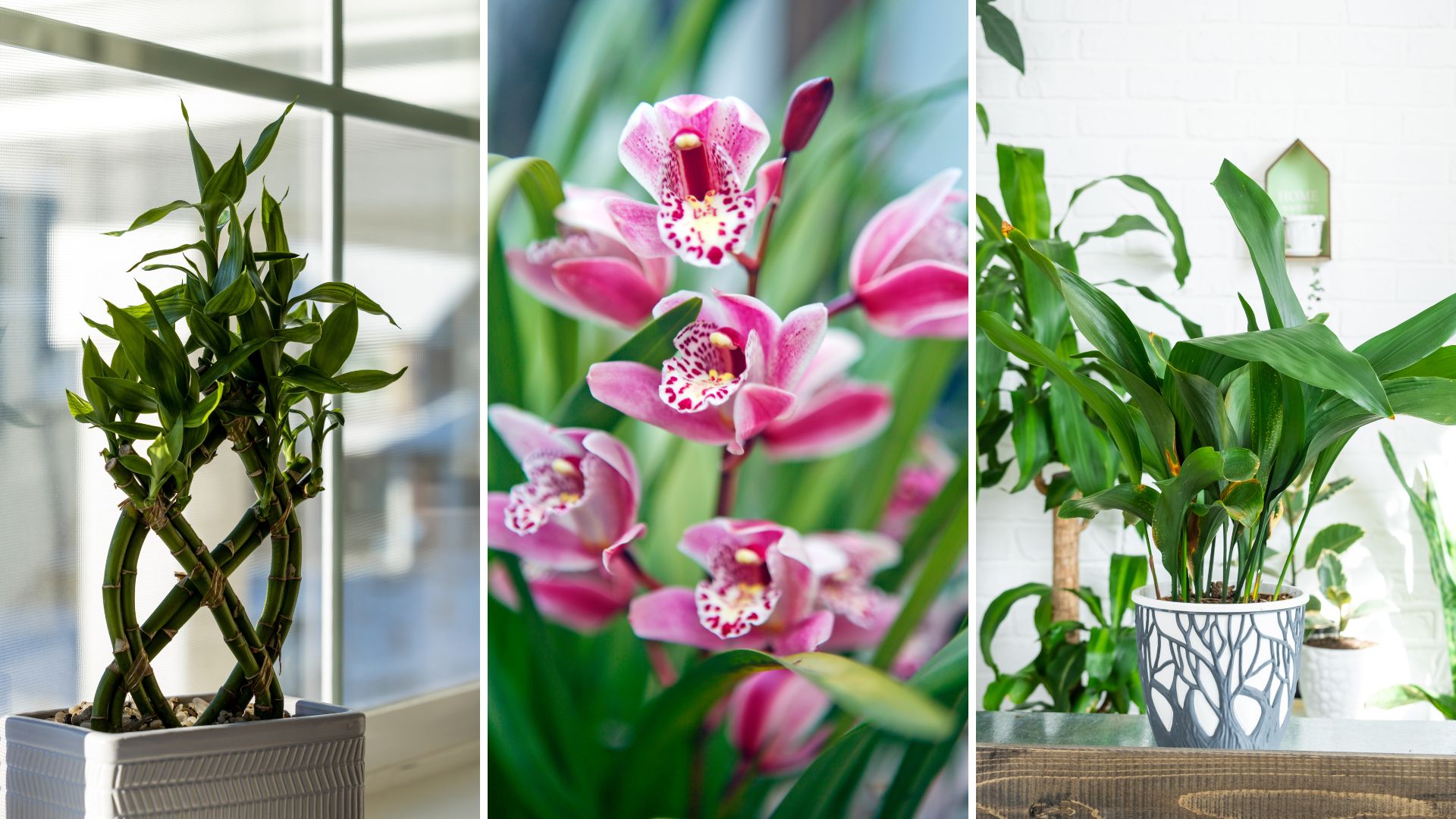
The best Japanese houseplants to create a zen, serene space in any room

20 Calming Paint Colors That Will Change the Way You Live

Designers Agree: These Are the Most Relaxing Paint Colors for Any Room

12 Japandi Bedroom Ideas That Bring Harmony to Your Personal Space

5 homes that bring serene Japanese-inspired design to life

What paint colors to use to create a relaxed vibe at home

5 colors that will make your bedroom feel calmer, according to designers
Pinterest trends: 7 of the biggest interior trends inspiring home decor right now
16 Calming Paint Colors That Will Make Your Home a More Restful Place
13 Calming Paint Colors Designers Use to Make Rooms Feel Soothing — And No, They're Not All Neutrals

How Your Home's Paint Colors Can Make You Happier, According to Experts

Elevate Your Space With These Inspiring Japandi Interiors

14 Paint Colors That Can Make a Room Feel Instantly Cozy

5 Cozy Paint Colors Interior Designers Use to Warm Up Cool Rooms and Create "Snug" Spaces

10 essential Japandi living room design tips to create a sense of calm and restfulness

6 Calming Paint Colors Designers Swear By For A Relaxing Living Room