6 Paint Color Mistakes To Stop Making, According To Designers
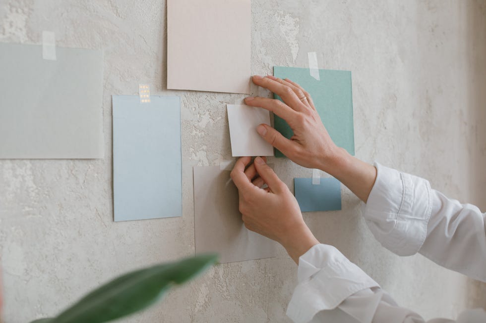
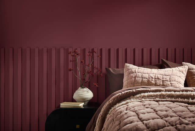
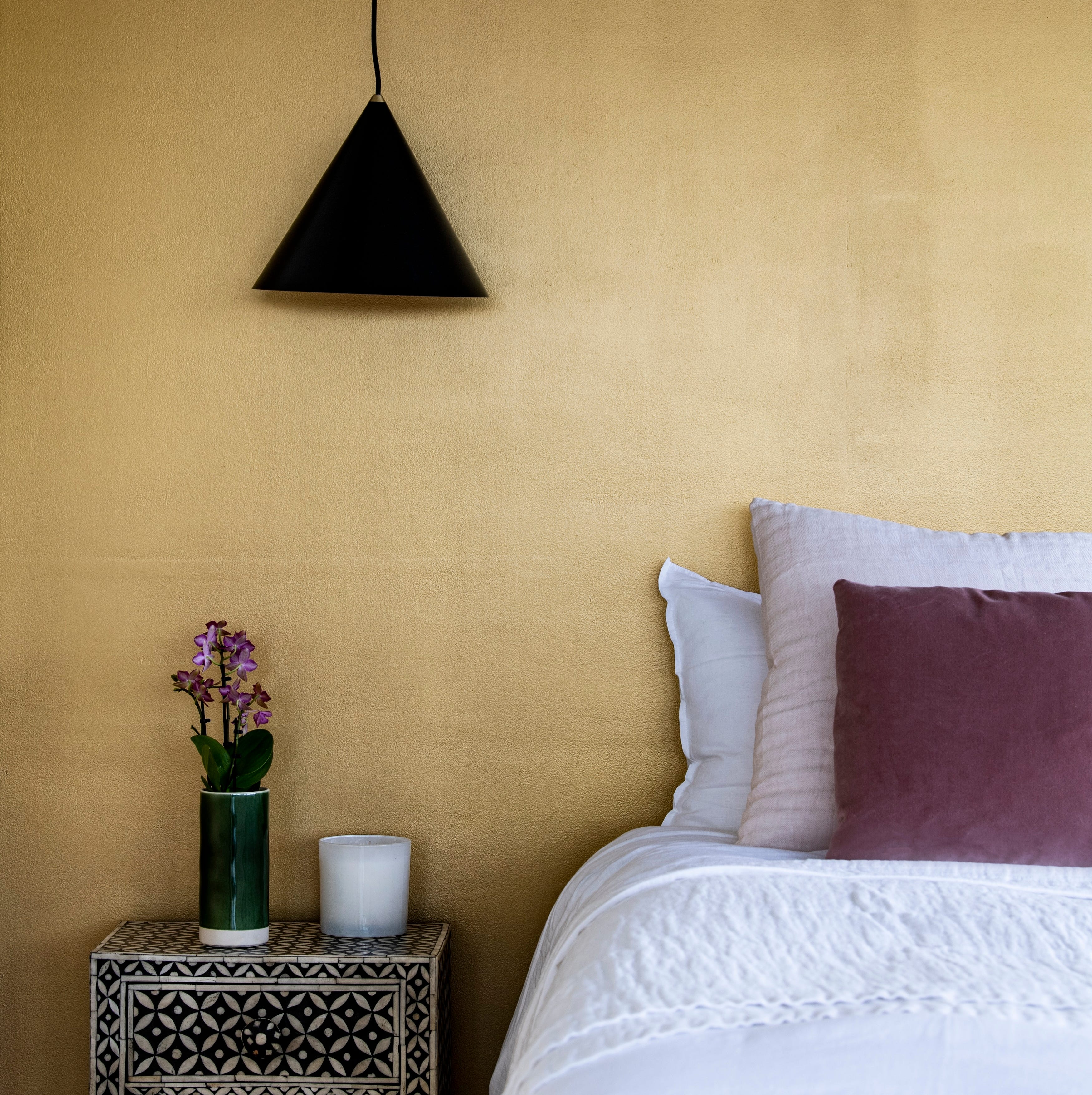
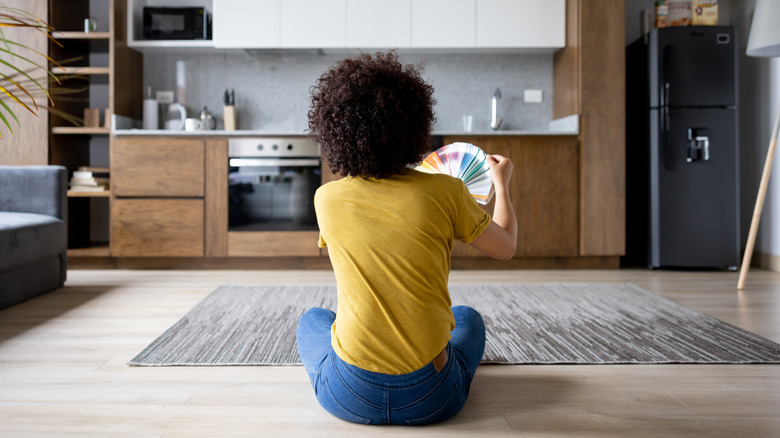
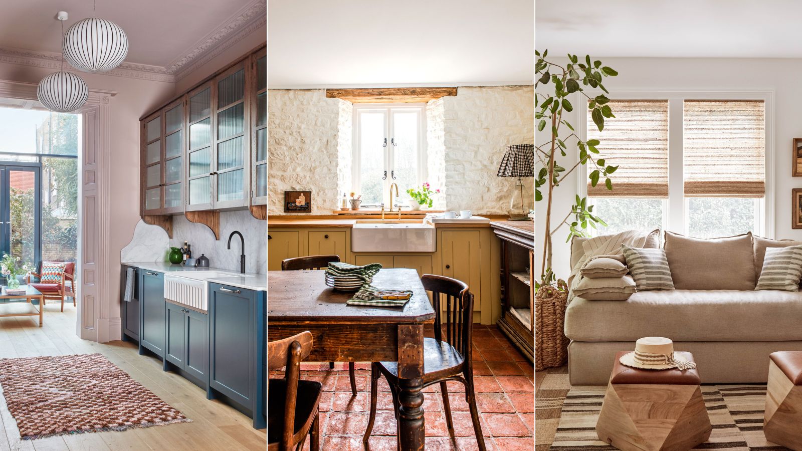
This article discusses common paint color mistakes that interior designers recommend avoiding to achieve a professional and timeless look in home interiors. The first significant mistake highlighted is disregarding undertones in paint colors. A color that appears neutral in a store setting might exhibit blue or purple undertones under different lighting conditions, disrupting a room's overall palette. To circumvent this, it is advised to test at least three to five paint samples in the actual space under various lighting before making a final selection, as comparing multiple colors side-by-side reveals their true undertones.
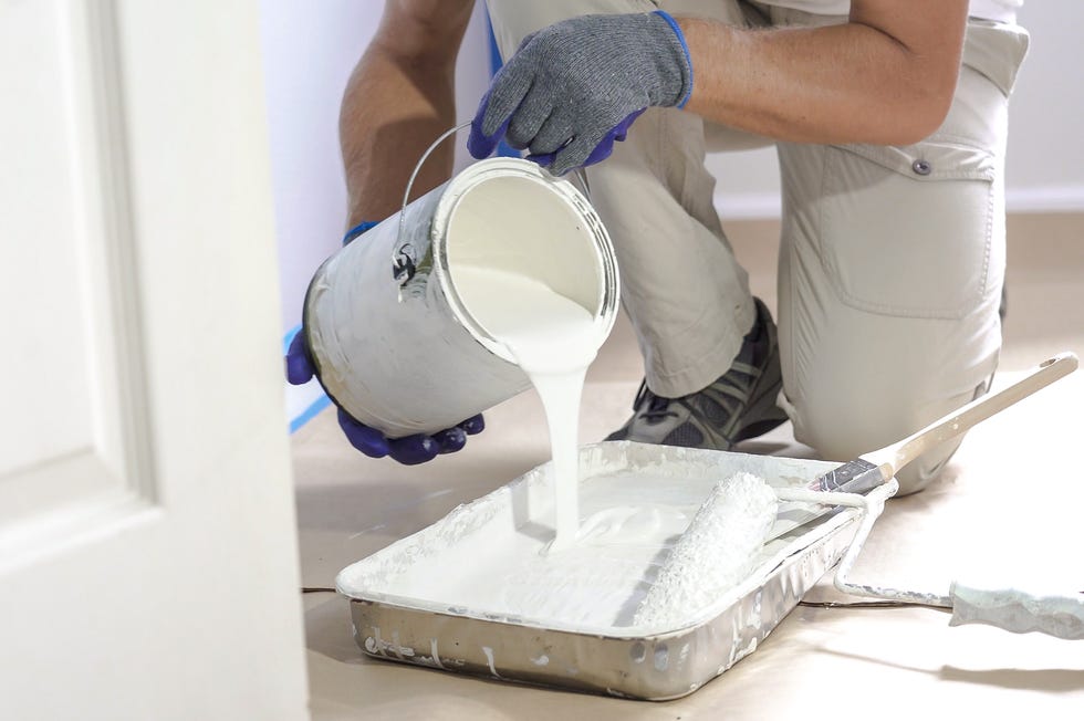
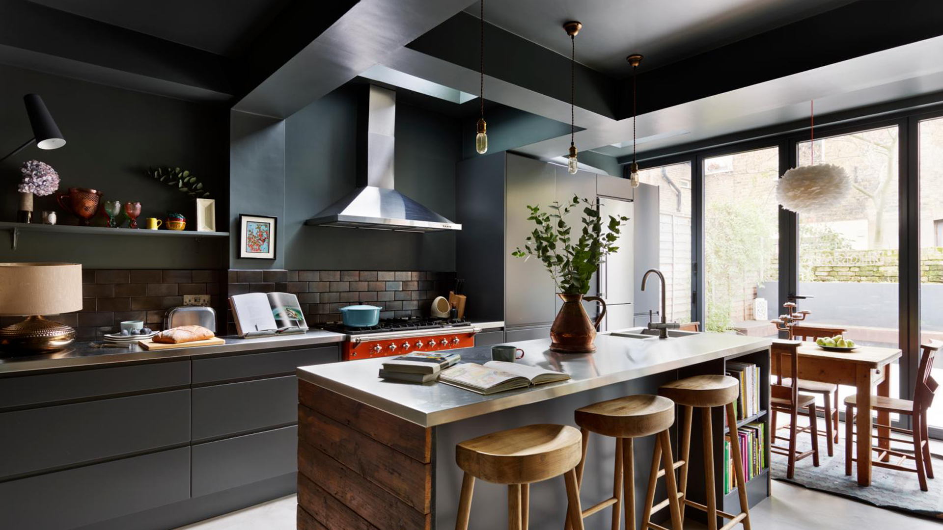
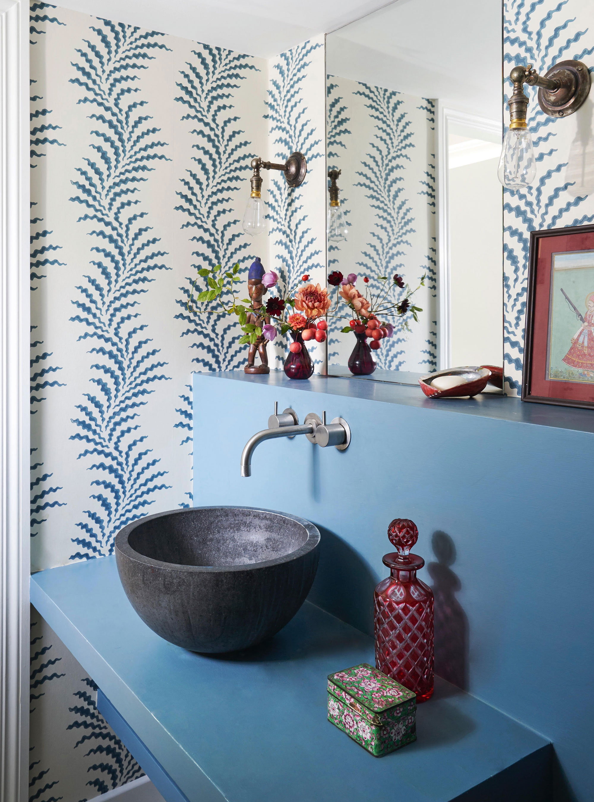
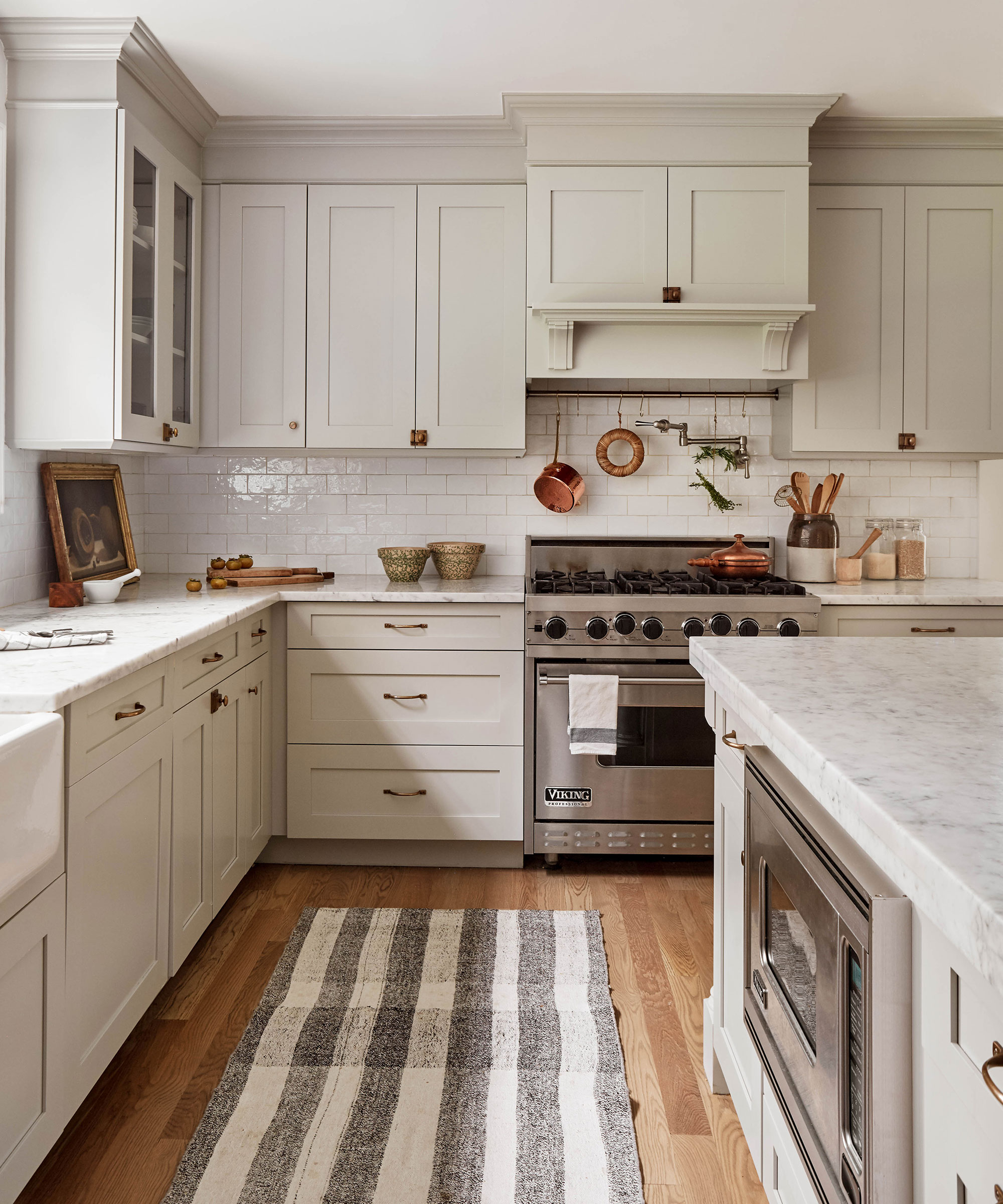
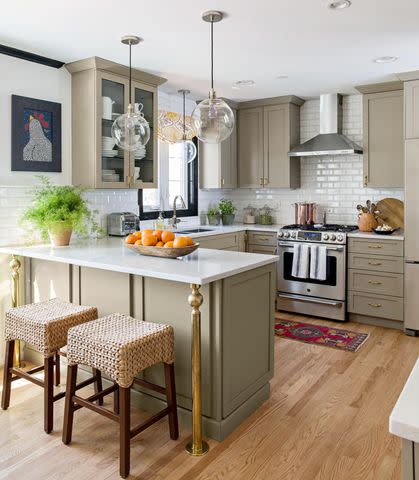
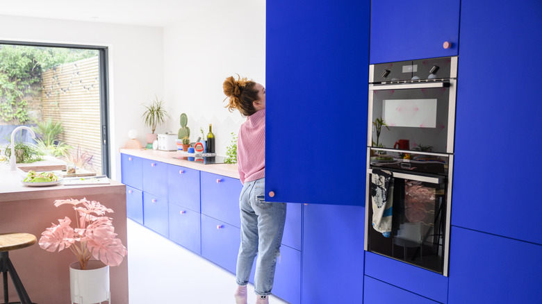
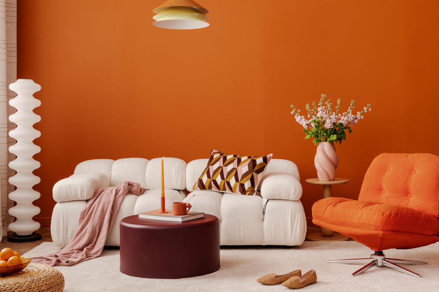
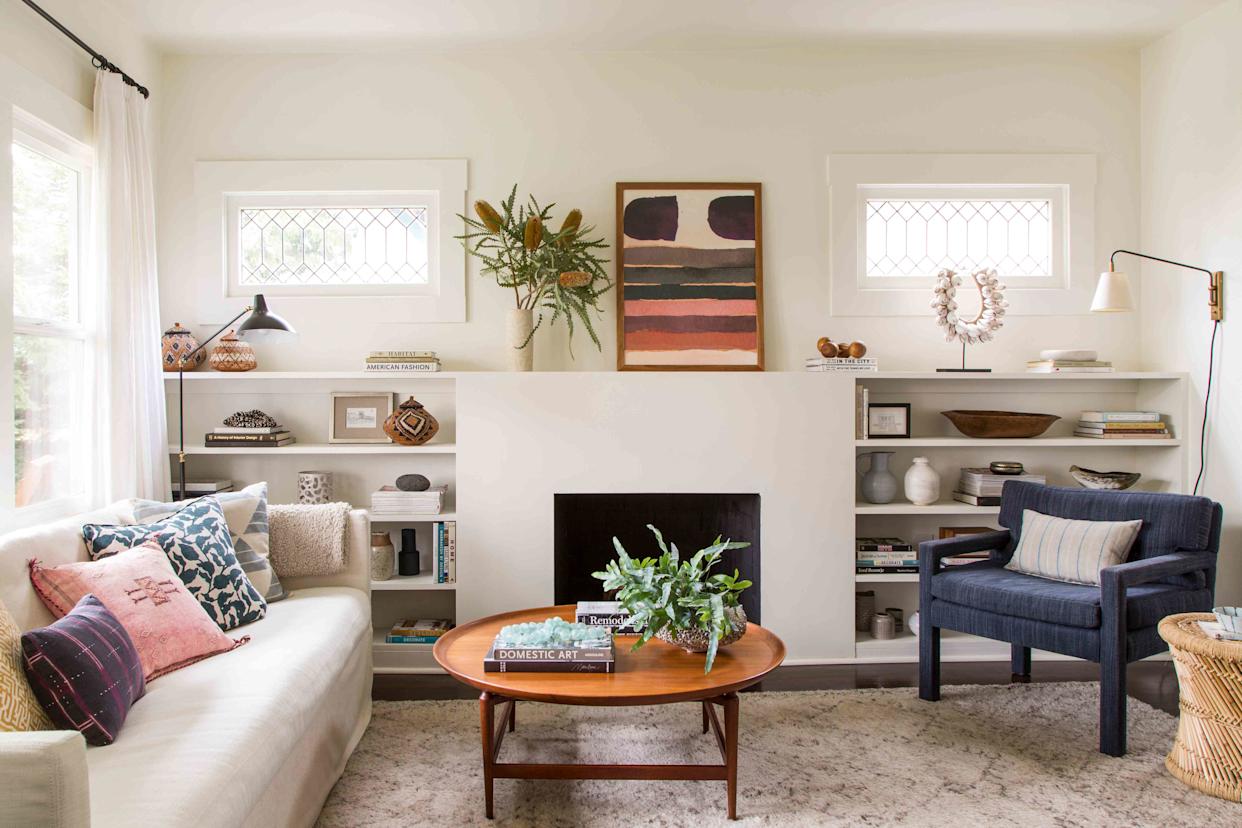
Another crucial aspect is the paint finish, which can significantly impact a design's aesthetics and durability. Choosing the wrong sheen can either accentuate wall imperfections or prove inadequate for high-traffic areas. Designers suggest avoiding eggshell finishes, which they consider dated, and instead opting for a matte finish, described as a more refined and durable alternative that is also more forgiving with surface imperfections. This choice ensures both aesthetic appeal and practicality.
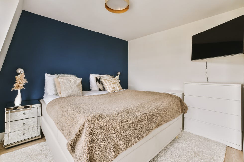
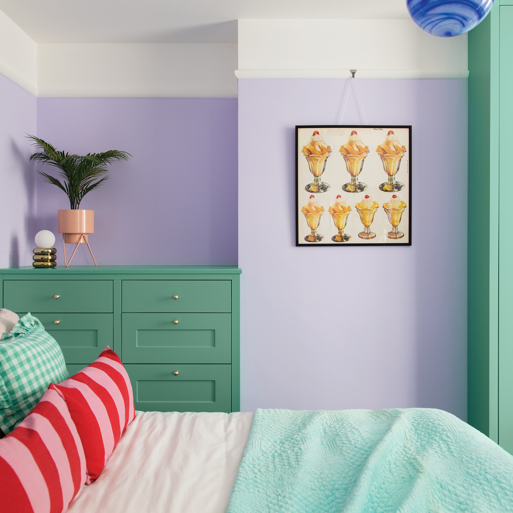
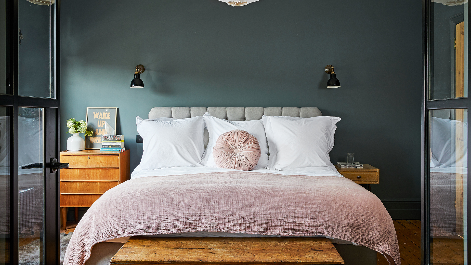
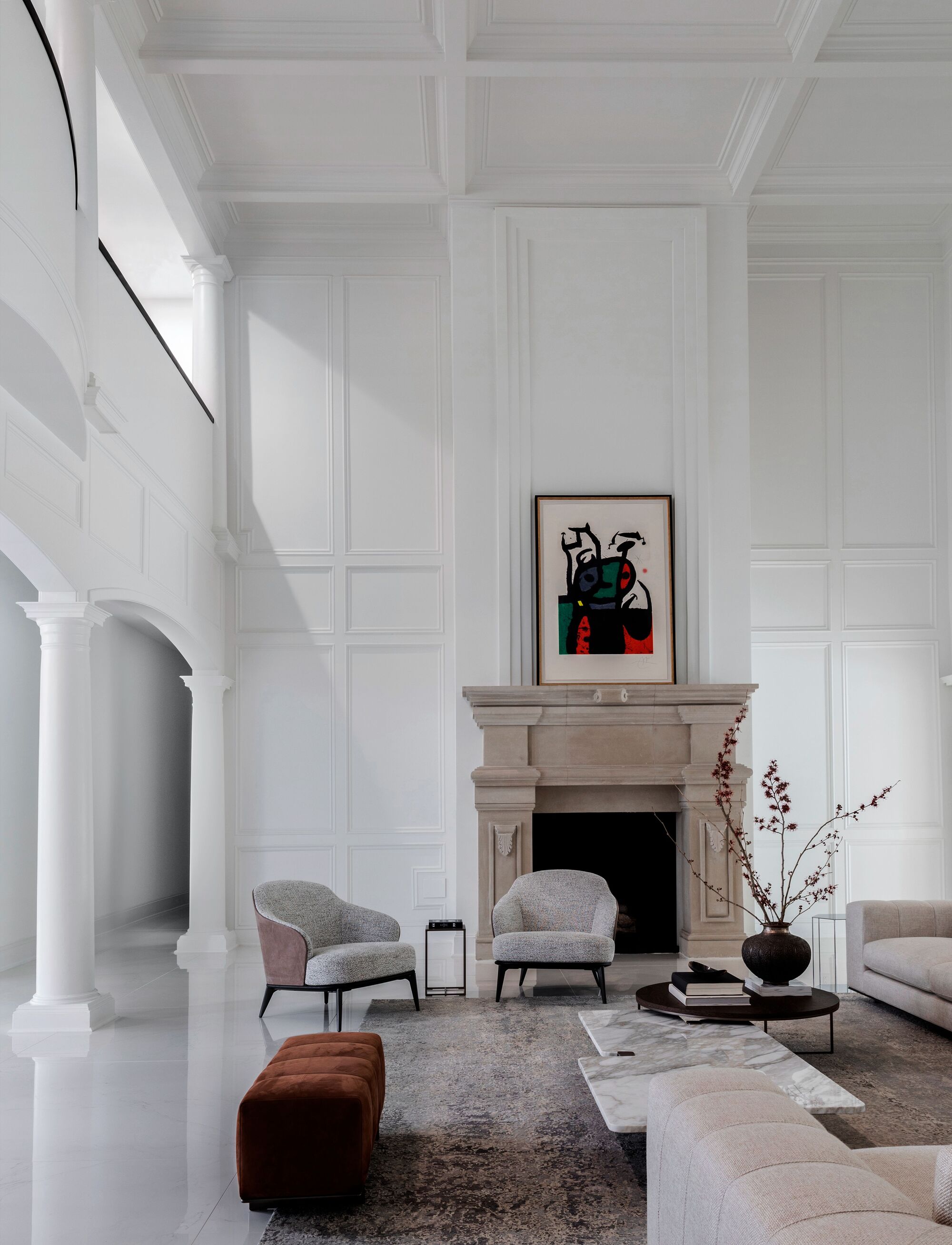
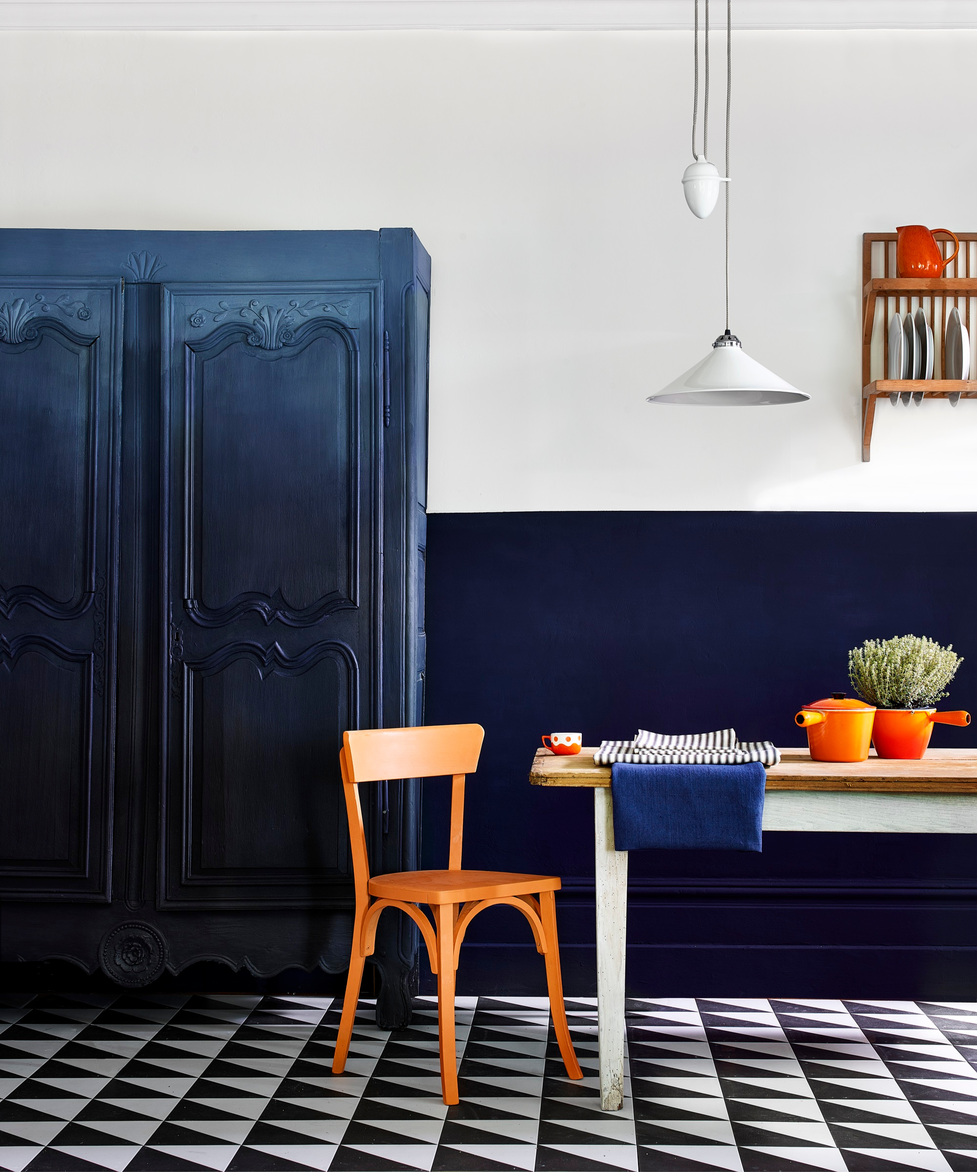
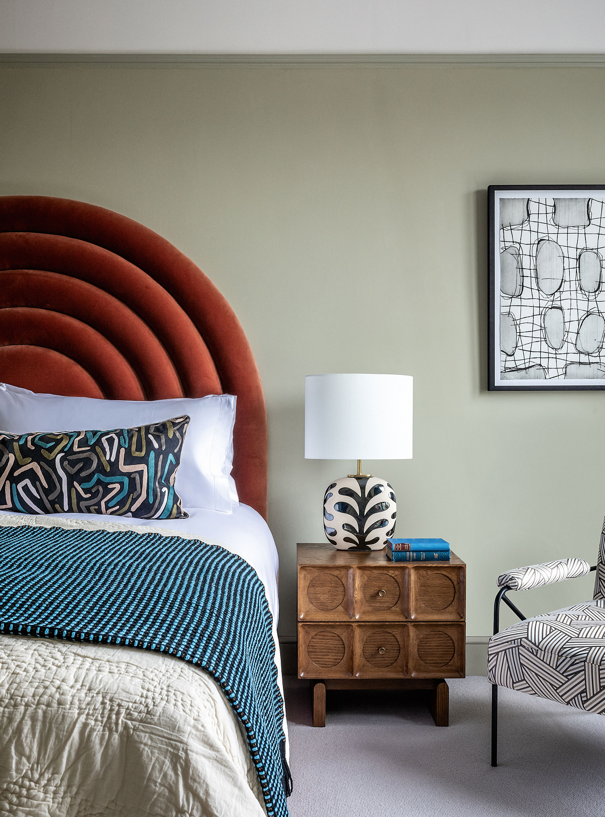
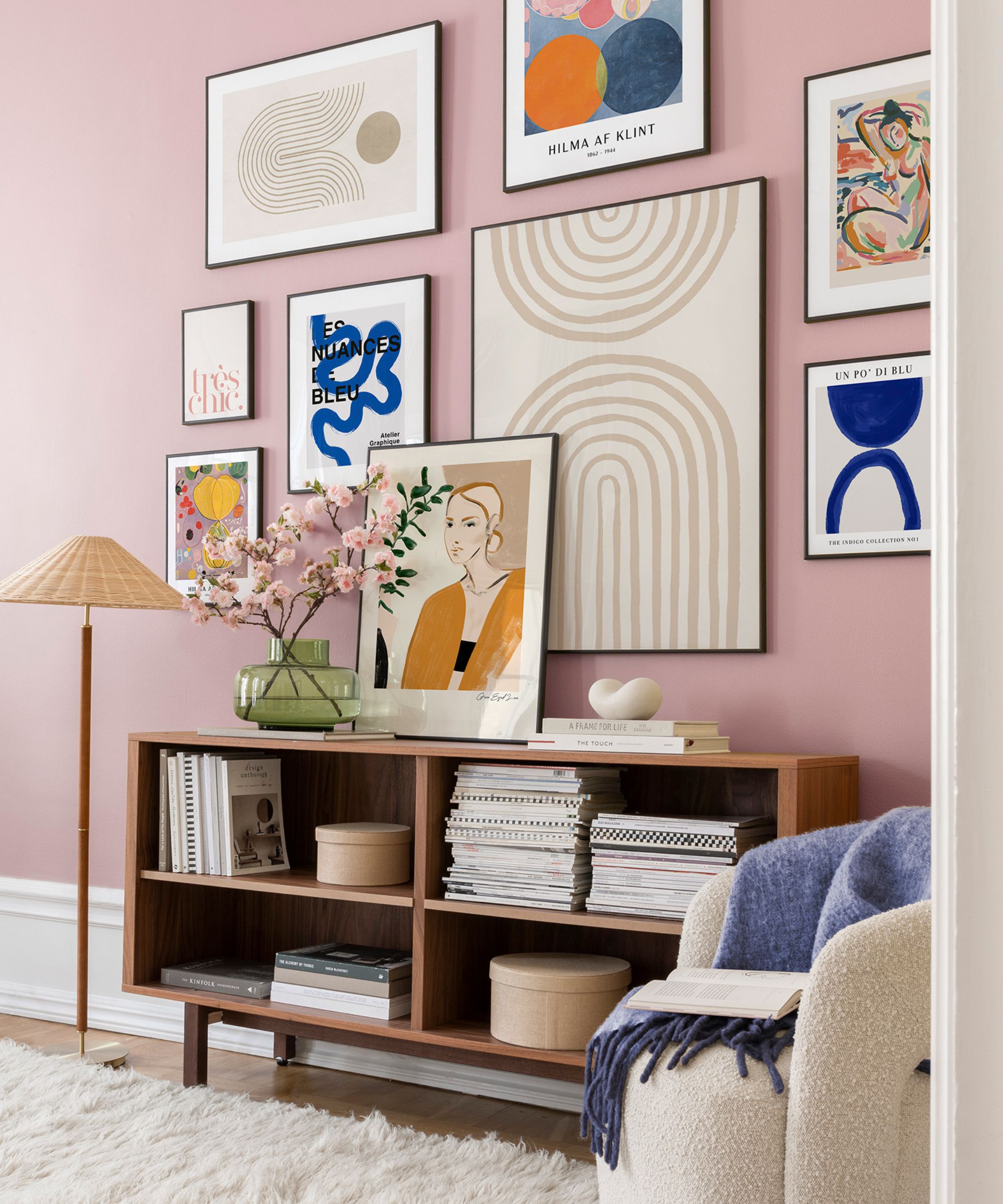
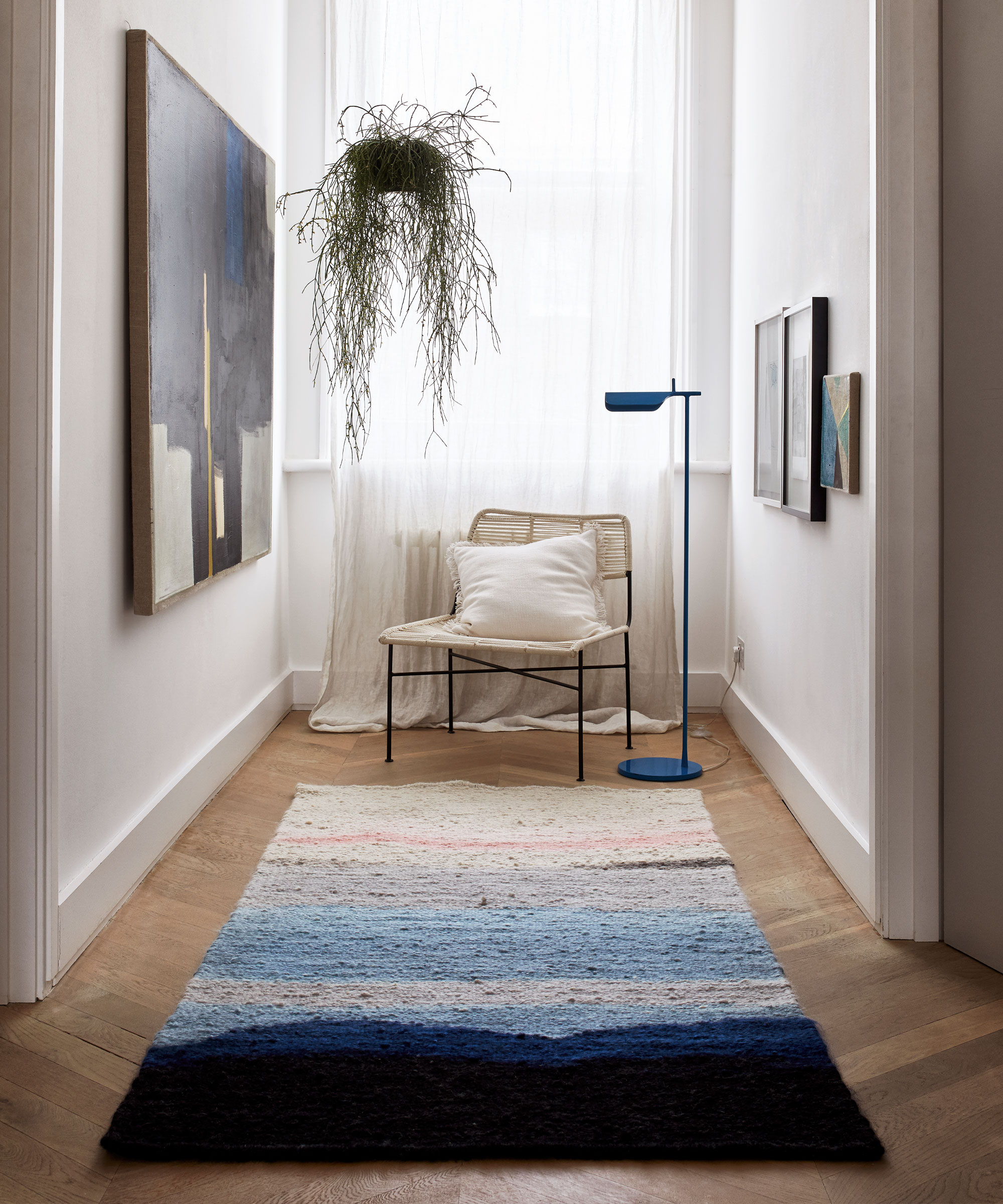
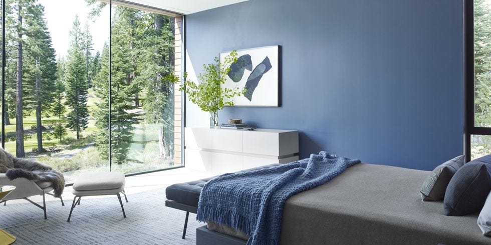
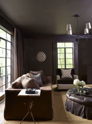
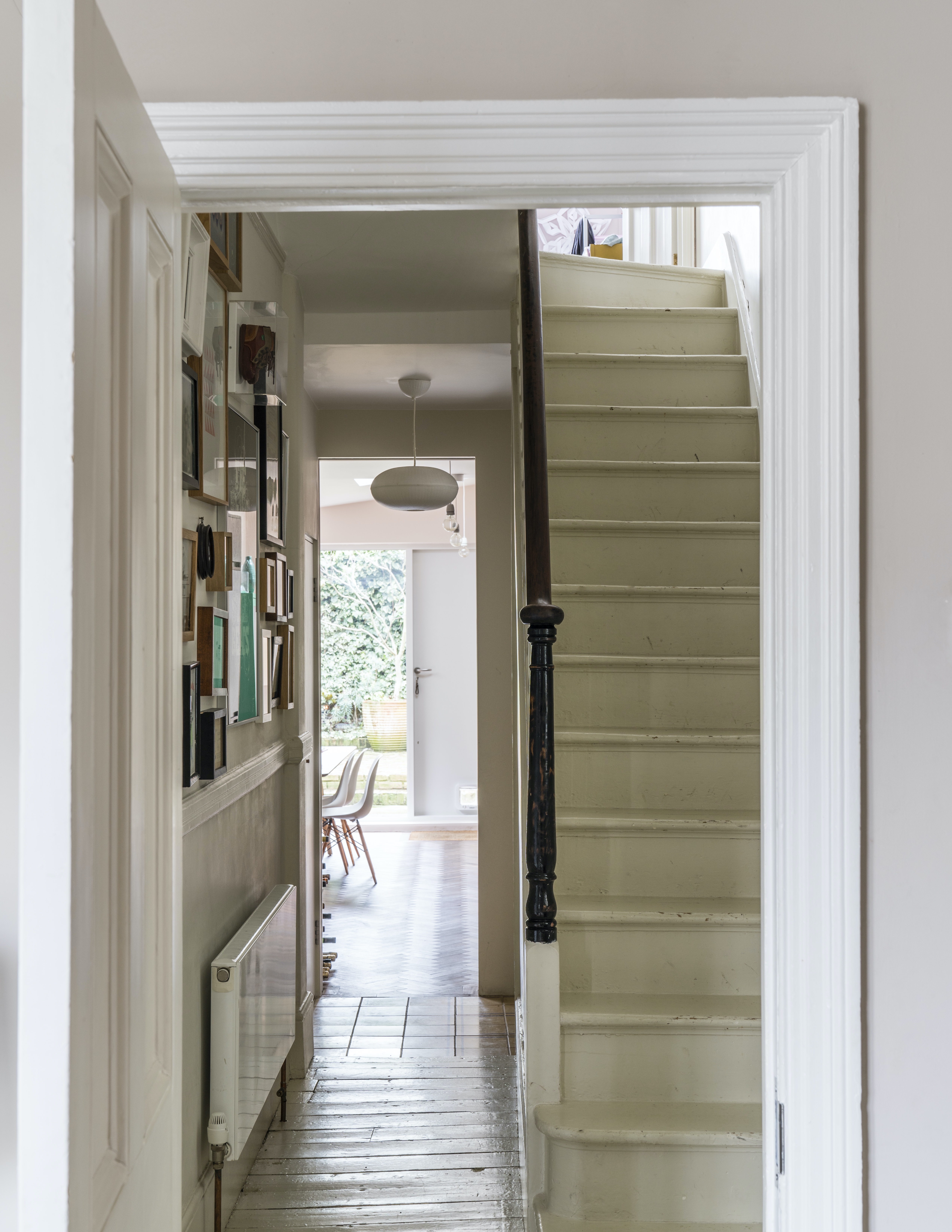
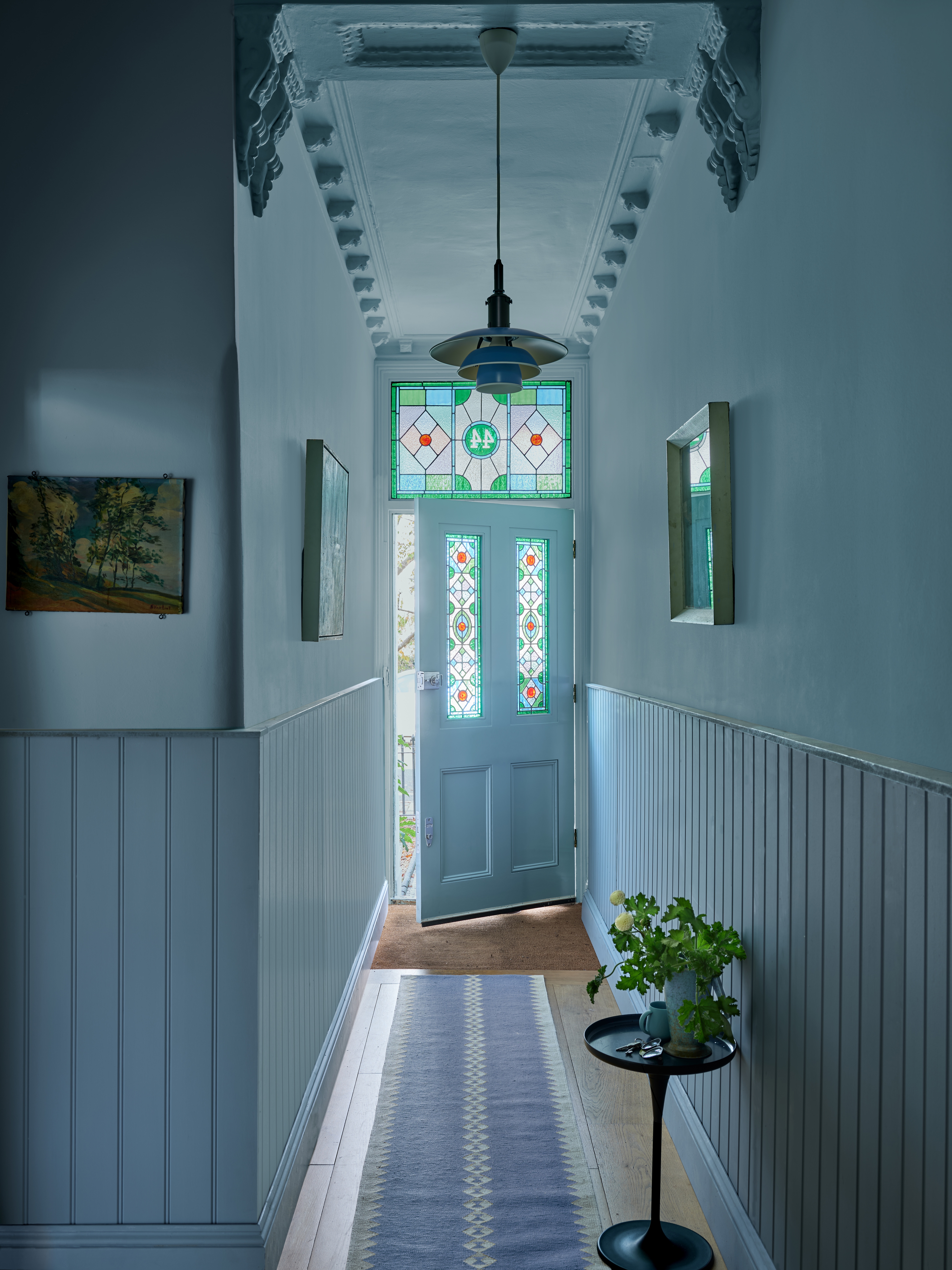
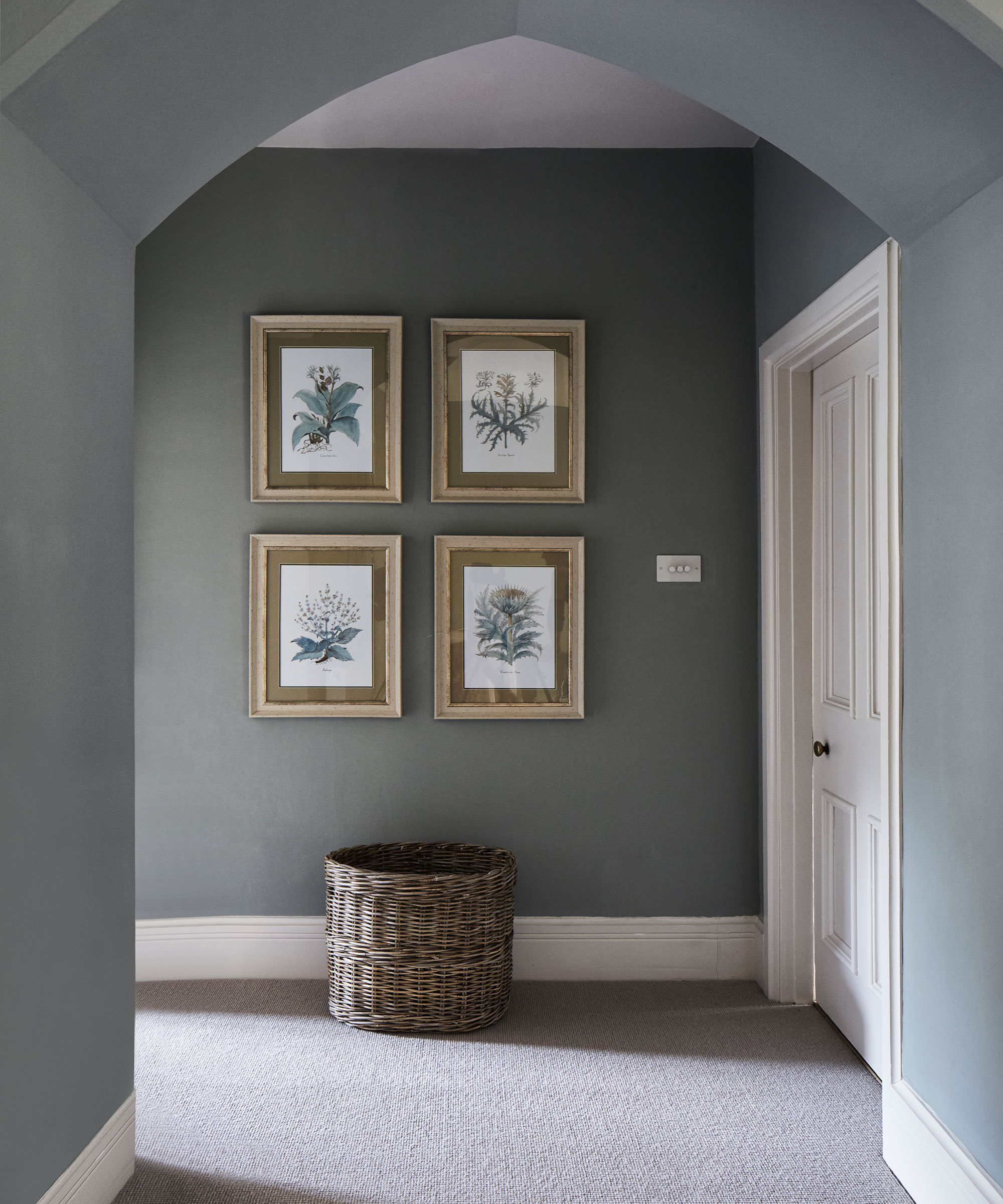
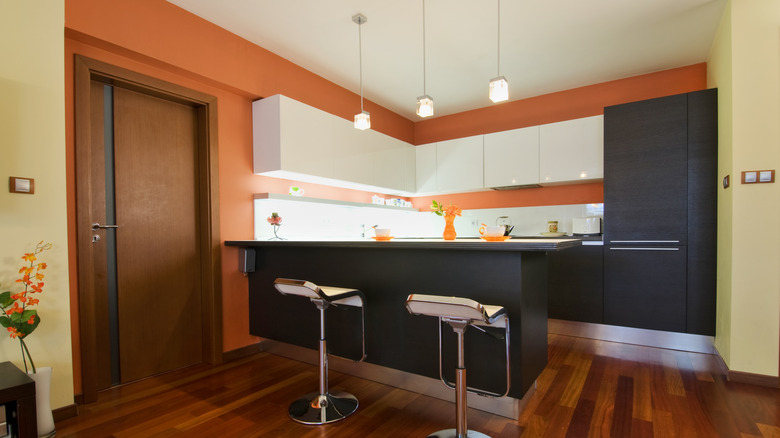
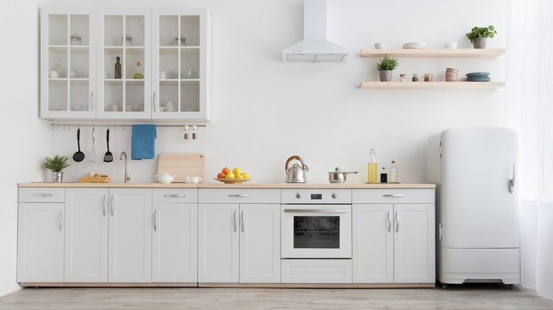
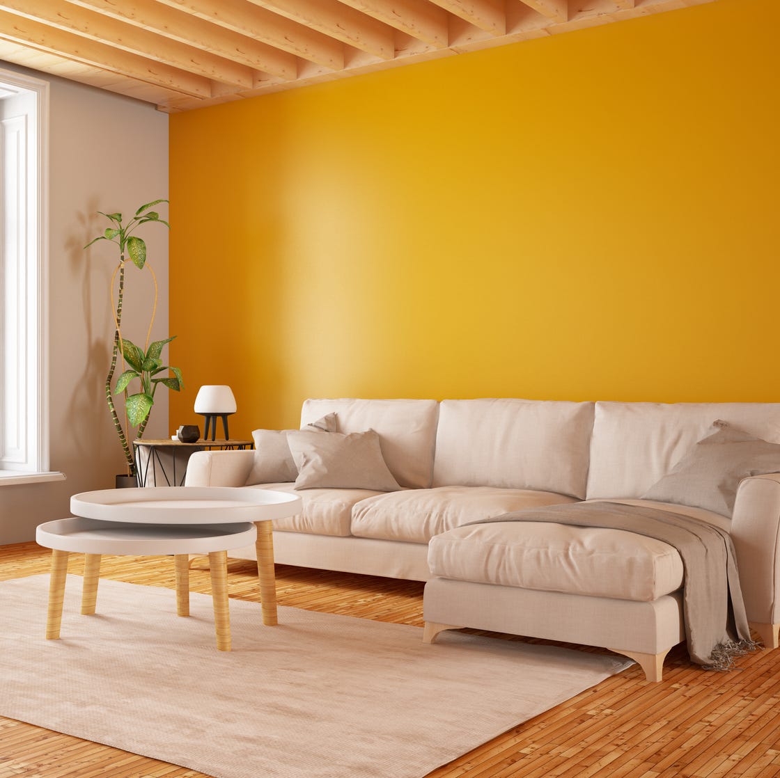
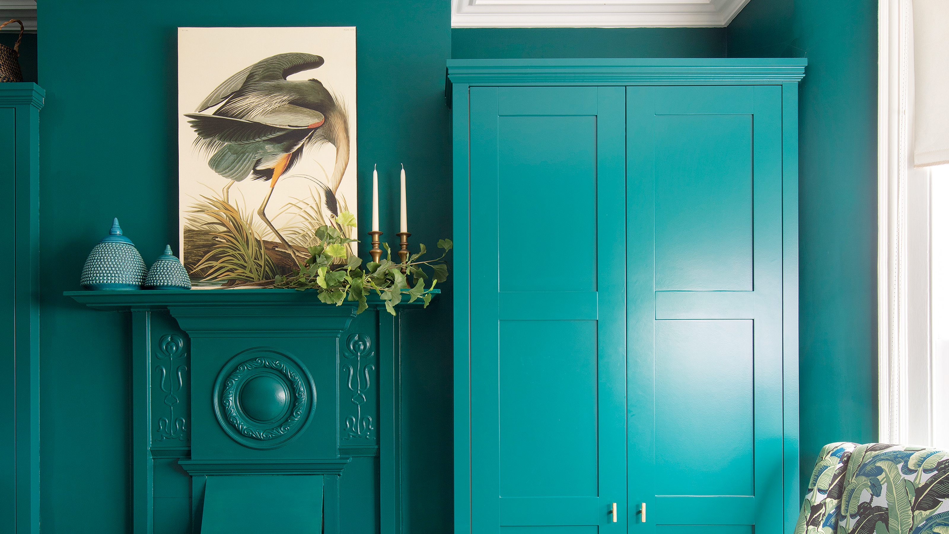
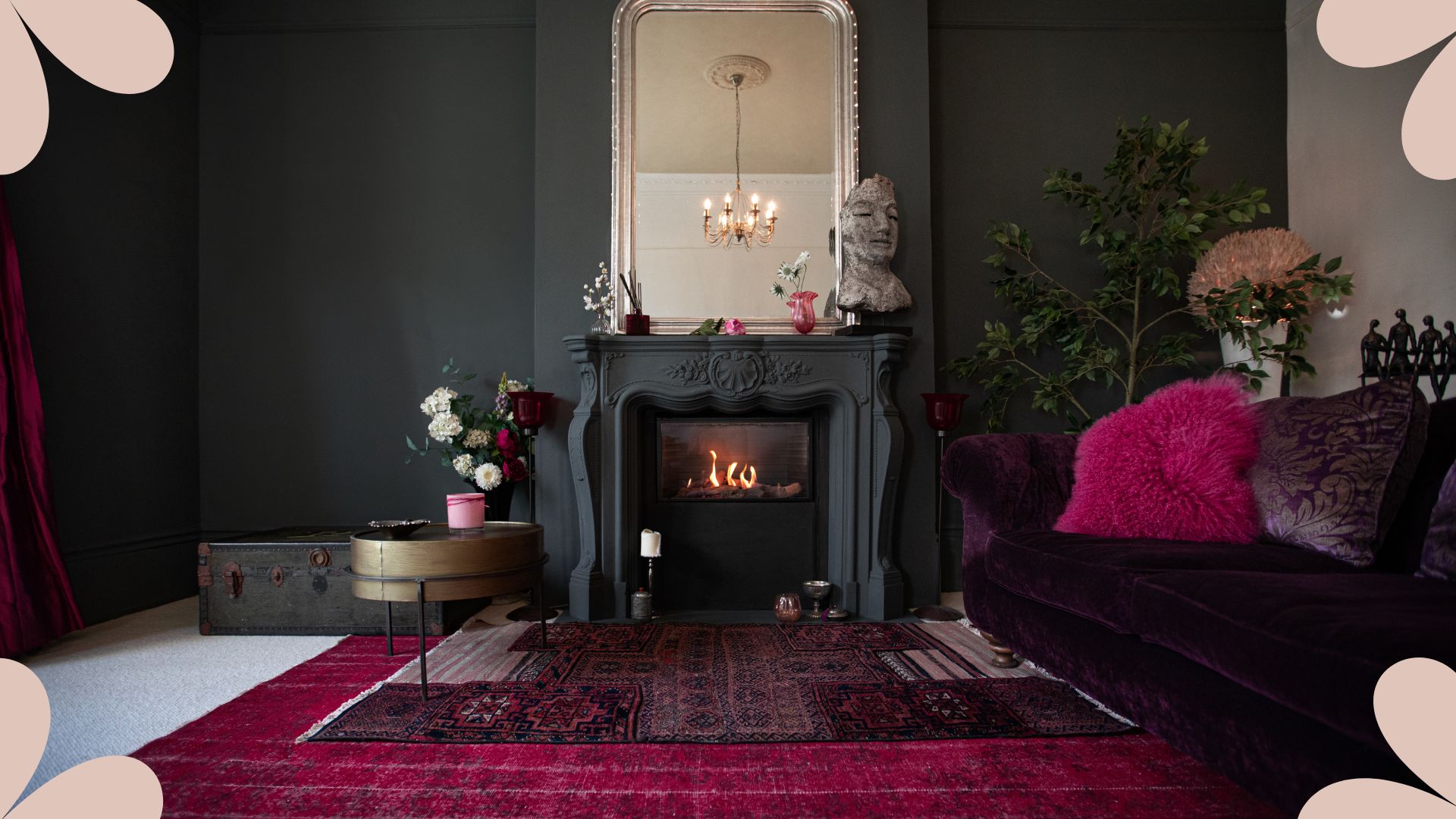
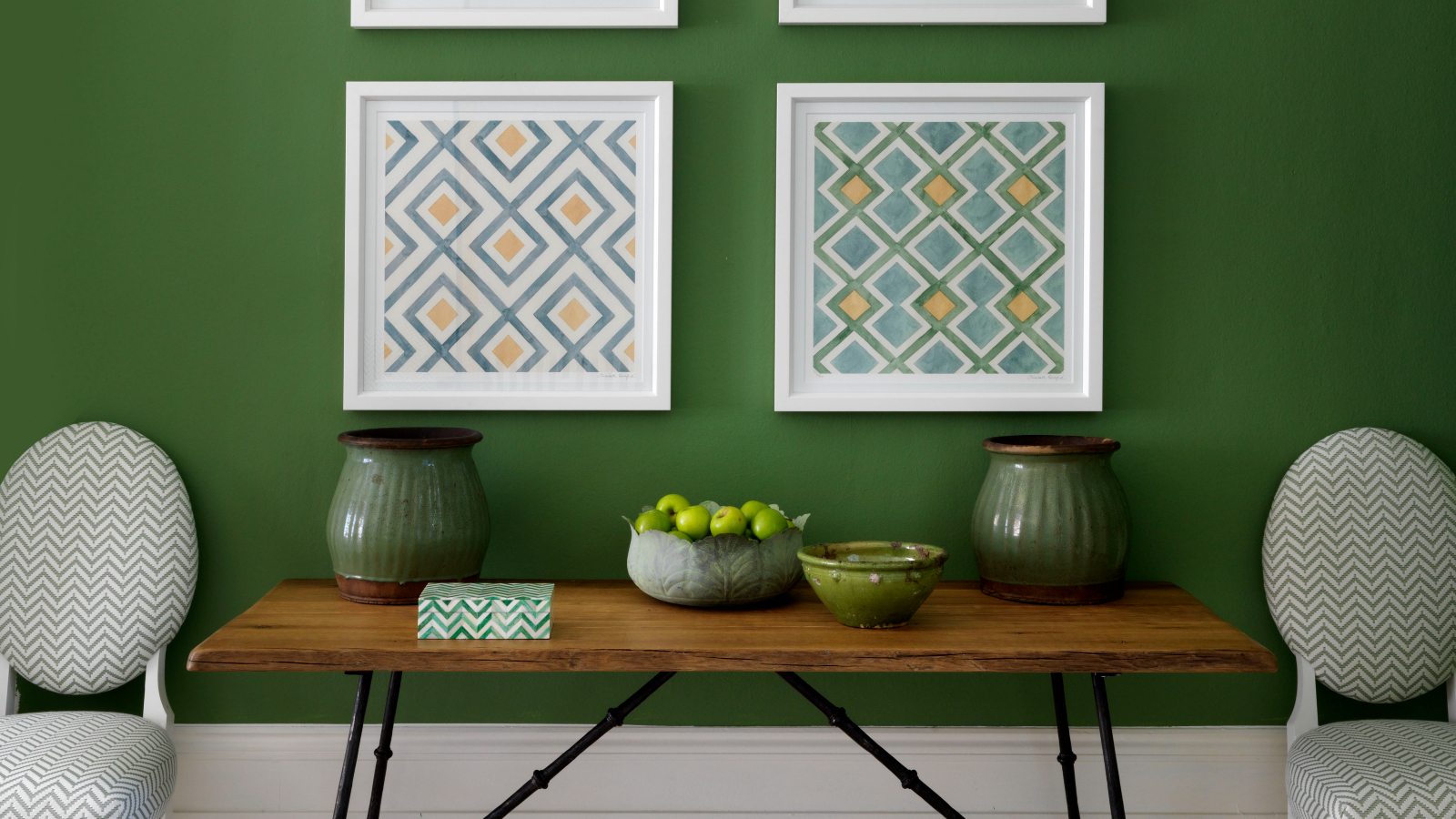
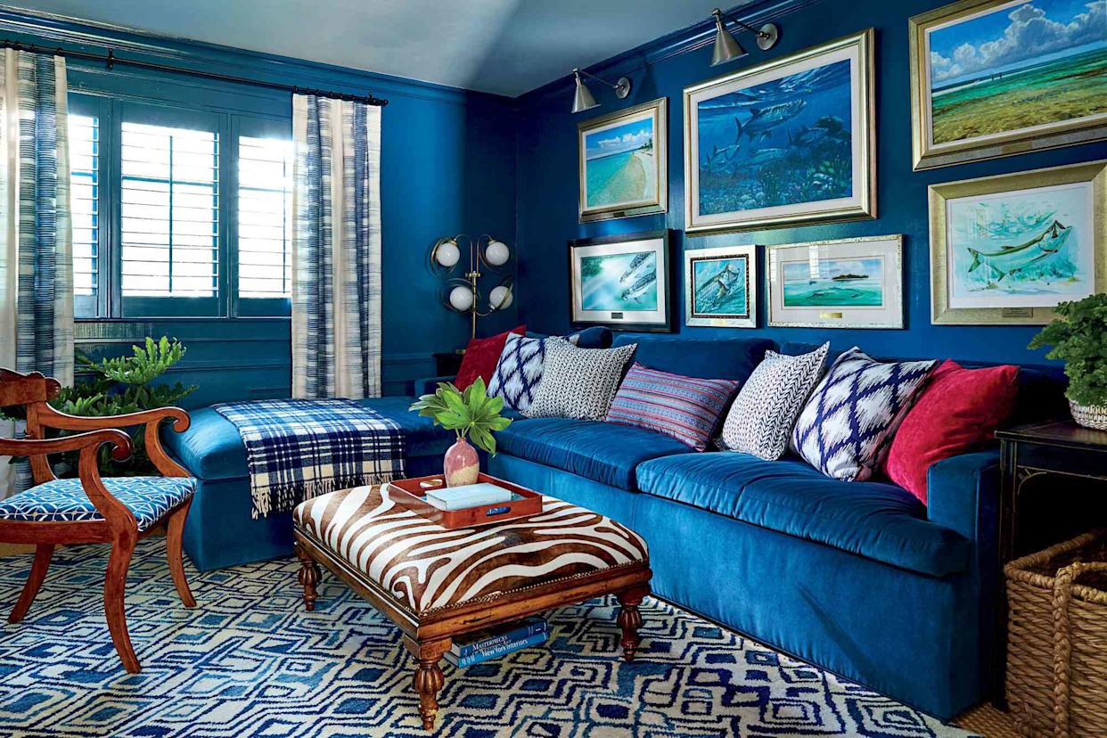
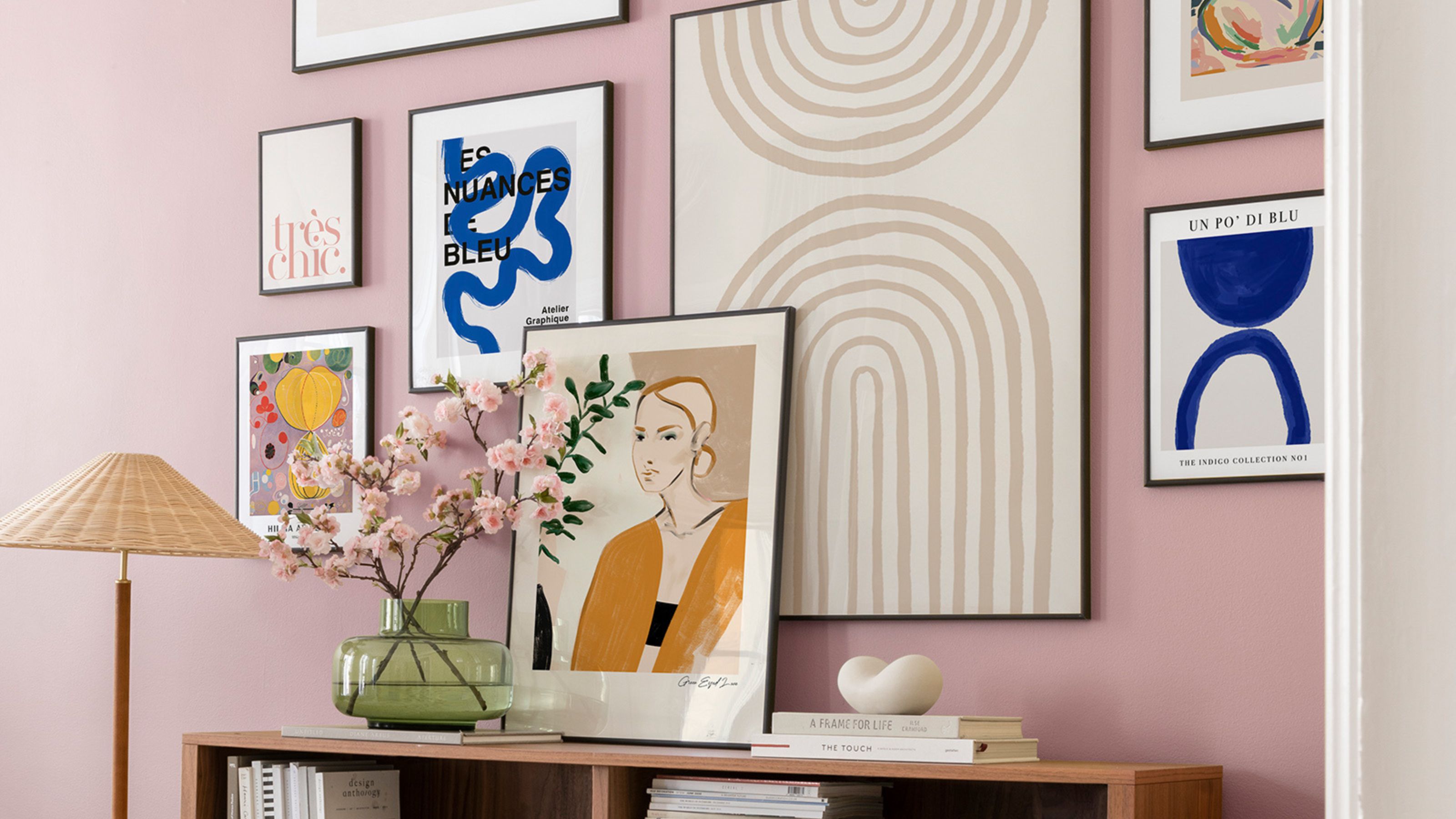
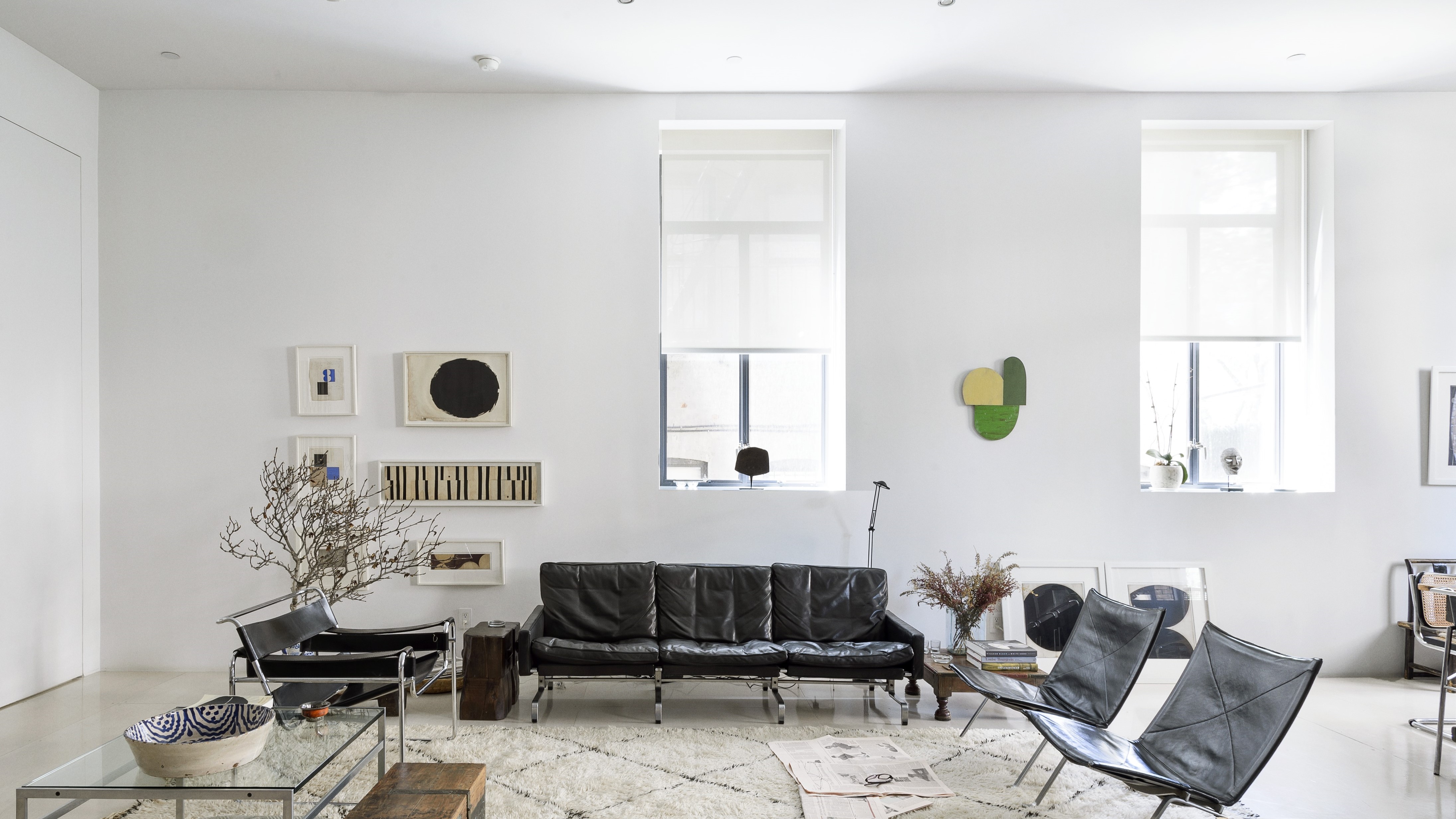
Accent walls are another design element that professionals recommend phasing out. Often used by individuals hesitant to commit to painting an entire room, accent walls can detract from a cohesive design. The advice is to be confident and paint the entire room for a more integrated and sophisticated outcome. Similarly, painting trim a bold color is discouraged in favor of a white or subtle trim. White trim is considered a timeless choice that prevents a room from looking trendy and ensures longevity in design appeal, even as decor styles evolve.
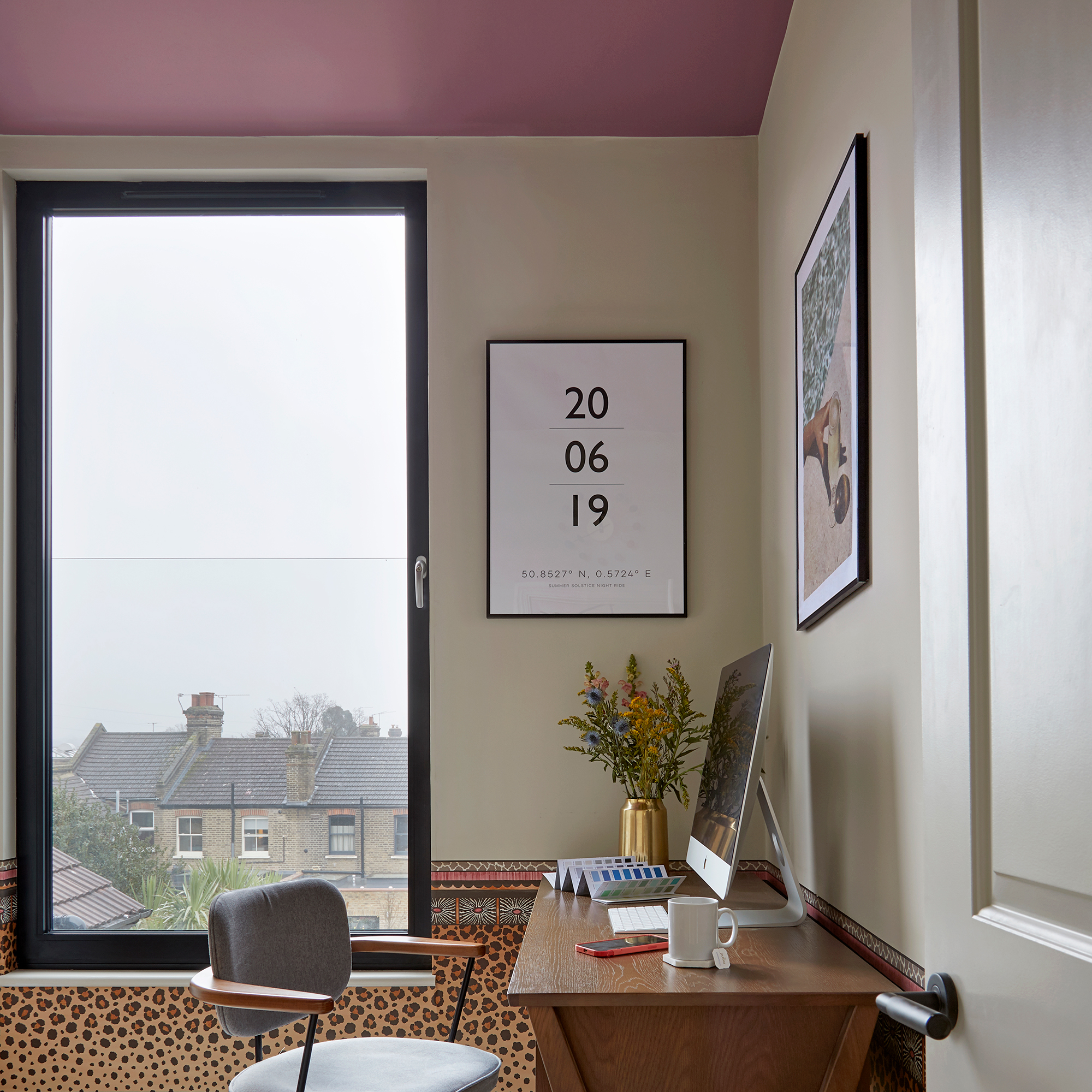
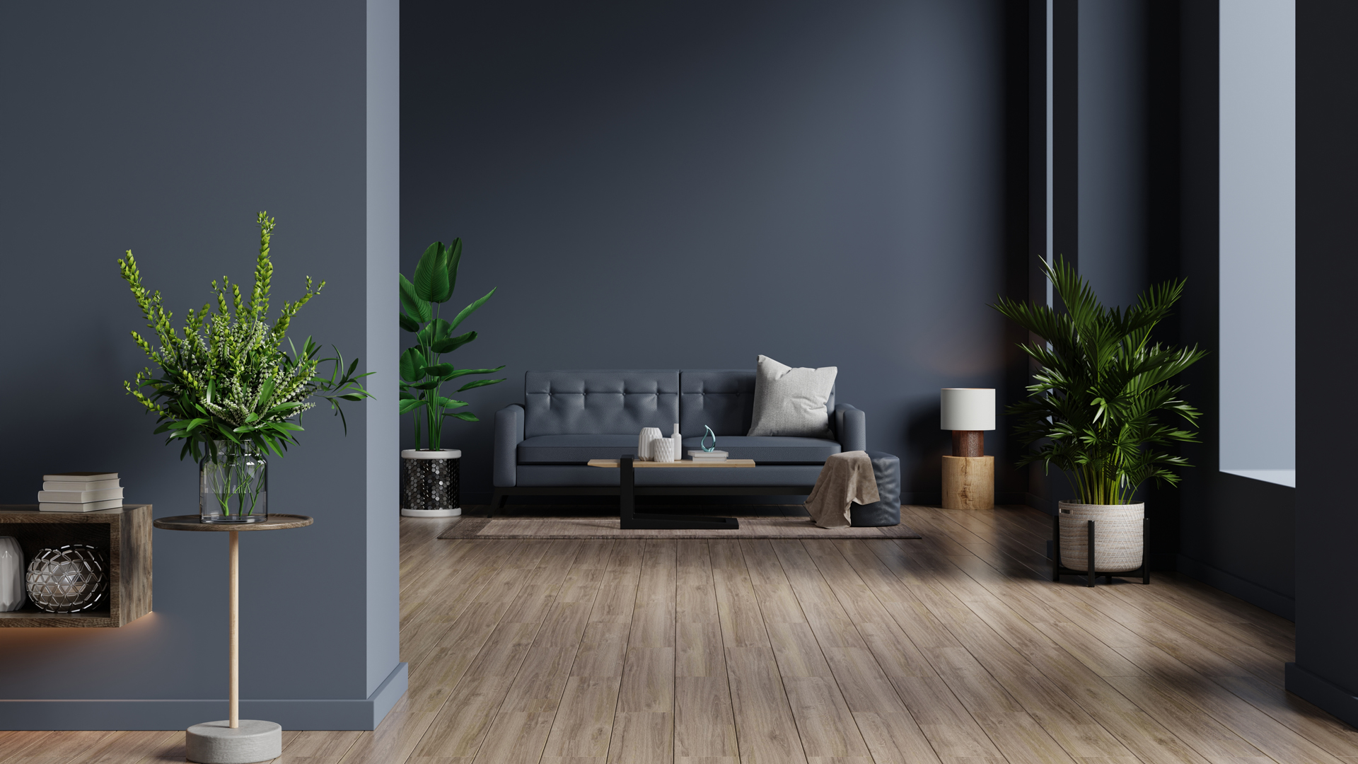
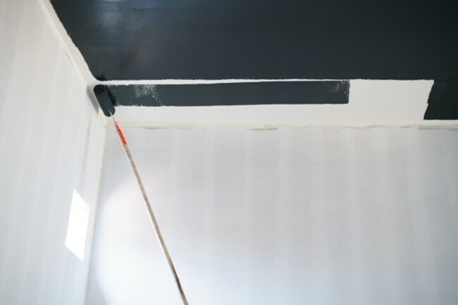
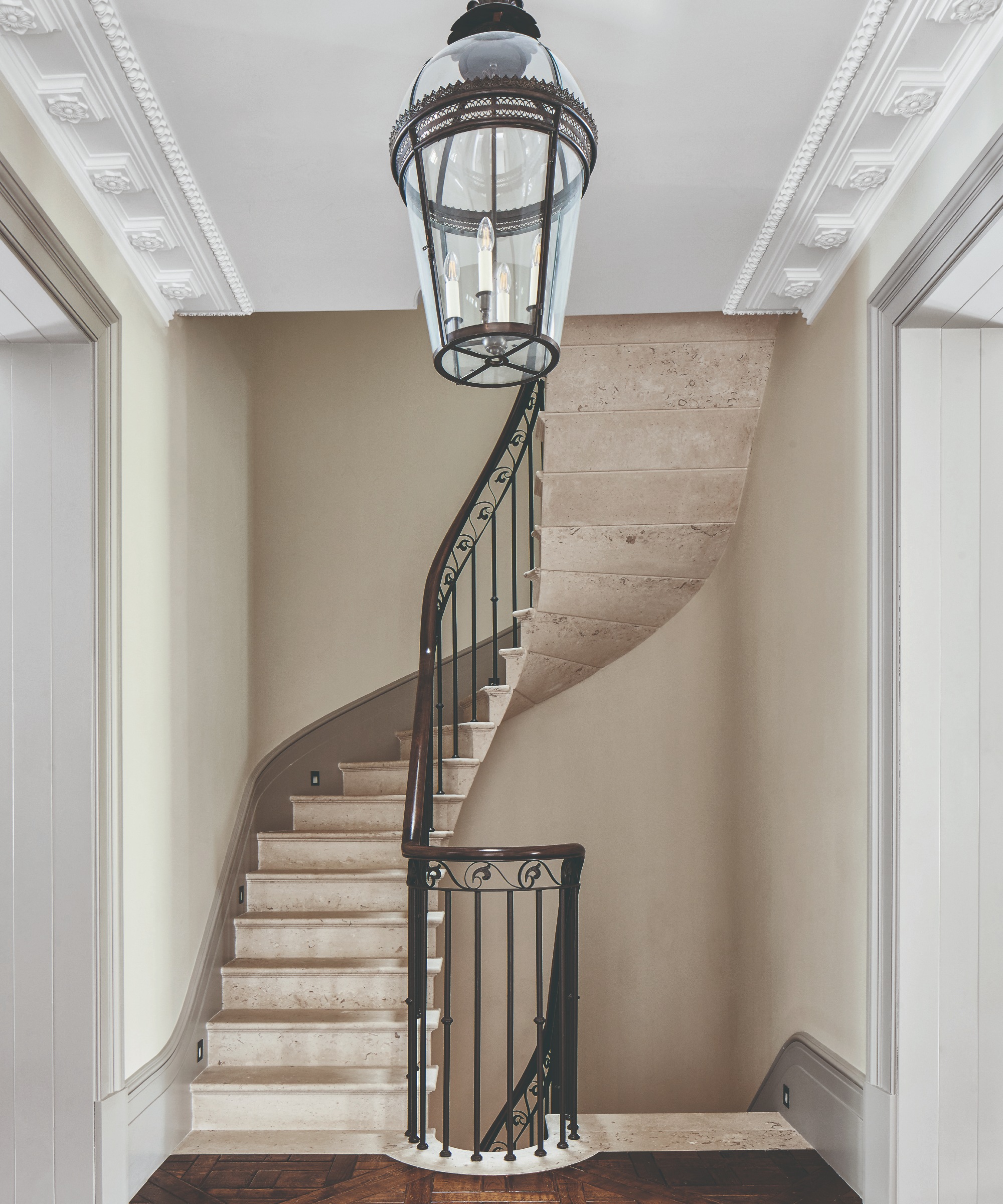
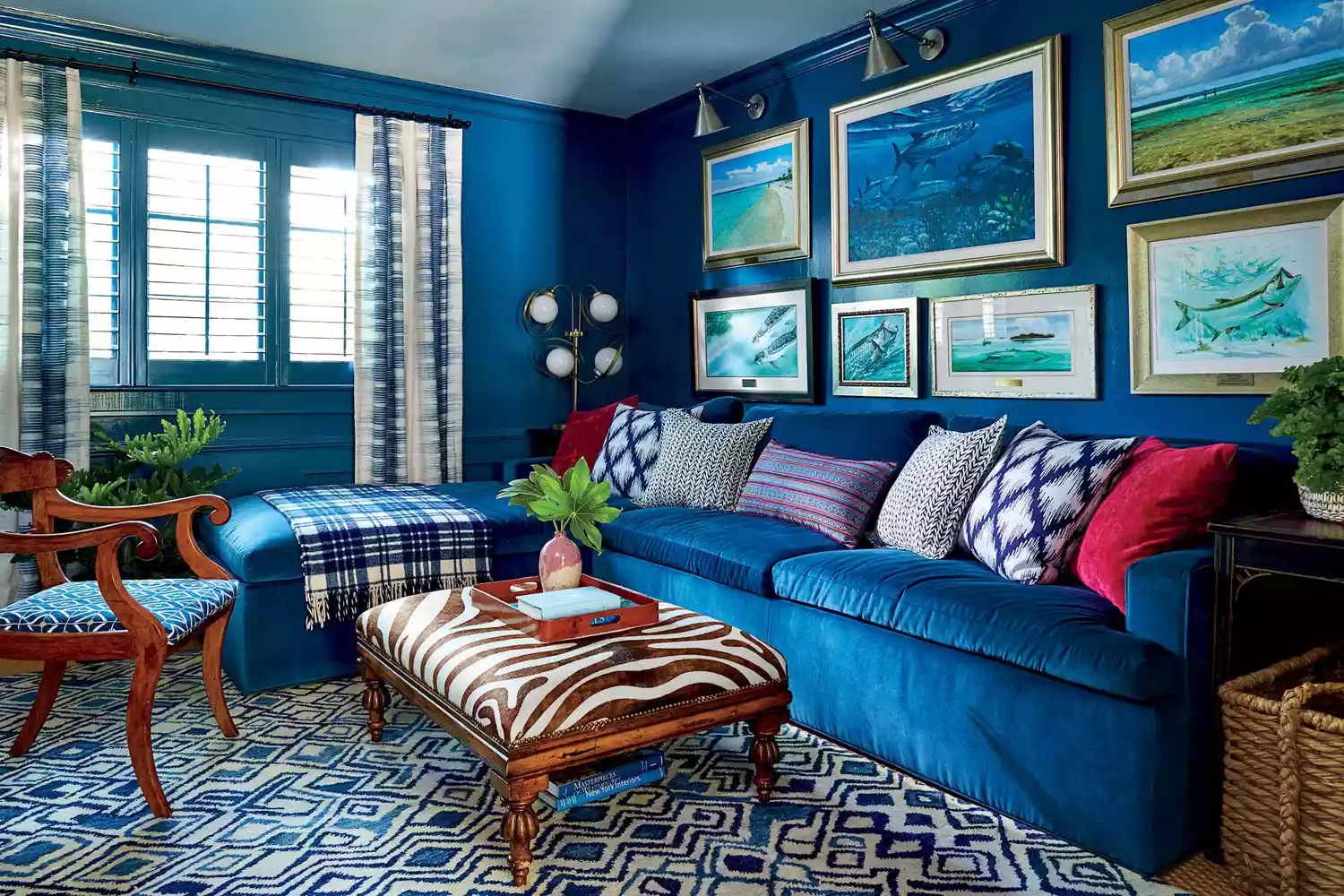
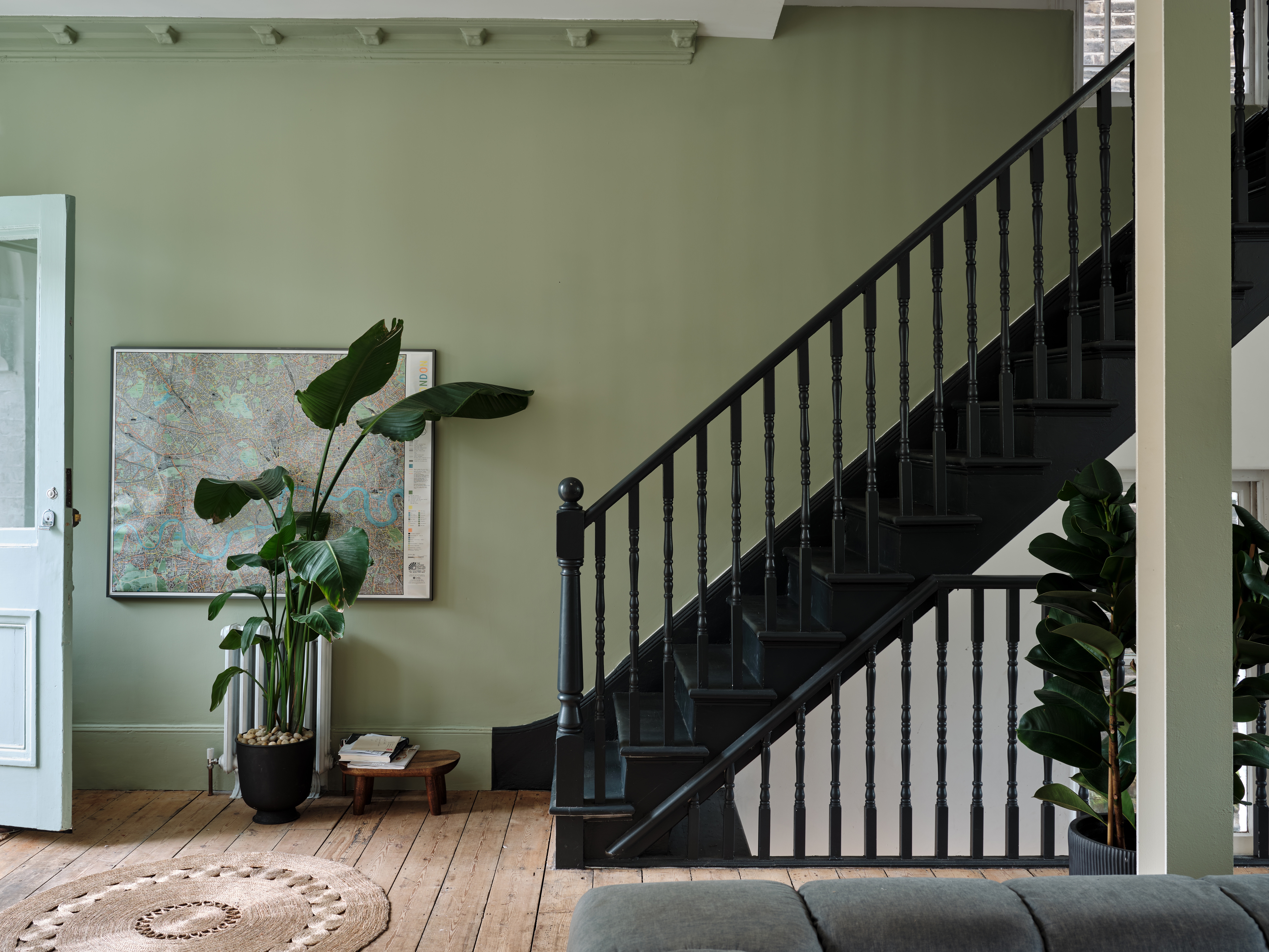
Maintaining color consistency between the ceiling and trim is also emphasized. Painting the ceiling the same color as the trim allows the eye to move seamlessly around the room, fostering a cohesive and appealing energy. Introducing a third distinct color for the ceiling, in addition to wall and trim colors, can create a disjointed and less harmonious environment.
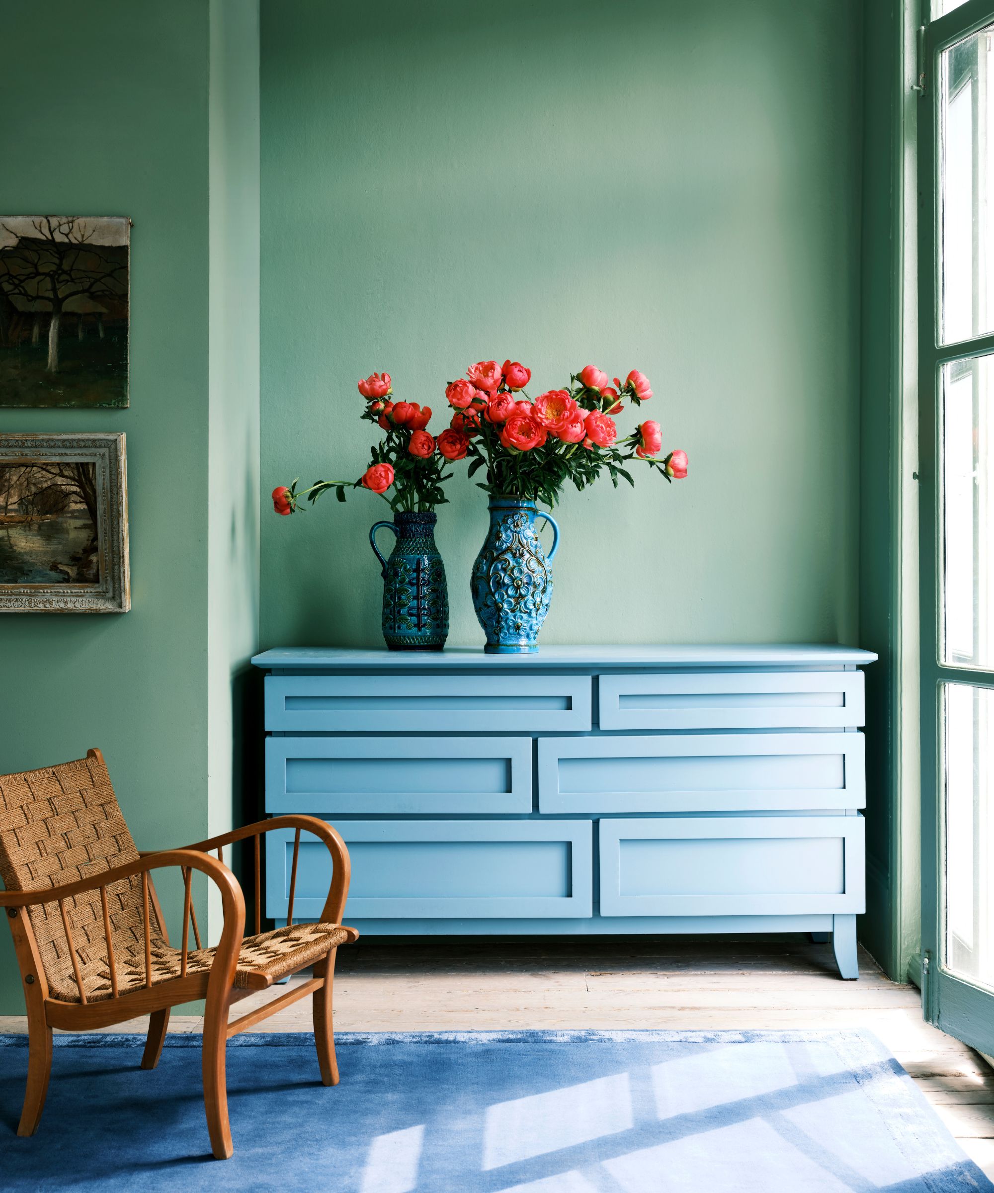
Finally, the article strongly advises against choosing paint colors based solely on current trends or influencer recommendations. A color that looks stunning in one home might not translate well to another due to differing architectural styles, natural light, and existing decor. To make an informed decision, ordering paint swatches and testing them at home at various times of the day is recommended. This practical step allows homeowners to observe how colors genuinely appear in their specific space, avoiding potential dissatisfaction and ensuring the chosen palette complements the home's unique characteristics.
#PaintColorMistakes #InteriorDesignTips #HomeDecor #PaintUndertones #PaintFinishes #AccentWalls #TrimColor #CeilingPaint #ColorTrends #PaintColorMistakes #InteriorDesignTips #HomeDecor #PaintUndertones #PaintFinishes #AccentWalls #TrimColor #CeilingPaint #ColorTrends
0 comment in total
You may also like
7 Paint Mistakes That Make Designers Instantly Cringe When They Walk Into Someone's Home

10 mistakes to avoid when painting wooden furniture, according to experts

These Master Tips Will Help You Avoid Choosing The Wrong Type Of Paint
6 Rookie Mistakes to Avoid When Decorating With Pantone’s Color of the Year
Interior design experts reveal the colour rules you should be breaking
5 colors you should never paint a small room – designers warn us to steer clear of these hues, and what to pick instead
7 Paint Colors Designers Totally Regret Using (and What They Wish They’d Used Instead)

7 Most Underrated Paint Colours, According To Colour Experts

An interior designer reveals the 5 mistakes to avoid when painting with dark colours

Never Regret a Paint Color Again—Avoid These 6 Common Mistakes


'Dark ceilings make the room look smaller': 6 classic paint colour myths it's time to give up on

5 colors to avoid painting a landing – and the secret to choosing the right shades
6 Paint Color Mistakes To Stop Making, According To Designers

The 5 small entryway color mistakes design experts say are big bloopers

5 Paint Colors That Experts Say You Shouldn't Use in 2025

6 Worst Colors To Paint Your Kitchen (And What To Choose Instead)
6 painting mistakes that are making your walls look 'dirtier' – and what you should be doing instead

Outdated color trends – 5 overdone colors that designers no longer love, and what to use instead
6 colors to avoid in an entryway – and the ones designers know make a better first impression
The 5 Most Overused Paint Colors and What to Try Instead, According to Designers