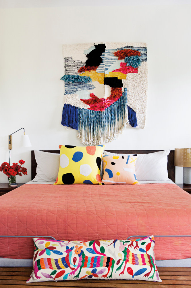
6 Rookie Mistakes to Avoid When Decorating With Pantone’s Color of the Year
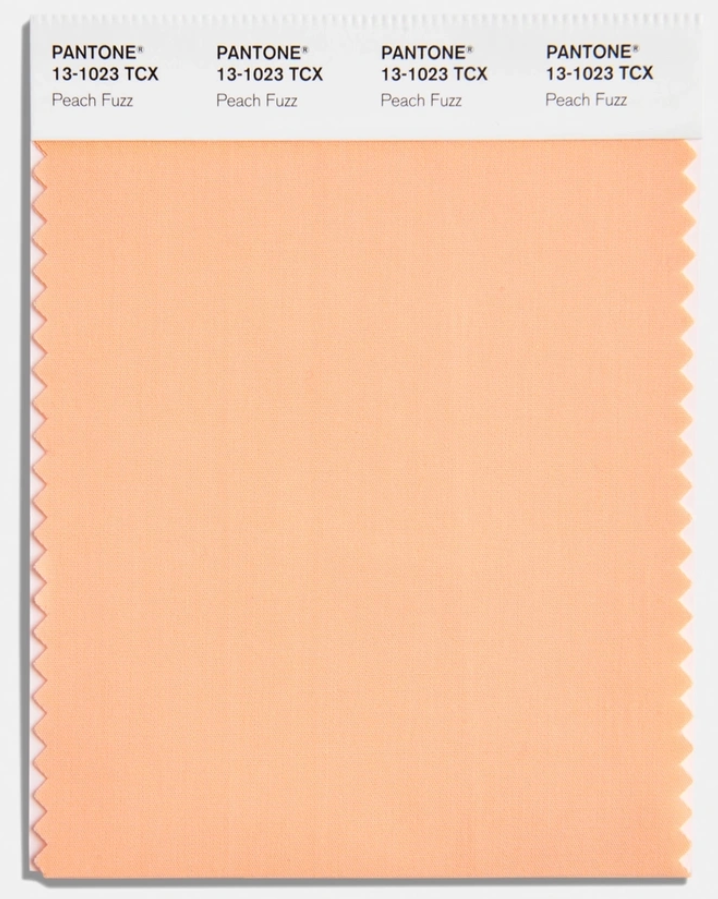
Living Coral, Pantone's 2019 Color of the Year, presents both an exciting opportunity and a challenge for home decorators due to its vibrant and statement-making nature. Integrating this hue seamlessly into existing decor without creating an outdated or overwhelming look requires careful consideration. This article, drawing insights from experienced interior designers, outlines several dos and don'ts to effectively incorporate Living Coral into various spaces.
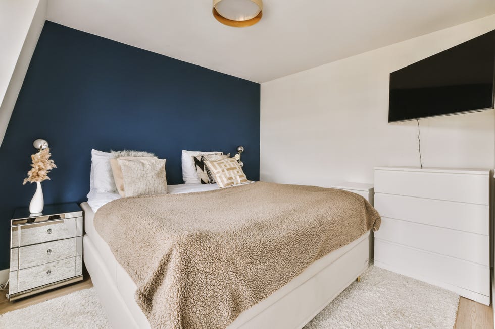
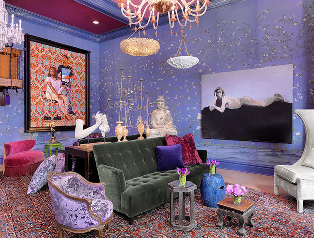
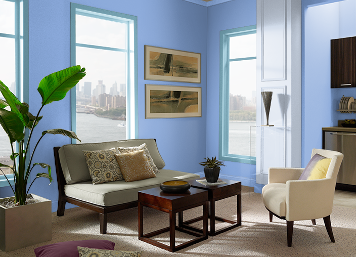
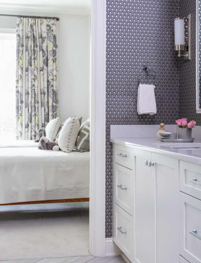
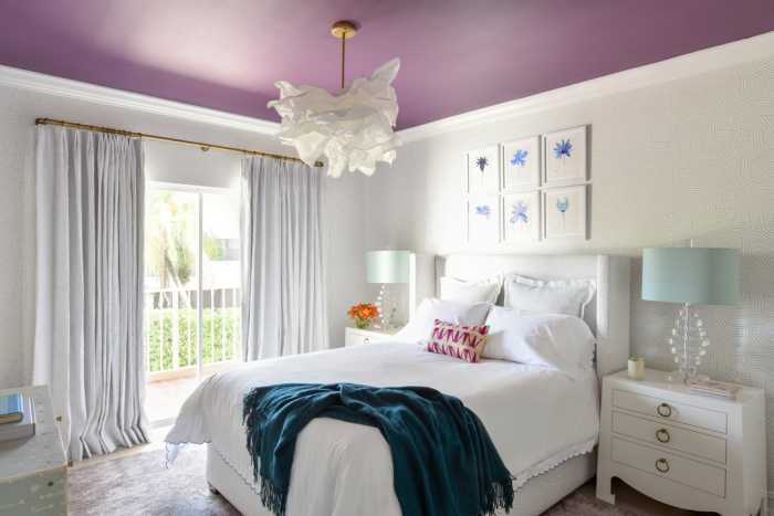
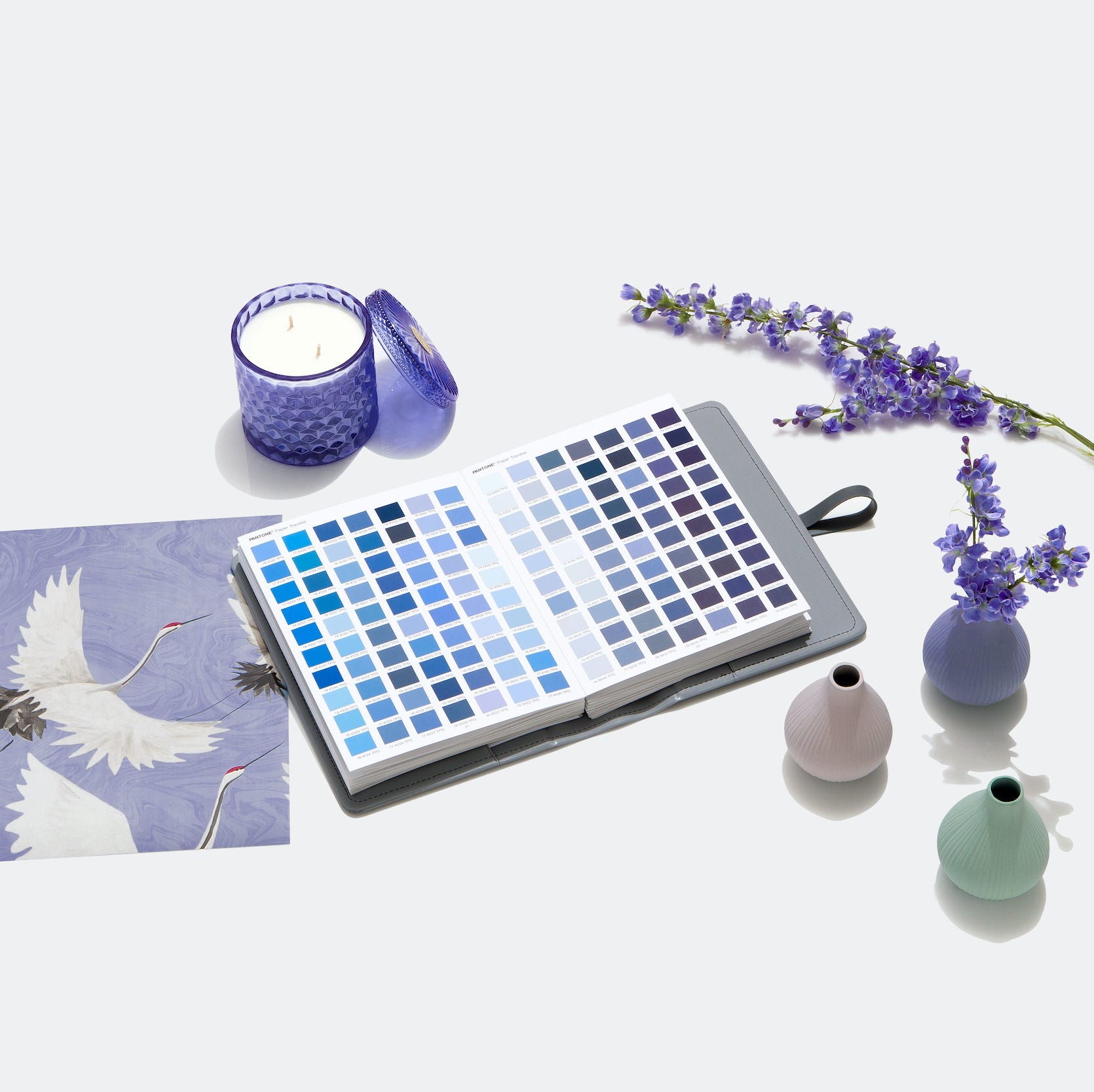
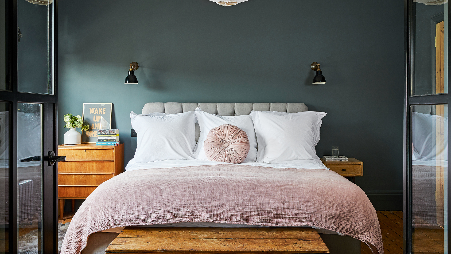
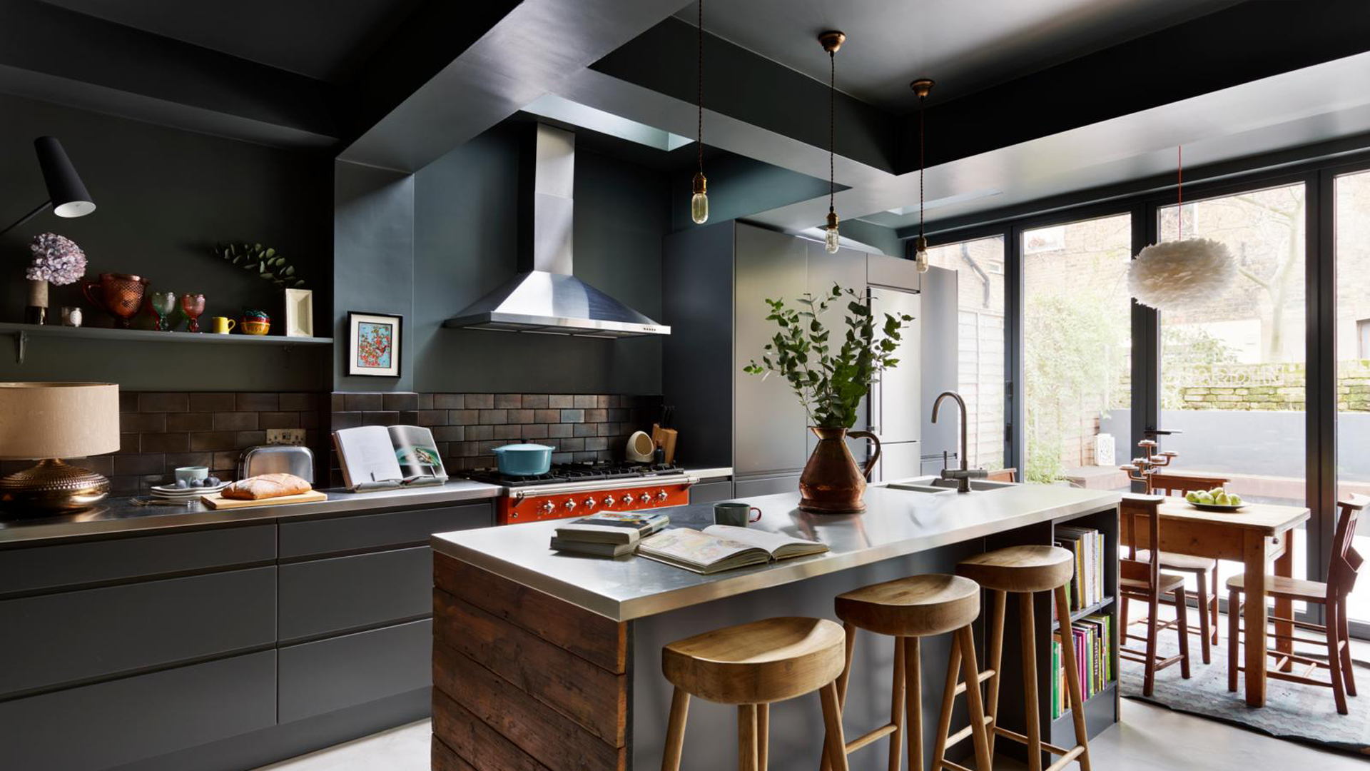
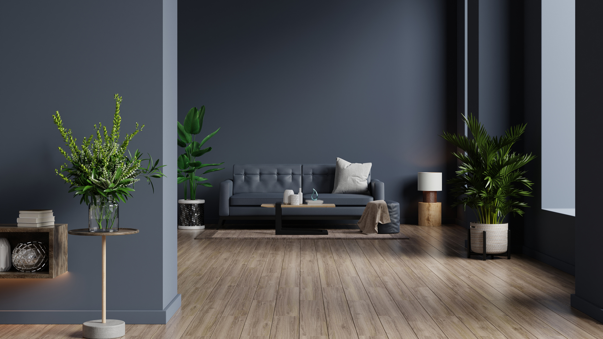

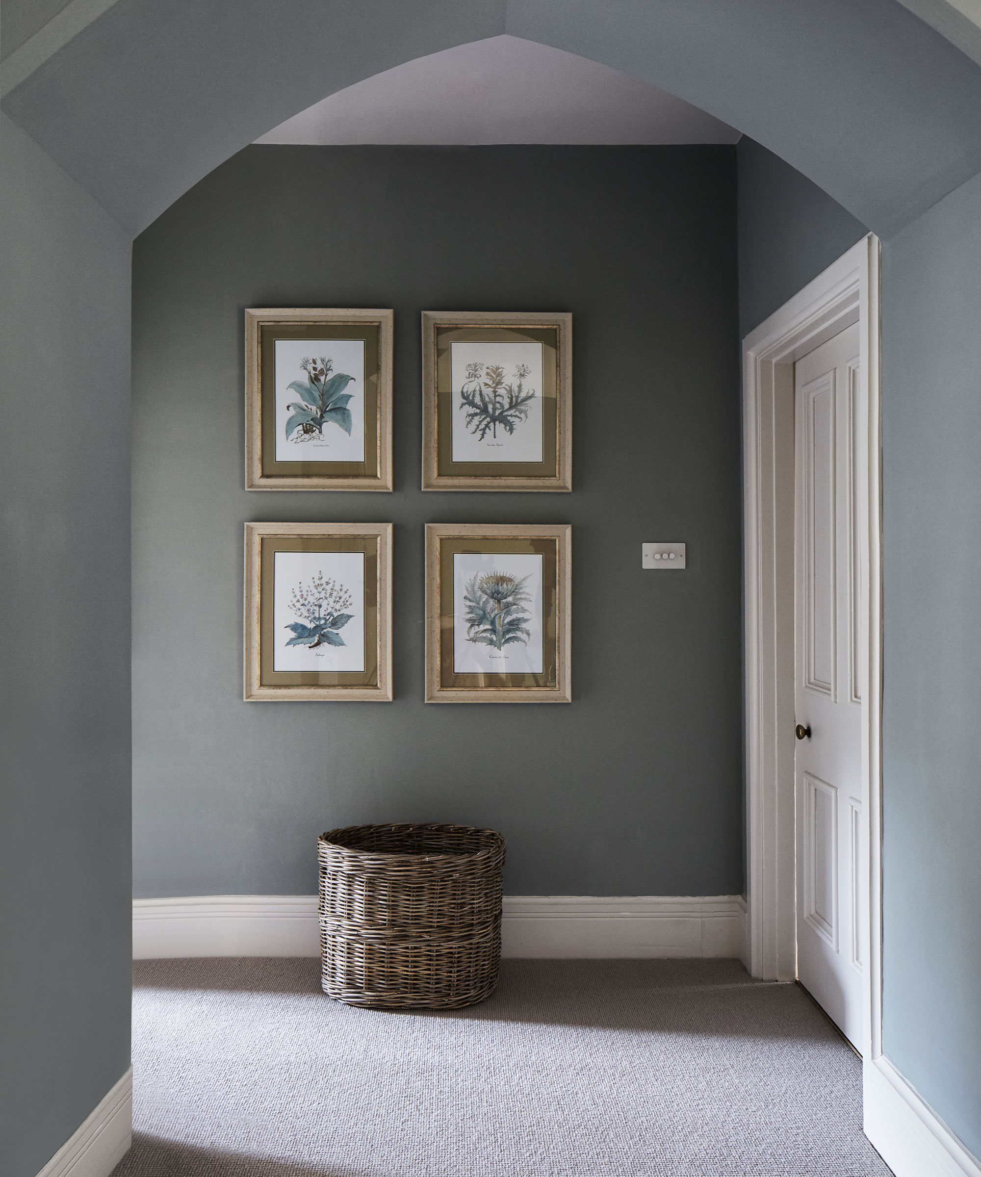
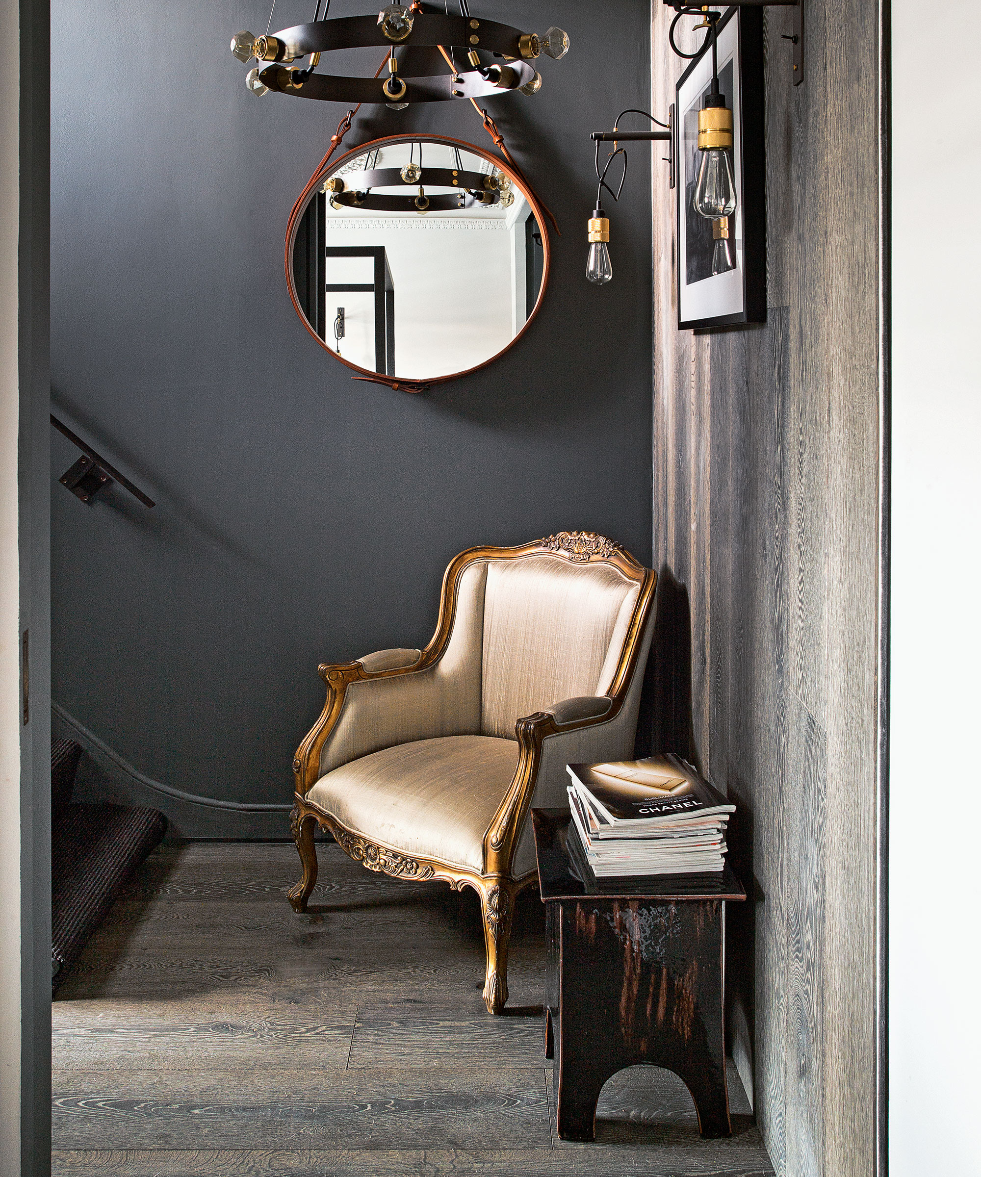
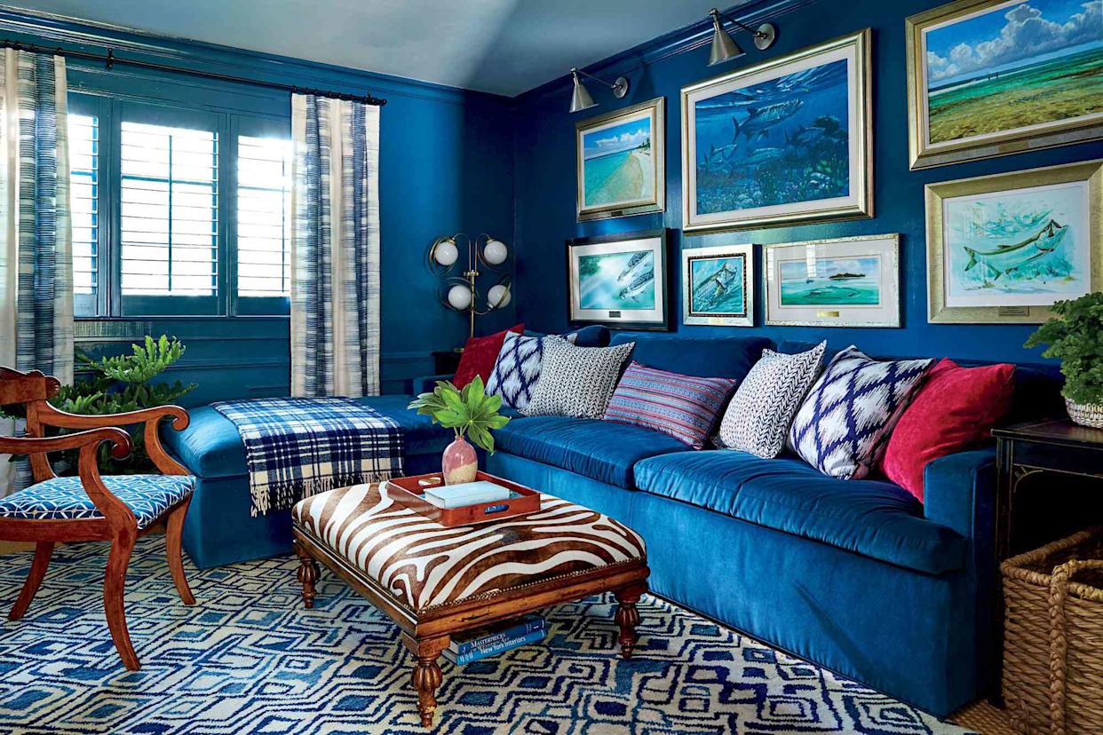
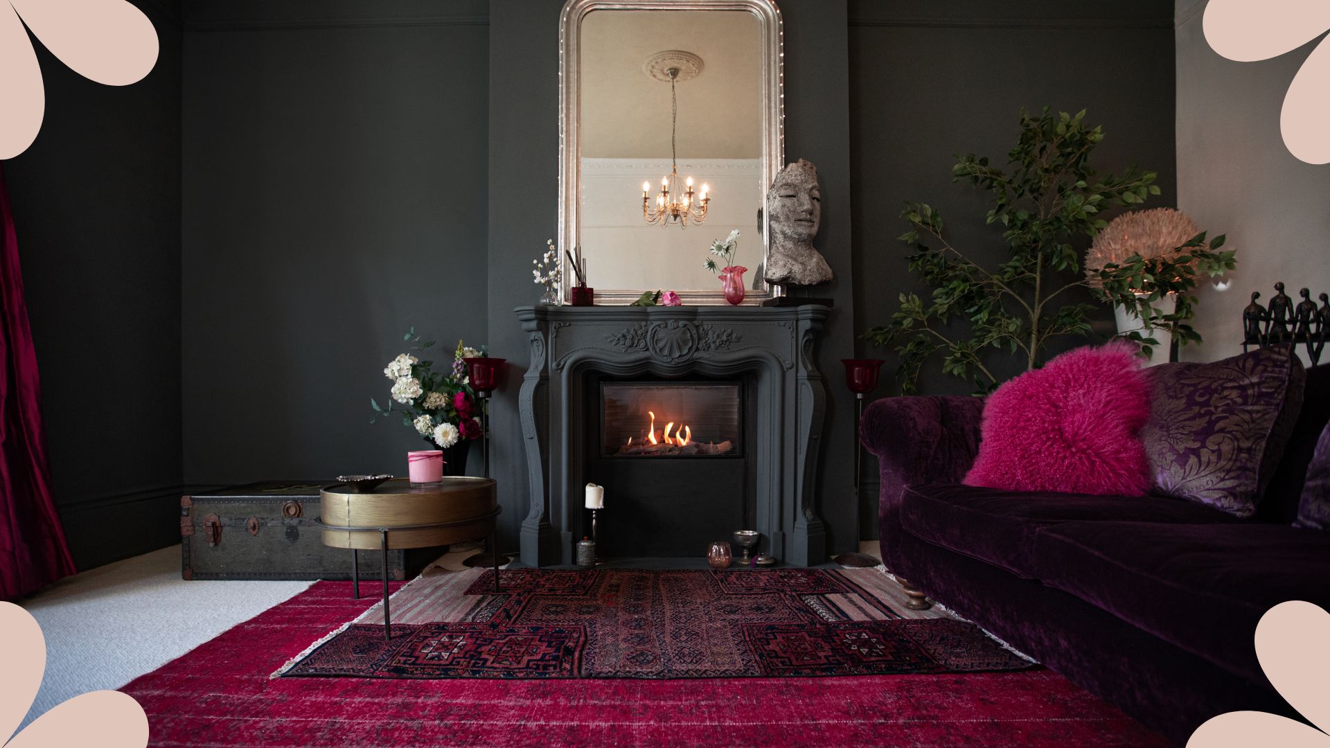
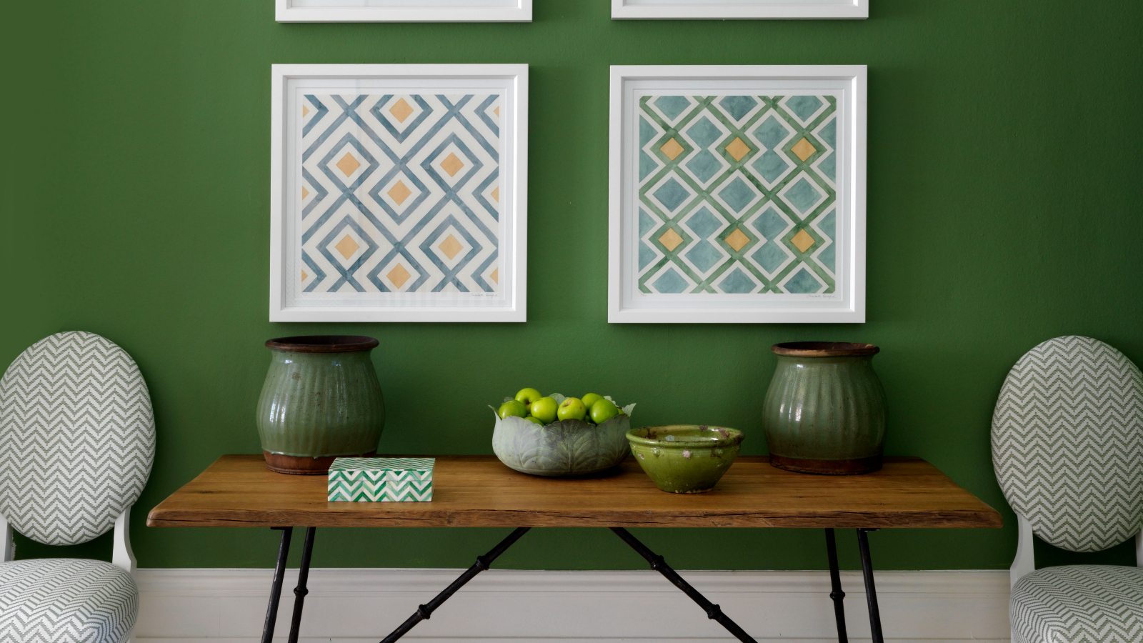
One common misconception is limiting Living Coral pairings exclusively to pastels. While it can complement such shades, the color is far more versatile. Instead, designers suggest exploring cooler tones on the color wheel. Pairing Living Coral with dusty blues, rich greens, and charcoals can create a sophisticated and dramatic aesthetic, adding depth and visual interest to a room.
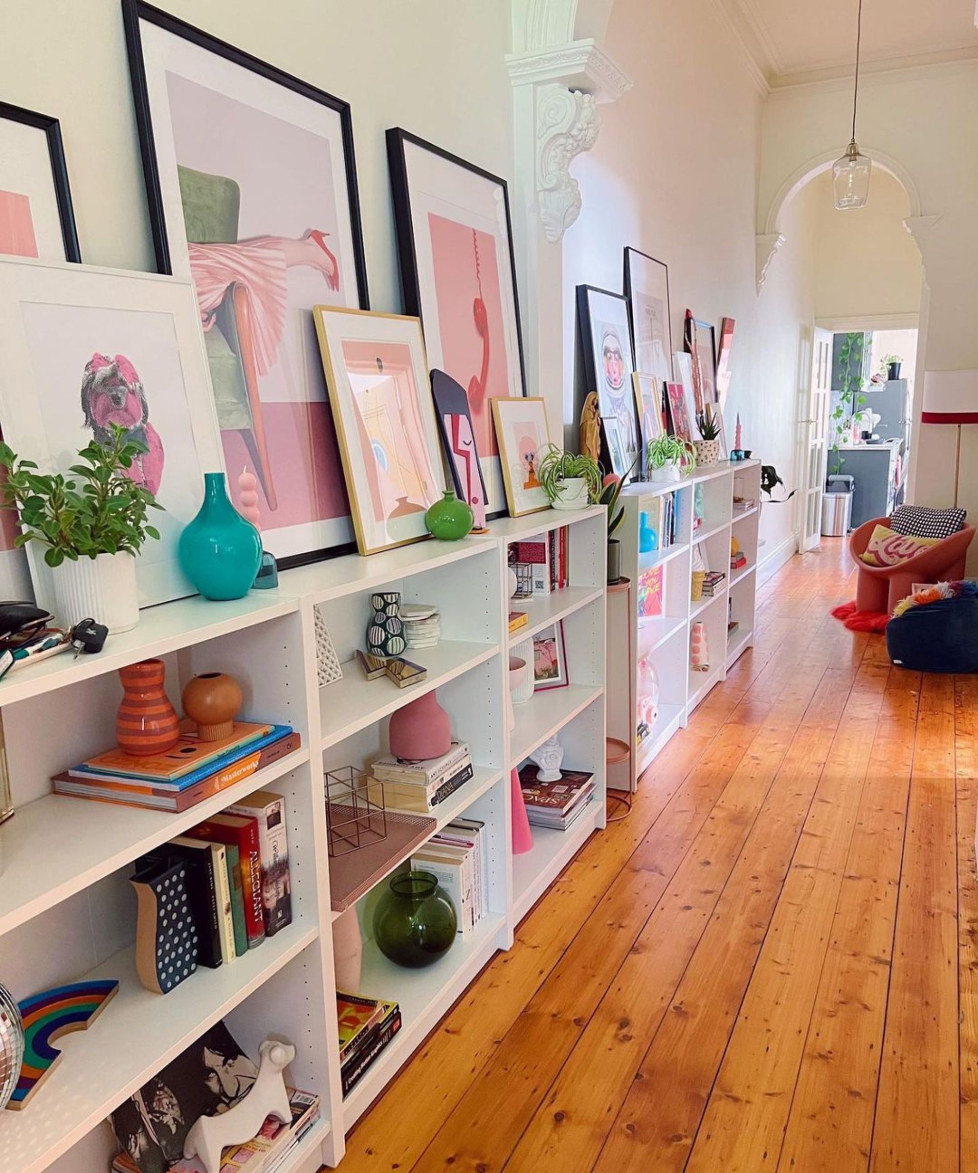
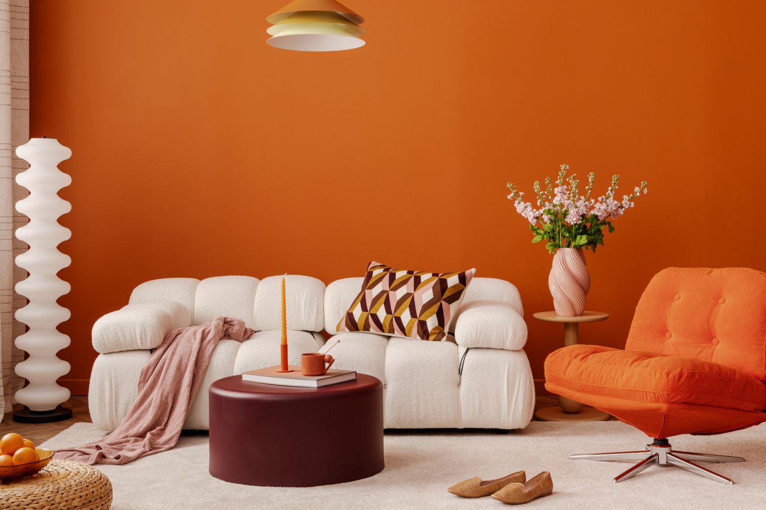
Another pitfall to avoid is immediately committing to painting entire walls in Living Coral. Unless one is certain of a long-term commitment to the color, a full wall makeover might be too bold for a trendy hue. A more flexible approach involves thinking smaller in scale. Incorporating the color through smaller accents, such as painting a side table in high-gloss coral, coating a powder room, or adding decorative accessories like ceramic vases, throws, or pillows, allows for playful experimentation without a significant overhaul. This method ensures that the color can be easily updated or removed if preferences change.
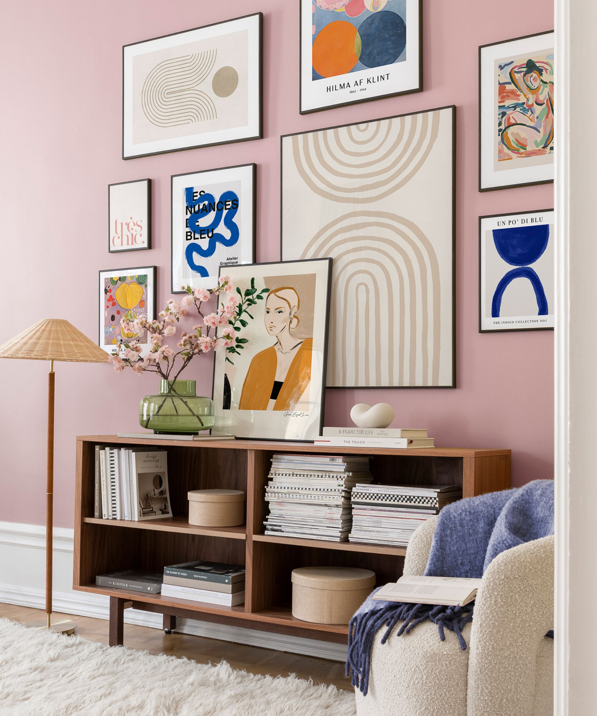
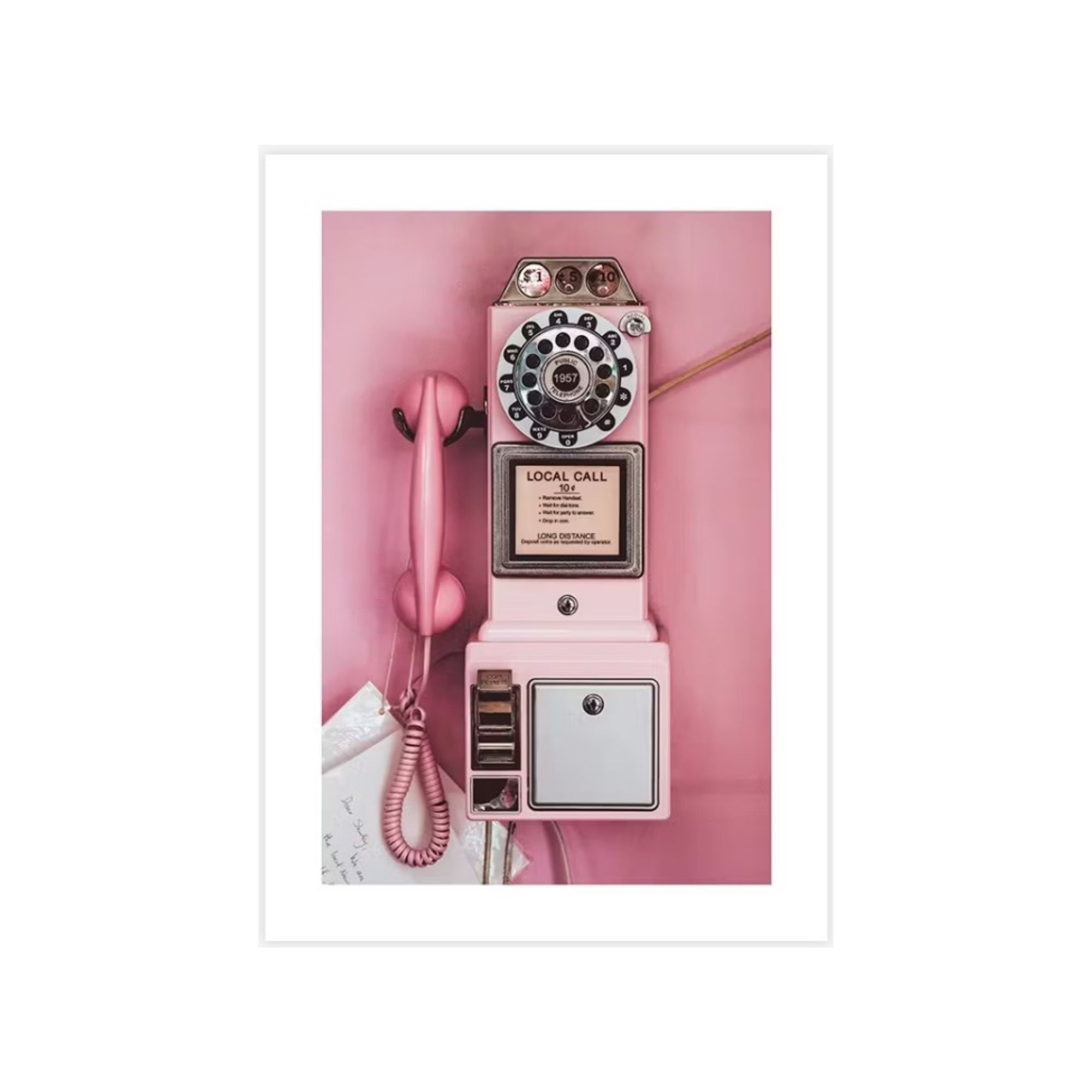
For those new to decorating with Living Coral, it's advisable not to go too bold too quickly. Rather than swapping out major furniture pieces or painting large surfaces, consider integrating the color in smaller, less committal ways. This could involve an art piece featuring the hue or textiles with coral woven into their patterns. Such subtle introductions make it easier to gradually increase the presence of the color if desired, allowing for a more organic integration into the existing decor.
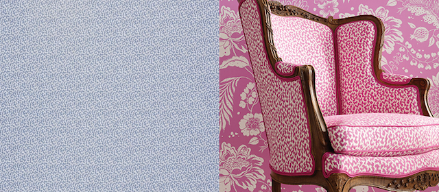
The article also debunks the notion that Living Coral is exclusively suited for nautical or coastal themes. Despite its vibrant, sea-inspired nature, the color is adaptable to various design styles. Instead of a strict nautical interpretation, designers recommend embracing a tropical, endless summer vibe. This approach encourages using whimsical wallpapers that evoke a coral reef motif, channeling the spirited and lively qualities of millennial pink to refresh a space.
Furthermore, focusing solely on major living areas like bedrooms, living rooms, or kitchens for a chromatic swap might be a missed opportunity. Thinking outside the box and designating Living Coral for less traditional spaces can introduce an unexpected element. For instance, Cathy Hobbs, an interior designer, suggests targeting rooms that lack natural light. The warm undertones of Living Coral can effectively brighten dark spaces, such as tiny closets or powder rooms, imbuing them with a bold and saturated character. This strategy helps maximize the color's impact in areas that might otherwise feel overlooked.
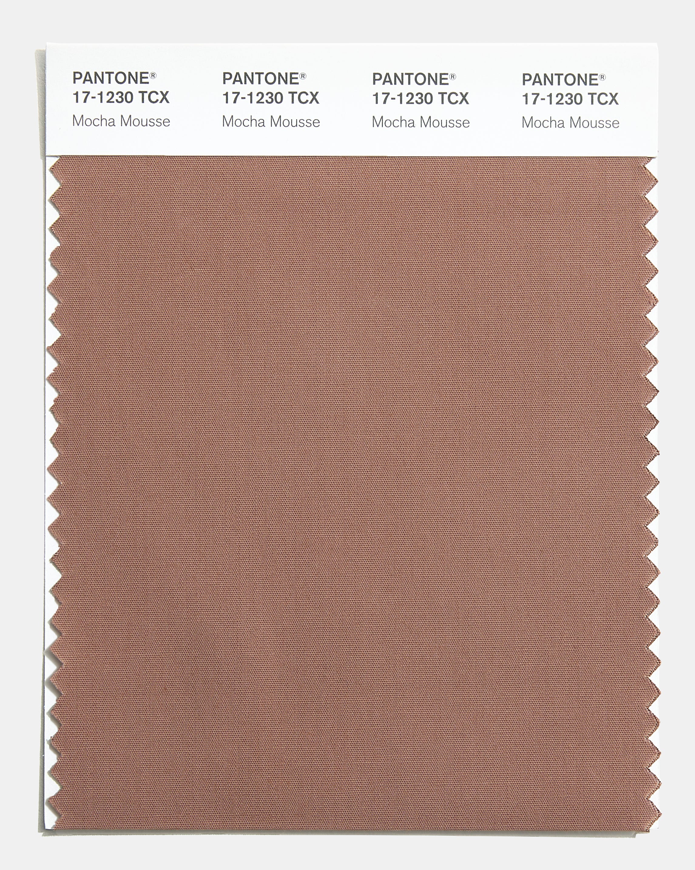
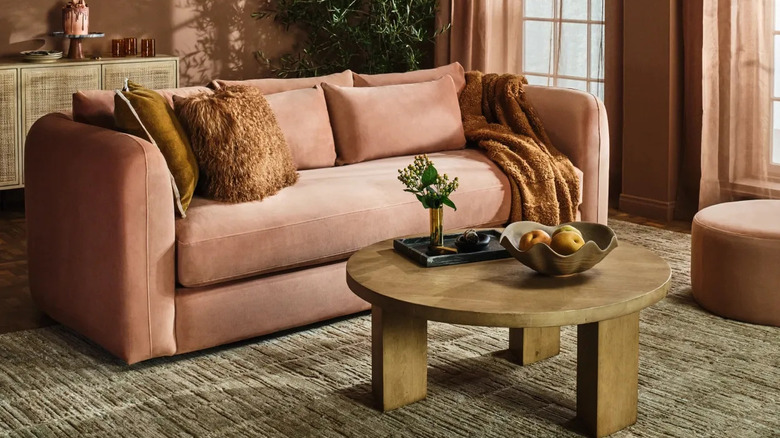
Finally, while blues and greens are often seen as obvious complements to Living Coral, exclusively sticking to them can lead to a predictable coastal aesthetic that might not appeal to everyone. If the vibrant, high-contrast look is not desired, it is recommended to stay on the warmer side of the color wheel. Pairing Living Coral with neutrals, browns, and dusty earth tones can soften its intensity, resulting in a more subdued and harmonious effect. This approach creates a balanced environment where the coral acts as an accent rather than an overwhelming presence.
#LivingCoral #PantoneColorOfTheYear #HomeDecor #InteriorDesign #ColorPairing #DesignTips #DecoratingMistakes #HomeStyling #LivingCoral #PantoneColorOfTheYear #HomeDecor #InteriorDesign #ColorPairing #DesignTips #DecoratingMistakes #HomeStyling
0 comment in total
 No comments yet
You may also like

Interior design experts reveal the colour rules you should be breaking
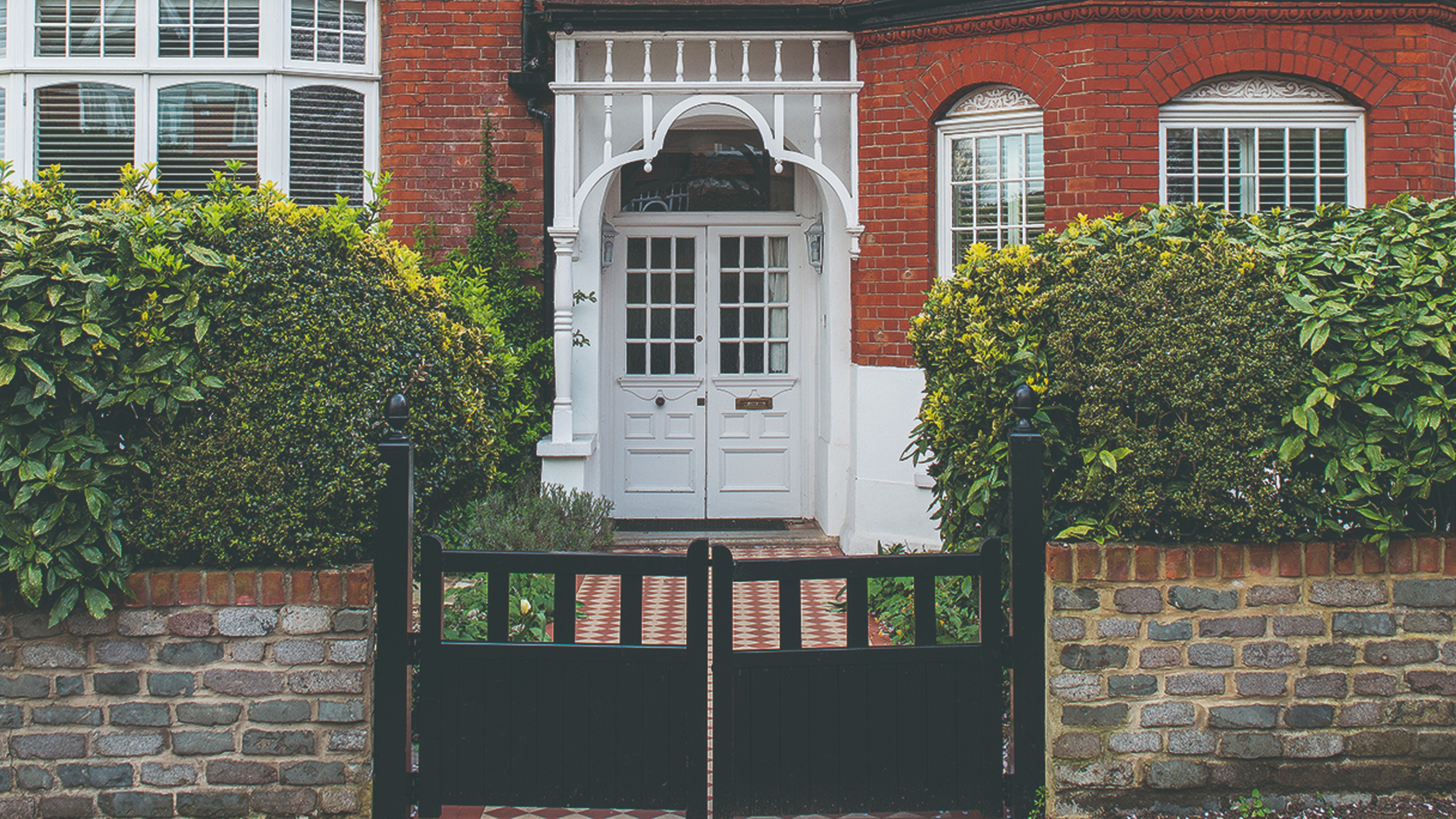
13 front door colours mistakes you might be making
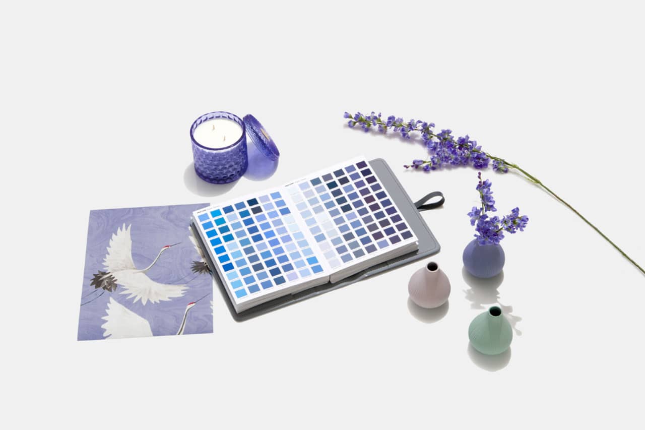
Designers Weigh in on 'Very Peri'—Pantone’s Color of the Year 2022
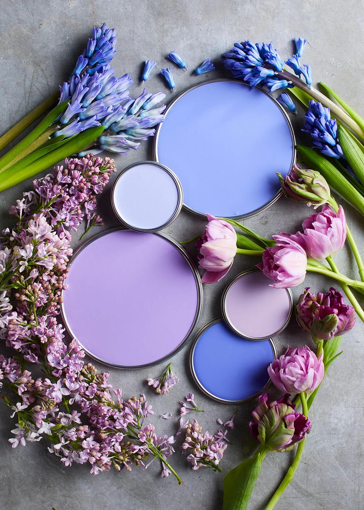
7 Brilliant Ways to Decorate with Pantone's 2022 Color of the Year

How to Use Pantone’s 2016 Color of the Year

Homes With This Color Inside Are Worth More

Never Regret a Paint Color Again—Avoid These 6 Common Mistakes

6 colors to avoid in an entryway – and the ones designers know make a better first impression

A Guide to All the Pantone Colors of the Year and What They've Represented

6 Paint Color Mistakes To Stop Making, According To Designers
Pantone created a brand new colour for its COTY 2022

Don't make these 5 entryway decor mistakes

6 Paint Color Mistakes To Stop Making, According To Designers

Every Pantone Color Of The Year For The Last Decade

An interior designer reveals the 5 mistakes to avoid when painting with dark colours

5 colors to avoid painting a landing – and the secret to choosing the right shades

7 Paint Mistakes That Make Designers Instantly Cringe When They Walk Into Someone's Home

The 5 small entryway color mistakes design experts say are big bloopers

6 Feng Shui Houseplant Decorating Mistakes Practitioners Want to Warn You Against
6 Colors You Should Never Paint Your Entryway, According to Color Experts