1/2
24 Complementary Color Schemes That Will Make Any Room Pop
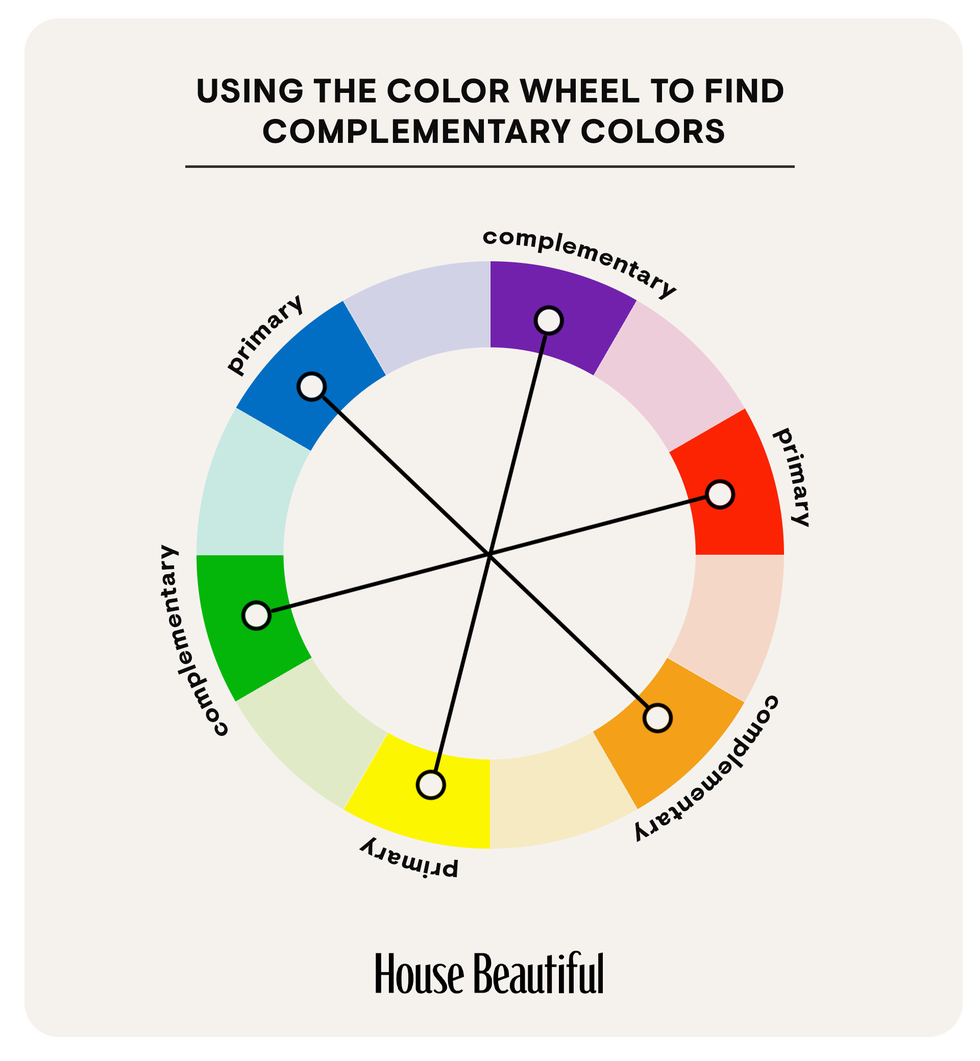
Complementary color schemes, derived from colors opposite each other on the color wheel, can significantly enhance interior design, transforming ordinary rooms into visually striking spaces. These schemes rely on three primary pairings: red and green, purple and yellow, and blue and orange. However, the versatility of these pairings is expanded by varying hues, tones, and saturations, leading to a wide array of distinct color palettes. Understanding the color wheel is fundamental to effectively implementing these schemes, as complementary colors create dynamic contrast when used together.
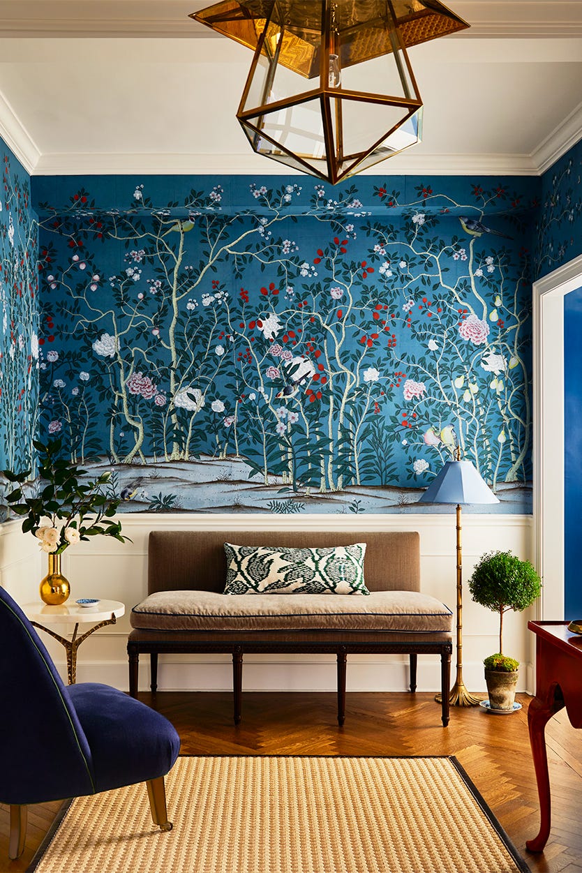
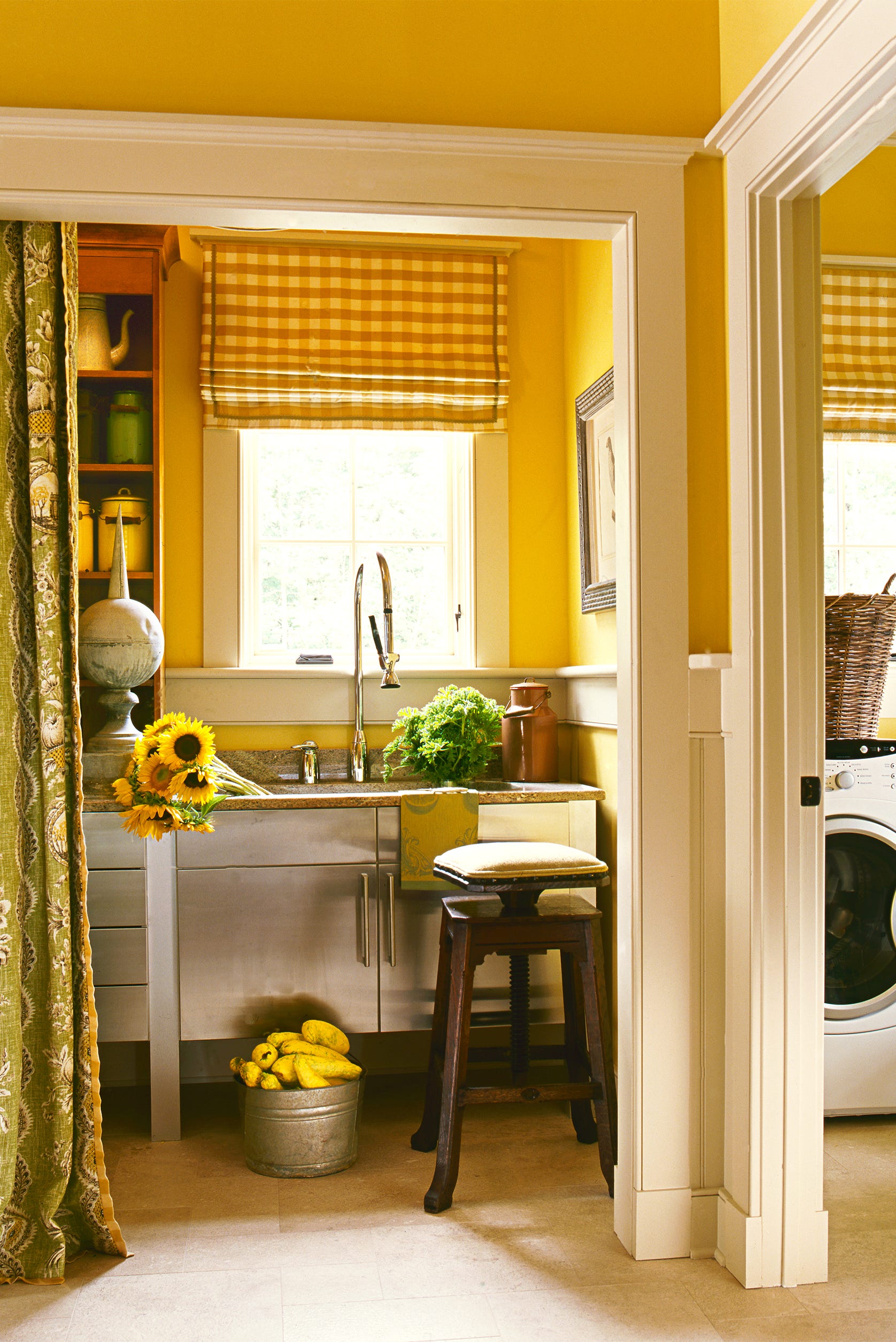
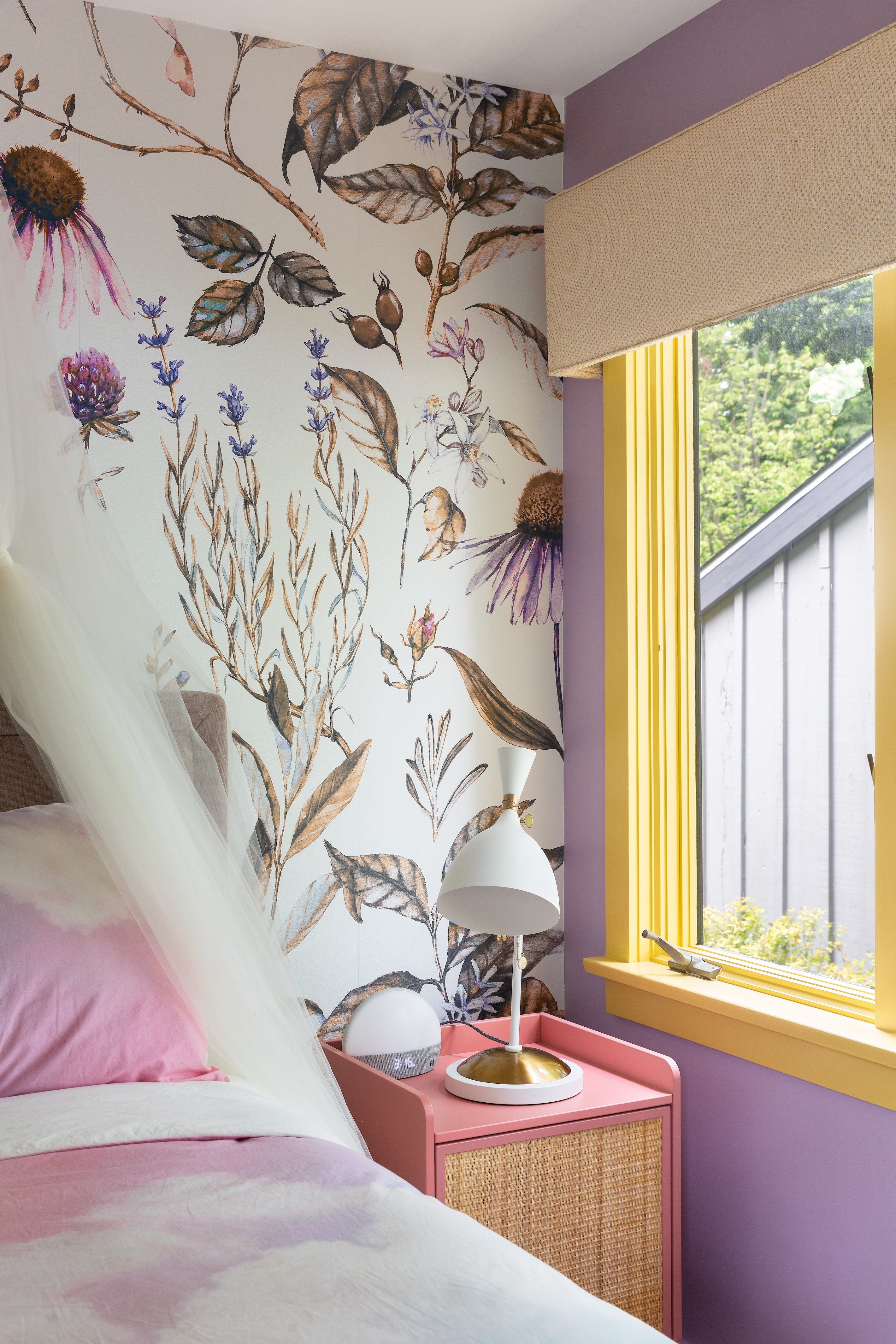
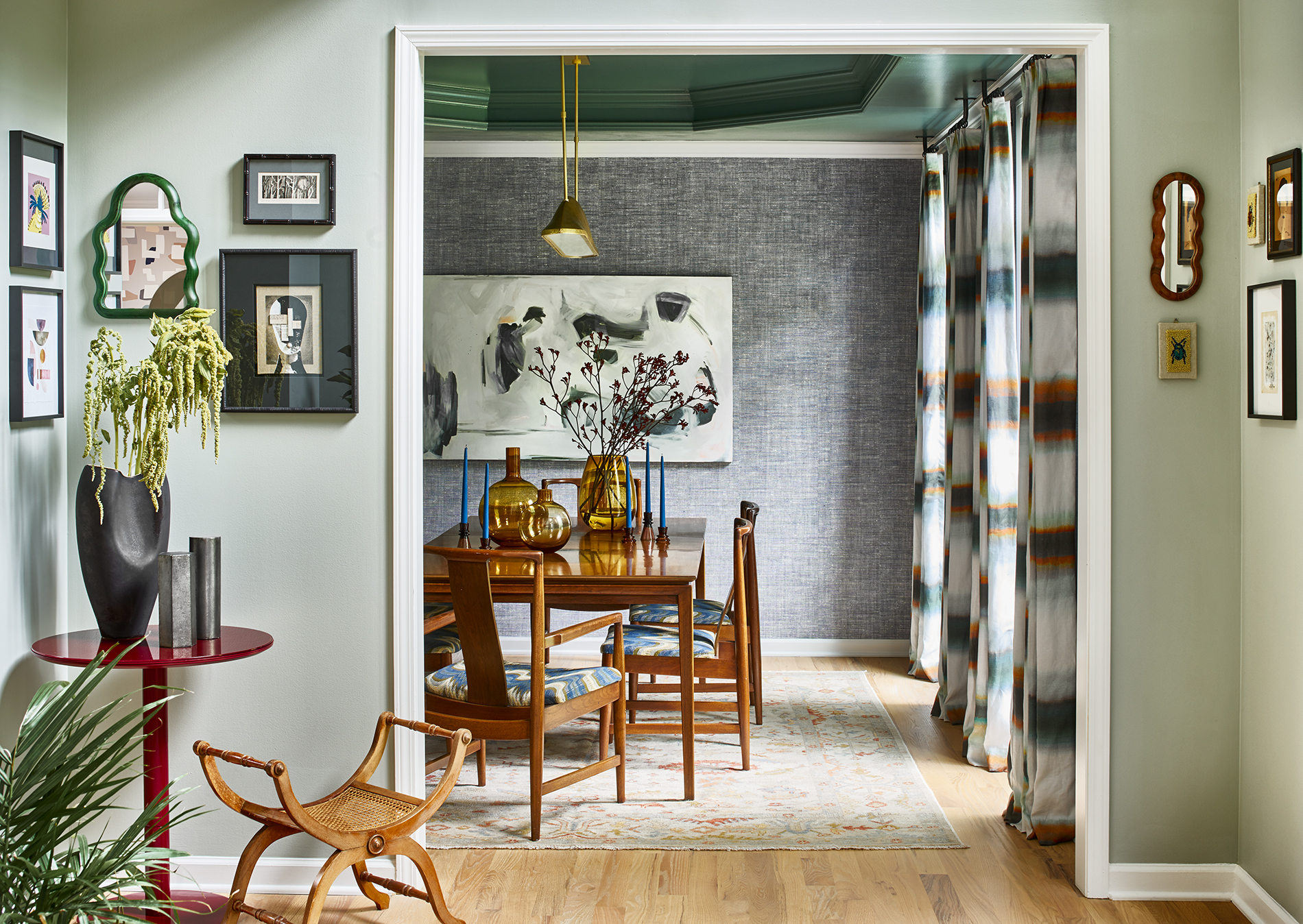
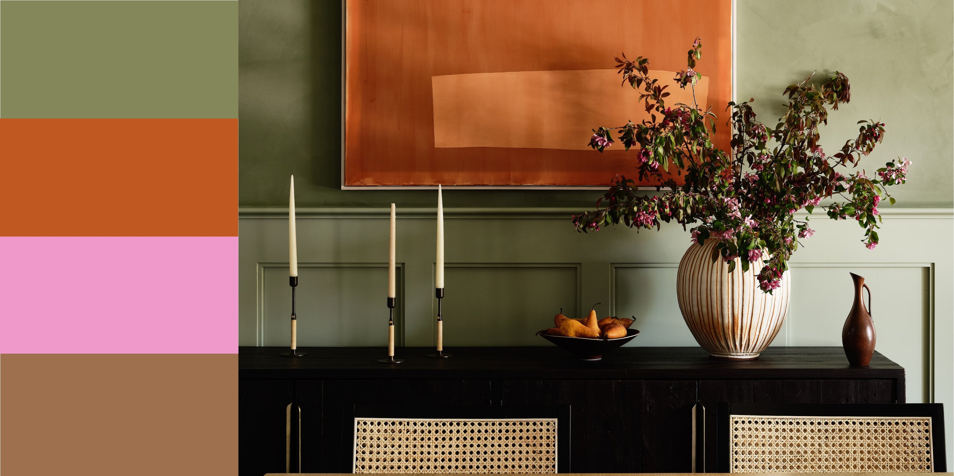
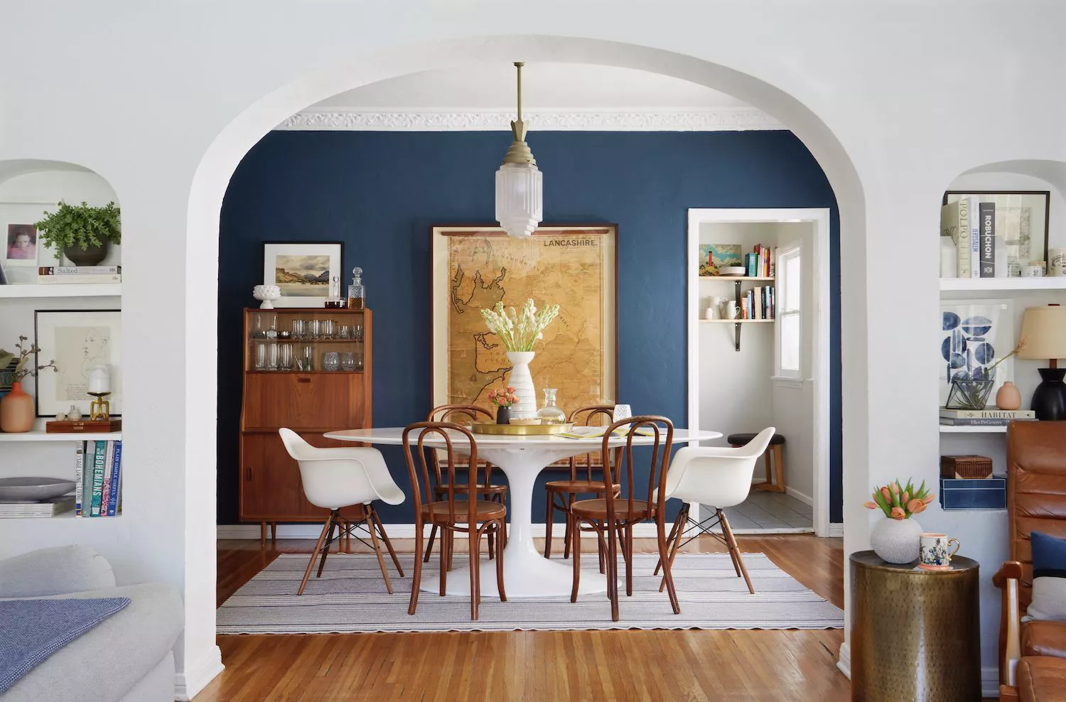
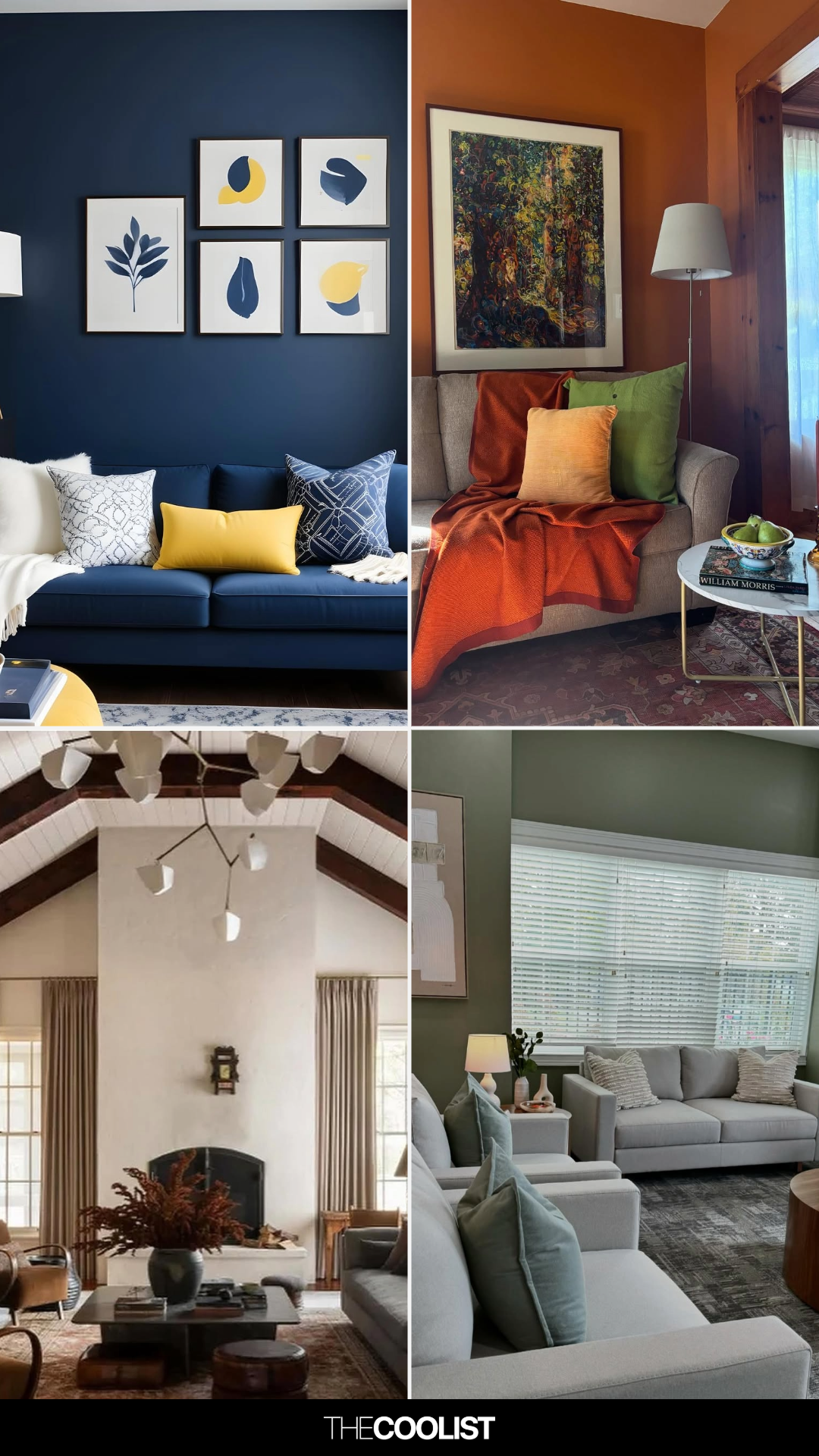
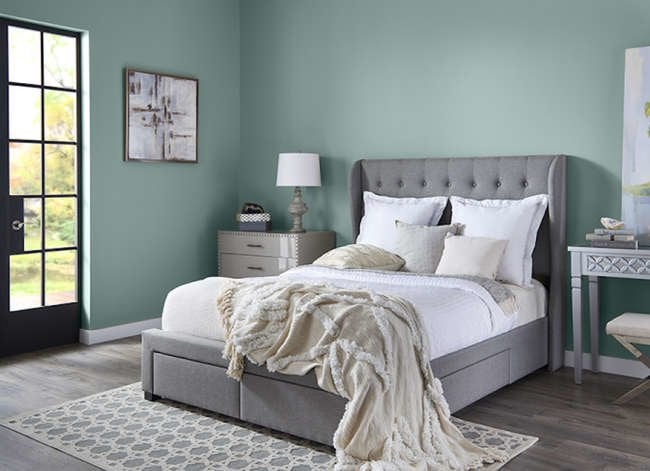
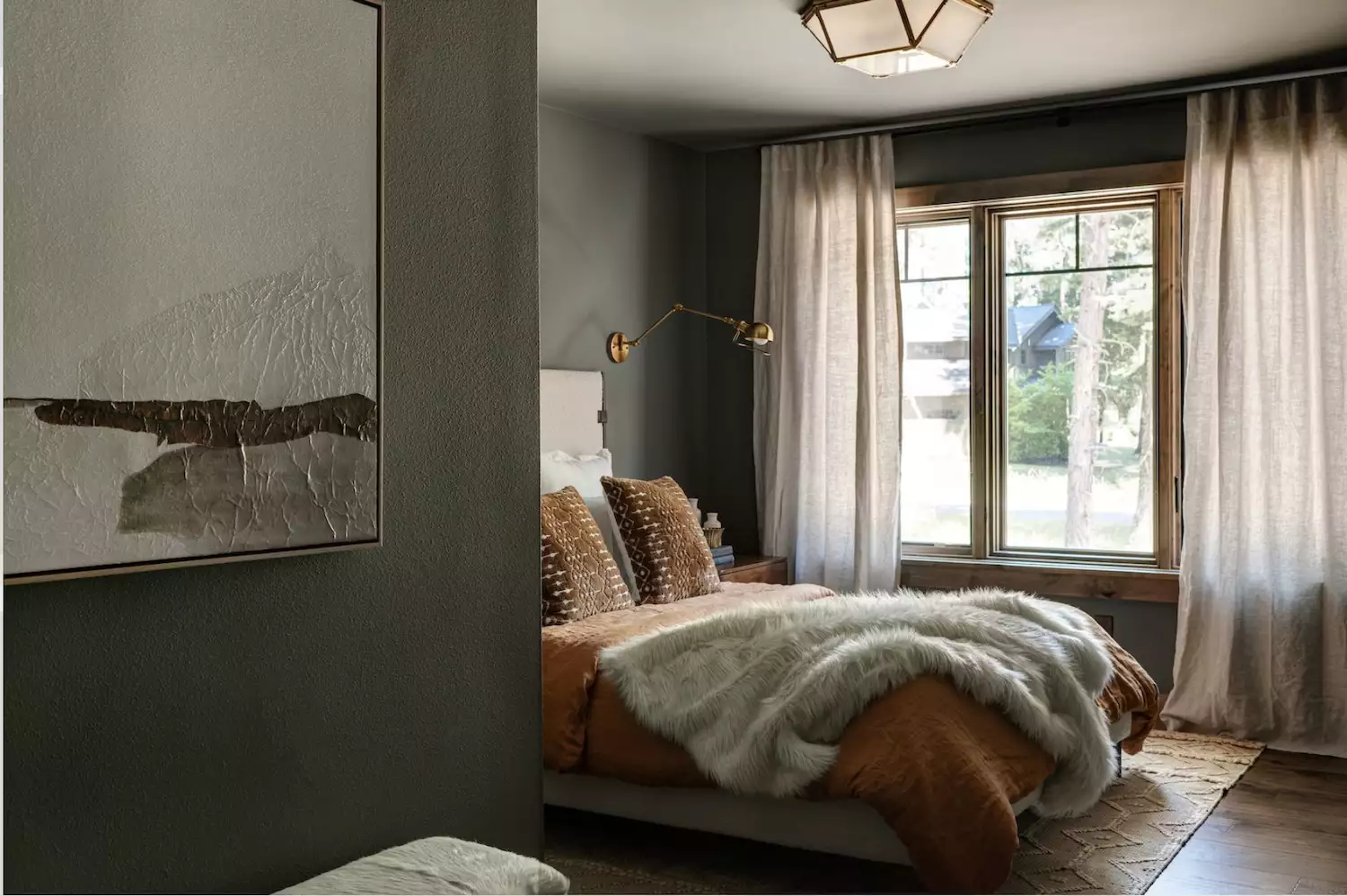
Examples of effective complementary color schemes are demonstrated across various rooms. In a rustic-industrial dining room, burnt umber and bright tangerine accents are contrasted with rich Pacific blue and navy. A white bedroom gains glamour from cherry red and emerald green jewel tones, with a red sofa and green rug and accent chair. For a softer approach, a bedroom uses pale cornflower accents with a goldenrod-colored blanket, creating a relaxed, inviting atmosphere. A primary bedroom showcases magenta and butterscotch, with a magenta bench and butterscotch yellow elements, making the color scheme the focal point against neutral surroundings.
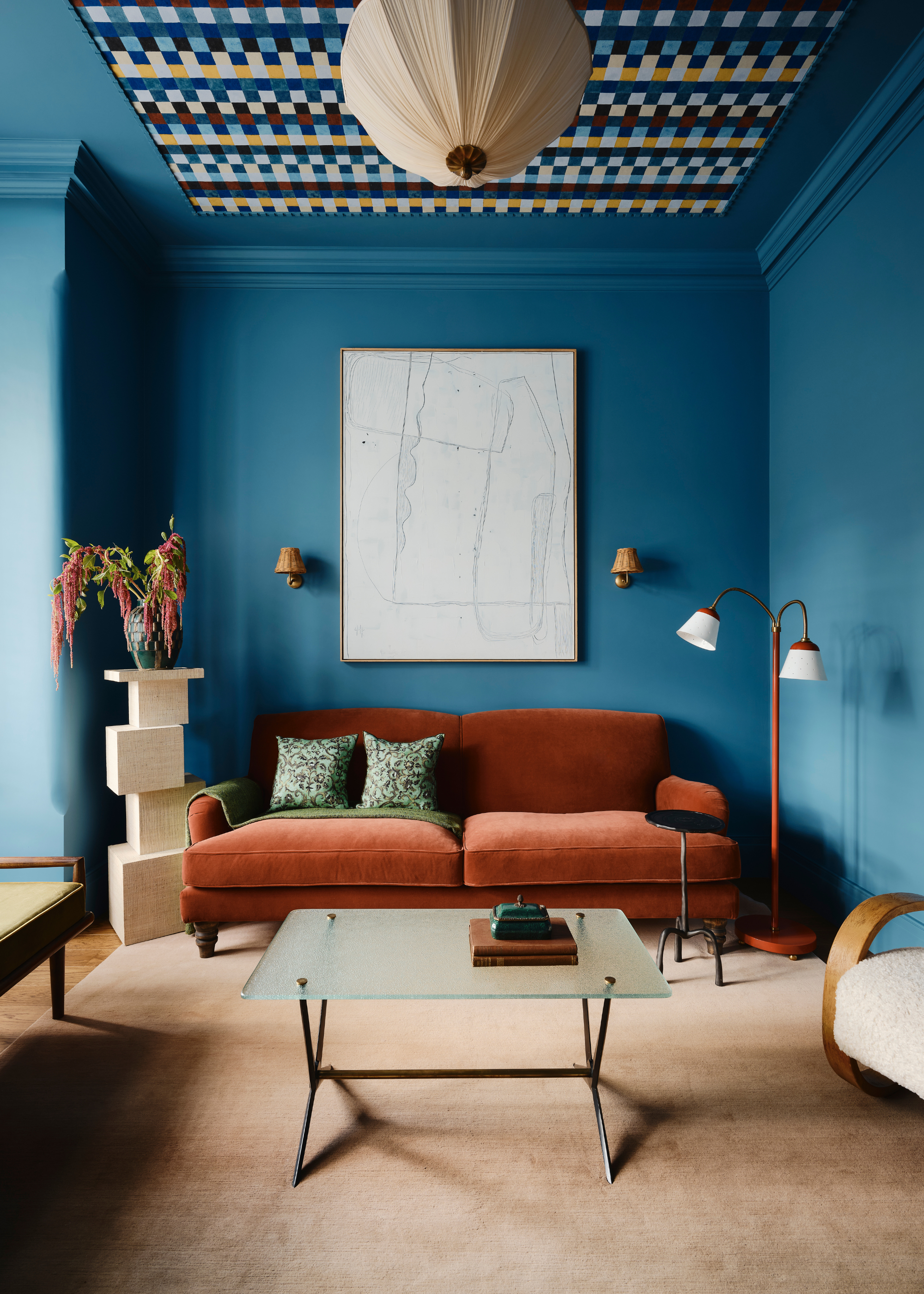
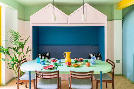
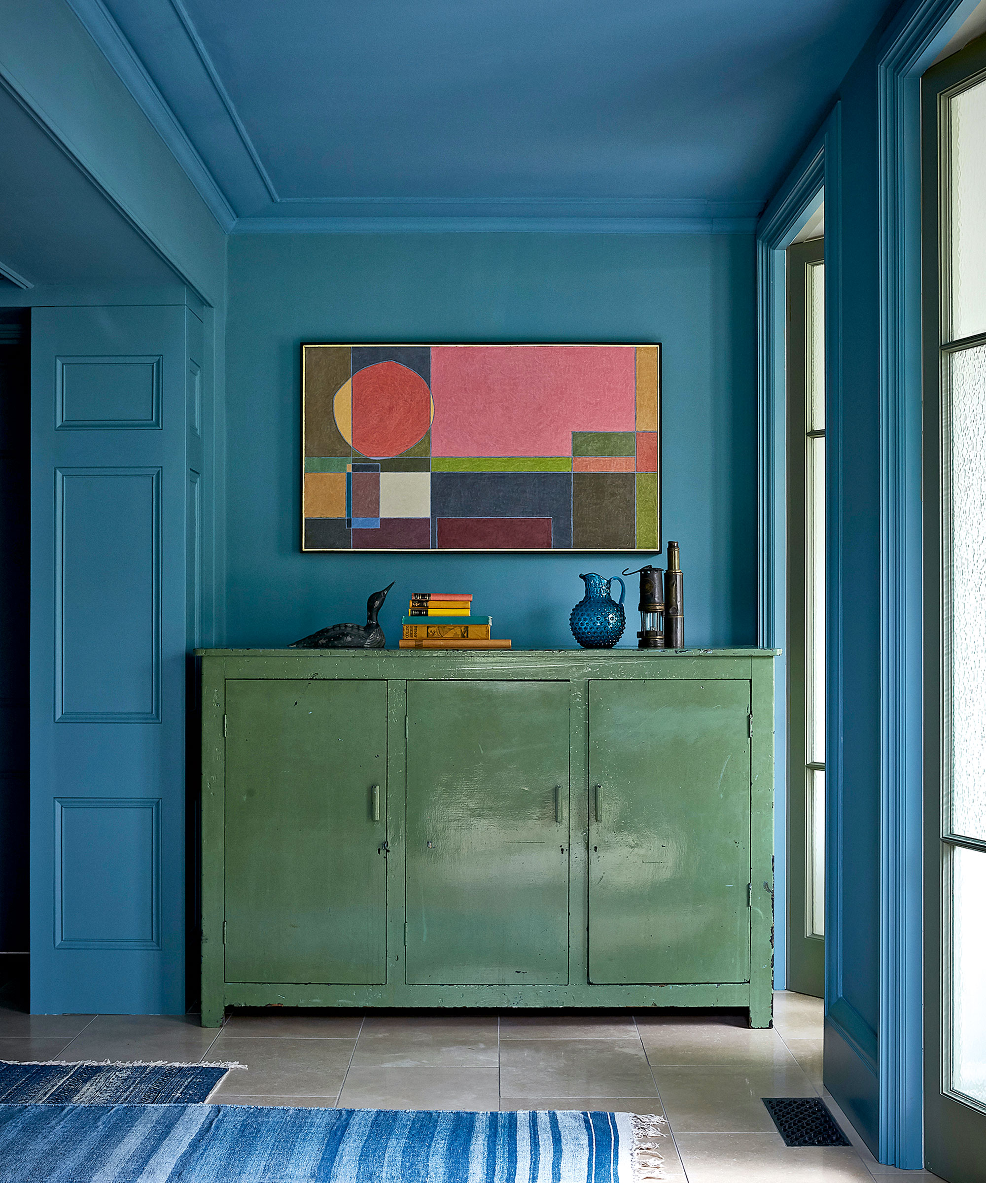
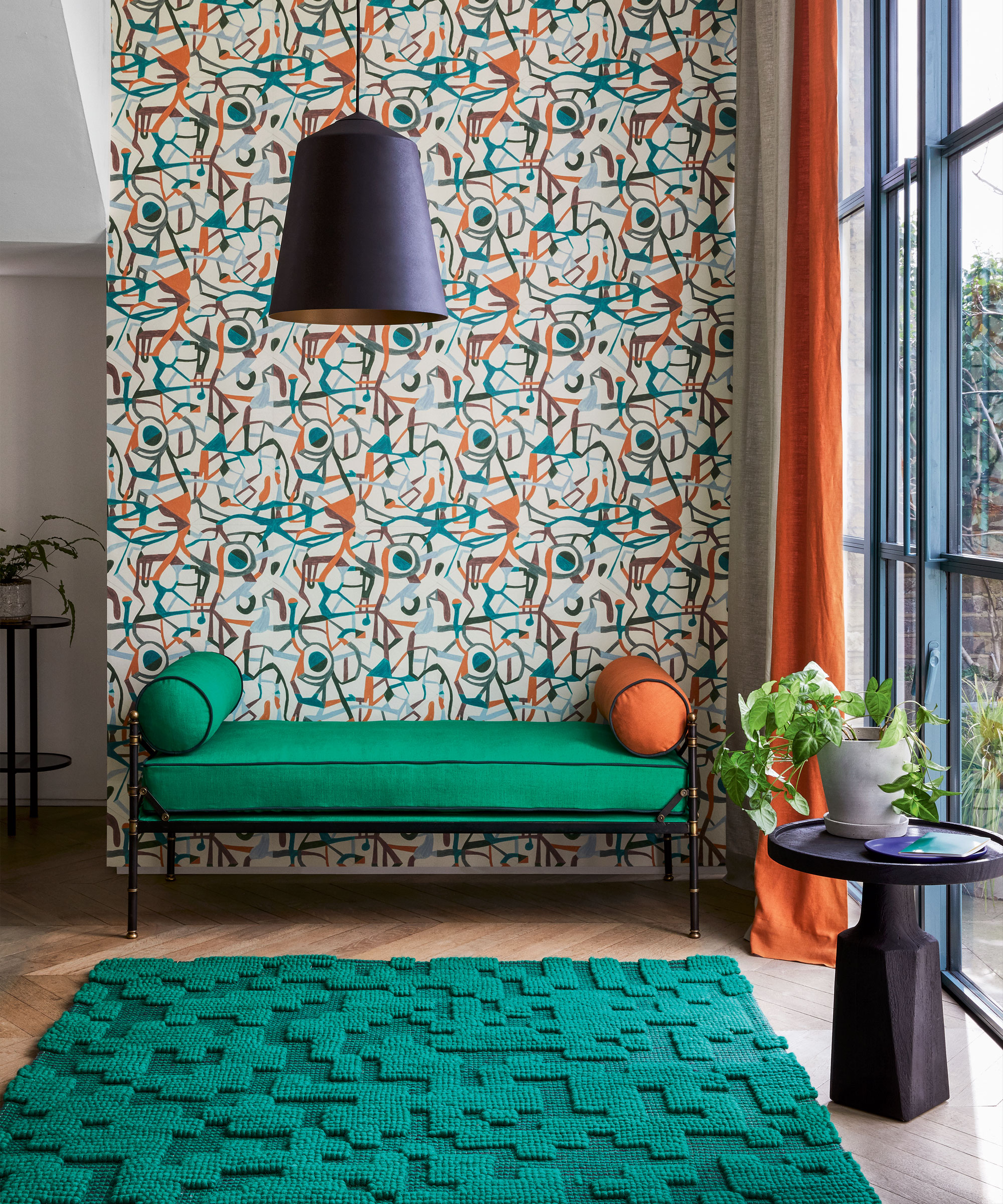
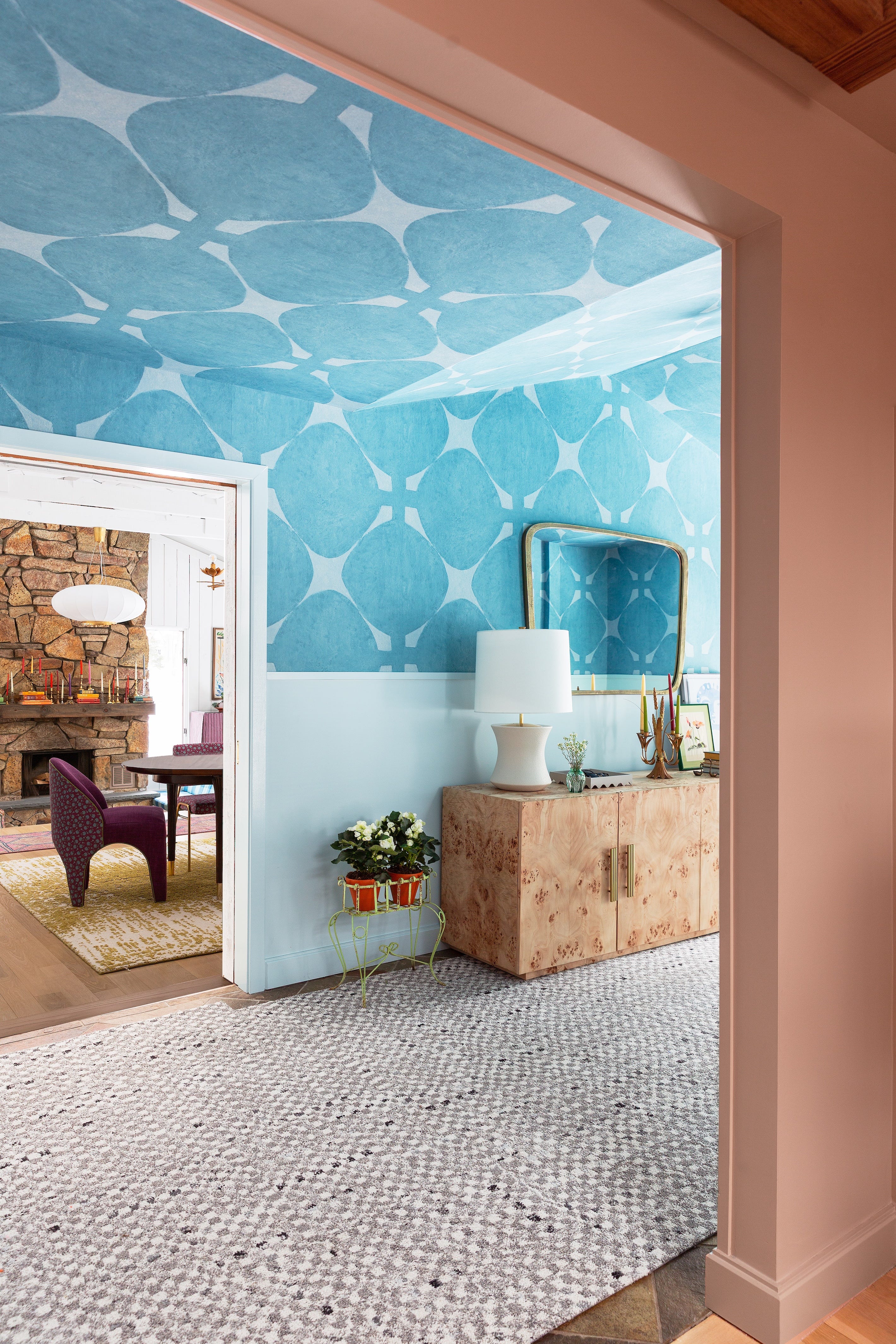
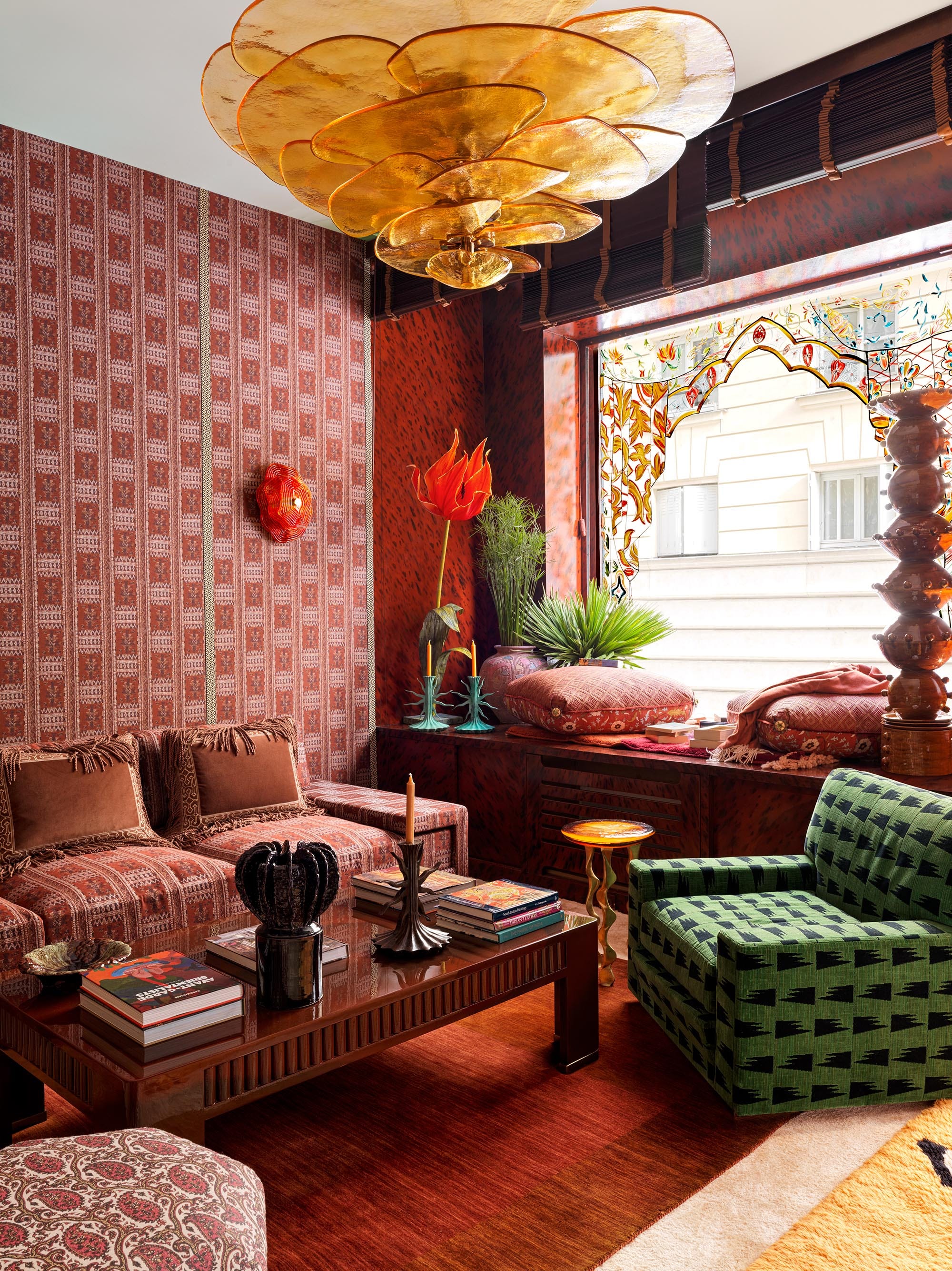
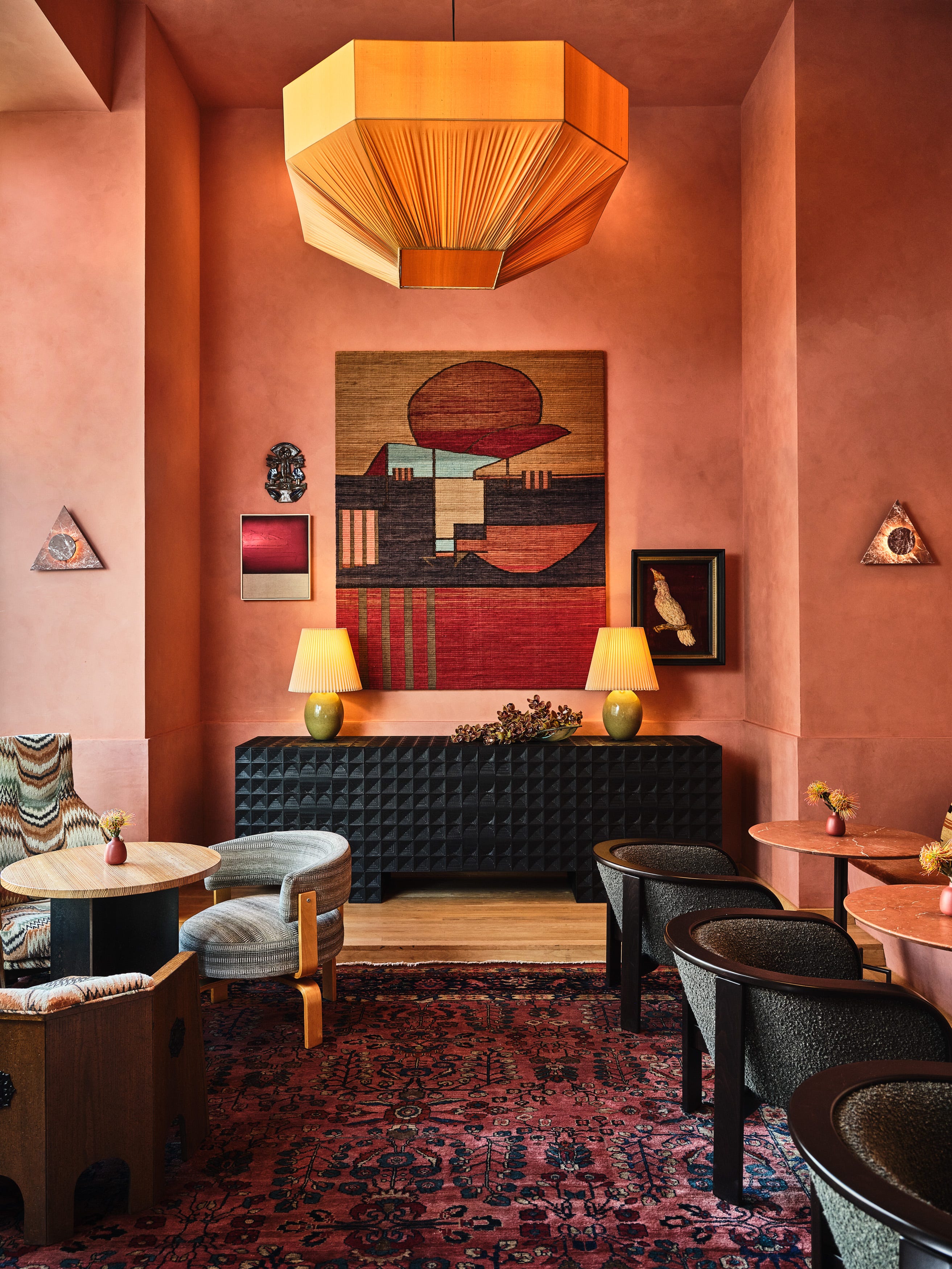
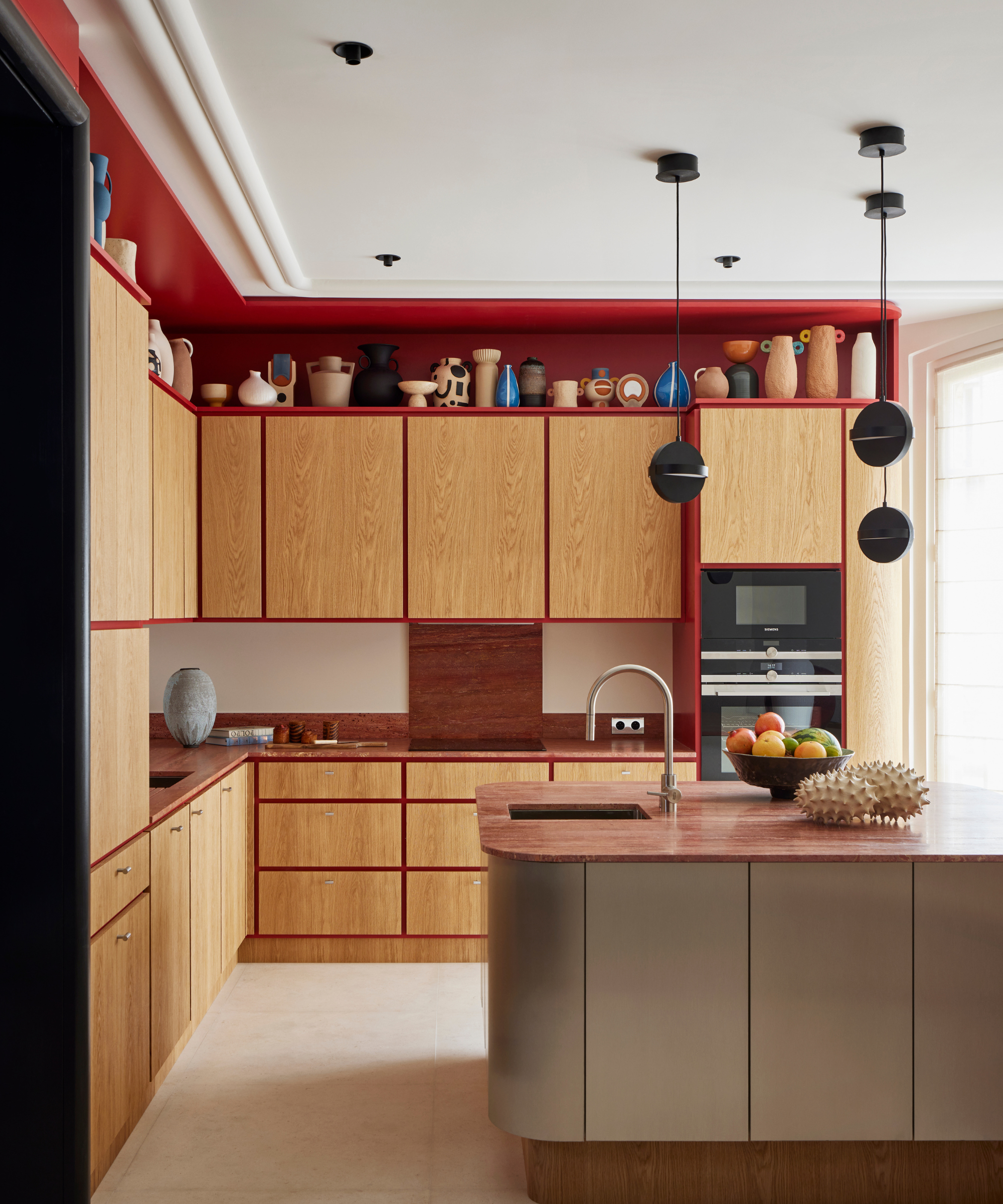
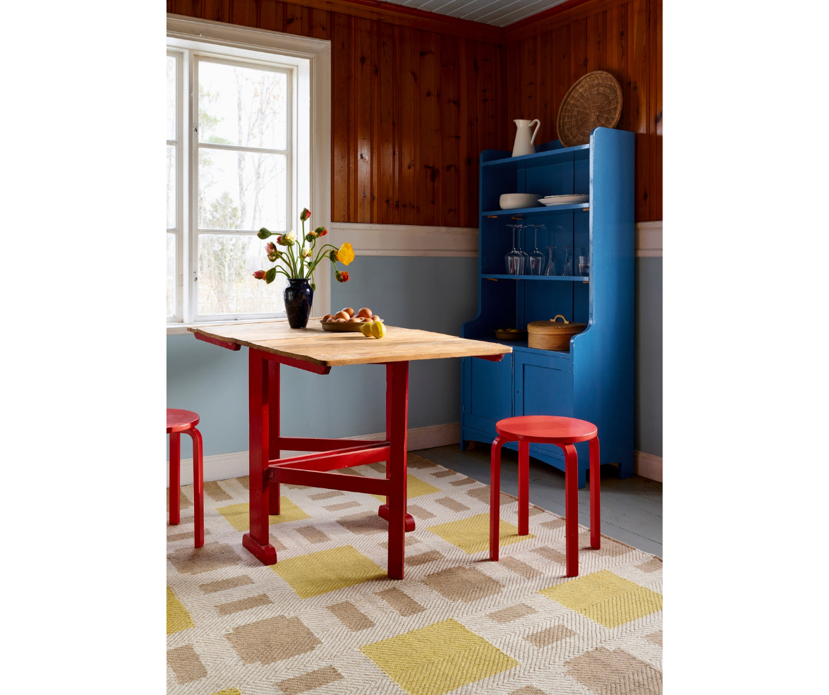
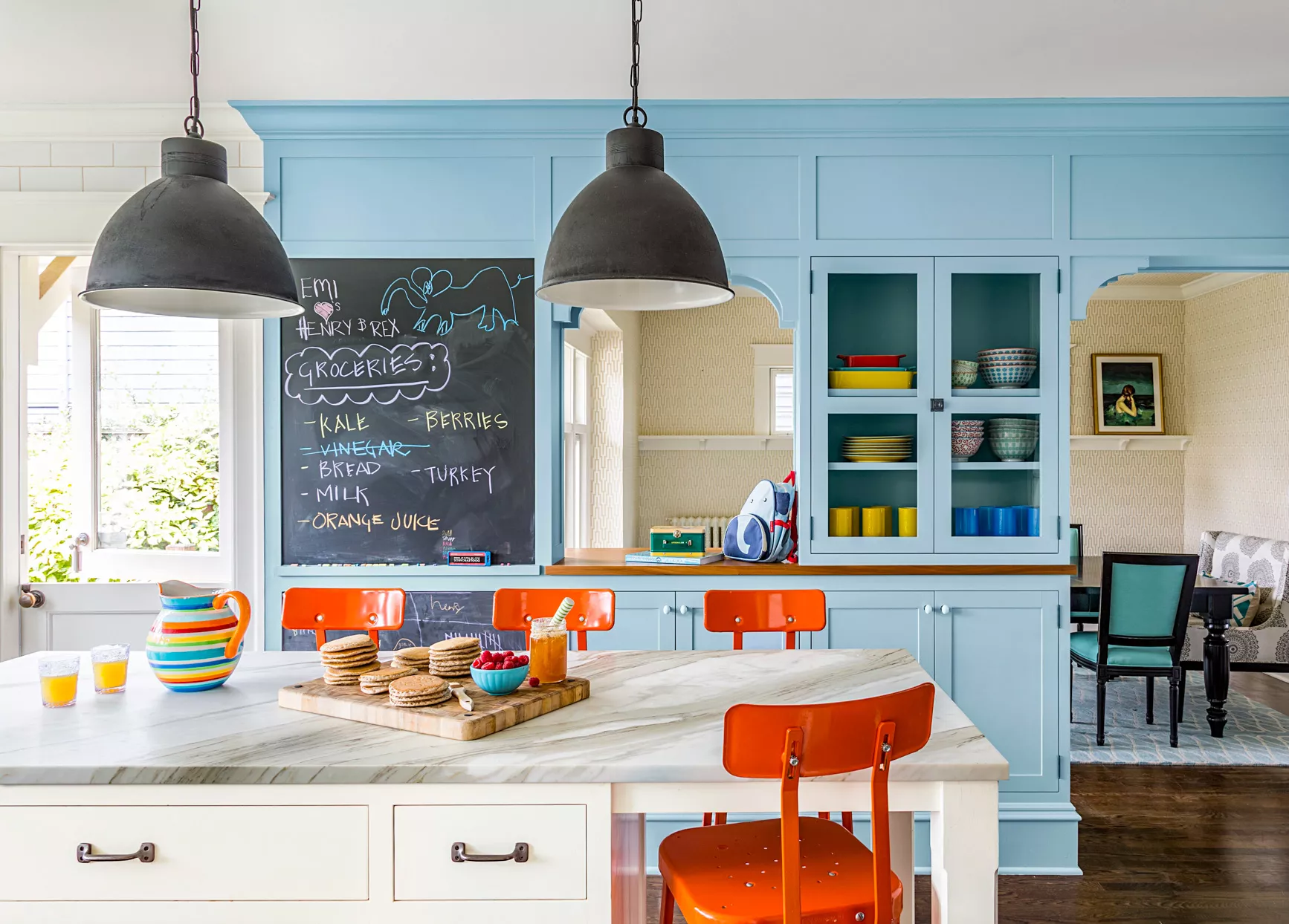
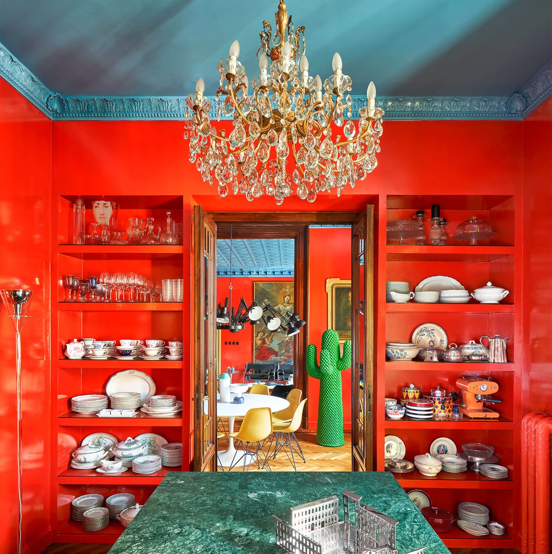
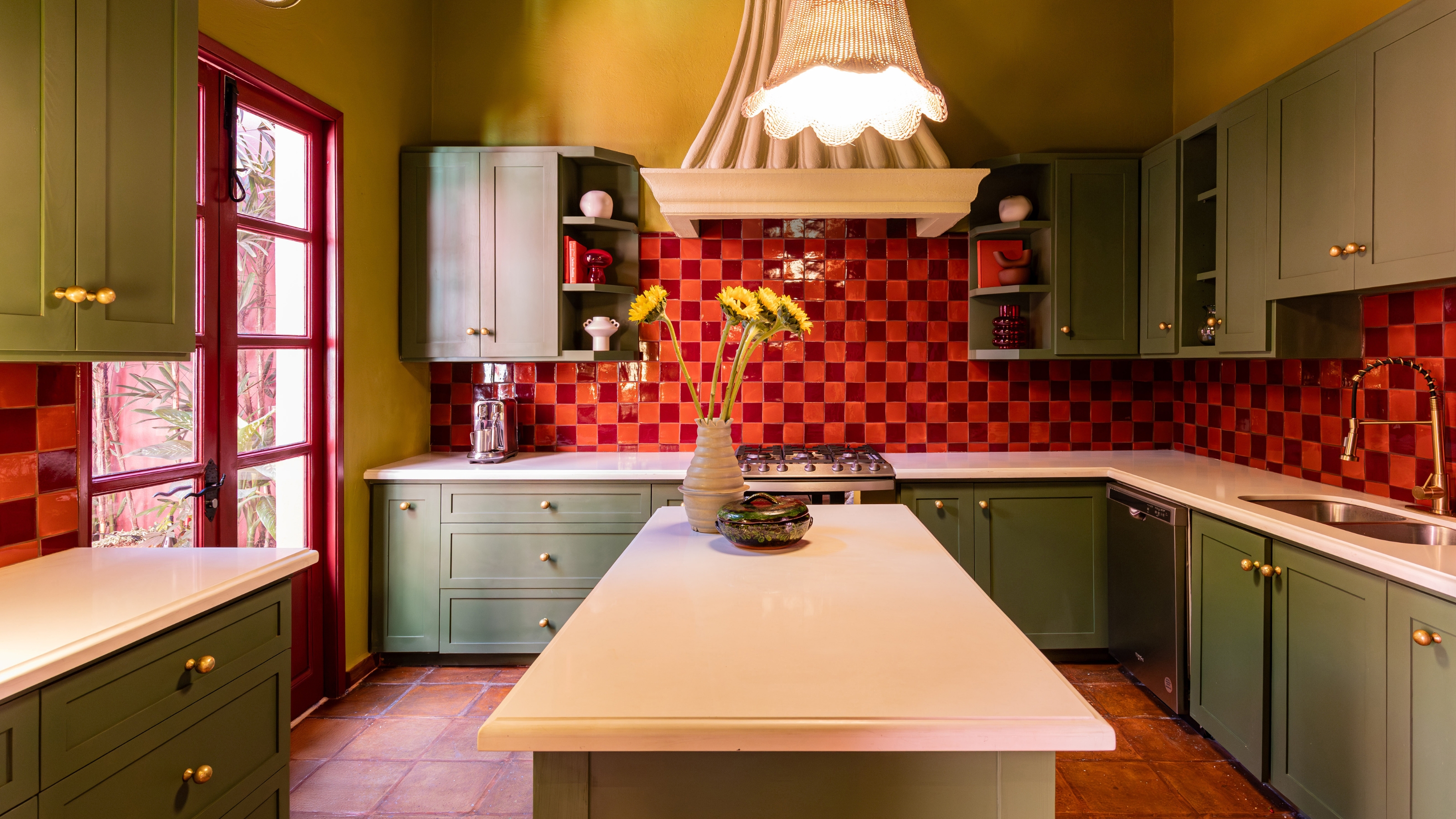
A kitchen is invigorated with robin's egg blue cabinetry and red-orange bar stools, with additional orange pops from displayed dishes. A sitting area features textured lilac walls contrasting with rich mustard-yellow leather armchairs, further enhanced by pale indigo and lime green accents. A home library achieves high impact with a peach and turquoise combination, where warm and cool tones and unique patterns increase visual interest, centered around a bright blue abstract painting on pale orange walls.
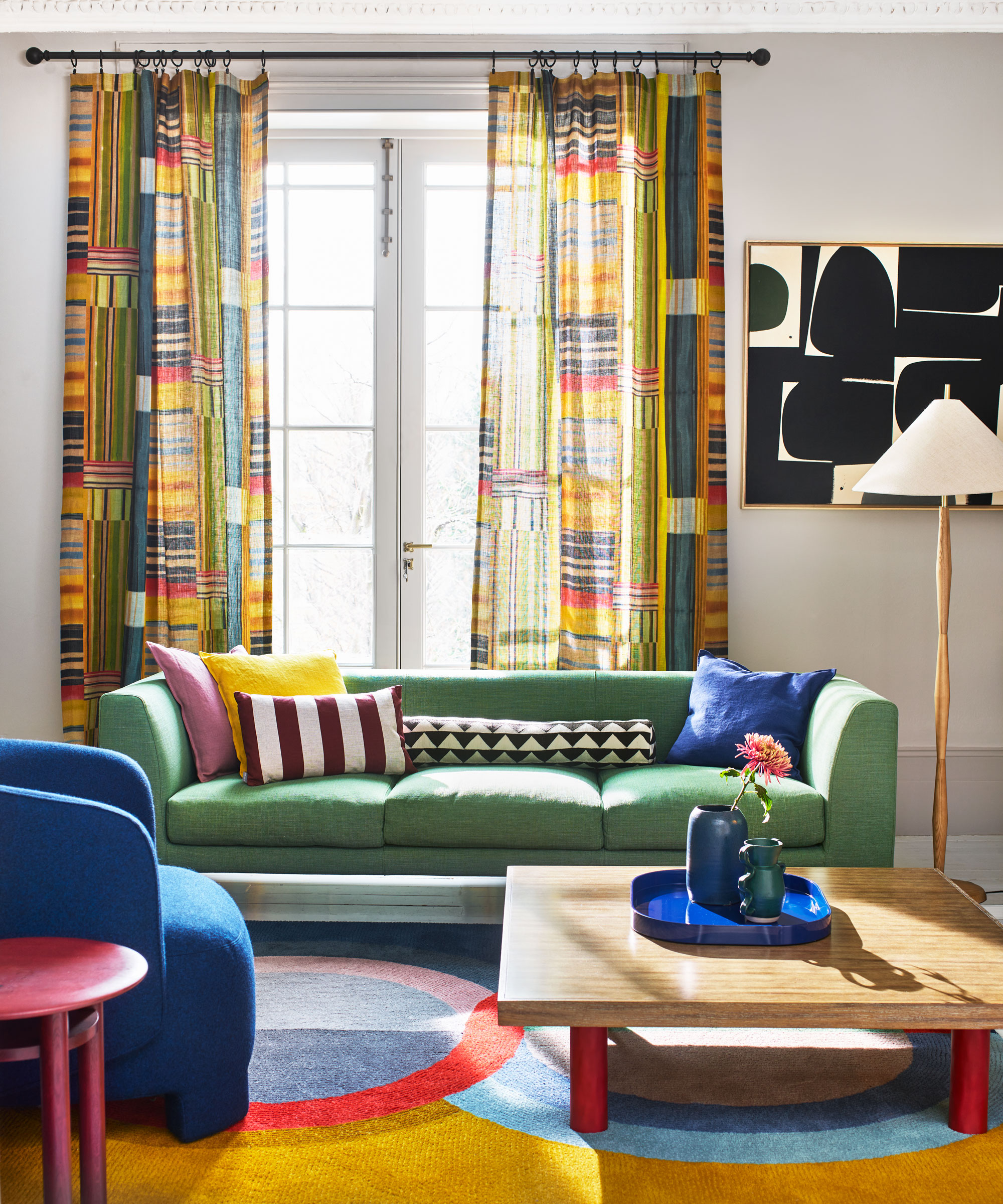
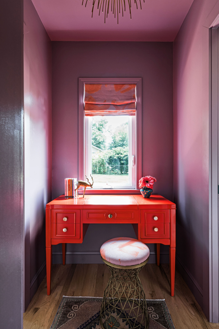
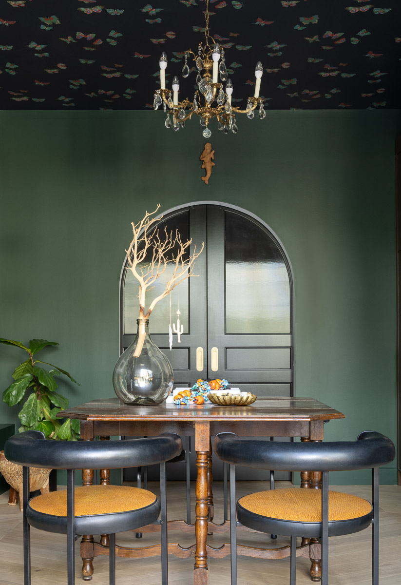
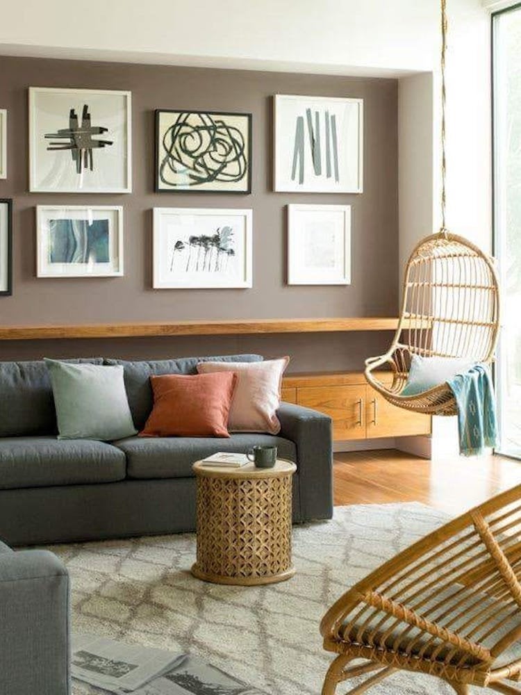
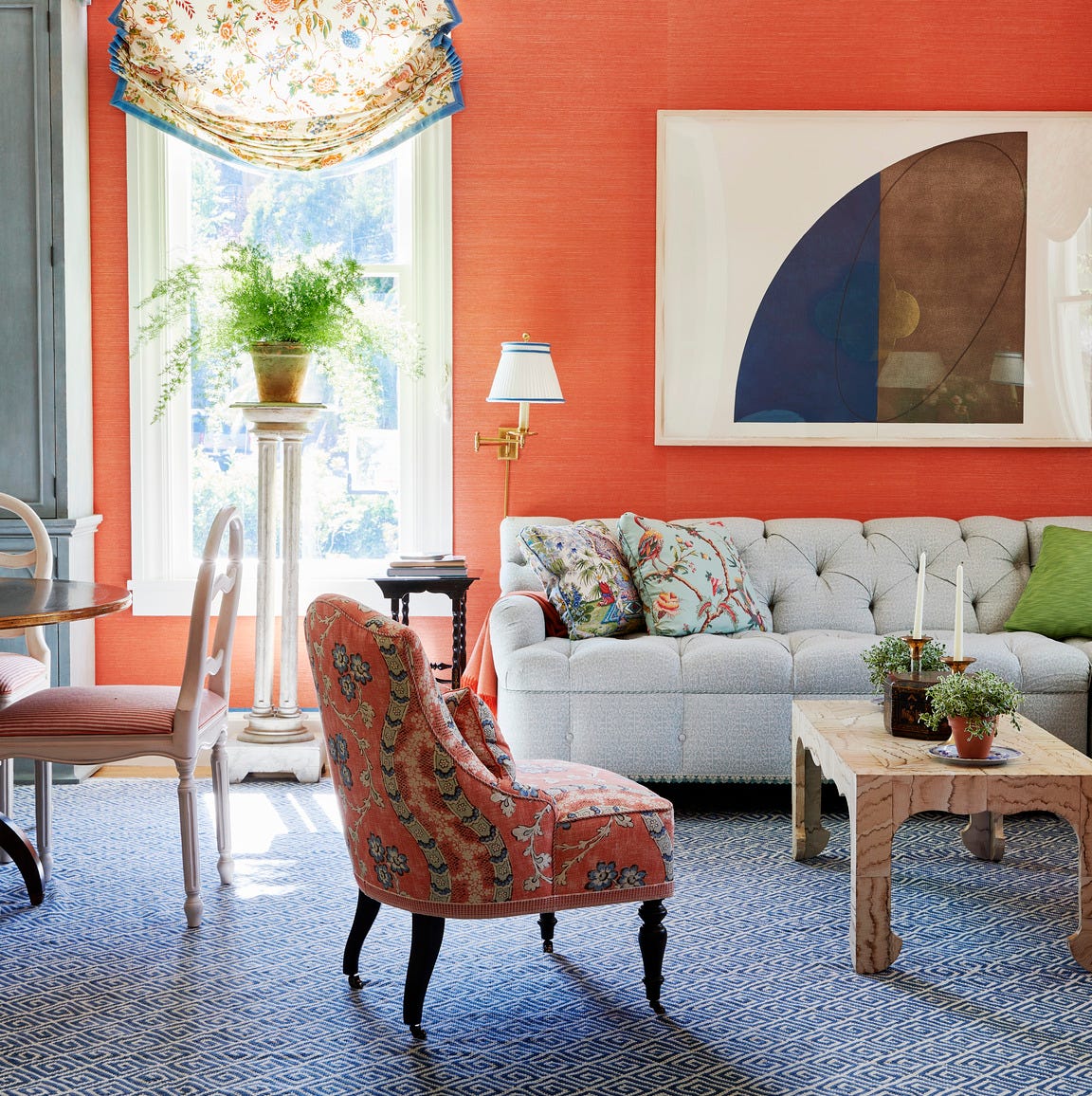
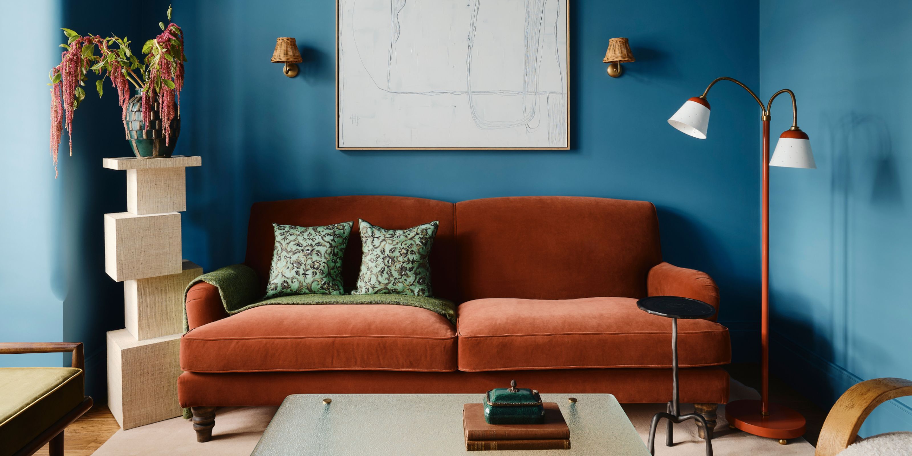
A romantic bedroom incorporates rose and sage, with a floral accent wall, sage background, and hot pink bed frame. A living room uses fuchsia, plum, and daffodil curtains to energize traditional furnishings and anchor a mustard-colored sofa. In another room, a royal blue sofa is complemented by orange patterned upholstery and accent pillows, with warm tans and browns providing grounding. A sophisticated dining area utilizes mauve and gold with muted tones for understated glamour. A southwestern-inspired bedroom pairs blue-green and red-orange (brick and teal) for a rustic ambiance.
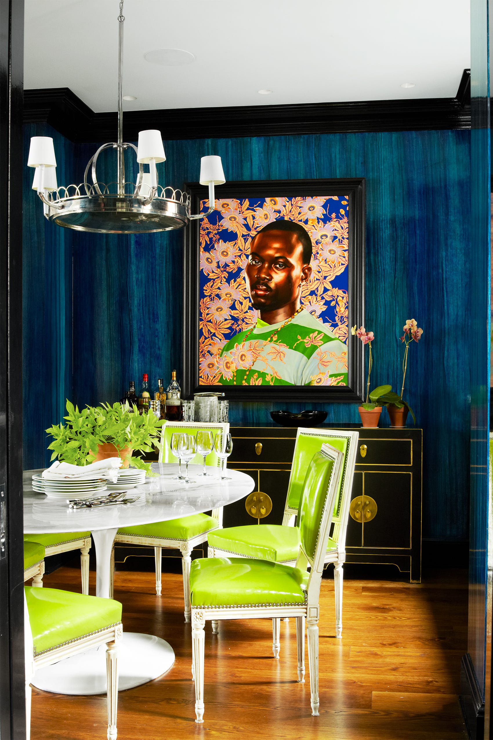
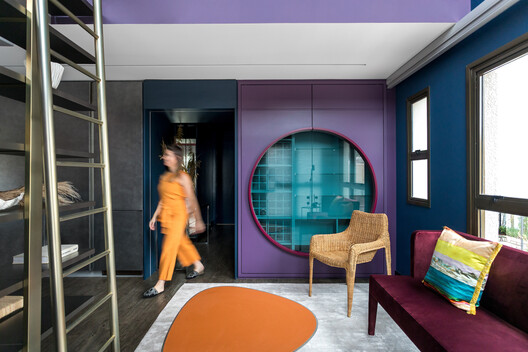
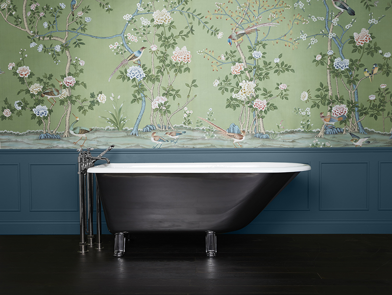
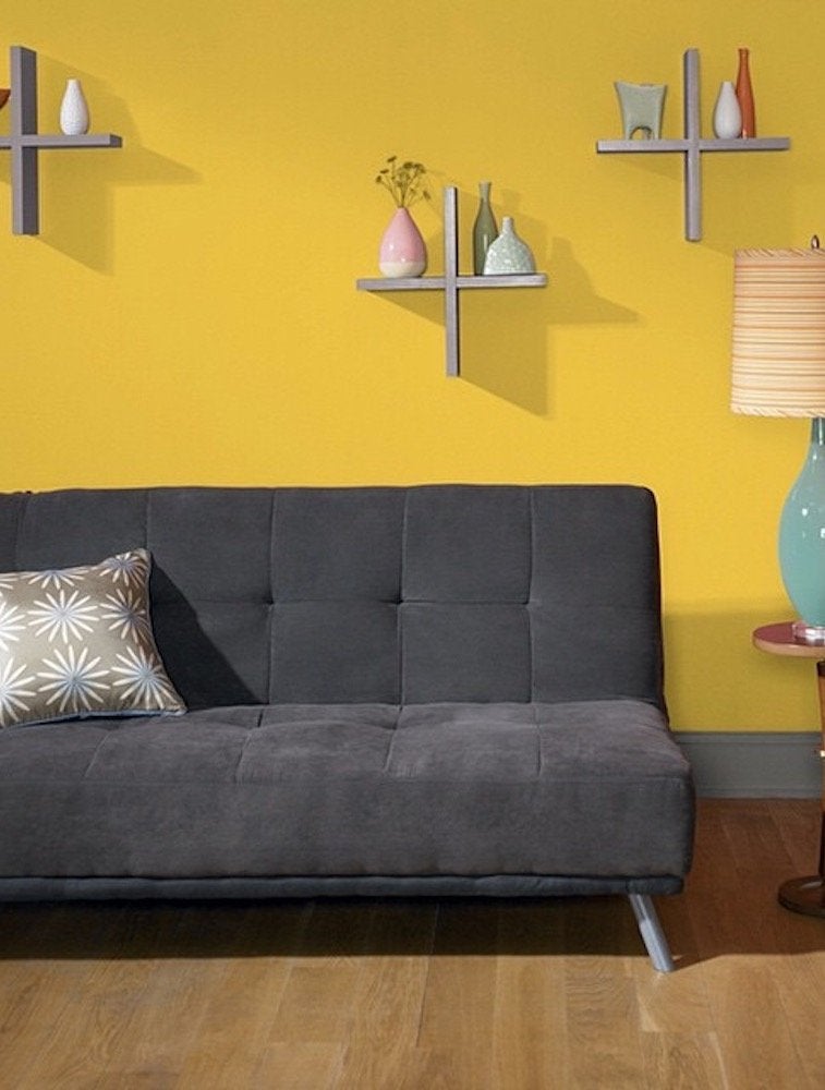
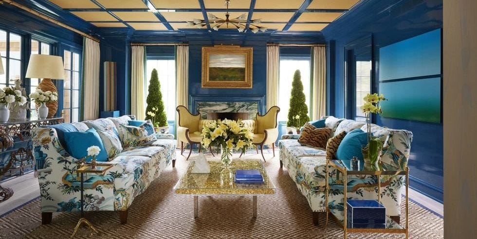
Wisteria-colored curtains contrast with a tufted chartreuse bedframe in one instance, with additional pale chartreuse and dusty purple elements. A minimalist space is brightened by safety orange accents against a cobalt blue sofa. A living room with gray undertones uses ochre and pale lavender walls for a subtle yet vibrant scheme. A bedroom pairs bright coral with pastel seafoam for a delightful contrast that also highlights darker wall art. Eggplant and dandelion tones, balanced by a dark gray couch and brown flooring, create a moody aesthetic with sunny accents in a modern living room. A vignette evokes the 1960s with punchy mulberry and tart lime, framed by wall art repeating these hues.
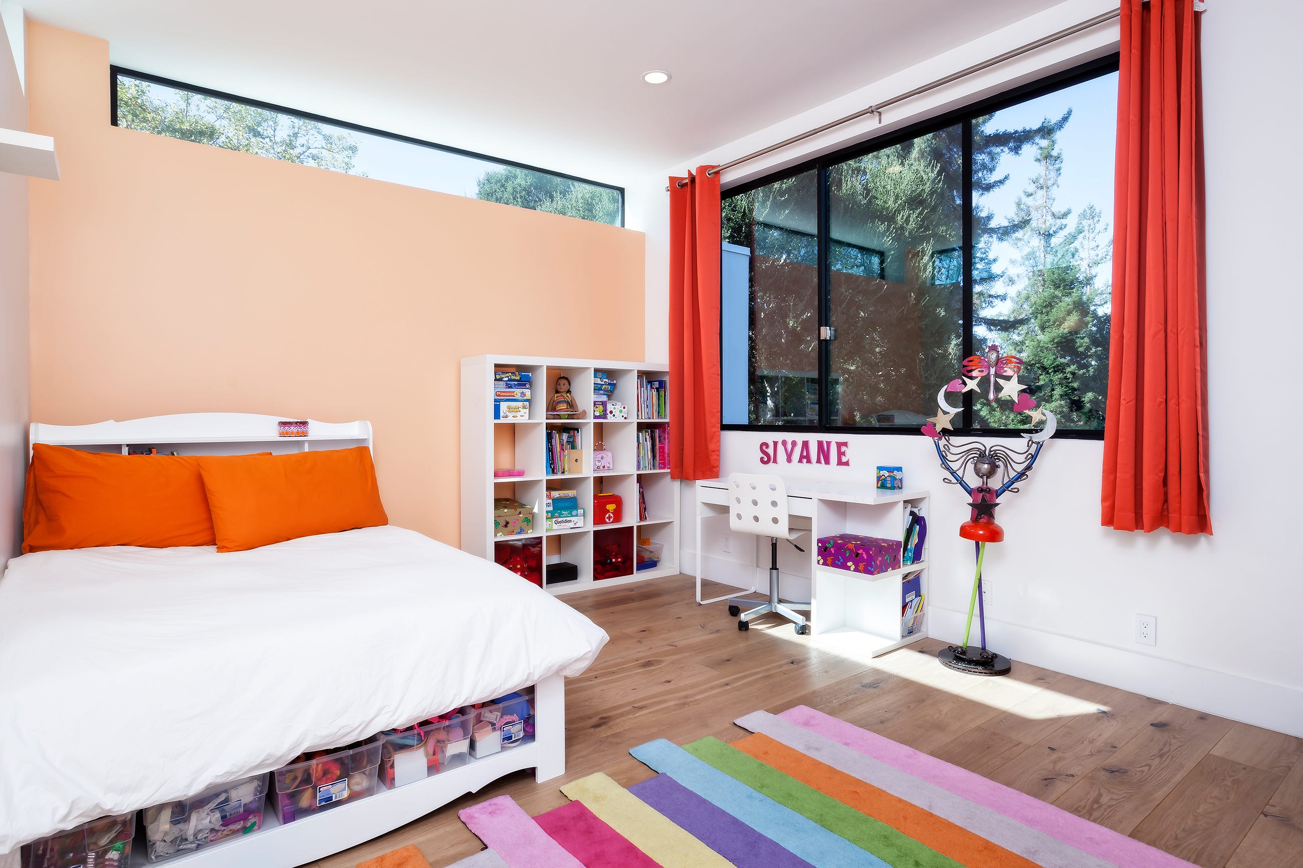
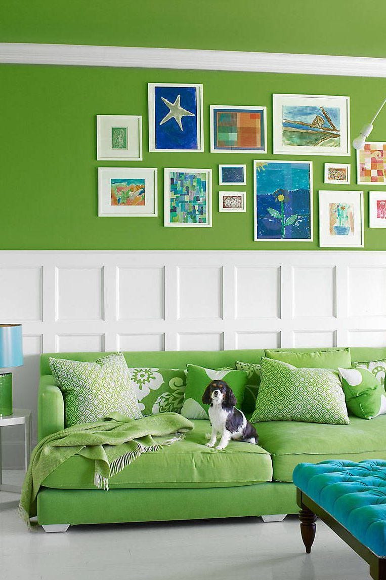
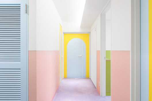
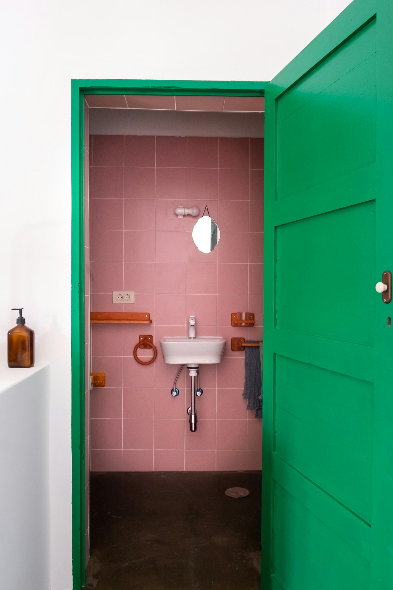
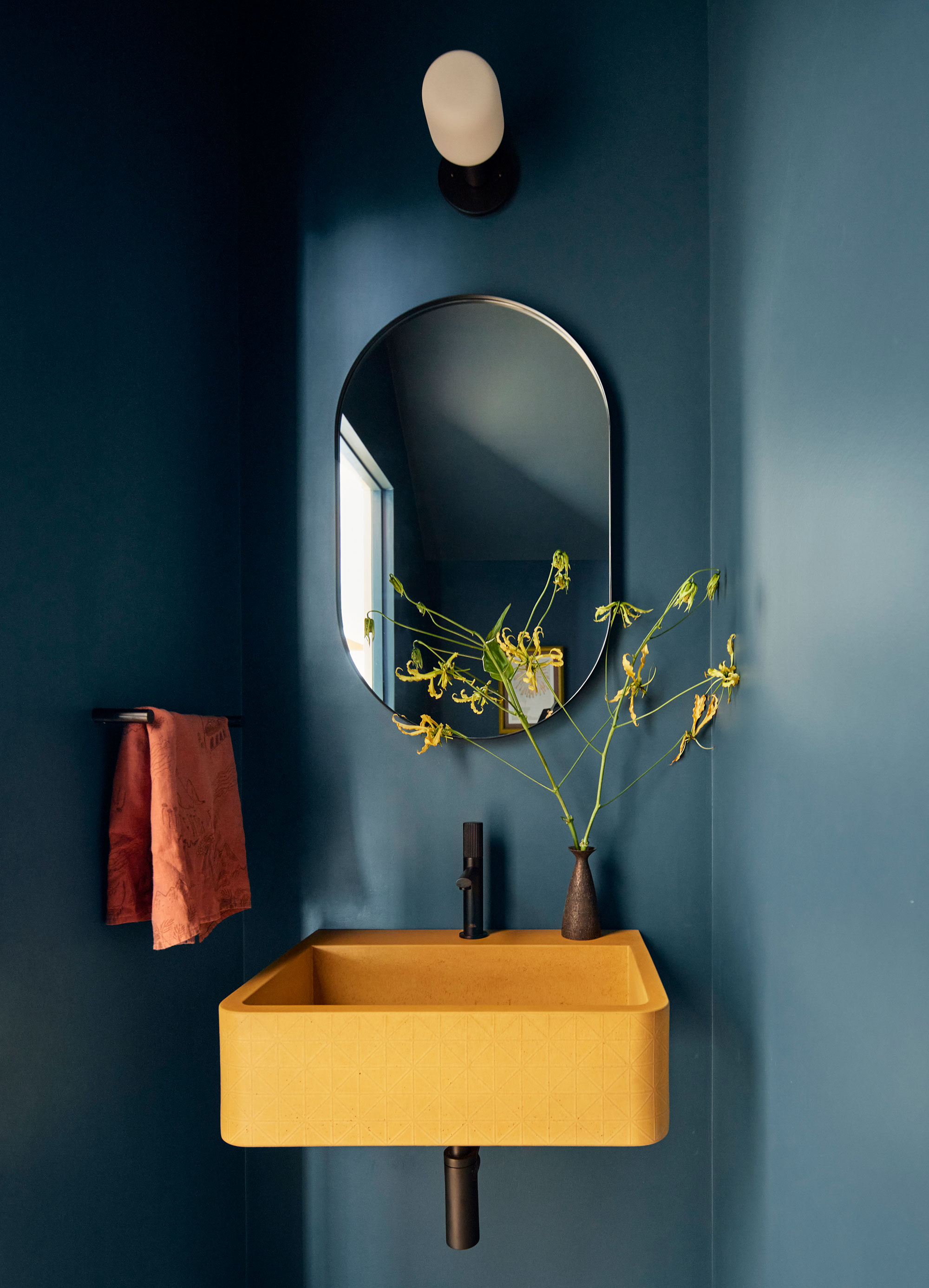
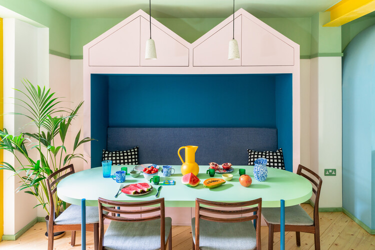
A preppy gray living room gets a color boost from hot pink and spring green, featuring Kelly green curtains and hot pink cushions. A bathroom uses raspberry and mint to create a summery feel with red and green variations. A small bathroom pairs dusty plum and soft sage, brightened by pale chartreuse and lilac, with natural finishes tempering the rich colors. A cottage-style kitchen combines blush pink shutters with jade-toned vintage dinnerware. Lastly, a children's bedroom features vibrant papaya and sky blue hues, softened by warm gray walls and white accents, and a space where wisteria purple and pear green are combined with variations of purple hues and different fabrics for visual movement.
#ComplementaryColorSchemes #InteriorDesign #ColorWheel #HomeDecor #ColorPsychology #DecoratingTips #RoomDesign #HomeStyling #AccentColors #ComplementaryColorSchemes #InteriorDesign #ColorWheel #HomeDecor #ColorPsychology #DecoratingTips #RoomDesign #HomeStyling #AccentColors
0 comment in total
You may also like
These Accent Color Ideas Will Transform Any Room

Making it Pop: 24 Residential Interiors that Embrace Color Blocking

12 Colors That Go With Green I'm Seeing Interior Designers Use All the Time Right Now

37 Best Accent Wall Colors for an Instant Room Makeover

How to Choose Colors That Work Together Every Time
Dress Up Your Space With Contrasting Colors

24 Obsessive Living Room Color Scheme Ideas You’ll Regret Not Seeing First
14 Paint Colors That Can Make a Room Feel Instantly Cozy

Colors That Go With Blue — 16 Pairings Designers Depend on for Bold, Breezy, and Perfectly Balanced Palettes
Love the Color Green? 22 Colors That Pair With It Perfectly in Any Room of the House
These 20 Rooms Use a Red Color Palette in All the Right Ways
What Colors Go With Red? 10 Colors That Hold Their Own Alongside This Fiery Hue
7 Color Combos That ALWAYS Look Good Together, According to Designers

Colorful room ideas – 15 vibrant spaces with daring decor

6 Failsafe Color Combinations That Designers Always Fall Back on – 'They're so Reliable!'
Ever Heard of a Split Complementary Color Palette? It's the Secret to Perfecting More Unexpected Pairings
35 Unexpected Color Combos We Can't Get Enough Of


Designers Say These Unusual Paint Color Combos Will Transform Your Home

How to combine colour, pattern and texture without making a complete mess of things
12 Color Drenching Ideas for Bedrooms That Add Wall-to-Wall Ambience