1/25
12 Colors That Go With Green I'm Seeing Interior Designers Use All the Time Right Now
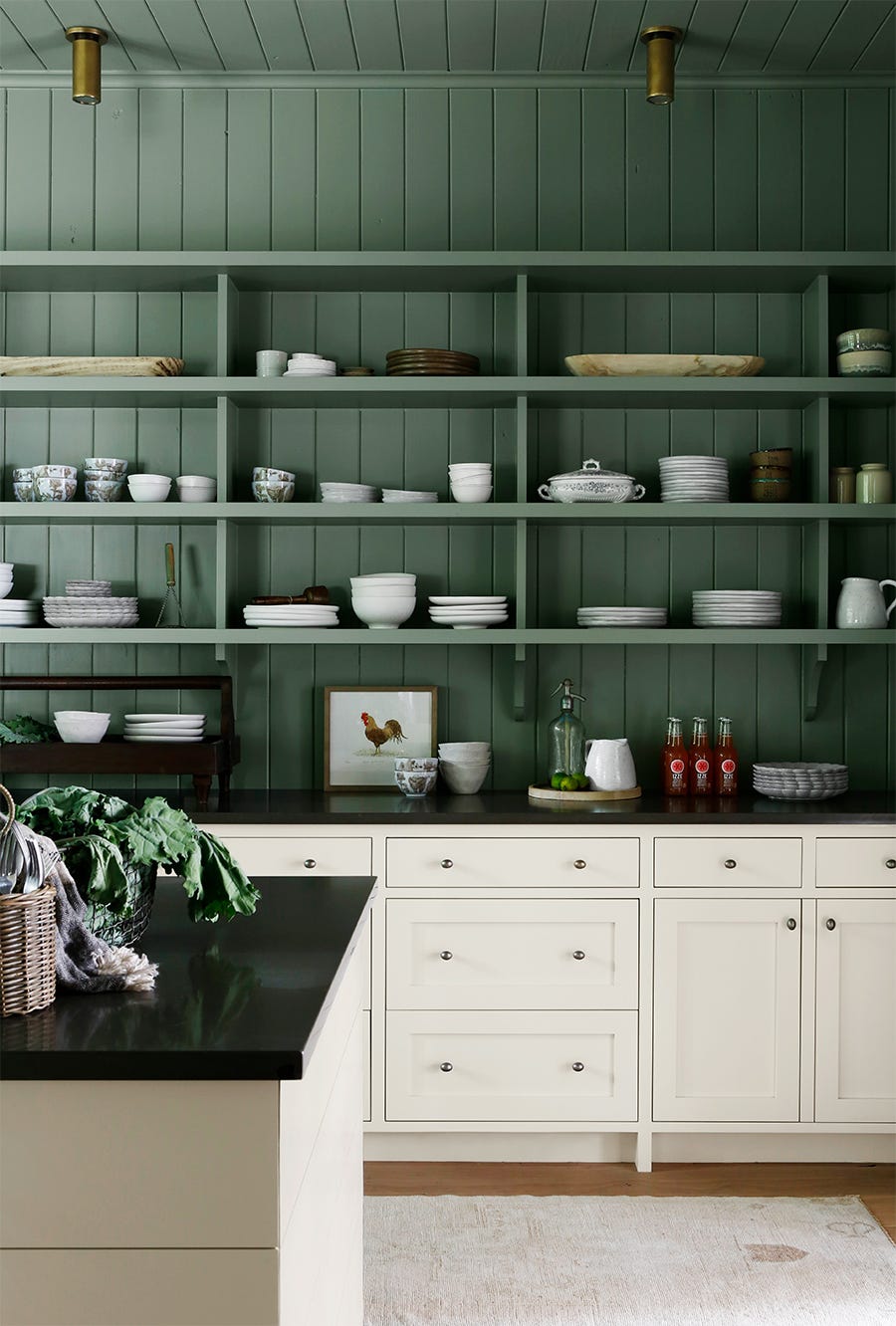
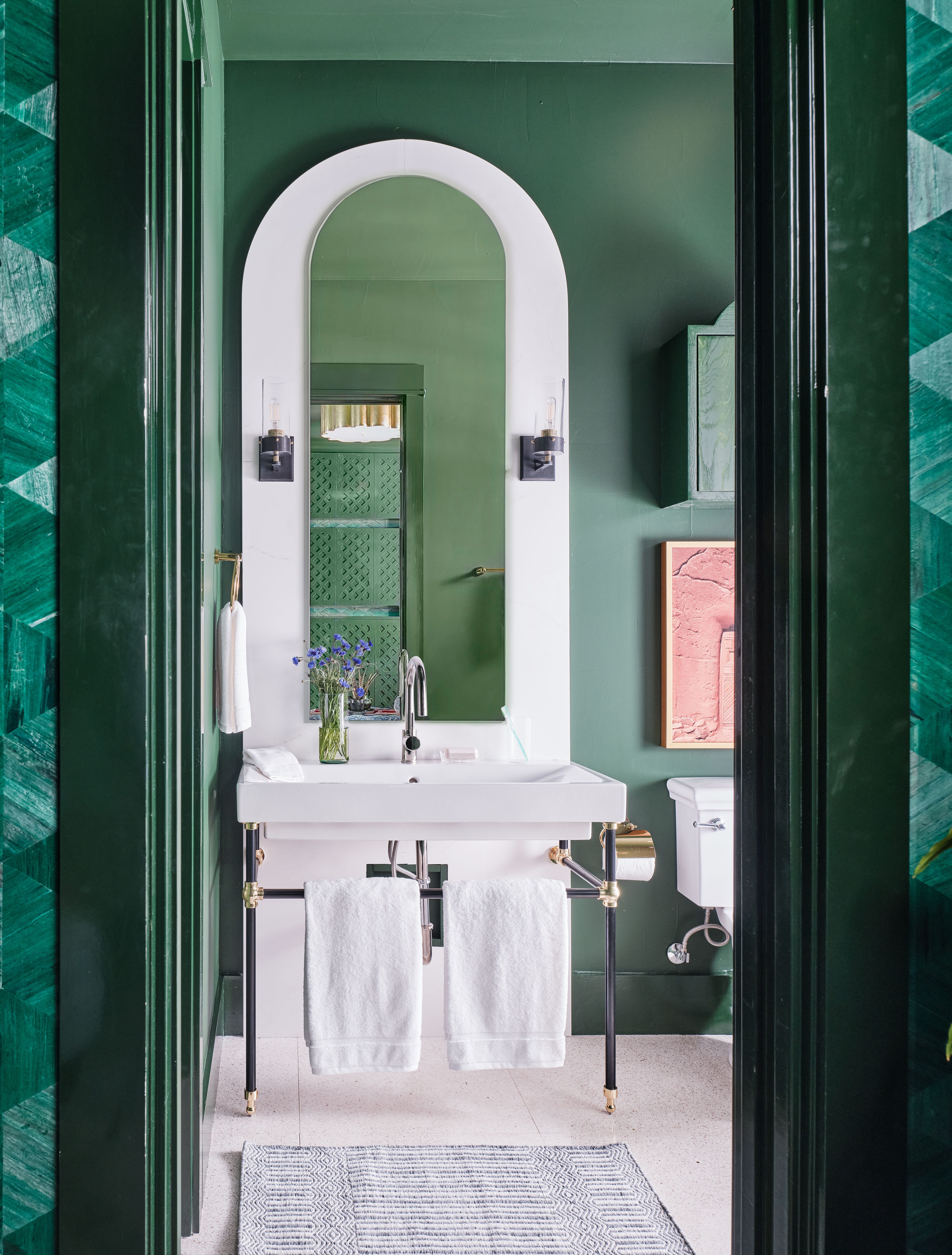
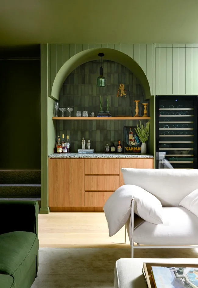
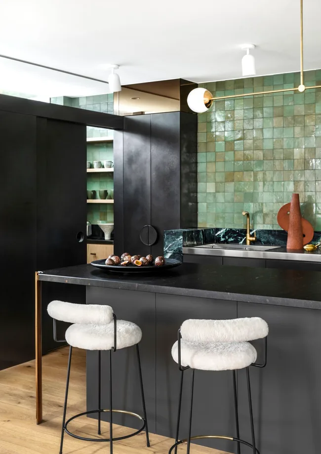
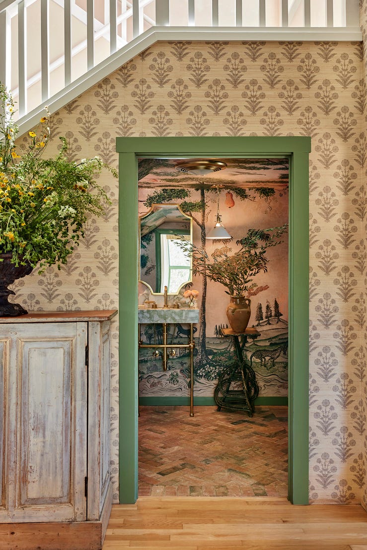
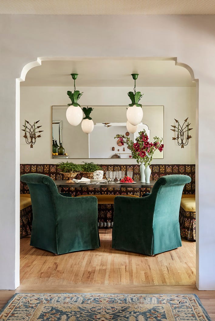
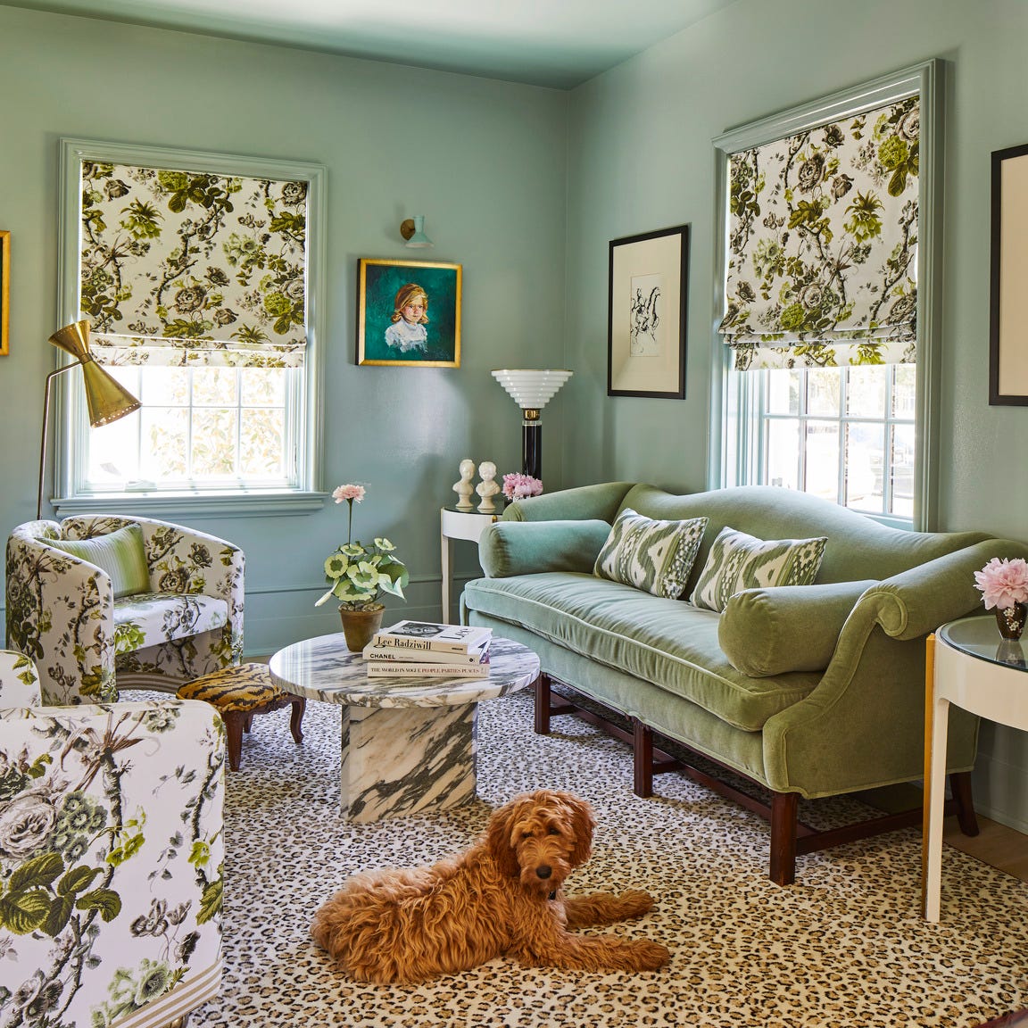
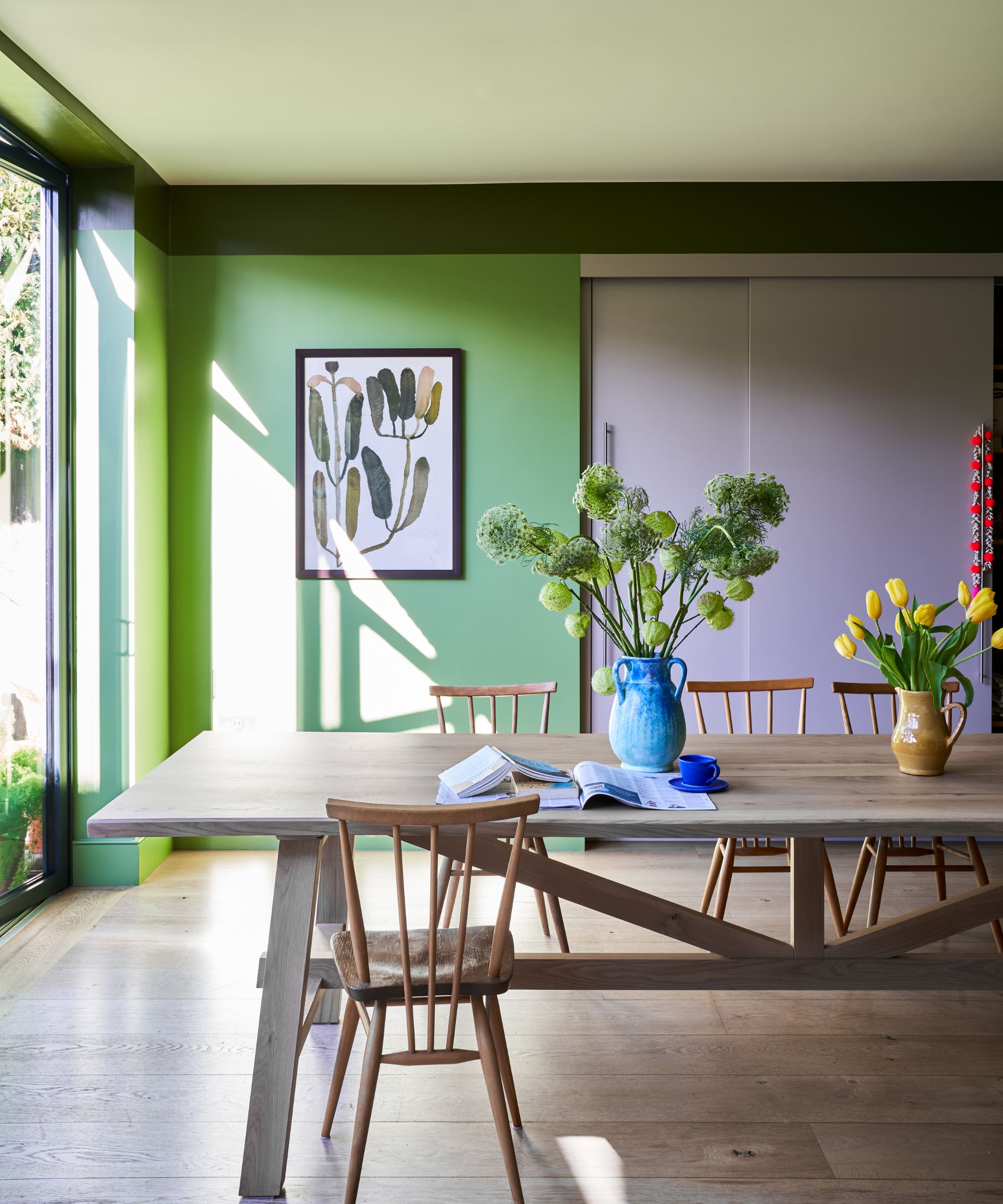
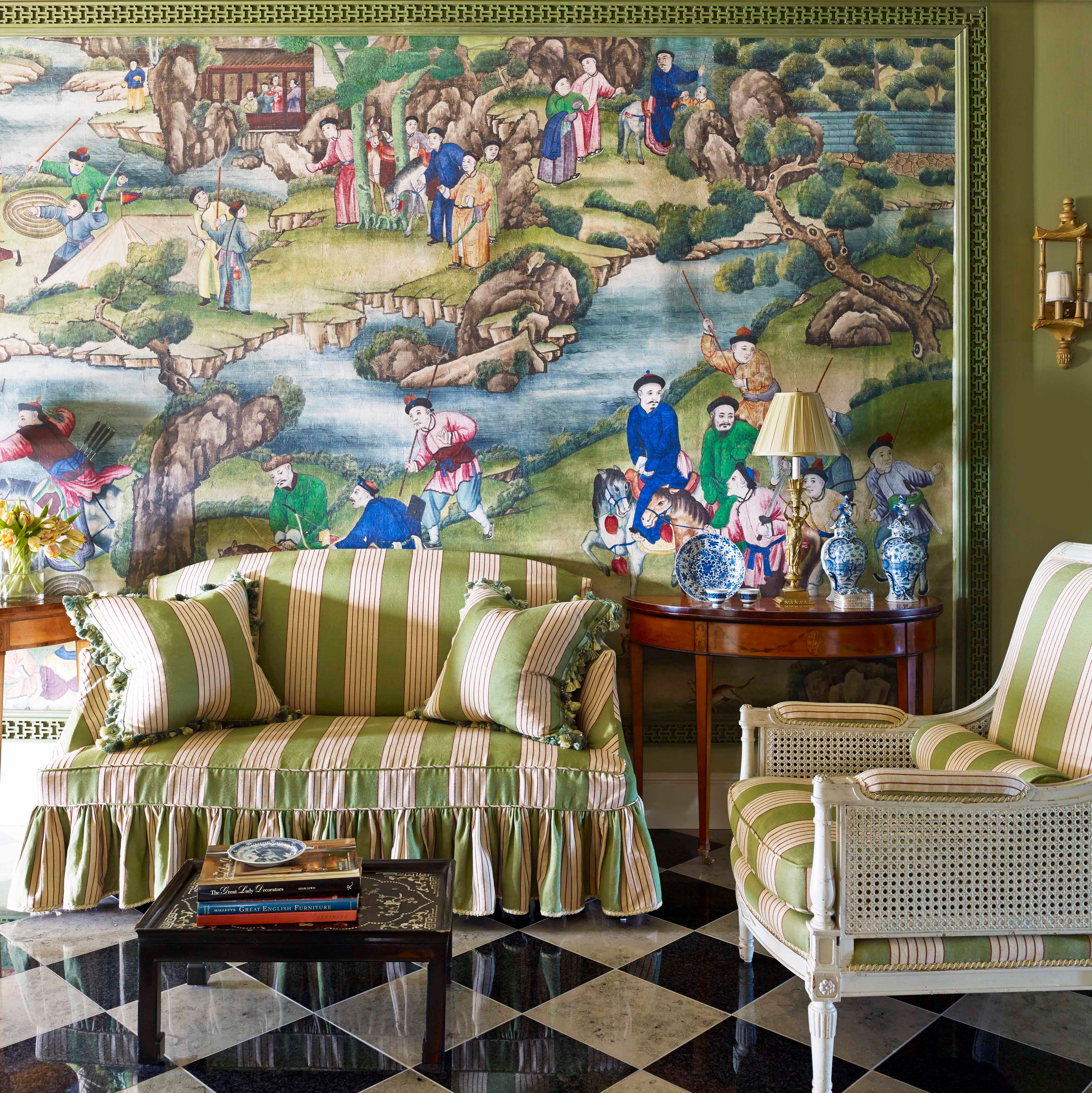
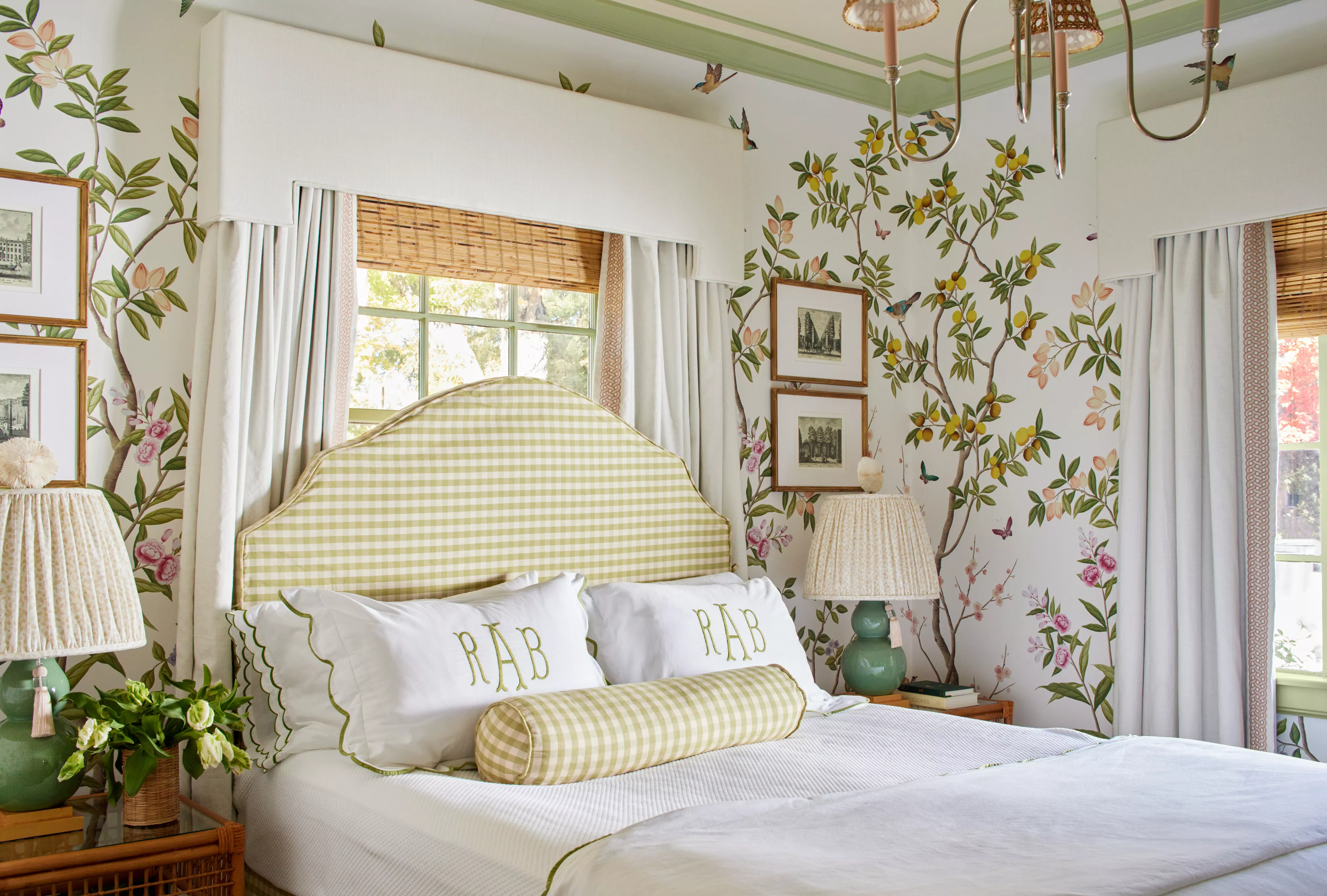
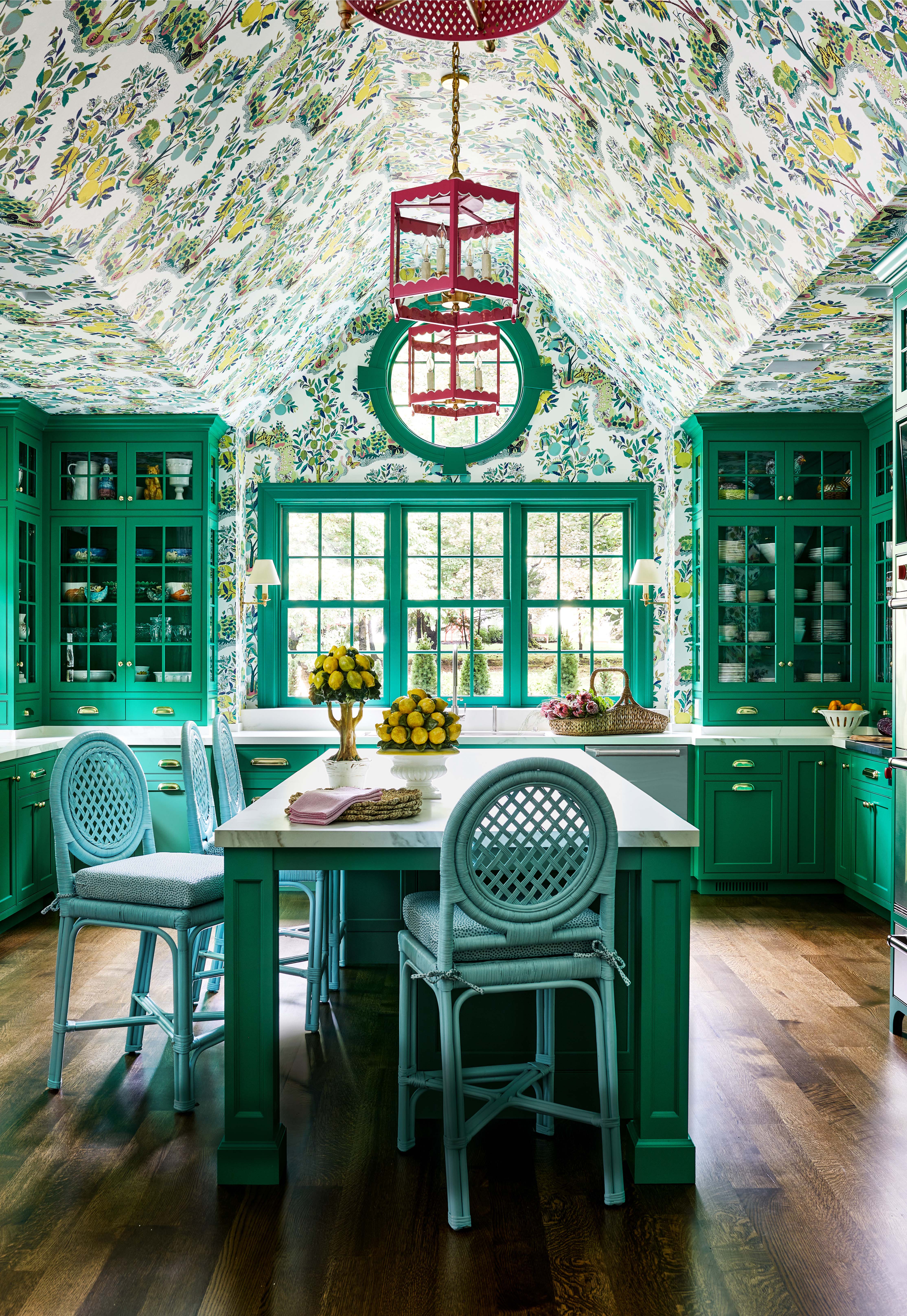
Green is highlighted as a highly versatile and calming color that seamlessly integrates into various interior design schemes. Its connection to nature provides an innate balance, allowing it to adapt to different styles and moods, whether the desired effect is refined, moody, fresh, or energetic. Interior design experts, such as Laetitia Laurent from Laure Nell Interiors and Hannah Yeo from Benjamin Moore, emphasize green's role as "nature's neutral" due to its refreshing and versatile qualities.
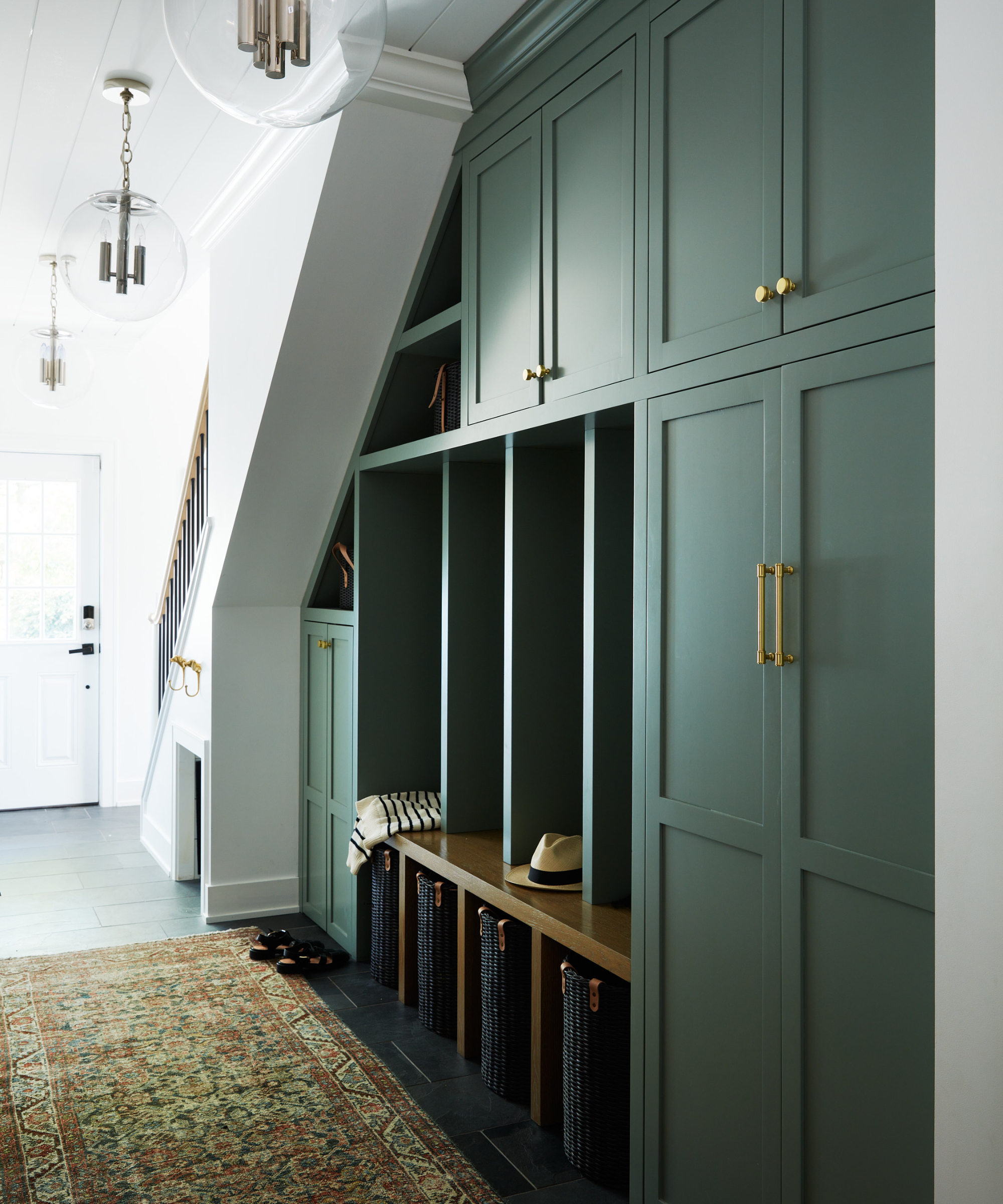
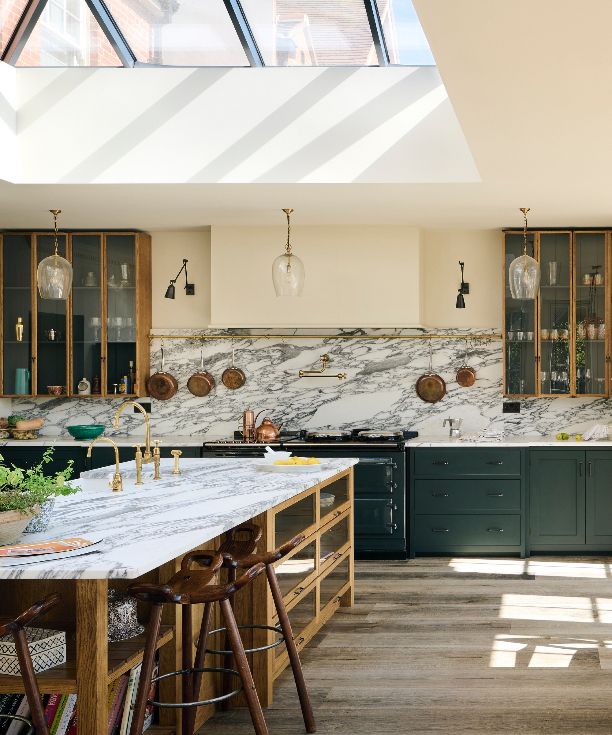
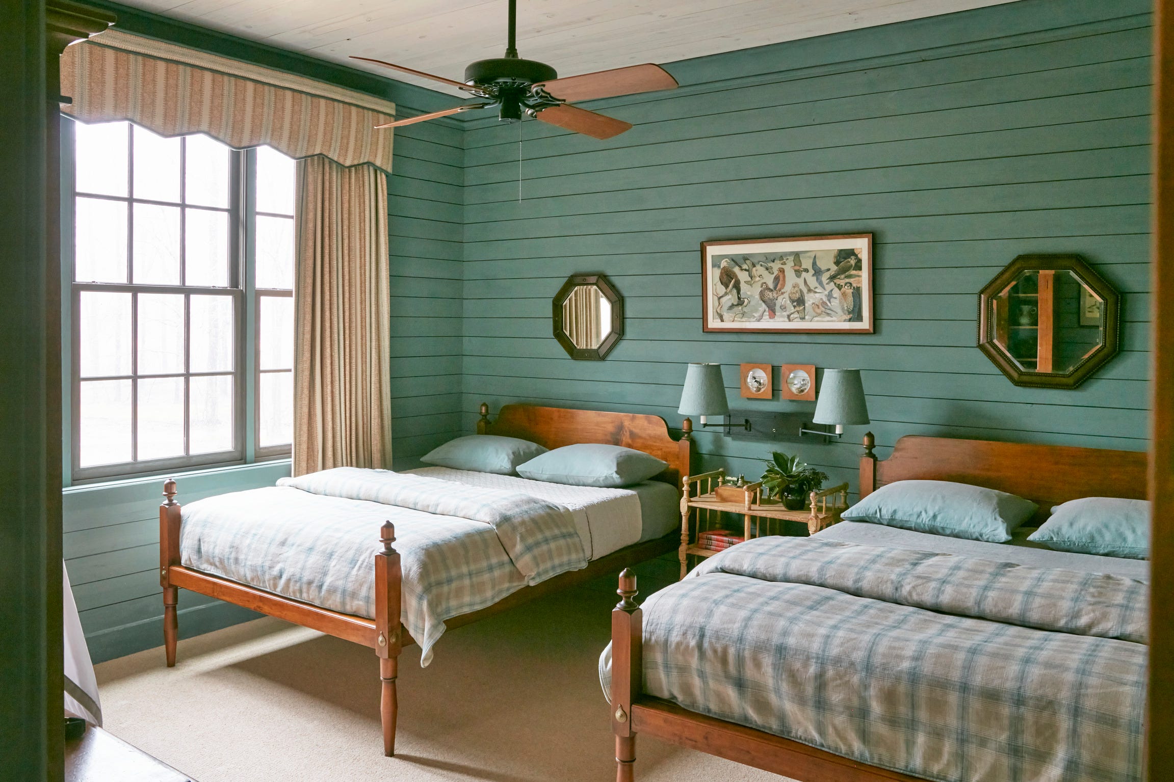
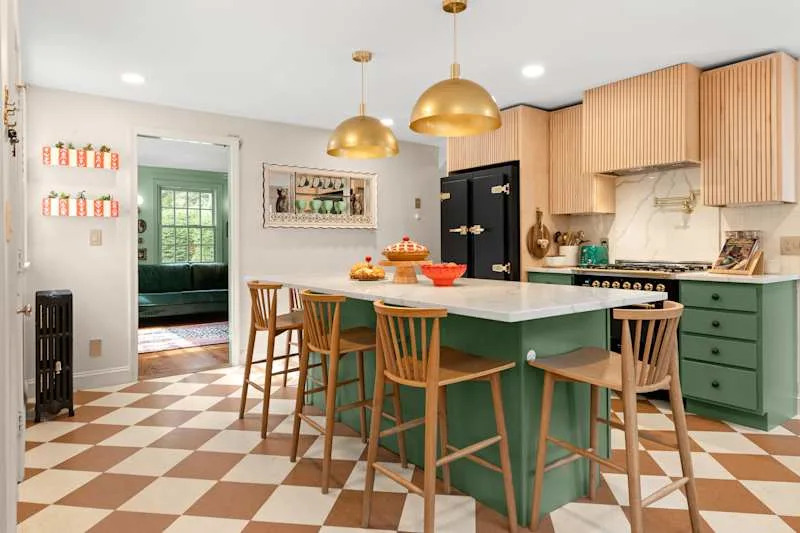
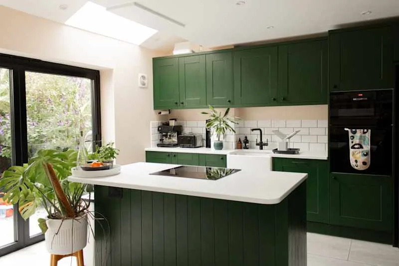
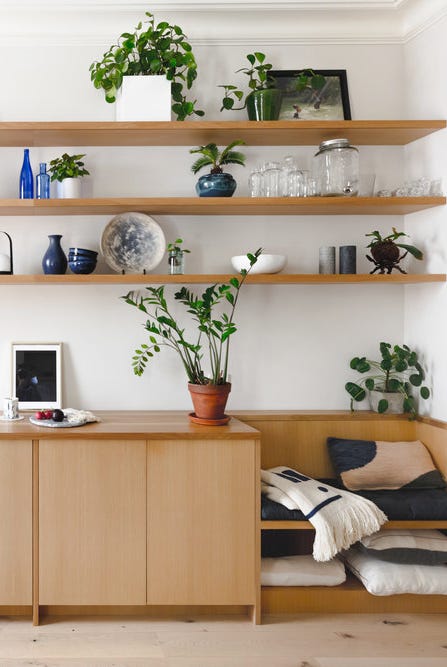
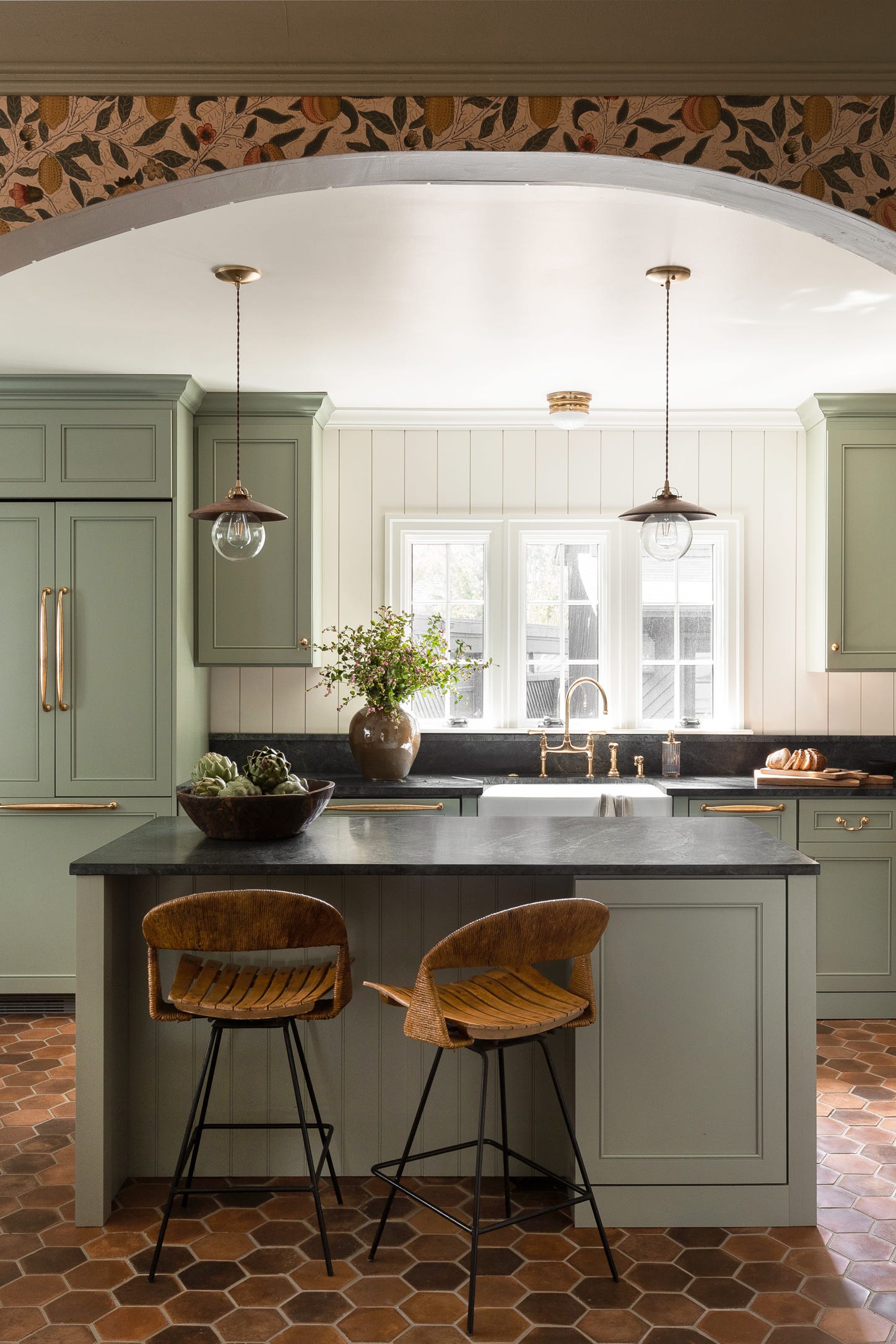
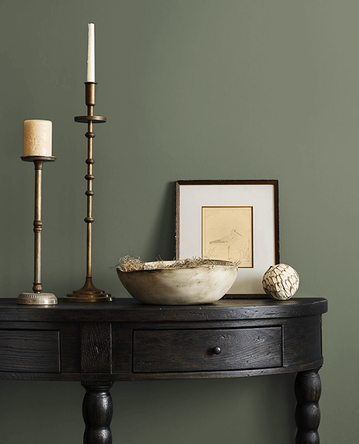
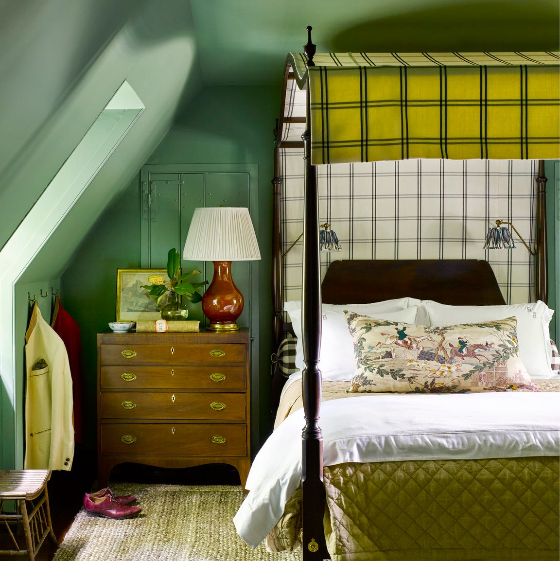
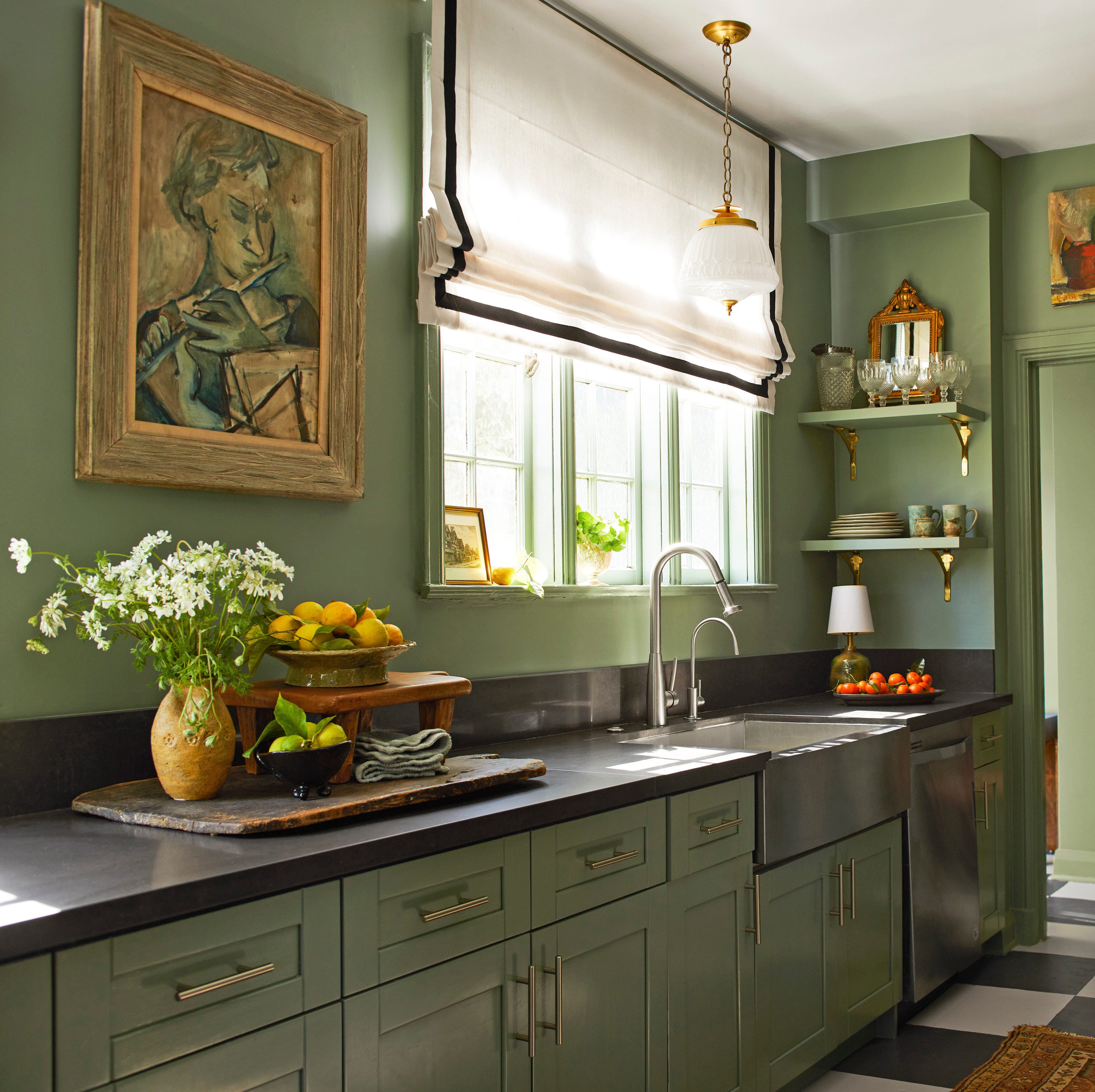
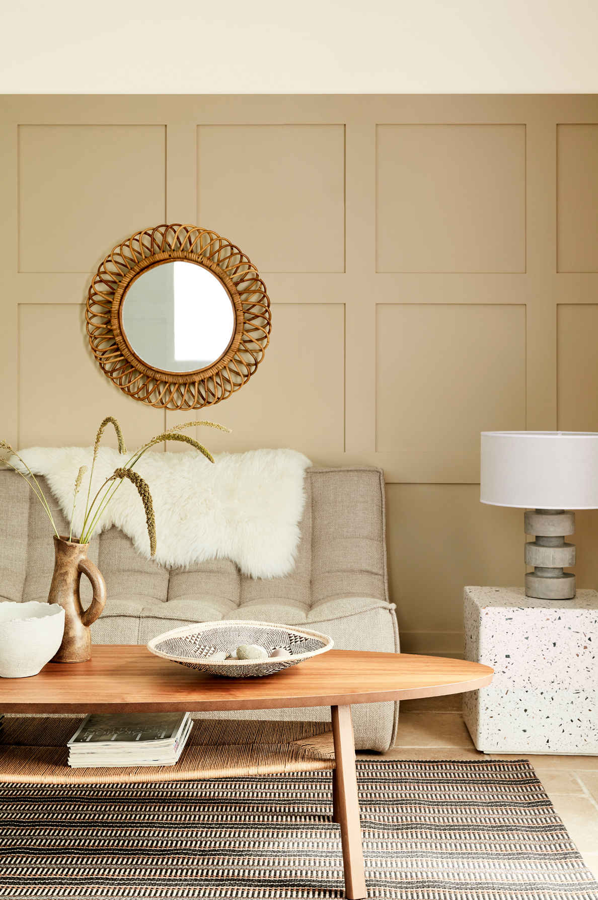
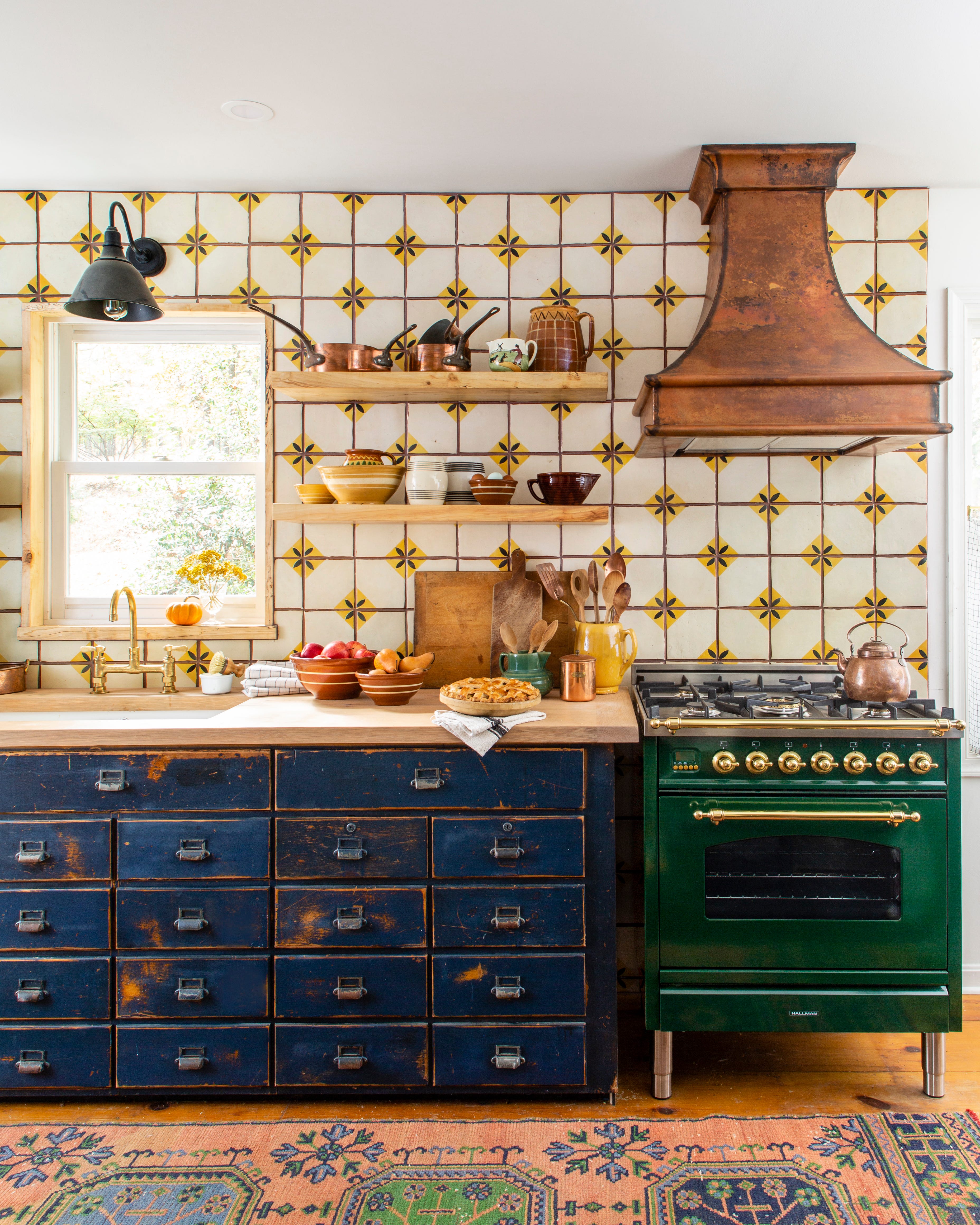
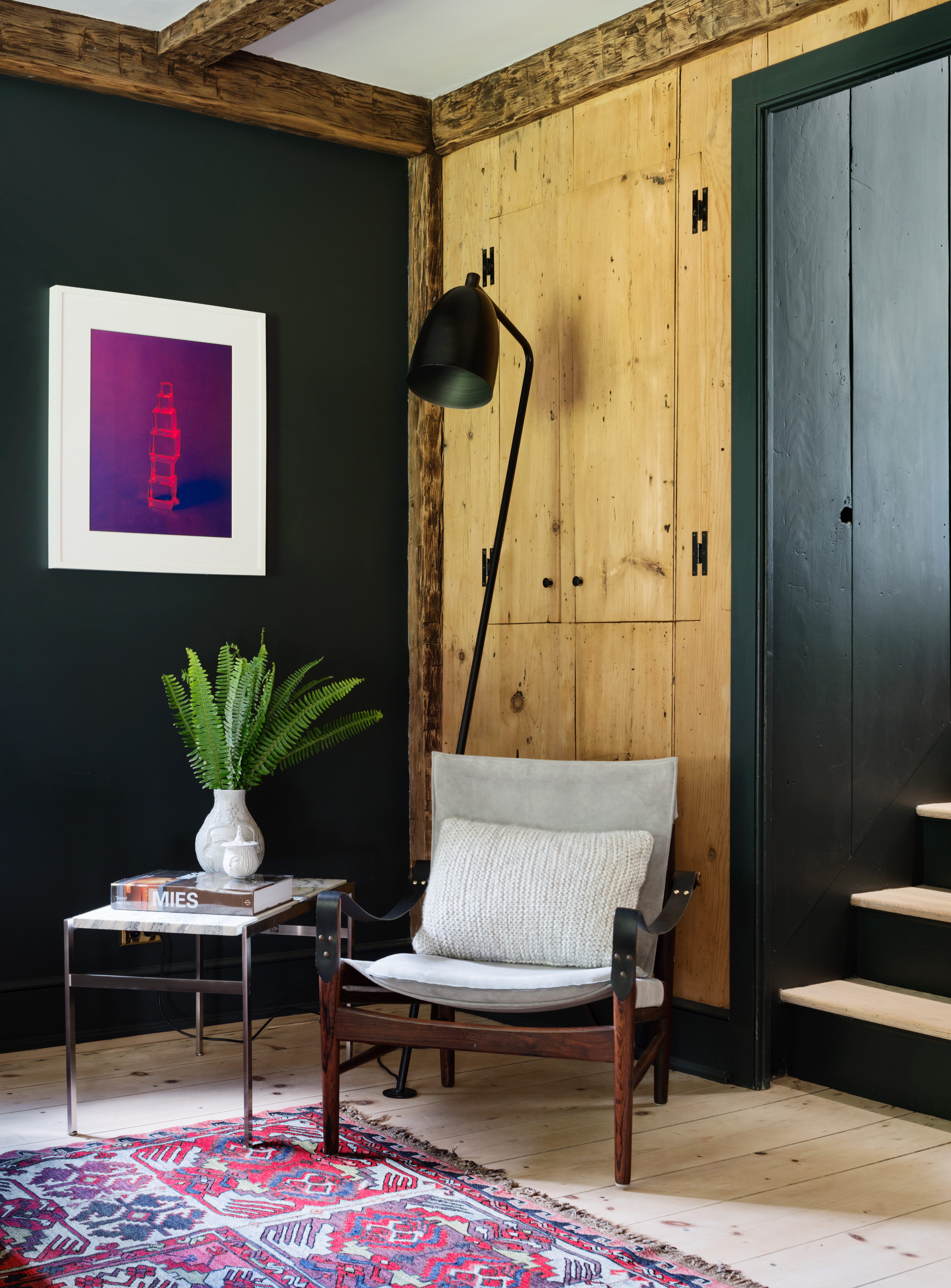
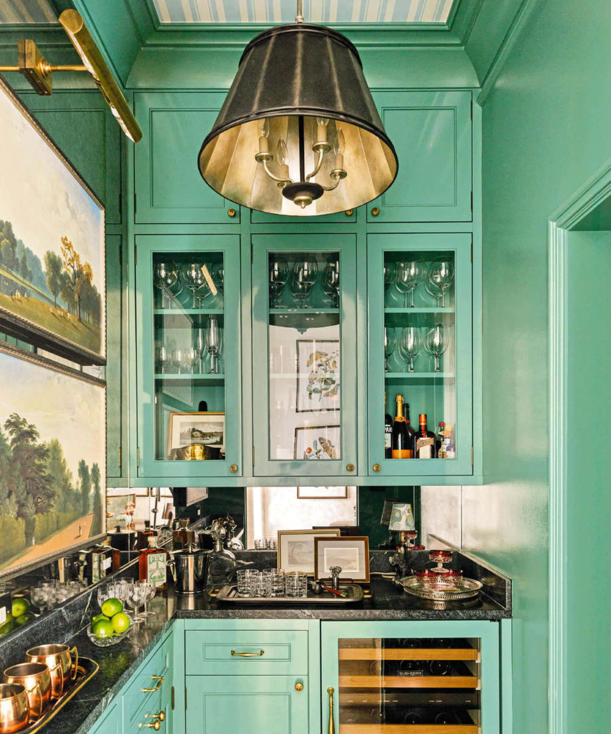
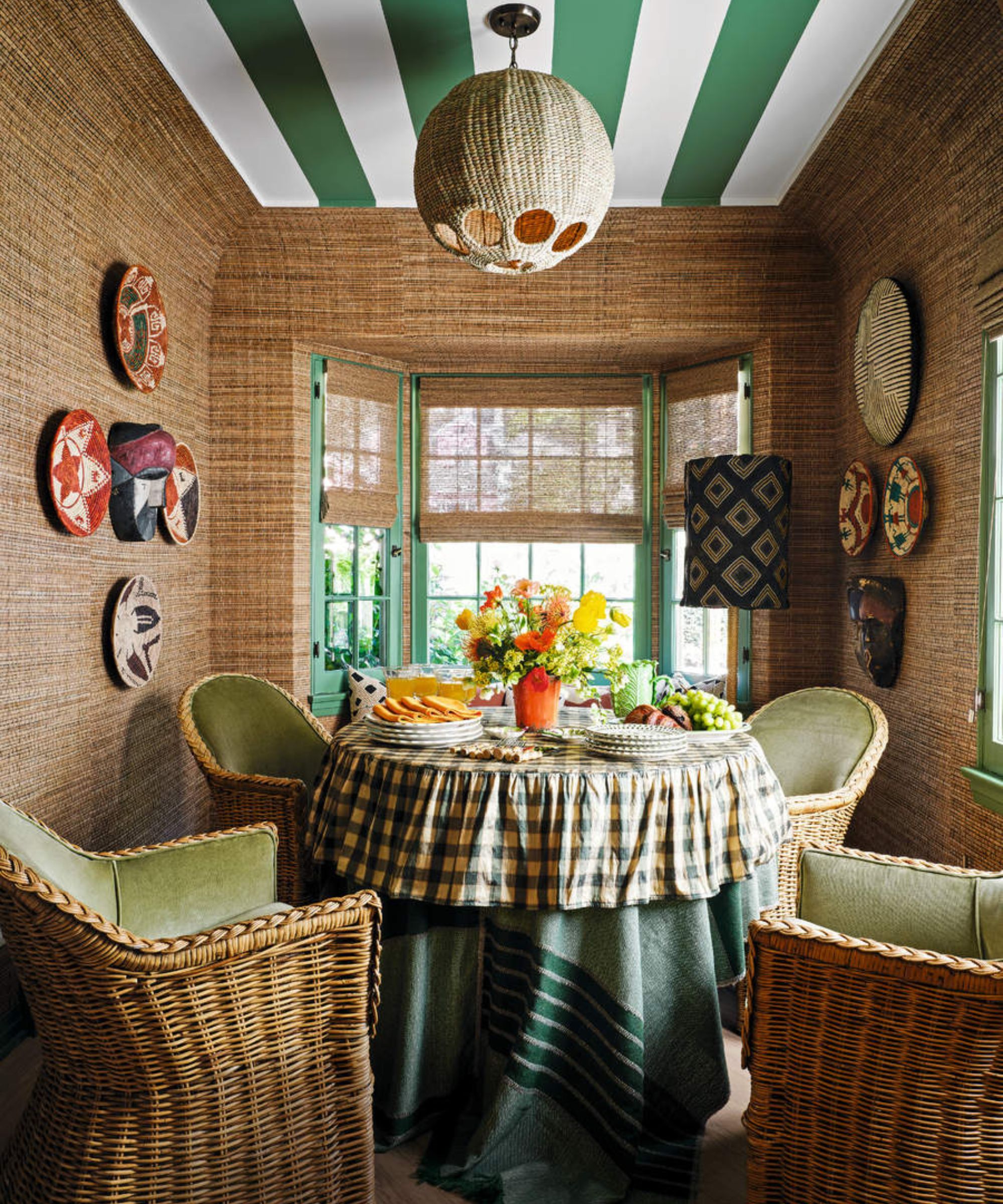
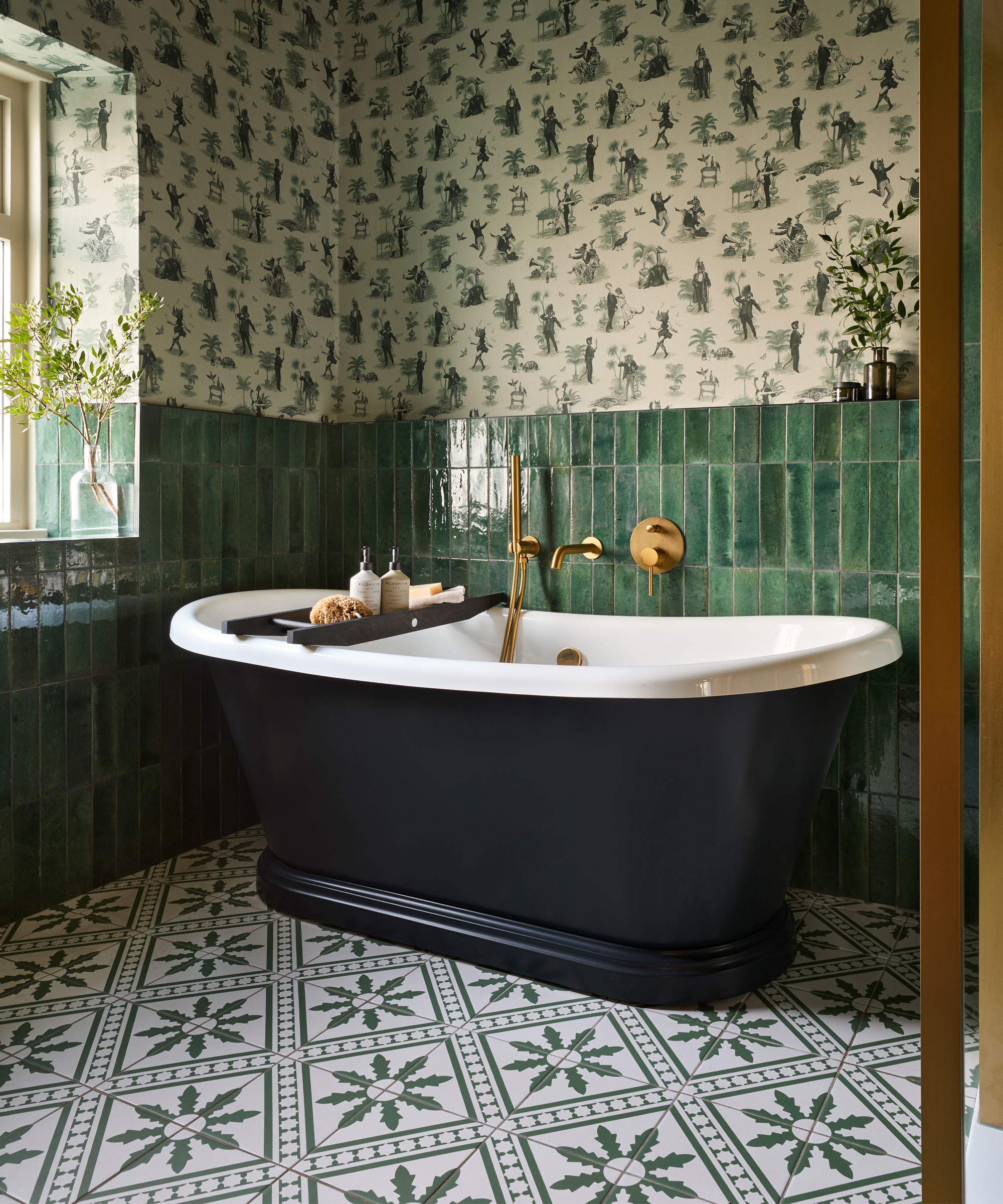
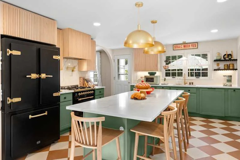
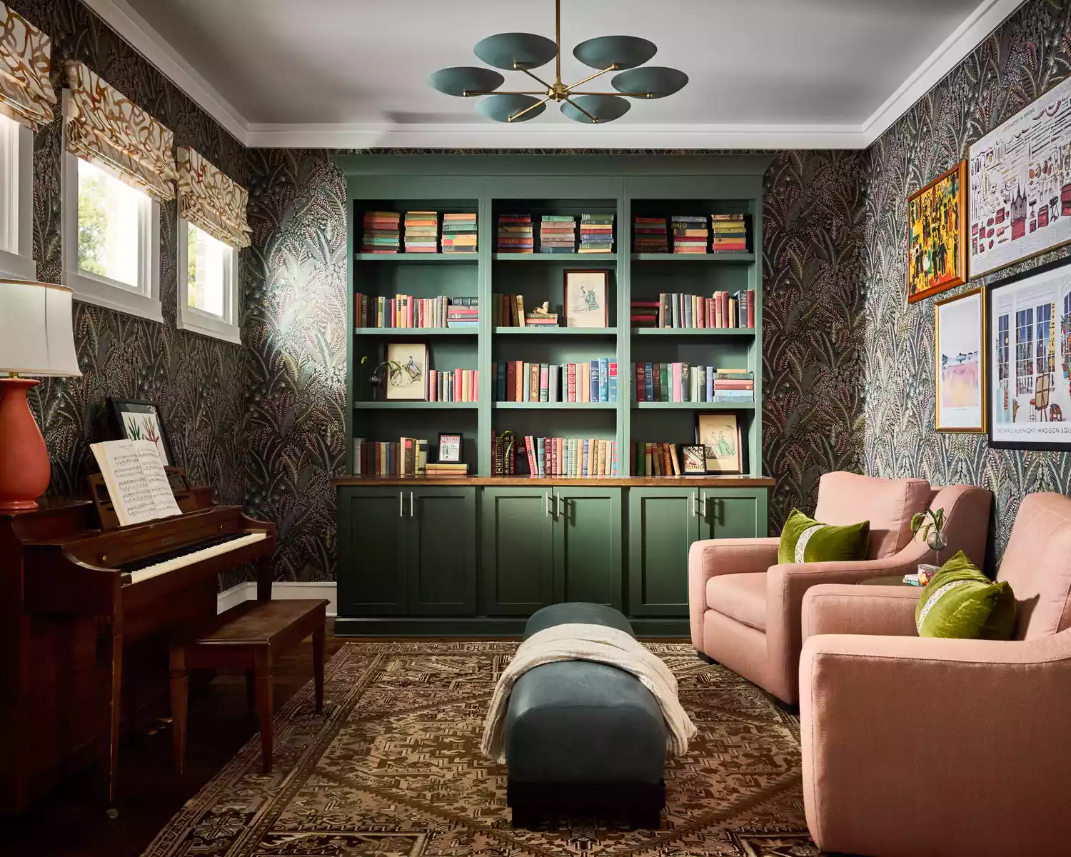
The article explores twelve specific color pairings that interior designers frequently utilize with green, offering practical guidance for homeowners. Brown is presented as a grounding combination with green, drawing from natural elements to create an effortless and warm atmosphere, especially when deep greens are paired with rich wood tones. Black, when combined with dark, jewel-toned greens, achieves a sophisticated and dramatic aesthetic, ideal for statement spaces, with an emphasis on avoiding bright, yellow-skewed greens.
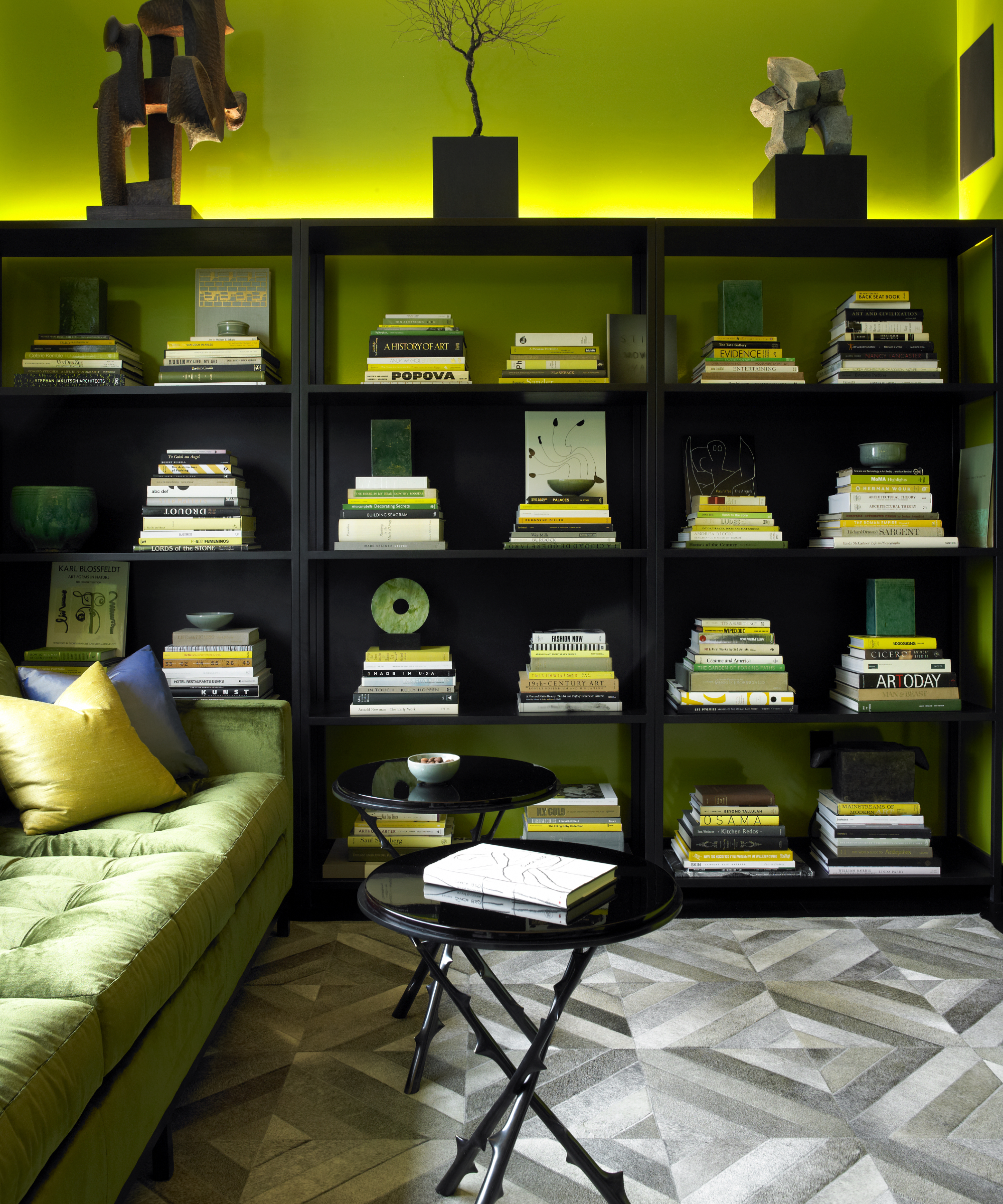
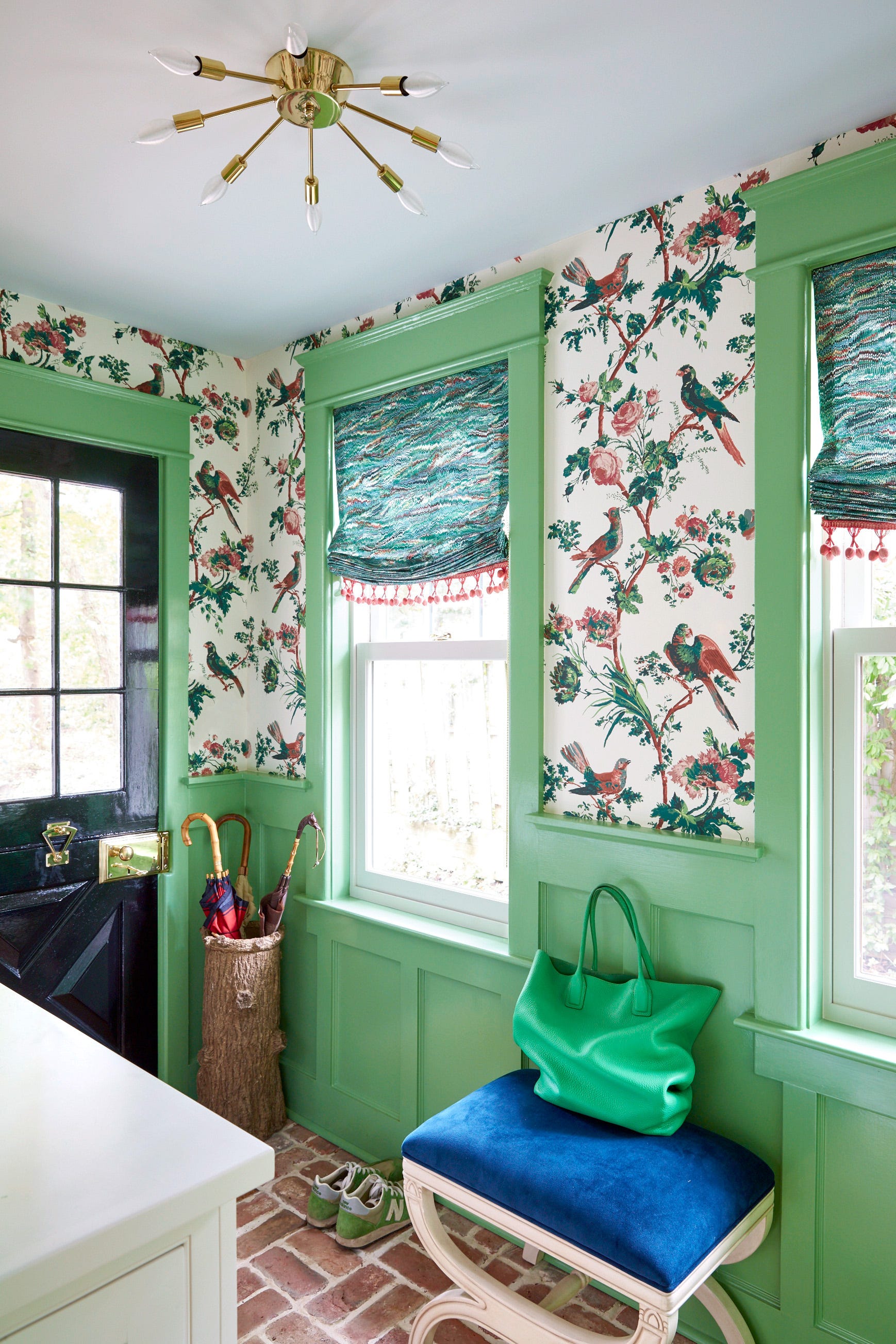
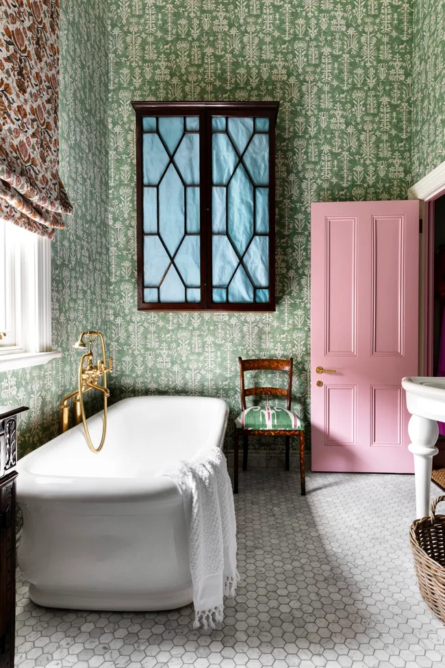
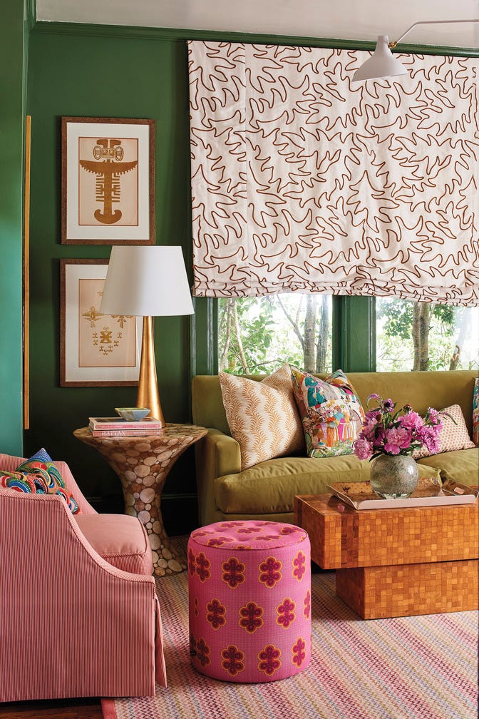
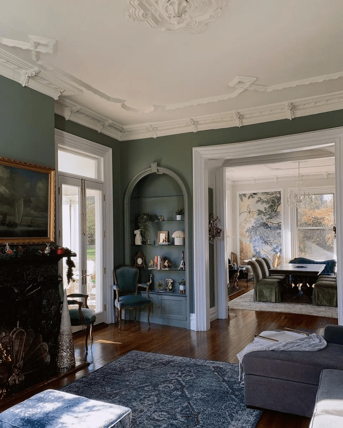
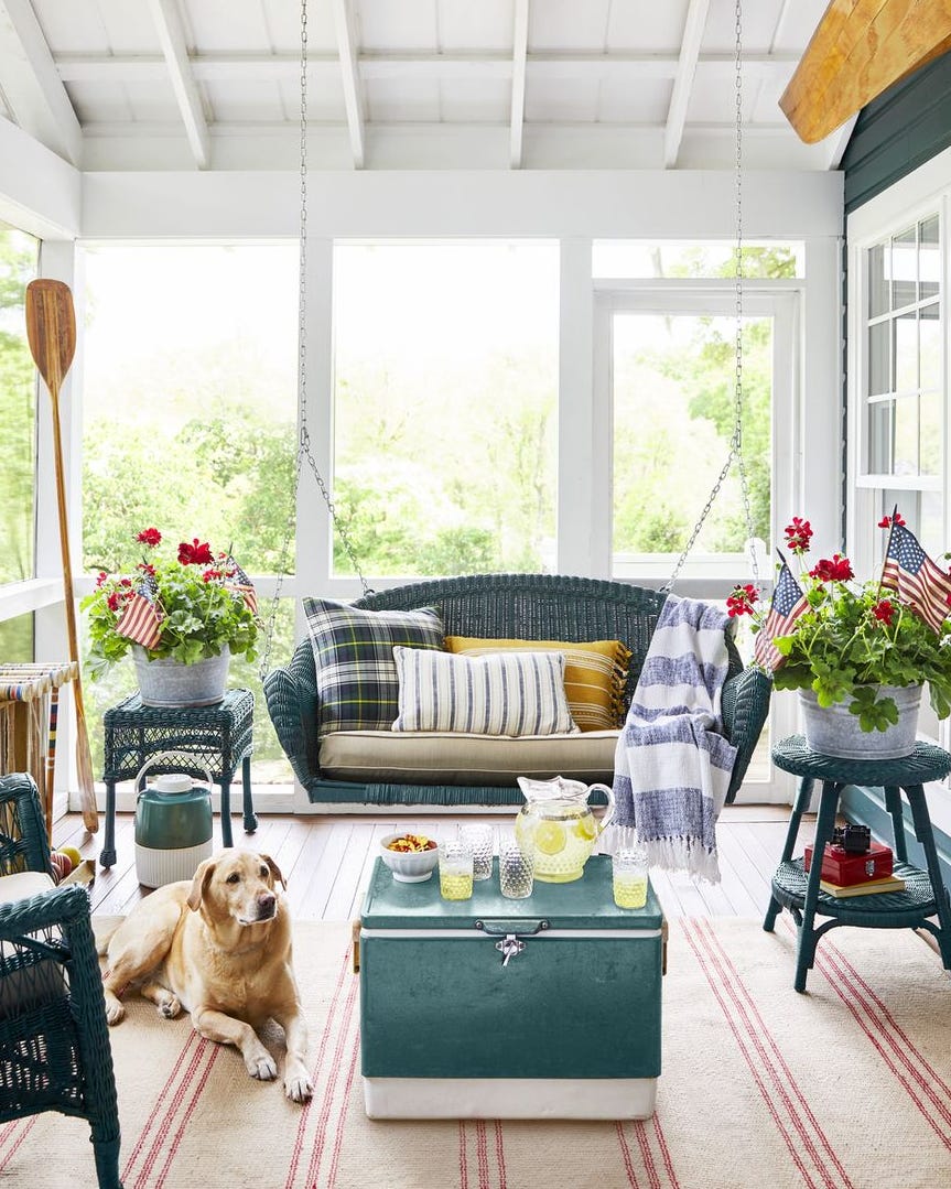
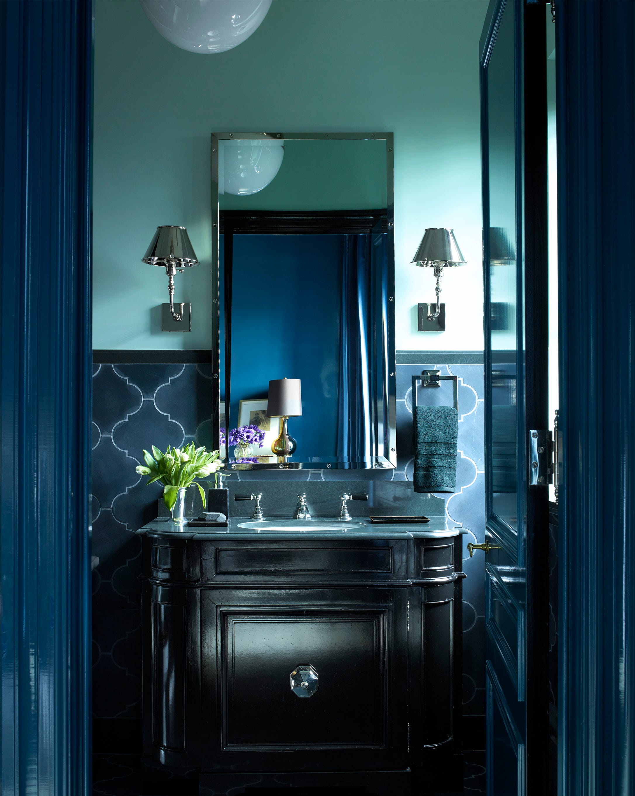
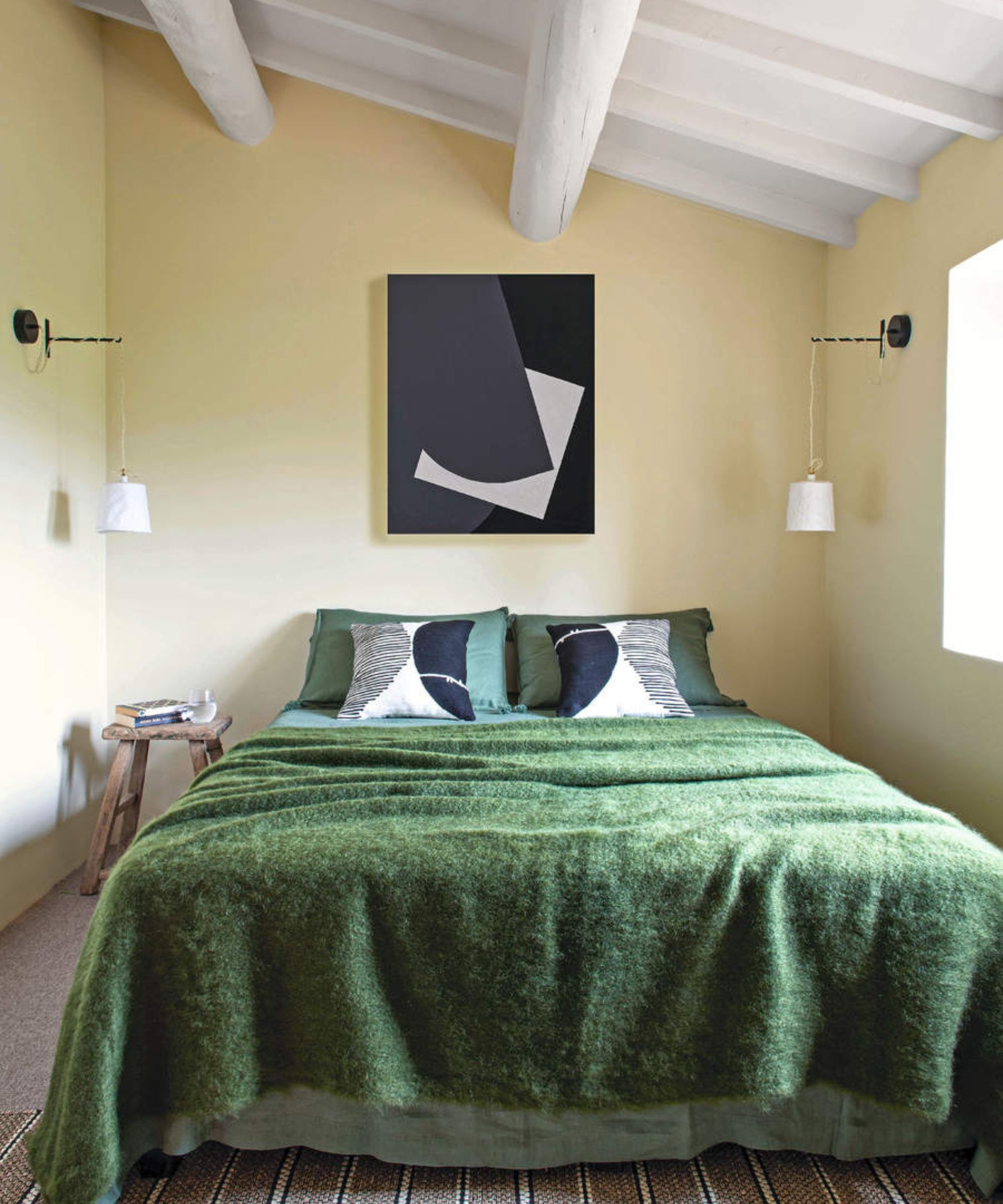
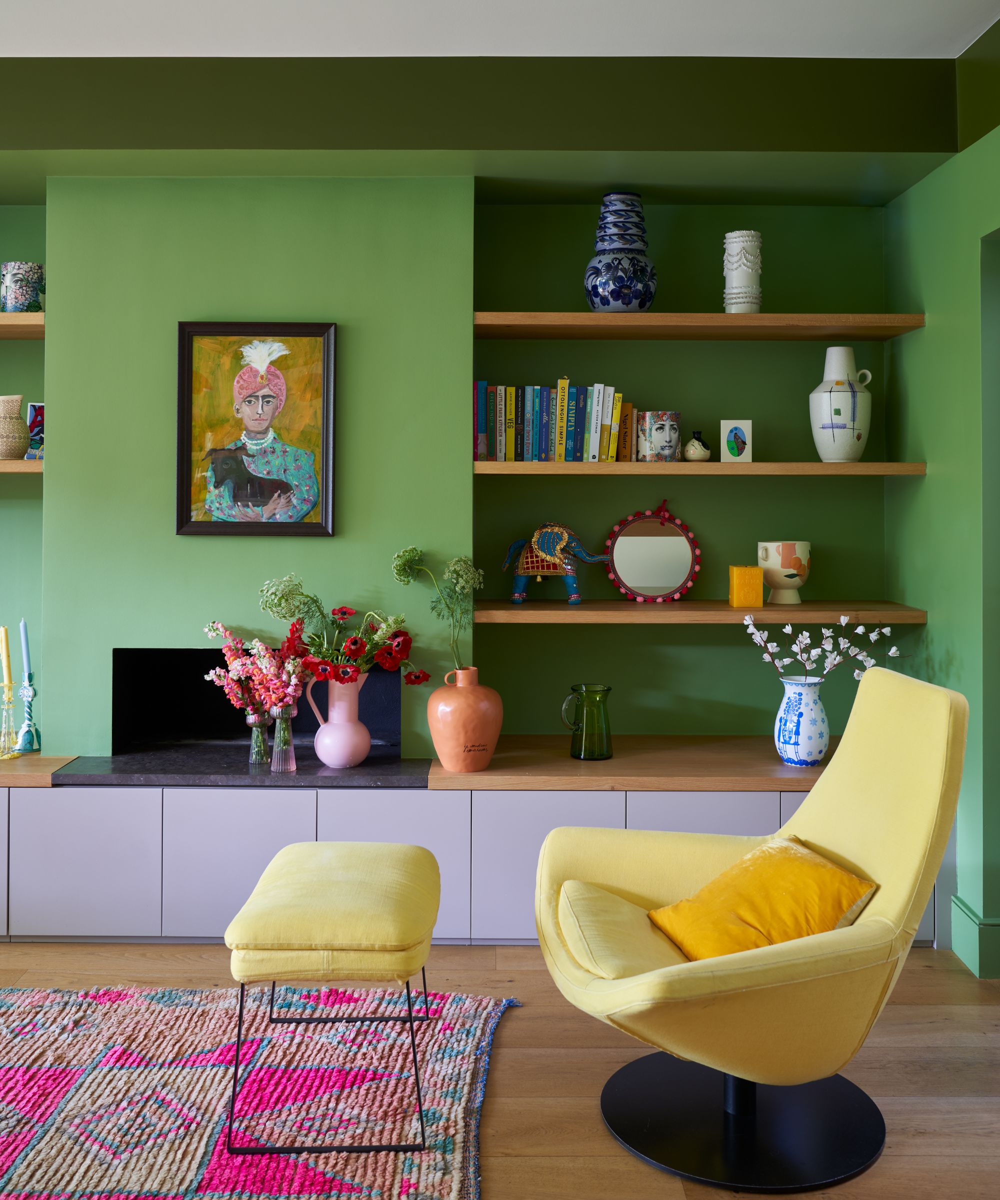
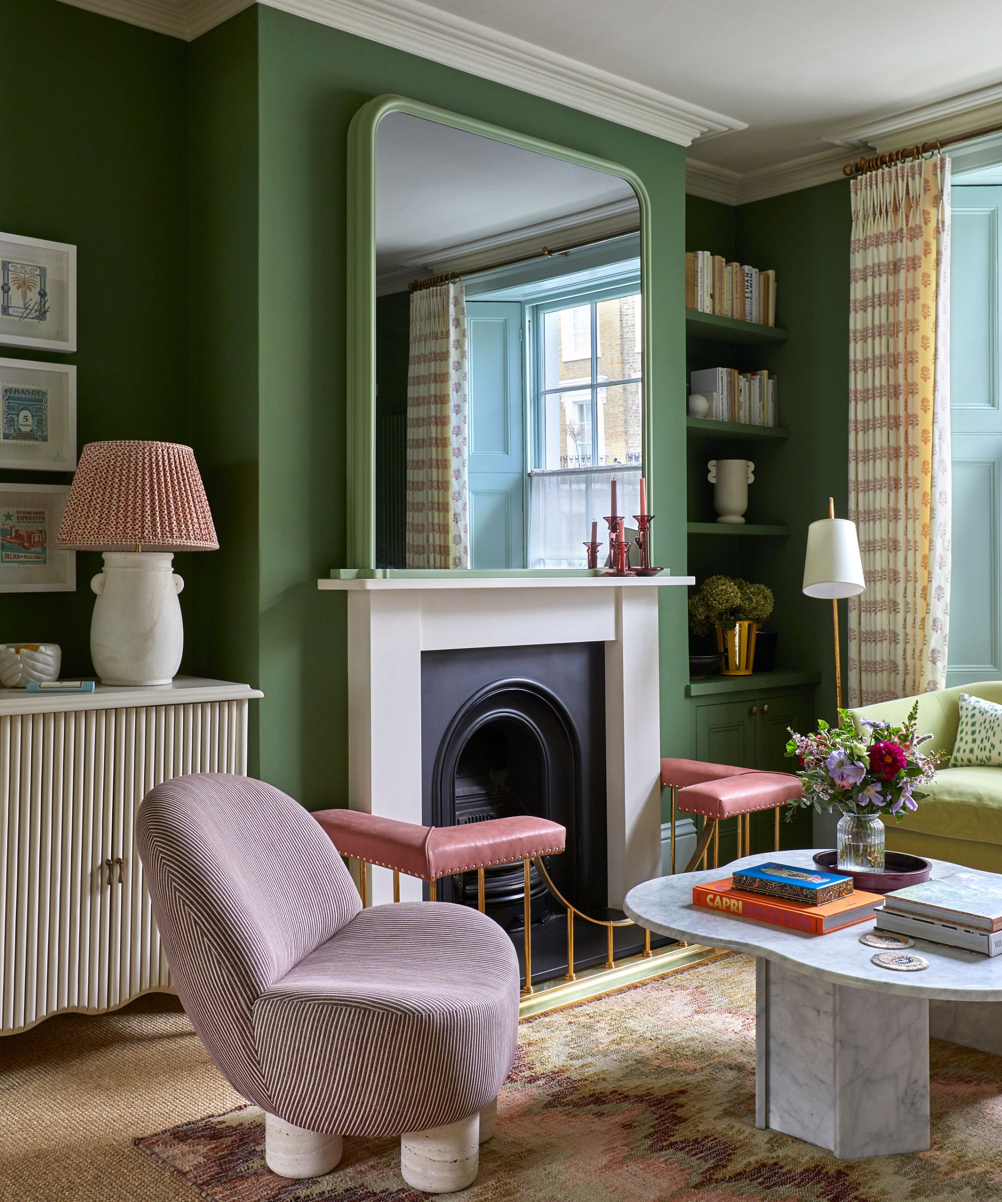
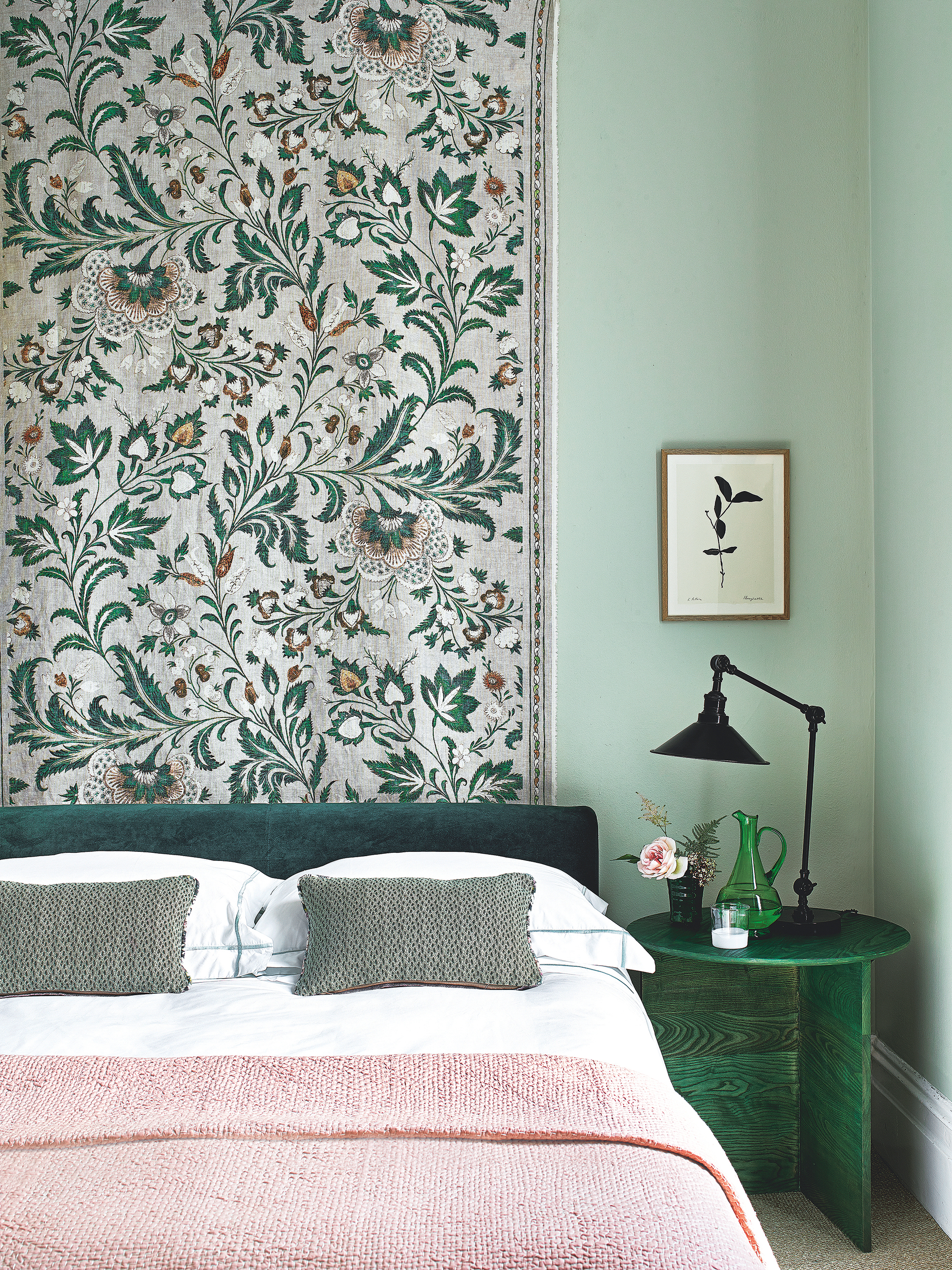
Navy blue and green also form a natural pairing, particularly effective when both colors possess depth, such as forest green alongside an inky blue. This combination evokes a classic yet unexpected feel, reminiscent of European townhouses. Yellow, positioned next to green on the color wheel, creates a vibrant and energetic combination, with warmer yellow shades enhancing the dynamic effect. For a stylish integration of pink with green, muted salmon and soft sage are recommended over brighter tones, offering a refreshing and elegant contrast that works in both modern and traditional settings.
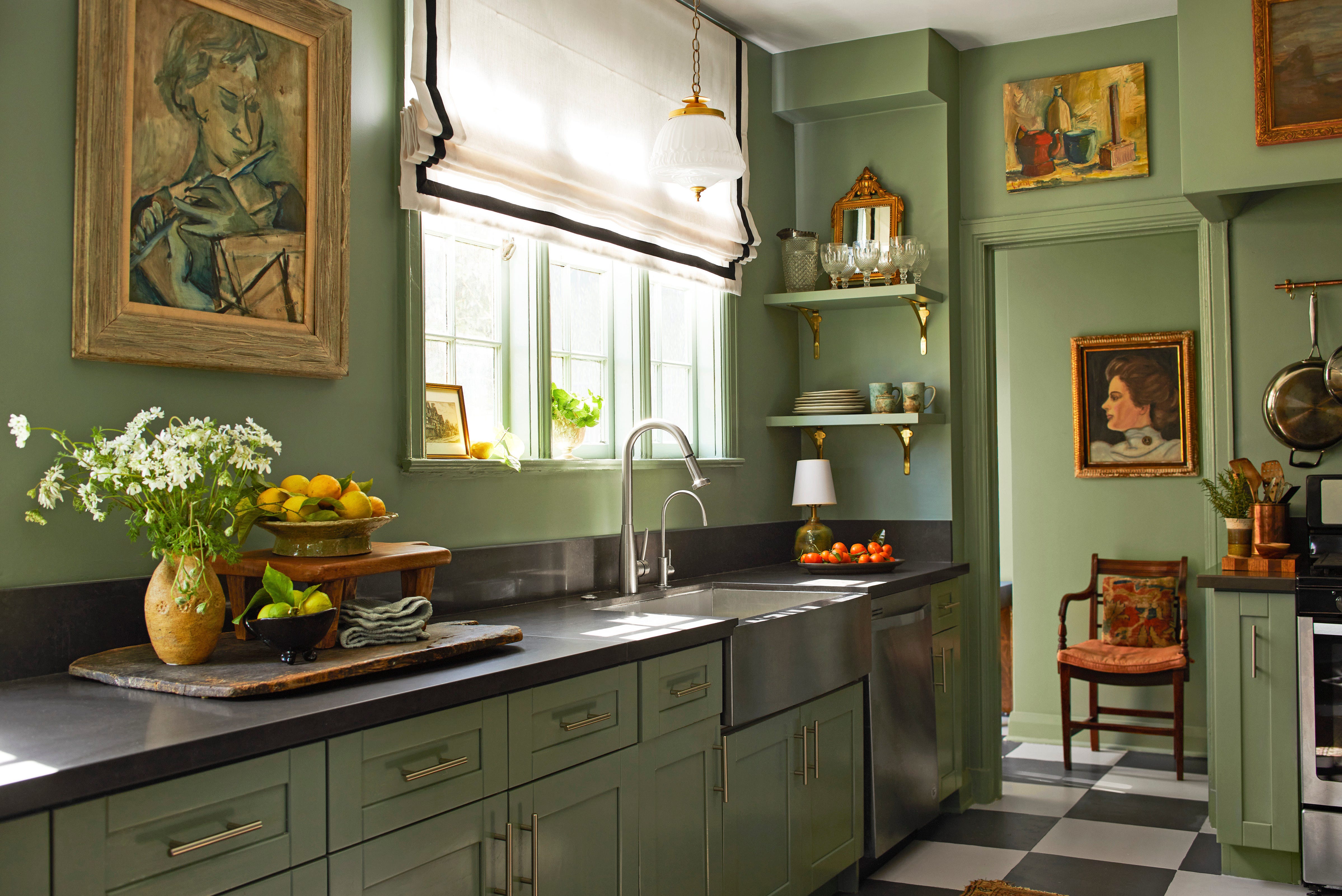
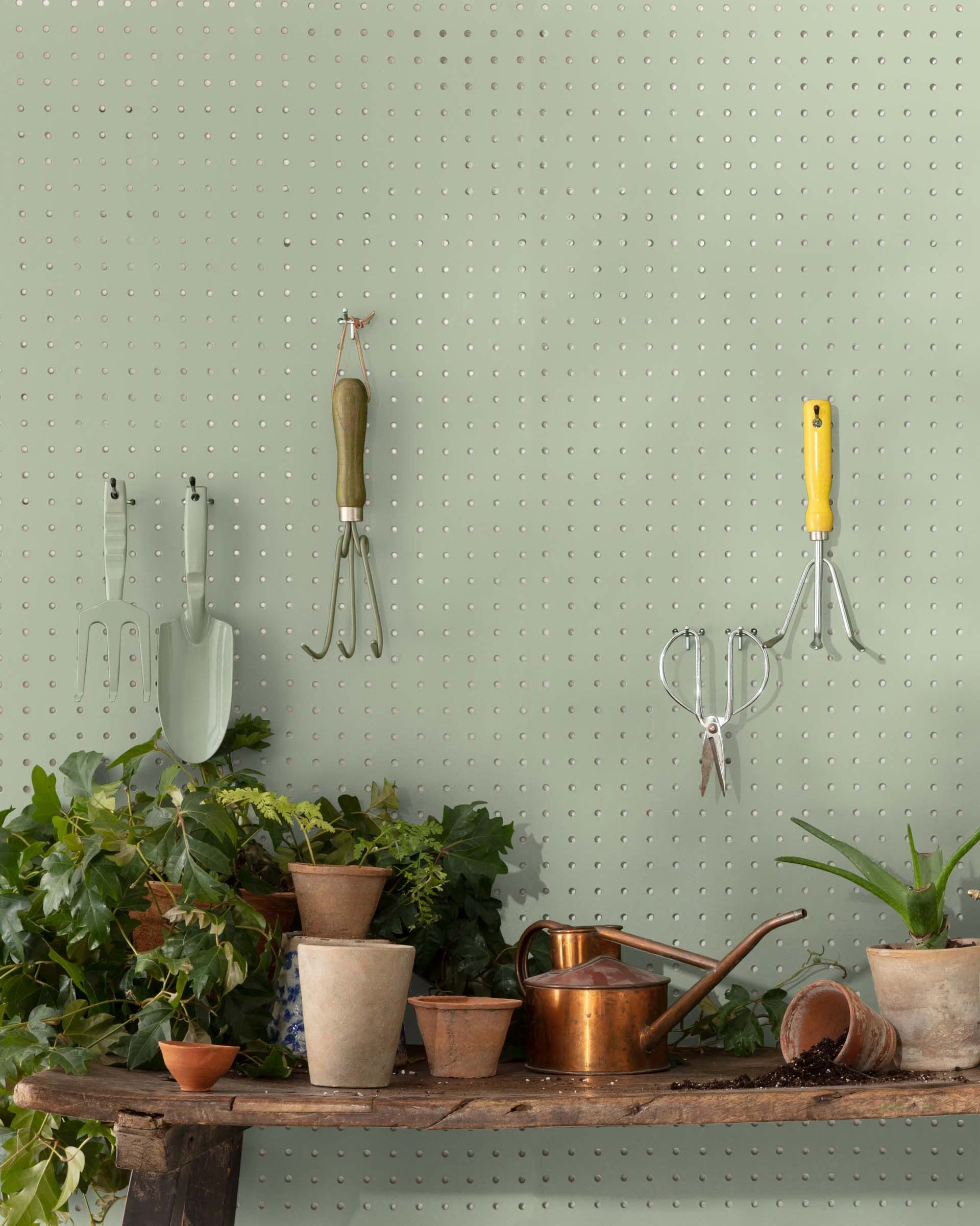
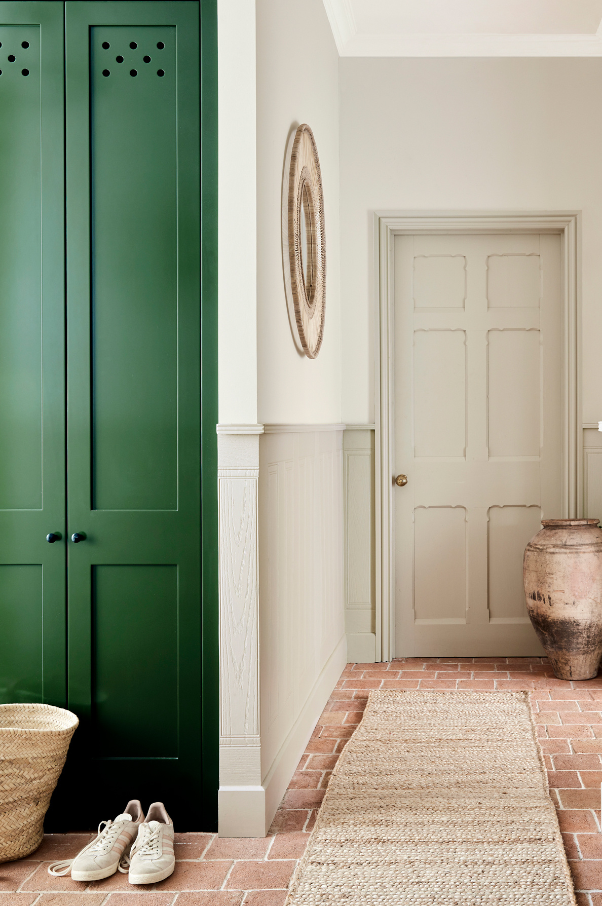
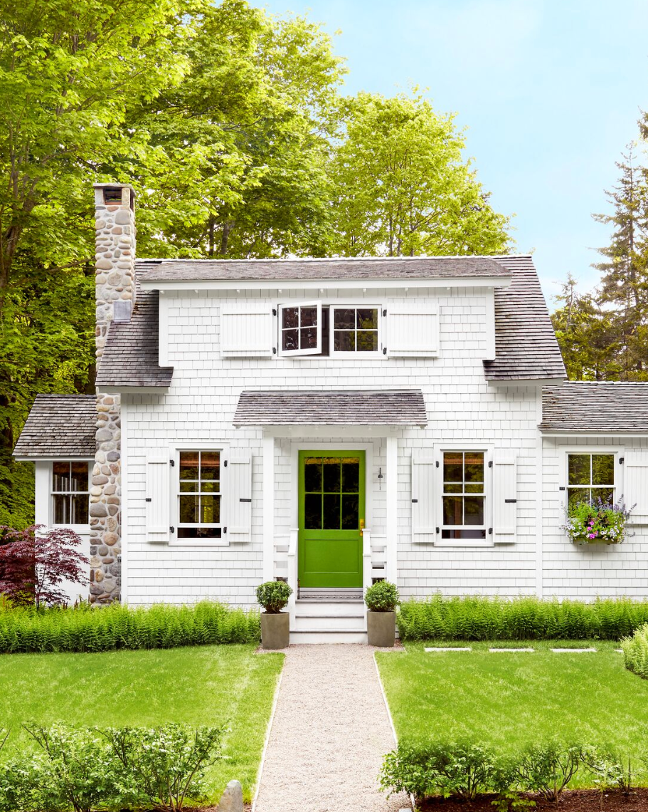
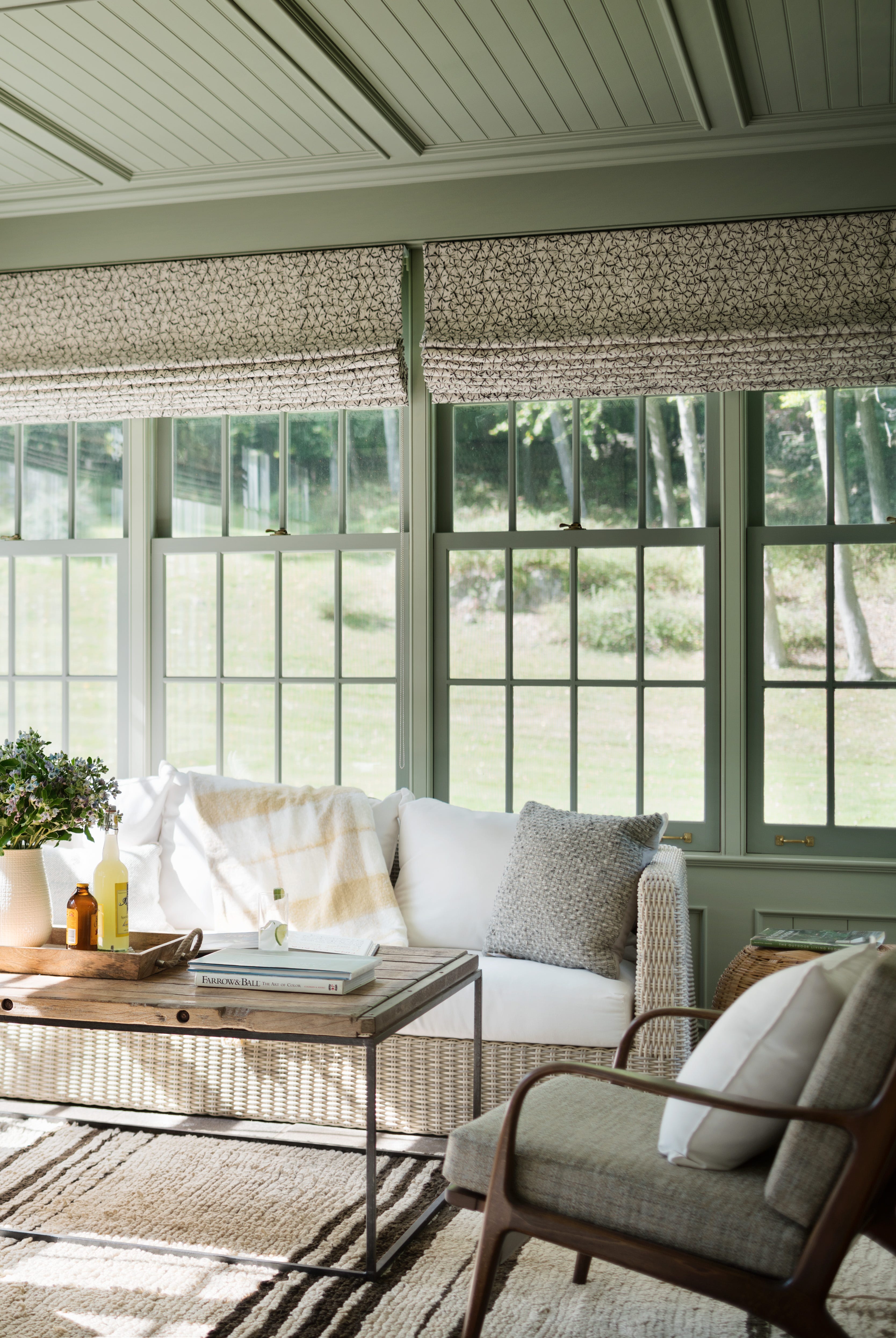
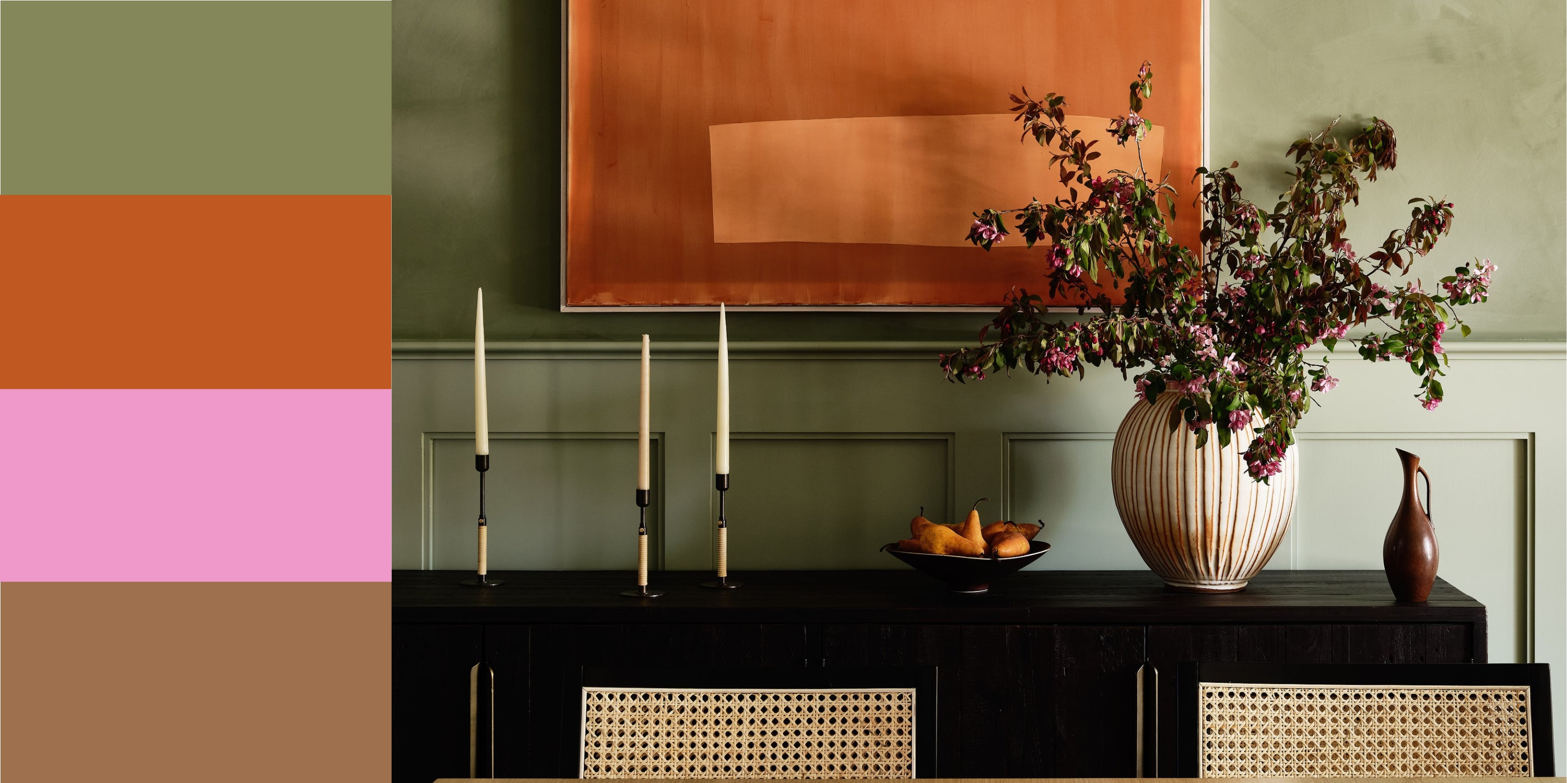
Gray, as a neutral, pairs particularly well with green, especially when a livelier green is used. Soft, smoky greens with warm gray textiles or stone surfaces create a timeless and enduring palette. Orange, though seemingly less obvious, combines wonderfully with muted sage greens and burnt oranges, resulting in a sophisticated and rich interior. White with green offers a minimalist and calming approach, allowing green to stand out, with the suggestion of using green on doors, trim, or statement furniture against white walls.
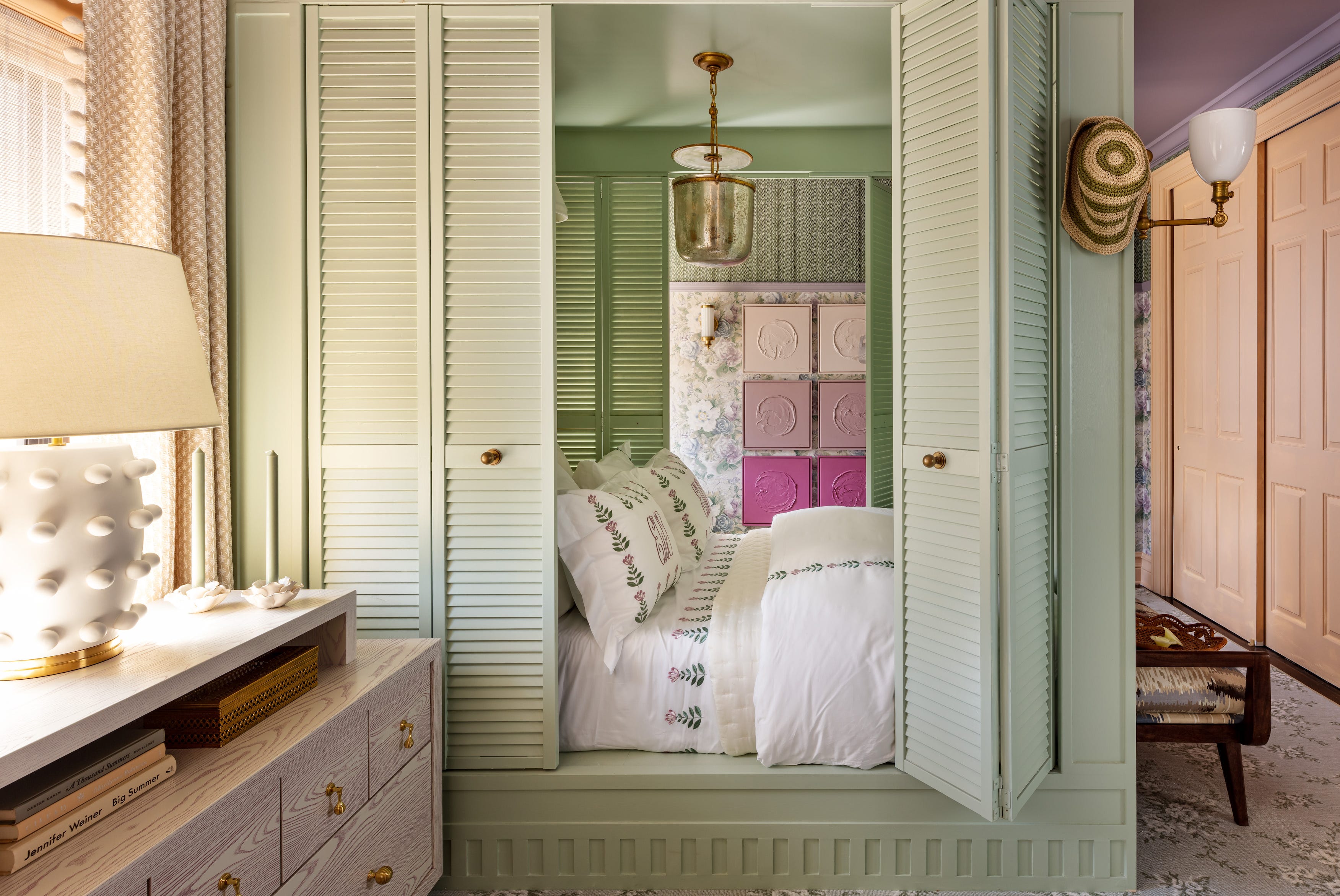
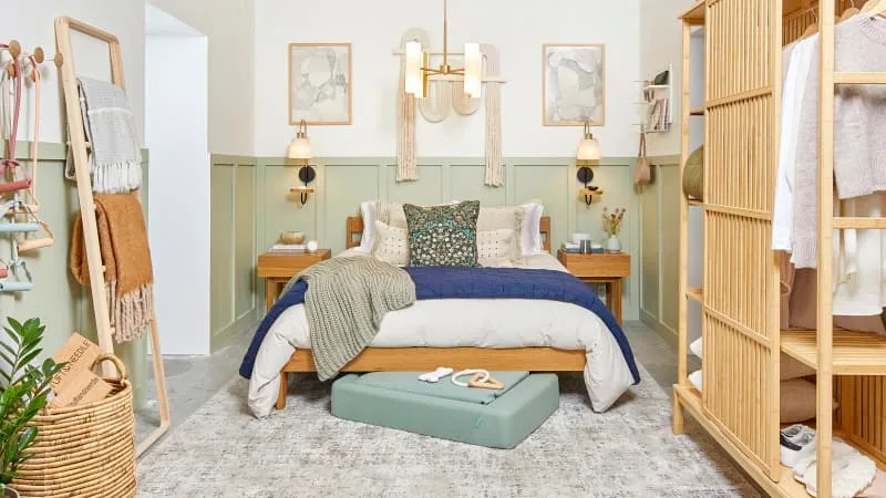
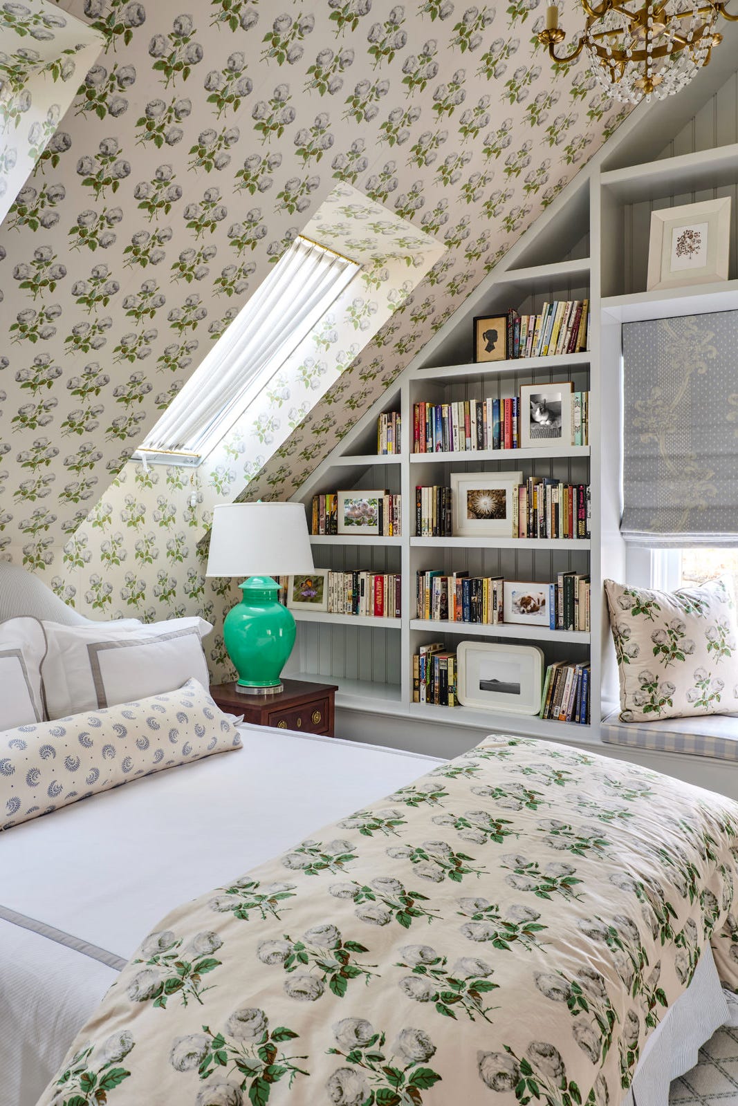
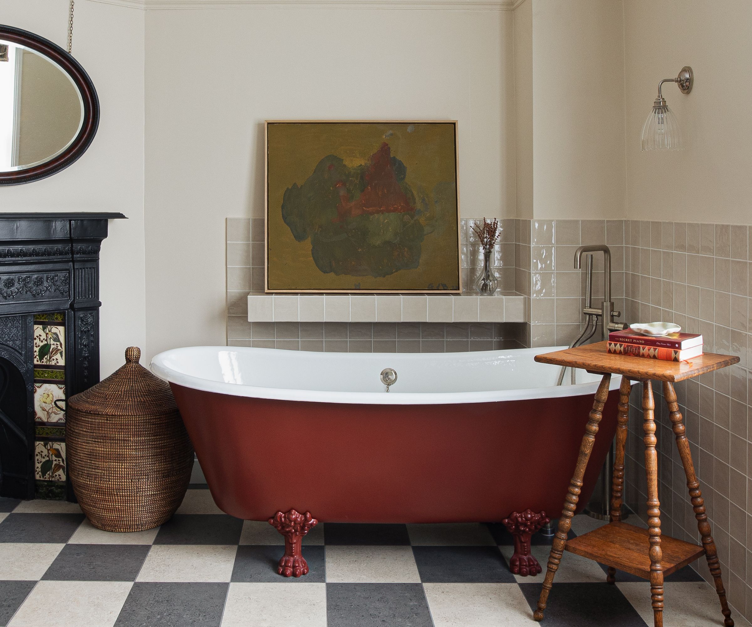
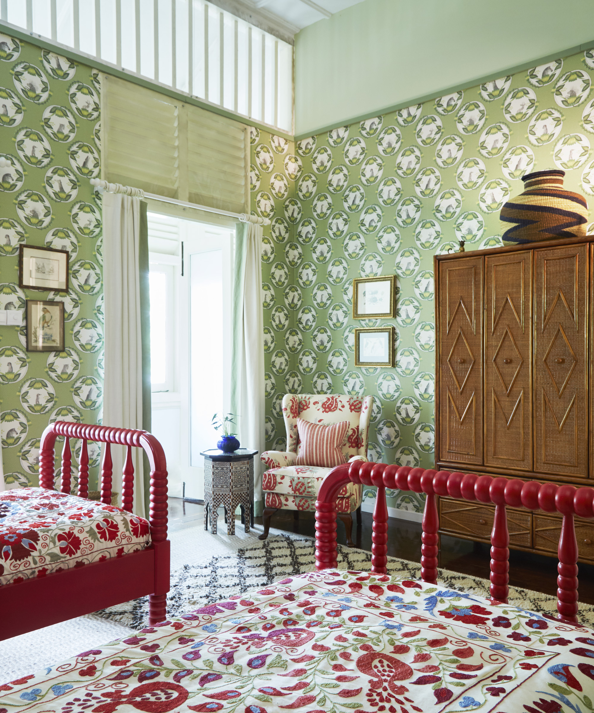
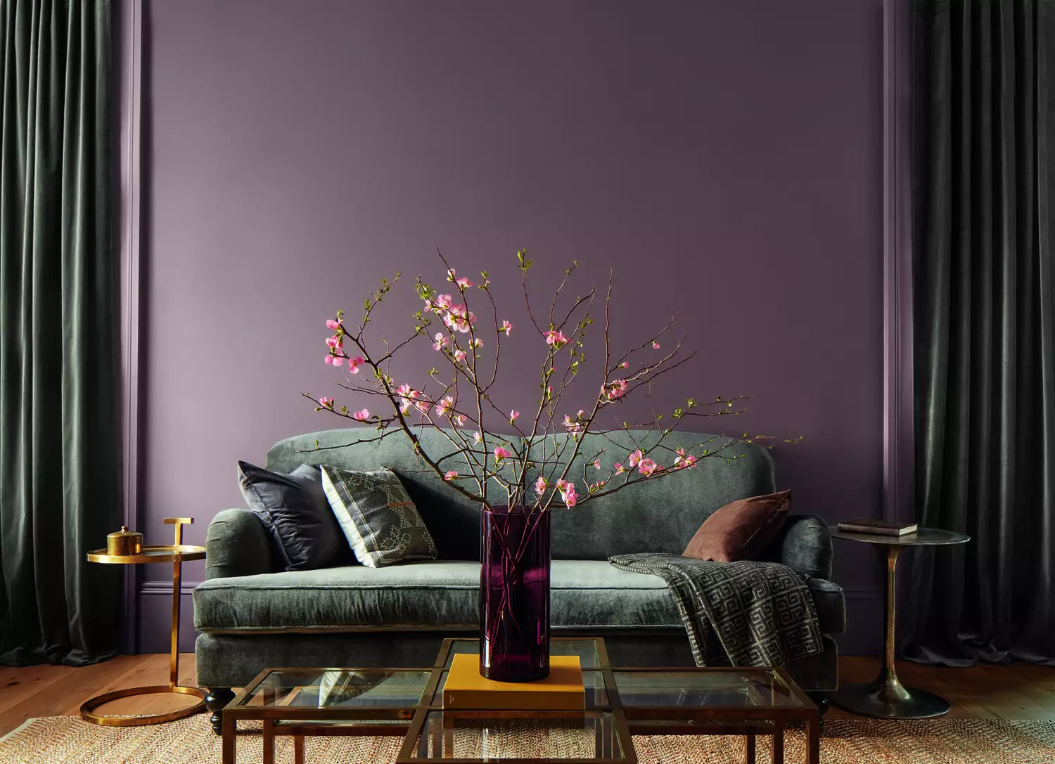
Purple and green, a naturally occurring combination found in flora like hydrangeas and lavender, can create an immersive design scheme, particularly with botanical-inspired and jewel-toned emerald greens. Light blue and green work well as softer pastels, especially when grounded with complementary fabrics and home accents. Red and green, traditionally associated with Christmas, can be extended beyond the holidays by introducing unexpected shades and softening brighter values with wood tones and metallic finishes. Finally, layering different shades of green in a monochromatic approach creates an immersive and tonal look, emphasizing texture and depth.
Regarding trending shades for 2025, experts predict a move towards mossier, more natural, and earthy greens, reflecting a preference for deep, moody, and subtle tones inspired by nature. While green is highly versatile, certain combinations might be less harmonious depending on the specific shades. For instance, pairing green with primary yellows and blues can be challenging, and certain shades of orange and purple might evoke Halloween if not carefully balanced. Light gray is also noted as a less favored pairing by some designers due to its potential to create a dull or smog-like effect.
#ColorPalettes #InteriorDesign #GreenDecor #HomeStyling #ColorCombinations #DesignTrends #HomeDecor #DesignerTips #RoomIdeas #ColorPalettes #InteriorDesign #GreenDecor #HomeStyling #ColorCombinations #DesignTrends #HomeDecor #DesignerTips #RoomIdeas
0 comment in total
 No comments yet
You may also like
5 best green paints that will always be classics, according to interior designers

37 Unexpected Colors That Pair Perfectly With Green, According to Designers

15 Lush Green Paint Colors to Invigorate Any Space

51 Green Color Schemes Perfect for Living Rooms, Bedrooms, and More

There Are Only Certain Green Paint Colors That Can Bring a Room to Life
These 13 Green Paint Colors Are the Best We’ve Ever Seen

17 Green Paint Colors for Every Room, From Soothing Sage to Electric Emerald
Green is the color of 2023 – these designer-approved ways to use it are bold and beautiful
15 green interior design ideas that will have you green with envy

12 Paint Colors That Interior Designers Are Buzzing About—See the Gorgeous Hues Here
The 10 Best Little Greene Paint Colors For Your Home, as Chosen by Interior Designers
5 colors to never pair with green according to designers – and what to use instead
8 Green Paint Colors Interior Designers Swear By for a Bold and Fresh Home

Here's How to Decorate With Green So It Actually Looks Chic
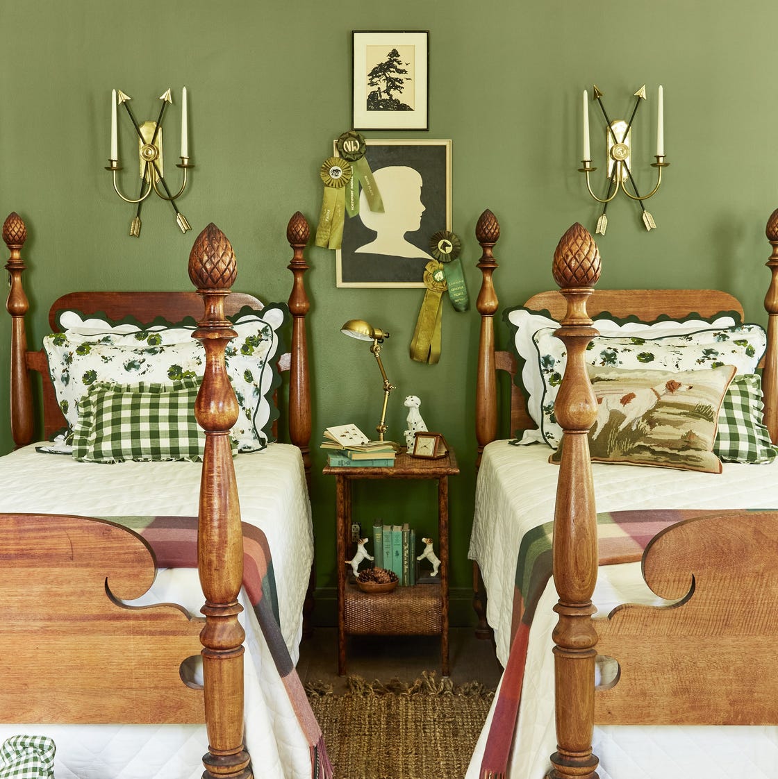
Green Is the Prettiest Color! These Rooms and Decorating Ideas Prove It
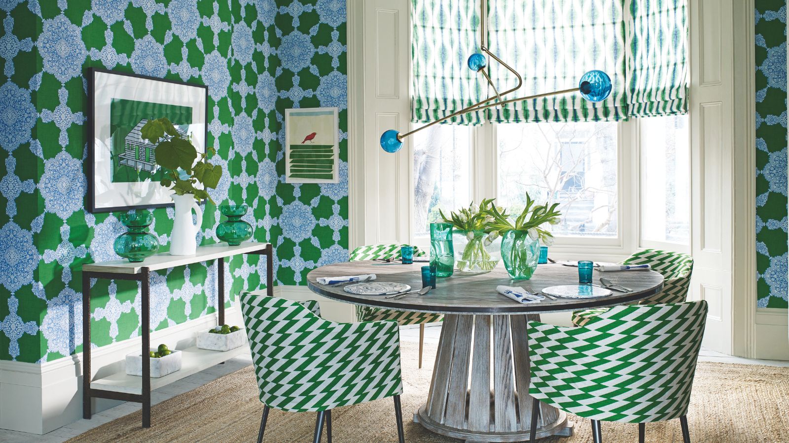
What colors go with green? Professionals propose these harmonious pairings for successful schemes
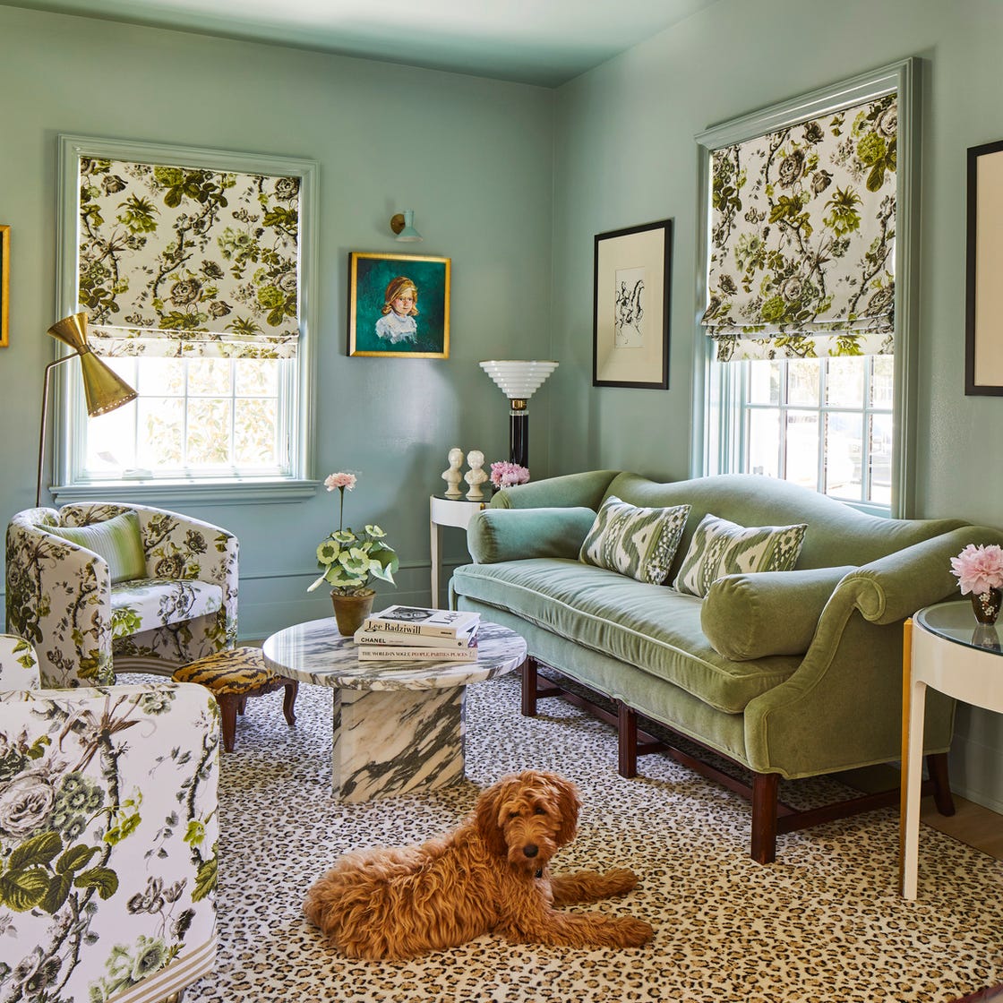
Designers Swear By These 11 Sage Green Paint Colors

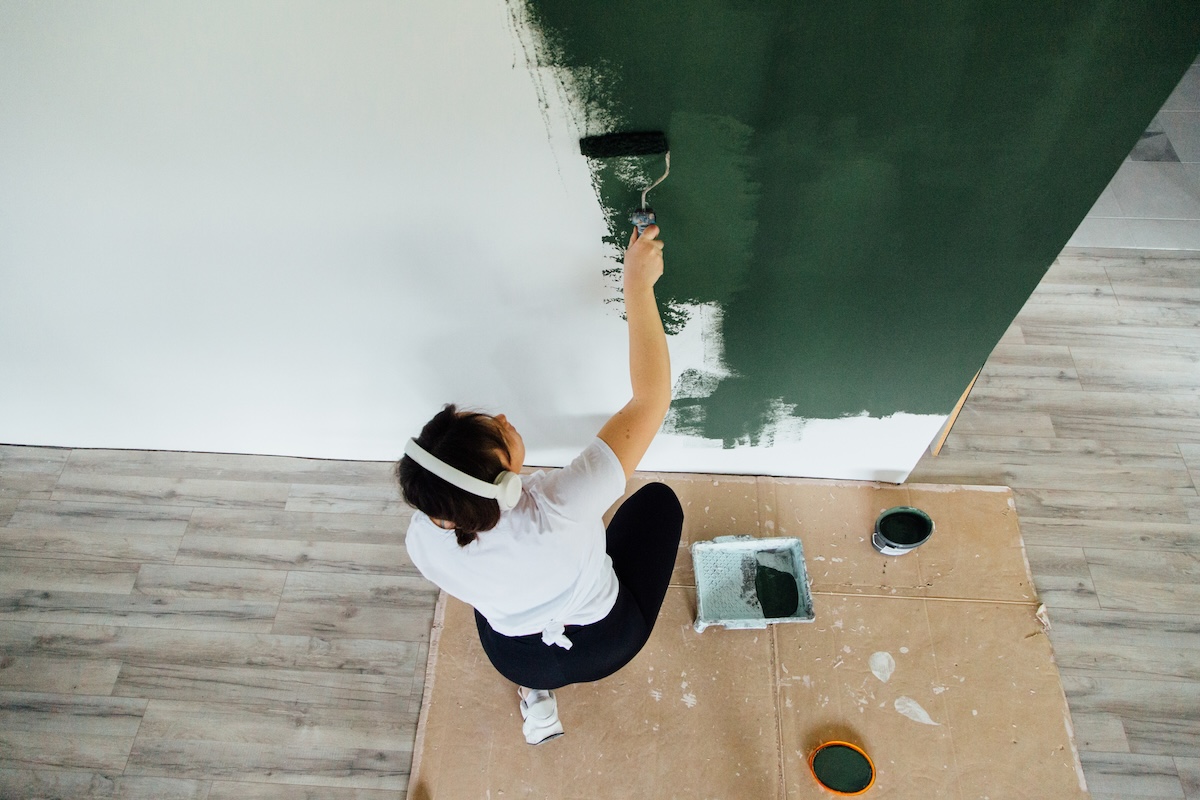
19 of the Best Green Paint Colors for Any Room in Your Home

32 Green Rooms That'll Make You Feel Alive

Going Green: Inside This Year’s Color Craze