1/9
The 10 Best Little Greene Paint Colors For Your Home, as Chosen by Interior Designers
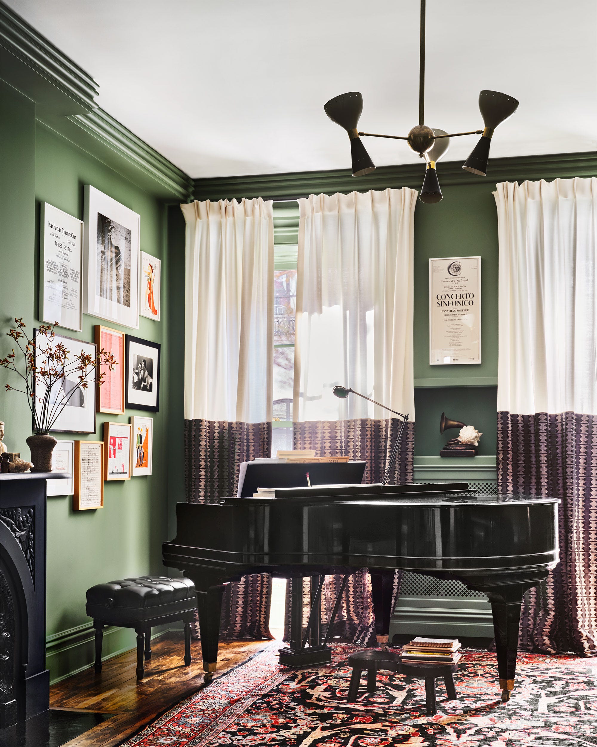
Little Greene is highly regarded by interior designers for its extensive color palette and superior paint quality. The brand’s commitment to sustainability and its use of archival sources for many shades contribute to the depth, character, and timelessness these colors bring to interiors. With a wide array of options, choosing the right shade can be challenging, but interior designers have highlighted ten specific colors for their transformative impact.
Slaked Lime is a versatile, warm off-white, appreciated for its subtle warmth and soft chalkiness. Interior designer Gemma John recommends Slaked Lime Mid for main living areas, complemented by Slaked Lime Dark on woodwork and fireplaces to create a layered, timeless aesthetic suitable for calm spaces.
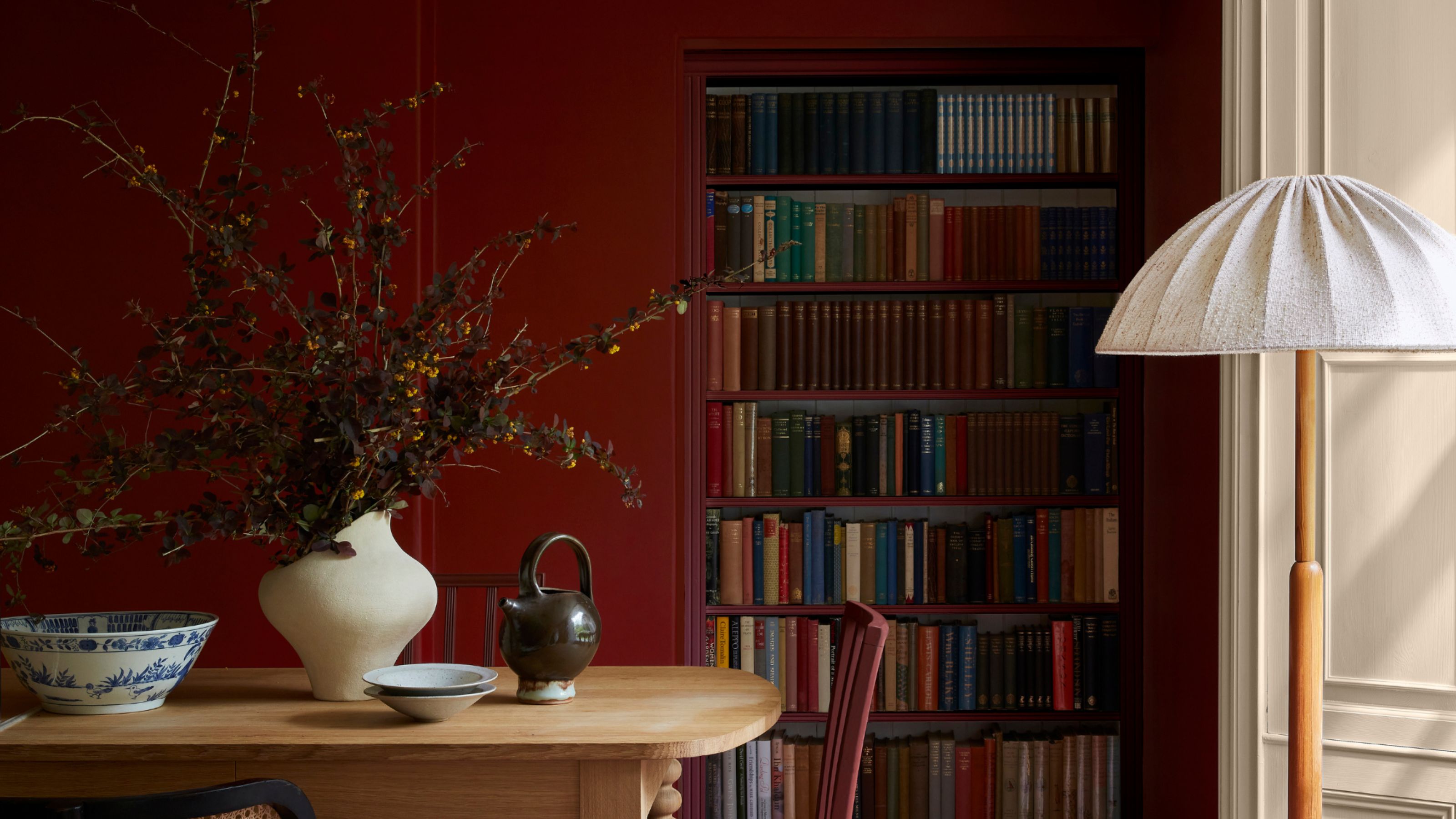
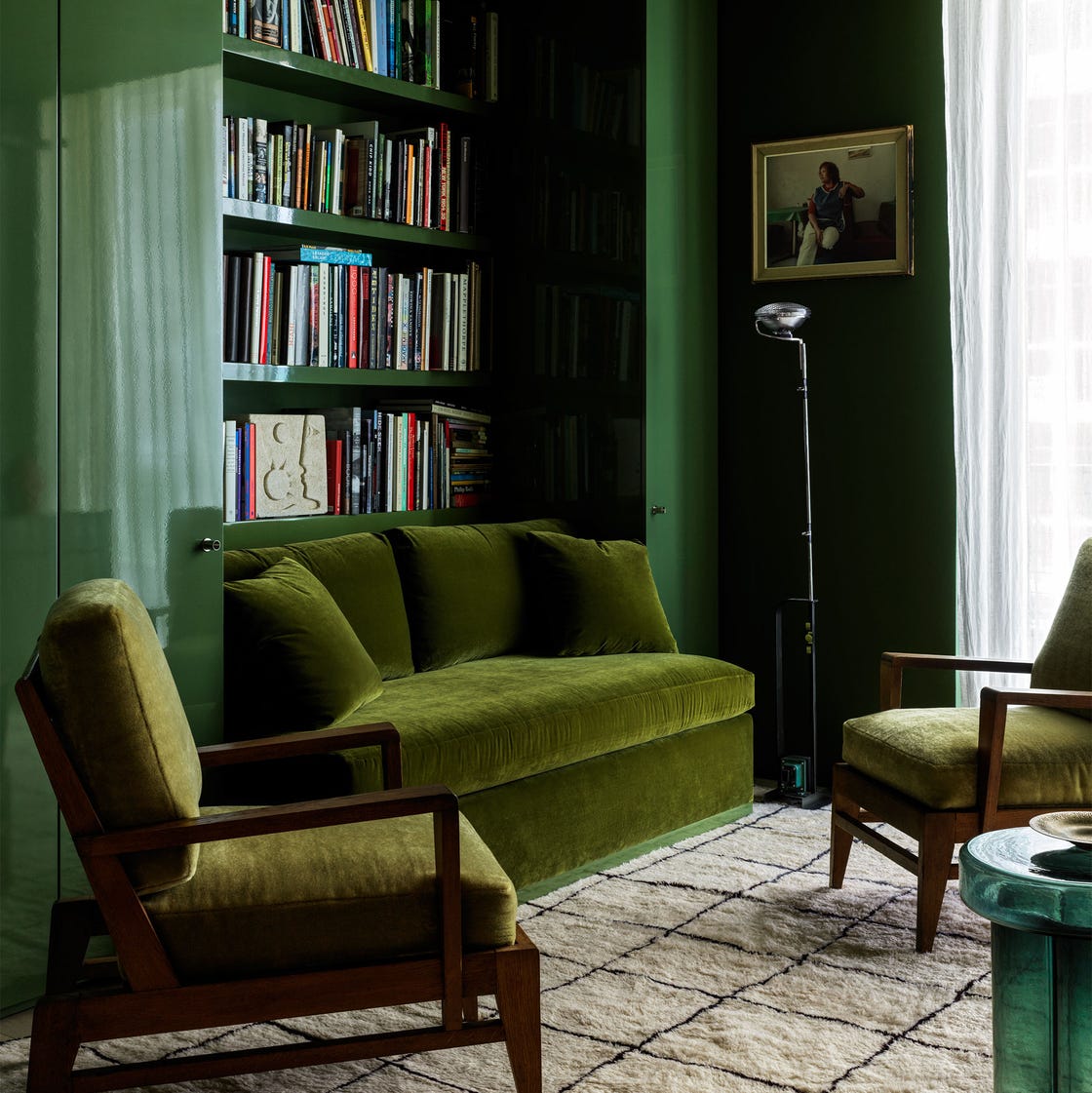
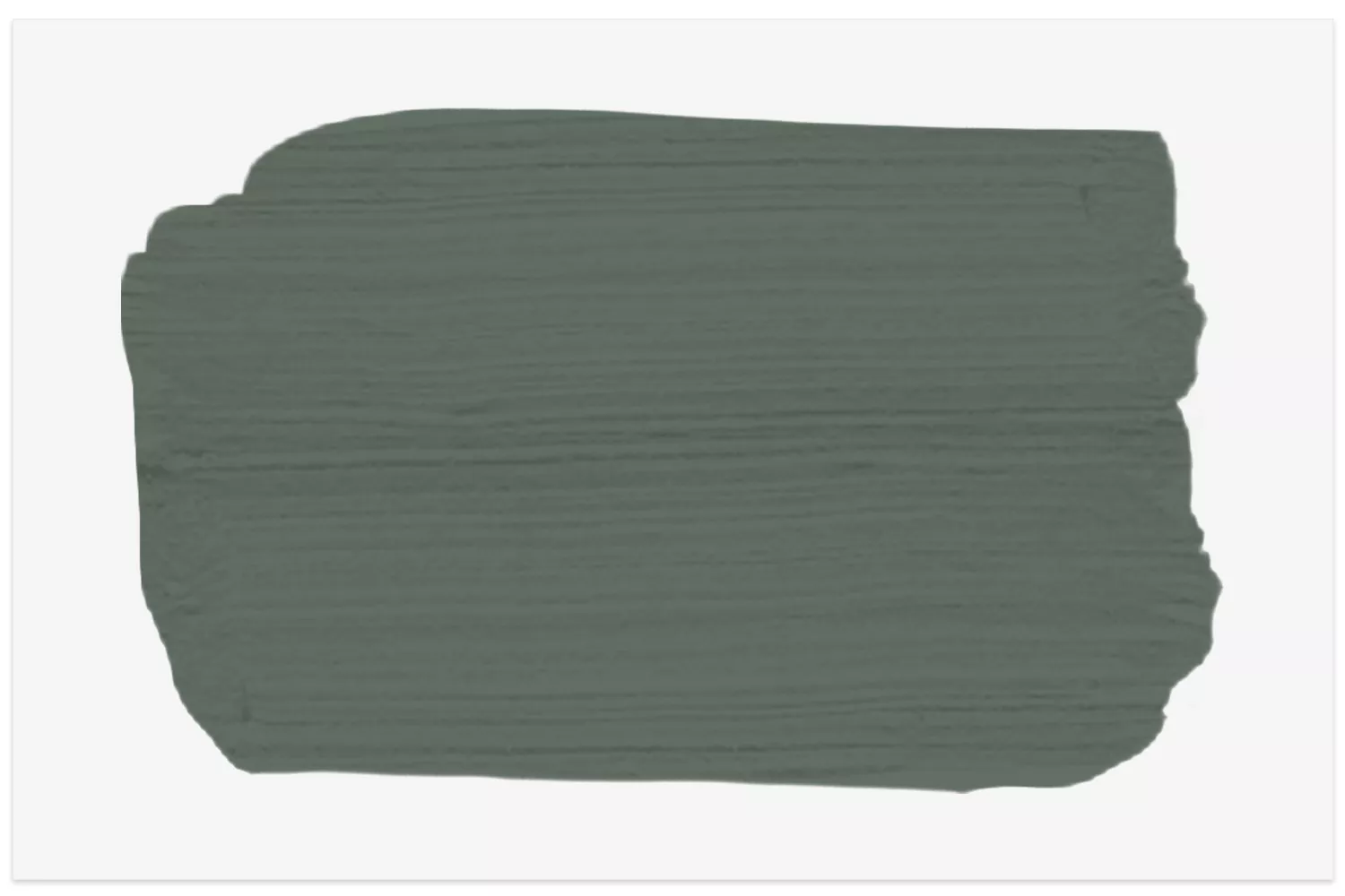
Arras is a deeply pigmented, muted red with brown undertones, inspired by traditional English textiles. This color adds richness and sophistication, ideal for creating intimate environments. Samantha Watkins McRae used Arras in a Victorian home, blending it into an earthy palette to introduce drama while maintaining a strong emphasis on sustainability.
Travertine is another highly recommended off-white, offering a faint warmth that balances ivory and putty tones. Its subtle nature makes it perfect for contemporary minimalist interiors, enhancing texture and light. Gemma John used Travertine in a coastal retreat to connect the interior with external sandy tones, allowing other materials to stand out without starkness.
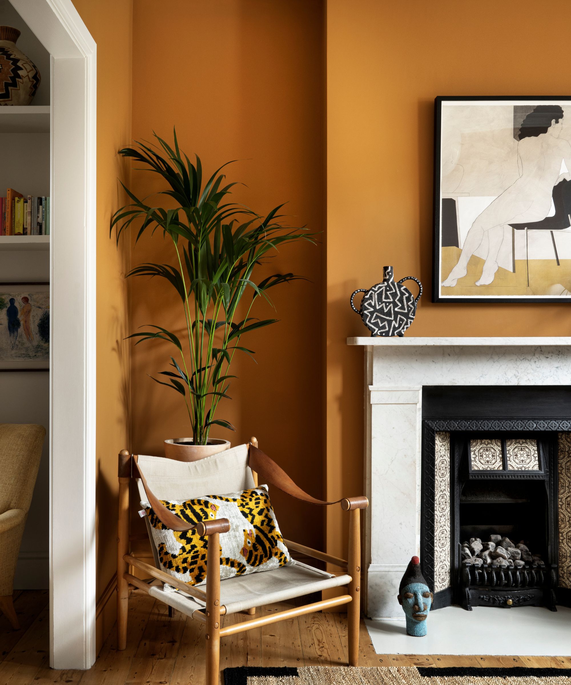
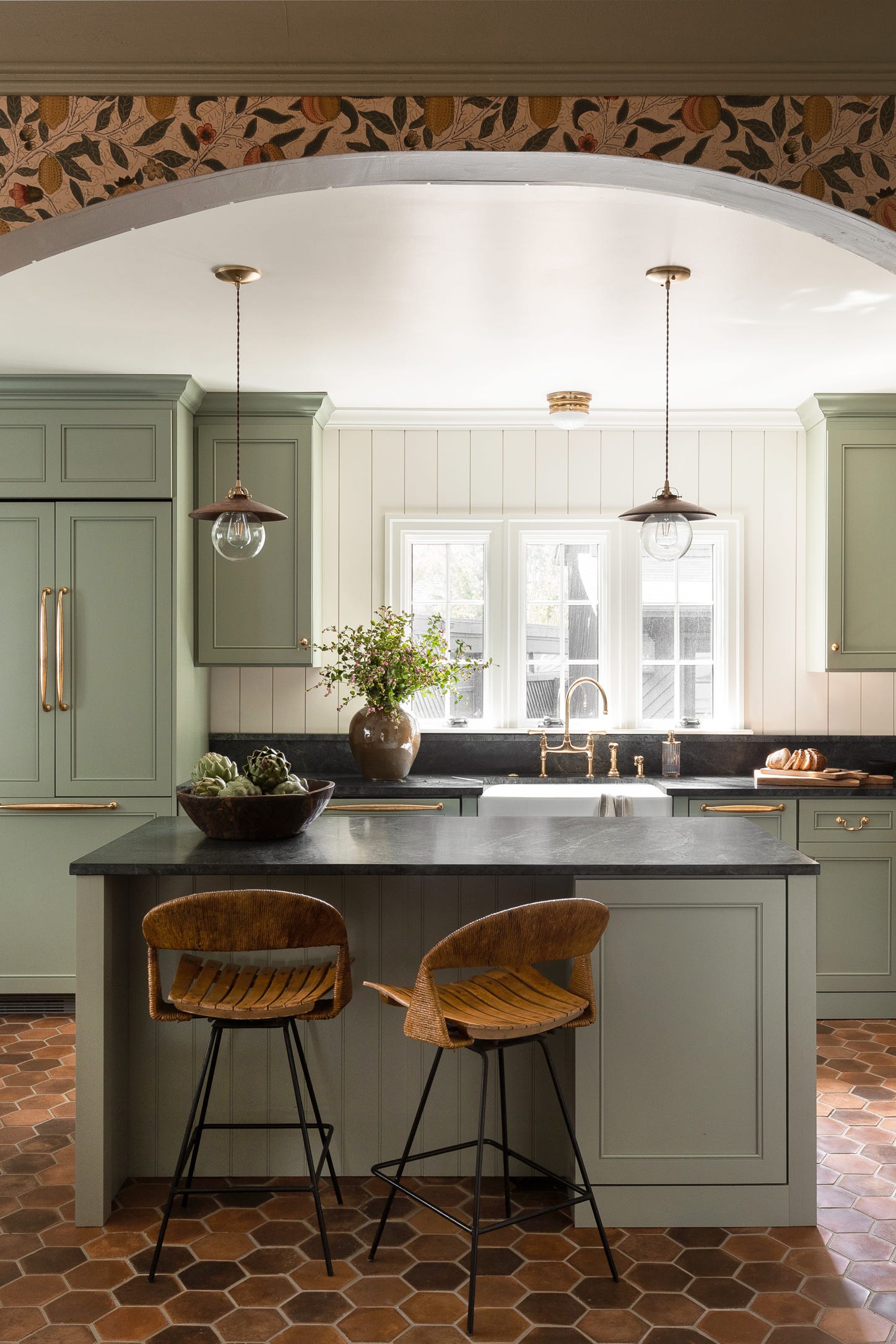
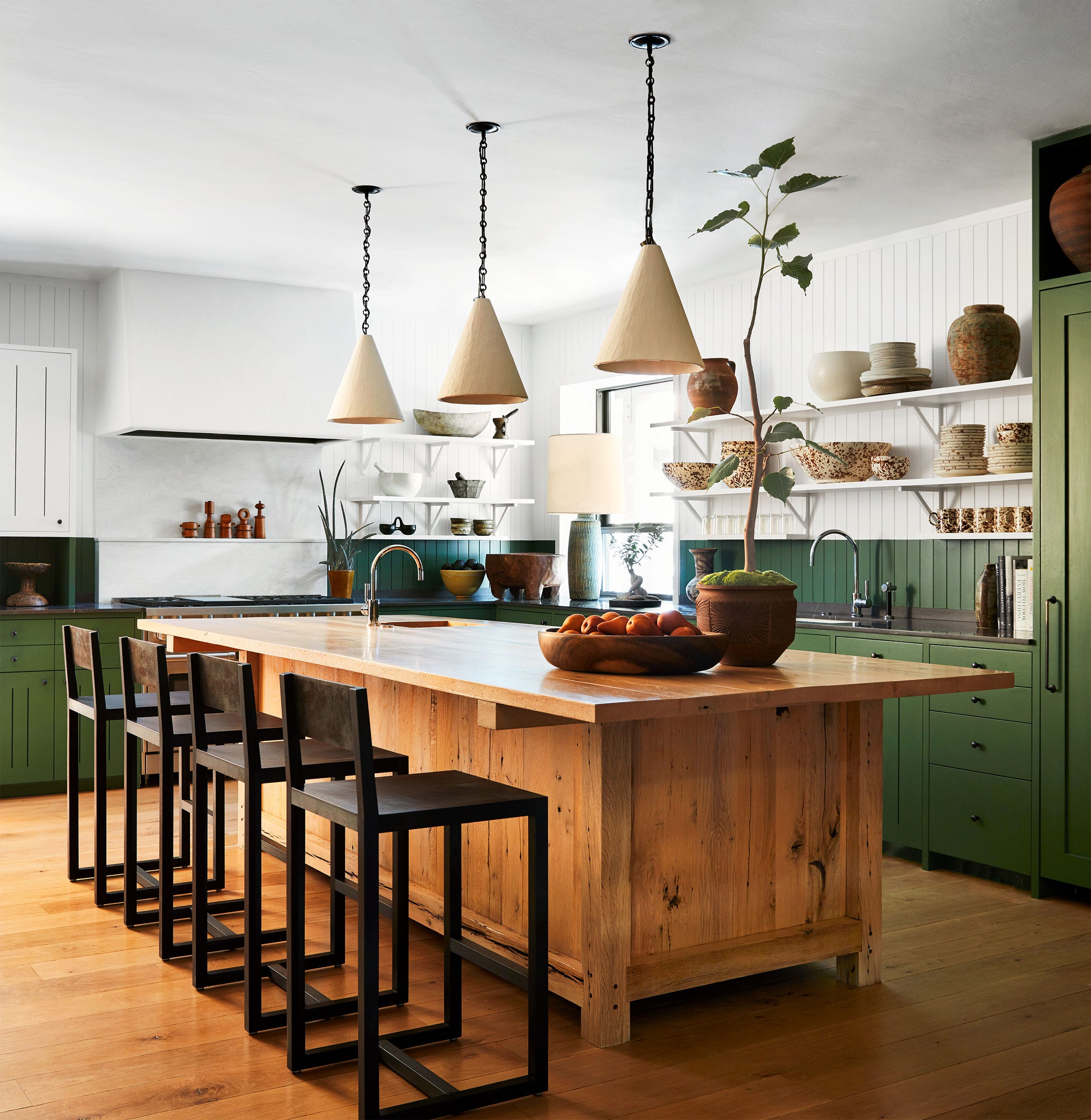
Middle Buff is a rich, warm, and intense ‘Indian Yellow’ that brings warmth and sophistication. Leo Wood of Kinder Design chose Middle Buff for a South London living room, creating an intimate yet vibrant space that encourages both entertaining and quiet relaxation.
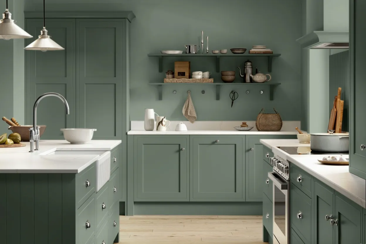
Portland Stone, named after the famous limestone, is a versatile and historically significant neutral. Cate St Hill frequently uses it in transitional spaces like hallways and landings to provide an elegant flow and a calm backdrop that complements various room styles, from moody sitting rooms to bright kitchens.
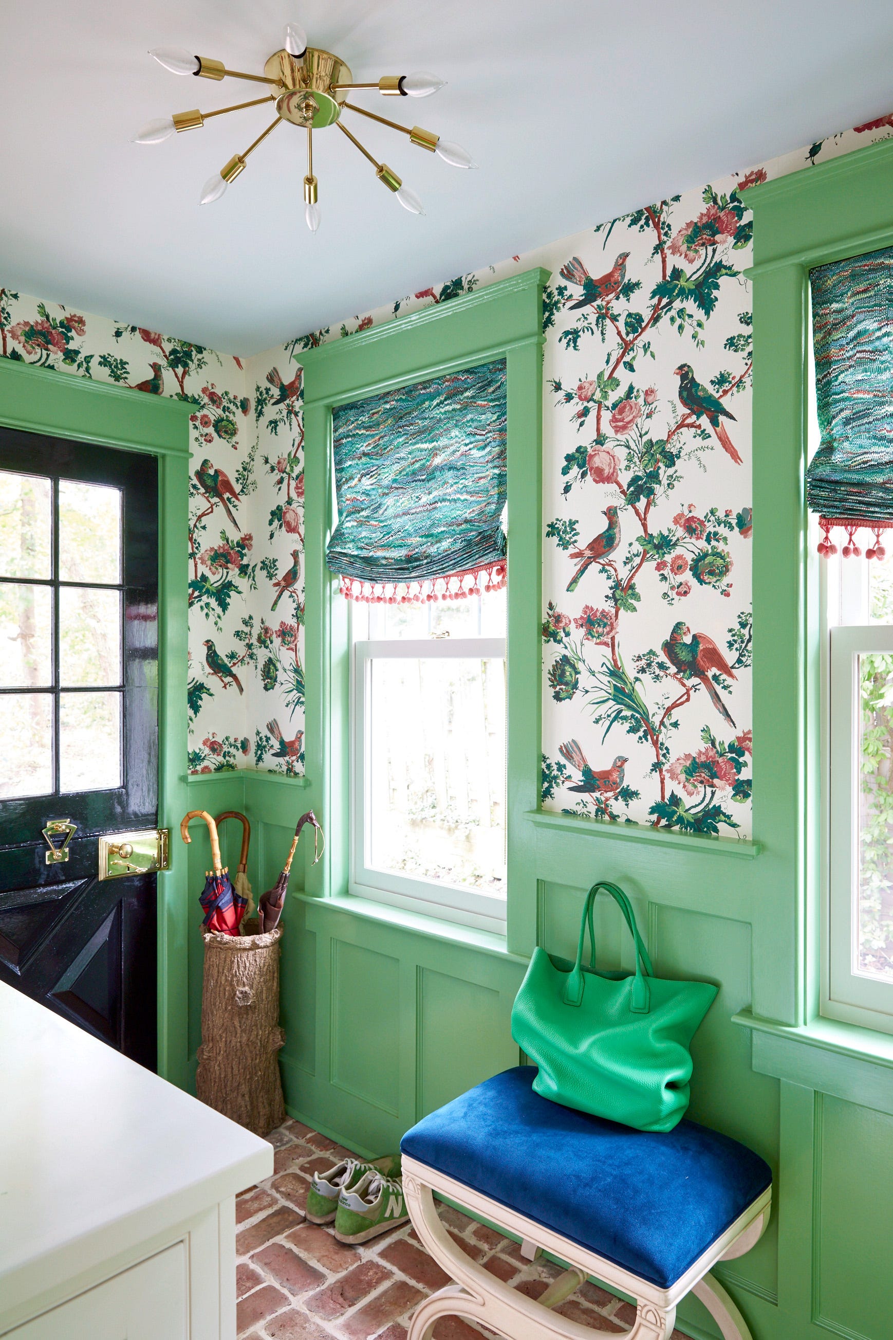
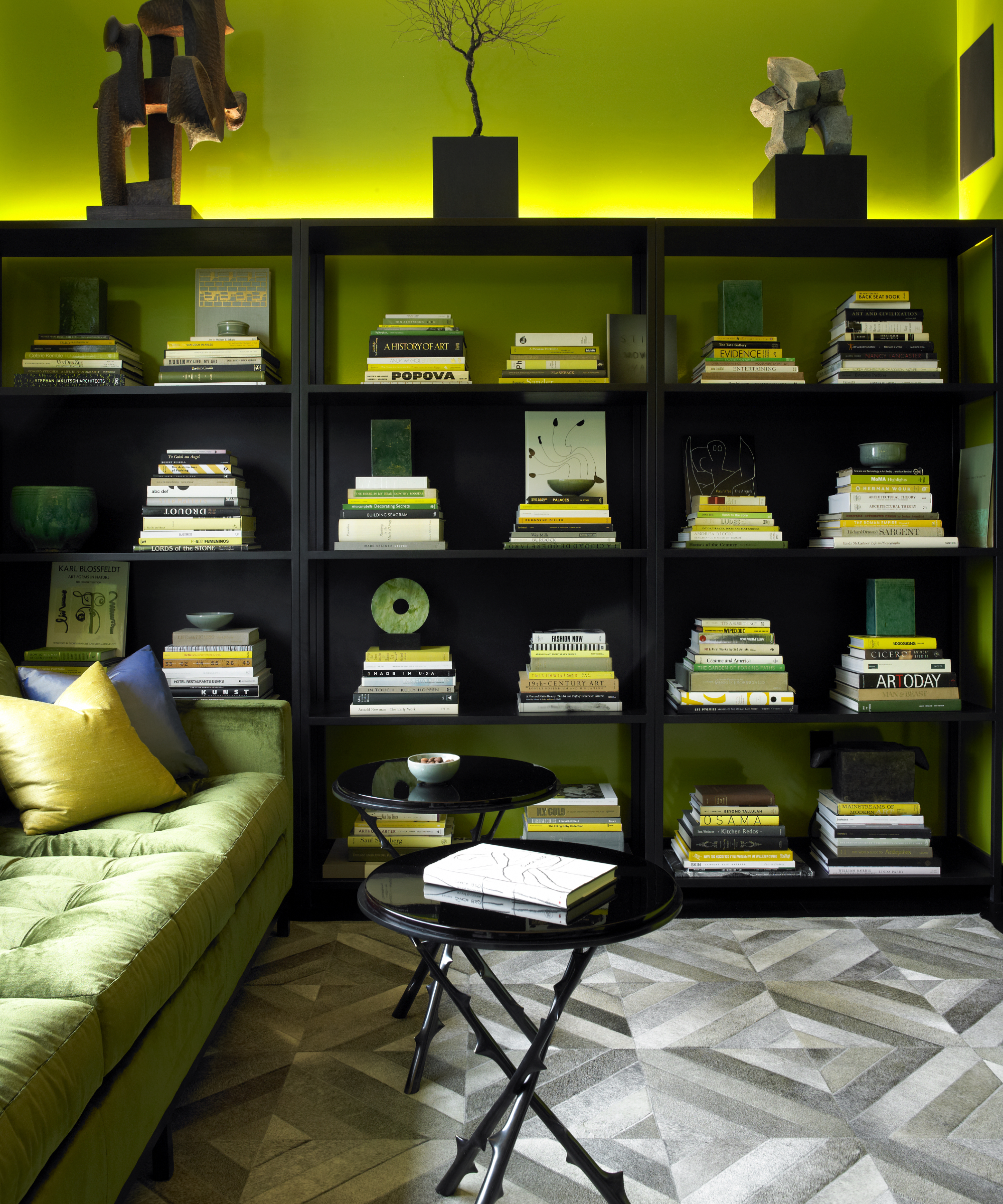
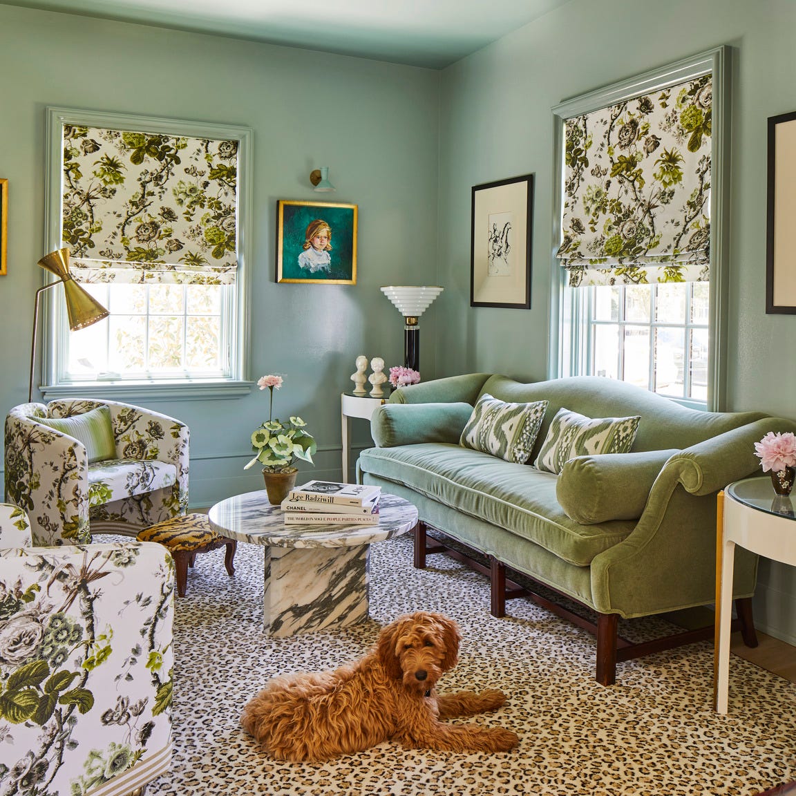
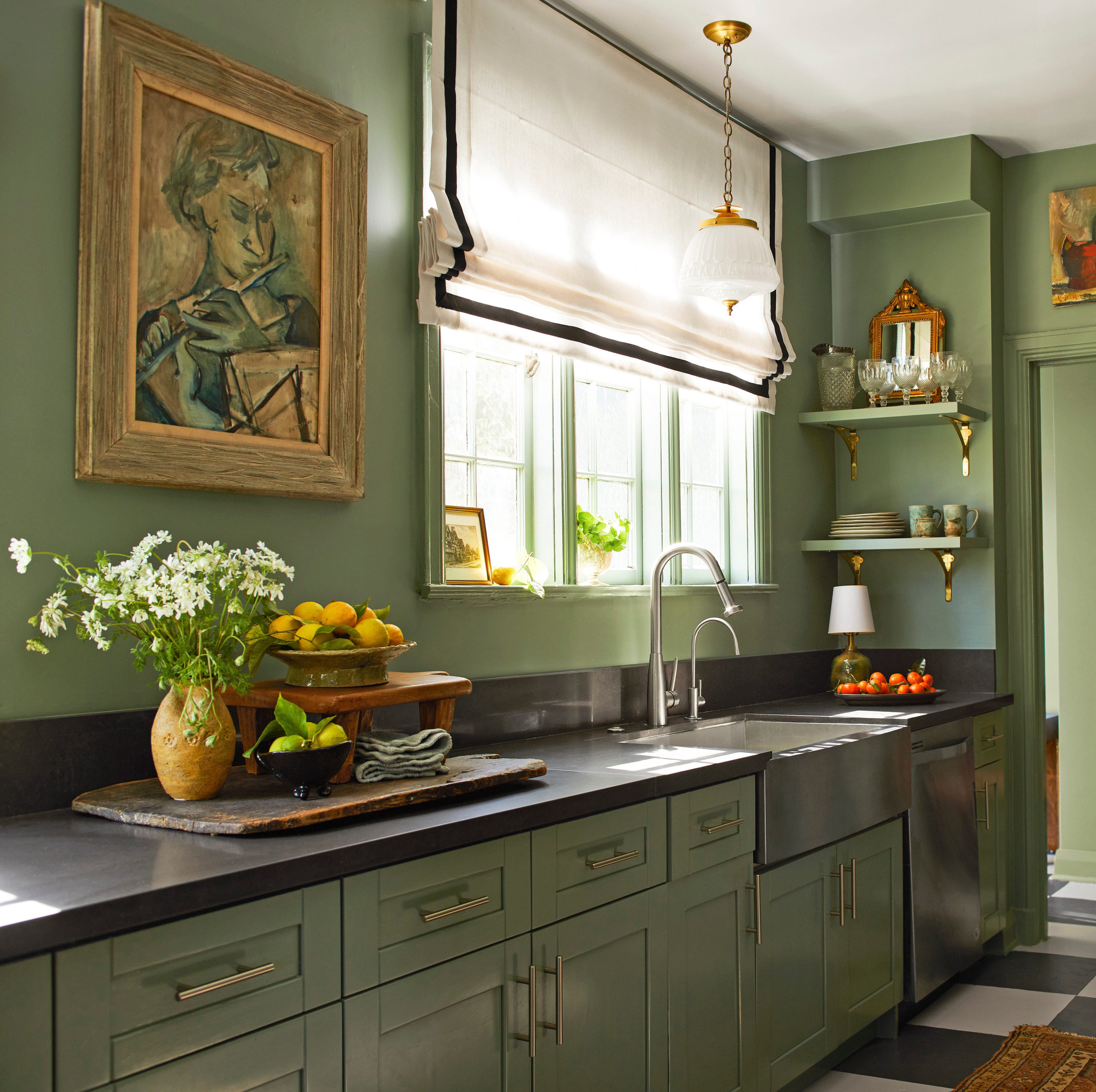
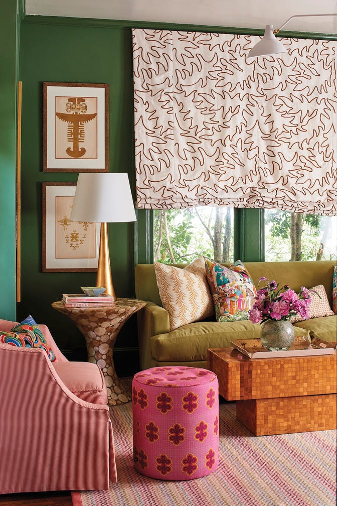
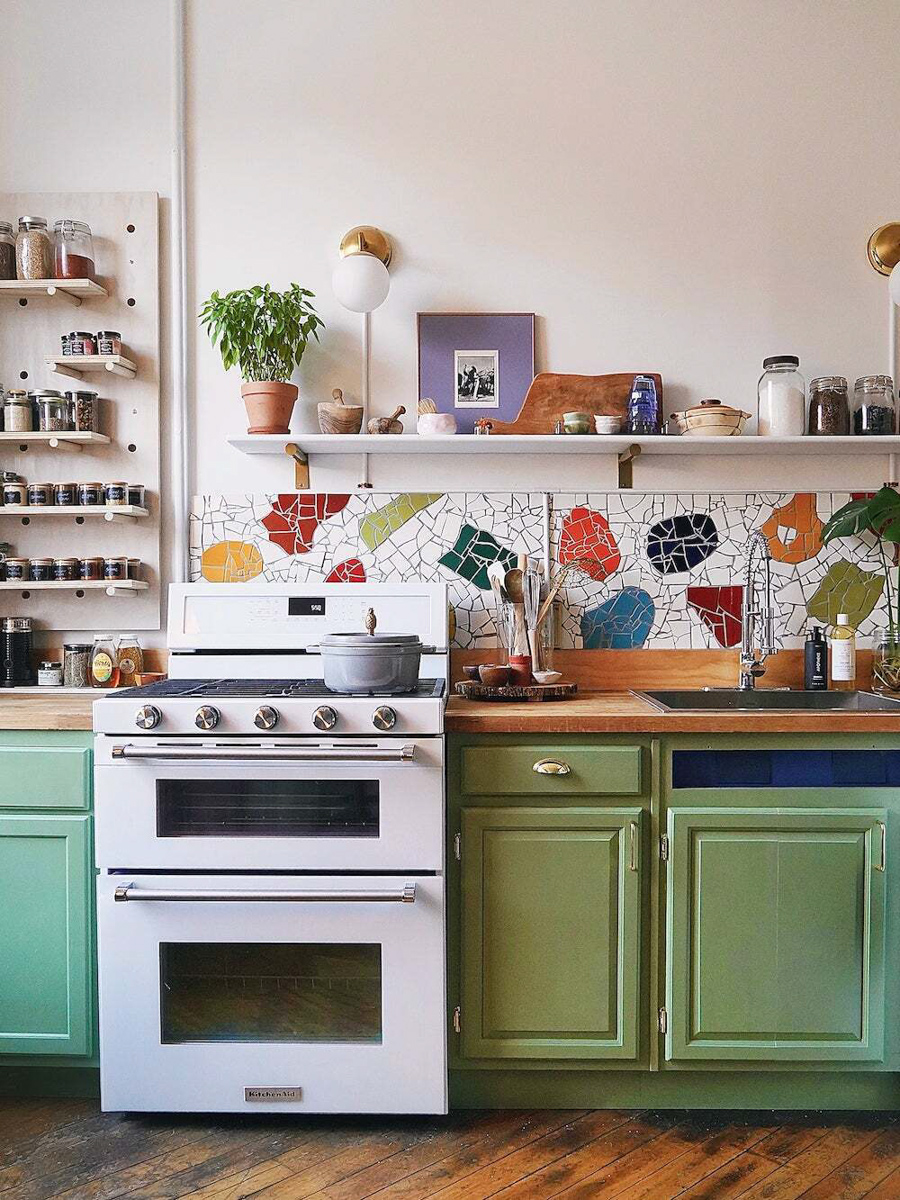
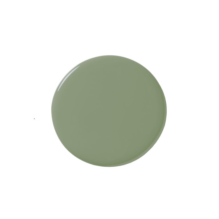
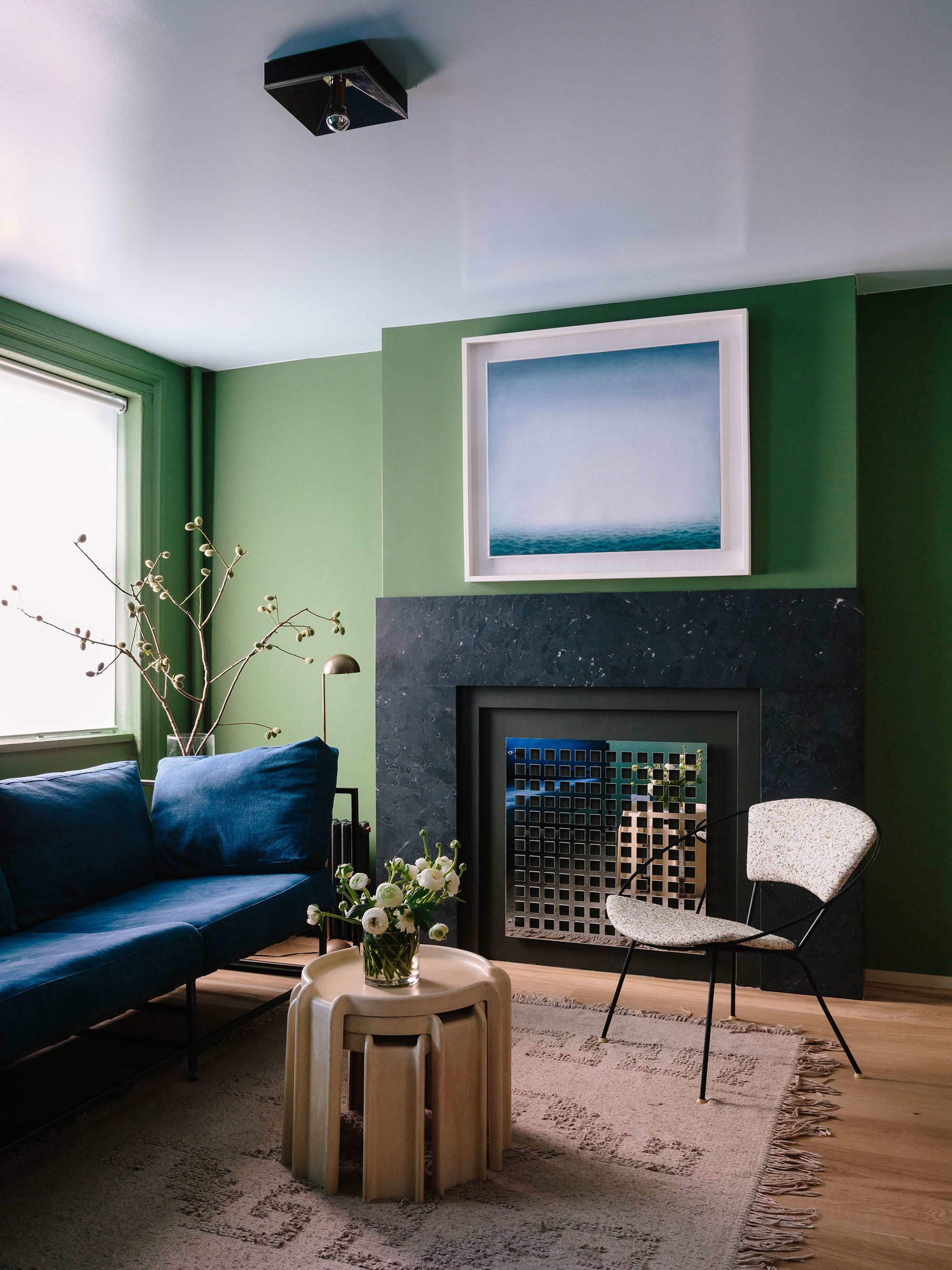
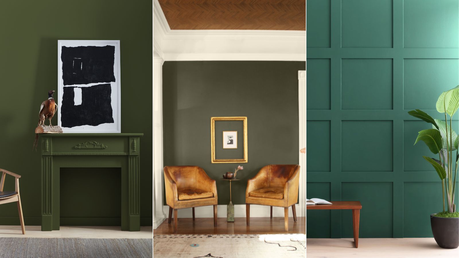
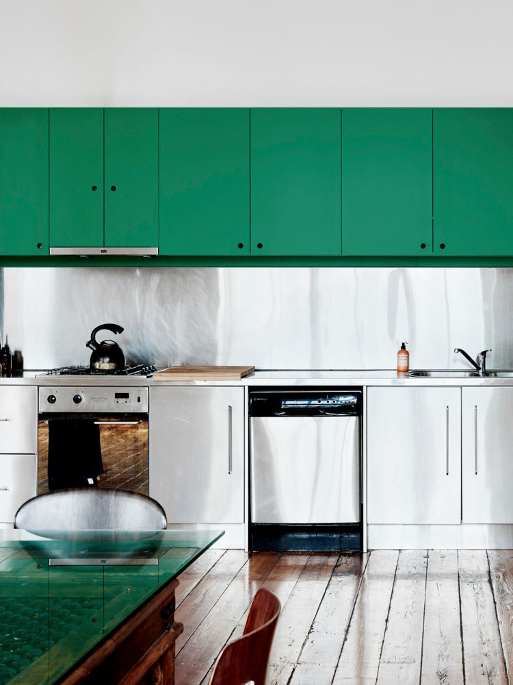
Tea with Florence is a refreshing, citrus-tinged green, inspired by 20th-century design. Gemma John incorporated this shade into an entryway, applying it across all walls and woodwork to create depth, vibrancy, and a sense of continuous space in a narrow hallway.
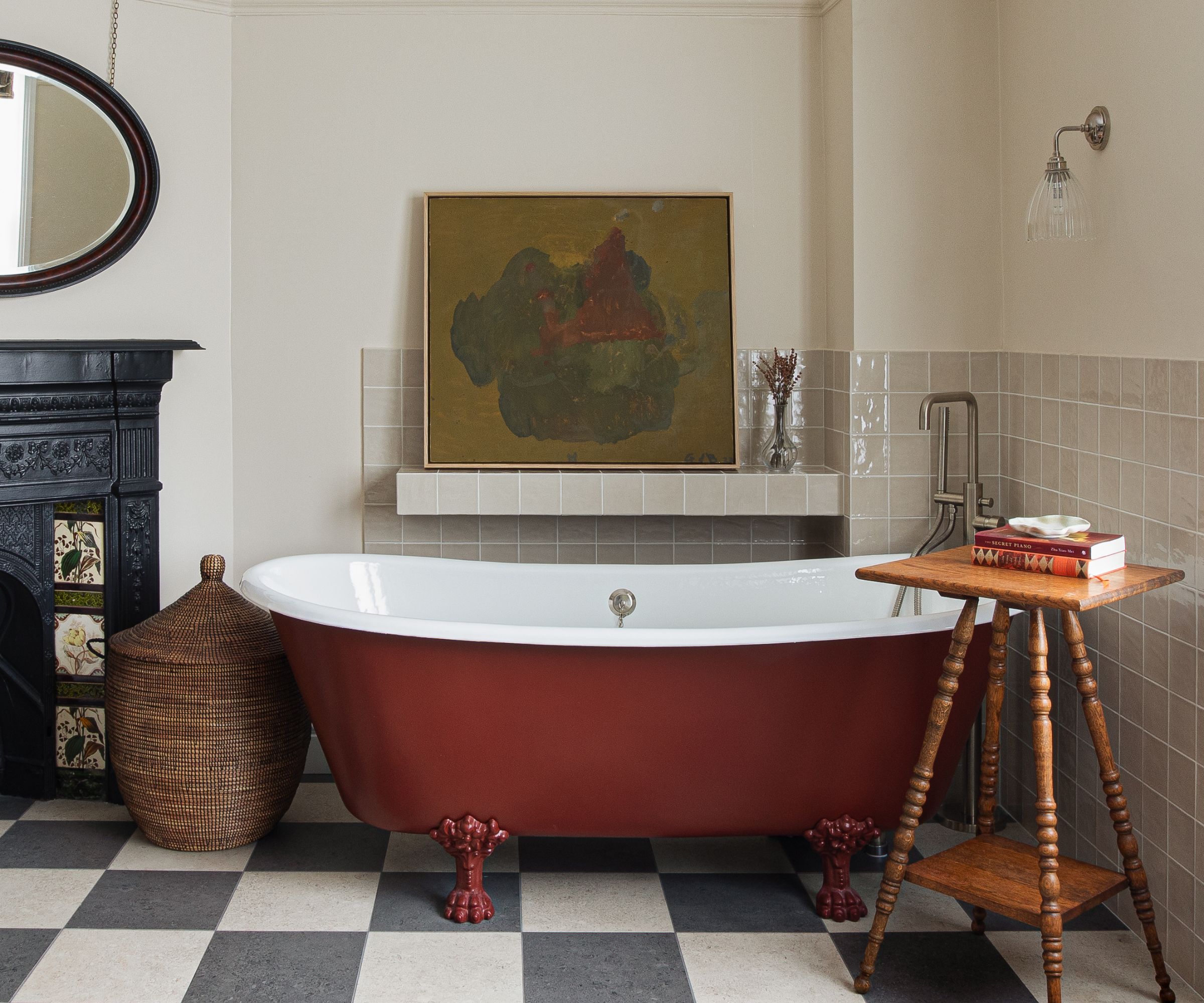
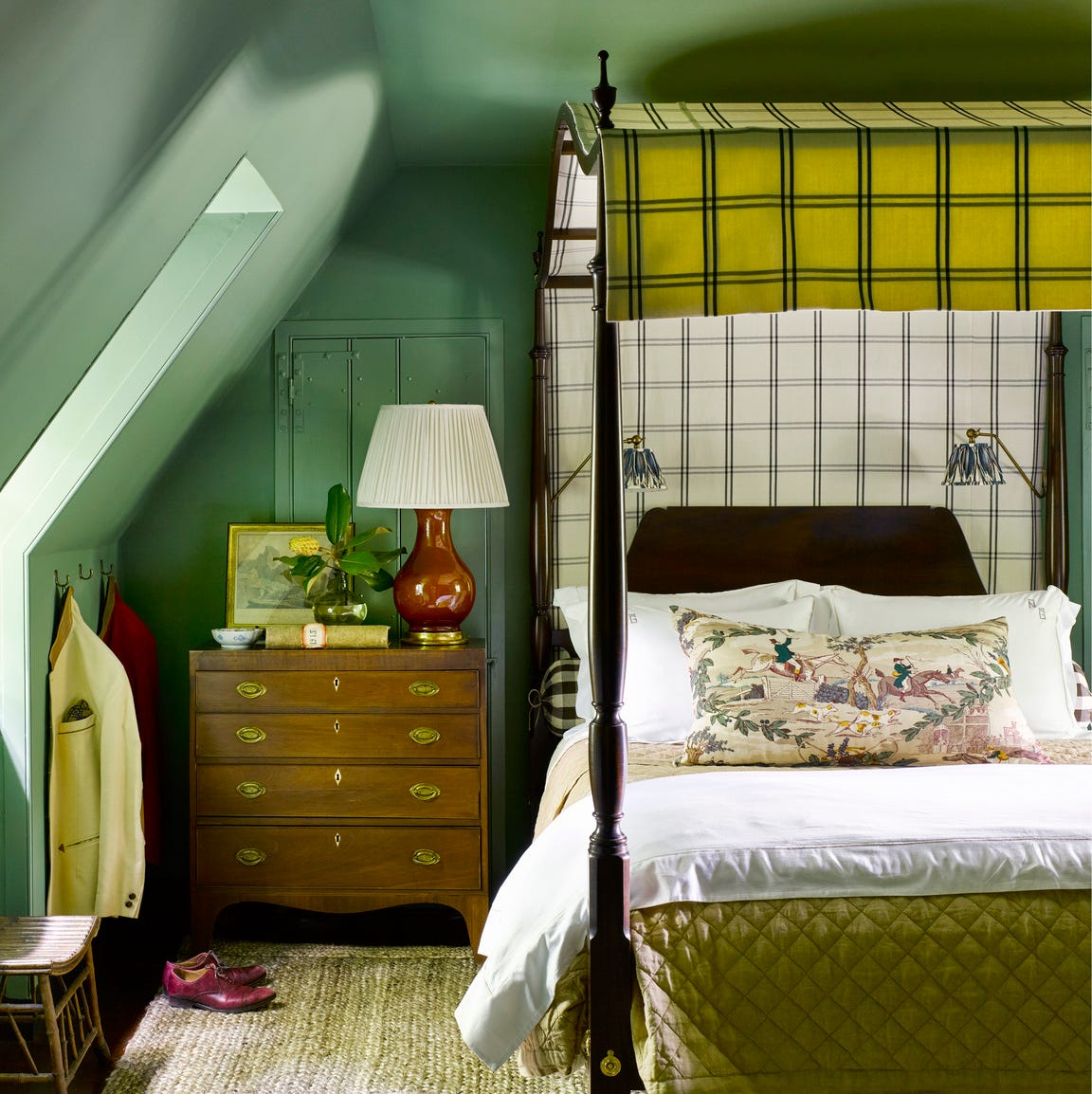
Bronze Red is a rich, warm hue from the late 19th century, perfect for creating opulent spaces. Tom Morris used it on architraves to contrast with greener wall tones, adding character to architectural details. This color is ideal for living rooms, dining rooms, or bedrooms and can be combined with other red oxide pigments for a dramatic ‘double drenching’ effect.
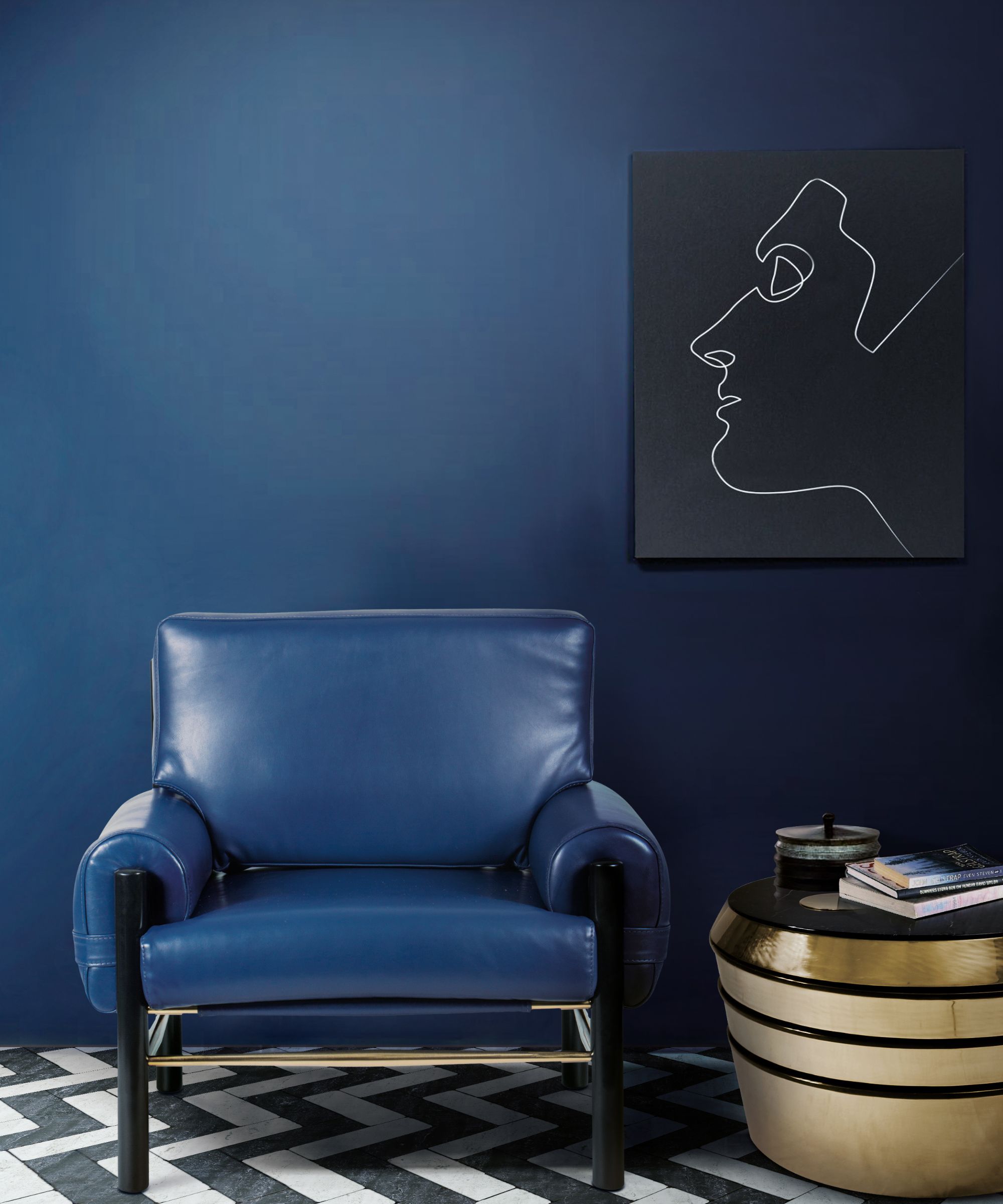
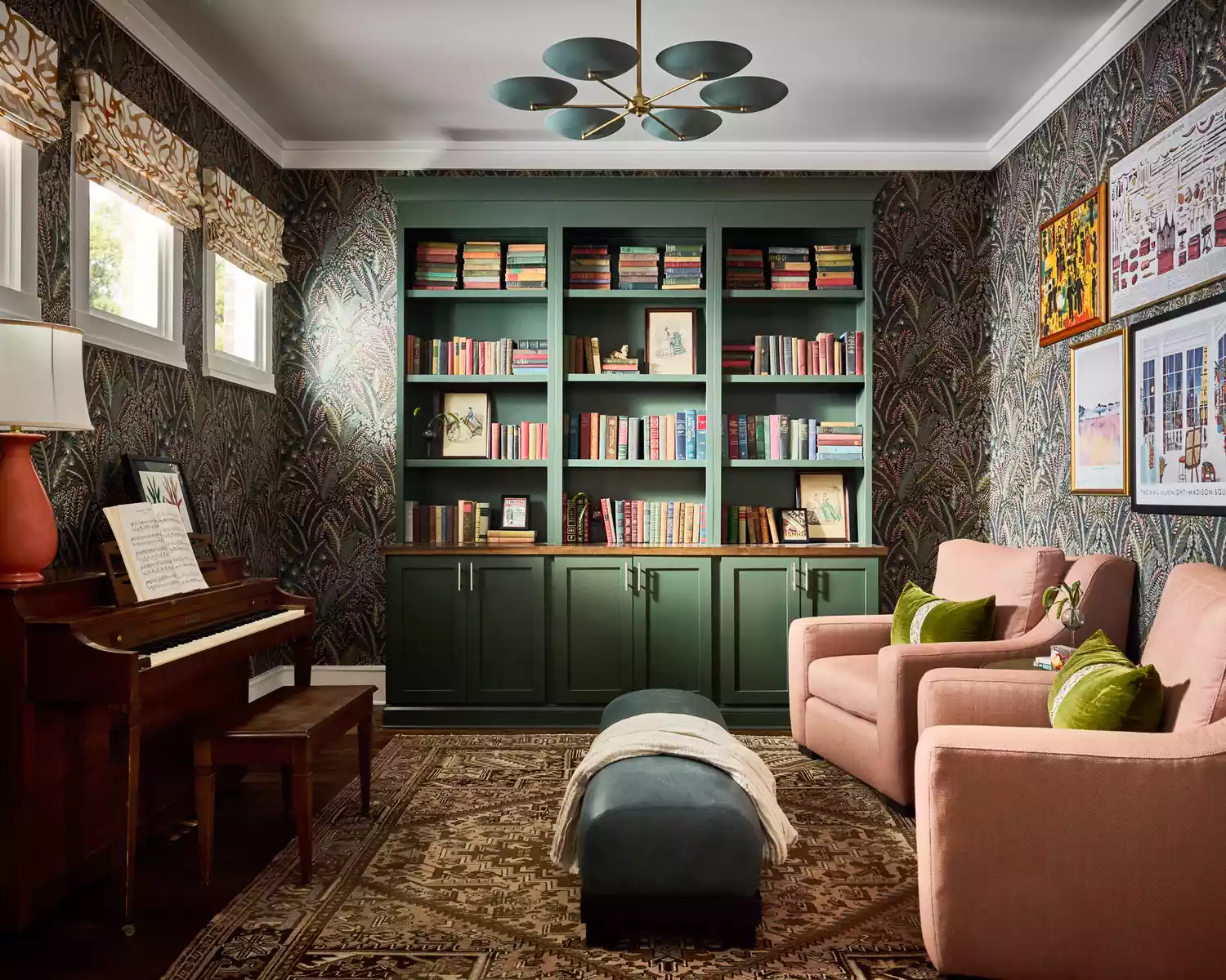
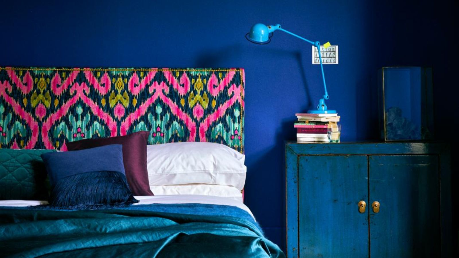
Bone China Blue is a delicate, refined blue with gray undertones, inspired by fine porcelain. It creates serene and calming environments, making it suitable for children's rooms. Natalia Miyar Atelier used it in a nursery to achieve an uplifting atmosphere, while Suzy Hoodless chose it for custom-made library shelves to add depth without overwhelming.
Silent White is a subtle white with barely-there gray undertones, offering clarity and softness without glare. Pernille Howarth, a Little Greene expert, recommended Silent White for ceilings and trims in a 17th-century cottage to maintain a neutral, calm, and relaxed feel that harmonizes with natural surroundings.
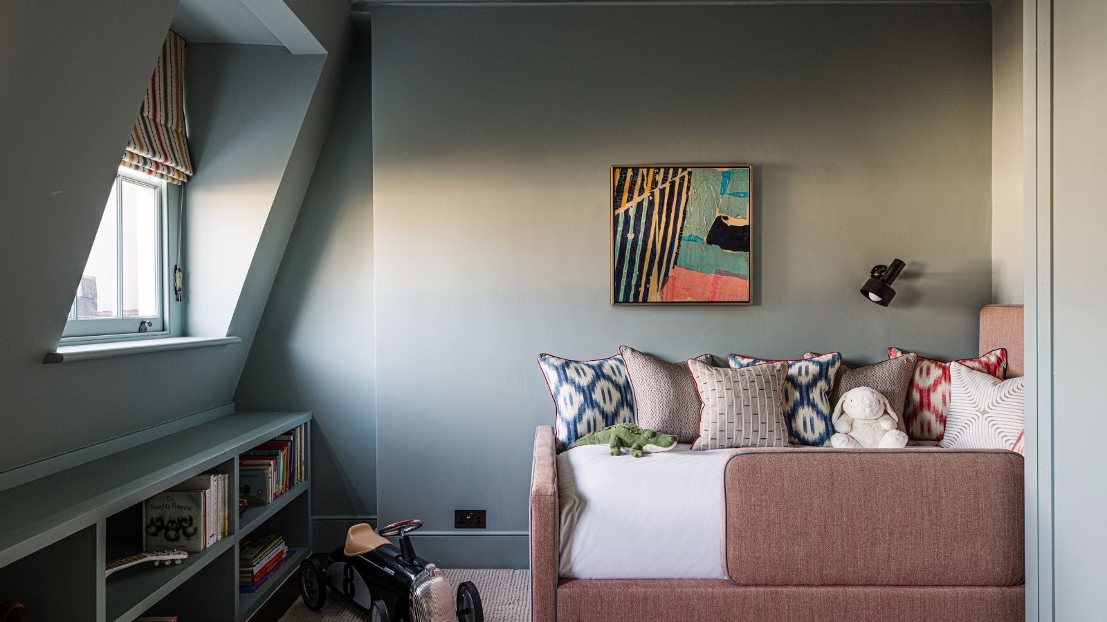
Yellow-Pink is a vibrant, earthy color with mustard hues, ideal for a bold statement. Natasha Lyon of Appreciation Project used Yellow-Pink to color-drench a child’s bedroom with sloped ceilings, simplifying the room's geometry and creating a cohesive, cozy, and calming ambiance. This approach effectively uses the color’s versatility and depth to adapt to natural light.
According to Ruth Mottershead, Creative and Marketing Director at Little Greene, the most popular colors are Travertine, Silent White, and Middle Buff, reflecting a trend toward warmer, natural neutrals. There is also a rising interest in solid mid-strength yellows, indicating a desire for uplifting and energetic colors in home interiors.
#LittleGreene #PaintColors #InteriorDesign #HomeDecor #ColorTrends #DesignerApproved #SustainablePaint #NeutralPalettes #BoldHues #LittleGreene #PaintColors #InteriorDesign #HomeDecor #ColorTrends #DesignerApproved #SustainablePaint #NeutralPalettes #BoldHues
0 comment in total
You may also like
There Are Only Certain Green Paint Colors That Can Bring a Room to Life

14 Best Dark Green Paint Colors to Cozy Up Your Home
Dark green paints are the 'it' color right now – here are 4 shades from Benjamin Moore to use in small rooms

51 Green Color Schemes Perfect for Living Rooms, Bedrooms, and More

19 of the Best Green Paint Colors for Any Room in Your Home

Here's How to Decorate With Green So It Actually Looks Chic
The best green paint colors for a soothing, sophisticated home

Green Is the Prettiest Color! These Rooms and Decorating Ideas Prove It
5 best green paints that will always be classics, according to interior designers
17 Green Paint Colors for Every Room, From Soothing Sage to Electric Emerald
The 10 Best Colors for Small Bedrooms, According to Color Experts and Interior Designers
These Dark Green Paint Colors Will Make You Feel Like You’re Living in a LITERAL Forest
8 Green Paint Colors Interior Designers Swear By for a Bold and Fresh Home

Designers Reveal the Best Lime Green Paint Colors for a Lively Home

37 Unexpected Colors That Pair Perfectly With Green, According to Designers
The best paint colors for small living rooms, according to design experts

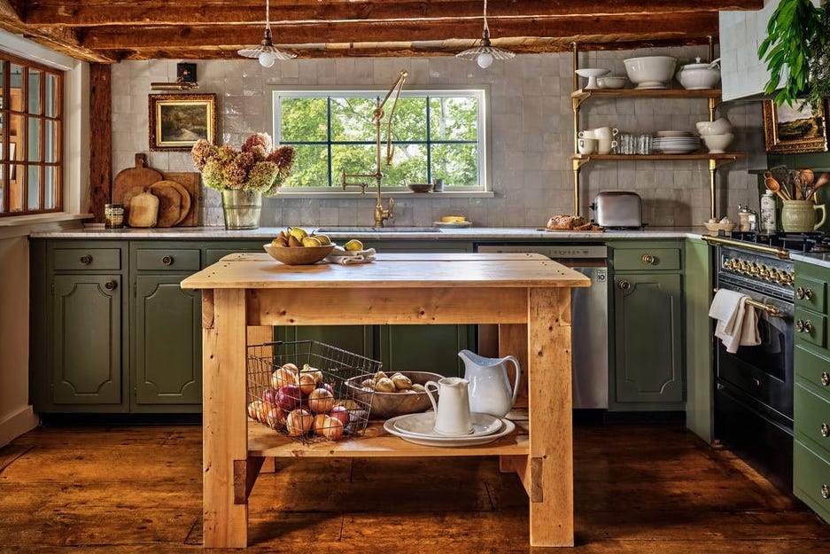
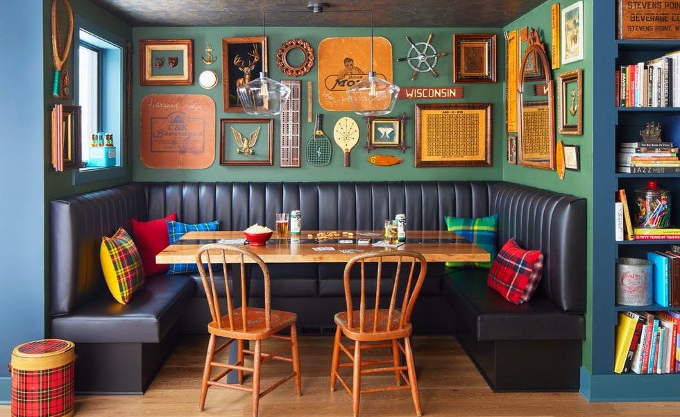
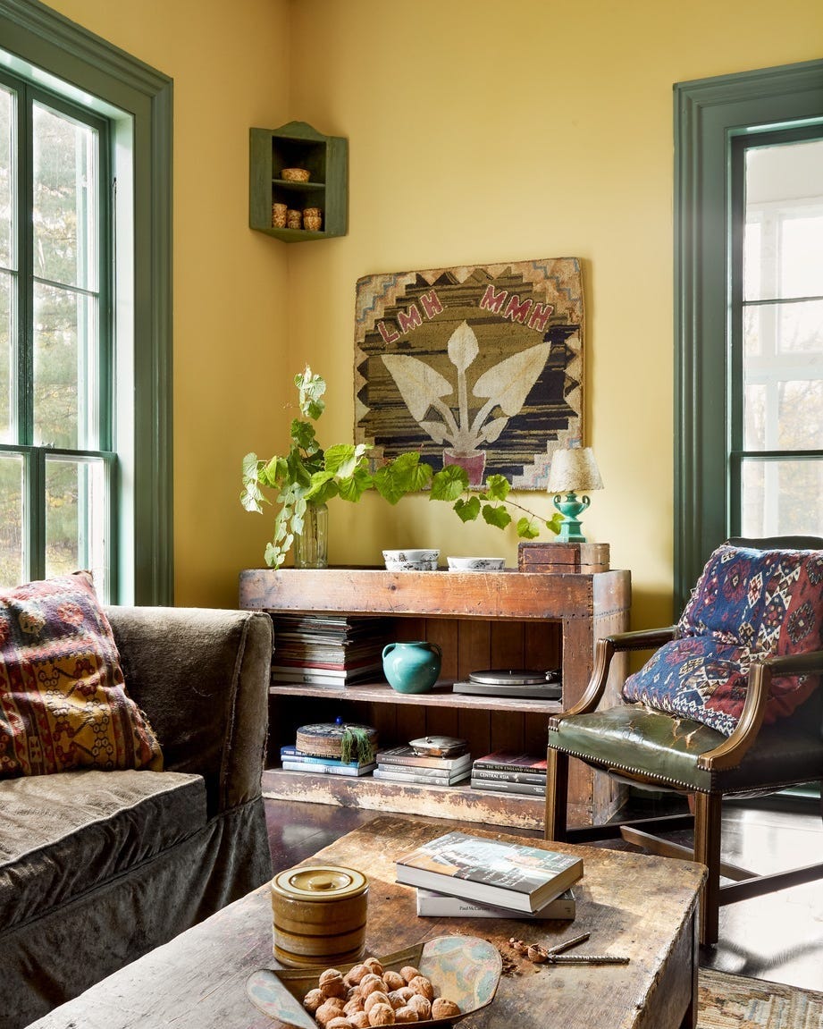
Little Greene paint colors in real homes
15 Lush Green Paint Colors to Invigorate Any Space

The 14 Paint Colors Featured in Our Favorite Green Kitchens

14 Best Green Paint Colors