1/10
Designers Reveal the Best Lime Green Paint Colors for a Lively Home
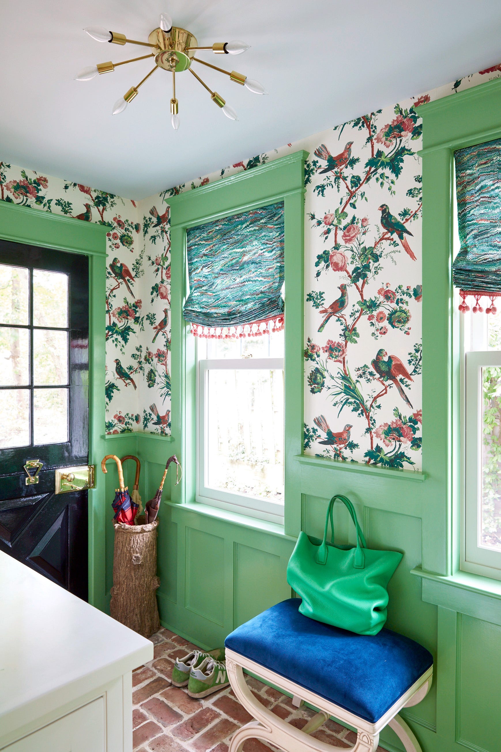
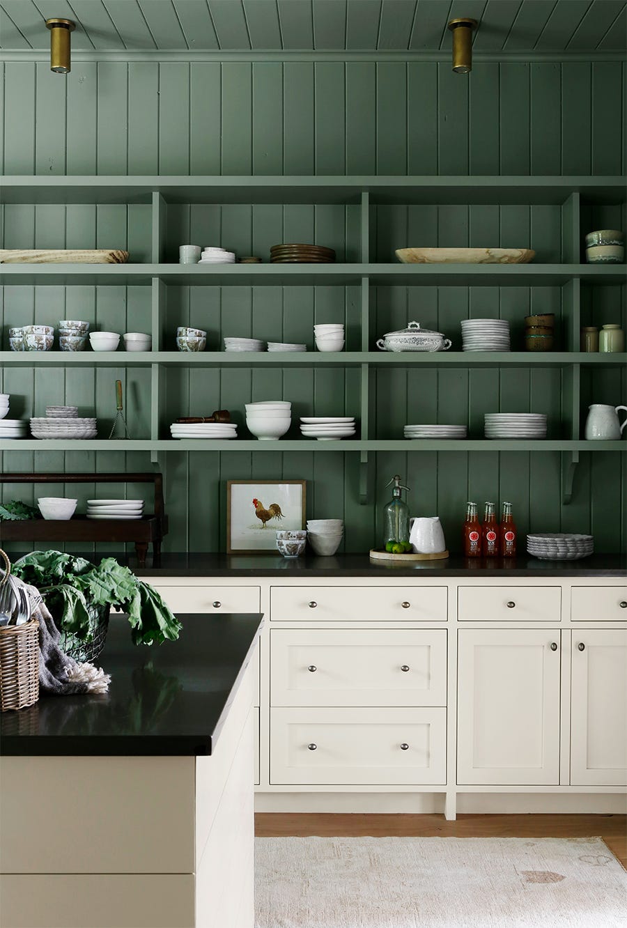
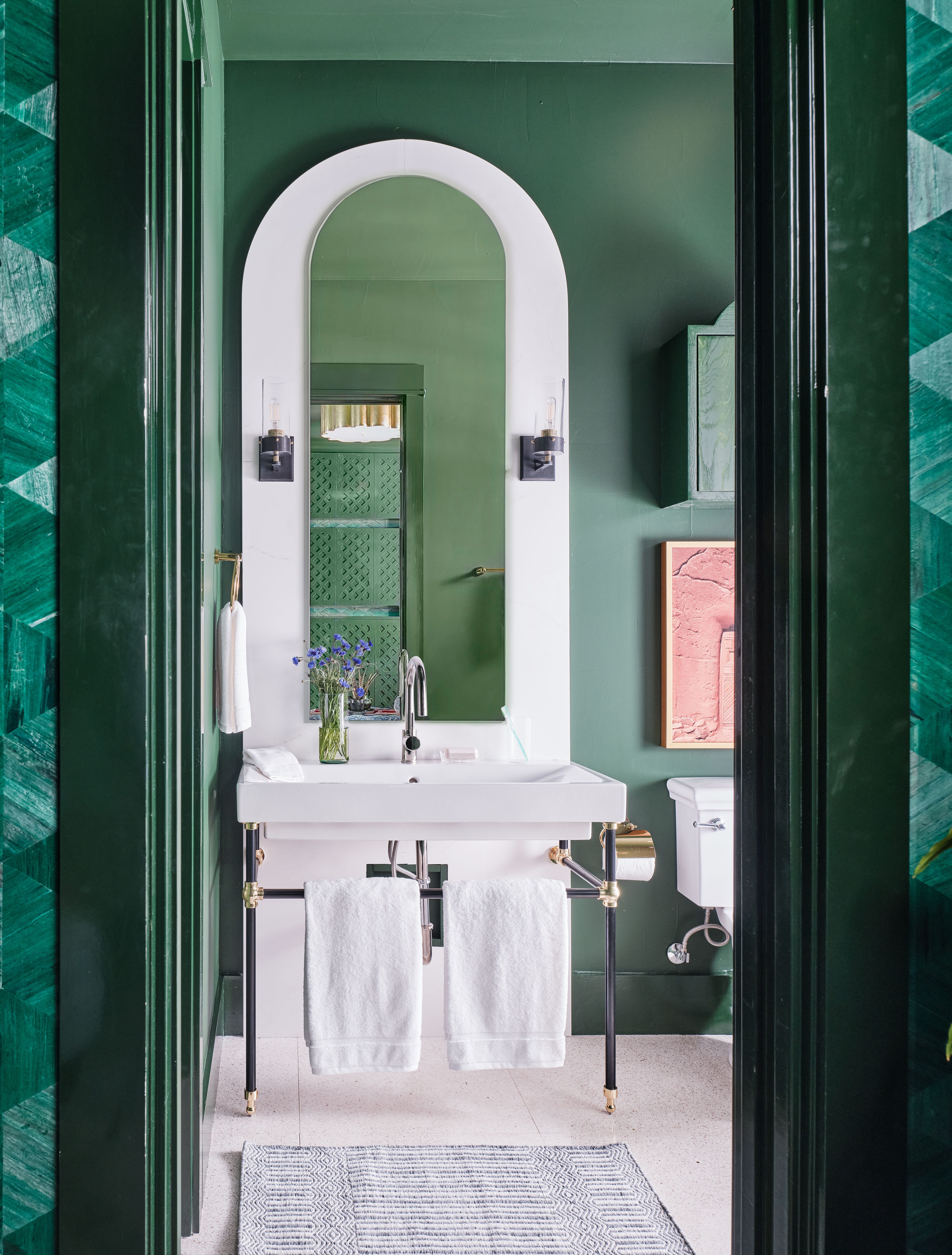
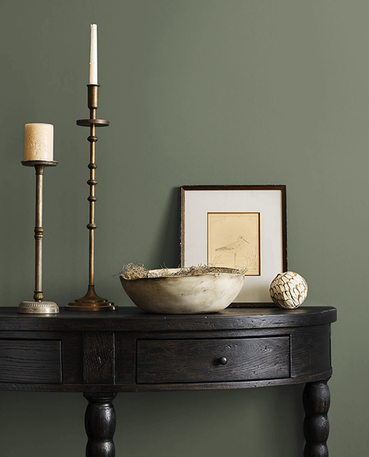
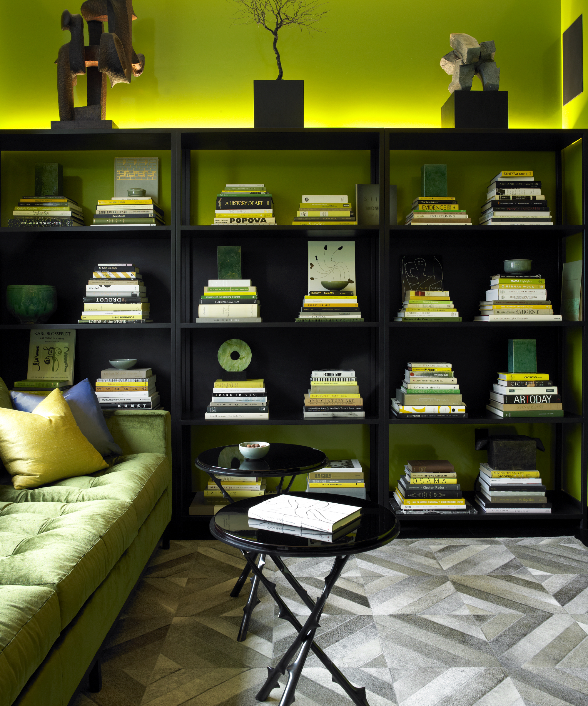
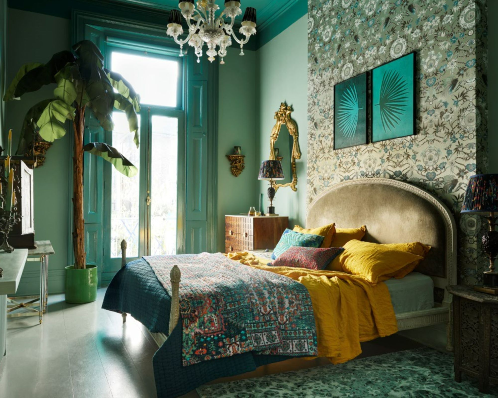
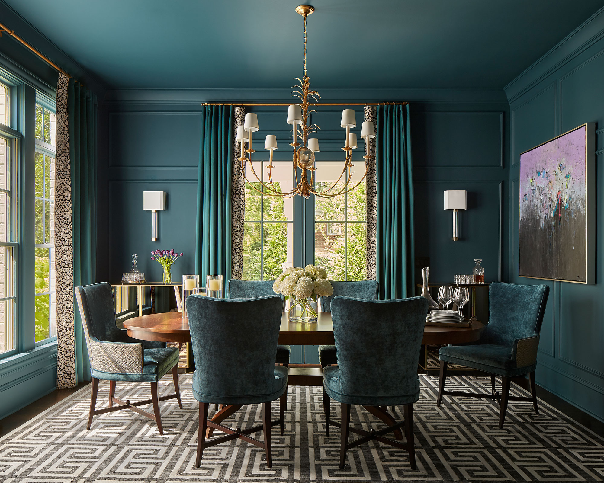
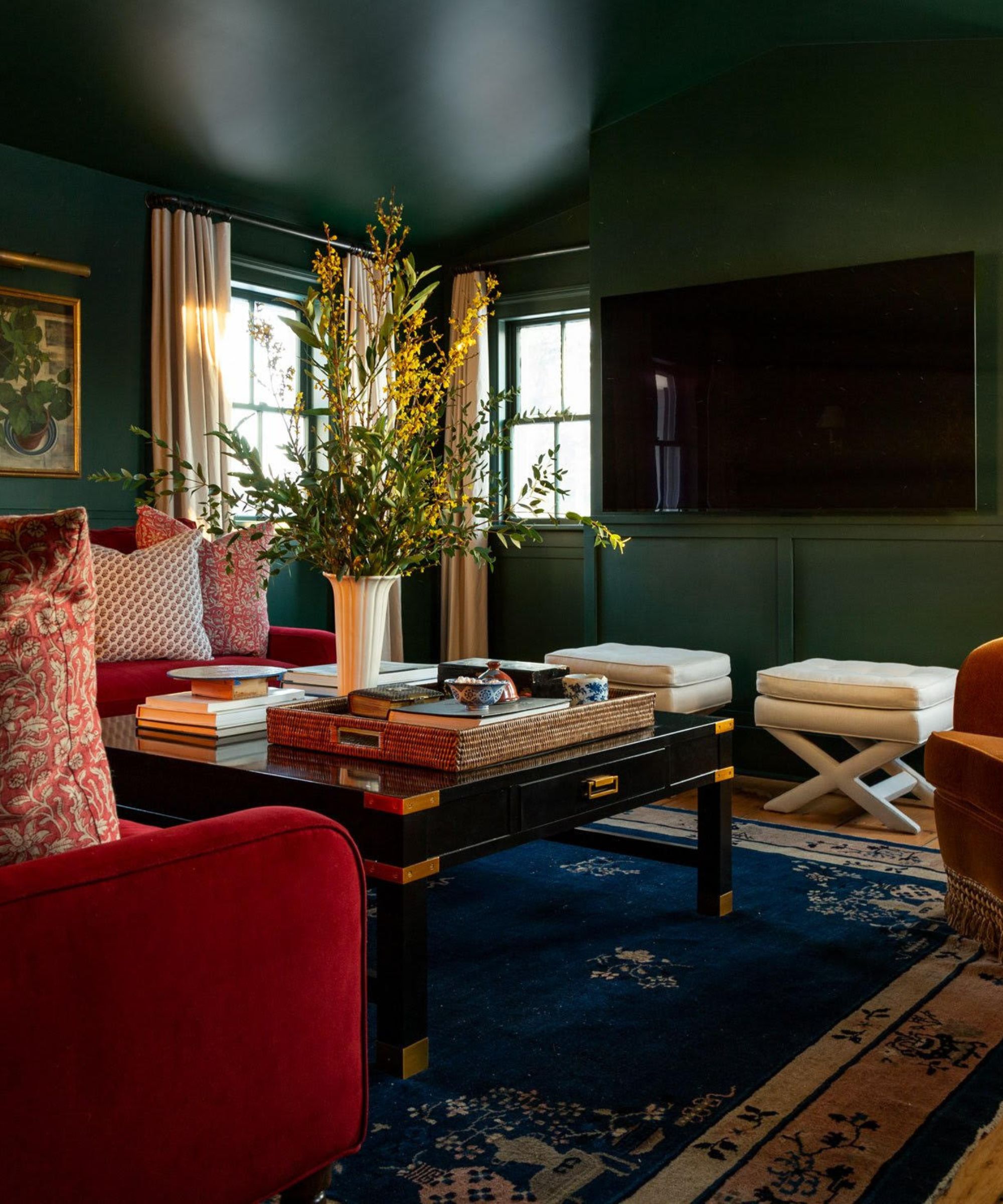
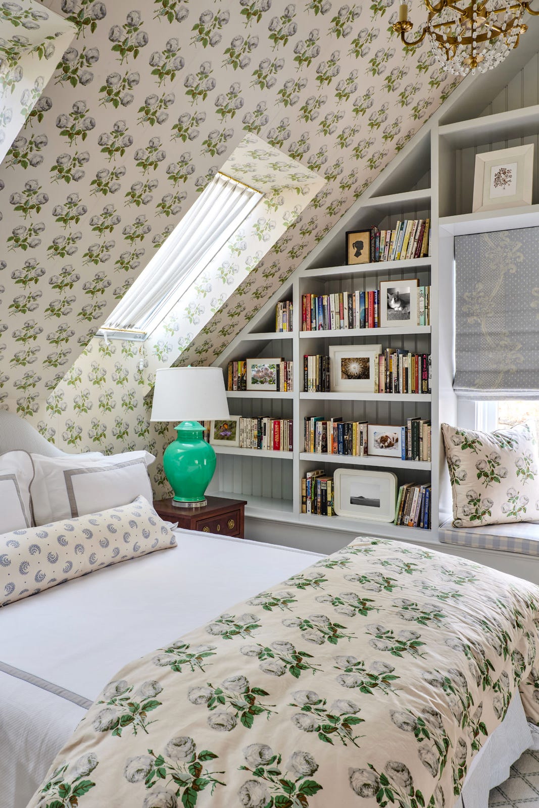
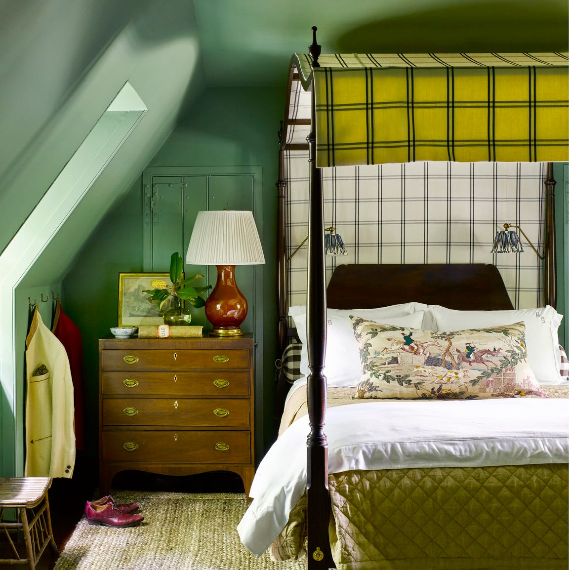
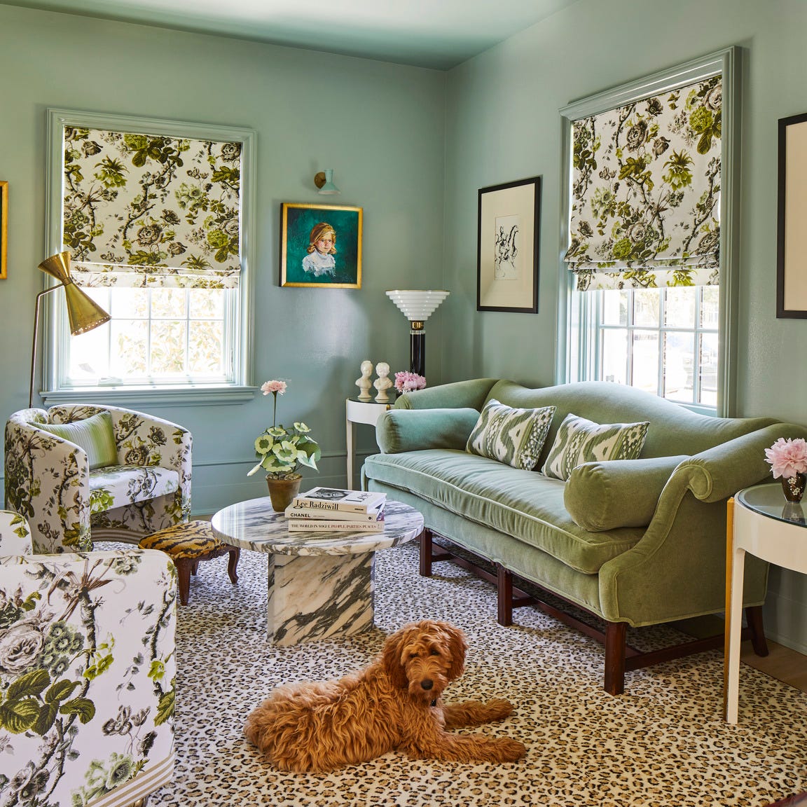
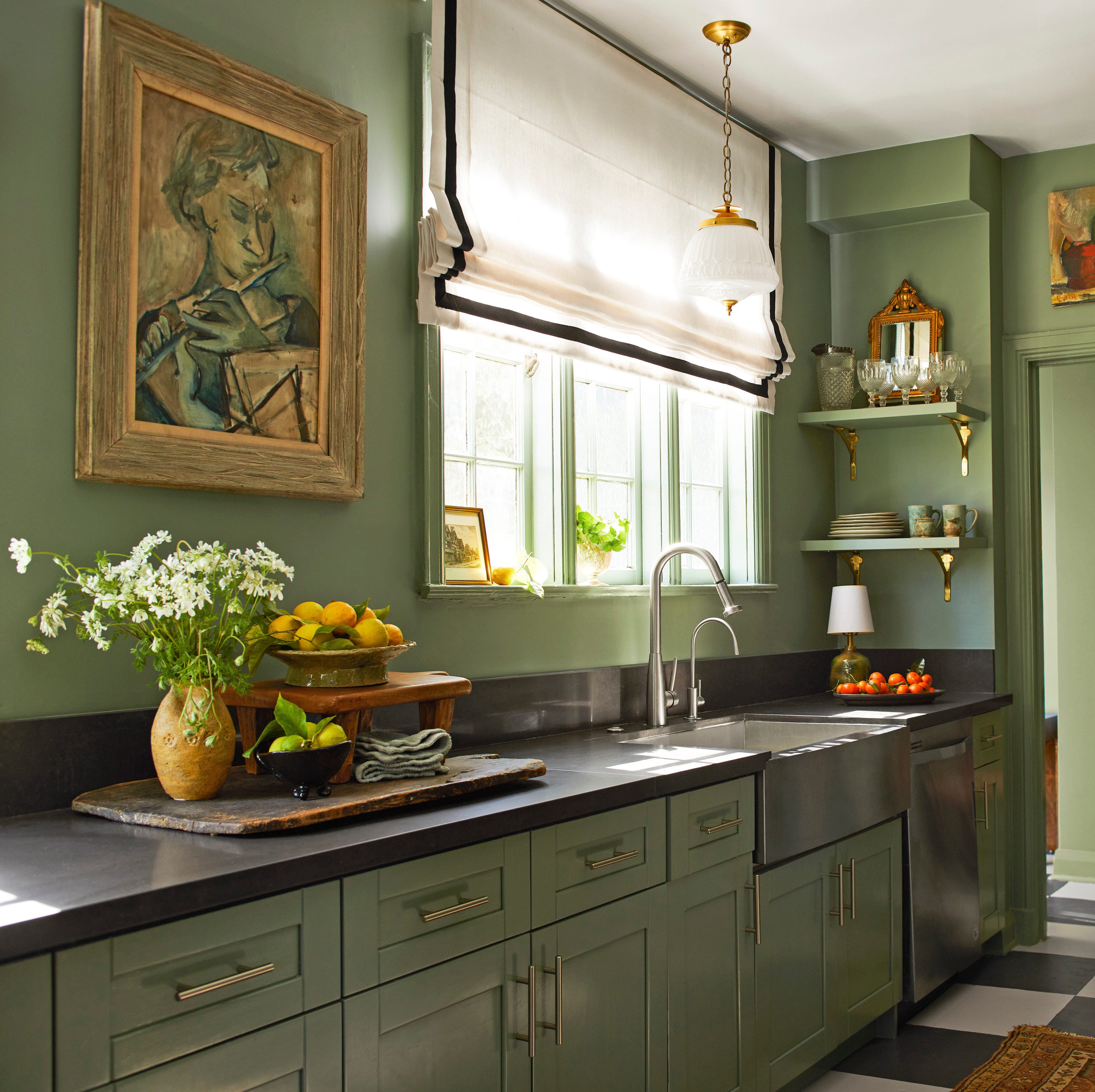
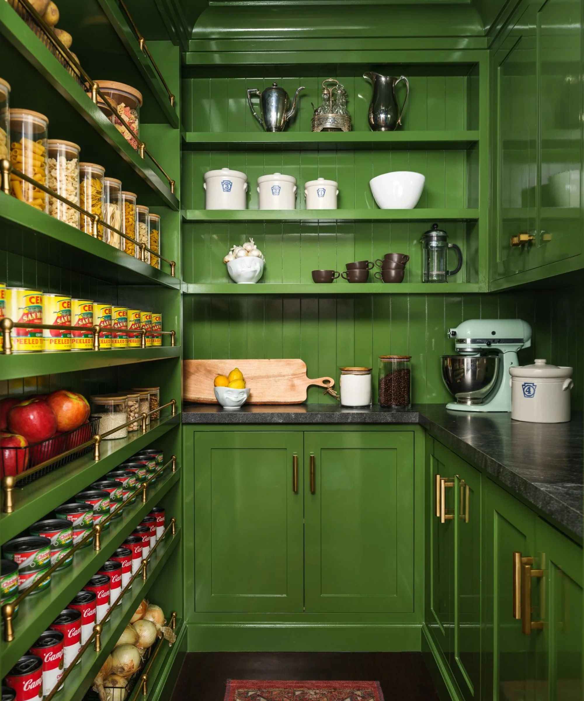
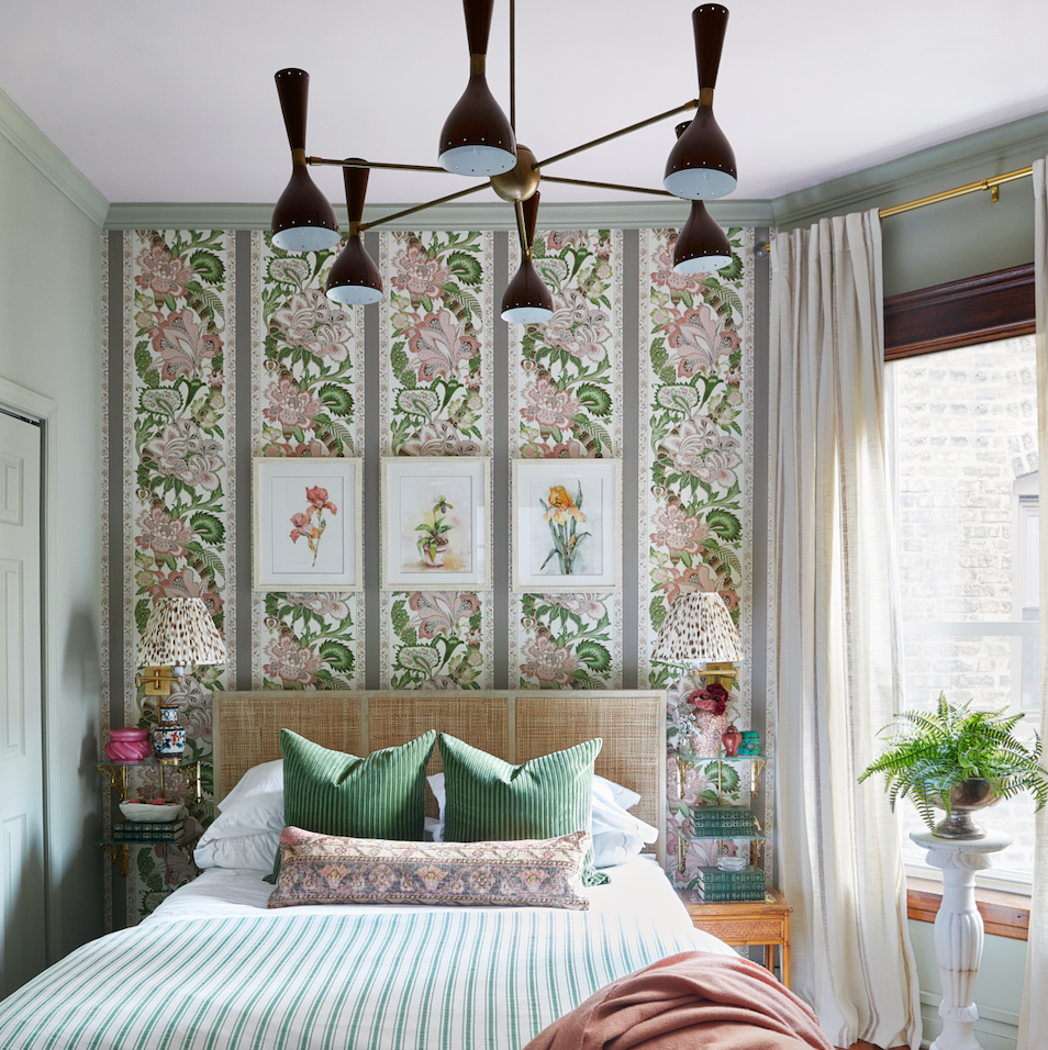
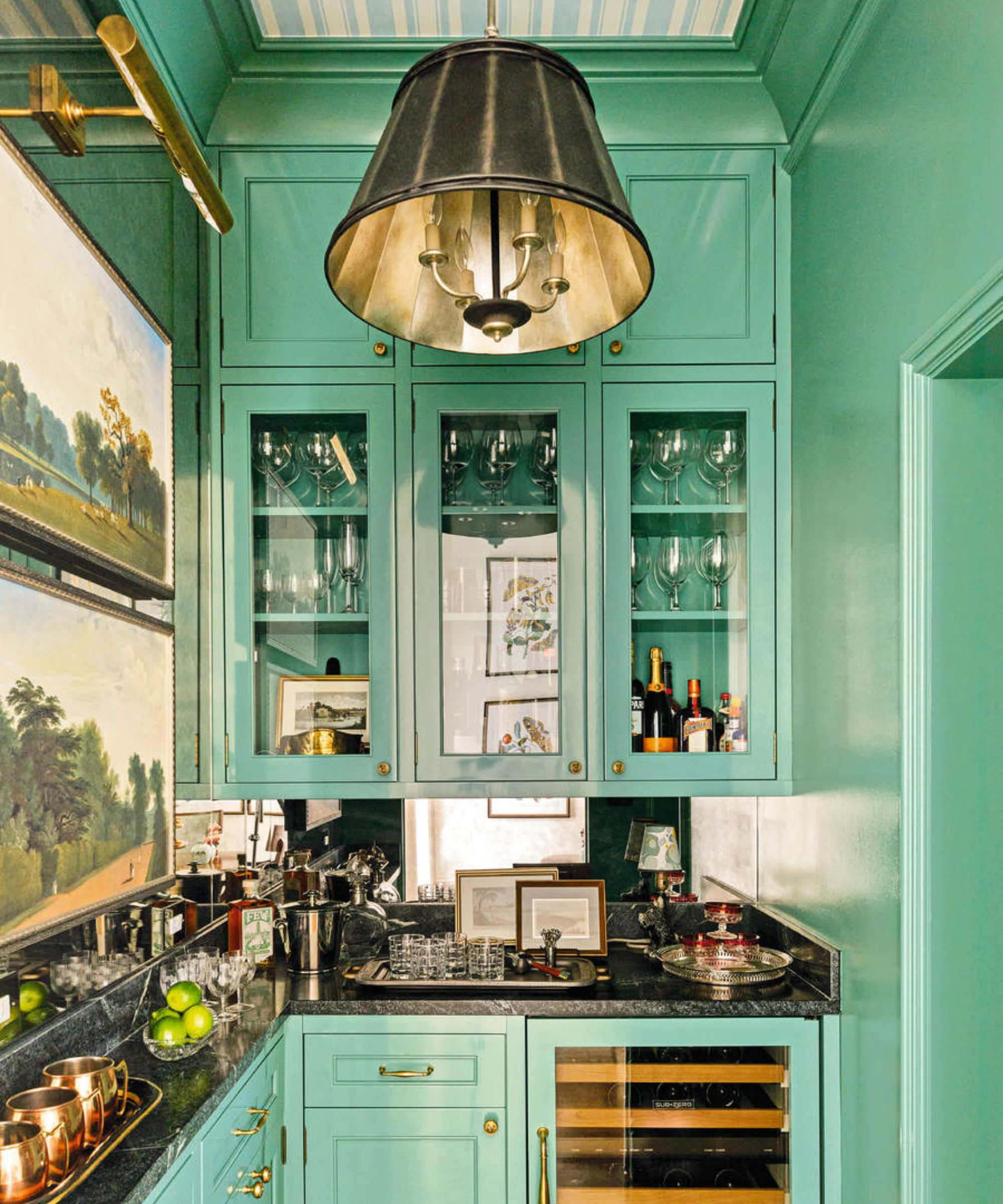
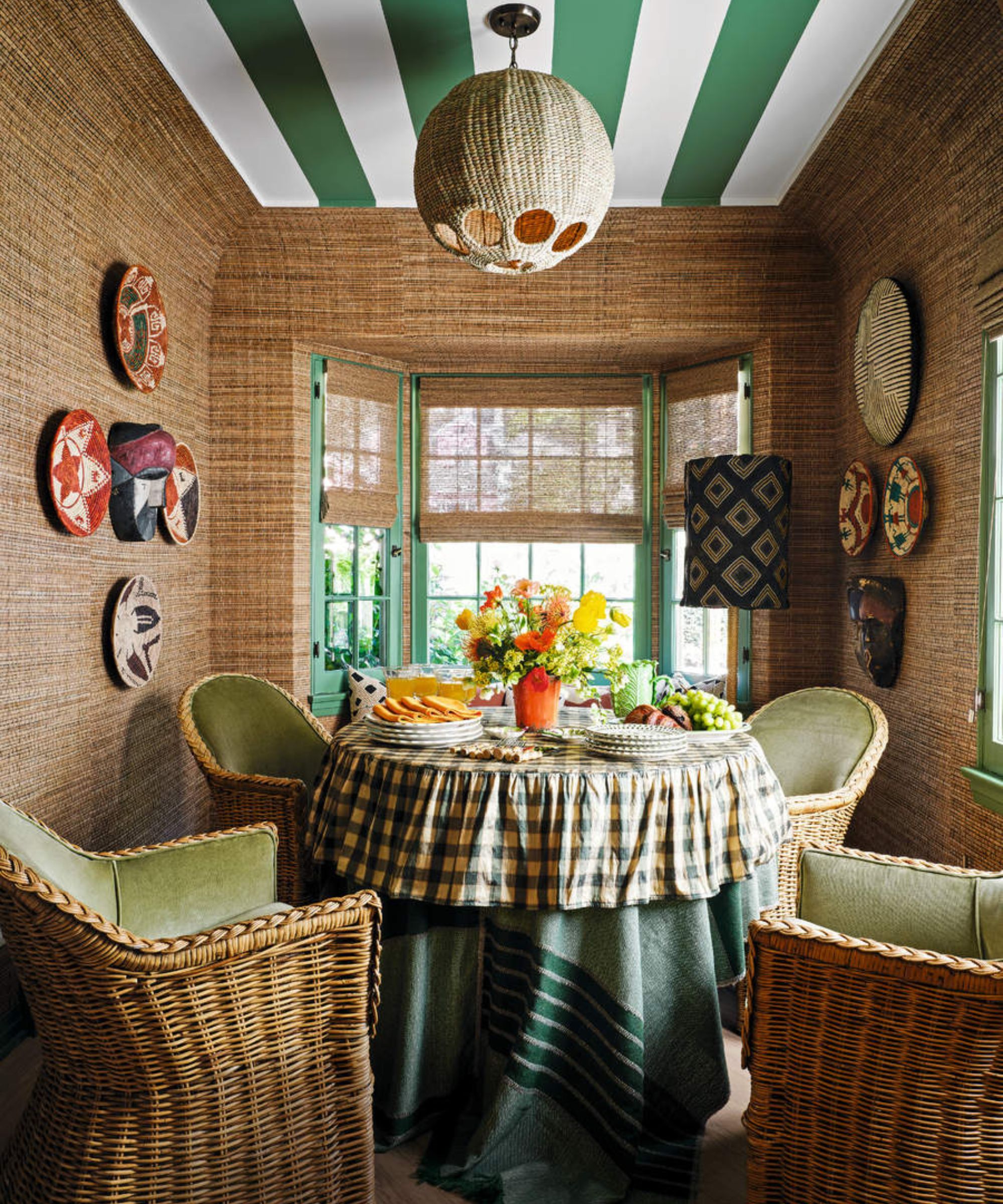
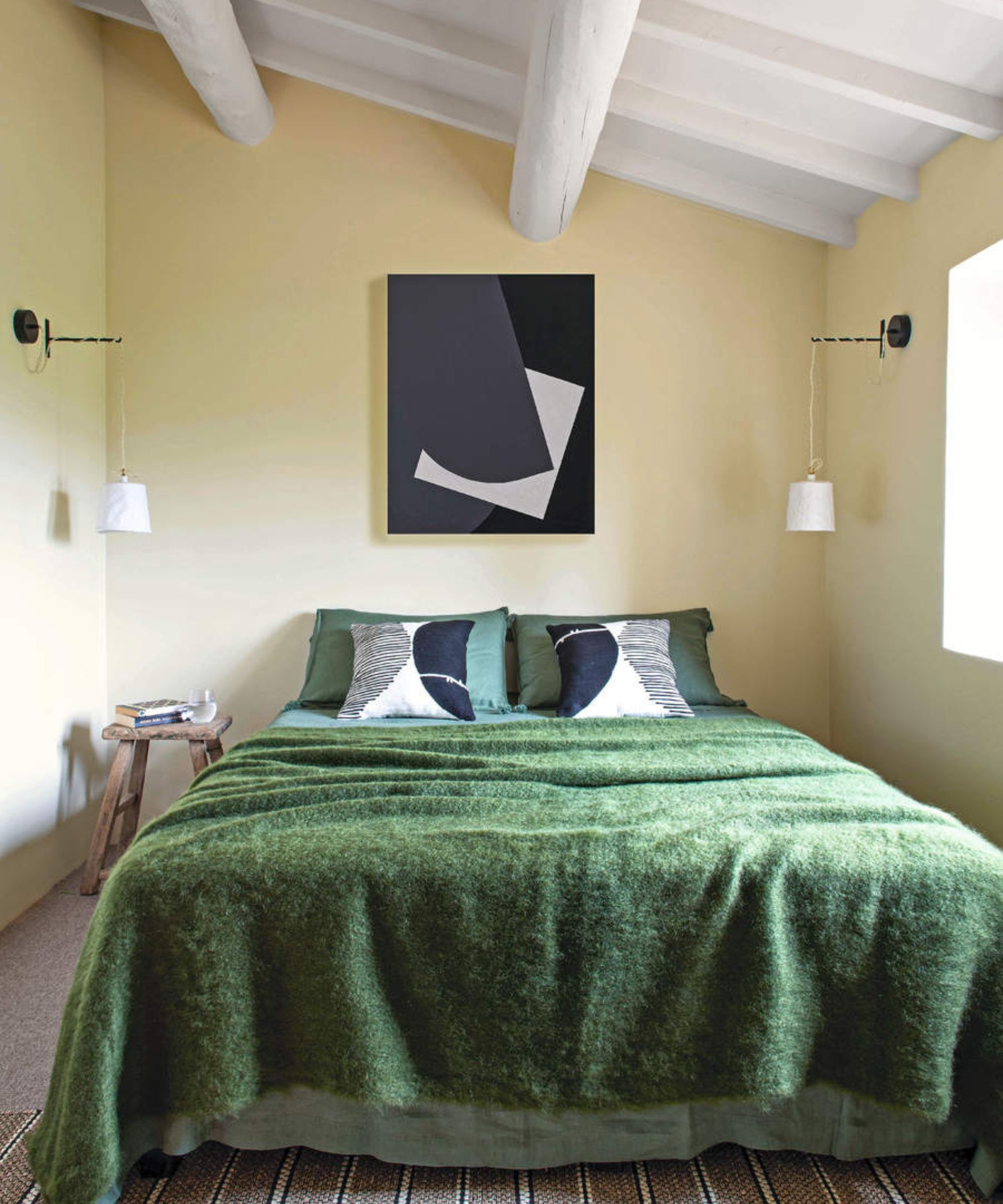
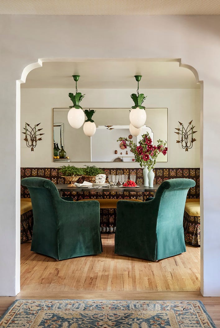
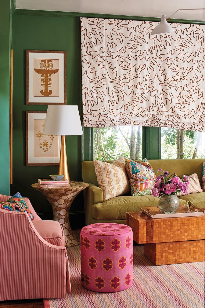
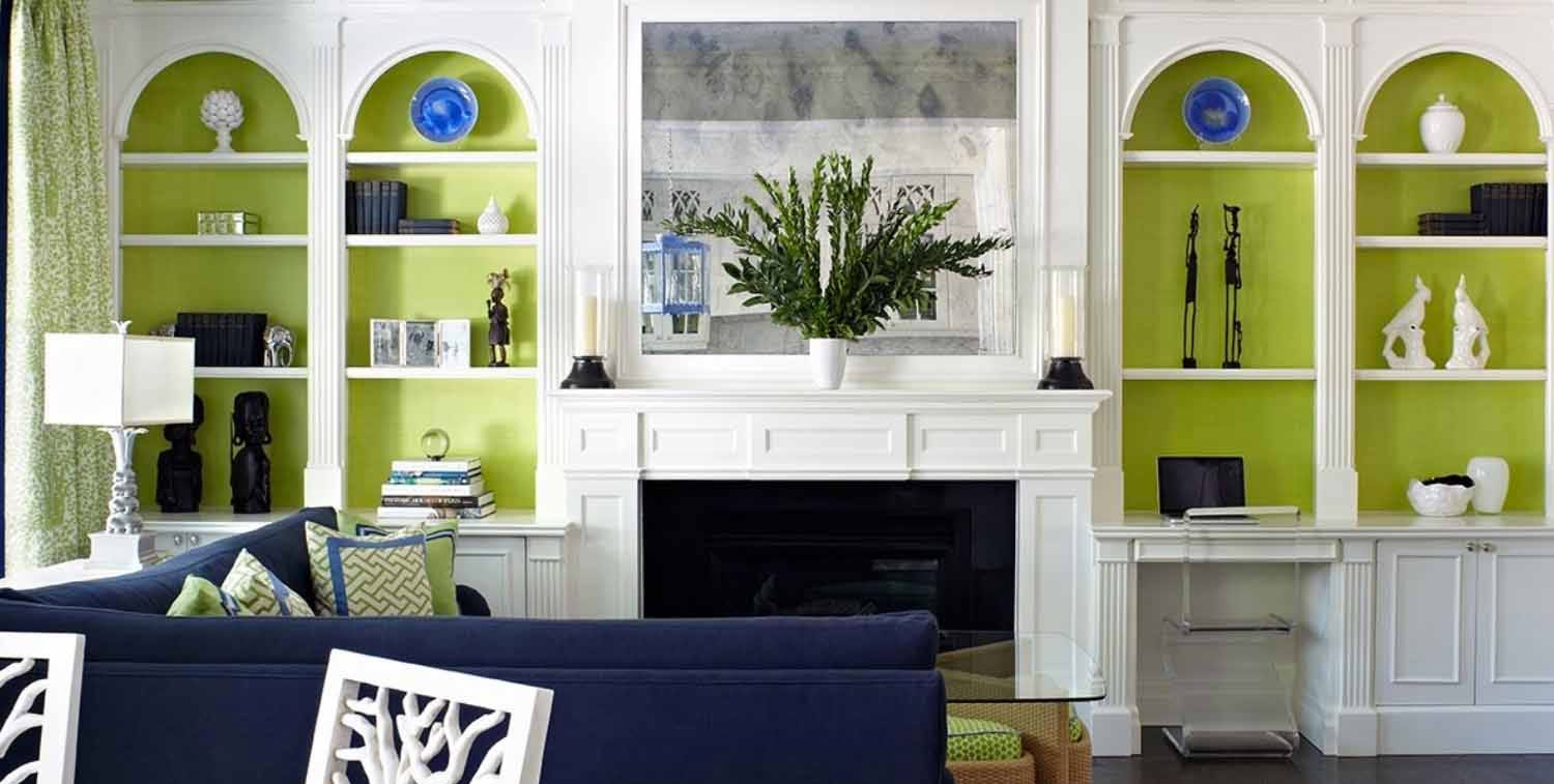
Lime green, often overlooked, is a versatile and vibrant color capable of adding a unique personality and energetic feel to any home. The article highlights various shades of lime green paint, chosen by ELLE Decor editors and recommended by interior designers, showcasing their application in different settings and the specific characteristics that make each shade stand out. These recommendations encourage homeowners to step outside their comfort zone and embrace this daring color.
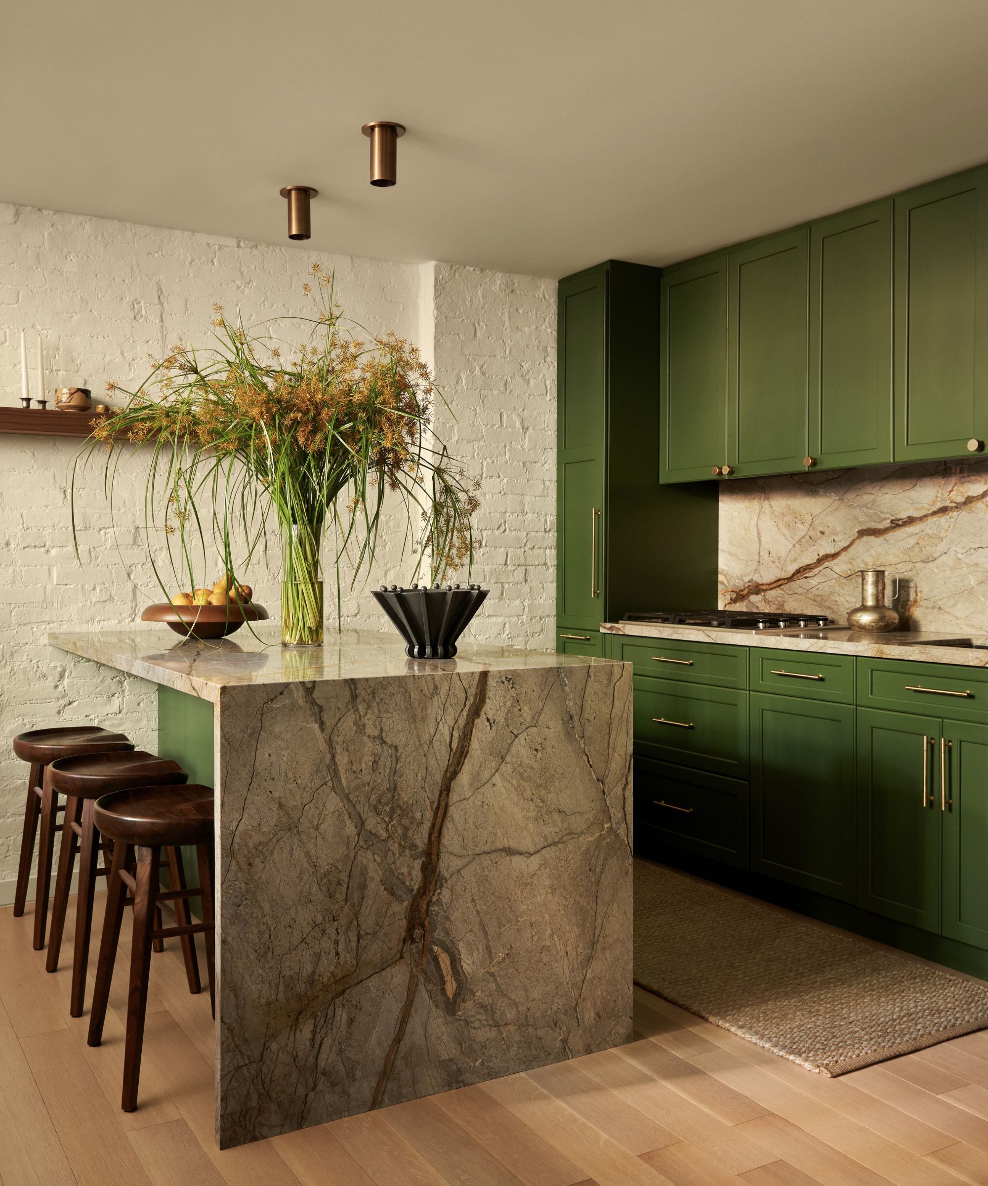
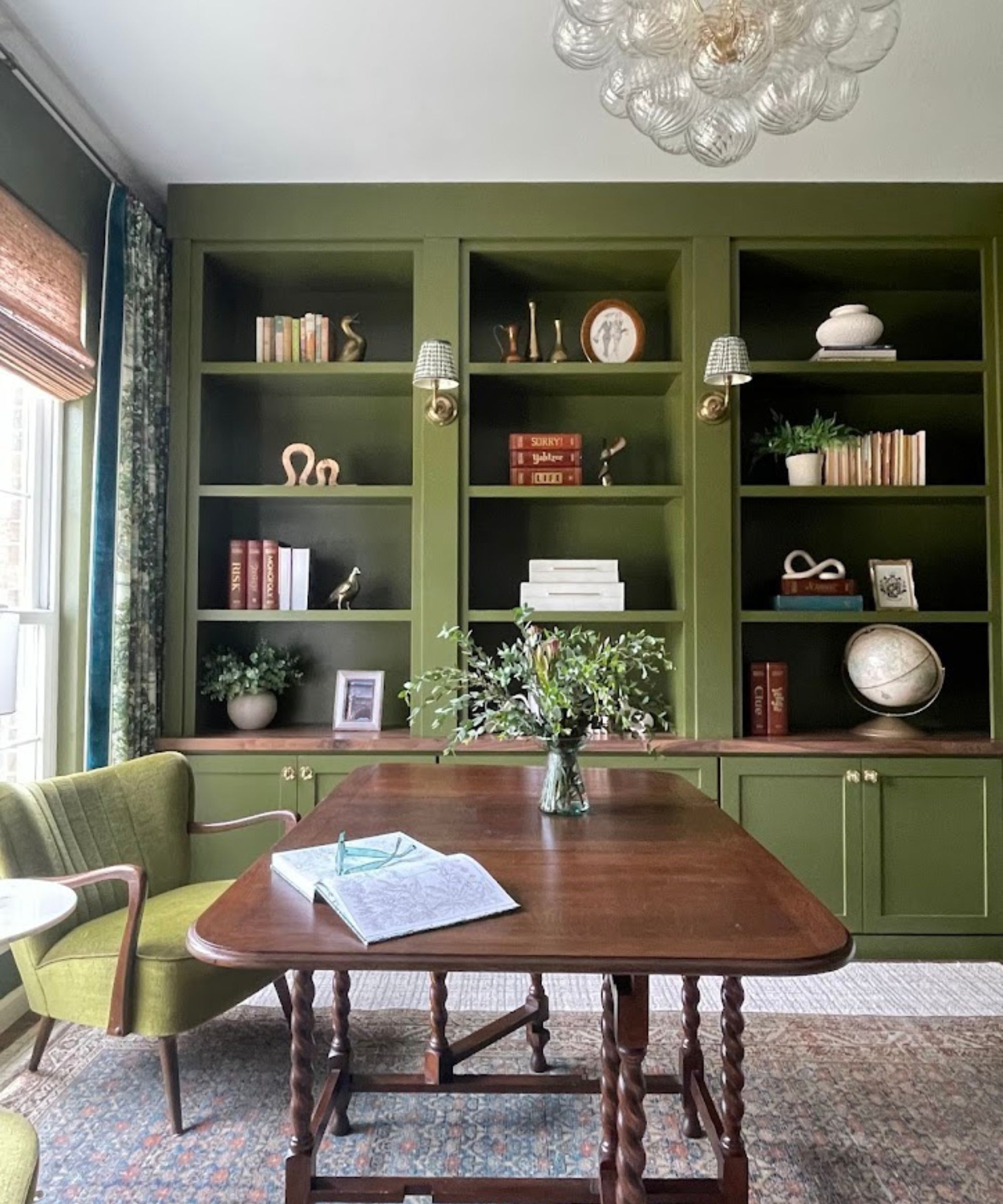
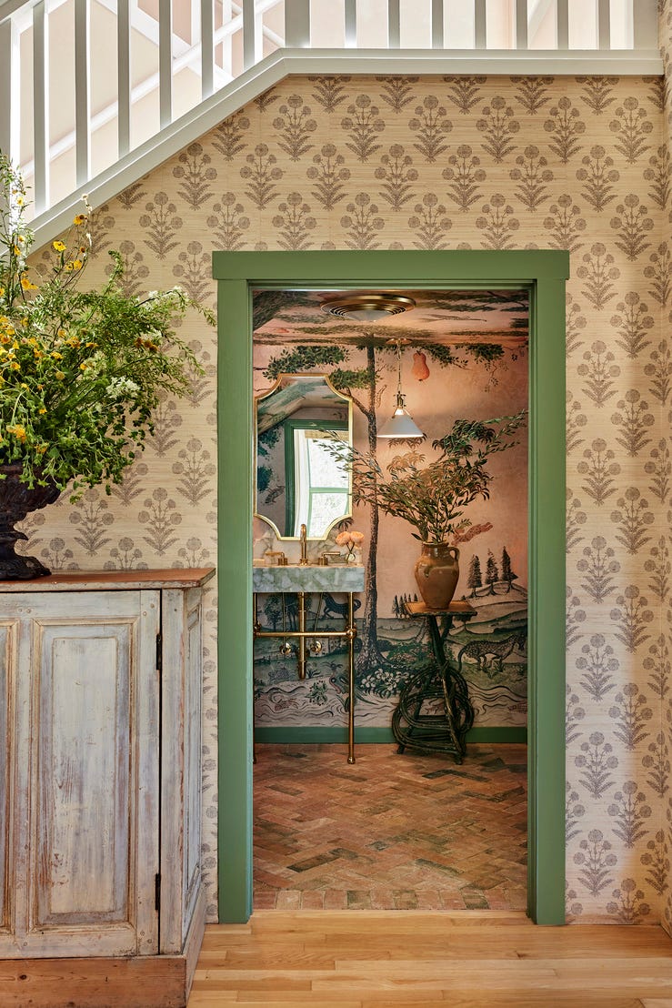
Designers offer insights into specific lime green paint colors from brands like Benjamin Moore, Sherwin-Williams, and Farrow & Ball. Ken Fulk recommends Benjamin Moore's 'Cat's Eye,' a dark lime green that provides vibrancy and depth without being too intense, suggesting its use for an immersive experience in dining rooms, salons, or glamorous baths by painting both walls and trim. Suysel dePedro Cunningham of Tilton Fenwick highlights Benjamin Moore's 'Grape Green' as a perfect accent for a child's nursery bathroom vanity, offering a whimsical pop of color.
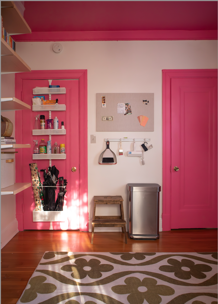
Kimberly Hall praises Sherwin-Williams' 'Center Stage' for its unique vibrance and balanced blue undertones, which prevent it from appearing too yellow. She notes its versatility in both sunny and dark rooms and its striking pairing with magenta. Sasha Bikoff shares her experience using Farrow & Ball's 'Acid Drop' for a Kips Bay Decorator Show House staircase, describing it as vibrant, psychedelic, happy, and reminiscent of key-lime pie. Gil Walsh suggests Benjamin Moore's 'Lime Green' to infuse energy into a dramatic hallway, emphasizing green's stable and balanced nature.
Rayman Boozer describes Benjamin Moore's 'Tequila Lime' as sharp and fresh, ideal for a summer getaway accent. Anne Hepfer also favors 'Tequila Lime,' noting its fun and unexpected strong, vibrant pop, suggesting pairing it with blue and white accessories for a fresh look. Joe Berkowitz advises commitment when using strong colors like Benjamin Moore's 'Perennial 405,' a pure, crisp lime tone that can create a refreshing, playful ambiance or be dressed up for a more formal space.
Finally, Greg Roth's personal favorite is Benjamin Moore’s 'Chamomile (397),' which straddles the yellow-green chartreuse line without being overly citric. He appreciates its subtle blue undertones that prevent it from being too harsh, allowing it to pair well with other strong colors like bright yellow, burnt orange, magenta, or teal, as well as more demure neutrals such as oatmeal and ash. These diverse recommendations underscore lime green's adaptability and potential to transform various spaces, proving it to be a compelling choice for interior design.
#LimeGreenPaint #InteriorDesign #PaintColors #HomeDecor #ColorTrends #DesignerTips #AccentWalls #BenjaminMoore #SherwinWilliams #FarrowAndBall #LimeGreenPaint #InteriorDesign #PaintColors #HomeDecor #ColorTrends #DesignerTips #AccentWalls #BenjaminMoore #SherwinWilliams #FarrowAndBall
0 comment in total
 No comments yet
You may also like
There Are Only Certain Green Paint Colors That Can Bring a Room to Life


Experts reveal the best living room paint colours to transform every space

25 green living room ideas that are the perfect spring refresh

5 Paint Colors That Will Take Over in 2025, According to Interior Designers

19 of the Best Green Paint Colors for Any Room in Your Home

What's replacing sage green in 2024? 5 on-trend variations of this nature-derived hue

The best green paint colors for a soothing, sophisticated home

Green is the color of 2023 – these designer-approved ways to use it are bold and beautiful
The 10 Best Little Greene Paint Colors For Your Home, as Chosen by Interior Designers

17 Green Paint Colors for Every Room, From Soothing Sage to Electric Emerald
15 Lush Green Paint Colors to Invigorate Any Space

Interior Designers Say the Key to Creating a Joyful Space Is to Add in This One Color
8 Green Paint Colors Interior Designers Swear By for a Bold and Fresh Home
Here's How to Decorate With Green So It Actually Looks Chic
Have you heard of dill green? Designers are calling this trending green 'nature's neutral' and it's surprisingly easy to use
37 Unexpected Colors That Pair Perfectly With Green, According to Designers
5 best green paints that will always be classics, according to interior designers
How to decorate with Dulux Overtly Olive – 7 easy tricks for using the ultimate versatile earthy green shade in any space
These 5 Paint Color Trends Will Be Everywhere in 2024, According to Interior Designers
14 Best Green Paint Colors