1/20
Little Greene paint colors in real homes
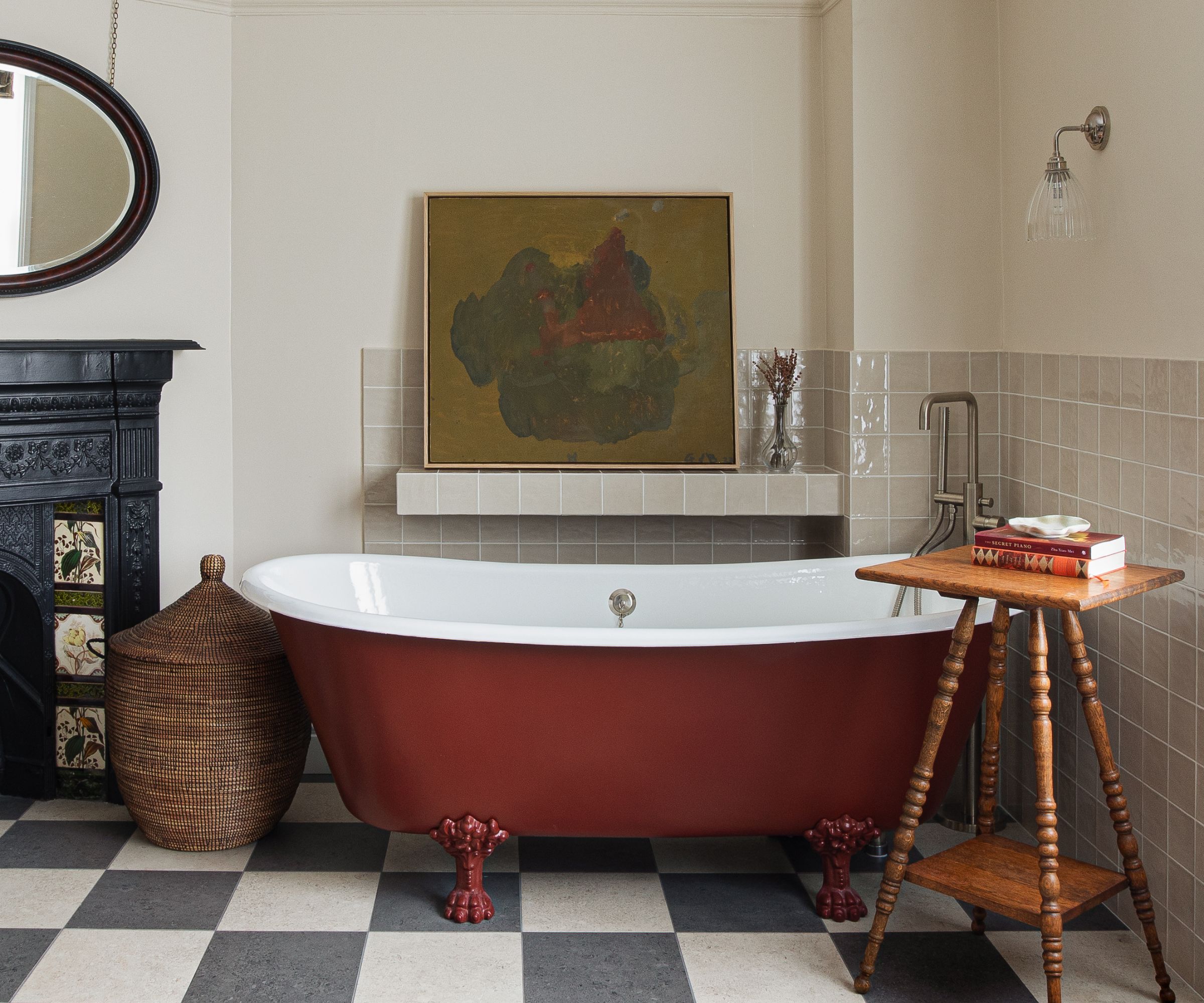
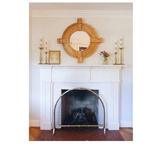
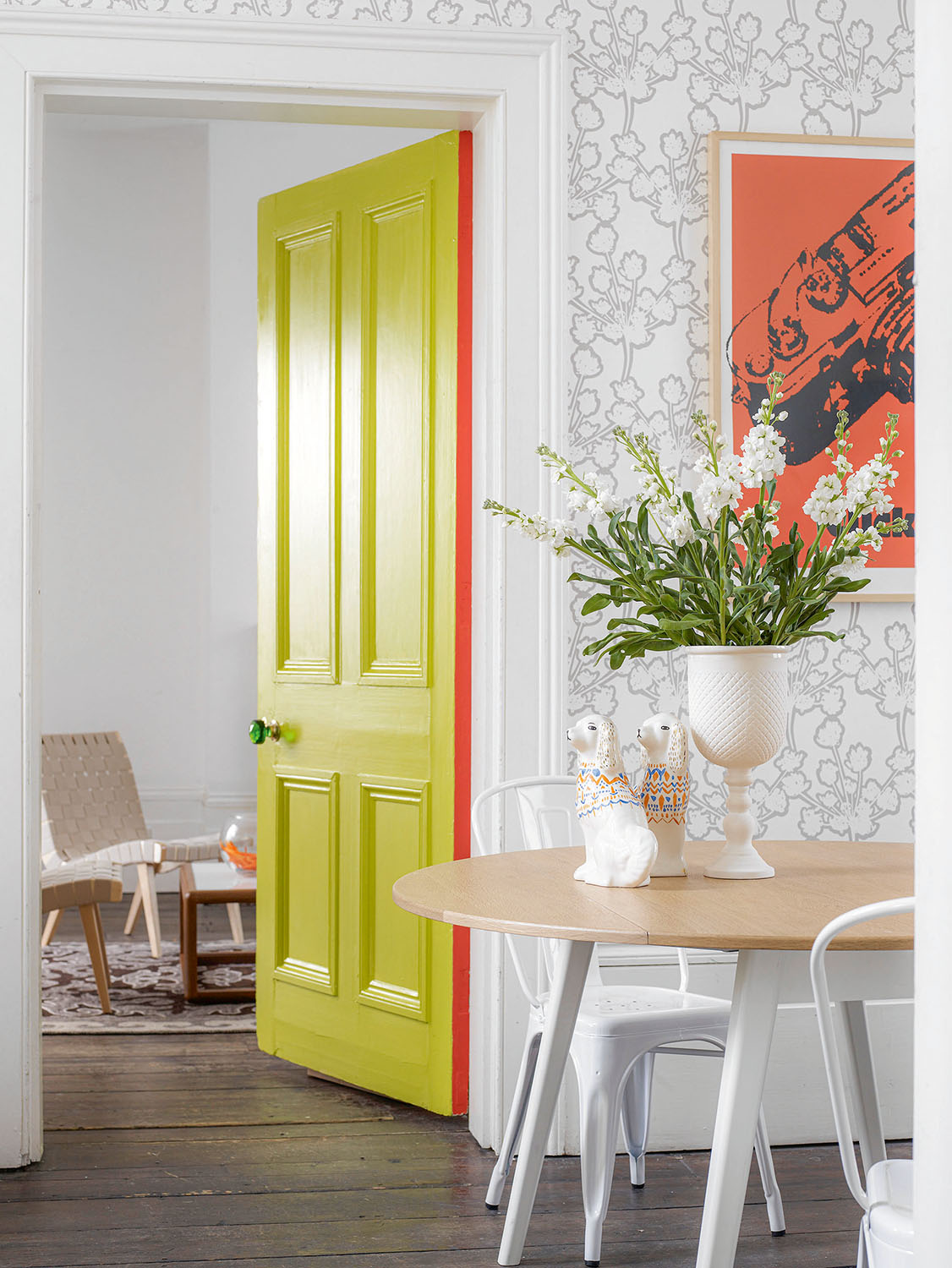
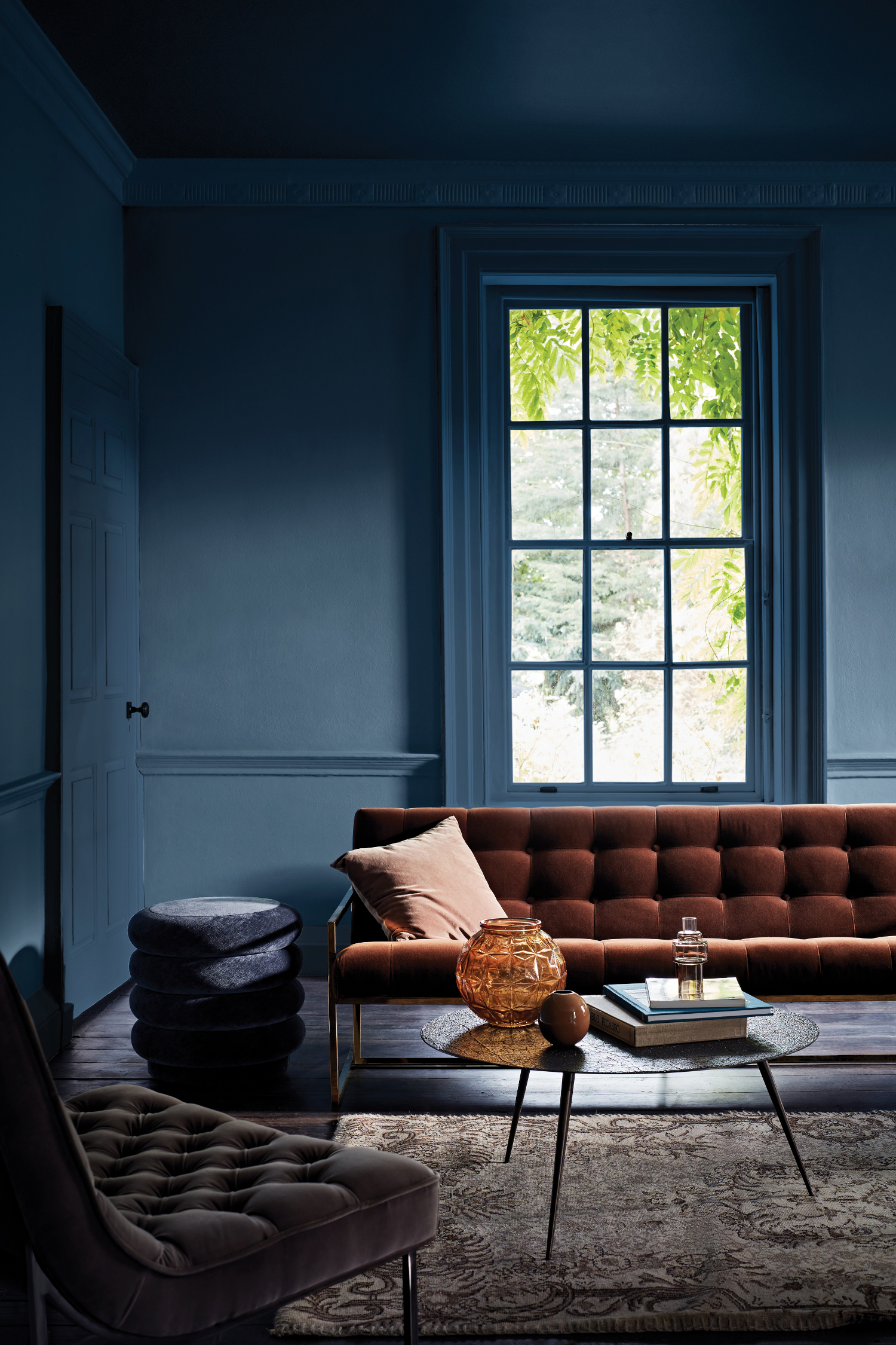
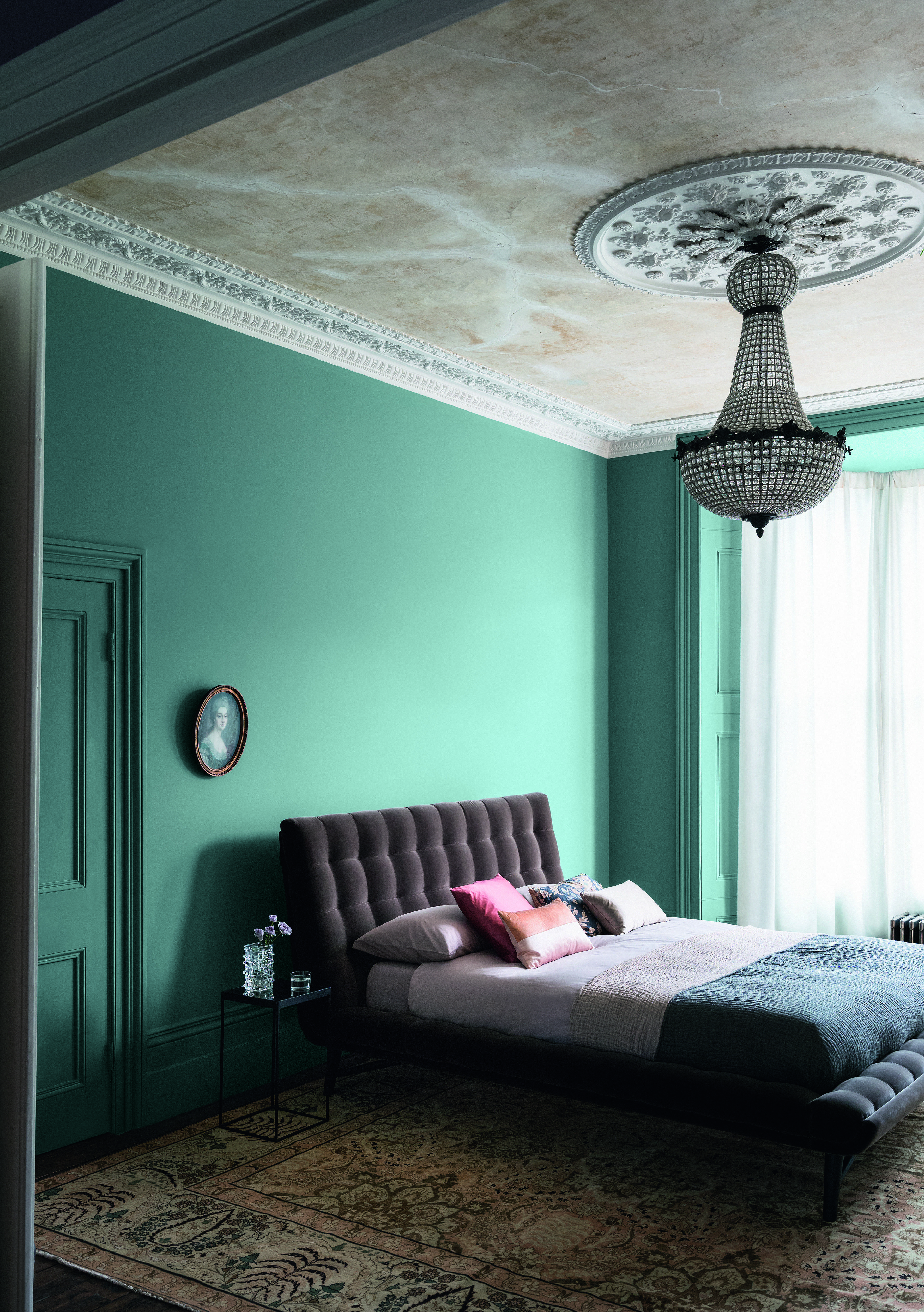
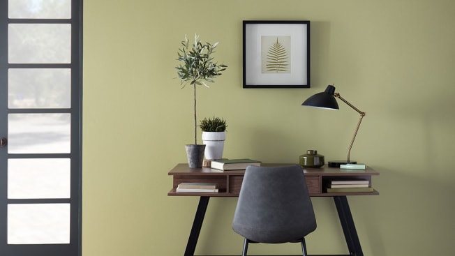
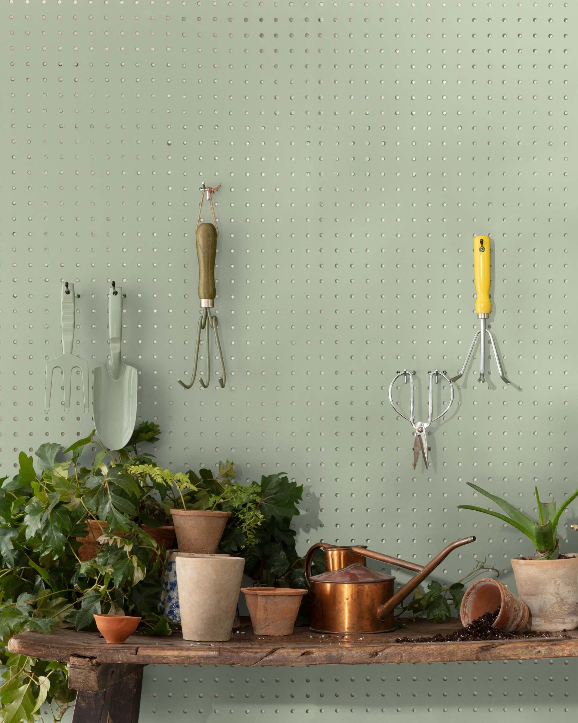
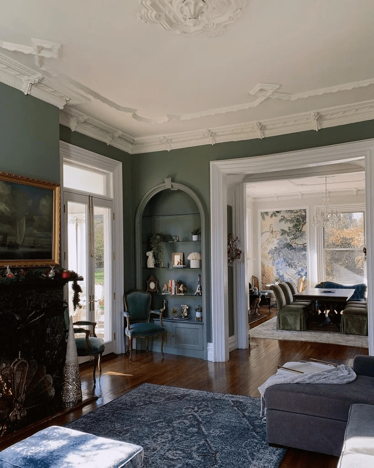
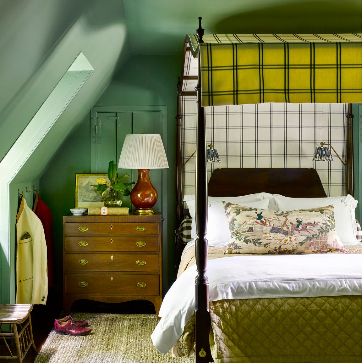
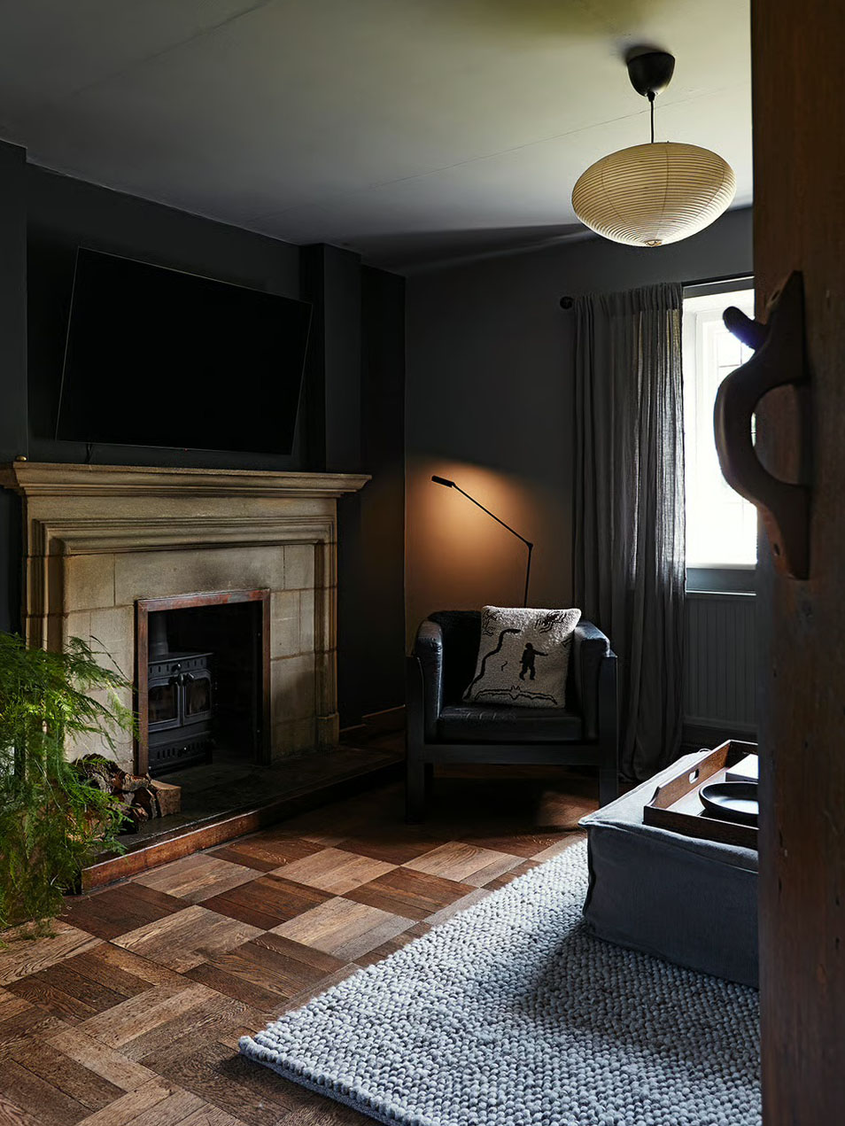
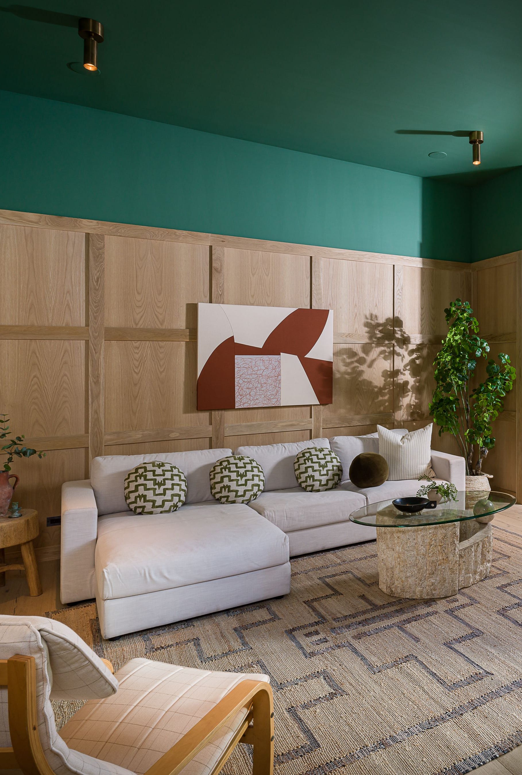
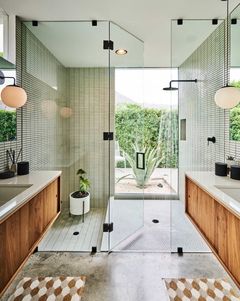
This article showcases 19 rooms in real homes, decorated by interior designers using Little Greene paint colors and wallpapers. Little Greene is a British-based paint manufacturer renowned for its timeless color palette, which draws inspiration from historical periods. The featured colors range from subtle neutrals to vibrant, bolder tones, illustrating how they can create serene and livable spaces in various settings, including modern kitchens and period living rooms. The article highlights specific shades like Arras, a dark muted red used as an accent in a neutral bathroom, and Middle Buff, a rich, warm orange employed in a living room to foster an inviting atmosphere for both entertaining and relaxation. Pea Green is presented as a peaceful yet upbeat choice for a home office that also functions as a guest bedroom, demonstrating the versatility of Little Greene's color range in creating distinct moods and functionalities.
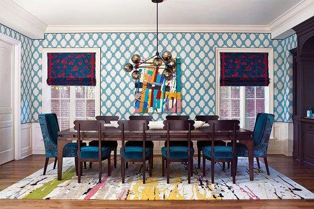
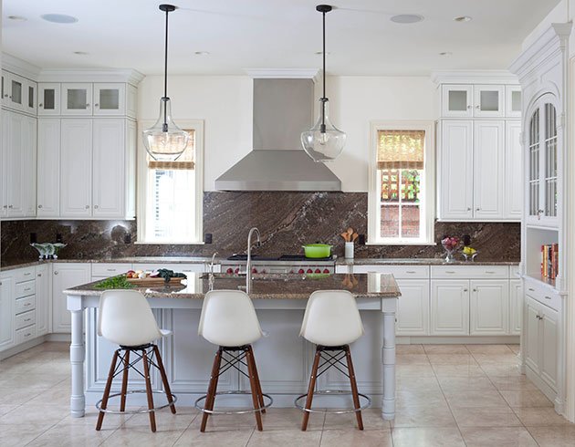
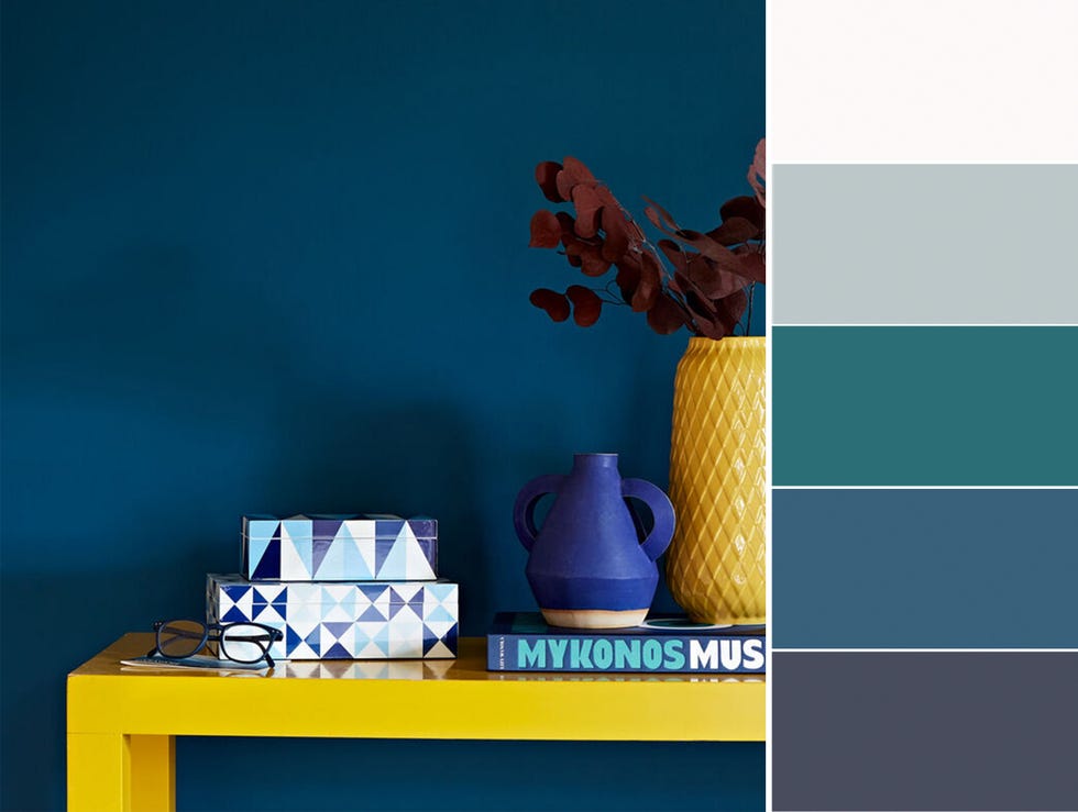
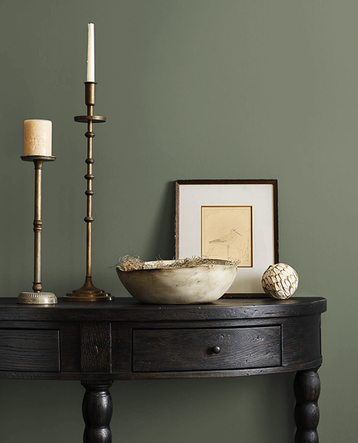
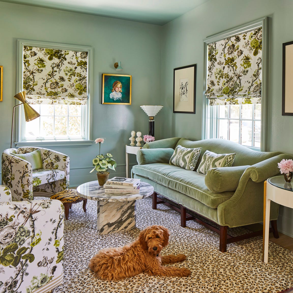
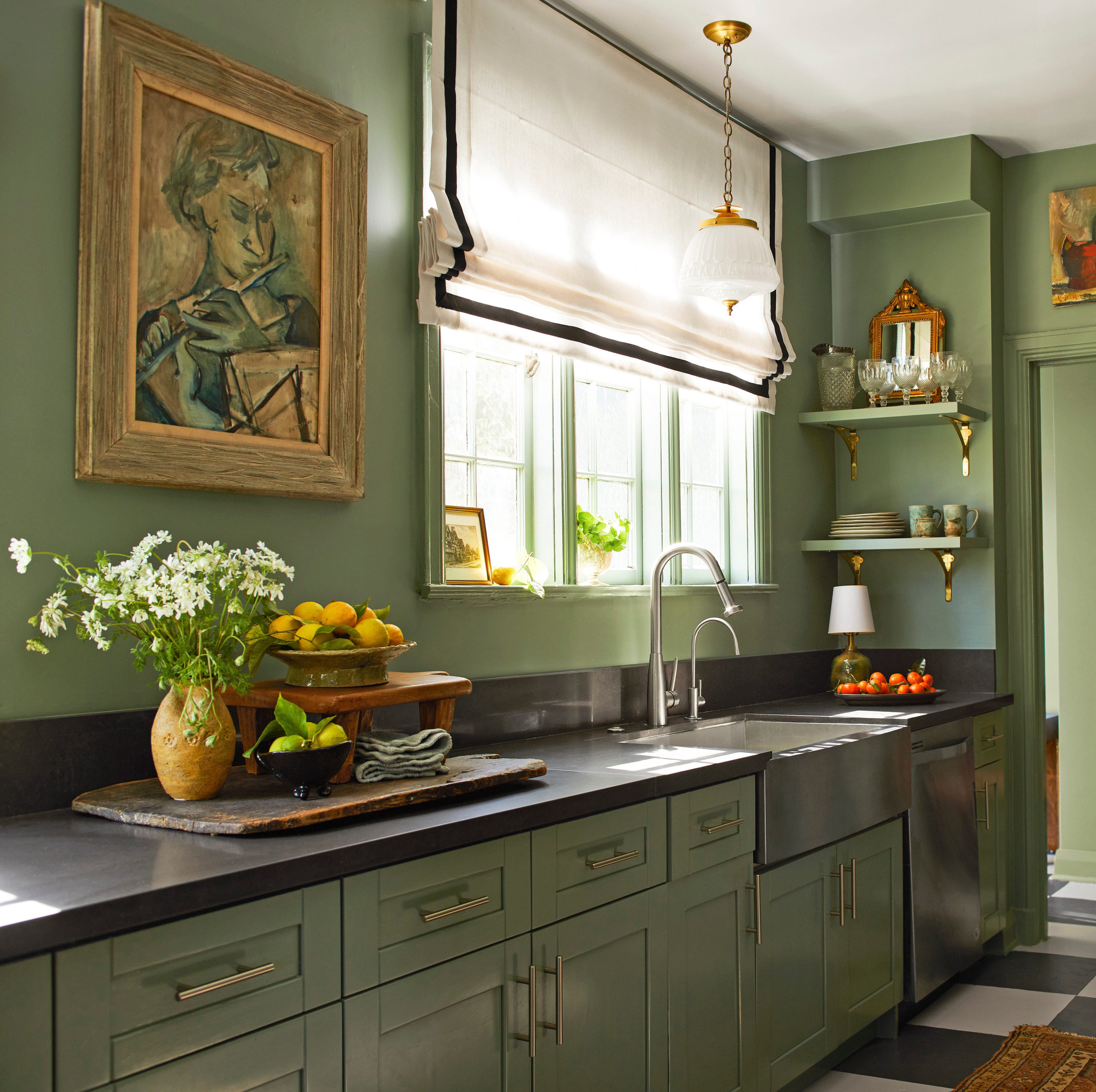
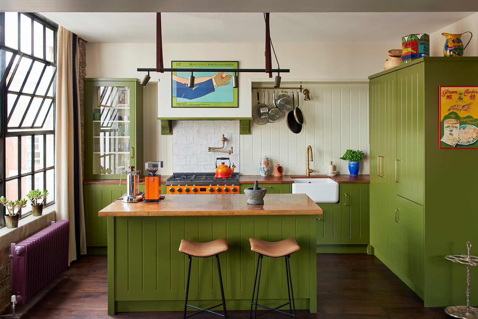
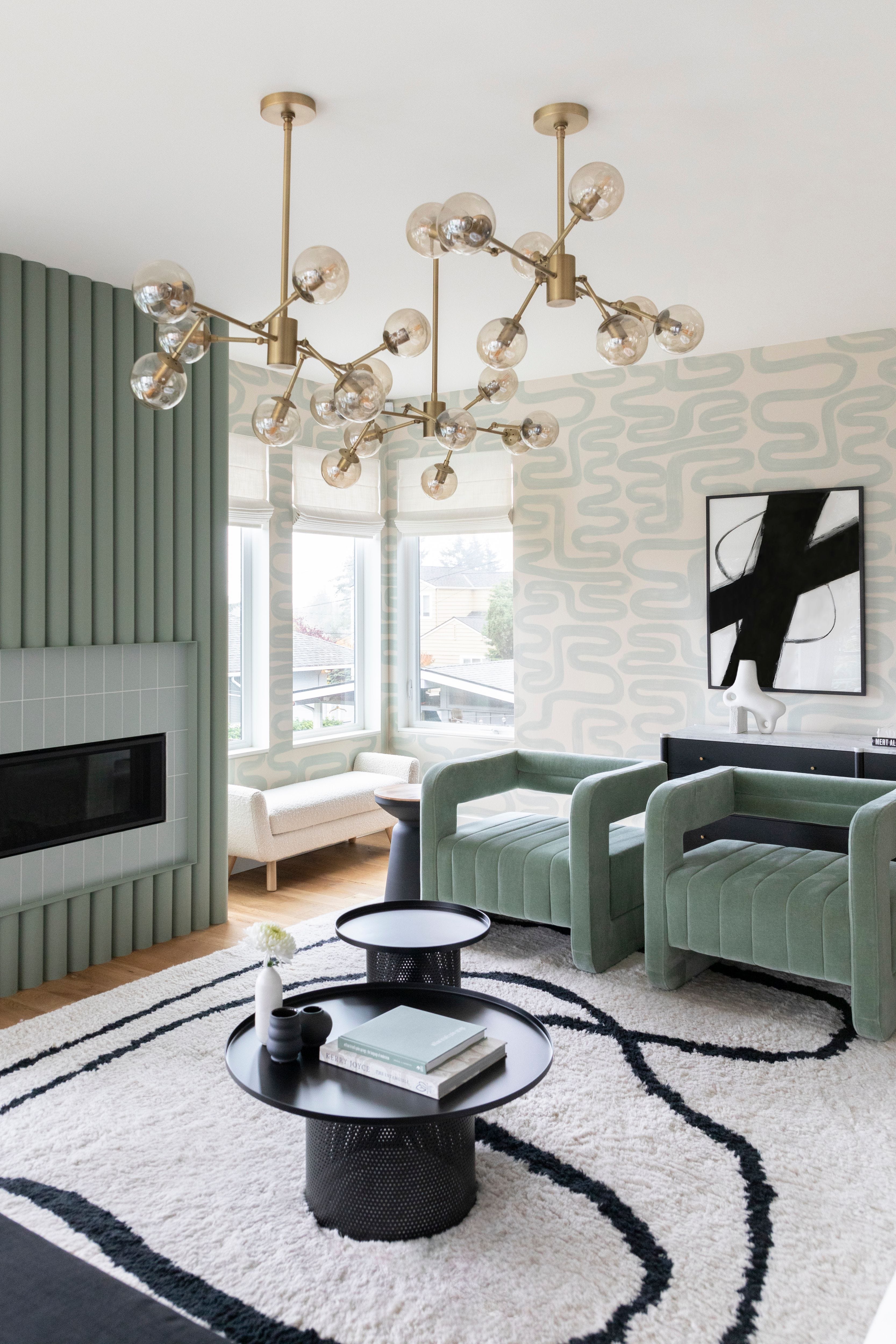
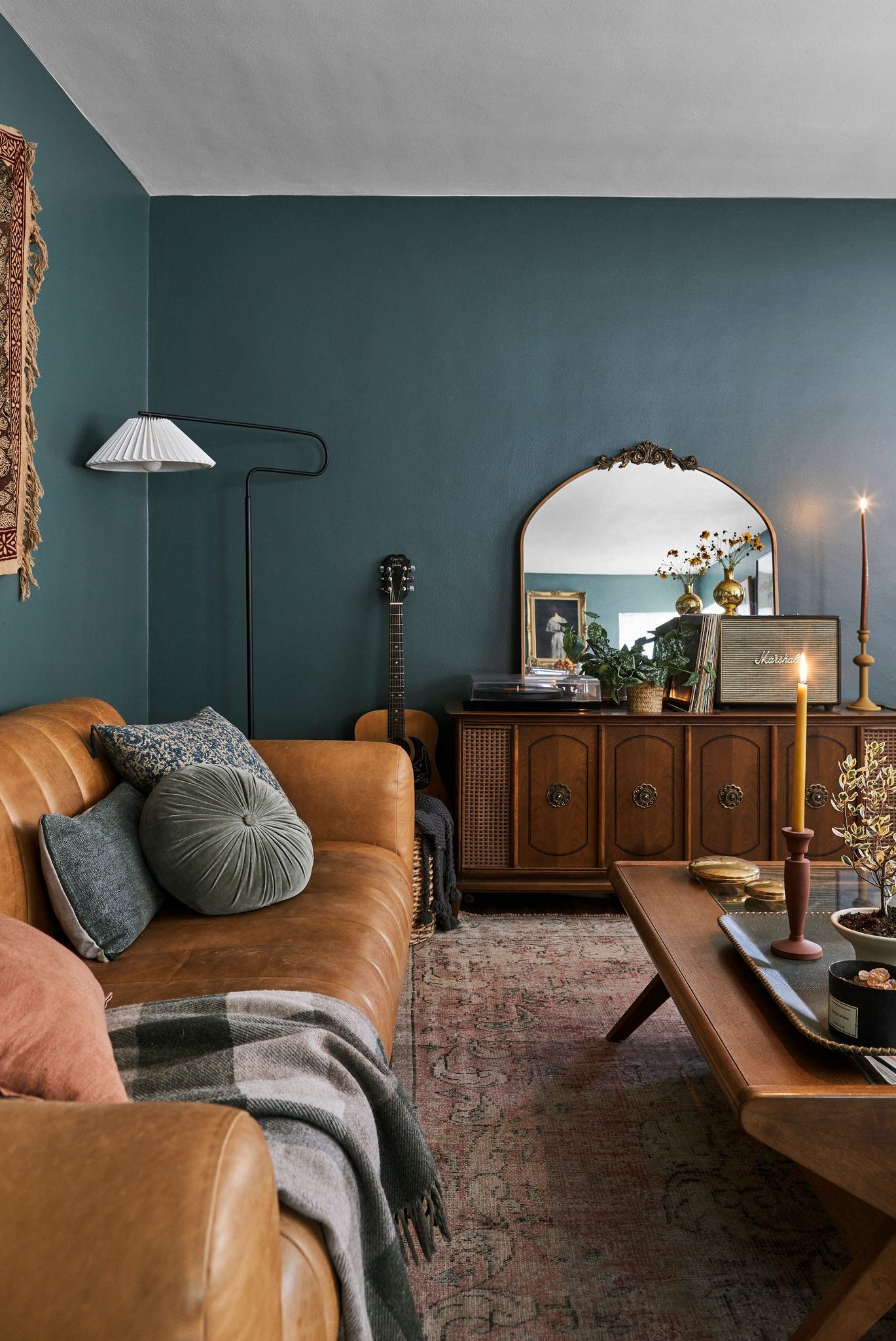
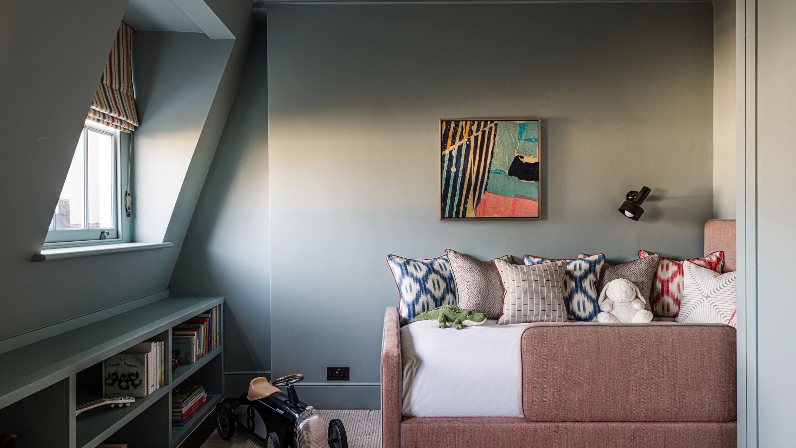
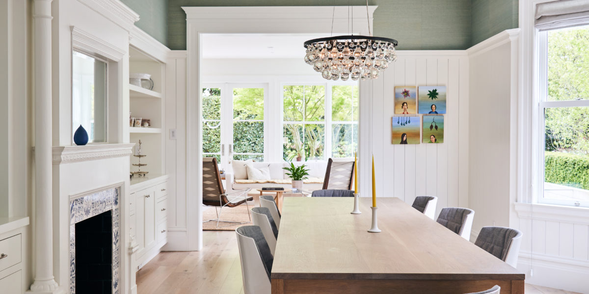
The popular warm white paint, Slaked Lime, is explored through multiple examples, with designers praising its purity and underlying warmth, suitable for contemporary architectural projects and natural light-filled dining rooms. Dark teal shades, such as Goblin, are shown to complement patterned wallpapers in maximalist studies, while Deep Space Blue creates a saturated and dramatic effect in a bedroom when layered with similar tones. For nurseries, Bone China Blue offers a calm and uplifting ambiance, pairing well with warm textiles. Ulla, a gentle green with a warm undertone, is featured in a living room, chosen for its ability to add a hint of color without being insipid, particularly in spaces with limited natural light. The article also delves into moodier greens like Olive Colour, which transforms kitchen cabinets into a timeless focal point that draws inspiration from outdoor greenery.
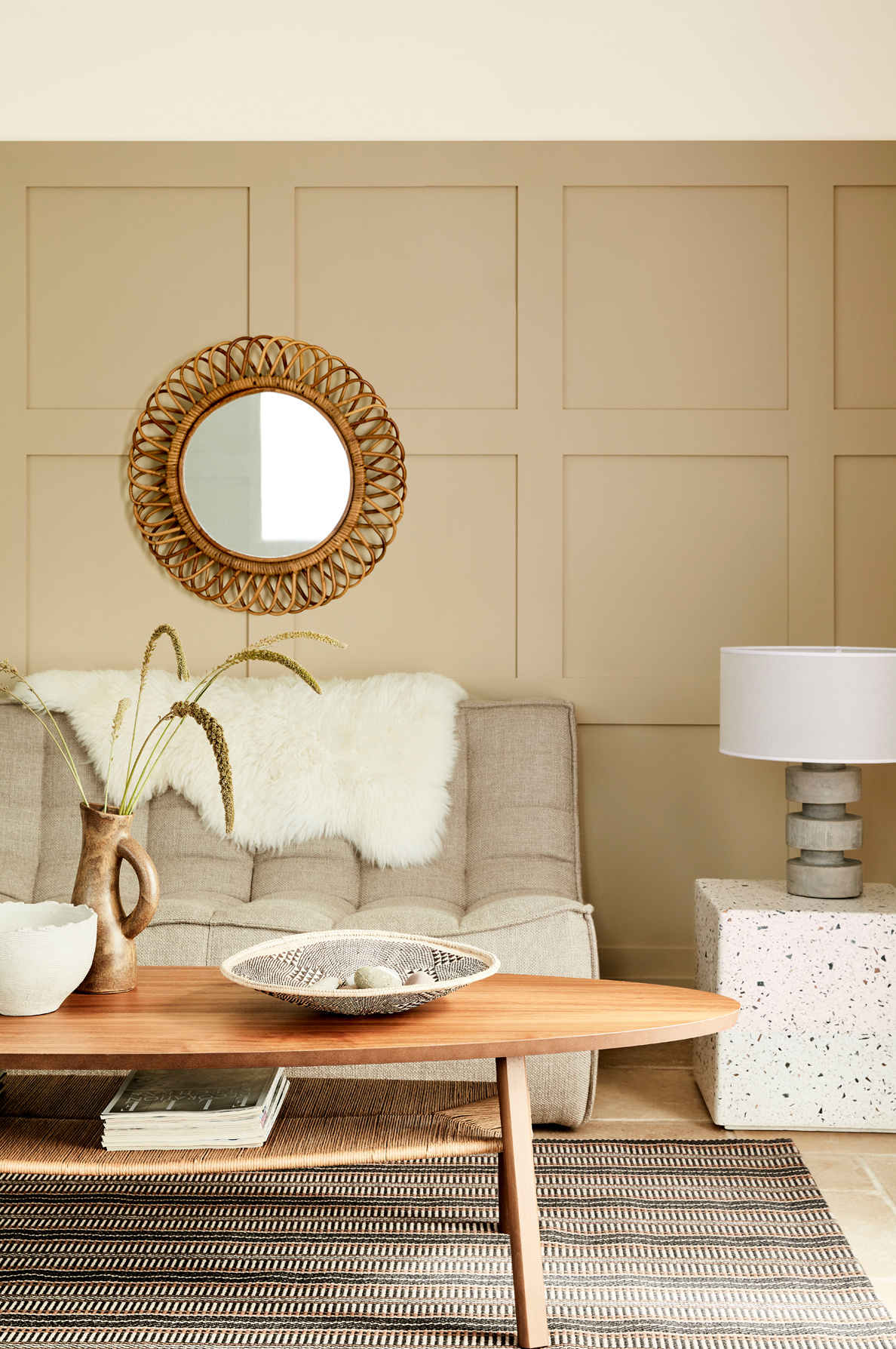
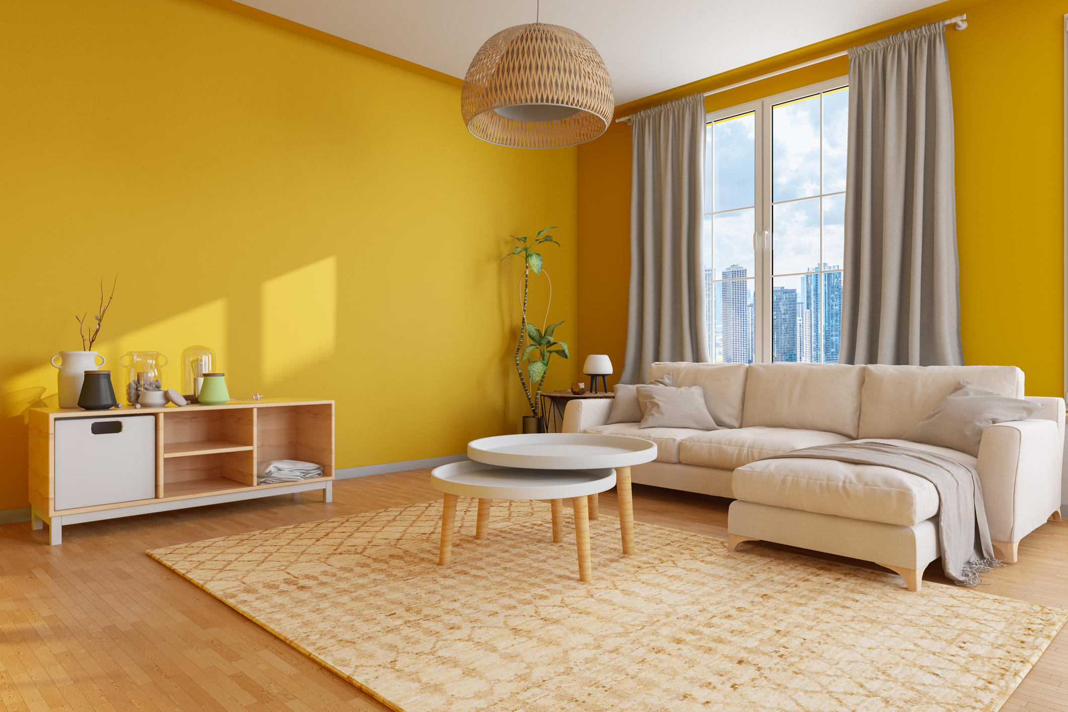
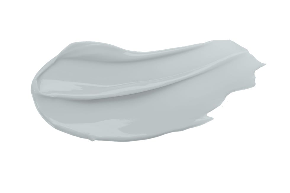
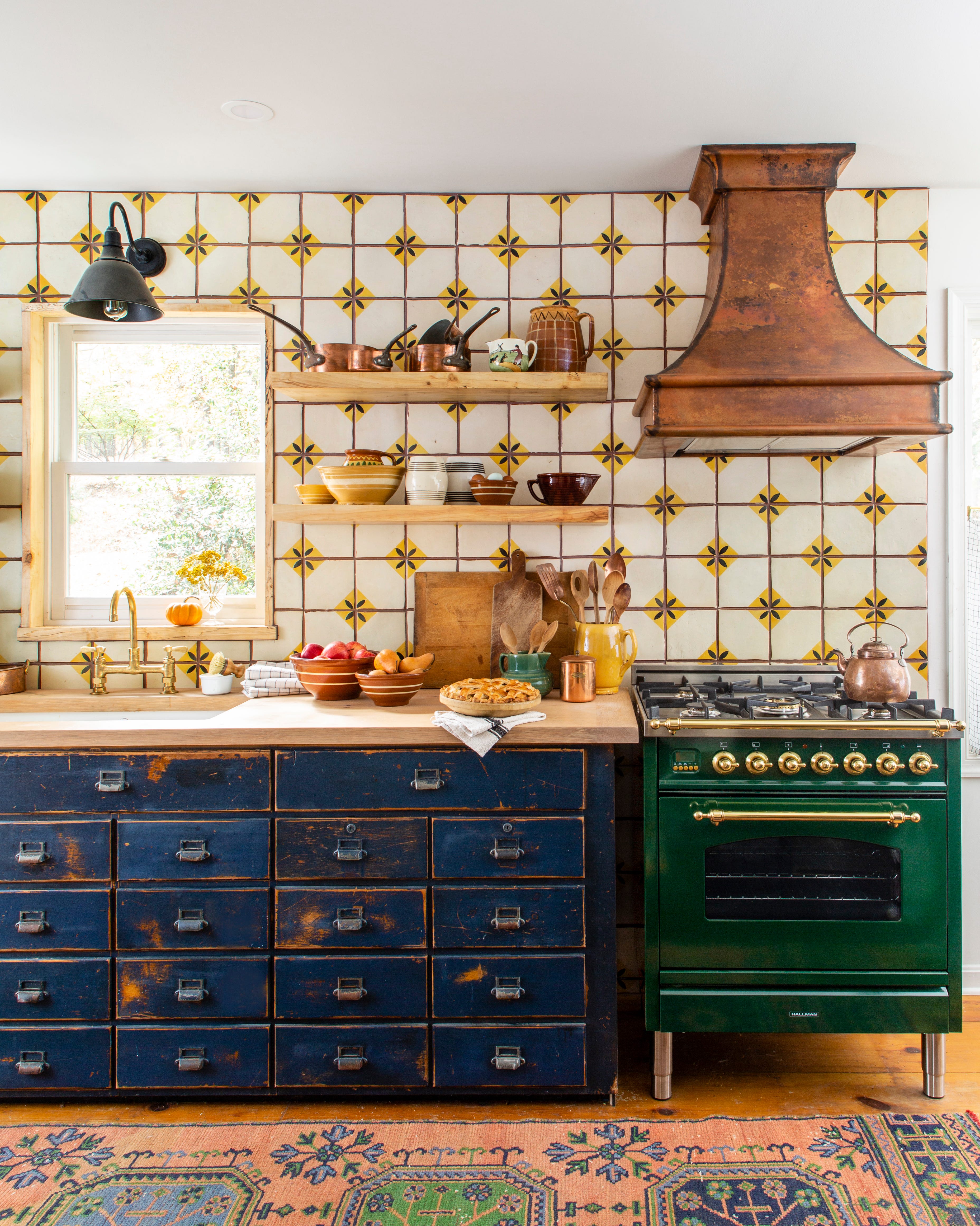
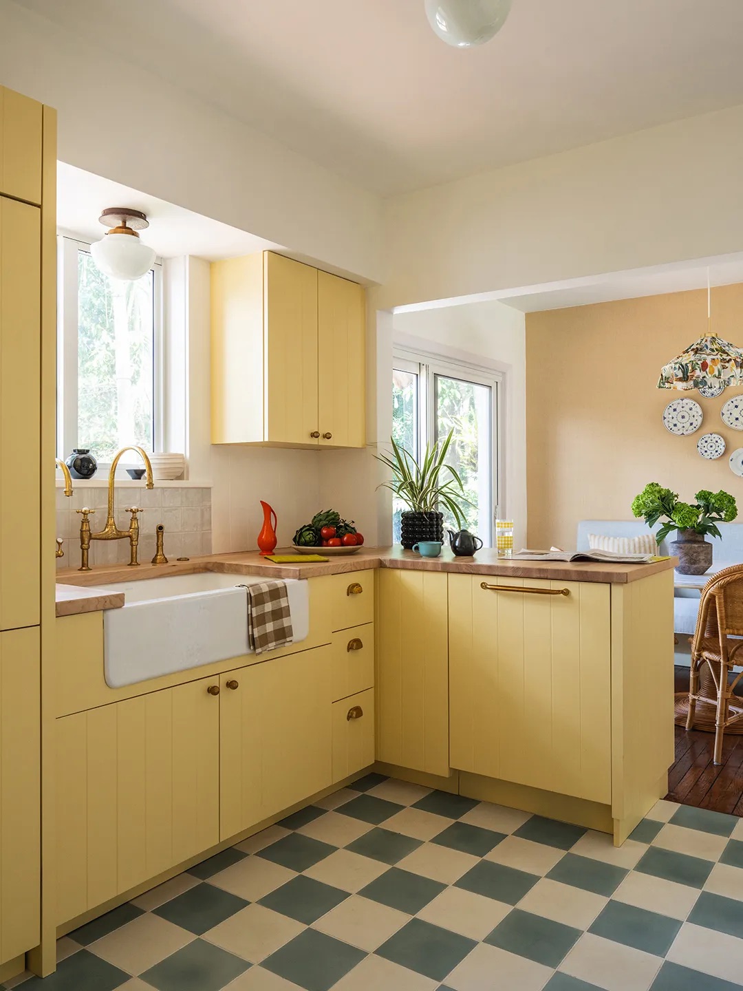
Bright and cheerful options, including Carys, a yellow paint used in a boot room, and Yellow-Pink, a mustard shade that color-drenches a child's room with earthy warmth, are presented for their ability to infuse spaces with happiness and coziness. Blush, a muted plaster pink, is showcased in a dressing room, creating a sophisticated and unexpected pop of color. Neutral bedrooms benefit from warm neutral paints like Clay, which, when combined with lighter shades like Whitening, adapts to different light conditions and room orientations. Portland Stone Pale is another versatile neutral, praised for its ability to maintain continuity across various room orientations. Hopper, an olive green, adds warmth and an earthy feel to kitchen cabinets, harmonizing with white marble countertops and pink accents.
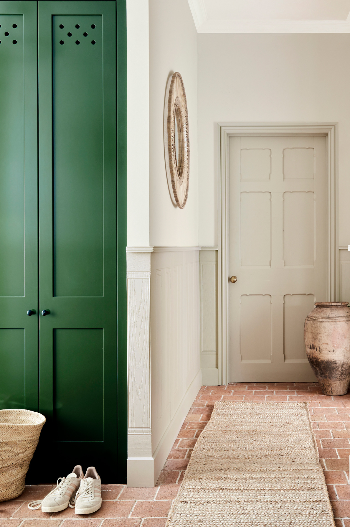
Beyond paints, the article also features Little Greene's wallpapers, illustrating their decorative impact. The Dahlia Scroll wallpaper in Giallo is highlighted for its subtle yet vibrant yellow hue and tone-on-tone dahlia motif, creating a layered and sophisticated feel in a hallway. Lastly, the Massingberd Blossom wallpaper in Verditer, combined with Tea with Florence paint on lower walls, is shown in a colorful bathroom, demonstrating how these designs can bring a fresh and pre-modern twist to interiors. The article concludes by inviting readers to explore Little Greene's range further for both neutral and richly pigmented tones, emphasizing their refined and sophisticated appeal.
#LittleGreene #PaintColors #InteriorDesign #HomeDecor #Wallpaper #DesignInspiration #ColorSchemes #DesignerRooms #RealHomes #LittleGreene #PaintColors #InteriorDesign #HomeDecor #Wallpaper #DesignInspiration #ColorSchemes #DesignerRooms #RealHomes
0 comment in total
 No comments yet
You may also like
The 10 Best Little Greene Paint Colors For Your Home, as Chosen by Interior Designers

These Dark Interior Colors Can Sell Your House for More Money, According to Zillow

30 on-trend paint colours for every room in your home

7 Paint Colors That Make a House Sell for More Money

Living In Color

8 Surprising Colors That Will Decrease Your Home's Value, According to Experts
14 Best Green Paint Colors


Timeless Paint Colors The Stars Of Fixer To Fabulous Love Seeing In Homes
Photos: My Favorite Room with Liz Tew
Why I’m Not Painting My Walls

19 of the Best Green Paint Colors for Any Room in Your Home

This Cheery Kitchen Color Could Hurt Your Home Value

There Are Only Certain Green Paint Colors That Can Bring a Room to Life

Hottest Interior Paint Colors of 2020
Green Is the Prettiest Color! These Rooms and Decorating Ideas Prove It
Here's How to Go Green in the Living Room

Should doors be painted the same color as walls? Expert advice on when to go all out and when to mix it up

Experts reveal the best living room paint colours to transform every space

15 Lush Green Paint Colors to Invigorate Any Space

This Surprising Paint Color Tricks Buyers Into Paying More for a Home