1/21
These 20 Rooms Use a Red Color Palette in All the Right Ways
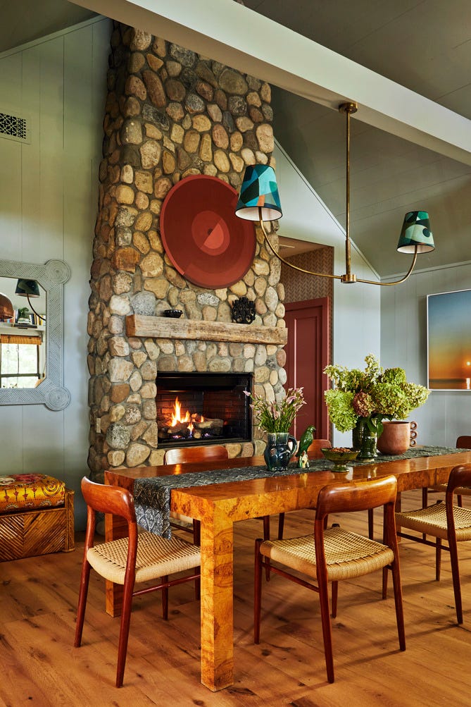
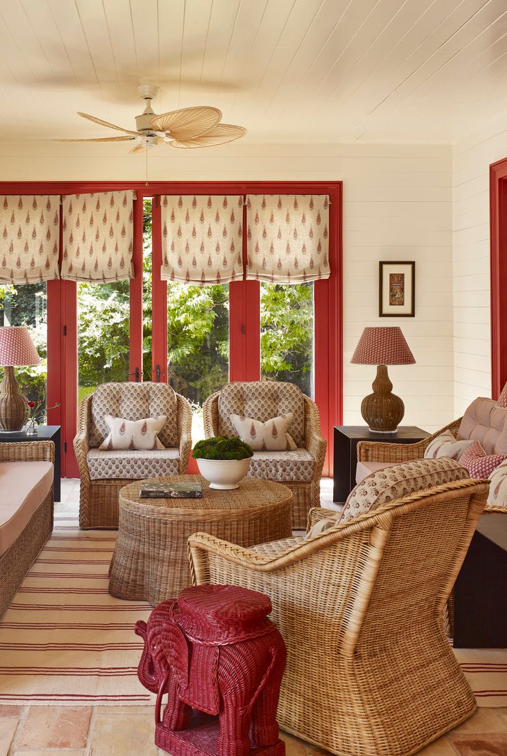
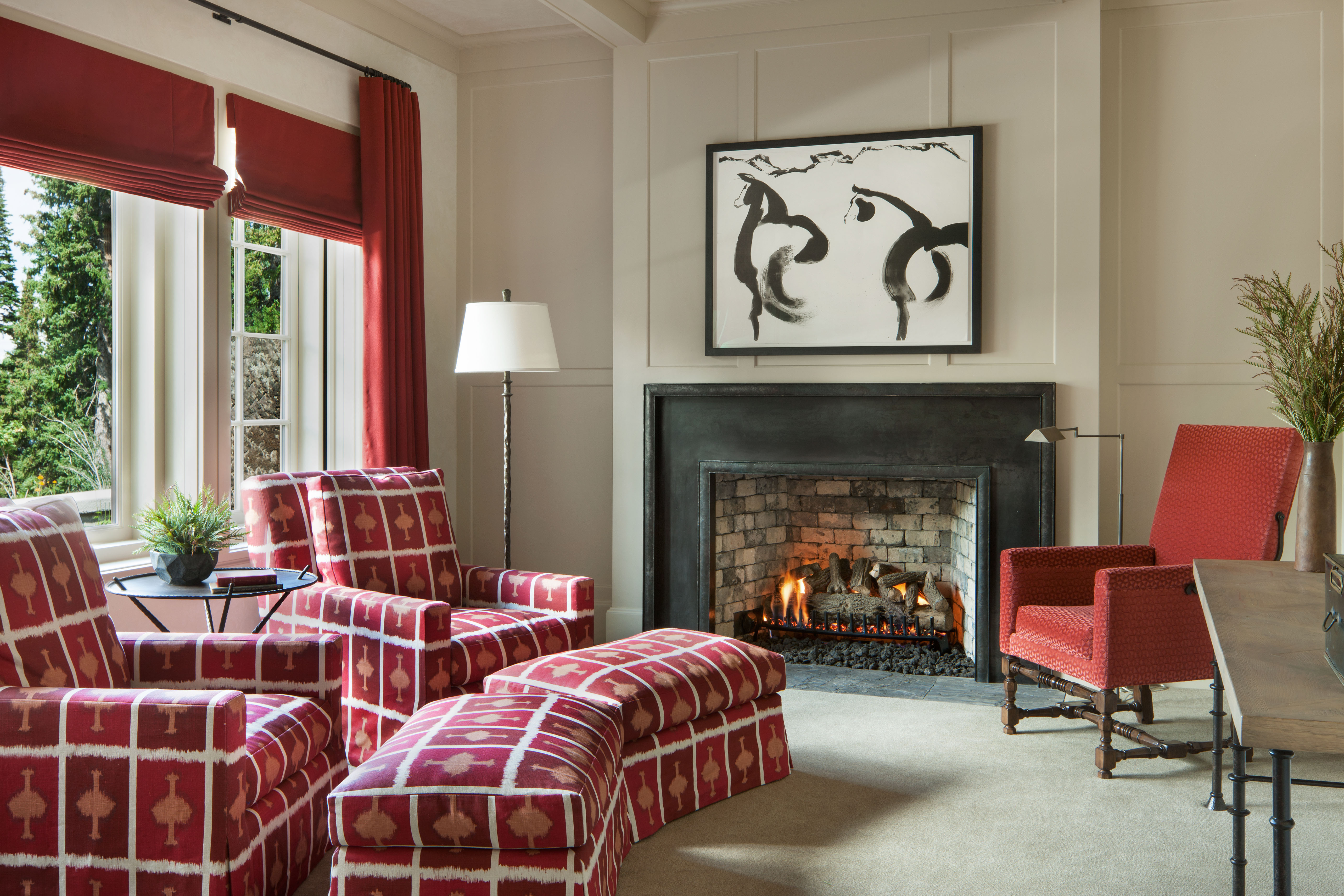
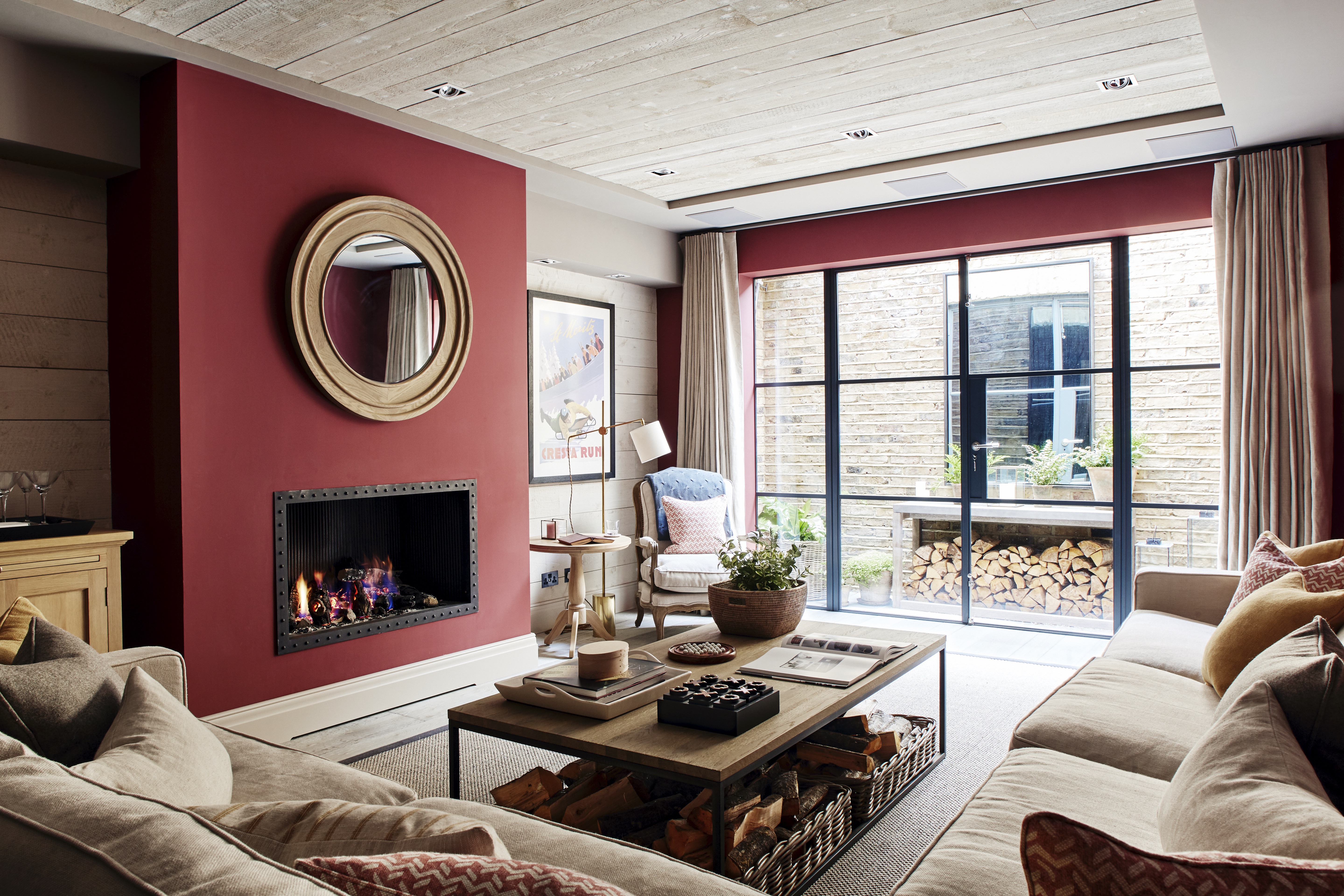
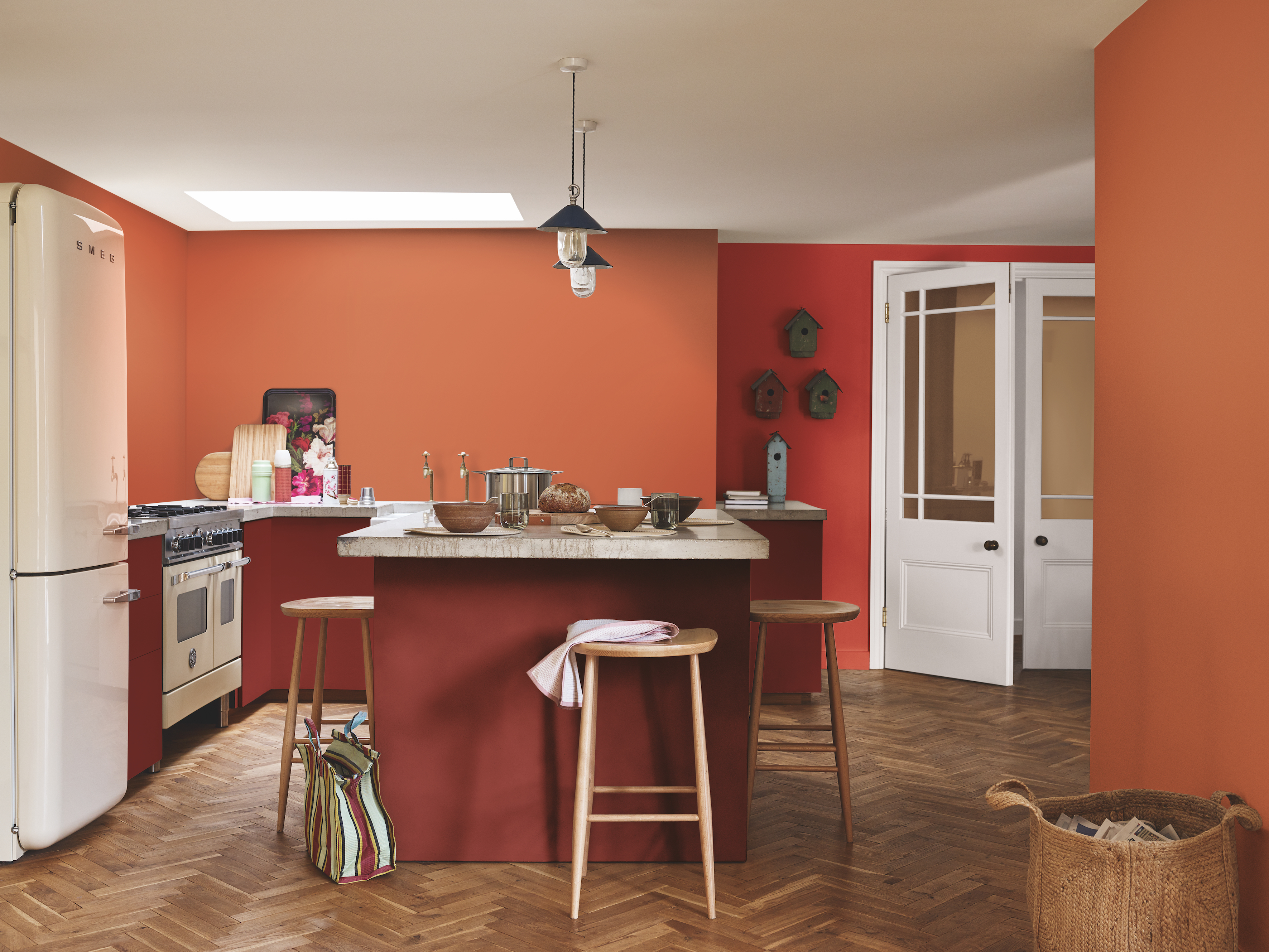
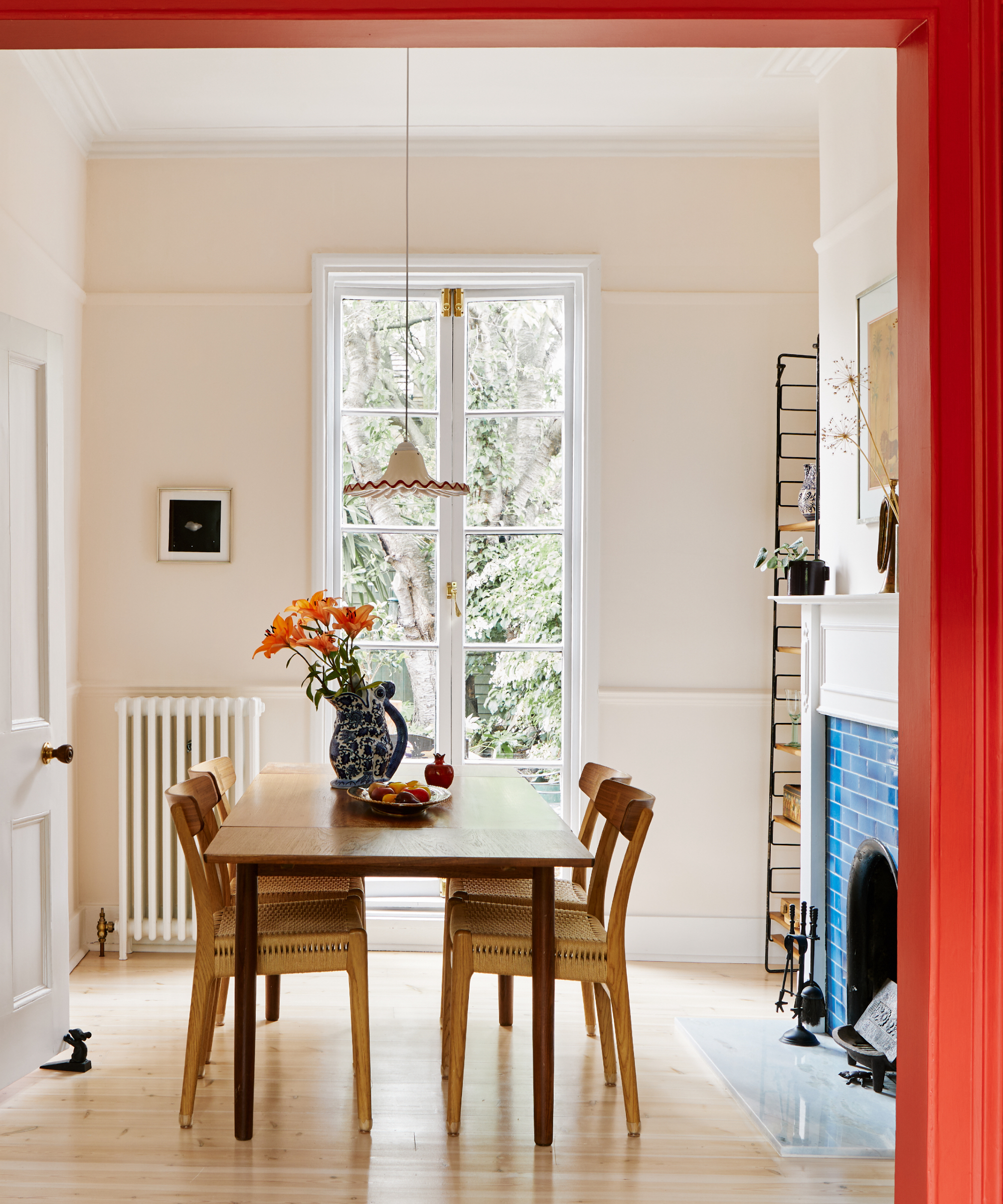
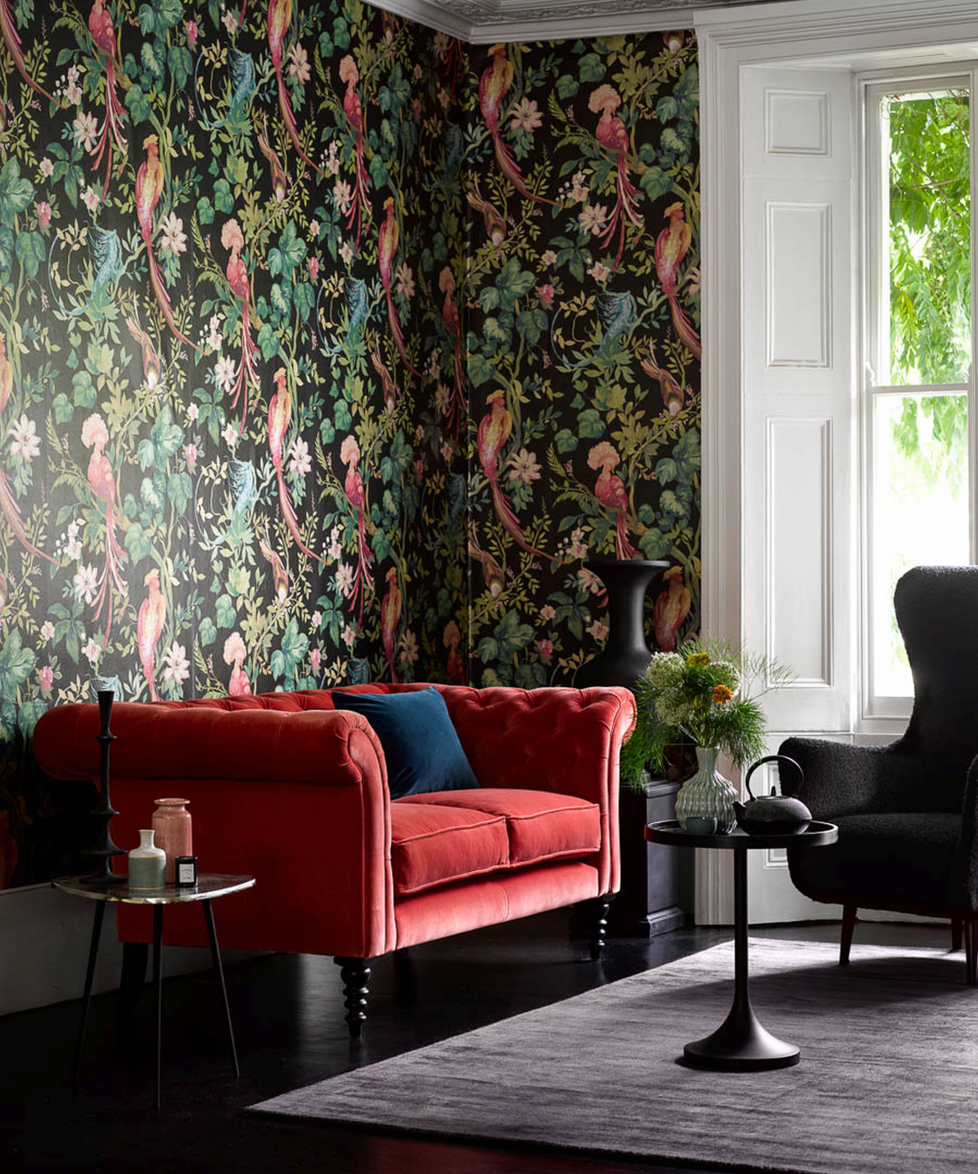
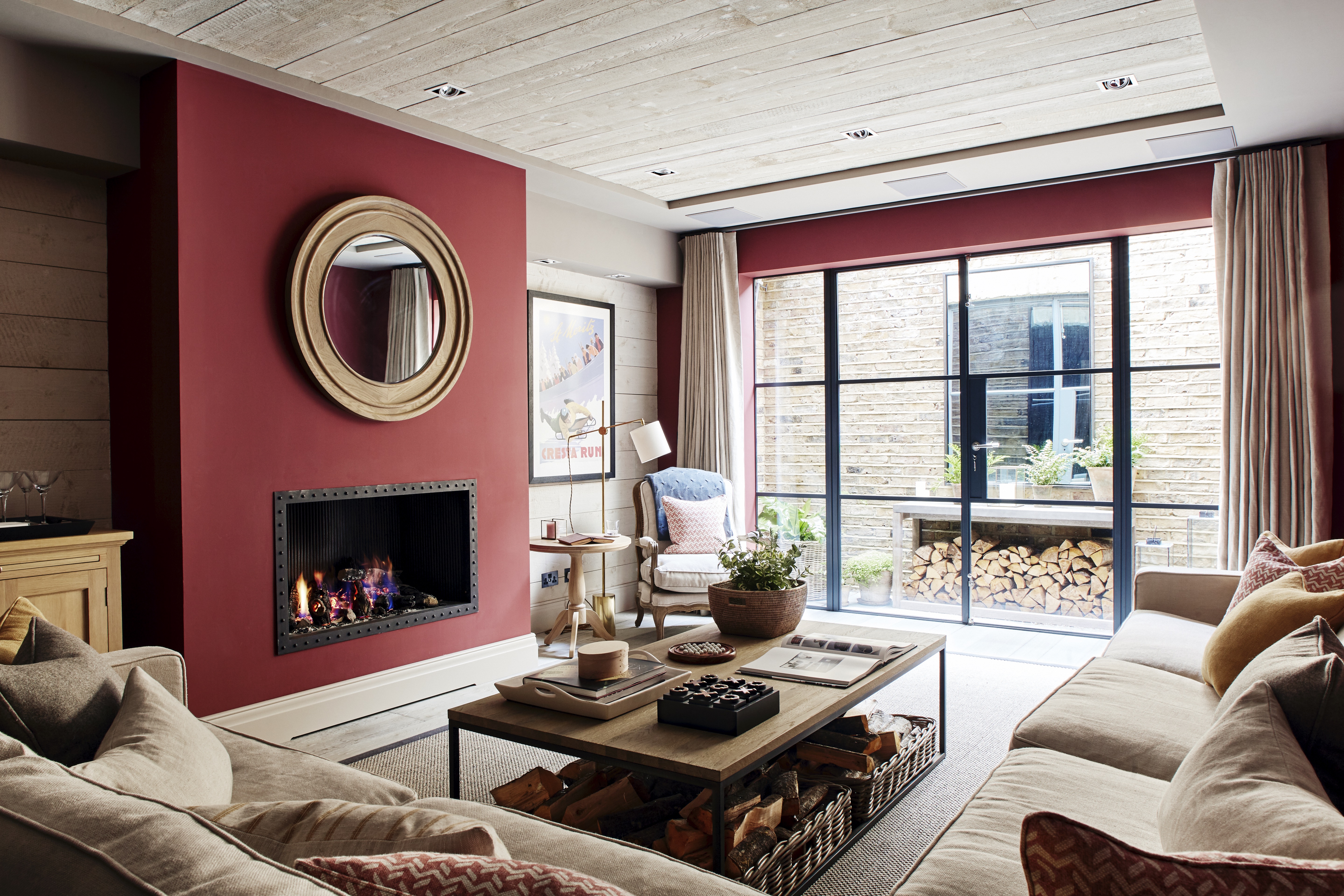
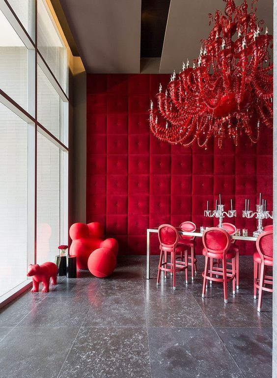
Red, an inherently emotional and often polarizing color, can be effectively integrated into interior design with careful consideration. While some designers find it intimidating, its strategic deployment, whether in high-gloss finishes or subtle eggshell, can transform a space. Paint and wallcovering brand cofounder Natalie Ebel suggests starting with smaller areas like accent walls or alcoves, but notes that deeper reds like burnt umber or crimson can create a dramatic and beautiful effect, especially when combined with other red shades or warm tones like peach and pink. Patrick O’Donnell, international brand ambassador for Farrow & Ball, emphasizes that selecting the right red shade can infuse an interior, traditional or contemporary, with warmth and drama. He also points out the physiological impact of red, which is said to increase metabolism, making it an ideal choice for social dining areas.
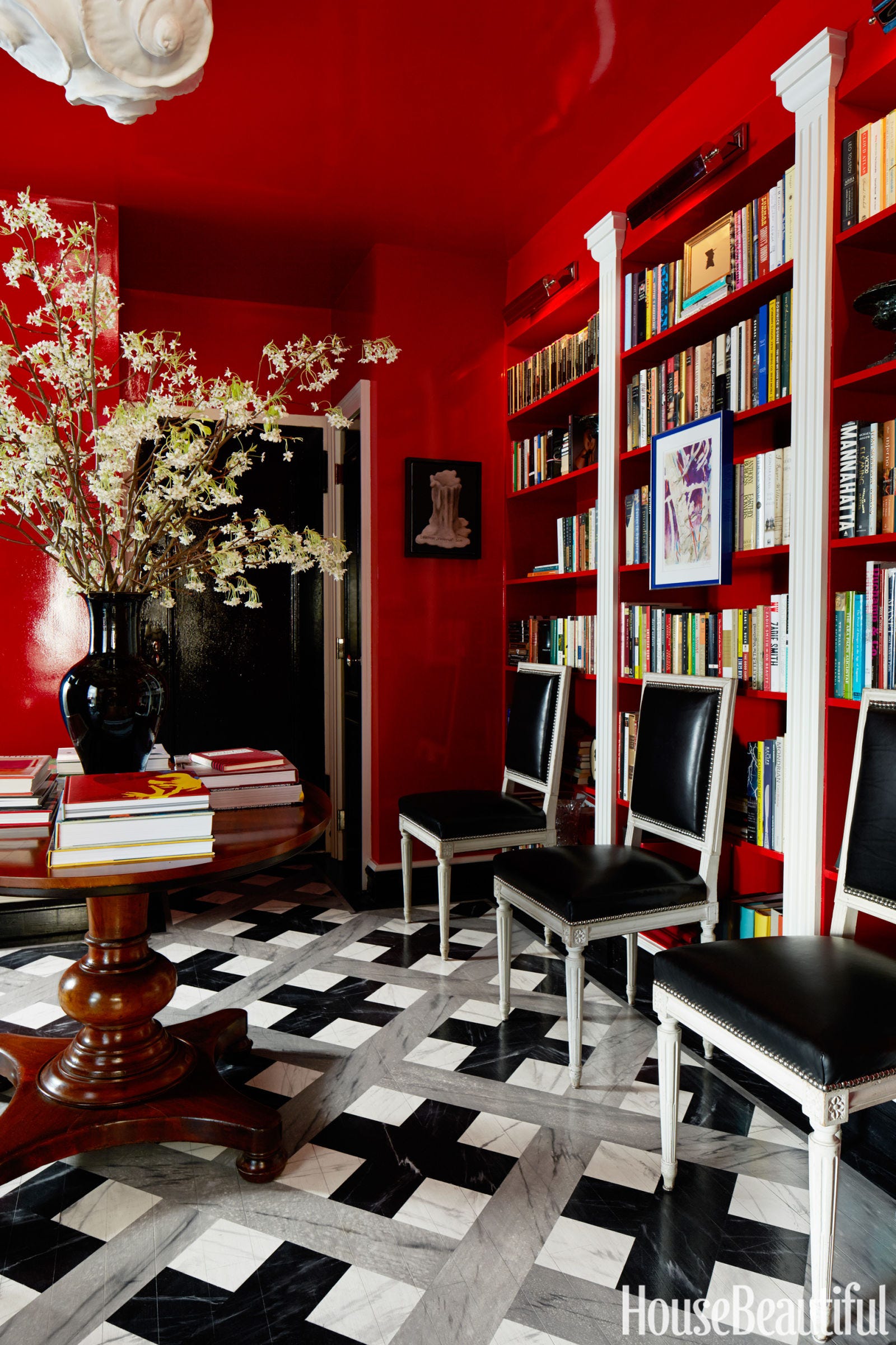
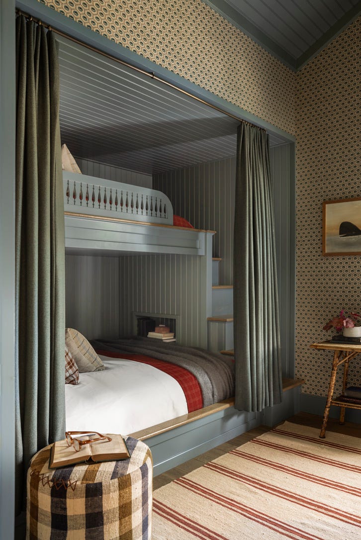
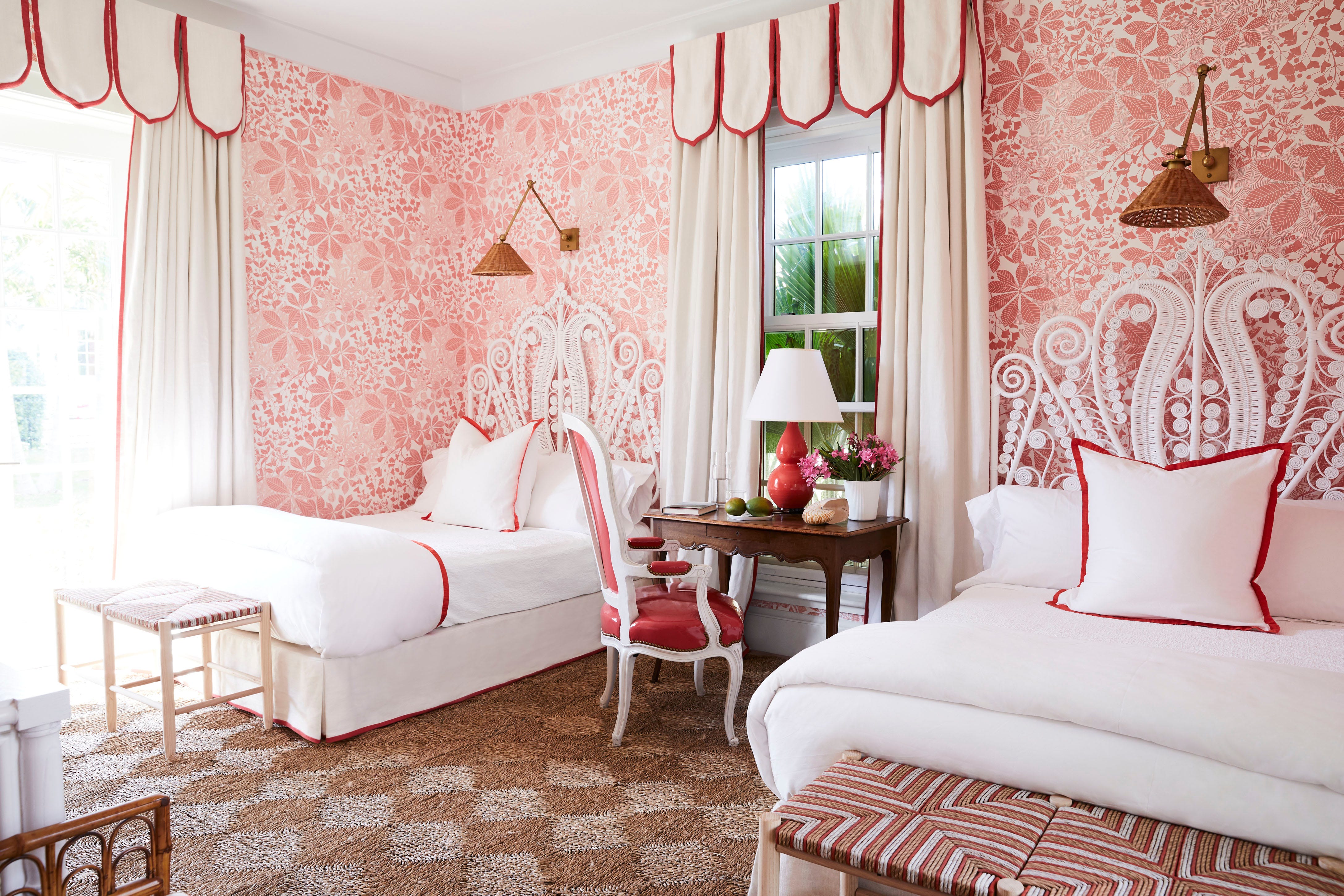
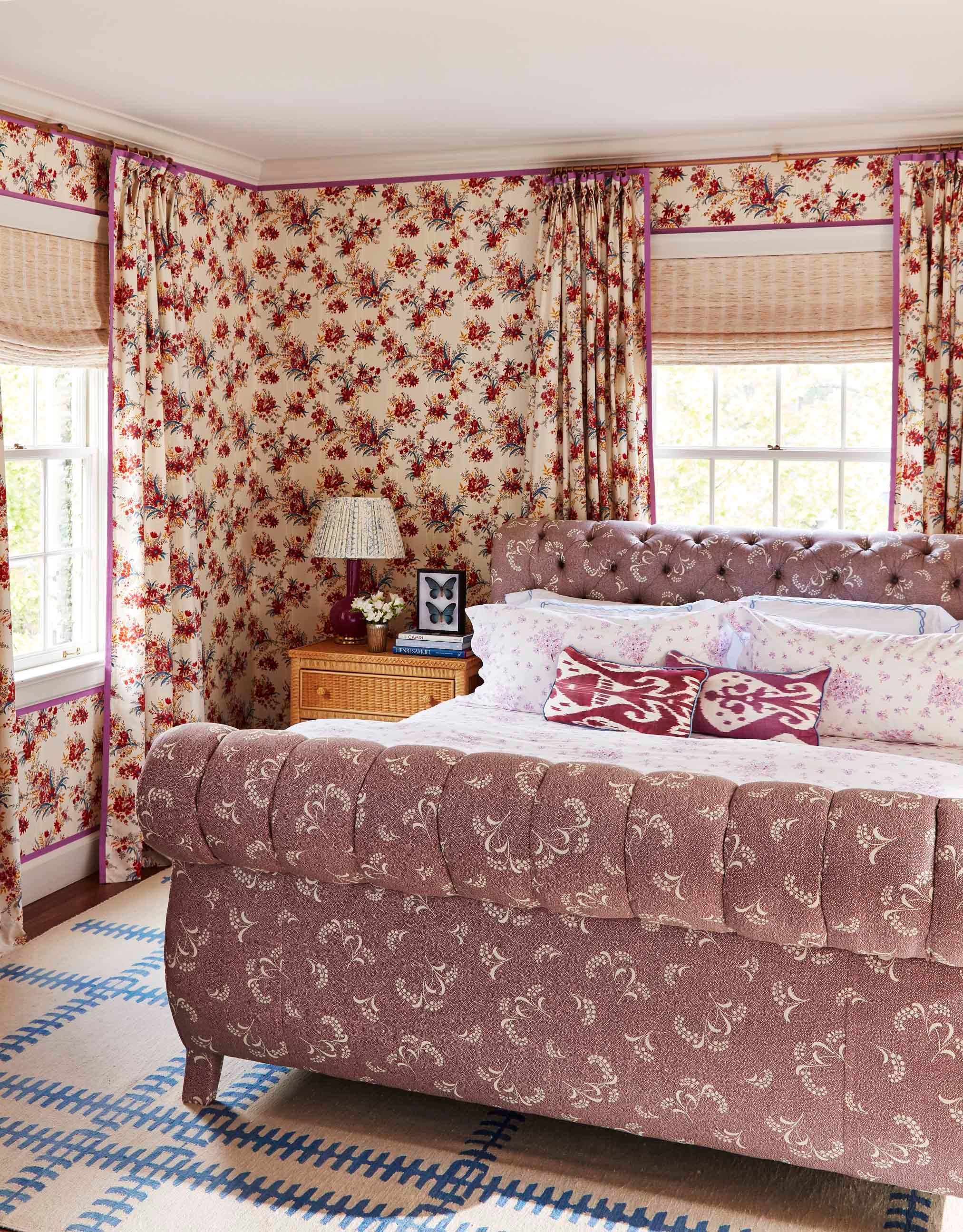
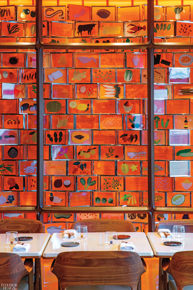
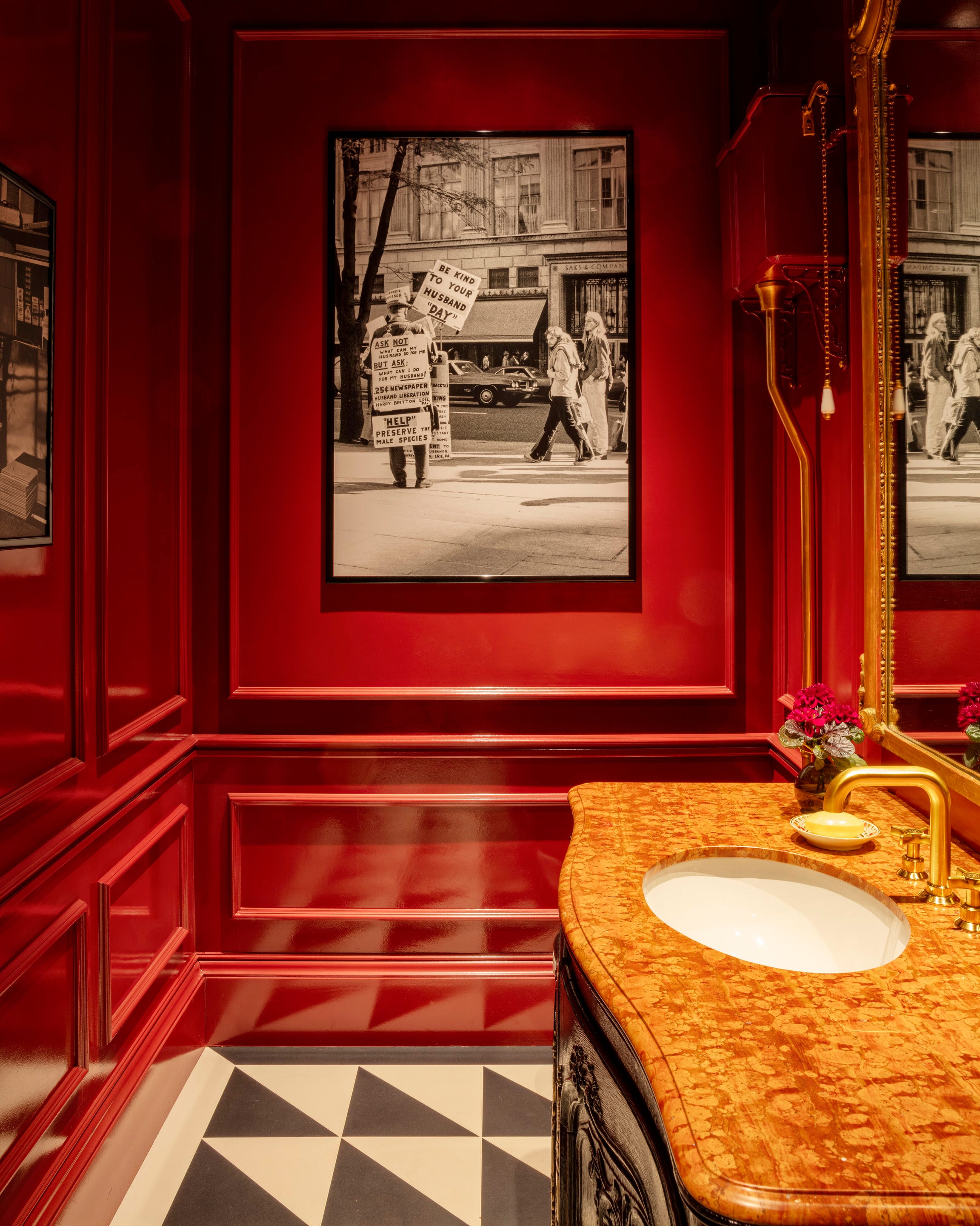
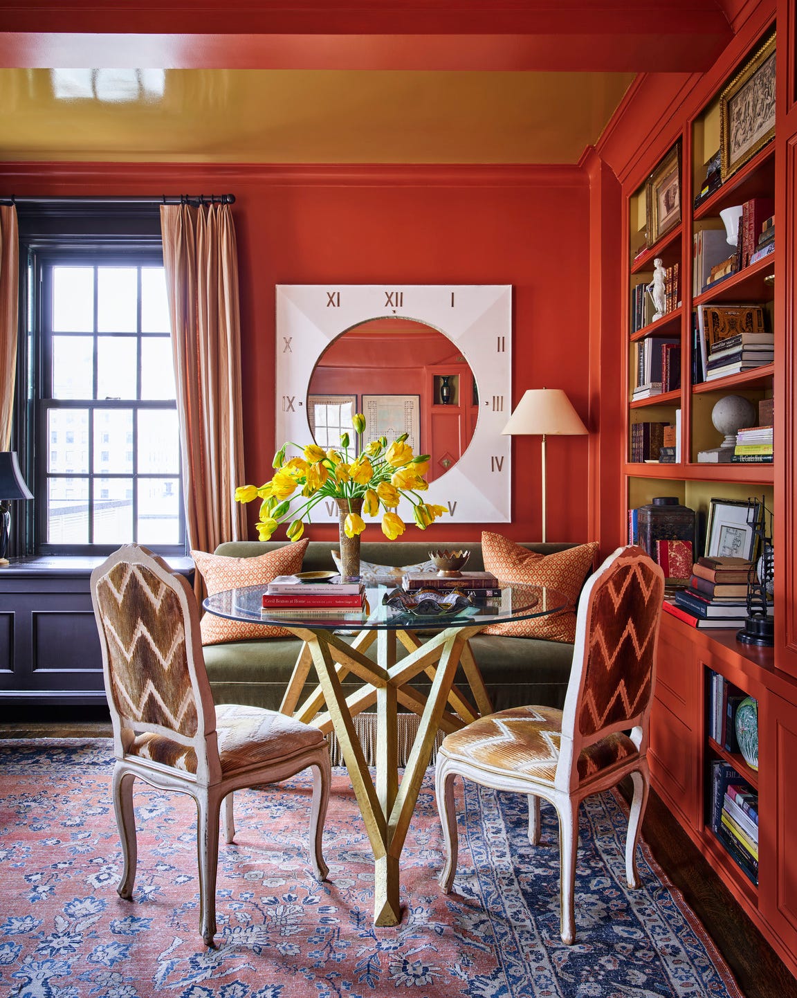
This article showcases 20 surprising color pairings that demonstrate red's versatility in home interiors. Examples include combining Burnt Sienna with Pine in a Paris gallery, where oxblood lacquered tables and tonal carpeting are offset by a pine green armchair, and pairing Rose with Ink in a Moroccan-inspired restaurant interior designed by Kelly Wearstler, using deep, inky black to complement a rose tone. Another pairing highlights Cherry with Charcoal in a Madrid apartment by Lorenzo Castillo, featuring Farrow & Ball’s Rectory Red on millwork and dark-stained herringbone flooring. Red-Orange is shown with Neutrals in a Manhattan powder room, where an Élitis wallcovering is complemented by a red travertine sink and tiled floor. Lipstick red is contrasted with Turquoise in a Houston library, allowing a turquoise linen-velvet sofa to stand out against bright red walls.
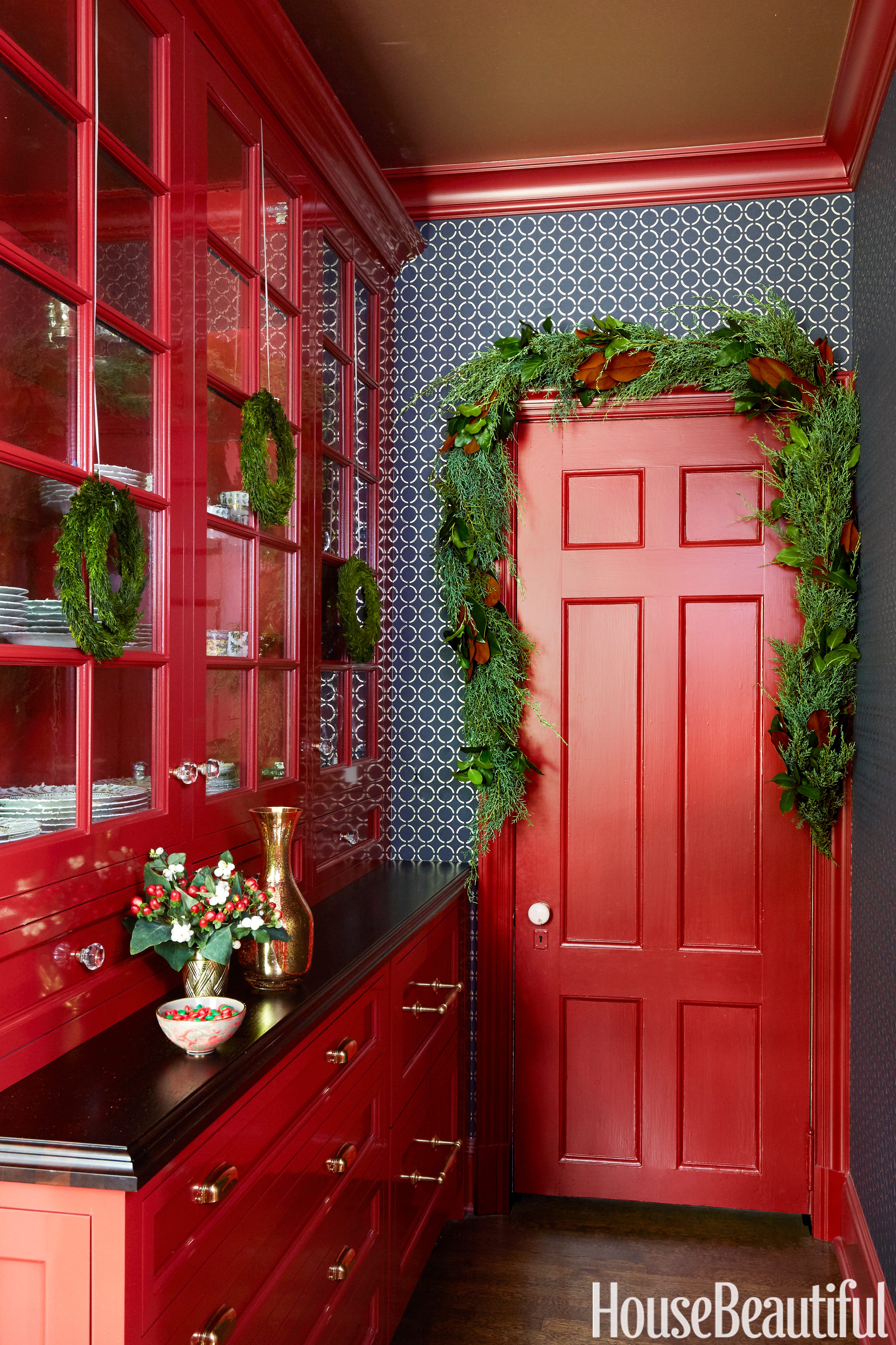
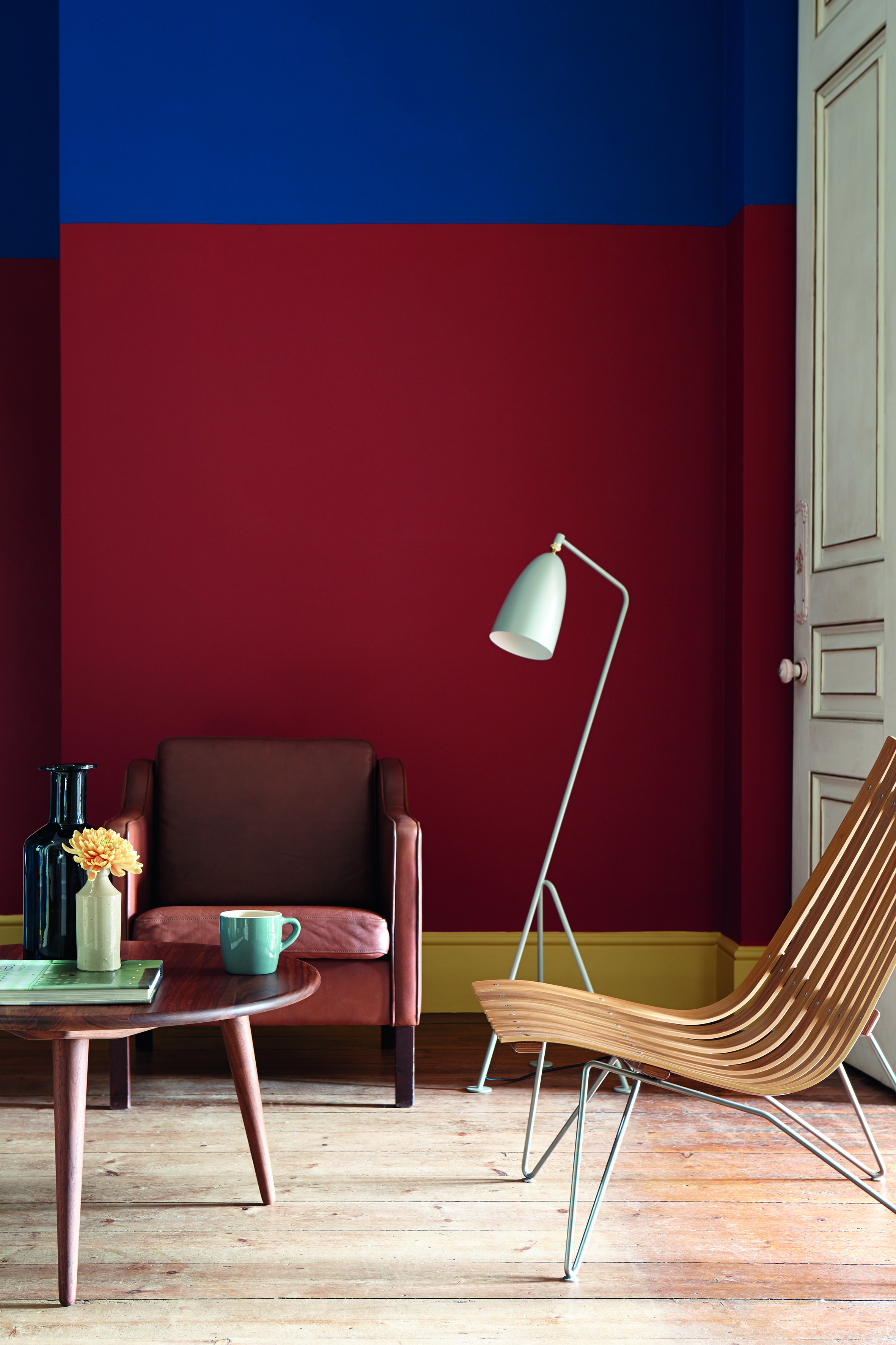
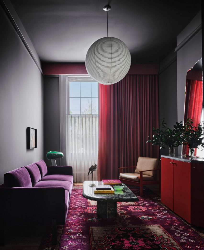
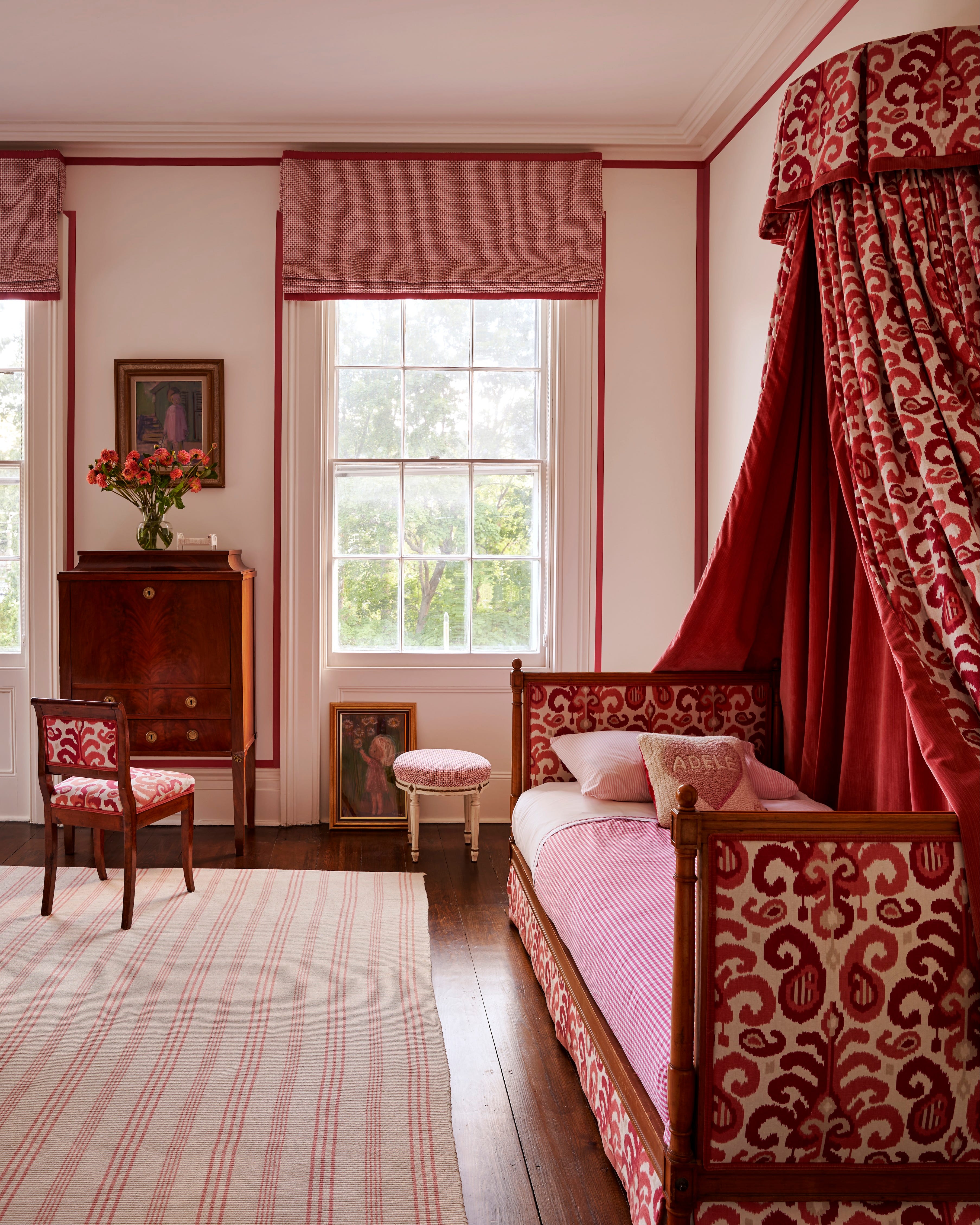
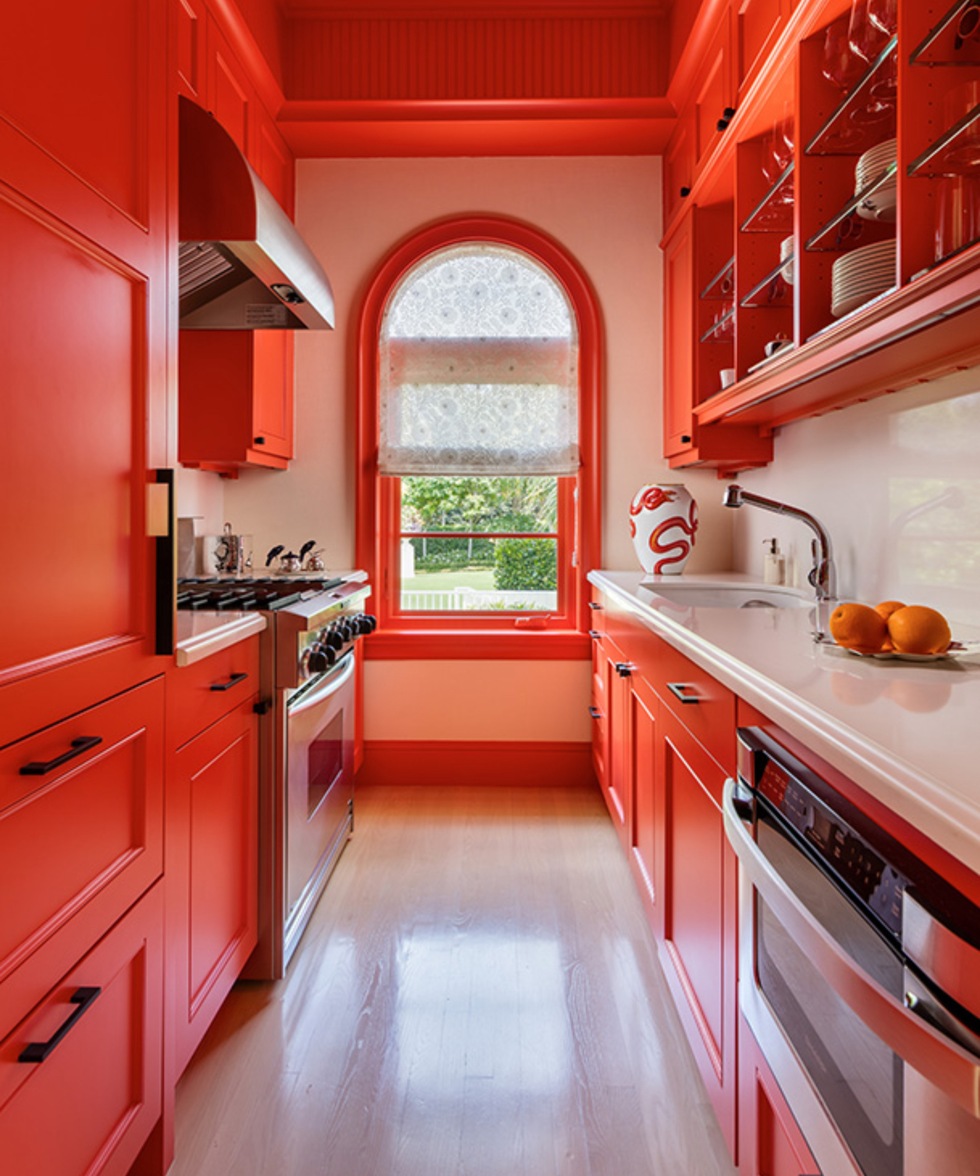
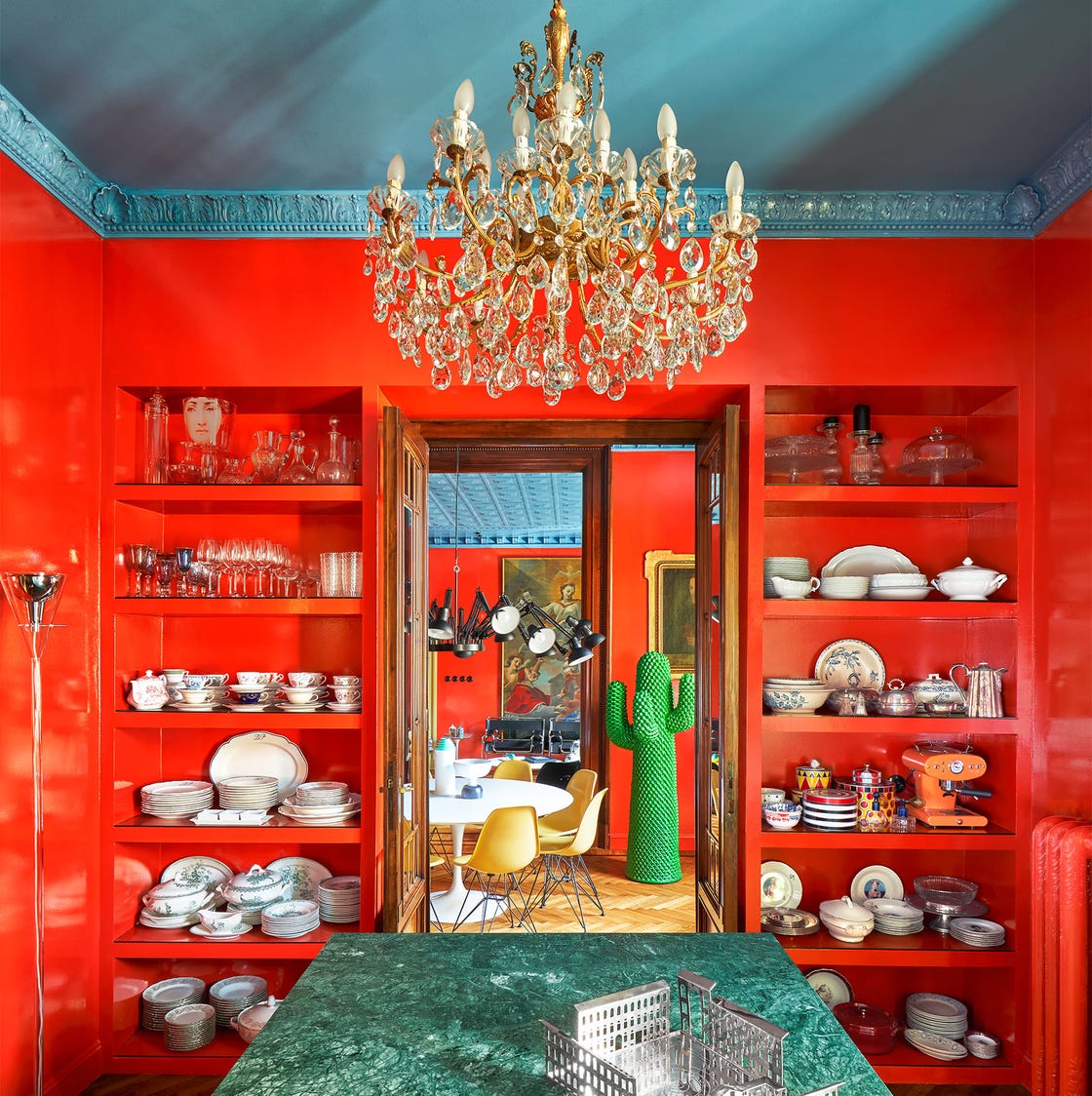
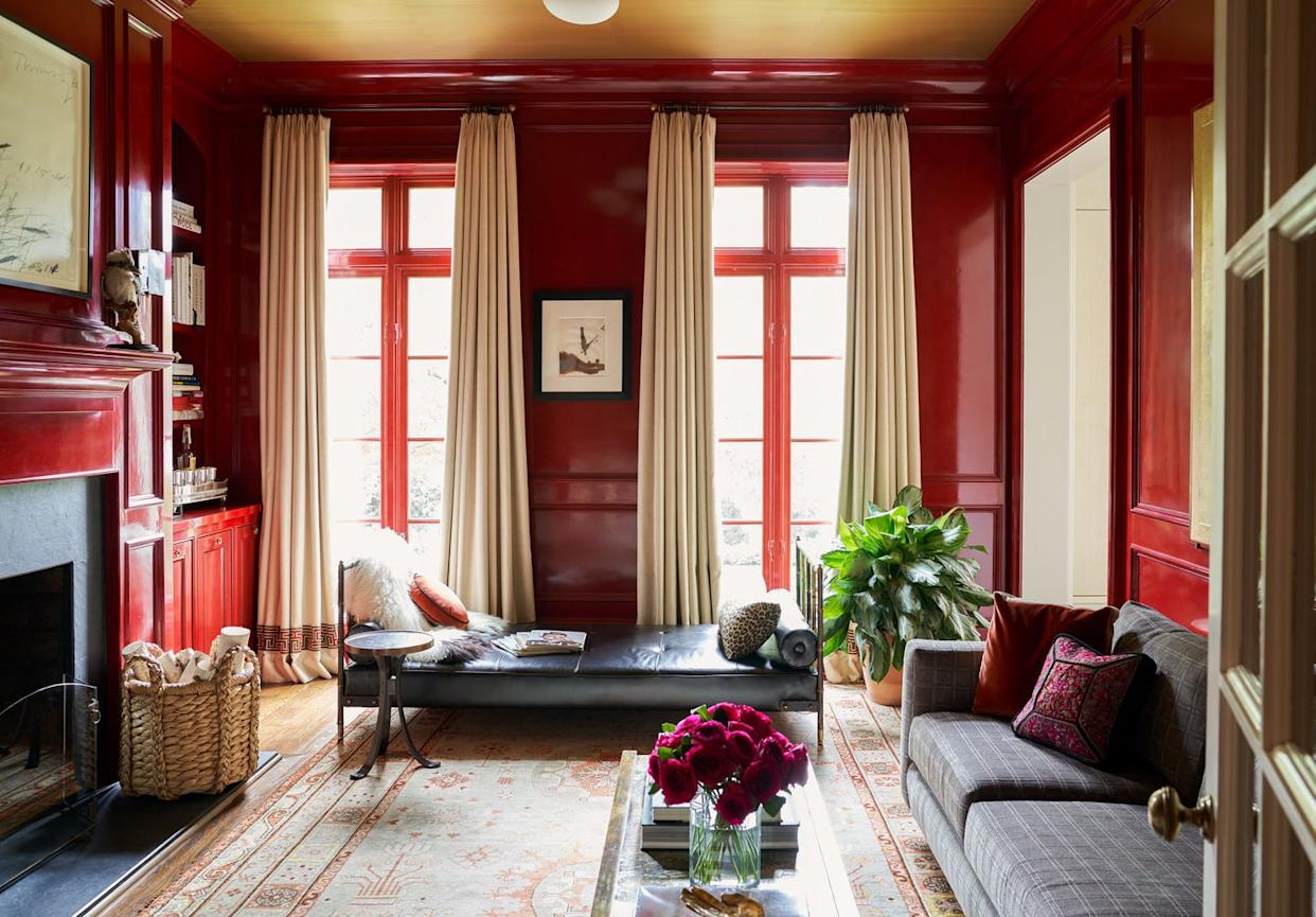
Other successful combinations include Glossy Ruby with Cornflower Blue in a Milanese home, where bold red walls are balanced by a blue ceiling. Pomelo and Black create a vibrant and welcoming foyer in a Manhattan space, while Red and Citrus evoke Pop Art elegance in a powder room. Crimson and Saffron are used in a Veere Grenney project, featuring crimson walls, a velvet daybed, and a contrasting yellow armchair. Salmon and Terra-cotta are combined in a Parisian kitchen with terra-cotta flooring, salmon-painted walls, and vintage red chairs. Red Stripes offer a dramatic impression in a Gramercy Park townhouse bedroom, using ticking-stripe canopies without painting the walls. Lacquered Crimson is applied to walls and ceilings for a high-gloss, impactful look. Tonal Reds in Farrow & Ball shades, along with terra-cotta tile flooring, add drama to a French country home.
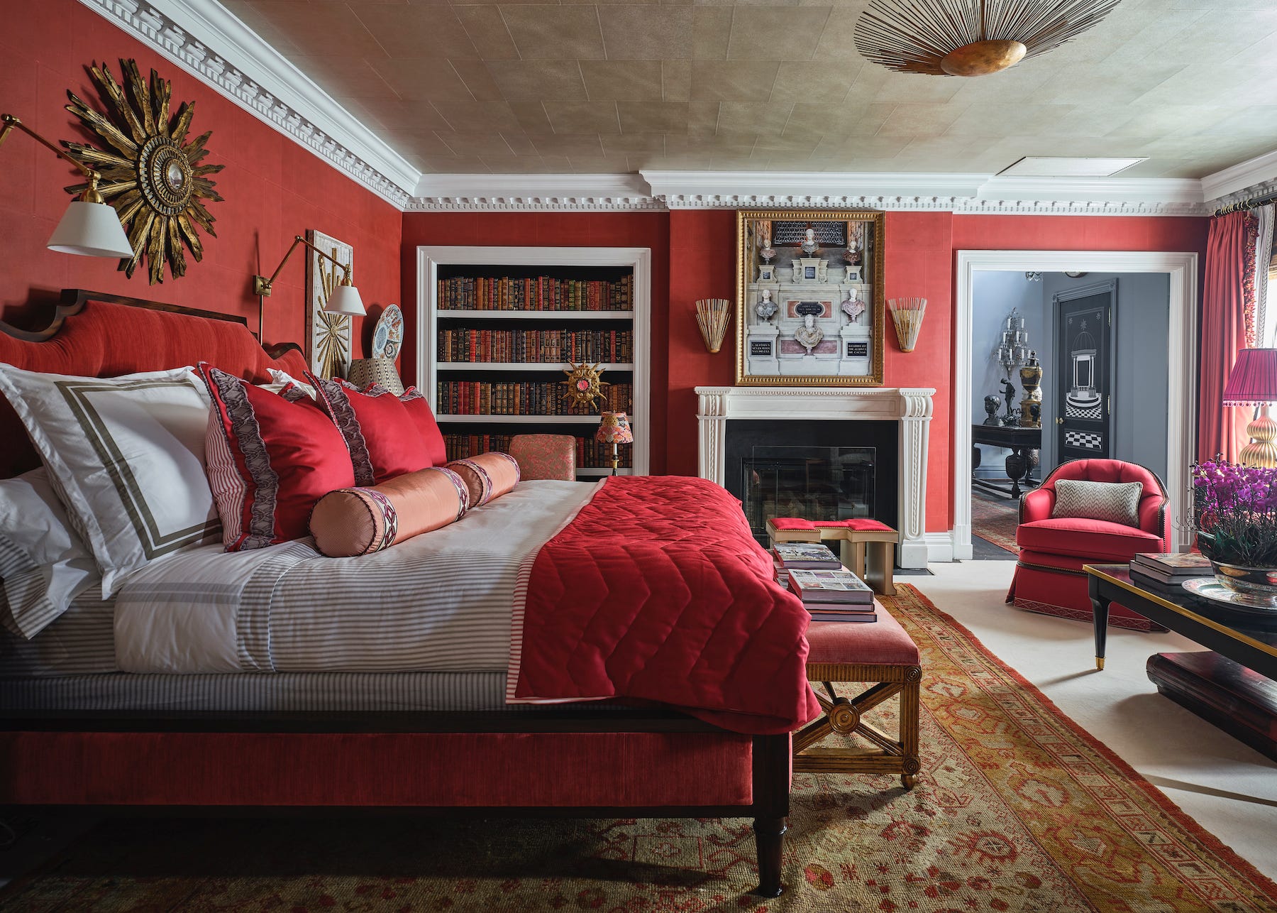
Further pairings explore Cocoa and Scarlet in a Redd Kaihoi room, where lacquered cocoa walls blend with a scarlet four-poster bed, accented by coordinating throw pillows, rugs, and art. Raspberry Sorbet and Burnt Sienna demonstrate how contrasting two red tones can create an impactful primary suite, even in a white room. Gilt and Pomelo combine an orangey-red tone with gilt wallpaper in a home bar. Glossy Ruby makes a second appearance, paired with “lacquered milk” in a home office designed by Ernest de la Torre. Burgundy is presented with Marble in a powder room, where rich red wallpaper is balanced by gold-toned sconces and marble. Raspberry Damask is matched with Crimson in a Chicago bedroom, featuring a de Gournay damask and deep crimson millwork. Finally, Scarlet Trellis with Ruby creates an elegantly draped space in a New York home, using deep scarlet vines and ruby accents.
#ColorPalette #InteriorDesign #RedDecor #HomeDecoration #PaintColors #ColorCombinations #HomeStyling #DesignInspiration #ColorPalette #InteriorDesign #RedDecor #HomeDecoration #PaintColors #ColorCombinations #HomeStyling #DesignInspiration
0 comment in total
 No comments yet
You may also like
13 Shades of Red That Bring the Drama
Red living room ideas – 10 atmospheric and elegant designs

19 one-color rooms that prove it can be done
Why This Hue Is Suddenly Dominating Every Designer's Wishlist—Plus, How to Style It

Red Rugs Are Taking Over Tasteful Interiors
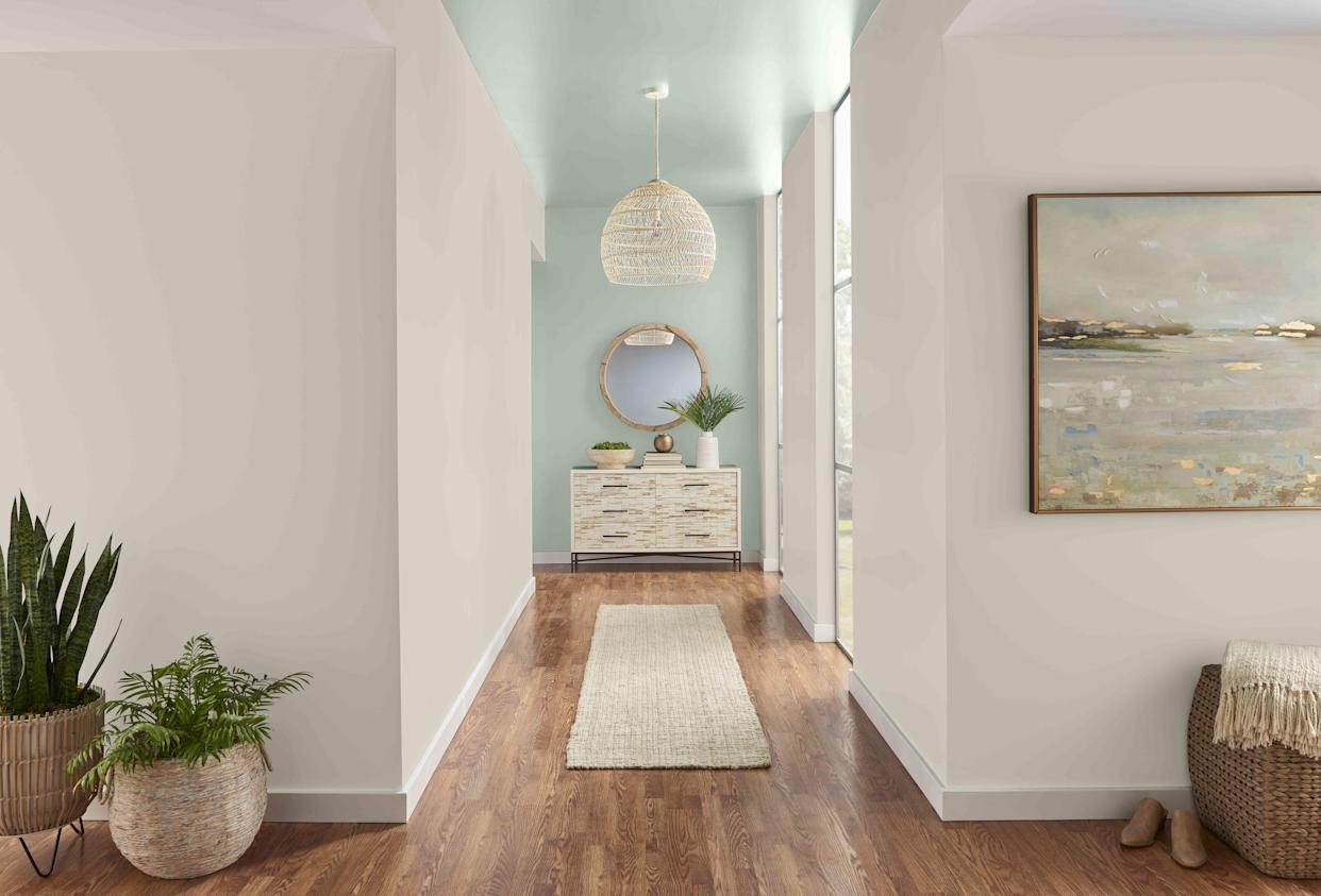
20 Hallway Paint Colors That Bring This Space to Life
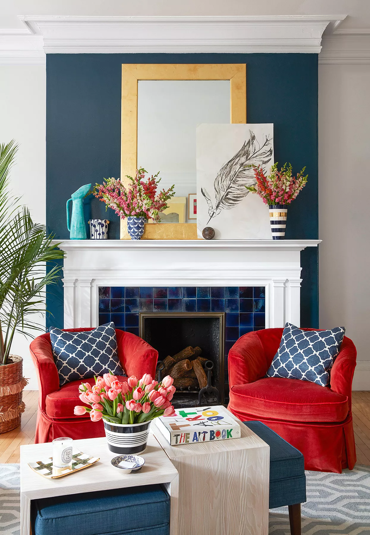
What Colors Go with Red? 21 Knockout Combinations to Consider

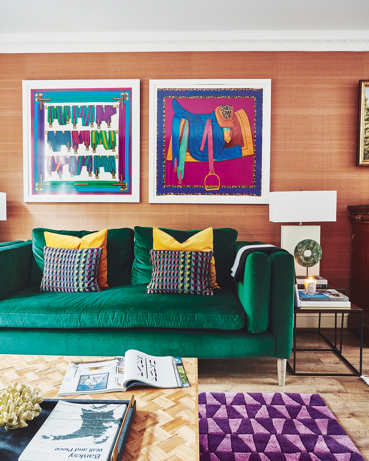
20 orange room design ideas

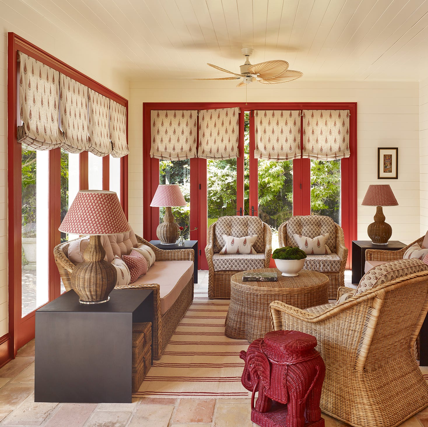
29 Unexpected Colors That Pair Beautifully With Red, According to Designers
20 Hallway Paint Colors That Bring This Space to Life

Shop Johnny Galecki's Eclectic Library With These 6 Picks
Why This Hue Is Suddenly Dominating Every Designer's Wishlist—Plus, How to Style It

27 Trend-Setting Red Living Room Ideas Defining 2025’s Hottest Homes
10 Spaces Designed With Colorful Tiles

35 Surprisingly Chic Pastel Rooms Packed with Personality
9 colors that go with red – the best pairings for this bold shade
This Polarizing Color is Actually a Designer Favorite for Bedrooms—but ONLY When It's Done Right
Ten rooms that make clever use of the "unexpected red theory"
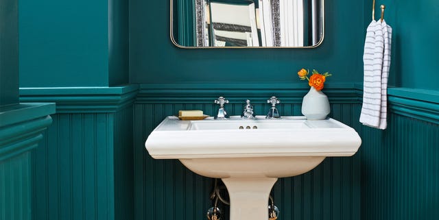
10 Rooms That Made Great Use of Teal Paint
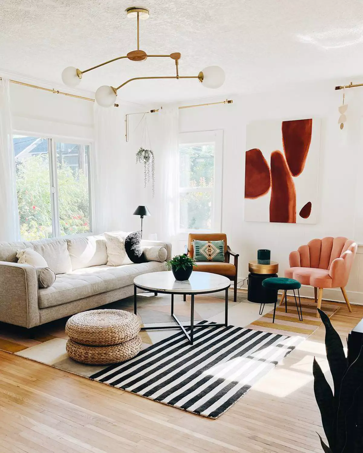
16 Living Rooms Perfect for Those Who Only Want a "Pop" of Color