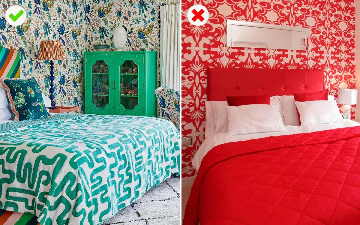
The nine worst decorating no-nos, from feature walls to slogan artwork
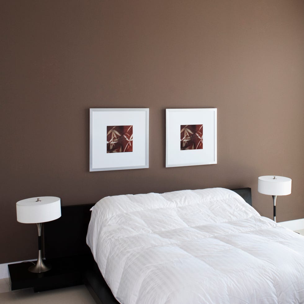
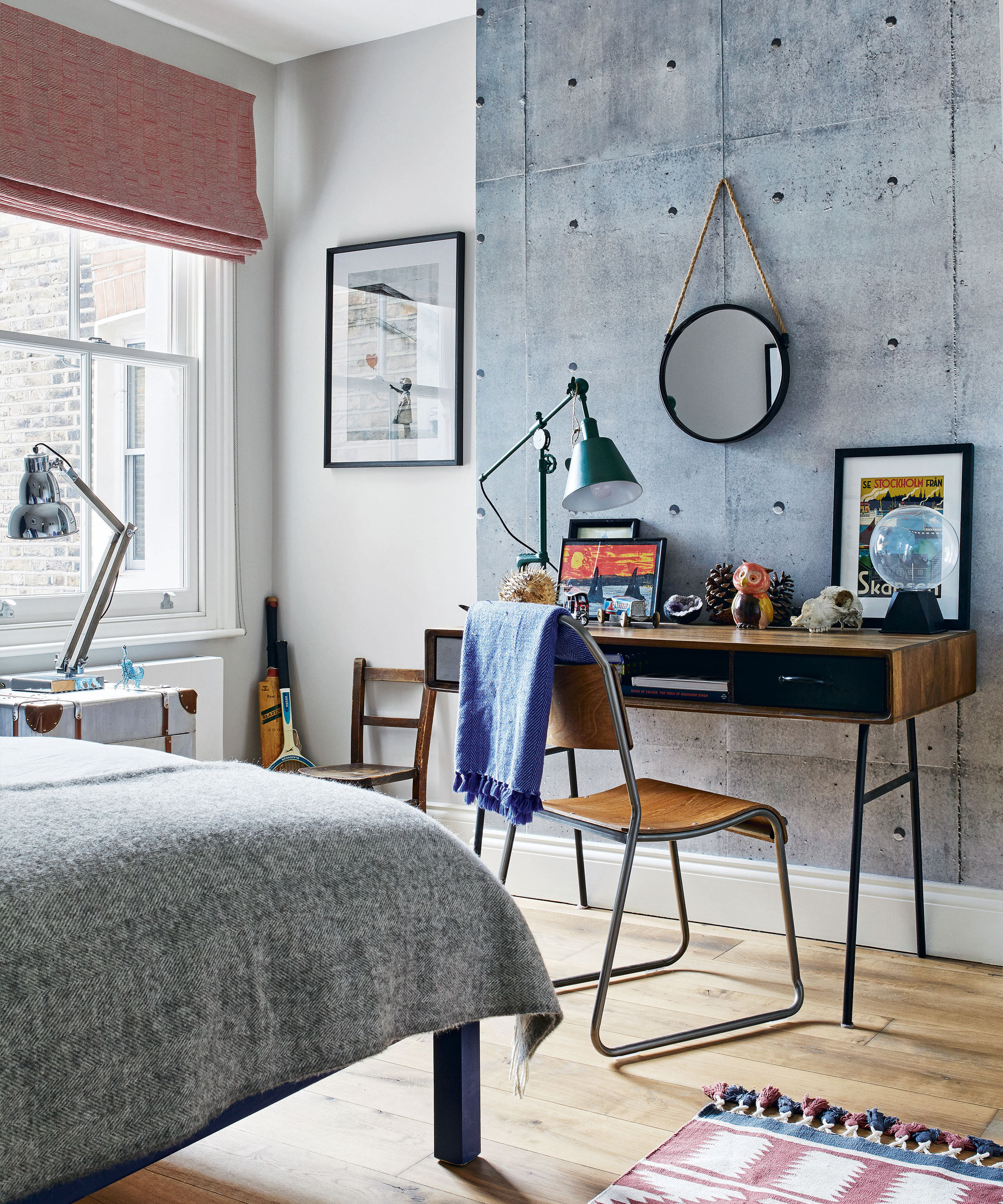
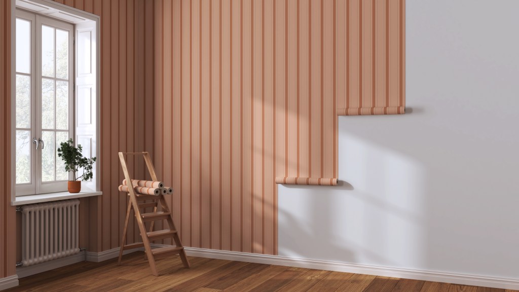
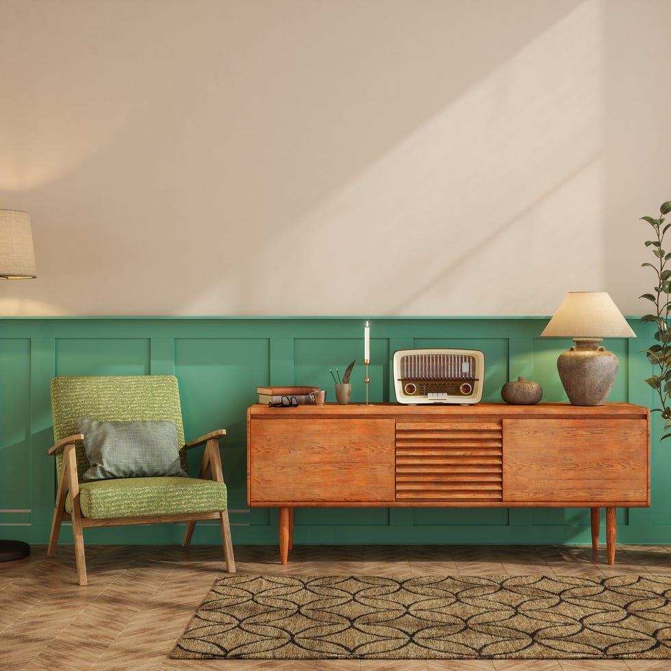
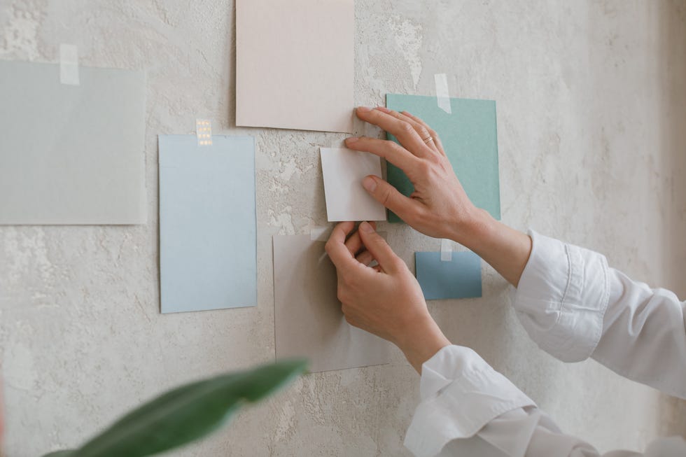
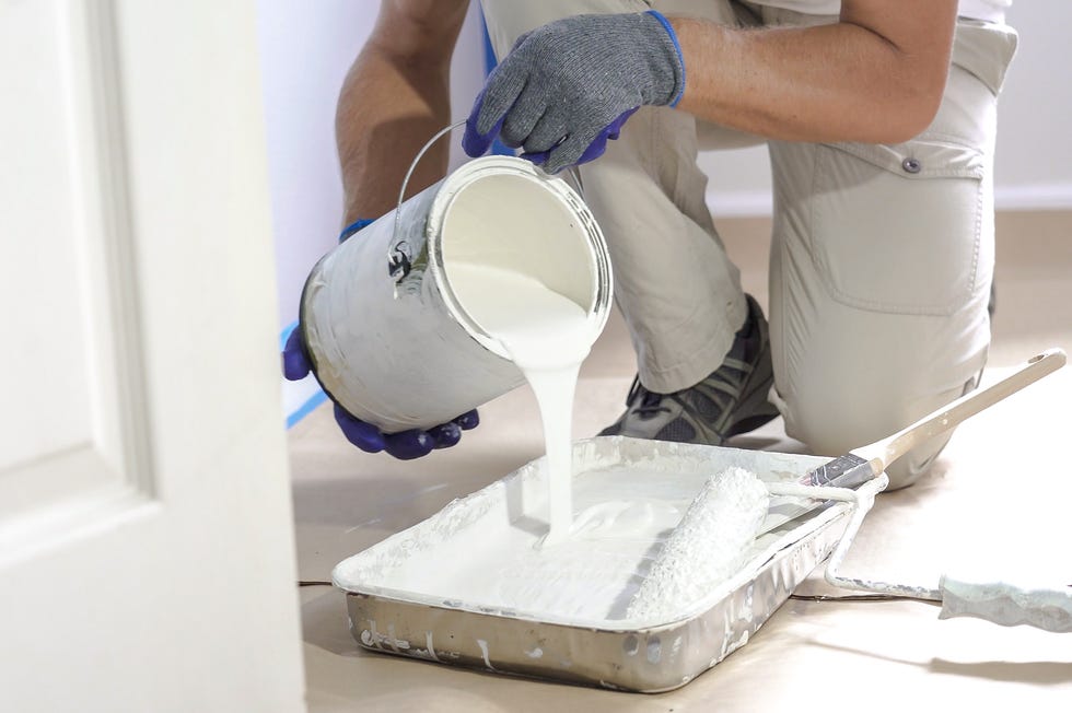
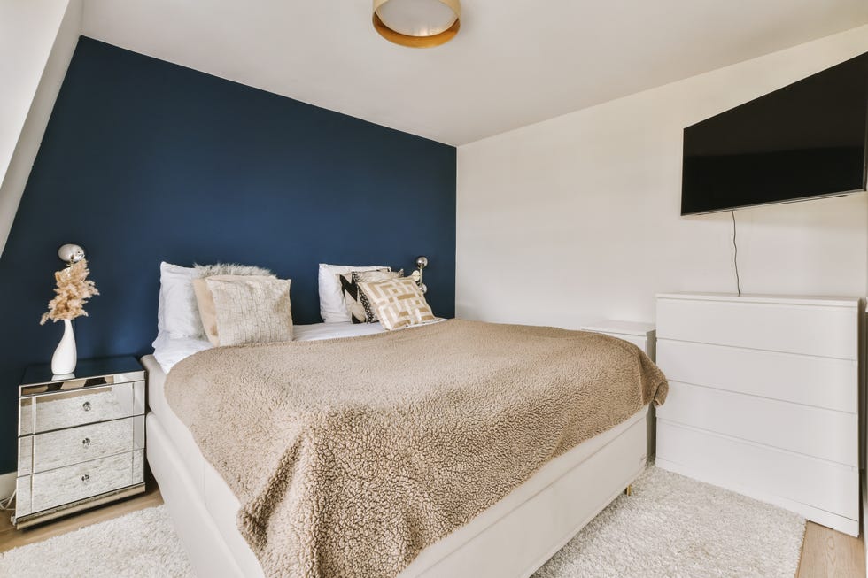
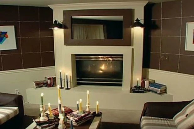
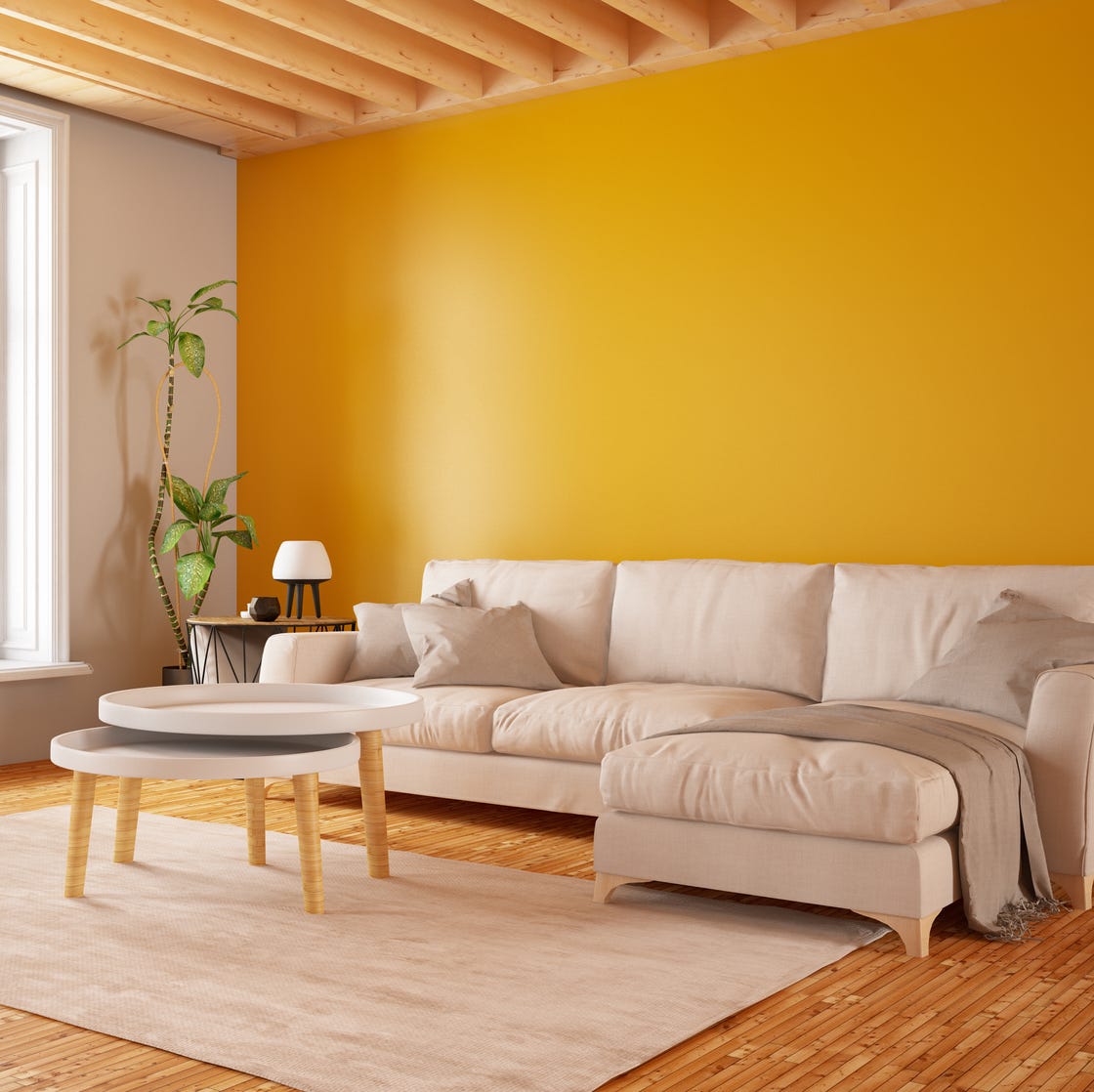
This article details nine common decorating mistakes that interior designers universally avoid, offering insights and alternative solutions to elevate home aesthetics. The first and foremost no-no is the feature wall. While seemingly an attempt at boldness, designers like Sophie Robinson argue it often indicates a lack of confidence in committing to a full color scheme or wallpaper. Instead, she advocates for wrapping an entire room in a consistent paint shade or wallpaper to achieve a more harmonious and coherent look. She notes that while designer wallpaper can be an investment, its impact is significant, and recommends coordinating curtains, furnishings, and accessories with the chosen palette.
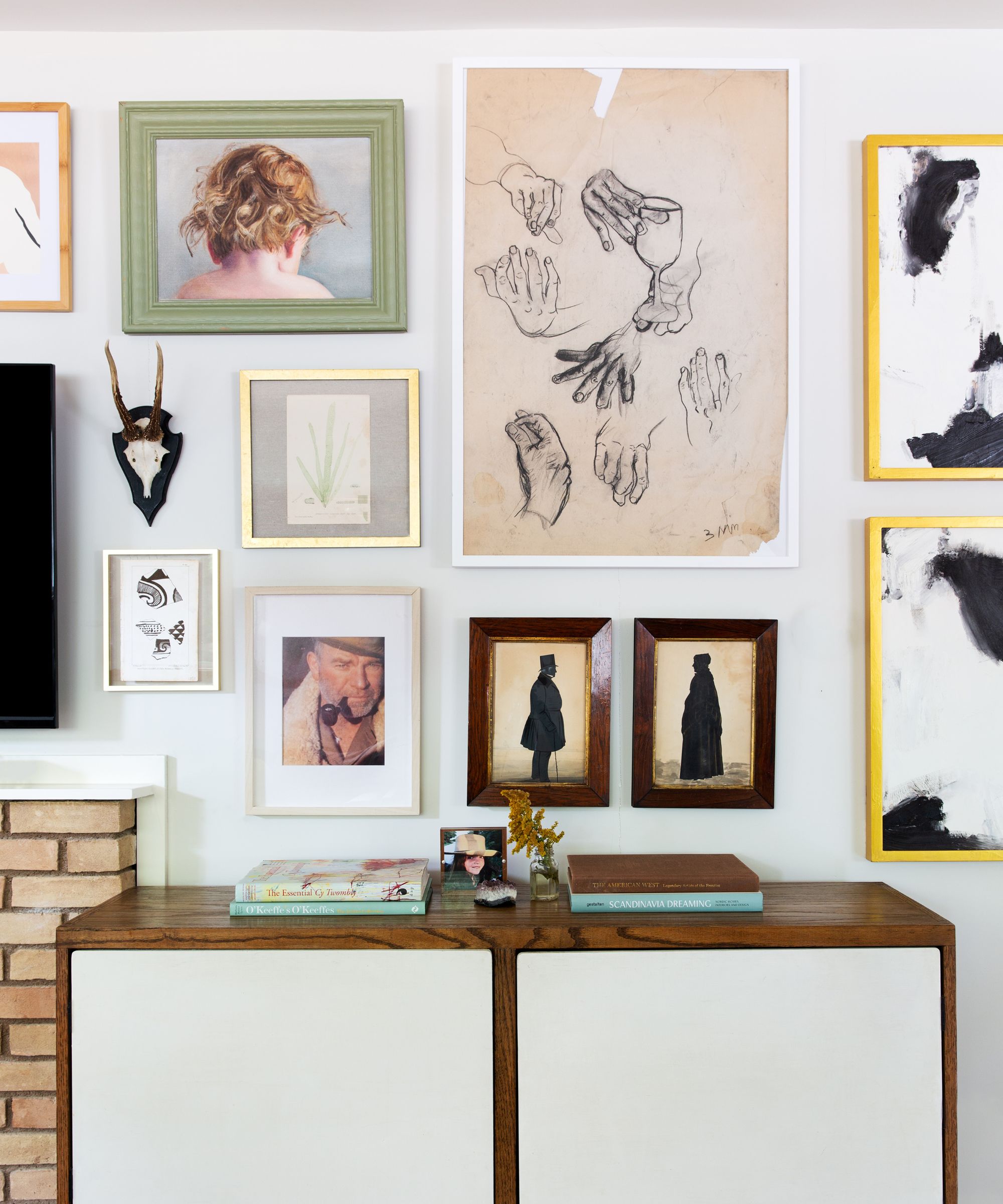
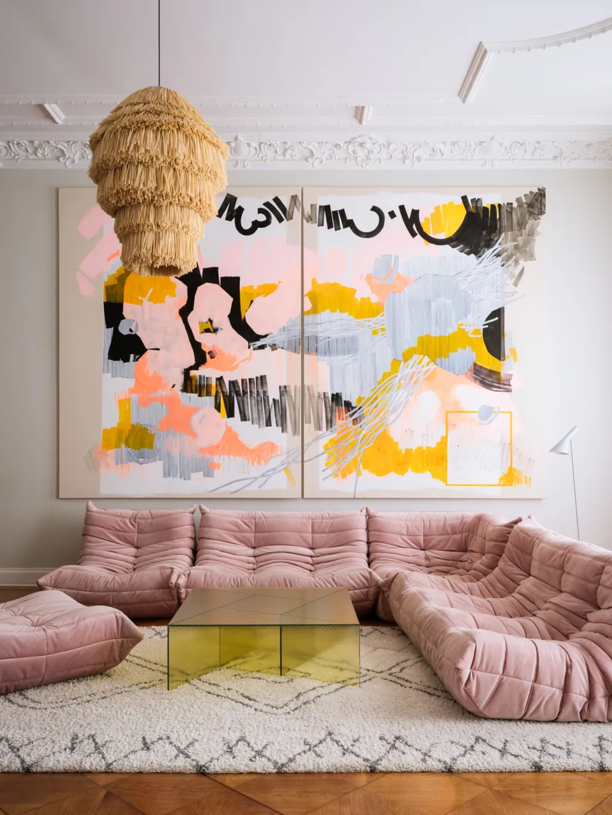
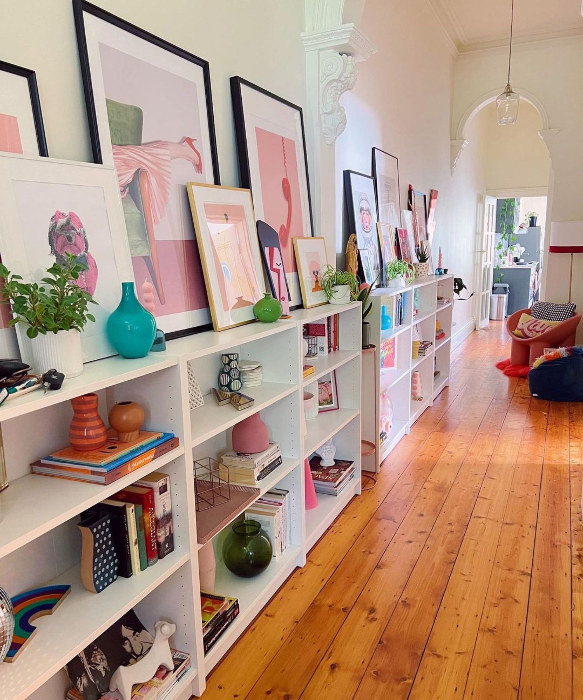
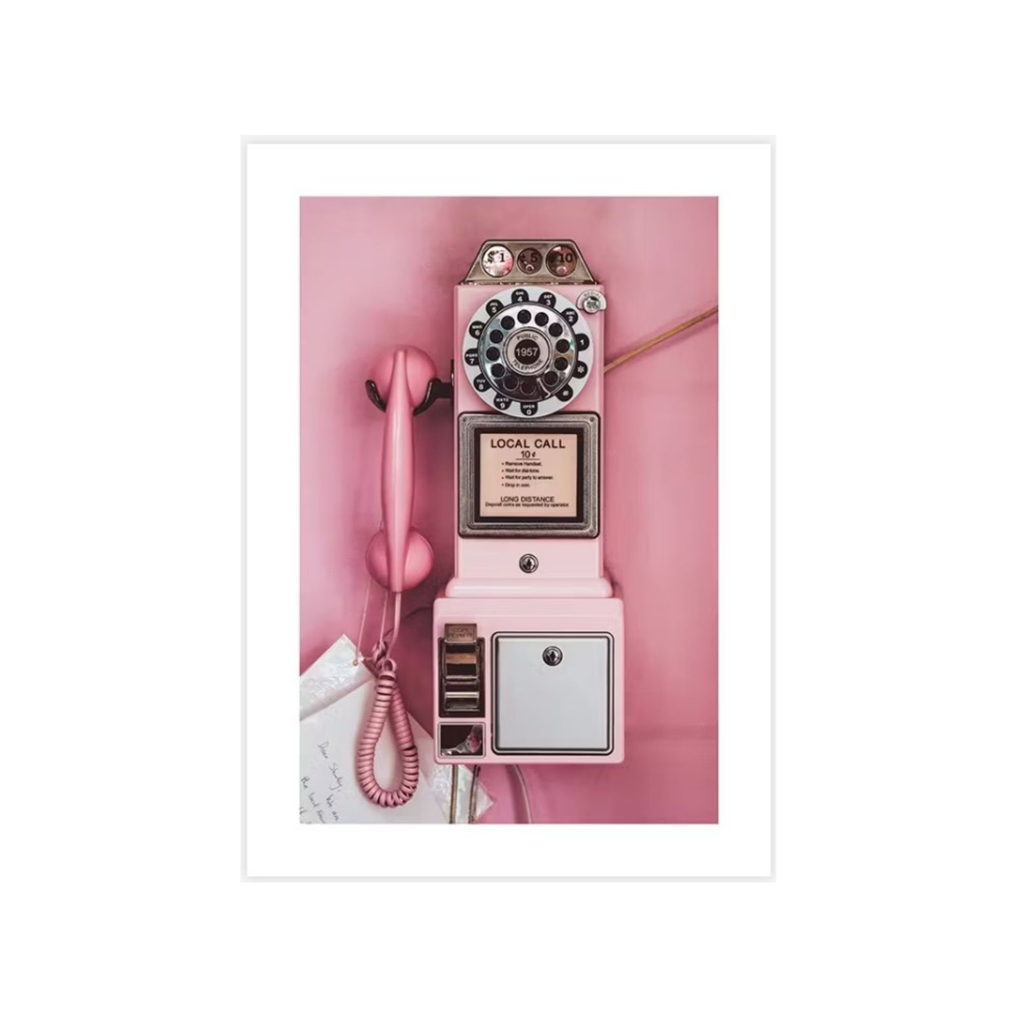
Another significant faux pas is slogan artwork, particularly those with trite phrases like “Live, Love, Laugh.” Interior designer Alexandria Dauley advises investing in genuine artwork that inspires, suggesting abstract pieces, visiting art college shows, or antique fairs for accessible options. She emphasizes the importance of a well-chosen frame, as it can significantly enhance even less expensive prints. Regarding window treatments, short curtains that barely reach the window ledge are a definite no. Jojo Barr of House Nine Design recommends long curtains that gently "kiss" the floor, allowing for natural fabric drop over time, especially for materials like linen. For high-traffic areas, a slight gap can prevent dirt collection.
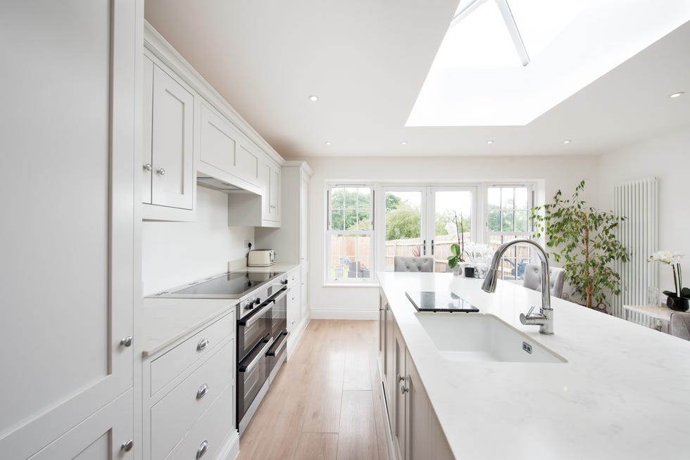
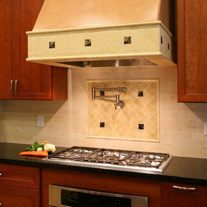
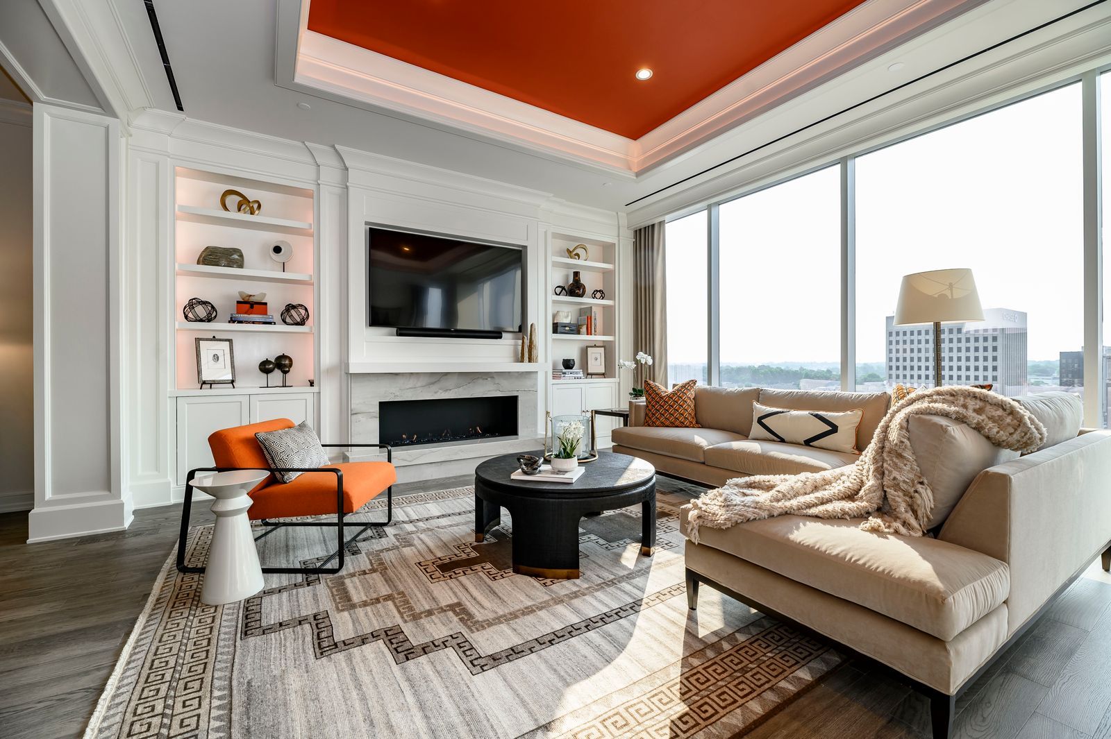
Glass furniture, particularly a glass TV stand, is heavily criticized by Karen Knox of Making Spaces due to its propensity to attract dust, its acoustic harshness, and cold aesthetic. She suggests built-in cabinets or timber media units for televisions, especially in alcoves, to hide cables and maximize storage. Knox herself plans to replace her glass coffee table with an ottoman due to its high maintenance. In the kitchen, Laura Parkinson of Palmer & Stone points out the unattractiveness of exposed vented extractors. Her solution involves concealing undermount extractors within wall-hung units or creating custom frames from MDF, painted to match or contrast the wall, ensuring controls and lights are accessible. The focus is on discreet integration to maintain a sleek kitchen design.
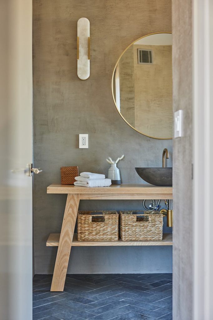
Overhead spotlights, which emit harsh and unflattering light, are a major decorating no-no for Alexandra Childs of Studio Alexandra. She advocates for mid- to low-level lighting, such as wall sconces, floor lamps, and table lamps, to create a softer, more ambient atmosphere. While pendants can be focal points, they are often rarely used for illumination. For task lighting, articulated task lights are preferred, and in bathrooms, strip and recessed lighting in shower niches can provide warm, indirect illumination. The overarching theme from these designers is to avoid generic or purely functional choices that detract from the overall design and atmosphere of a home, opting instead for thoughtful, integrated, and aesthetically pleasing solutions.
#HomeDecorating #InteriorDesign #DecoratingMistakes #FeatureWalls #SloganArtwork #CurtainLength #GlassFurniture #KitchenExtractors #HomeLighting #HomeDecorating #InteriorDesign #DecoratingMistakes #FeatureWalls #SloganArtwork #CurtainLength #GlassFurniture #KitchenExtractors #HomeLighting
0 comment in total
 No comments yet
You may also like
9 CONTROVERSIAL Decor Choices Designers Secretly Wish You’d Stop Making

8 Backsplashes to Avoid, According to Interior Designers

I Asked Interior Designers to Share the Worst Decorating Trends They've Seen on Social Media

An Interior Designer Shares the "Tacky" Decor You Should Never Waste Your Money On

The 10 Biggest Interior Design No Nos According to Decorators

7 cheap and tacky interior design errors rich people never make — ban these aesthetic atrocities from your home
10 Decorating Mistakes That Make Your Home Look Messy
13 Worst ‘Trading Spaces’ Designs, From the Sob-Inducing Fireplace to Straw-Covered Walls (Photos)

5 things designers say you should never put on a mantel

7 Home Décor Trends Designers Say Are a Waste of Money
7 Paint Mistakes That Make Designers Instantly Cringe When They Walk Into Someone's Home

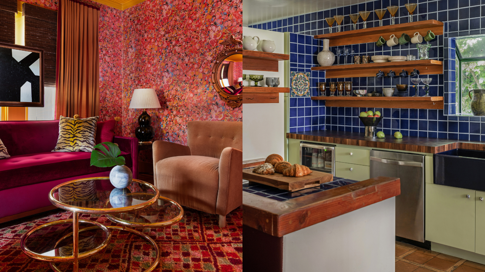
9 'good weird' paint colours approved by designers

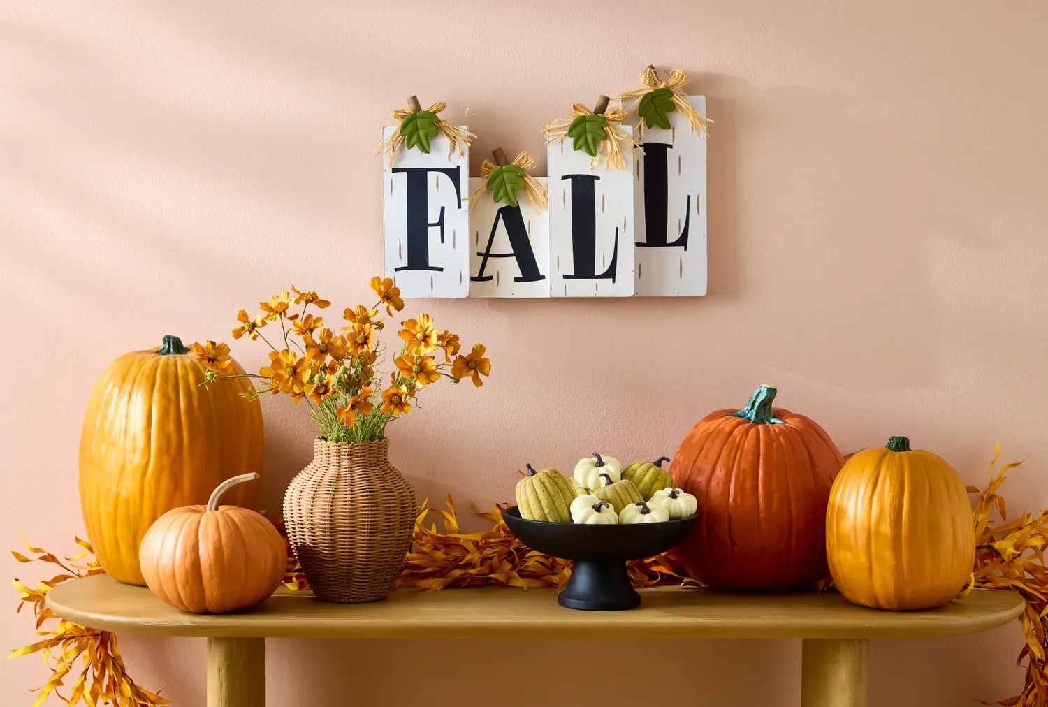
7 Tacky Fall Decorating Choices That Instantly Make Your Home Look Bad, According to a Designer
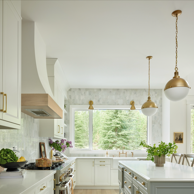
5 Kitchen Renovation Moves That Make Designers CRINGE
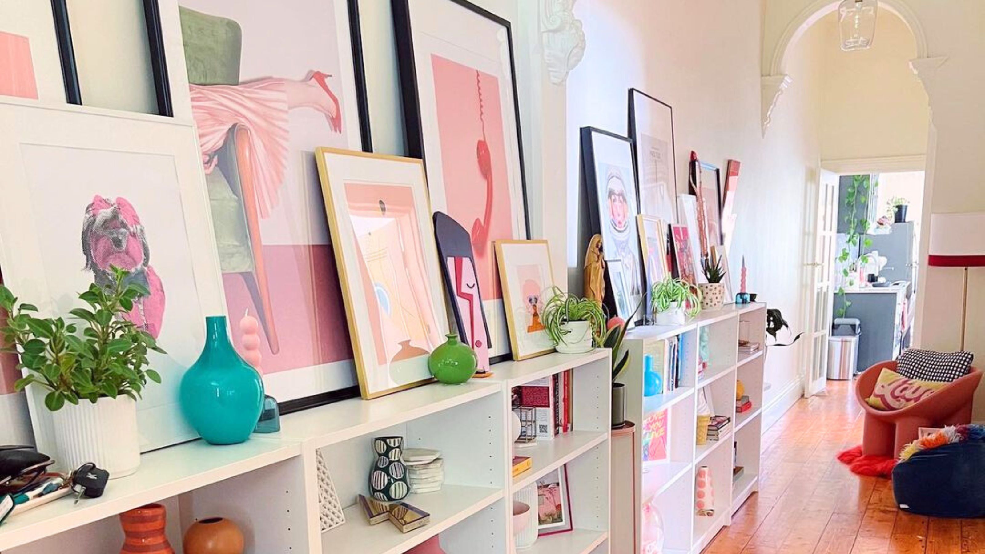
Don't make these 5 entryway decor mistakes


4 Outdated Colors Designers say you Should Steer Clear of When Decorating a Living Room

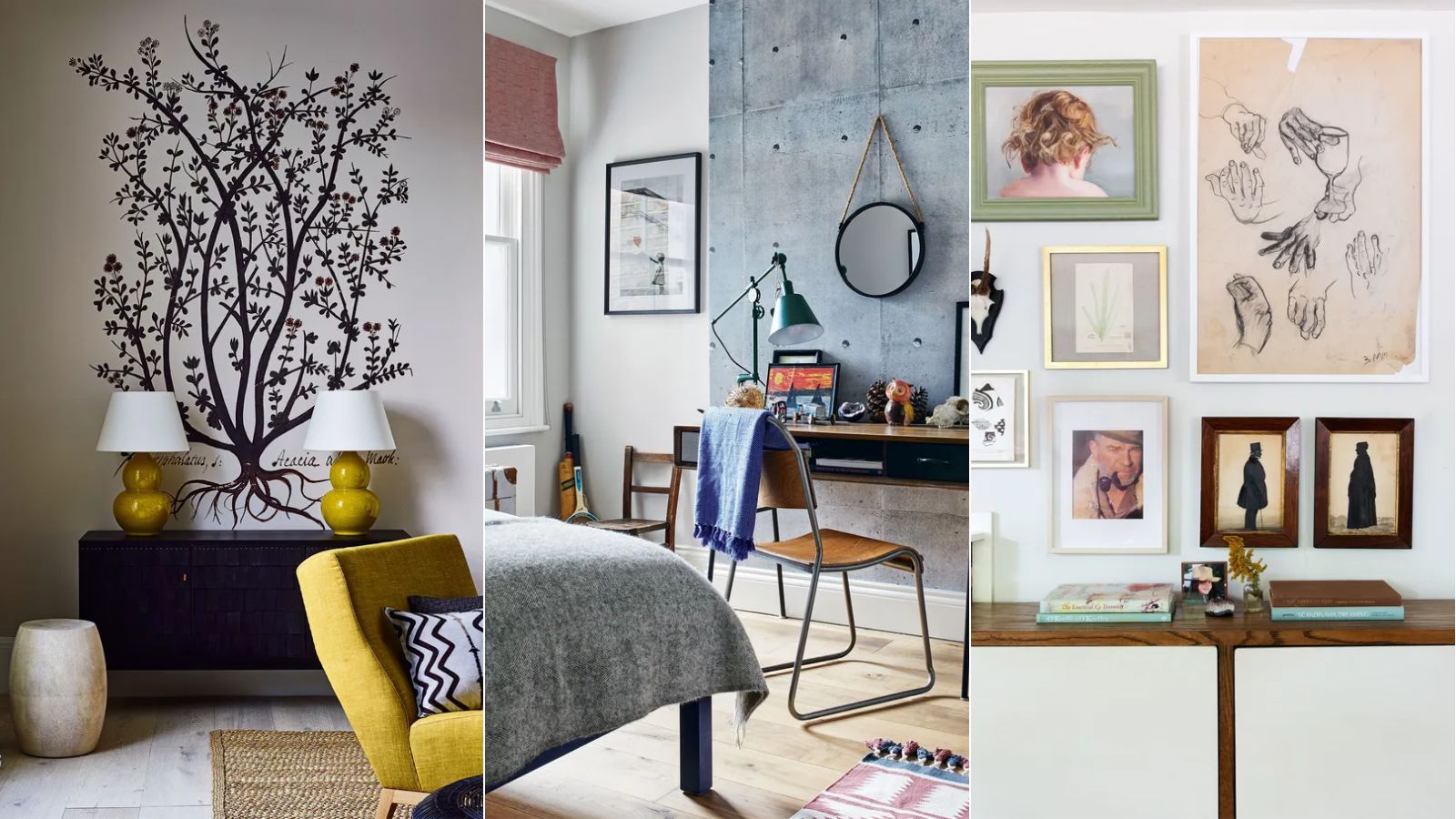
5 outdated wall decor trends designers warn to avoid – plus what we should be doing instead
8 Tacky Home Trends That Designers Say Are TRAGICALLY Dead
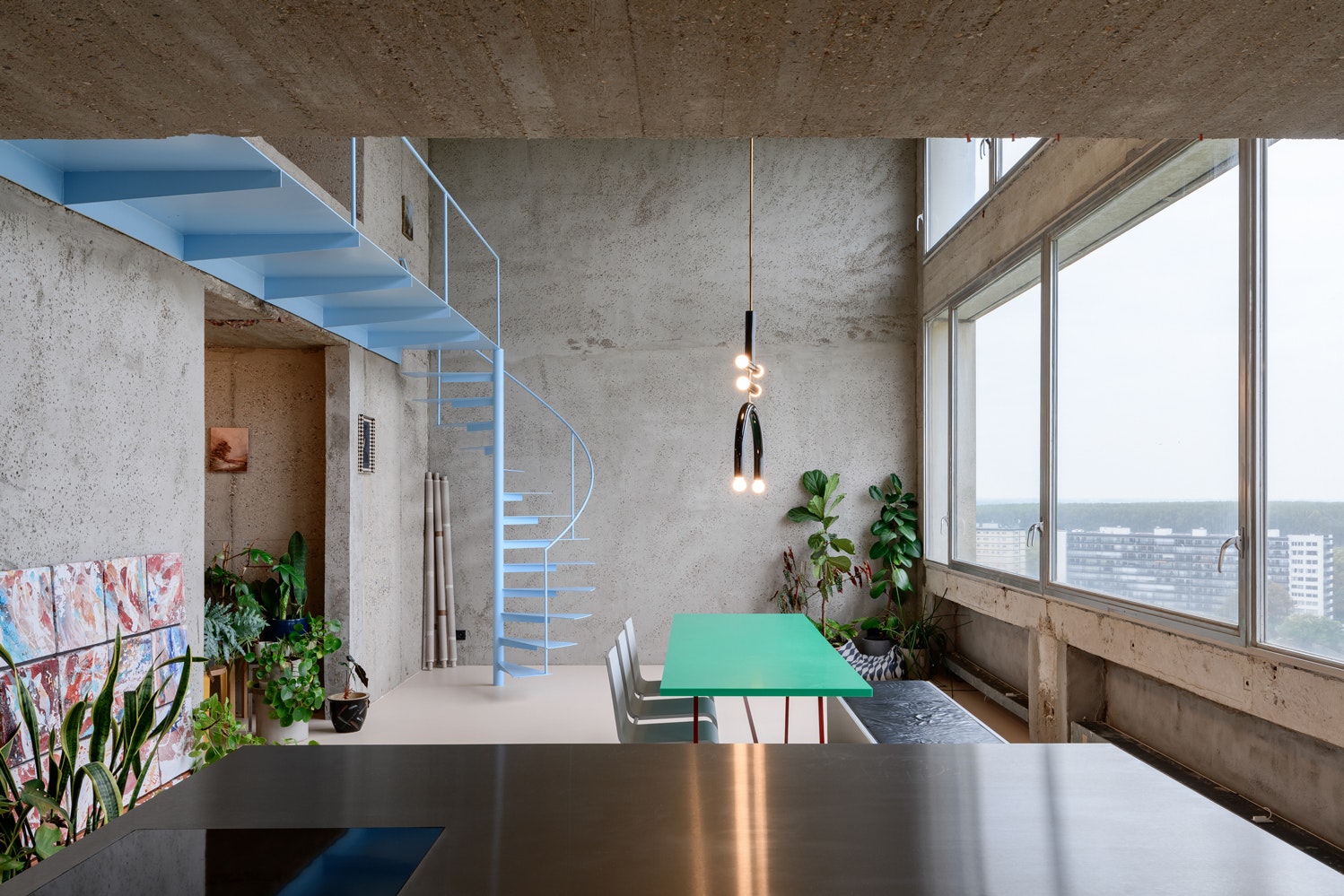
17 Projects That Use “Ugly” Materials in Beautiful Ways

7 Decorating Mistakes That Always Make Interior Designers Cringe