15 Timeless Paint Colors You’ll Never Tire Of, According To Designers
Selecting the perfect paint color can be a challenging task, often requiring multiple samples to find the right shade. To simplify this process, interior designers frequently rely on a curated selection of timeless hues that consistently deliver an appealing aesthetic. This article presents 15 such paint colors, categorized into 'Welcoming Whites,' 'New Neutrals,' and 'Moody Hues,' all approved by designers and suitable for various home styles and rooms.
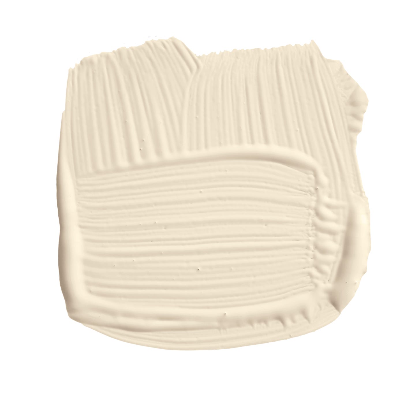
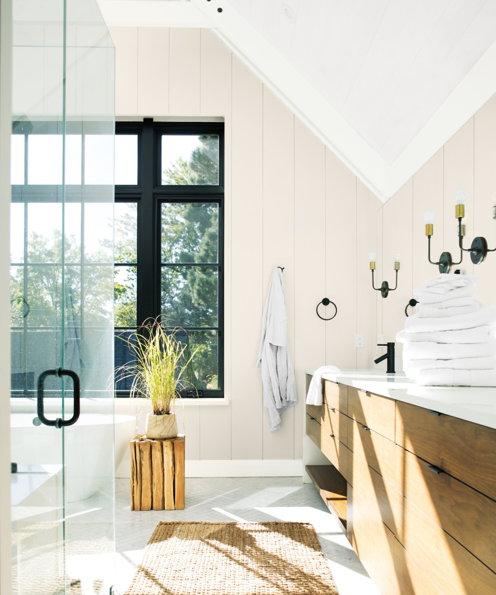
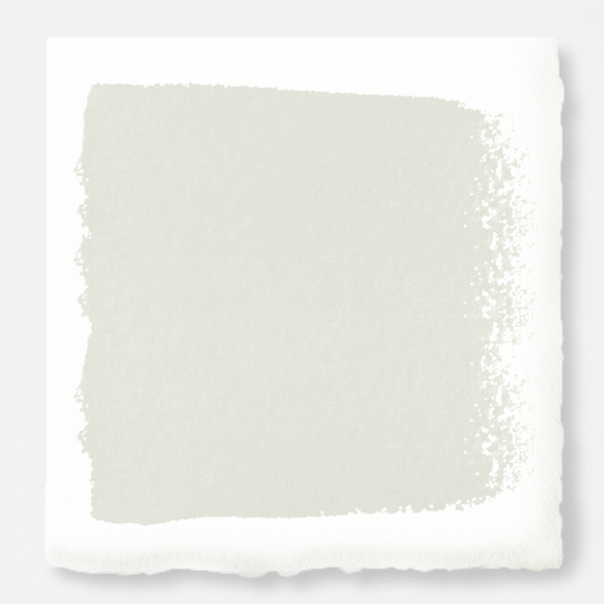
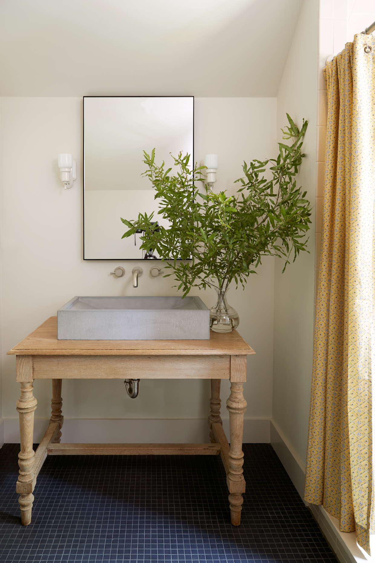
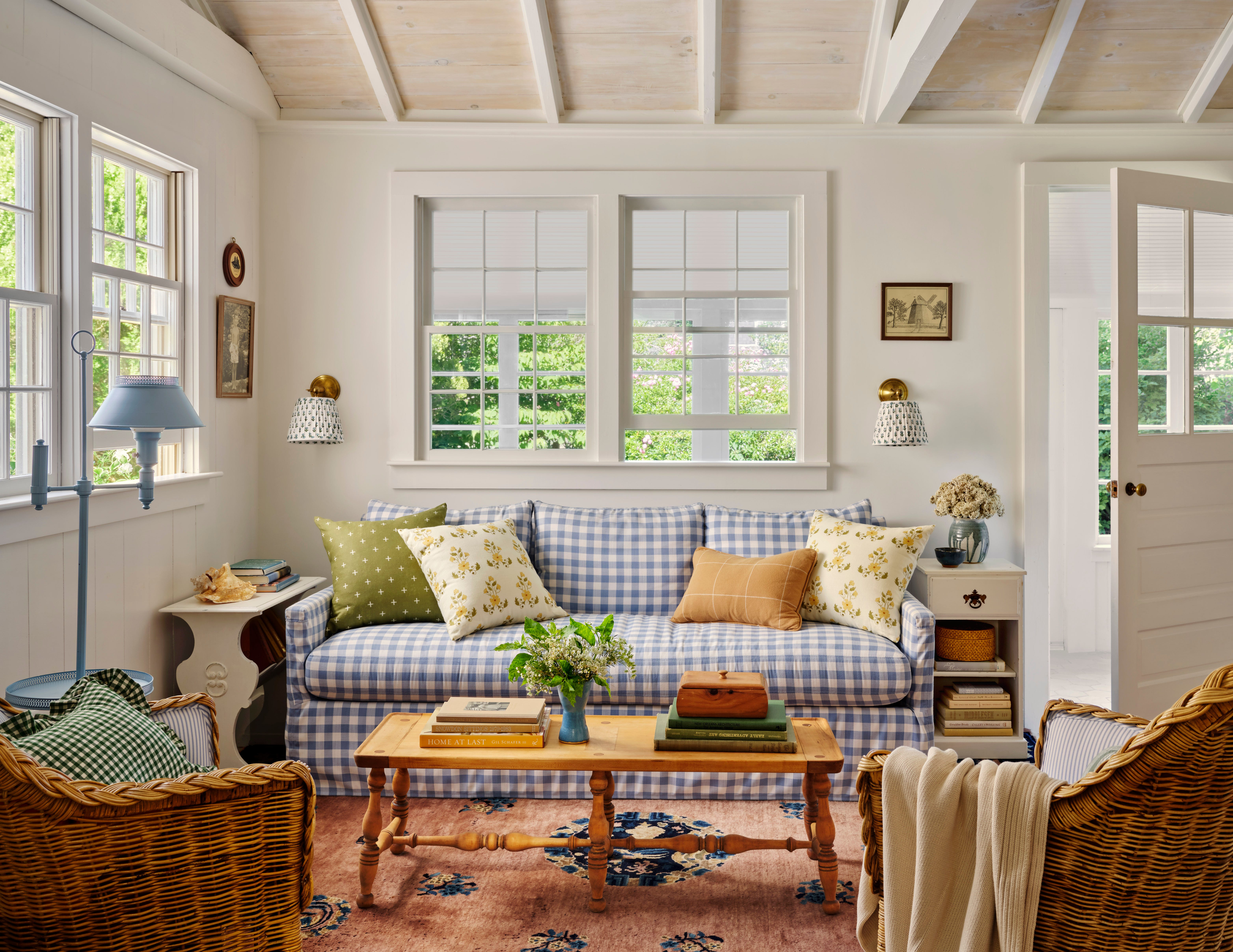
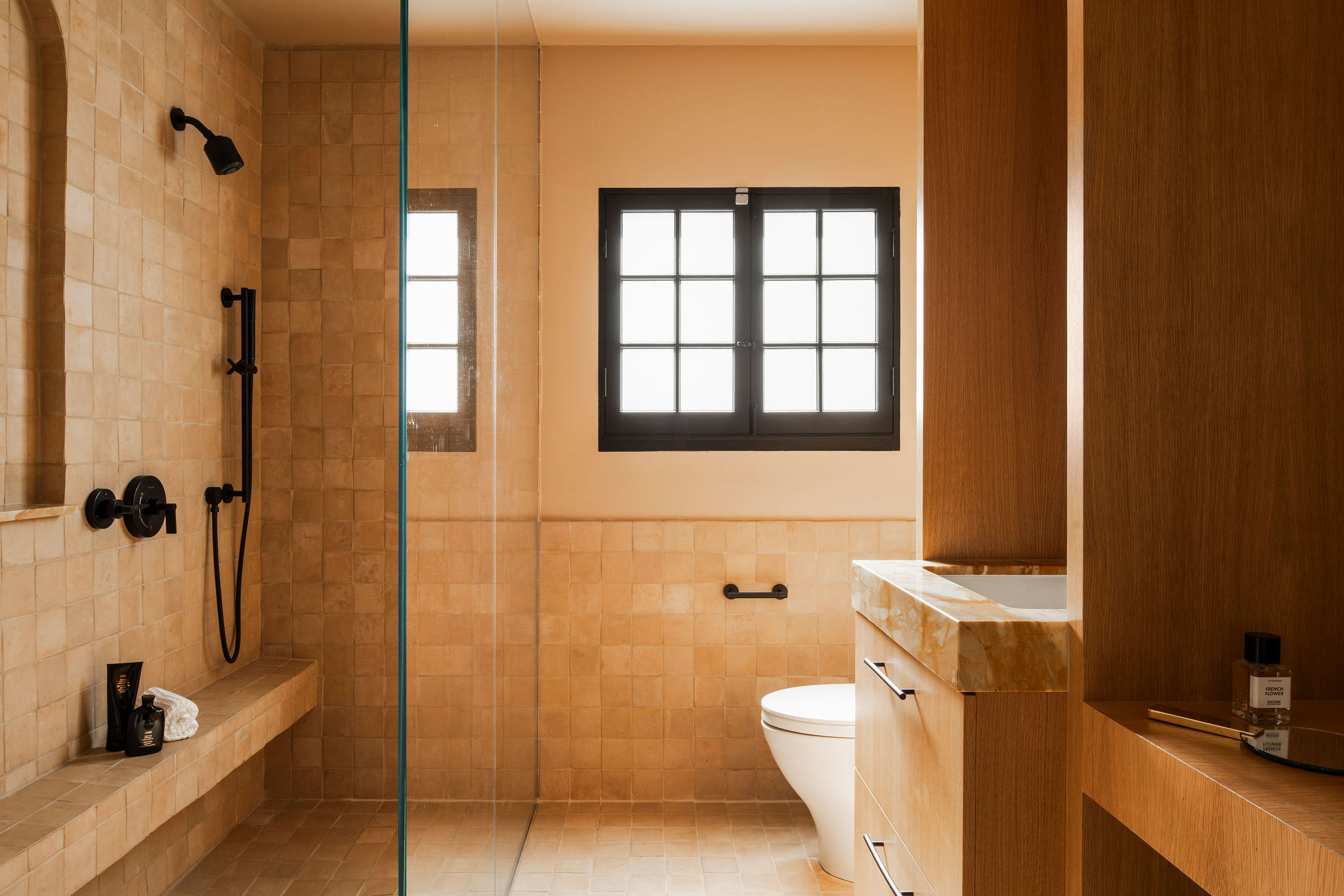
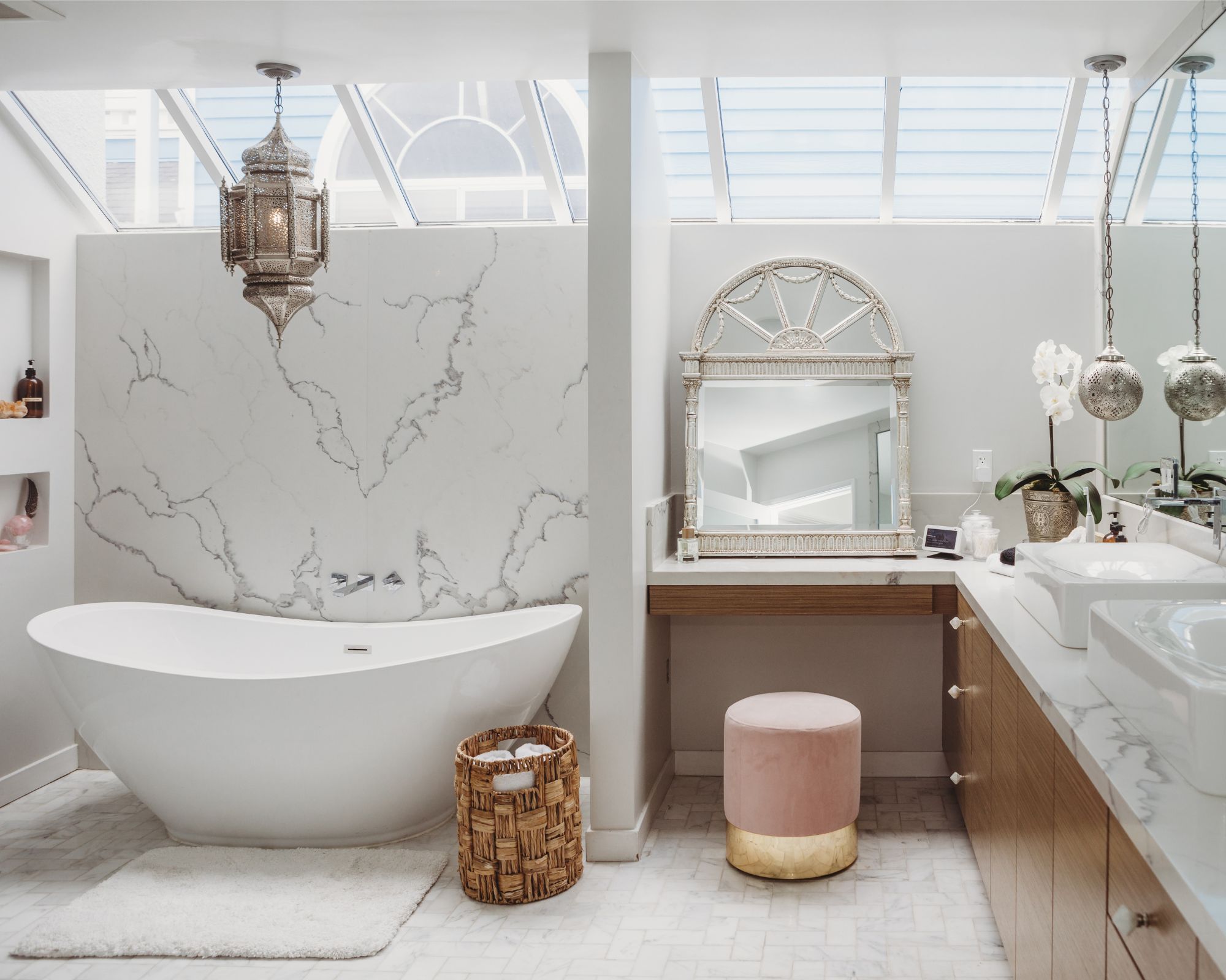
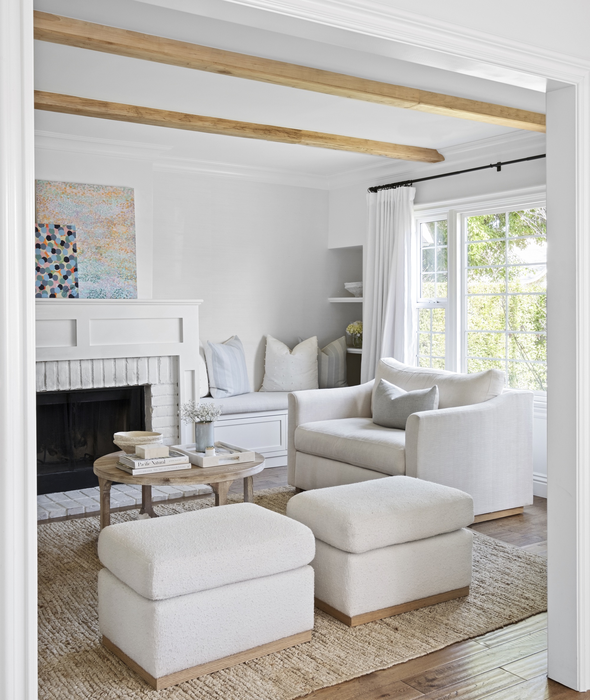
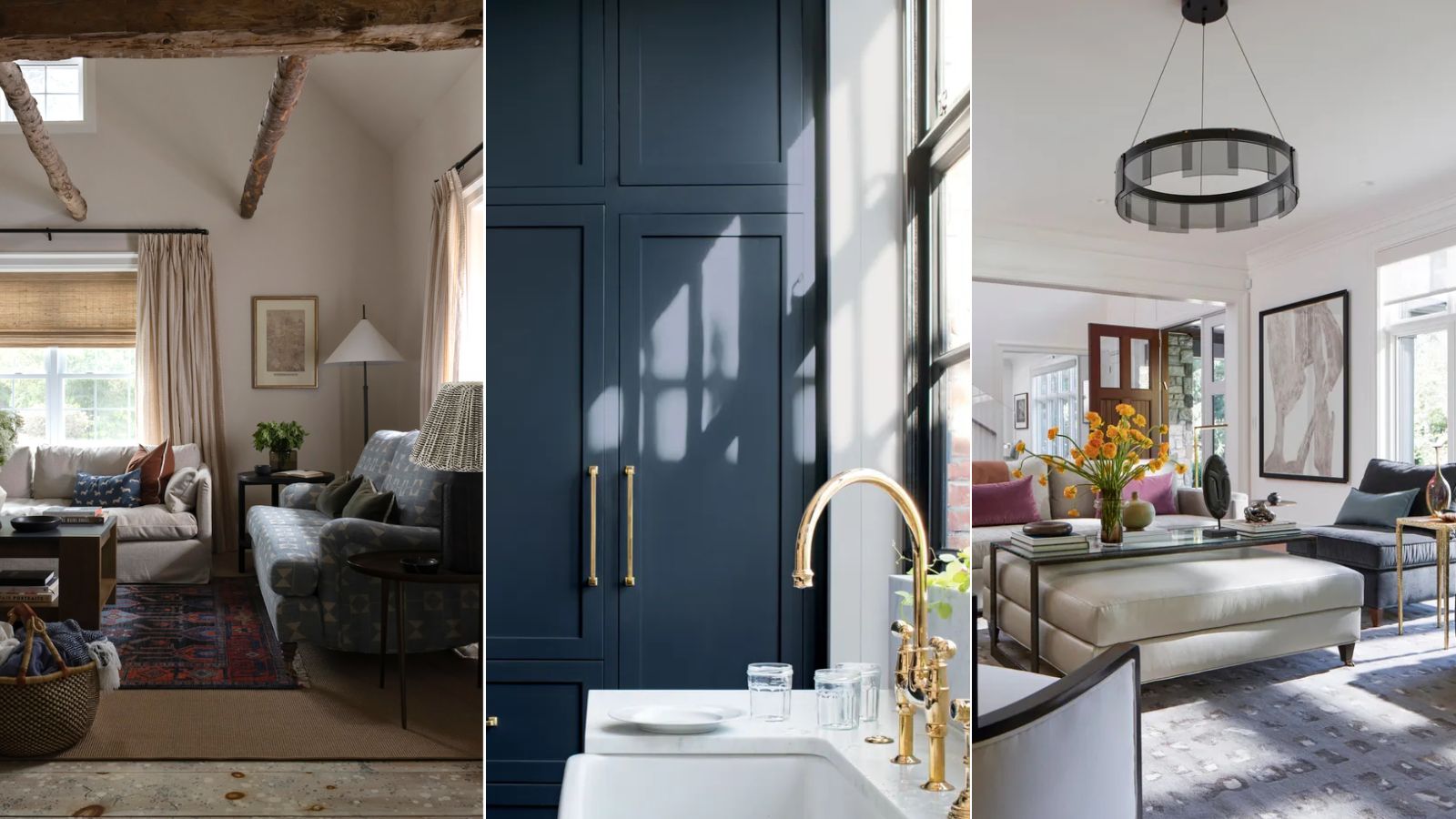
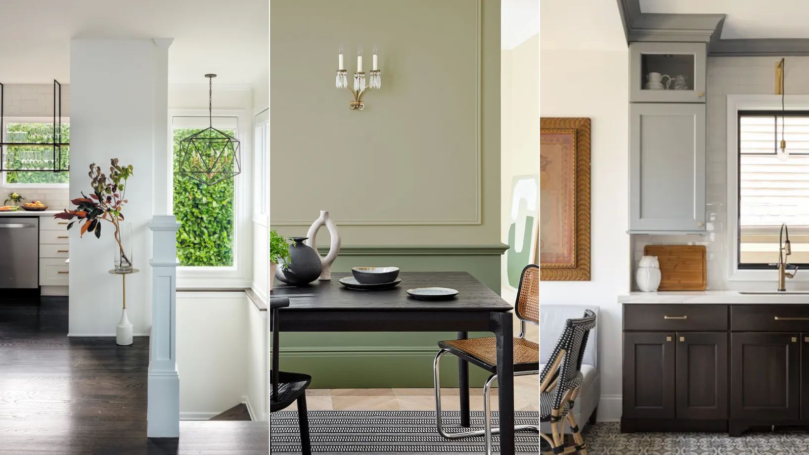
The 'Welcoming Whites' category highlights shades that brighten spaces without appearing sterile. Benjamin Moore’s Swiss Coffee (OC-45) is praised by designer Caroline Brackett for its easygoing quality, used to revitalize a 19th-century farmhouse entry. Sherwin-Williams’ Greek Villa (SW 7551) is described by Amy Studebaker as a warm white with a subtle yellow undertone, making it welcoming and ideal for traditional homes. Benjamin Moore’s White Dove (OC-17) is a popular choice for its ability to make rooms feel open and airy, as noted by Catherine Branstetter who used it throughout her historic Nashville Tudor. Sherwin-Williams' Alabaster (SW 7008) is a sun-bleached shade that brings a beachy feel, chosen by Heather Chadduck Hillegas for a Florida bedroom. Farrow & Ball’s Wimborne White (No. 239) offers a soft, creamy coat that reflects natural light, perfect for a pine-paneled dining room in a Highlands, North Carolina, mountain cabin designed by Whitney McGregor.
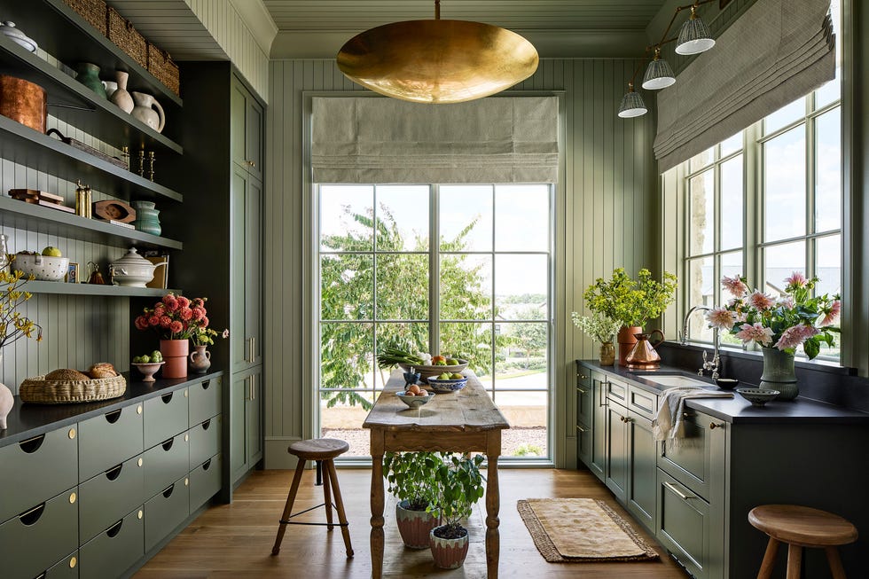
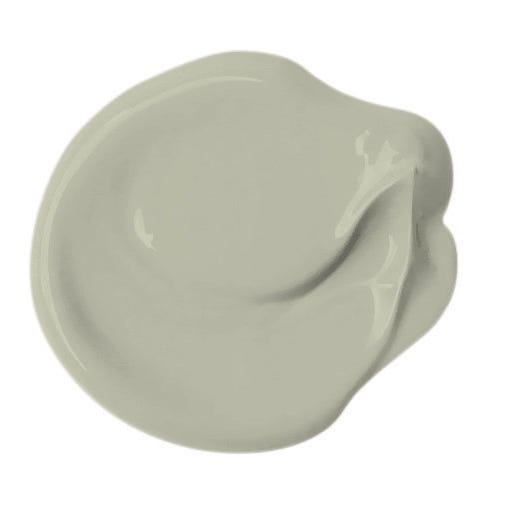
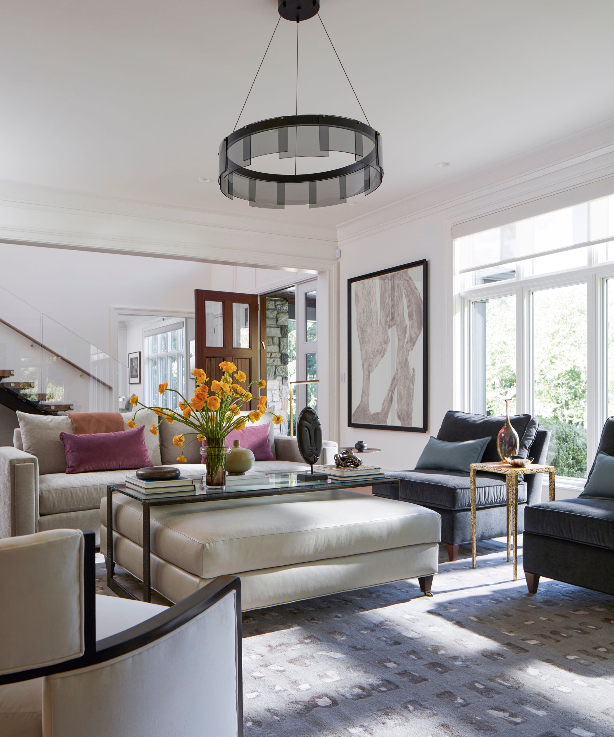
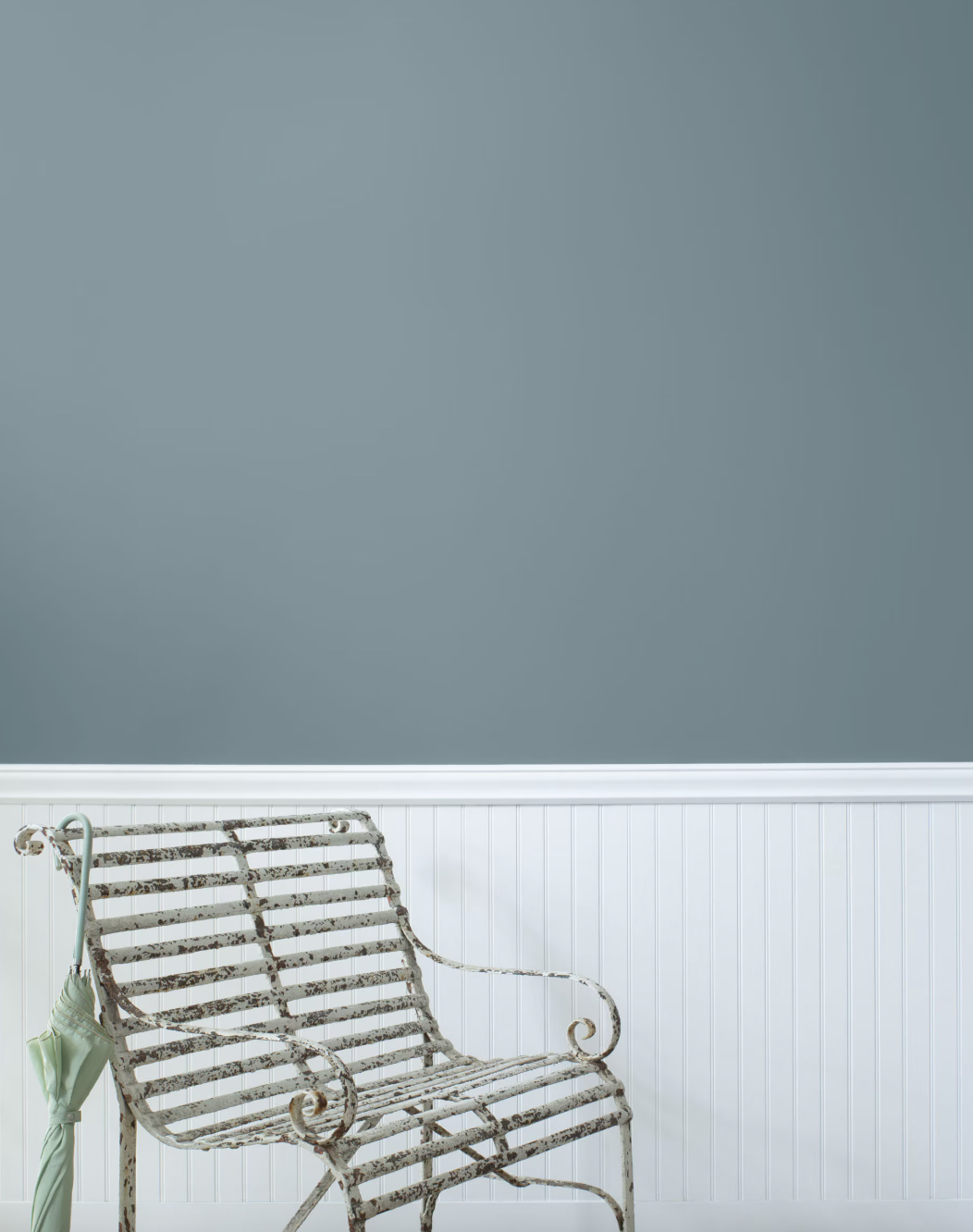
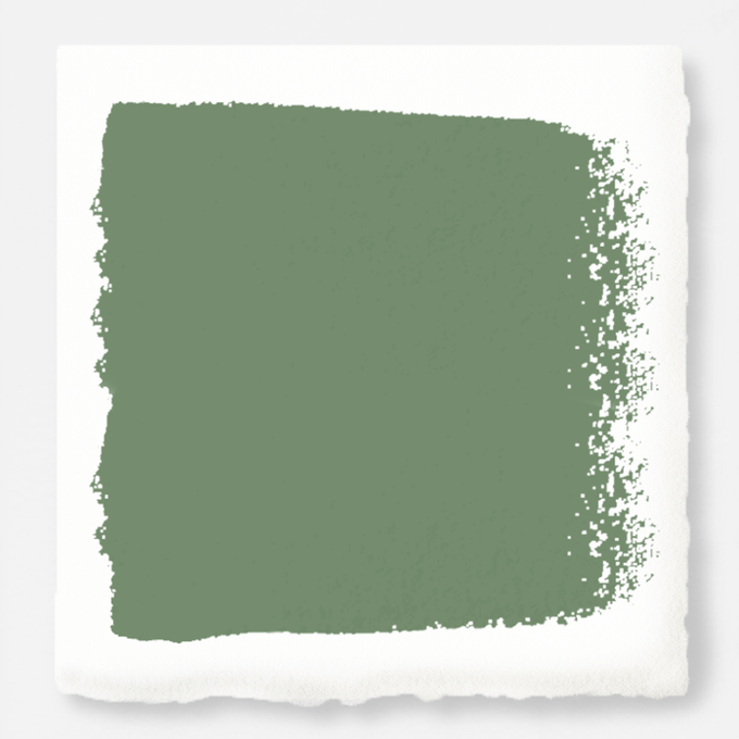
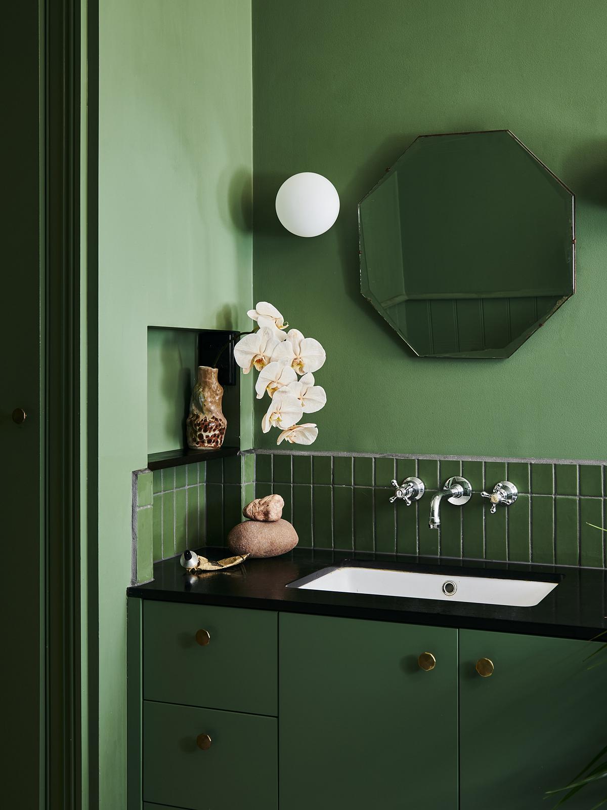
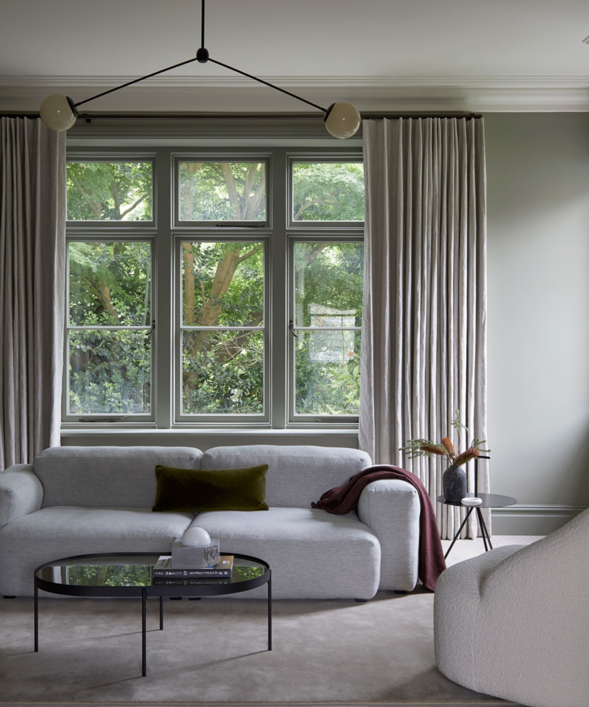
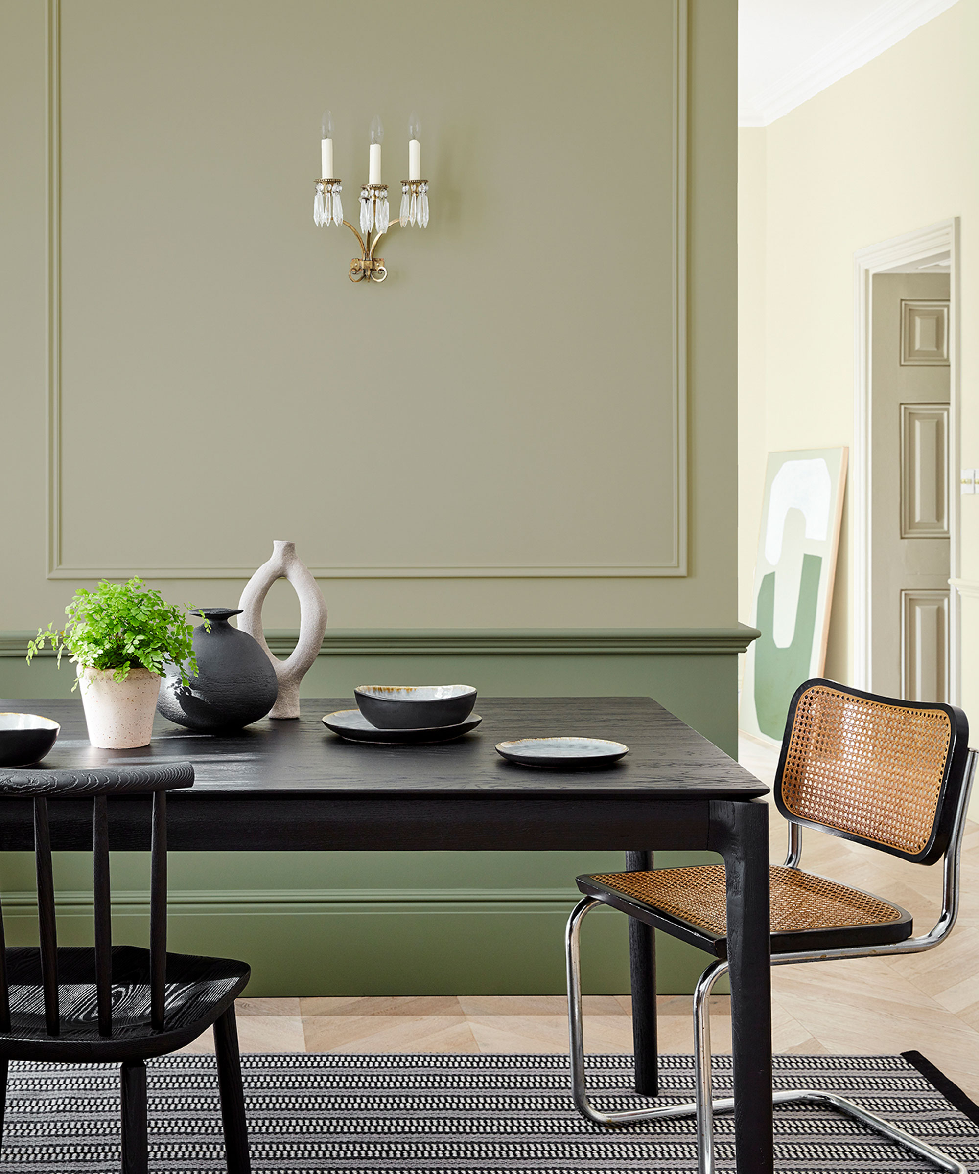
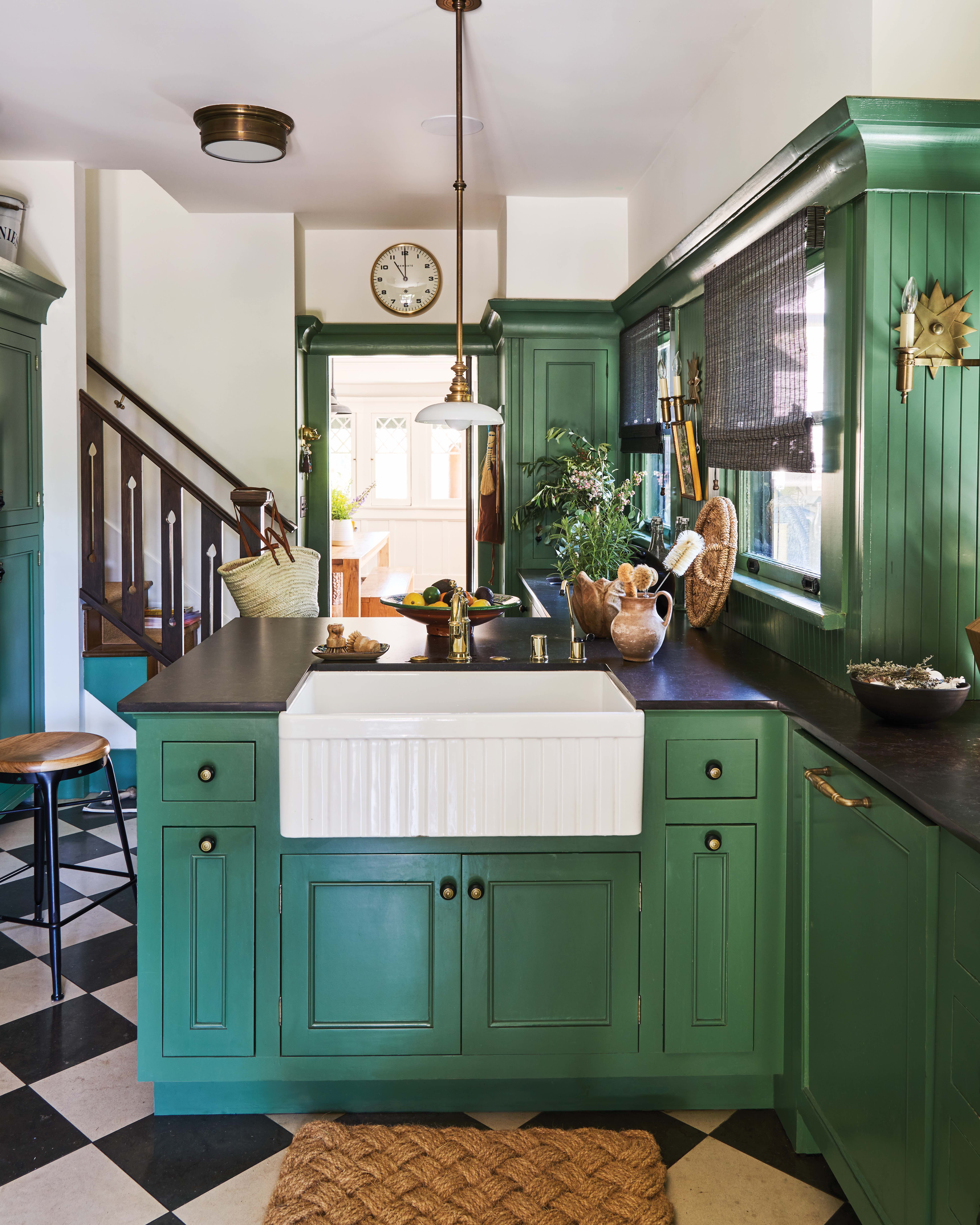
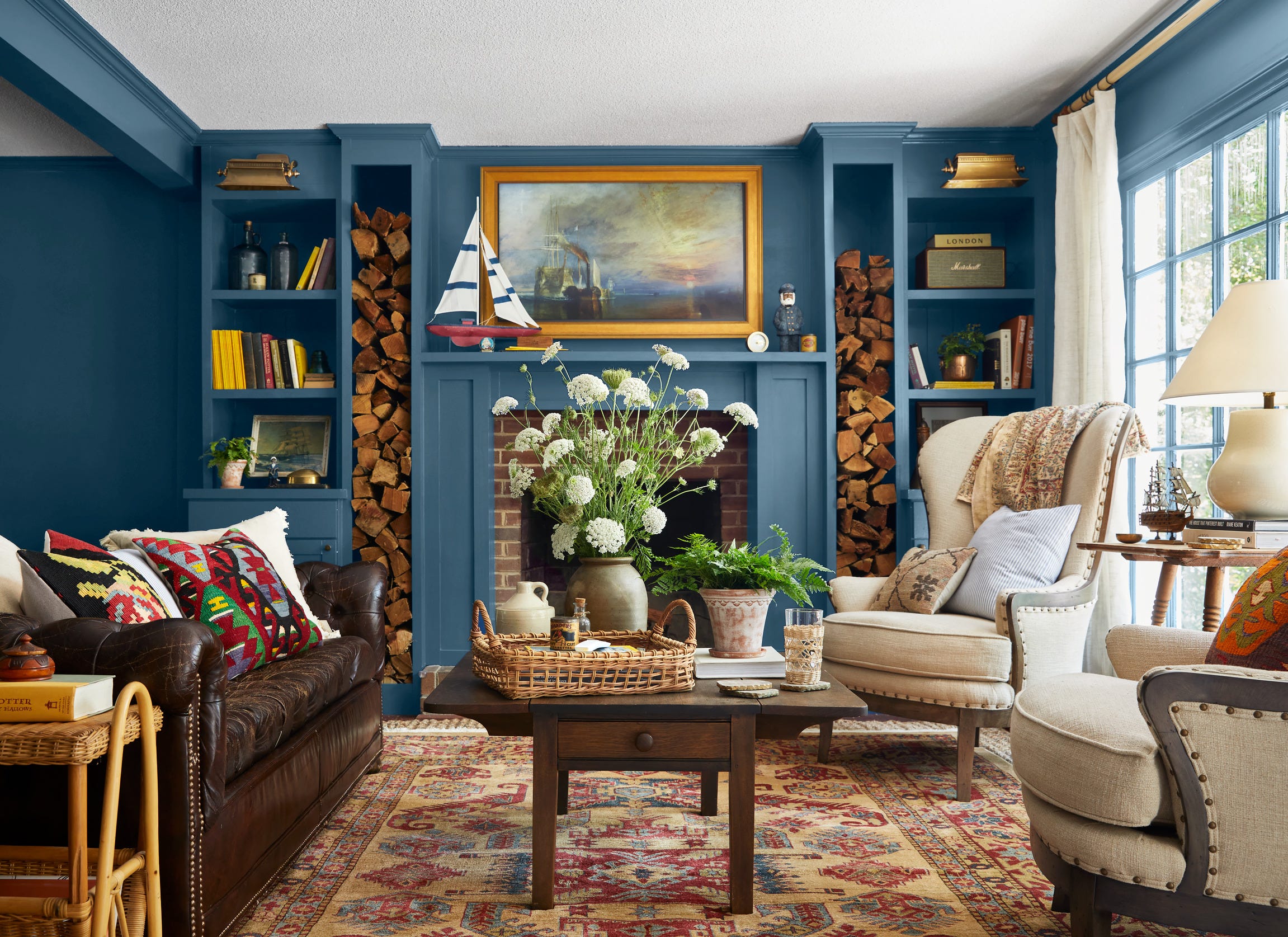
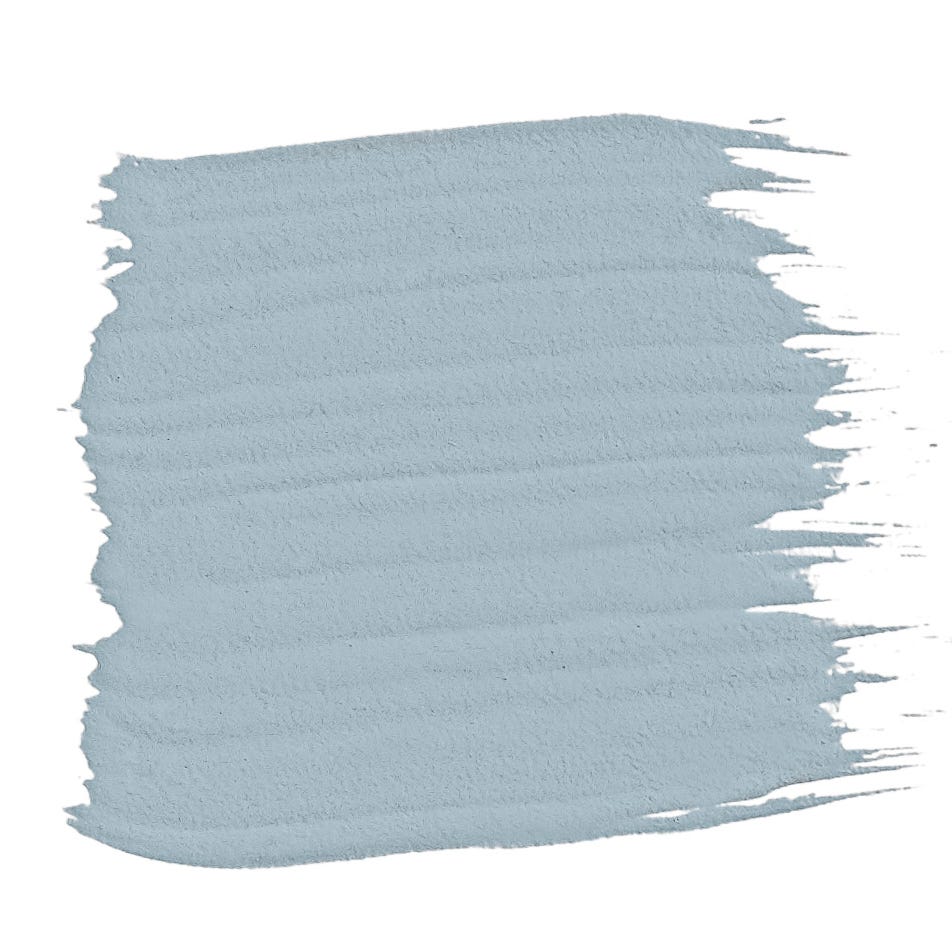
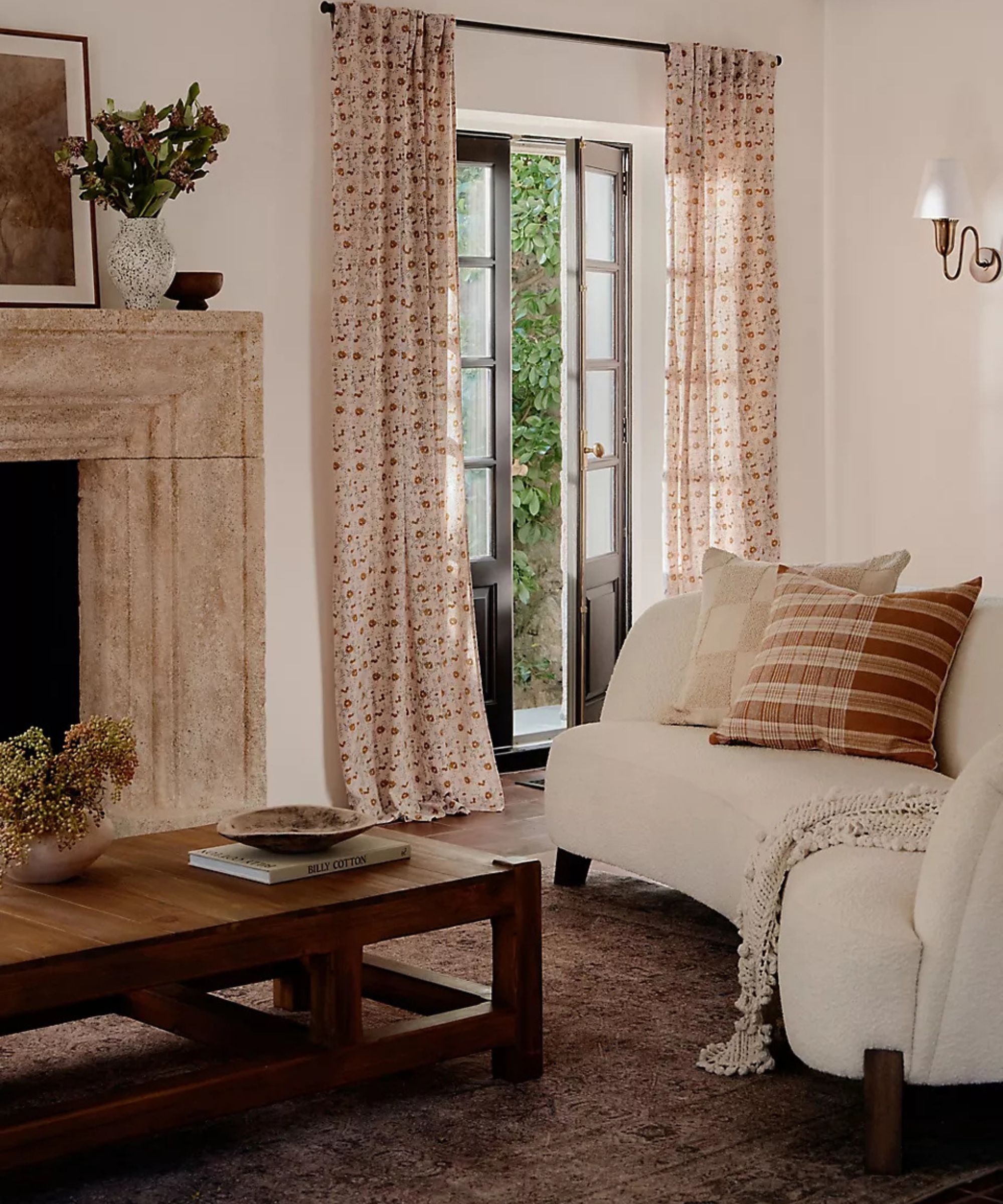
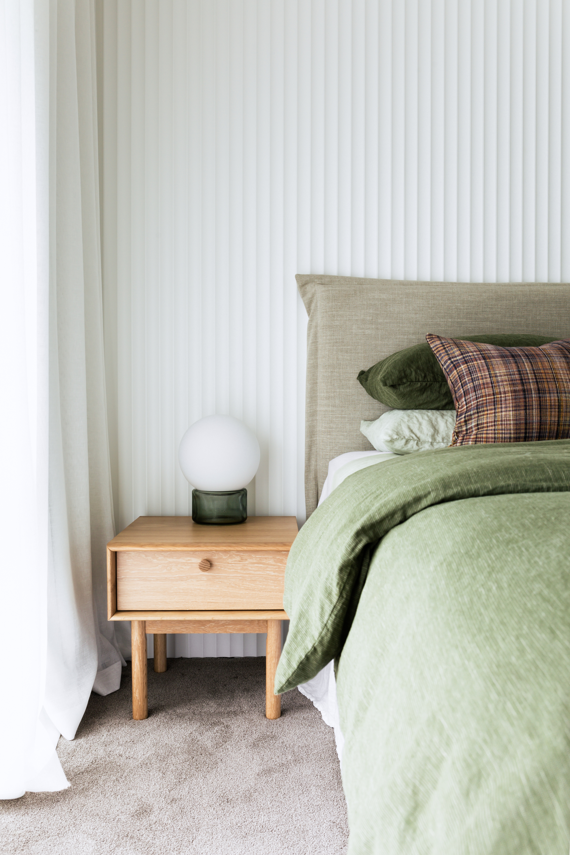
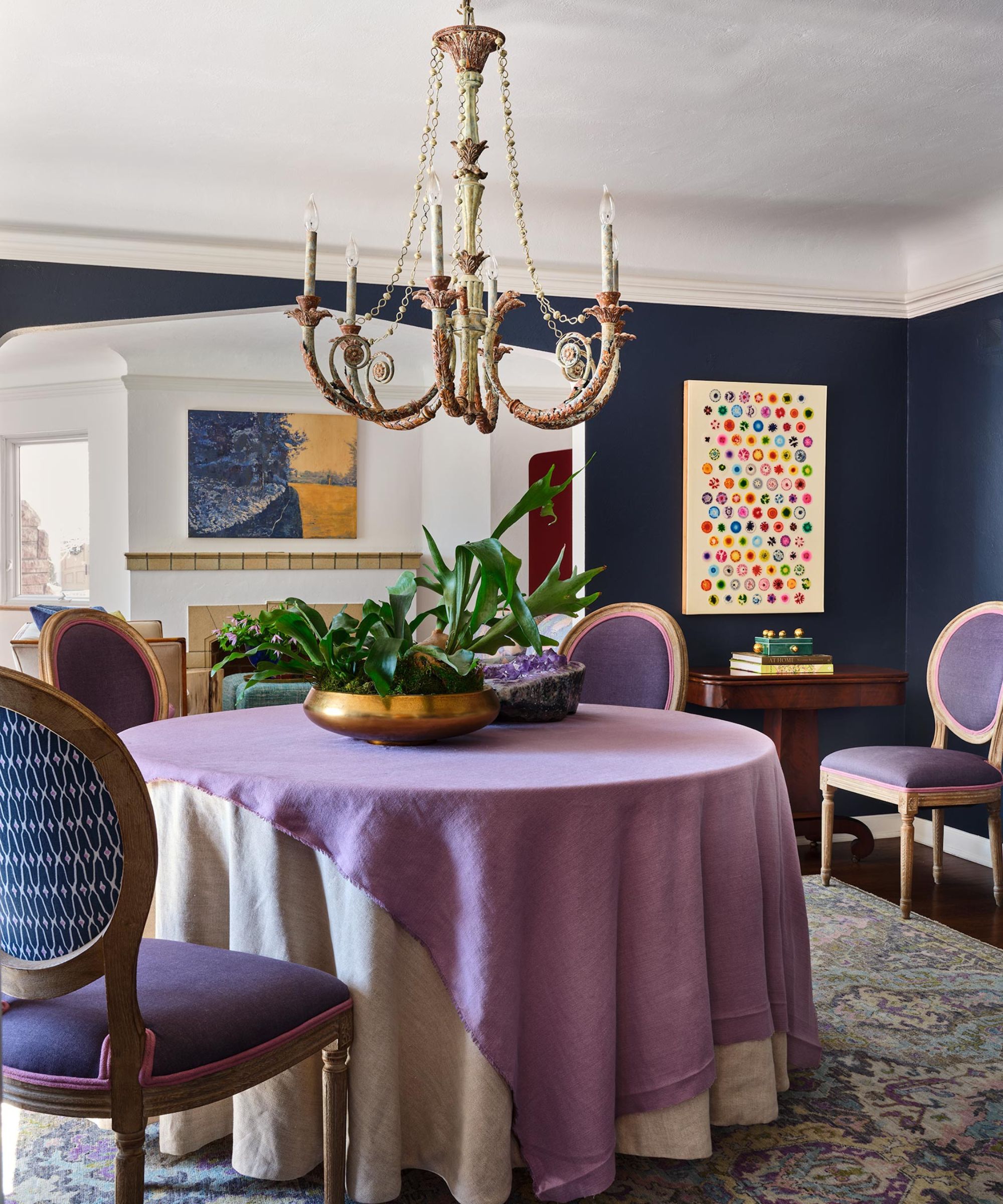
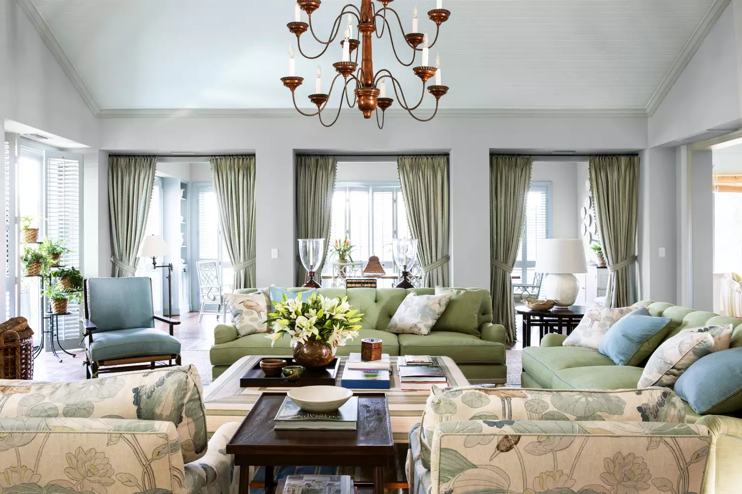
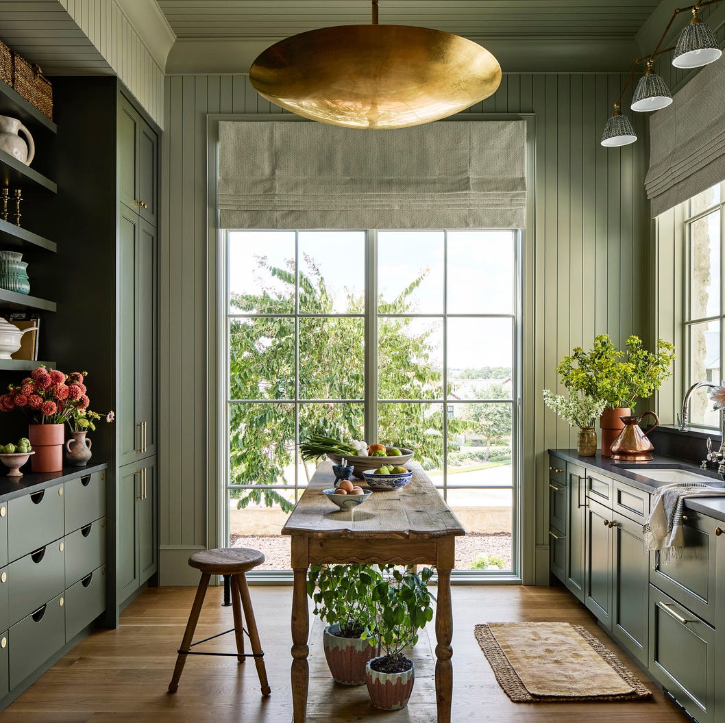
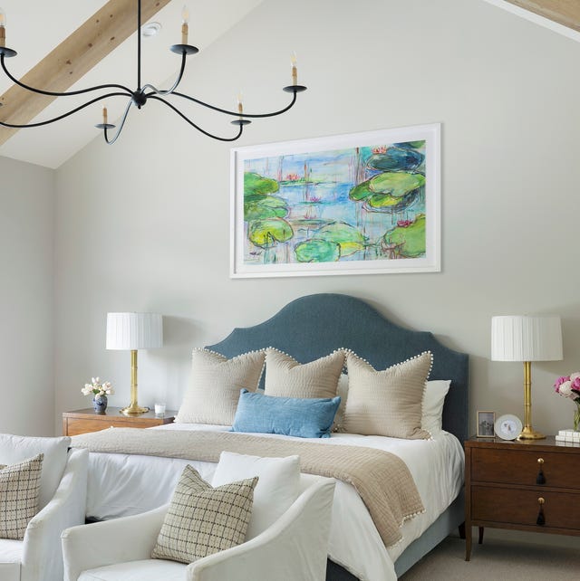
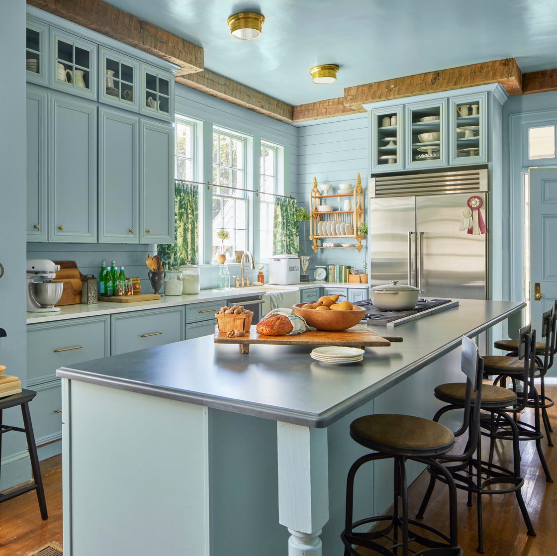
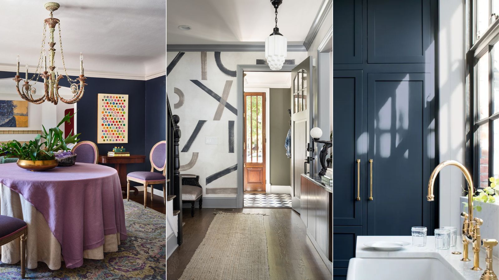
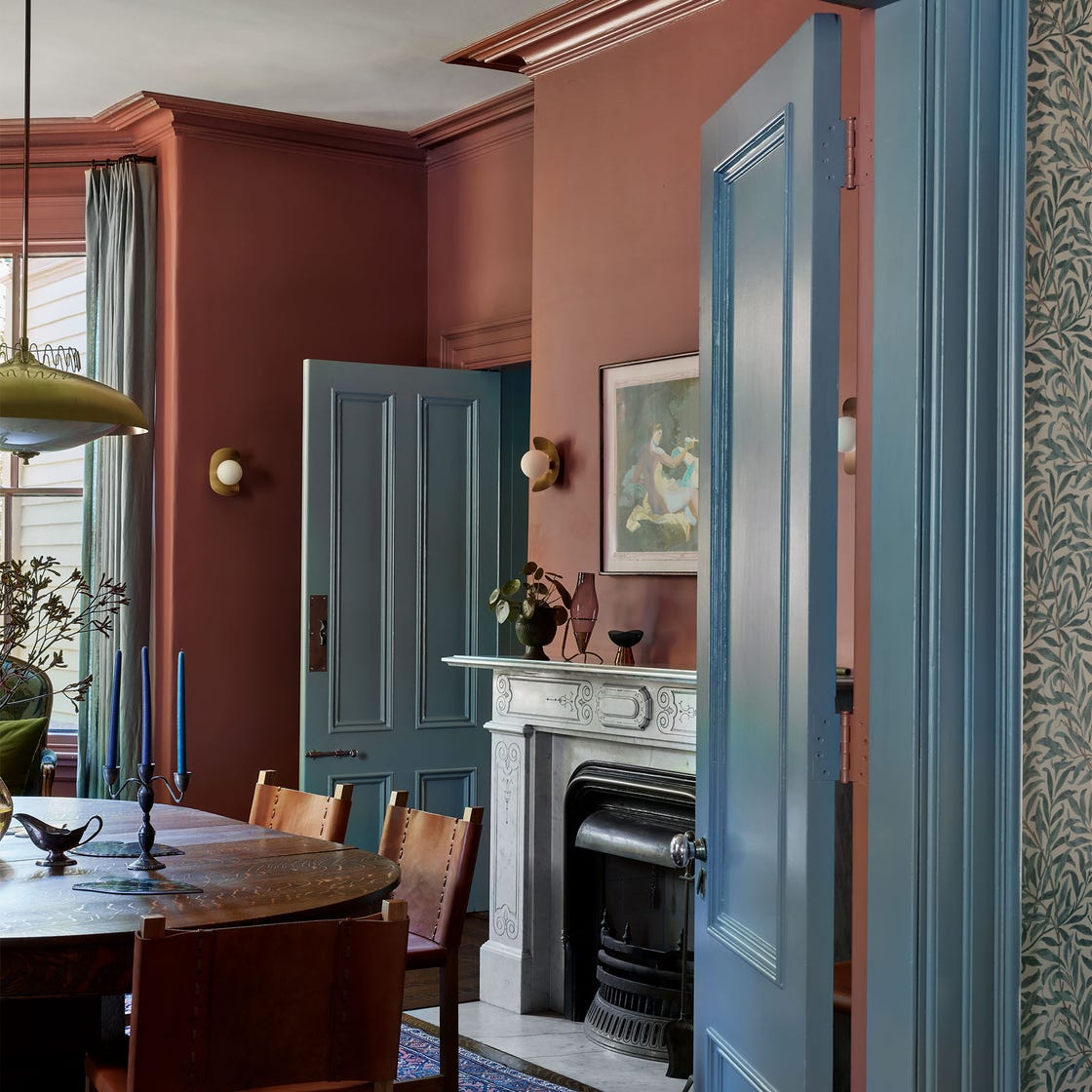
The 'New Neutrals' section features versatile colors that adapt well to different settings. Designer Mark D. Sikes utilized three shades of blue from Farrow & Ball—Skylight (No. 205) on walls, Borrowed Light (No. 235) on the ceiling, and Light Blue (No. 22) on trim—to create a soothing atmosphere in a Sea Island, Georgia, living room. Sherwin-Williams’ Liveable Green (SW 6176) is a fresh, verdant hue that Hannon Doody employed in a Tennessee cottage's family room to instill old-house character. Farrow & Ball’s Pink Ground (No. 202) is a sophisticated, muted pink chosen by Ashley Hanley for her daughter’s bedroom, intended to age gracefully. Sherwin-Williams' Natural Tan (SW 7567) is a creamy yellow that adds depth beyond white, fitting perfectly into a beach house kitchen by Heather Chadduck Hillegas. Sherwin-Williams’ Mountain Air (SW 6224) mimics the traditional 'haint blue' ceilings of Southern verandas, used by Natalie Roe in a Fairhope, Alabama, primary bedroom.
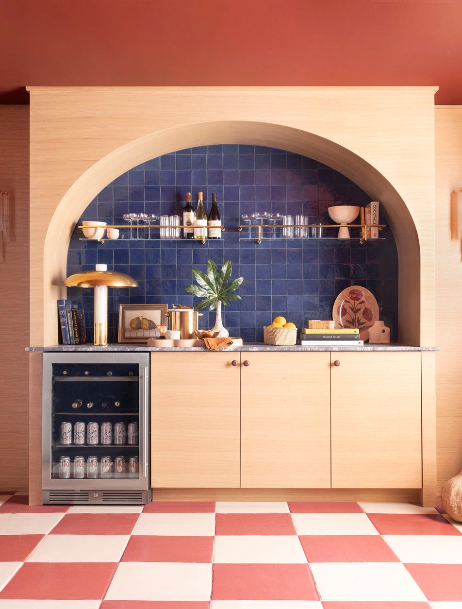
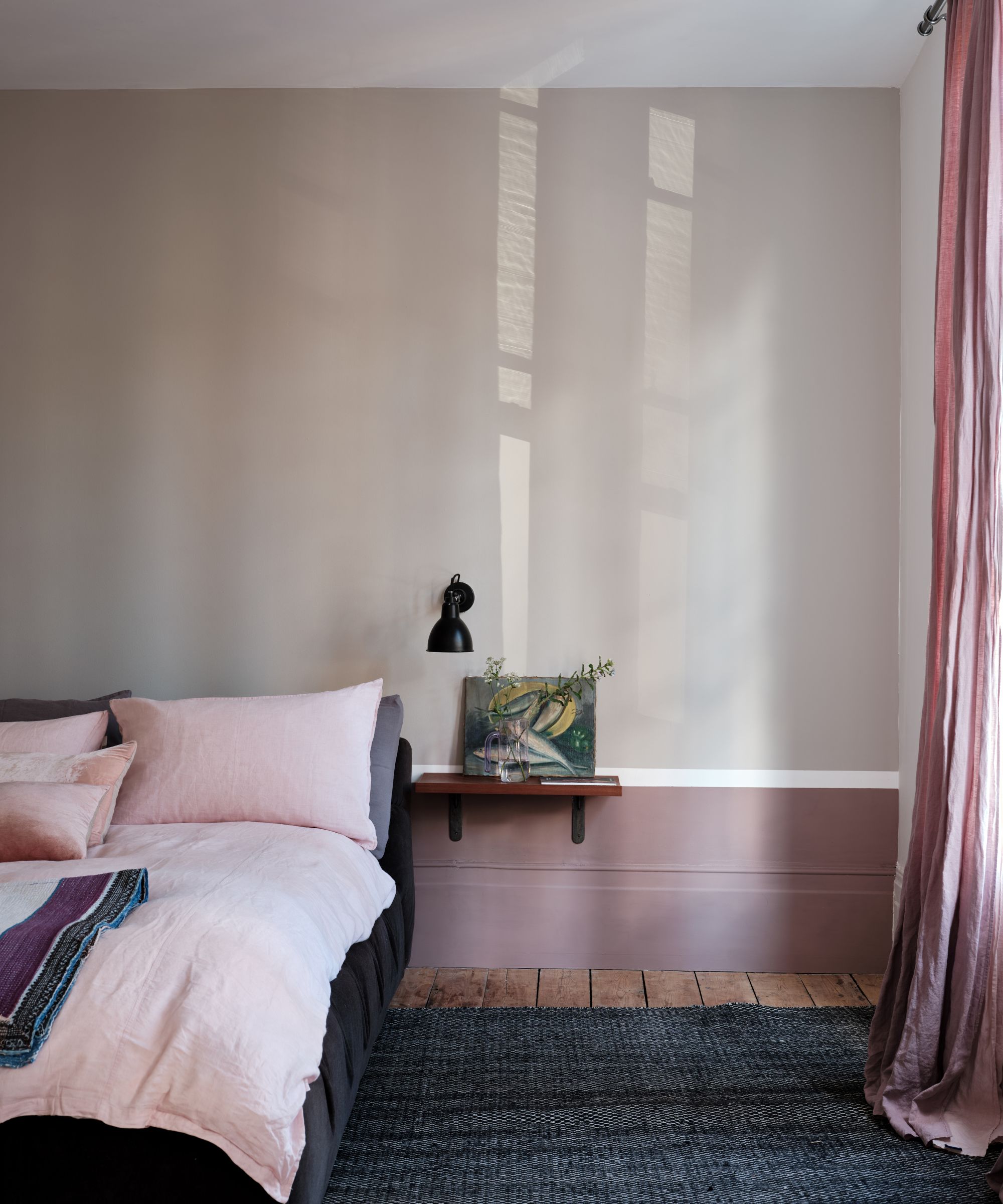
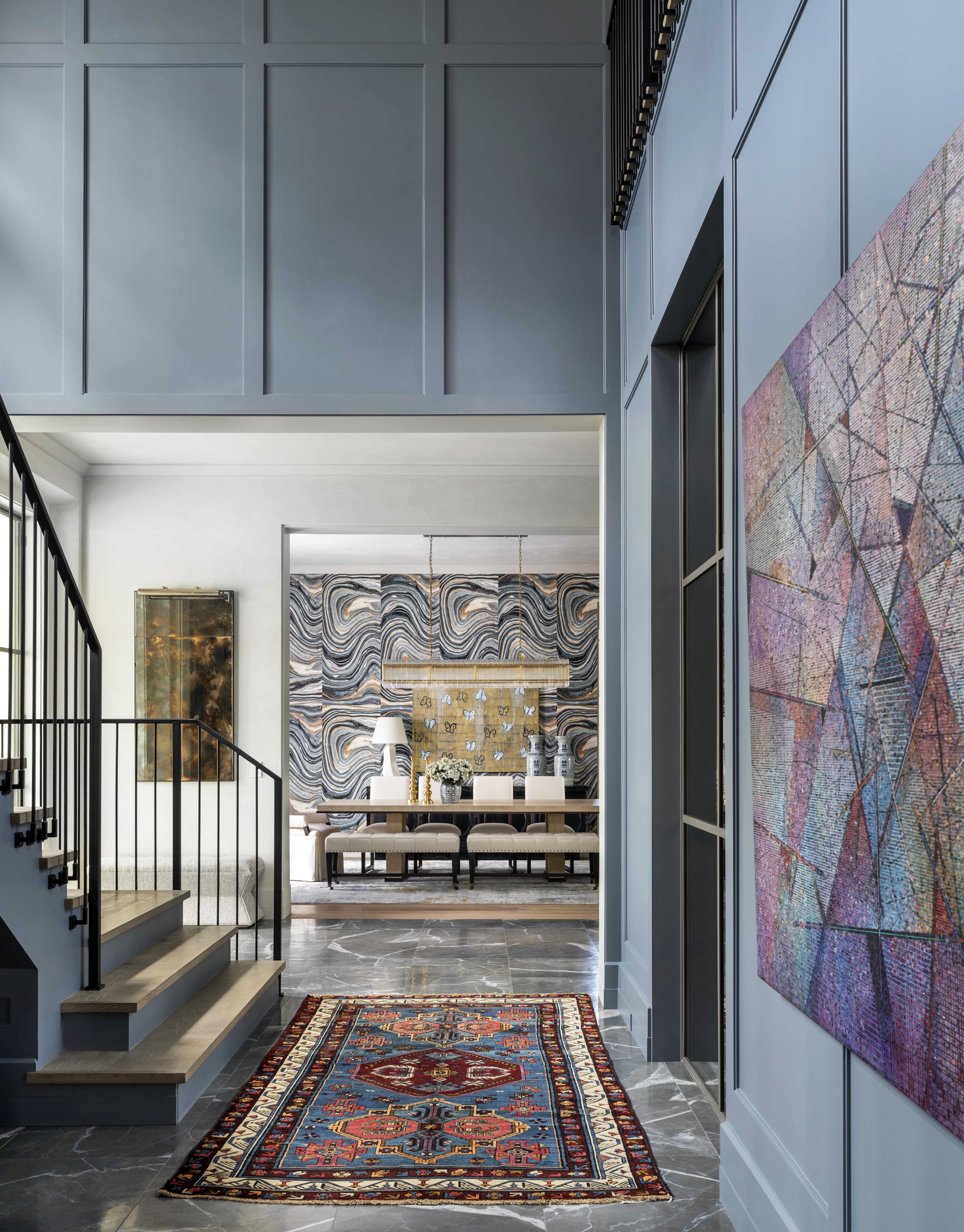
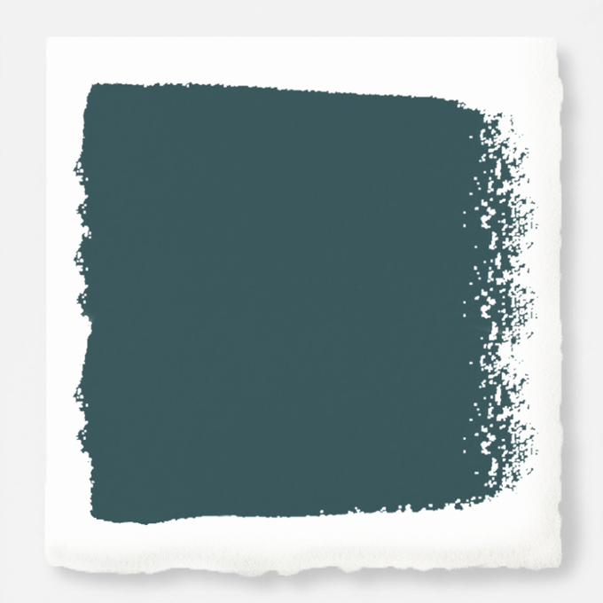
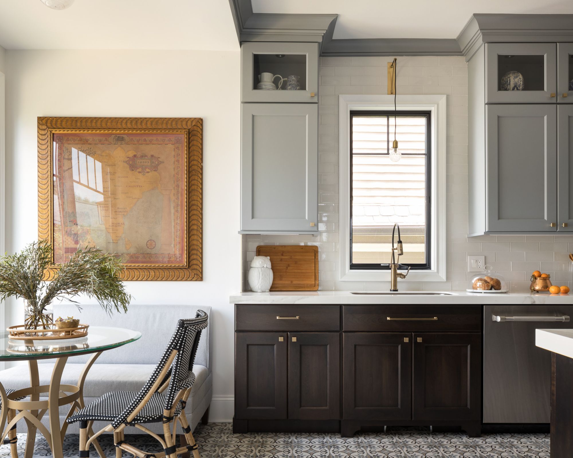
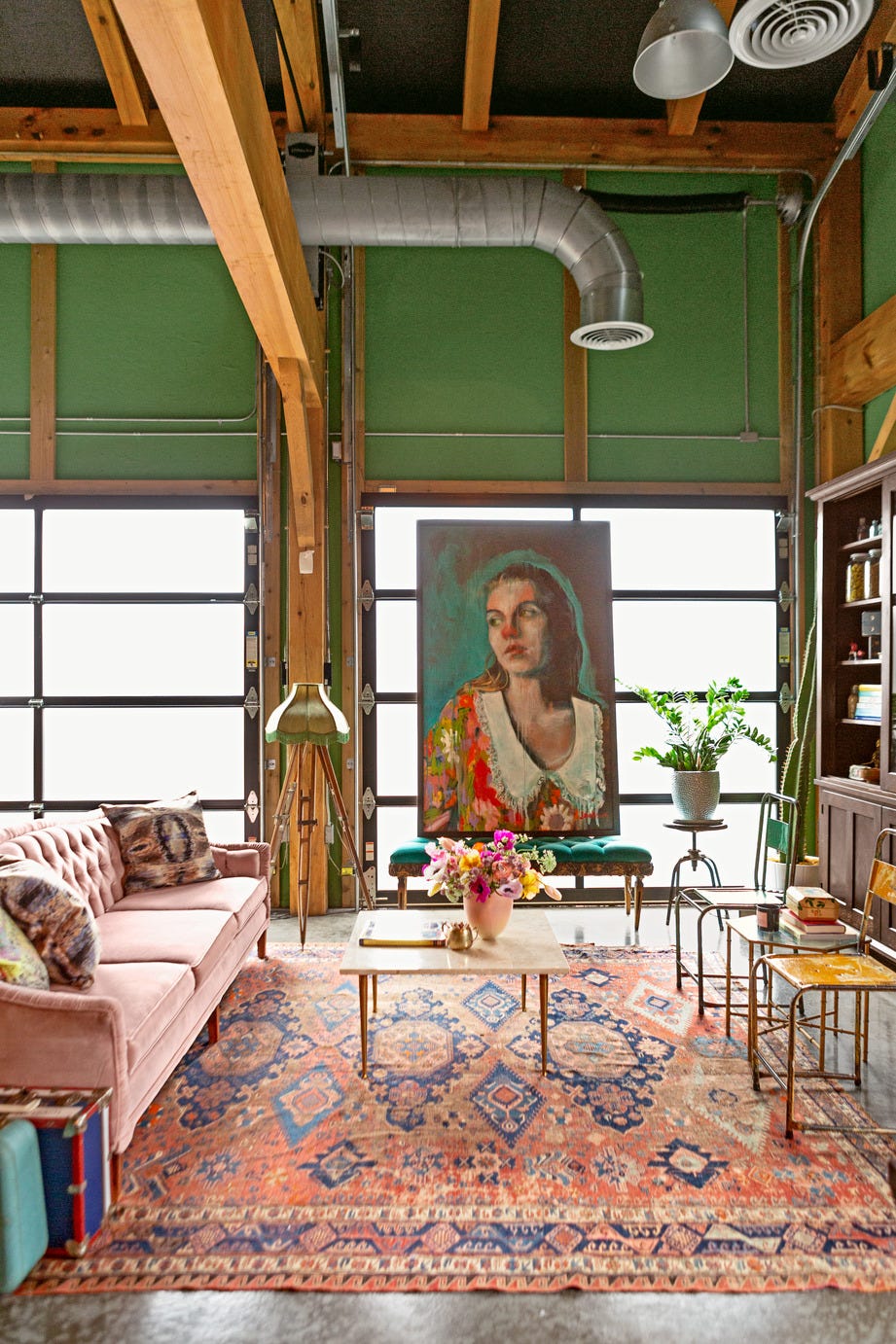
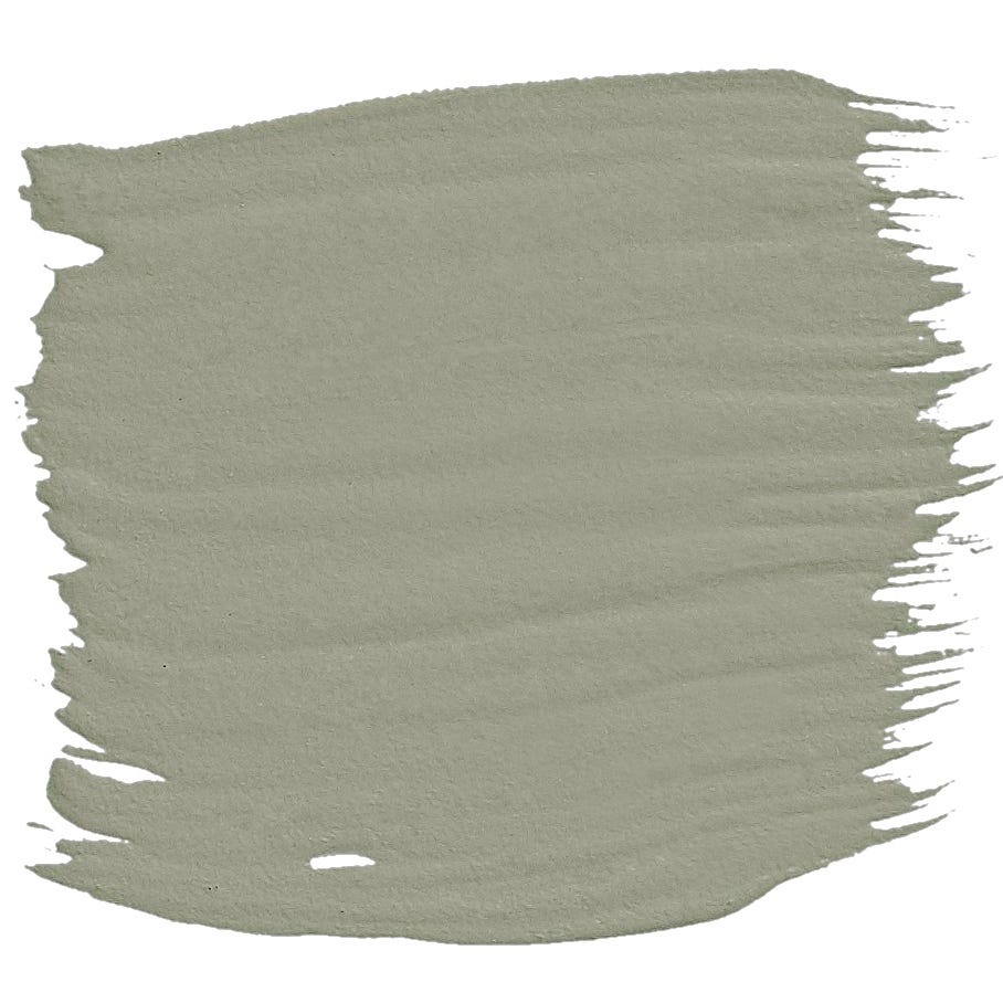
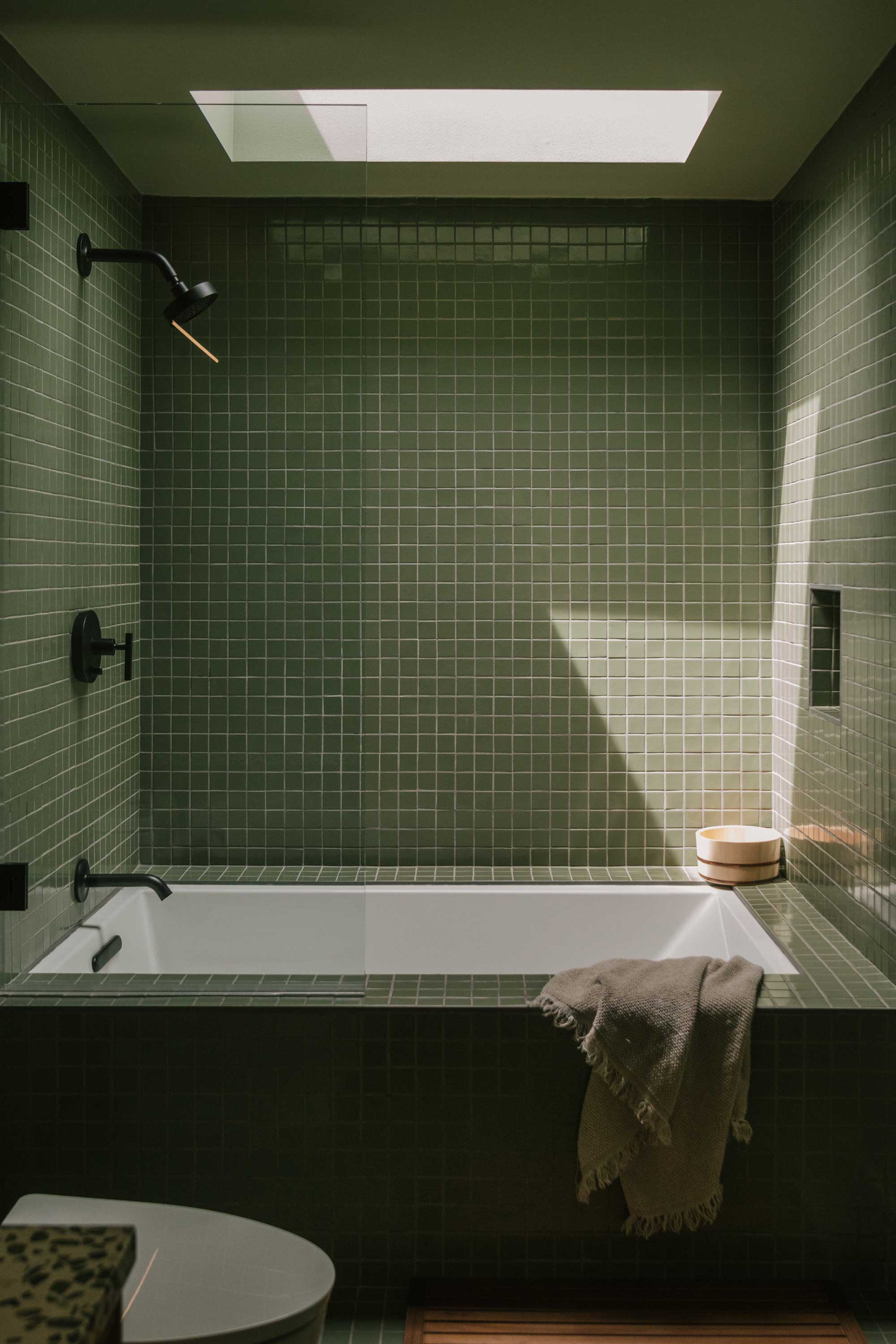
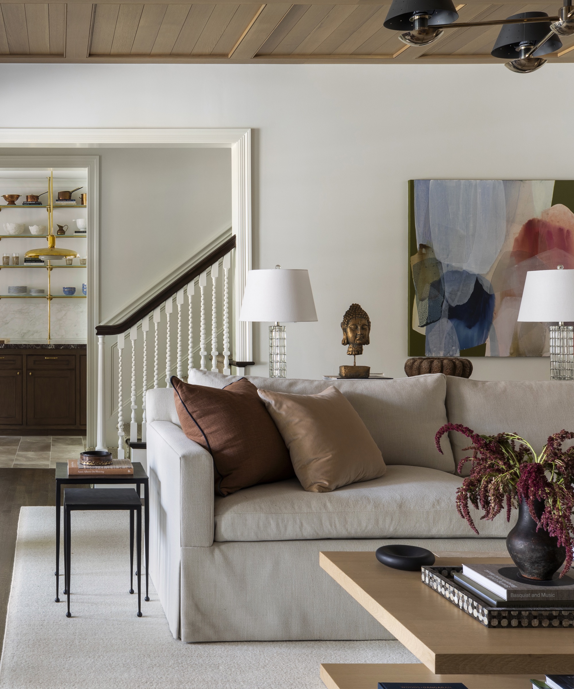
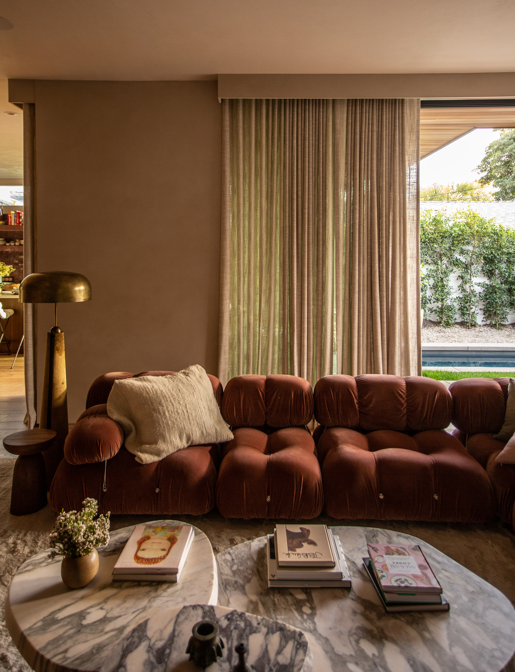
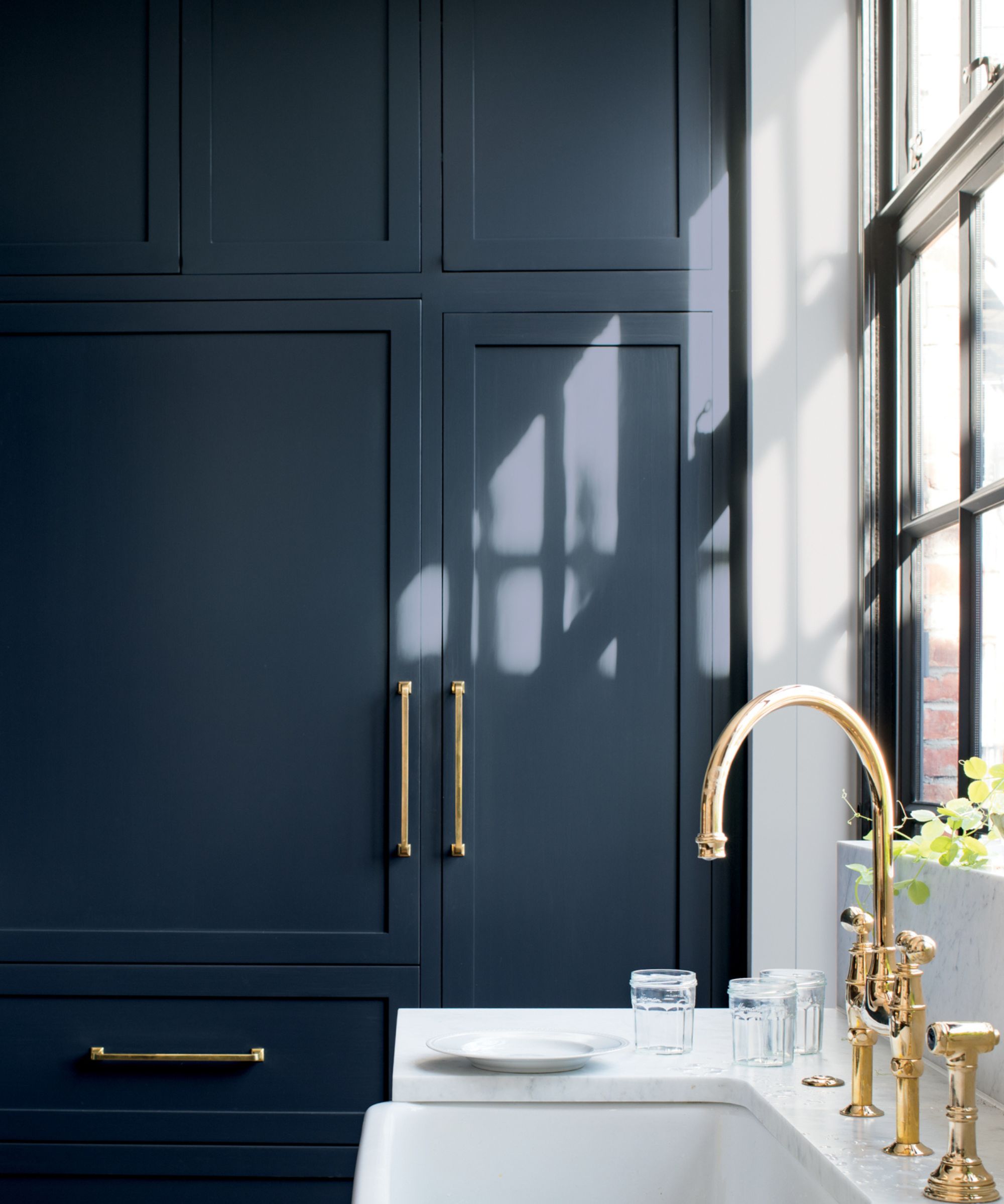
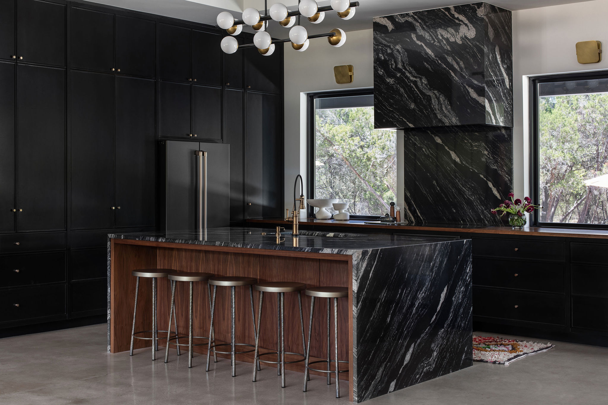
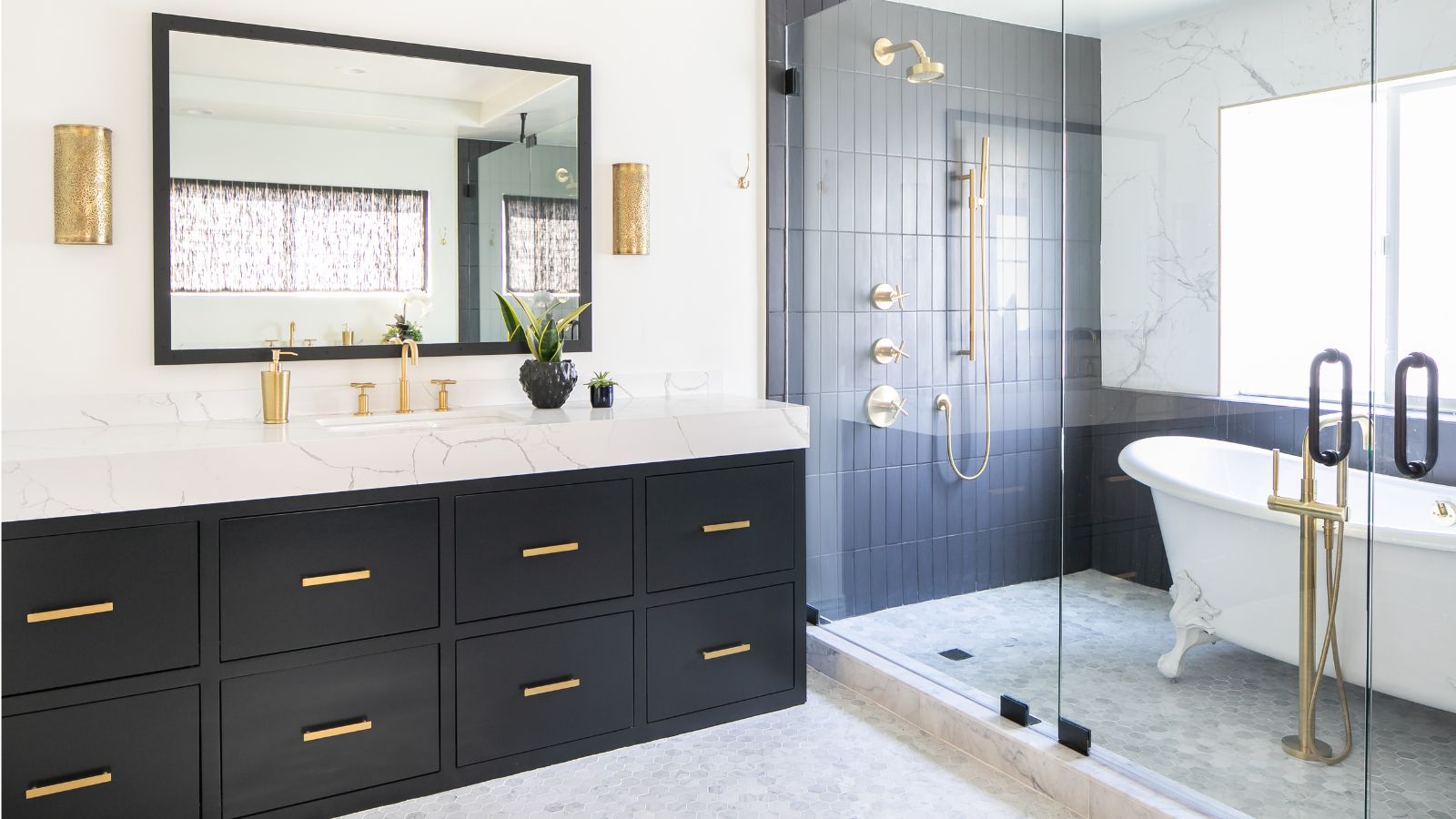
Finally, 'Moody Hues' introduce deep, rich tones for enduring style. Sherwin-Williams’ Black Fox (SW 7020) provides a harmonious look for cabinetry with its velvety greige undertones, preventing a stark appearance in a historic Kentucky home. Farrow & Ball’s Brinjal (No. 222), a saturated berry shade with a glossy finish, was selected by Elly Poston Cooper for a Richmond, Virginia, pantry to create a jewel-box ambiance in smaller spaces. Sherwin Williams’ Forged Steel (SW 9565) demonstrates gray’s dramatic potential, as showcased by Laura Hodges in a pantry at the 2023 Southern Living Idea House. Benjamin Moore’s Garden Cucumber (644), a blue-tinged green, elevates utilitarian areas like mudrooms, as seen in Ellen Kavanaugh’s Wellington, Florida, home. Lastly, Sherwin-Williams’ Tricorn Black (SW 6258) offers a softer, welcoming black that modernized a saltbox-style cabin renovation by homeowners EJ and Whit Brown in Florence, Alabama. These selections demonstrate a range of colors that designers trust to create stylish and lasting interiors.
#PaintColors #InteriorDesign #HomeDecor #DesignerApproved #TimelessColors #WhitePaint #NeutralHues #MoodyColors #HomeImprovement #PaintColors #InteriorDesign #HomeDecor #DesignerApproved #TimelessColors #WhitePaint #NeutralHues #MoodyColors #HomeImprovement
0 comment in total
You may also like
5 Timeless Paint Colors That Will NEVER Go Out of Style, According to Designers

3 Paint Colors That Will Never Go Out of Style, According to Joanna Gaines

10 Timeless Living Room Paint Colors Designers Swear By
12 Jewel-Tone Paint Colors Designers Say Are Always On-Trend
These 20 Paint Colors Will Never Go Out of Style, According to Designers

5 Timeless Colors to Choose for a Bathroom That Will Never go Out of Style

16 Beige Paint Colors That Never Go out of Style, According to Interior Designers
5 "trend-proof" colors for your home designers think will be just as popular in 10 years' time

The most timeless paint colors according to designers

8 Timeless Paint Colors That Always Look Fresh, No Matter the Season

10 Kitchen Paint Colors You Won’t Regret in 10 Years, According to Designers
Kitchen Cabinet Colors That Will Never Go Out of Style — 10 Tones That Are a Timeless Choice
5 Timeless Paint Colors That Go With Absolutely Everything, According to Color Experts
5 enduring colors designers always return to when they have trend fatigue
Which Bathroom Tile Colors Will Never Go Out of Style? 5 Timeless Options Favored By Designers
Designers who never follow trends swear by this color family to make their homes look timeless
15 Designer-Approved Blue-Gray Paint Colors That Will Never Go Out of Style
The 6 Paint Colors for Your Kitchen That Will Never Go out of Style
7 couch colors that will never go out of style, according to interior designers
Classic Color Schemes That Never Go Out of Style