1/7
Designers who never follow trends swear by this color family to make their homes look timeless
While warm whites and sandy earth tones are often considered timeless neutrals in home design, a growing consensus among interior designers points to blue as an equally enduring and versatile color choice. This article explores why various shades of blue, particularly navy, are favored for creating timeless interiors that transcend fleeting trends. Designers emphasize that selecting a paint color for everlasting style goes beyond simple neutrality, often involving an understanding of how colors interact with architectural elements and personal preferences.
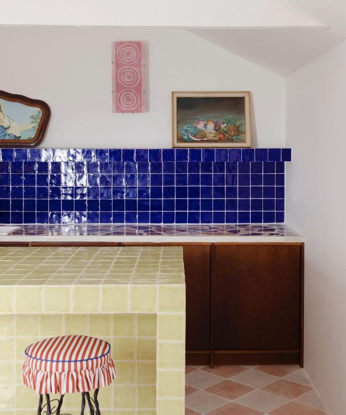
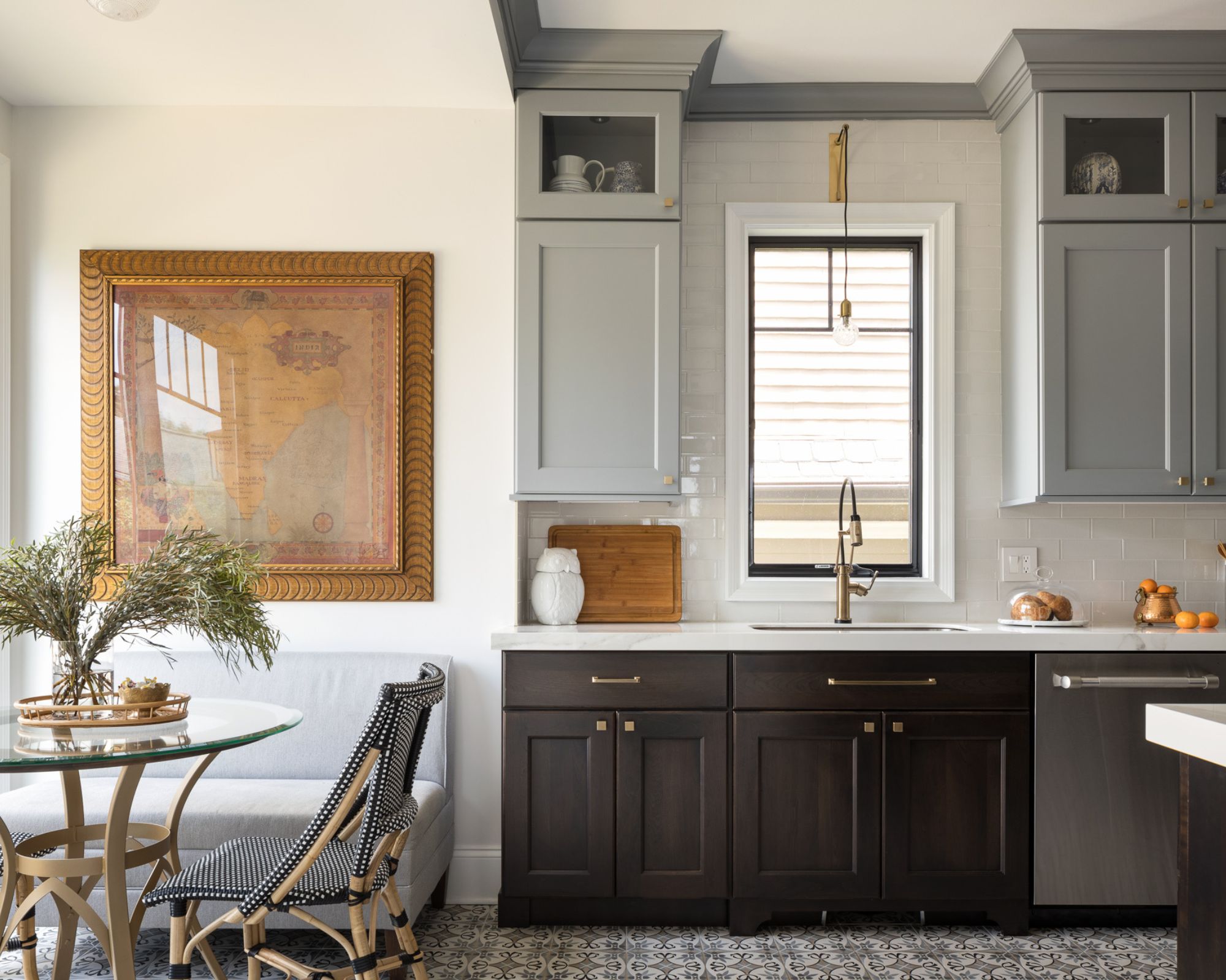
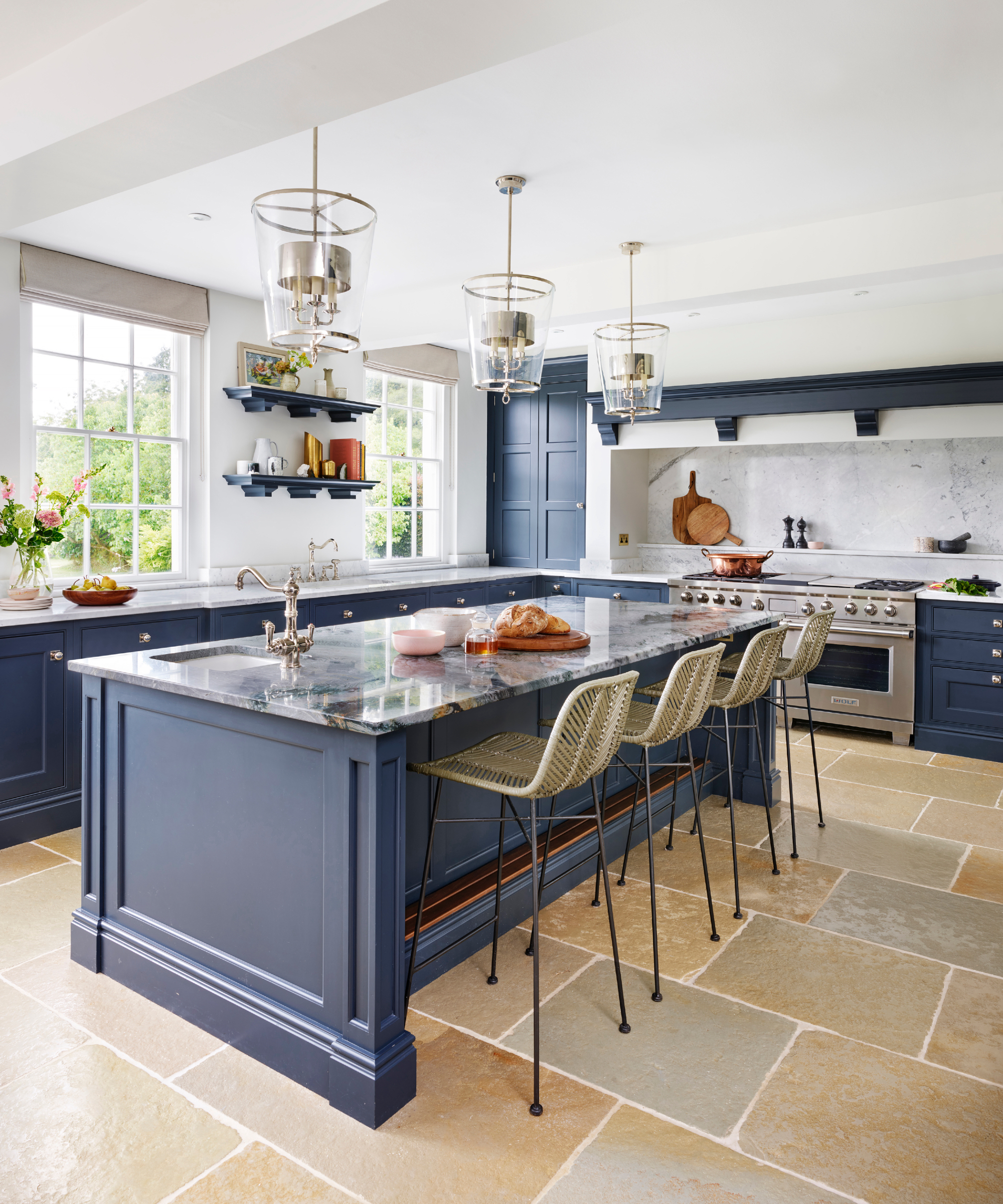
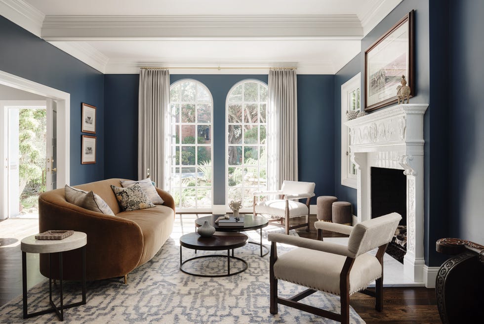
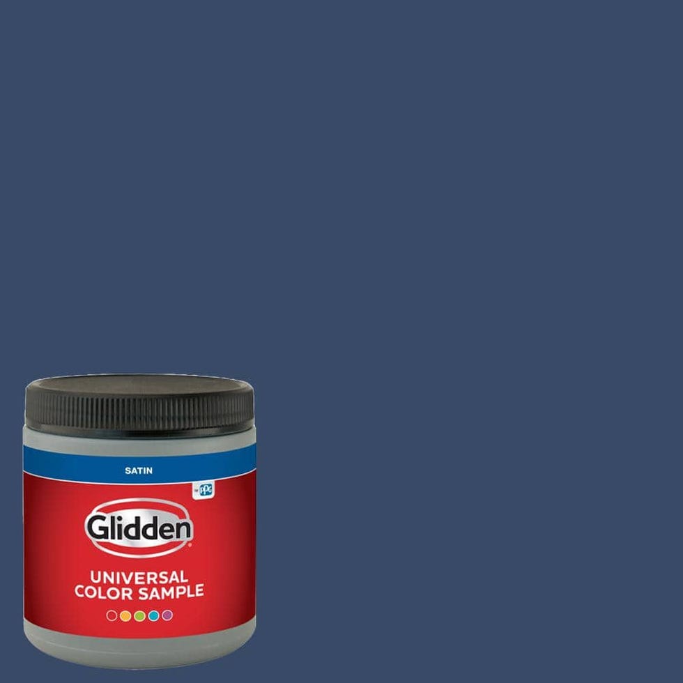
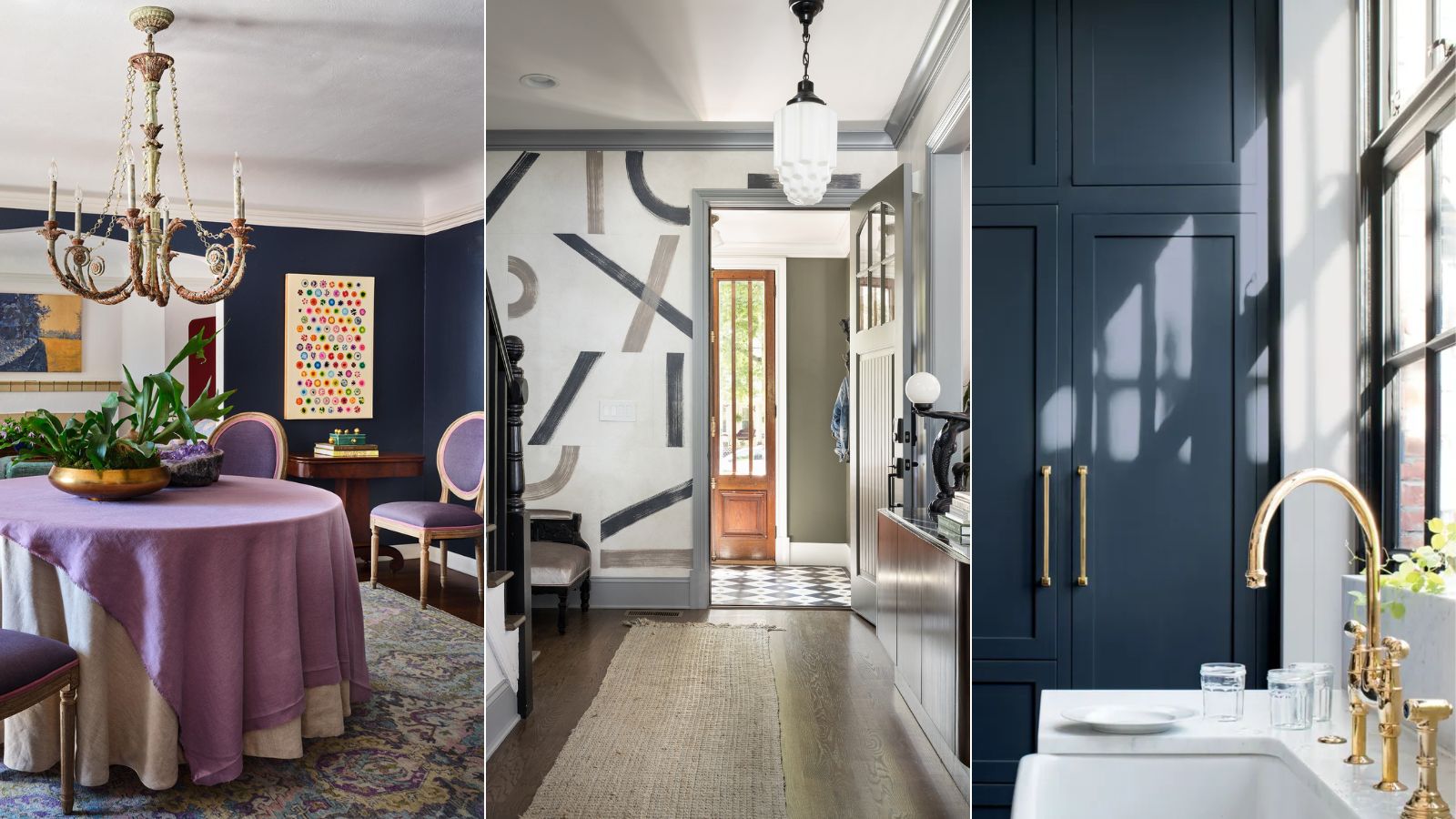
Several designers highlight Benjamin Moore's Hale Navy as a prime example of a timeless blue. Sarah Latham of Latham Interiors suggests that Hale Navy can emphasize key architectural characteristics, making a home look sophisticated for generations. Nadia Watts, a Denver-based interior designer, echoes this sentiment, calling Hale Navy a "workhorse color" due to its suitability for all types of rooms, walls, and ceilings. Watts explains that navy functions effectively as a neutral because it complements a wide range of other colors. She illustrates this by describing a dining room where Hale Navy walls create a sophisticated space with greater depth than traditional light neutrals. According to Watts, Hale Navy imbues a room with timeless elegance, elevating surrounding elements and pairing beautifully with various wood tones, making it a reliable choice for homes with wood floors. Its historical, classic, and clean aesthetic contributes to its lasting appeal.
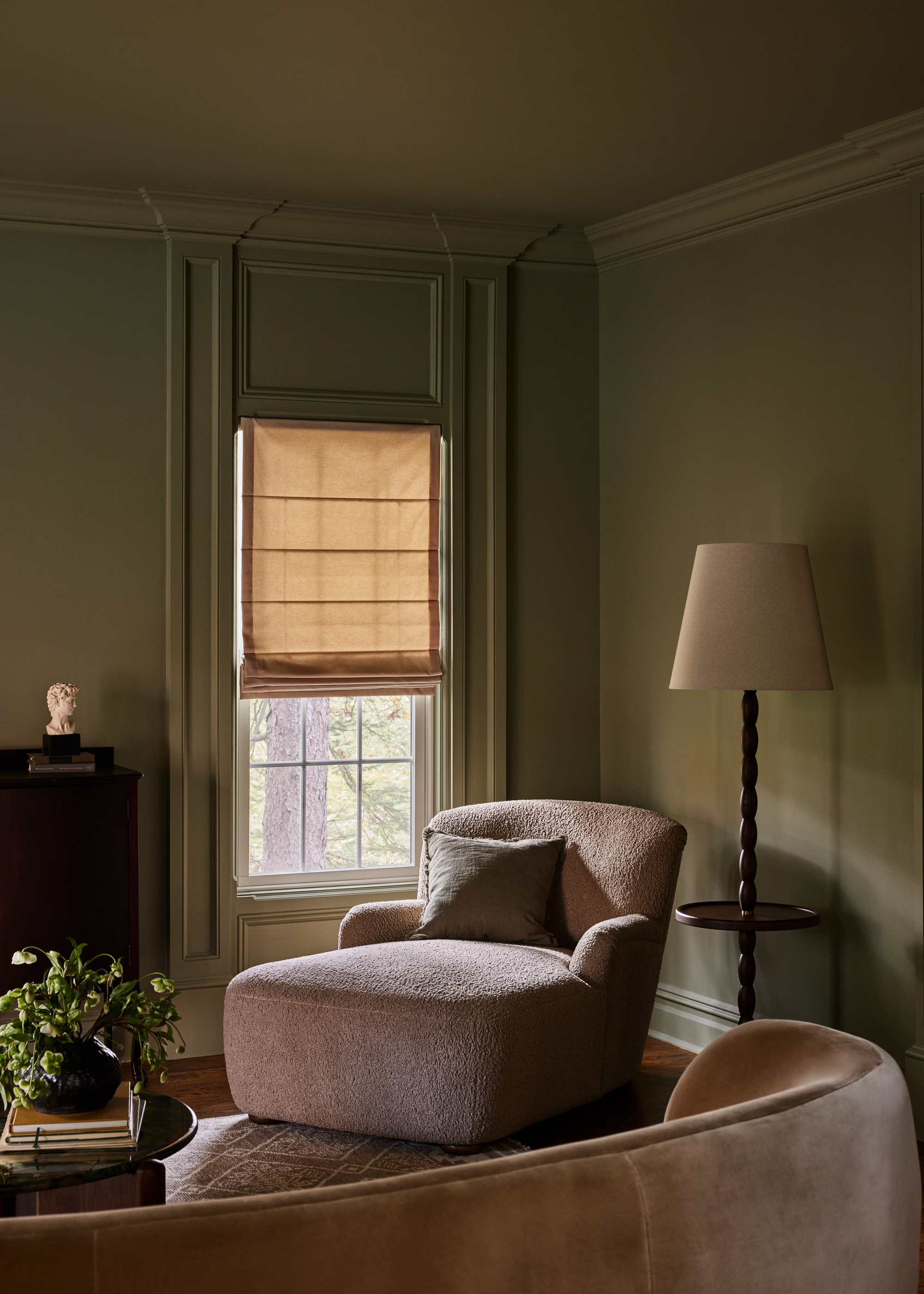
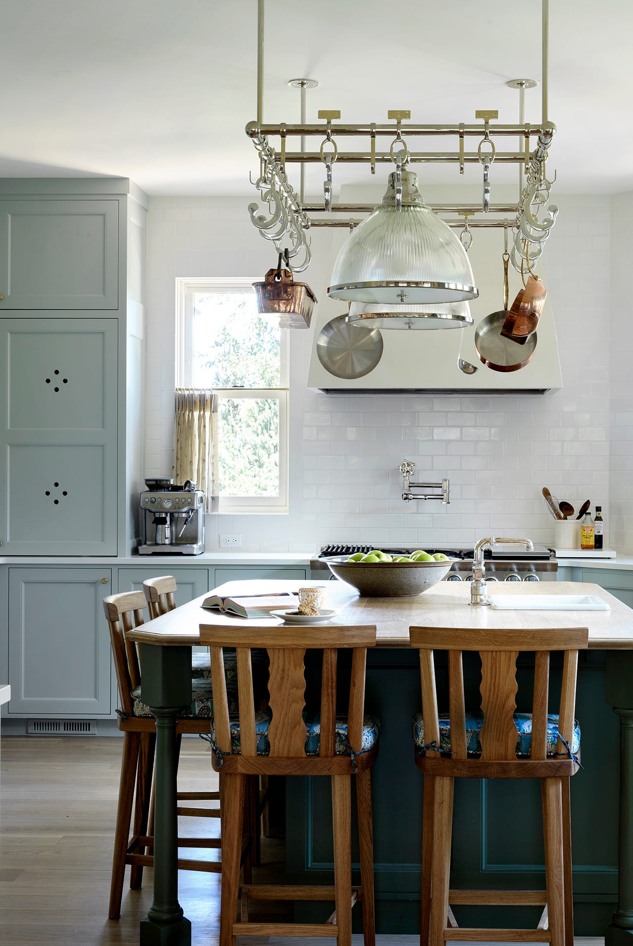
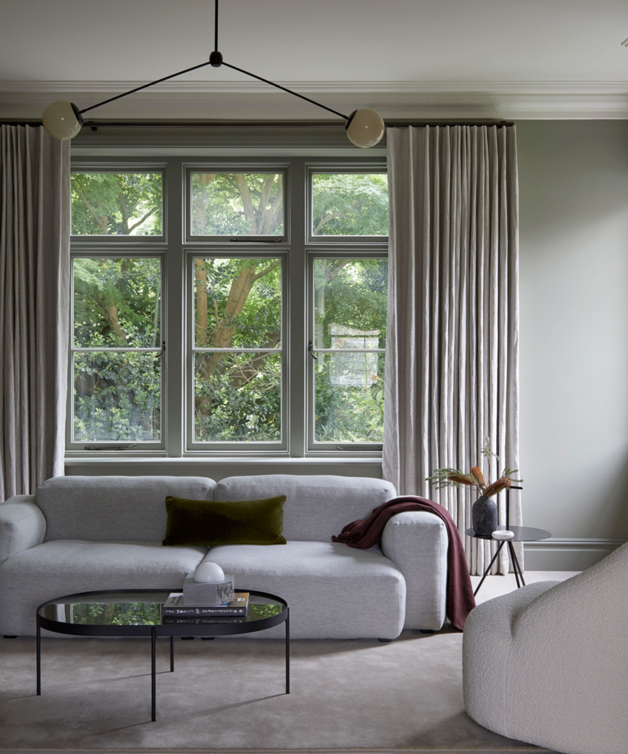
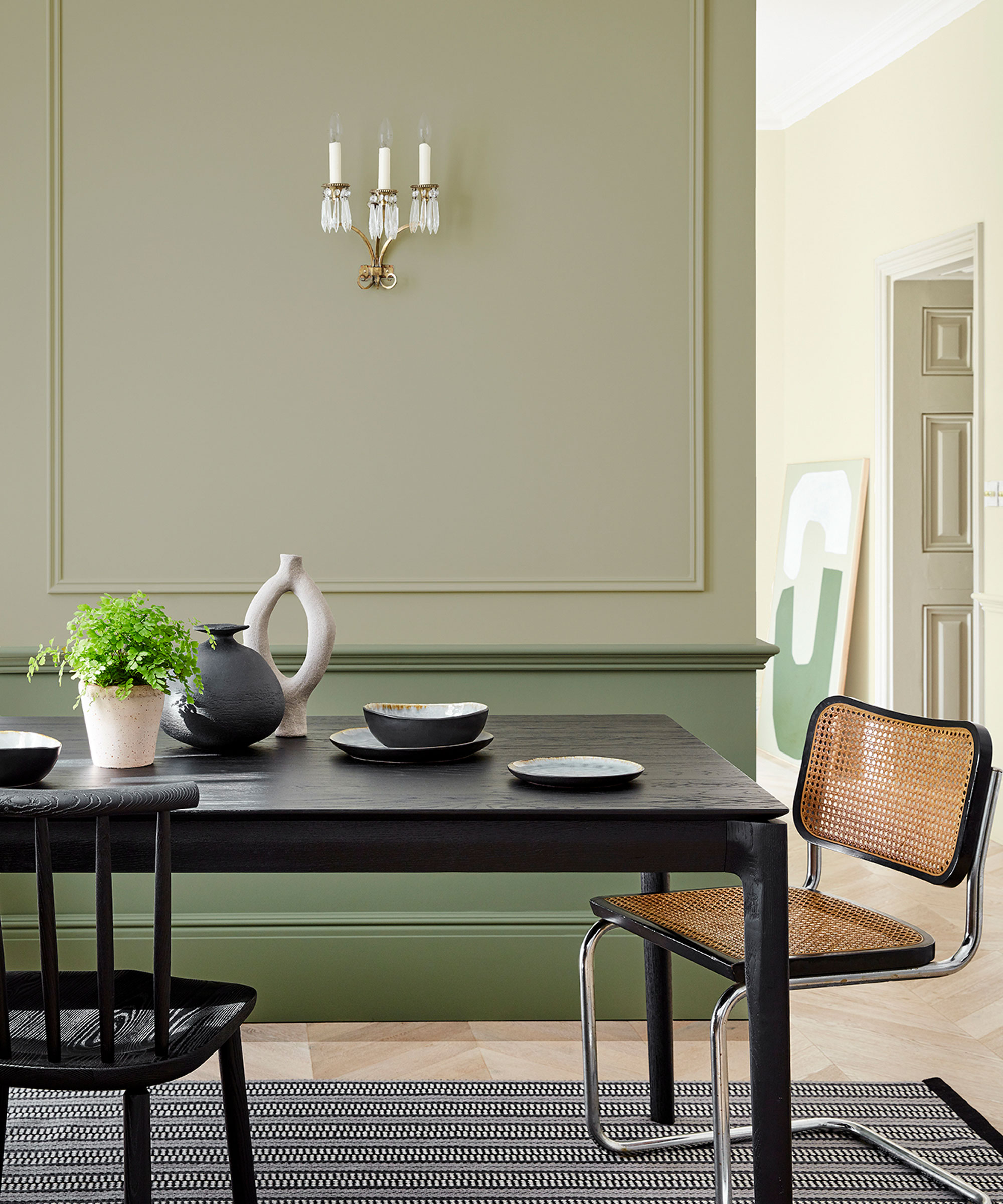
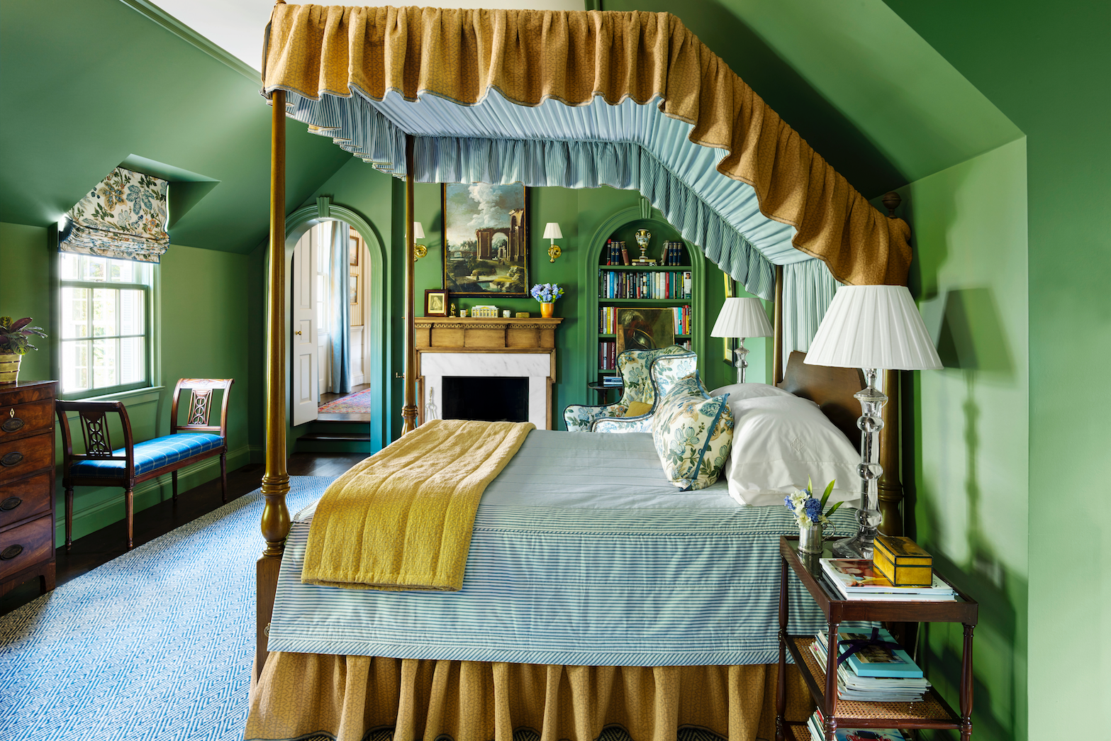
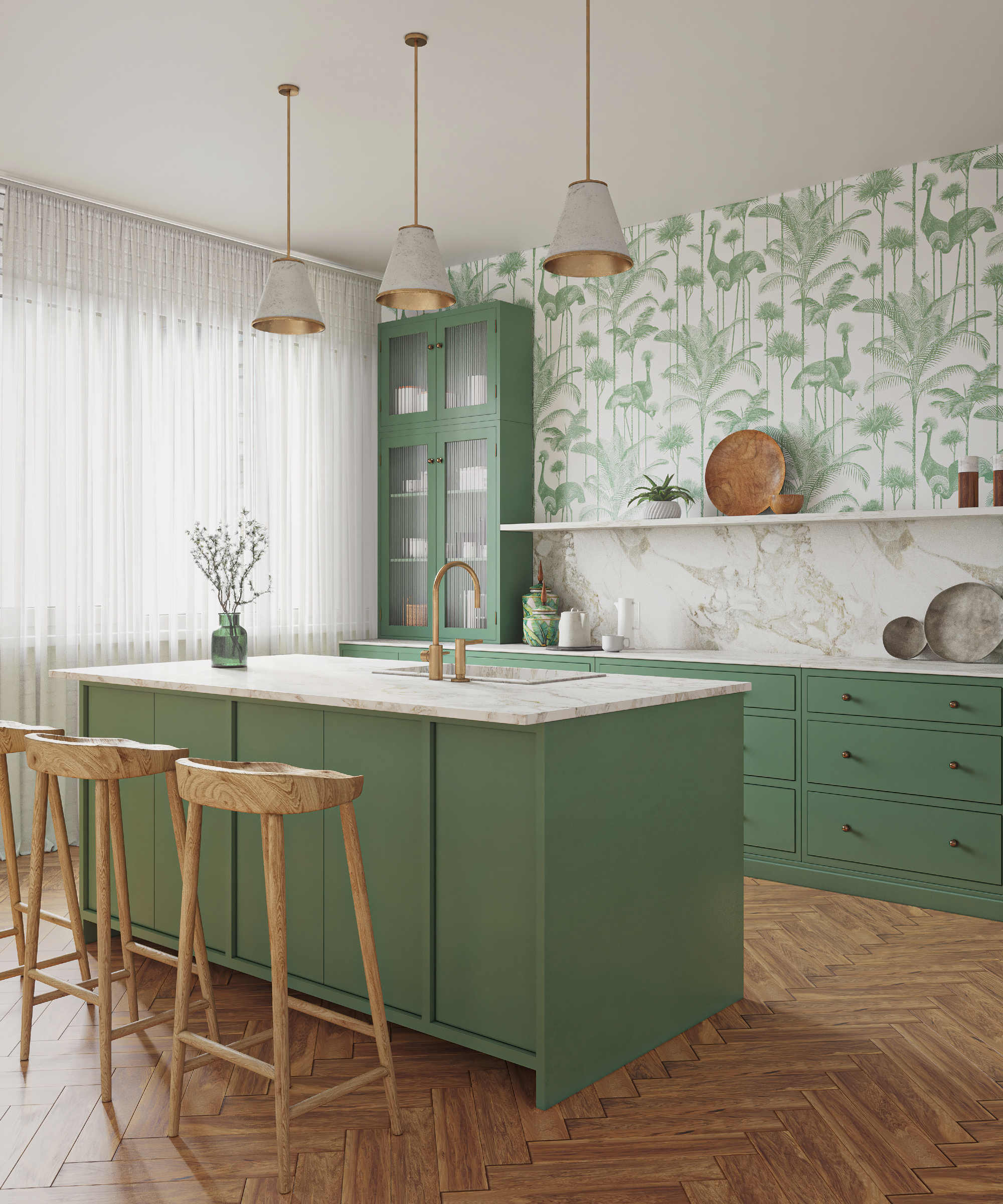
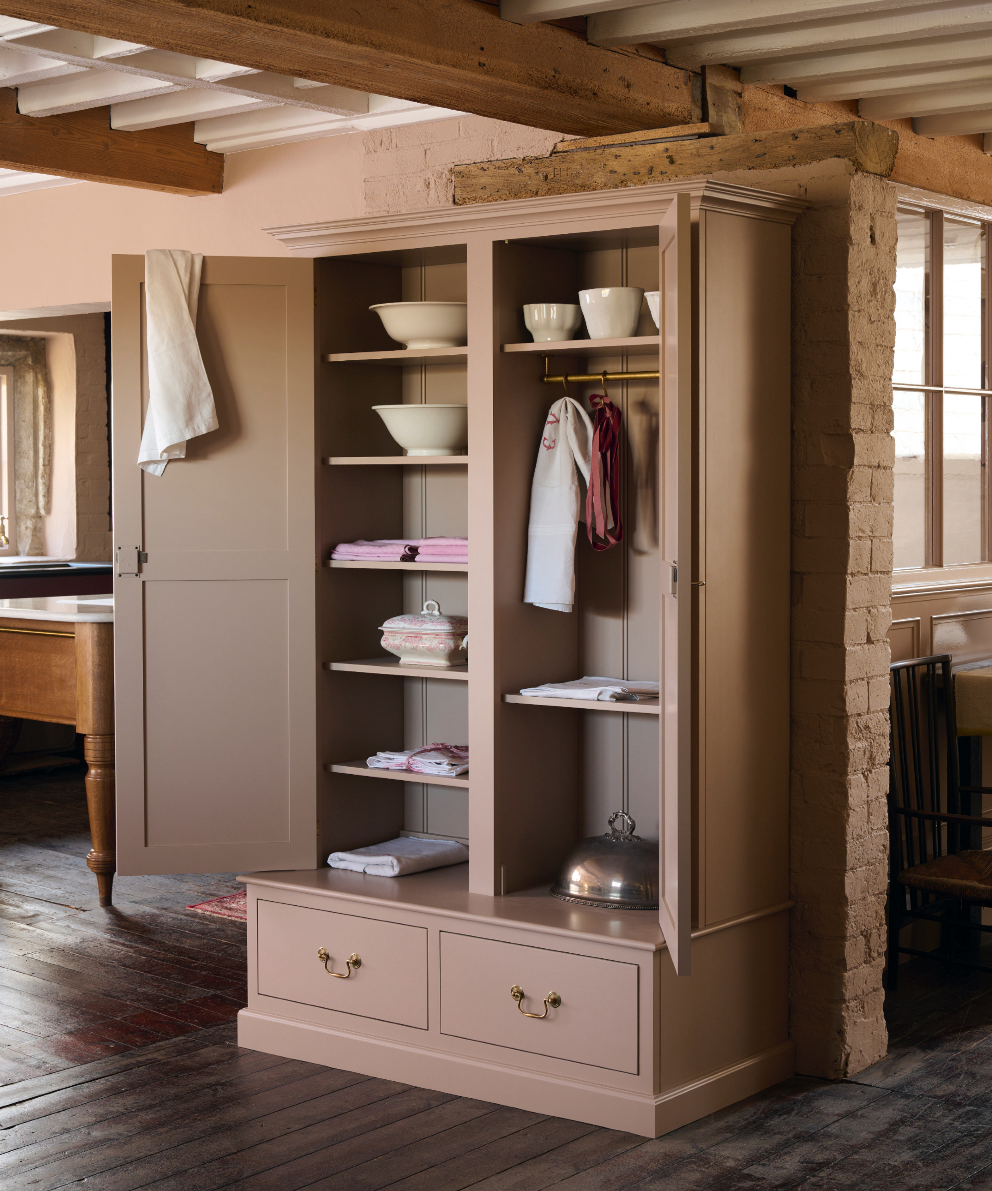
The inherent timelessness of blue is often attributed to its deep connection with the natural world, evoking imagery of the sea and sky. This natural association provides blue with an enduring appeal, much like green, another color frequently cited for its stylish and trend-resistant qualities when inspired by historical and natural tones. Patrick Fox of Crafted Interiors notes that while emerald greens can be trendy, opting for more historical shades like Farrow & Ball's Green Smoke, which possesses a blue undertone, ensures a lasting design. This blue undertone allows the color to shift beautifully with varying lighting and translates well into textiles and upholstery.
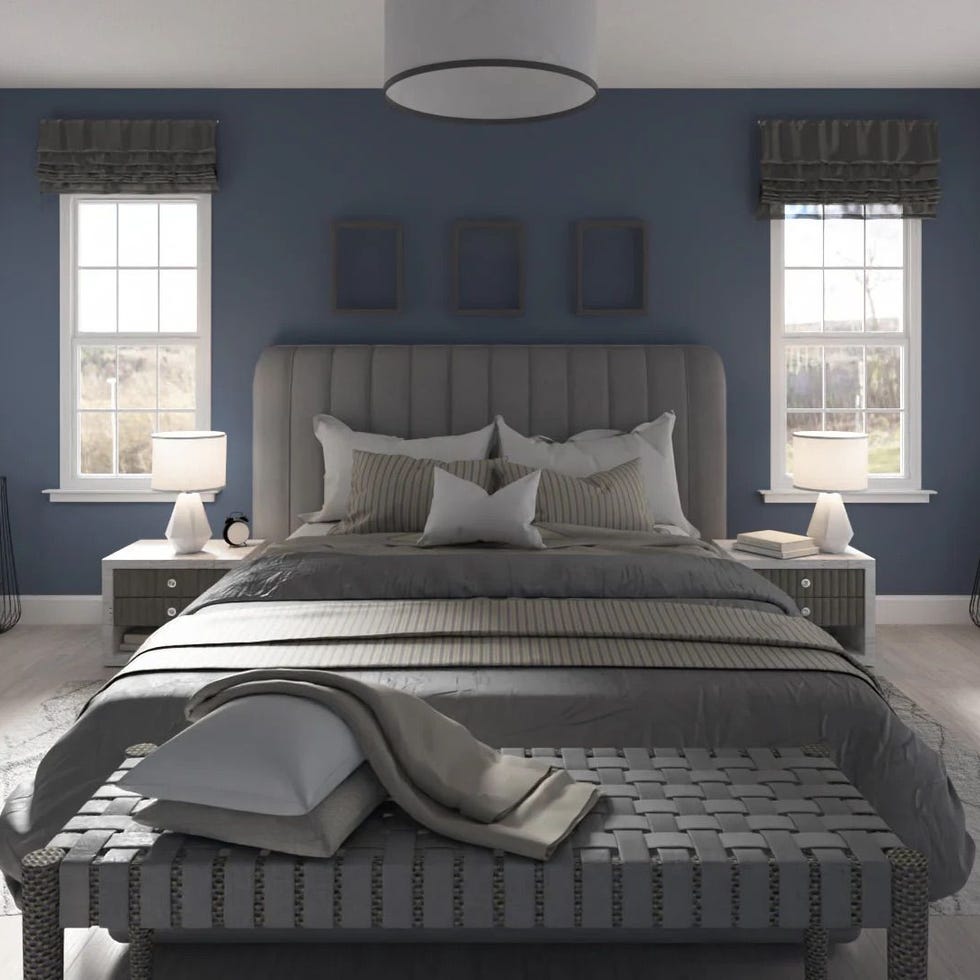
For those who find navy blue too intense, lighter and more muted blue hues offer equally effective timeless color schemes. From pale blues to darker variants, blue remains a universally classic choice that accommodates diverse interior design styles. Jaclyn Isaac of Doni Douglas Design recommends Benjamin Moore's Cobblestone Path, describing it as a quintessential French blue that brings timeless charm to any space. Isaac notes that this shade feels natural within classic color palettes and is particularly effective when applied to interior trim, offering a subtle yet impactful hint of color without dominating the room. The article concludes by encouraging readers to explore various blue paint options, including Farrow & Ball's Hague Blue for its moody green undertones, Benjamin Moore's Van Deusen Blue for an understated mid-blue, and Lick's Blue 04 for a soothing, relaxed blue with gray undertones, all suitable for designing homes that withstand the test of time.
#InteriorDesign #TimelessColors #BluePalette #PaintColors #HomeDecor #NadiaWatts #BenjaminMoore #ColorSchemes #InteriorDesign #TimelessColors #BluePalette #PaintColors #HomeDecor #NadiaWatts #BenjaminMoore #ColorSchemes
0 comment in total
 No comments yet
You may also like

The most timeless paint colors according to designers

5 Timeless Paint Colors That Will NEVER Go Out of Style, According to Designers

These 7 Colors Will Rule Interiors in 2026, According to Experts

15 Timeless Paint Colors You’ll Never Tire Of, According To Designers
3 Classic Color Palettes That I'm Betting Will Feel Just as Current in 100 Years' Time

5 "trend-proof" colors for your home designers think will be just as popular in 10 years' time
3 Kitchen Paint Colors Experts Promise Will Never Go Out of Style


Katherine Heigl's timeless living room cured my trend fatigue – it's proof that classic styling prevails
The Kitchen Colors Designers Call “Forever Favorites”
Classic Color Schemes That Never Go Out of Style

11 Paint Colors That INSTANTLY Make Your Home Look "Expensive," According to Designers

Timeless Paint Colors The Stars Of Fixer To Fabulous Love Seeing In Homes
Designers Agree: This Classic Living Room Paint Color Never Goes Out of Style

5 enduring colors designers always return to when they have trend fatigue
Which kitchen color is timeless? Our experts give us their take

Lick Paint Will Transform the Mood in Your Home Through Color Psychology

Designers LOVE Pairing These Unexpected Colors With This One Timeless Hue


10 Timeless Living Room Paint Colors Designers Swear By
7 couch colors that will never go out of style, according to interior designers
12 Jewel-Tone Paint Colors Designers Say Are Always On-Trend