8 Limewash Paint Colors for a Beautiful, Timeless Home, According to Interior Designers
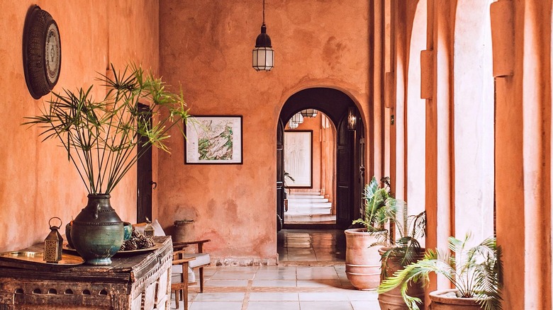
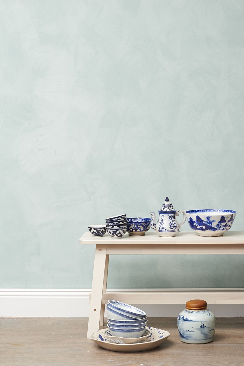
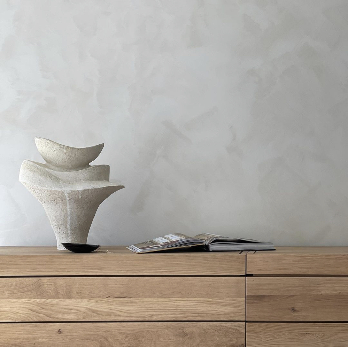
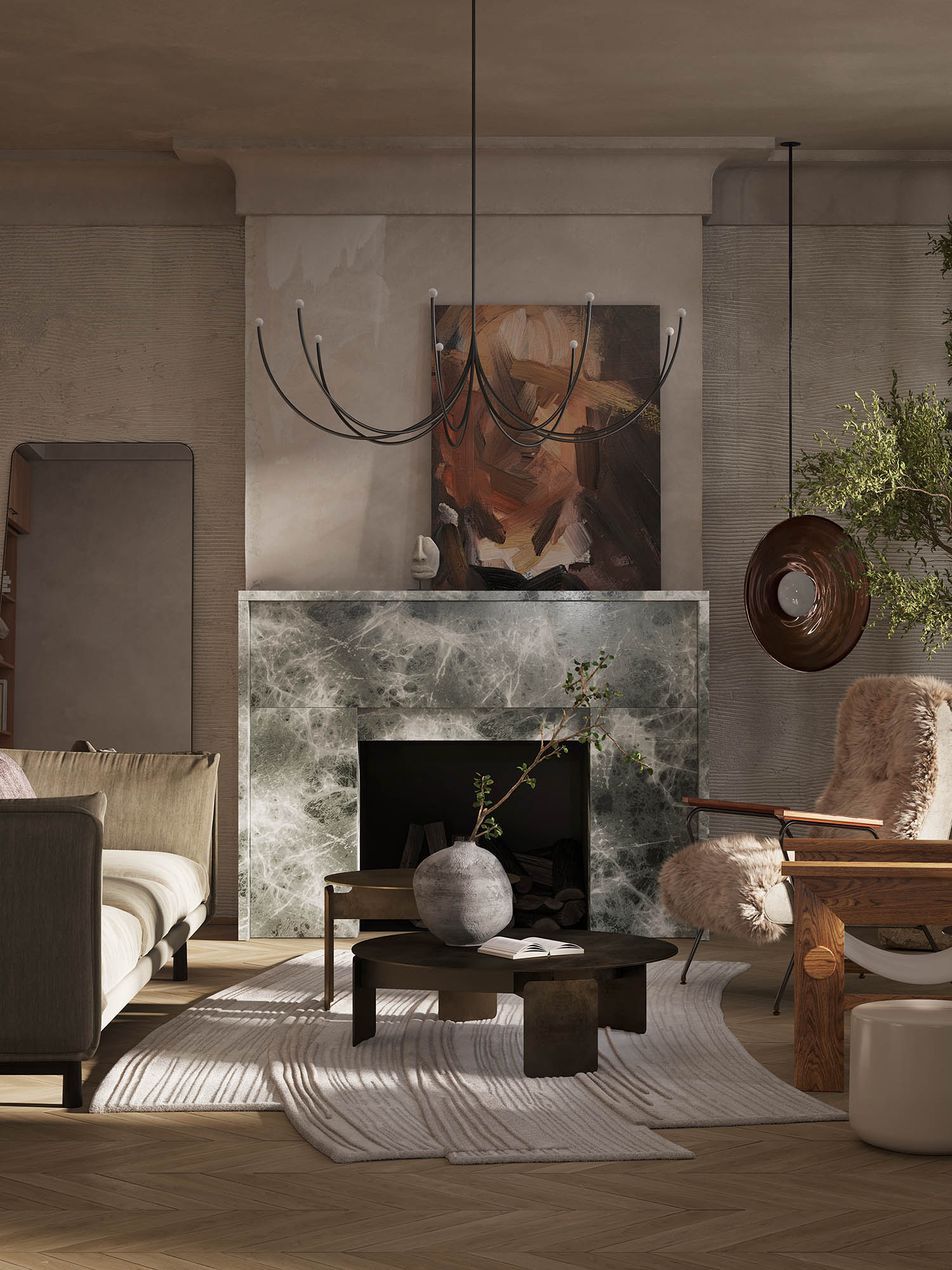
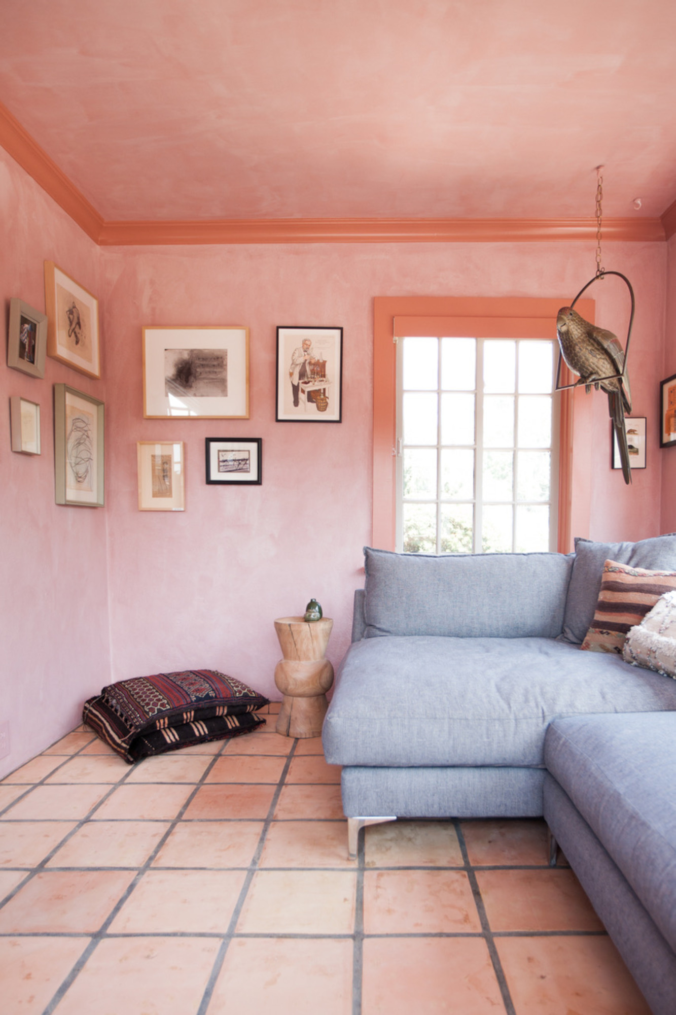
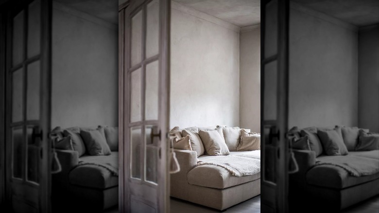
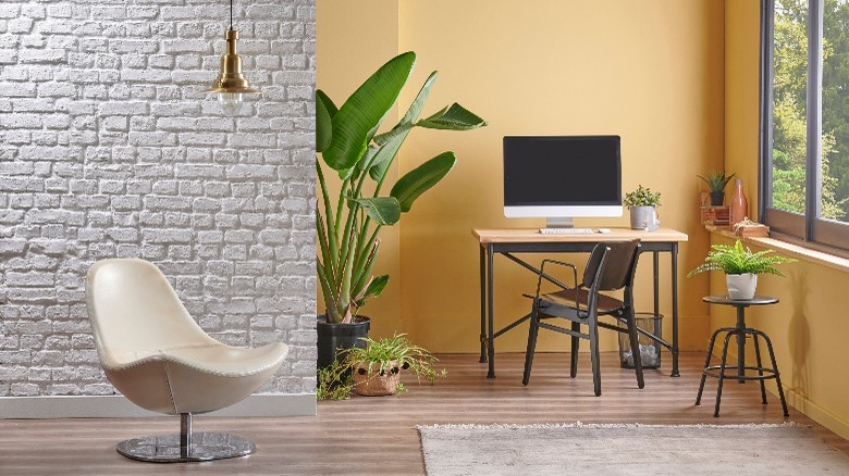
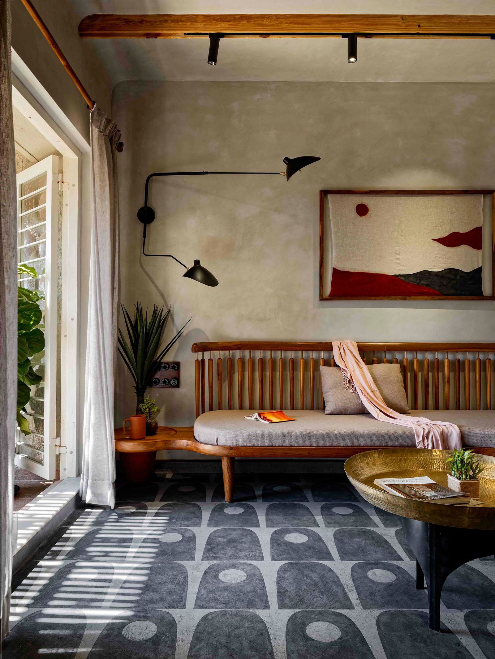
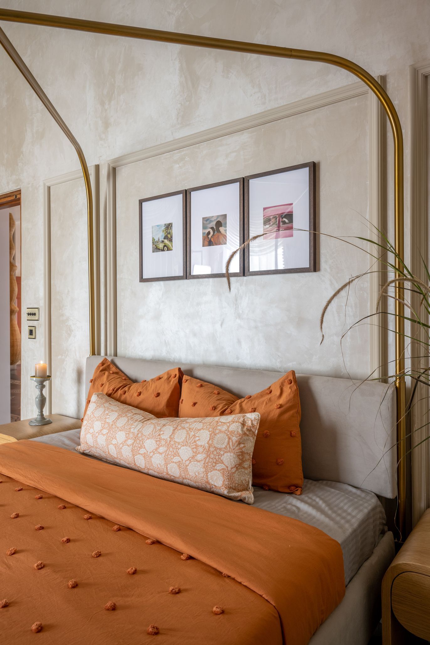
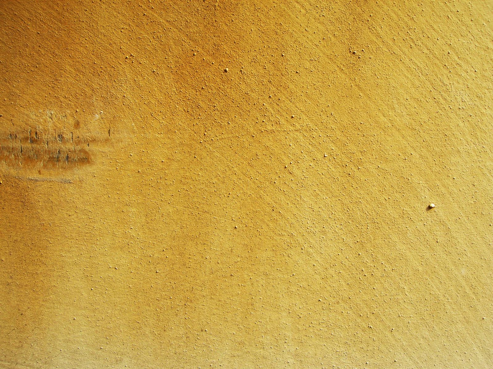
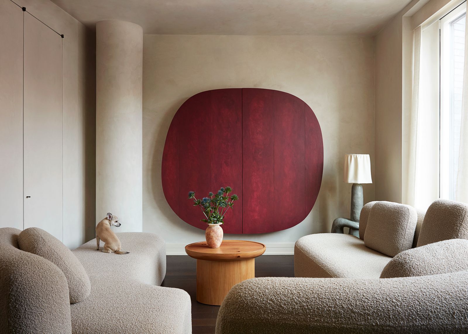
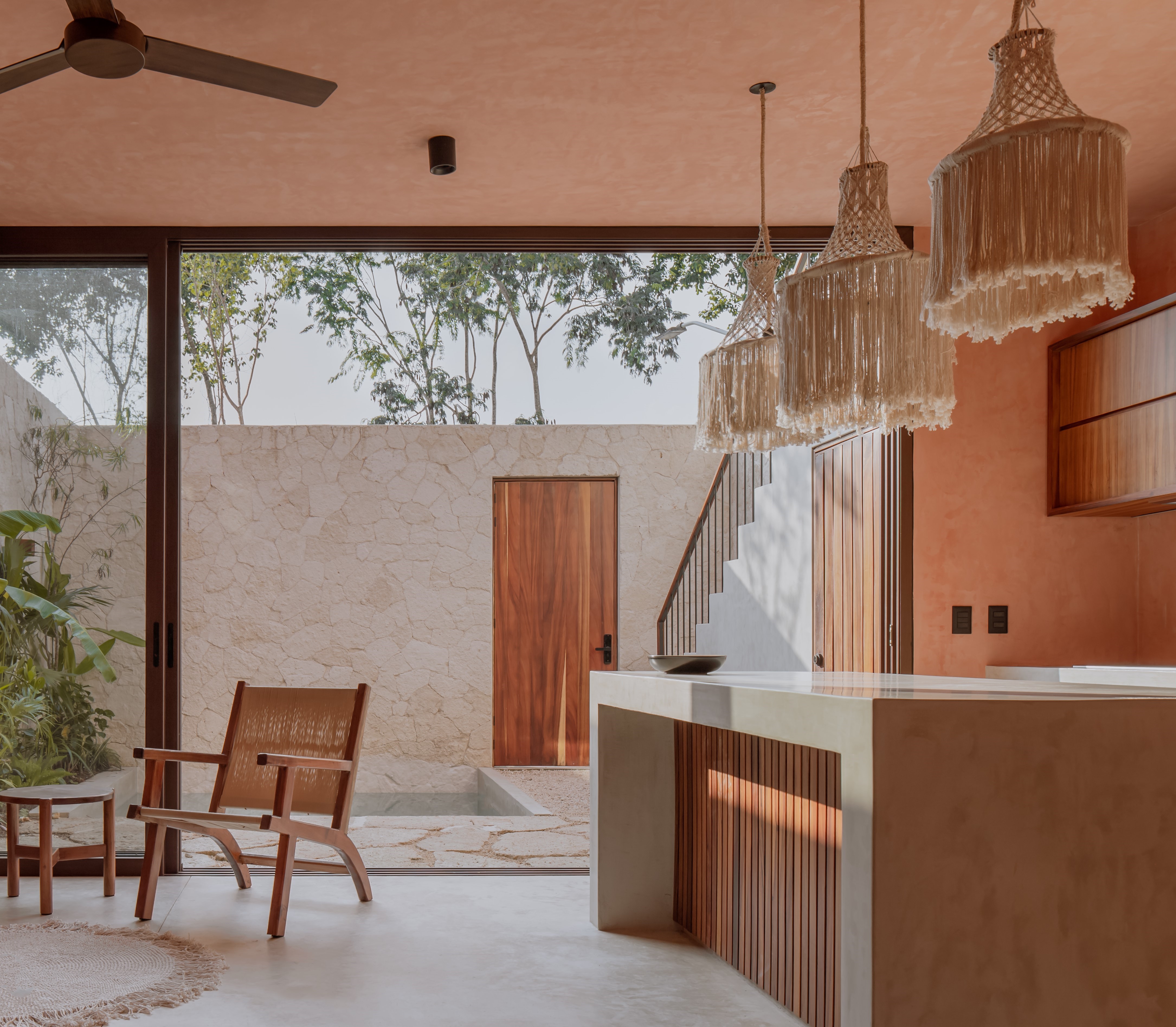
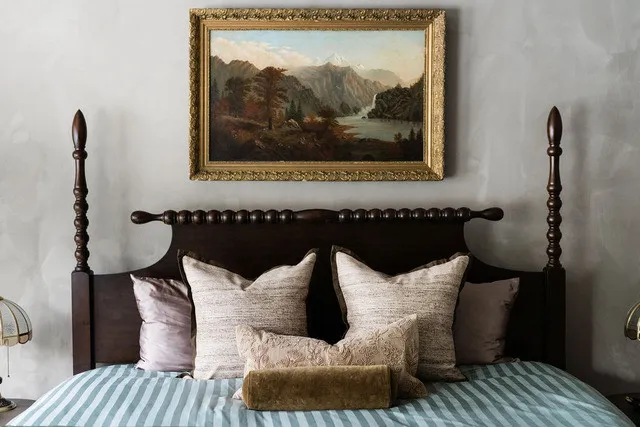
Limewash, a wall finish with historical roots, is experiencing a resurgence in popularity for its ability to impart a natural, aged patina to interiors. This technique adds depth and richness, transforming even minimalist rooms with a nuanced, luxurious feel. It is frequently employed in spaces aiming for an Old World aesthetic, and it can also elevate neutral colors by giving them more presence and character.
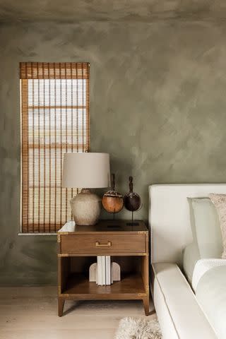
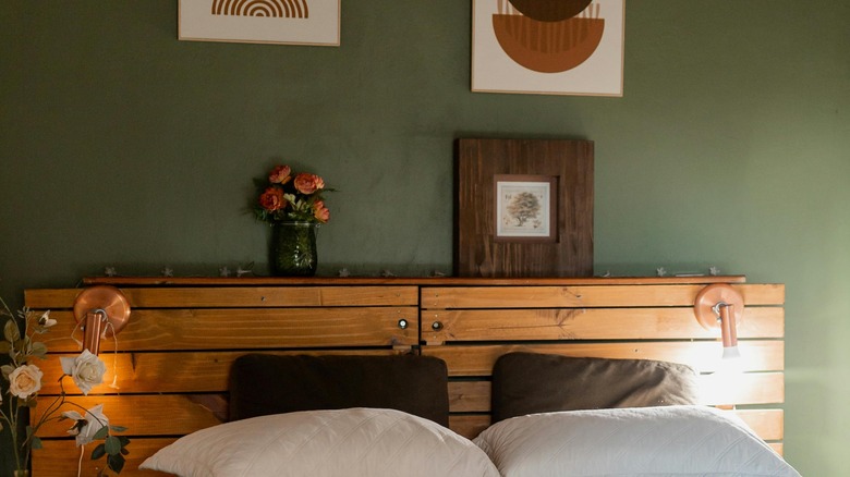
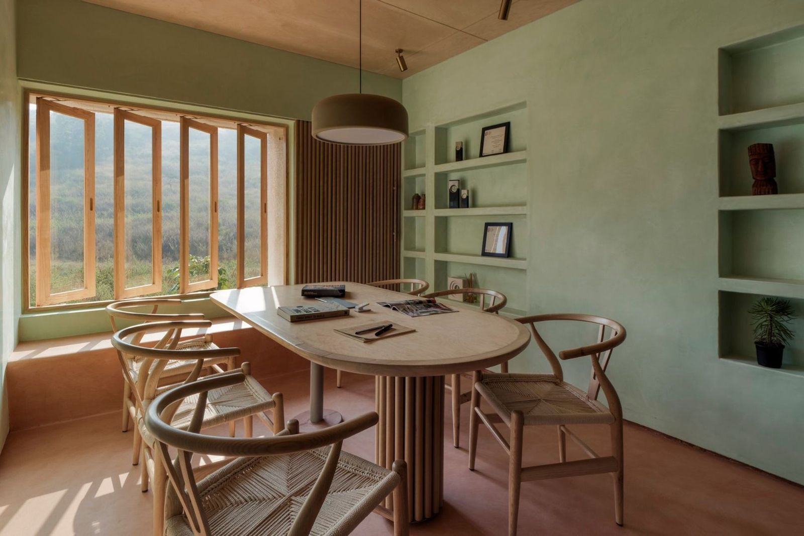
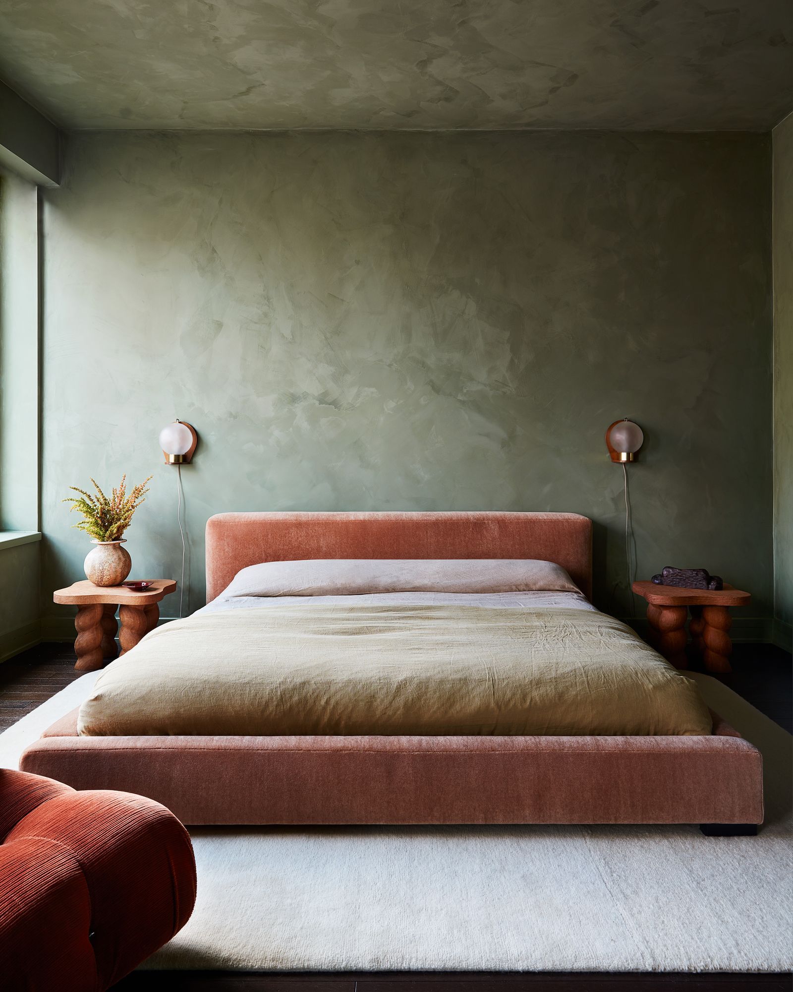
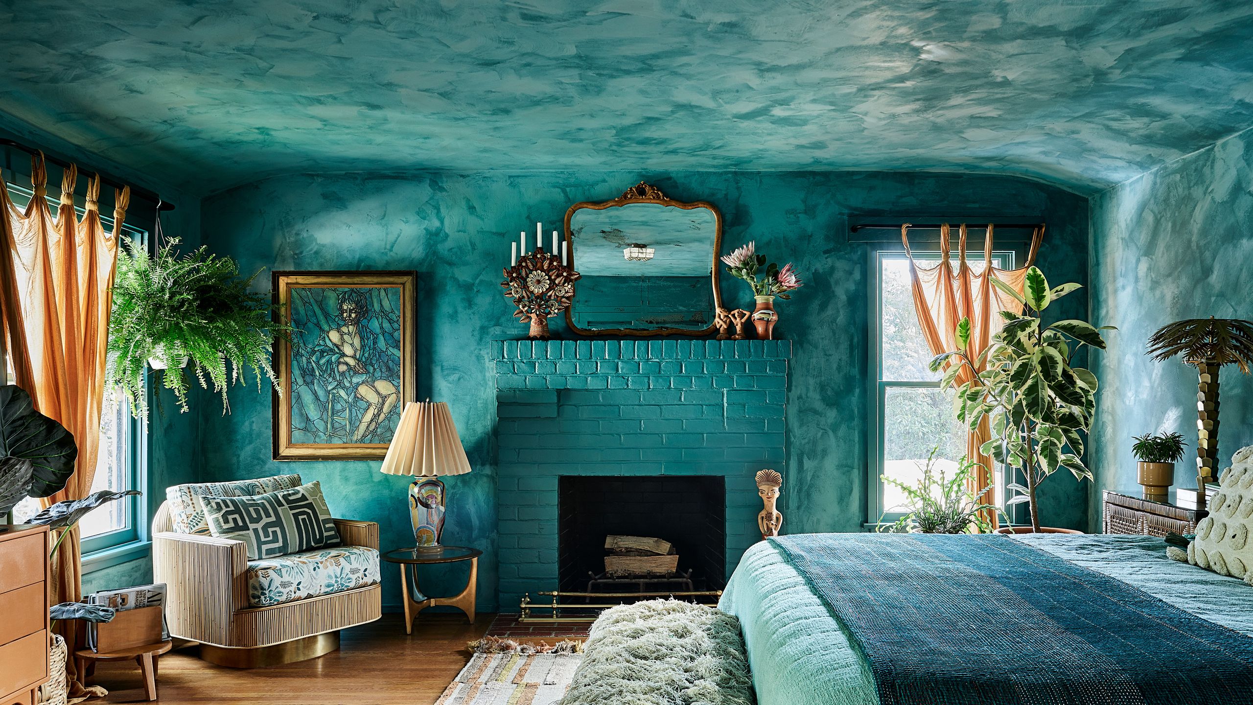
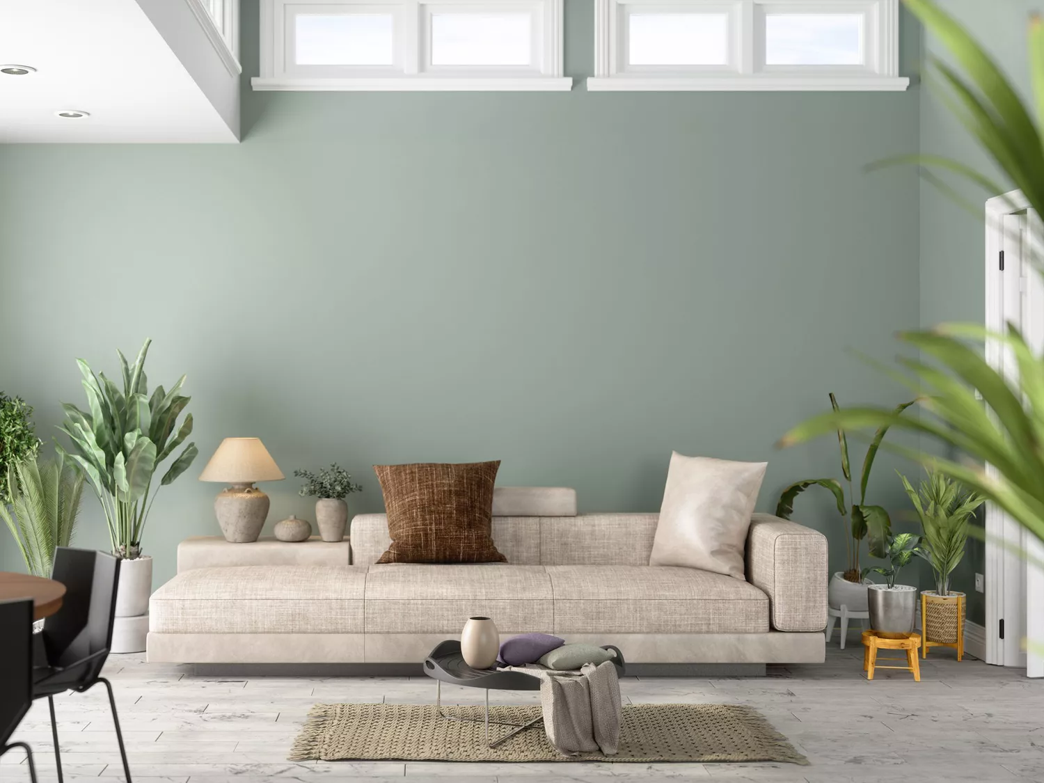
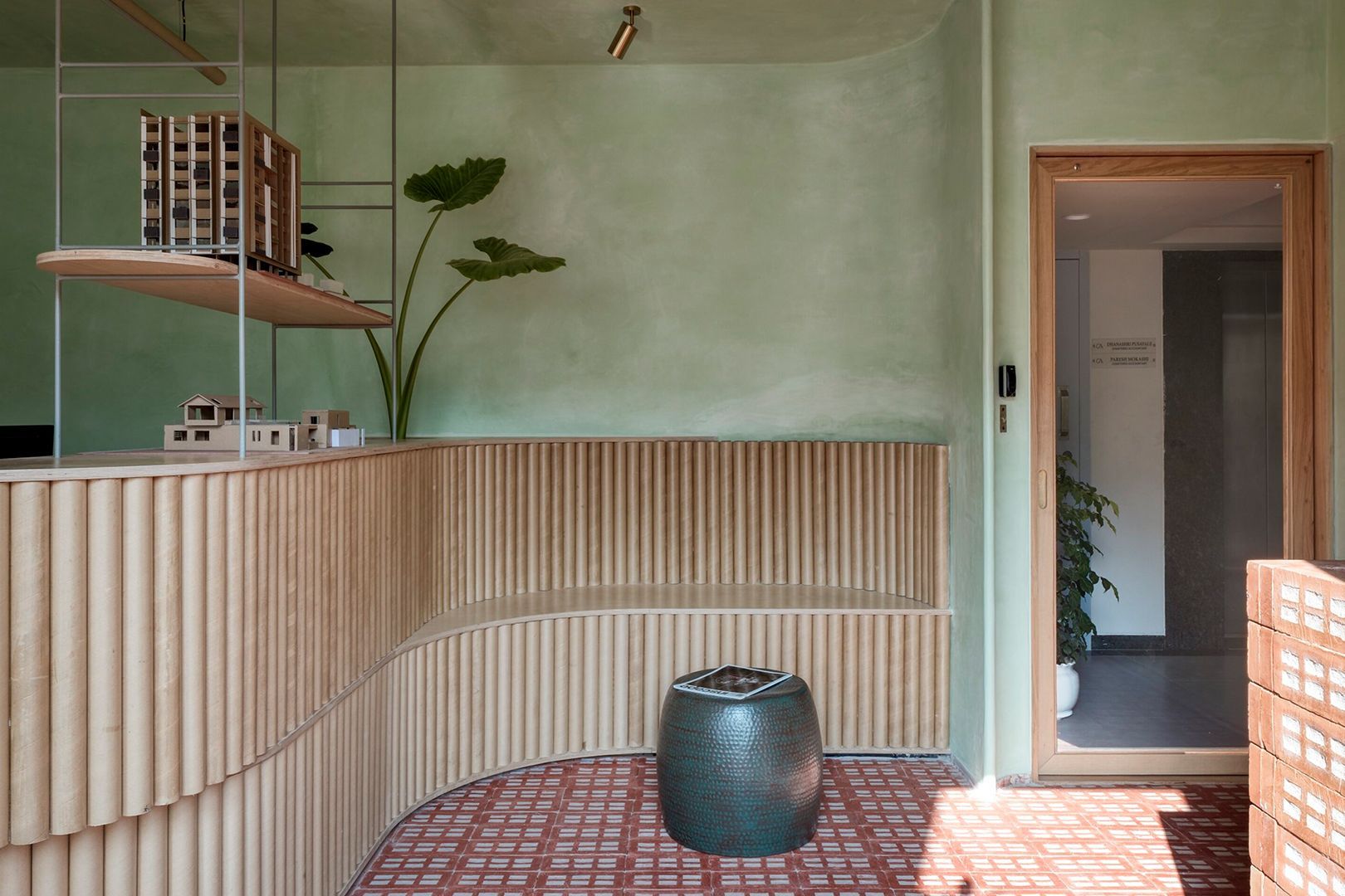
Several interior designers recommend specific limewash shades to achieve an elevated and timeless look. Erica Davis of Eralyn Interiors suggests "Seine by Color Atelier," a deep, moody green that introduces significant texture and soul. Unlike flat paints, limewash's inherent tonal variation and softness, especially in a saturated green, create an organic quality reminiscent of nature. The dynamic nature of this color means its appearance shifts throughout the day with natural light.
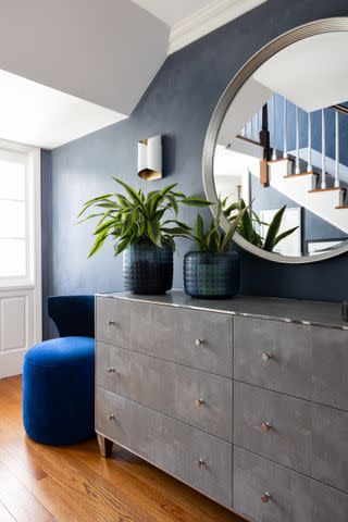
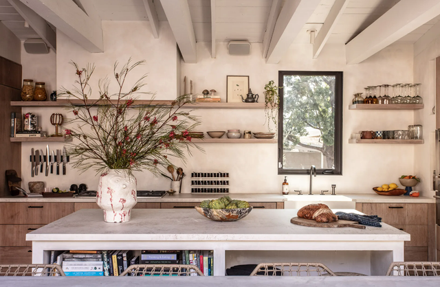
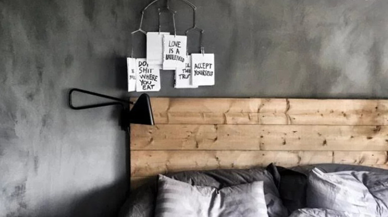
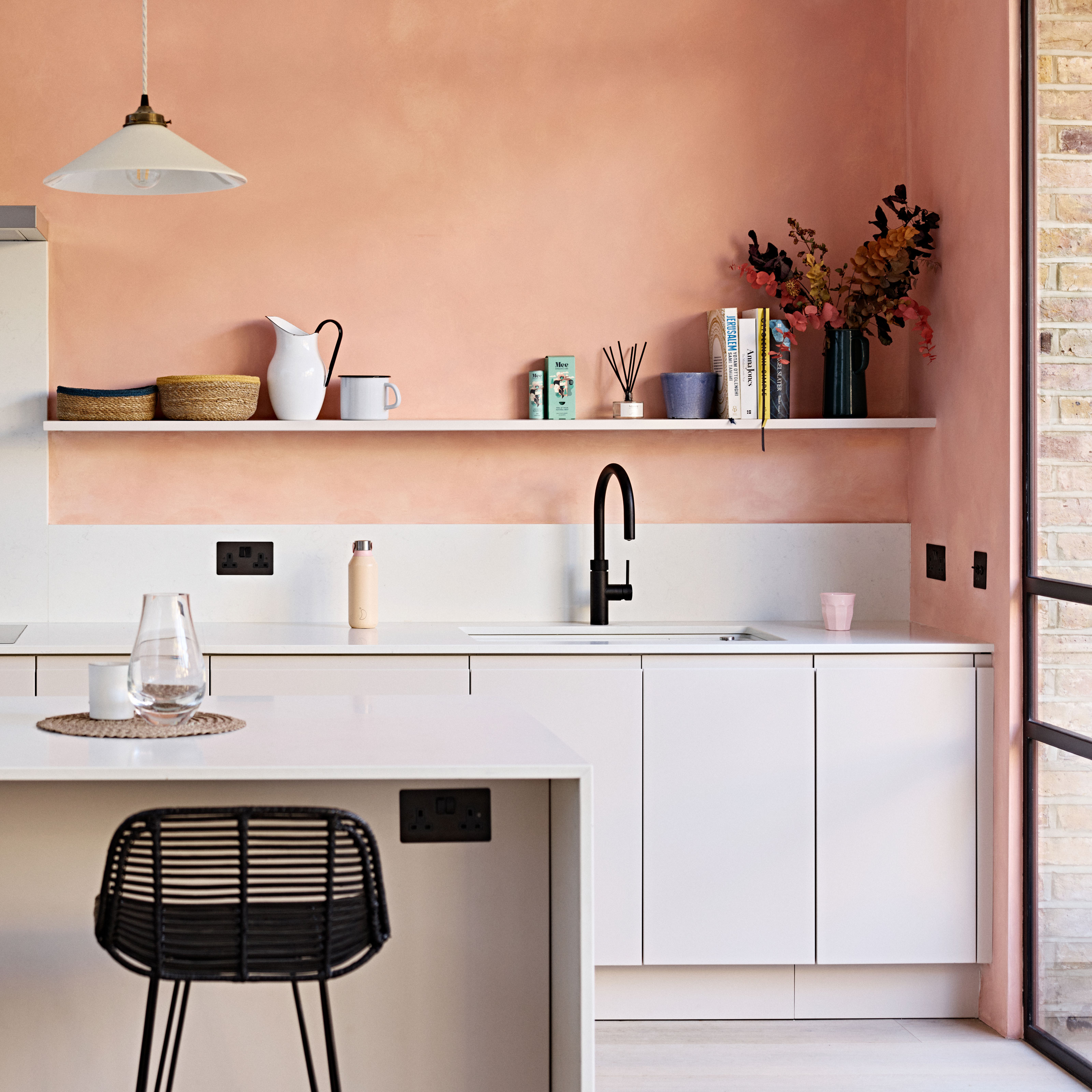
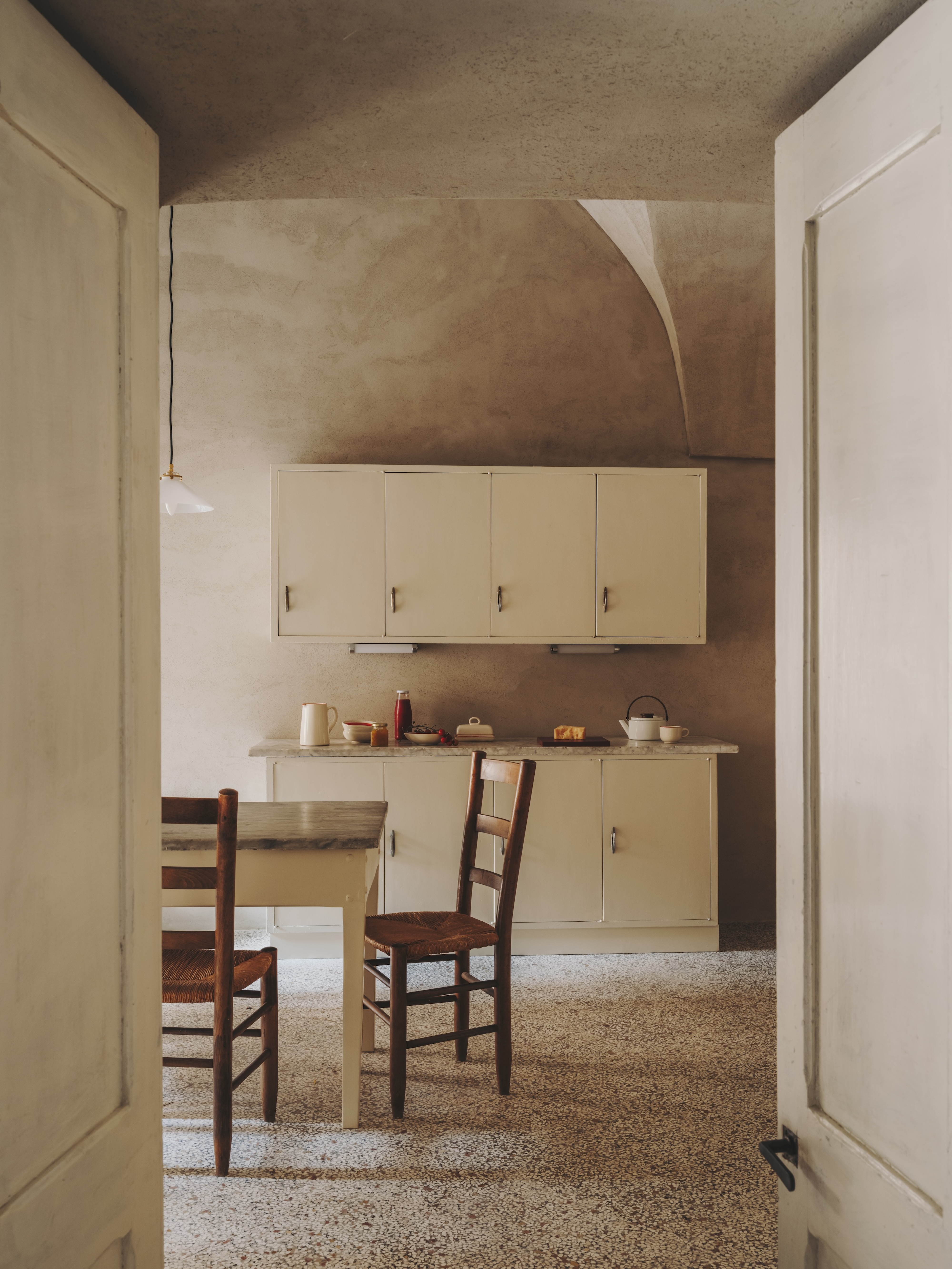
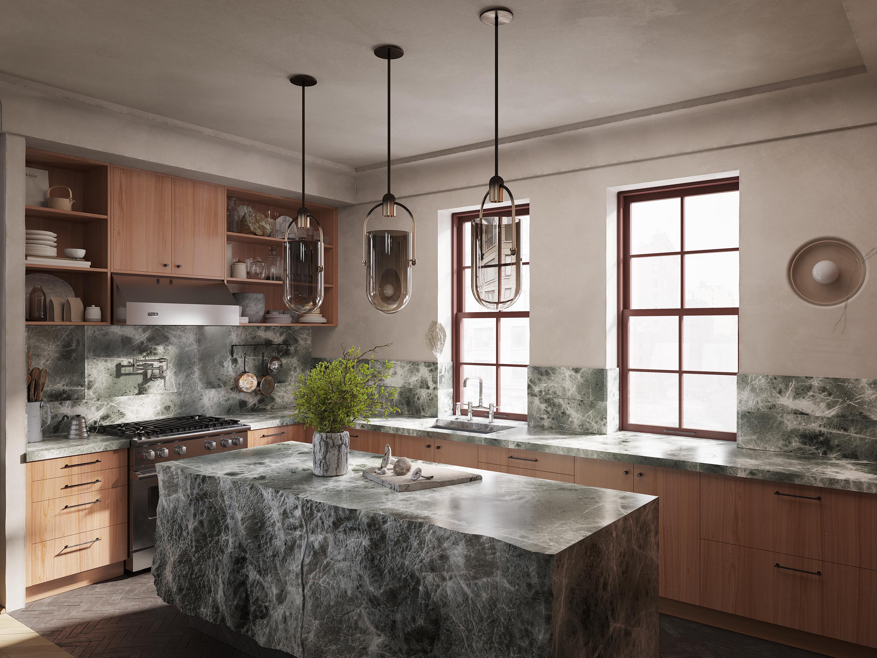
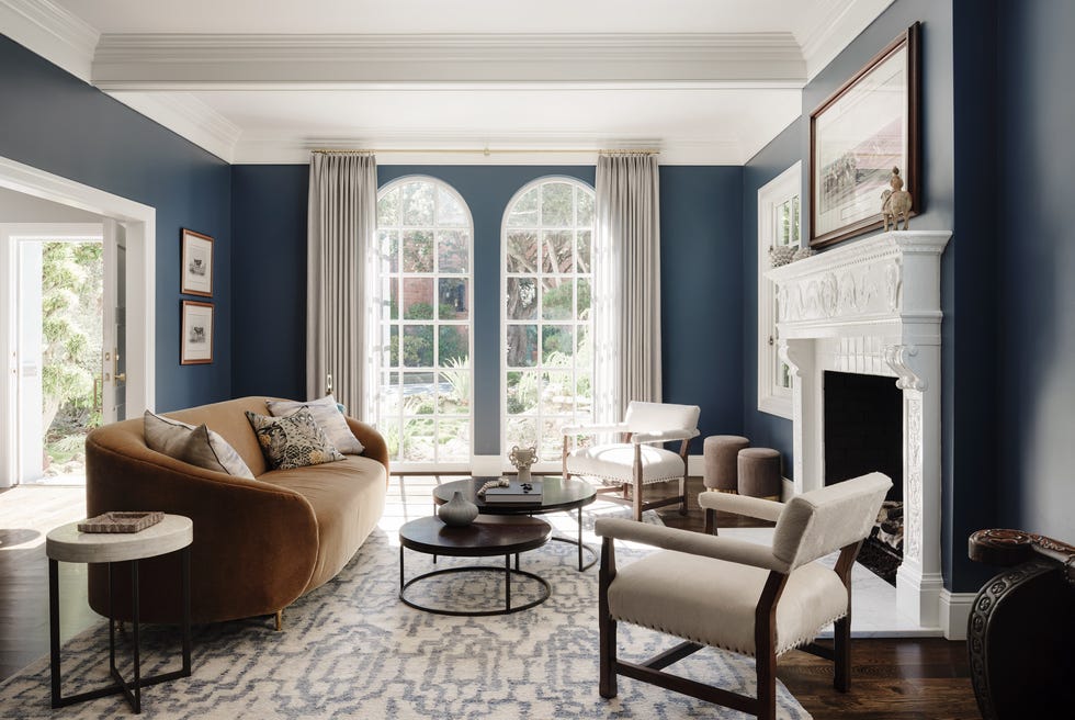
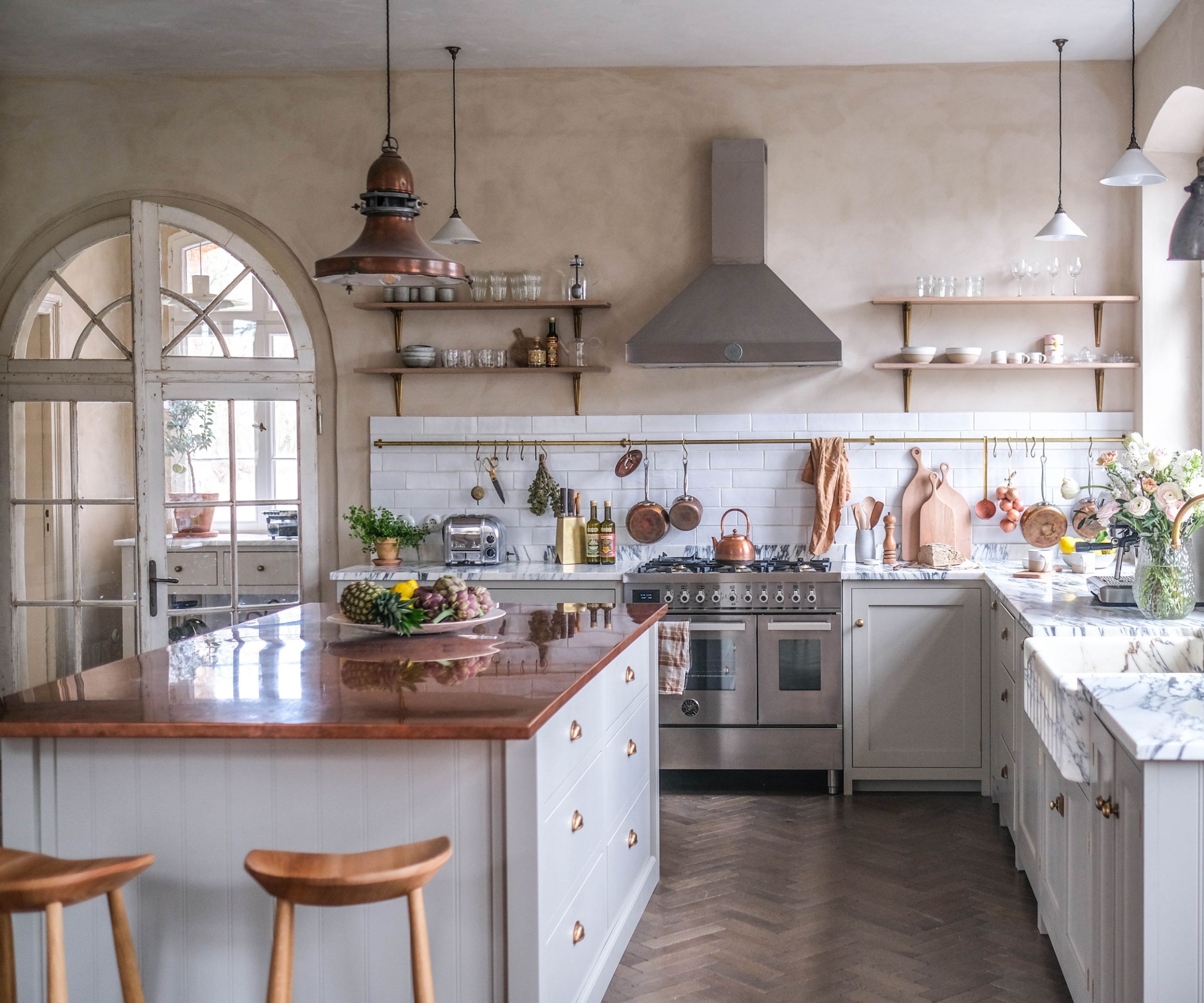
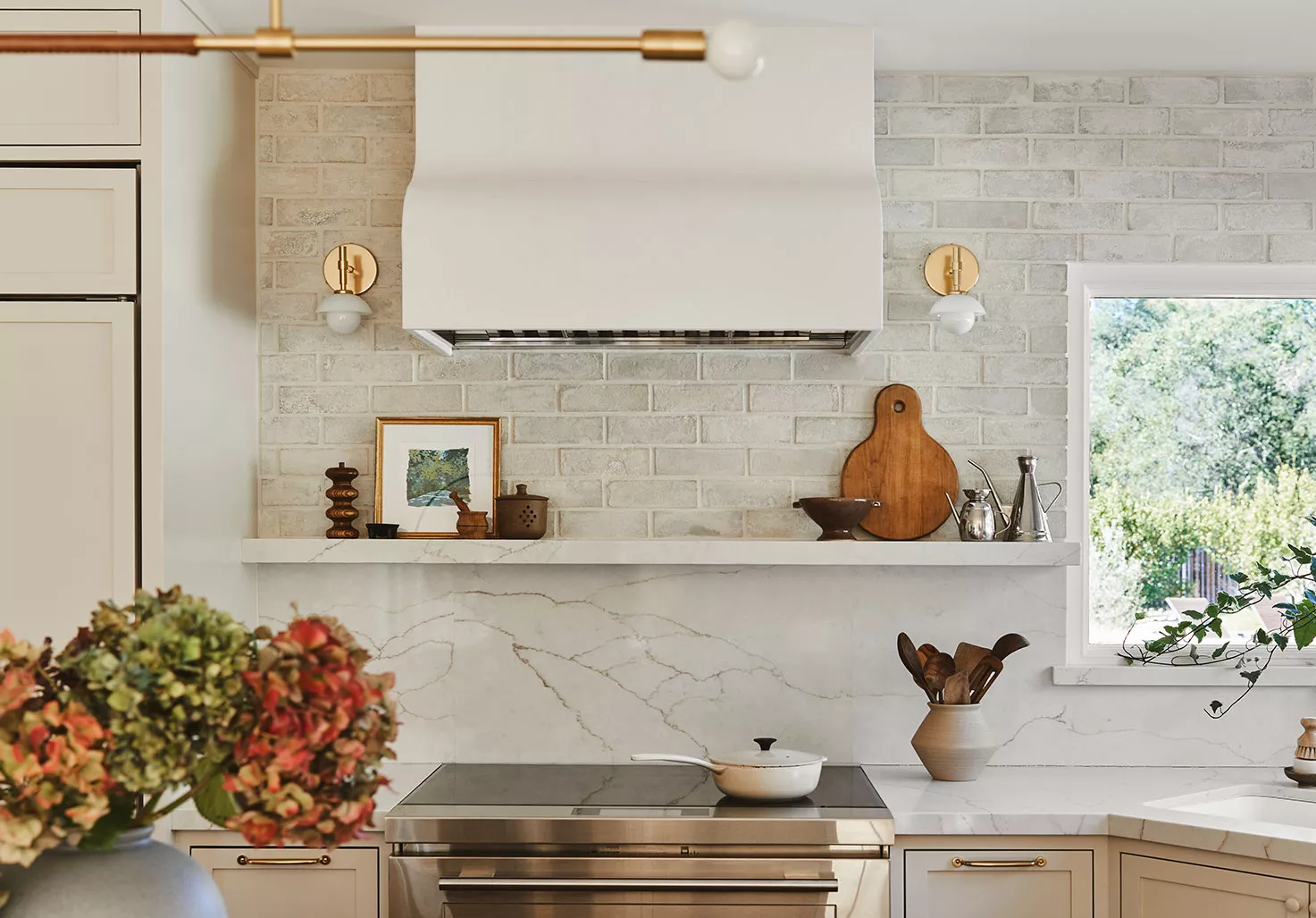
Andrea Sinkin, an interior designer, highlights the versatility of limewash beyond light and neutral tones, noting its effectiveness in darker hues. She points out the durability of limewash, making it suitable for high-traffic areas such as hallways and staircases. Sinkin utilized "Jay by Portola Paints" in a hallway to establish a moody ambiance. Summer Jensen, CEO and principal designer at Hawk & Co, recommends "Mineral Stain 101 by JH Wall Paints" for its capacity to instill a serene, zen-like atmosphere, exemplified in a warm, cozy kitchen with floating wood shelves. Jensen also mentions "Mineral Stain 103 by JH Wall Paints" for living rooms, praising its calming and organic palette that creates depth and tranquility throughout a home.
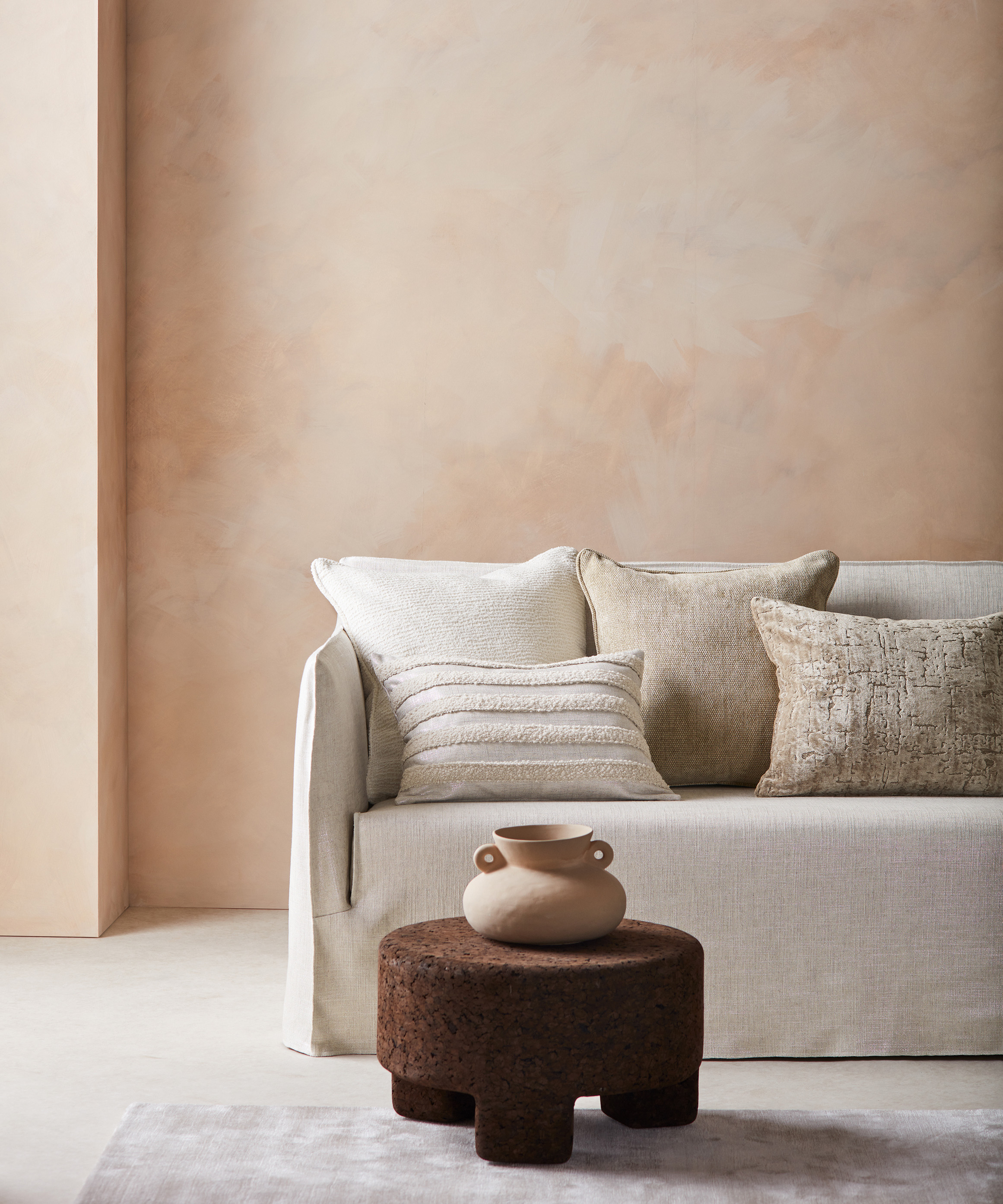
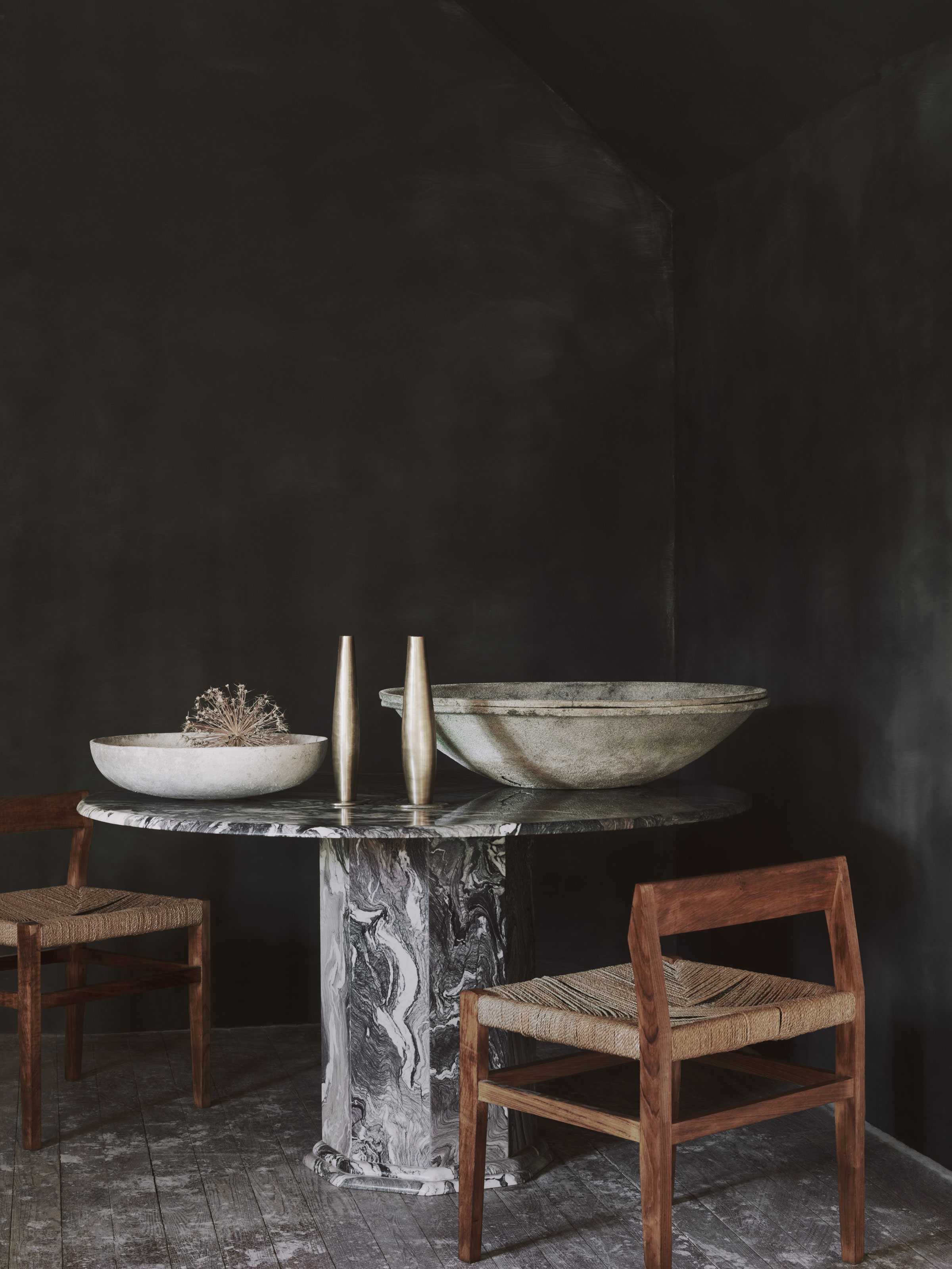
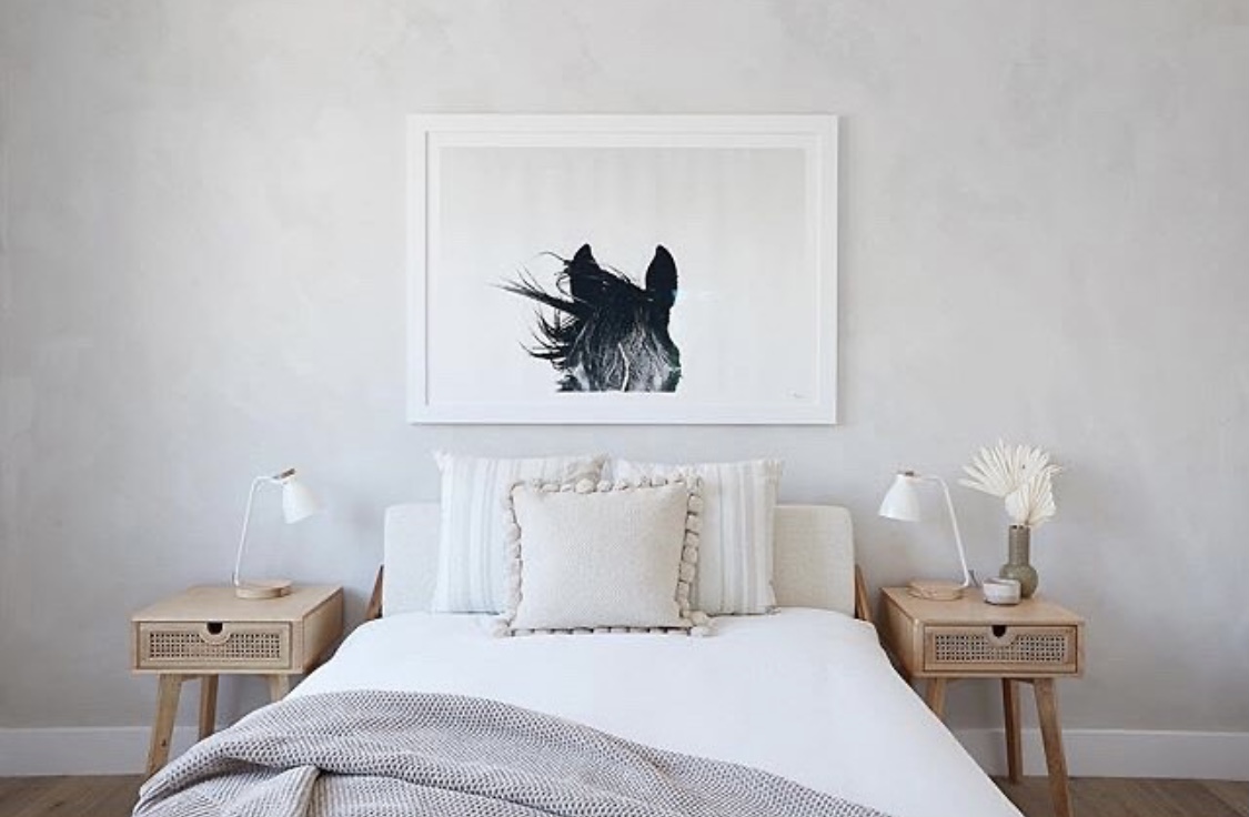
Limewash is not restricted to walls. Lucas / Eilers Design Associates L.L.P. incorporated a marine-inspired, blue-green limewash on a ceiling to complement seafaring wallpaper. Sarah Eilers, co-founder of the firm, suggests "Fellowship by Portola Paints" as an alternative for a similar muted, oceanic hue that offers tranquility. Laura Williams, founder of Living Oak Interior Design, uses "Dry Ground by Portola Paints," a warm gray, to add sophistication and individuality to otherwise plain white walls, giving them a sense of history and presence without being overly dark or overwhelming. Kara Childress Interior Atelier advocates for "Drift by Sydney Harbour," a soft greige, for its ability to add warmth, softness, and subtle dimension, making it suitable for bedrooms or hallways and easily paired with various decor styles. Finally, Sarah Latham, owner of L Interiors, recommends "Darkside by Portola Paints" for its smoky and dynamic effect, especially in bathrooms. The natural movement of limewash allows for dark colors without appearing flat, making it a durable and attractive option for areas requiring depth and texture.
#LimewashPaint #InteriorDesign #HomeDecor #PaintColors #WallFinish #TimelessStyle #OldWorldElegance #HomeRenovation #DesignerTips #LimewashPaint #InteriorDesign #HomeDecor #PaintColors #WallFinish #TimelessStyle #OldWorldElegance #HomeRenovation #DesignerTips
0 comment in total
 No comments yet
You may also like
8 Limewash Paint Colors That Will Add Elegance and Style to Your Home
Designers Reveal the Best Lime Green Paint Colors for a Lively Home

What Is Limewash Paint: Four Places to Use It in Your Home

8 Calming Paint Colors Designers Use to Create a Warm, Welcoming Living Room

10 Limewash Wall Color Ideas That Add Old-World Elegance To Your Space
10 living rooms with limewash walls that prove that this textural wall finish is the perfect cozy-but-chic finishing touch

The 8 Best Living Room Paint Colors, According to Design Experts
Lick Paint Will Transform the Mood in Your Home Through Color Psychology

The Allure of Limewash Paint
Rediscover Limewash Paint, the Old-World Finish That's Trending Again


10 Timeless Living Room Paint Colors Designers Swear By

8 Favorite Paint Colors of Local Interior Designers

8 Limewash Paint Colors That Will Add Elegance and Style to Your Home

4 Creative Ways To Use Limewash Paint To Transform Your Home

Limewash paint ideas – 10 ways to use this trending wall finish to bring texture to your home
The biggest paint trends of 2025 – 17 stylish ways to decorate with paint, according to designers


11 Paint Colors That INSTANTLY Make Your Home Look "Expensive," According to Designers
What is limewash paint: Four places to use it in your home

This Kitchen Trend Can Make Your Space Look Like a Charming, Tuscan Retreat — "It's Instantly Warming"
This painting technique has been trending for thousands of years