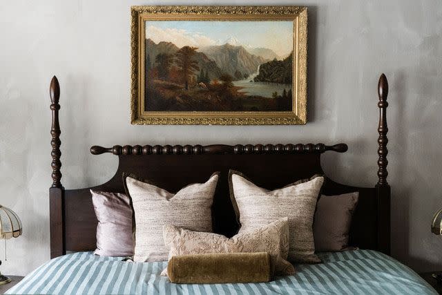
8 Limewash Paint Colors That Will Add Elegance and Style to Your Home
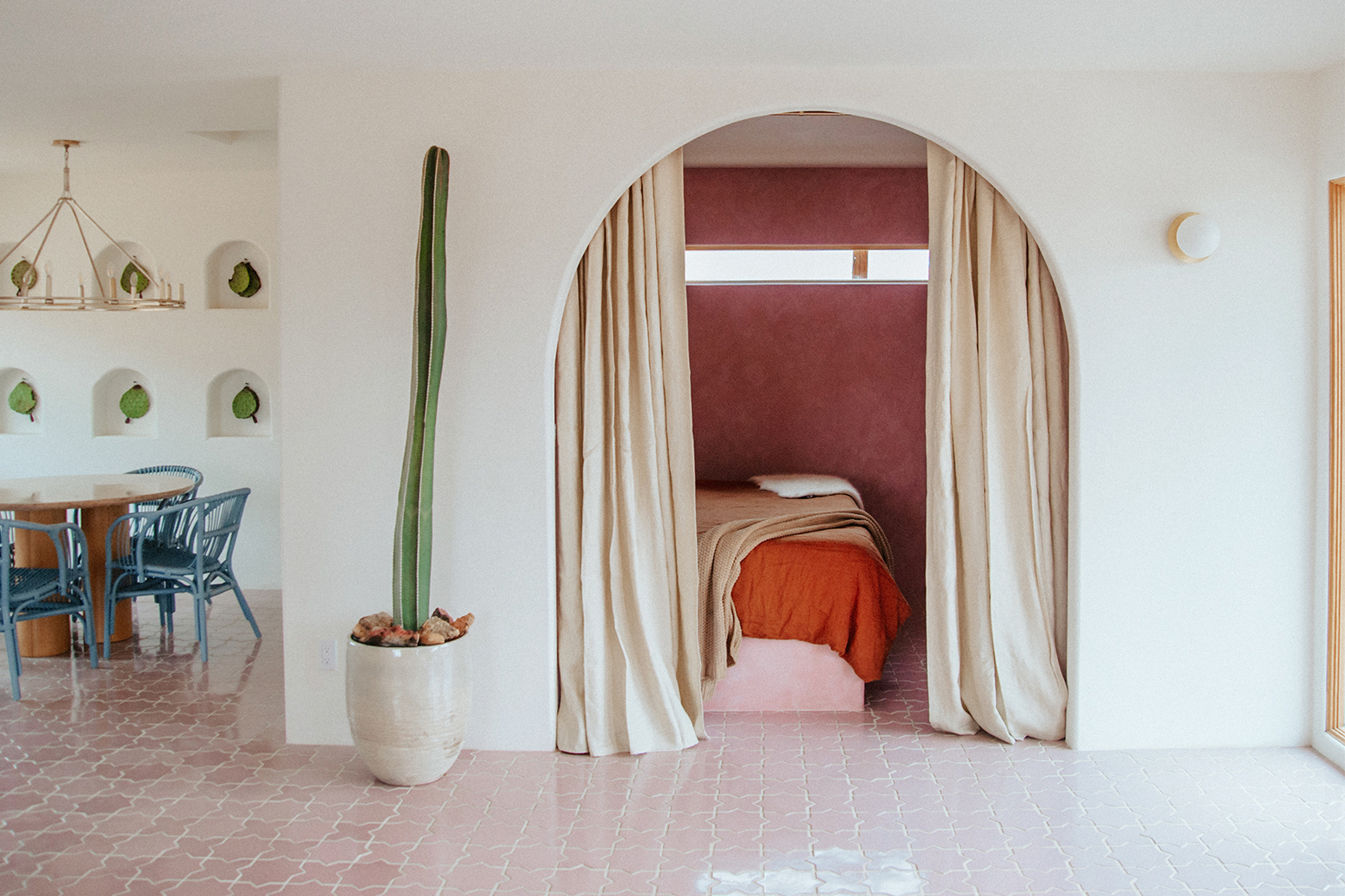
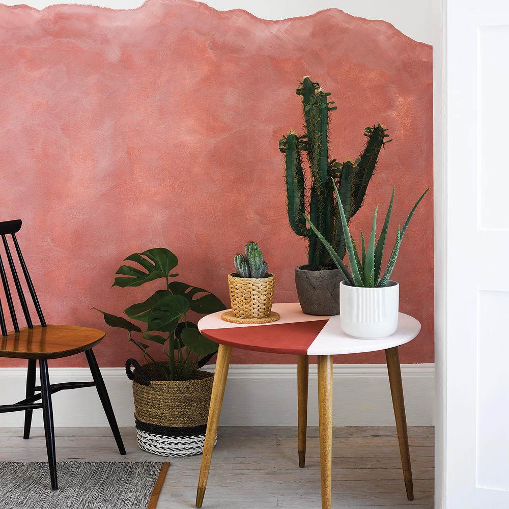
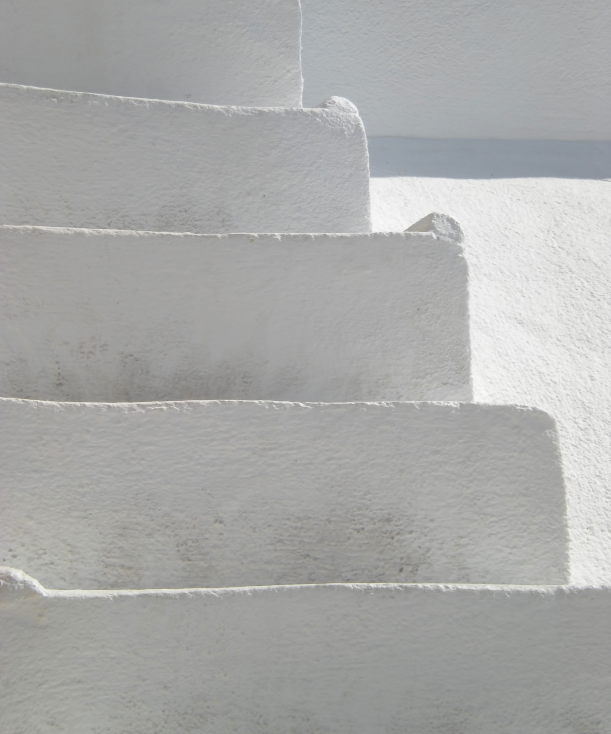
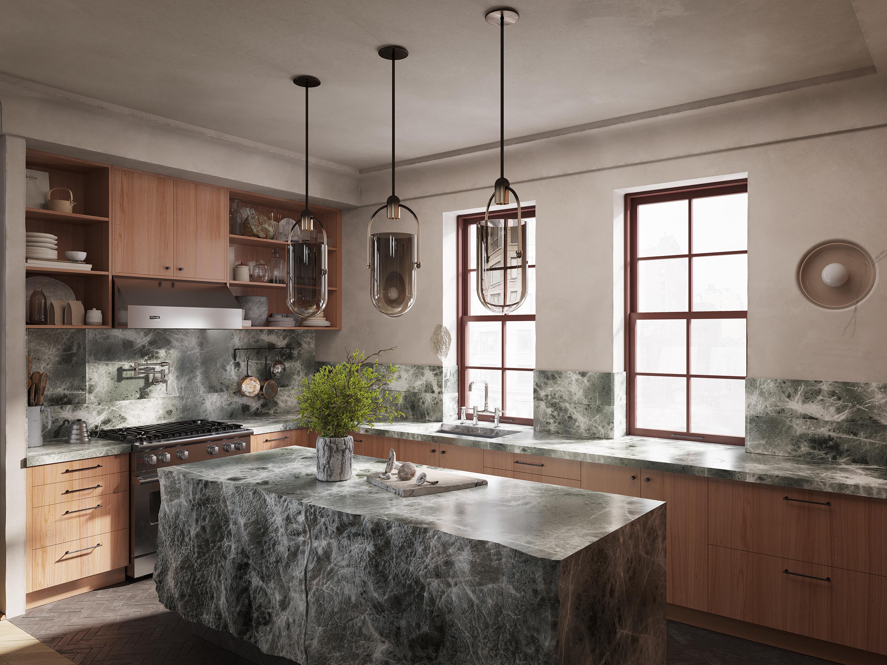
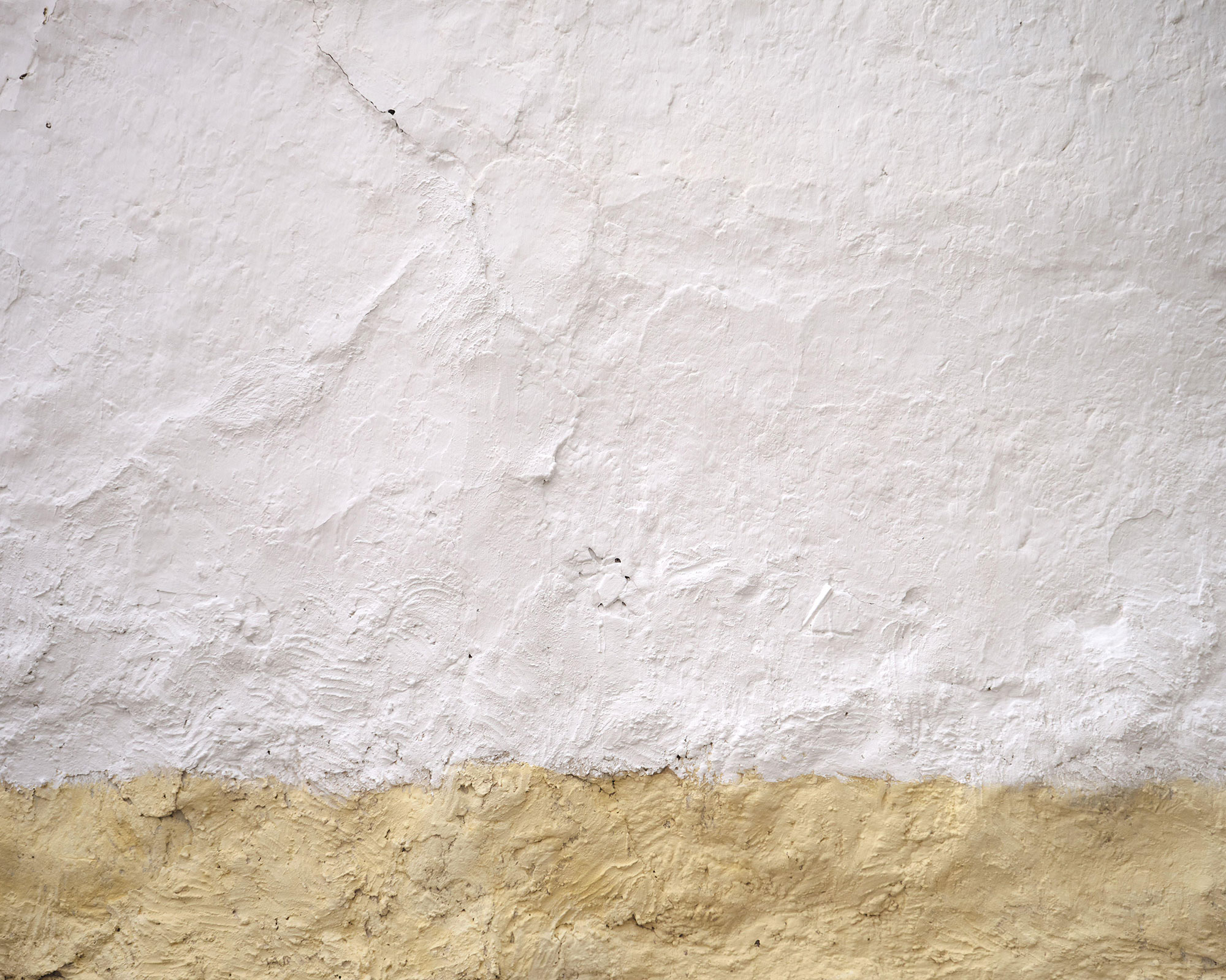
Limewash paint, a finish with a rich historical background, offers a unique way to imbue modern homes with an aged, natural patina. This technique, possibly dating back to ancient times, brings depth and richness to interior spaces, transforming even simple rooms into sophisticated environments. The characteristic texture of limewash creates a nuanced effect, making it a popular choice for achieving an Old World aesthetic or for adding visual interest to neutral color palettes. This article explores eight interior designer-approved limewash shades that can elevate a home's style with a timeless appeal.
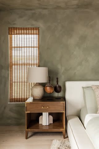
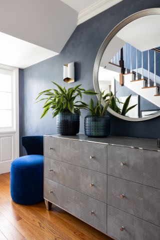
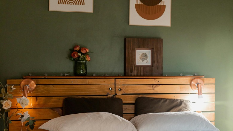
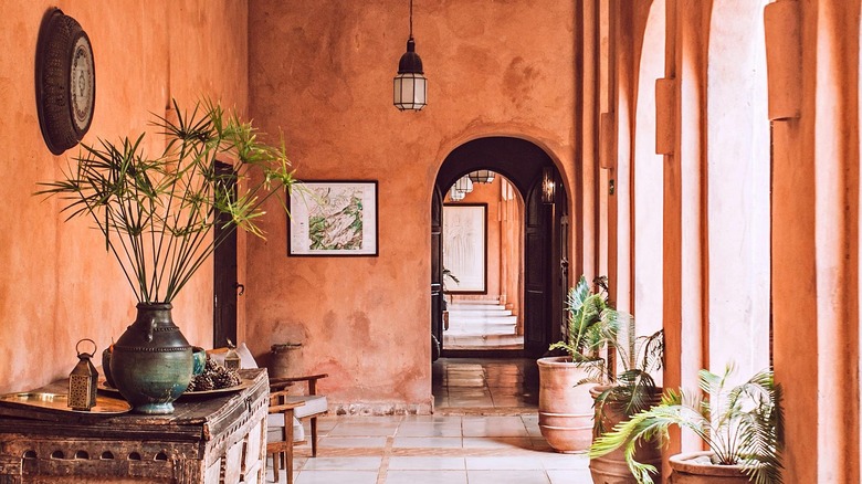
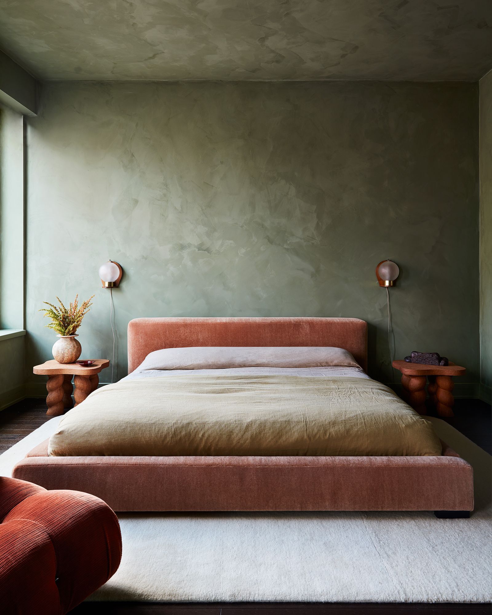
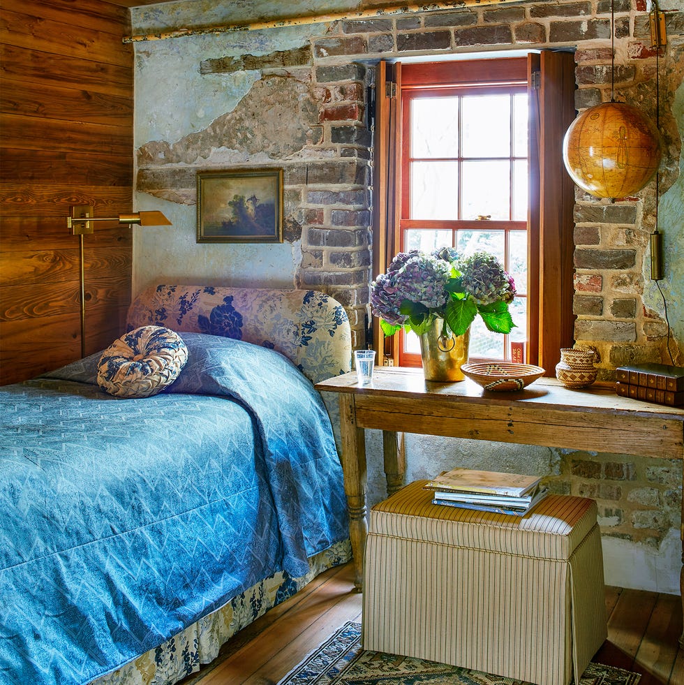
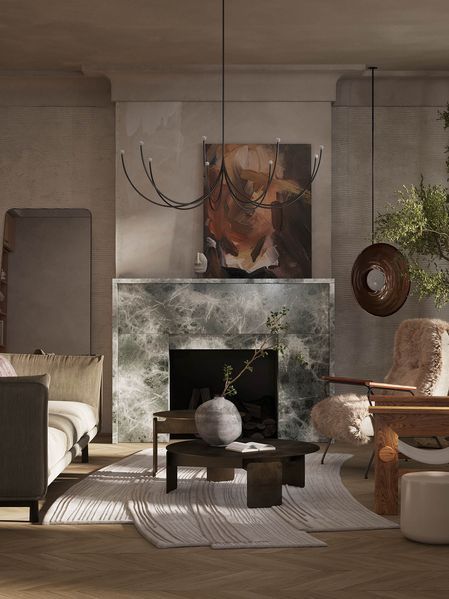
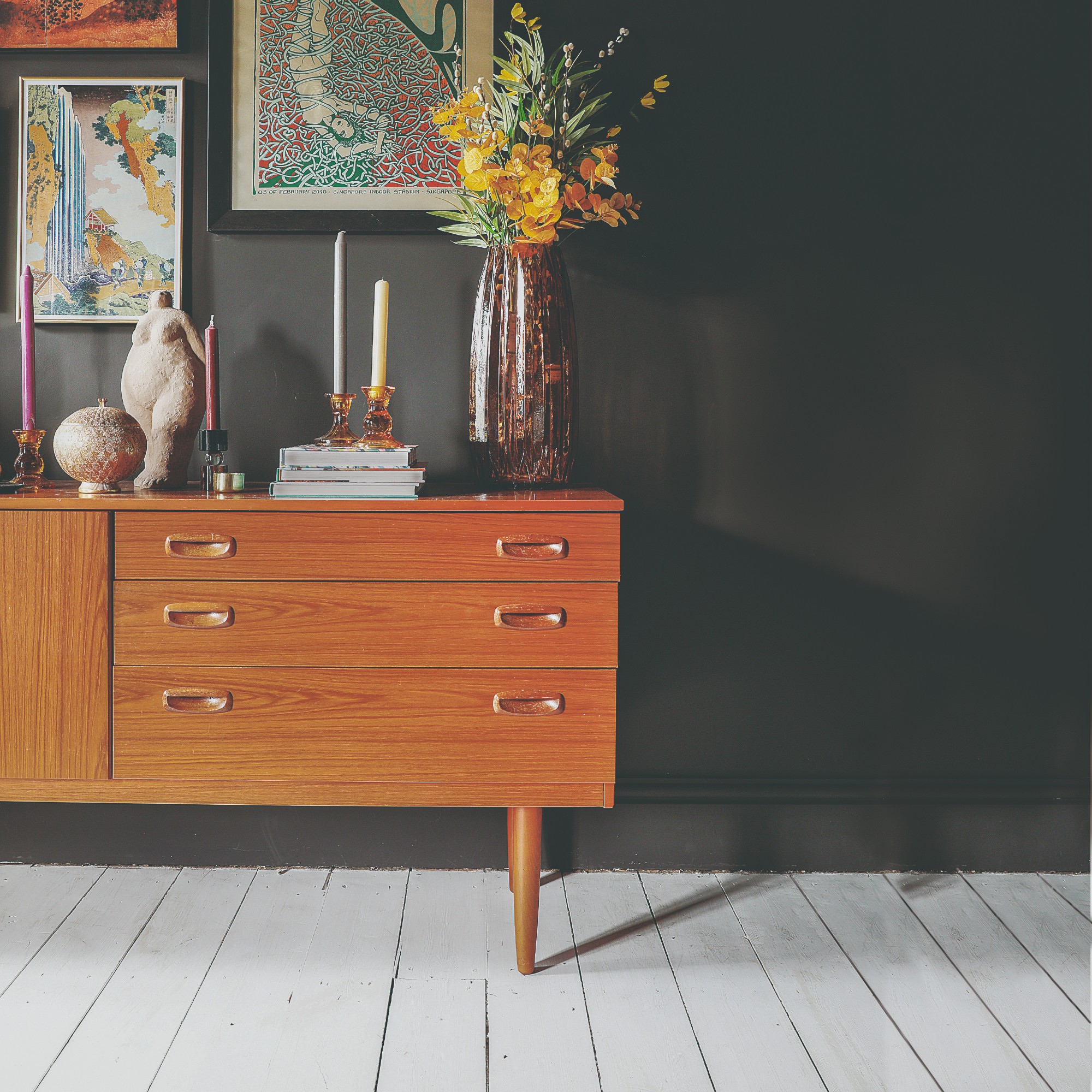
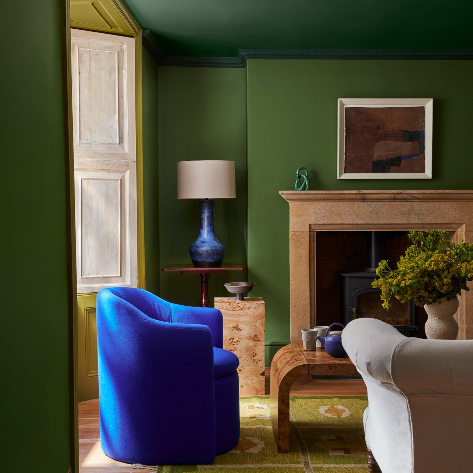
Erica Davis, founder of Eralyn Interiors, recommends 'Seine' by Color Atelier, describing it as a deep, moody green that introduces texture and soul. Unlike flat paints, limewash inherently possesses tonal variation and softness. When applied in a saturated green, it acquires an organic quality reminiscent of natural elements like moss-covered stone or a shadowy garden. This dynamic color changes throughout the day, responding to variations in natural light. For high-traffic areas, interior designer Andrea Sinkin suggests 'Jay' by Portola Paints, highlighting limewash's durability. She notes its effectiveness in hallways and staircases, particularly in homes with children and pets, demonstrating how darker limewash hues can make a significant impact in often-overlooked spaces.
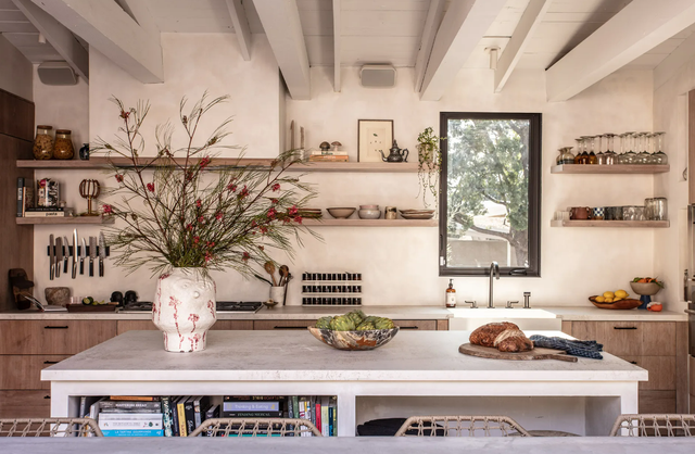
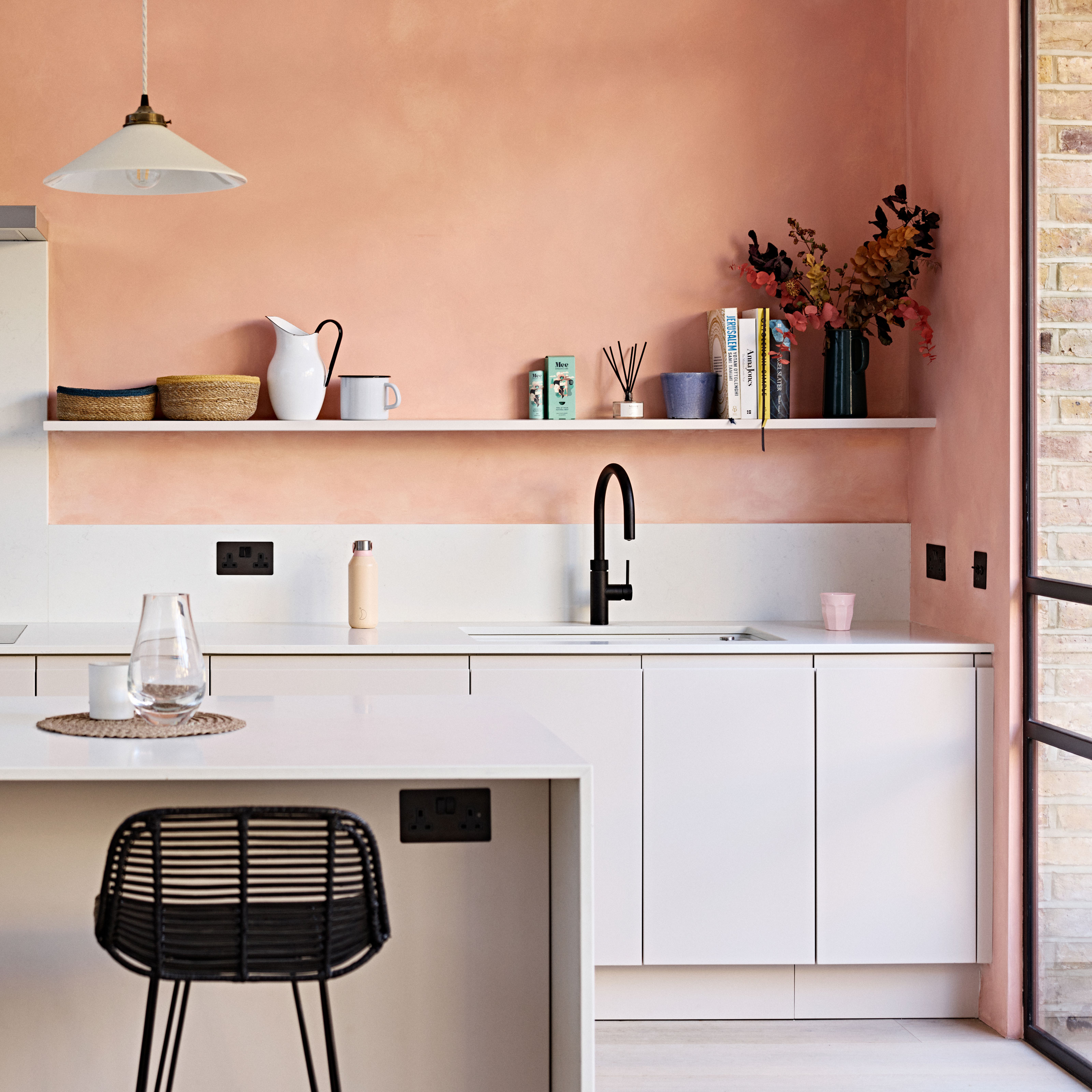
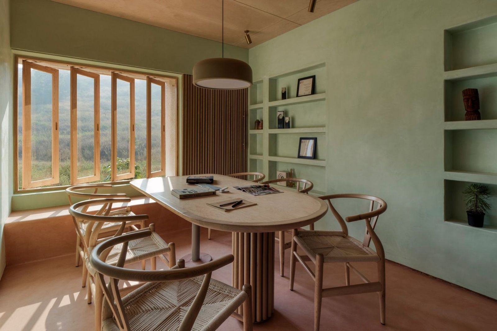
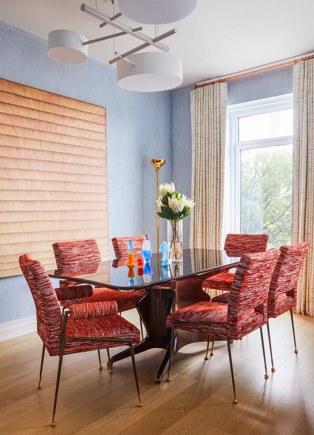
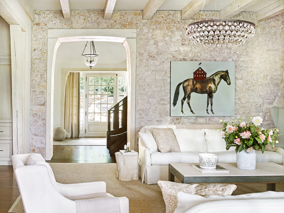
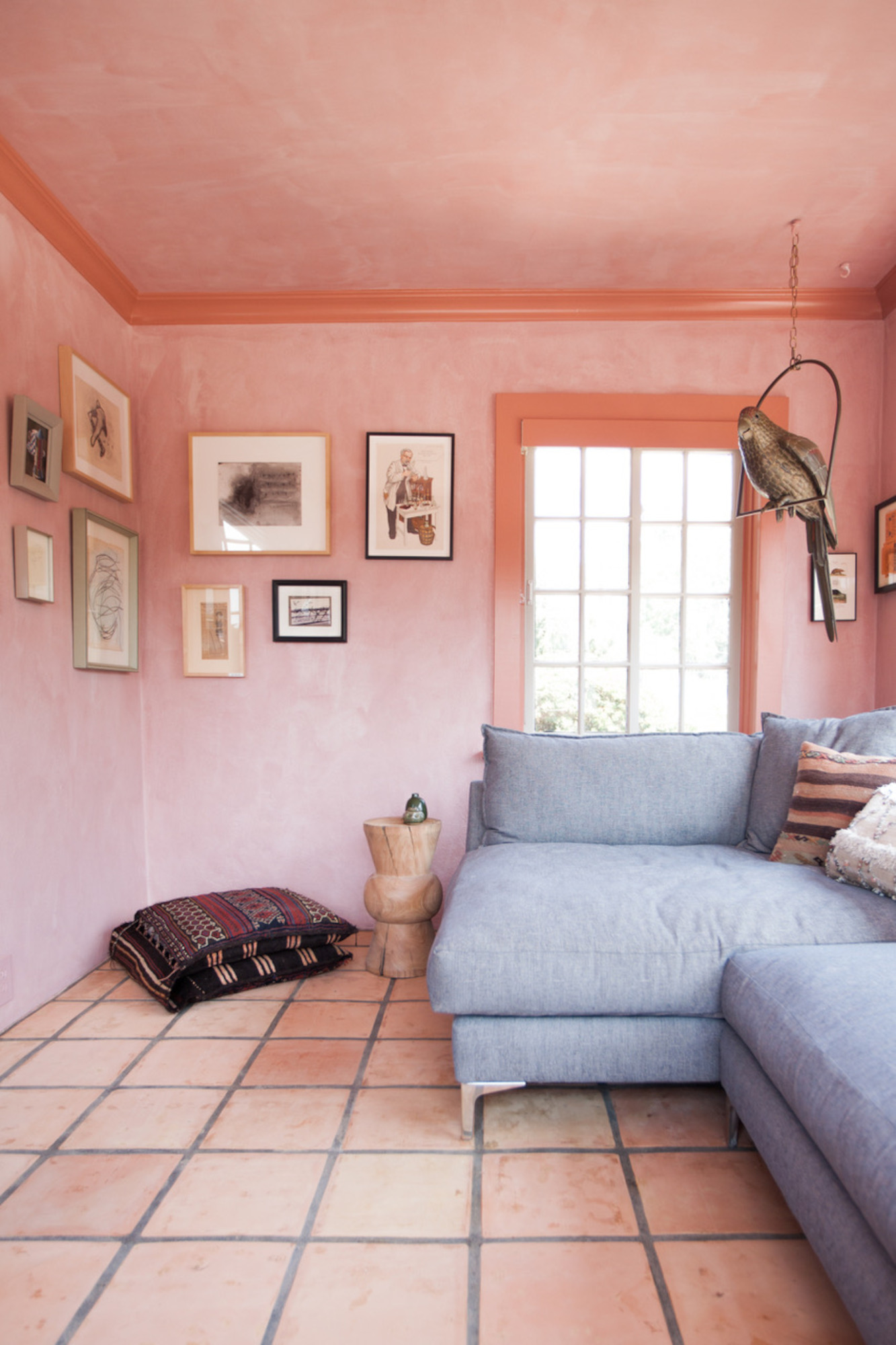
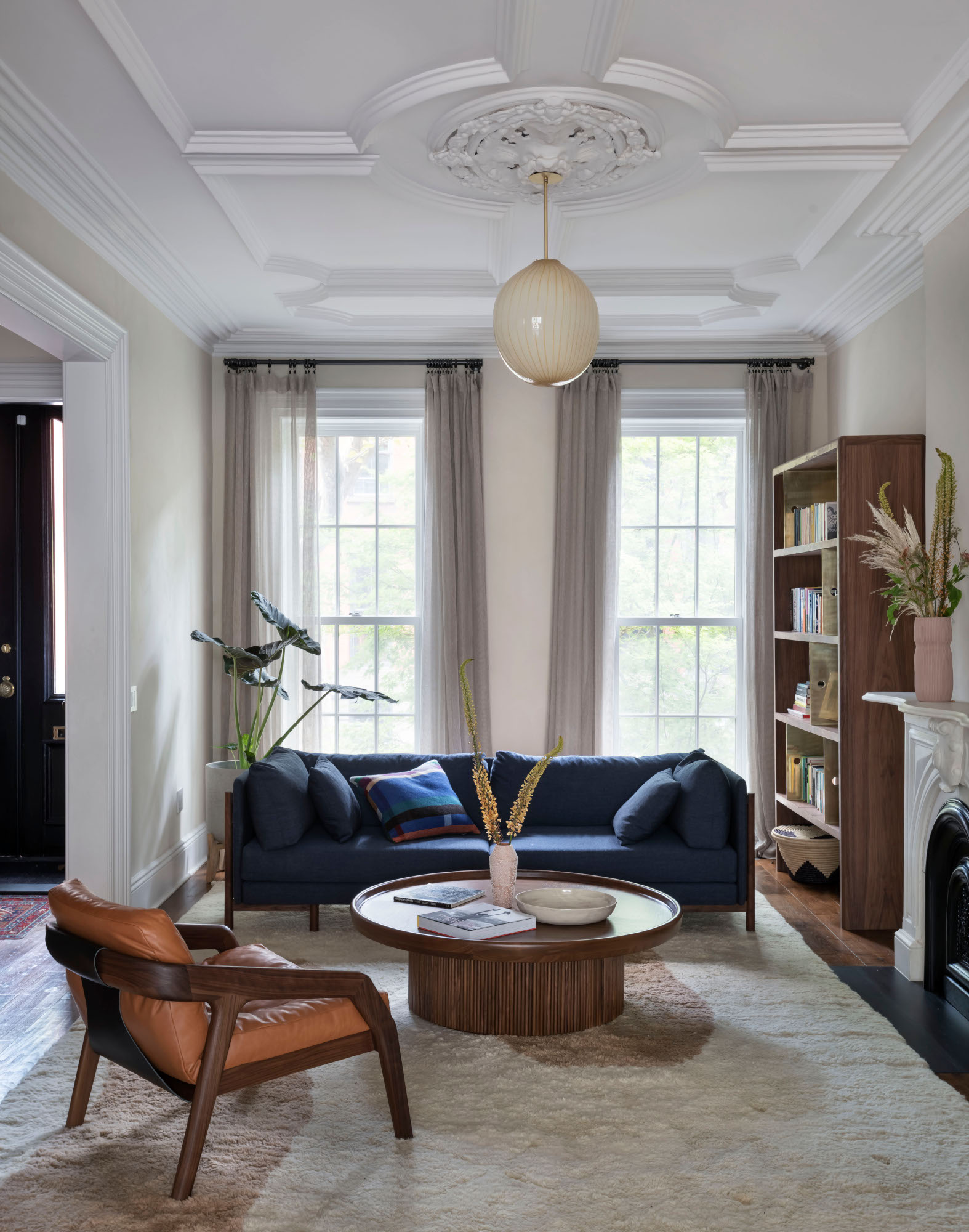
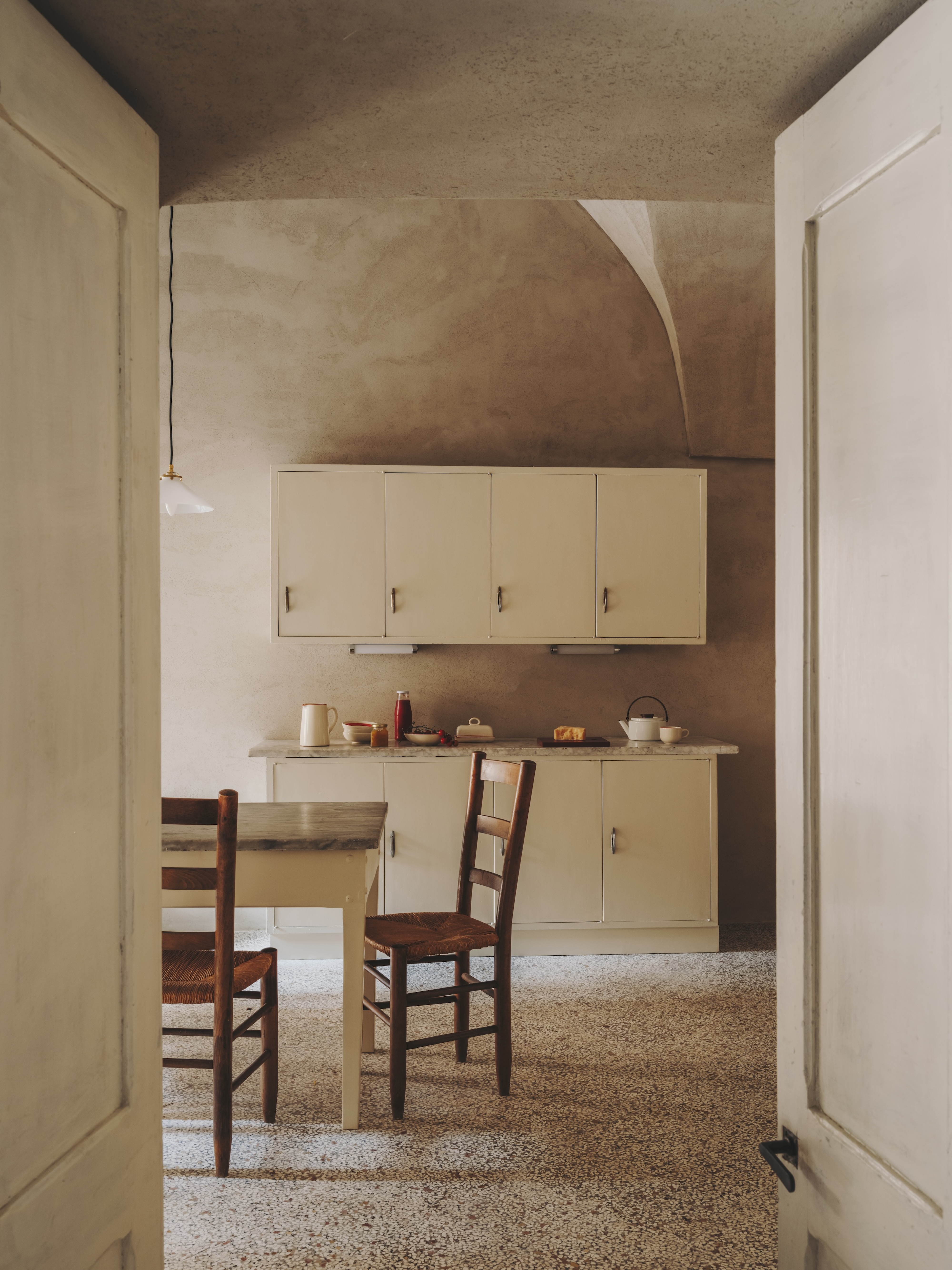
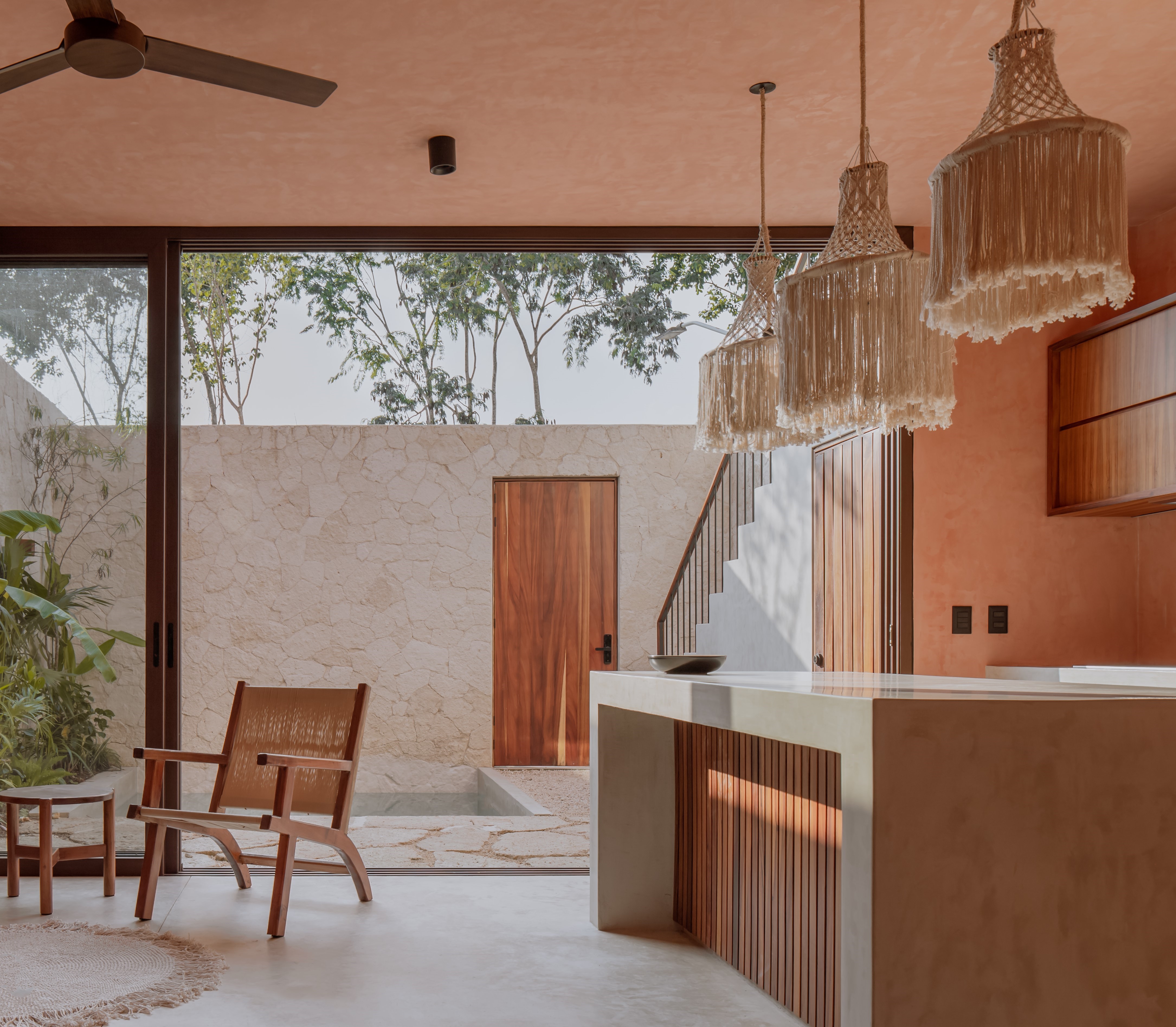
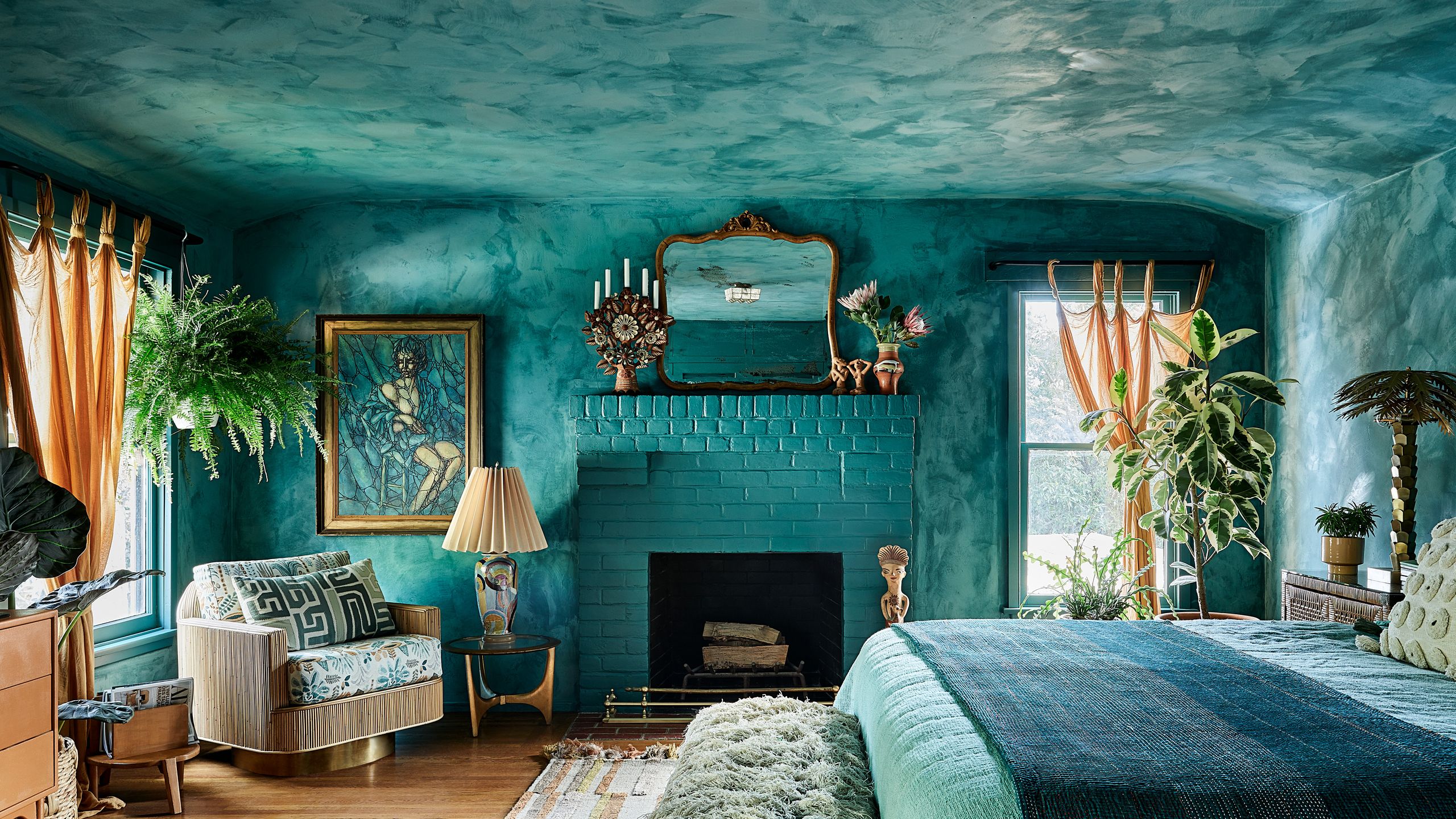
Summer Jensen, CEO and principal designer at Hawk & Co, identifies 'Mineral Stain 101' by JH Wall Paints as a color that instills a serene, zen-like atmosphere, ideal for creating a warm and cozy kitchen ambiance, evoking the charm of an Italian villa. Jensen also points to 'Mineral Stain 103' for living rooms, emphasizing its calming and organic palette that provides depth and tranquility, ensuring a seamless flow throughout the home. Limewash isn't limited to walls; Sarah Eilers, co-founder of Lucas / Eilers Design Associates L.L.P., discusses its application on ceilings. She references a custom plaster finish similar to 'Fellowship' by Portola Paints, a muted, oceanic blue-green that adds marine-inspired depth and character to a dining room, proving limewash can enhance architectural features beyond traditional wall applications.
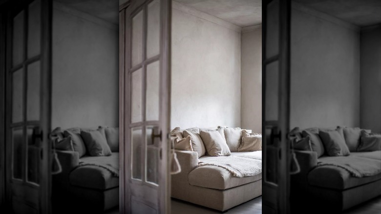
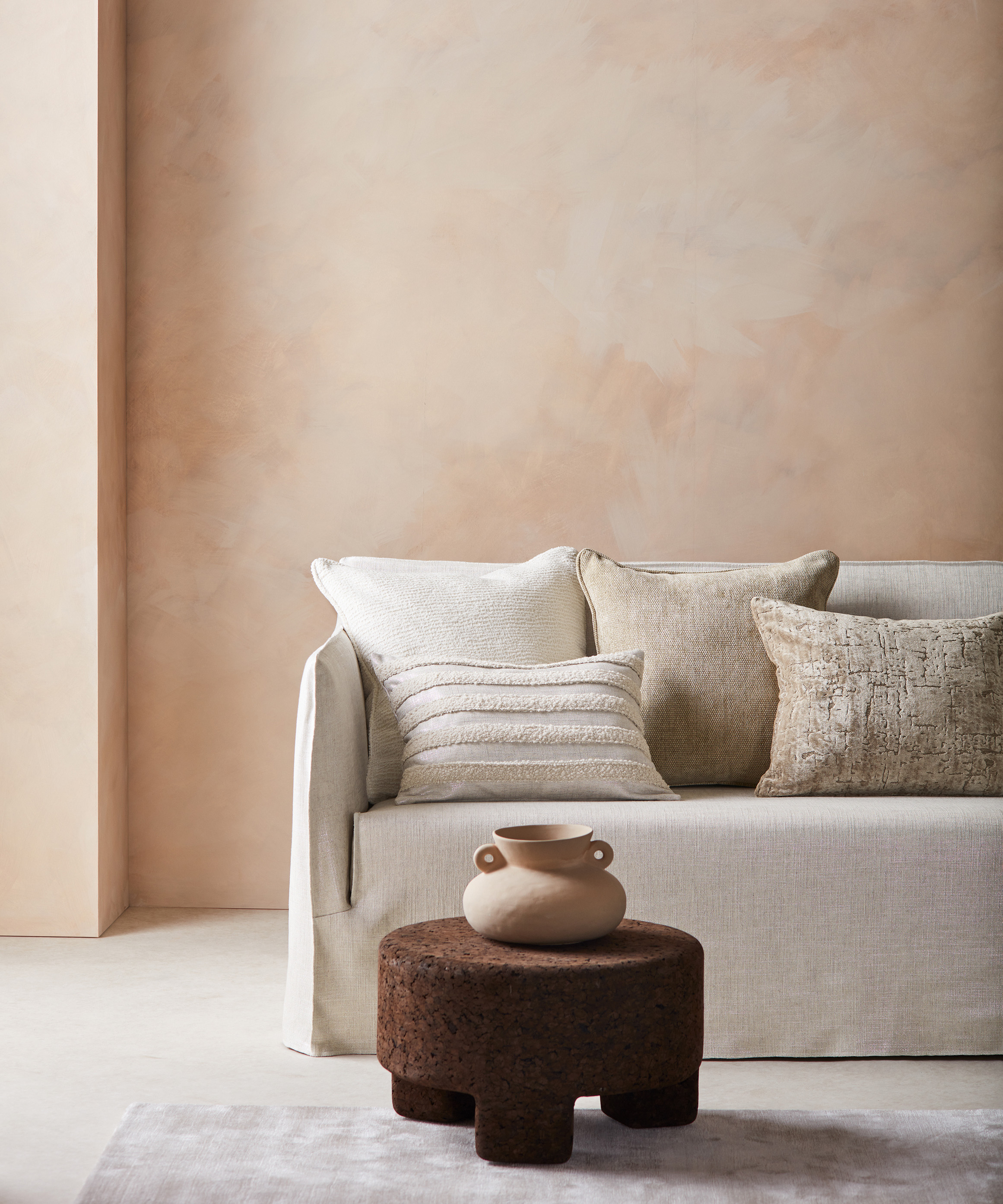
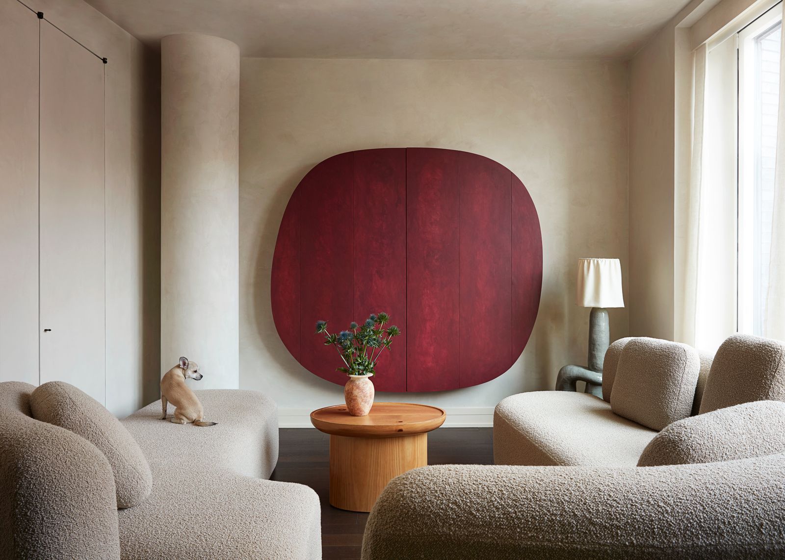
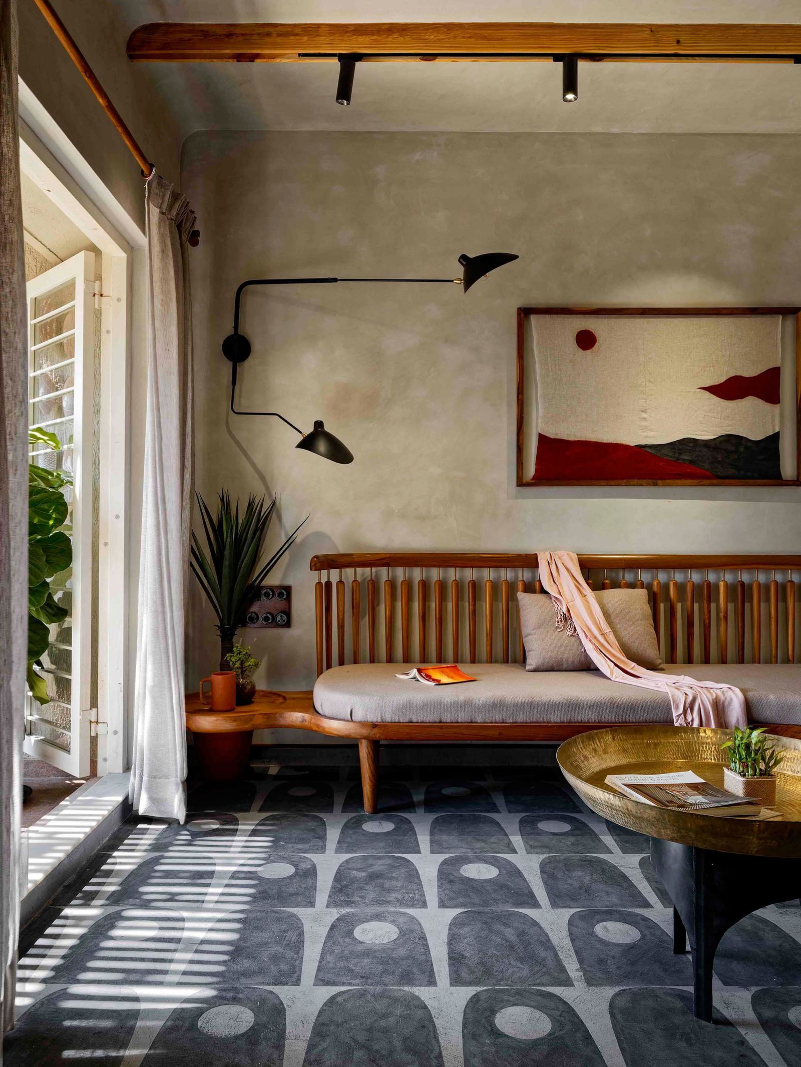
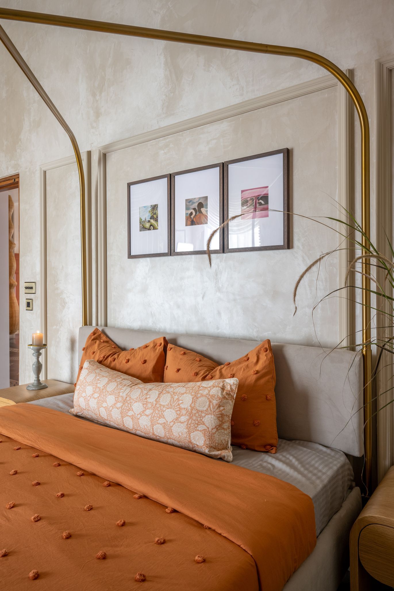
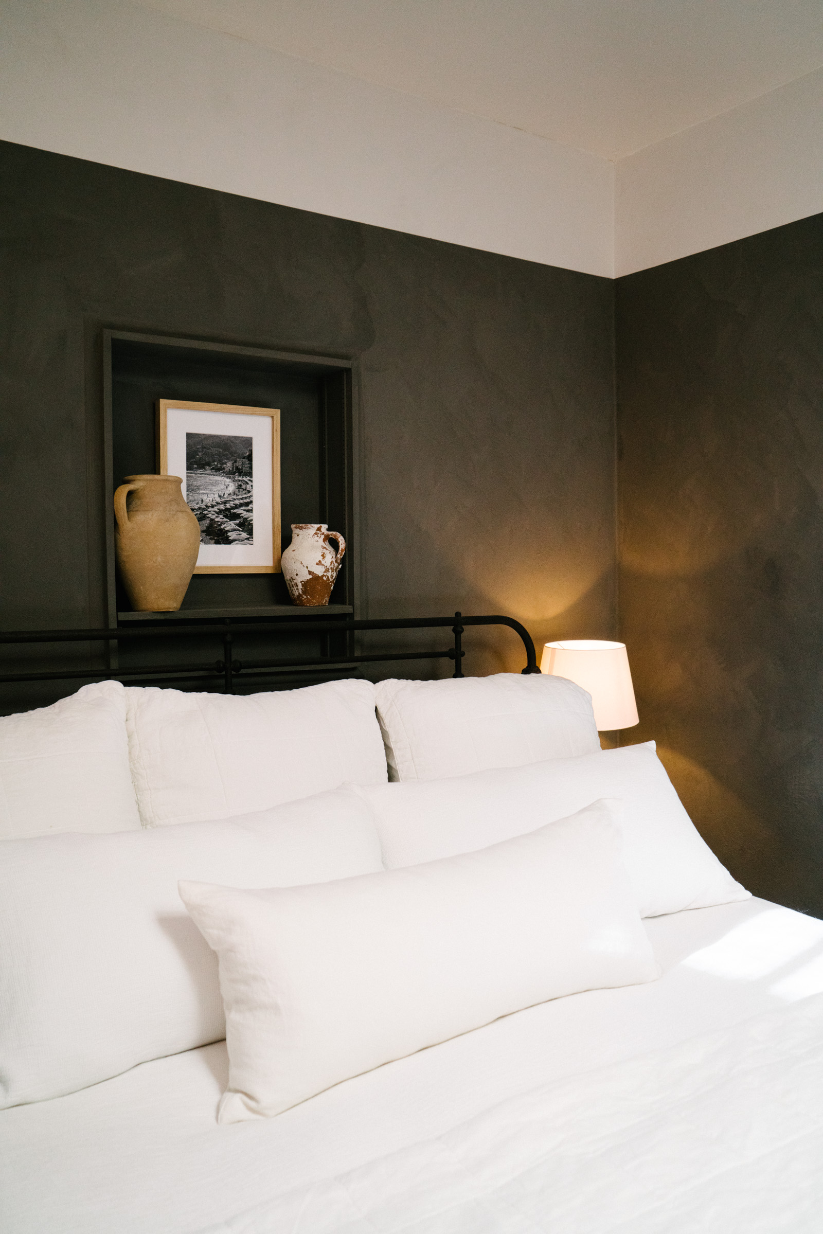
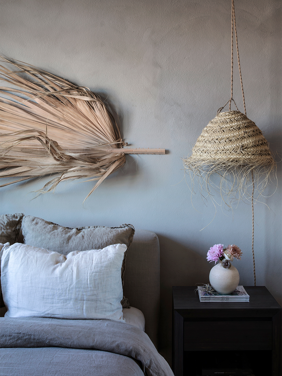
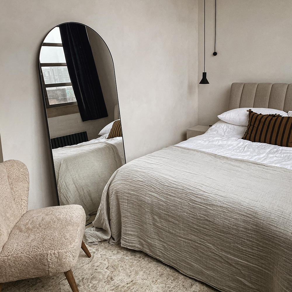
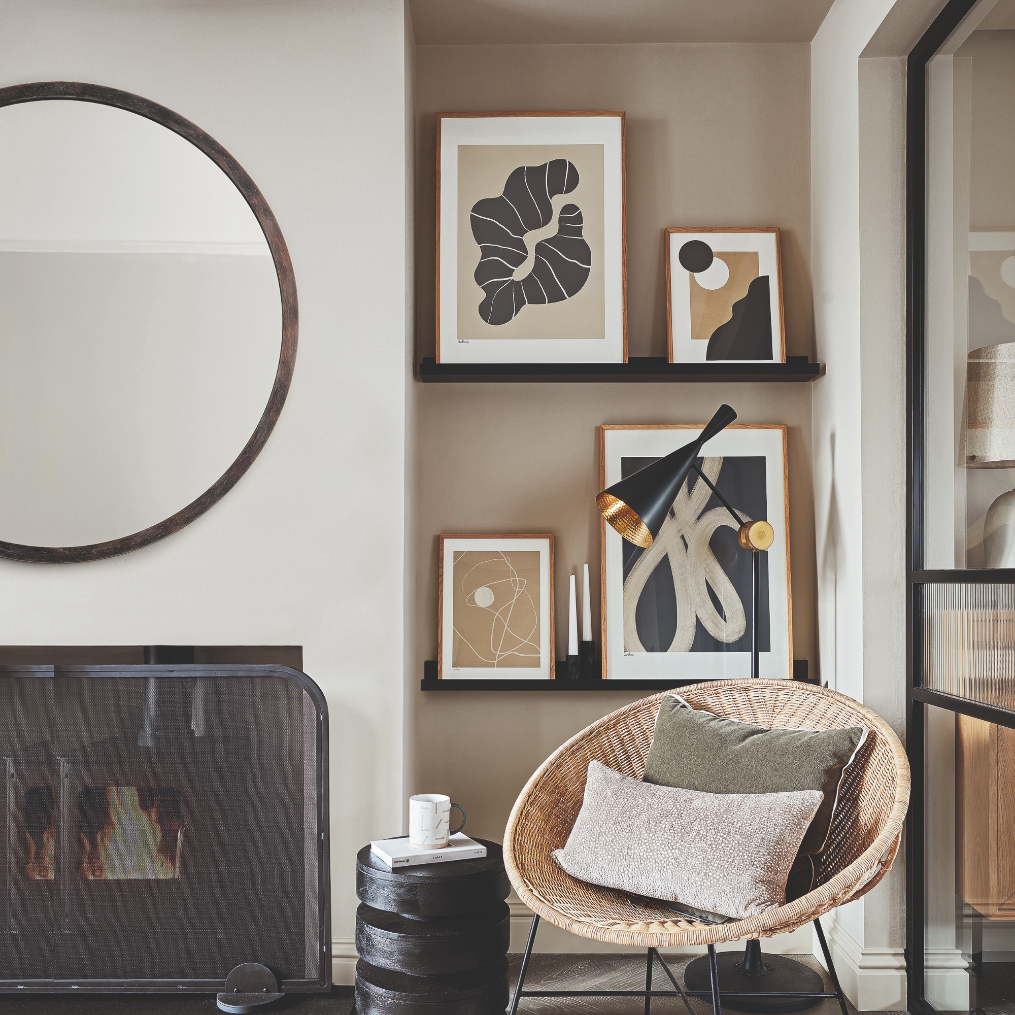
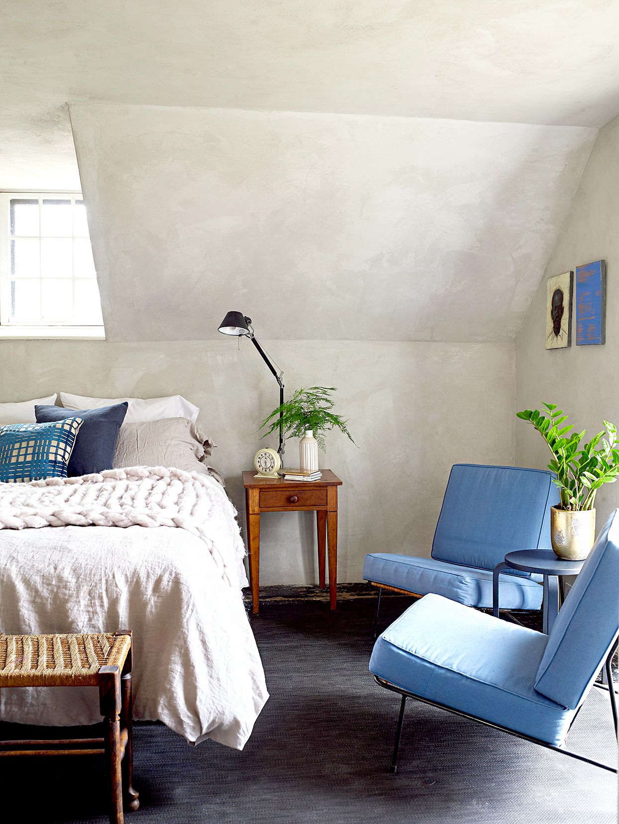
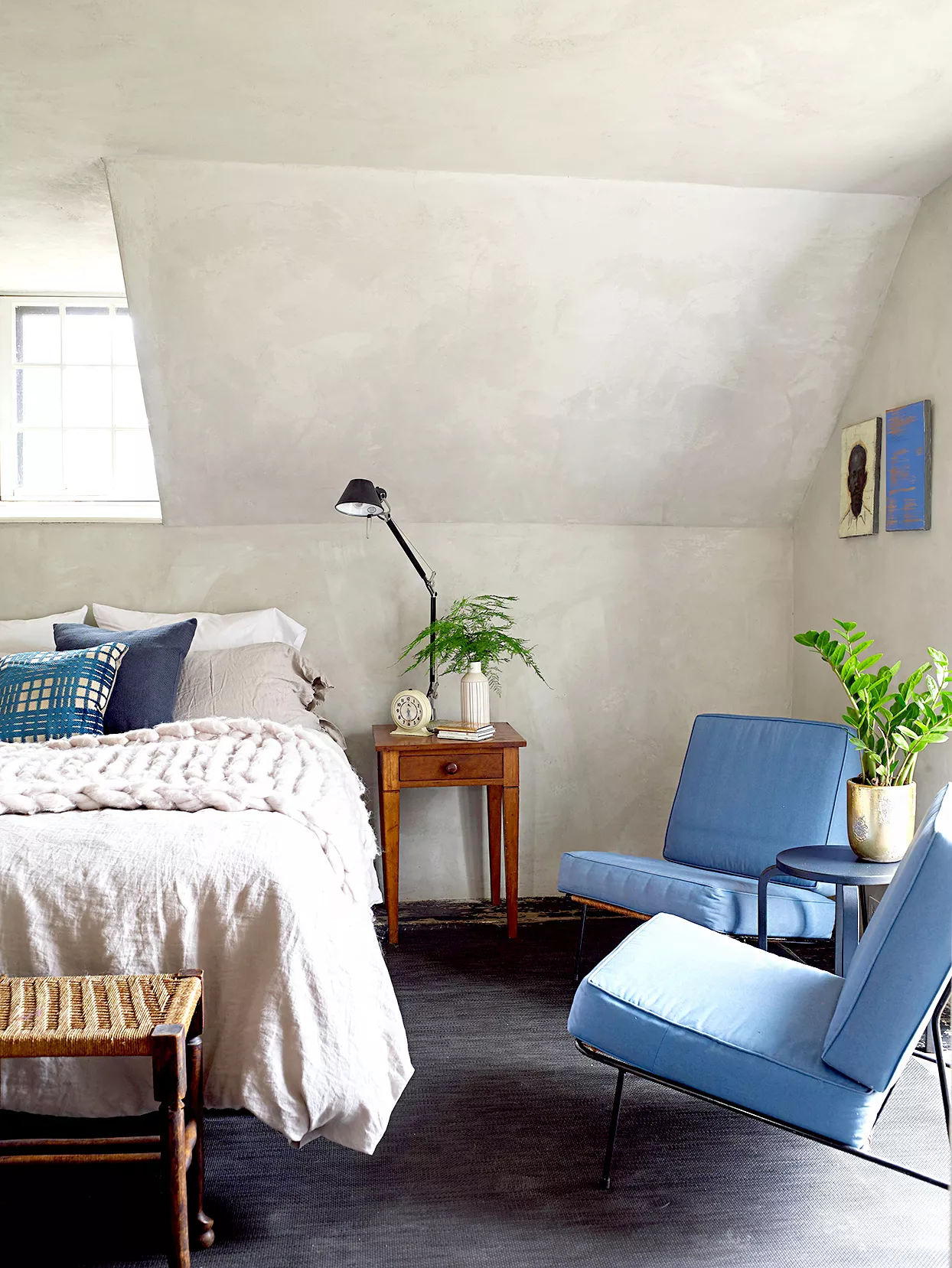
Laura Williams, founder and principal designer of Living Oak Interior Design, recommends 'Dry Ground' from Portola Paints to transform plain white walls into spaces with history and presence. This warm gray shade creates a moody yet not overwhelming effect. Williams shares an example of its use in a Nashville primary bedroom, where it was applied as a color-drenched finish to add sophistication and individuality. For a soft greige option, interior designer Kara Childress suggests 'Drift' by Sydney Harbour. This color adds warmth, softness, and subtle dimension, making it suitable for bedrooms or hallways, and effortlessly complements both rustic and tailored decor styles.
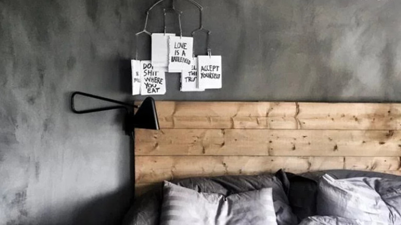
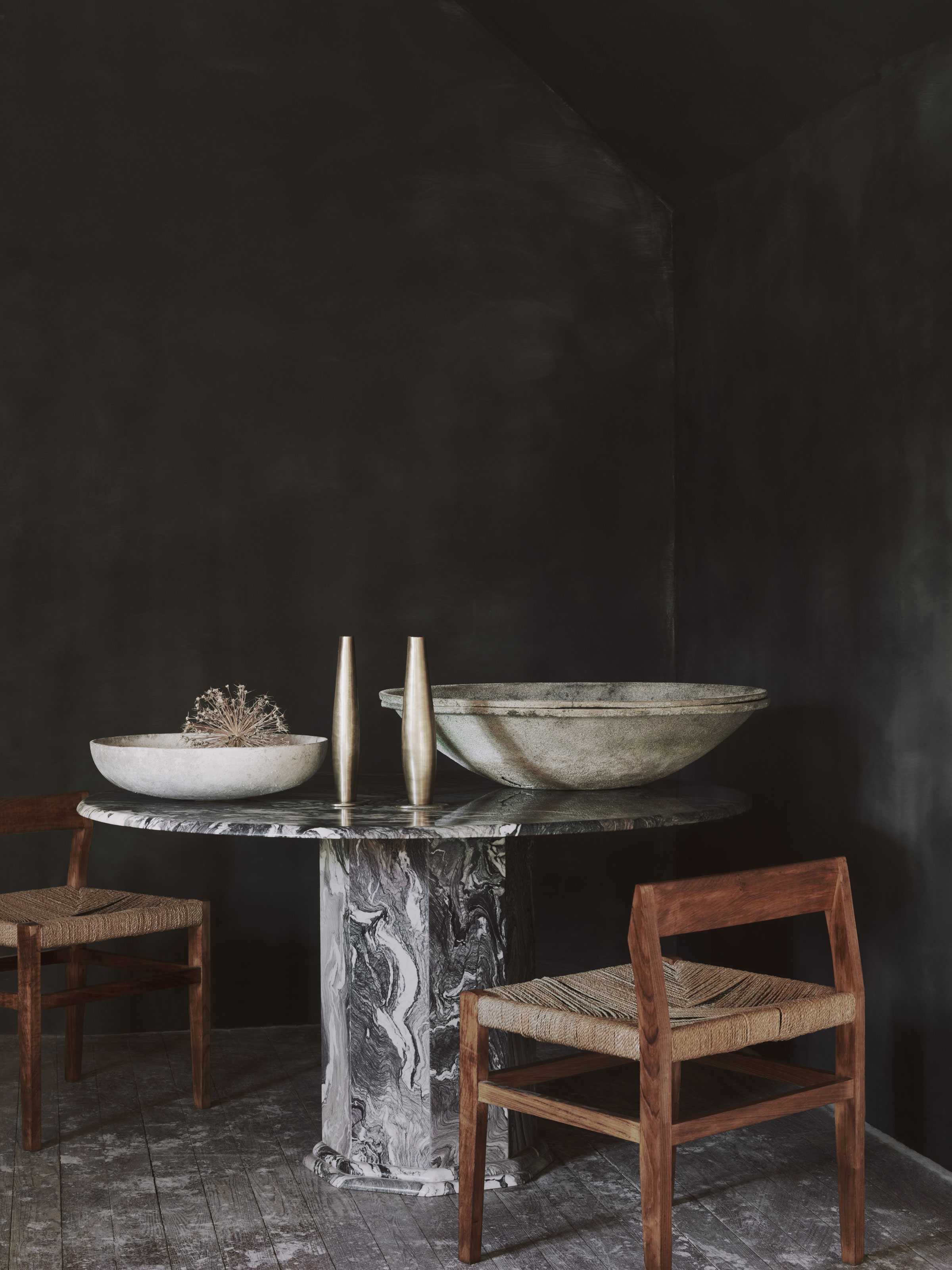
Finally, Sarah Latham, owner of L Interiors, highlights 'Darkside' by Portola Paints for areas requiring depth and texture, such as bathrooms. The natural movement of limewash prevents dark colors from appearing flat or overwhelming, creating a smoky and dynamic effect that pairs well with contrasting elements like glossy black tiles. This demonstrates limewash's versatility in creating a sophisticated and durable finish, even in moisture-prone environments like bathrooms.
#LimewashPaint #InteriorDesign #HomeDecoration #PaintColors #HomeDecorTrends #WallFinishes #OldWorldStyle #DesignInspiration #LimewashPaint #InteriorDesign #HomeDecoration #PaintColors #HomeDecorTrends #WallFinishes #OldWorldStyle #DesignInspiration
0 comment in total
 No comments yet
You may also like
8 Limewash Paint Colors That Will Add Elegance and Style to Your Home
Limewash paint ideas – 10 ways to use this trending wall finish to bring texture to your home

10 living rooms with limewash walls that prove that this textural wall finish is the perfect cozy-but-chic finishing touch
10 ways to use limewash at home: and how to apply it

10 Limewash Wall Color Ideas That Add Old-World Elegance To Your Space
What Is Limewash Paint: Four Places to Use It in Your Home

8 Butter Yellow Paint Colors That Will Bring a Charming, Serene Aesthetic to Every Room in Your Home
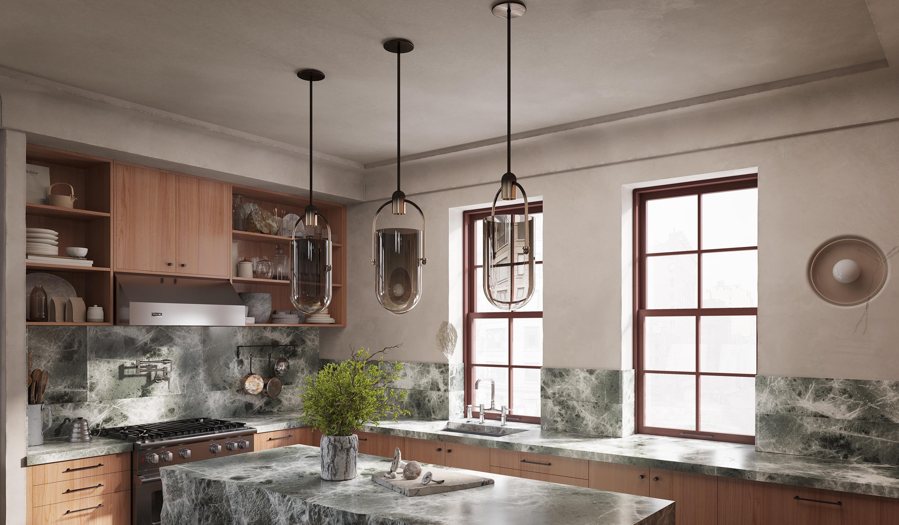
This Kitchen Trend Can Make Your Space Look Like a Charming, Tuscan Retreat — "It's Instantly Warming"
4 Creative Ways To Use Limewash Paint To Transform Your Home

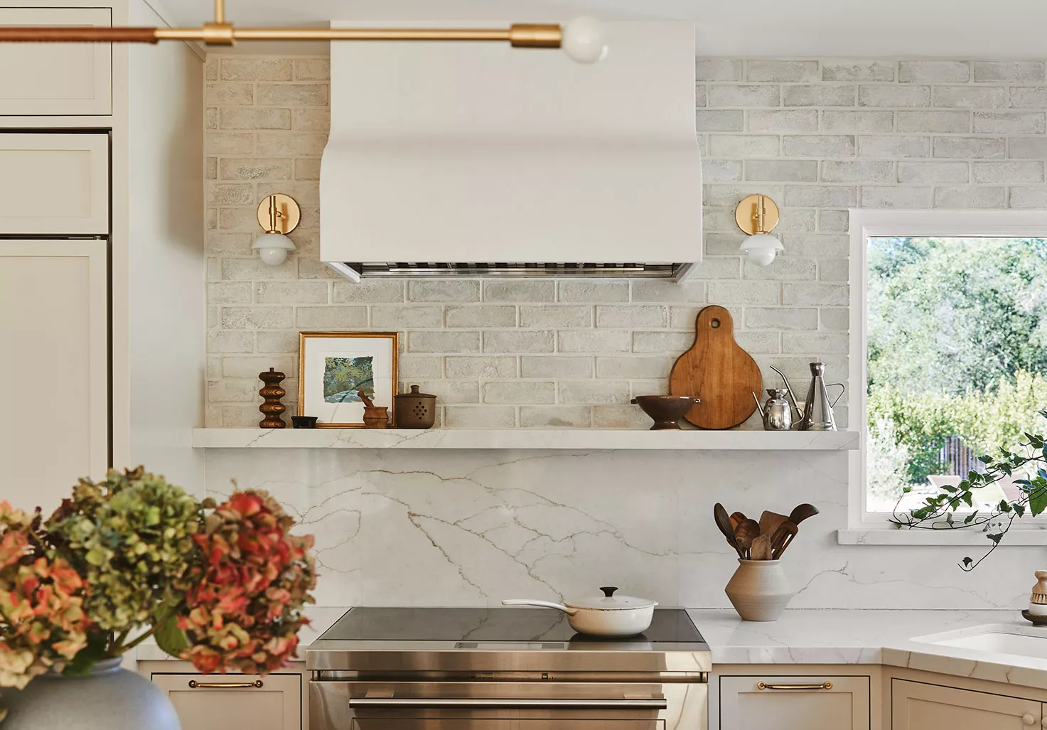
Rediscover Limewash Paint, the Old-World Finish That's Trending Again

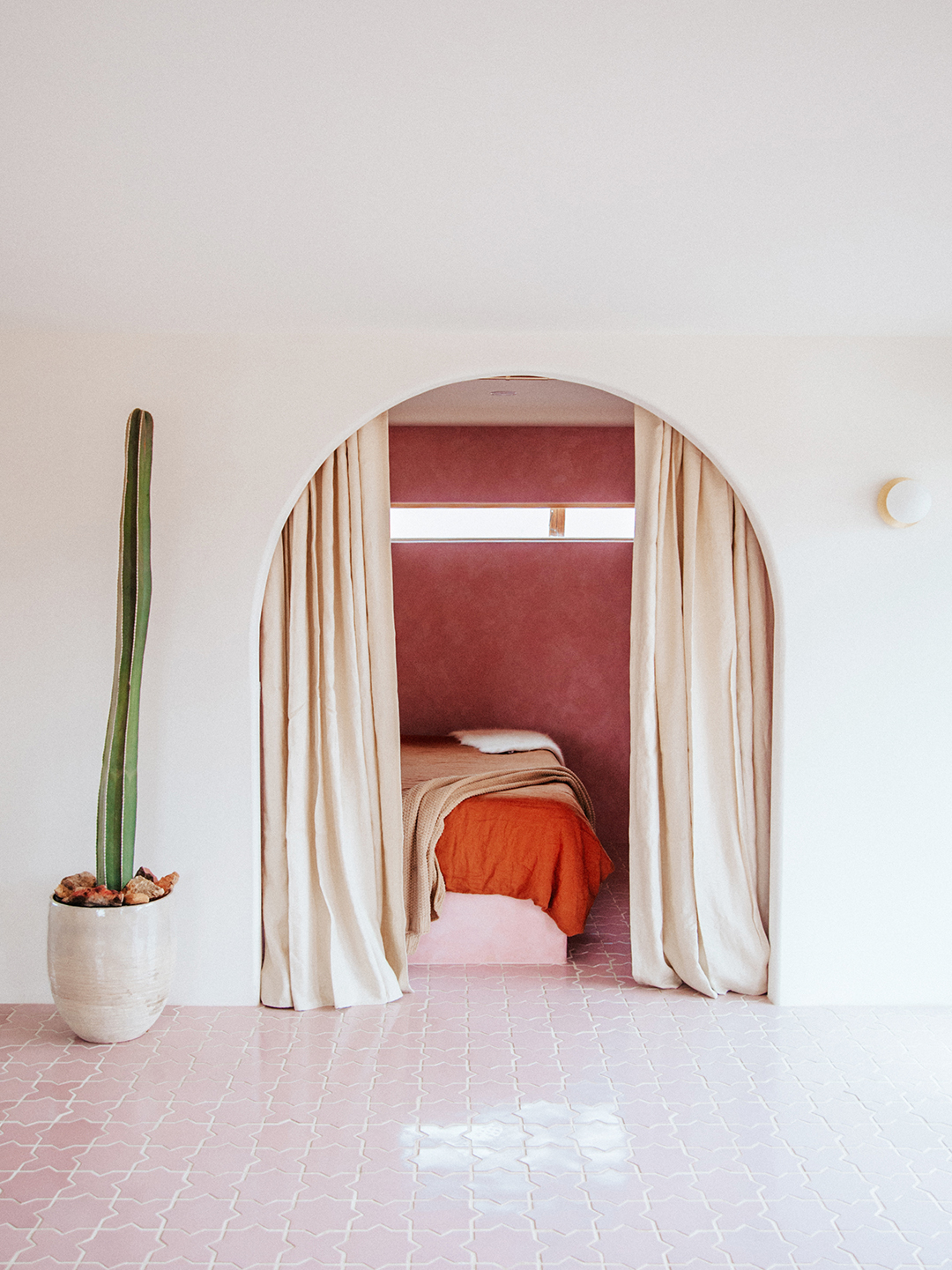
If You Want Your Home to Look Like a Charming Tuscan Villa, Try This

Designers Reveal the Best Lime Green Paint Colors for a Lively Home

8 Limewash Paint Colors for a Beautiful, Timeless Home, According to Interior Designers
What is limewash paint: Four places to use it in your home

Instagram can't get enough of this new textured paint craze - here's how to get the look
Living room paint ideas – 27 easy ways to bring your lounge to life with stylish and creative colours and techniques
The Allure of Limewash Paint
This Texture-Rich Finish Is Designers' Go-To for Instant Patina

This Simple DIY Limewash Paint Hack Costs Less Than $20 — But the Results Look Way More Expensive
What Is Limewash Paint? Plus, How to Use It In Your Home