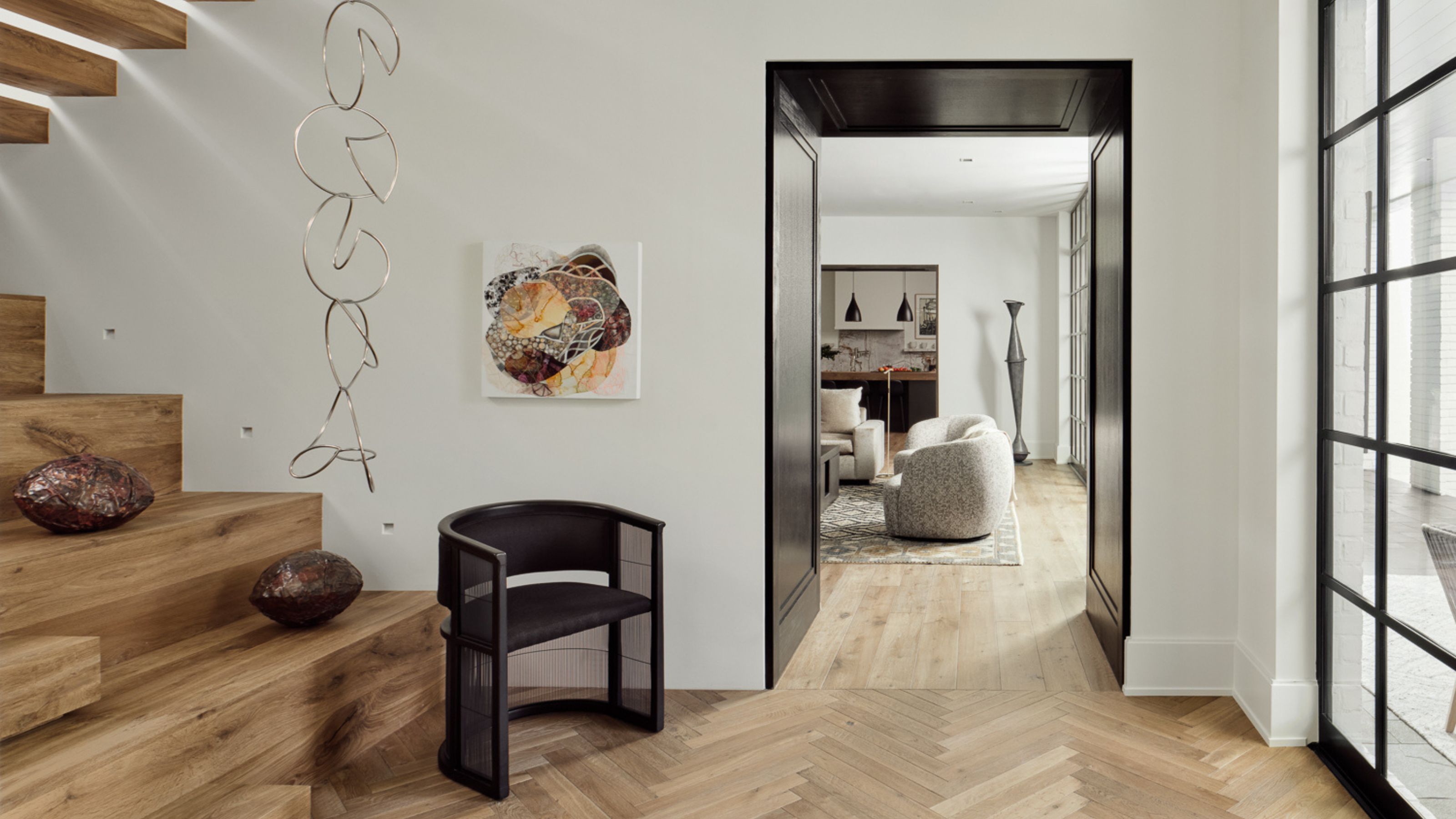
1/19
9 Neutral Paint Colors Designers Constantly Reach For — "It's My Tried-and-True"
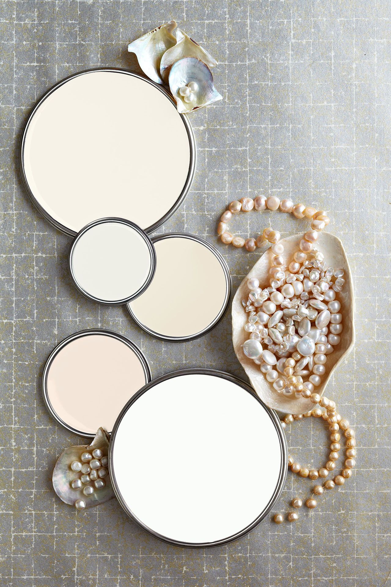
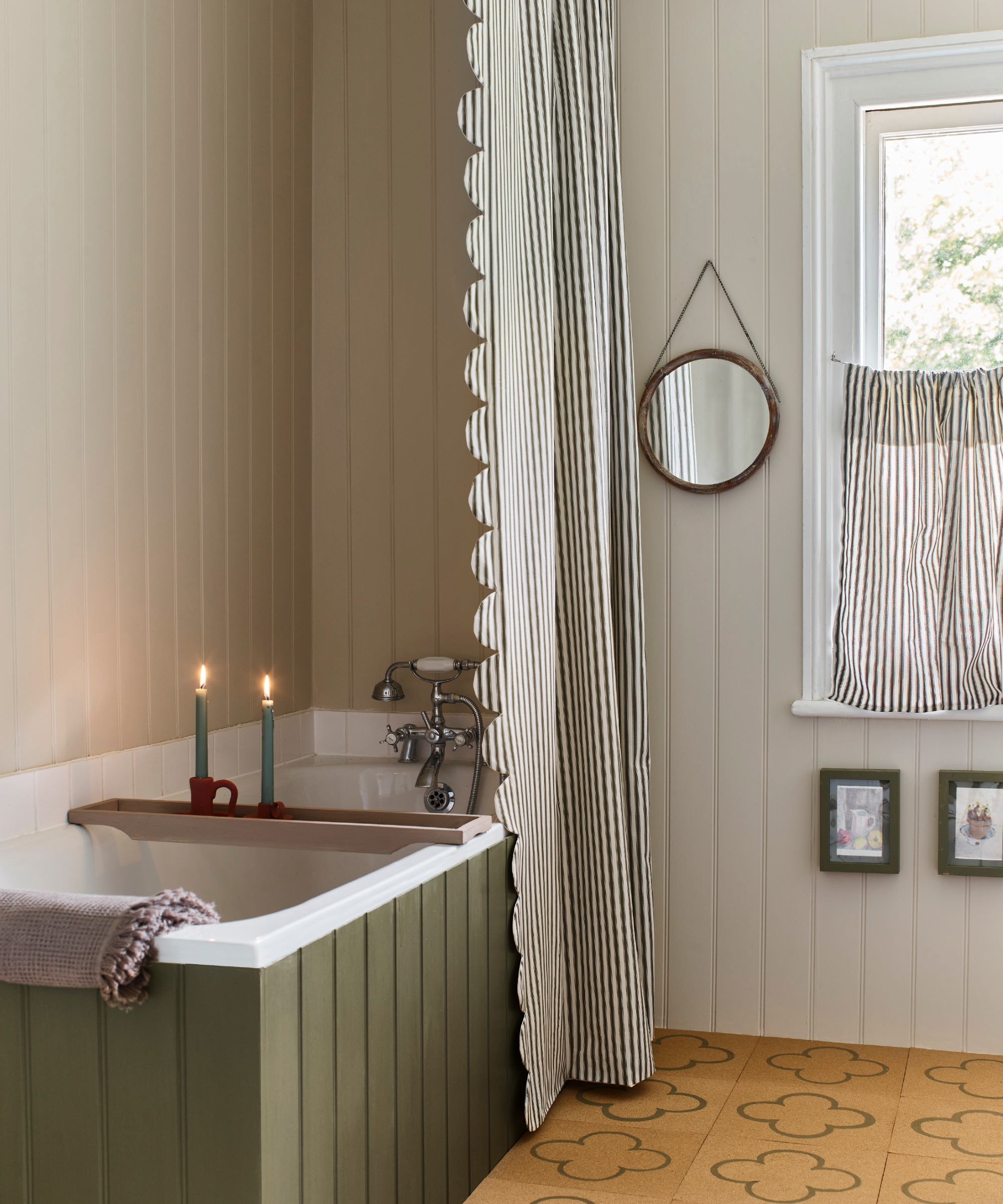
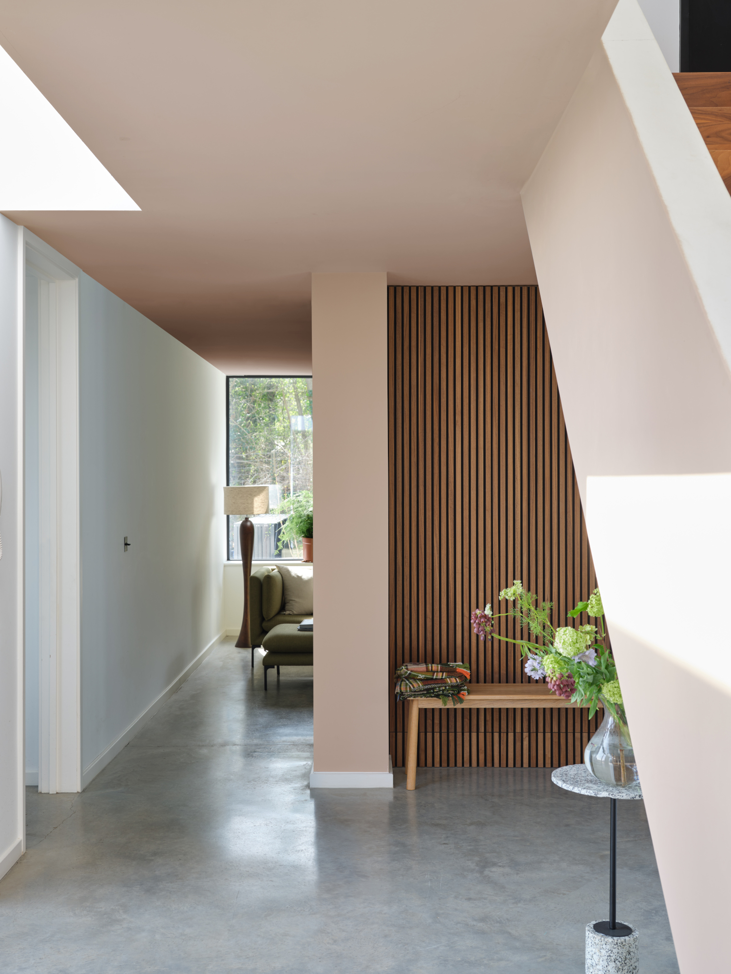
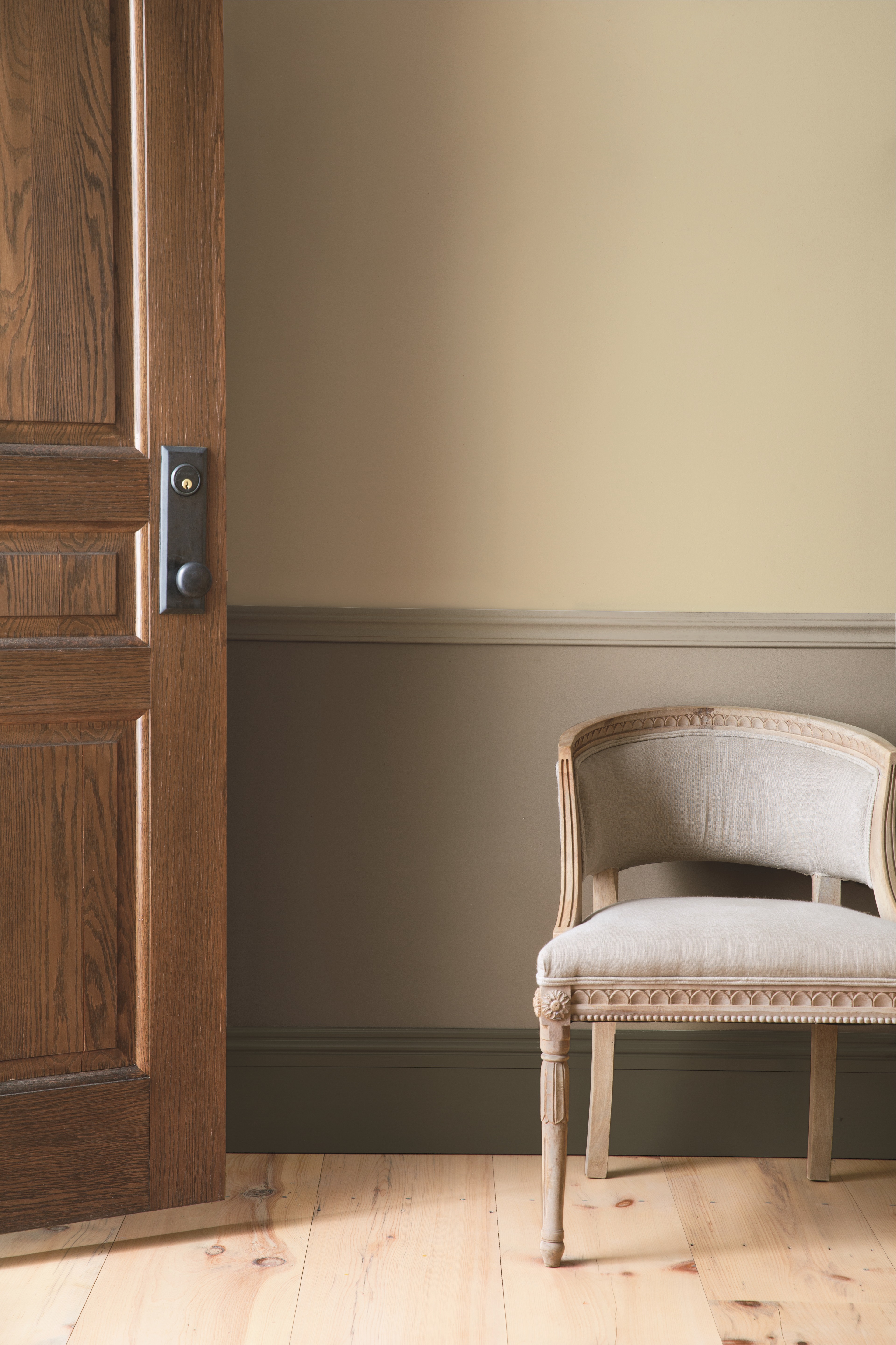
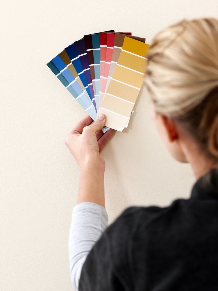
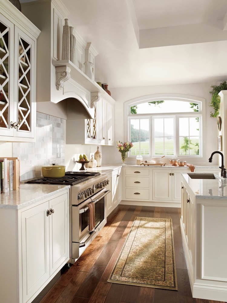
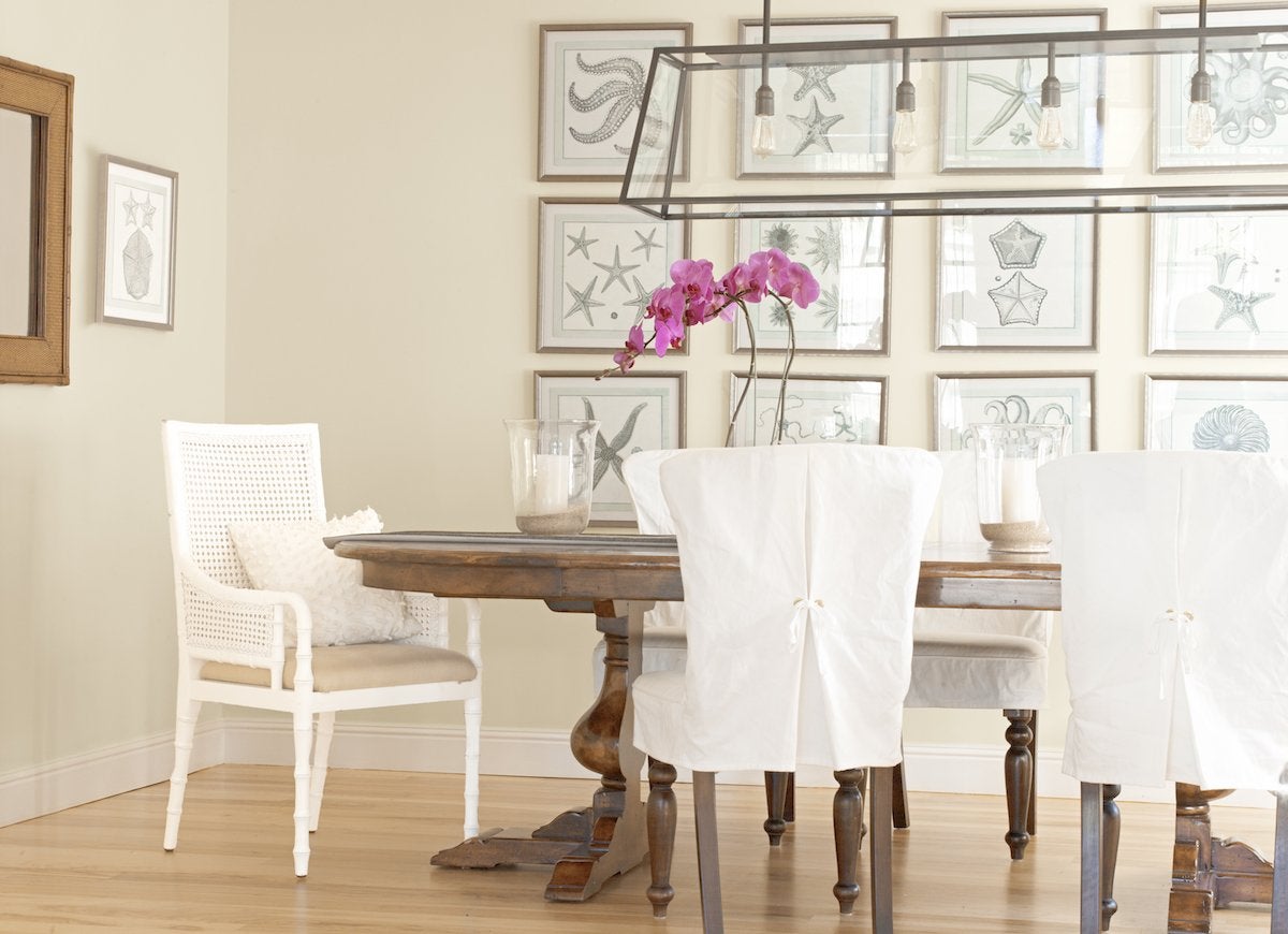
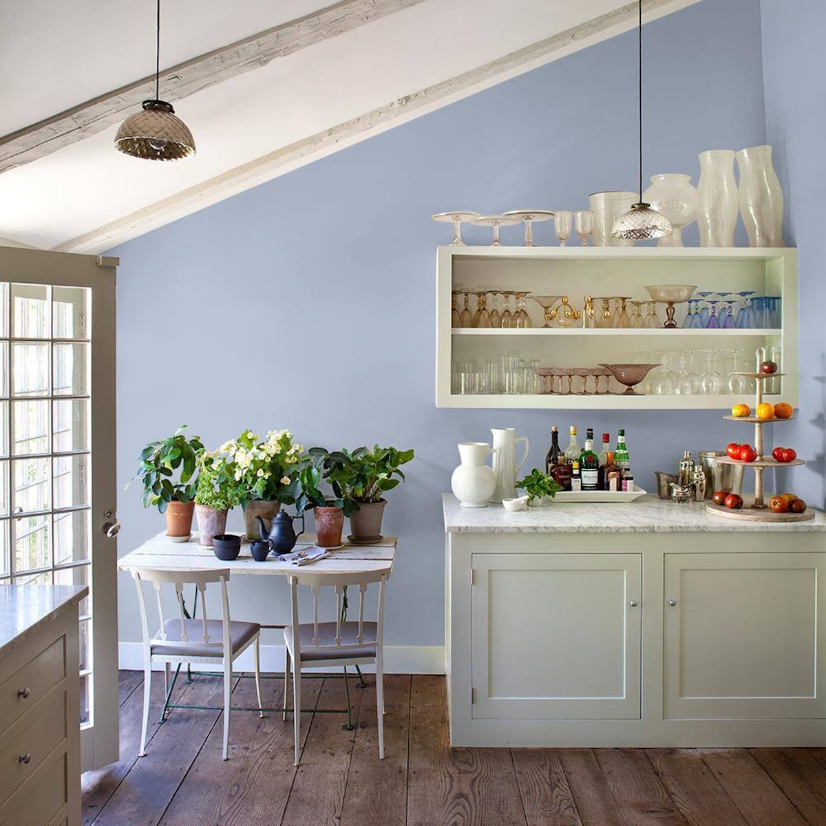
The article explores the challenges of selecting neutral paint colors from the vast array of available shades, including whites, beiges, greiges, and creams. To simplify this decision-making process for readers, it compiles recommendations from interior designers regarding their preferred neutral paint shades. The designers' insights highlight how certain neutral paints are consistently chosen for their versatility and ability to adapt to various lighting conditions and design aesthetics.
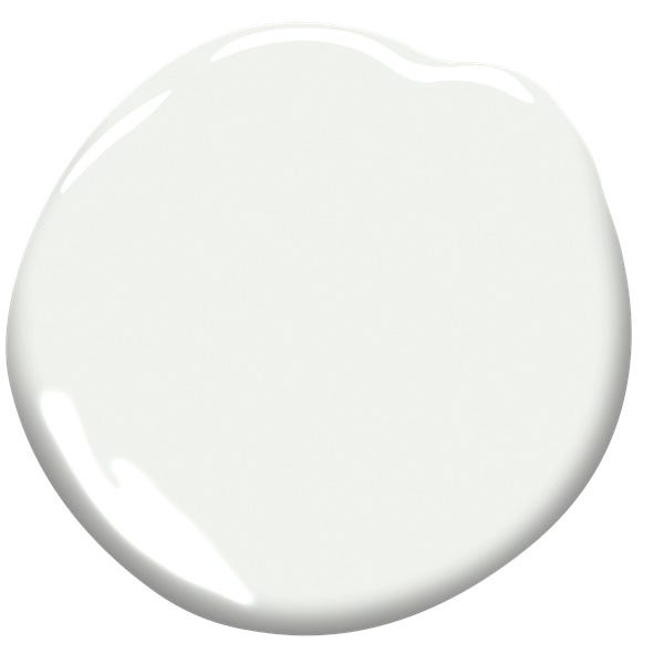
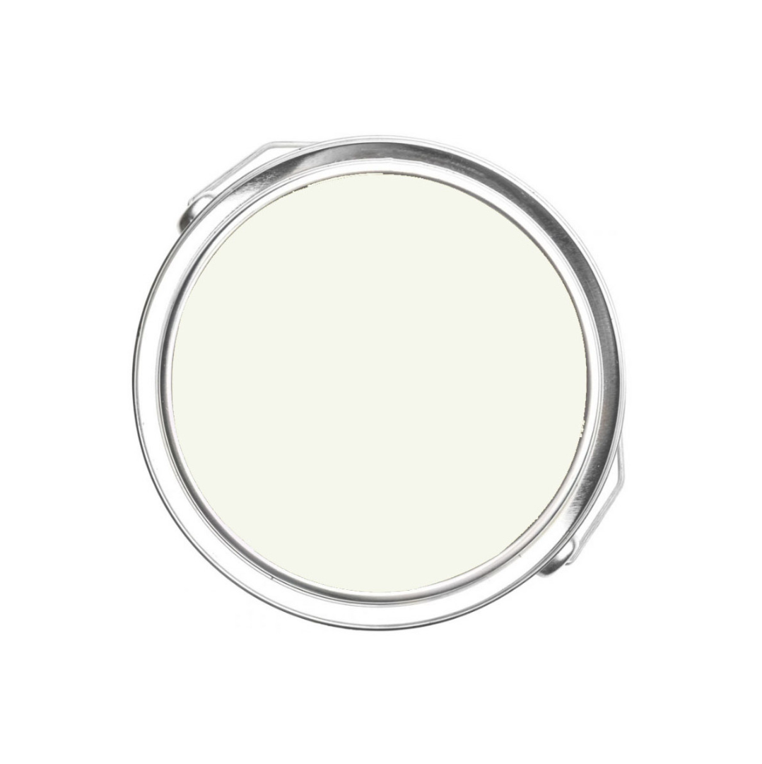
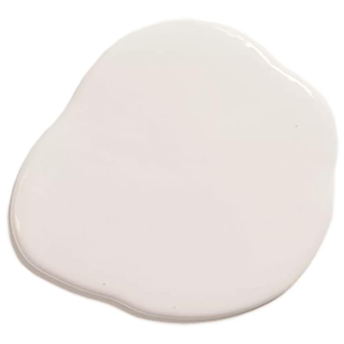
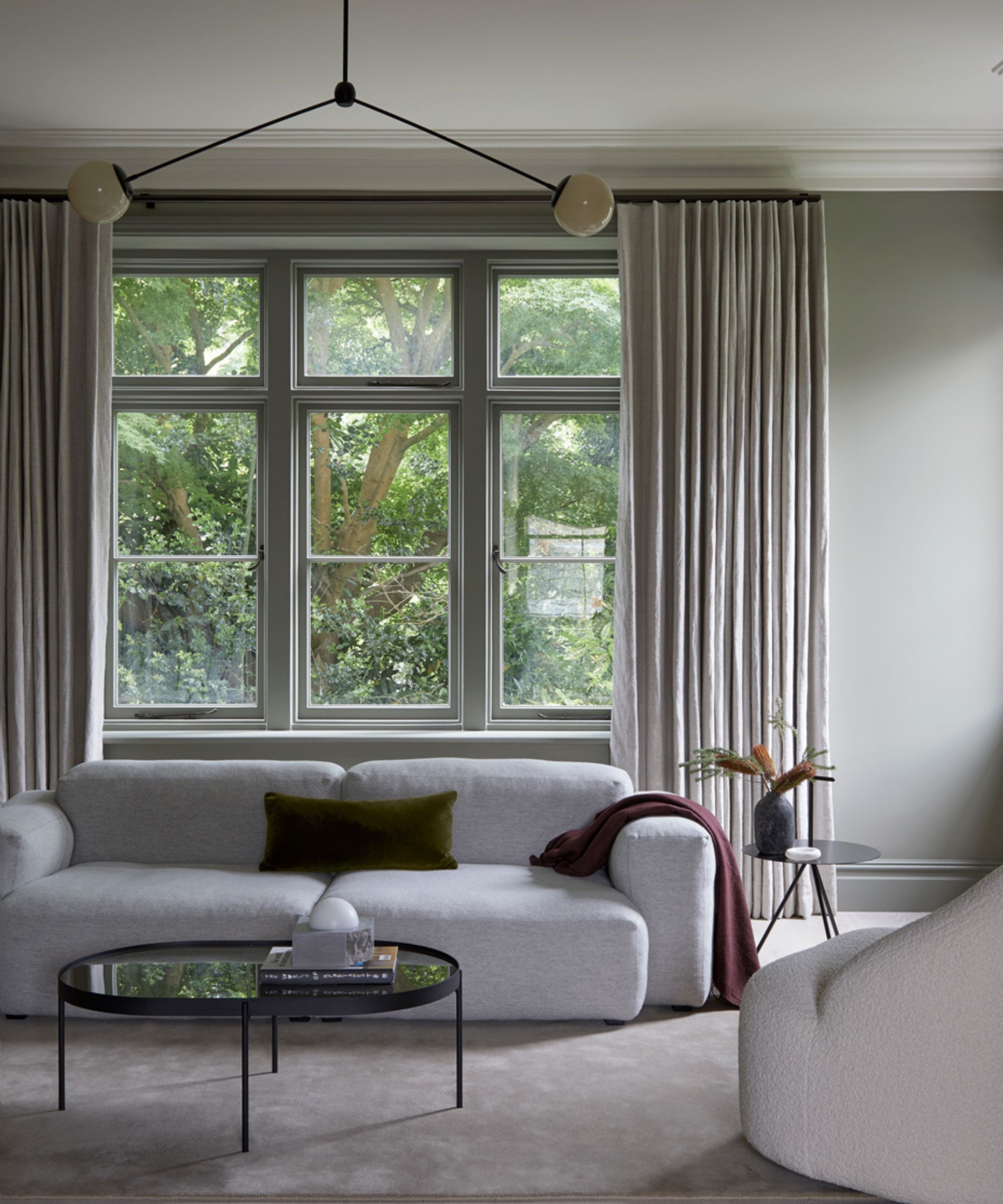
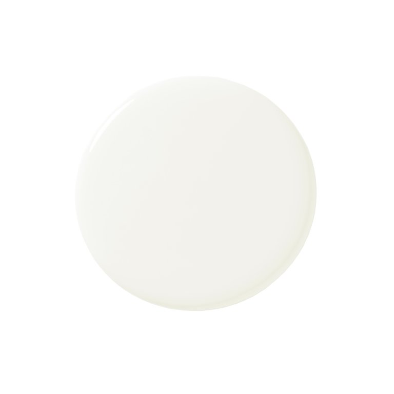
Benjamin Moore's 'Chantilly Lace' is highlighted as a top choice. Designer Lee Broom selected this shade for a neutral living room to create a clean backdrop that emphasizes furniture and textures, primarily in ivory and beige. He notes that the paint appears warmer in the evening due to strategic lighting. Nureed Saeed of Nu Interiors also advocates for 'Chantilly Lace' for its bright yet warm qualities, using it across walls, trim, and ceilings for a cohesive feel in both her New Jersey and California homes.
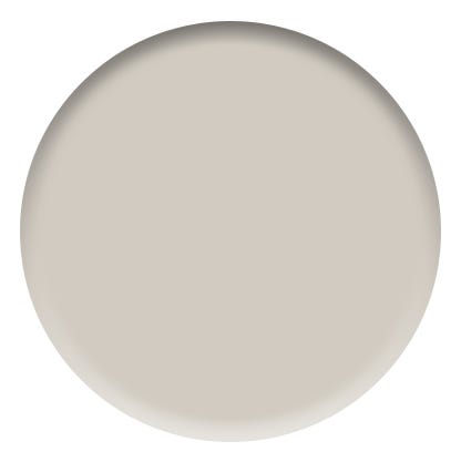
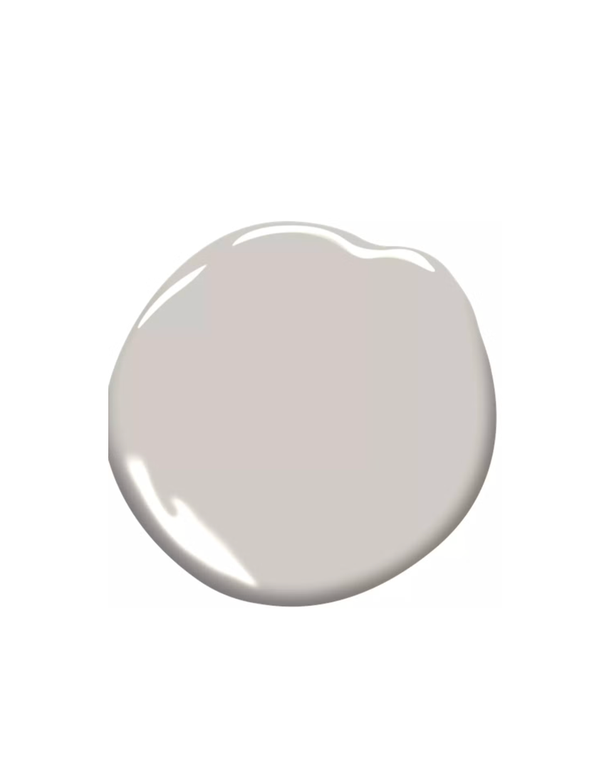
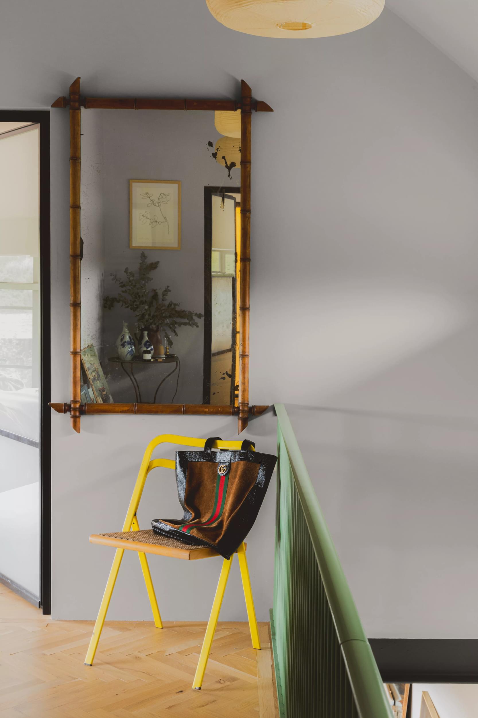
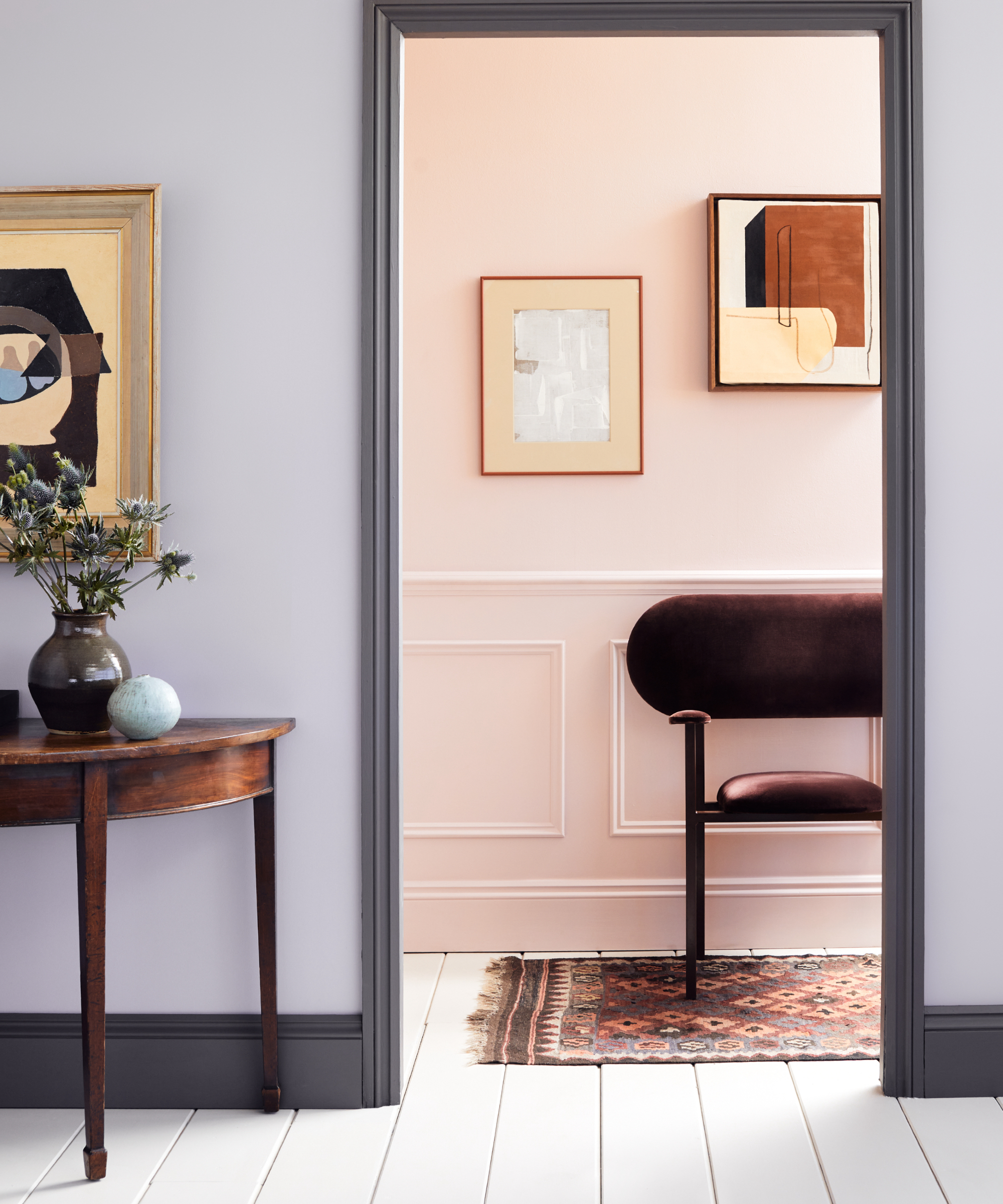
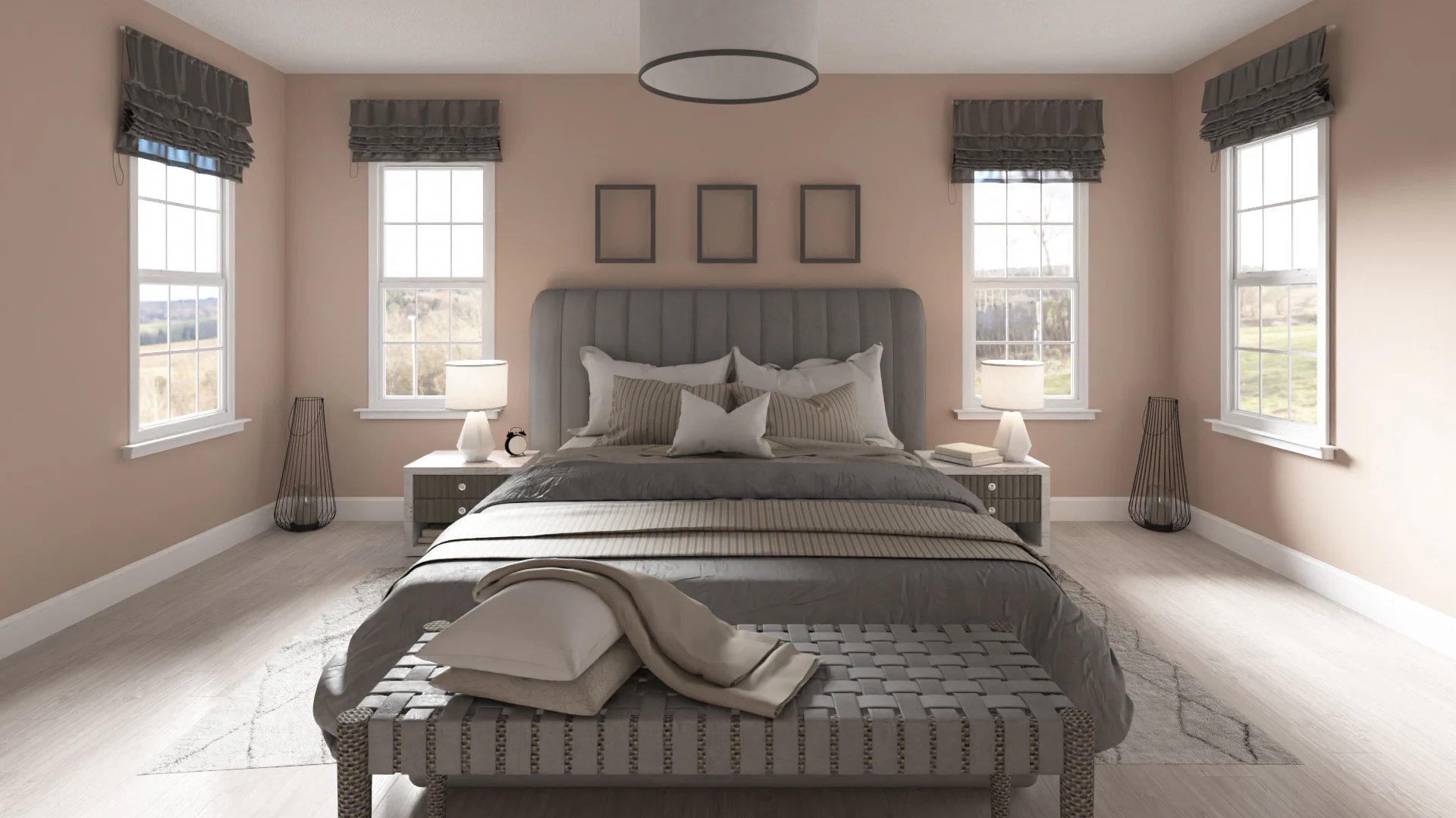
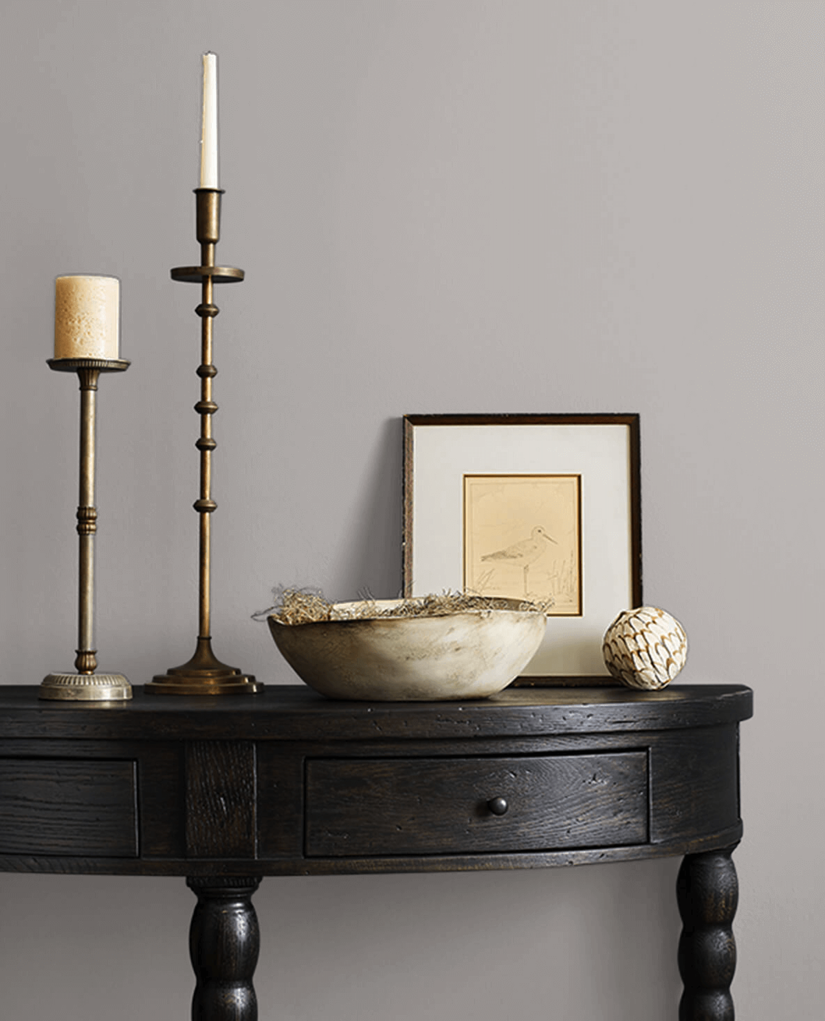
Backdrop's 'Morning Ritual' is presented by interior designer Alana Marie as an adaptable shade for bedrooms. Its warm, light gray-beige tones can subtly shift towards taupe or lavender, depending on the room's light. Marie suggests pairing it with cooler tones like taupe and blue, and incorporating antiques to introduce warmth and character.
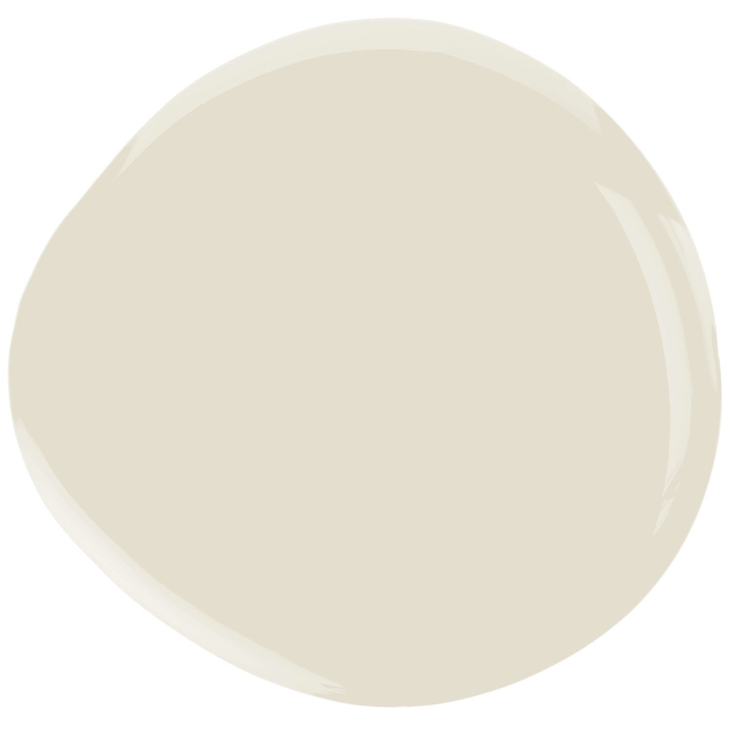
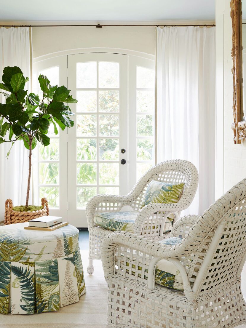
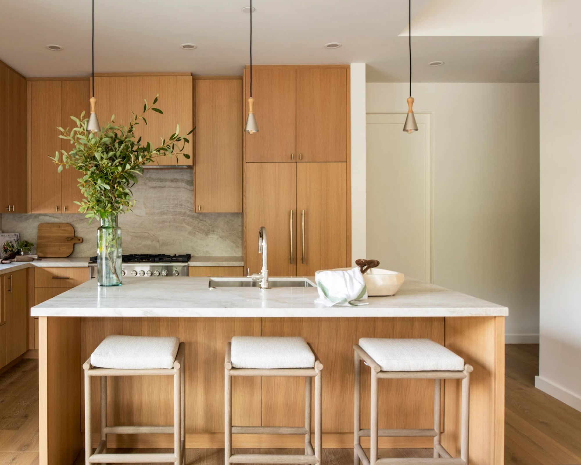
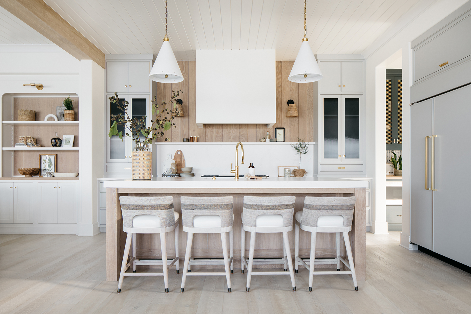
Sherwin Williams' 'Alabaster' is another designer-approved off-white paint known for its coziness. Shannon Mann of Mann Designs Studios chose this color for its ability to be both crisp and warm under different lighting. Its subtle creamy undertones make it suitable for darker days, enhancing a cocooning effect. The color complements light caramel tones in French oak floors and provides a sophisticated neutral backdrop for art.
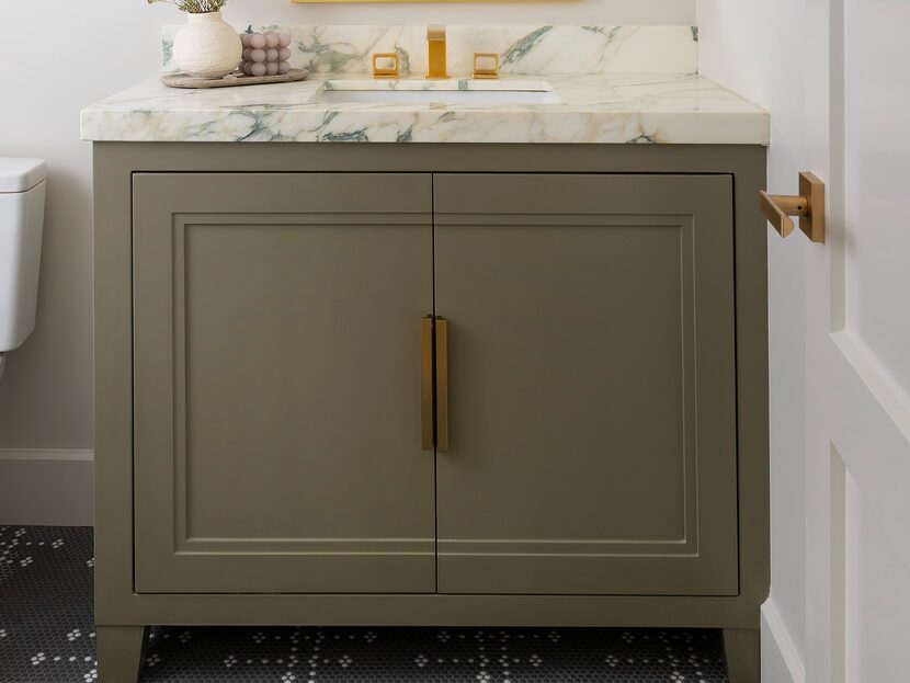
Benjamin Moore's 'Pale Oak' is recommended by Ashley Macuga of Collected Interiors for its balanced warm and cool undertones, making it an ideal backdrop for furniture, decor, and architectural features. An example given is its use in a bathroom, where it balances bright white marble countertops and mirrors with warmer wood cabinet tones.
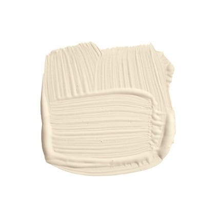
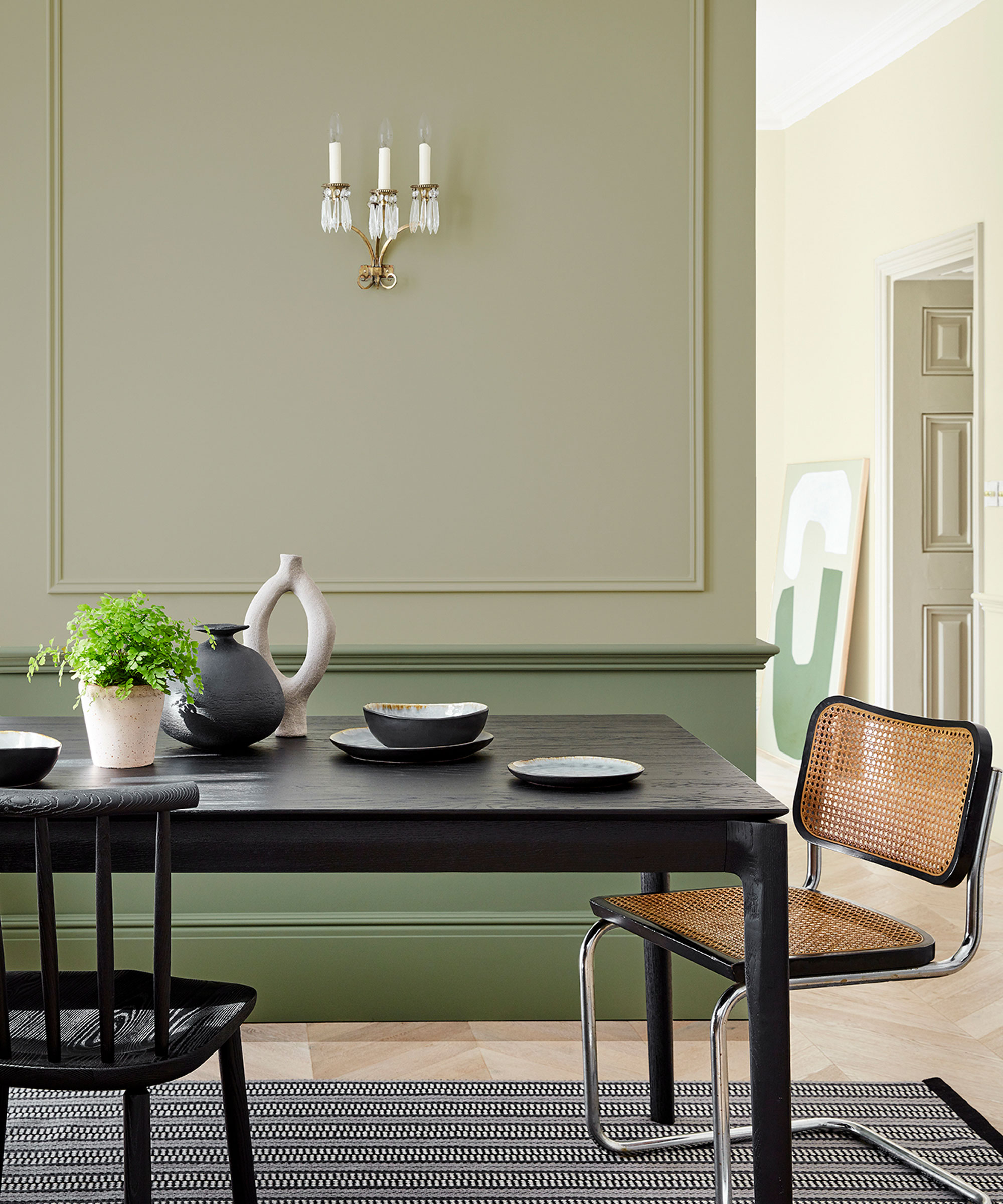
Farrow & Ball's 'Shaded White' is suggested for those seeking a warmer, sandy off-white with yellow undertones, particularly suitable for fall and winter. Designer Christine Lemieux considers it a favorite for its warming qualities.
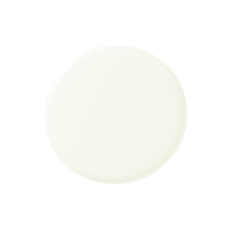
Benjamin Moore's 'White Dove' is a frequent choice for interior designer Bethany Adams, who uses it for white trim or neutral white walls in almost every project. She praises its balanced hue, being neither too yellow, gray, nor stark. Sarah Brady of Salt Design Company also endorses 'White Dove' for its soft, warm undertones, describing it as light yet deep, lending a sophisticated and timeless feel that pairs well with natural stone, wood, and modern finishes.
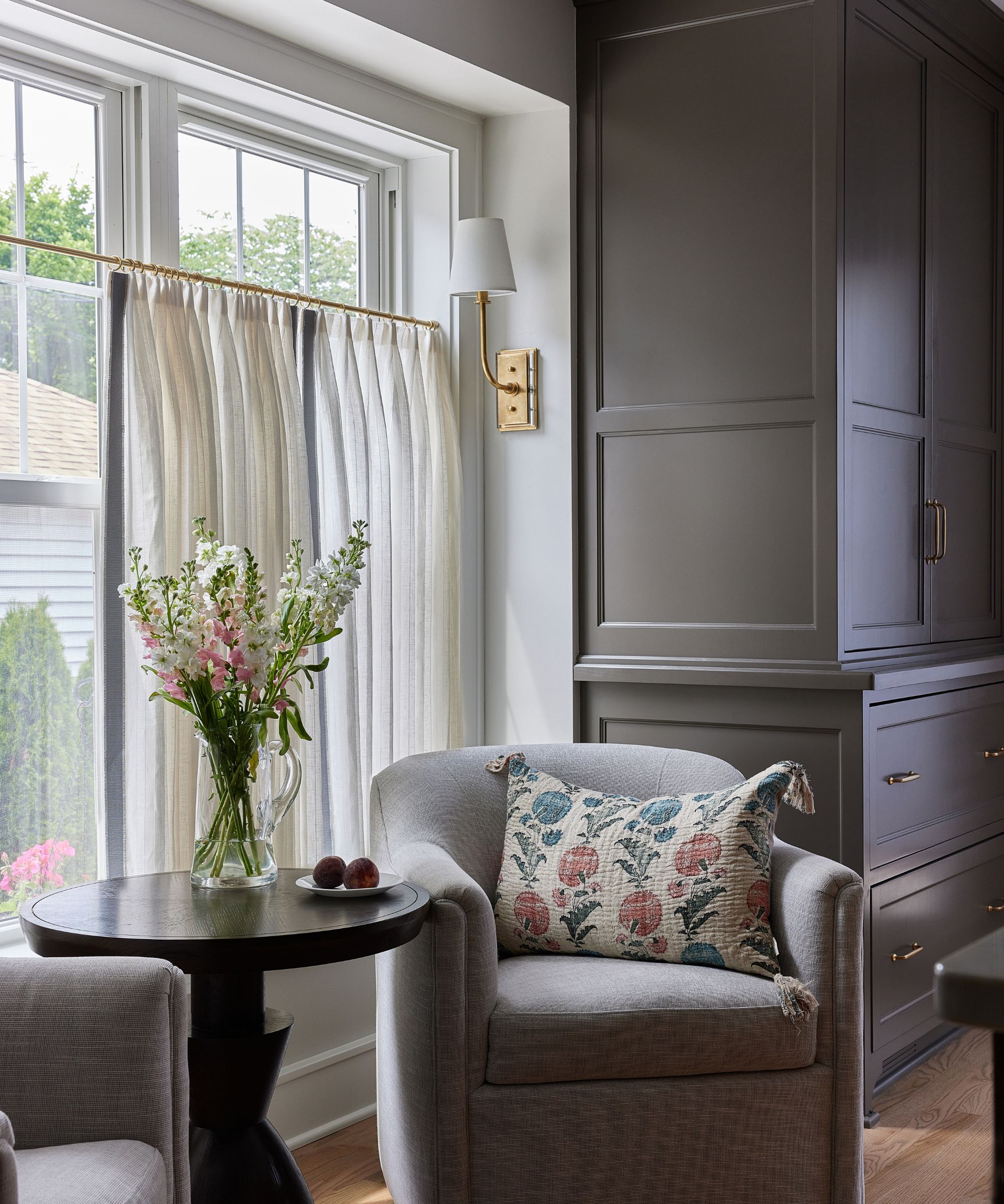
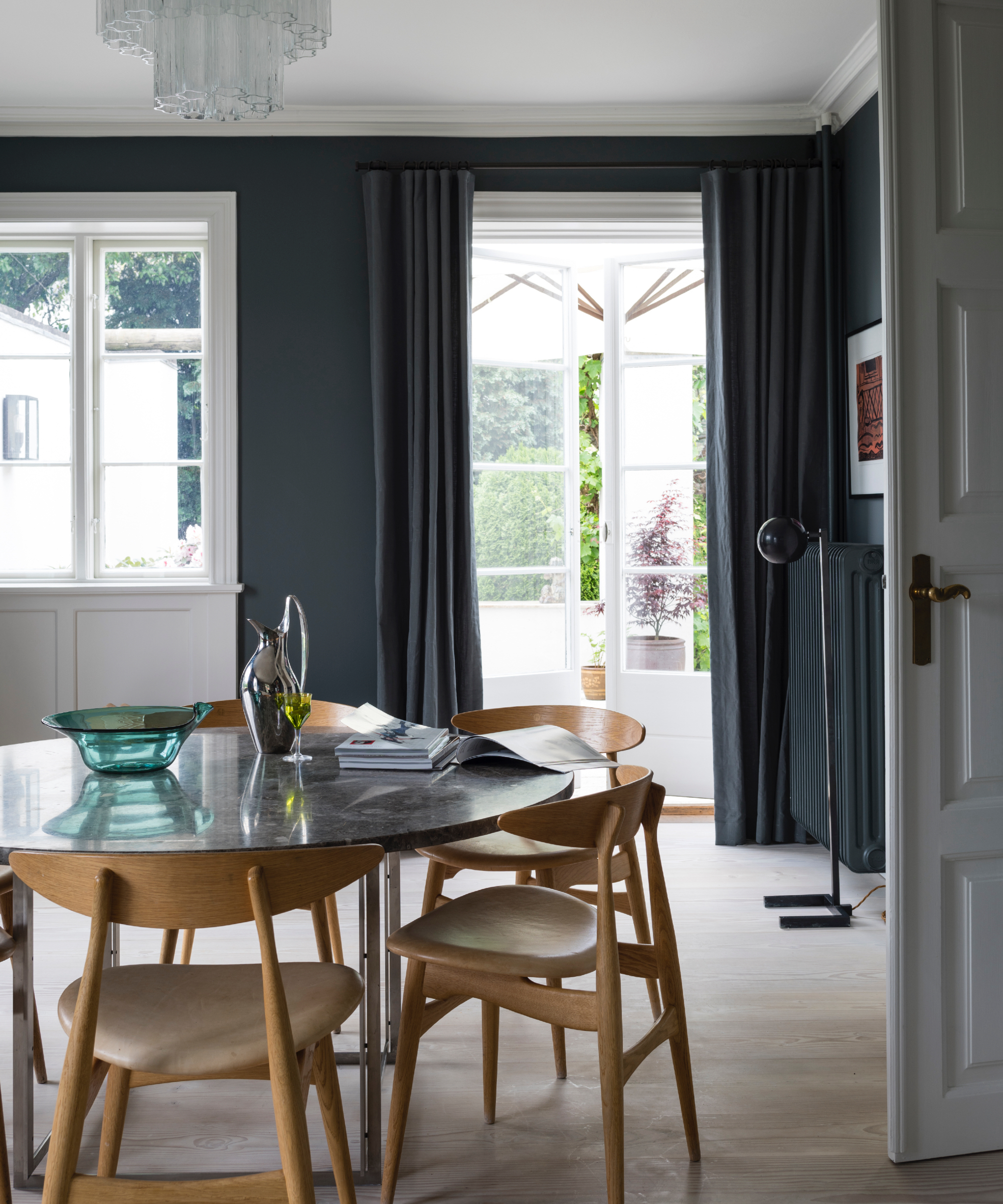
Benjamin Moore's 'Titanium' is another versatile option, favored by Bethany Adams for its chameleon-like quality, appearing gray, green, or blue depending on adjacent colors and light conditions. It performs well in various settings, from dimly lit basements to brightly lit sunrooms.
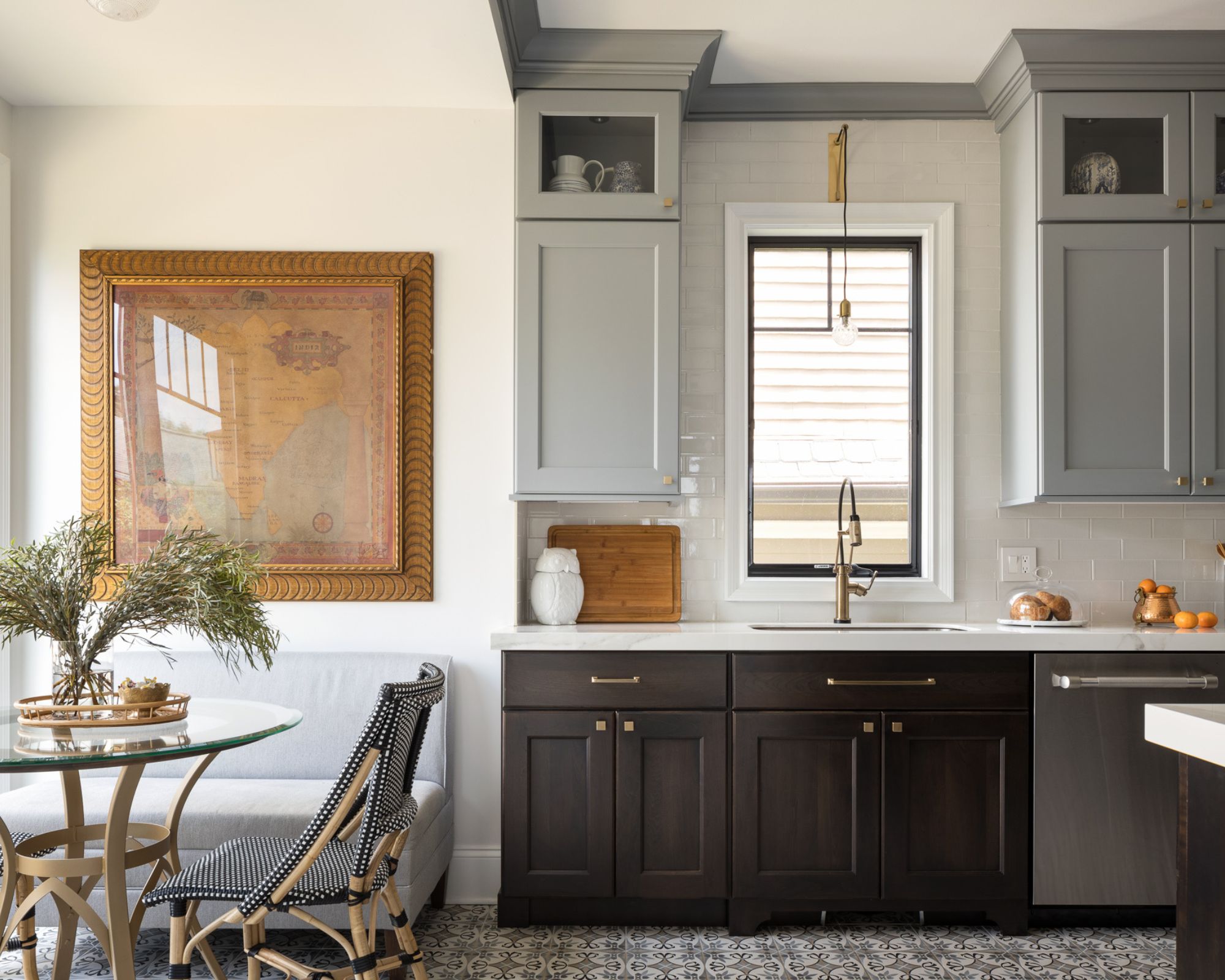
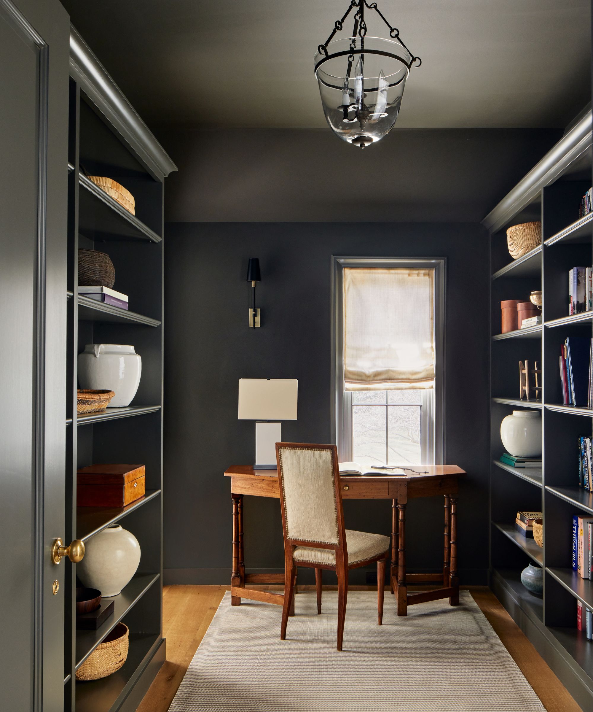
For a gray-toned neutral, Lauren Sullivan of Well x Design recommends Sherwin Williams' 'Drift of Mist', particularly for its warm and inviting off-white with a hint of gray. She uses it to balance intense warm evening sun in her home, often in a custom-tinted limewash plaster. Finally, Benjamin Moore's 'Horizon' is suggested by Matthew Rauch of Rauch Architecture. This warm, milky blue-green gray is noted for its subtle green tinge in certain lights, reflecting light effectively without clashing with other design elements. It creates a calming gray that changes throughout the day, offering a golden glow in the mornings and a soft backdrop in the evenings, making any room feel cozier. Rauch also suggests color drenching, painting ceilings the same color as walls, to create a subtle, muted scheme and make the ceiling feel less imposing. The article concludes by emphasizing the importance of considering factors like room size, sunlight, and intended purpose when choosing neutral paint colors.
#InteriorDesign #NeutralPaintColors #HomeDecor #PaintShades #DesignTips #ColorSchemes #BenjaminMoore #SherwinWilliams #FarrowAndBall #InteriorDesign #NeutralPaintColors #HomeDecor #PaintShades #DesignTips #ColorSchemes #BenjaminMoore #SherwinWilliams #FarrowAndBall
0 comment in total
 No comments yet
You may also like
35 Neutral Paint Colors Interior Designers Can't Get Enough Of

Find your perfect neutral with COAT Paints' new Polite Palette

The best dark neutral paints – 9 favorites among designers from Farrow & Ball, Sherwin-Williams, and more

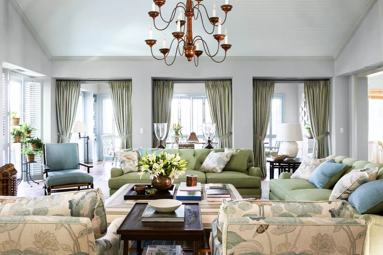
15 Timeless Paint Colors You’ll Never Tire Of, According To Designers
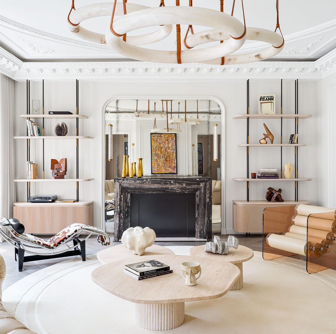
These Are the Neutral Paint Colors Interior Designers ACTUALLY Use


The most timeless paint colors according to designers
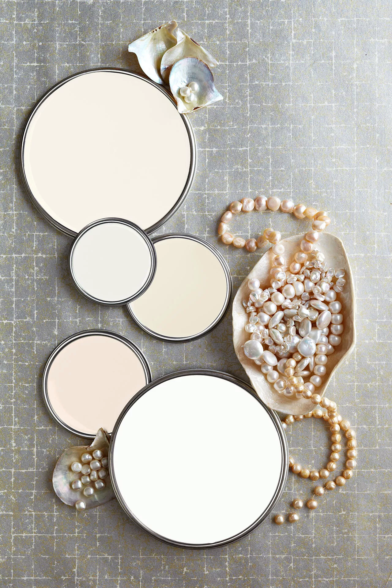
27 Neutral Paint Colors and Tips from Experts On How to Use Them

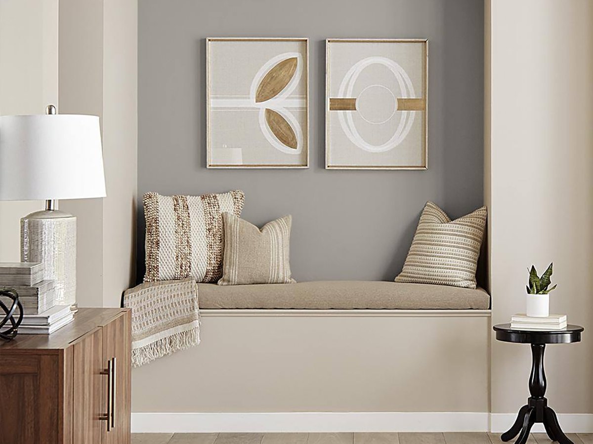
The 20 Best Neutral Paint Colors for Your Home in 2025


An A-List Designer’s Secrets To Picking Perfect Paint Colors
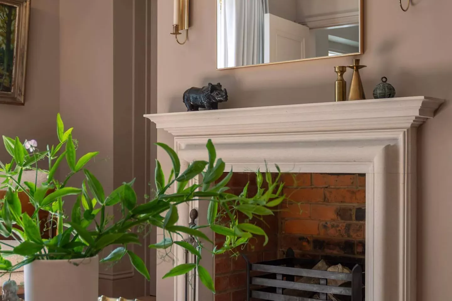
33 Absolutely Perfect Paint Colors Designers Love


7 of the most versatile and easy to use paint colors according to designers

8 Paint Color Trends You'll ACTUALLY Want to Live With in 2026, According to Designers
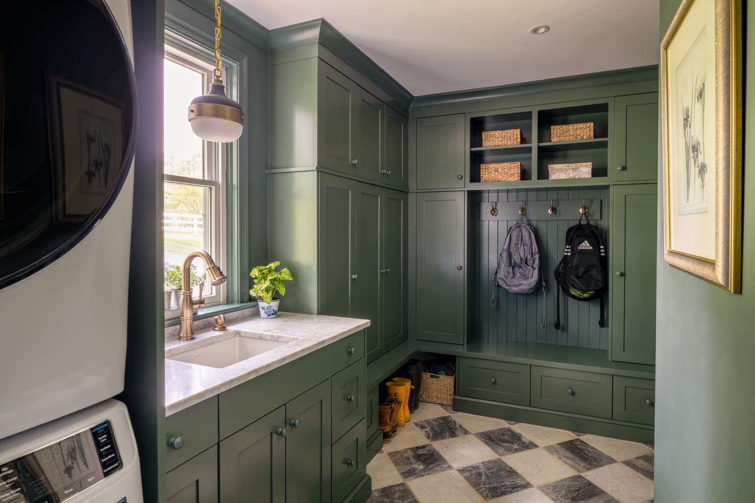
Tired of Touch-Ups? These 9 Paint Colors Are Forgiving and Designer-Approved

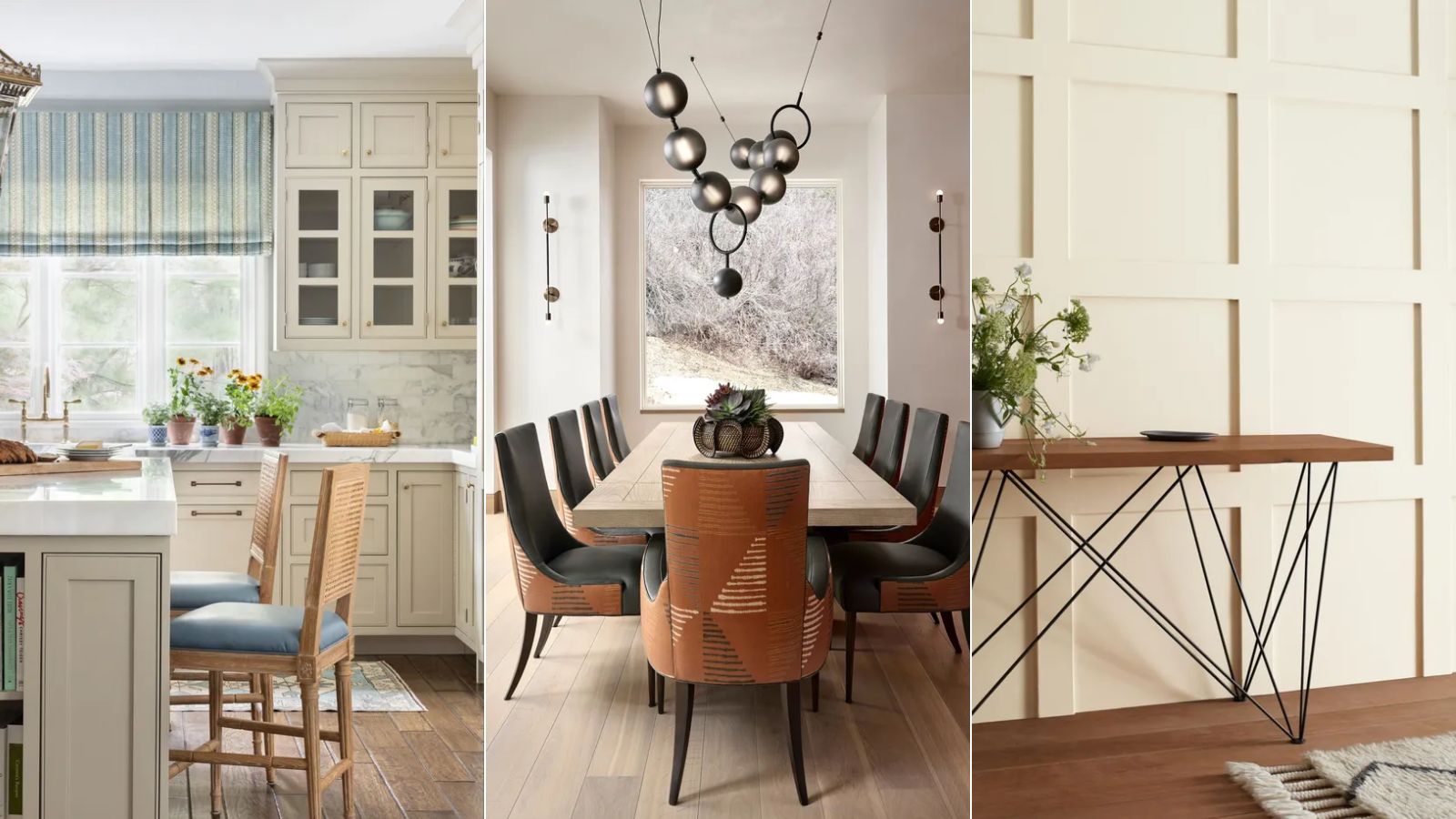
10 best warm neutral paints as recommended by interior designers – from beige to muted pink
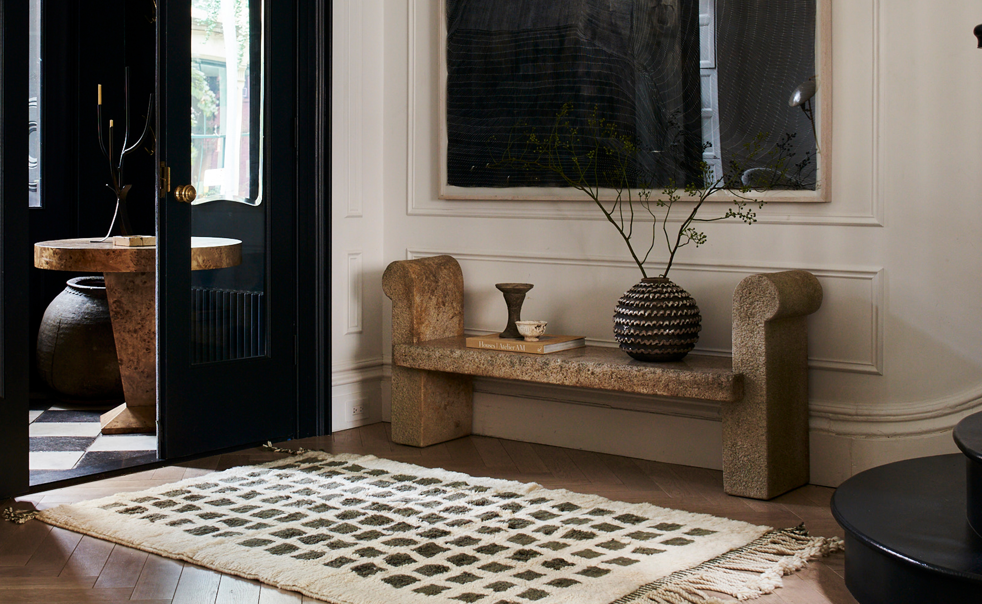
The 3 Best Neutral Entryway Paint Colors to Set the Right Tone for a Sophisticated Home
The Paint Color That All This Designer's Followers Ask About | domino

19 go-to paint colors that Dallas designers love
5 enduring colors designers always return to when they have trend fatigue
The Most Popular Paint Colors in America

5 Underrated Paint Colors Designers Always Use in Their Projects (and You Should Too)