10 Wine-Inspired Paint Colors Designers Will Cheers To
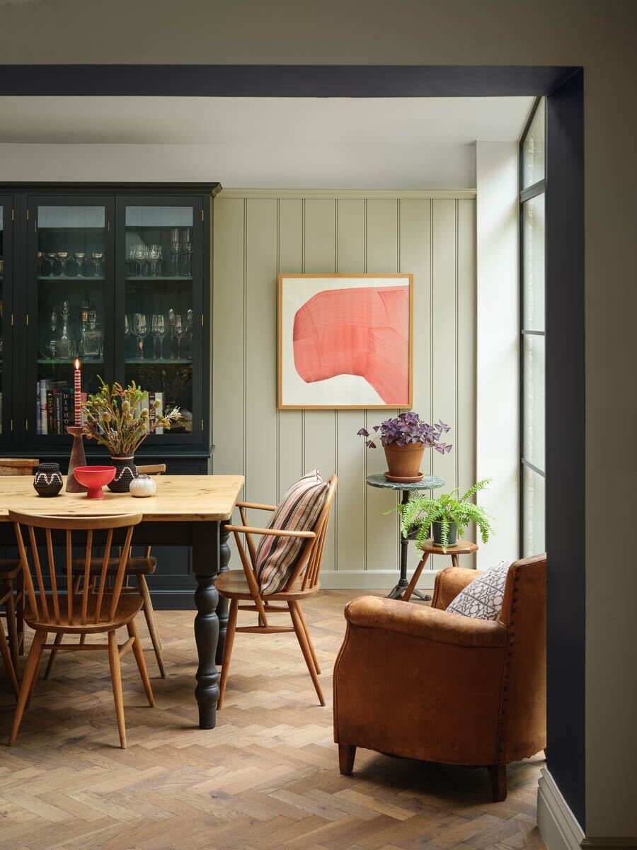
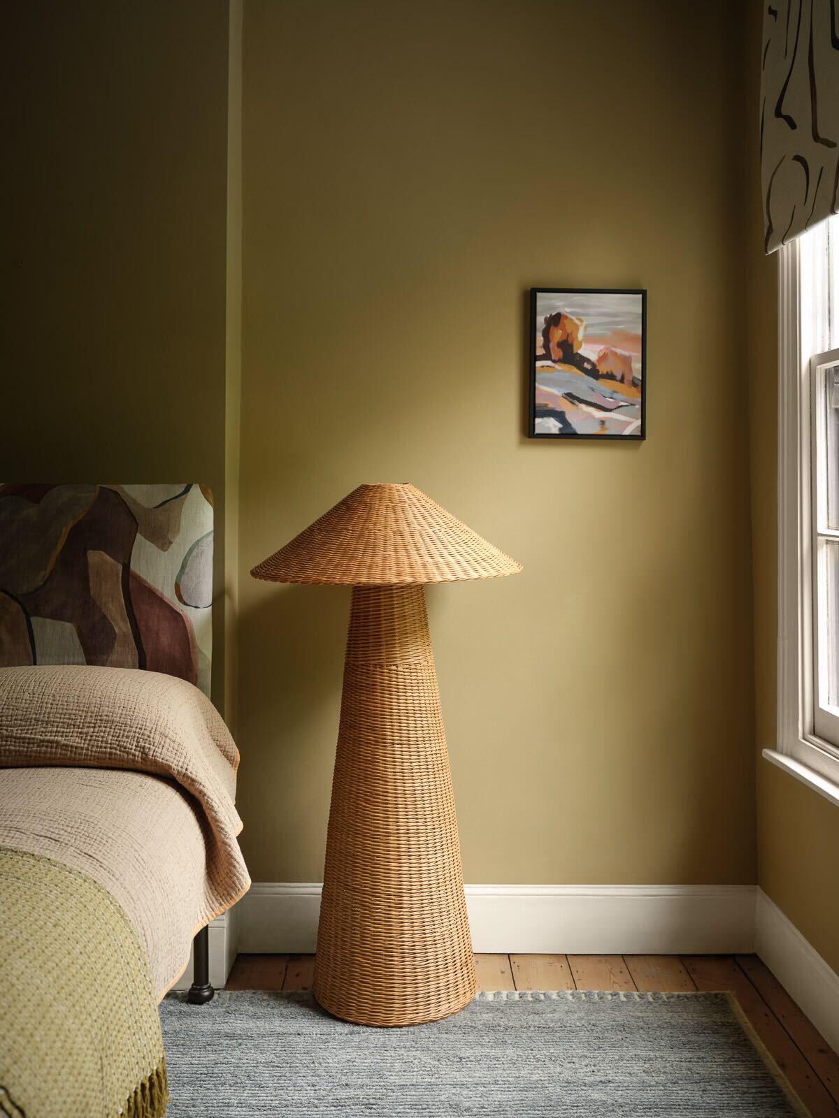
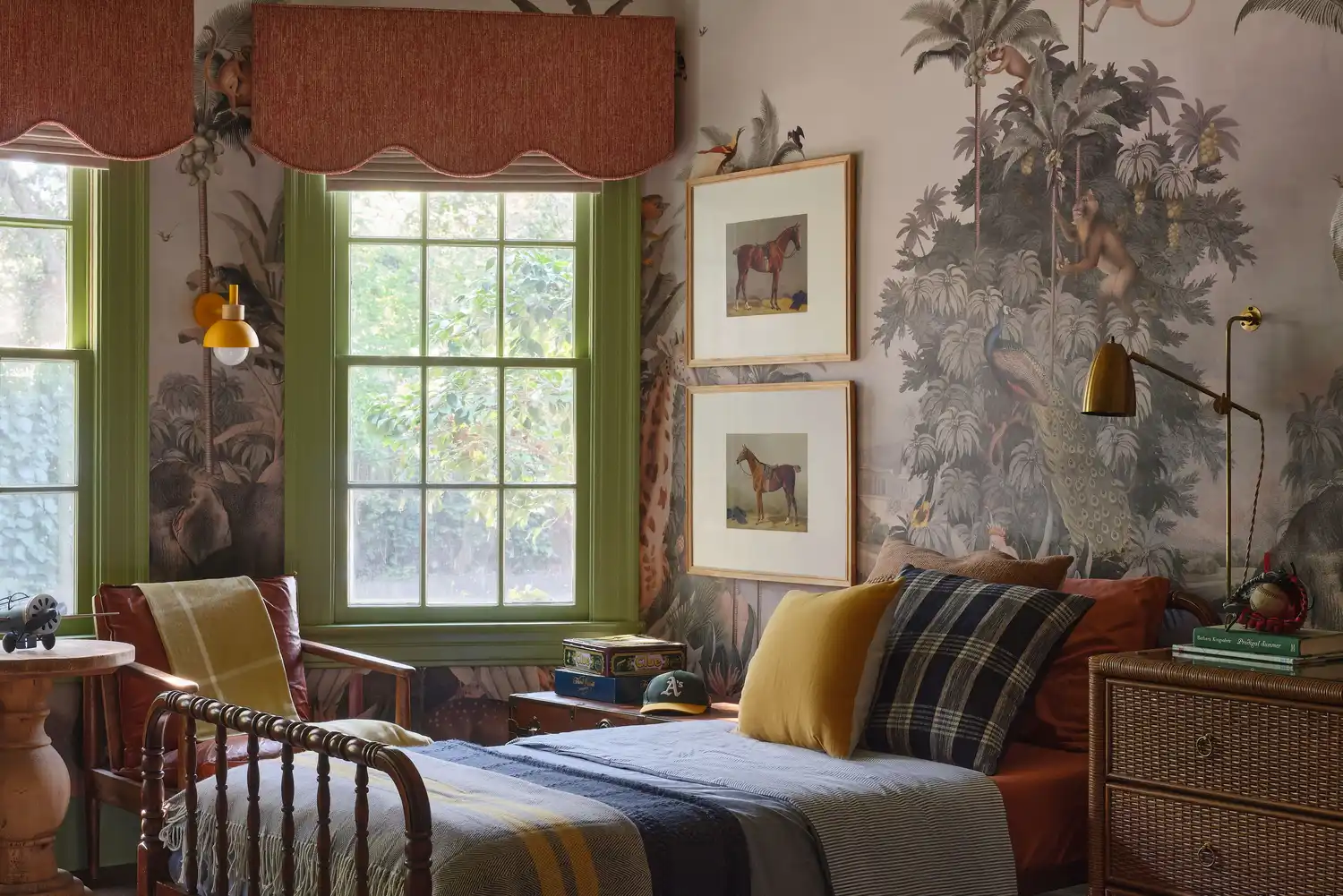
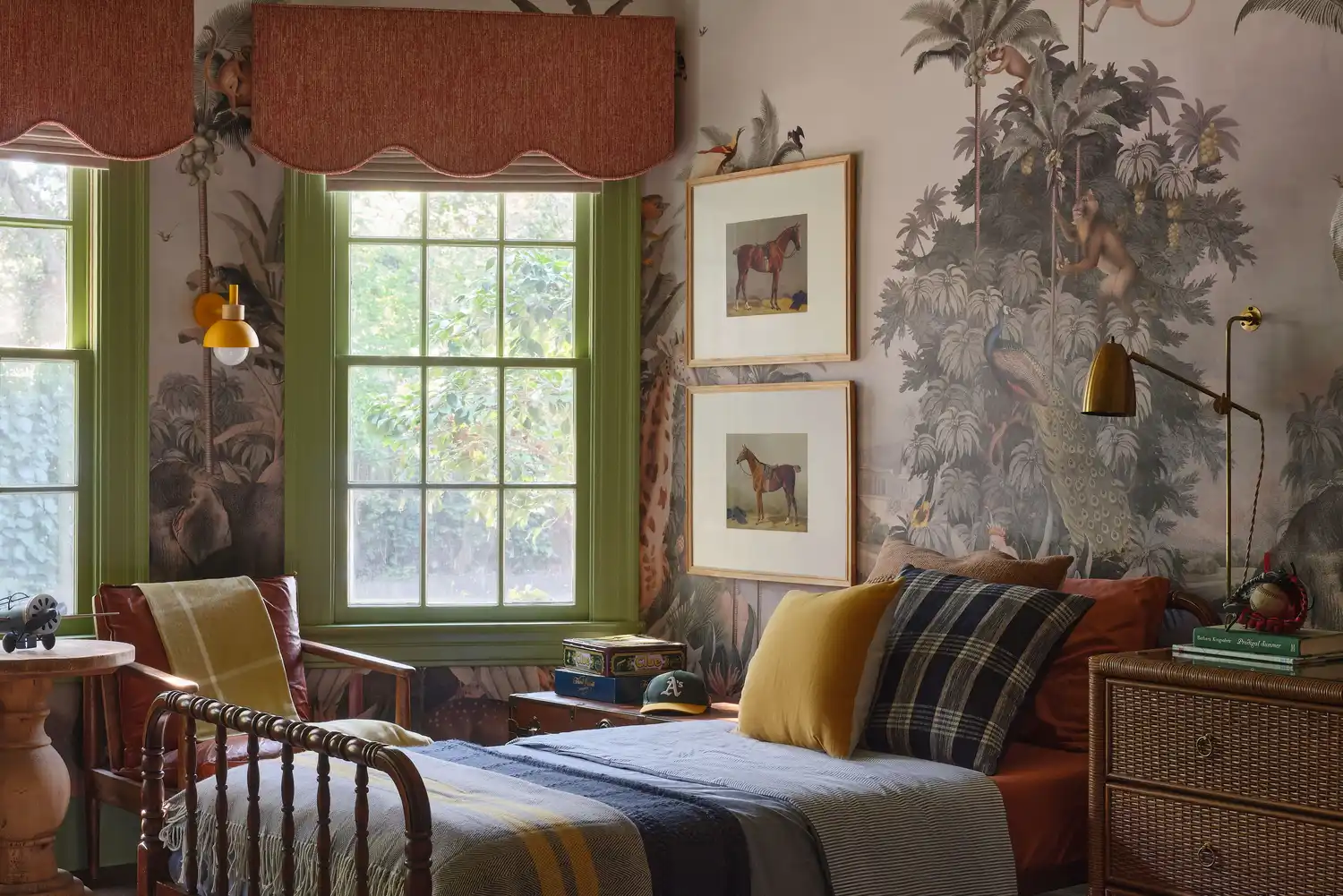
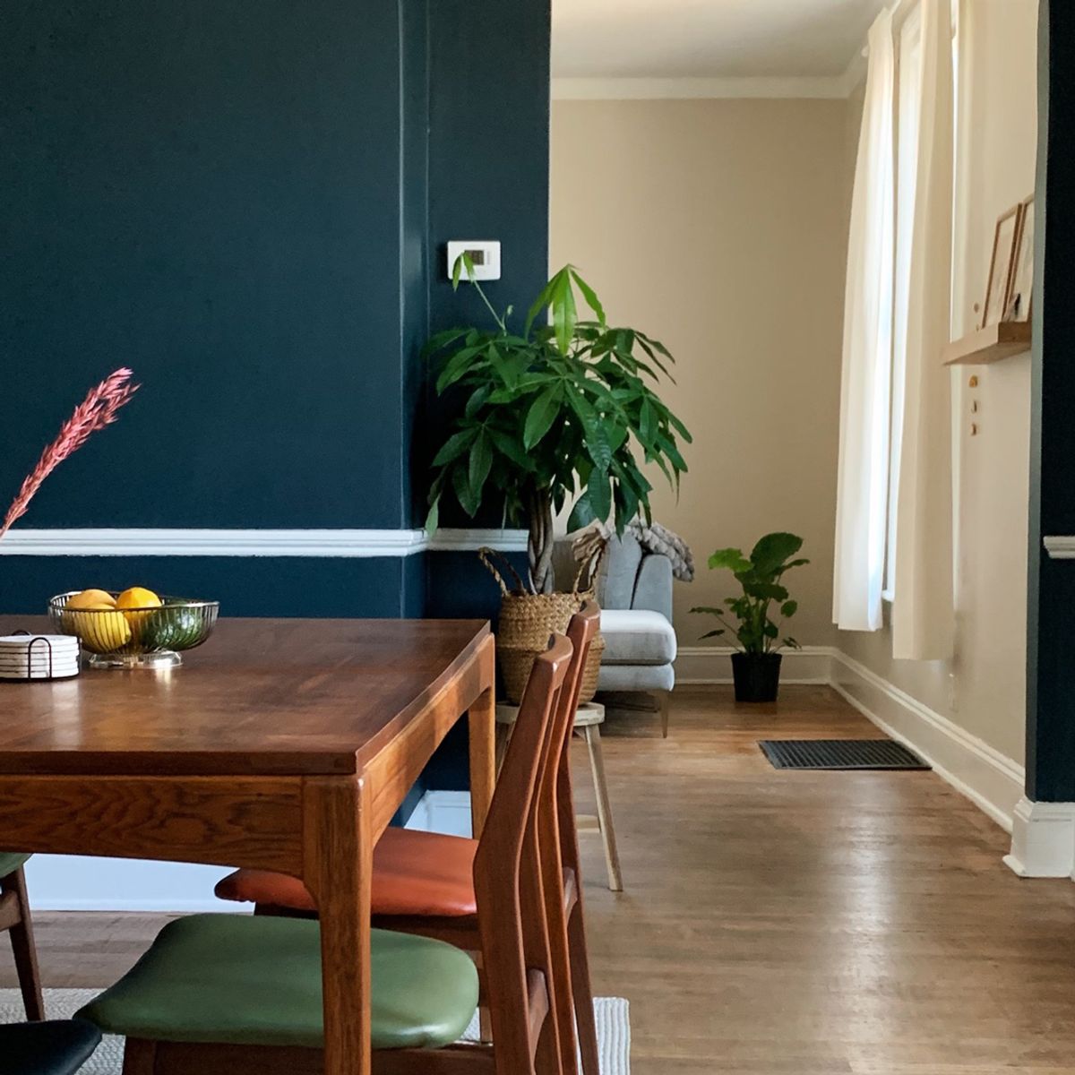
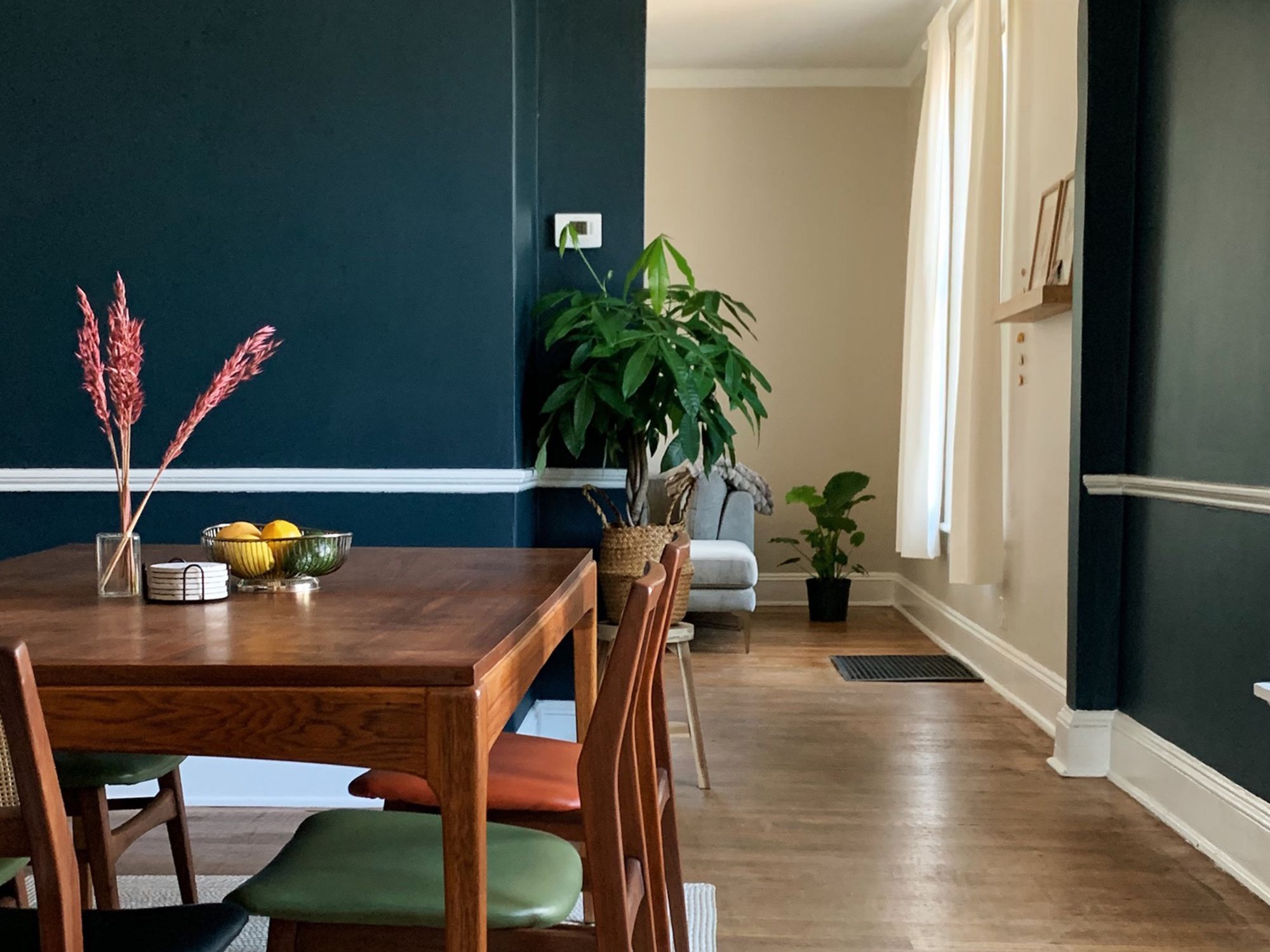
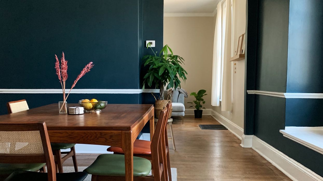
This article explores ten wine-inspired paint colors recommended by interior design experts to infuse homes with warmth, sophistication, and unique character. The color palette ranges from deep, rich reds reminiscent of vintage Cabernet Sauvignon to light, crisp shades inspired by champagne and rosé, offering diverse options for various home aesthetics.
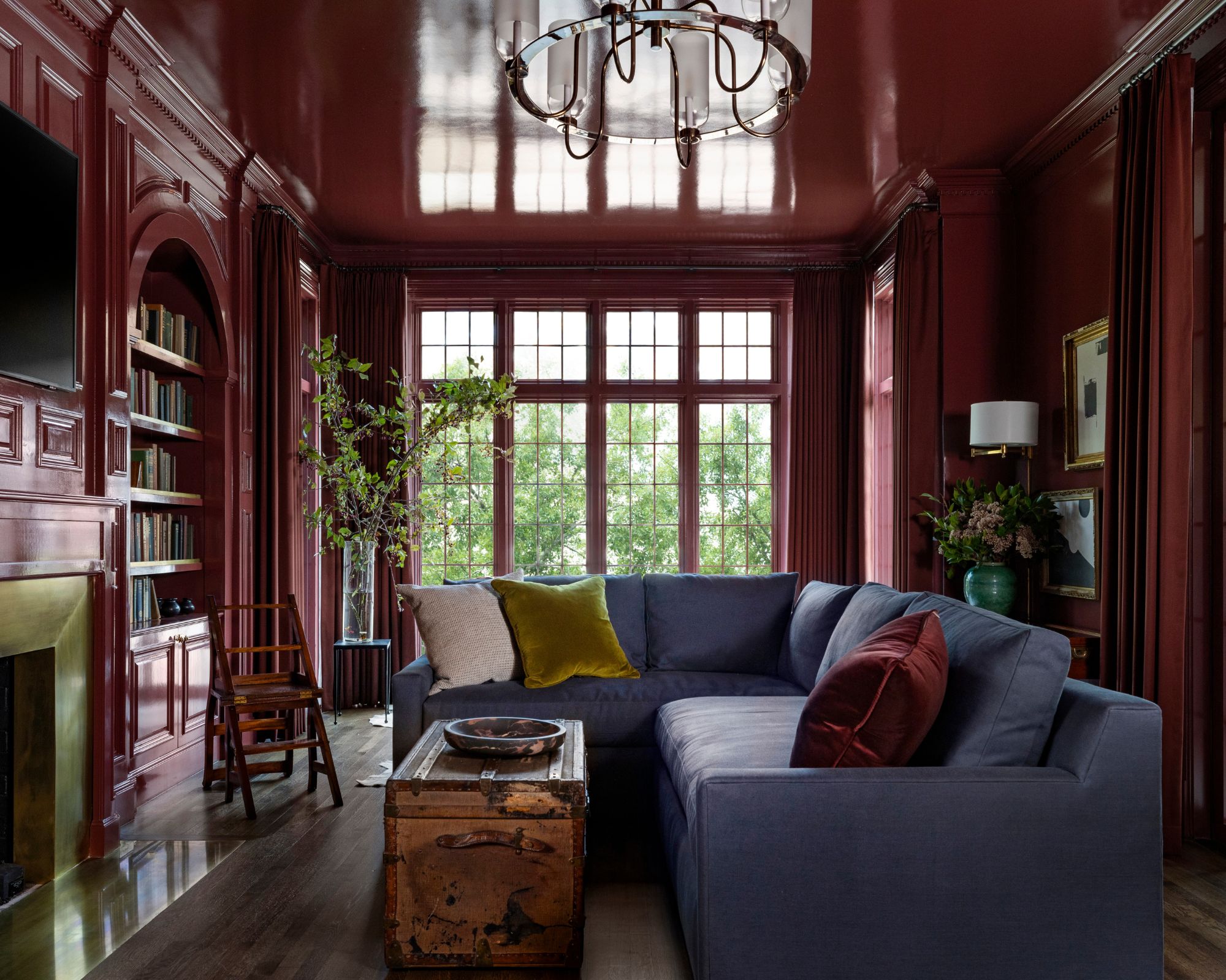
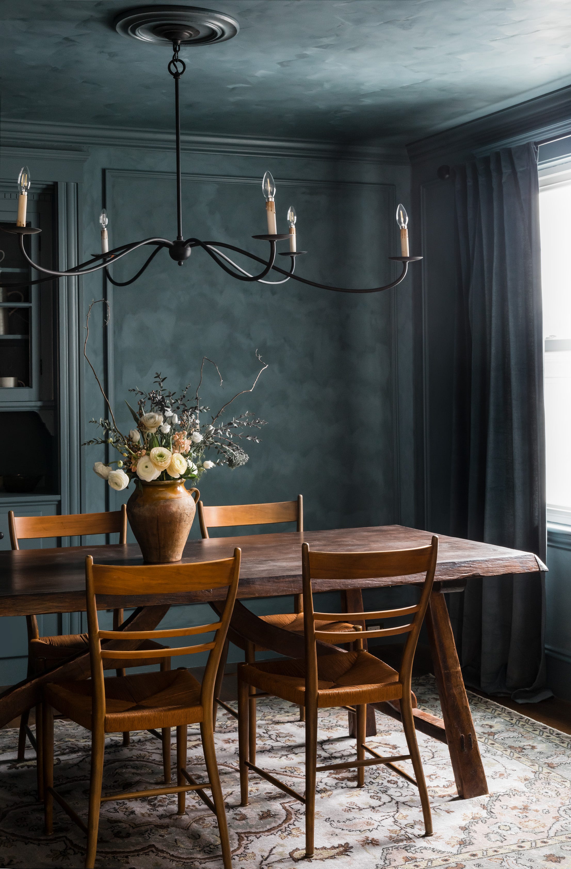
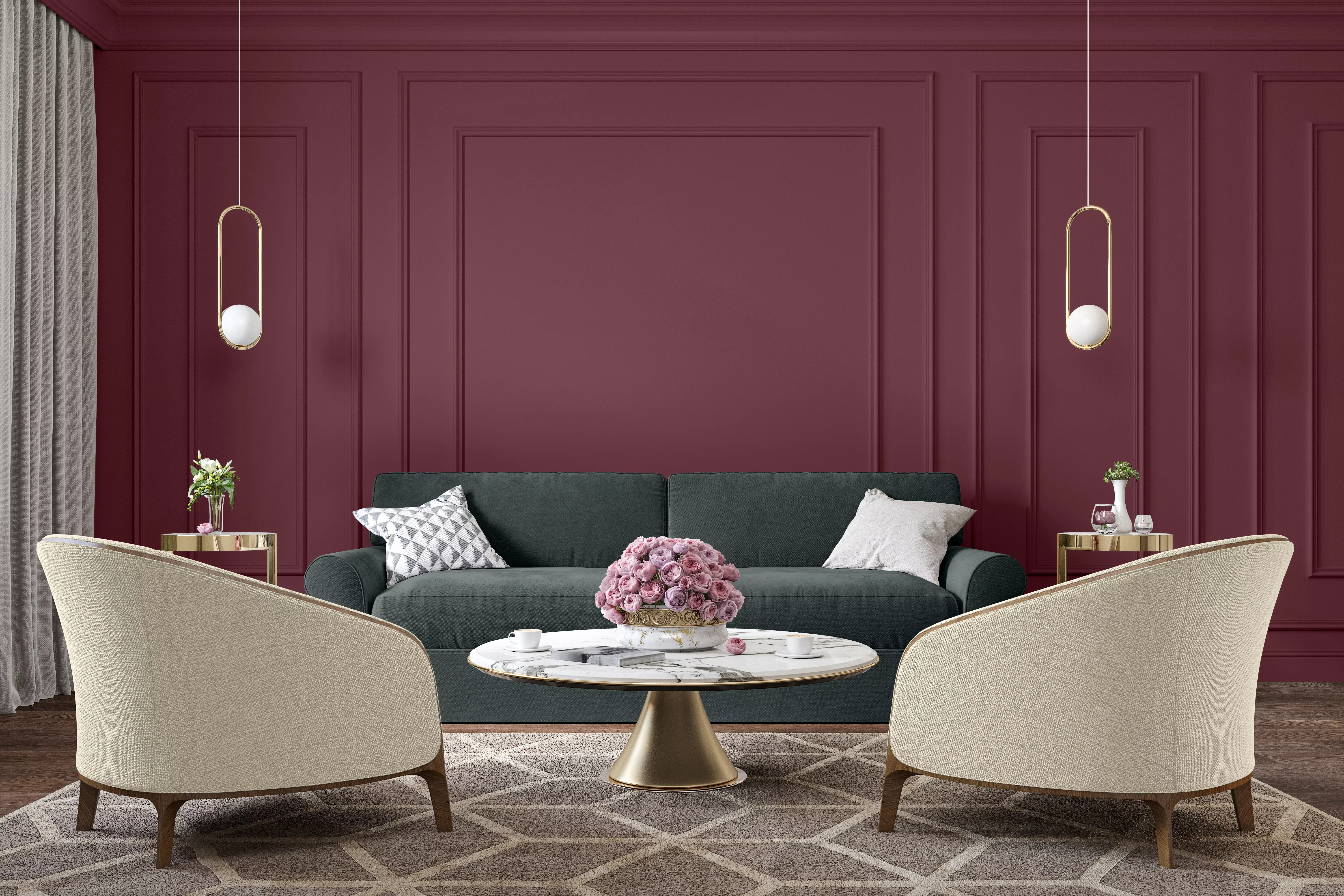
Cara Newhart, an interior designer and Behr ambassador, highlights the psychological connection between wine and color, suggesting that these hues can evoke feelings of coziness and connection. Dark, Merlot-like colors provide depth and comfort, making them ideal for communal spaces like family rooms and dining rooms. In contrast, light, warm neutrals, similar to Sauvignon Blanc, foster inviting environments, while rosé-inspired pastels offer sophistication, femininity, and versatility, allowing for experimental yet conversation-starting color choices.
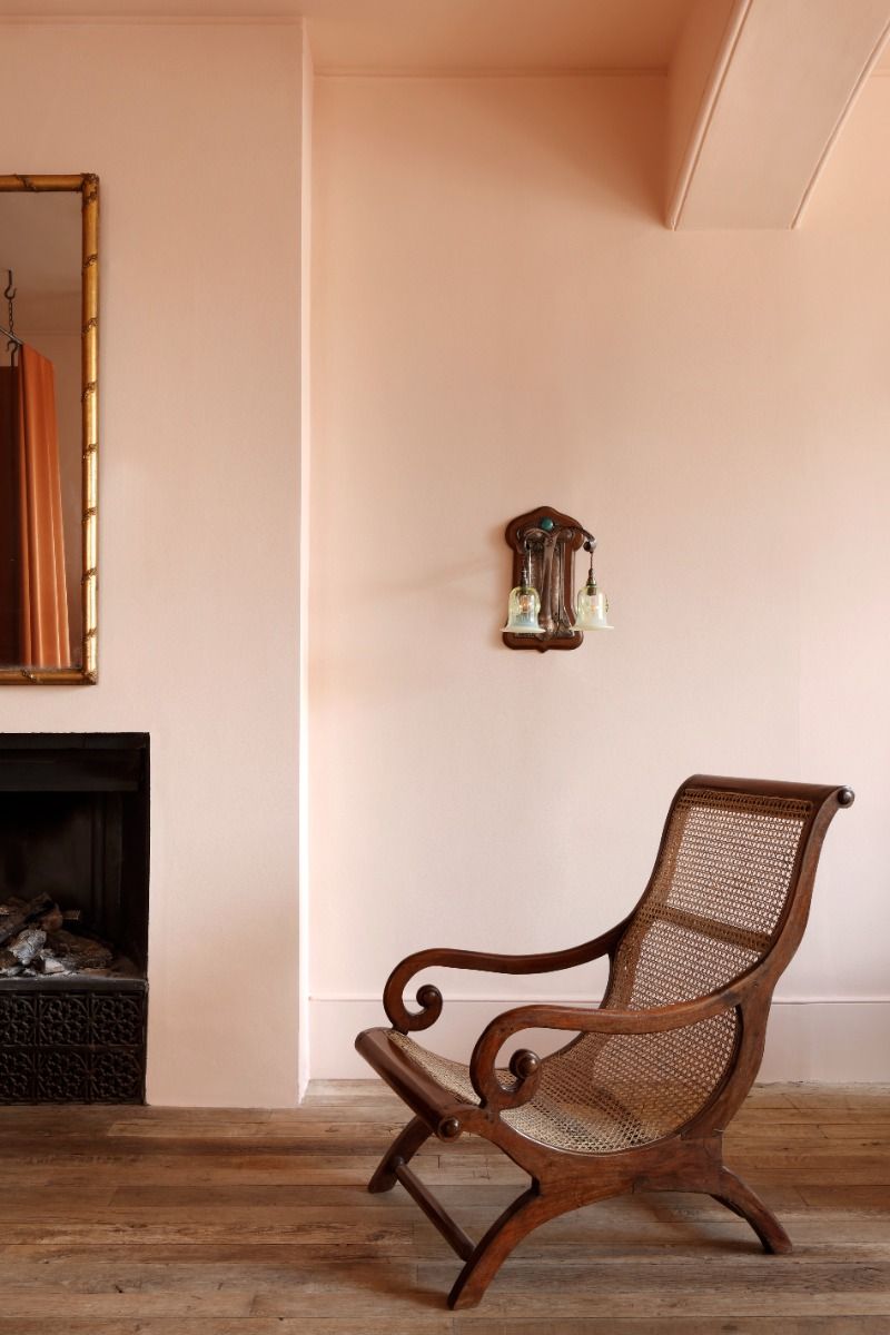
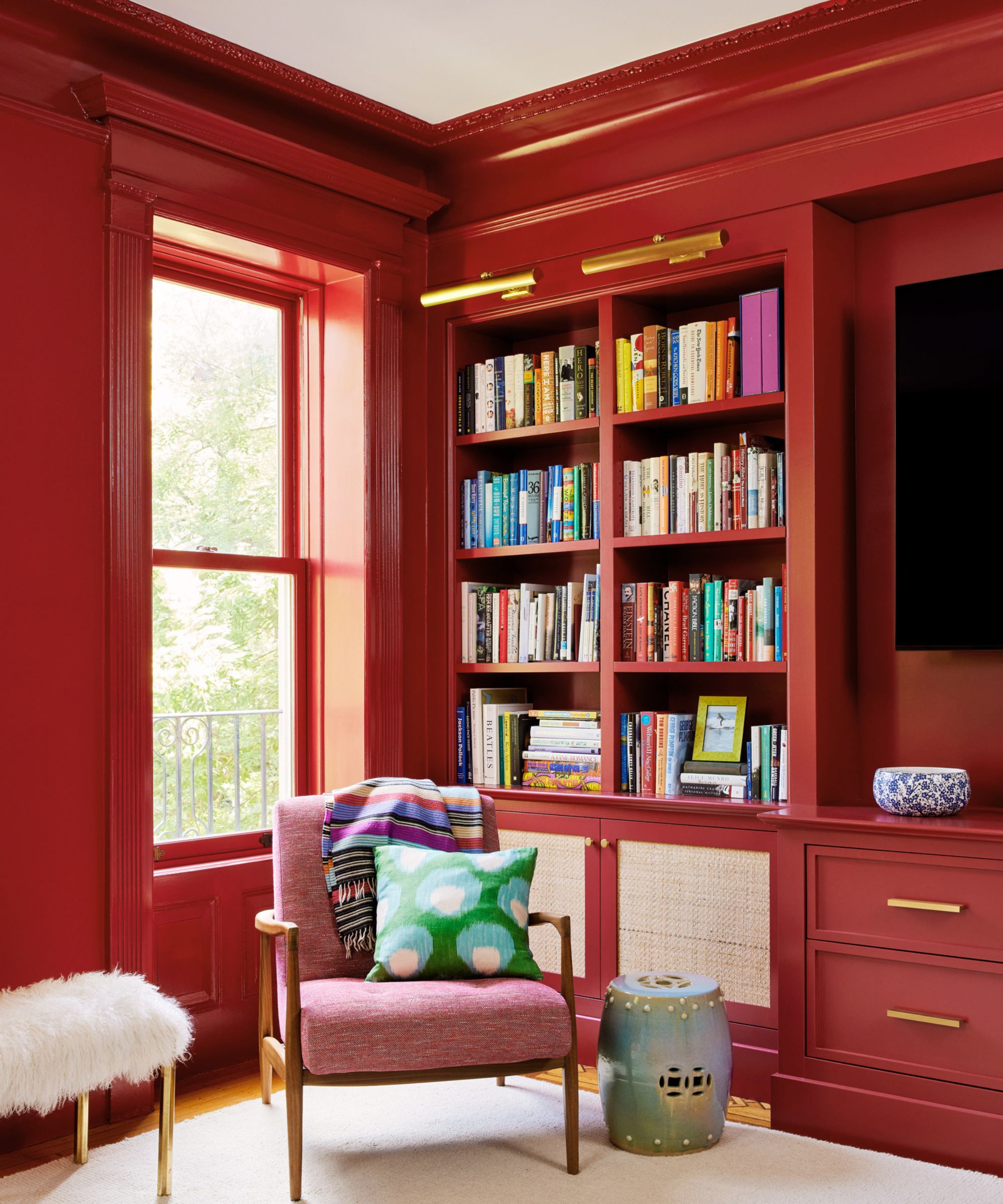
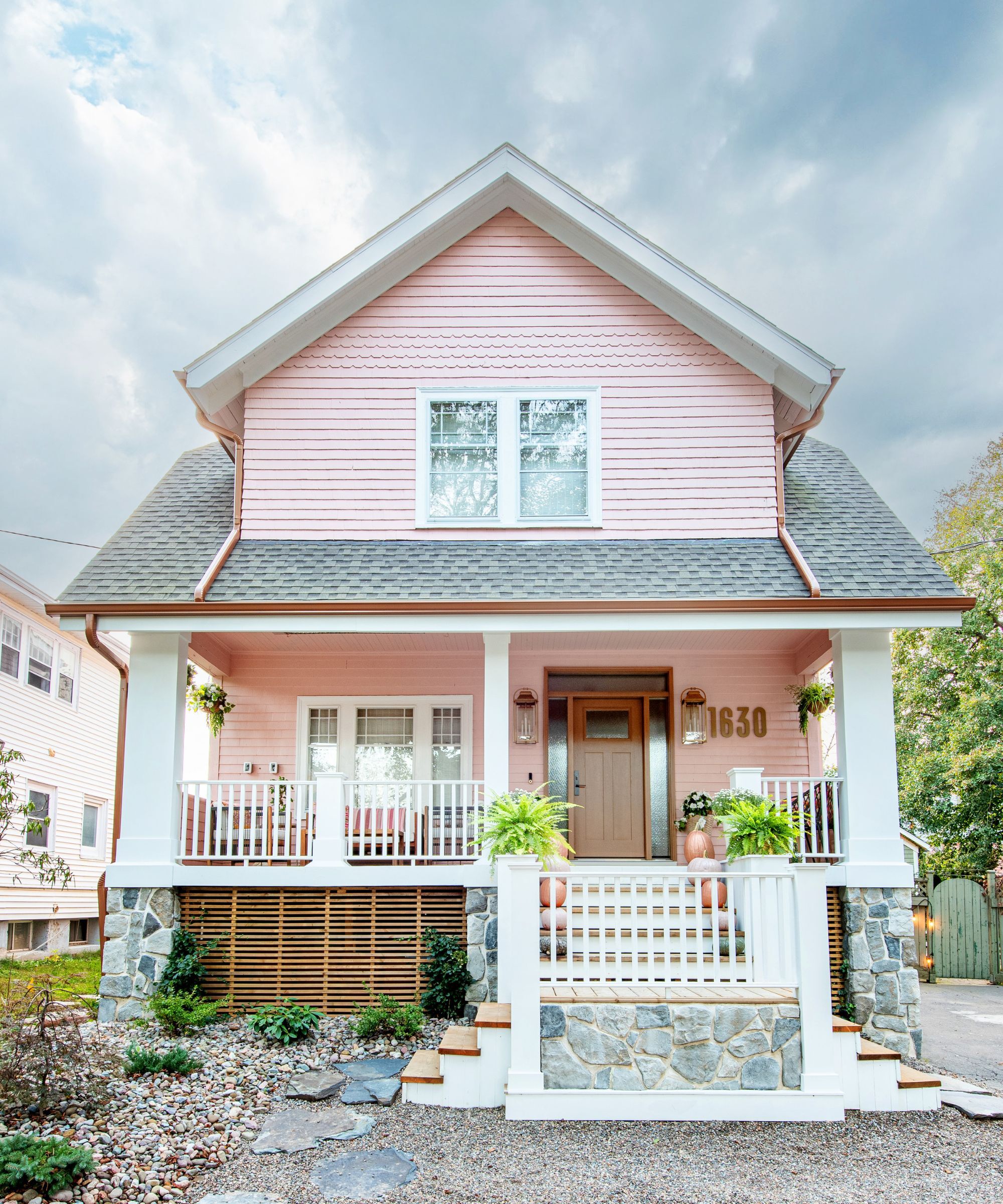
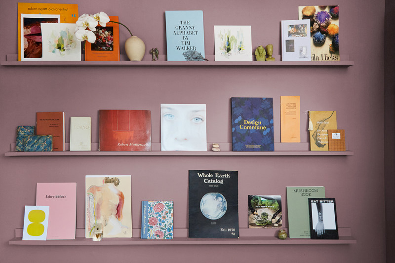

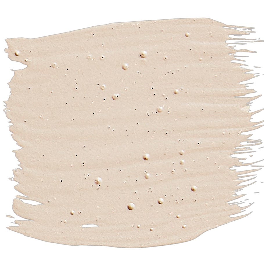
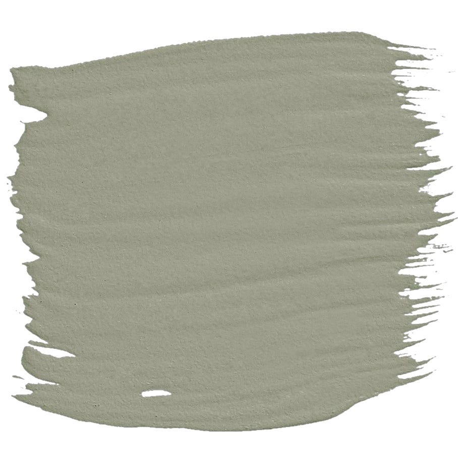
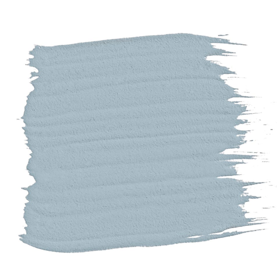
Among the featured colors, Benjamin Moore's 'Vintage Wine' is described by Hannah Yeo, color marketing and development manager at Benjamin Moore, as an intoxicating blend of brown and violet, providing a cozy, old-world feel and acting as a practical neutral for high-traffic areas. Behr's 'Wine Pairing' is a light, playful misty pink that adds interest without being overwhelming. Glidden's 'Red Red Wine' creates a moody interior, perfect for dining or theater rooms, especially when paired with dark furniture or lightened with warm neutrals.
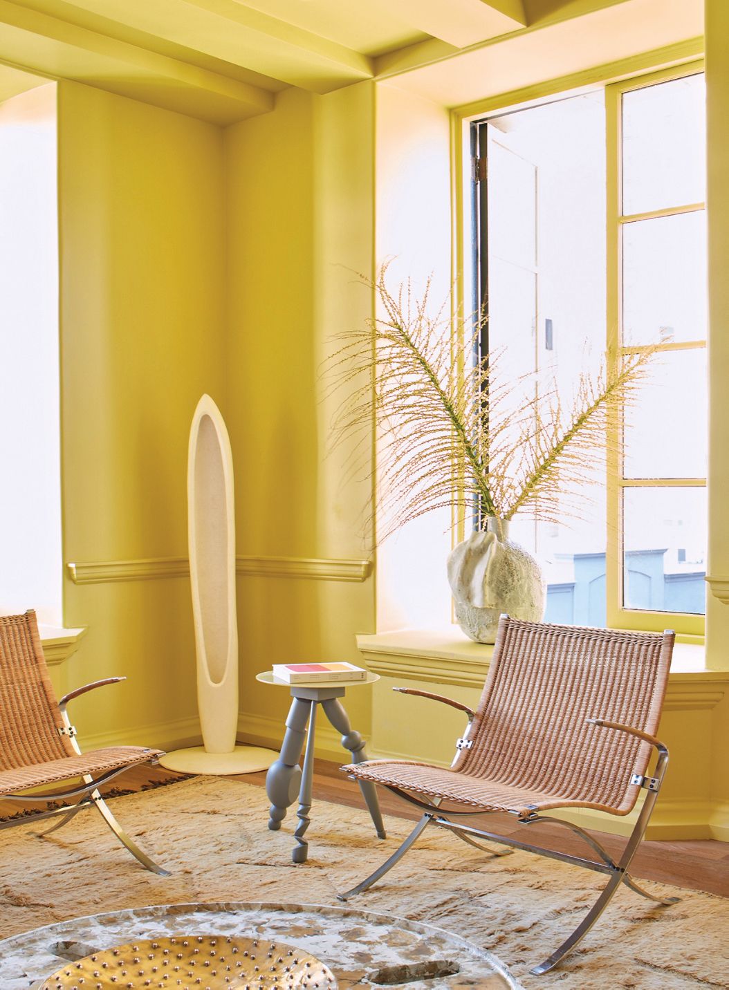
Valspar's 'Rare Wine' is a complex, luxurious hue with red undertones, suitable for dramatic color drenching in smaller spaces like powder rooms. Glidden's 'Champagne Wishes' is a soft, reddish-brown ideal for living rooms, dining rooms, or kitchens, complementing warm neutrals and subdued blues and greens. Behr's 'Chilled Wine', an amber-gold inspired by Chardonnay, offers comforting warmth and is recommended for accent walls or furniture in neutral spaces.
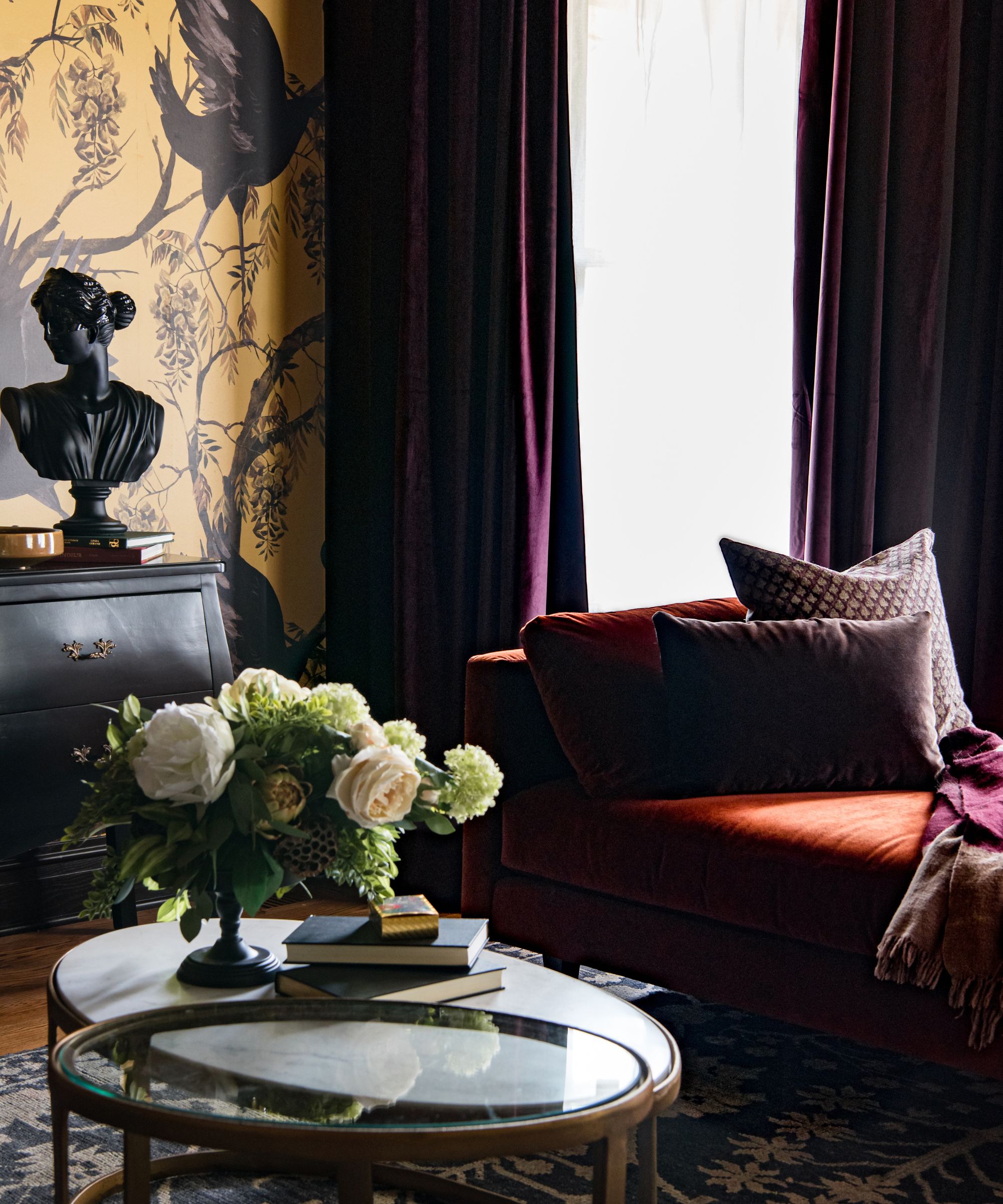
Benjamin Moore's 'Cabernet' is a deep violet with earthy brown hints, which can be accentuated with off-whites or layered with black and navy for a glamorous look. HGTV Home by Sherwin-Williams' 'Napa Dawn' is a soothing neutral with a pink tint, evoking vineyard mornings, best paired with mid-tone woods and crisp white trim. Valspar's 'Champagne Pink' is a gentle pink with coral undertones, bringing soft energy to a space when combined with brass accents and rich fabrics. Finally, Glidden's 'Champagne Ice', a pale orange with a copper undertone, is suggested for lively dining areas or kitchens, paired with warm neutrals and mid-tone greens or blues.
These expert-approved paint colors offer homeowners a curated selection of sophisticated and evocative options to transform their living spaces, each drawing inspiration from the rich and varied world of wine.
#WineInspiredColors #InteriorDesign #PaintColors #HomeDecor #ColorPalette #DesignTips #BenjaminMoore #BehrPaint #GliddenPaint #ValsparPaint #WineInspiredColors #InteriorDesign #PaintColors #HomeDecor #ColorPalette #DesignTips #BenjaminMoore #BehrPaint #GliddenPaint #ValsparPaint
0 comment in total
 No comments yet
You may also like
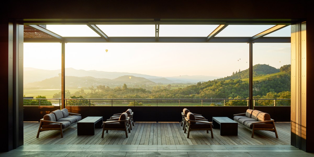
These Stunning Wineries Are a Must-Visit for Design Lovers

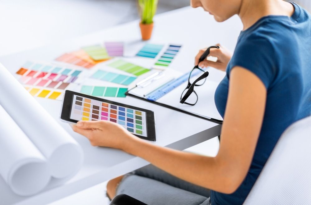
10 Paint Color Apps Every DIYer Should Know About

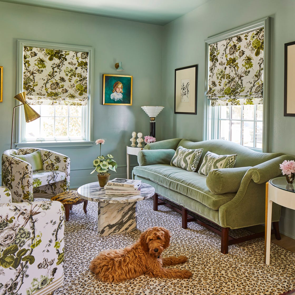
Designers Swear By These 11 Sage Green Paint Colors

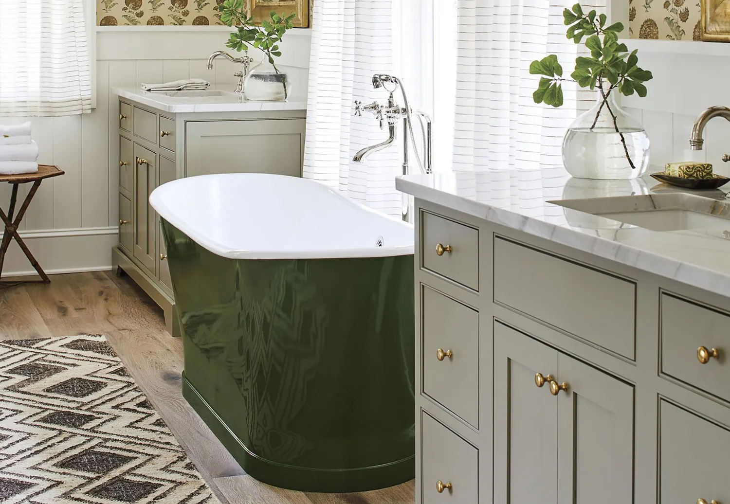
10 Greige Paint Colors Designers Recommend Again And Again

10 Timeless Living Room Paint Colors Designers Swear By

The most timeless paint colors according to designers

33 Absolutely Perfect Paint Colors Designers Love

6 Paint Color Duos Designers Can't Get Enough of This Fall


An A-List Designer’s Secrets To Picking Perfect Paint Colors

10 Color Drenching Ideas That Highlight the Beauty of This Paint Trend
The 10 Best Blue-Green Paint Colors Designers Can't Stop Using
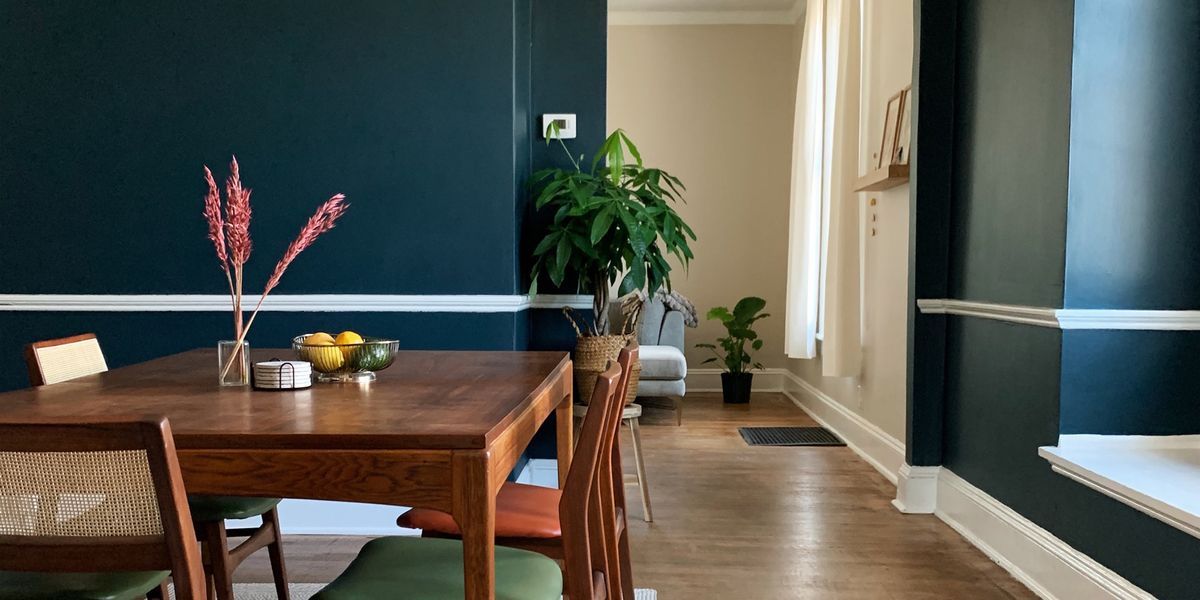
Fall’s Most Stylish Paint Color Trends Have Us Swooning
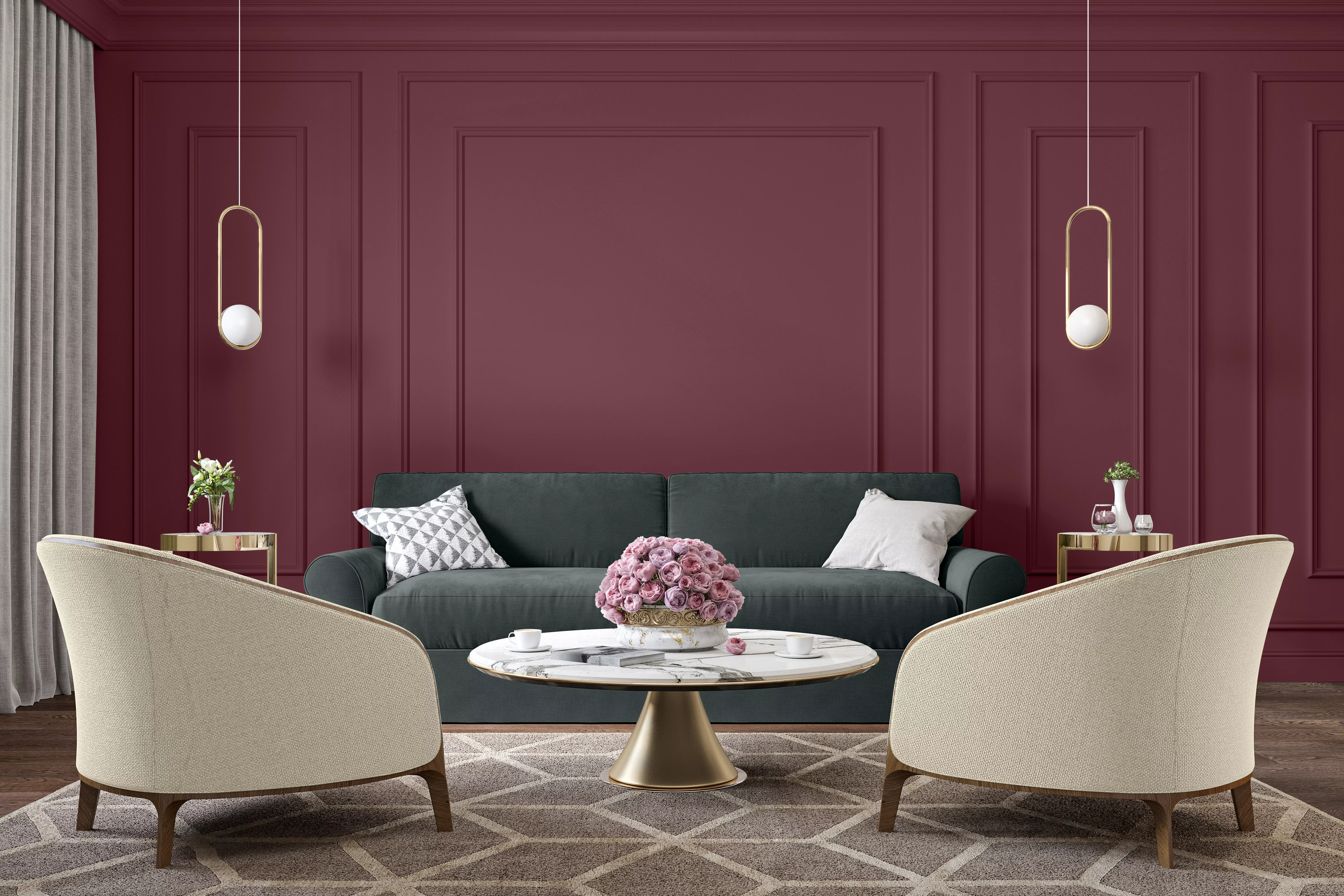
10 Paint Colors Inspired by Your Favorite Wines
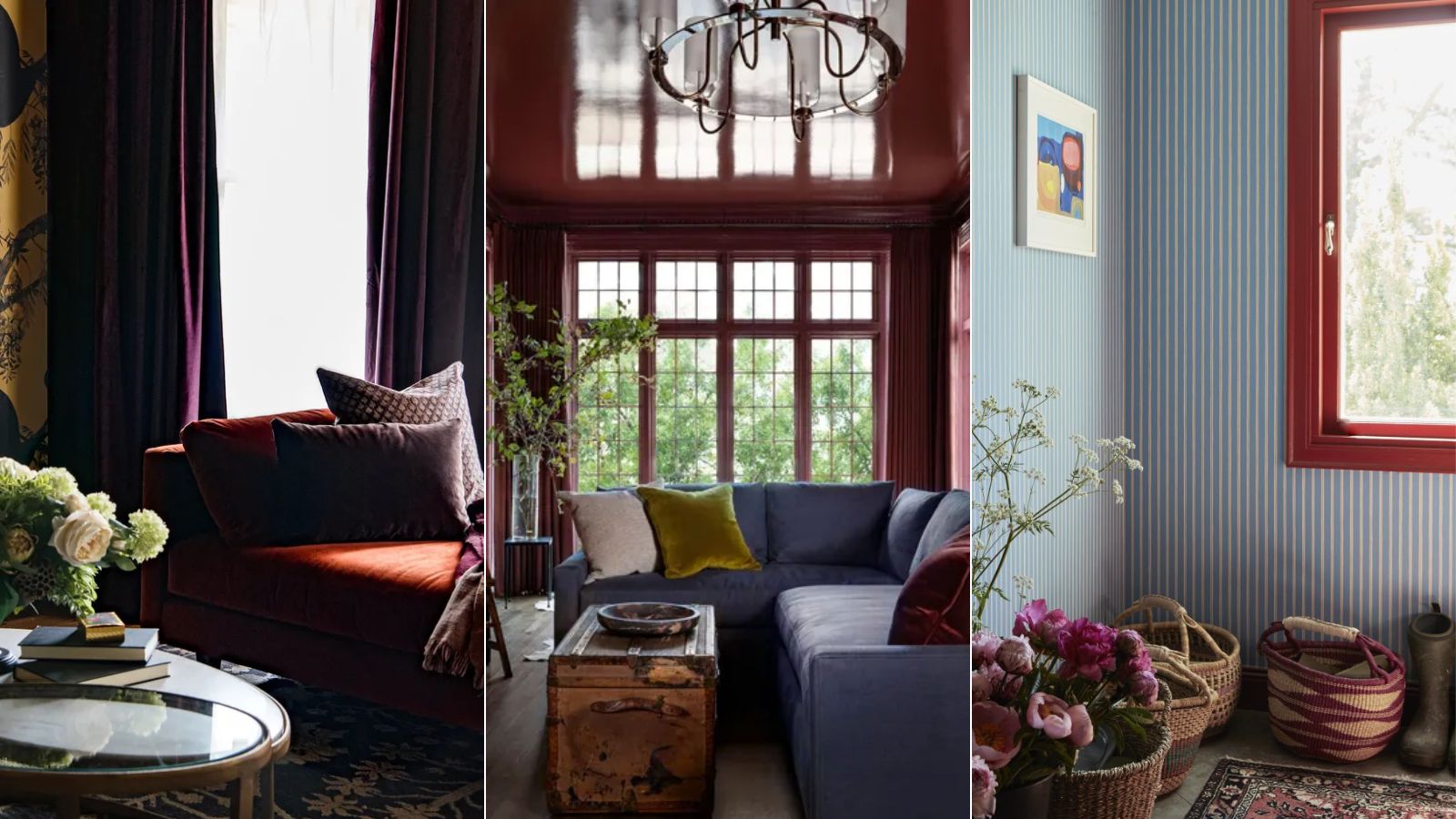
I predict wine red as the winning color of fall and winter 2024 – here's how designers are embracing this alluring shade
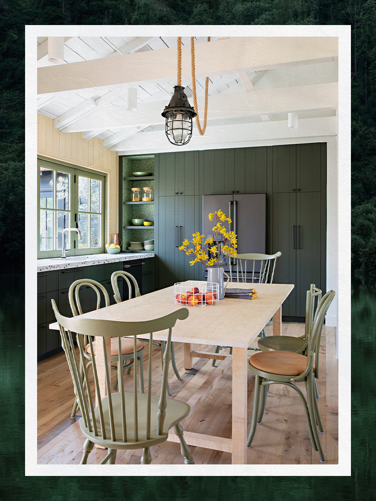
Designers Share Their Tried-and-True Shades From the Best Interior Paint Brands
10 Kitchen Paint Colors You Won’t Regret in 10 Years, According to Designers
All the interior designers with paint collaborations (and our favourite shades)
10 of the best exterior paint colors according to designers – these are the go-to shades from tried and trusted brands
The Best Vintage-Inspired Paint Colors — 6 Expert-Approved Shades for a Touch of Chic Nostalgia

The 10 Best Accent Wall Colors From the Paint Experts