10 Paint Colors Inspired by Your Favorite Wines
This article explores ten wine-inspired paint colors recommended by interior design experts to infuse homes with warmth, sophistication, and unique character. The selection ranges from deep, rich reds reminiscent of aged Cabernet to light, effervescent champagne tones, each designed to evoke specific moods and complement various interior styles. The featured paint colors are sourced from prominent brands like Benjamin Moore, Behr, Glidden, Valspar, and HGTV Home by Sherwin-Williams.
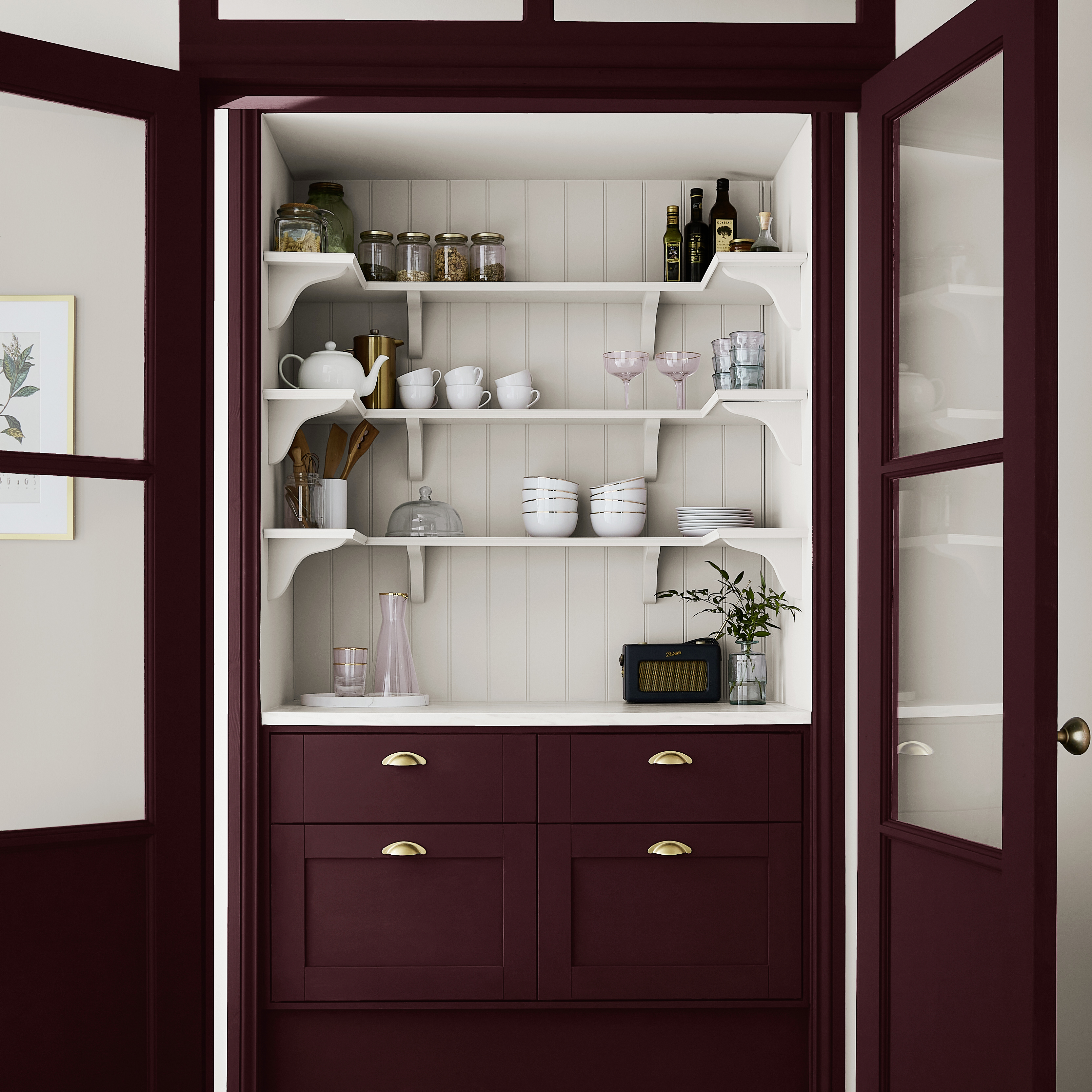
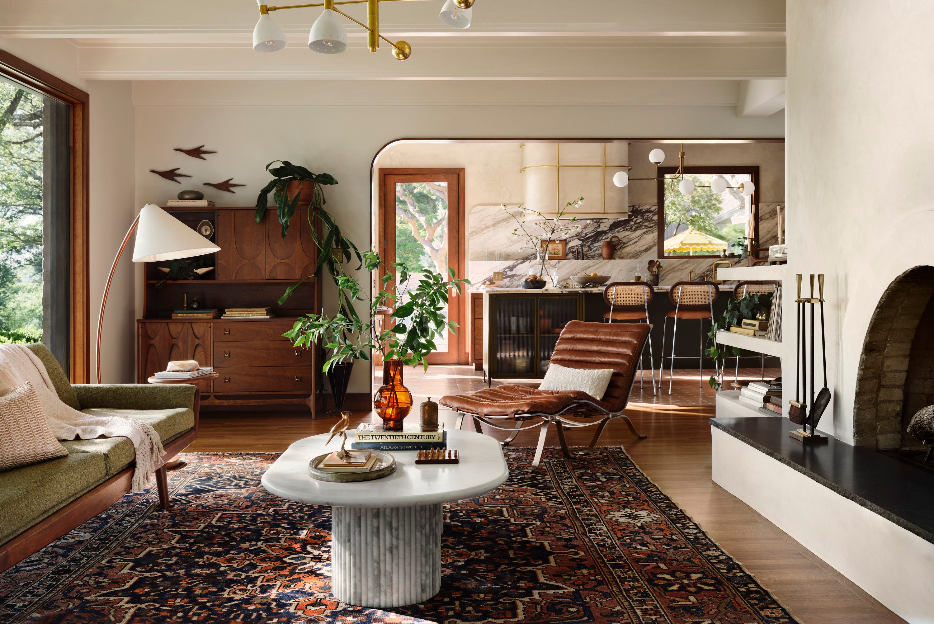
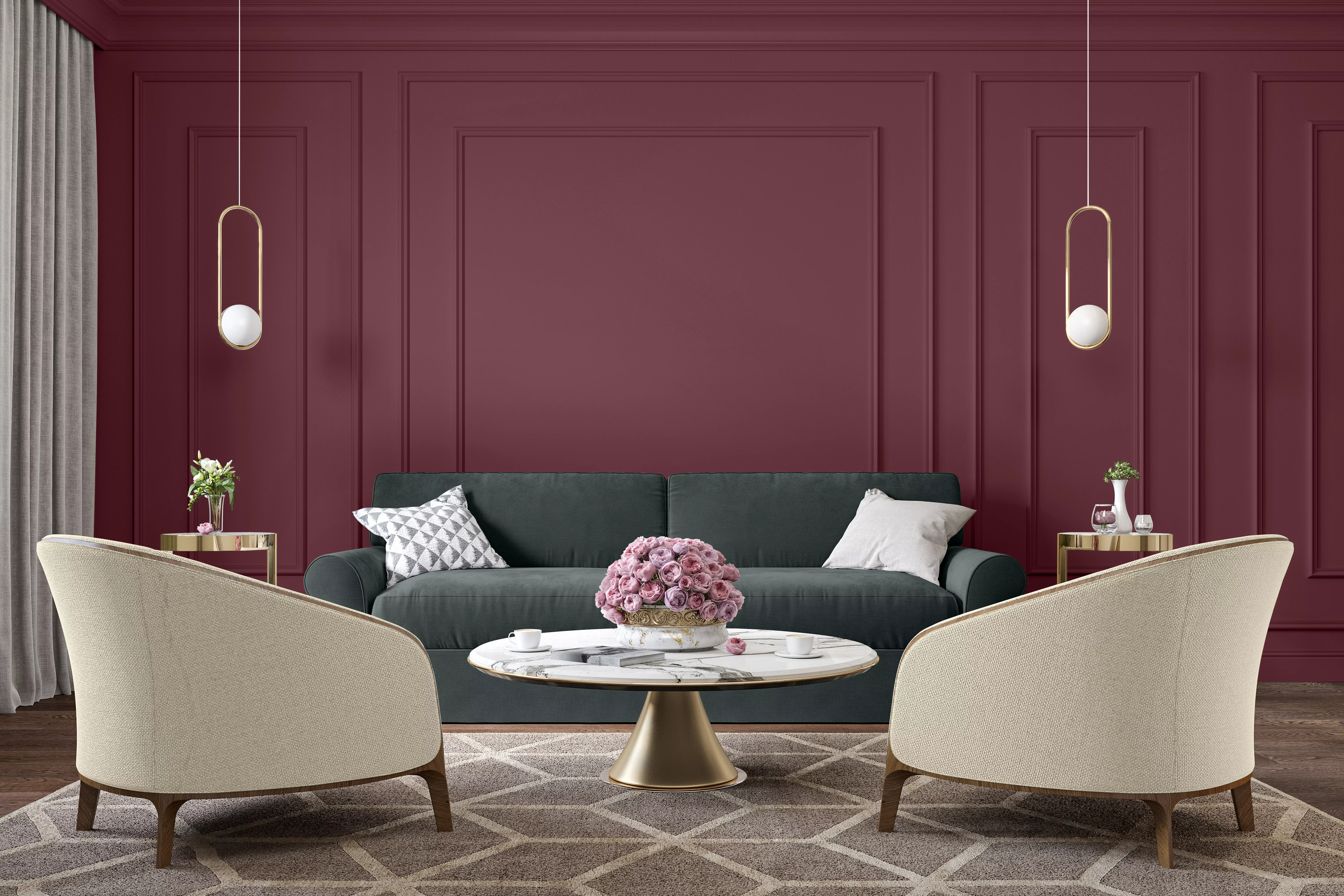
The article begins by highlighting the versatility of wine-inspired colors, suggesting that they can create parallels between beloved elements and desired atmospheres within a space. For instance, dark, full-bodied shades like a Merlot establish a soothing depth, ideal for gathering areas such as family rooms or dining rooms. Conversely, light, warm neutrals, similar to a Sauvignon Blanc, promote an inviting environment, while rosé-inspired pastel pinks offer a blend of sophistication and femininity, serving as a versatile option for those new to incorporating color.
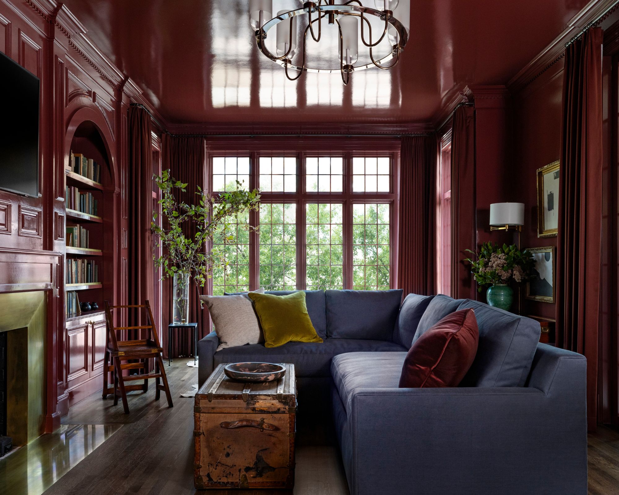
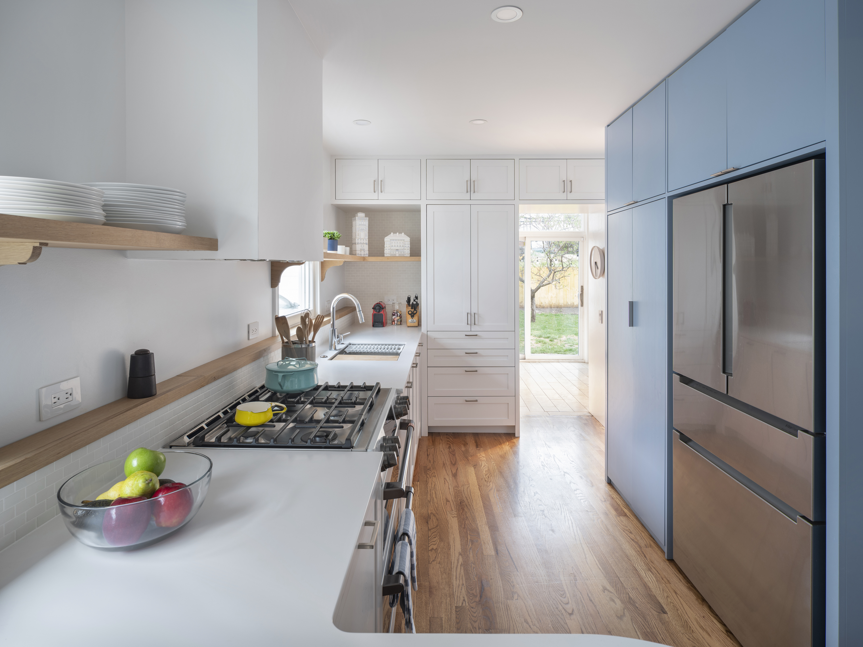

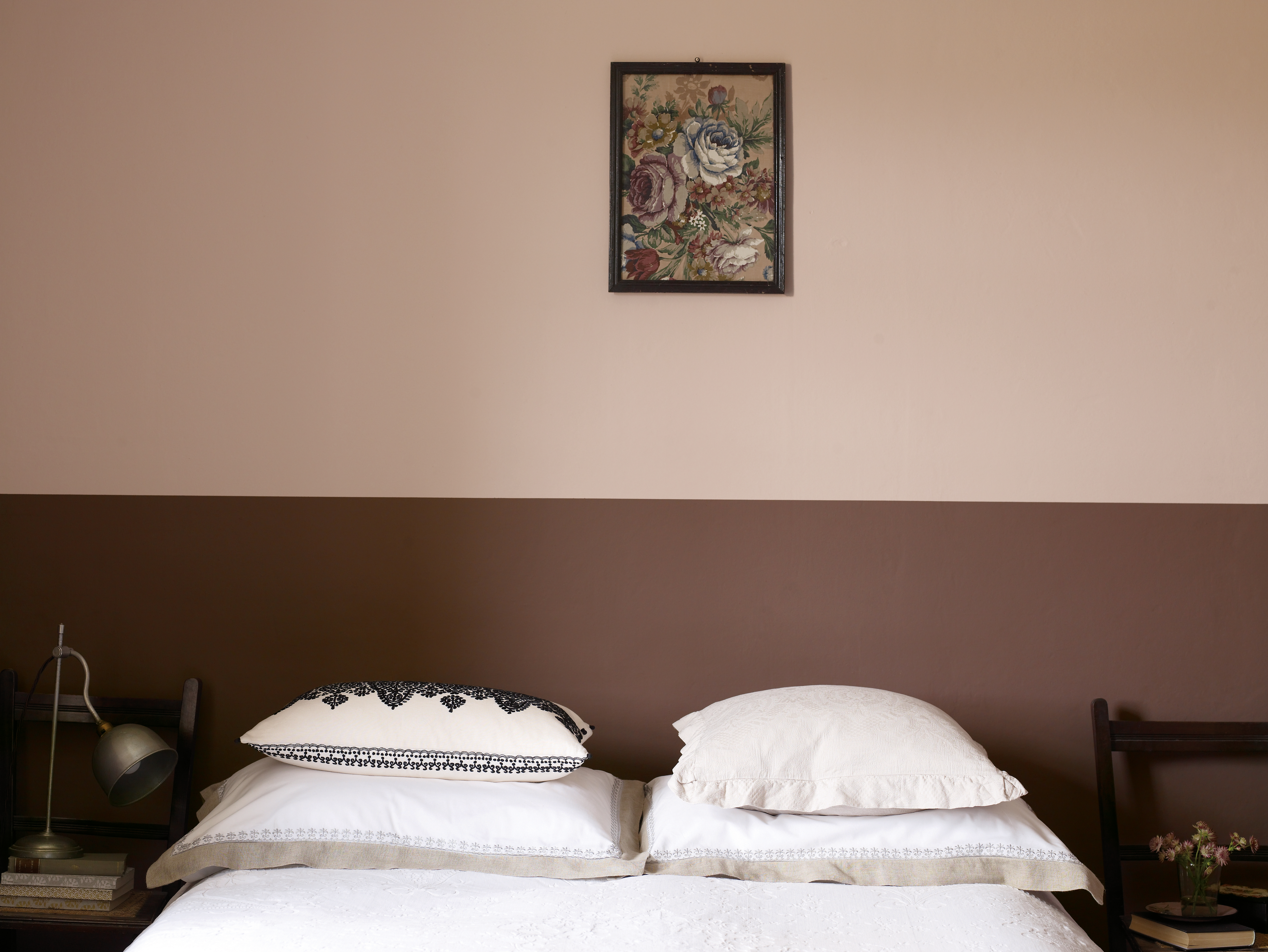
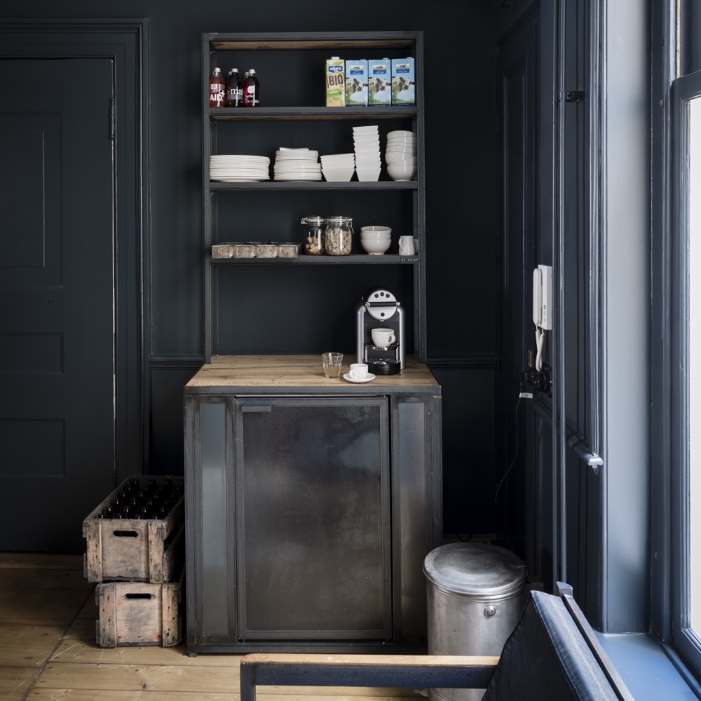
Each of the ten featured colors is described in detail, including its specific hue, the emotion it evokes, and practical application advice from color experts. For example, Benjamin Moore’s “Vintage Wine” is presented as an intoxicating blend of brown and violet, providing a rich, cozy, old-world feel. It is recommended for high-traffic areas like mudrooms or family rooms due to its ability to hide dirt while adding beauty. Behr’s “Wine Pairing,” a misty pink, is suggested for those seeking a light, playful, and whimsical vibe, easily integrated into various schemes. Glidden’s “Red Red Wine” is a dark, dusty shade perfect for creating moody interiors in dining rooms, wine-tasting rooms, or bedrooms, and pairs well with dark furniture or can be lightened with whites and warm neutrals.
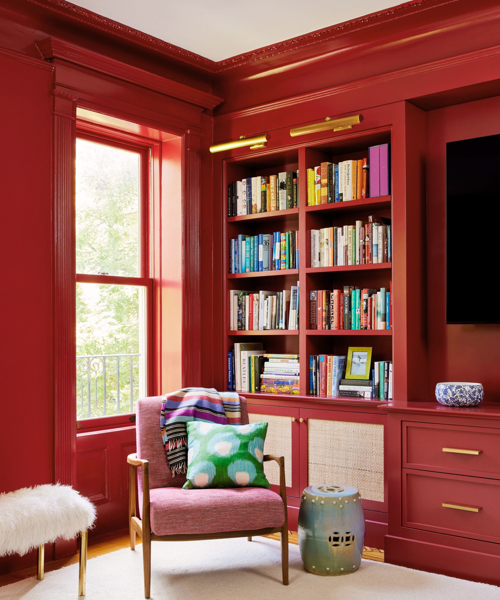
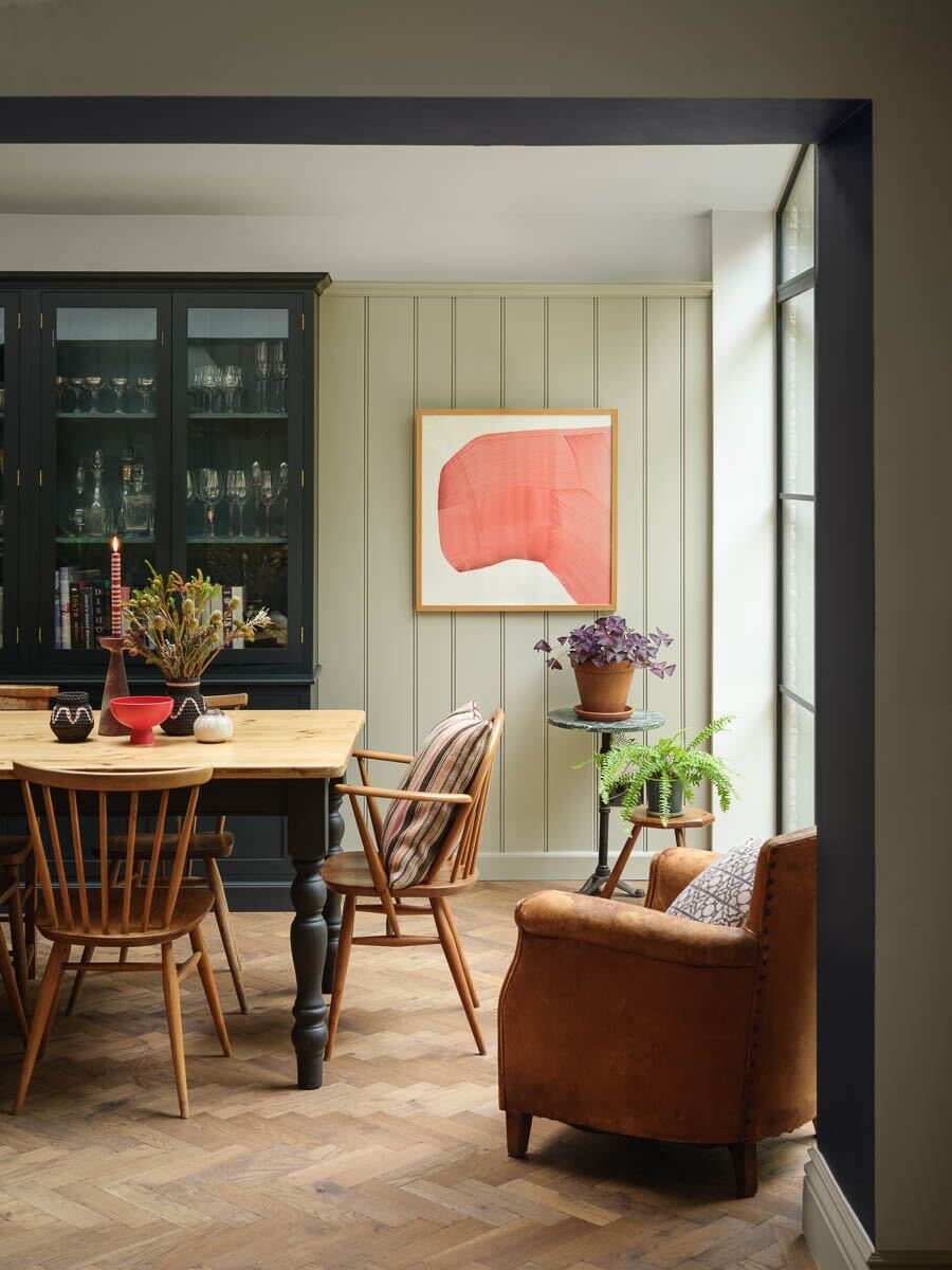
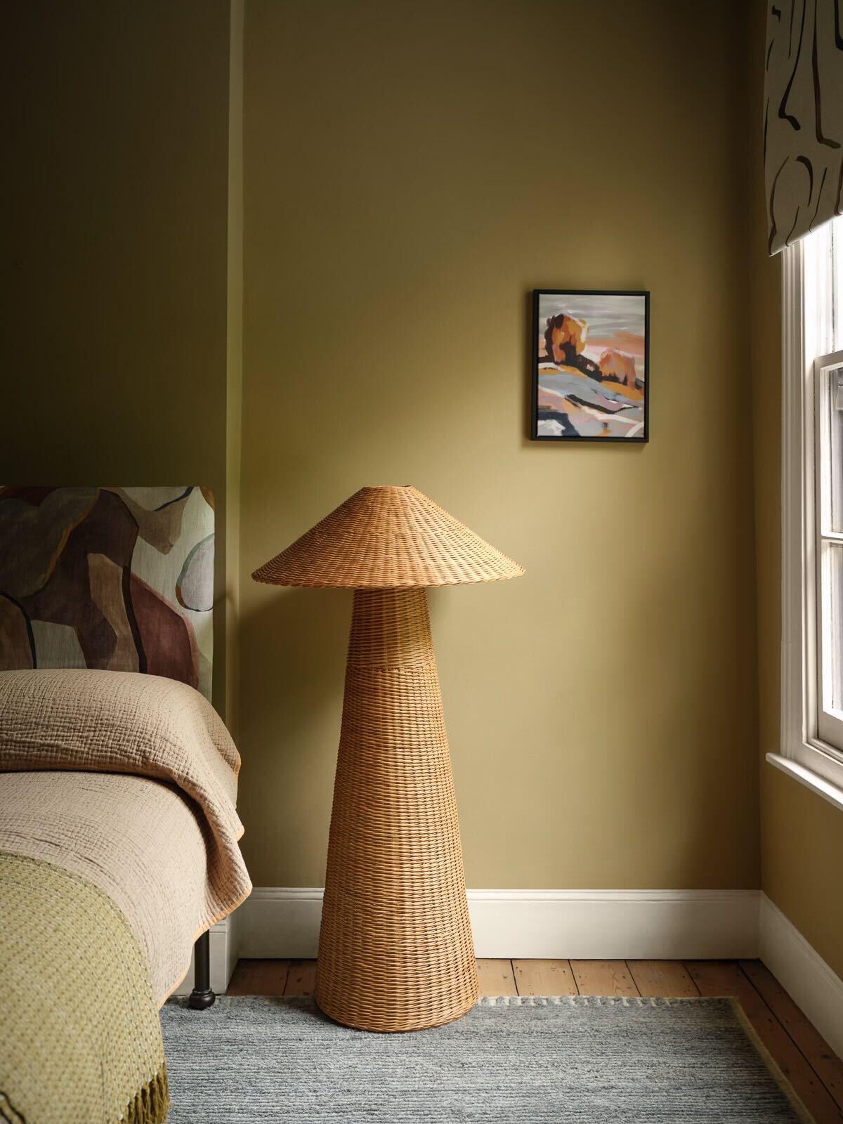
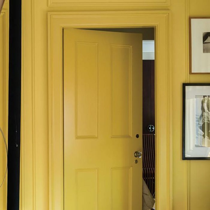
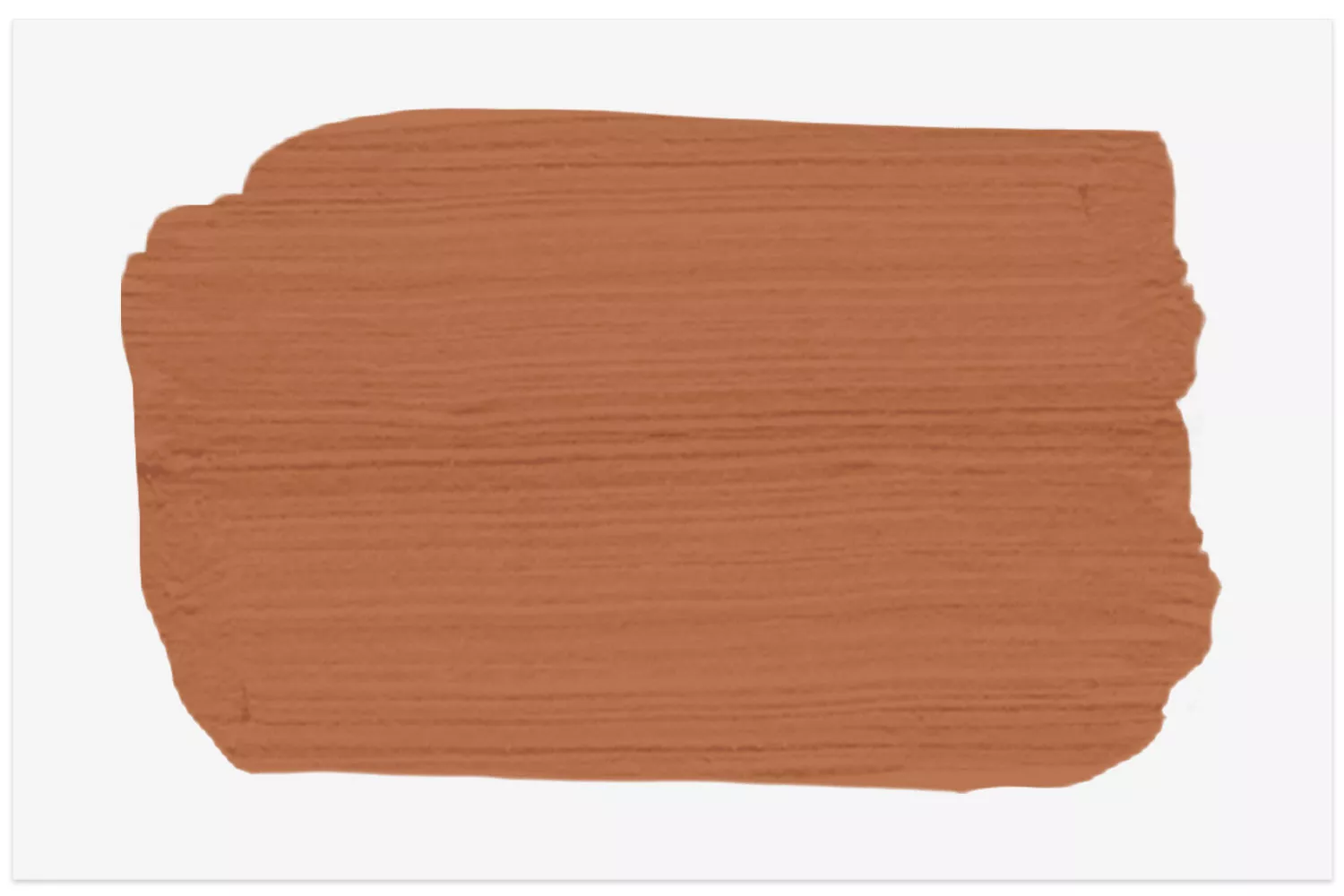
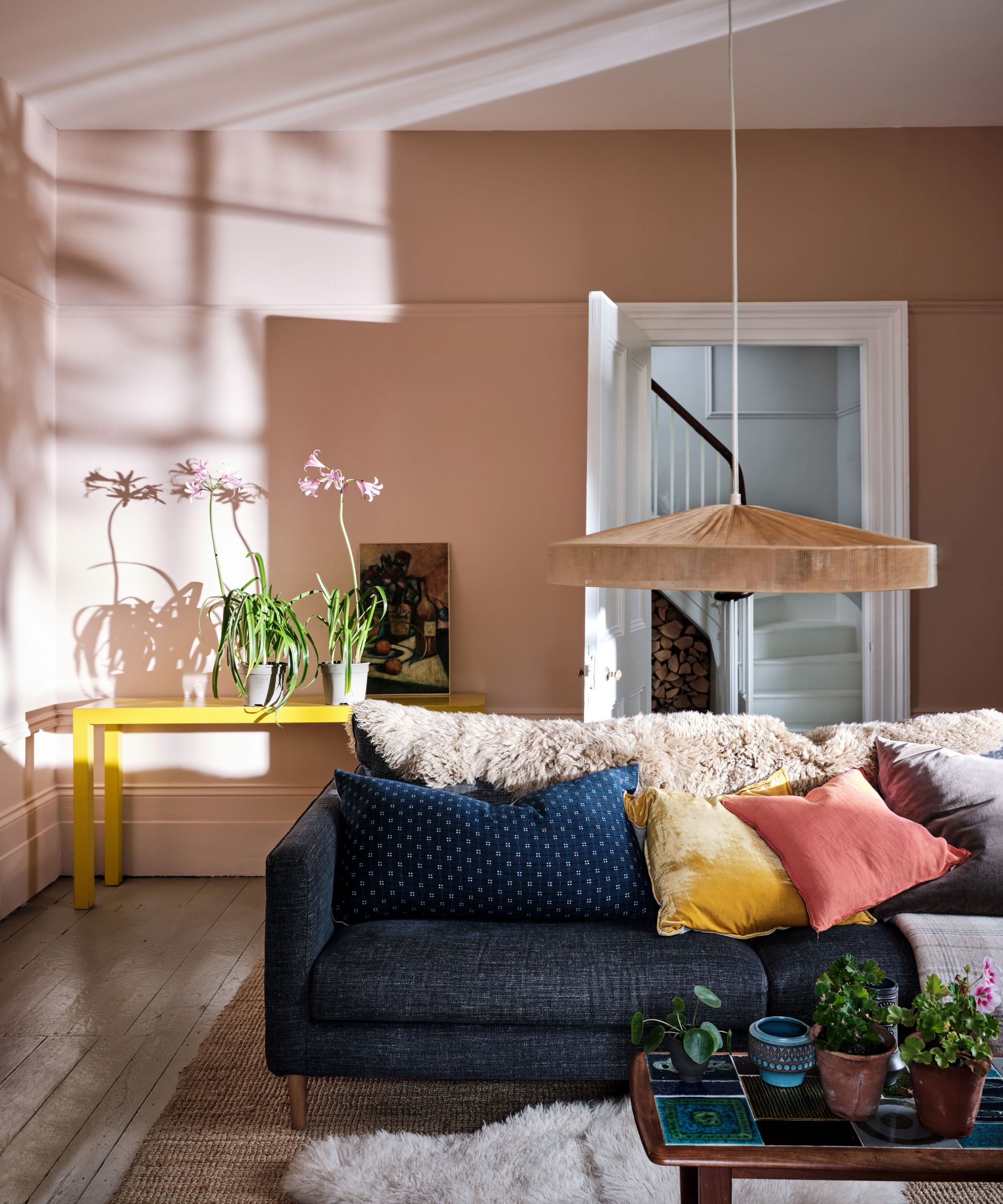
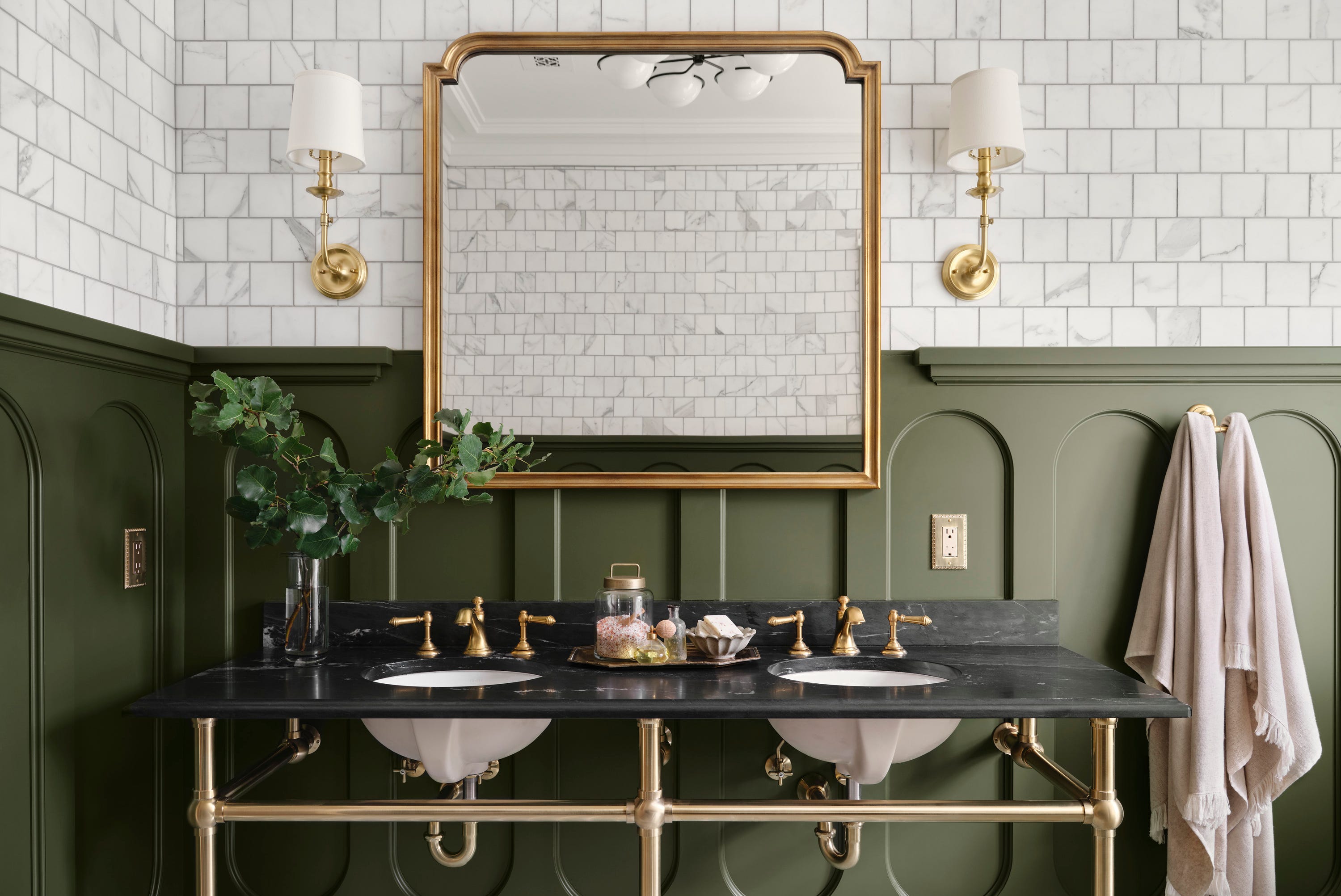
Valspar’s “Rare Wine” is described as a luxurious hue with a red undertone, ideal for dramatic color drenching in small spaces like powder rooms or studies. Glidden’s “Champagne Wishes,” a soft reddish-brown, is presented as a friendly and inviting shade suitable for living rooms, dining rooms, kitchens, or bathrooms, harmonizing with warm neutrals and subdued blues and greens. Behr’s “Chilled Wine,” a Chardonnay-inspired amber-gold, is recommended for accent walls or revitalizing furniture, bringing optimistic warmth to neutral spaces when paired with blues and natural wood tones.
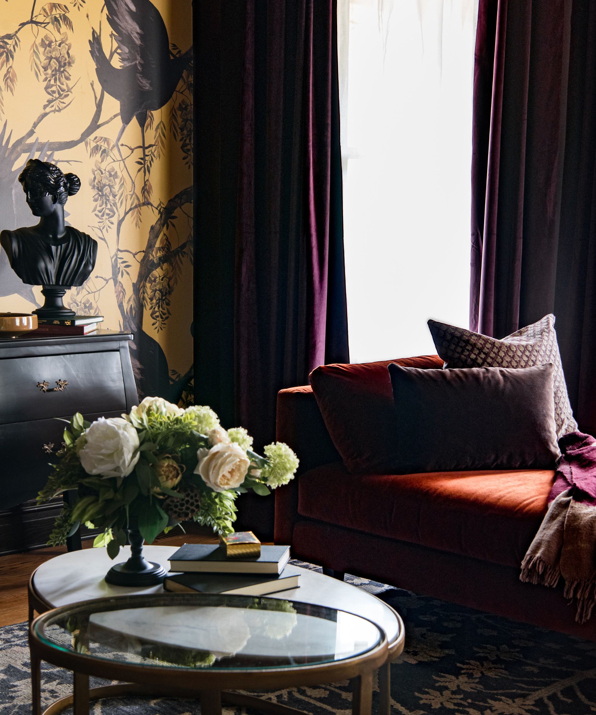
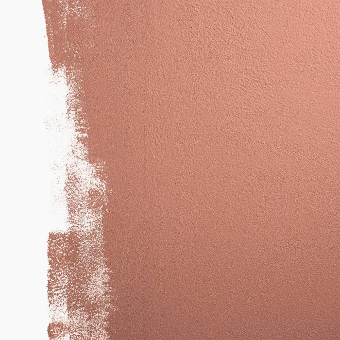
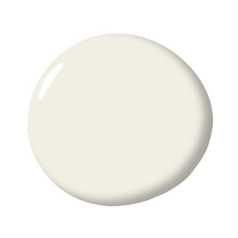
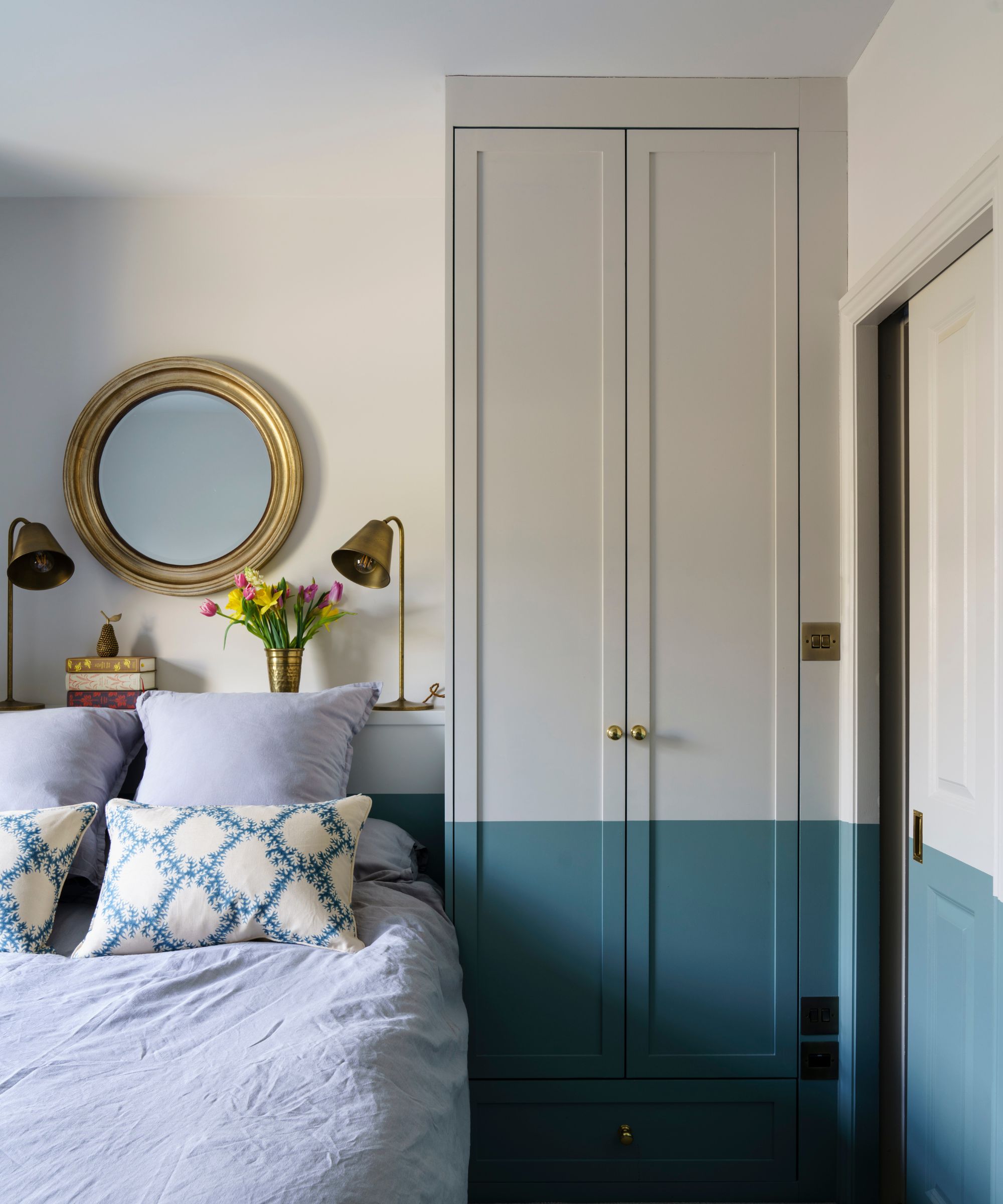
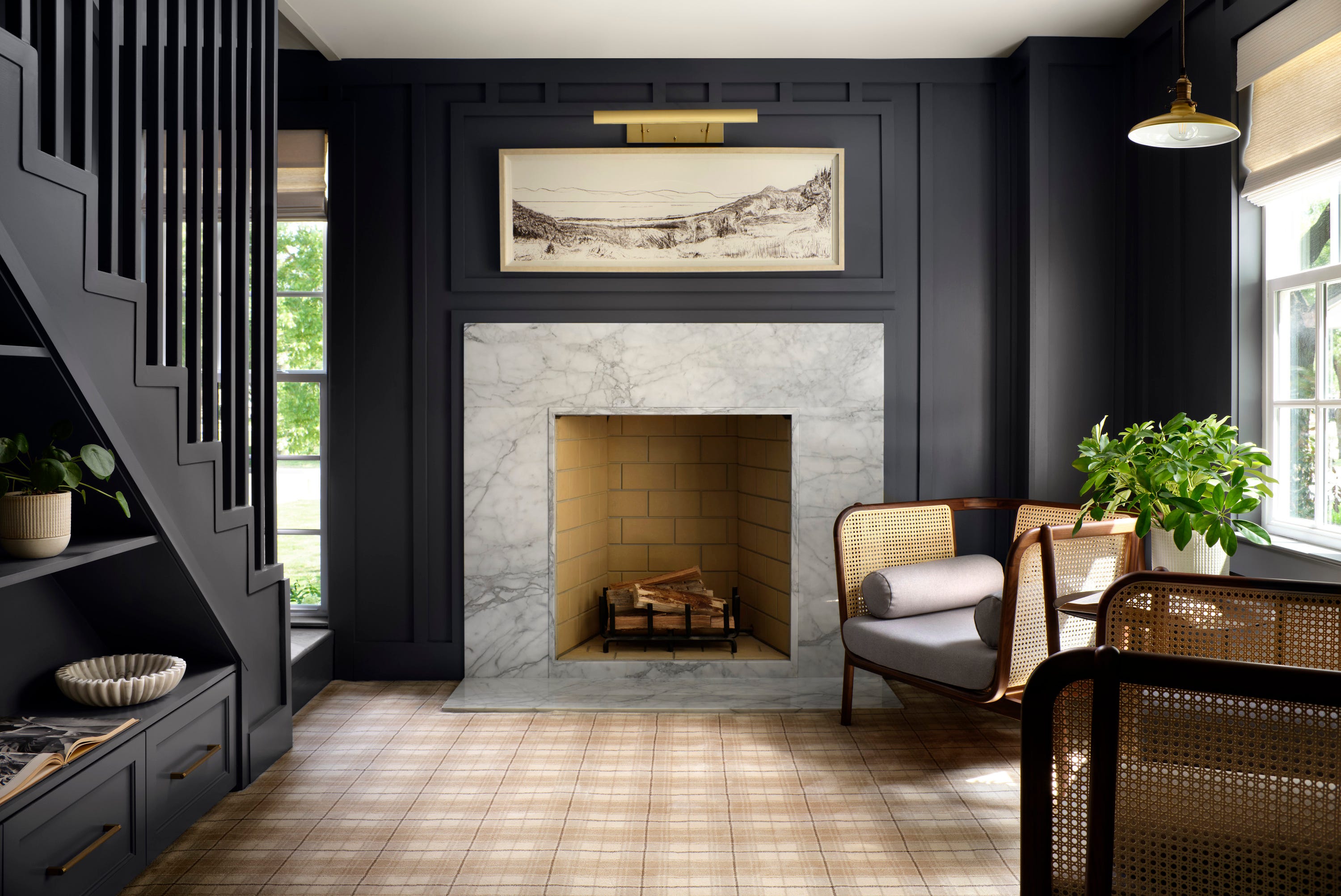
Benjamin Moore’s “Cabernet” is a deep, full-bodied violet with earthy brown hints, which can be paired with creamy off-whites to accentuate its violet tones or with light pastels like “Soft Fern” for a creative spark. HGTV Home by Sherwin-Williams’ “Napa Dawn” is a soothing neutral with a pink hint, inspired by wine country, and works well with mid-tone woods, crisp white trim, and glass accents. Valspar’s “Champagne Pink” is a gentle pink with coral undertones, offering a fun and engaging energy, especially when combined with brass accents and rich fabrics. Finally, Glidden’s “Champagne Ice” is a pale orange with a copper undertone, providing a light and bright ambiance suitable for dining areas, kitchens, or lively living spaces, and pairs effectively with warm neutrals, mid-tone greens, and blues.
The article concludes by encouraging readers to consider these wine-inspired shades as a means of personalizing their home environments, transforming spaces into sophisticated and conversation-starting areas.
#WineInspiredColors #InteriorDesign #PaintColors #HomeDecor #ColorTrends #BenjaminMoore #BehrPaint #GliddenPaint #ValsparPaint #SherwinWilliams #WineInspiredColors #InteriorDesign #PaintColors #HomeDecor #ColorTrends #BenjaminMoore #BehrPaint #GliddenPaint #ValsparPaint #SherwinWilliams
0 comment in total
 No comments yet
You may also like
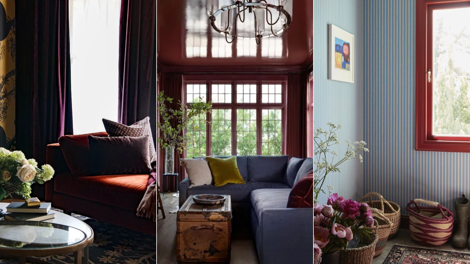
I predict wine red as the winning color of fall and winter 2024 – here's how designers are embracing this alluring shade

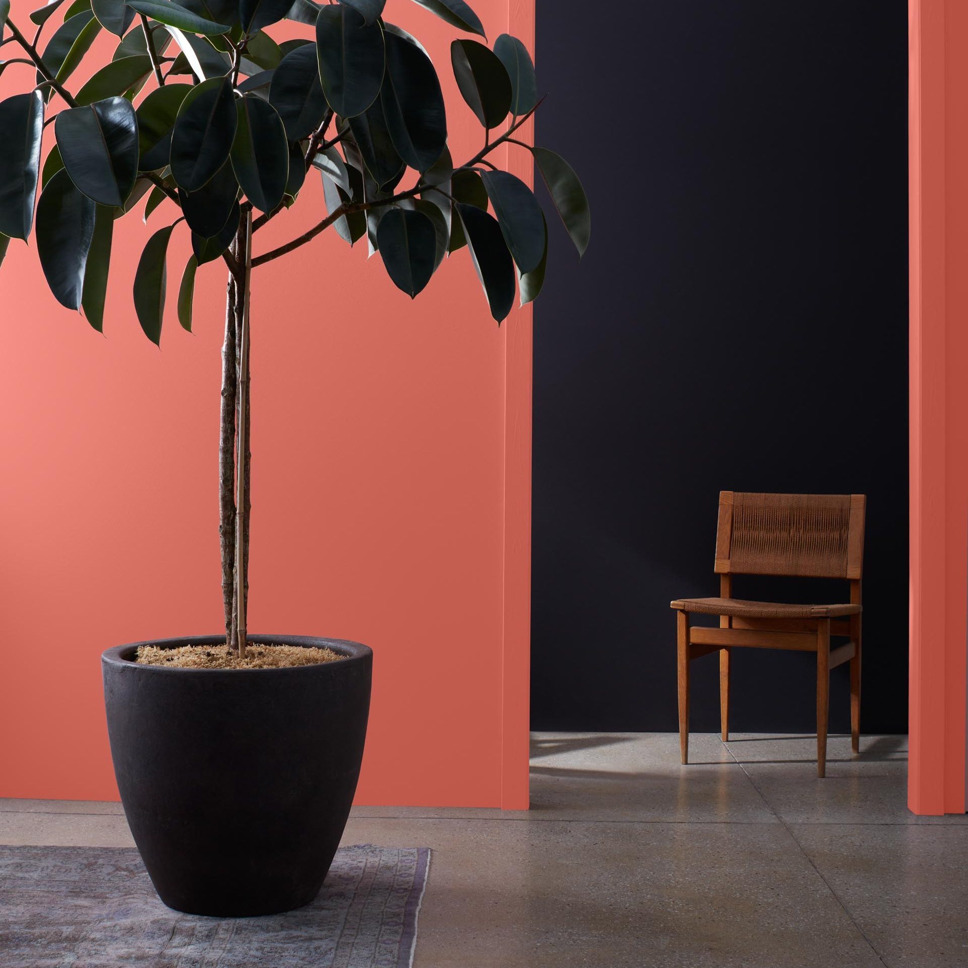
9 Best Interior Paint Colors


10 Timeless Living Room Paint Colors Designers Swear By
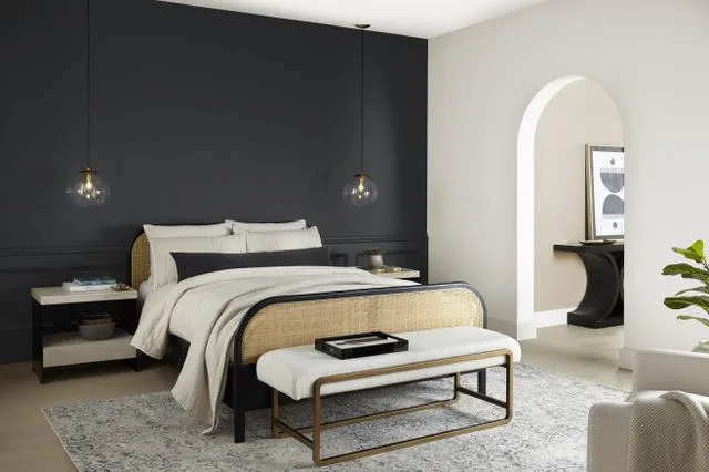
10 Gorgeous Paint Colors for Accent Walls

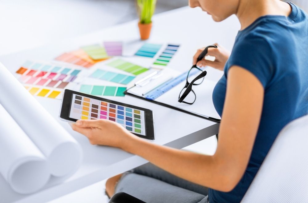
10 Paint Color Apps Every DIYer Should Know About

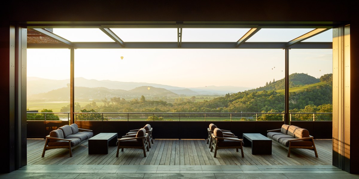
These Stunning Wineries Are a Must-Visit for Design Lovers

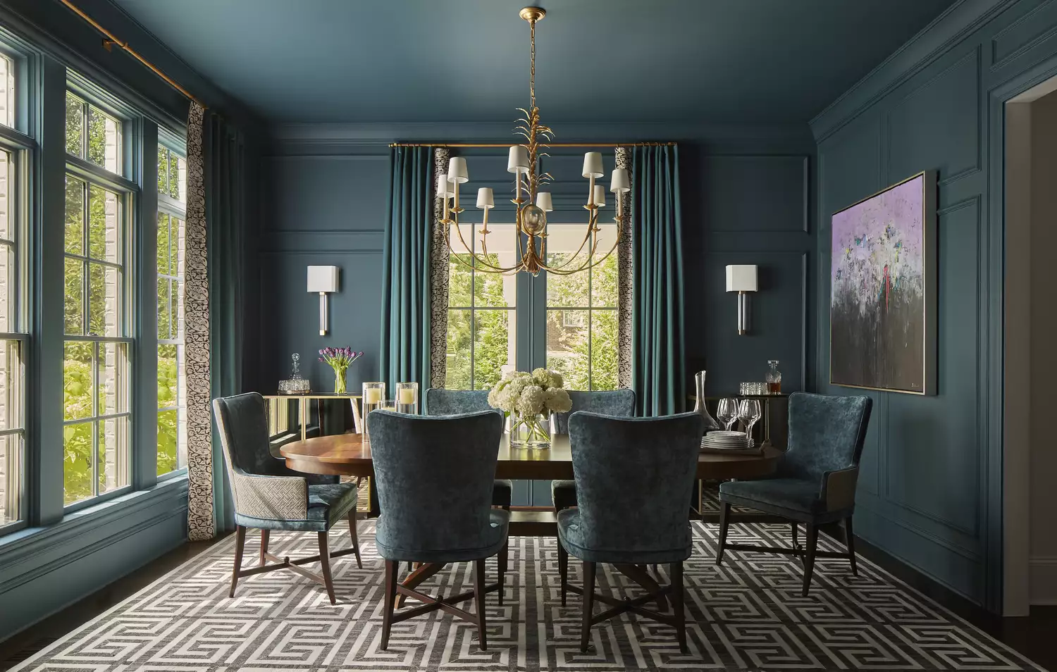
10 Color Drenching Ideas That Highlight the Beauty of This Paint Trend
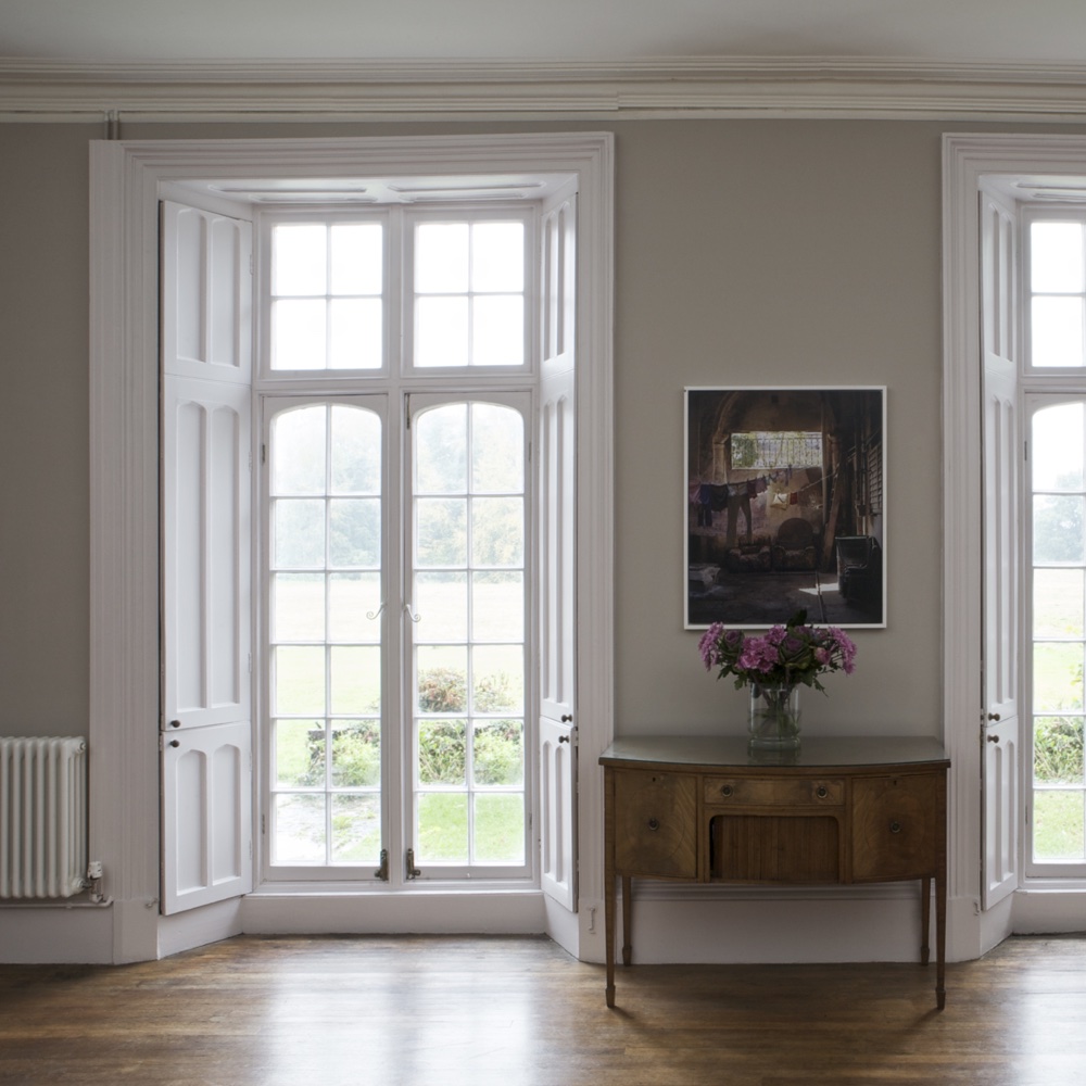
The top 54 paint colours of the decade – all the shades we couldn't live without
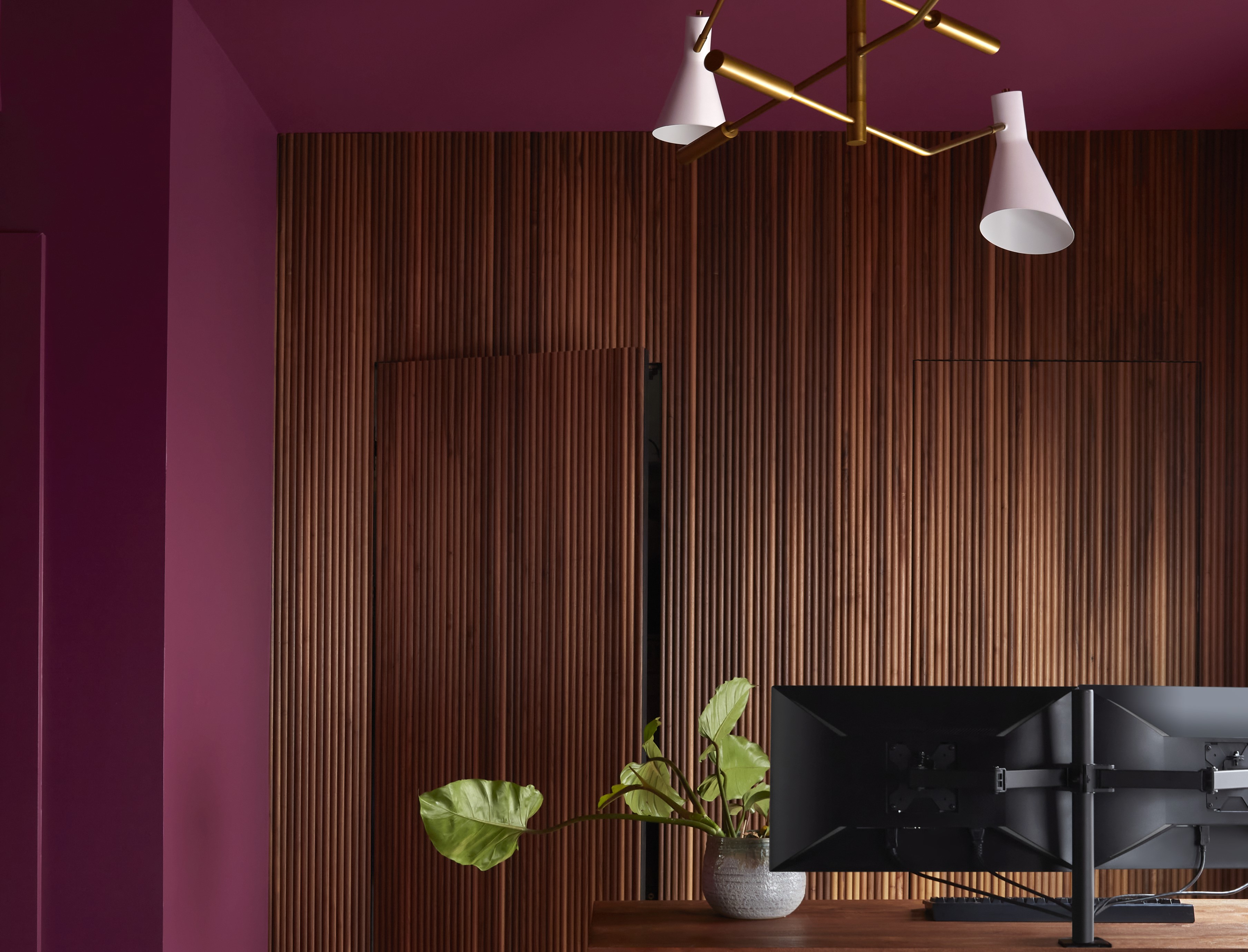
Paint Colors That Go With Natural Wood — 10 Picks That Bring Out the Beauty of This Organic Material

10 Best Tuscan Paint Colors to Use in Your Home

10 Ways To Decorate With The World’s Favorite Color
Tips for adding the hottest paint colors to your decor

10 Wine-Inspired Paint Colors Designers Will Cheers To

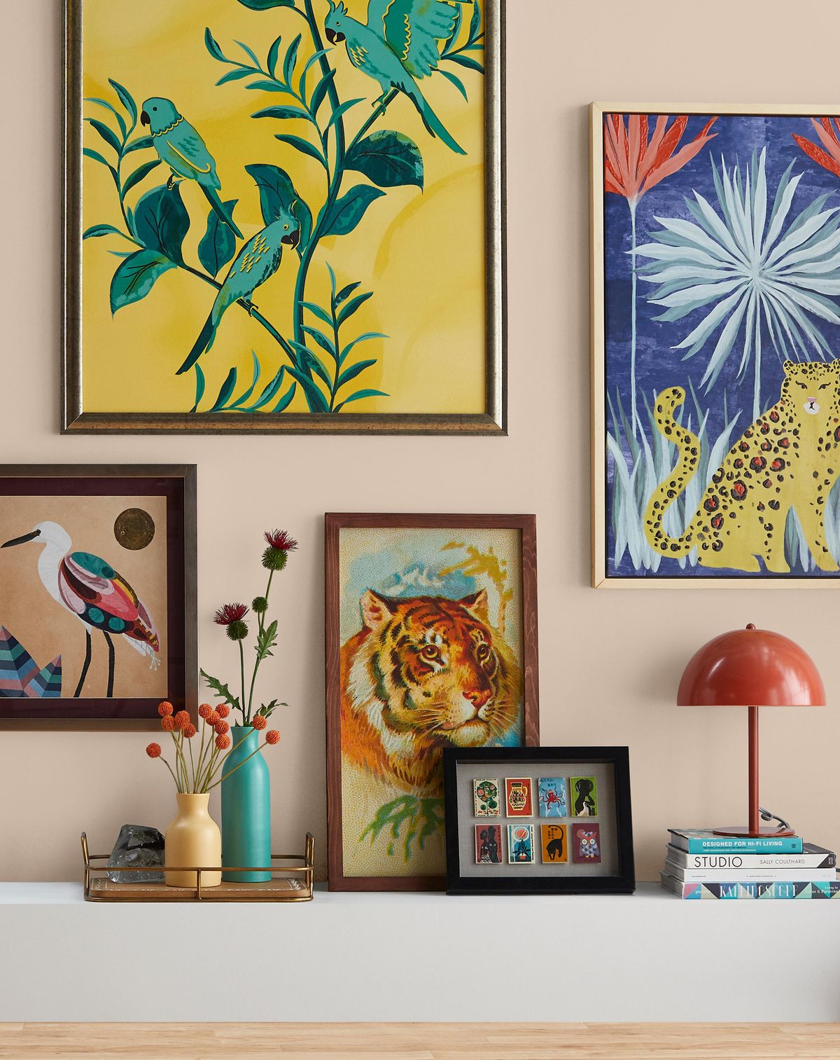
12 Home Paint Colors We're Loving for Fall

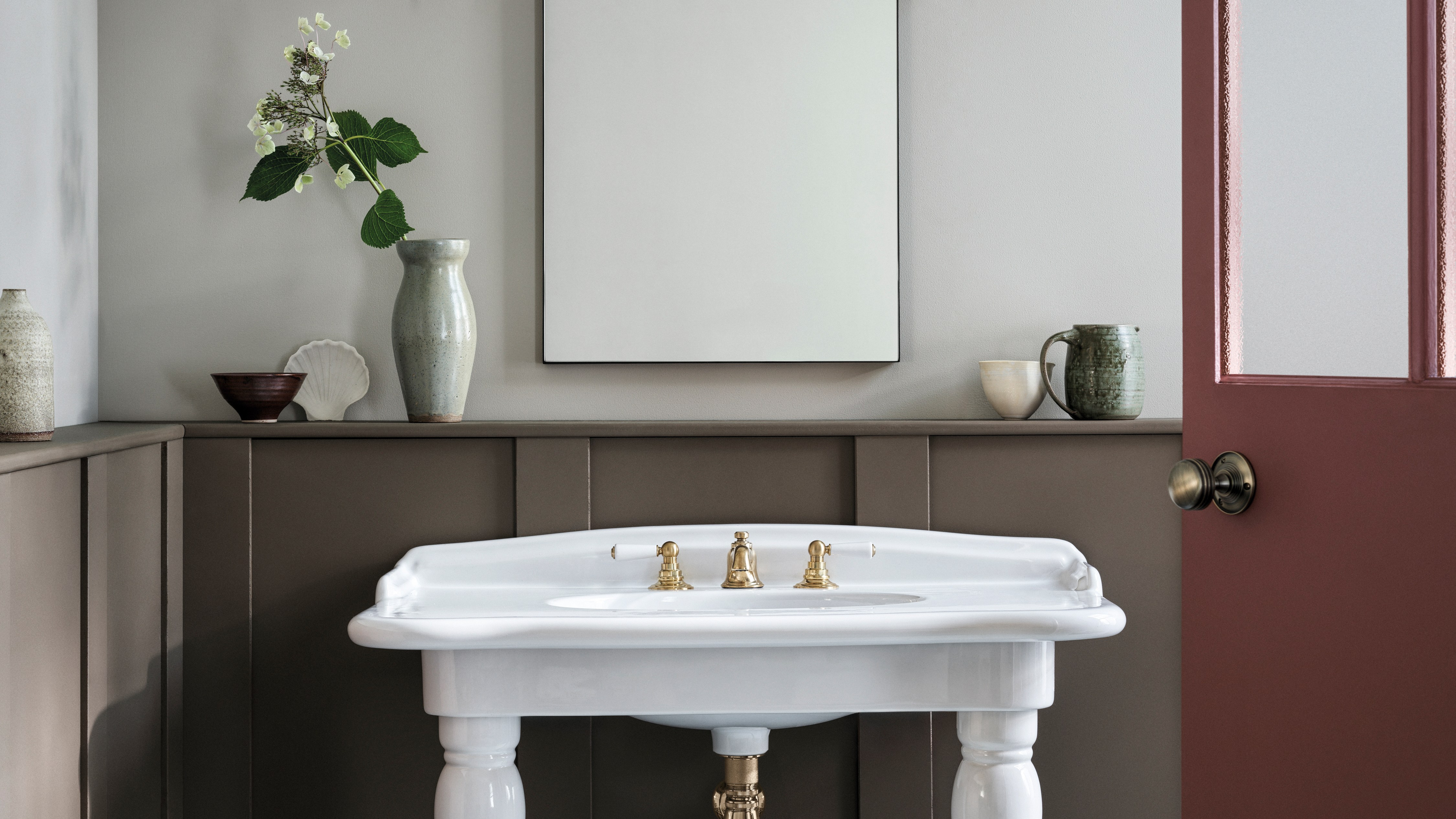
The best paint colours for autumn — and how to style them at home
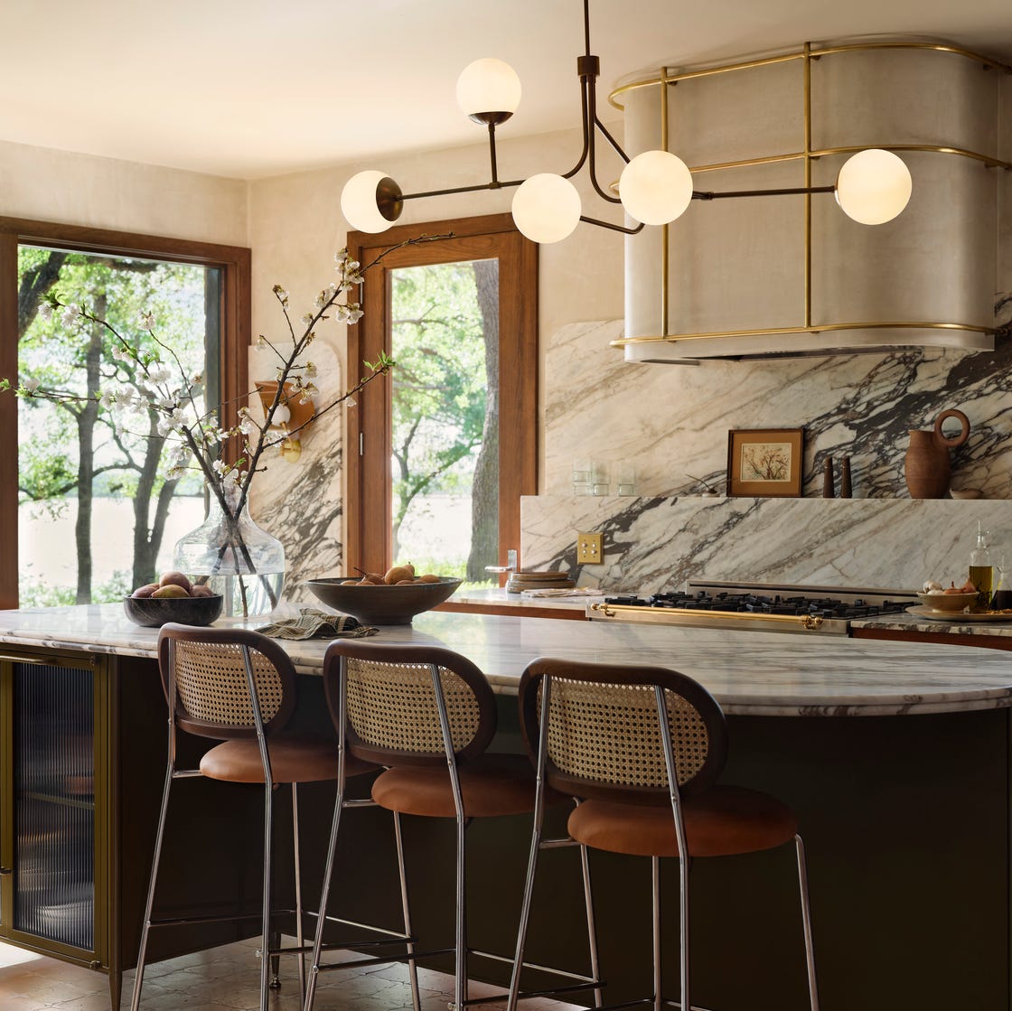
Joanna Gaines Swears By These 12 Stunning Paint Colors
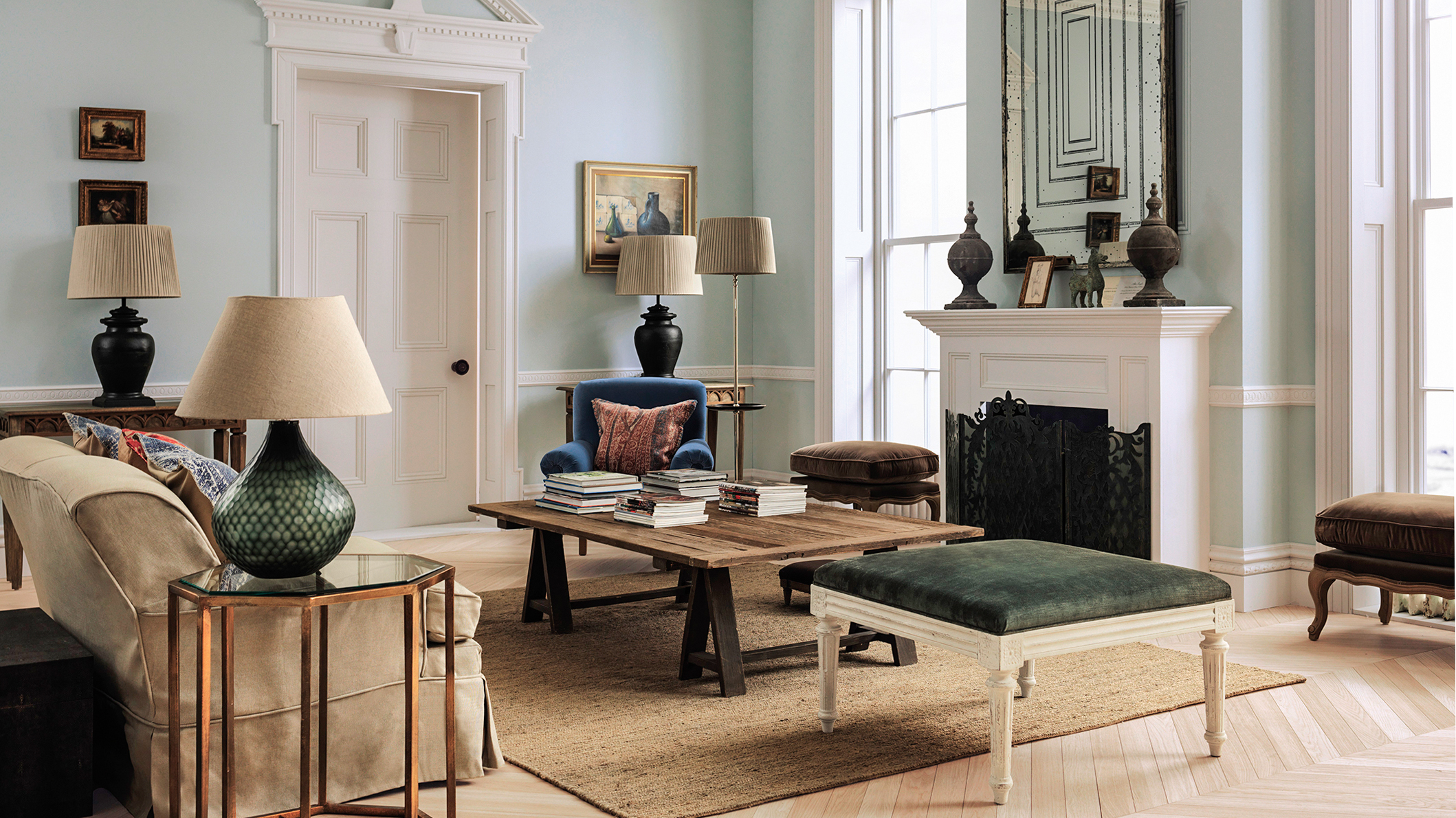
The Best Vintage-Inspired Paint Colors — 6 Expert-Approved Shades for a Touch of Chic Nostalgia
These Are The 12 Best-Selling Paint Colors From All Your Favorite Brands

These 10 Farrow & Ball colors are their most popular paints – from earthy neutrals to deep and dark shades
The 10 Best Accent Wall Colors From the Paint Experts