10 Soothing Colors That Are Perfect for the Nursery
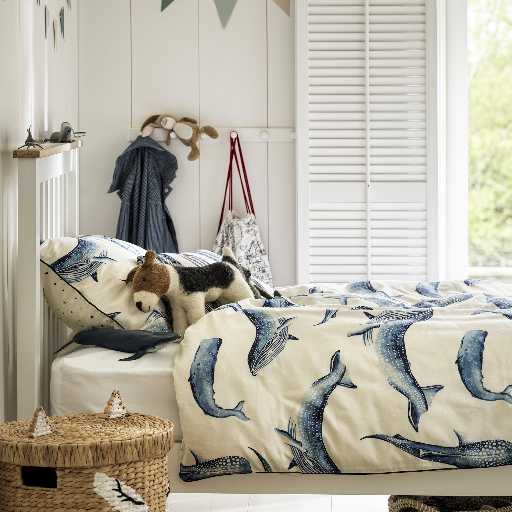
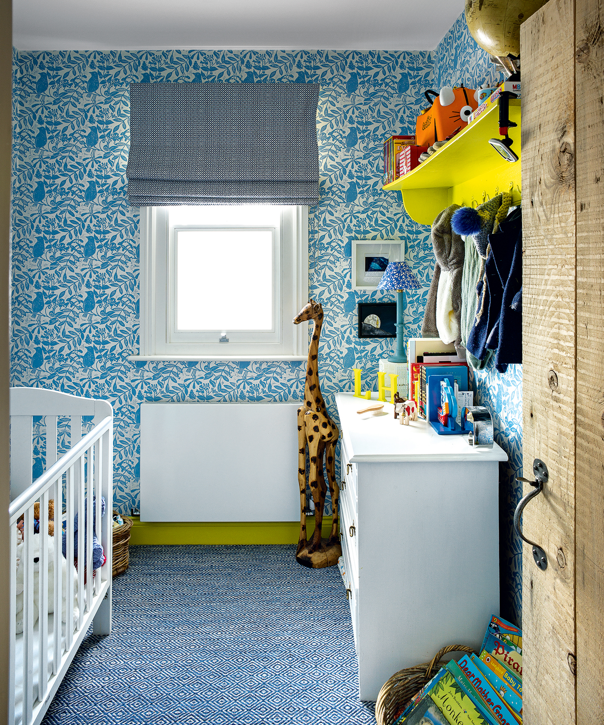
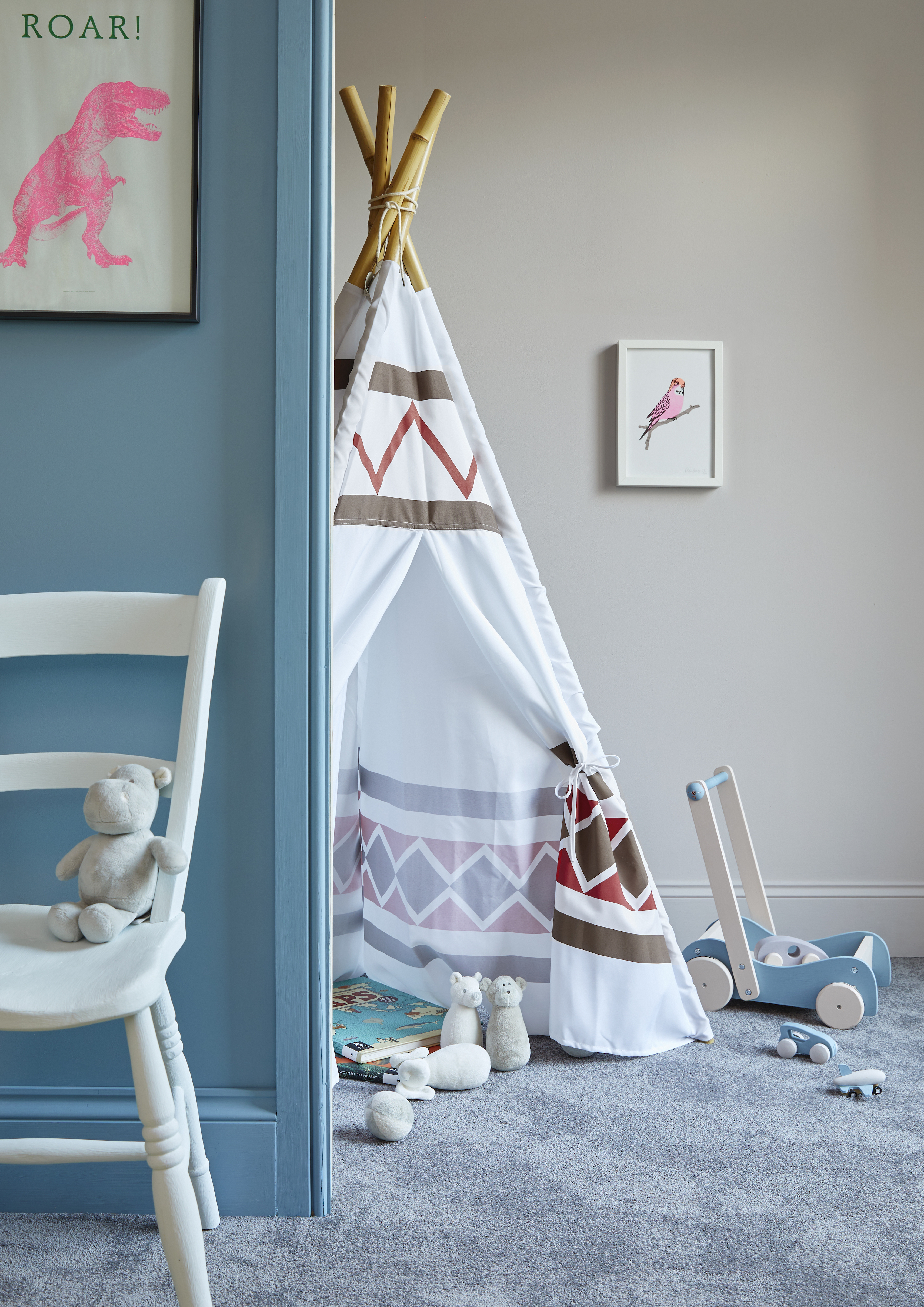
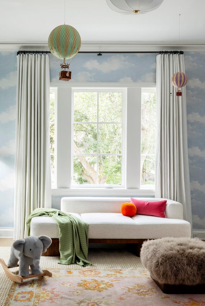
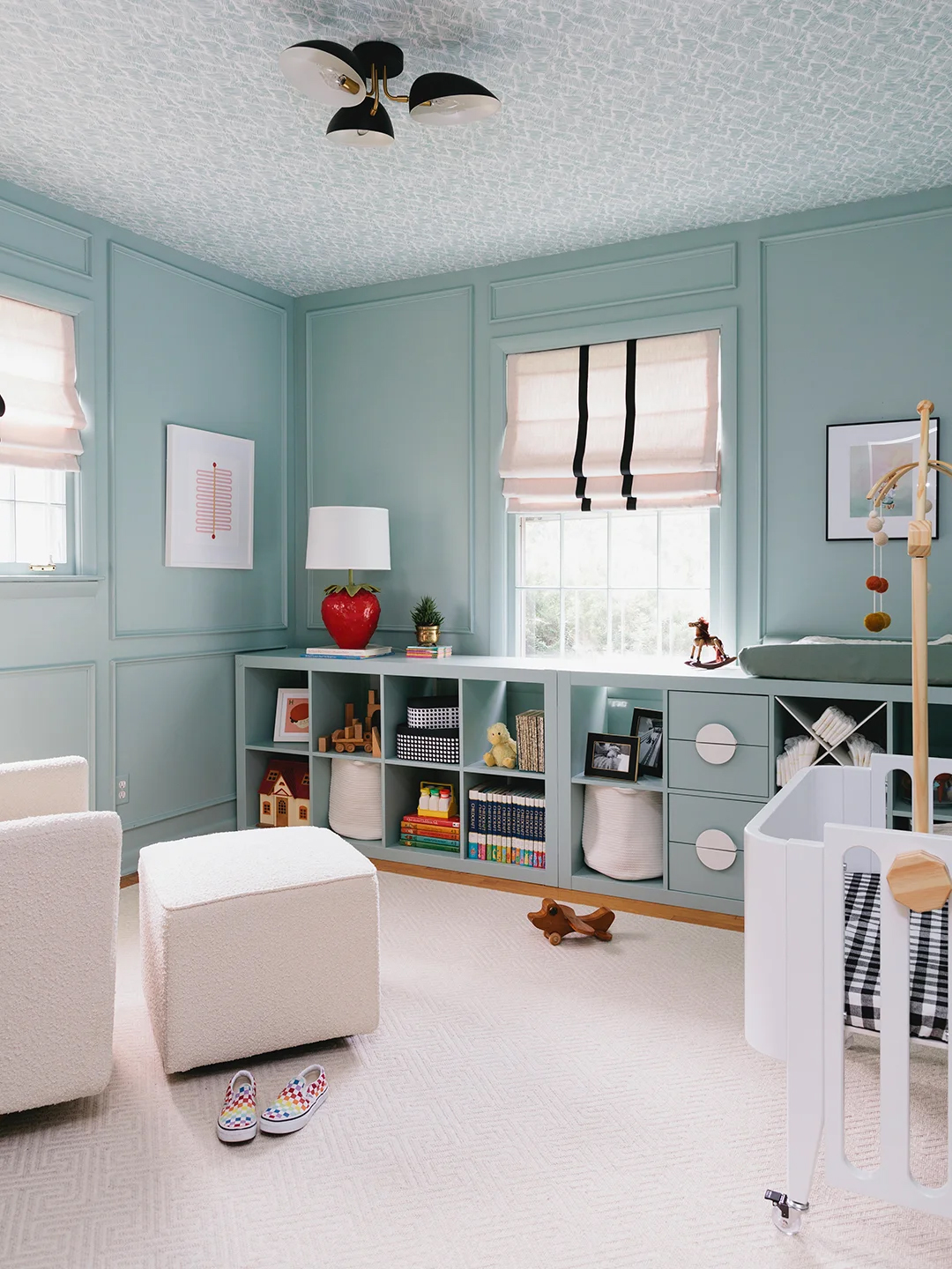
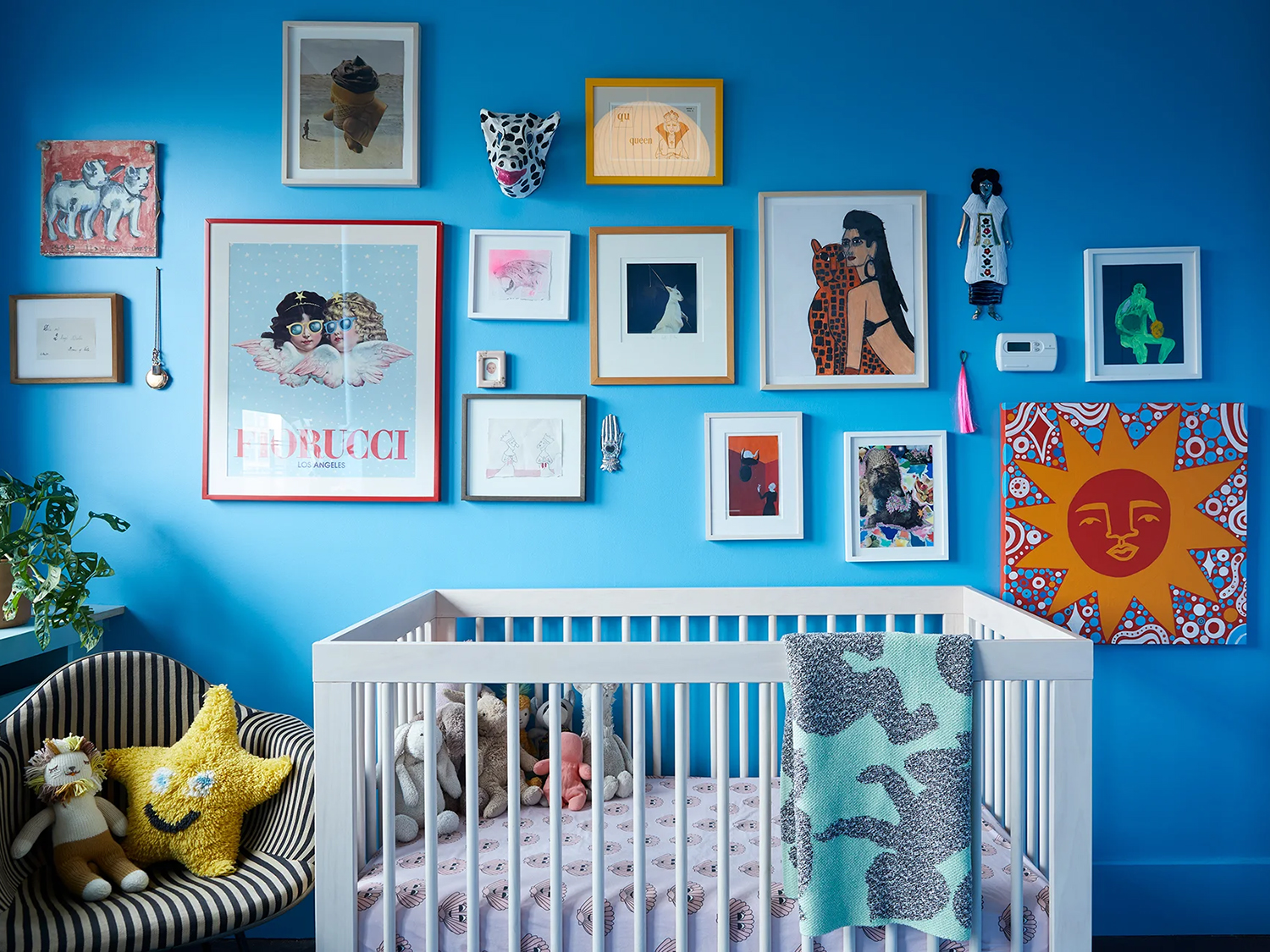
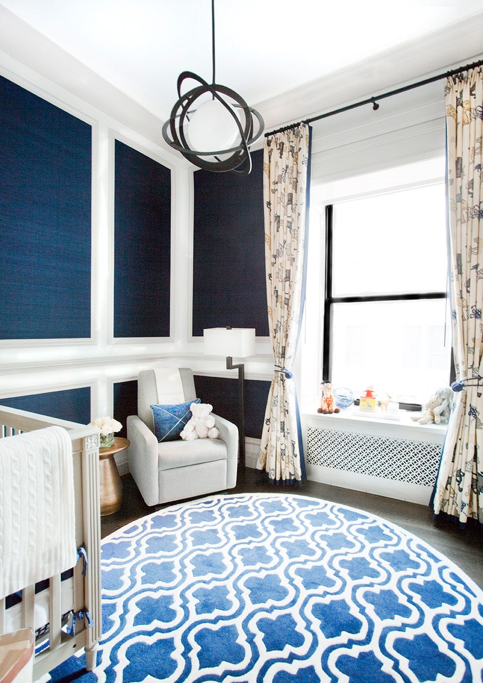
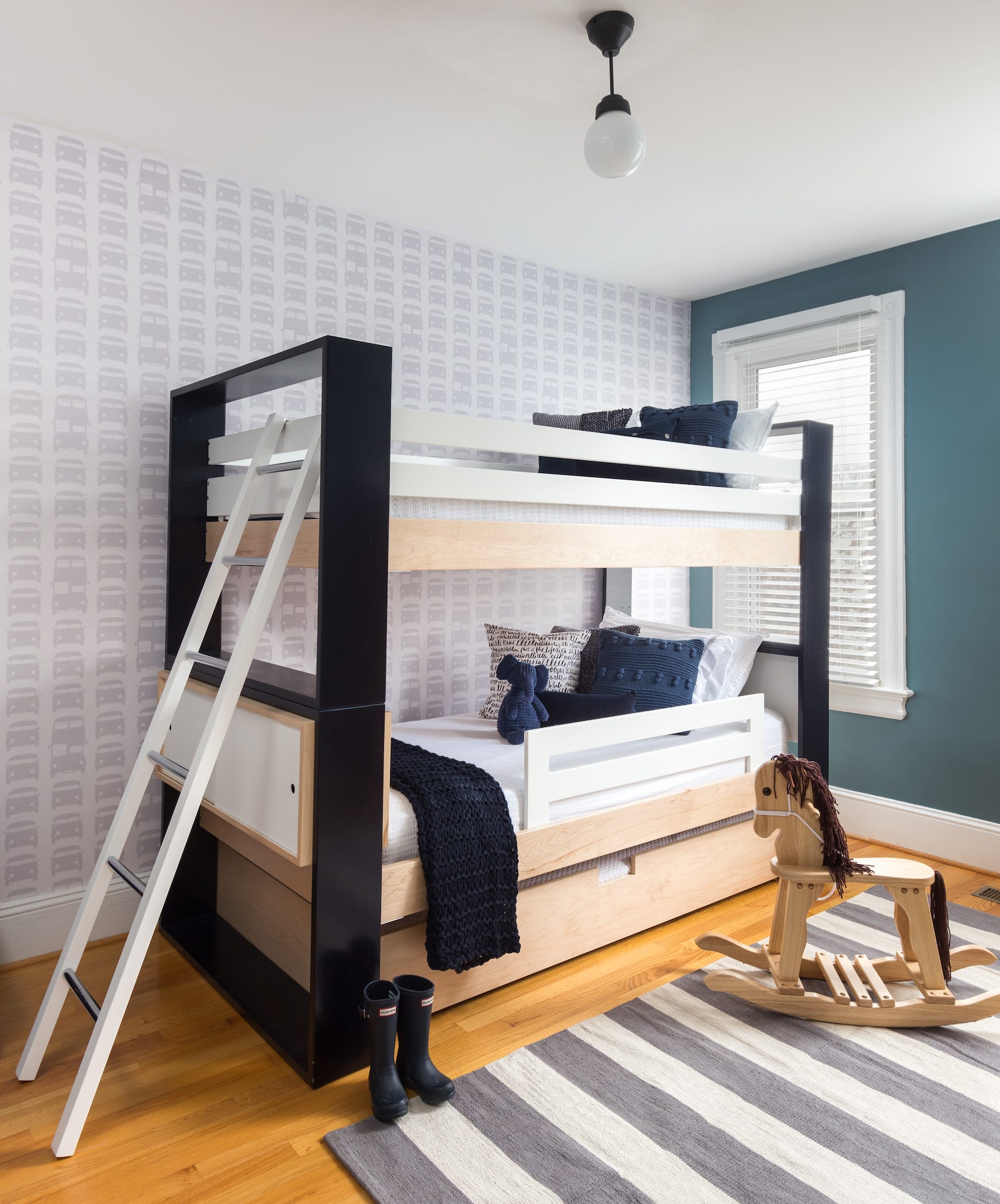
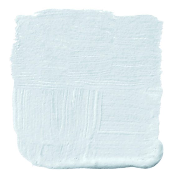
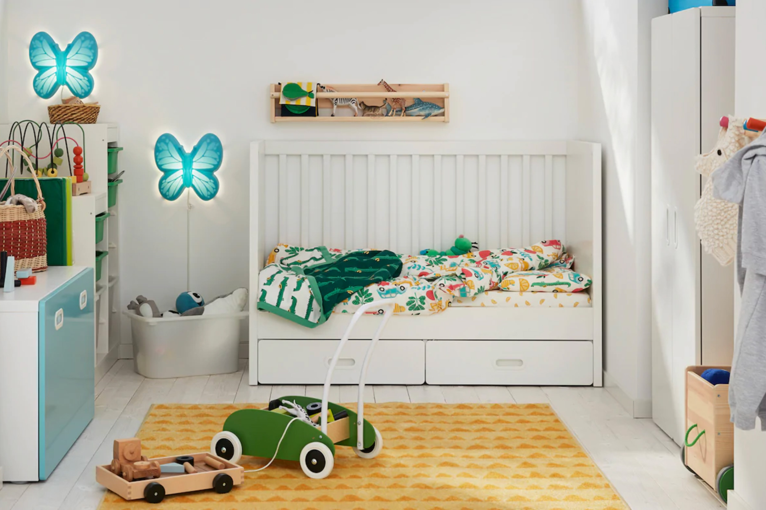
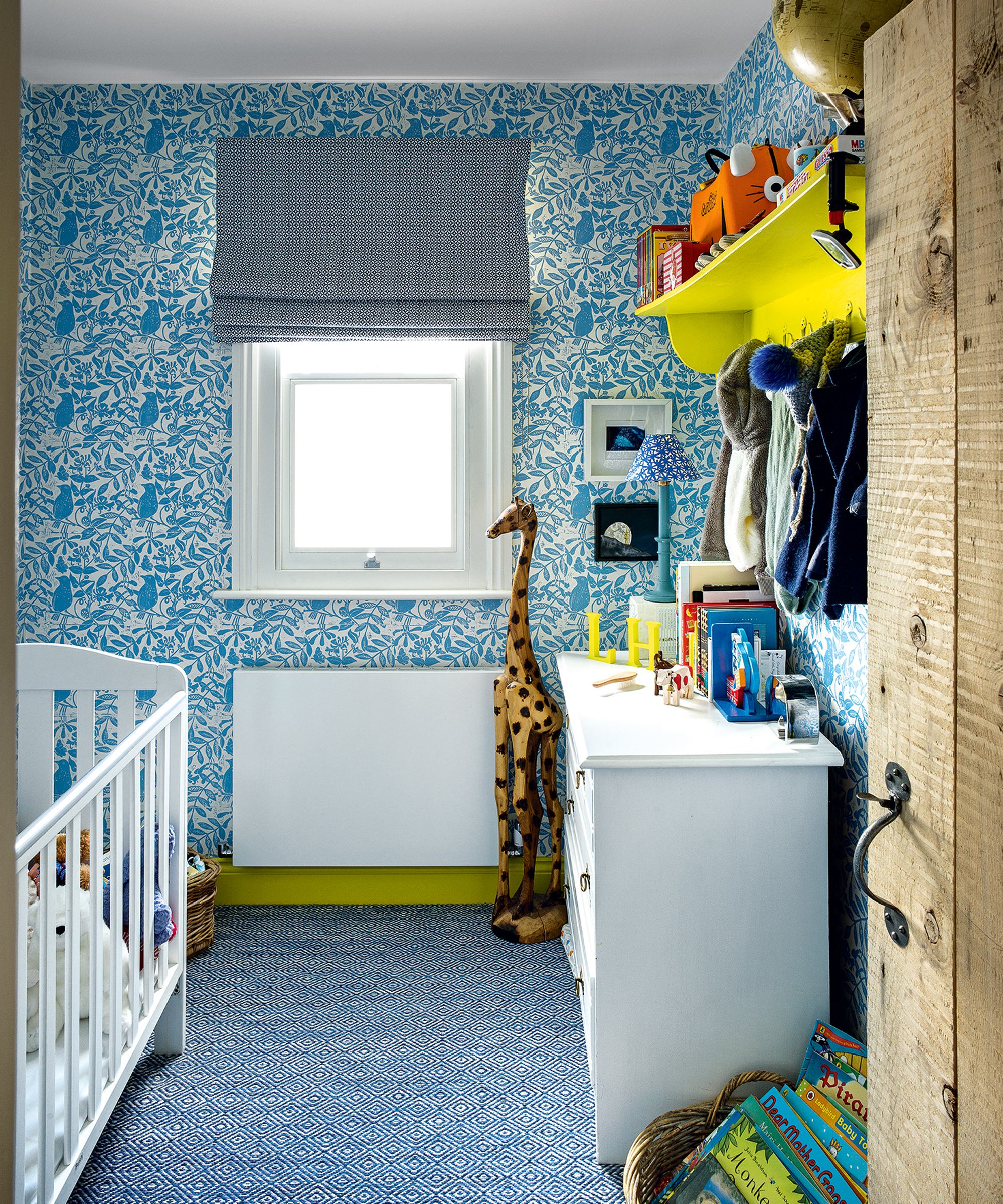
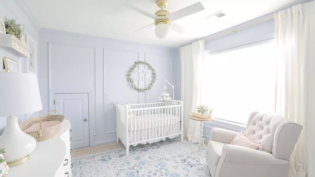
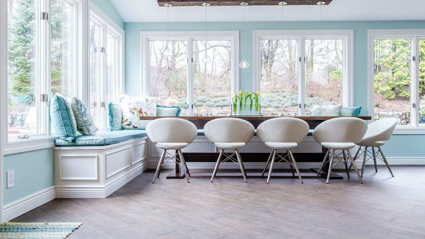
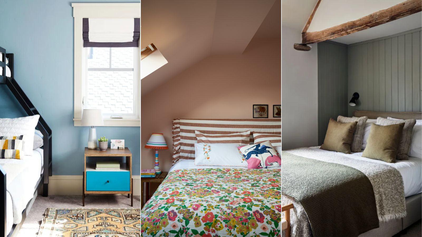
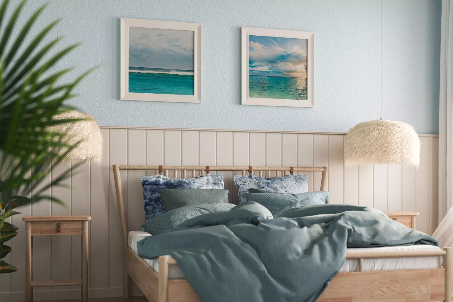
The choice of nursery color significantly impacts a baby's mood and well-being, as color psychology suggests. Utilizing specific hues can transform a nursery into a soothing sleep sanctuary. Subdued blue shades, such as powder blue, aqua, or light turquoise, are known to relax the mind and body, lower blood pressure and heart rate, and reduce anxiety and aggression, making them ideal for nervous newborns. However, dark blues should be avoided as they can have an energizing effect, hindering sleep.
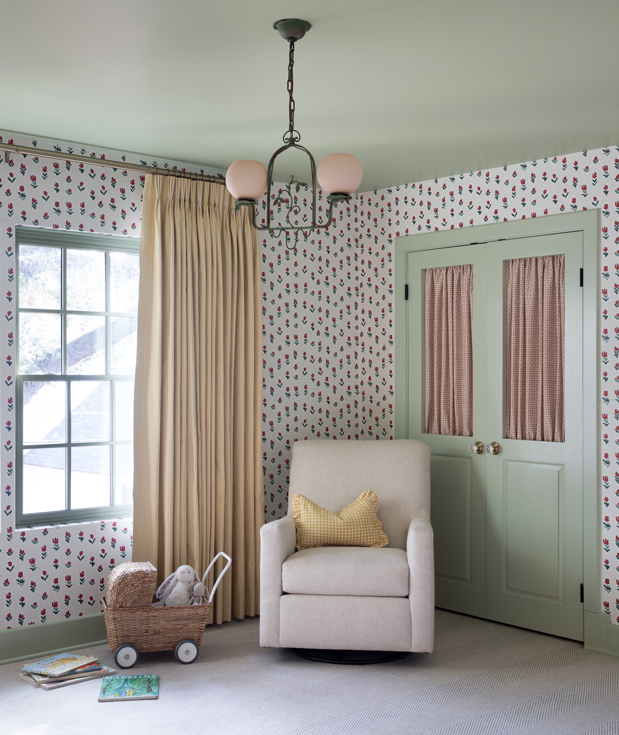
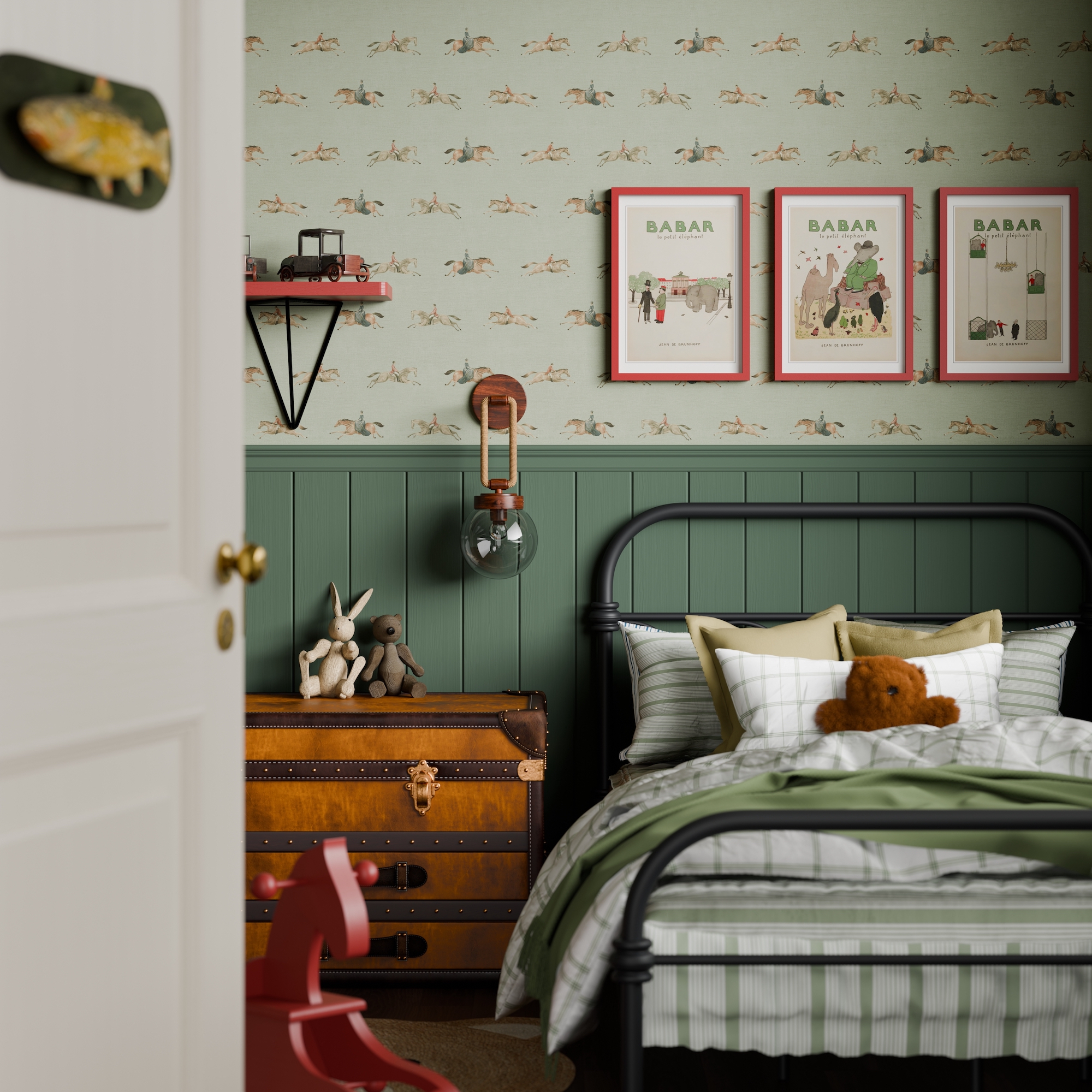
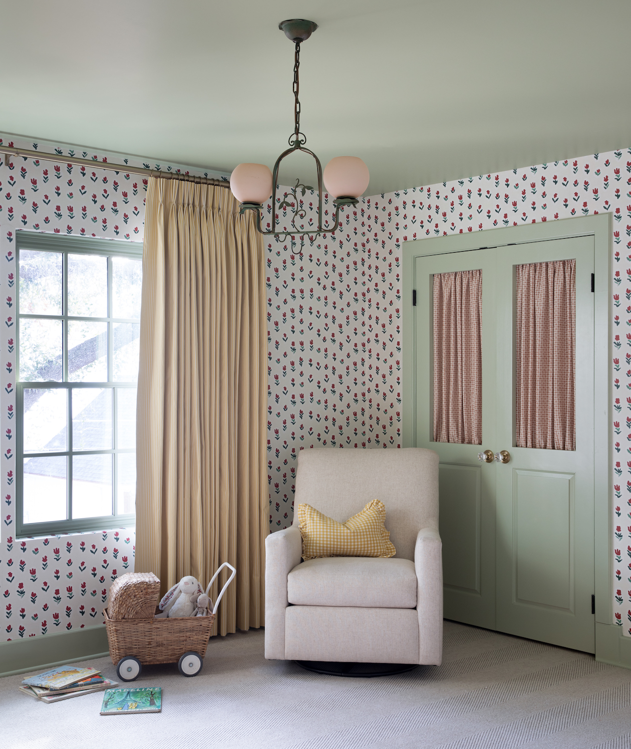
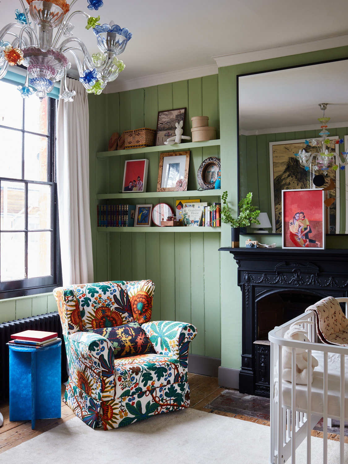
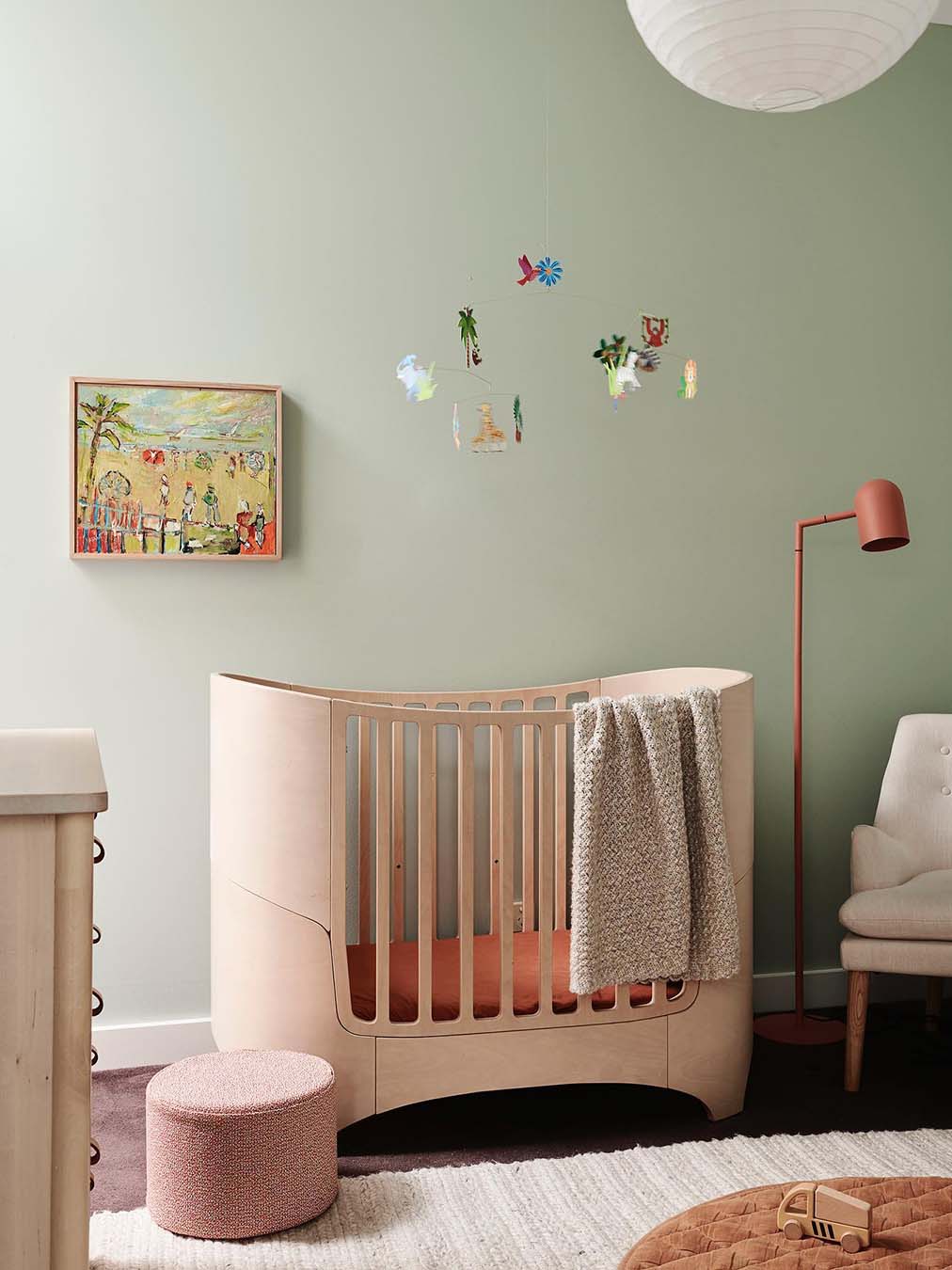
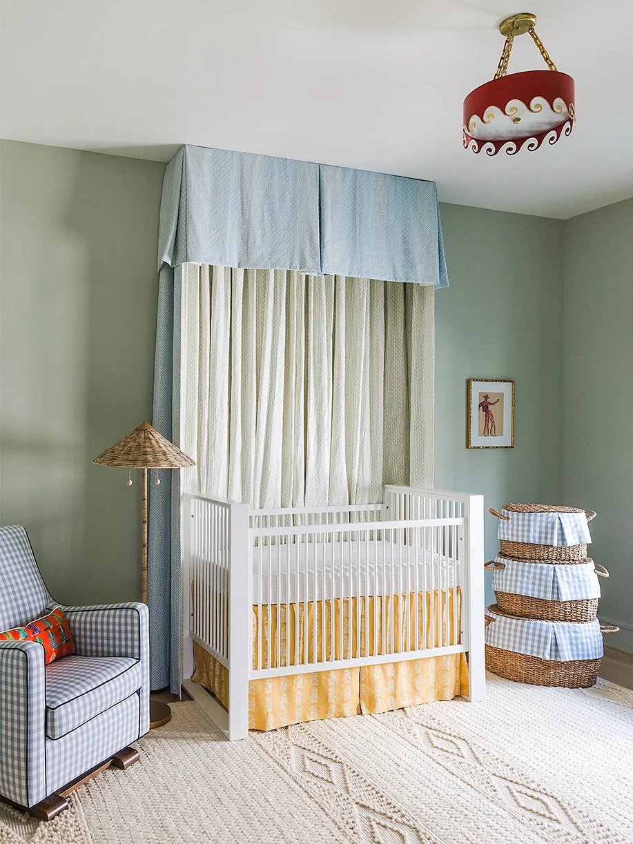
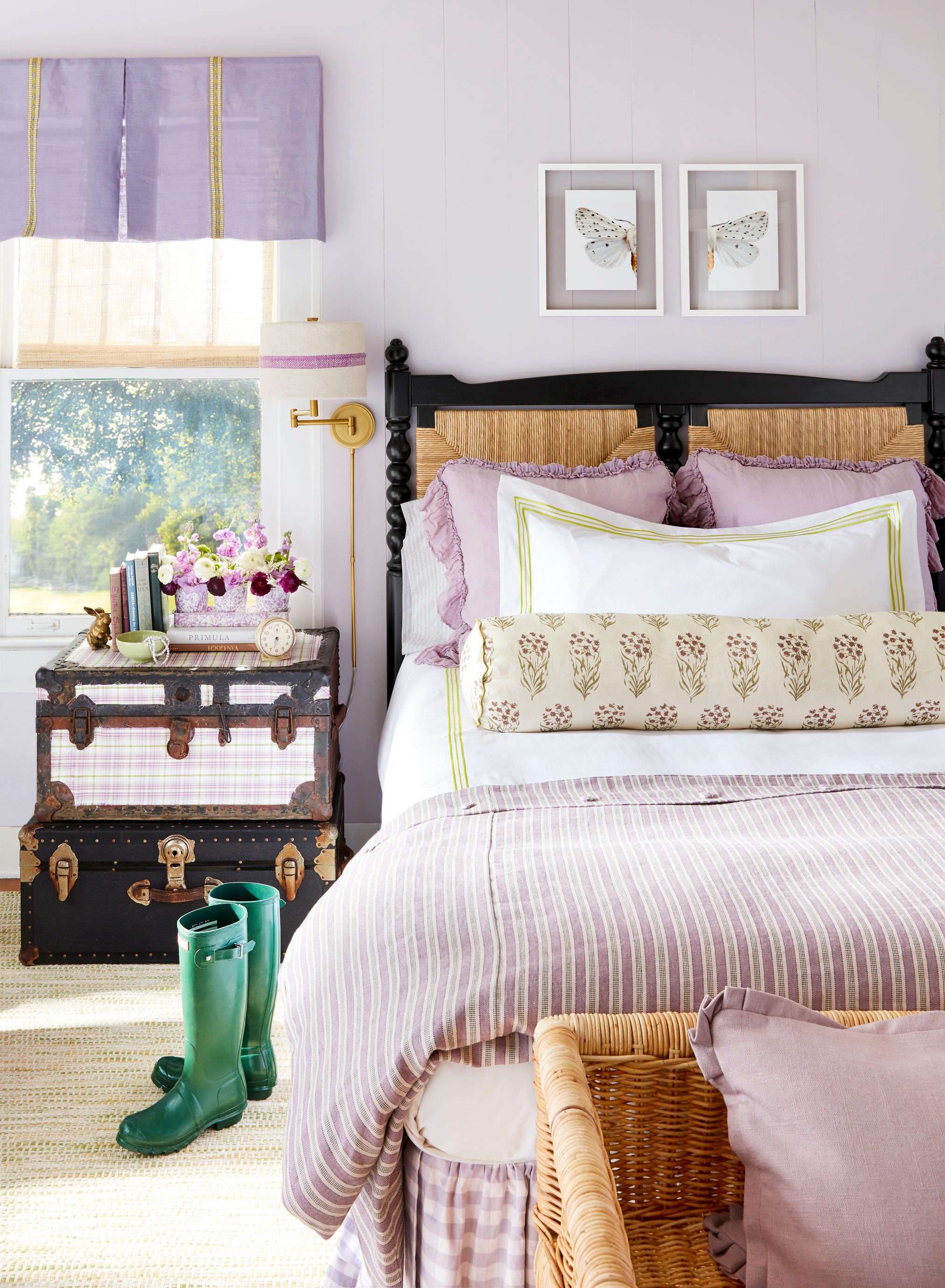
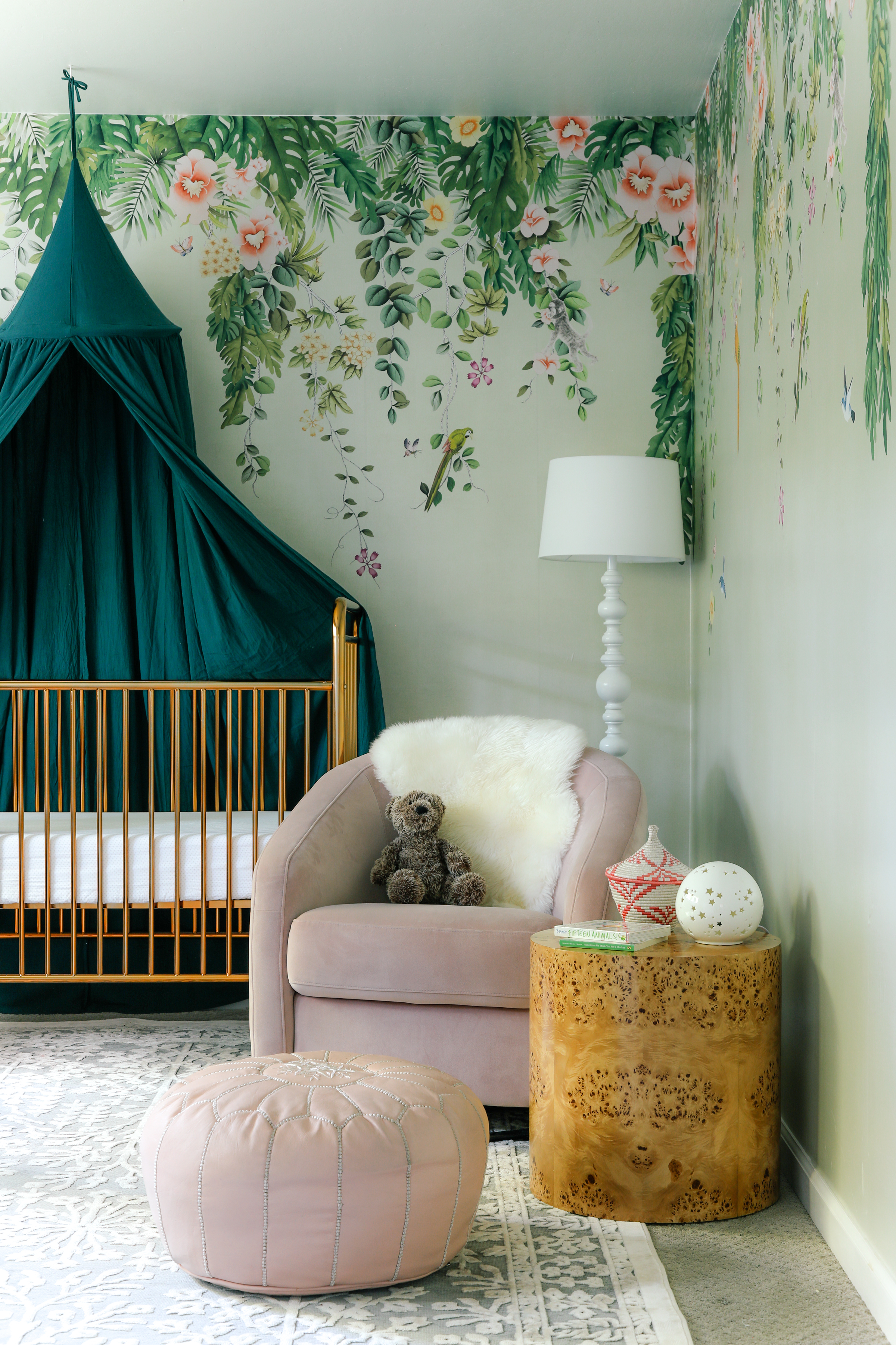
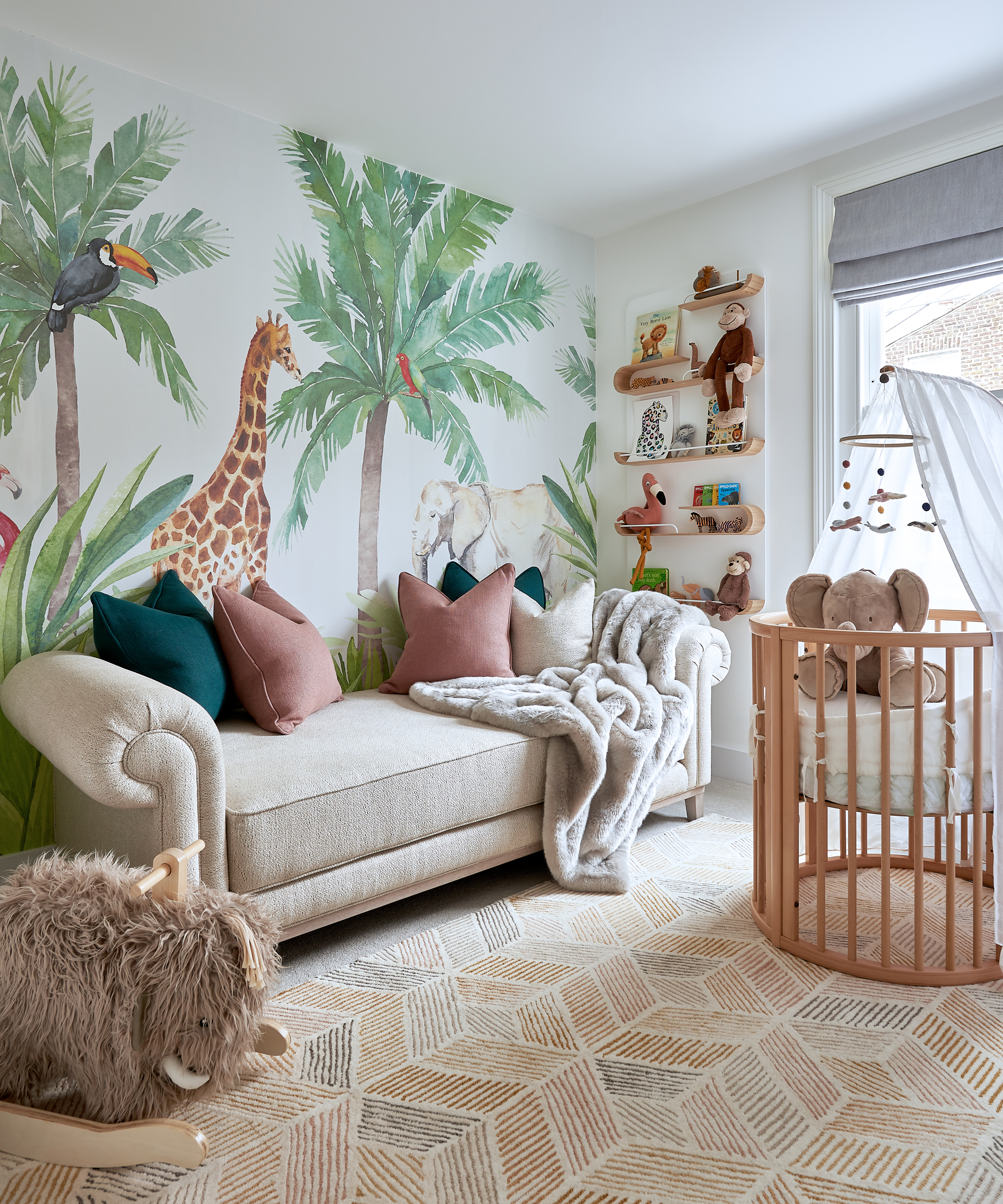
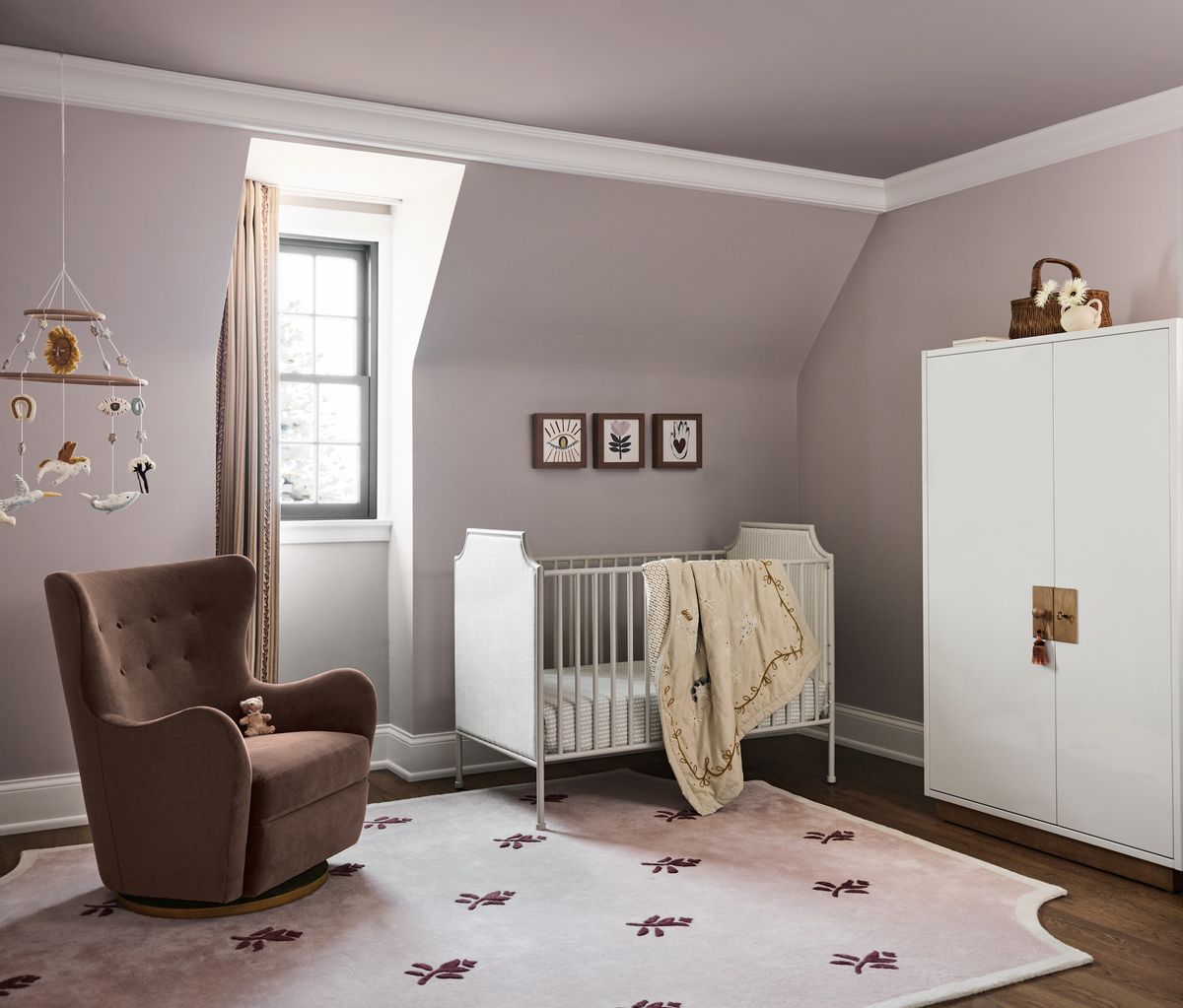
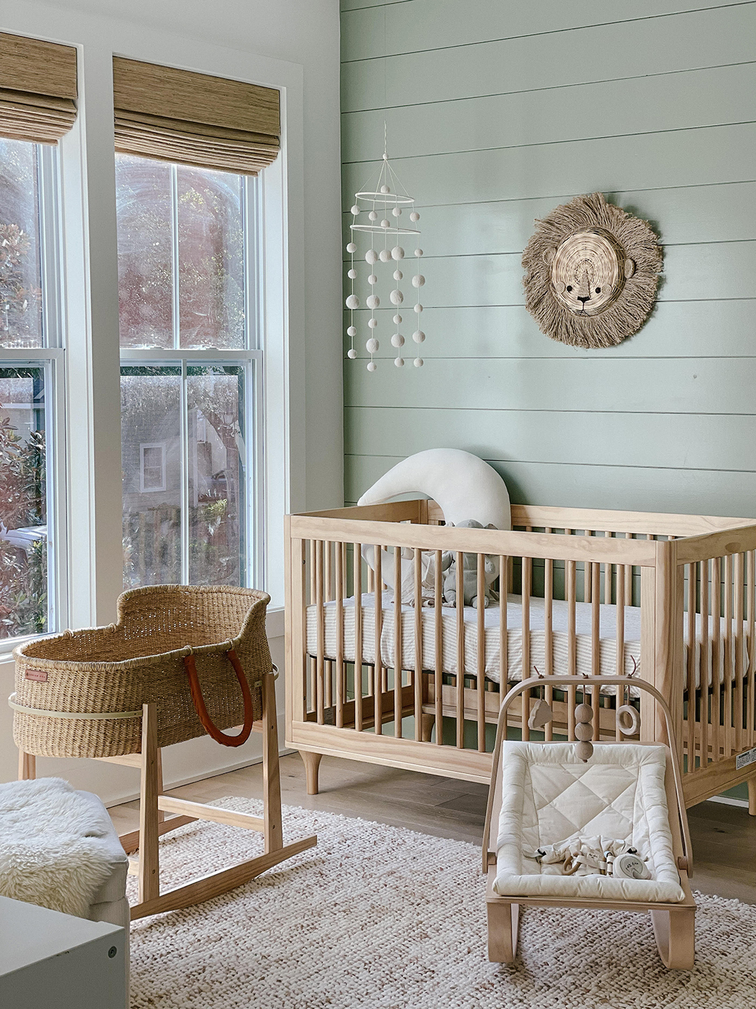
Muted green, reminiscent of nature, provides a sense of security and promotes health, healing, and well-being. It can reduce anxiety and even improve reading ability in children. Earthy greens like sage and moss are recommended, and darker greens can be used if balanced with lighter neutrals. Pale purple, incorporating the soothing qualities of blue and the nurturing aspect of pink, creates a serene atmosphere. Lavender and lilac are good choices, but it's crucial to select very pale shades, as purple often appears darker on walls than anticipated; opting for a hue at least one shade lighter than desired is advisable.
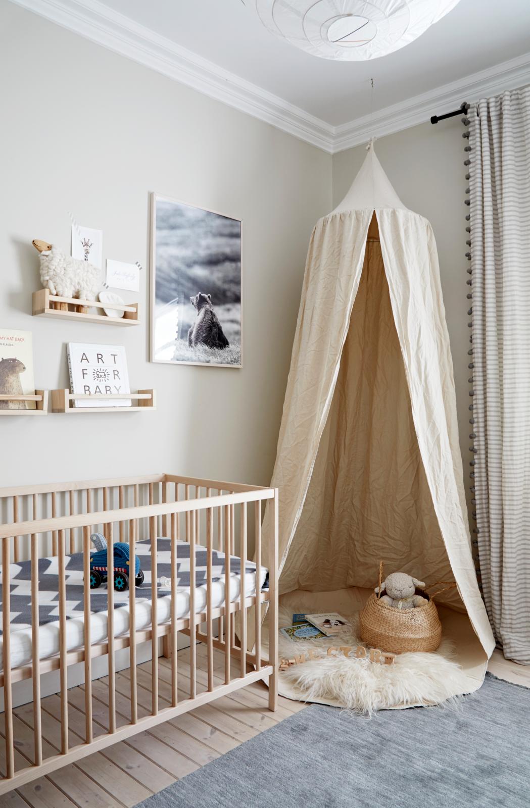
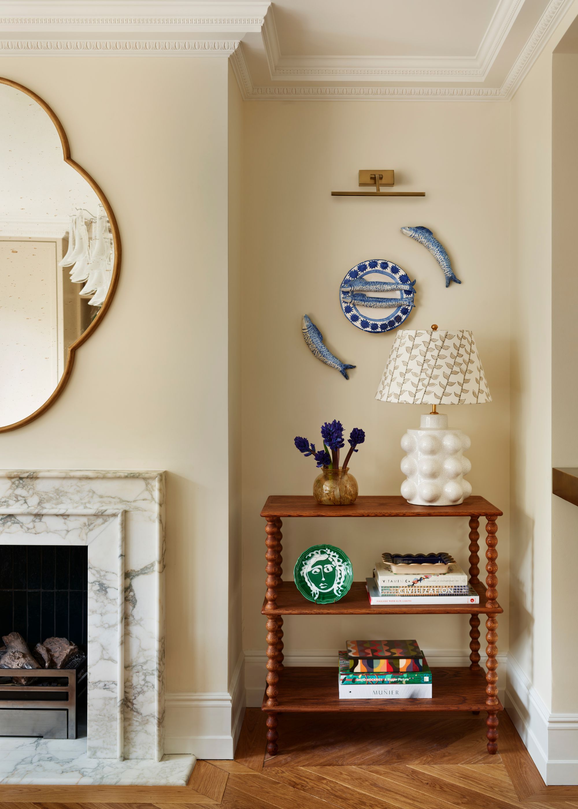
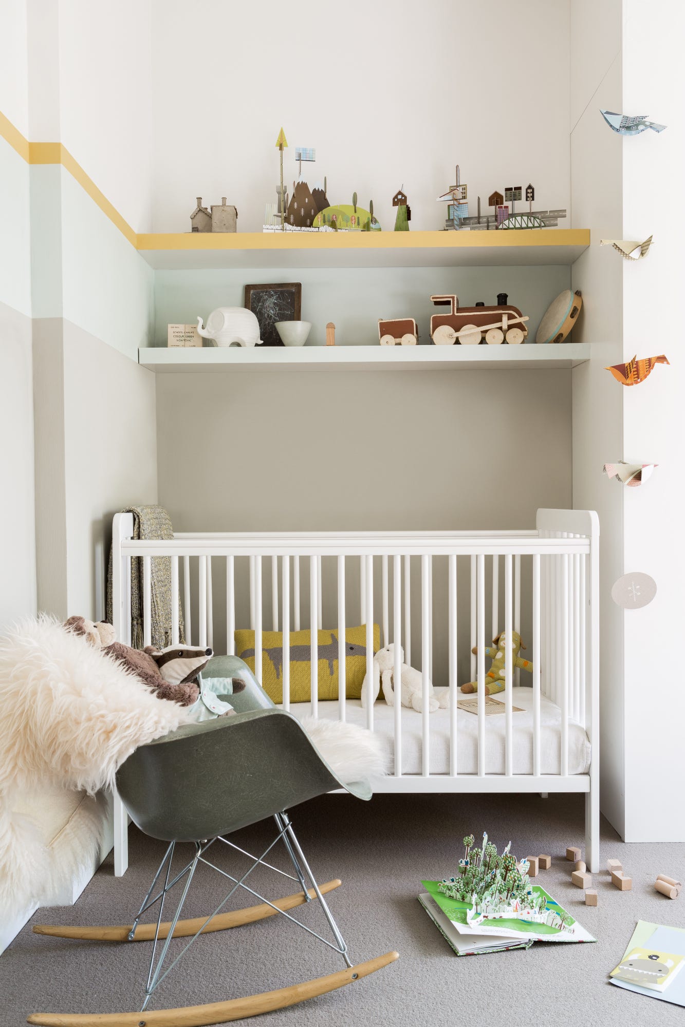
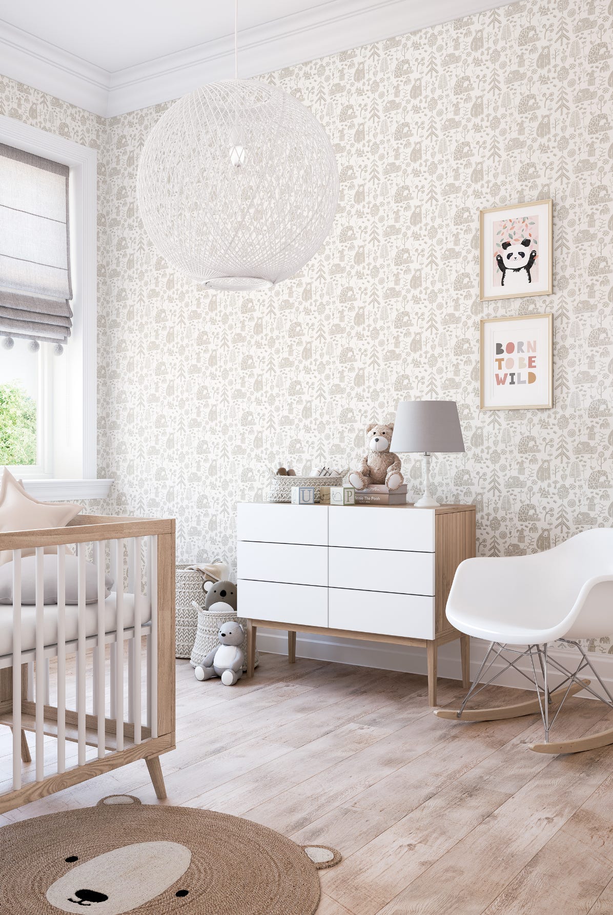
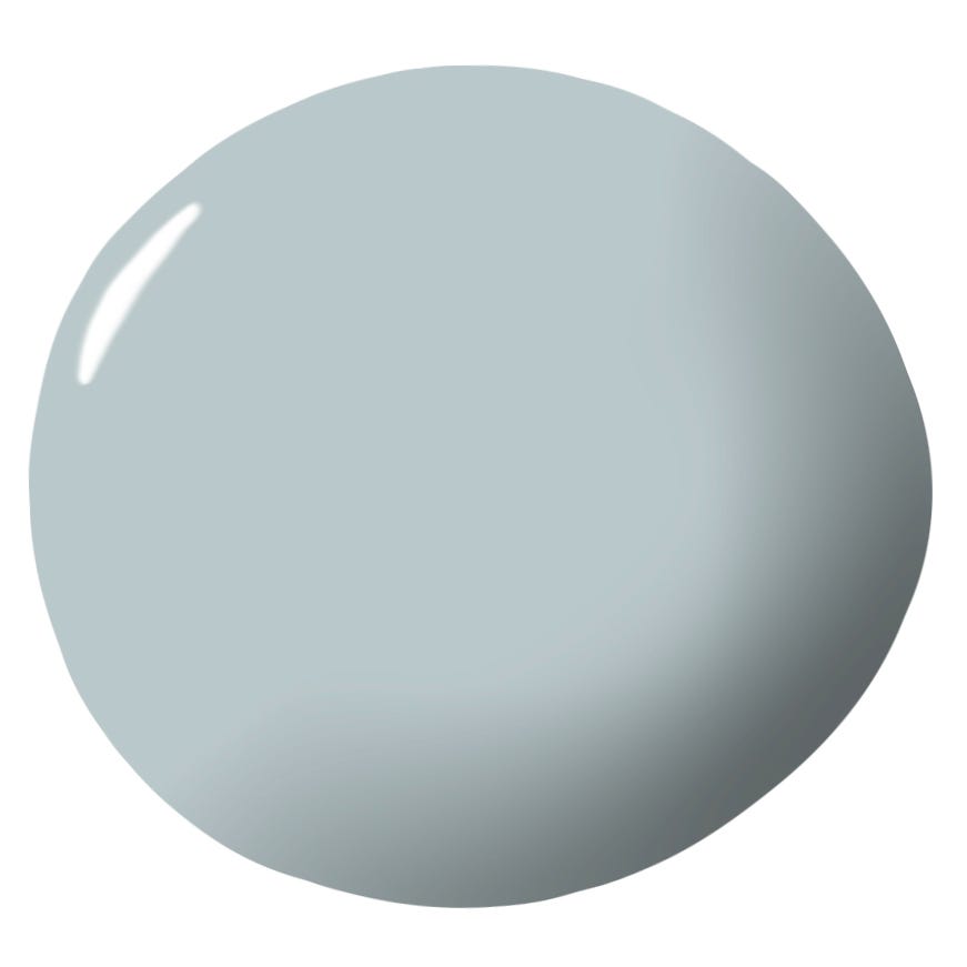
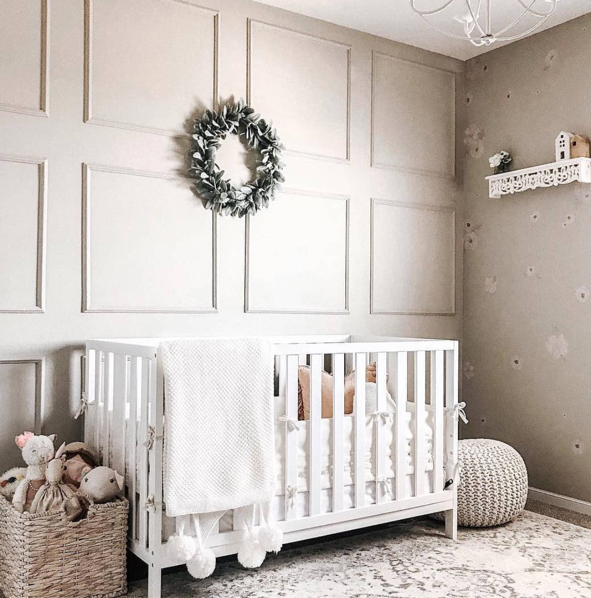
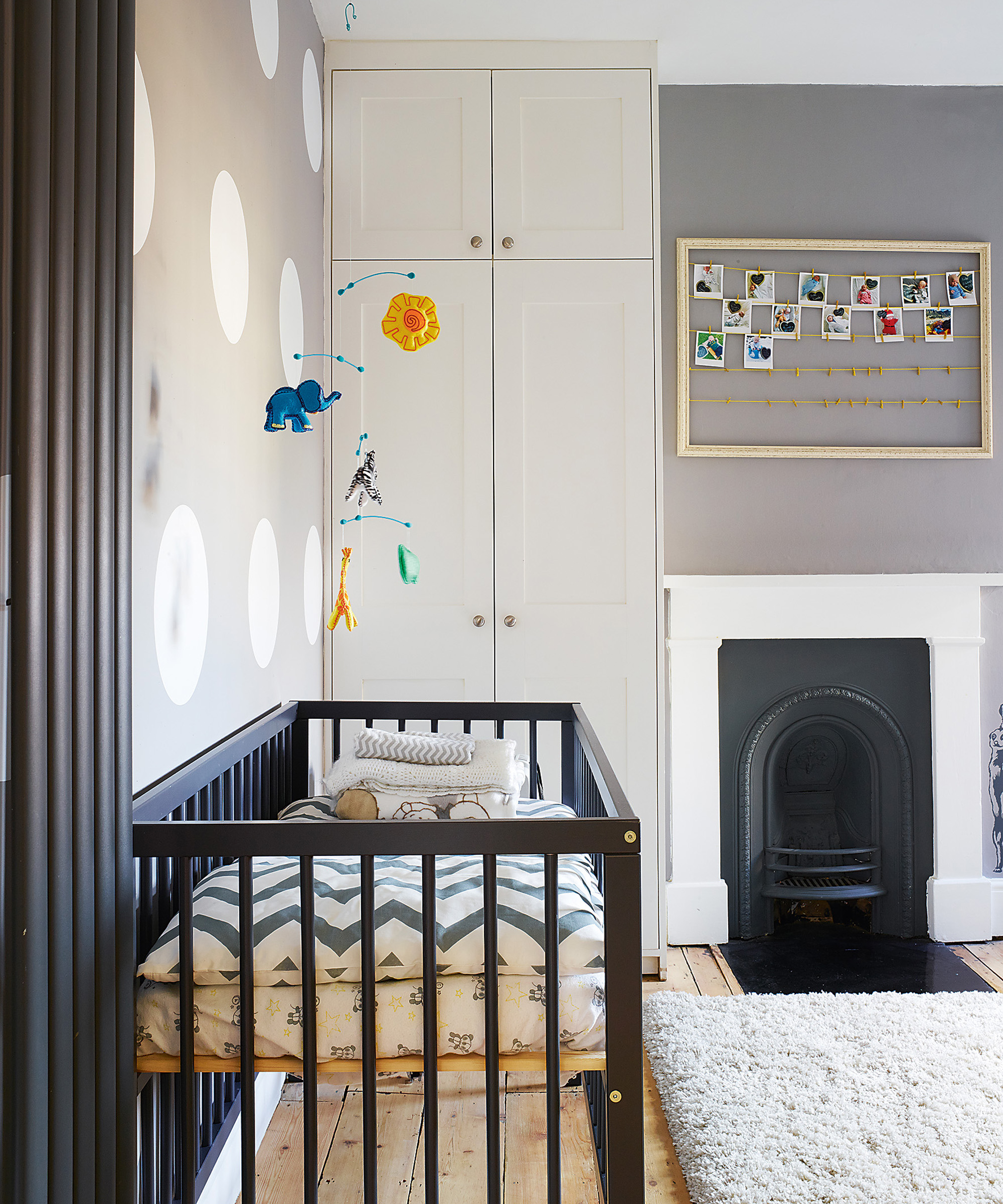
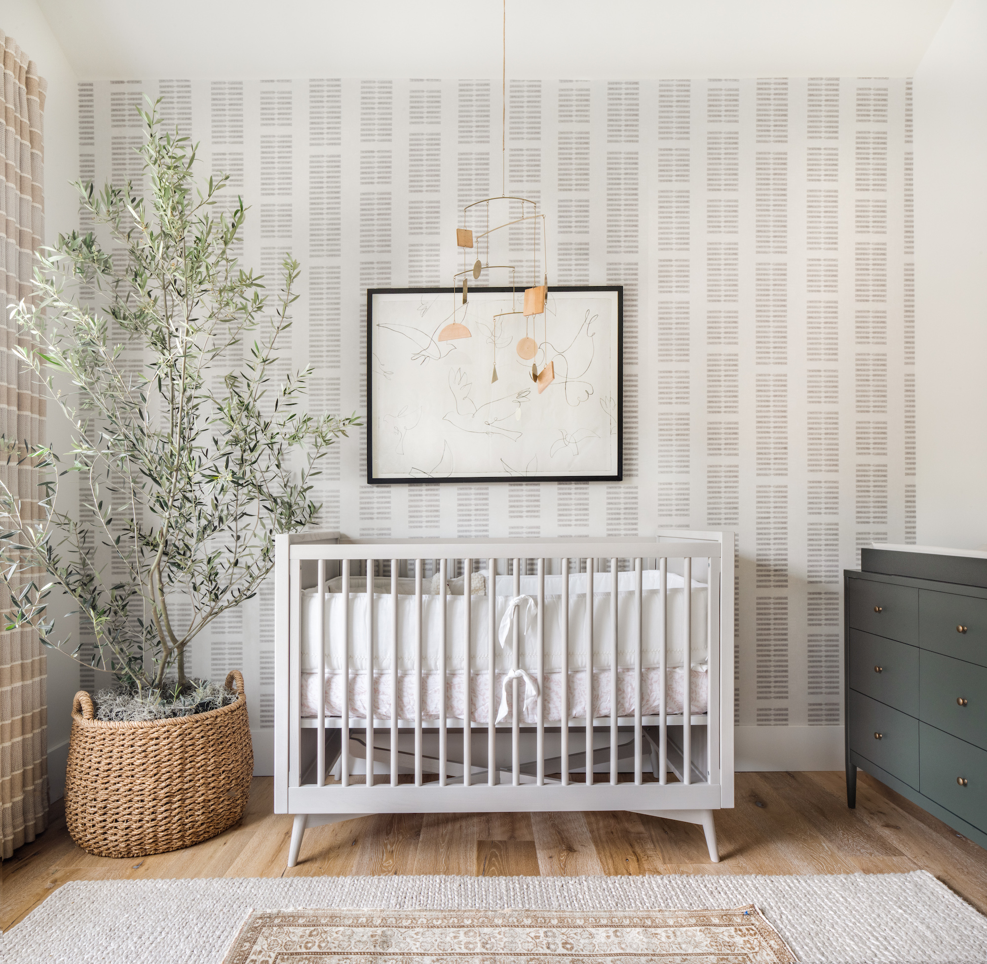
Soft white, while evoking innocence and peace, can sometimes appear cold or institutional. To create a warm, soothing white nursery, creamier shades like soft ivory and antique white are preferred over harsh blue-whites. Adding rich, earthy textures such as wicker and wood, along with soft, colorful accents, can enhance warmth and encourage openness without over-stimulating the baby. Glacial gray, a contemplative color, promotes thought and emotion but can induce sadness if too dark. Light, blue-grays are recommended, and darker grays can be brightened with clean white trim, pastel accents, or wood elements.
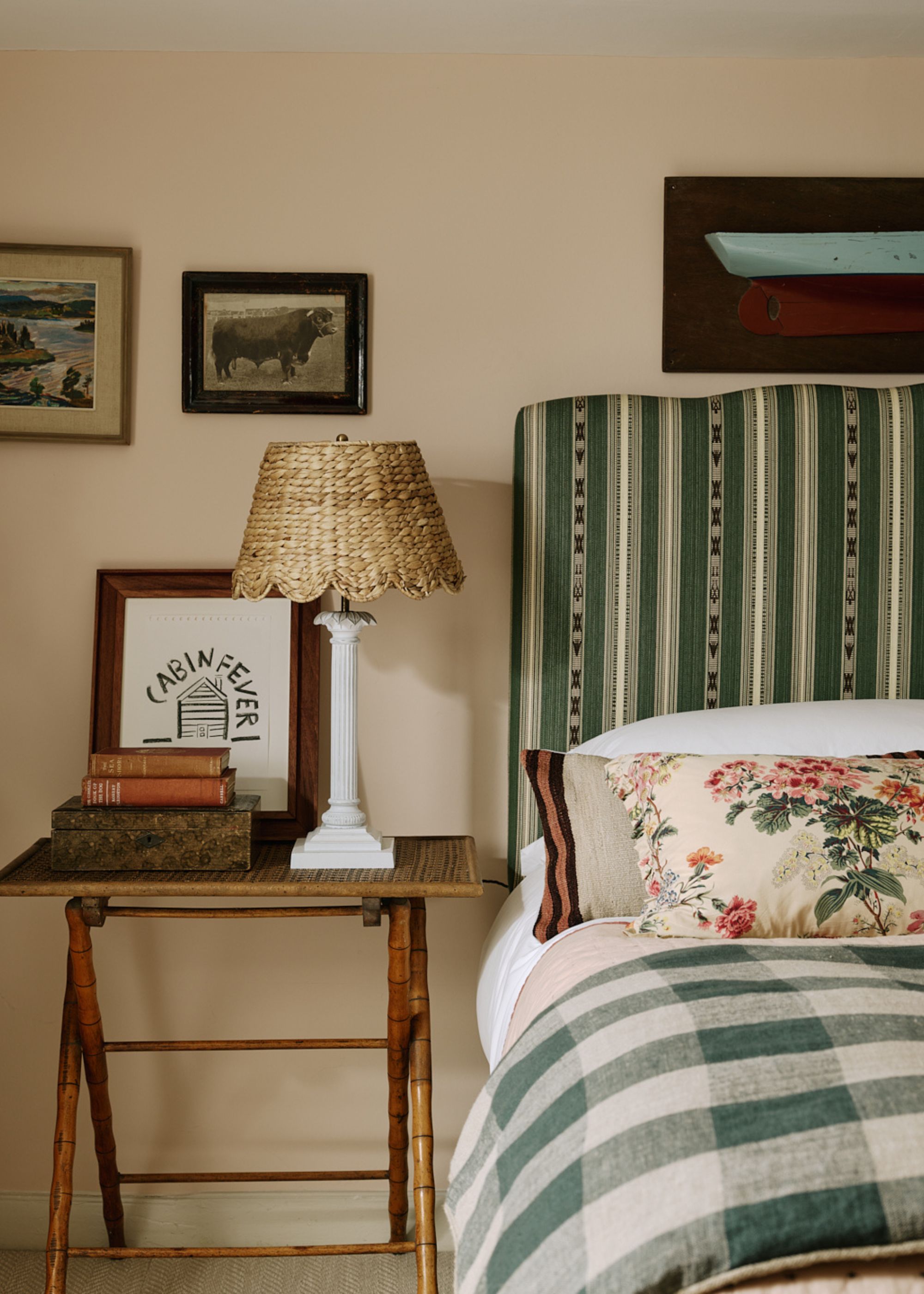
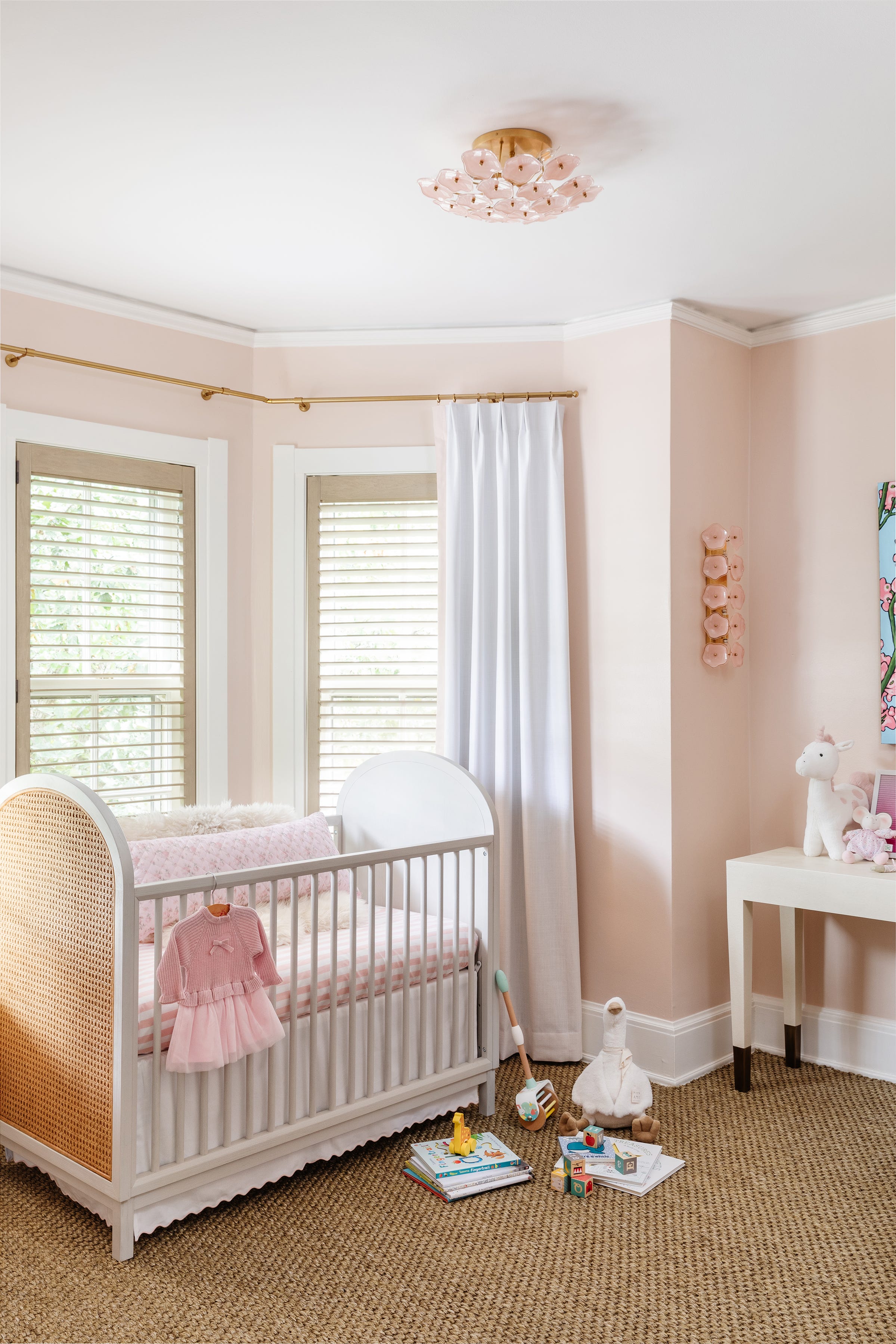
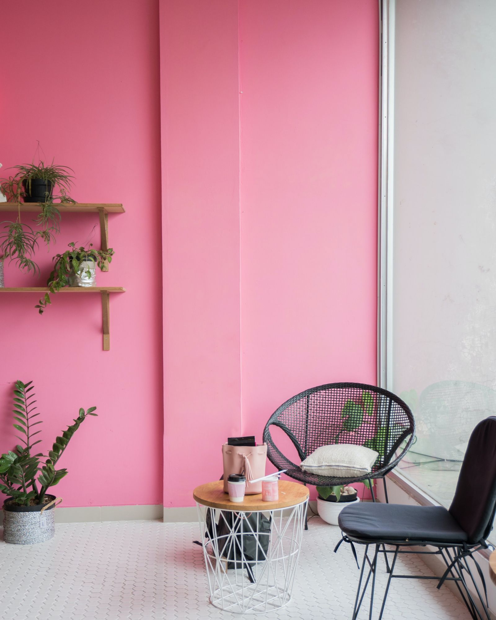
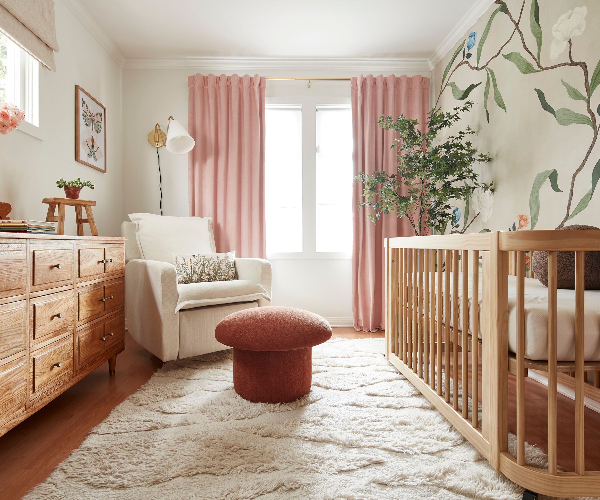
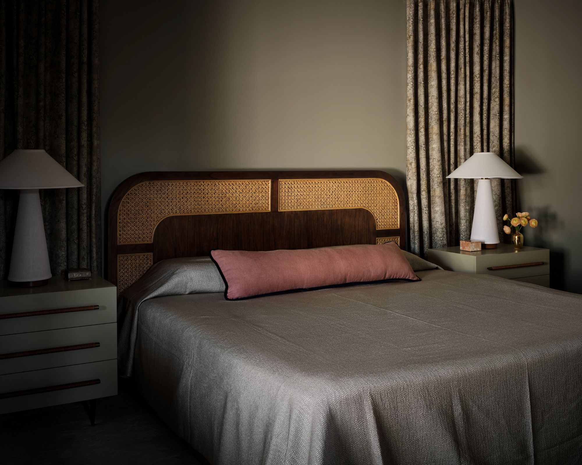
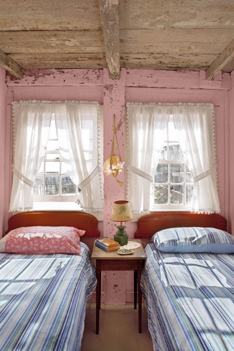
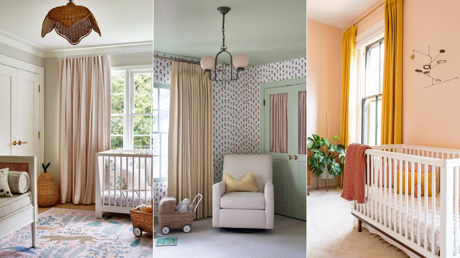
Pastel pink symbolizes unconditional love and compassion, inspiring warm and comfortable feelings that can help a baby relax. Studies indicate pink's calming effect and its ability to lessen aggressive behavior. Pale, peachy, or dusty pastel shades are best used sparingly and balanced with neutral spaces. Earthy neutrals, including beige and brown, offer a warm, grounding effect, creating a cozy environment. These shades provide a rest for a baby's developing eyes, helping them wind down and sleep.
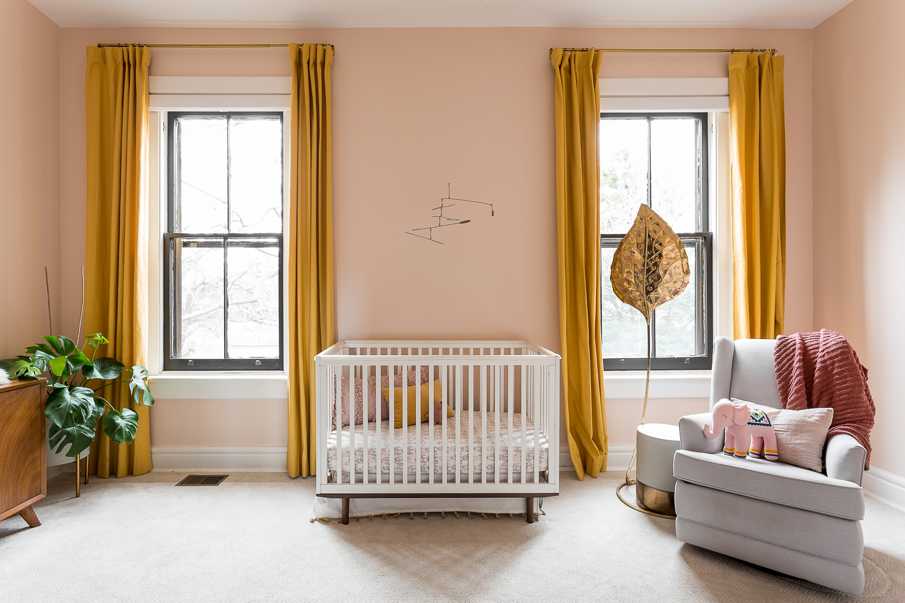
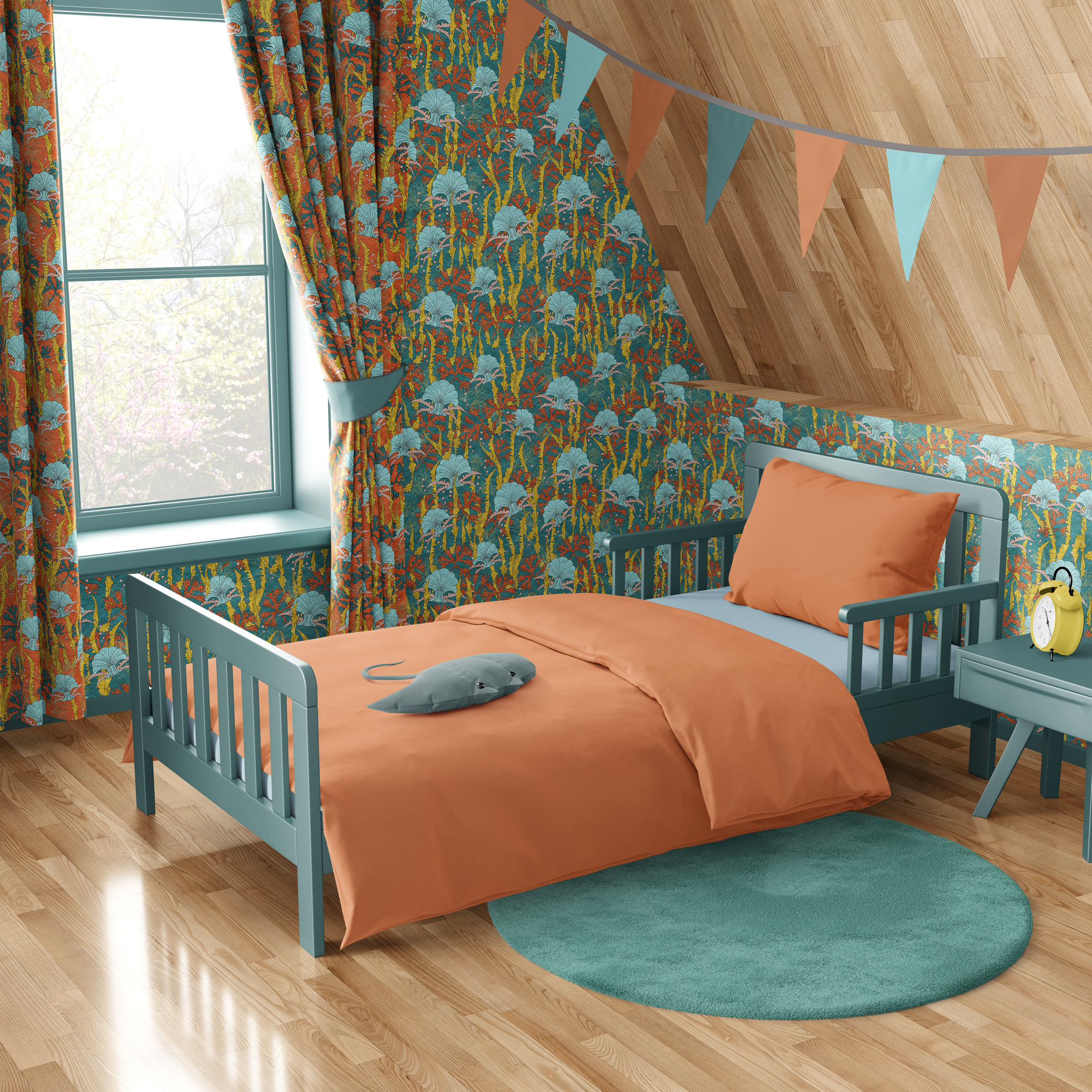
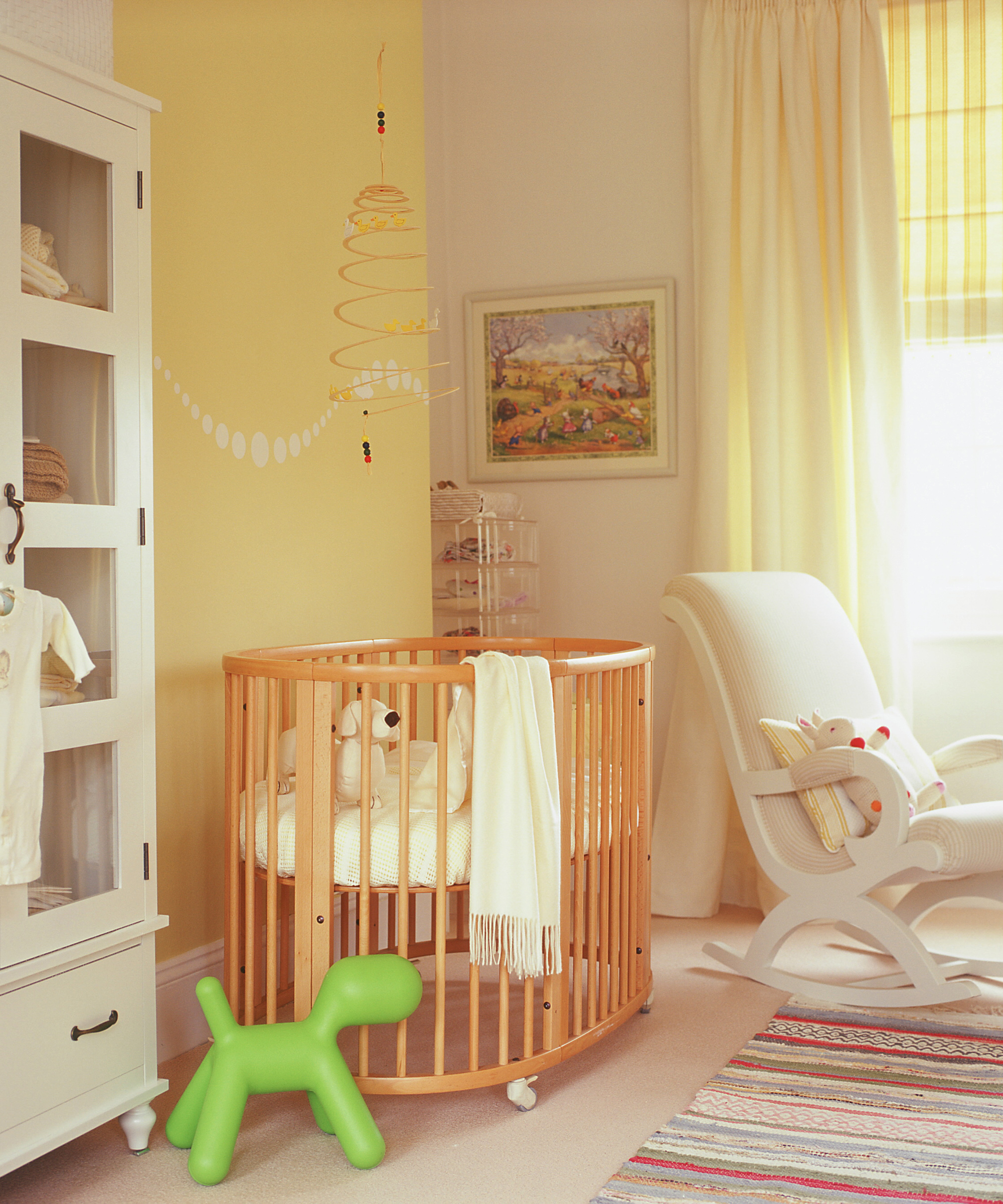
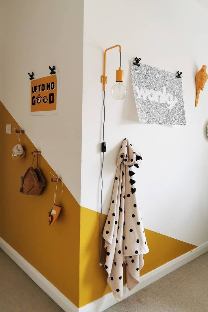
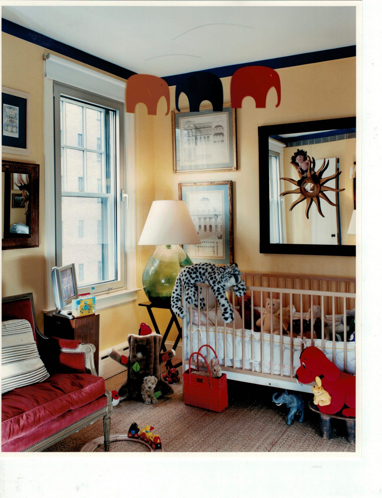
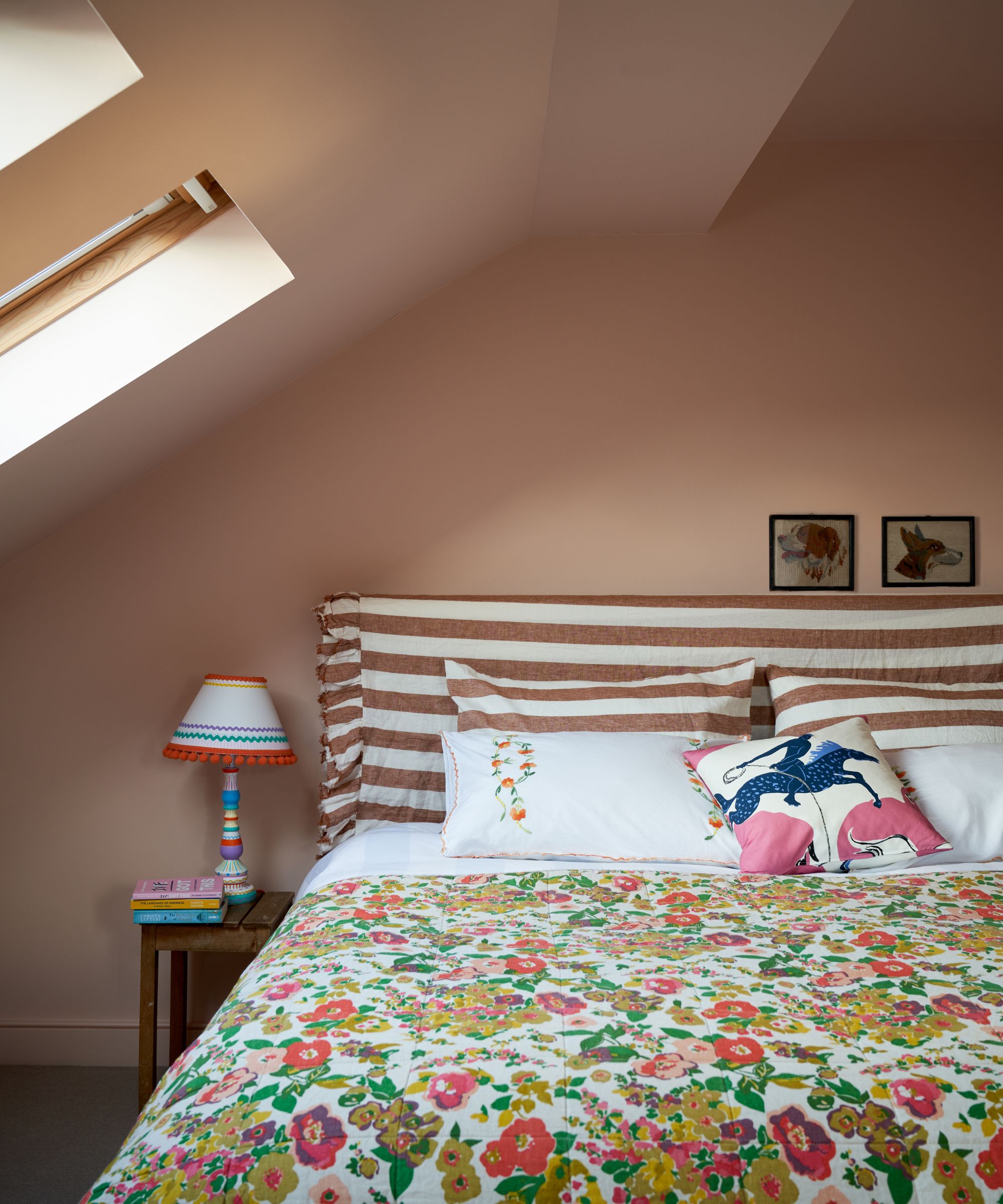
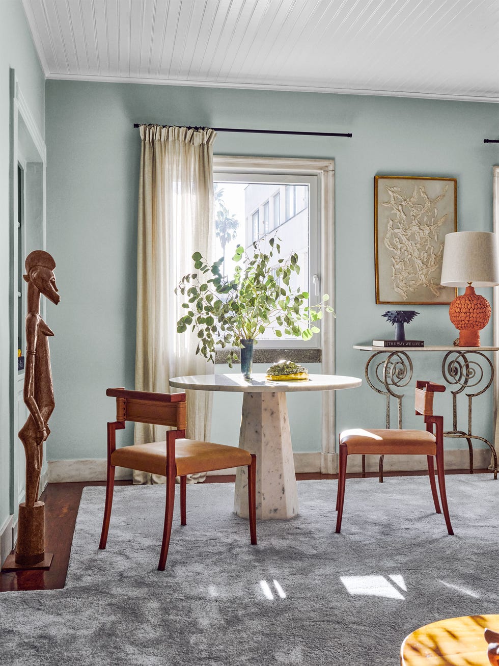
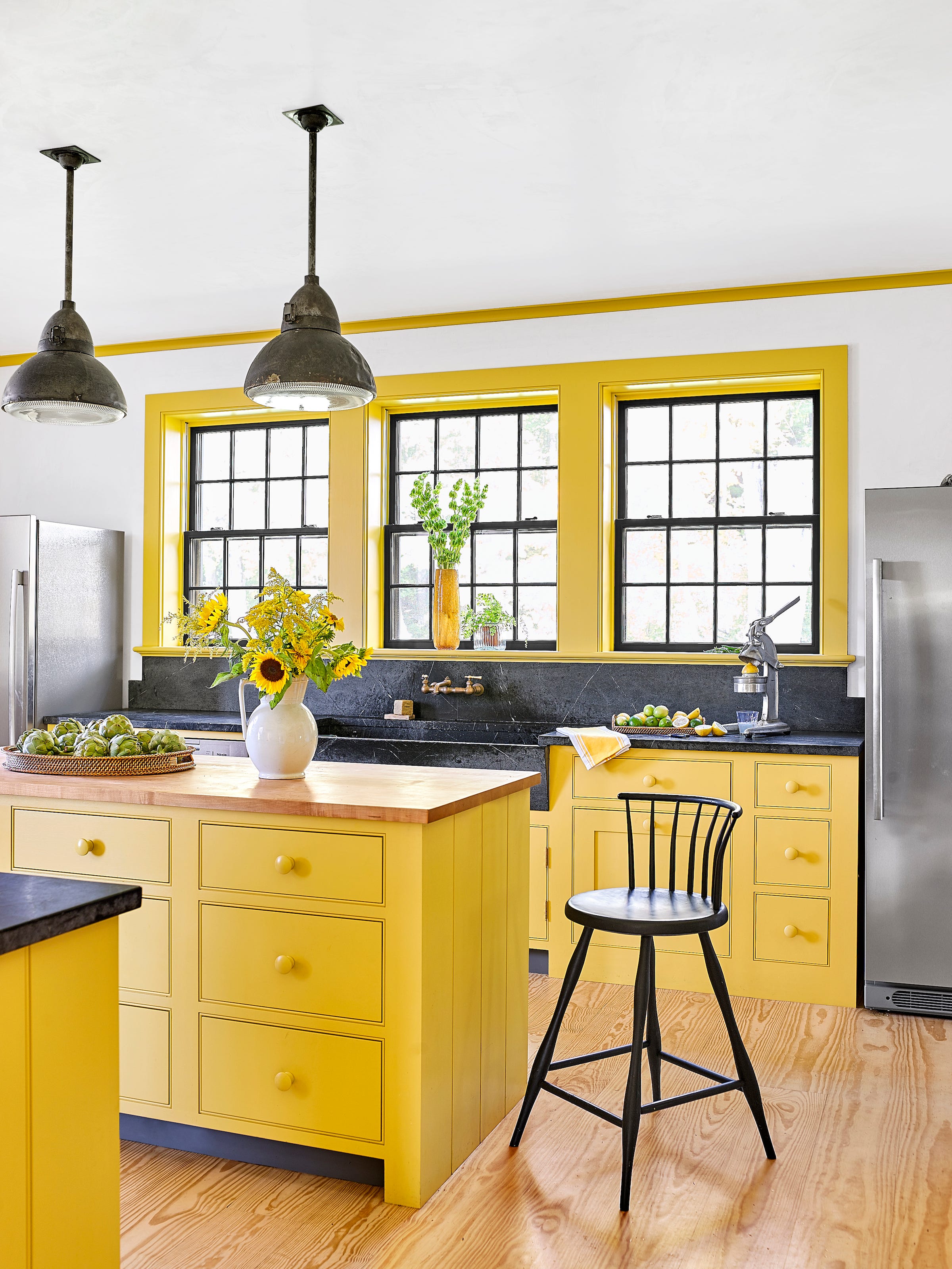
Dandelion yellow, associated with positivity and happiness, brings a soothing warmth to the nursery. Softer versions like daffodil or dandelion are preferable to harsh, brighter tones. Floral wallpaper with a yellow backdrop can add a vintage touch. Serene teal, a blend of blue and green, combines the calming and peaceful properties of both colors, providing a sense of balance. Mint or seafoam are excellent choices. Teal is also a versatile gender-neutral hue that complements various decor styles. Soft peach serves as an alternative to pink, creating a serene environment when paired with neutrals or cool tones. It brightens spirits without being too intense and can be a long-lasting choice as a child grows. For those unsure, using peach as an accent wall can help determine full commitment, especially when balanced with printed wallpaper to enhance serenity.
#CalmingNurseryColors #NurseryDecor #ColorPsychology #BabyRoomDesign #InteriorDesign #ChildDevelopment #HomeDecor #PaintColors #CalmingNurseryColors #NurseryDecor #ColorPsychology #BabyRoomDesign #InteriorDesign #ChildDevelopment #HomeDecor #PaintColors
0 comment in total
 No comments yet
You may also like
Nursery color schemes – 8 spaces to soothe your baby to sleep

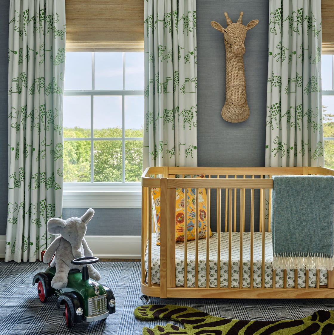
Designers Reveal How to Make a Baby’s Room Look ANYTHING But Childish

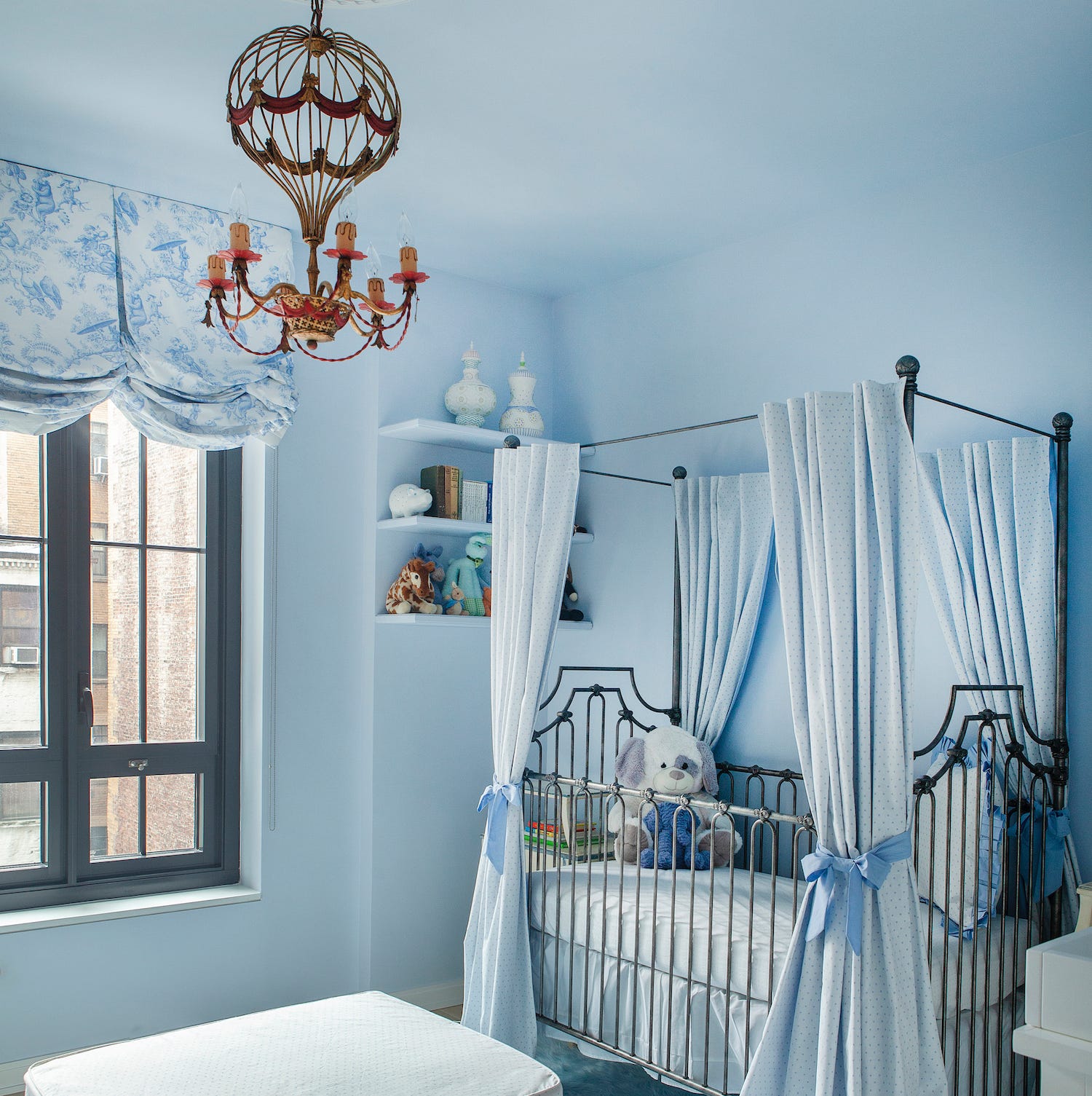
15 Designer-Approved Kids' Room Paint Colors
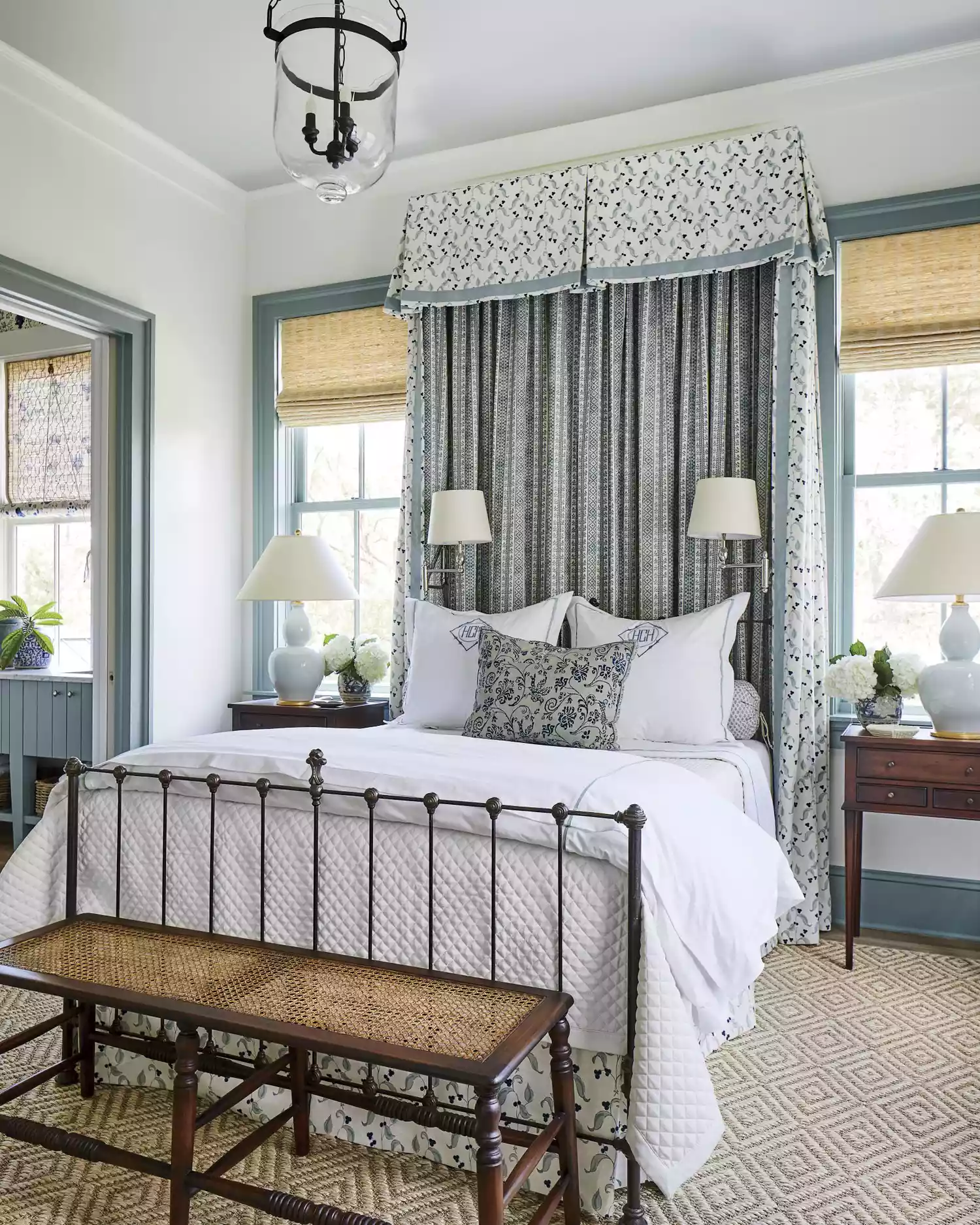
25 Soothing Paint Colors to Make Your Space Instantly Restful
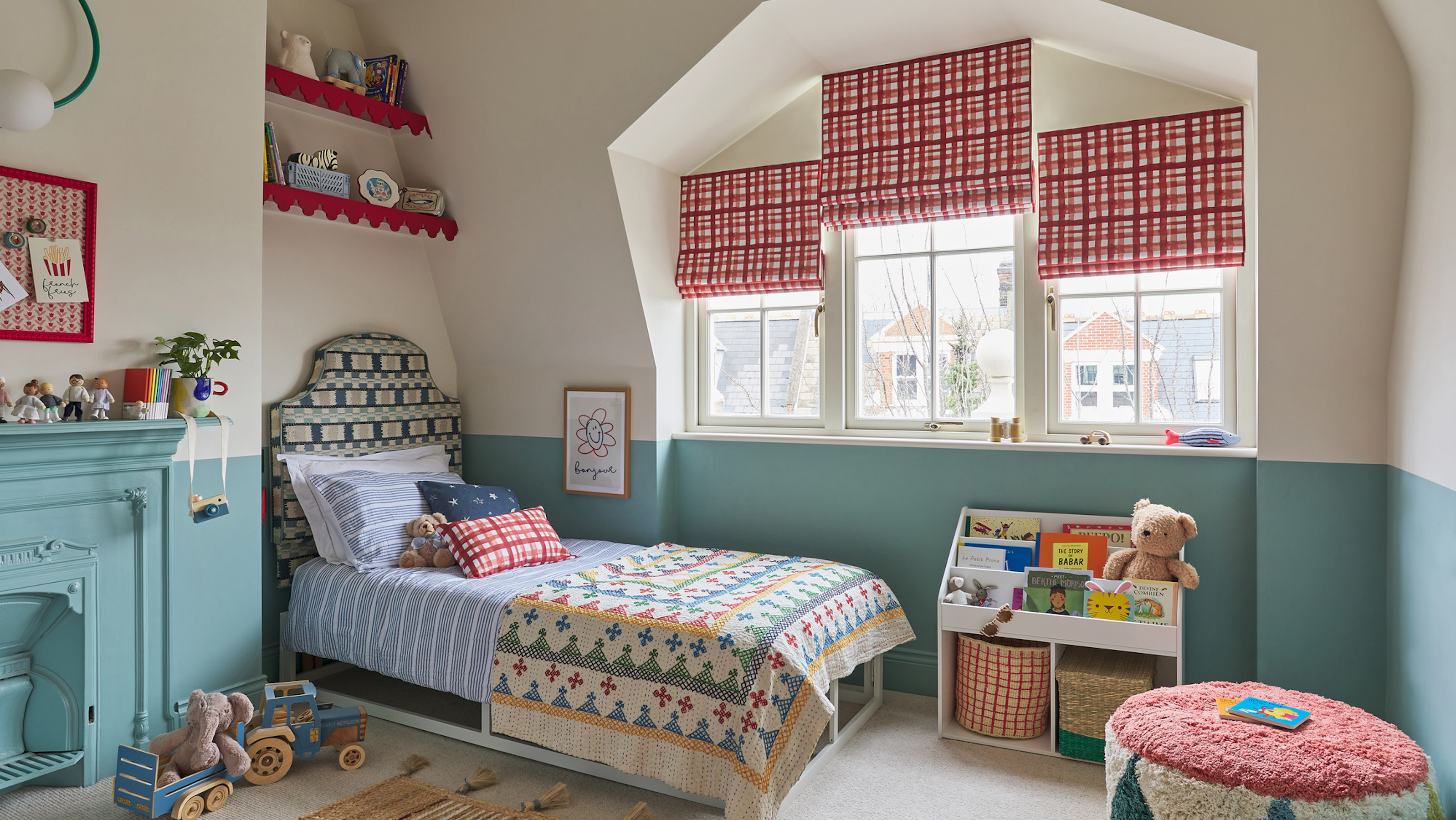
The best calming colours for kids' bedrooms to create a soothing and stylish scheme for little ones

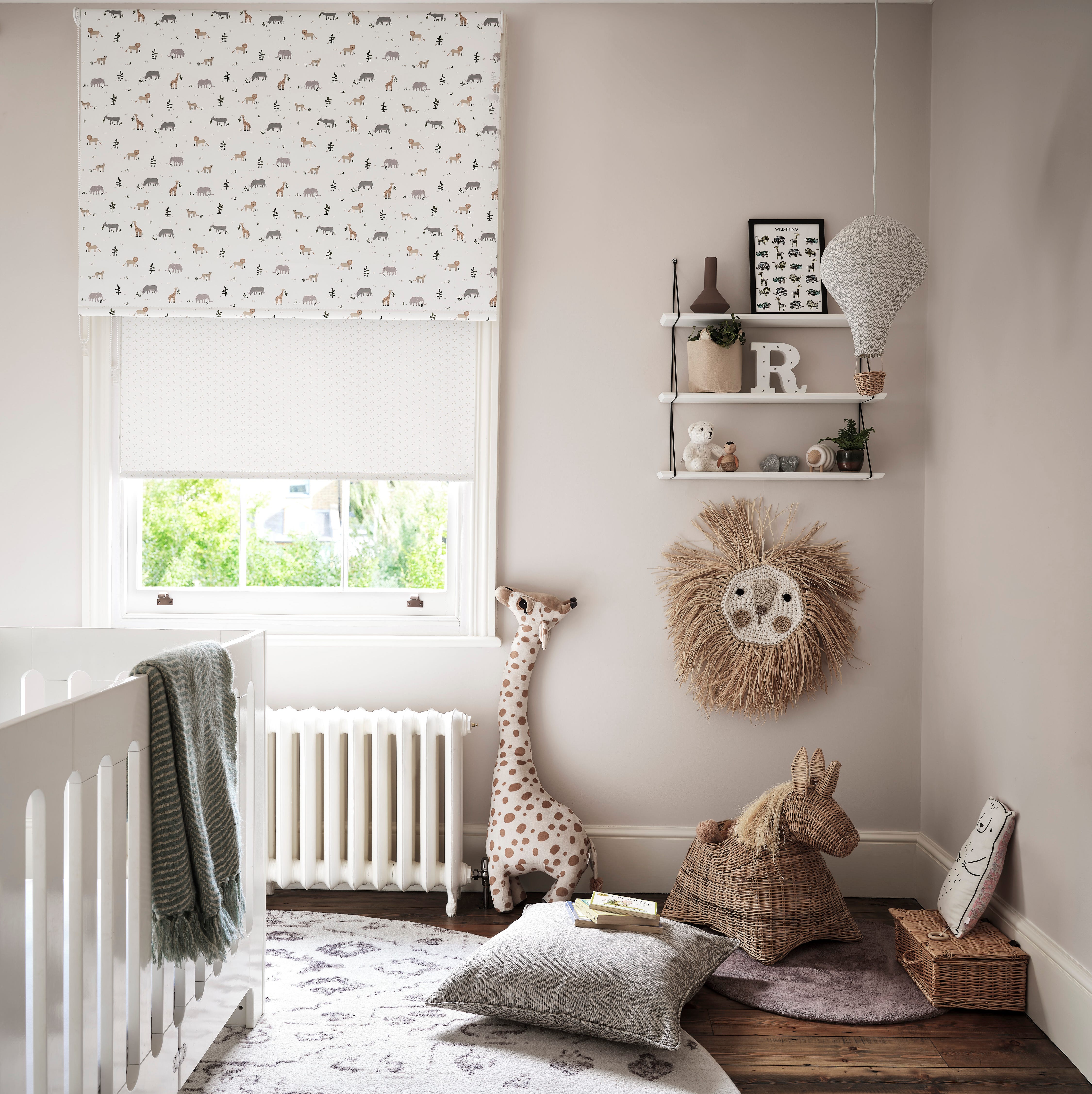
13 neutral nursery ideas for a soothing, serene space

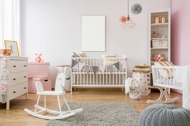
Baby room decor: the beginners guide to decorating a nursery

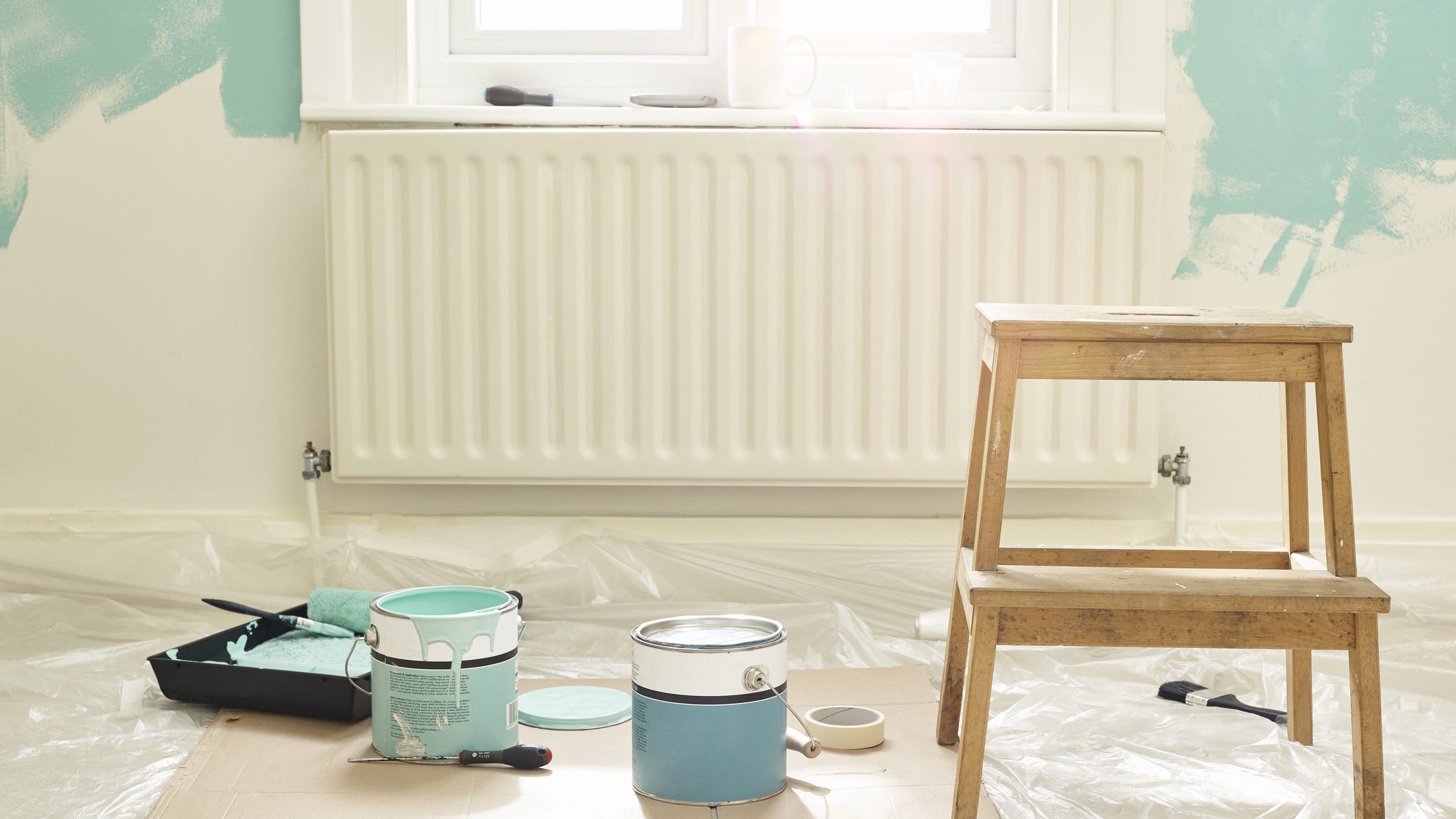
Add These Happy Colors to Your Home and Boost Your Mood
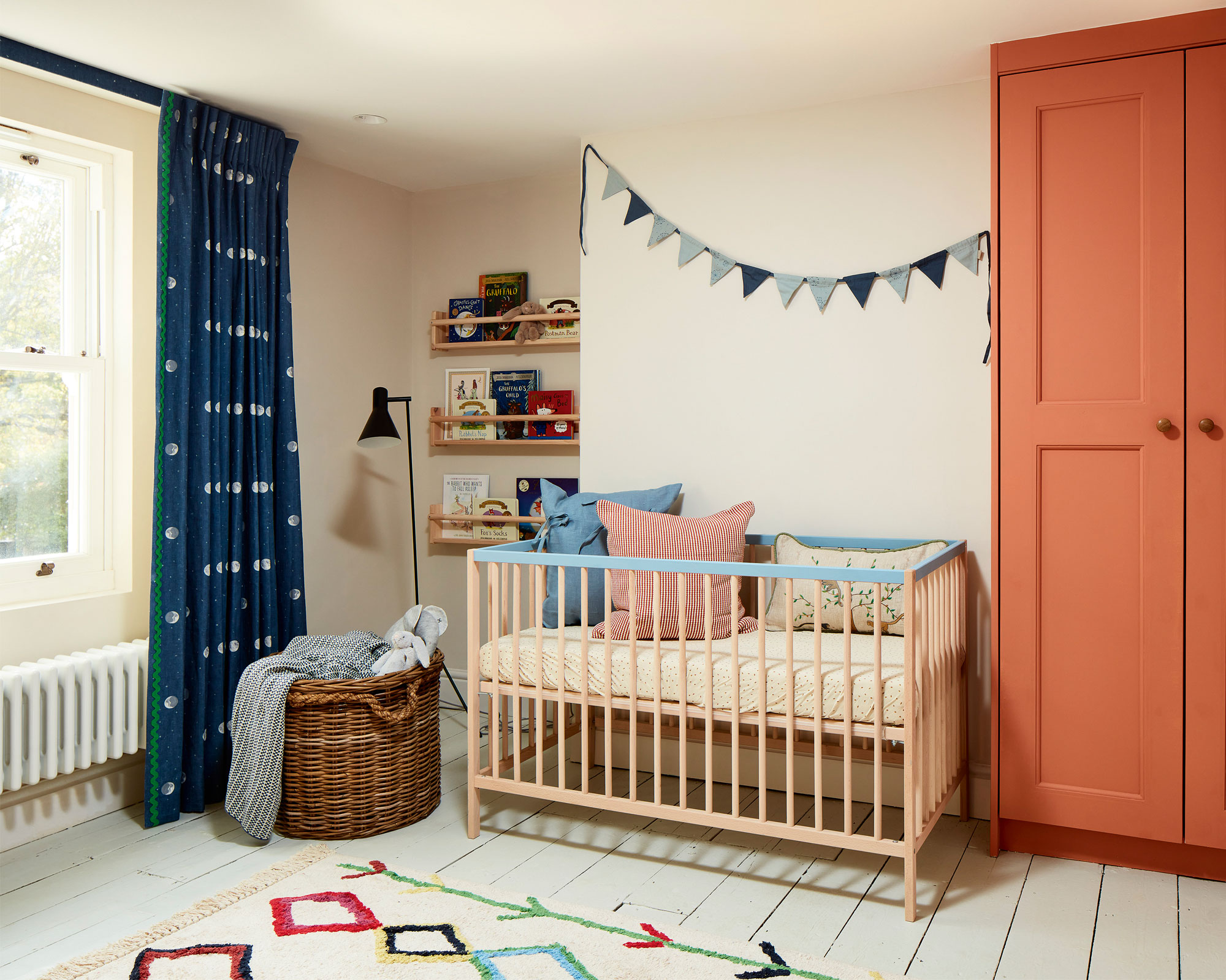
What is the best color for a nursery? Design experts and sleep psychologists advise
Expert Speak: What are the most soothing colours for the home?

5 colors that will make your bedroom feel calmer, according to designers
Nursery ideas – 20 beautiful rooms new parents will love
8 Stunning Colors For All Your Nursery Decor, According To Designers

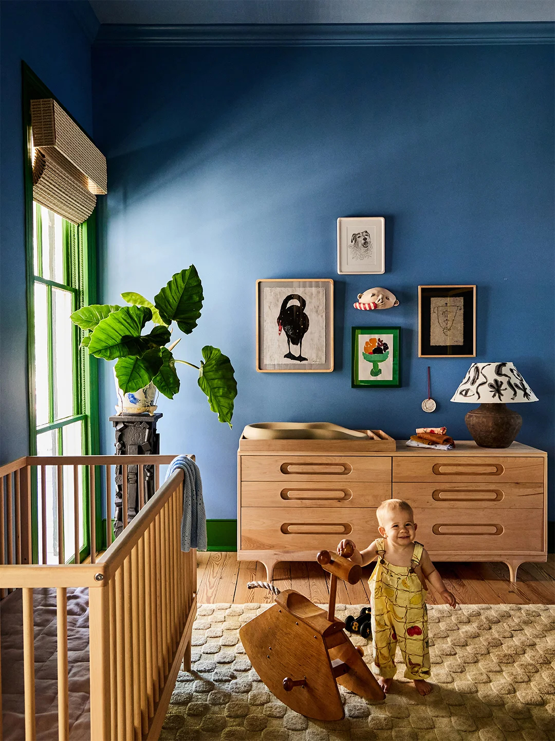
7 Blue Nurseries That Aren’t Pastel Everything
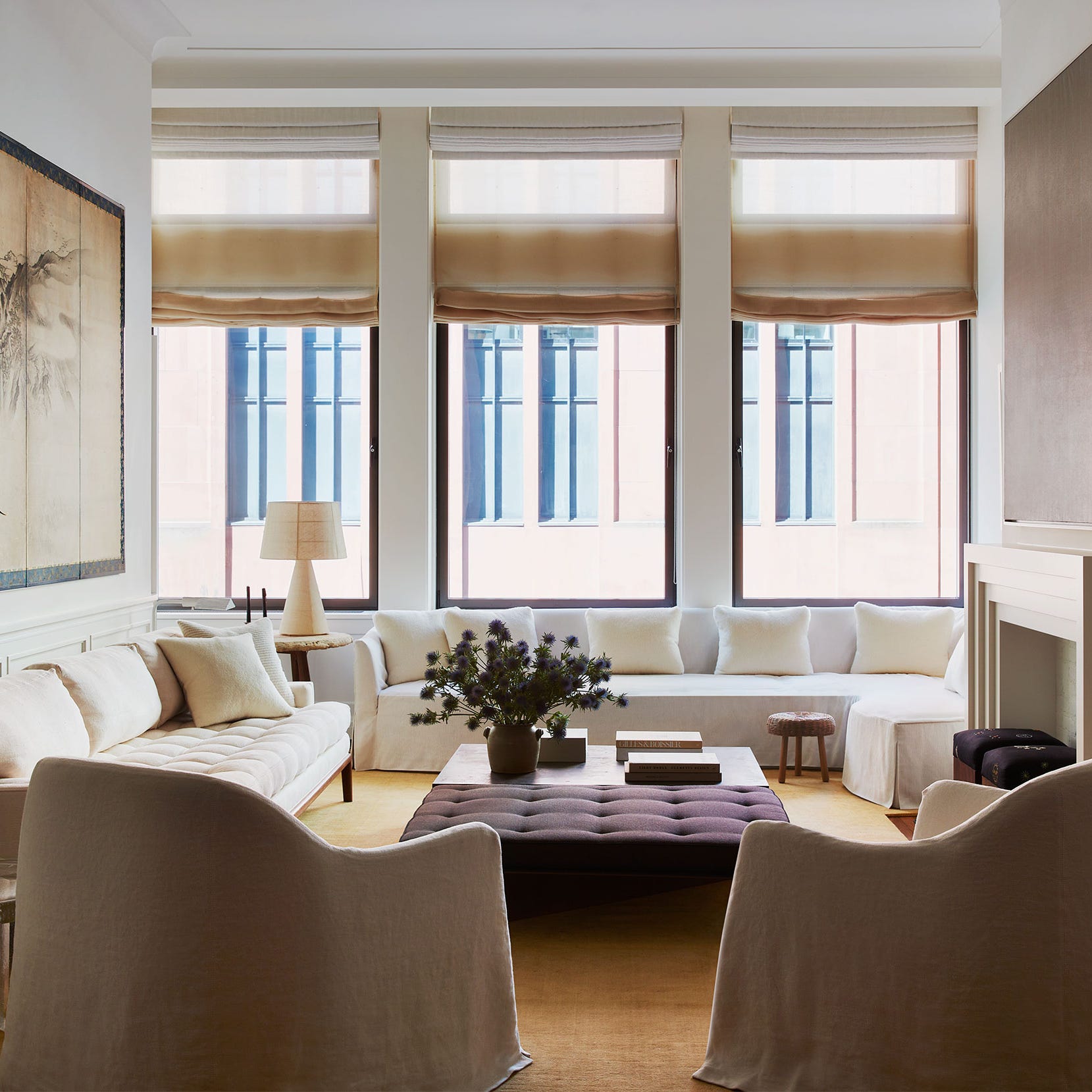
20 Calming Paint Colors That Will Change the Way You Live
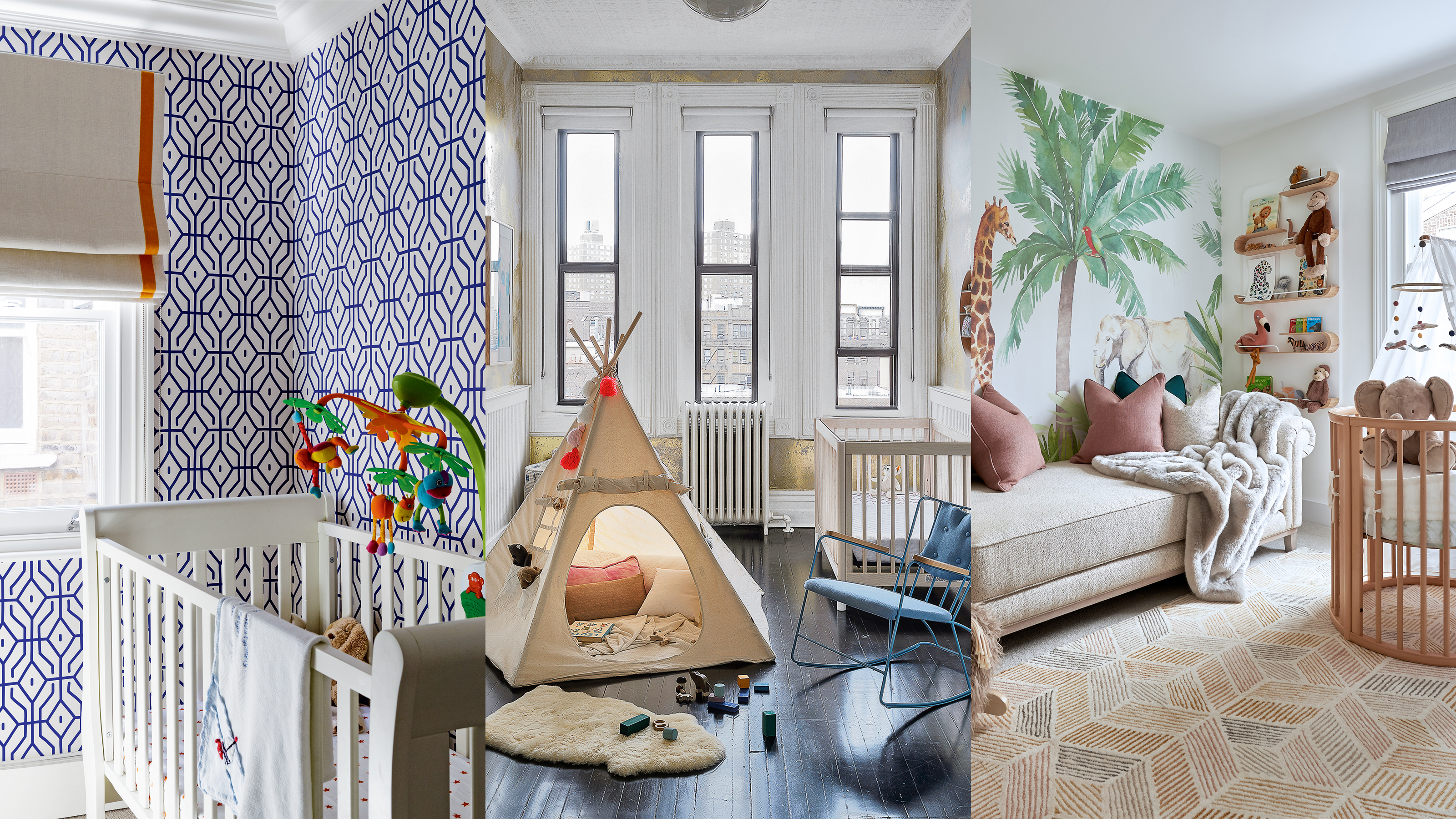
Baby boy nursery ideas – 17 tips for creating a soothing sleep space
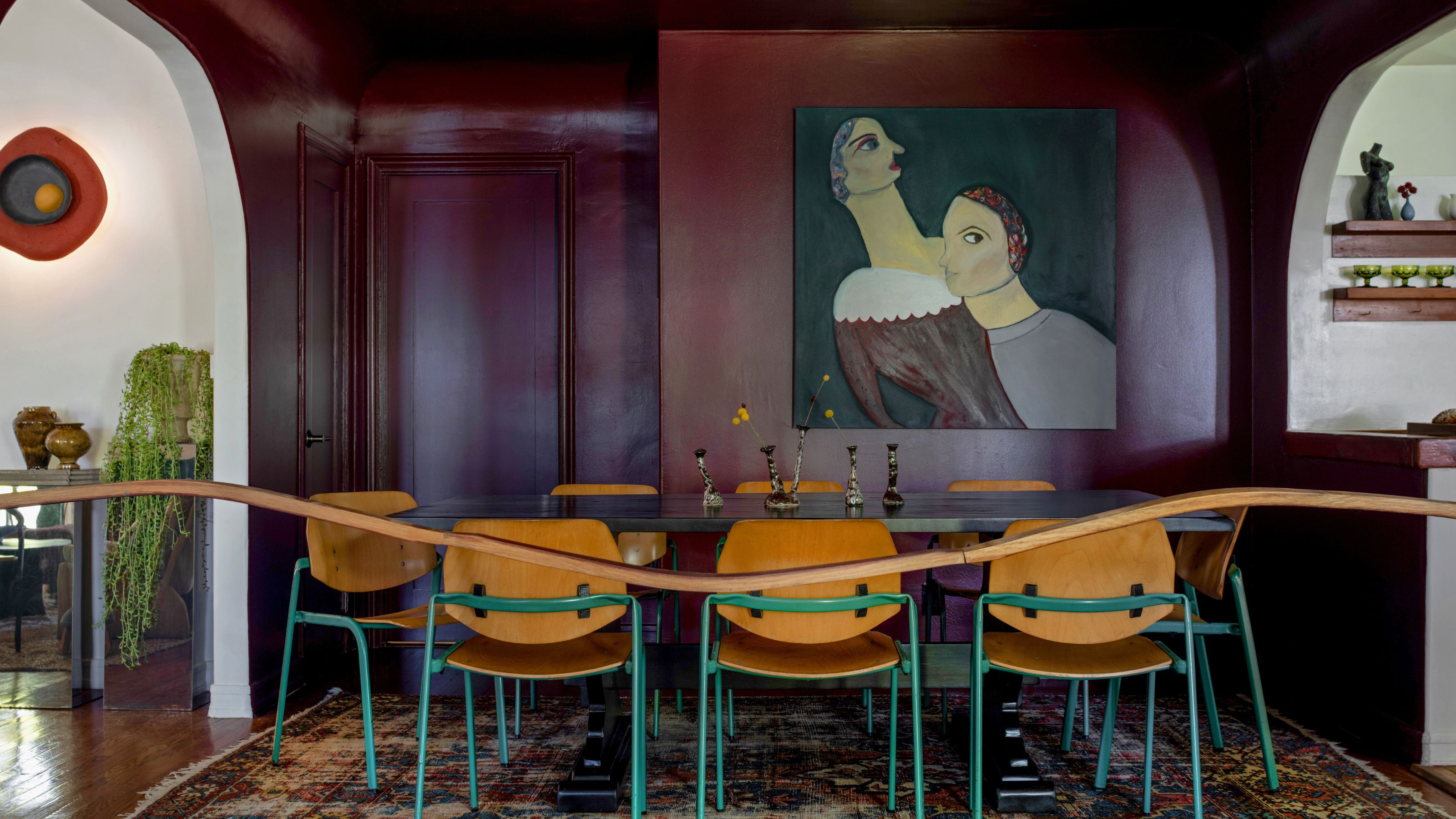
13 Calming Paint Colors Designers Use to Make Rooms Feel Soothing — And No, They're Not All Neutrals

Sad beige nurseries are out – here's how to introduce color to your once-neutral space
7 Sage Green Nursery Ideas, So That at Least One Spot in Your House Feels Calm | domino

11 Calming Bedroom Paint Colors to Help You Relax and Wind Down at the End of the Day