Colors of well-being: Acoustic ceiling color trends and specification
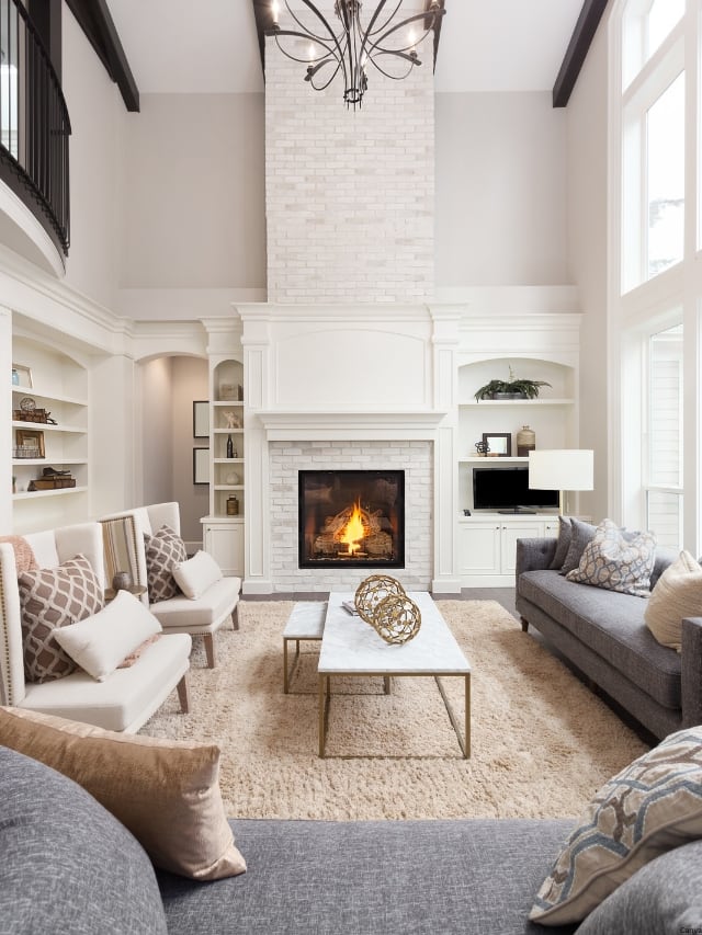
The selection of colors in commercial interior spaces is increasingly influenced by predictive forecasts from various industries, including fashion, automotive, housewares, and building products. This trend analysis identifies four primary color trends, each with distinct motivations and palettes, that are shaping ceiling designs and overall interior aesthetics. These trends include Biophilic awareness, Wabi-sabi, Technology-inspired designs, and Calm enclosure.
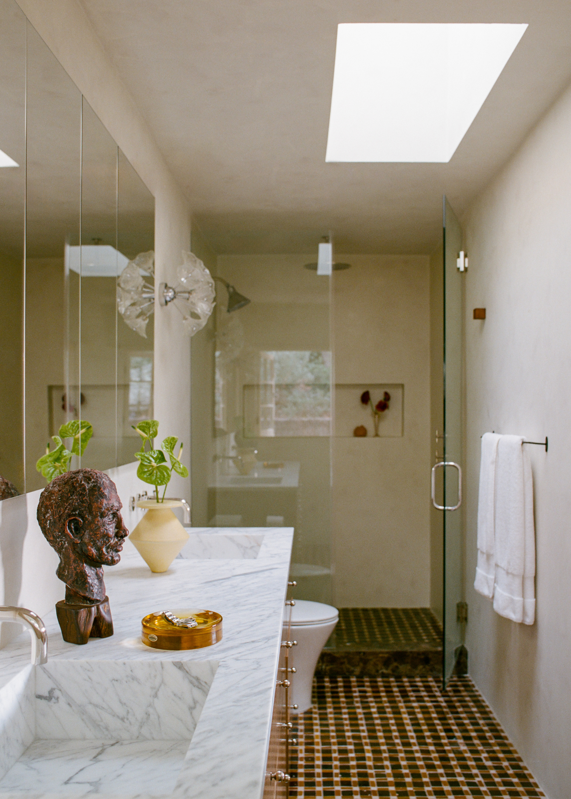
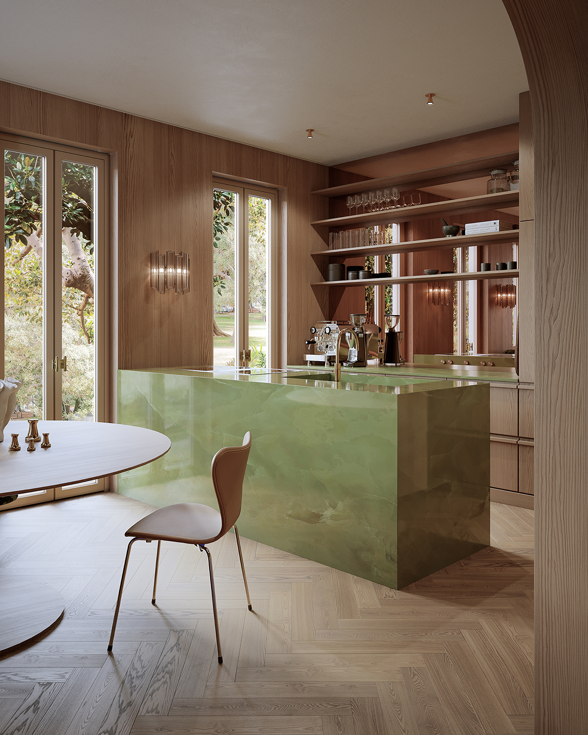
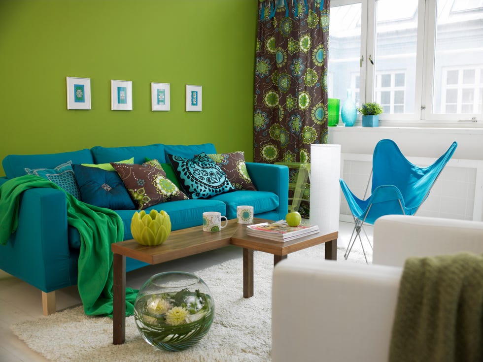
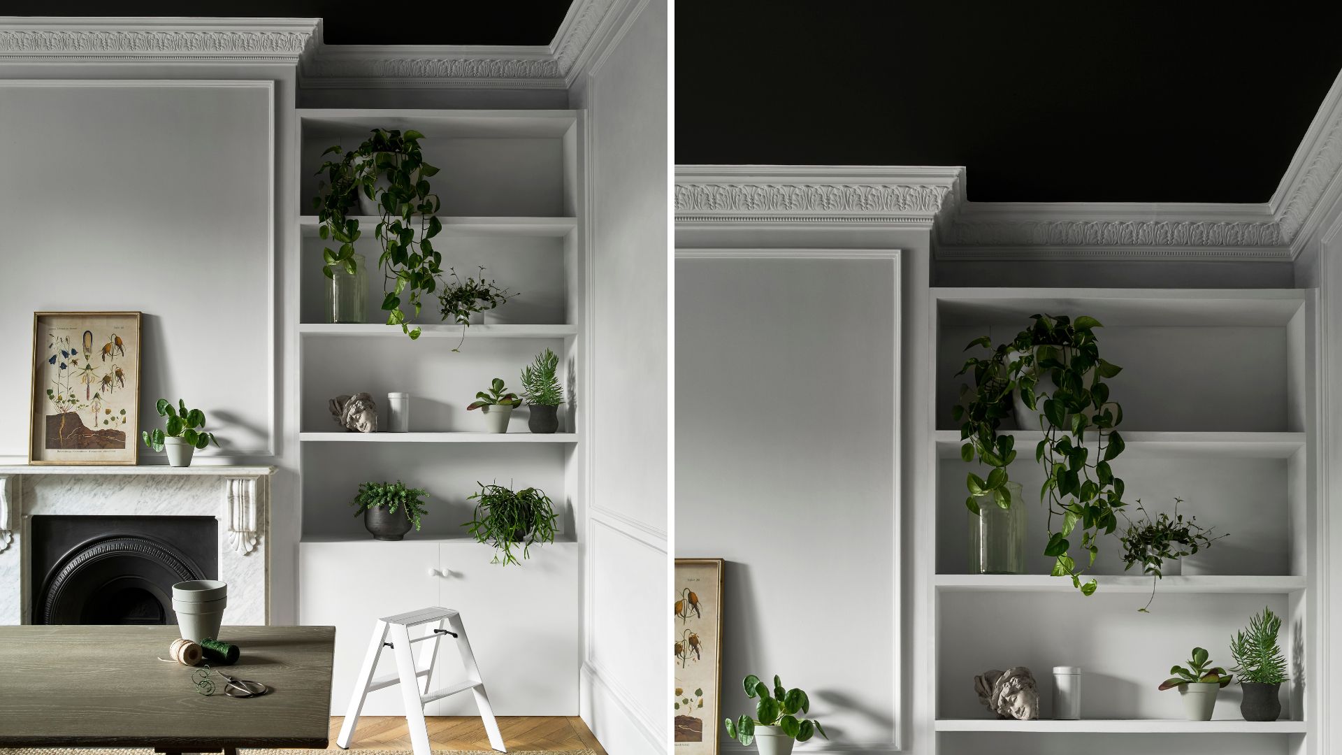
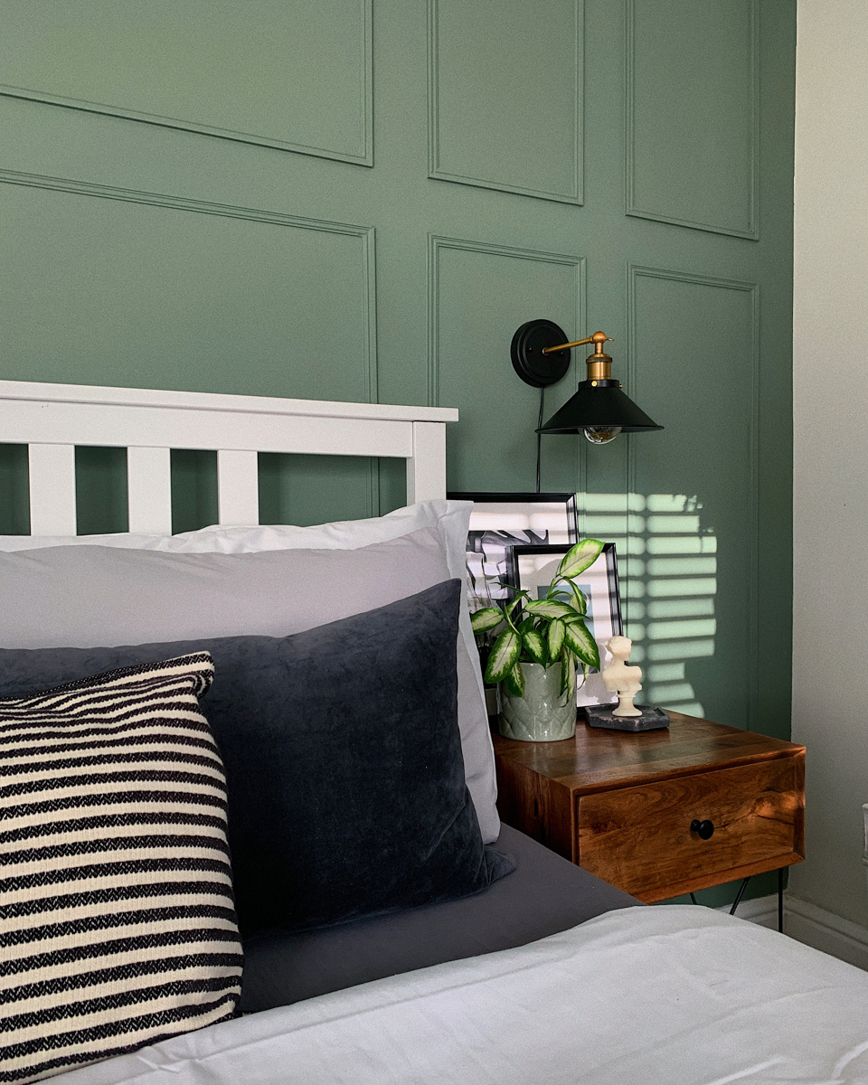
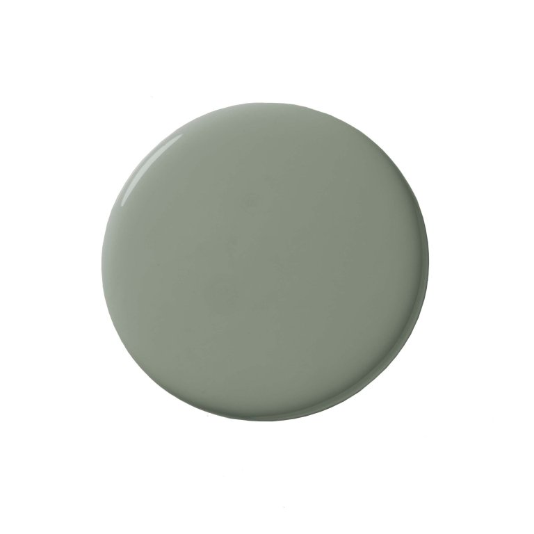
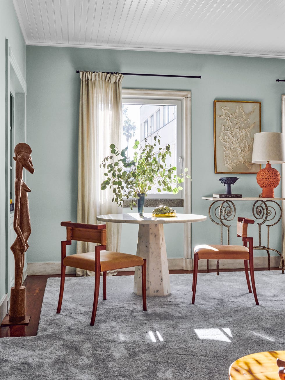
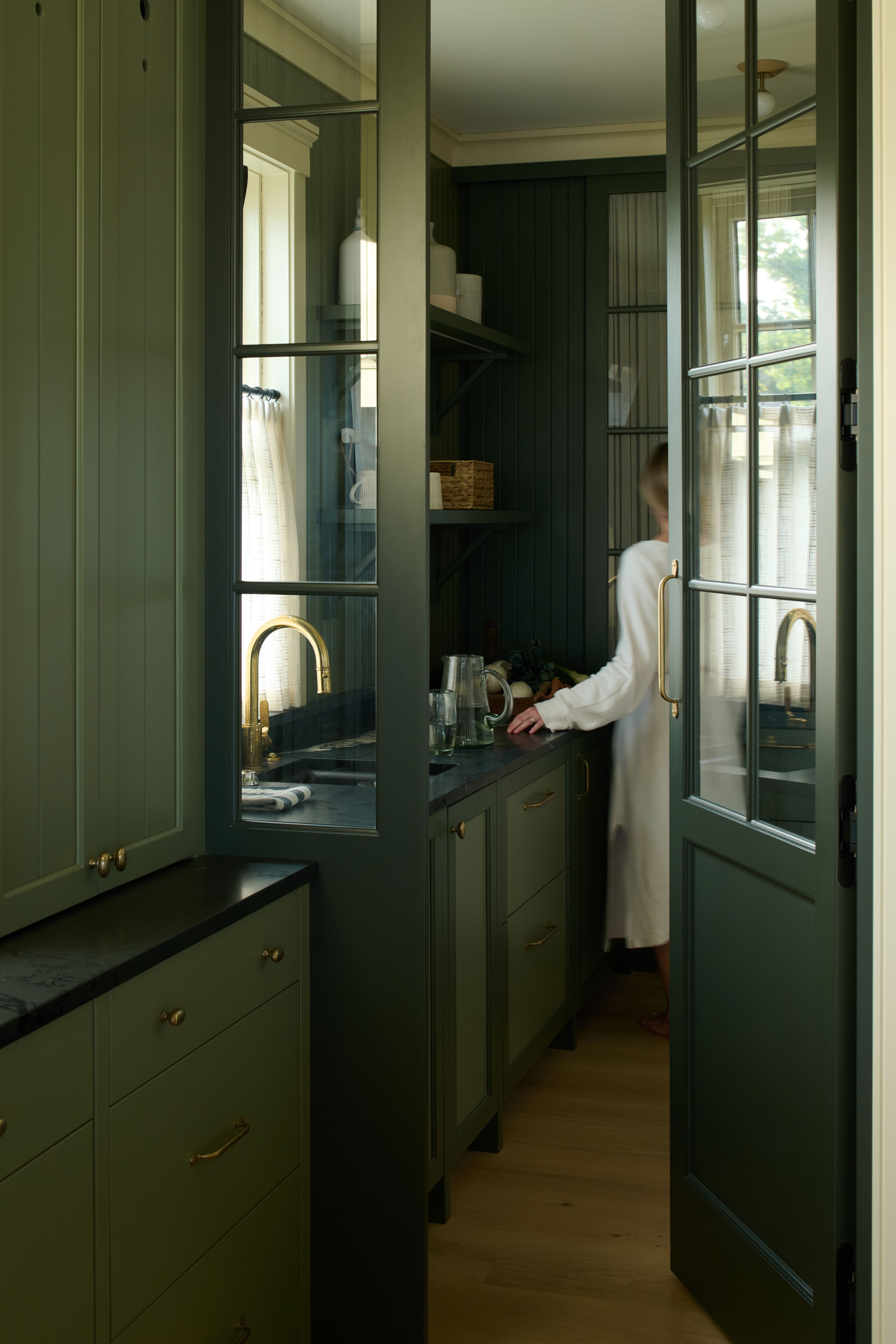
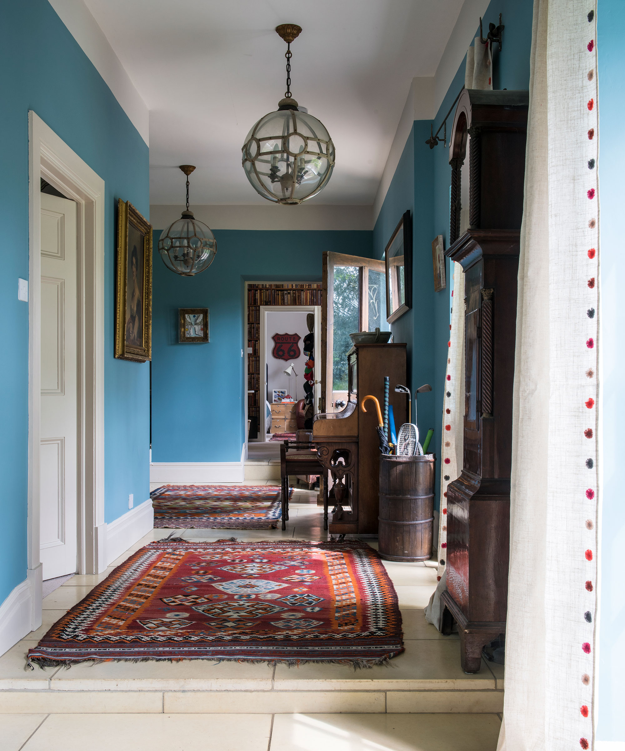
Biophilic awareness focuses on connecting with the natural world, incorporating elements such as natural light, outdoor views, indoor plants, water features, and natural materials. Ceiling designs under this trend favor organic shapes, wood or wood-look finishes, and colors derived from plant and ocean life, ranging from seaweed greens to storm blues. This approach aims to create an indoor environment that mimics the outdoors, fostering a sense of well-being through nature-inspired design.
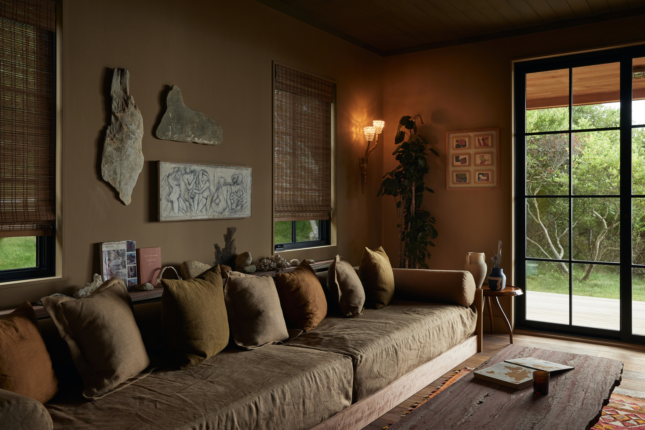
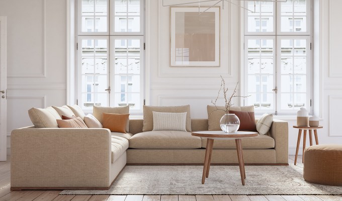
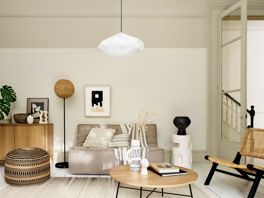
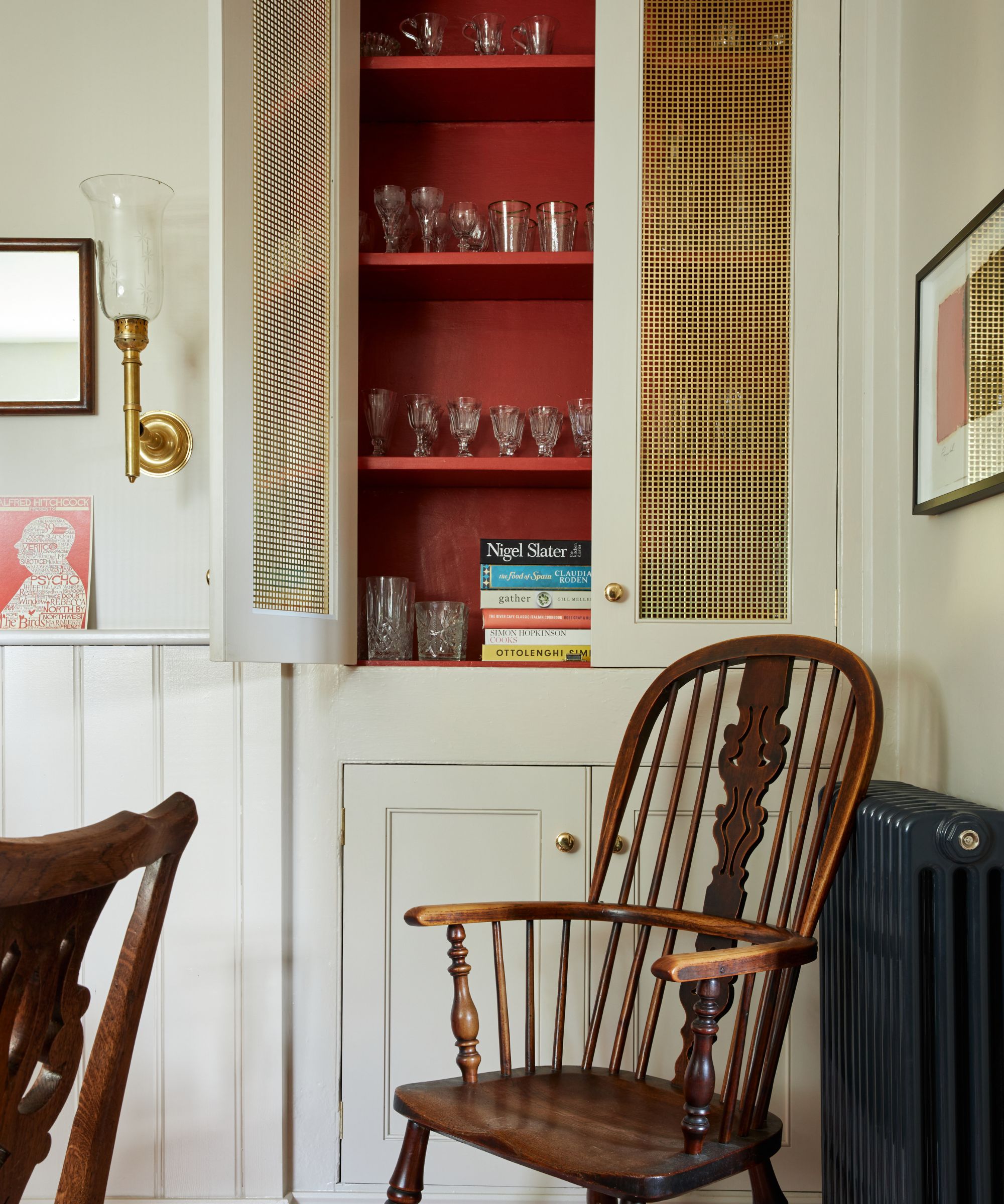
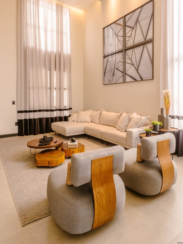
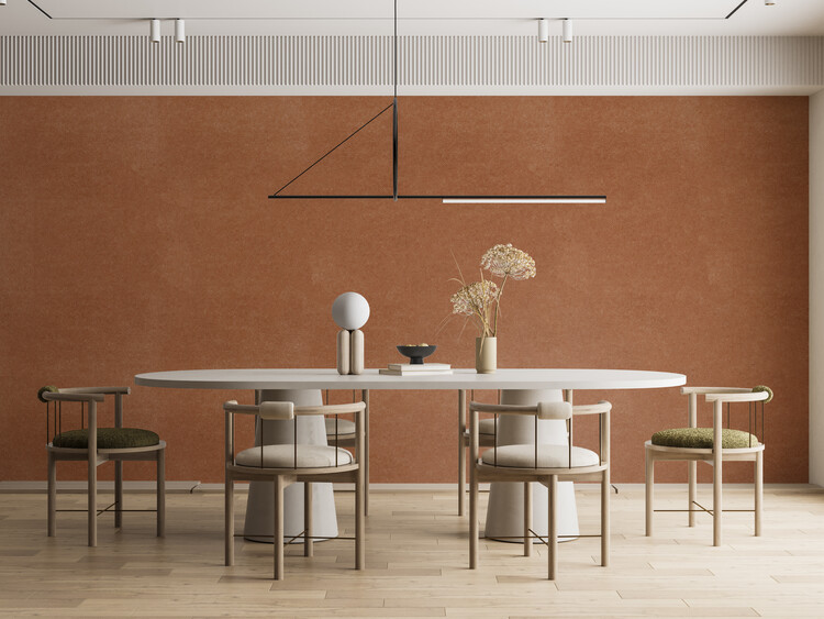
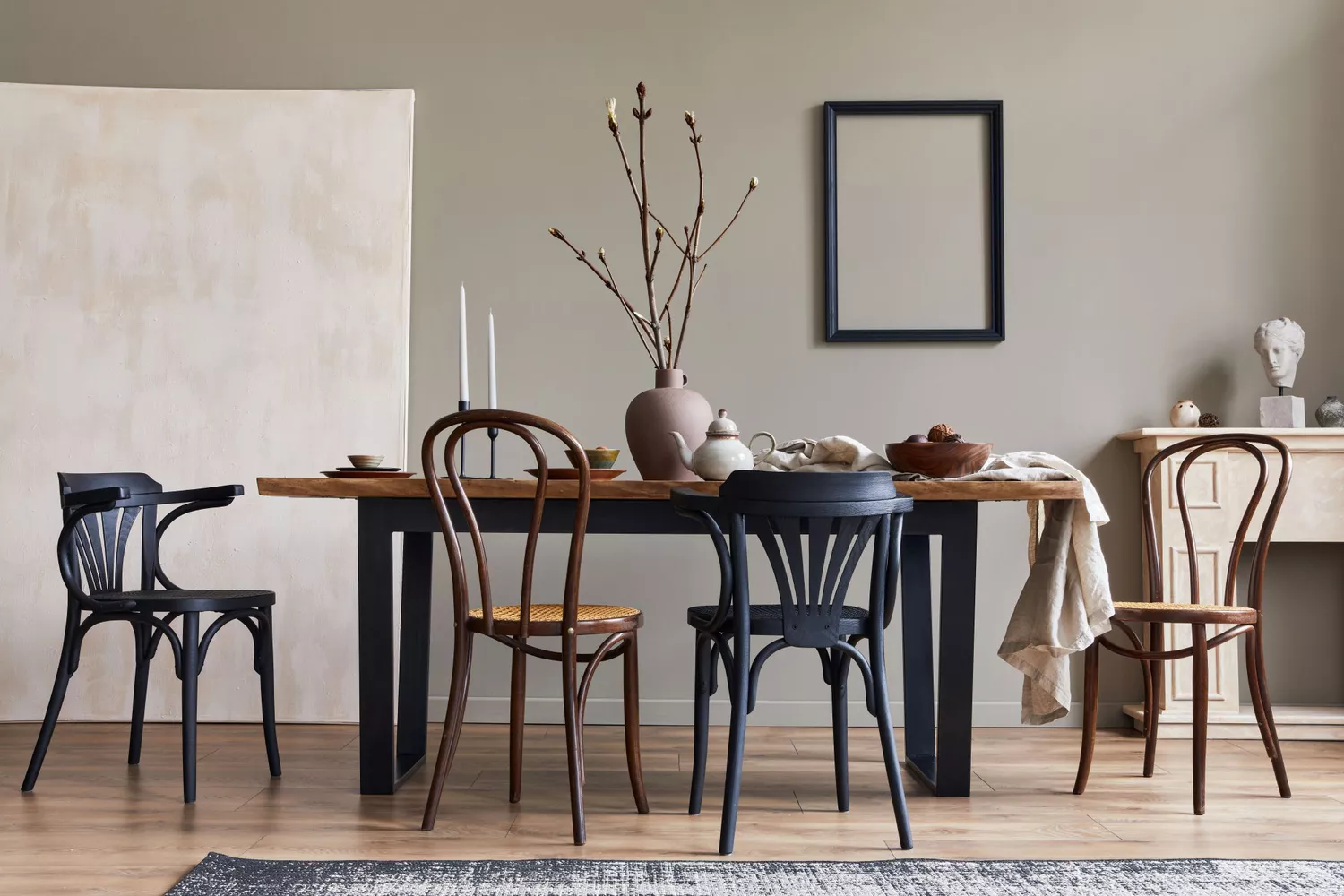
The Wabi-sabi aesthetic, originating from traditional Japanese philosophy, celebrates the beauty found in imperfection, impermanence, and incompleteness. It embraces the authentic character and serenity that develop over time, applying this concept to human-made objects with understated elegance. Designs inspired by Wabi-sabi feature asymmetrical and natural forms with smooth edges, utilizing earth tones such as clay, cork, chalk, hemp, and stone, along with wood and copper finishes. This trend is particularly suitable for spaces dedicated to healing, learning, and meditation, encouraging self-care and contemplation.
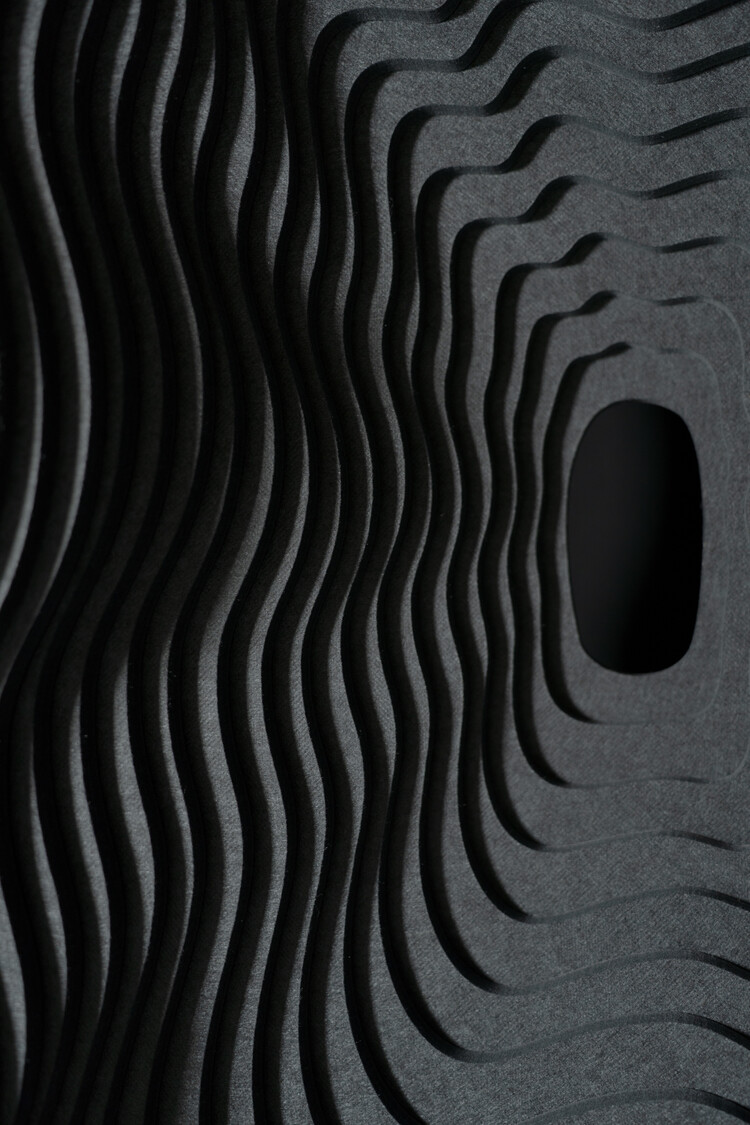
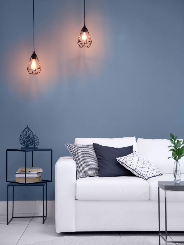
In contrast, the technology-inspired trend acknowledges the therapeutic potential of digital distractions in an uncertain future. It explores the convergence of human and artificial intelligence, redefining spaces where people live, work, and interact. This trend is characterized by metallic, manufactured, and molded materials with sharp angles, crisp edges, and precise radial arches. The color palette includes chromatic blue, dark gray, and elemental tones like mercury, zinc, and iron, reflecting a modern, high-tech sensibility.
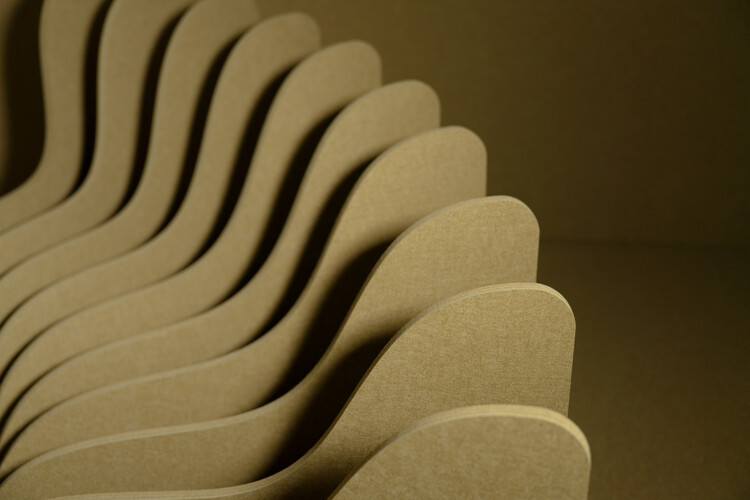
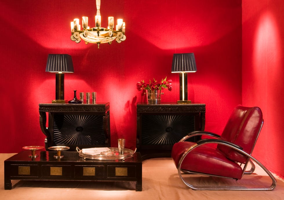
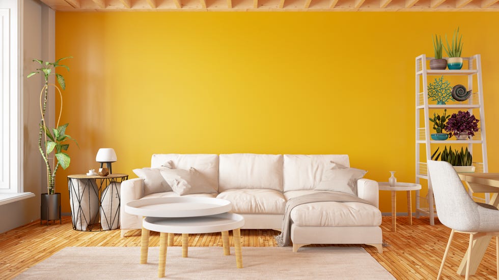
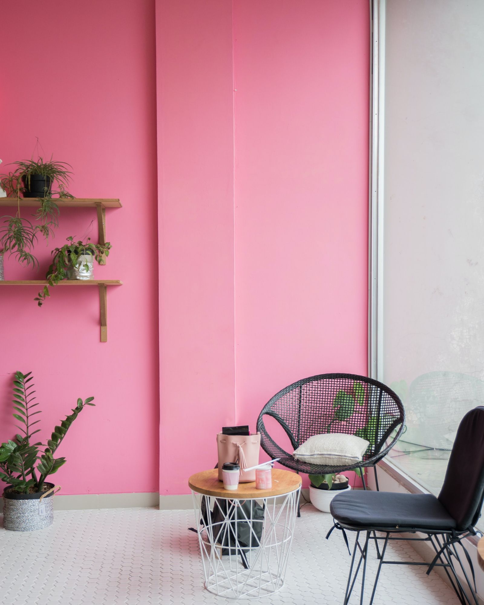

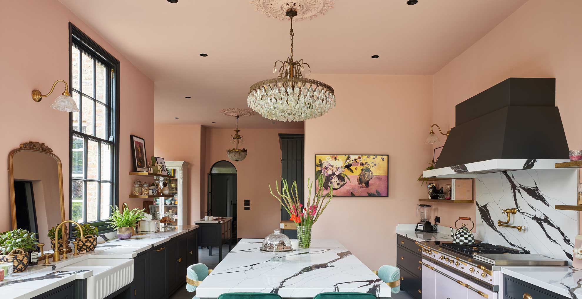
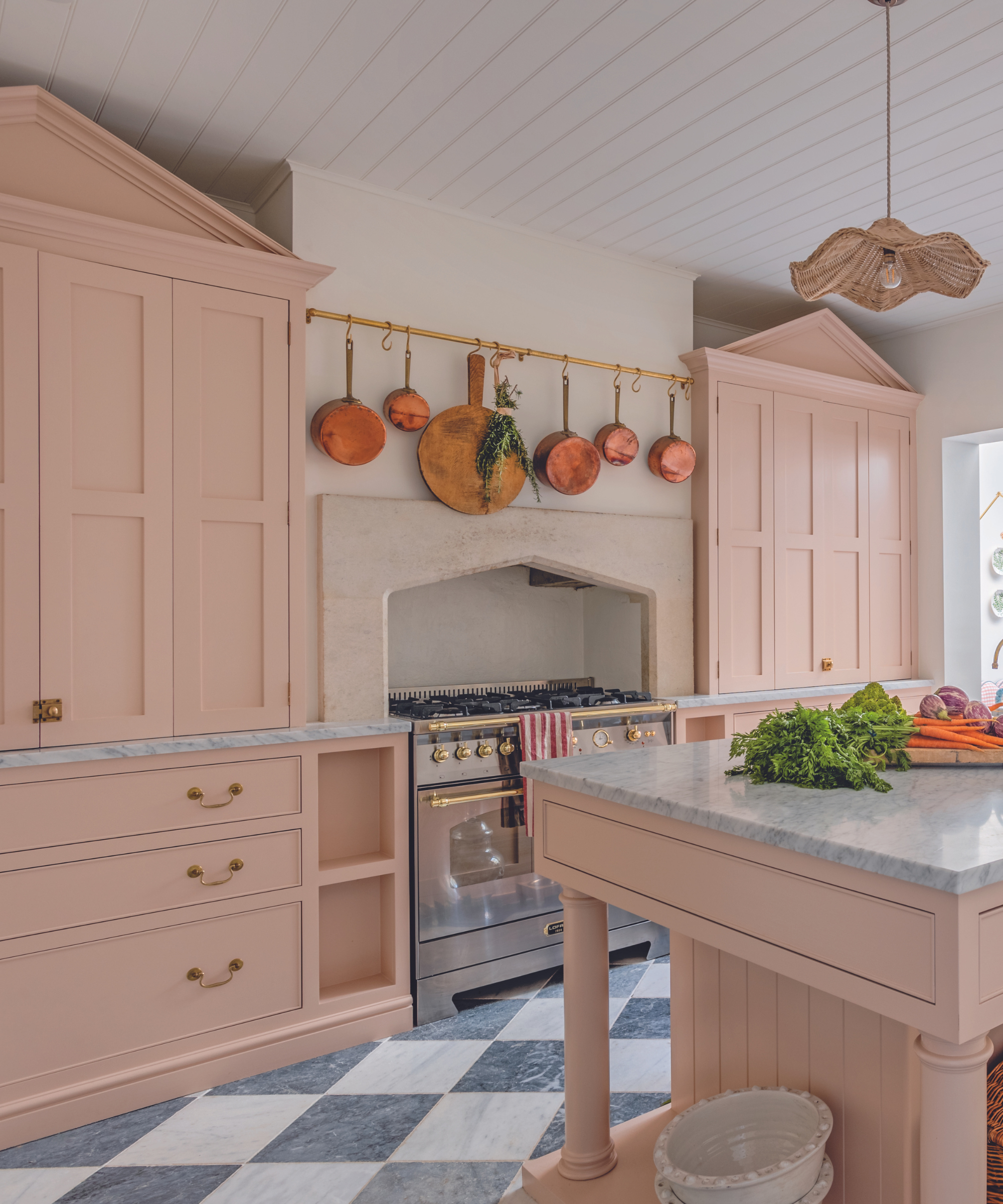
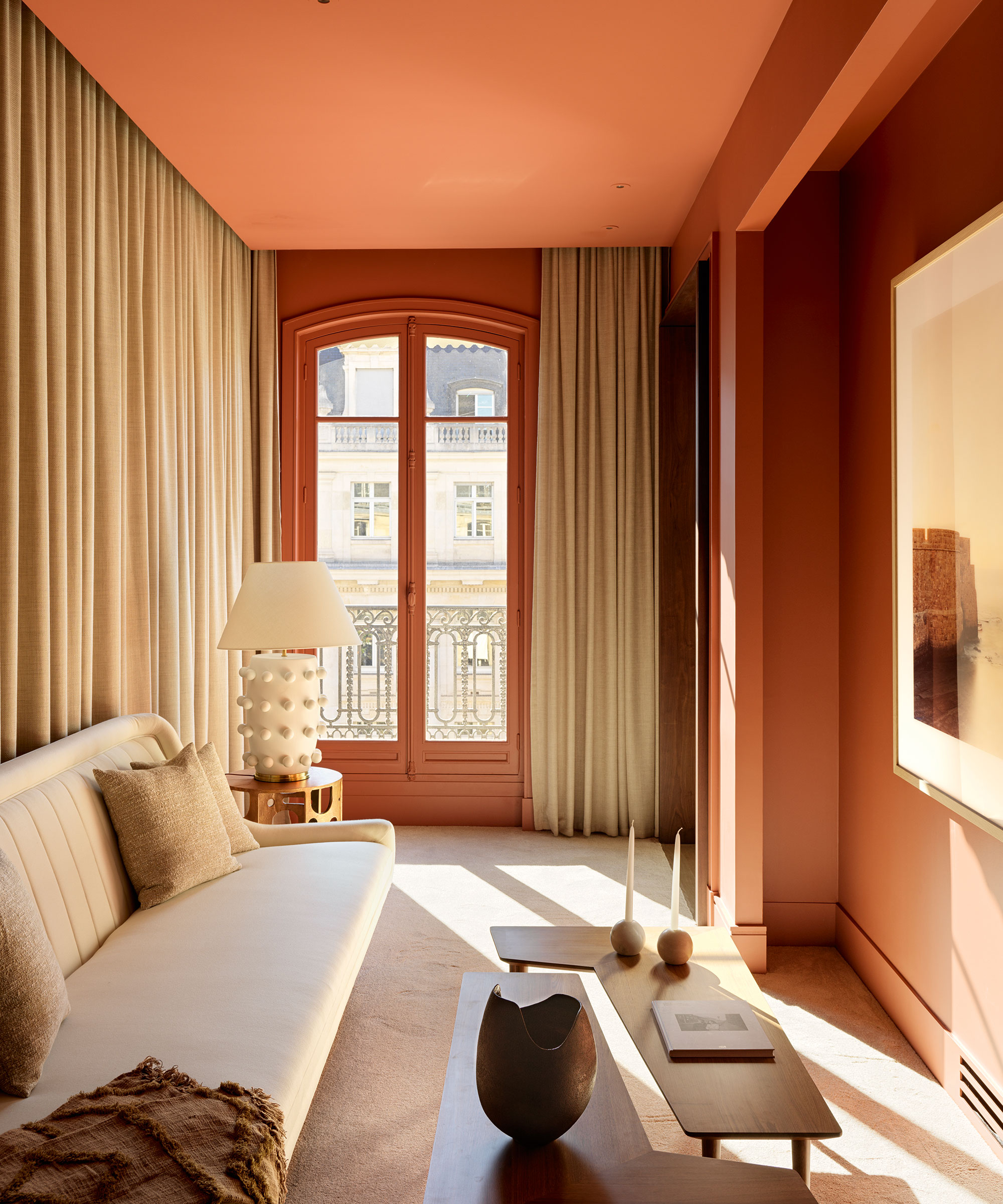
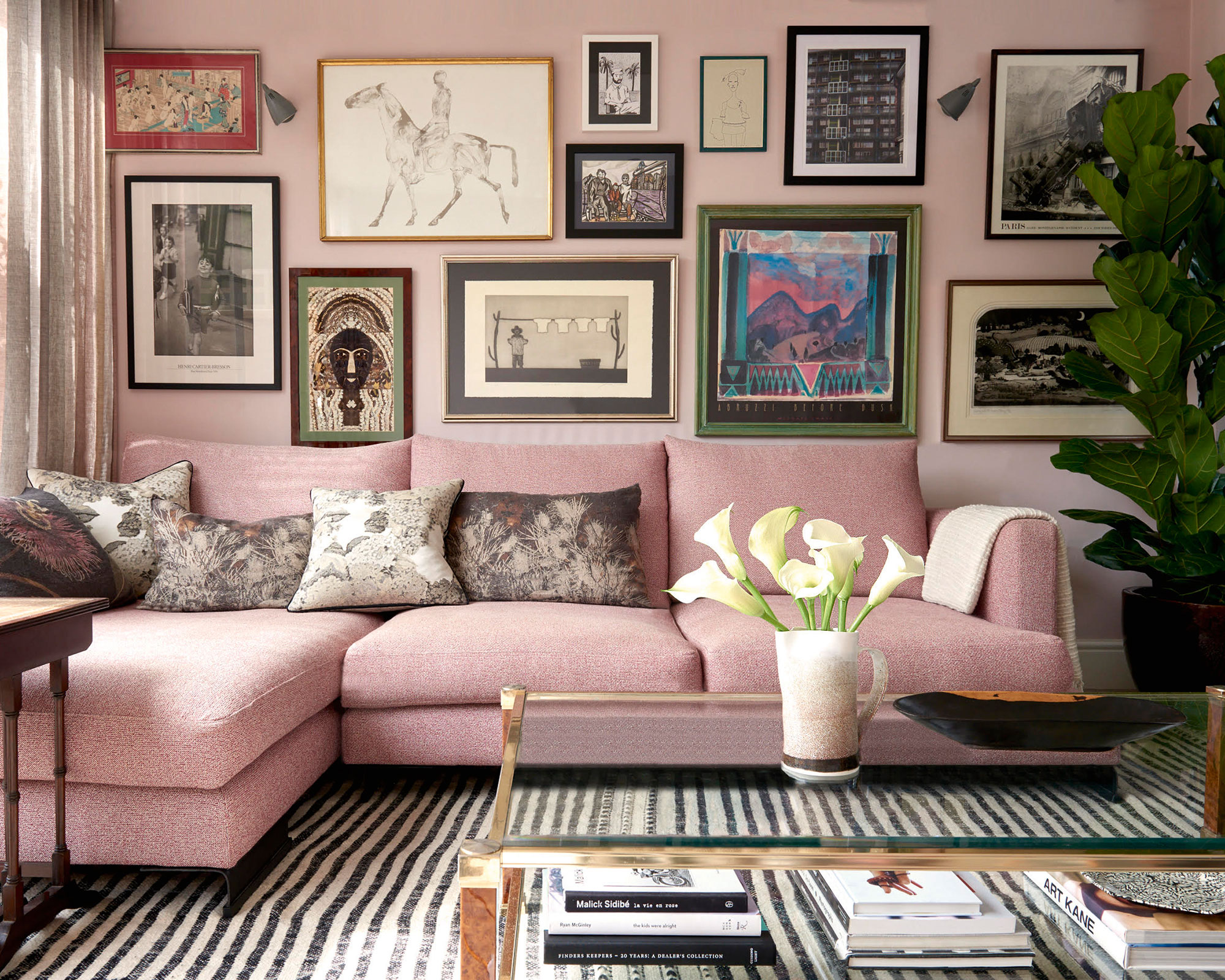
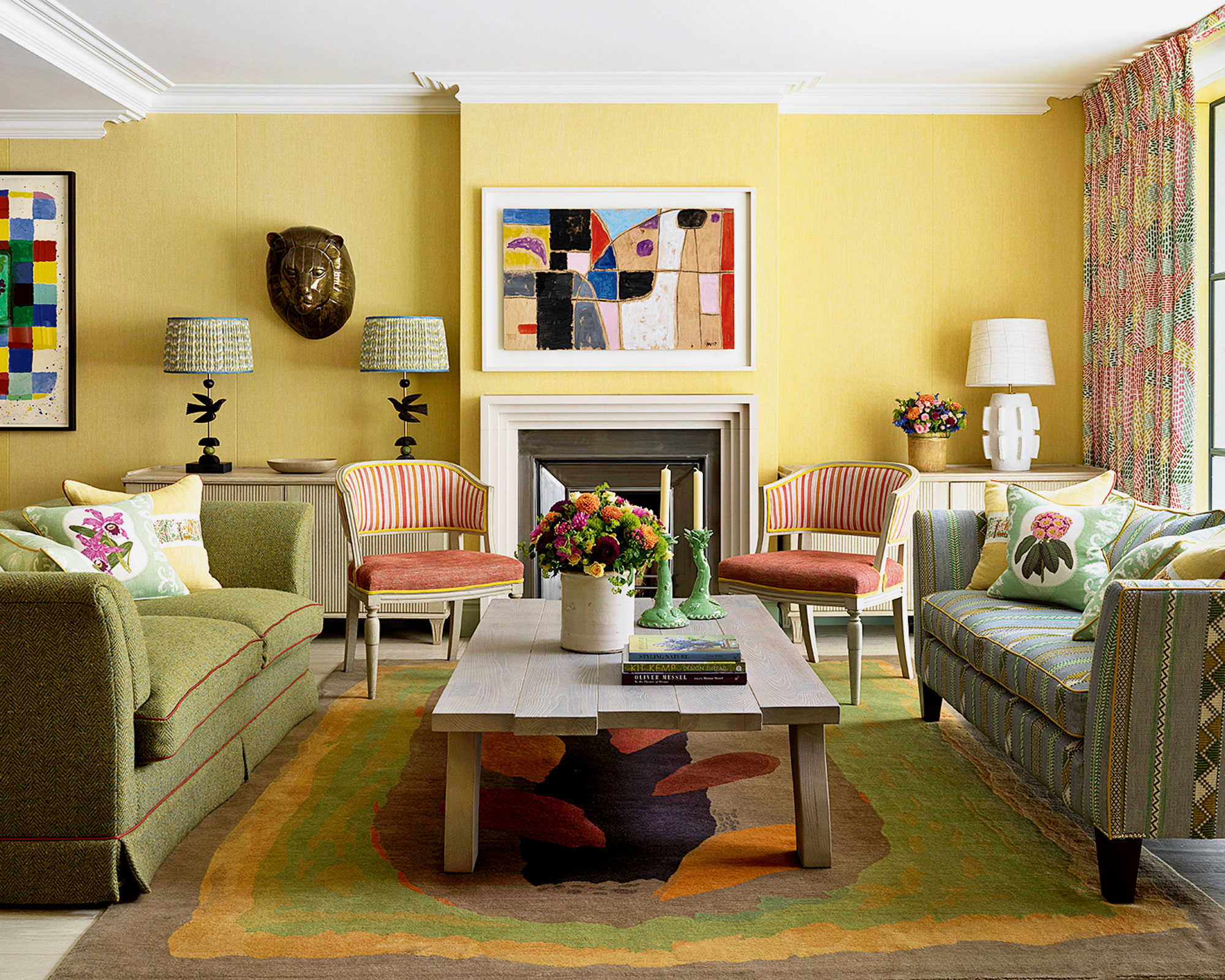
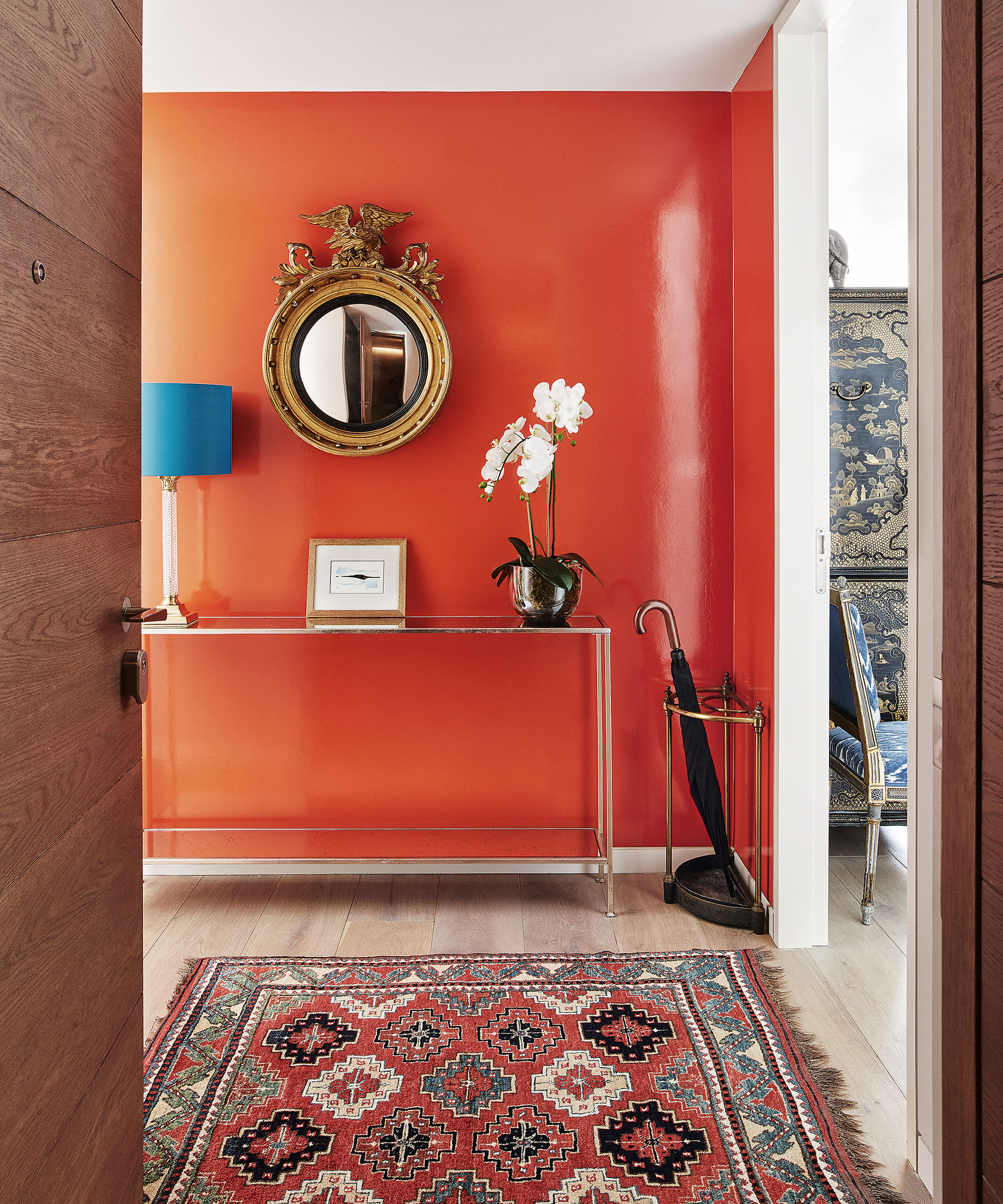
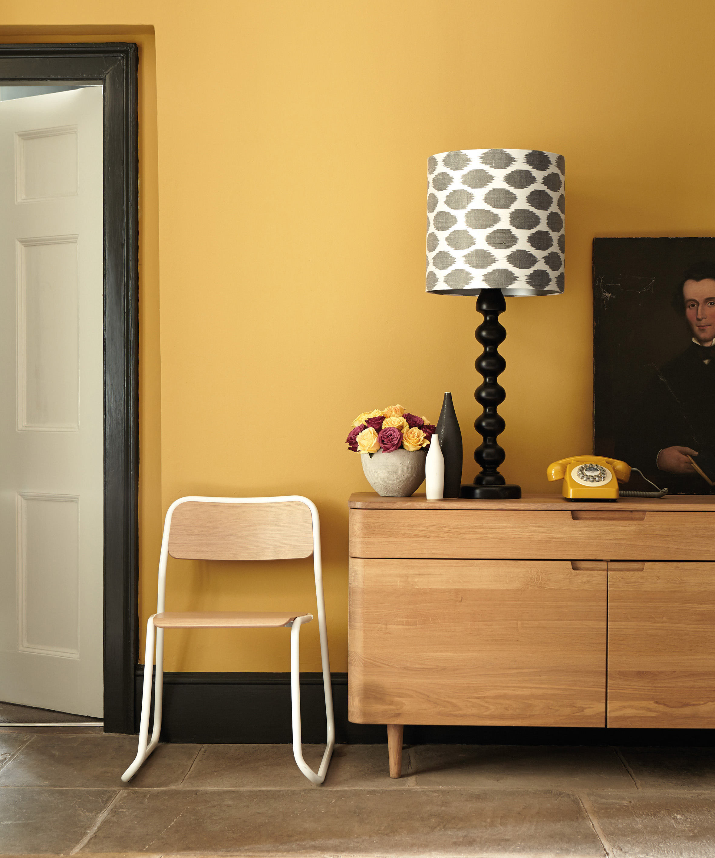
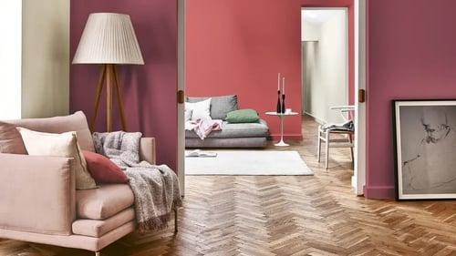
Finally, the calm enclosure trend, despite its name, is an energizing and playful style that empowers individuals to find inner peace and express themselves. It features a vibrant palette of mustard yellows, deep scarlets, powdered corals, and seashell pinks, combined with rounded, wavy shapes and soft, velvety textures. This trend is ideal for environments that encourage communication, collaboration, creativity, connection, and compassion, promoting a sense of joy and self-expression.
Beyond aesthetics, the article emphasizes the critical role of color perception, light reflectance (LR), and consistency in ceiling specifications. Isaac Newton's studies established that color is a reflection and absorption of light, with lighter colors reflecting more and darker colors absorbing more. Smooth, white ceiling surfaces with high LR values, such as 0.86, are often specified to maximize natural light, enhance electric lighting efficiency, and diffuse light for a more comfortable and productive occupant experience. Conversely, very low LR values, such as 0.04 for dark black panels, are preferred in spaces like theaters or electronic gaming centers where minimal light reflection is desired. Different colors of ceiling panels each possess a unique LR value.
The perception of color is dynamic, influenced by material, lighting, and shape. Light sources, their position, time of day, and even seasonal changes can alter how colors appear. A color may look different in a south-facing room versus a north-facing one, or between morning and afternoon. Furthermore, the material of a surface—whether stone wool, metal, or wood—and its form, such as curved, angled, or flat, can affect the perceived tone or hue of a color. This variability highlights the importance of examining material samples side-by-side under intended conditions before specifying multiple ceiling products from different manufacturers.
When specifying ceiling systems, designers should consider practical aspects like color consistency between panels and suspension systems, acoustic baffles, or decorative accents. Utilizing a single-source supplier can help maintain color uniformity. Important questions to ask include whether edges are color-matched to the surface, if touch-up paint is needed for field cuts, if a 360-degree finish is required for open plenums or visible angles, and how the ceiling's height impacts color visibility and maintenance requirements. For instance, lighter panels in low ceilings may need to withstand more frequent and rigorous cleaning due to their accessibility and visibility.
#AcousticCeiling #ColorTrends #CommercialInteriorDesign #BiophilicDesign #WabiSabi #TechnologyIntegration #LightReflectance #ColorPerception #MaterialSpecification #AcousticCeiling #ColorTrends #CommercialInteriorDesign #BiophilicDesign #WabiSabi #TechnologyIntegration #LightReflectance #ColorPerception #MaterialSpecification
共0条评论
 暂无评论
暂无评论你可能还喜欢
Sound Off, Color On: 4 Creative Ways to Integrate Colorful Acoustic Panels in Interiors

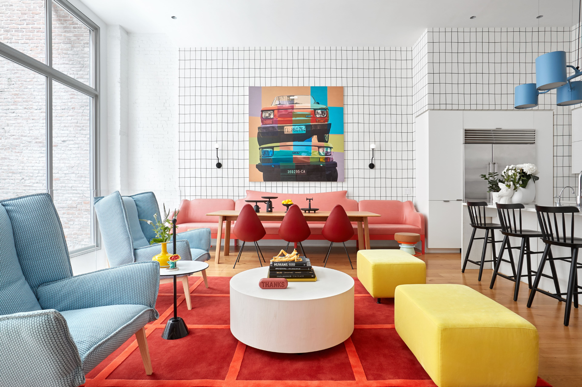
The Power of Color Psychology in Interior Design — How to Create a Home That Feels as Good as It Looks

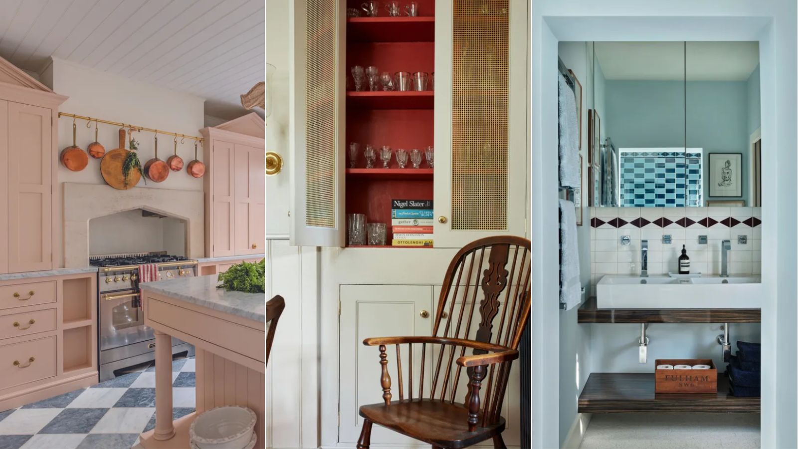
A color psychologist says these color schemes are the most likely to boost your mood

10 home color choices that scream lower middle class energy to refined observers

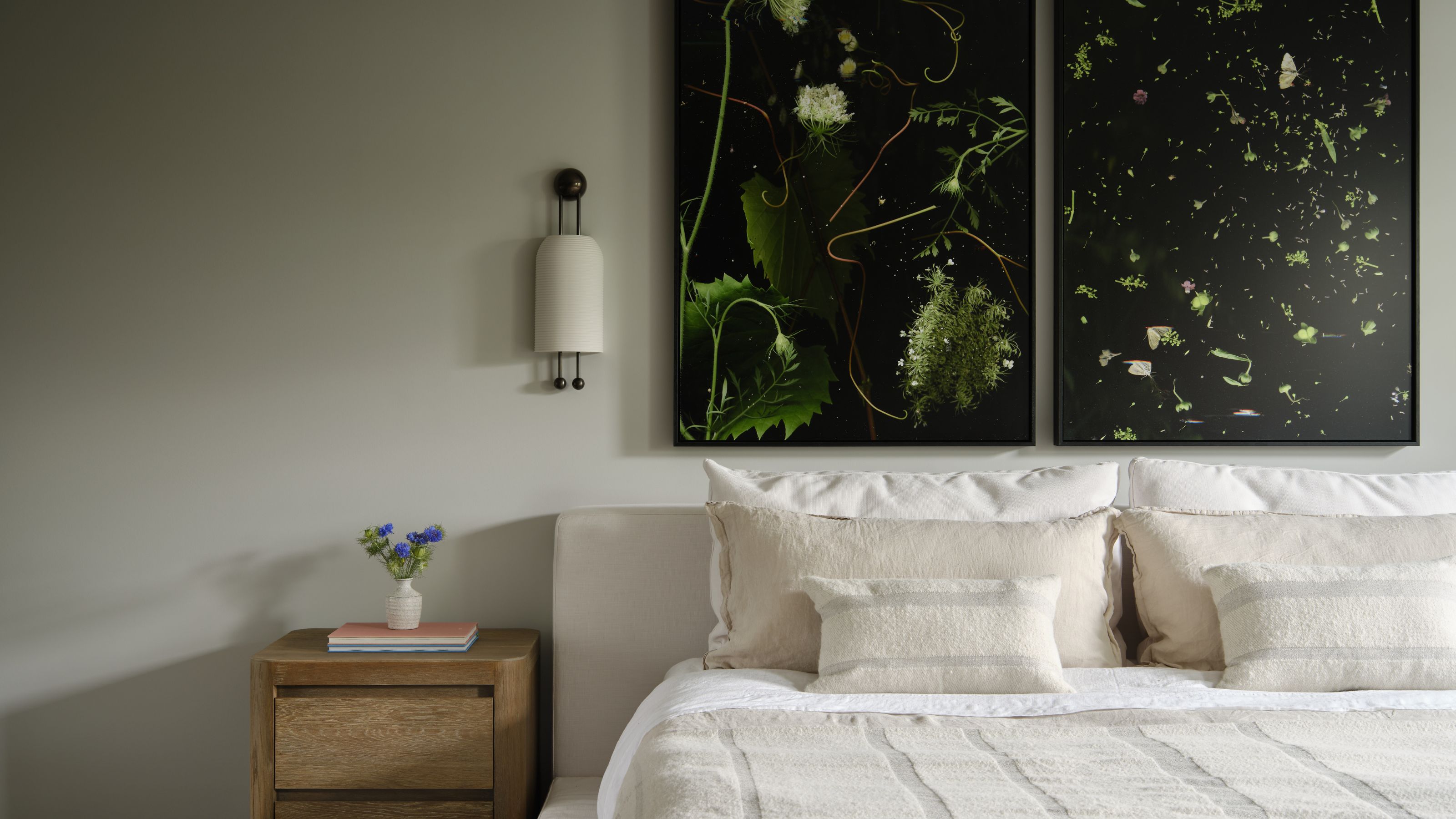
The 10 Secrets Behind 'Biophilic Colors' That Bring Nature's Power Into Your Home — And It's Not All Just About Green

The best colour for ceilings as recommended by interior designers and colour specialists

An expert in color psychology shares the 5 shades you should have in your living room
Can’t Concentrate? Decorating Your Space With These Colors Can Sharpen Your Focus
These Paint Colors Bring Hostility to Your Home, According to Experts

5 Living Room Paint Color Trends for When You're Craving a New Look
From clutter-free zen to cosy comfort: The mental health benefits of home decor | Hindustan Times

5 best happy living room colors for an uplifting space
Expert Speak: What are the most soothing colours for the home?

A Color Psychologist Says This Is the Most Relaxing Paint Color

20 Calming Paint Colors That Will Change the Way You Live
The colors you should never paint your hallway – and what really works
From Quiet Luxury to the Sad Beige Baby, When Will ‘Beigification’ End?

How paint colour in your home can affect your mood
7 colour tricks to transform your mood and living room design

8 Paint Colors That Promote Wellness at Home