1/23
colorful living rooms (no beige allowed)!
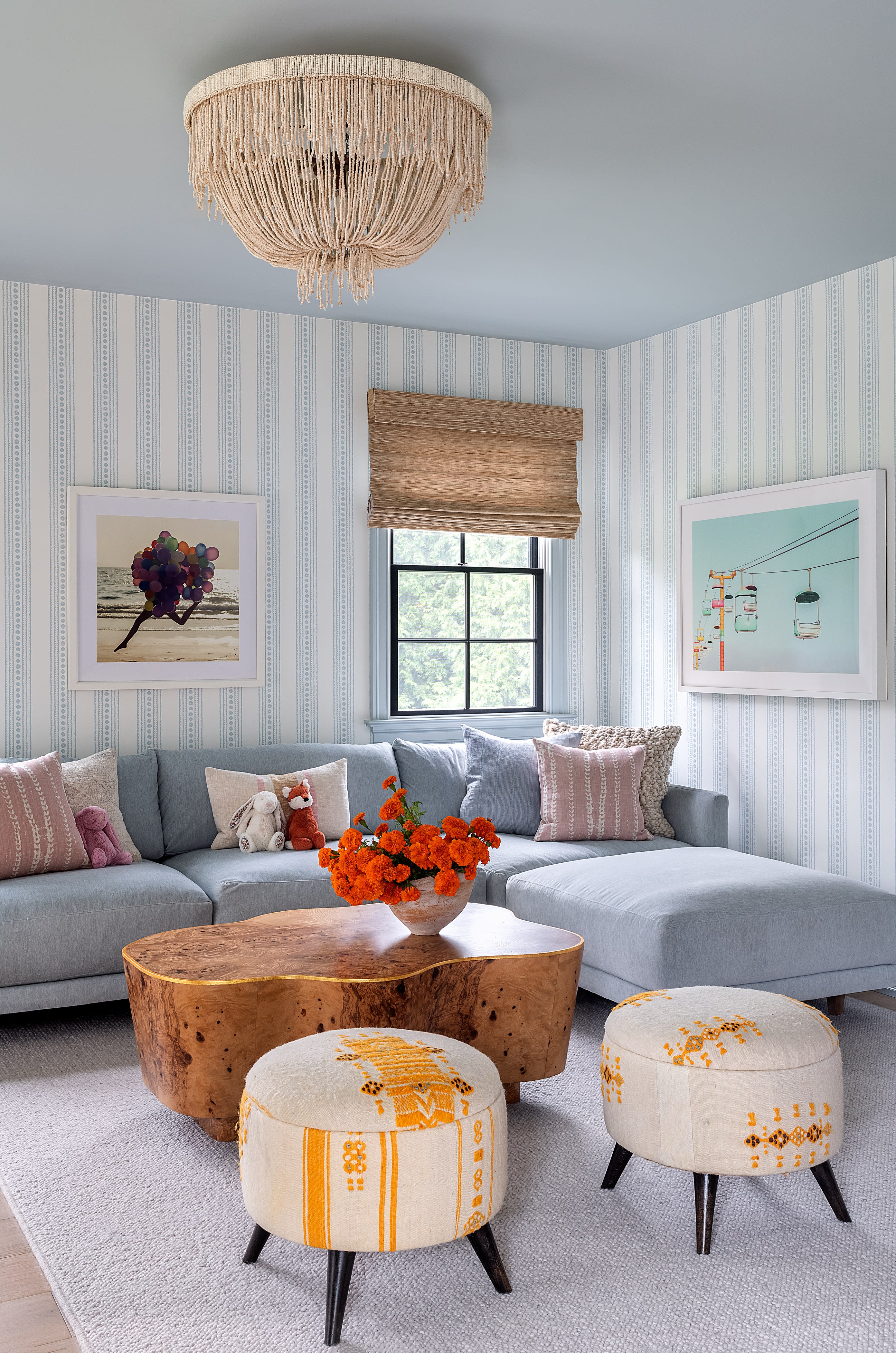
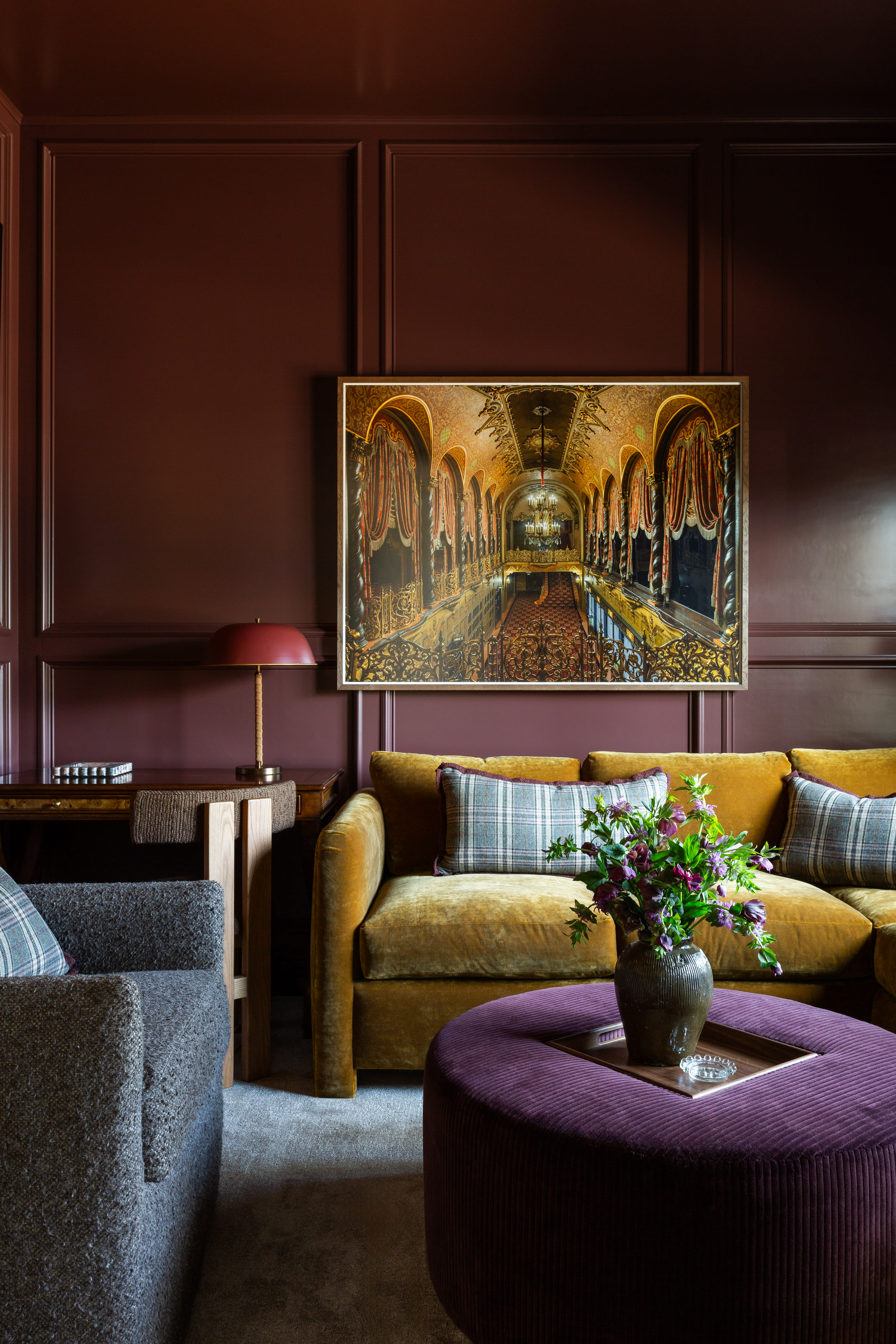
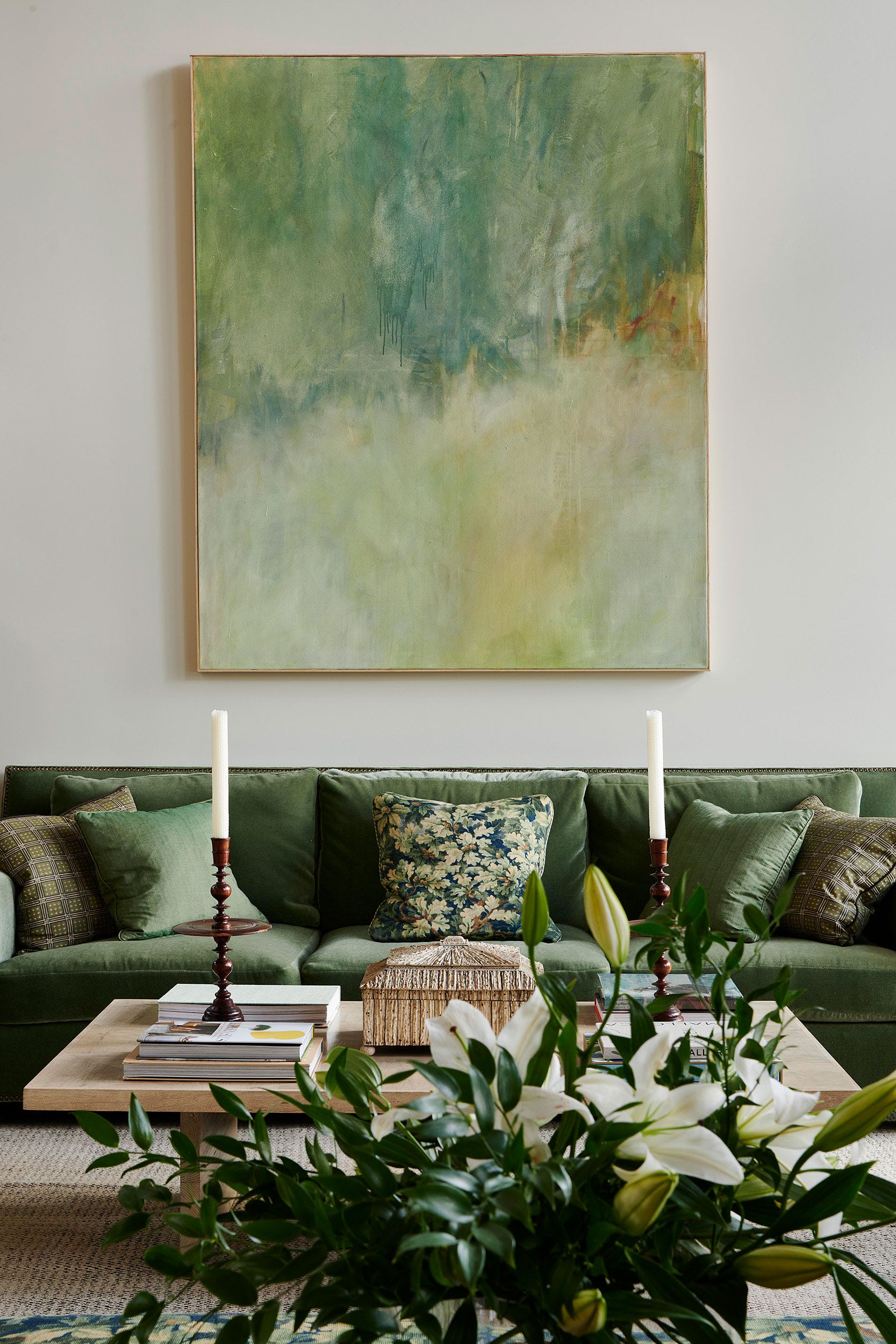
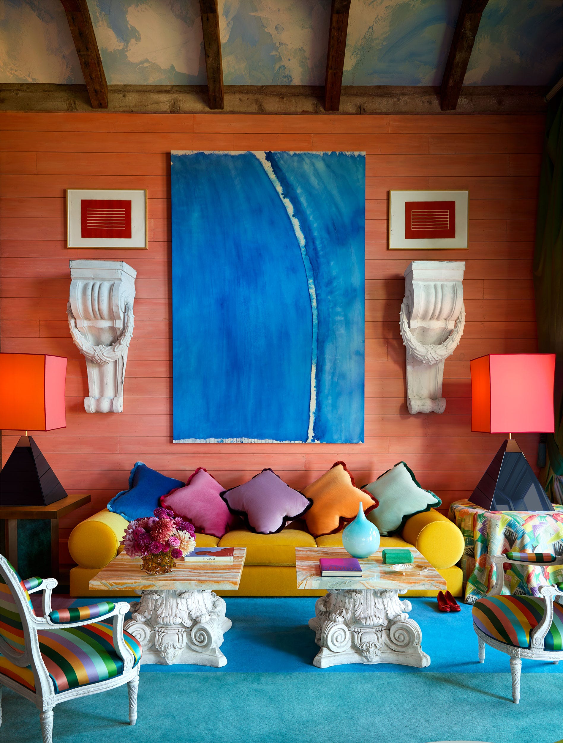
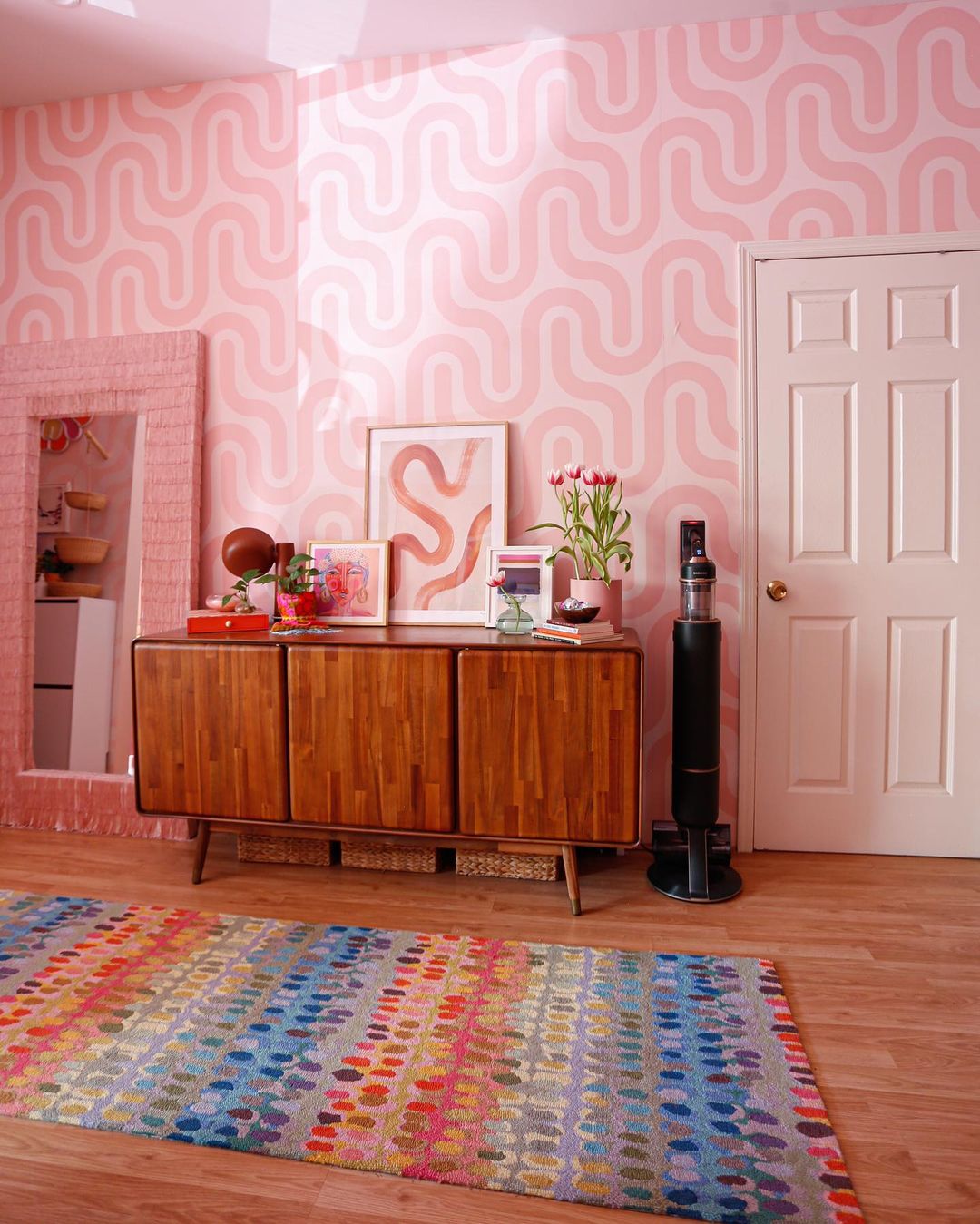
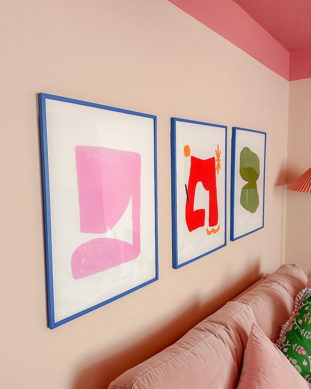
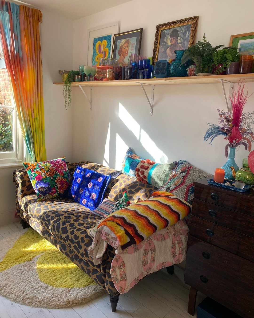
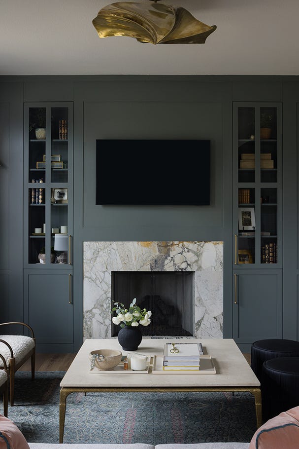
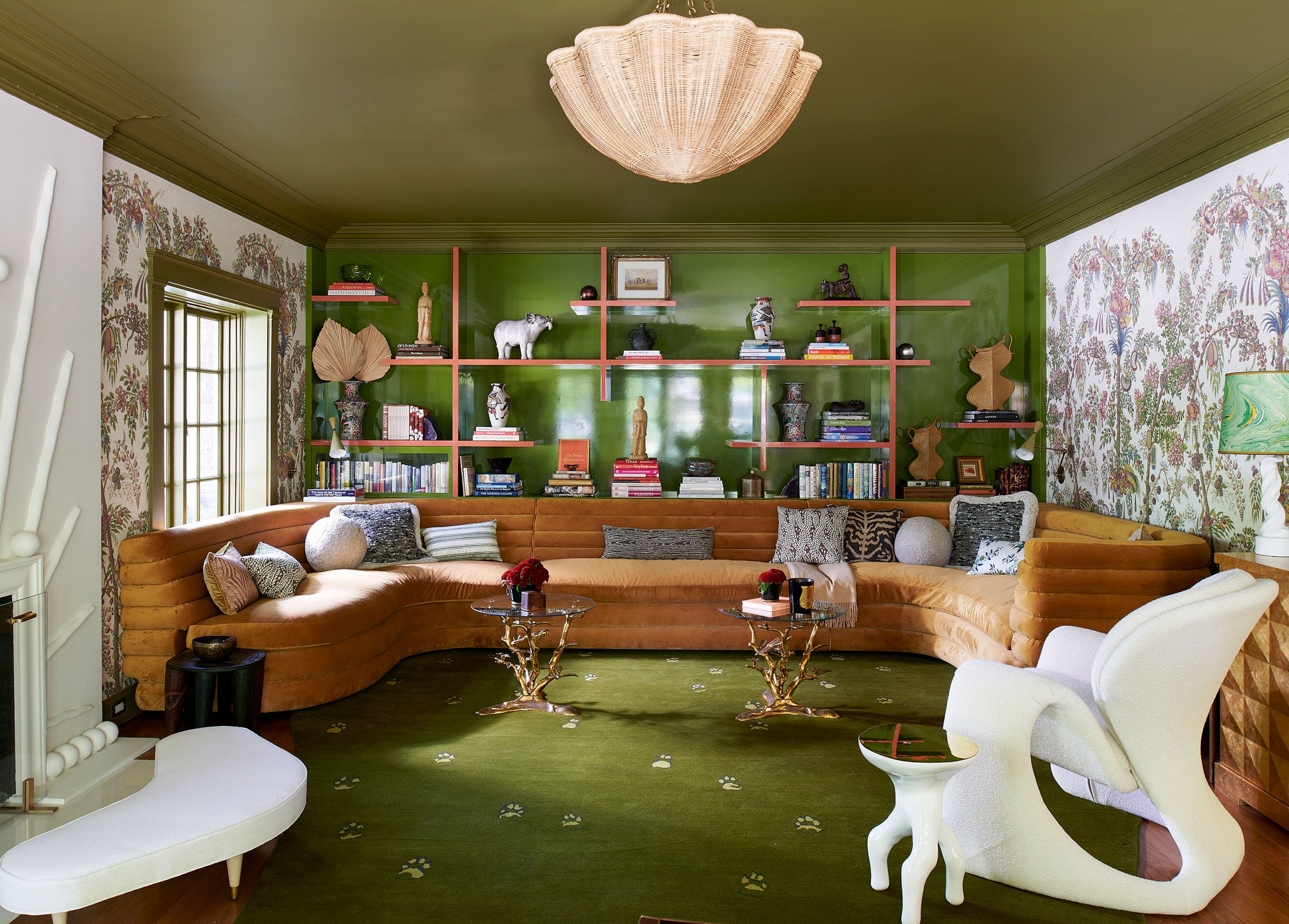
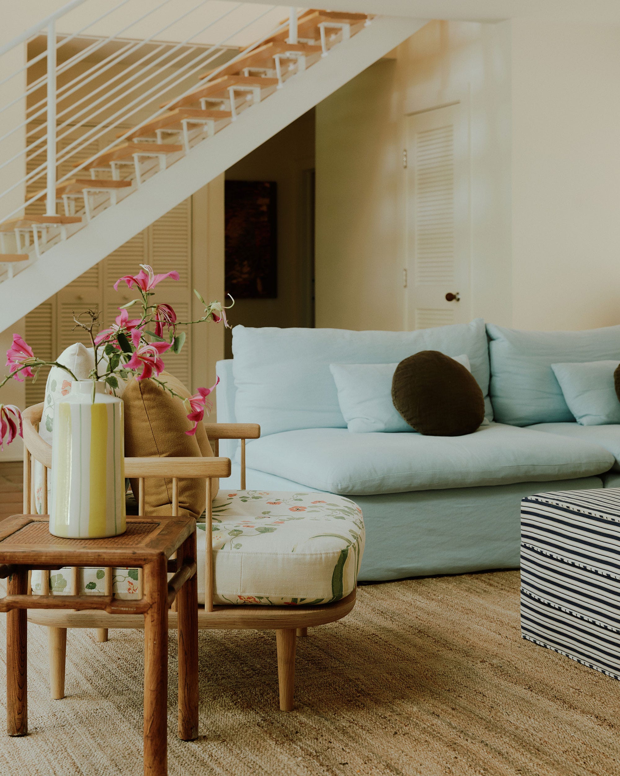
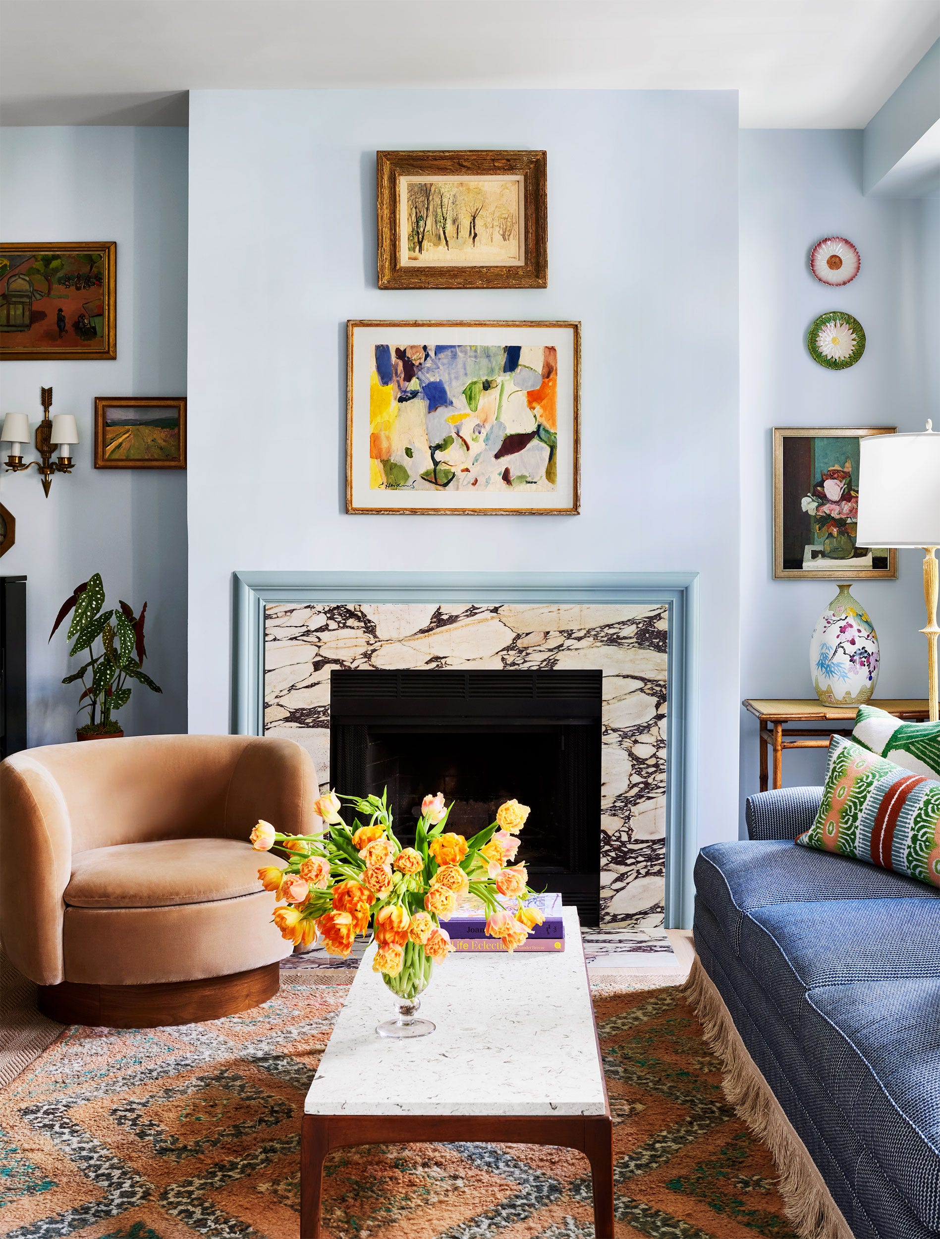
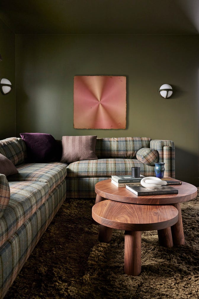
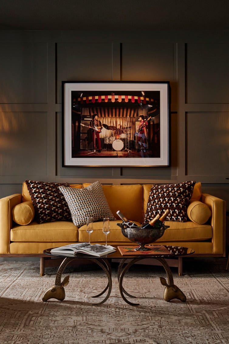
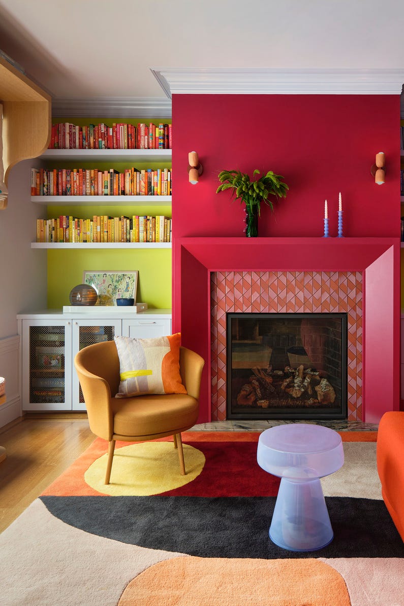
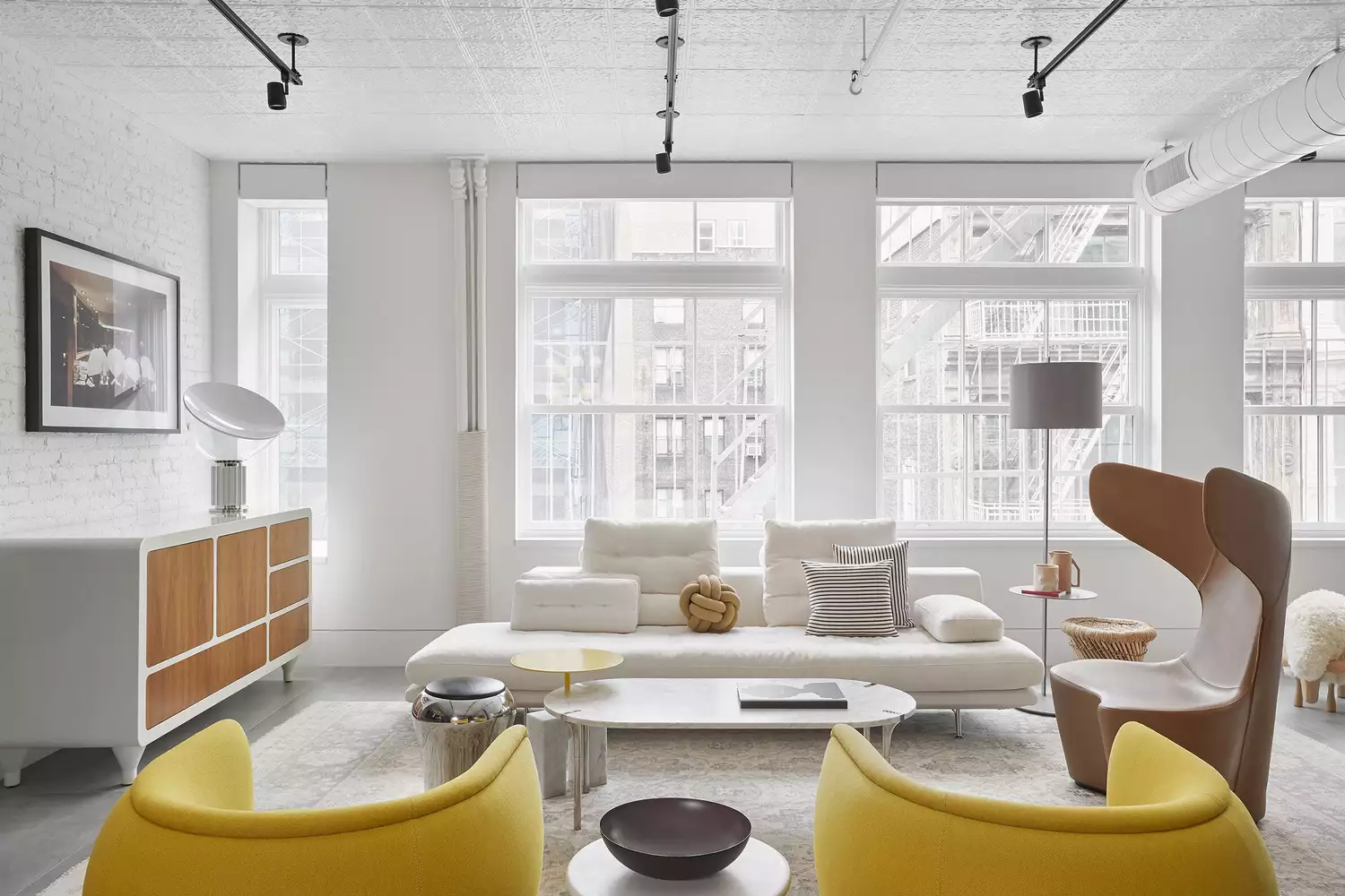
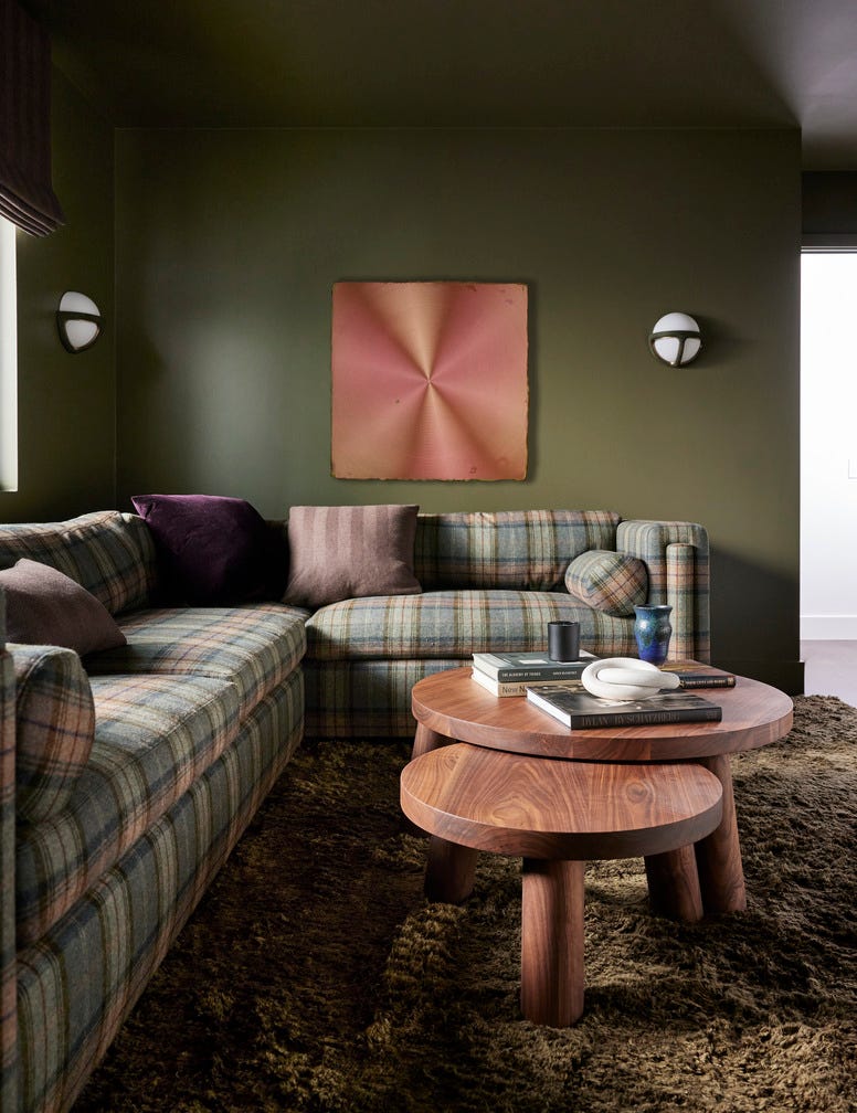
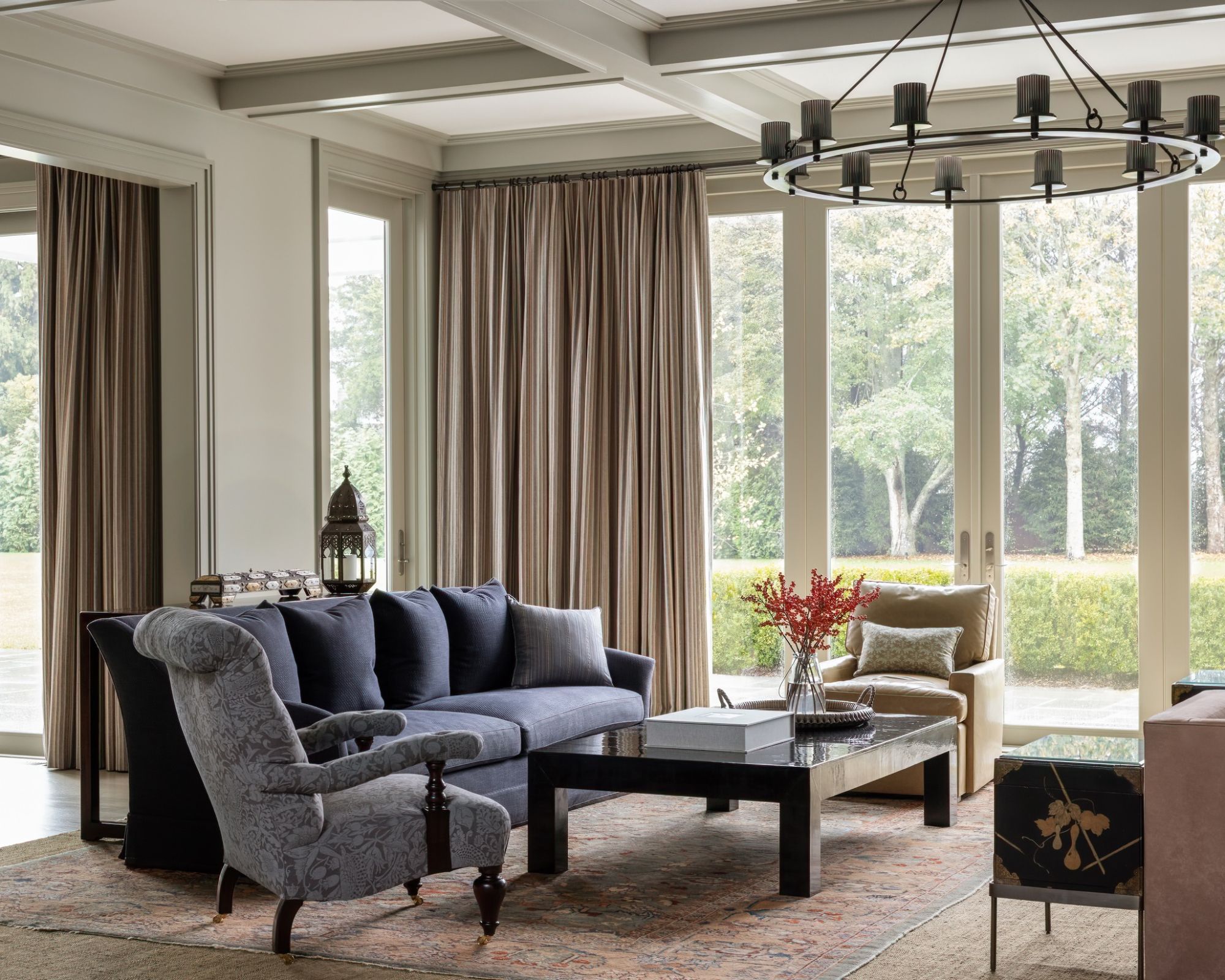
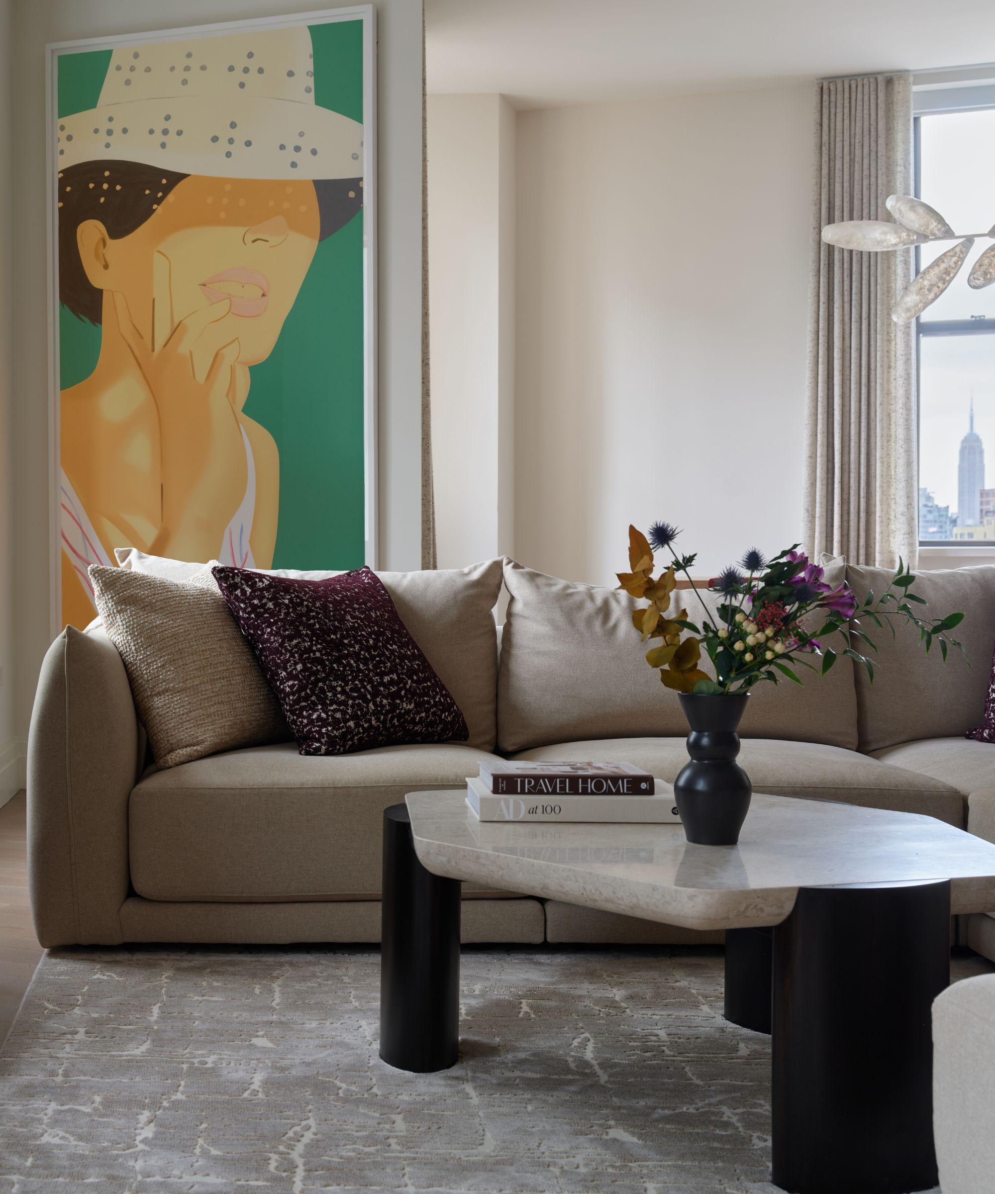
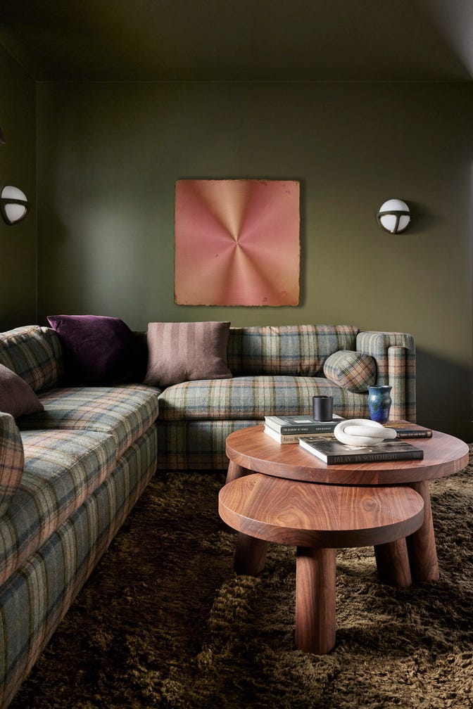
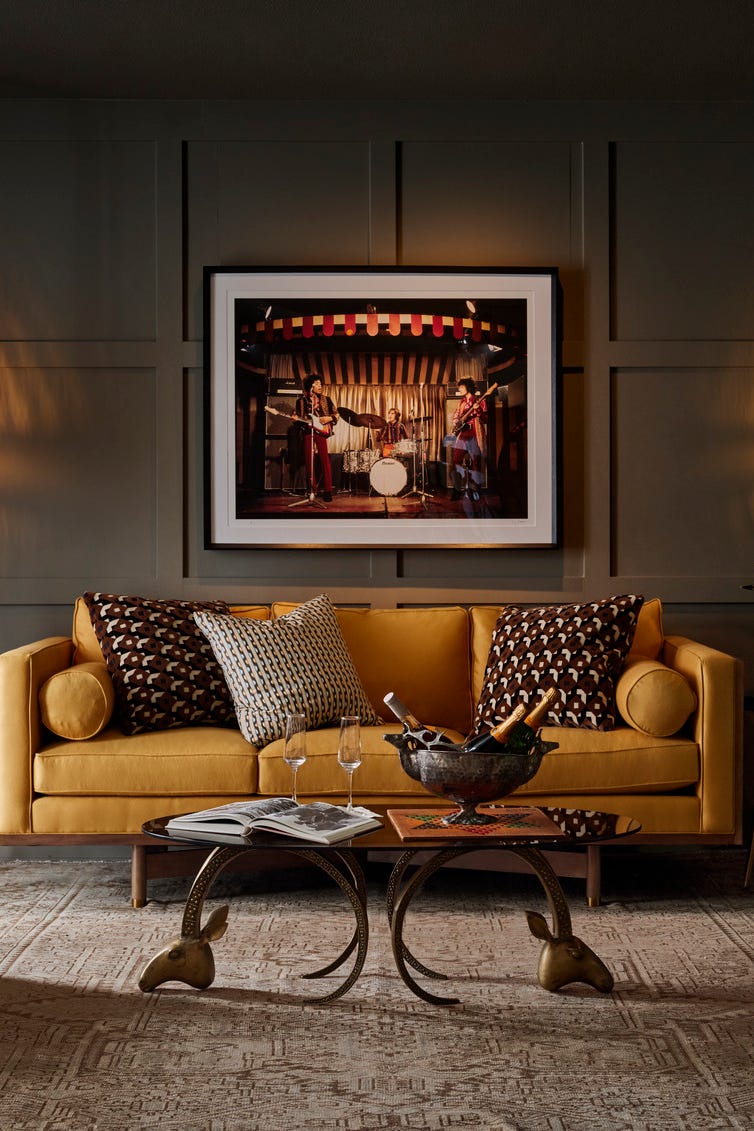
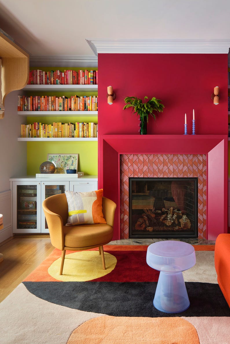
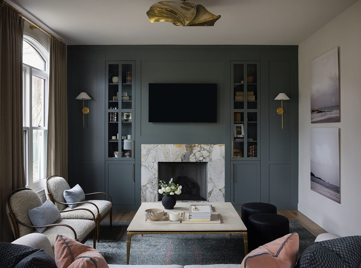
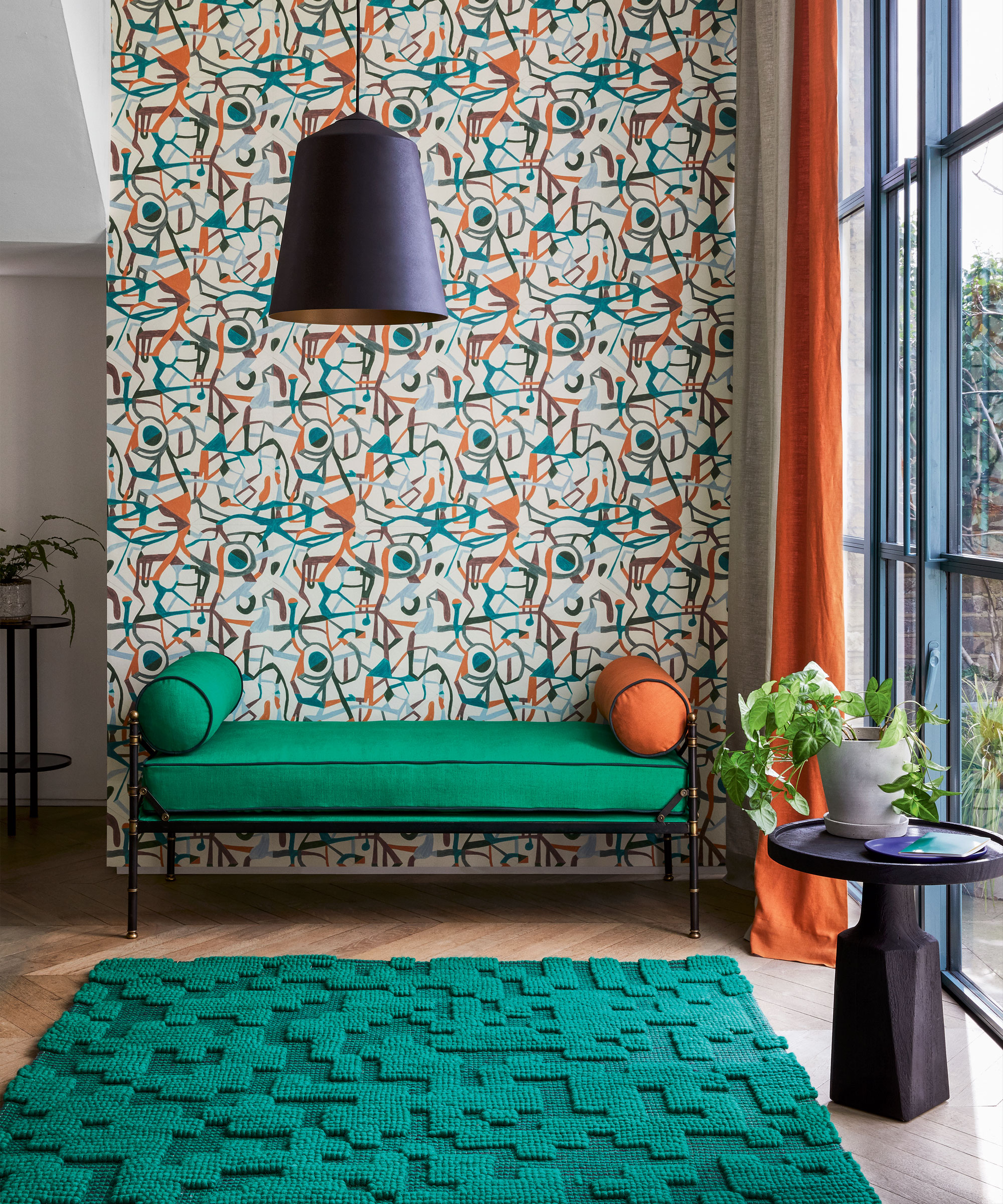
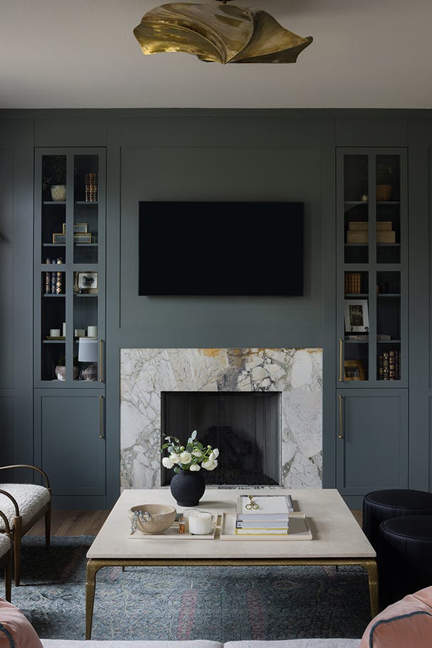
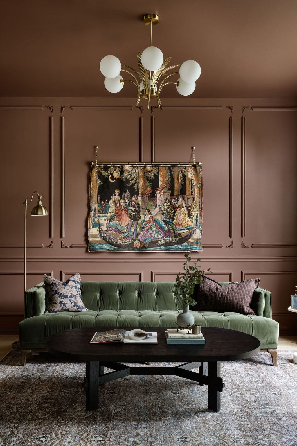
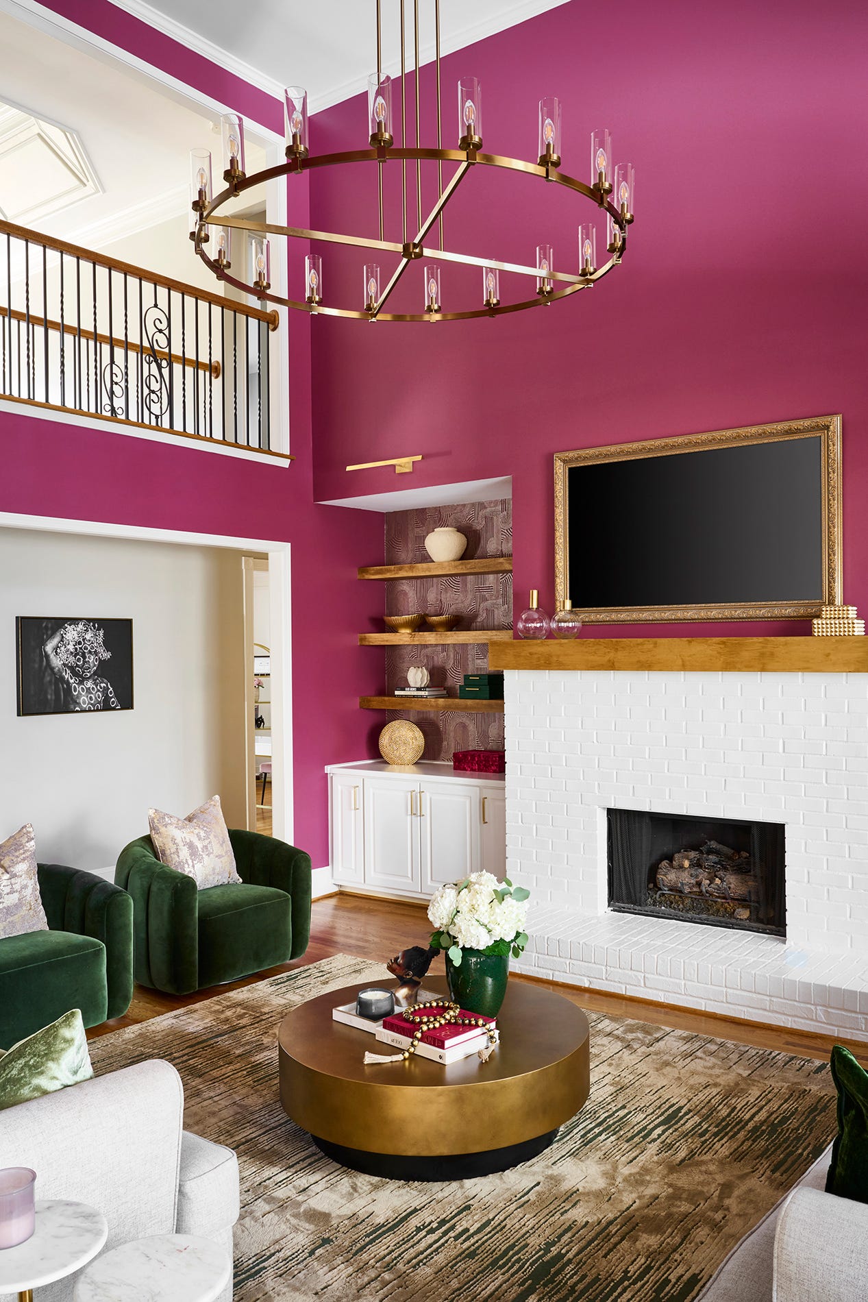
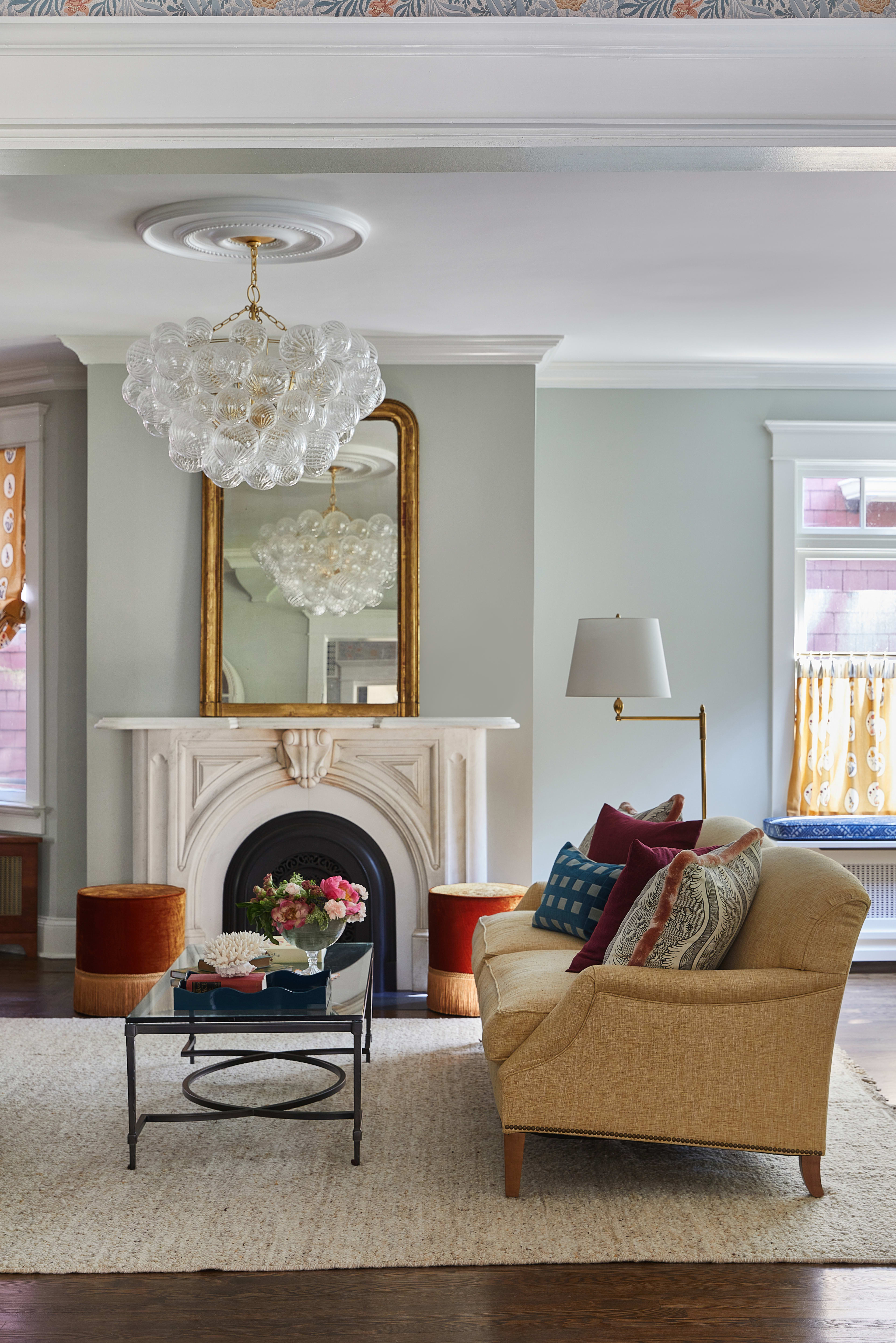
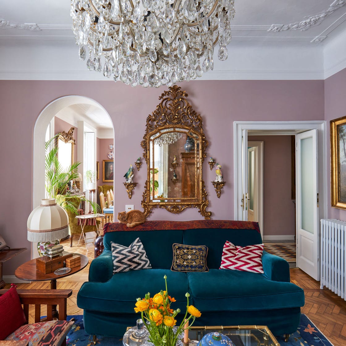
This article explores various approaches to incorporating color into living room design, moving beyond neutral palettes. It presents a collection of ideas and examples, demonstrating how different color schemes can impact the ambiance and style of a living space. The article begins by showcasing a living room with a tinted navy wall paint, which serves as a backdrop for a blend of modern and shabby chic furnishings. Another example highlights a warm palette achieved through delicate neutrals and textured accents, emphasizing the strategic use of subtle tones within a predominantly warm room. A Scandinavian living room features a serene wall paint fluctuating between deep gray and shady blue, illustrating a subdued yet colorful aesthetic. The concept of pastel colors is explored with a lilac backdrop complemented by pastel furnishings and copper accents, creating a calming atmosphere.
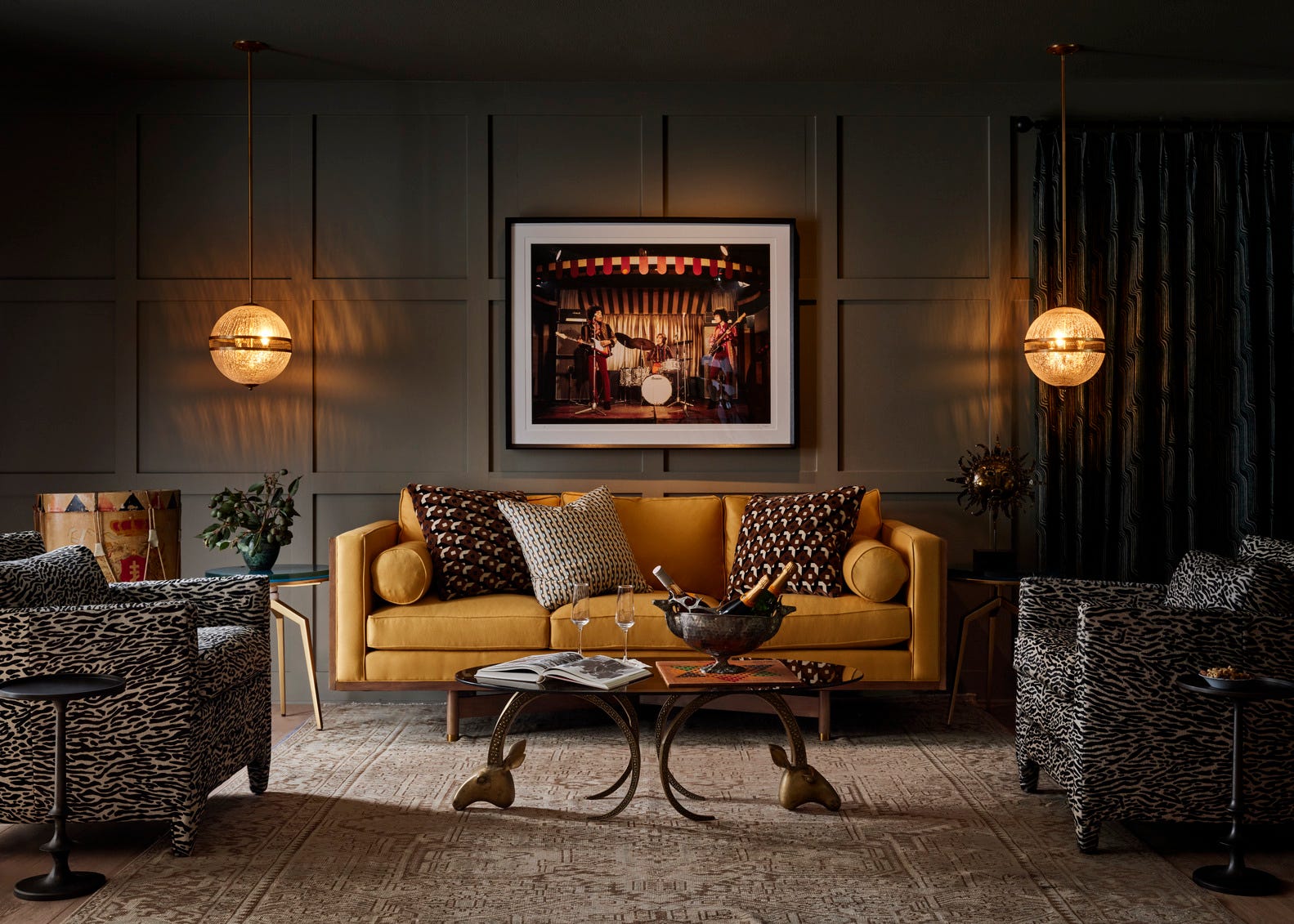
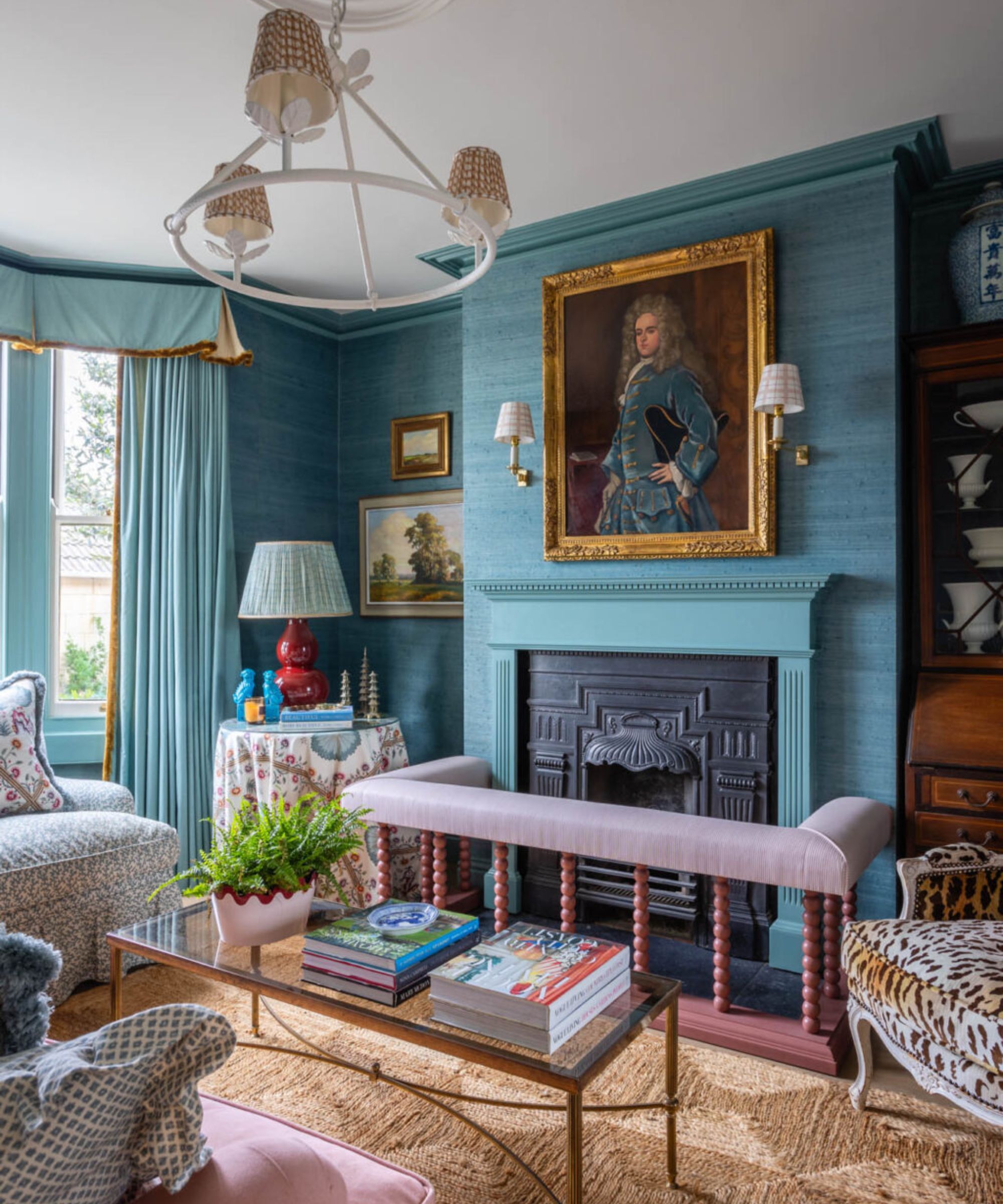
The article also delves into more contrasting and bold applications of color. One example illustrates a study in contrast using a concrete floor, delicate frilly furnishings, and an eclectically intricate backdrop. Another showcases playful patterns and sweet shades to redefine a two-toned room. For a bolder look, a living room with charcoal wall paint is presented, softened by elegant, modern furnishings. The use of subtly patterned wallpaper with a neutrally saturated shade is demonstrated, allowing for eclectic island-chic and mid-century modern decor elements to stand out. A smokey gray wall is presented as a color choice, especially when paired with wood floors and a subtly tinted paint, challenging the perception of gray as a non-color.
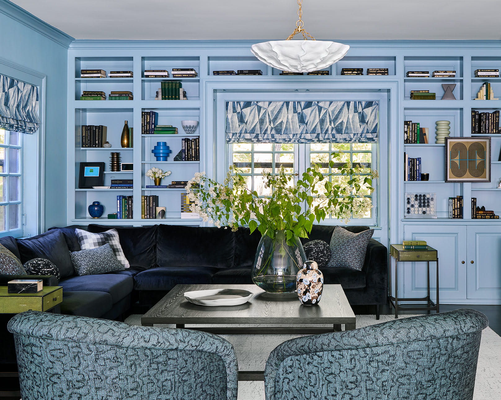
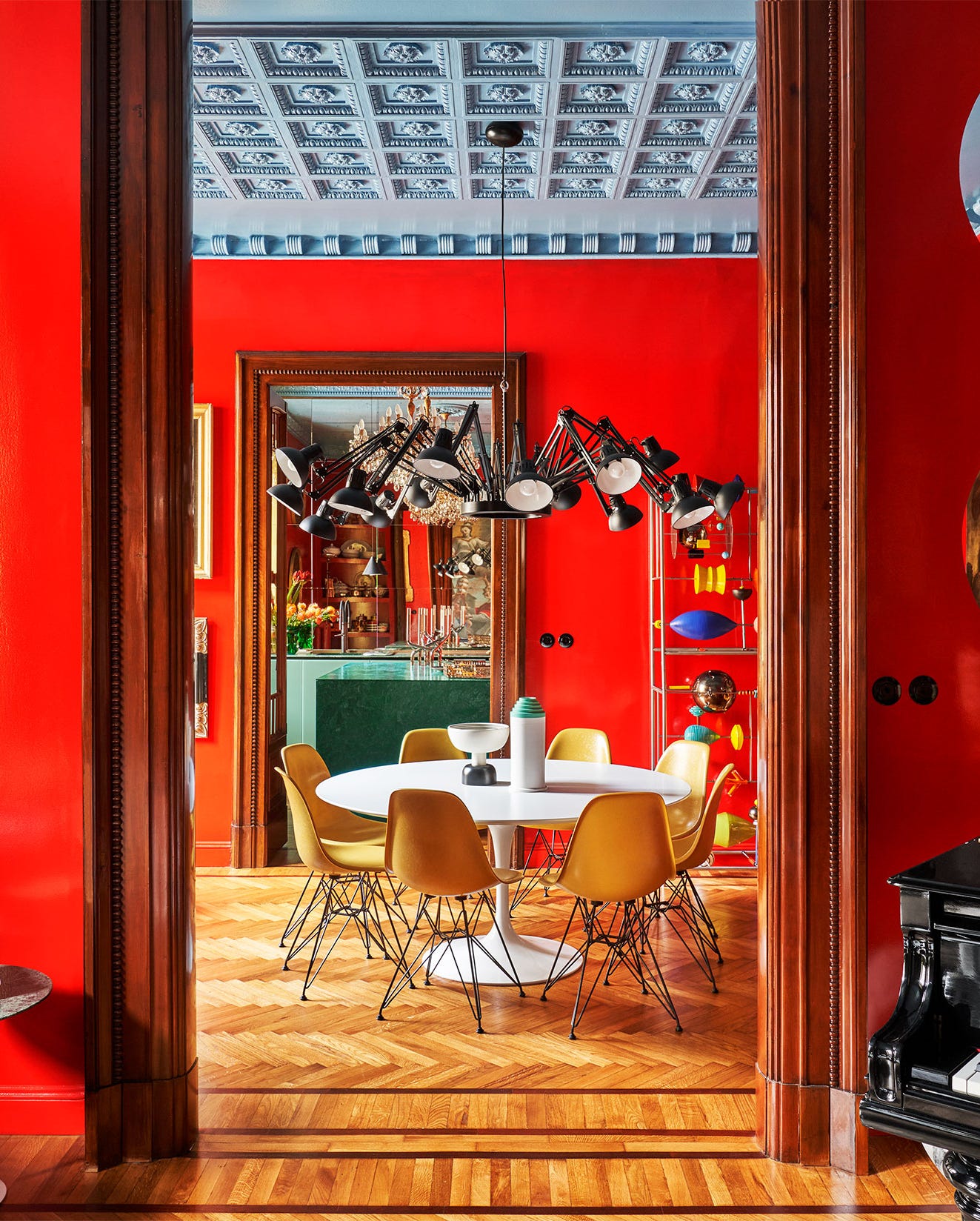
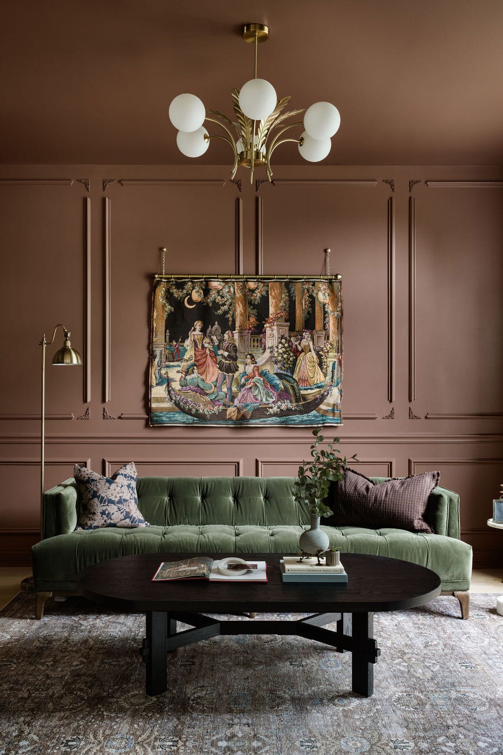
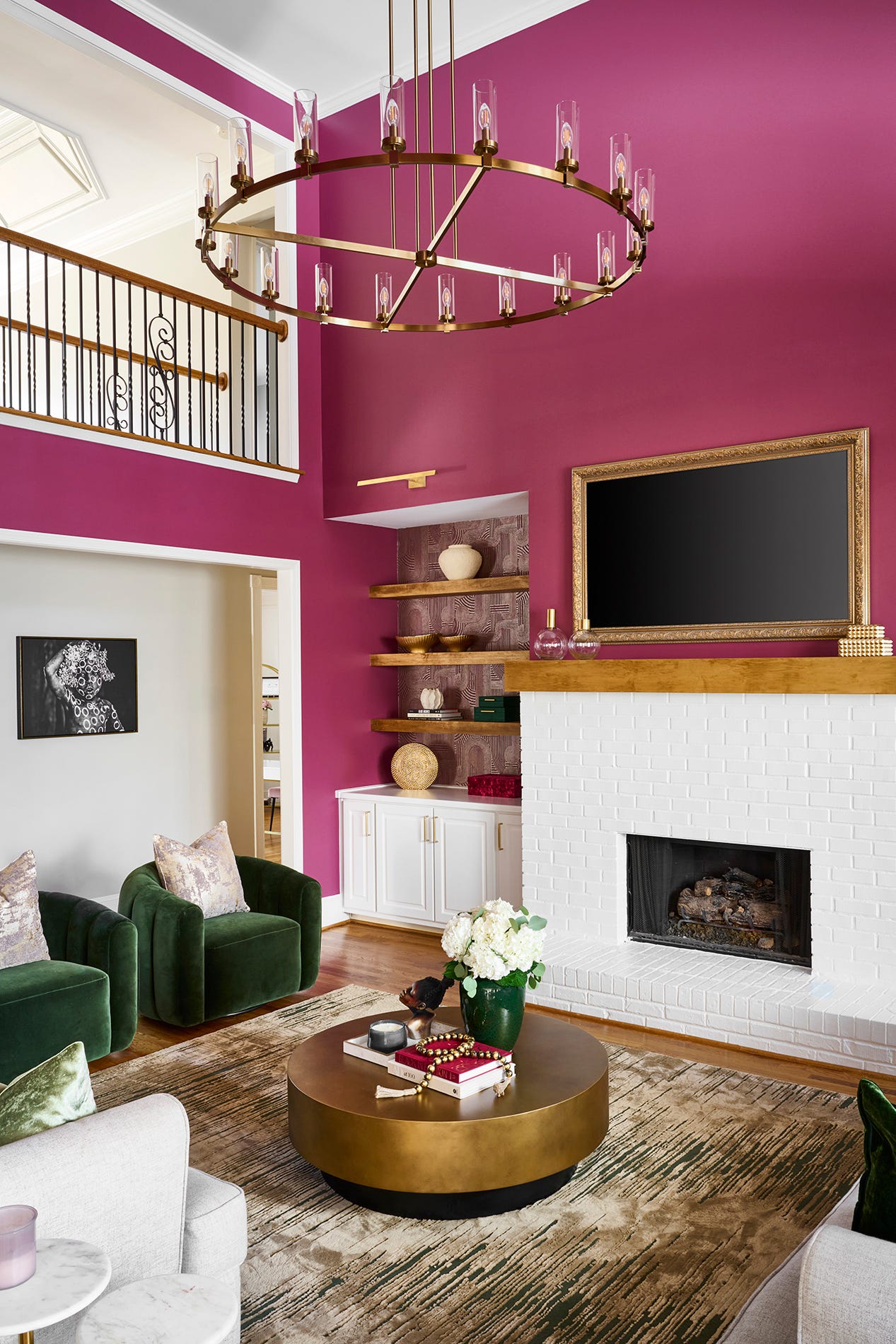
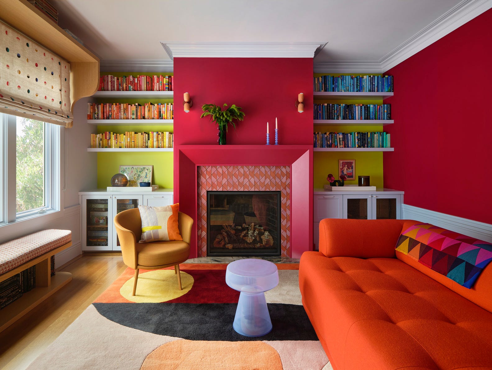
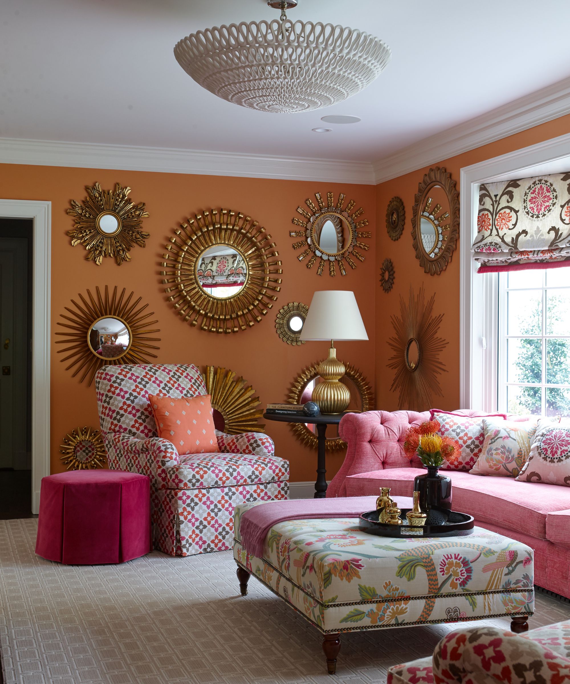
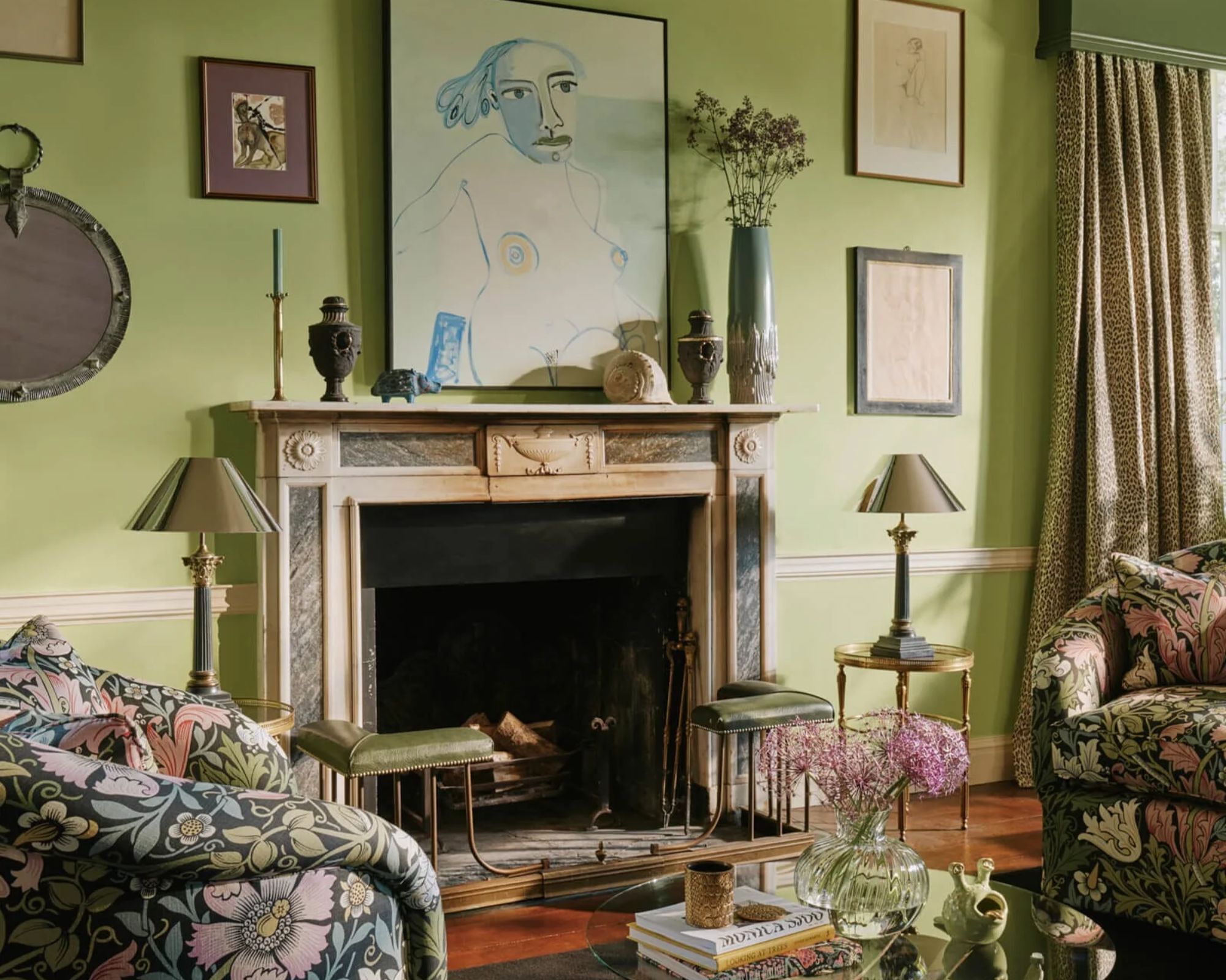
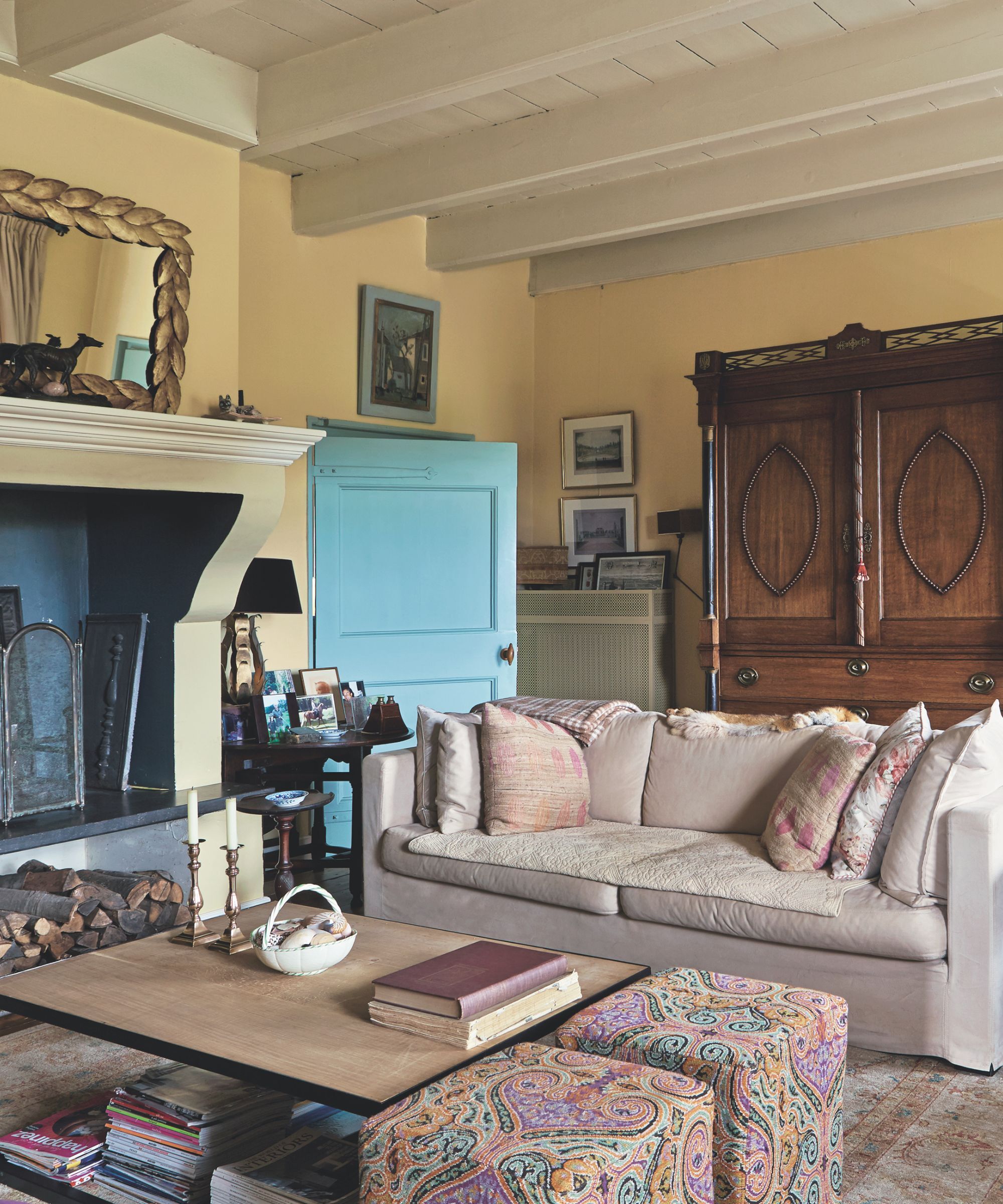
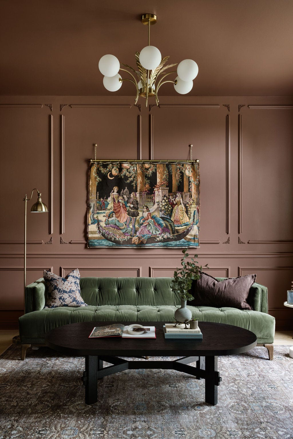
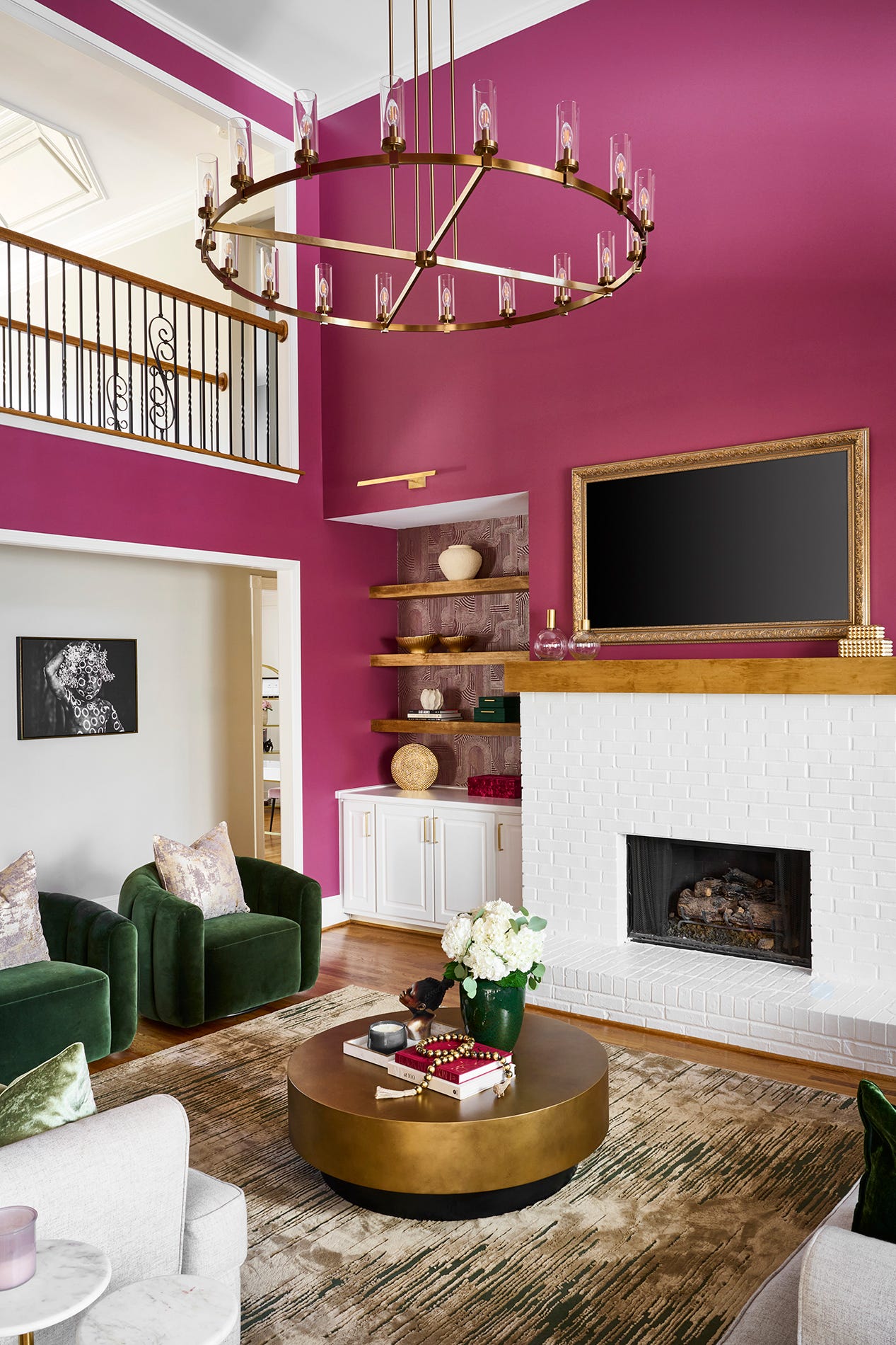
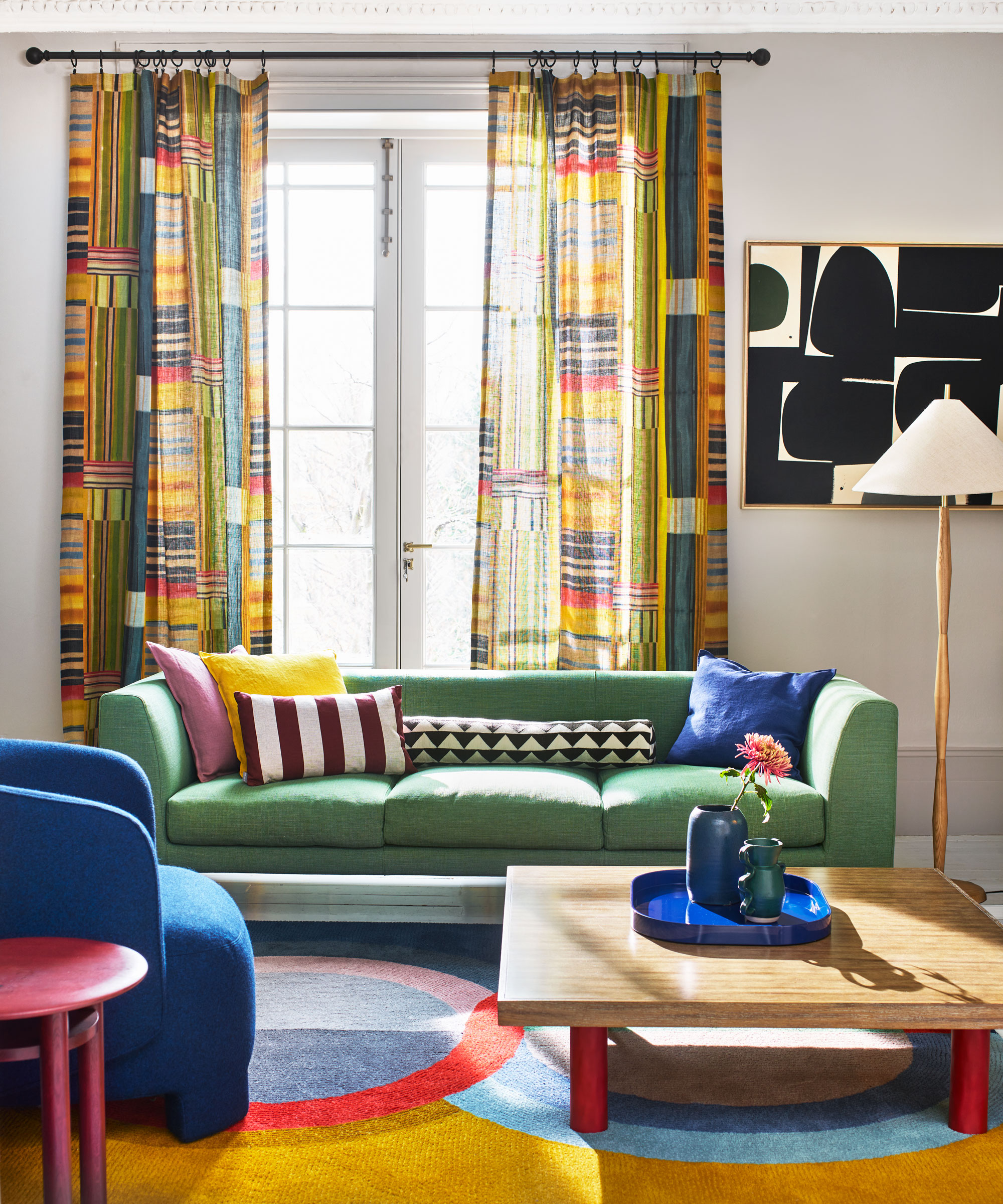
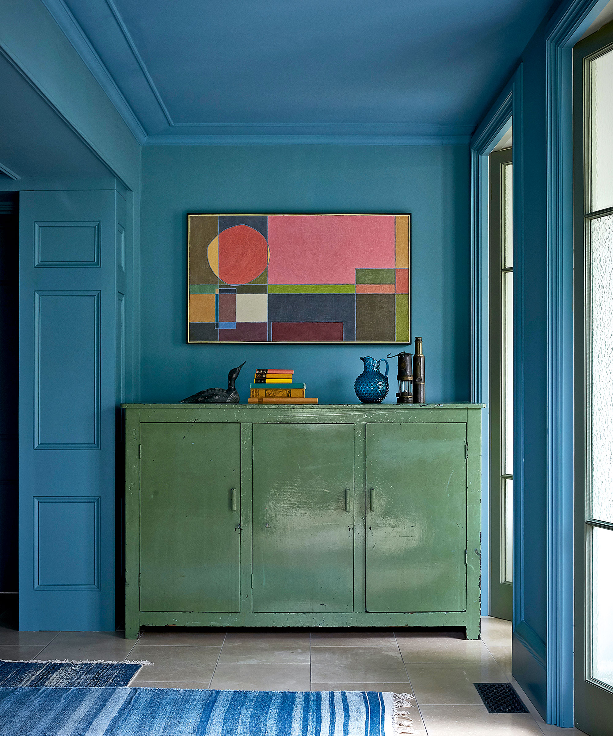
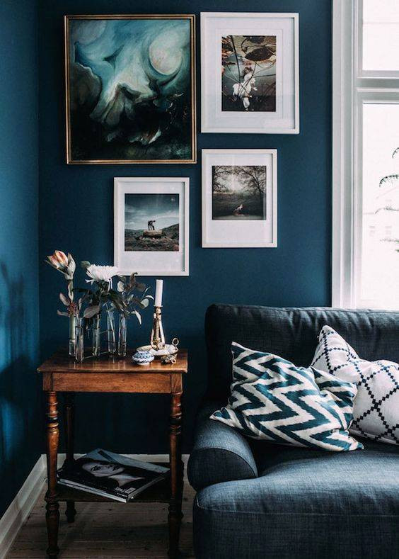
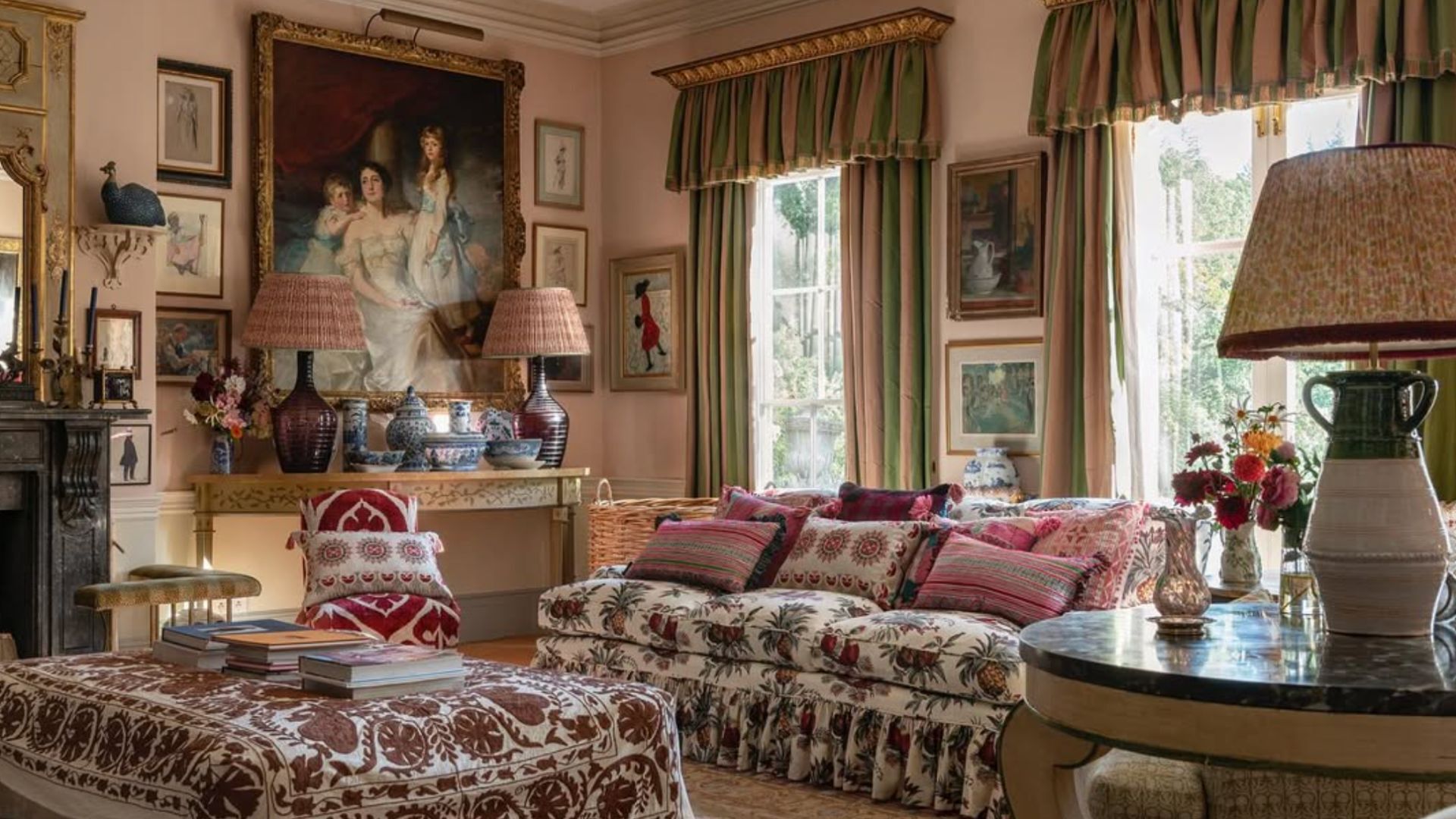
Further examples include a bright blue wall paint combined with a whitewashed ceiling and eclectic, colorful decor, accentuating the vibrancy of the space. A two-toned living room integrates a chic mix of color, texture, and style, enhanced by sleek copper details and marbled wallpaper. The article also reconsiders commonly overlooked shades, featuring a pigmented brown with a hint of magenta on an accent wall. A gray-washed living room is elevated with vibrant furnishings and mid-century modern style, demonstrating that "too much color" is a subjective concept. The article also provides a solution for adding color without painting walls, suggesting a wall-to-wall mirror installation to reflect vibrant decor. A bright green wall paint in an English cottage emulates a rustic decor, while a seemingly textured wallpaper adds depth to monochrome walls, providing a base for warm-hued decorative elements. A rosy wall paint creates a subdued setting for accented colors and organic features, making the space inviting. The article concludes by showing that color blocking works effectively with two saturated shades, with the sofa's hue strategically used to unify bold wall colors. Other examples include a monochrome living room with subtle bursts of eye-catching color, multiple shades of blue accentuated by daylight and clever paint contrasts, a delicate wall paint with a cool undertone complementing dusty blush-toned furnishings, wood panel walls creating a nautical theme for a beachfront property, an earthy decor scheme stemming from patterned wallpaper and woven accents, and an elegant gallery wall complementing a saturated wall paint, emphasizing the importance of accent pieces.
#ColorfulLivingRooms #InteriorDesign #WallPaintIdeas #HomeDecor #ColorSchemes #LivingRoomDesign #AccentWalls #DesignInspiration #PaintColors #ColorfulLivingRooms #InteriorDesign #WallPaintIdeas #HomeDecor #ColorSchemes #LivingRoomDesign #AccentWalls #DesignInspiration #PaintColors
0 ความคิดเห็นรวม
 ยังไม่มีความคิดเห็น
คุณอาจจะชอบอีกด้วย
18 Living Room Color Ideas That are Oh-So Inviting
These Living Room Paint Colors Are a Total Mindset Shift
5 living room paint colors going out of style in 2025
32 Vibrant Living Room Ideas That Turn One Bold Piece Into a Whole Vibe
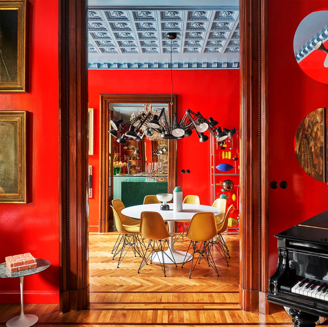
55 Living Room Color Ideas That Will Take Your Space from Drab to Fab

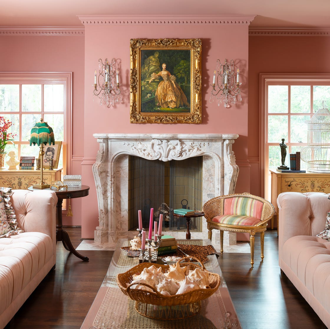
Designer-Approved Living Room Colors That'll Make You Feel Happier

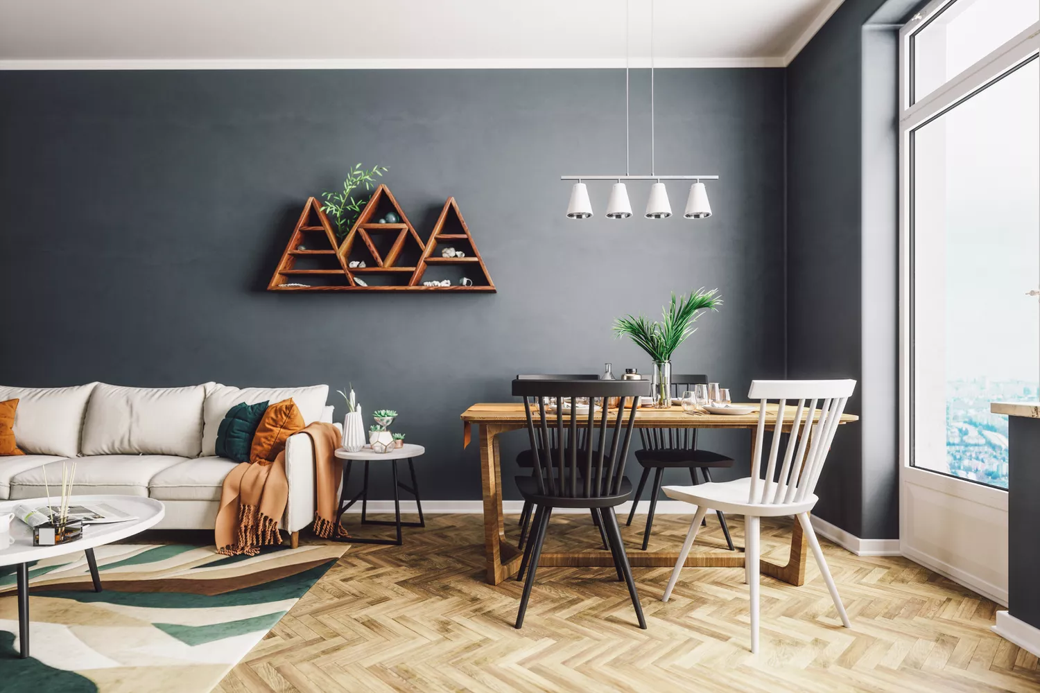
4 Living Room Paint Colors That Are So Outdated, According to Designers

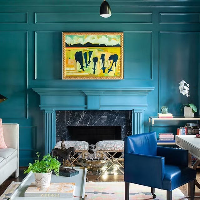
The 60 Most Popular Living Room Paint Colors Right Now

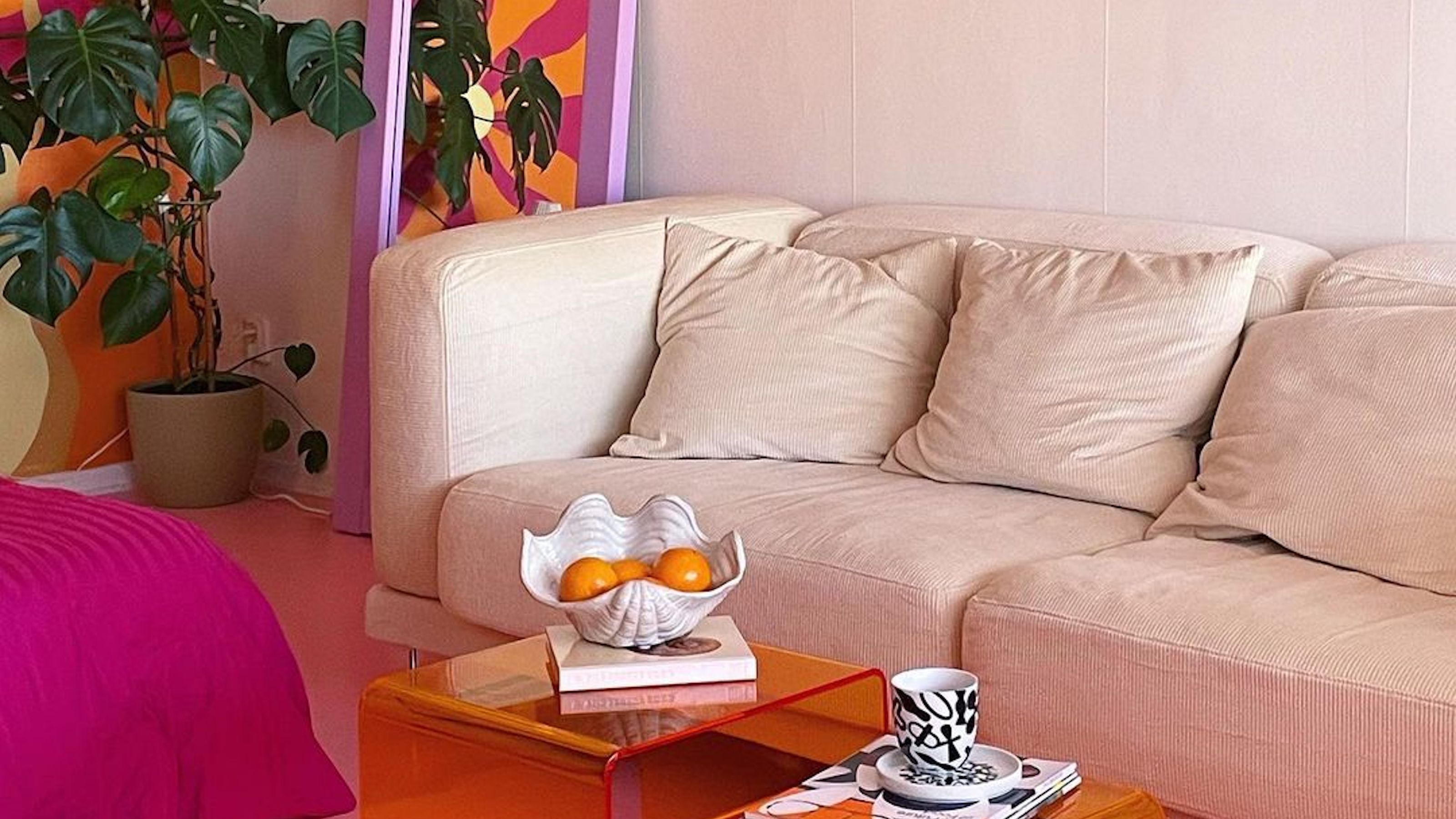
Interior influencers show us how it’s done with these colorful living room ideas

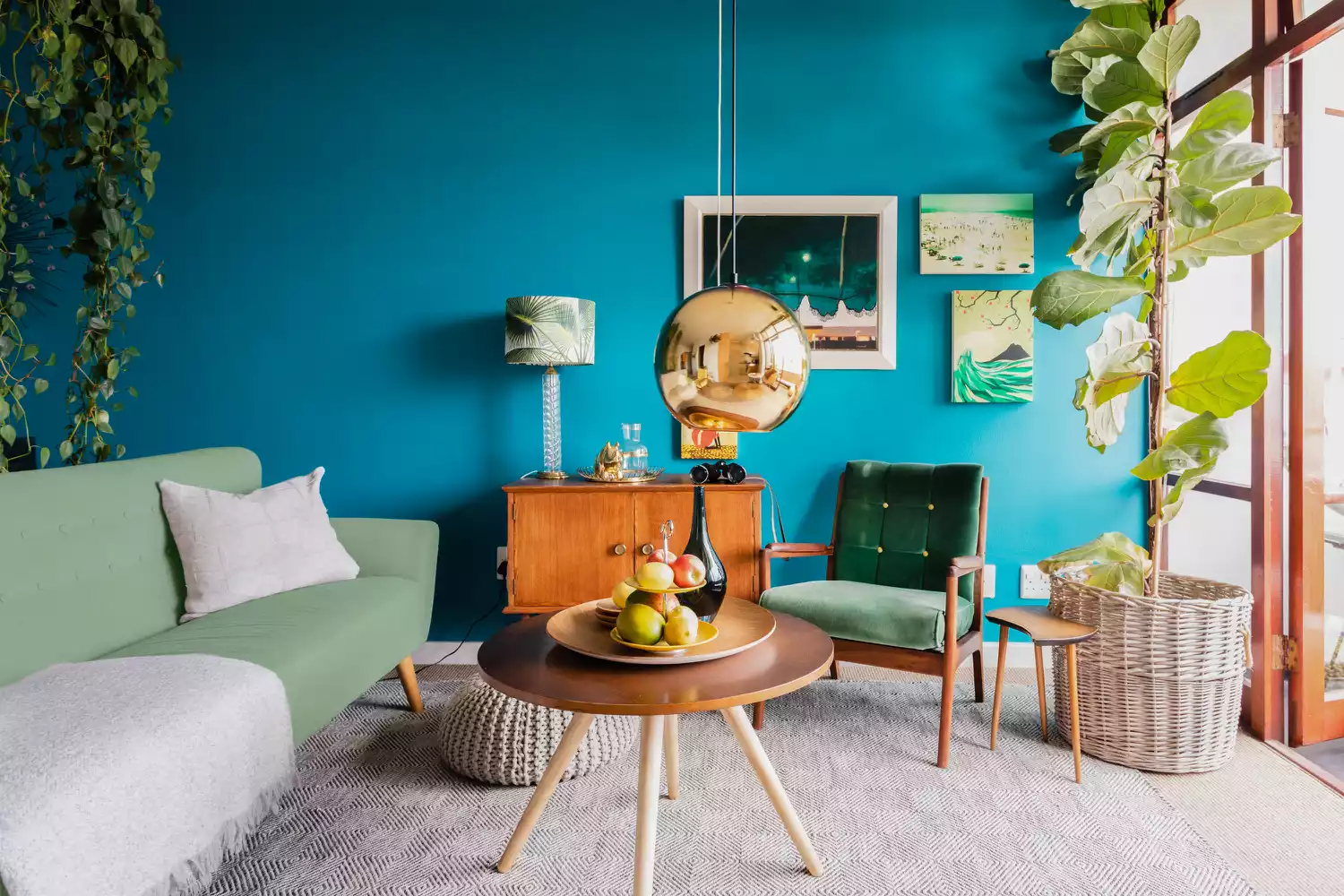
51 Living Room Color Schemes That Will Bring Your Space to Life
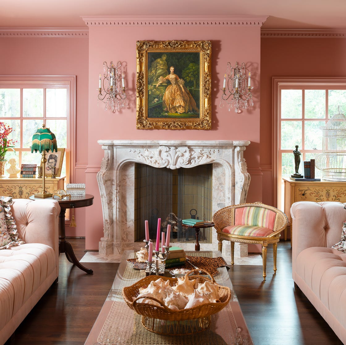
The Year's Best Living Rooms
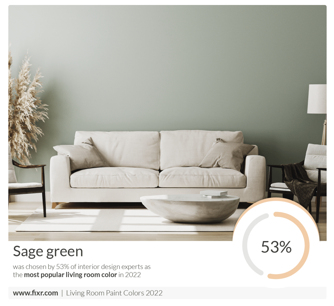
7 Popular Paint Colors for the Living Room
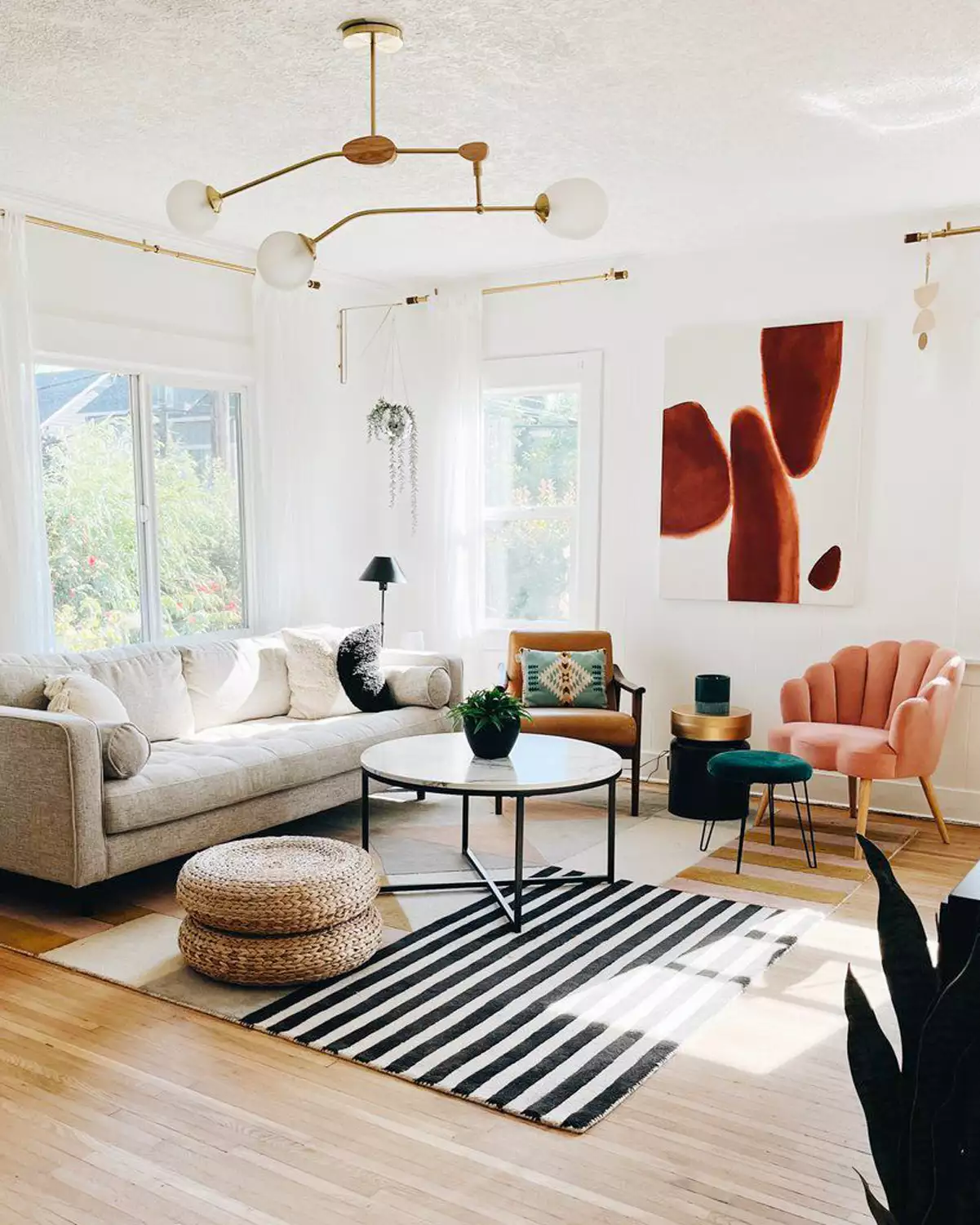
16 Living Rooms Perfect for Those Who Only Want a "Pop" of Color
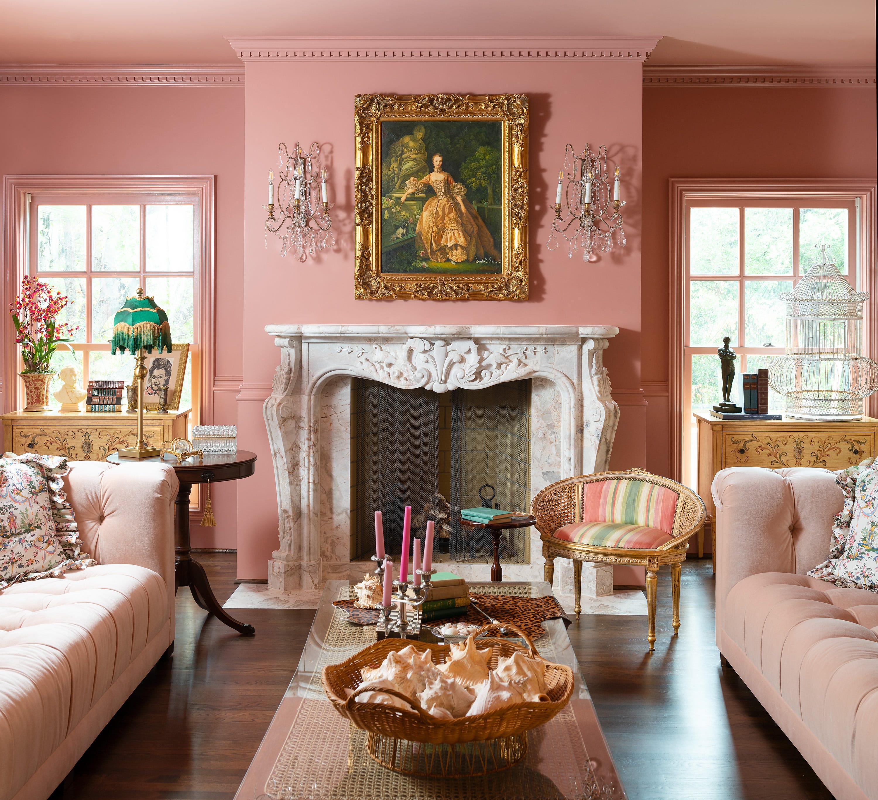
Jewel Tones Are Trending for Living Room Paint Colors, According to Designers
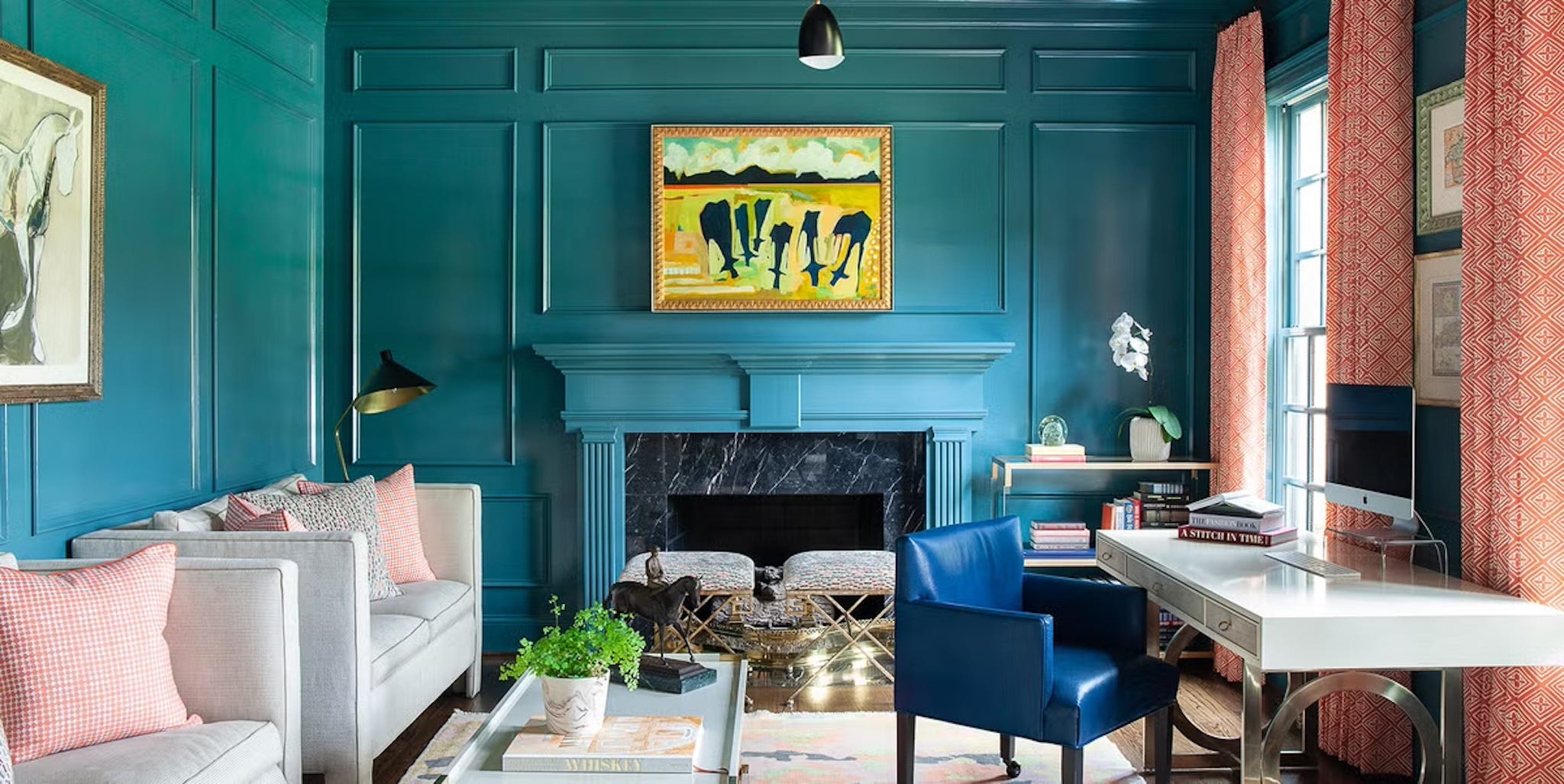
Design Pros Have Spoken: Here Are the Only Paint Color Trends That Matter in 2022

Experts reveal the best living room paint colours to transform every space

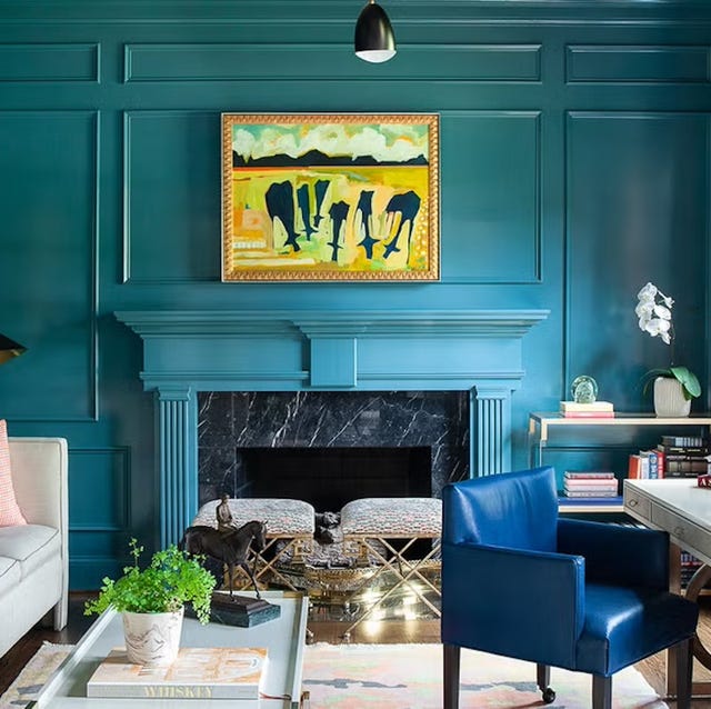
Listen Up: These Are the Best Paint Colors for Your Living Room
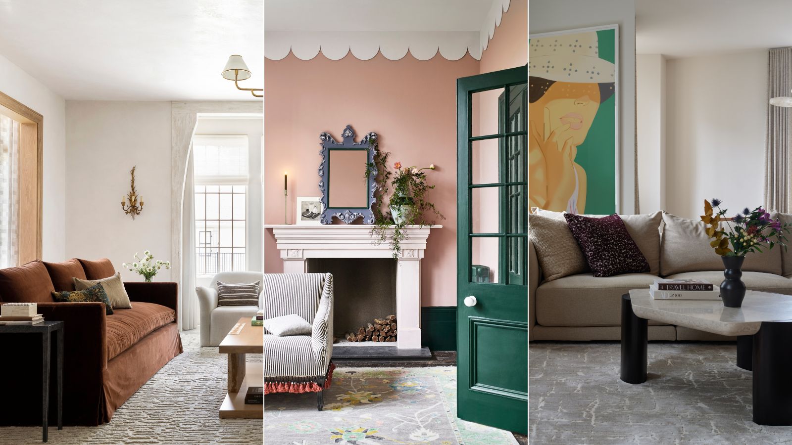
These are interior designers' favorite color combinations for living rooms – from neutral and calming to bold and playful
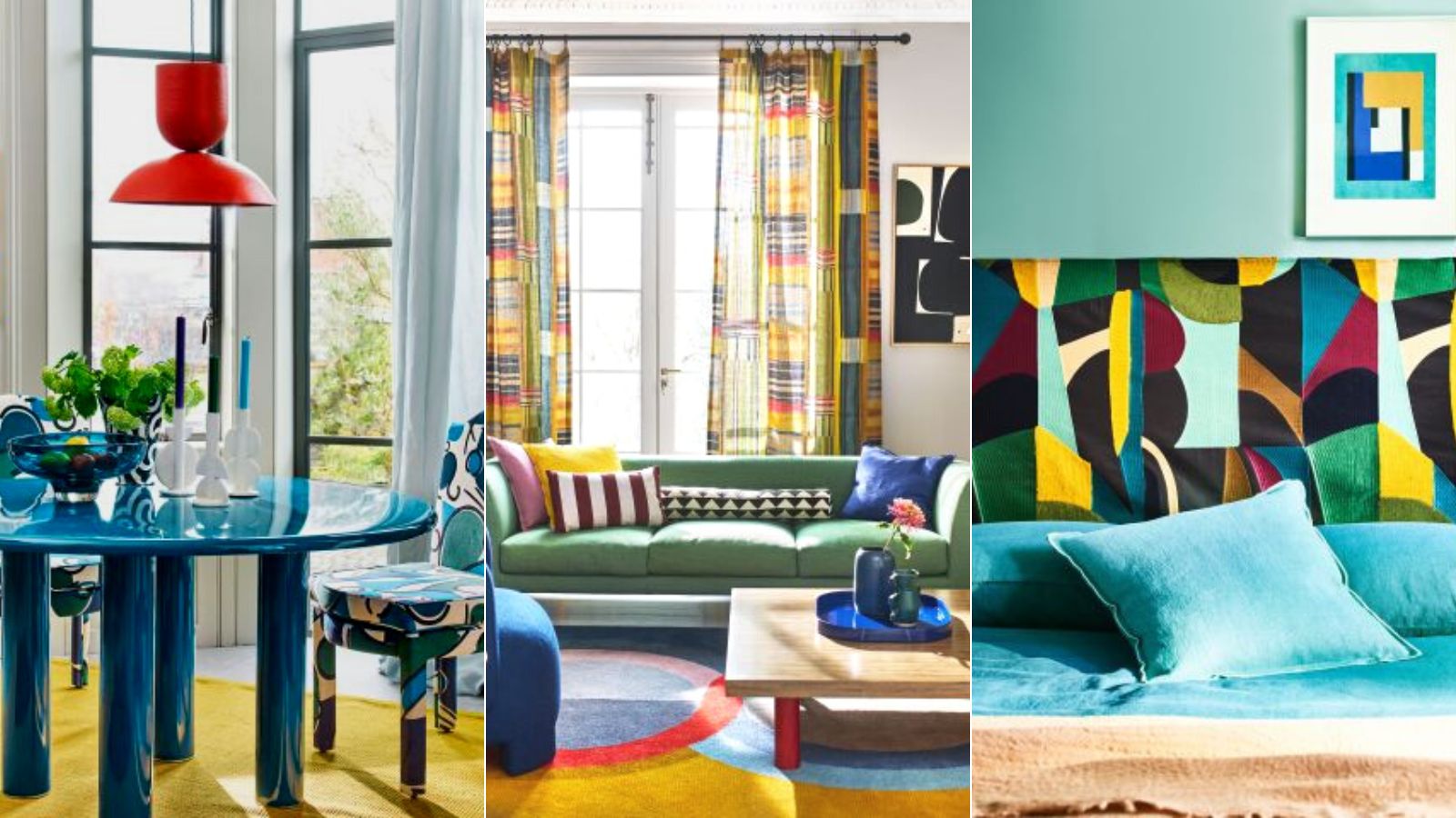
Colorful room ideas – 15 vibrant spaces with daring decor

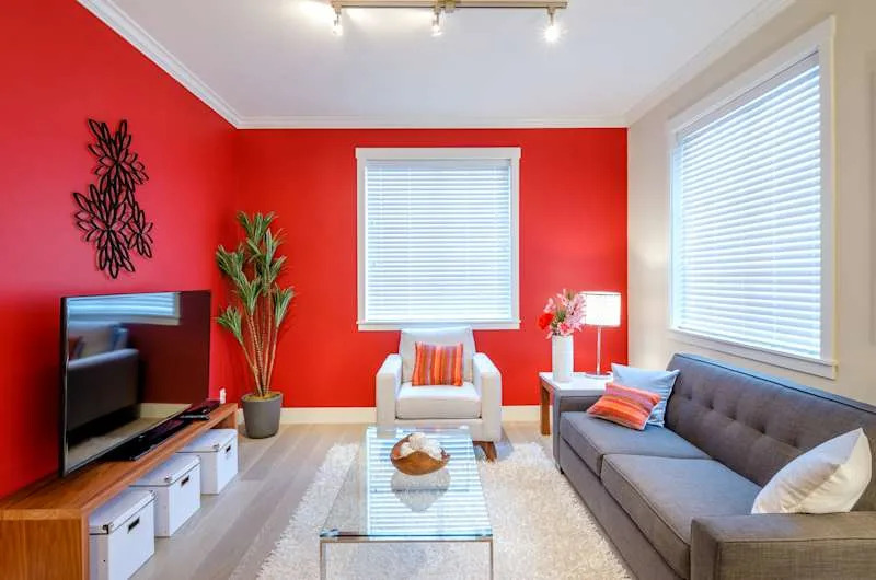
The 3 All-Time Worst Living-Room Paint Colors, According to Designers