1/3
The #1 Trendy Paint Color Designers Want You To Avoid
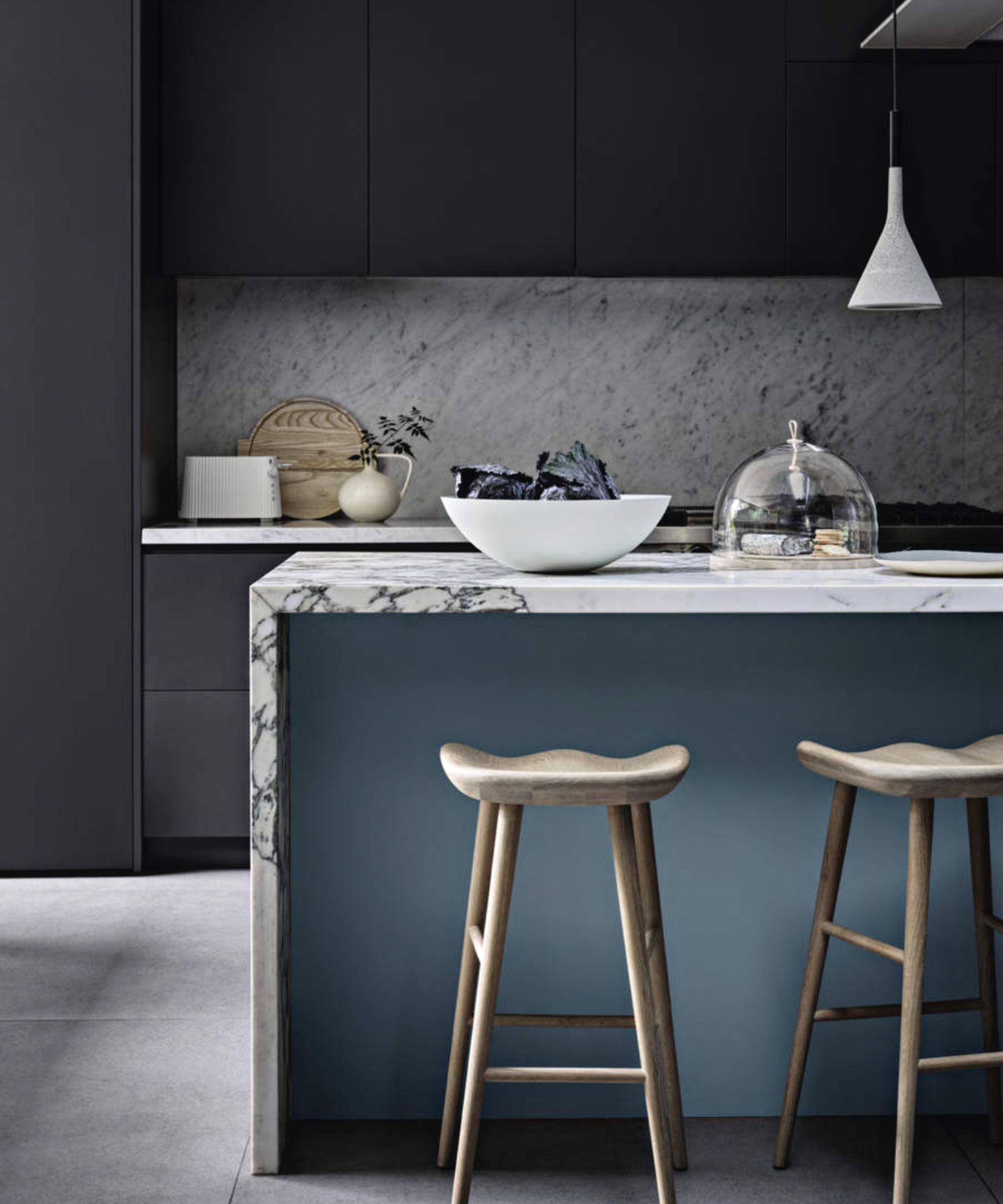
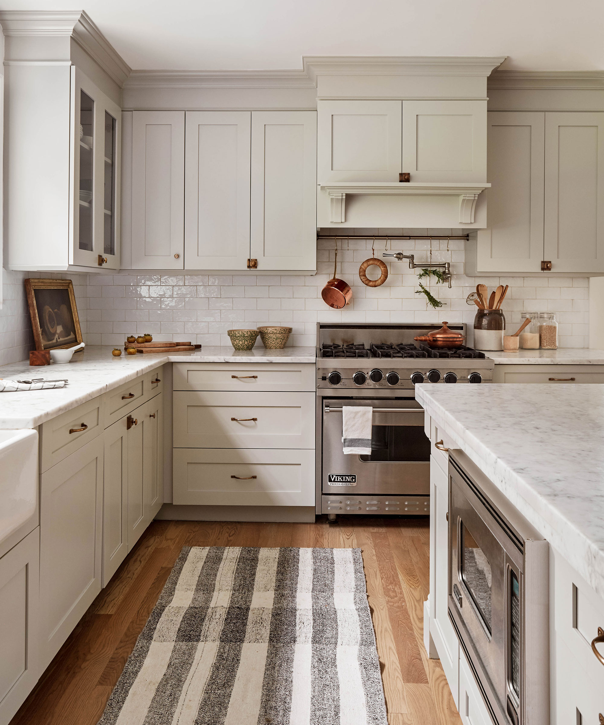
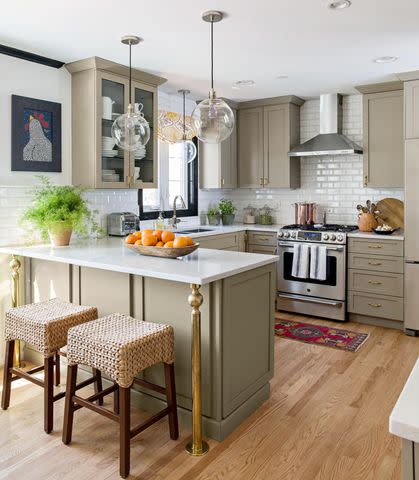
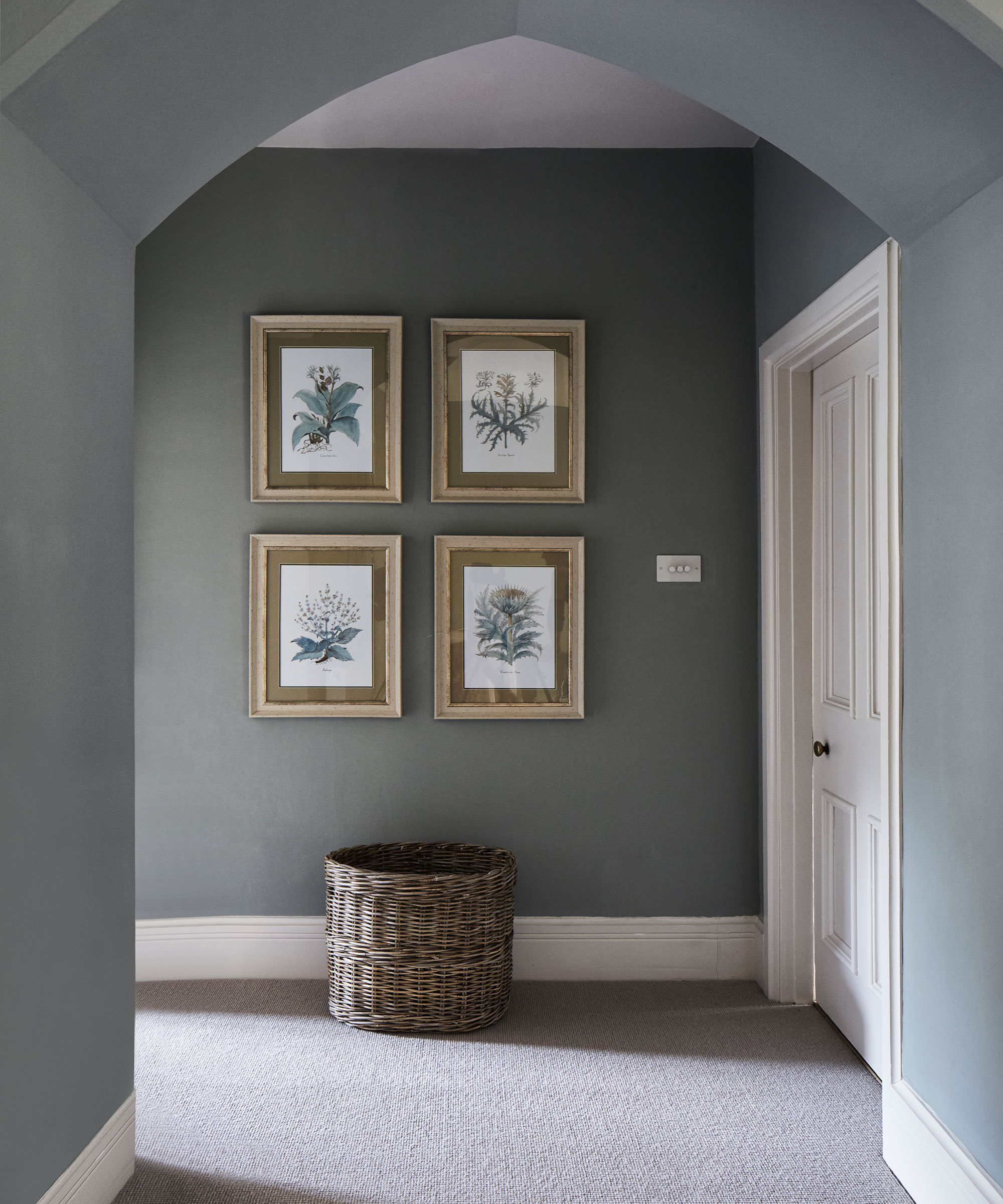
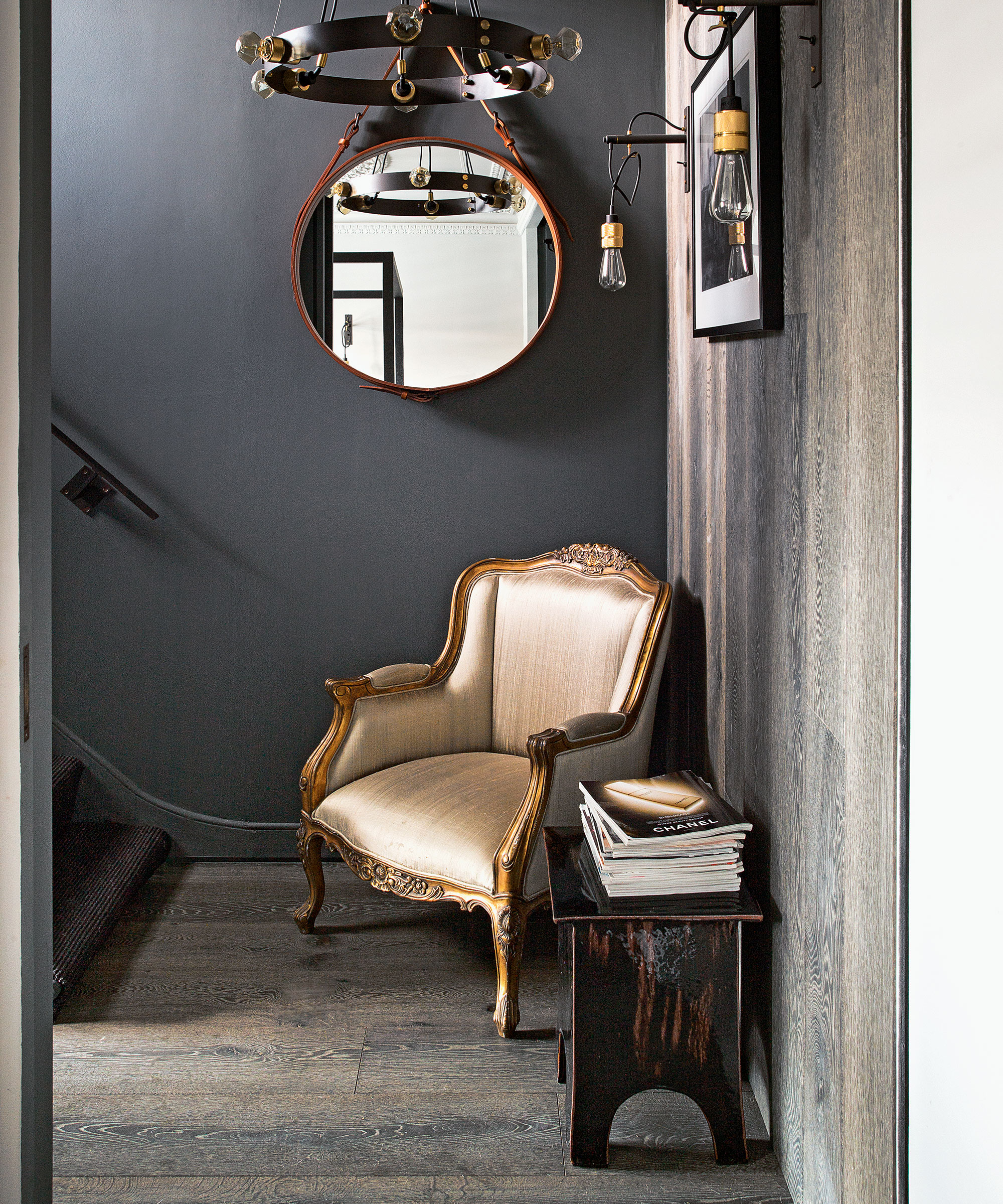
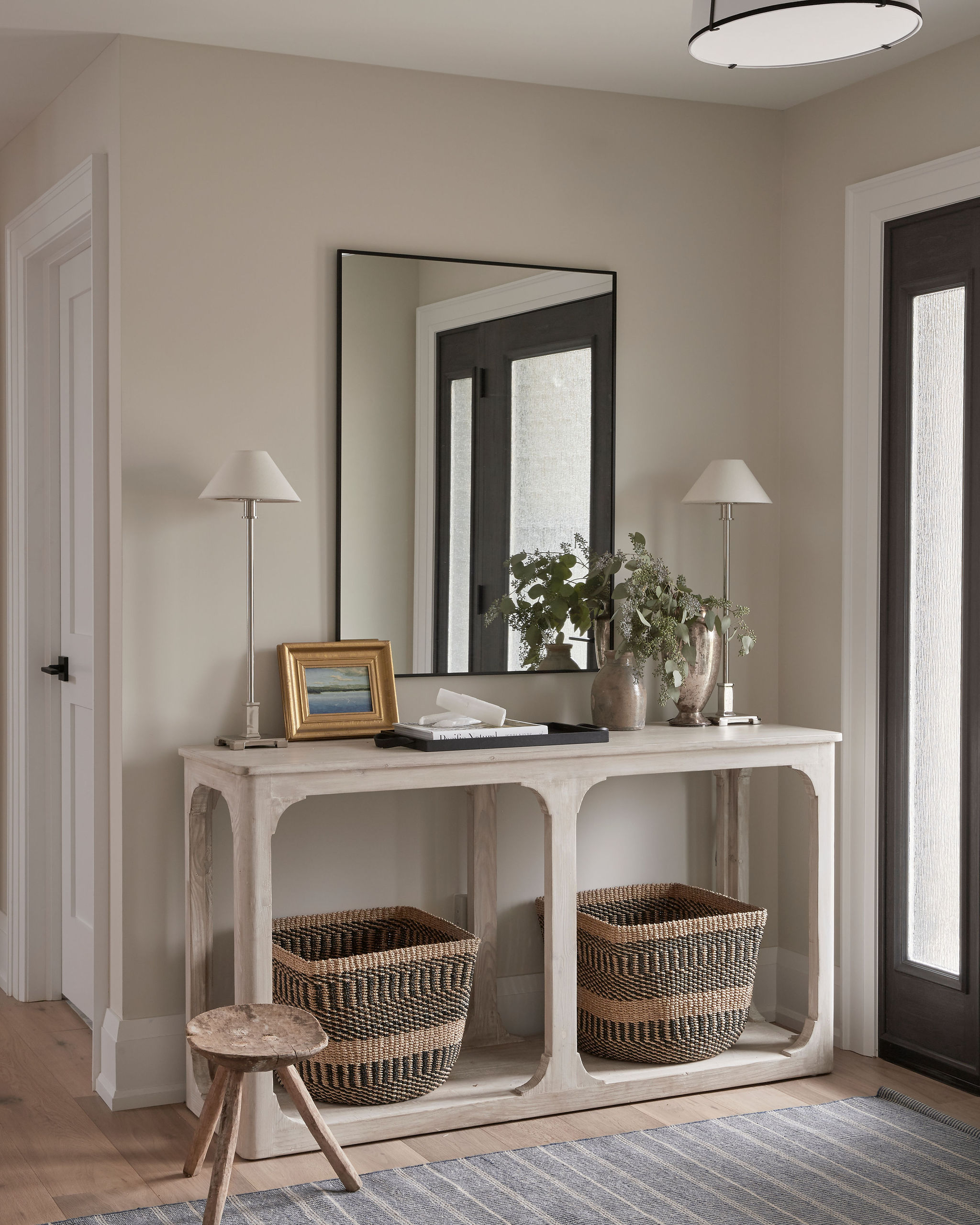
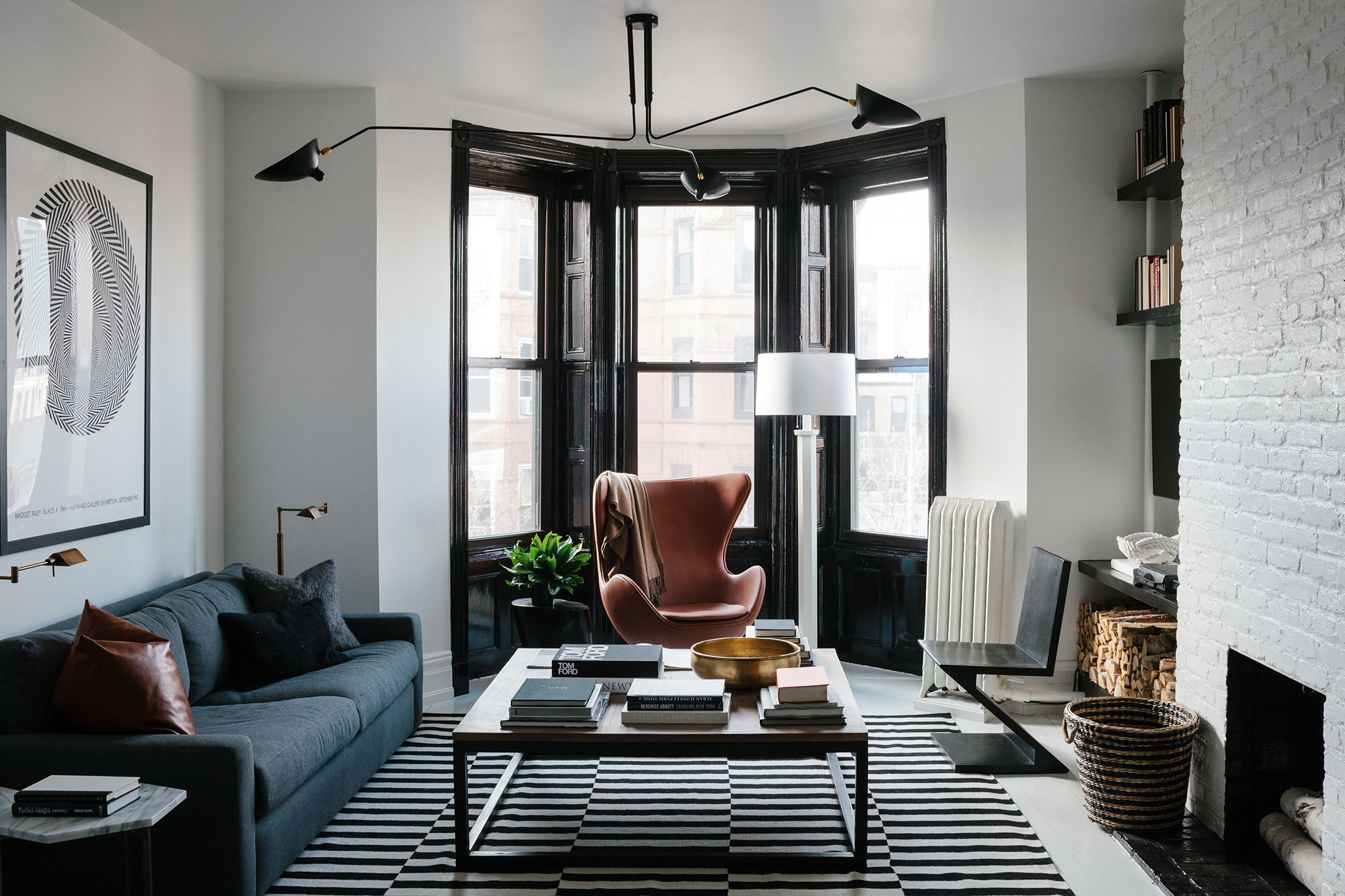
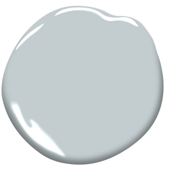
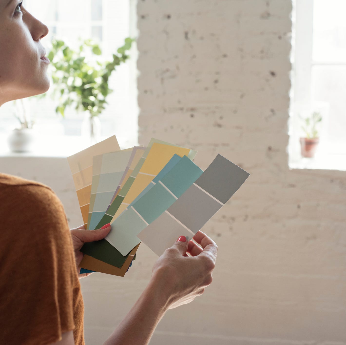
Gray, a once-popular paint color often associated with minimalism and neutral interiors, is now considered outdated by many interior designers. While millennial gray had a significant moment, design experts are increasingly guiding homeowners toward more vibrant, personalized, and warmer color palettes. The sentiment among designers is that color adds excitement and personality to a space, moving away from the generic appeal often sought in homes renovated for sale.
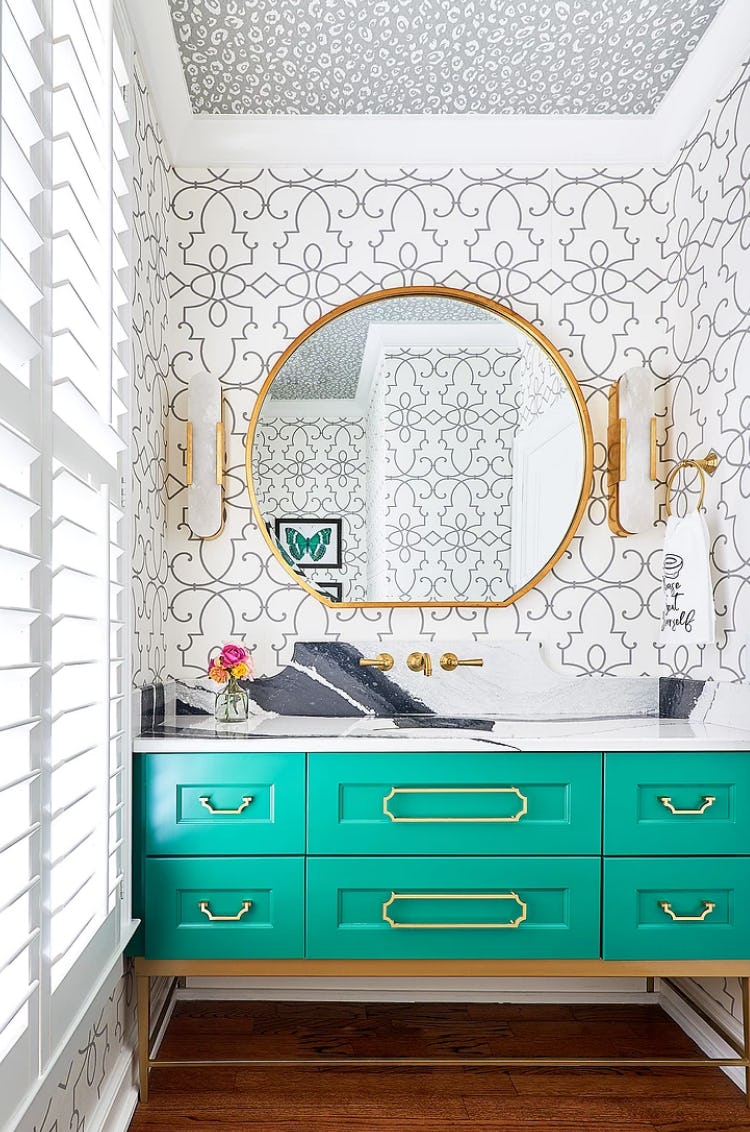
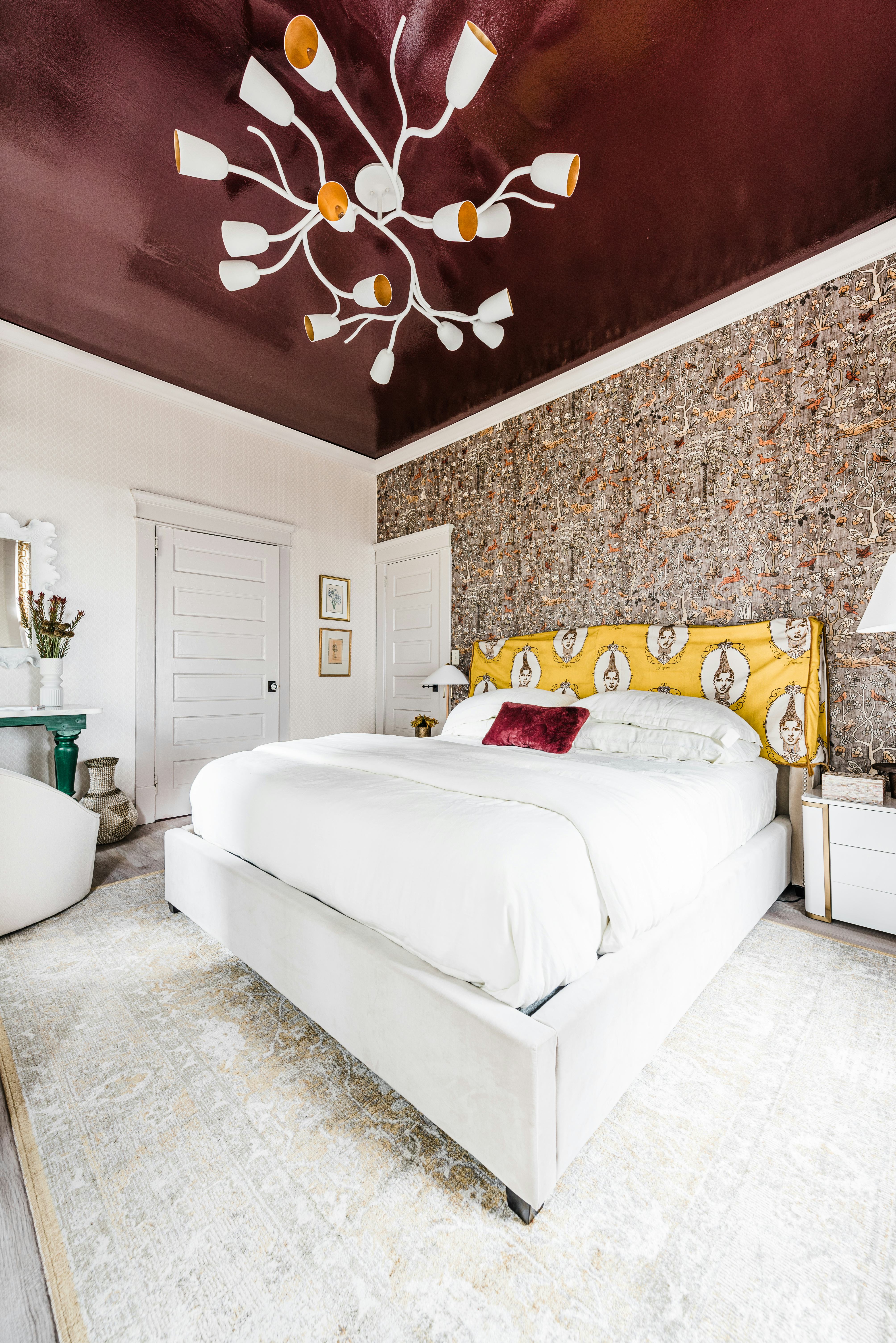
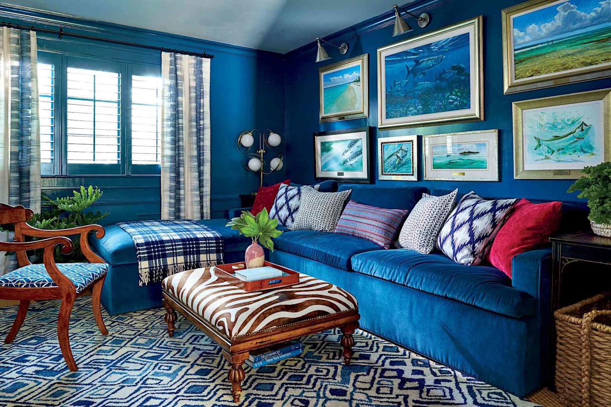
Interior designer Gail Davis emphasizes that living in color is crucial, advocating for spaces saturated with exciting hues rather than solely neutral tones. Tiffanni Reidy of Reidy Creative supports this view, noting a resurgence in bold design choices as homeowners become less apprehensive about personalizing their living environments. Reidy argues that the all-gray aesthetic, frequently employed by renovators and developers aiming for broad appeal, lacks genuine character and fails to hold up against more intentional design approaches. Autumn Pochiro of Autumn Dawn Design concurs, stating that gray, despite its decade-long run as a versatile neutral, has overstayed its welcome as a foundational color for walls, furniture, and cabinetry.
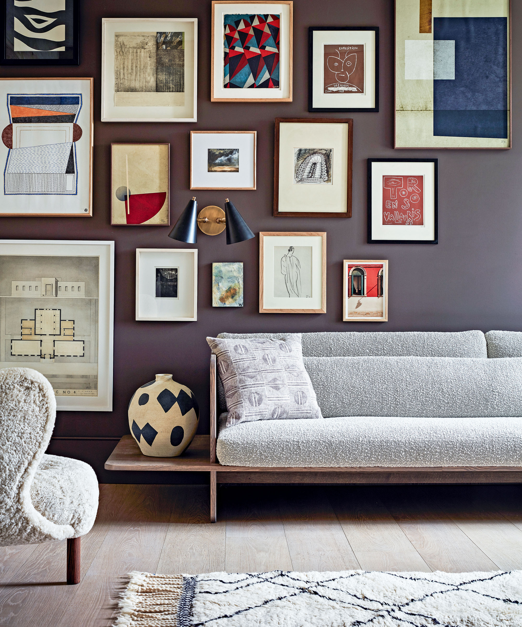
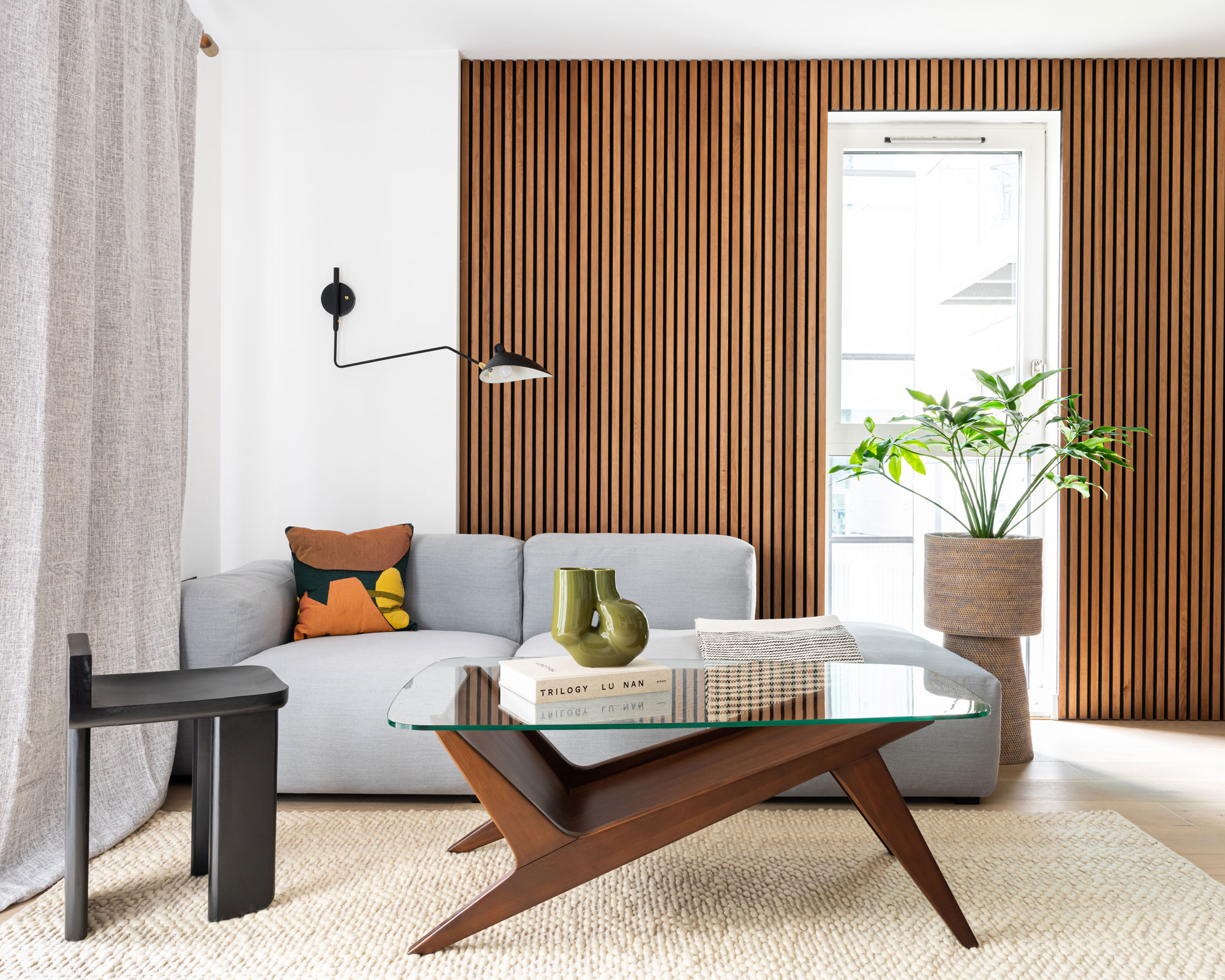
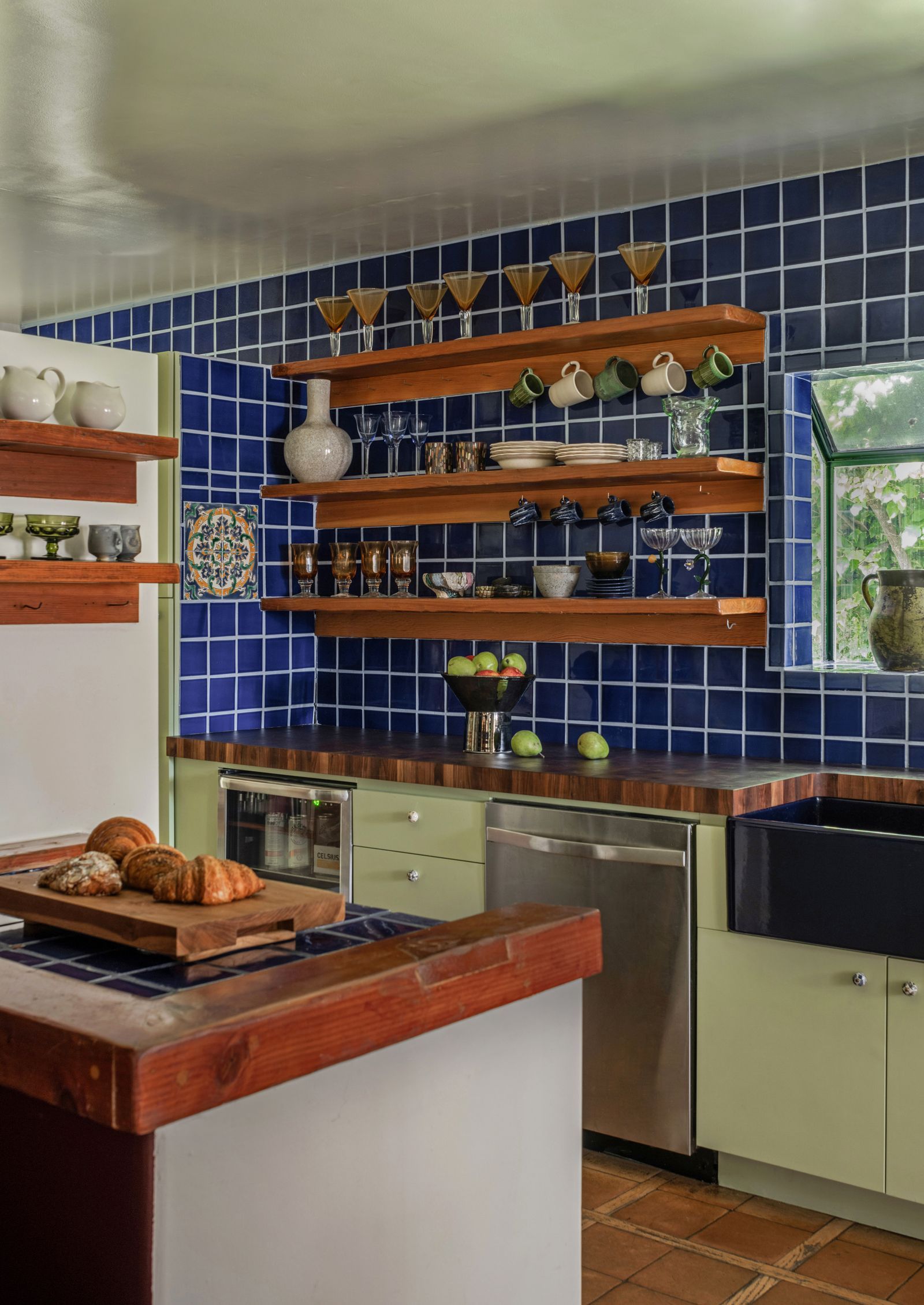
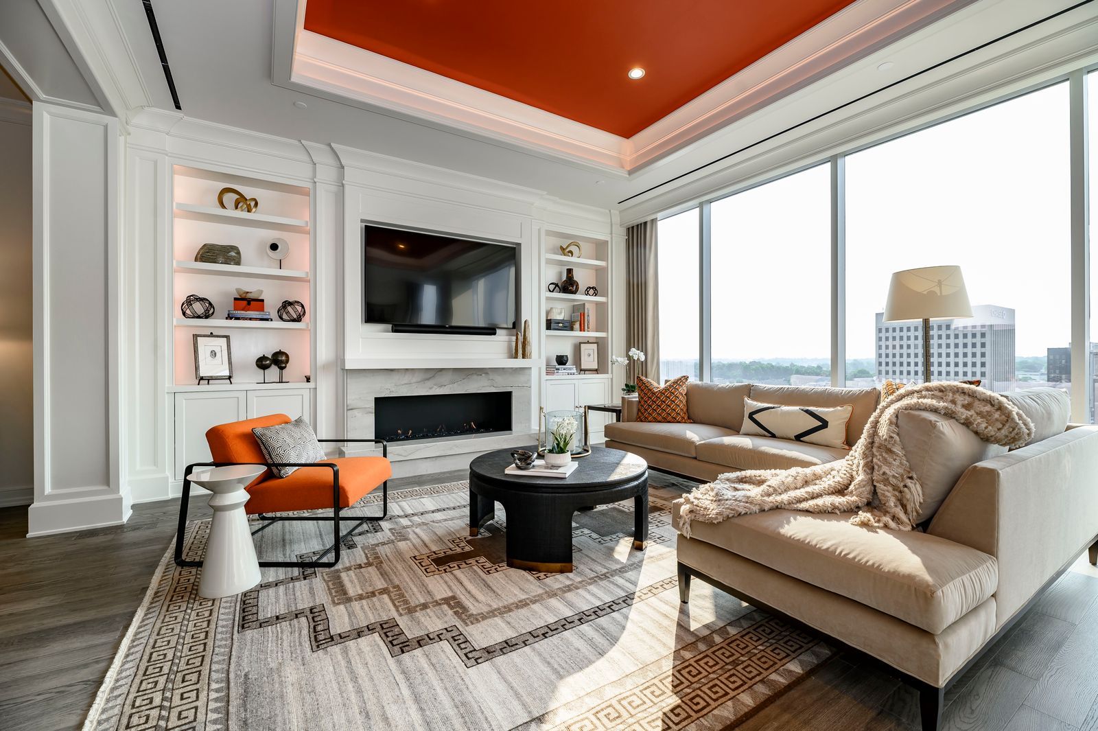
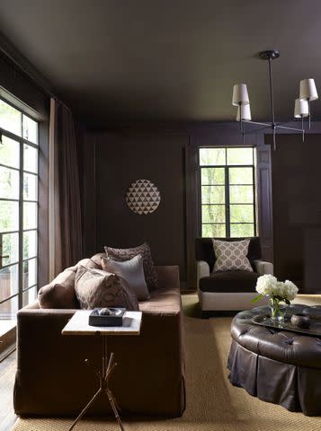
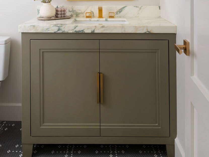
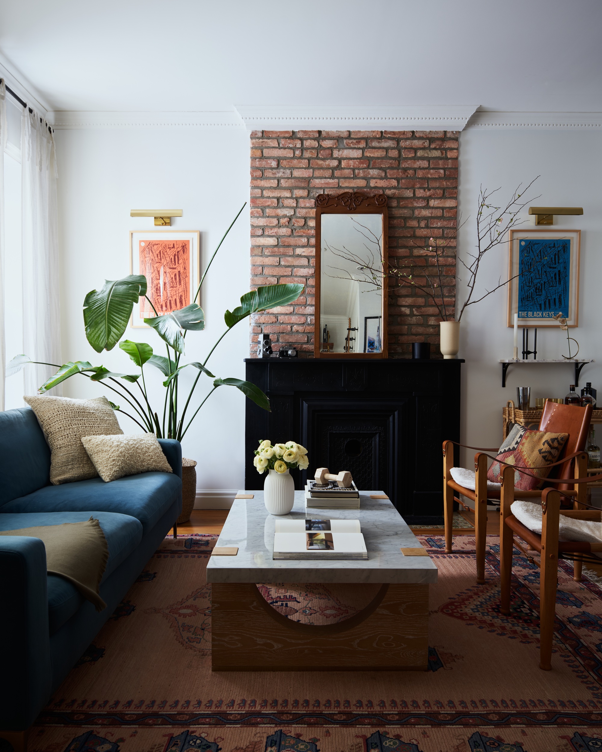
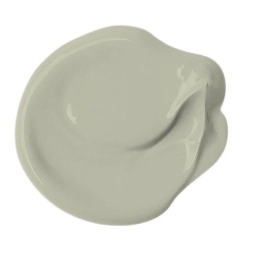
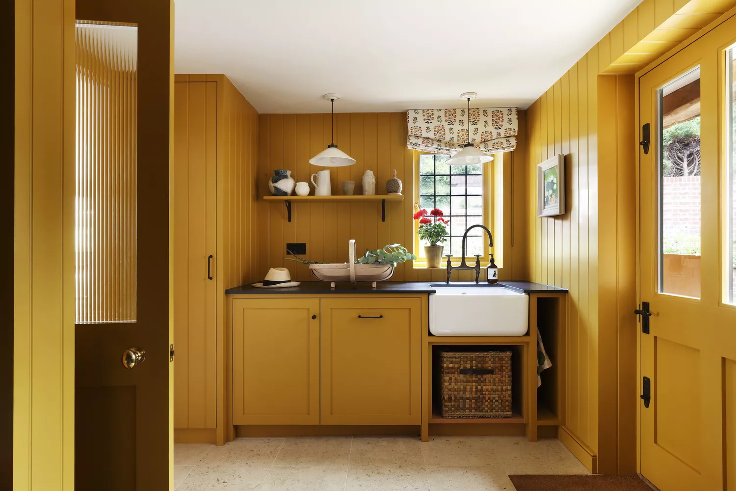
In place of gray, designers suggest a shift towards warmer and more dramatic colors. Blair Britt of Bella B Home Designs highlights a preference for warm neutrals, browns, olives, and strategic pops of color. Gideon Mendelson of Mendelson Group anticipates that various shades of brown, such as rich taupe, warm clay, and burnt umber, will become more prevalent, driven by a desire for nature-inspired aesthetics and a '70s retro revival. These earthy tones offer a grounded feel and a timeless quality. Stephanie Brown has observed this move to earth tones extending beyond paint to marble, tile selections, rugs, furniture, and decor.
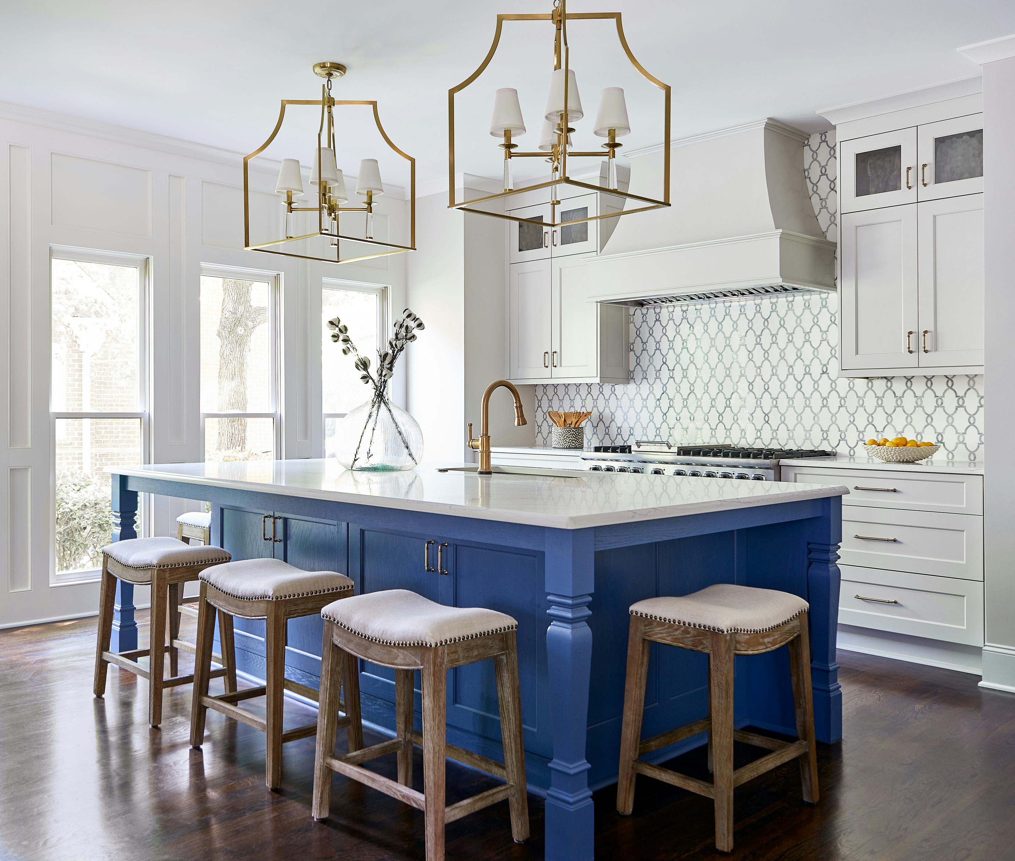
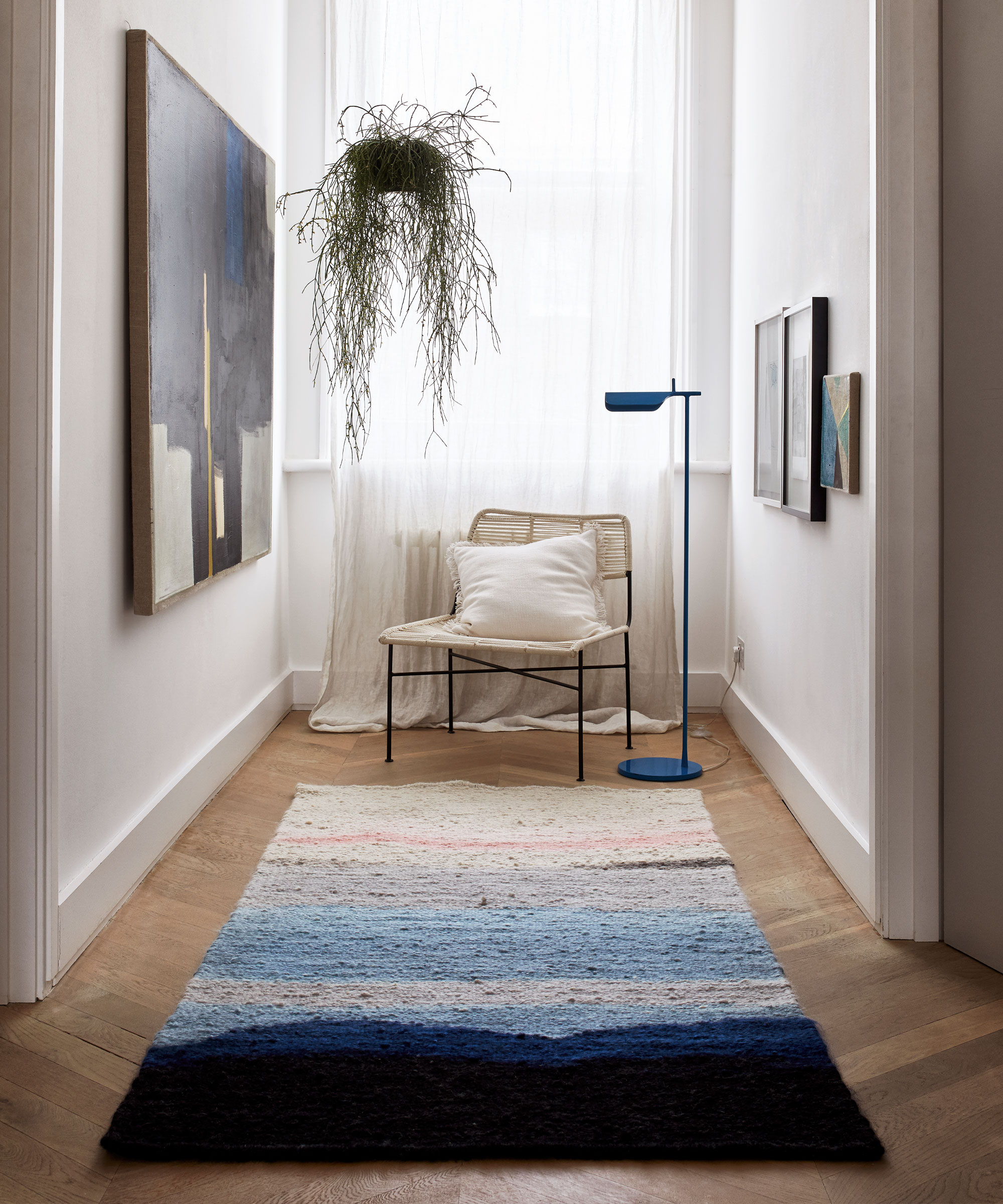
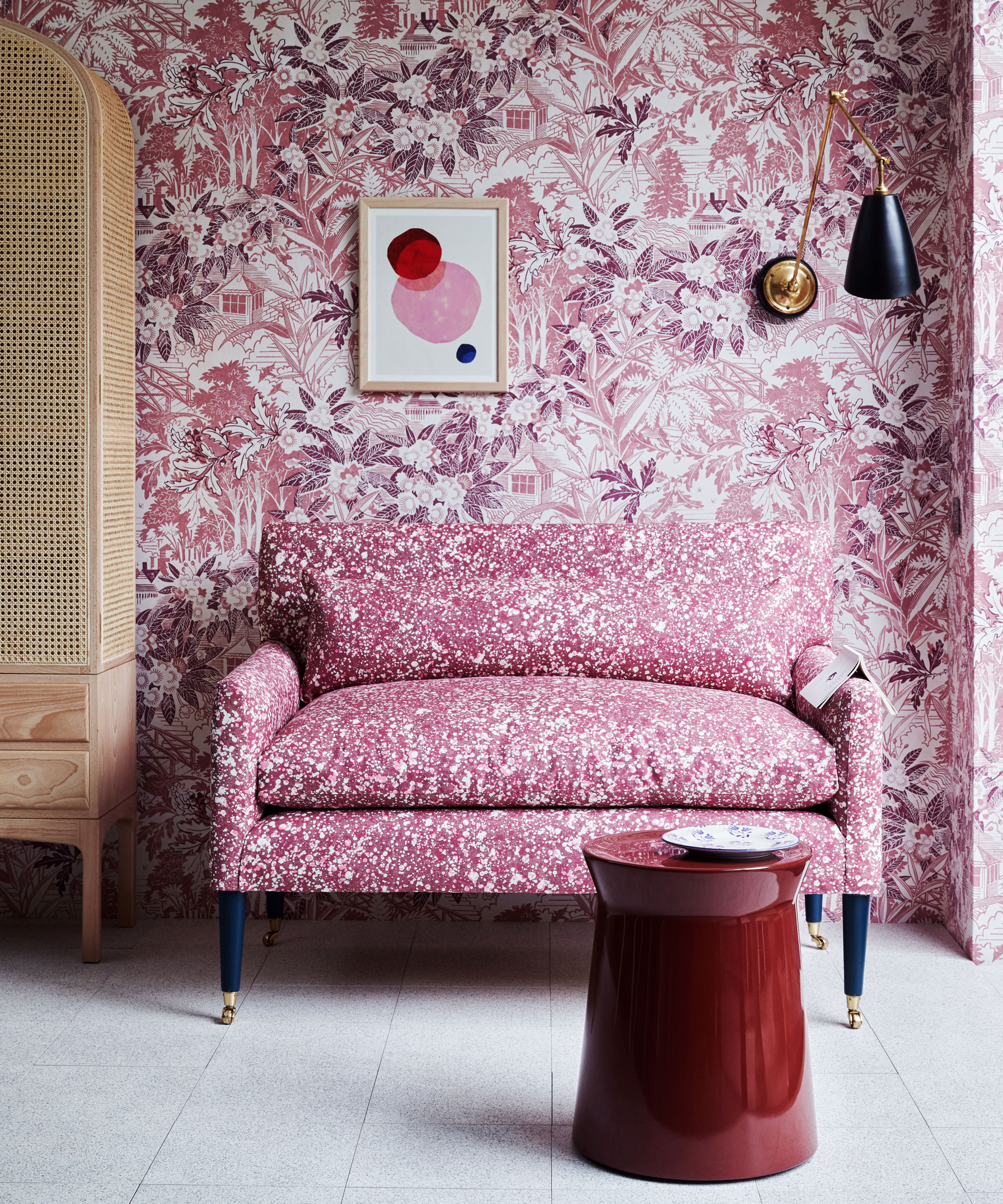
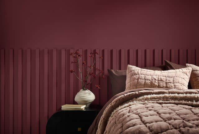
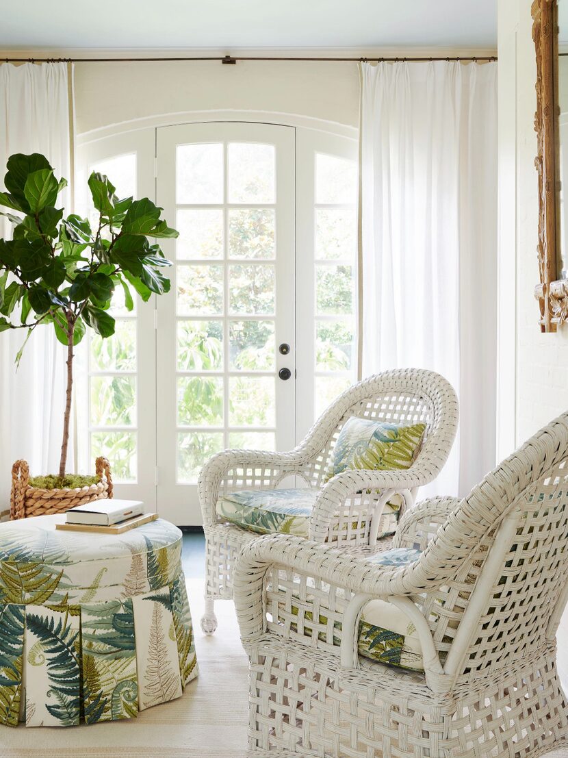
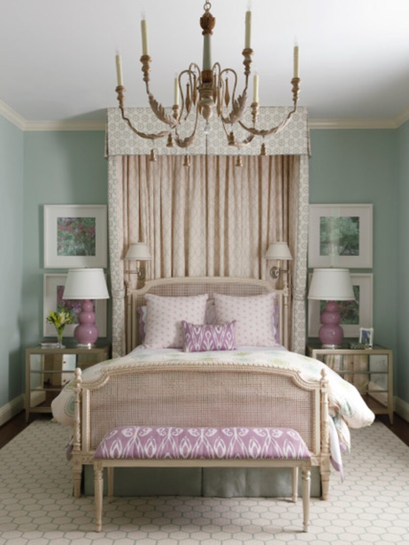
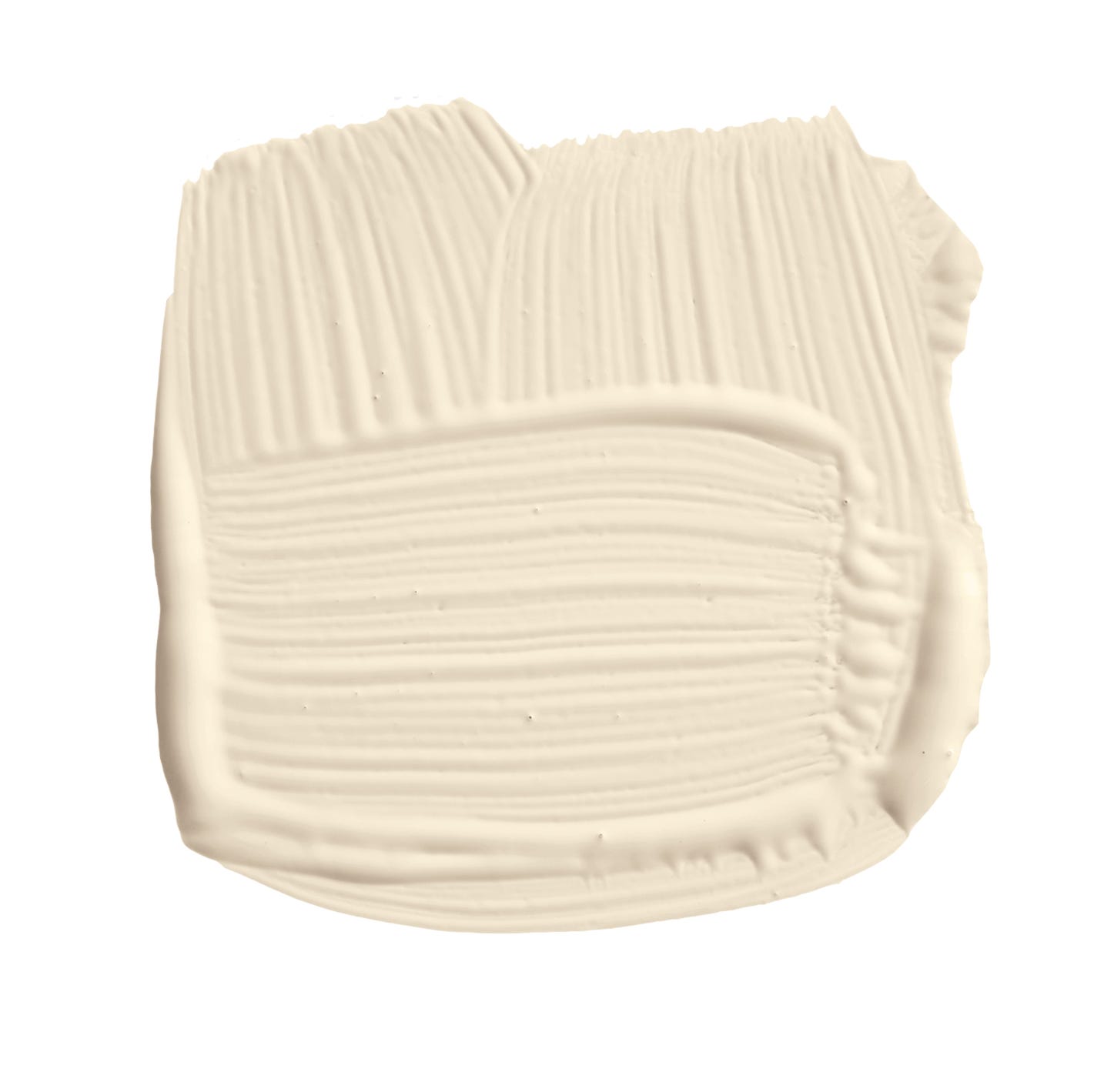
Pochiro further notes that the cool gray neutral base is being replaced by a warmer palette of creams, blues, and greens, accented by striking contrast colors. For those willing to experiment, designer Matthew Williamson proposes a soft plaster pink as a visually appealing alternative. He finds this shade to be a perfect balance of warmth without being overwhelming, offering sophistication and depth that gray often lacks. Williamson describes it as a fresh, interesting new neutral that is still incredibly versatile.
Ultimately, while trends evolve, designers acknowledge the importance of personal preference. Amy McCoy of McCoy Design Studio states that if gray complements the overall aesthetic of a space, she would use it regardless of current trends, emphasizing that a home should reflect the individual's taste and preferences.
#OutdatedPaintColor #InteriorDesignTrends #HomeDecorating #PaintColorChoices #NeutralColors #WarmNeutrals #ColorPsychology #DesignersAdvice #HomeStyling #OutdatedPaintColor #InteriorDesignTrends #HomeDecorating #PaintColorChoices #NeutralColors #WarmNeutrals #ColorPsychology #DesignersAdvice #HomeStyling
0 комментариев всего
 Комментариев пока нет
Вам также может понравиться

4 Outdated Colors Designers say you Should Steer Clear of When Decorating a Living Room


Interior design experts reveal the colour rules you should be breaking
5 Paint Colors That Experts Say You Shouldn't Use in 2025

6 Paint Color Mistakes To Stop Making, According To Designers

These Unusual Paint Colors May Not Be An Obvious Choice, But Designers Can’t Get Enough
Outdated color trends – 5 overdone colors that designers no longer love, and what to use instead

6 Paint Color Mistakes To Stop Making, According To Designers
5 rug colors to avoid – the hues designers think you should veer away from on floors, plus how to make them work

The most timeless paint colors according to designers
5 Paint Color Trends Designers Are Begging You to Leave in 2025

5 colors to avoid painting a landing – and the secret to choosing the right shades

4 Interior Designers Share the Biggest Paint Color Trends Right Now (and What’s Out!)

7 Paint Colors Designers Wish They Never Used (and What You Should Use Instead)

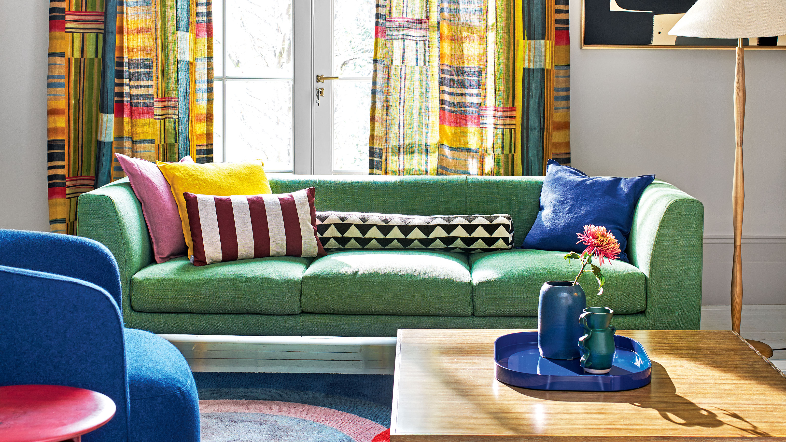
Couch colors to avoid – and what designers are recommending instead
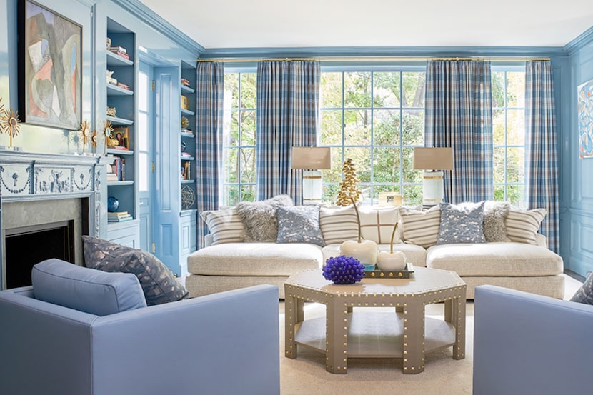
19 go-to paint colors that Dallas designers love
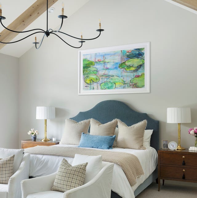
These 20 Paint Colors Will Never Go Out of Style, According to Designers


An A-List Designer’s Secrets To Picking Perfect Paint Colors

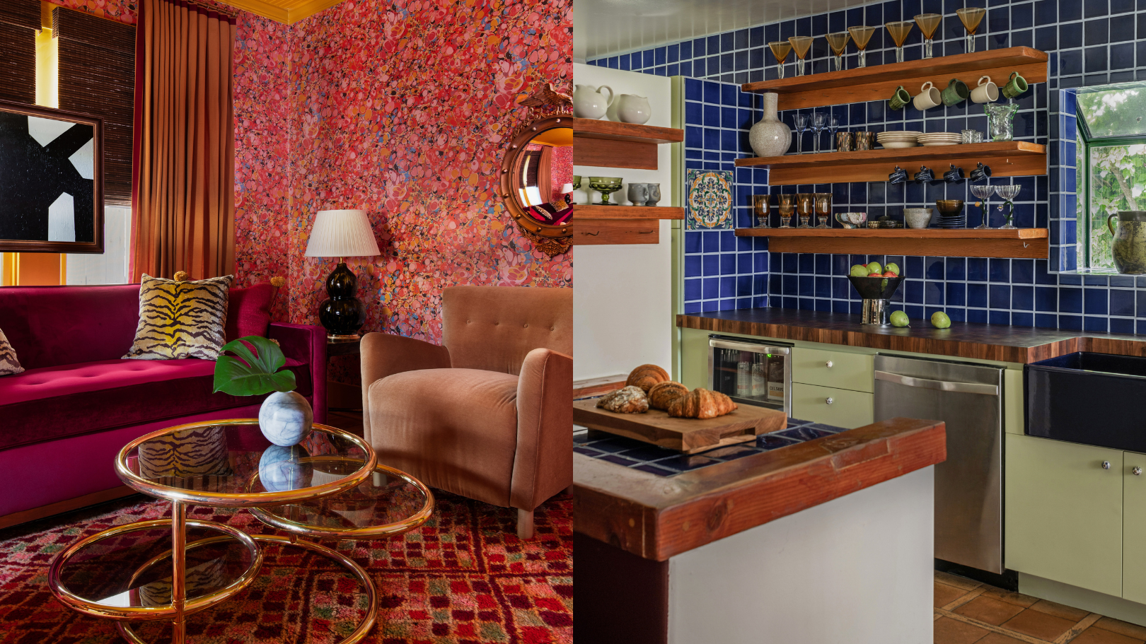
9 'good weird' paint colours approved by designers


5 Timeless Paint Colors That Will NEVER Go Out of Style, According to Designers

5 Underrated Paint Colors Designers Always Use in Their Projects (and You Should Too)