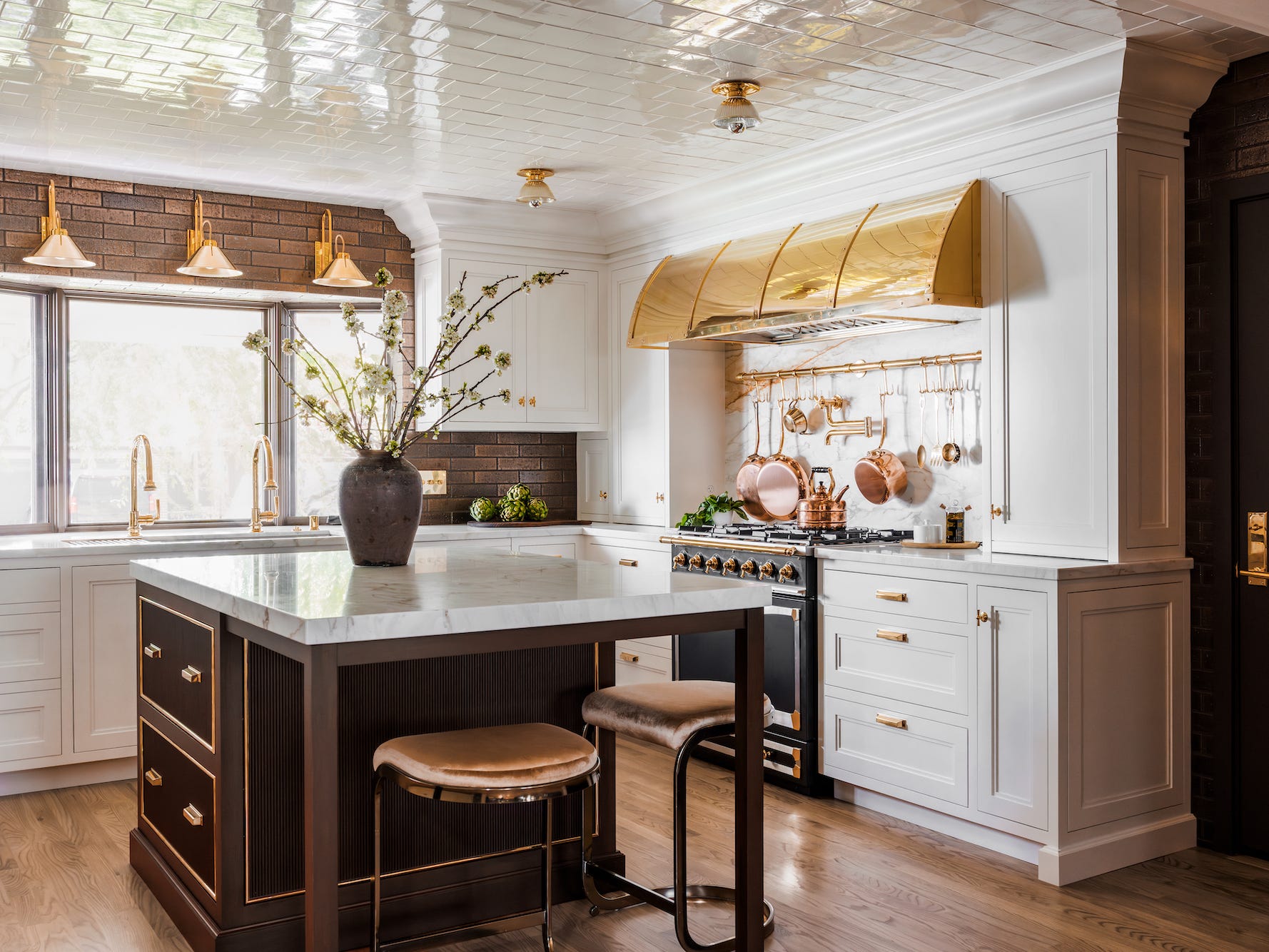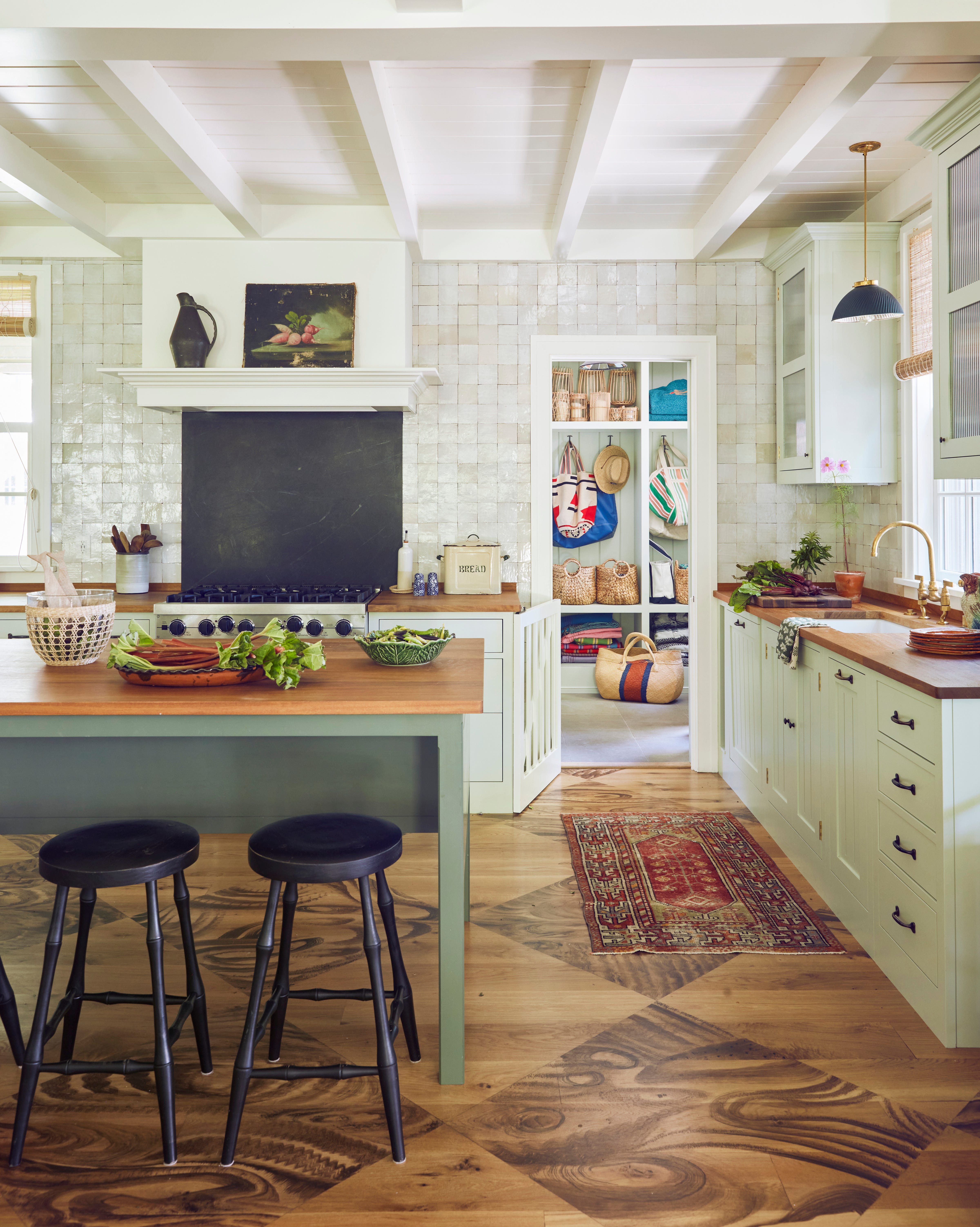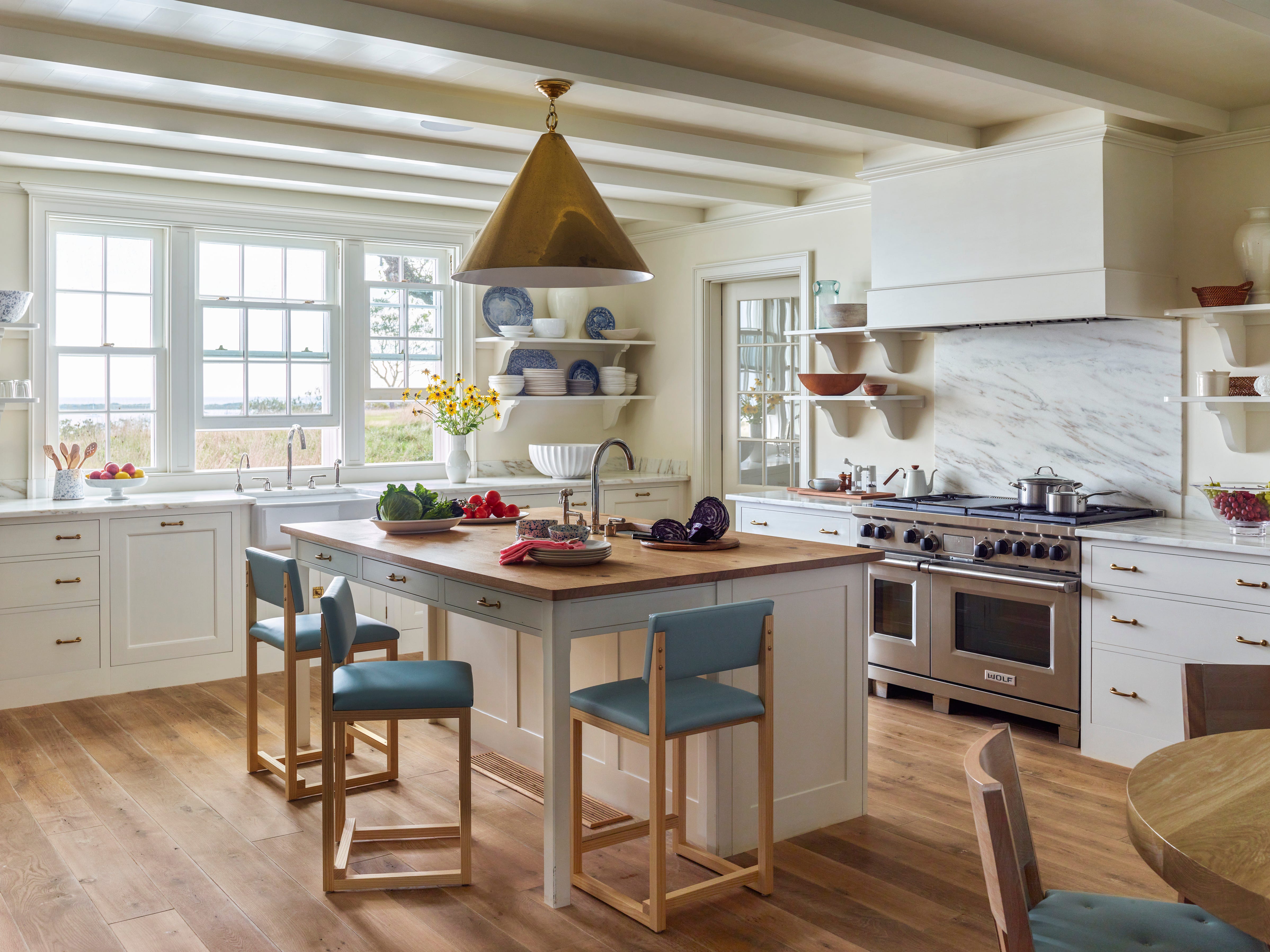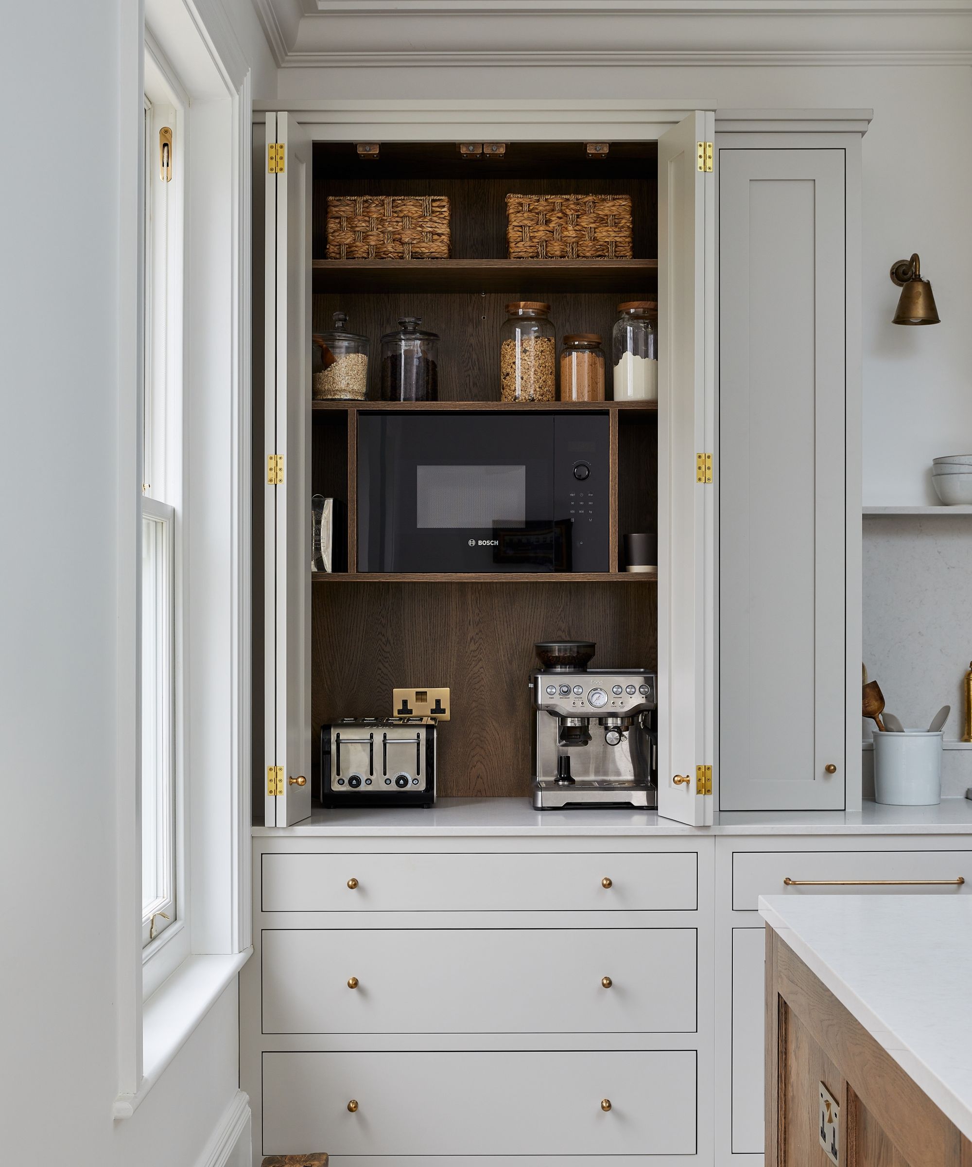
8 Things That Make Your Kitchen Look Tacky, According to Interior Designers
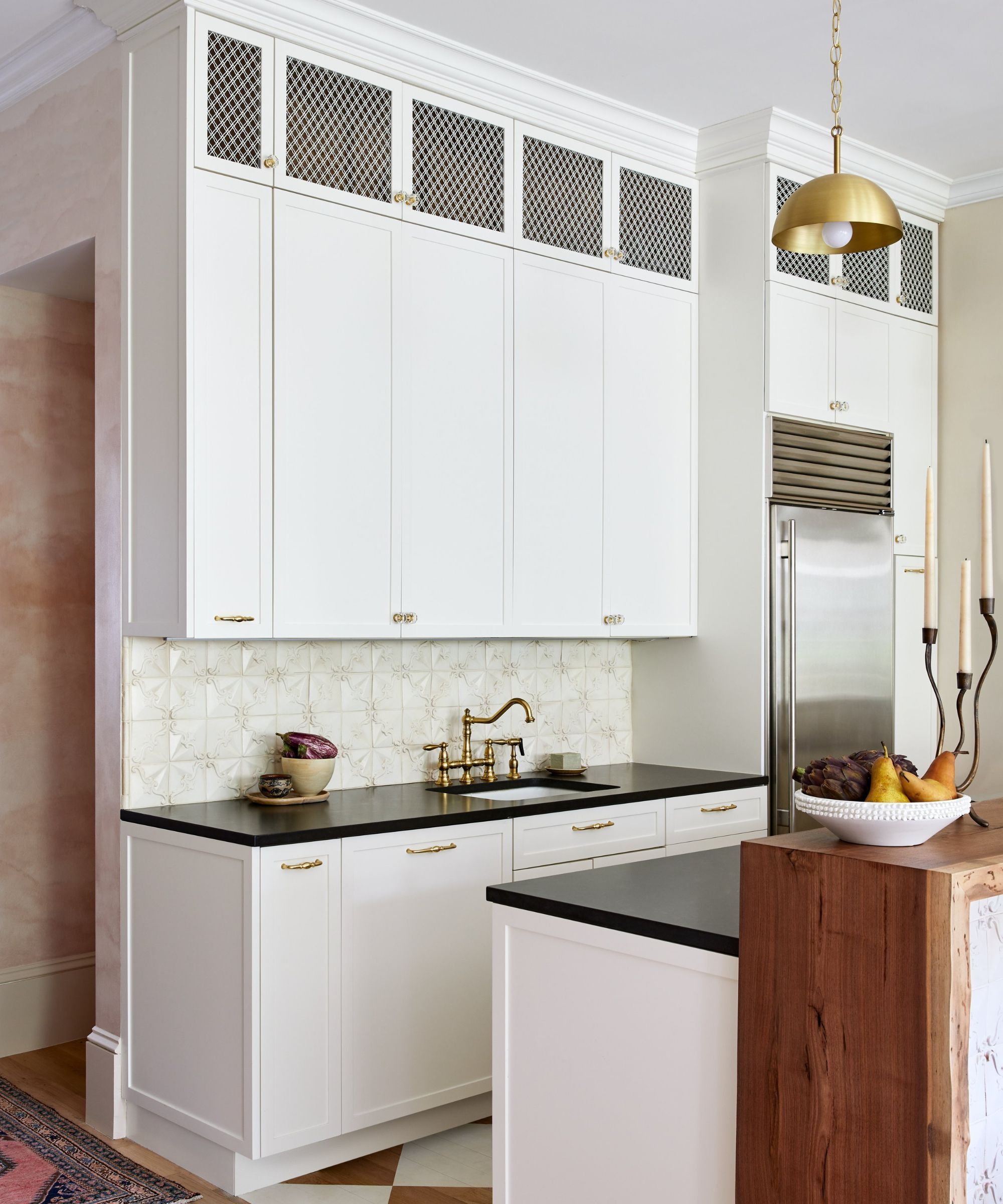
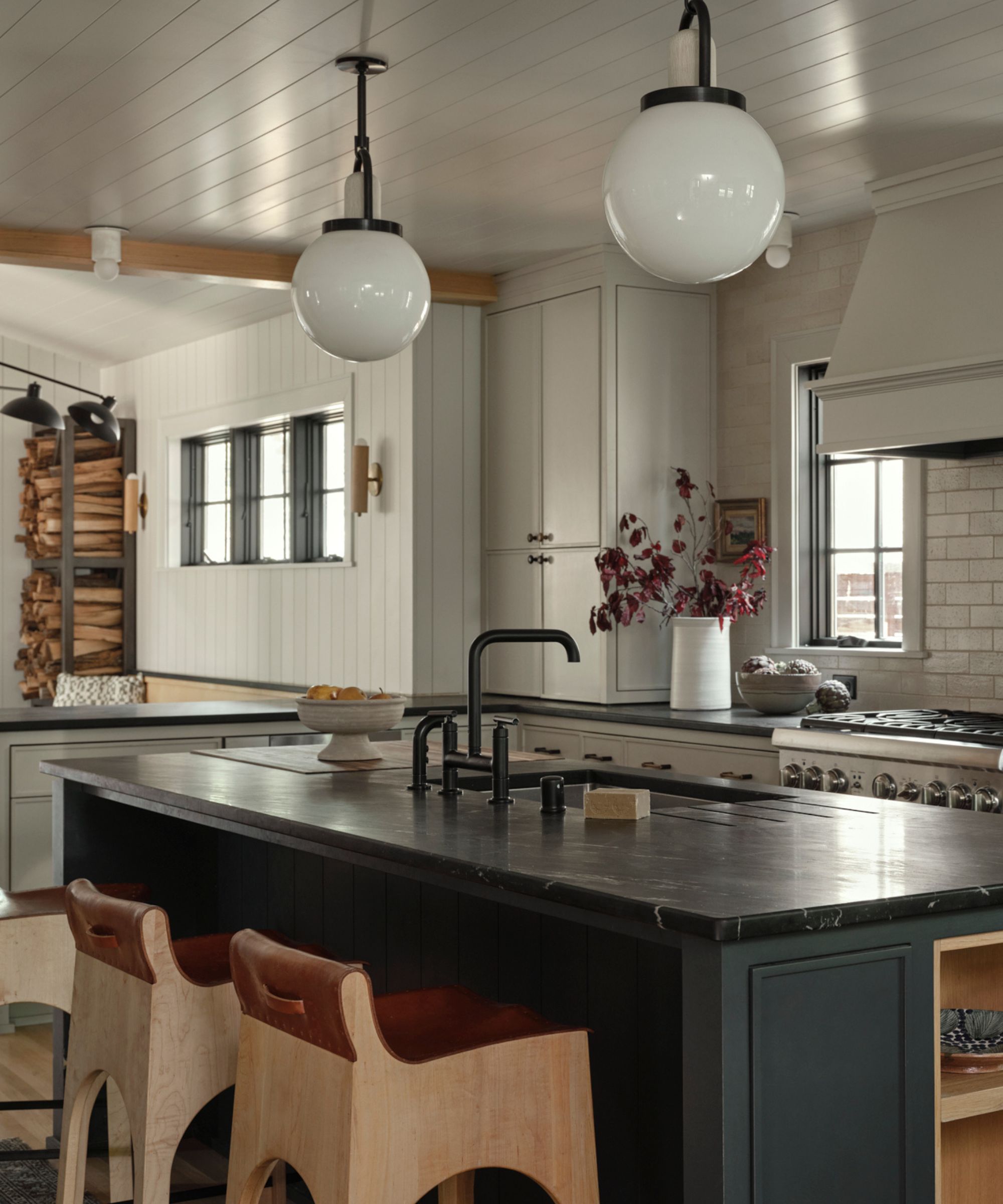
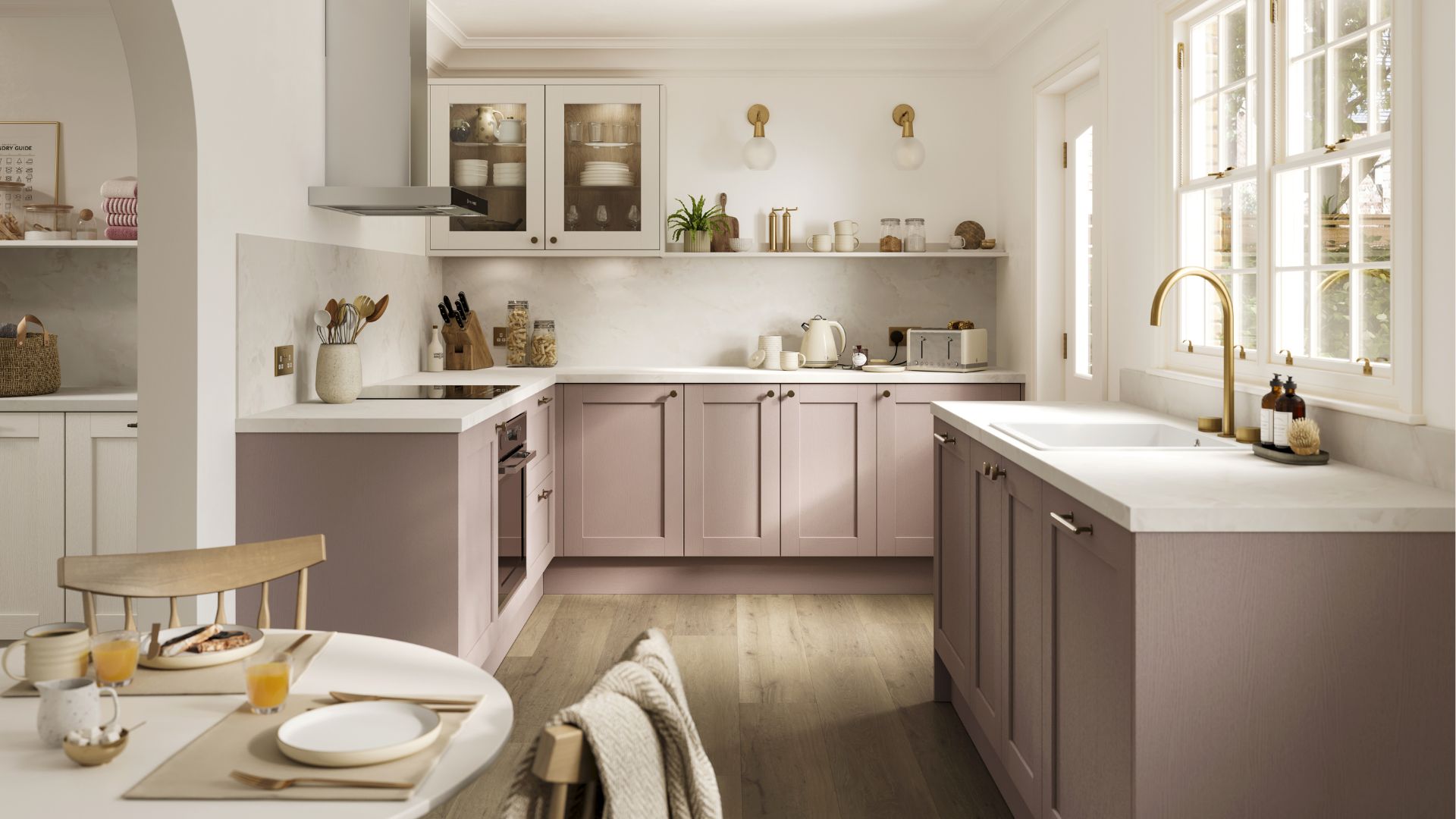
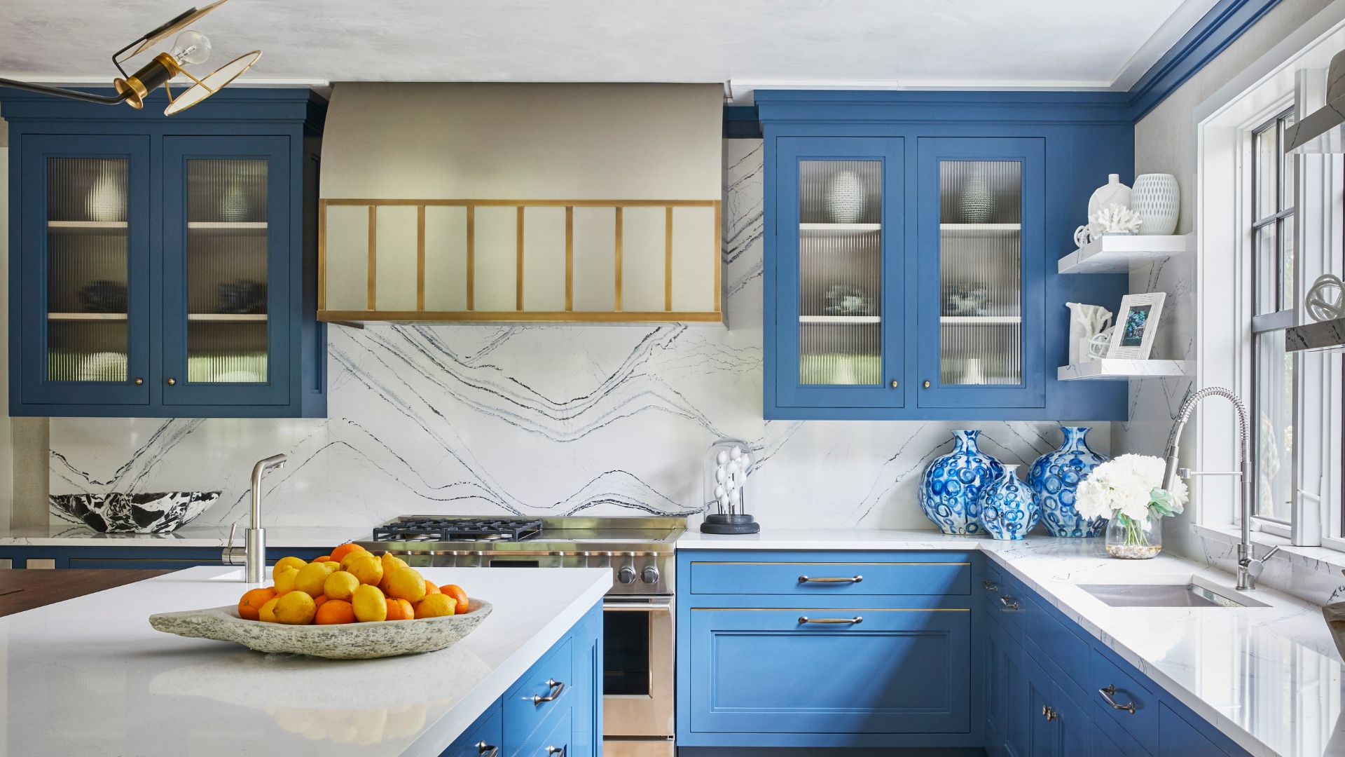
The article addresses common aesthetic pitfalls in kitchen design that can make the space appear tacky or unrefined. Drawing on insights from interior design experts Felipe Freig and etiquette consultant Jo Hayes, it identifies eight specific elements to avoid to create a more elegant and intentional kitchen environment. The kitchen is often viewed as the heart of the home, but without careful consideration of design choices, it can easily fall prey to outdated or overdone trends. The objective is not to dictate personal taste but to offer guidance for those seeking to streamline their kitchen's aesthetic.
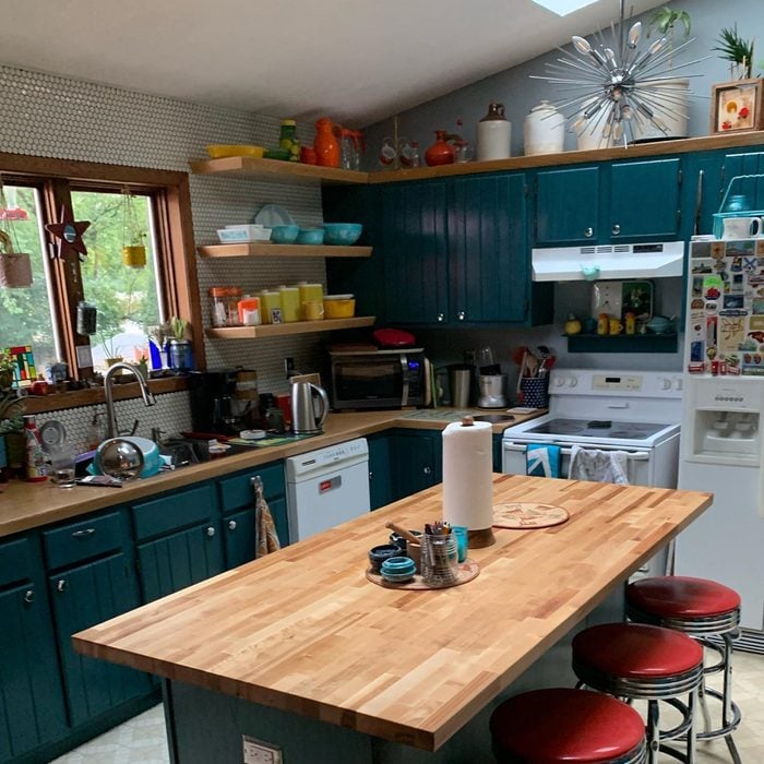
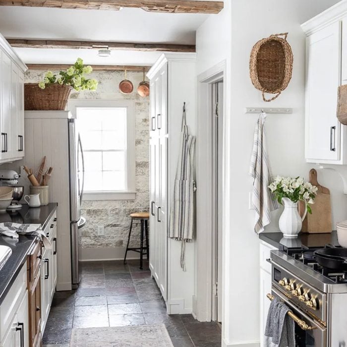
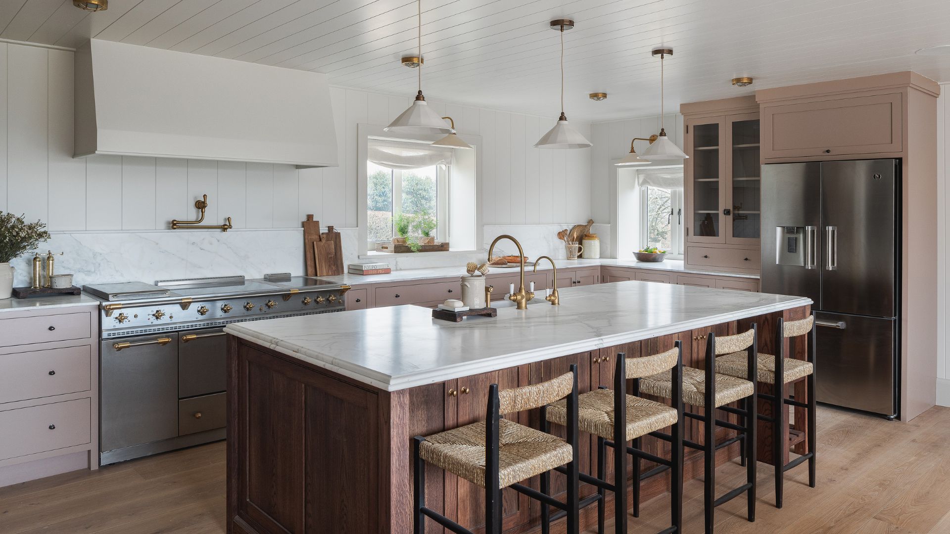
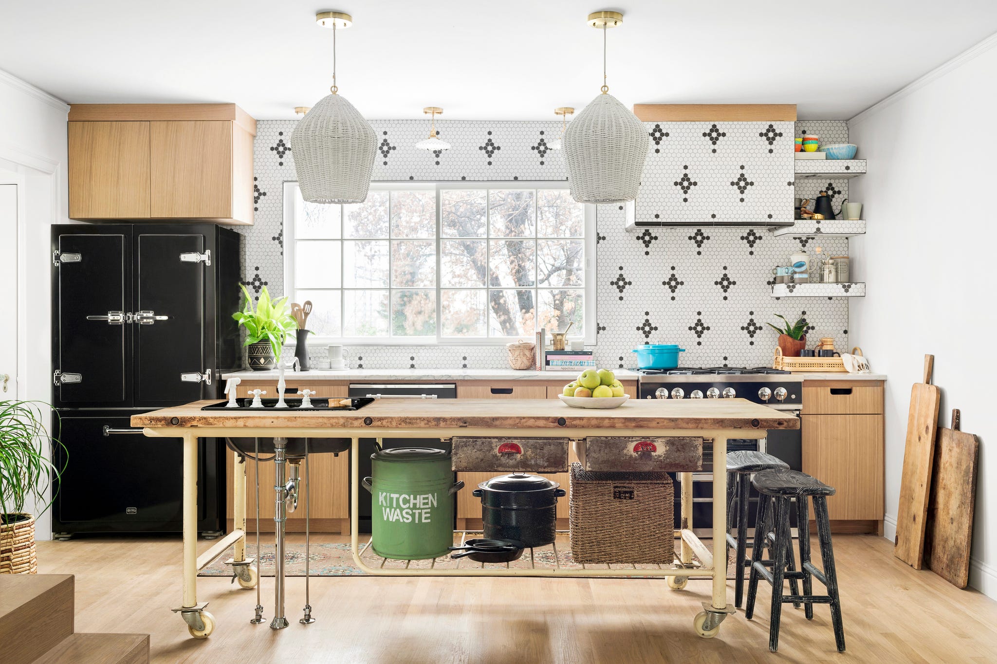
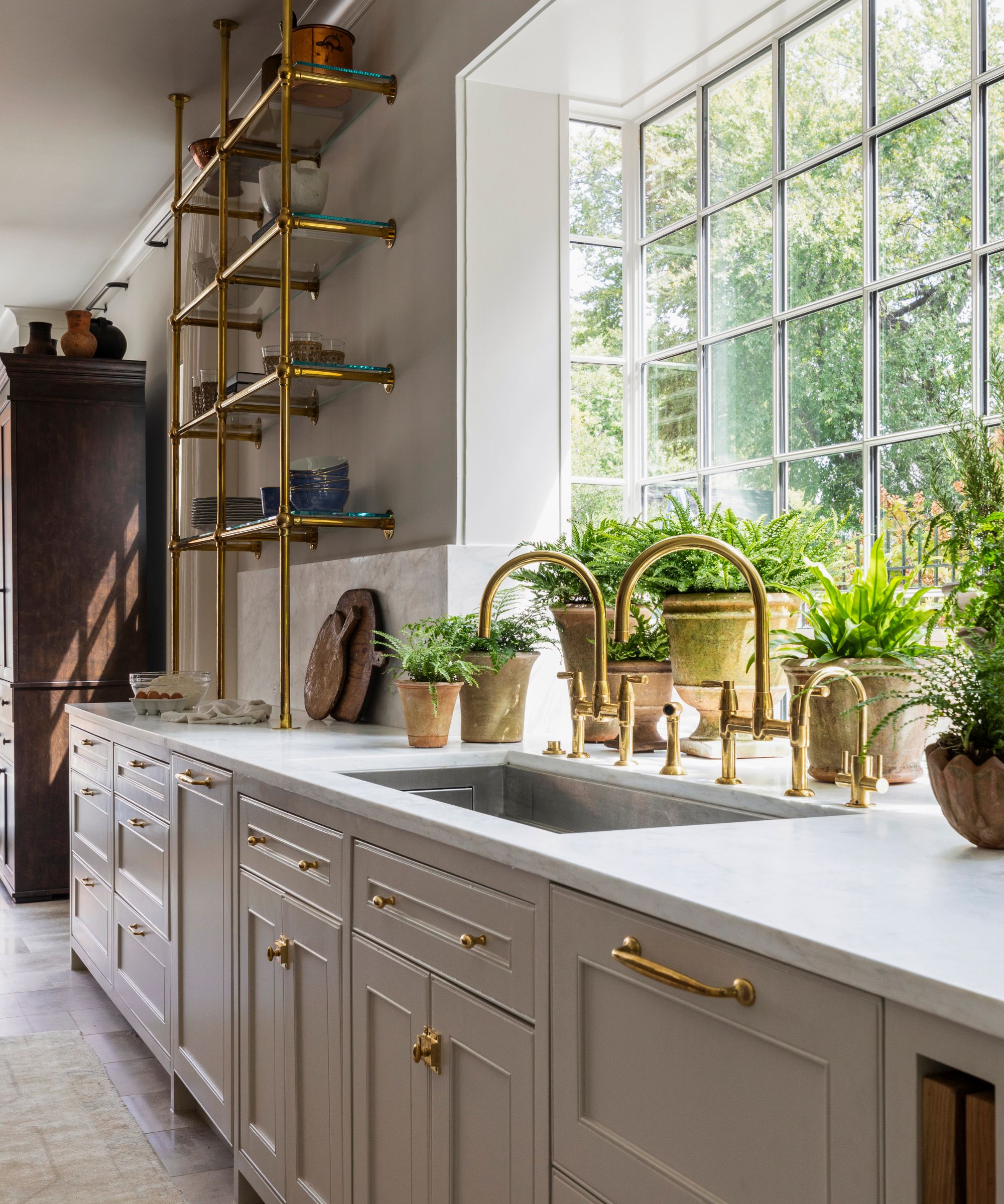
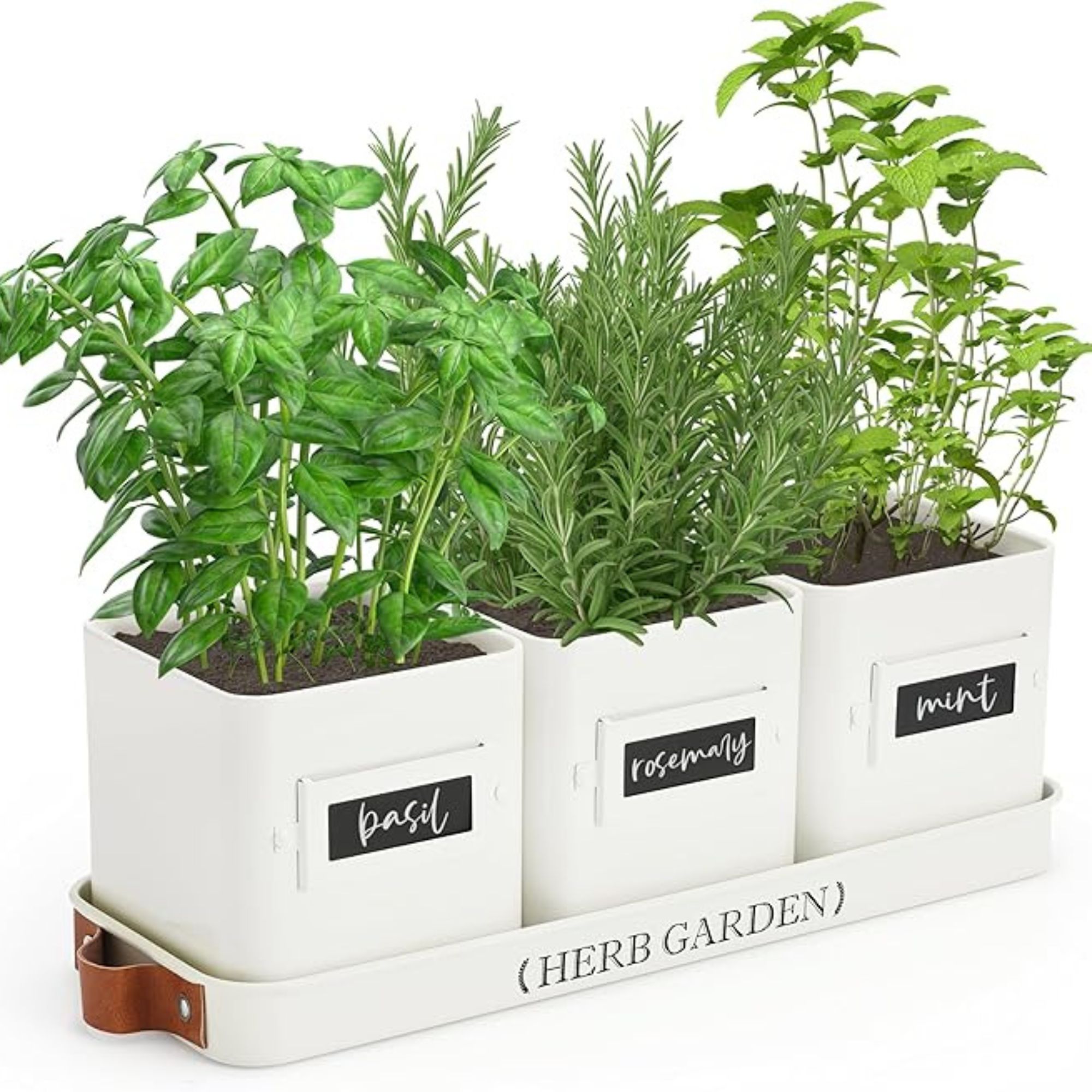
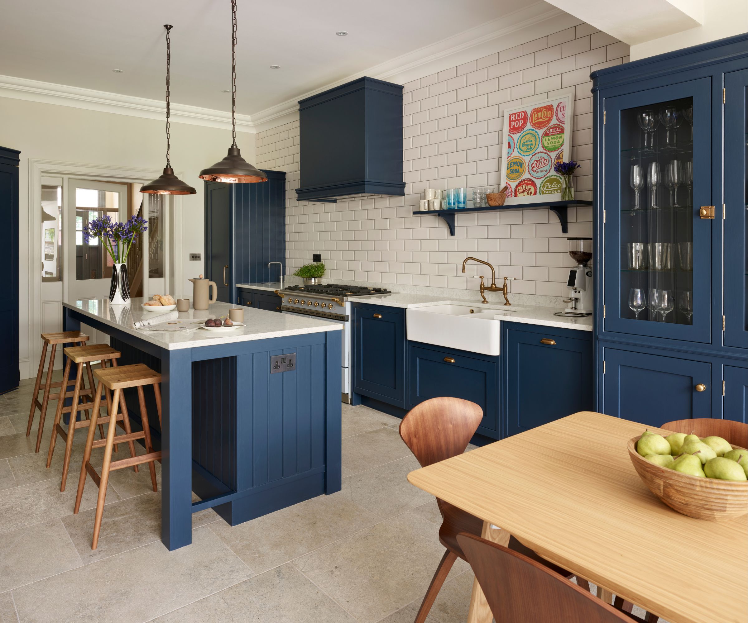
One of the primary recommendations is to replace plastic or folding chairs with more substantial options like wooden stools or cushioned chairs. Flimsy, temporary seating is identified as making a space feel unfinished, whereas robust seating contributes to a more grounded and intentional atmosphere. Another area of concern is the use of artificial decorative elements, such as fake fruit and faux greenery. These items are criticized for rarely being convincing and for attracting dust, suggesting that genuine alternatives like fresh produce or real potted herbs offer superior aesthetic value and authenticity.
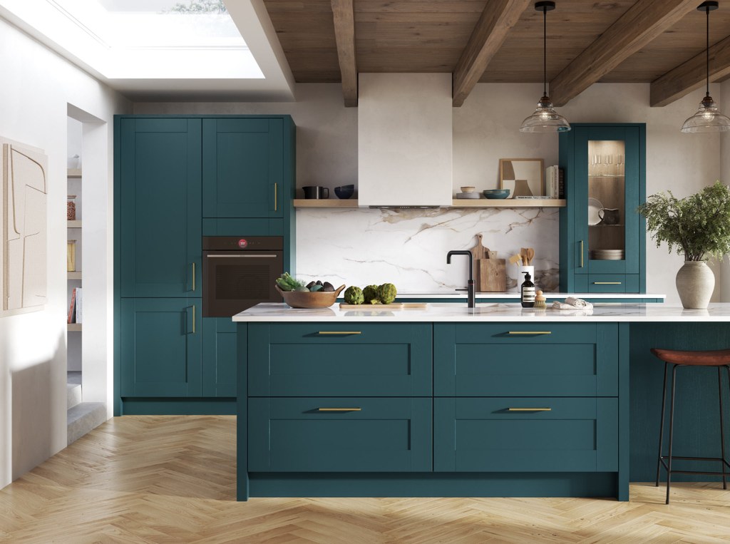
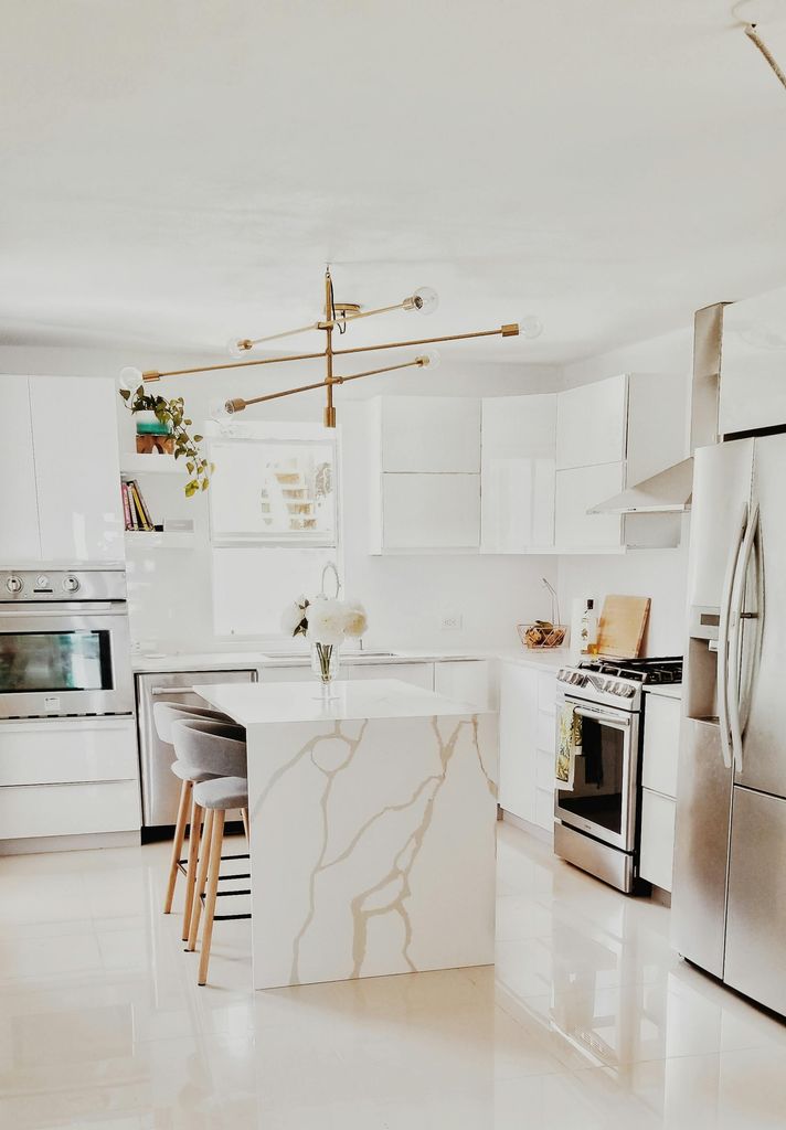
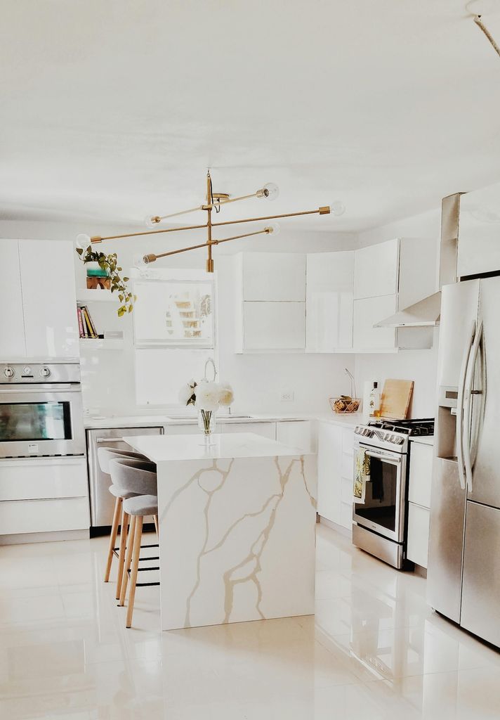
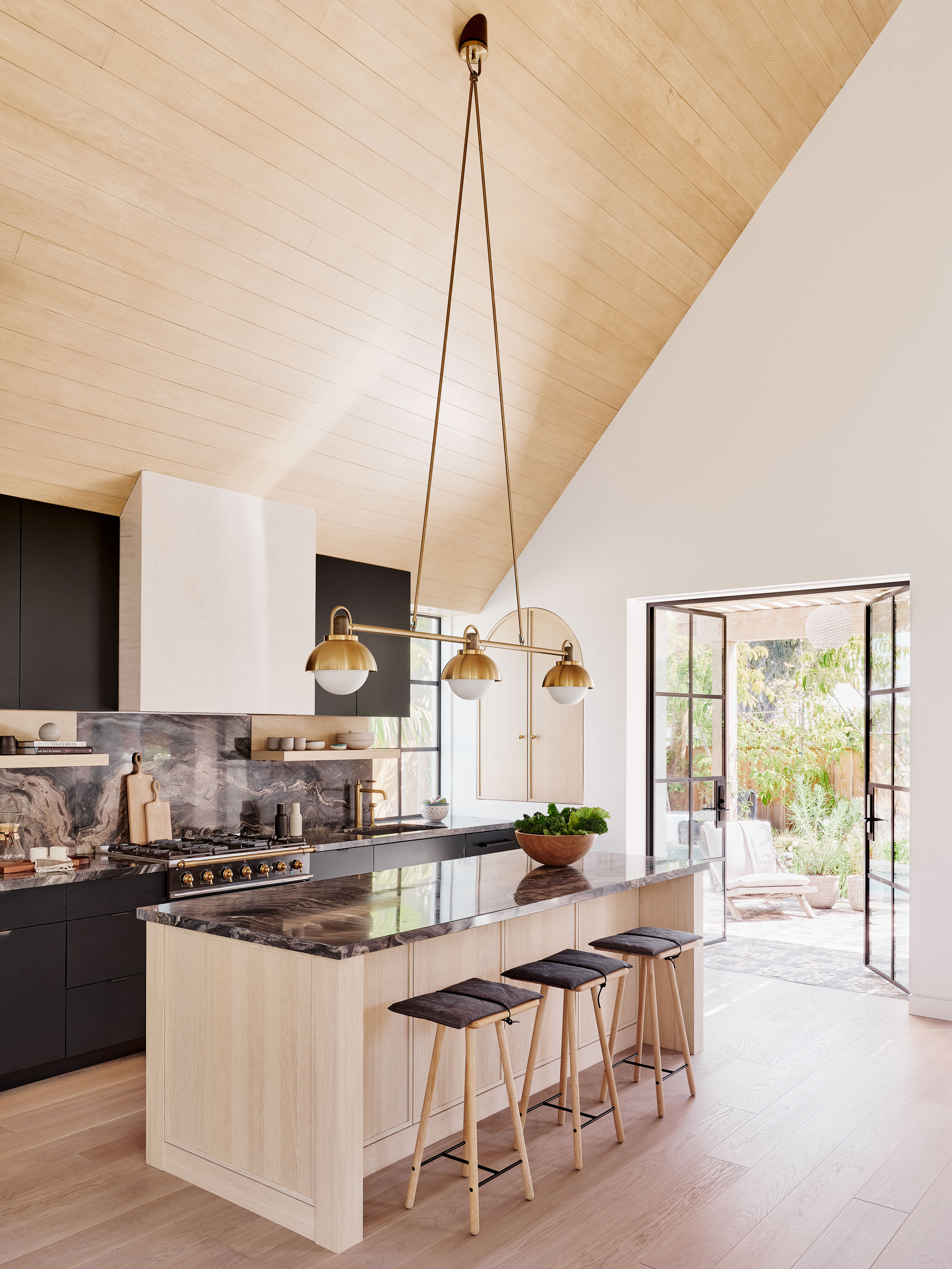
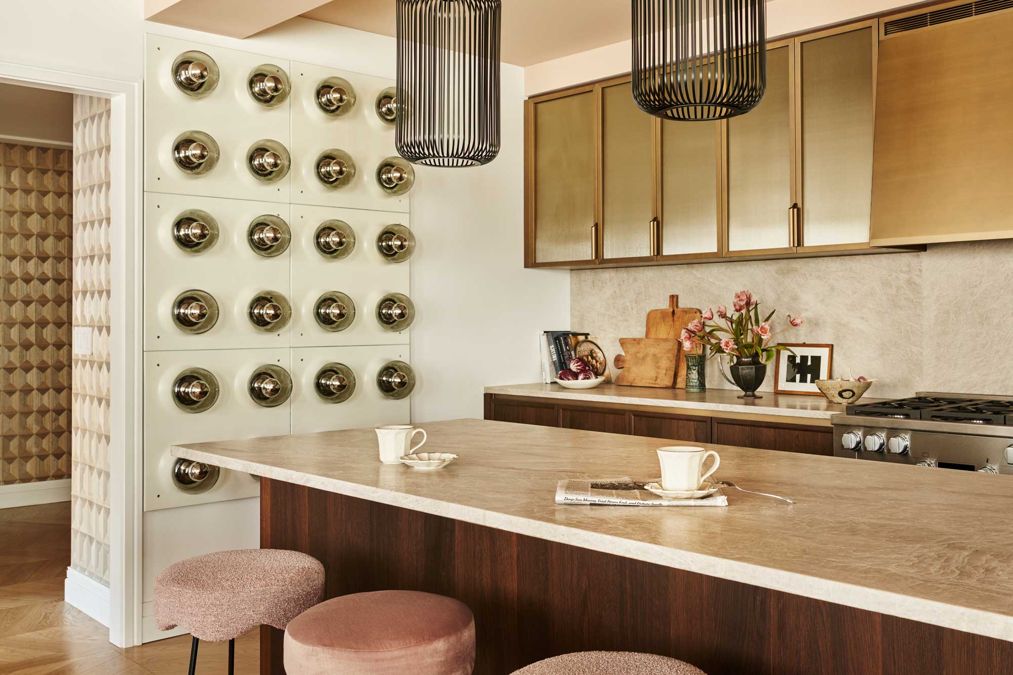
The article also touches upon the re-emergence of televisions in kitchens as part of a '90s decor trend, advising caution. While acknowledging the trend, experts question the necessity of a screen in a space intended for cooking, slowing down, and being present, suggesting that minimizing screen time is generally beneficial. Excessive or flashy lighting, such as overly glamorous chandeliers, is another element to avoid. The emphasis is on lighting that complements the design rather than competing with it, with understated fixtures and warm, diffused light recommended for creating an elevated atmosphere.
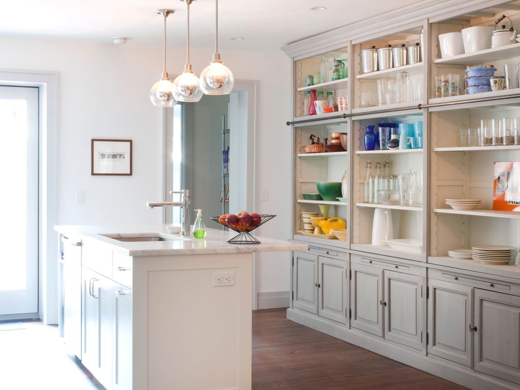
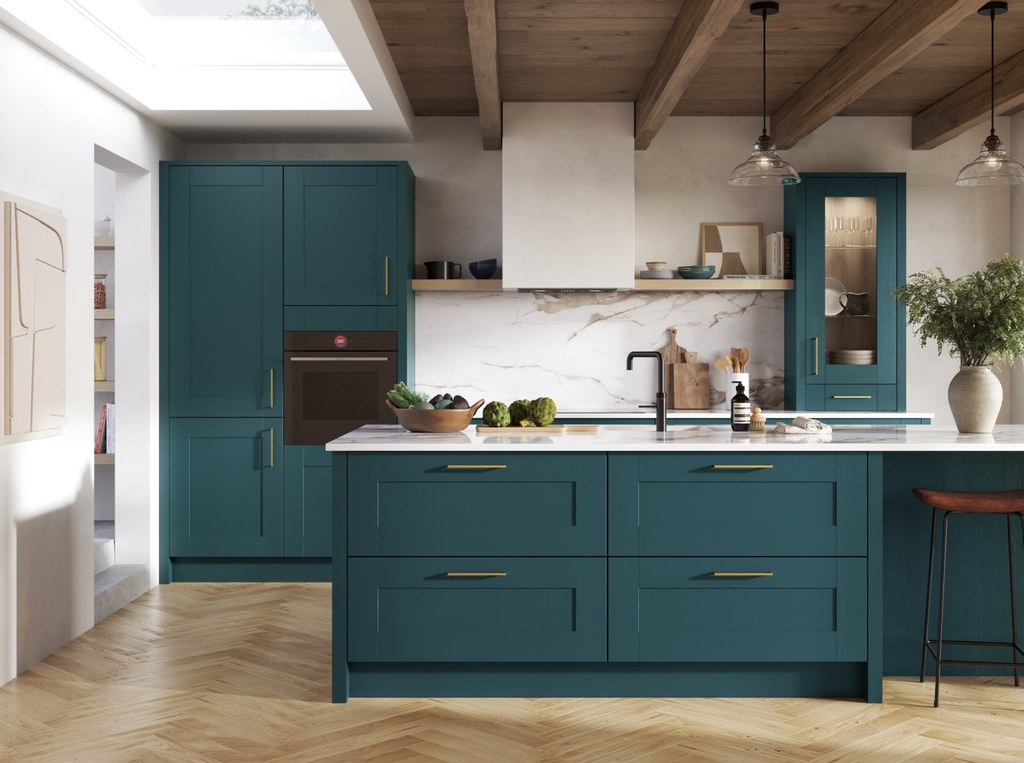
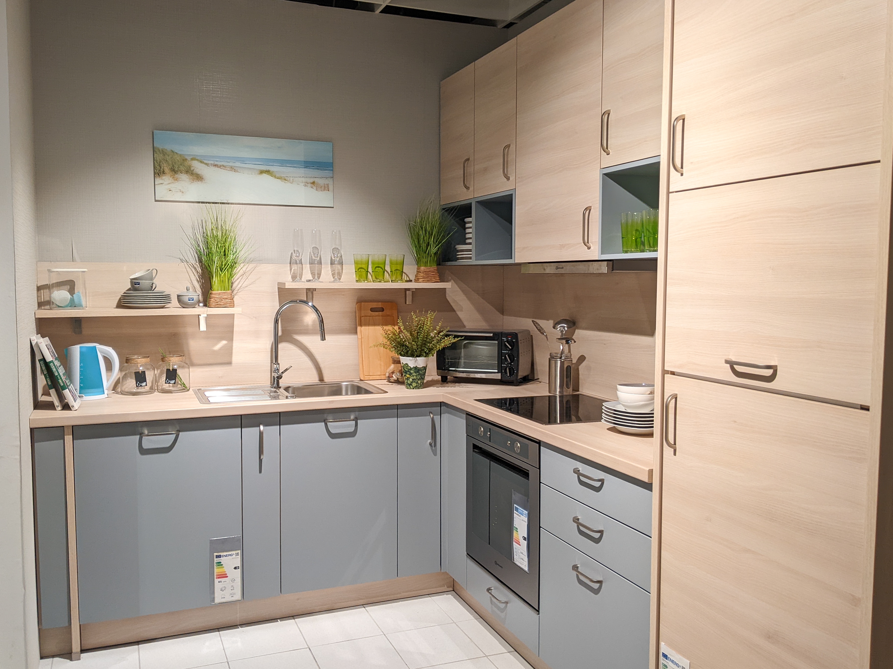
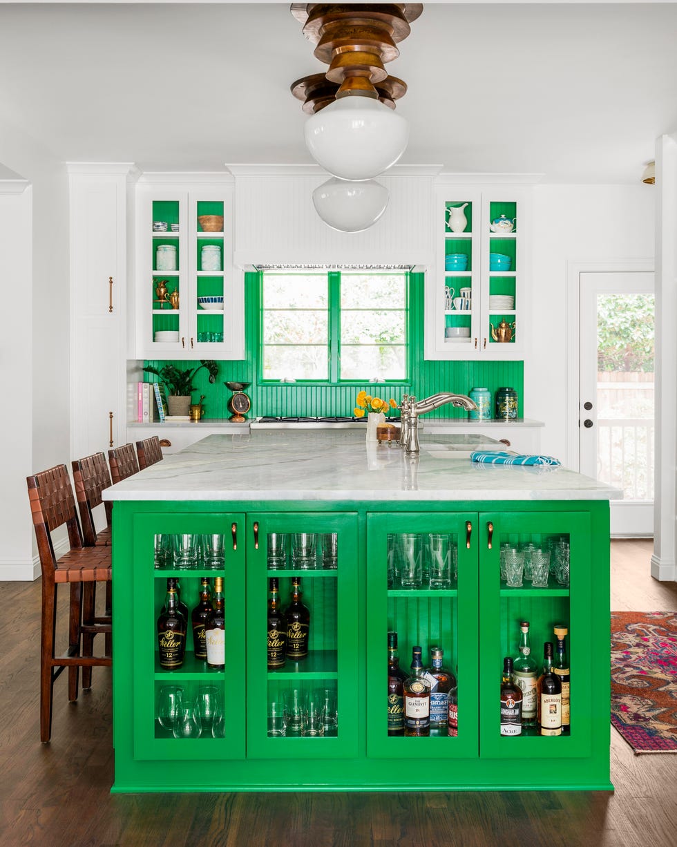
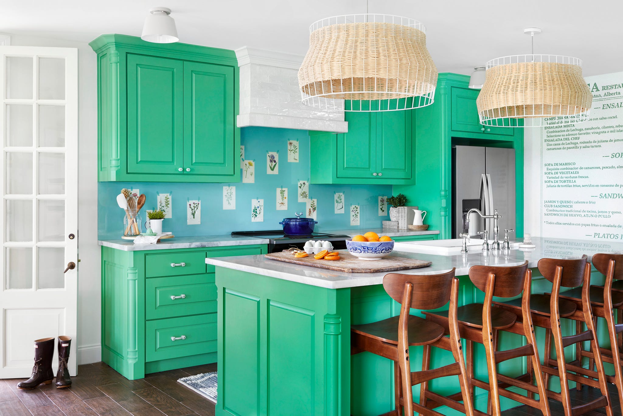
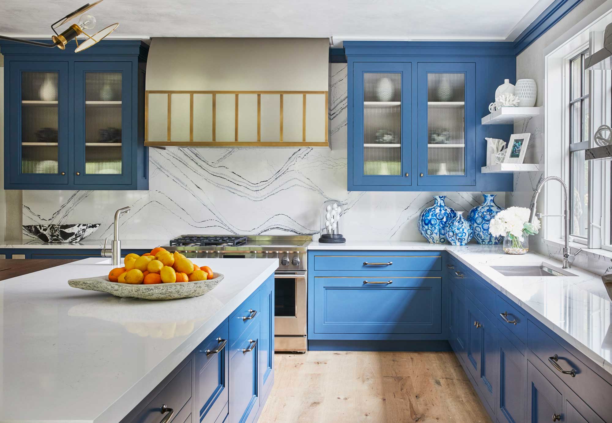
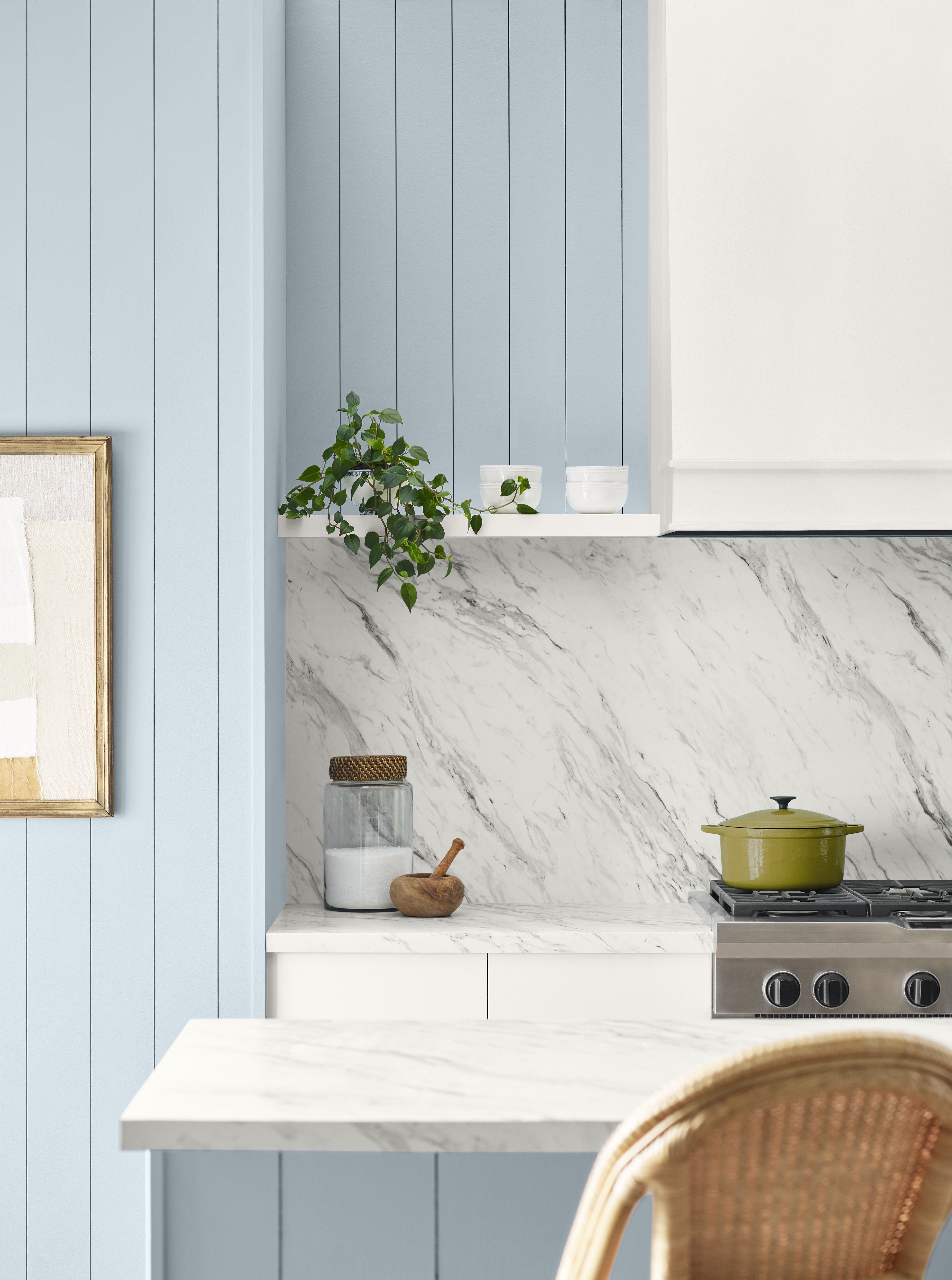
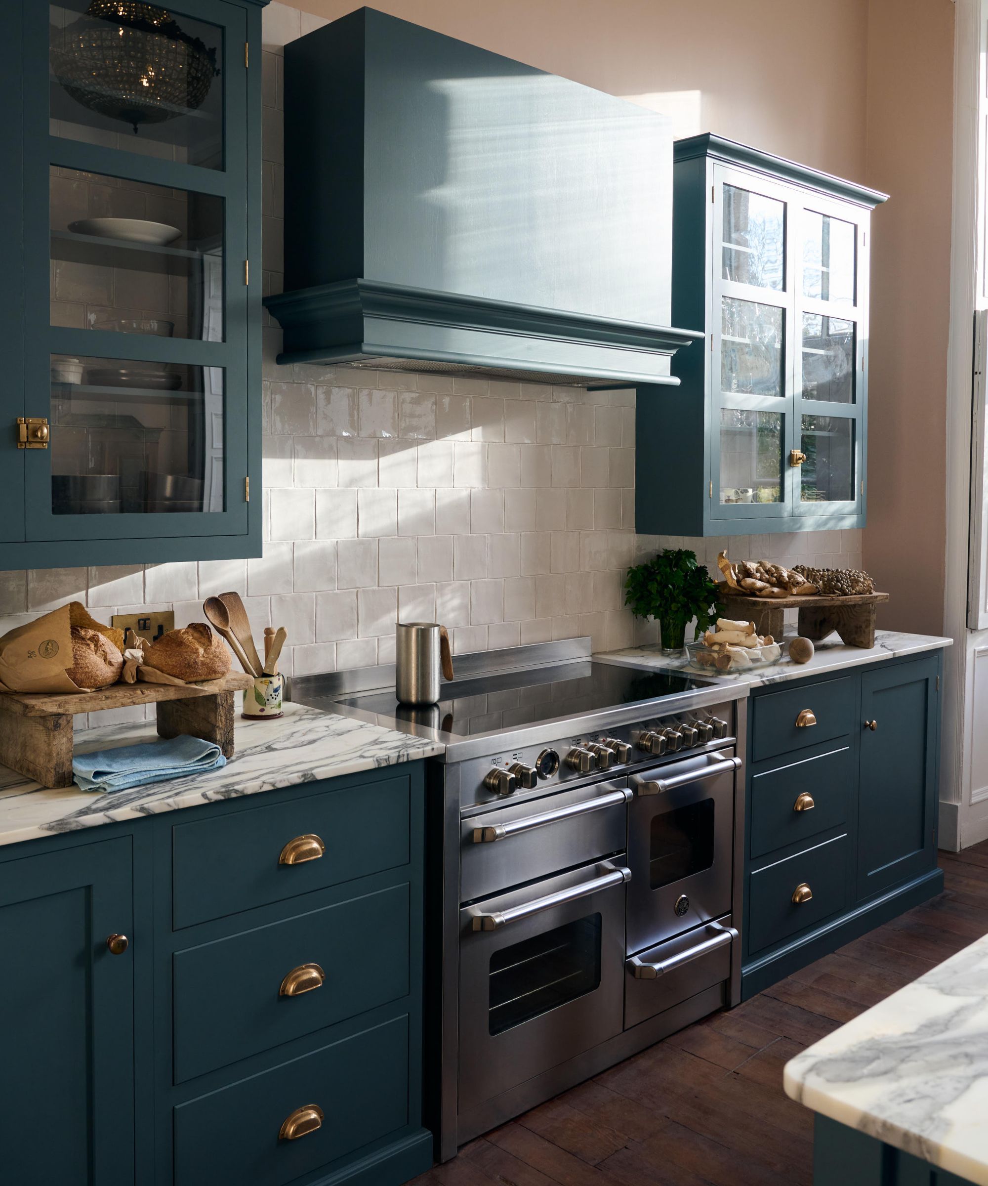
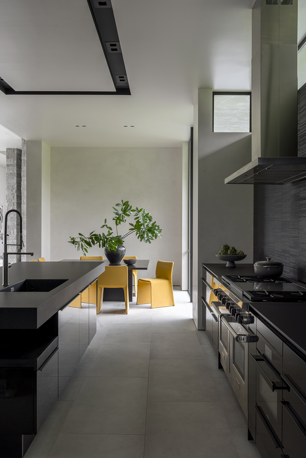
Word art and slogan prints, despite their initial charm, are now considered generic and unstylish. Phrases like 'home sweet home' or 'live, laugh, love' are seen as impersonal. Alternatives proposed include framed photography, minimalist art, or vintage mirrors, which can introduce subtle character and texture to the walls. The use of too many competing colors is also highlighted as a design mistake, as it can create visual distraction. The advice is to adhere to a cohesive palette, ideally limiting it to three main colors, and to use variations in texture, material, and finish to add depth. Neutral tones are suggested for a more timeless appeal.
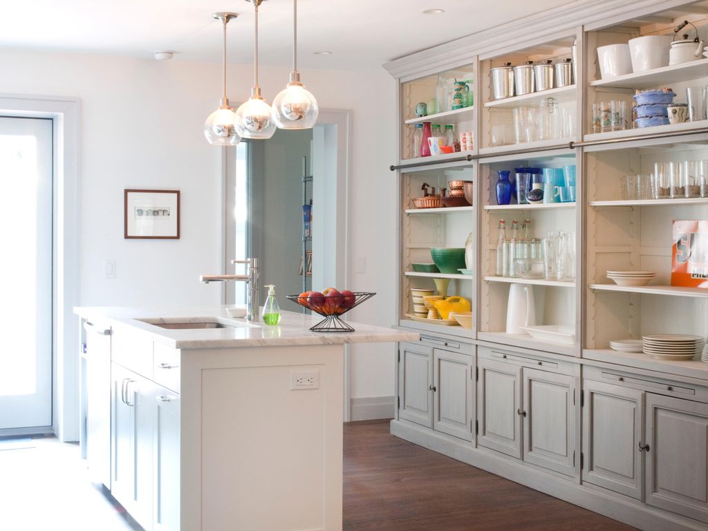
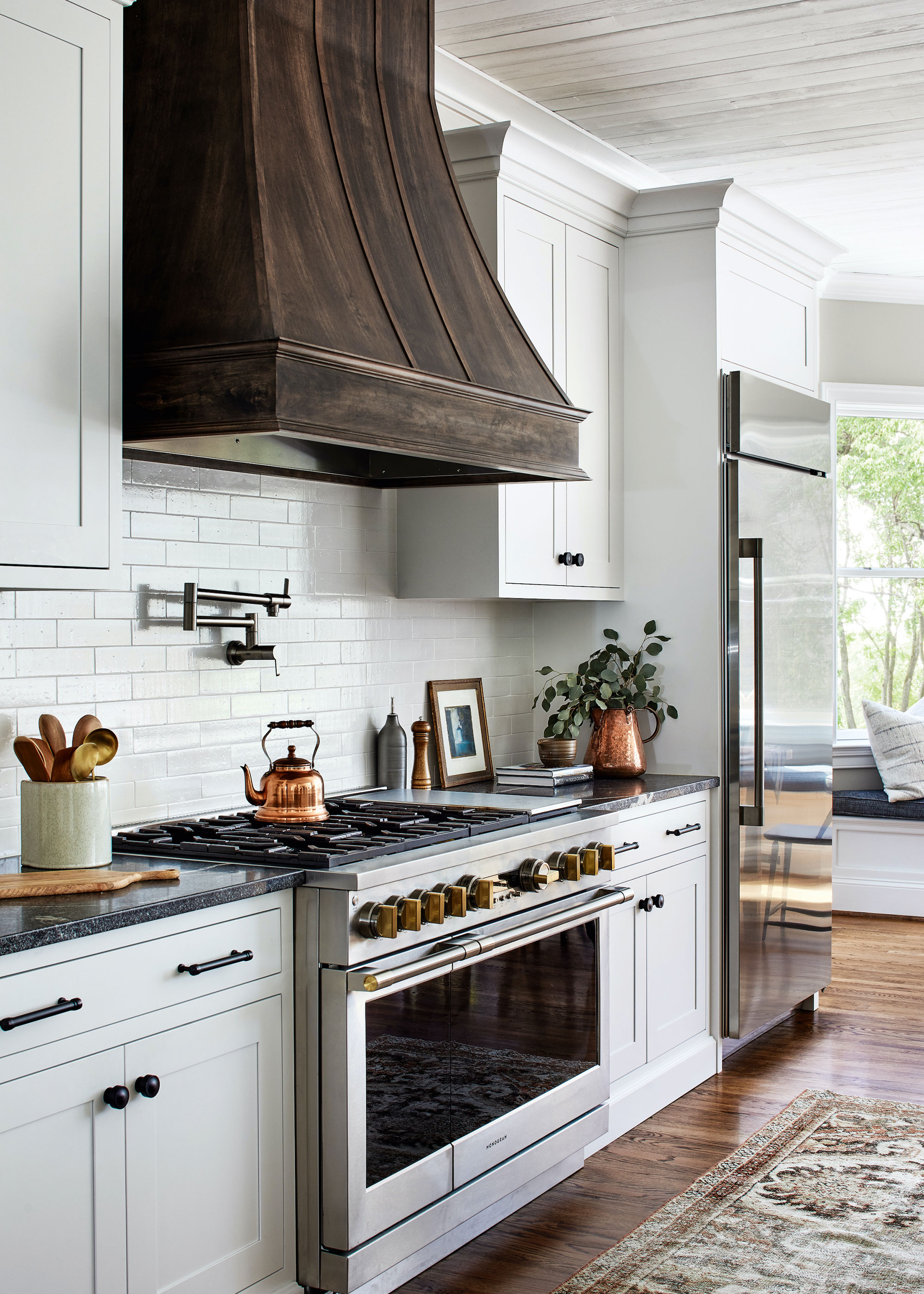
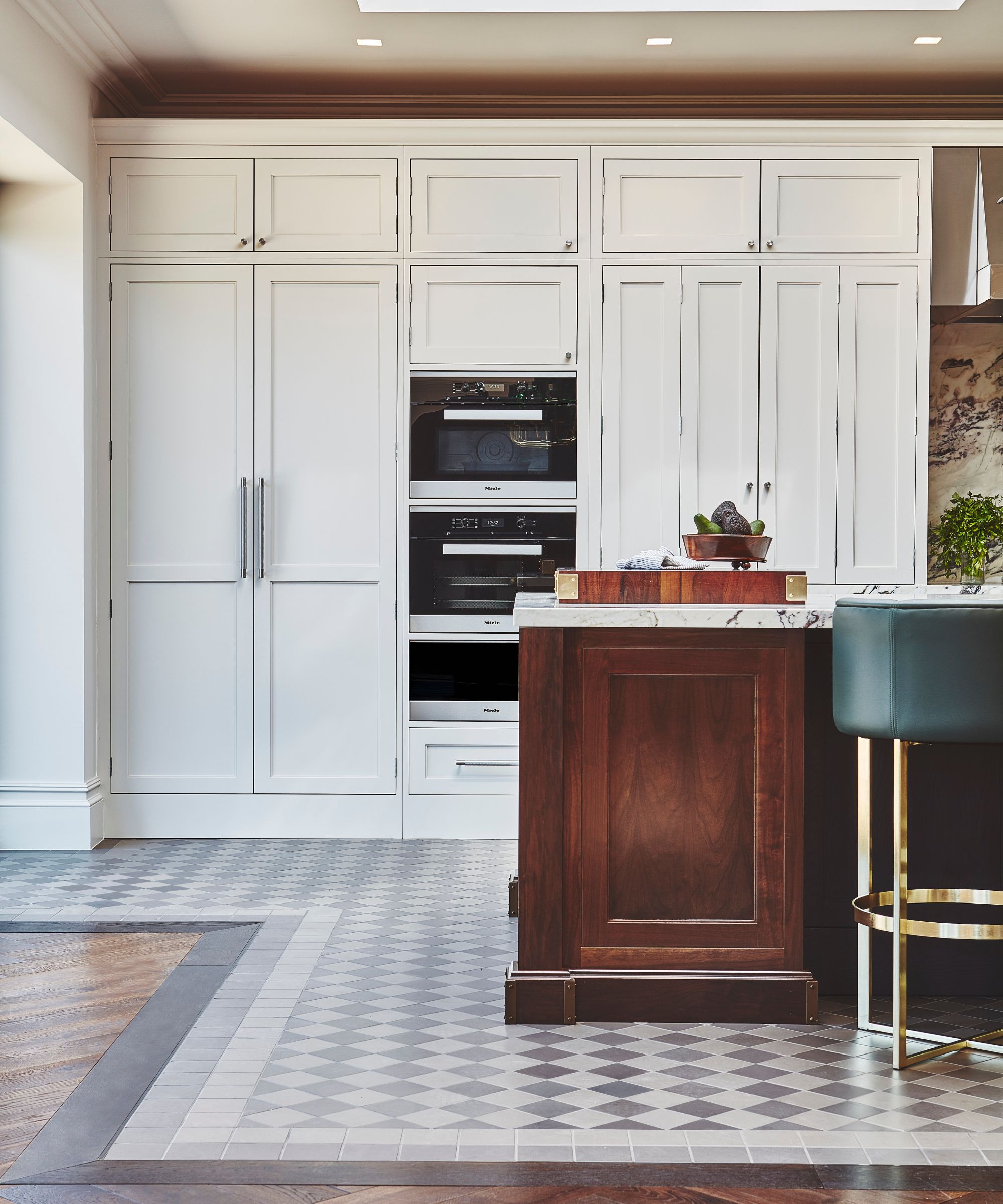
Clutter is identified as a significant contributor to a chaotic kitchen environment. This includes excessive stacks of cookbooks and abundant countertop décor. The experts advocate for editing possessions, emphasizing that the most beautiful kitchens are those where each object has room to breathe. A clear counter is presented as not only elegant but also more practical for daily use. Finally, busy refrigerator doors, adorned with coupons, magnets, and postcards, are deemed distracting. A clean fridge door is described as an easy and free upgrade, with suggestions to move personal touches to a corkboard or inside a pantry door to maintain a cleaner aesthetic.
#KitchenDecor #InteriorDesign #HomeImprovement #DesignTips #HomeStyling #KitchenRenovation #HomeAesthetics #KitchenDecor #InteriorDesign #HomeImprovement #DesignTips #HomeStyling #KitchenRenovation #HomeAesthetics
0 comment in total
 No comments yet
You may also like
8 Kitchen Design Ideas

5 Ways to Make Your Kitchen Look Instantly More Expensive, According to Designers

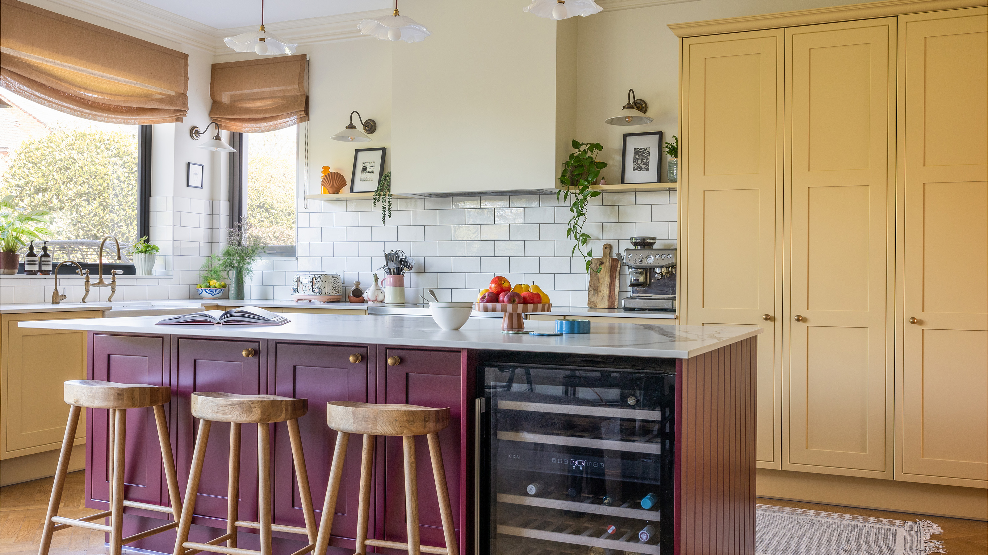
Designers all agree that these 7 kitchen features are always eyesores – and what you should do about them
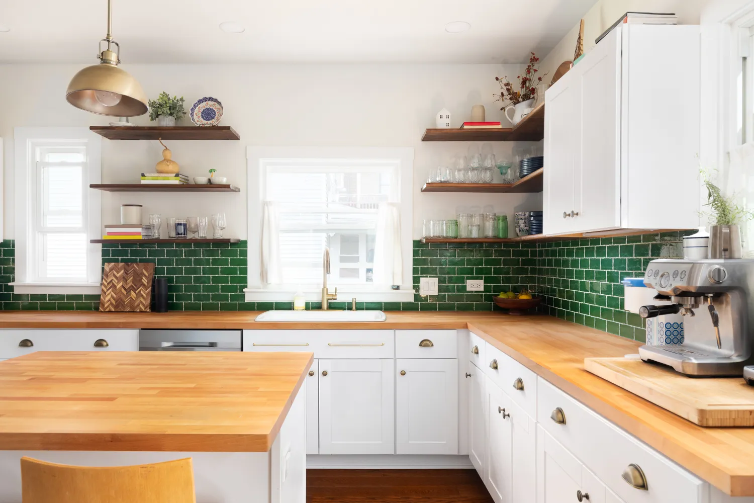
5 Tacky Kitchen "Upgrades" That Instantly Make a Home Look Bad, According to Designers

8 shockingly common kitchen design mistakes according to a pro

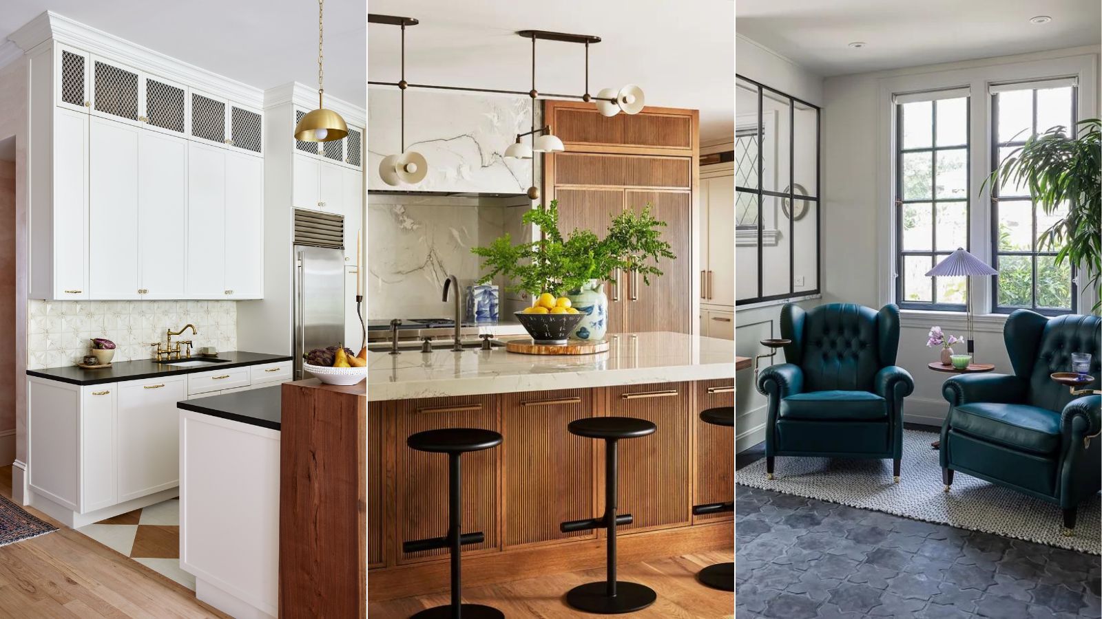
10 things every kitchen needs, according to interior designers

6 Sneaky Things That Are Making Your Kitchen Look Cluttered
7 underrated kitchen features that are sure to make your life easier, according to interior designers
8 shockingly common kitchen design mistakes according to a pro

8 Secrets That Will Make Your Kitchen Look Expensive, According to Designers

These are the kitchen trends designers say will elevate your design
5 kitchen hardware mistakes interior designers say homeowners always make, and how to fix them
7 Common Kitchen Features That Actually Give Designers the "Ick"
6 design rules worth breaking for a more characterful kitchen

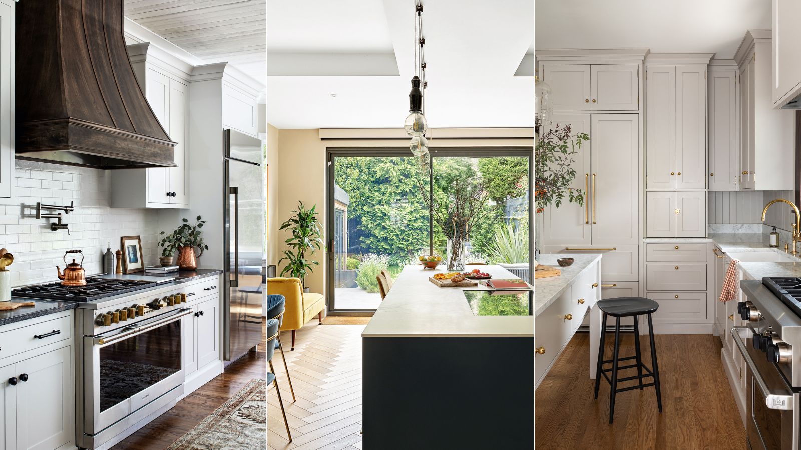
Outdated kitchen trends – 5 overdone looks that designers like to avoid, and here's why you should too
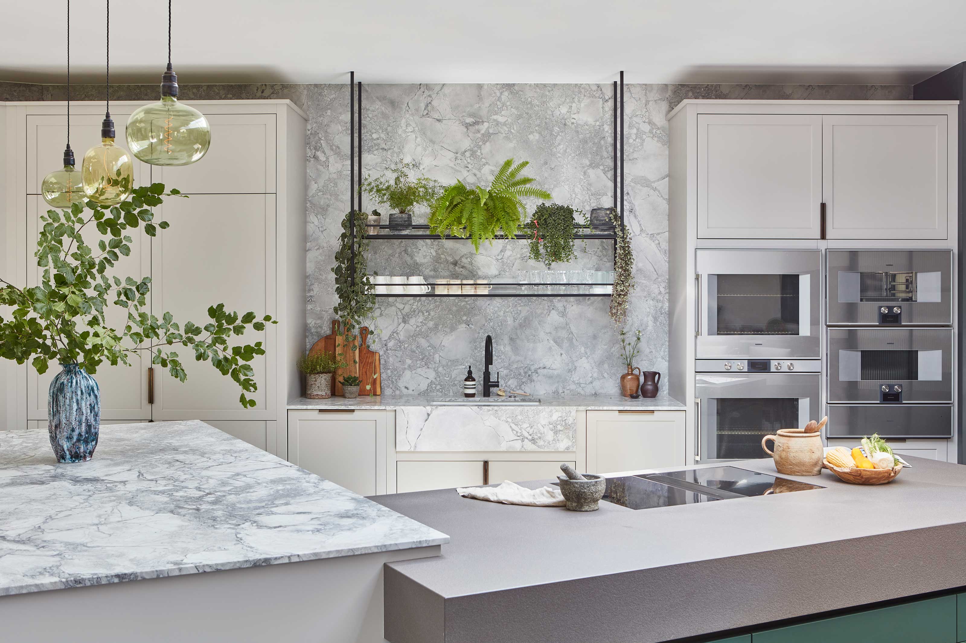
8 hacks the best designers use to make a kitchen more ergonomic – from the right layout to raising your appliances

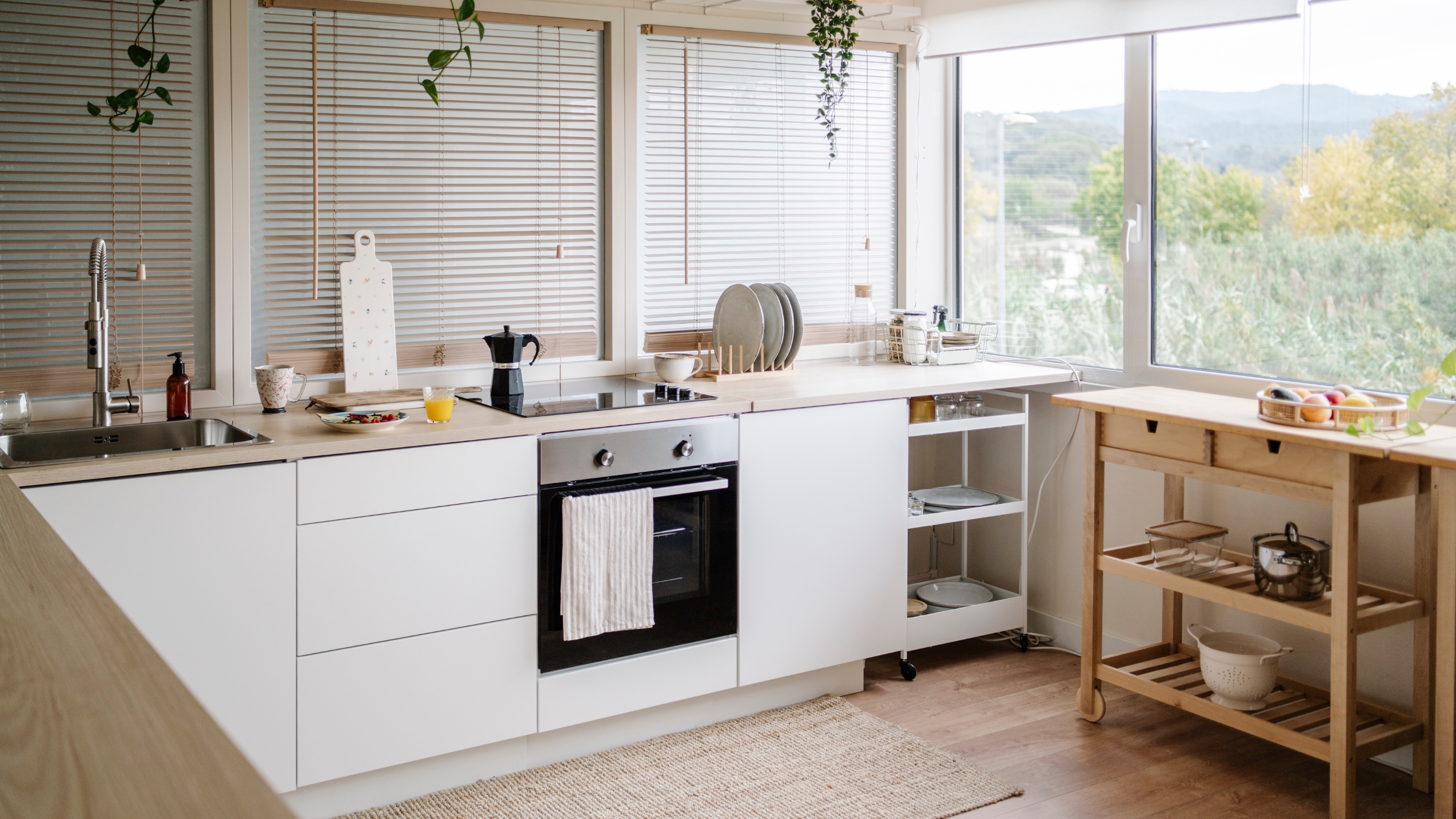
8 small kitchen design mistakes to avoid, according to an interior designer

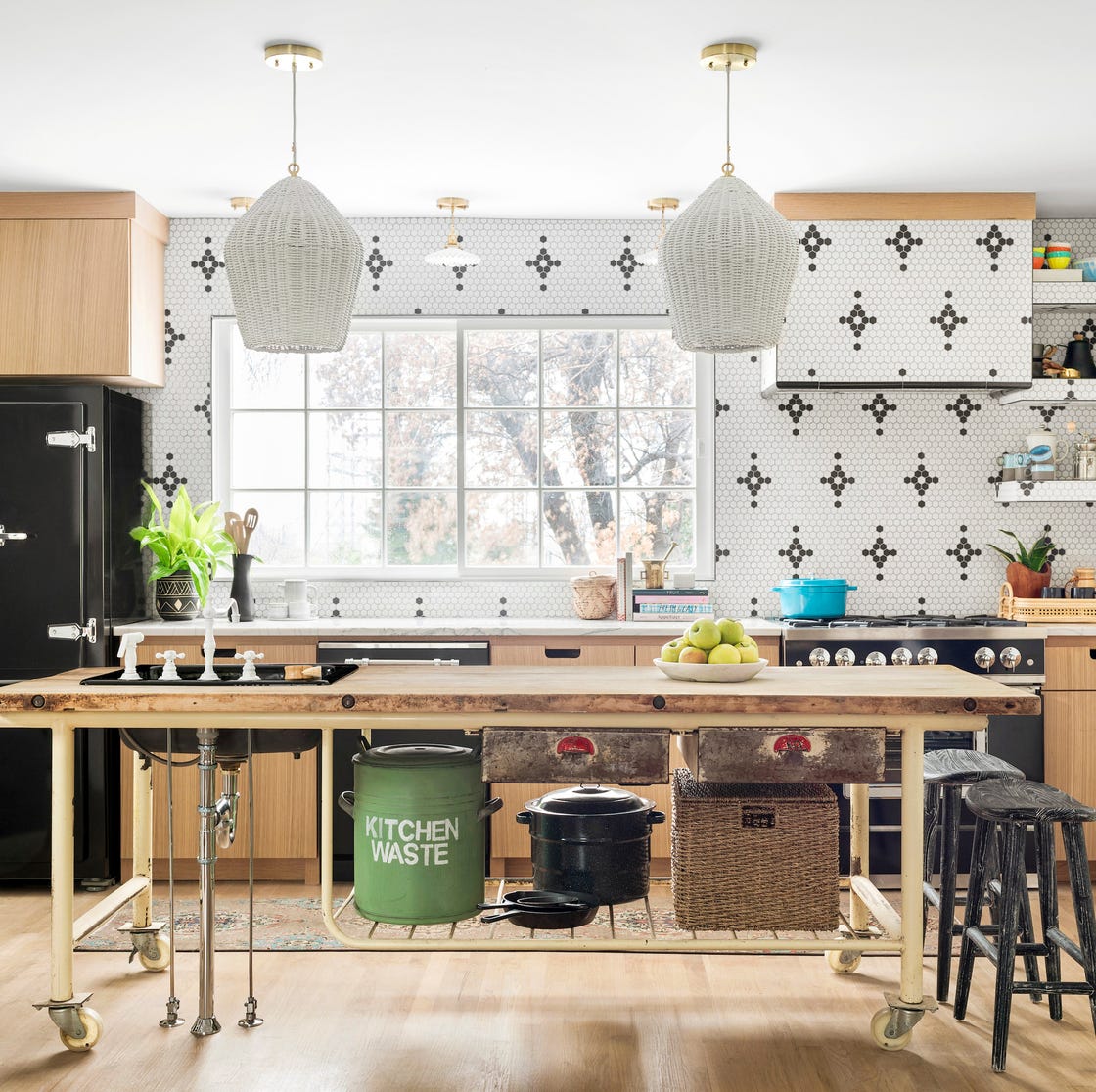
11 Fool-Proof Ways to Add Character to Your Kitchen
6 Things That are Making Your Kitchen Look Cheap, and How to Fix Them According to Designers
7 Features Designers Say Make Your Kitchen Look Outdated (Some May Surprise You)