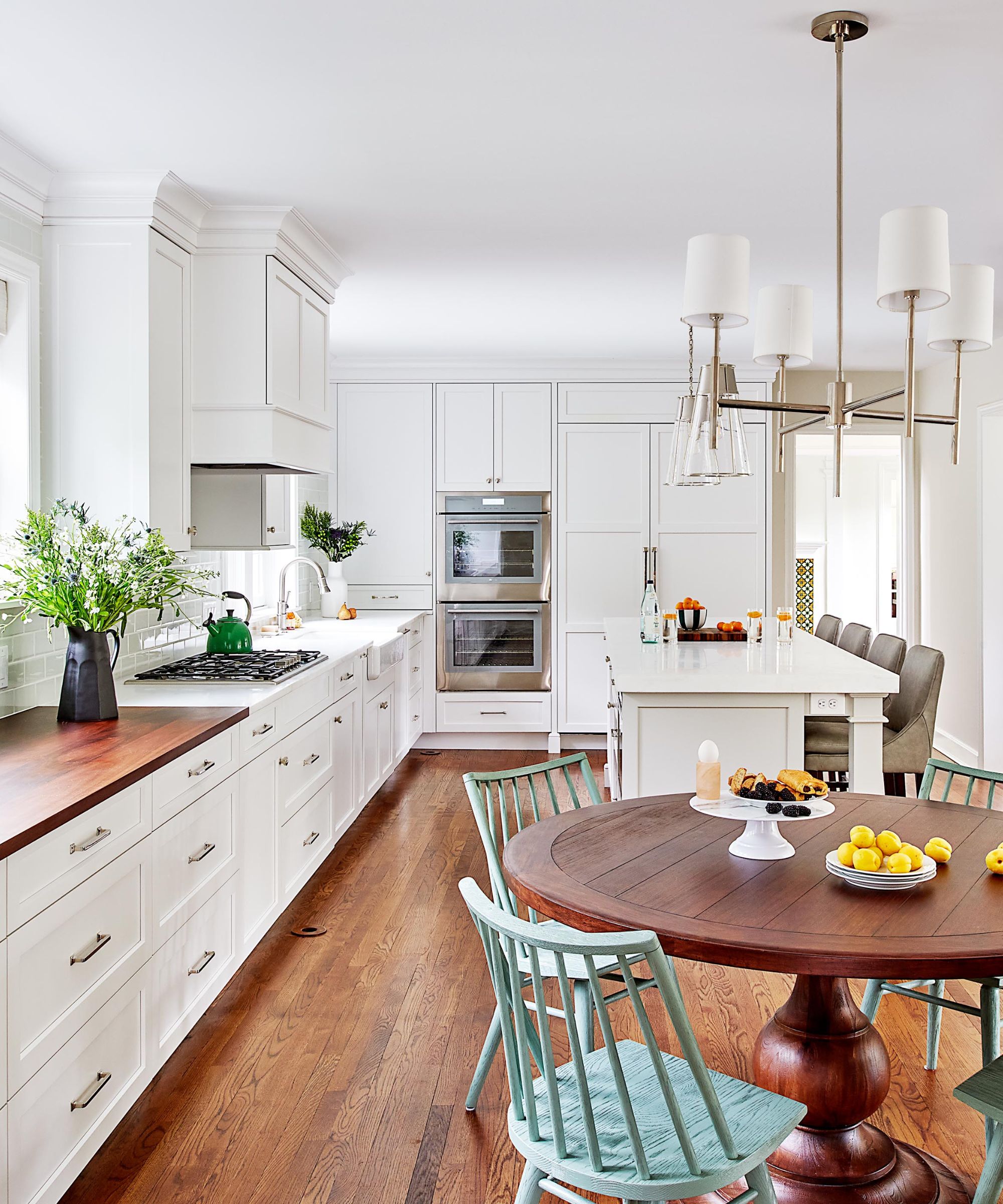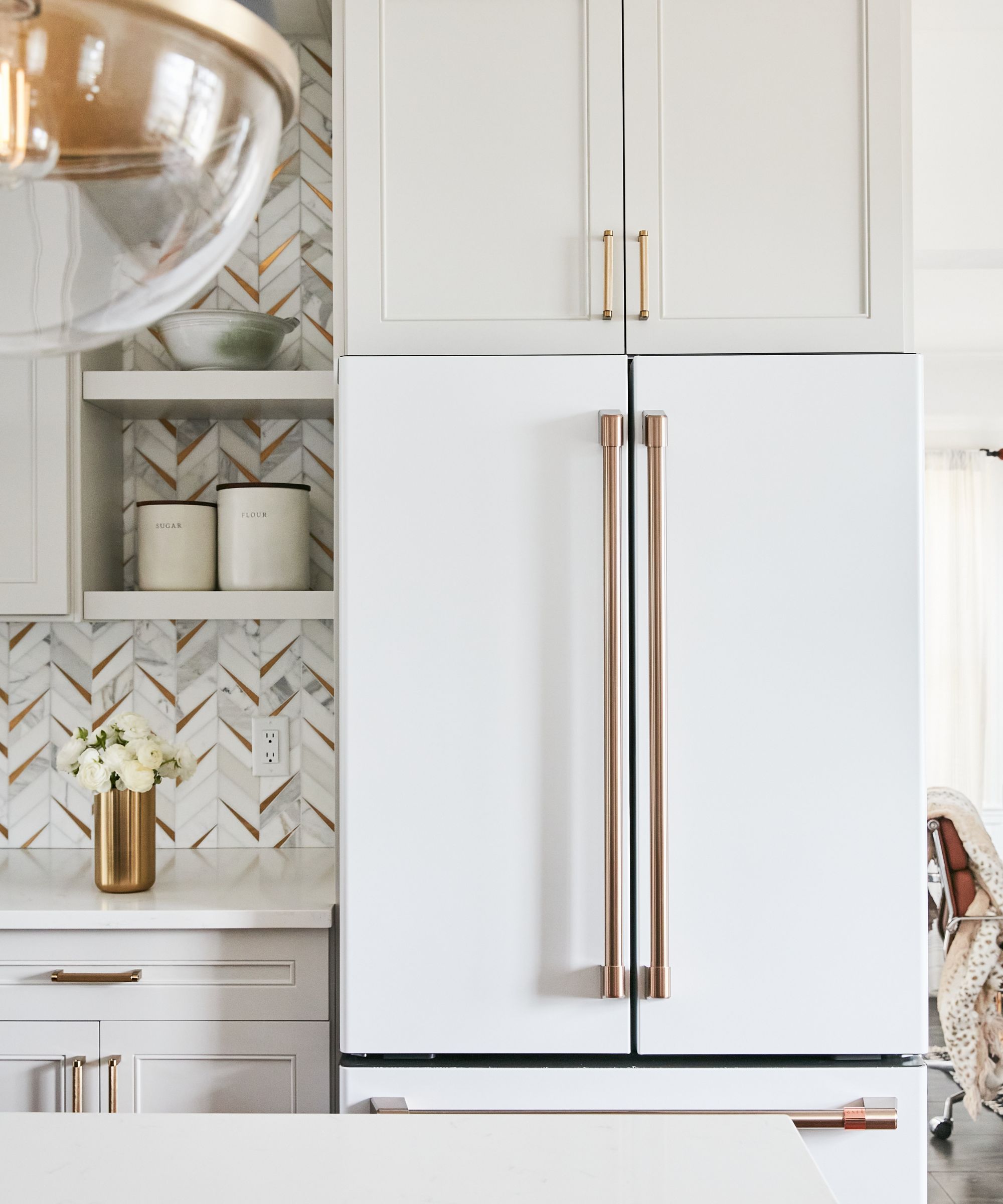
If You Love Pottery Barn, This New Sherwin-Williams Color Palette Is for You
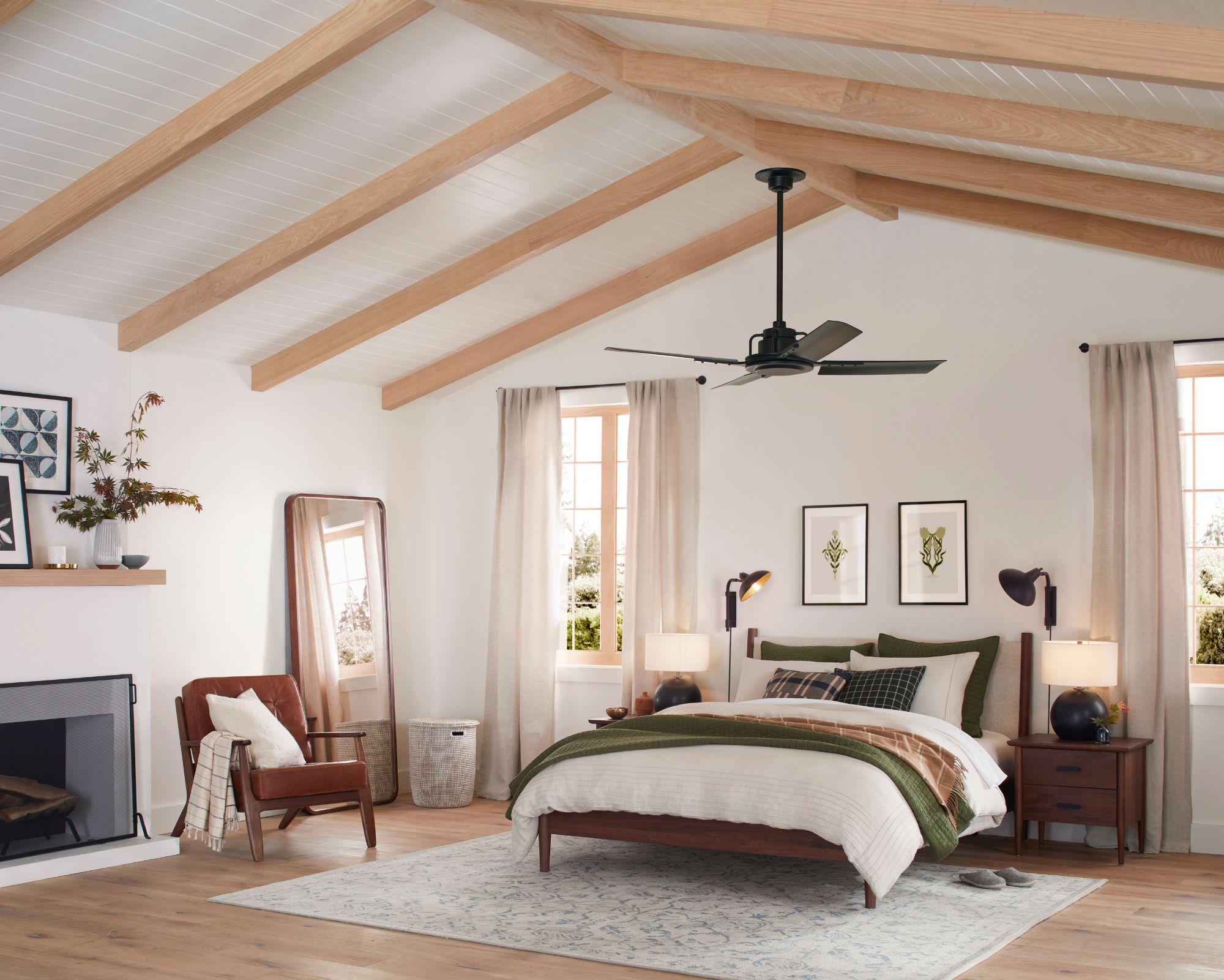
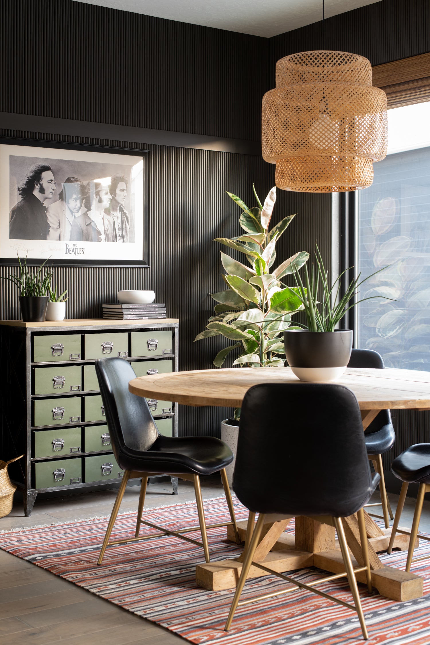
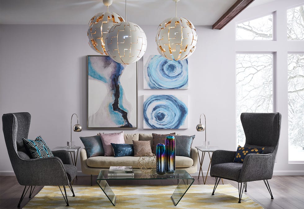
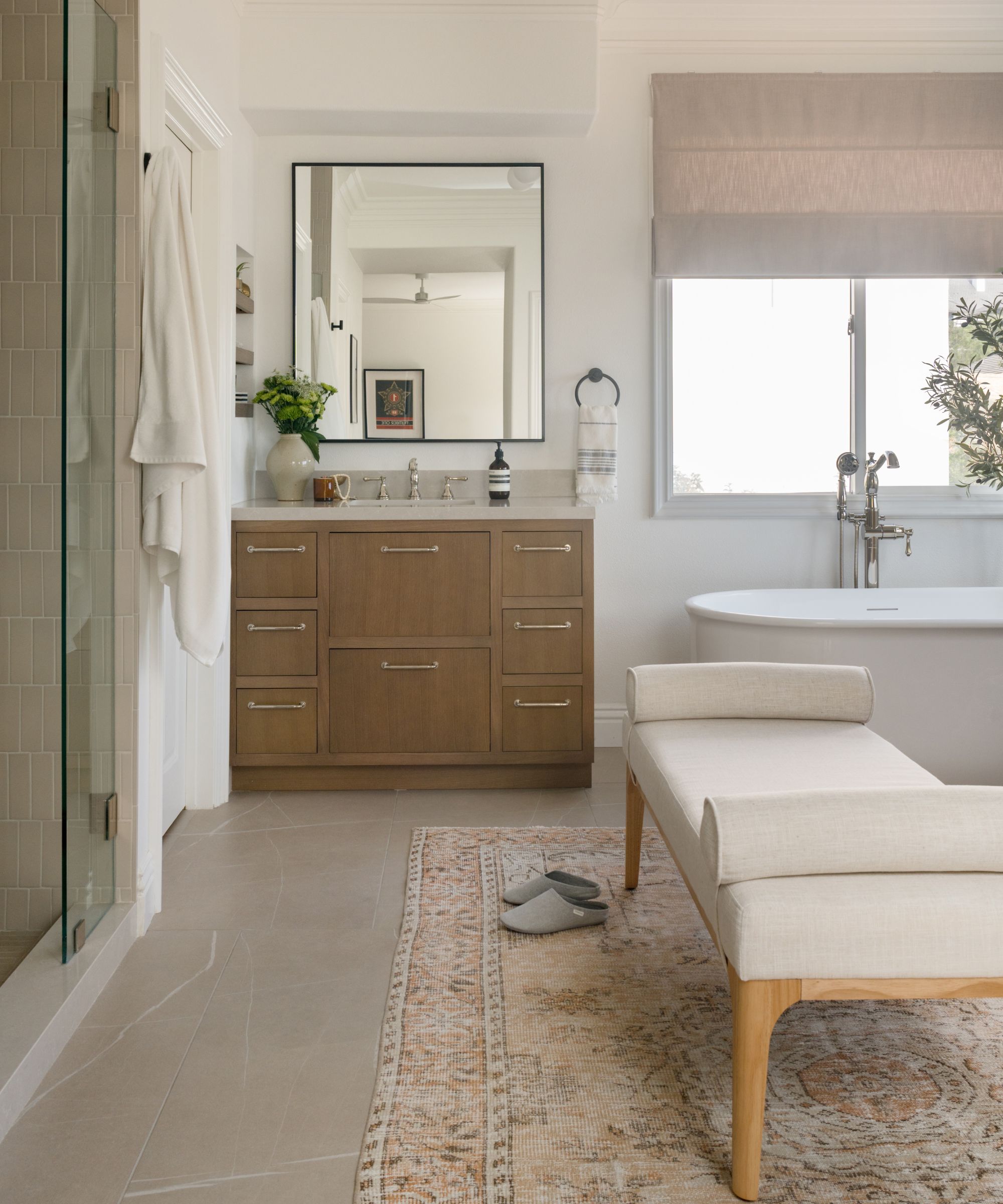
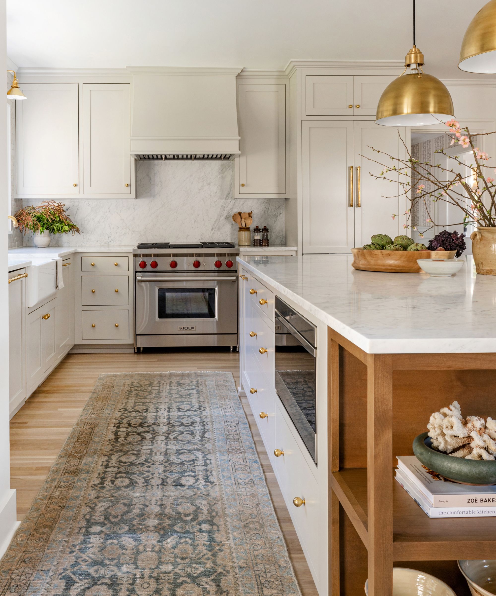
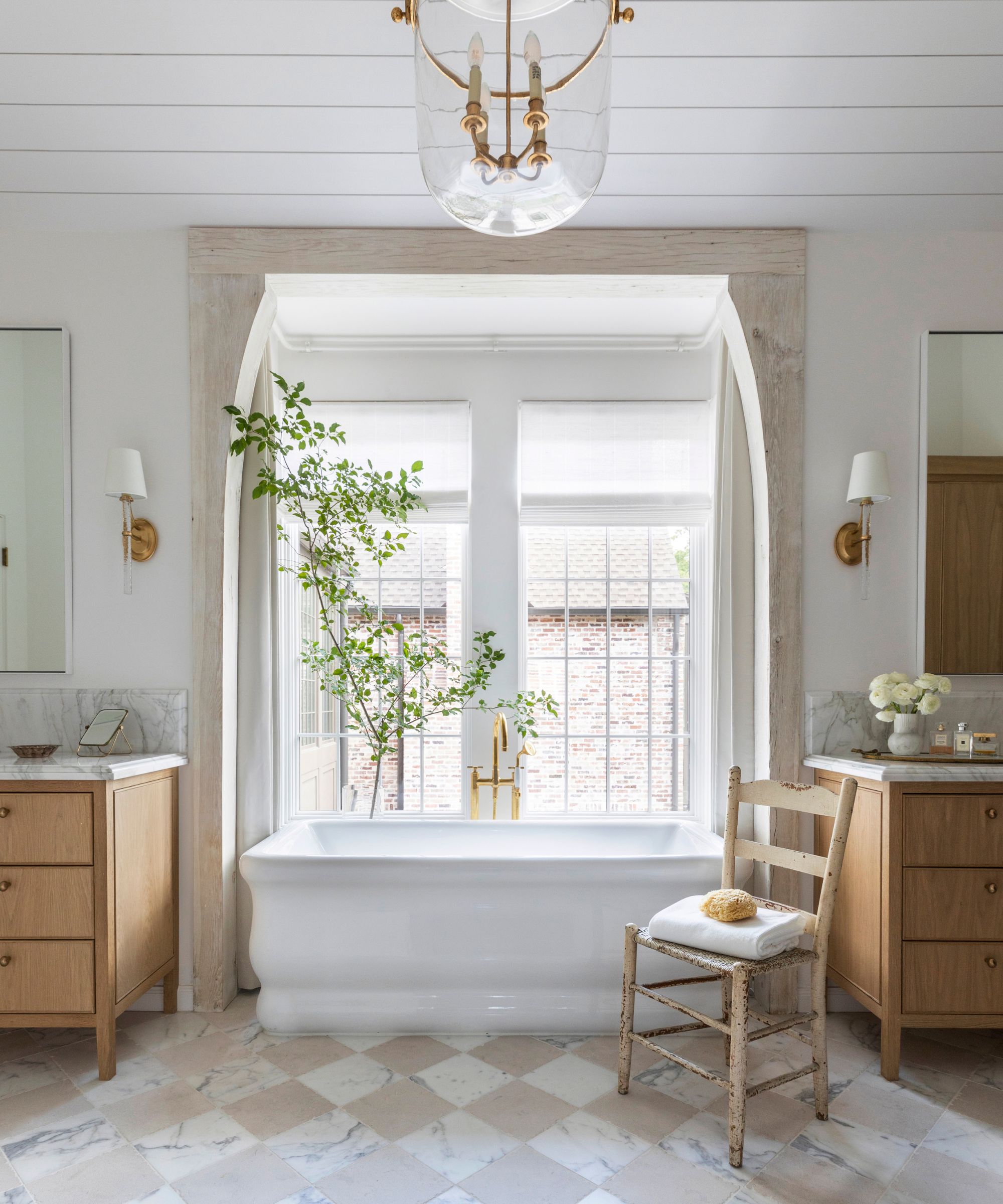
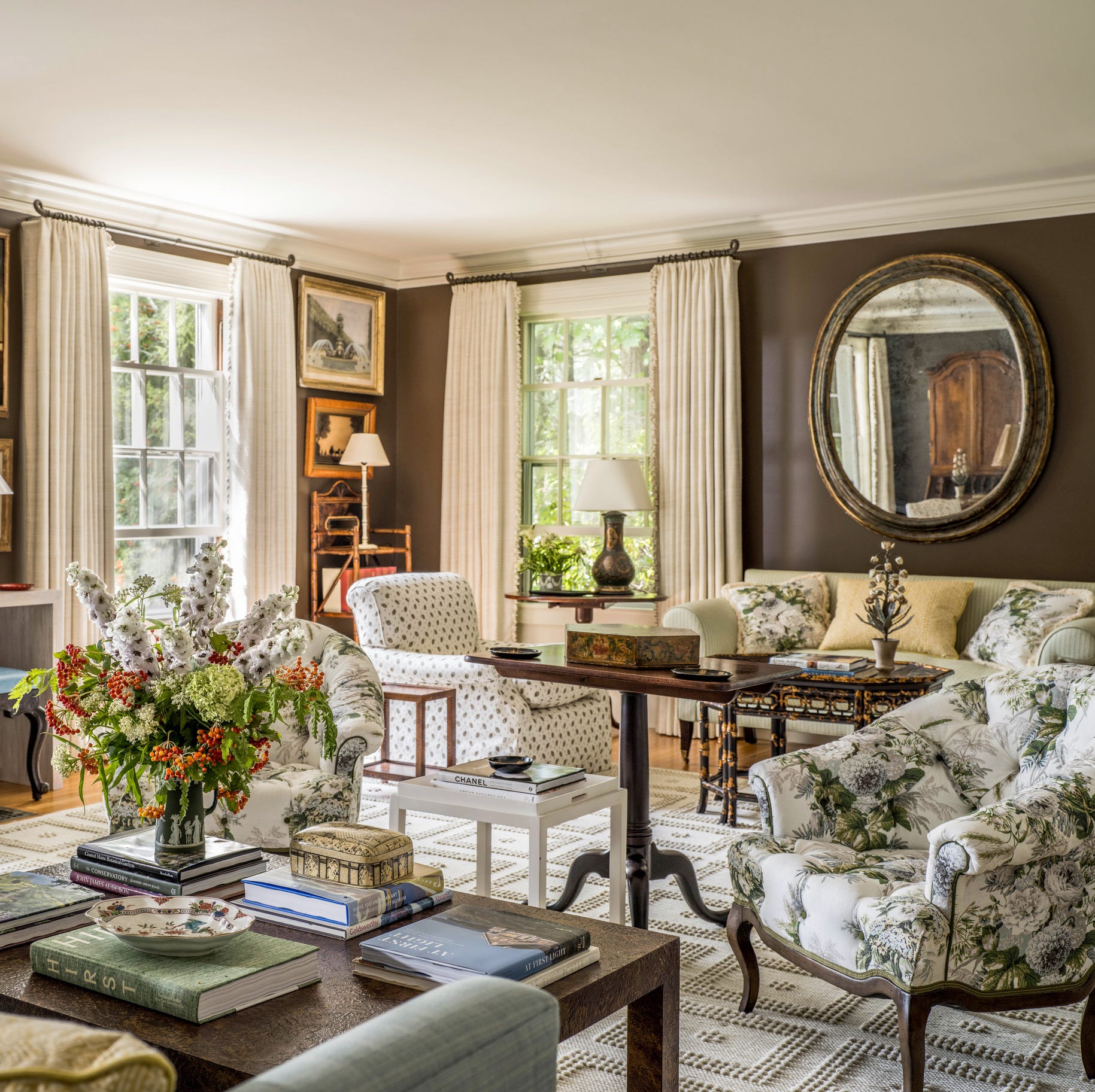
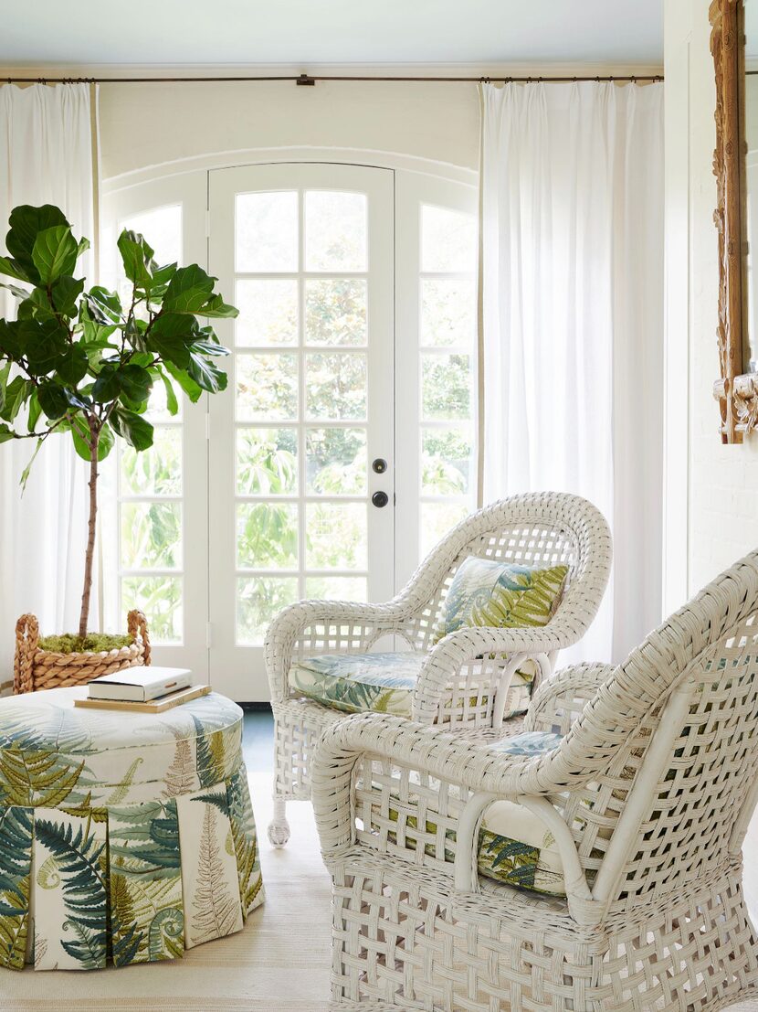
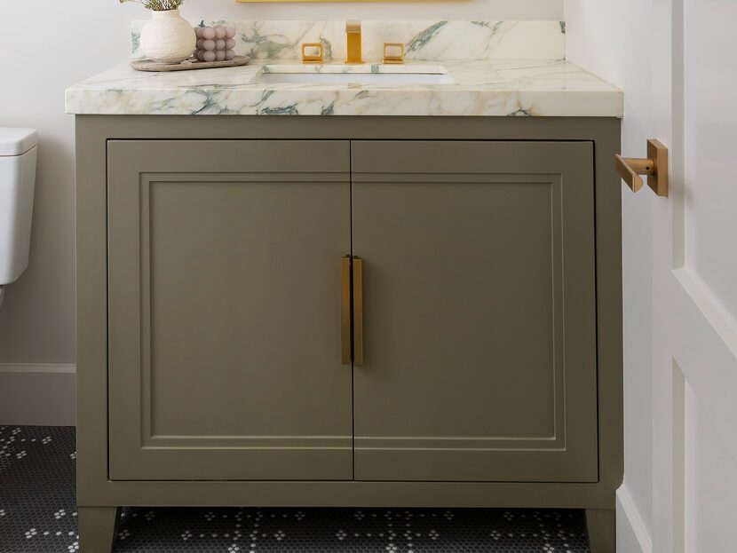
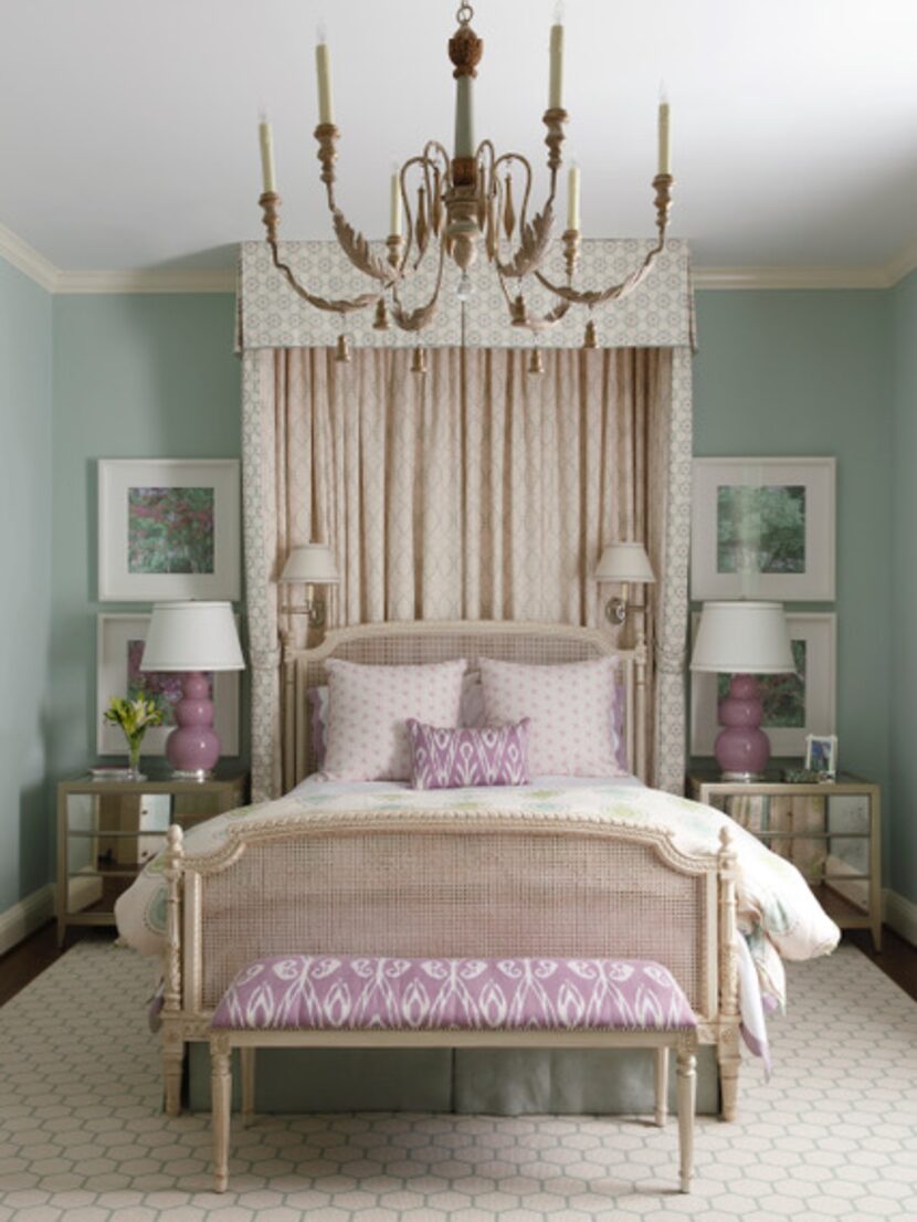
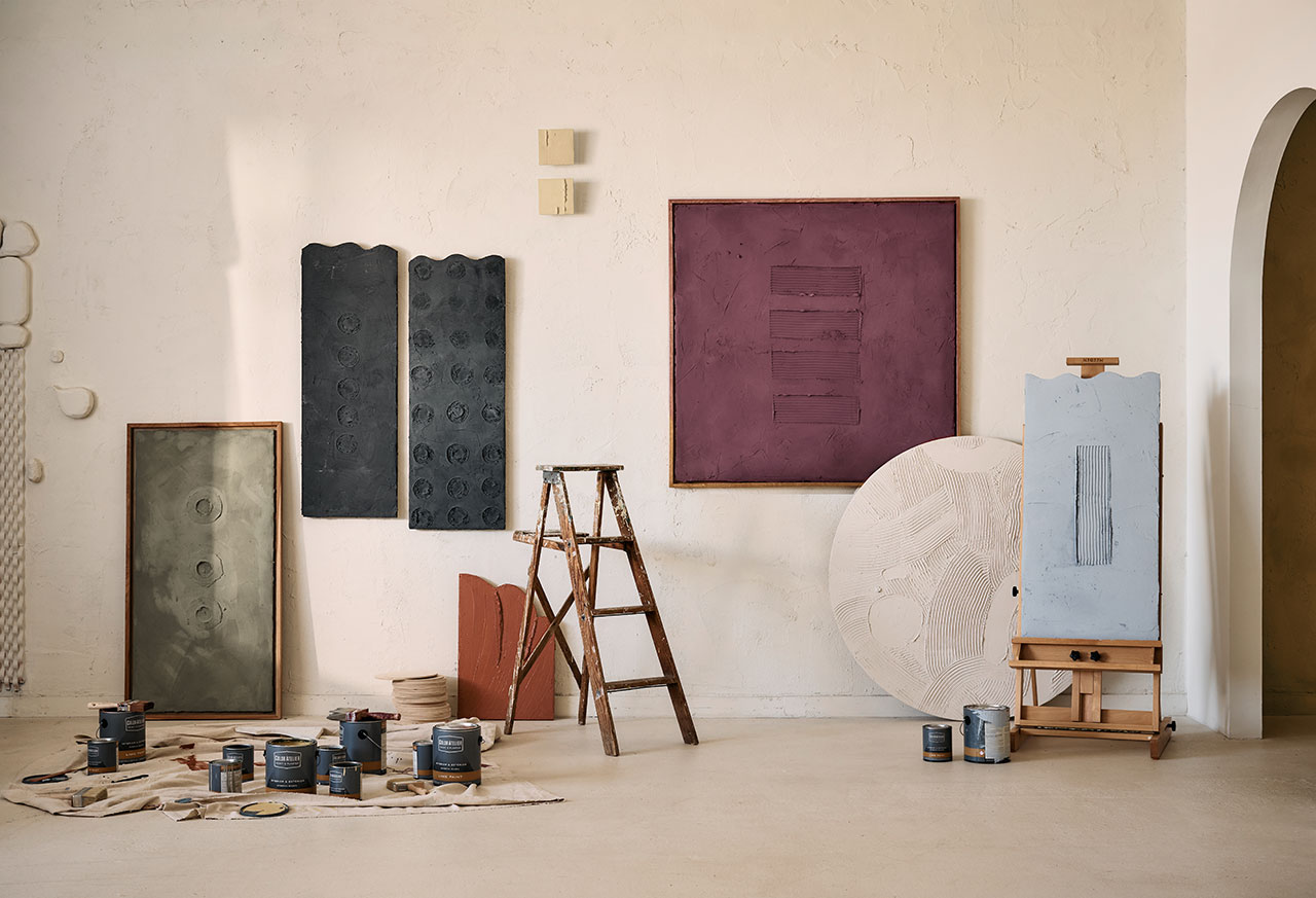
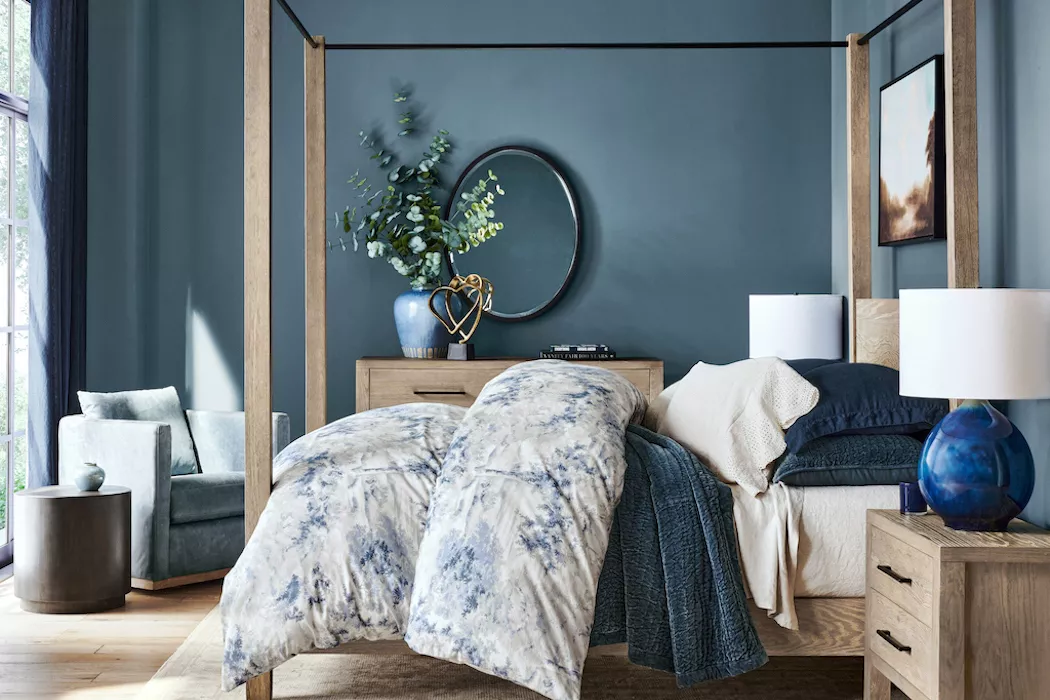
The collaboration between Pottery Barn and Sherwin-Williams introduces their annual paint palette, designed to create cohesive and harmonized interior spaces. This partnership focuses on merging interior design with current trends, specifically by offering a color scheme that ties decor together and emphasizes bringing elements of nature indoors. The 2023 Paint Palette by Sherwin-Williams and Pottery Barn features soothing, summery shades, reflecting a desire to connect with the outdoors, a trend that has gained significant traction since the pandemic, as people seek to bridge the gap between their indoor living spaces and the natural environment. While painting cannot entirely replace outdoor experiences, these nature-inspired tones aim to foster a sense of connection and tranquility within the home.
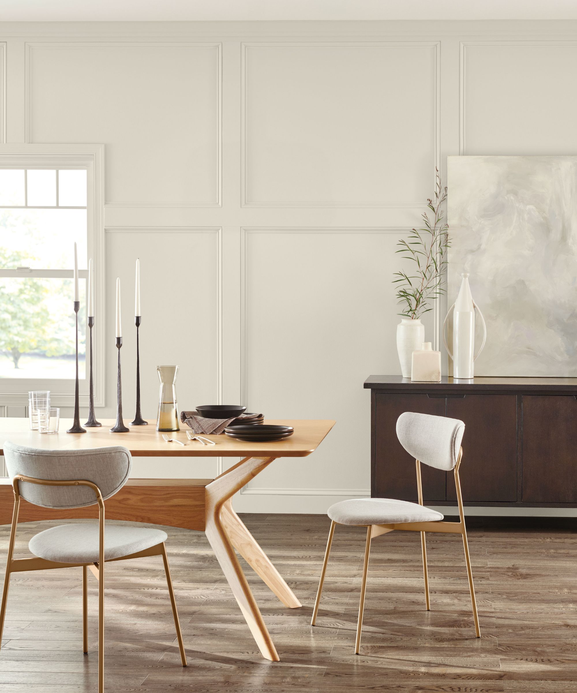
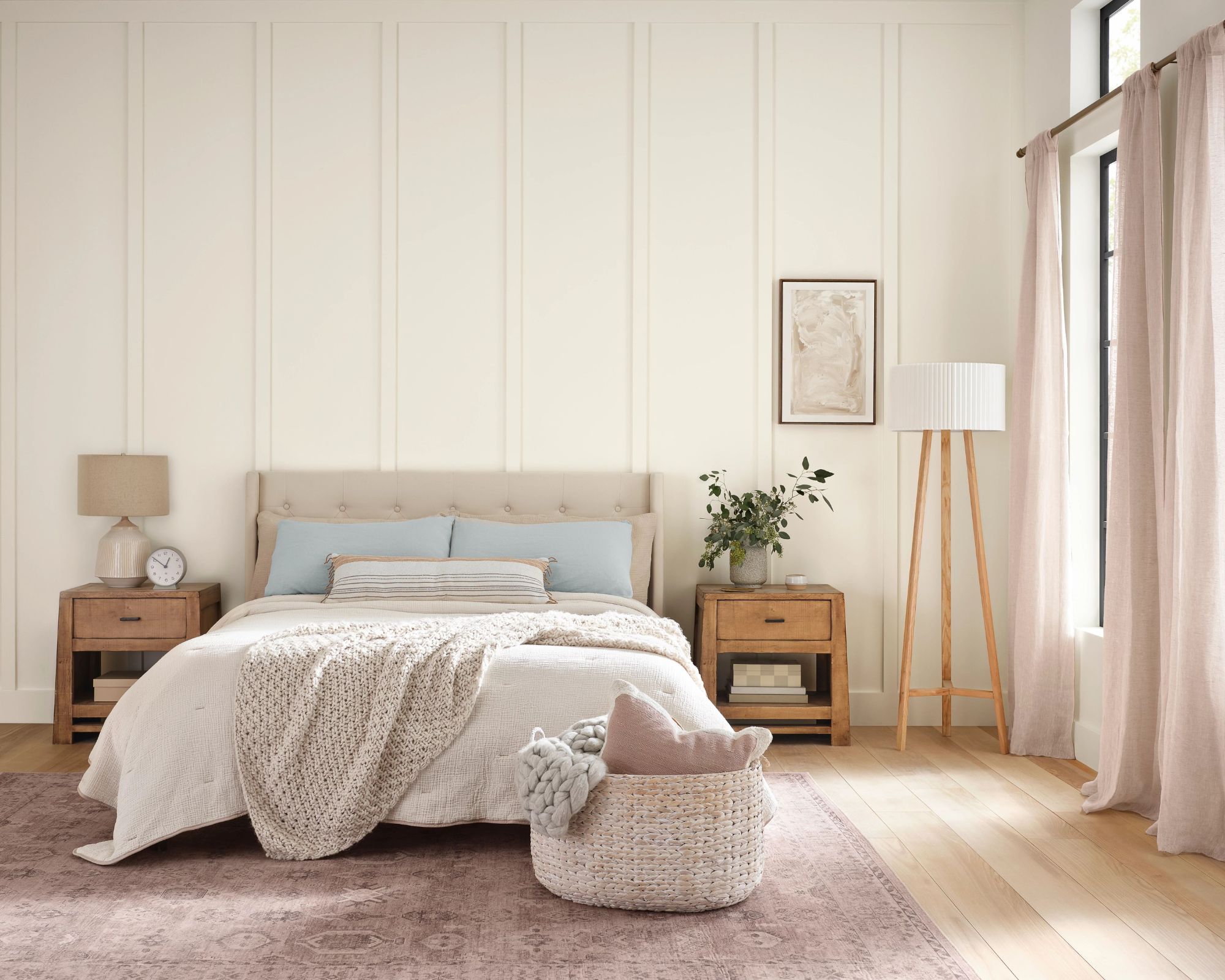
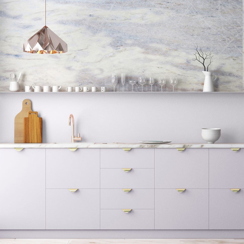
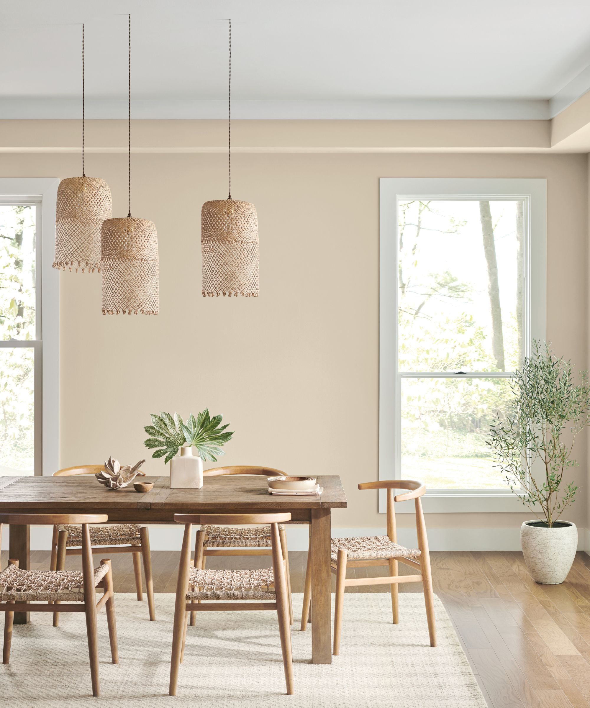
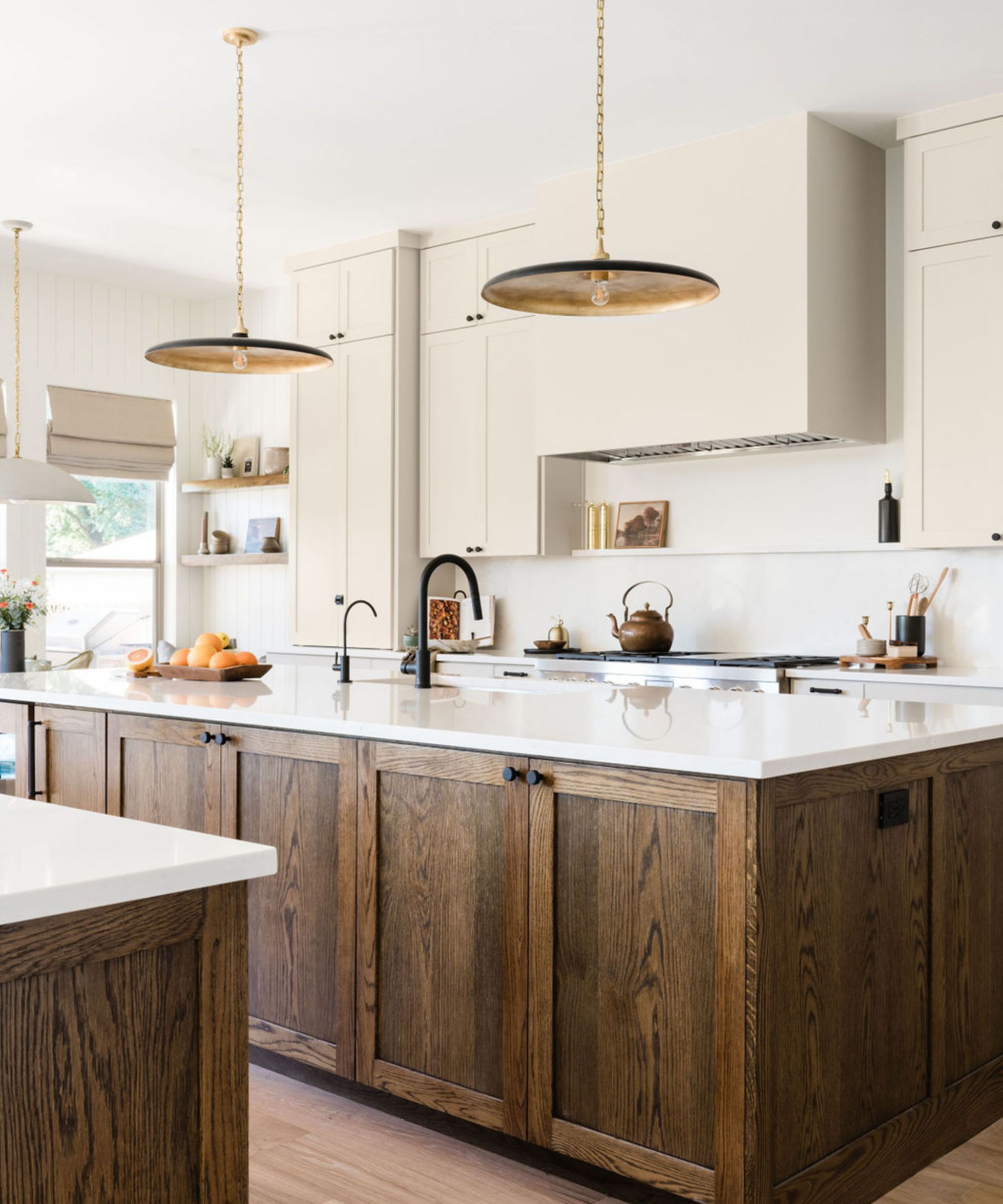
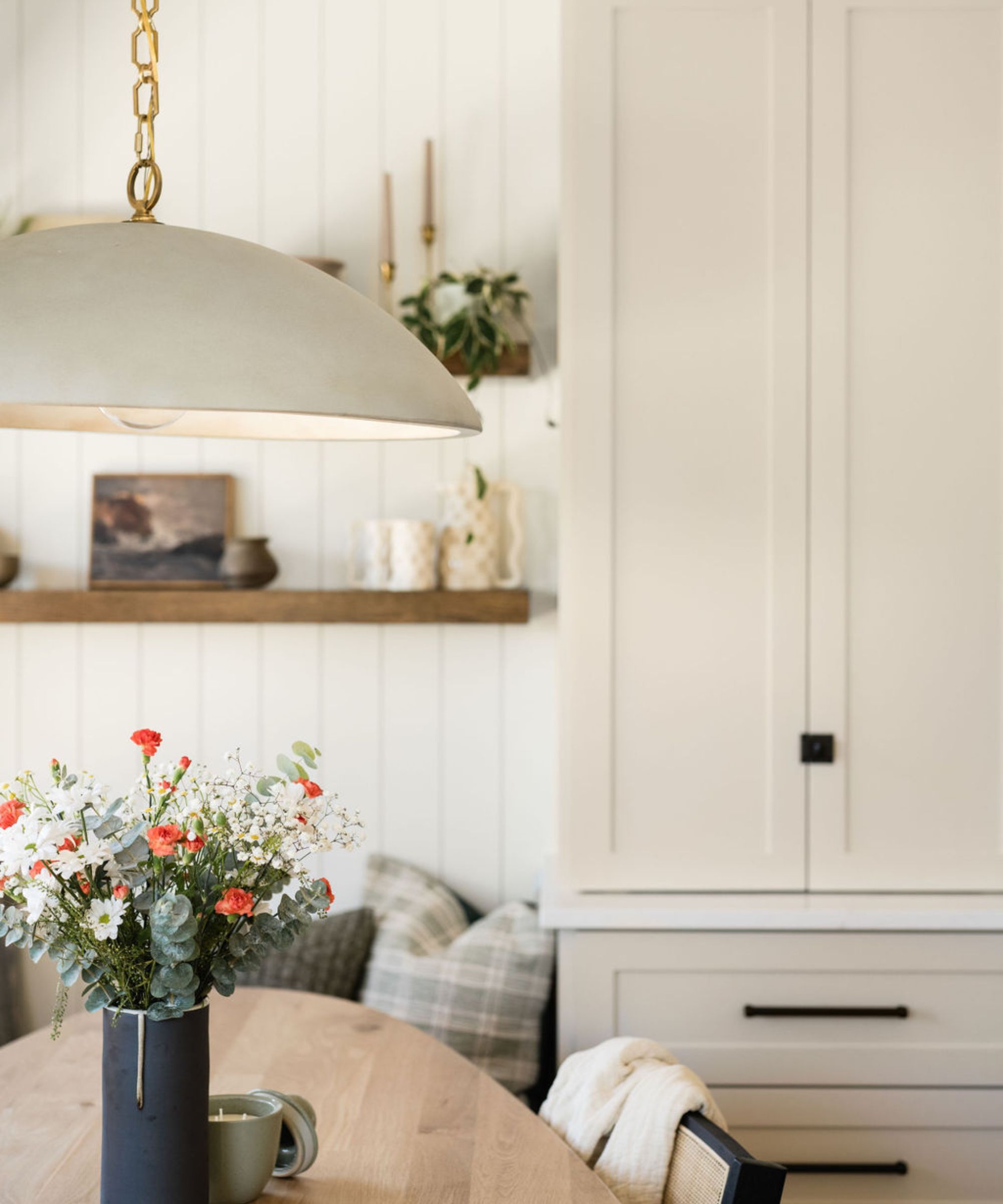
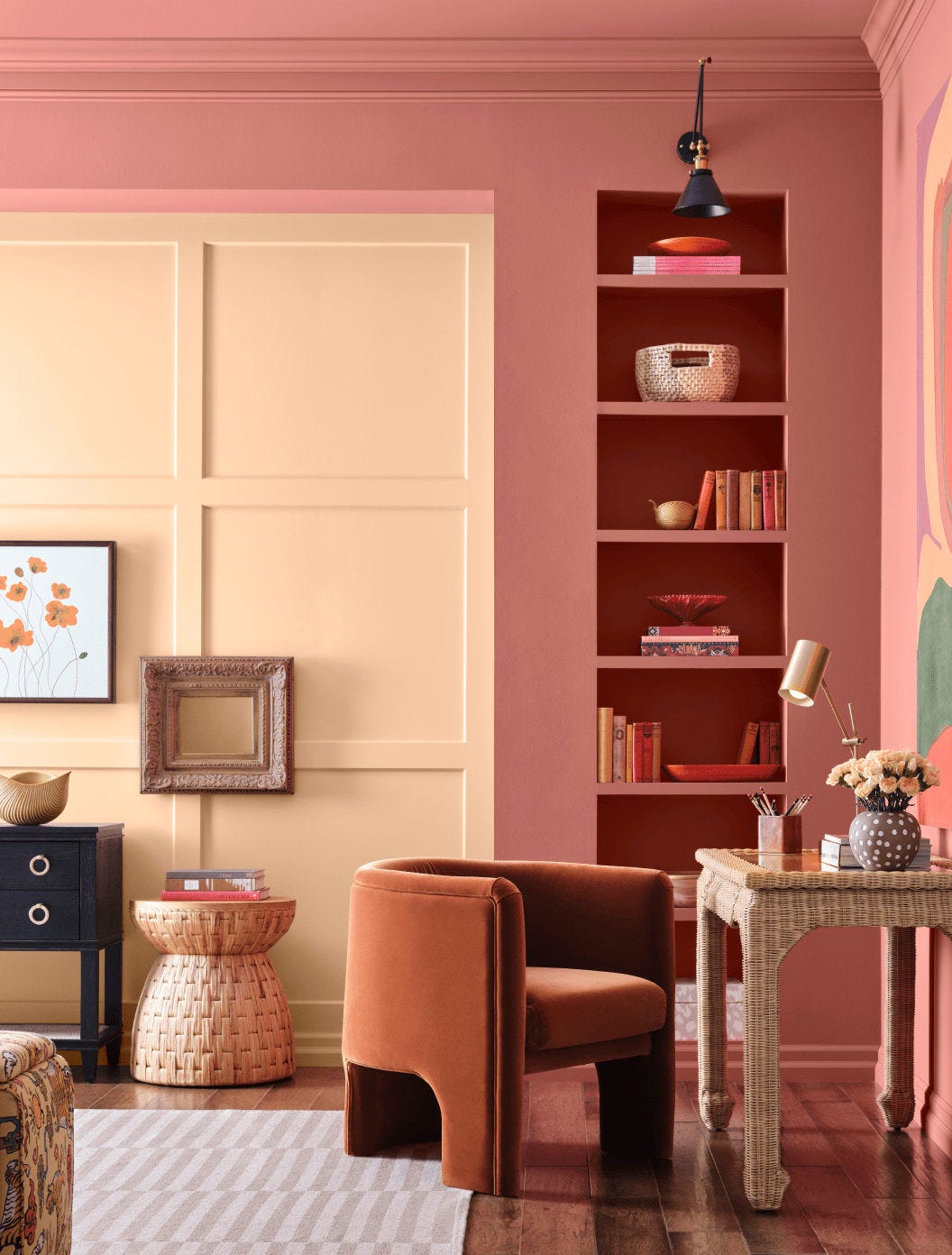
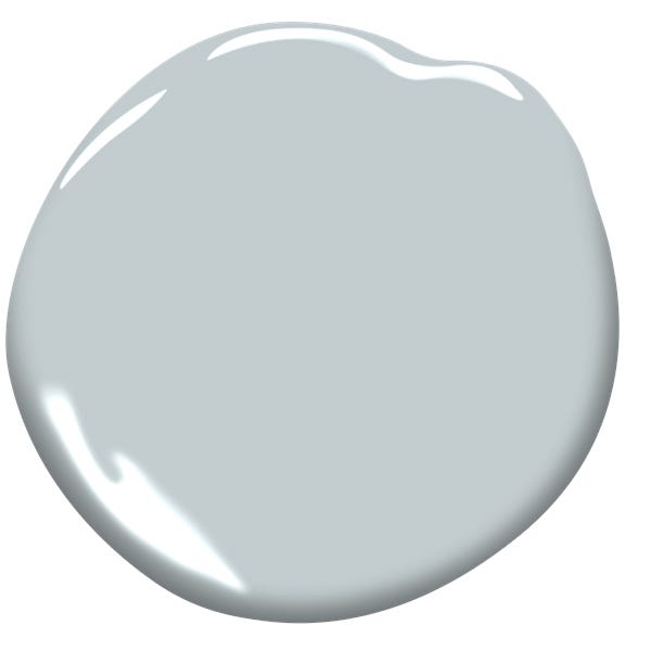
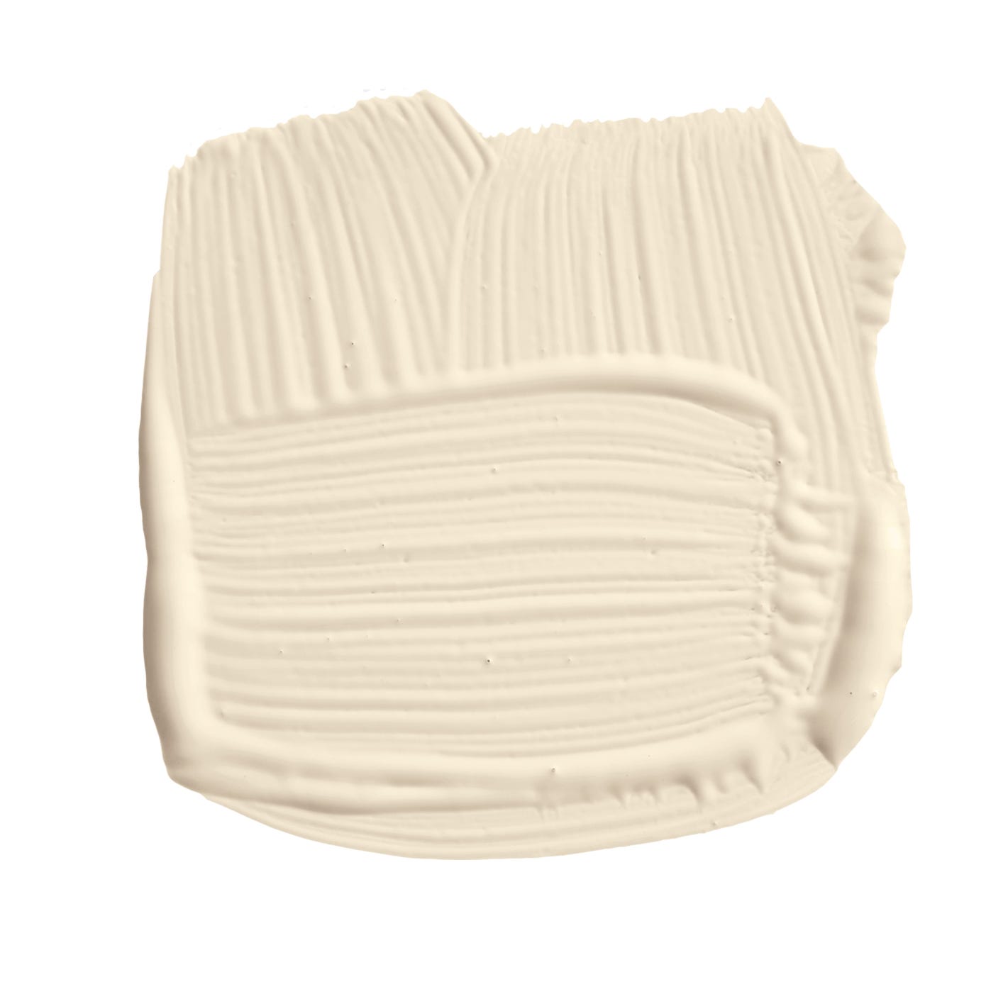
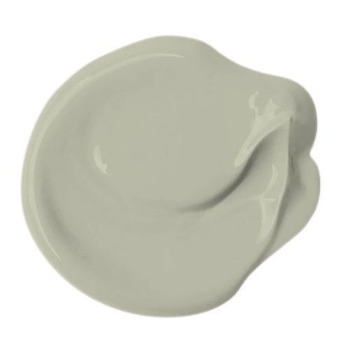
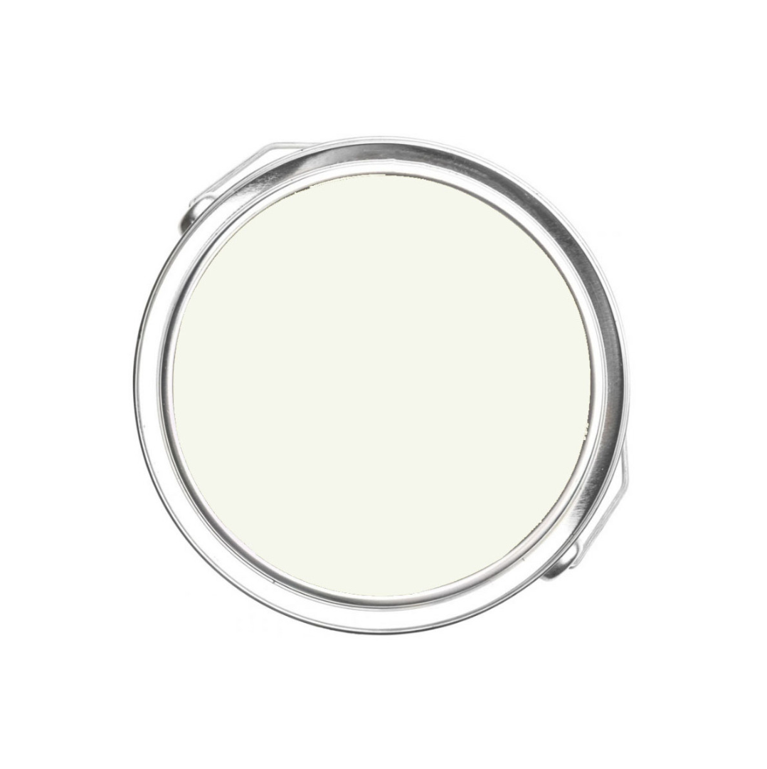
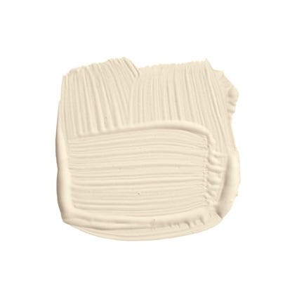
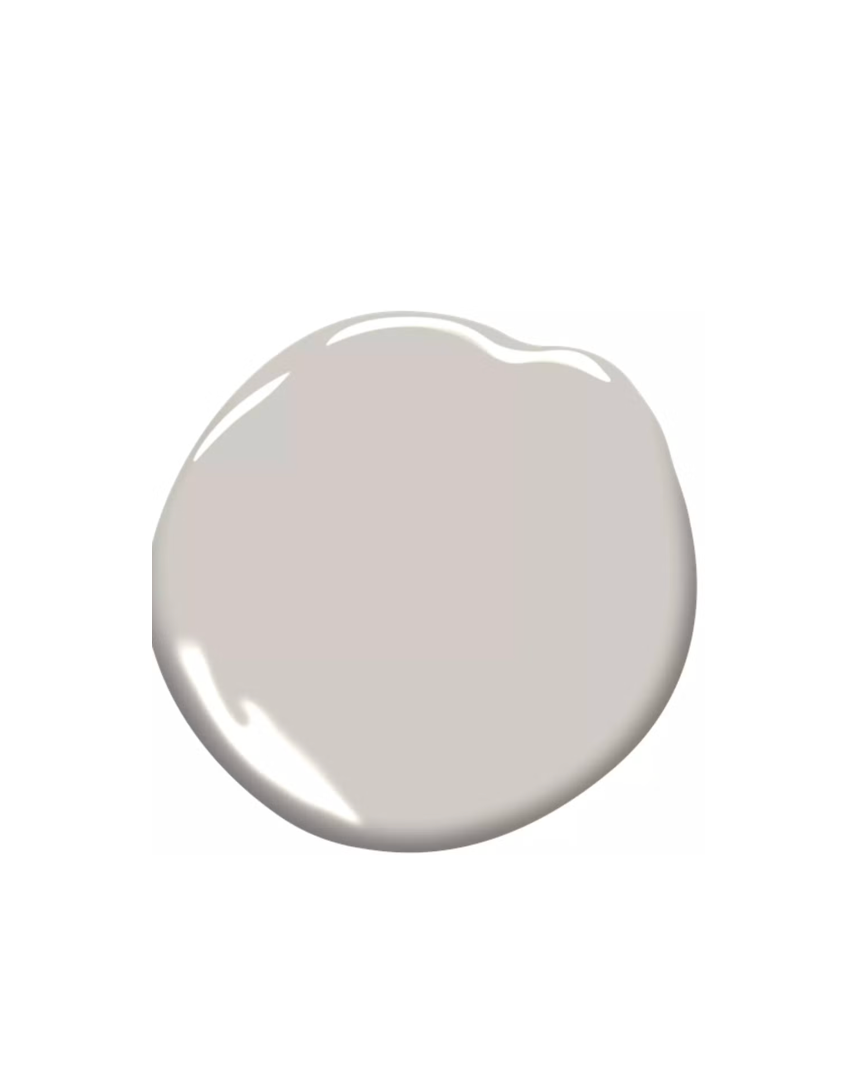
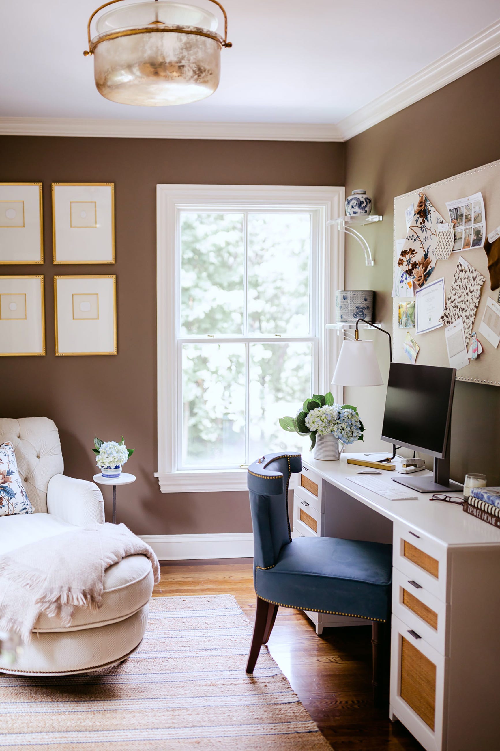
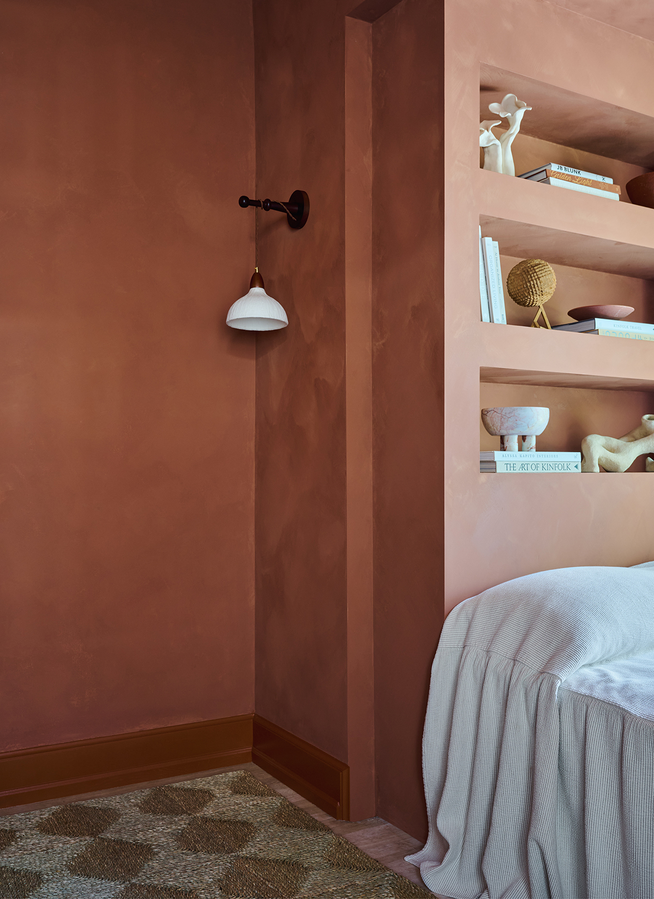
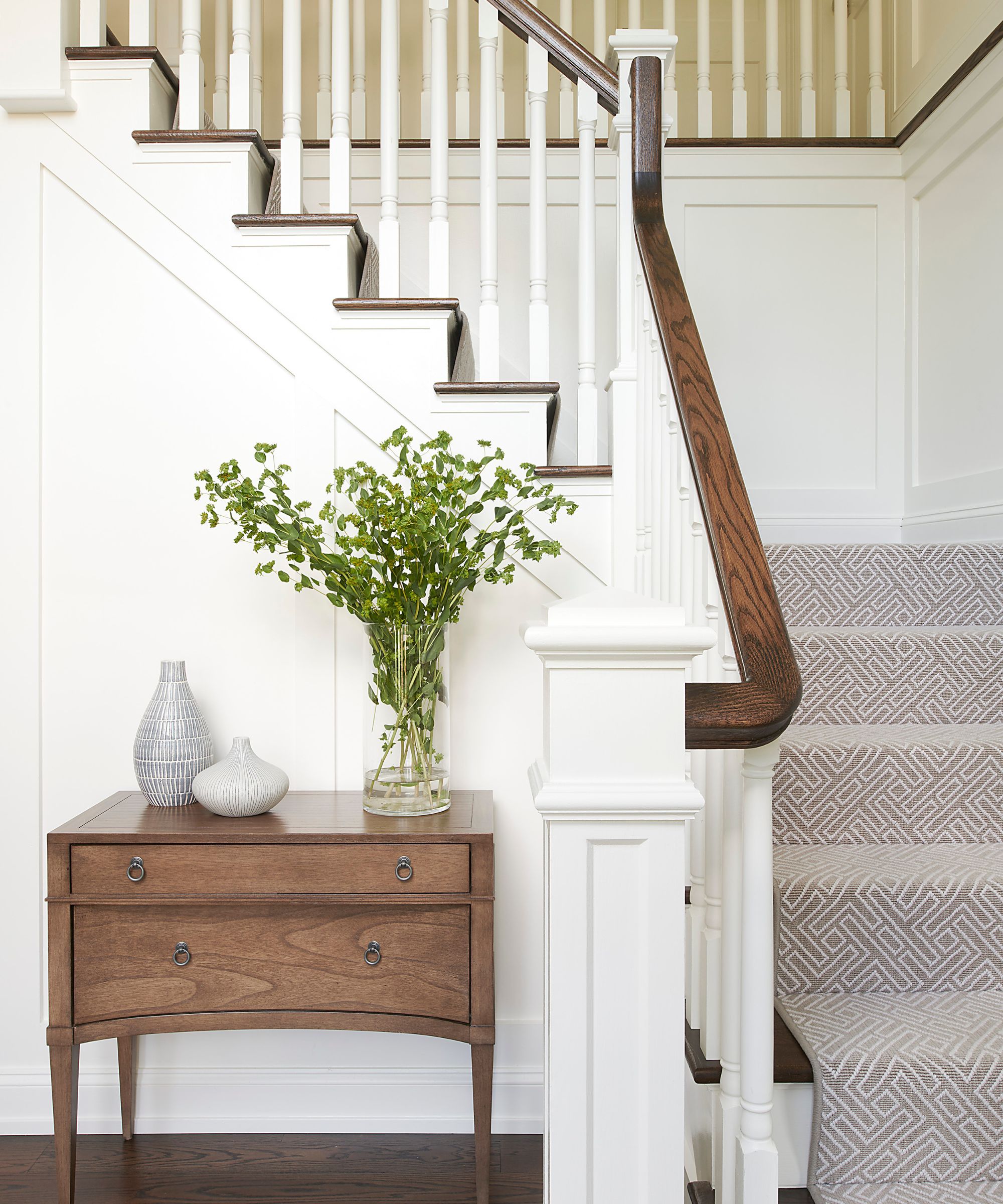
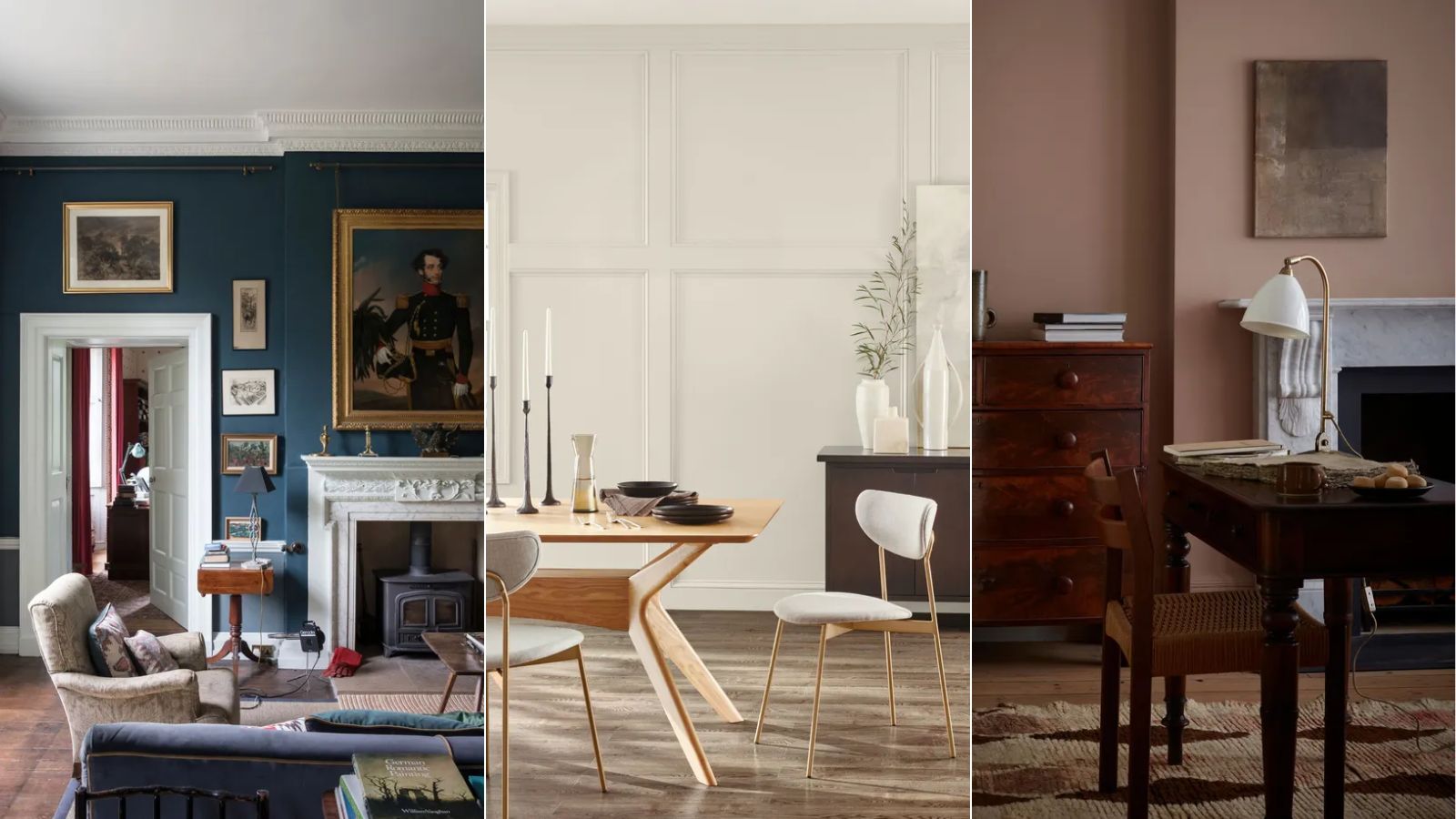
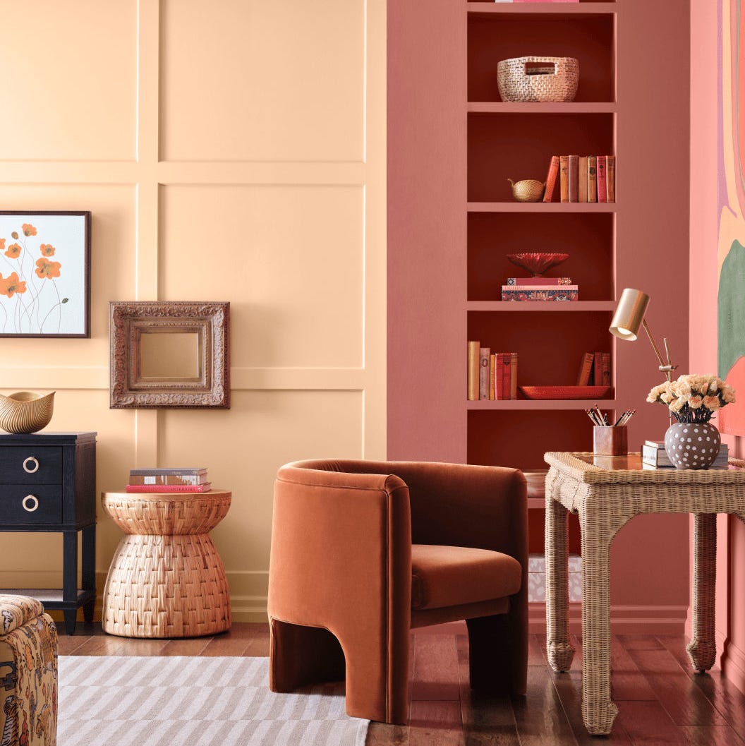
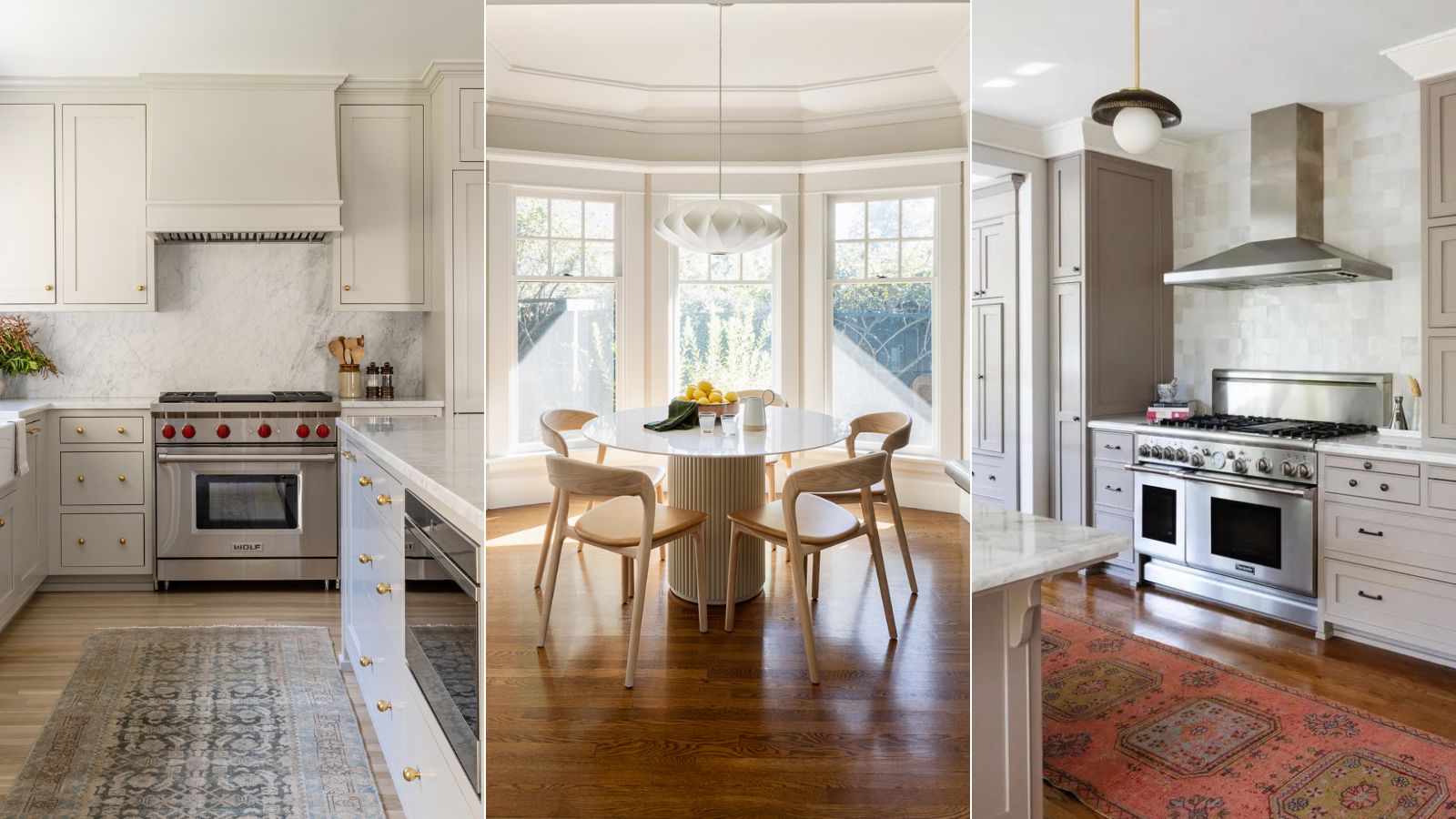
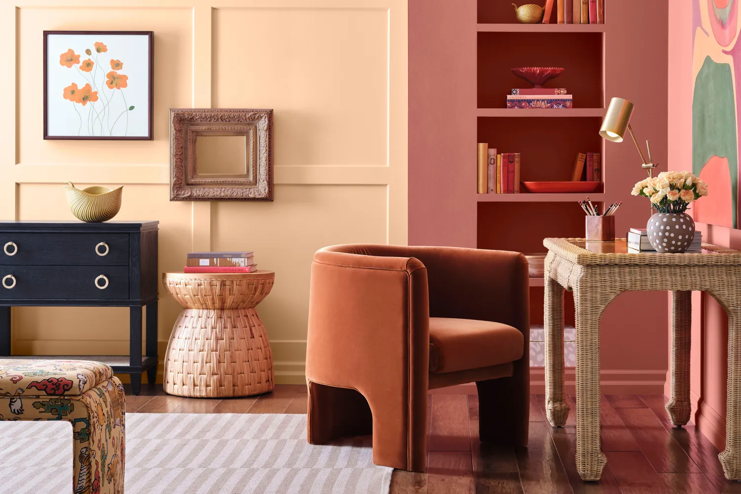
The 2023 palette is systematically divided into three distinct categories: Go-To Neutrals, Earthy Elements, and Statement Hues. The Go-To Neutrals category is the most extensive, offering twelve shades that encompass warm whites, versatile beiges, and subtle grays. These neutral tones provide a foundational base that can complement a wide range of interior styles and furniture choices, ensuring versatility and timeless appeal. The Earthy Elements category draws direct inspiration from natural landscapes, featuring colors such as Nomadic Dessert, a warm, sandy hue; Morning Sun, a gentle yellow; Dried Thyme, a muted green; and Redend Point, which was Sherwin-Williams' 2023 Color of the Year—a sophisticated, comforting blush-beige. These colors evoke the organic beauty of the natural world, aiming to create calm and inviting atmospheres within living spaces.
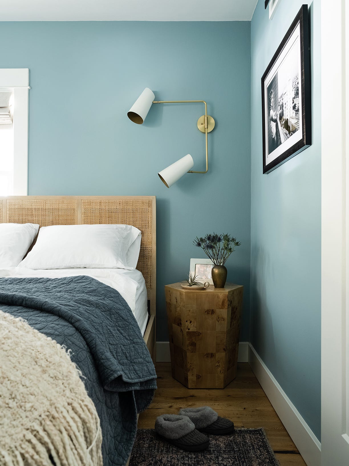
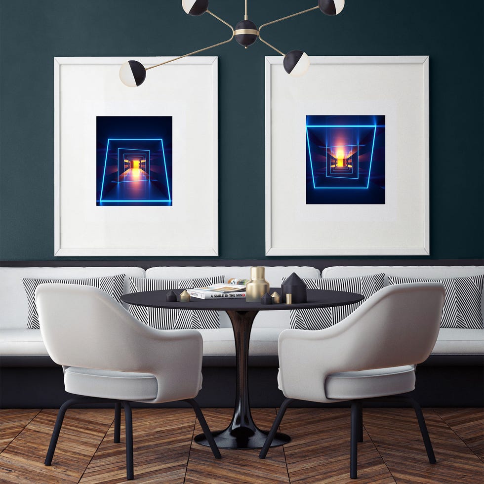
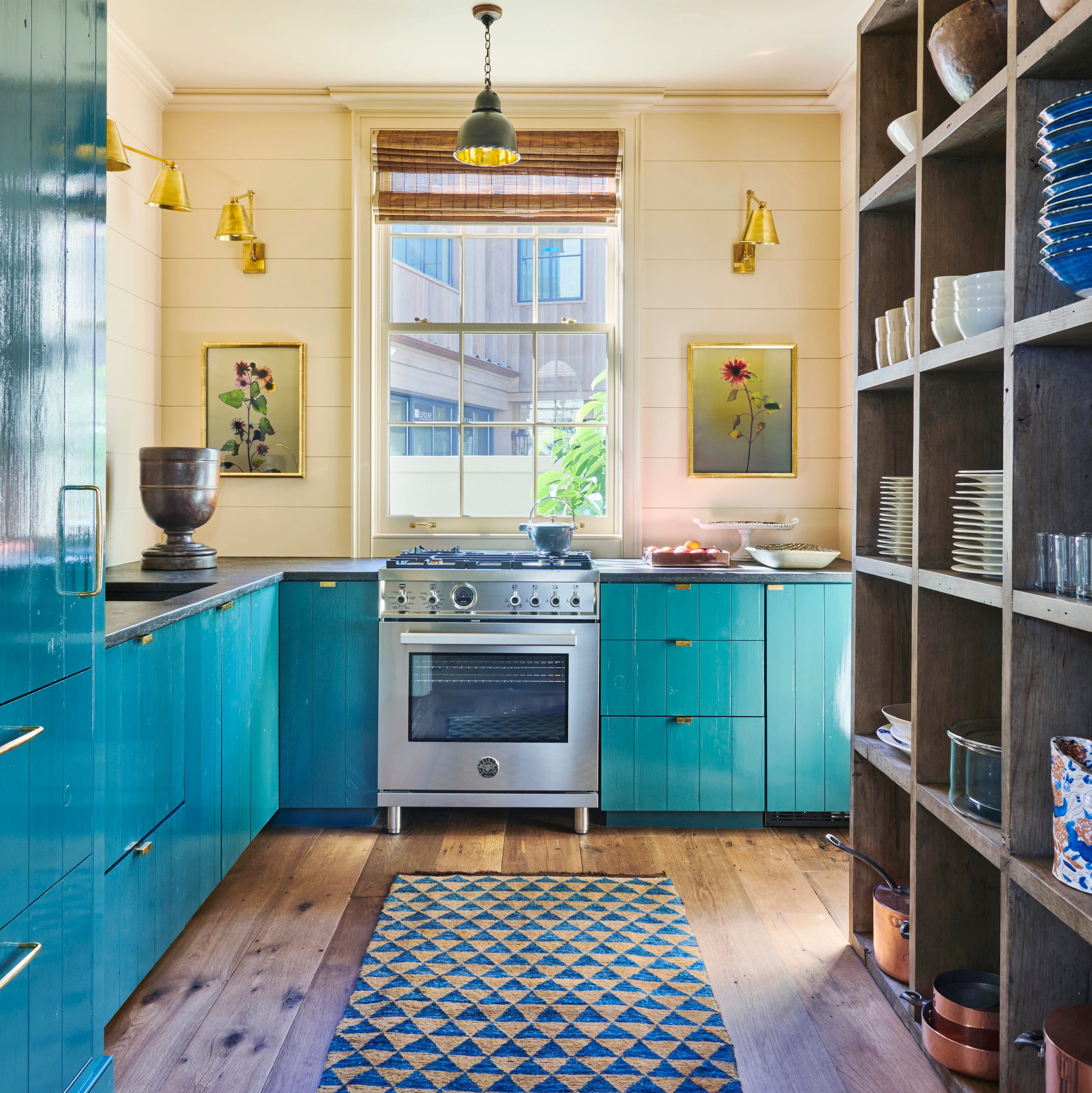
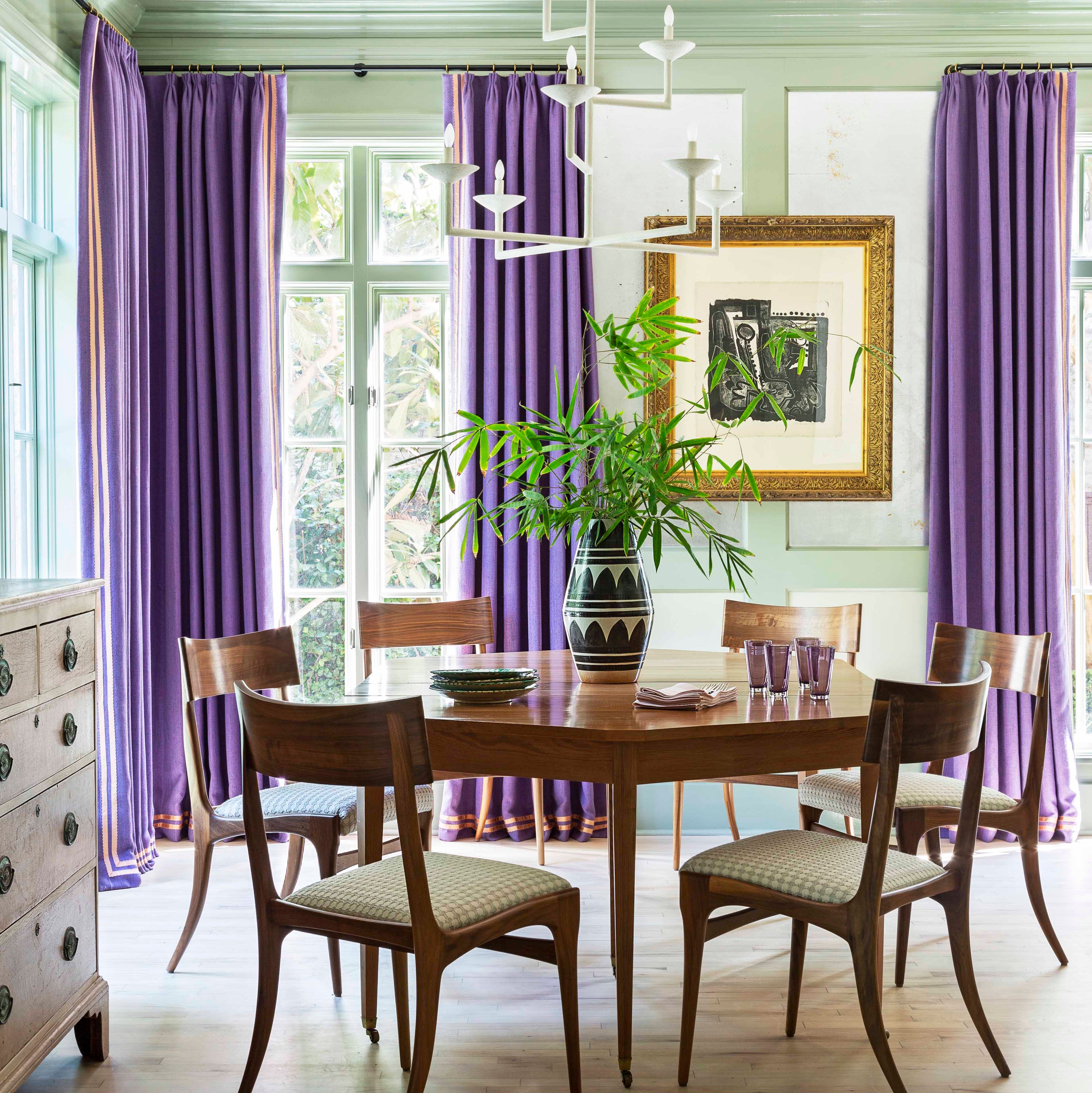
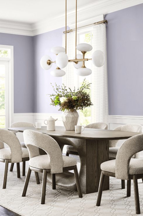
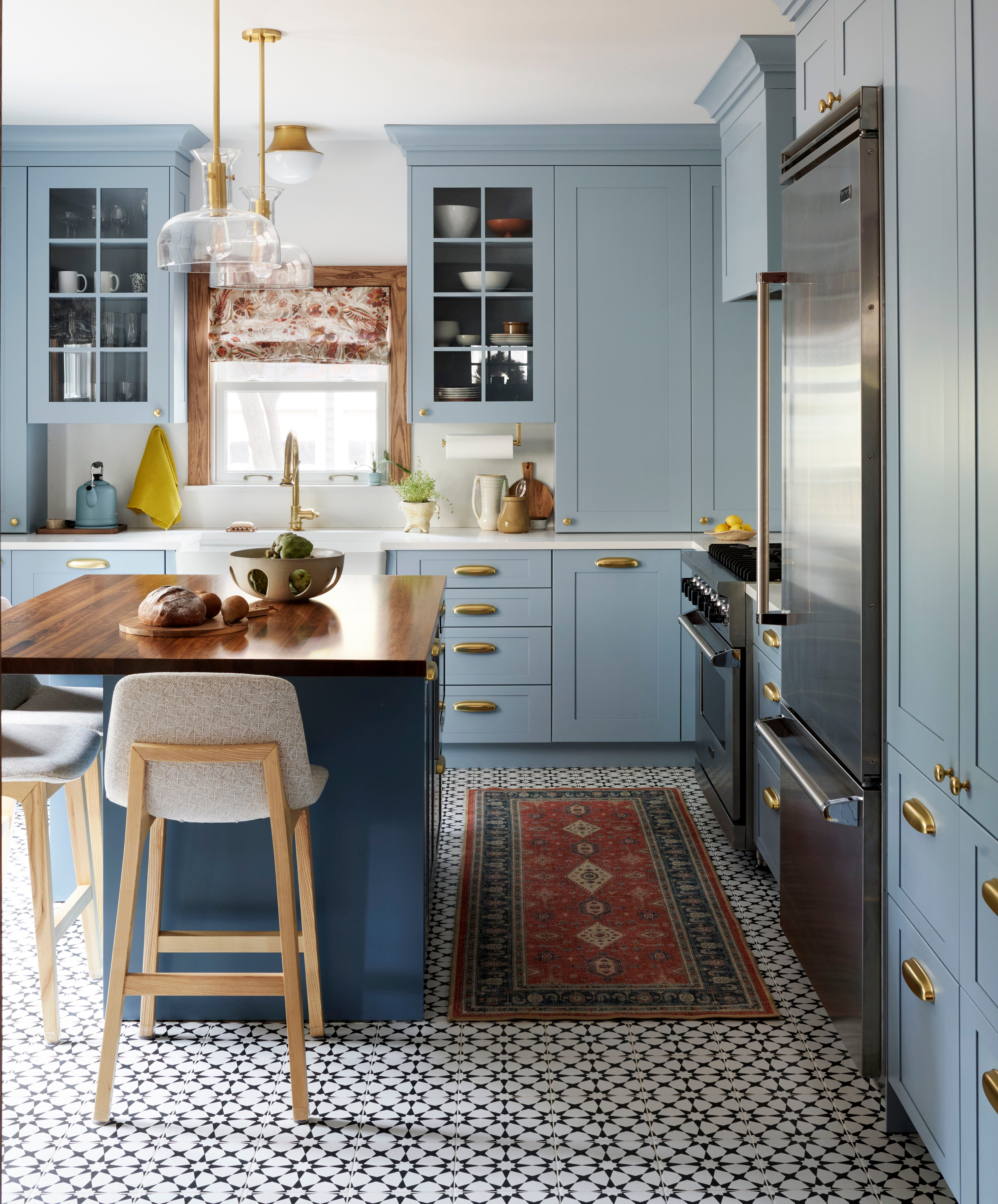
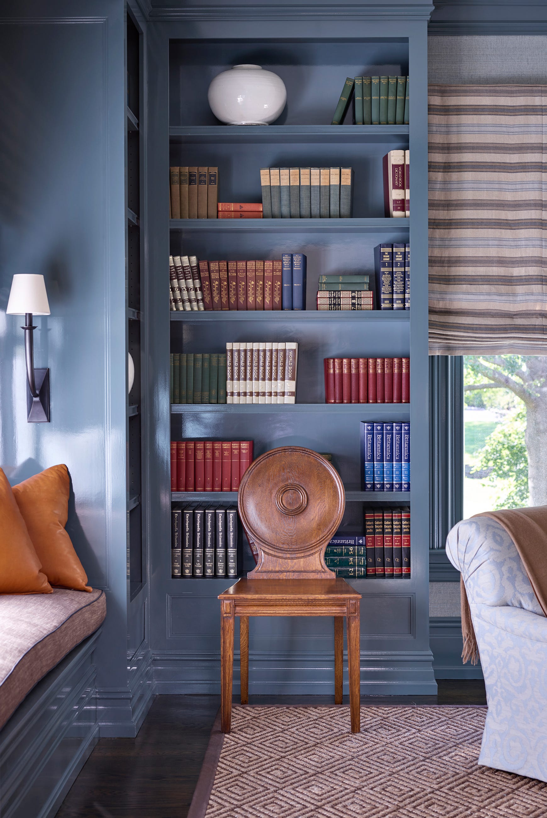
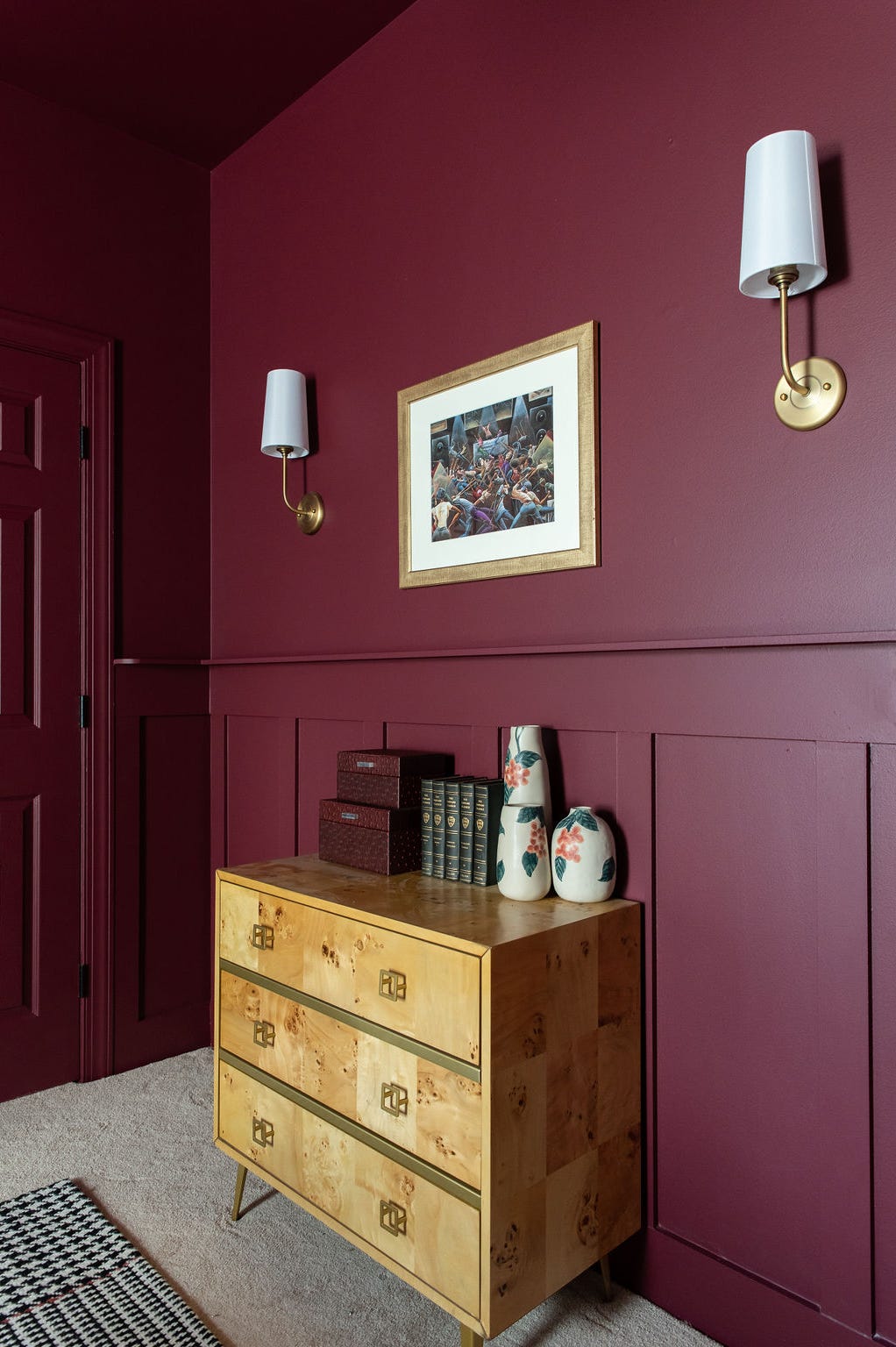
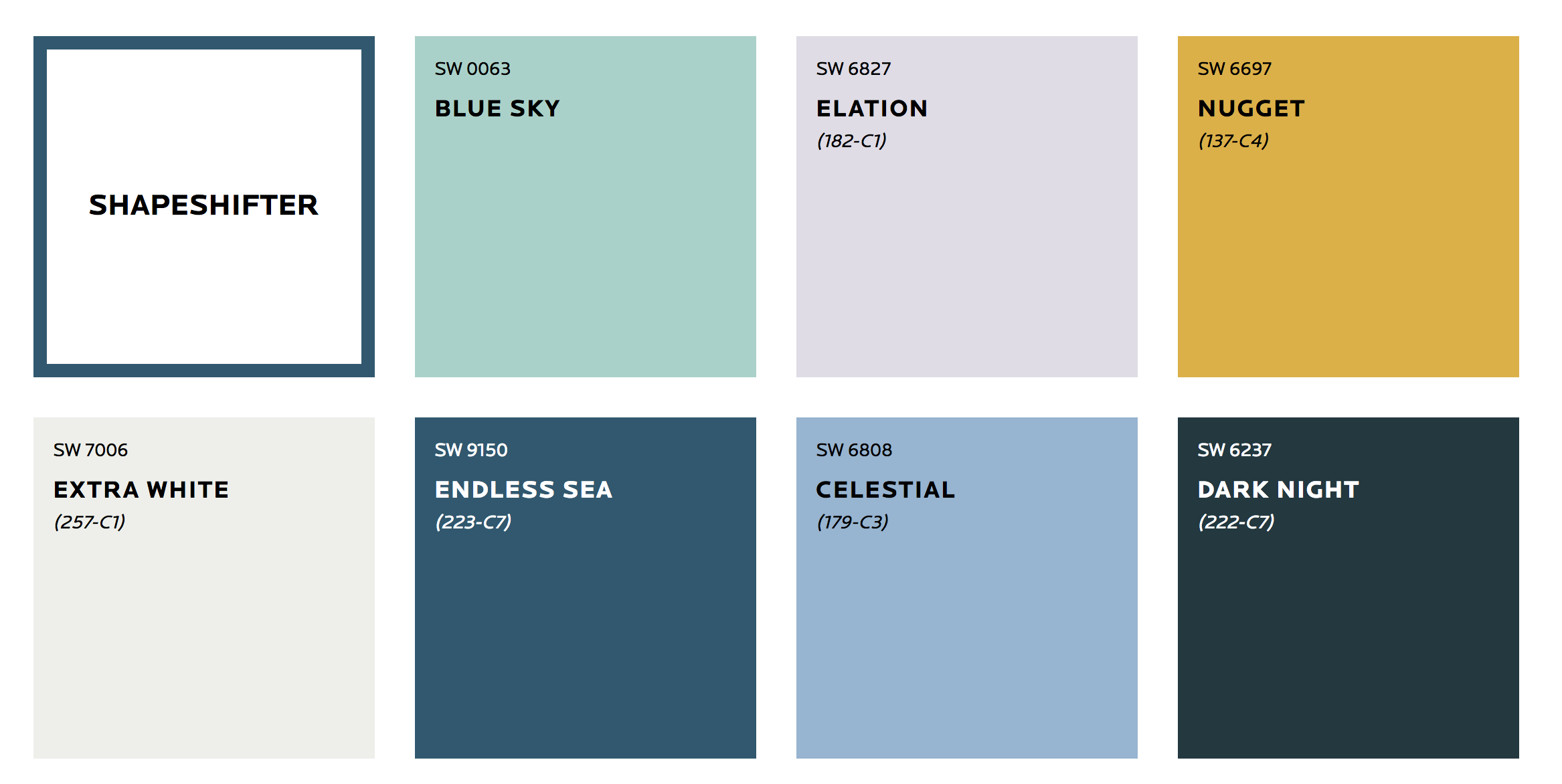
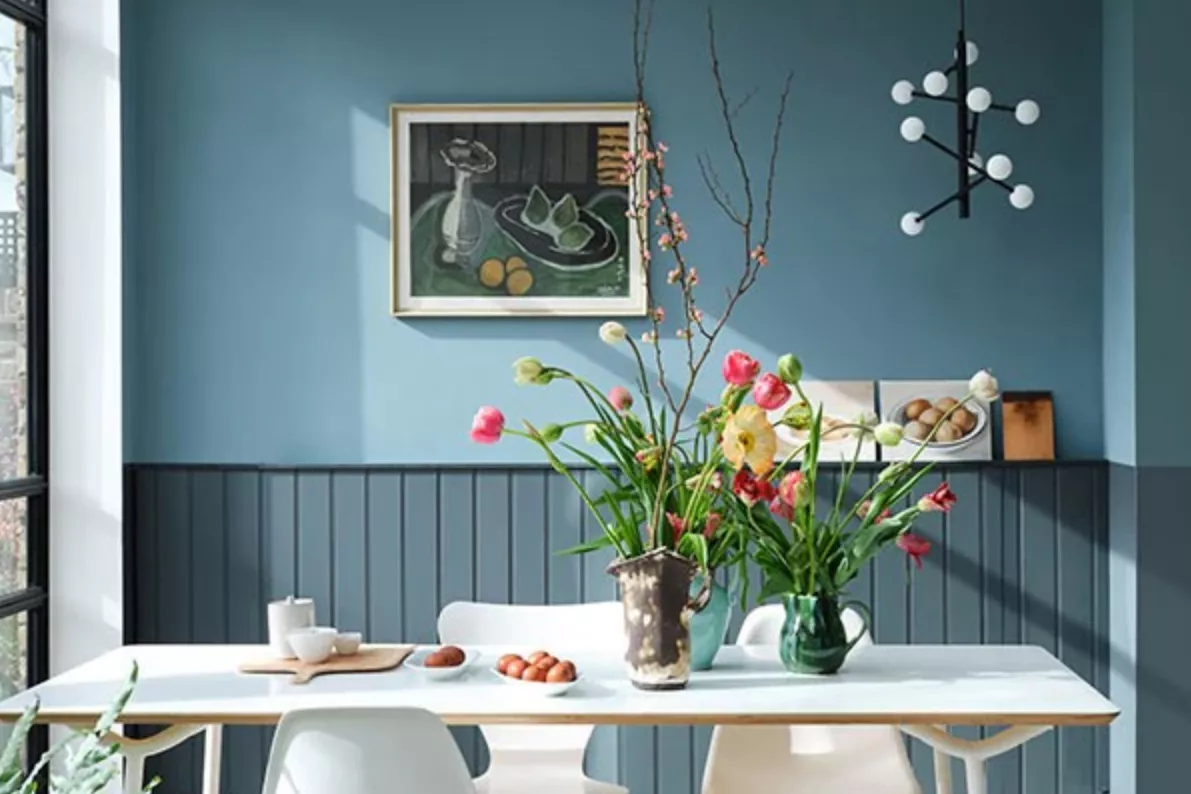
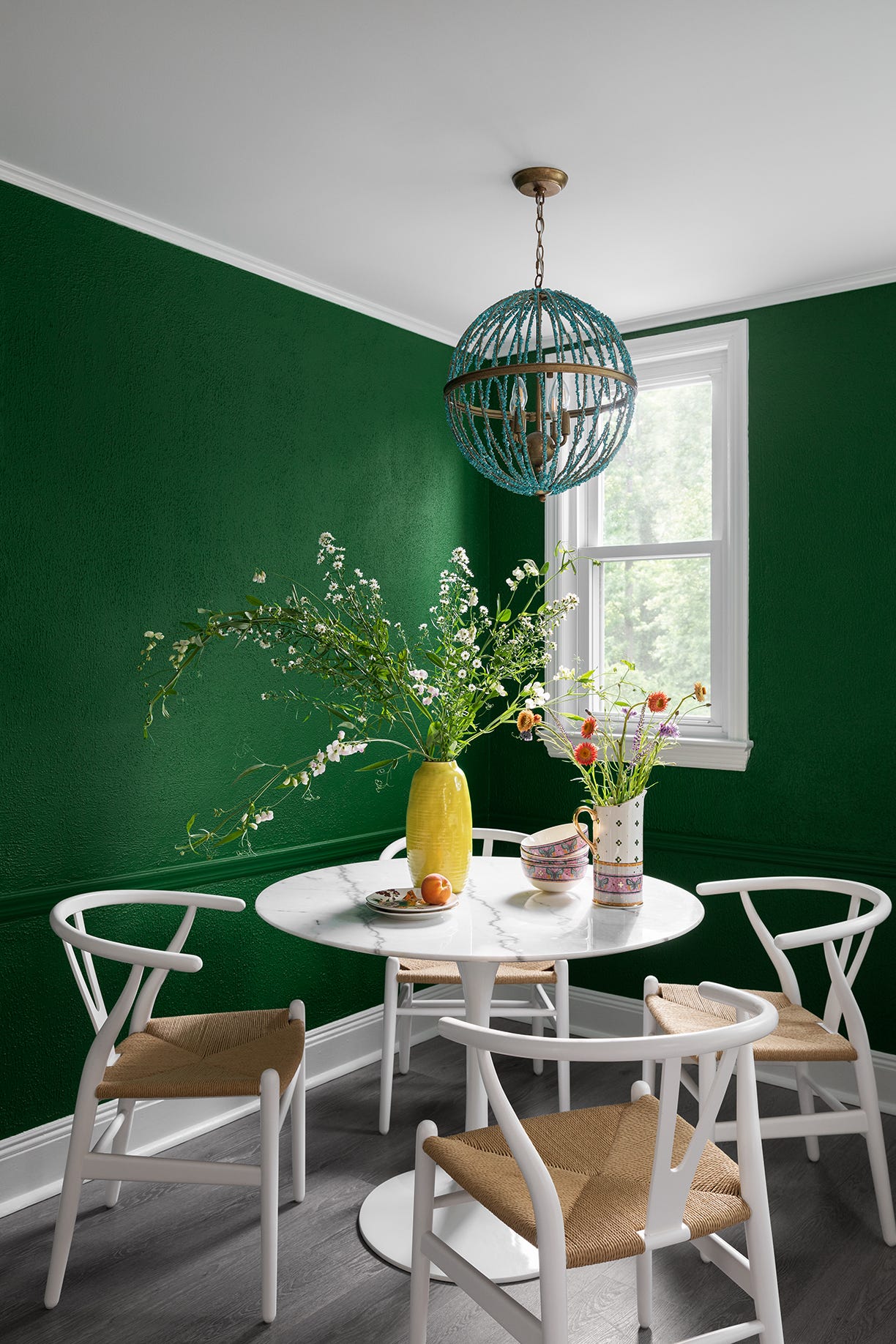
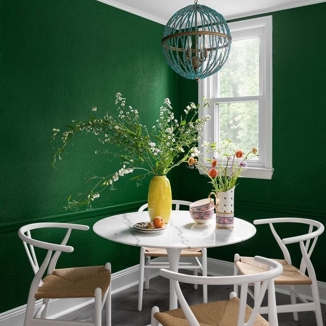
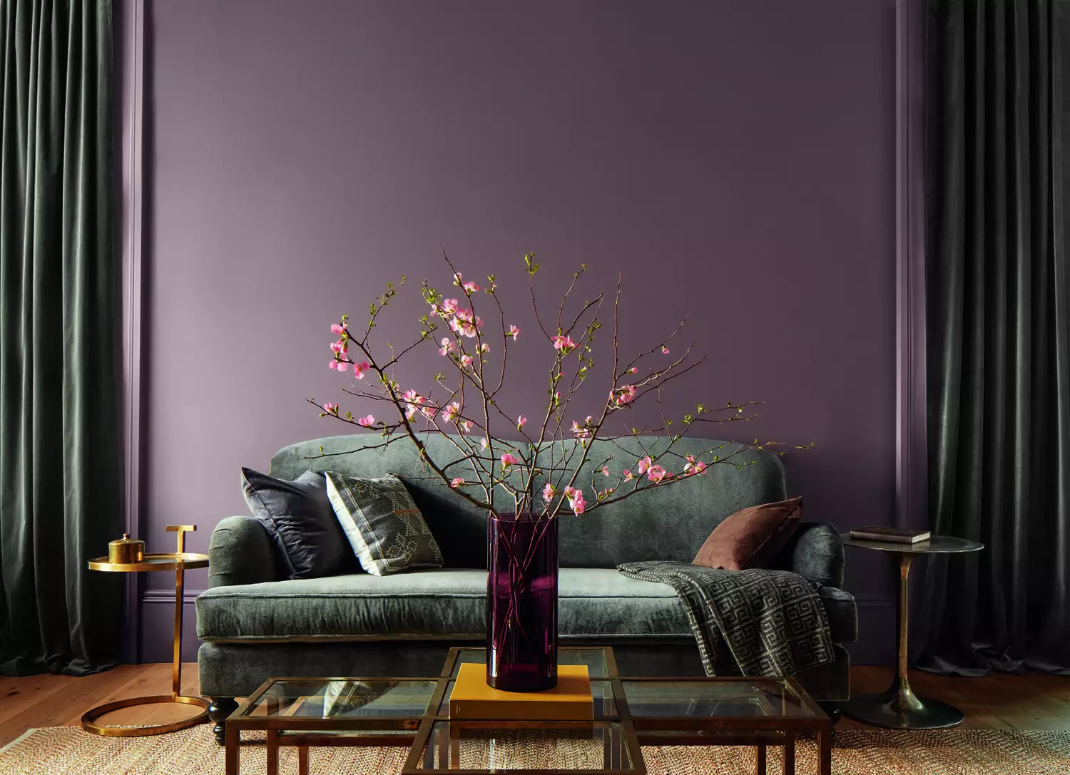
The third category, Statement Hues, includes richer and more vibrant colors like deep blues, lush greens, and a cheerful sunny yellow. While the term "statement" might initially suggest boldness, these colors are curated to serve as effective accent colors within the broader palette. They are designed to be used in conjunction with the neutral and earthy tones, providing depth and focal points without overwhelming the space. This strategic use of accent colors allows homeowners to introduce splashes of vibrancy that enhance the overall design without compromising the serene, nature-inspired theme. This curated selection offers reliable options for freshening up home interiors, with any combination of these paints expected to yield aesthetically pleasing results. Additionally, Pottery Barn extends its free design crew services to customers, offering professional guidance for styling and incorporating these new colors. As an added incentive, a discount code is available through the Pottery Barn landing page, providing $15 off purchases of $75 or more at Sherwin-Williams, making it more accessible for consumers to transform their homes with these trending colors.
#PotteryBarn #SherwinWilliams #PaintPalette #HomeDecor #InteriorDesign #ColorTrends #NatureInspired #DesignCollaboration #HomeImprovement #PotteryBarn #SherwinWilliams #PaintPalette #HomeDecor #InteriorDesign #ColorTrends #NatureInspired #DesignCollaboration #HomeImprovement
合計0件のコメント
 まだコメントはありません
あなたも好きかもしれません
We asked paint brands what their most popular shades of 2024 were – these were the 13 favorites

These Are the Colors You'll Be Obsessed With Next Year, Based on Your Personality

Sherwin-Williams' 2026 Color Forecast Is Here and It’s Packed With 48 Fresh Hues
7 Bold Paint Colors Interior Designers Are Longing to Use on Their Next Projects

12 Trending Paint Colors for 2024, According to Design Experts

What are Sherwin-Williams' best-selling paints? And how interior designers put them to use
If You Can't Find Your New Paint Color in Sherwin-Williams' 2026 Palettes, We'll Be Shocked

The Interior Paint Colors You'll Be Seeing Everywhere in 2024

The most timeless paint colors according to designers
12 Paint Colors That Interior Designers Are Buzzing About—See the Gorgeous Hues Here
These 20 Paint Colors Will Never Go Out of Style, According to Designers
Color Atelier Unveils New Limewash Collection With Sarah Sherman Samuel
Sherwin-Williams Predicts These 4 Color Palettes Will Dominate Homes in 2026—and One May Surprise You

7 Color Trends That Will Be Huge in 2024, According to Color Experts

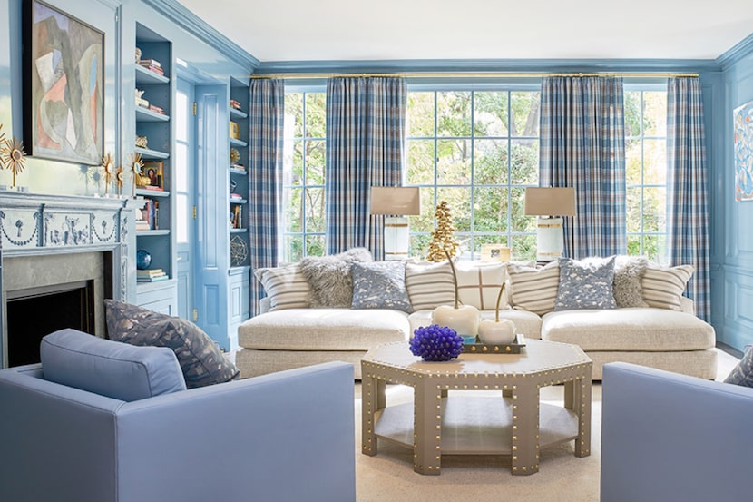
19 go-to paint colors that Dallas designers love
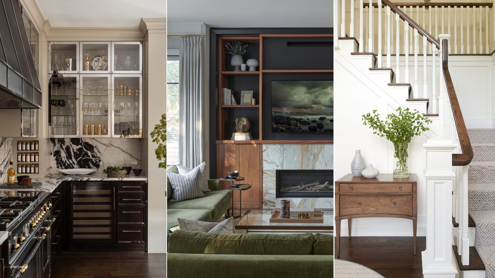
We asked 12 interior designers for their favorite Sherwin-Williams paints – these are the colors that came out on top
Take 'Disco Nap,' and other 2021 colors of the year, for a spin

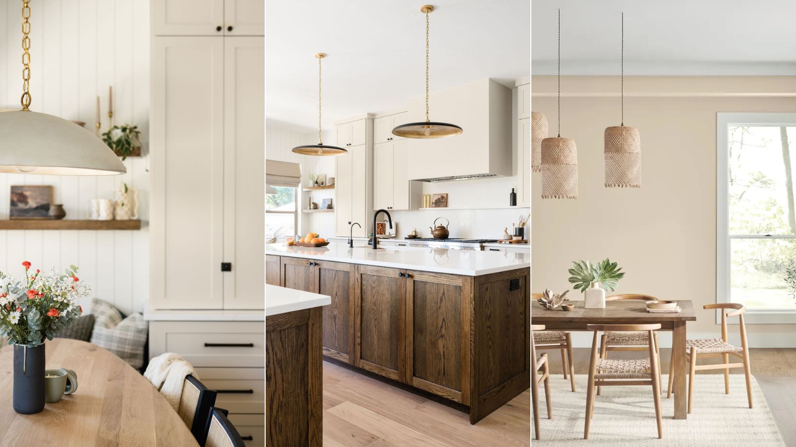
Sherwin-Williams' Accessible Beige is the 'perfect…

These Are the Neutral Paint Colors Interior Designers ACTUALLY Use
7 Sherwin-Williams Paint Colors Interior Designers Can’t Stop Using