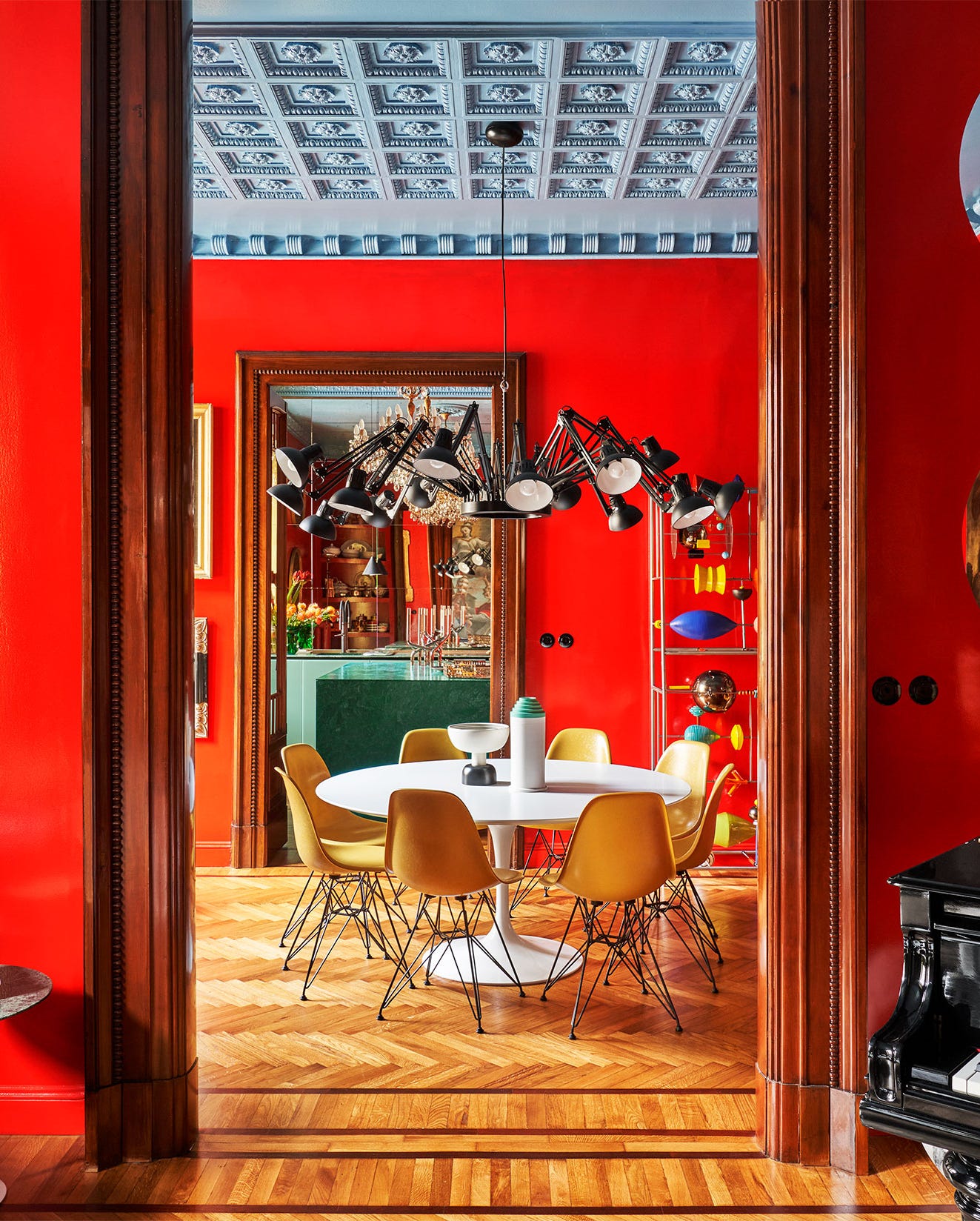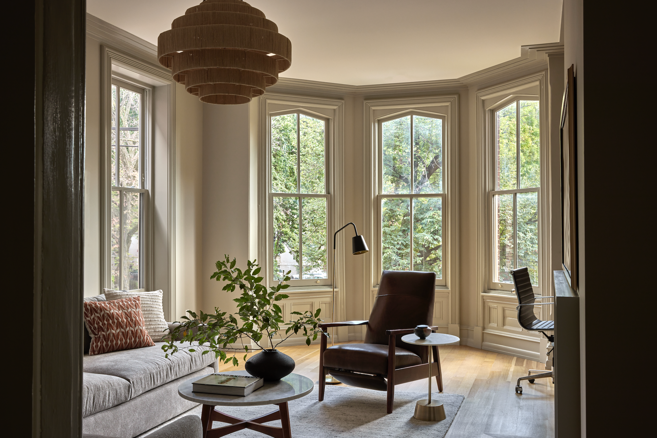
A color expert shares the 8 shades you should use in your living room this year
This article explores the recommendations of color expert and designer Maria Killam regarding popular and timeless color choices for living rooms. Killam advocates for incorporating vibrant hues over traditional neutrals, asserting that the latter can quickly become dated. She highlights eight specific shades that offer both aesthetic appeal and design versatility.
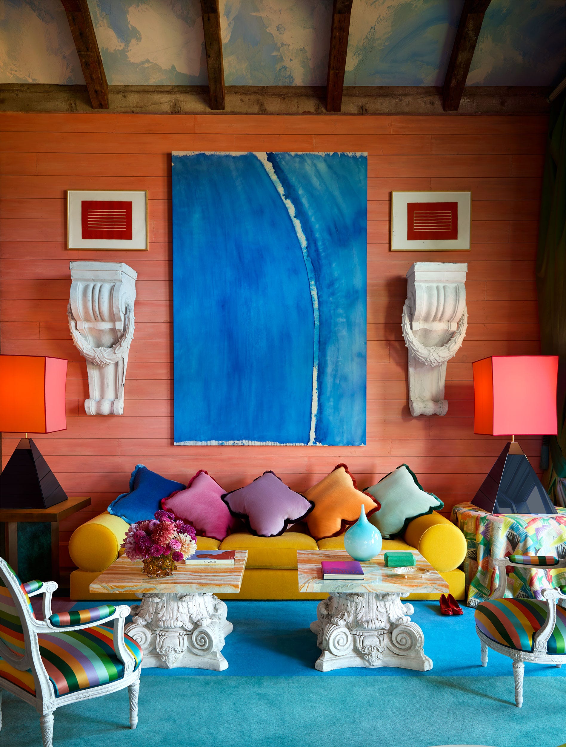
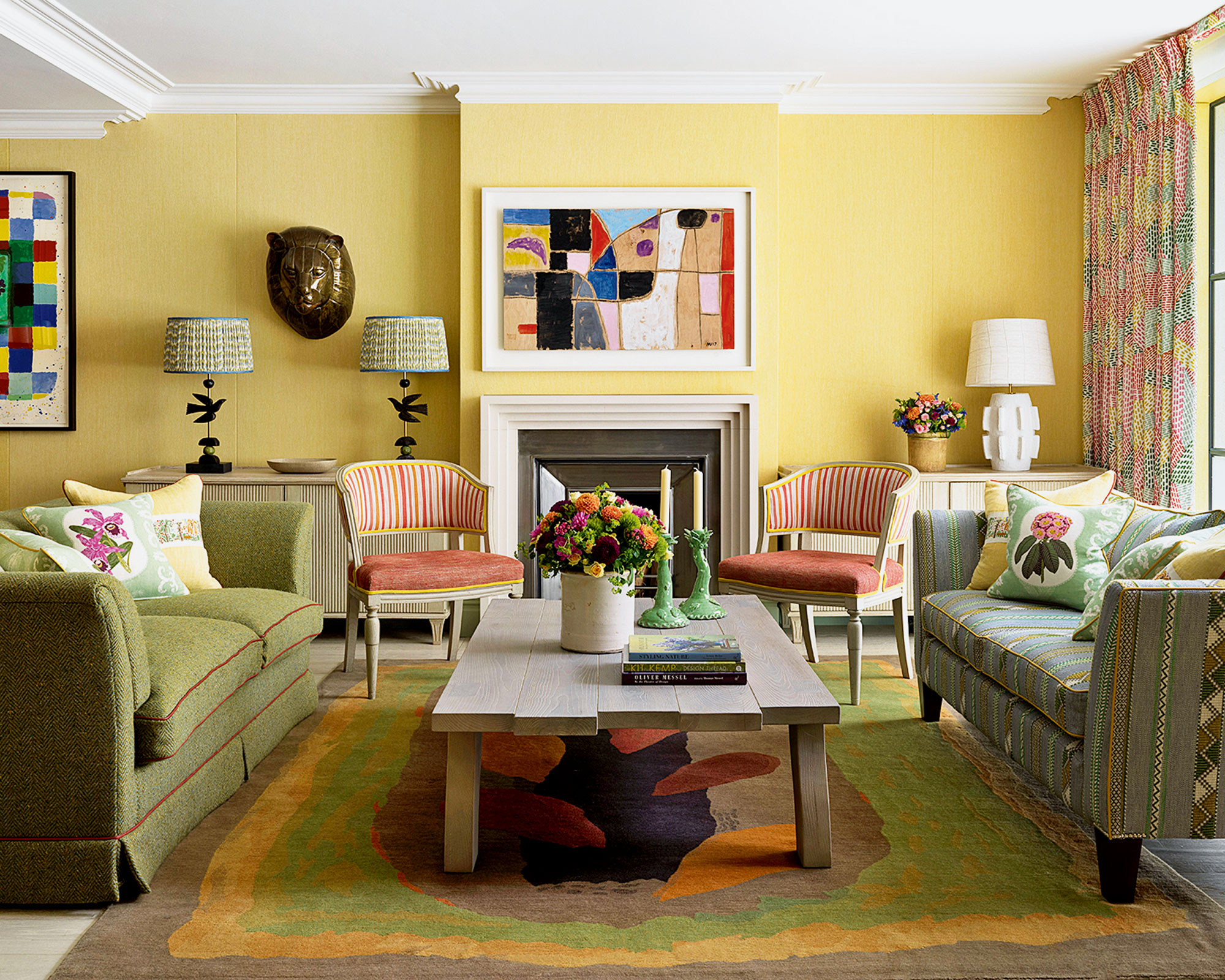
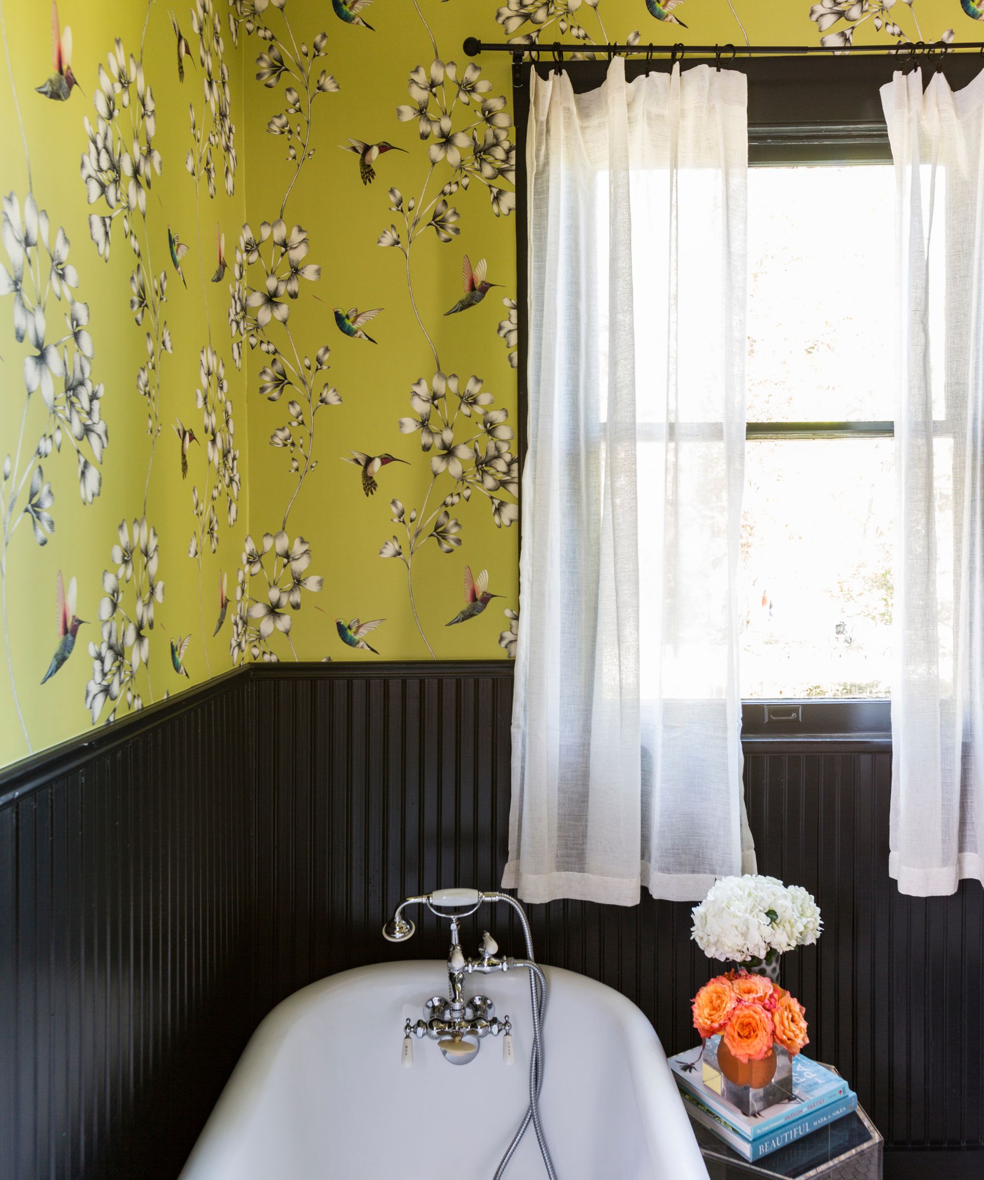
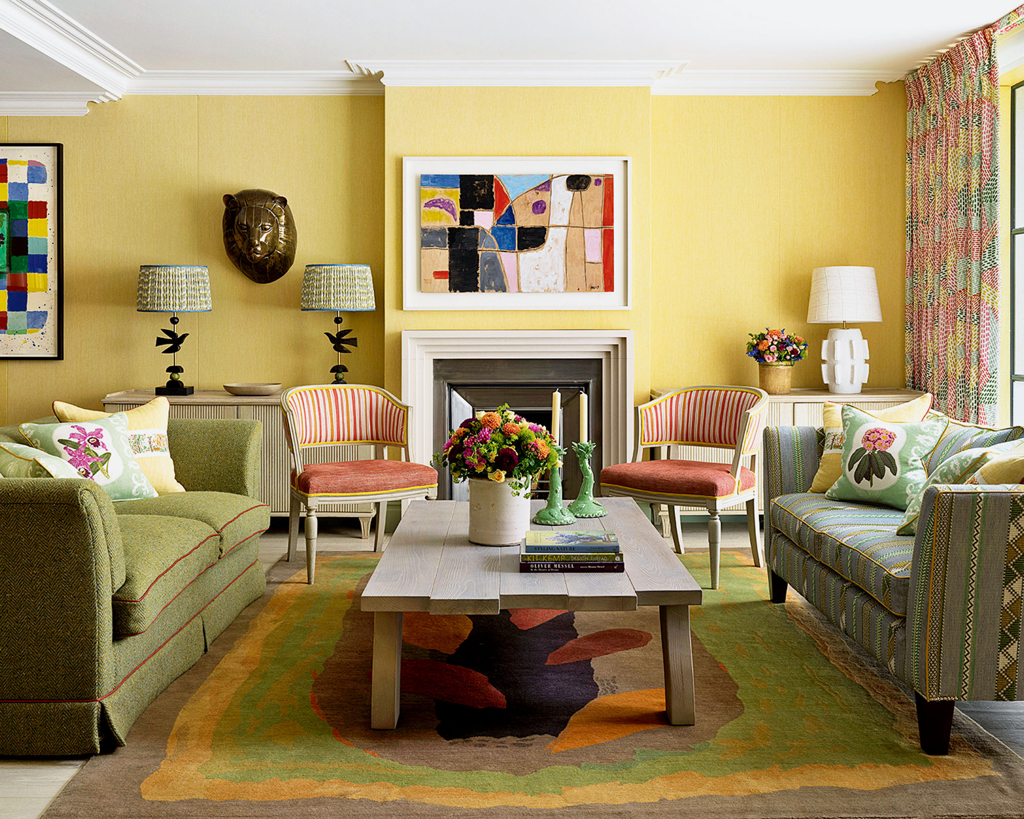
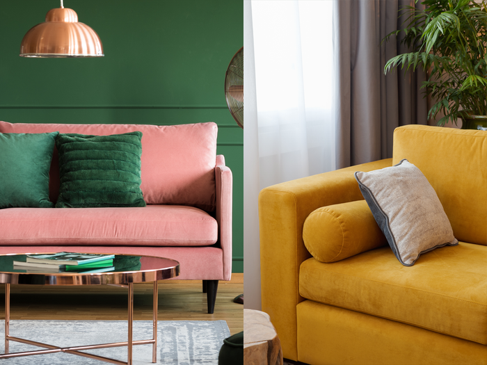
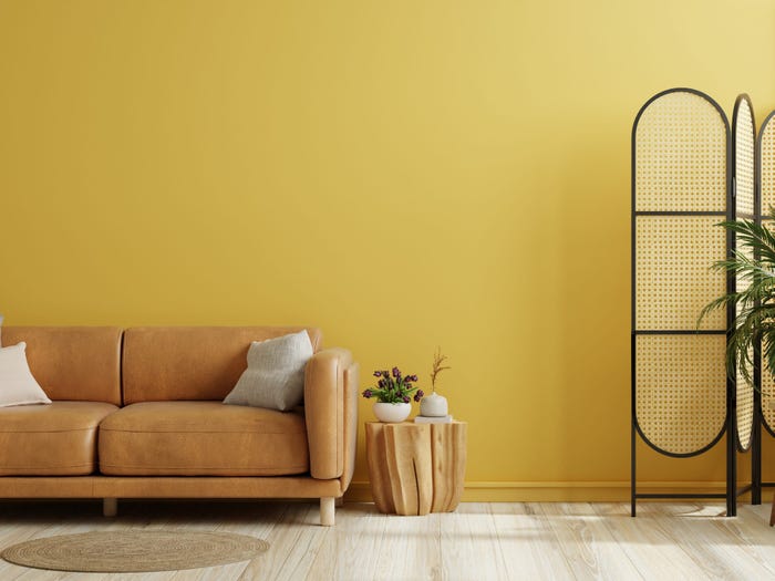
Yellow, particularly a bright and happy shade, is presented as a surprisingly timeless choice for living room furniture, such as a sofa. Killam notes that her own yellow sofa has remained relevant and beautiful in her living room for over a decade, adapting well to various decorating palettes. This challenges the common perception that bold colors are inherently less enduring than neutrals.
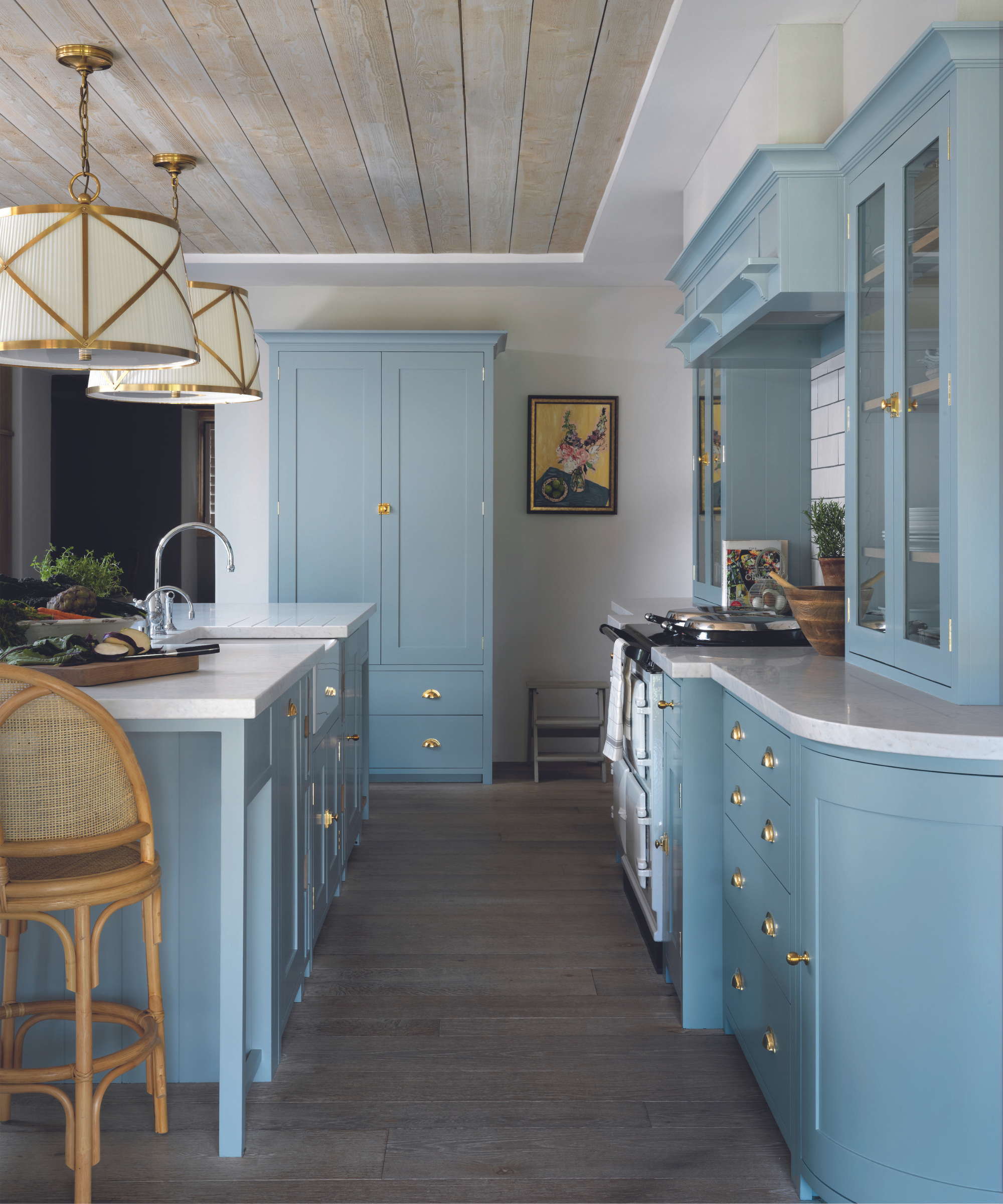
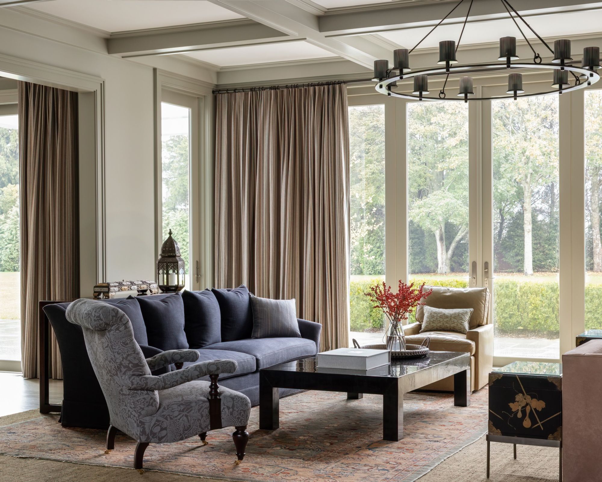
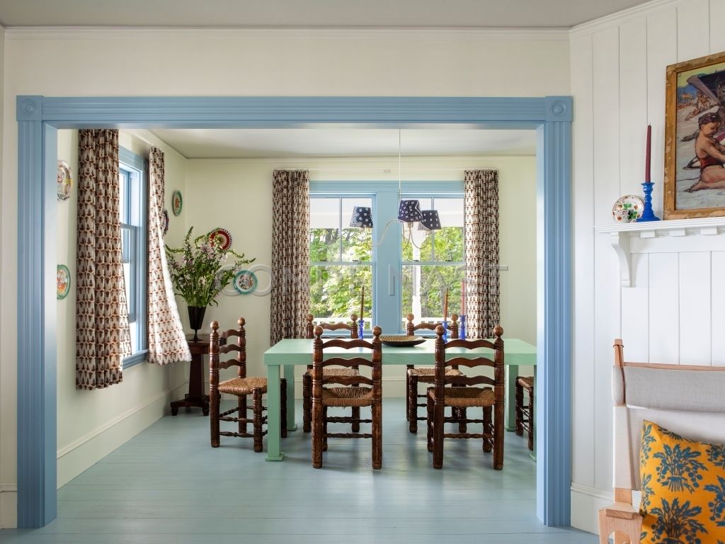
Traditional blue is another color recommended for its classic and serene qualities. It is described as a versatile option that pairs easily with white and can be accented with other colors and warm wood tones to create a polished and classic aesthetic. The adaptability of blue makes it a reliable choice for long-term design.
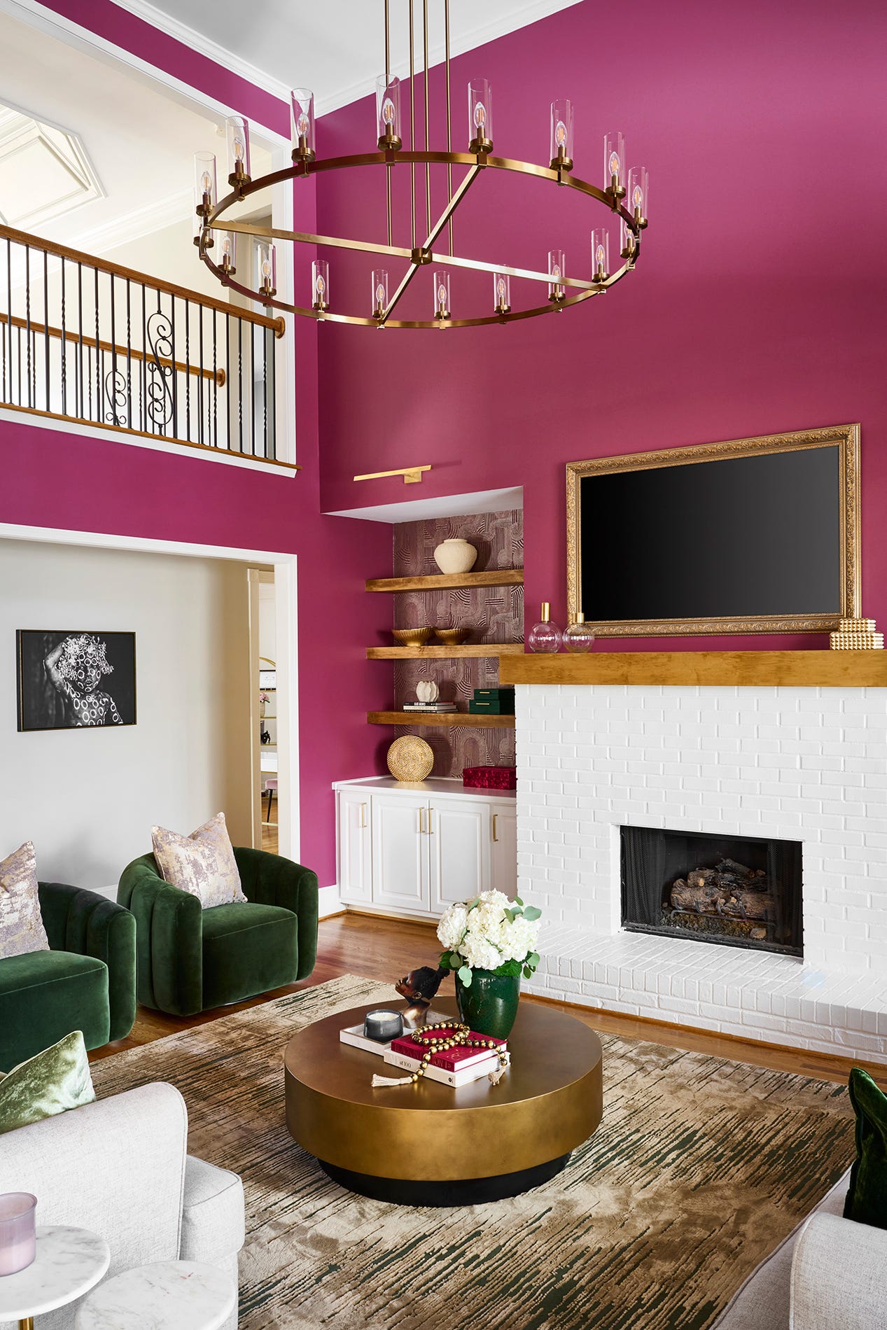
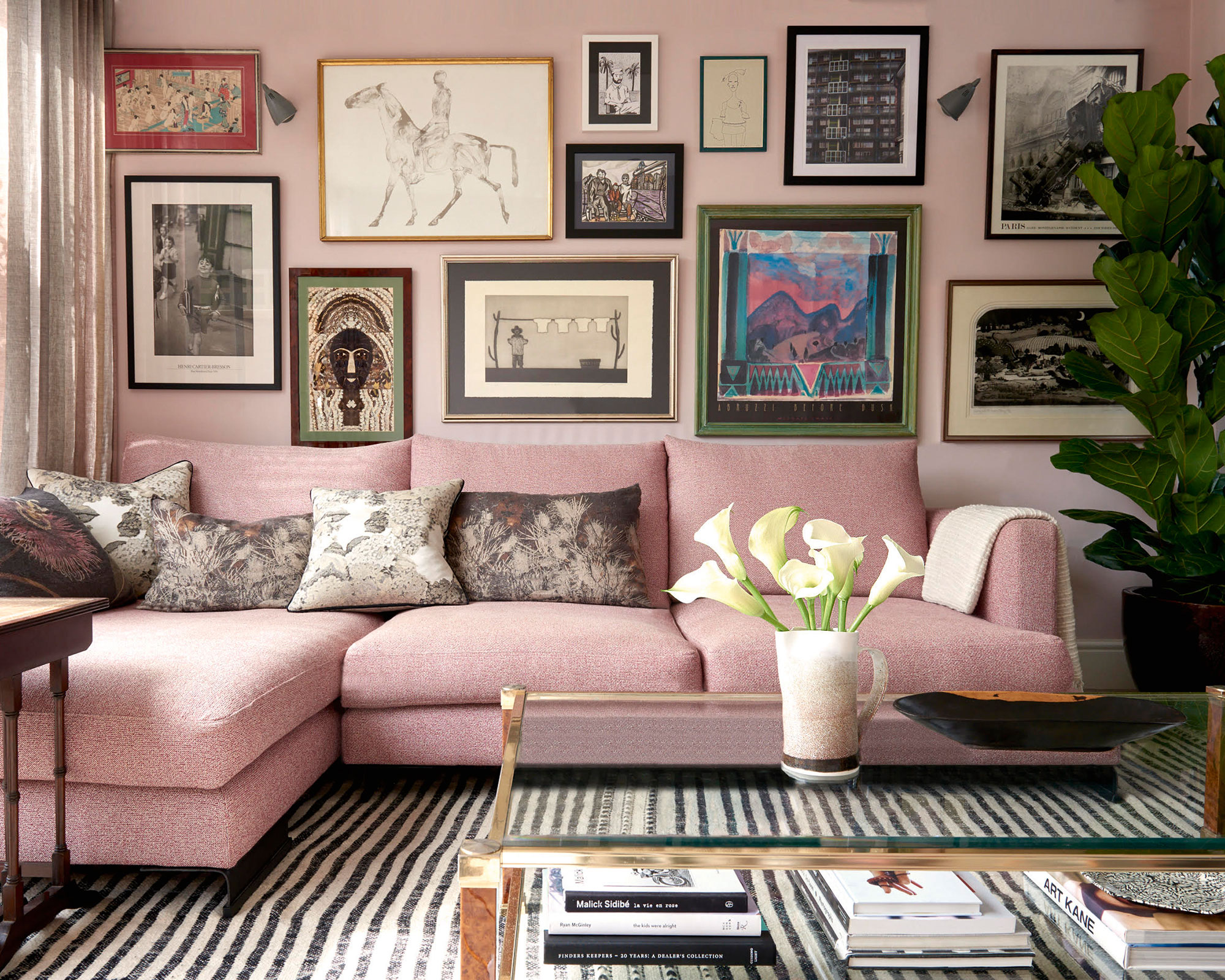
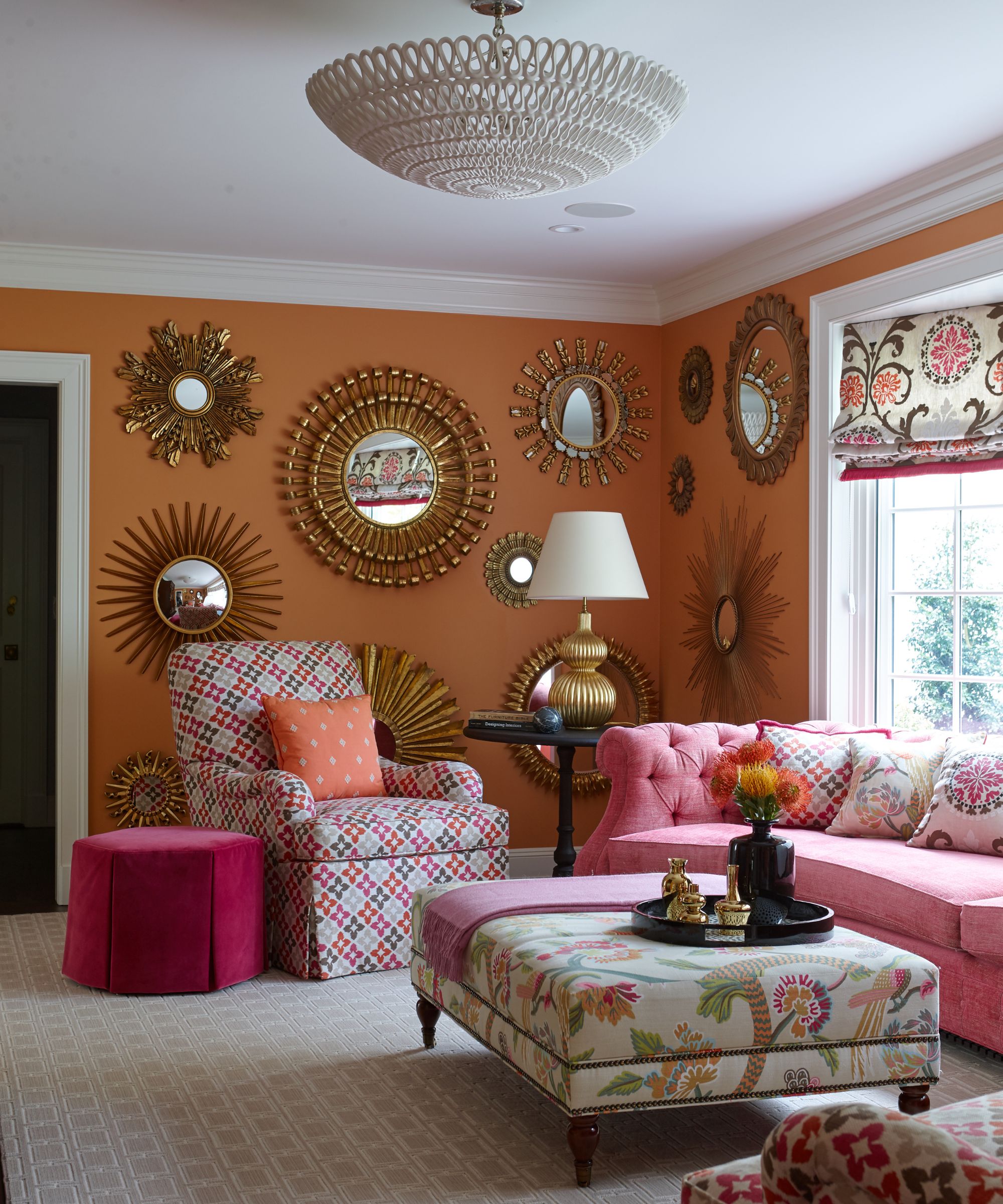
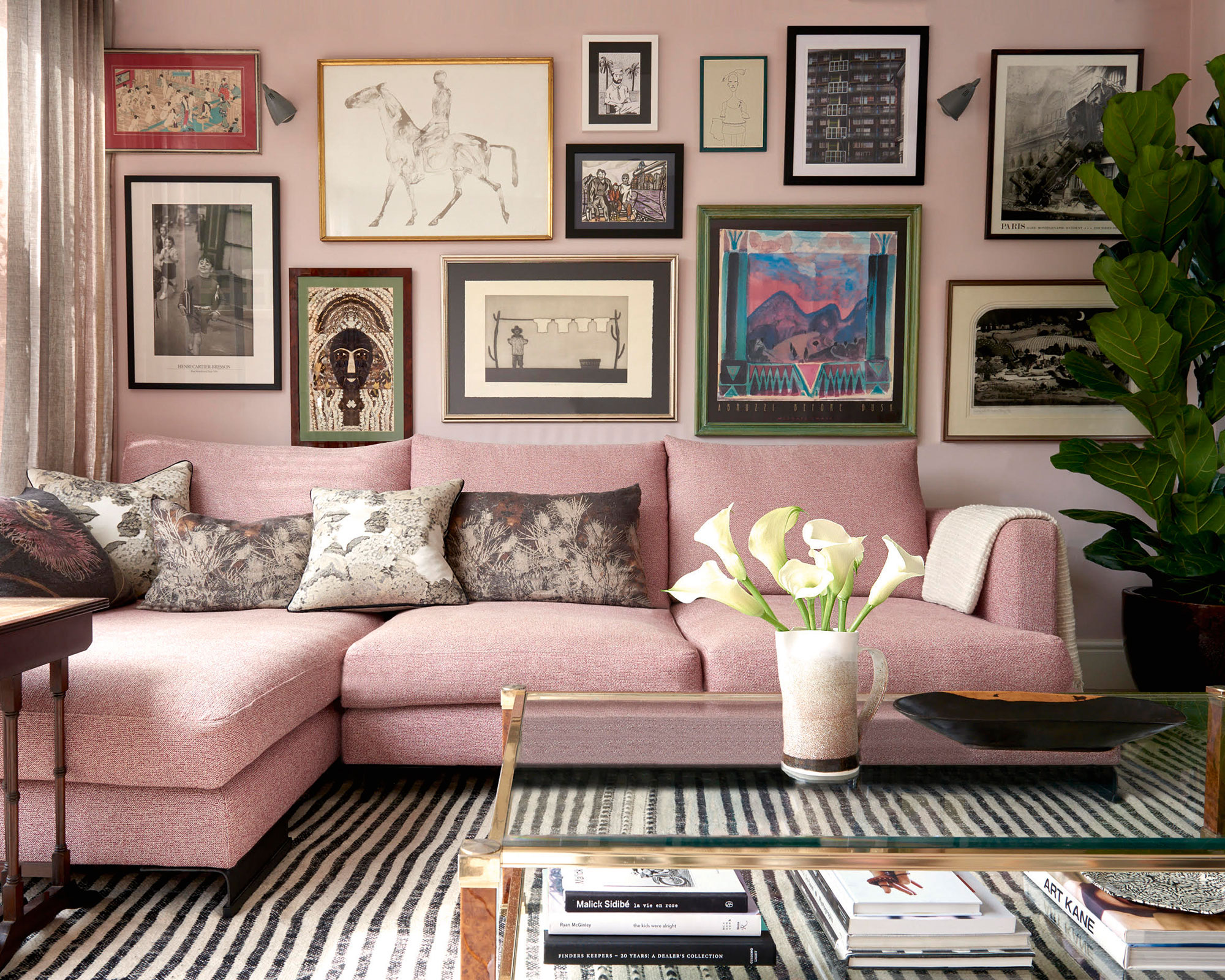
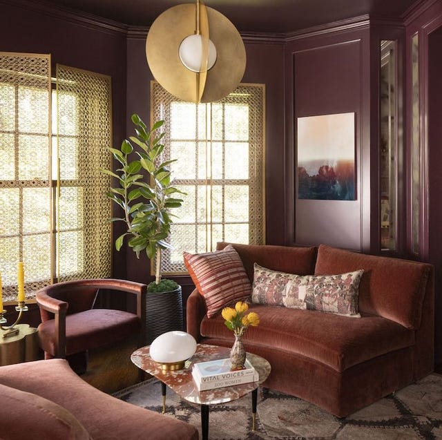
Sophisticated pink is identified as a versatile and enduring hue, suitable for a living room sofa. The color's ability to be integrated through paint choices and area rugs allows for a cohesive and tasteful overall design.
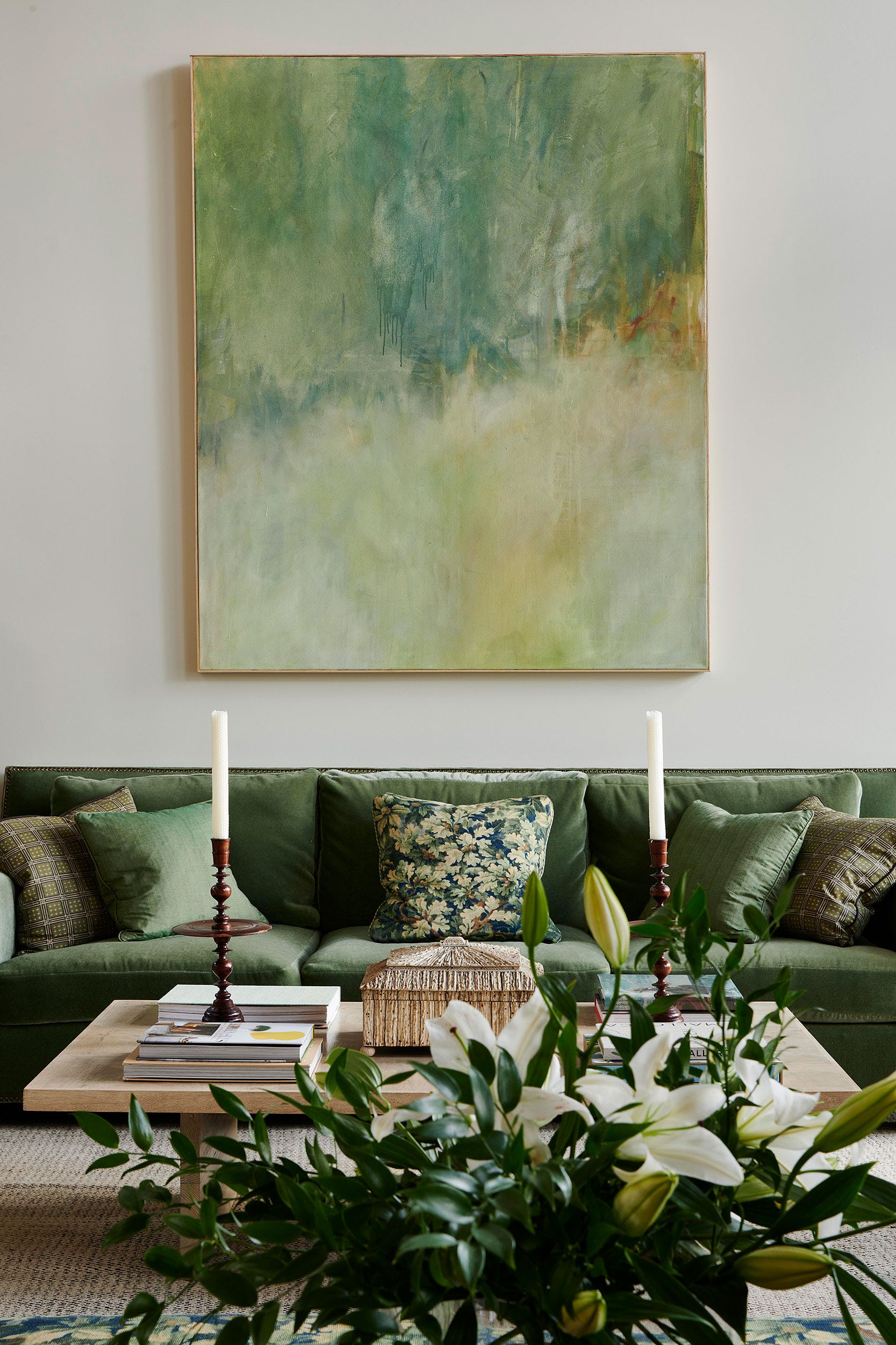
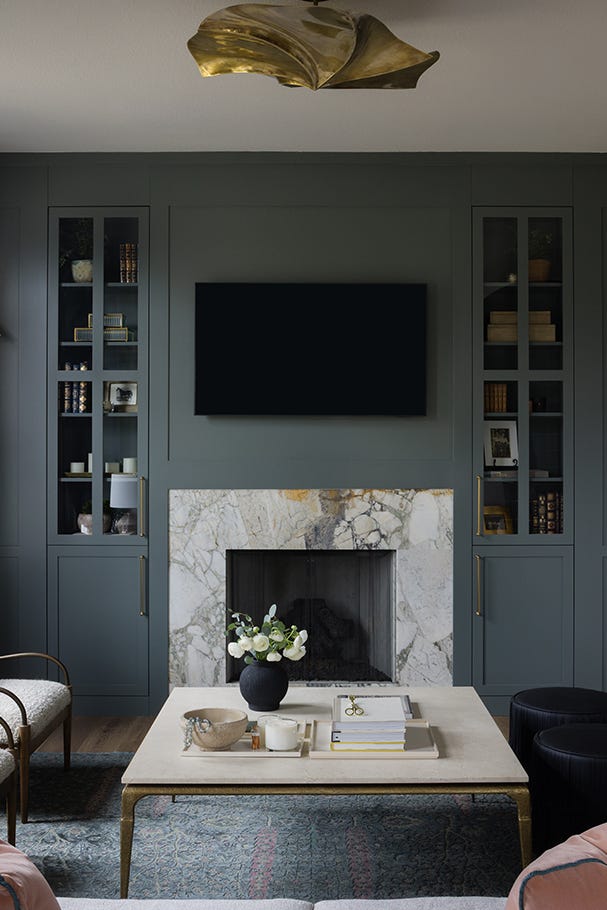
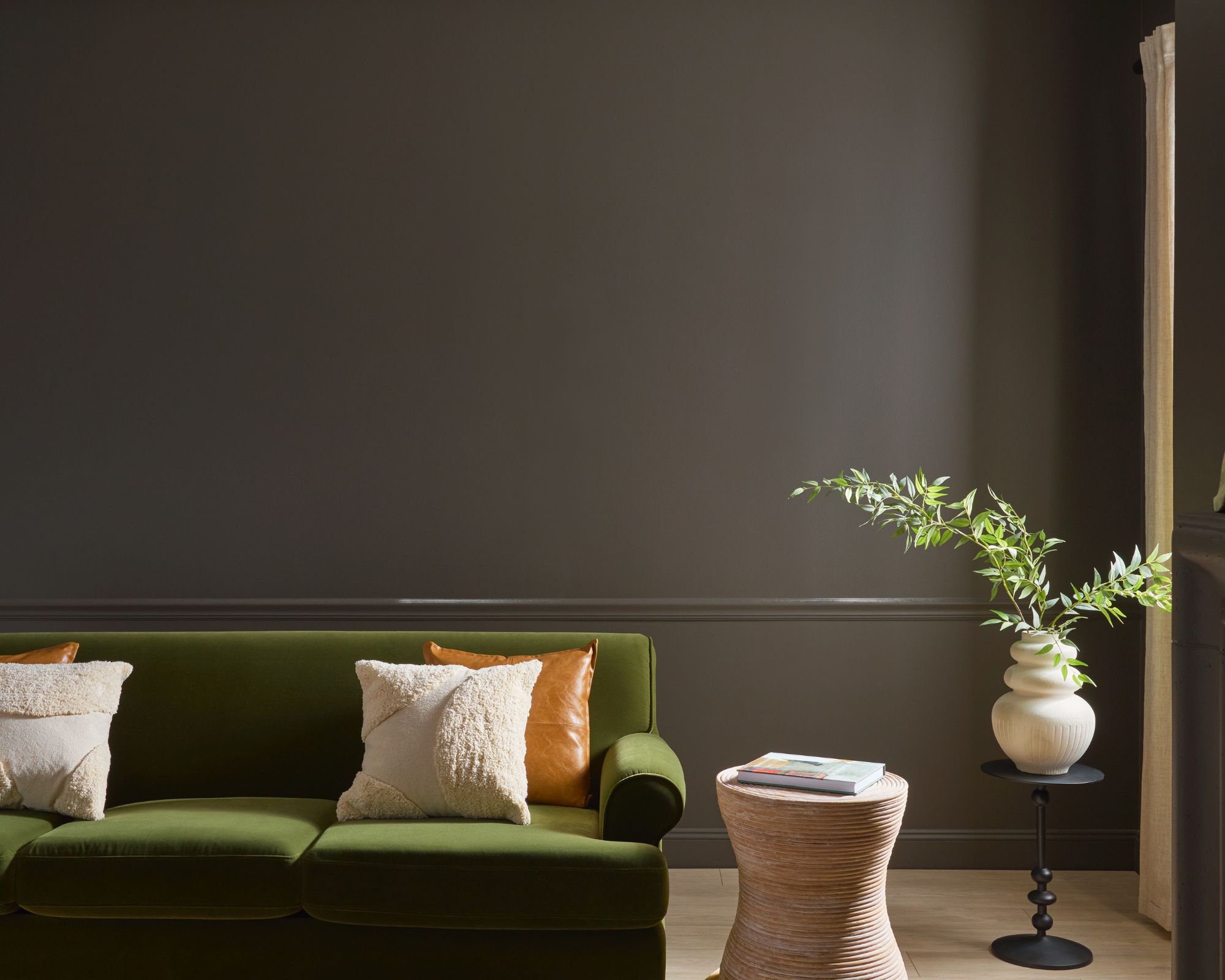
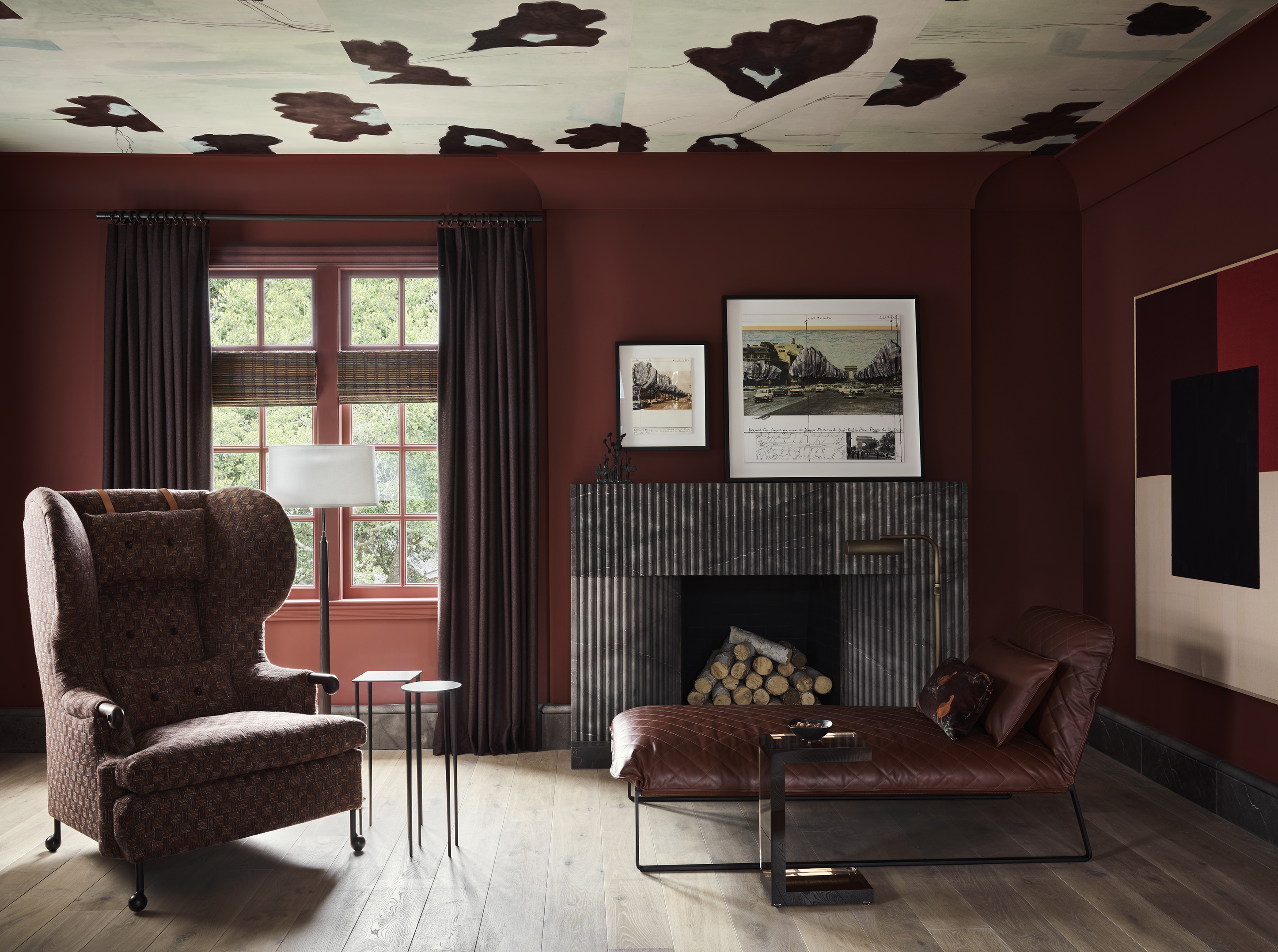
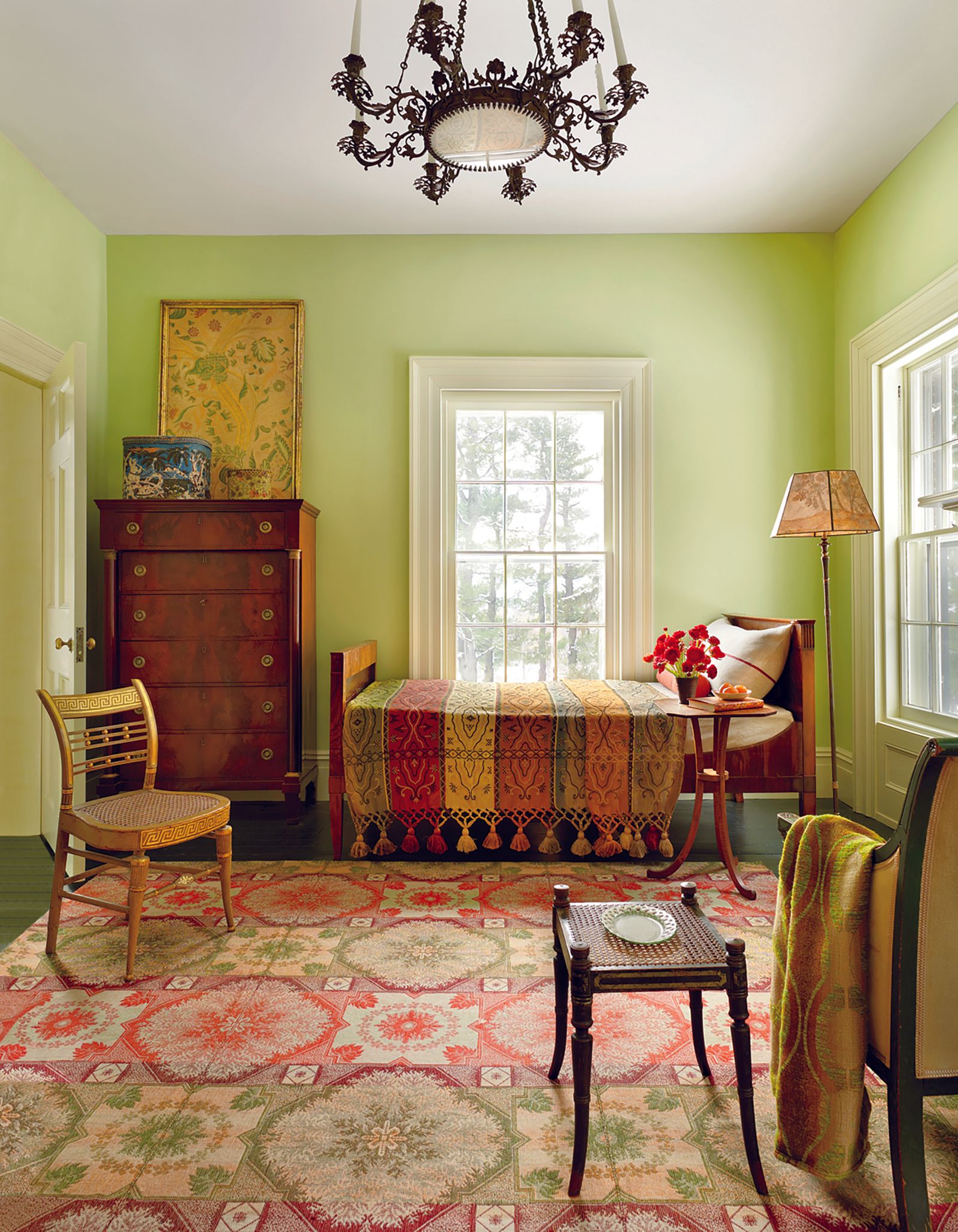
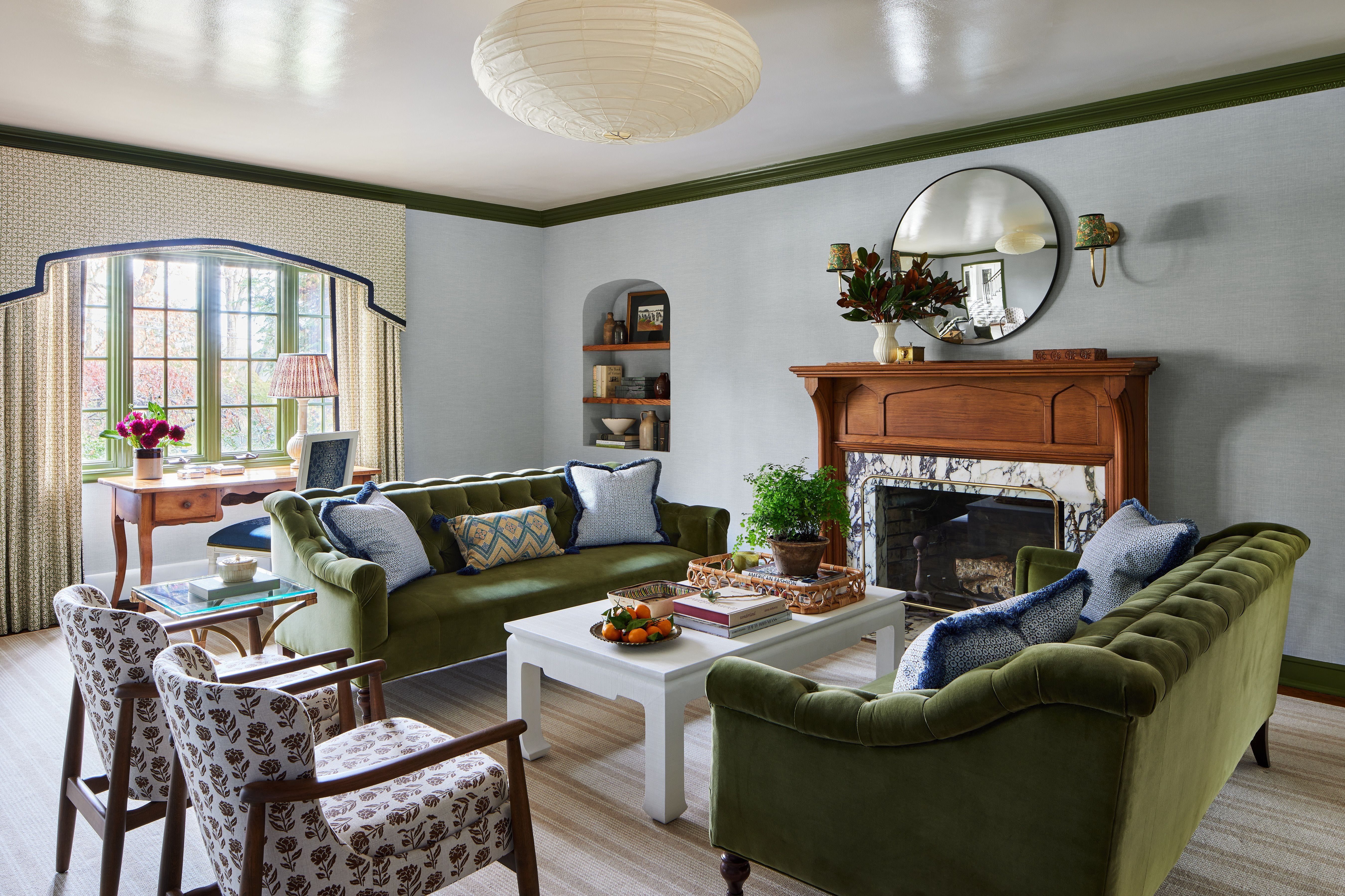
Deep green, inspired by nature, is highlighted for its versatility and calming effect. It can be introduced through various decor elements, including plants, and complements a wide range of interior styles.
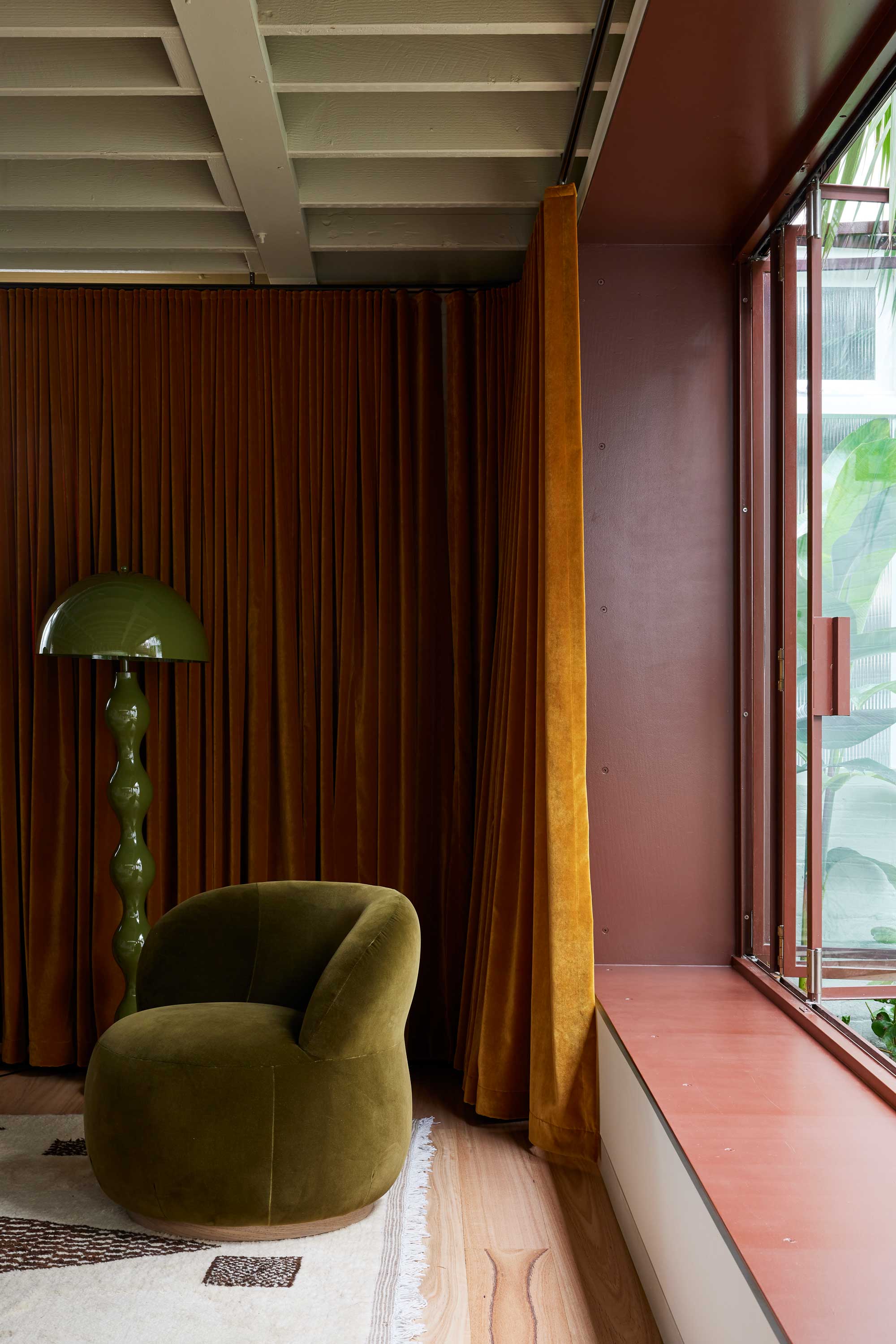
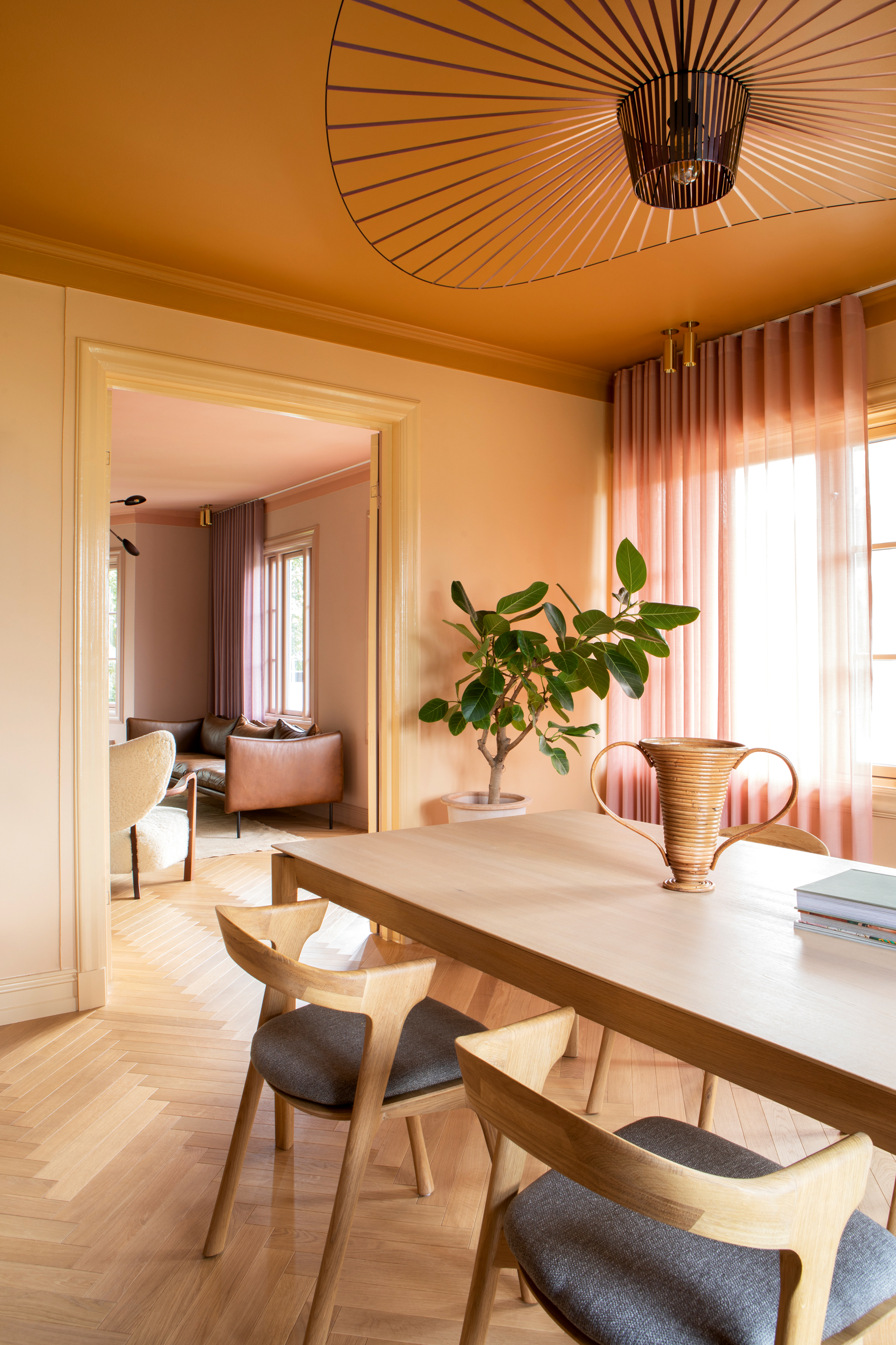
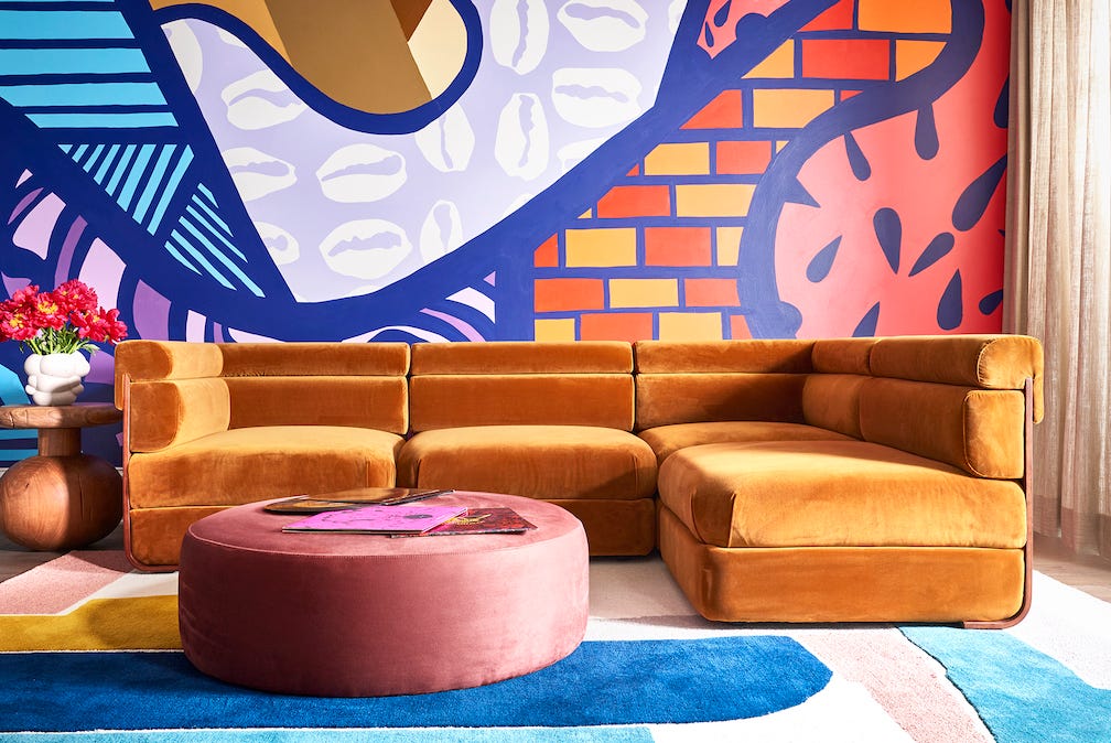
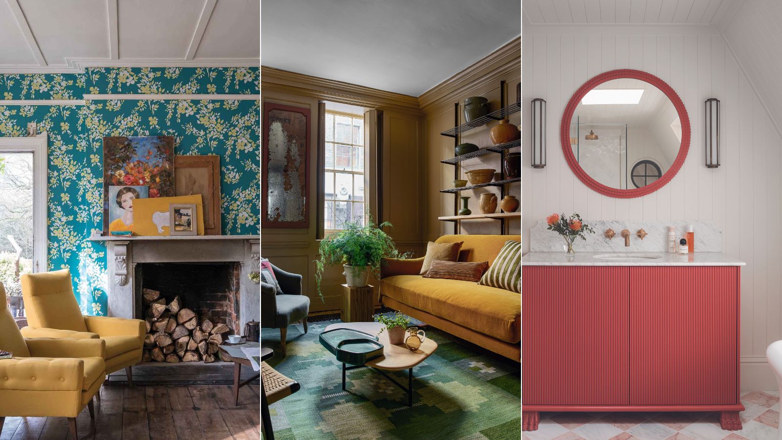
Rich ochre, a more muted gold variation of yellow, is gaining popularity for its ability to work well in both modern and traditional decor settings. It can be used for larger elements like sofas or as a bold wall color, providing a cozy ambiance.
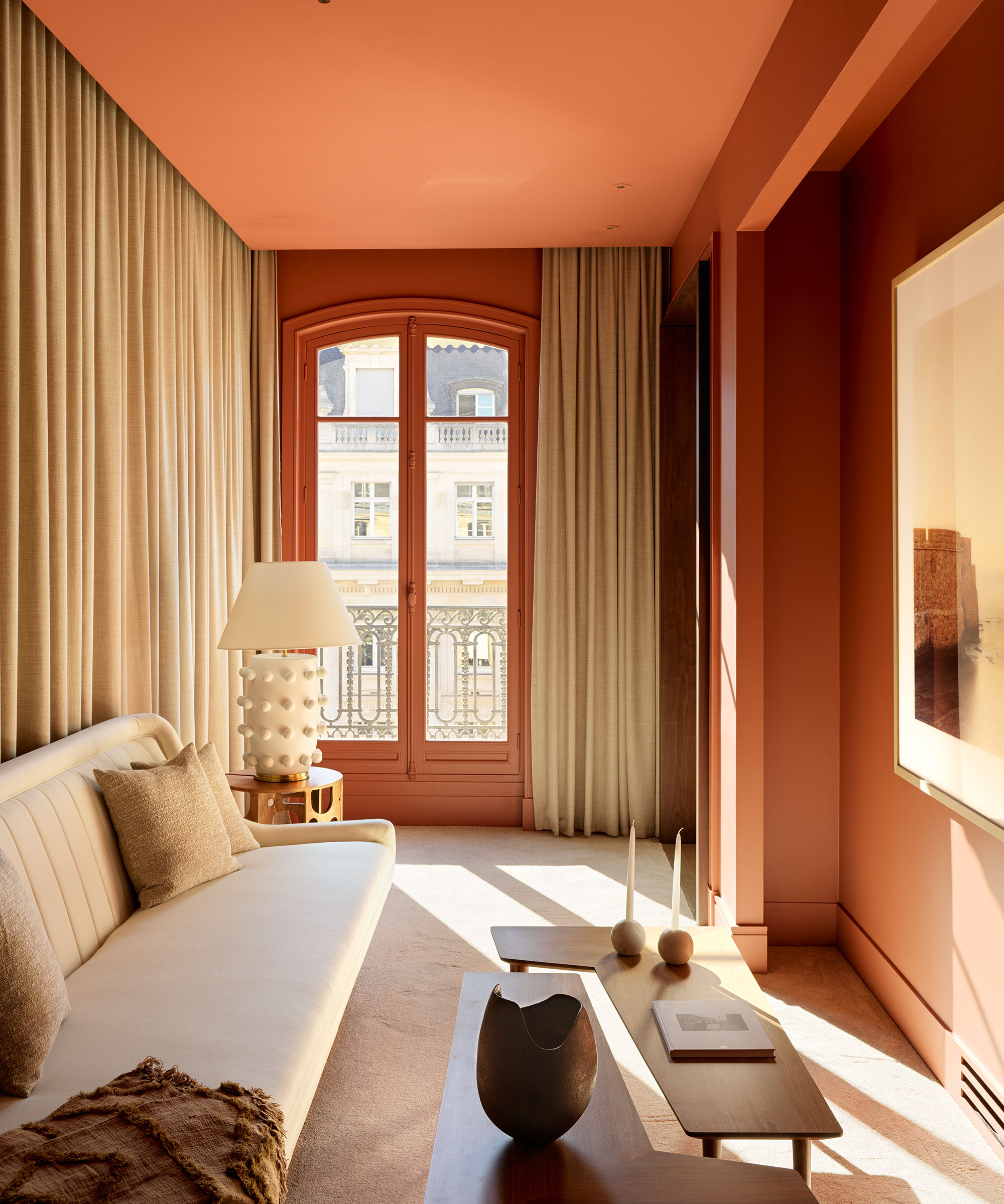
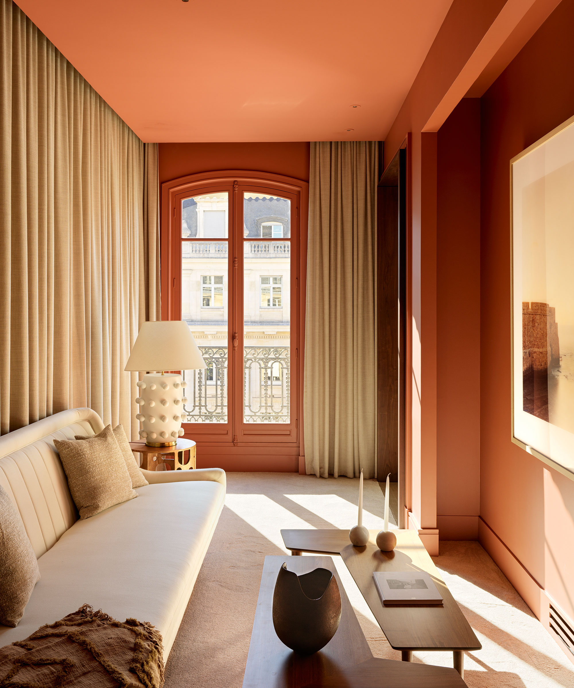
Warm burnt orange is presented as an antidote to desaturated decor, offering personality and warmth. With variations ranging from spicy red-orange to cleaner coral tones, it allows for customization based on individual preferences and coordinating decor.
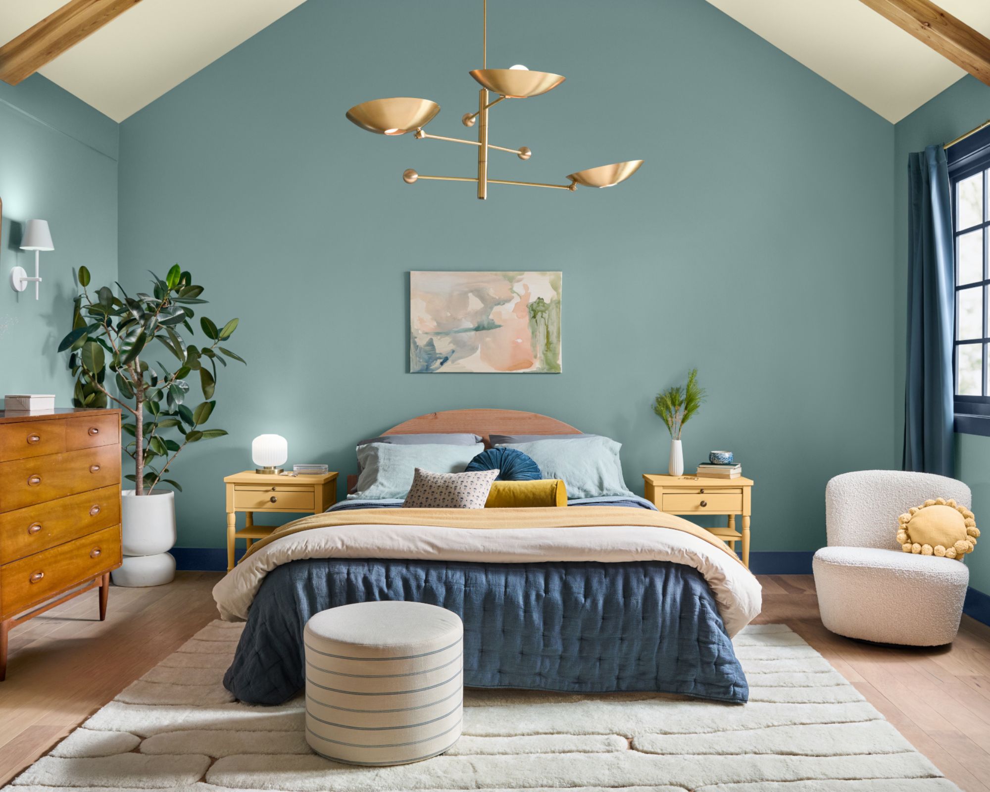
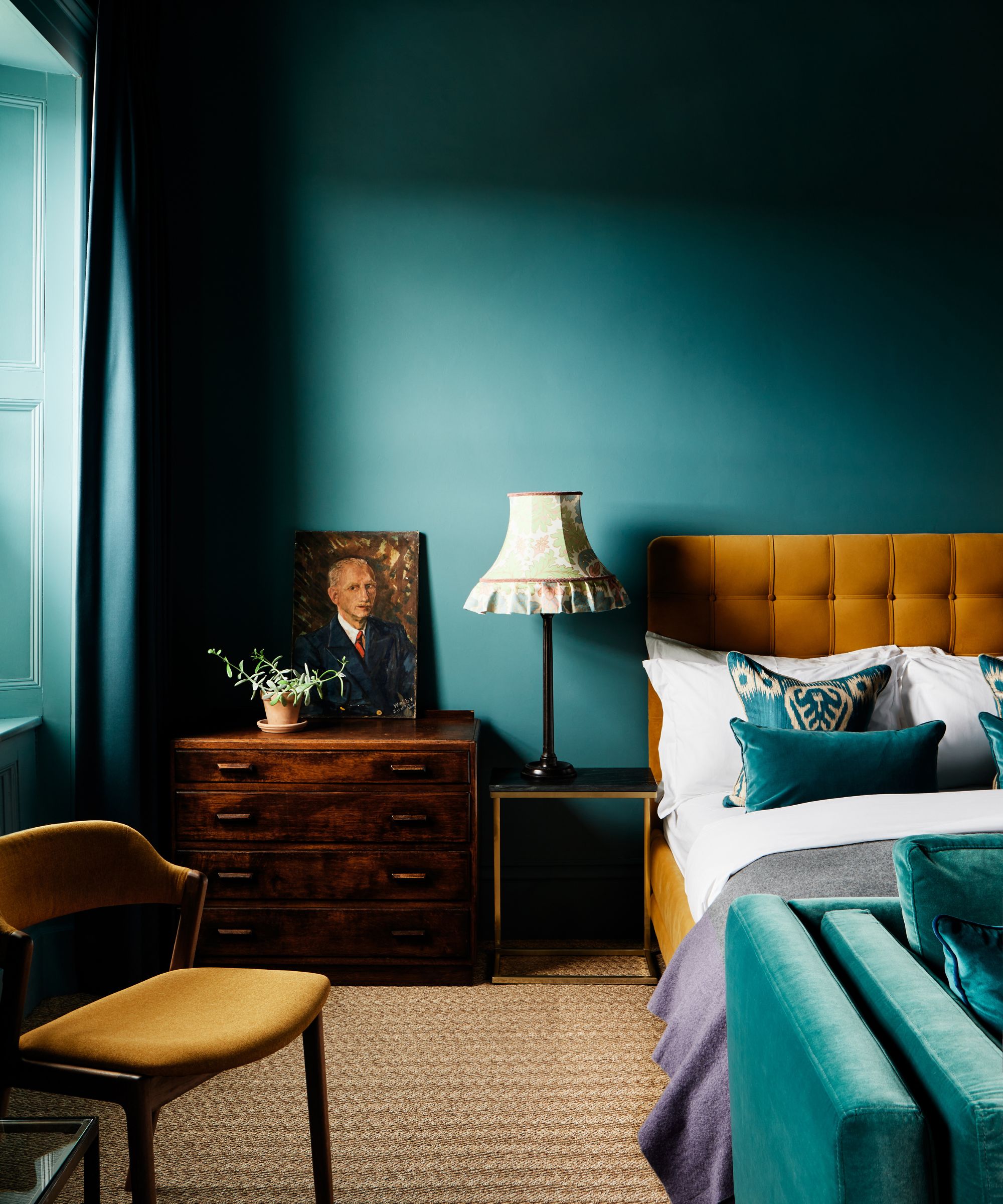
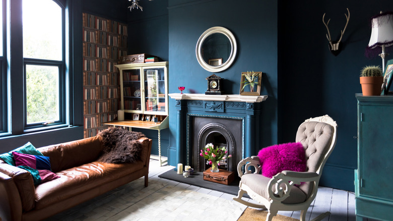
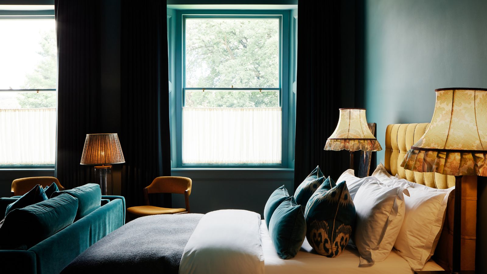
Cerulean blue-green, reflecting the colors of the sky and sea, is suggested for its calming and joyful qualities. This aqua tone is perennially popular and balances cool and warm elements, making it an excellent choice for rooms drenched in color. Its widespread availability in decor items simplifies integration into a design scheme.
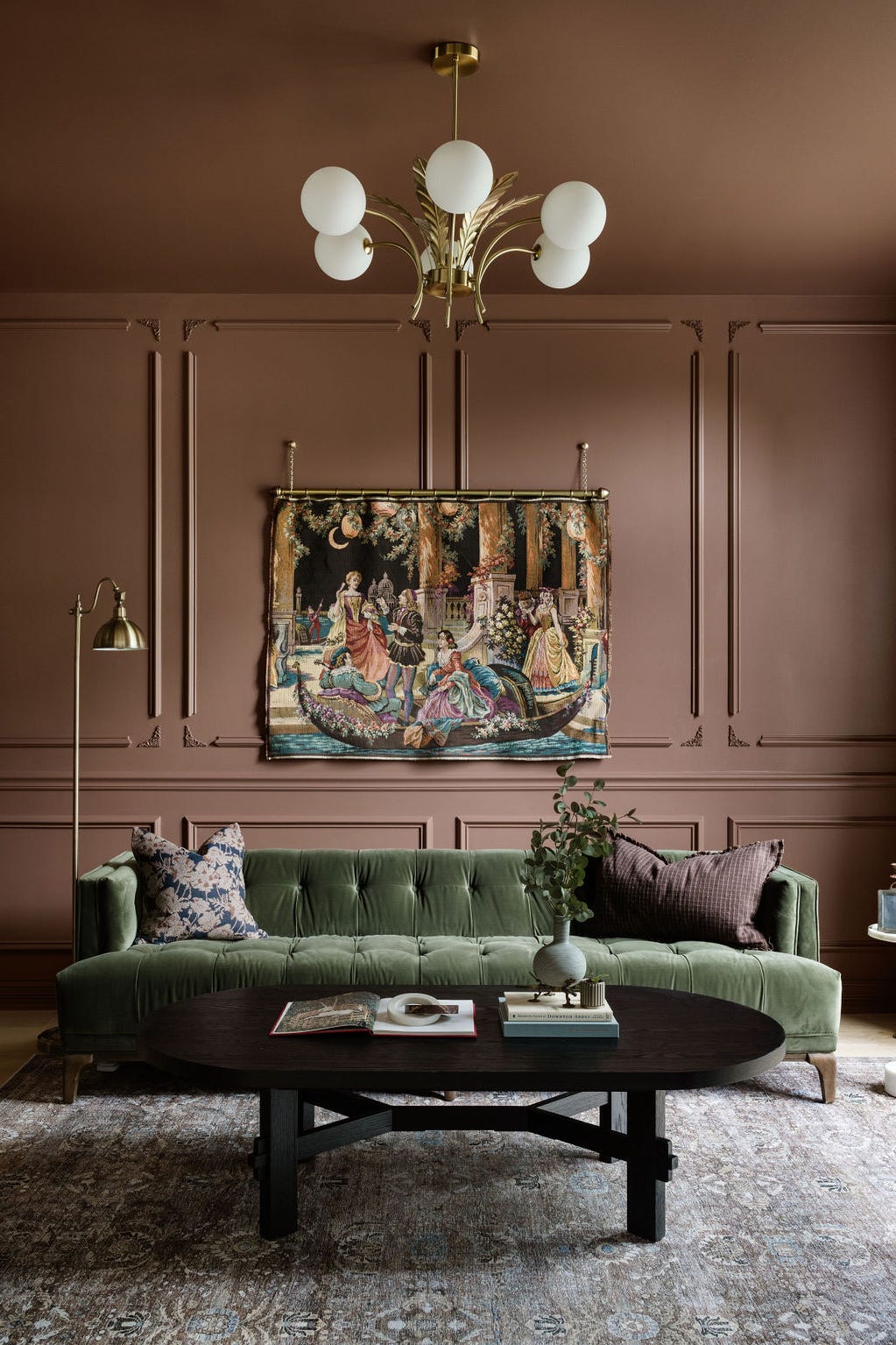
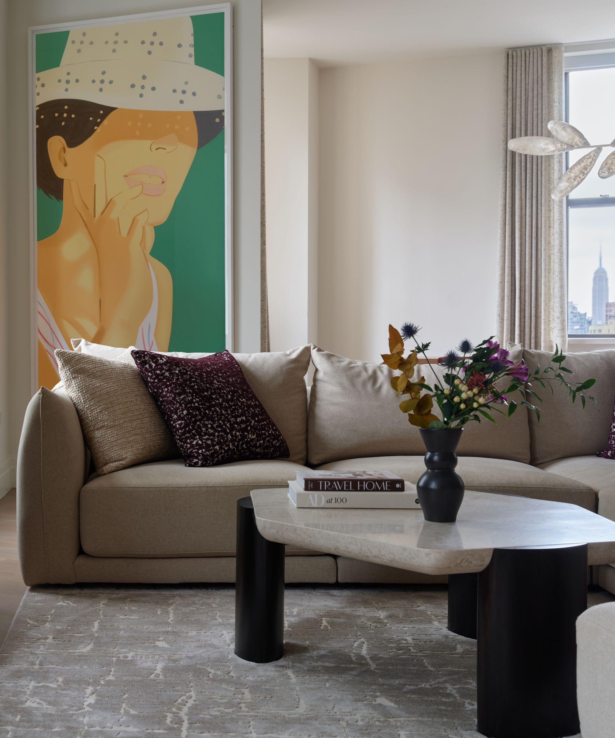
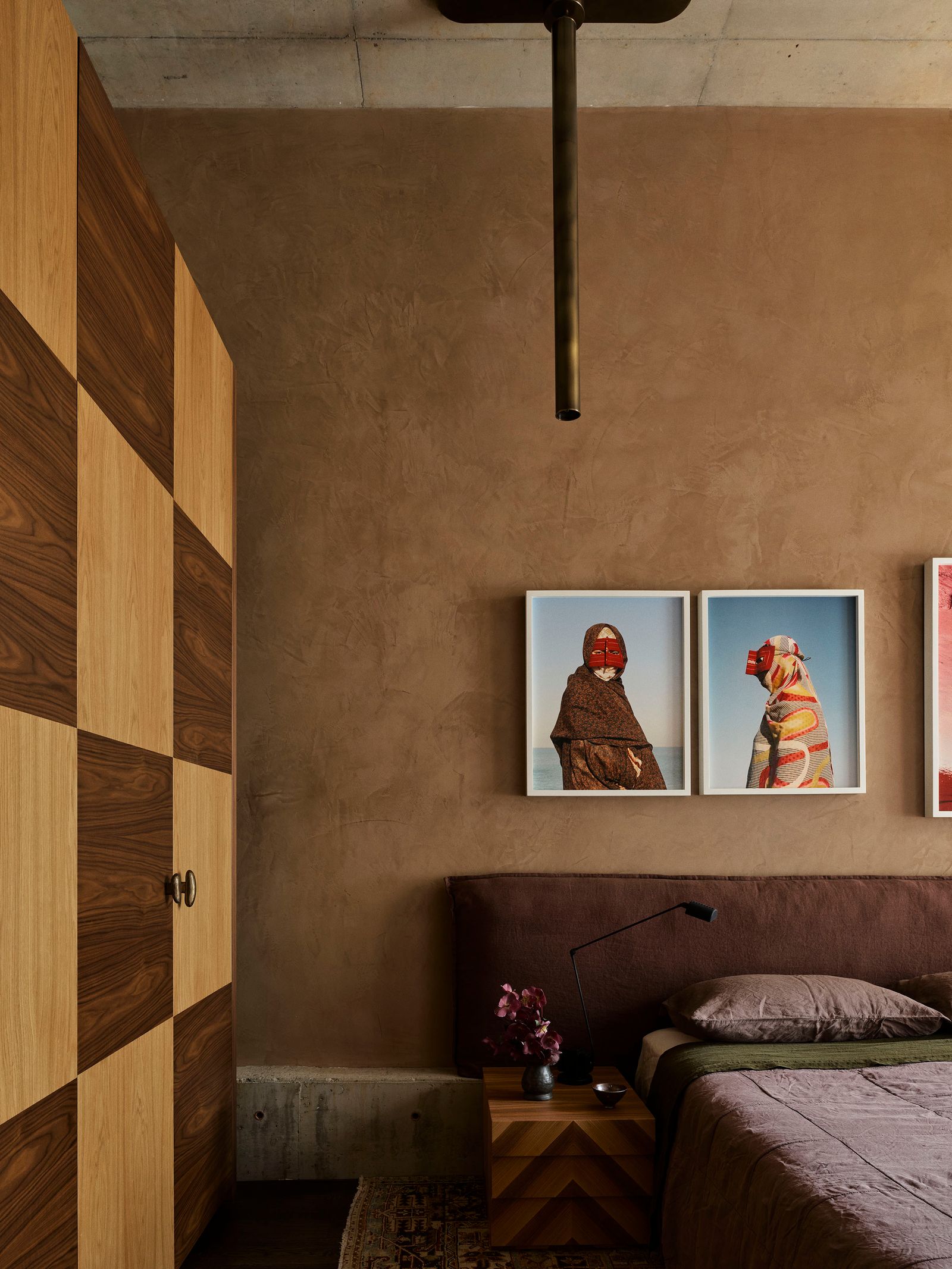
Finally, classic cognac is recommended for those who desire to add vibrancy to a neutral space without committing to overly bright colors. As a warm neutral, cognac provides more depth than charcoal and can effectively liven up black-and-white or all-grey rooms. A cognac leather couch is considered timeless, and the color can be echoed through warm wood tones, yellows, and golds, while also harmonizing with a broad spectrum of accent colors, including rich greens, blues, deep plum, and warm pinks. These color recommendations emphasize timelessness, versatility, and the ability to inject personality into living spaces.
#ColorExpert #LivingRoomDesign #InteriorDecorating #DesignTrends #HomeDecor #ColorPsychology #MariaKillam #InteriorDesign #ColorExpert #LivingRoomDesign #InteriorDecorating #DesignTrends #HomeDecor #ColorPsychology #MariaKillam #InteriorDesign
0 commenti in totale
 Nessun commento ancora
Potresti anche gradire

These Colors Will Be Everywhere in Interiors in 2025
Listen Up: These Are the Best Paint Colors for Your Living Room

Colors of The Year – get to know every shade revealed by leading paint brands for 2025


The Best Colors To Incorporate Into Your Living Room In 2025

55 Living Room Color Ideas That Will Take Your Space from Drab to Fab

5 colors that will make your living room feel happier, according to interior designers
The 3 All-Time Worst Living-Room Paint Colors, According to Designers

These Colors Will Be Everywhere in Interior Design in 2026

Experts reveal the best living room paint colours to transform every space

The 8 Best Living Room Paint Colors, According to Design Experts

These Are the Biggest Color Trends That You'll See Everywhere in Interiors Next Year, From Tranquil Teal to Rich Plum
Designers Say This Fabric Will Dominate Living Rooms in 2024

An expert in color psychology shares the 5 shades you should have in your living room
Seasonal color analysis in interior design – should your ideal palette influence the shades you choose for your home?
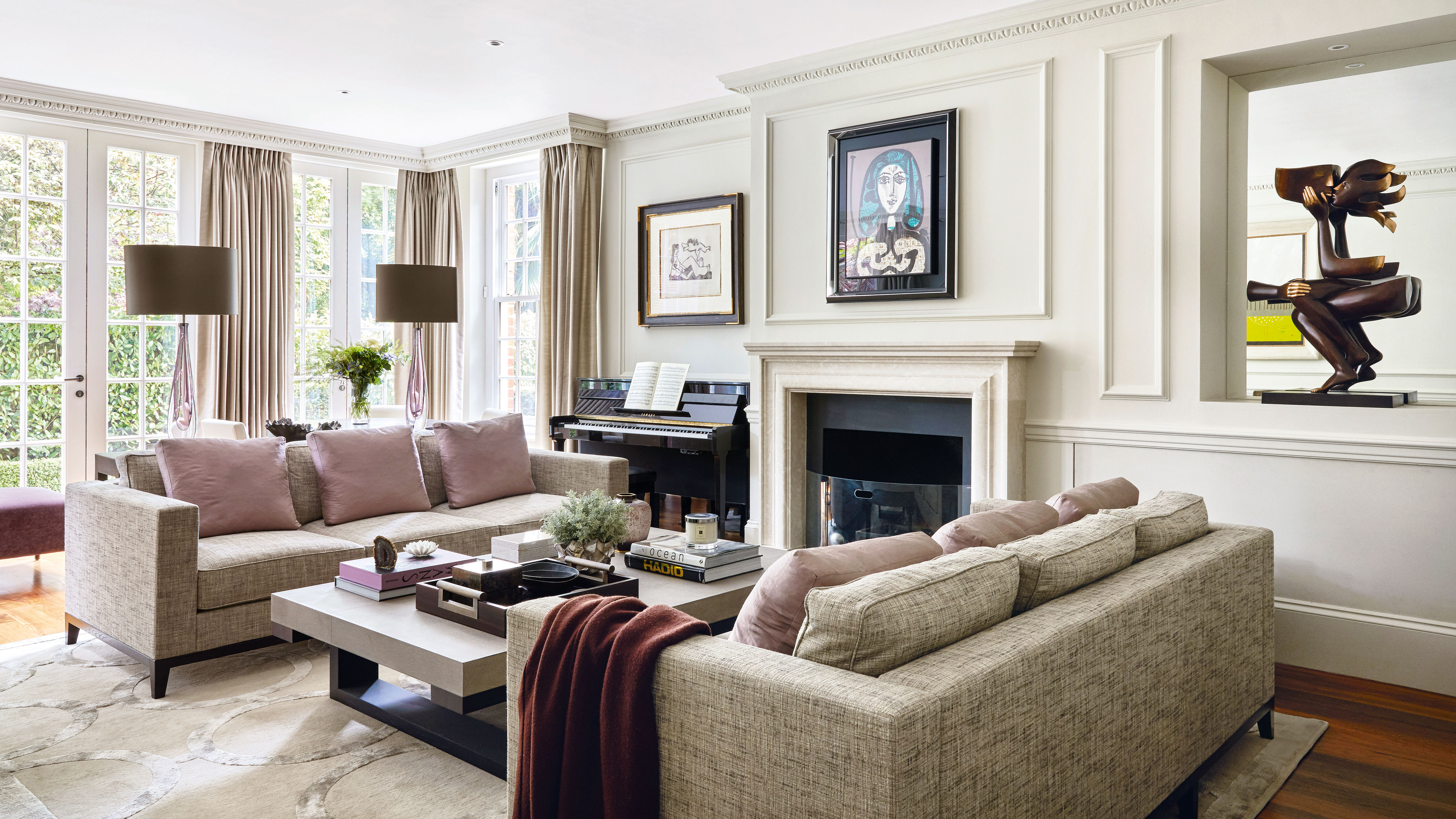
5 unexpected colors guaranteed to bring lasting joy and happiness to your living room – 'the perfect pick-me-up for fall and winter'
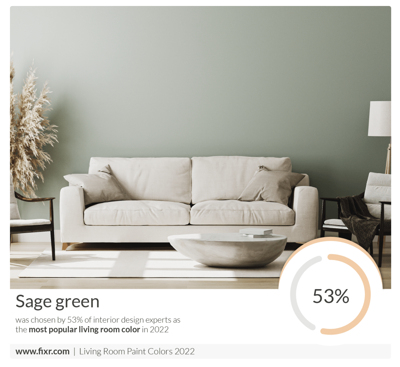
7 Popular Paint Colors for the Living Room
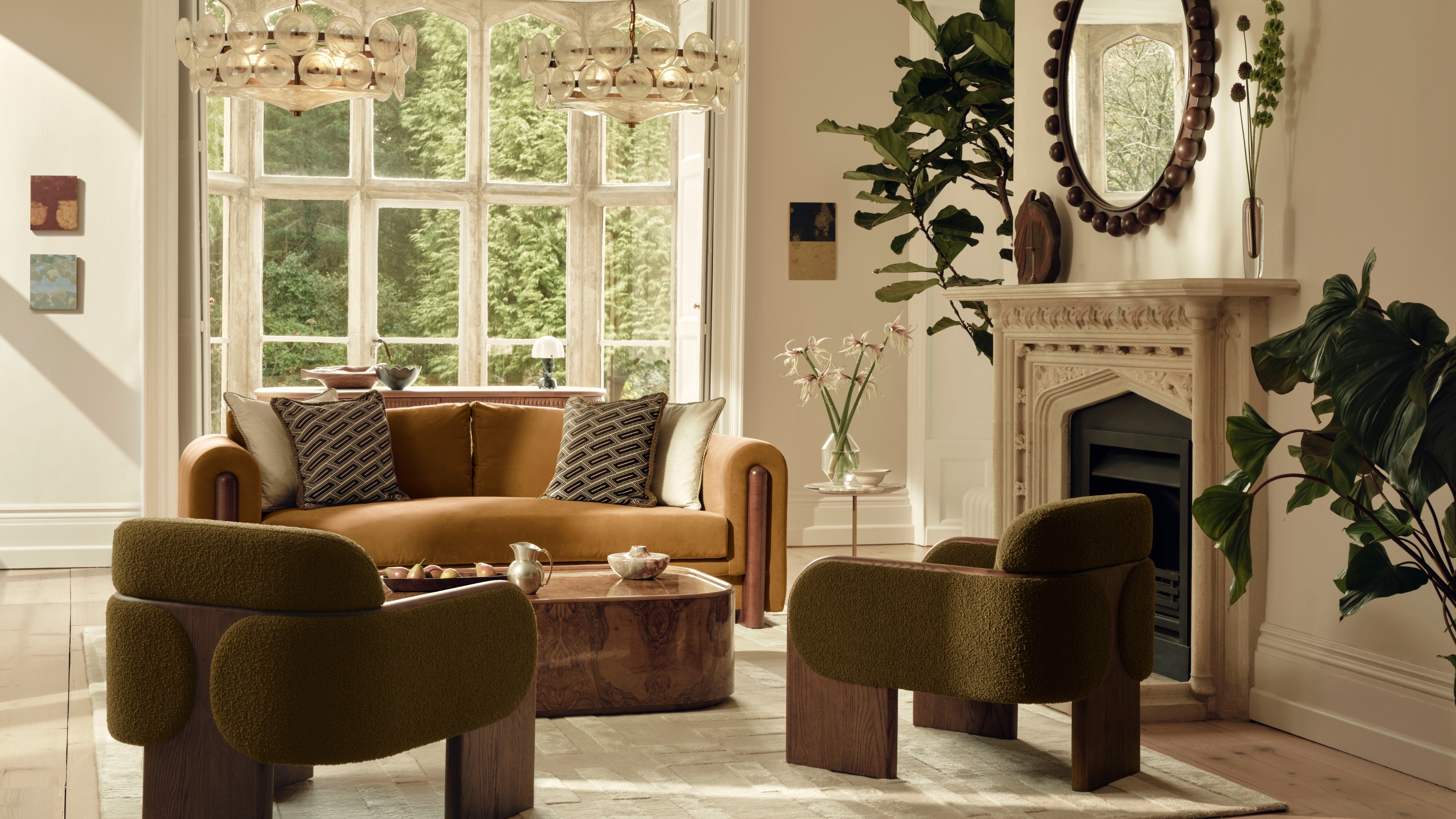
These Are the 3 Living Room Colors That Are Out of Style in 2025 — And the Shades to Use Instead

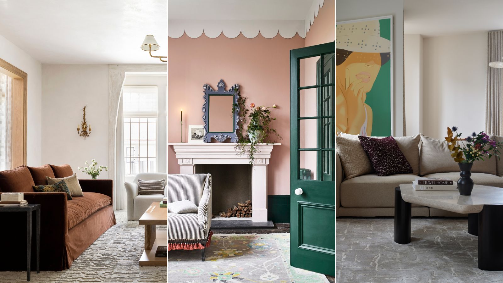
These are interior designers' favorite color combinations for living rooms – from neutral and calming to bold and playful
5 Living Room Color Trends for 2025 — New and Exciting Shades Designers Are Choosing for Walls
4 Living Room Paint Colors That Are So Outdated, According to Designers