1/8
These Are the Biggest Color Trends That You'll See Everywhere in Interiors Next Year, From Tranquil Teal to Rich Plum
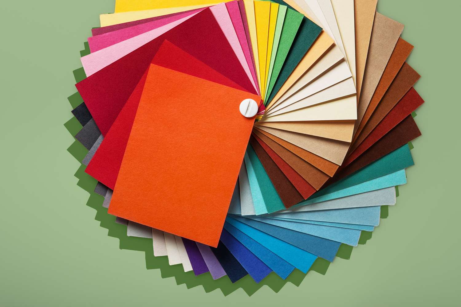
As 2025 draws to a close, interior design and color experts are looking ahead to the dominant color trends for 2026. This coming year is predicted to be a period of "color confidence," characterized by a blend of bold, soothing, and nature-inspired shades that imbue homes with a sense of personality and tranquility. The article delves into seven key color trends that designers and specialists are championing, offering insights into their appeal and how they can be incorporated into various decorating styles, from vibrant room ideas to timeless neutrals.
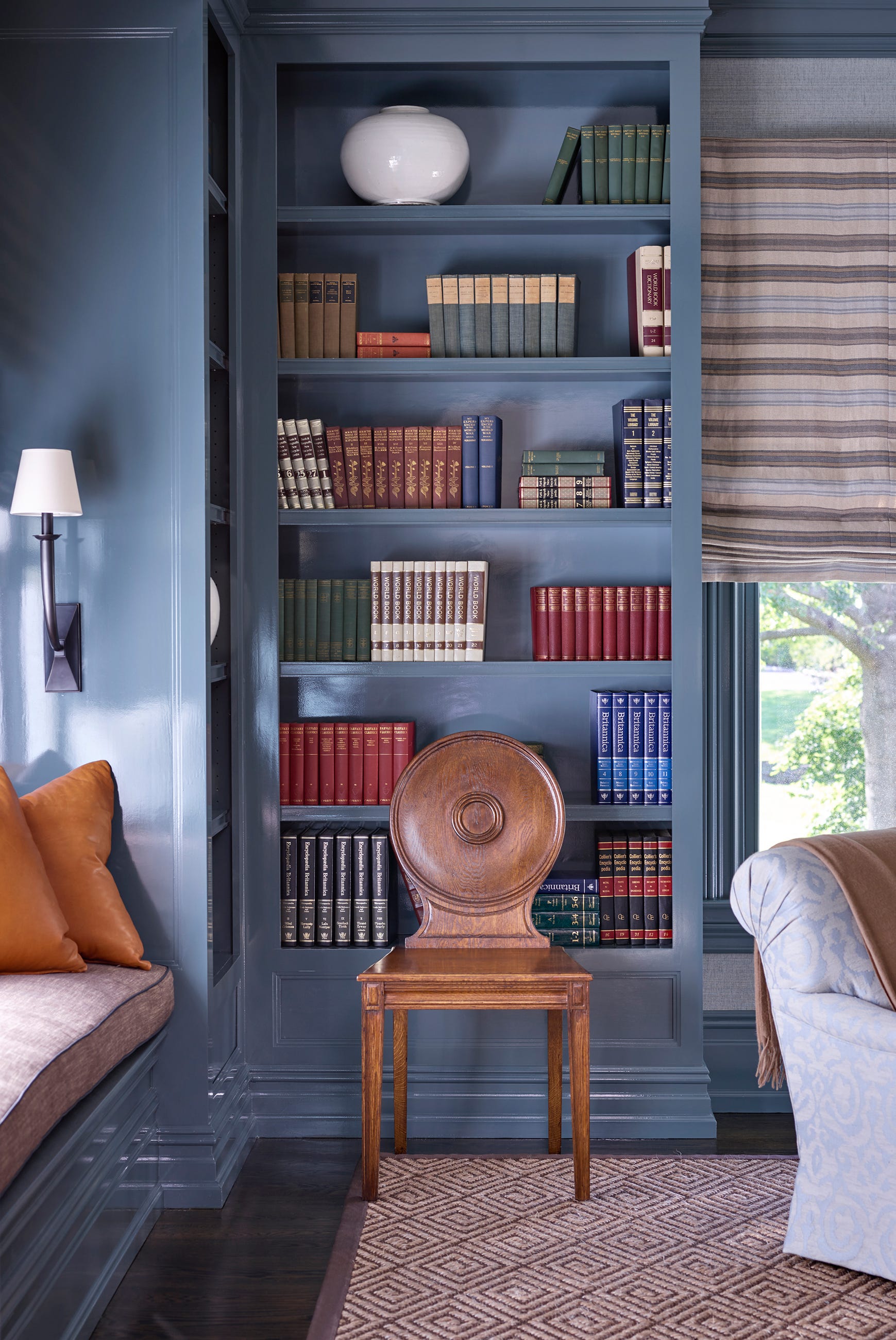
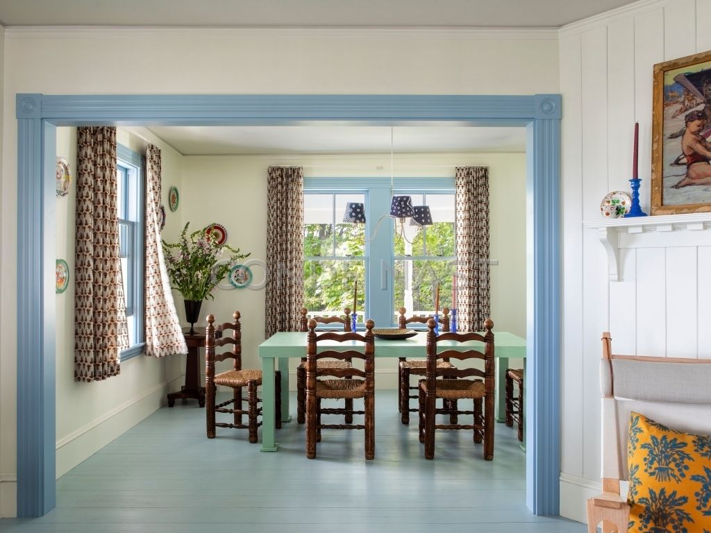
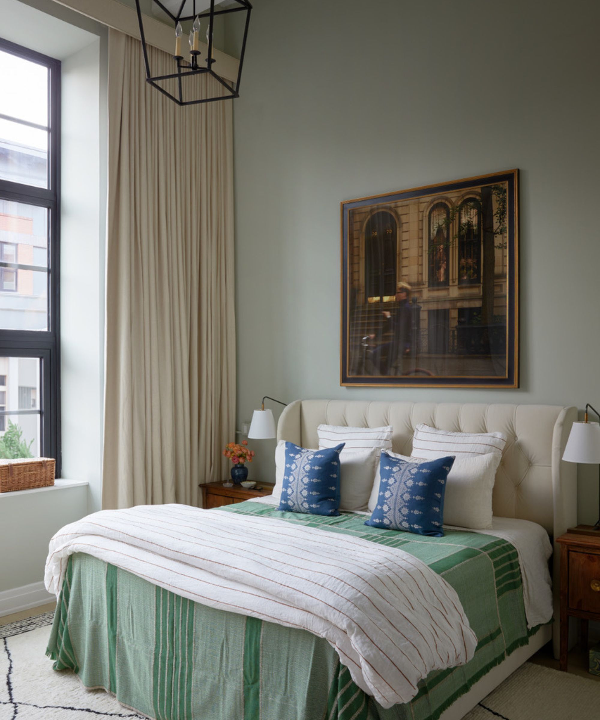
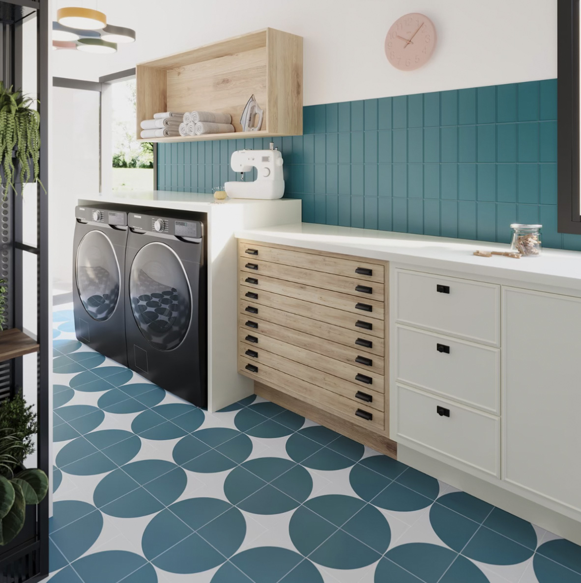
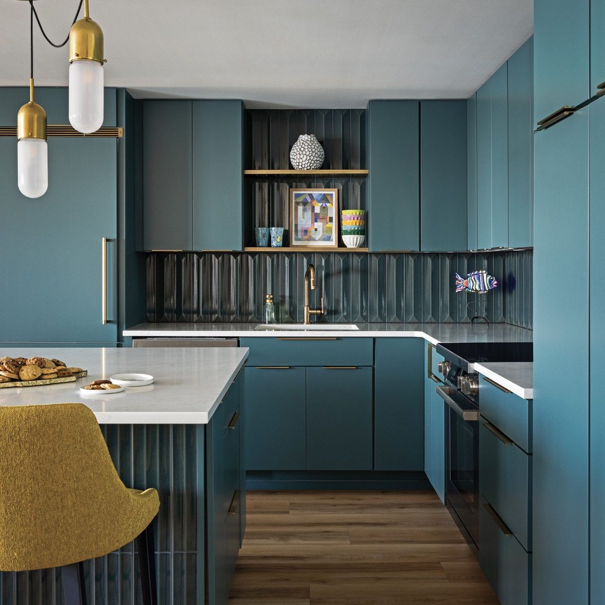
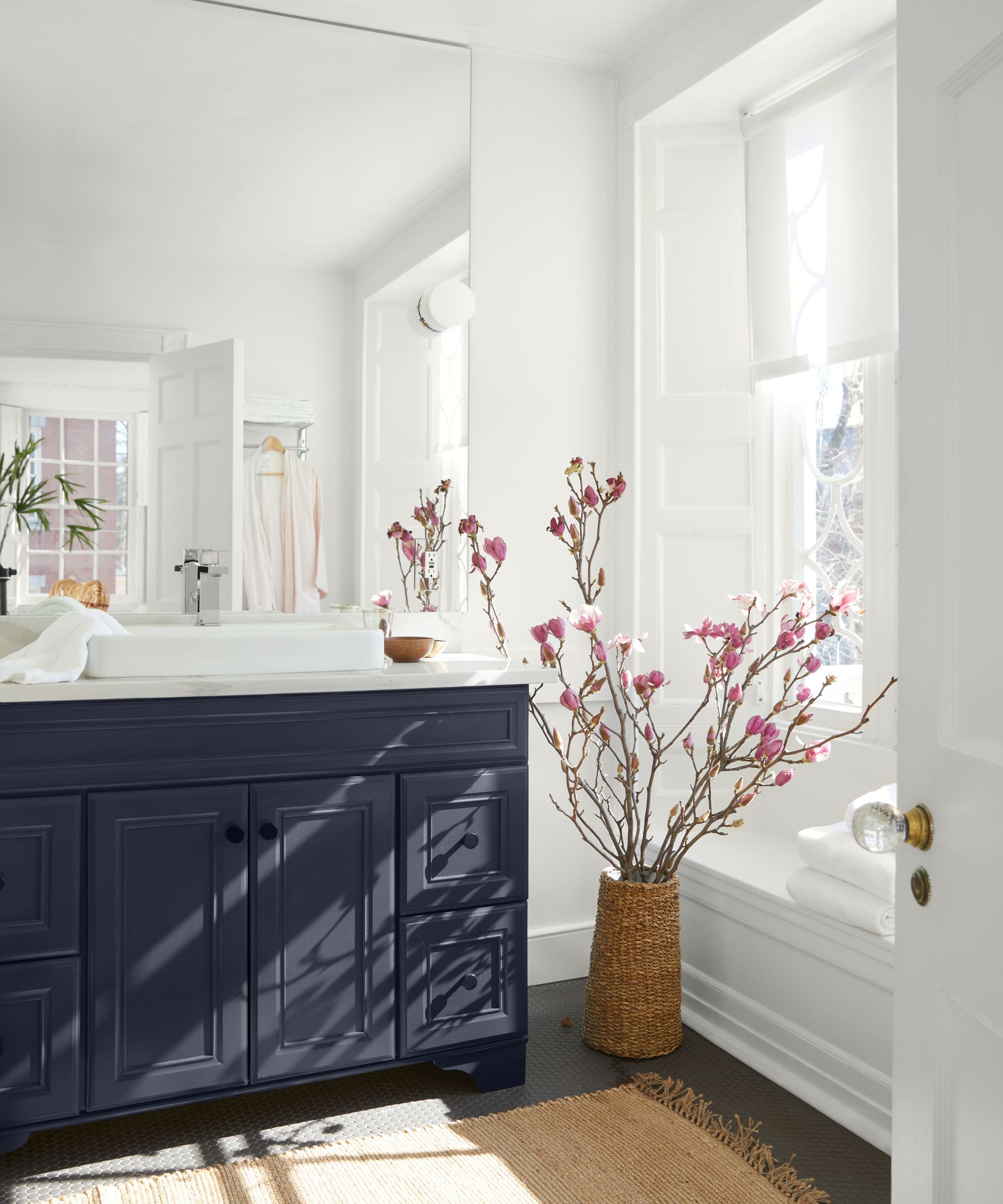
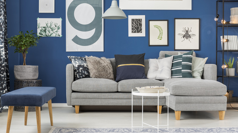
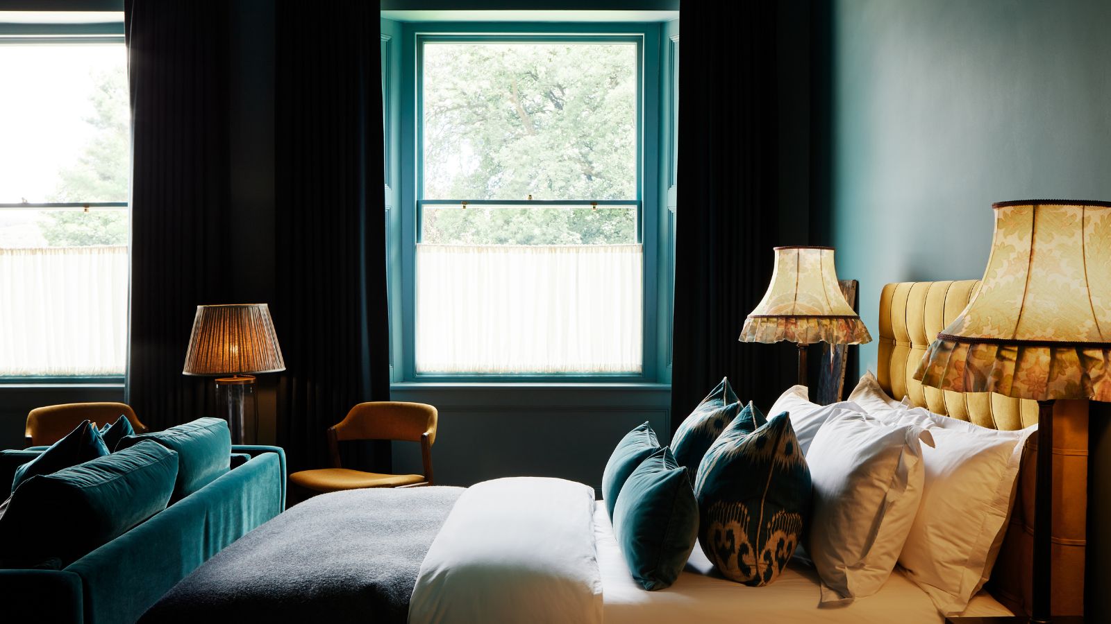
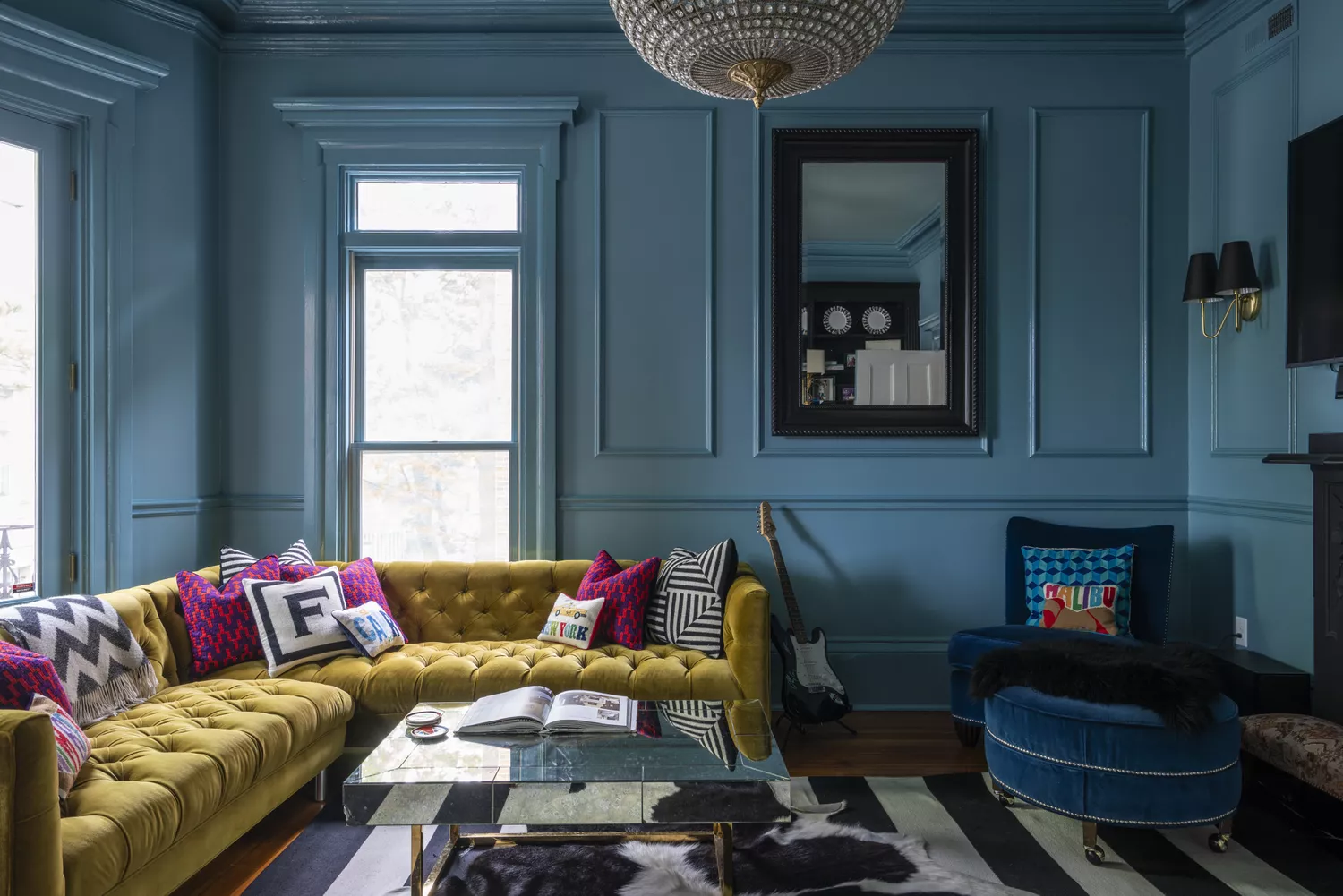

One of the most prominent trends for 2026 is "Tranquil Teals." This hue, a sophisticated blend of blue and green, is gaining significant traction, particularly highlighted by Behr's selection of 'Hidden Gem' as its Color of the Year for 2026. Experts like Erika Woelfel of Behr and Lauren Saab of Saab Studios emphasize teal's ability to make a statement while remaining subtle and its strong connection to nature. Teal is noted for its versatility, working well in small spaces for color-drenching or in larger areas without feeling overwhelming, and it pairs beautifully with natural materials like travertine, light oak, and aged brass.
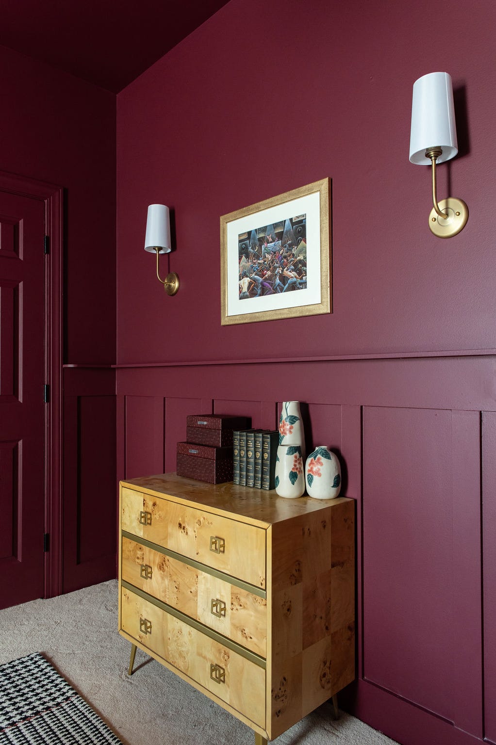
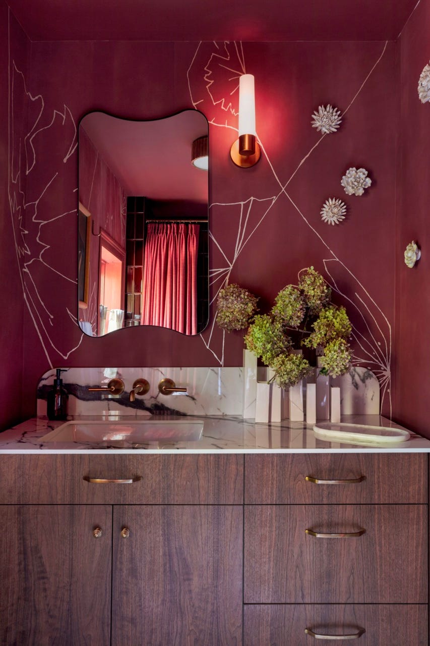
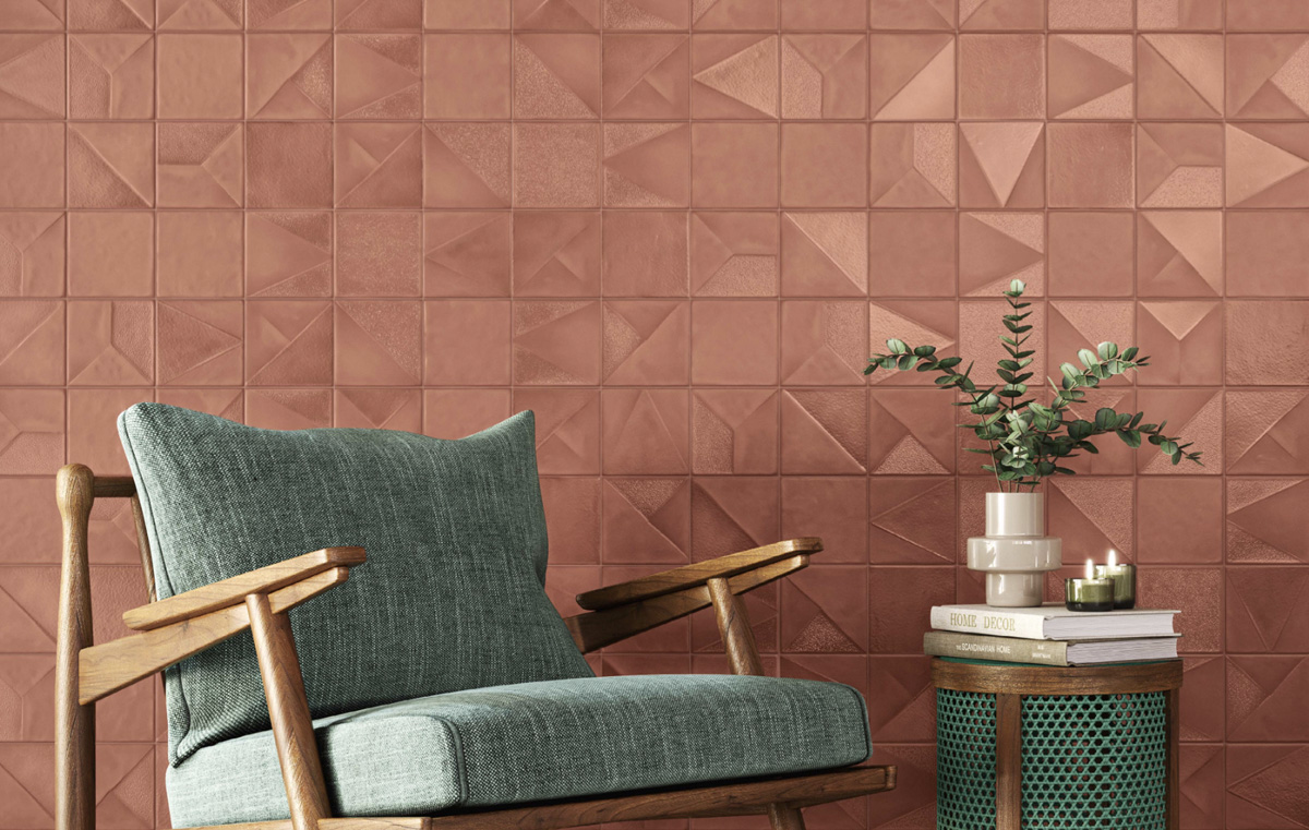
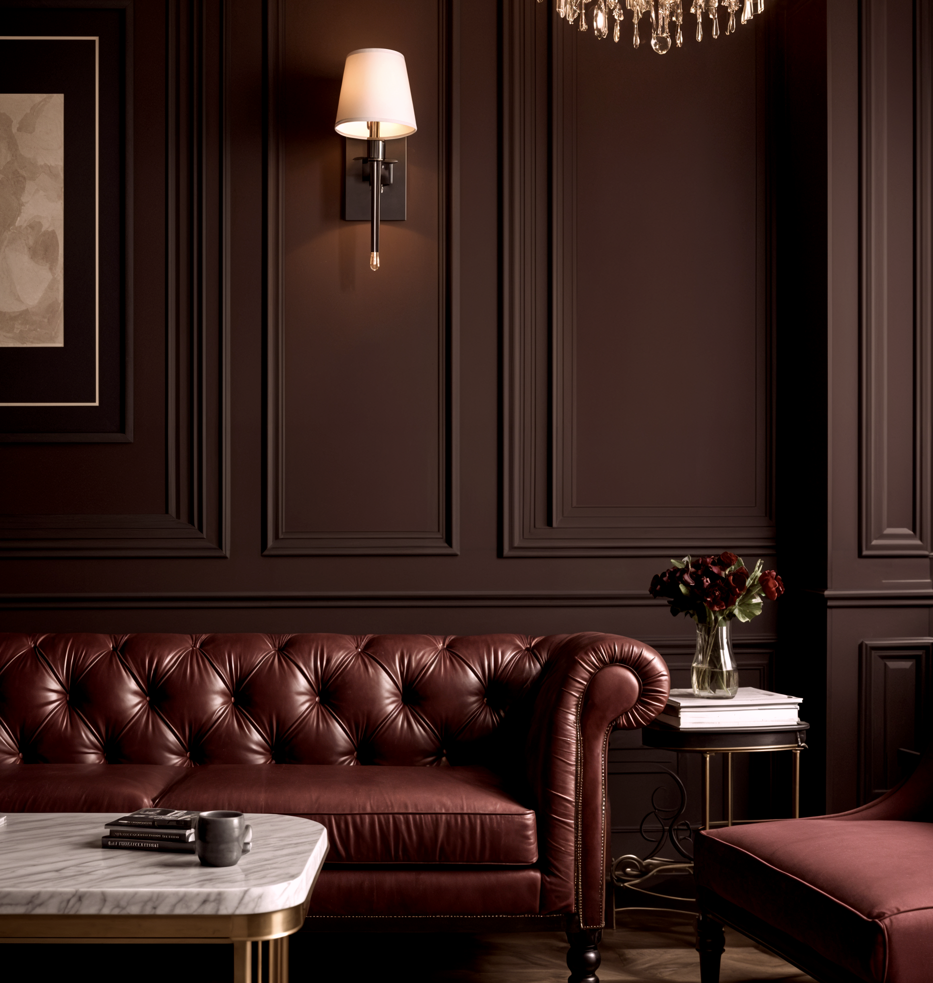
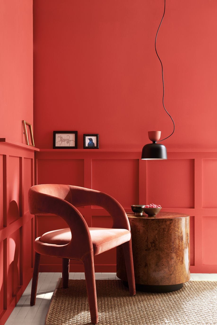
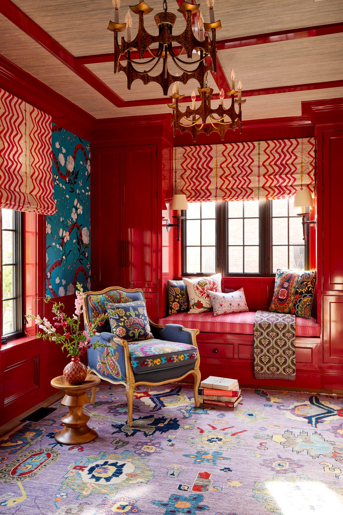
Following teal, "Mellow Reds" are set to continue their popularity into 2026, evolving from vibrant cherry tones to more earthy and sophisticated shades. Tash Bradley, director of interior design at Lick, points to 'Red 06' from their 2026 Color Edit as a prime example, describing it as a rich, berry red with lilac undertones that feels luxurious and grounding. Similarly, designer Marie Flanigan favors deep burgundies like Sherwin-Williams’ 'Carriage Door' and 'Aurora Brown' for their ability to create intimate and dramatic "jewel box" rooms such as butler's pantries or lounge areas. These reds are ideal when layered on walls, cabinetry, or in textiles, and they harmonize with soft neutrals, natural wood, or brass accents.
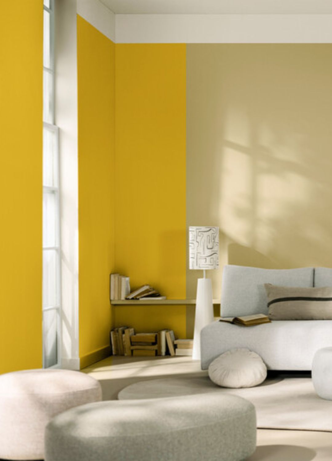
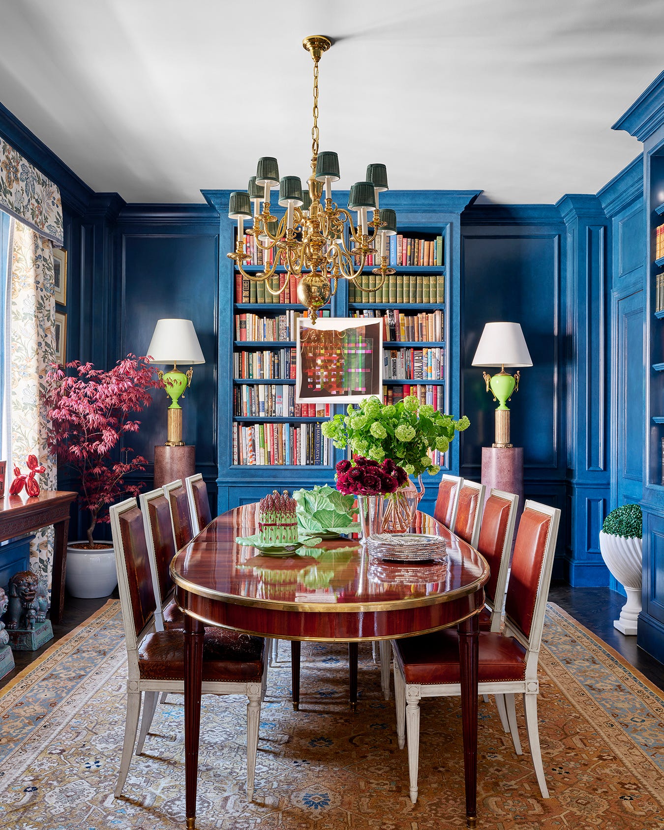
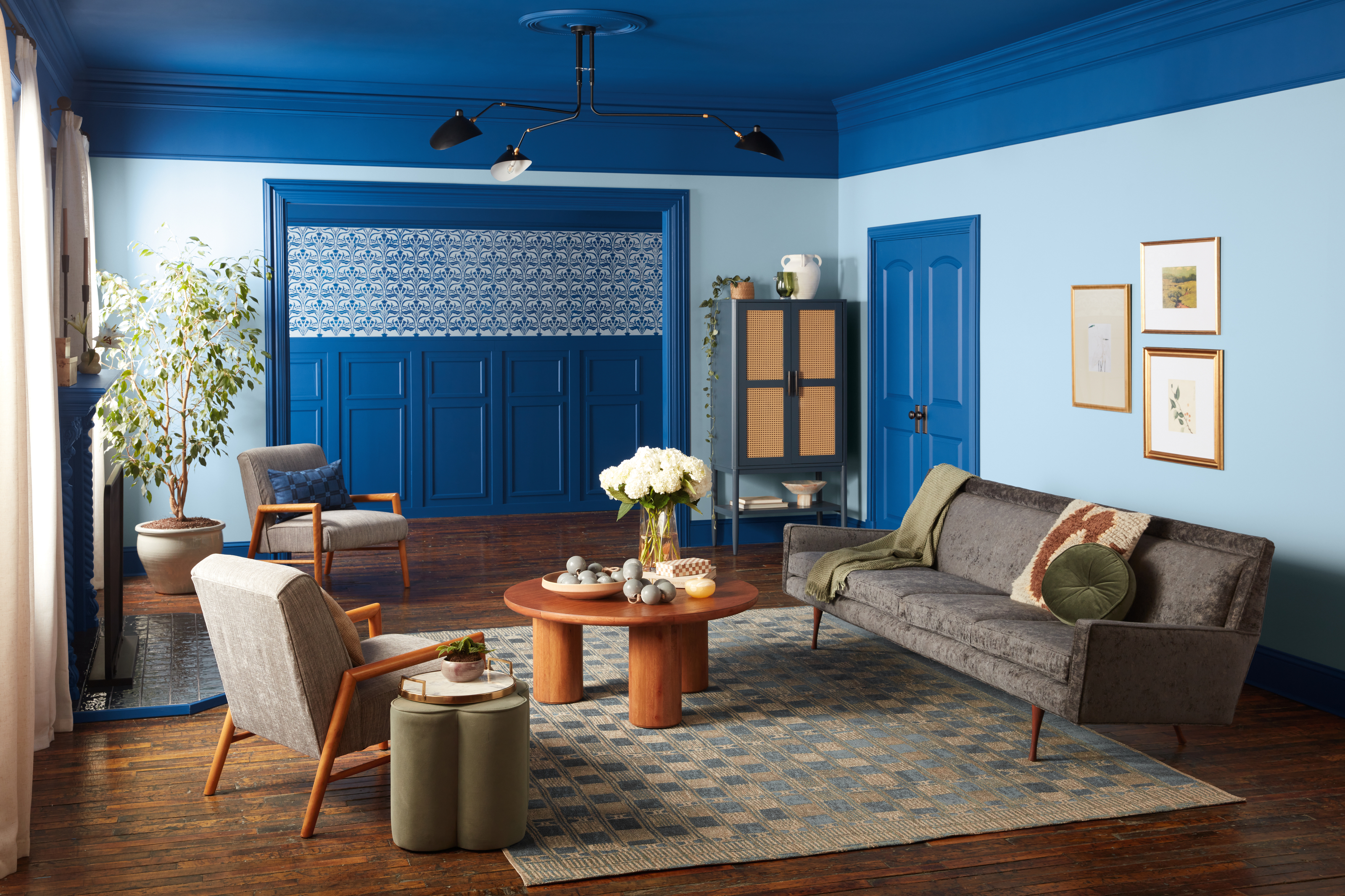
"Uplifting Yellows" are also expected to see a surge in popularity, building on the success of butter yellow in previous years. Courtnay Tartt Elias of Creative Tonic Design notes the increasing use of yellow, from pale buttercream to vibrant sunshine shades, which can serve as a cheerful backdrop for various styles. Yellow can also function as a striking contrast color, such as yellow drapes or trim work in a blue room, offering a versatile way to introduce this happy hue.
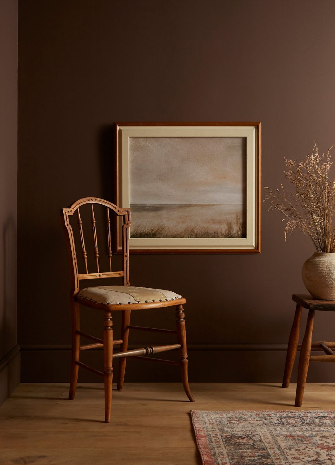
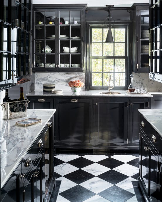
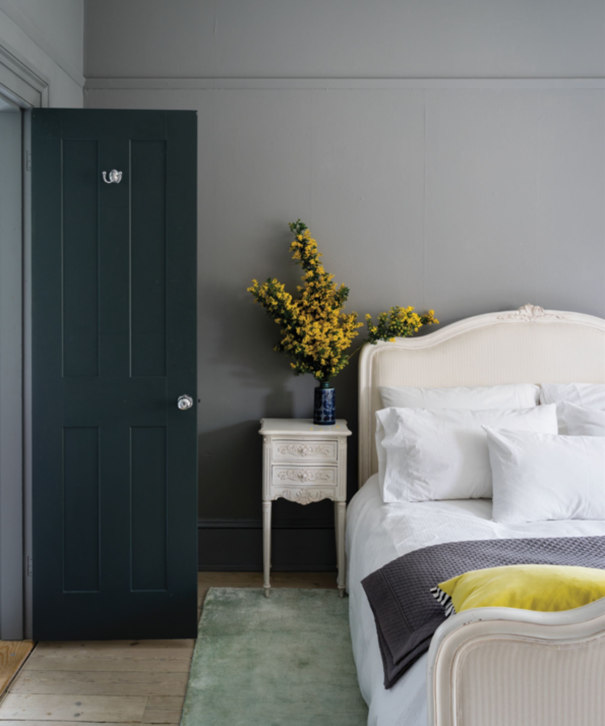
For those seeking bolder choices, "Warm Blacks" are emerging as a significant trend. Designers like Linda Eyles predict a rise in warm-toned blacks that offer drama with a rich, earthy side, making them elegant and handsome neutrals. Benjamin Moore's Color of the Year 2026, 'Silhouette,' an espresso tone with charcoal notes, exemplifies this trend. Helen Shaw, a color expert at Benjamin Moore, explains that this hue can create a chic backdrop for color-drenching or provide dramatic contrast when paired with lighter colors and textured fabrics.
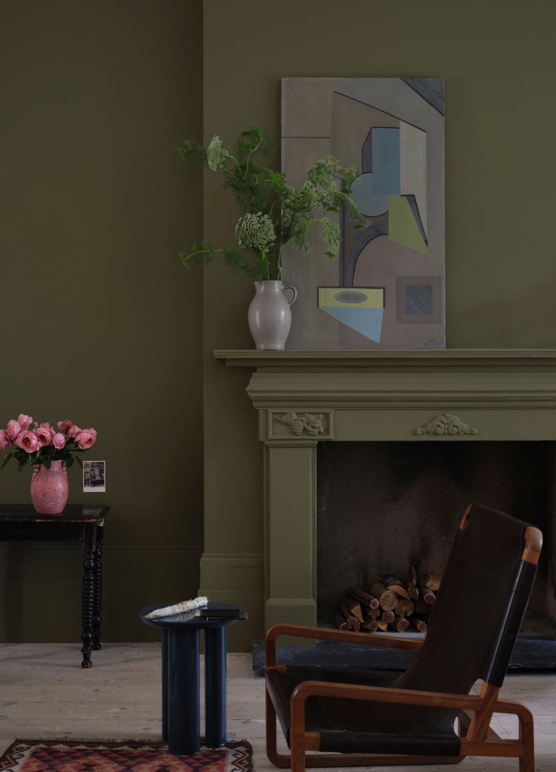
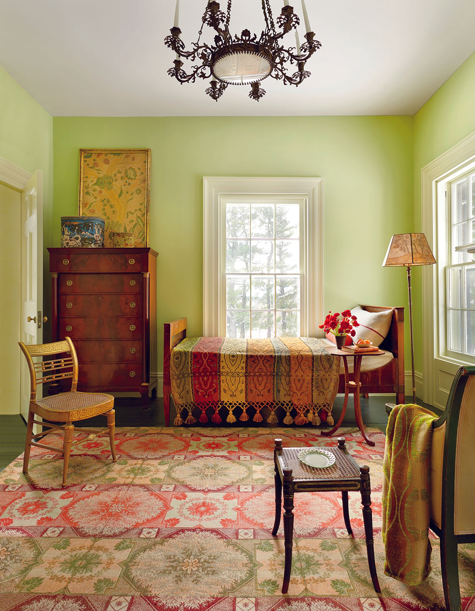
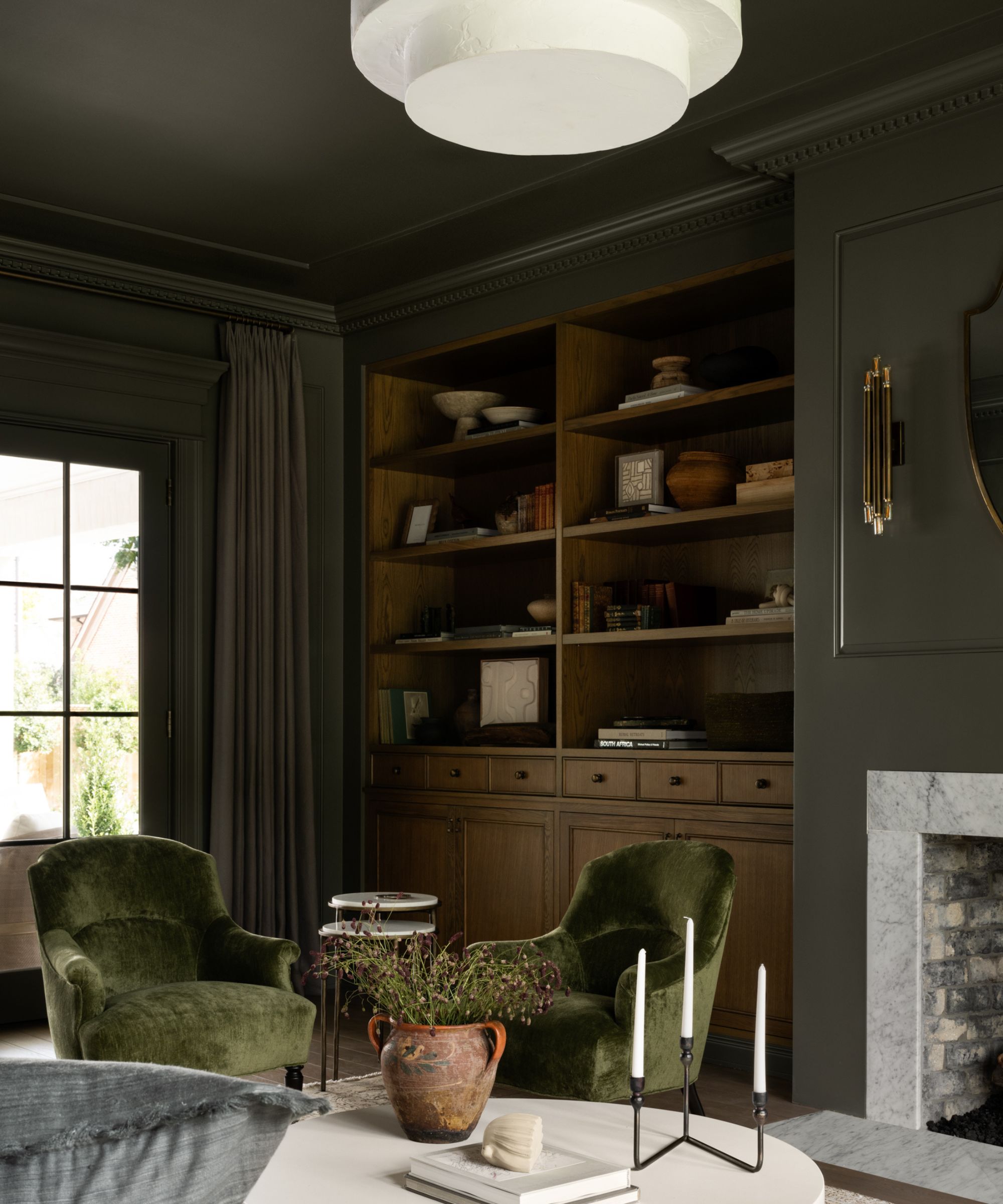
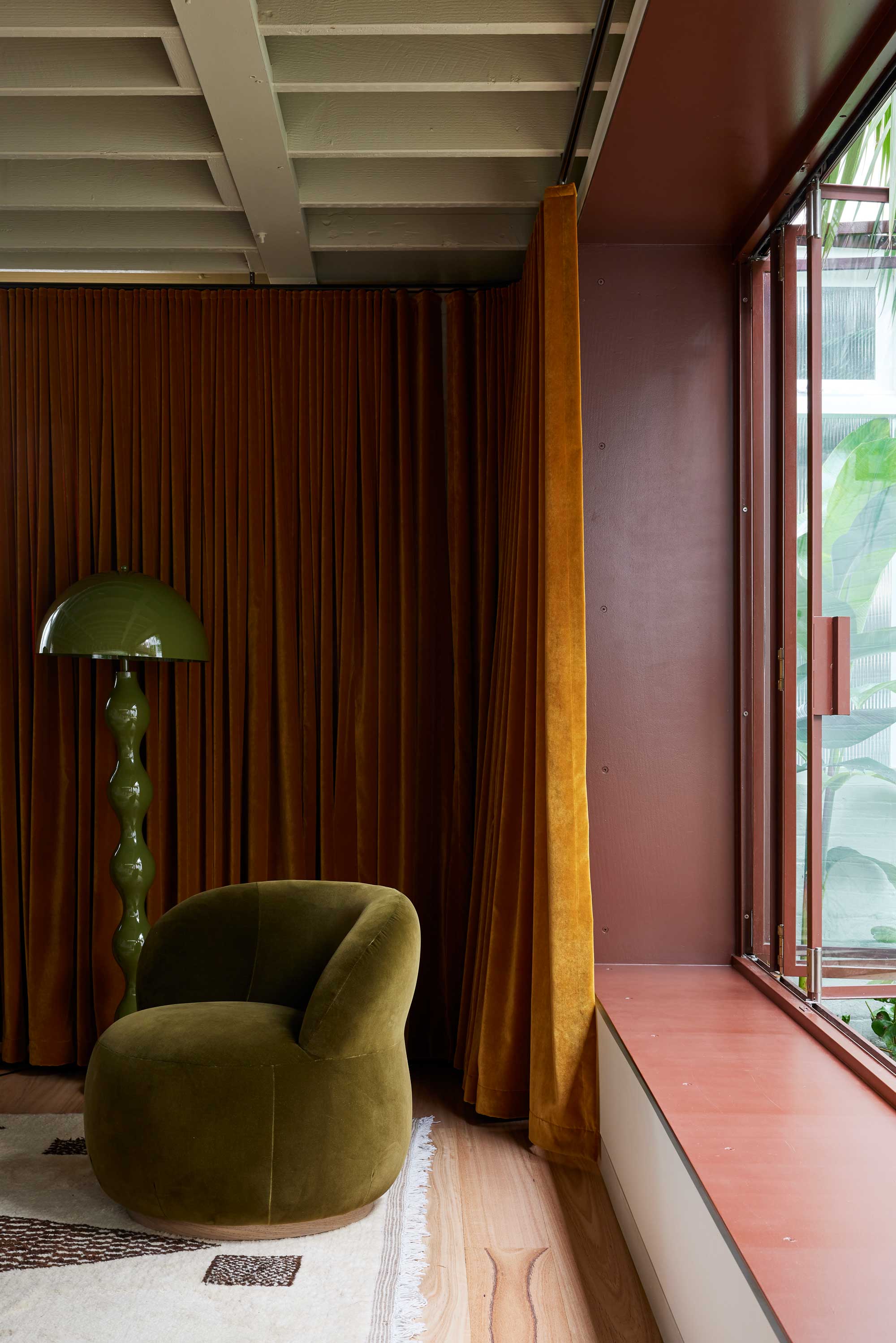
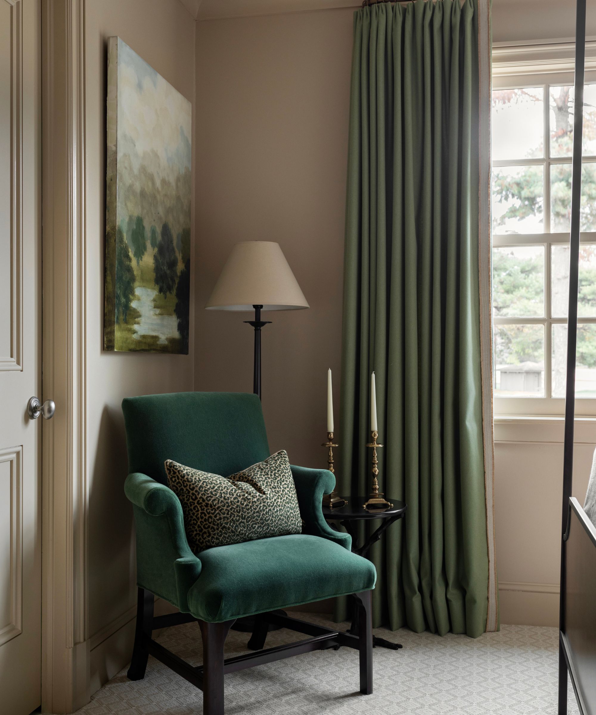
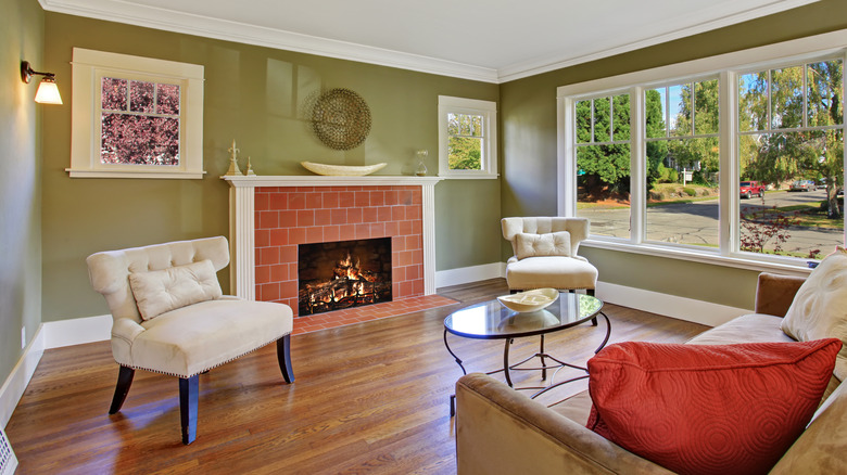
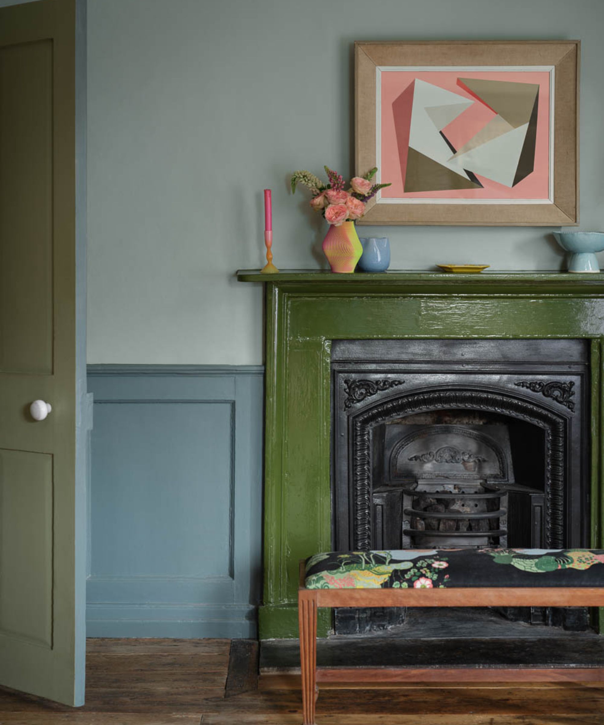
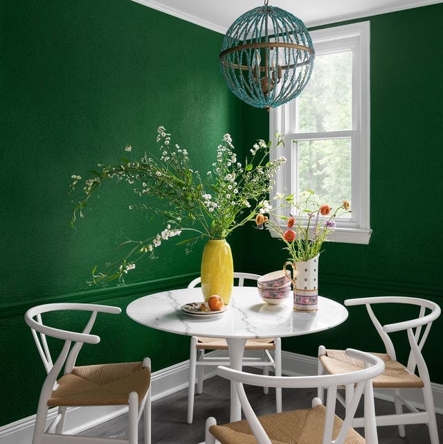
Nature-inspired palettes continue with "Earthy Dark Greens," which are poised to remain popular, replacing lighter sage tones with deeper, restorative shades. Jamie Davis of Portola Paints and Pamela Forman of PBF Homes highlight the desire for spaces that feel grounded and connected to the outdoors. These deep greens are particularly effective as kitchen cabinet colors, contrasting beautifully with lighter countertops or brass hardware, and they enhance the natural grain of warm woods in living spaces.
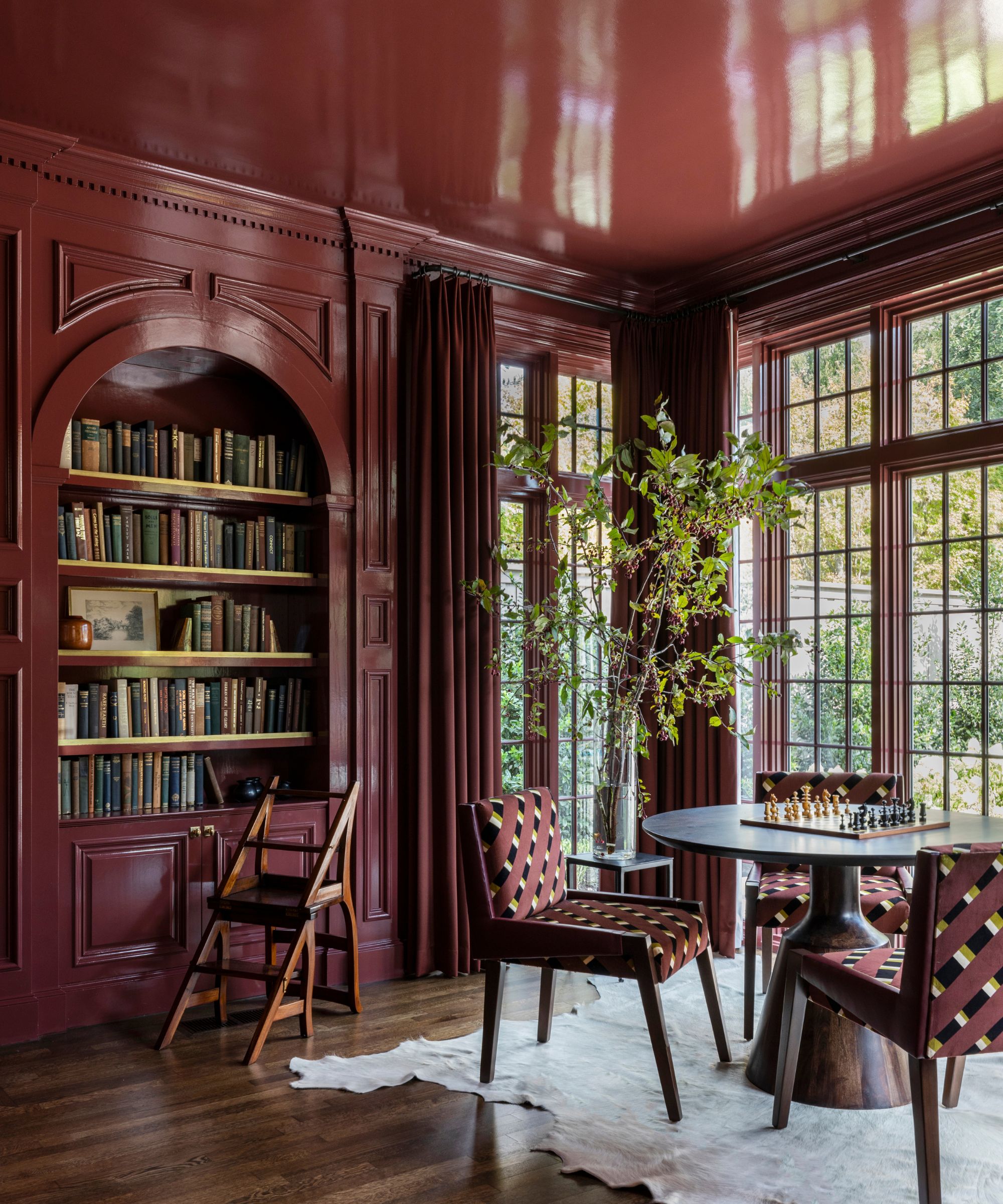
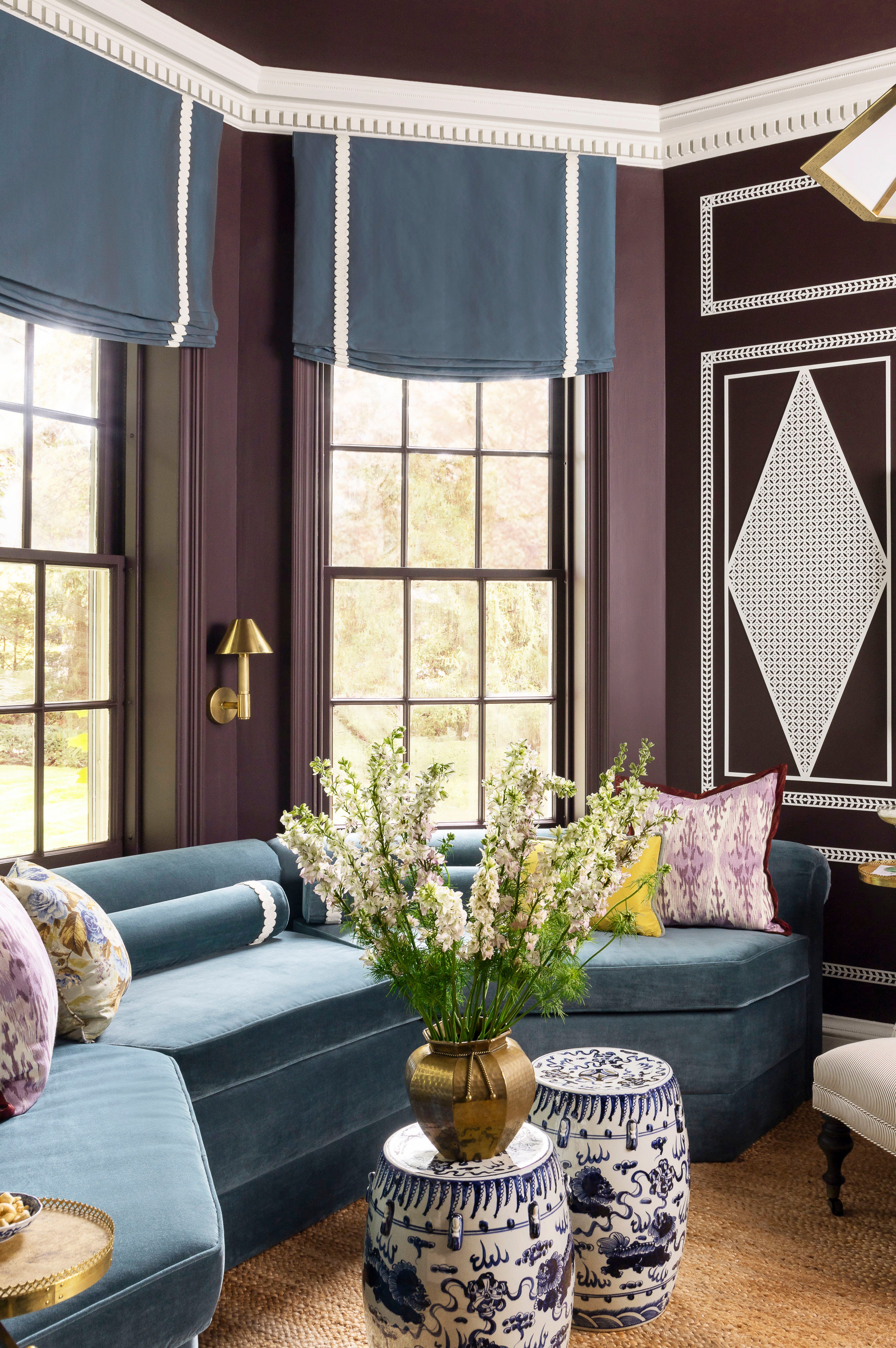
Lastly, "Rich Plum Shades" are anticipated to evolve from previous purple trends, offering a more mature and timeless take on the hue. Ruth Mottershead of Little Greene and Florence Sherwood, a color consultant, foresee plums and purples becoming more popular as homeowners become more confident with color. These rich tones work well in combination with yellow ochre schemes, with specific examples including Farrow & Ball’s 'Paean Black' for depth in berry schemes and 'Great White' for a softer, pink-purple-white complement.
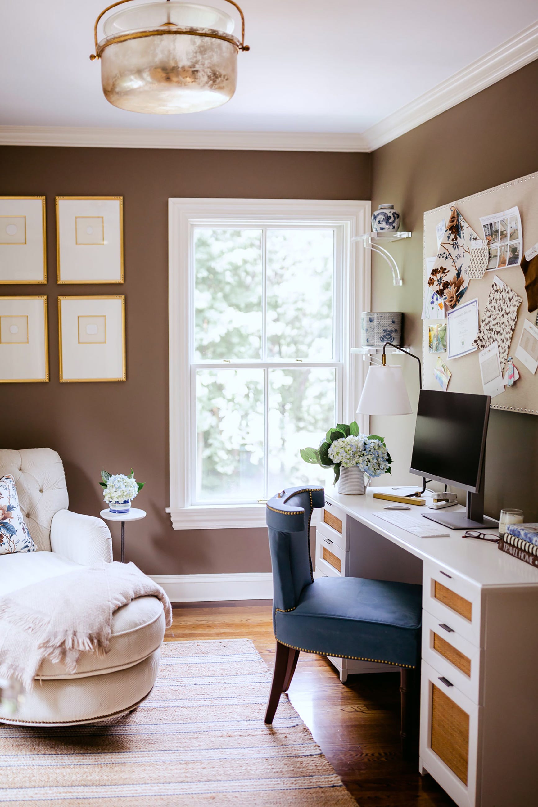
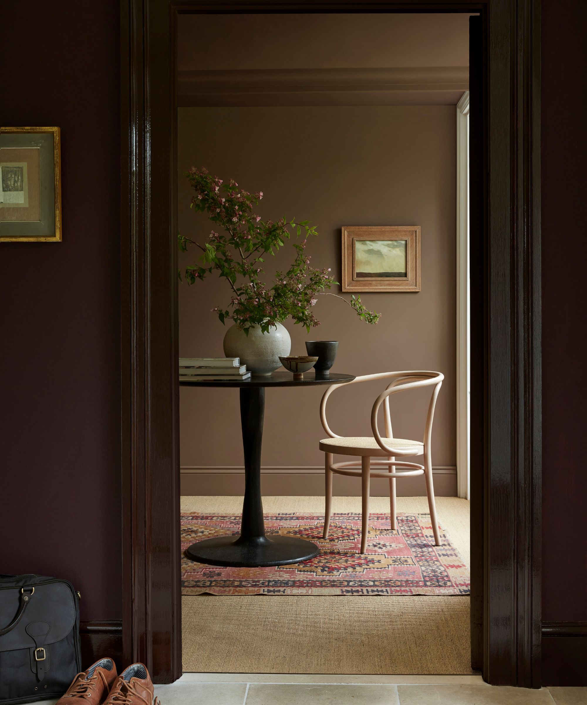
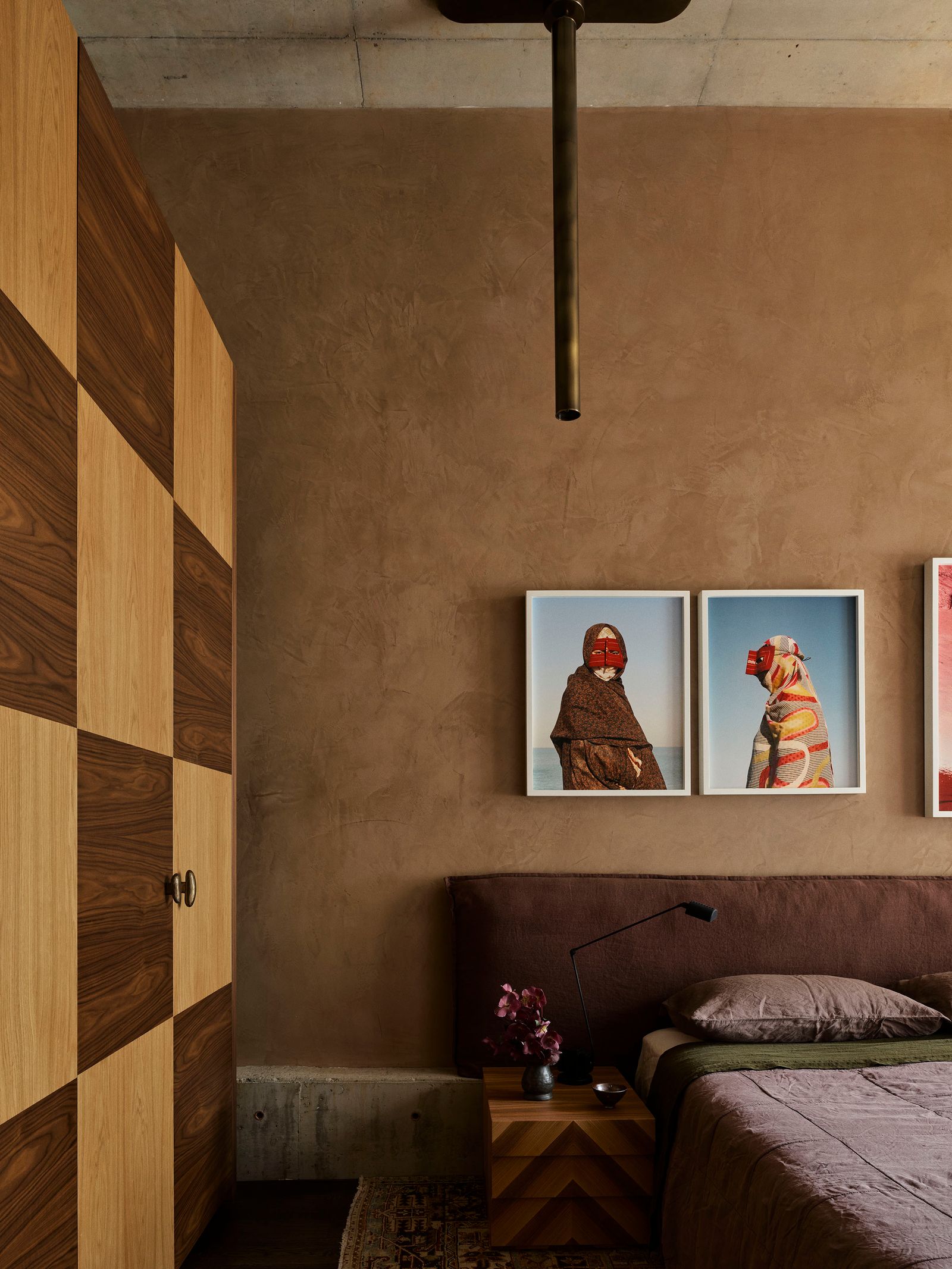
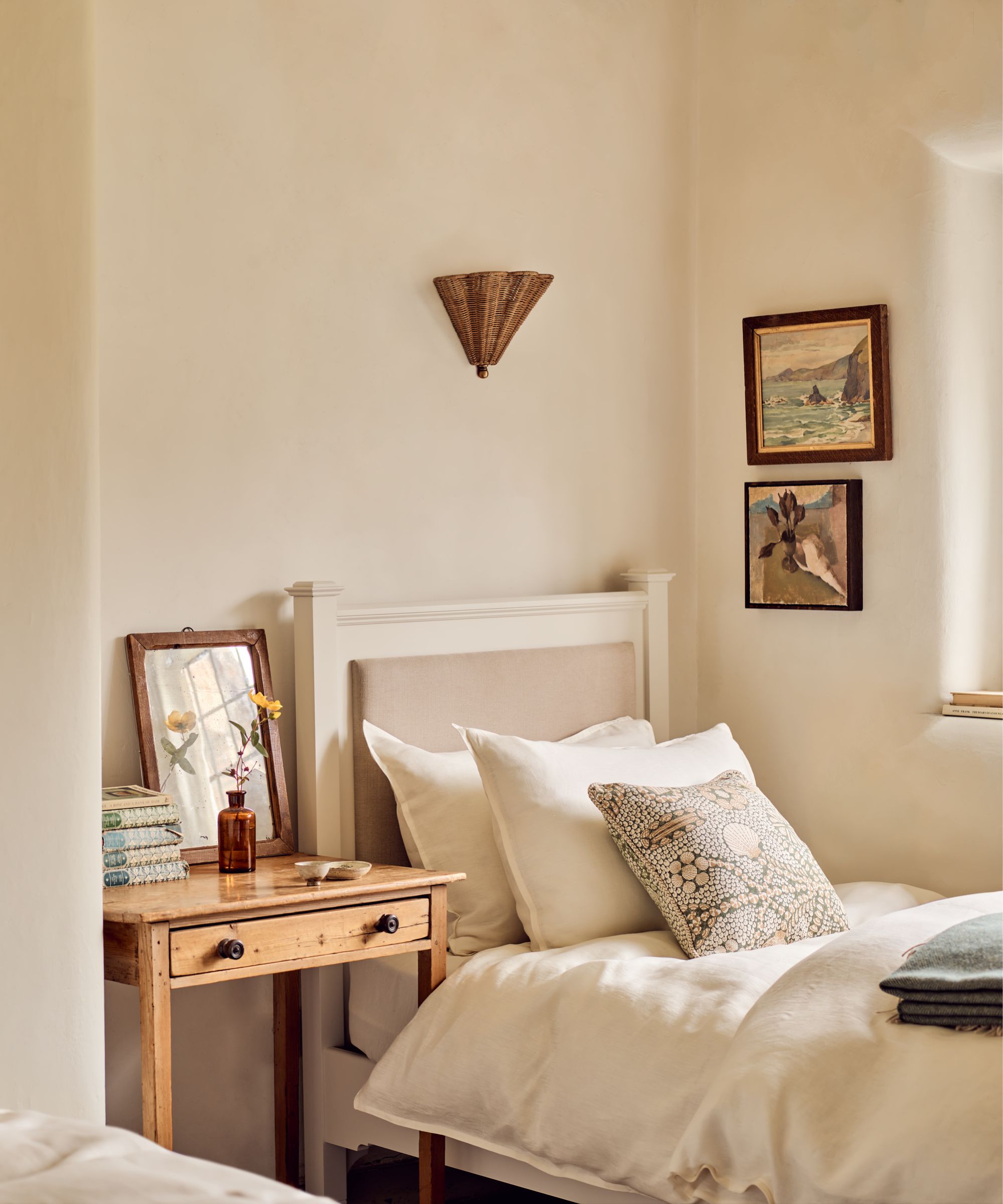
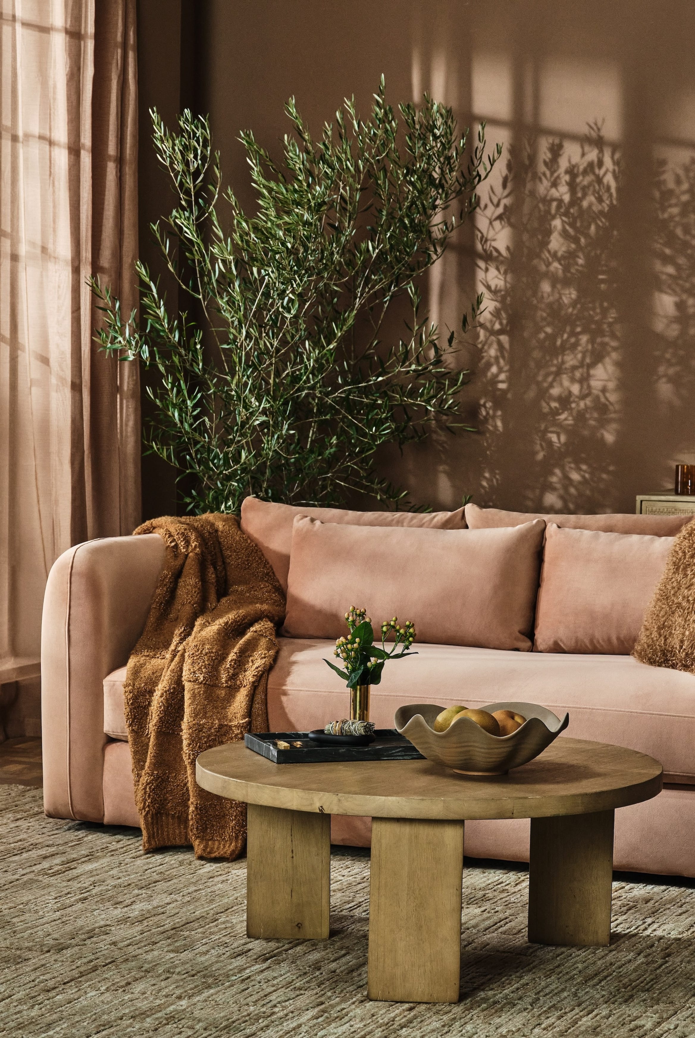
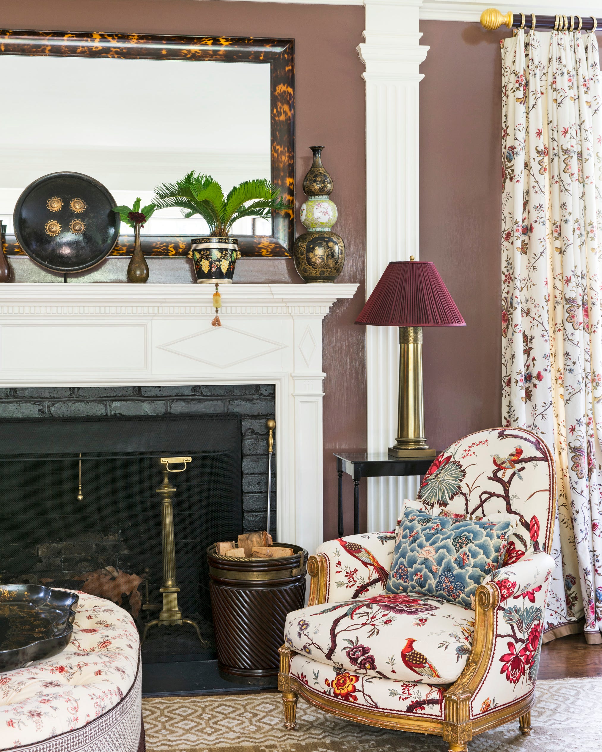
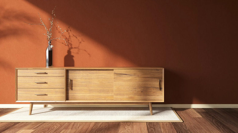
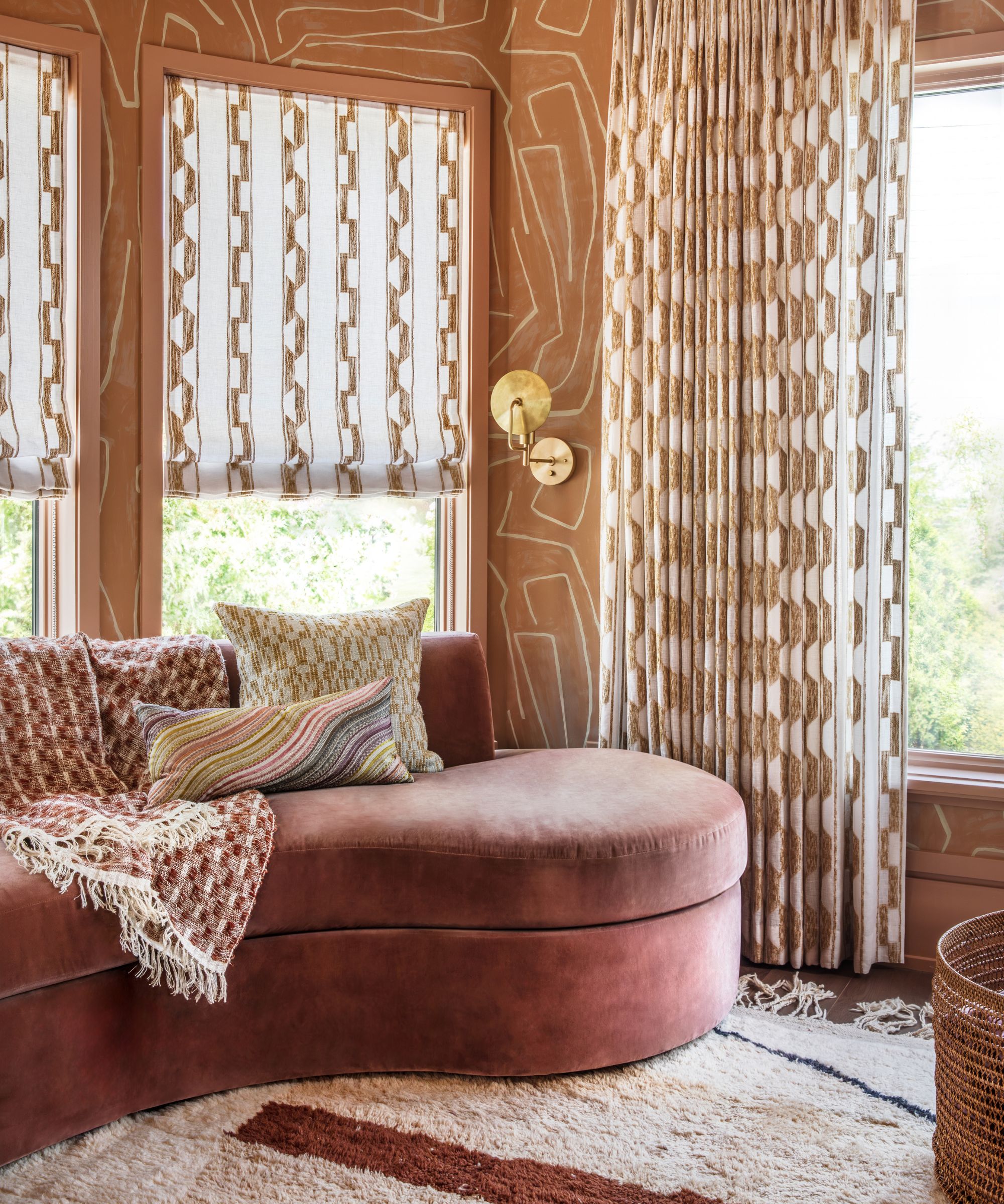
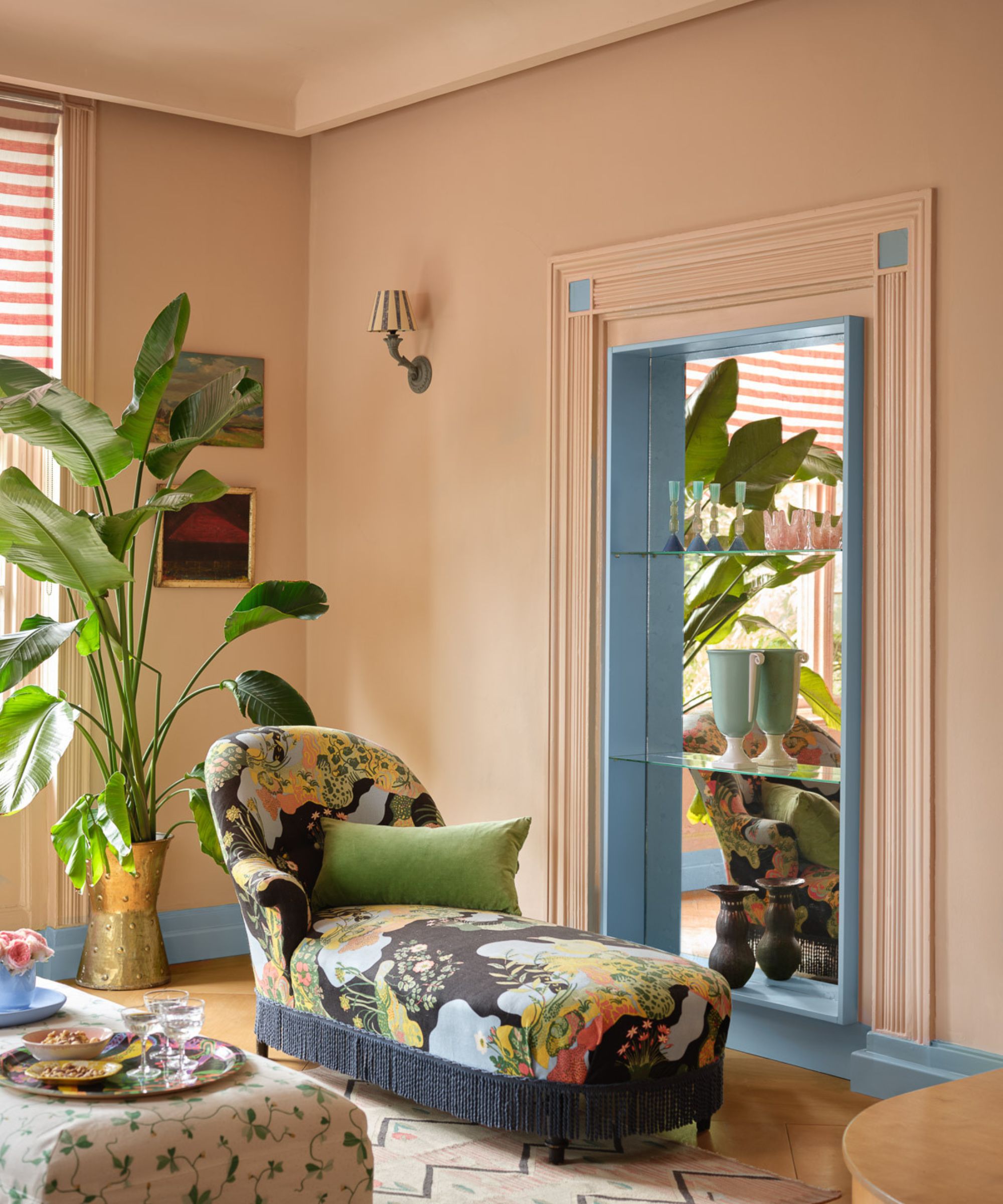
Finally, for neutrals, "Red-Based Taupes" are gaining favor. Charlotte Cropper, a Milan-based color consultant, describes these tones—ranging from mushroom-like 'Smoked Trout' by Farrow & Ball to earthy clay tones like 'Taupe 03' by Lick—as a sophisticated bridge between traditional neutrals and bolder colors. The red undertones elevate them, making them feel both classic and contemporary, and they serve as a comforting, grounding backdrop that allows for vibrant accents and individual expression. The overarching theme for 2026 is a move towards soulful, personality-driven homes through a thoughtful and confident application of color. The article concludes by encouraging readers to take inspiration from these trends while adhering to design principles for balanced schemes.
#InteriorDesign #ColorTrends2026 #HomeDecor #TranquilTeals #MellowReds #UpliftingYellows #WarmBlacks #EarthyGreens #RichPlumShades #RedBasedTaupes #InteriorDesign #ColorTrends2026 #HomeDecor #TranquilTeals #MellowReds #UpliftingYellows #WarmBlacks #EarthyGreens #RichPlumShades #RedBasedTaupes
0 comment in total
 No comments yet
You may also like

These Colors Will Be Everywhere in Interiors in 2025
These Colors Will Be Everywhere in Interior Design in 2026
These 8 Color Trends Will Rule in 2025, According to Color Pros

6 Outdated Paint Colors We're Saying Goodbye to in 2025, According to Designers

Interior paint colour trends 2025: 10 hues you'll be seeing everywhere this year

As a color editor, I've seen hundreds of color trends come and go this year – these are the ones I think will stick for 2025
Trending Interior Paint Colors for Homes in 2025

Interior Paint Color Trends You Should Know About In 2021

The Interior Paint Colors You'll Be Seeing Everywhere in 2024

9 Trending Paint Colors You'll See Everywhere in 2025, According to Designers
What is Color Forecasting? Experts Explain How to Map Trends |

9 Color Trends That Will Take Over in 2023

7 Interior Paint Color Trends You'll See Everywhere In 2025
Designers Predict You'll Use AT LEAST One of These Colors in Your Home in 2025
These Are the 3 Living Room Colors That Are Out of Style in 2025 — And the Shades to Use Instead
Designers say these '80s-inspired colors are making a comeback in 2025 – 5 retro shades for a colorful home
The biggest color trends of 2025 – 10 colors designers say will lead the way next year
Color Explosion: 2025 Color Trends

Paint colors going out of style in 2025
5 Paint Colors That Will Take Over in 2025, According to Interior Designers