1/3
The Mistake You're Making When Displaying Art
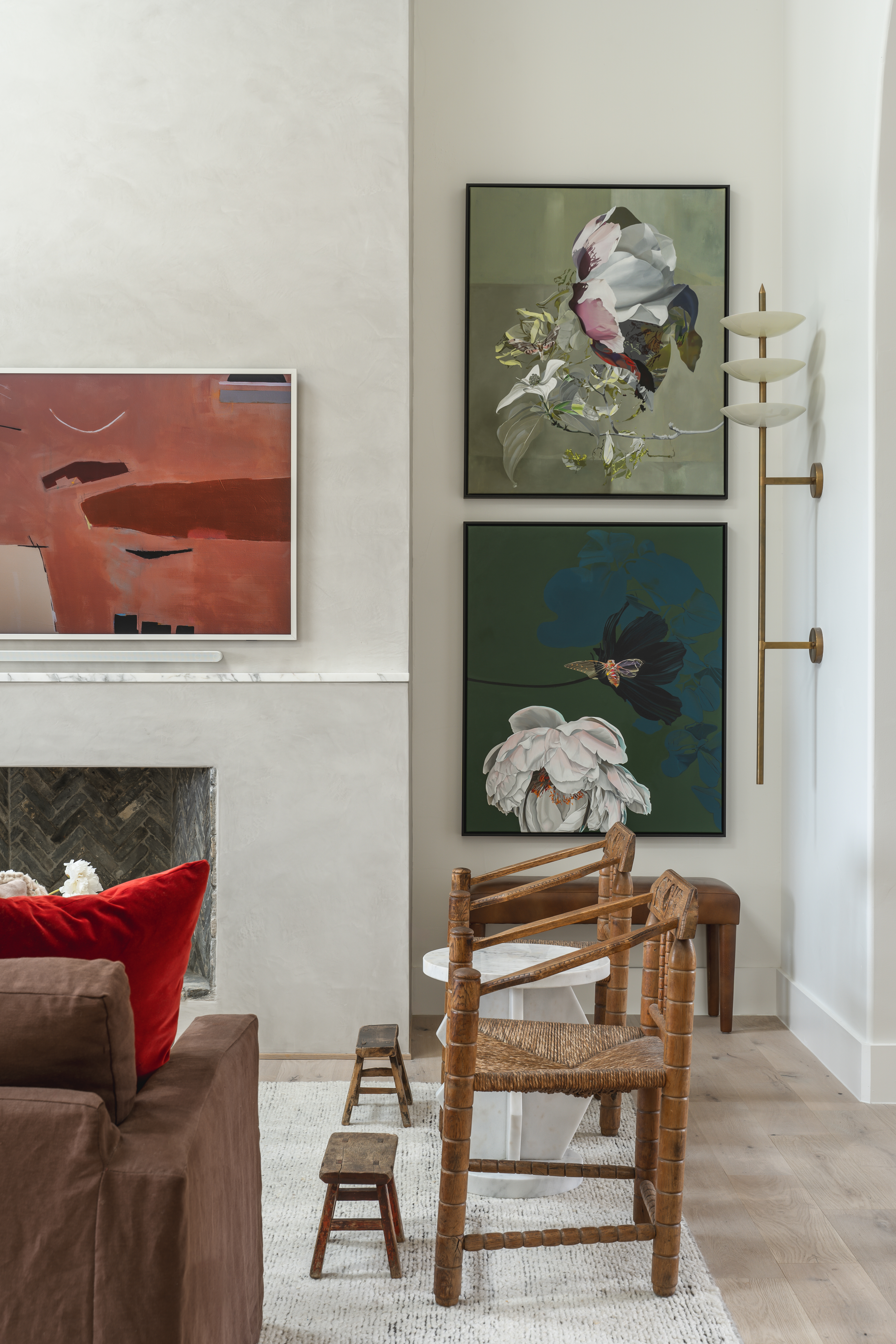
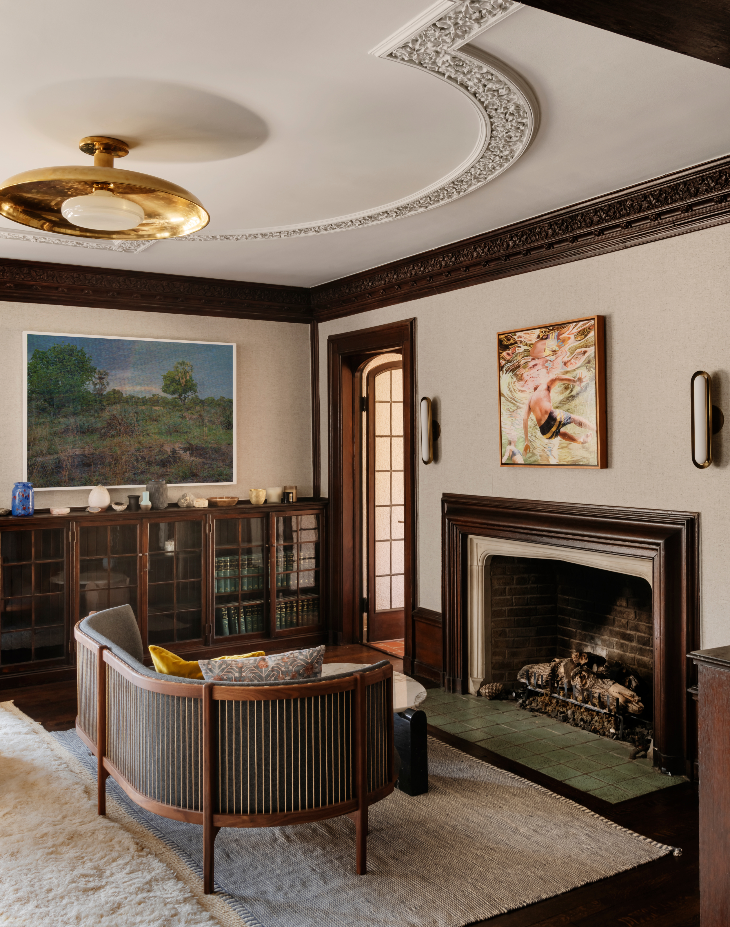
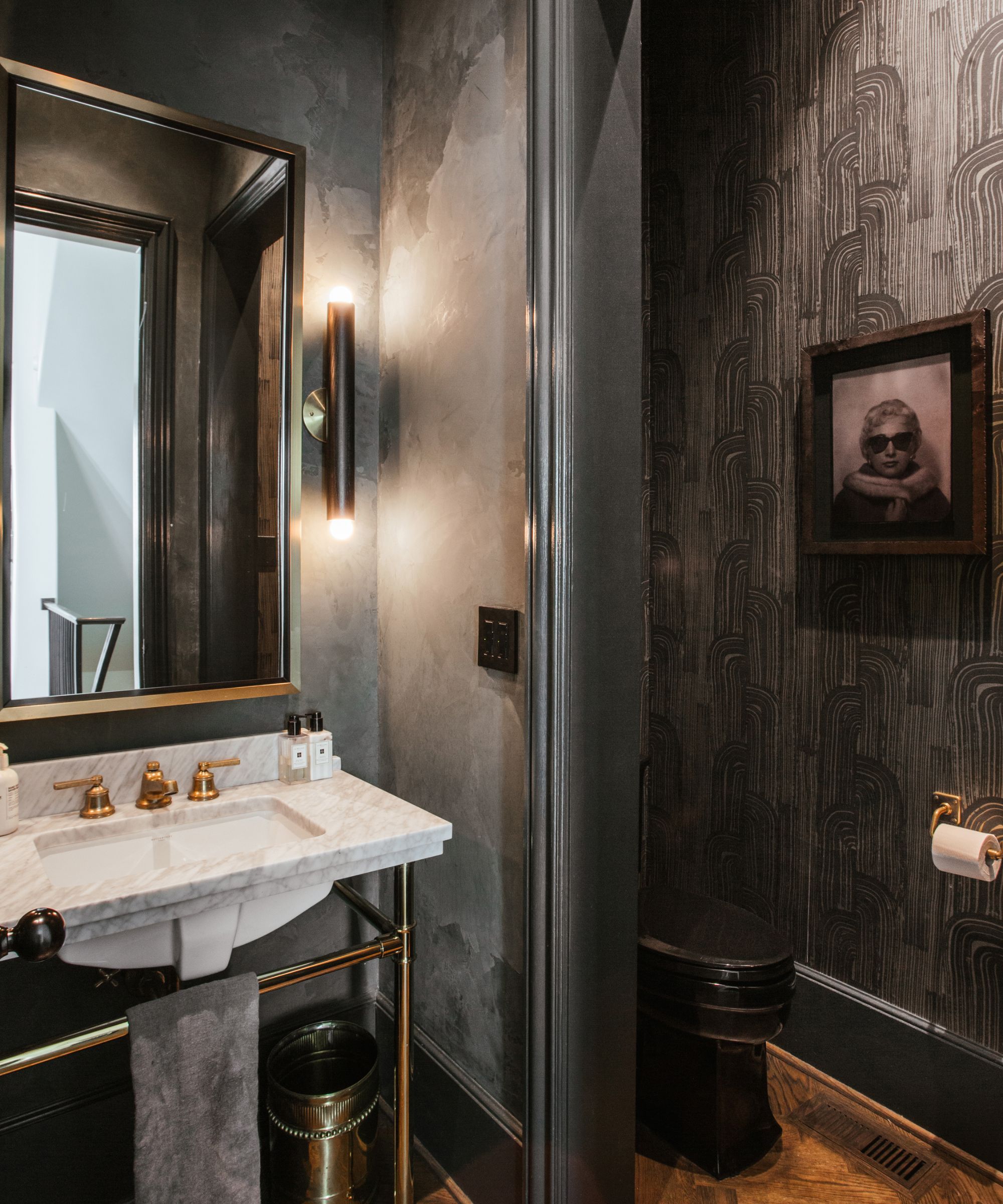
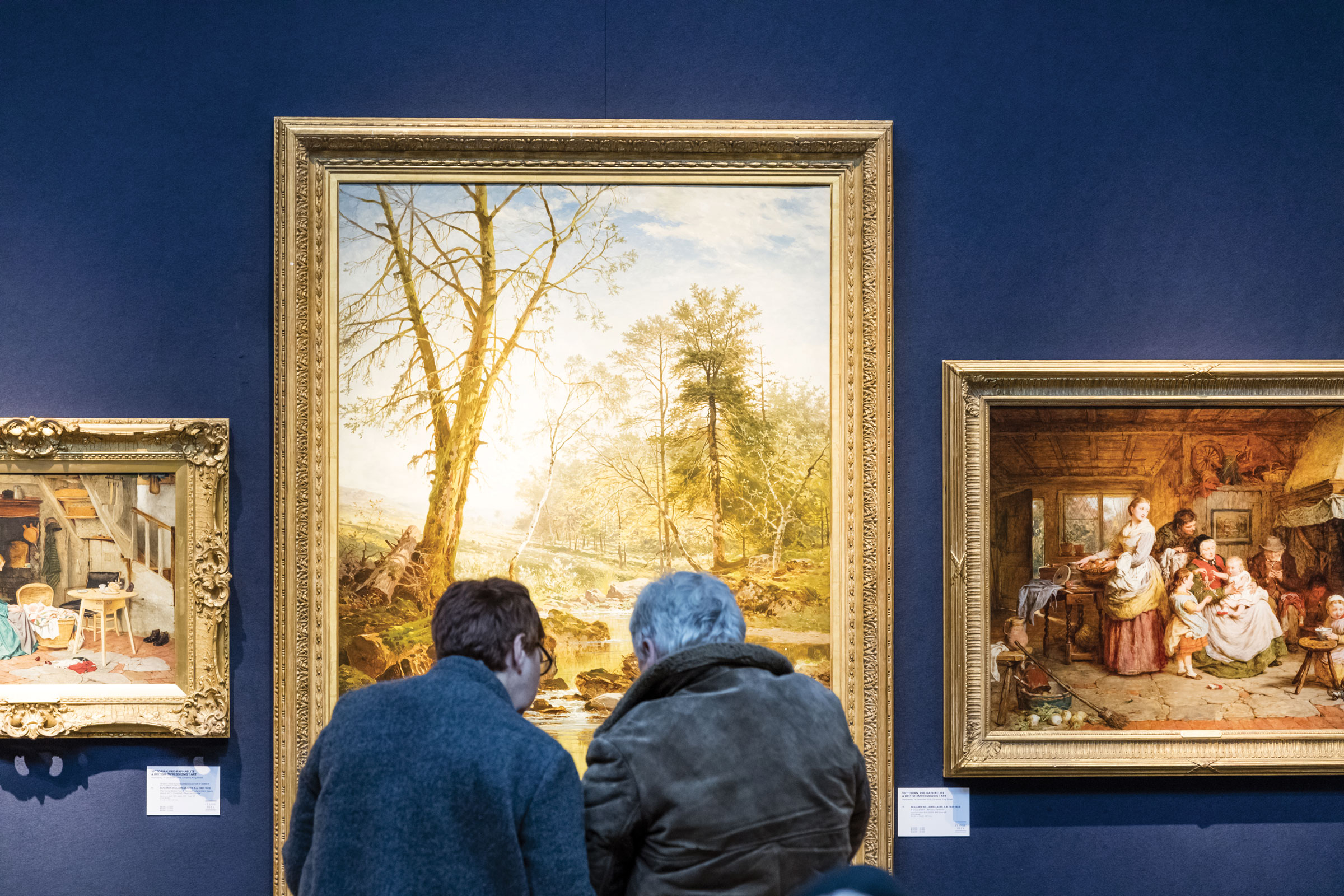
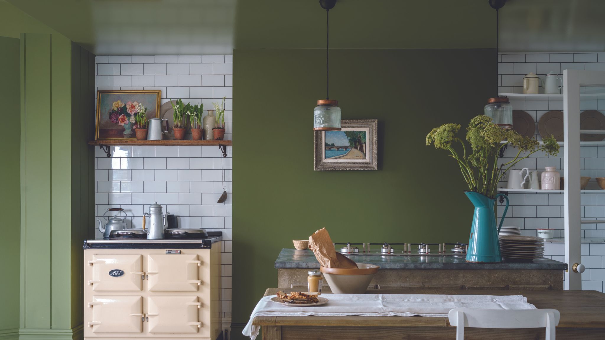
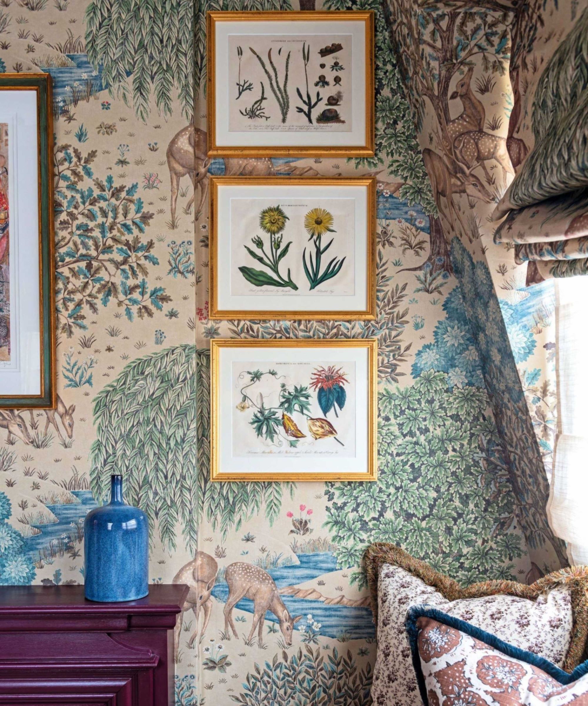
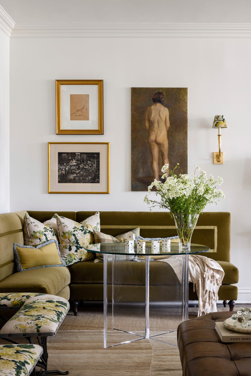
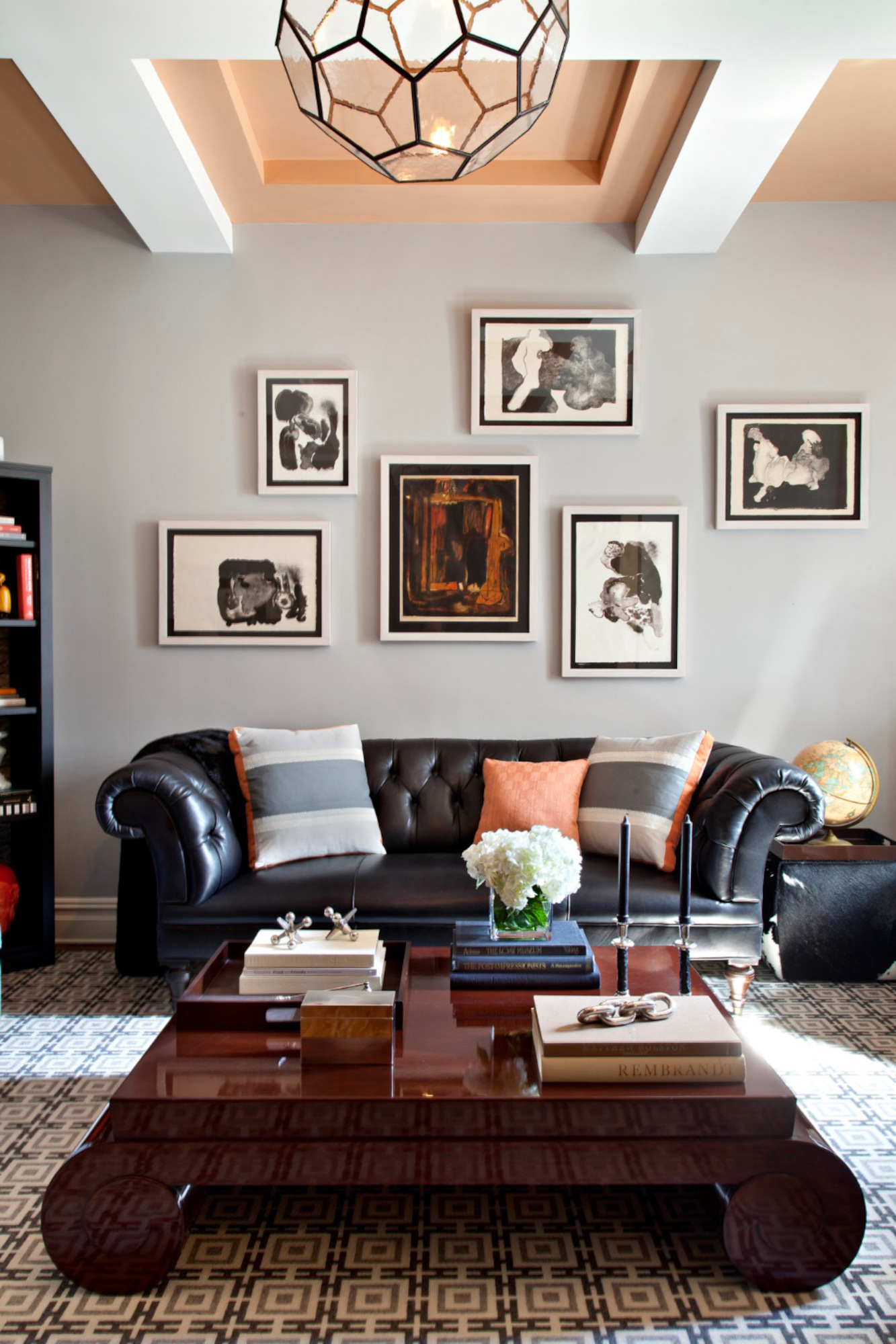
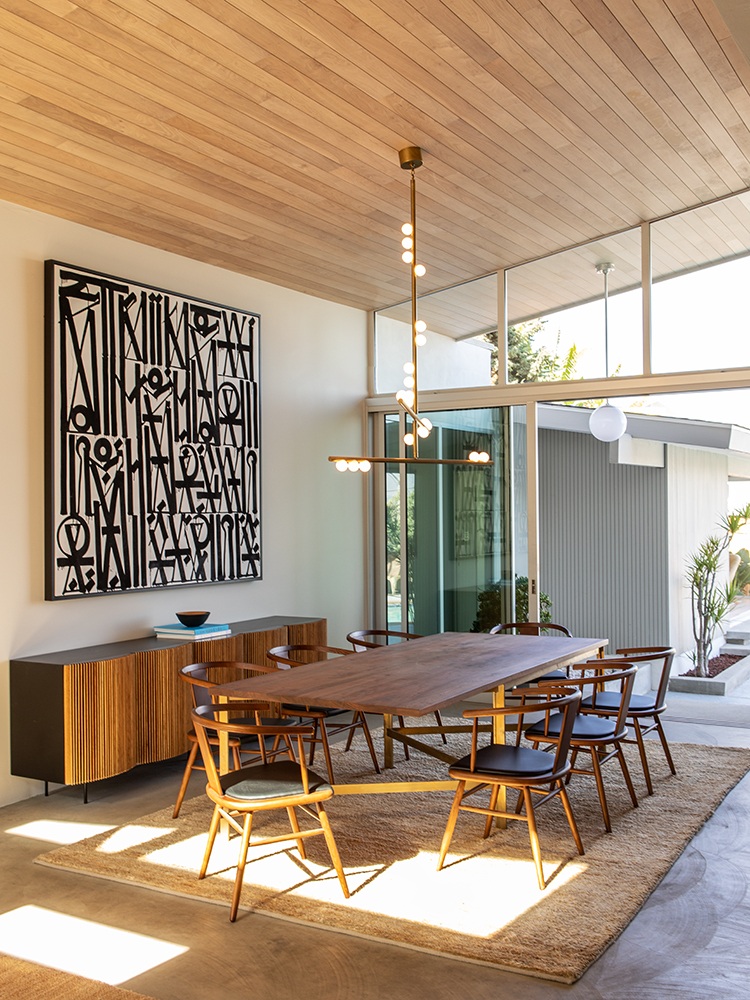
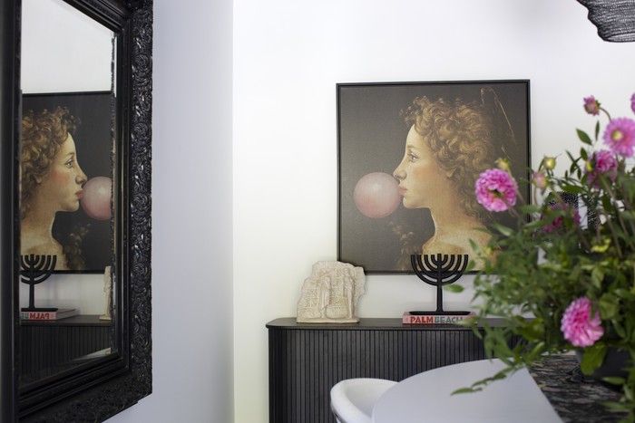
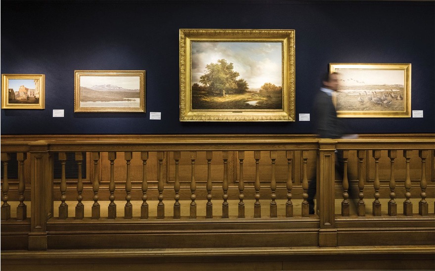
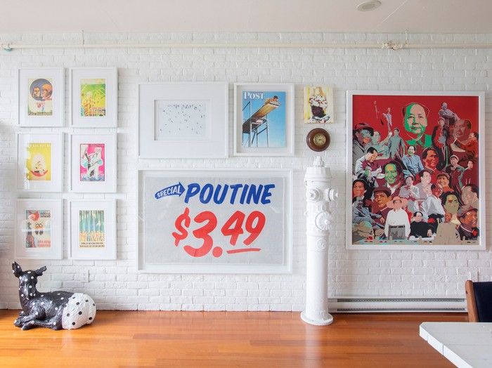
Selecting the appropriate paint color for an art gallery wall can significantly influence how artwork is perceived. The chosen hue should make the pieces stand out and align with the overall mood of the collection. For instance, colorists from Farrow & Ball collaborated with MoMA curators to develop a deep battleship gray for an Edgar Degas exhibition. This shade, a combination of Worsted, Mole's Breath, and Off-Black, was specifically designed to complement the inky blacks and charcoal grays in Degas's works, creating an atmospheric backdrop for his sketches and monotypes.
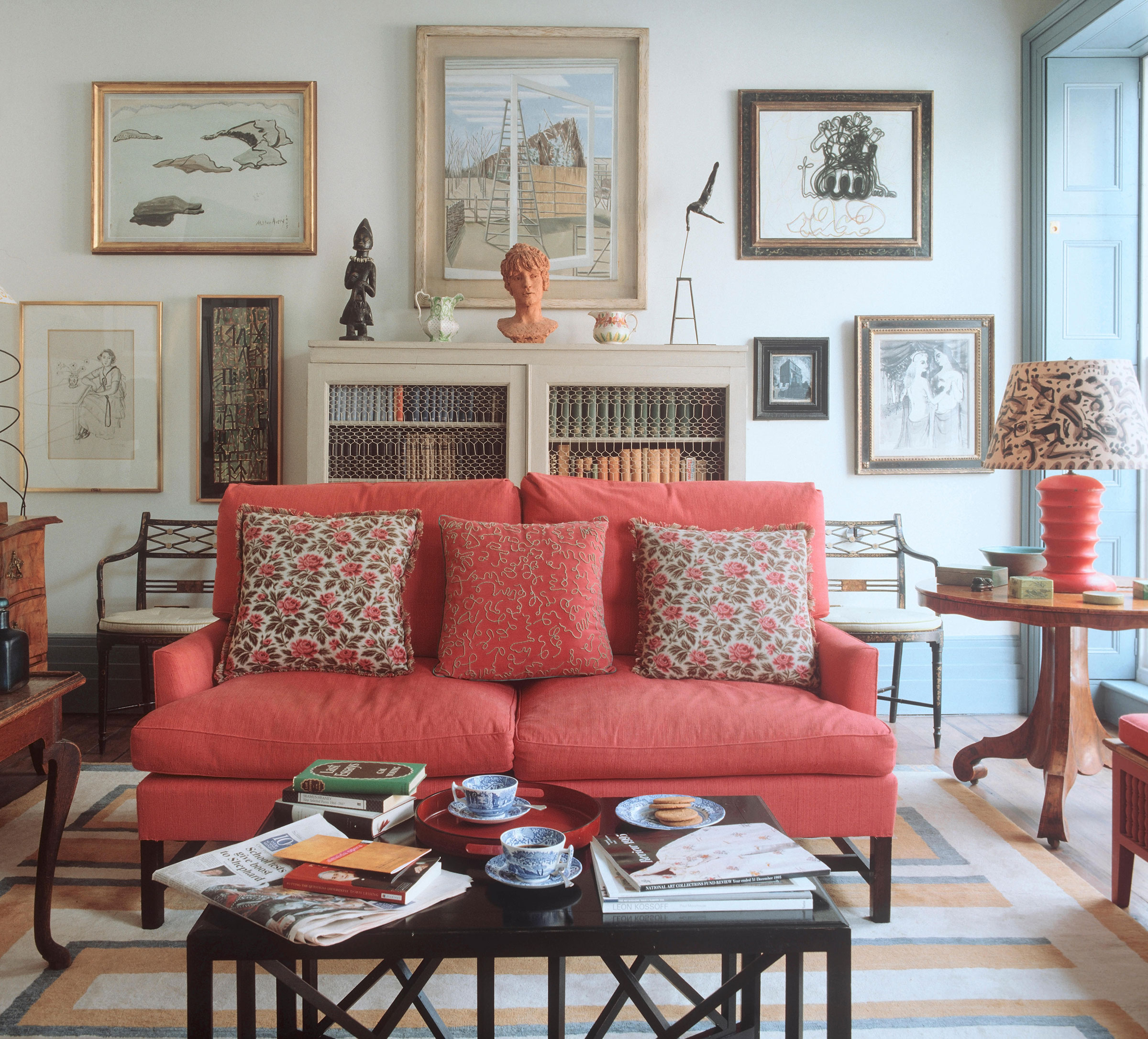
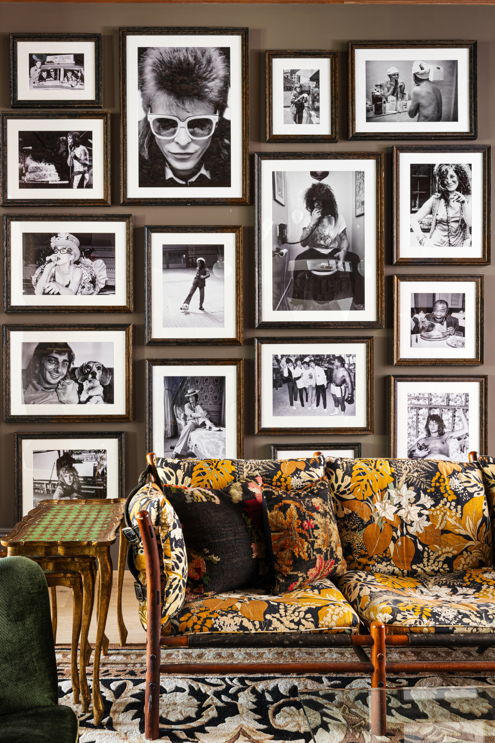
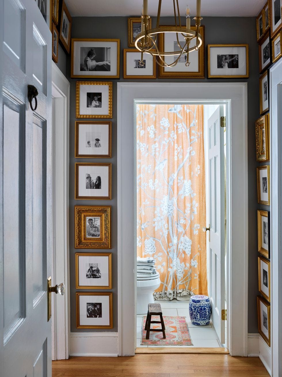
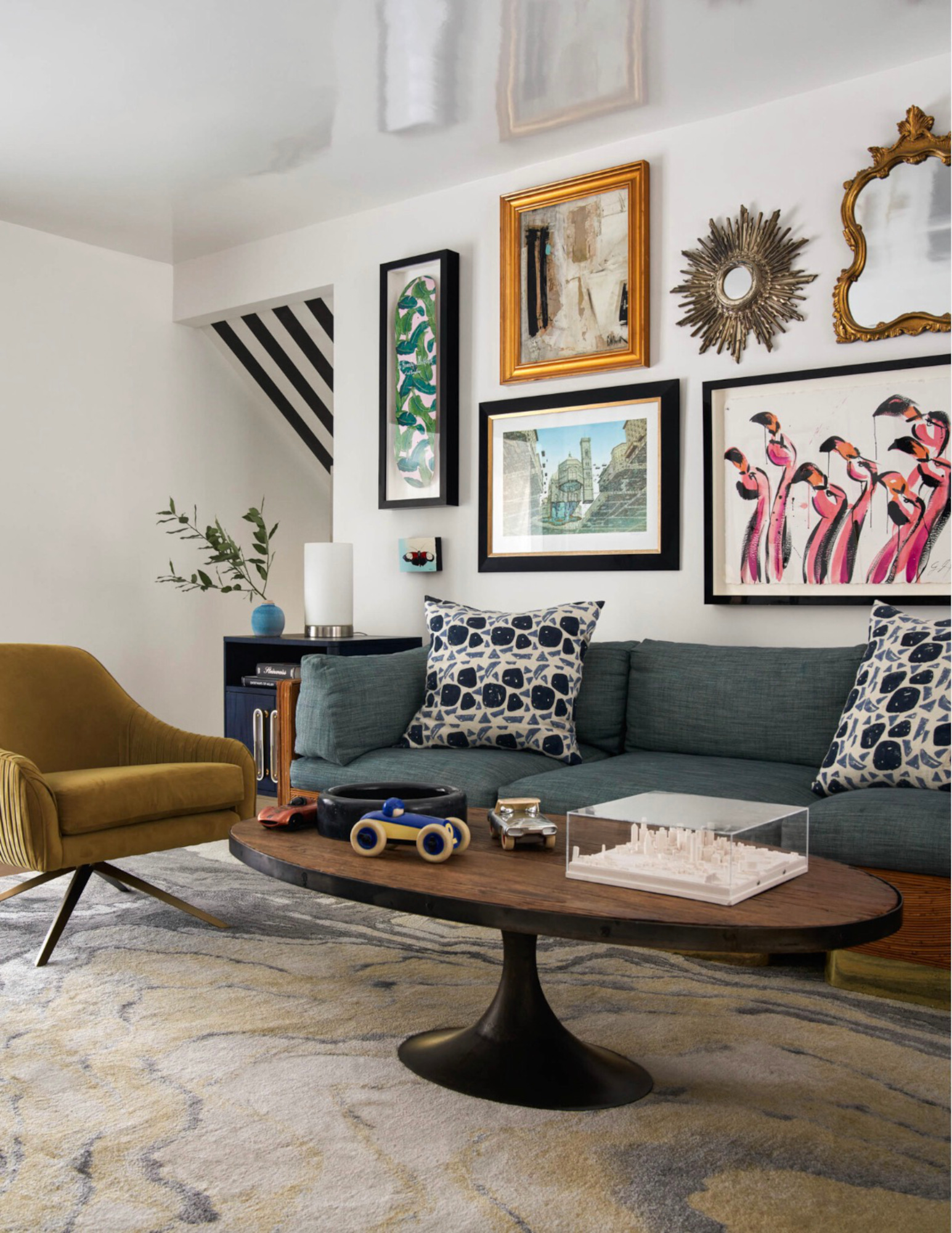
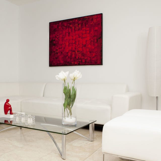
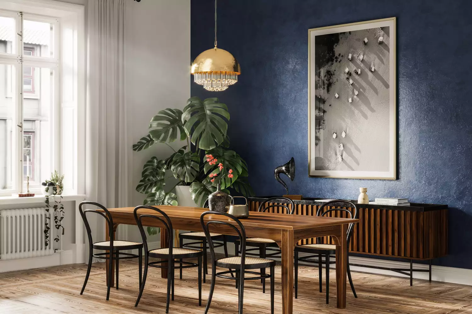
The softness or boldness of the artwork should guide the paint selection. For art with subtle tones, a stormy gray might be suitable, as it was for the Degas exhibit. Conversely, bold graphic pieces often benefit from a contrasting backdrop. When choosing paint, a flat finish is generally recommended because it reflects color without sheen, allowing the artwork to be the primary source of light reflection. If a dark, flat finish seems too heavy, a satin finish can be an alternative, also offering the benefit of hiding fingerprints in high-traffic areas.
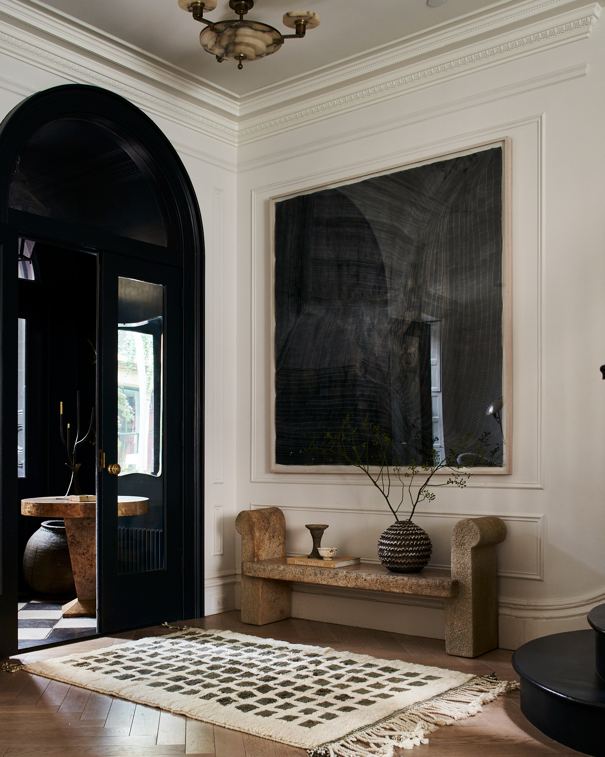
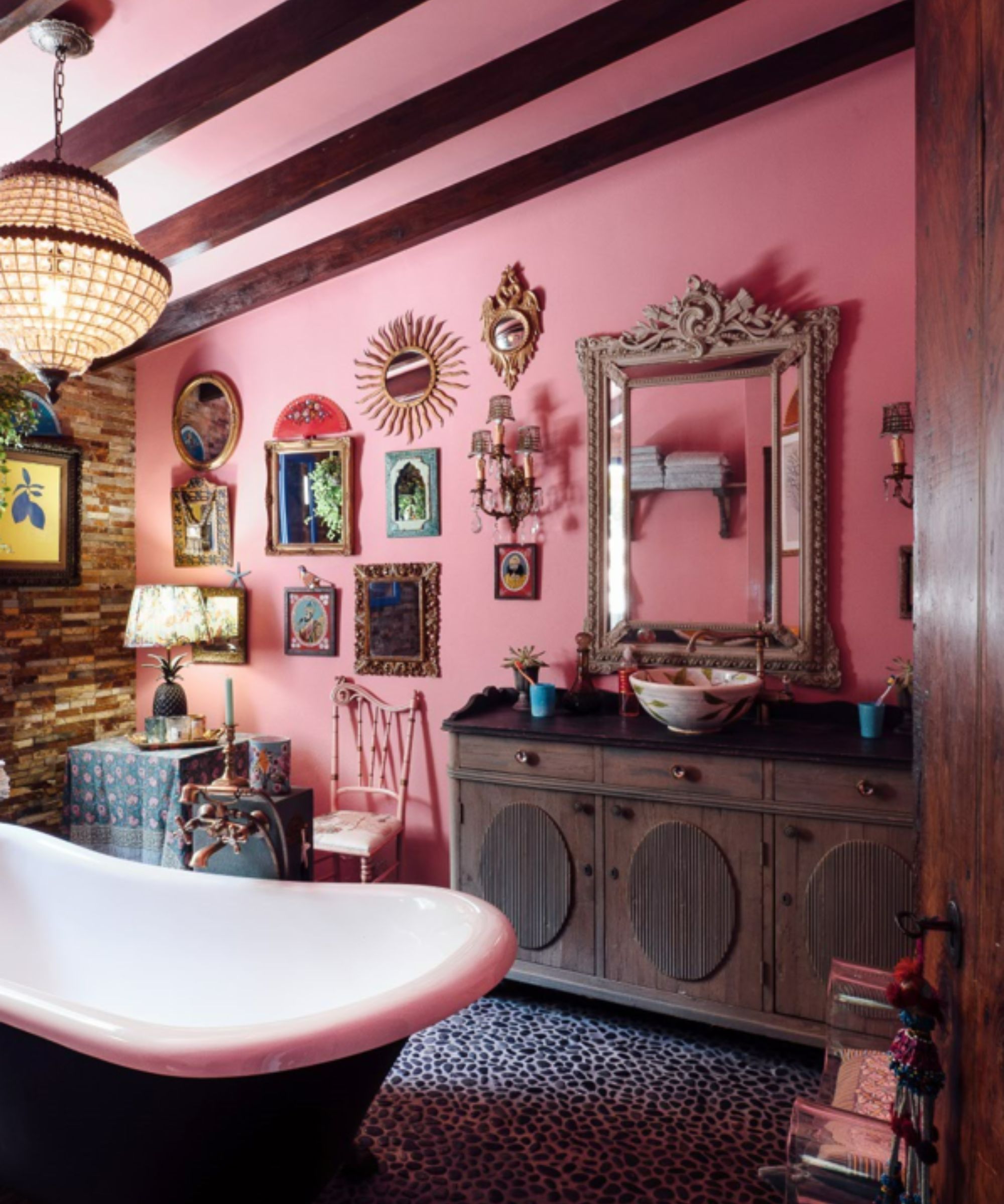
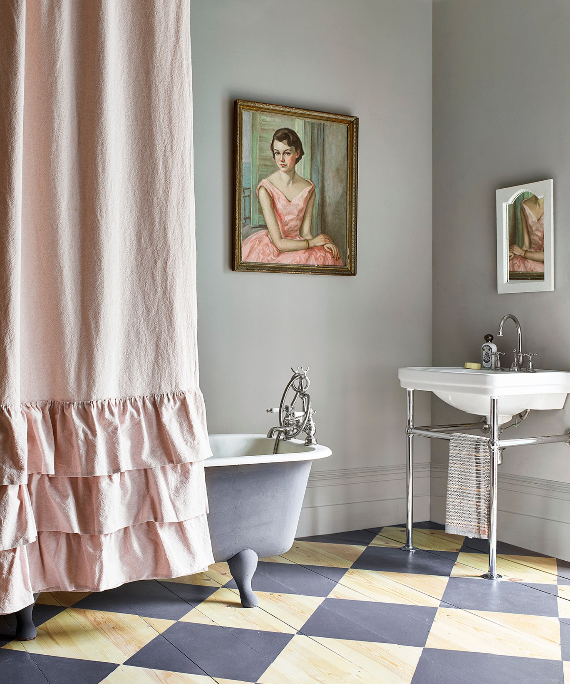
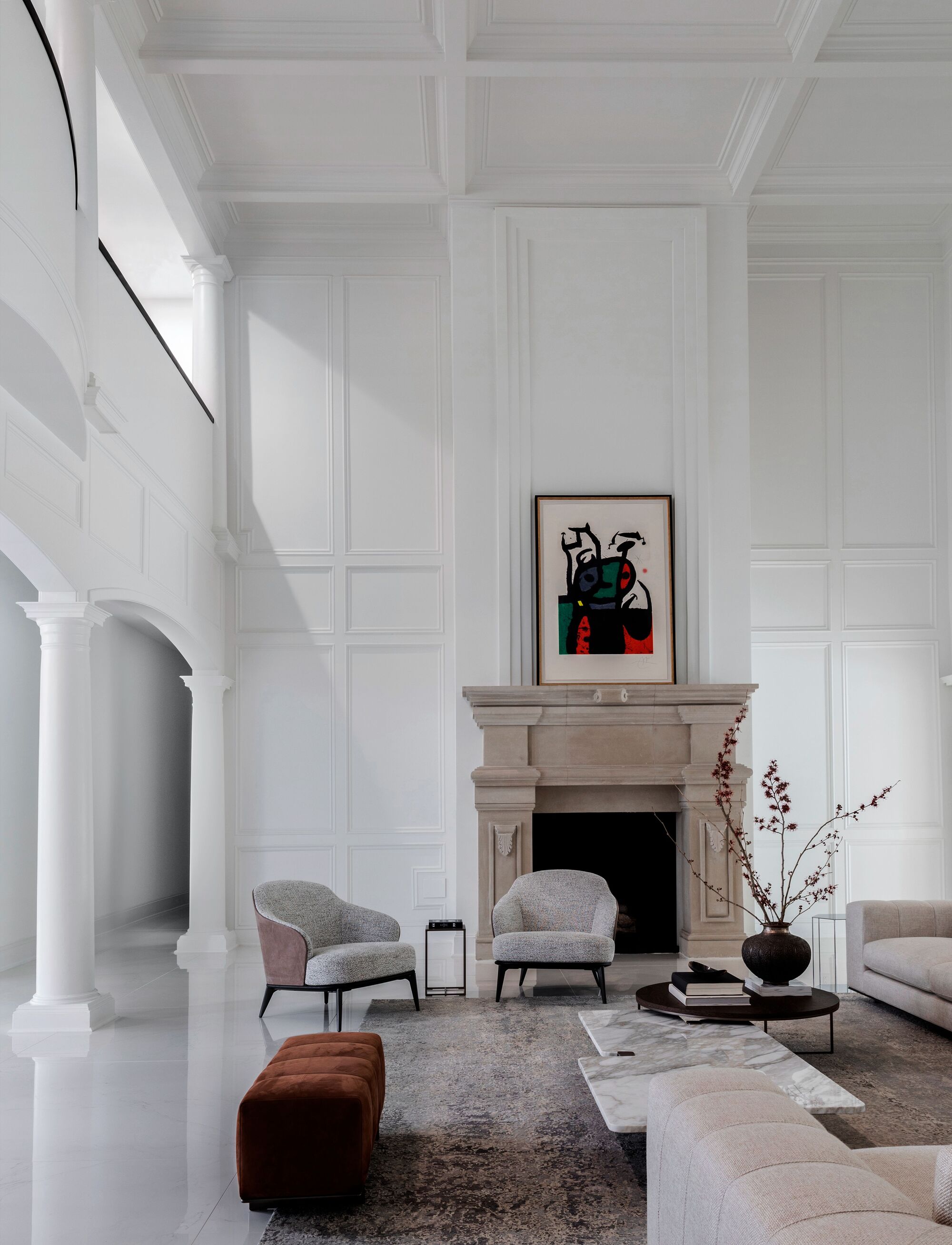
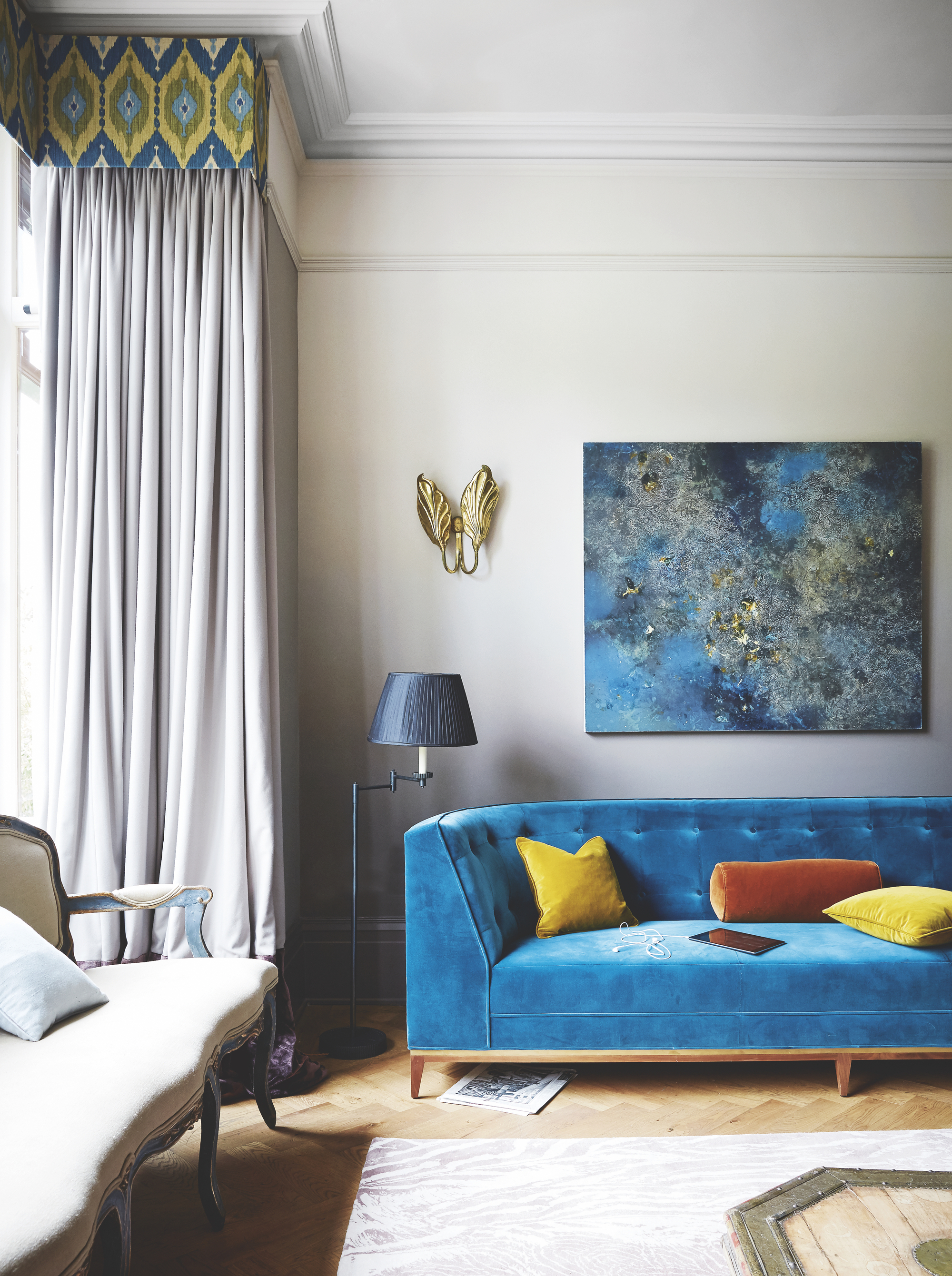
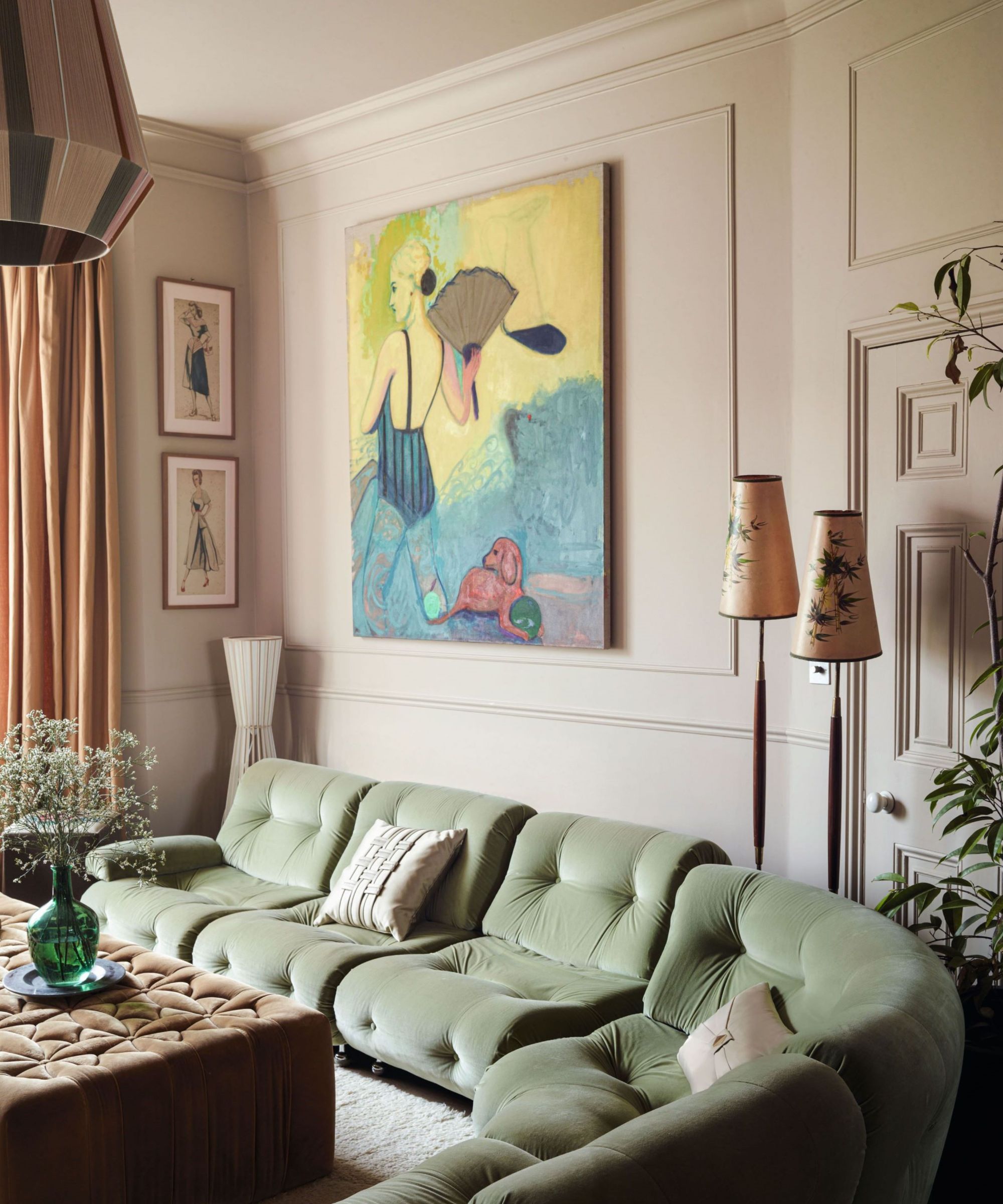
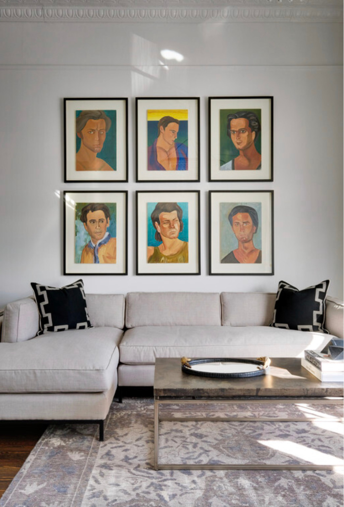
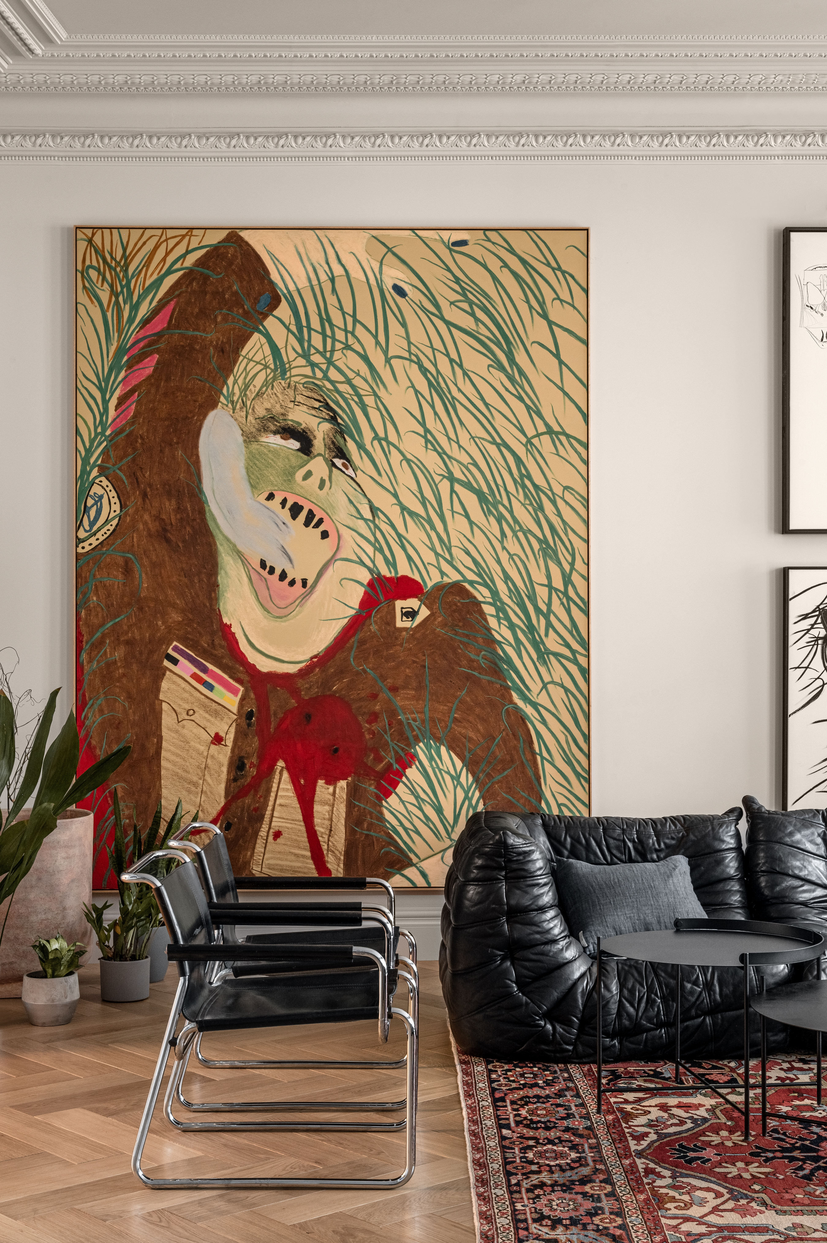
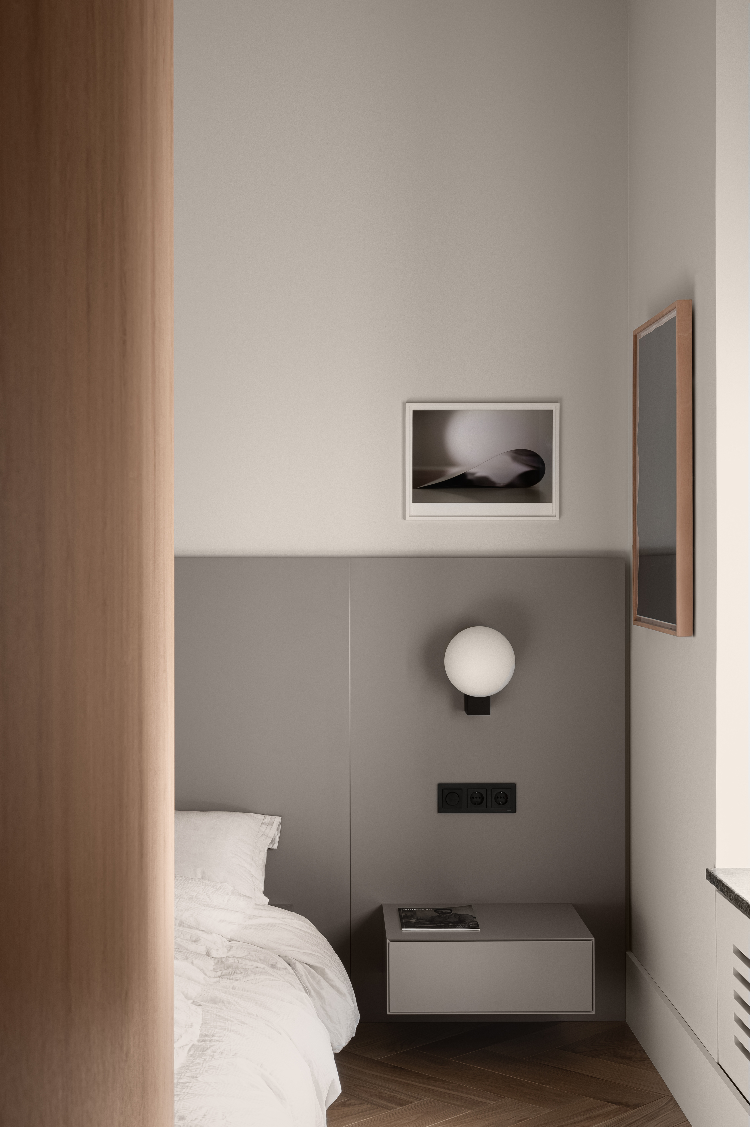
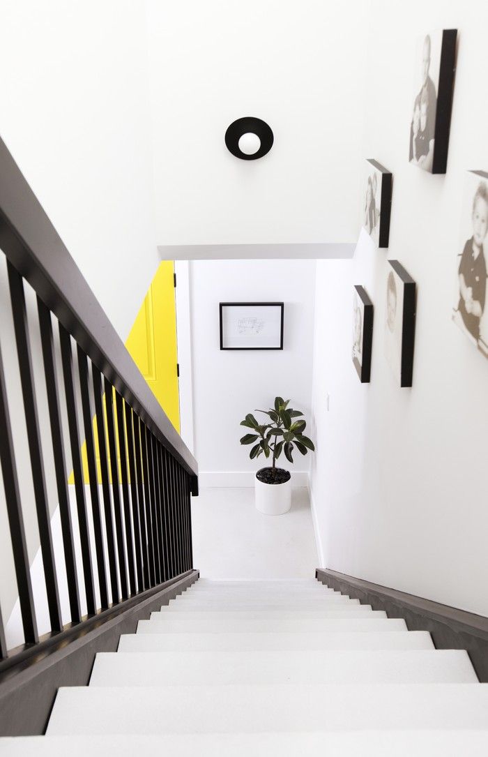
While white walls are common in art galleries, they can sometimes appear outdated or too stark. Traditional gallery whites, such as Benjamin Moore's White Dove, have a slight yellow tint, but some spaces opt for cooler whites like Super White to evoke a sense of examination, depending on the art displayed. However, contemporary galleries are increasingly moving away from harsh whites in favor of softer, more natural environments. For example, the Los Angeles County Museum of Art utilized a maté tea wash to create a gentler setting for Pacific Art. To draw attention to a specific painting or create an accent wall, one technique involves selecting a color directly from the artwork for that wall, while painting adjacent walls in a different shade. Darker walls can also make a painting appear lighter.
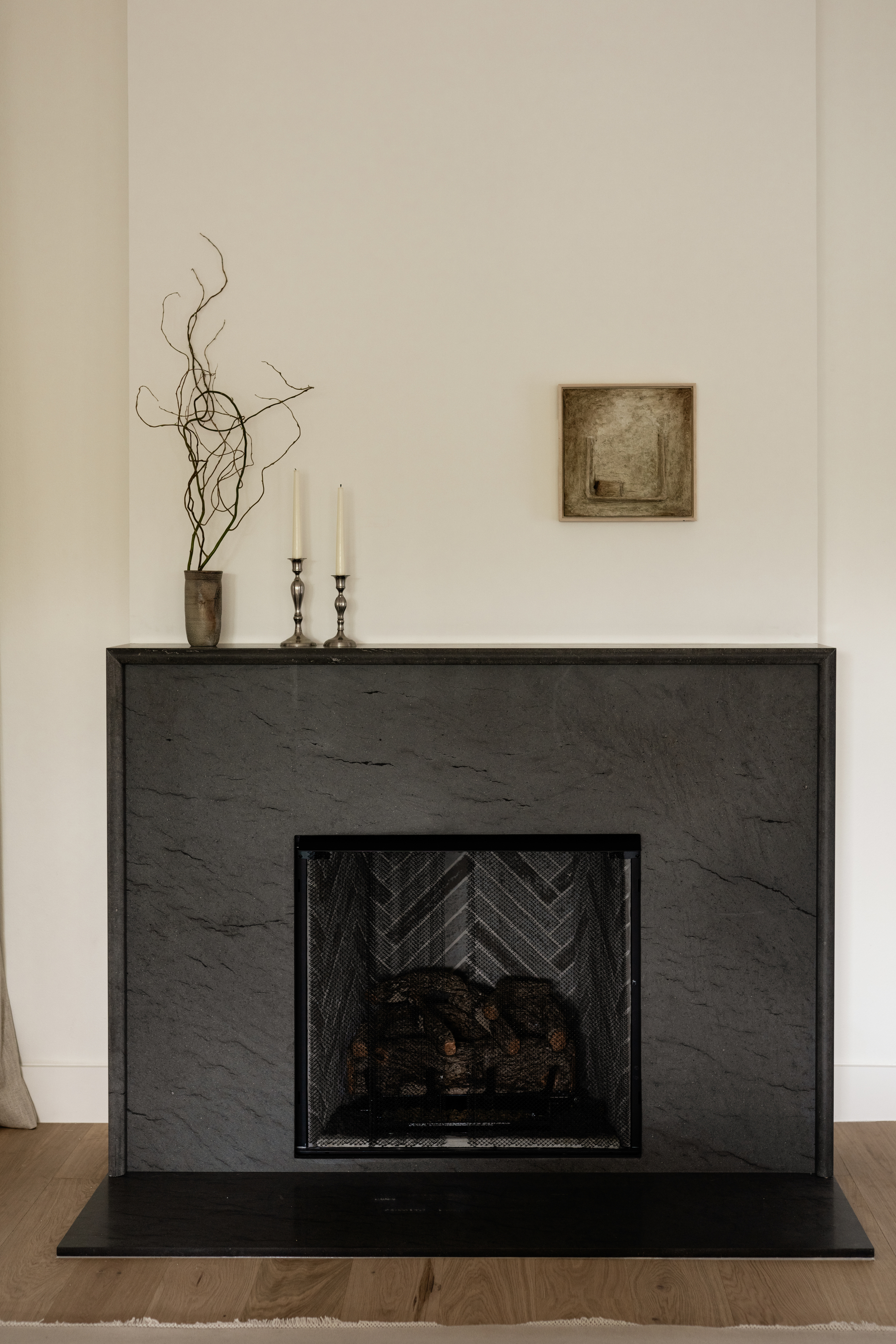
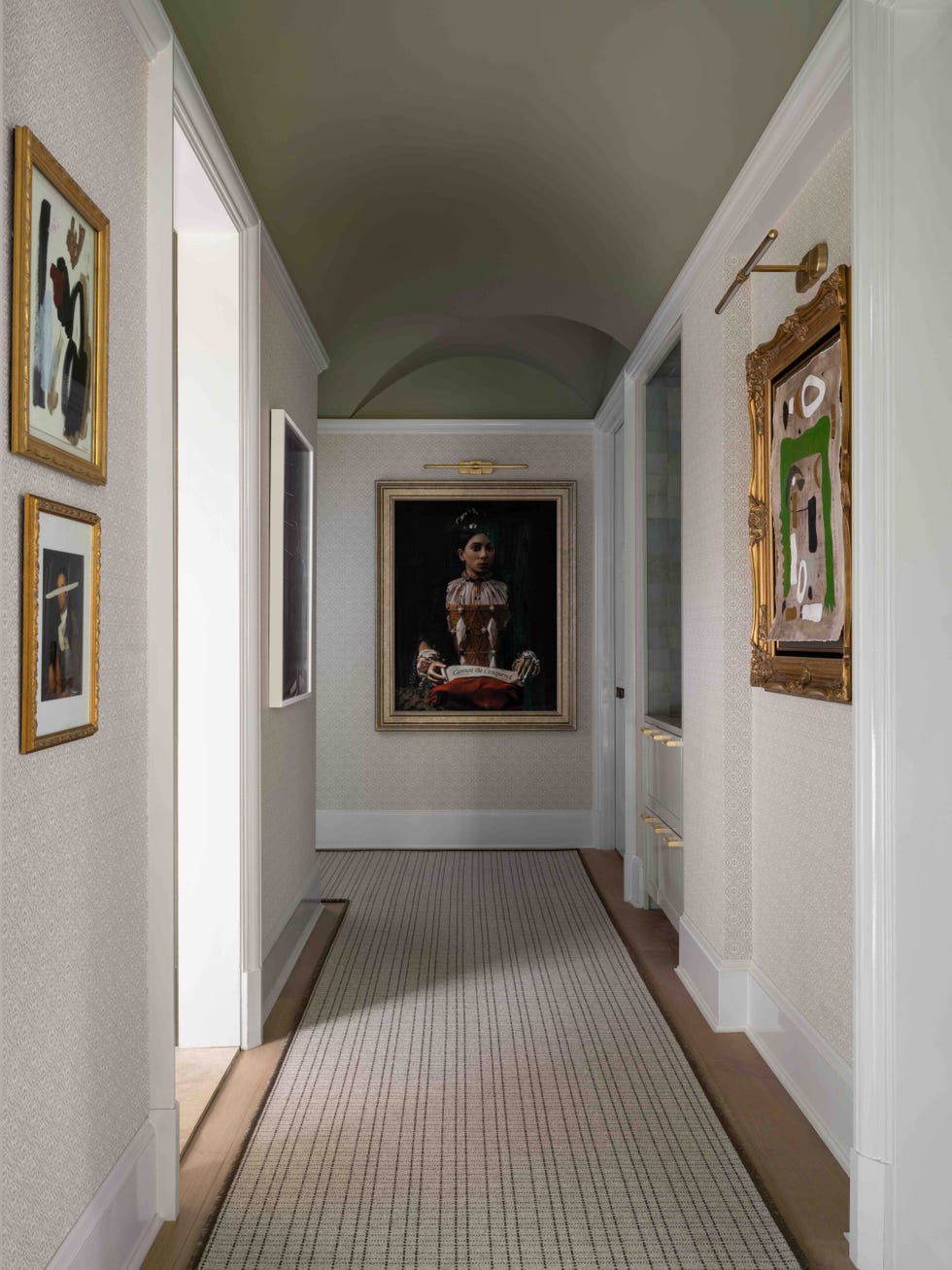
It is crucial not to overdo the color. Homeowners often underestimate the intensity of a color once applied to an entire room. The goal is for the walls to serve as a supportive element, allowing the art to be the focal point. Jeffrey Strean, director of design and architecture at the Cleveland Museum of Art, advises paying close attention to undertones, as a subtle hint of color within a gray or beige might be sufficient to achieve the desired effect without overwhelming the space. The process involves thoughtful consideration of the art's characteristics, the desired ambiance, and the practical aspects of paint finishes.
#ArtGalleryWall #PaintColorSelection #InteriorDesign #HomeDecoration #ArtDisplay #ColorTheory #PaintFinishes #AccentWall #ArtGalleryWall #PaintColorSelection #InteriorDesign #HomeDecoration #ArtDisplay #ColorTheory #PaintFinishes #AccentWall
कुल 0 टिप्पणियाँ
 कोई टिप्पणी नहीं
आपको यह भी पसंद आ सकता है
5 common gallery wall mistakes designers warn to always avoid – to create the chicest of displays

Should you display art in a bathroom? Here are some things to consider first
7 Interior Designers Share Their Tips on Buying Art for Your Home
The Best (and Easiest!) Ways To Hang Pictures, According to Art Pros

5 Places You Should Never Hang Art in Your Home

How to hang paintings: Everything you need to know
Here’s Where Gallery Wall Enthusiasts *Actually* Shop For Artwork

Putting a Collection on Display
There's Hanging Art, and Then There's Hanging Art Like an Interior Designer — Here's How to Do the Latter
How to Arrange Art for a Flawless Wall Display

Emily Henderson just shared her tried-and-true tips for hanging art – this is how to get a gallery-like look
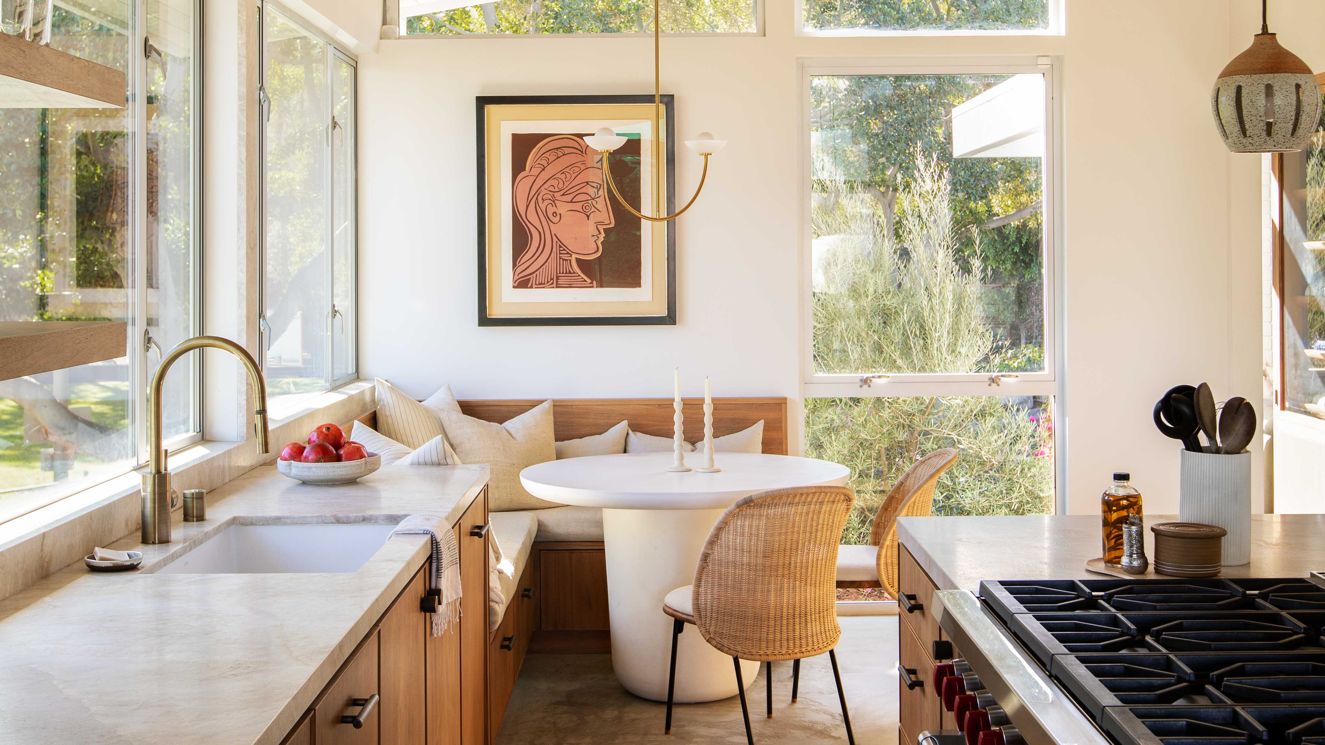
Should You Always Frame Art? These Are the Golden Rules Gallery Curators and Interior Designers Swear By
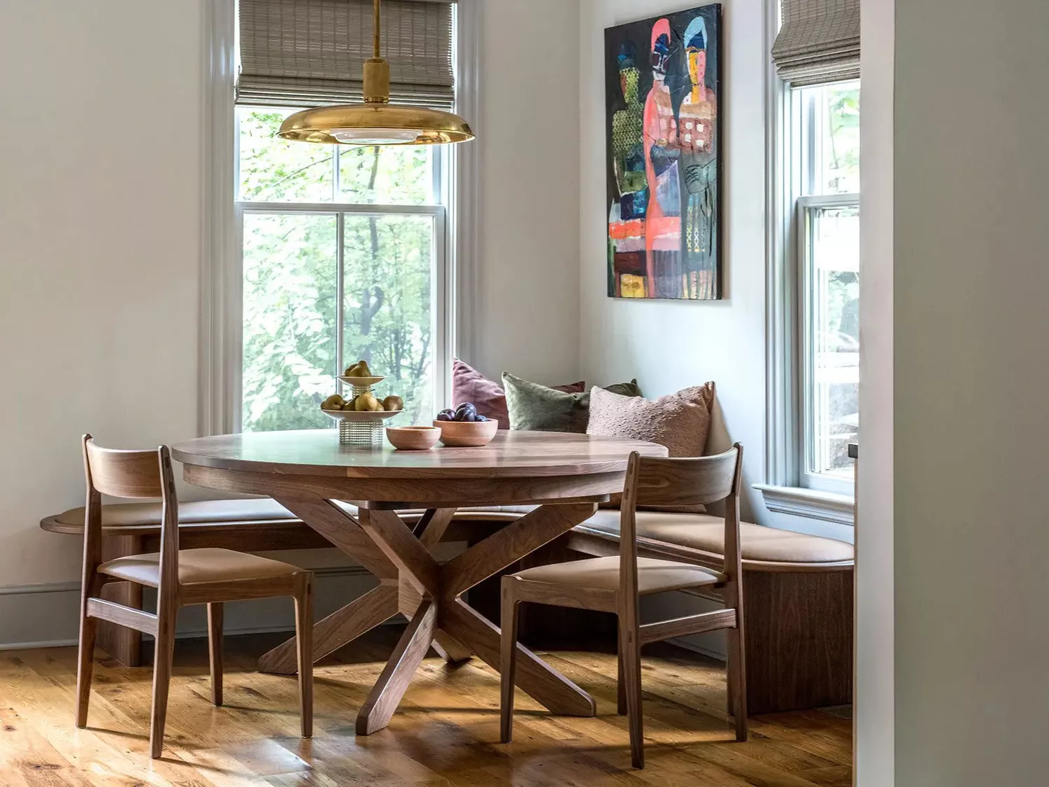
5 Things Design Pros Always Do When Buying Artwork for Their Homes (And You Should Too)

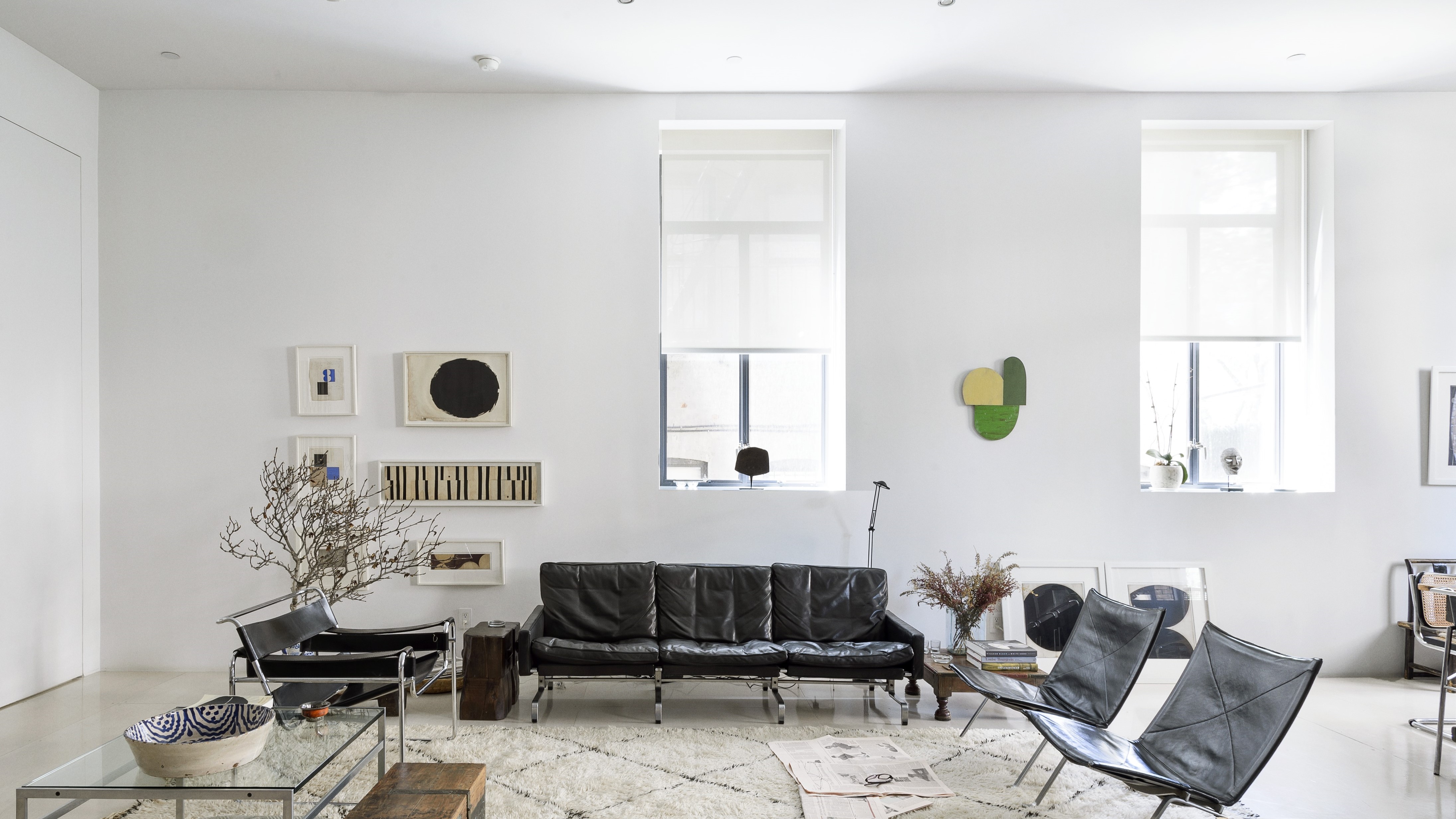
6 painting mistakes that are making your walls look 'dirtier' – and what you should be doing instead
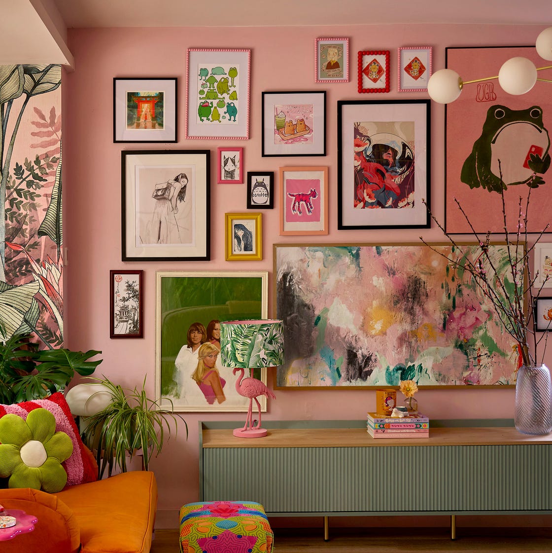
You're Styling Your Gallery Wall All Wrong—Here's How to Get It Right, According to Experts

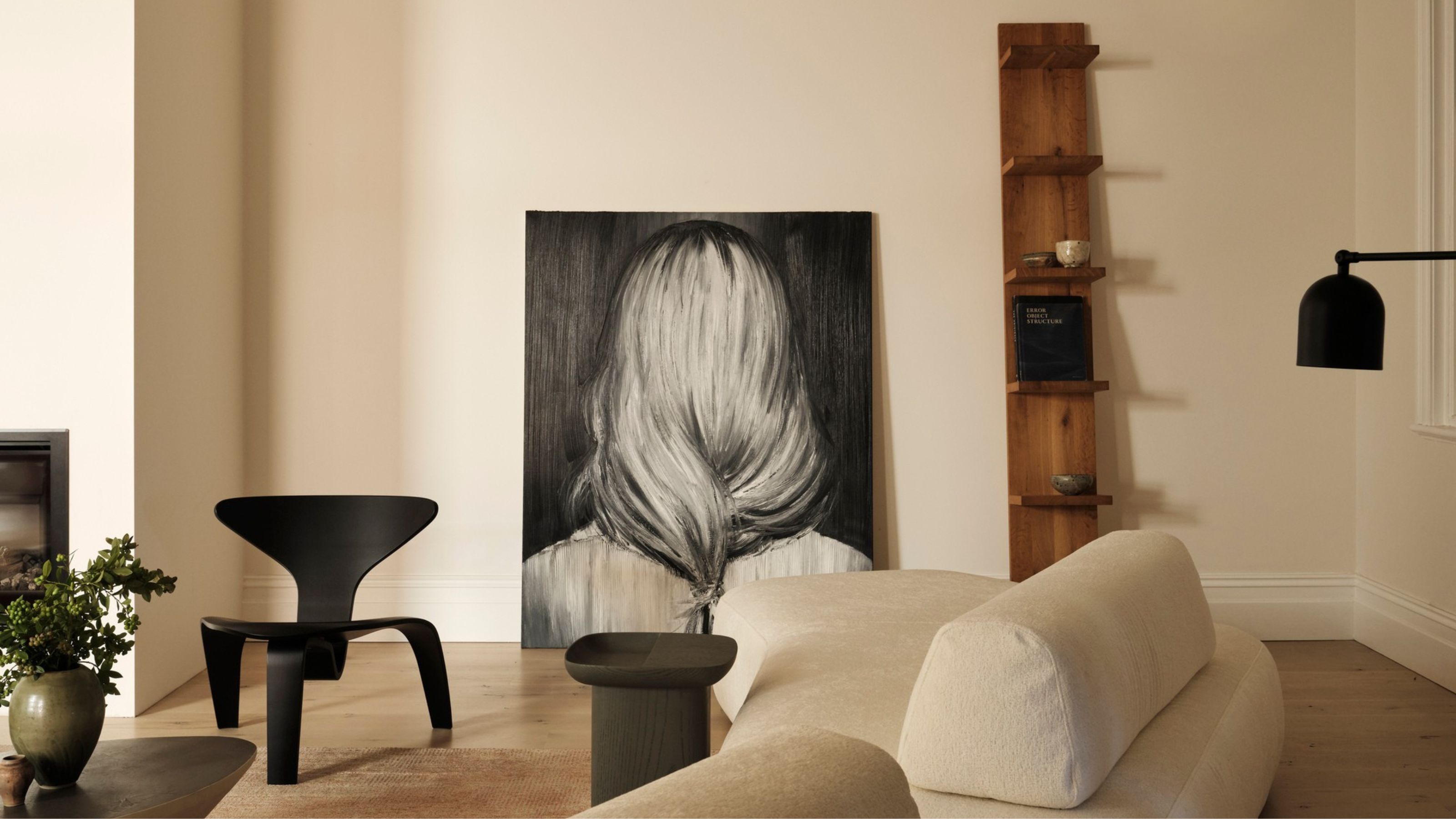
Curating art for the home is an art in itself

This 'Lazy' Way of Displaying Art, Conveniently, Also Happens to Be the Best Looking
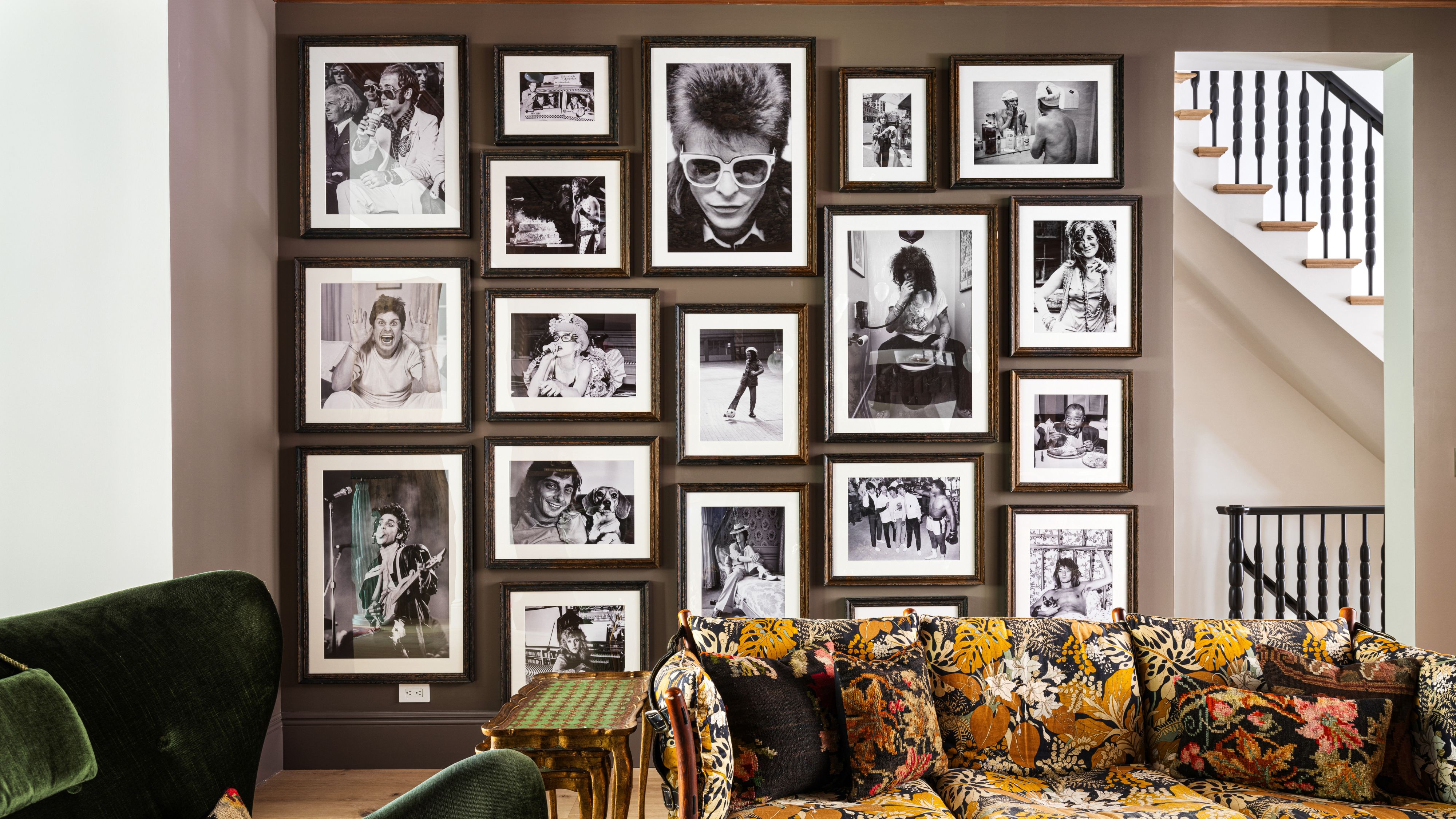
Gallery Walls Aren’t Dated – They’re Just Being Done Wrong
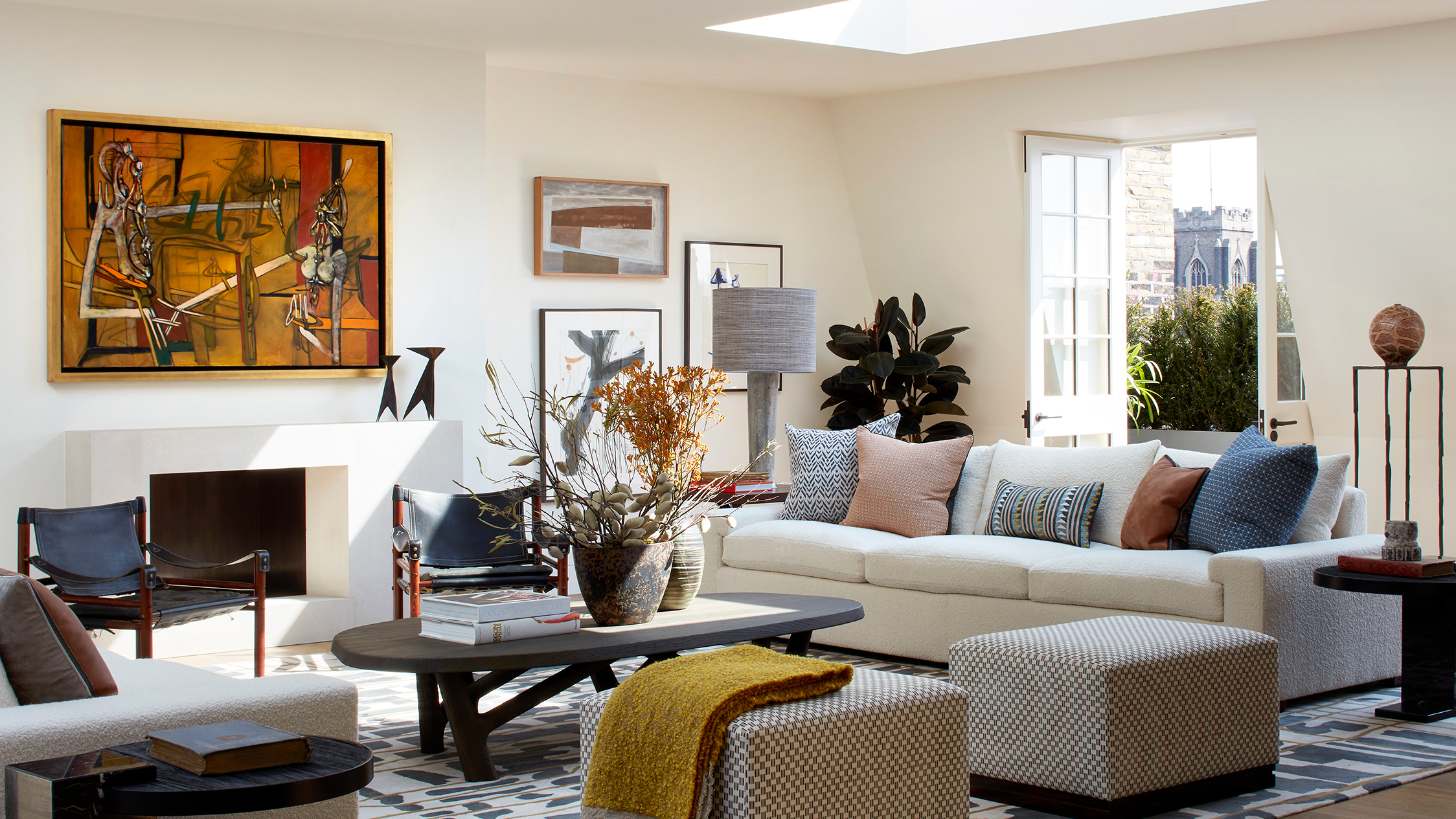
'Your art should be in conversation with each other' – how to coordinate wall decor in a room for a curated display
Interior Designer Reveals the No. 1 Thing Making Your House Look Cheap