1/22
Designer-Approved Living Room Colors That'll Make You Feel Happier
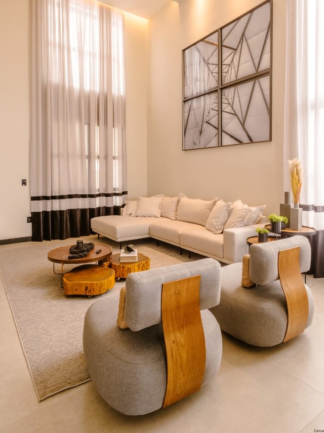
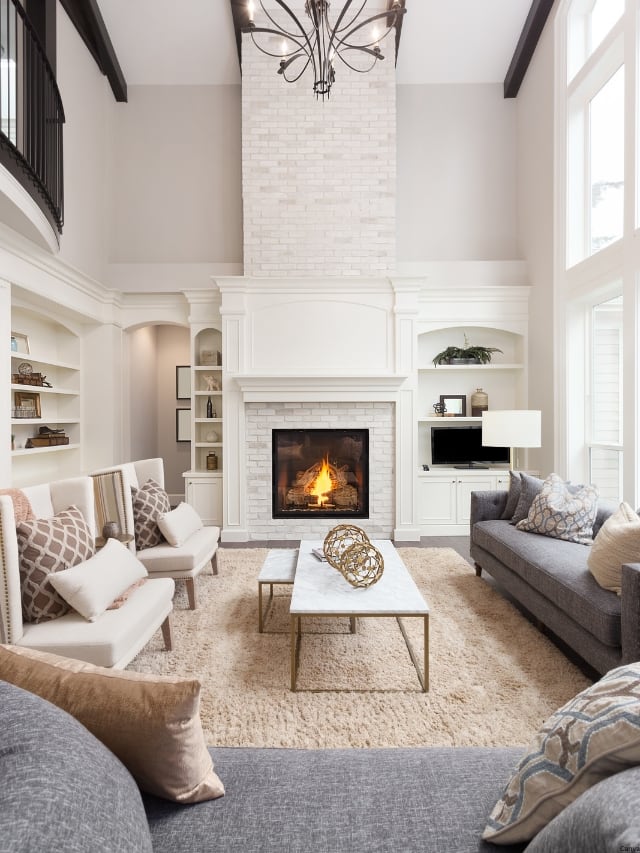
Redecorating a living room can often feel like a daunting task, especially when budget constraints limit the options for new furniture or extensive decor changes. However, a fresh coat of paint offers an affordable and relatively easy way to revitalize a space and inject new life into its aesthetic. This article provides a comprehensive, designer-approved list of 78 living room paint color ideas to inspire creativity and assist homeowners in selecting the perfect hue for their interiors.
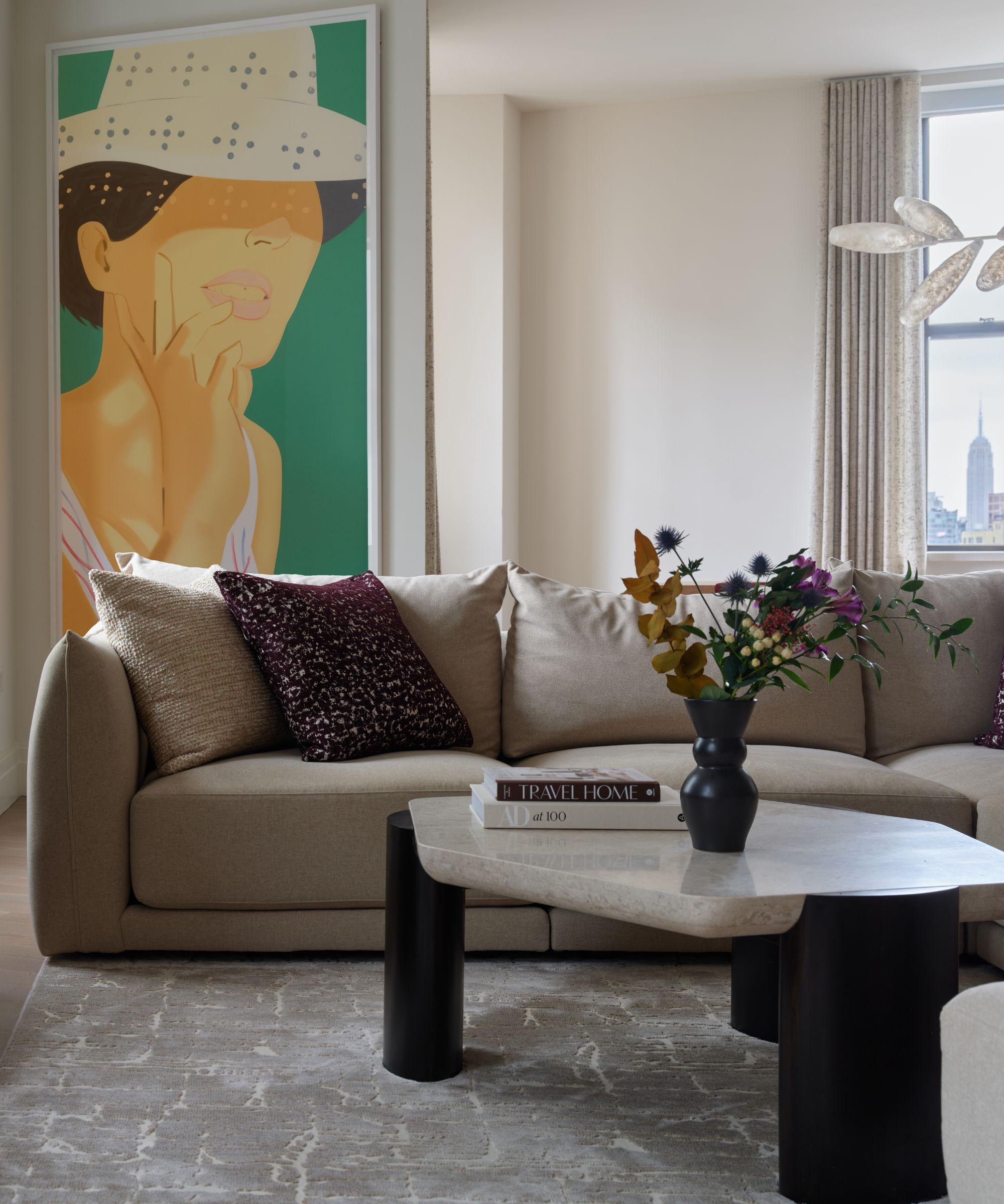
Choosing the best living room paint color involves balancing current trends with timeless appeal, while also considering the home’s existing architecture and personal design preferences. The sheer volume of paint swatches available at hardware stores can be overwhelming, making a curated guide particularly valuable. While classic neutrals such as white, off-white, and greige remain popular choices for their versatility and ability to brighten spaces, designers are increasingly incorporating richer tones like brown and burgundy, which have shown a notable rise in popularity in recent years.
Before settling on a specific paint color, it is important to consider the desired mood and atmosphere for the living room. Jewel tones, for instance, can create a dramatic and enveloping feel, contributing to a sense of luxury and intimacy. Lighter pastels and soft shades are effective in reflecting natural light, thereby making smaller rooms appear more expansive and open. Conversely, deeper, moody colors like navy or forest green can cultivate a cozy and intimate ambiance, ideal for spaces intended for relaxation and quiet contemplation. This diverse selection of 78 living room paint colors aims to provide ample inspiration for every style, preference, and spatial requirement, ensuring that homeowners can find a shade that aligns perfectly with their vision for their home.
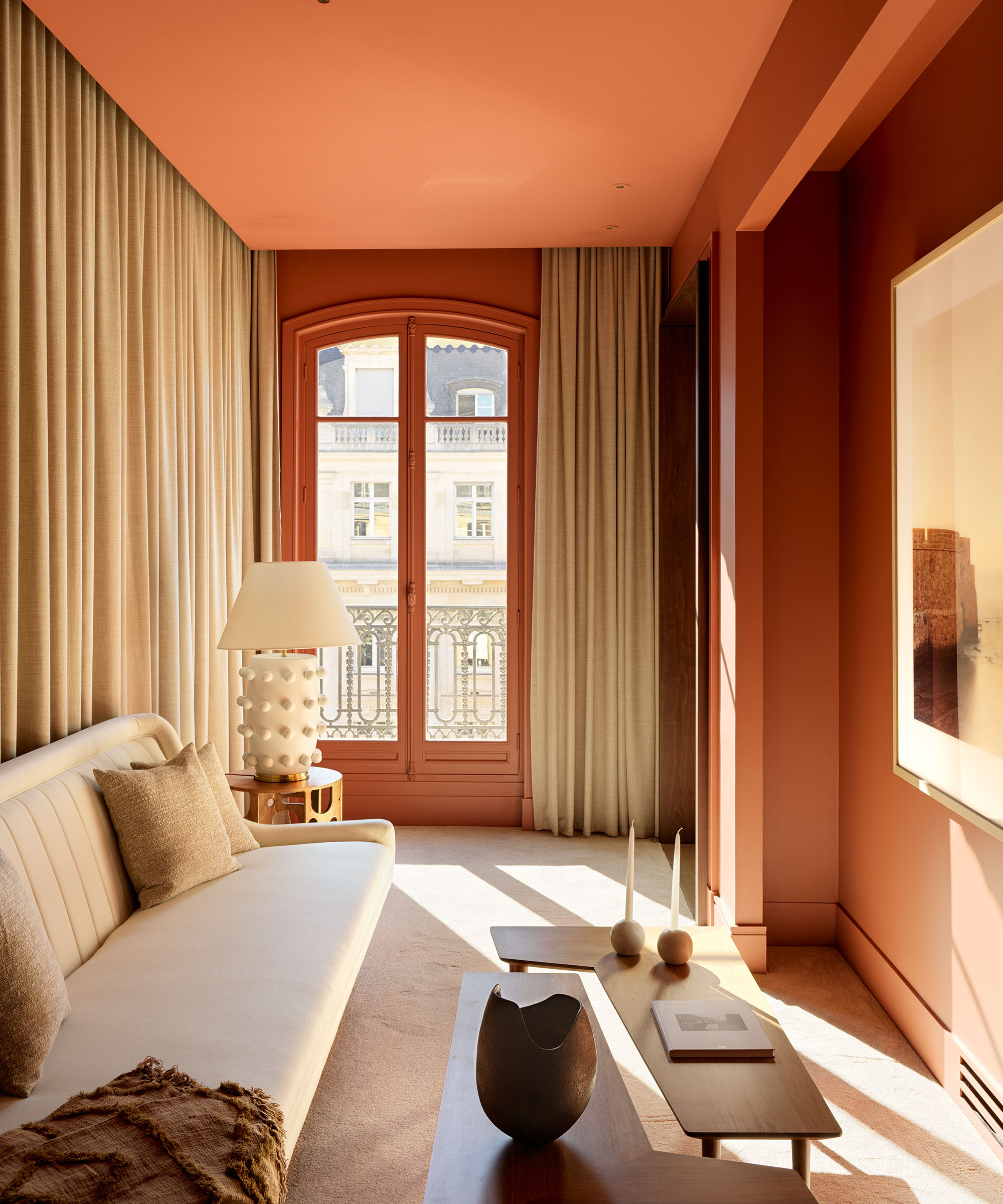
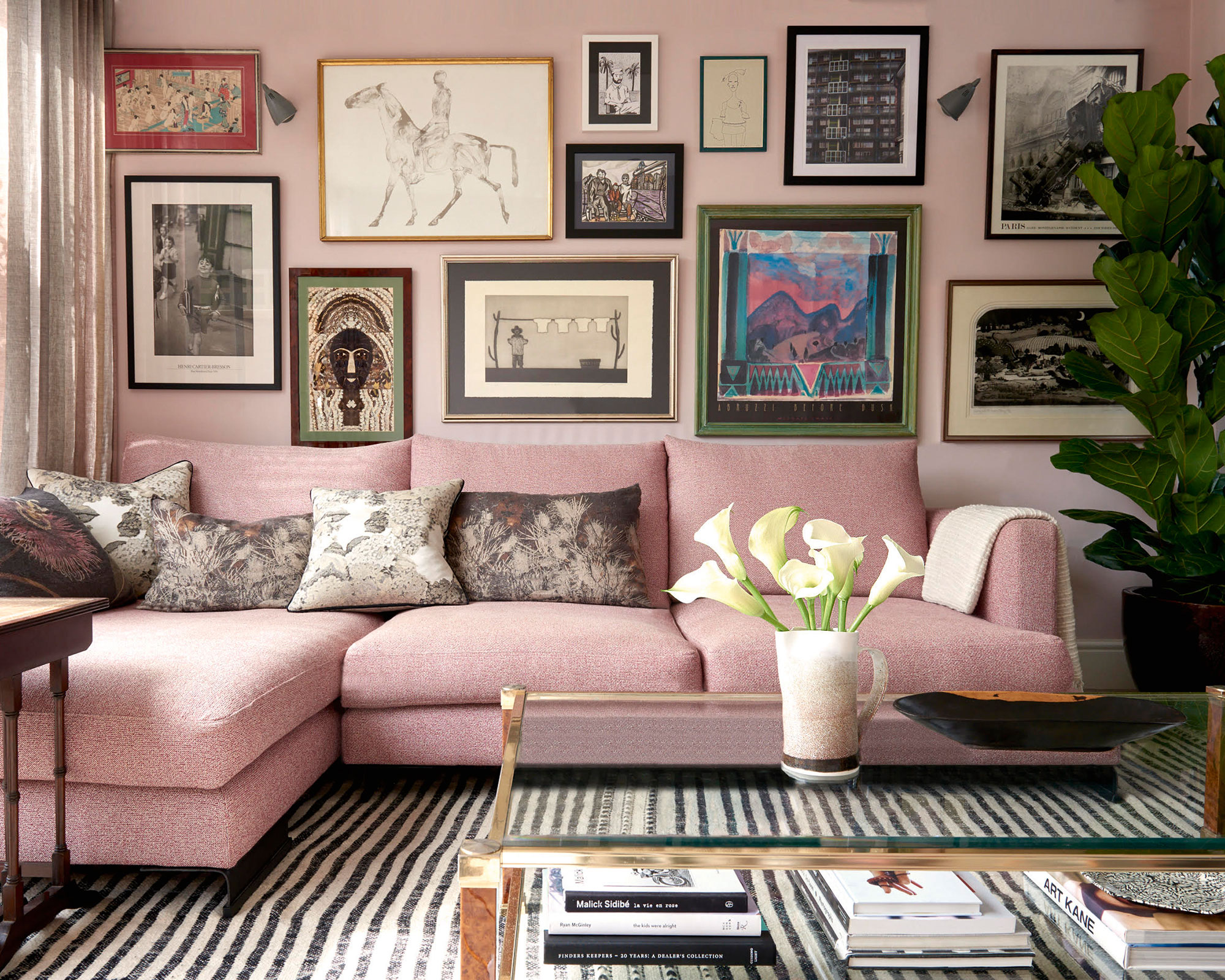
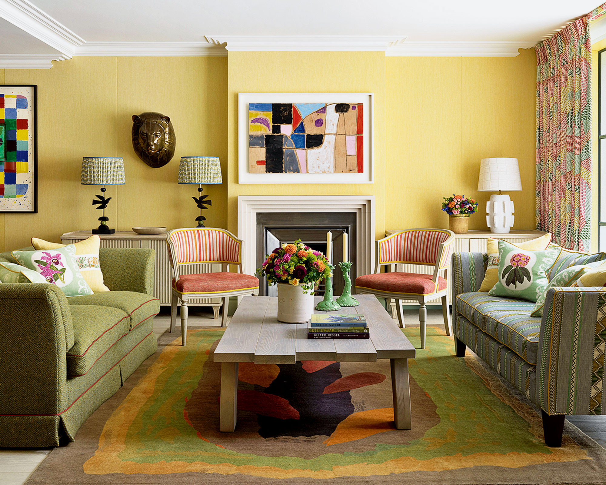
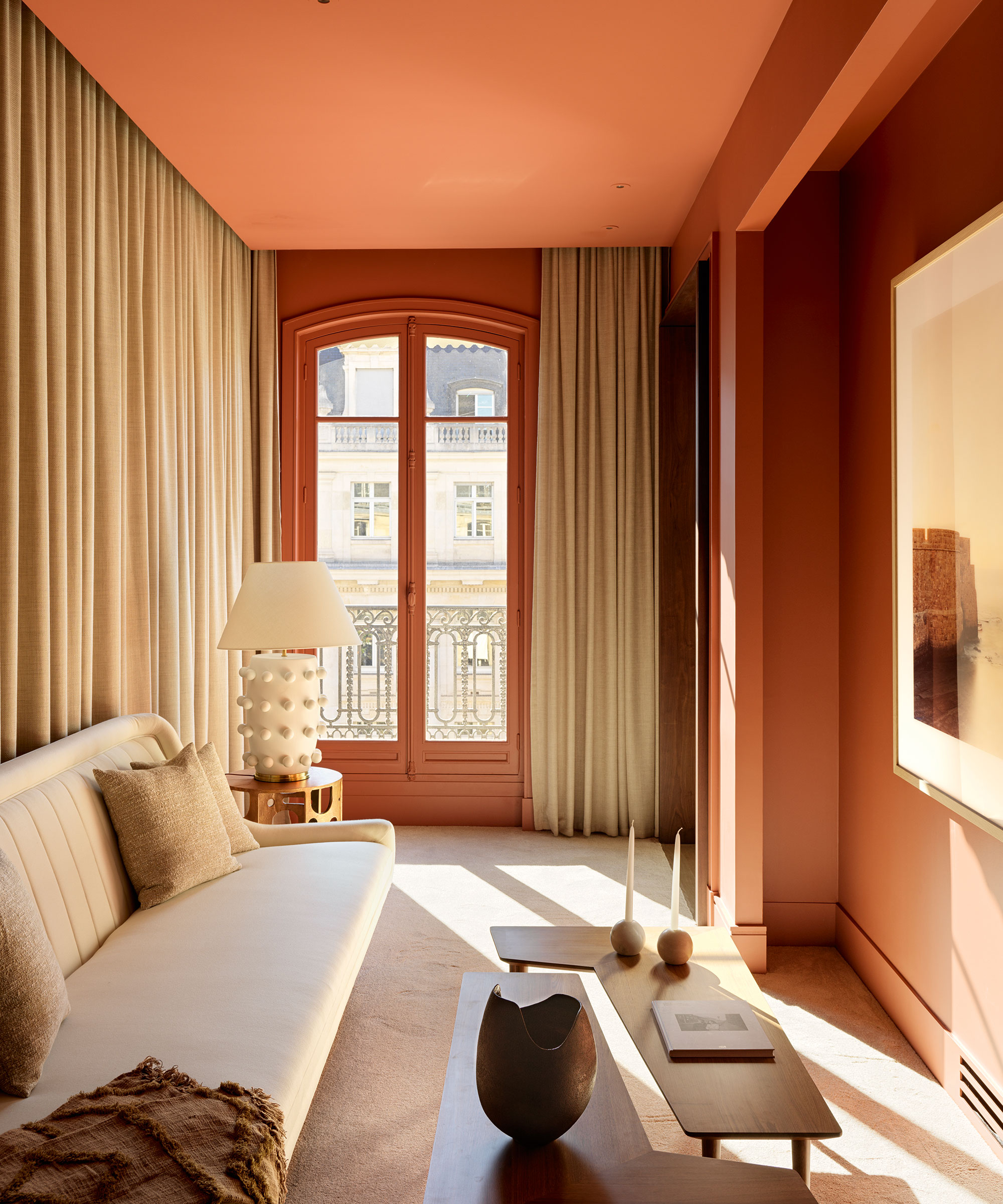
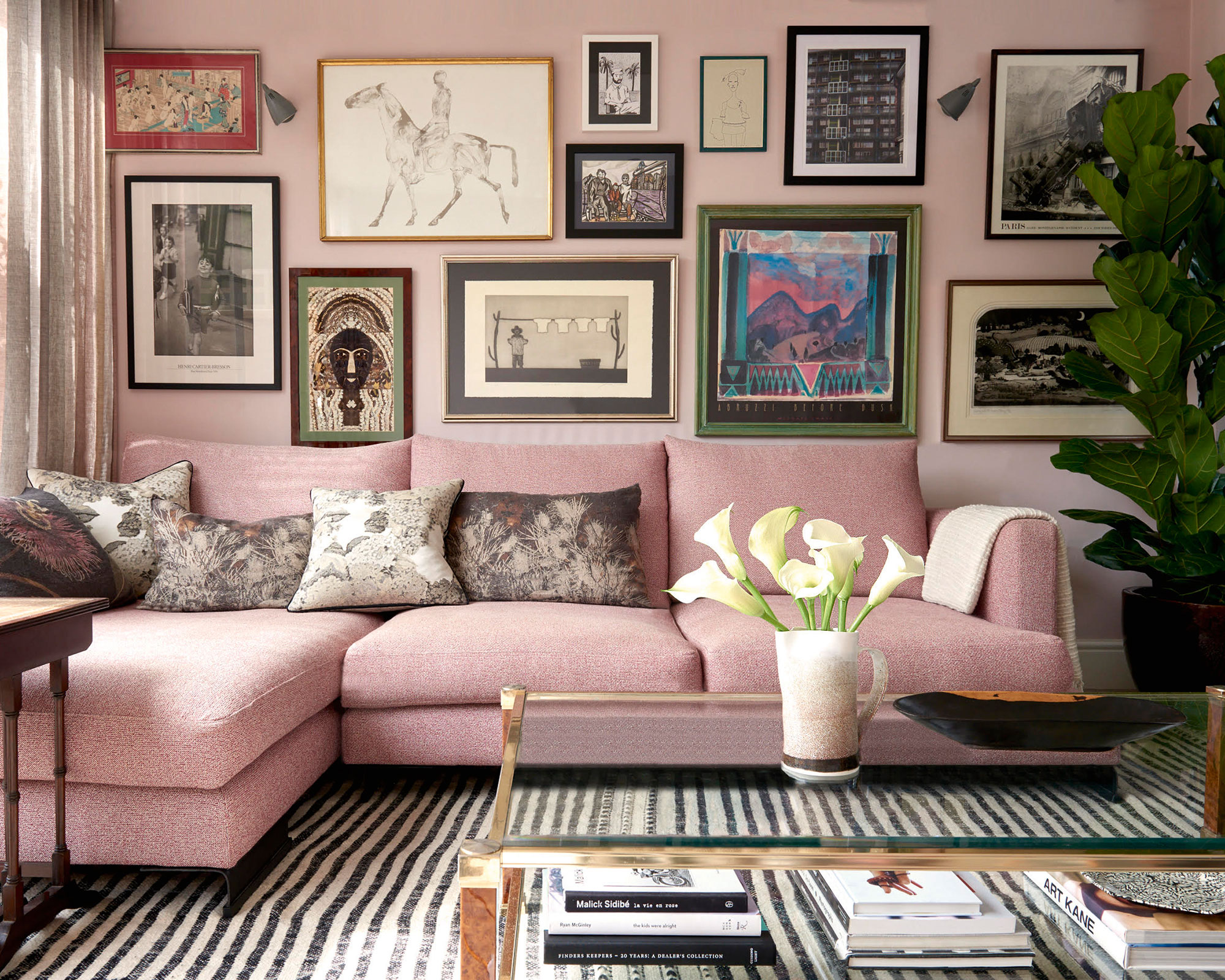
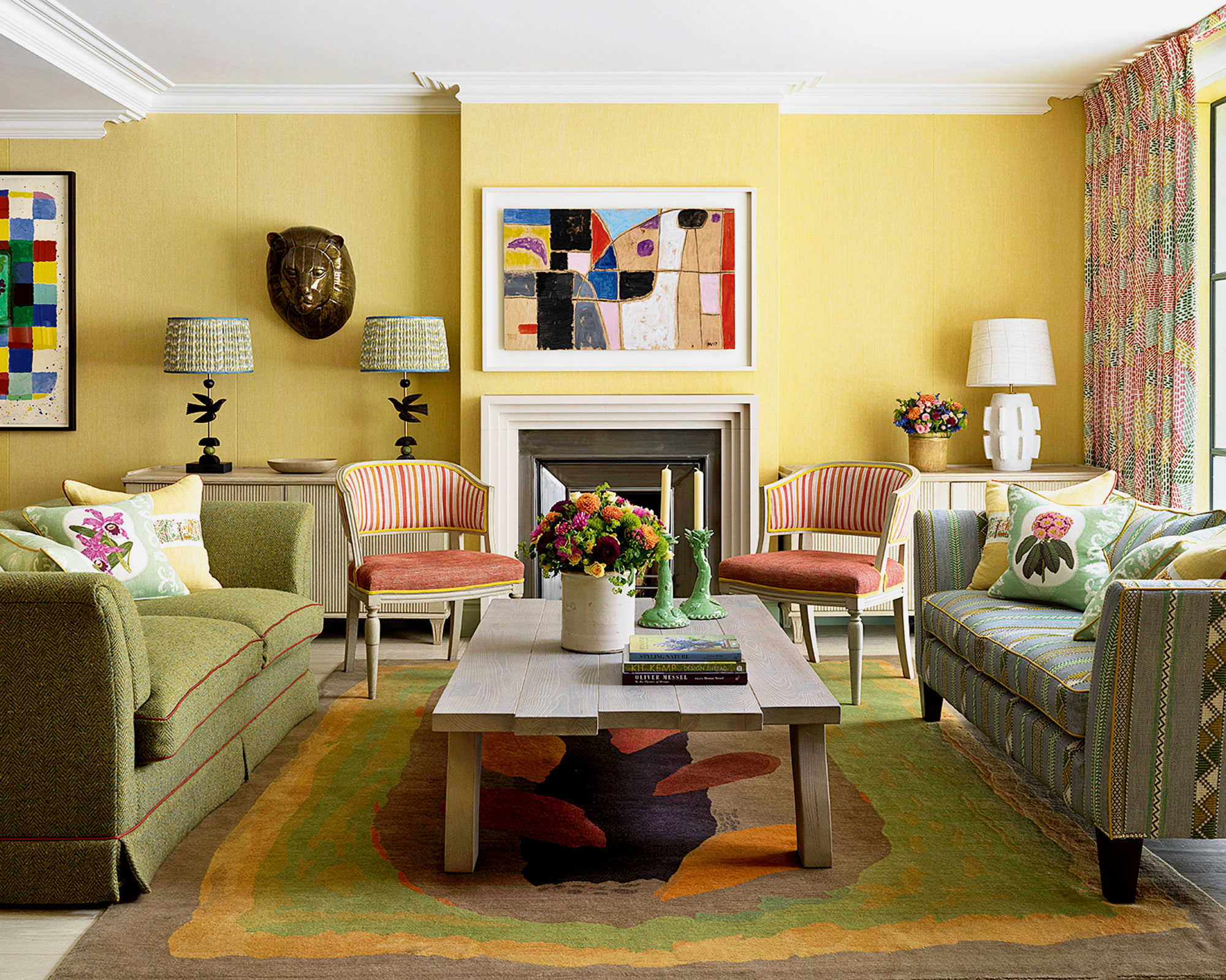
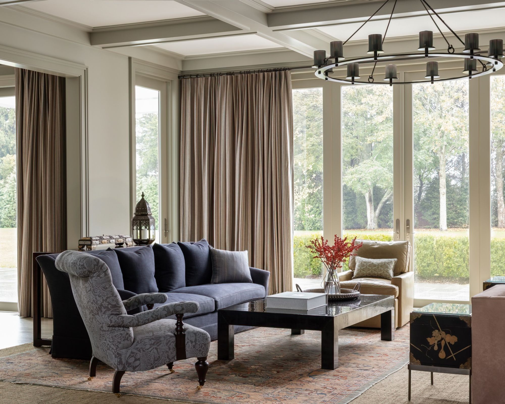
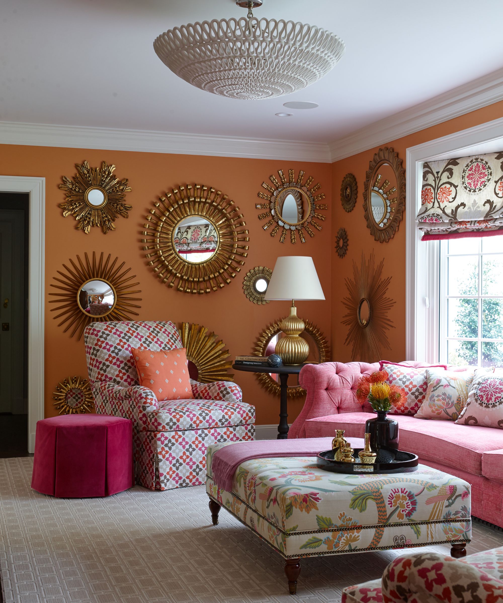
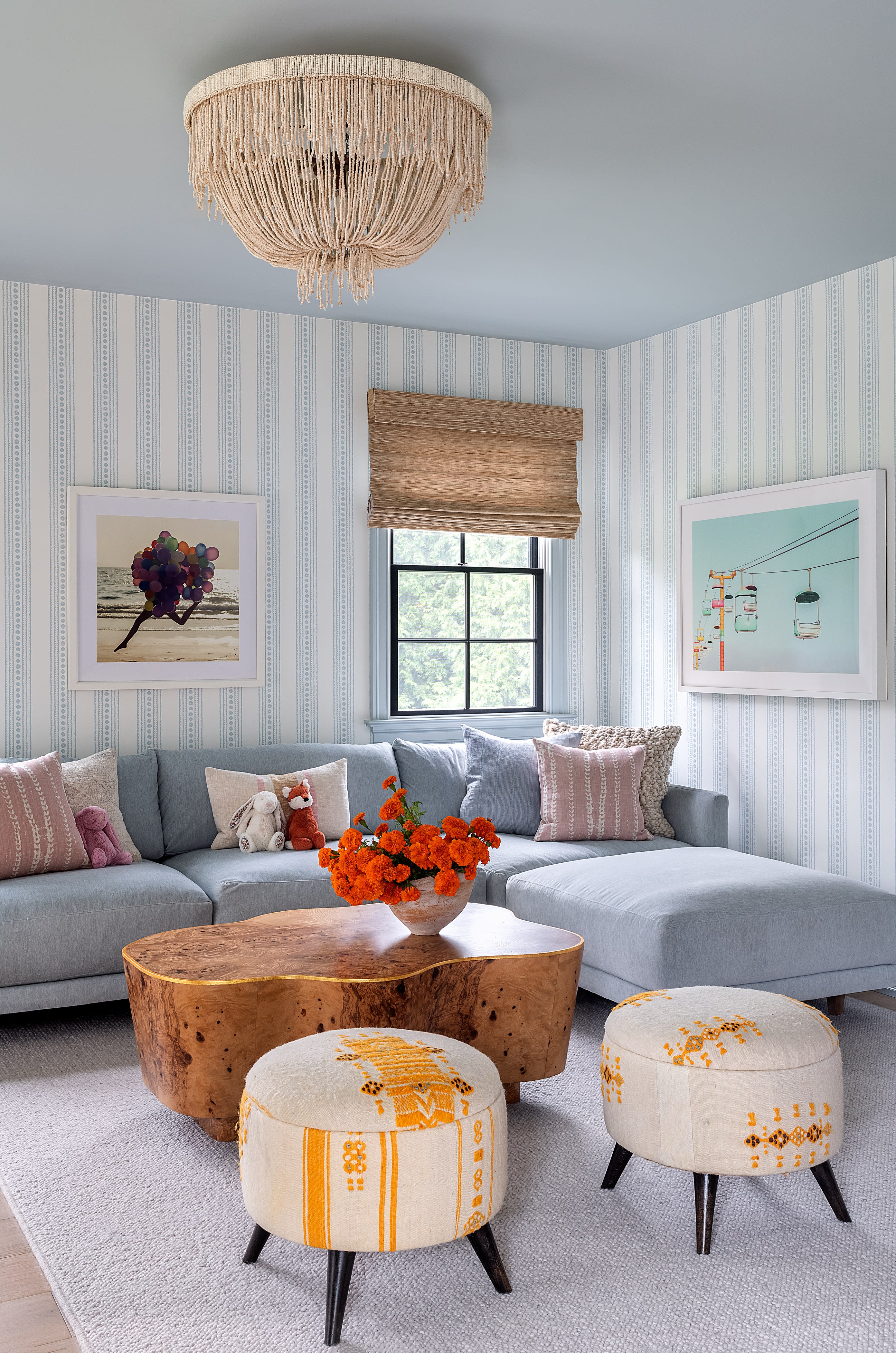
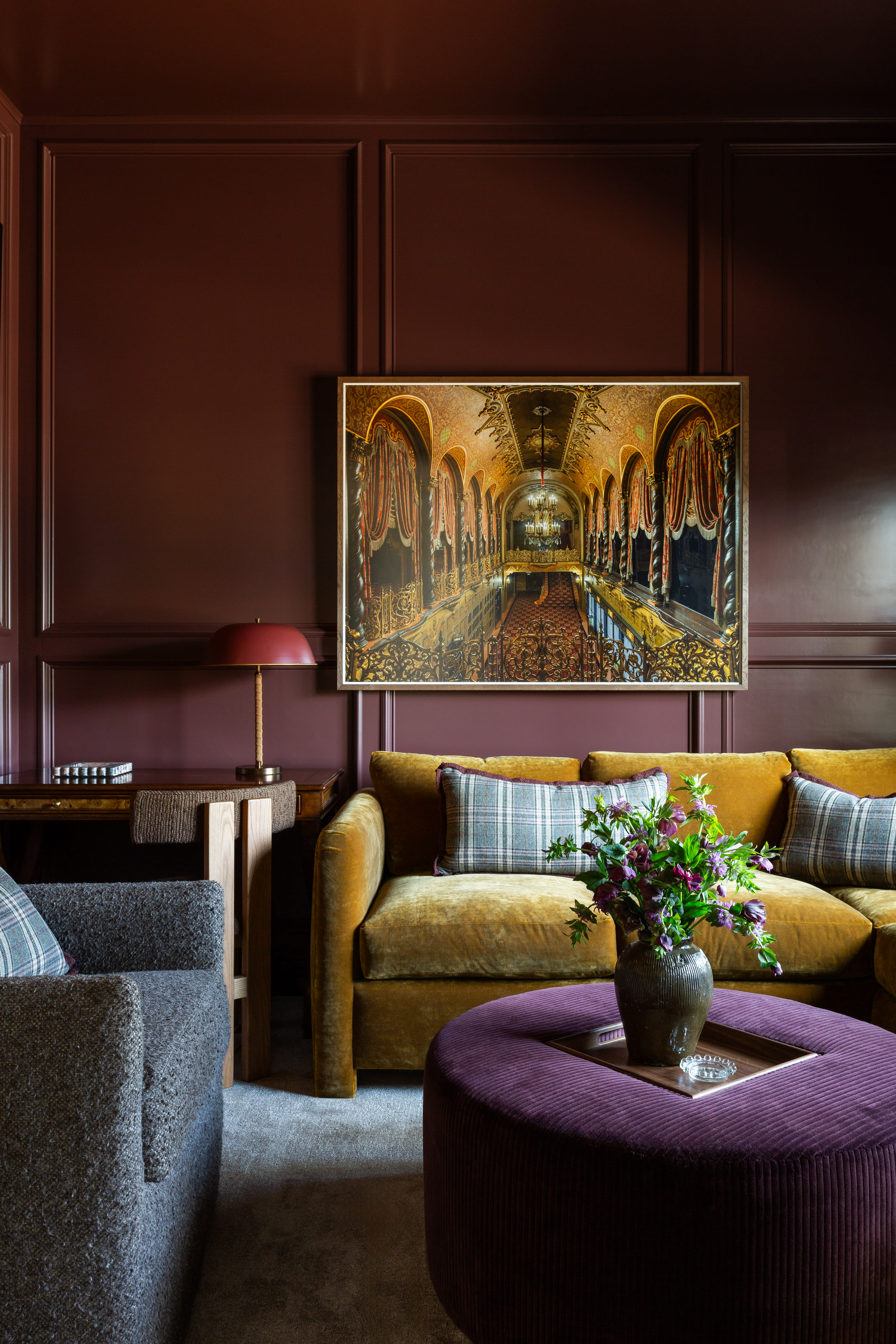
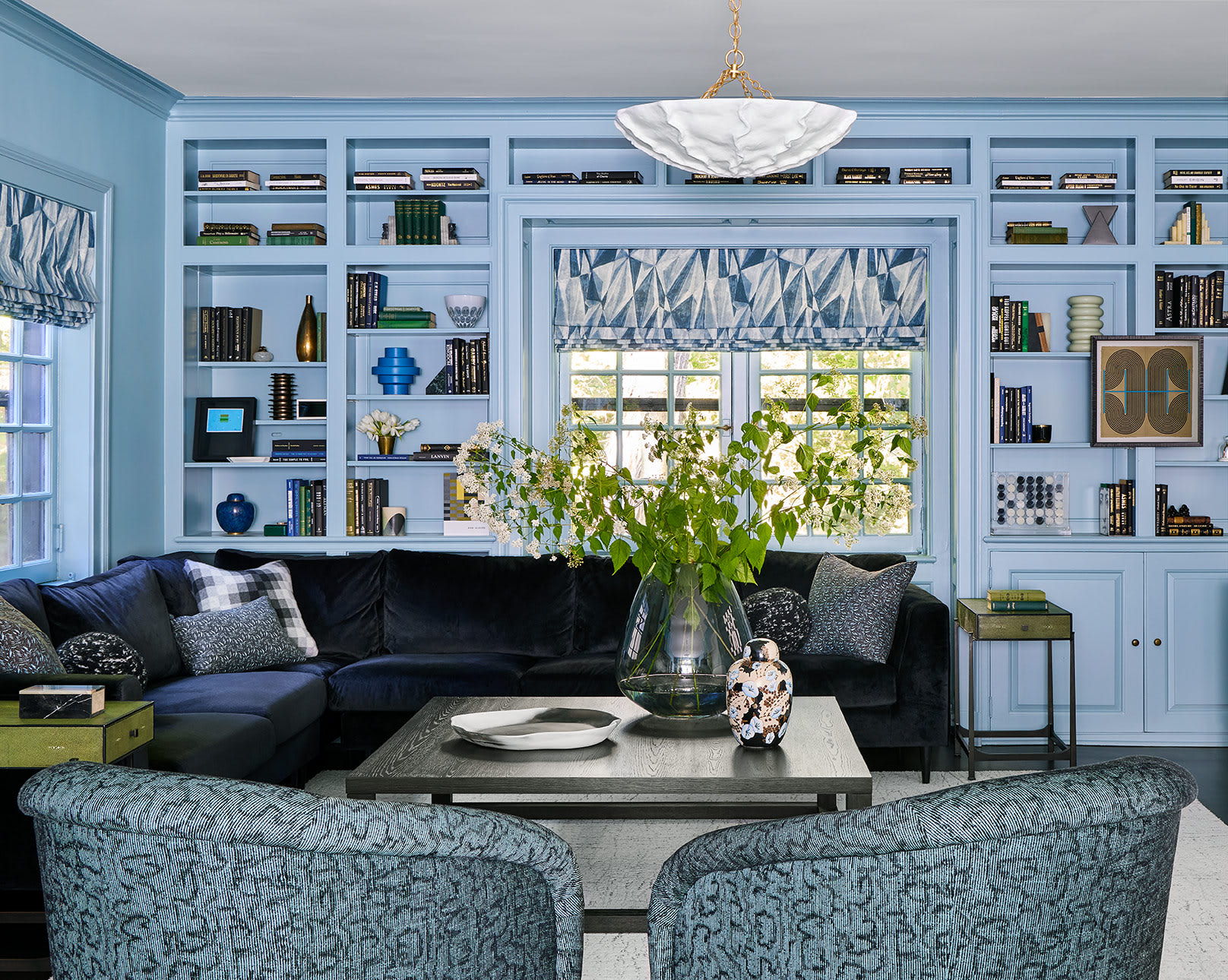
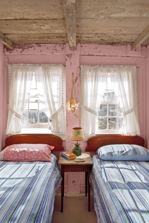
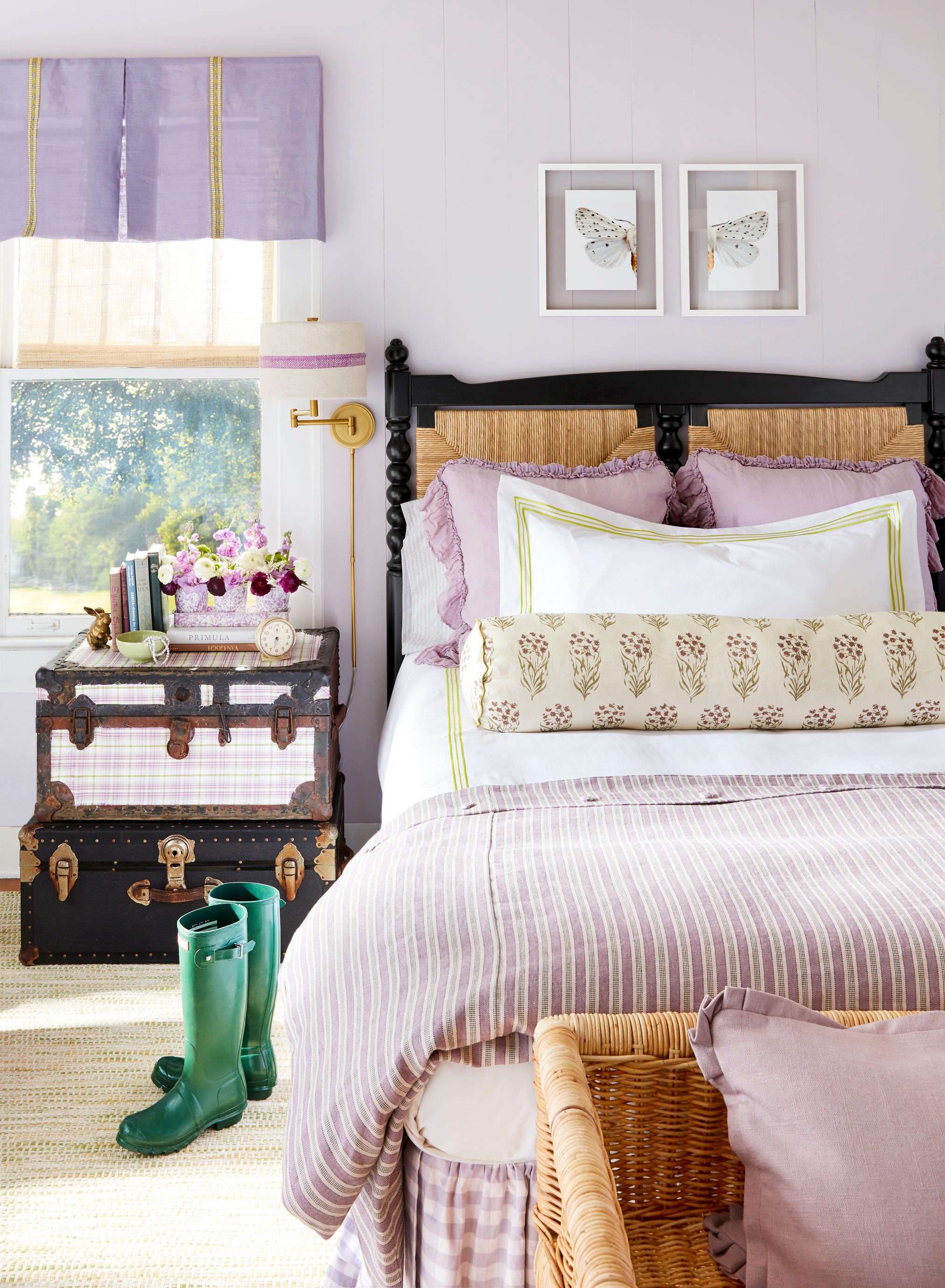
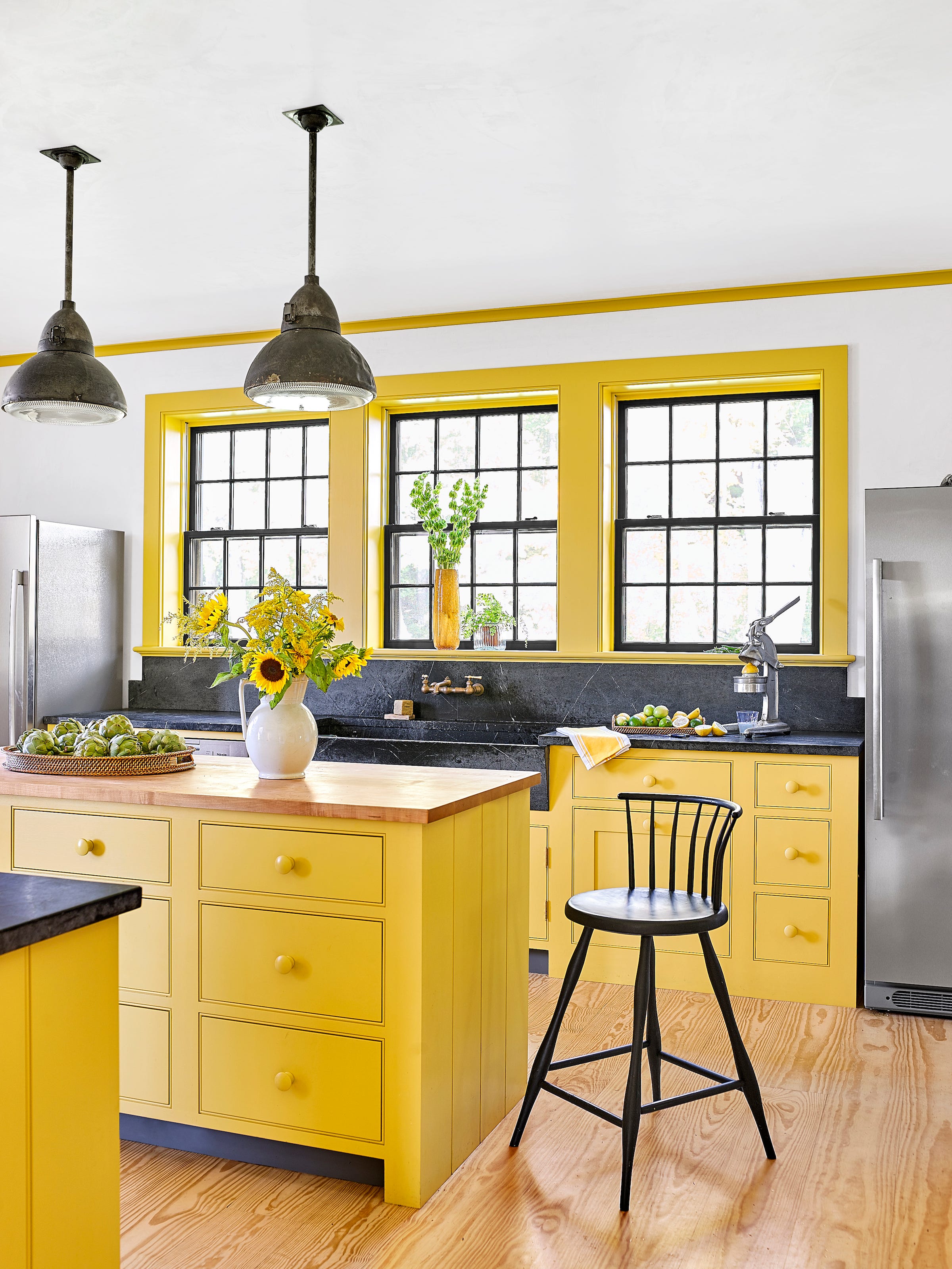
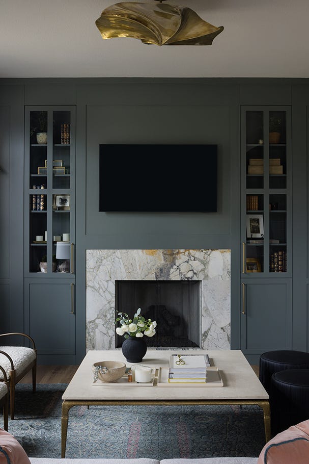
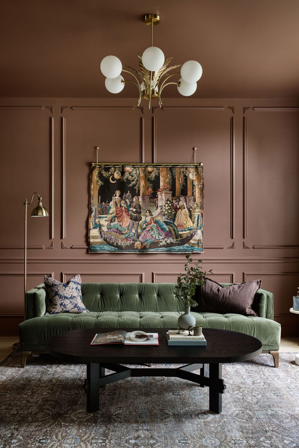
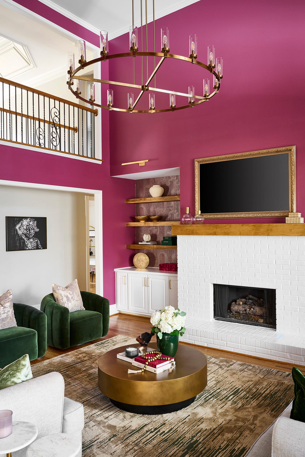
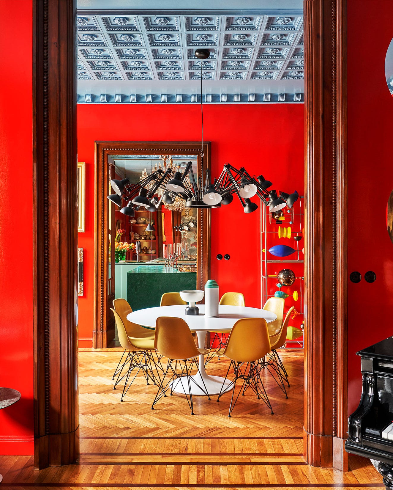
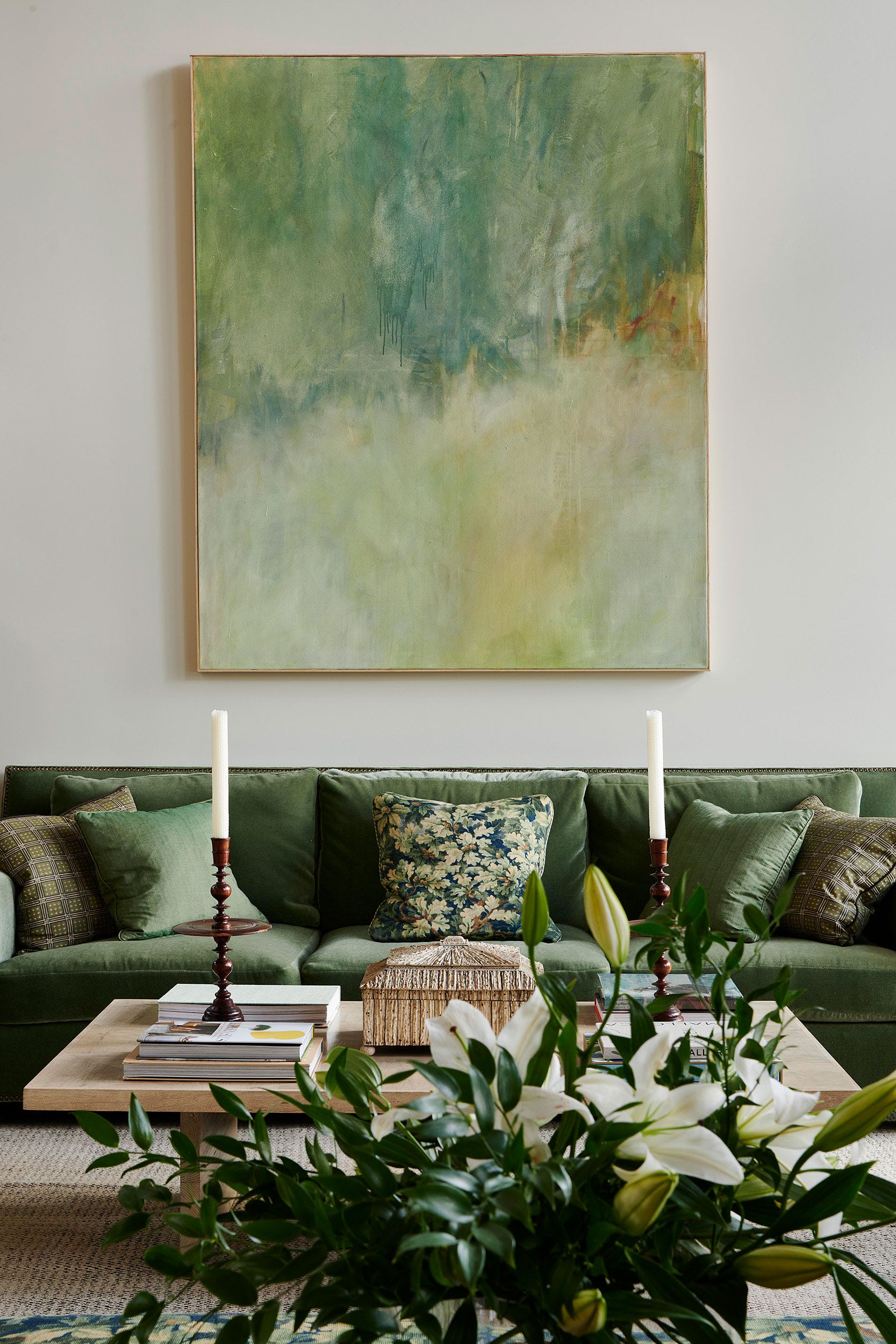
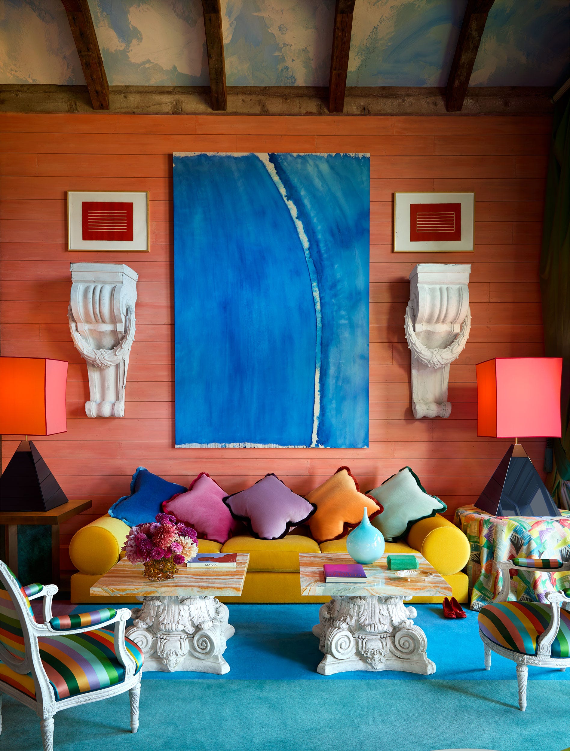
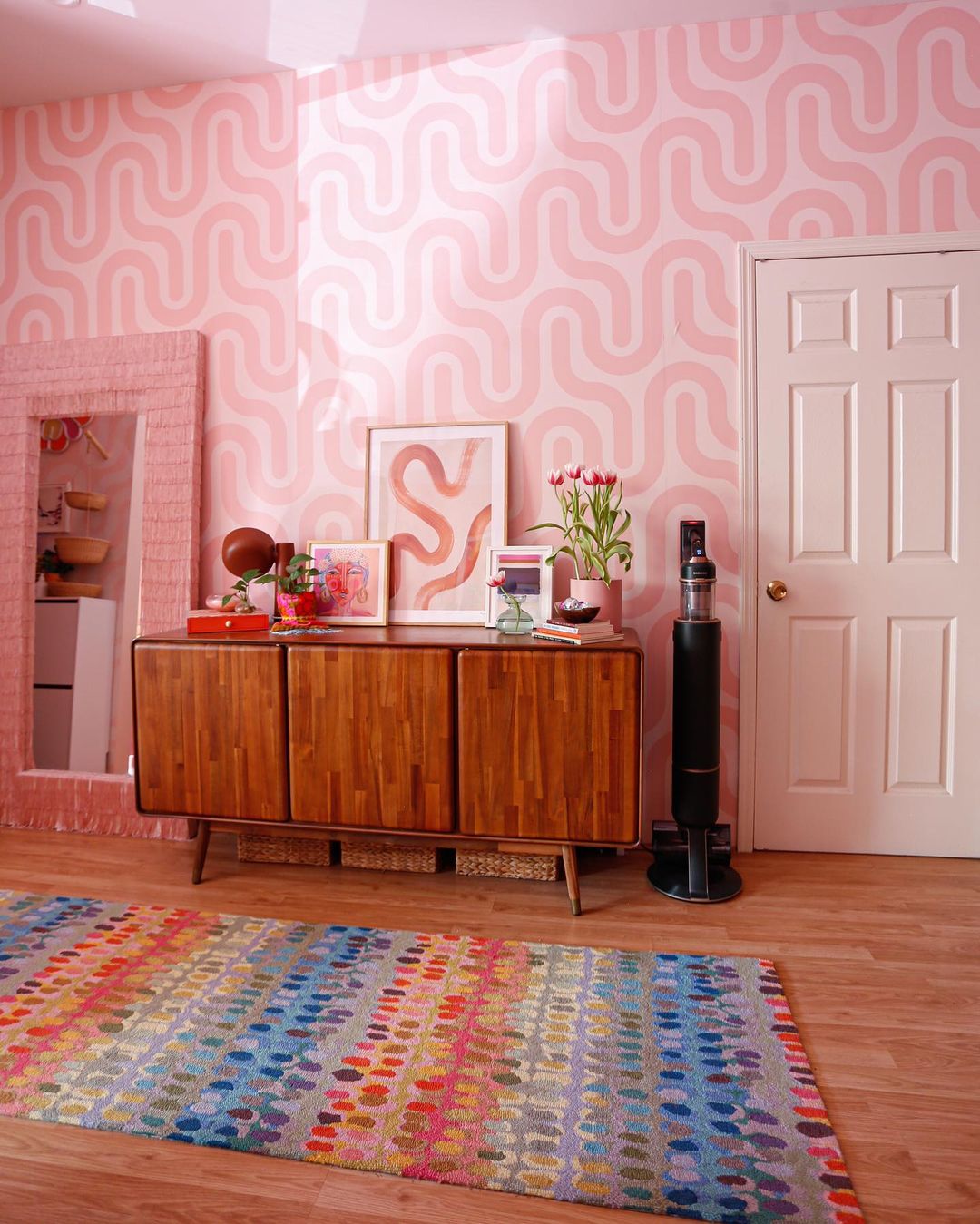
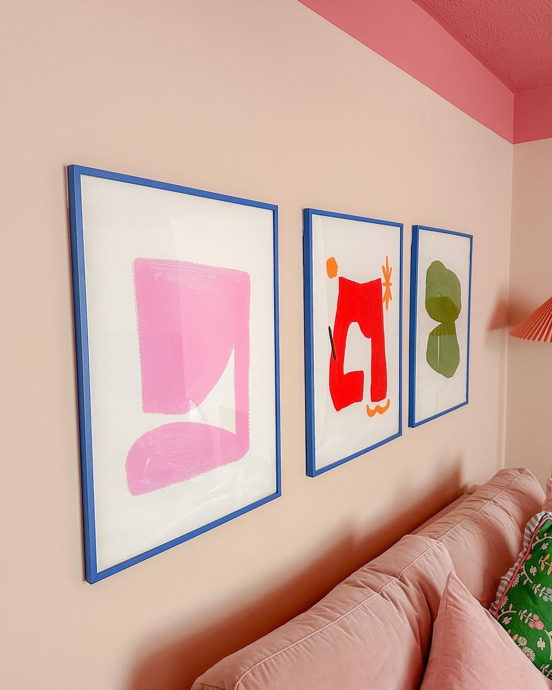
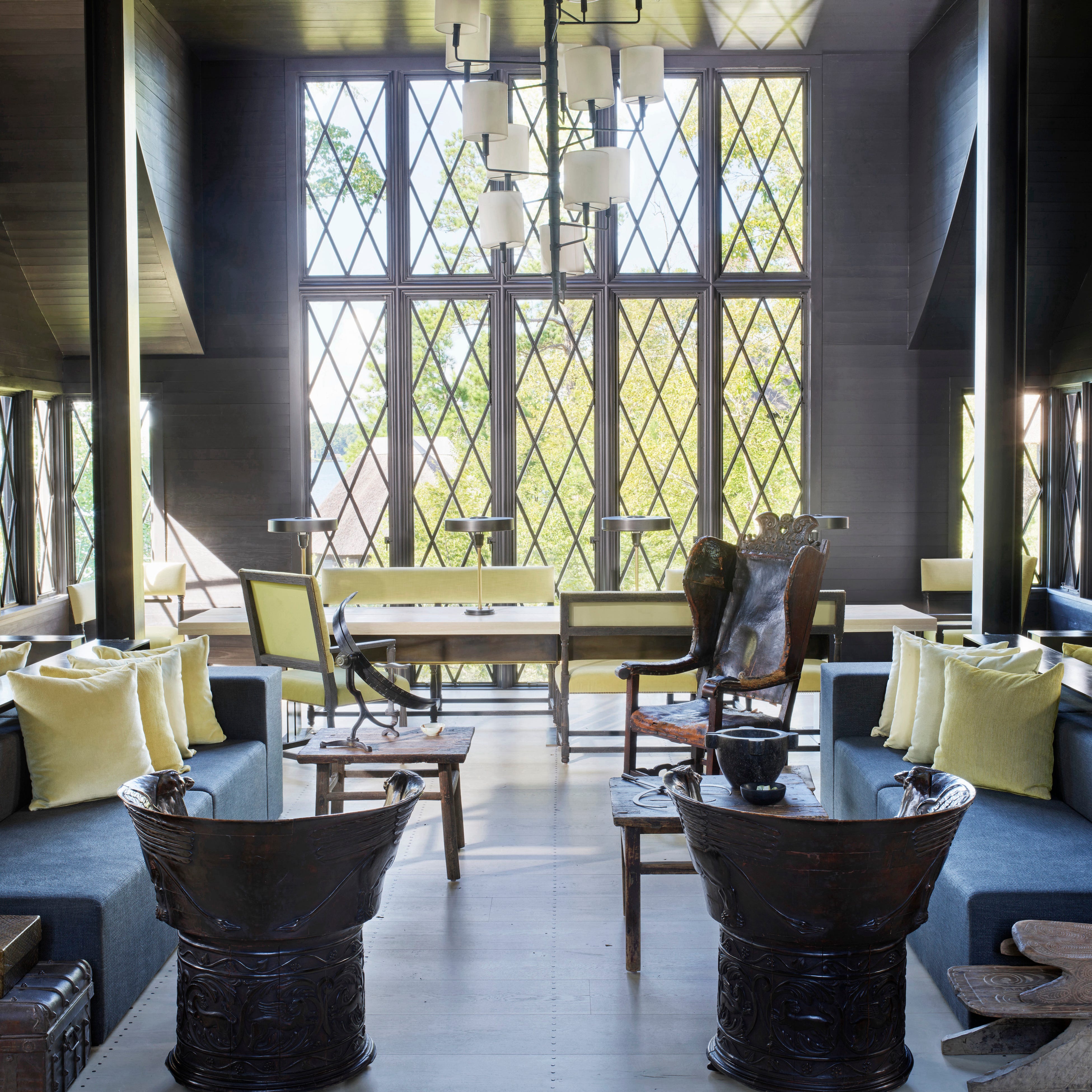
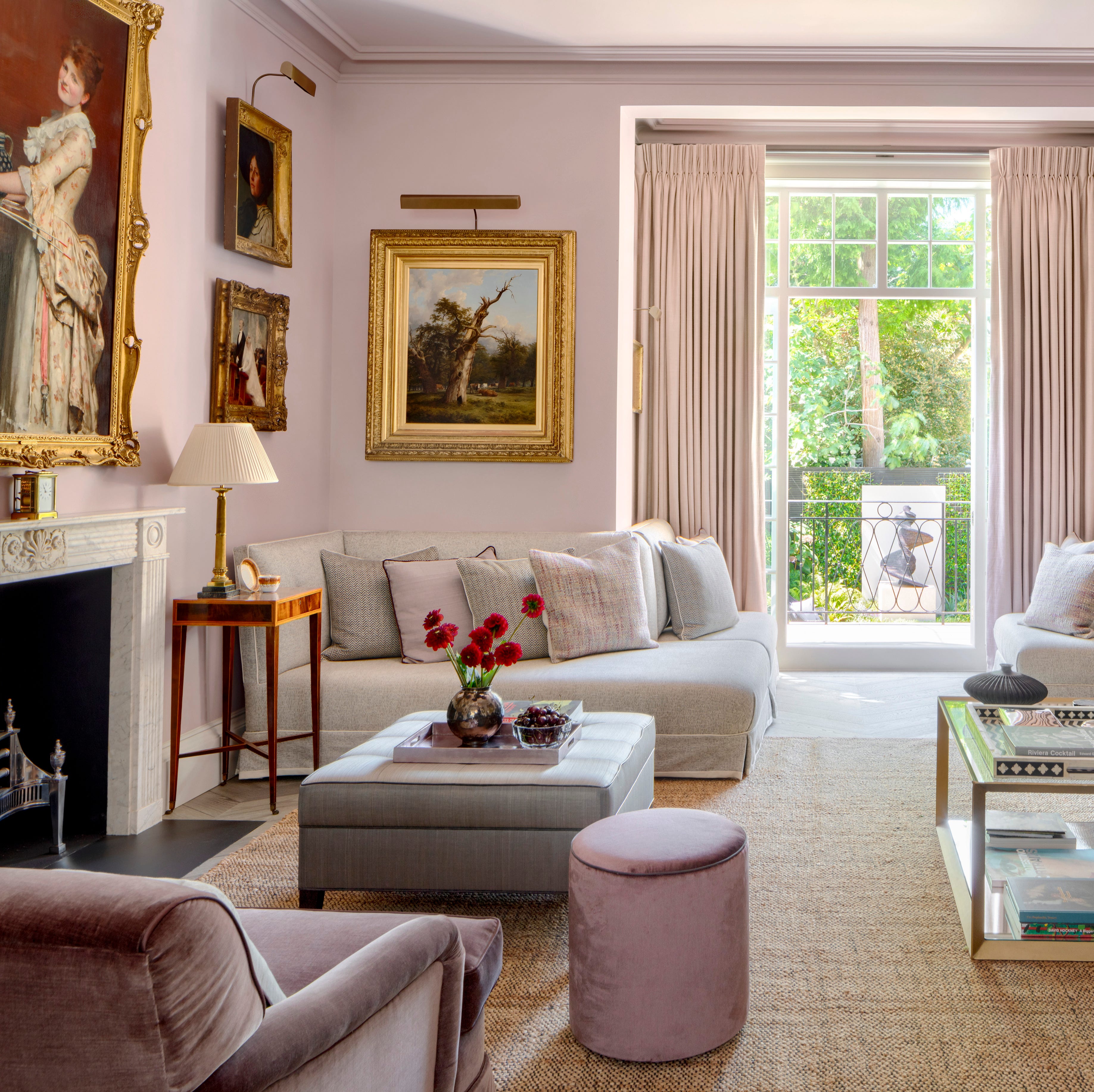
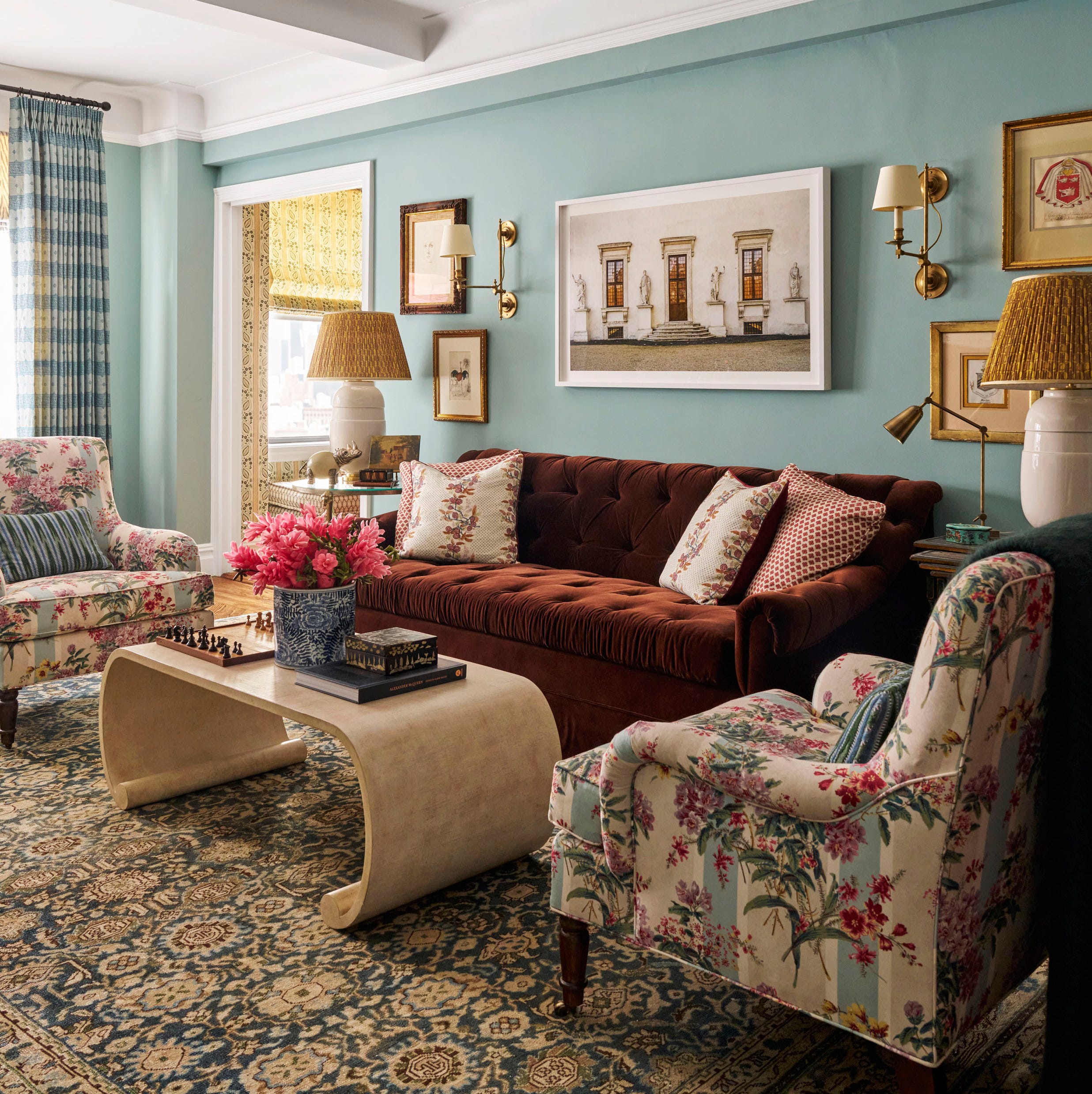
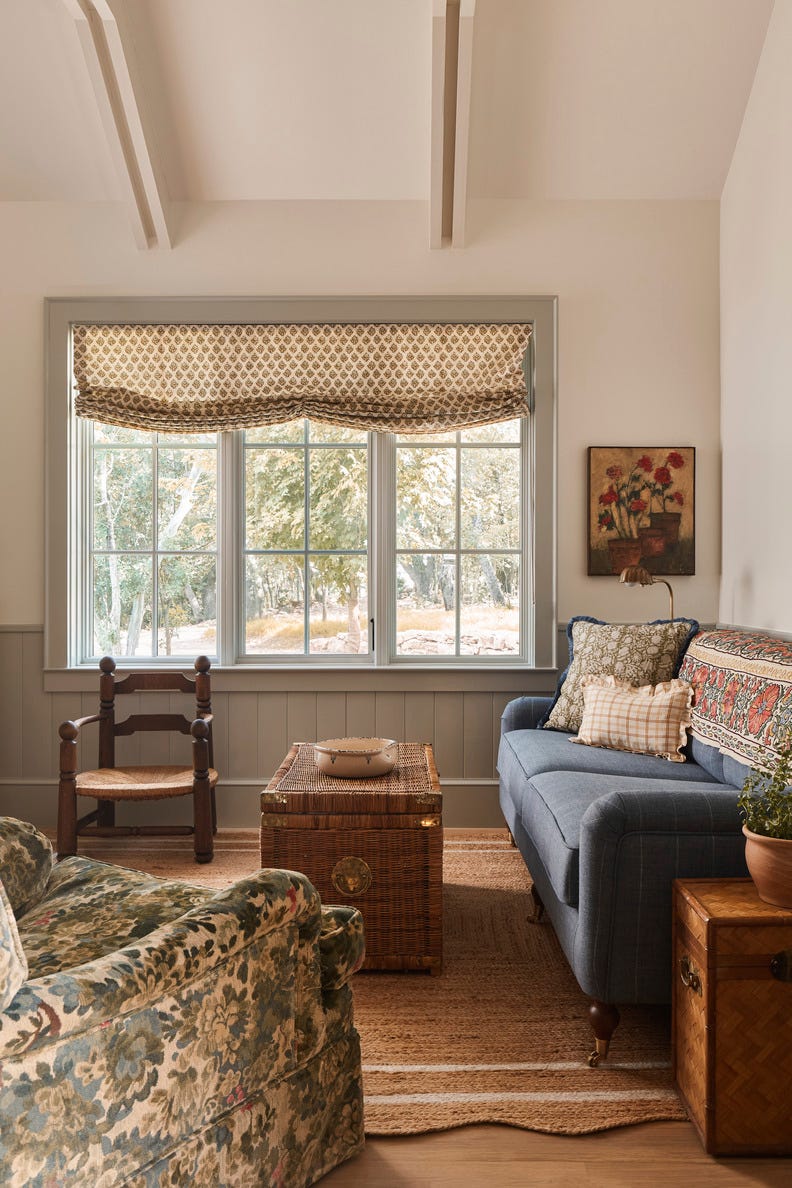
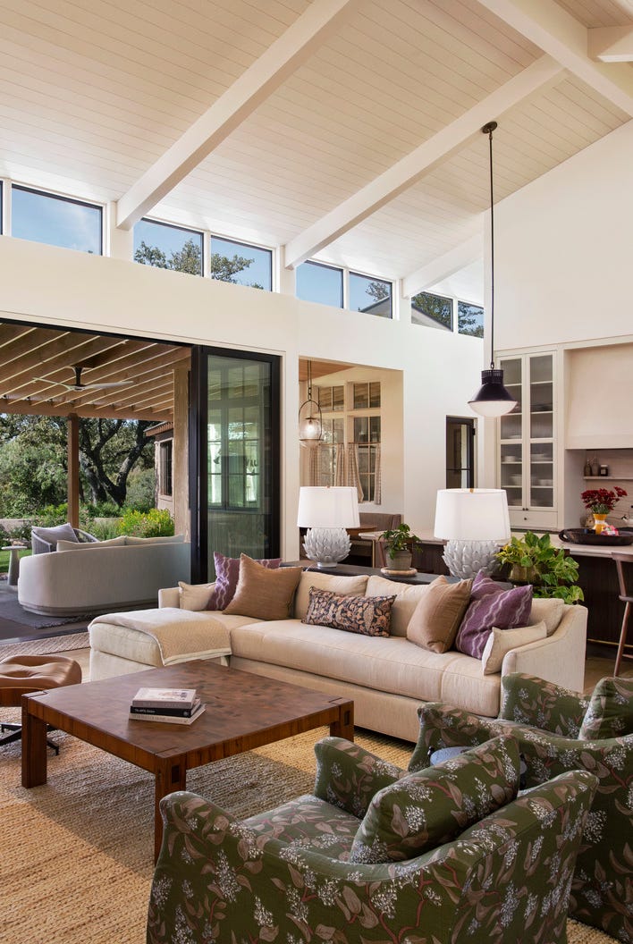
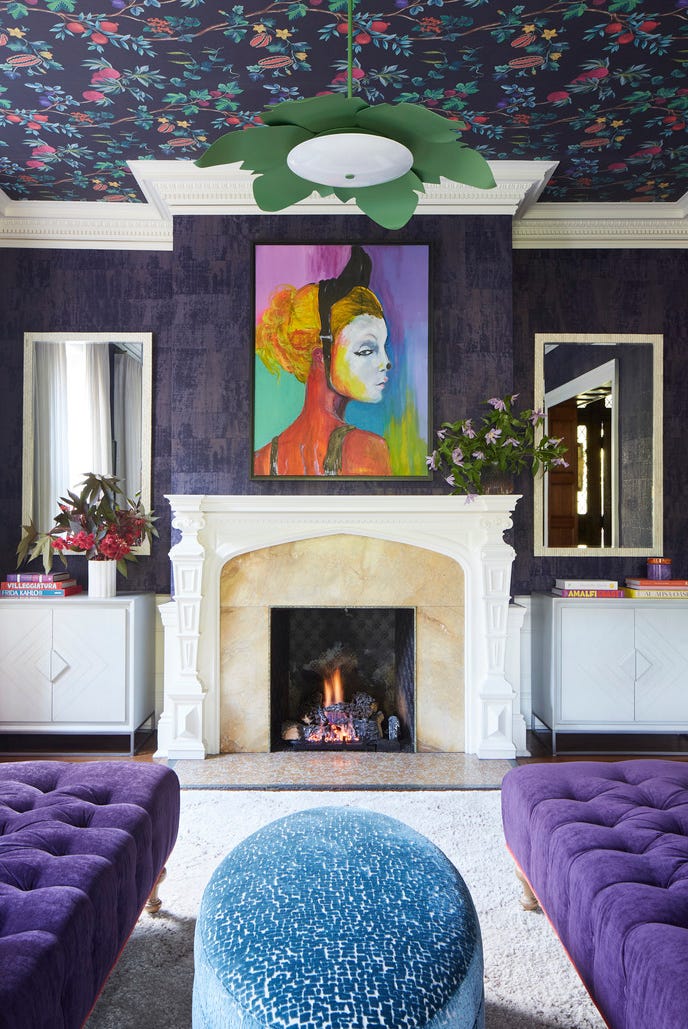
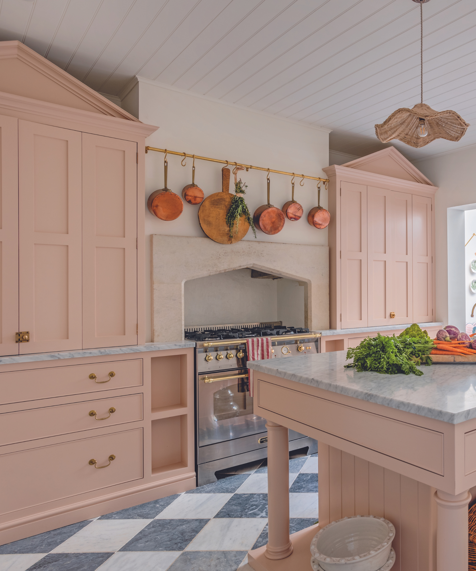
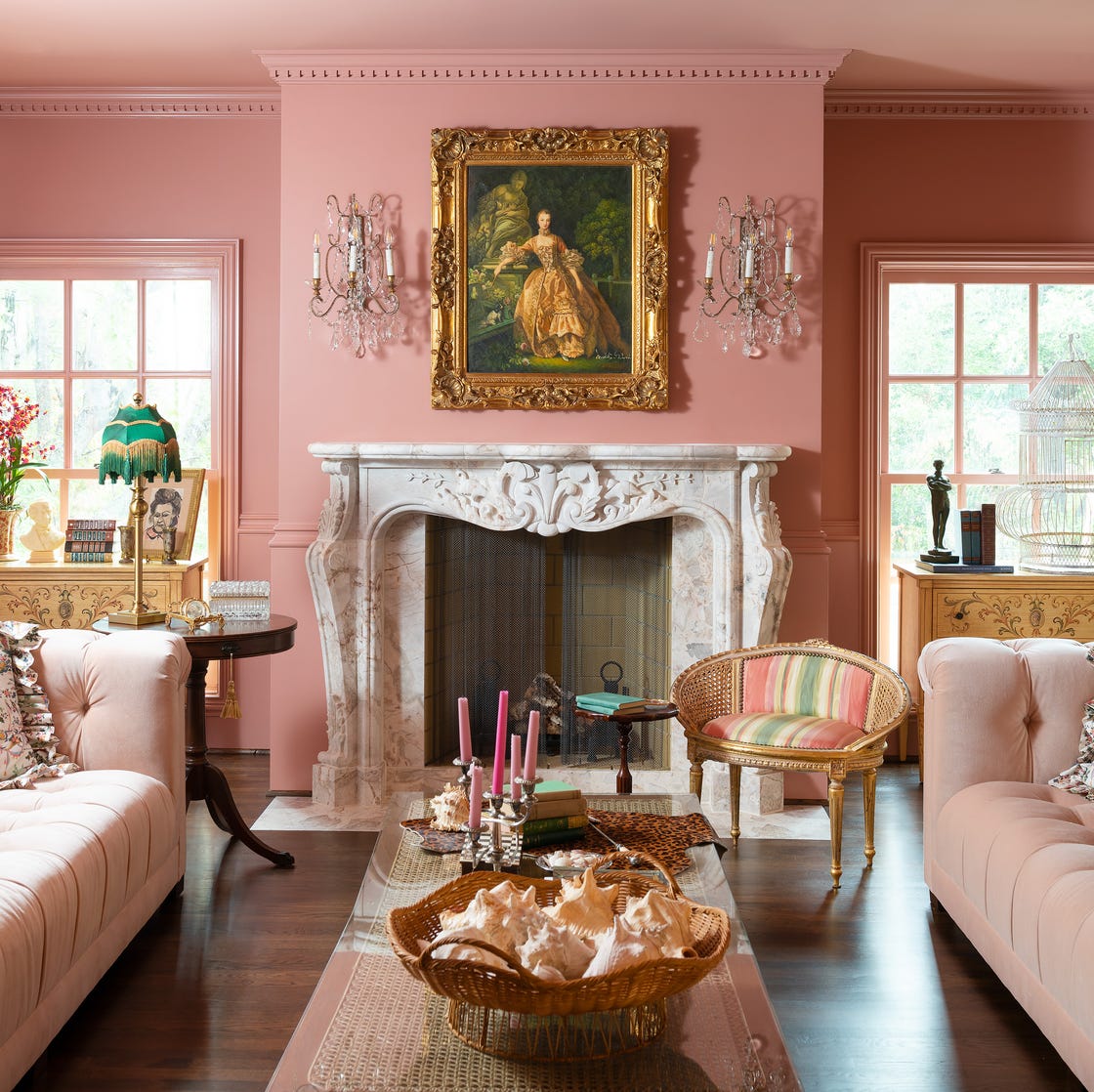
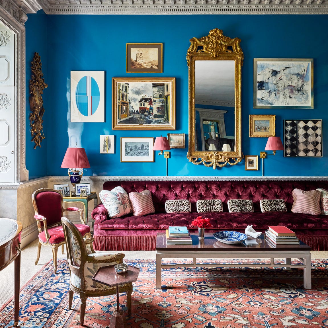
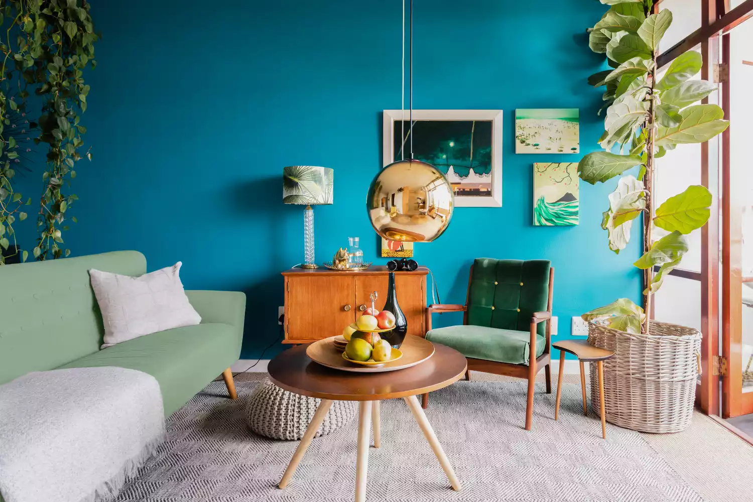
The article showcases a variety of specific examples of paint colors implemented by designers in different living room settings. For instance, Kristen Peña utilized 'Trailing Vines' by Benjamin Moore, a dark olive with a charcoal grey cast, to create a moody living room. Sarah Stacey opted for a rich grey-brown to fashion a cozy, intimate speakeasy-inspired space. Sawyers Design employed a vibrant lime green and magenta palette, contributing to a lively and polished home ethos. Ali Budd selected 'Patchwork Plum' by Sherwin-Williams, a saturated mauve, to connect a living room to a pink kitchen and add an intimate touch. Heather French anchored a patterned space with the deep 'Admiral Blue' by Benjamin Moore. Hannah Ozburn used a deep Kelly green that functioned as a neutral, helping to unify a colorful and patterned room. Suzanne Kasler highlighted a ceiling with glossy slate blue 'Providence Blue' by Benjamin Moore in a wood-paneled room. Serena Dugan chose the serene 'Raindance' by Benjamin Moore, a chameleon-like grey-green, demonstrating its flexibility. Amber Lewis took a risk with a mossy green, similar to 'Elemental Green' by Dunn-Edwards, which beautifully transformed the entire room. Minnette Jackson selected a custom cloudy blue by Pittsburgh Paints to make a long, narrow living room feel cozier and calming. Samantha Stathis Lynch chose 'Tailor Tack' by Farrow & Ball, a delicate pink, inspired by spring cherry blossoms, to create an uplifting interior. Byron Risdon complemented tonal soft furnishings with ochre, a deep yellow with brown undertones. Marie Flanigan utilized burgundy, a red-toned deep purple, to create a dynamic and cozy lounge. Sarah Vaile’s wood-paneled room, inspiring a warm orange paint, suggests pairing with a complementary blue. Brie Williams highlighted sage green, a soothing hue, paired with warm furnishings and soft textures for coziness. Erin Shakoor selected 'Evening Skyline' by Benjamin Moore, a lilac purple, to complement a tropical mural and create a sophisticated yet playful atmosphere. Ben Pentreath painted a drawing room in vibrant egg-yolk yellow for a sunny and warm ambiance. Fort Design Studio used a bright bubblegum pink to honor a home's original architecture. Cecilia Casagrande opted for 'Hague Blue' by Farrow & Ball, a deep teal, to achieve a lush yet livable feel and give the illusion of higher ceilings. Kemble Interiors chose 'Del Mar Blue' by Benjamin Moore, a soft turquoise, to elevate a Palm Beach home with a coastal yet sophisticated vibe. These examples demonstrate the diverse applications and effects of various paint colors in enhancing living room aesthetics.
#LivingRoom #PaintColors #InteriorDesign #HomeDecor #ColorInspiration #DesignerTips #RoomIdeas #HomeRenovation #AestheticChoices #LivingRoom #PaintColors #InteriorDesign #HomeDecor #ColorInspiration #DesignerTips #RoomIdeas #HomeRenovation #AestheticChoices
0 commentaire au total
 Aucun commentaire pour le moment
Vous aimerez aussi
5 colors that will make your living room feel happier, according to interior designers
Add These Happy Colors to Your Home and Boost Your Mood
Interior Designers Say the Key to Creating a Joyful Space Is to Add in This One Color

8 Calming Paint Colors Designers Use to Create a Warm, Welcoming Living Room
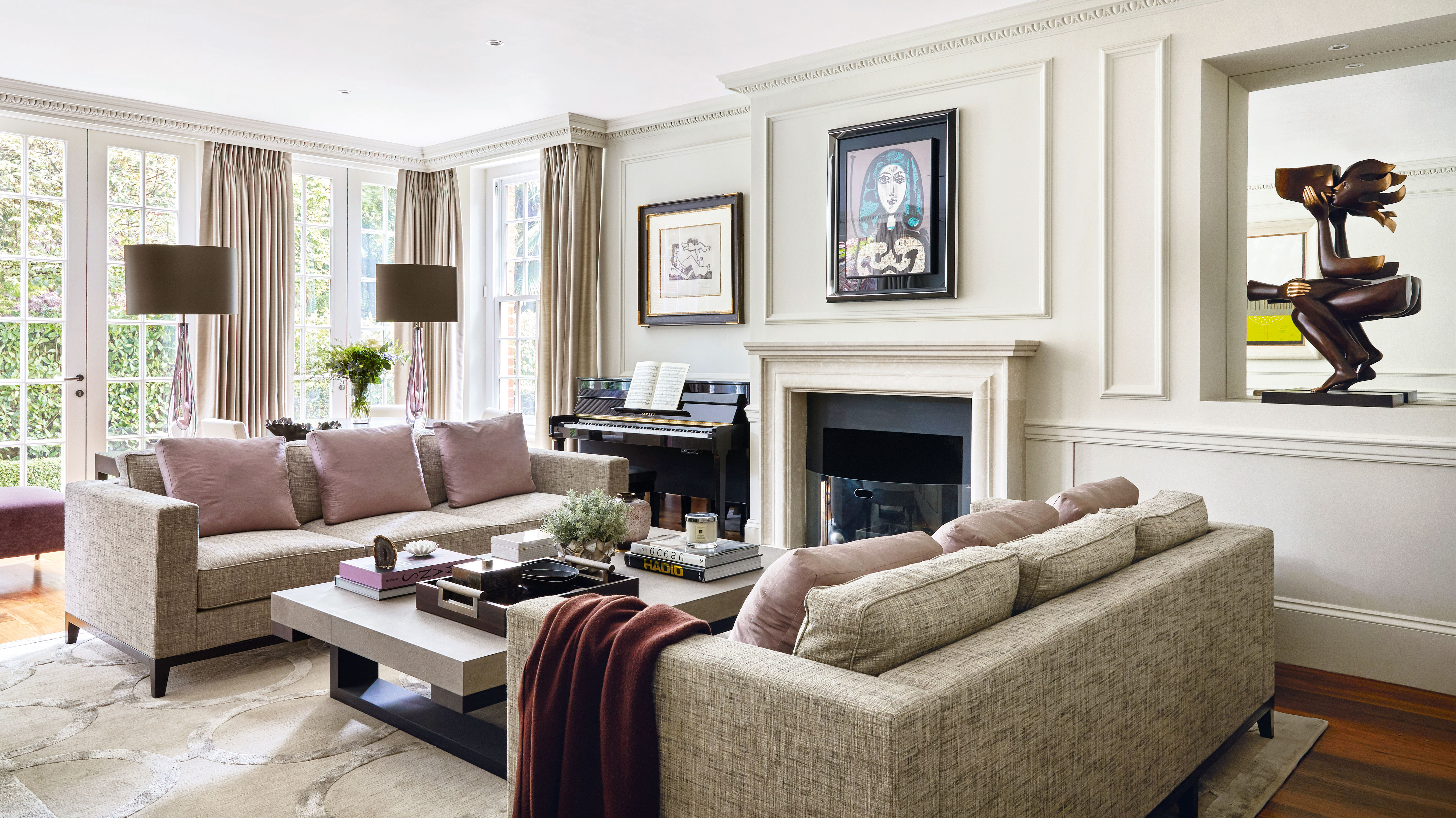
5 best happy living room colors for an uplifting space

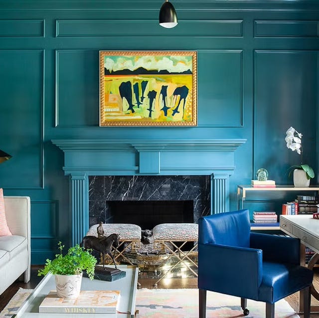
Listen Up: These Are the Best Paint Colors for Your Living Room

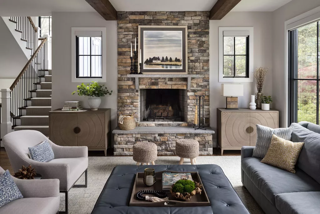
The Best Living Room Paint Colors, According To Designers
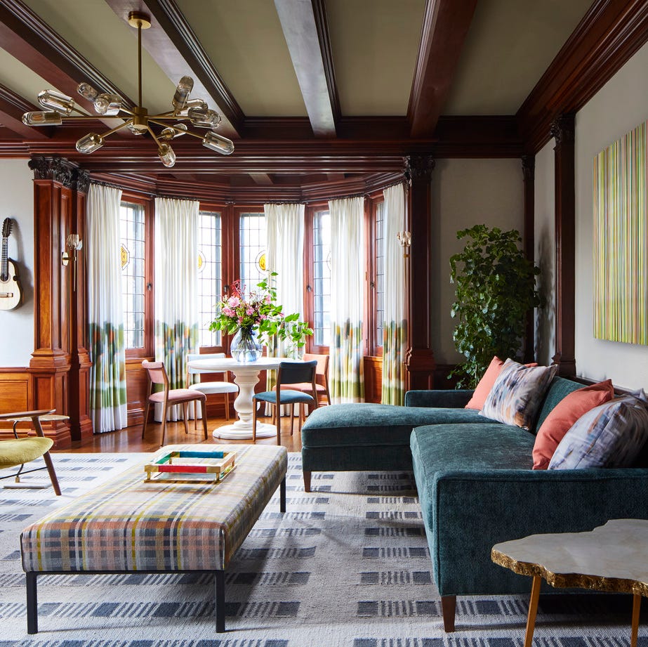
Easy Ways to Transform Your Living Room Into a Space You LOVE
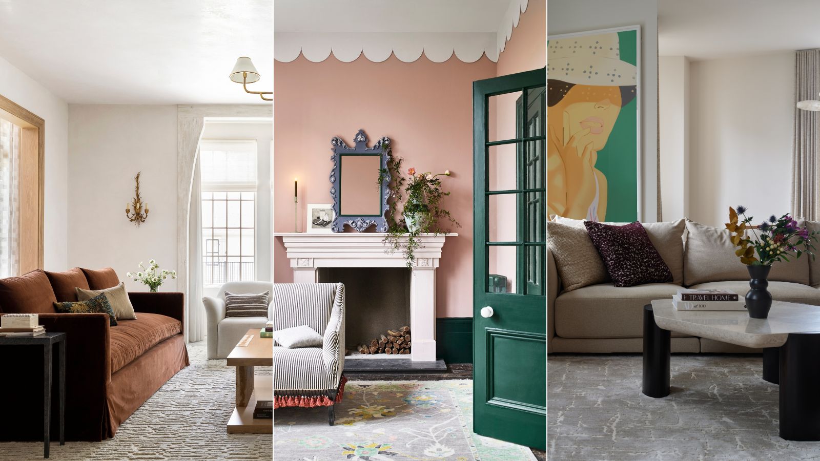
These are interior designers' favorite color combinations for living rooms – from neutral and calming to bold and playful
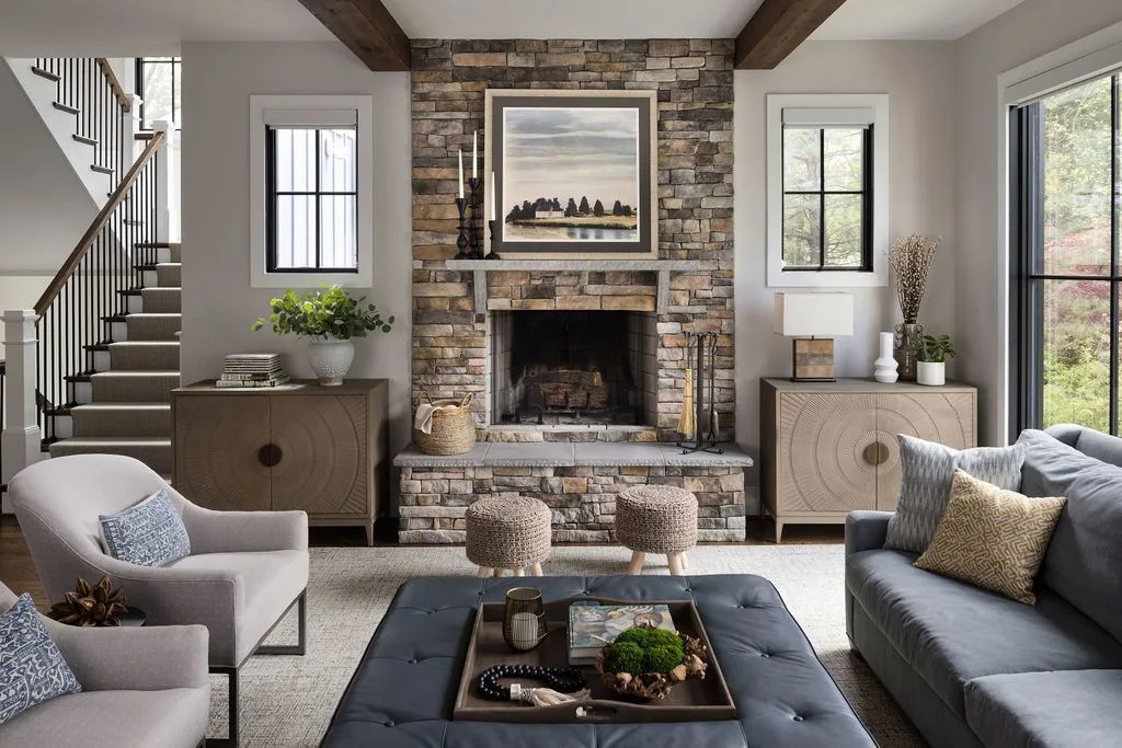
The Best Living Room Paint Colors, According To Designers

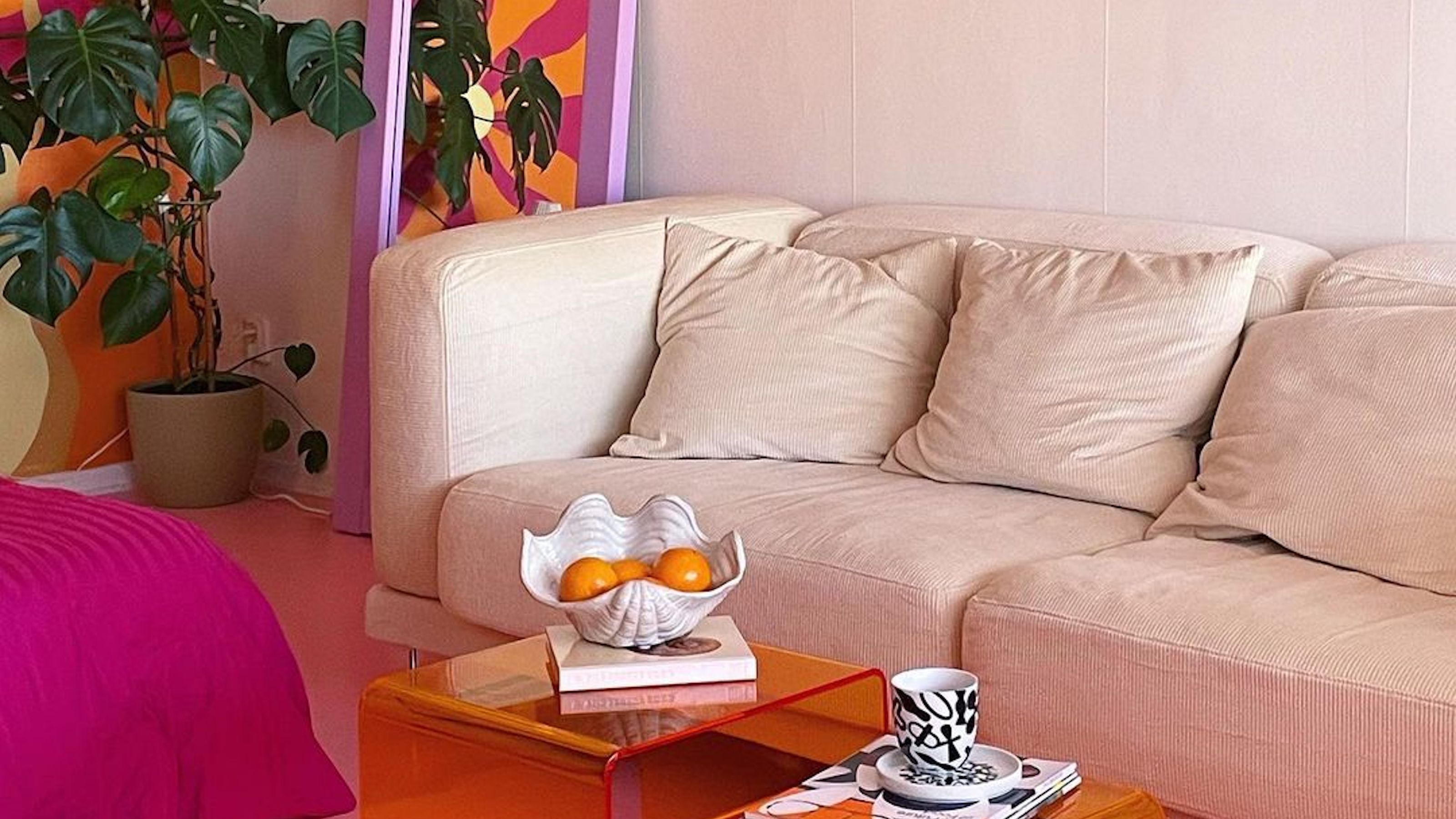
Interior influencers show us how it’s done with these colorful living room ideas


These Colors Will Be Everywhere in Interiors in 2025
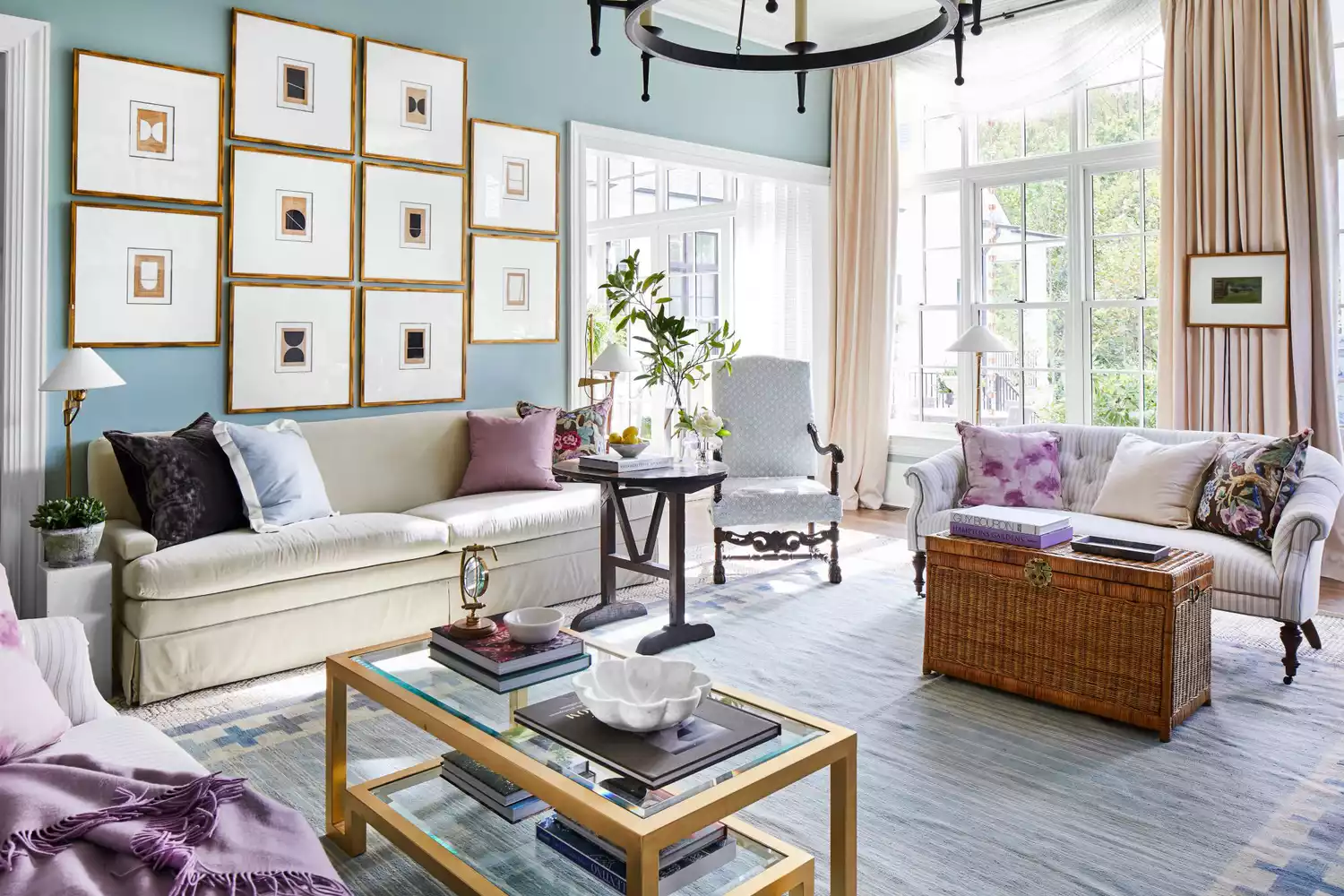
6 Calming Paint Colors Designers Swear By For A Relaxing Living Room

Experts reveal the best living room paint colours to transform every space

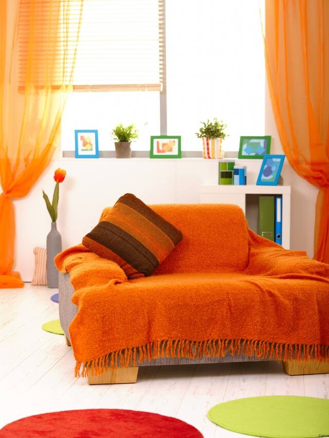
7 colour tricks to transform your mood and living room design

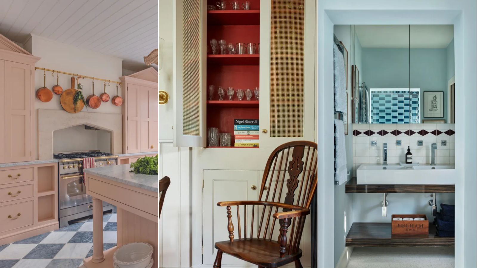
A color psychologist says these color schemes are the most likely to boost your mood
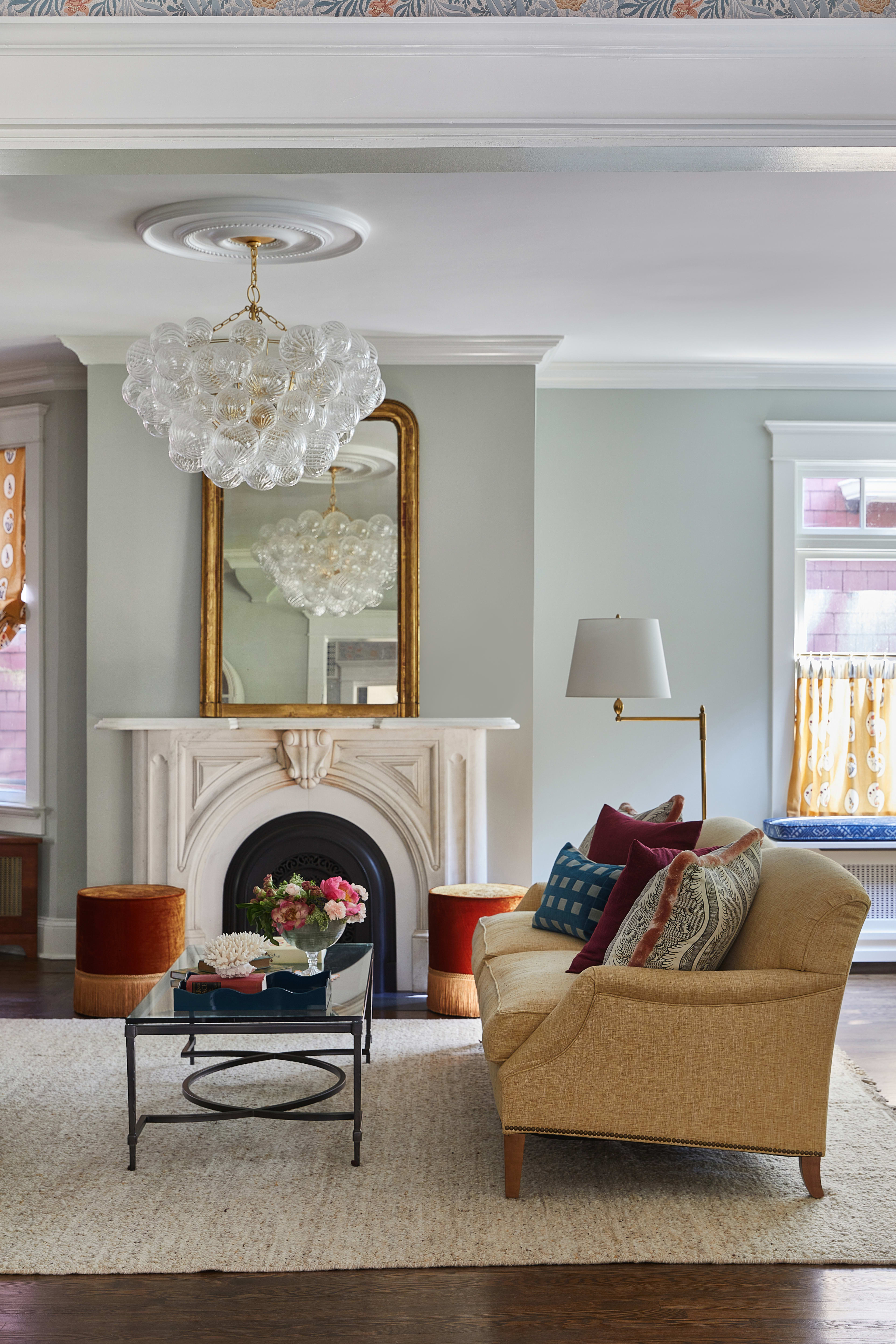
18 Living Room Color Ideas That are Oh-So Inviting
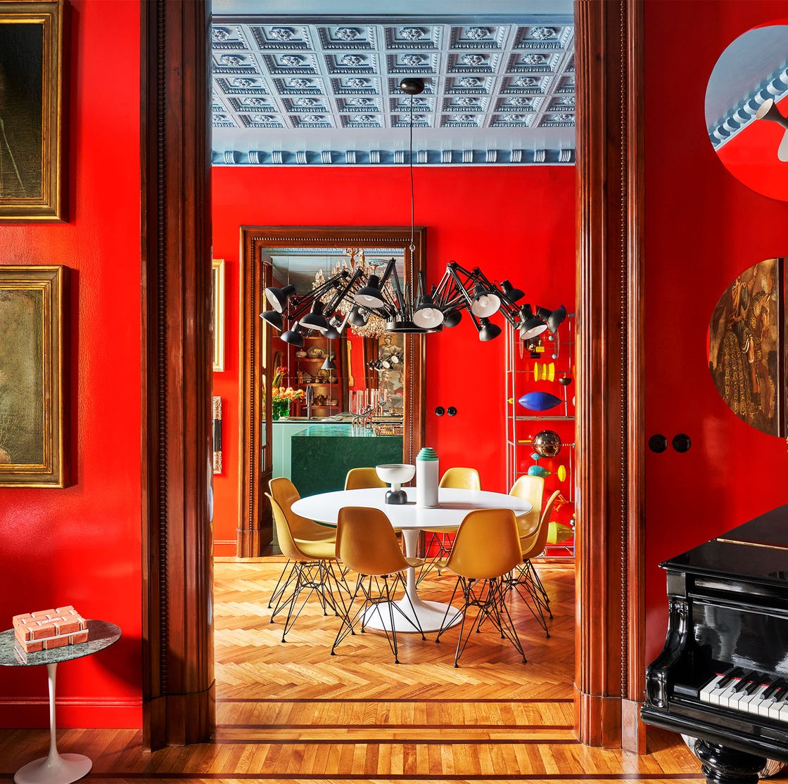
55 Living Room Color Ideas That Will Take Your Space from Drab to Fab

Designers Swear By These 65 Living Room Paint Colors

51 Living Room Color Schemes That Will Bring Your Space to Life