Wallpaper is so back — but don't make these 7 mistakes when using it, according to interior designers
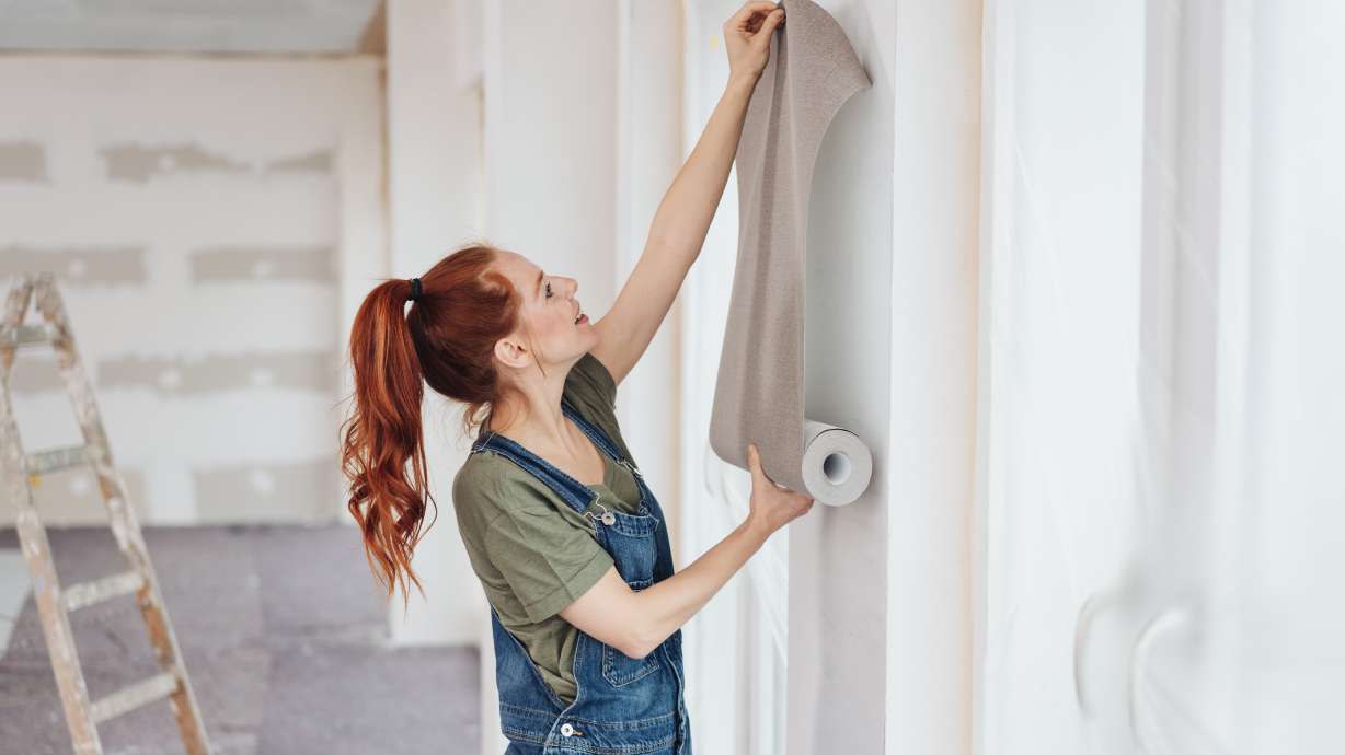
Wallpaper is experiencing a resurgence in home decor, offering an effective way to inject personality and color into any room, whether through bold florals, geometric patterns, or textured neutrals. However, successful wallpaper application requires meticulous planning to avoid common pitfalls. Interior designers TC Chou of Design Determination and Angeline Guido Hall of Angeline Guido Design highlight key mistakes to sidestep.
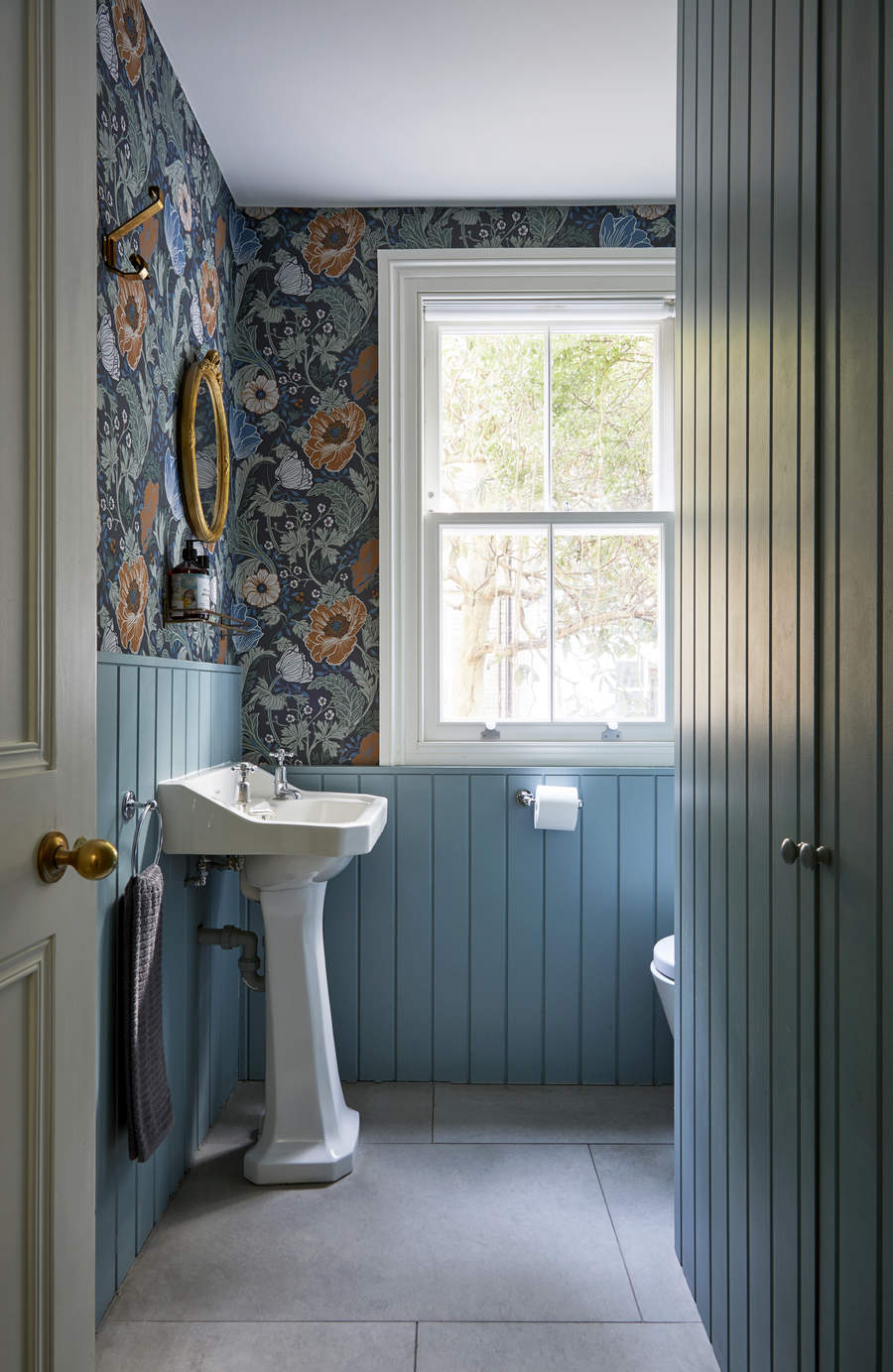
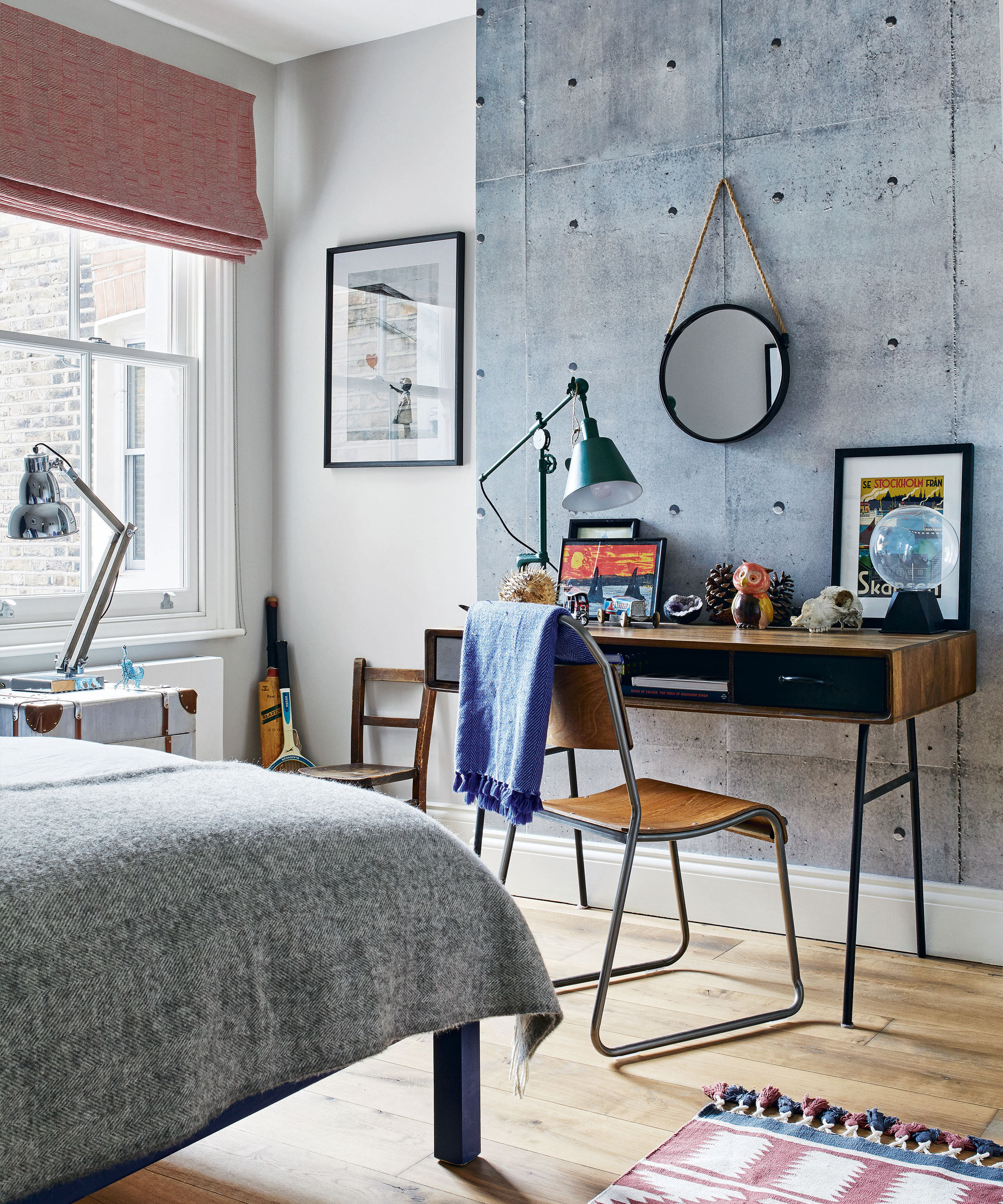
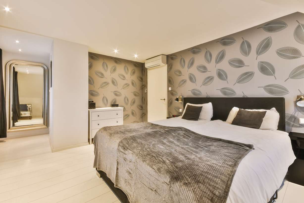
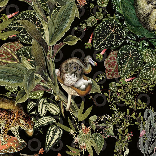
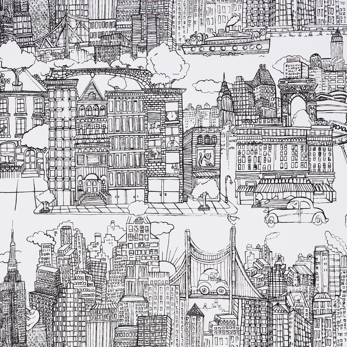
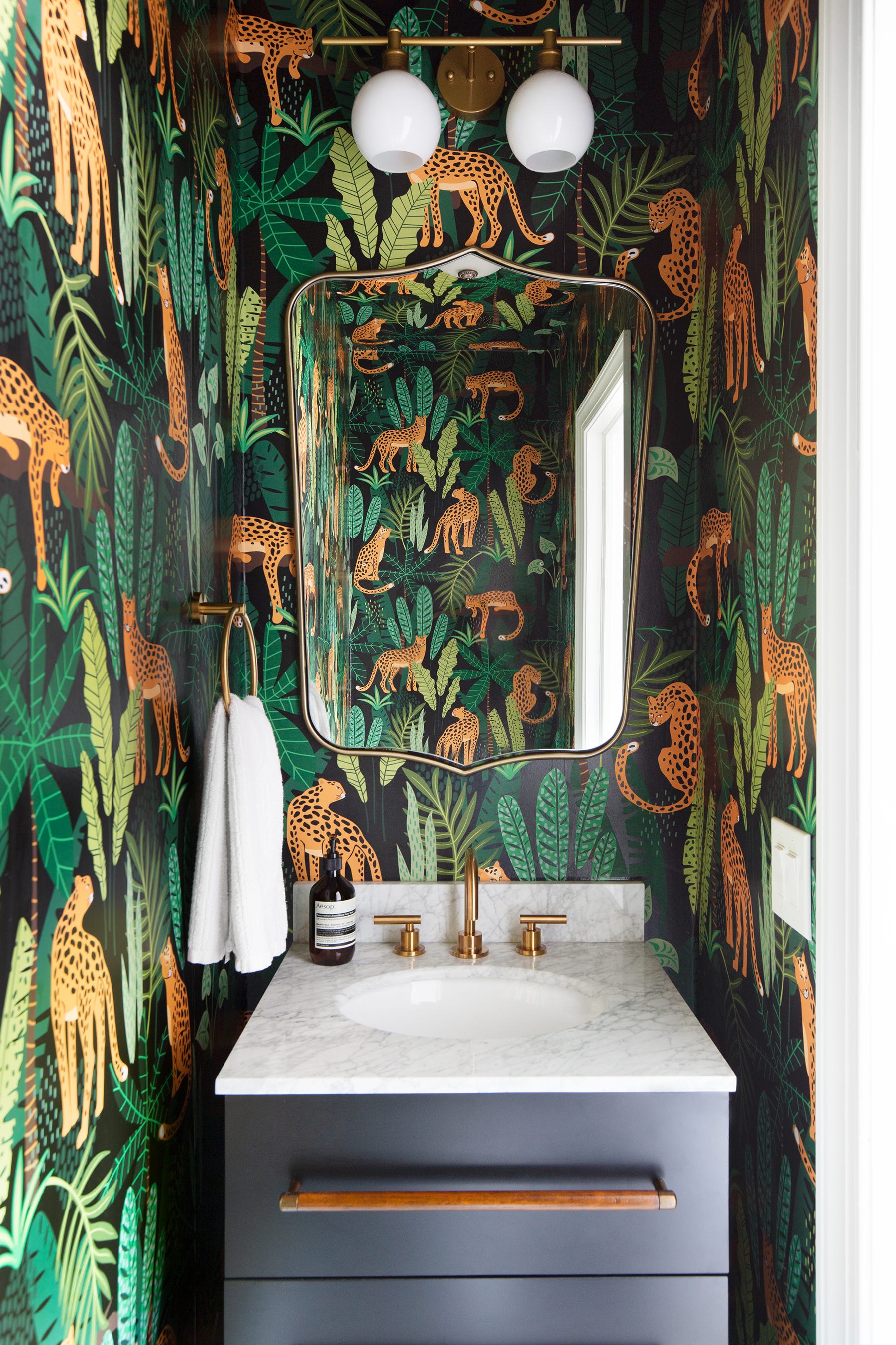
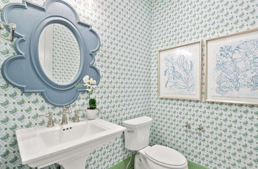
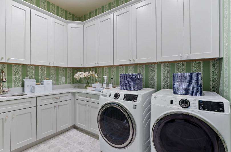
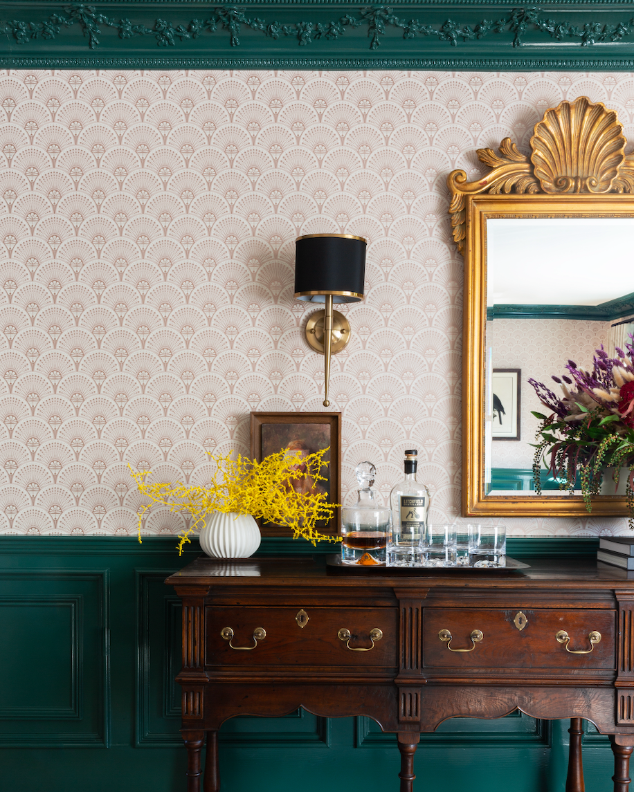
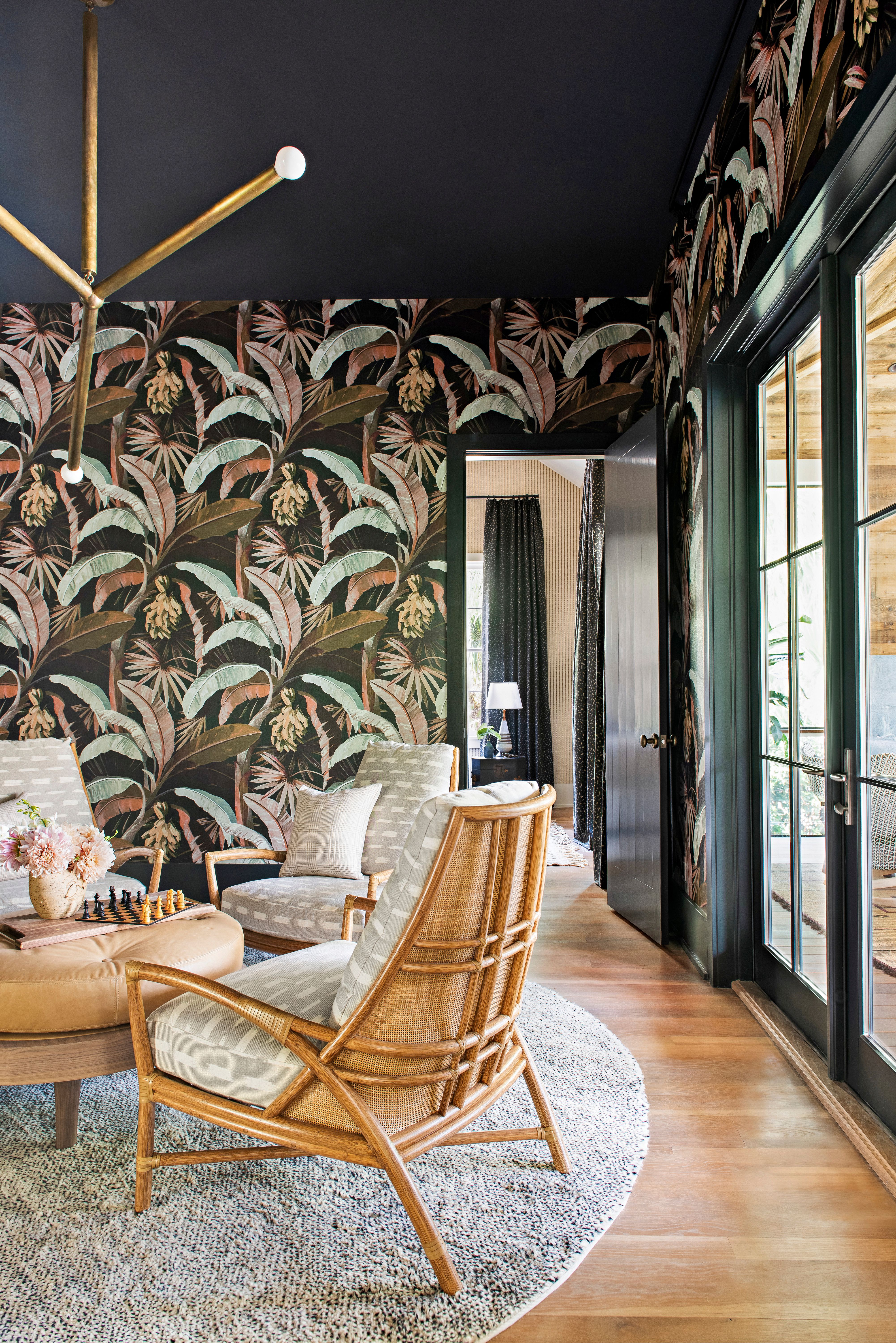
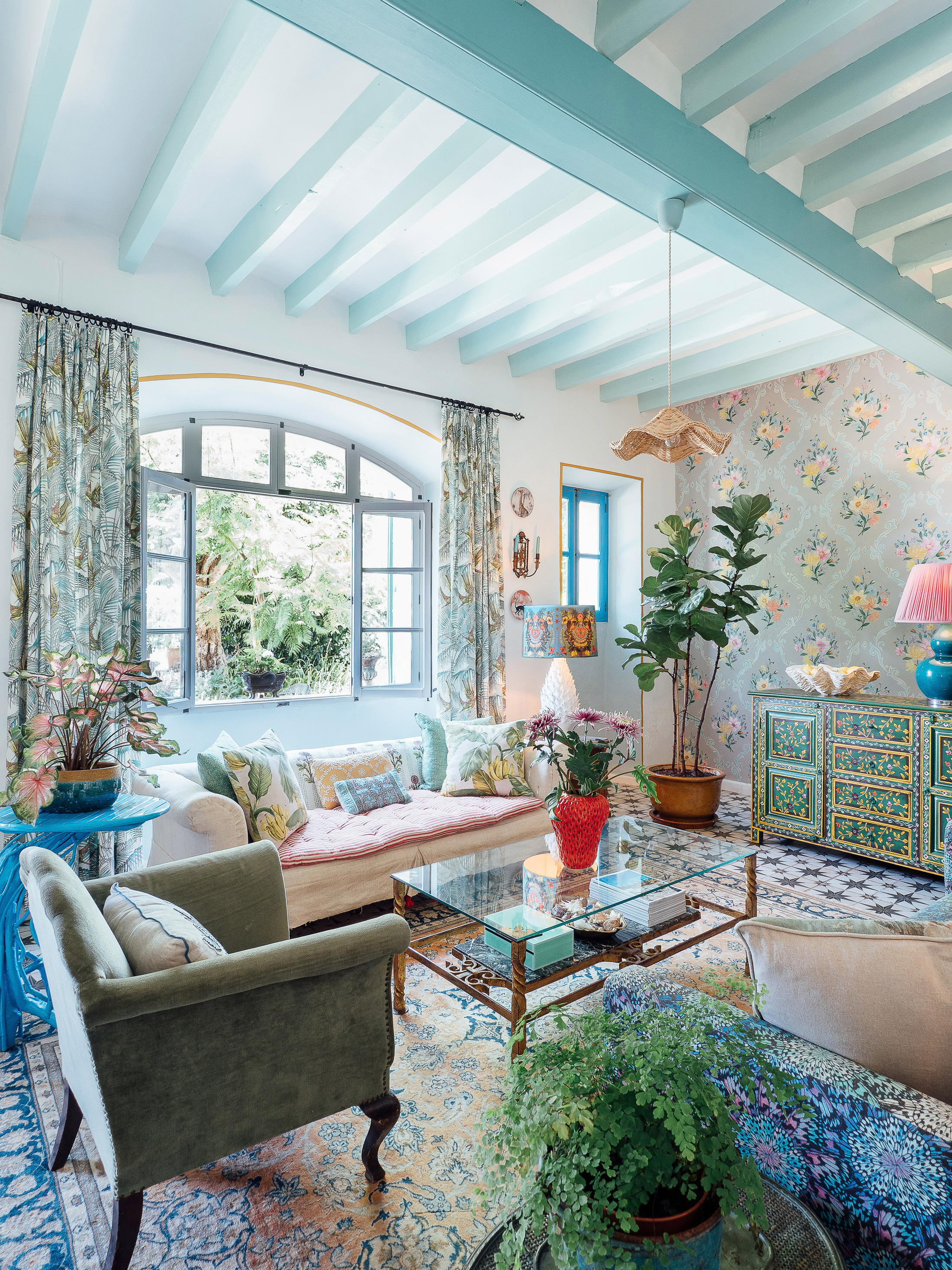
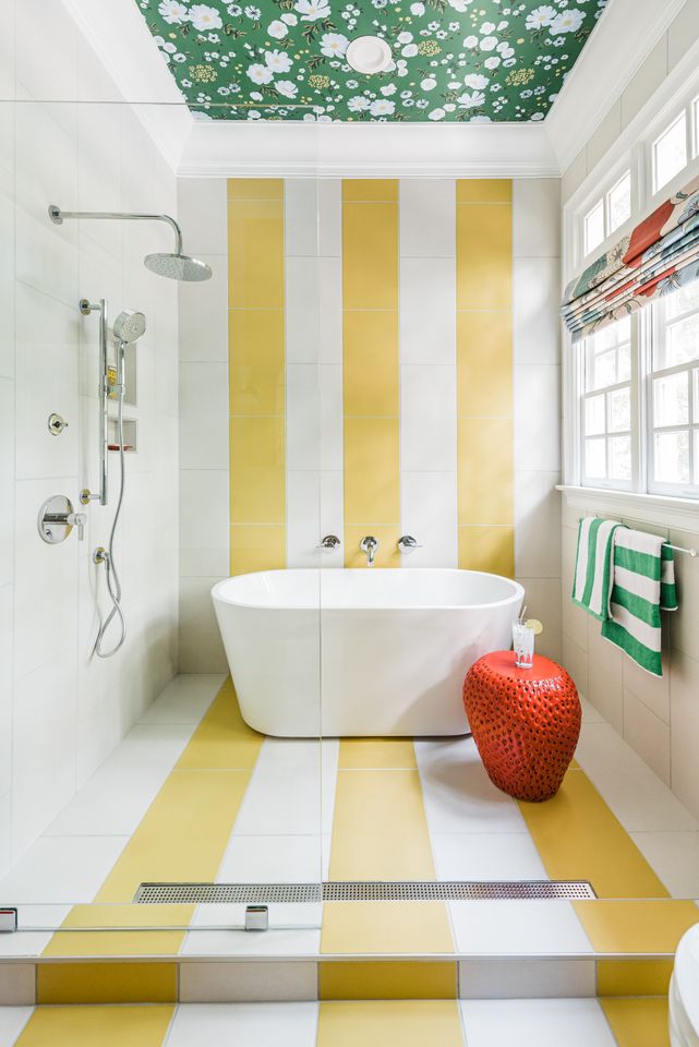
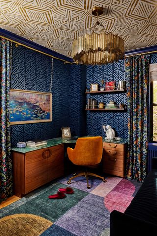
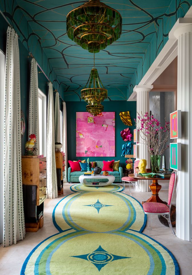
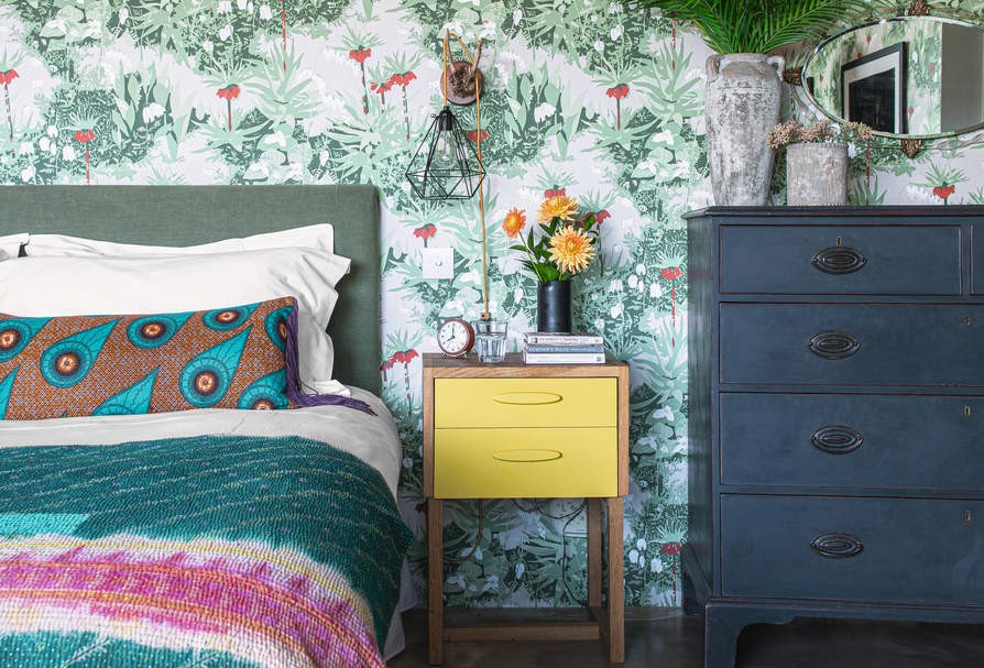
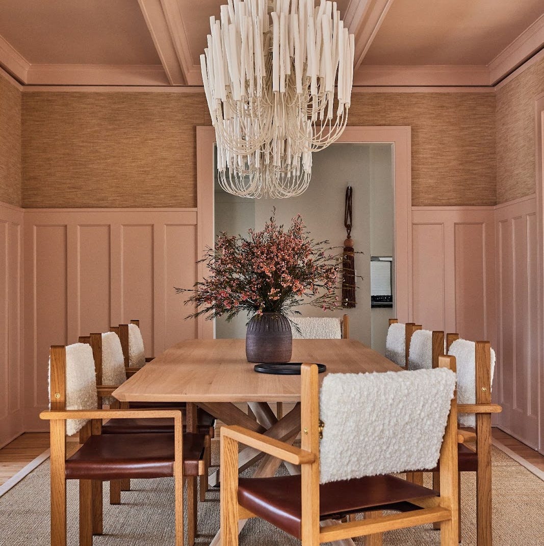
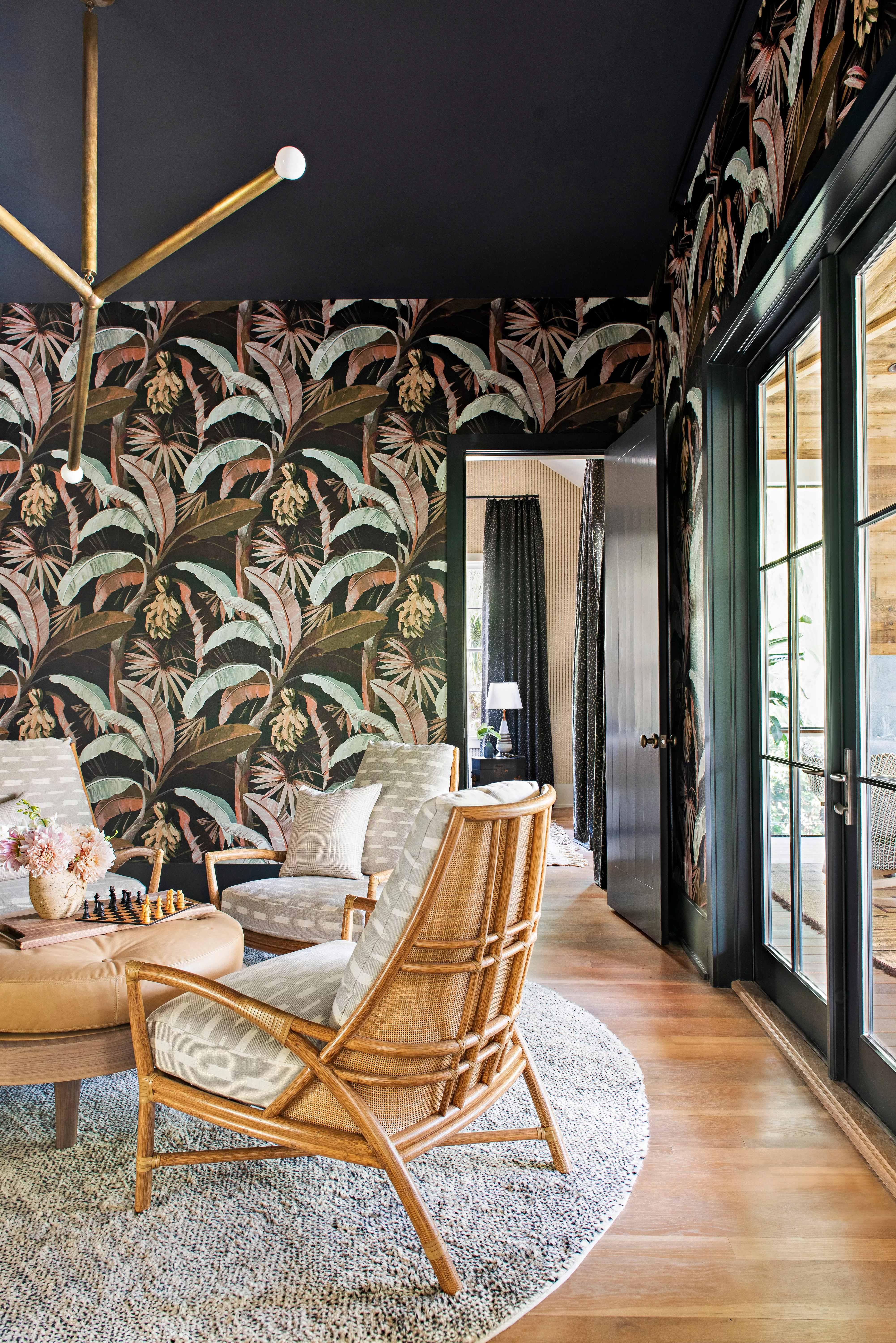
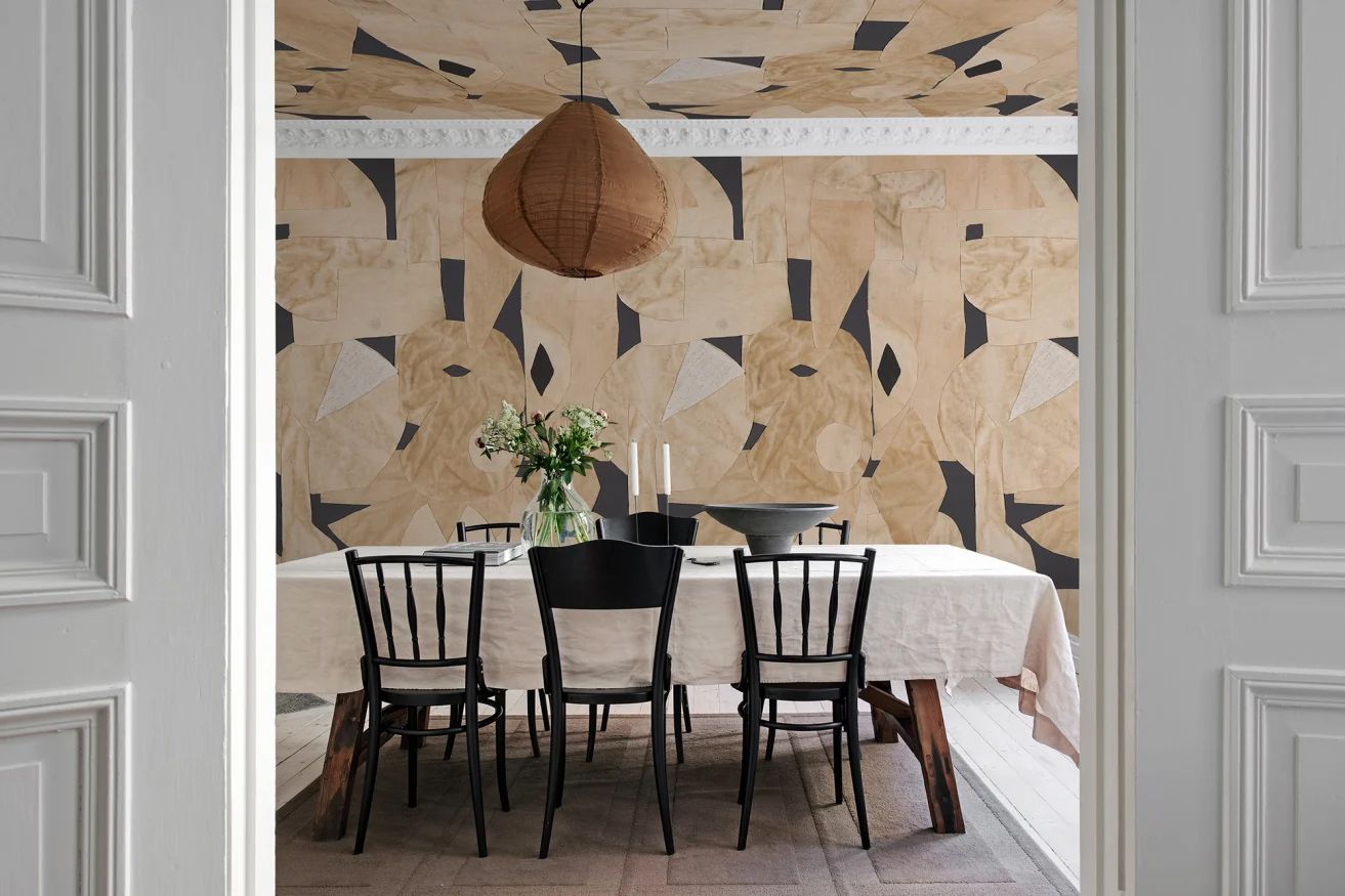
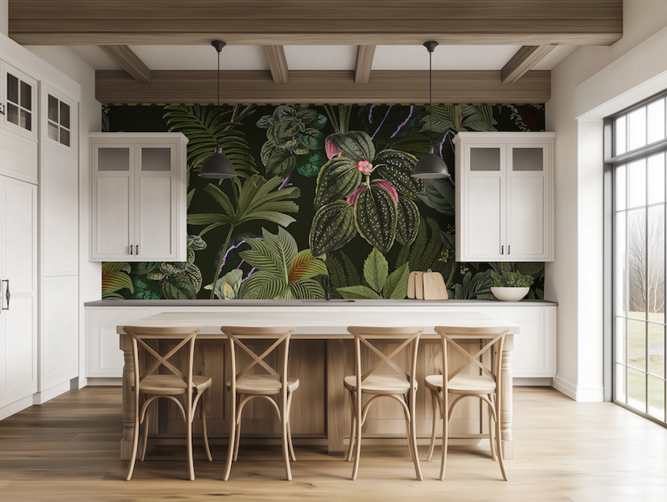
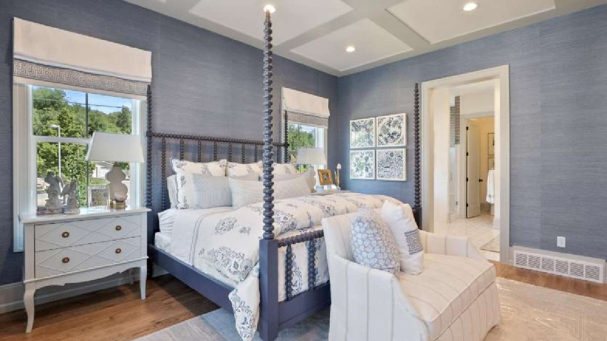
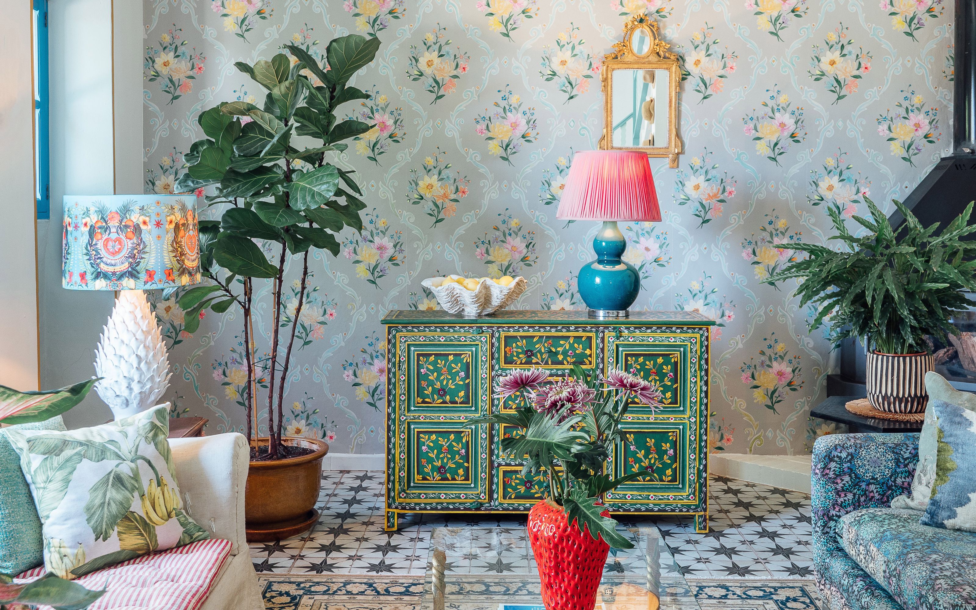
One critical error involves selecting the wrong type of wallpaper for specific environments. In moisture-prone areas like bathrooms and powder rooms, paper-backed wallpapers are susceptible to damage and peeling. Instead, vinyl wallpaper, known for its moisture resistance and ease of cleaning, is the recommended choice. Additionally, many individuals limit their creative use of wallpaper. Hall suggests innovative applications such as adorning ceilings to draw the eye upward, backing bookcases to introduce depth, or lining the insets of cabinet doors for subtle visual interest. Wallpaper extends beyond traditional wall coverings and can be utilized to enhance various architectural elements.
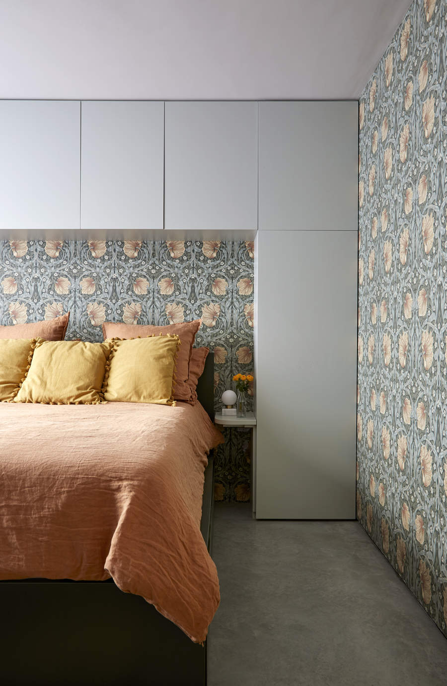
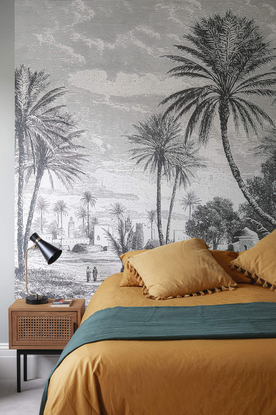
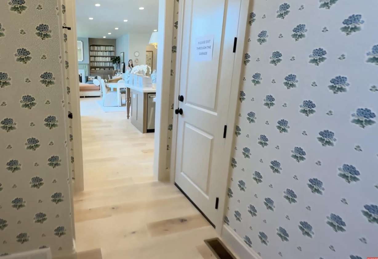
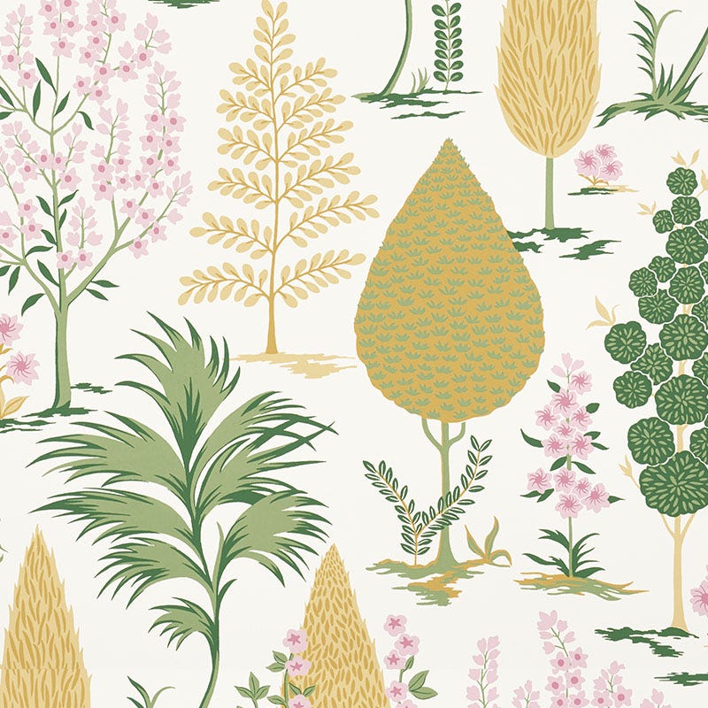
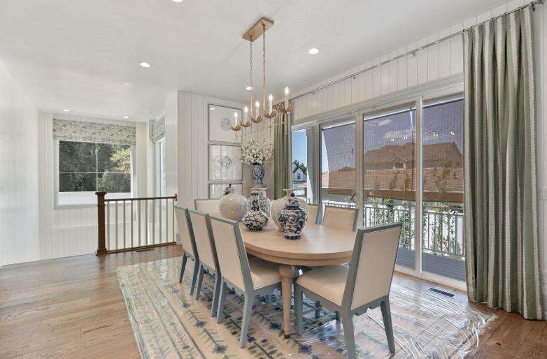
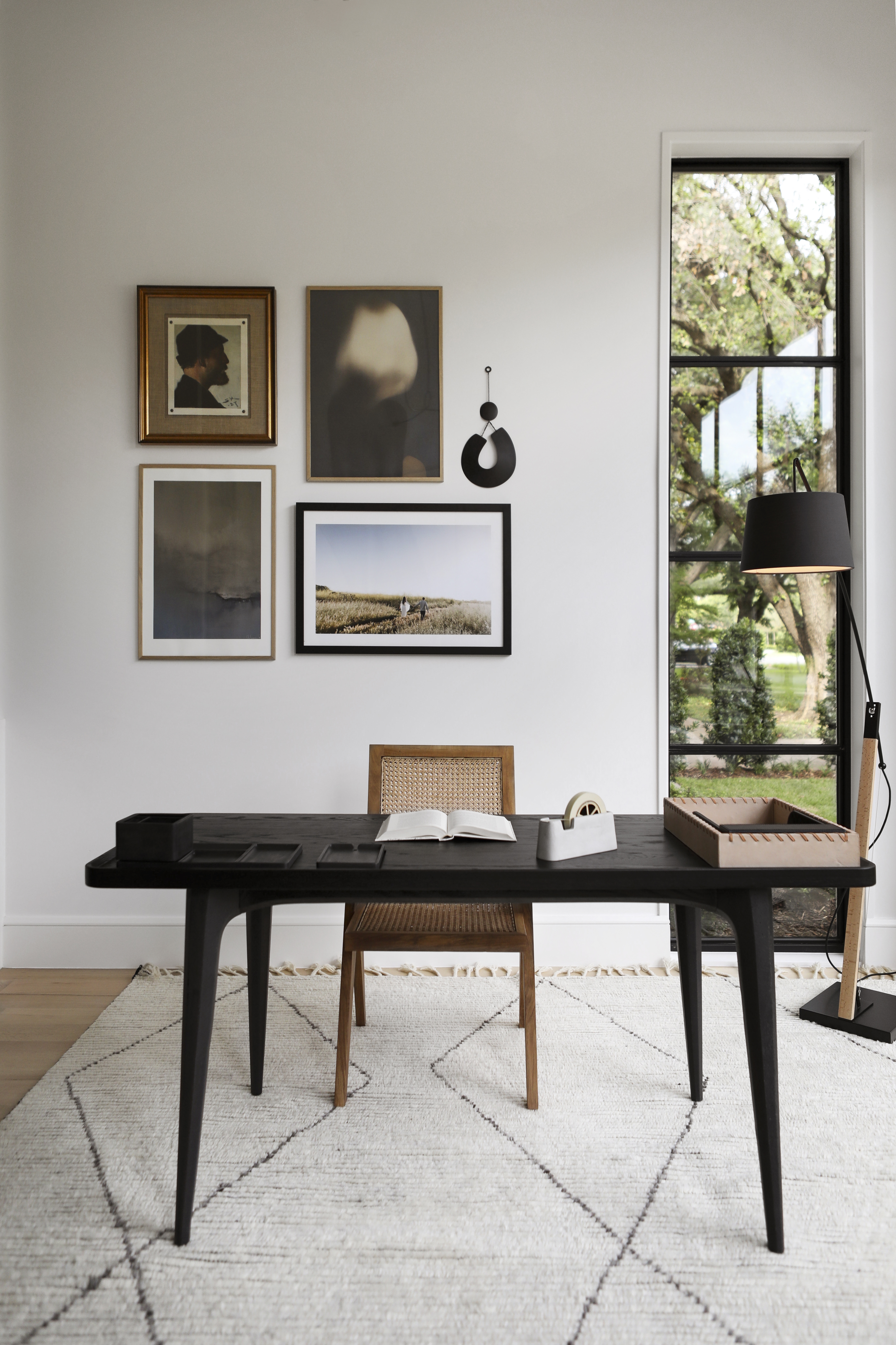
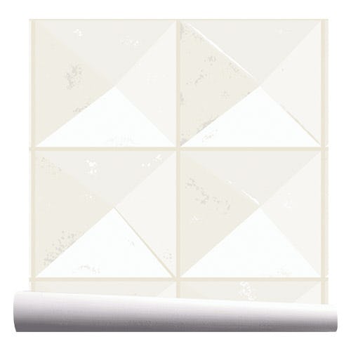
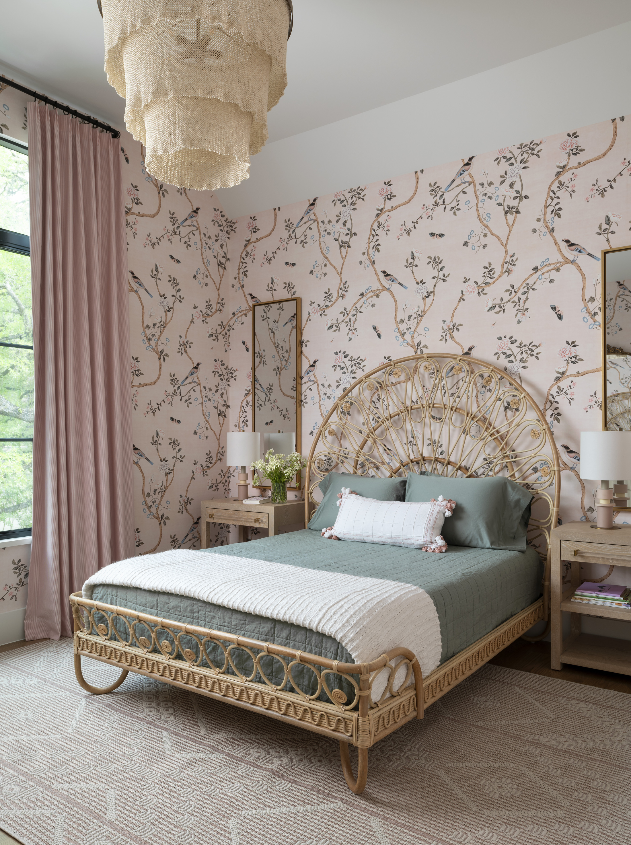
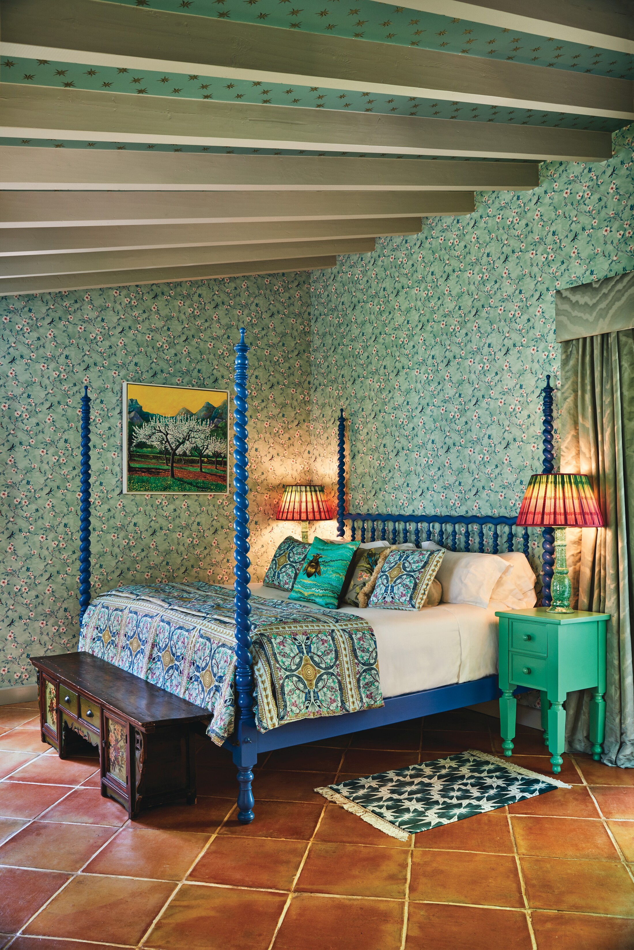
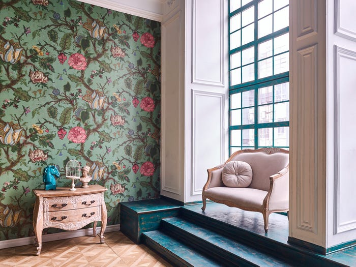
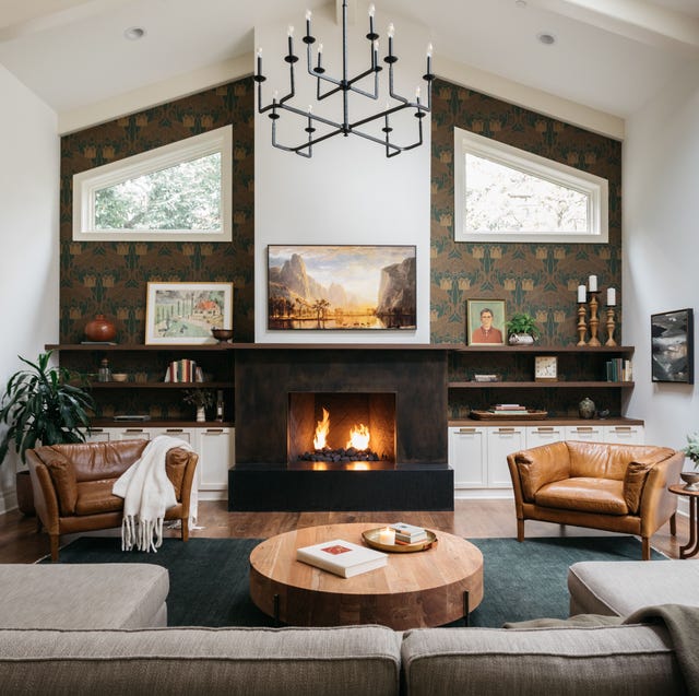
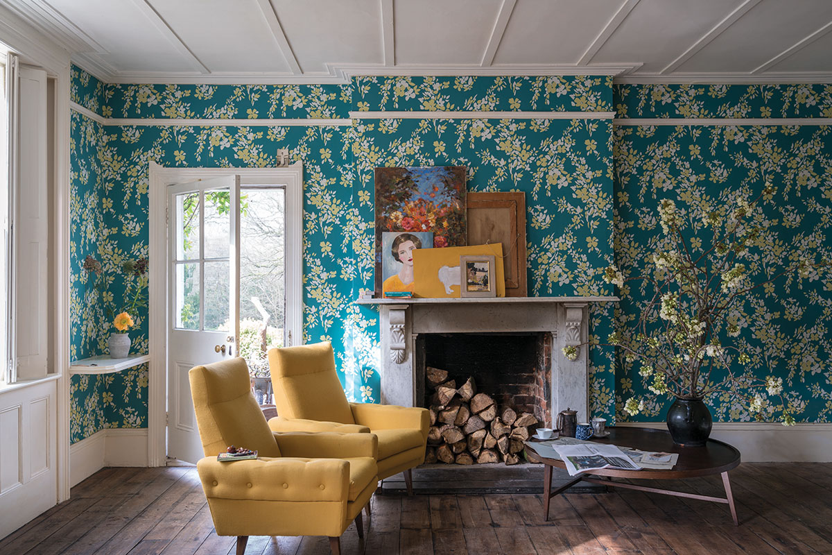
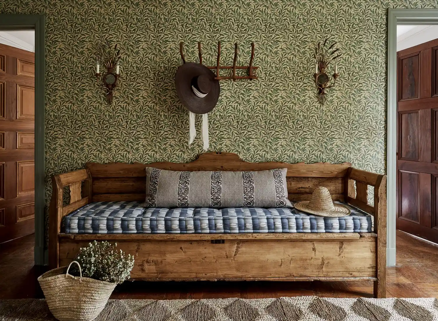
Another common mistake is employing large patterns in small rooms, which can create a feeling of confinement rather than spaciousness. Chou advises opting for smaller patterns or solid colors in compact areas to enhance spatial perception and foster a more harmonious atmosphere. Furthermore, neglecting to meticulously plan the installation process can lead to aesthetic issues. When applying patterned wallpaper across multiple walls, Hall emphasizes the importance of selecting a starting corner that minimizes the visibility of pattern misalignment in the final corner. For non-repeating patterns, Chou recommends pre-planning furniture and decor placement to ensure the design's full visual impact is achieved.
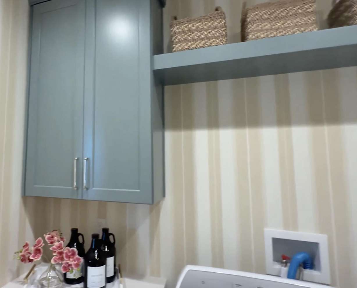
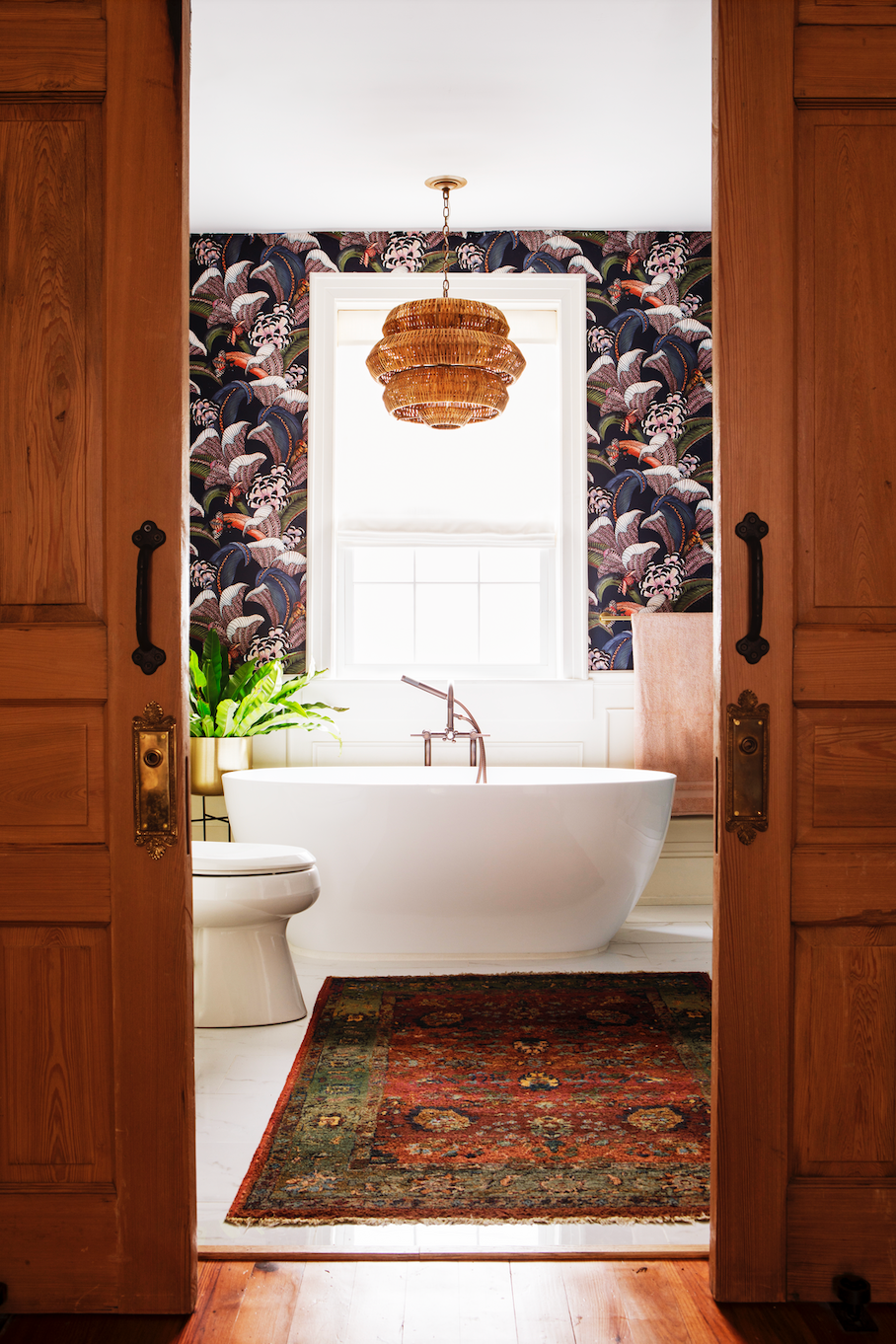
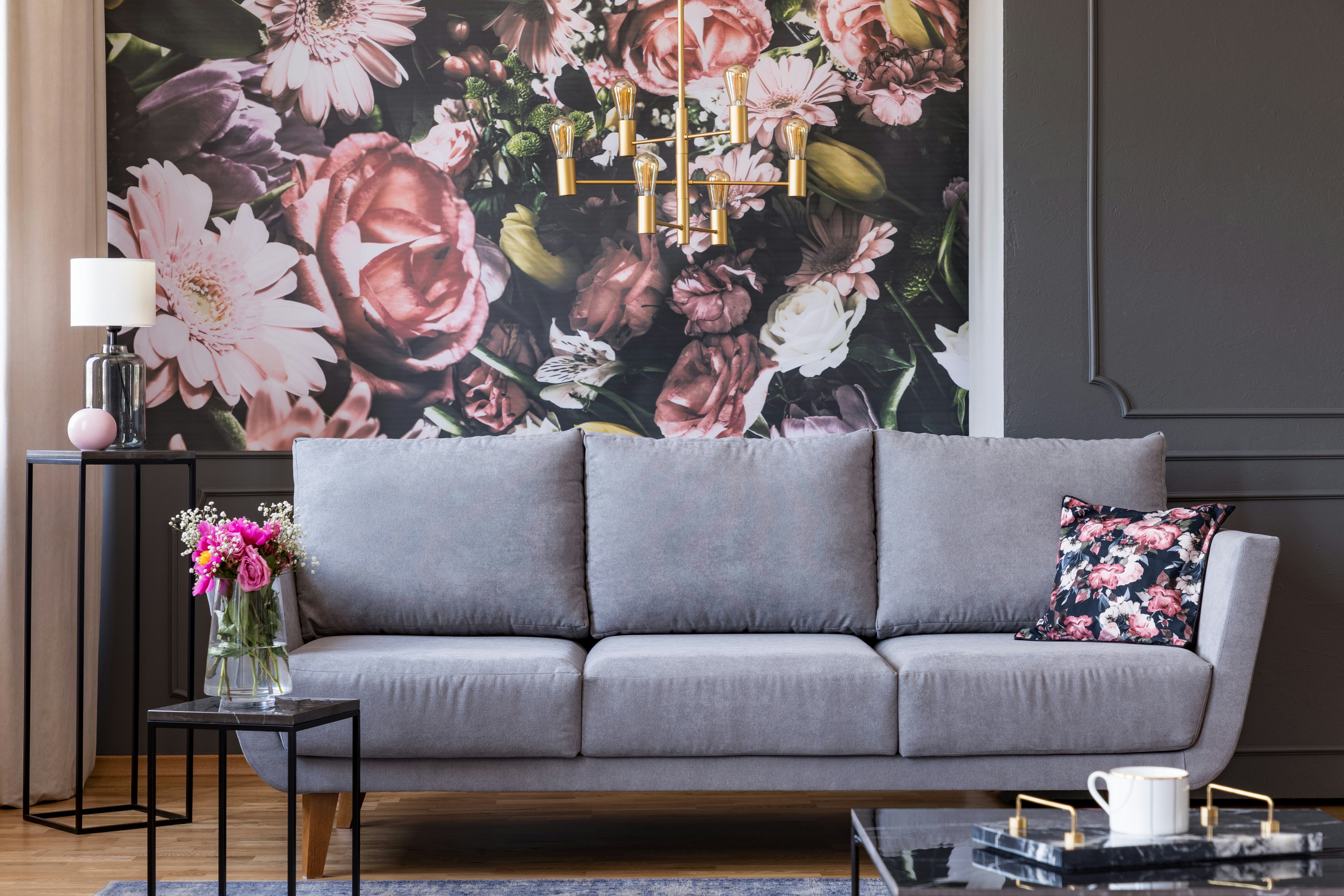
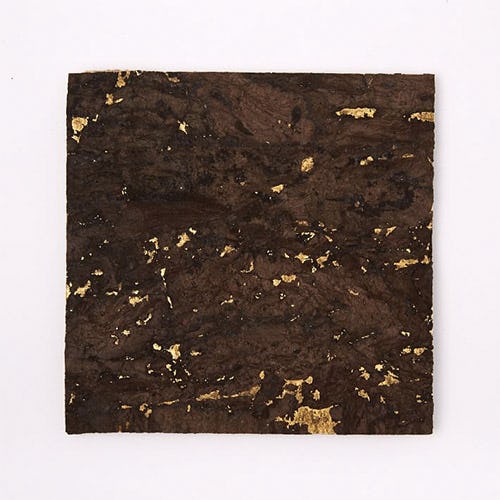
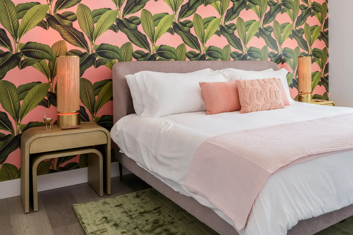
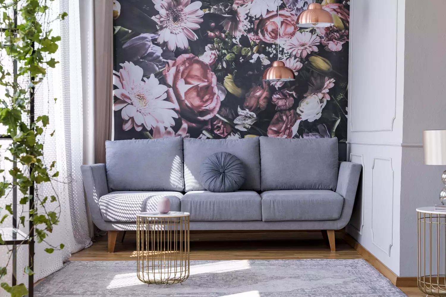
Overly bright colors in textured wallpapers can disrupt a room's tranquility. Chou suggests using natural or subtle hues for textured wallpapers to maintain a calming and serene environment, allowing the texture to be appreciated without overwhelming the space. This approach fosters a sophisticated backdrop that promotes relaxation. When developing a room's color scheme, designers advocate for starting with the wallpaper and area rugs before selecting paint colors. Wallpaper often features a diverse palette of colors and patterns that can serve as inspiration, leading to a more coordinated and visually appealing result when paint colors are chosen to complement the wallpaper.
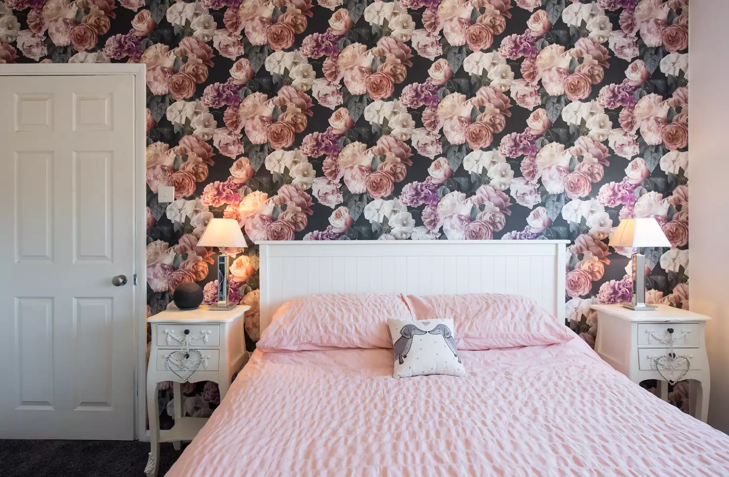
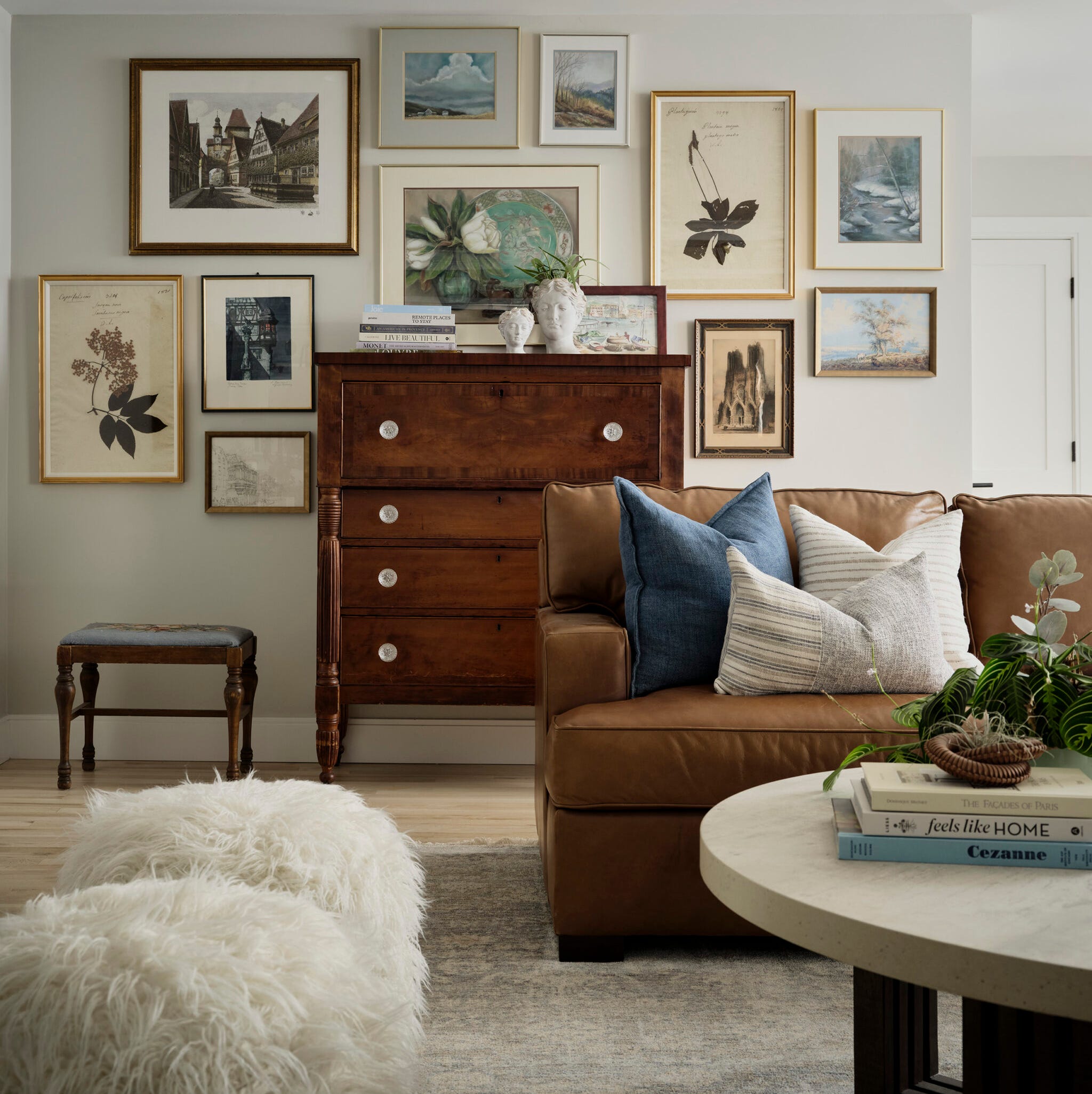
Finally, concerns about resale value should not deter individuals from choosing wallpapers they genuinely love. Hall encourages homeowners to select patterns that bring them joy, asserting that wallpaper is a significant investment and personal satisfaction with the choice will prevent regret. Embracing personal preferences over potential future buyer appeal ensures a more fulfilling design outcome. By avoiding these common errors, homeowners can effectively leverage wallpaper to enhance their living spaces with style and personality.
#Wallpaper #InteriorDesign #HomeDecor #DesignTips #RoomDesign #PatternMatching #ColorPalette #Wallpaper #InteriorDesign #HomeDecor #DesignTips #RoomDesign #PatternMatching #ColorPalette
0 comment in total
You may also like
Wallpaper mistakes to avoid – 7 of the most common errors and how to solve them


Wallpaper Is Back. Here's How to Add this Bold Accent Into Your Home.

7 Retro Design Trends Making a Comeback, According to Interior Designers

We Asked Designers If Wallpaper Is Finally Out in 2026—And Their Answer Surprised Us

5 outdated wall decor trends designers warn to avoid – plus what we should be doing instead

11 of the Best Wallpapers, According to Designers

8 Common Wallpaper Mistakes (and How to Fix Them)

Should You Put Wallpaper on the Ceiling? Here’s What Designers Recommend
Wallpaper is back: 7 top trends for 2025


6 Wallpaper Trends That Are So Outdated, According to Designers
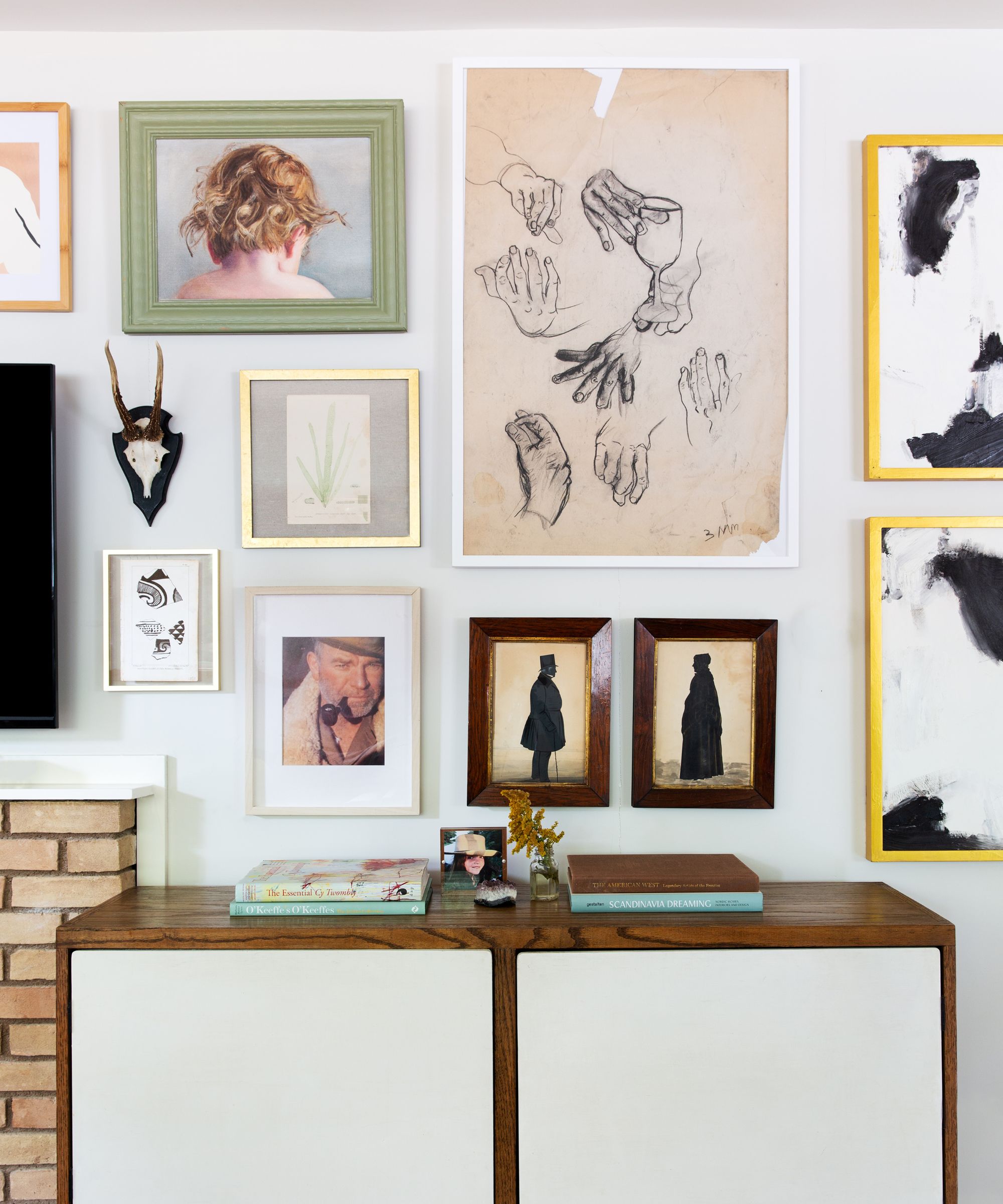
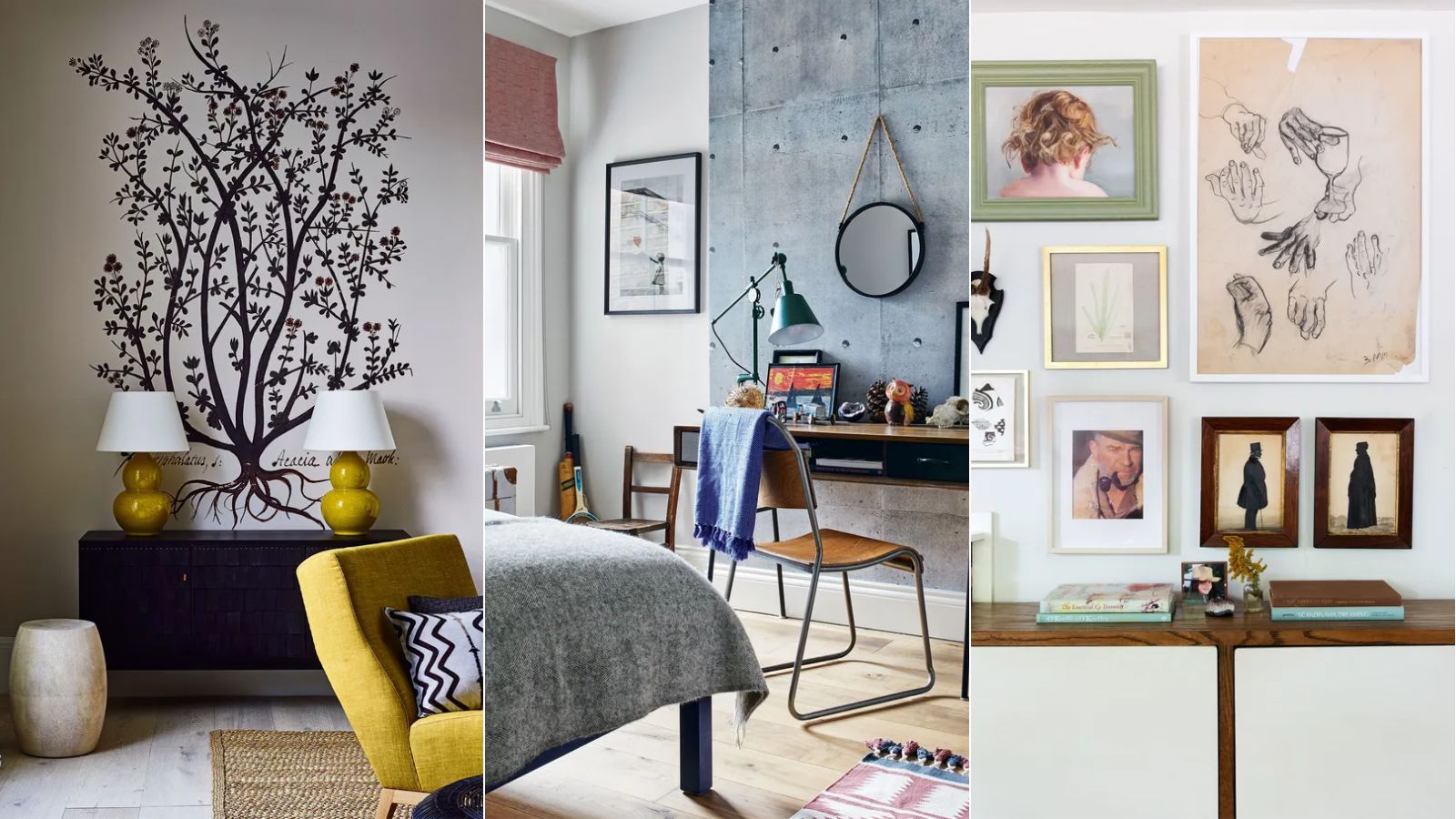
5 common gallery wall mistakes designers warn to always avoid – to create the chicest of displays
5 trends that look good right now but interior designers warn they won't last
6 Wallpaper Mistakes Designers Immediately Notice in Any Home
16 Latest Wallpaper Trends That Designers Are Loving for 2023

Even Wallpaper Skeptics Can Tackle The Trend With This Foolproof Tip
7 Design Mistakes Interior Designers Always Notice

5 ways to transform your home now that wallpaper is back in style
Patterned perfection: 7 wallpaper trends that are sure to impress
5 Wallpapered Rooms we say Prove Vintage-Style Wallcoverings are Making a Comeback This Year
Vintage '70s Wallpapers Are This Year's Unexpected Decor Trend, Designers Say