1/25
The 6 must-have colors to bring into your home this June
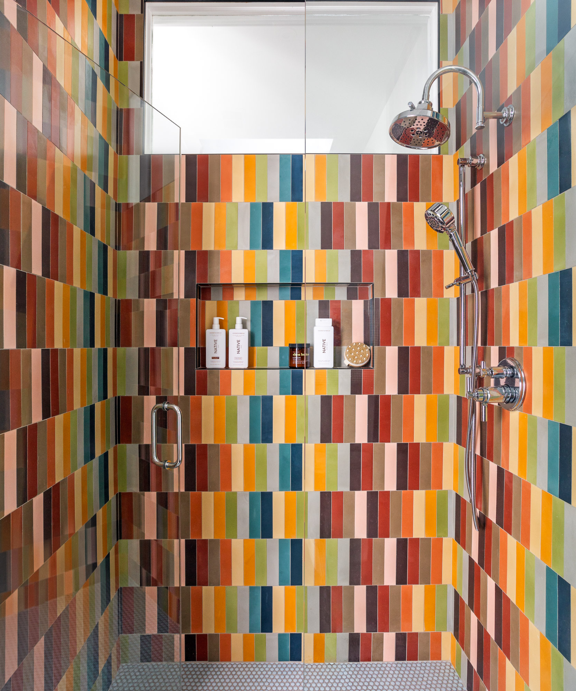
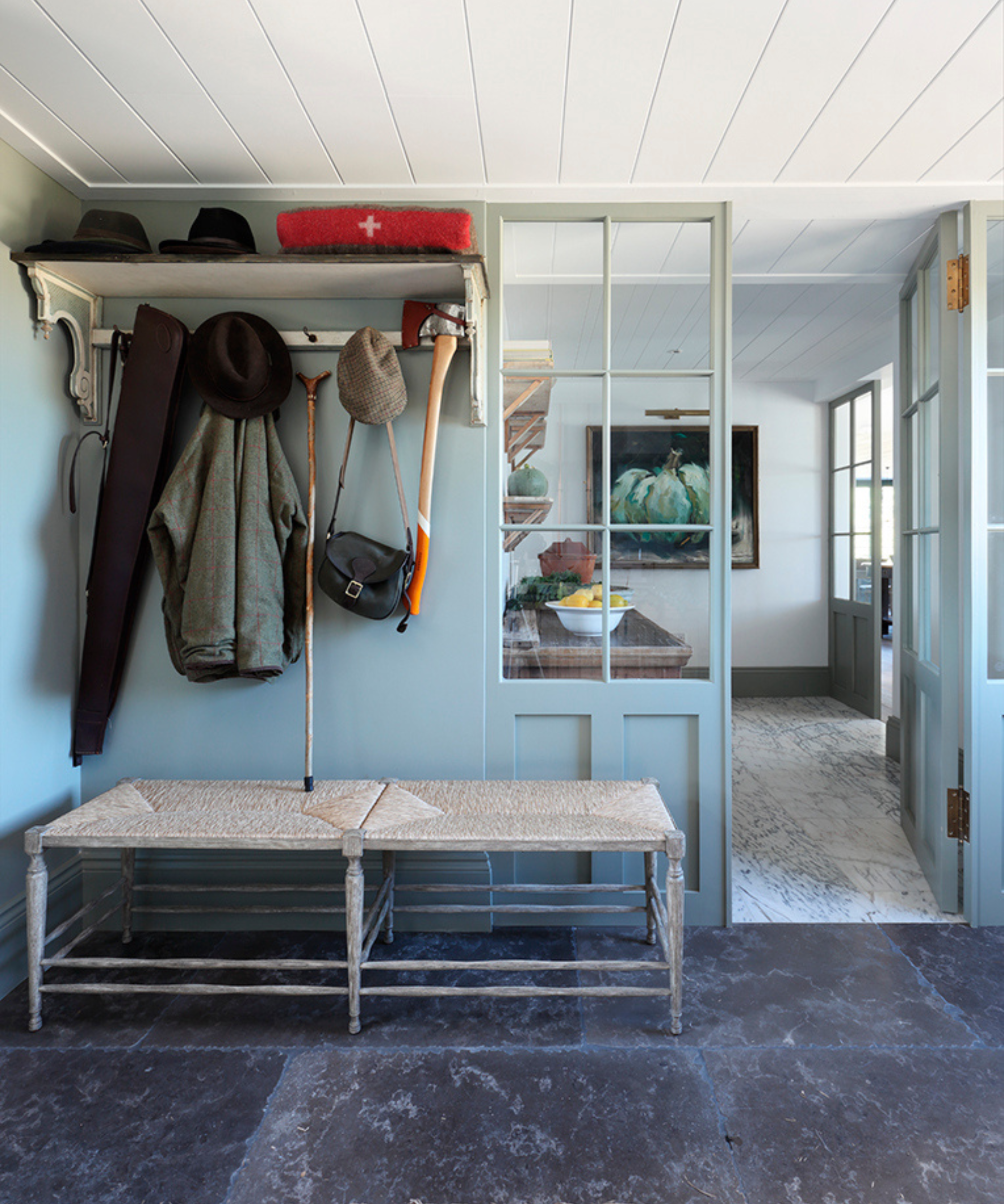
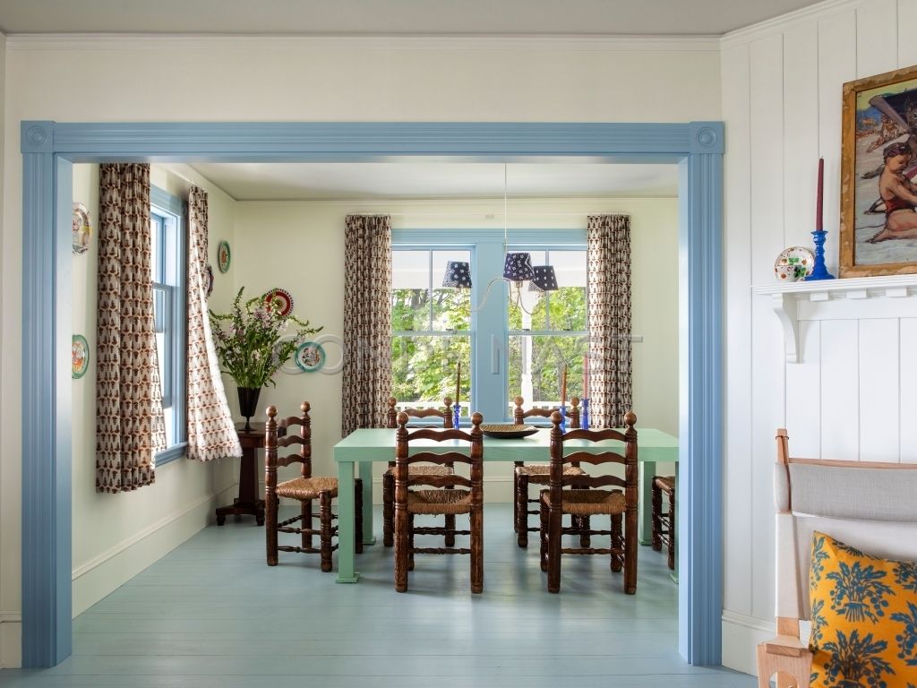
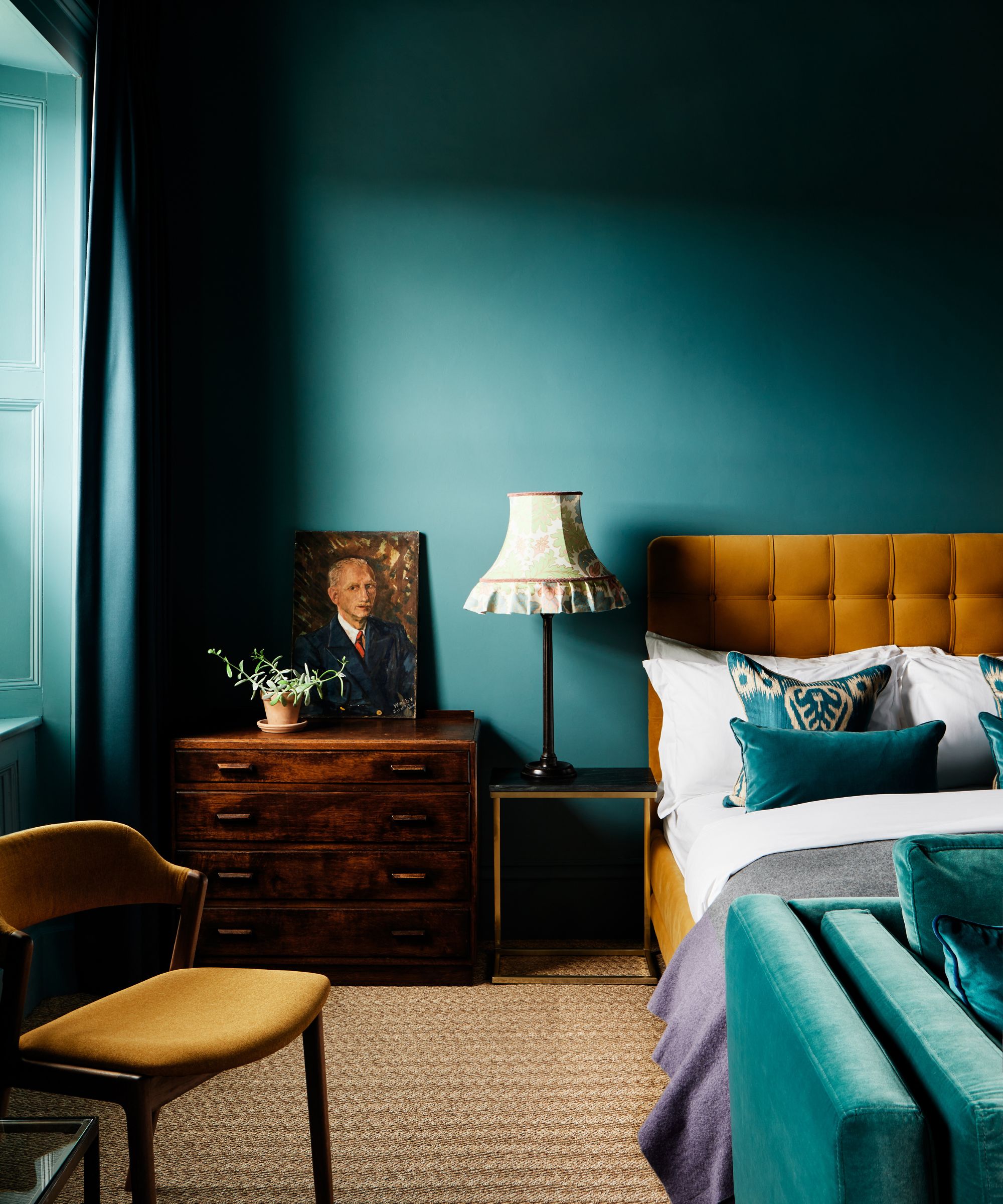
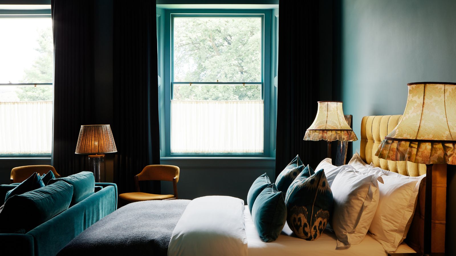
June's vibrant colors offer an opportunity to infuse living spaces with the lush energy of the outdoors, encouraging experimental color choices inspired by nature. Interior designers and color experts have identified six summer-inspired shades, ranging from perennial favorites to adventurous hues, suitable for home decoration. The article suggests six must-have colors for June, starting with turquoise. Turquoise is described as a mood-boosting, cerulean greenish-blue reminiscent of tropical waters and fresh forests. While its intensity might not appeal to everyone, its smile-inducing qualities are undeniable. Paint variations like Little Greene's Jack-in-a-box, Slipper, or Mylands' Deep Green are recommended, with a note that their appearance can vary significantly based on lighting.
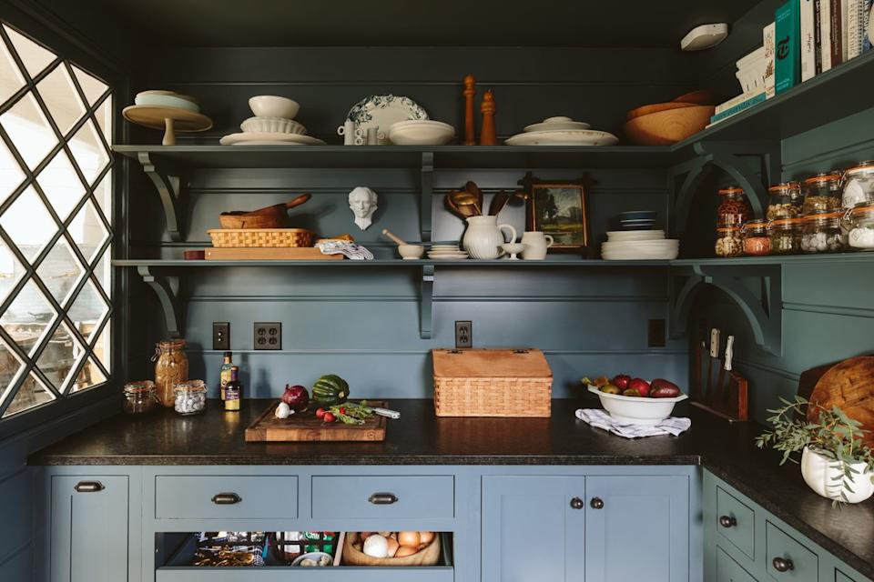
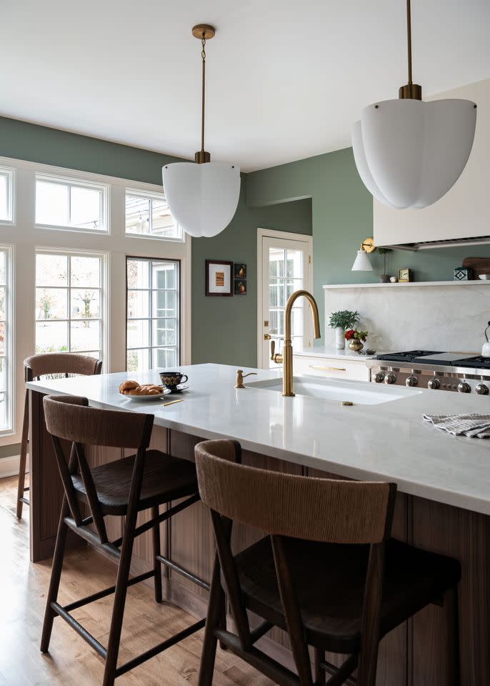
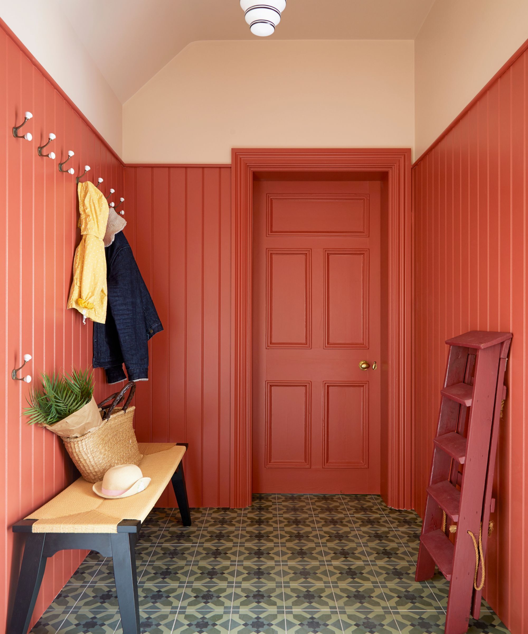
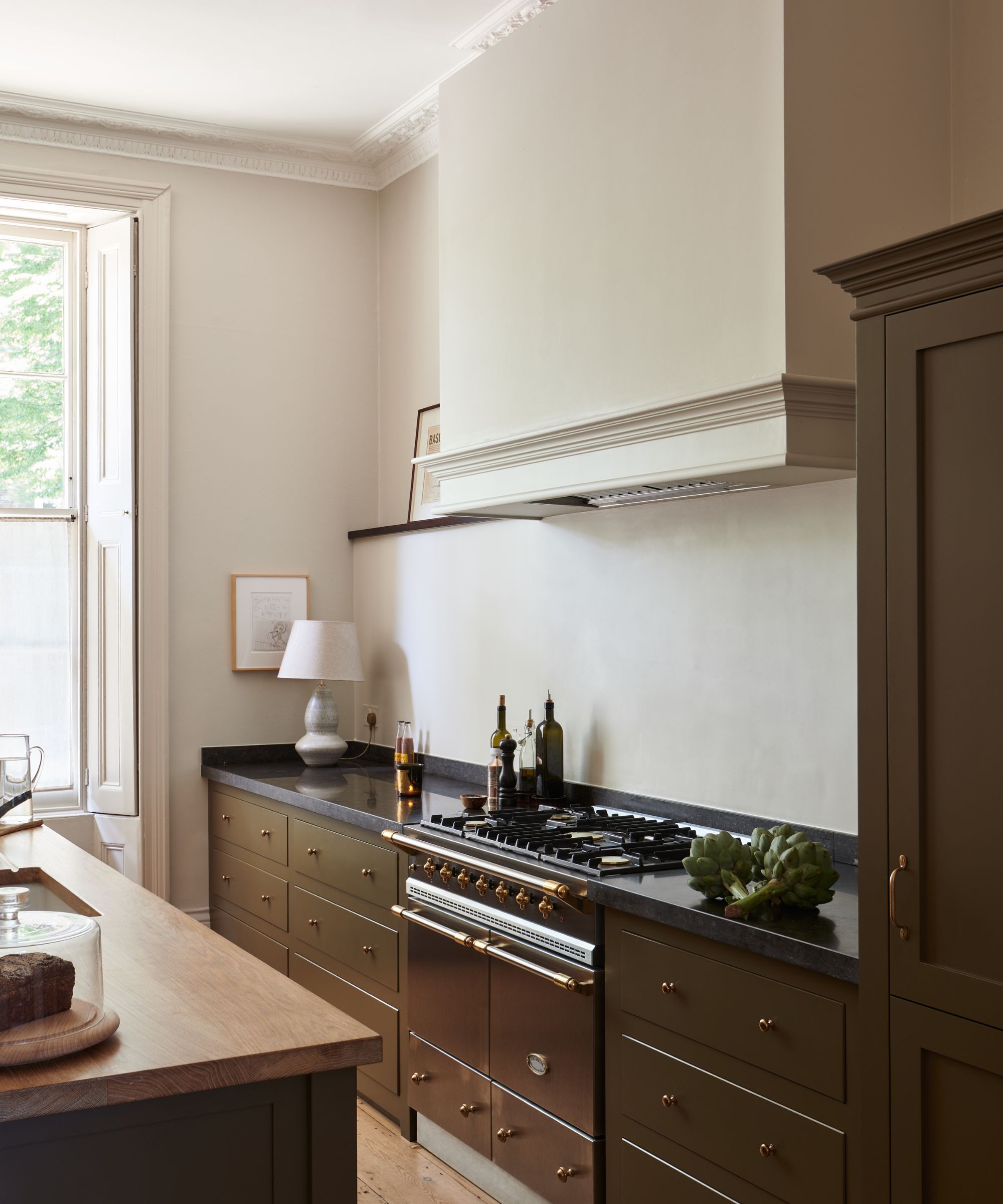
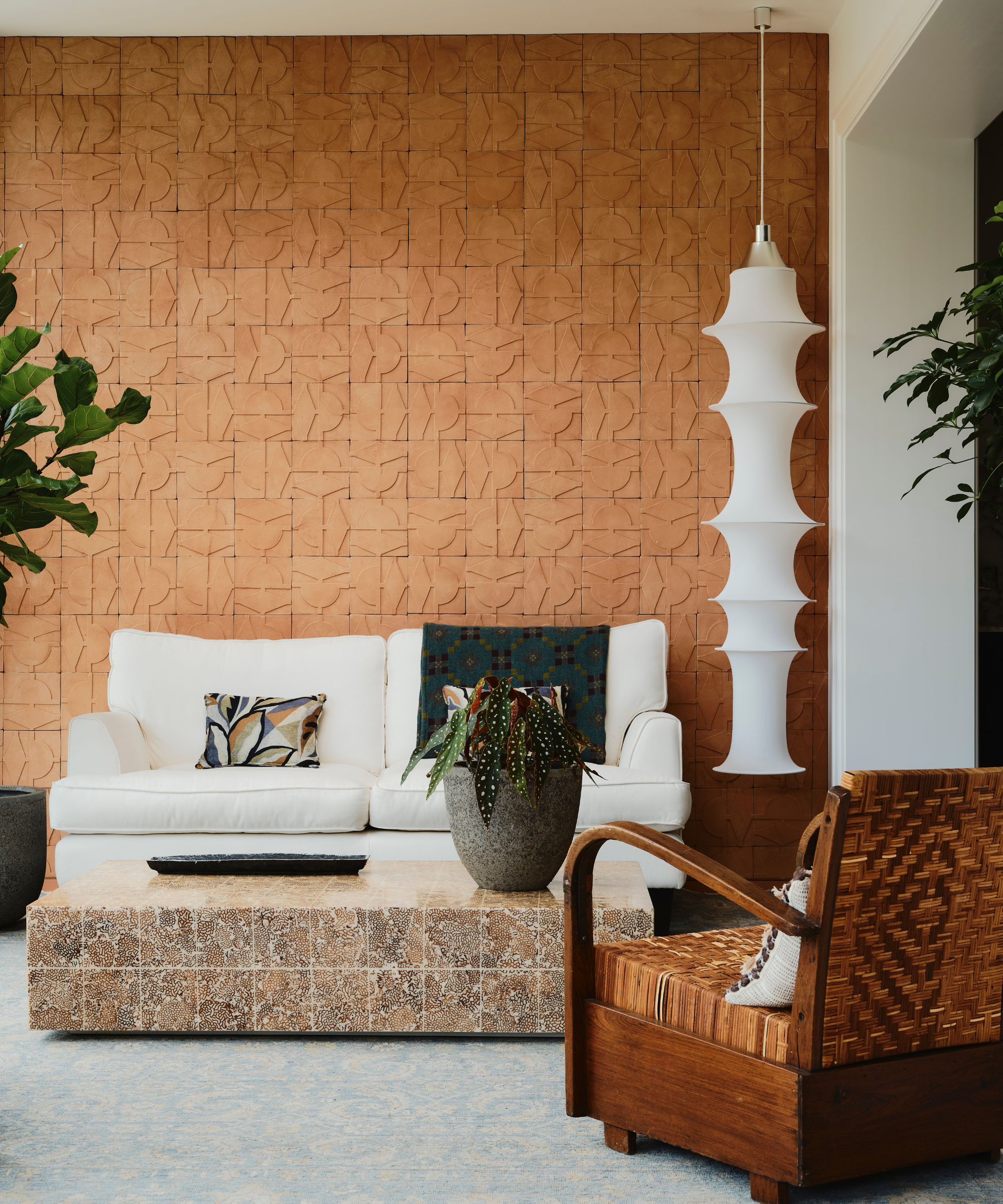
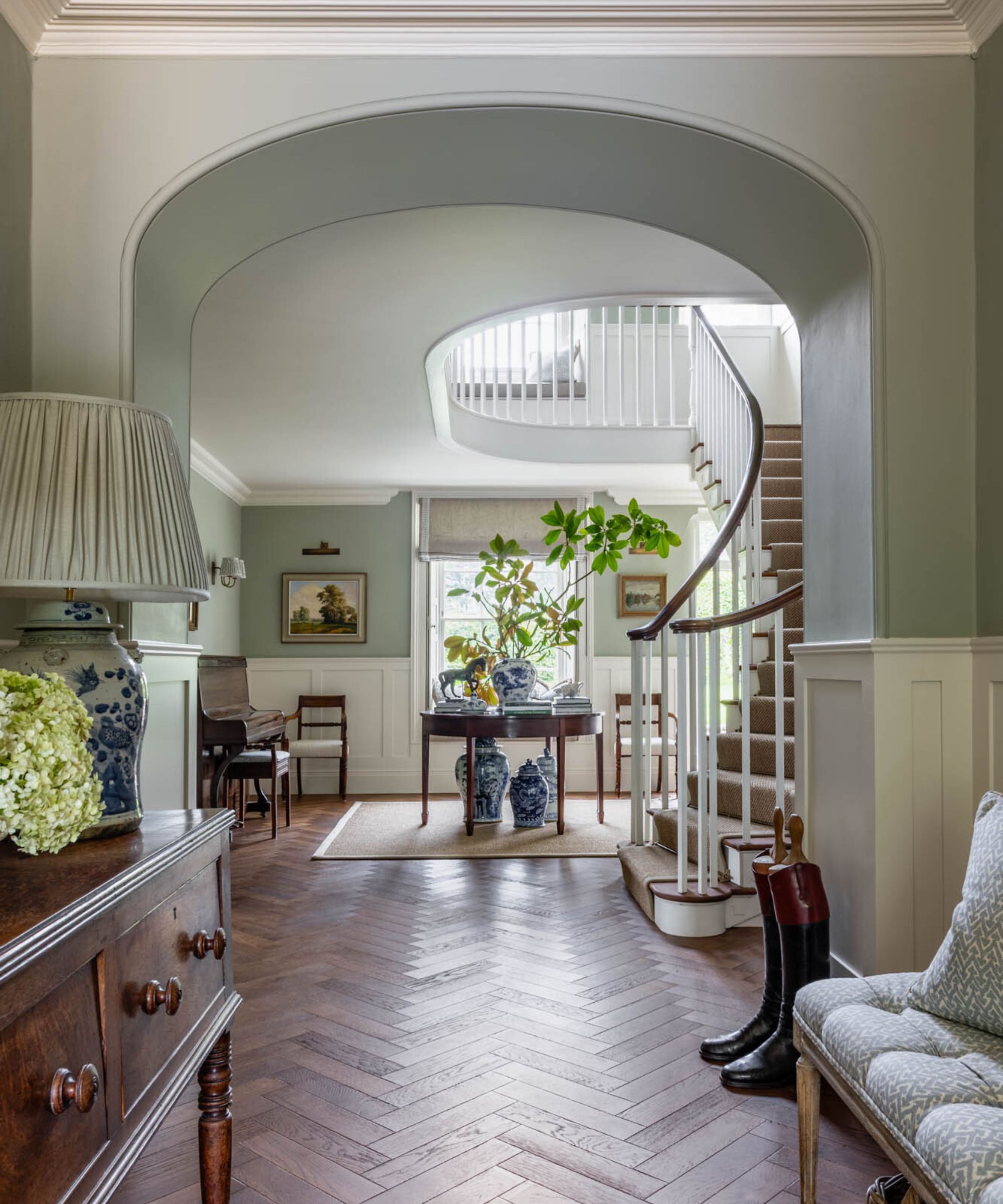
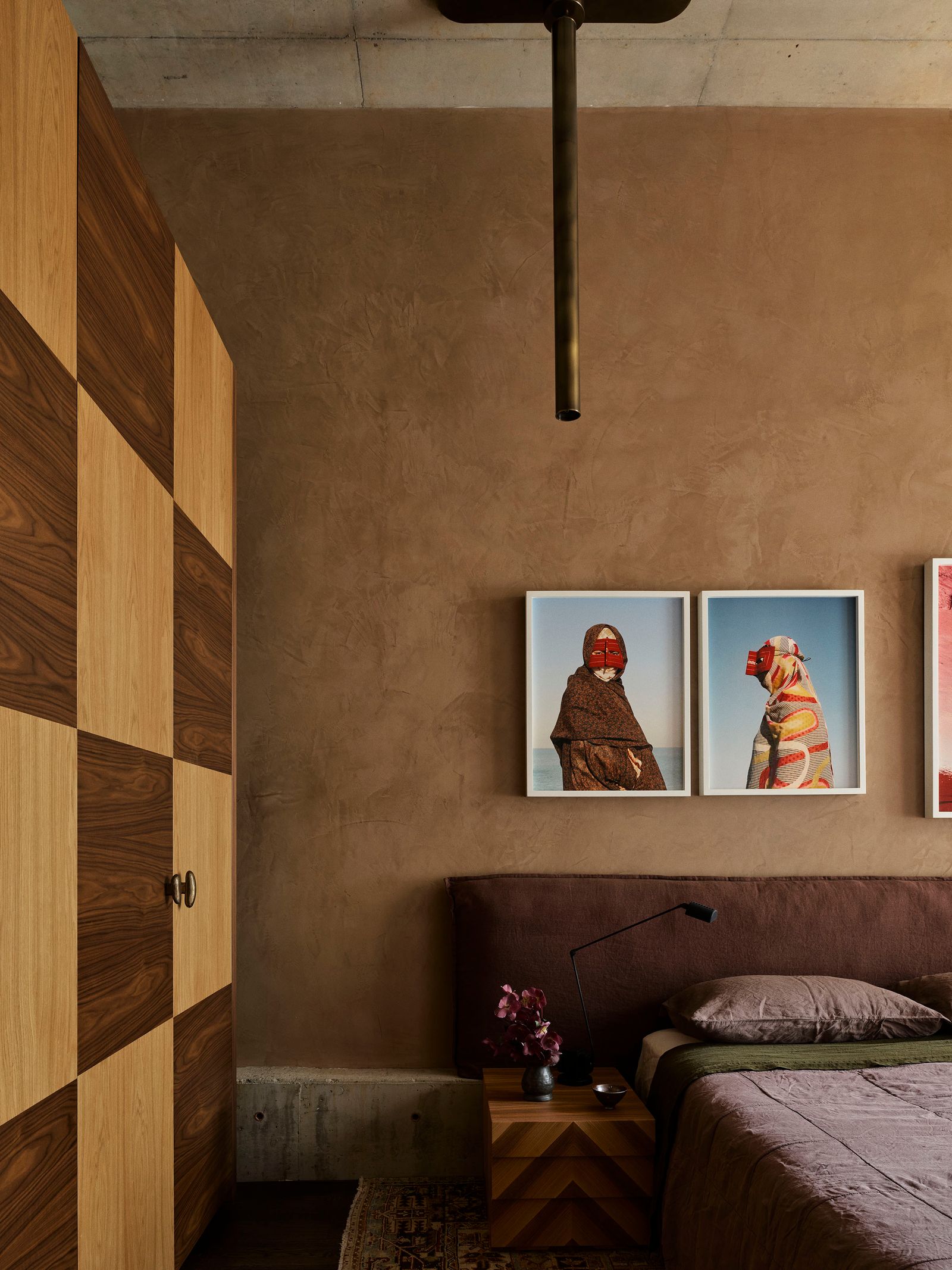
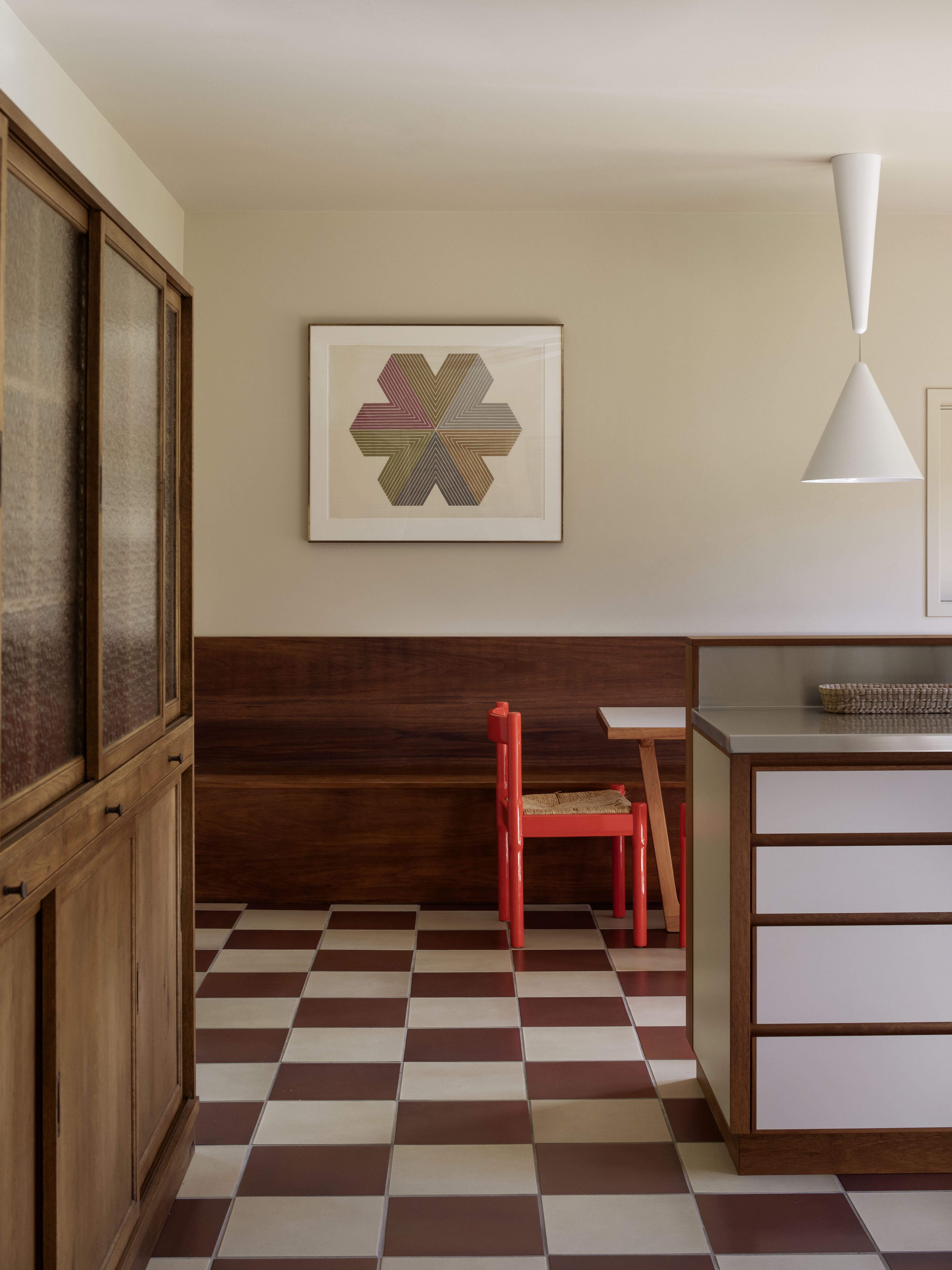
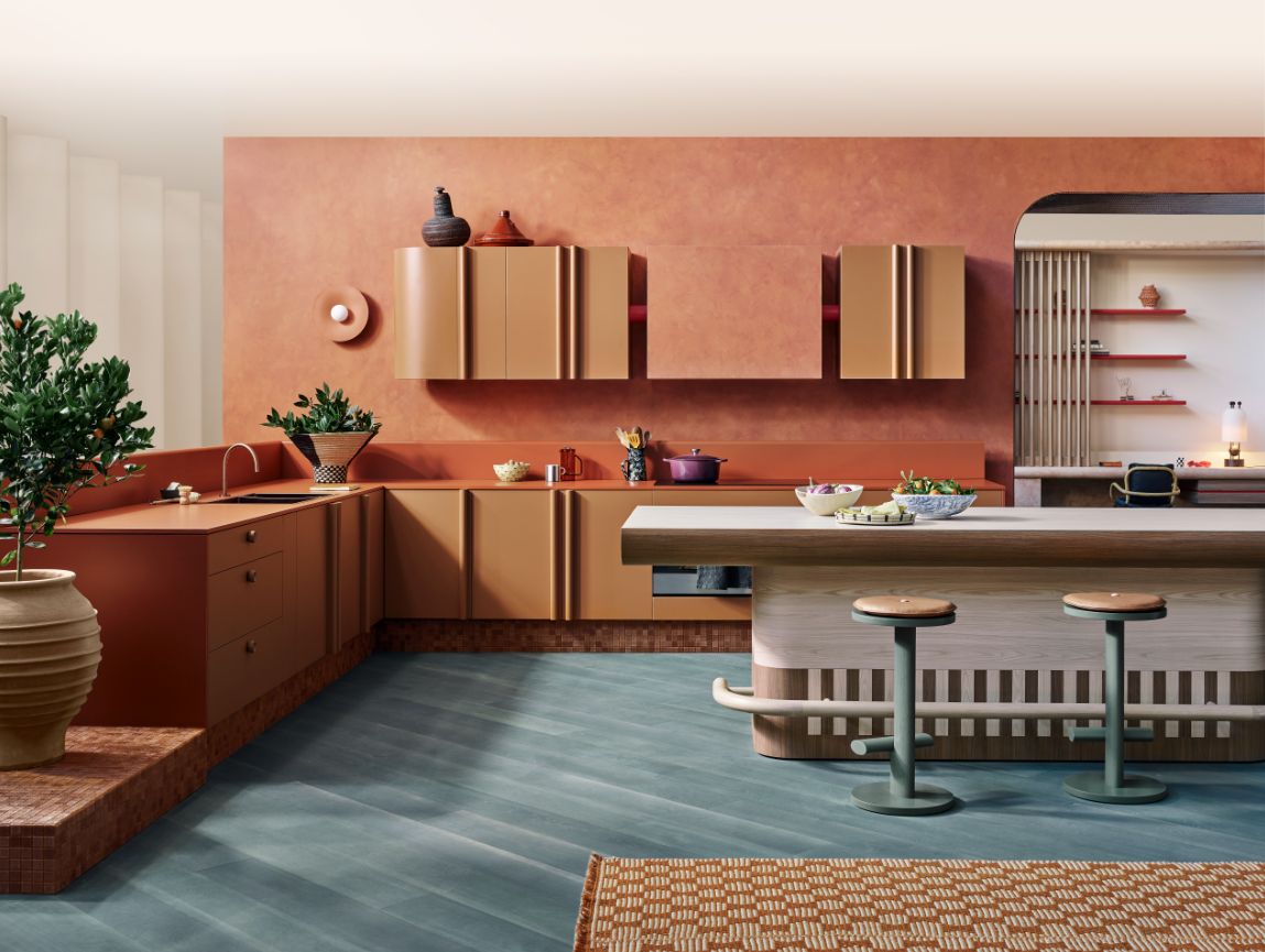
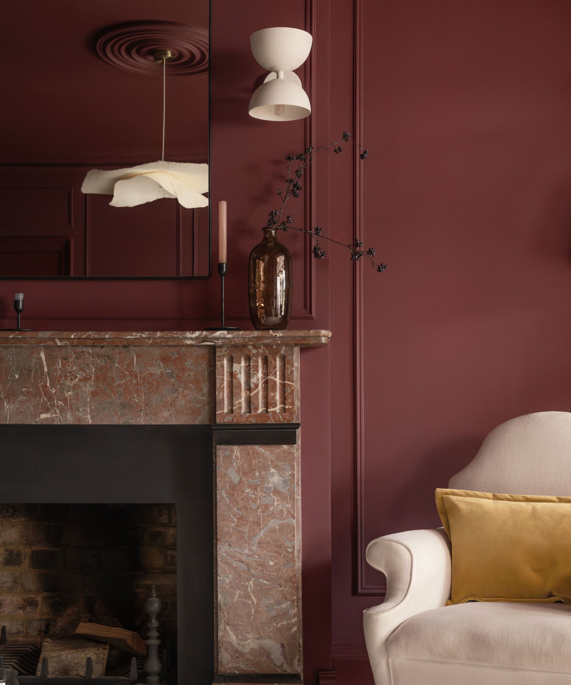
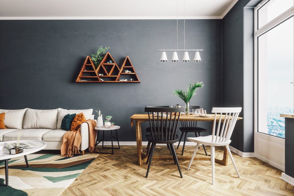
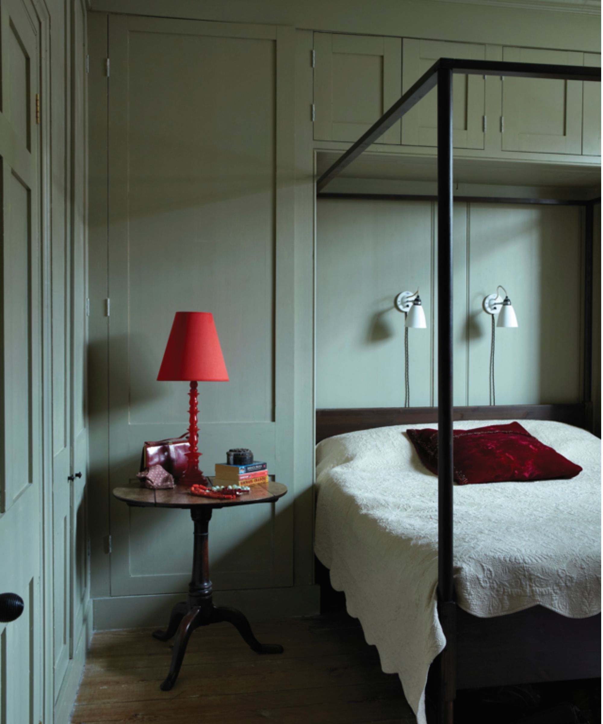
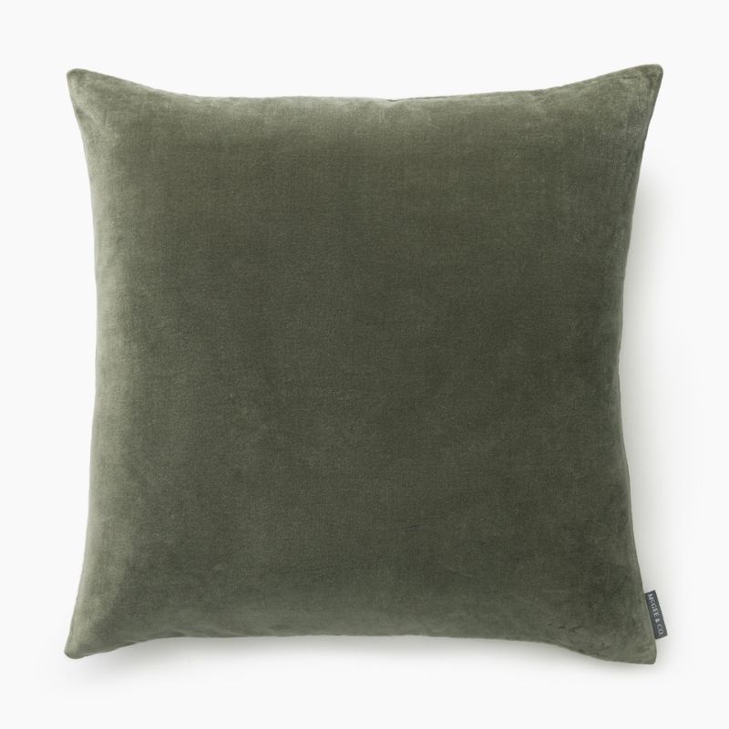
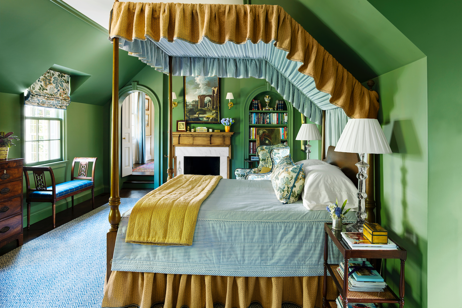
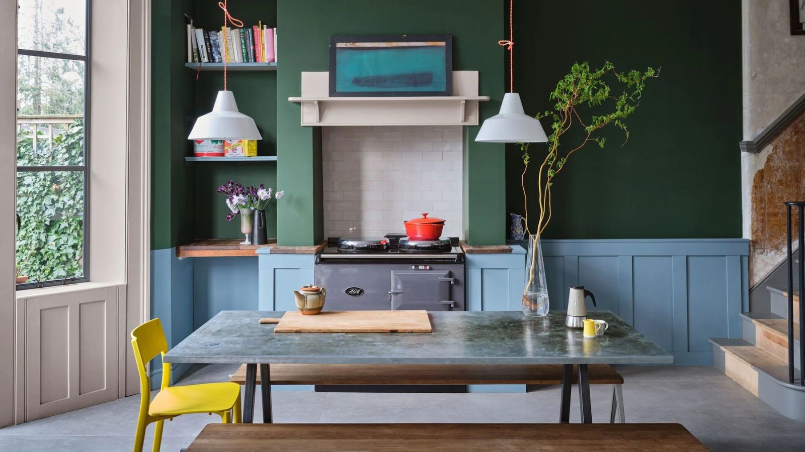
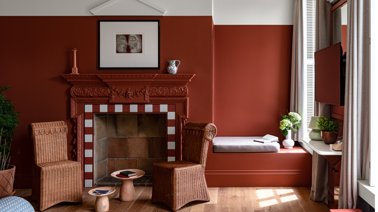
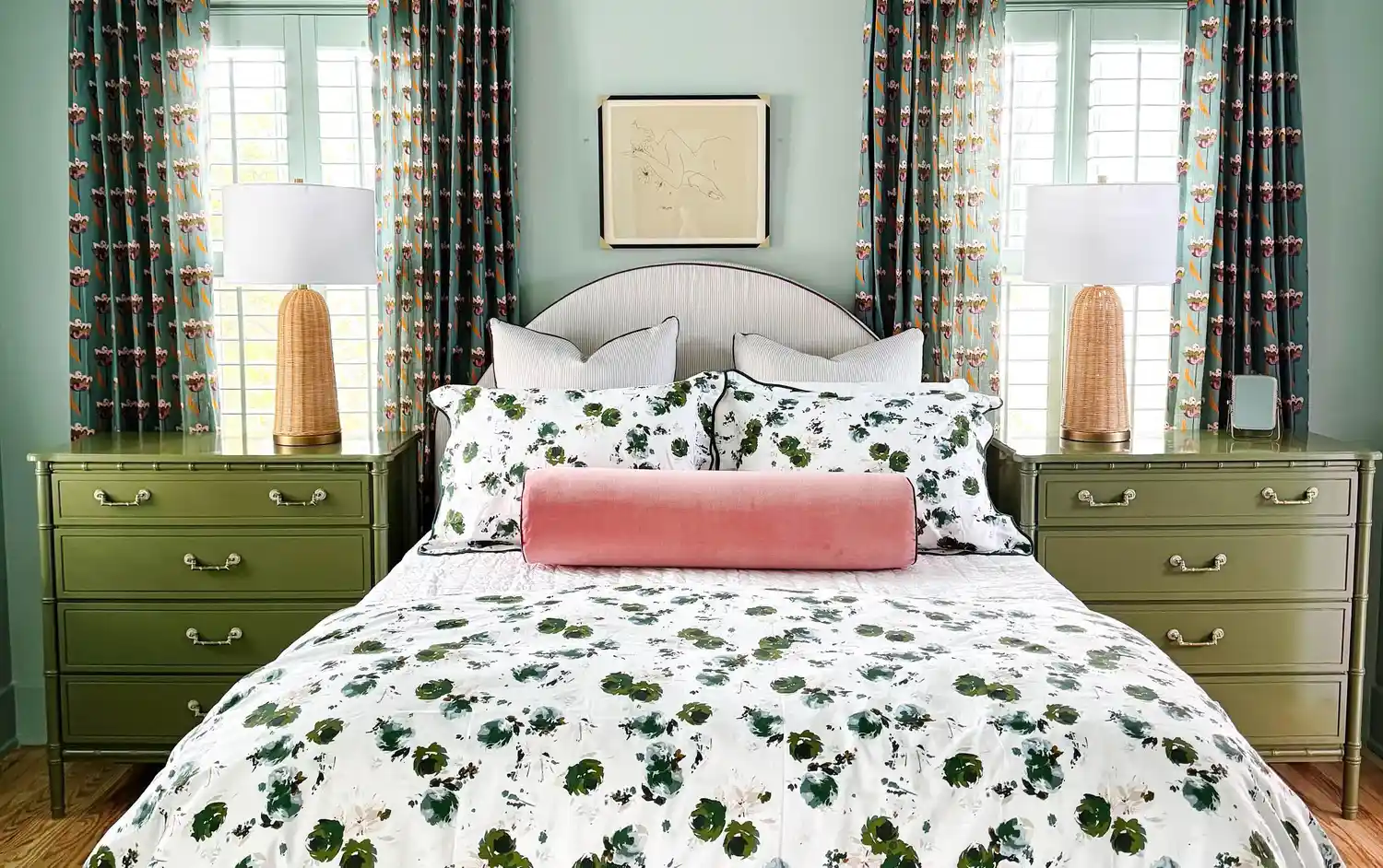
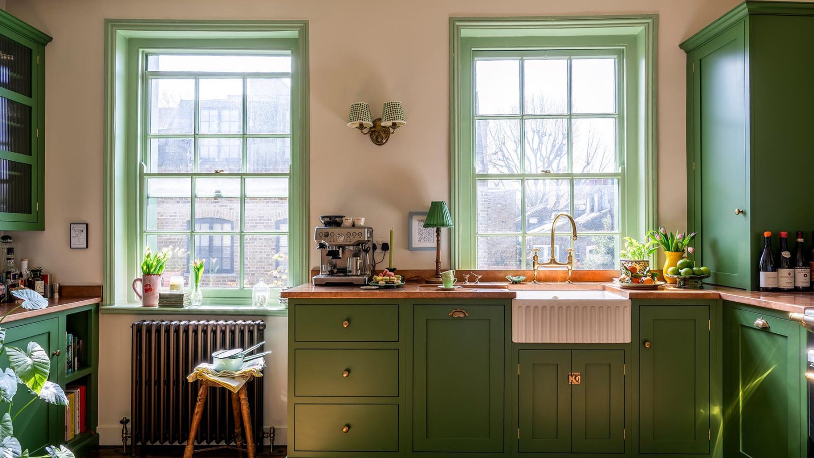
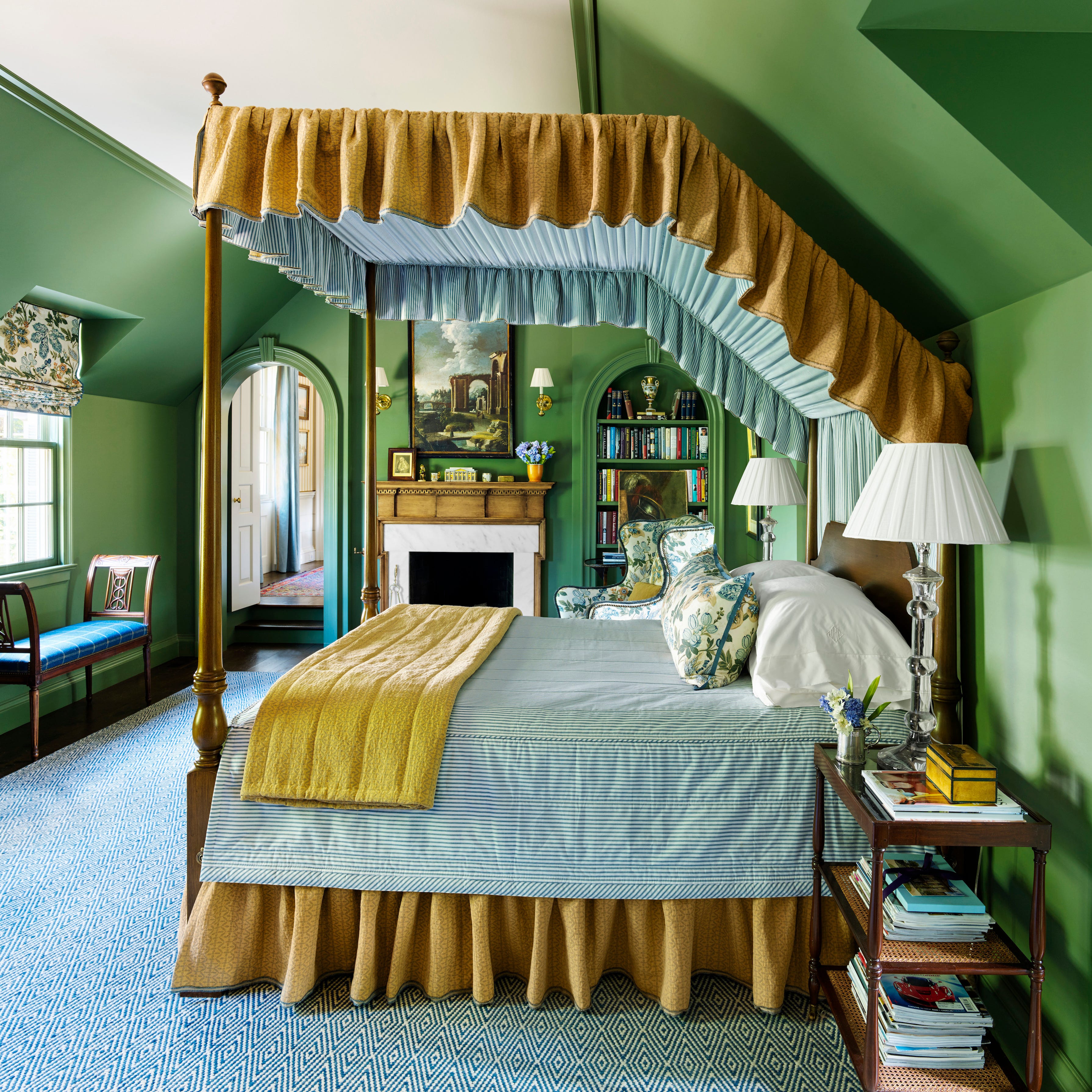
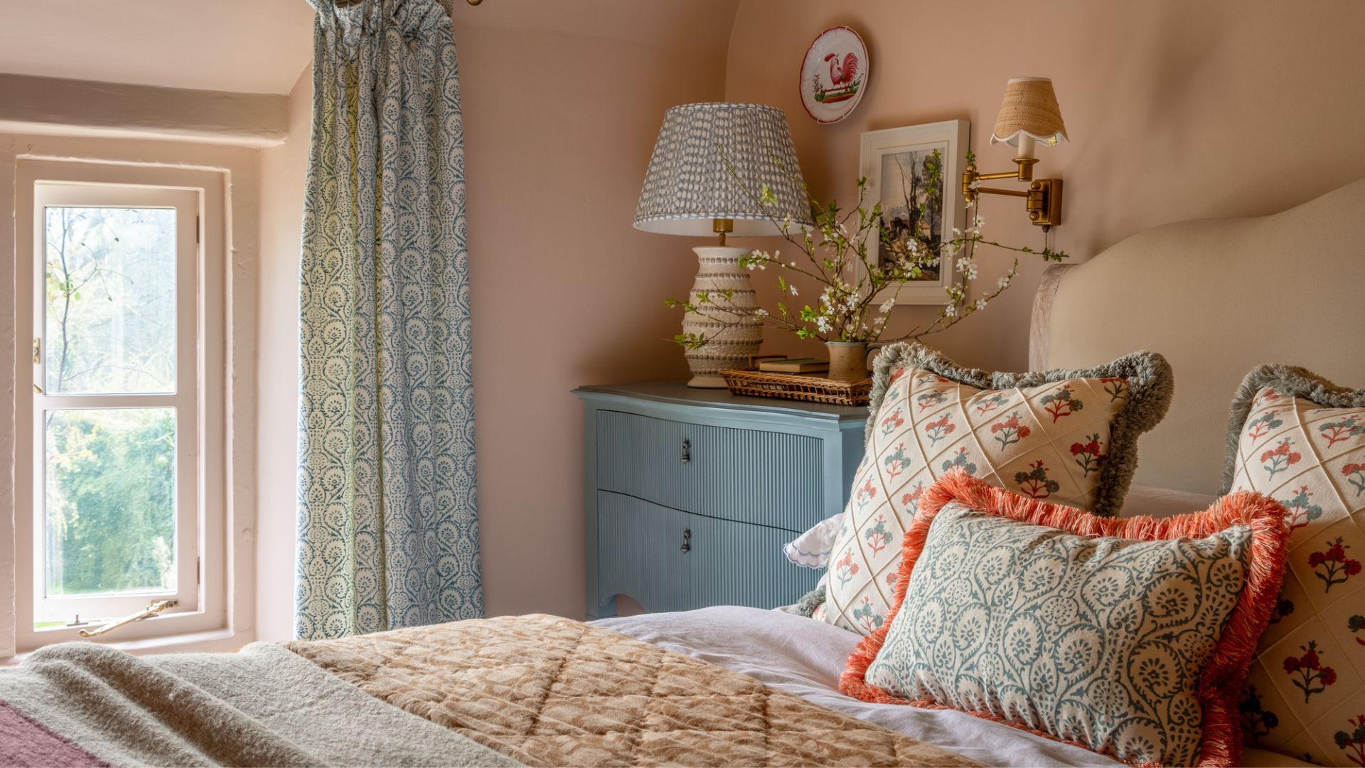
Next is terracotta, which evokes the warmth and Mediterranean feel of sunbaked earth. Jaime Zhener, an interior designer, highlights terracotta's grounding quality, describing it as both modern and timeless. Farrow & Ball's Jitney is a favored shade for its soft, sun-kissed depth, suitable for contemporary and traditional spaces. Red Earth by Farrow & Ball is also mentioned as an iconic choice that pairs well with natural materials like linen, stone, and wood, creating an inviting and calming atmosphere. Bottle green is presented as a distinctive and complex dark green, mirroring the intense verdancy of the natural world in June. Alex Keith of Otta Design suggests color-drenching rooms in bottle green for calmness and tranquility, comparing its depth to a deep lake. Abigail Ahern, known for her moody color use, emphasizes surrounding oneself with colors that reflect the landscape. Benjamin Moore's Hunter Green and Graham & Brown's Glasshouse are recommended for traditional interiors.
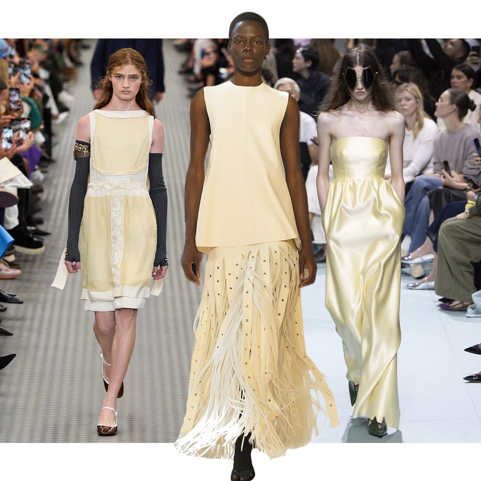
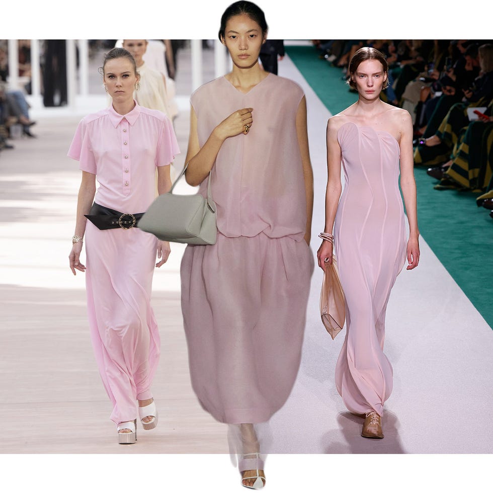
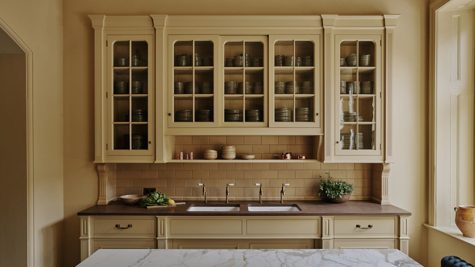
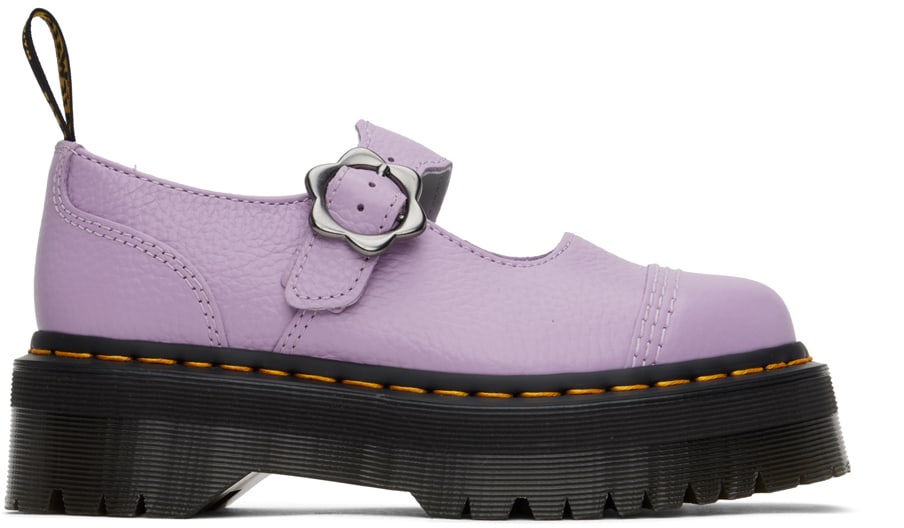
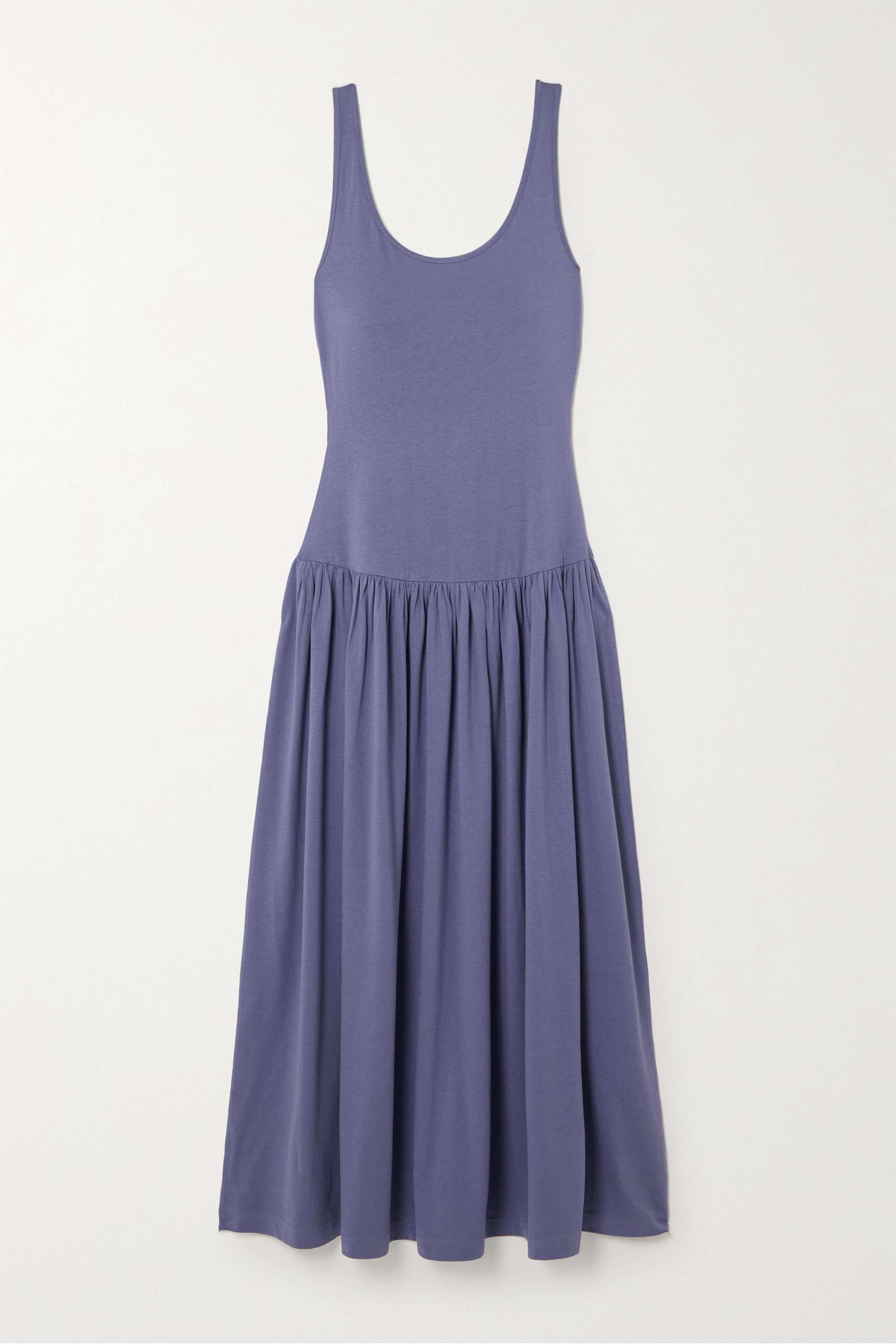
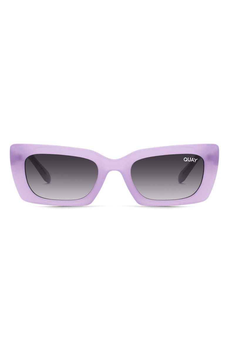
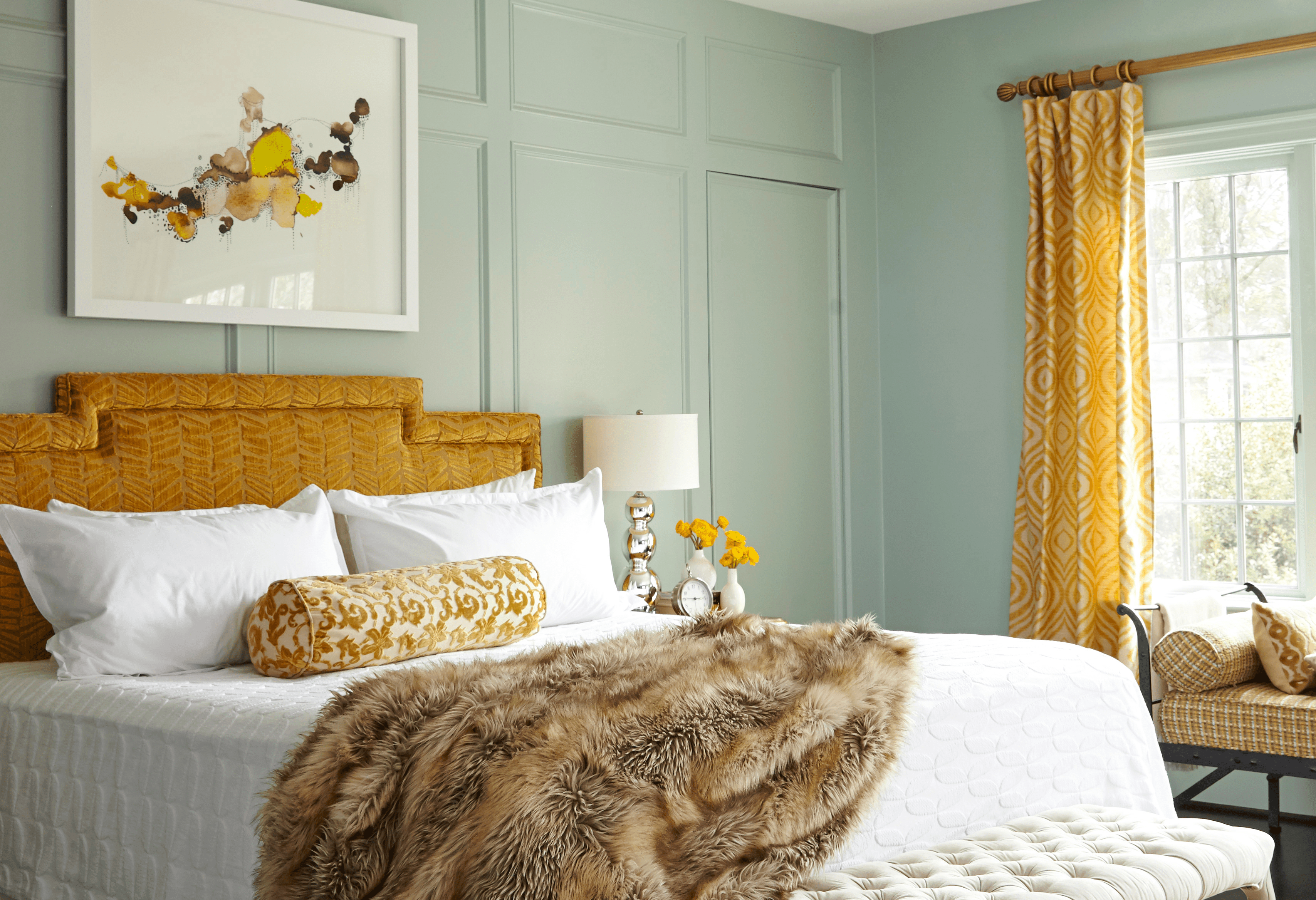
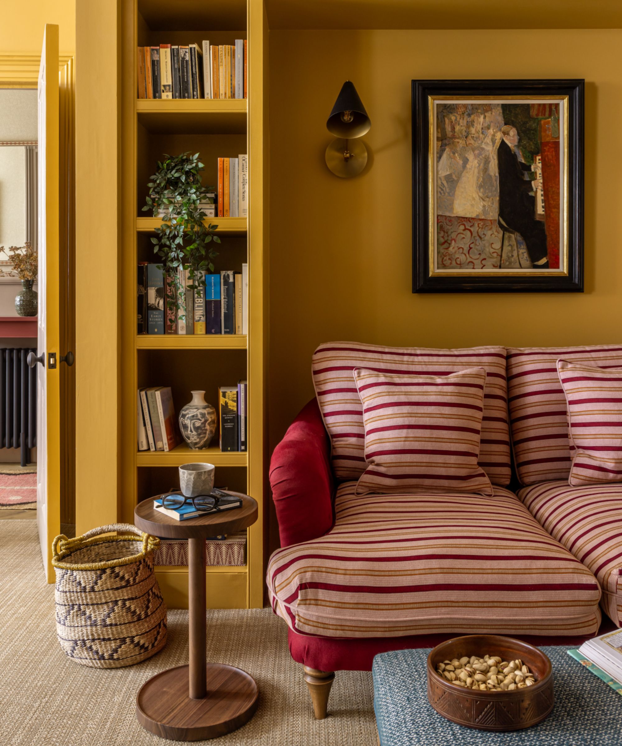
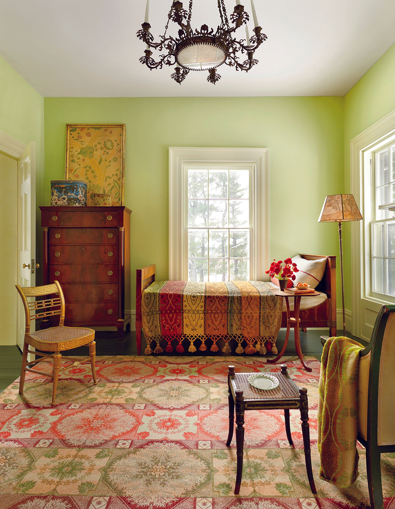
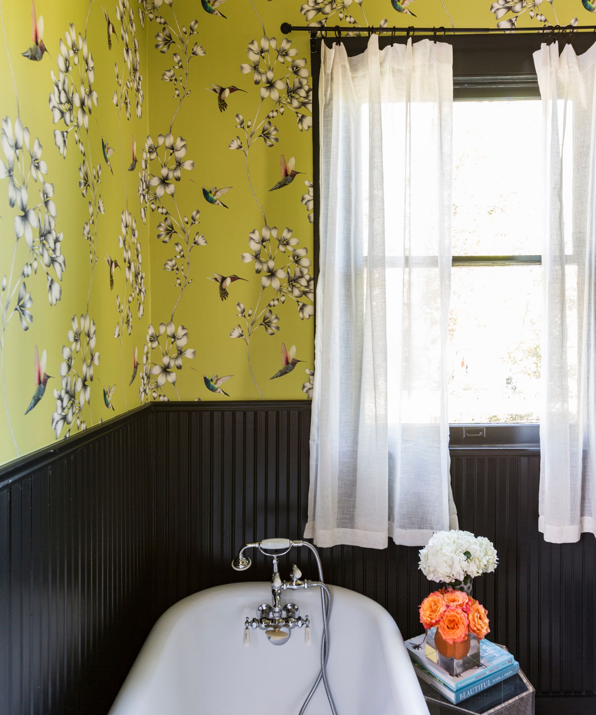
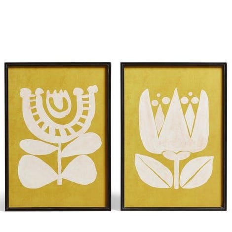
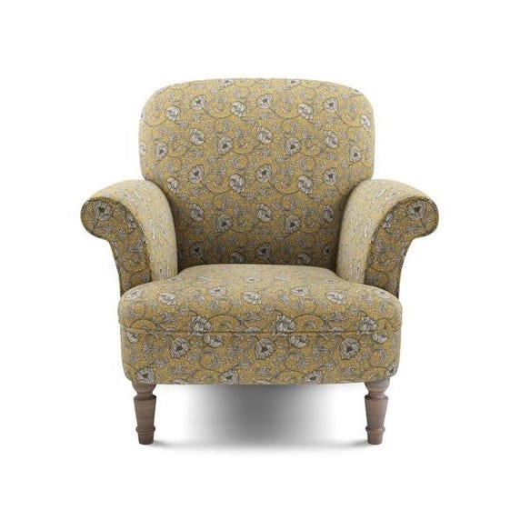
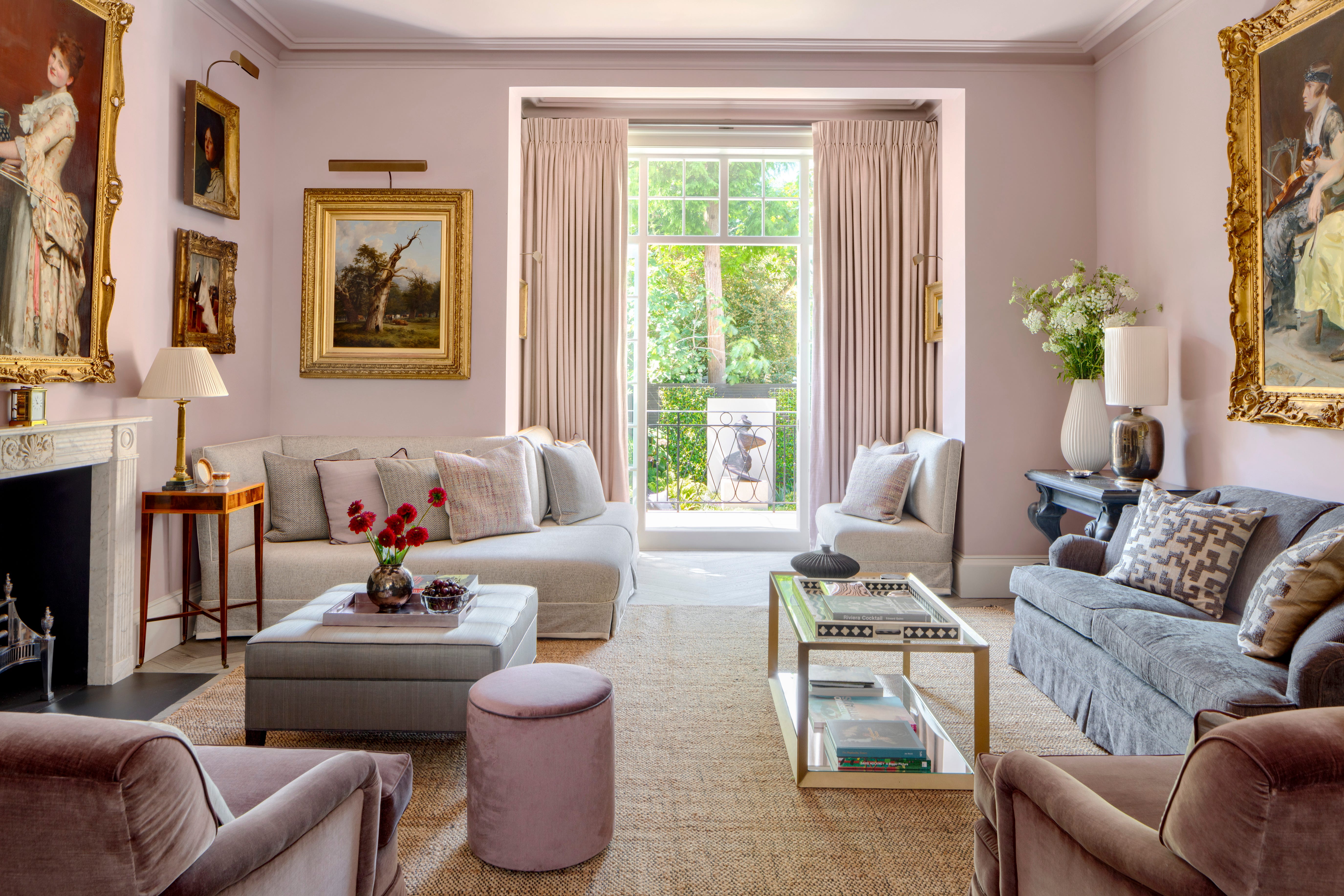
Lavender is introduced as a color experiencing a personality transformation, moving from a 90s throwback to a coveted hue. Muted, gentle lavender tones, with a mere suggestion of purple, can create a cool, breezy, soft, and elegant ambiance. Chloe Vince of House of Hackney advises finding the perfect shade to avoid decorating mishaps and suggests grounding lavender schemes with dusky pinks. Straw yellow follows, having evolved from a jolly but juvenile color to a prominent trend. Pale, hushed, golden-infused straw yellow, often seen in nature during summer, is recommended. Interior designer Beata Heuman used a soft straw yellow paint, Wheatsheaf by Mylands, in her London home as an atmospheric alternative to white. Other shades like Farrow & Ball's String and Benjamin Moore's Weston Flax offer a similar laidback appeal.
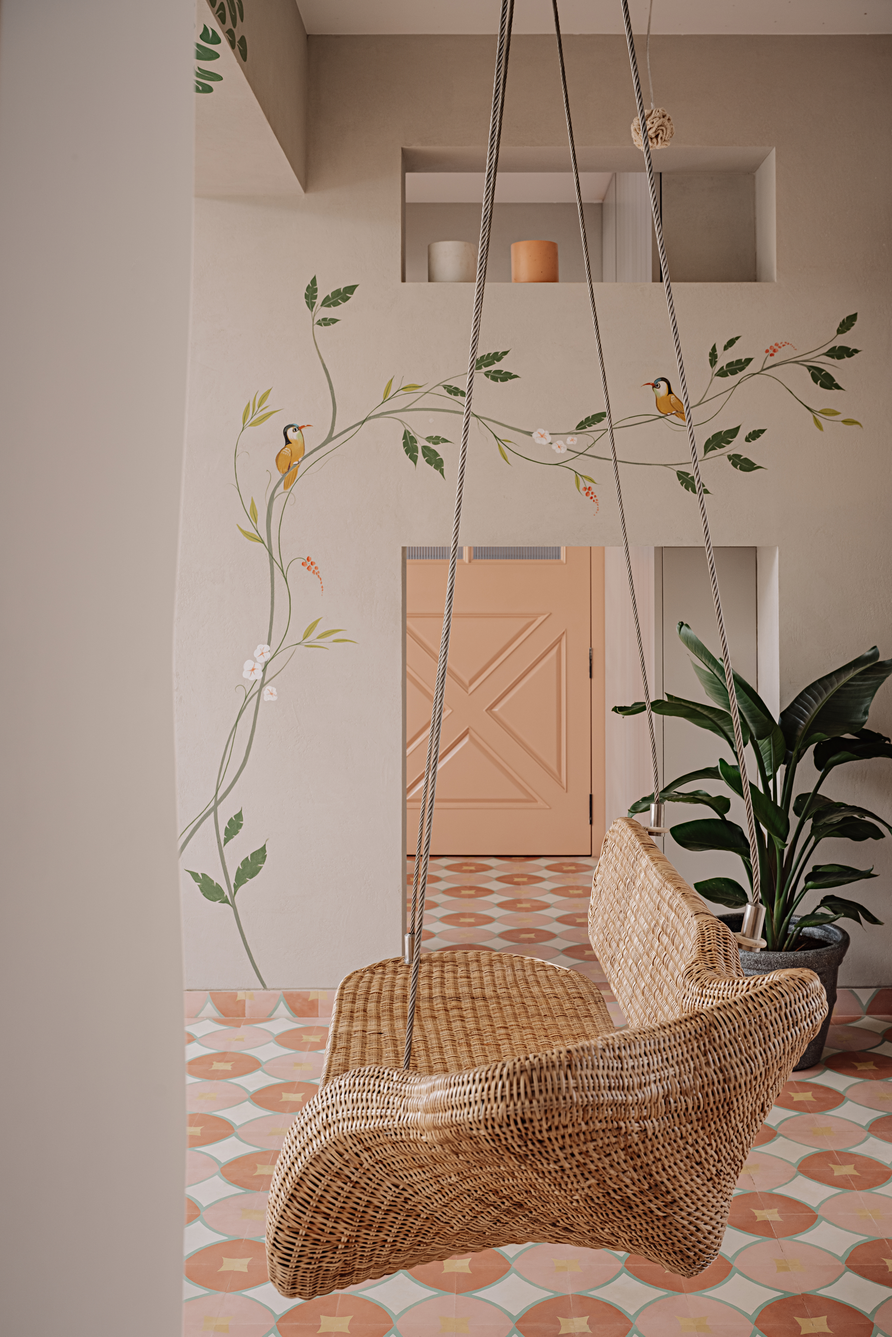
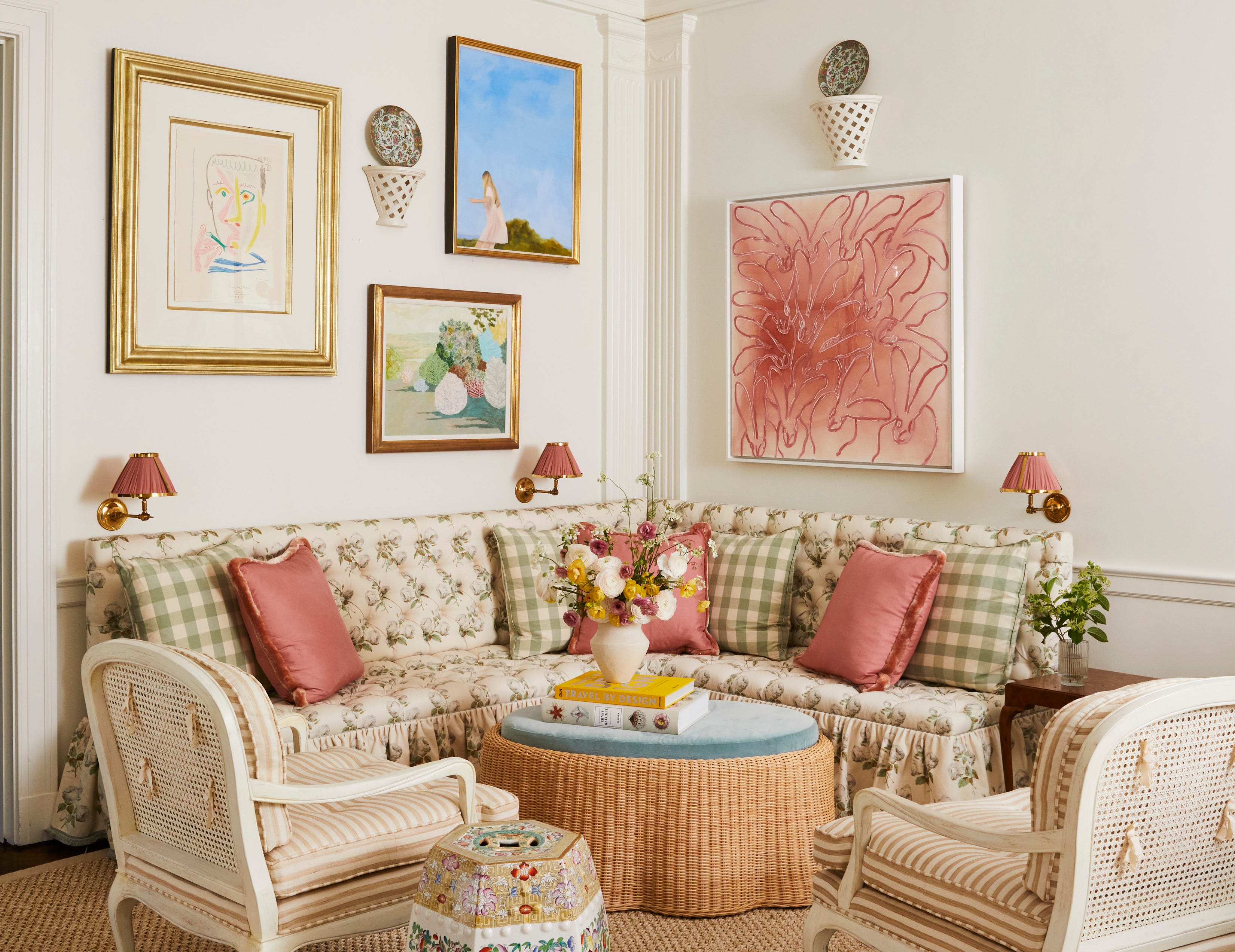
Finally, Barbie pink, defined by Pantone 219C, is highlighted as an outrageous and on-trend shade for high summer. This intensely pigmented fuchsia, or other bright, unabashed pinks, is presented as a powerful, energetic, and fierce color. Caroline Aston of House of Hackney advises using the color with intention, daring to be brave, and embracing its punch and vibrancy. She suggests using bright pink paint as an instant mood lifter in entryways and kitchens, pairing it with contrasting colors like chocolate browns or dark forest greens for a mature look, or softening it with warm neutrals. For spaces requiring calm, pink can be used as an accent. The article concludes by emphasizing that June's vivid colors offer an opportunity to rewild interiors and blend indoor and outdoor aesthetics, encouraging the use of high-contrast, playful colors for artistic, curated, and dynamic home designs.
#SummerColors #InteriorDesignTrends #PaintColors #HomeDecoration #ColorPsychology #TurquoiseDecor #TerracottaTones #BottleGreenInteriors #LavenderHues #StrawYellowPalette #BarbiePink #SummerColors #InteriorDesignTrends #PaintColors #HomeDecoration #ColorPsychology #TurquoiseDecor #TerracottaTones #BottleGreenInteriors #LavenderHues #StrawYellowPalette #BarbiePink
0 comment in total
 No comments yet
You may also like
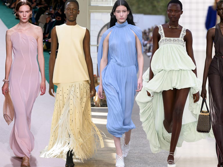
These Are the Top 6 Color Trends We’ll Be Sporting This Summer
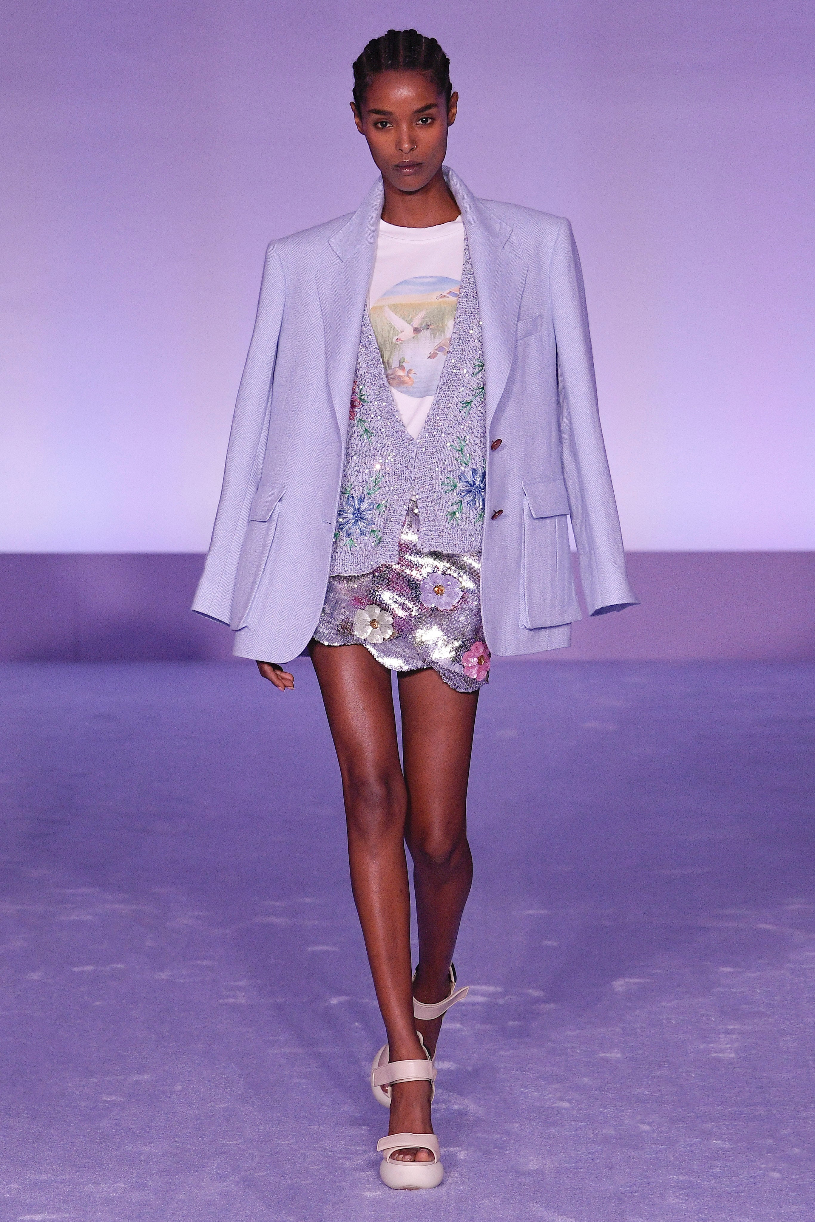
6 Fresh Color Trends To Inspire Your Summer 2023 Style

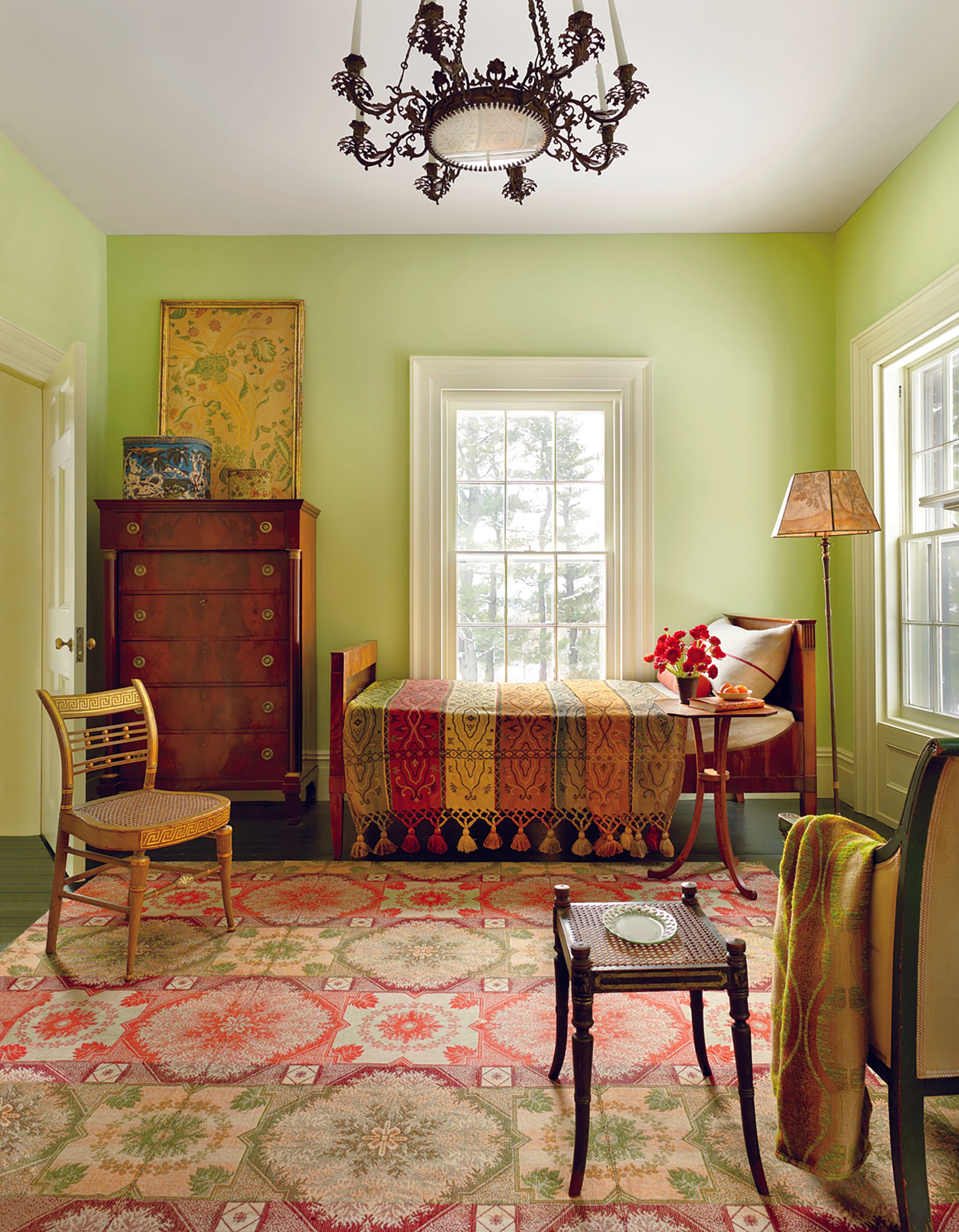
These Colors Will Be Everywhere in Interior Design in 2026
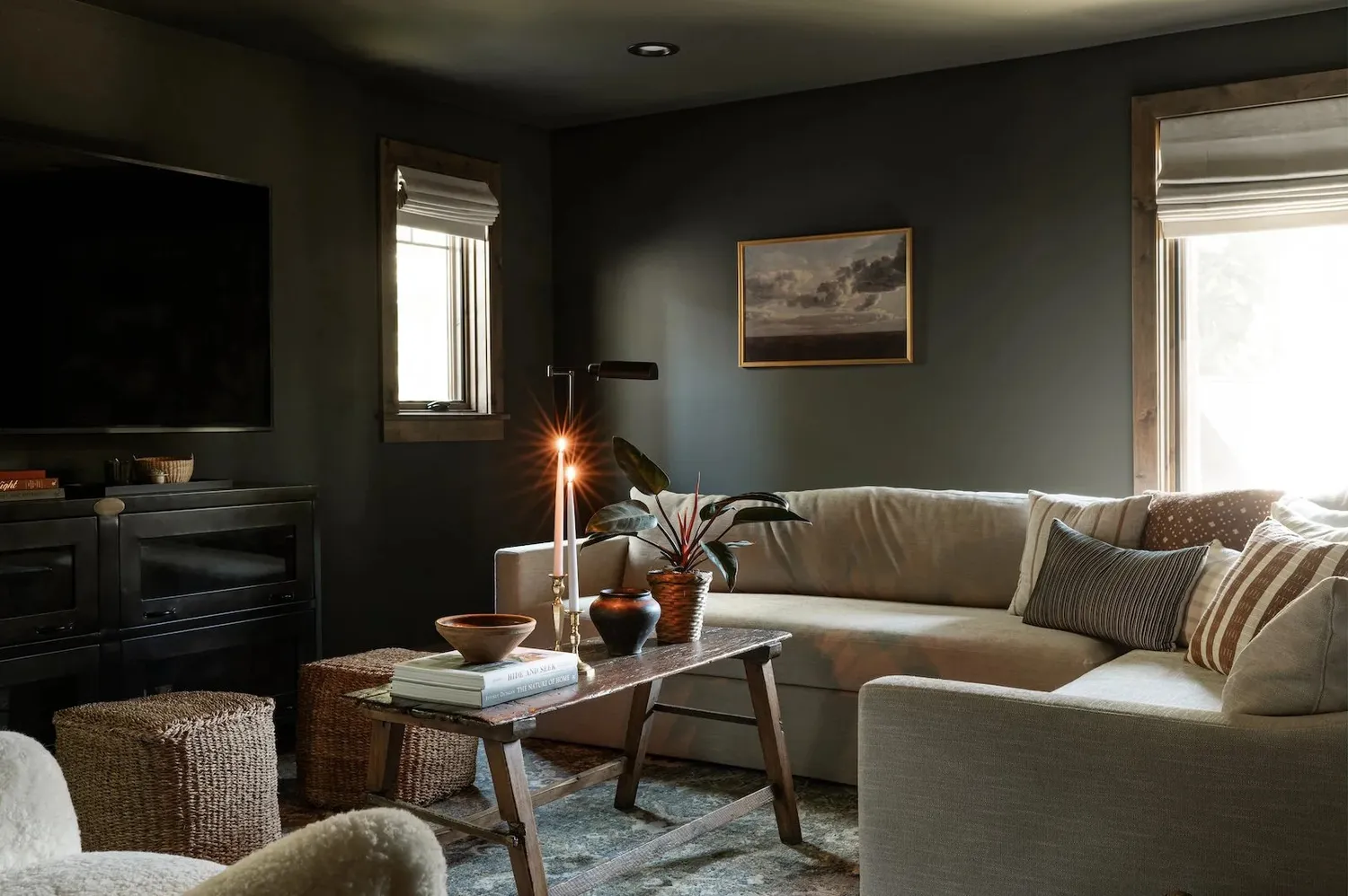
6 Living Room Paint Color Trends That Are Going to Take Over Walls in 2026


6 key colors to decorate with in May 2025, according to interior design and color experts in the know
6 'Energetic Colors' for Vitality and "Sophisticated Interiors", According To Psychologists And Design Experts

6 Feel-Good Paint Colors That Are Suddenly Everywhere This Summer
These 6 paint colours instantly make small rooms feel bigger
6 Kitchen Paint Color Trends That Are Already Taking Over Walls in 2026
6 Paint Colors That Add Positive Feng Shui to Every Room in Your Home

Colorful floors are the joyful design trend our homes need right now – here's how 6 designers embraced 6 different colors
7 Best Colors Designers Say You Should Use to Make Your Home Feel Fresh, Light and Spring-Ready
6 Gorgeous Home Color Trends That Aren't Just Neutrals

Summer color trends for 2025 – 8 bang on shades interior designers can't get enough of
These Are the Biggest Color Trends That You'll See Everywhere in Interiors Next Year, From Tranquil Teal to Rich Plum
These 8 Colors Will Rule Interiors in 2026, According to Experts

These are the 6 must-have colors to decorate with in April 2025

These 6 Colors Will Rule Interiors in 2026, According to Experts

6 Paint Colors That Will Make Your House Sell for More Money

16 Yellow Color Schemes to Refresh Every Room in Your House