6 Feel-Good Paint Colors That Are Suddenly Everywhere This Summer
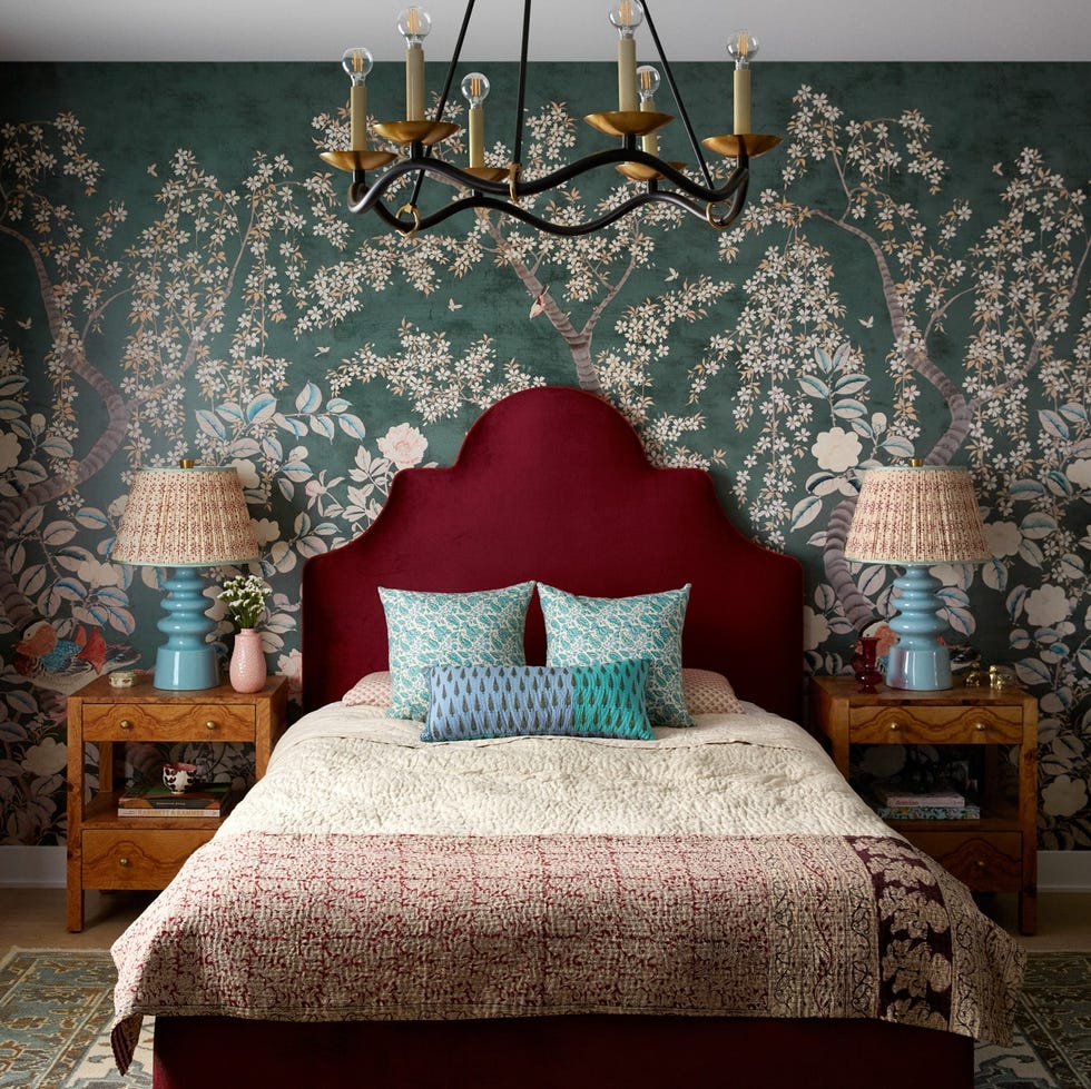
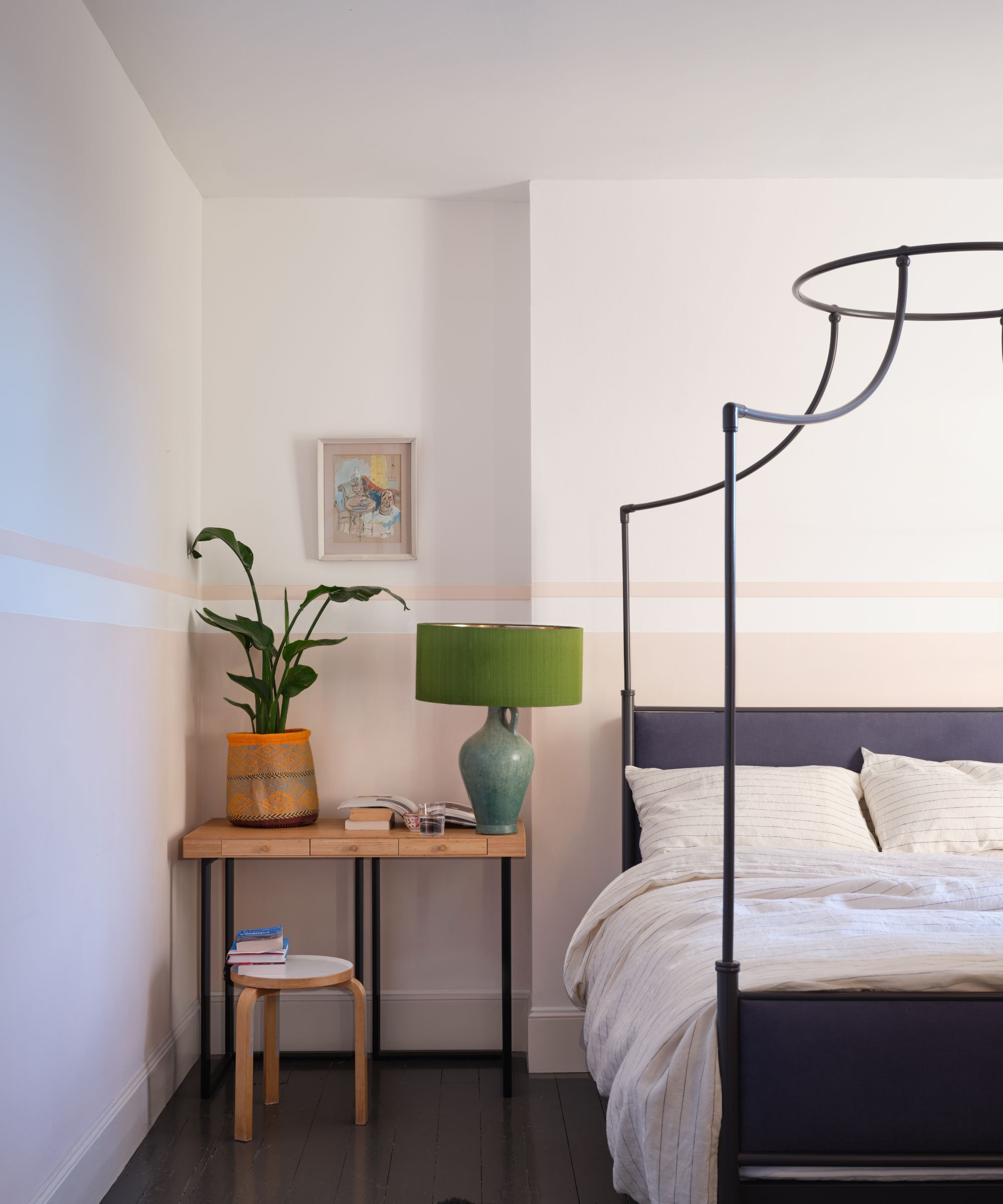
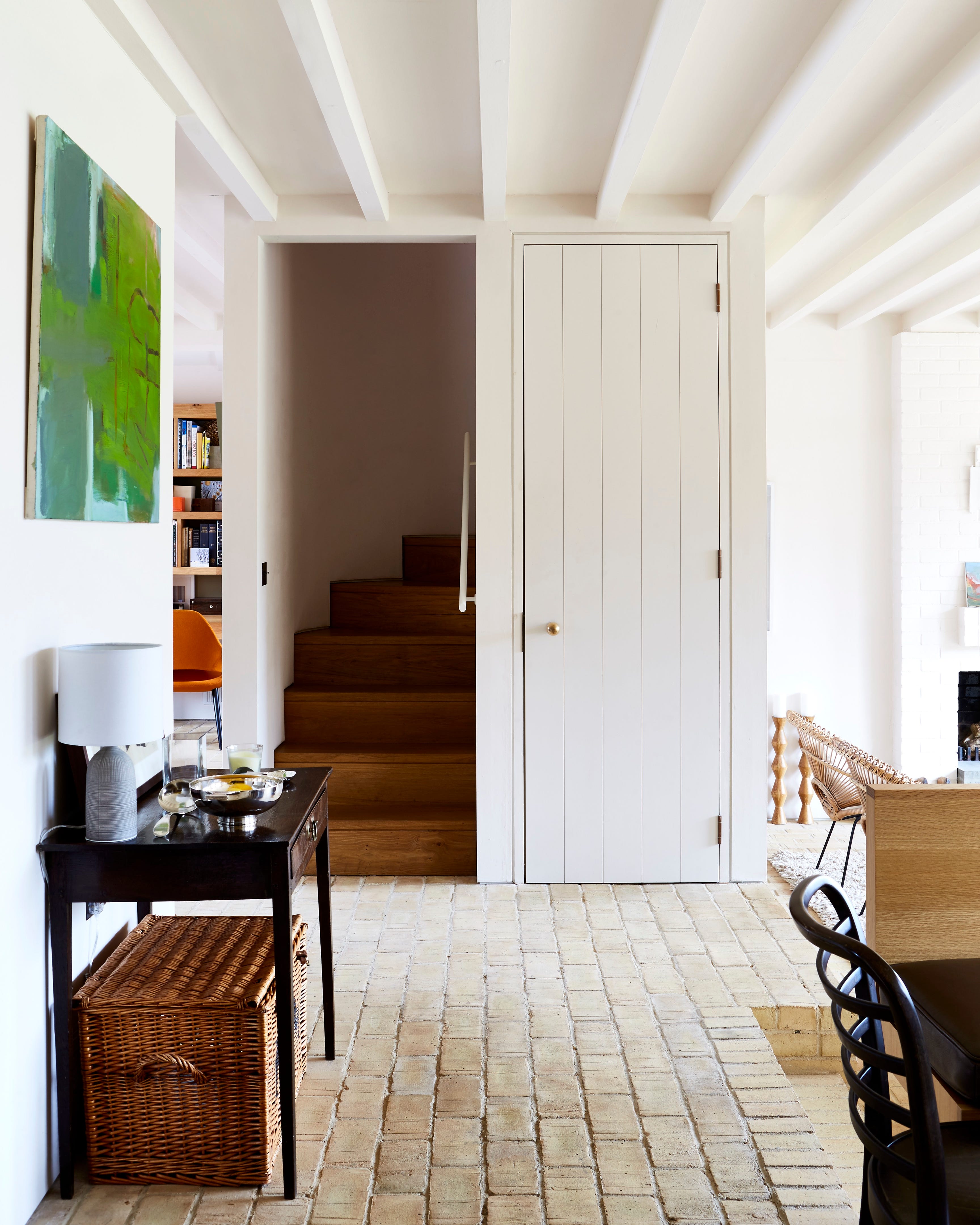
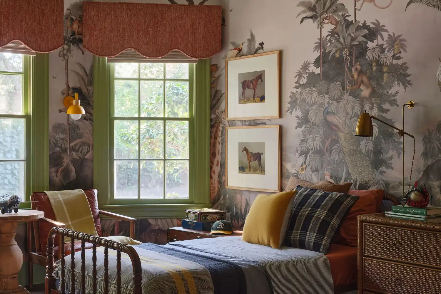
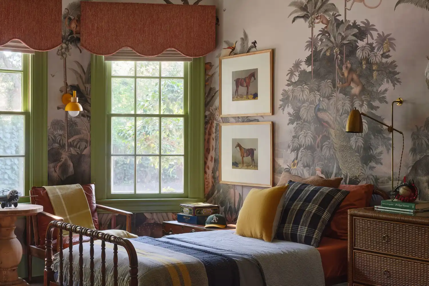
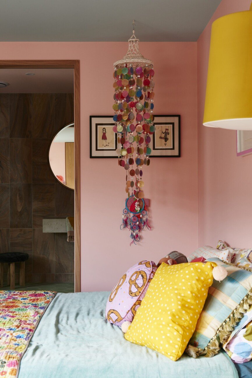
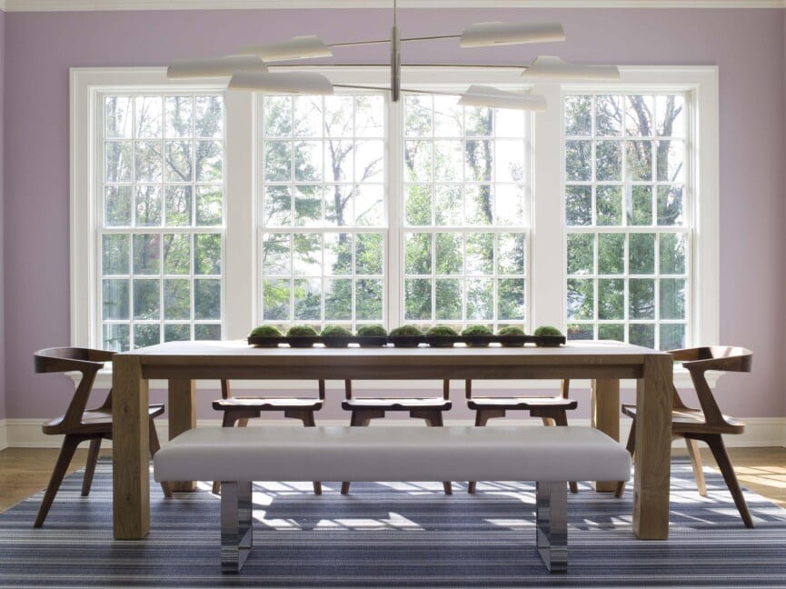
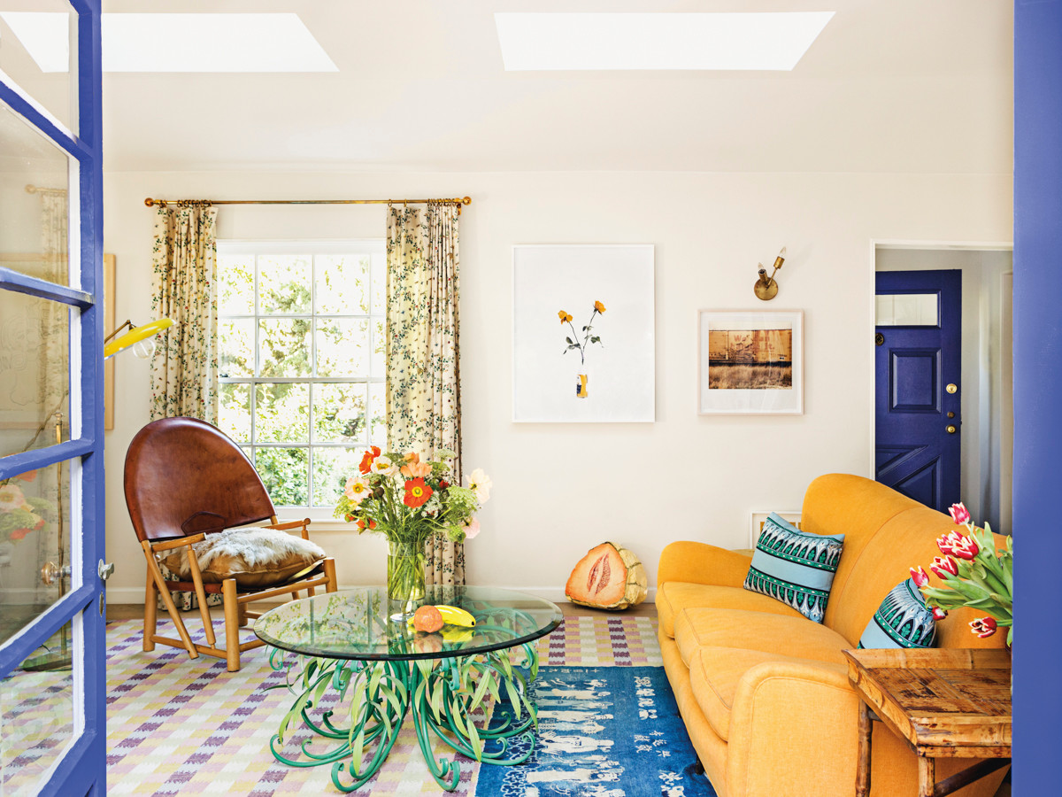
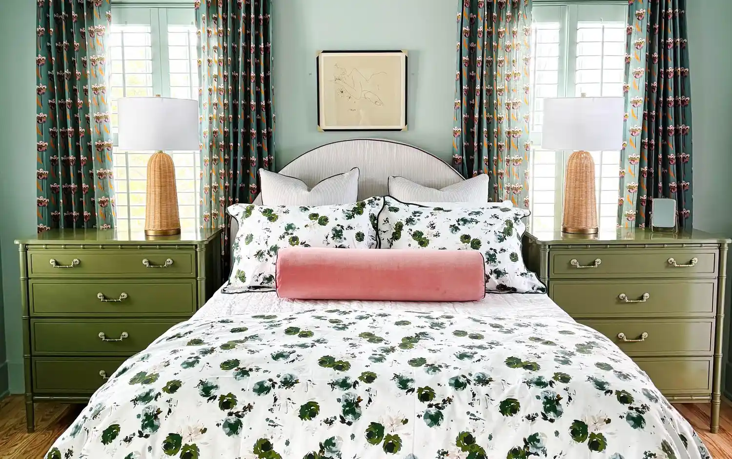
The article highlights a shift in interior design trends, moving away from neutral tones towards vibrant, bold paint colors. This change is attributed to a desire for more lively and expressive home environments, possibly influenced by a psychological phenomenon known as the “lipstick effect,” where individuals opt for smaller, impactful purchases like paint during uncertain economic times. Interior designers Monica Guarnaschelli of Indigo Mavens, Gray Benko and Chelcie Eastman of Gray Benko Home, and Chandler Hammons of Chandler Helms Designs, observe this trend and offer insights into integrating these bright hues into homes.
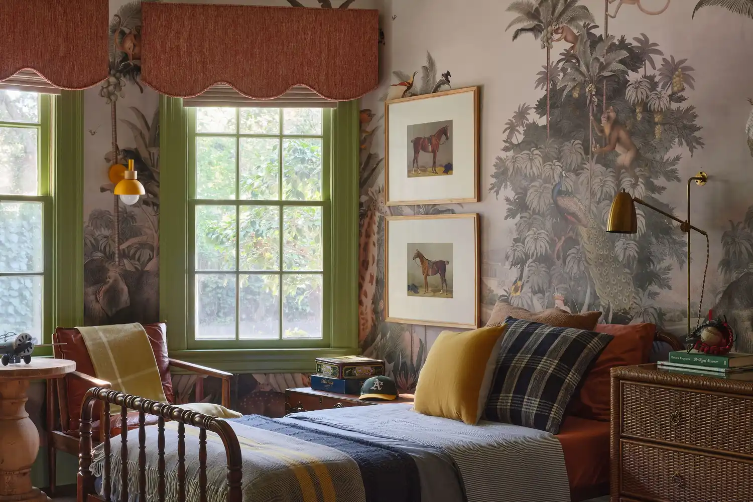
For those hesitant to embrace bold colors fully, the designers suggest starting with smaller applications, such as painting the inside of cabinetry or a closet. This approach allows for experimentation and adds a unique touch without overwhelming a space. The summer season, with its long days and relaxed atmosphere, naturally inspires a preference for colors that evoke happiness and vibrancy, aligning with the current trend of using bright blues and greens.
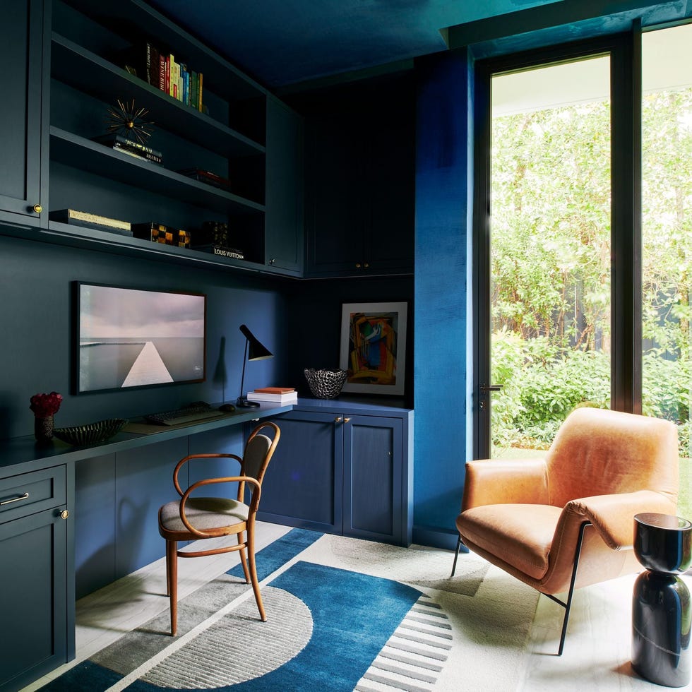
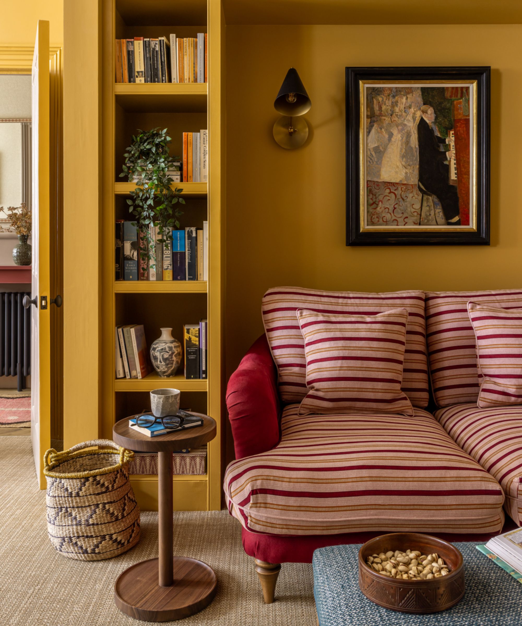
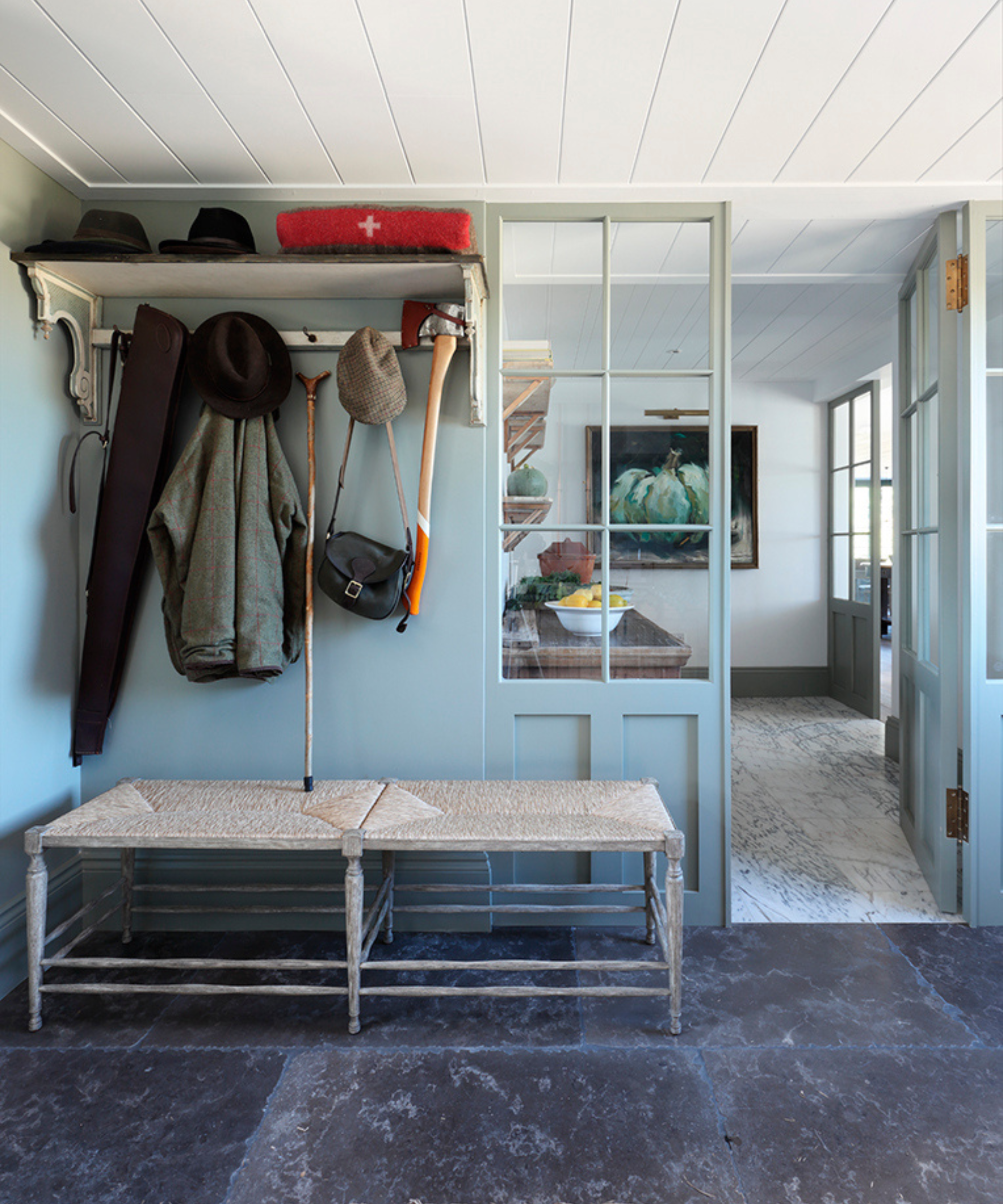
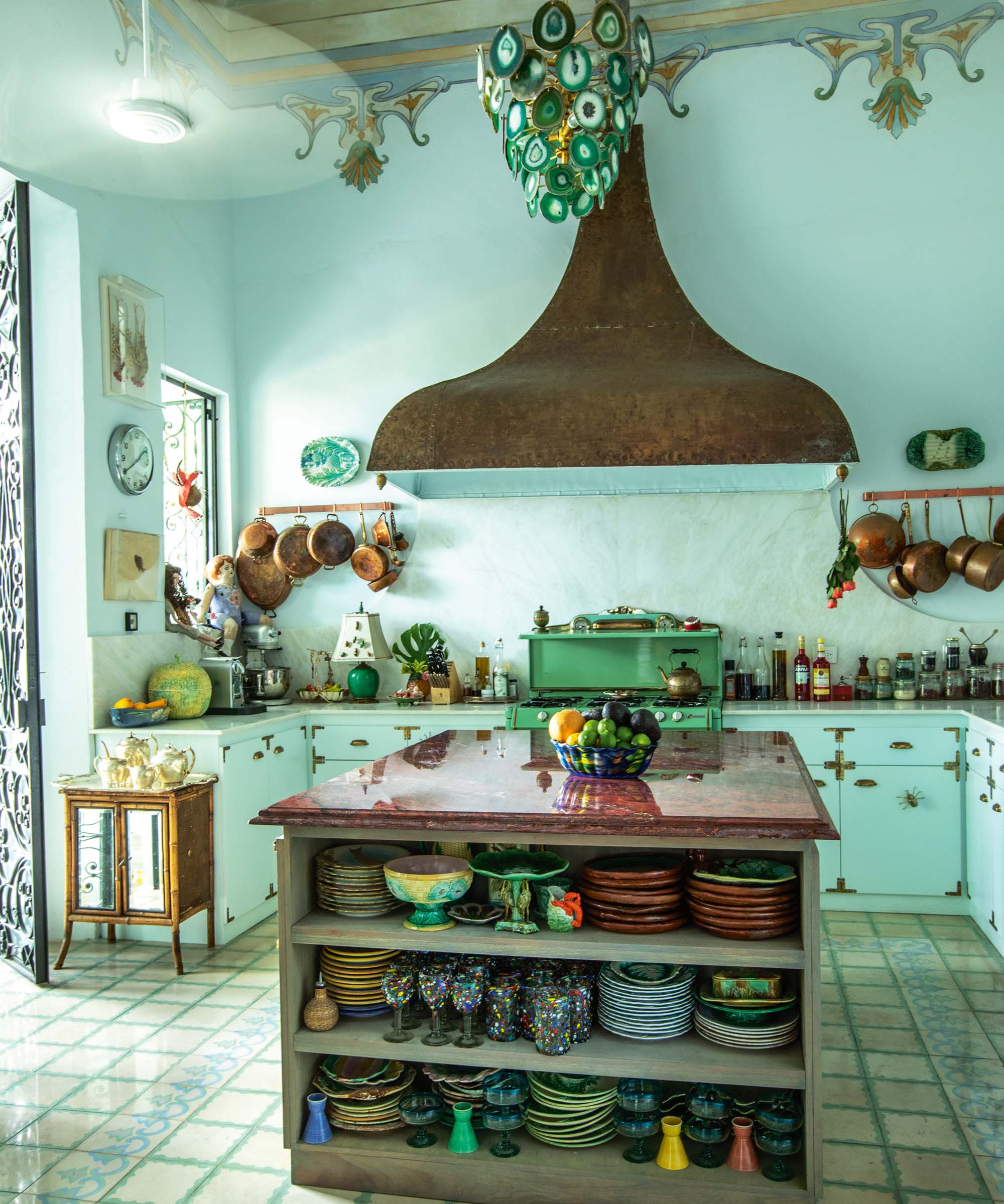
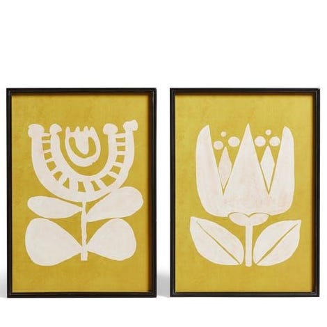
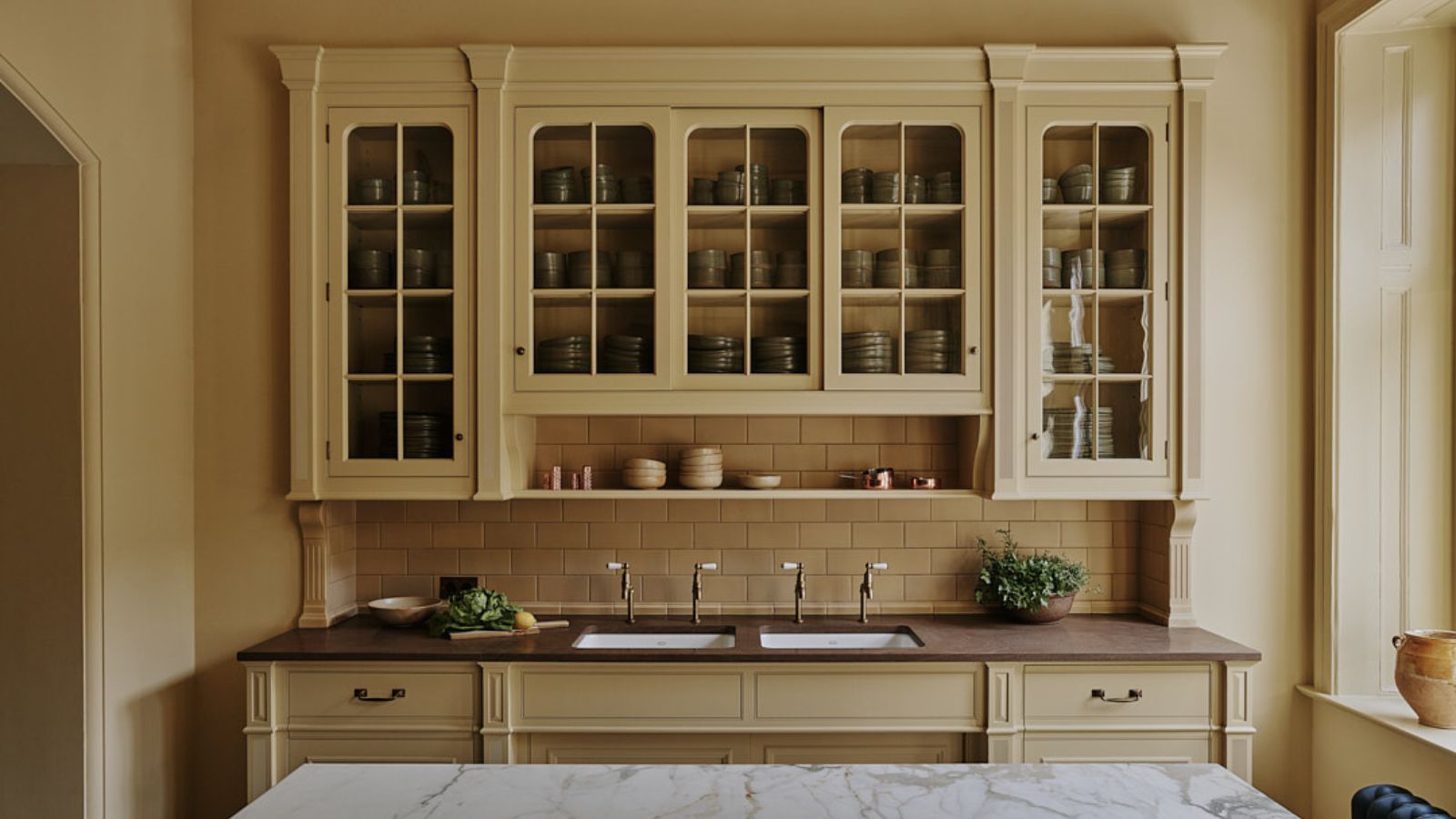
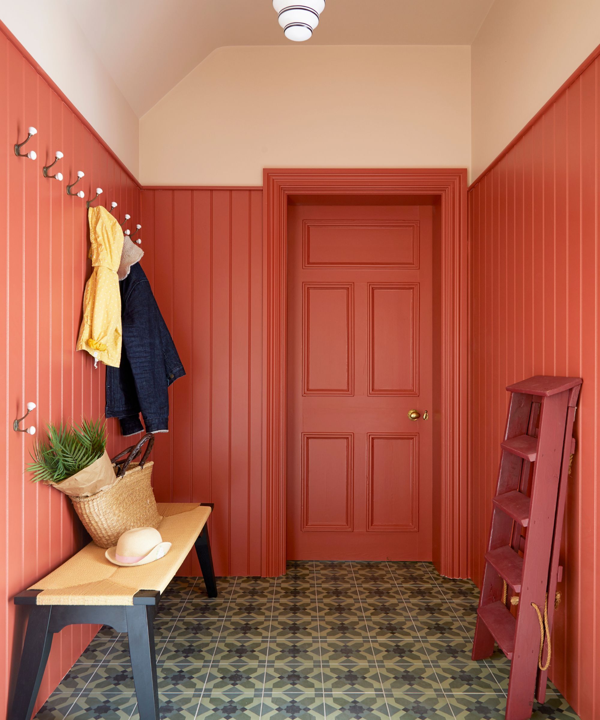
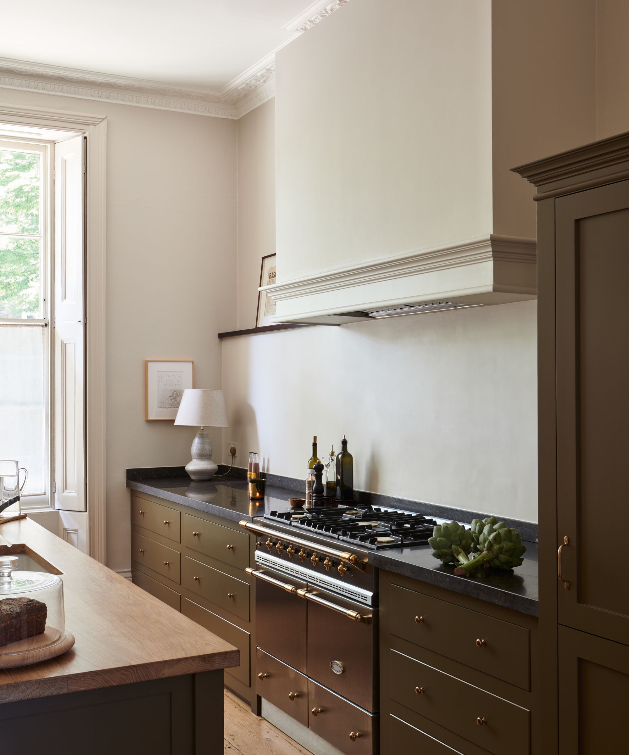
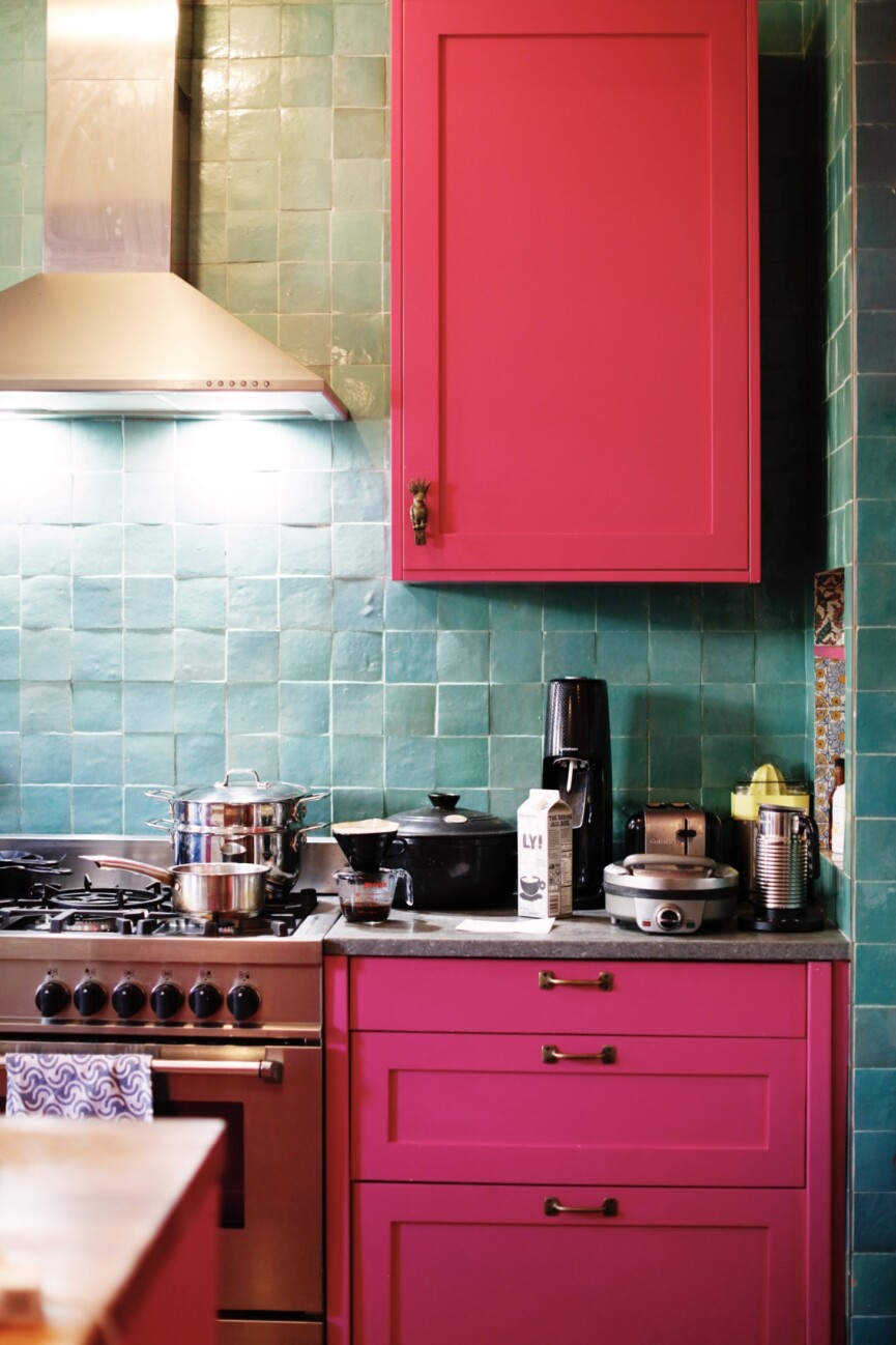
The article provides specific recommendations for six feel-good paint colors that are gaining popularity. Sherwin-Williams' Raging Sea (6474), a versatile teal, is noted for its depth and vibrancy, suitable for both historic and modern settings, especially when used for color-drenching with a glossy finish. Farrow & Ball's Sudbury Yellow (51) is recognized as a trendy summer shade with golden undertones, recommended for doors and trim to introduce warmth and personality. Farrow & Ball's Blue Ground (210) is described as a fresh and joyful blue, ideal for creating charming accents like a colorful kitchen door.
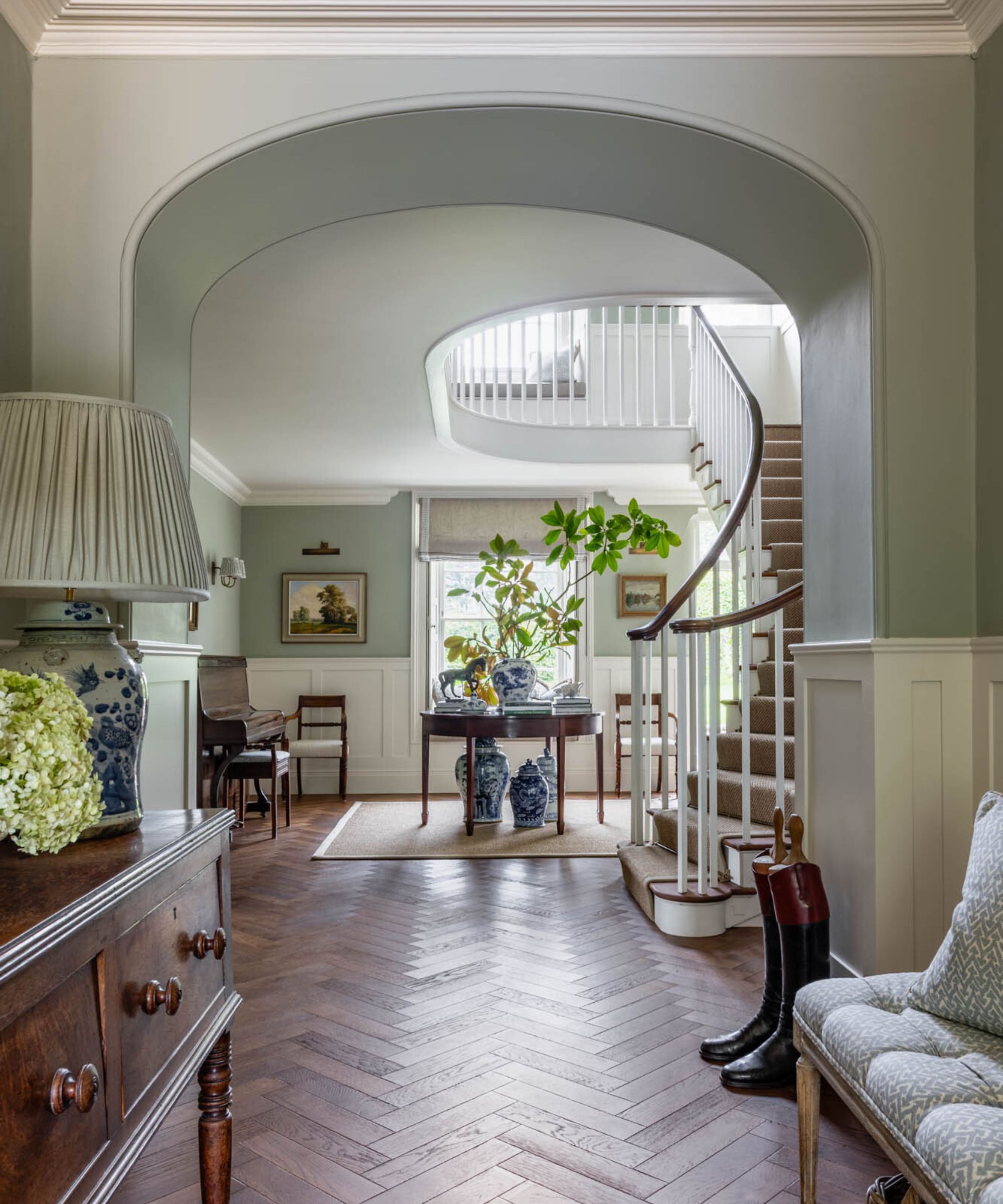
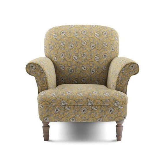
Benjamin Moore's Golden Delicious (390) is presented as a sophisticated citron that transforms from an intimidating swatch into a striking wall color when paired with natural light and neutral furnishings. Farrow & Ball's Green Blue (84) is a dynamic shade that shifts between green and blue depending on the light, making it a favorite for color-drenching walls and trim, and can act as a neutral when combined with appropriate decor. Lastly, Farrow & Ball's Arsenic (214), a minty fresh hue, is suggested for floors to add subtle energy without overpowering a room.
#InteriorDesign #PaintColors #HomeDecor #ColorTrends #SummerDecor #DesignTips #FarrowAndBall #SherwinWilliams #BenjaminMoore #InteriorDesign #PaintColors #HomeDecor #ColorTrends #SummerDecor #DesignTips #FarrowAndBall #SherwinWilliams #BenjaminMoore
0 comment in total
 No comments yet
You may also like
These Are the Top 6 Color Trends We’ll Be Sporting This Summer
6 Fresh Color Trends To Inspire Your Summer 2023 Style

These 6 paint colours instantly make small rooms feel bigger
6 Earthy Paint Colors That'll Make Any Room Feel Cozy and Relaxed

Designers Predict These Color Combinations Will Be EVERYWHERE This Summer

The colour trend taking over our gardens for summer holiday vibes all year round
7 Spring Paint Colors to Freshen Up Your Space, According to Designers
These are the 6 must-have colors to decorate with in April 2025

Summer color trends for 2025 – 8 bang on shades interior designers can't get enough of
These Will Be the Hottest Paint Colors for Summer 2025, Designers Predict
6 Paint Color Duos Designers Can't Get Enough of This Fall
The Brighter, the Better—These Vibrant Paints Will Infuse Your Home With Positivity

6 Gorgeous Home Color Trends That Aren't Just Neutrals

6 calming and cozy paint colors from Farrow & Ball

4 Interior Designers Share the Biggest Paint Color Trends Right Now (and What’s Out!)

The Color Combo You’re About to See Everywhere
The 6 must-have colors to bring into your home this June
7 Colors Designers are Painting Outdoor Furniture in 2024

Unexpected Color Combinations Trend Spring/Summer 2026

The 18 Most Popular Paint Colors of All Time