7 Spring Paint Colors to Freshen Up Your Space, According to Designers
As the seasons change, bringing warmer weather and renewed energy, updating a home’s aesthetic with a fresh coat of paint offers an accessible and cost-effective way to revitalize living spaces. Paint is often considered the easiest and most economical method to achieve a significant “before and after” transformation, whether applied to an entire room, an accent wall, or even individual pieces of furniture or cabinetry. This article explores a selection of spring-appropriate paint colors recommended by interior designers, emphasizing hues that are not only on-trend for the current season but also possess a timeless quality that will endure beyond it.
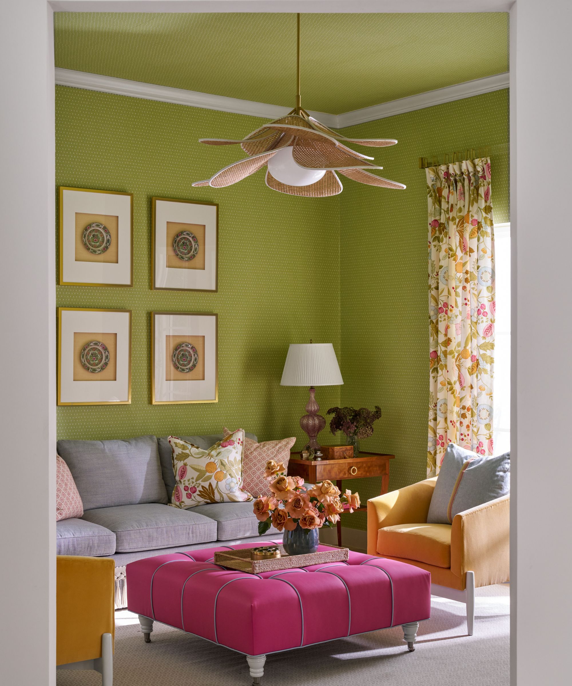
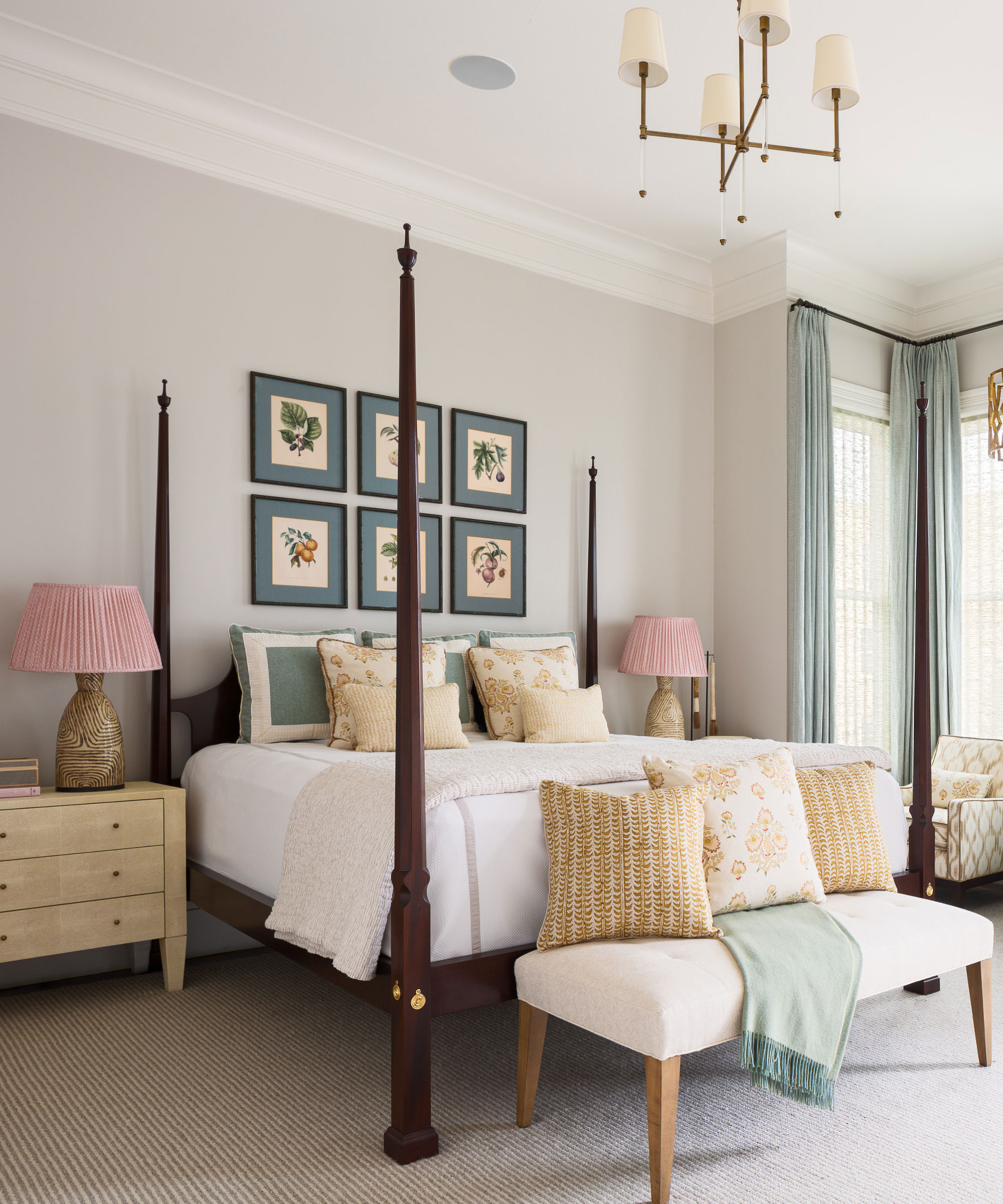
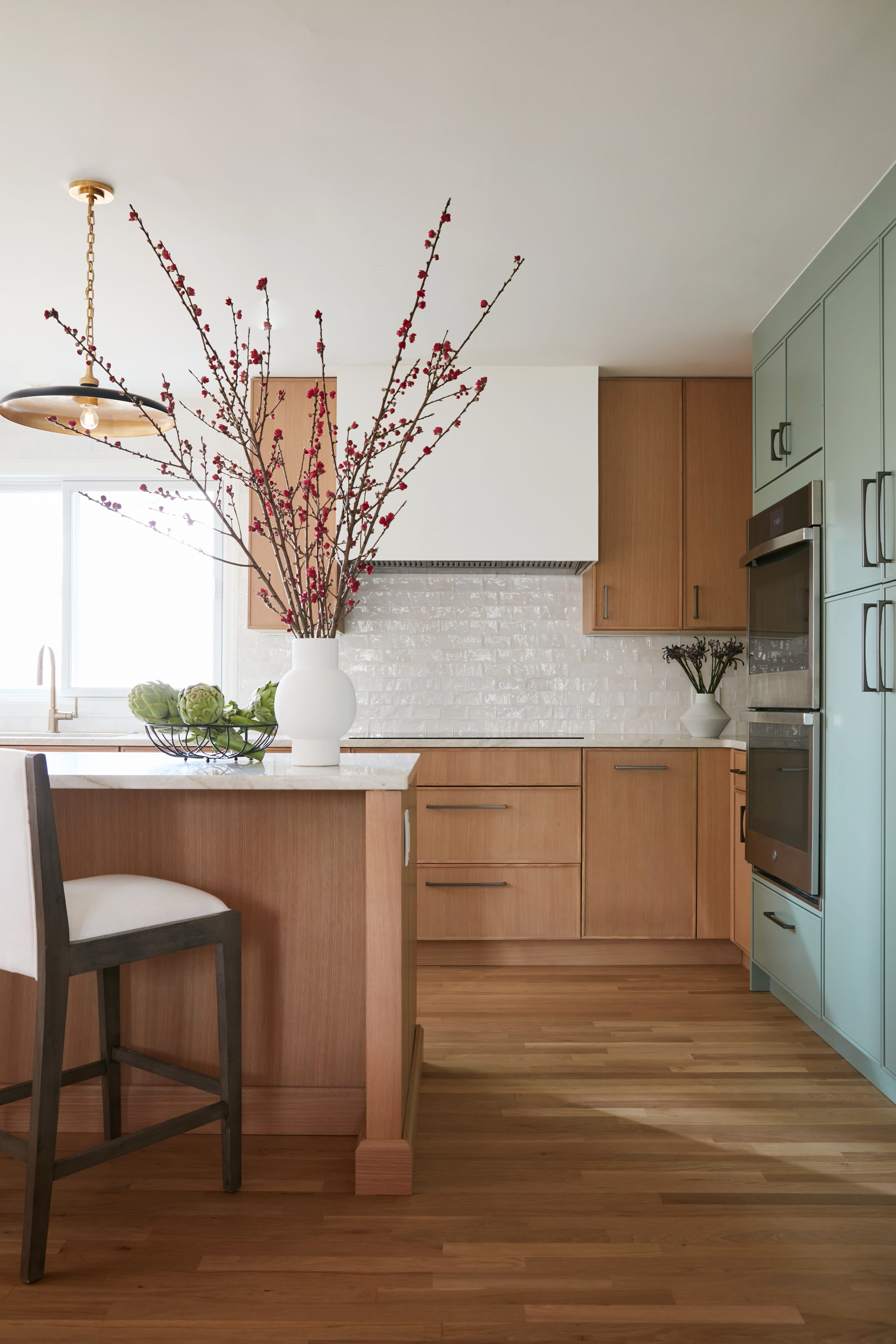
The designers consulted, Melanie Bryant, Laura Botelho, and Liz Williams, offer a diverse range of color suggestions that cater to various preferences and design schemes. One notable recommendation is Benjamin Moore’s ‘Aganthus Green,’ described as a soft celadon with a subtle hint of gray. This particular shade is praised for its depth and freshness, making it versatile enough to complement warm whites and soft pinks, and transition smoothly into cooler seasons. Its appeal lies in its balanced tone, providing a calming yet invigorating presence in any room.
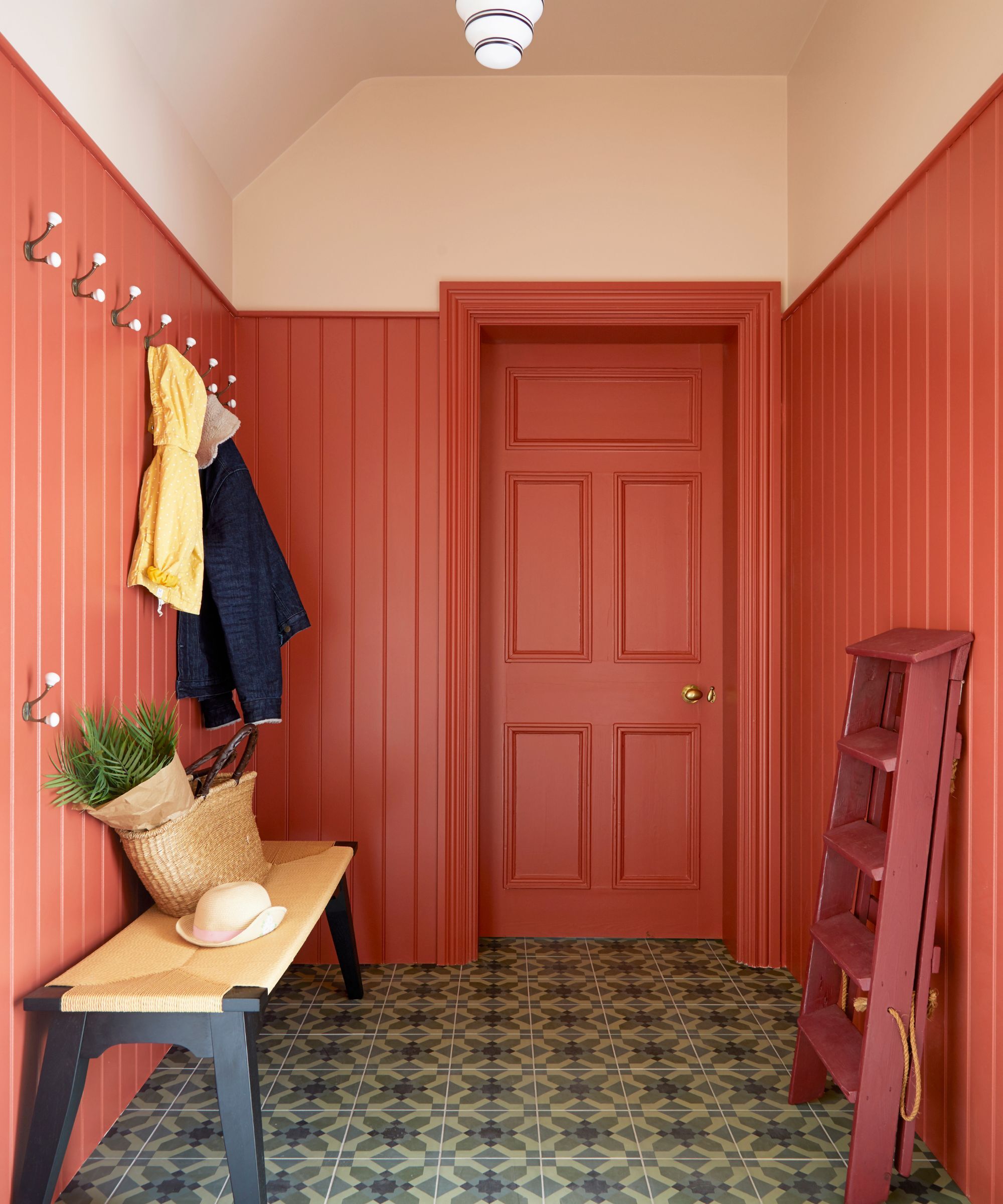
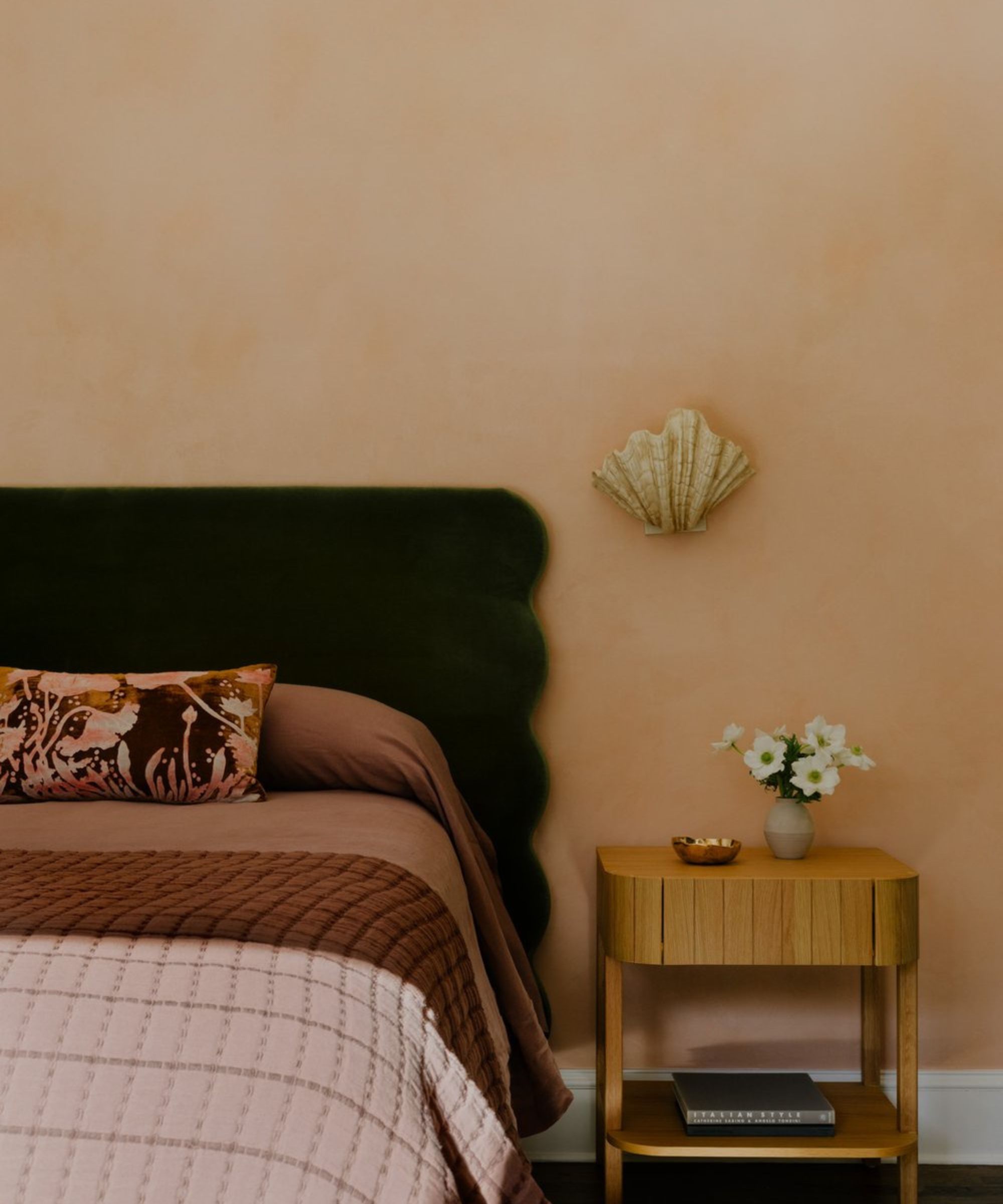
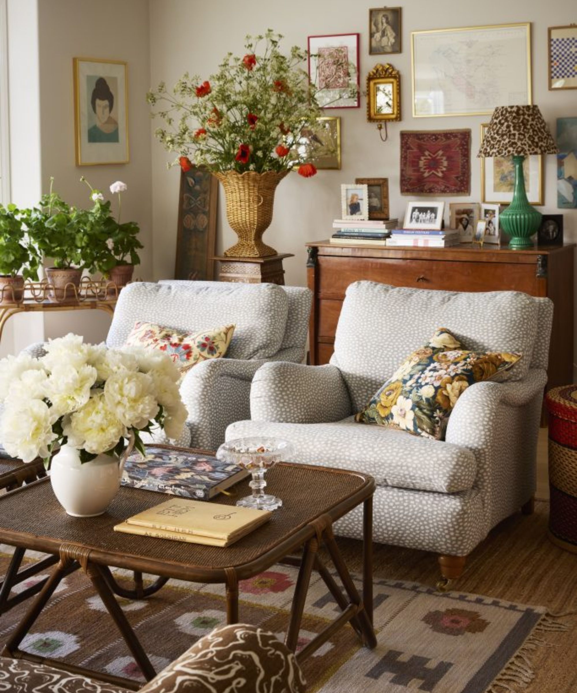
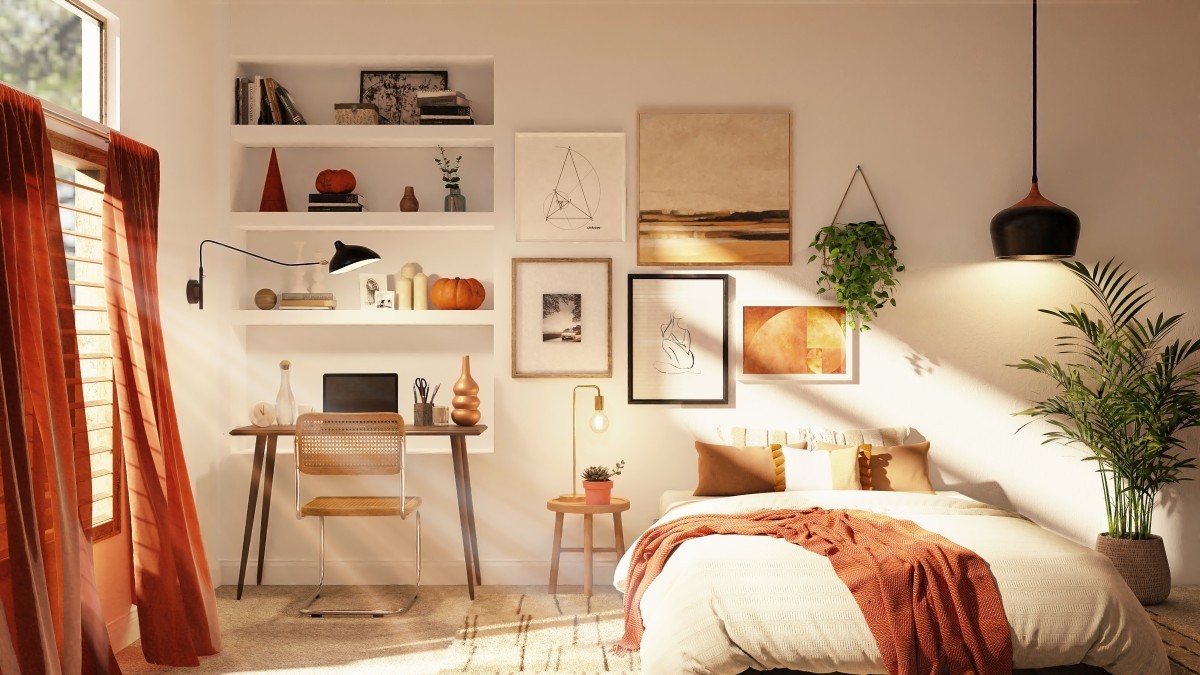
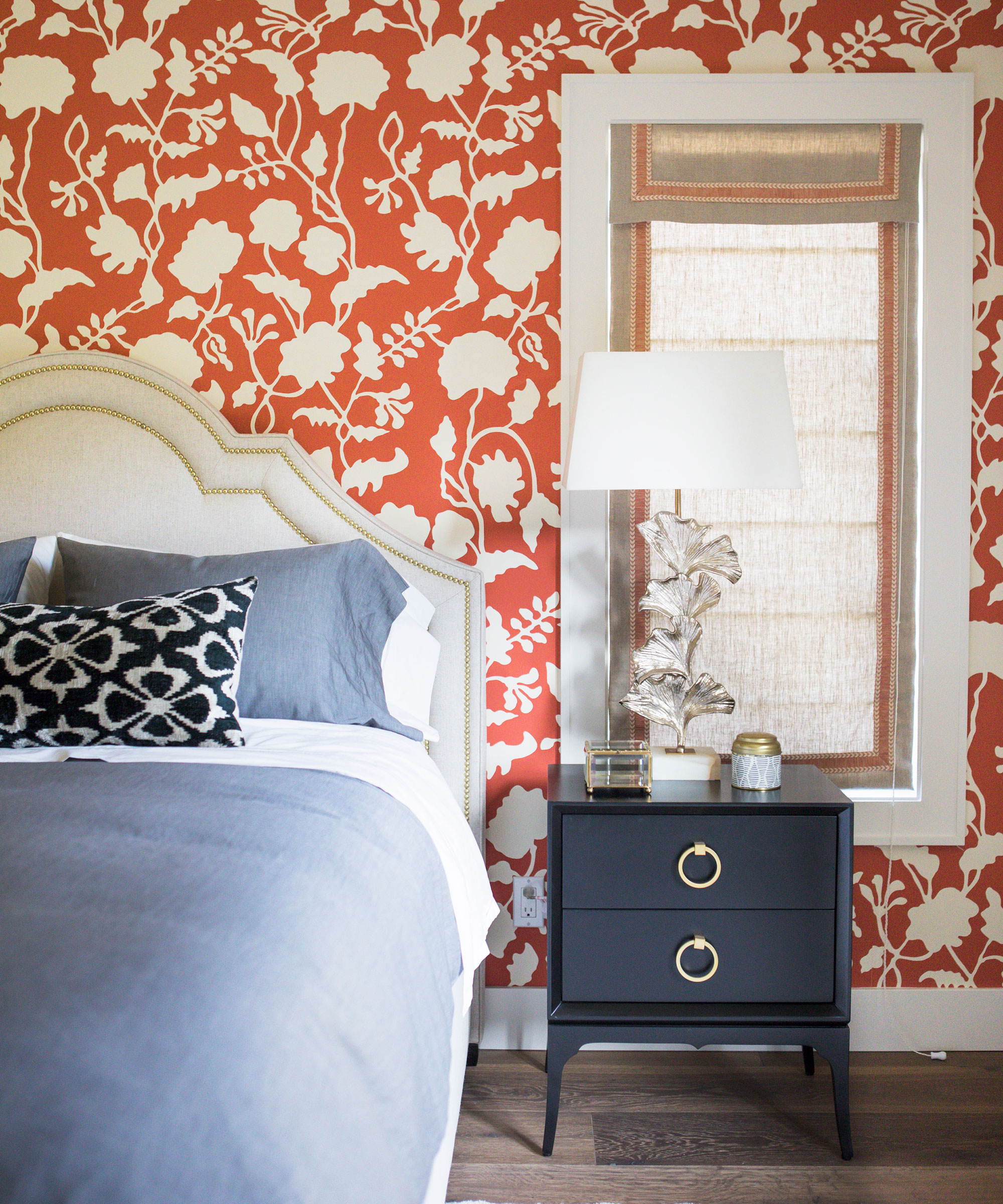
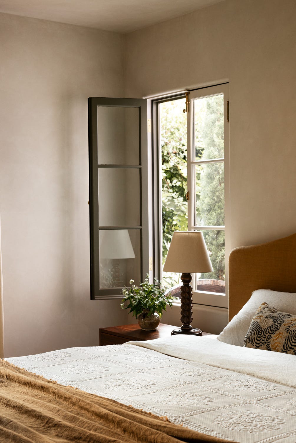
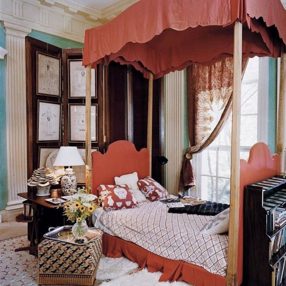
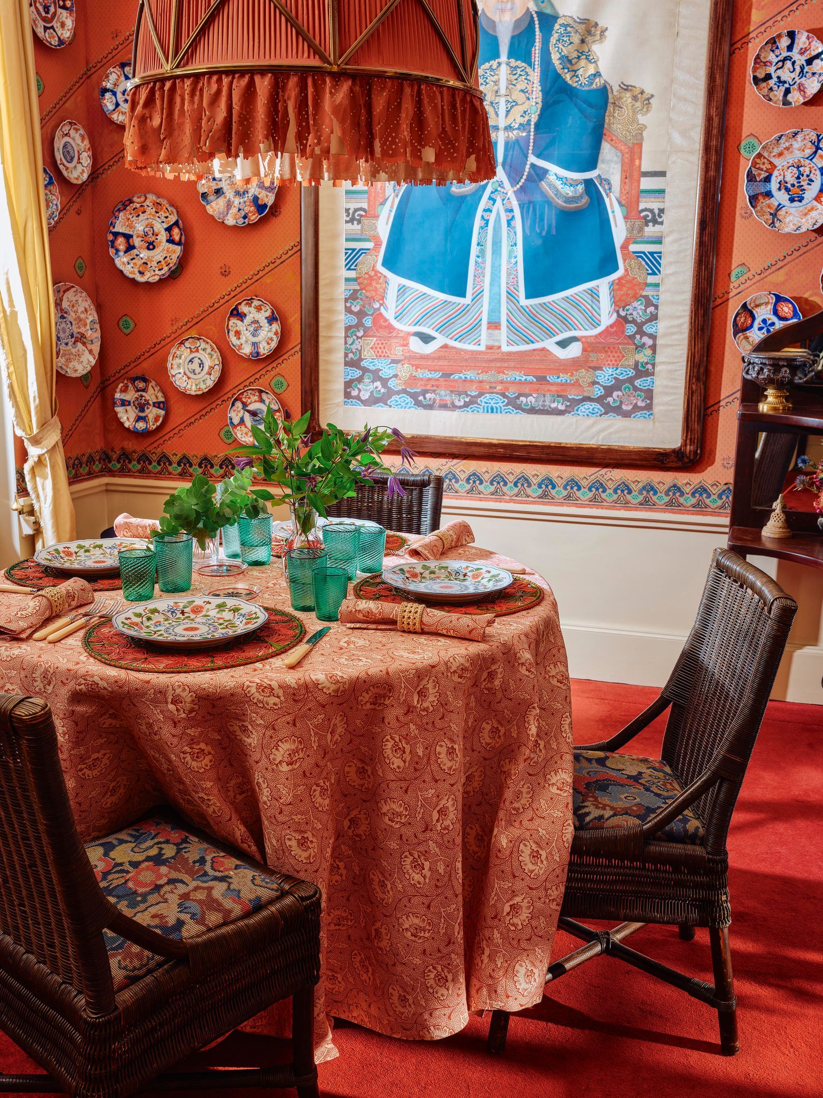
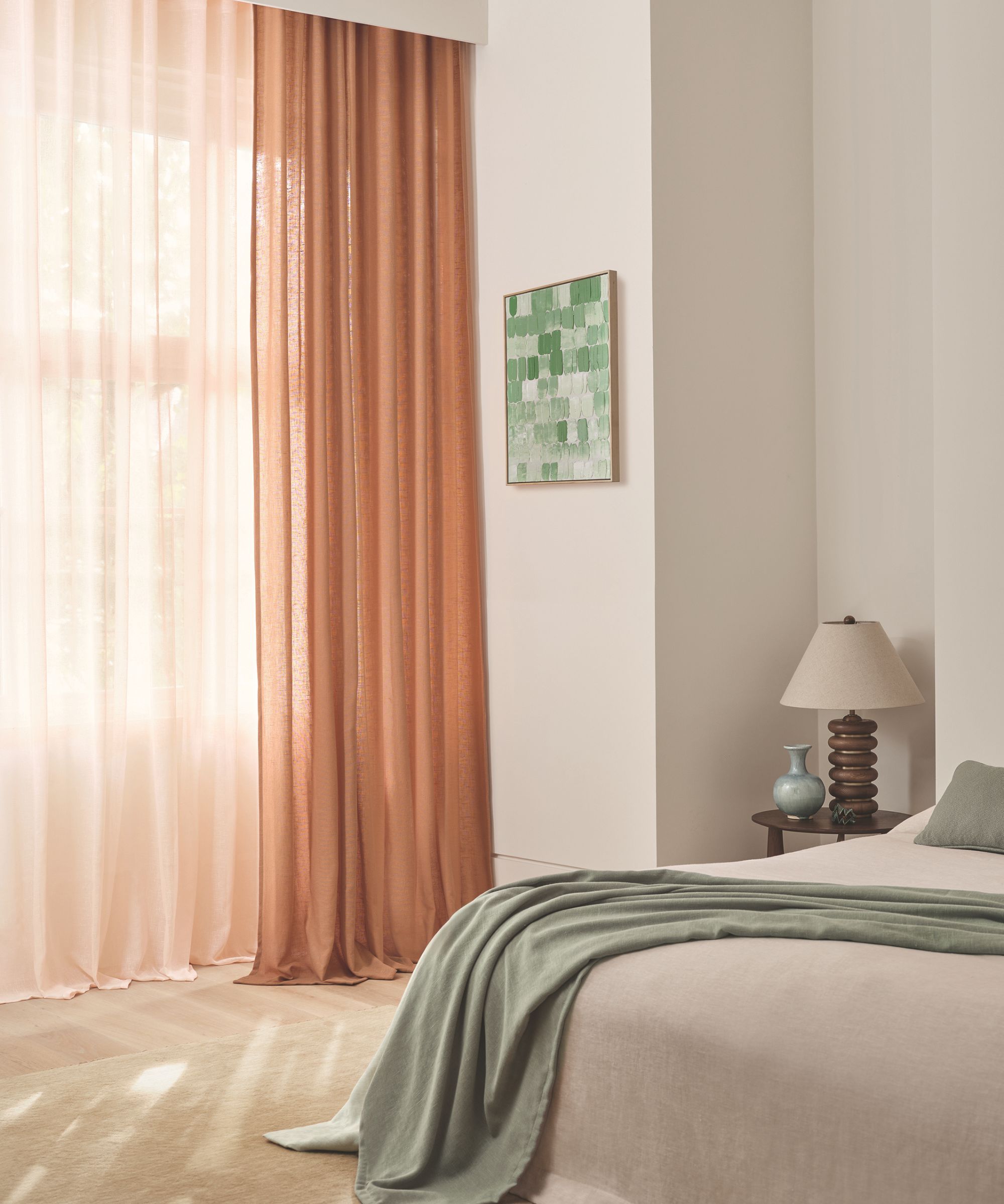
For those drawn to warmer, cozier aesthetics, Sherwin Williams’ ‘Redend Point’ is highlighted. This muted terracotta shade embodies a significant trend for spring and is expected to maintain its popularity. It is recommended for various spaces, including bedrooms, bathrooms, and dens, due to its ability to create a warm and inviting atmosphere without appearing overly dark or imposing. The color pairs well with light-colored woods, caning, sage greens, and beiges, fostering a harmonious and comfortable environment.
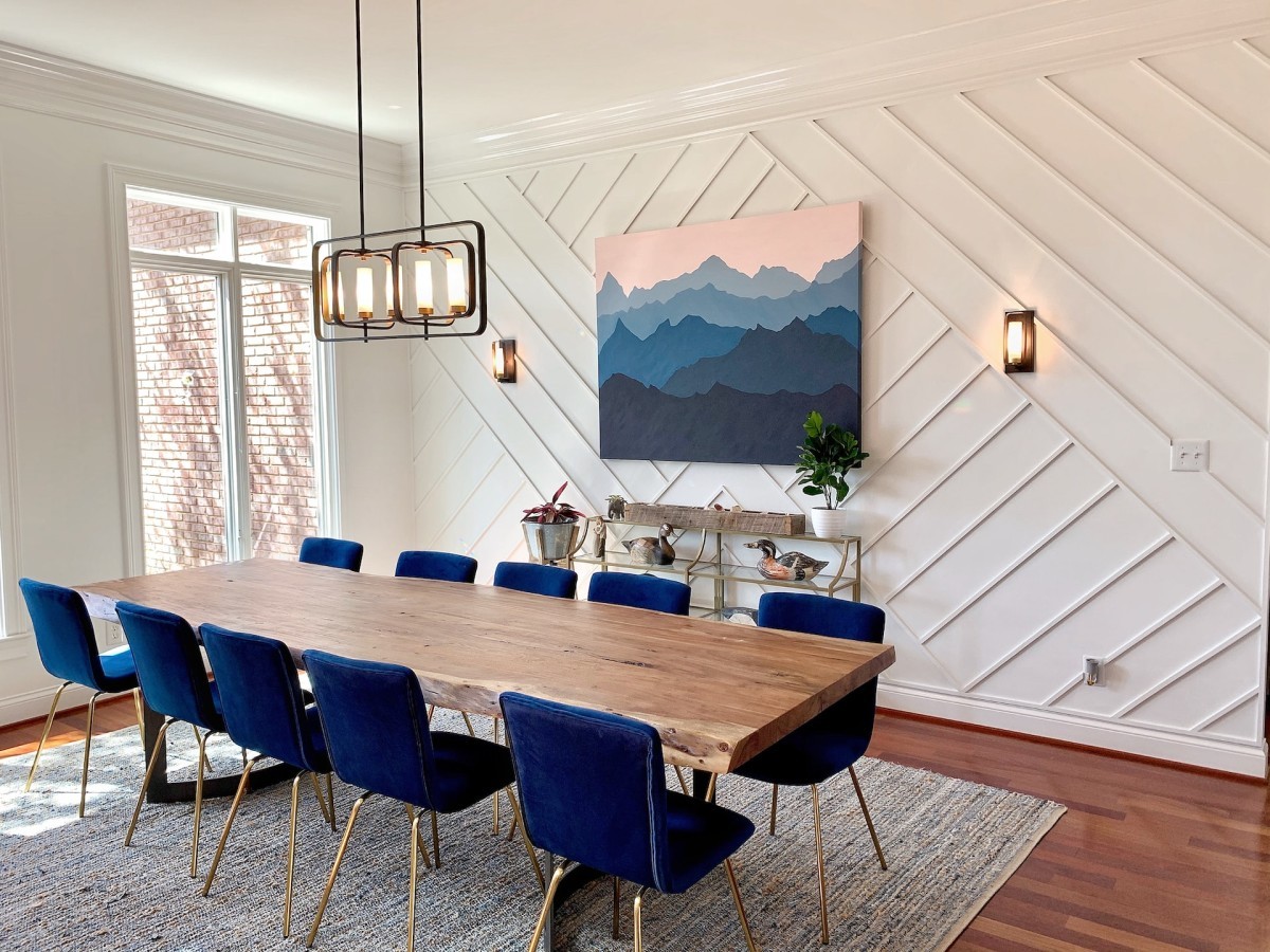
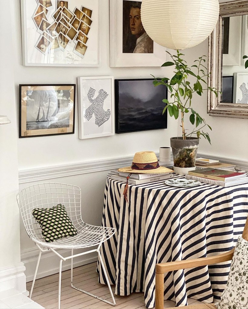
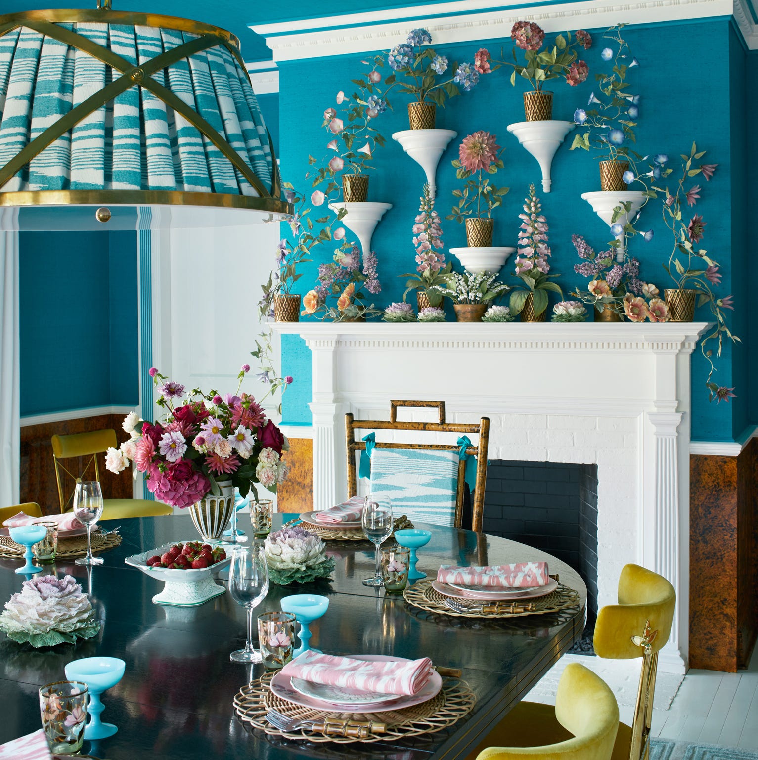
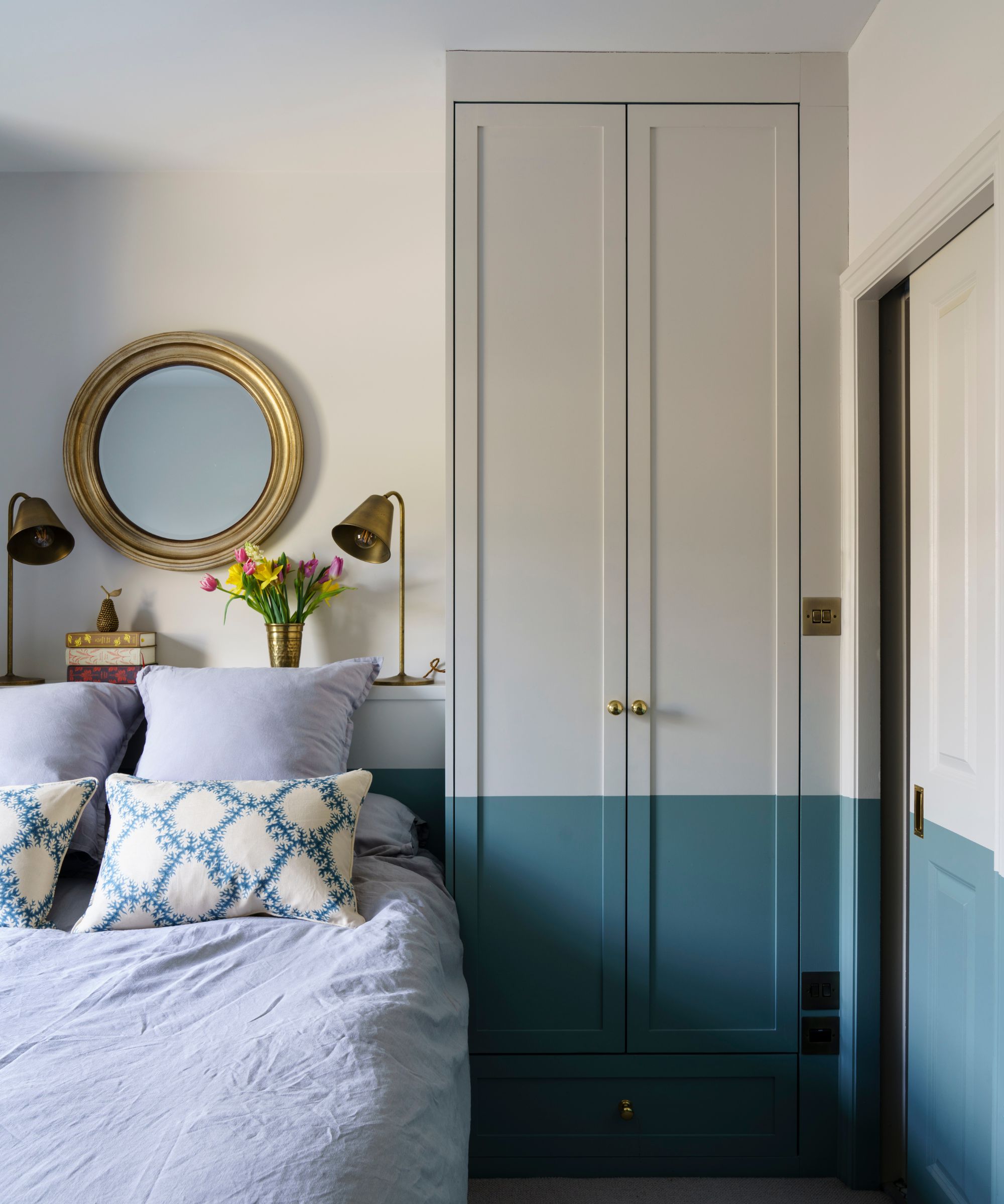
Conversely, individuals who prefer cooler tones might find Benjamin Moore’s ‘Yarmouth Blue’ to be an ideal choice. This light and airy blue is celebrated for its refreshing quality, which is not overpowering. Its versatility allows it to blend seamlessly with neutrals and complement a broad spectrum of other colors, making it a cheerful and adaptable option for spring decorating. This shade can contribute to an open and serene ambiance, particularly in areas where a sense of calm is desired.
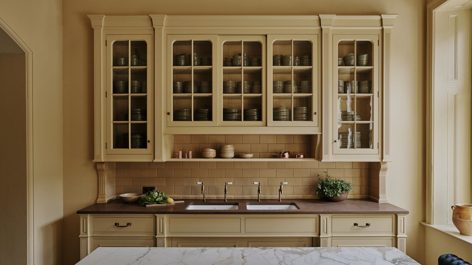
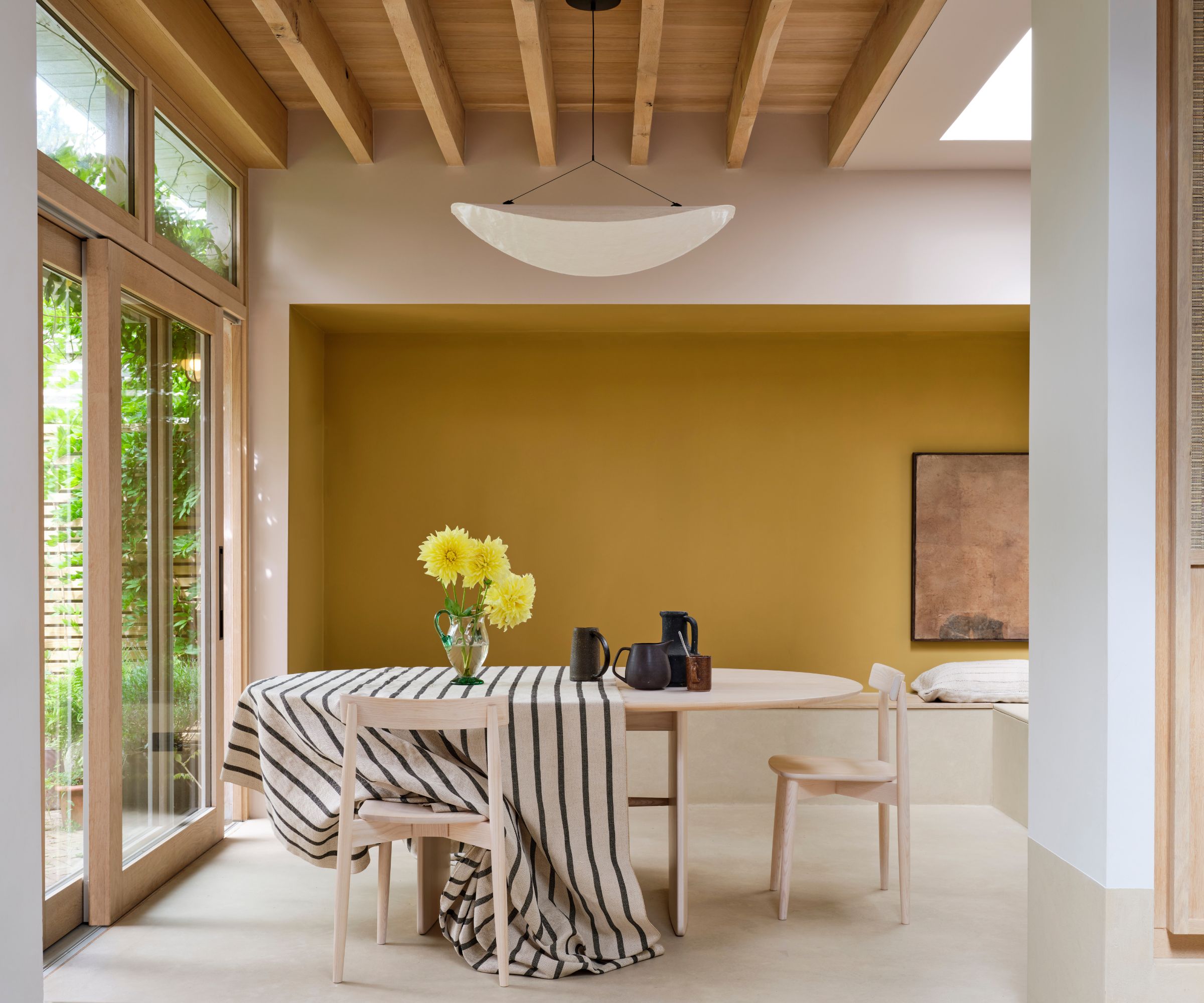
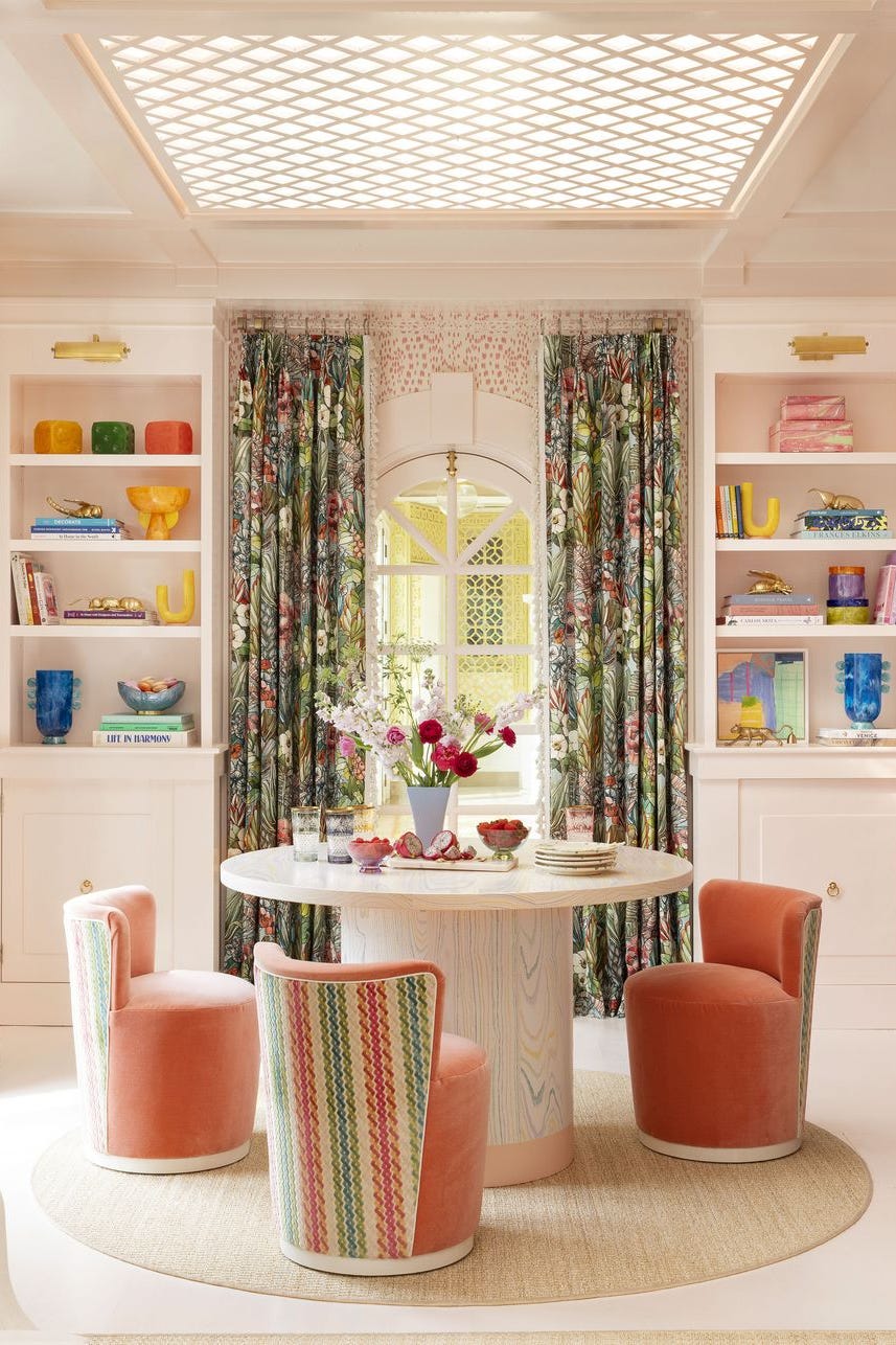
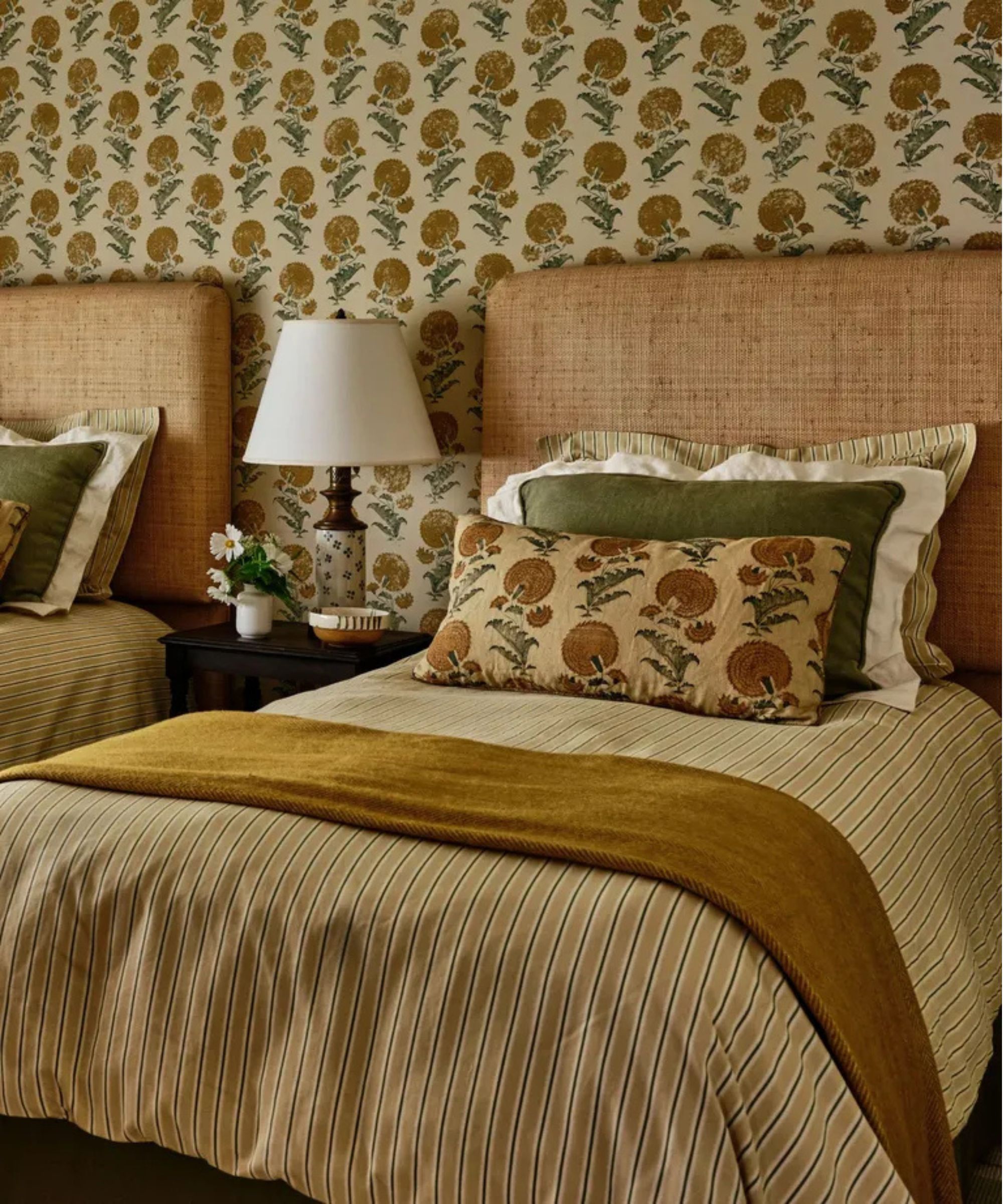
The article also features Farrow & Ball’s ‘Yellow Ground,’ which taps into the current popularity of buttery yellow hues. This creamy, soft yellow is presented as a mood-boosting color, with Melanie Bryant describing it as rich and cheerful, akin to a bright smile or a warm hug. It is particularly suggested for spaces that could benefit from an energetic lift, such as laundry rooms, sunrooms, or kitchens, injecting a vibrant yet gentle warmth into functional areas.
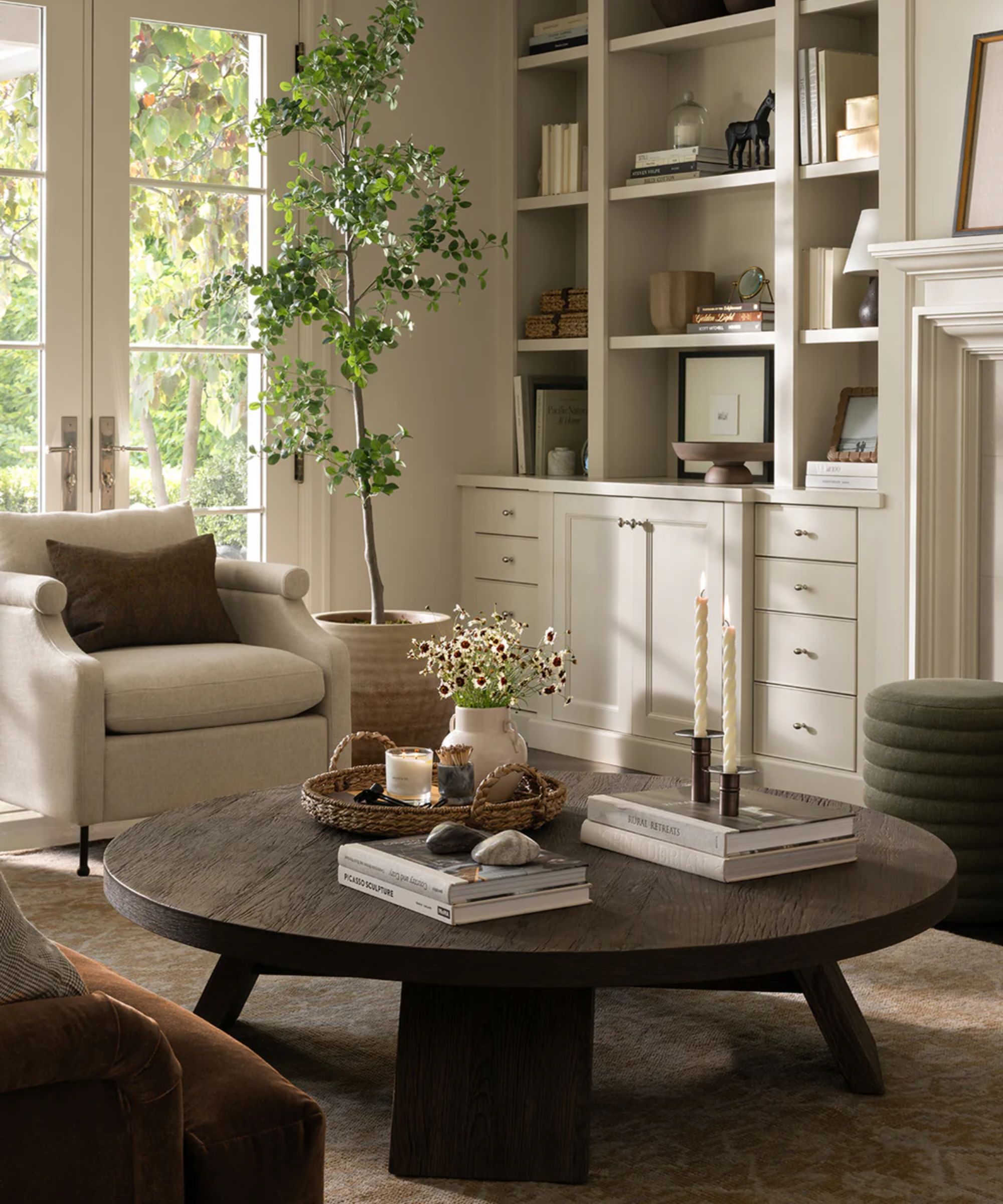
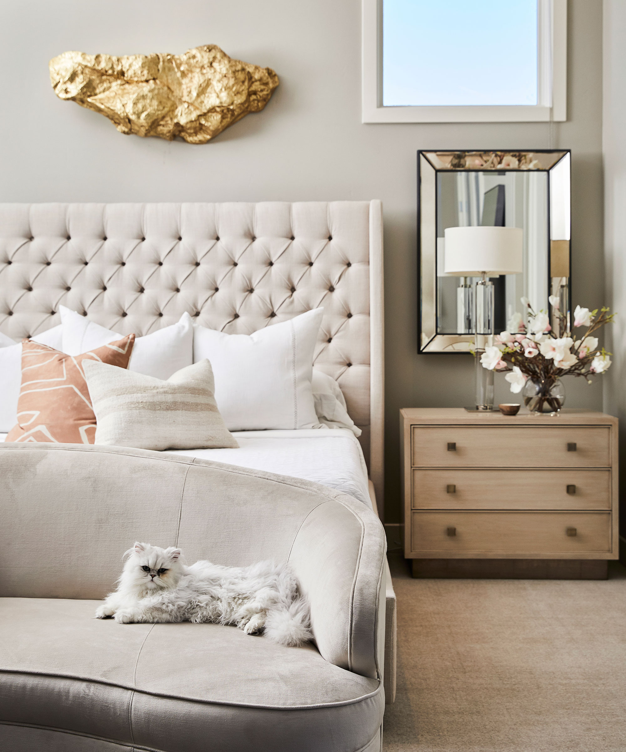
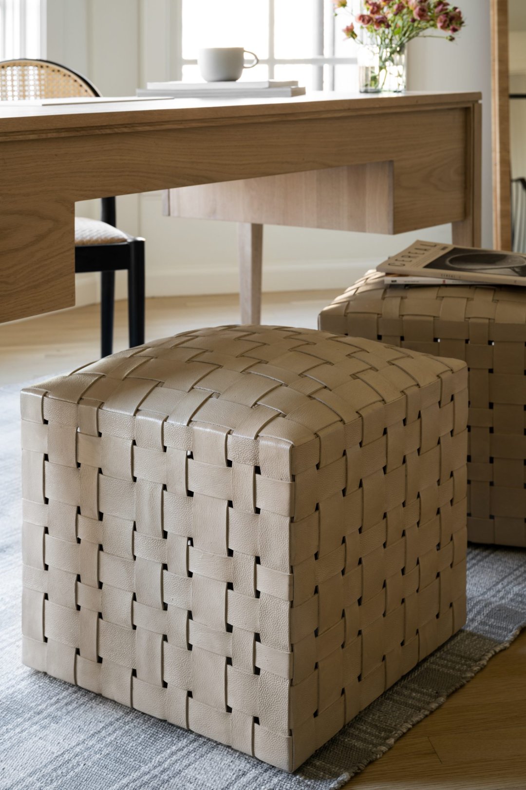
Another neutral option discussed is Sherwin Williams’ ‘Unfussy Beige,’ a beige with a subtle pink undertone that avoids being overtly pink or mundane. Laura Botelho suggests this color for home offices, gyms, or secondary bedrooms, noting its bright and inviting nature. It pairs effectively with both light and dark woods, and can be accented with brass metal finishes and black furniture to achieve a sophisticated and bold look, demonstrating its adaptability across different interior styles.
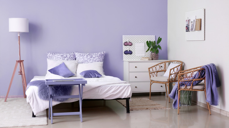
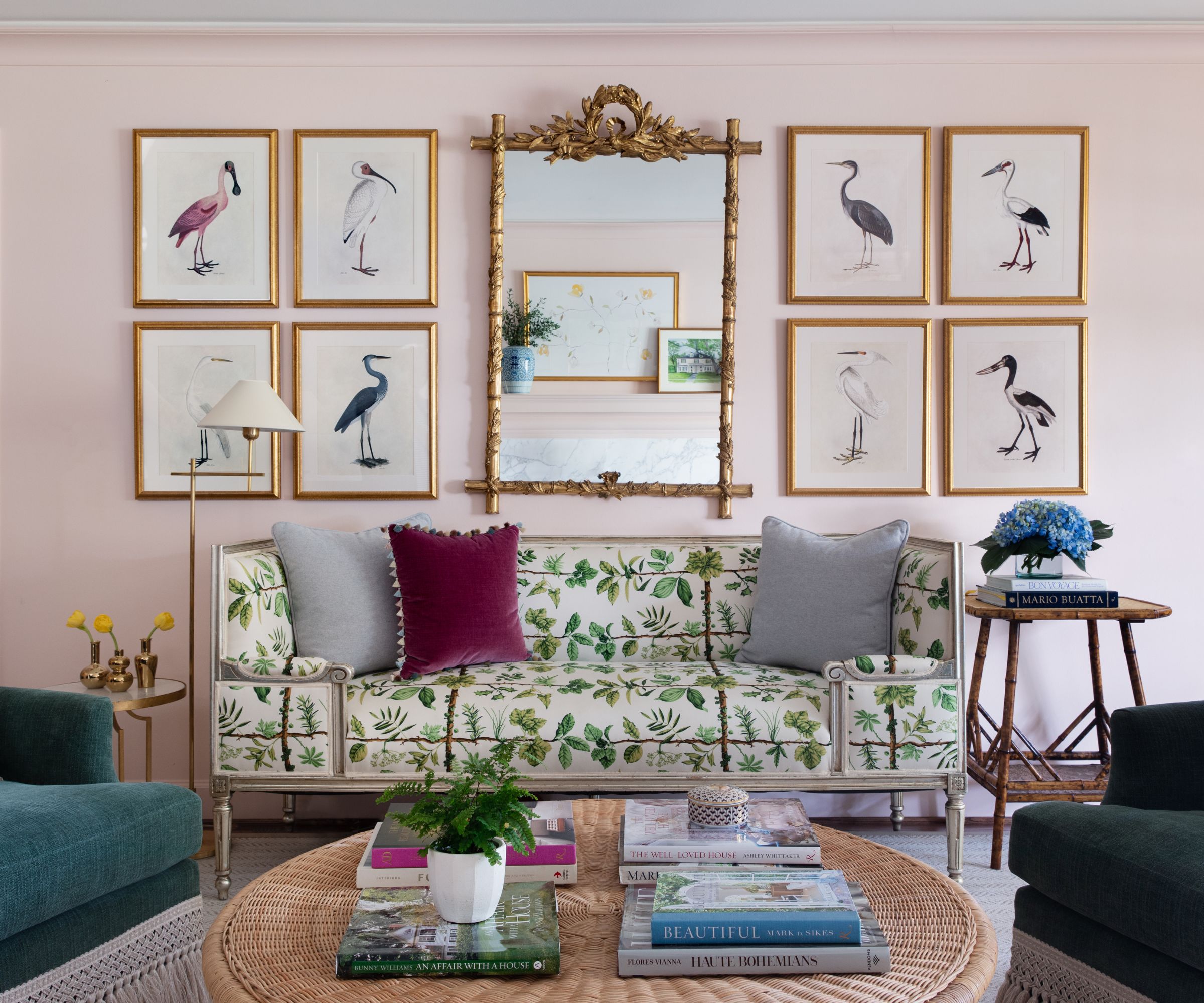
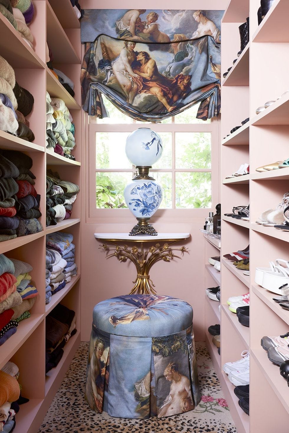
For a touch of subtle elegance, Sherwin Williams’ ‘Silver Peony’ is presented as a pale, dimensional purple with warm undertones. Melanie Bryant characterizes it as a clean, soft violet that imparts an incredible calming effect. Its delicate nature makes it suitable as a largely neutral background color for bedrooms or bathrooms, where it can provide a serene base for layering colorful textiles and various wood tones, creating a tranquil and visually interesting space.
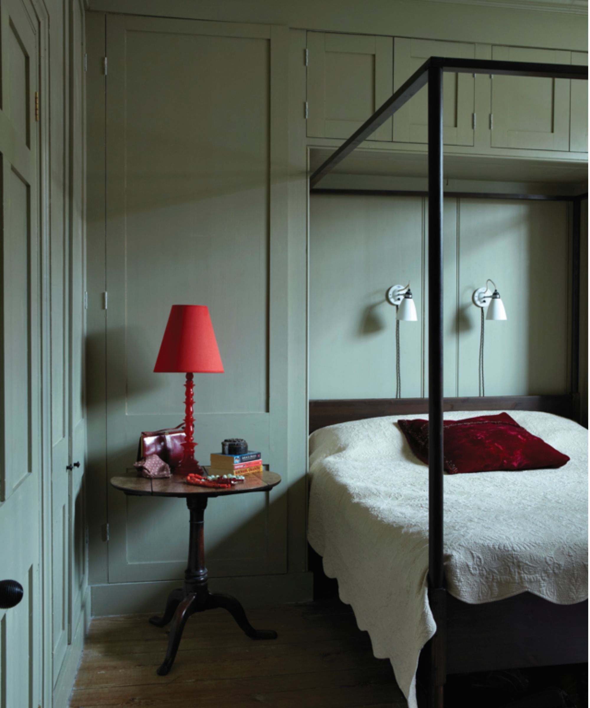
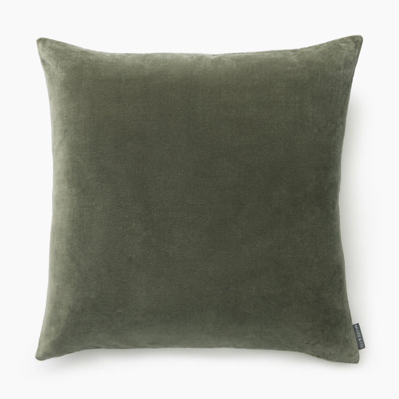
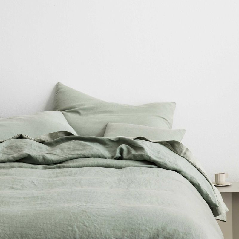
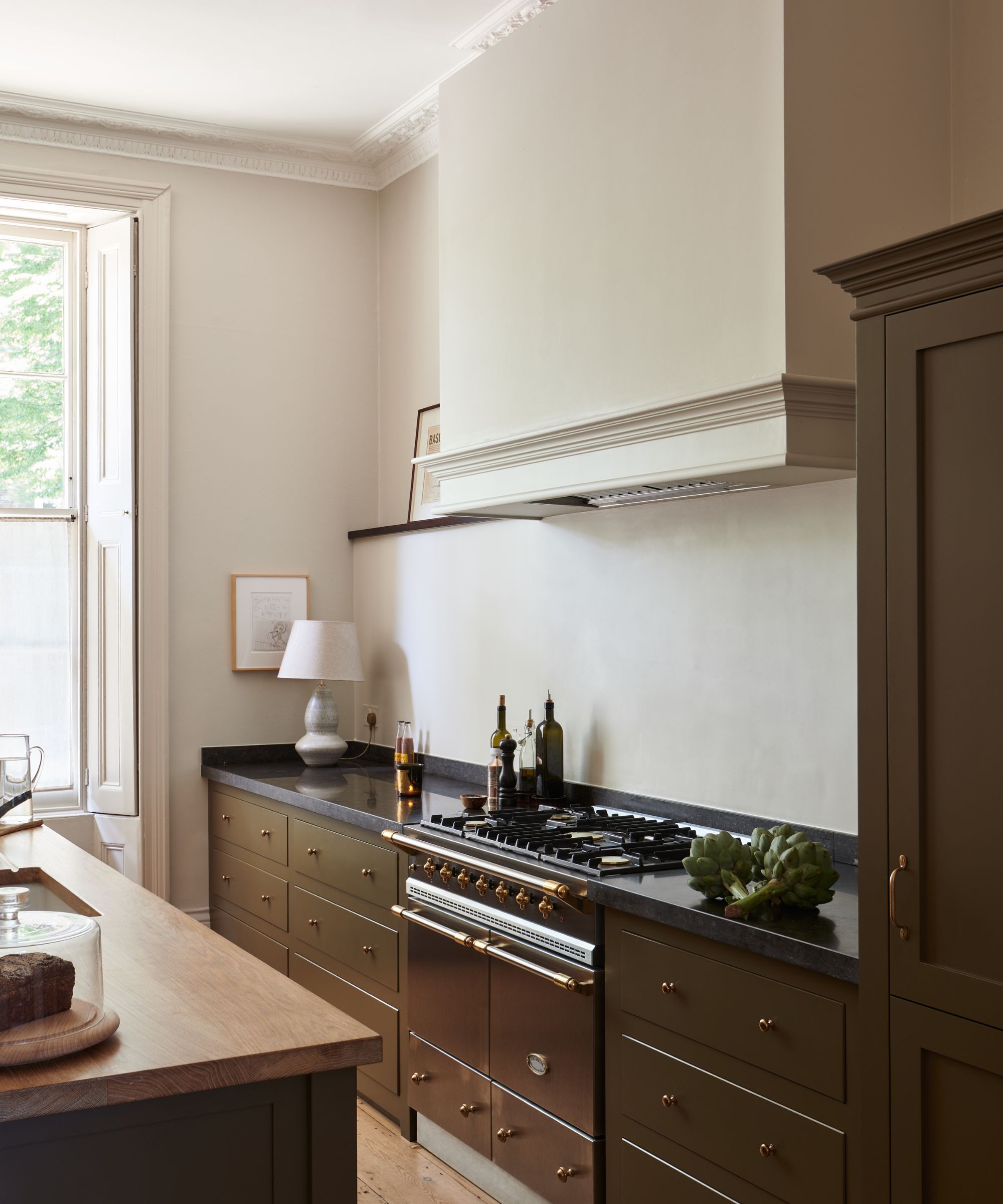
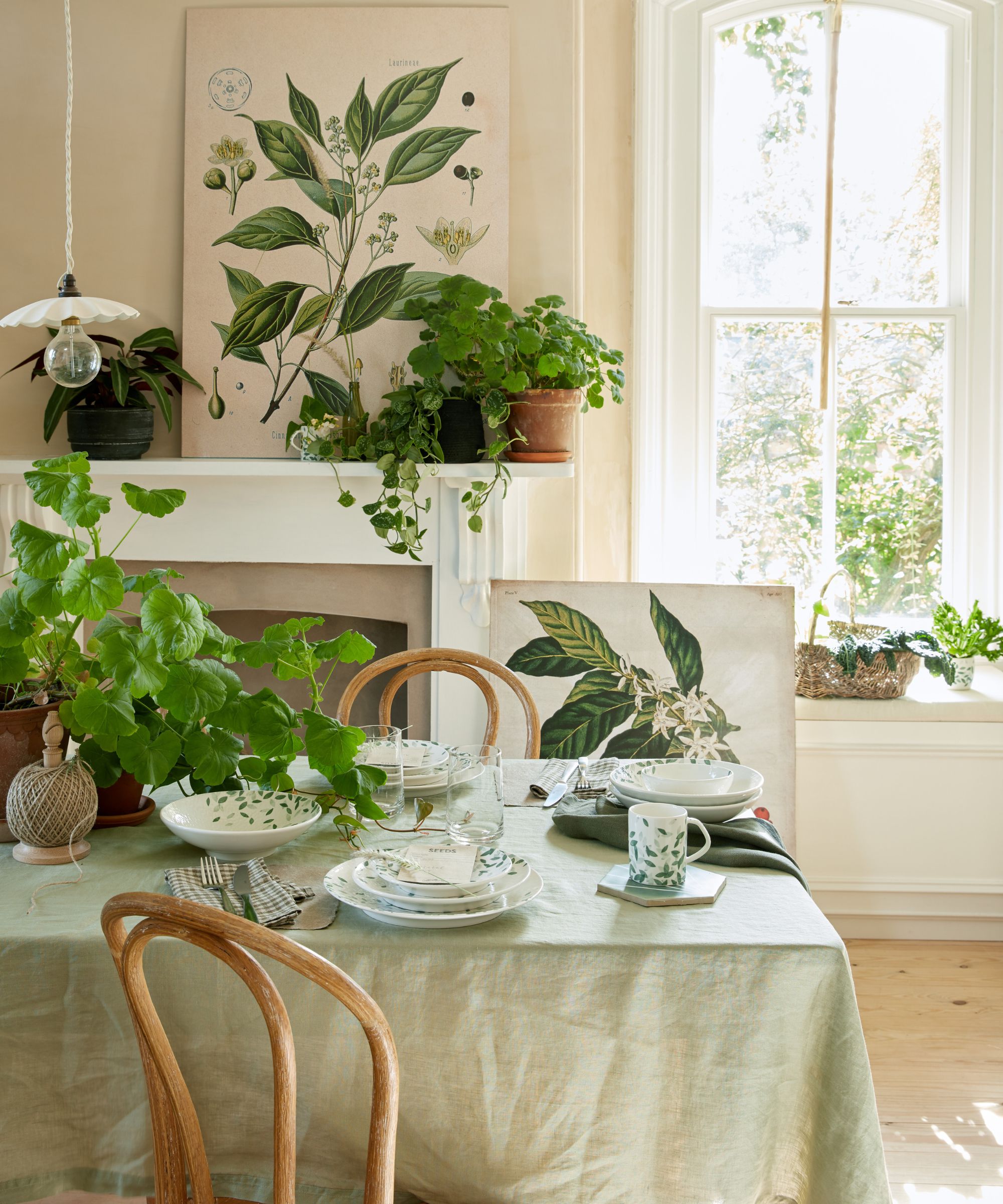
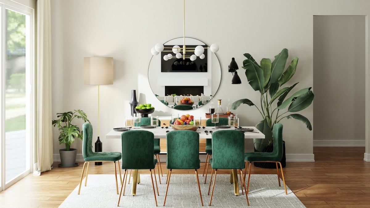
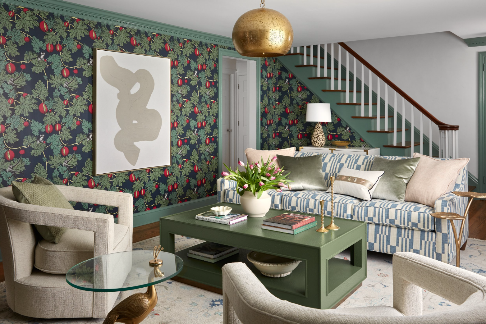
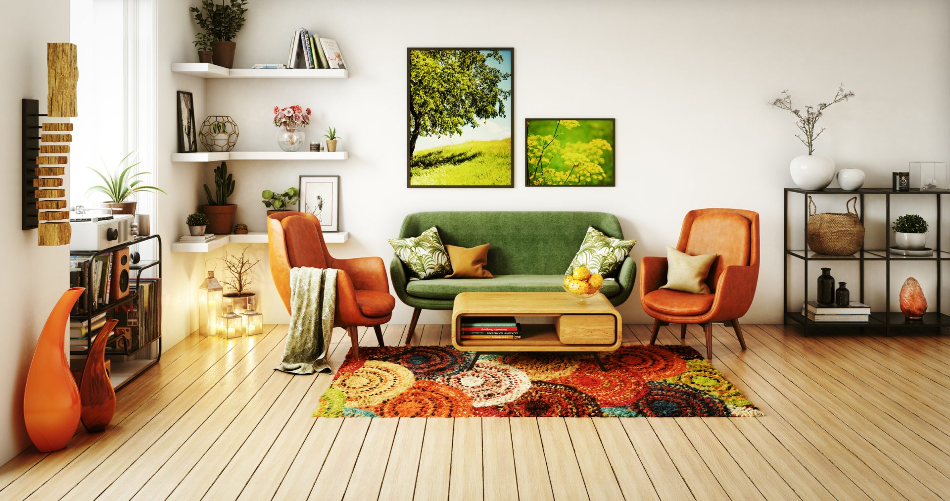
Finally, the article reiterates the timeless appeal of green for springtime, highlighting its earthy, verdant qualities and soothing impact. Sherwin Williams’ ‘Dried Thyme’ is chosen as a perfect sage green—neither too dark nor too light—that can create a moody yet light atmosphere. This shade is highly compatible with light warm beiges, cognac leathers, light or medium woods, rattans, terra cottas, and even soft pinks, making it a versatile choice for a range of rooms, including nurseries. These expert recommendations provide homeowners with a curated palette of colors to refresh their spaces, ensuring that their choices are both fashionable and enduring.
#SpringPaintColors #InteriorDesignTrends #HomeRefresh #ColorPalette #DesignersChoice #HomeDecorating #PaintRecommendations #SpringPaintColors #InteriorDesignTrends #HomeRefresh #ColorPalette #DesignersChoice #HomeDecorating #PaintRecommendations
0 comment in total
 No comments yet
You may also like
7 Best Colors Designers Say You Should Use to Make Your Home Feel Fresh, Light and Spring-Ready

Sorry pastels, there's a new color palette on trend for spring – and it's all about playful and more saturated hues
How To Style Your Home With Spring Styling Trends
8 Spring Color Schemes the Paint Pros Are Raving About for 2025


The Color Palettes Currently Inspiring Domino Editors

Say goodbye to winter blues with these 8 spring living room ideas that will feel like a breath of fresh air for your space

20 Spring Color Combos That will Brighten Your Home No Matter the Season
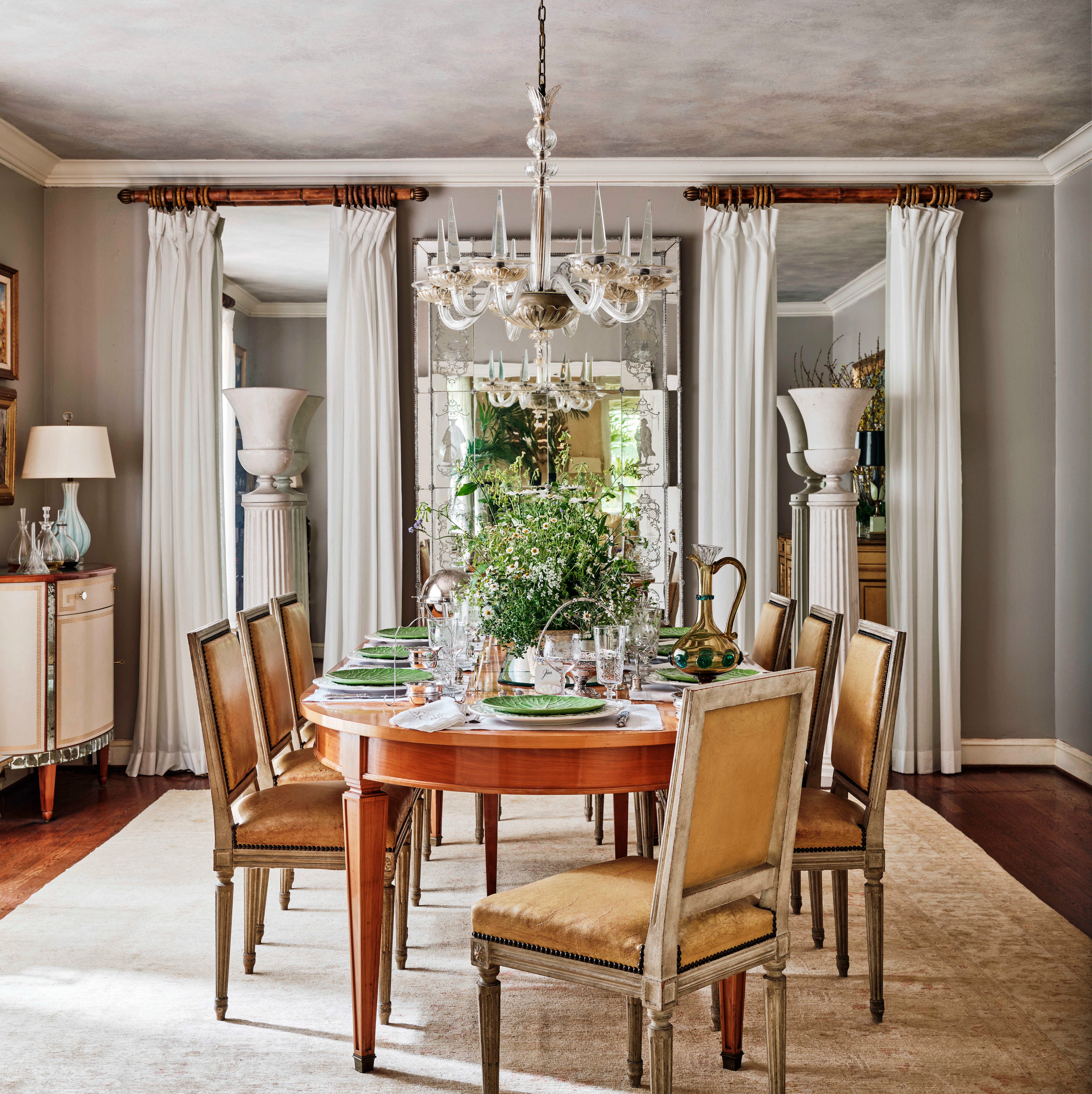
16 Spring Decorating Ideas to Give Your Home the Refresh It Deserves

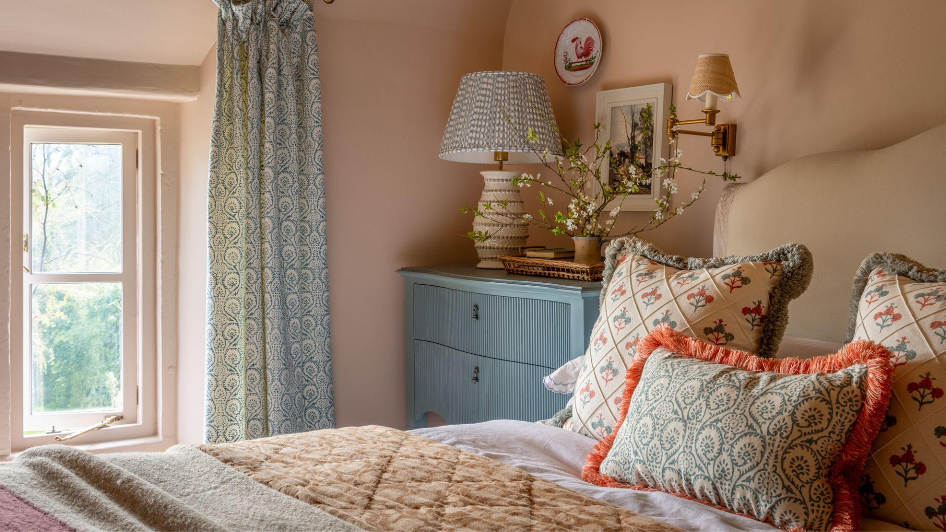
These are the 6 must-have colors to decorate with in April 2025
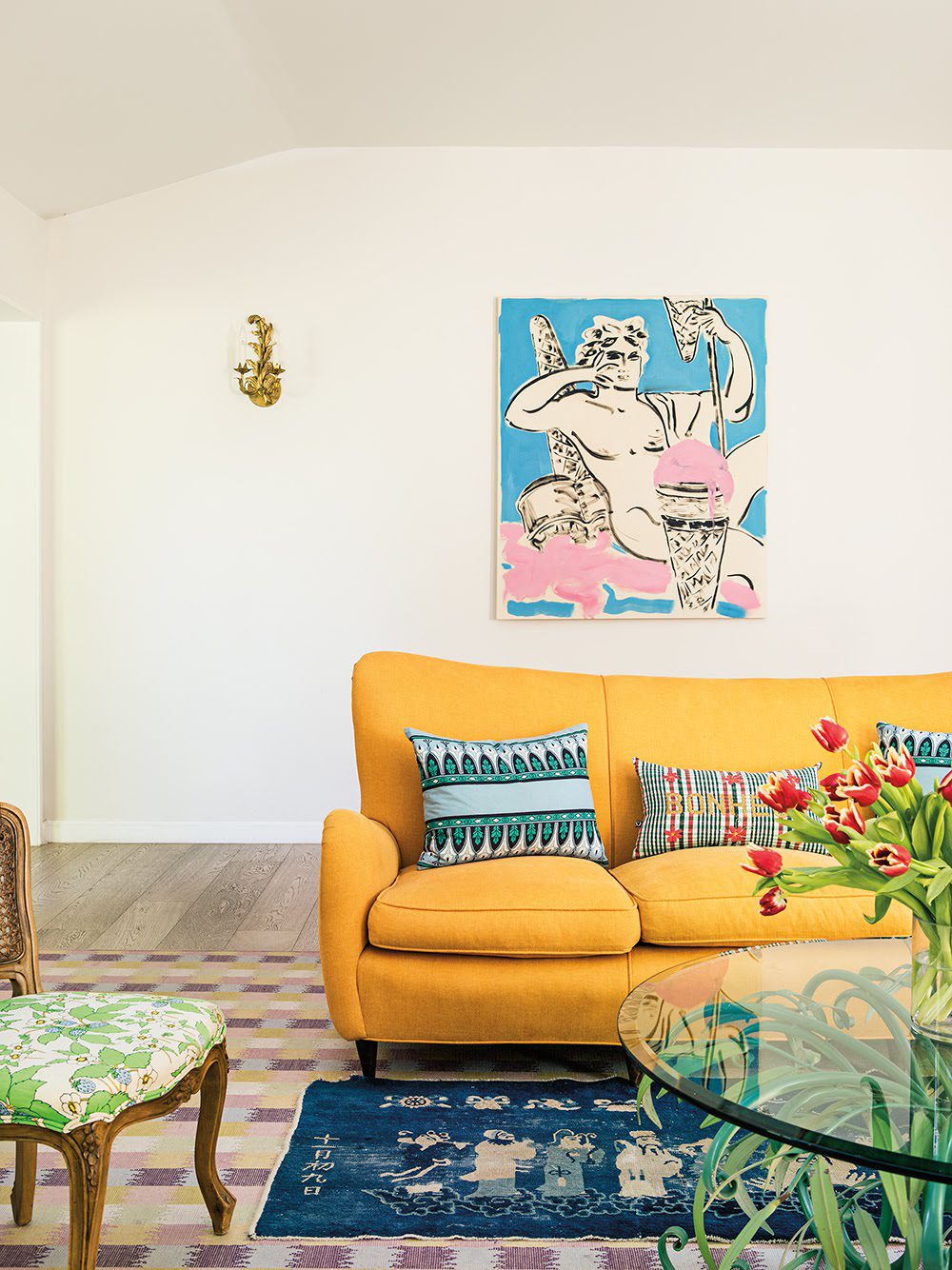
21 Designers Share Their Color-Trend Predictions for Spring
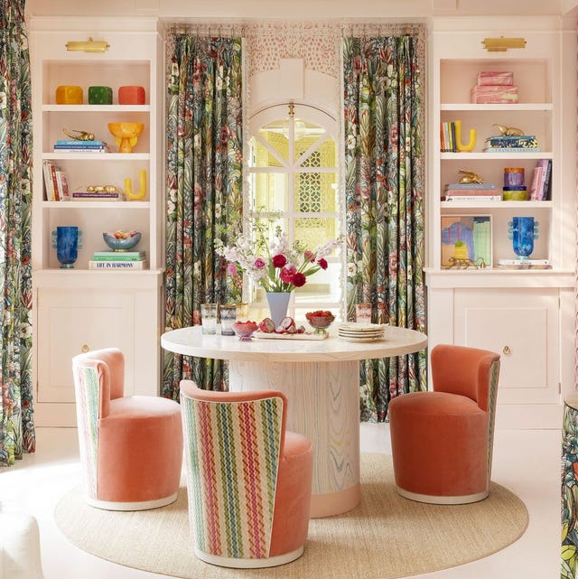
These Are the New Floral Prints Designers Are Loving

15 Unexpected Spring Home Trends That Will Define the Season


The Spring Color Trend That'll Make Your Home Feel Refreshed

2023 spring trends: decorate your home with this season's colours

Get Into the Spring Cleaning Spirit with These Five Interior Design Accounts
Spring bedroom ideas – 10 ways to refresh and reinvent your sleep space
7 spring home decor ideas to refresh your home for the season

11 spring color ideas for bedrooms – to make your home look lighter, brighter, and bigger
How To Decorate the Home for Spring: 19 Full-Colour, Floral-Inspired Ideas
4 ways to refresh your living room for spring, according to an interior designer