1/3
"It's time to reconsider the whole colour of the year carnival"
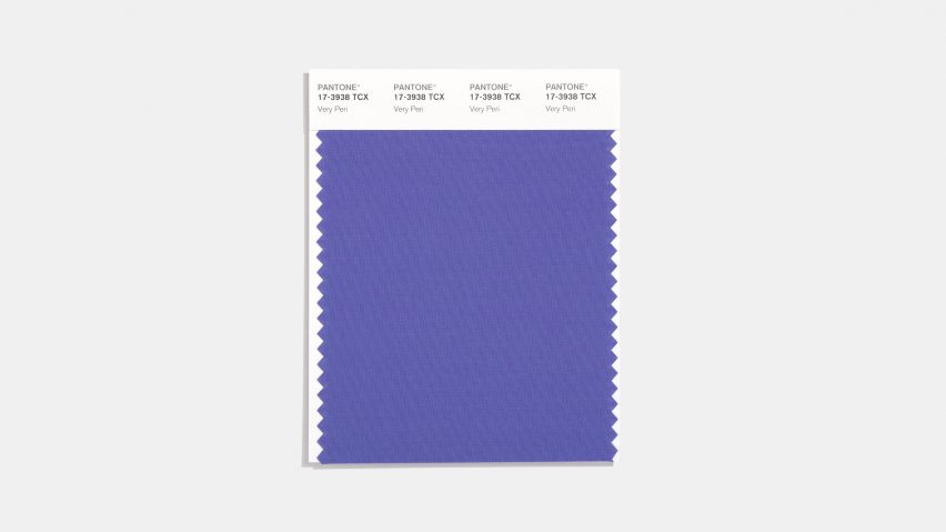
The article critically examines the concept of 'colour of the year' pronouncements, specifically focusing on Pantone's 2022 choice of Very Peri. It argues that the tradition of a single company dictating a color trend feels outdated and primarily serves as a marketing exercise, especially given the significant global shifts experienced in recent years. The author, Michelle Ogundehin, questions the validity and relevance of these annual declarations in a world grappling with larger issues such as health, community, sustainability, and climate.
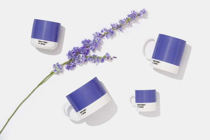
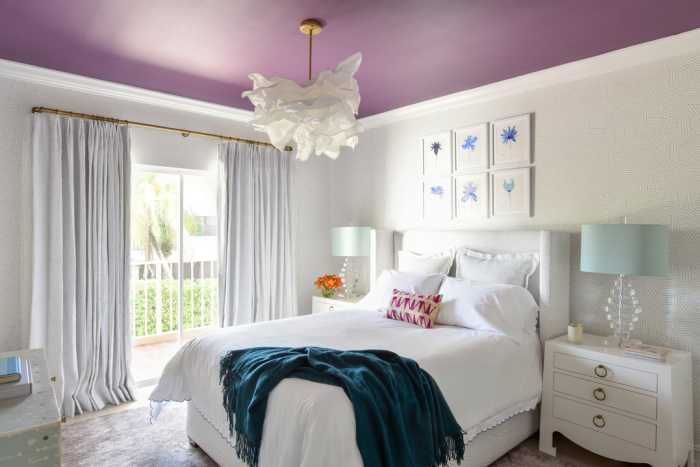
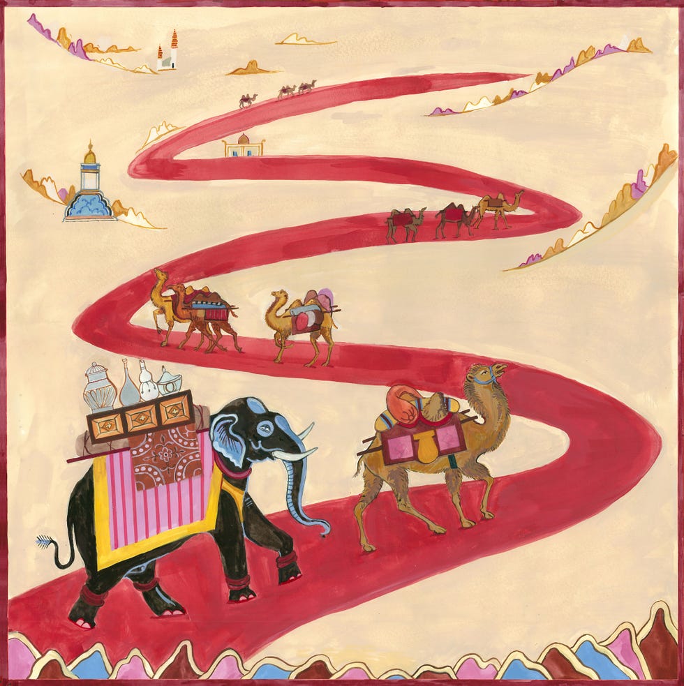
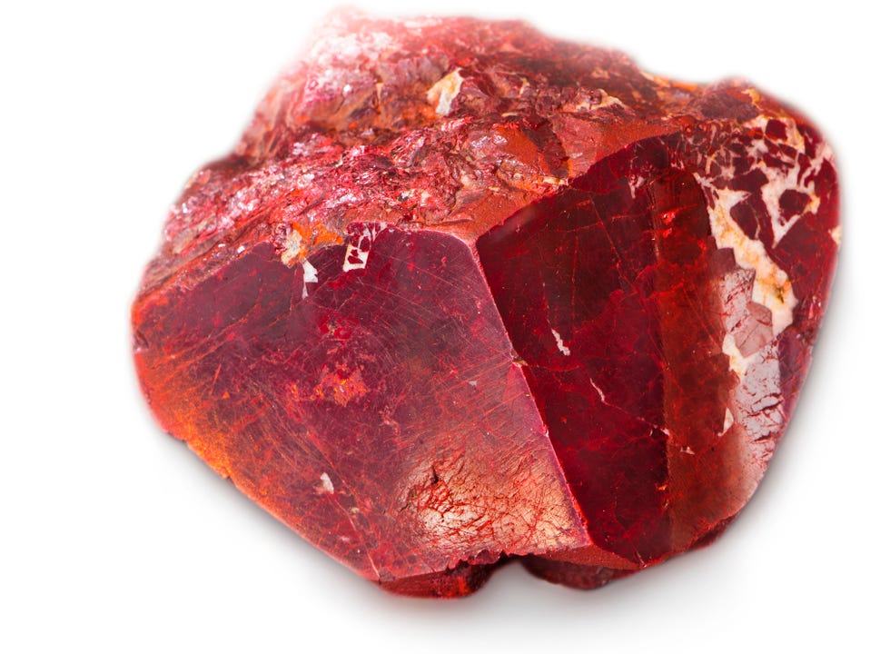
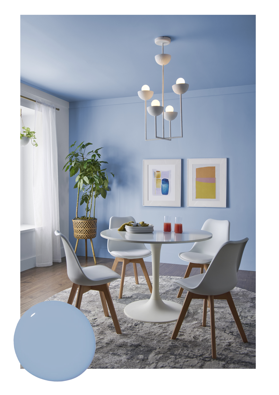
A central point of contention is Pantone's classification of Very Peri, described as "a dynamic periwinkle blue hue with a vivifying violet-red undertone," as a shade of blue. Ogundehin asserts that the color is clearly purple, or more precisely, a saturated lilac. The article delves into the historical and cultural associations of purple, noting its presence in Neolithic art, Greek mythology (the Tyrian purple legend), and its long-standing connection to royalty, extravagance, wealth, and power due to the labor-intensive process of its original dye extraction. This historical context highlights the color's inherent elitism and its historical use by the powerful, contrasting sharply with Pantone's modern-day justification of it representing "carefree confidence and a daring curiosity" and embracing "an altered landscape of possibilities."
The article also discusses the physiological effects of purple, describing it as a color that is harder for the eye to perceive, comparatively more tiring, and potentially agitating. This contrasts with green, which is positioned as the easiest and most restful color for the eye. Ogundehin critiques Pantone's claim that Very Peri symbolizes the "global zeitgeist of the moment and the transition we are going through," questioning whether a difficult and individualistic color truly reflects contemporary human needs. The author emphasizes that the red undertone in Very Peri, rather than a blue one, is what causes the perceived issues, attributing qualities like anger, passion, or reactivity to it.
Furthermore, the piece differentiates Very Peri from lavender, suggesting that a lavender tone would have been a more subtle and considered choice, representing a soothing, solution-seeking approach. In contrast, Very Peri, as a lilac-like purple, is described as irritating and attention-seeking. The author concludes by suggesting that while colors undoubtedly reflect moods and moments, and trends naturally ebb and flow, the 'colour of the year' initiative should be an opportunity for meaningful dialogue about these cultural shifts. However, Pantone, in this instance, is seen as failing to meet that challenge, instead promoting a color with problematic classifications and justifications.
#Pantone #ColorOfTheYear #VeryPeri #MichelleOgundehin #ColorTrends #DesignCritique #InteriorDesign #ColorPsychology #Pantone #ColorOfTheYear #VeryPeri #MichelleOgundehin #ColorTrends #DesignCritique #InteriorDesign #ColorPsychology
0 comment in total
 No comments yet
You may also like
This Very "Controversial" Color Is About To Be Everywhere Again

Four designers weigh in on Pantone's Colour of the Year


Deeper, moody colours and precious jewel tones are in style this year
The 2026 paint Colors of the Year Have Been Announced

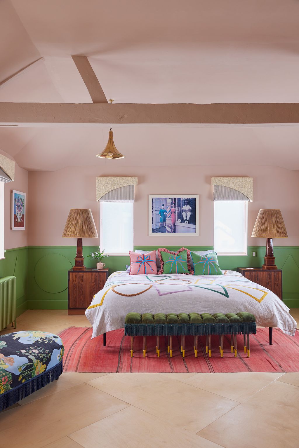
Time to rethink coloured ceilings and woodwork
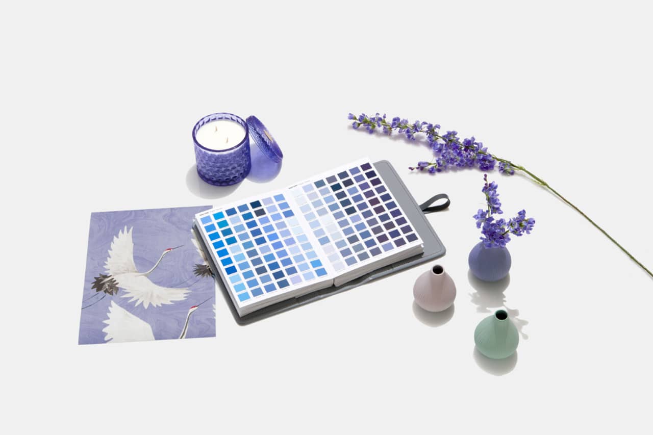
Designers Weigh in on 'Very Peri'—Pantone’s Color of the Year 2022
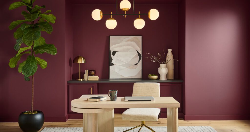
Behr Paint’s Head of Global Marketing Talks Color of the Year Campaign

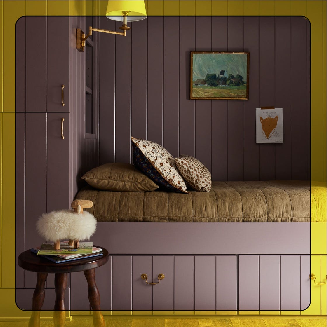
Sherwin-Williams Just Announced the Color of the Year
Backdrop + Coming Soon Reveal Bold Color of the Year
The return of the fashion colour consultation

We Already Know the Color That's Going to Have 2027 in a Chokehold — Now's Your Chance to Beat the Trend

This surprising color trend is having a comeback
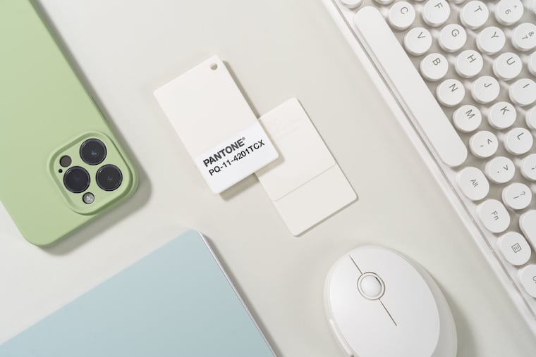
White is the 2026 Pantone Color of the Year. They say the choice isn’t political.
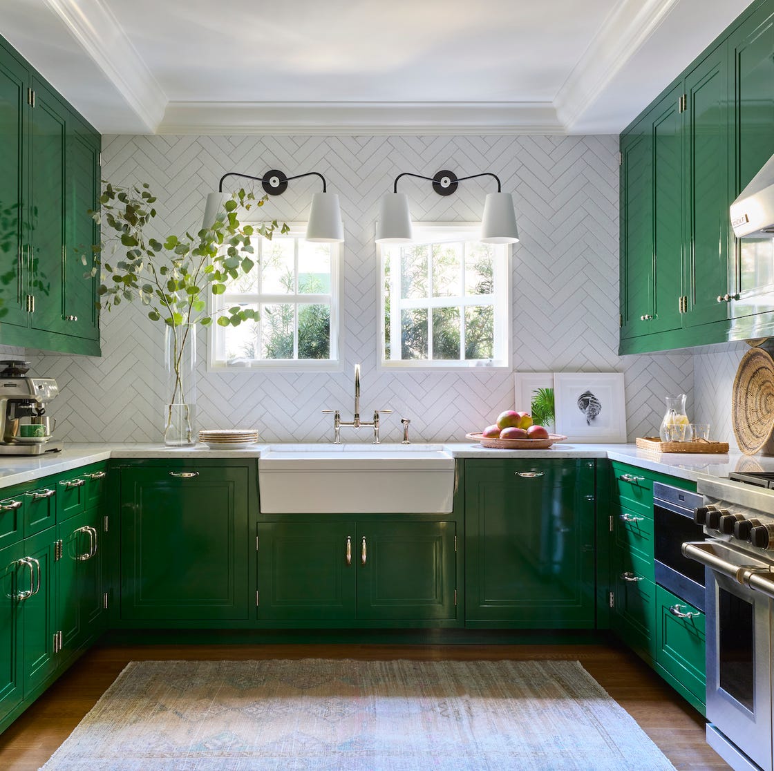
8 Kitchen Trends Designers Predict Will Be Everywhere in 2025

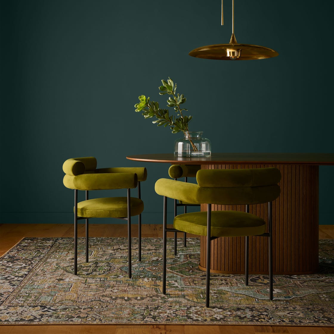
Behr's 2026 Color of the Year Is Here—And It’s Moody

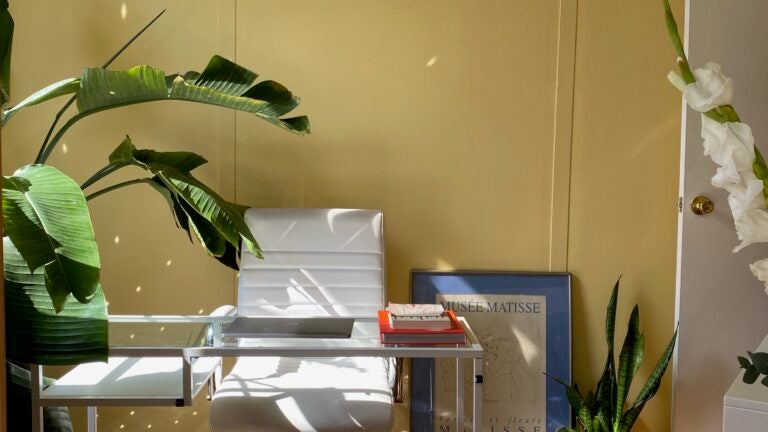
Take ‘Disco Nap’ for a spin. This lively hue is one of 2021’s colors of the year.

Take 'Disco Nap,' and other 2021 colors of the year, for a spin

2026 Color of the Year Announcements Have This In Common
Our 2026 Color of the Year Started With a Scandal-Plagued Royal—No, Not That One

Say Goodbye to Neutrals: Color-Drenching Will Define 2026 Interiors