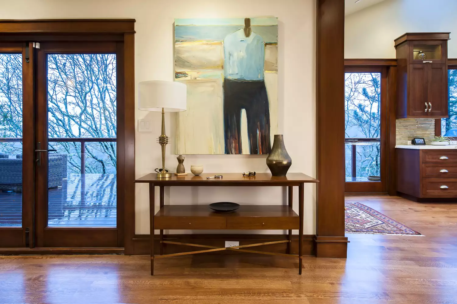
If Your Home Features Cherry Wood, These Paint Color Tips Are For You
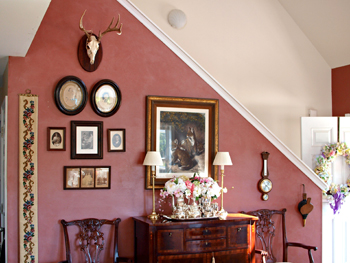
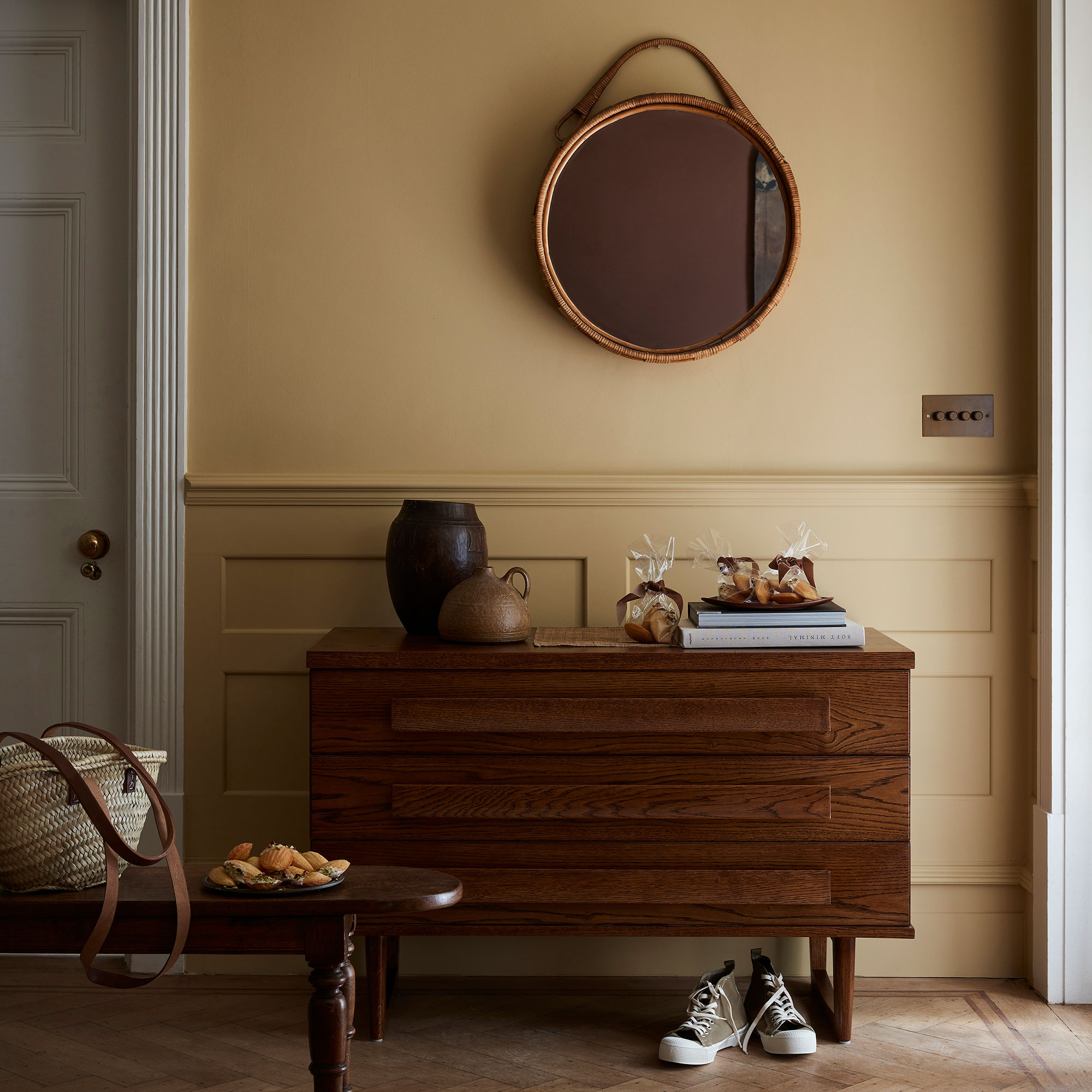
Cherry wood, often associated with traditional interiors, can also be integrated into contemporary designs, as it comes in various beautiful varieties globally, including black and pink woods from North America and exotic types from Brazil and Patagonia. When naturally stained, its beauty can enhance modern aesthetics. The main challenge when incorporating cherry wood into a home design is selecting appropriate paint colors that complement its inherent undertones and overall warmth. Designers emphasize that understanding the undertones of cherry wood is crucial for harmonious color pairing.
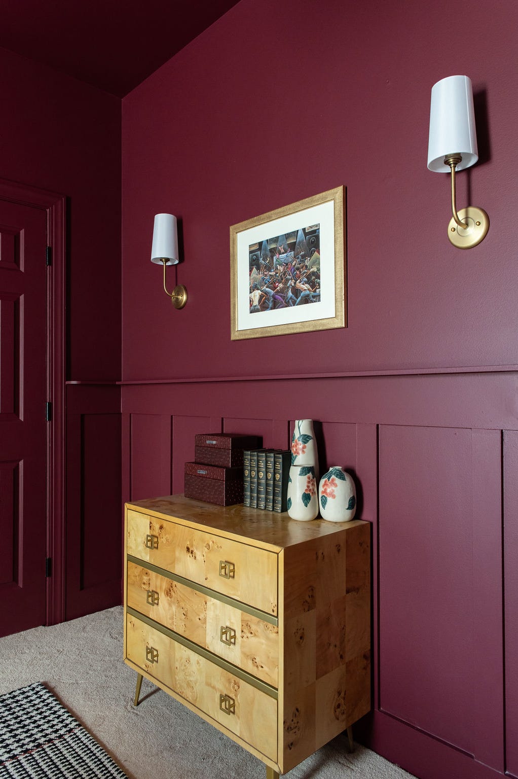
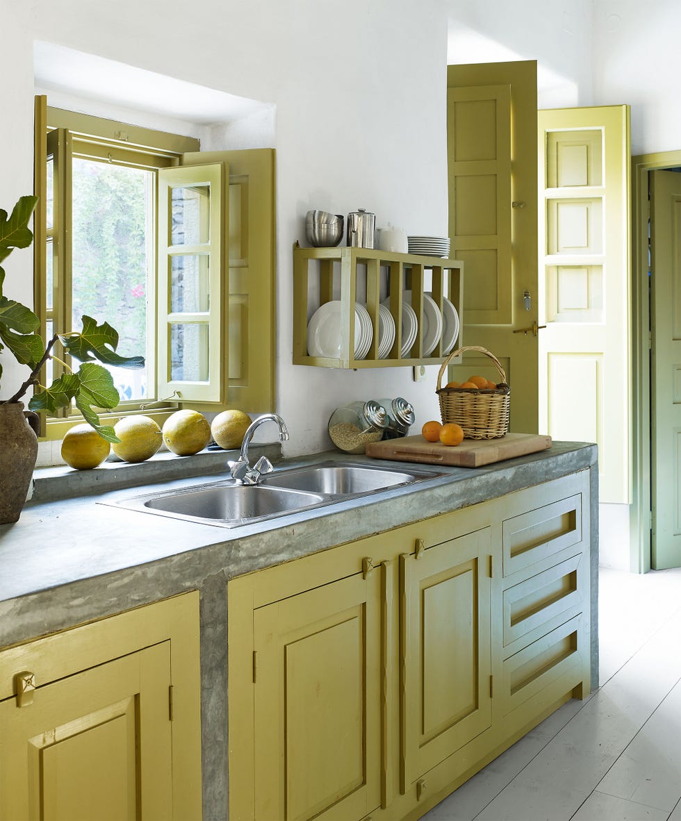
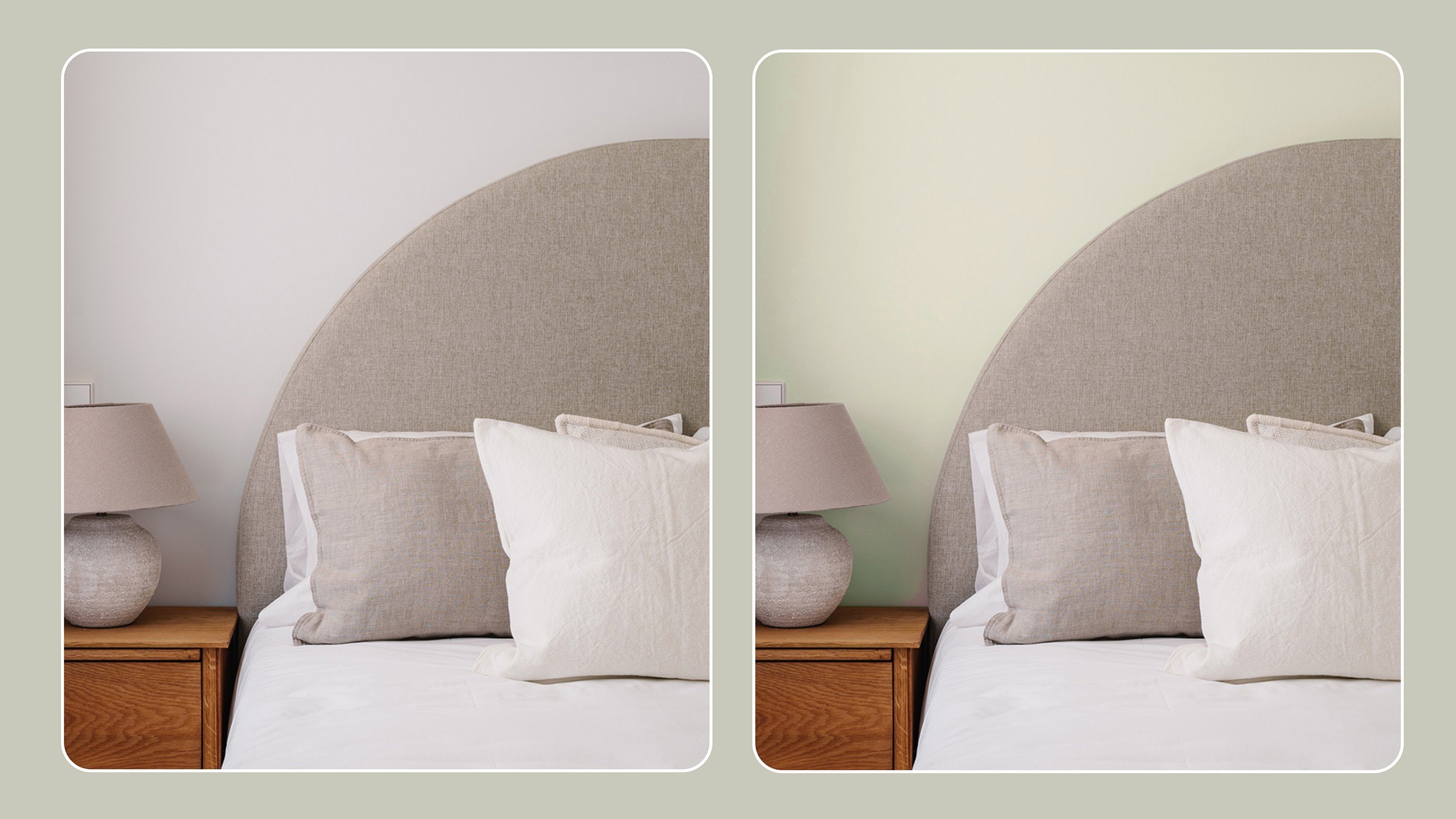
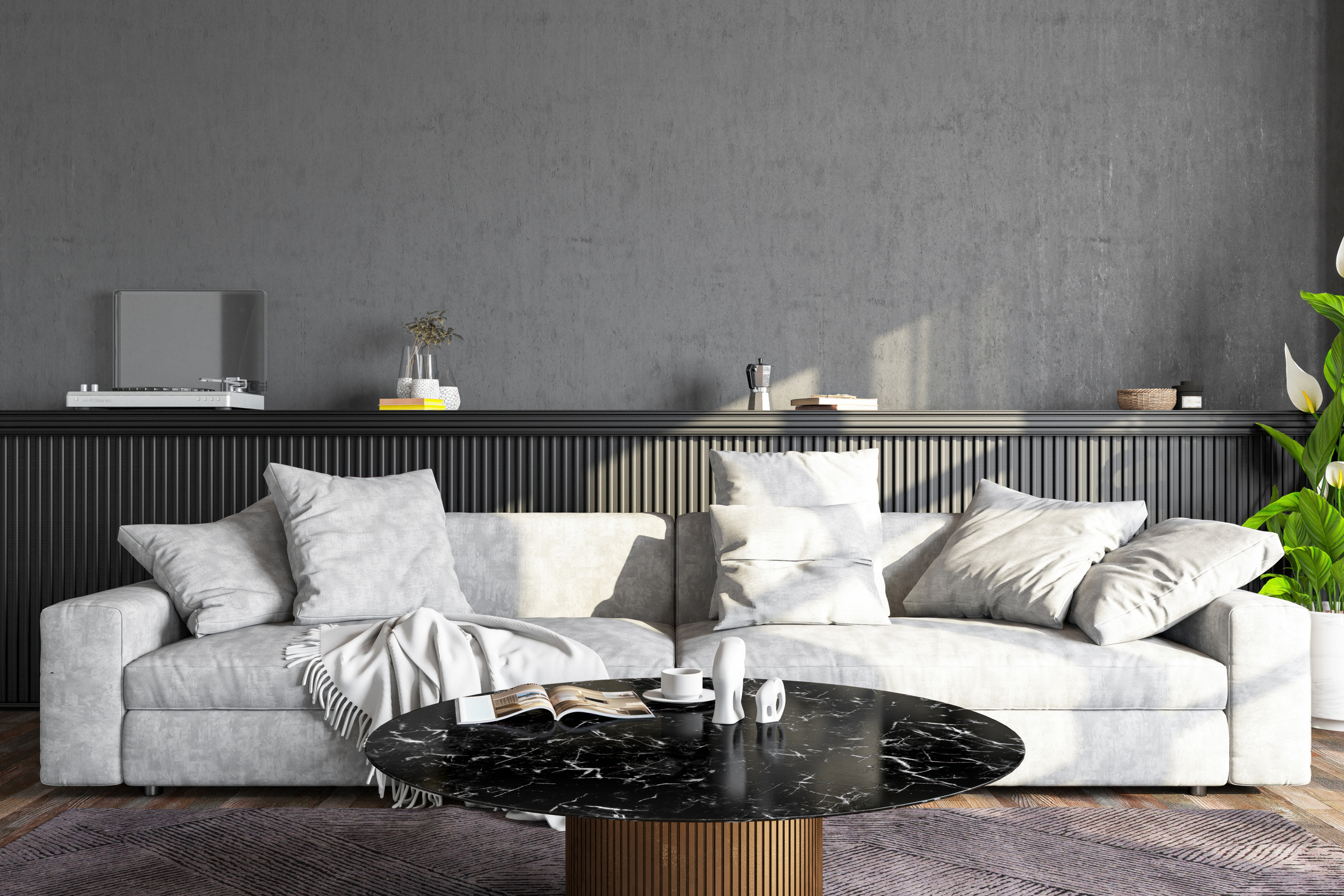
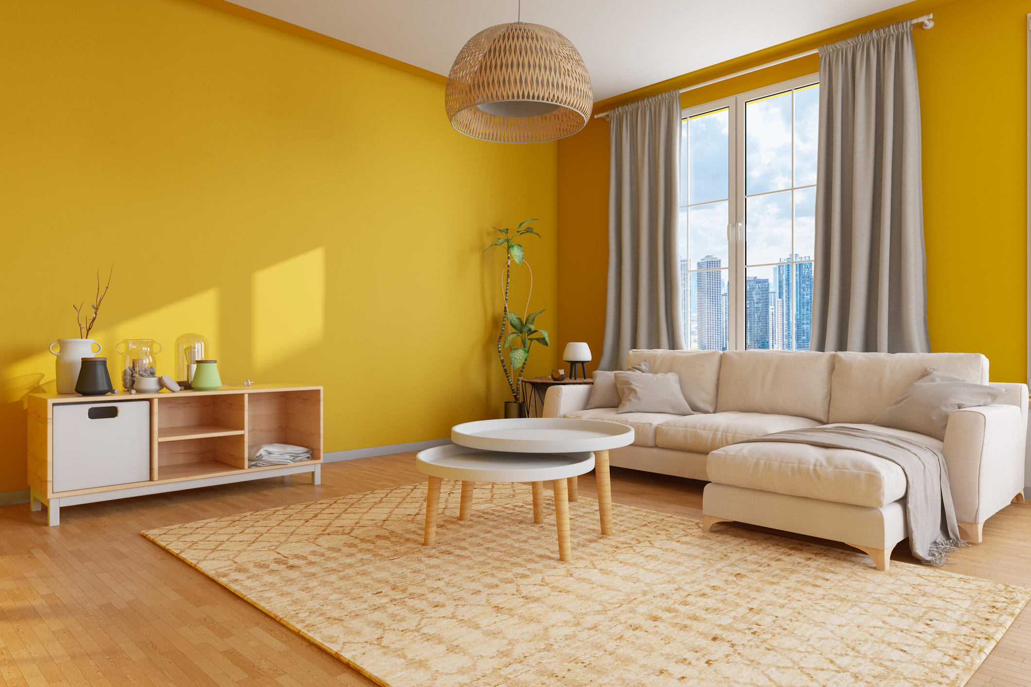
When choosing paint colors, it's essential to consider the subtle pink undertones present in cherry wood. Designer Shoshanna Shapiro advises selecting paint colors with both warm and subtle pink undertones to work effectively with the wood. She specifically recommends avoiding yellow, blue, and green hues, as these colors tend to clash with cherry wood's natural characteristics. Instead, Shapiro suggests Benjamin Moore Classic Grey, highlighting its warm grey undertones that complement cherry wood well. Another recommendation from Shapiro is Benjamin Moore Chantilly Lace, a soft white that provides a pleasant contrast and accentuates the wood's tones.
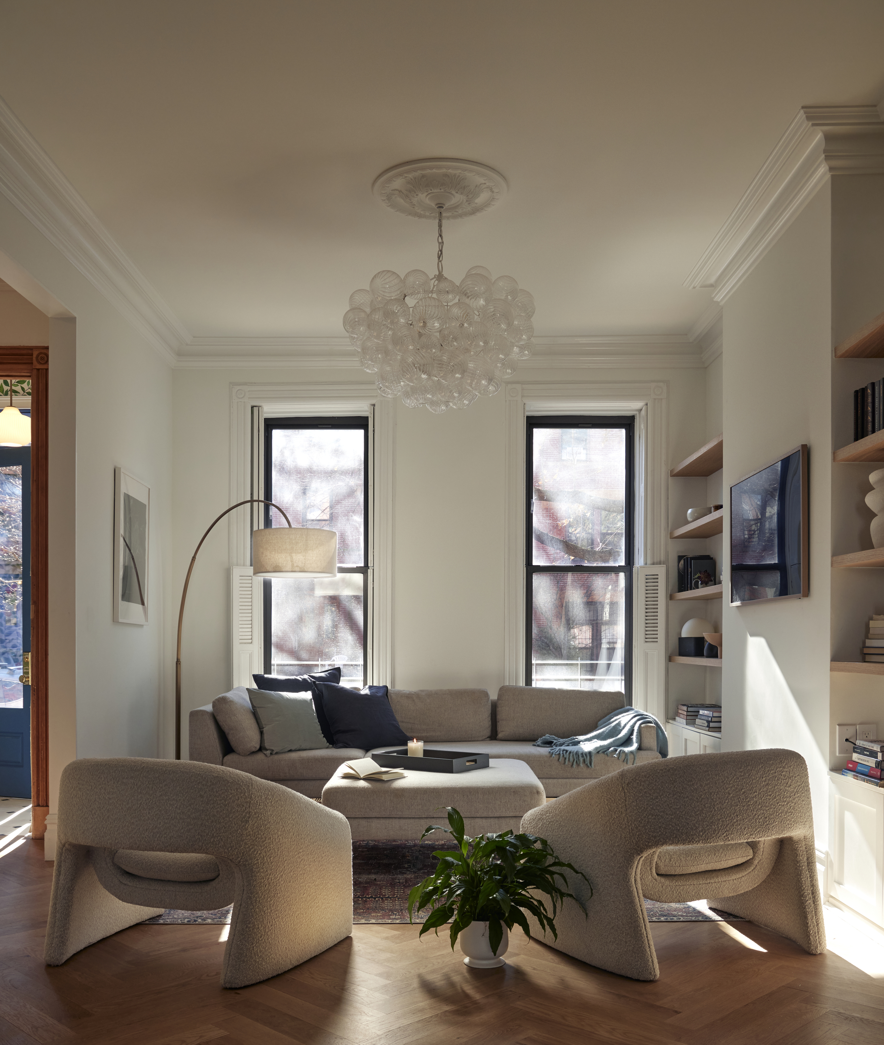
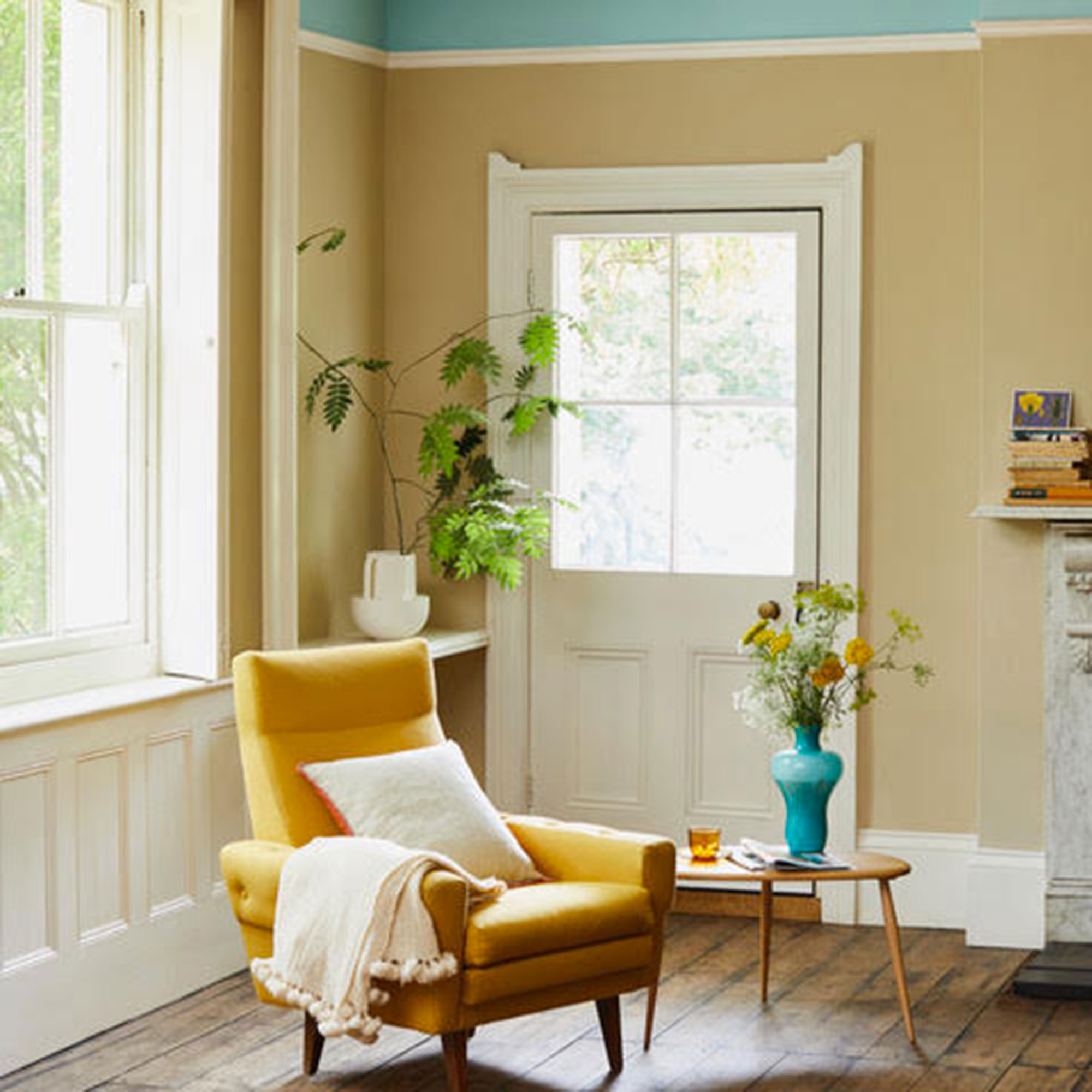
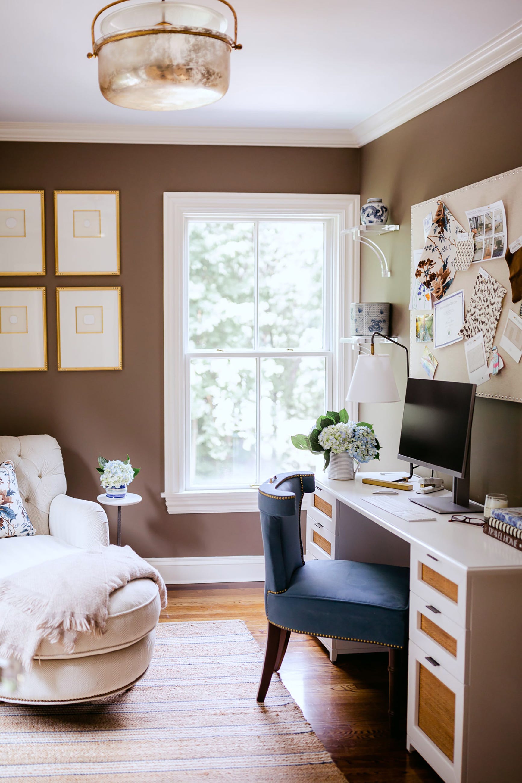
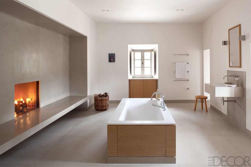
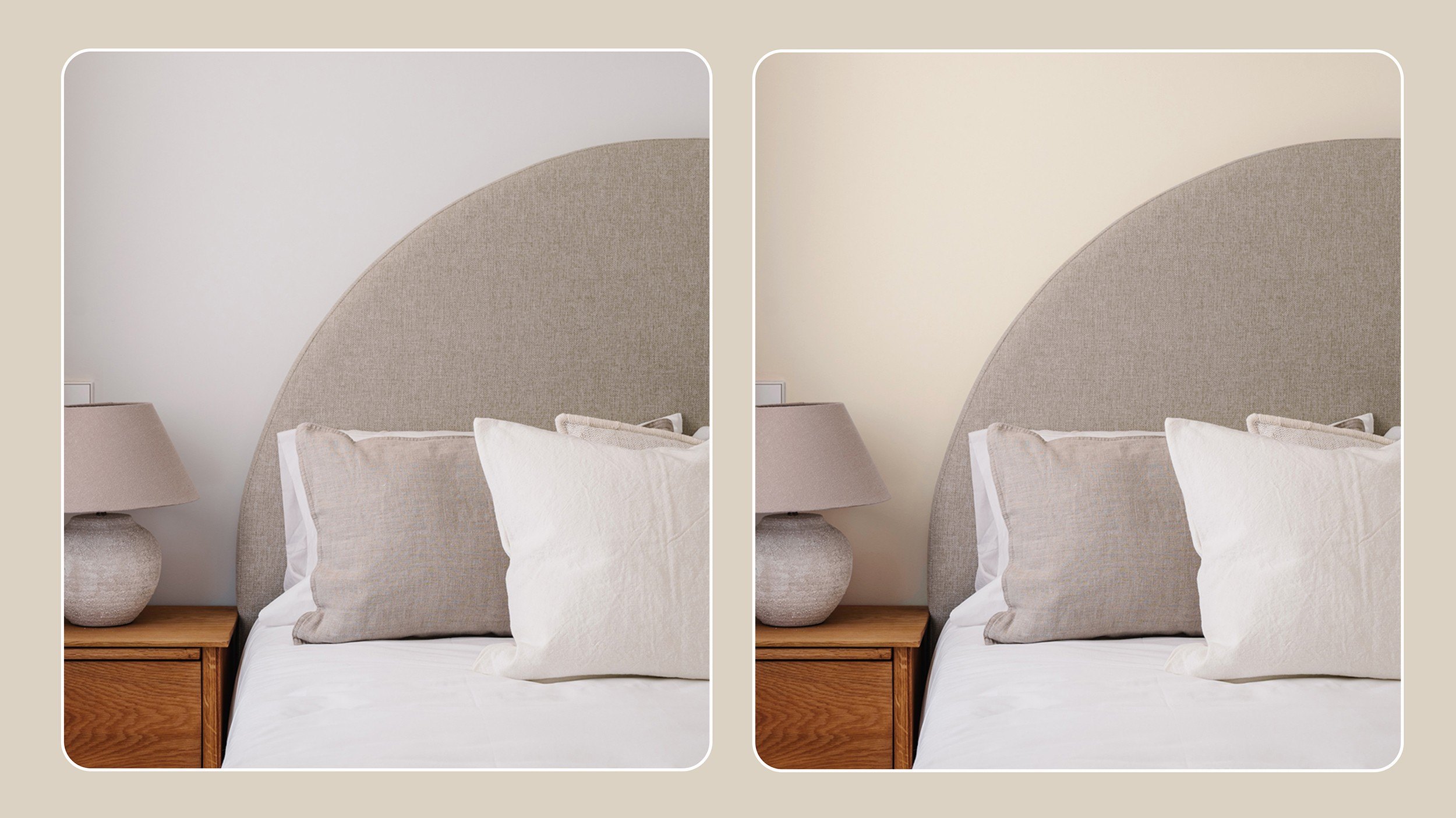
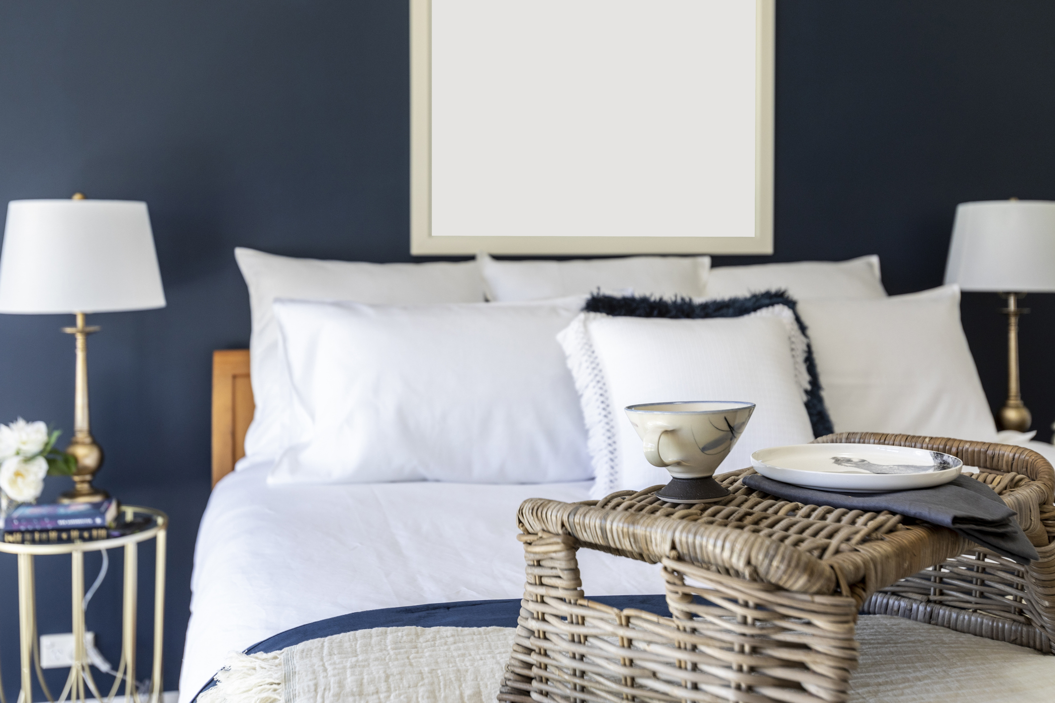
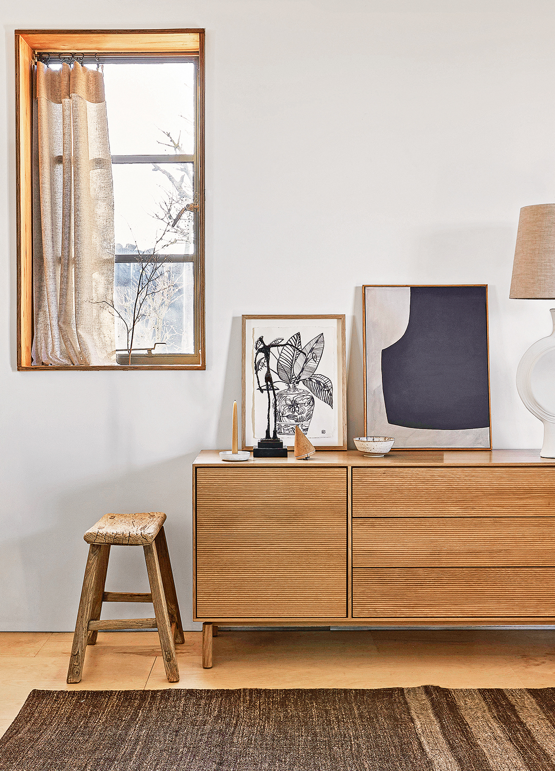
Cream and off-white shades are also considered excellent choices for cherry wood. Sherry Hope-Kennedy notes that these warm, neutral tones pair effectively with the wood’s earthy red. This combination offers a sophisticated look that is versatile enough to suit a variety of design styles, from modern dining areas and traditional bedrooms to transitional kitchens and contemporary home offices. These neutral options ensure a timeless and elegant backdrop for cherry wood furniture and finishes.
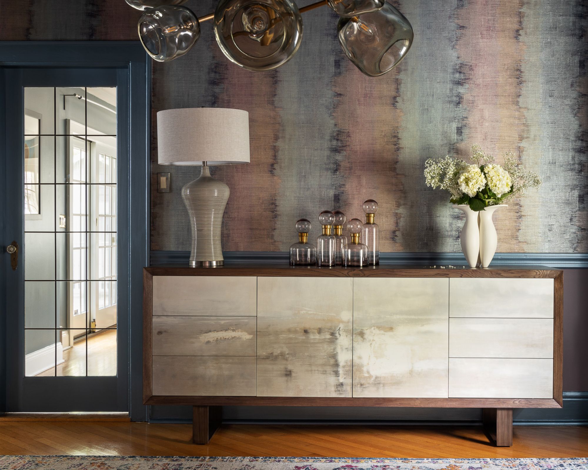
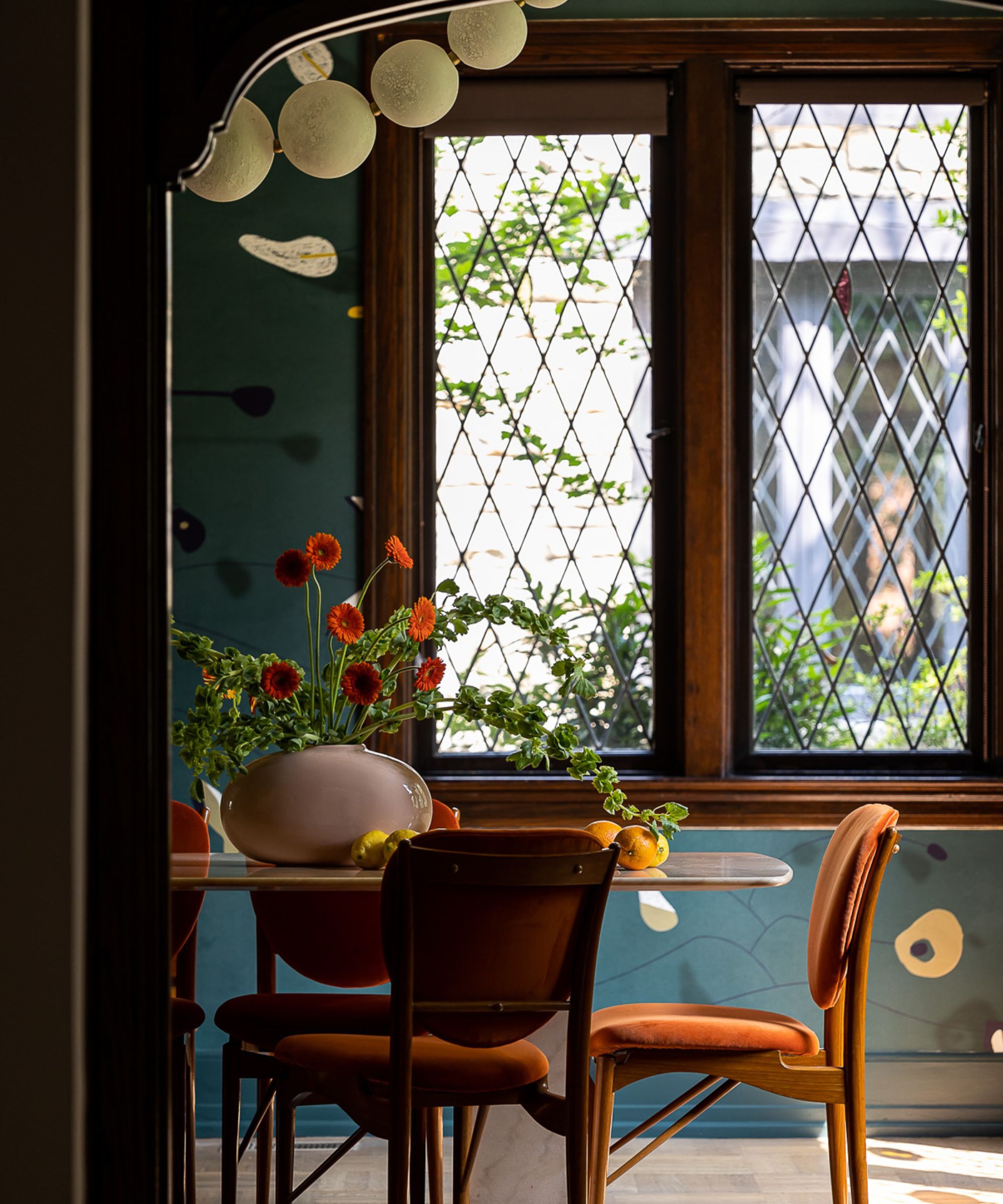
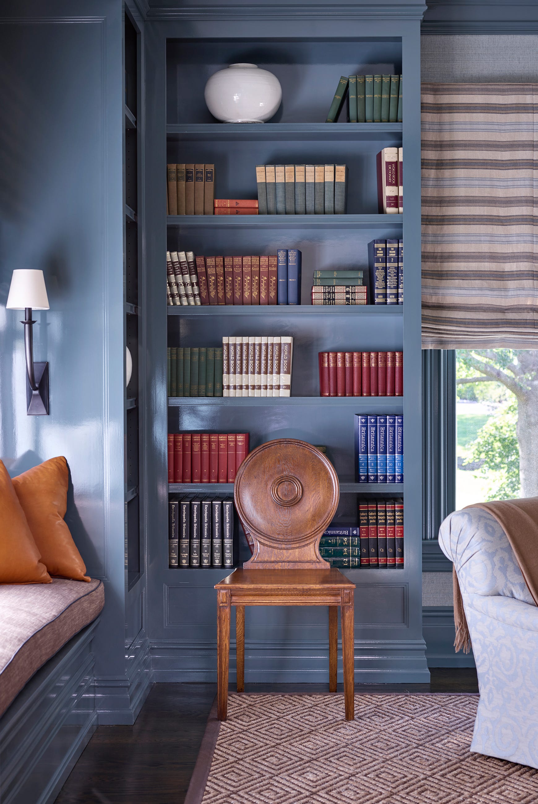
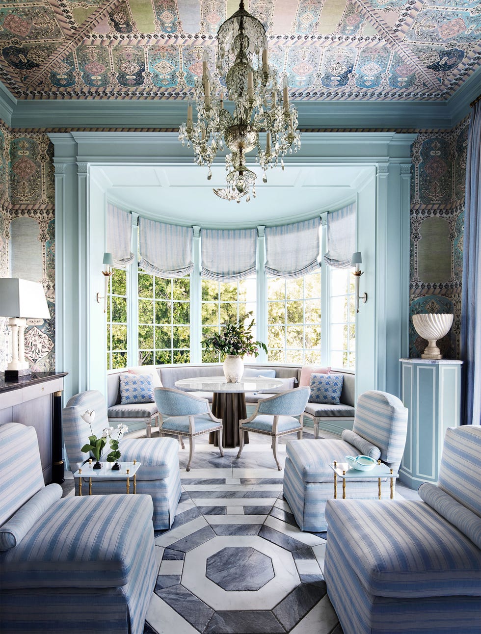
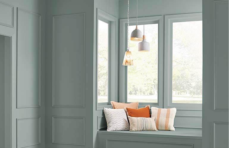
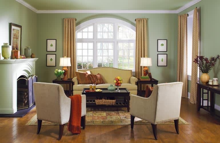
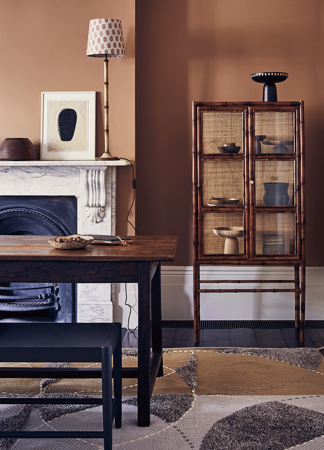
Alternatively, some designers suggest looking to the opposite side of the color wheel for complementary colors. Kevin O'Gara indicates that greens and blues can create an excellent contrast with the dark red tones of cherry wood, providing a balanced visual effect. Furthermore, O'Gara points out that using small accents of true red can paradoxically make the cherry wood appear cooler in tone, as the strong red accents contrast with the wood's inherent warmth. However, he cautions against overusing red due to its visual dominance, stressing the importance of balance in such applications.
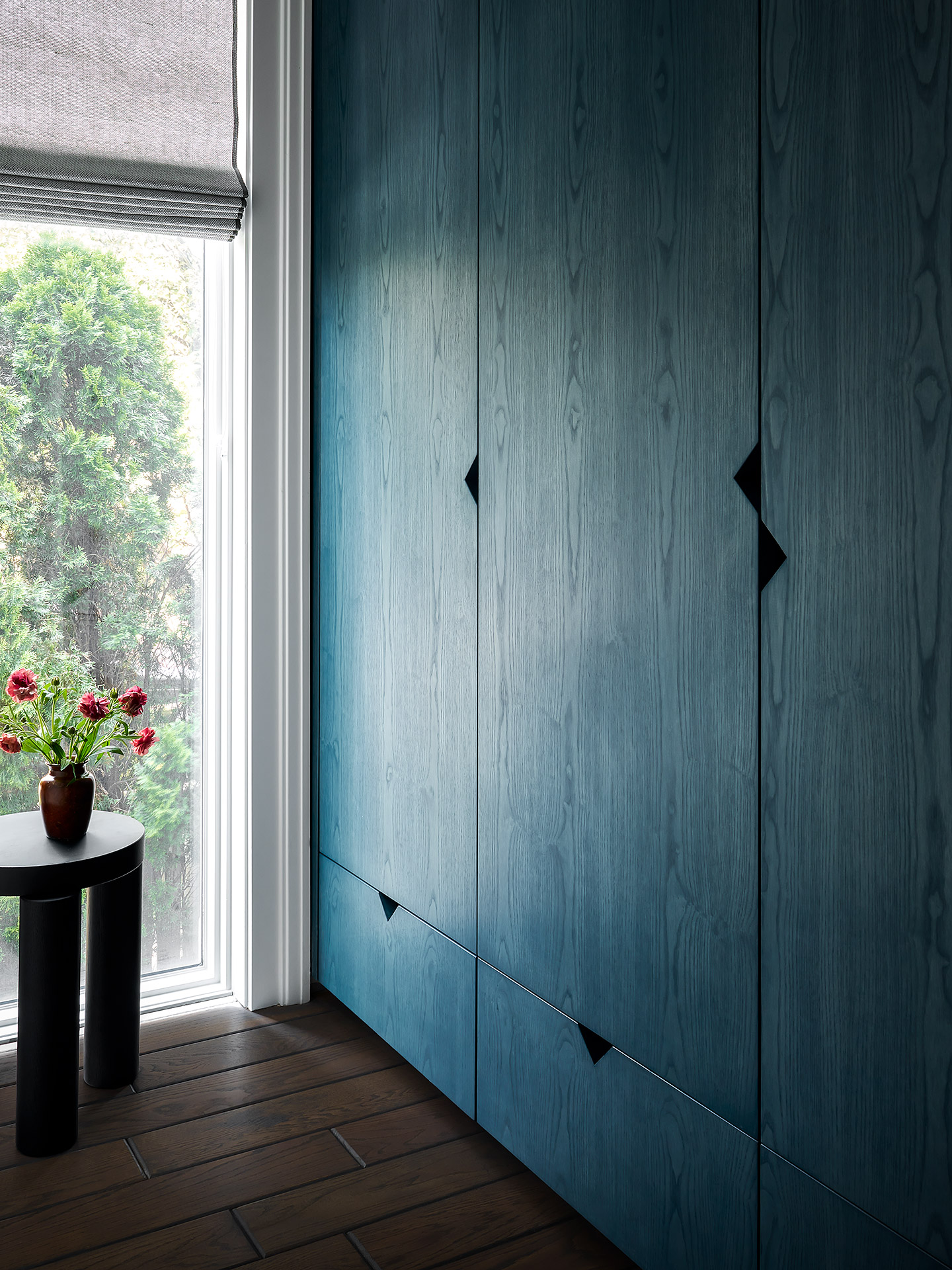
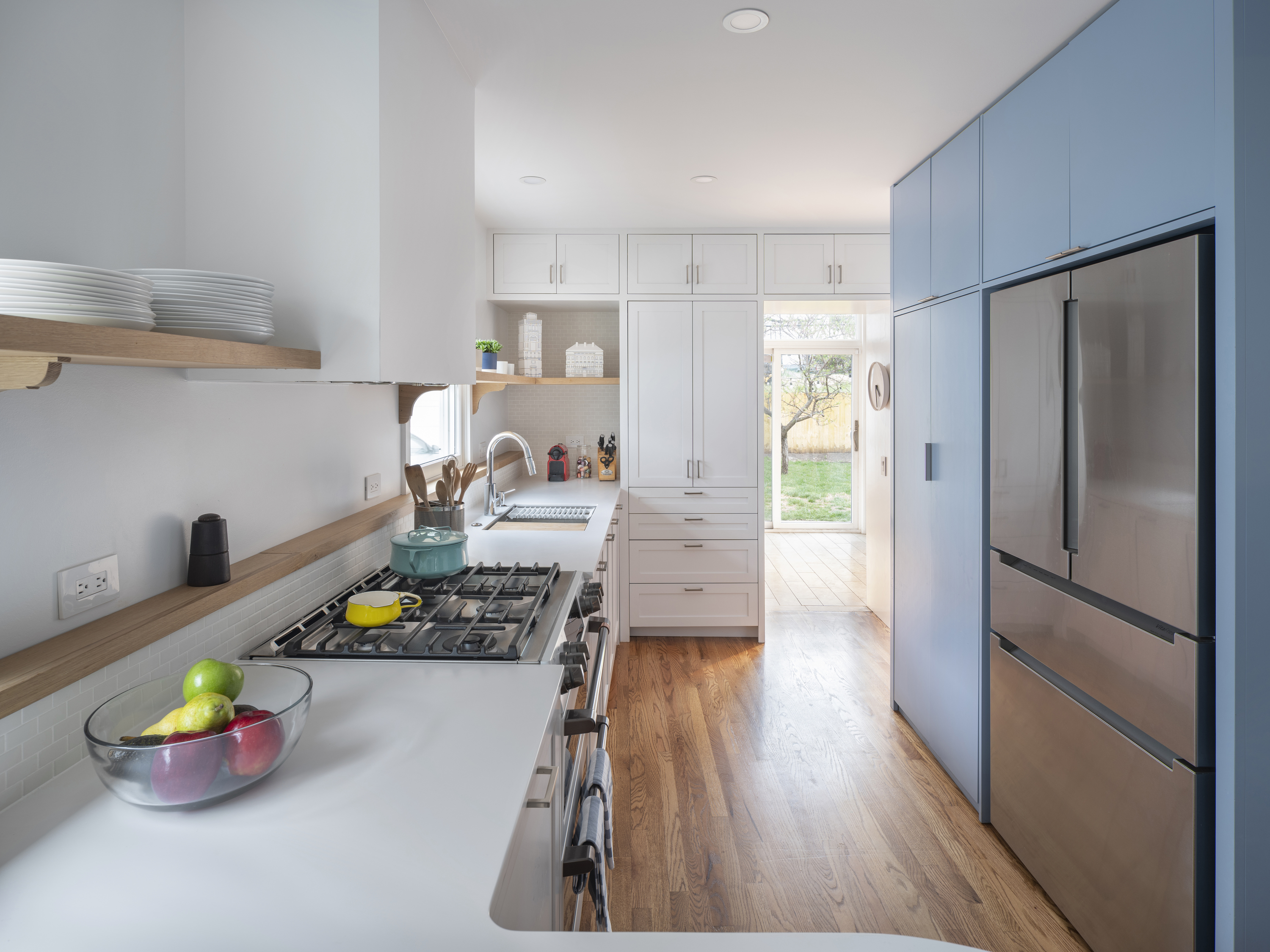
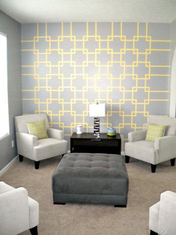
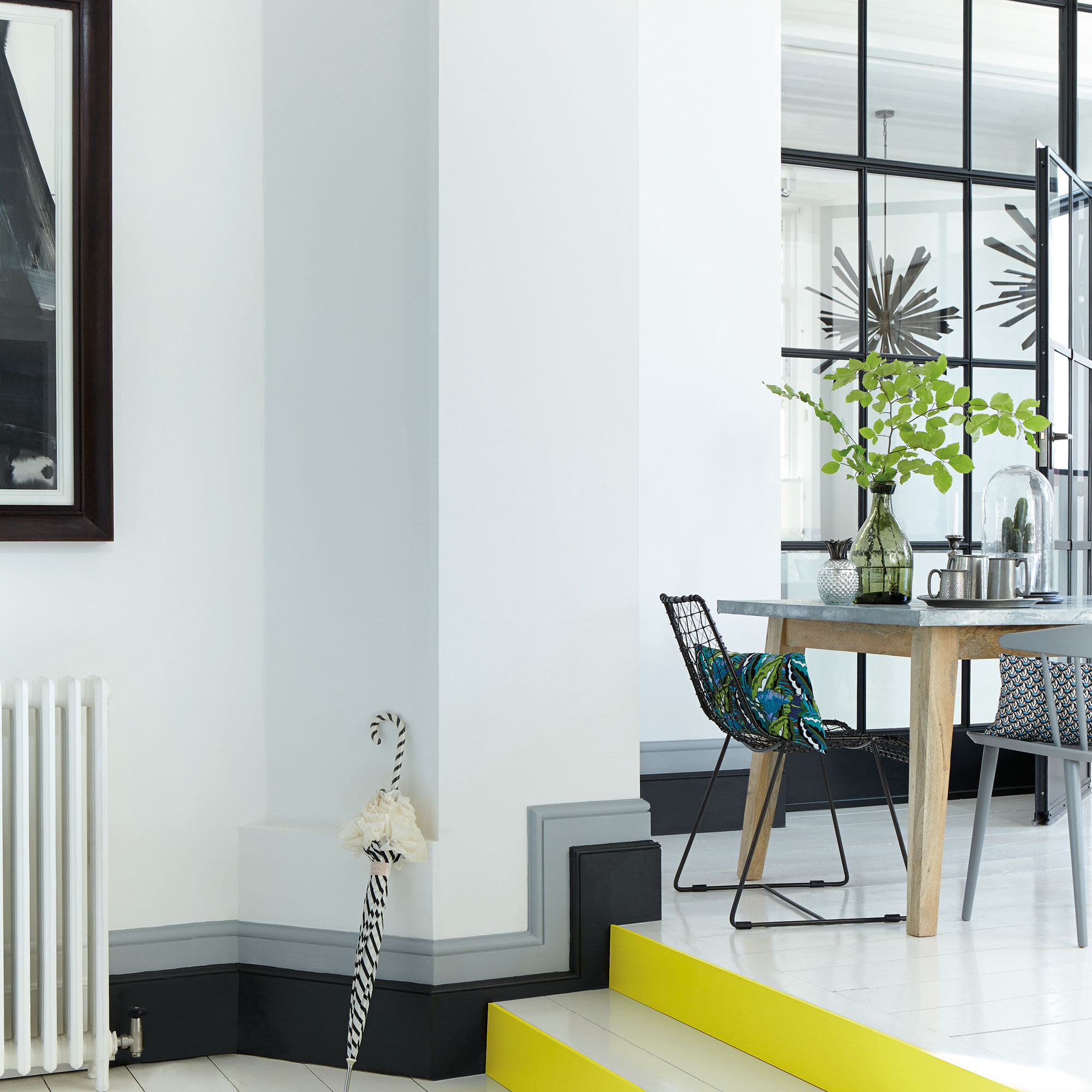
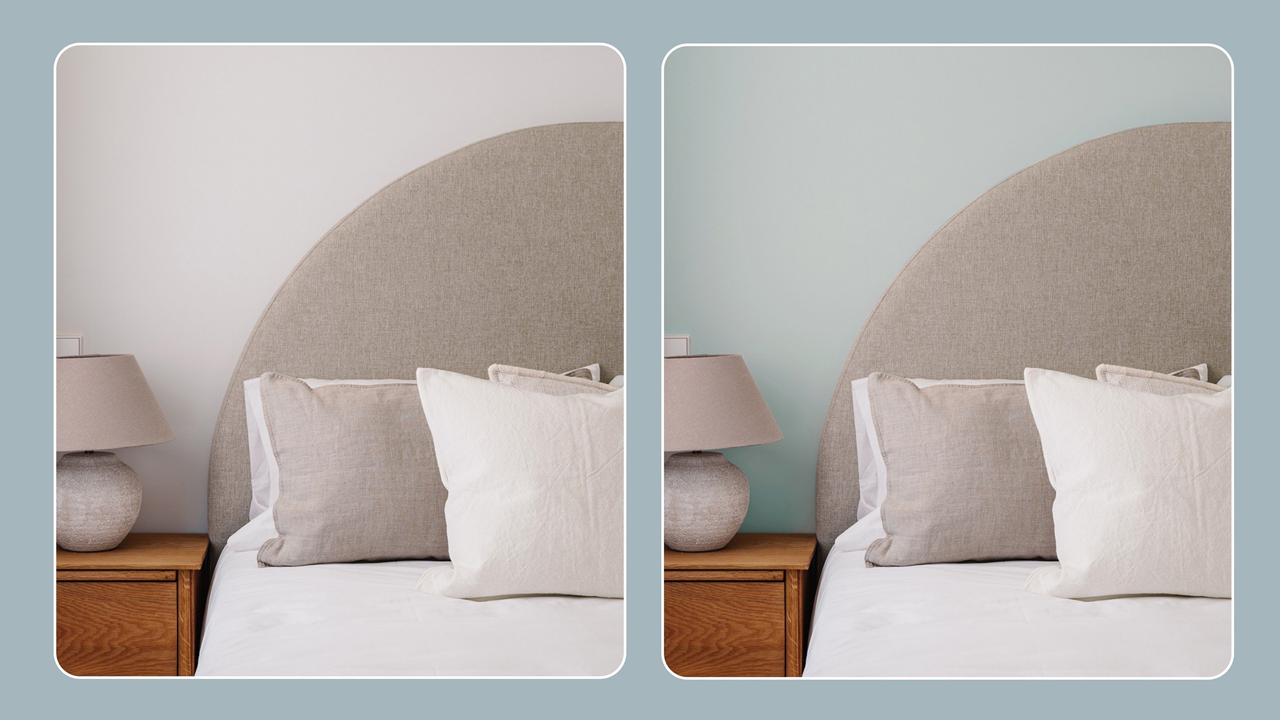
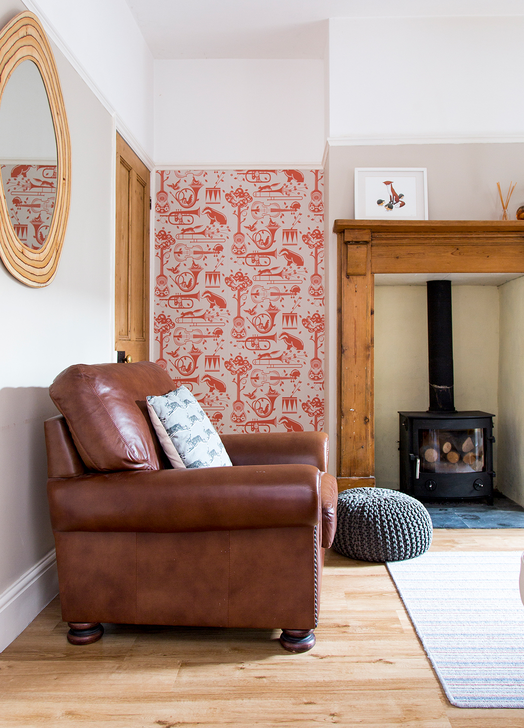
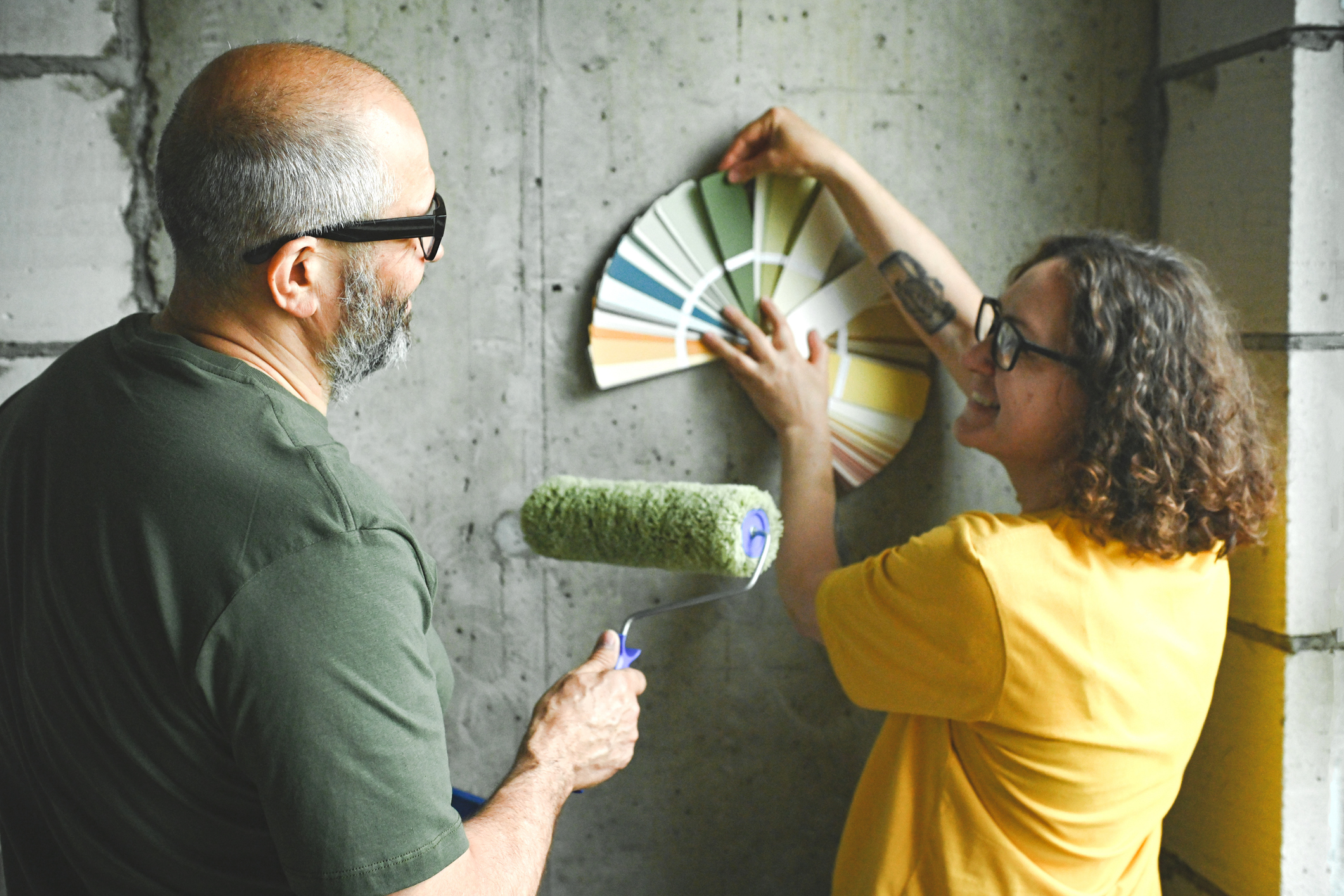
For those aiming for a more contemporary aesthetic with cherry wood, John Lum suggests treating the wood as an architectural material for elements like cabinetry, trim, and casework. He advises using light blue or gray paint colors in these settings to create a more energetic feel, making the cherry wood visually "pop" in a modern context. Ultimately, the paint selection process should involve practical steps such as gathering inspiration from design magazines, blogs, and social media platforms like Pinterest and Instagram. It is also recommended to test paint swatches on walls, placing them near cherry wood elements, to observe how the colors interact under different lighting conditions throughout the day before making a final decision.
#CherryWood #PaintColors #InteriorDesign #HomeDecor #ColorSchemes #DesignTips #WoodFurniture #HomeImprovement #DesignTrends #CherryWood #PaintColors #InteriorDesign #HomeDecor #ColorSchemes #DesignTips #WoodFurniture #HomeImprovement #DesignTrends
0 comment in total
 No comments yet
You may also like
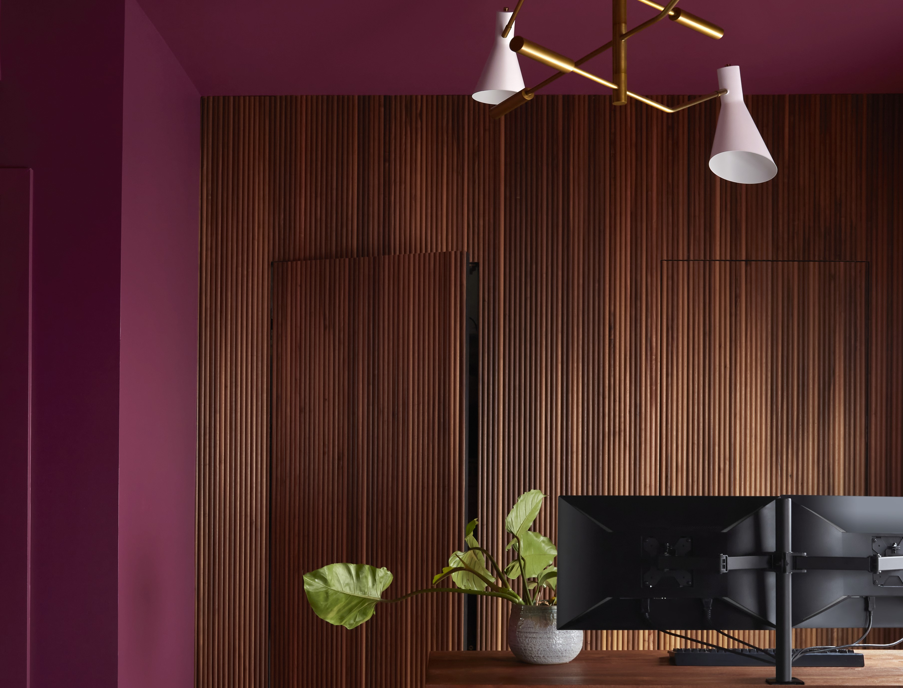
Paint Colors That Go With Natural Wood — 10 Picks That Bring Out the Beauty of This Organic Material

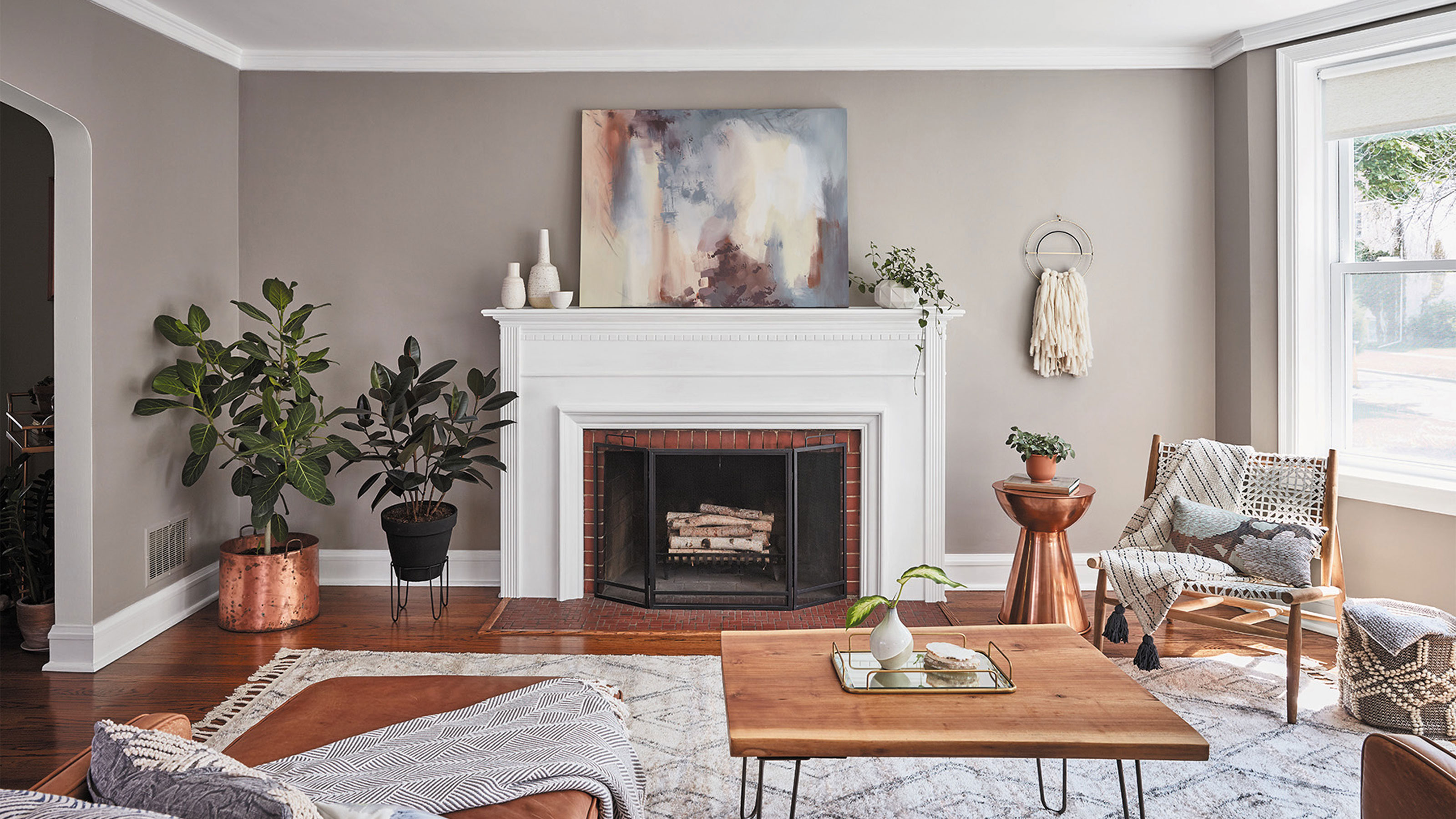
Should woodwork be lighter or darker than walls? The rules colour experts use to choose the perfect colour
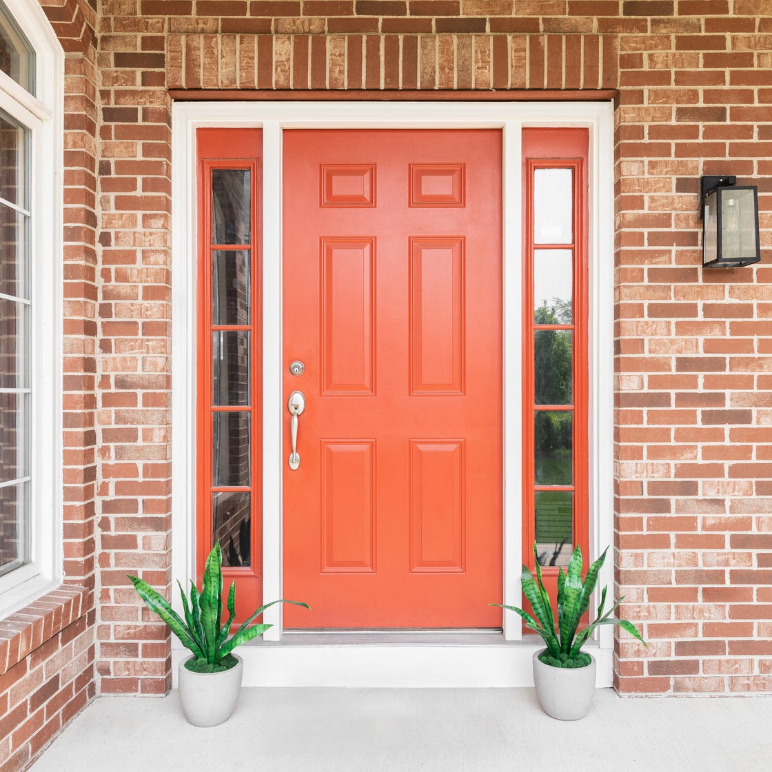
8 Surprising Colors That Will Decrease Your Home's Value, According to Experts

8 Paint Colors That Pair Beautifully With Dark Wood, According to Designers

Update your home with these paint tips!

The Interior Paint Colors You'll Be Seeing Everywhere in 2024

The Sweet Sophistication of Cherry Mocha Is Here to Elevate Your Home

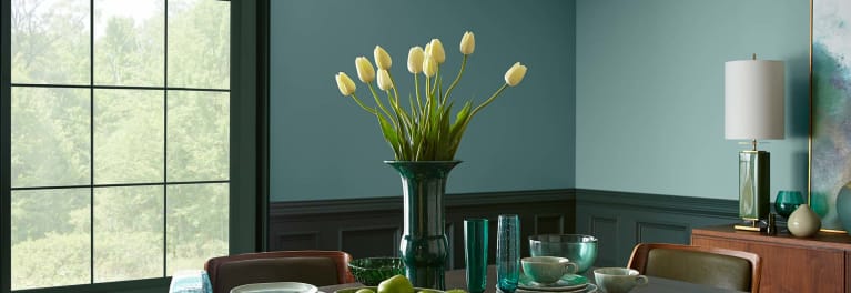
Hottest Interior Paint Colors of 2018
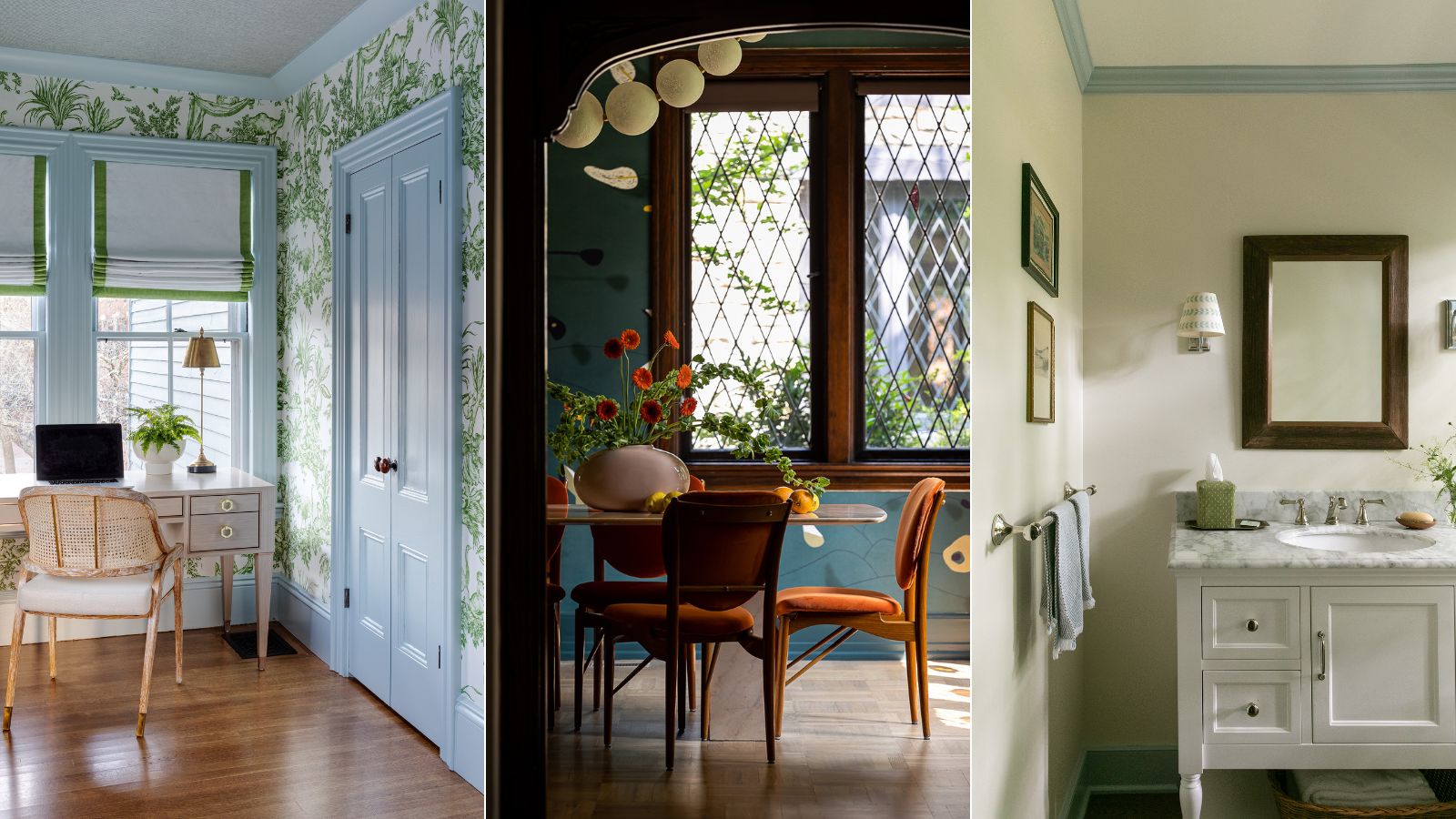
What color should you paint woodwork? Expert ways to factor this small yet impactful detail into color schemes

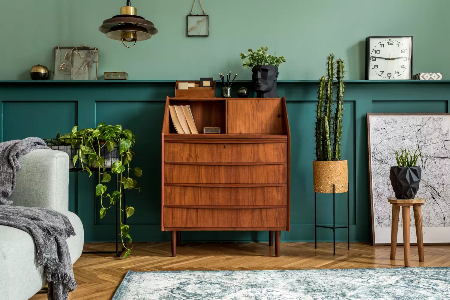
How to Choose Paint Colors to Complement Wood Tones in Your Home
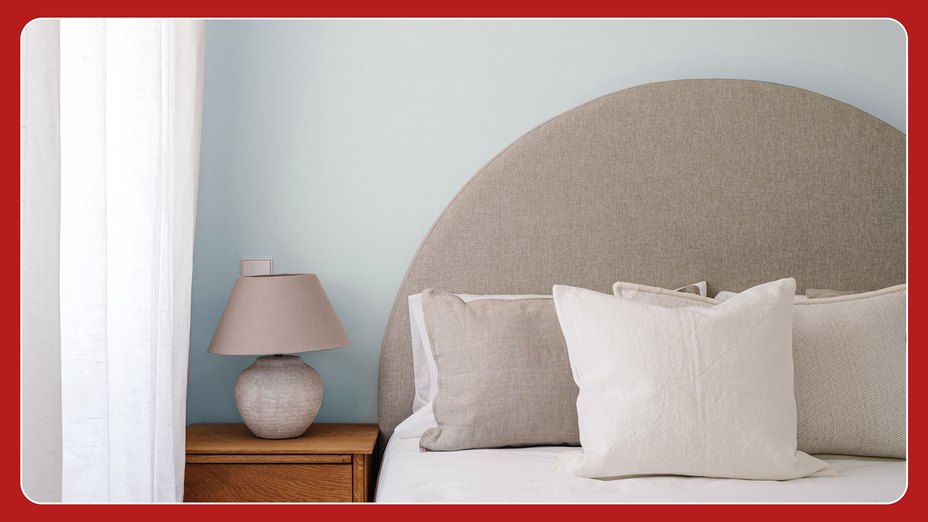
Millennial Gray Is So Over—Here Are 5 Paint Colors to Try Right Now
These Dark Interior Colors Can Sell Your House for More Money, According to Zillow

Cherry Red Is Trending – Here’s How To Style It In Your Home
Incorporate Color Drenching Into Your Home Design

Best Wood Stain Colors For Interior And Exterior Surfaces

5 rules of thumb for mixing wood tones around your home, shared by interior designers

Here's What Colorists Want You to Know About Picking House Paint

Why the Correct Trim Color Can Totally Transform Your Home

An A-List Designer’s Secrets To Picking Perfect Paint Colors

8 Timeless Paint Colors That Always Look Fresh, No Matter the Season