1/13
Get A Home Town-Inspired Look With Erin Napier's Top Painting Tips
Paint is often considered a cost-effective method for renovating a room or an entire house, offering a fresh appearance for a relatively low investment. Despite its perceived simplicity, painting involves various complexities that can significantly impact the final outcome. Ben and Erin Napier, known for their work on “Home Town,” have demonstrated how paint can transform older residences into updated, charming homes. Erin Napier, with a background in fine arts and extensive experience in decorating, emphasizes the transformative power of paint, stating, “Paint changes the world.” Through their work, the Napiers have accumulated valuable insights and practical advice on painting.
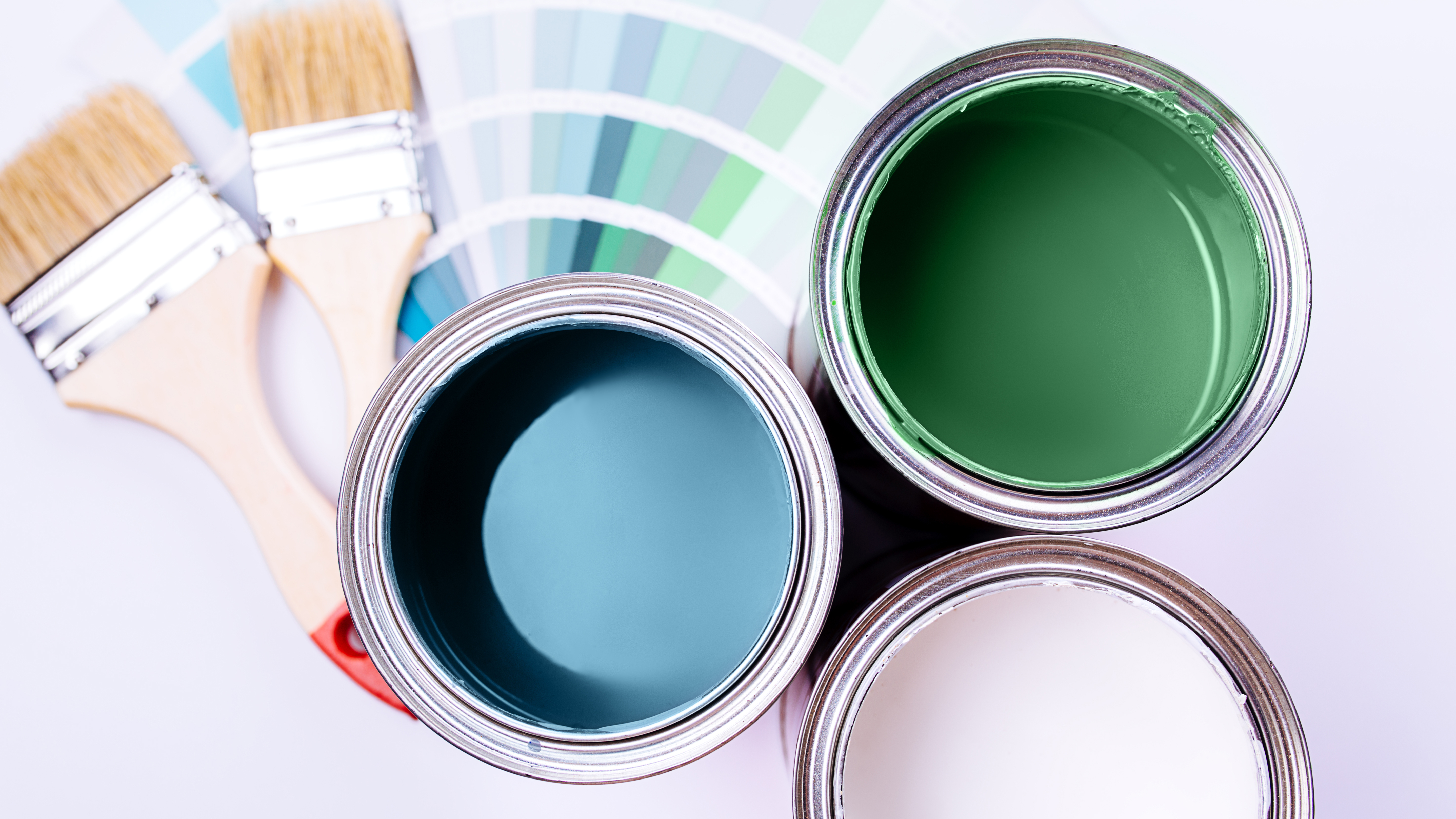
One crucial tip from Erin Napier is the importance of swatching paint colors. She advises against skipping this step, especially for exteriors, because paint can appear differently on a wall than in a can due to factors like room aspect and floor tone. Napier recommends bringing home several paint samples and brushing them onto a sizable section of the wall for comparison. It is important to apply a second coat to swatches, as a single coat can look lighter and less saturated. Moreover, the existing wall color can influence how swatches appear, with light colors making swatches seem darker and warm tones accentuating cool shades. To counter this, painting large test squares is essential, and avoiding small patches for color determination is advised.
Lighting is another critical factor that significantly alters how paint colors are perceived. Erin Napier highlights that artificial light and natural sunlight affect paint differently. For interiors, direct sunlight, diffused light, and artificial lights all interact uniquely with paint shades. Therefore, it is important to swatch in various spots to observe how the color performs under different lighting conditions, including dark corners and under planned long-term lighting fixtures. Choosing the right light bulb color is also important to enhance paint colors effectively.
The Napiers also offer advice on what not to paint. Erin Napier suggests not painting historic trim or original wood paneling, as it can be a significant mistake that removes the home's original character and depth. Old growth wood is unique and cannot be replicated with paint. However, if trim is in poor condition or is paint-grade pine, painting might be a practical solution. Personal taste is also a factor, but painting over historic elements solely due to current trends is cautioned against.
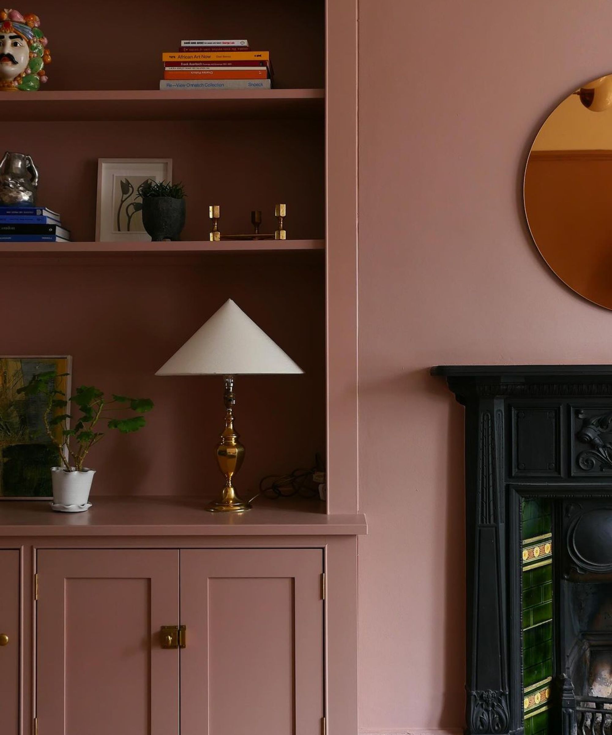
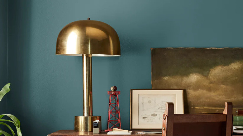
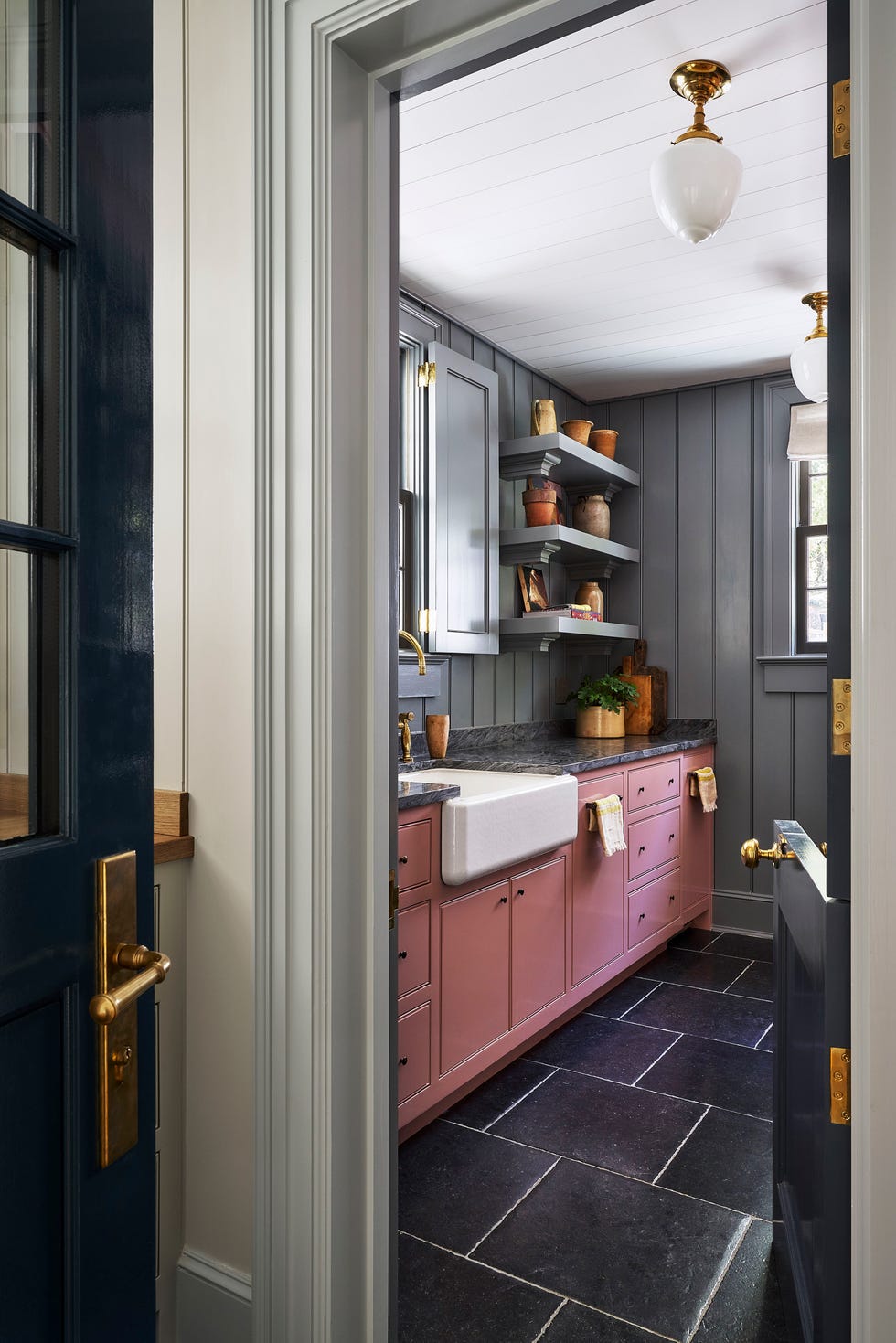
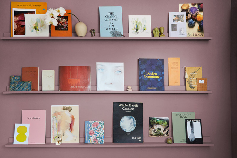
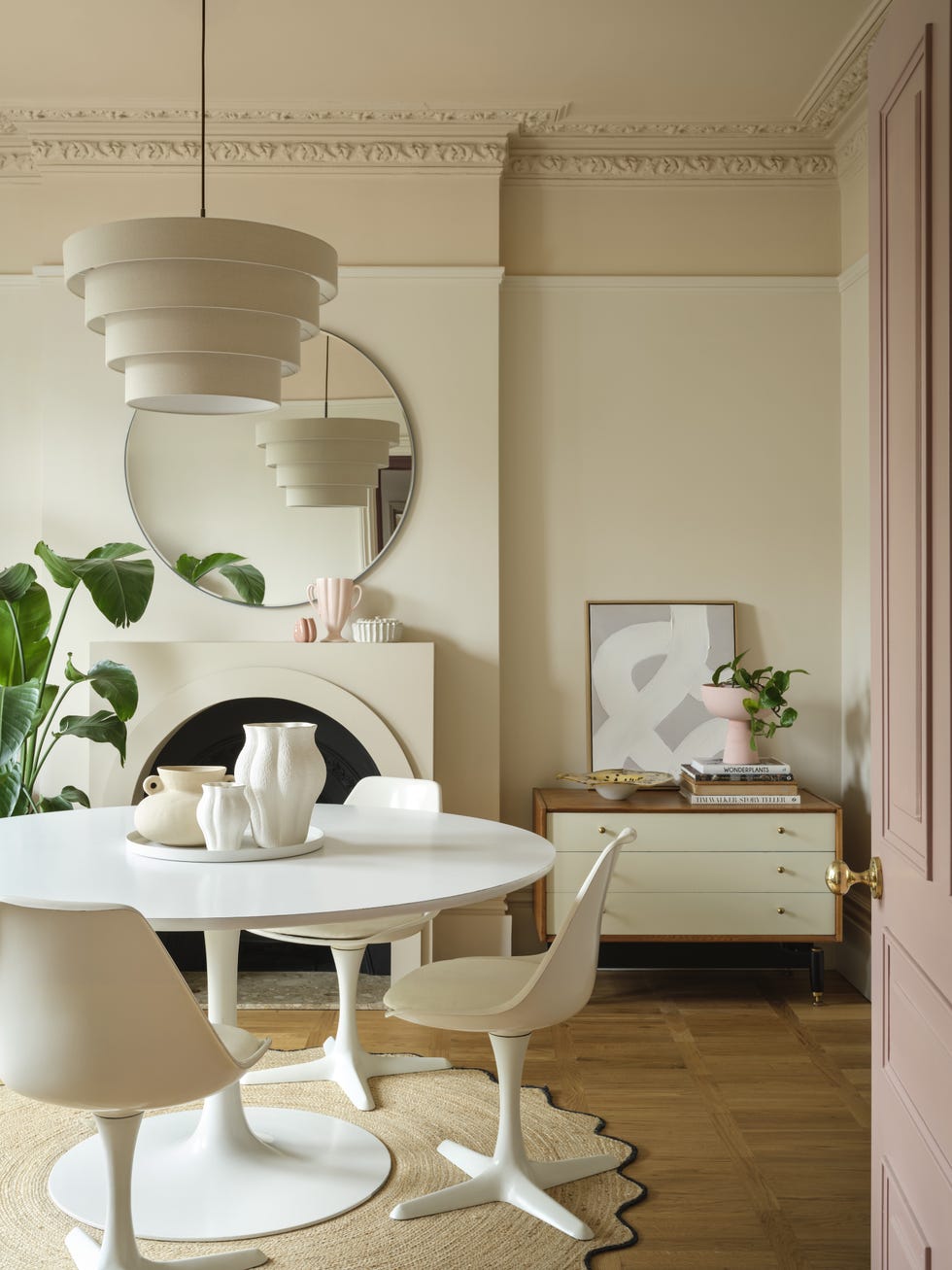
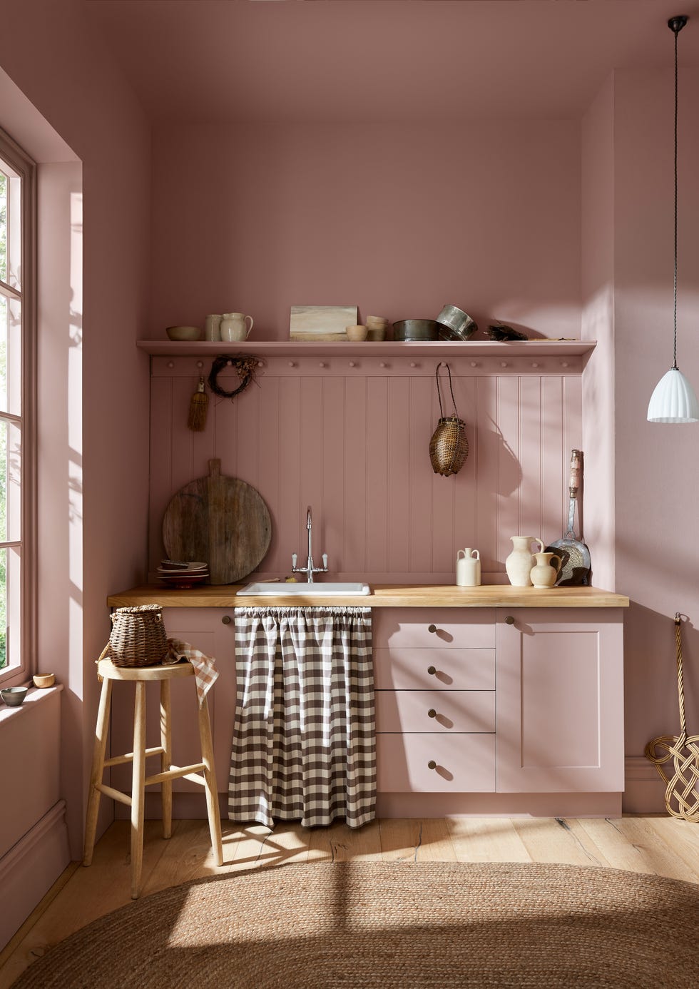
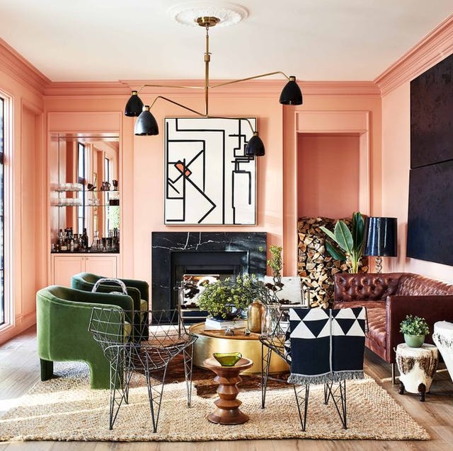
For an aged aesthetic, Erin Napier recommends choosing paint colors with yellow undertones, which she refers to as “dinge.” This subtle yellow infusion helps colors feel integrated and natural, preventing them from appearing too new or out of place. She suggests specific shades like Dover White by Sherwin-Williams for a versatile white and Rock Bottom by Sherwin-Williams for a moody tone. When considering pink shades, Napier advises opting for dusty pinks with yellow undertones, such as Cape Sands by Valspar, to achieve a neutral and mature look that avoids a “babyish” or “bubblegummy” feel. Deeper, dusty pinks like Sulking Room Pink by Farrow & Ball are also gaining popularity for their subtle, sophisticated appeal.
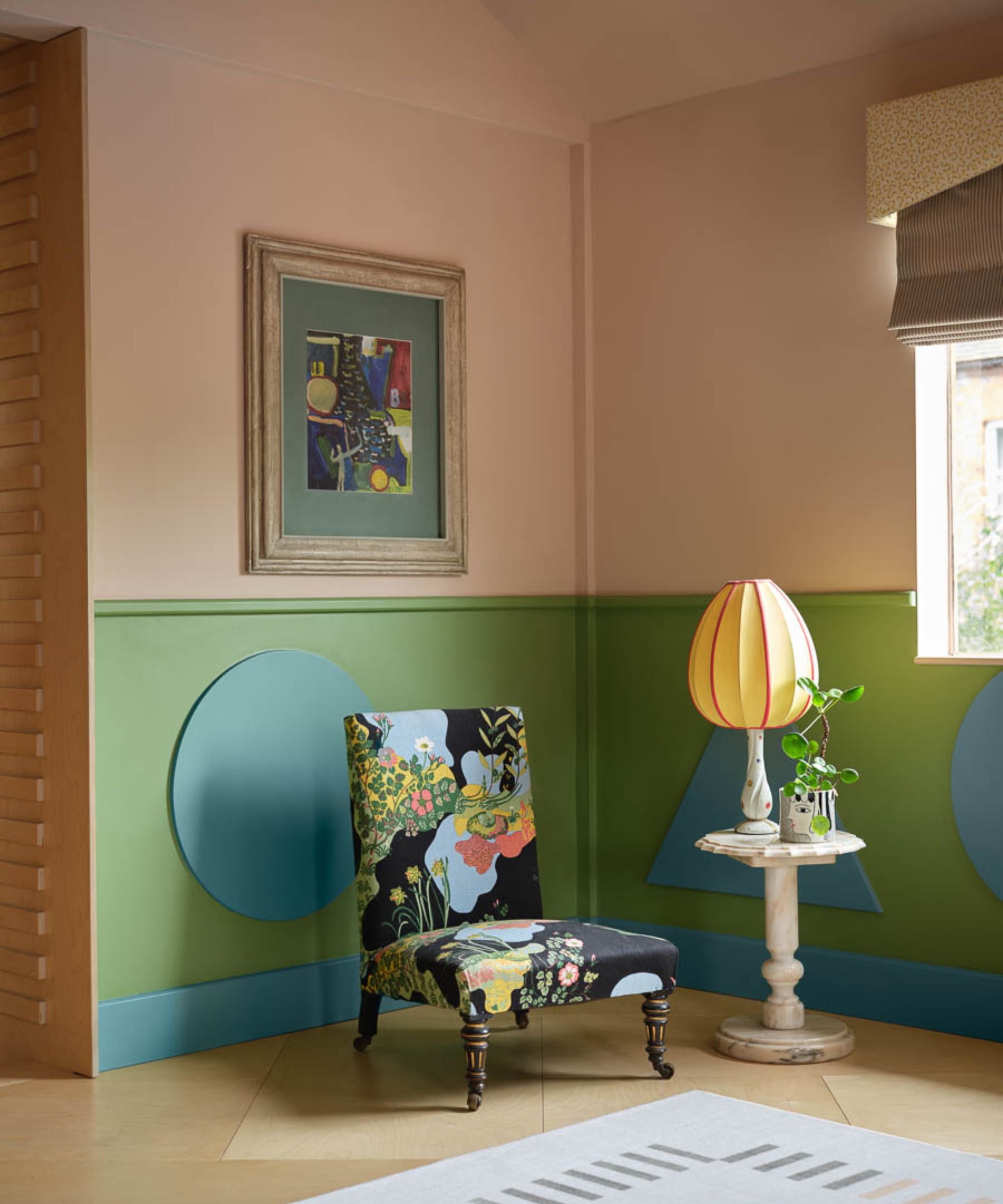
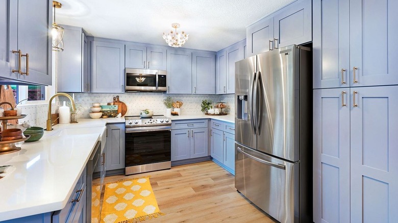
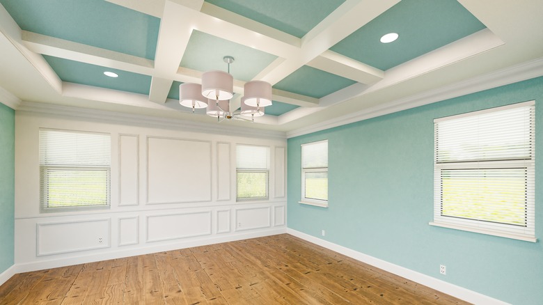
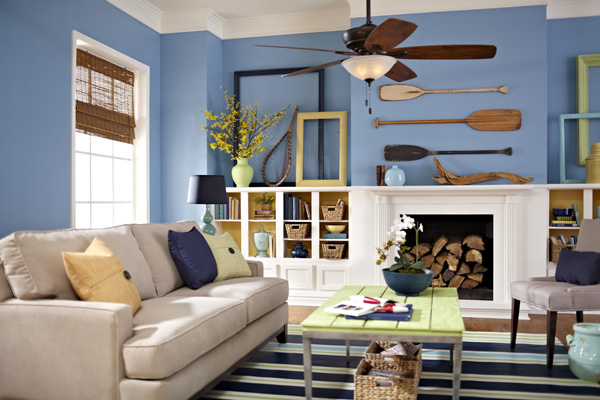
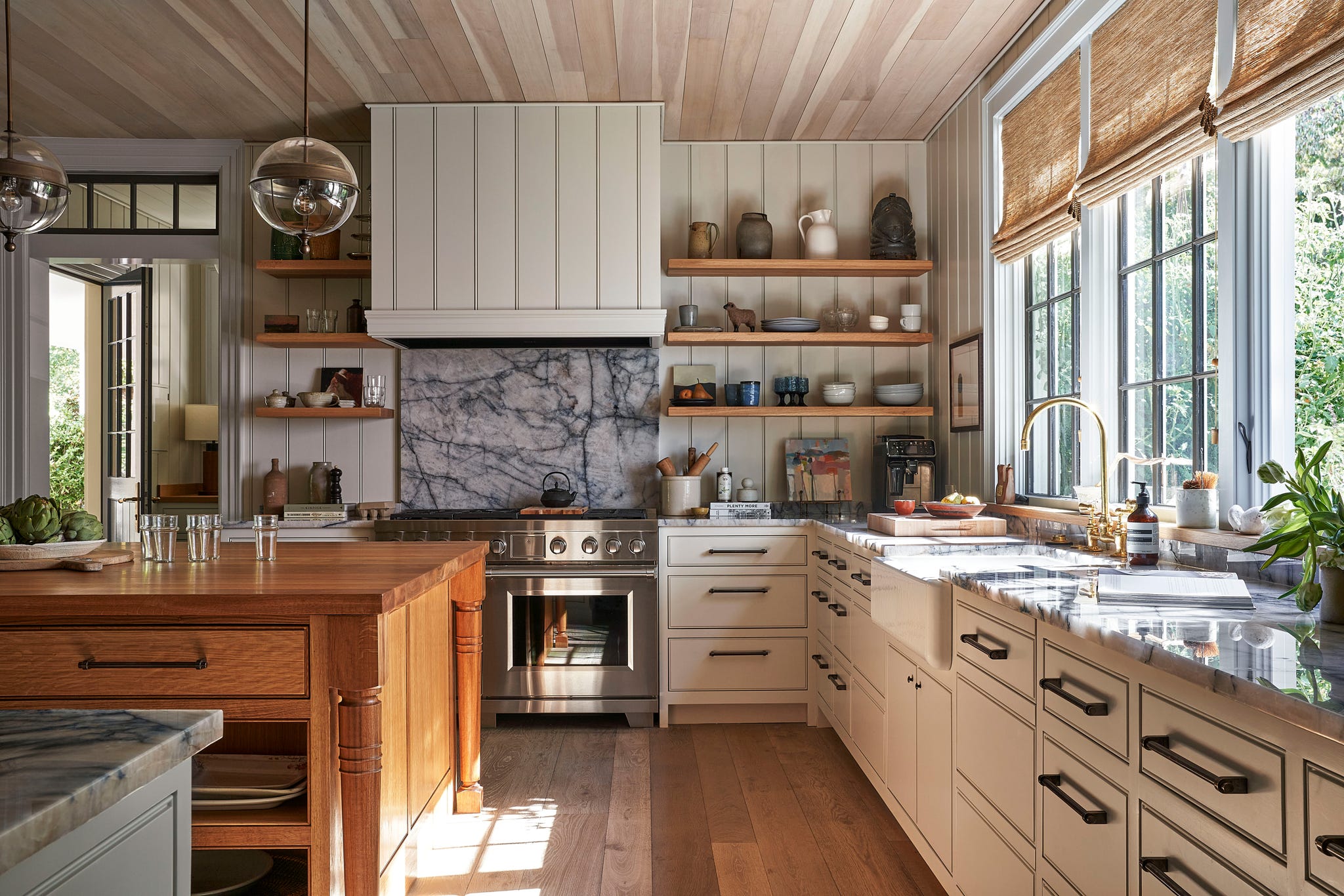
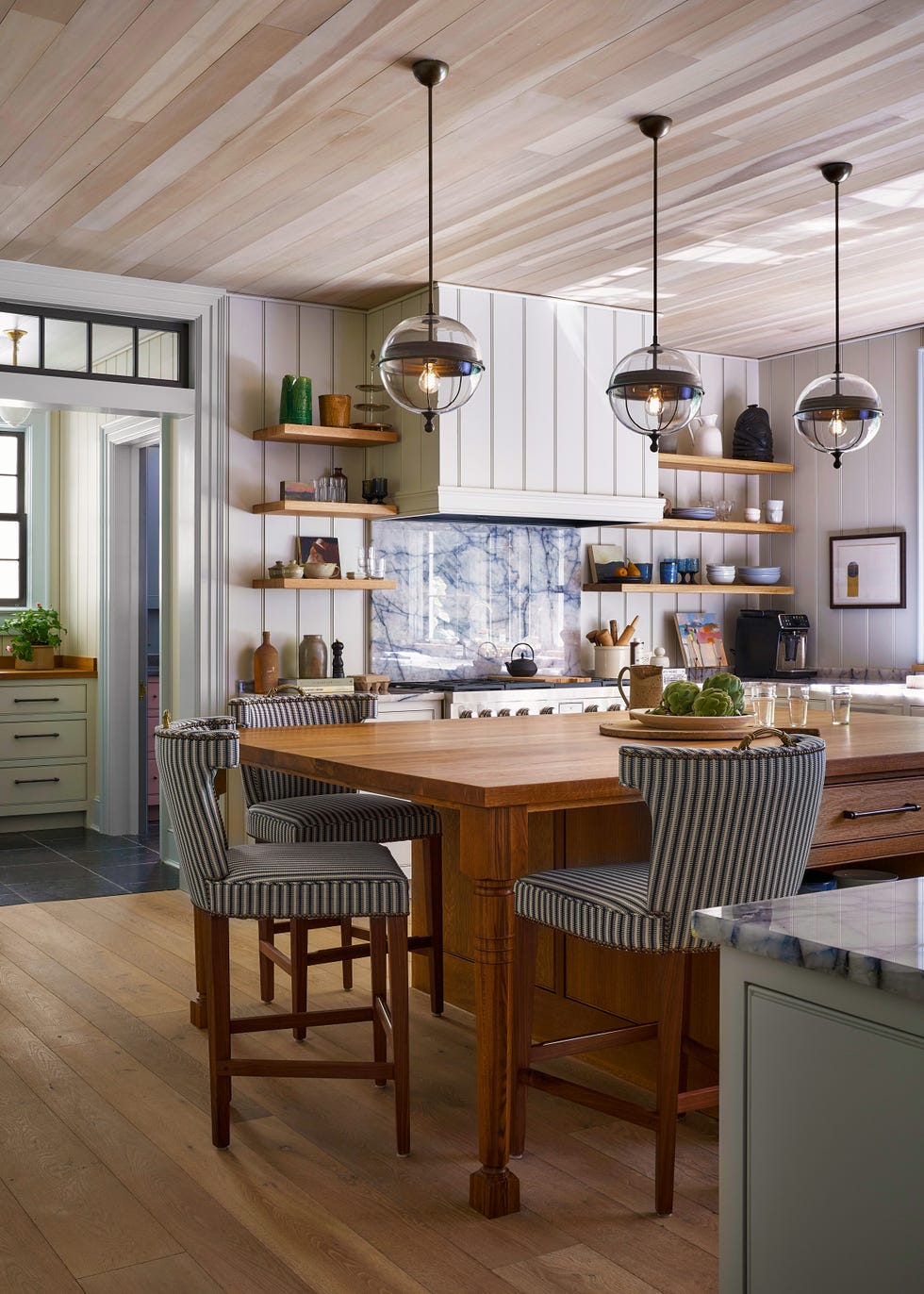
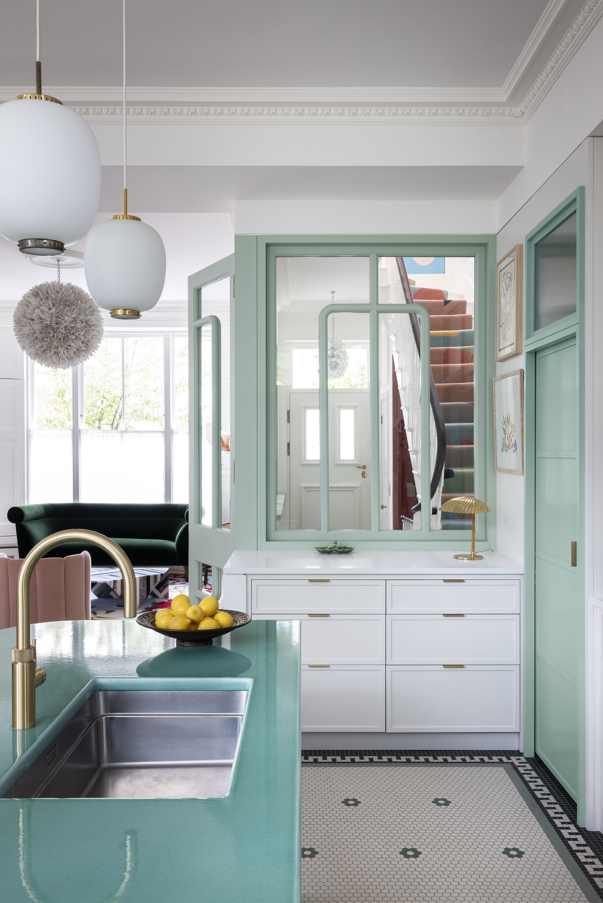
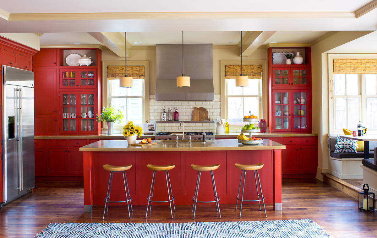
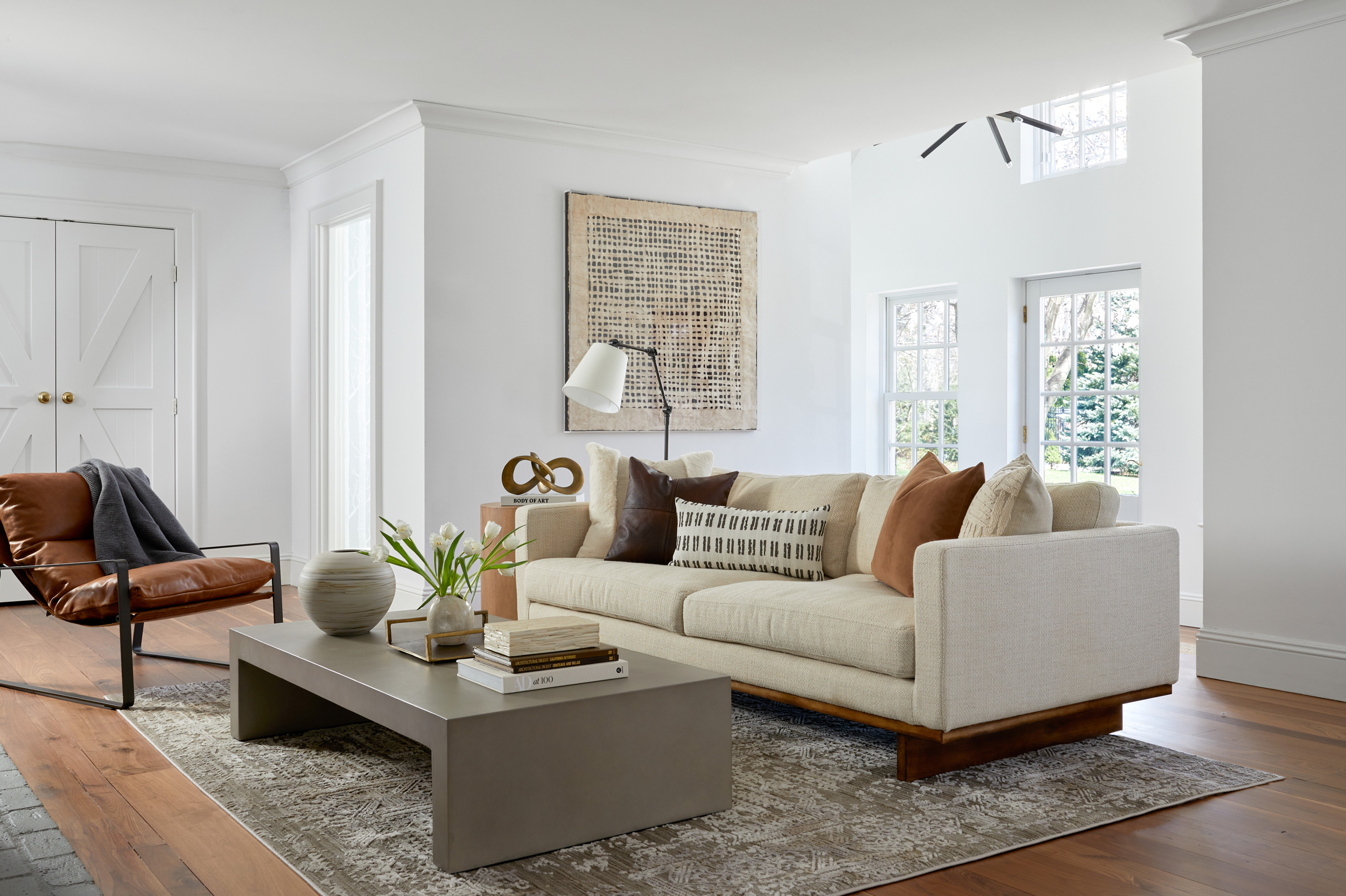
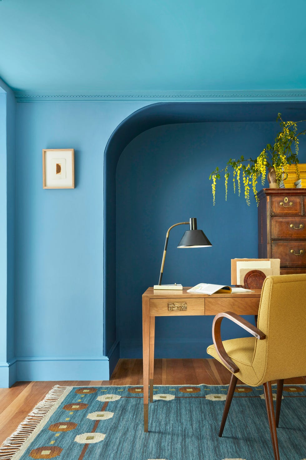
Erin Napier also explores the psychological impact of color, noting that soft, light-hearted shades can promote feelings of happiness. A palette of sky blue, light coral, lemon meringue yellow, and neutrals creates an uplifting atmosphere. These light color schemes are easy to integrate and serve as excellent backdrops for artwork. They also complement dark wood trim and furniture, especially in historic homes. Painting old kitchen cabinets is presented as a cost-effective alternative to replacement, with tips on proper preparation, such as assessing existing paint type and using bonding primer. For a smooth finish, foam rollers or paint sprayers are recommended.
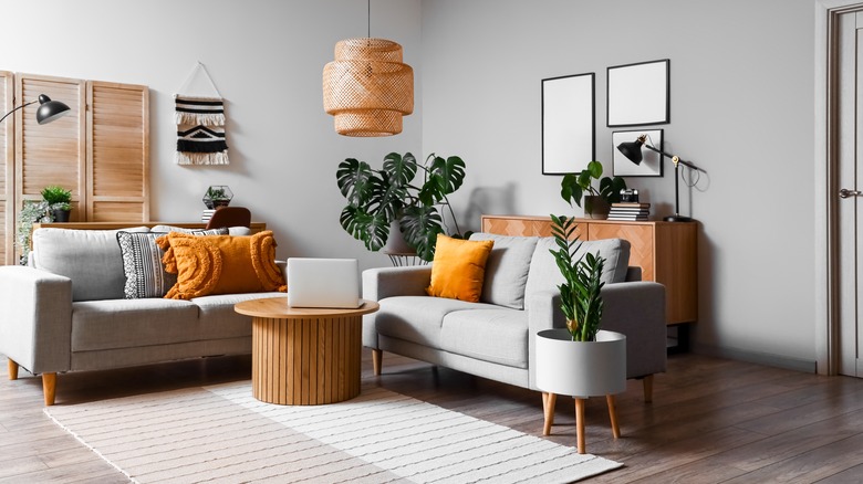
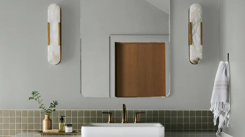
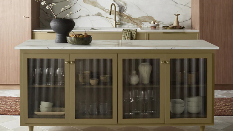
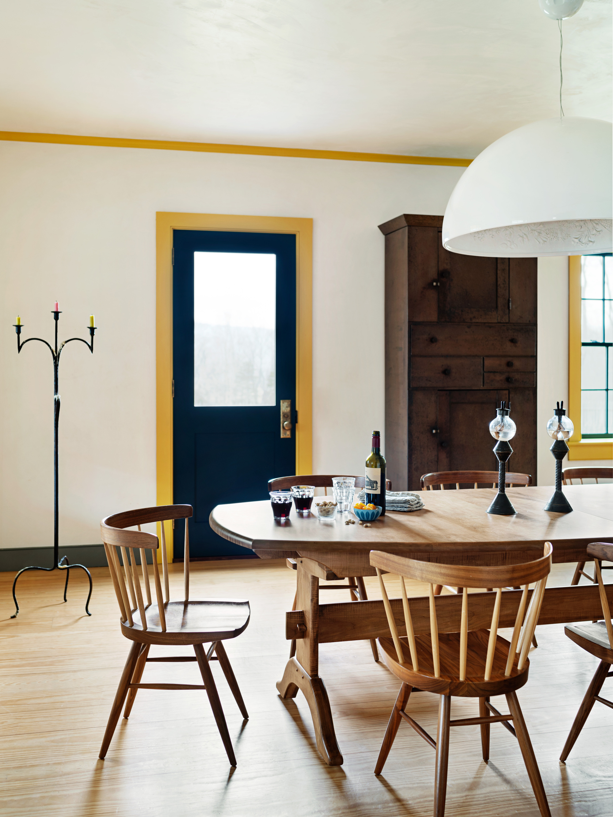
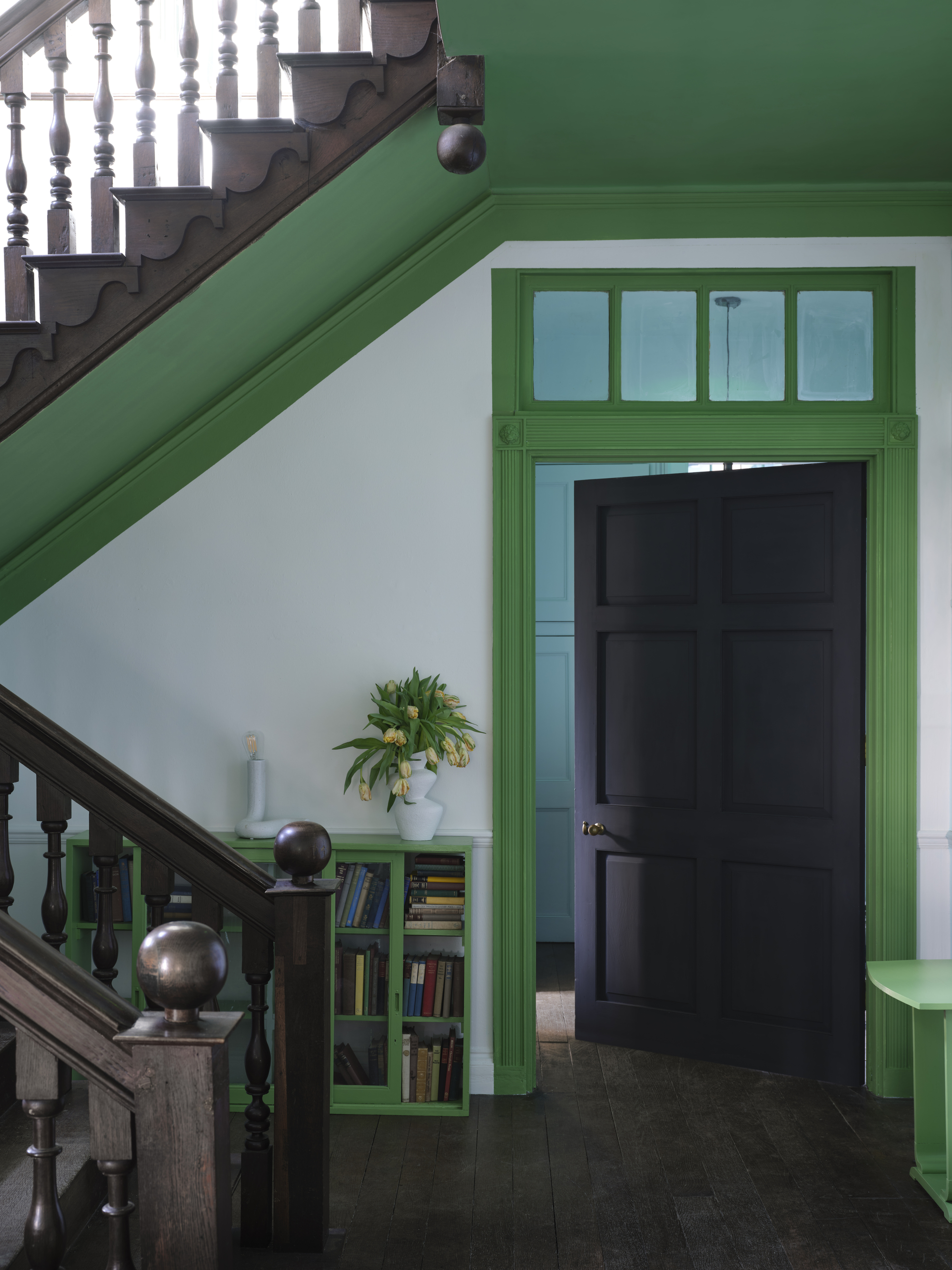
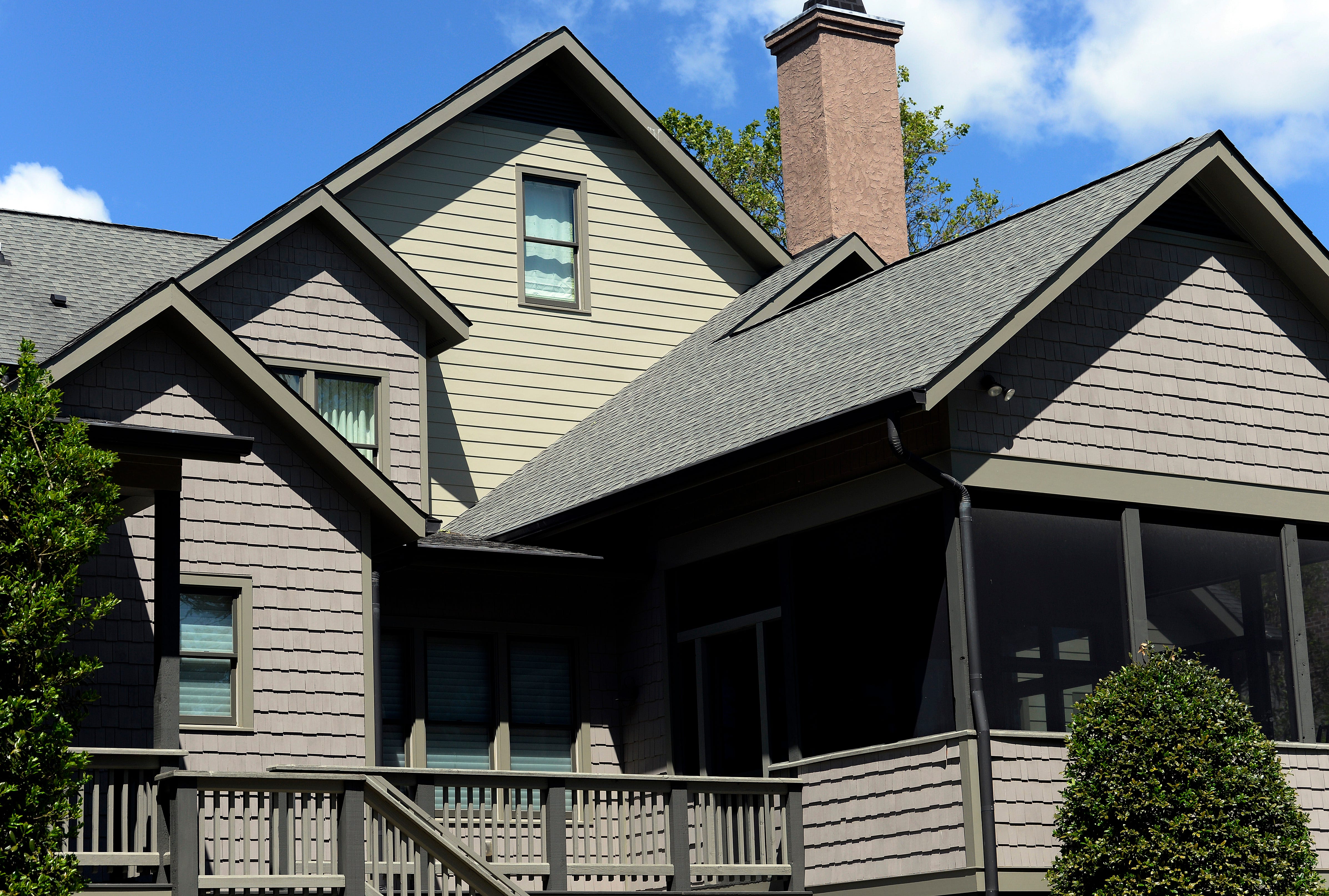
To make bold accents stand out, Napier suggests keeping wall colors neutral, using them as a canvas for vibrant furnishings or artwork. She uses shades like Celery Salt by Benjamin Moore, a warm green-infused off-white, as a favorite. The importance of considering undertones, even in light colors, is highlighted for cohesive interior design. For new brick construction, a trick for achieving an aged, sooty look involves lightly dusting edges with charcoal spray paint before mortaring. Lastly, the Napiers advise against immediately repainting home exteriors if the existing paint is professionally chosen and in good condition, as this can save budget for other interior updates. While green is not traditionally seen as a neutral, Erin Napier champions muted greens as a versatile option, connecting homes with their natural surroundings and offering a calming aesthetic. Sage green is a timeless choice, complementing a wide array of colors, while darker greens can add drama to traditional homes. However, the Napiers express reservations about painting over tile due to concerns about longevity and adherence, though they don't completely rule it out for certain low-traffic areas like sunrooms, emphasizing thorough preparation and quality paint for those who choose this DIY route.
#ErinNapier #PaintingTips #HomeTown #ColorTheory #InteriorDesign #ExteriorPainting #Renovation #DIYHomeImprovement #CabinetPainting #ErinNapier #PaintingTips #HomeTown #ColorTheory #InteriorDesign #ExteriorPainting #Renovation #DIYHomeImprovement #CabinetPainting
0 comment in total
 No comments yet
You may also like

Erin Napier Has a New Favorite Color and We’re Honestly SHOCKED


Decorating expert reveals this is the best time of year to paint your home

'It's the best way to make a home joyful' - this paint trend is the perfect idea to introduce color thoughtfully

5 Painting Mistakes That Are Actually Ruining Your Projects, According to Reno Pros

Update your home with these paint tips!


10 Painting Tips The Stars Of HGTV's Unsellable Houses Swear By
Rosie on the House: Interior and exterior paint tips from a pro

Designers Predict This Will Be The Biggest Paint Trend Of 2026

Understanding paint finishes

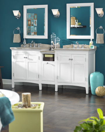
Paint tips from a pro!
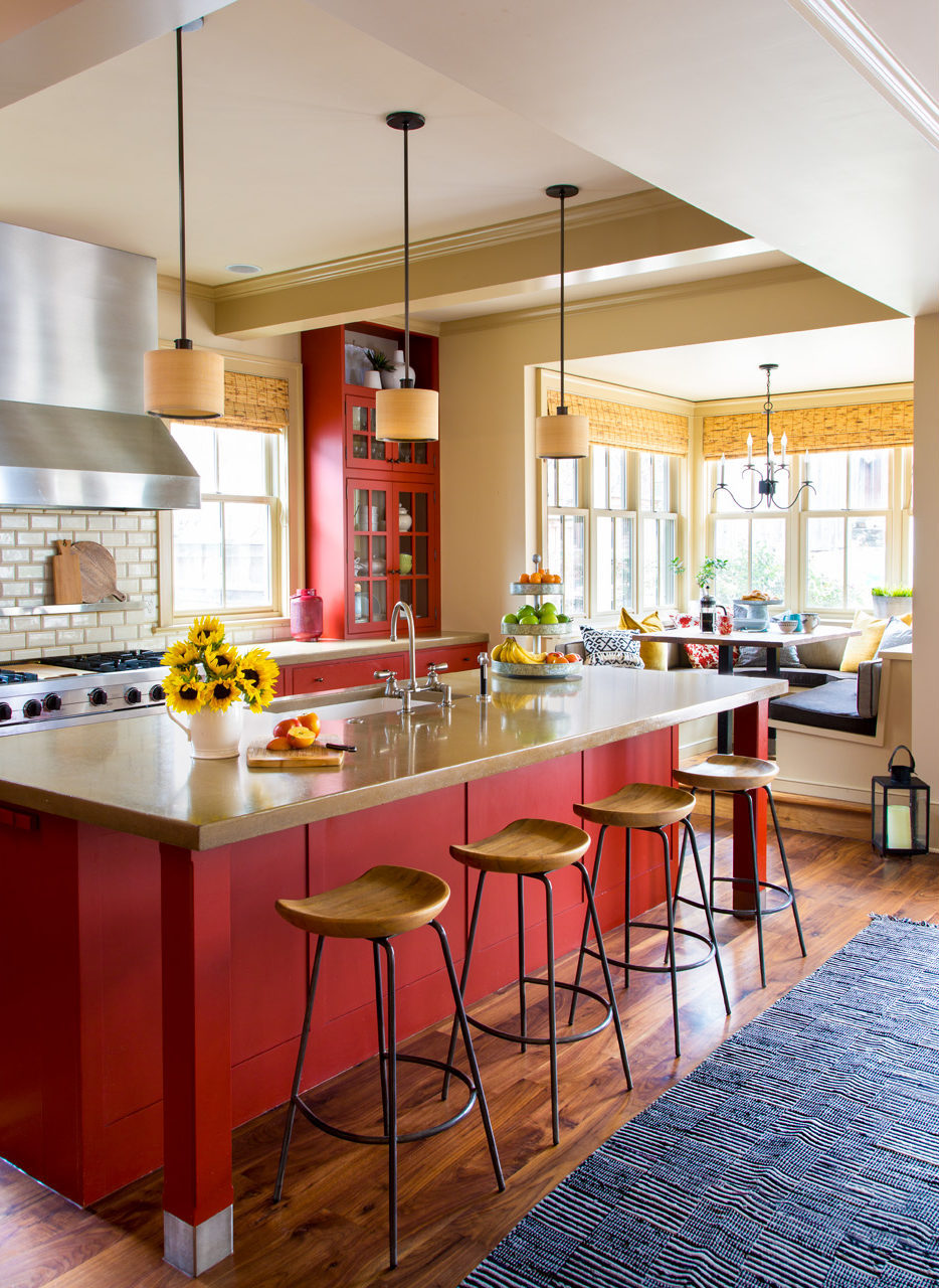
Four Gorgeous Front Range Rooms That Embrace Color

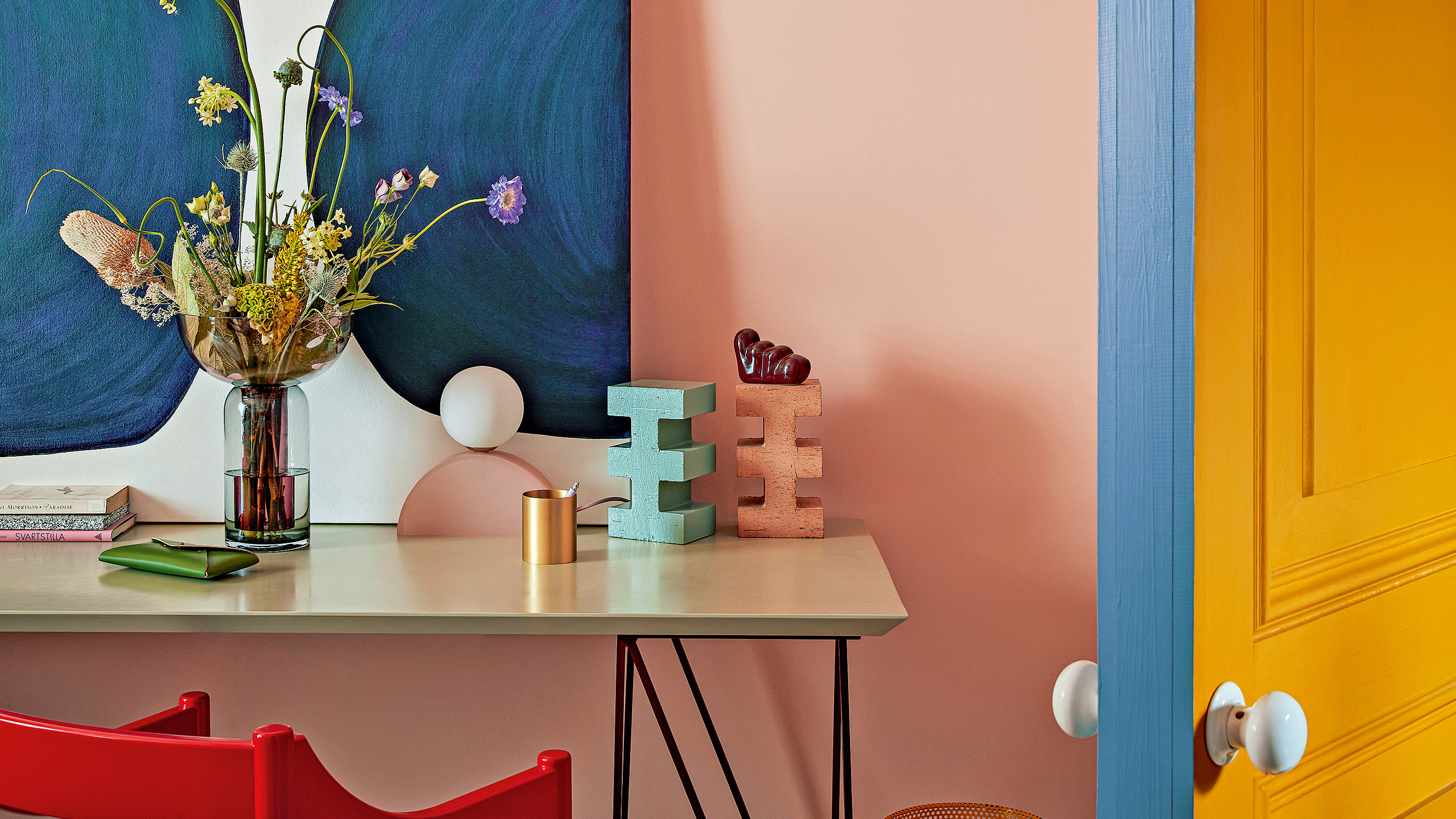
Paint finishes explained – an expert guide to choosing the perfect type of paint for your projects

HGTV's Erin Napier Shares The Perfect Paint Shade For A Homey Exterior

Fixer Upper's Joanna Gaines Shares The Perfect Paint Colors For Every Area Of Your House
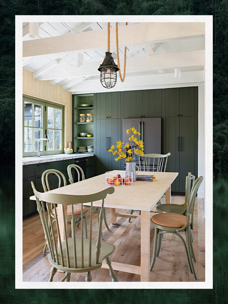
Designers Share Their Tried-and-True Shades From the Best Interior Paint Brands
These Master Tips Will Help You Avoid Choosing The Wrong Type Of Paint
There's still time! I’m a painting expert and it's the best month to paint inside your home for a silky-smooth finish

An Artist's Creative Eye for Color Shapes This Nashville Home
These hacks are all you'll need for your next home painting project

How to pick an exterior paint color for your Nashville home