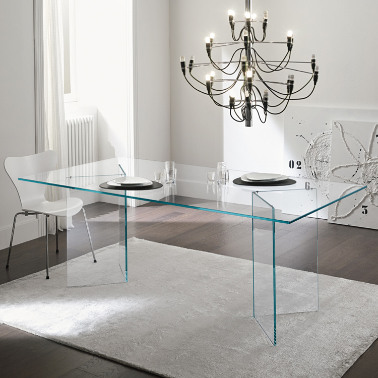
1/12
9 chartreuse decor ideas to instantly brighten up a space
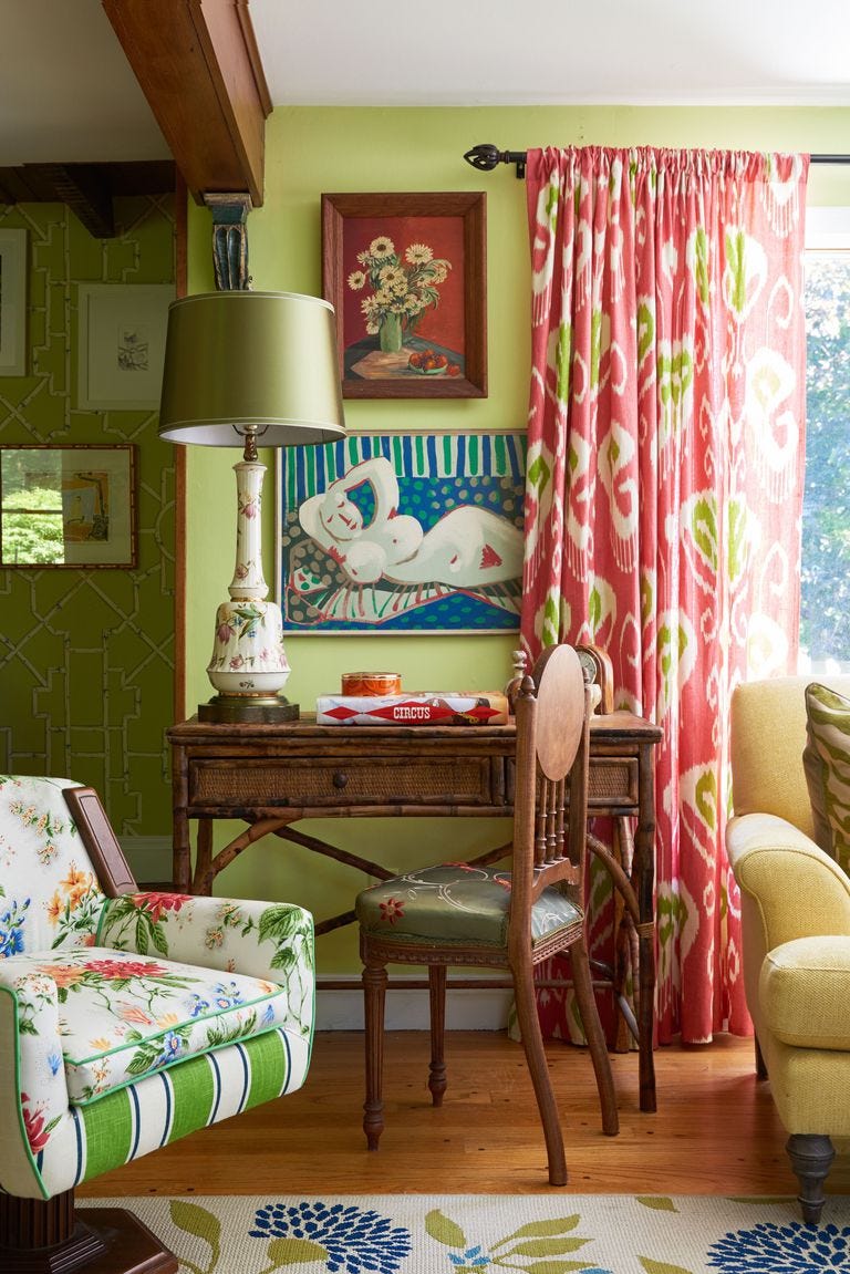
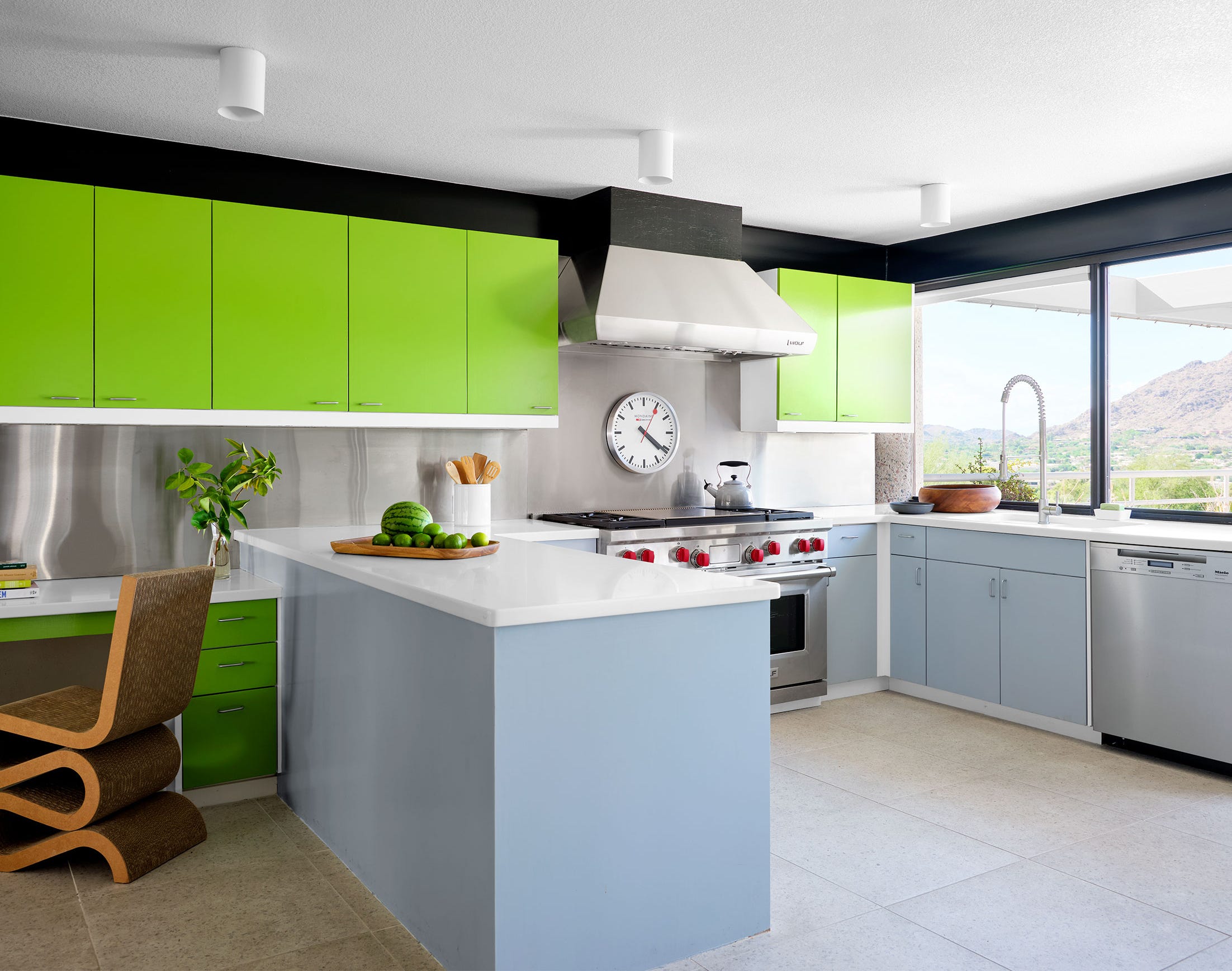
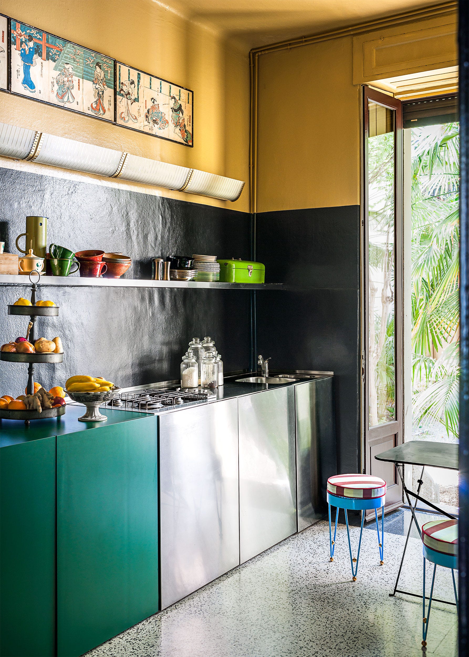
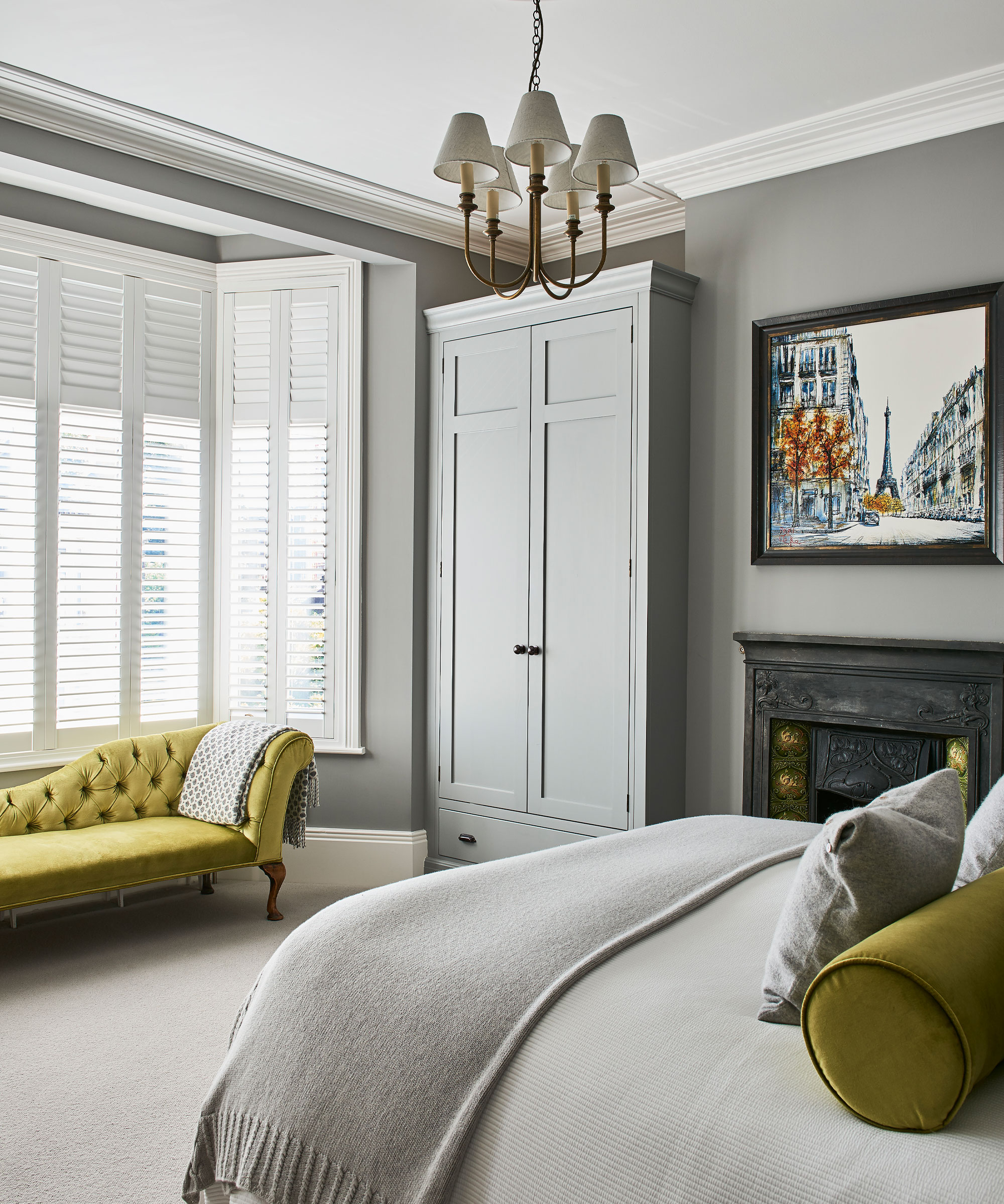
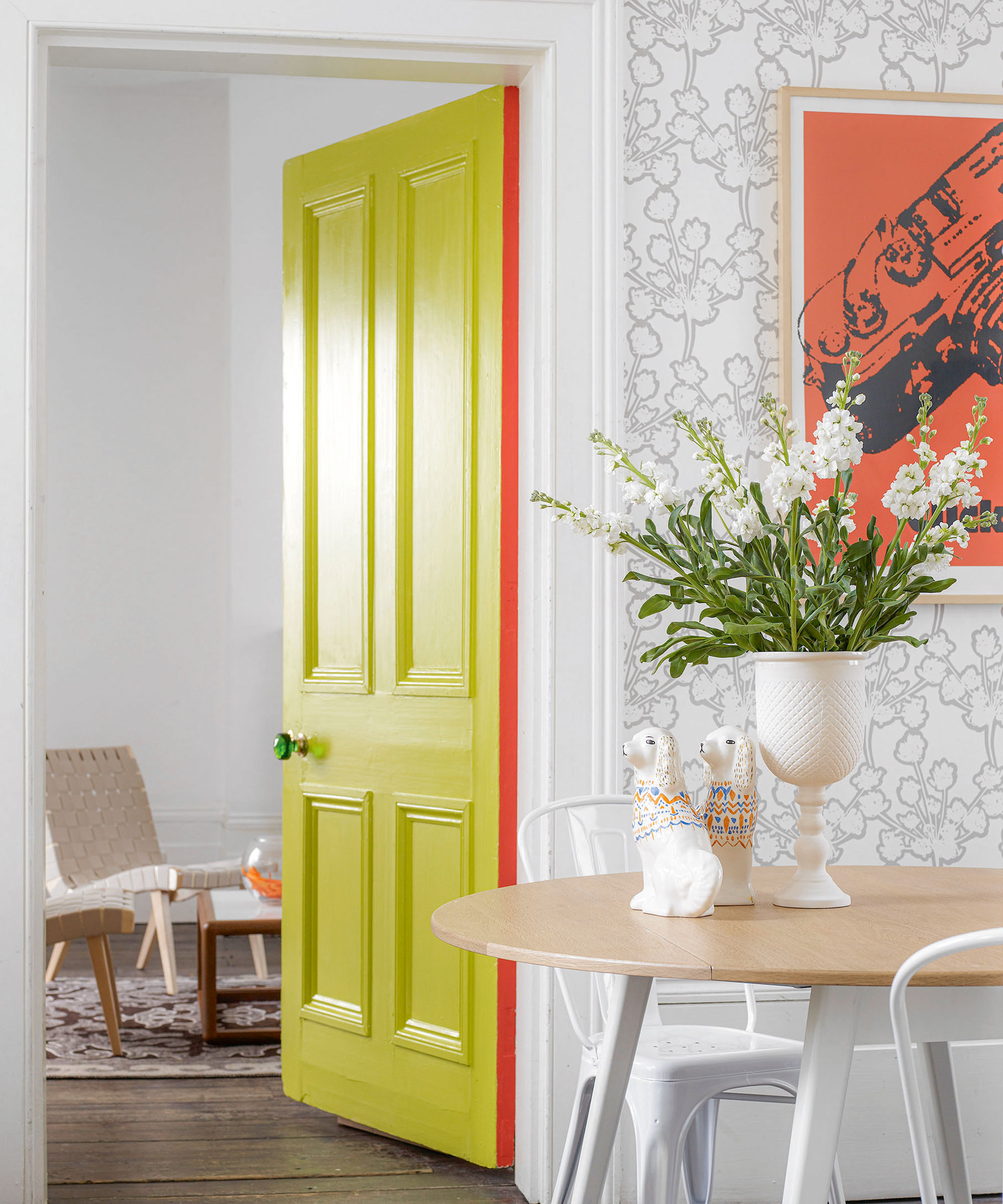
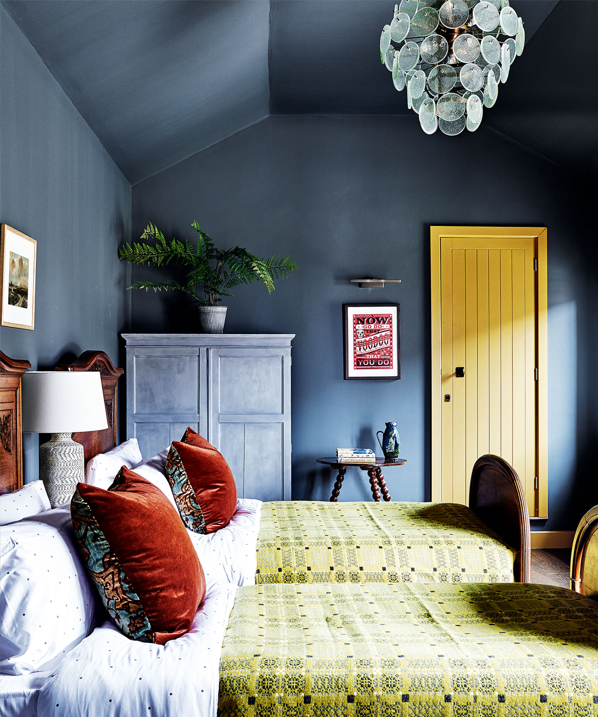
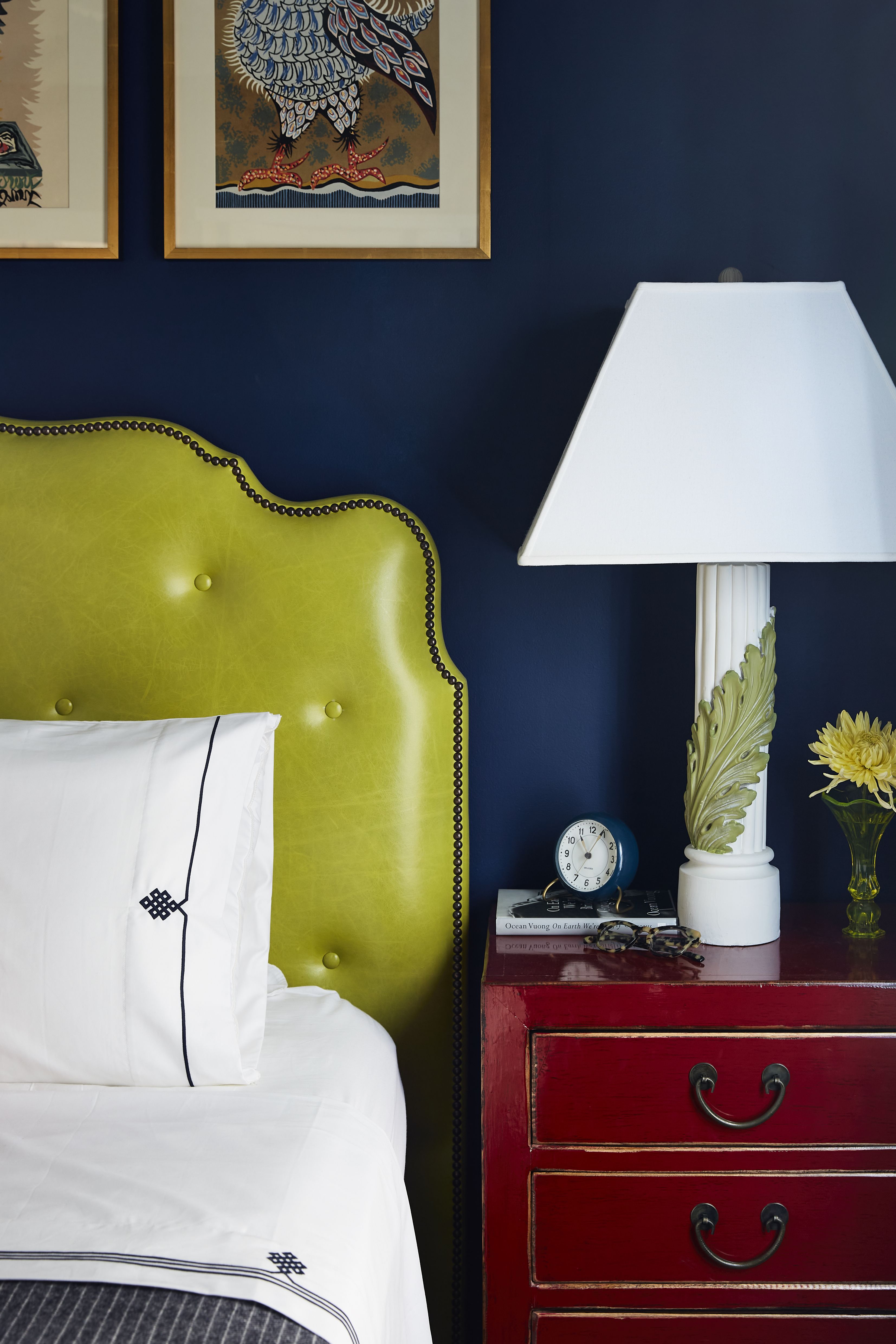
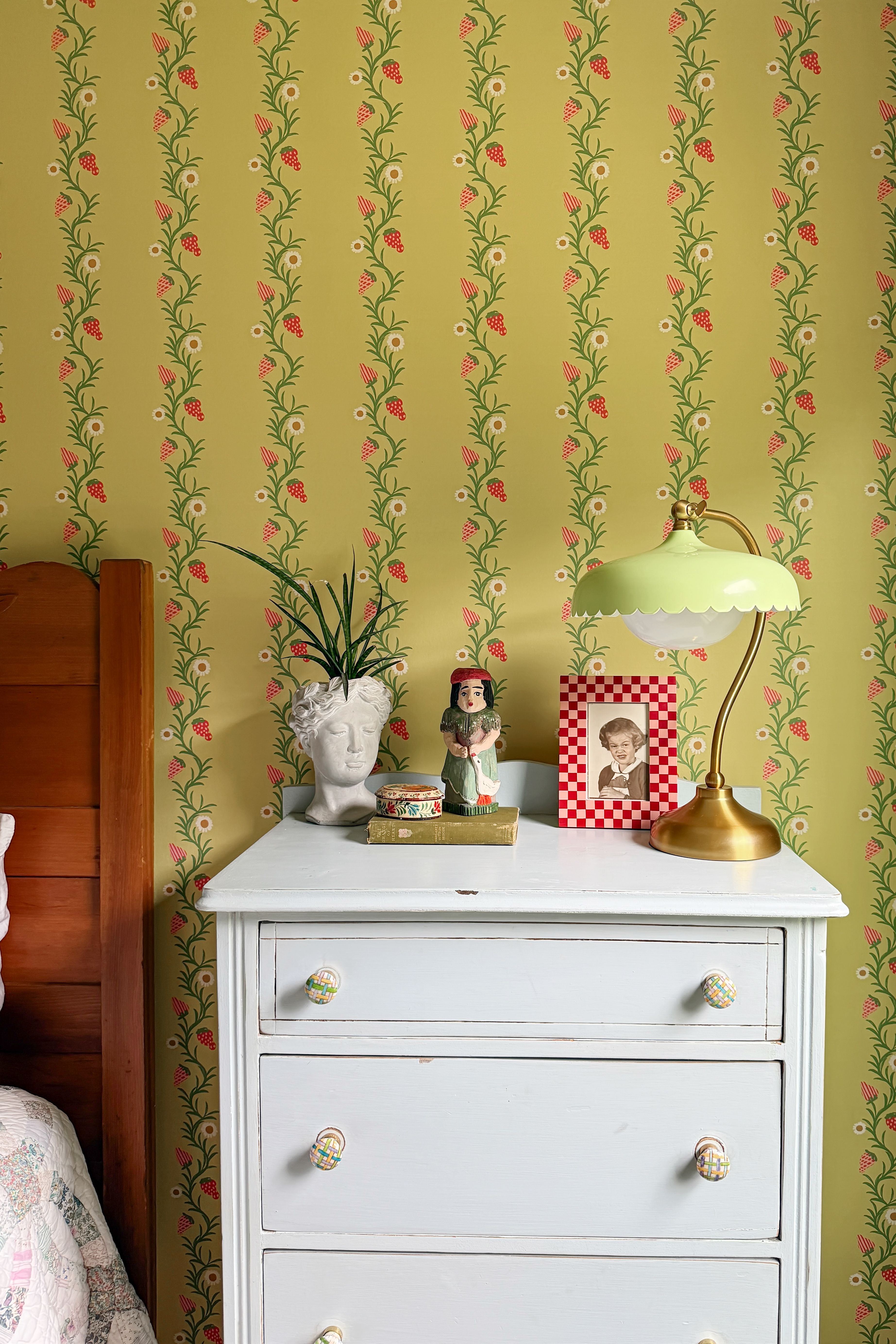
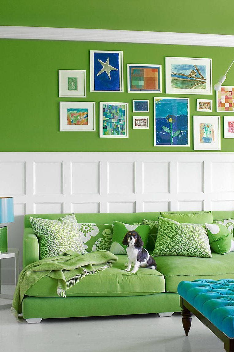
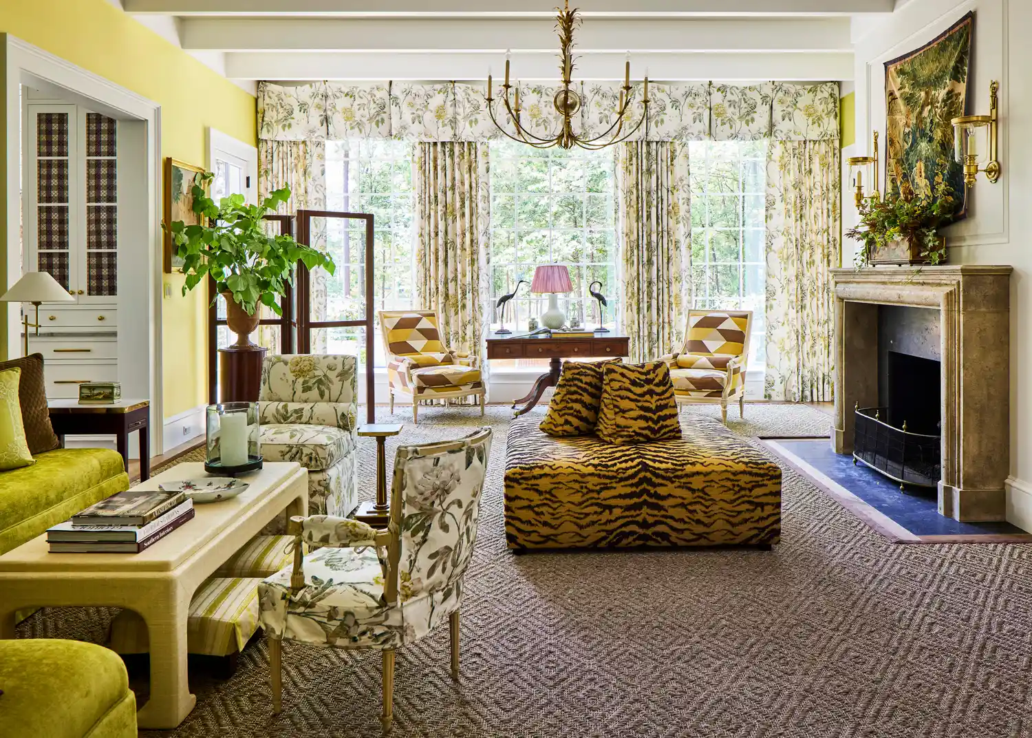
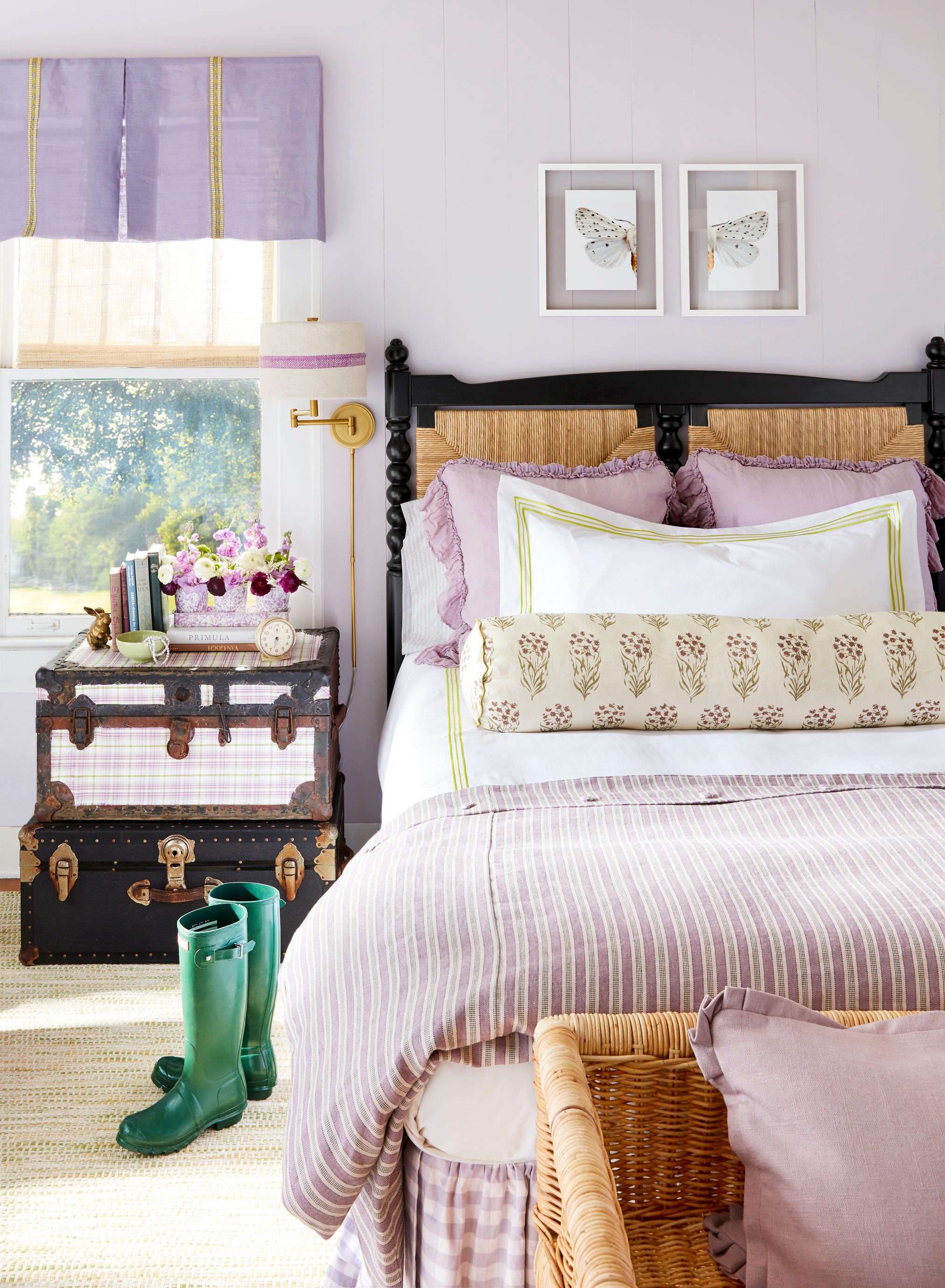
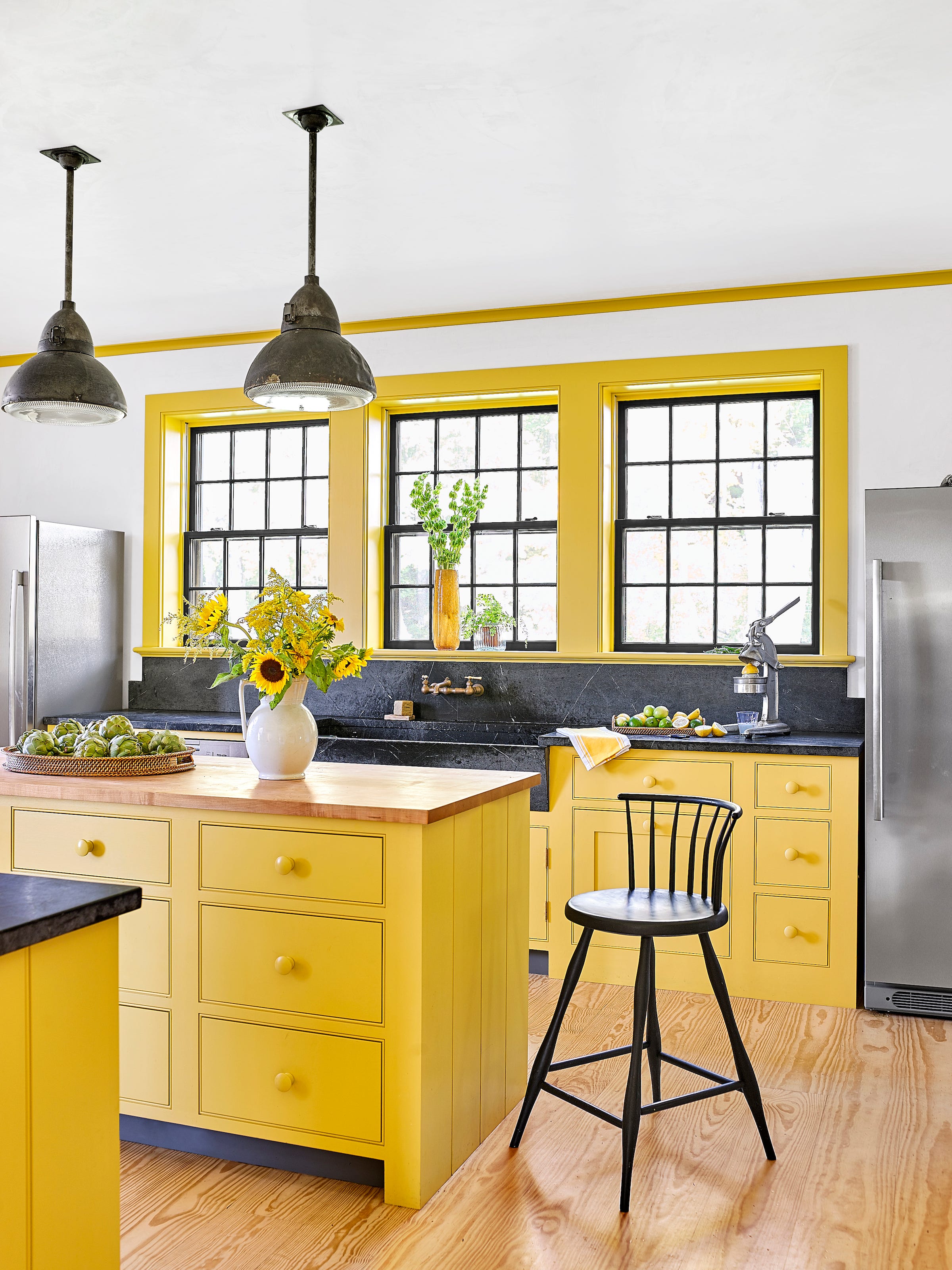
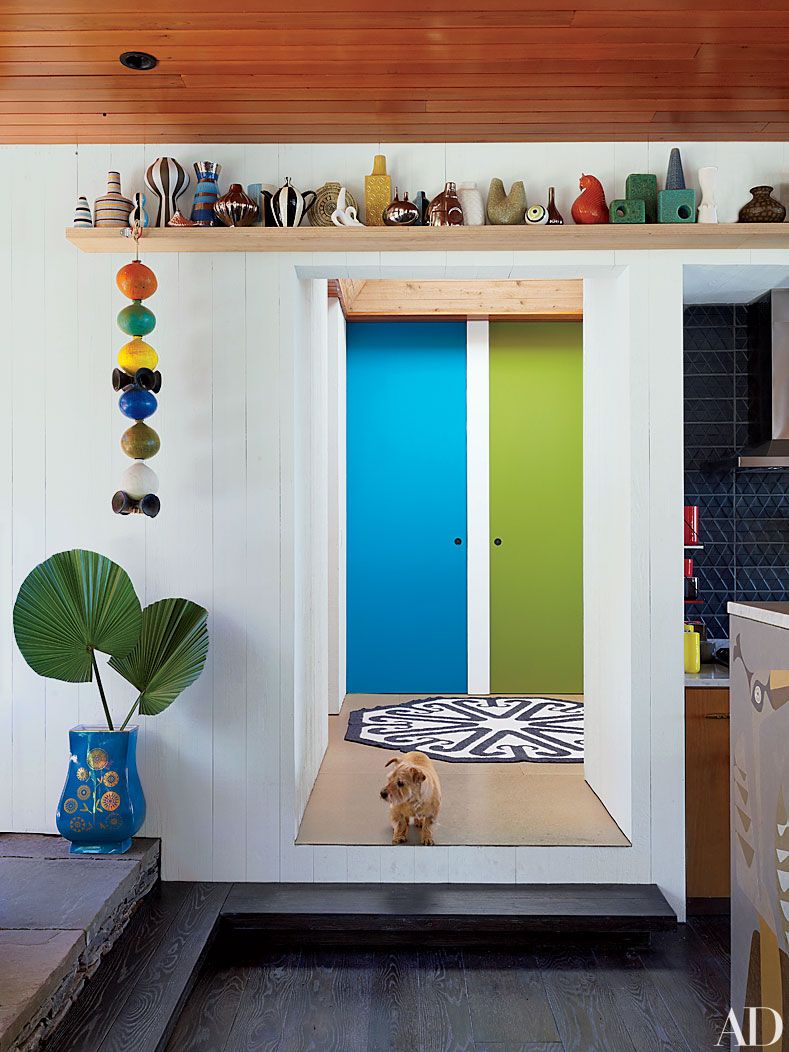
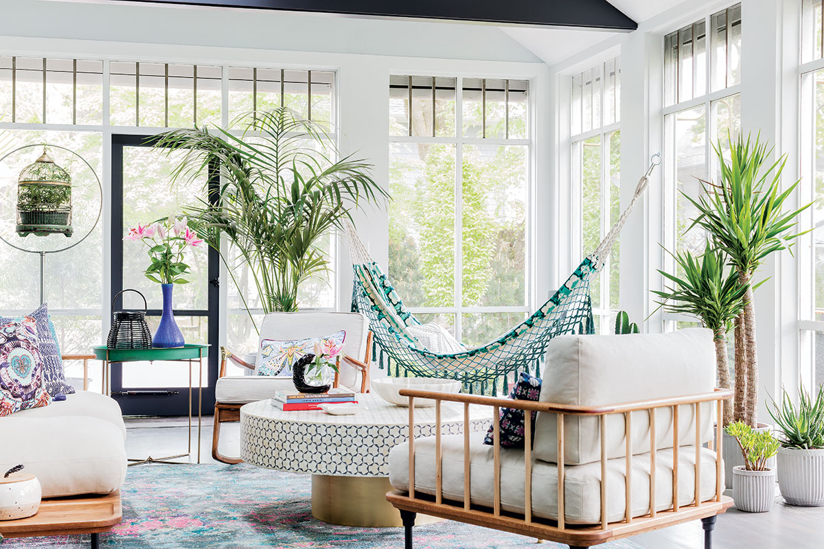
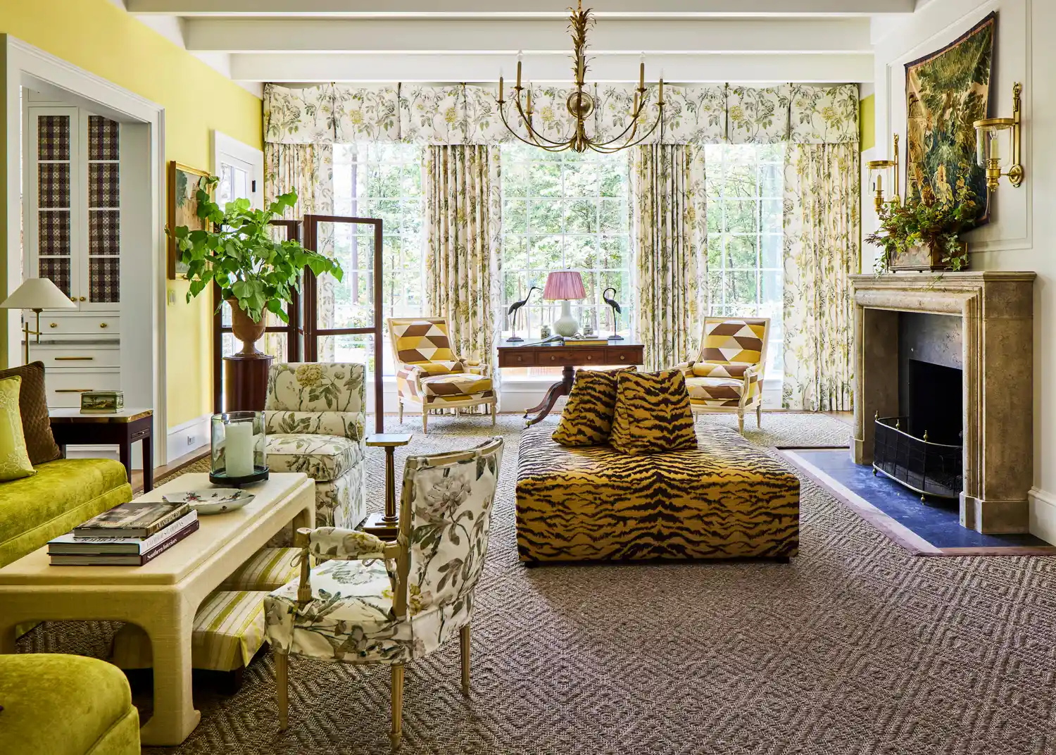
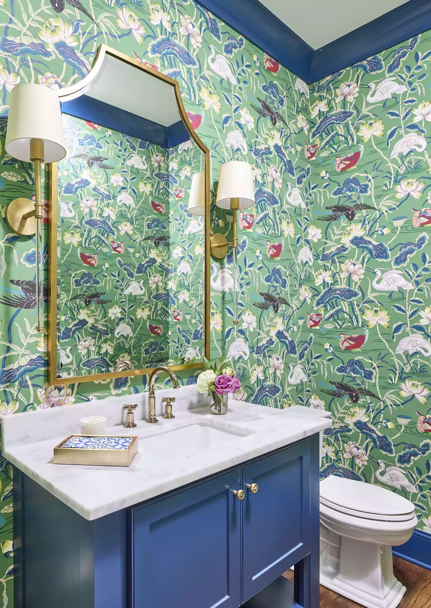
The article explores the growing trend of incorporating chartreuse, a vibrant yellow-green hue, into interior design. Chartreuse is highlighted as an energetic and chic color, appearing frequently in the current marketplace for decor accents. While bold colors can be challenging to integrate into existing palettes, designer Ariel Okin emphasizes the versatility of chartreuse, noting its compatibility with a wide range of colors, including deep browns, plums, pale blues, pinks, and even lavender. Okin describes chartreuse as a striking jewel tone capable of adding significant visual impact to even neutral design schemes.
Three interior designers—Ariel Okin, Kiyonda Powell, and Maneli Wilson—offer their insights and product recommendations for incorporating chartreuse into home interiors. Ariel Okin, known for her livable and elegant spaces with courageous color pops, suggests using a classic Scalamandré Wild Glamour Viscose Animal Print Pillow Cover and Insert for a hint of drama in a neutral bedroom. She also recommends a Brushed Mohair Throw in Pesto by Lands Down Under for adding texture and color to a bed or sofa, and a solid Studio Velvet Chartreuse Pillow Cover by ShopLittleDesignCo as a versatile backdrop for layering prints, suggesting a combination with chocolate brown chintz for a striking effect.
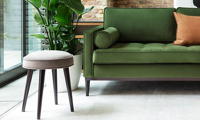
Kiyonda Powell, whose designs balance spirited and soothing elements through nuanced use of color and patterns, highlights the Cosmos Nesting Coffee Table in Chartreuse Shagreen and Brass by R&Y Augousti for its unique sculptural shape and "wow factor." She also points to the Bilson Modern Bolster Arm Green Velvet Gold Bench by Kathy Kuo Home as a statement piece that can energize any room, adaptable to both modern and traditional aesthetics. For textiles, Powell expresses admiration for Nador Pimento by Black Edition, a velvet stripe fabric with a hint of chartreuse, envisioning it as a bolster pillow paired with white linens and a mahogany four-poster bed.
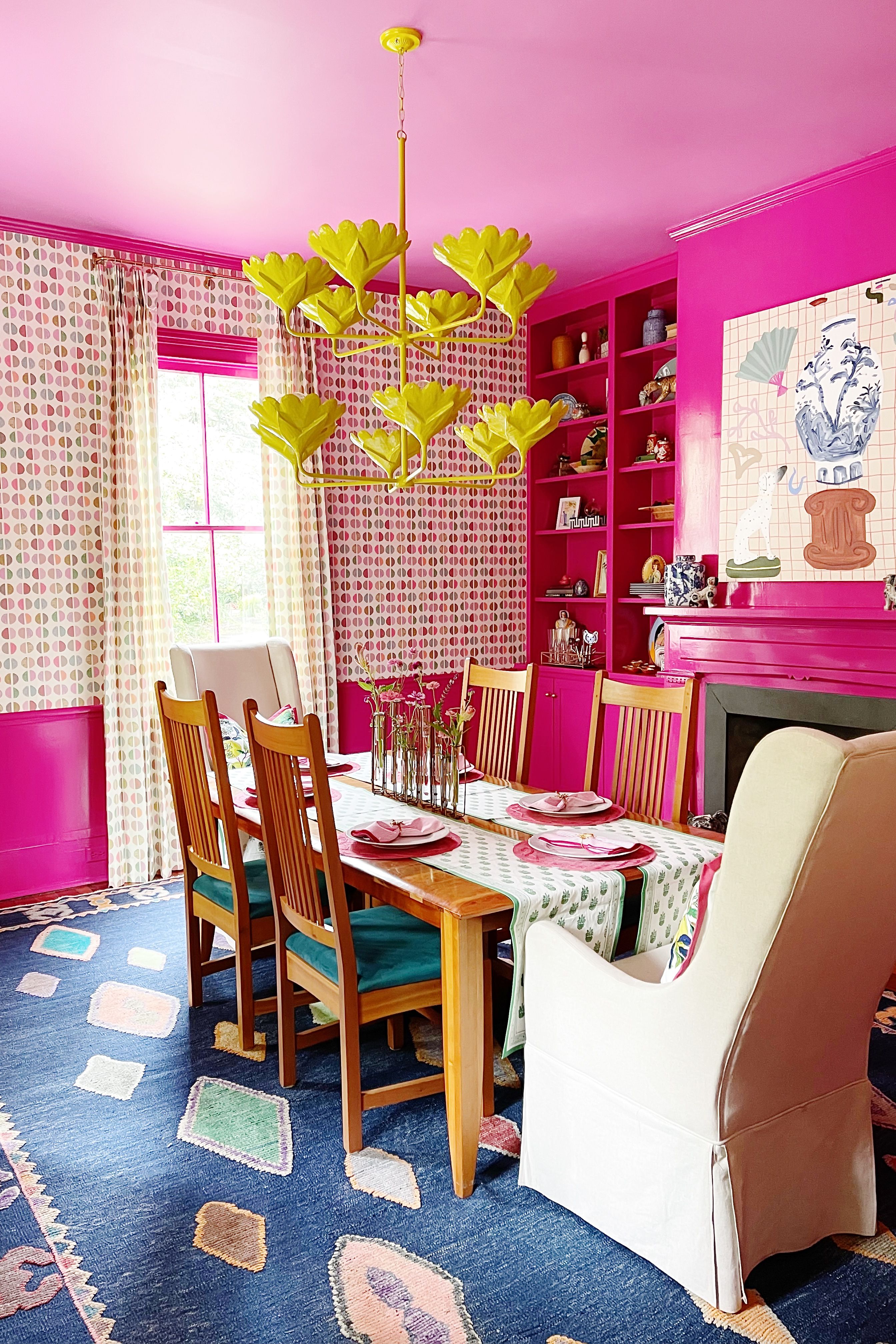
Maneli Wilson, who blends maximalist, old-world styles with serene minimalism and appreciates craftsmanship, recommends Plushy in Chartreuse by Perennials for performance plush velvet on a wing chair, noting its ability to create contrast within a color story of deep aubergine, blacks, and whites. Wilson also expresses her fondness for Amethyst Antiques Very Large Opaline Glass Box in Bright Lime Green, viewing these minimalist decorative accents as sources of gorgeous color and texture. Lastly, she details using Geo in Pale Gold by Porter Teleo as a starting point for a dining room's color scheme, coordinating the chartreuse wallpaper with richer wall tones and a high-gloss, dark gray-green ceiling paint for a sophisticated finish.
Collectively, the designers demonstrate that chartreuse is a flexible and impactful color, capable of being integrated subtly through accents or more boldly as a foundational element, to brighten and enhance a space. The recommendations range from pillows and throws to furniture and wallpaper, illustrating diverse applications of the color in different design contexts.
#InteriorDesign #HomeDecor #ColorTrends #Chartreuse #DesignTips #DesignerInsights #AccentColors #DecorIdeas #InteriorDesign #HomeDecor #ColorTrends #Chartreuse #DesignTips #DesignerInsights #AccentColors #DecorIdeas
0 comment in total
 No comments yet
You may also like
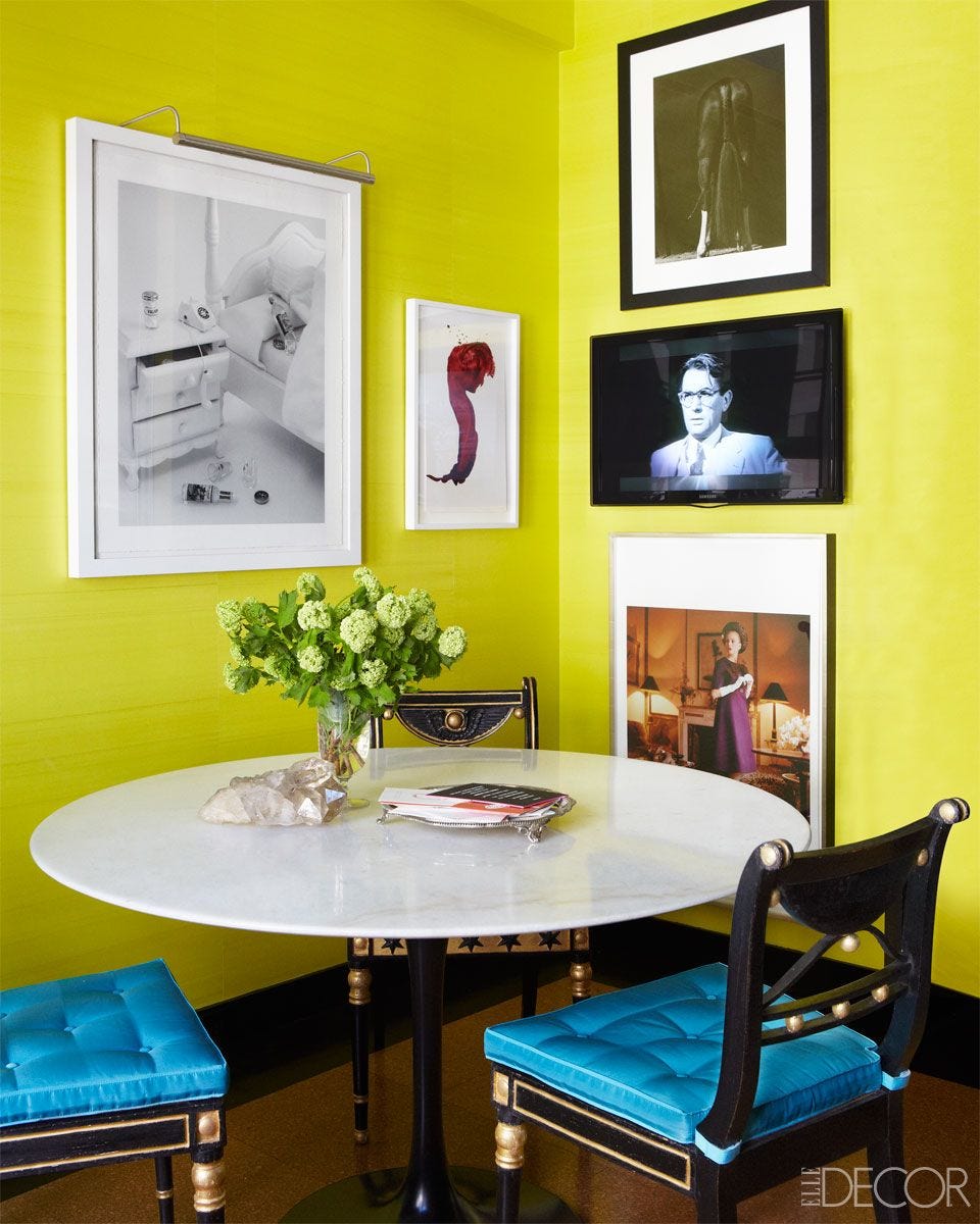
21 Chartreuse Color Ideas for a Summer-Ready Refresh

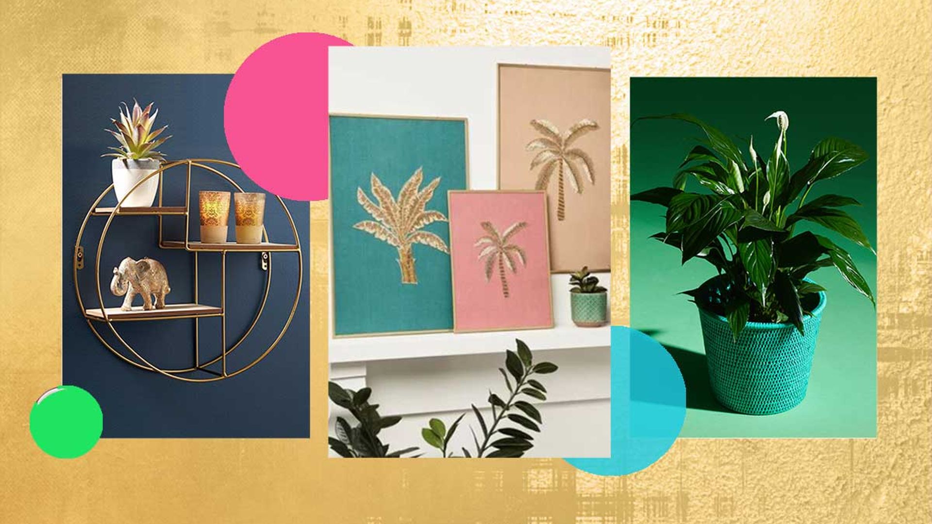
27 best living room accessories to brighten up your mood
Chic Lighting Fixtures - Lighting To Redecorate Your Rooms

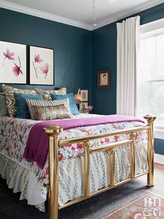
Take a Leap into Bold Color with These Decorating Ideas

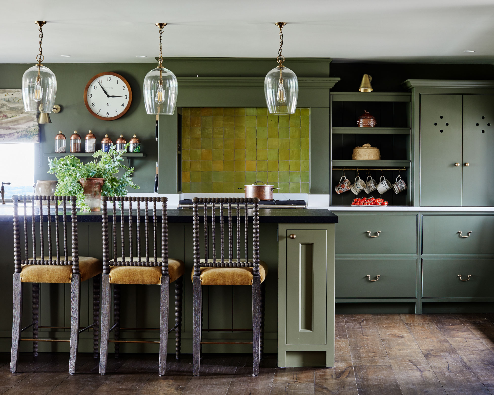
What color is chartreuse? How to use it in your decor
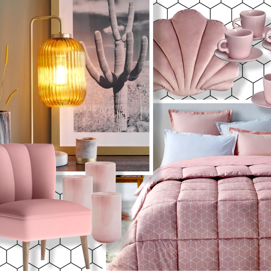
Give your home the rose-tinted treatment with these 9 blush accessories
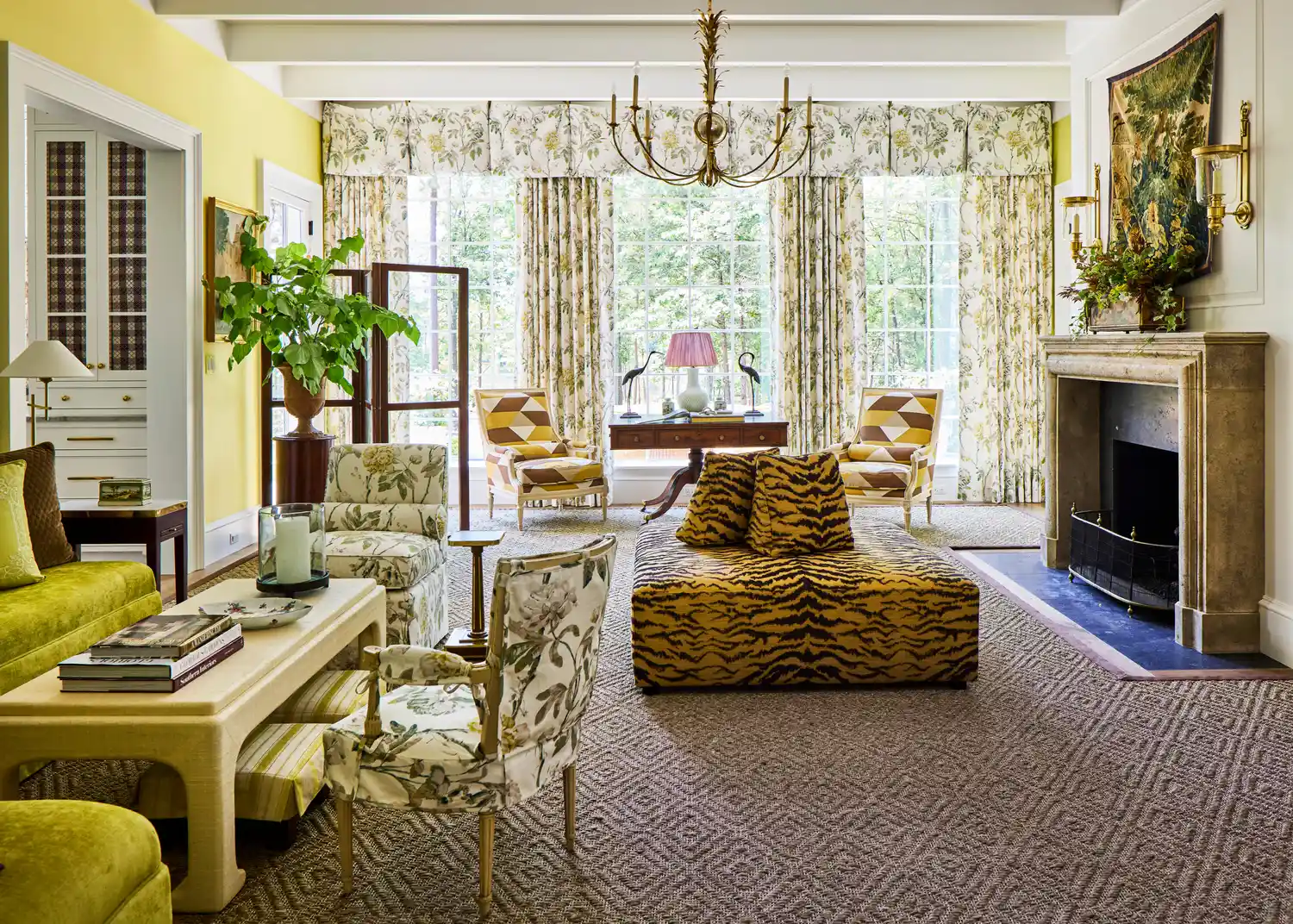
This Bold 1960s Color Is The Most Talked-About Hue In Our 2025 Idea House
This Design Element Instantly Brightens a Dark Room
37 Beautiful Decor Pieces That Are Essentially Jewelry For Your Home
This Bold 1960s Color Is Making A Comeback In Our Idea House
23 Things Designers ALWAYS Buy for Their Homes

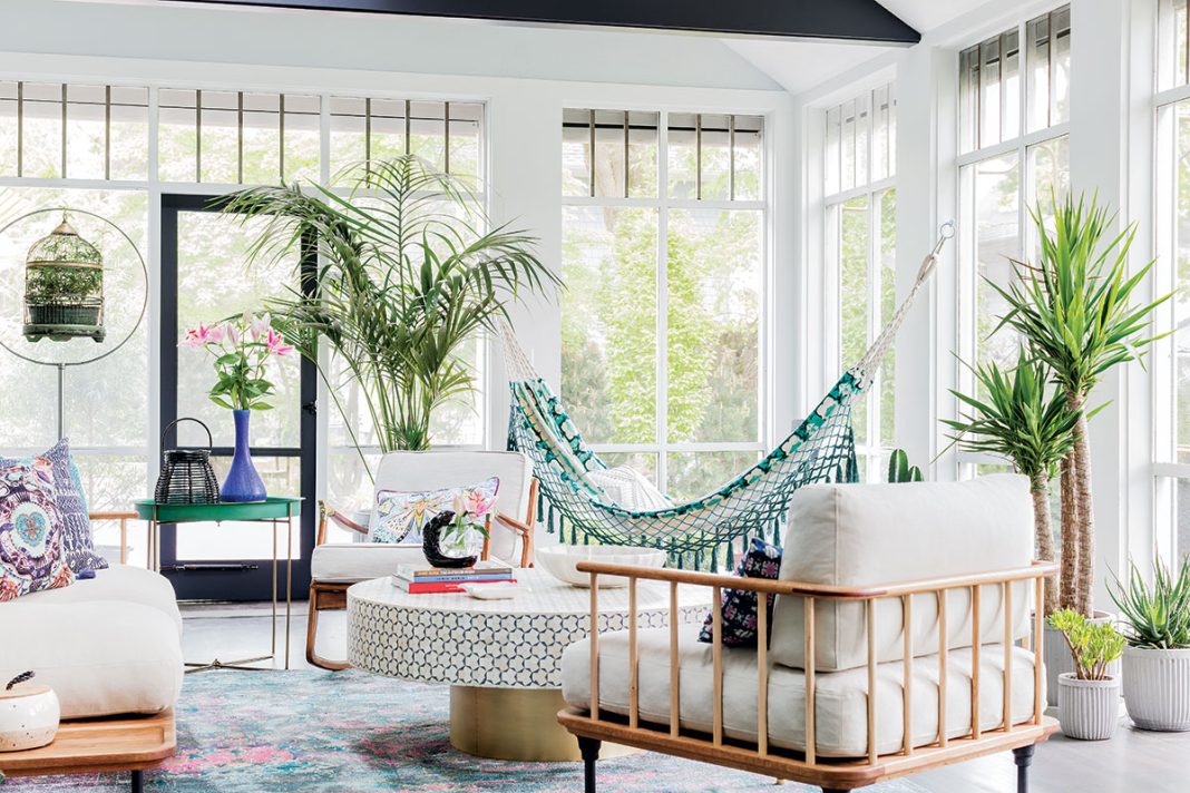
Creative, Captivating Use of Color Helps This Home Redesign Shine

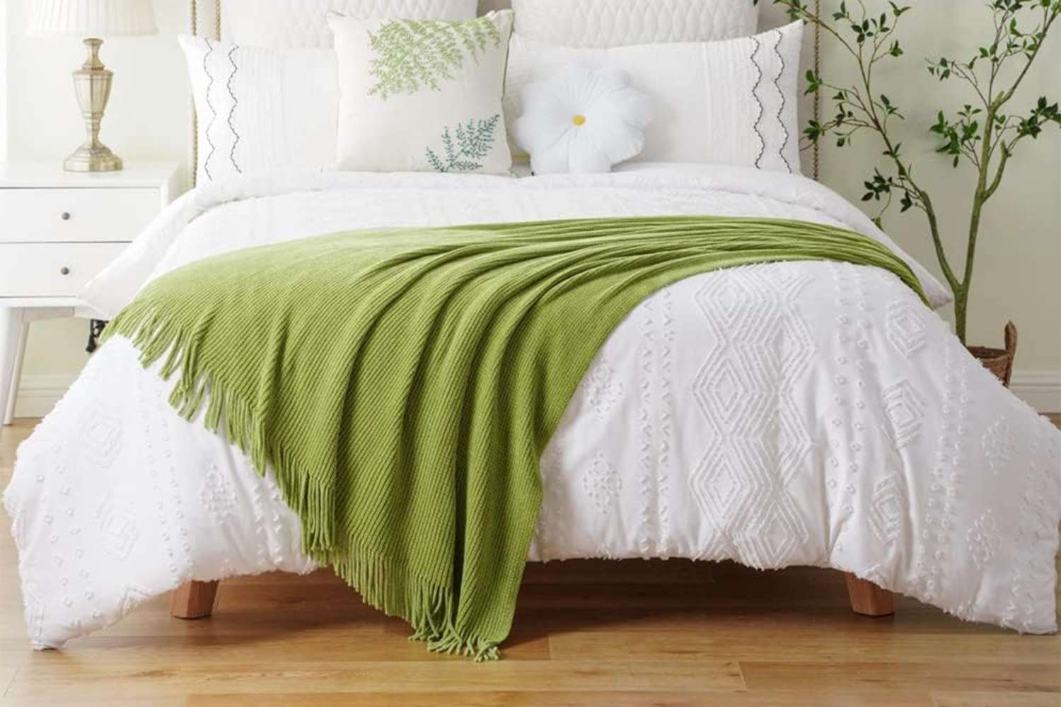
I’m an Interior Designer, and This Is the 1 Color I Wish More People Used in Their Homes

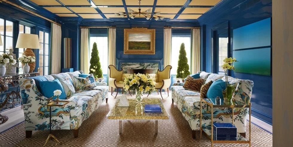
These Accent Color Ideas Will Transform Any Room
Add These Happy Colors to Your Home and Boost Your Mood
9 Amazing Illusion Tricks To Make A Small Space Look Bigger
This electric 1960s shade is making an unexpected return – and designers say it’s the key to lifting darker, moodier interiors this fall

DIY Decor Ideas That Add Personality and Charm to Every Room

9 Color Blocking Ideas for a Bright, Cheery Home

No Natural Light? Here's How To Brighten Your Space, According To Designers