10 home color choices that scream lower middle class energy to refined observers
The article delves into how certain home color choices can subtly convey socio-economic signals, suggesting that these choices often reflect a desire to appear successful without the inherent resources to achieve a truly refined aesthetic. The author, drawing on years of observing design patterns and psychological triggers, argues that color selections can reveal more about one's class background than commonly acknowledged. While acknowledging personal expression, the piece aims to help readers make more intentional decisions about their space's presentation by highlighting ten specific color combinations that, to an experienced eye, indicate an attempt to emulate affluence rather than embodying genuine taste.
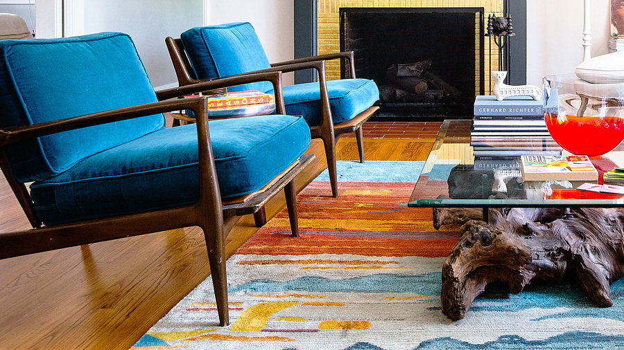
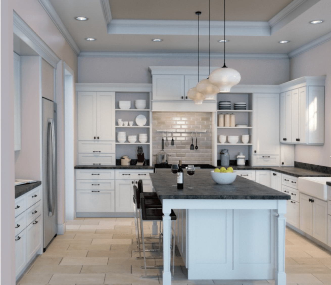
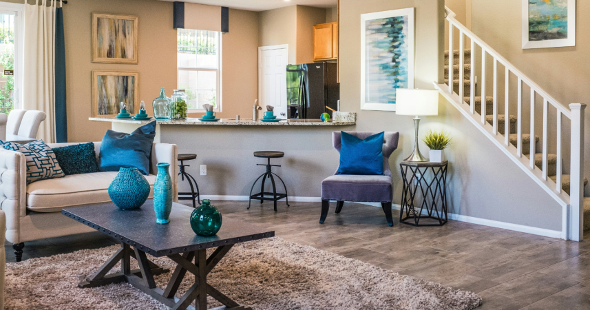
First, the article critiques builder-grade beige paired with harsh white trim, noting its institutional feel and suggesting it signals a lack of investment in personalization or a misunderstanding of sophistication. This combination is presented as a default choice rather than an intentional one, lacking the depth and warmth of true neutrals. Second, bright teal accent walls are discussed as a trend from around 2010 that persisted in lower-income areas, seen as a 'design by committee' approach rather than genuine taste, often using saturated, hardware-store-specific shades rather than nuanced, complementary colors.
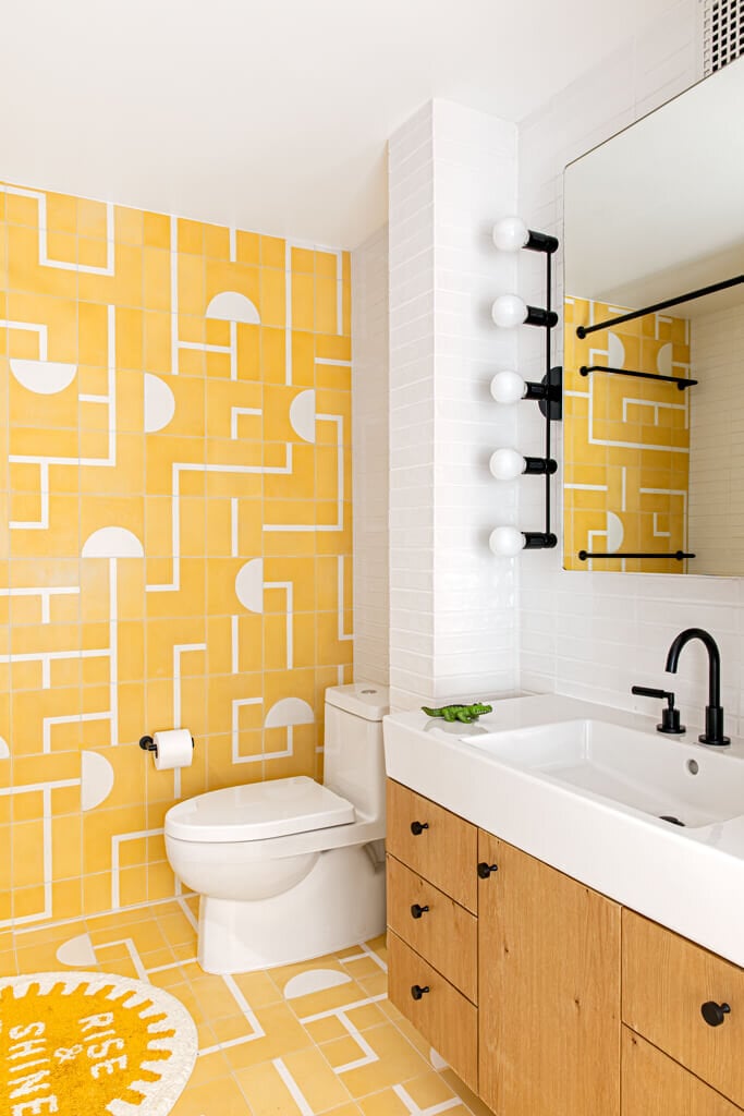
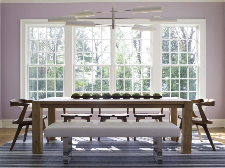
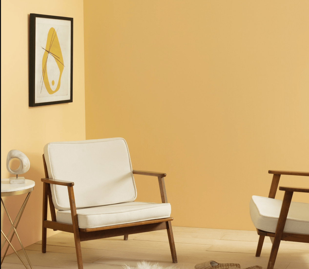
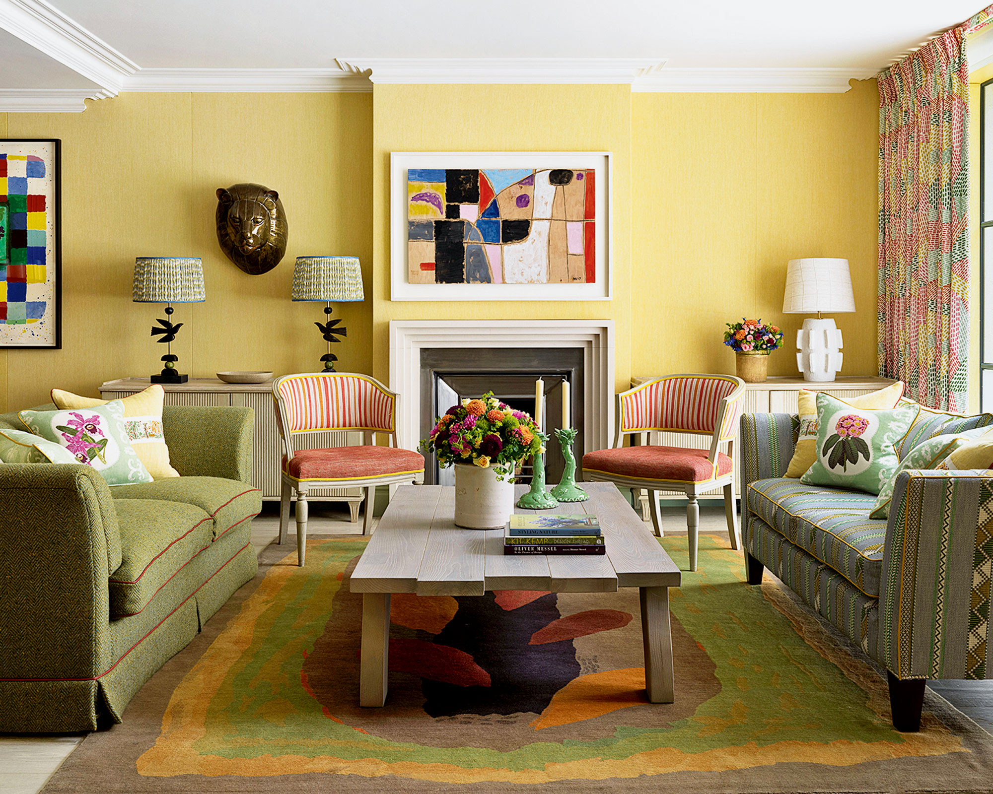
Third, the Tuscan yellow with terra cotta palette, popular in the late 1990s and early 2000s, is described as a mass-marketed attempt to evoke Mediterranean elegance that lacked authenticity. This combination became a superficial shorthand for 'taste' without requiring actual discernment. Fourth, the overuse of purple and gold is highlighted as an effort to broadcast luxury and status, contrasting with the 'whispering' nature of true luxury. This pairing is often associated with aspiration rather than genuine arrival.
Fifth, the specific shade of rental property gray is criticized for being cold, institutional, and lacking depth. This gray, often chosen for its cheapness and perceived trendiness in rental units, creates an unwelcoming atmosphere, distinct from carefully selected grays with nuanced undertones. Sixth, red feature walls in dining areas, while based on the psychological idea of stimulating appetite, are deemed formulaic rather than inspired, representing an adherence to rules over the development of personal taste.
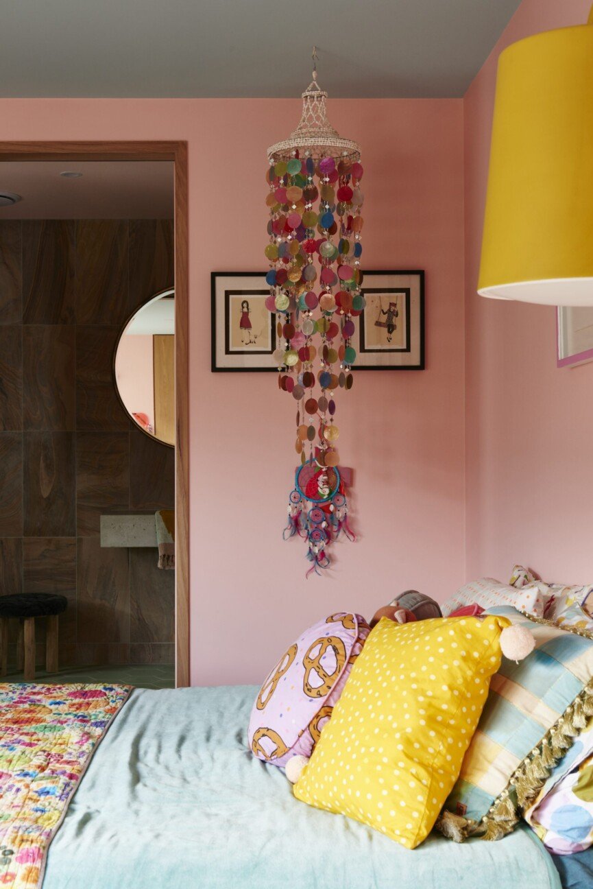
Seventh, the combination of bright white everything with chrome fixtures is identified as a characteristic of flipped houses and budget renovations. This look is considered sterile and has become synonymous with quick, inexpensive remodels rather than modern, high-end design, which now favors warmer whites, mixed metals, and textured materials. Eighth, mauve and dusty rose with oak trim is presented as a deeply dated palette from the 1980s and early 1990s, suggesting a lack of updates or economic mobility.
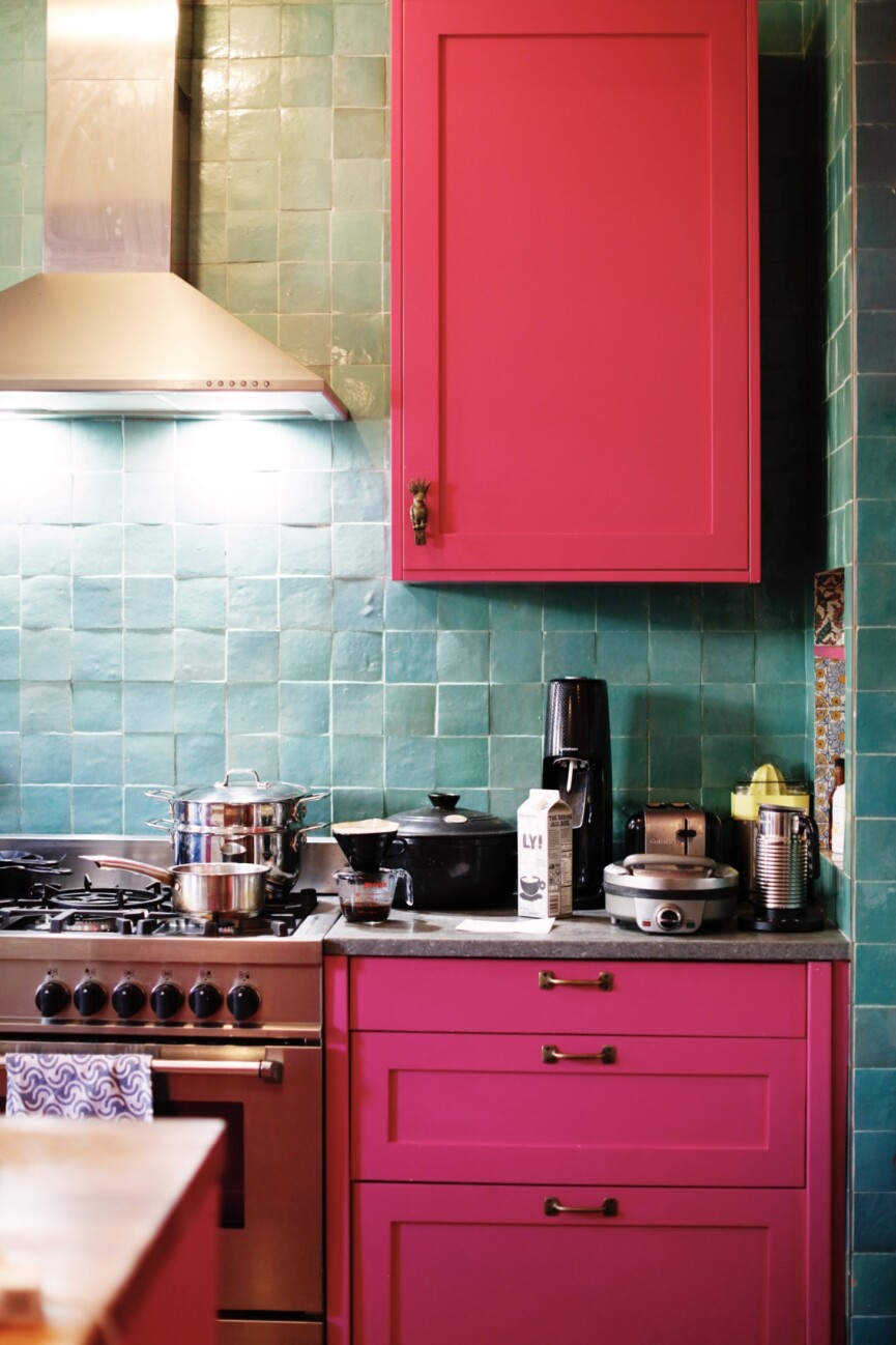
Ninth, lime green and hot pink combinations are criticized for confusing 'bold' with 'good,' often appearing in spaces where an impact was desired without the budget or knowledge for tasteful execution. These fluorescent shades are seen as a visual equivalent of shouting. Finally, chocolate brown and turquoise, a mid-2000s trend, lost its sophistication when it became widely available as pre-packaged sets at discount retailers, signaling an aesthetic bought off the shelf rather than cultivated.
The article concludes by emphasizing that the goal is not to shame individuals but to encourage intentional choices in home design. It prompts readers to consider whether their color selections genuinely reflect personal preference or an attempt to signal a desired image, suggesting that authenticity is paramount. Consulting with design professionals is offered as a valuable resource for those seeking guidance in developing a truly authentic and personal space.
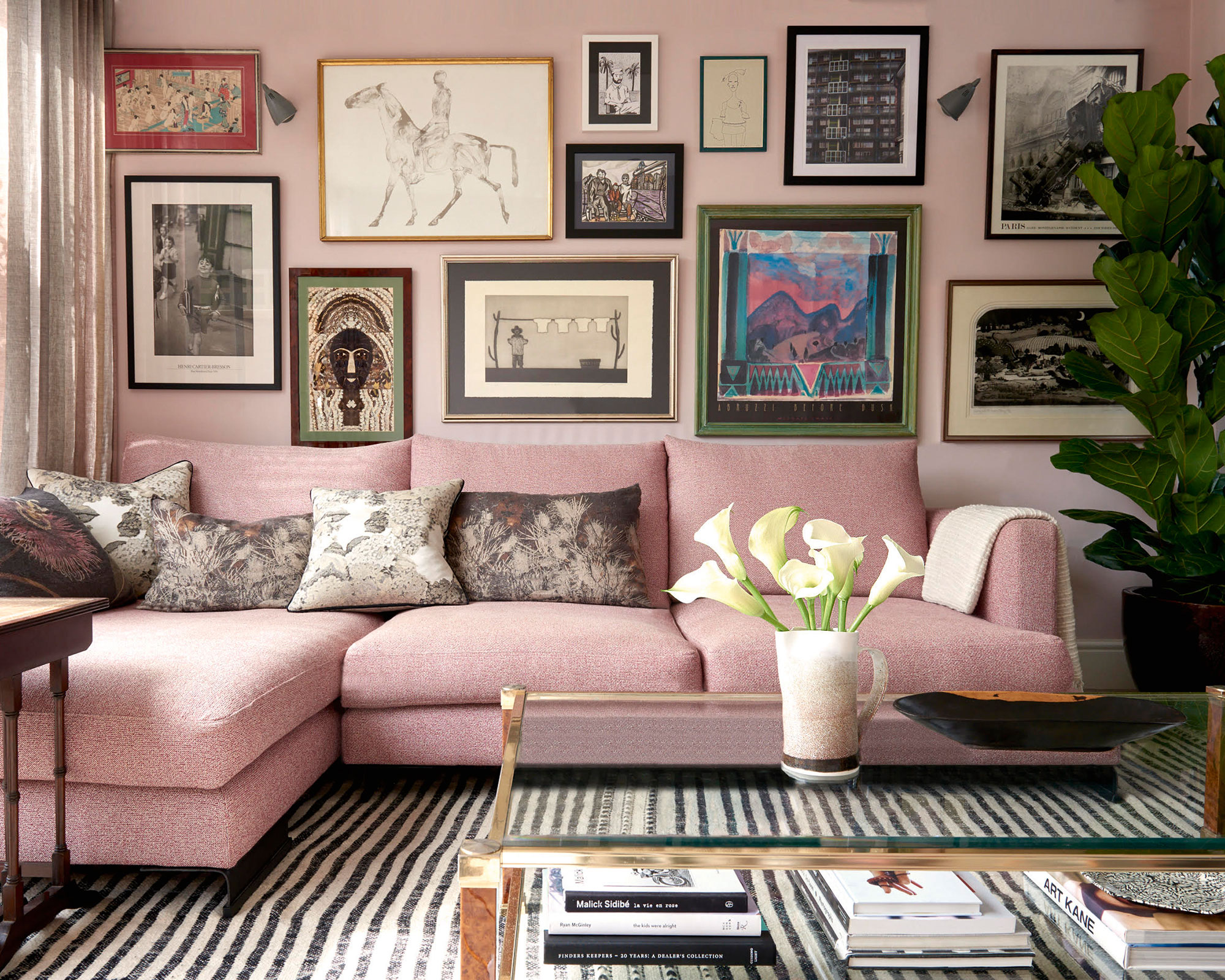
#HomeDecor #ColorPsychology #InteriorDesign #LifestyleChoices #DesignTrends #Aesthetic #SocioeconomicSignals #AuthenticDesign #HomeDecor #ColorPsychology #InteriorDesign #LifestyleChoices #DesignTrends #Aesthetic #SocioeconomicSignals #AuthenticDesign
0 comment in total
 No comments yet
You may also like
10 homes that feature colour blocking
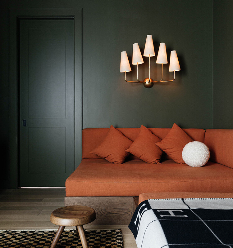
We Can’t Get Enough of These 13 Paint Color Trends for 2021
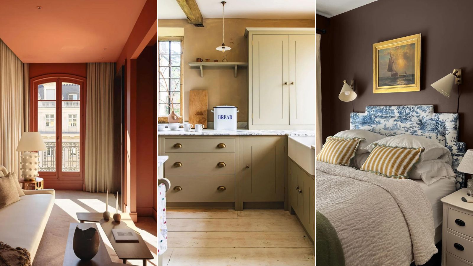
5 'ugly colors' that I'll be decorating with in 2024 – these undesirable colors will trend this year

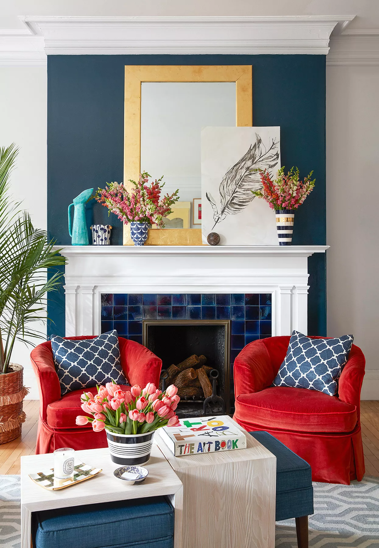
What Colors Go with Red? 21 Knockout Combinations to Consider

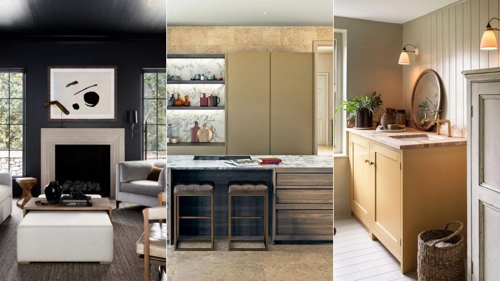
5 colors to decorate with if you're over 'quiet luxury' but still want your home to look rich
The Brighter, the Better—These Vibrant Paints Will Infuse Your Home With Positivity

The 10 Best Warm Paint Colors For A Cozy Home
The biggest color trends of 2025 – 10 colors designers say will lead the way next year
15 Ways to Add Bold Color to Your Home
10 Midcentury Modern Color Palette Ideas for Every Room in Your Home
5 best happy living room colors for an uplifting space
6 'Energetic Colors' for Vitality and "Sophisticated Interiors", According To Psychologists And Design Experts

7 living room paint colors lower-middle-class people adore but others secretly find questionable
12 Home Paint Colors We're Loving for Fall

The 13 Best Paint Colors for Low-Light Rooms

5 colors that will make your living room feel happier, according to interior designers

11 Paint Colors That INSTANTLY Make Your Home Look "Expensive," According to Designers

As a color editor, I've seen hundreds of color trends come and go this year – these are the ones I think will stick for 2025
10 opulent interiors that spurn minimalism for rich colours and textures
5 Underrated Paint Colors Designers Always Use in Their Projects (and You Should Too)