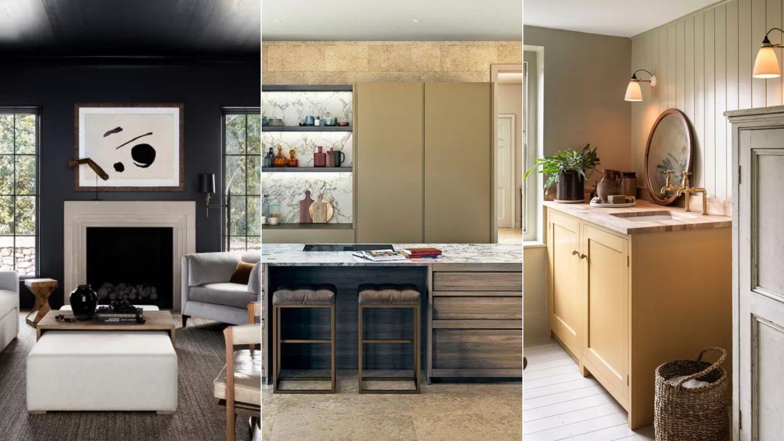
1/6
5 colors to decorate with if you're over 'quiet luxury' but still want your home to look rich

While the 'quiet luxury' trend has dominated interior design in 2023, featuring muted and pale color schemes, many designers and homeowners are seeking to introduce more vibrant and 'rich' colors into their living spaces without resorting to maximalism. This shift aims for an aesthetic that conveys opulence and depth, moving beyond the subdued beige tones that have characterized quiet luxury. Experts suggest five specific color palettes that achieve this balance, offering alternatives that add character and sophistication.
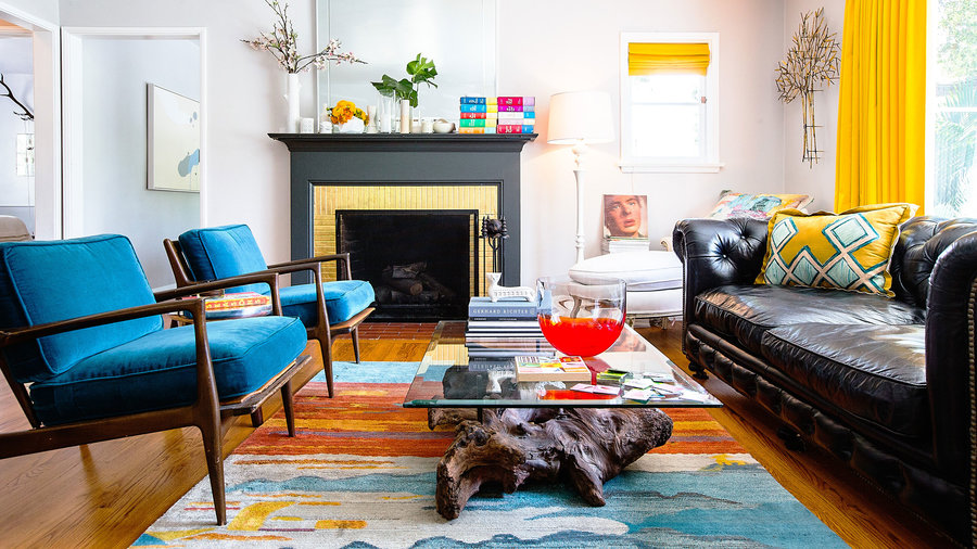
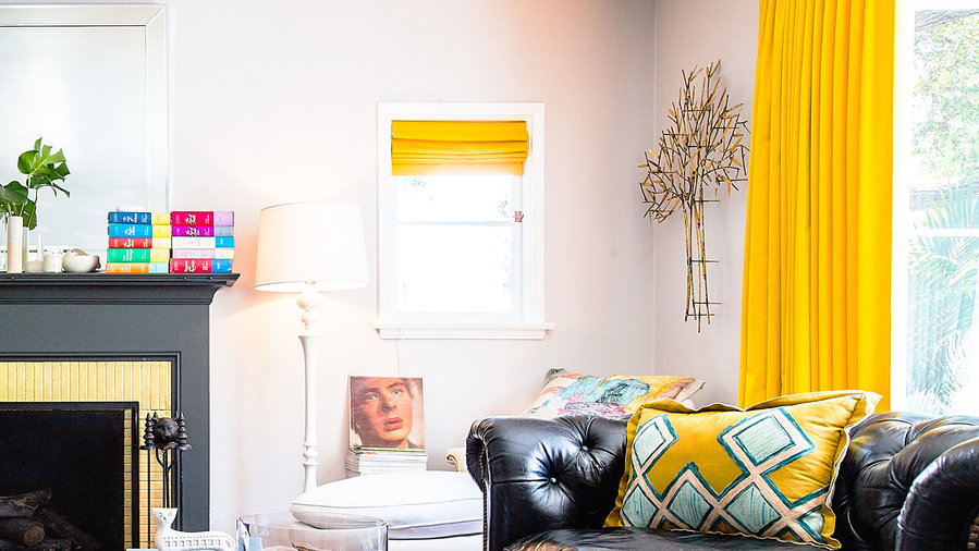
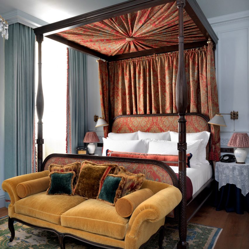
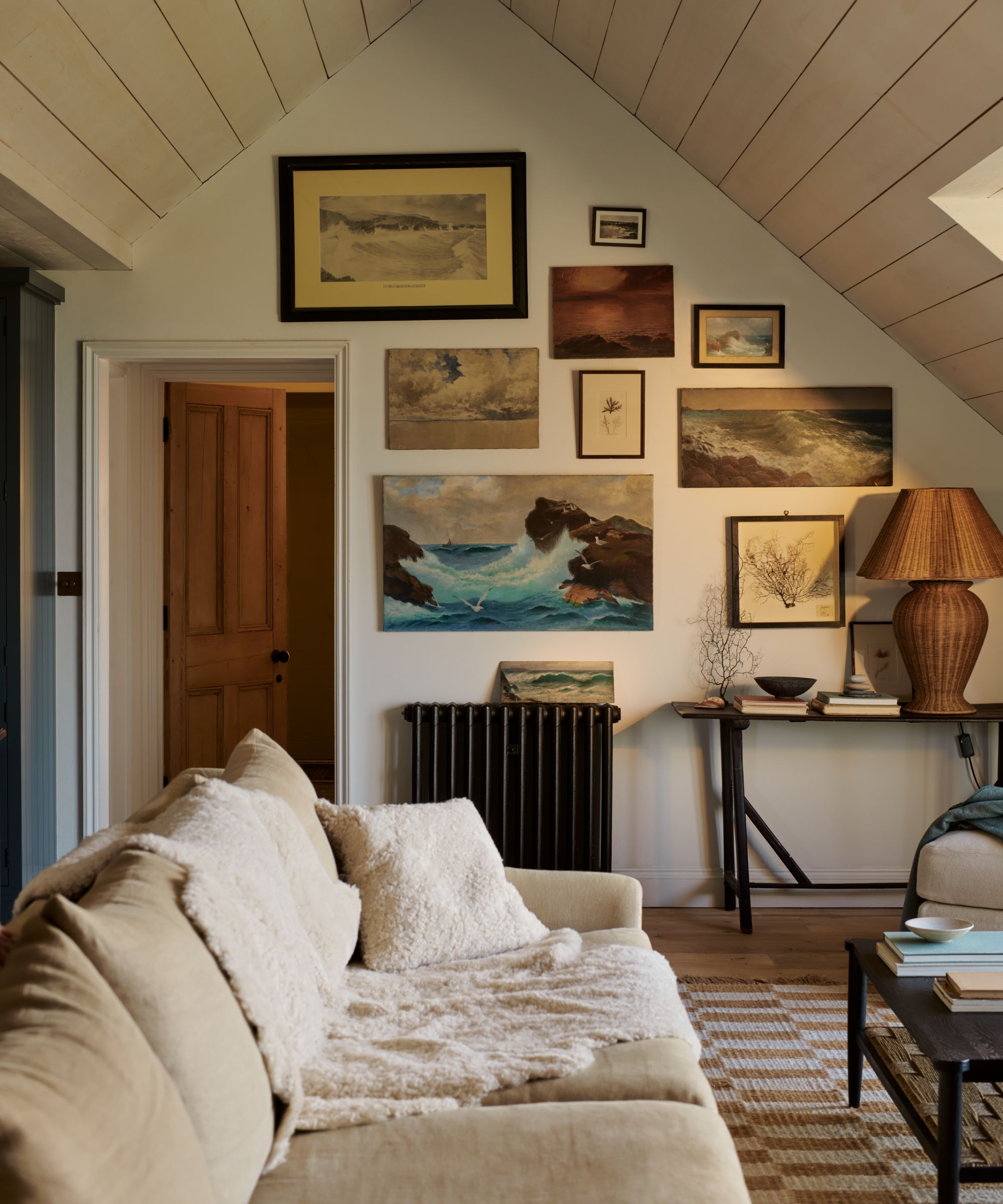
Ochre, an earthy amber, is presented as a historical and versatile color choice. Known as one of the earliest pigments, ochre offers a mellow yet vibrant hue that can serve as an eye-catching accent or a brightening element in spaces like narrow entryways or formal living rooms. Its warmth and sunny associations provide a distinct departure from cooler, understated neutrals, imbuing a sense of richness and history into a room's design.
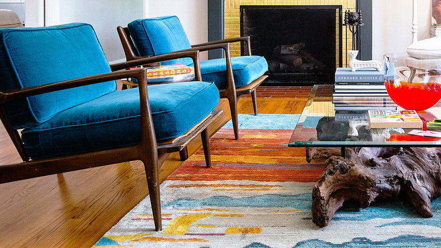
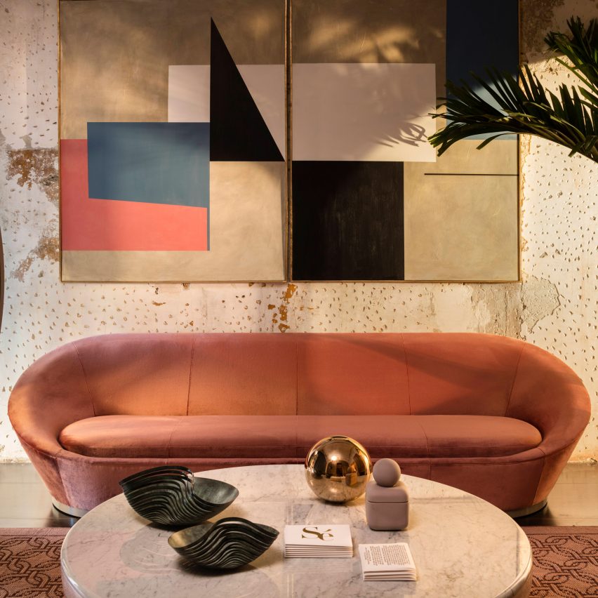
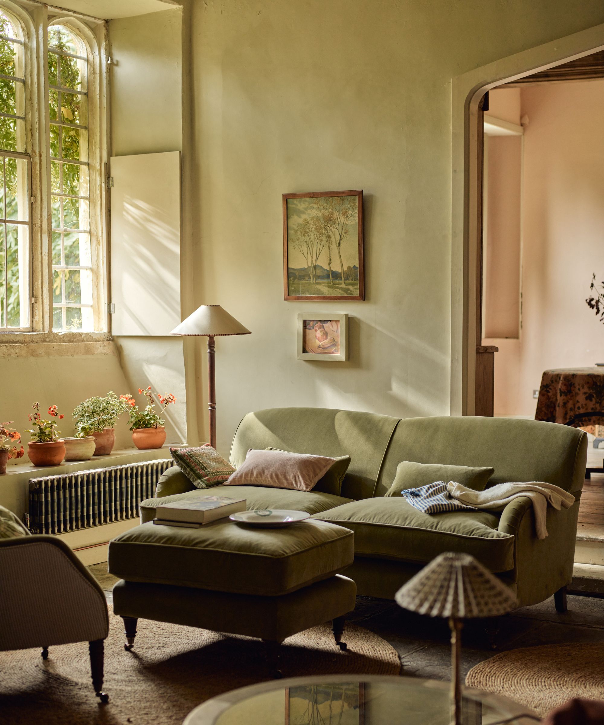
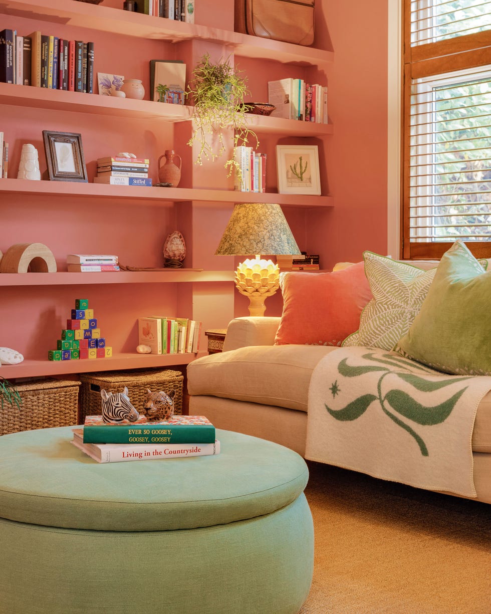
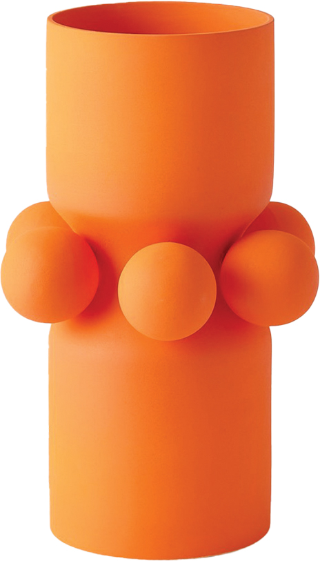
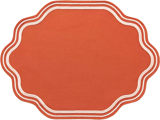
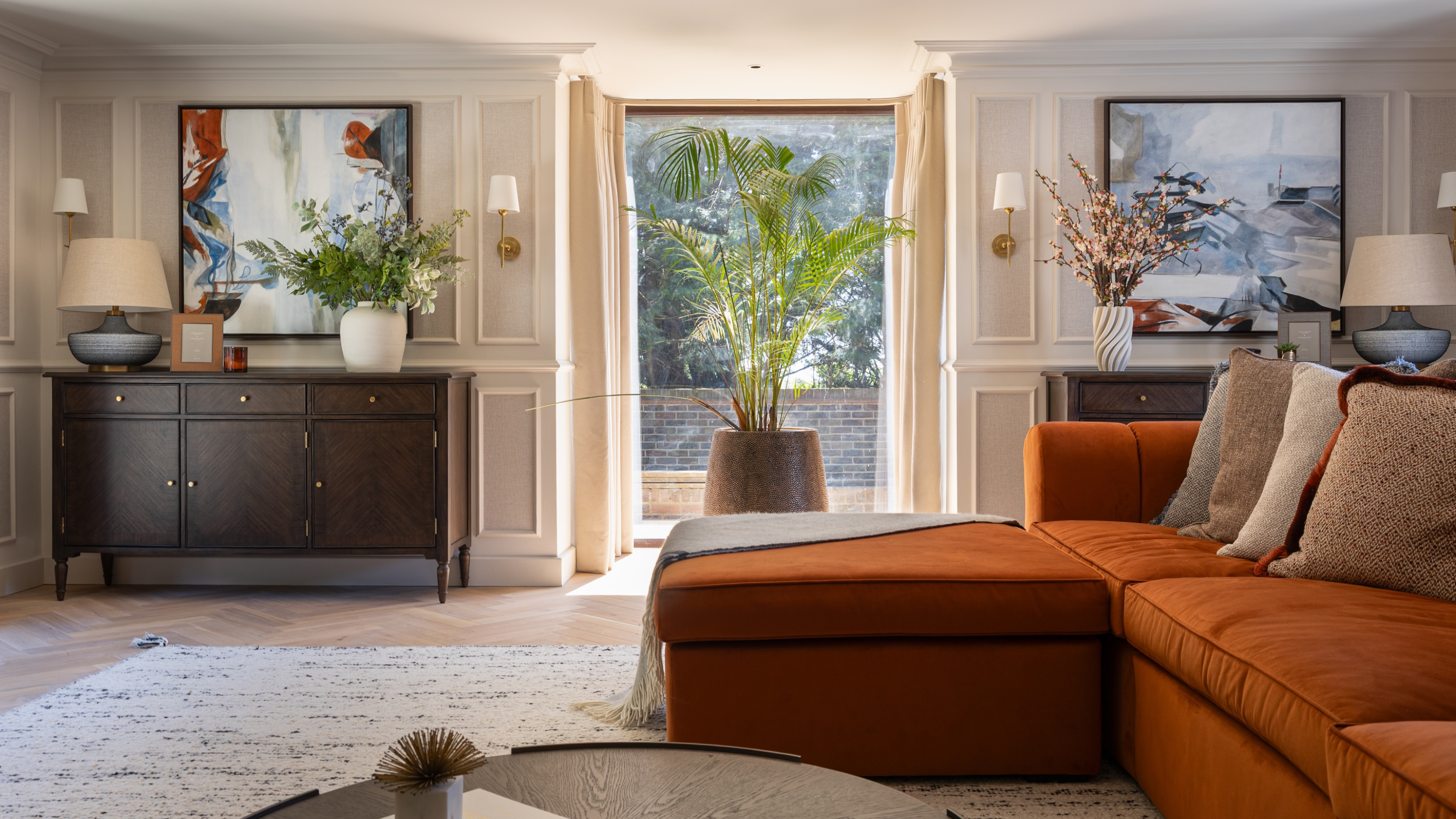
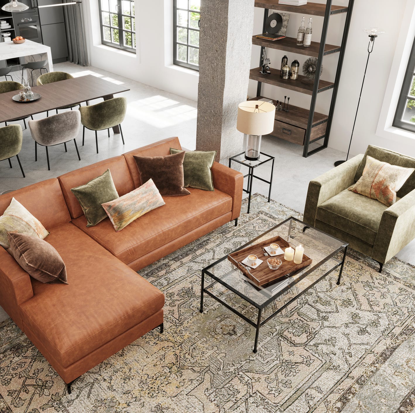
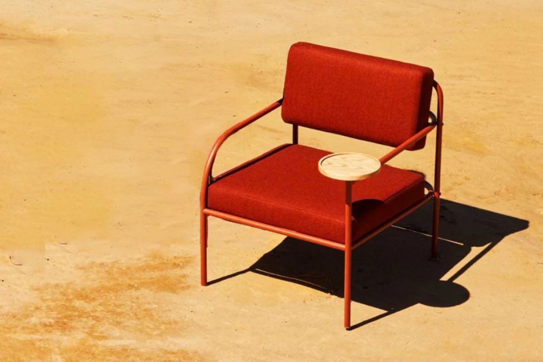
Terracotta, with its warm, sun-baked tones ranging from rich reds to burnt oranges, offers depth and an inviting aesthetic reminiscent of warmer climates. This color can function as a primary backdrop or an accent, wrapping a home in warmth throughout the year. Its natural origins in rich soil lend a grounded quality, and it pairs exceptionally well with ochre due to their shared derivation from natural clay pigments. This combination creates a balanced scheme where the grounded nature of terracotta underpins the vibrancy of golden ochre.
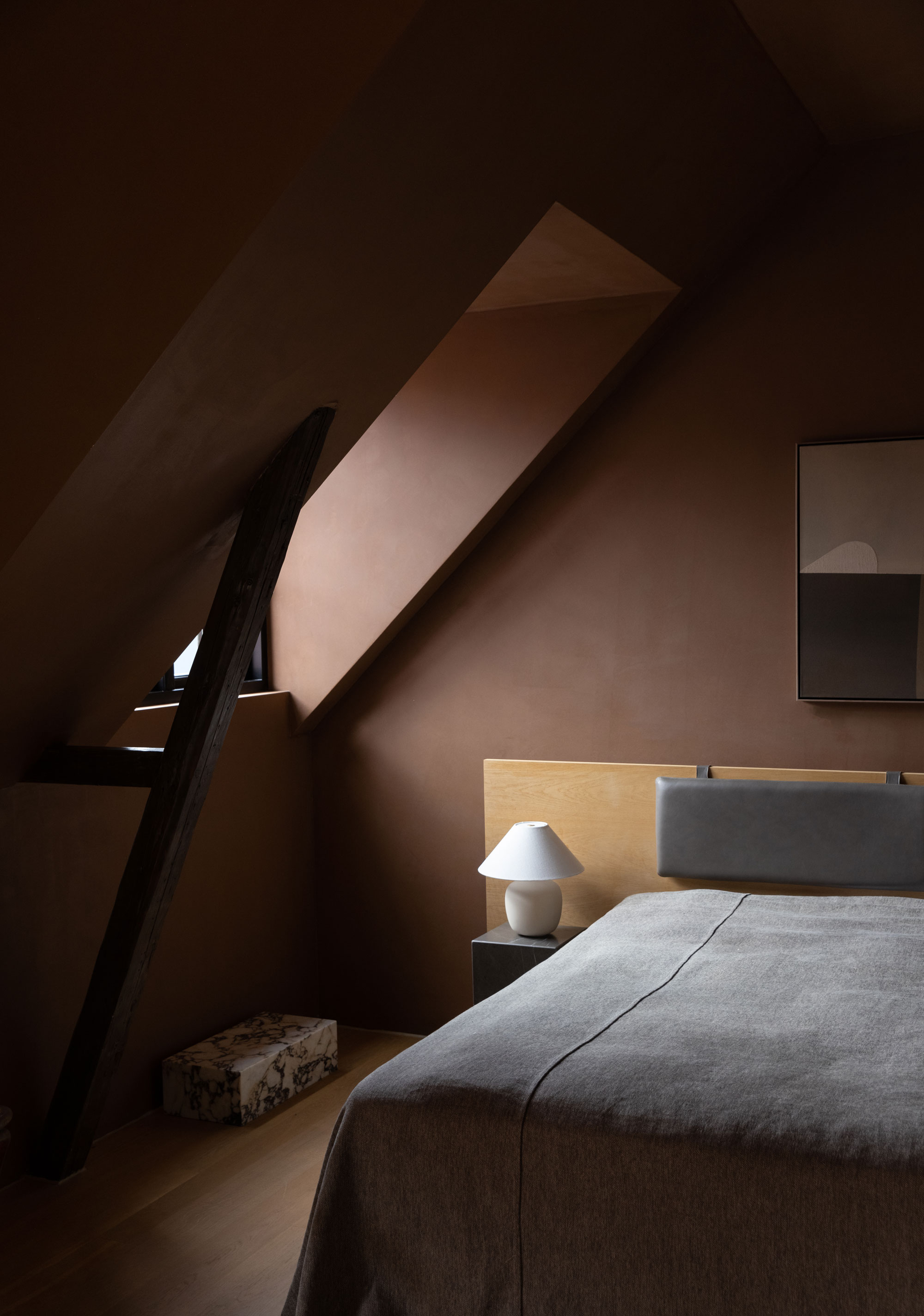
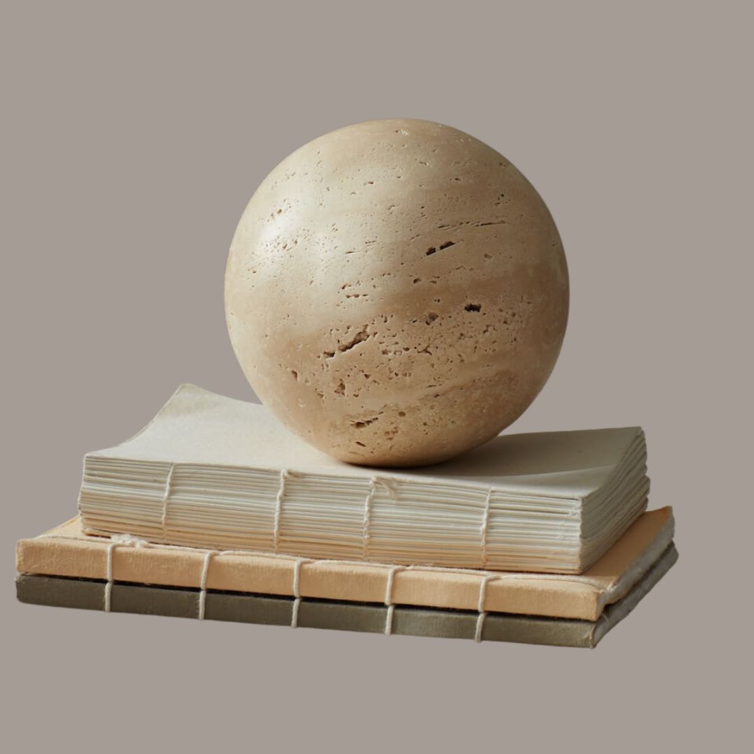
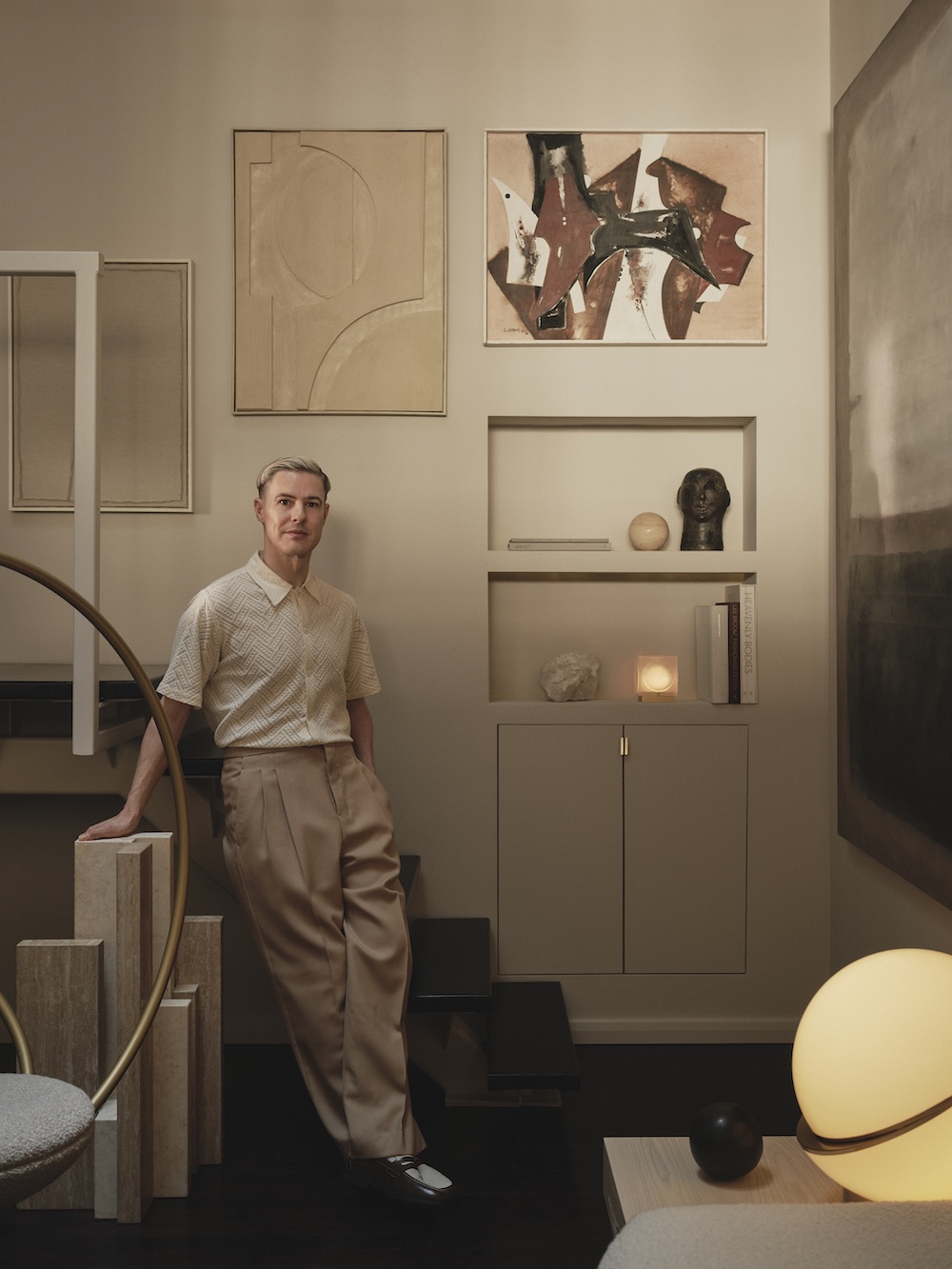
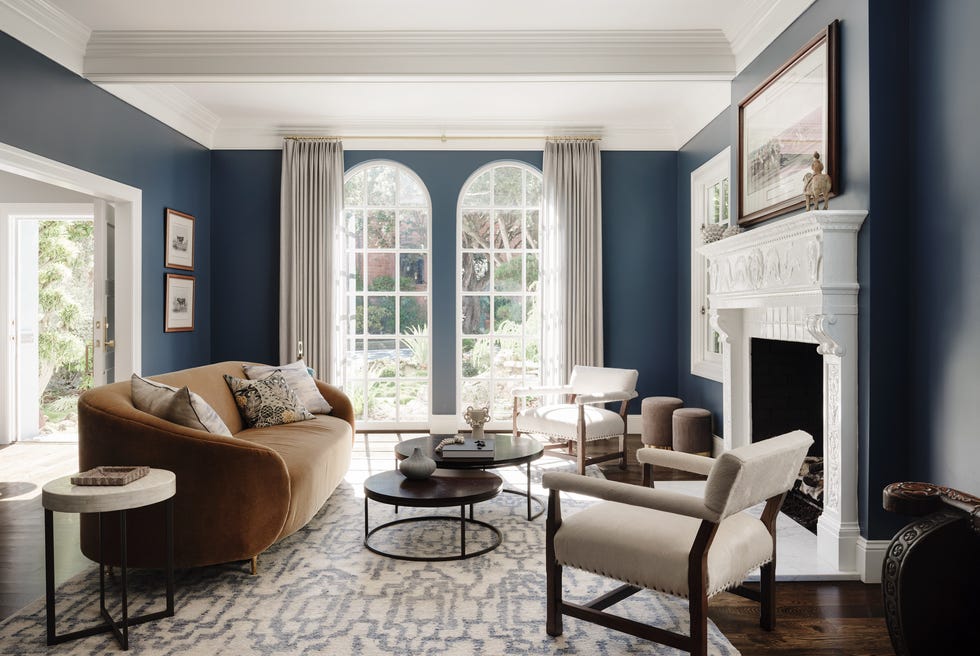
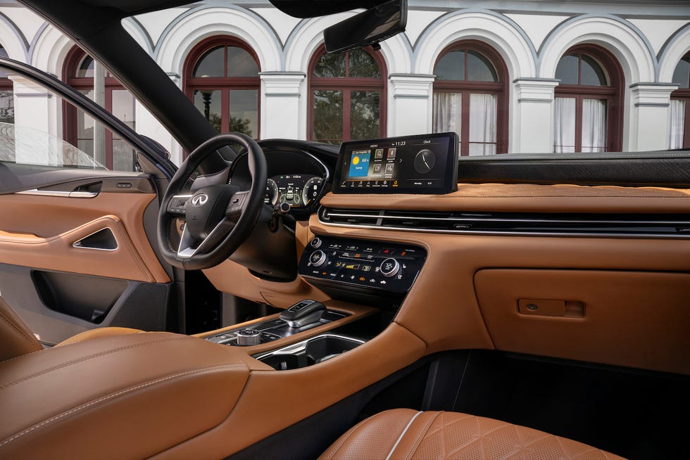
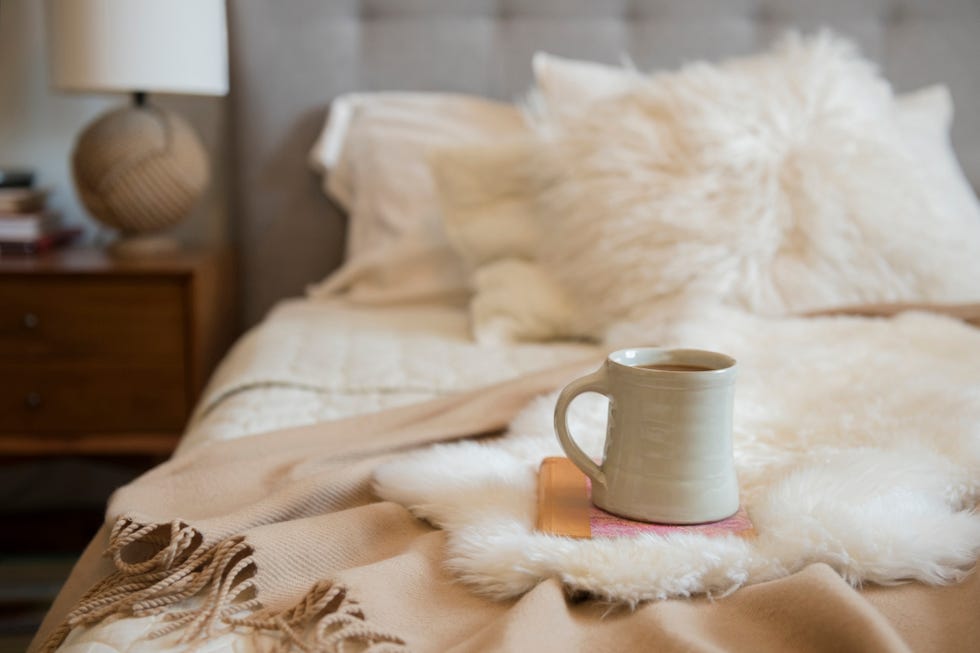
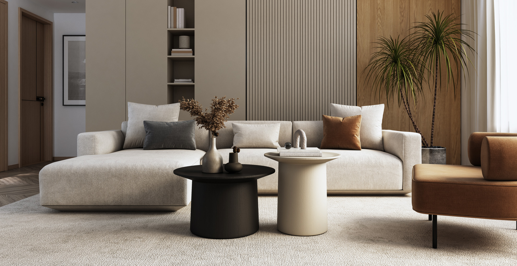
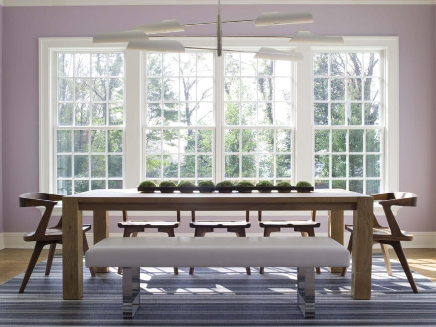
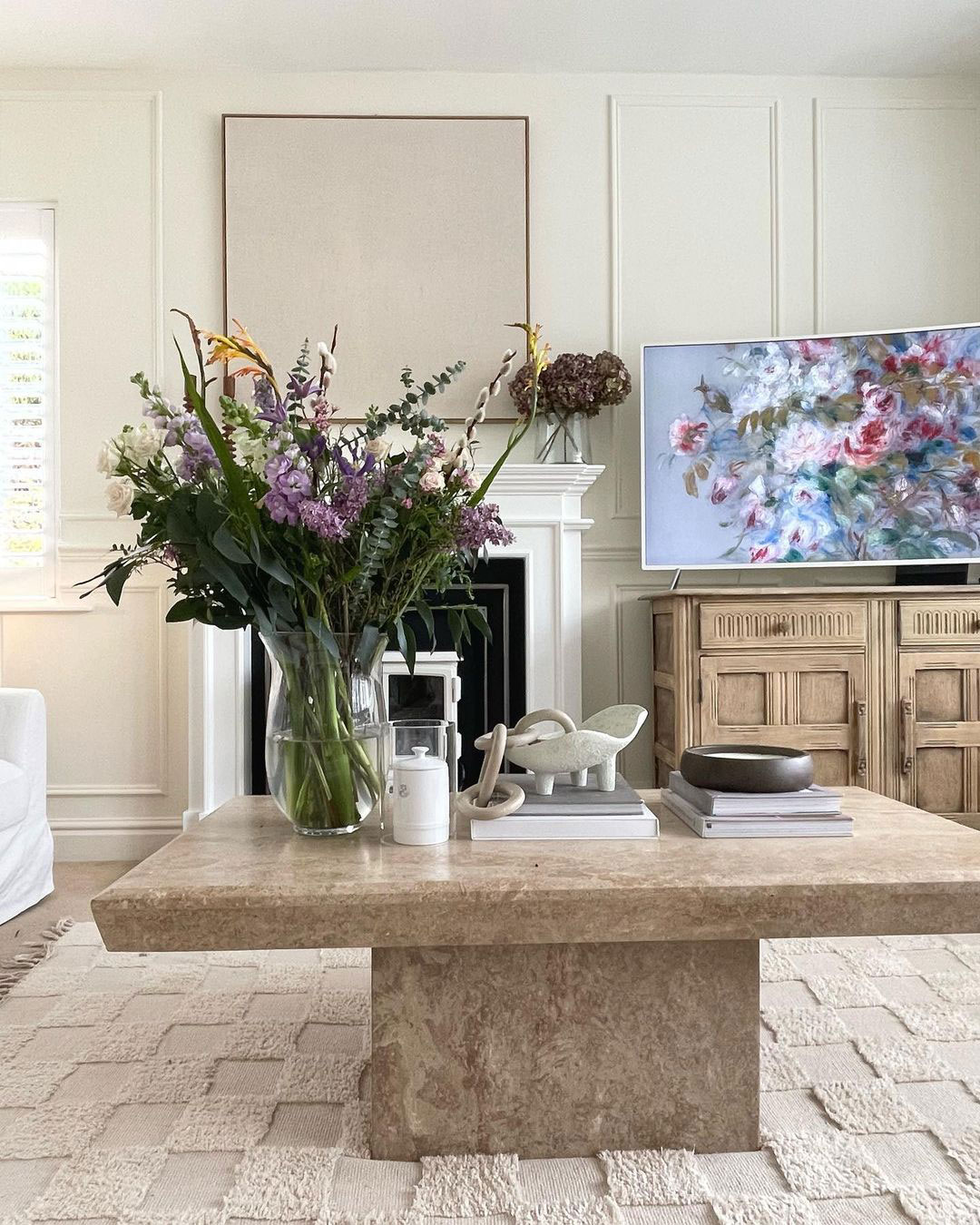
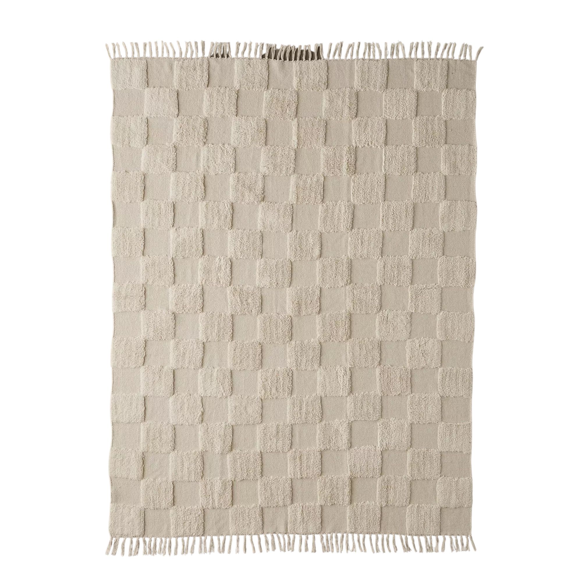
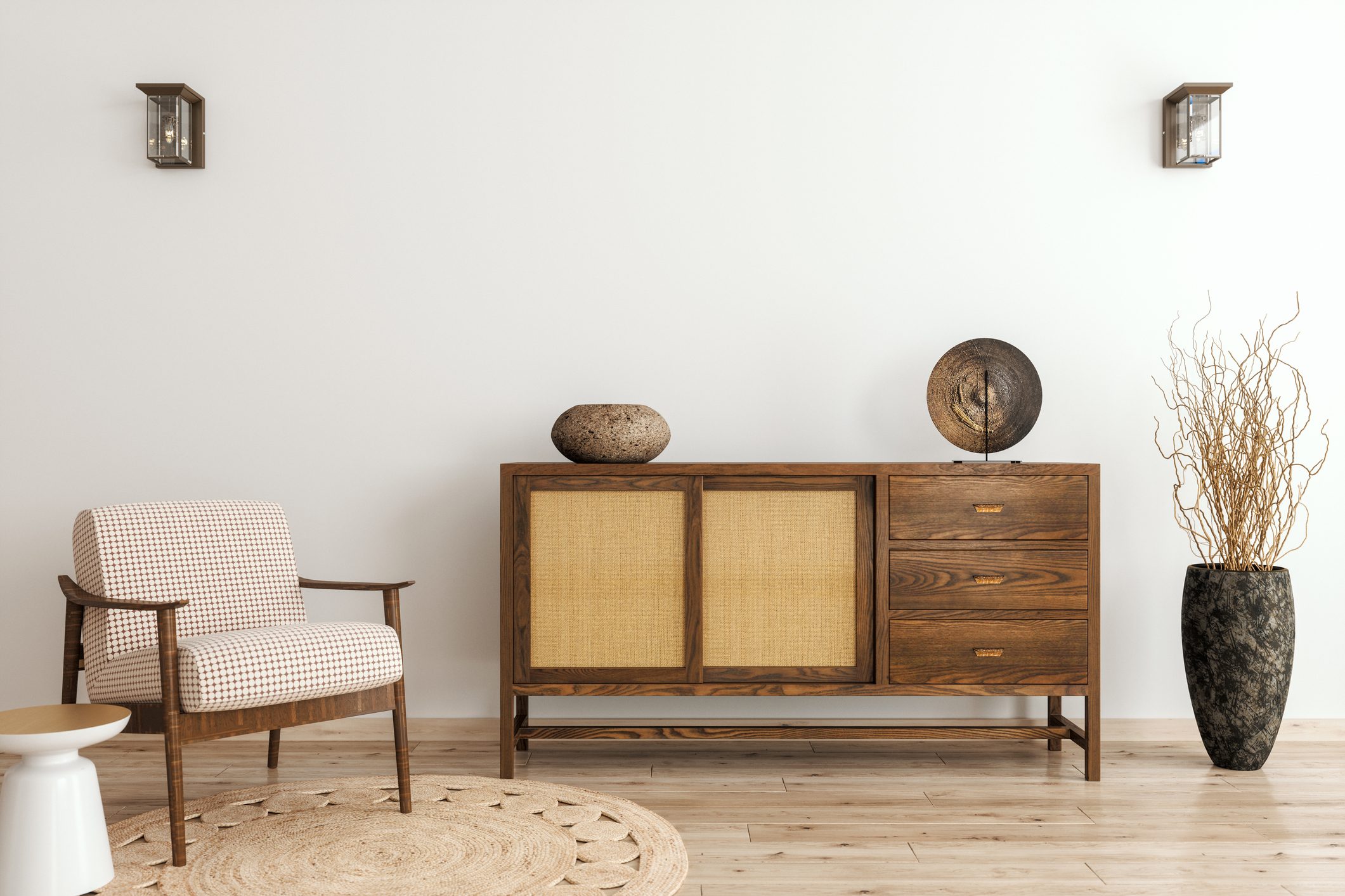
Taupe, specifically a mid-brown hue resembling velvety cocoa, provides a luxurious yet classic alternative to lighter neutrals. It can create a neat and tailored or soft and welcoming ambiance depending on the accompanying furniture and accent colors. Decorating with brown, particularly taupe, is favored by designers for its ability to ground a space, offering a calm and comfortable environment that aligns with a classic interior aesthetic.
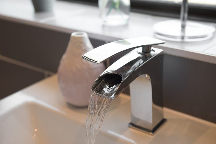
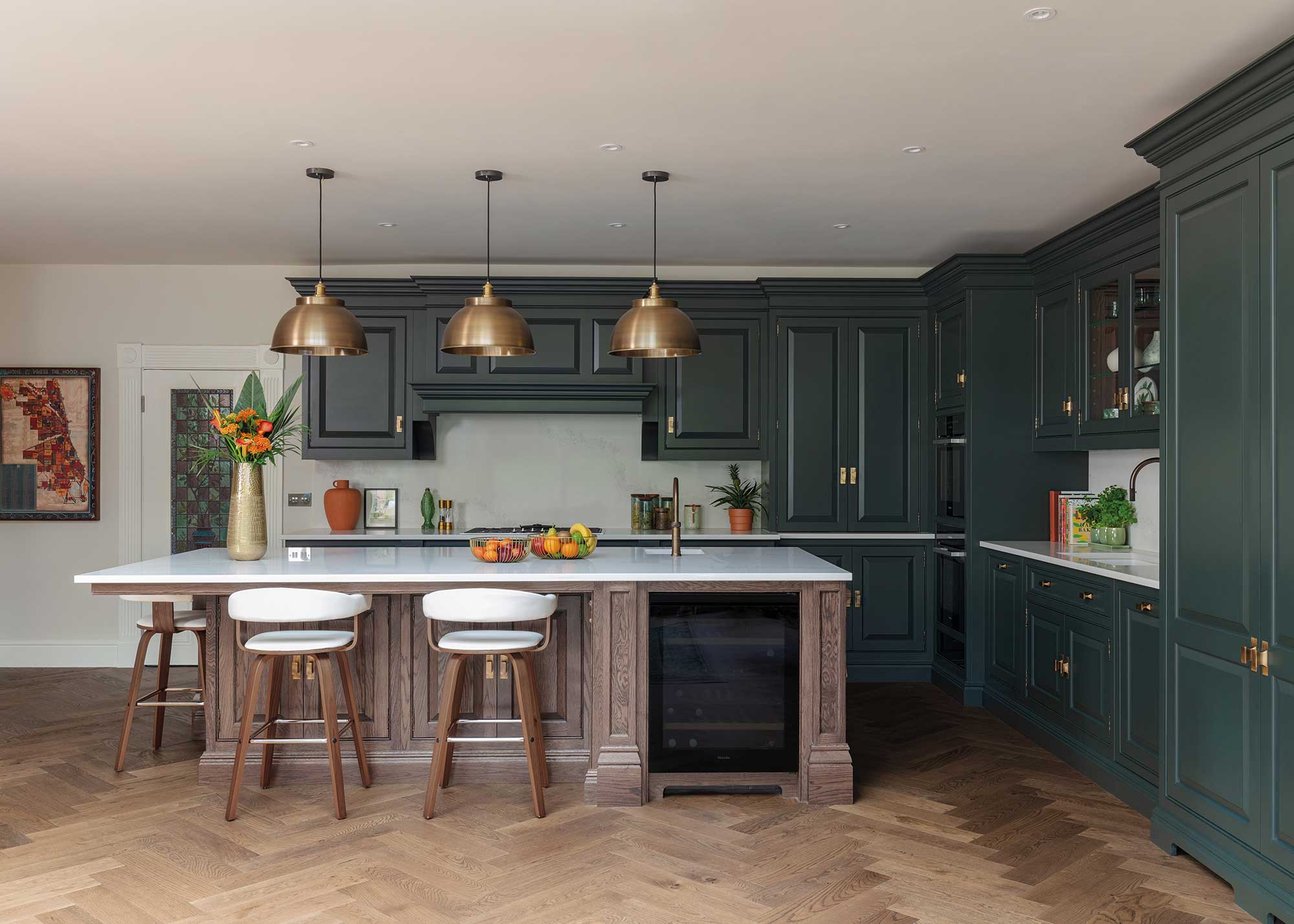
Metallic colors, including chrome, gold, and copper, are making a significant return to interior design after their prevalence in fashion. These shiny accents, when contrasted with dark timbers, provide a sharp silhouette and instant glamor. Used thoughtfully, metallics reflect light, opening up spaces and adding an unexpected touch of luxury without being overtly flashy or mellow.
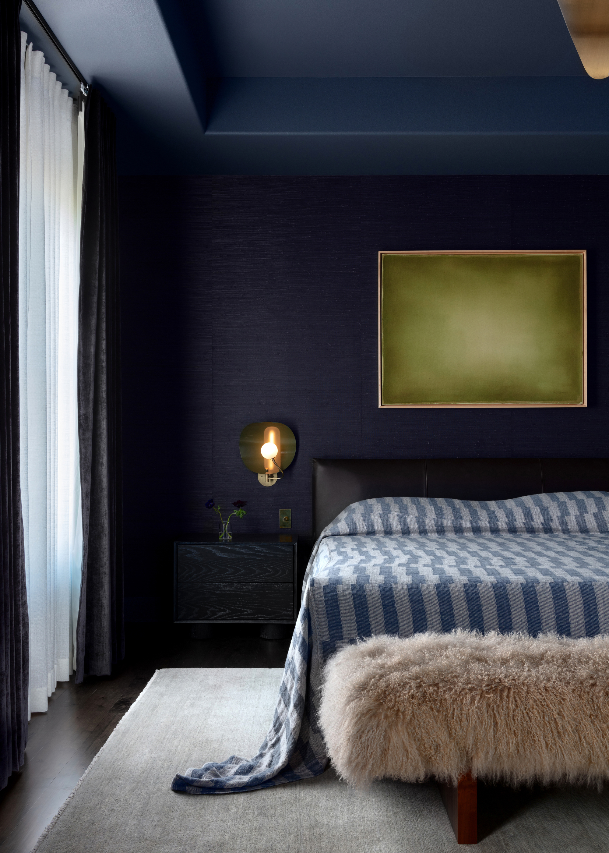
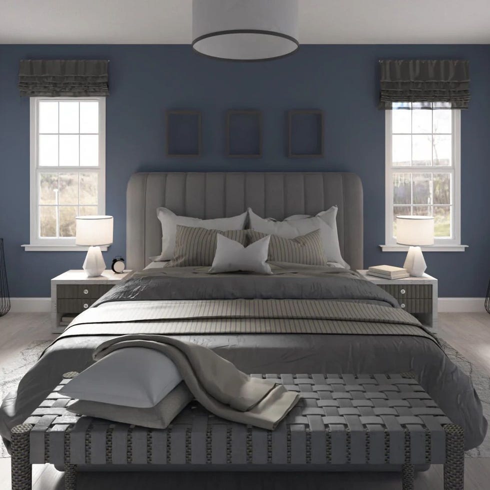
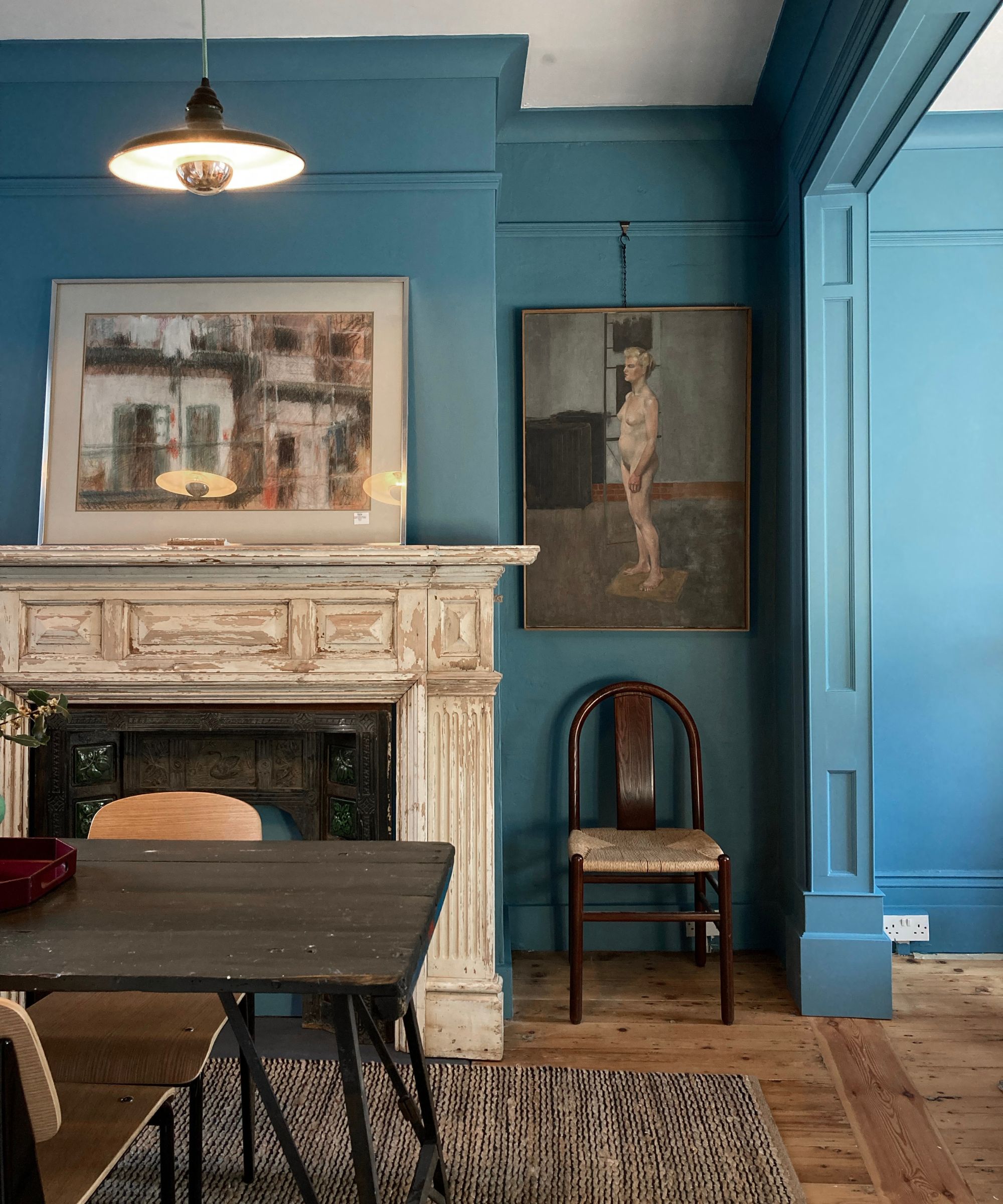
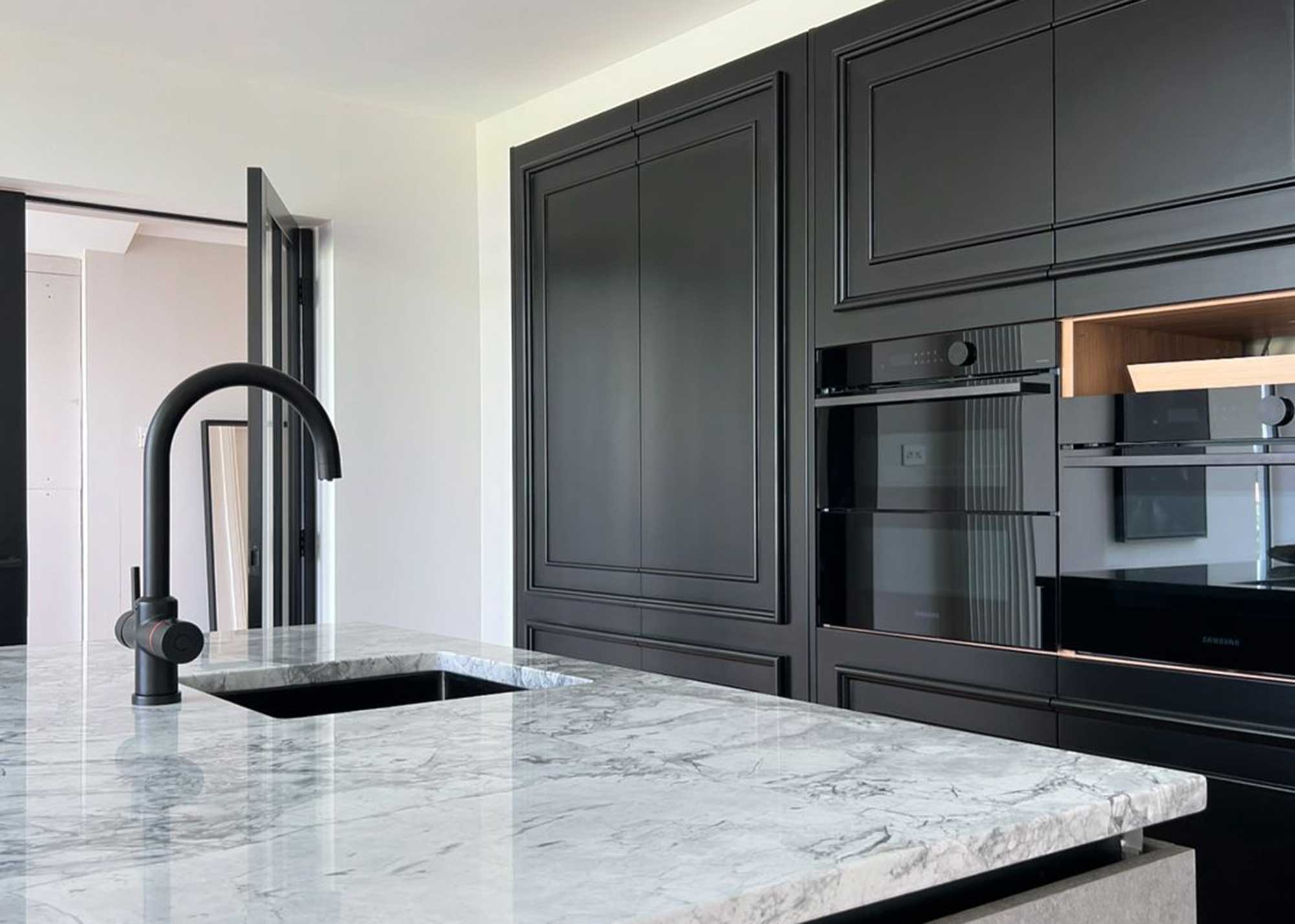
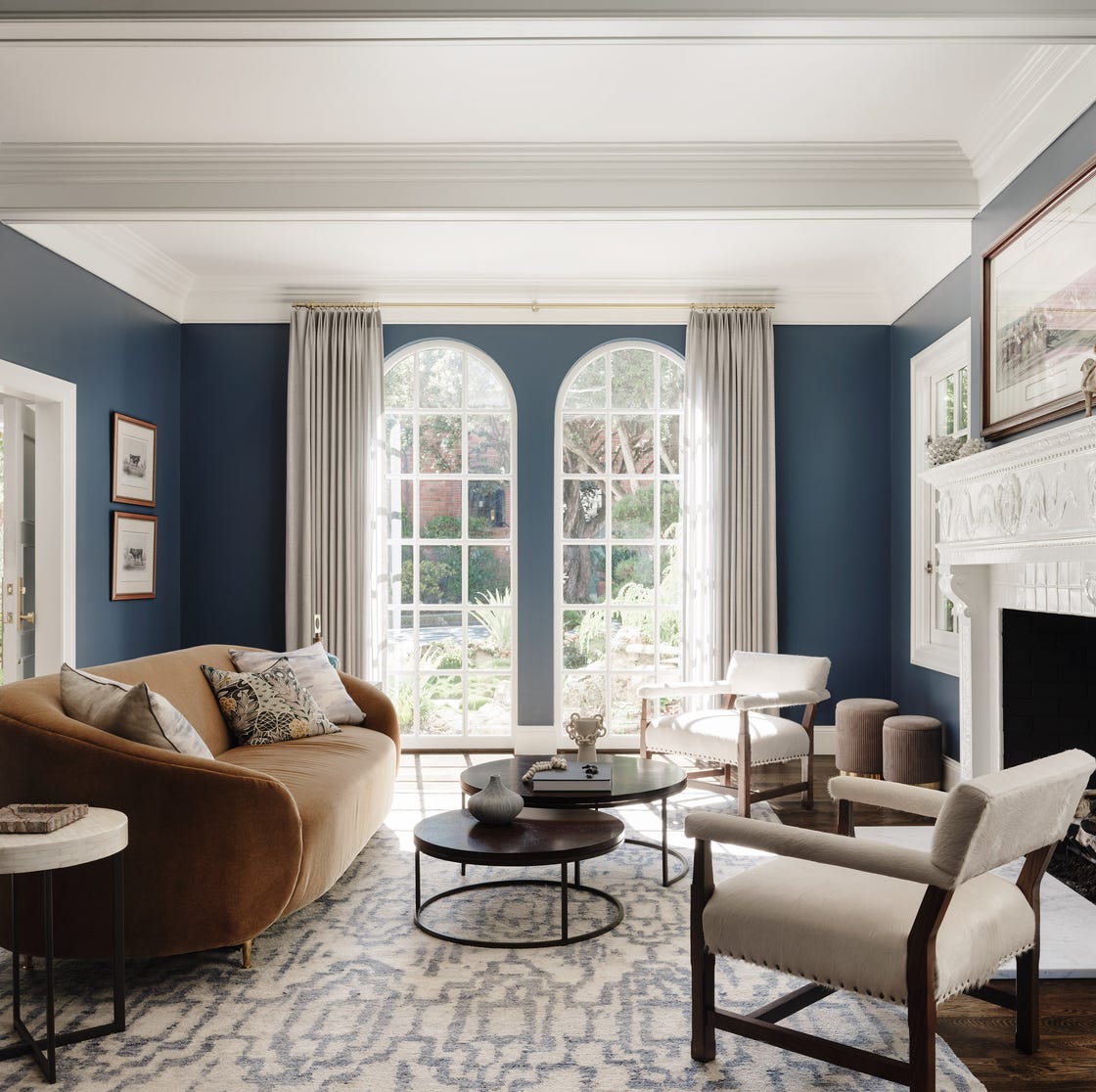
Charcoal, a daring and decadent shade, is an elegant and sophisticated choice that brings drama and verve to interiors. As people become more confident with color, dark and robust shades like black and charcoal are increasingly popular for their ability to add ambiance and a timeless appeal. While a charcoal scheme requires careful editing and the introduction of texture and subtle tonal variations to avoid appearing flat, when executed correctly, it effectively creates a stylish and dramatic environment. Darker colors, in general, are highly effective in creating a sense of luxury and intimacy, anchoring spaces and infusing them with elegance, especially when combined with rich textures.
#InteriorDesign #ColorTrends #LuxuryDecor #Ochre #Terracotta #Taupe #MetallicAccents #CharcoalInteriors #InteriorDesign #ColorTrends #LuxuryDecor #Ochre #Terracotta #Taupe #MetallicAccents #CharcoalInteriors
0 comment in total
 No comments yet
You may also like
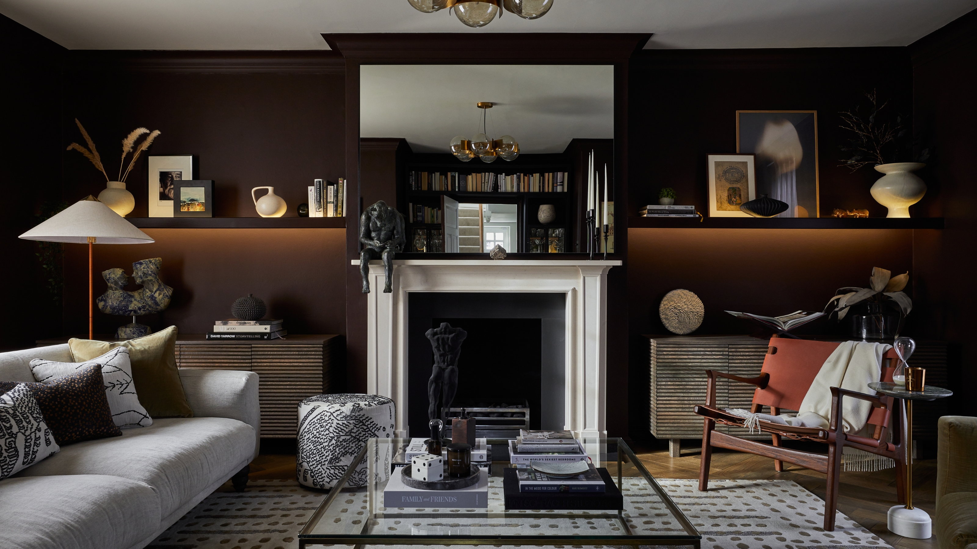
'Colorful Quiet Luxury' Isn't an Oxymoron, It's a Vibe


11 Paint Colors That INSTANTLY Make Your Home Look "Expensive," According to Designers

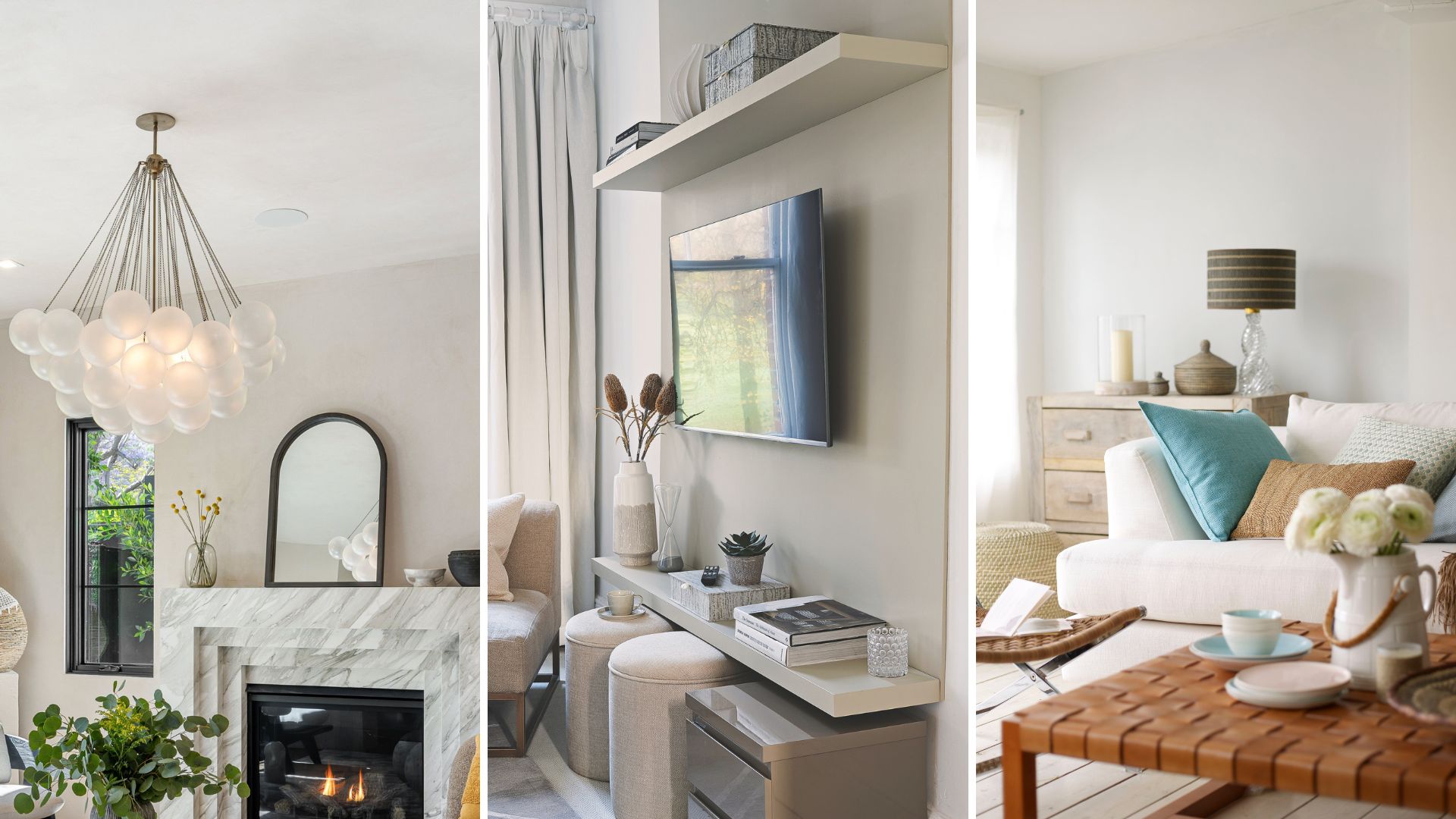
How to make a living room look expensive on a budget: 11 simple interior design tips

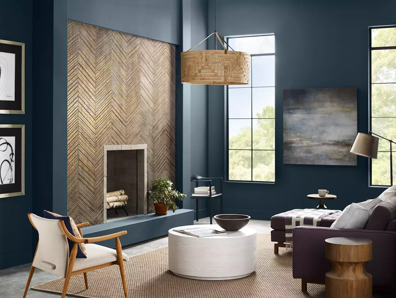
5 Living Room Paint Color Trends for When You're Craving a New Look
5 Things You Should Be Lighting in Your Home to Make Your Rooms Look More Expensive
5 Fabrics and Materials to Elevate Your Home’s Style
6 Gorgeous Home Color Trends That Aren't Just Neutrals

Incorporate Color Drenching Into Your Home Design

15 Ways to Add Bold Color to Your Home
10 home color choices that scream lower middle class energy to refined observers

What colors work best with rustic decor? These 5 shades are all you need to perfect a rustic color palette
8 luxury small living room ideas that bring the right kind of drama

What paint colors to use to create a relaxed vibe at home

10 opulent interiors that spurn minimalism for rich colours and textures
The Brighter, the Better—These Vibrant Paints Will Infuse Your Home With Positivity

9 Colors That Designers Say Will Make Your Kitchen Look Much More Expensive
Lick Paint Will Transform the Mood in Your Home Through Color Psychology
18 Cheap Decor Ideas That Look Expensive

How to make your home look instantly more stylish with clever use of colour

9 Luxury Home Decor Hacks For Less