Getting Your Colors Done Isn't Just for Your Wardrobe—How to Use Them in Your Home
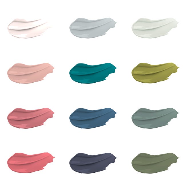
The concept of personal color analysis, traditionally applied to wardrobe and makeup, can be effectively extended to interior design to create a more harmonious and personalized living space. This practice, popularized by Carole Jackson's "Color Me Beautiful" in the 1980s, categorizes individuals into one of four seasonal palettes—spring, summer, autumn, or winter—based on their skin tone, hair, and eye color, considering undertones and chroma. Each season is further divided into subcategories, ranging from bright to soft and light to dark.
Applying a personal color analysis palette to home decor offers several benefits. Beyond simply making one's features pop in photographs, decorating with colors that complement personal aesthetics can positively impact mood and energy. Just as wearing a flattering color can boost confidence, living within a complementary color scheme can enhance feelings of happiness and well-being within one's home. Furthermore, this approach simplifies the often daunting task of selecting a home's color palette by providing a pre-defined, "designer-approved" framework.
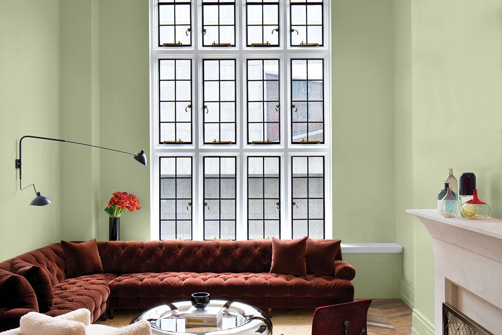
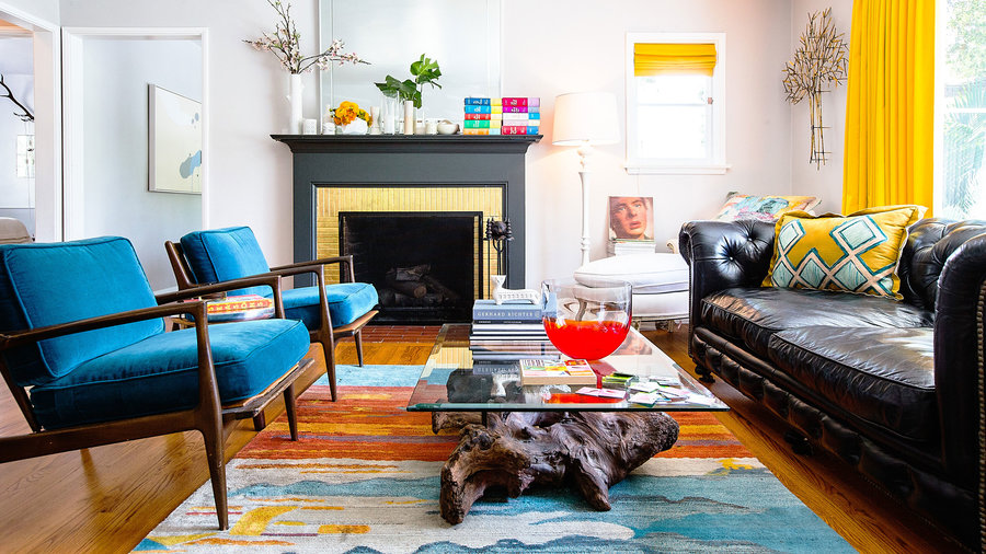
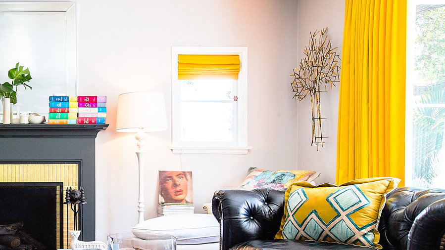
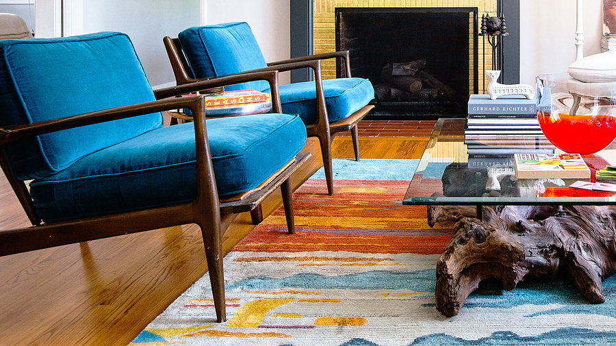
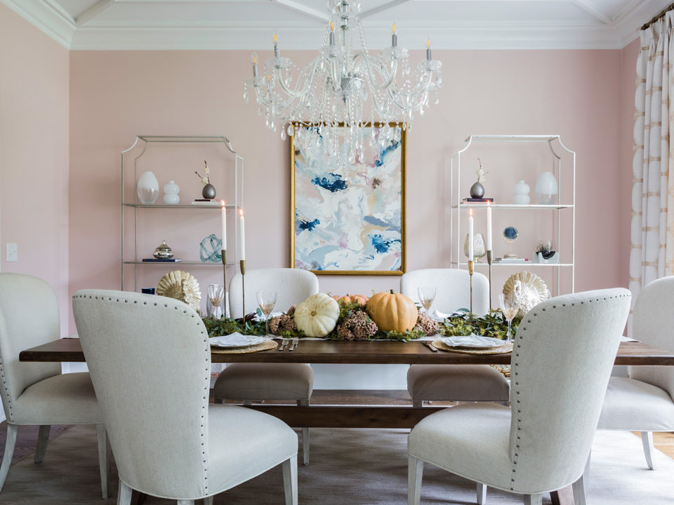
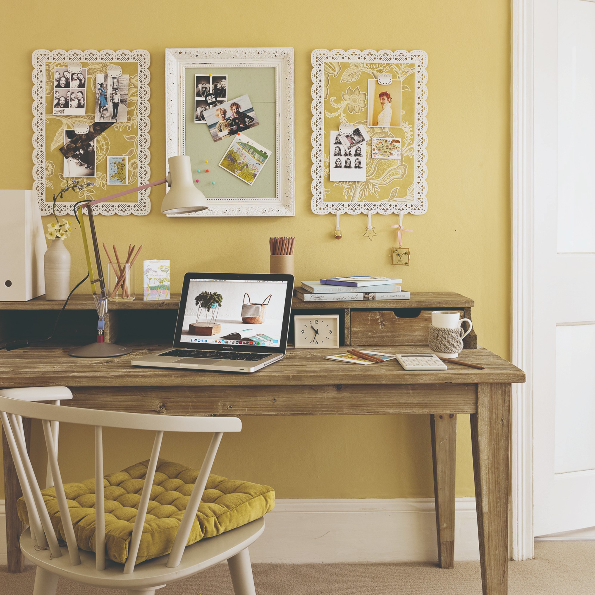
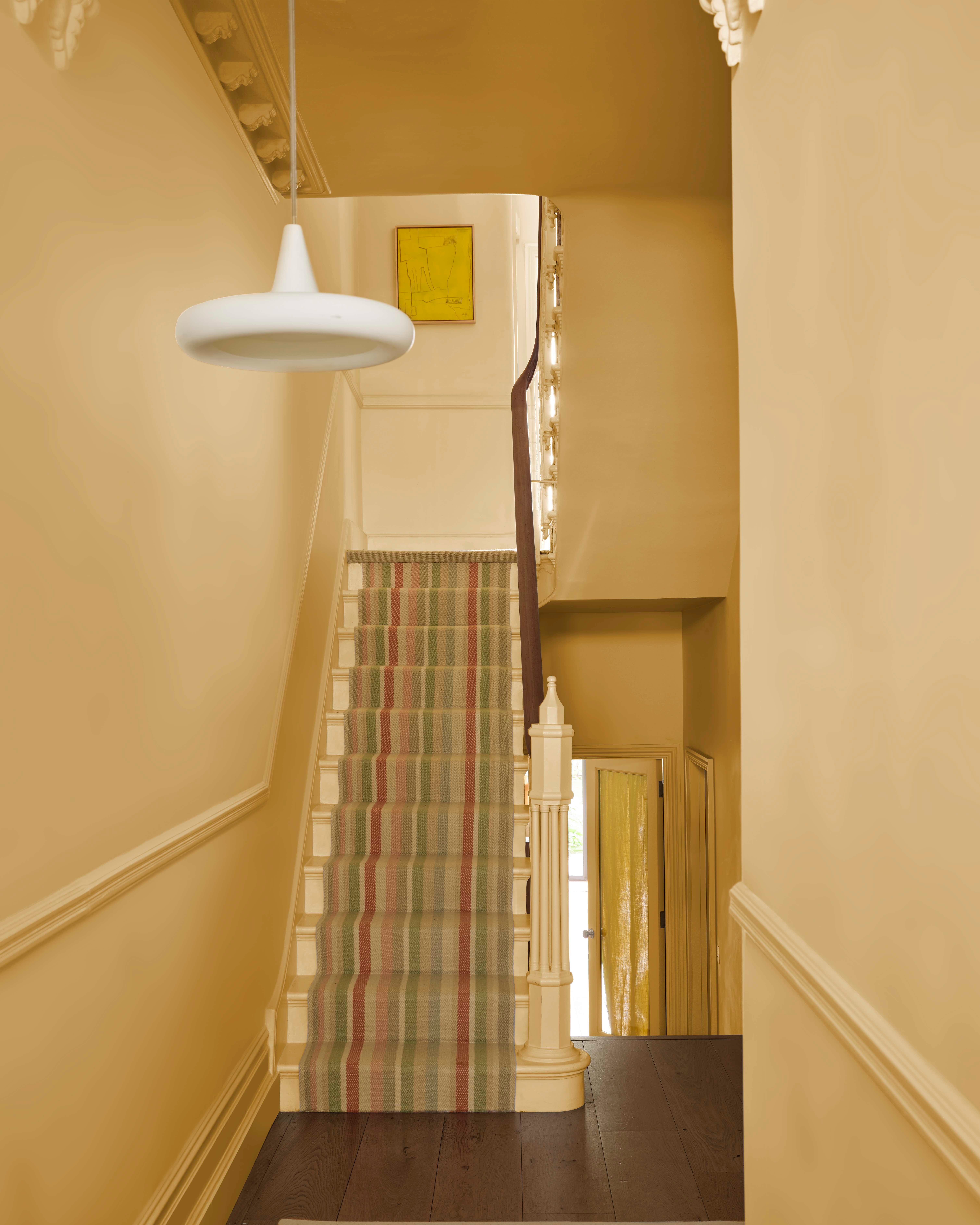
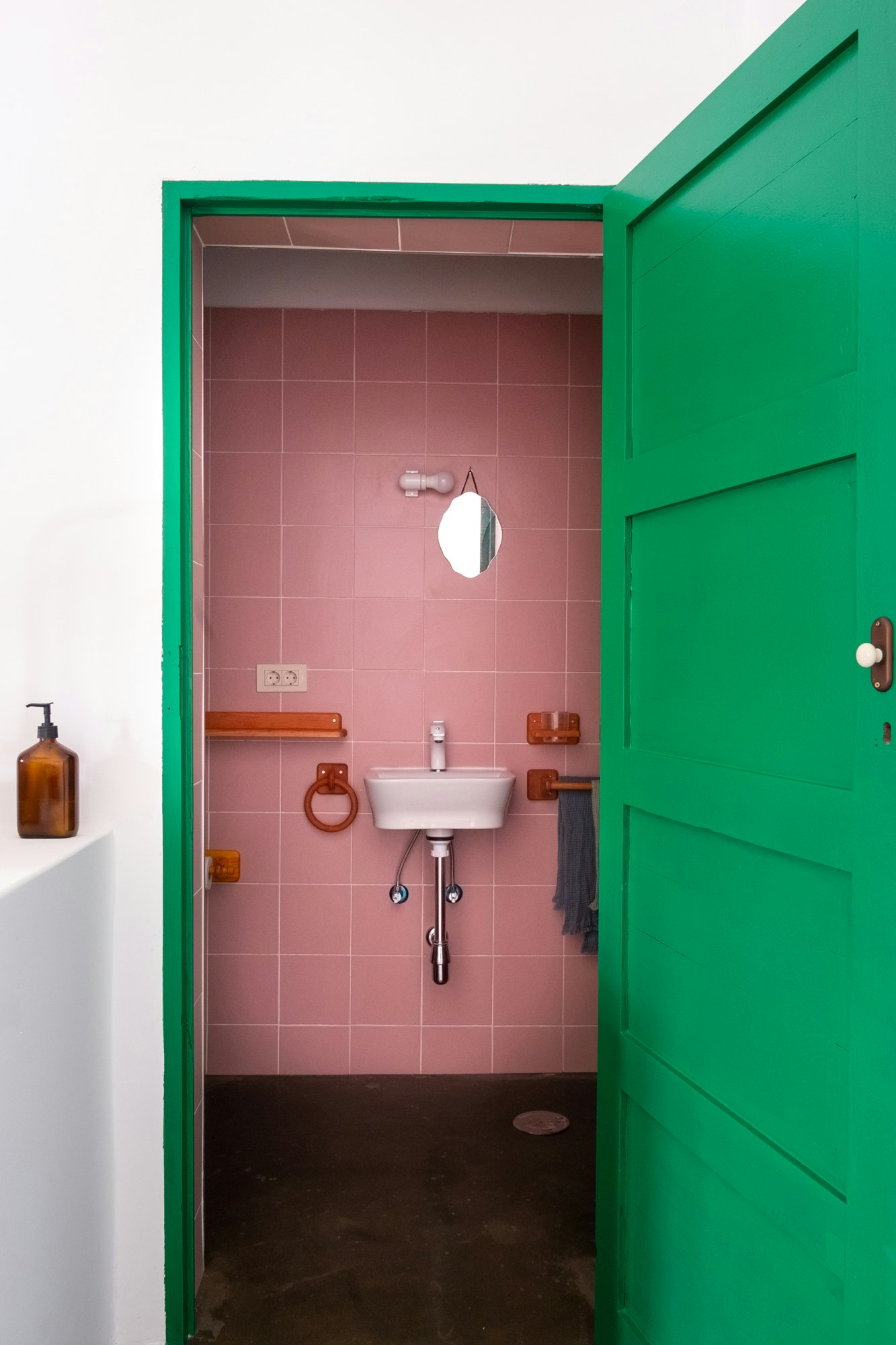
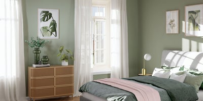
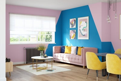
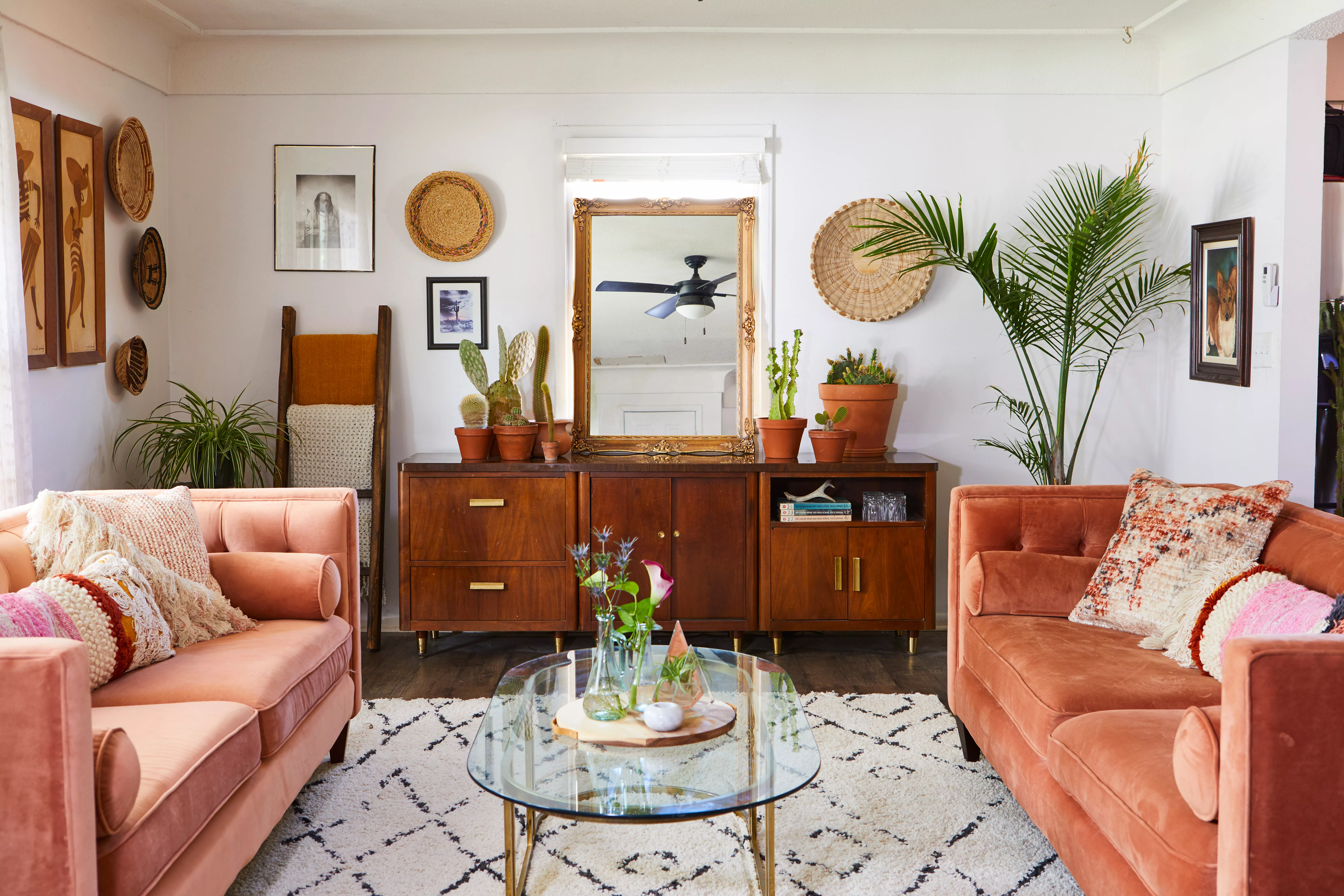
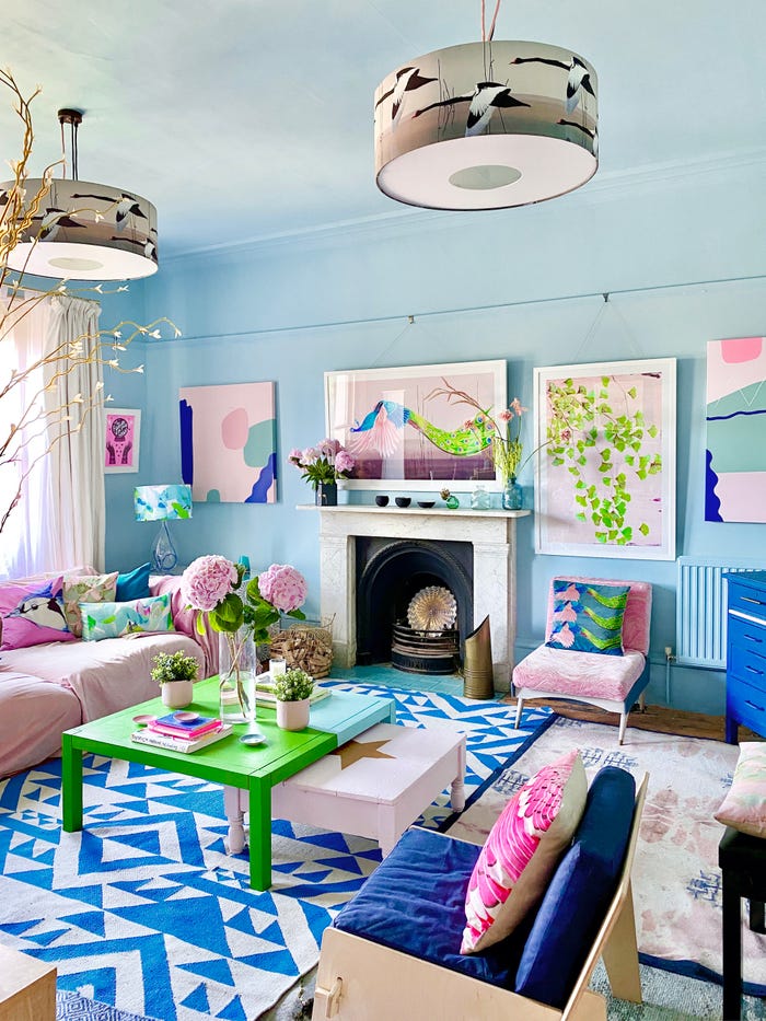
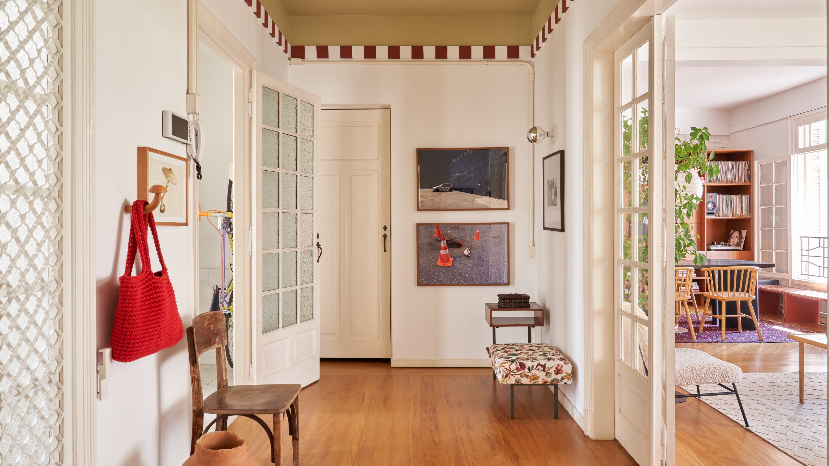
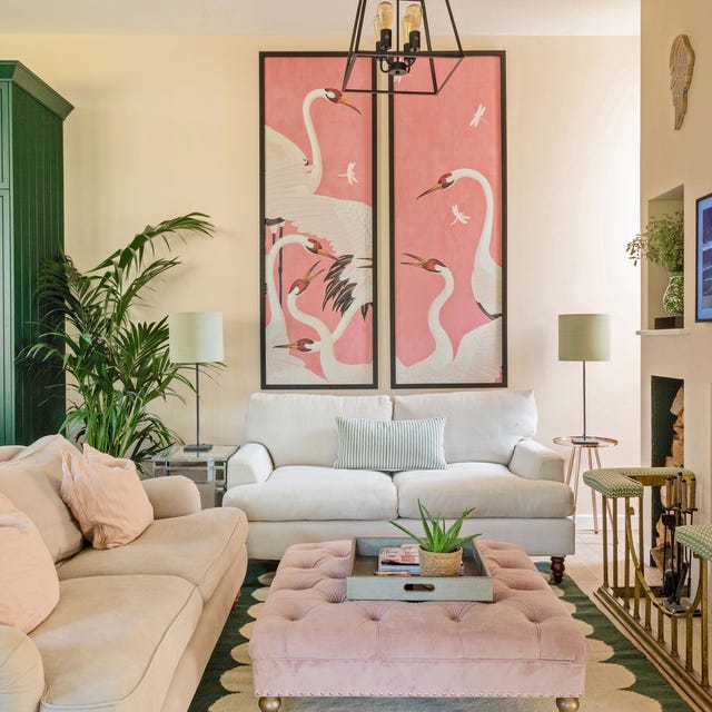
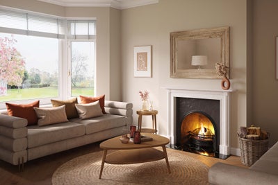
For those identified with a spring color palette, which embodies the light, warm, and fresh qualities of the season, home decor should focus on pastel shades and vibrant accents. Key colors include light green, pink, buttercup yellow, lavender, and bright blue, alongside warmer tones like coral and ginger. To implement this, consider painting walls in a pastel hue such as lavender, light pink, or warm yellow, and grounding the space with a deeper accent color in furniture. Alternatively, maintain light walls and furniture, and introduce bold spring colors through artwork. The essence of a spring palette in home design lies in balancing freshness with warm accents.
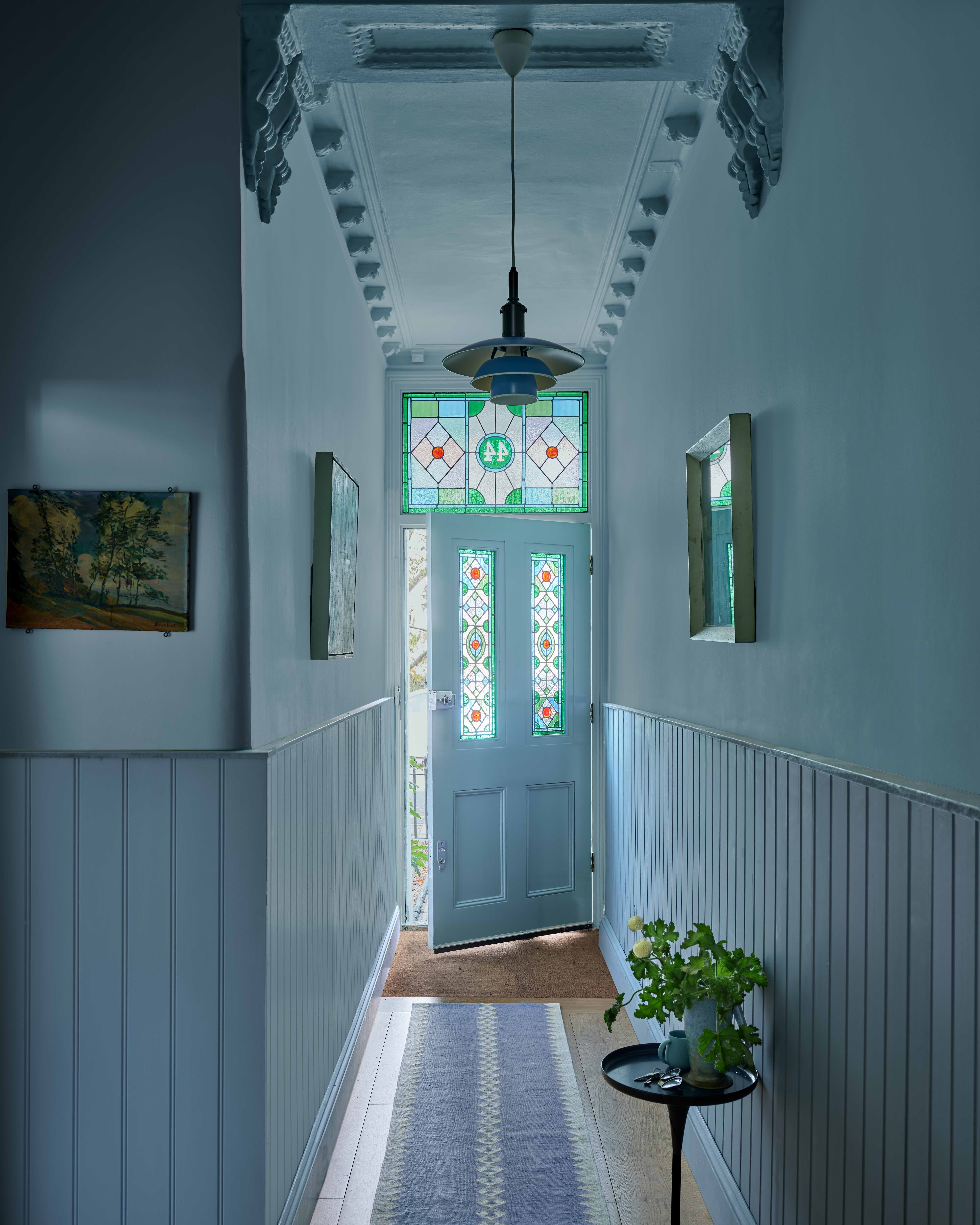
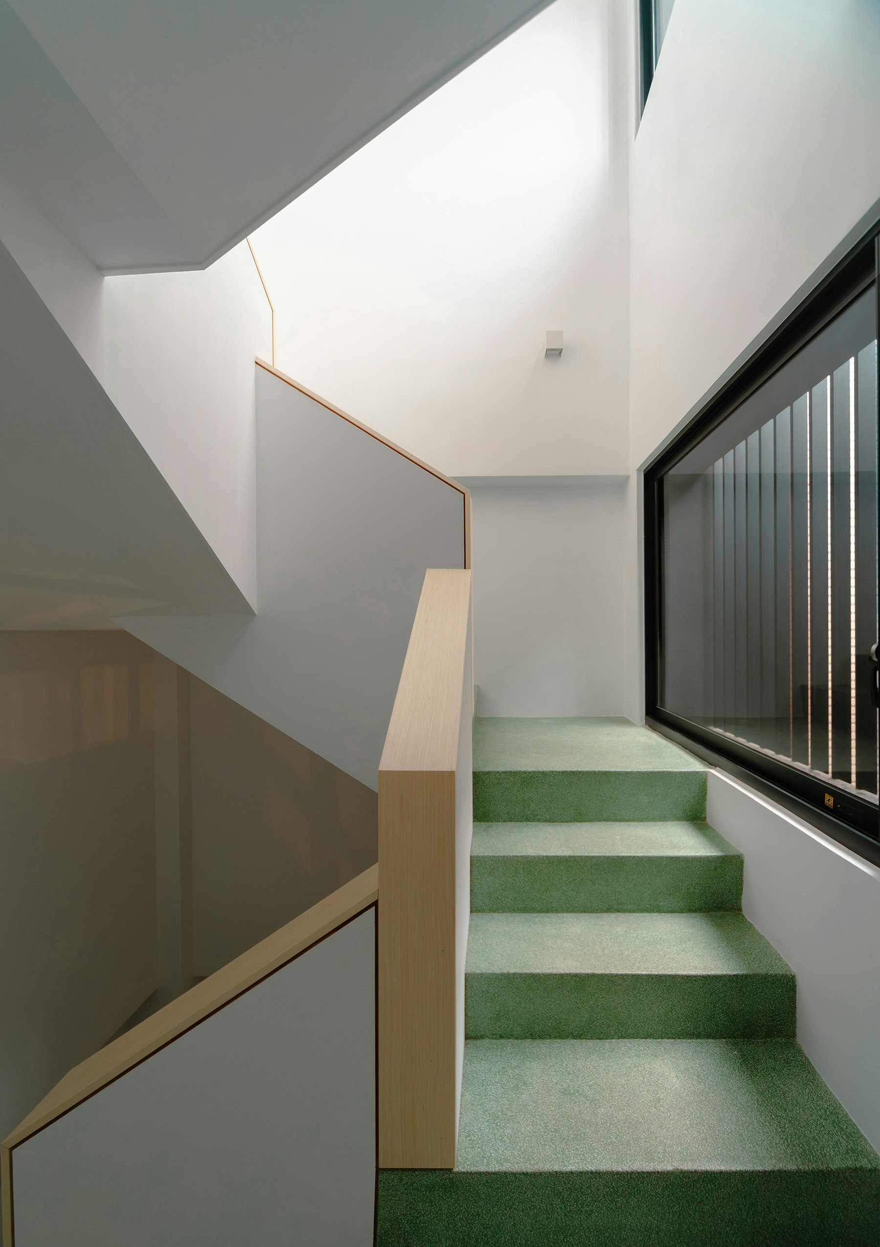
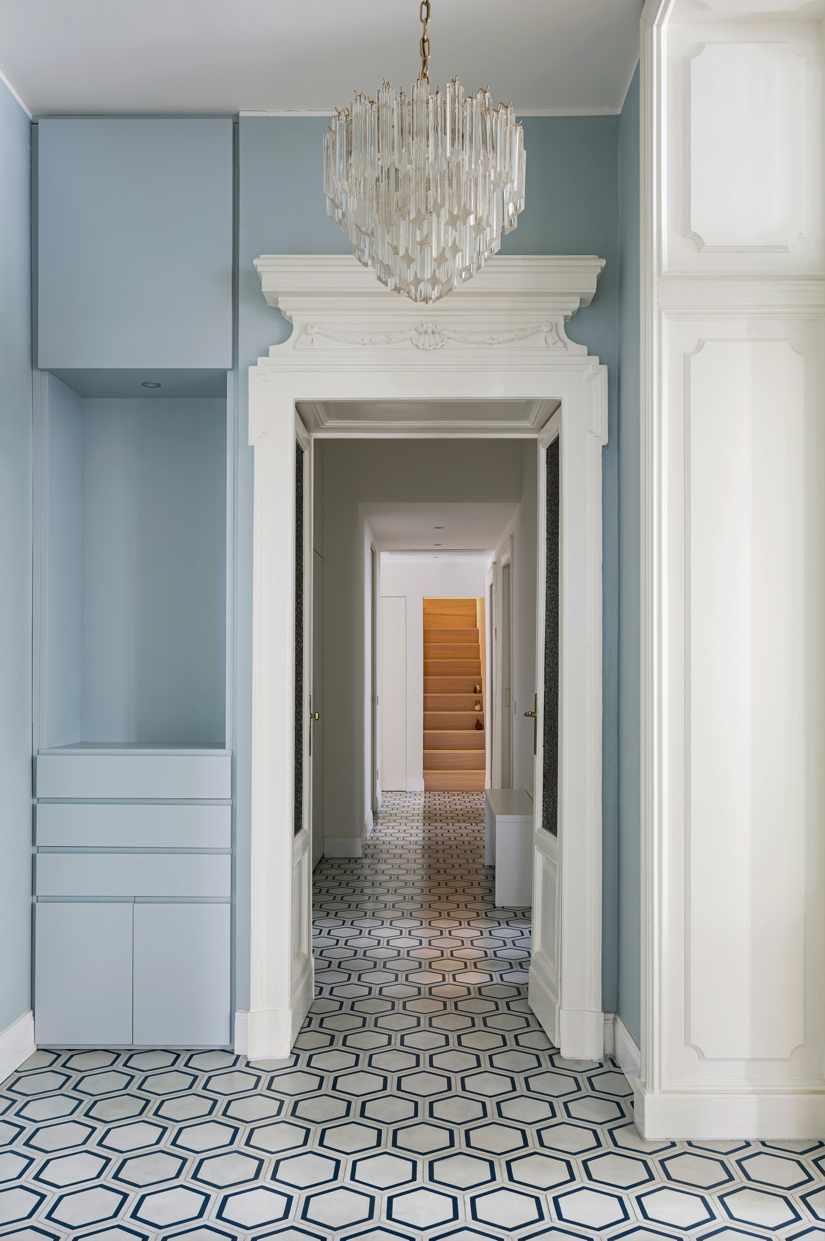
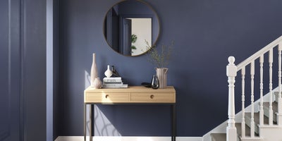
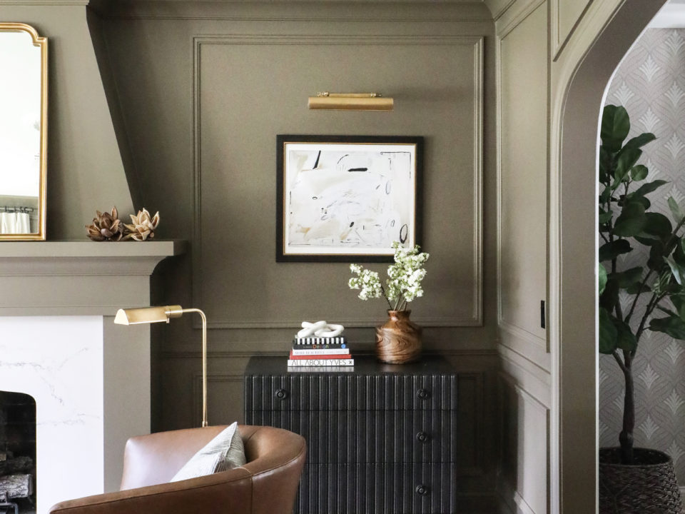
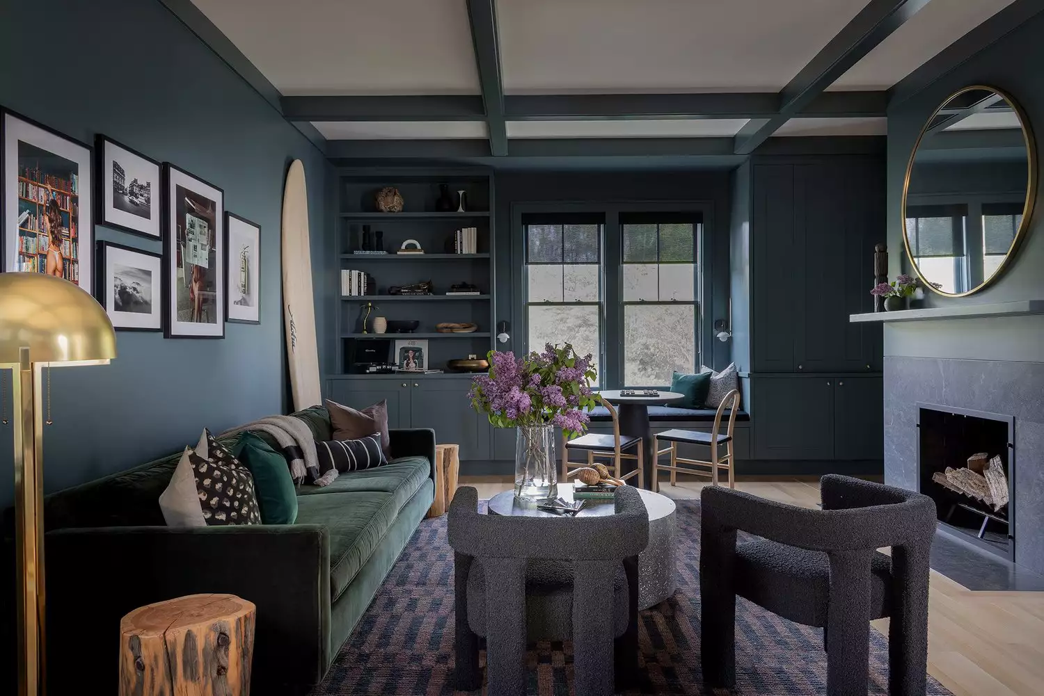
Summer color palettes are characterized by soft, cool, and smoky tones, offering a wide range from deep charcoal gray to icy pink, all with cool undertones. Unlike the vibrant hues often associated with summer outdoors, this palette leans towards subtler shades like light blue, silver, teal, and periwinkle. When decorating with a summer palette, prioritize cool tones, opting for blues with gray undertones instead of bright ones, and incorporating silver accents over gold or brass. Artwork should reflect yellow, green, and blue combinations rather than orange, red, and pink. The guiding principle for summer palettes is the consistent use of cool undertones, even in neutrals like white, gray, and black.
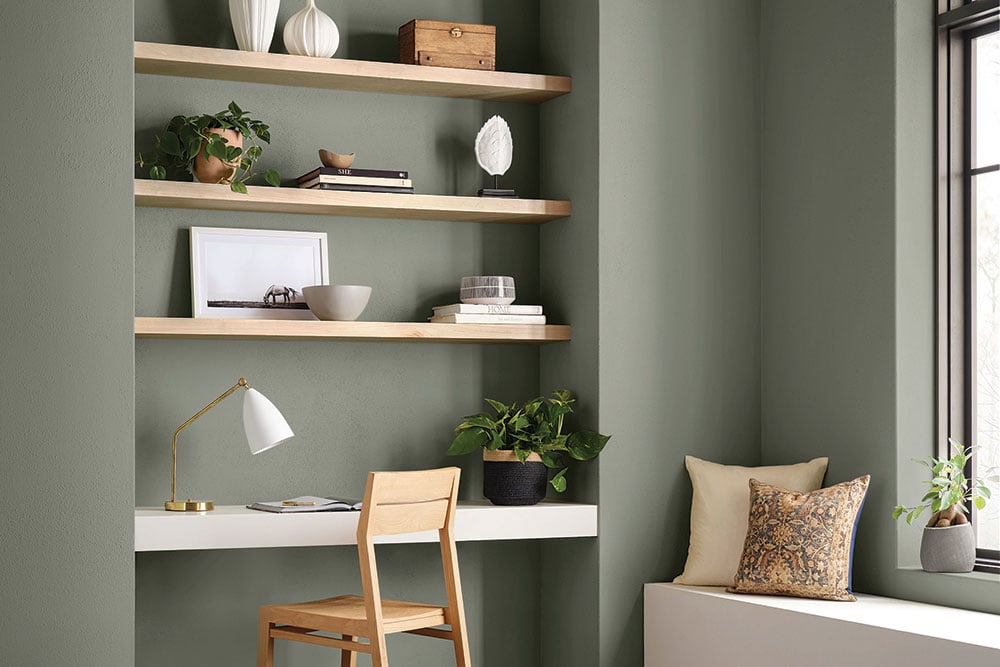
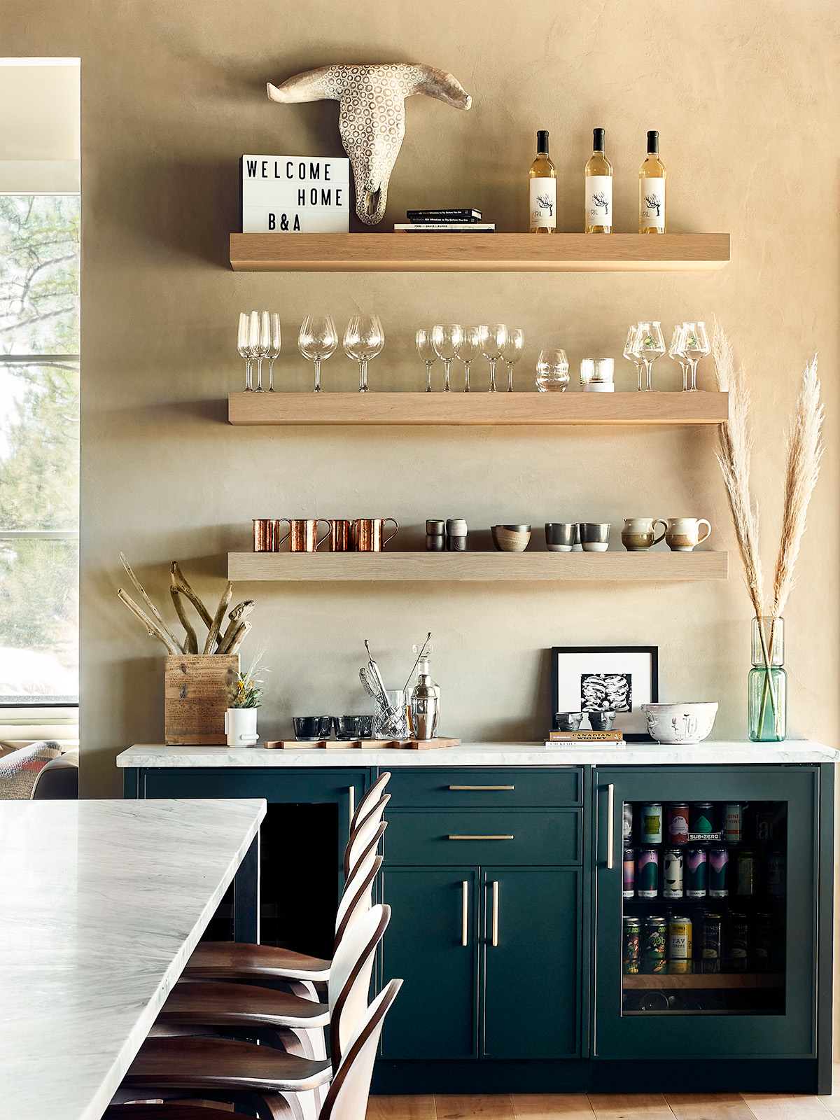
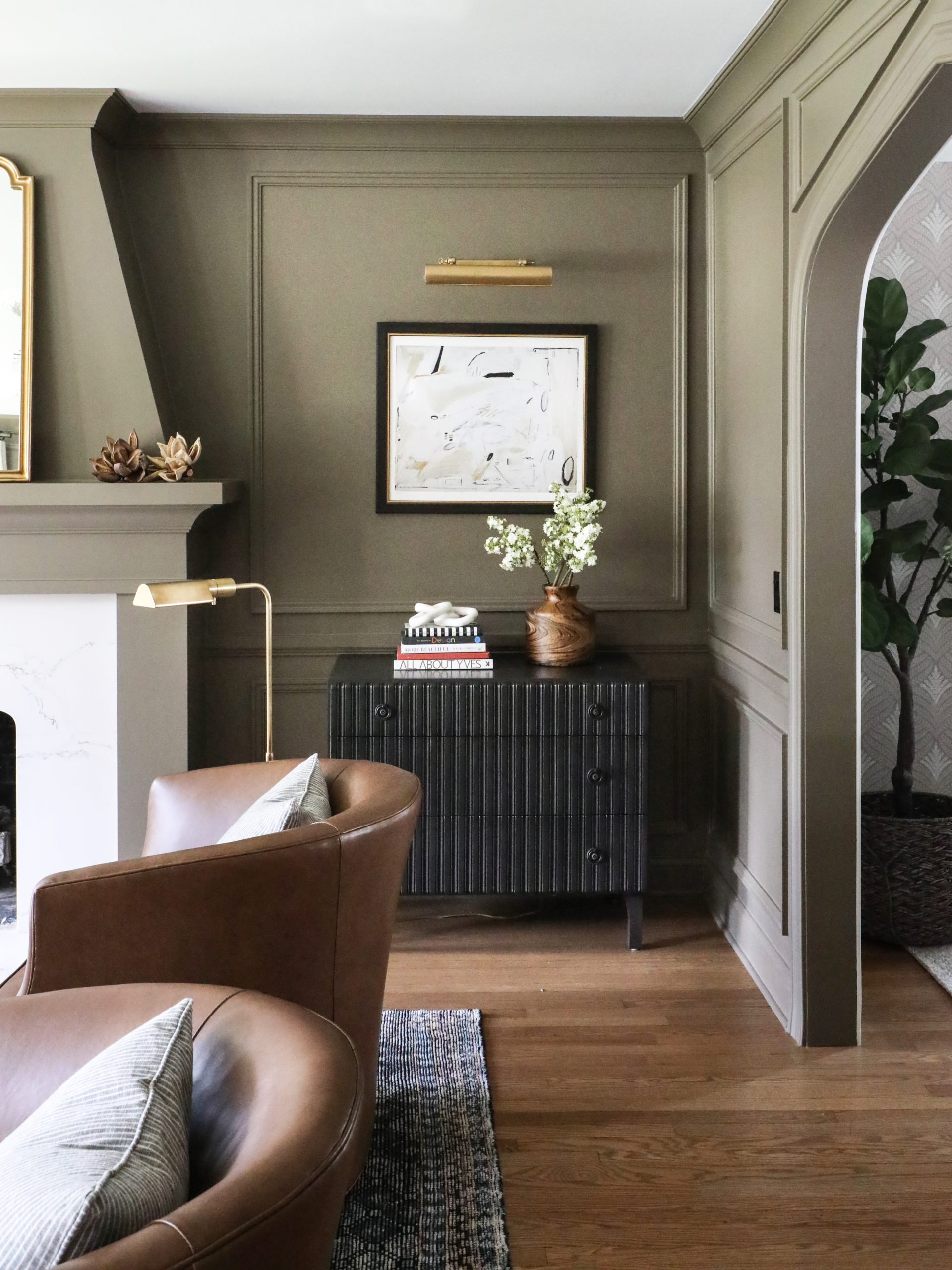
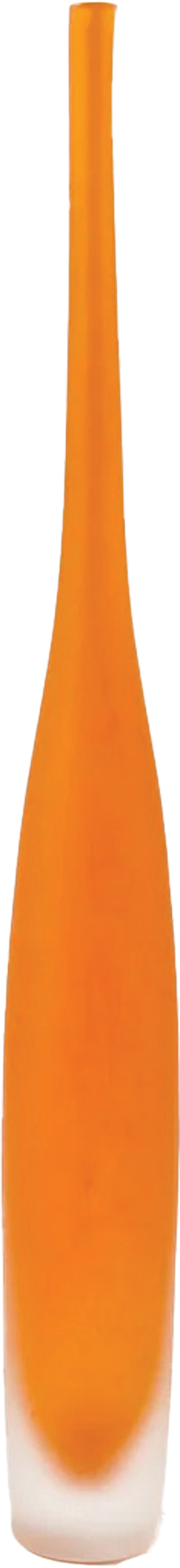
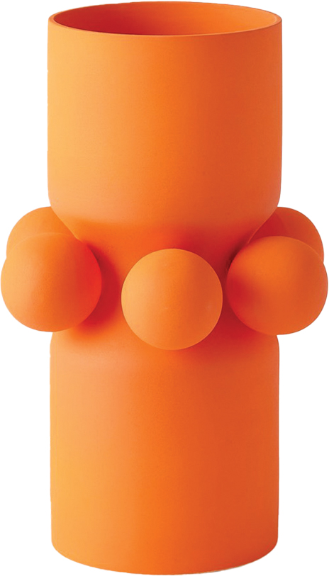
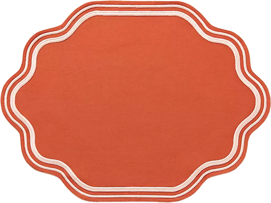
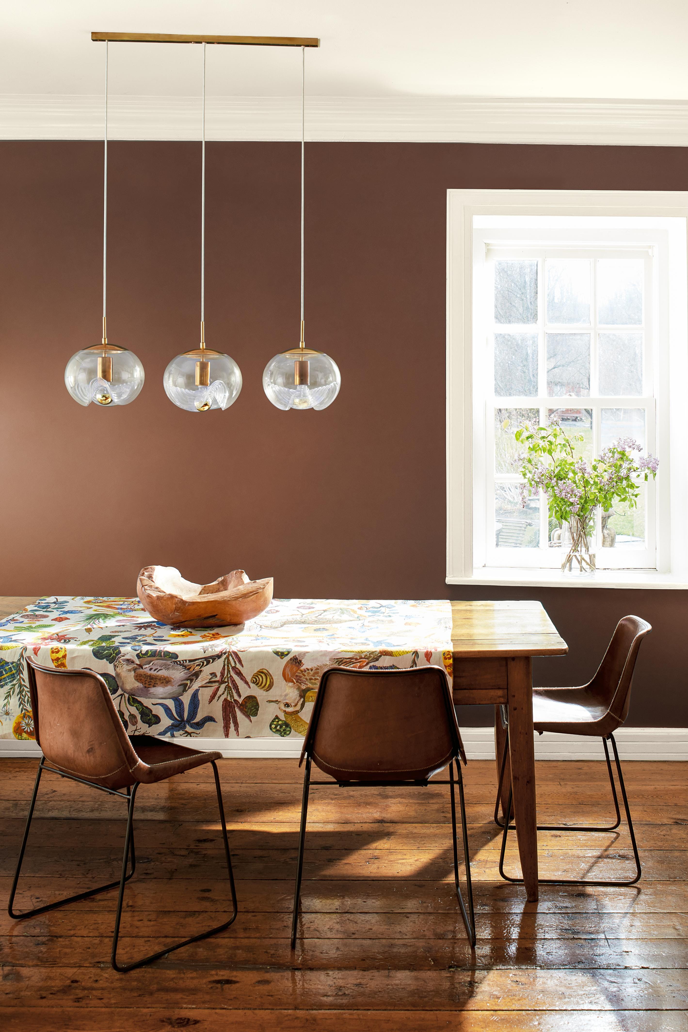
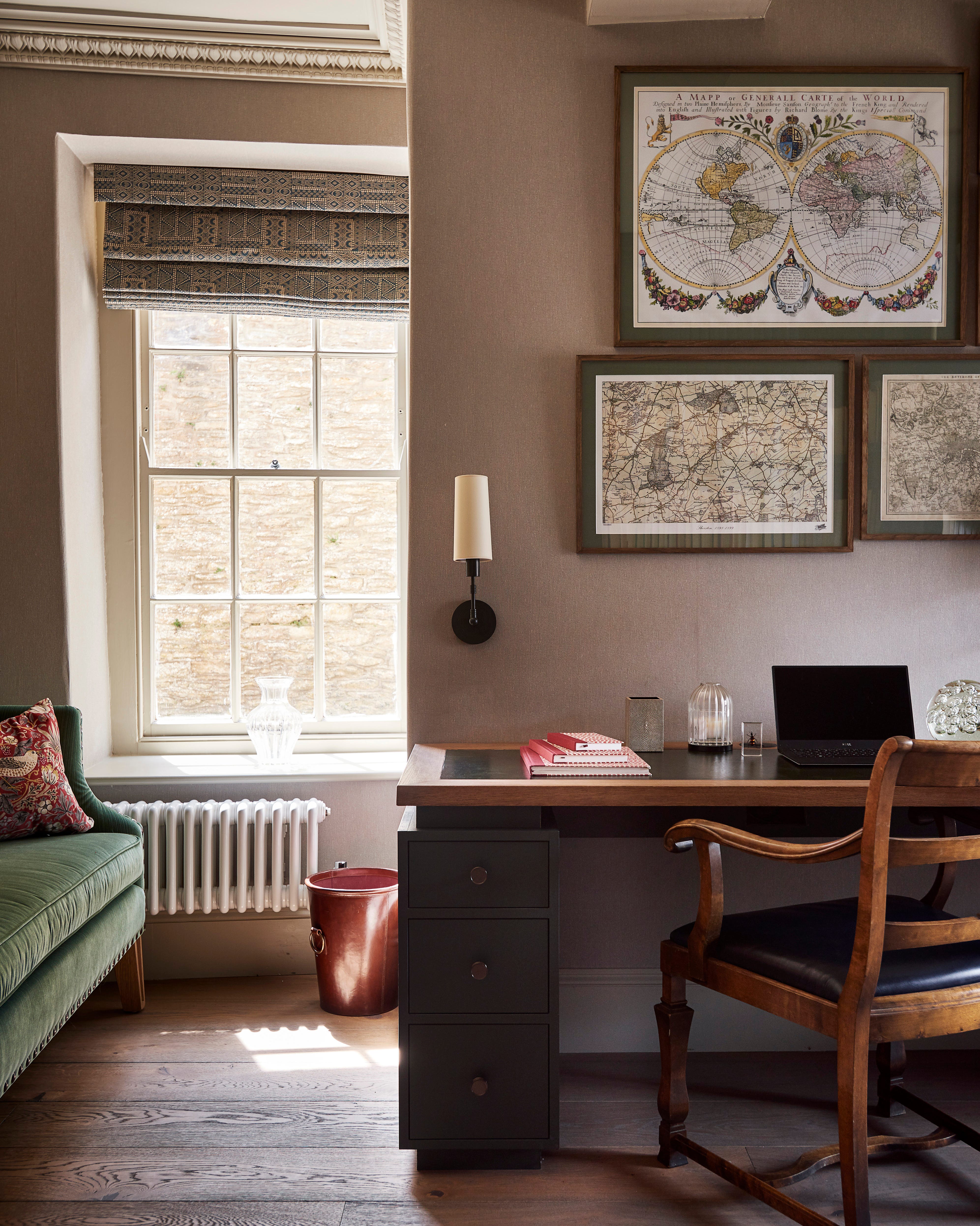
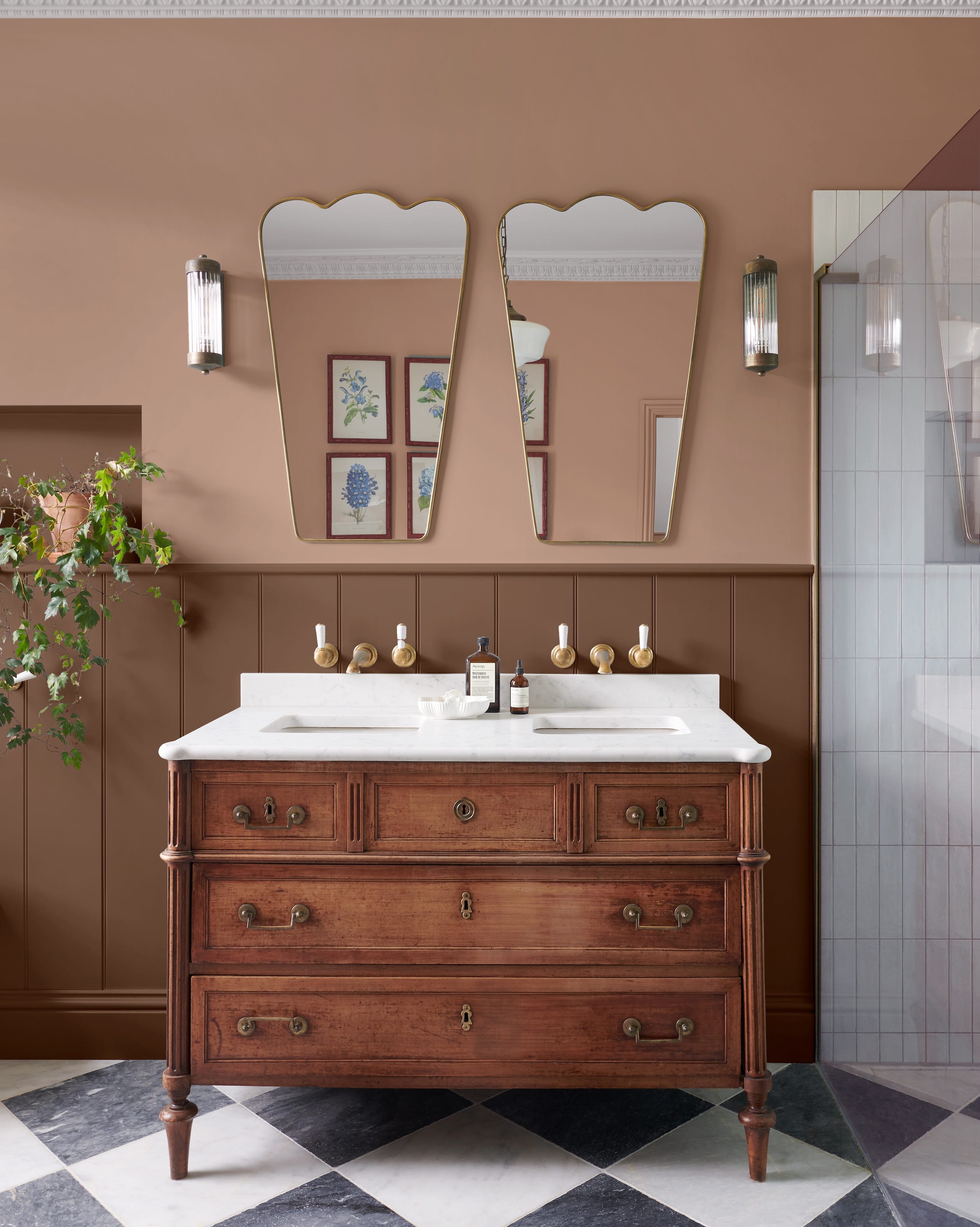
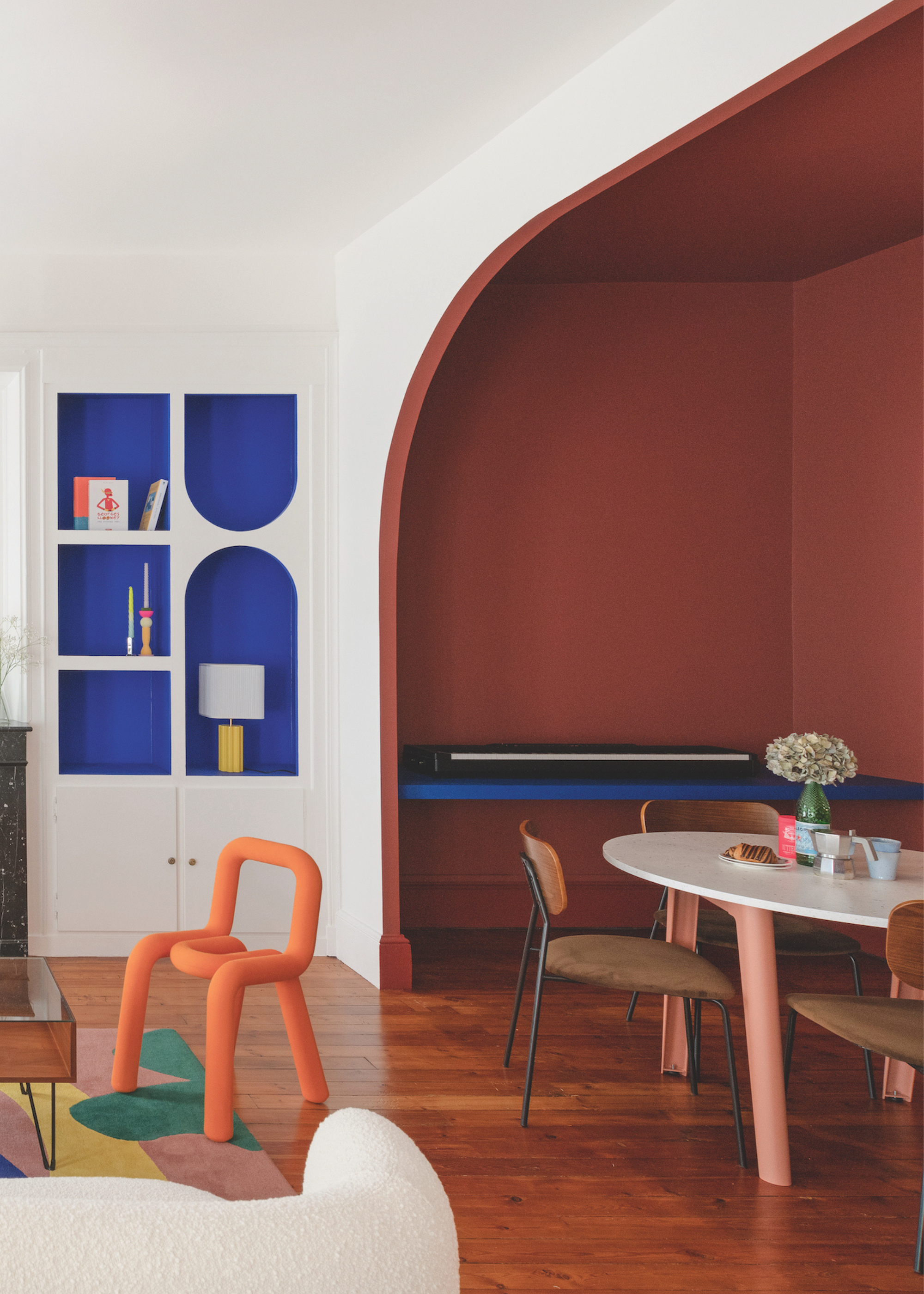
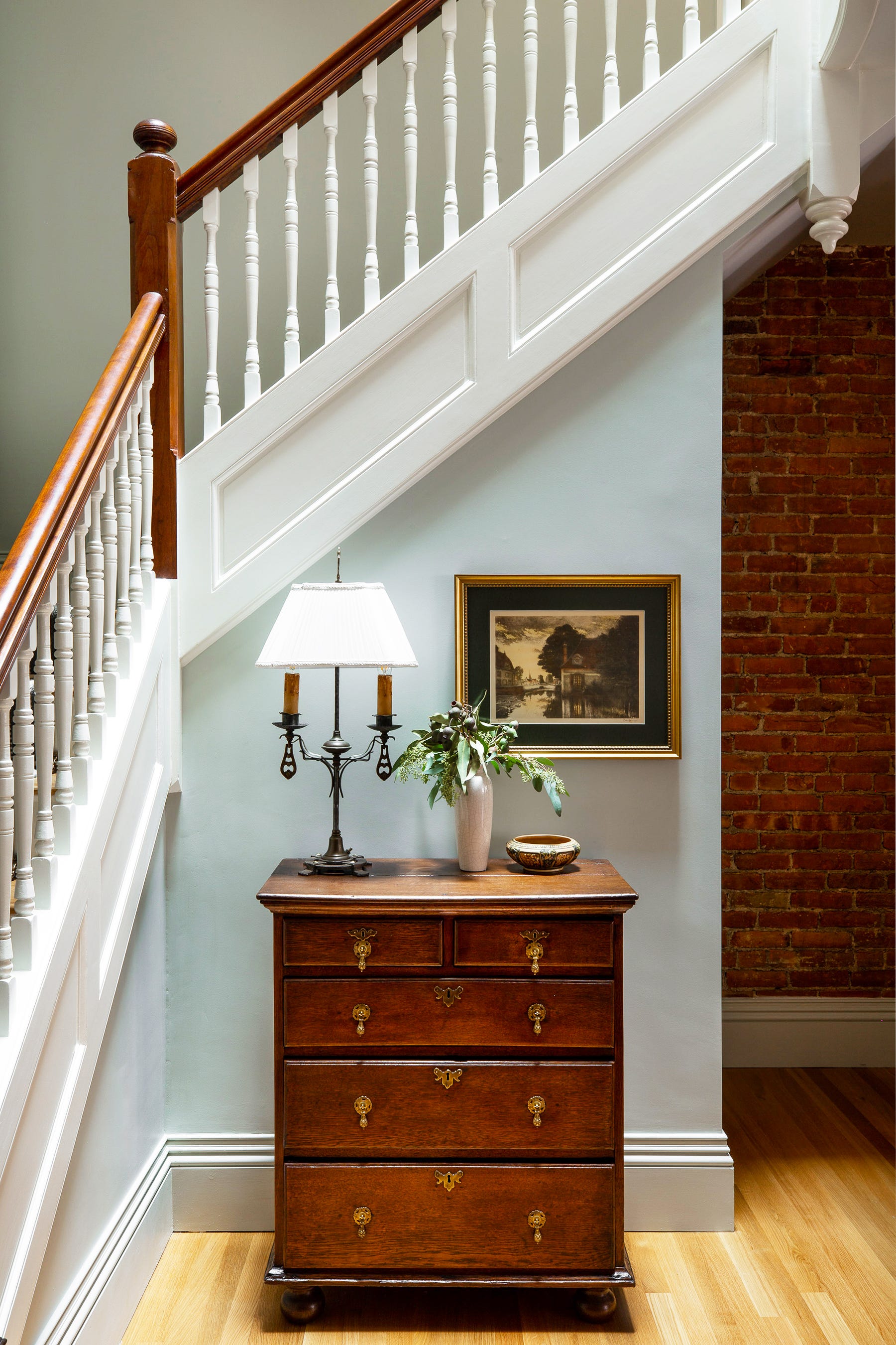
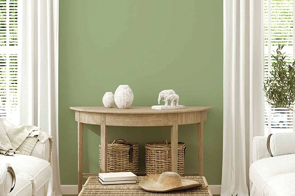
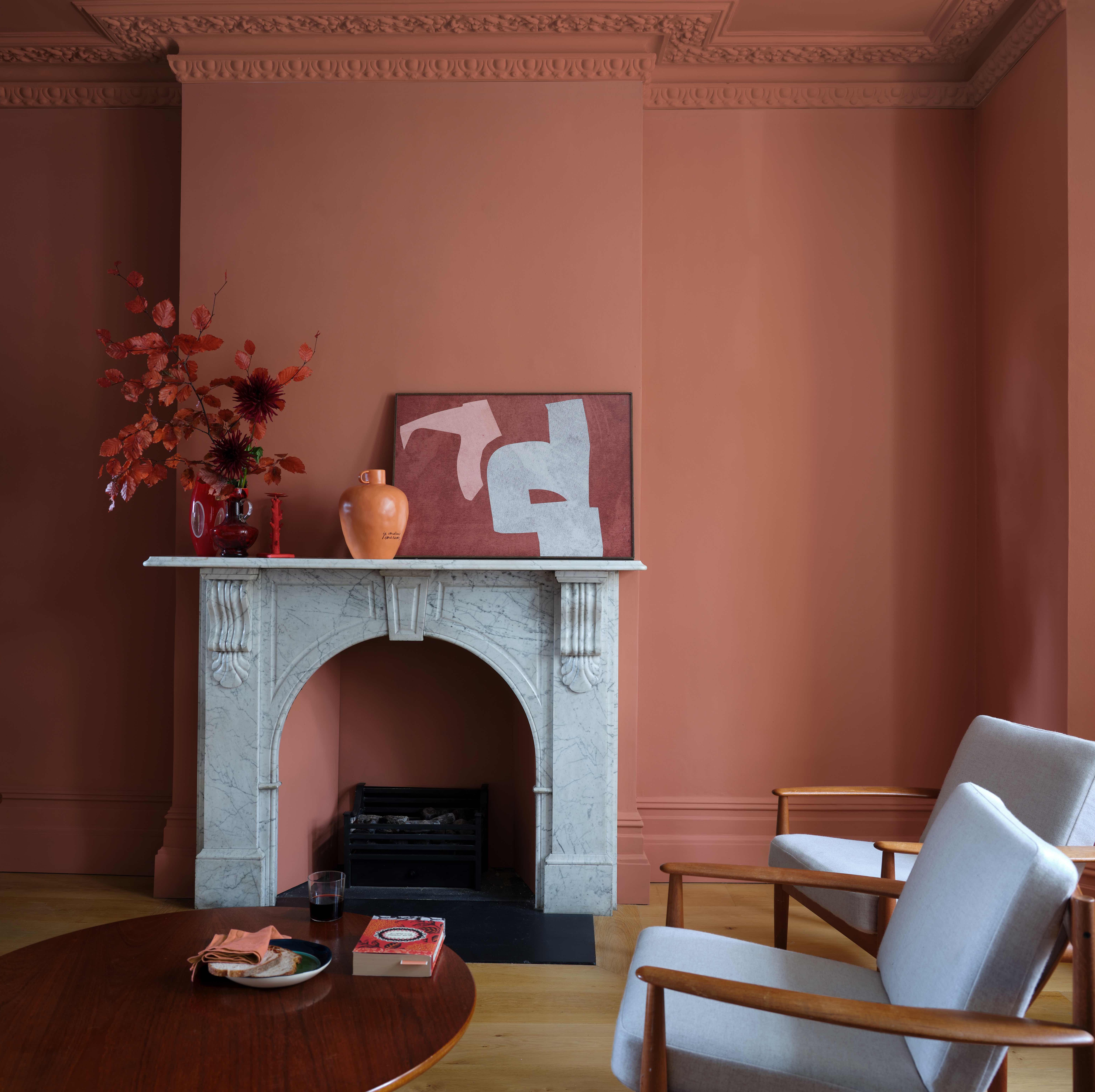
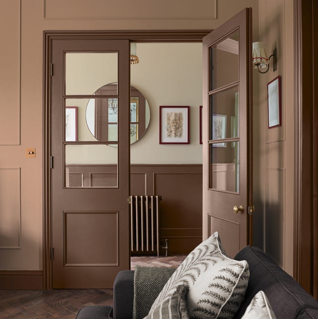
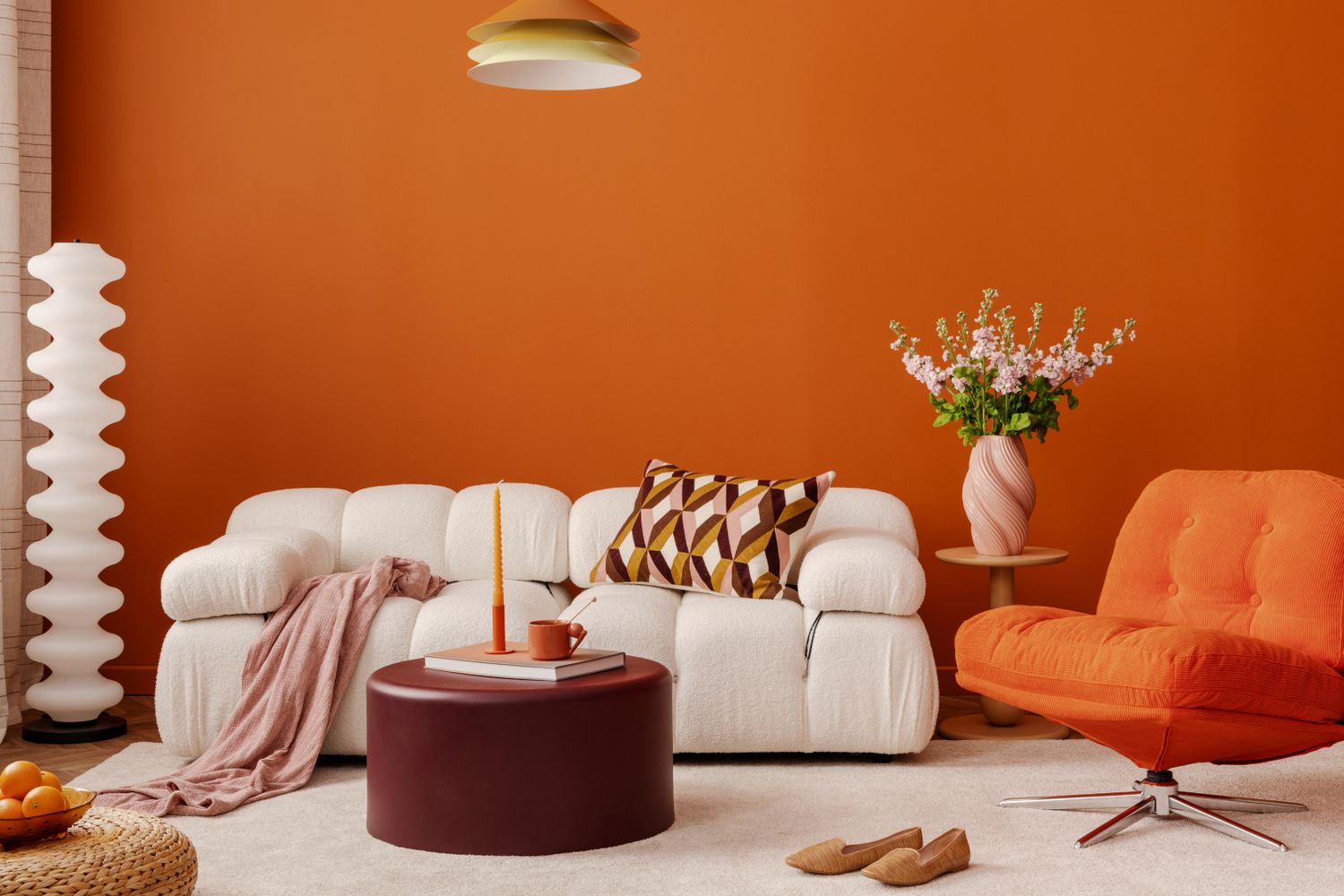
Autumn color palettes draw inspiration from nature's rich and warm hues, featuring earthy tones like olive green, rust, and mustard yellow, complemented by vibrant shades such as chartreuse, tangerine, and clay pink. The focus here is on warm colors, avoiding harsh cool tones. Incorporating natural materials is crucial; think leather furniture, natural wood dining tables, and decor made from clay, wicker, and jute. Gold or brass finishes can provide a contrasting element to this earthy palette. The key to an autumn home aesthetic is to mirror classic fall colors and nature-inspired elements.
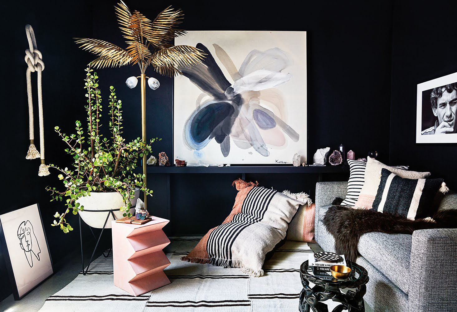
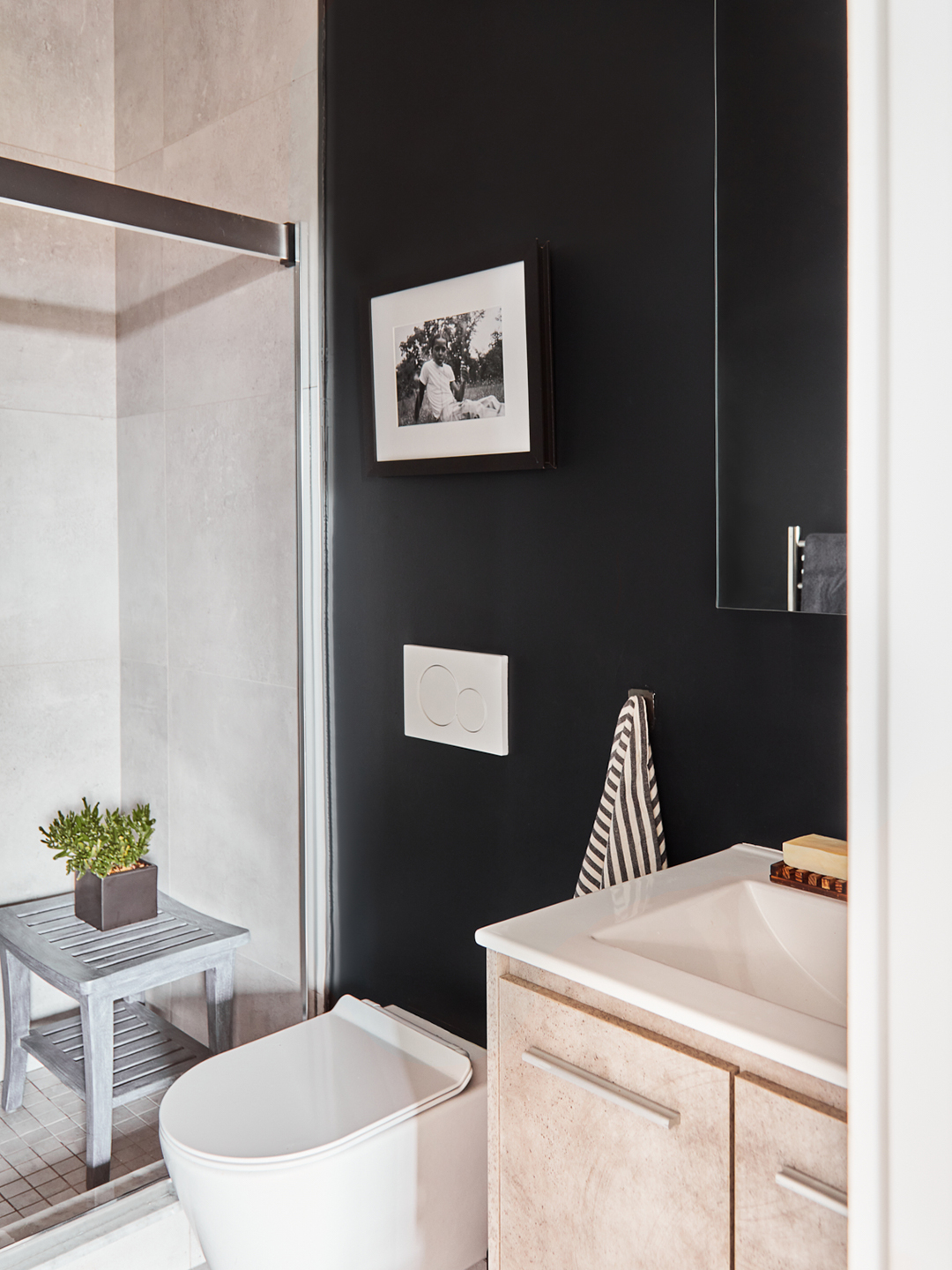
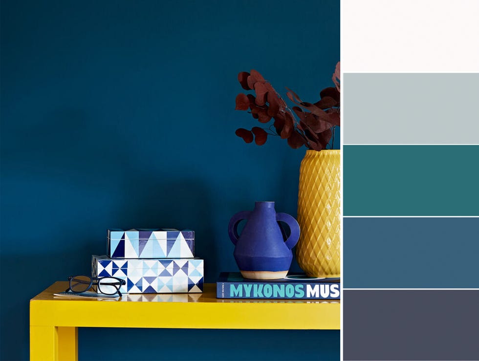
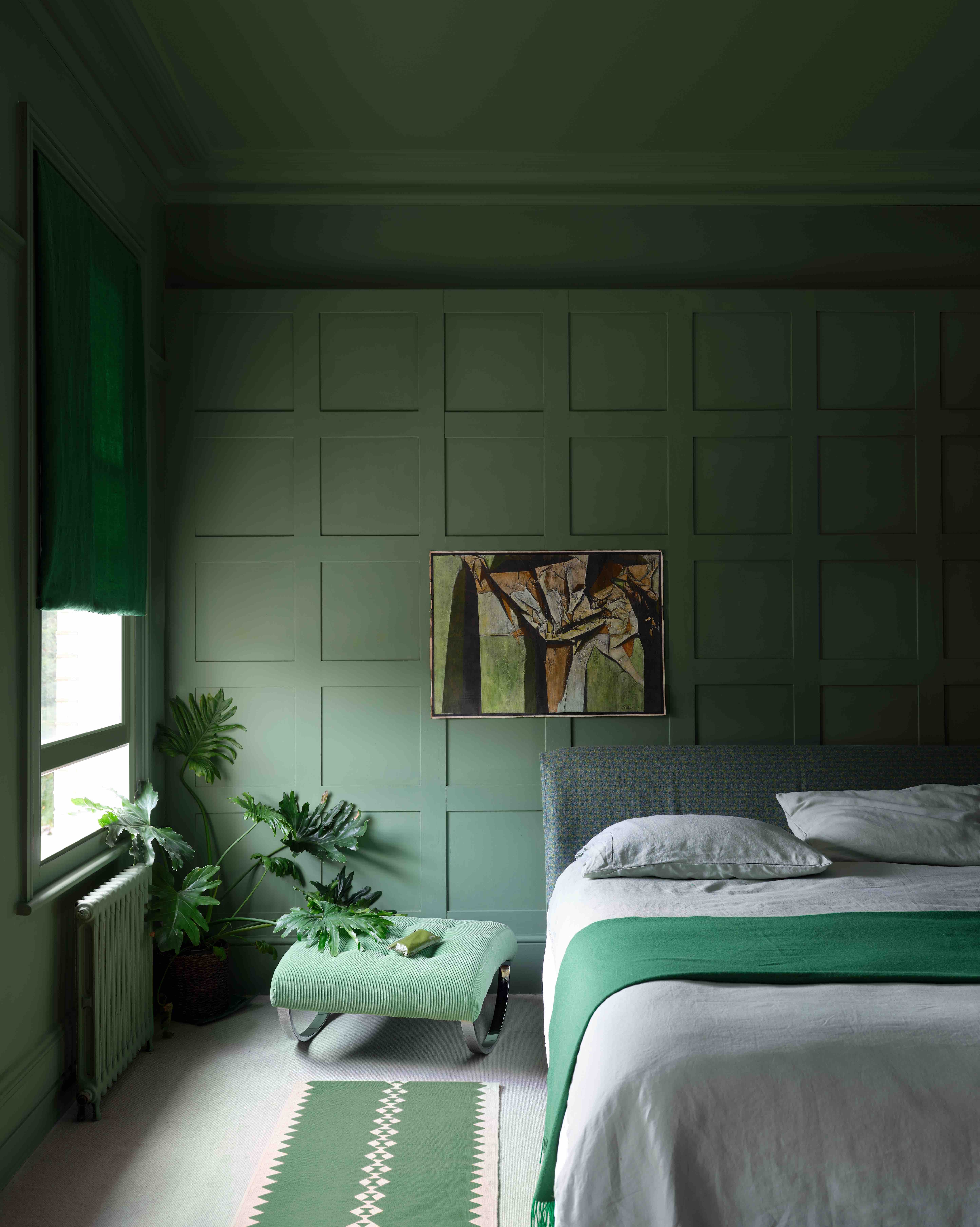
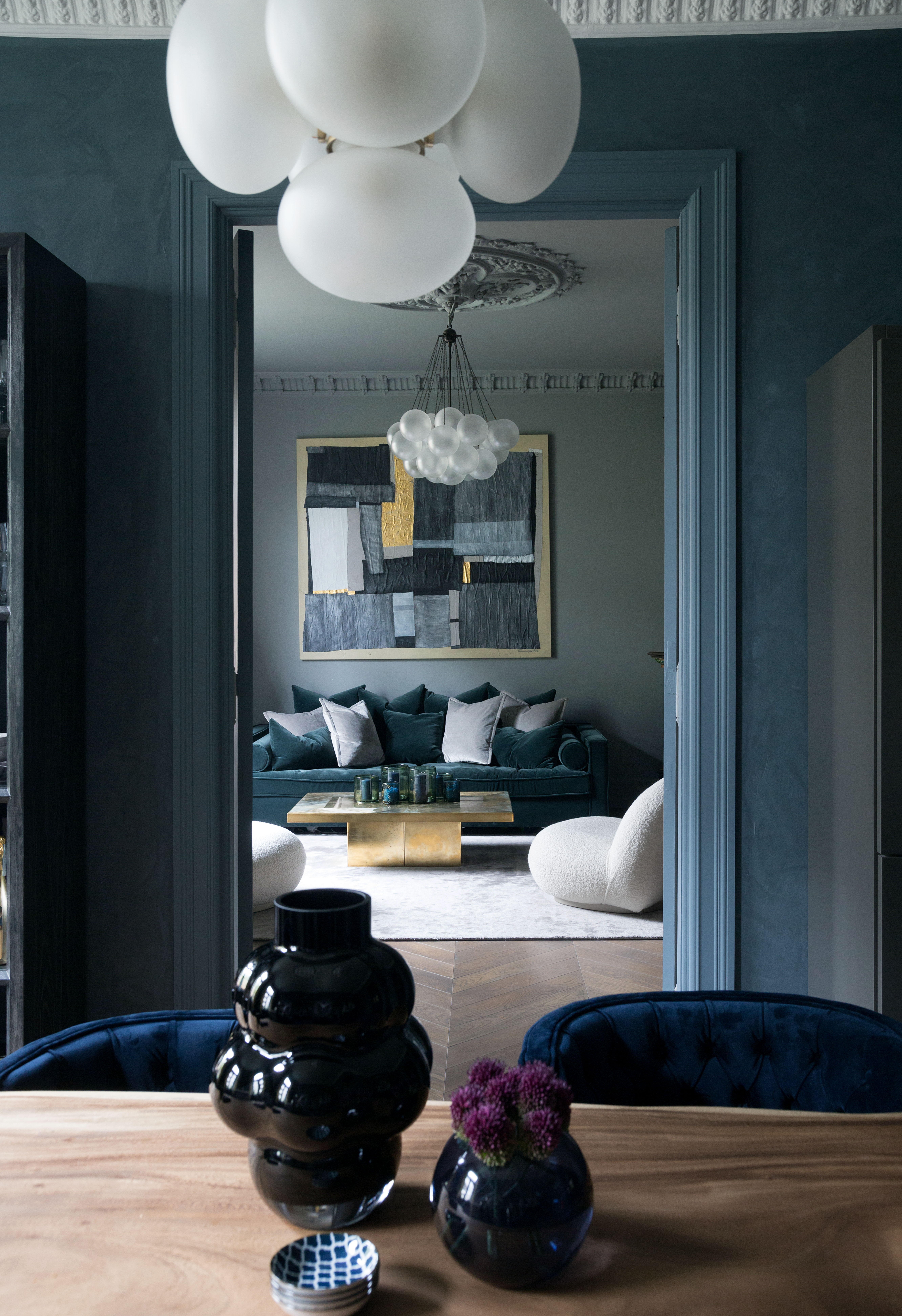
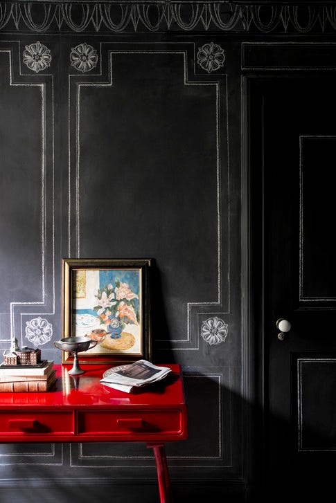
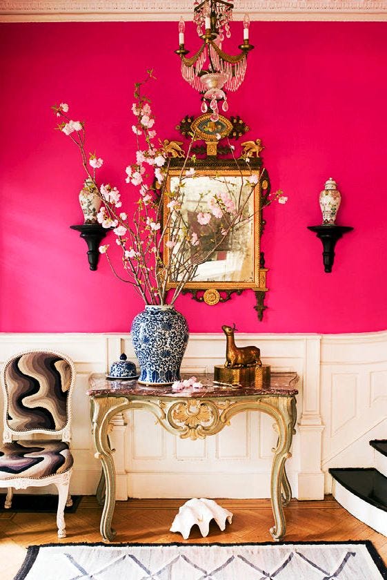
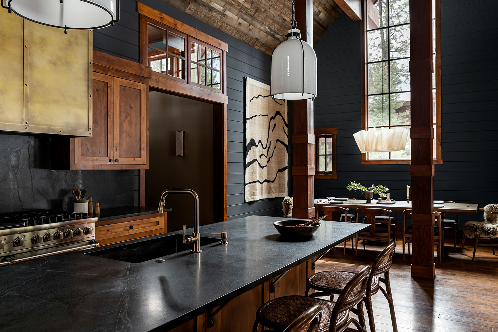
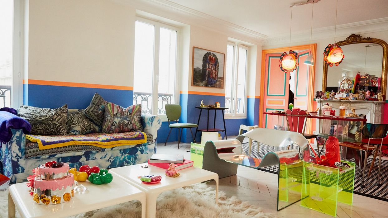
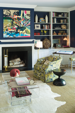
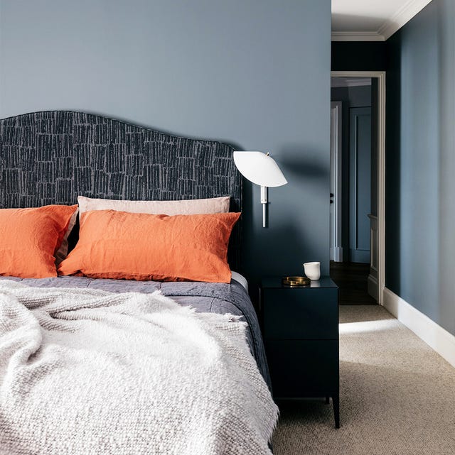
Finally, winter color palettes are distinct for their cool, clear, saturated, and high-contrast nature. This palette features stark bright whites and deep blacks, alongside rich greens and vibrant purples. Jewel tones such as royal blue, emerald green, and ruby red are prominent, as are various shades of silver and gray. When decorating with a winter palette, boldness is encouraged. Consider painting kitchen cabinets in deep blues or greens, or even opting for an unexpected ceiling color. High-contrast color pairs are ideal for artwork, throw pillows, and other decorative items. The mantra for a winter color palette in home decor is "the bolder, the better," encouraging a move beyond conventional design comfort zones.
#PersonalColorAnalysis #InteriorDesign #SeasonalColorPalettes #HomeDecor #ColorPsychology #SpringPalette #SummerPalette #AutumnPalette #WinterPalette #PersonalColorAnalysis #InteriorDesign #SeasonalColorPalettes #HomeDecor #ColorPsychology #SpringPalette #SummerPalette #AutumnPalette #WinterPalette
0 comment in total
You may also like
How To Incorporate The Latest Color Trends in Your Home

How to Pick the Best Paint Colors for Every Space in Your Home

30 on-trend paint colours for every room in your home


How To Choose The Right Paint Color For Your Home, According To An Interior Design Expert

How to Use One of the Trickiest Paint Colors in Your Home

15 ways to add color to your home, according to interior designers
How Often Do Designers Really Recommend Painting a Home to Stay On Trend? We Got Answers

Here's How to Coordinate Paint Colors Throughout Your Home, so That It Looks Cohesive, Curated, but Still Creative

How to make your home look instantly more stylish with clever use of colour

Tips for Bringing More Color Into Your Home, Straight from Interior Designers

6 great ways to use colour drenching in your home
Decorating with paint

COLOR! How to Add to Your Home
9 home office colour schemes to inspire productivity and focus in your WFH space

Dress Up Your Space With Contrasting Colors

35 Paint Colors to Consider for Every Room in Your House

15 Ways to Add Bold Color to Your Home
Incorporate Color Drenching Into Your Home Design

Brown is the colour of the moment — here's how to use it in your home
Never Regret a Paint Color Again—Avoid These 6 Common Mistakes