1/12
The exterior paint colours replacing grey on Australian homes in 2026
Choosing an exterior paint colour scheme for a home can be a challenging task, given the vast array of available shades and the need to consider both aesthetics and durability, particularly in the unique Australian climate. This article provides insights into selecting appropriate colour palettes, undertones, and the interplay between various architectural elements such as main walls, trim, front doors, and roofs.
Australian homes face specific environmental challenges, including harsh UV conditions, coastal salt exposure, and diverse climate zones. Therefore, paint choices must be beautiful while also being able to withstand these elements and complement the home's architectural style and surrounding landscape. Experts from leading paint brands Dulux, Haymes Paint, and Wattyl, alongside professional advice from Three Birds Renovations, offer guidance on these considerations.
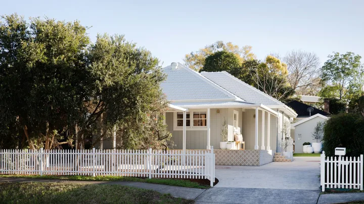
Exterior colours significantly influence a home's character and can impact its market value. Warm neutrals, such as soft beiges, terracotta, and creamy whites, create an inviting and grounded feel, particularly suitable for timber cladding and brick. Conversely, cool tones like crisp greys, slate blues, and whites with blue undertones lend a sophisticated, contemporary style, ideal for modern facades with clean lines. Harmonious colour schemes can enhance a home's appeal and attract potential buyers.
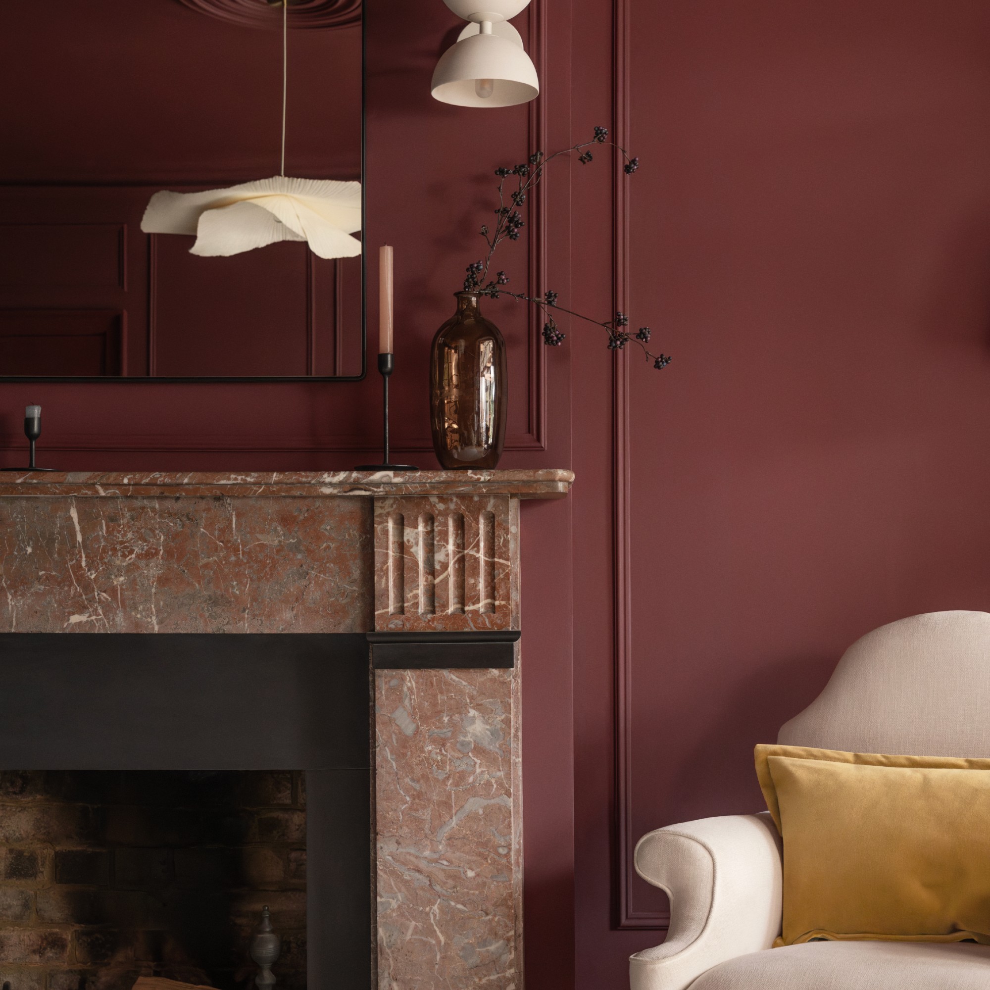
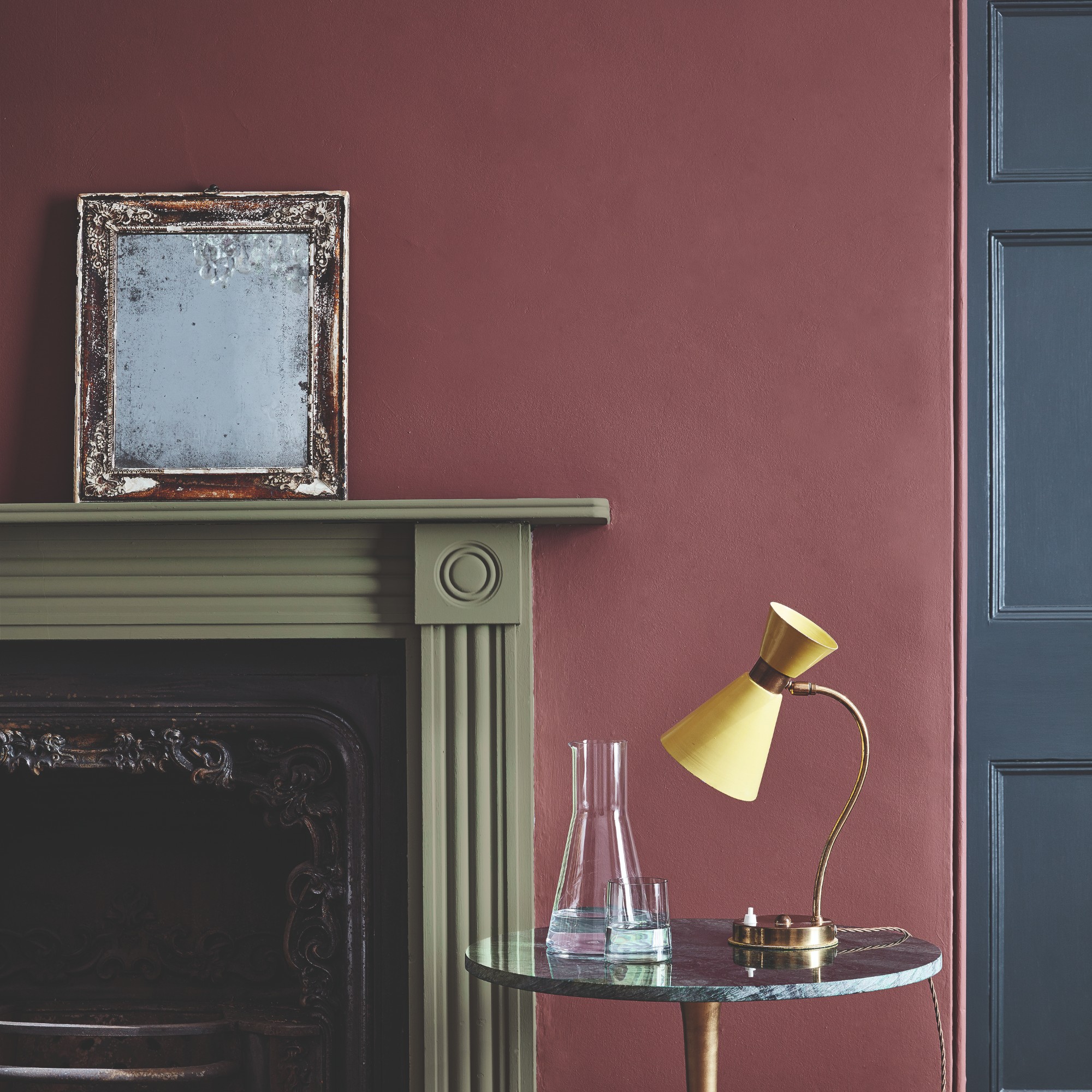
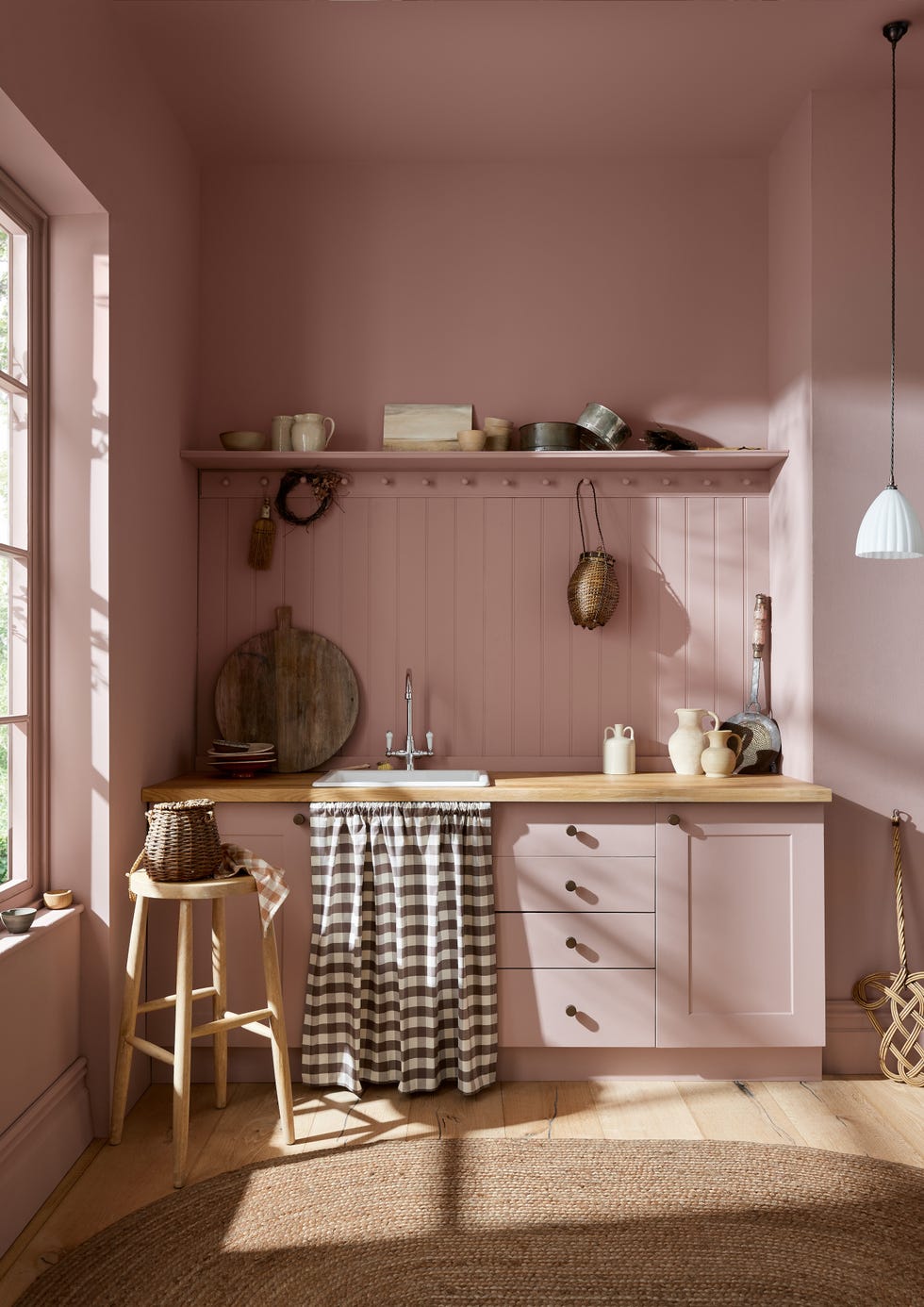
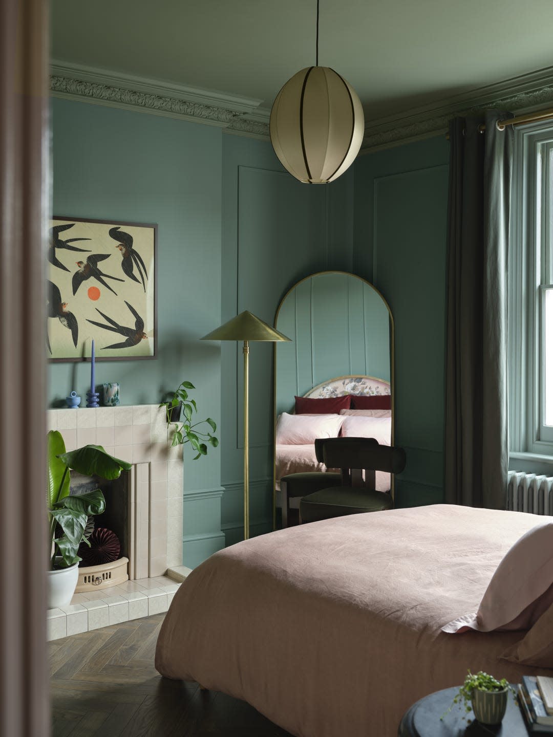
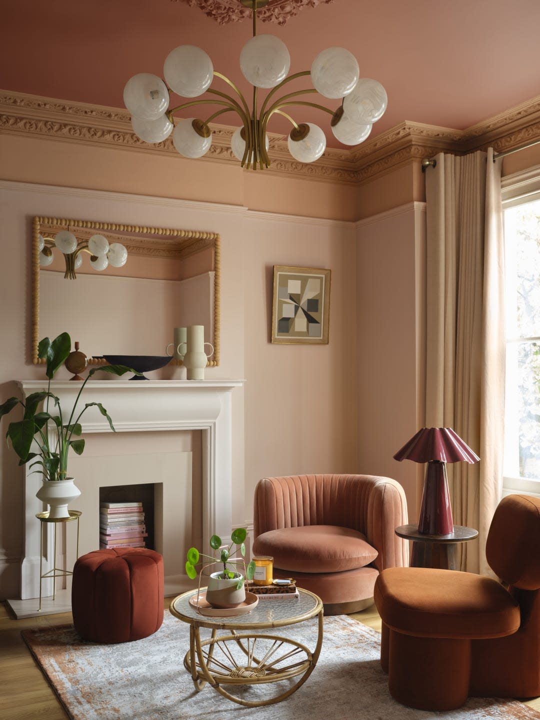
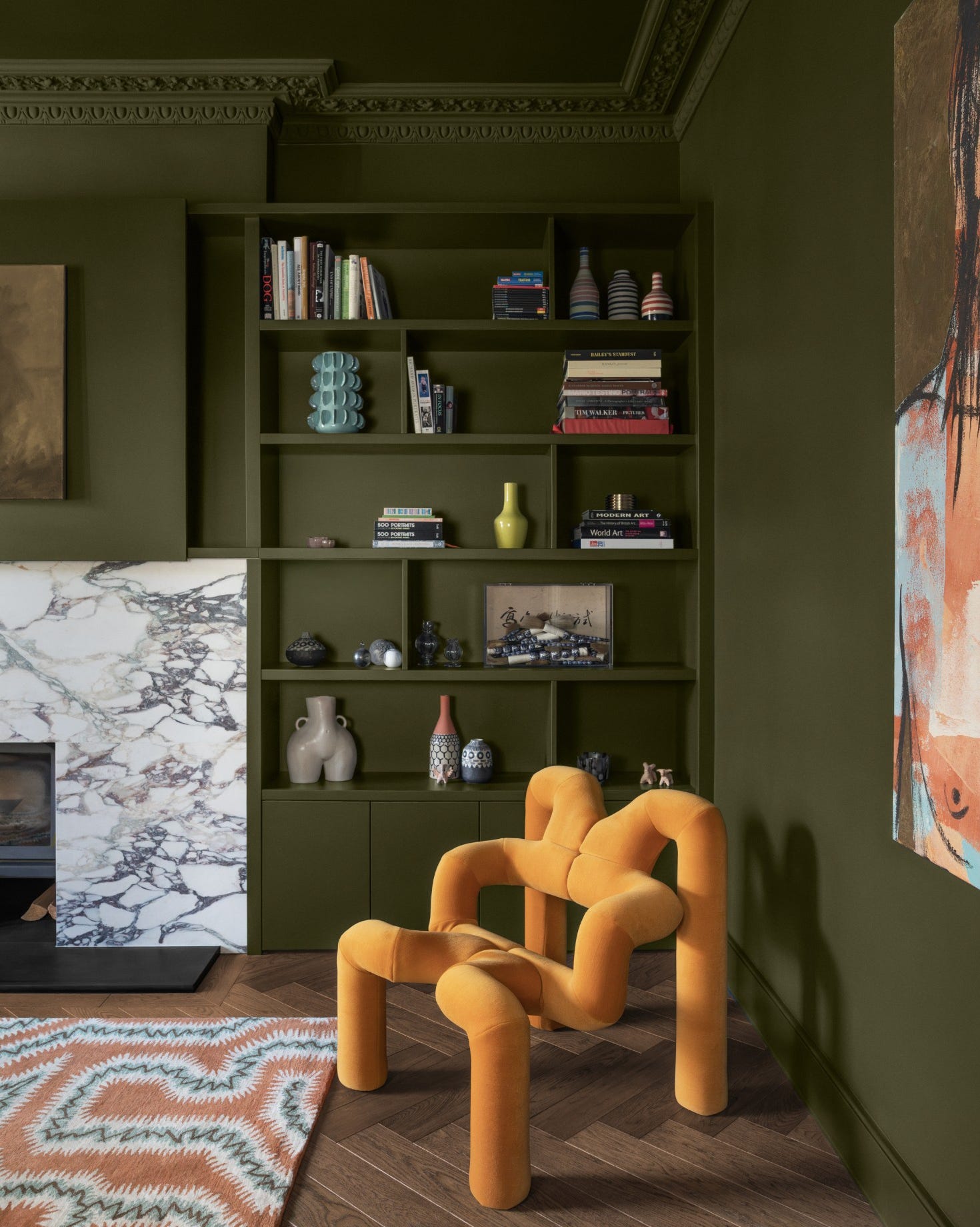
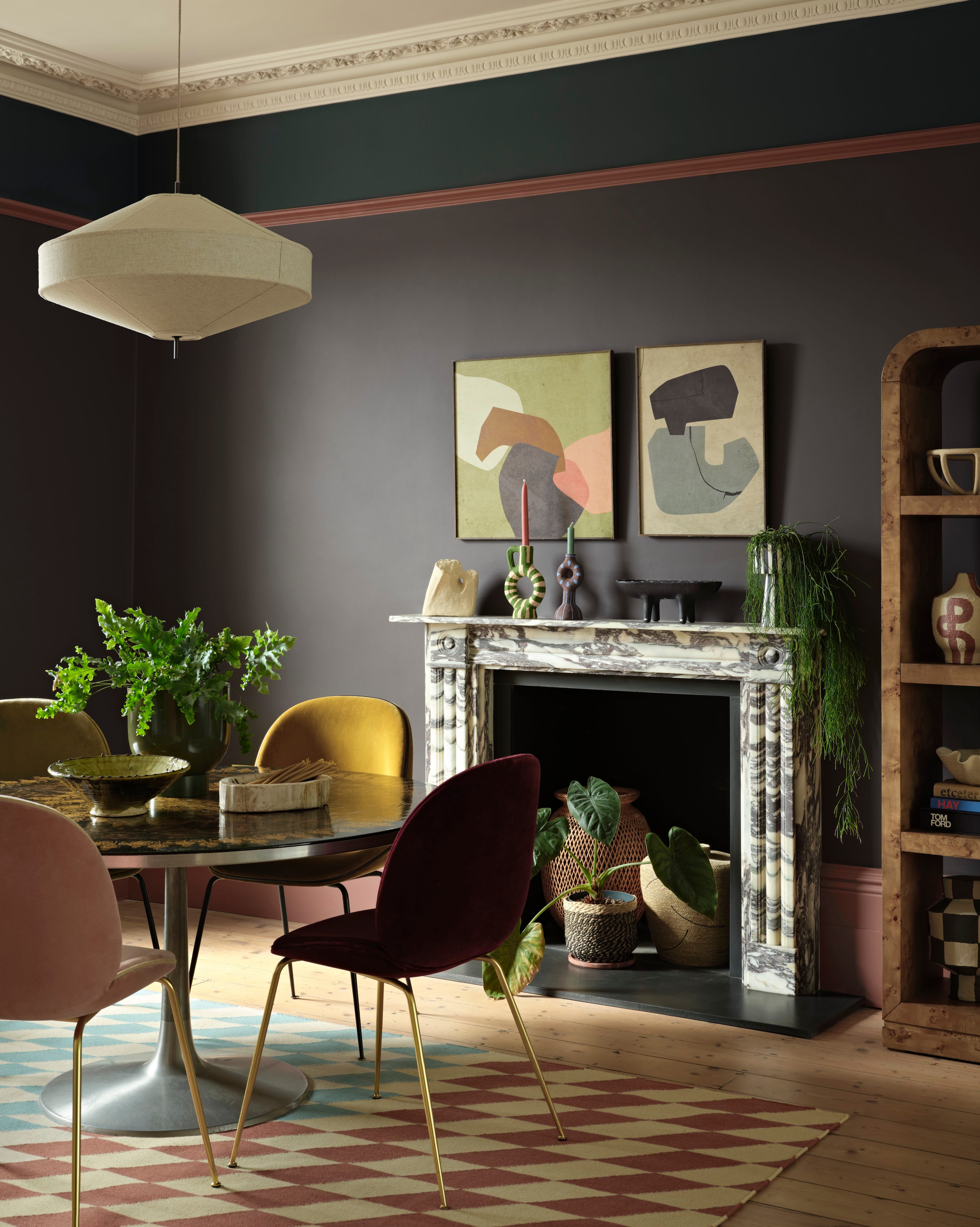
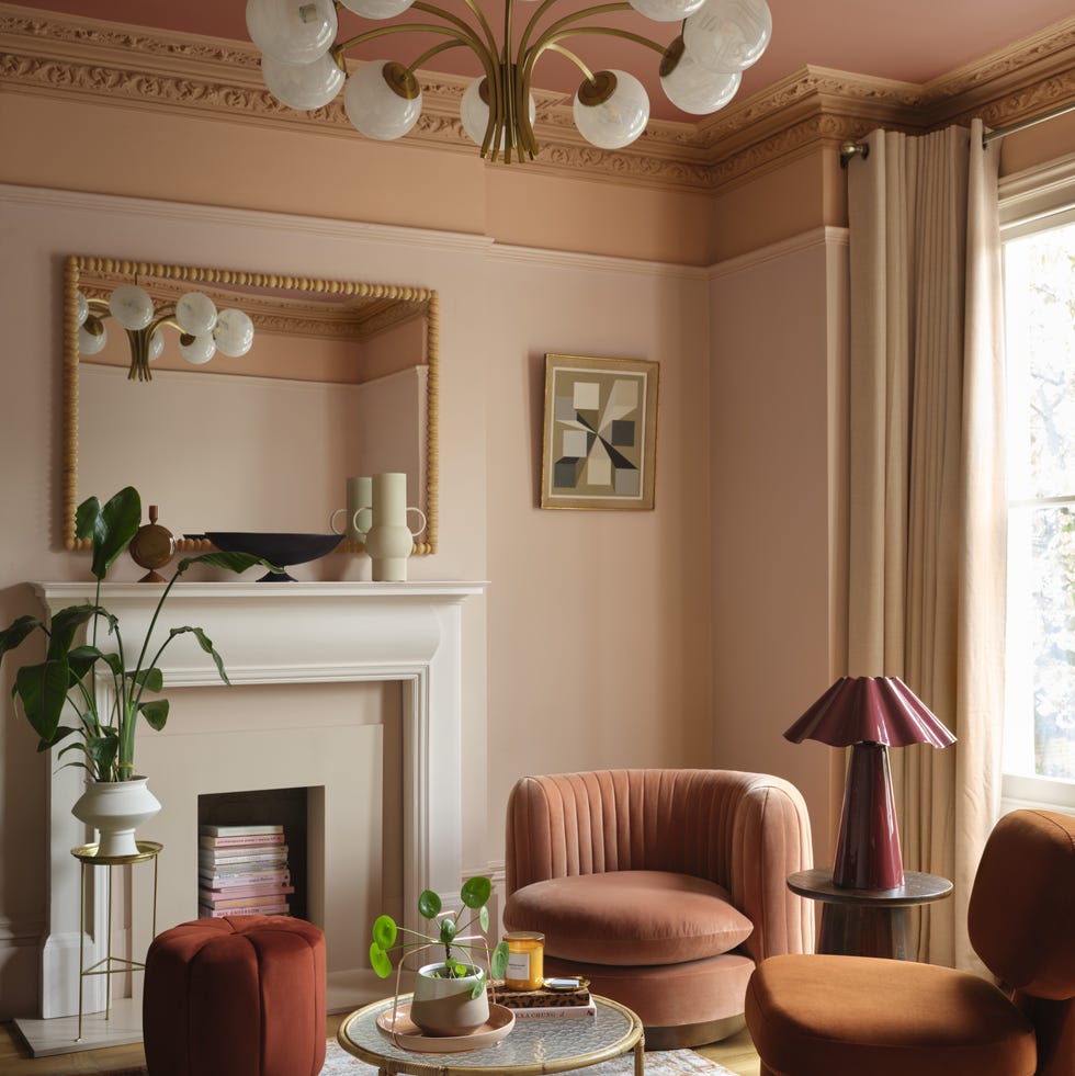
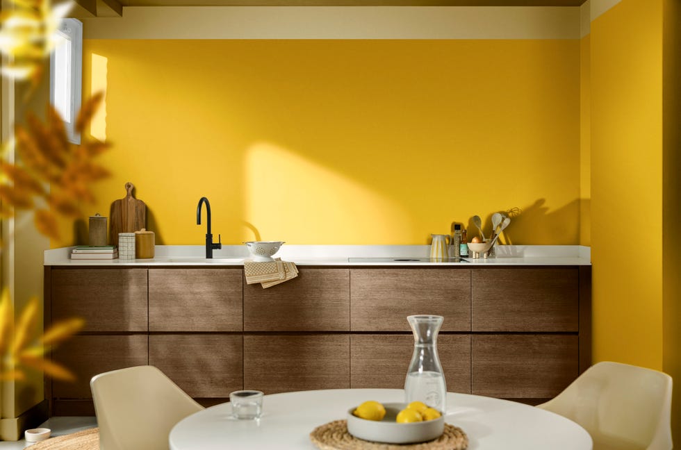
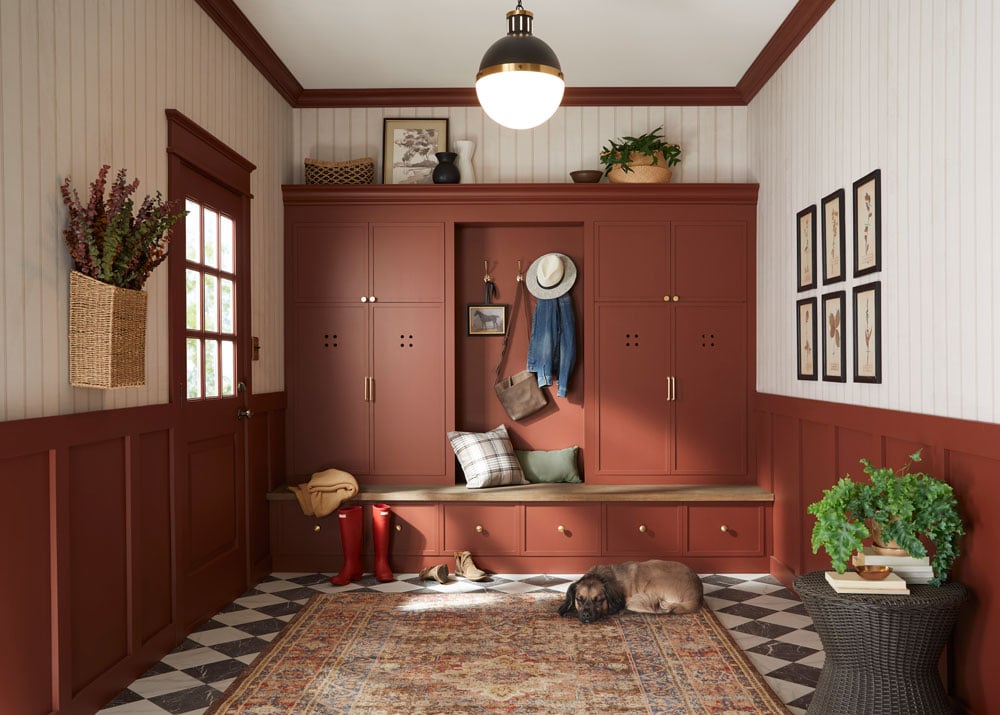
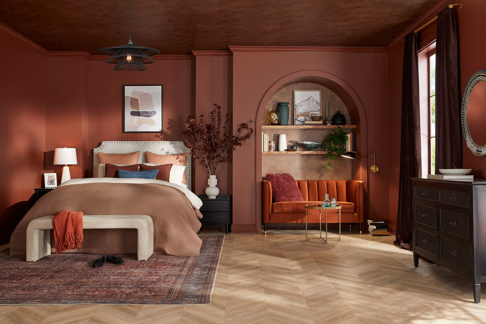
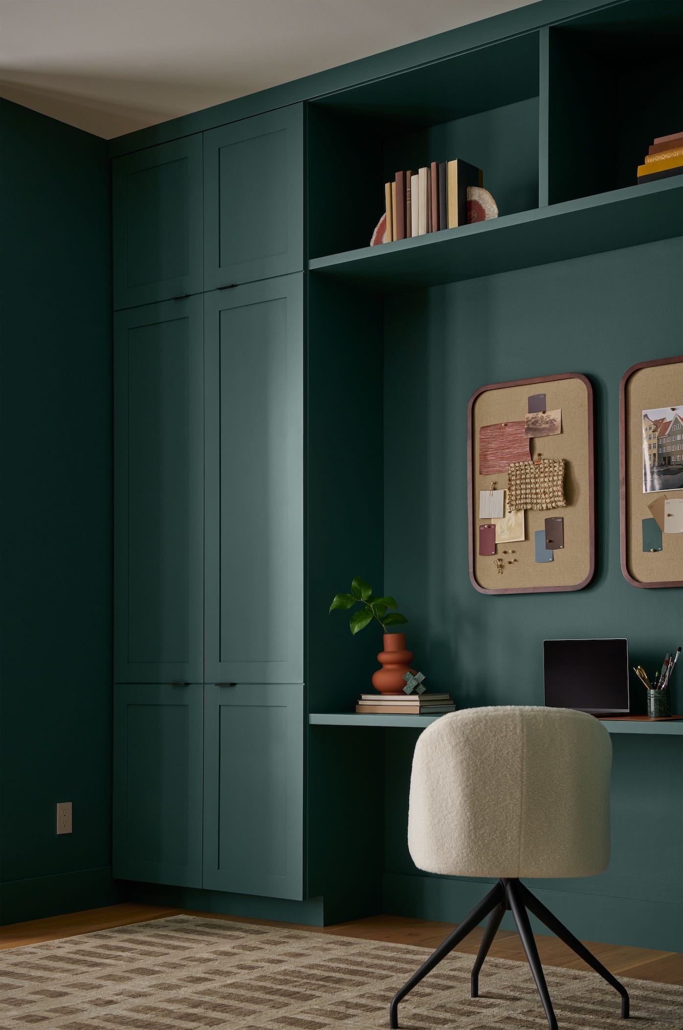
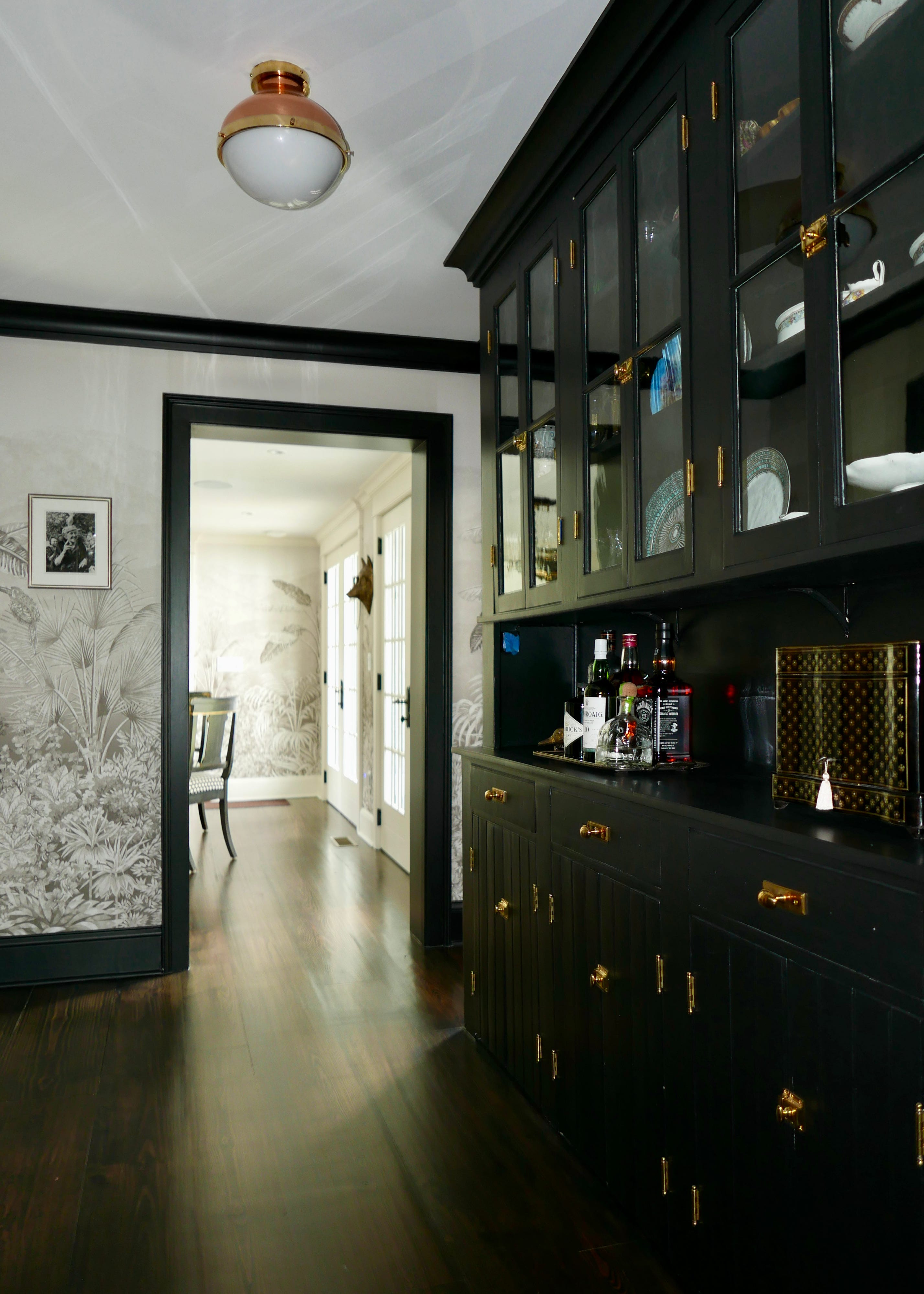
The year 2026 marks a shift in Australian exterior colour trends, moving away from cool greys towards warmer, nature-inspired palettes. Earthy tones, including sandy beiges, terracotta, and clay, are gaining popularity. Green, in shades from soft sage to deep forest hues, is emerging as a prominent colour. The Hamptons style is also evolving, favoring creamy whites over stark cool whites, paired with warm neutrals and natural timber accents. Bold colours like deep charcoals, rich forest greens, and even dramatic blacks are becoming popular for contemporary homes, often used with lighter trim for striking contrast.
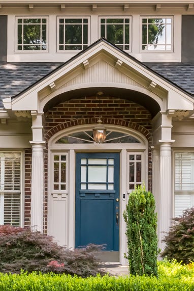
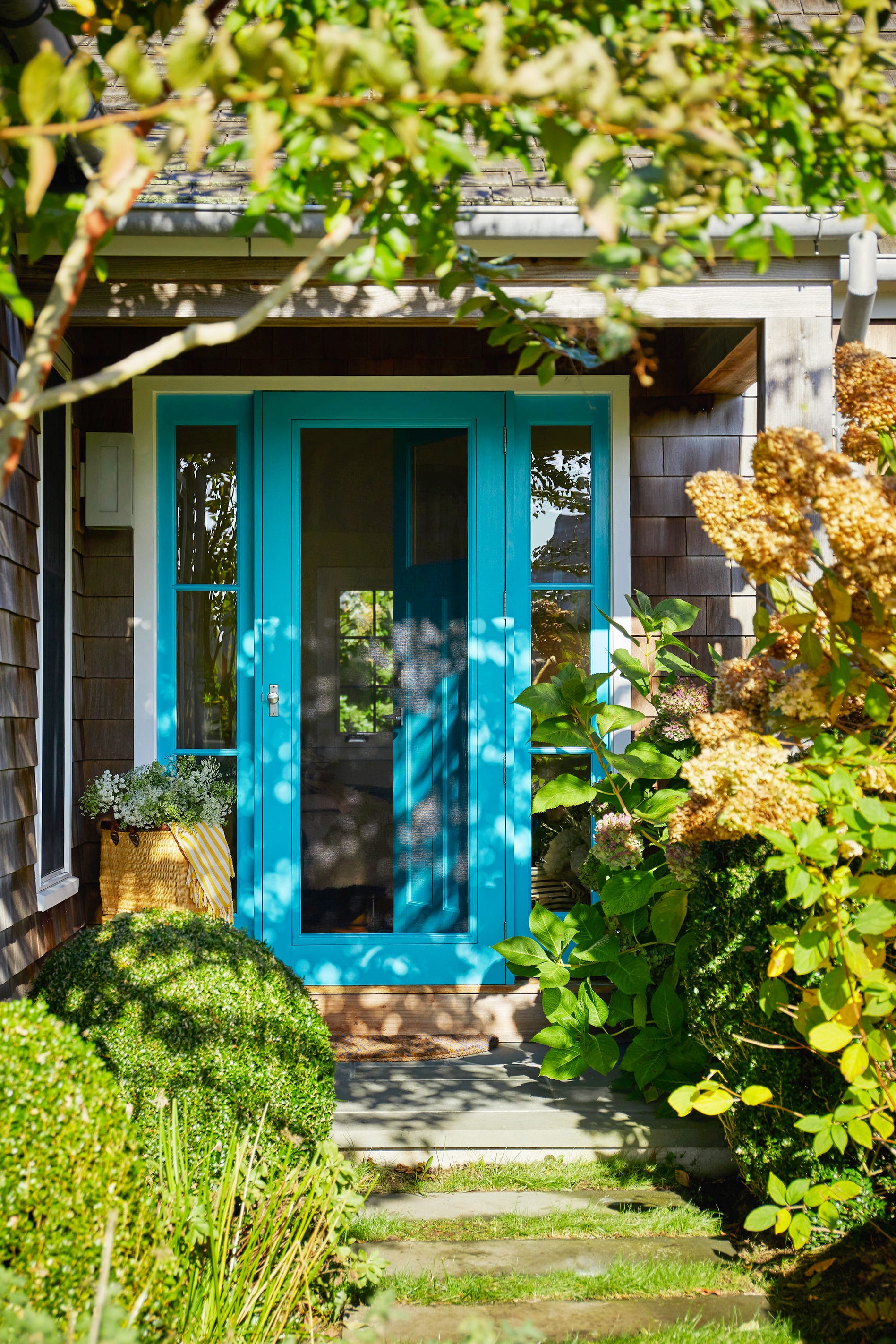
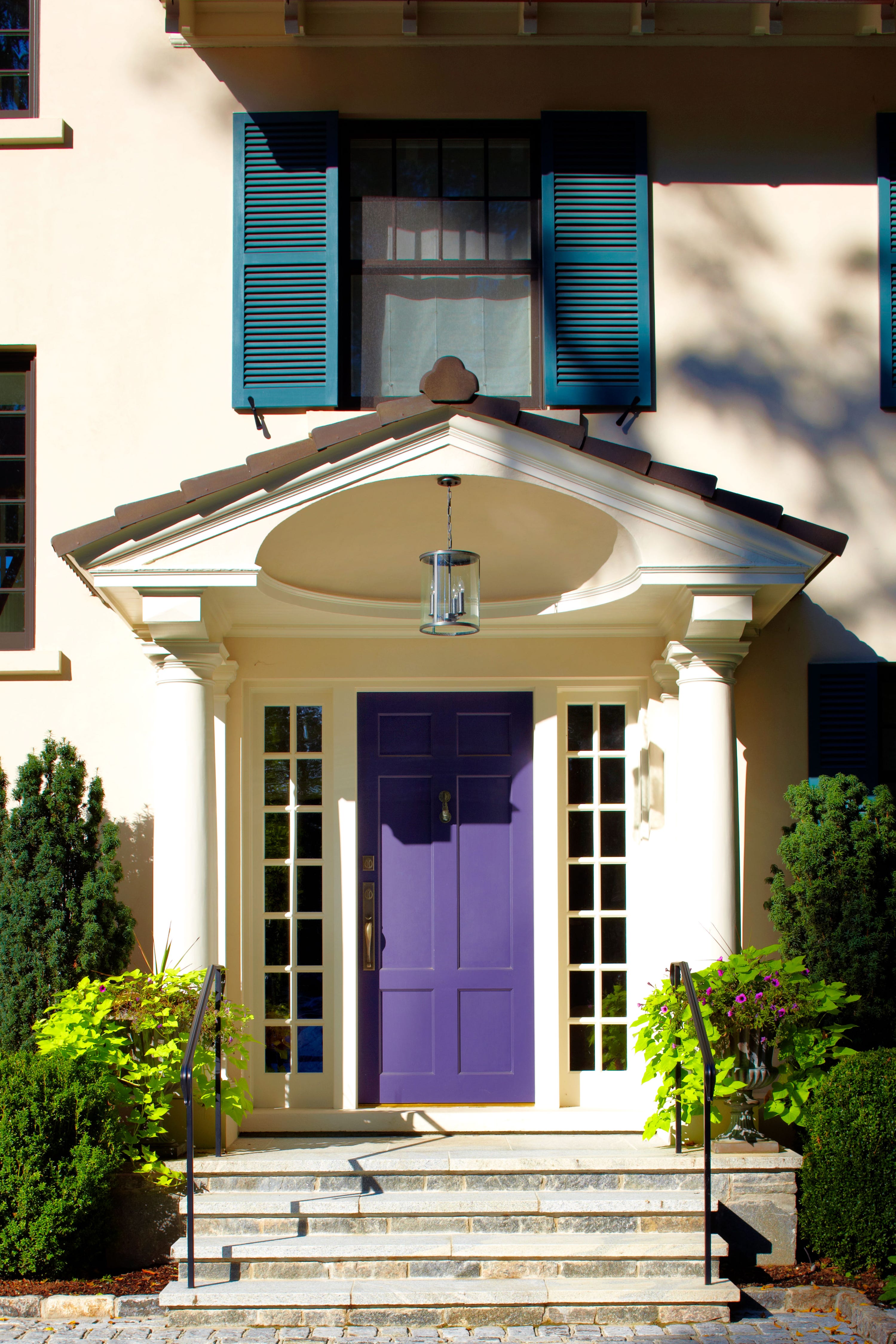
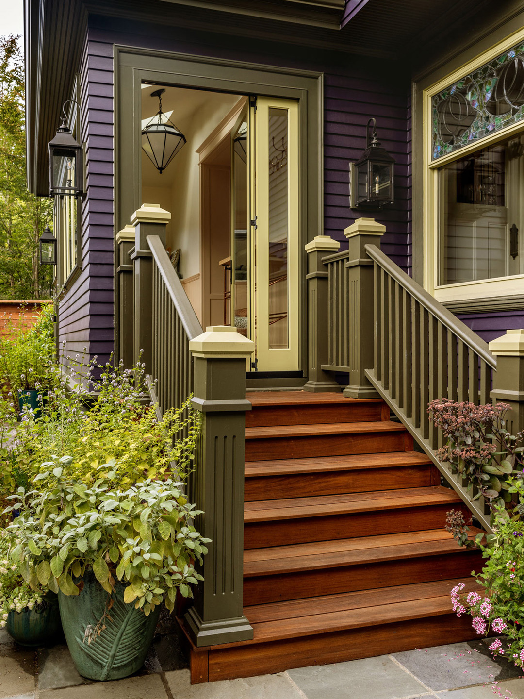
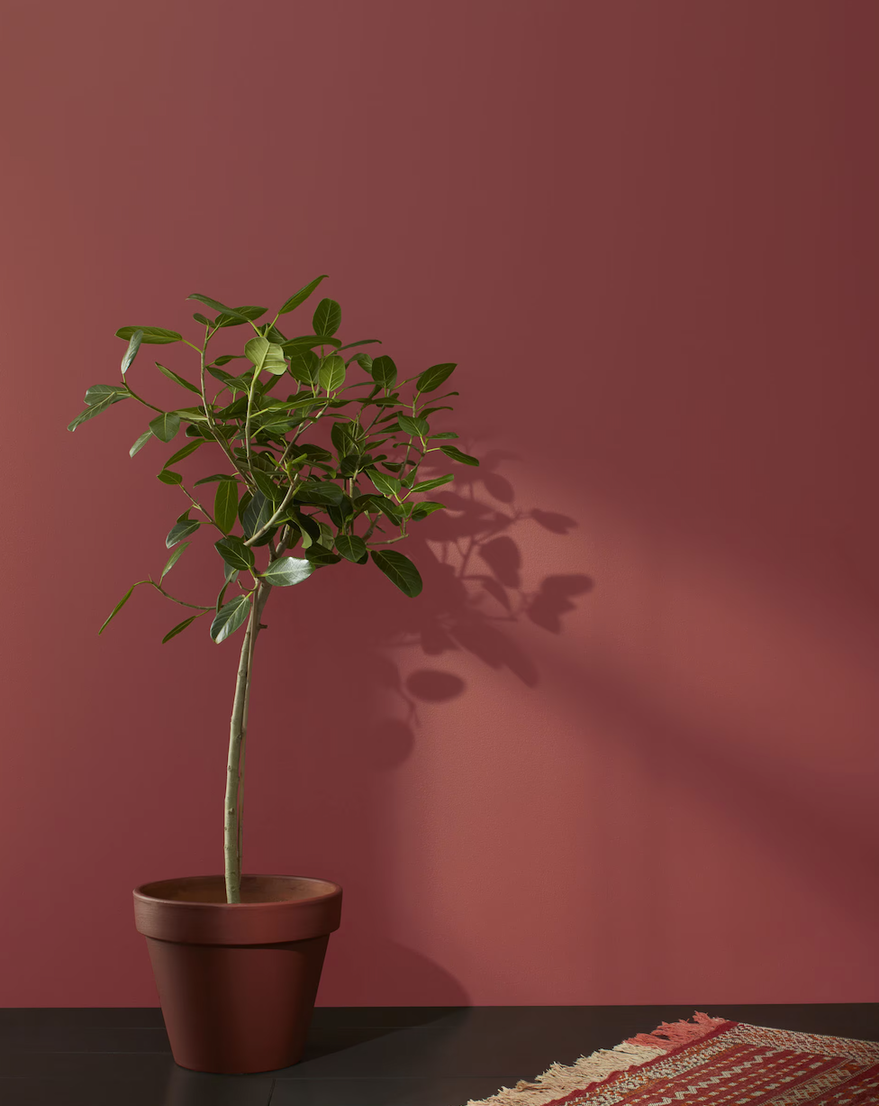
Seven primary colour schemes are highlighted: pastels, primary colours, shades of grey, two-tone schemes, earthy tones, green, and white and bright. Pastels can add personality, especially when used for accent features like front doors. Primary colours are best used as accents to highlight architectural details. Shades of grey remain popular for their versatility and longevity. Two-tone schemes, achieved by selecting lighter or darker variations of a chosen colour, can emphasize architectural features. Earthy tones, often combined with natural textures like stone and timber, create a connection to the landscape. Green hues offer a natural and calming feel, suitable for both bold and serene exteriors. White and bright schemes provide a fresh, simple look, with careful consideration given to the numerous white shades available and their interaction with light.
Seven tips from Three Birds Renovations for choosing exterior paints are provided. These include selecting colours based on personal preference rather than fleeting trends, using 'safe' colour options that can be accessorized, consulting the colour wheel for complementary combinations, and always sampling paint on the actual home under different lighting conditions. Emphasis is placed on considering the finish and durability of the paint, with low-sheen options often preferred for exteriors. Creating a vision board is recommended for guiding design choices, and the decision between DIY painting and hiring professionals is discussed, with pros and cons for each approach.
#ExteriorPaint #ColorSchemes #HomeRenovation #AustralianDesign #ArchitecturalStyle #PaintTrends2026 #ThreeBirdsRenovations #Dulux #HaymesPaint #Wattyl #ExteriorPaint #ColorSchemes #HomeRenovation #AustralianDesign #ArchitecturalStyle #PaintTrends2026 #ThreeBirdsRenovations #Dulux #HaymesPaint #Wattyl
0 comment in total
 No comments yet
You may also like
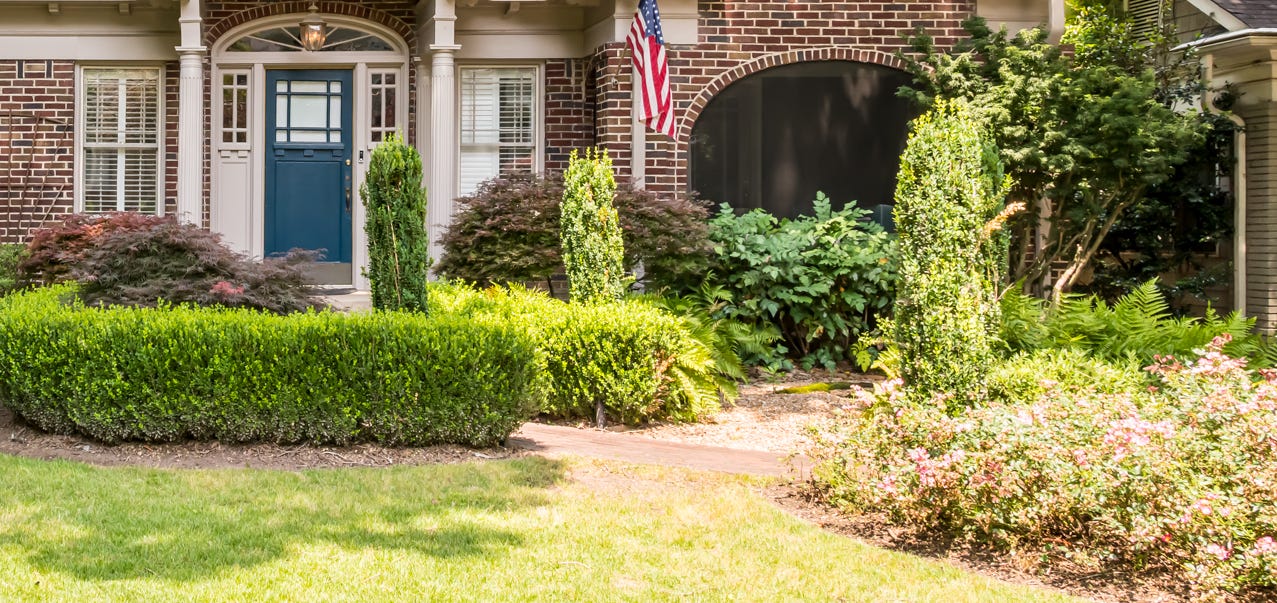
Designers Predict Every Front Door Will Be One of These Colors in 2026

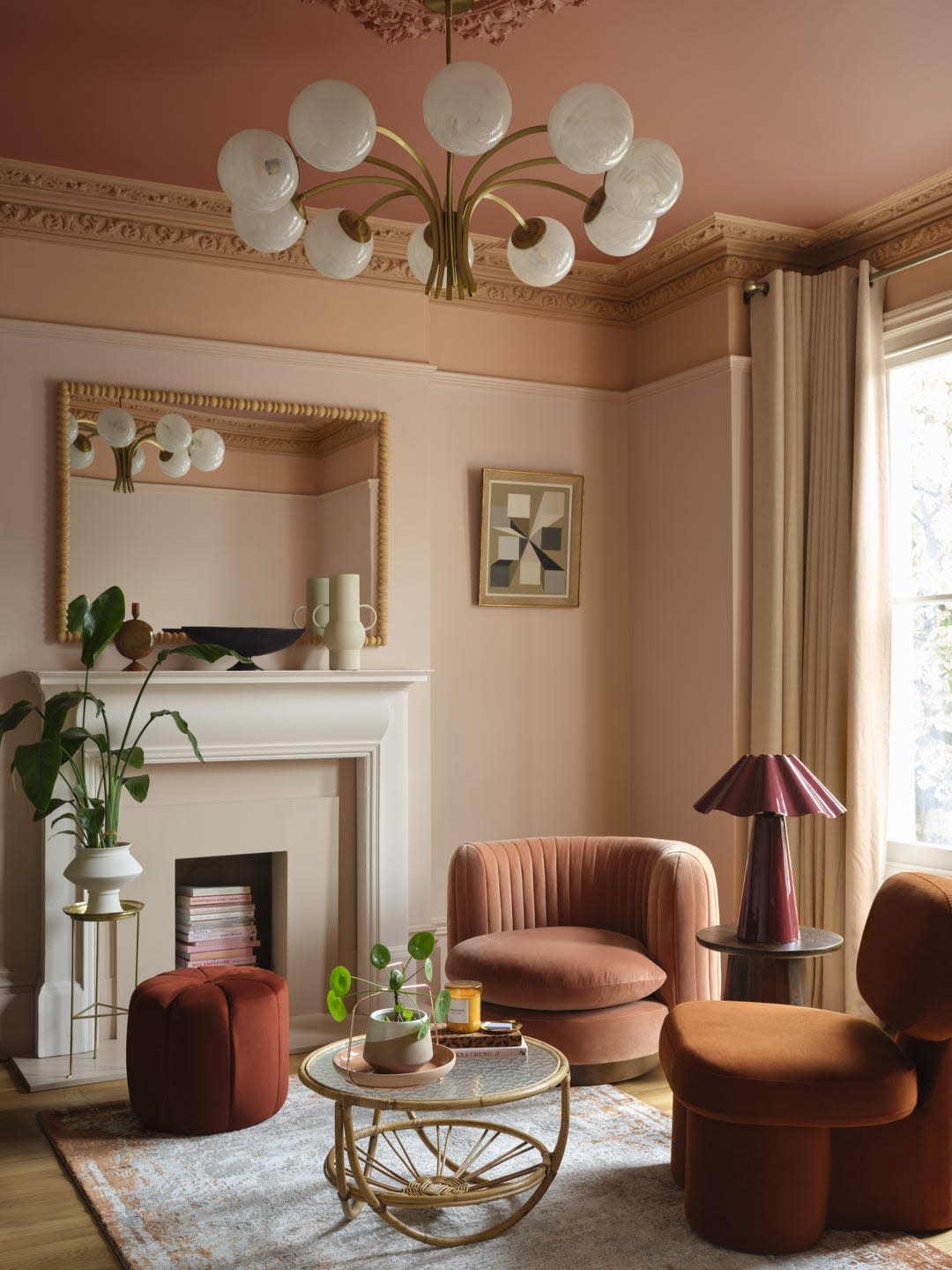
This British Paint Trend Is Set to Take Over 2026

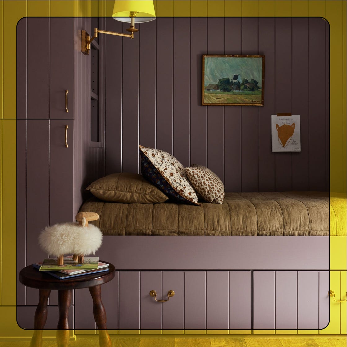
What Paint Colors Will Rule 2026? Designers Make Their Predictions
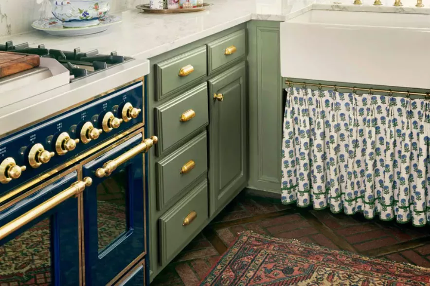
The ‘New Neutral’ Paint Color Everyone Is Adding To Their Homes In 2025, According To Designers
The colour trends 2026 that will define our homes next year

The Moody Shade That Will One-Up White Exteriors in 2026

Move Over, Color Drenching— Color Capping Will Dominate 2026 Interiors

Will This Be the Color Everyone Paints Their Room in 2026?

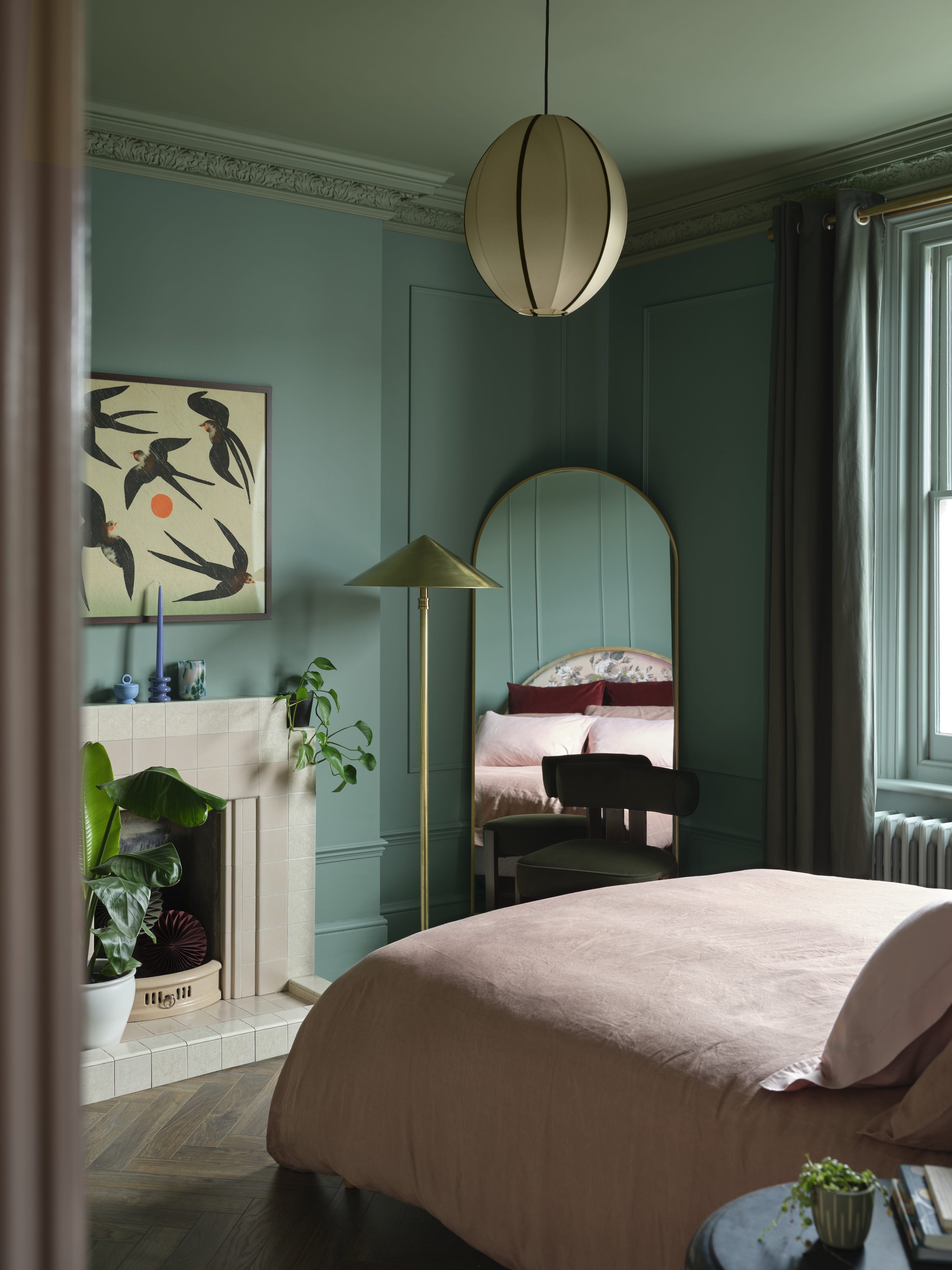
Interiors experts predict this will be the biggest paint trend of 2026

Goodbye Gray—This Soothing Paint Color Will Dominate Interiors in 2026, Designers Say

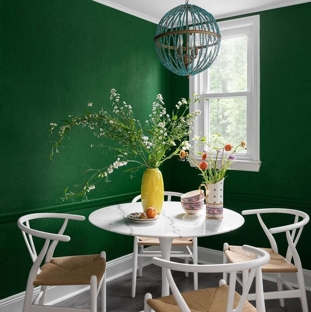
The Interior Paint Colors You'll Be Seeing Everywhere in 2024

These 20 Trendy Paint Colors Will Be Taking Over Walls In 2026
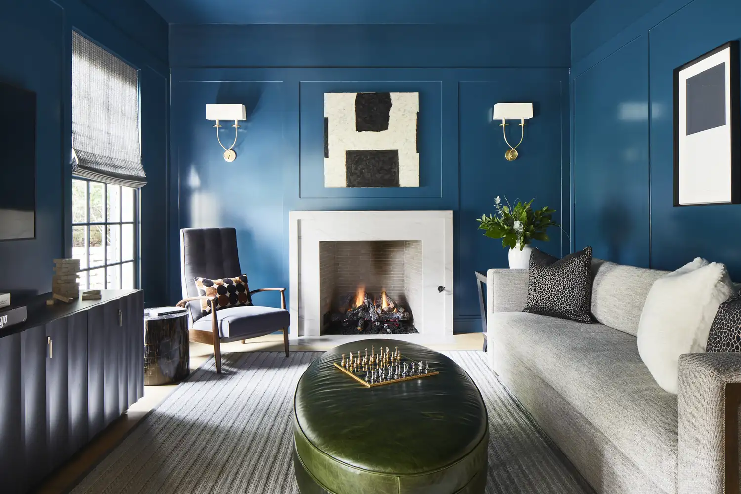
Say Goodbye to Neutrals: Color-Drenching Will Define 2026 Interiors

These Colors Will Be Everywhere in Interiors in 2025

Experts Say These 5 Paint Colours Will Be Everywhere In 2026
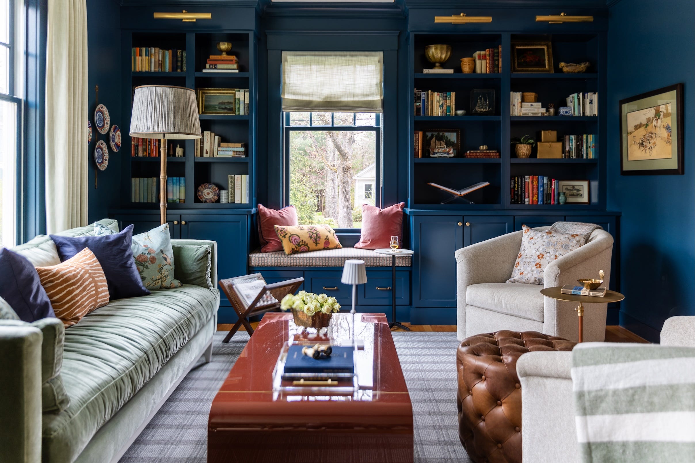
Designers Say These 12 Paint Colors Will Be Everywhere in 2026
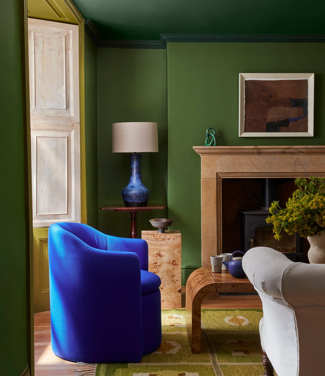
This British Paint Trend Is Set to Take Over 2026
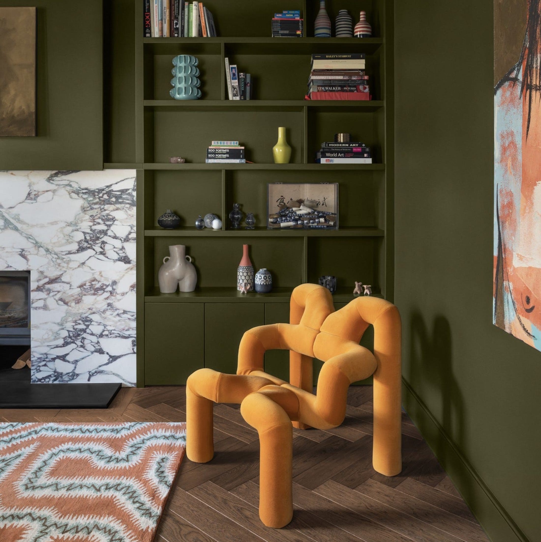
What Paint Colours will Rule 2026? The Experts Make Their Predictions

Meet 'colour capping', the paint trend set to take over 2026
The Bold Color Trend That's Replacing Accent Walls In 2026