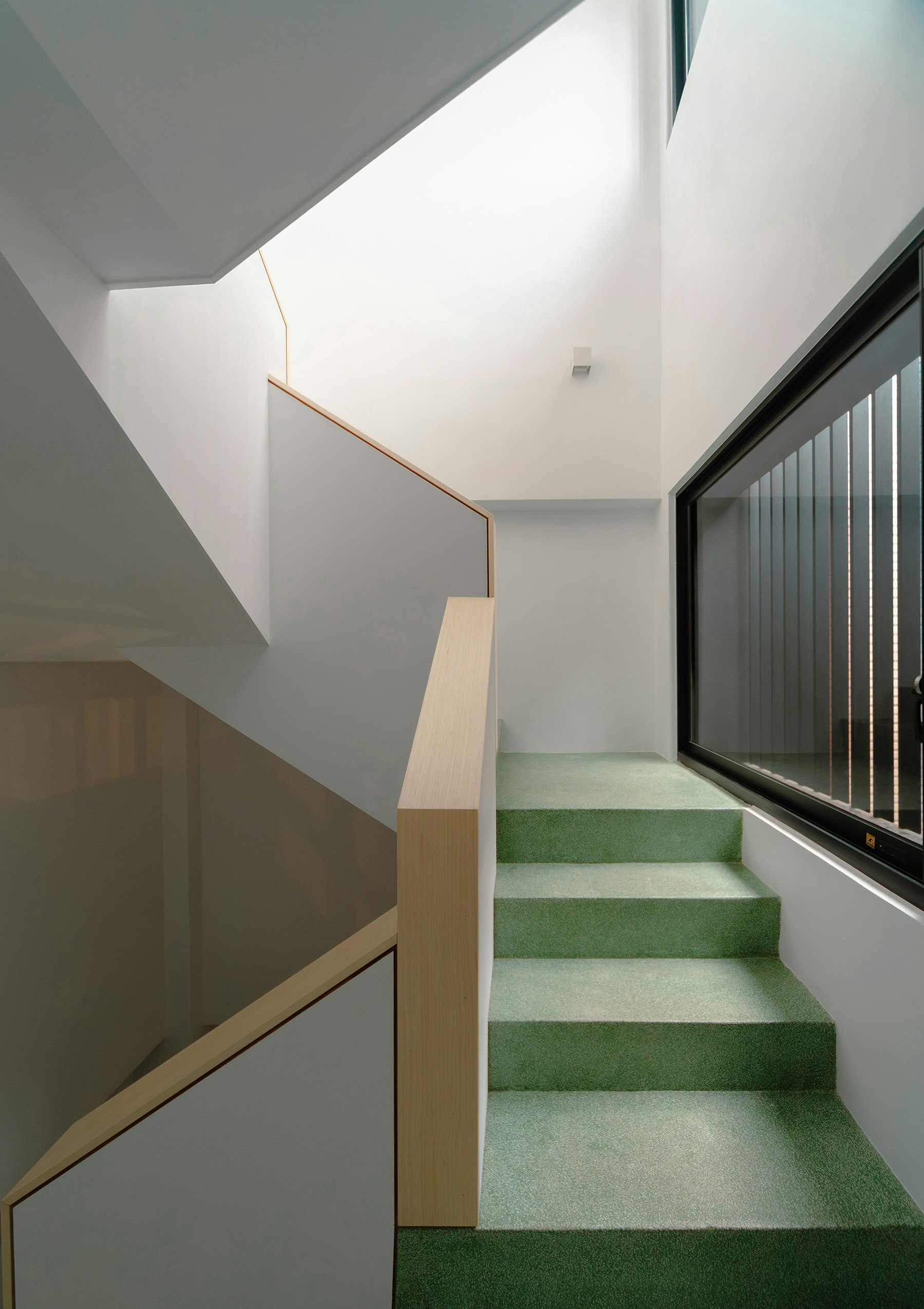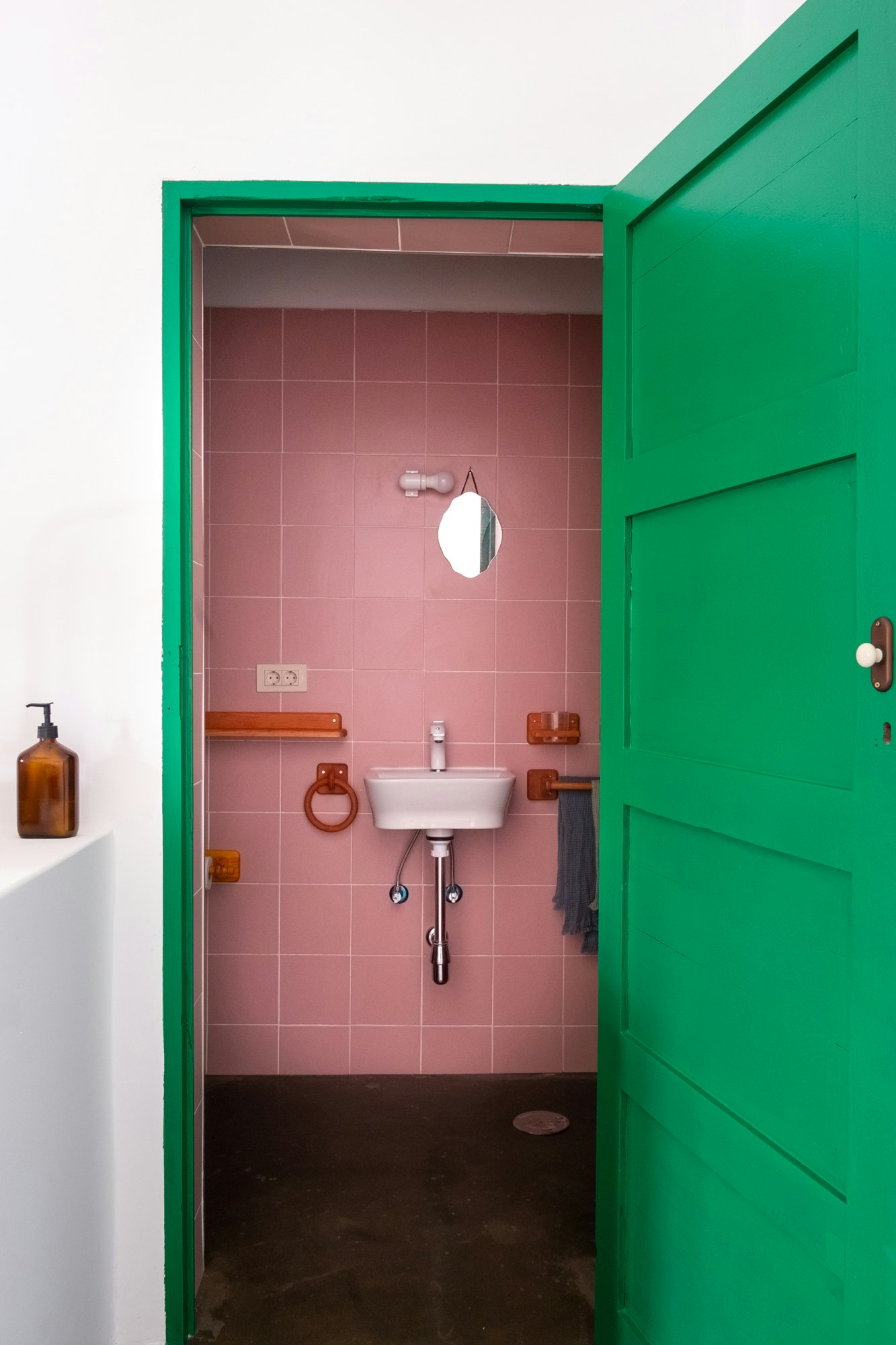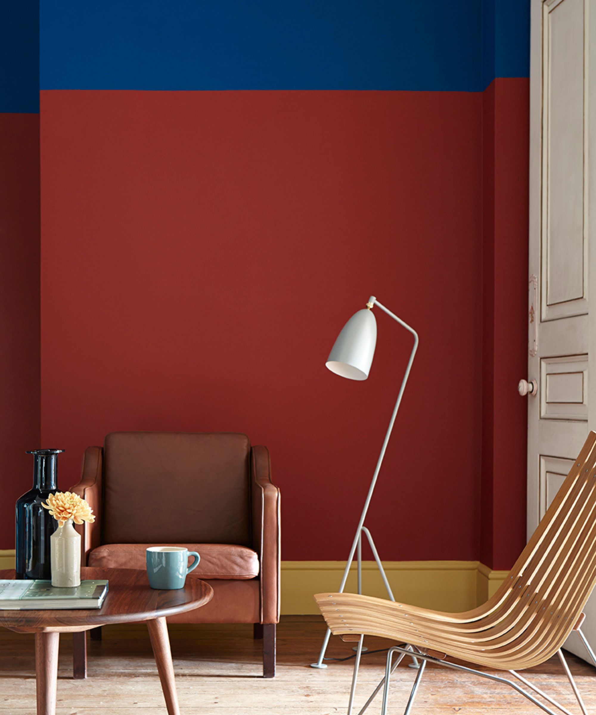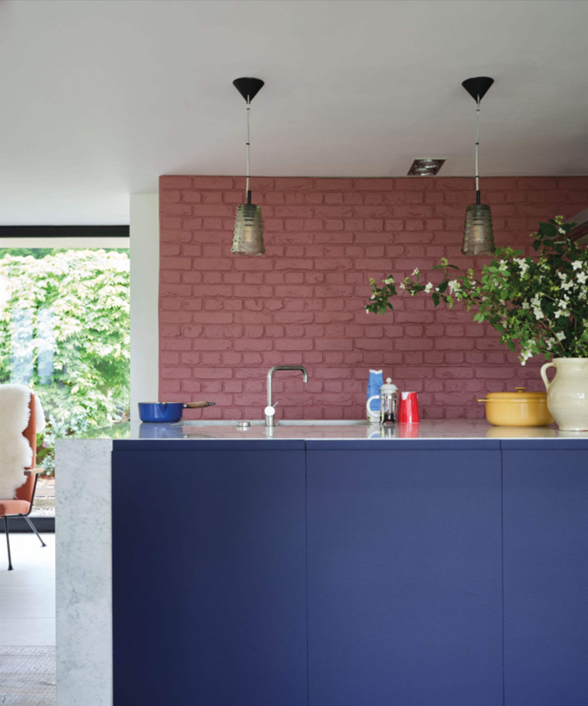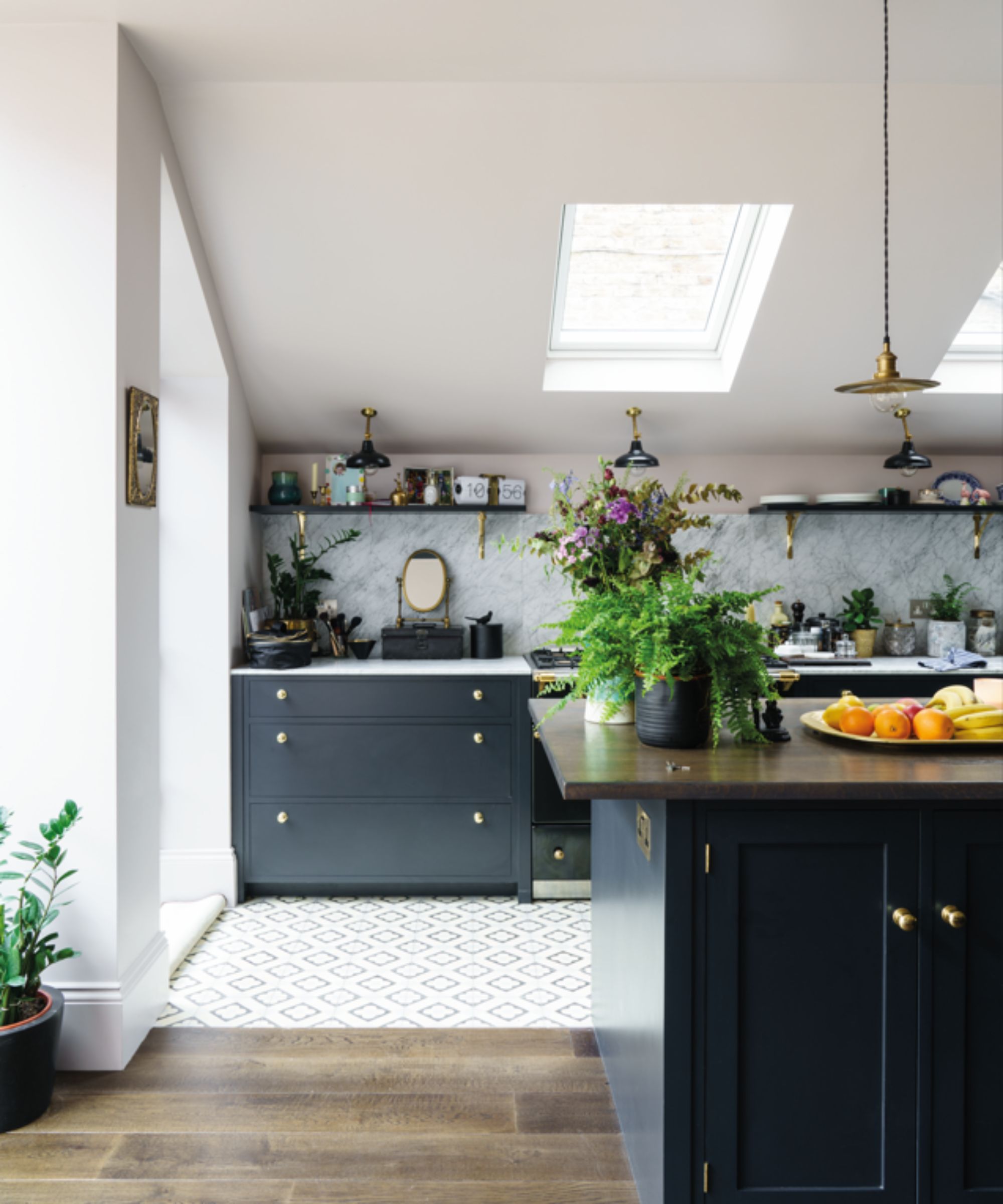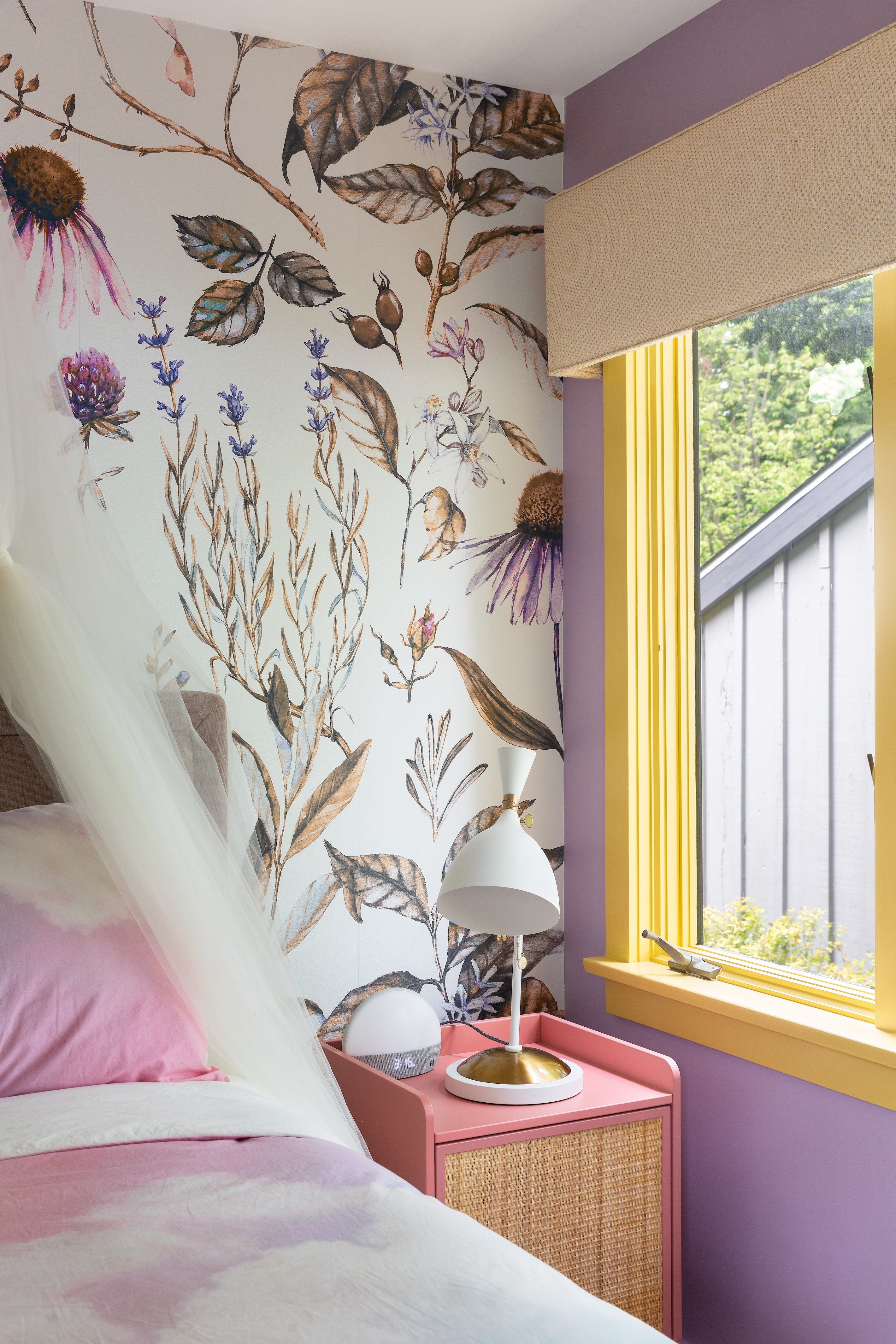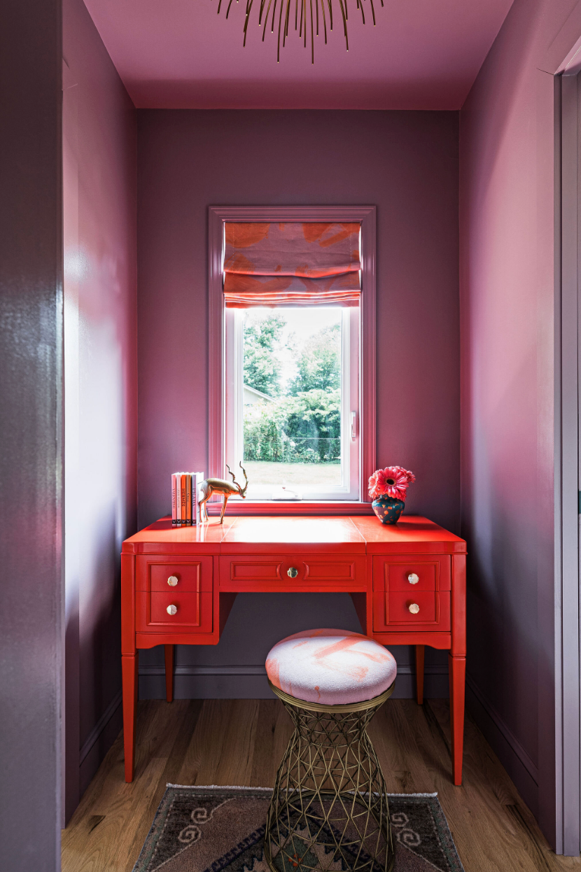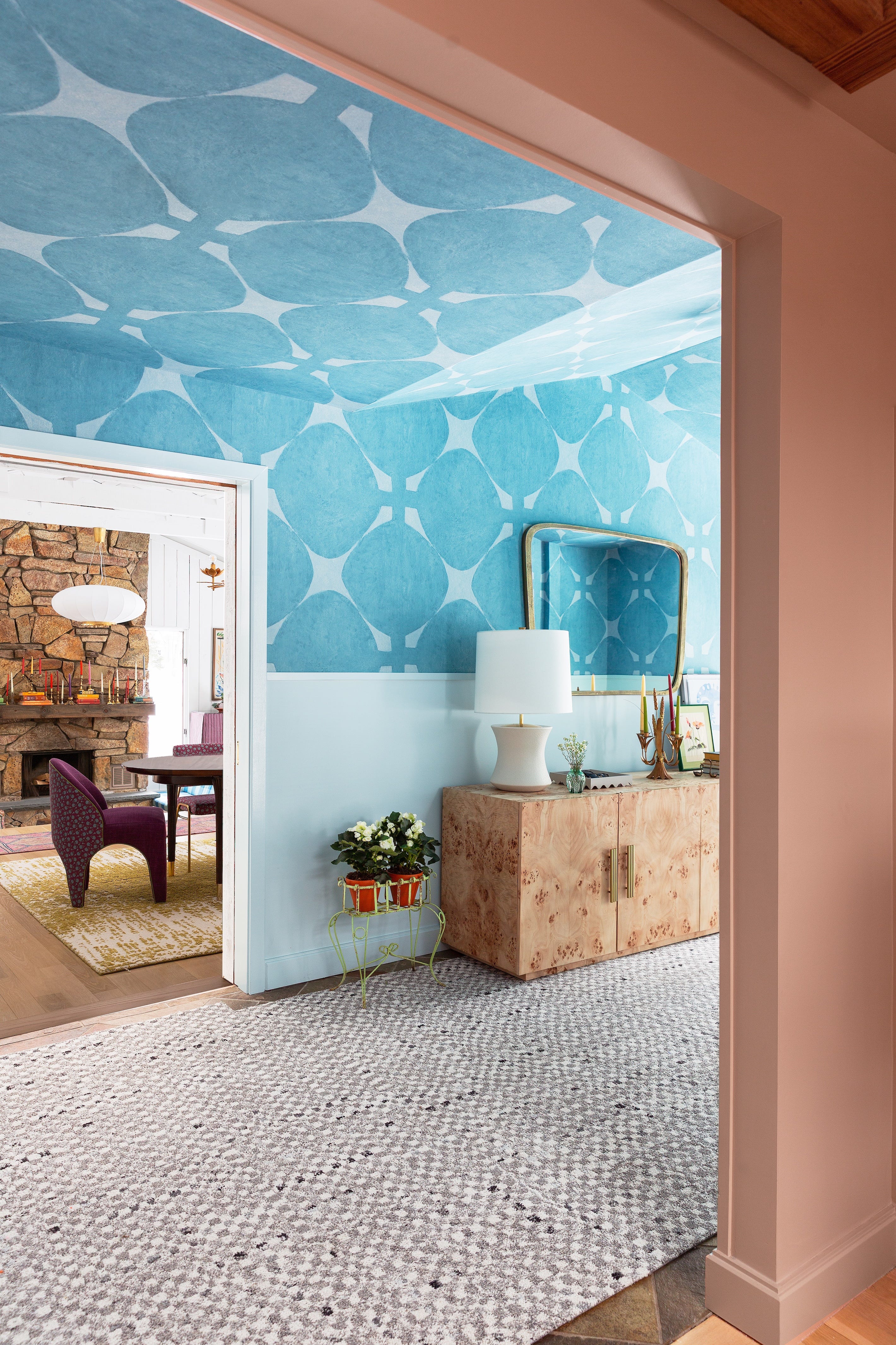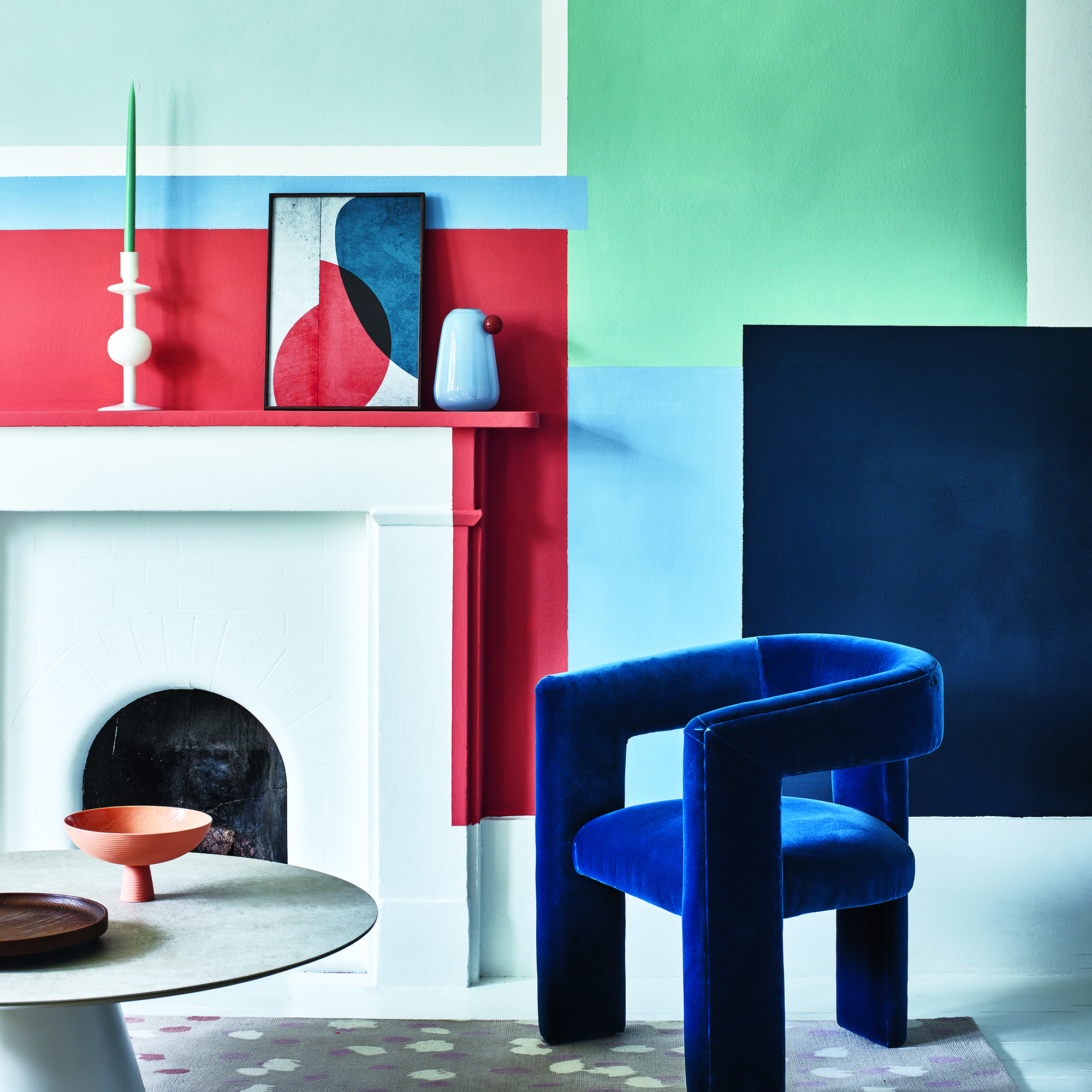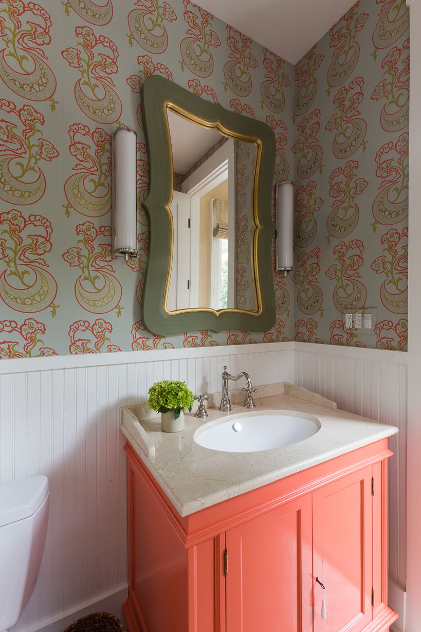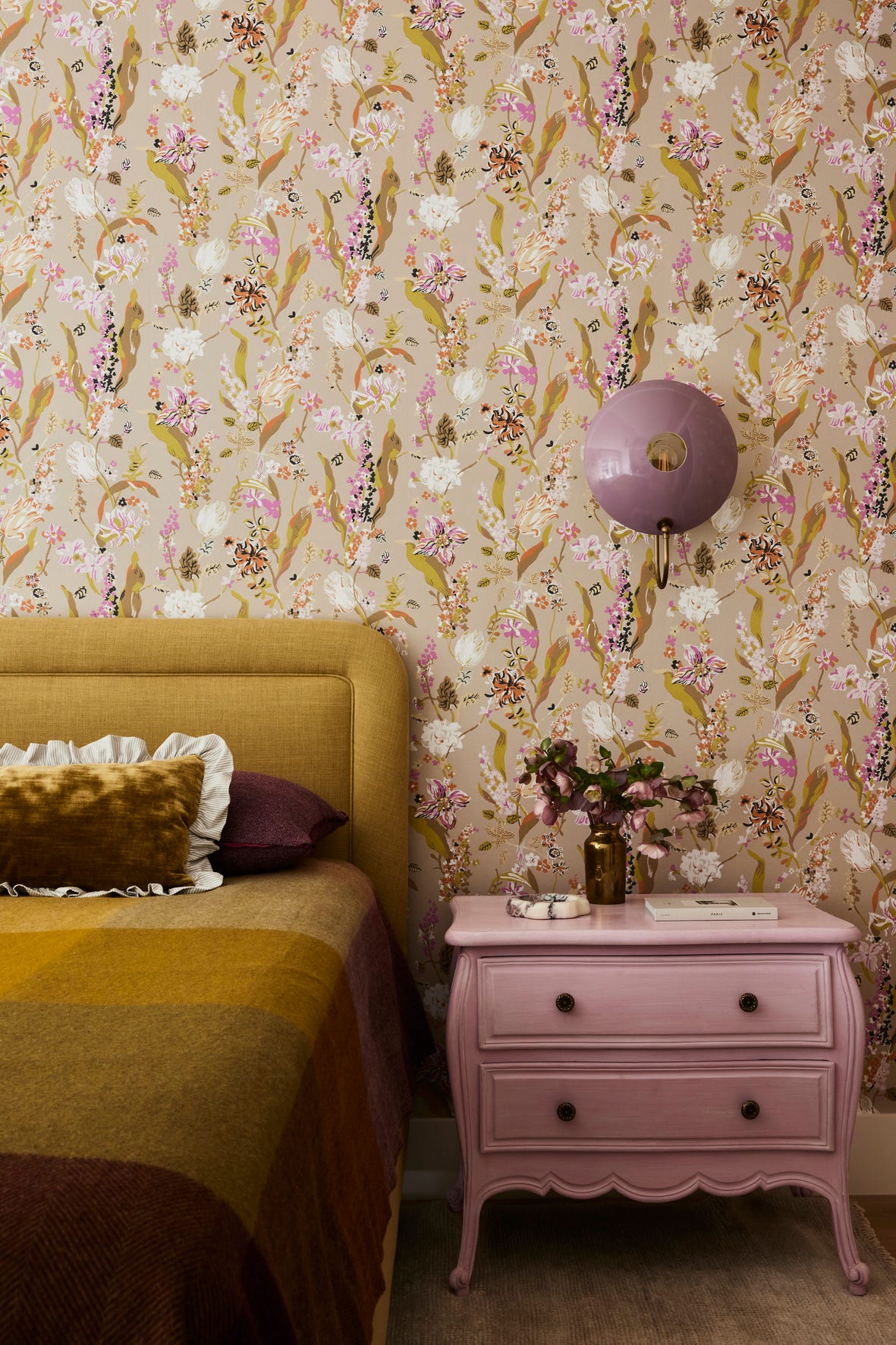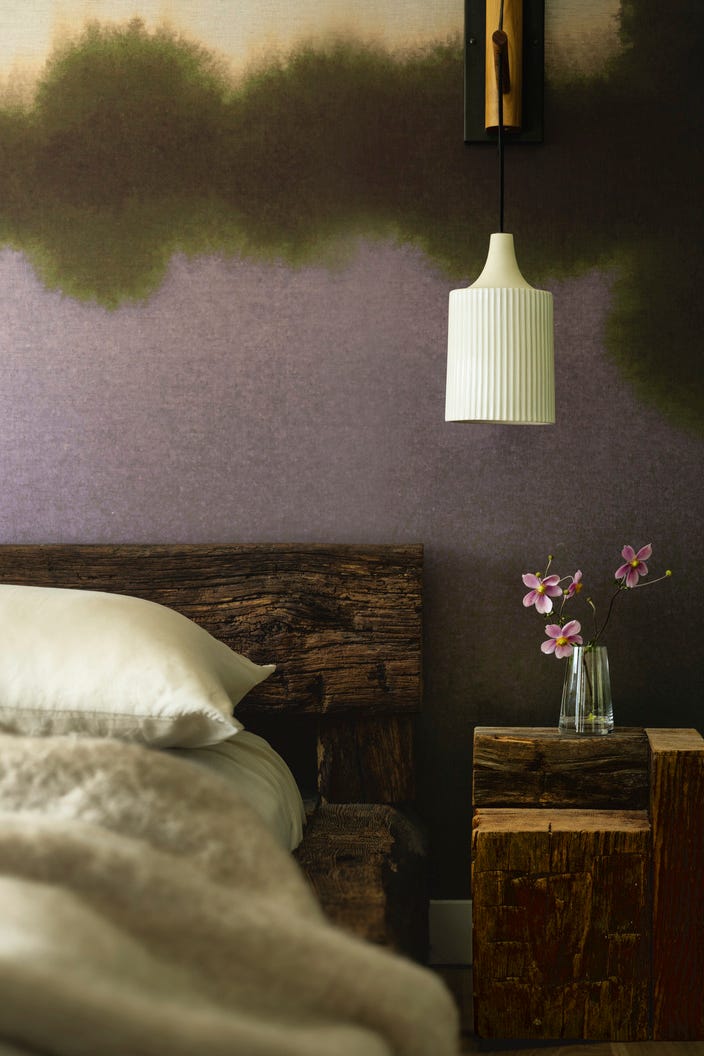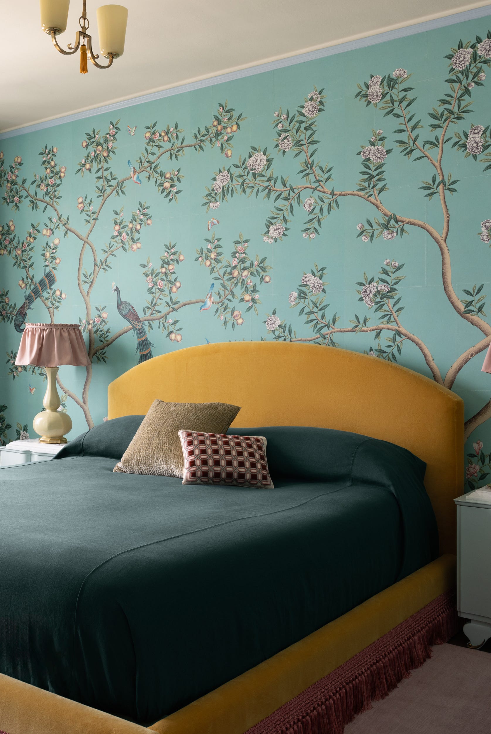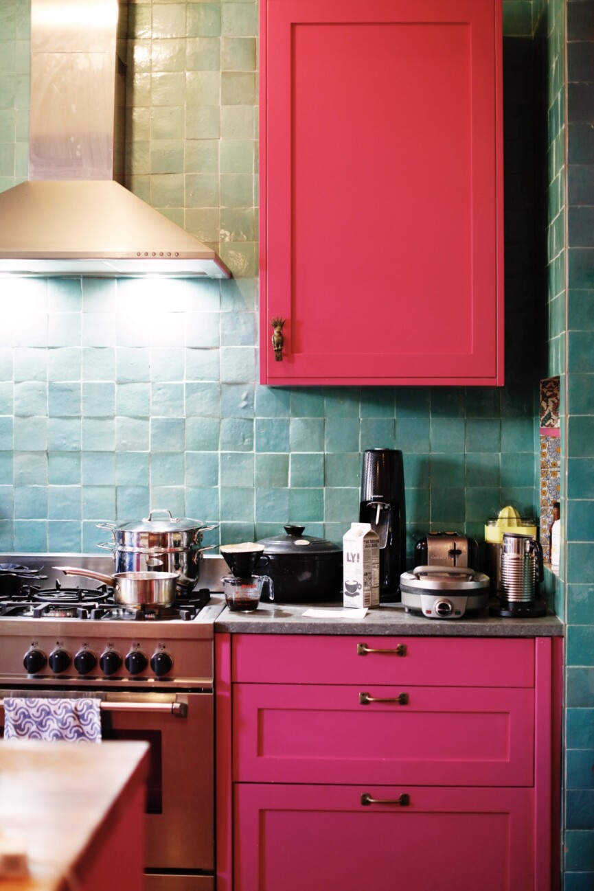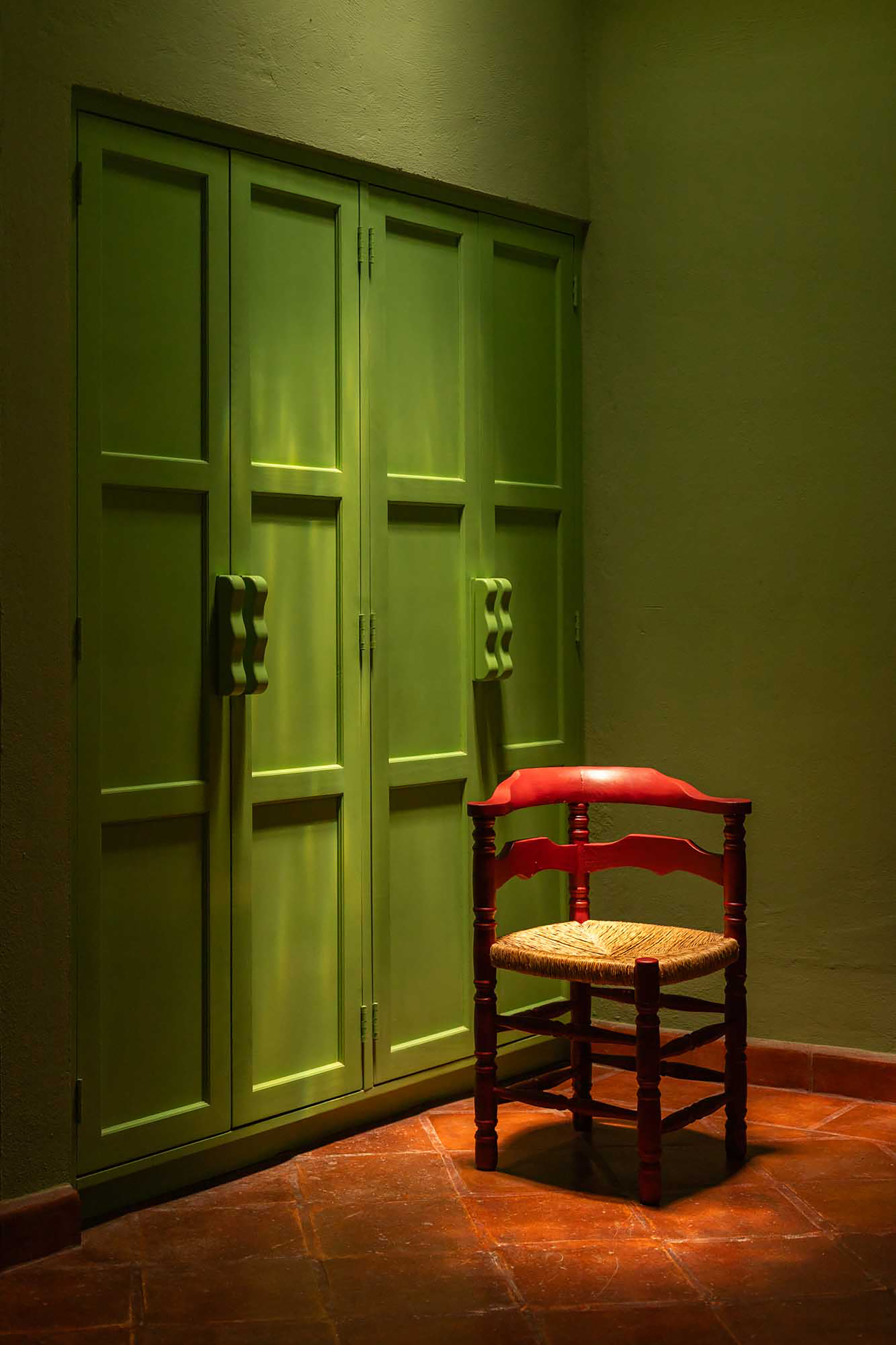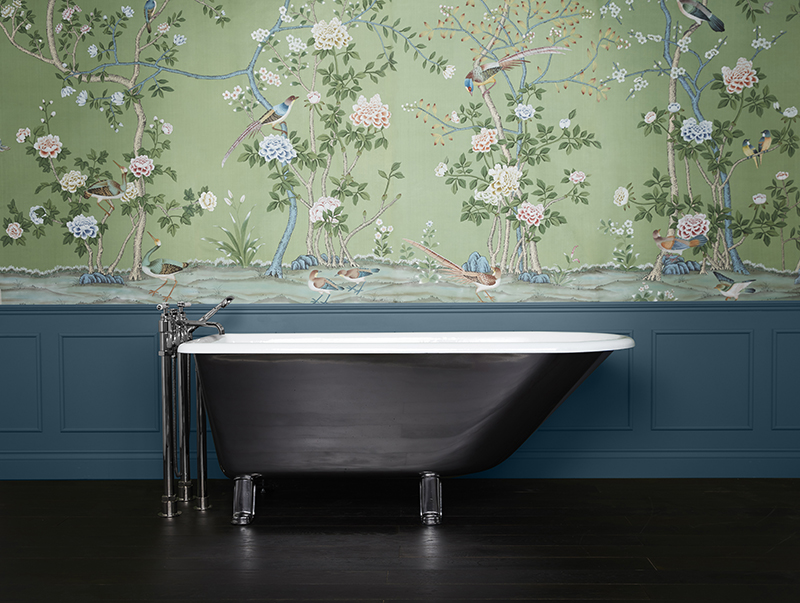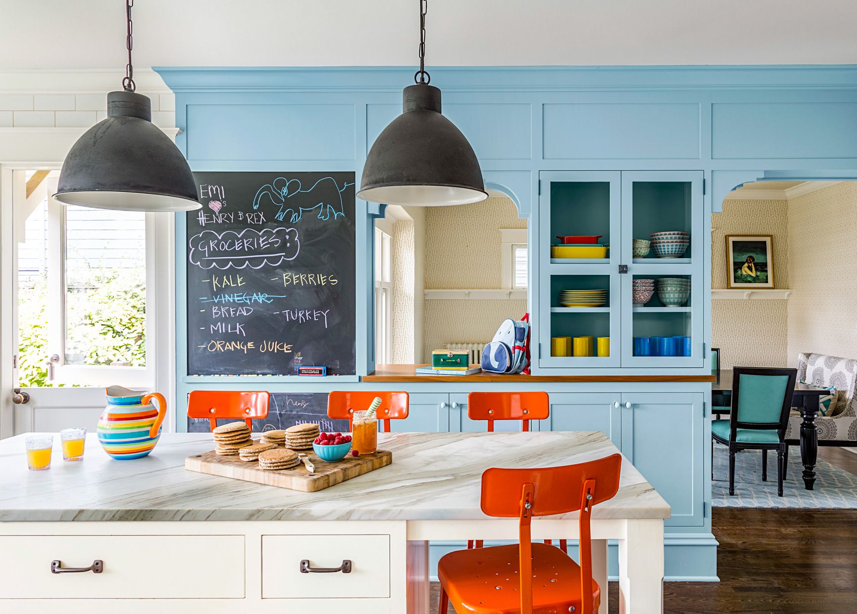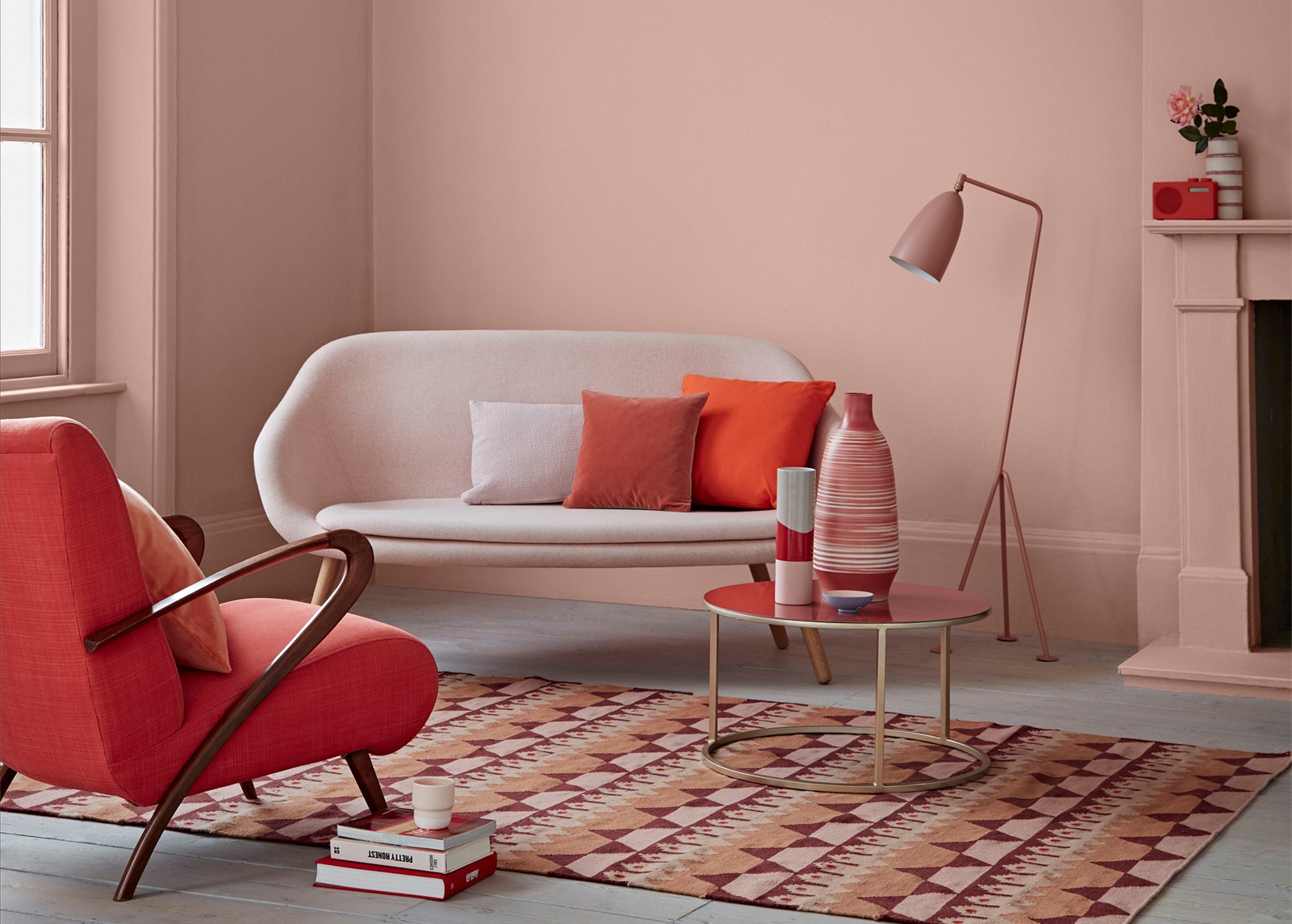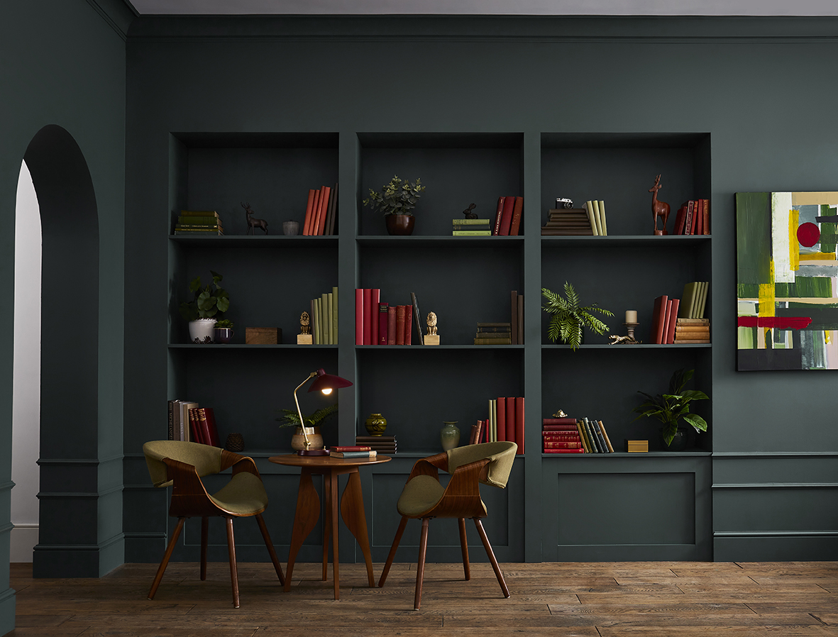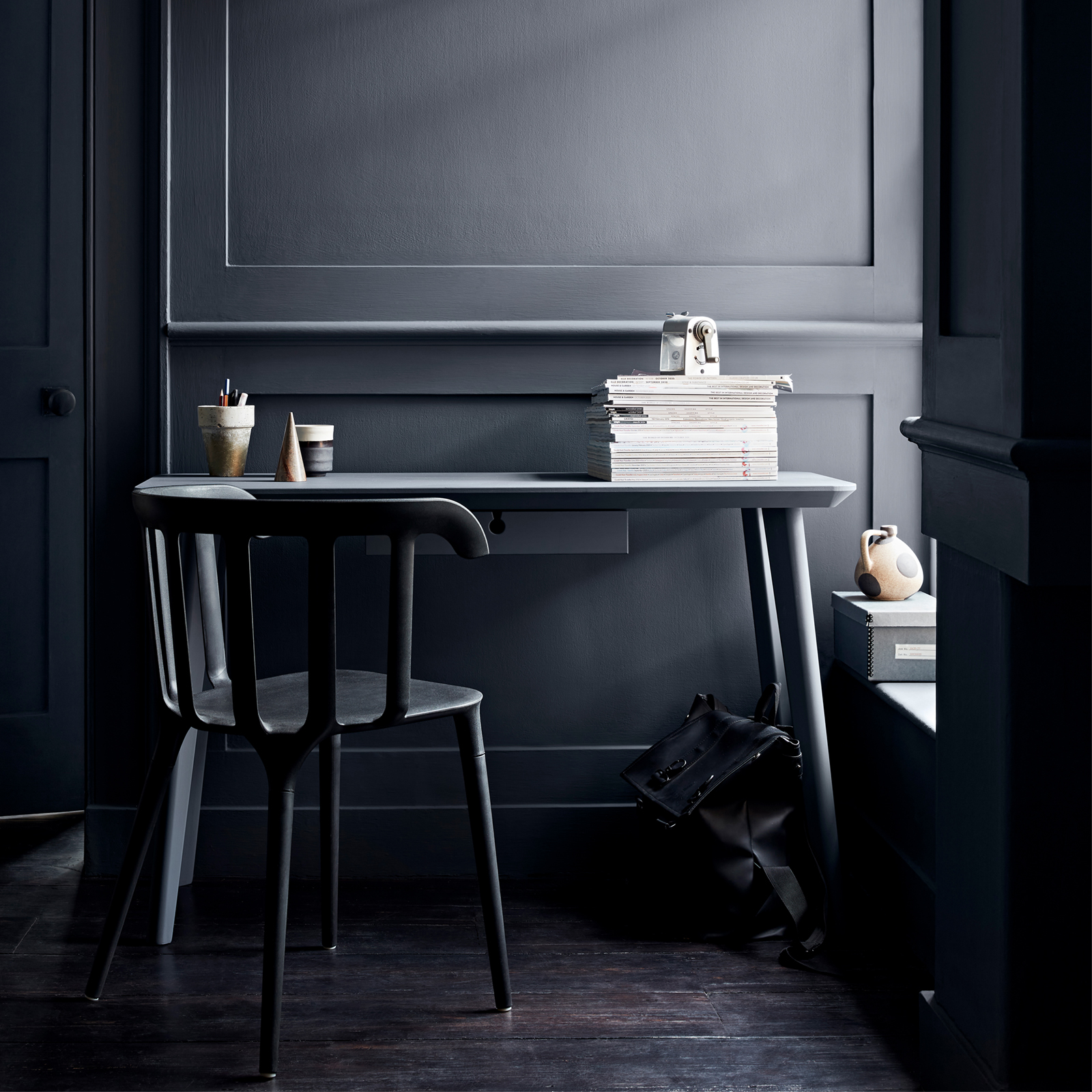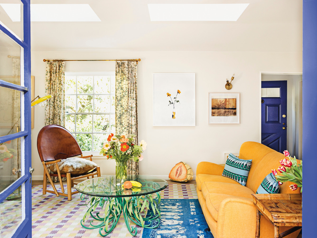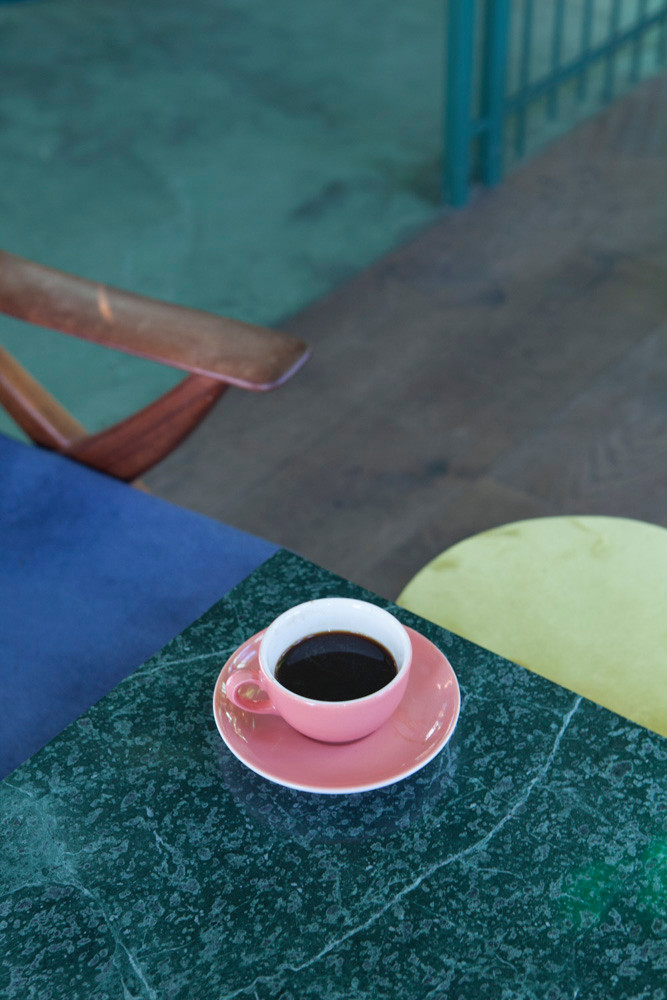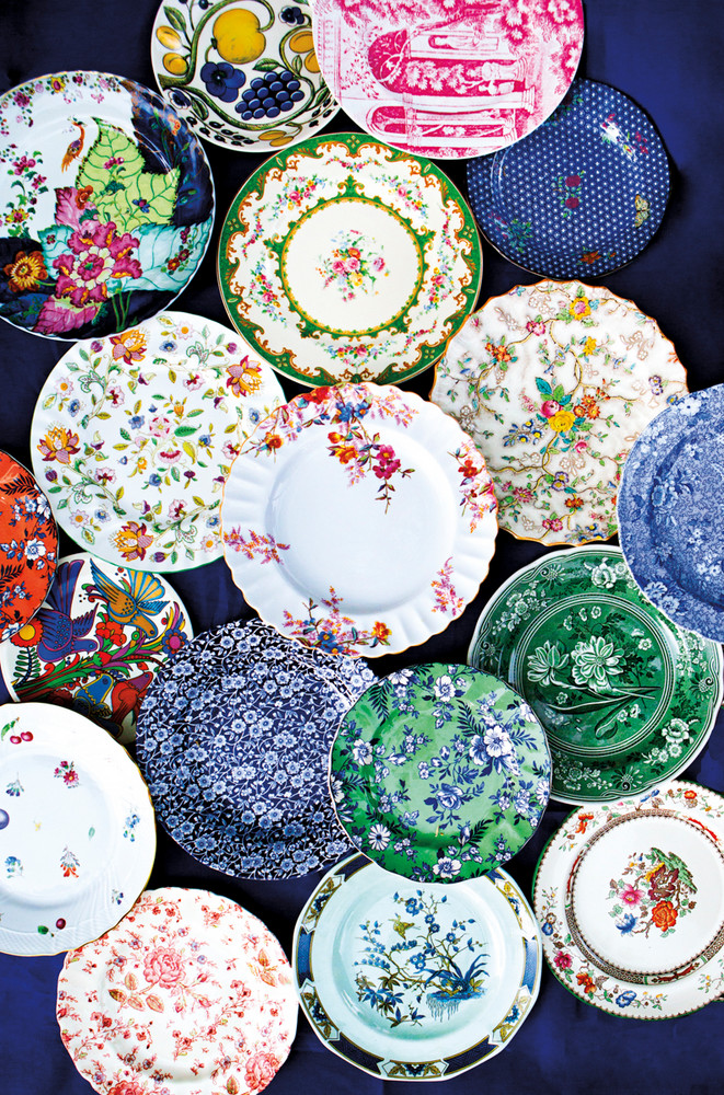
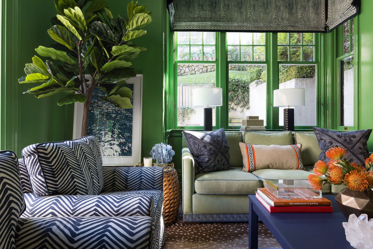
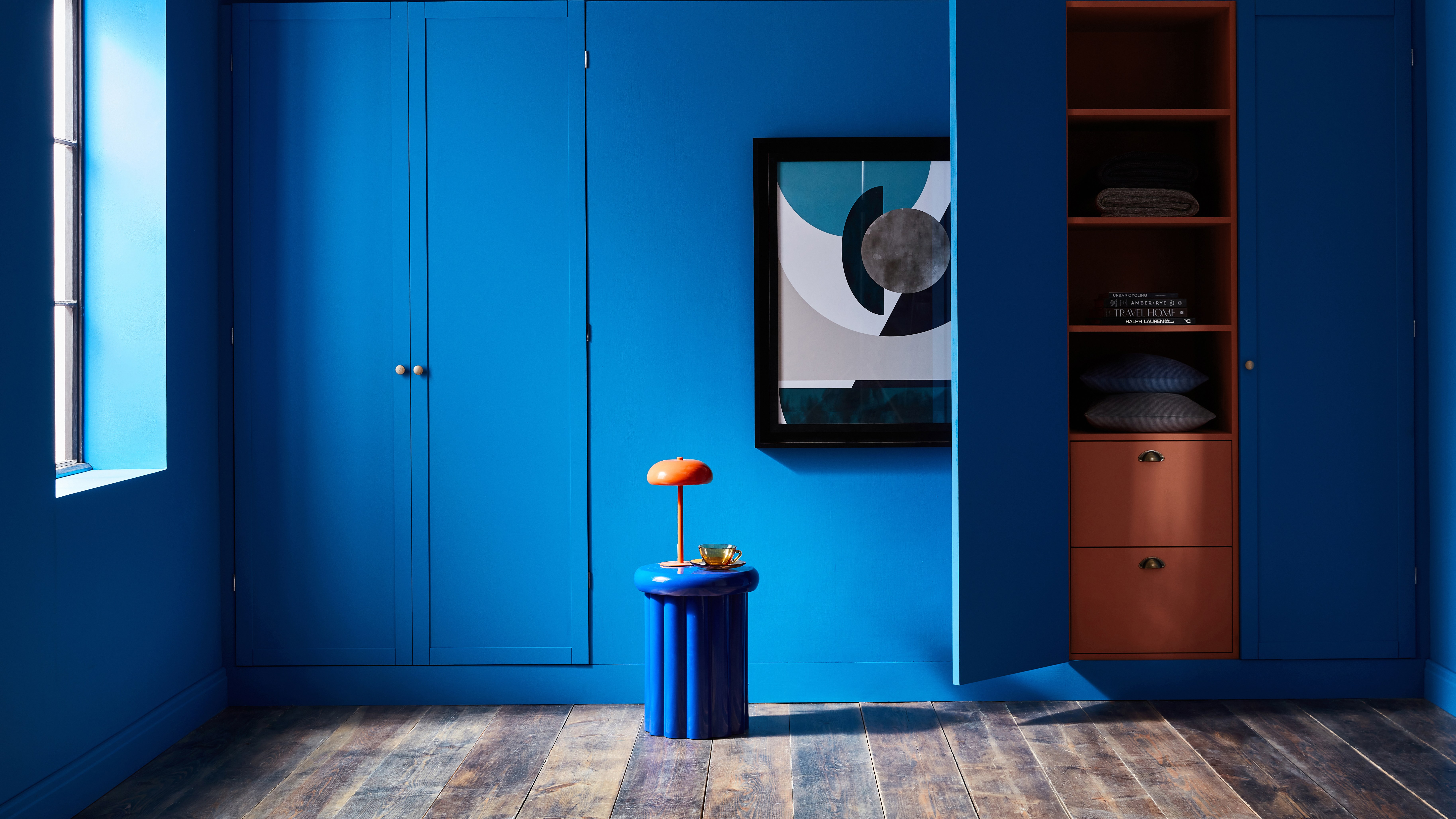
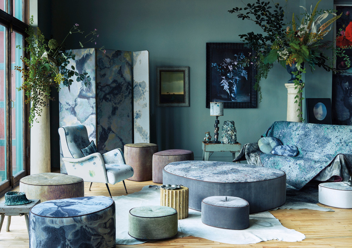
Choose contrasting color schemes for a more powerful effect
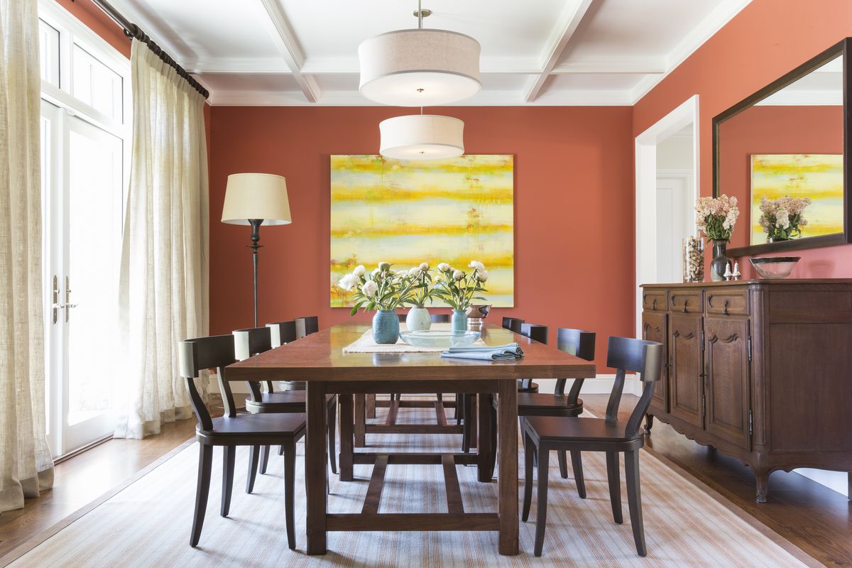
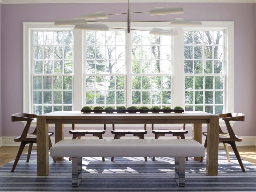
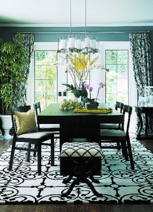
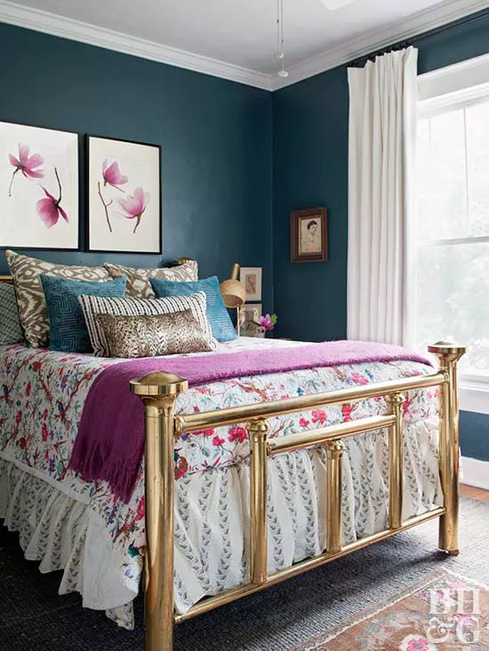
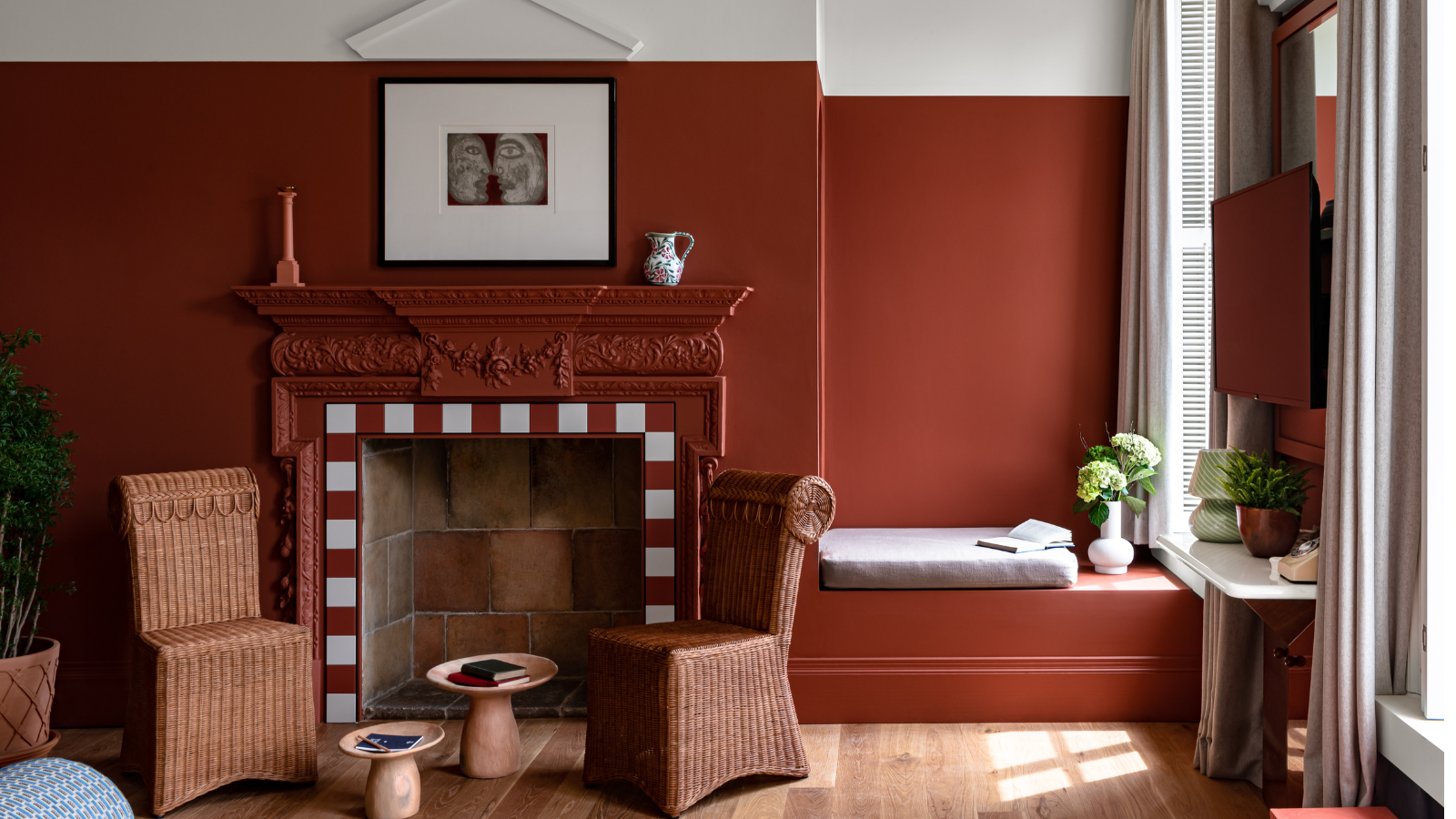
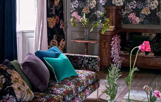
This article addresses two common interior design dilemmas, providing insights into creating dynamic and cohesive living spaces. The first question explores alternatives to a monochromatic gray and beige color scheme. The author suggests moving away from coordinating colors that are similar in intensity, which can result in a dull, albeit sophisticated, aesthetic. Instead, the focus shifts to contrasting color schemes, which introduce 'high notes' and 'clarion colors' against a quieter background to create a more energetic environment. An example cited is a dining room featuring gray walls and ceiling, complemented by a "virtual medley of crisply contrasting black-and-white patterns." Elements like curtains, a rug, and upholstery utilize related but non-matching patterns. Black-painted frames on French doors further enhance the room's energy, while white urns and statuary add wit. This design, described as "Glamorous" in Jean Nayar's book "Staged to Sell -- Or Keep," successfully incorporates multiple extroverted patterns by maintaining consistent colors while varying pattern scales for high contrast.
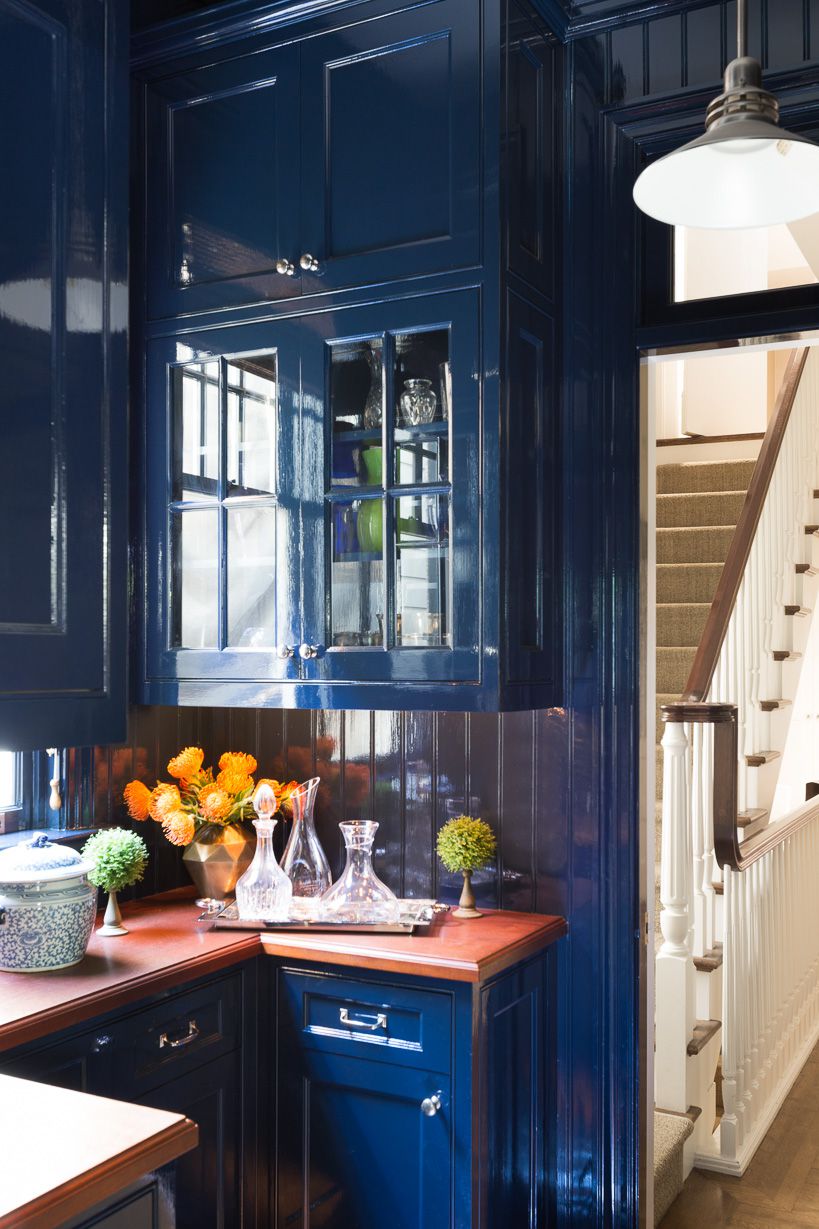
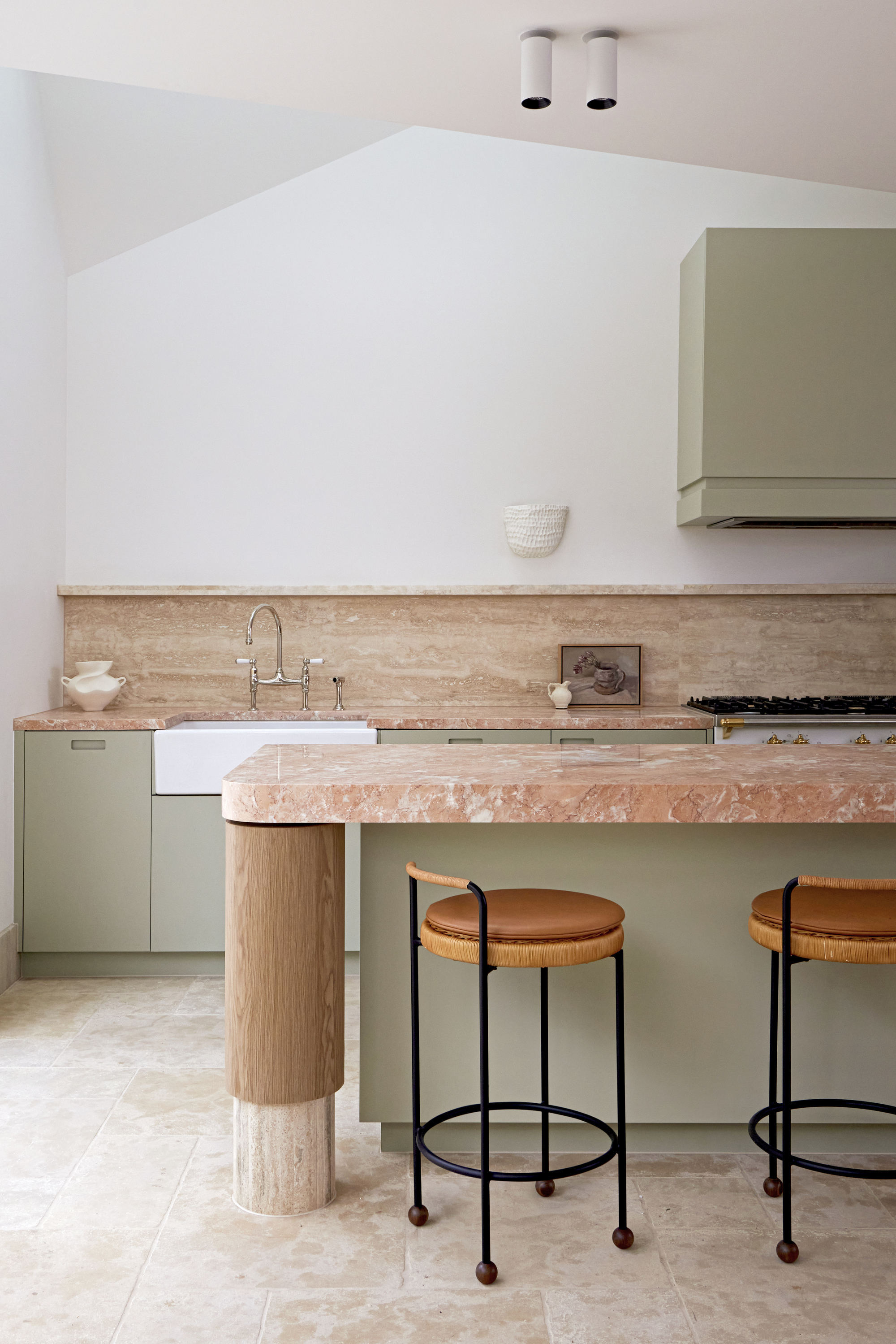
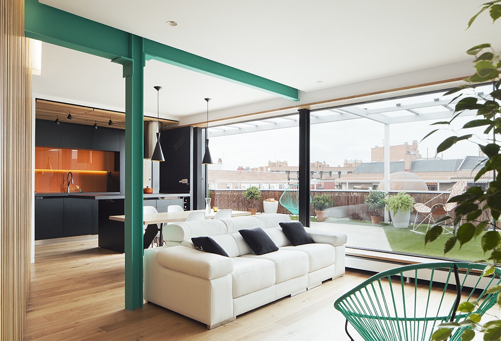
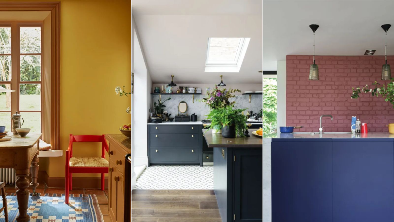
The second query addresses whether new kitchen cabinet wood tones must match existing oak floors in an adjacent dining room, particularly when the spaces are visually connected through an archway. The author firmly states that matching is unnecessary and outdated. Modern interior and kitchen designers advocate for blending or contrasting wood tones rather than seeking exact matches, eschewing the "matchy-matchy" approach. This philosophy allows for greater design flexibility and the creation of more visually interesting spaces. The article references www.hardwoodinfo.com, suggesting it as a resource for professional advice on this topic, reinforcing the idea that experts encourage deviation from strict matching. The overarching theme emphasizes the strategic use of contrast and thoughtful blending to achieve impactful and contemporary interior designs, moving beyond traditional, uniform approaches to color and material coordination in home decor. Rose Bennett Gilbert, the co-author of "Hampton Style" and associate editor of Country Decorating Ideas, provides these expert recommendations, highlighting current trends and professional perspectives in interior design.
#InteriorDesign #ColorSchemes #HomeDecor #ContrastingColors #WoodTones #KitchenDesign #DiningRoomDesign #PatternMixing #DesignTips #InteriorDesign #ColorSchemes #HomeDecor #ContrastingColors #WoodTones #KitchenDesign #DiningRoomDesign #PatternMixing #DesignTips
0 comment in total
You may also like
Dress Up Your Space With Contrasting Colors

15 high-risk high-reward paint hues
The Brighter, the Better—These Vibrant Paints Will Infuse Your Home With Positivity


24 Complementary Color Schemes That Will Make Any Room Pop

Designers are swapping tonal color schemes for high-contrast hues – here's how to do this daring color trend stylishly

Designers LOVE Pairing These Unexpected Colors With This Sophisticated Hue

Contrast Trim: The Design Trend You Need to Try in 2025

6 great ways to use colour drenching in your home

Designers Say These Unusual Paint Color Combos Will Transform Your Home

5 Secrets To Picking Paint Colors Like A Designer
How to Make Orange and Green Work Together — It Can Be "Dynamic and Joyful", but Only If You Get It Right

How to transform your rooms with colour drenching
Take a Leap into Bold Color with These Decorating Ideas
6 'Energetic Colors' for Vitality and "Sophisticated Interiors", According To Psychologists And Design Experts
How to combine colour, pattern and texture without making a complete mess of things
The Color Combo You’re About to See Everywhere
Primary colours are having a moment - but the secret to styling them is through 'unexpected' touches

Designers LOVE Pairing These Unexpected Colors With This One Timeless Hue

Deeper, moody colours and precious jewel tones are in style this year
6 Paint Color Mistakes To Stop Making, According To Designers