1/5
This Farrow & Ball paint color is trending, but it's tricky to decorate with – here's how the experts make it work
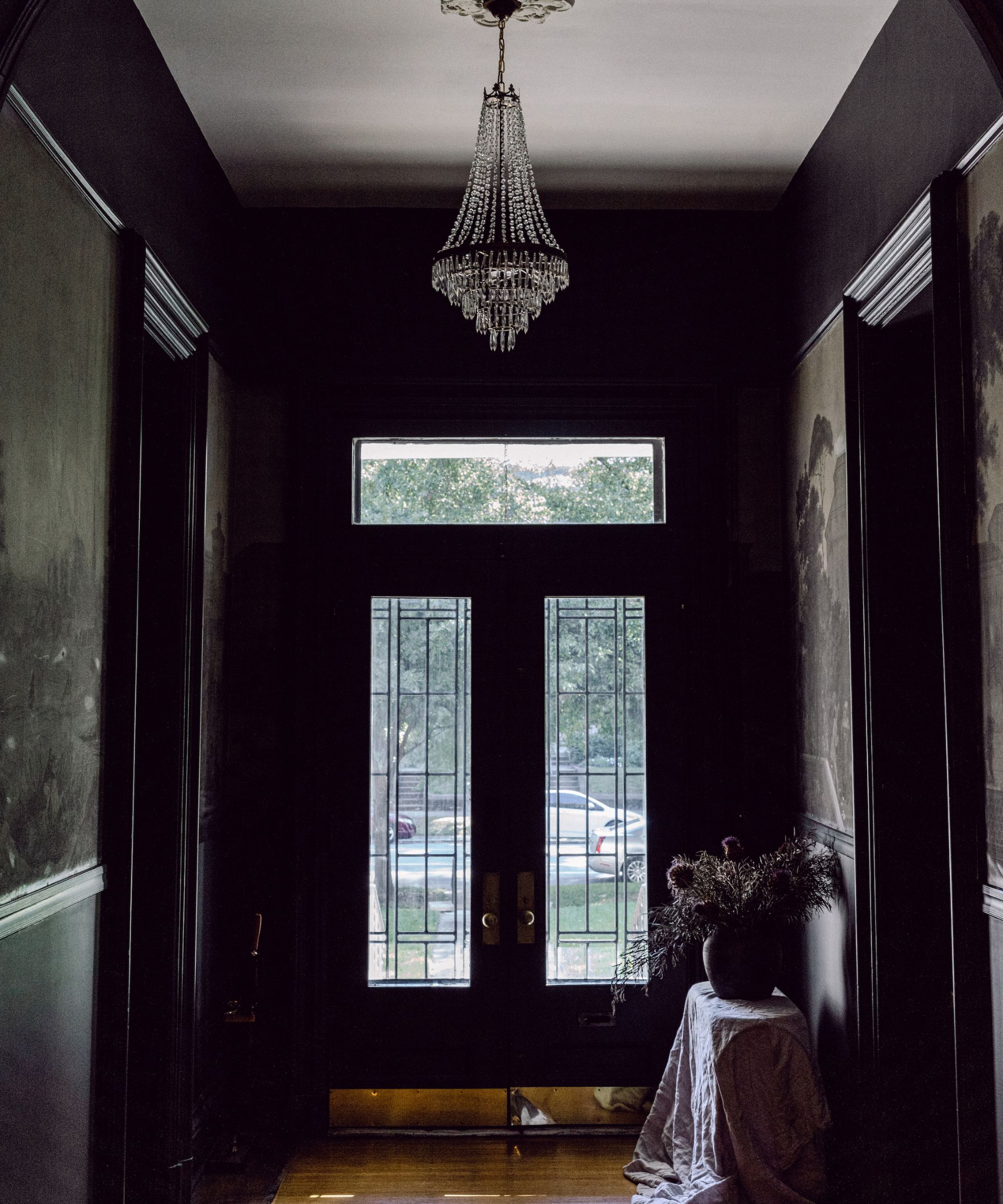
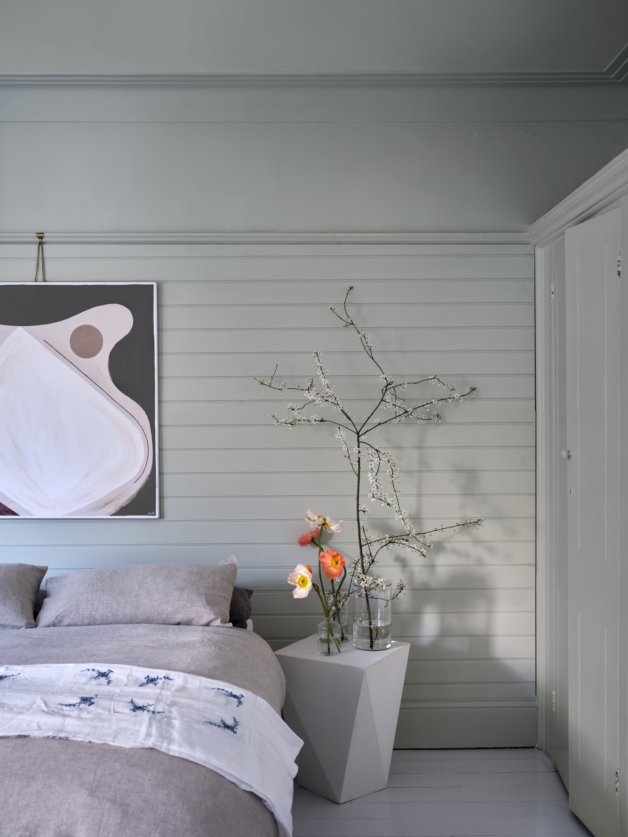
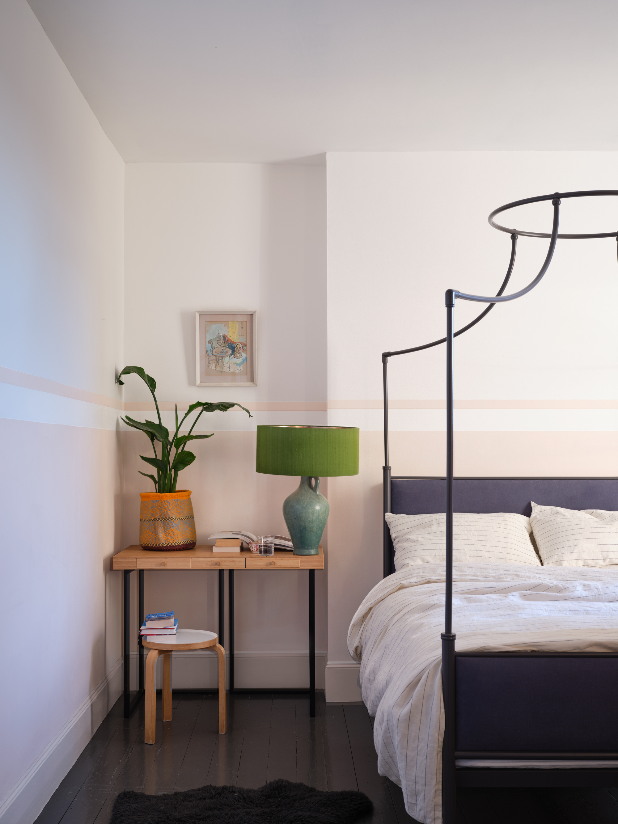
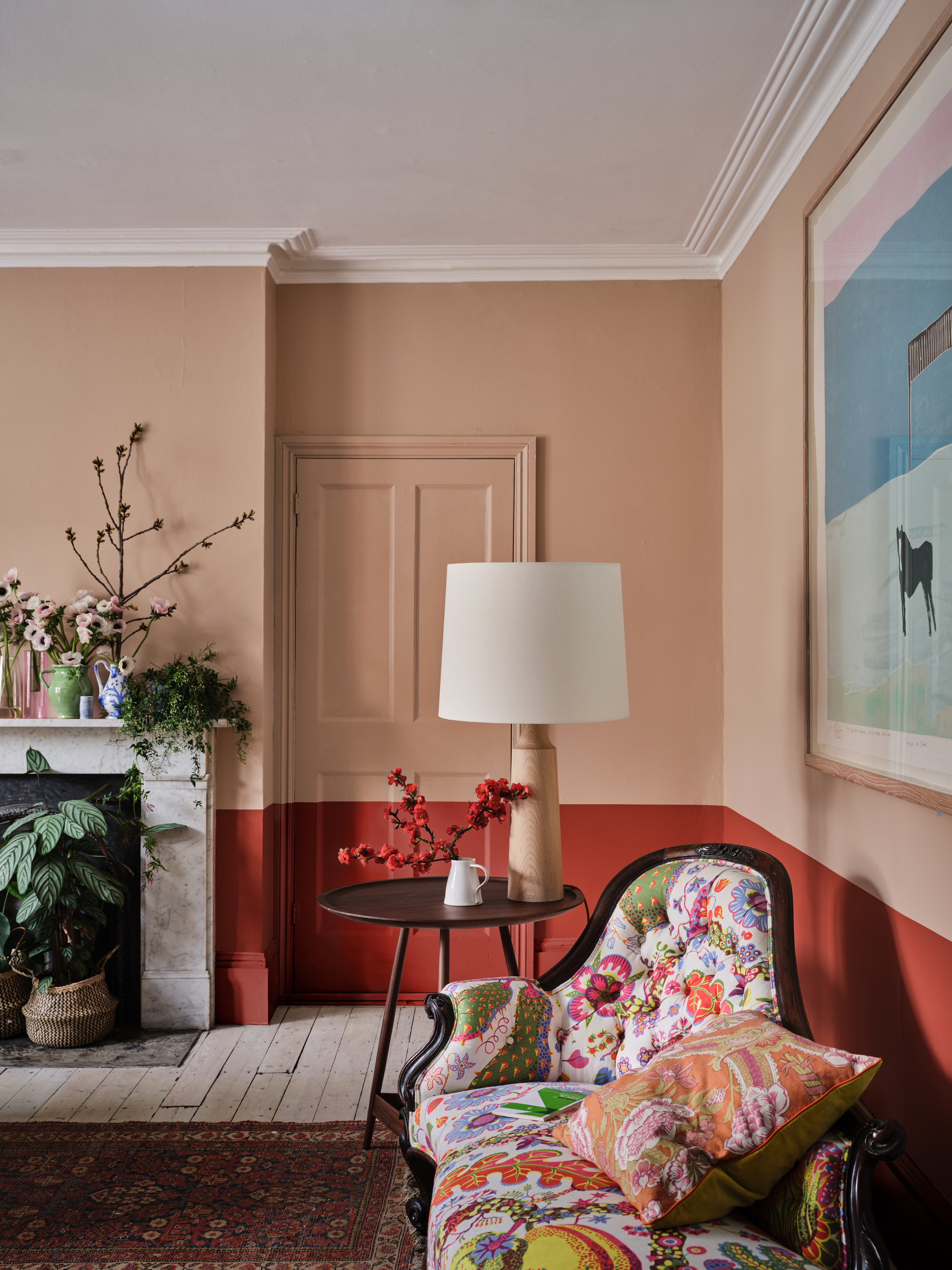
The article discusses the growing popularity of brown tones in modern interior design, particularly highlighting Farrow & Ball's 'Broccoli Brown' paint color. This shade is described as a muted, mid-tone hue that brings depth, dimension, and a sense of calm to a space. However, it can be challenging for everyday decorators to use effectively. The piece aims to provide expert advice on how to integrate this trending color into various home settings, drawing insights from color experts and designers.
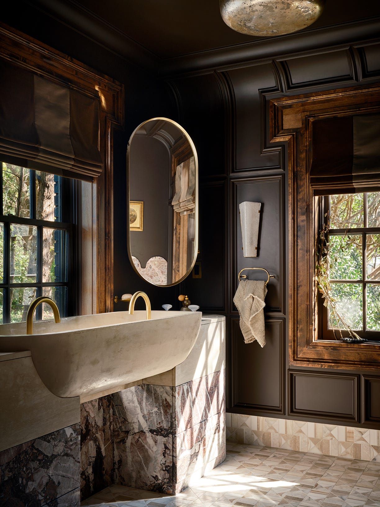
According to Patrick O’Donnell, International Brand Ambassador at Farrow & Ball, brown, in all its forms, is effortlessly chic and acts as a fantastic neutral. He specifically praises 'Broccoli Brown' for its 'softness,' noting that despite its relatively dark, mid-weight tone, it serves as an excellent backdrop for various complementary shades, fabrics, or artwork, creating a 'cosseting ambiance.' Alison Damonte, founder of Alison Damonte design studio, points out that 'Broccoli Brown' is a great brown because it contains a subtle hint of green, making it appear more neutral compared to other browns that often have red undertones.
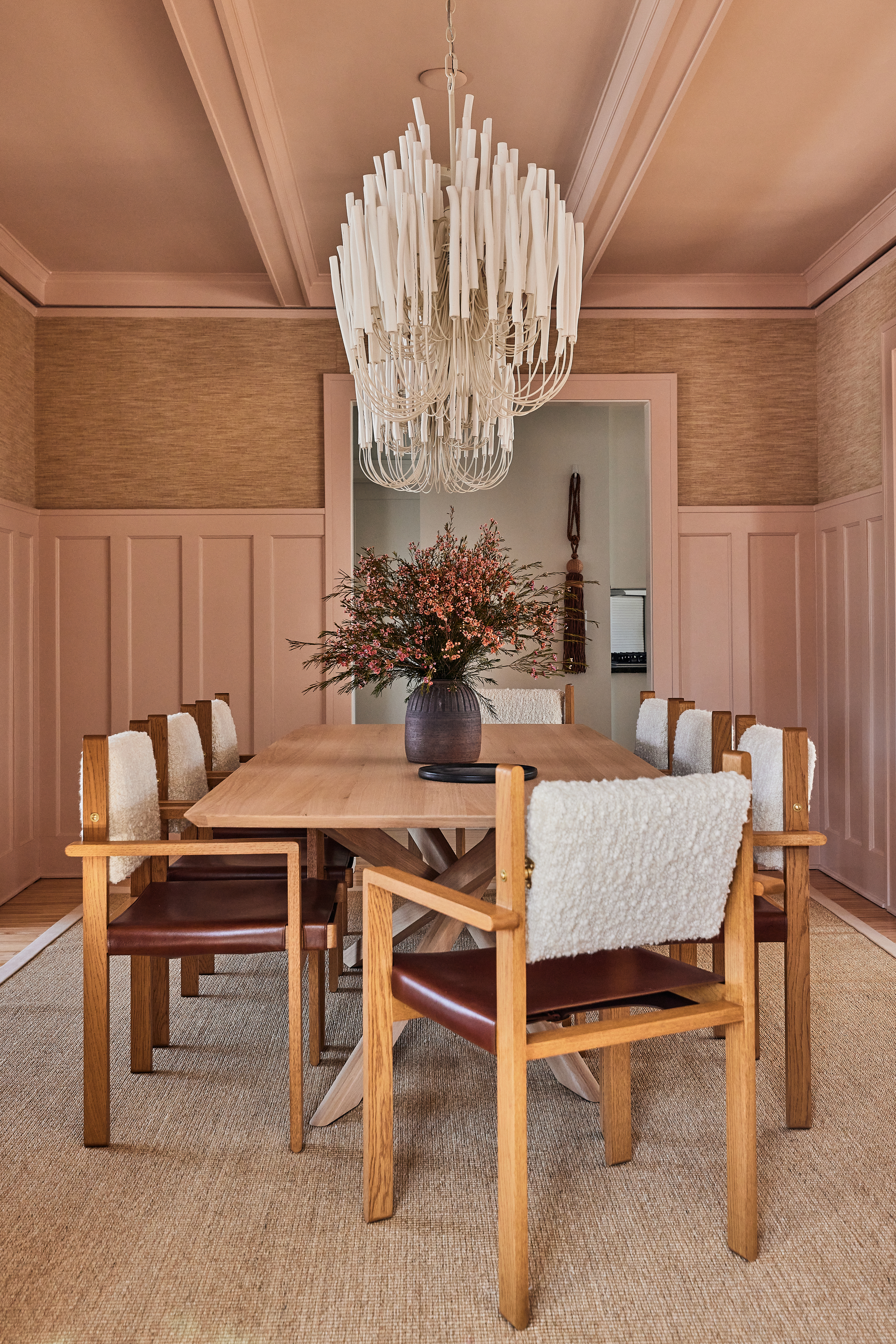
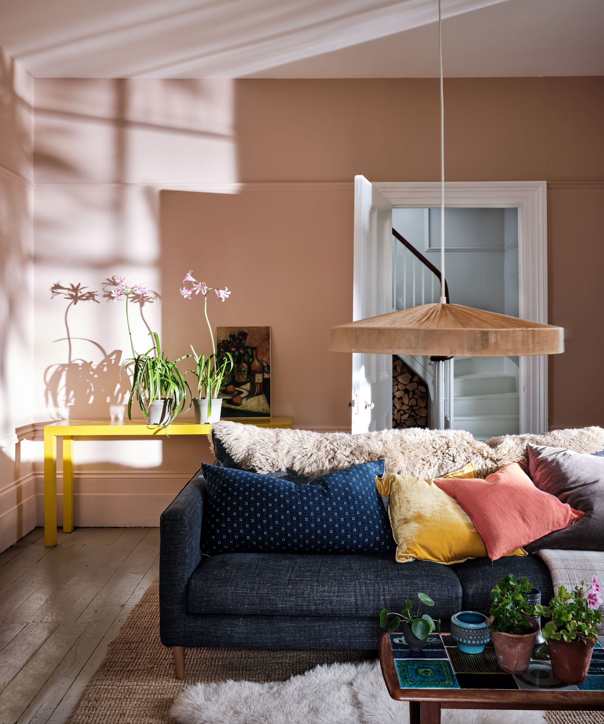
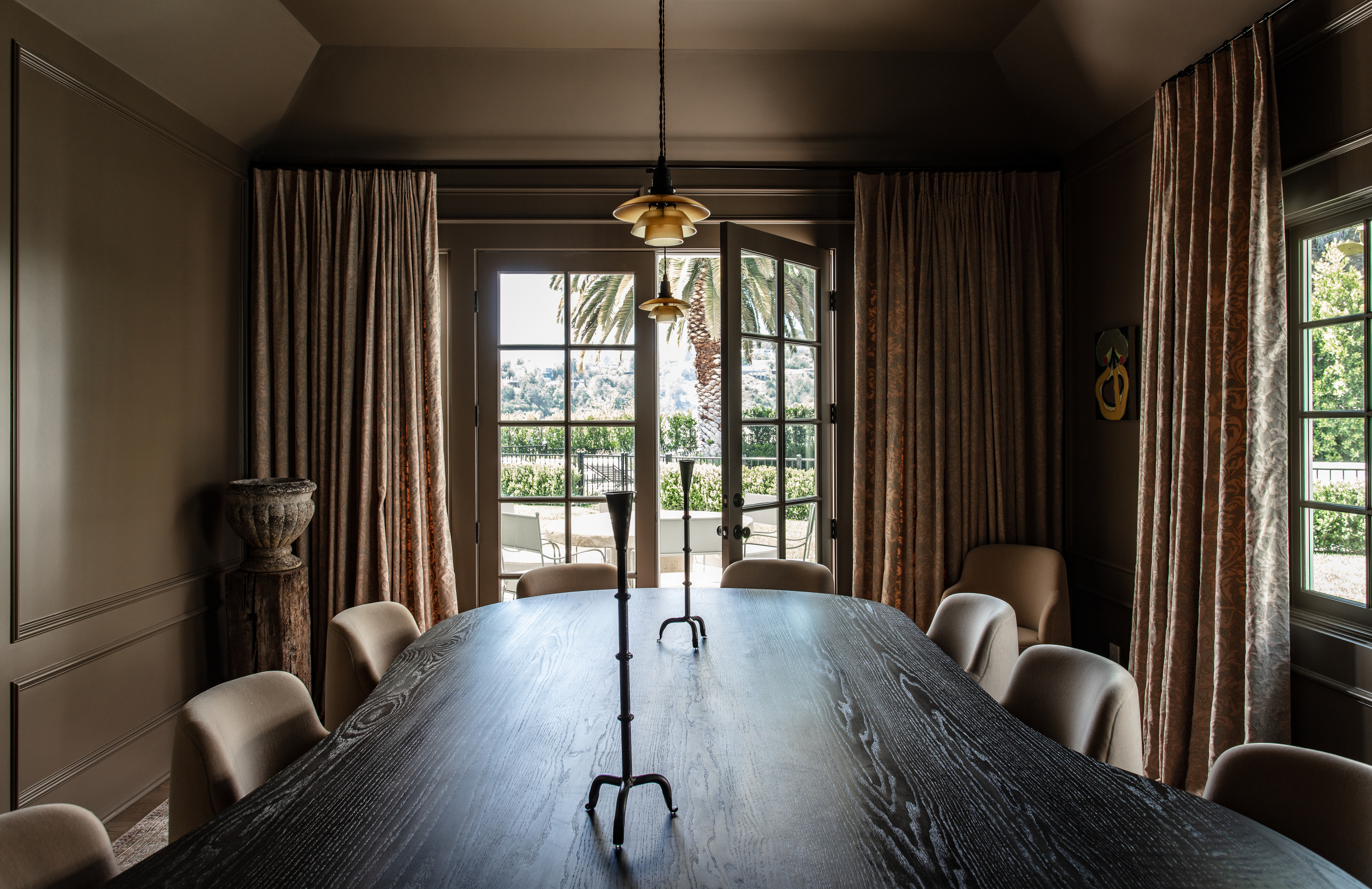
Regarding the mood this paint color creates, experts suggest that its restrained, understated, yet elegant quality can foster a deeply pensive atmosphere. This makes it an ideal choice for intimate spaces such as bedrooms, dining rooms, or studies. The color can be applied to both walls and ceilings to create an enveloping, 'warm hug' sensation. Jake Arnold, founder of Studio Jake Arnold, shares that he used 'Broccoli Brown' in a dining room to evoke a feeling of warmth and coziness.

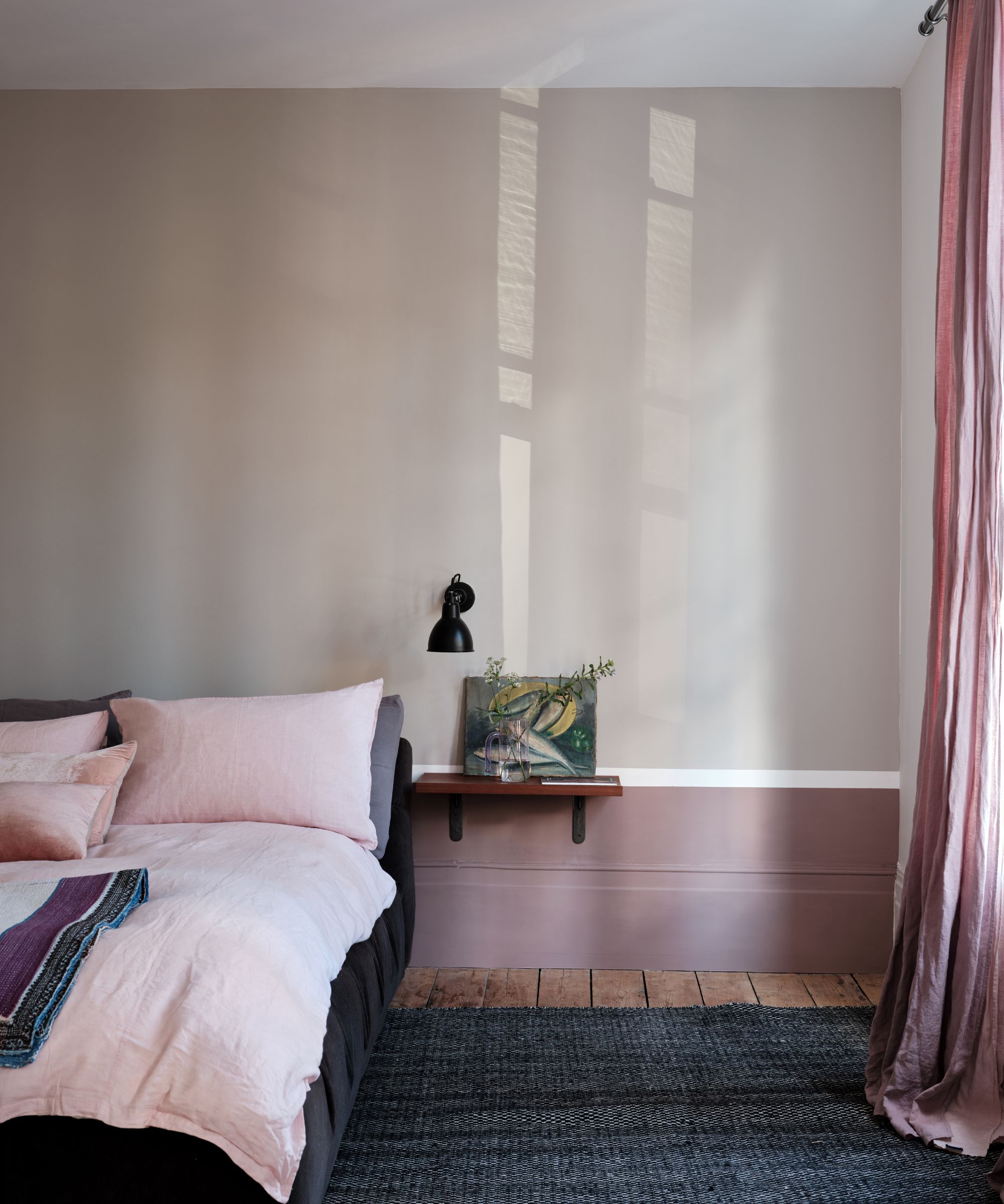

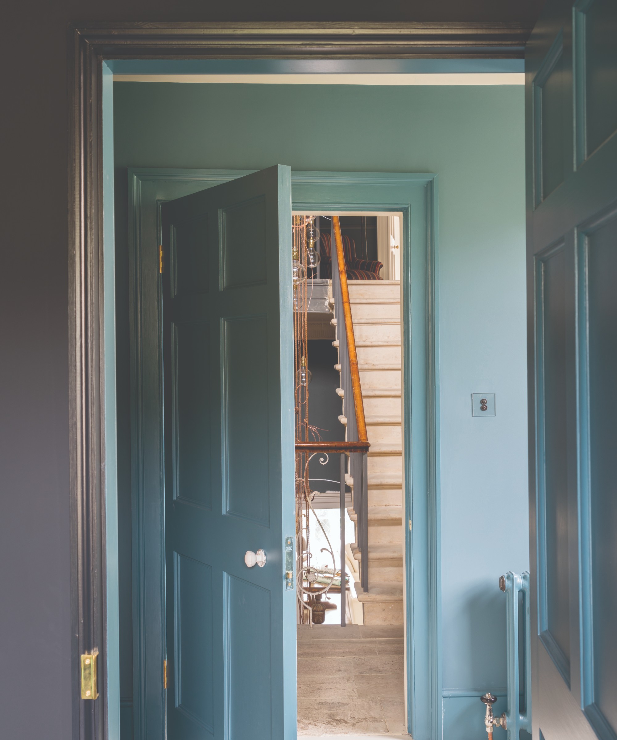
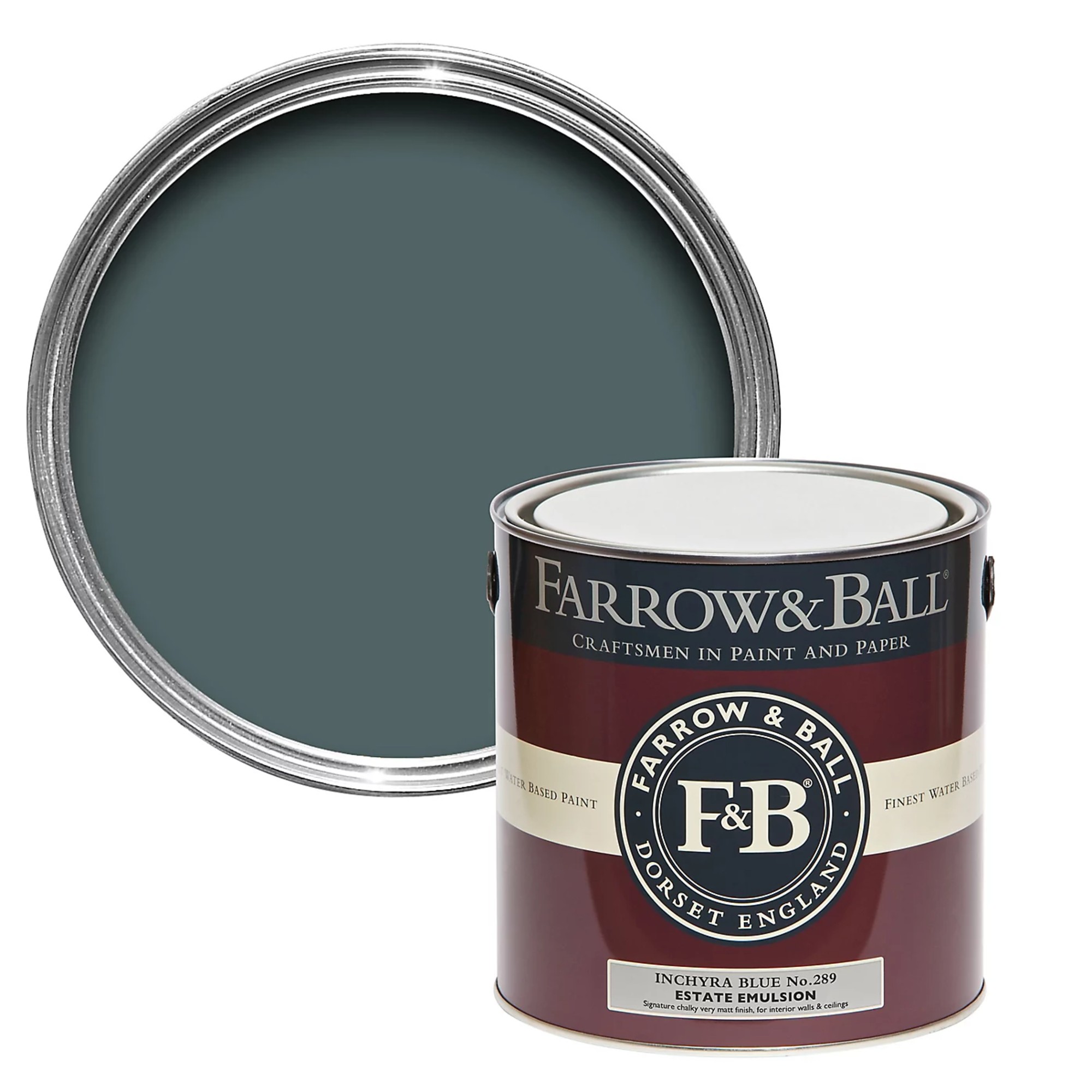
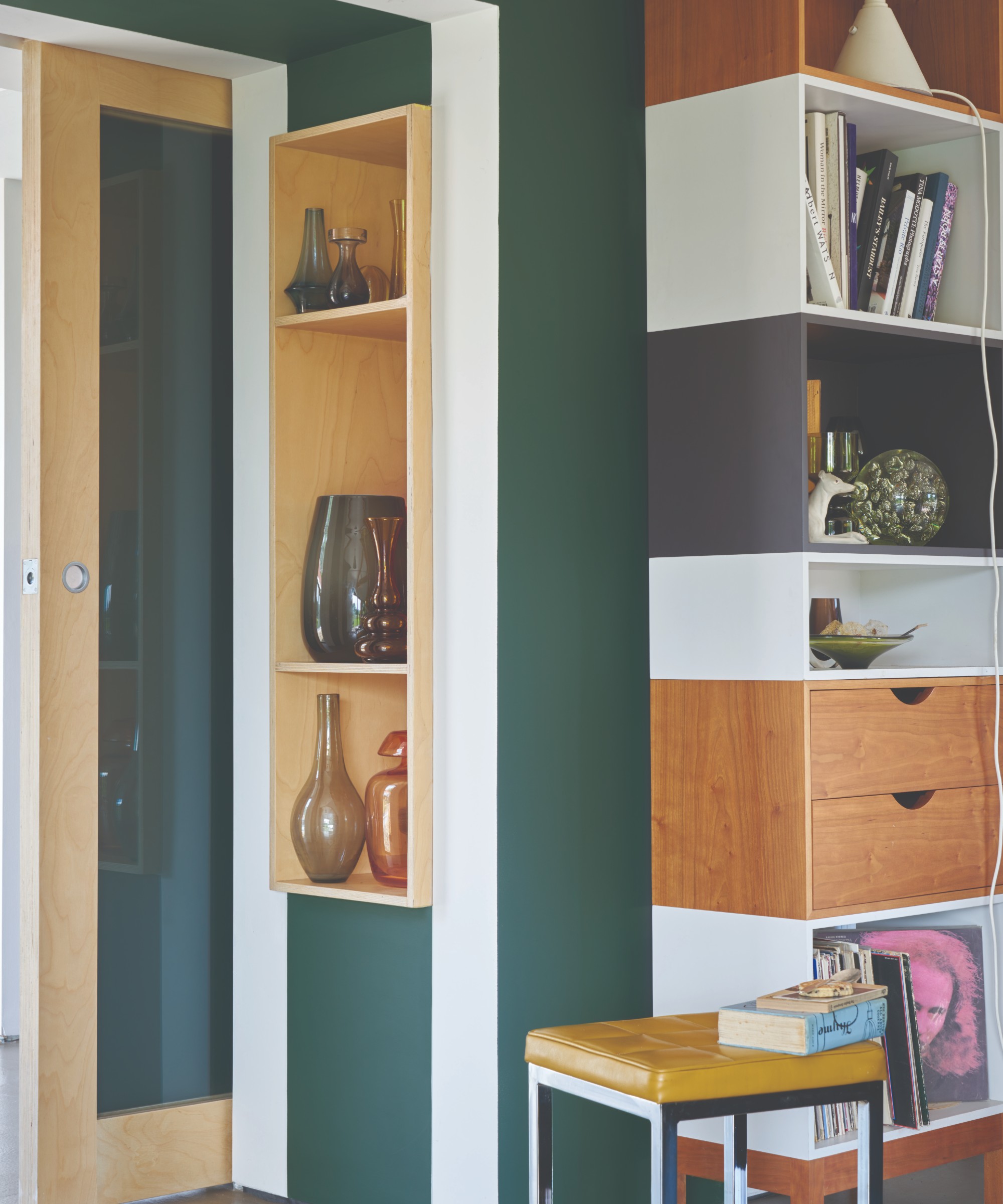
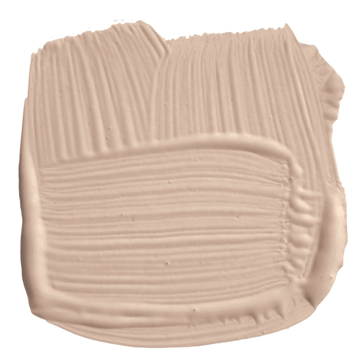
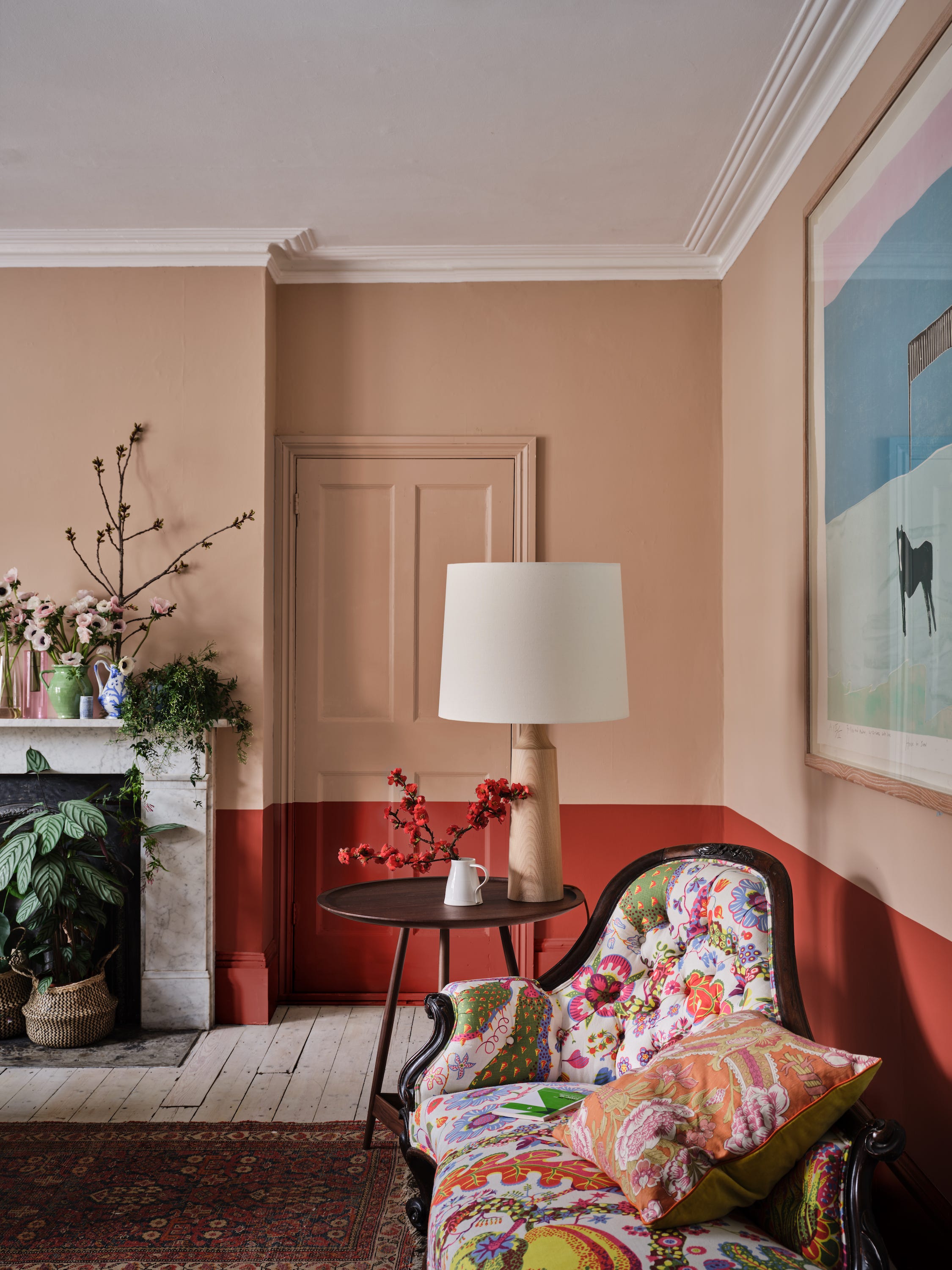
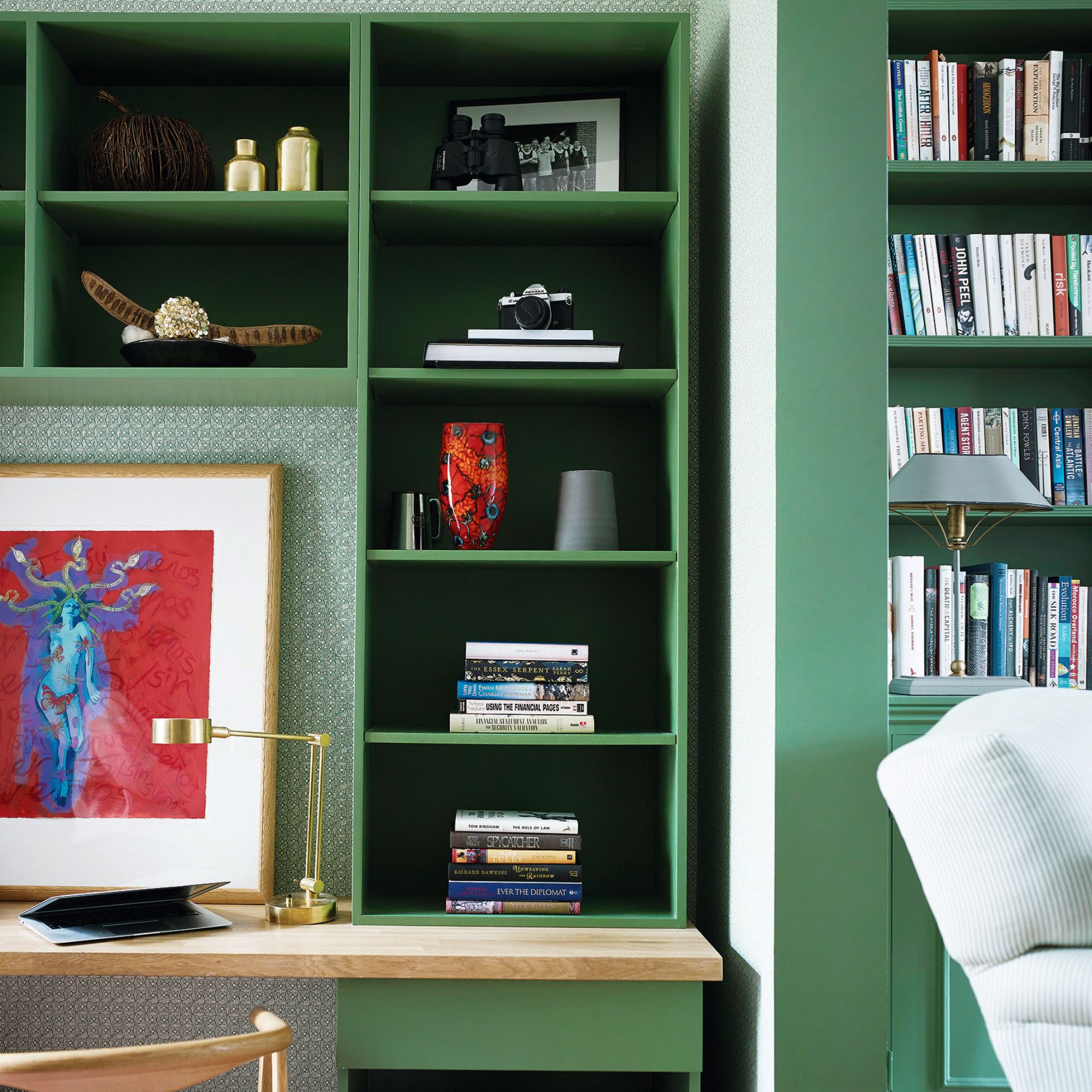
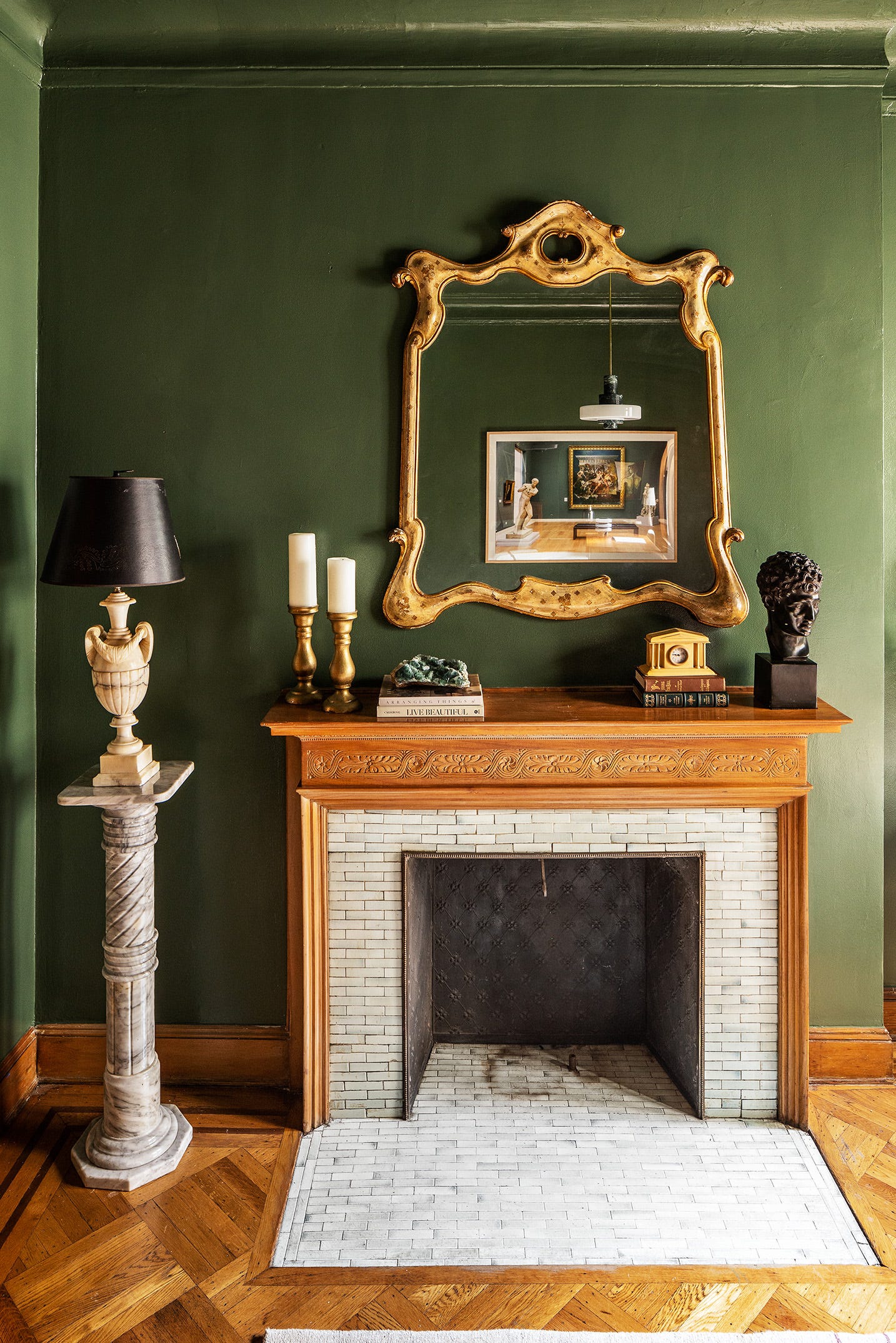
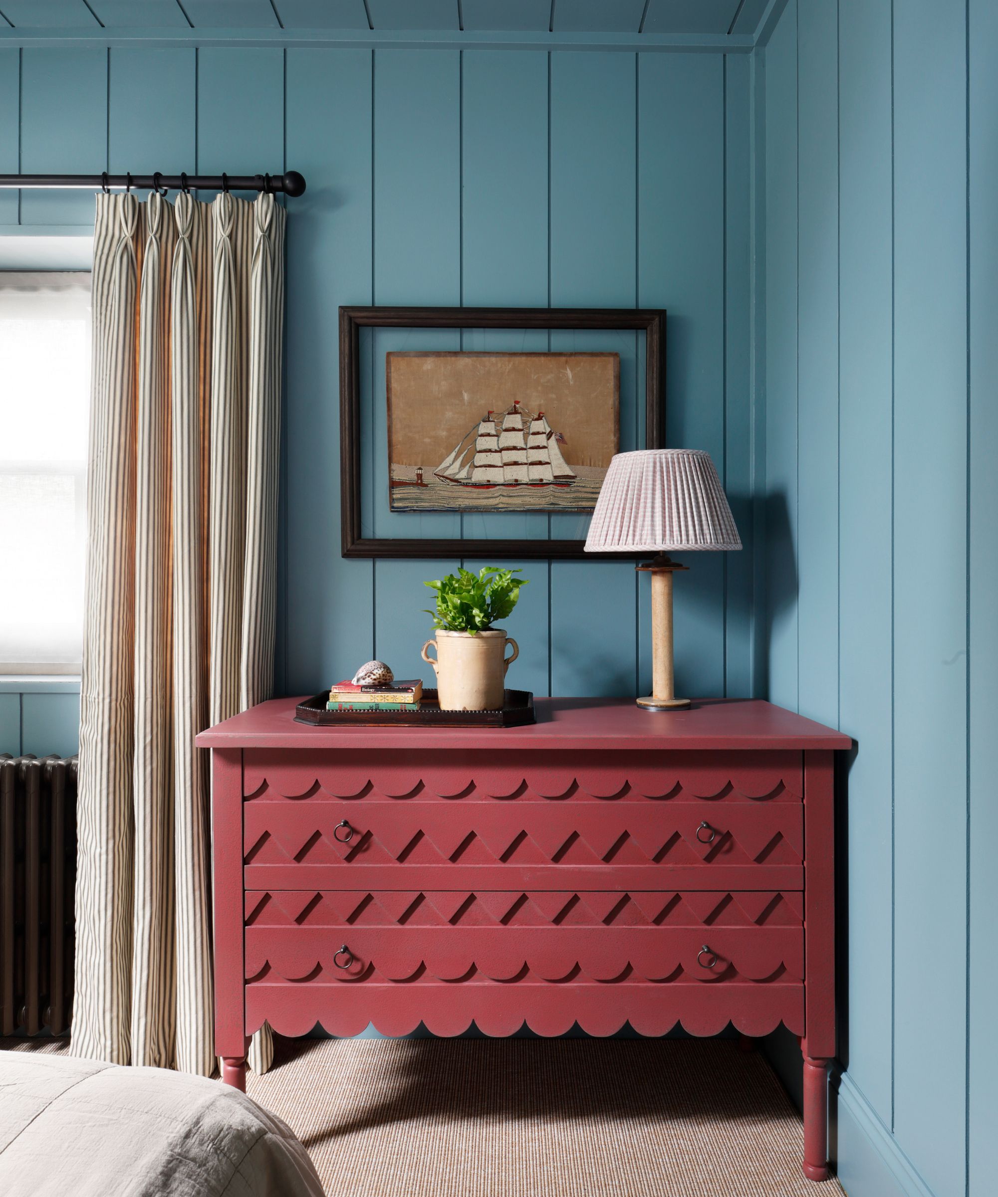
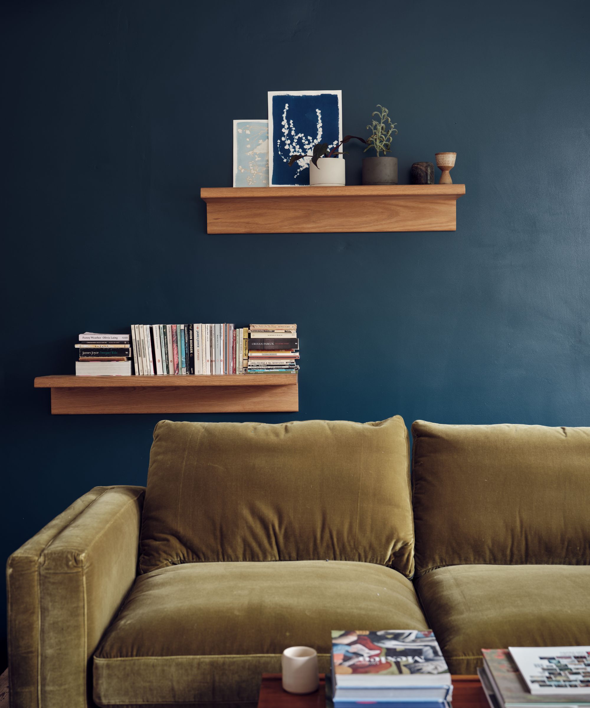
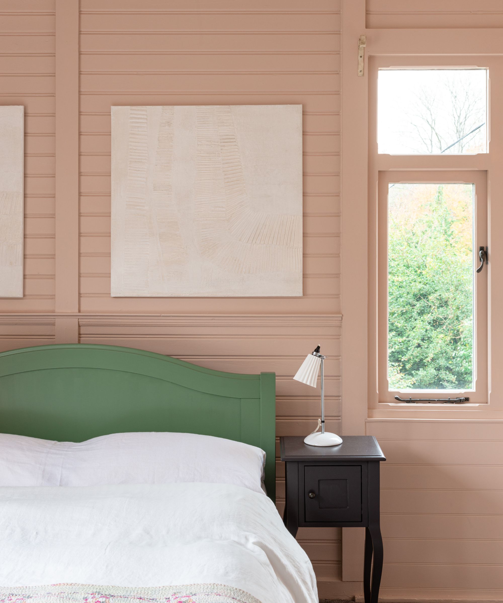
For color pairings, Patrick O’Donnell recommends mixing 'Broccoli Brown' with a verdant green like 'Yeabridge Green' for added vibrancy, especially for elements like fitted bookcases. Alternatively, pairing it with dusty pinks such as 'Setting Plaster' can create a dreamy bedroom palette. For a more dramatic effect, he suggests incorporating a gun-metal blue for woodwork, like 'Inchyra Blue,' to achieve a calming yet elegant hallway.
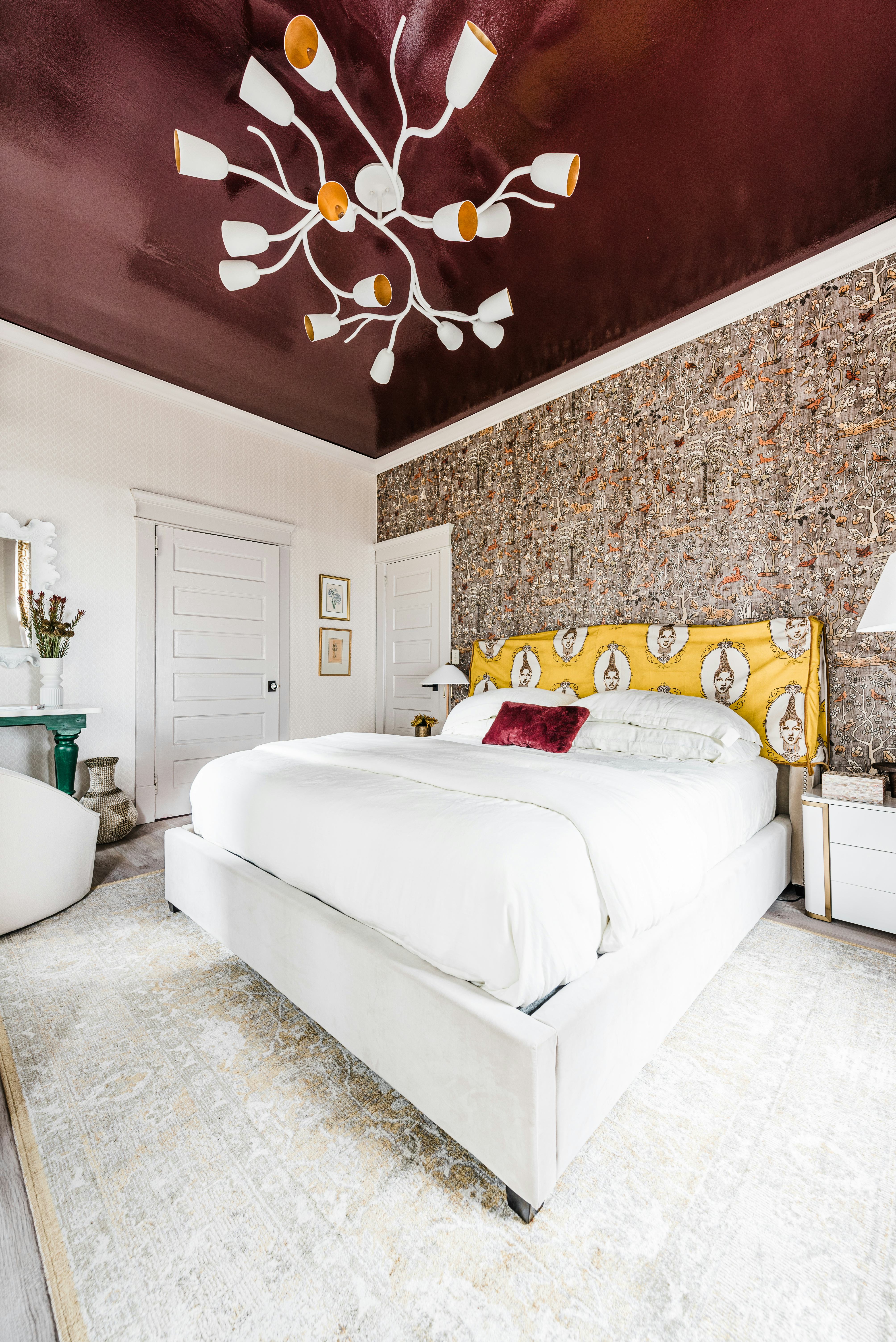
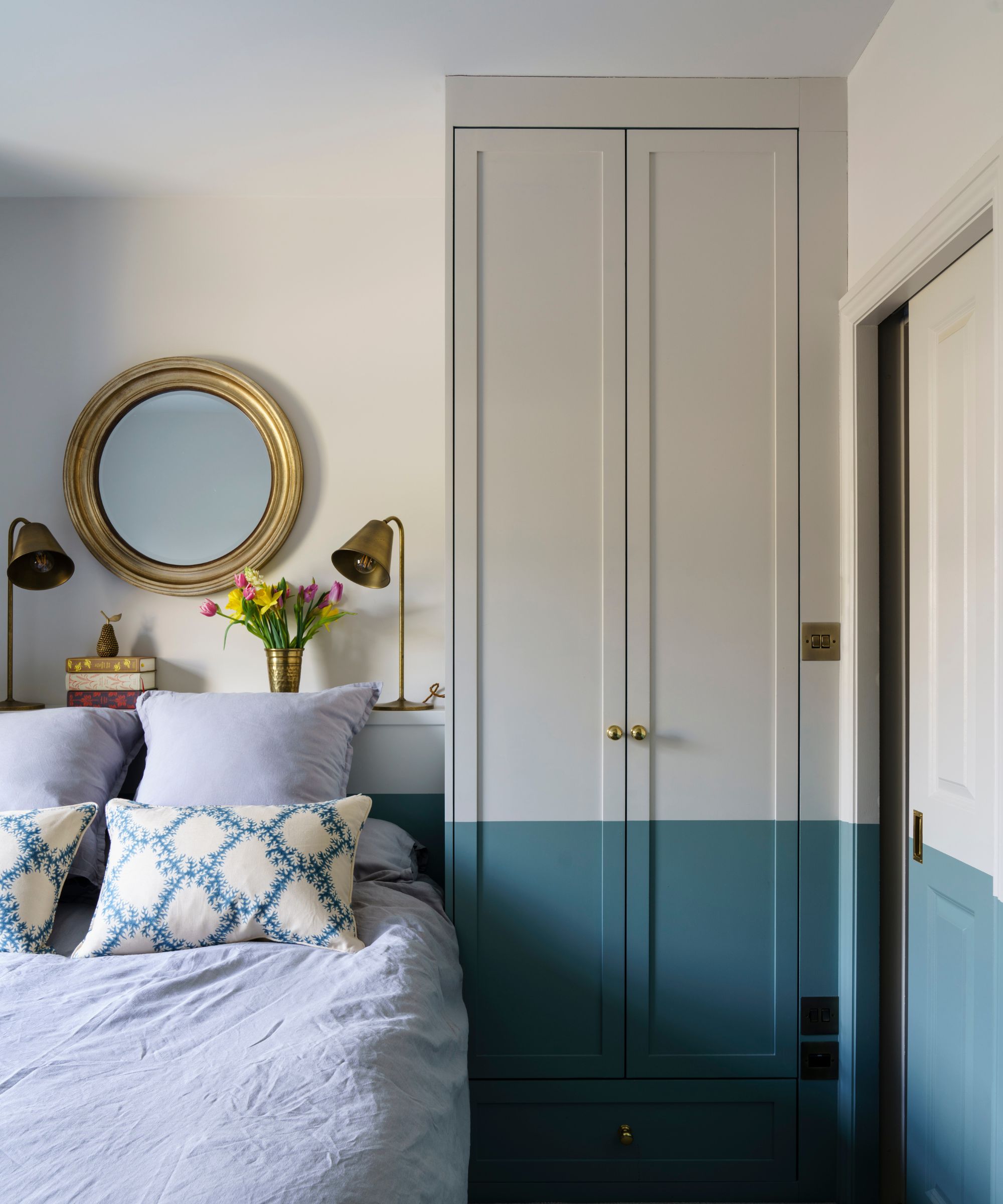
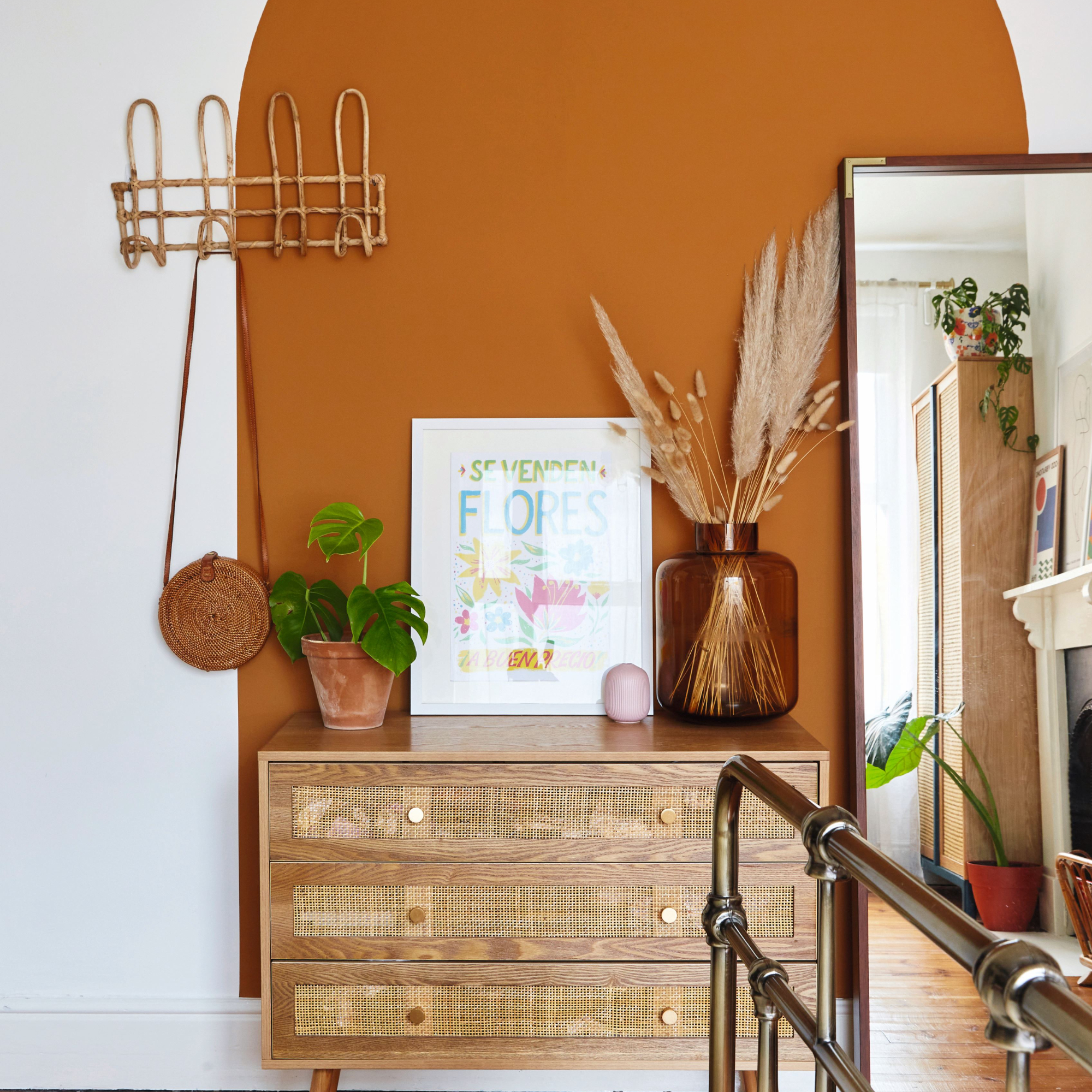
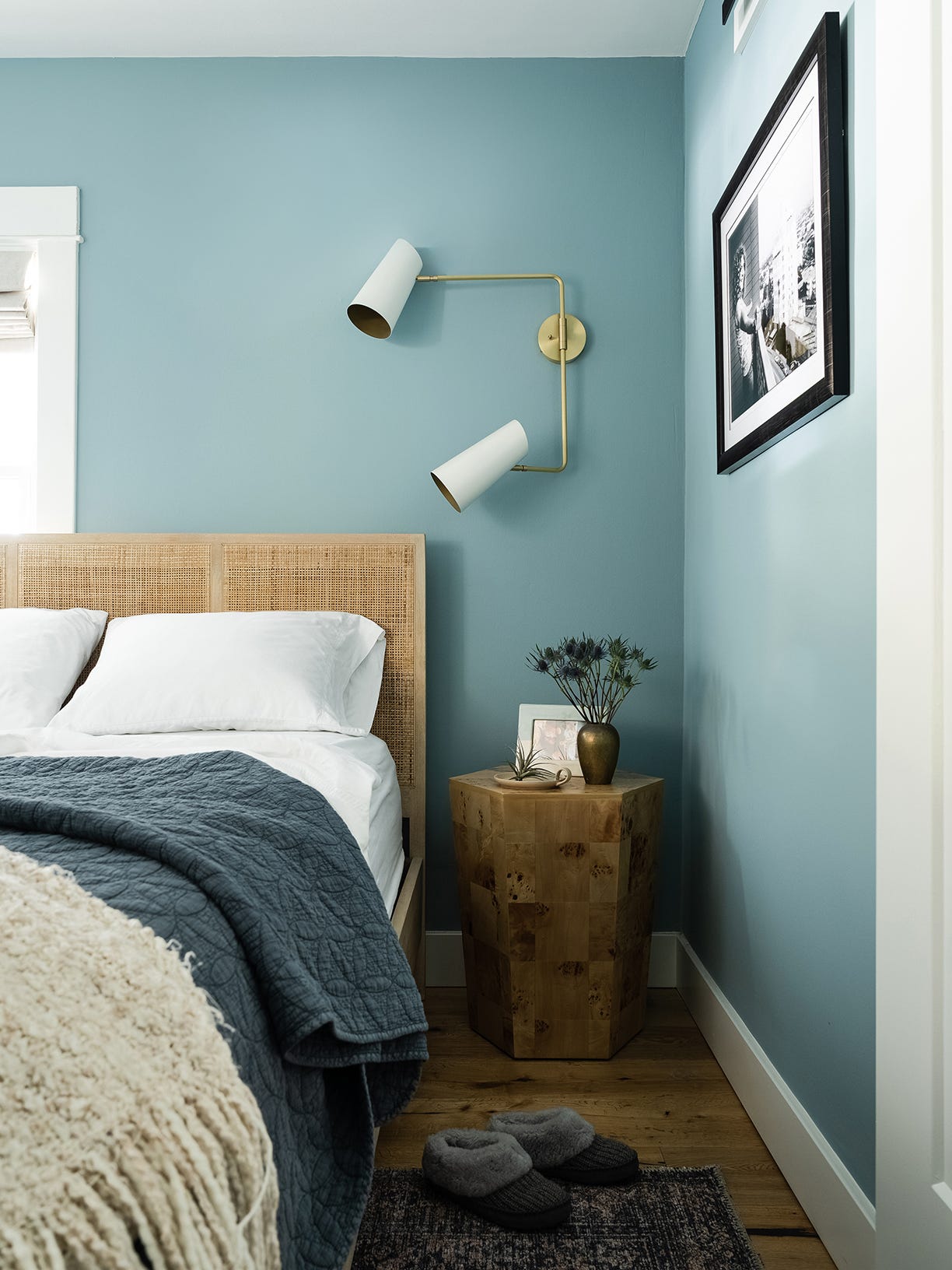
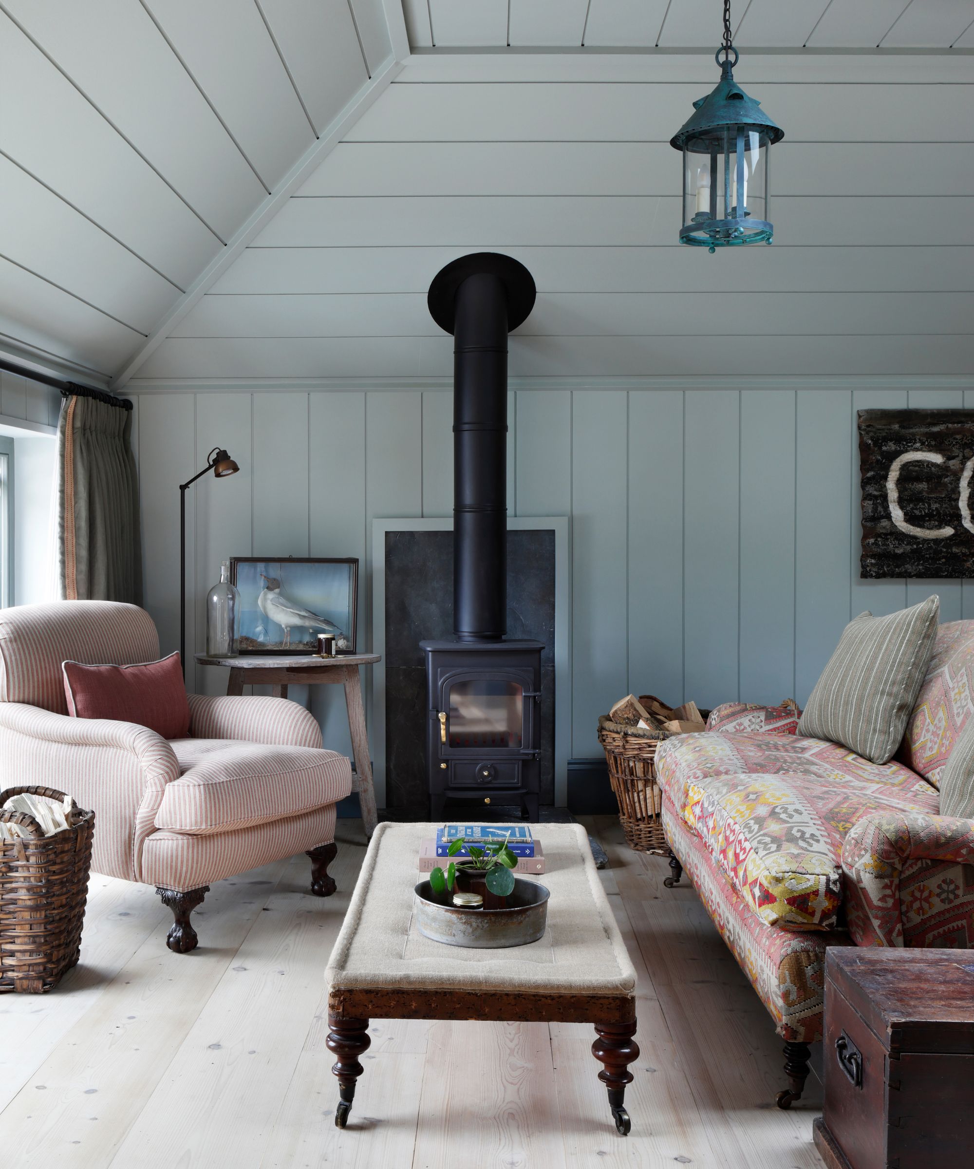
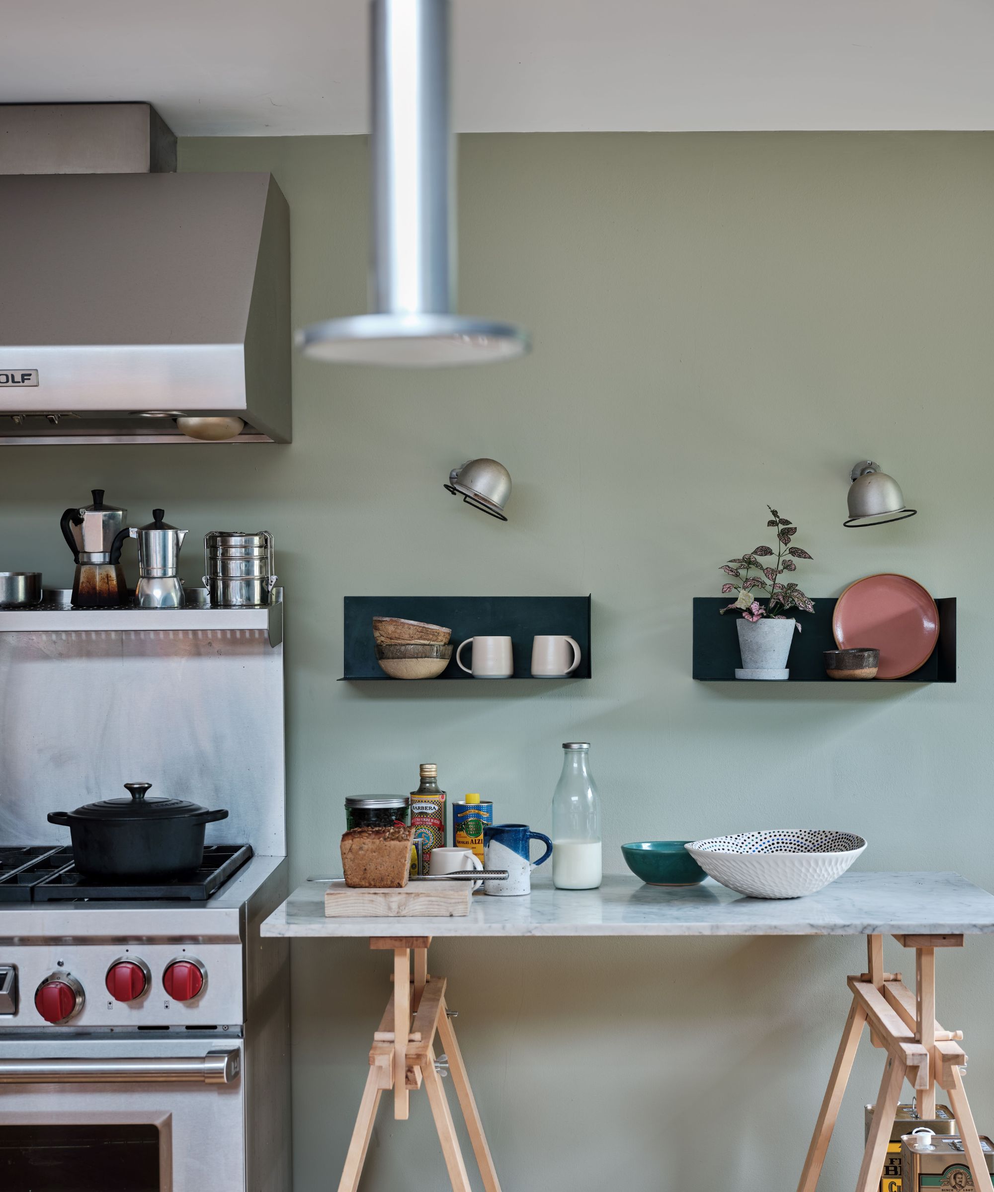
When it comes to application, Patrick suggests that 'Broccoli Brown' is versatile enough for almost any room, from utilitarian boot rooms (where it can be used all-over) to hallways, bedrooms, living rooms, and even as a sophisticated option for kitchen cabinetry, possibly mixed with a drab _eau de nil_ like 'Blue Gray' on walls. Alison Damonte recounts using the color in a small bedroom with limited natural light, where painting both walls and ceiling in 'Broccoli Brown' created a cozy, cocoon-like feeling ideal for sleeping. This approach also allowed a vintage Paco Rabanne screen to reflect light without overpowering the small room.
The article also advises on paint finishes: for more public spaces like dining rooms or family rooms, a semi-gloss effect can provide a formal feel and help bounce light. For smaller, private areas such as powder bathrooms or bedrooms, a matte or eggshell finish is recommended to achieve an earthy, subdued touch.
#FarrowAndBall #BroccoliBrown #PaintColors #InteriorDesign #ColorTrends #HomeDecor #ExpertAdvice #DesignTips #EarthyTones #FarrowAndBall #BroccoliBrown #PaintColors #InteriorDesign #ColorTrends #HomeDecor #ExpertAdvice #DesignTips #EarthyTones
0 comment in total
 No comments yet
You may also like
How to Use One of the Trickiest Paint Colors in Your Home

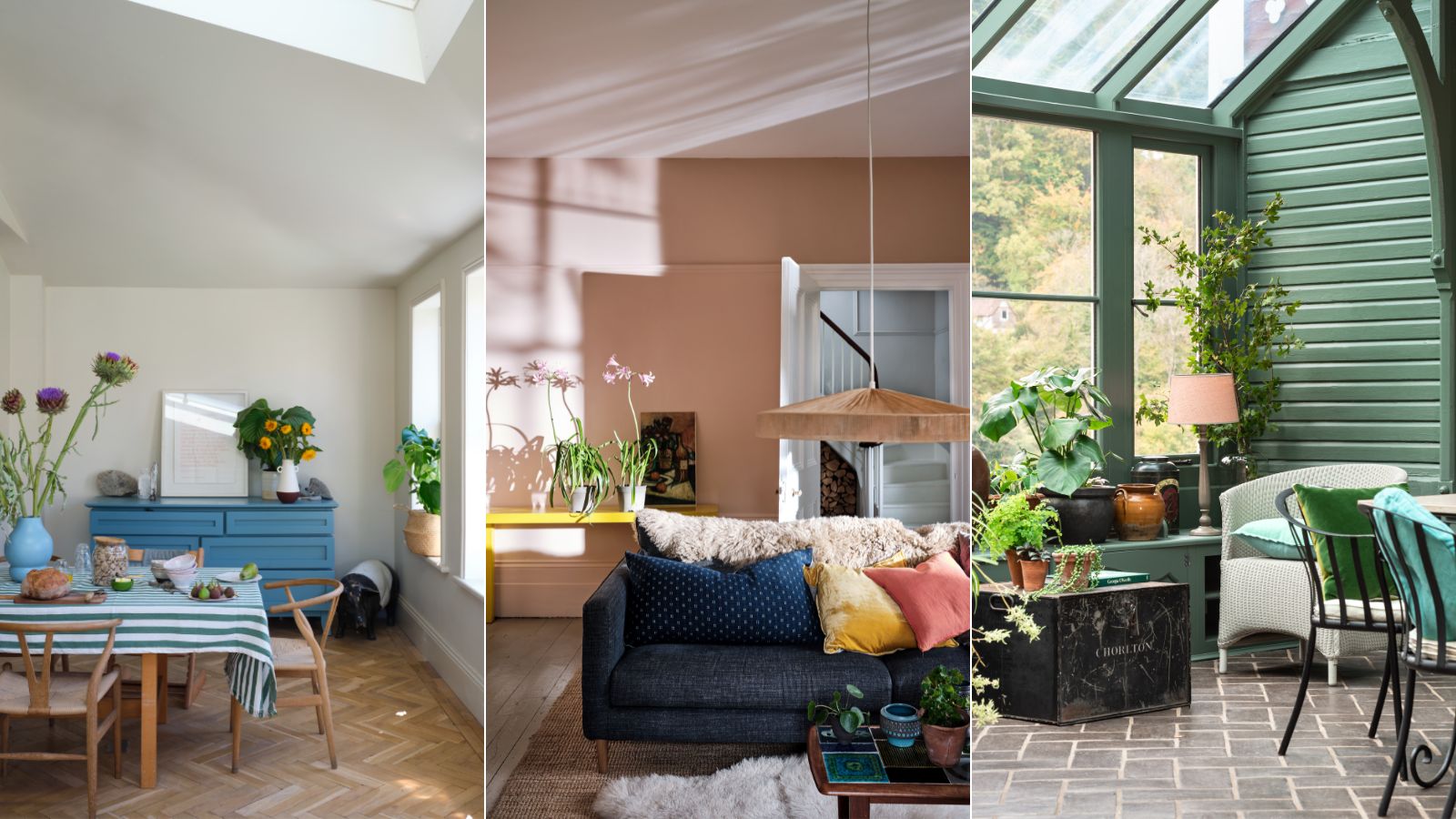
These 10 Farrow & Ball colors are their most popular paints – from earthy neutrals to deep and dark shades

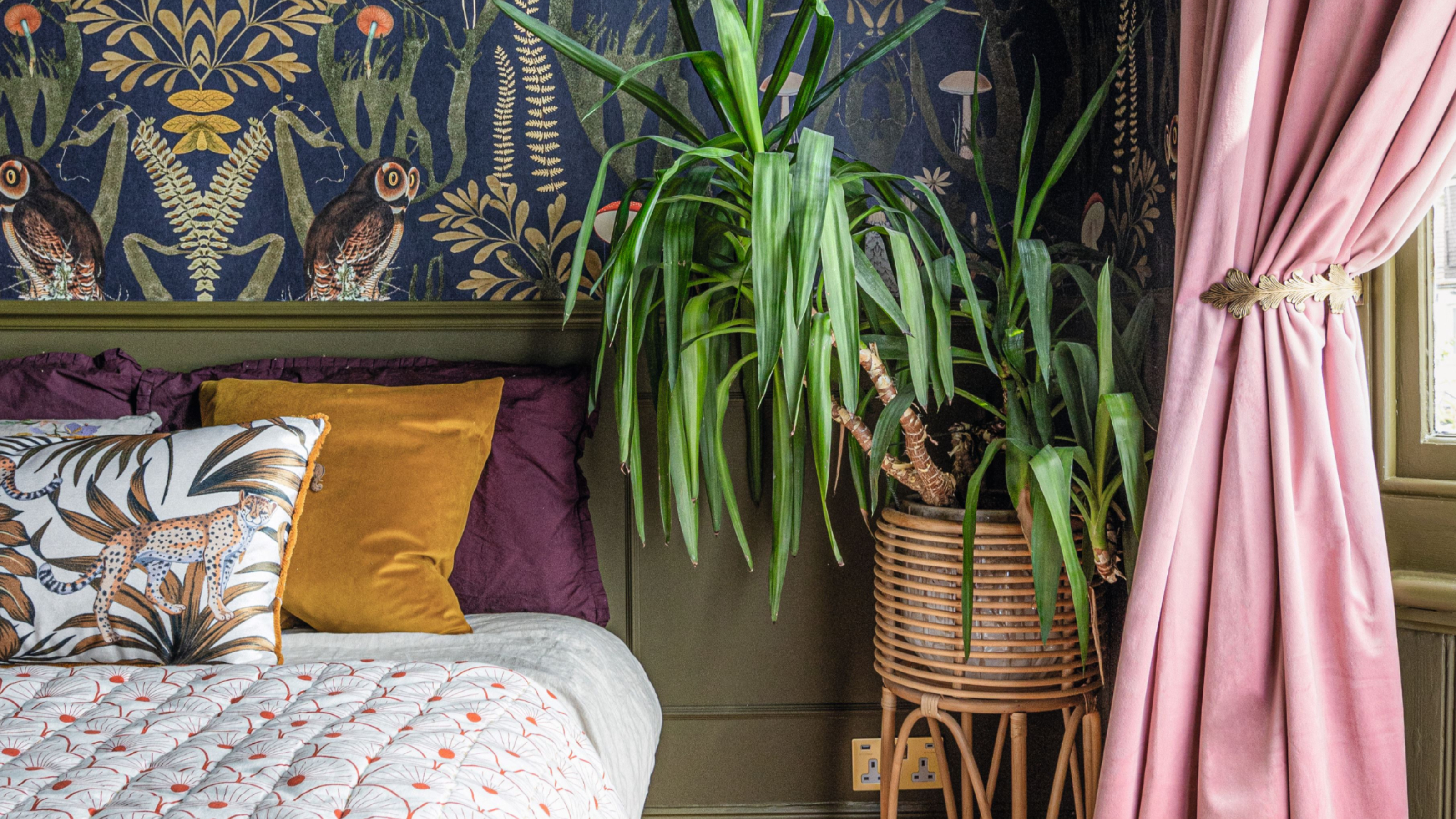
'It's so effective at making your home work harder' – the latest paint trend endorsed by colour gurus
How to Decorate With One of 2018’s Most Popular Colors | domino
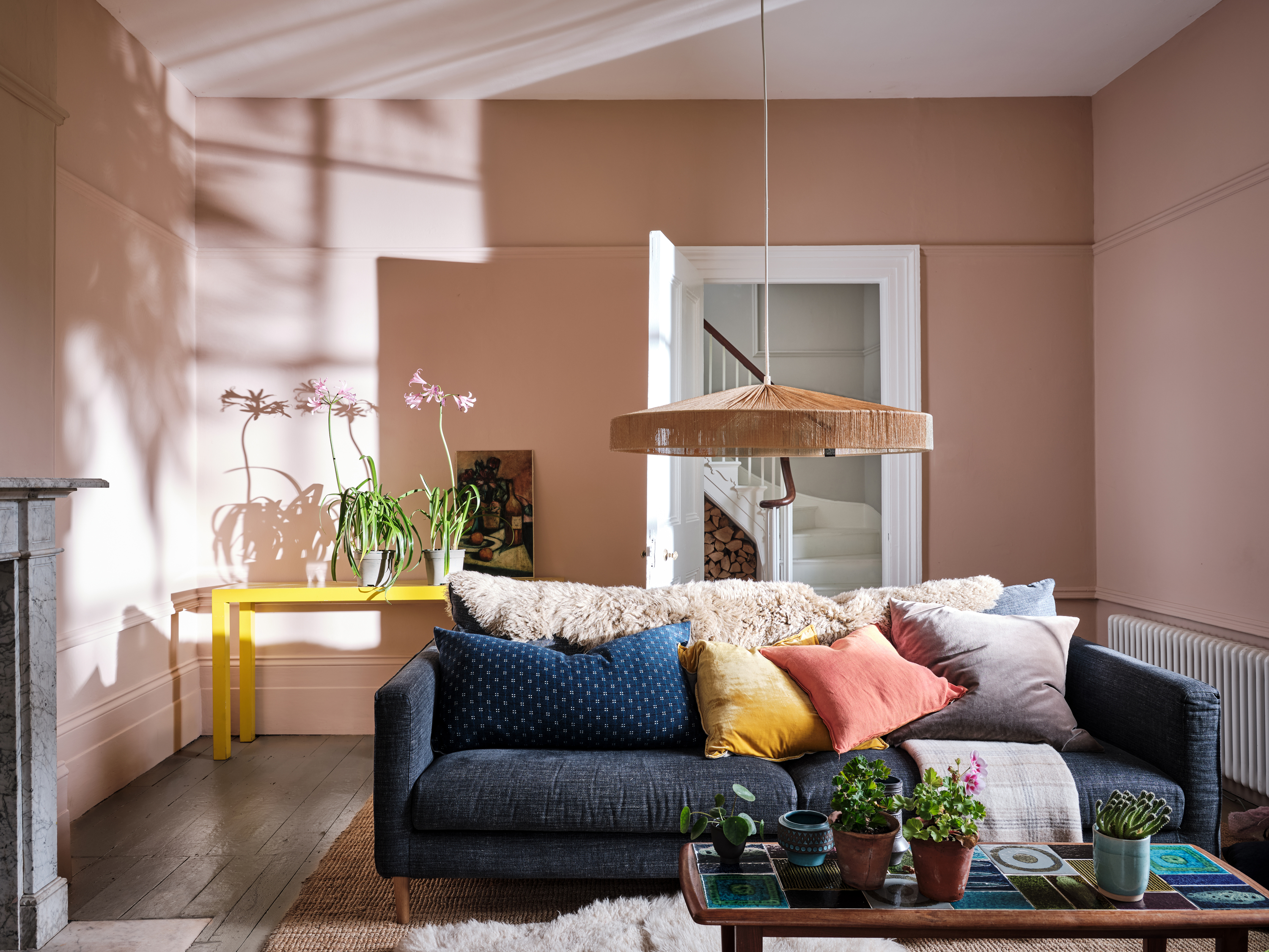
Farrow & Ball Setting Plaster ideas – how to use this muted pink paint color
6 great ways to use colour drenching in your home
Color Drenching Is the Bold Paint Trend Taking Over—Here’s How to Nail It
These are Farrow & Ball's current 'most loved' paints – and how to decorate with them throughout the home
These Unusual Paint Colors May Not Be An Obvious Choice, But Designers Can’t Get Enough
The 10 Best Farrow & Ball Paint Colors of All Time

12 Trending Paint Colors for 2024, According to Design Experts

Primary colours are having a moment - but the secret to styling them is through 'unexpected' touches
How to Nail This Tricky But Surprisingly Trendy Farrow & Ball Paint Color

The 3 best Farrow & Ball paint colours for a hallway – the unexpected shades the experts recommend
15 Farrow & Ball paint colors in real homes – from calming blues to warm neutrals
The top 54 paint colours of the decade – all the shades we couldn't live without
Interior designers' favorite Farrow & Ball paint colors
First look! Farrow & Ball has just released 11 new colours
Farrow & Ball's new colors have just launched – we ask designers how to use this calm, yet colorful palette
How Do Paint Colors Get Their Names?