1/8
Farrow & Ball Setting Plaster ideas – how to use this muted pink paint color
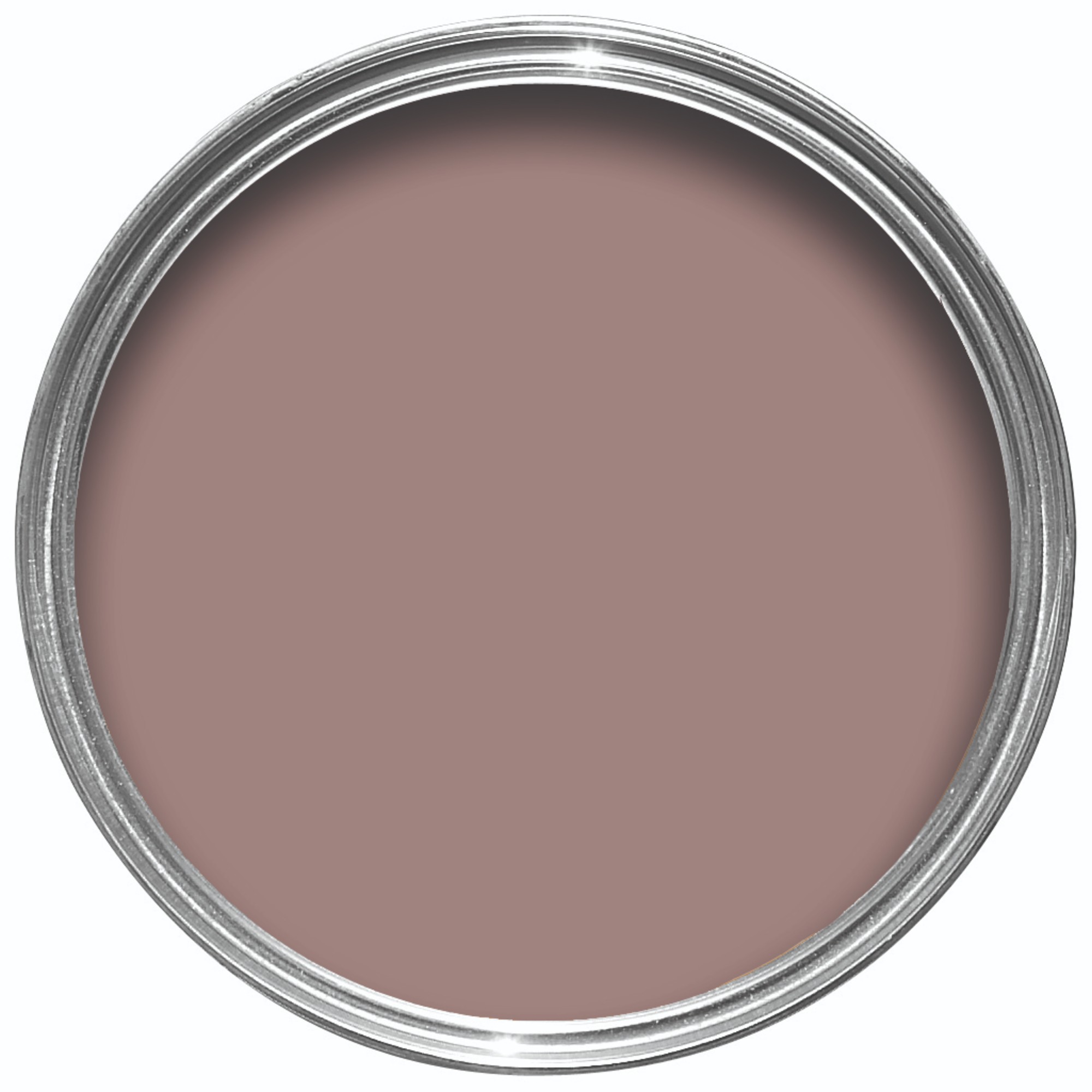
This article provides inspiration and guidance on utilizing Farrow & Ball's 'Setting Plaster' paint color within interior design. Described as a gentle, dusty pink with a lime-washed appearance, the color mimics freshly applied and dried plaster, offering a unique and soft aesthetic. It contains a beautiful yellow pigment, contributing to its inherent warmth and versatility.
The article highlights that 'Setting Plaster' is a favorite among designers due to its ability to act as a wonderful backdrop for antique furniture, walls, ceilings, and joinery without being overwhelming or disappearing within a space. Patrick O’Donnell, brand ambassador for Farrow & Ball, emphasizes its soft and forgiving nature, suggesting it be treated as a neutral. He notes its gentle brown undertones can flatter complexions and bring warmth to rooms lacking natural light.
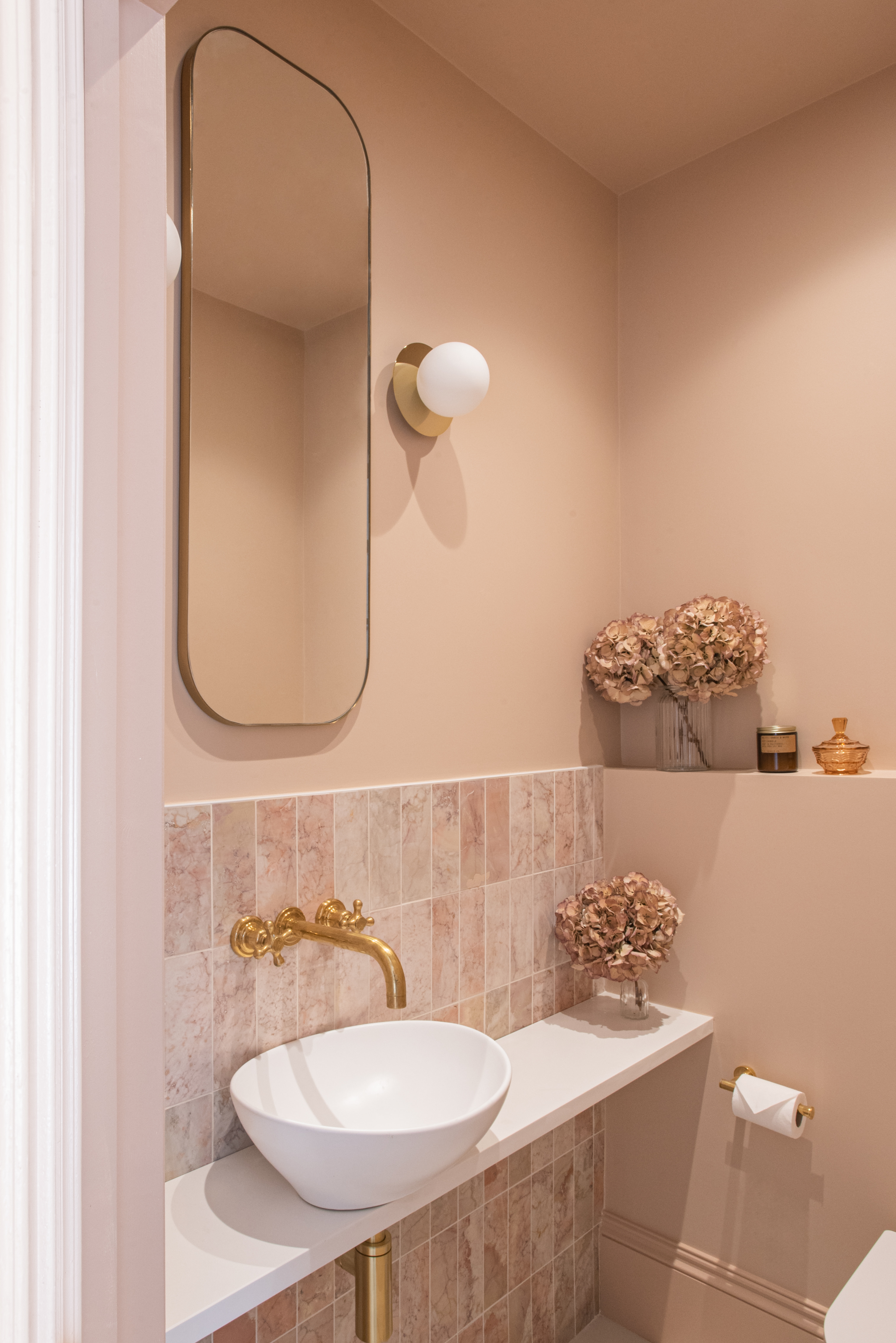
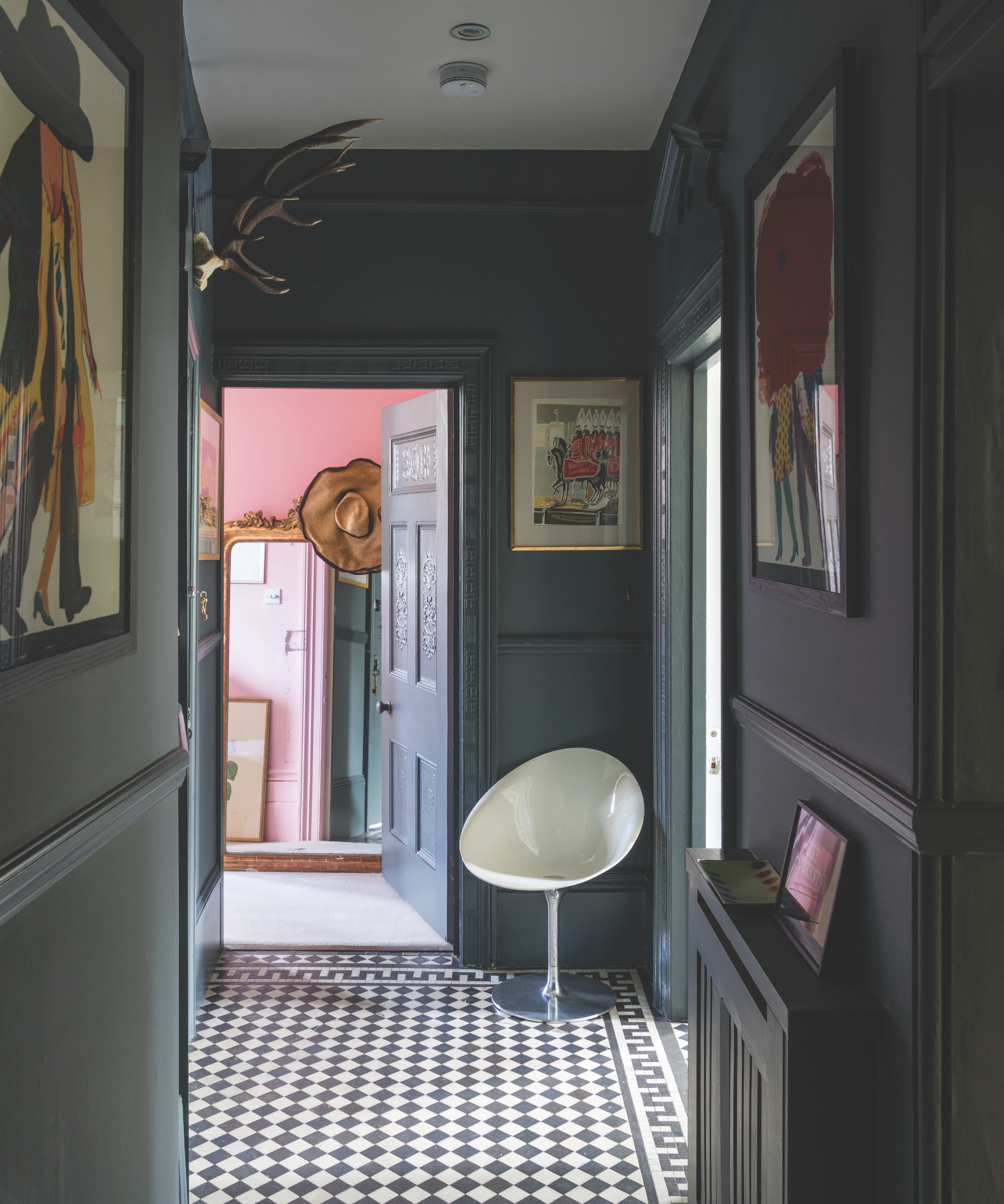
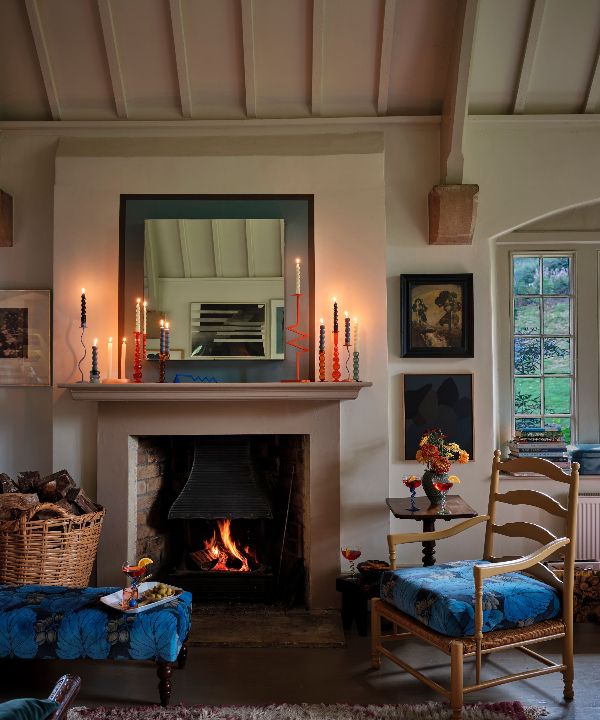
Several specific applications for 'Setting Plaster' are explored. Painting ceilings with this hue is presented as a daring yet effective way to add personality and create a cocooning effect, drenching the room in soft radiance. Interior designers suggest that pink, especially this particular shade, can make skin appear brighter and more luscious. Additionally, soft colors on ceilings can visually expand a room's proportions by drawing the eye upward.
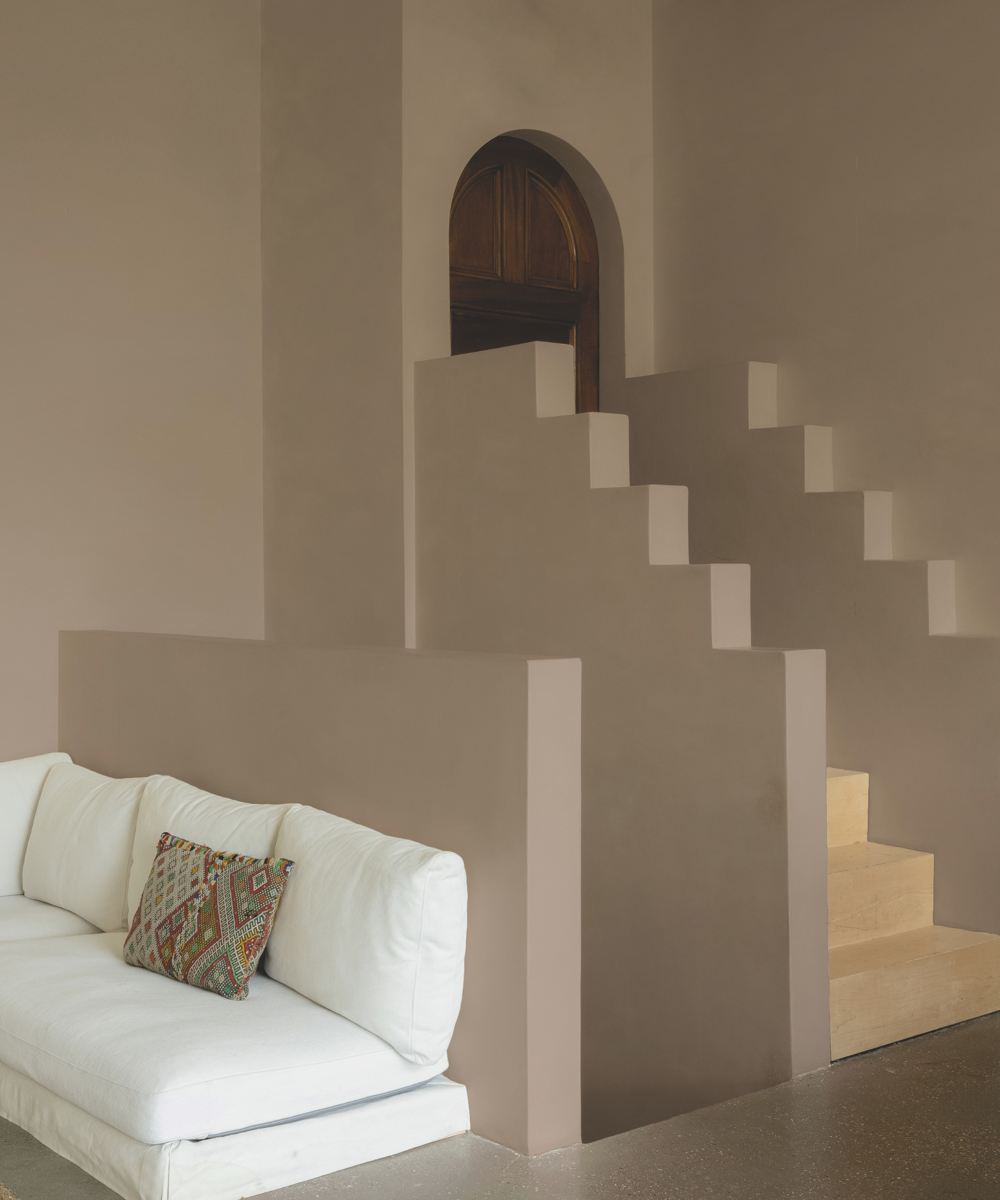
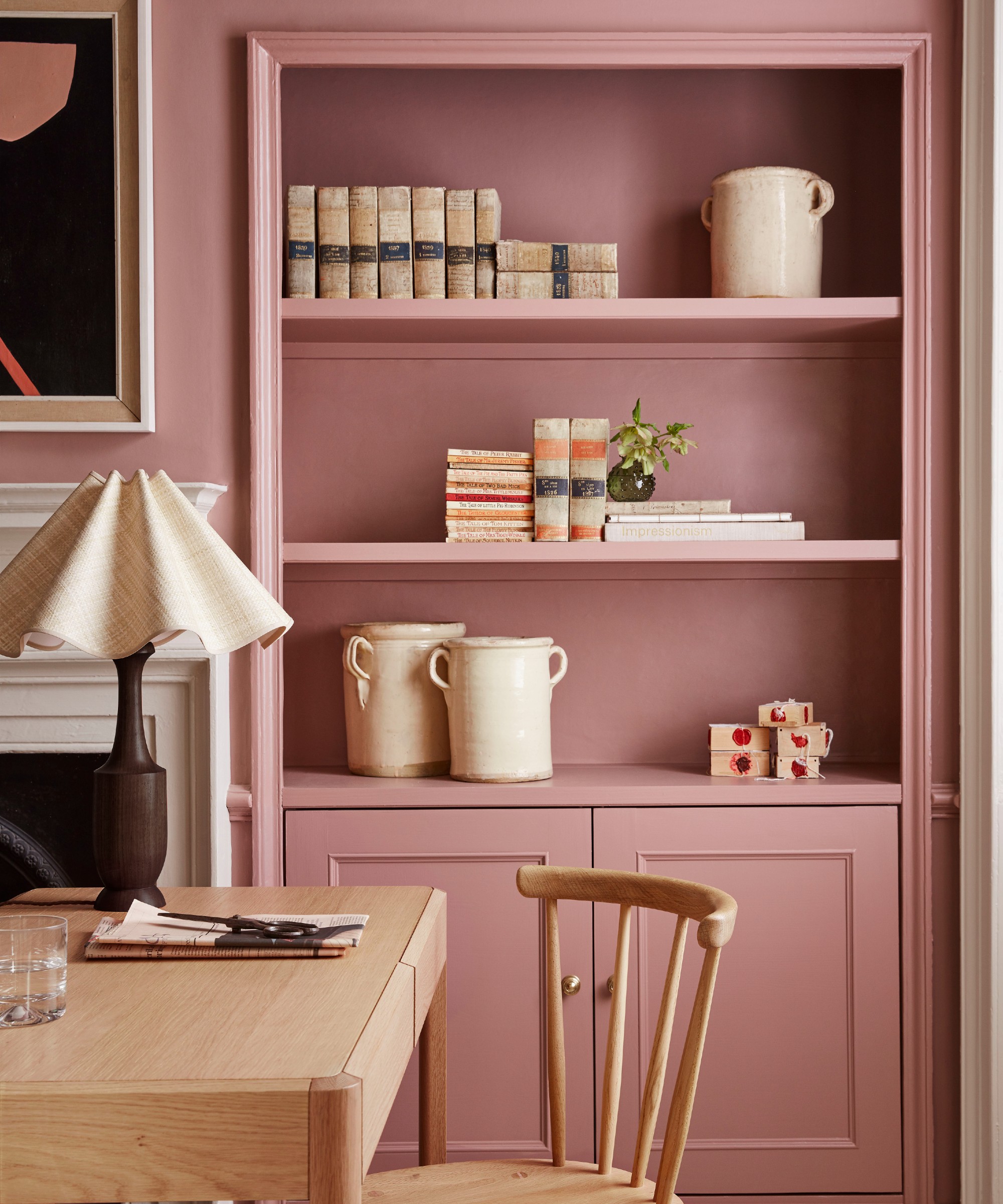
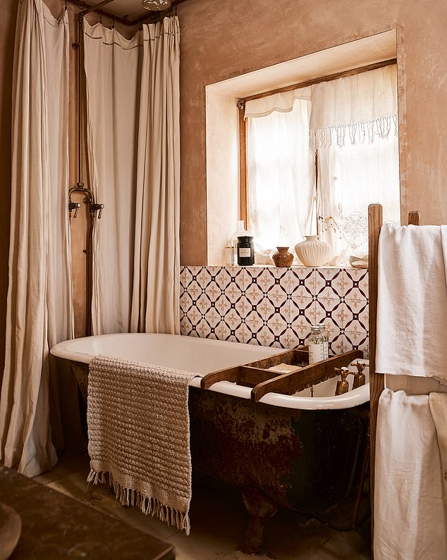
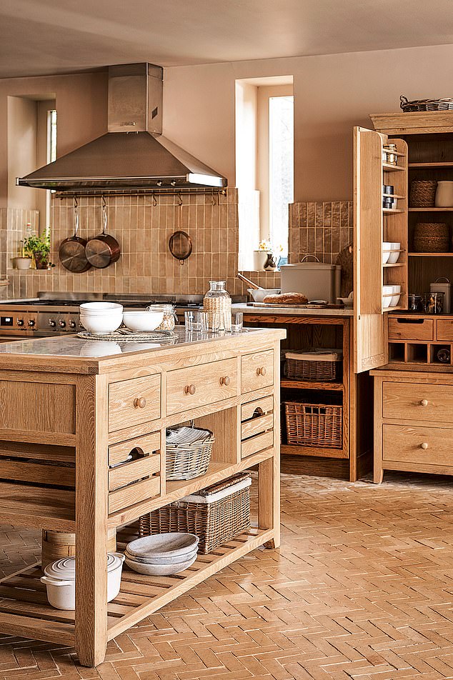
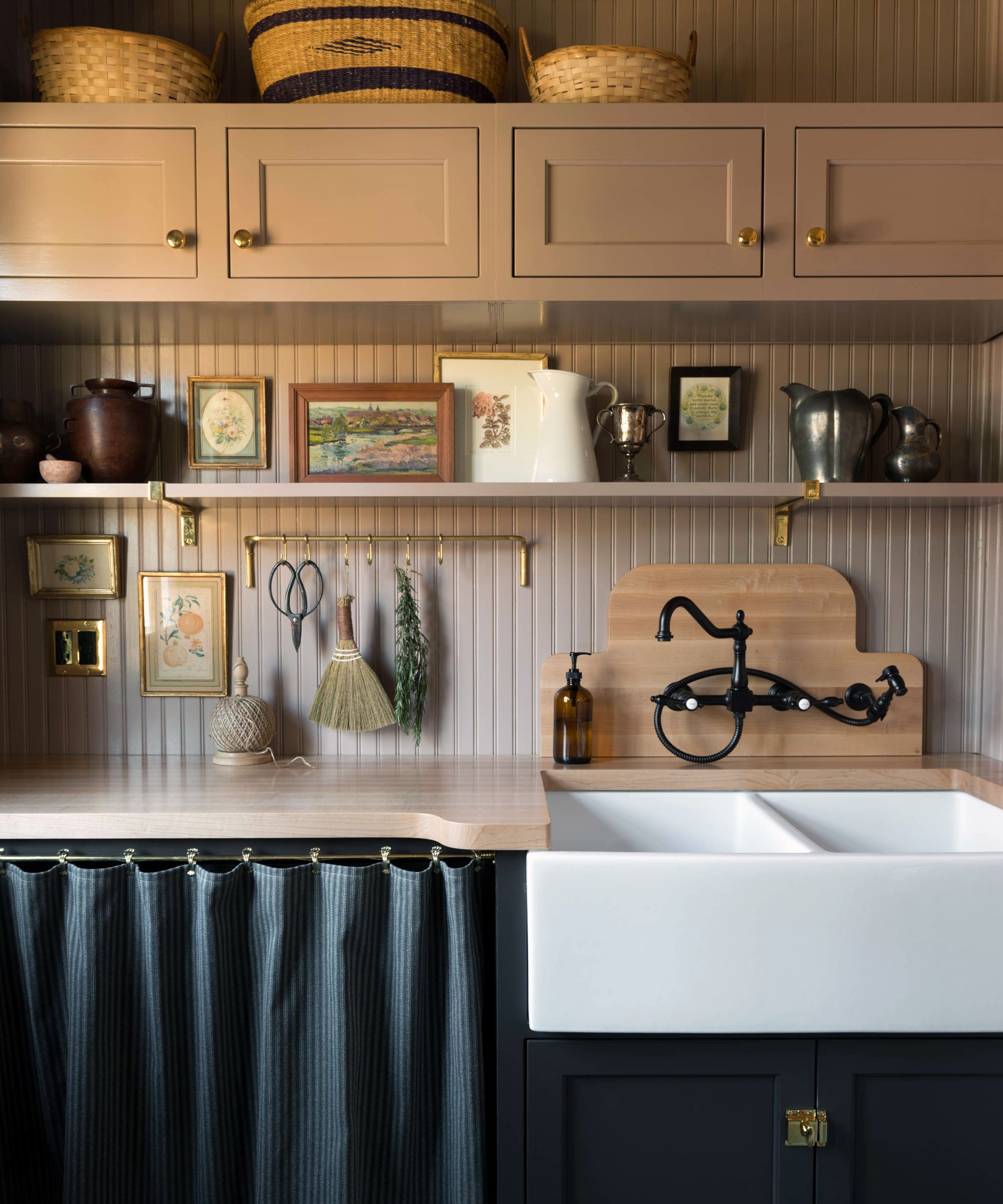
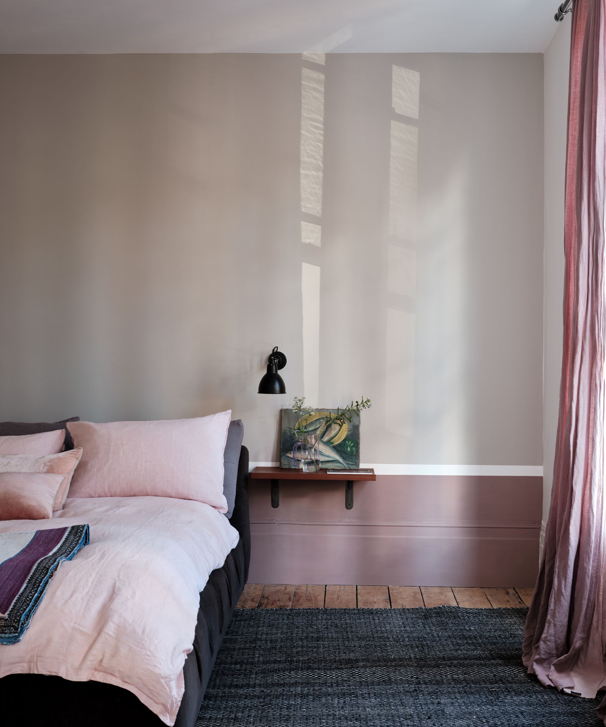
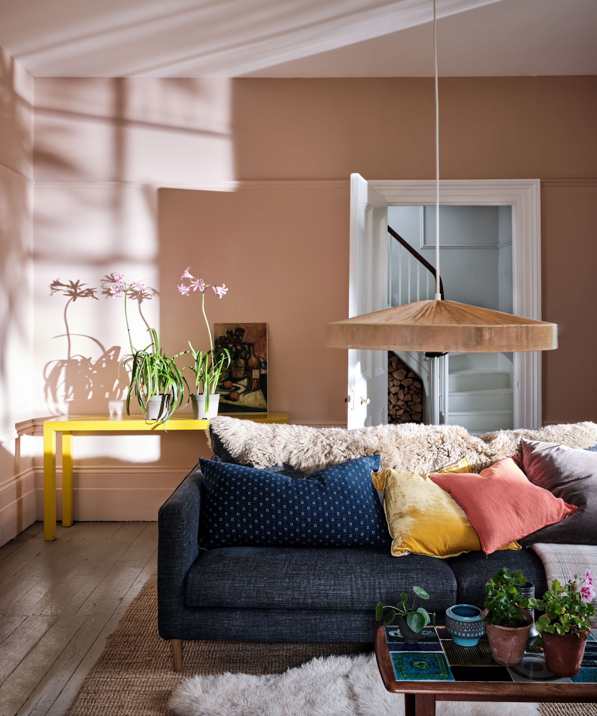
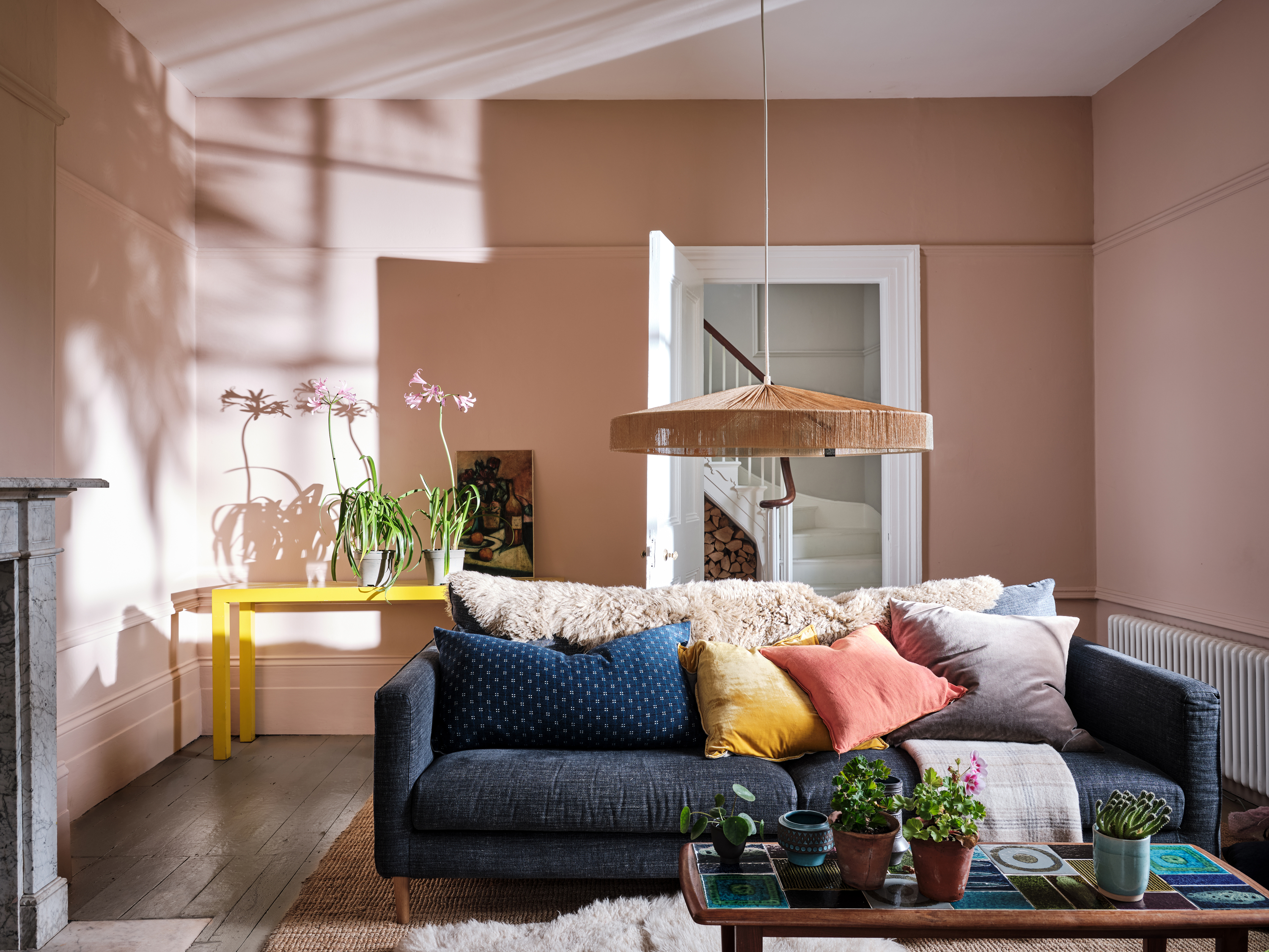
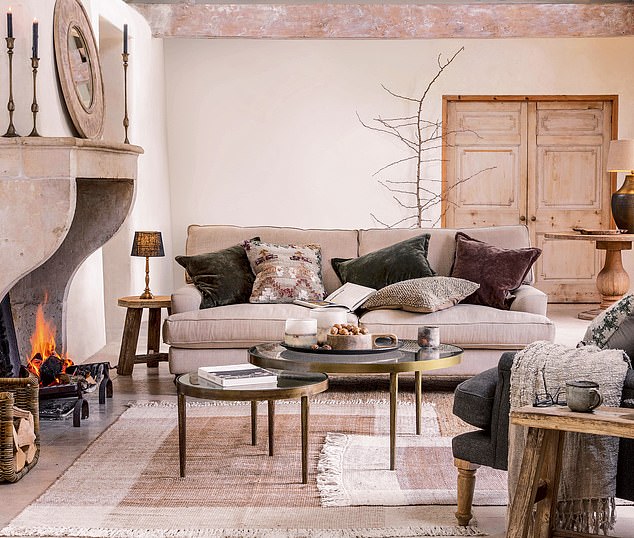
The article encourages embracing pink throughout a room, moving beyond traditional associations with candy or princesses. 'Setting Plaster' is shown to function as a subdued neutral that still imparts vibrancy. An example illustrates its paler, peachier appearance when used to bathe an entire room, pairing well with neutral furniture and rugs.
Another innovative use involves color-matching actual plaster walls. Given the ongoing trend for textural wall finishes, 'Setting Plaster' can be used on joinery and doors to seamlessly blend with exposed skimmed walls, as demonstrated by Trellik Design Studio. This application provides a cohesive and authentic look.
The versatility of 'Setting Plaster' extends to exterior applications. The muted tone serves as an appealing backdrop for darker browns and greens, often found in nature, helping to create a harmonious street aesthetic. Jessica Lagrange mentions using it for her living room and pool house folly, highlighting its adaptability across various settings.
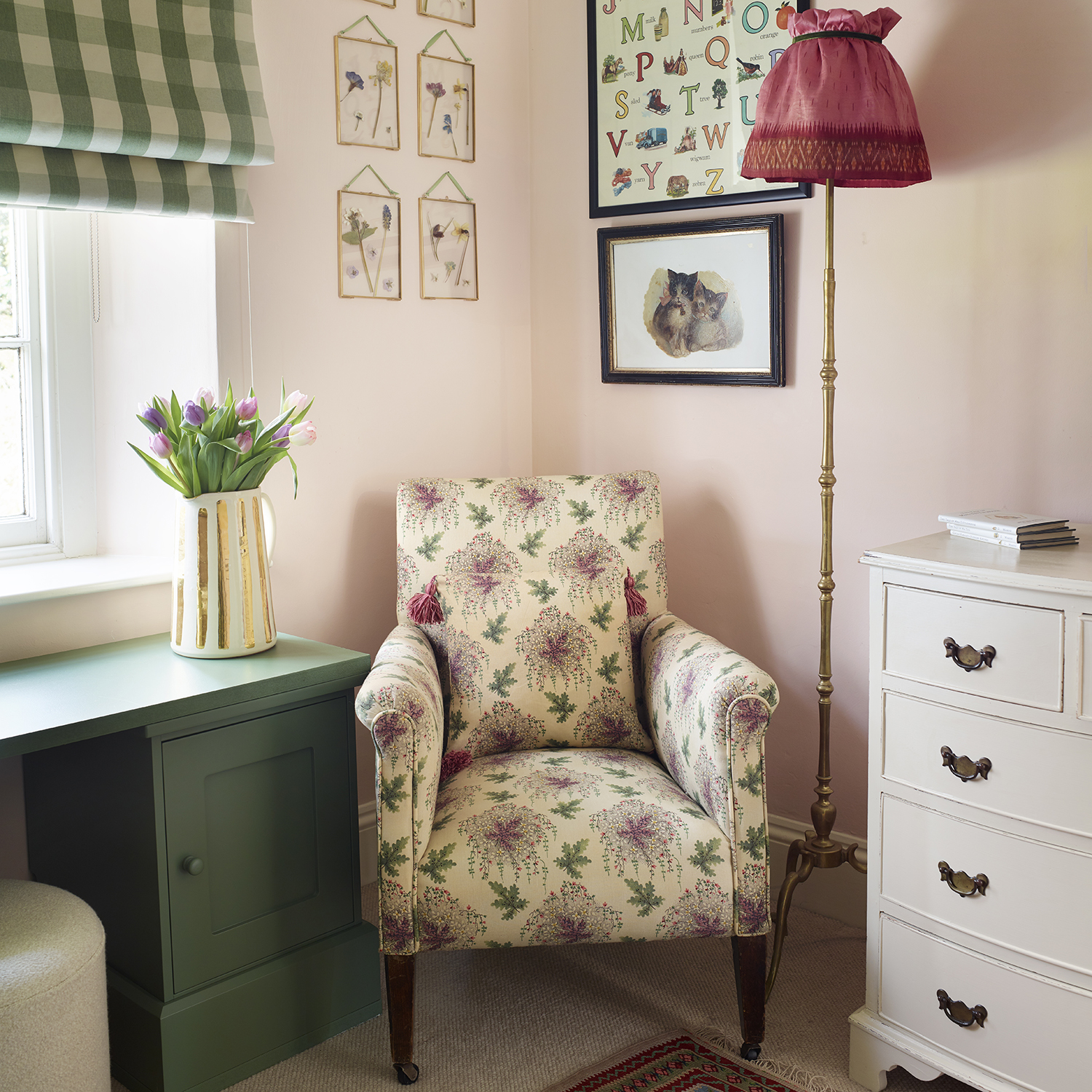
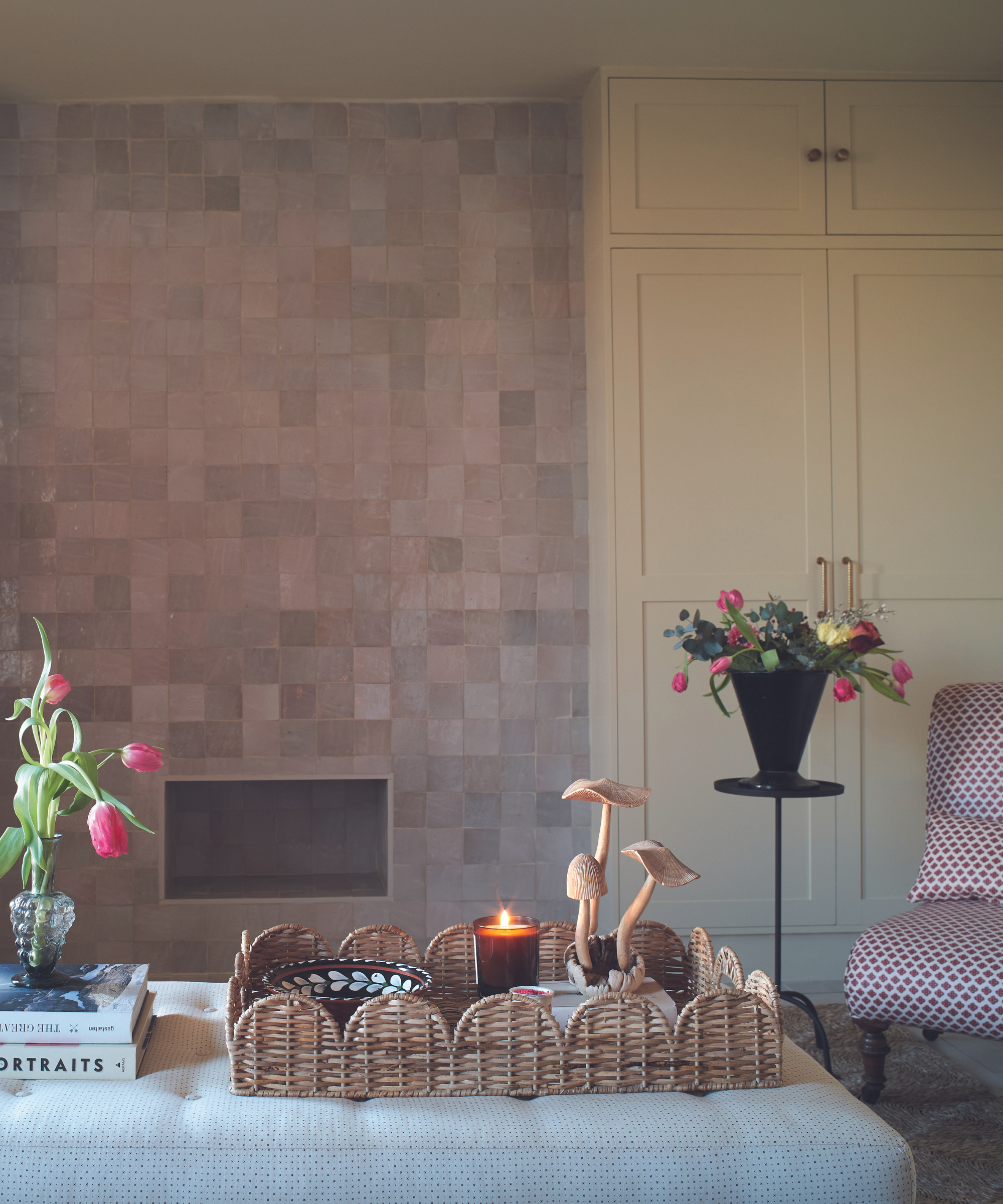
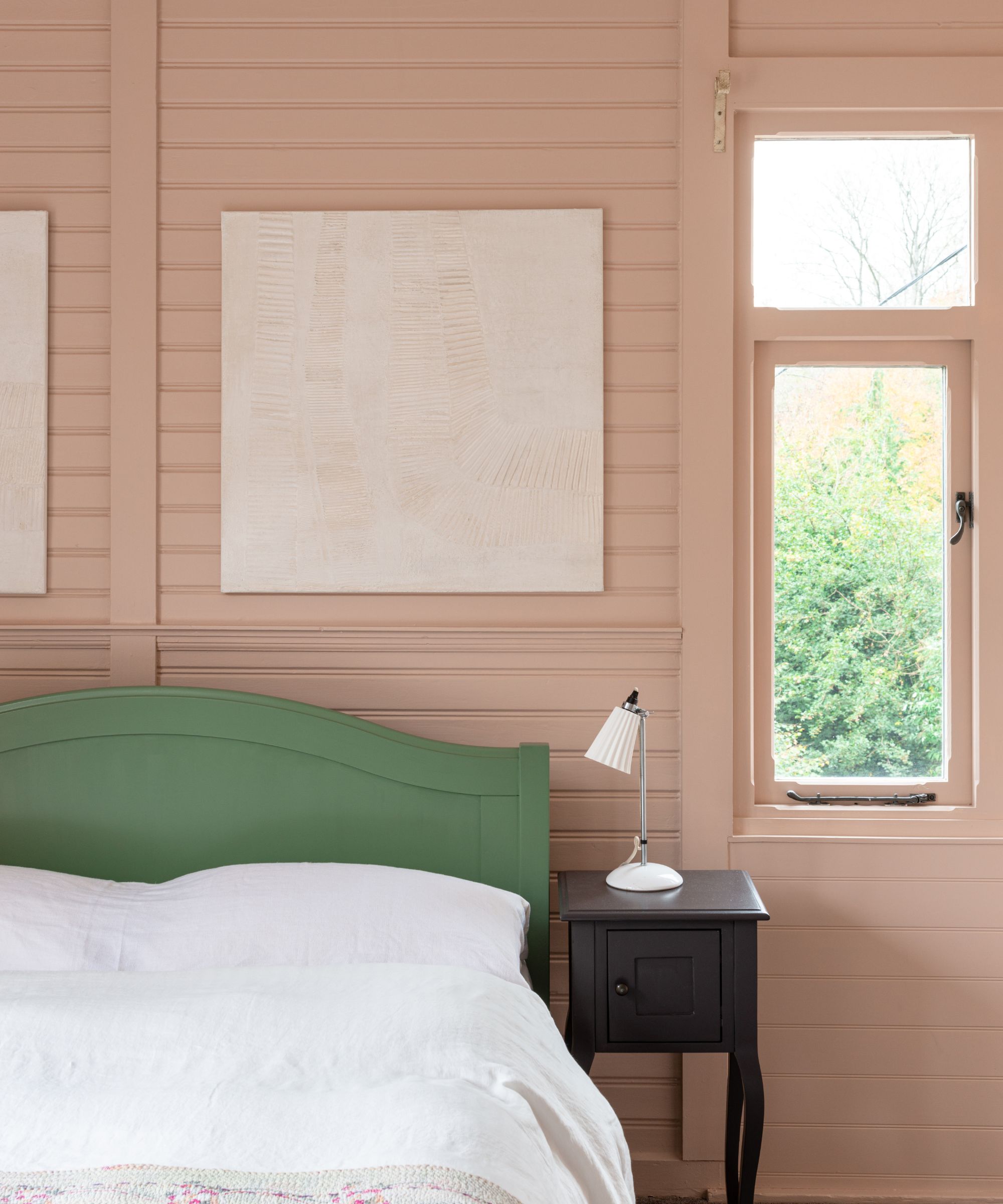
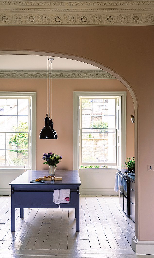
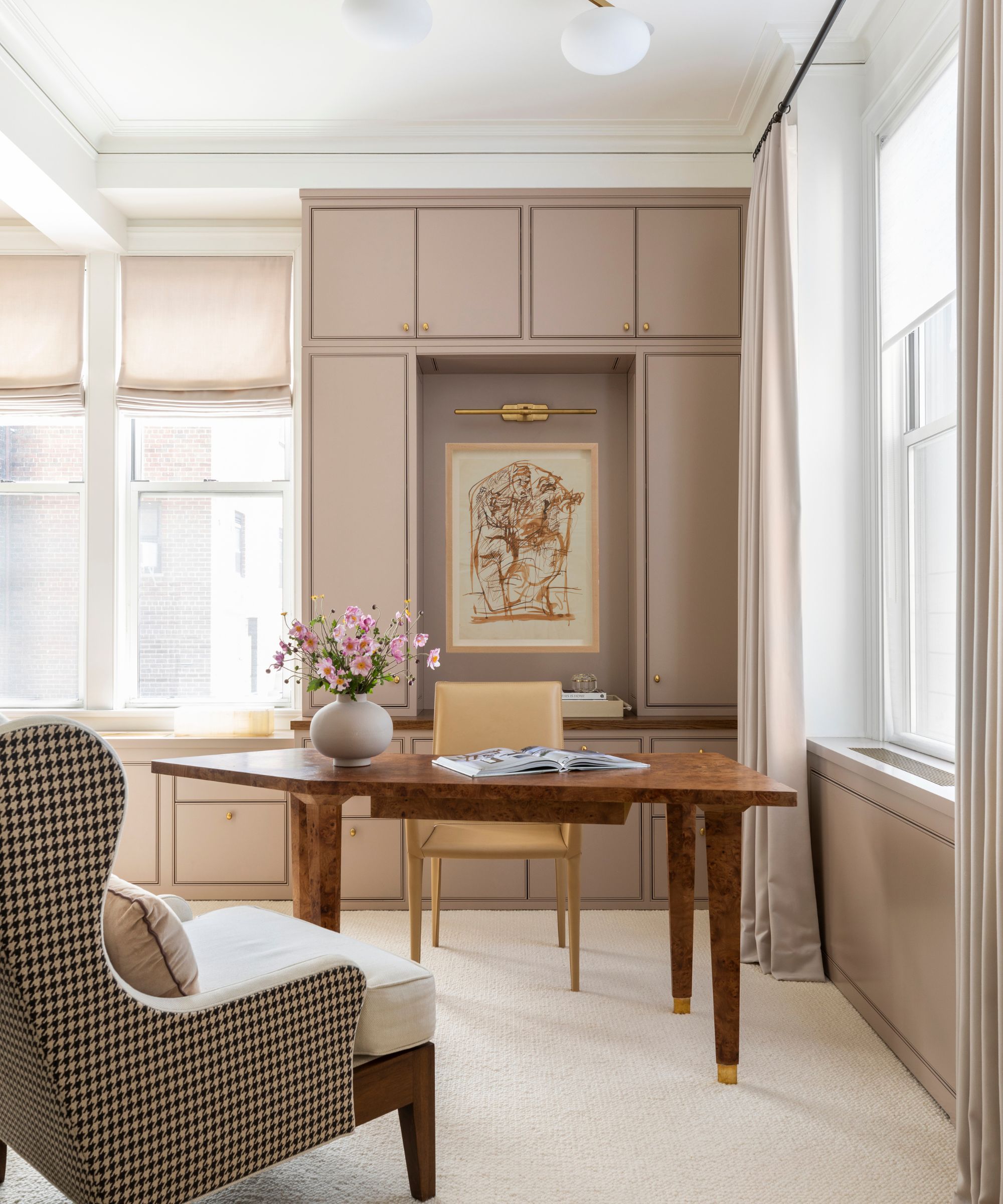
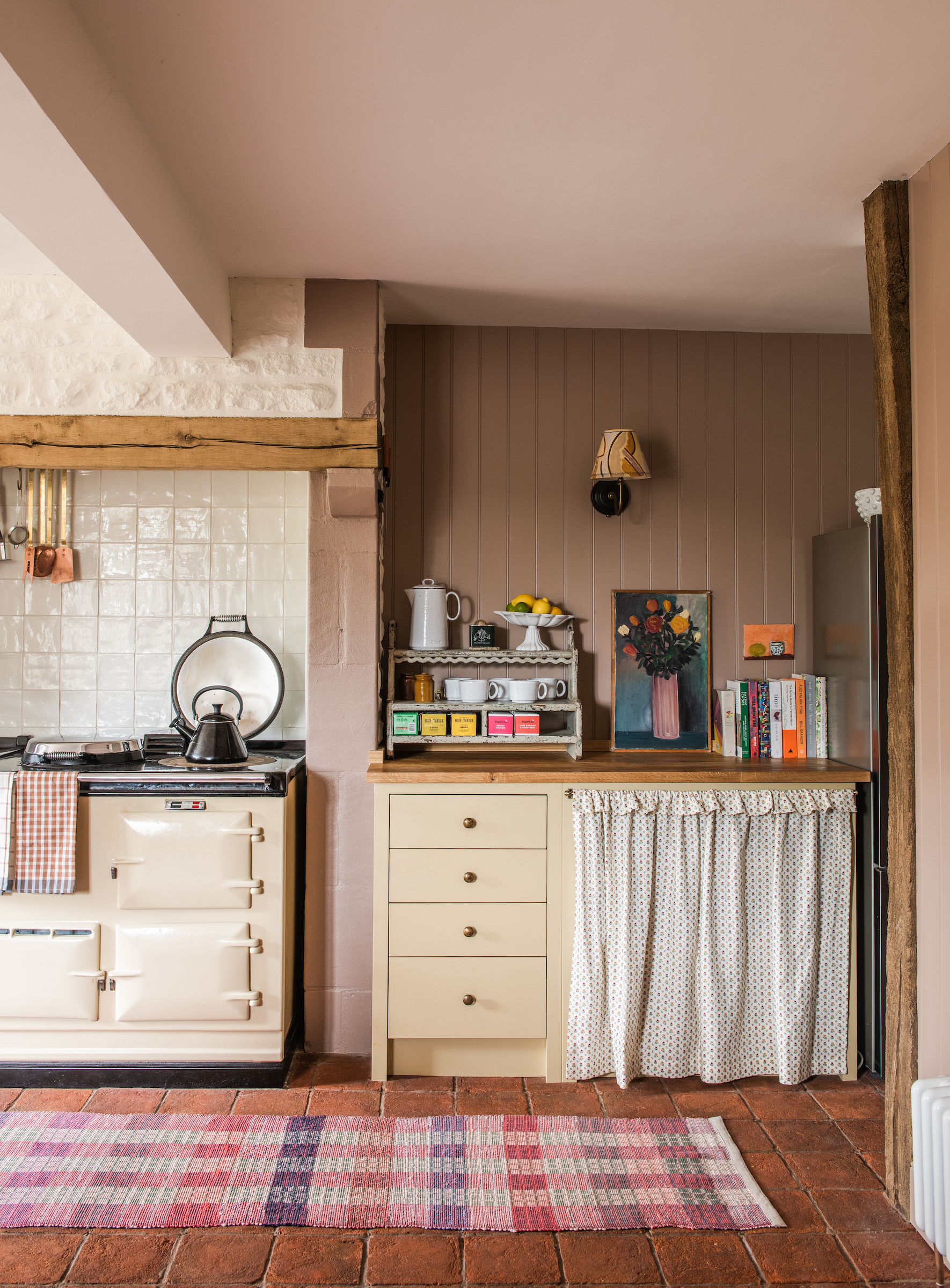
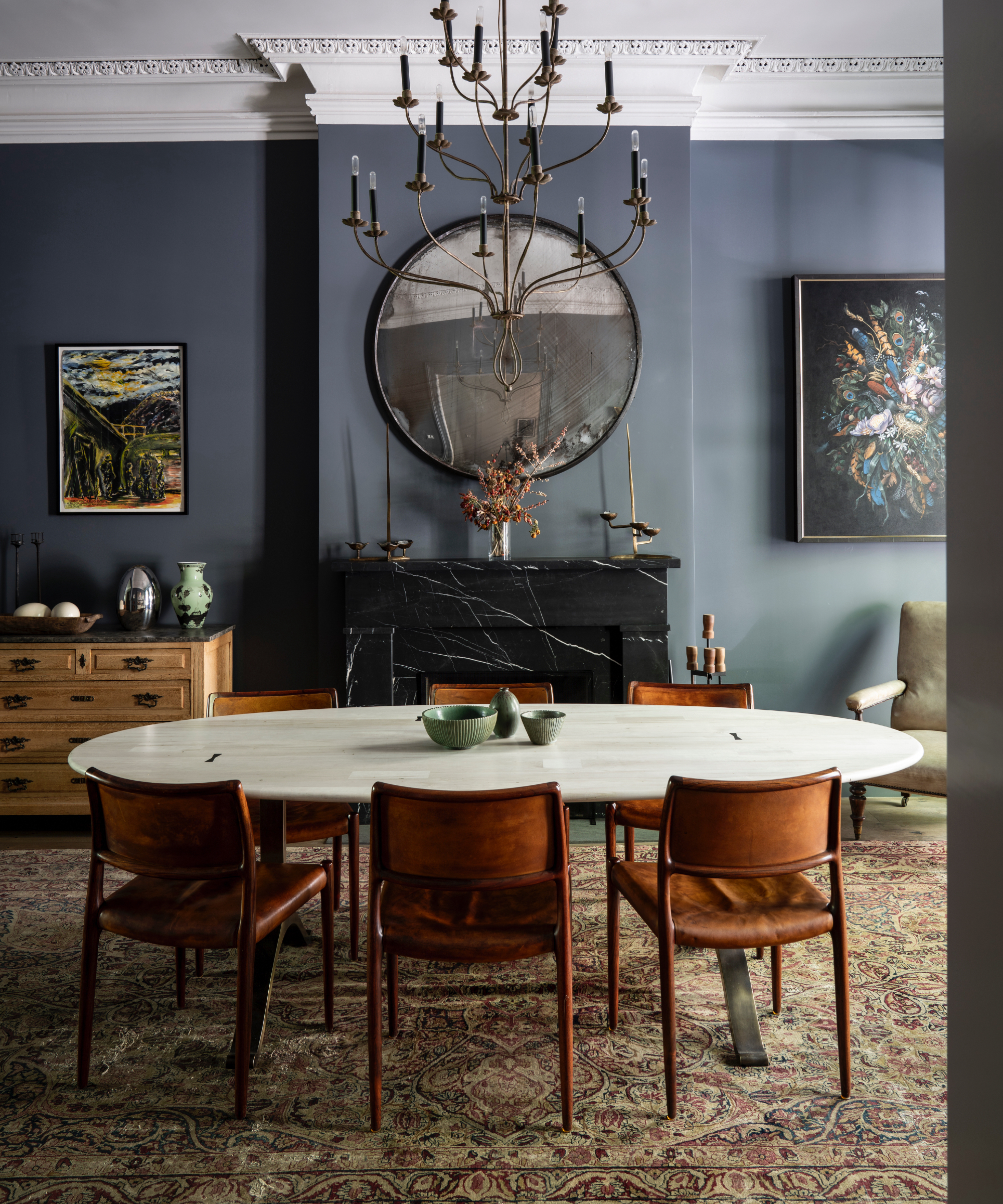
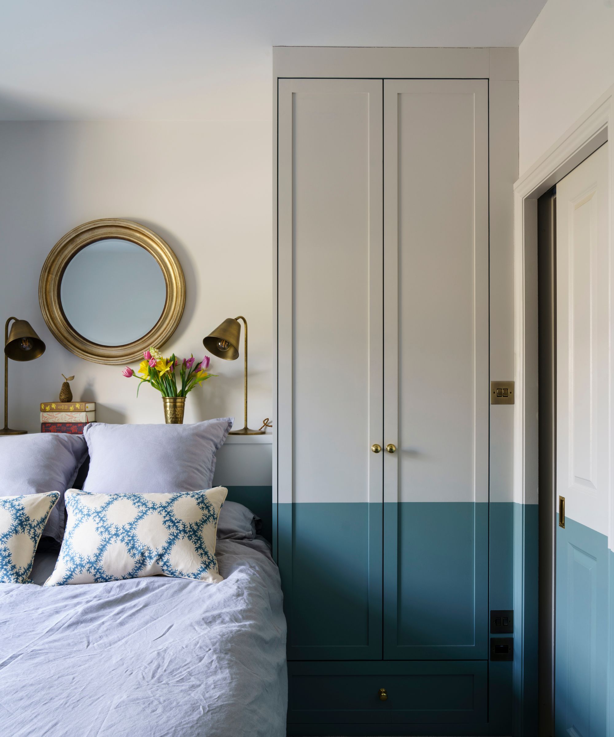
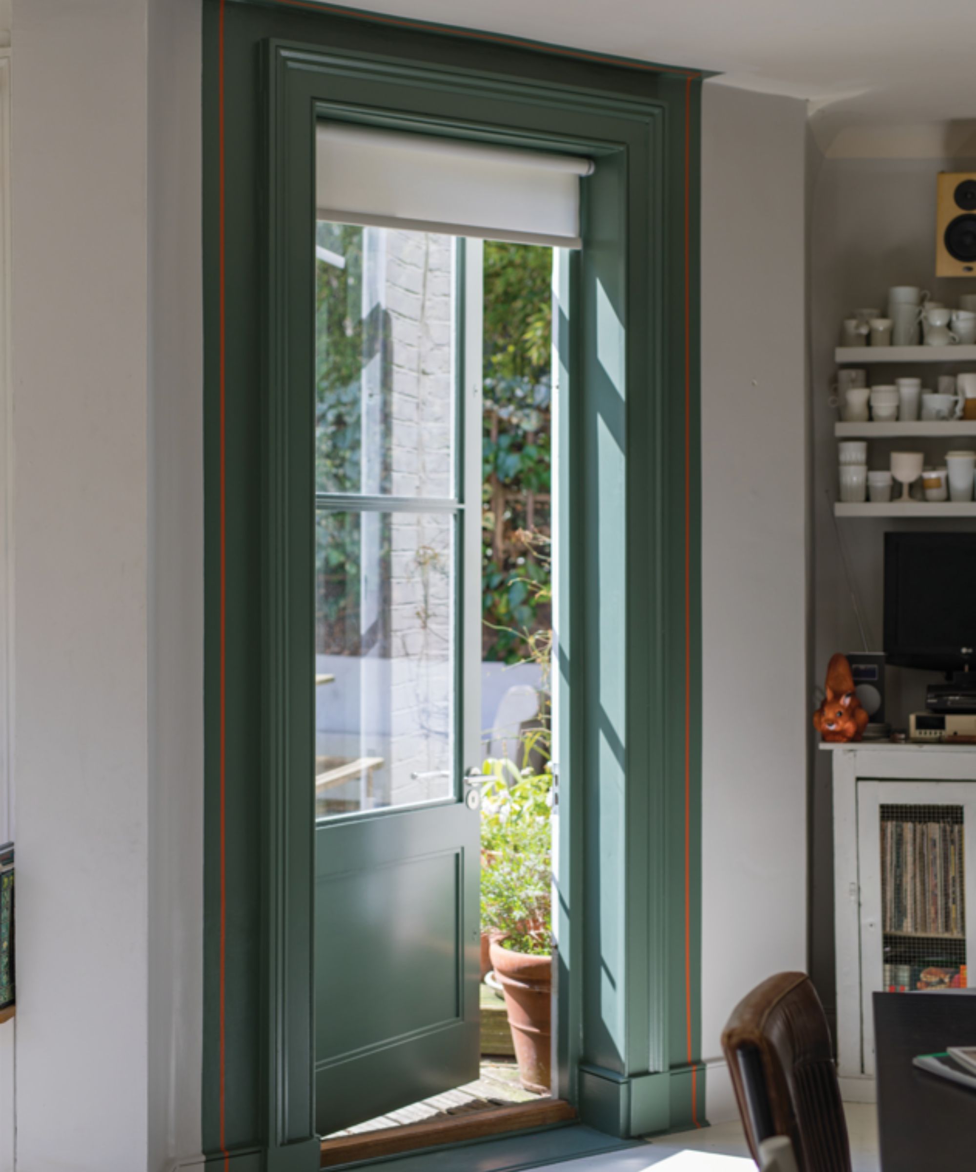
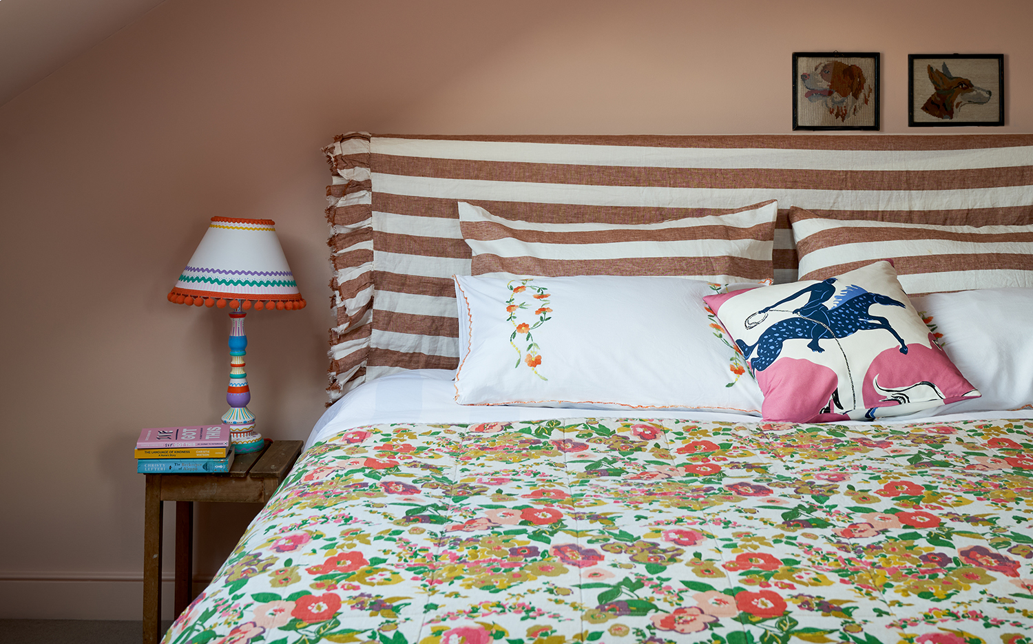
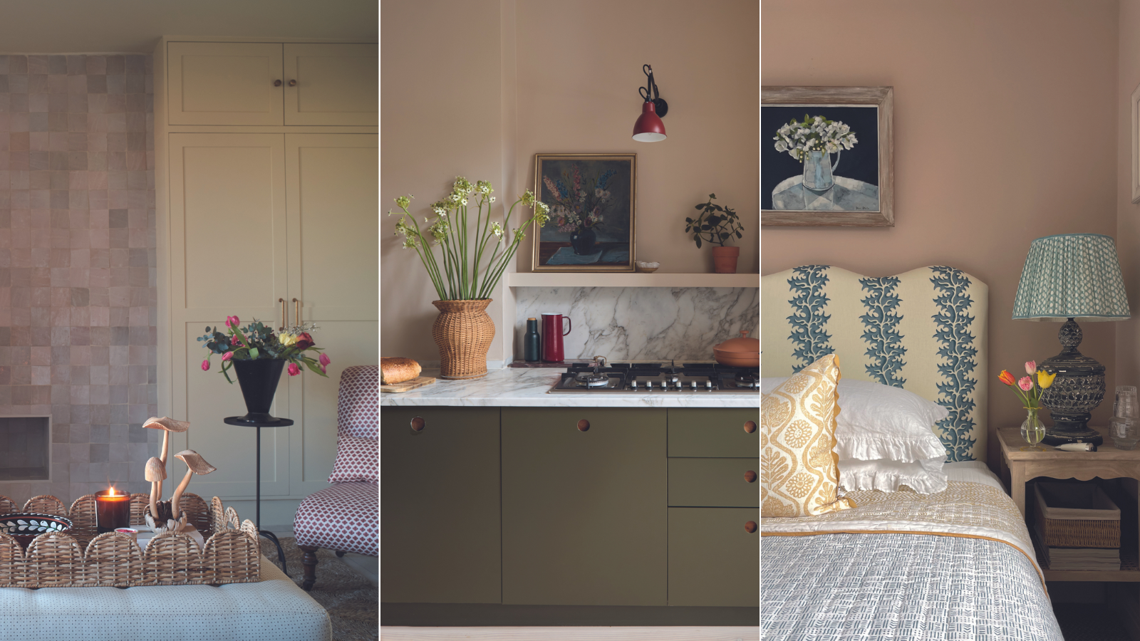
Finally, the article suggests layering 'Setting Plaster' with prints and organic tones to add depth and a modern vibe. The softness of the pink is complemented by natural elements, preventing any potential 'sugariness.' Lauren L Caron of Studio Laloc describes it as a 'warm hug' for bedrooms. The color is also presented as an excellent choice for highlighting architectural features like crown molding when contrasted with white, creating a luxurious yet restrained effect.
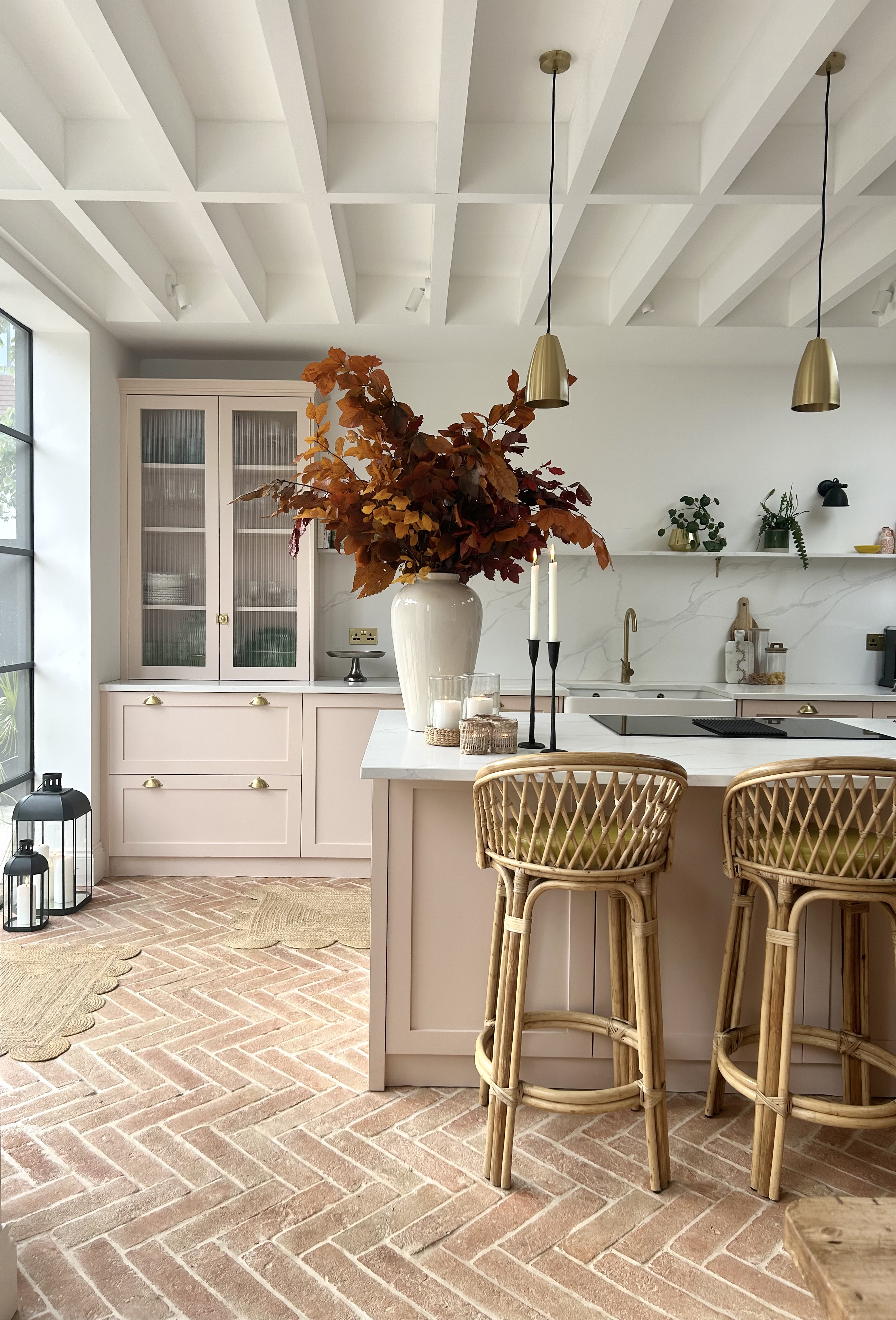
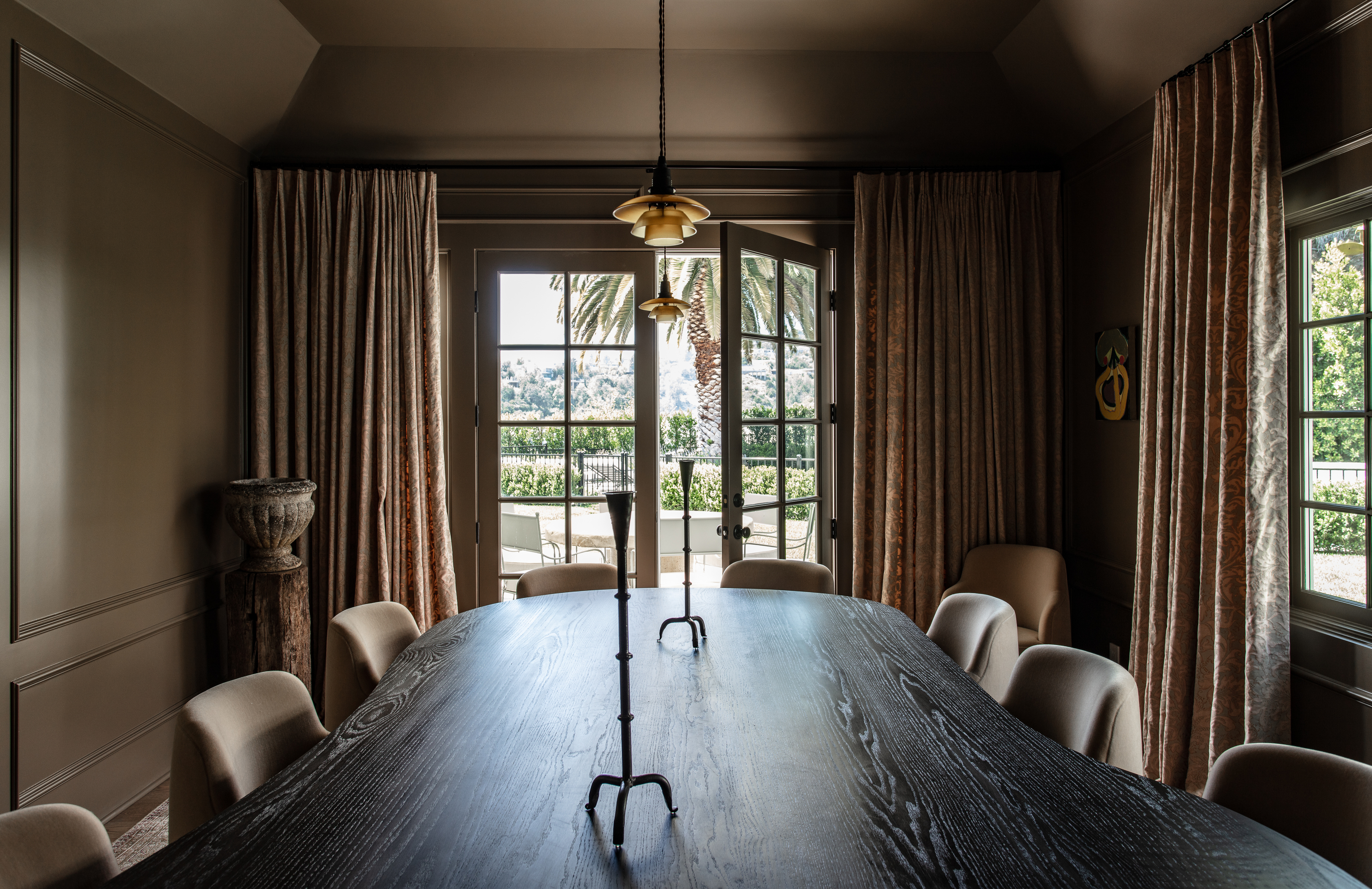
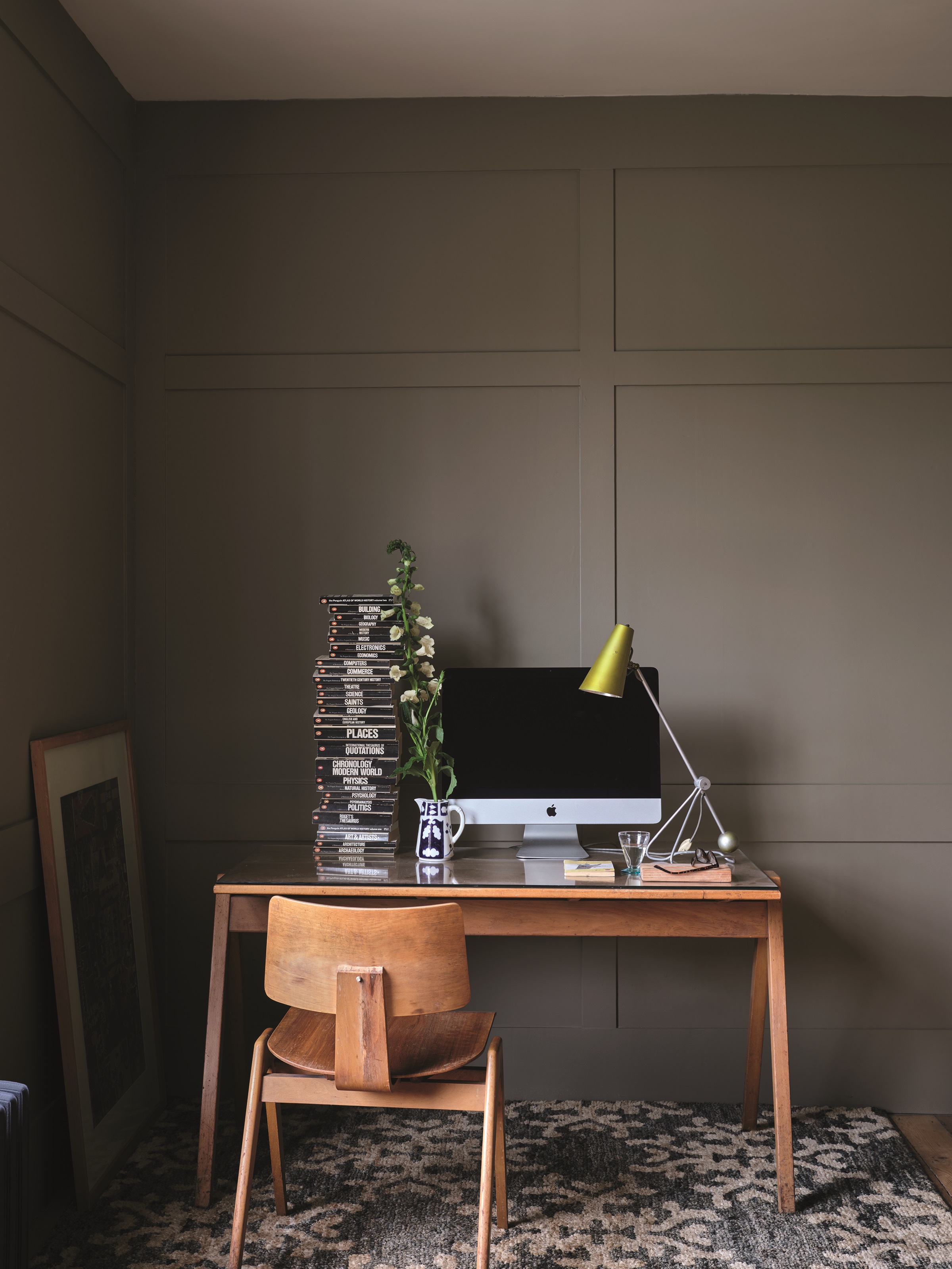
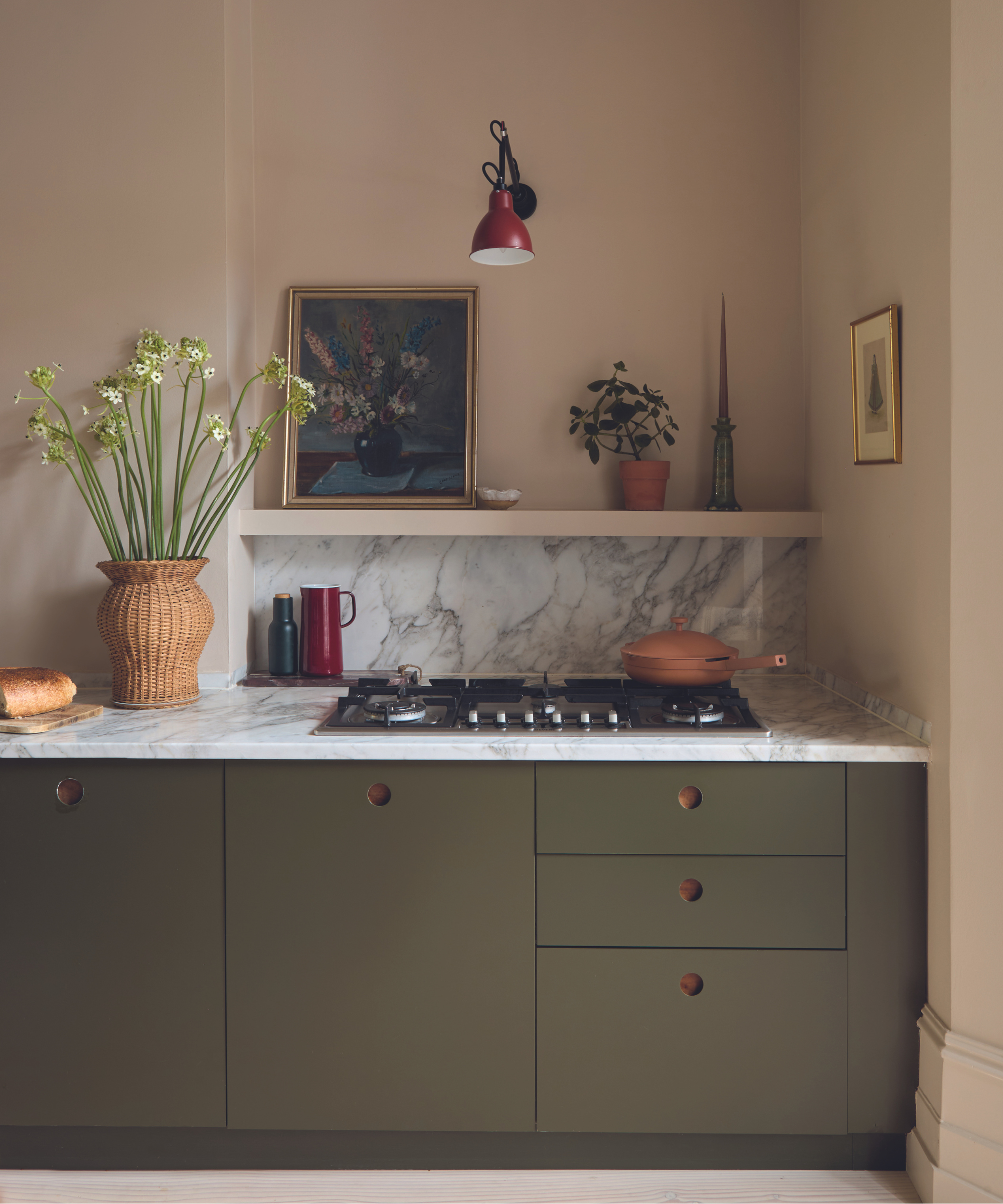
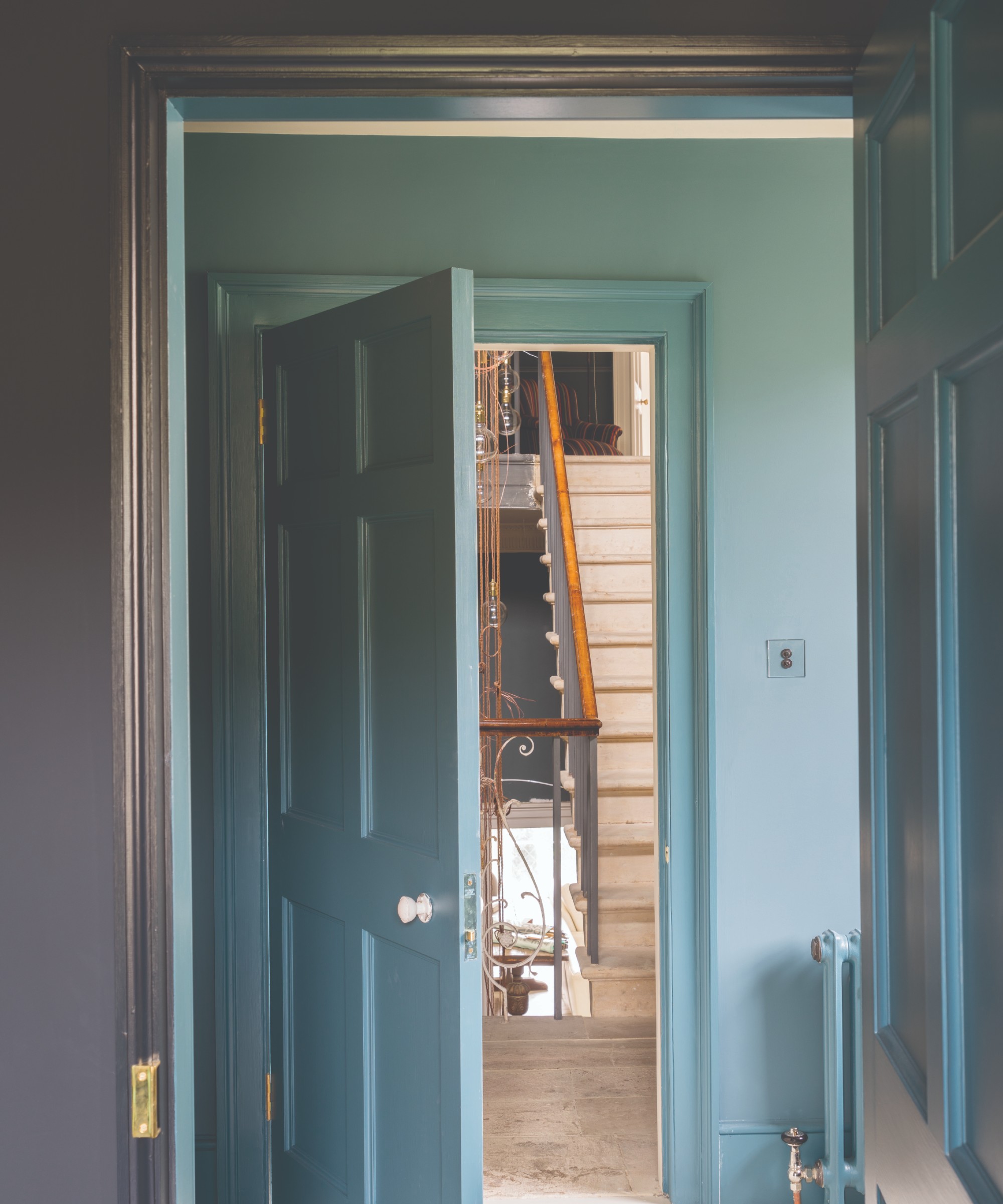
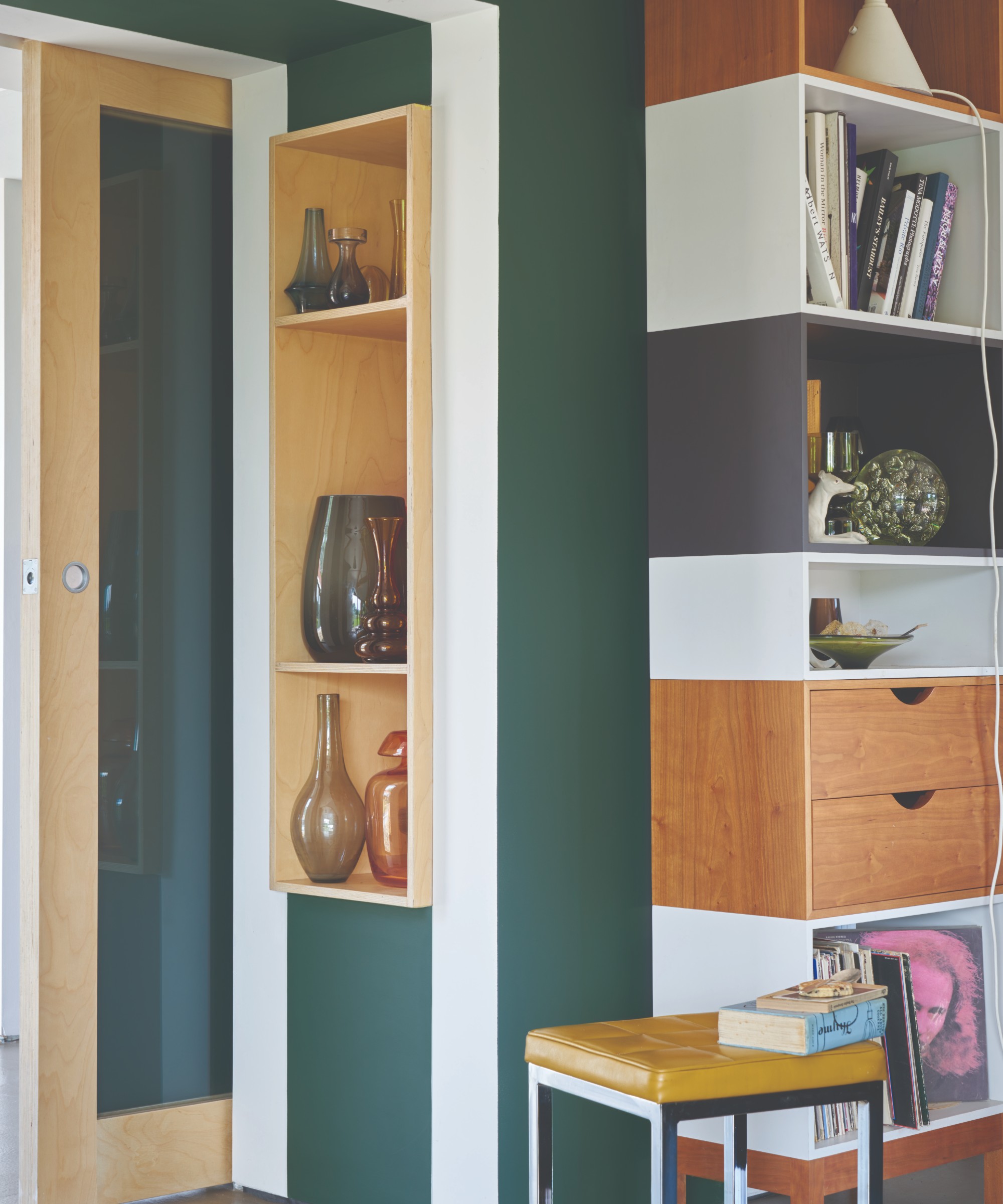
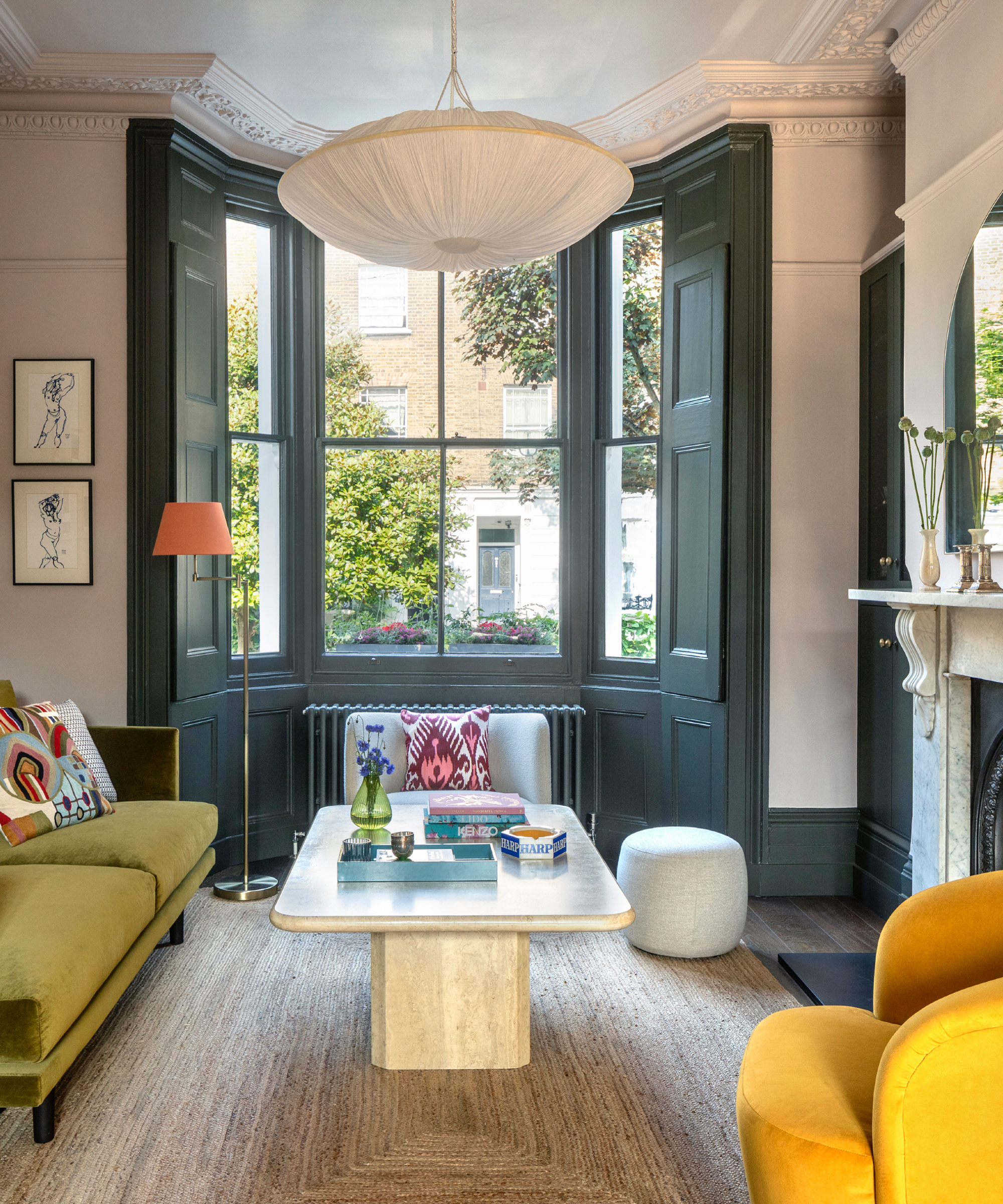
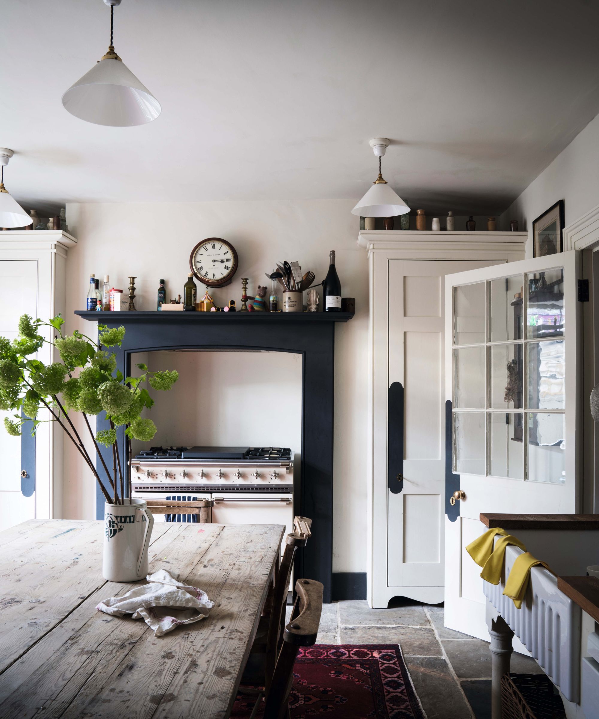
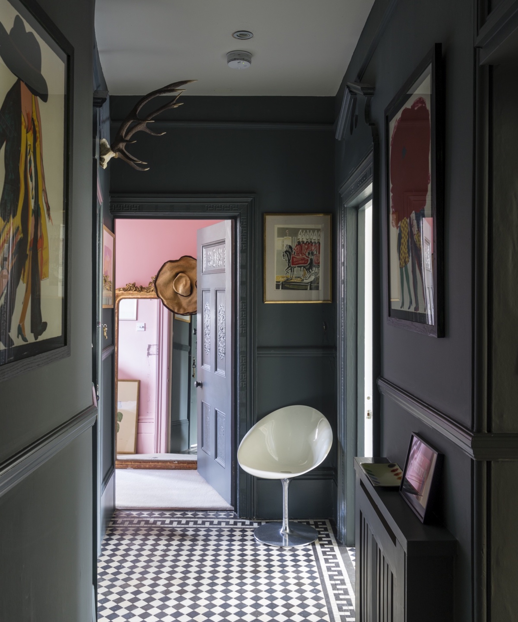
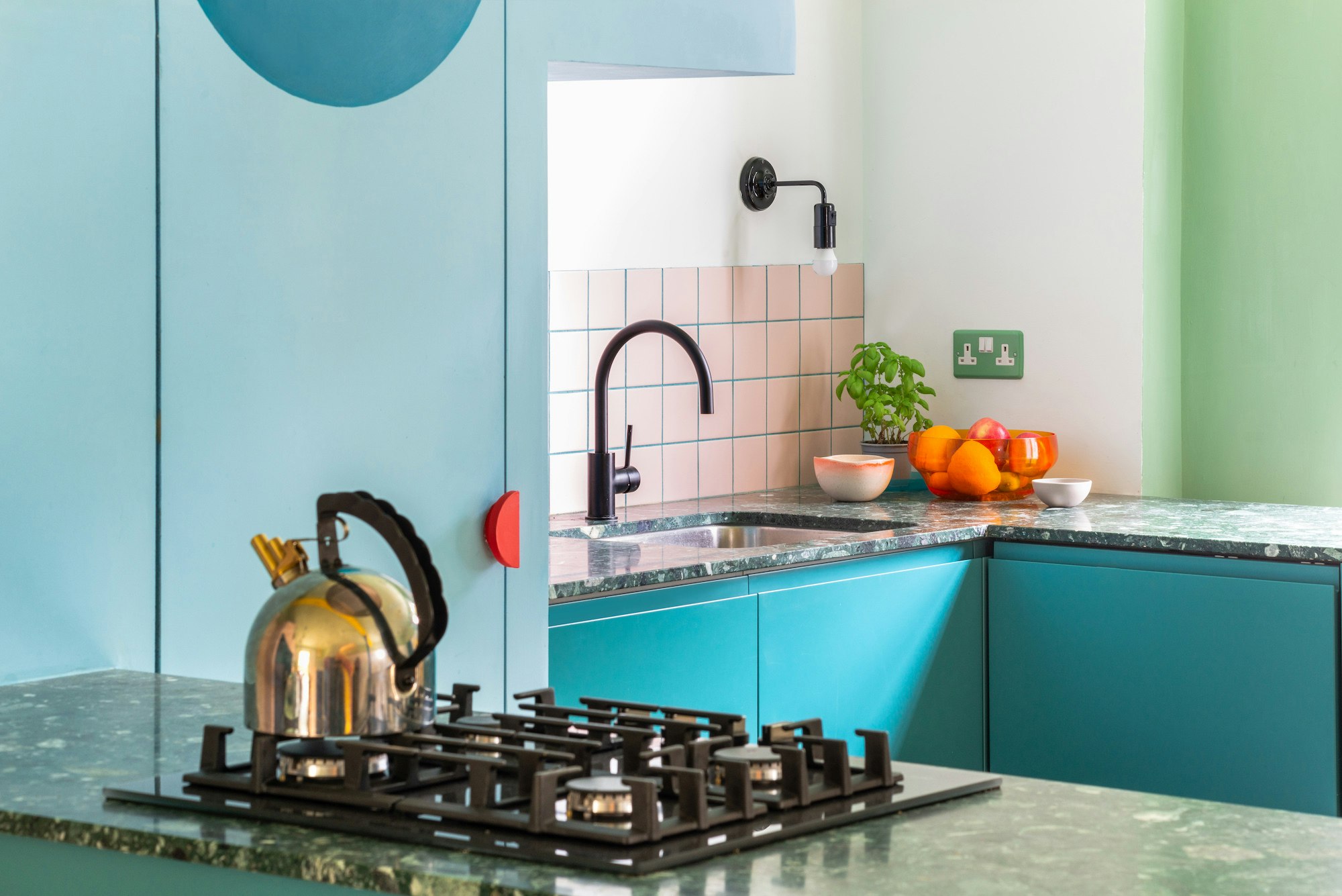
Regarding its warmth, 'Setting Plaster' is definitively a warm, subtle shade of pink, influenced by factors like natural light and complementary colors. It pairs well with a variety of hues, including blues for contrast, light greens for a natural combination, and other Farrow & Ball shades like Pink Ground and Blue Grey. For a contemporary look, it can be combined with Mahogany, or with brown for added warmth. Bold combinations with orange or black are also discussed for dynamic and impactful interiors, with pink softening the drama of black.
#FarrowAndBall #SettingPlaster #PaintColor #InteriorDesign #HomeDecor #PinkPaint #ColorTrends #DesignTips #AccentWalls #FarrowAndBall #SettingPlaster #PaintColor #InteriorDesign #HomeDecor #PinkPaint #ColorTrends #DesignTips #AccentWalls
0 comment in total
 No comments yet
You may also like
How to decorate with Farrow and Ball's Pink Ground – 7 designers share how they use this perfect pink shade

These are Farrow & Ball's current 'most loved' paints – and how to decorate with them throughout the home
6 ways to decorate with Farrow & Ball Down Pipe, a dramatic black paint

DUPES for Farrow & Ball Scallop, Kakelugn, Marmelo, Naperon, Duster, Sizing, and more

This Farrow & Ball paint color is trending, but it's tricky to decorate with – here's how the experts make it work
INTERIORS: The joy of plaster pink
How Do Paint Colors Get Their Names?
These 10 Farrow & Ball colors are their most popular paints – from earthy neutrals to deep and dark shades
How to decorate with plaster pink tones – 5 ways to bring this timeless yet trendy hue into your home
The 10 Best Farrow & Ball Paint Colors of All Time

How to decorate with Farrow & Ball Railings, the best-selling soft black paint
Grout Expectations: Ways to Play With Tinted Paste

How to Nail This Tricky But Surprisingly Trendy Farrow & Ball Paint Color

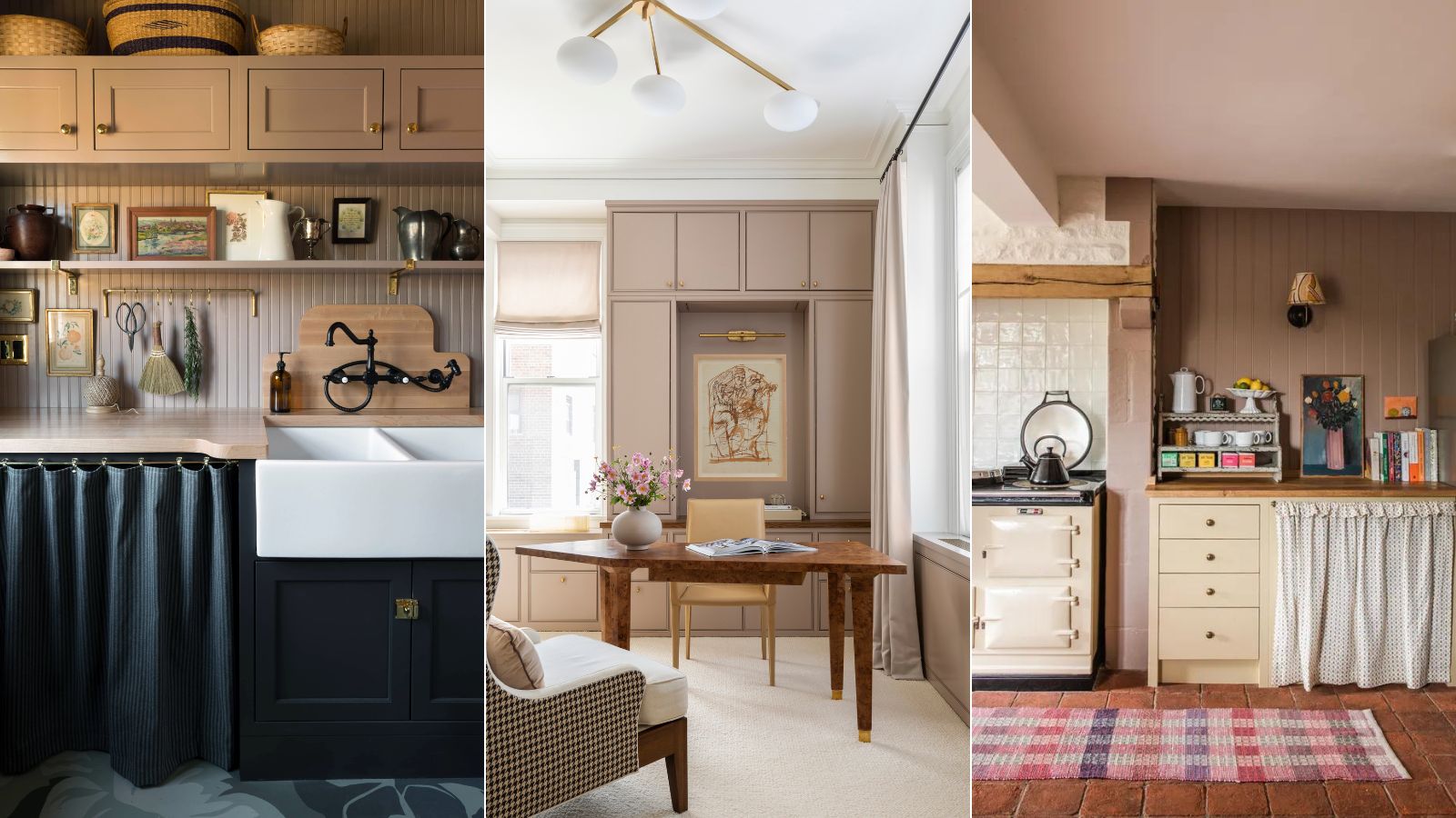
How to decorate with Dead Salmon, Farrow & Ball's perfect earthy pink
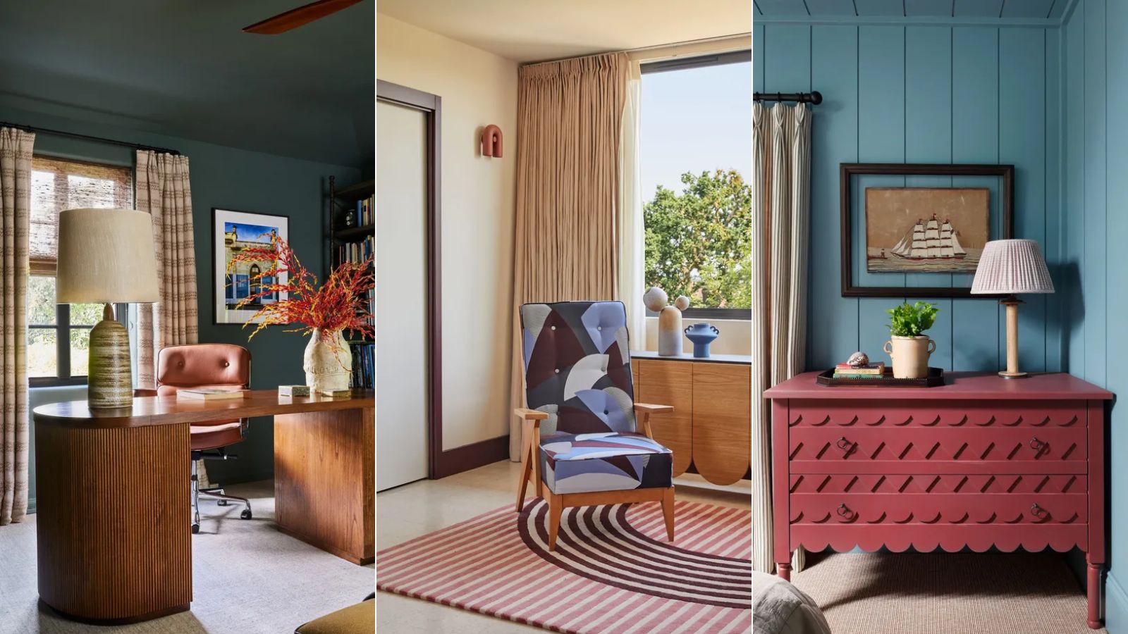
15 Farrow & Ball paint colors in real homes – from calming blues to warm neutrals
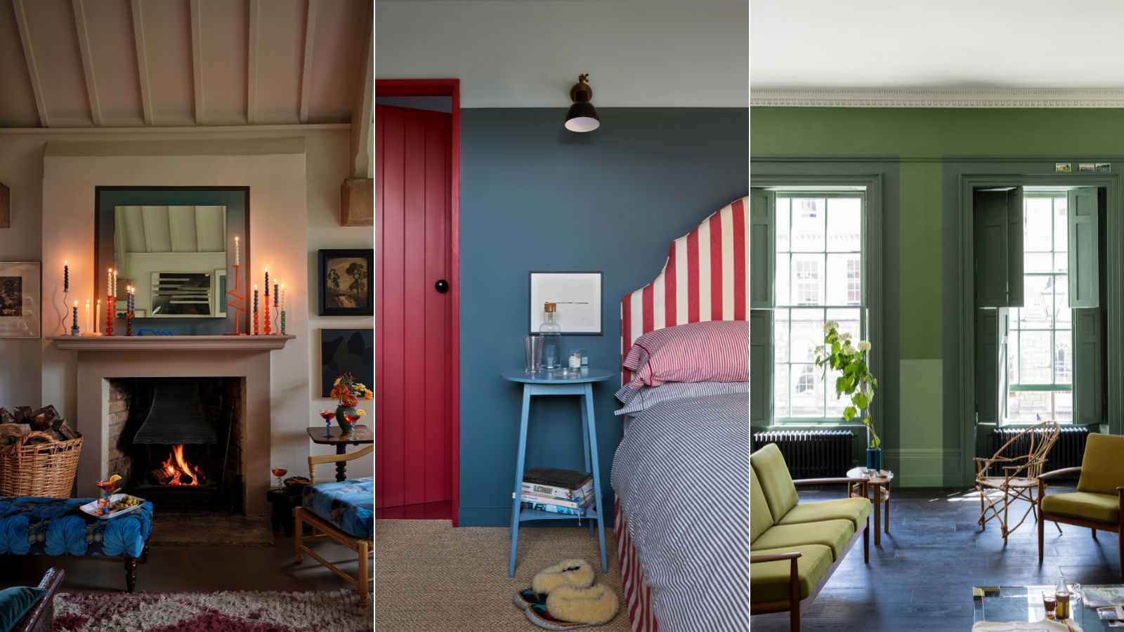
'Modest amounts of color can make huge statements' – Farrow & Ball's color curator shares 5 simple ways to transform the home with paint
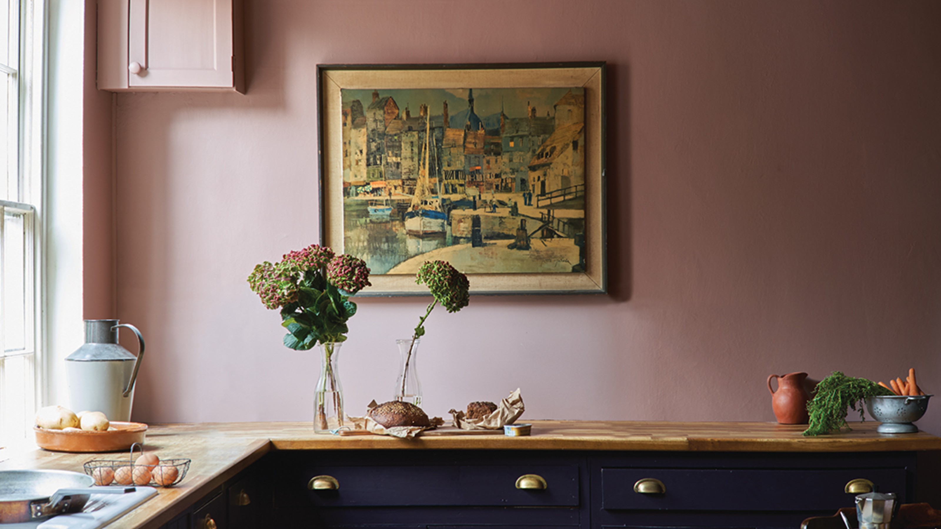
The 4 best Farrow & Ball Sulking Room Pink alternatives

The 3 best Farrow & Ball paint colours for a hallway – the unexpected shades the experts recommend
Interior designers' favorite Farrow & Ball paint colors
Farrow & Ball Purbeck Stone: DUPES, coordinating colors & Sarah’s full review