1/17
These are the colors that just don't work with purple – 4 shades to sheer clear of if you want to bring this on trend color into your home
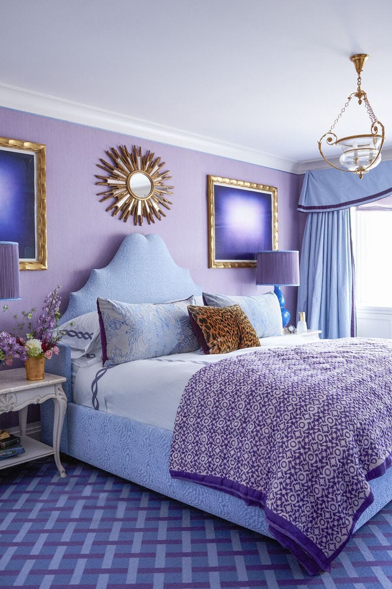
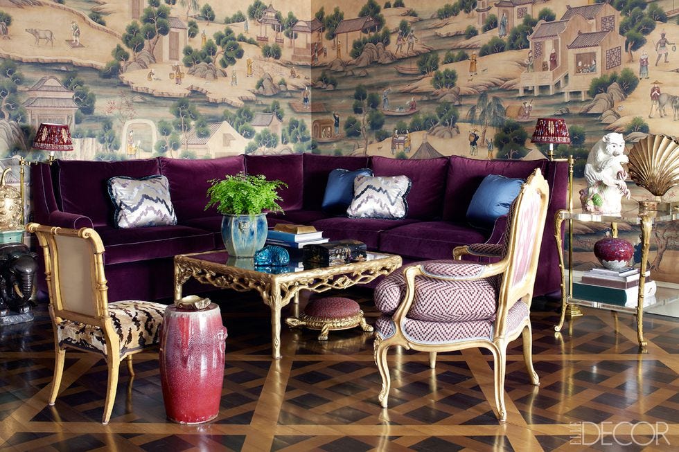
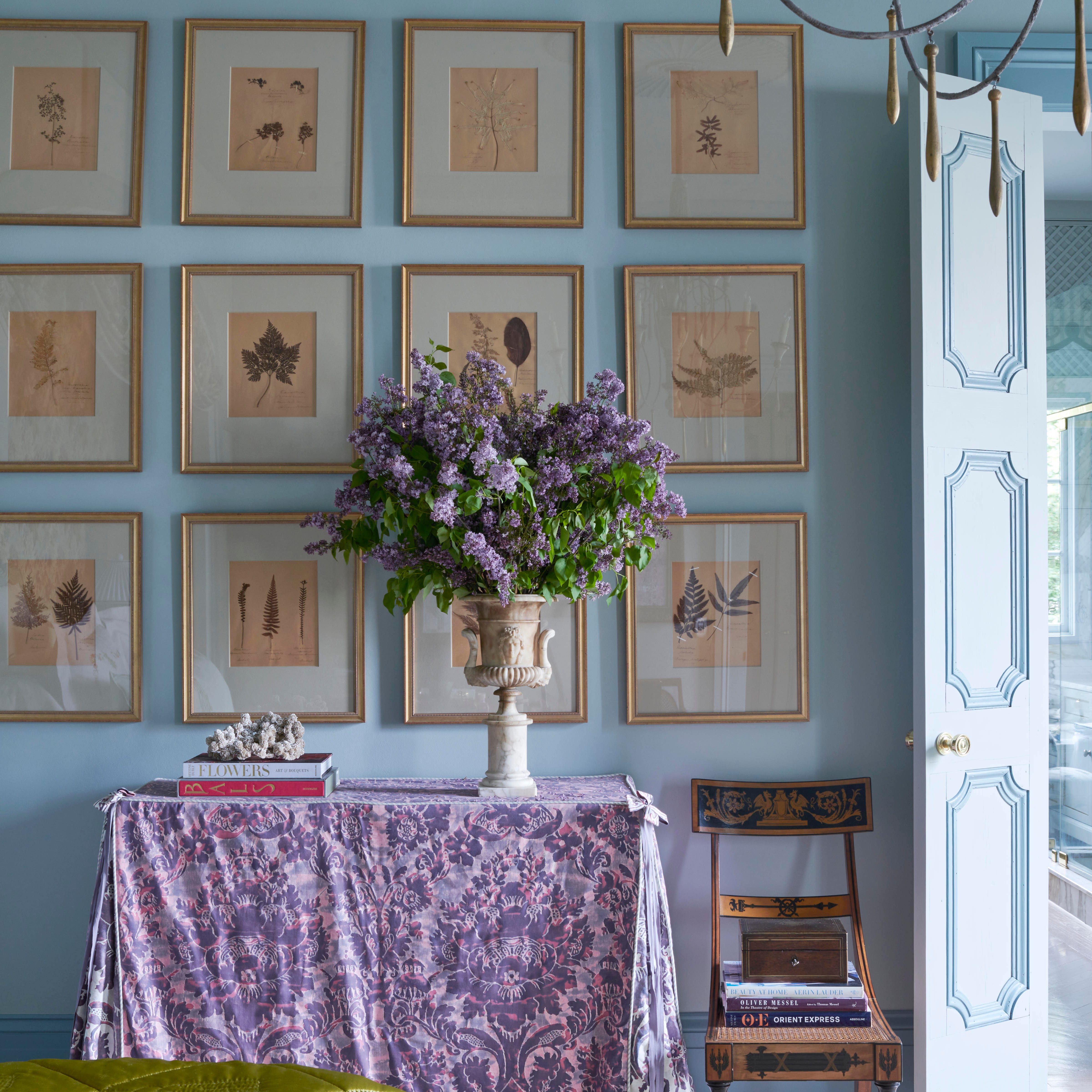
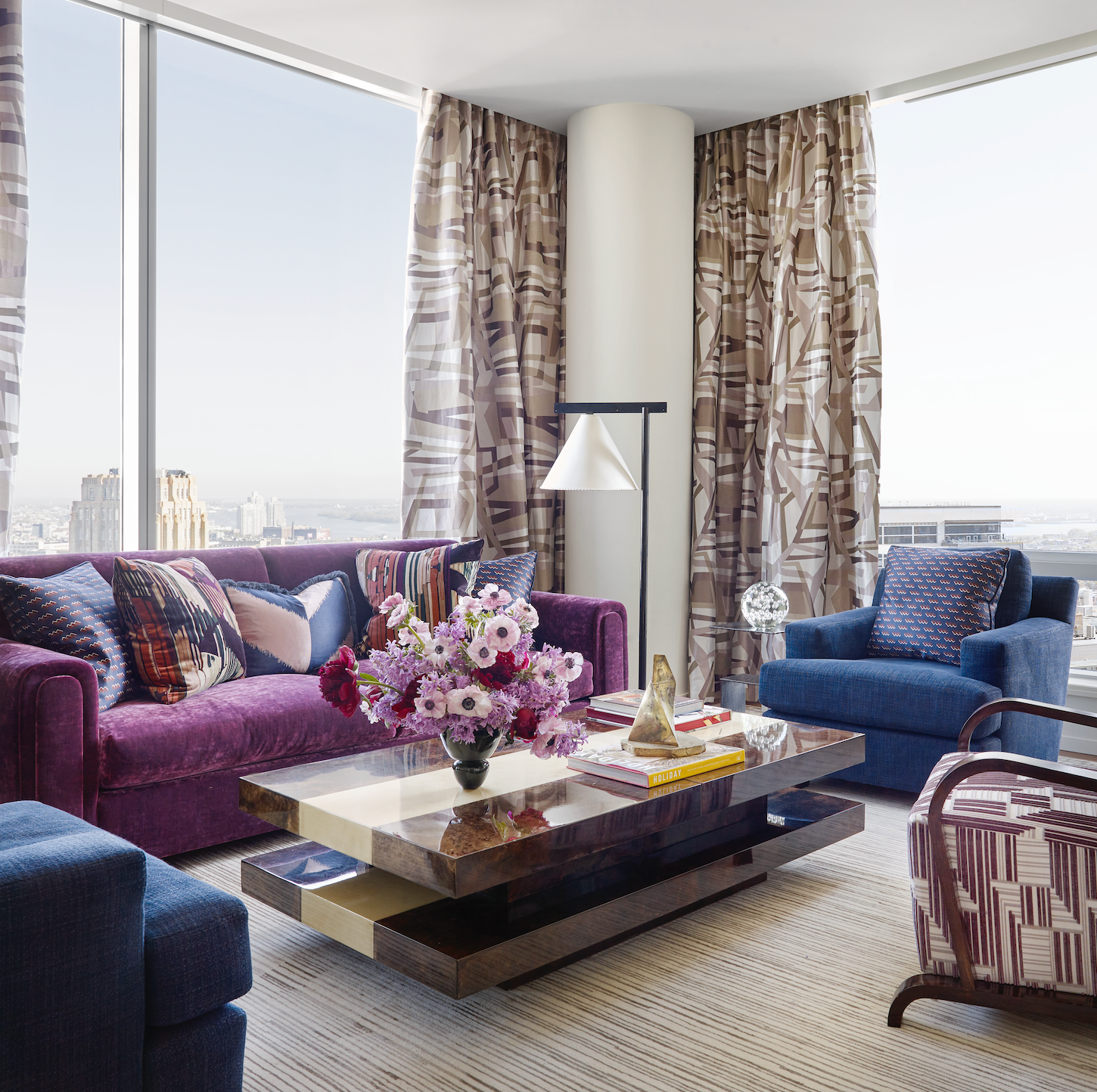
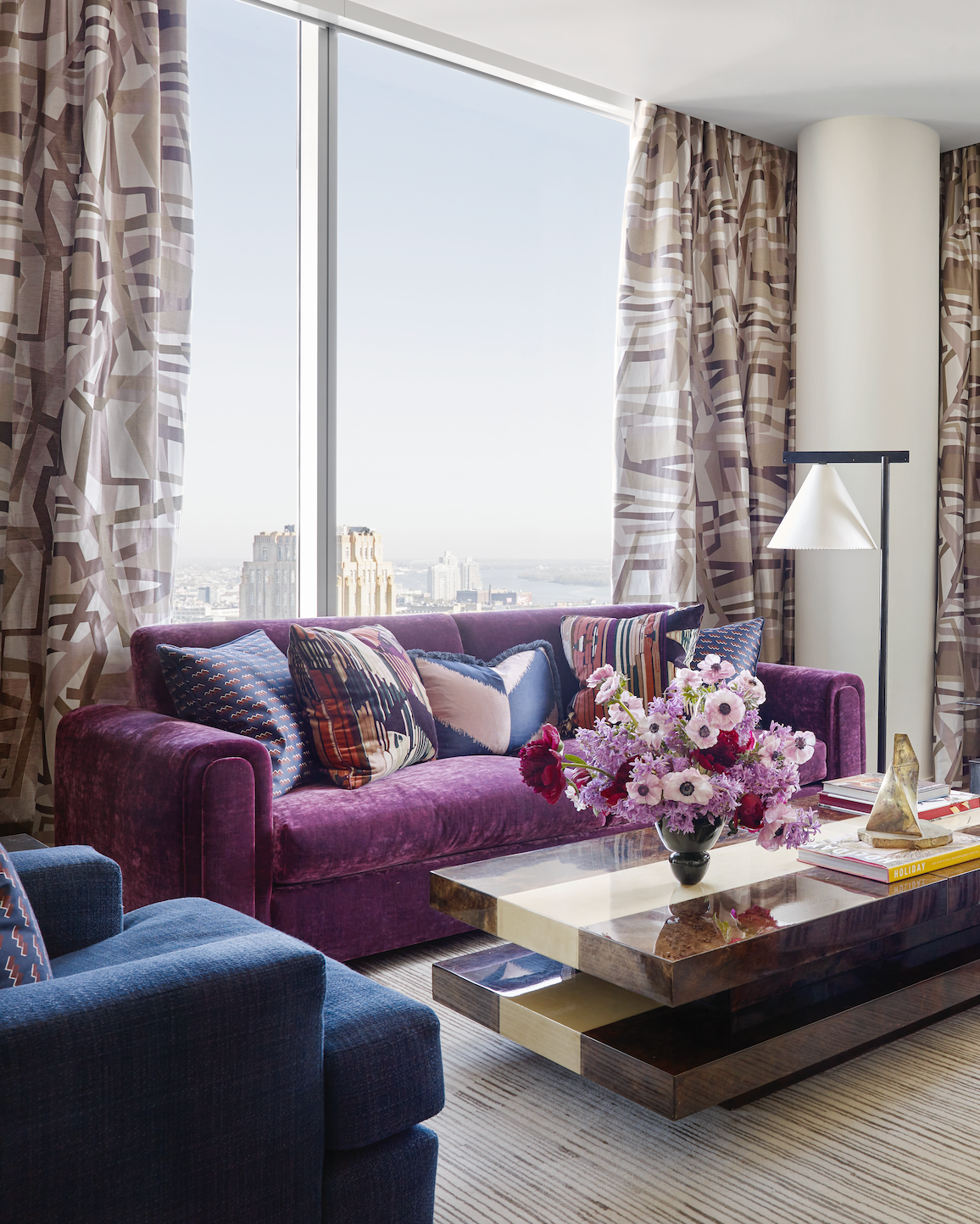
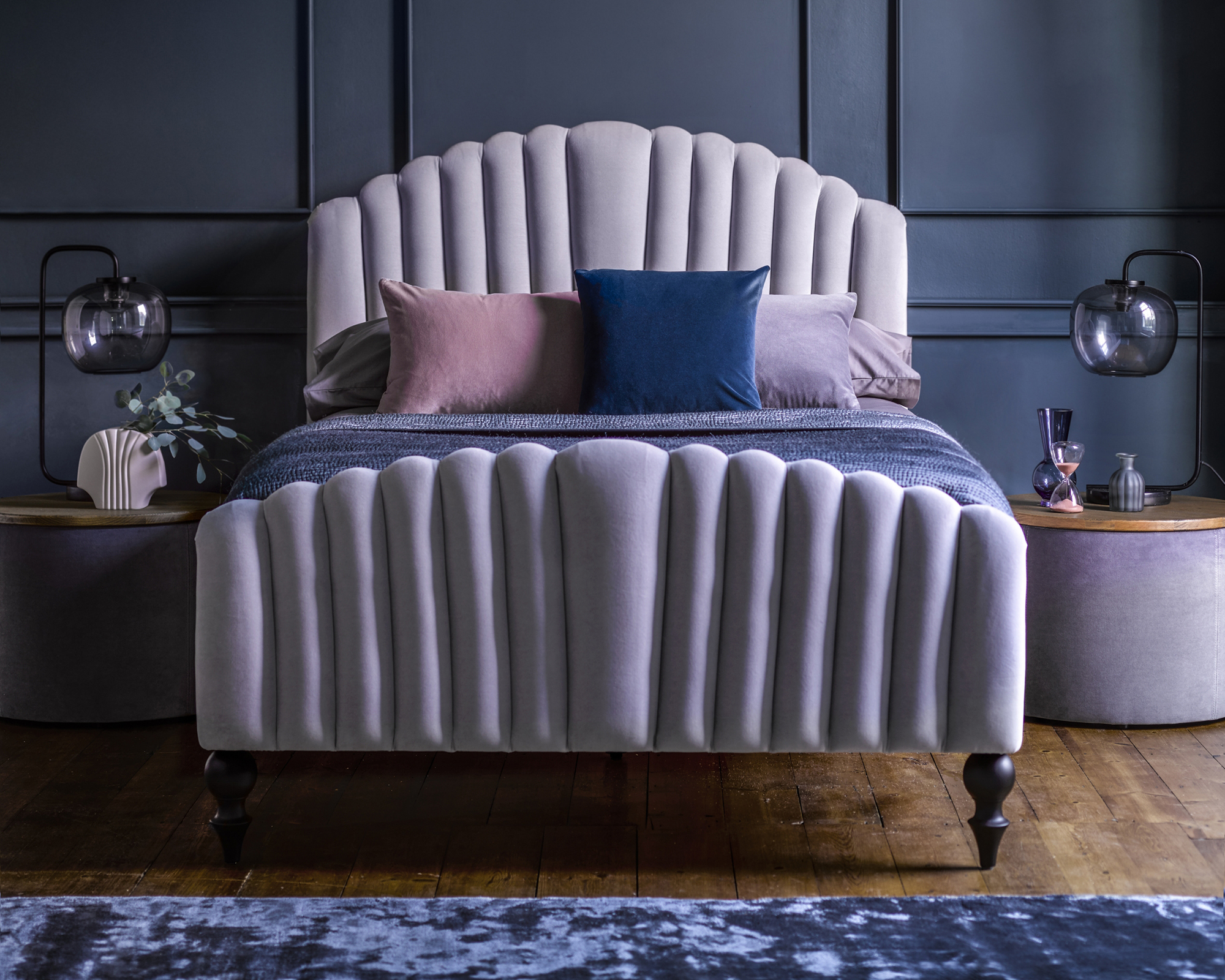
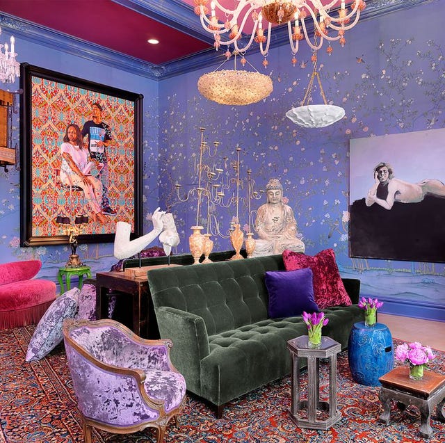
Purple, a color associated with creativity and luxury, can be a bold and impactful choice for home interiors when used correctly. However, not all color pairings enhance purple's inherent flair; some combinations can detract from its richness and lead to an unappealing aesthetic. This article identifies four specific color families that should generally be avoided when decorating with purple, offering alternative, more harmonious choices.
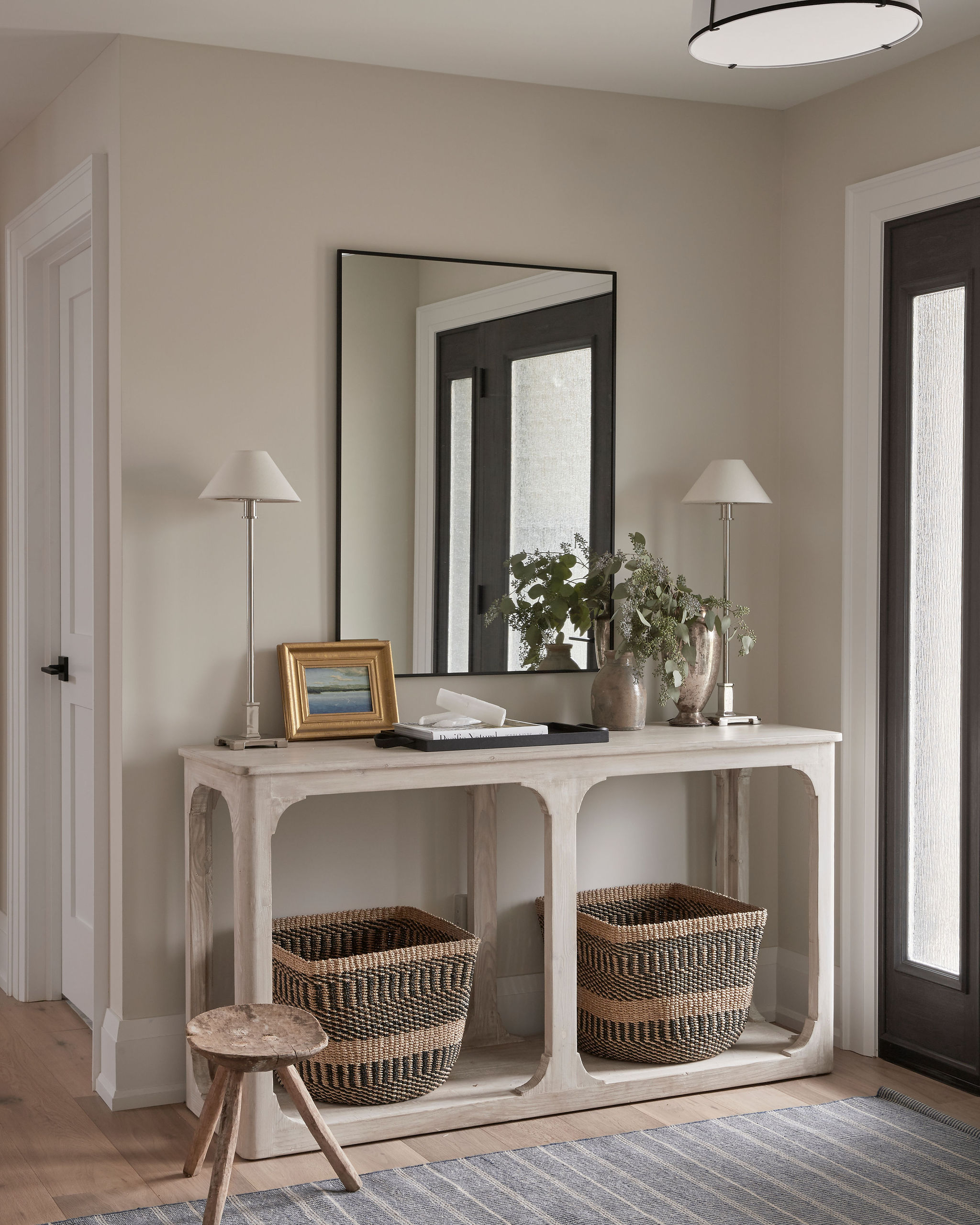
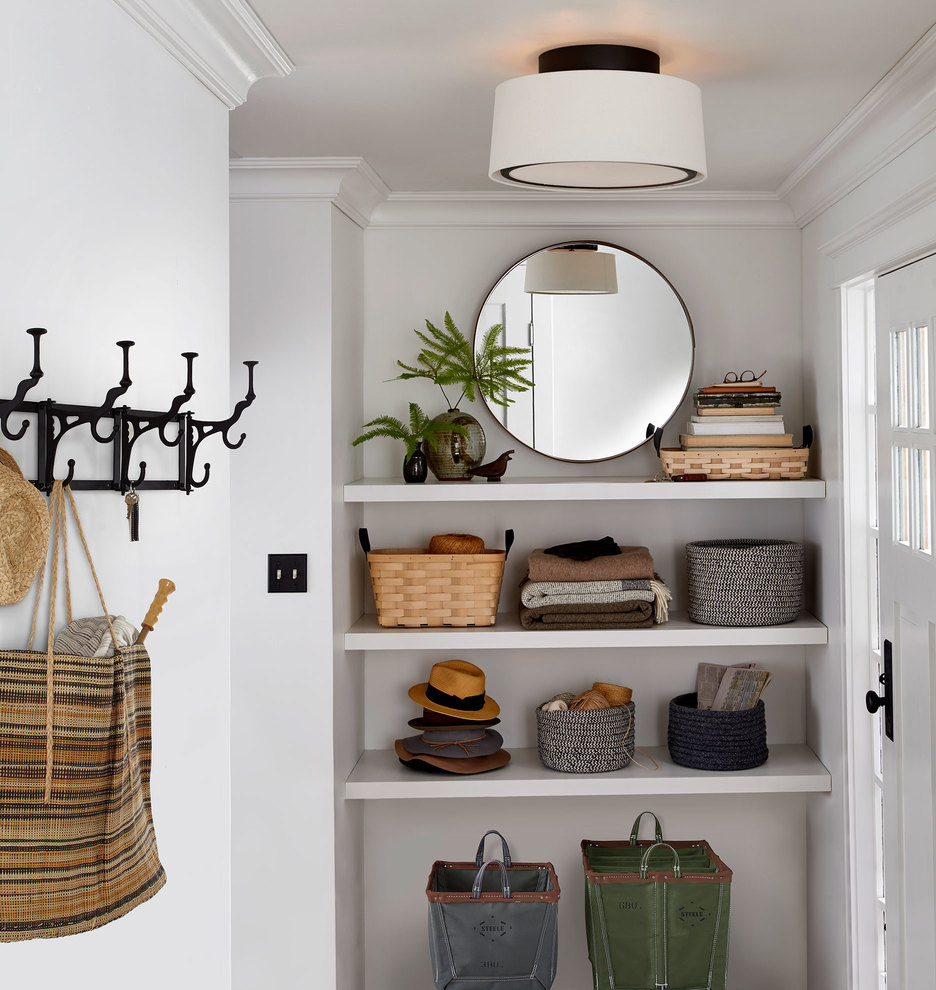
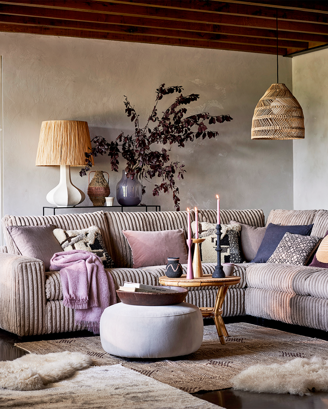
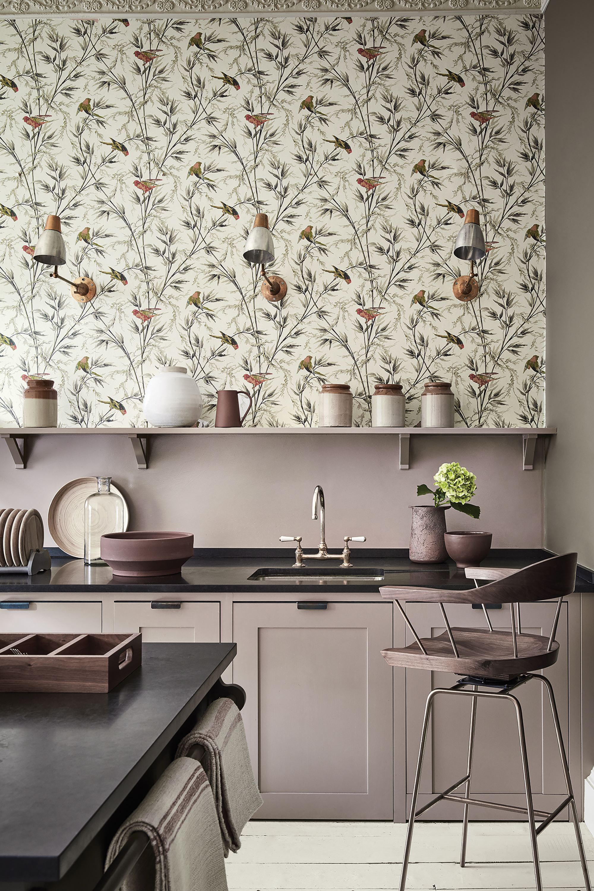
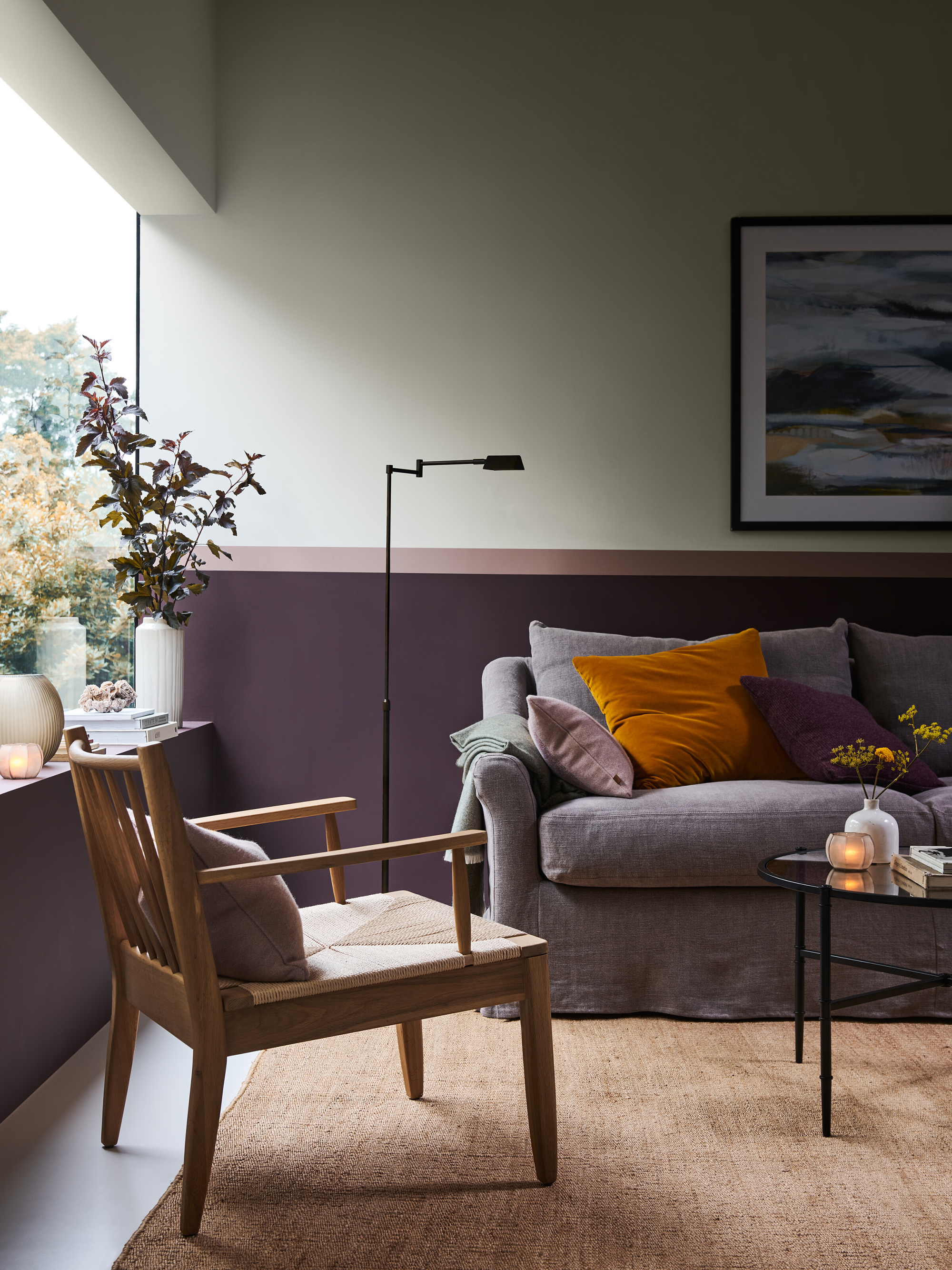
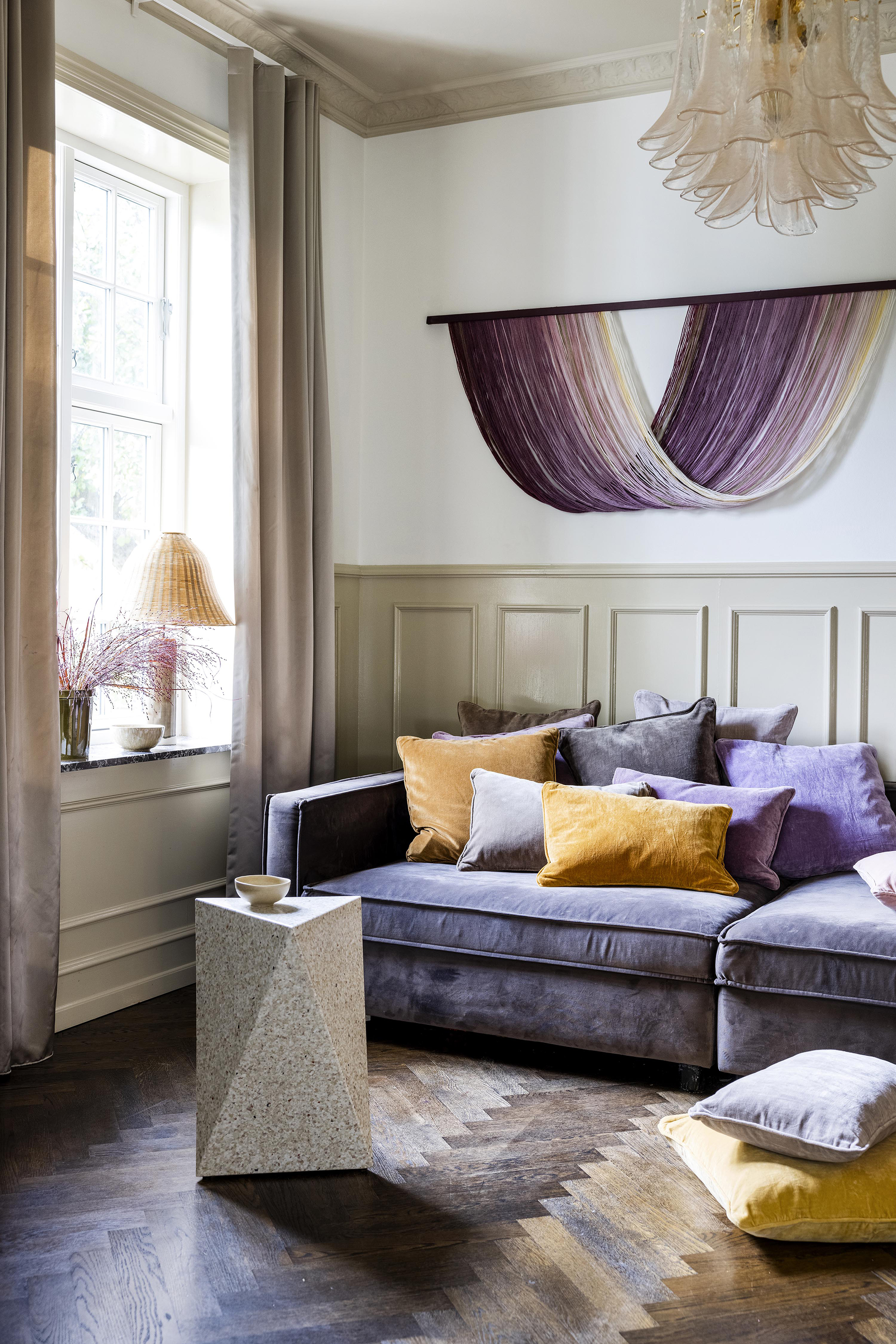
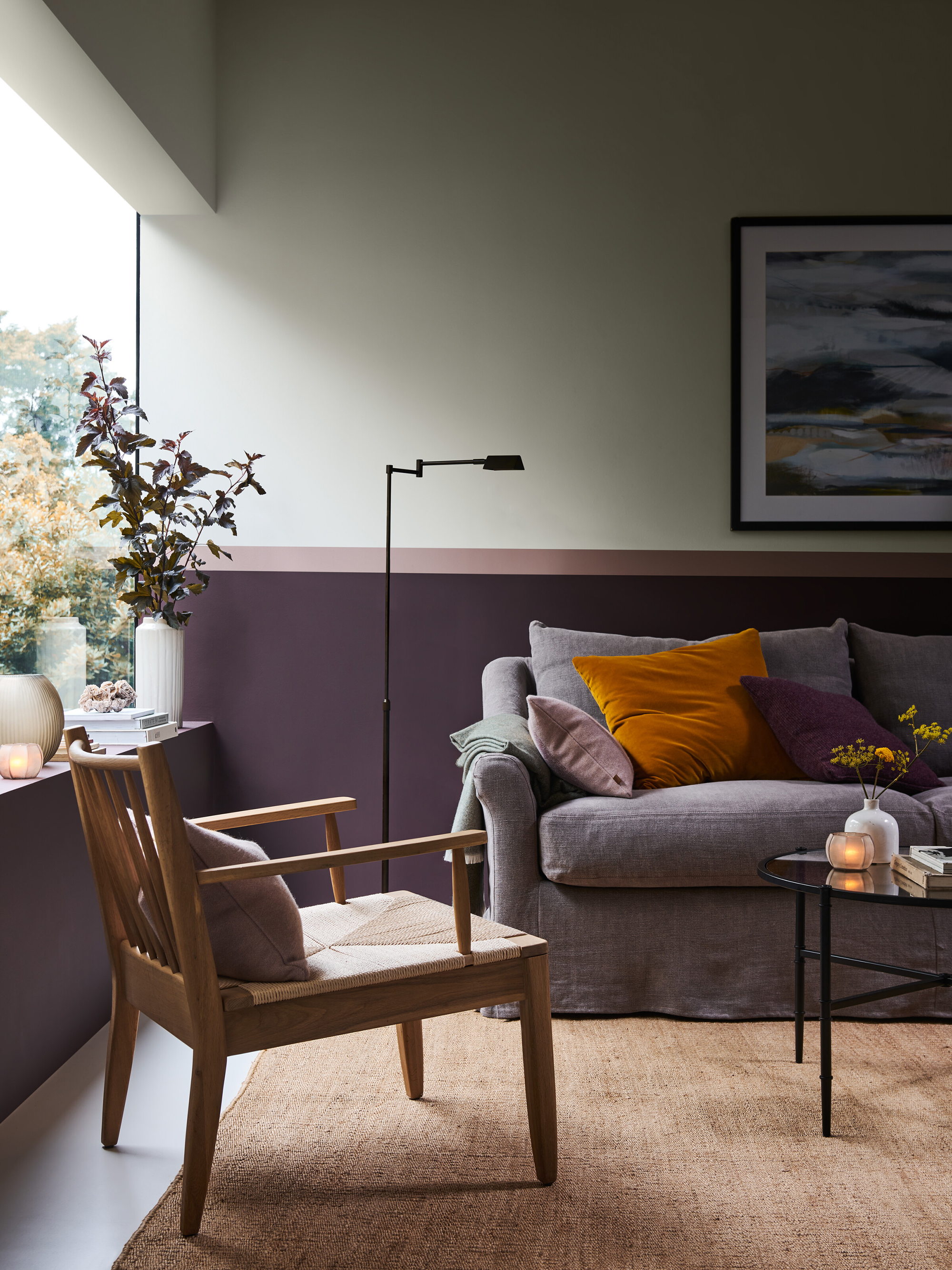
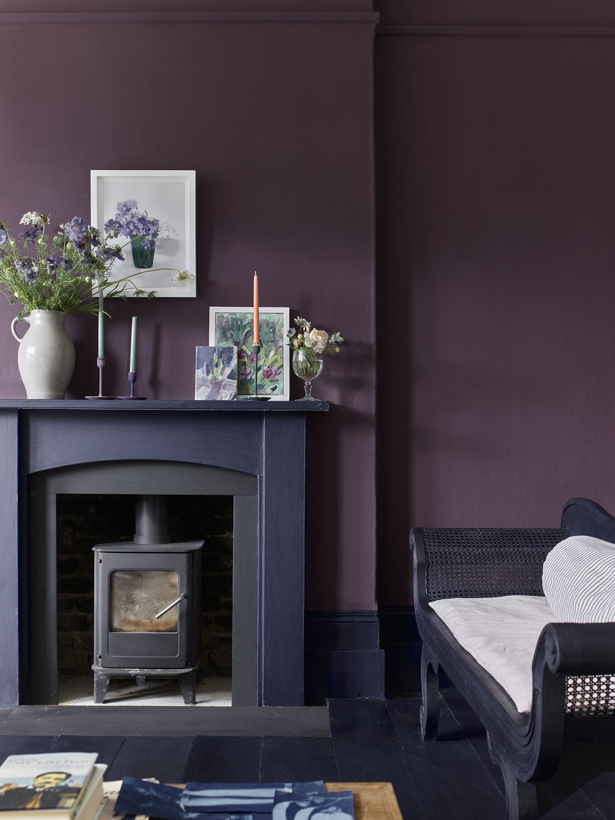
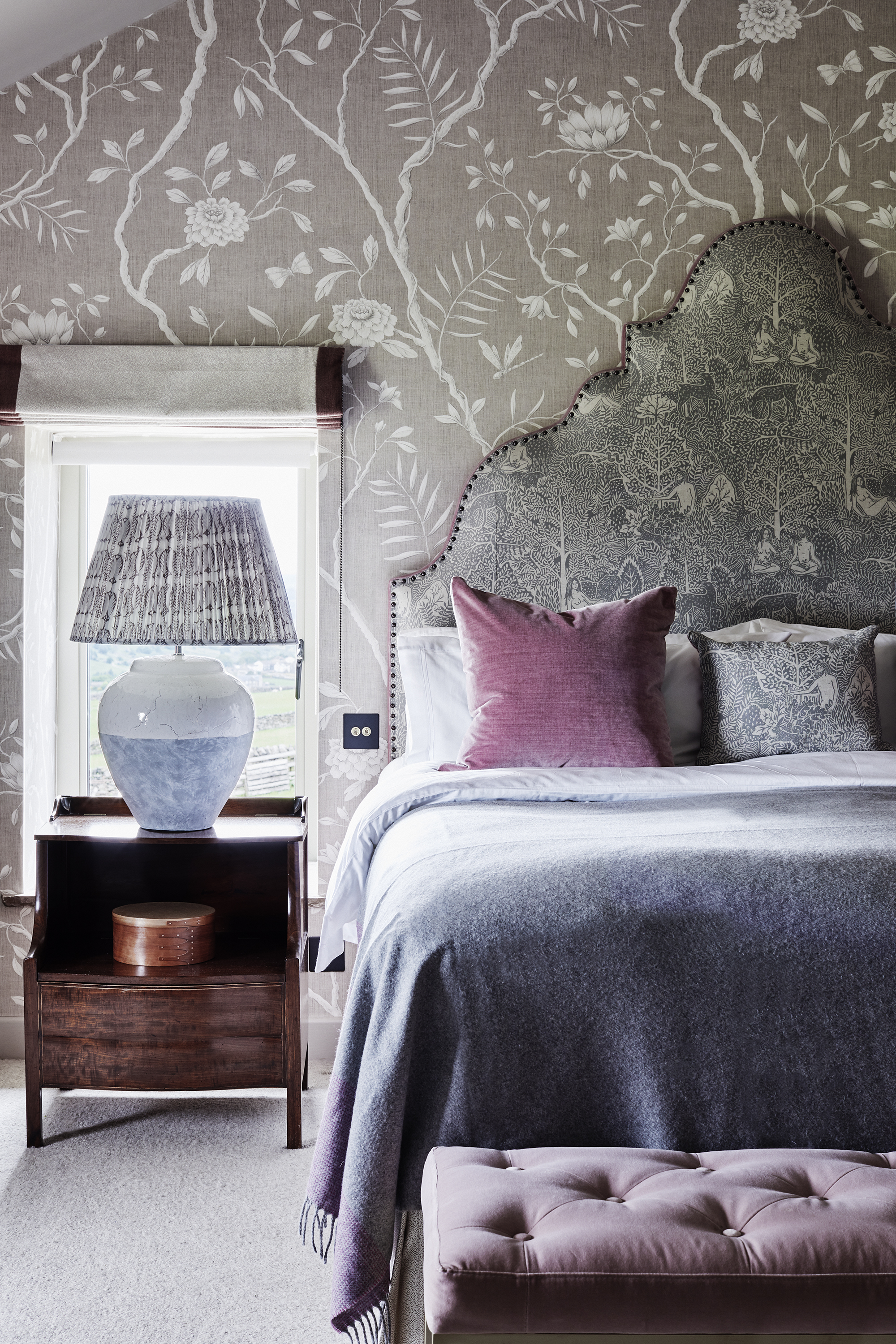
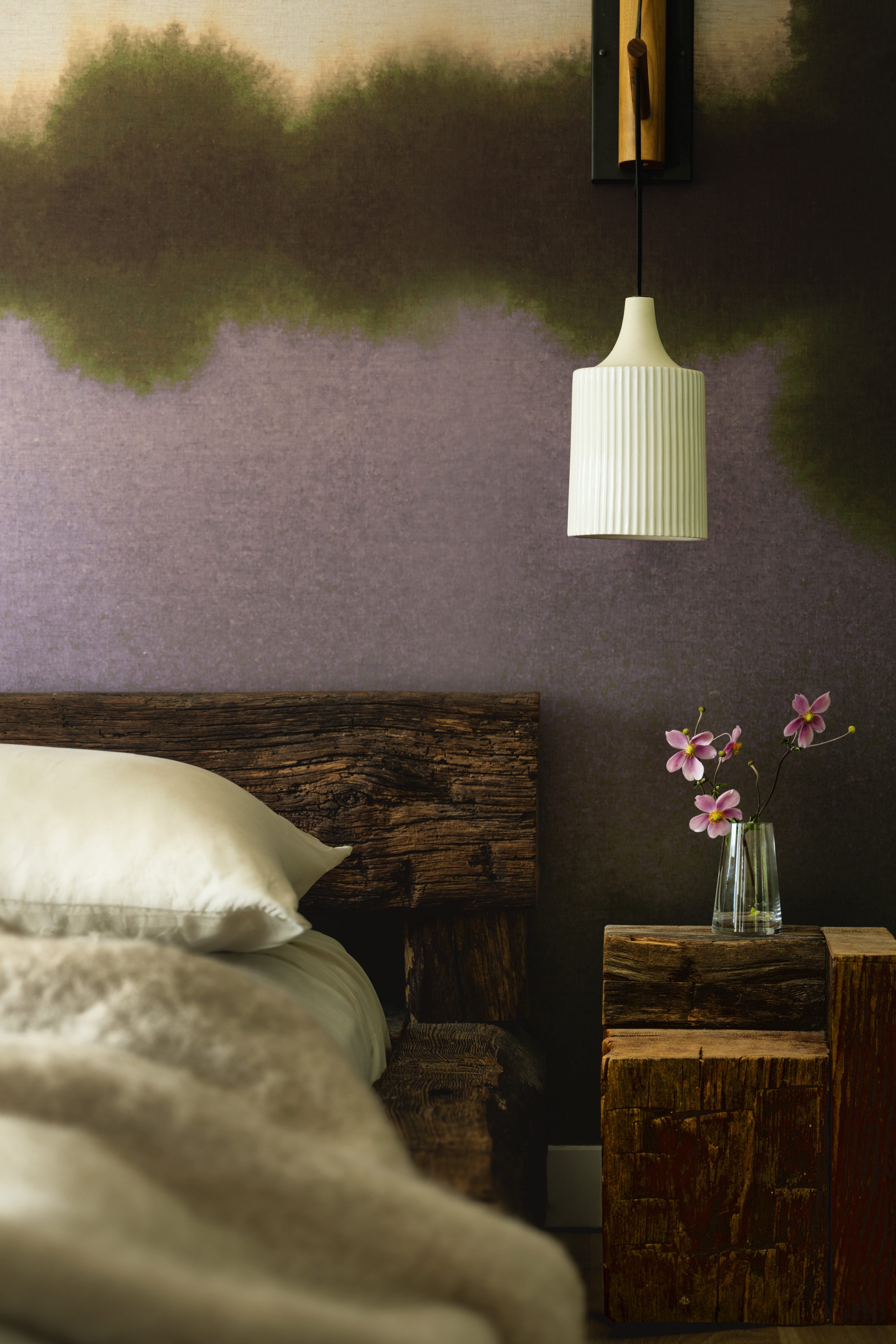
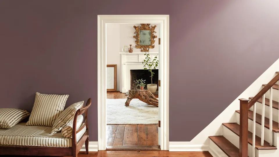
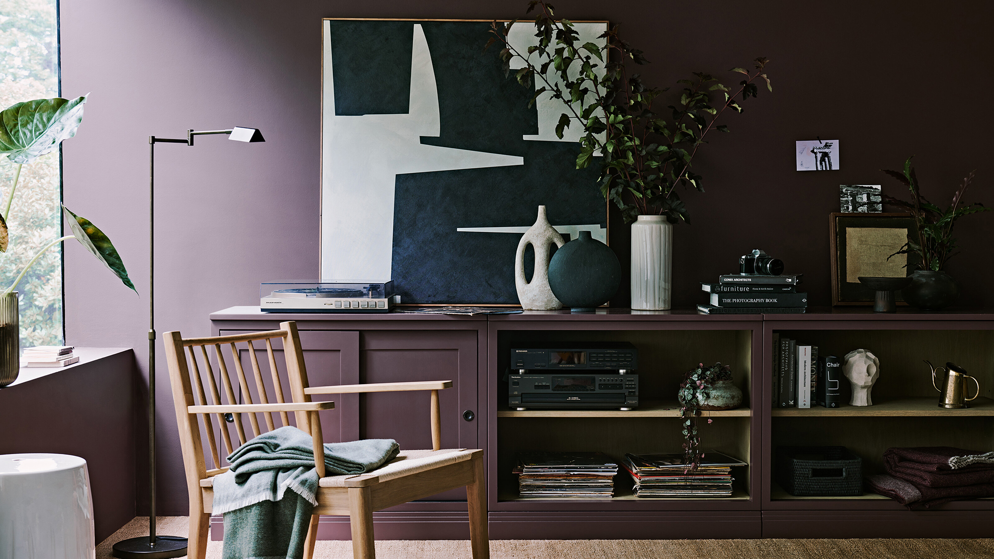
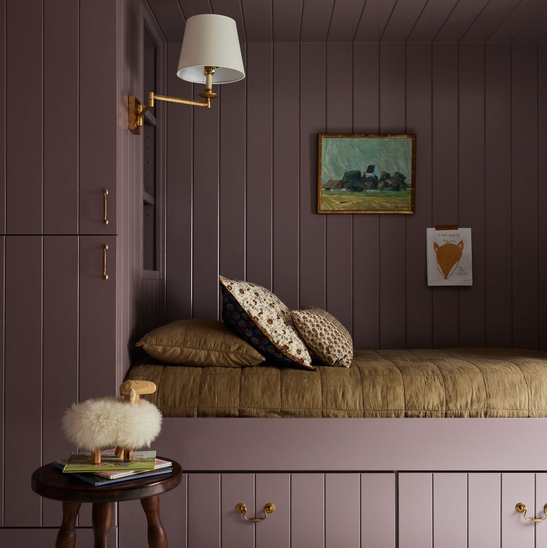
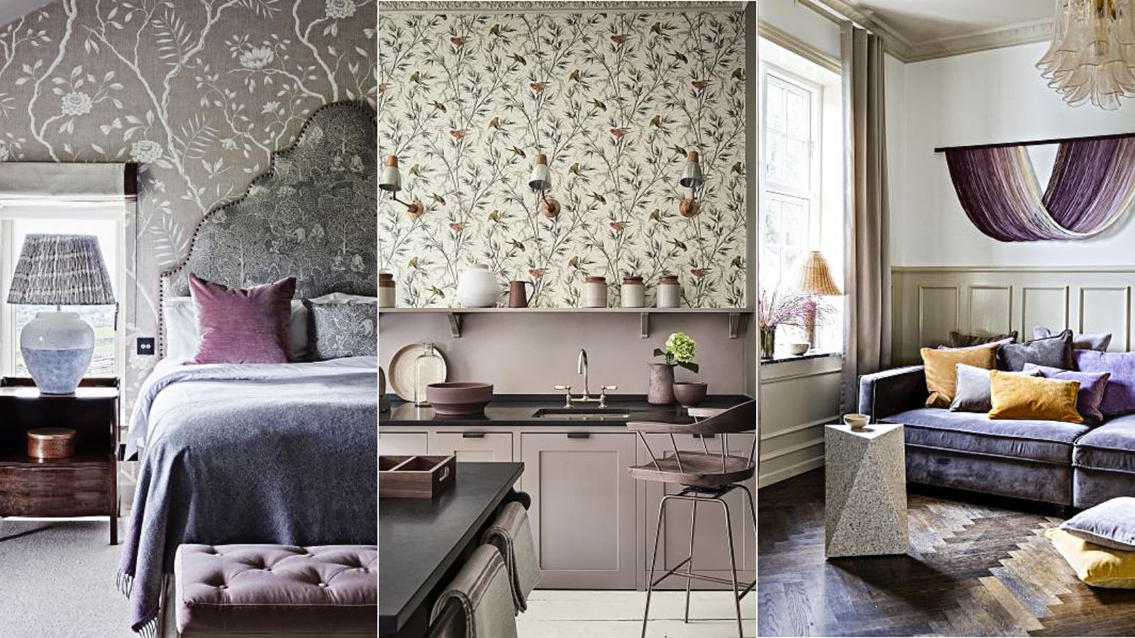
The first color to steer clear of is cool-toned gray. While gray might seem like a sophisticated neutral, its cool undertones can neutralize purple's vibrancy, making a room feel cold and unwelcoming. This effect is particularly noticeable in north-facing rooms, where cool colors can exacerbate a chilly atmosphere. Instead of gray, the article recommends pairing purple with brown. Brown introduces warmth and a grounding effect, allowing purple to maintain its spark without feeling dull.
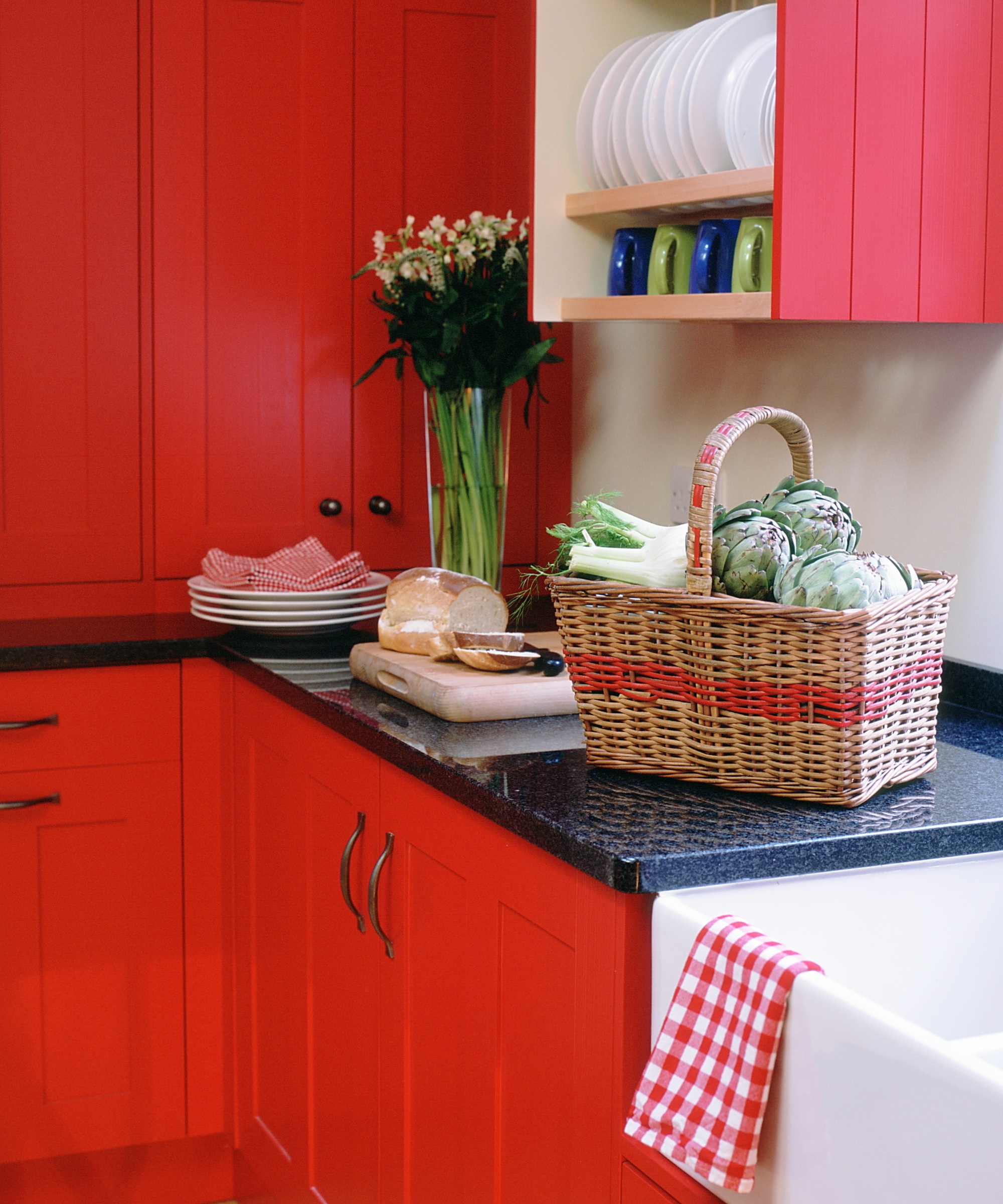
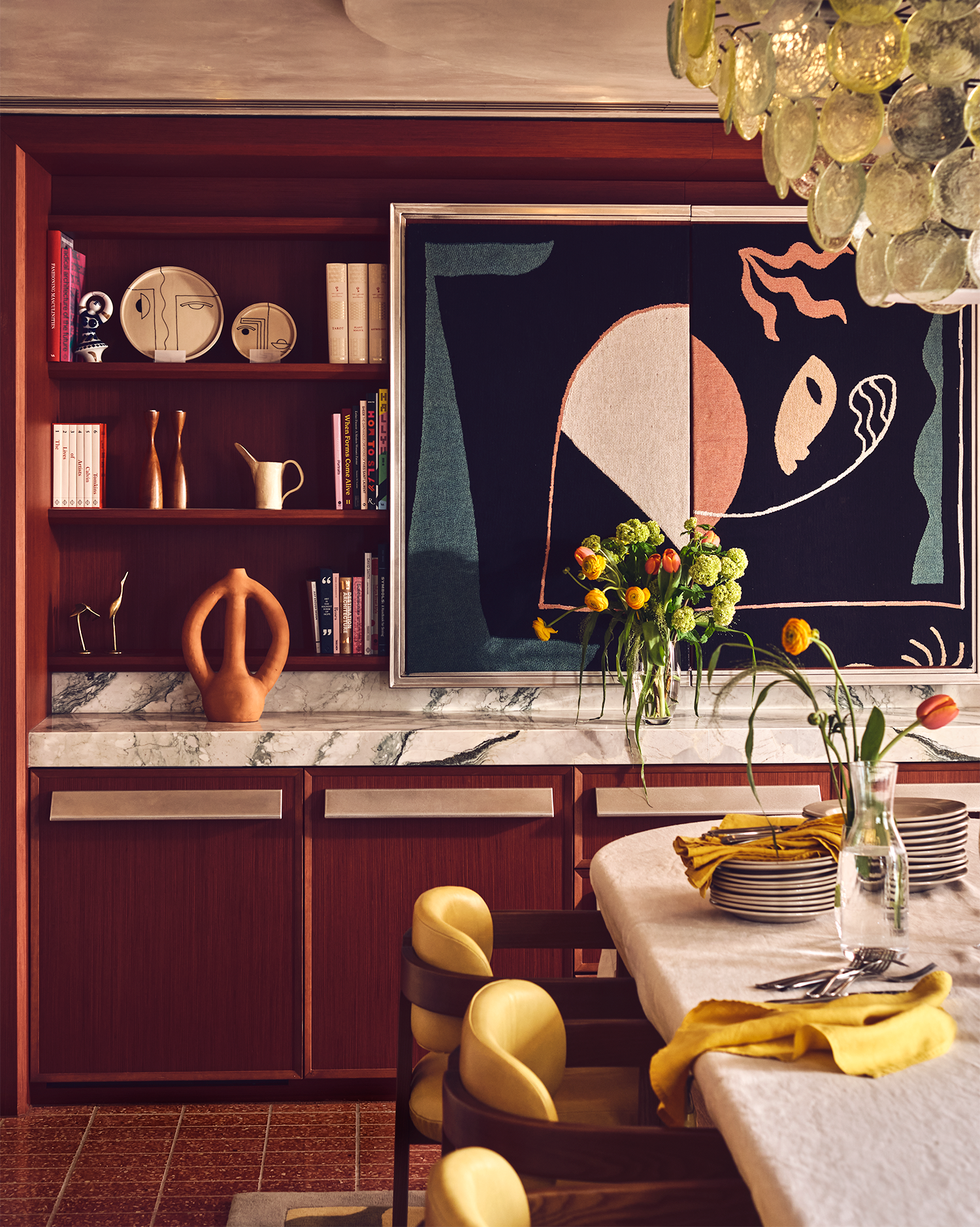
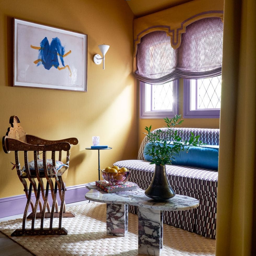
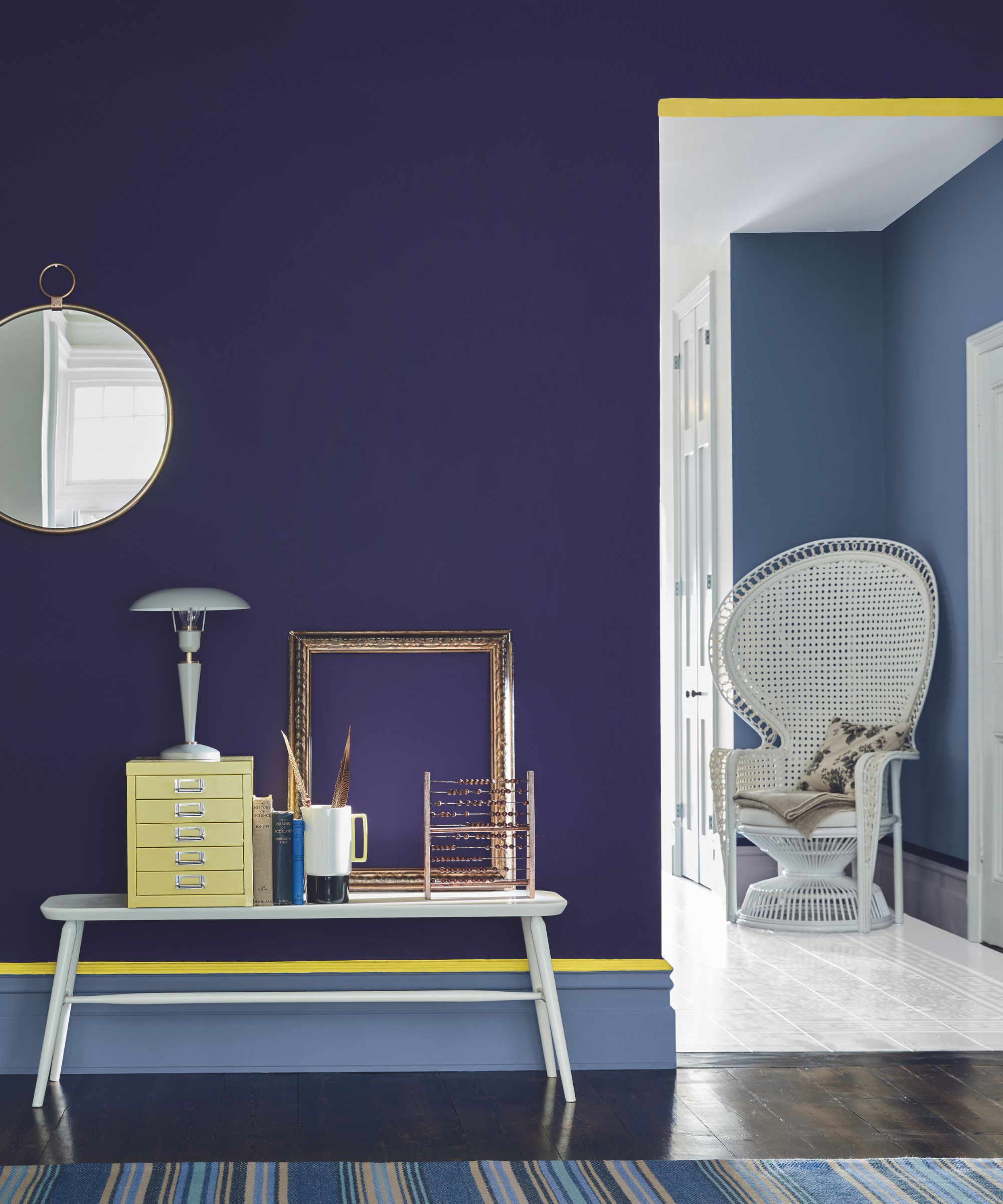
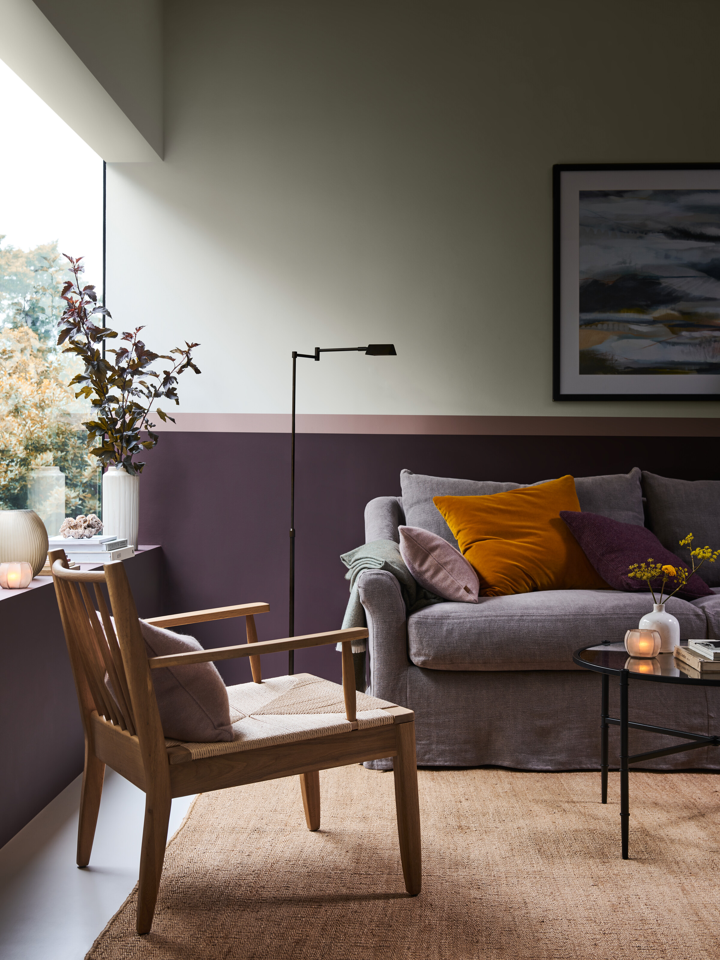
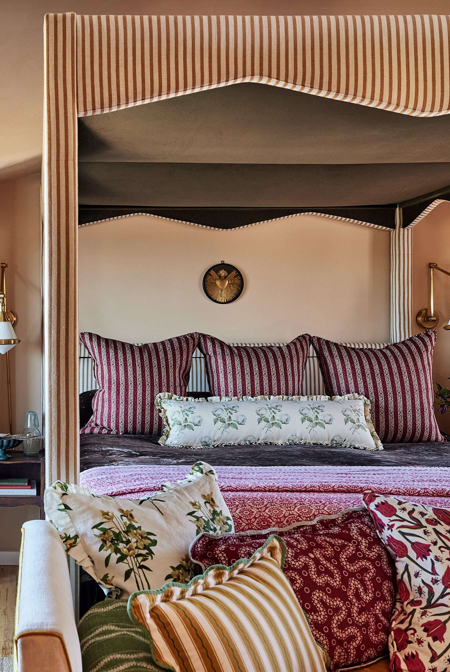
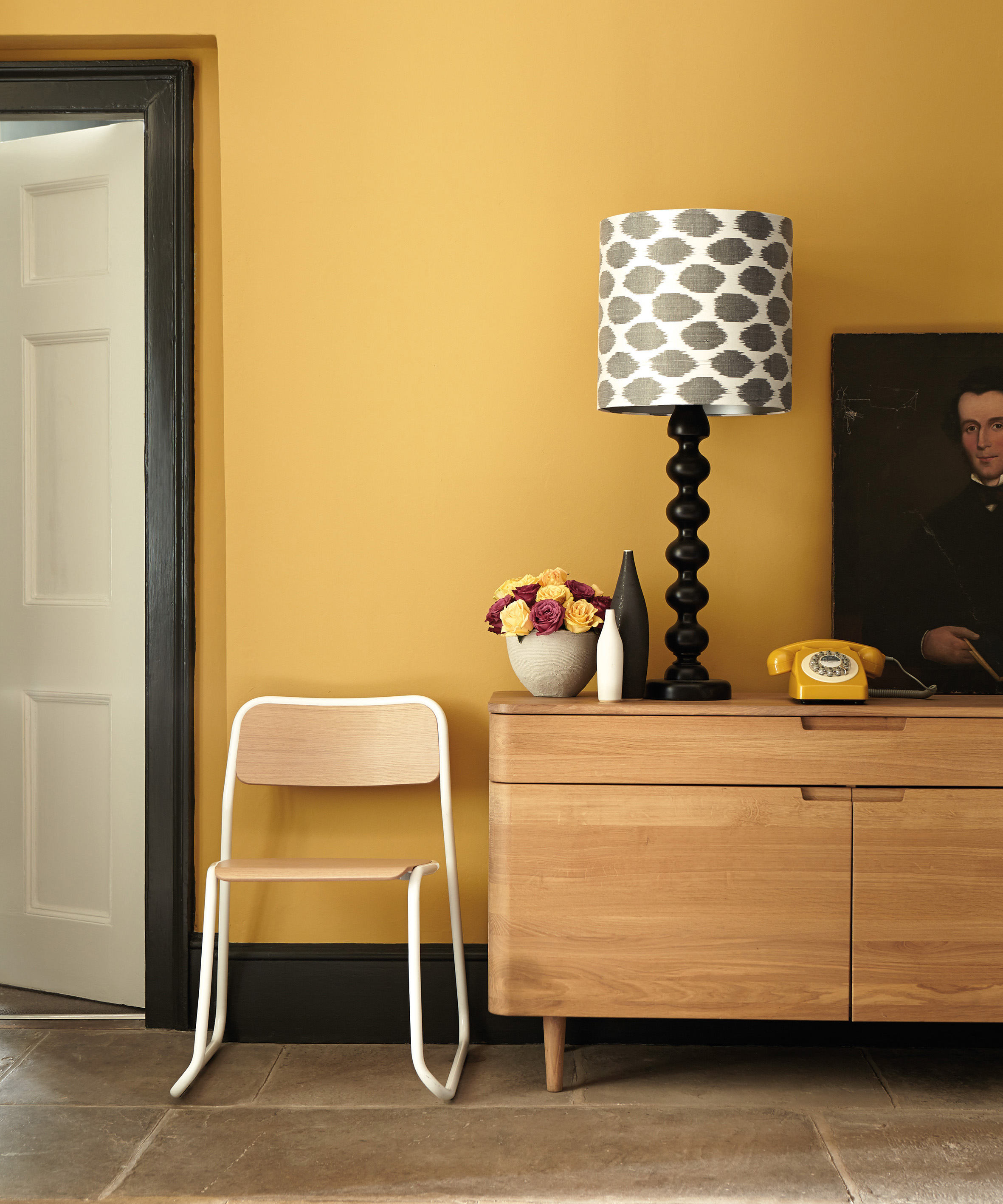
Next, bright yellow is highlighted as a problematic companion for purple. Despite being a complementary color on the color wheel, bright, lemony yellows create a jarring and chaotic contrast with purple, making the space feel restless. The recommendation is to opt for yellow-toned greens or earthier shades like umber, deep mustards, terracottas, and burnt ochres. These alternatives possess brown undertones that help to ground the scheme and prevent an artificial or clashing appearance. When using these earthier yellows, it's suggested to incorporate them through decorative details such as cushions, throws, rugs, and ceramics, rather than painting entire walls.
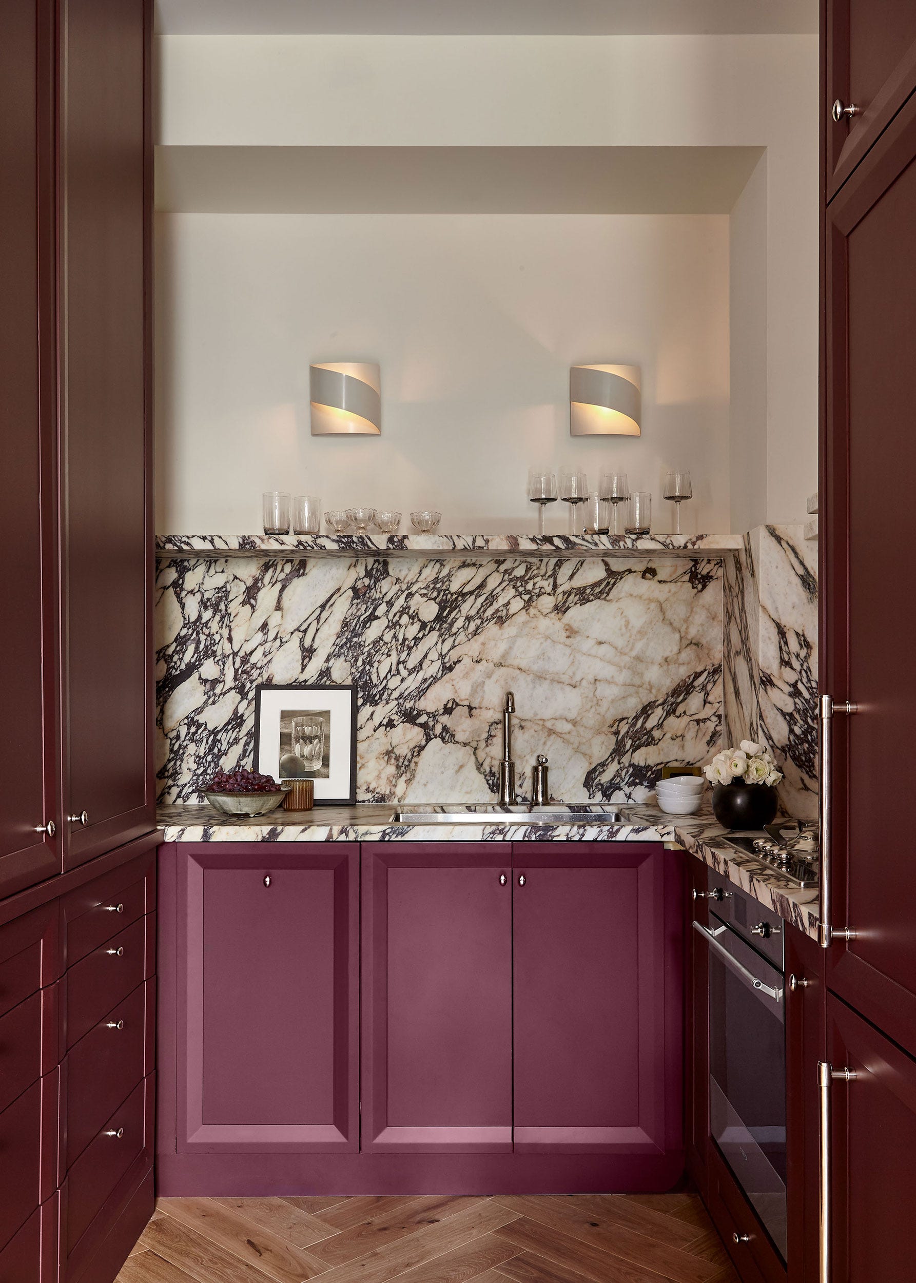
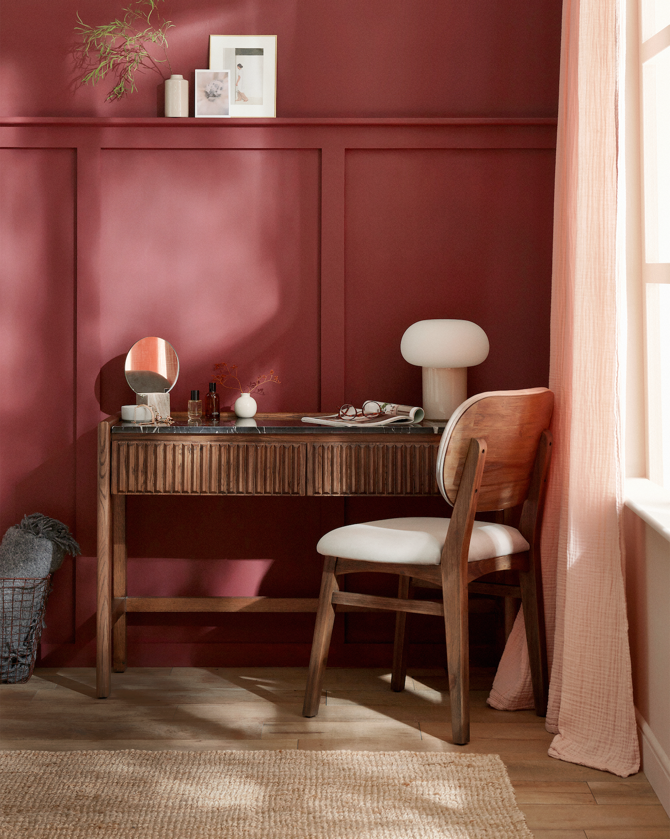
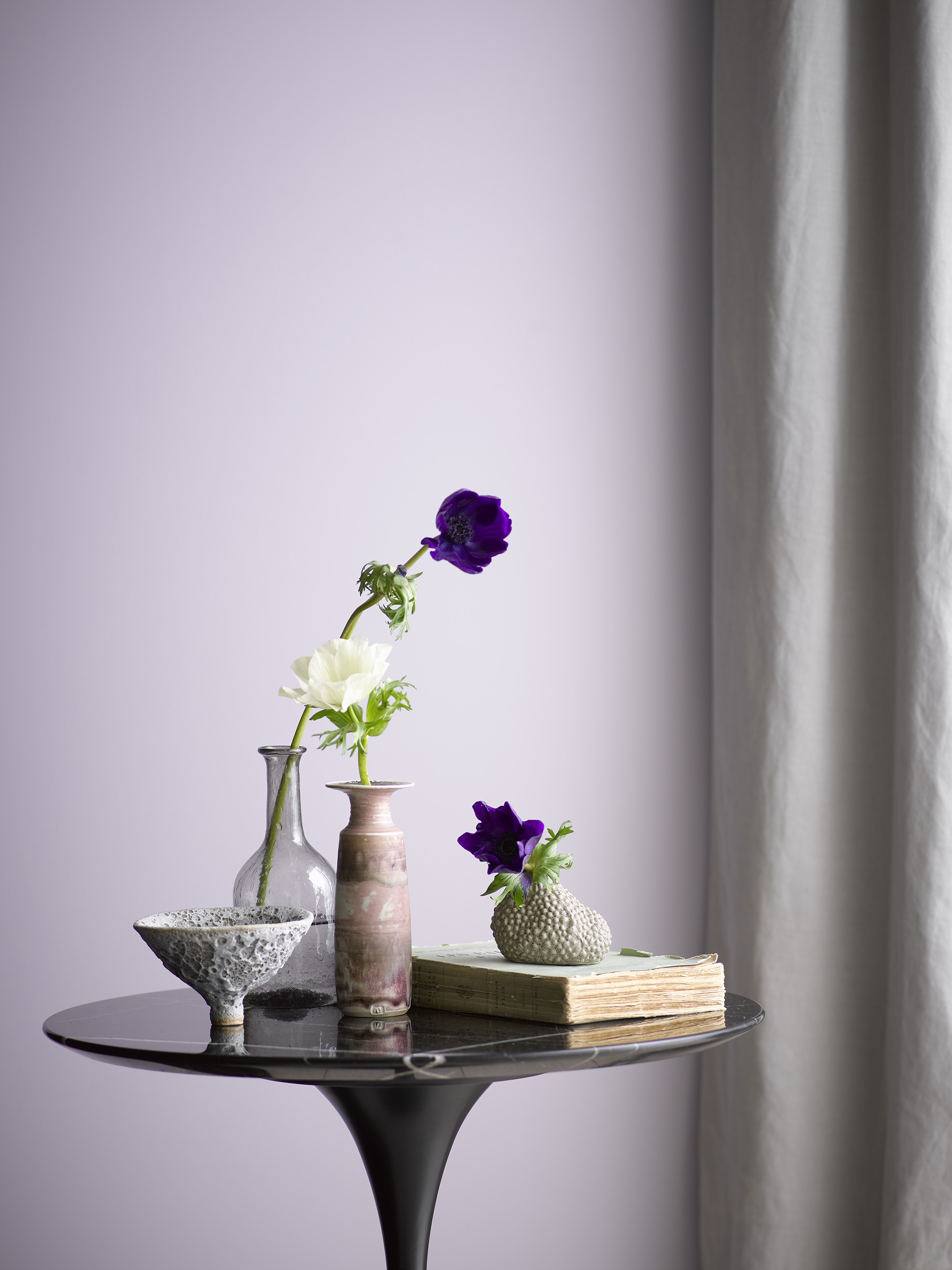
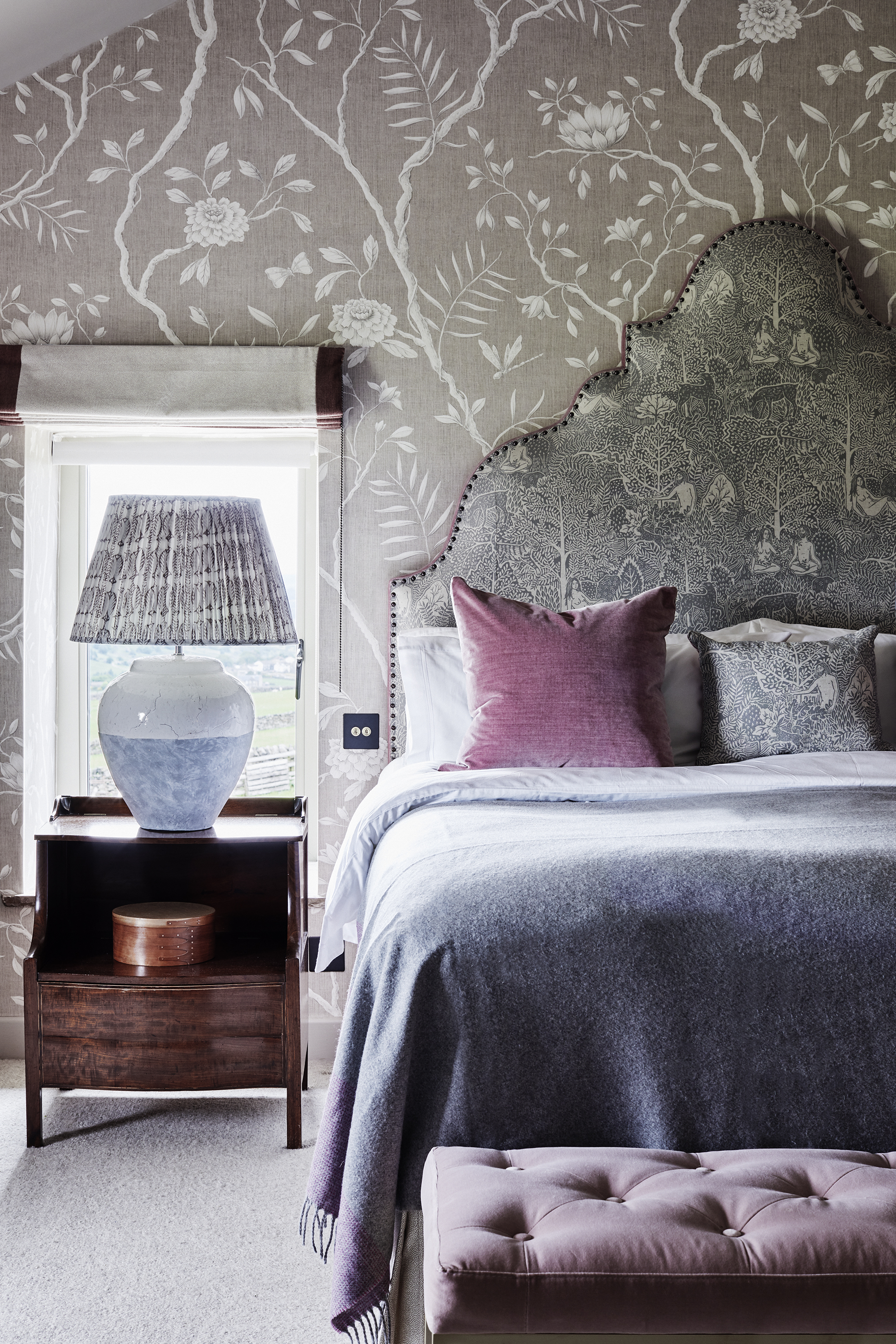
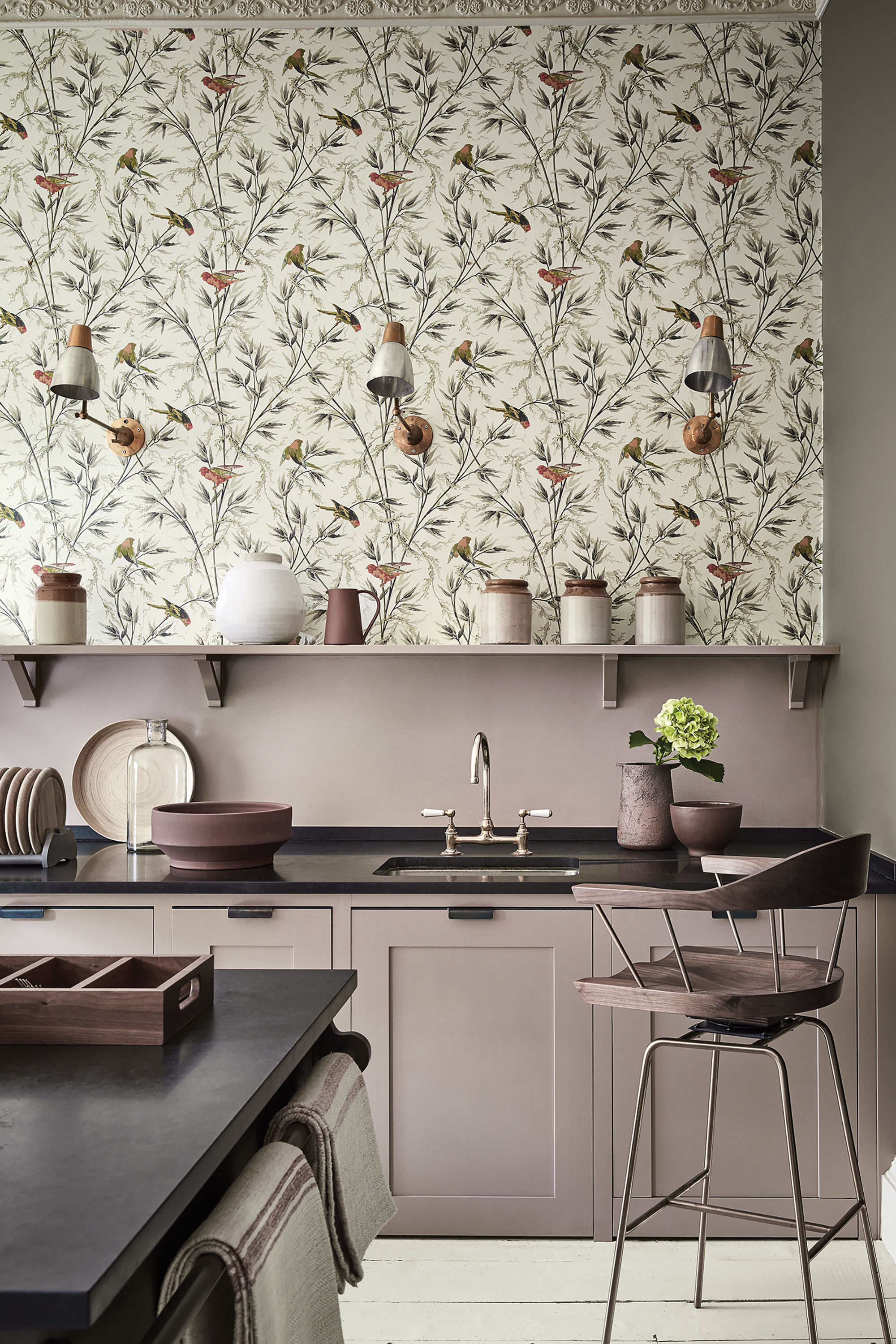
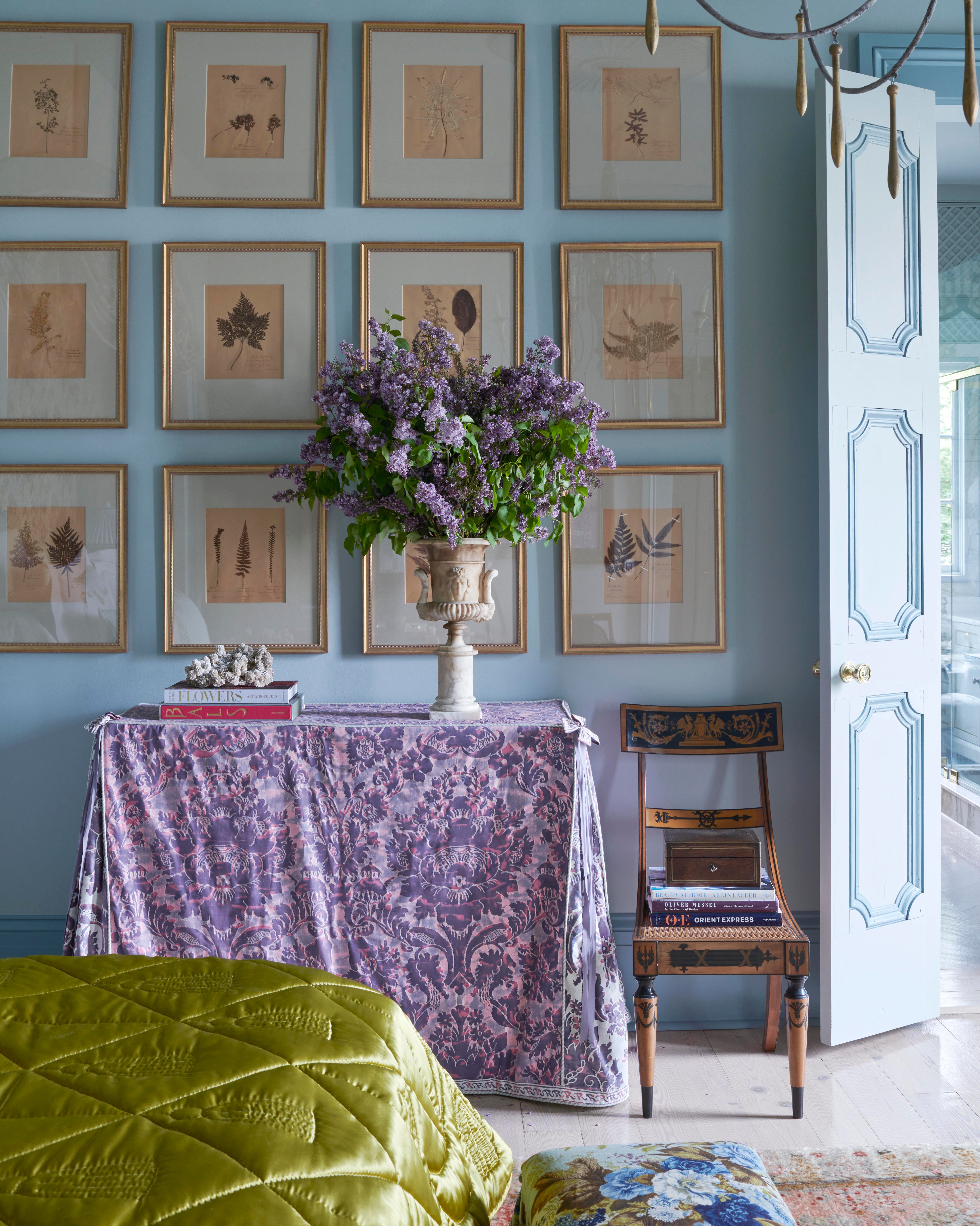
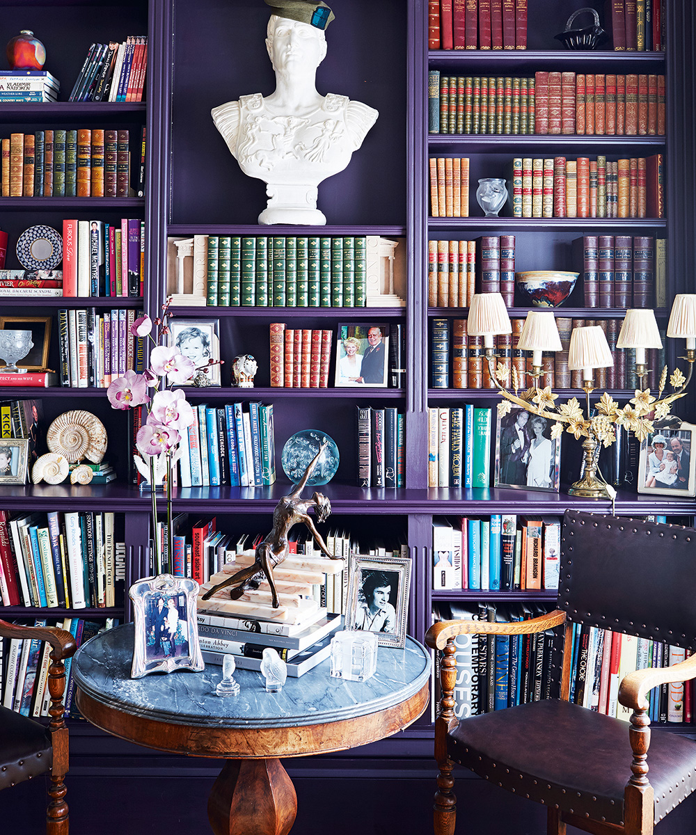
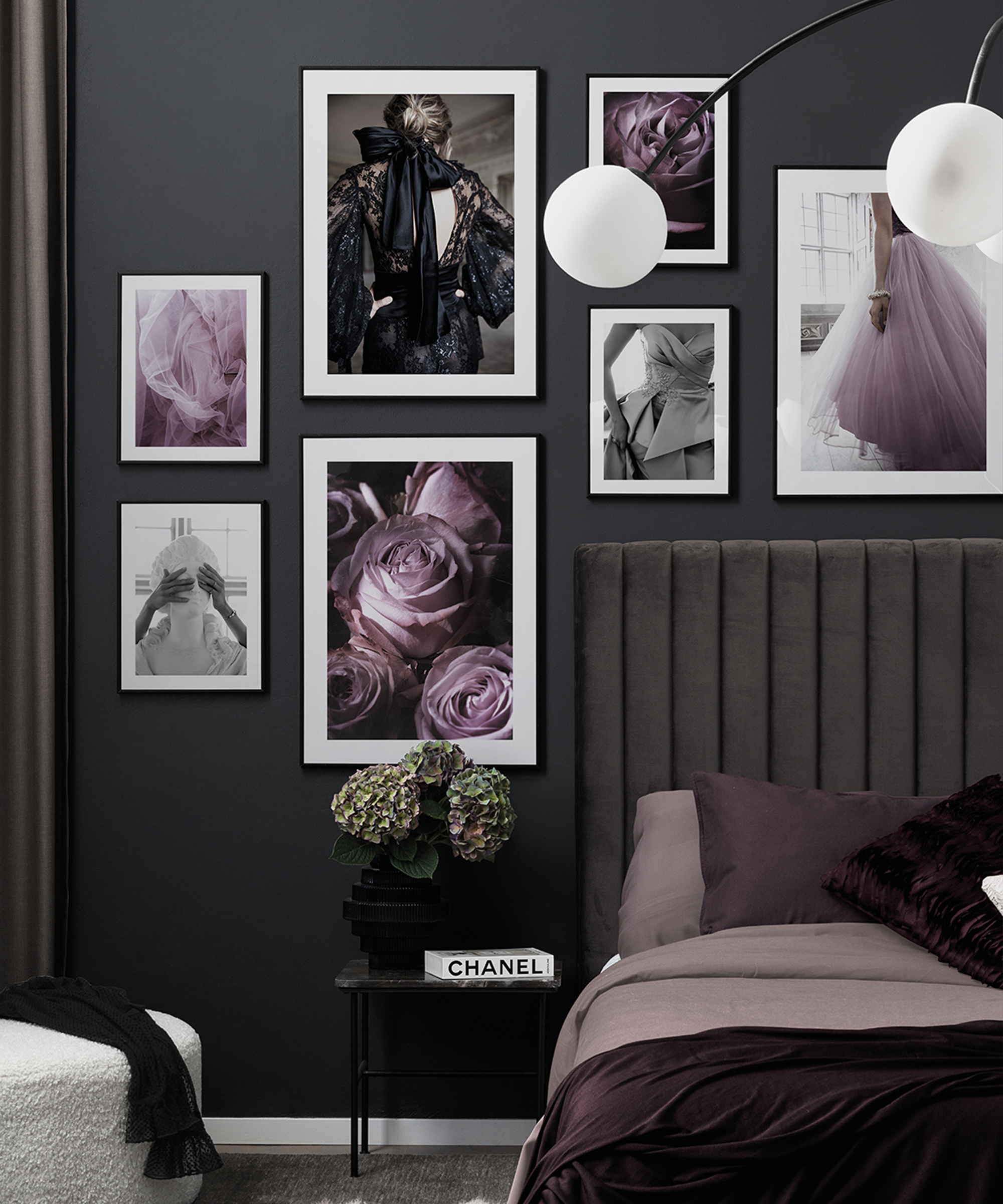
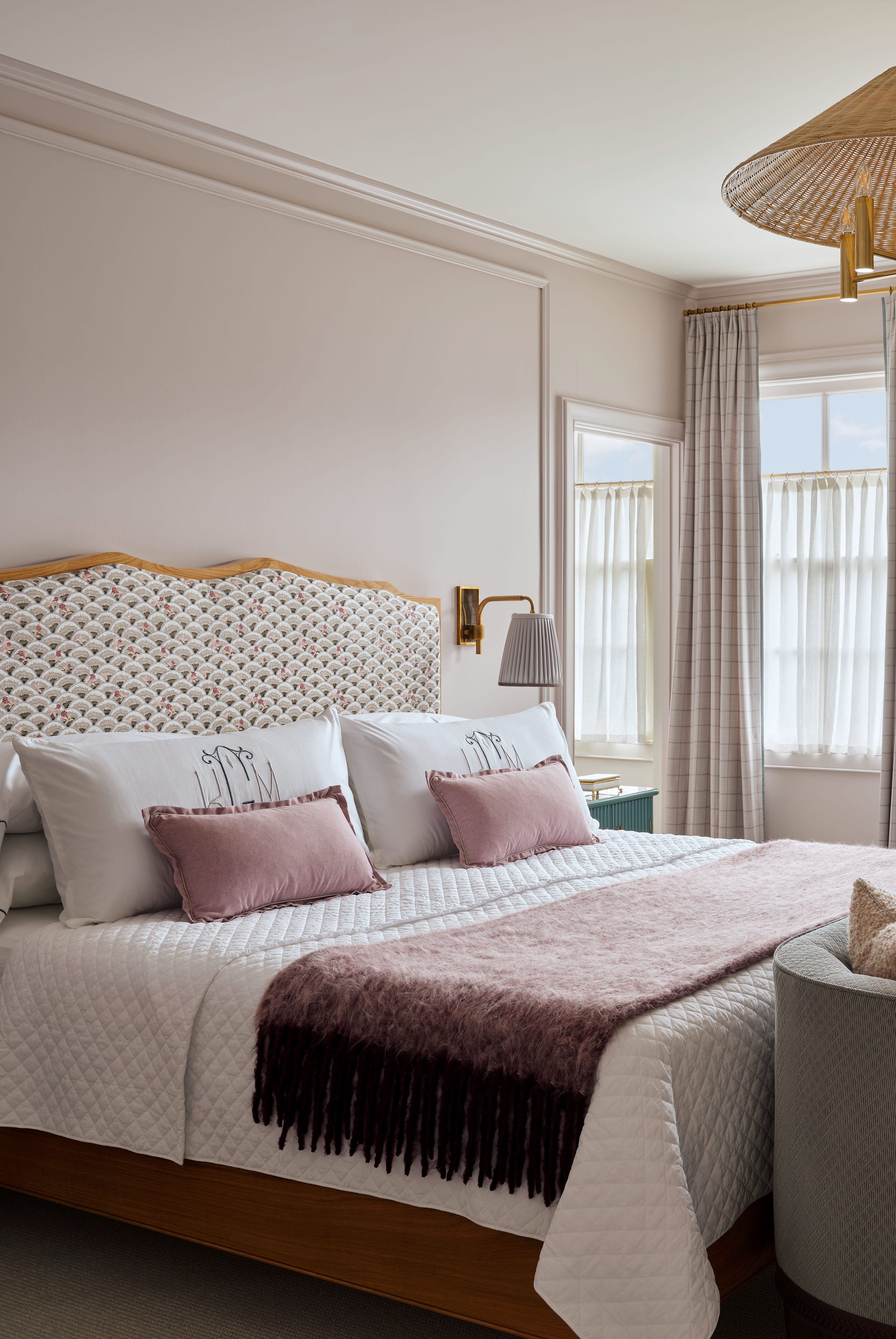
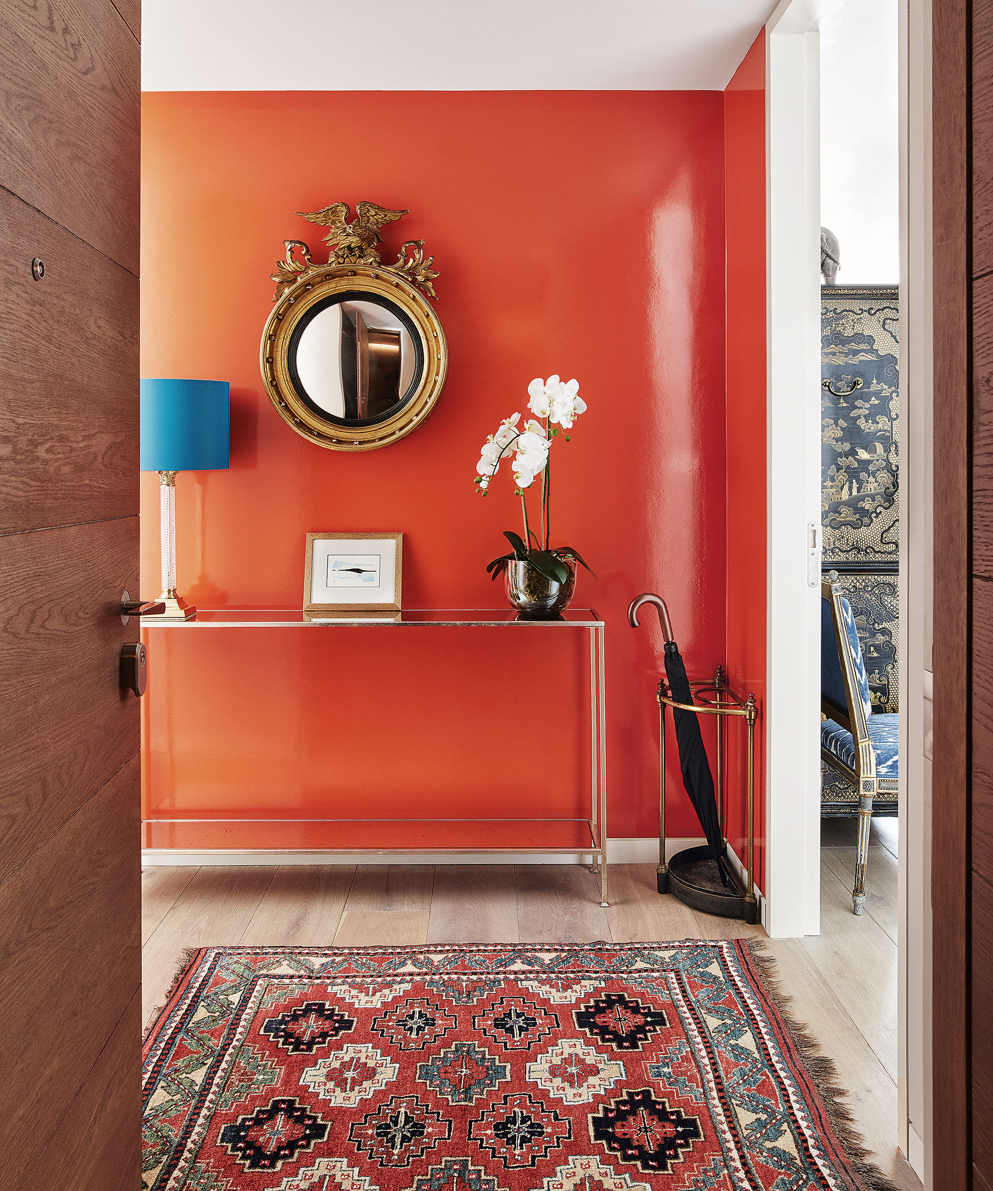
The third color combination to approach with caution is bright pink. While purple and pink can form a romantic and chic palette, particularly when pinks are dusky and muted, overly sugary or bright pinks can make a space resemble a 'birthday cake' rather than a sophisticated design. The key is to select dusky, muted pinks with hints of gray or beige, which create a warm, grown-up, and balanced aesthetic. Examples of suitable paint shades include Nether Red by Little Greene and Paean Black by Farrow & Ball, described as a tasteful, almost black purple.
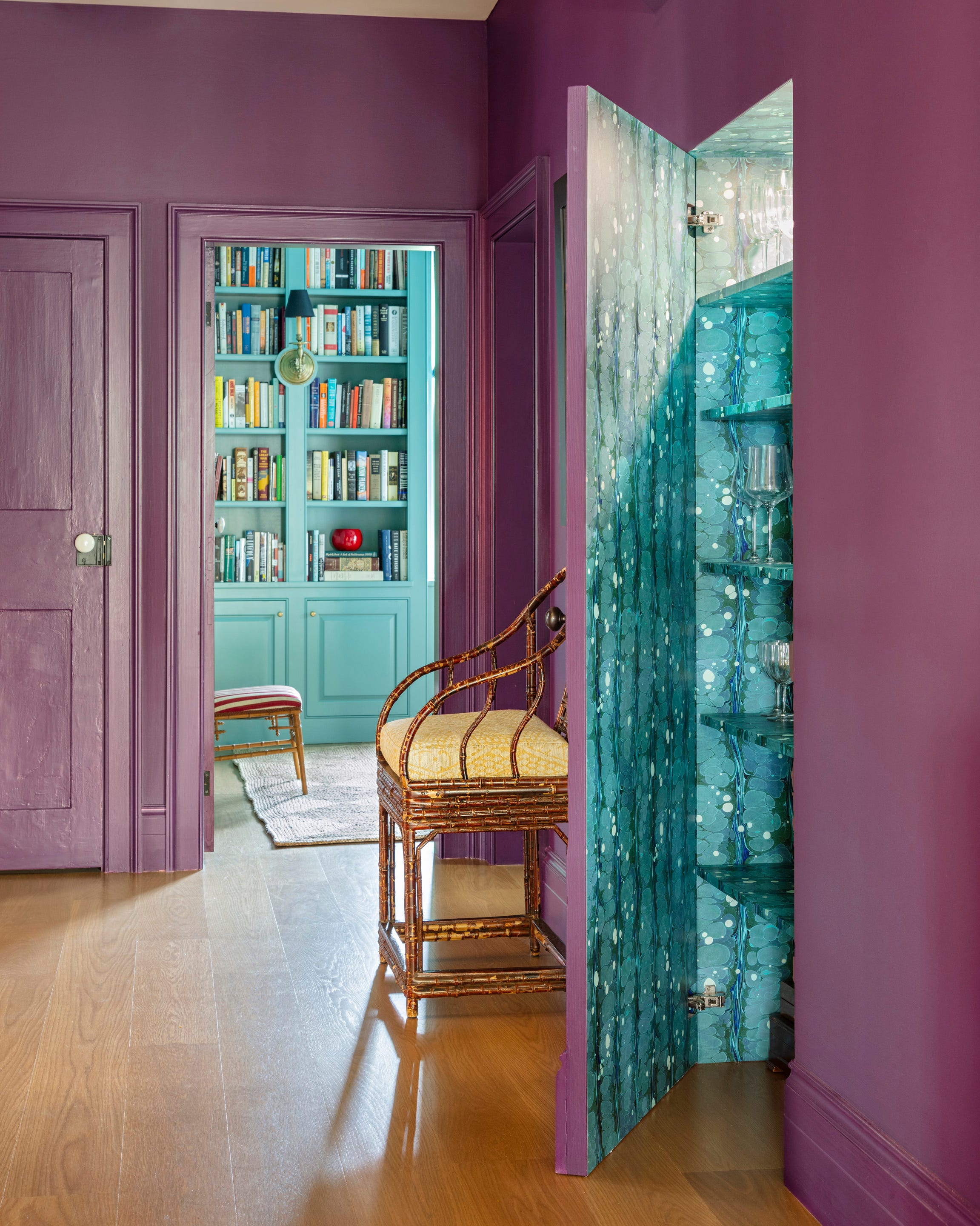
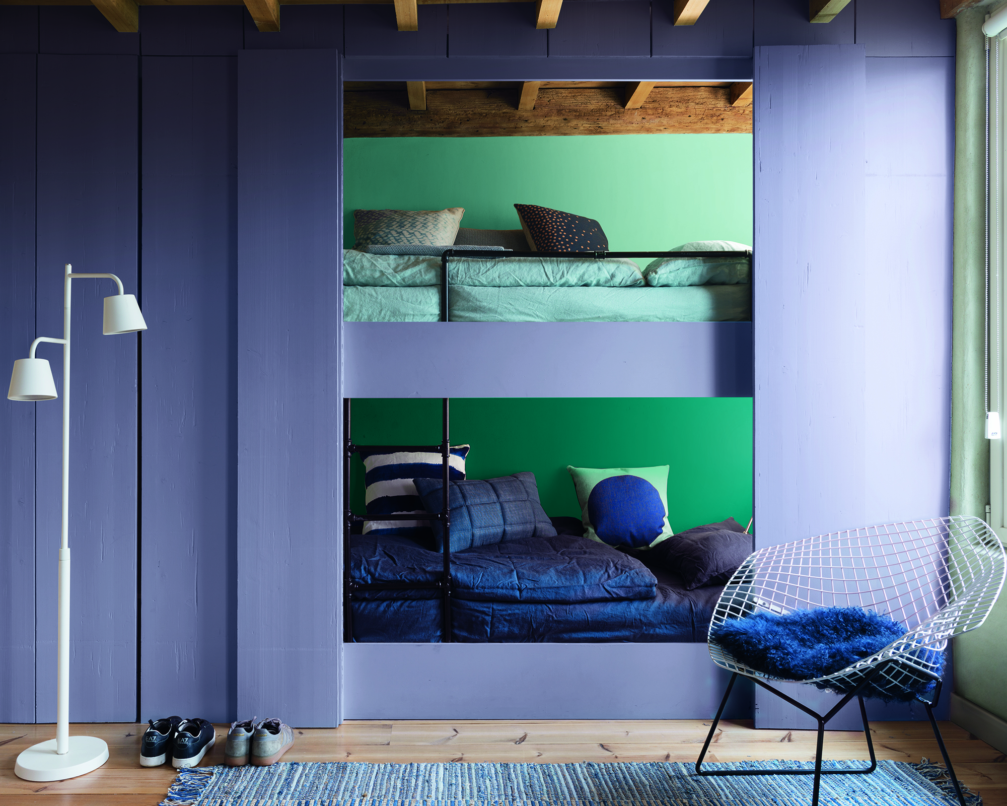
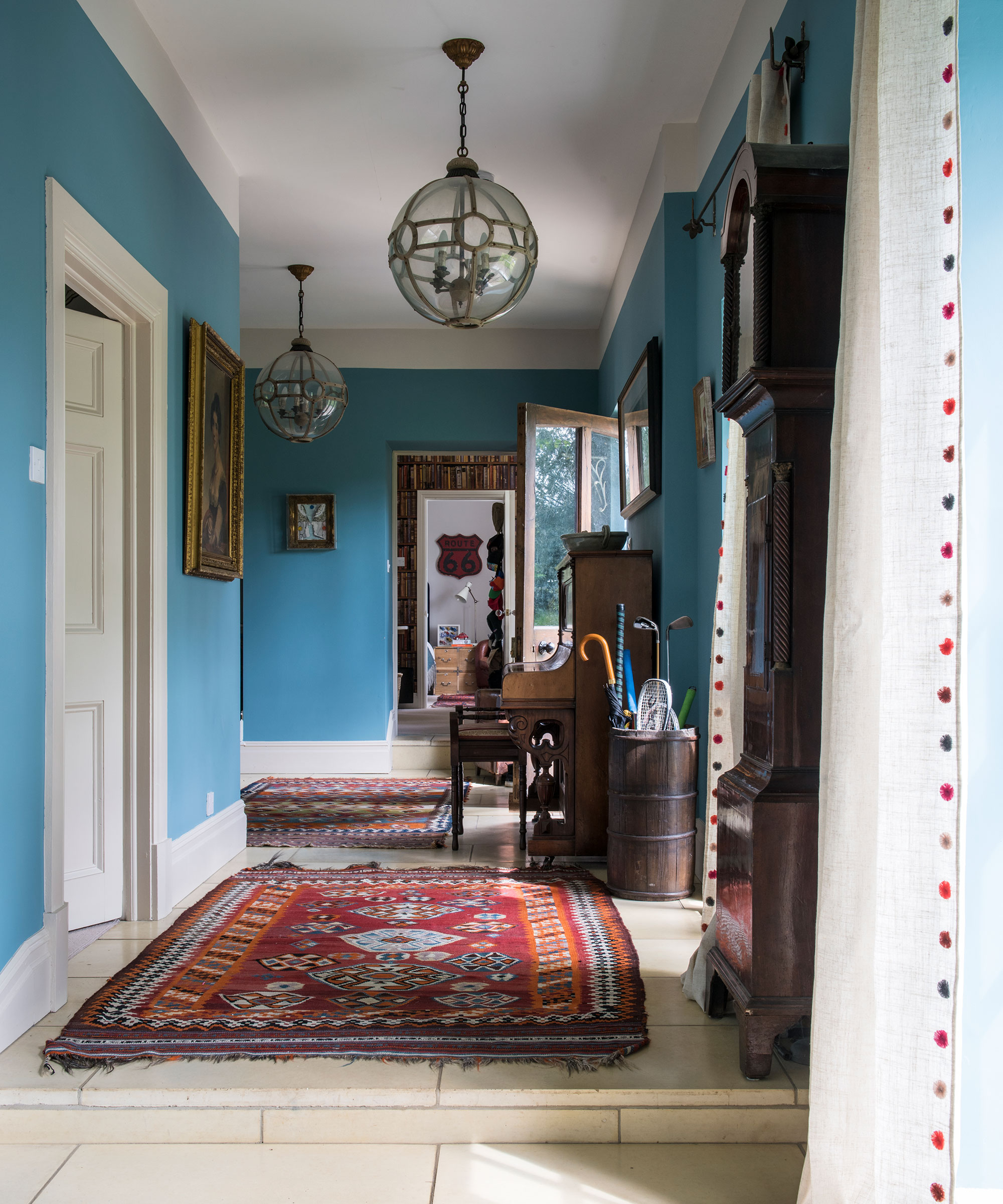
Finally, garish green is identified as a color that can go 'really wrong' with purple. Bright, acid greens tend to clash with purple's richness, potentially leading to a sickly or synthetic feel. A much more effective pairing is olive green. Olive green offers sufficient depth and warmth to complement purple, softening its cool edge and creating a surprisingly calming and harmonious look. For those concerned about an overly regal or rich scheme, incorporating soft jade-tone greens, perhaps through cut-velvet fabrics, can cool down the palette and add subtle pattern and texture.
In essence, effectively decorating with purple requires careful consideration of its accompanying colors. By avoiding cool grays, bright yellows, garish pinks, and acid greens, and instead opting for warm browns, earthy yellows, muted pinks, and olive greens, purple can be celebrated for its depth and flair, transforming an interior into a rewarding and stylish space.
#ColorPsychology #HomeDecor #InteriorDesign #ColorCombinations #PurpleDecor #DesignTips #DecoratingTrends #ColorPalettes #ColorPsychology #HomeDecor #InteriorDesign #ColorCombinations #PurpleDecor #DesignTips #DecoratingTrends #ColorPalettes
0 comment in total
 No comments yet
You may also like

4 Outdated Colors Designers say you Should Steer Clear of When Decorating a Living Room

Decorating With Purple: 9 On-Trend Ways To Use This Versatile Shade At Home

Interior Designers Swear by Pairing These 20 Colors with Purple for a Major Statement

10 of the Prettiest Purple Paint Colors to Upgrade Any Room

Decorating with Purple? Here Are the Best Colors to Pair with It 💜
Purple room ideas – 10 ways to use this on-trend color

4 Paint Colors You Should Never Use For Exterior Trim
16 Dreamy Purple Bedroom Ideas That Prove This "Controversial" Color Is Very Versatile
5 rug colors to avoid – the hues designers think you should veer away from on floors, plus how to make them work
4 Paint Colors Designers Say You Should Never Use In A Hallway
Purple living room ideas – 11 ways to use this on-trend color

What are the worst colors to paint a room? The shades experts say you should never use
Pair Purple With Any of These Complementary Hues

The 19 Best Colors to Pair with Purple, According to Designers
Decorating with purple – 10 ways to use this versatile shade
The colors you should never paint your hallway – and what really works
Colors not to paint a mudroom – 5 hues to avoid in this high-traffic space
What colors go with purple? Perfect pairings, suggested by experts
Purple bedroom ideas: 11 designs that prove lilac and plum aren't granny or glum

The 10 Worst Paint Colors for Your Home, Experts Say