4 Paint Colors You Should Never Use For Exterior Trim
Selecting the right exterior trim color is a crucial decision that significantly impacts a home's curb appeal and overall aesthetic. This article, featuring insights from Southern designers, identifies four categories of paint colors that should generally be avoided for exterior trim to ensure a timeless and inviting look. These recommendations aim to help homeowners make informed choices that will last, preventing the need for frequent repainting.
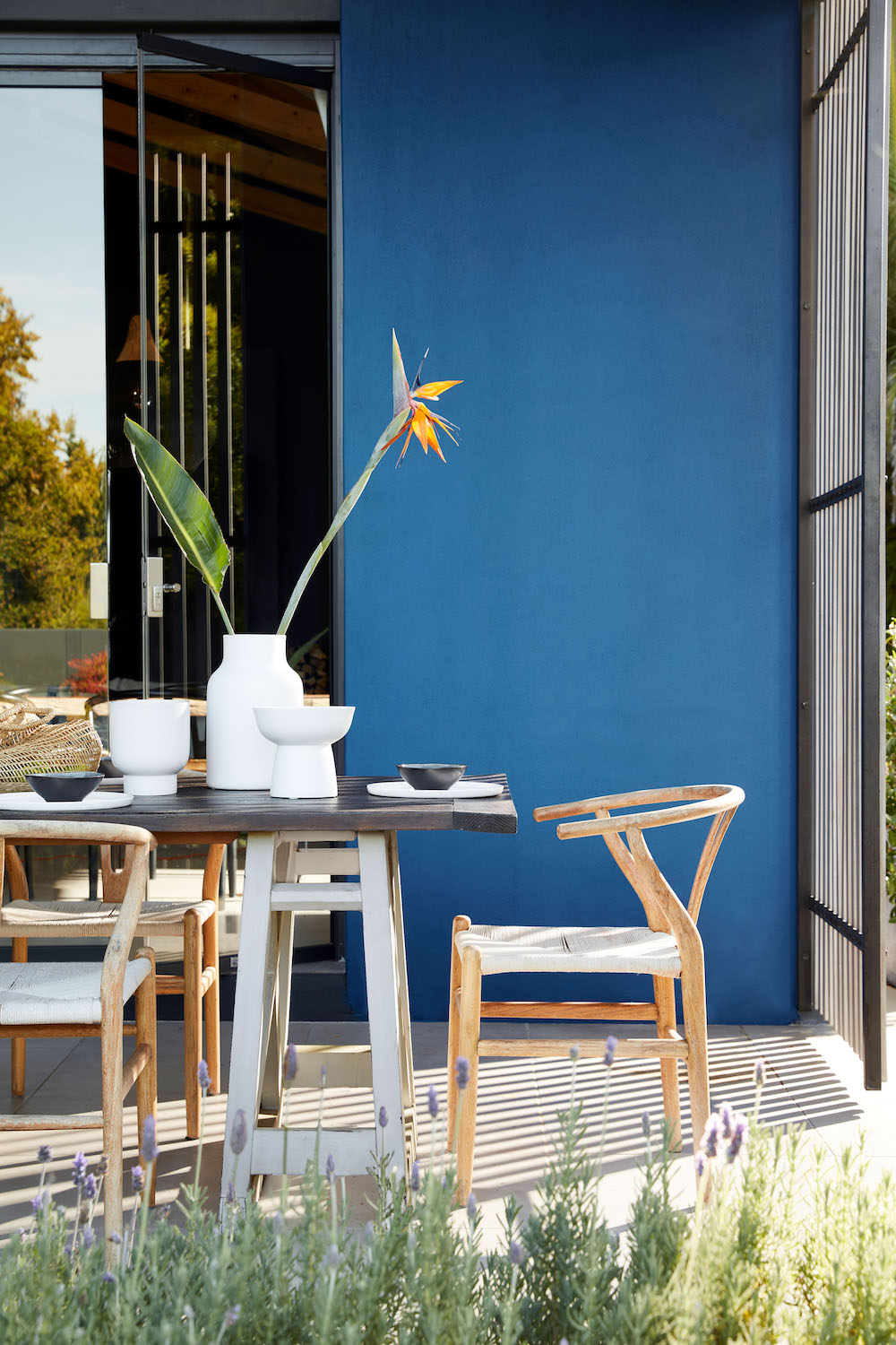
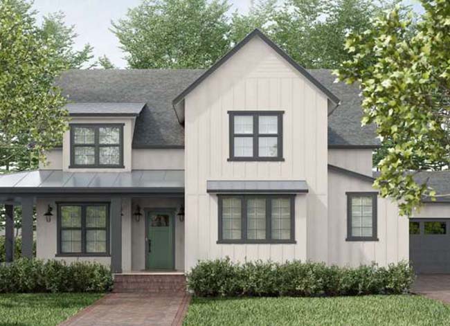
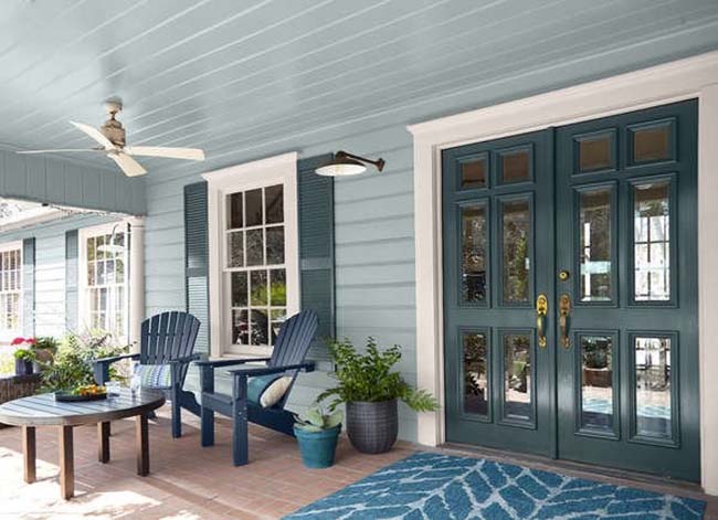
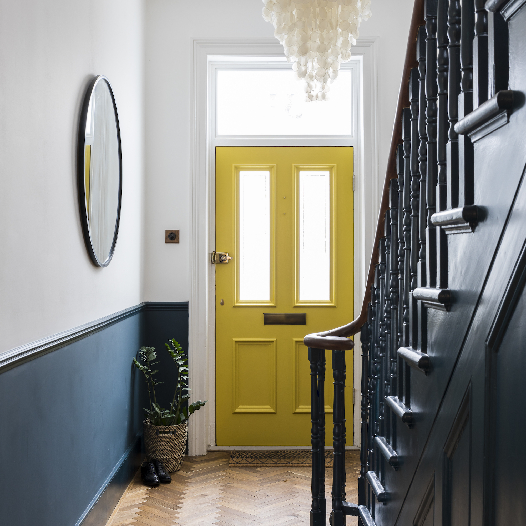
One category to steer clear of is bold primary colors. Designers emphasize that colors typically found in a basic crayon box, such as vibrant reds, blues, or yellows, are rarely suitable for exterior trim. These hues often appear out of place and can make a home stand out in an undesirable way, particularly in neighborhoods where a more cohesive aesthetic is preferred. Instead, the advice is to opt for shades that draw inspiration from nature, like warm whites, muted greens, and soft charcoals, which tend to be more timeless and harmonious with the surroundings.
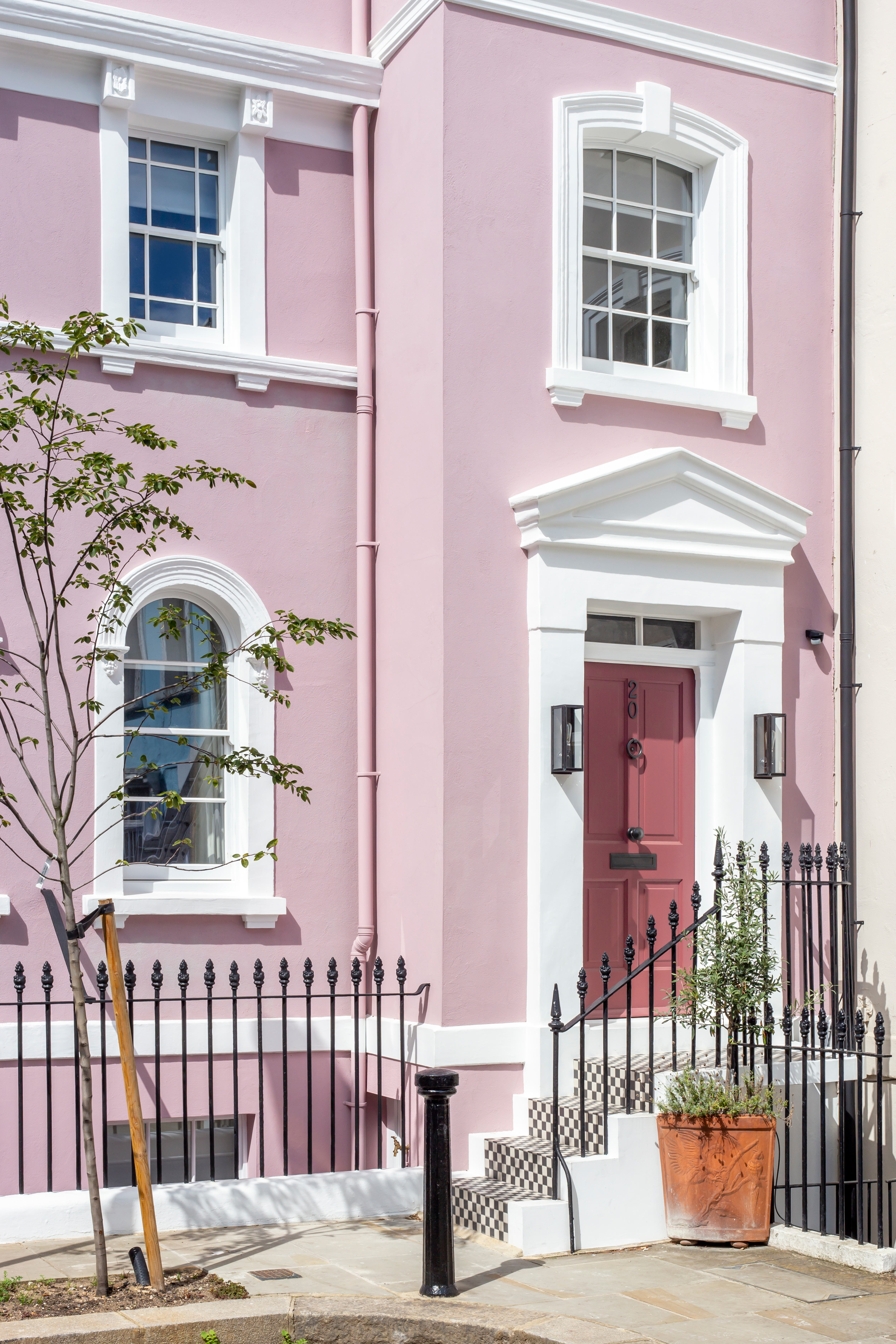
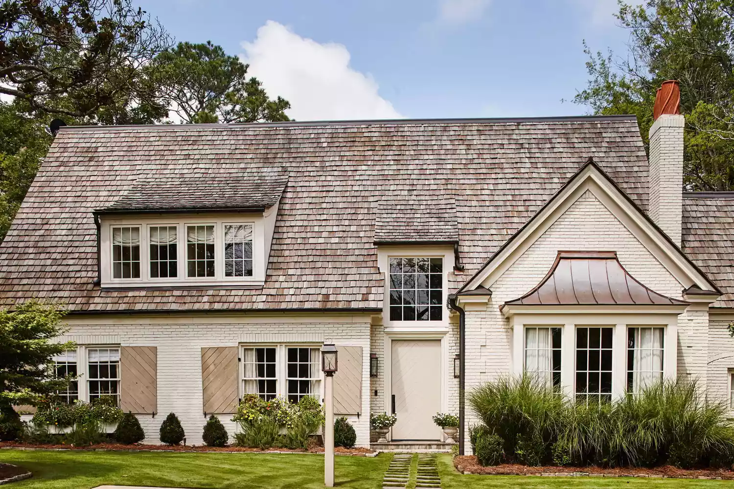
Another type of color pairing to avoid is high-contrast combinations. When the trim color dramatically differs from the main facade color, it can create a jarring effect. For instance, pairing a soft cream exterior with a bold pastel or highly saturated trim color is generally discouraged, unless the architectural style or regional context specifically calls for such vibrancy, as might be seen in tropical locations. The guiding principle here is subtlety, aiming for complementary colors that blend rather than clash, thereby enhancing the home's overall appearance without overwhelming it.
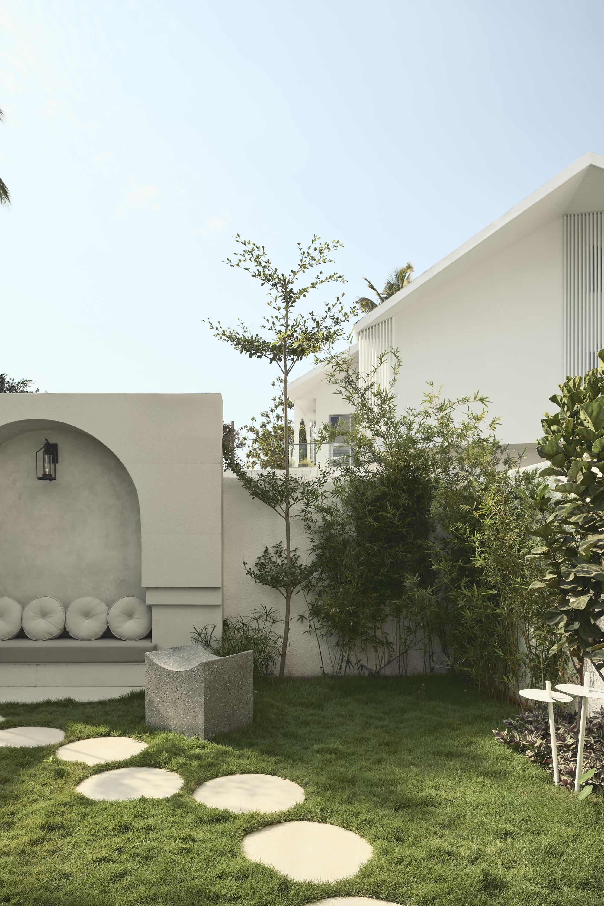
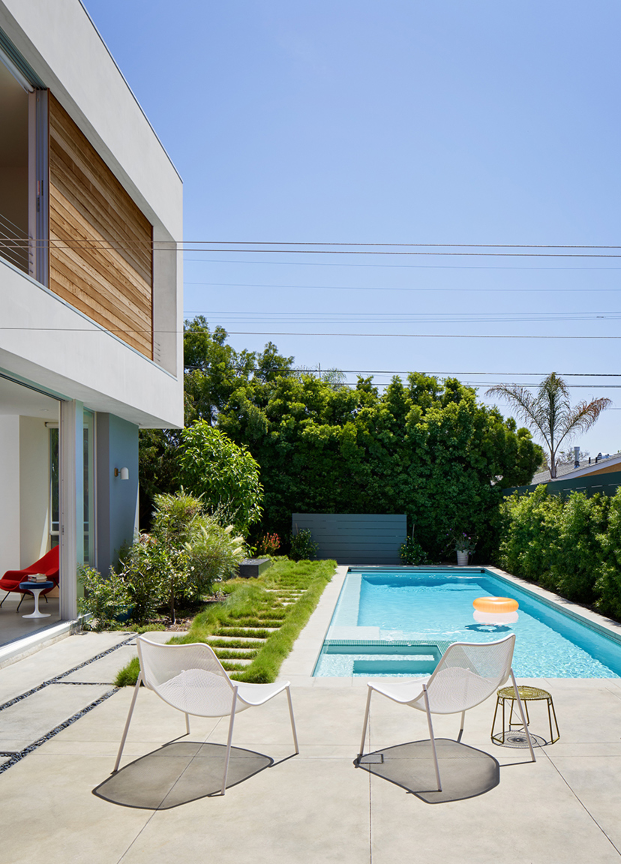
Stark or overly creamy whites also make the list of colors to avoid. While white is a popular choice for trim, extreme shades can be problematic. Stark whites can appear harsh and unwelcoming under natural light, creating an artificial feel. Conversely, extra creamy whites are prone to looking dirty over time, and exposure to sunlight can cause their yellow undertones to become more prominent, leading to a faded or discolored appearance. For those who favor white, the recommendation is to choose warmer, softer whites or other complementary neutrals that contribute to a more cohesive and welcoming exterior.
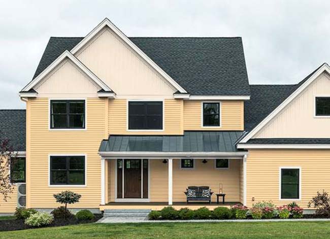
Finally, the article advises against using anything too trendy for exterior trim. Unlike interior design, where trends can be easily updated, exterior paint is a more significant and less frequently changed element. Colors that are currently fashionable, such as butter yellow or pastel blue, can quickly become dated, making the home appear less classic and more susceptible to aesthetic obsolescence. A neutral palette is consistently recommended for exterior trim, as it ensures longevity and maintains a sophisticated appearance that withstands the test of time. Thoughtful consideration of these color categories can save homeowners both time and money, ensuring a beautiful and enduring exterior for their home.
#ExteriorDesign #PaintColors #HomeImprovement #CurbAppeal #DesignTips #NeutralPalette #ColorSelection #HomeExterior #ExteriorDesign #PaintColors #HomeImprovement #CurbAppeal #DesignTips #NeutralPalette #ColorSelection #HomeExterior
0 comment in total
 No comments yet
You may also like
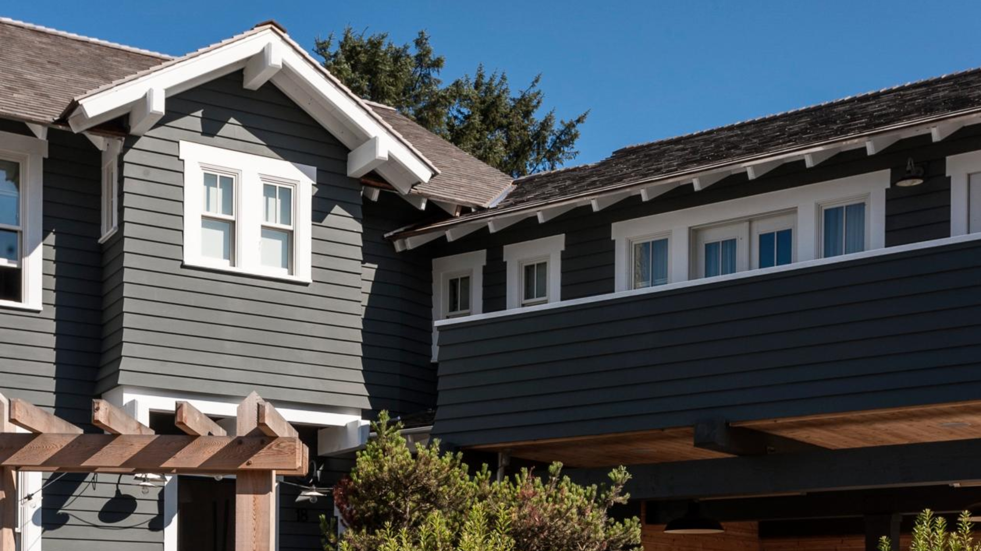
5 Exterior Paint Mistakes to Avoid If You Don't Want Your House to Become the Worst-Looking on the Street

The colors you should never paint your hallway – and what really works

5 colors to avoid painting a landing – and the secret to choosing the right shades
4 Colors You Should Never Paint Cabinets, According To Designers

5 colors you should never paint your entryway – according to interior experts
8 colors you should never paint kitchen cabinets according to the experts

4 Paint Colors Designers Say You Should Never Use In A Hallway
5 Paint Colors That Experts Say You Shouldn't Use in 2025


What are the worst colors to paint a room? The shades experts say you should never use
5 Paint Colors to Never Use on Your Front Porch, According to Interior Designers
12 Exterior Paint Colors That’ll Help Sell Your House

Trust us, these are the colours to avoid when painting a small hallway
8 Paint Colors You Should Never Use For Your Front Door

4 Outdated Colors Designers say you Should Steer Clear of When Decorating a Living Room
Stop! Step Away From the Paintbrush — Here's 4 Things Interior Designers Would Never, Ever Paint Around the Home

5 colors you should never paint a pantry – designers share the shades they swerve
These 4 outdoor furniture colors are probably a bad idea, say experts – here's what to choose instead
The Best Exterior Paints for Every Outdoor Surface
The Best Exterior Paint Colors Designers Have Ever Used

6 Colors You Should Never Paint Your Entryway, According to Color Experts