1/20
The 19 Best Colors to Pair with Purple, According to Designers
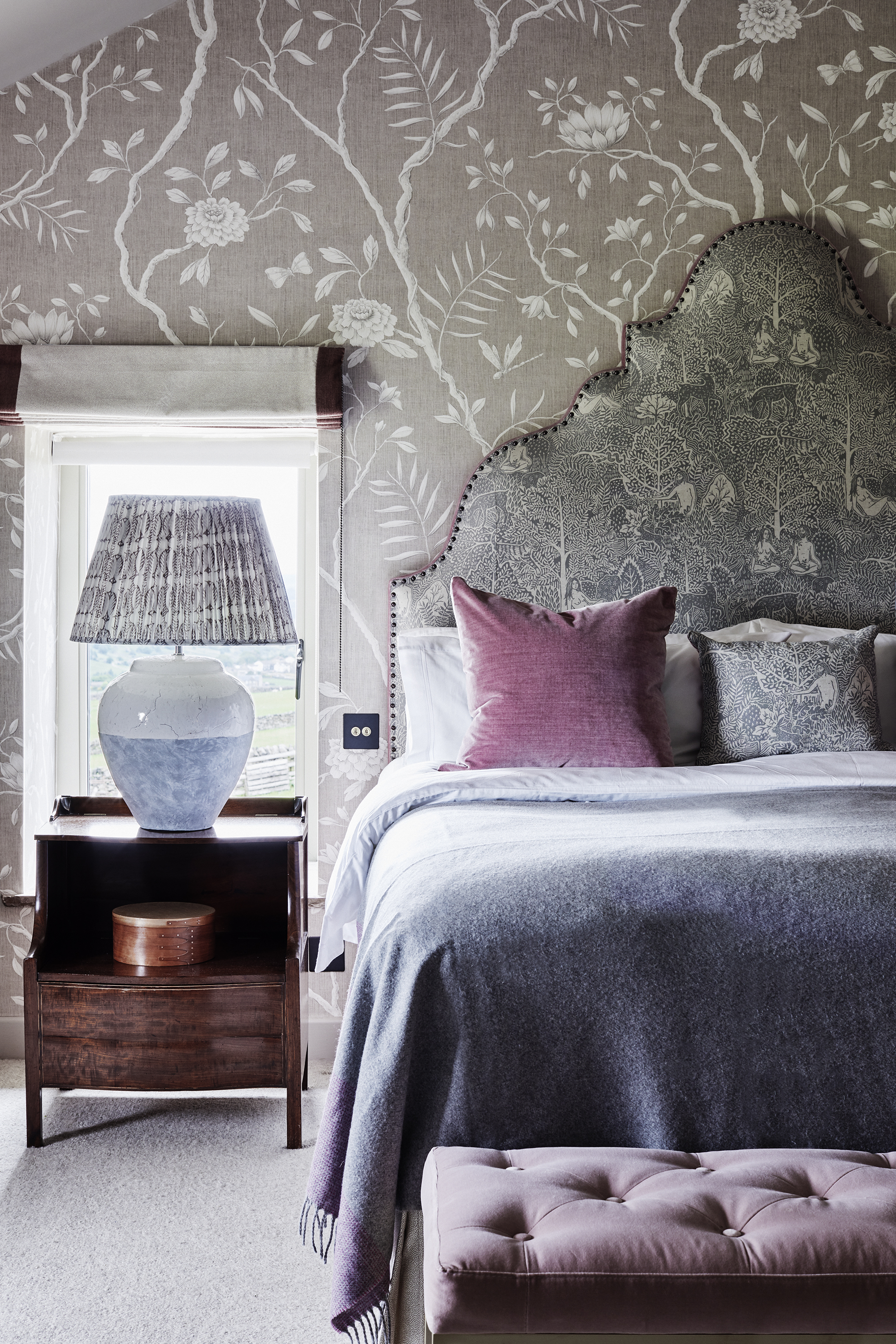
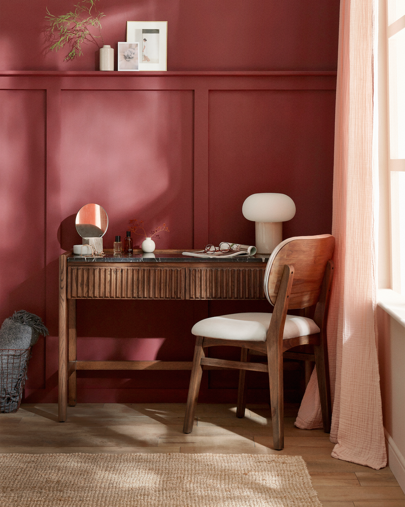
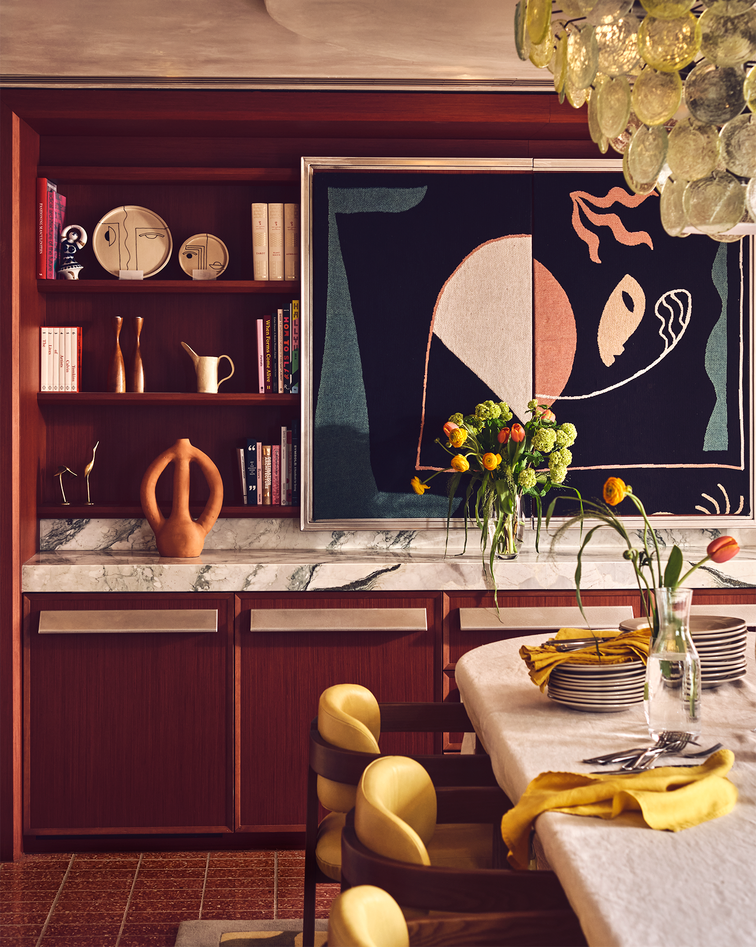
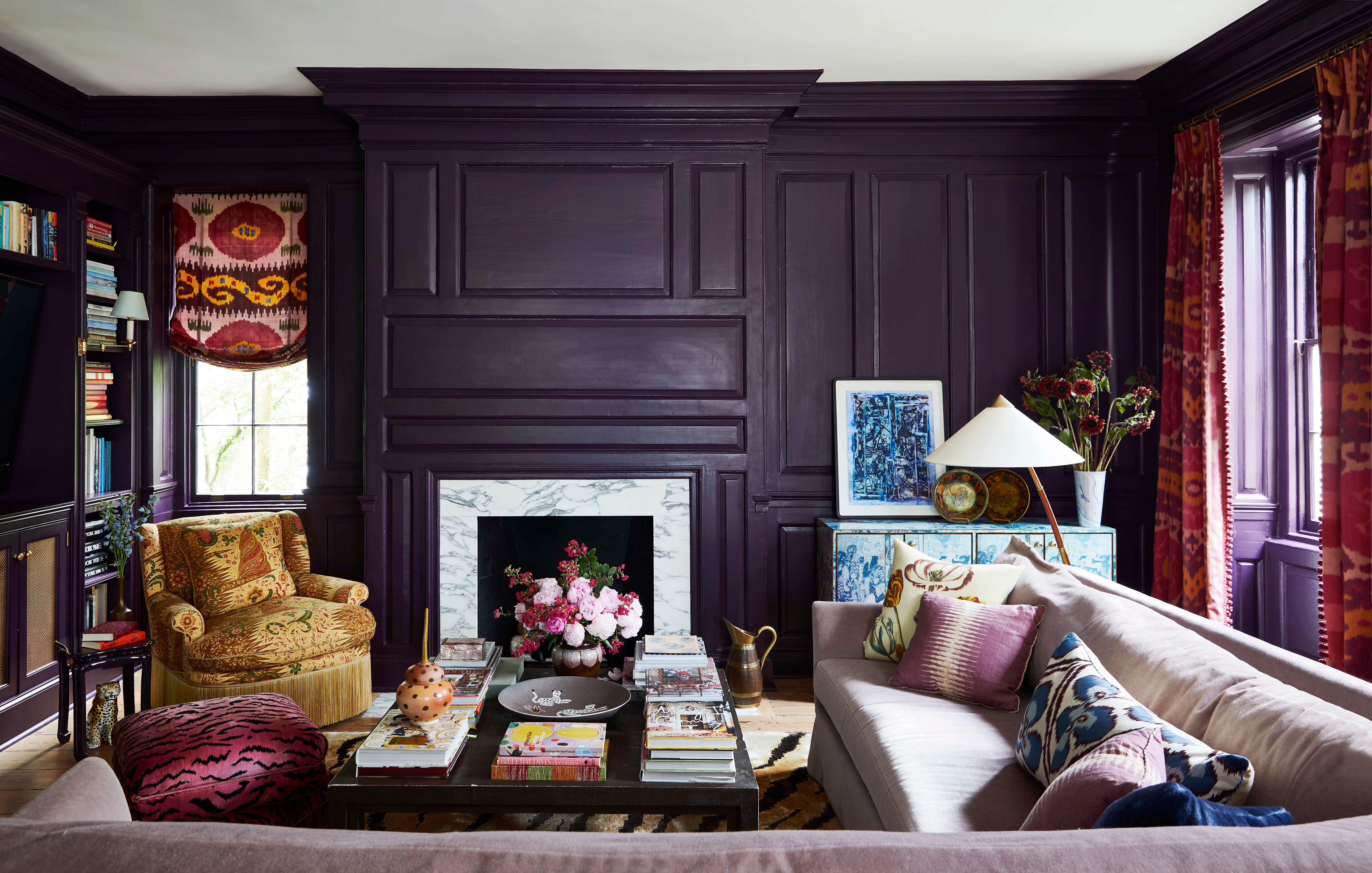
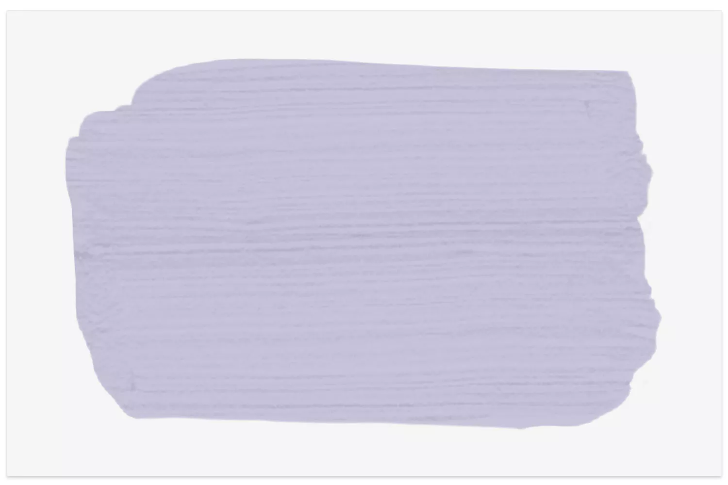
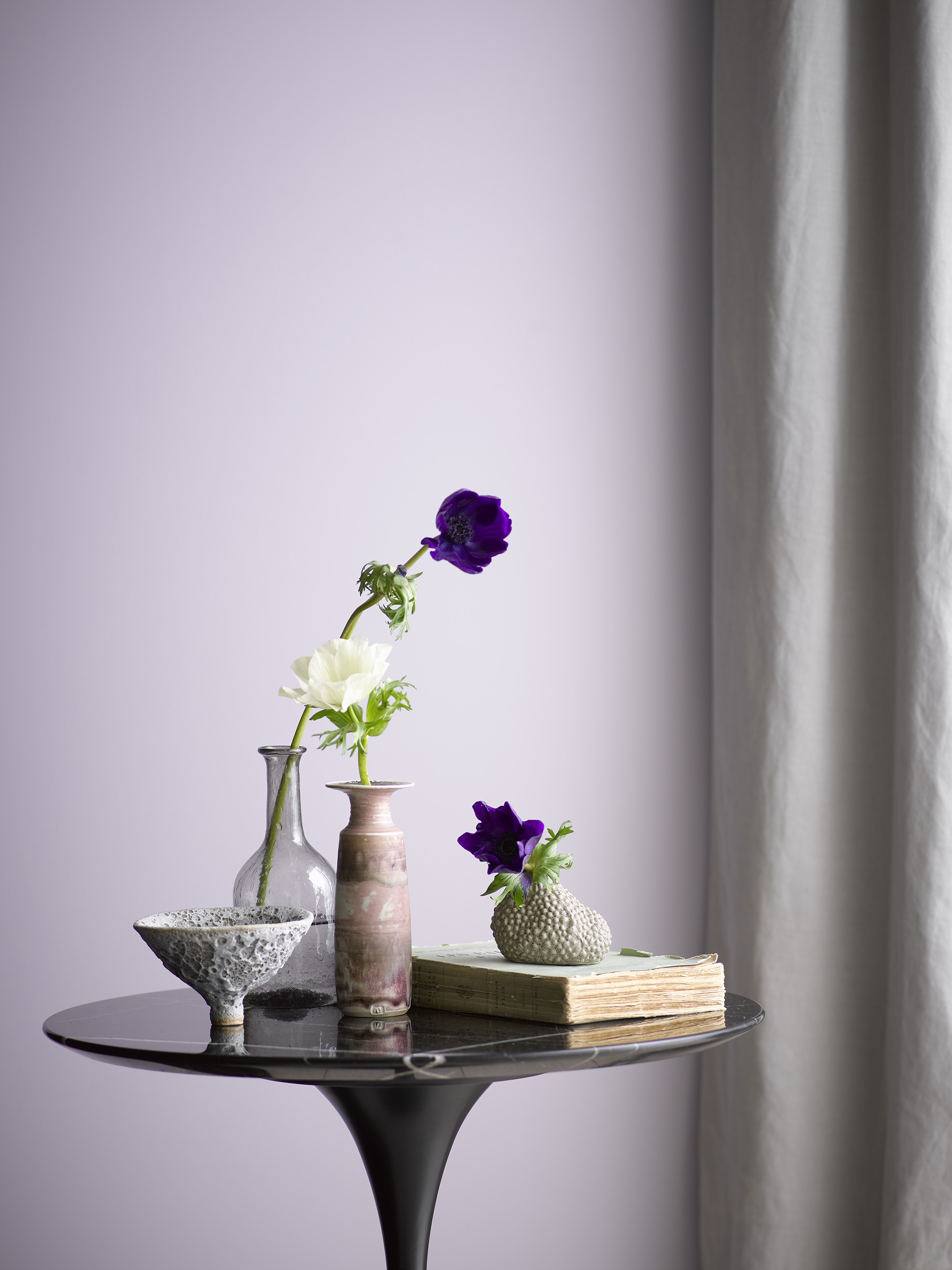
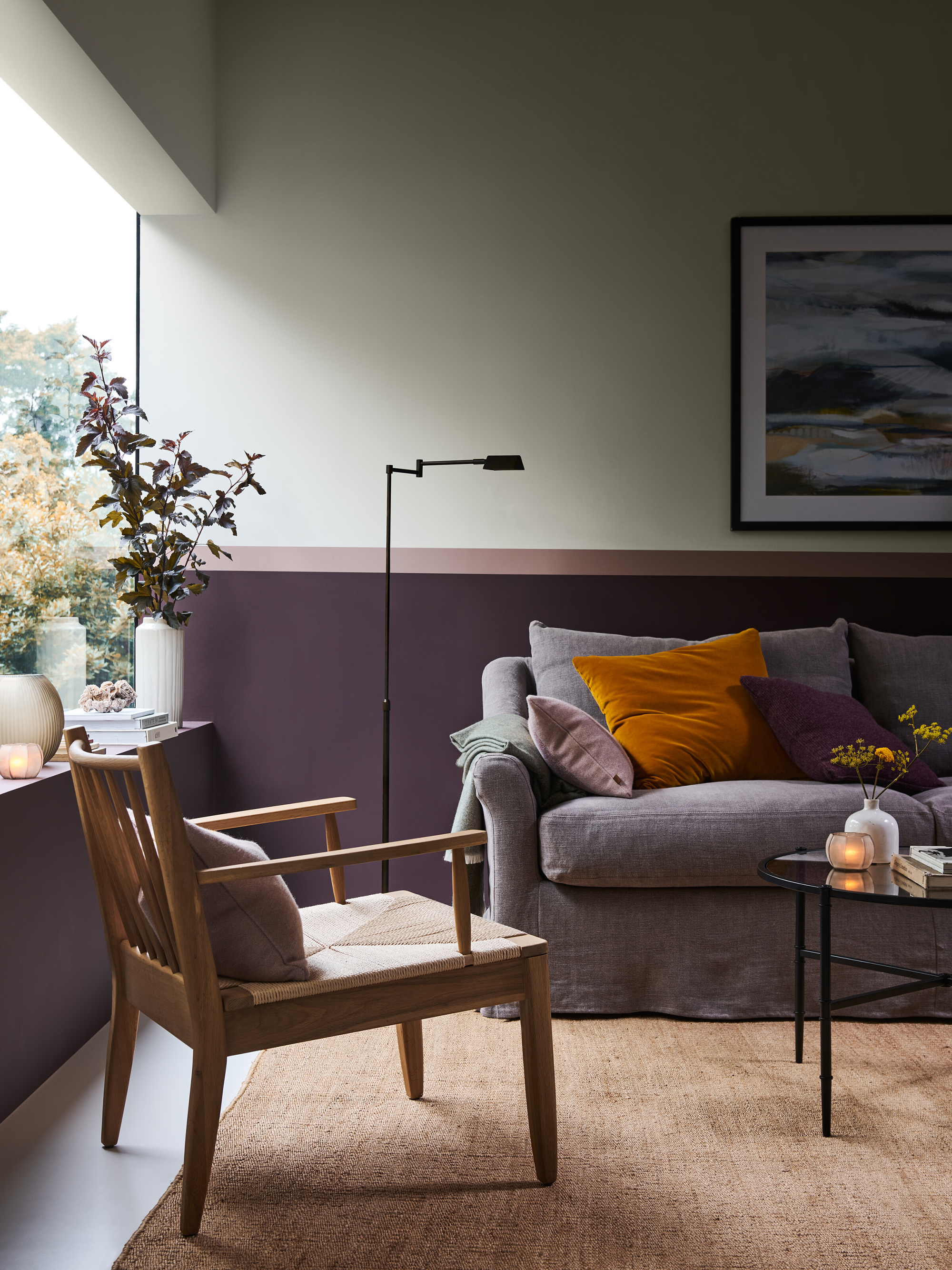
Purple is a versatile color in interior design, ranging from rich aubergines to light lavenders and mid-range amethysts. Designers Renvy Graves Pittman and Henry Prideaux highlight its adaptability for both traditional and contemporary settings, emphasizing that the specific tone of purple can influence a room's mood, making it either vibrant or serene. The article explores various color pairings suggested by top designers to enhance purple in different living spaces.
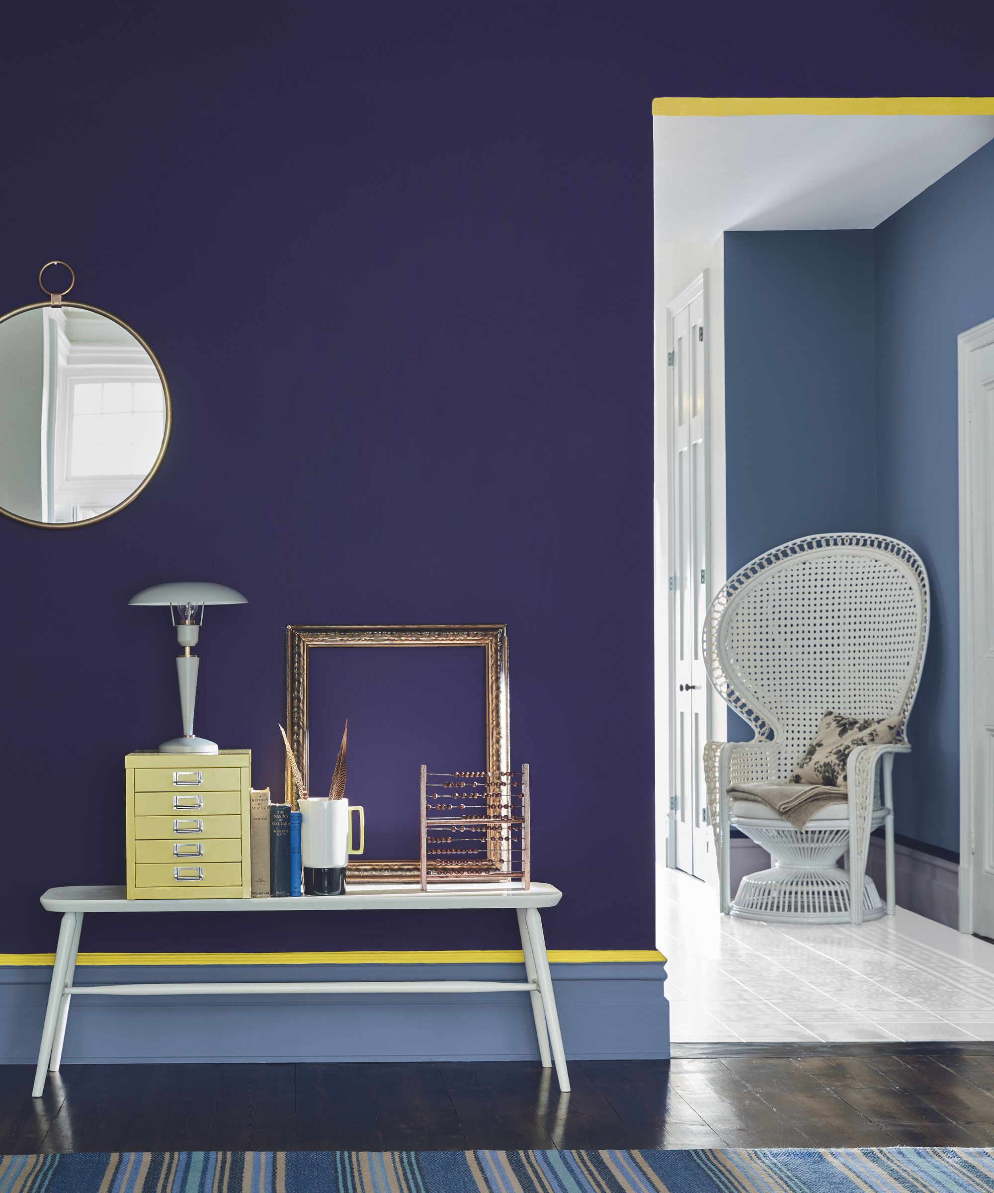
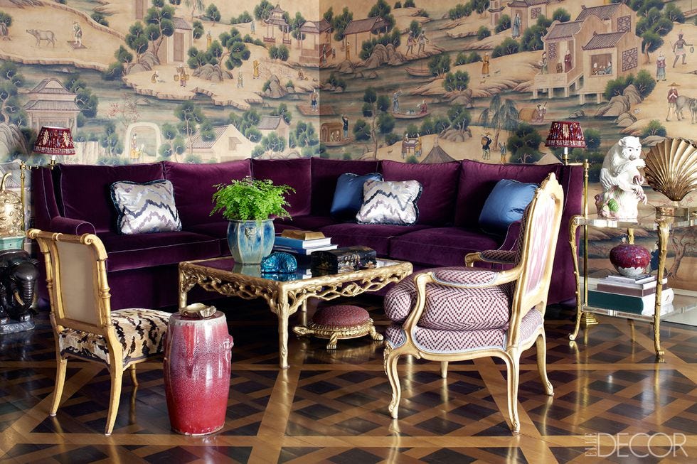
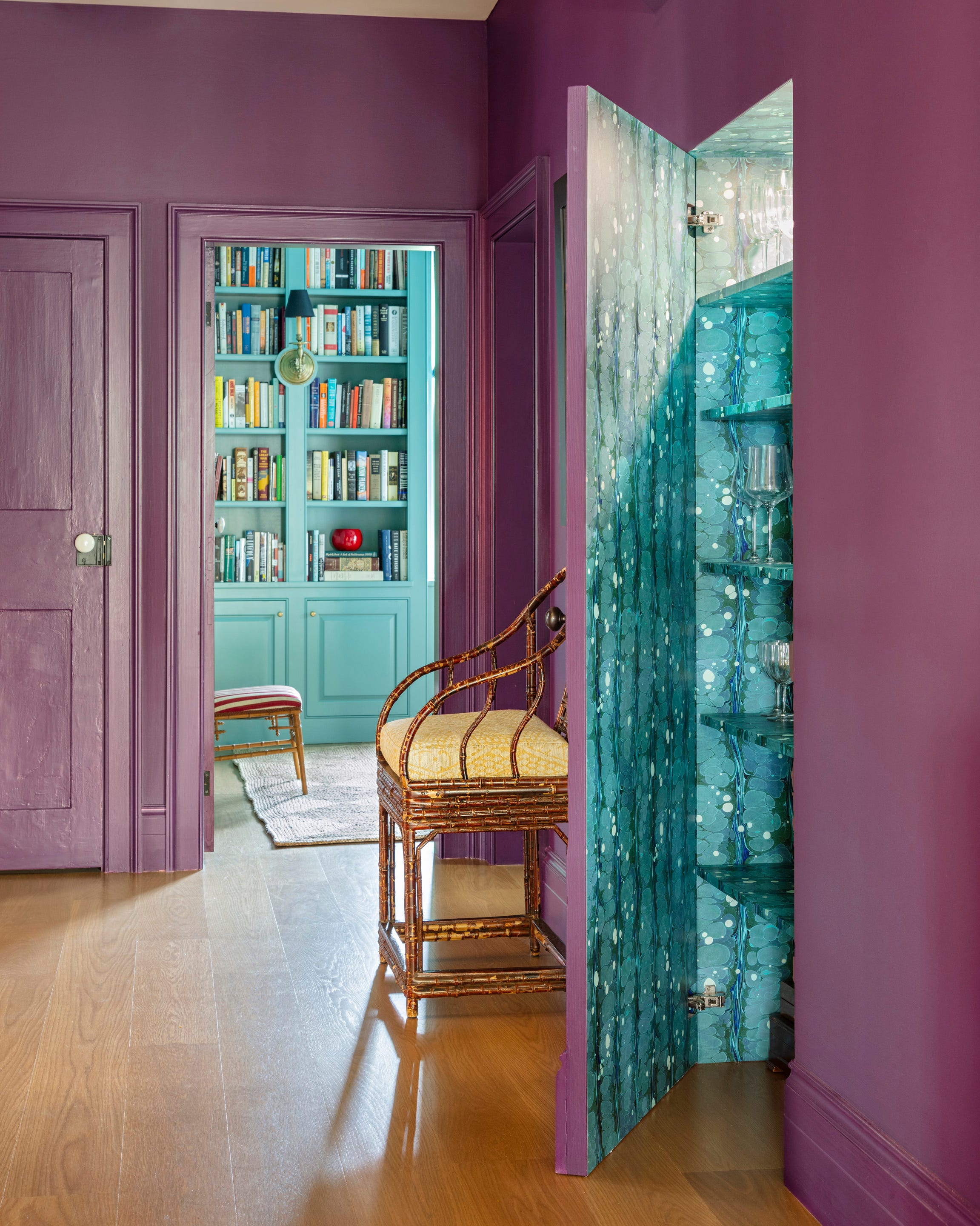
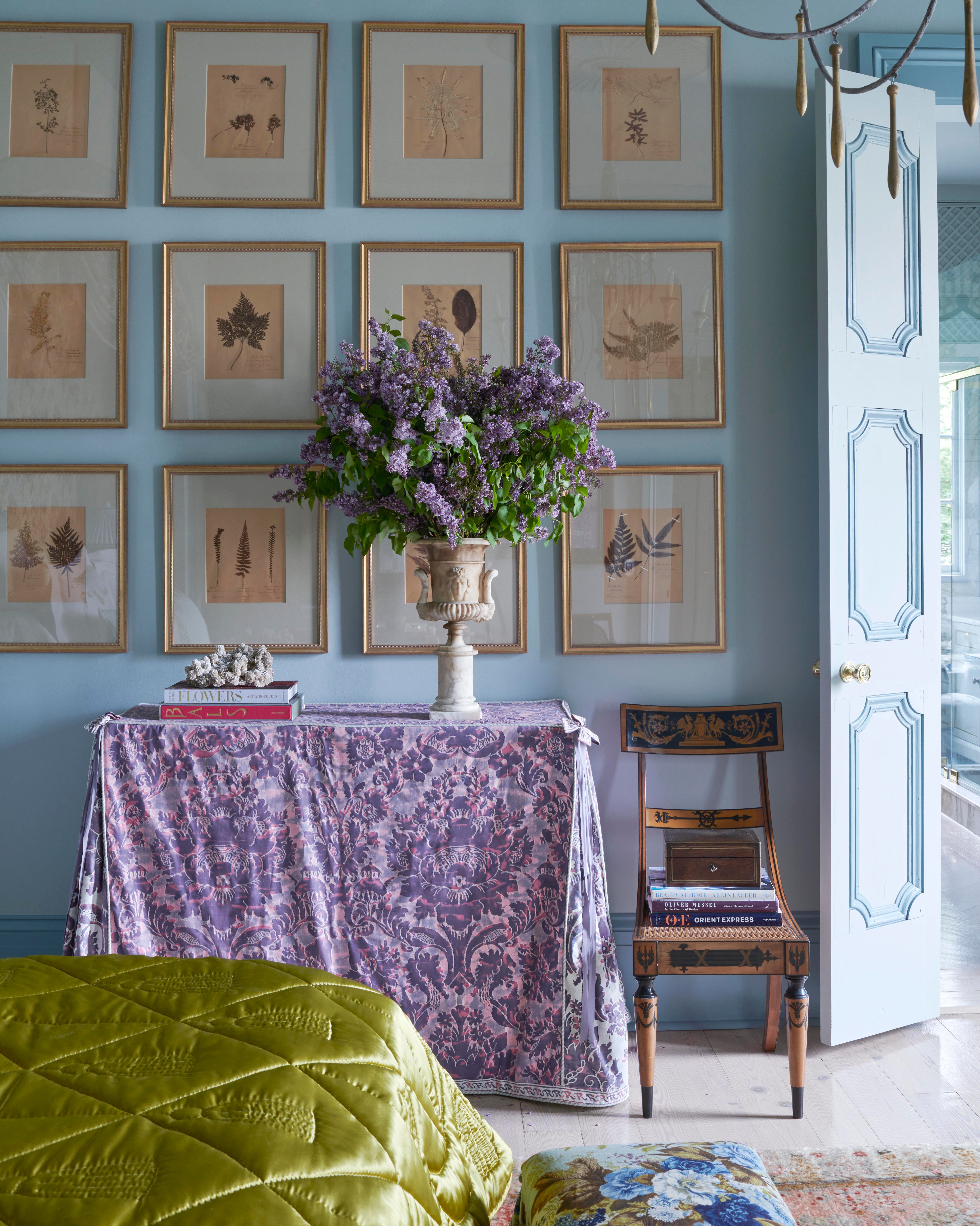
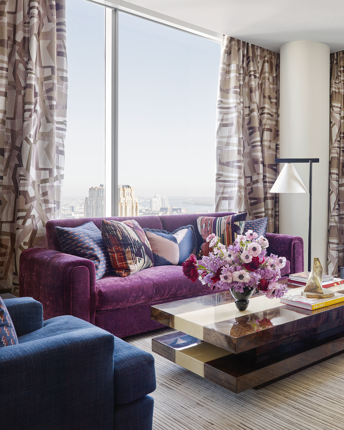
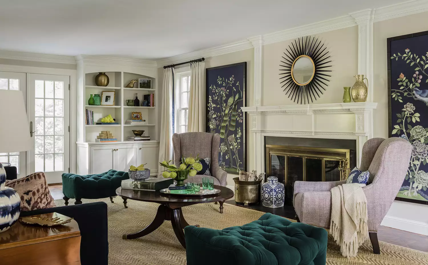
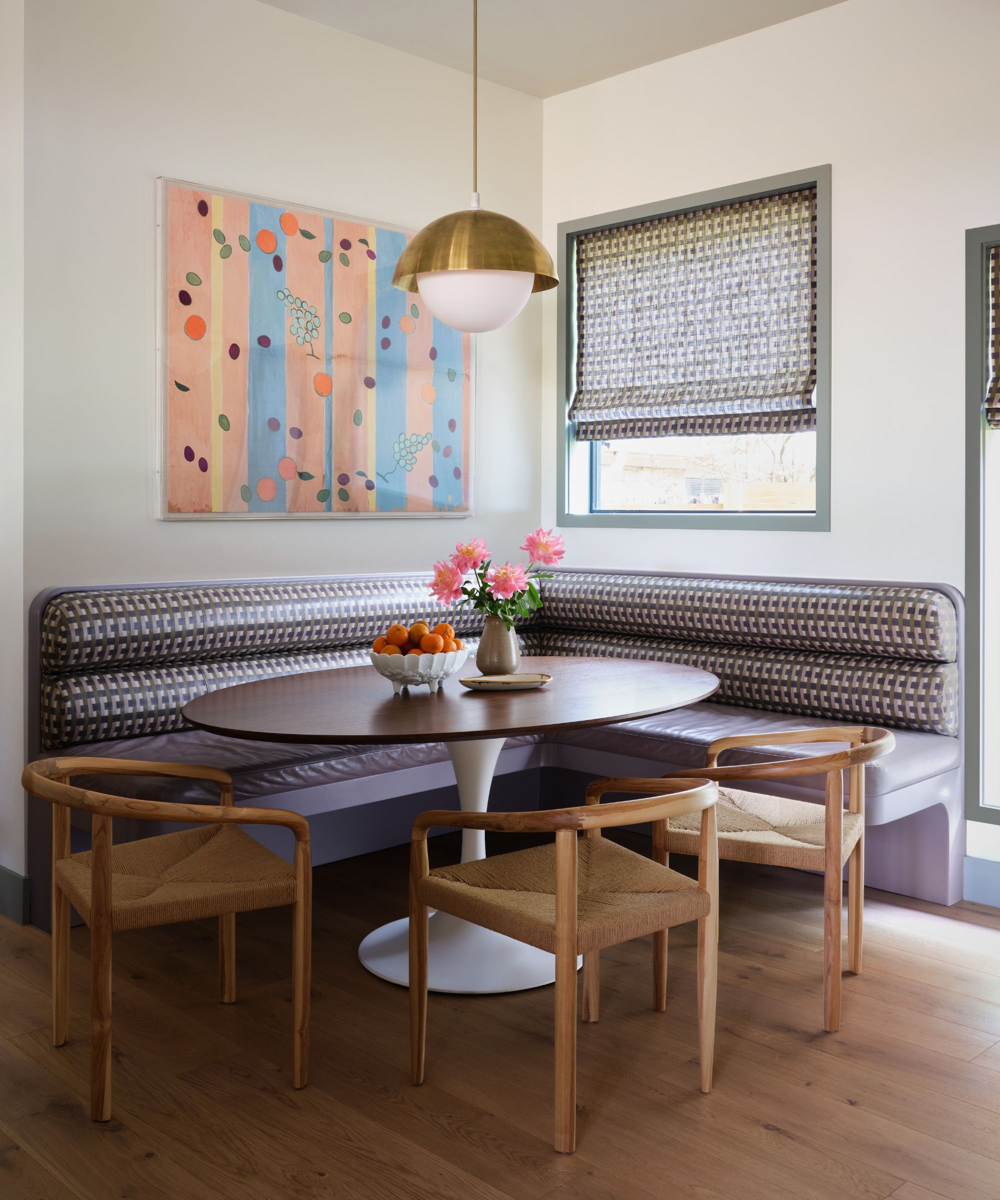
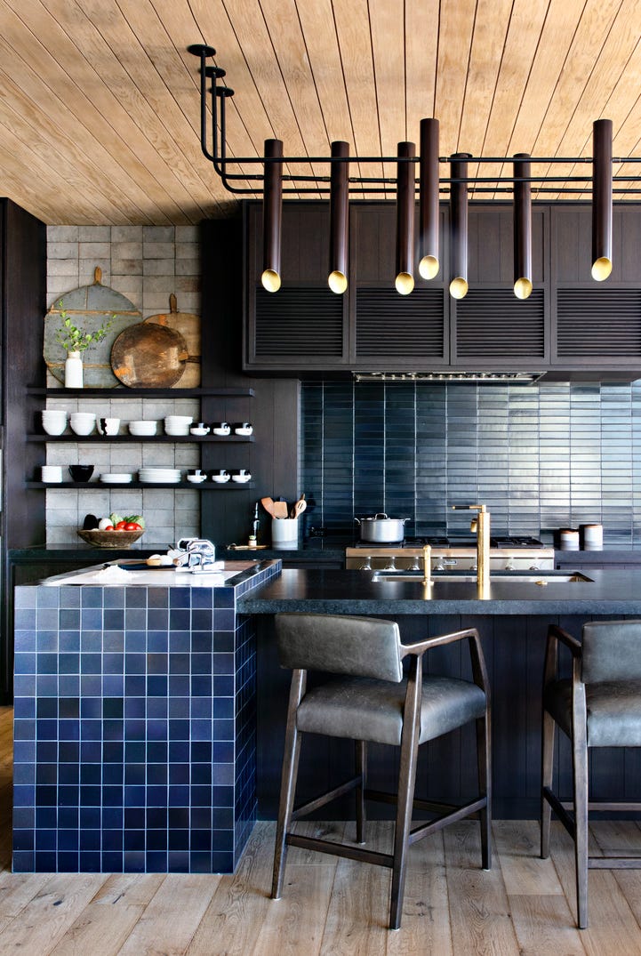
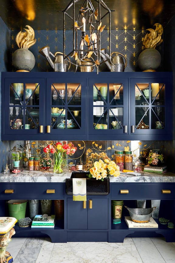
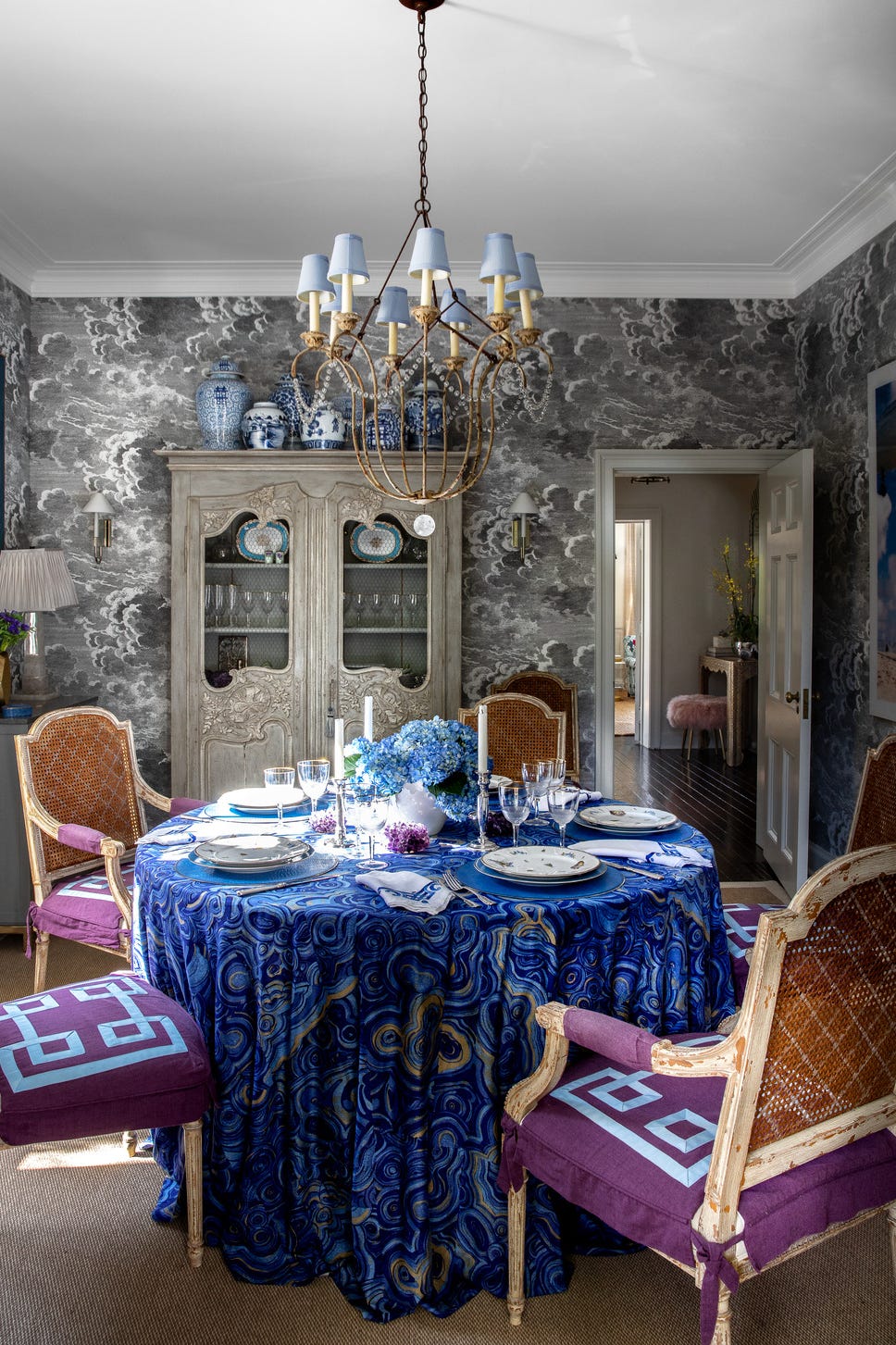
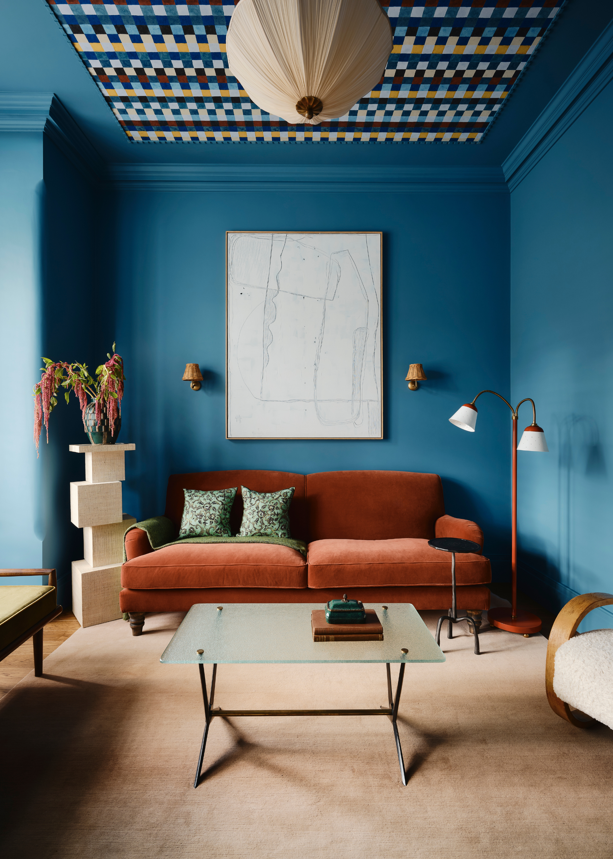
One popular pairing is Tiffany Blue. Designer Jena Salmon uses pale lilac on ceilings with Tiffany blue accents for an inviting dining room. An example includes a New Orleans bedroom suite with purple damask and robin's-egg blue walls. Navy blue also complements purple, with designer Young Huh combining plum with navy in a Philadelphia living room, noting its effectiveness with dark wood tones and gold accents. Mustard yellow, particularly muted tones, is recommended by Salmon for brighter purple shades like magenta, creating a striking contrast, as seen in a Kips Bay Decorator Show House Dallas sitting room by Blaire Murfree.
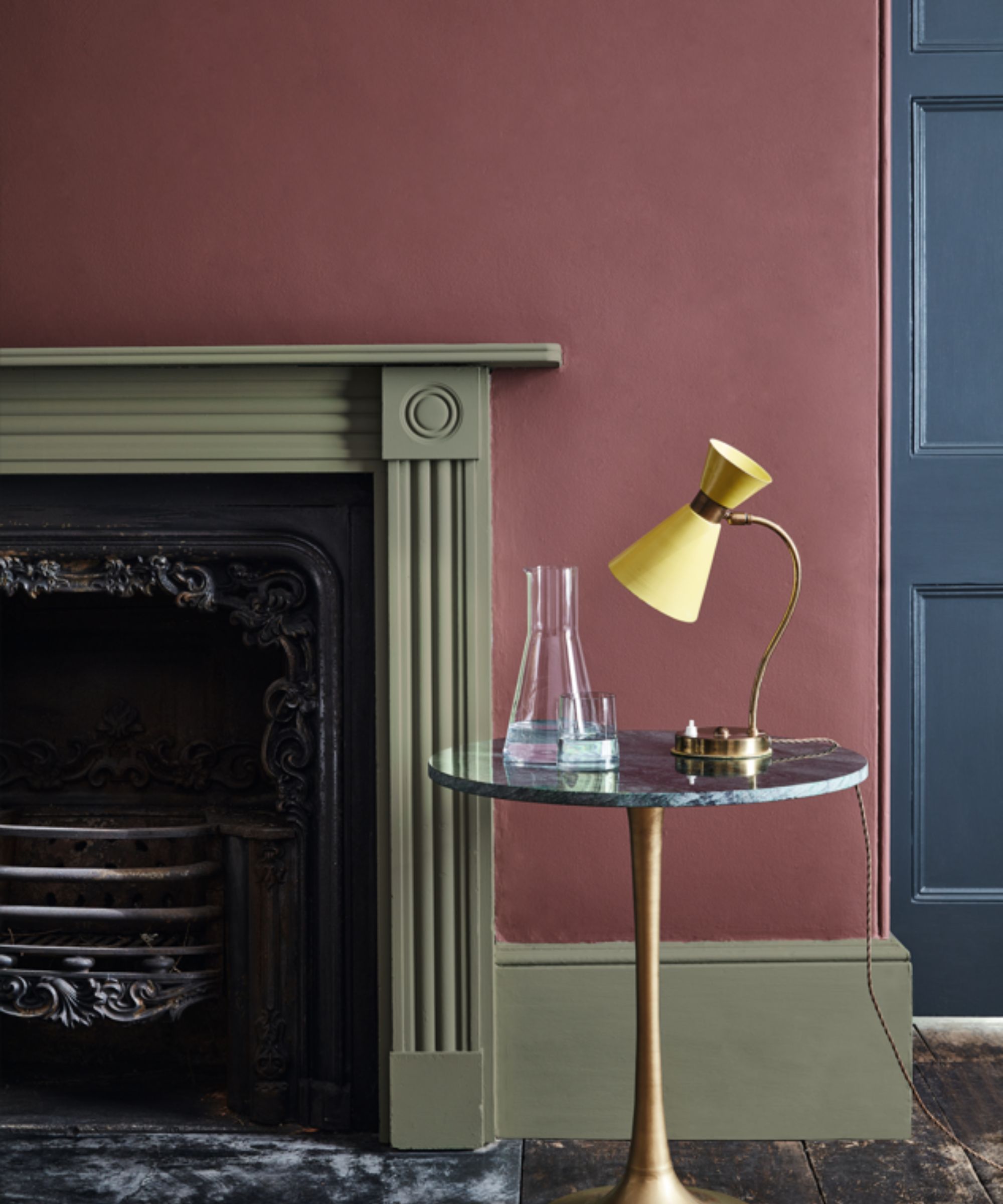
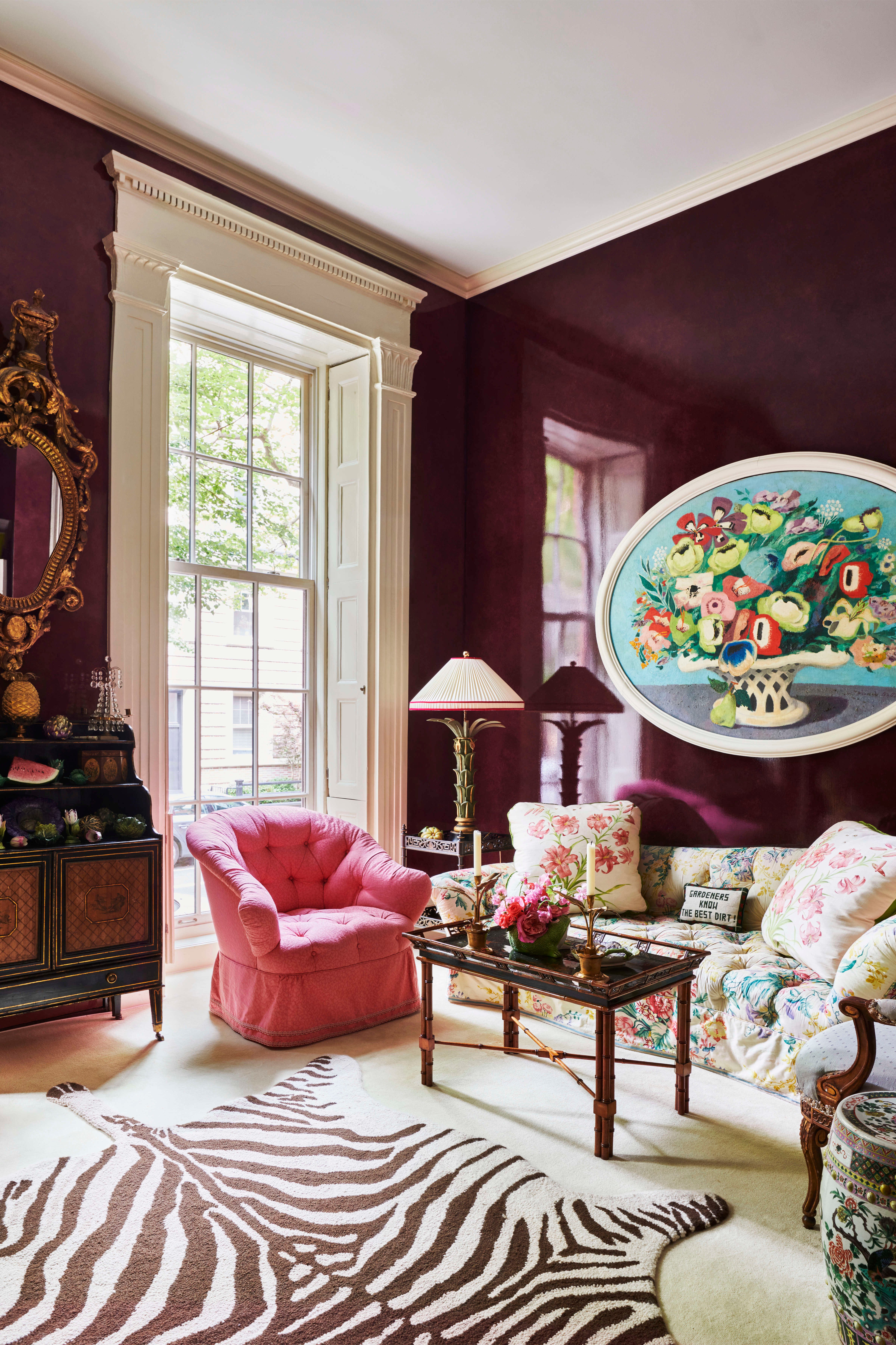
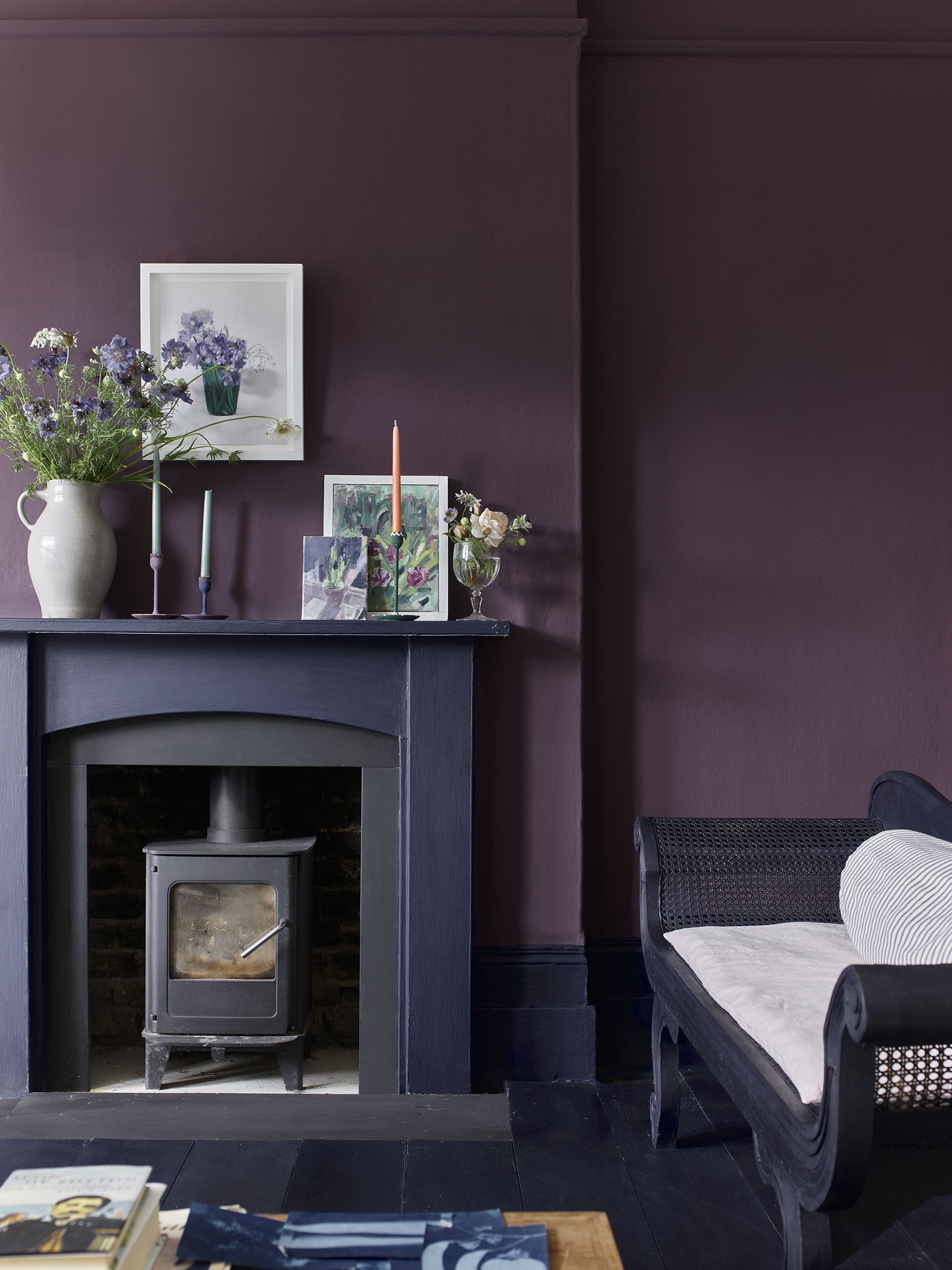
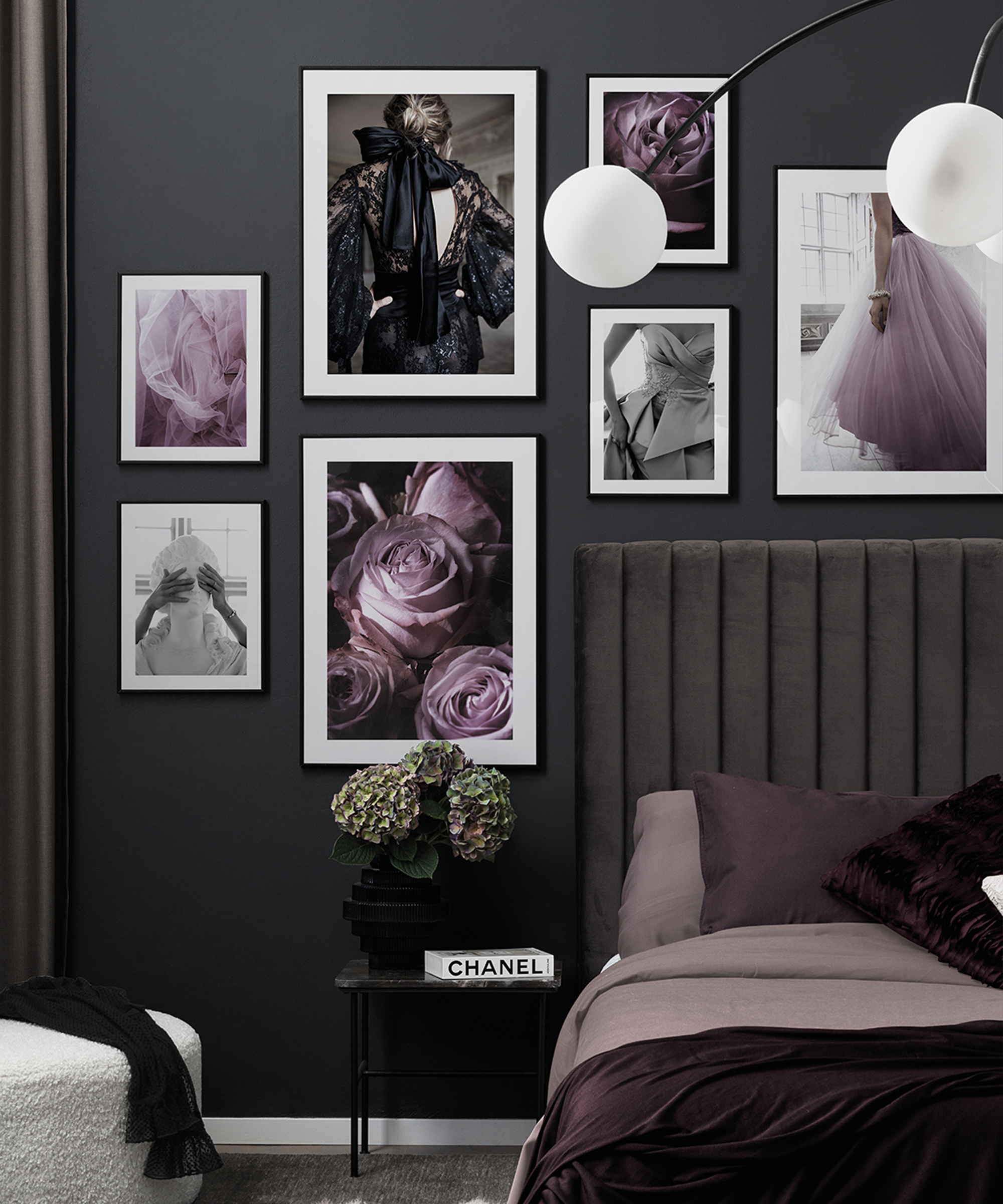
For a modern aesthetic, black is suggested. Salmon pairs amethyst with lacquered black, gold, and clear acrylic, likening the combination to precious stones in elegant settings. A New York gallery features black fireplace mantels against lacquered aubergine walls. Medium greens, such as Farrow & Ball's Bancha and Benjamin Moore's Weekend Getaway, are also strong pairings. Patrick O'Donnell notes that purple looks striking with mid-century greens, while Celerie Kemble exemplifies this with lacquered plum walls and retro green dining chairs.
Cream is presented as a neutral to bring out purple's richness. Salmon suggests incorporating purple in antique furnishings, velvets, and silks alongside cream-paneled walls, as seen in a Hamptons living room designed by Amanda Nisbet. Bright white offers a balanced look with muted purple shades, creating a mix of tradition and modernity, as demonstrated by Henry Prideaux in a breakfast room with natural stone and sleek countertops.
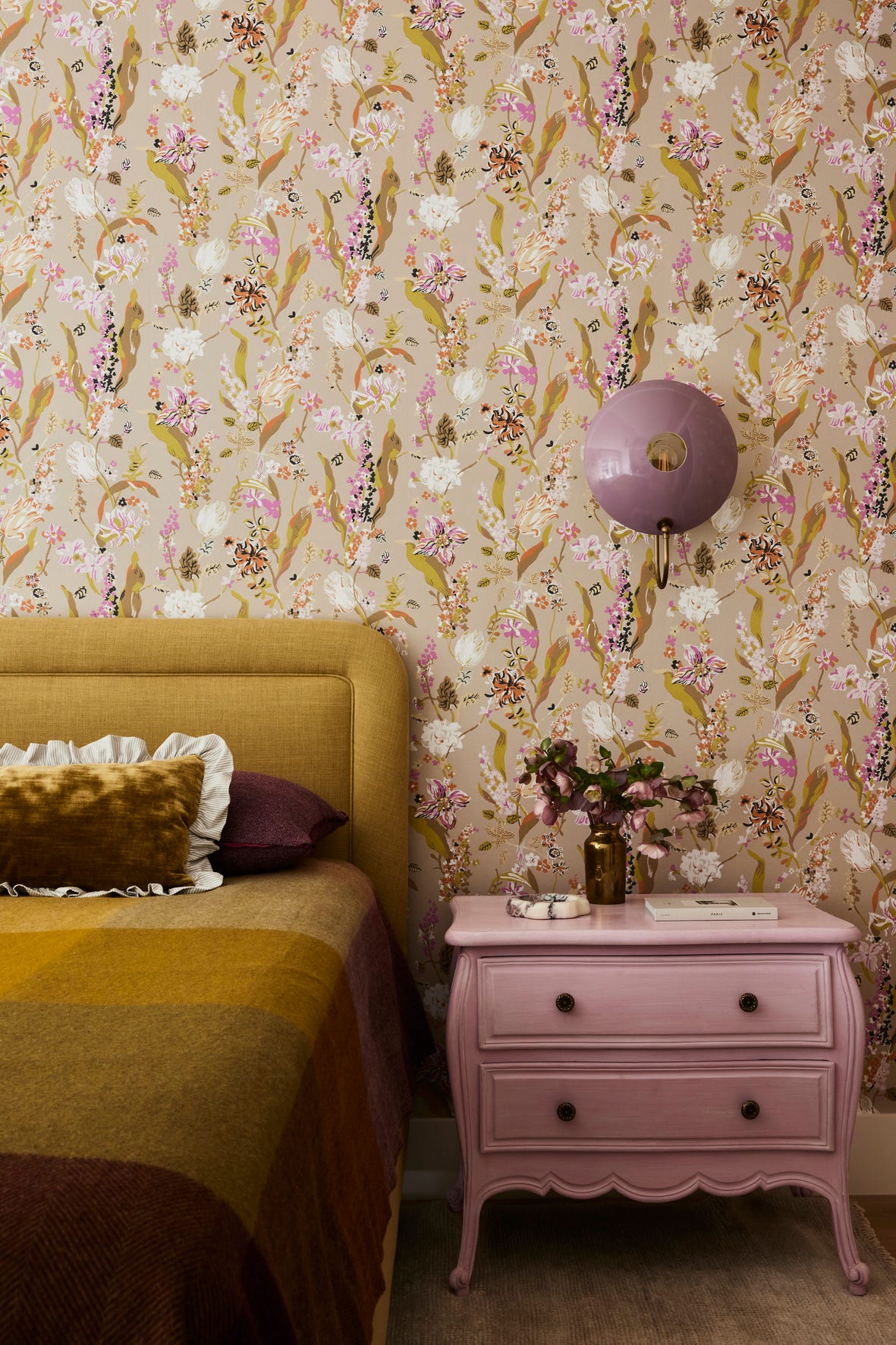
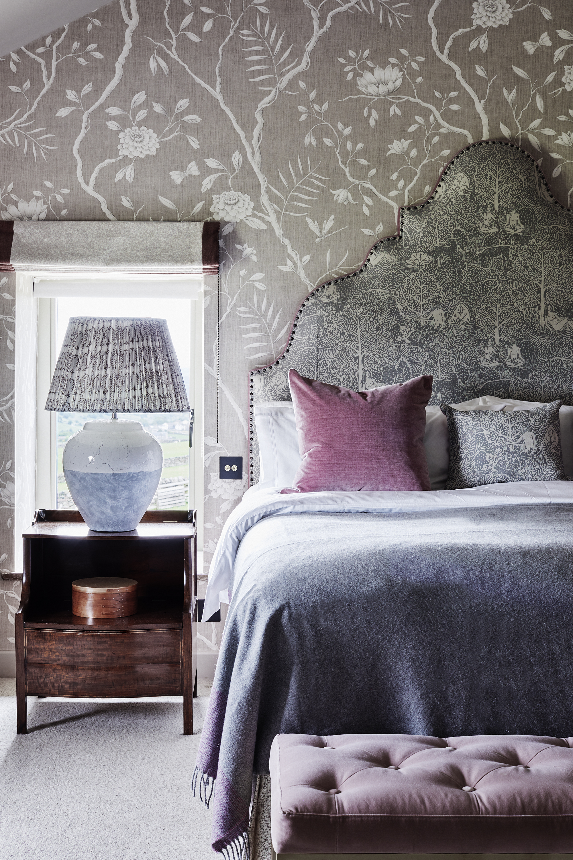
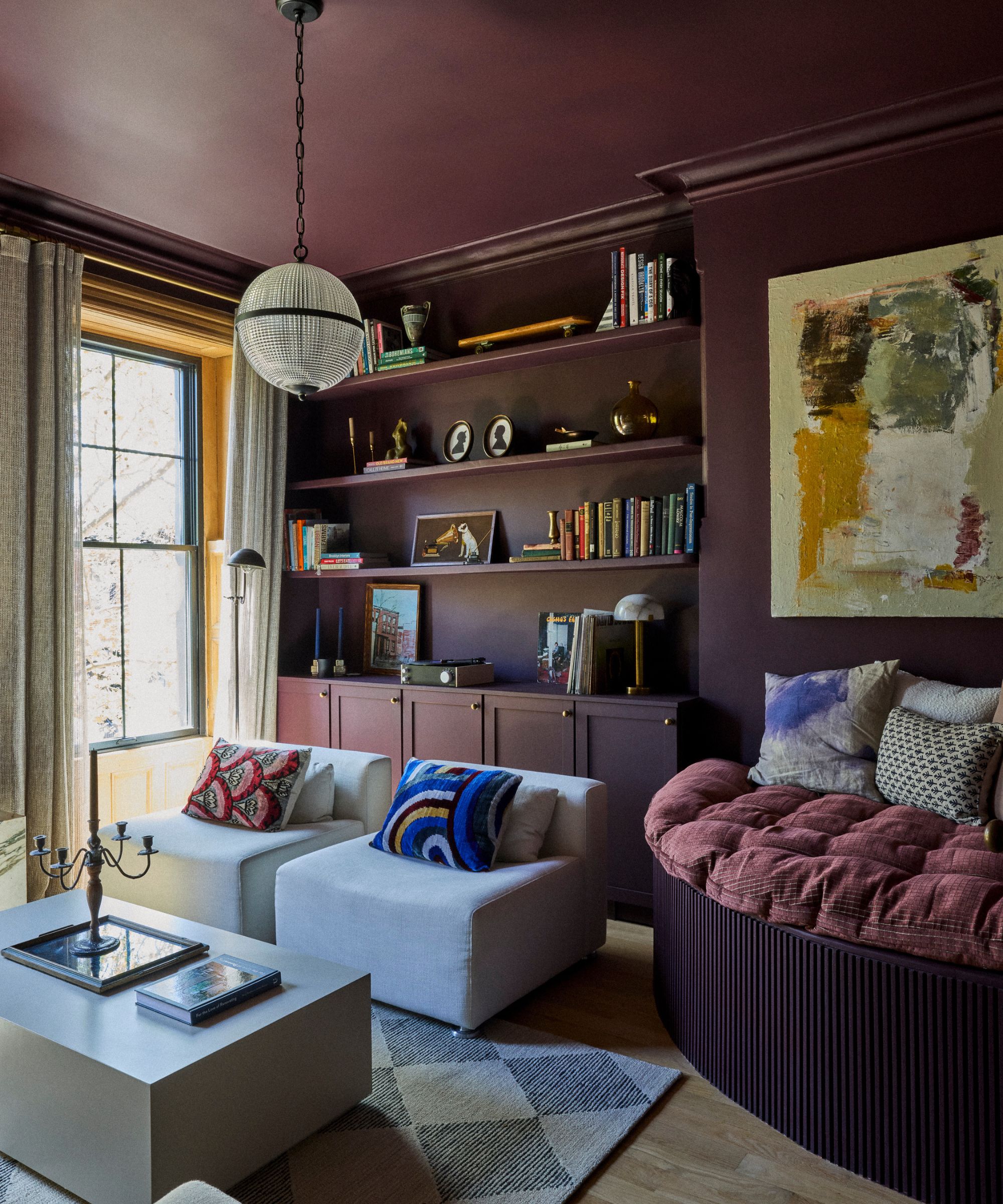
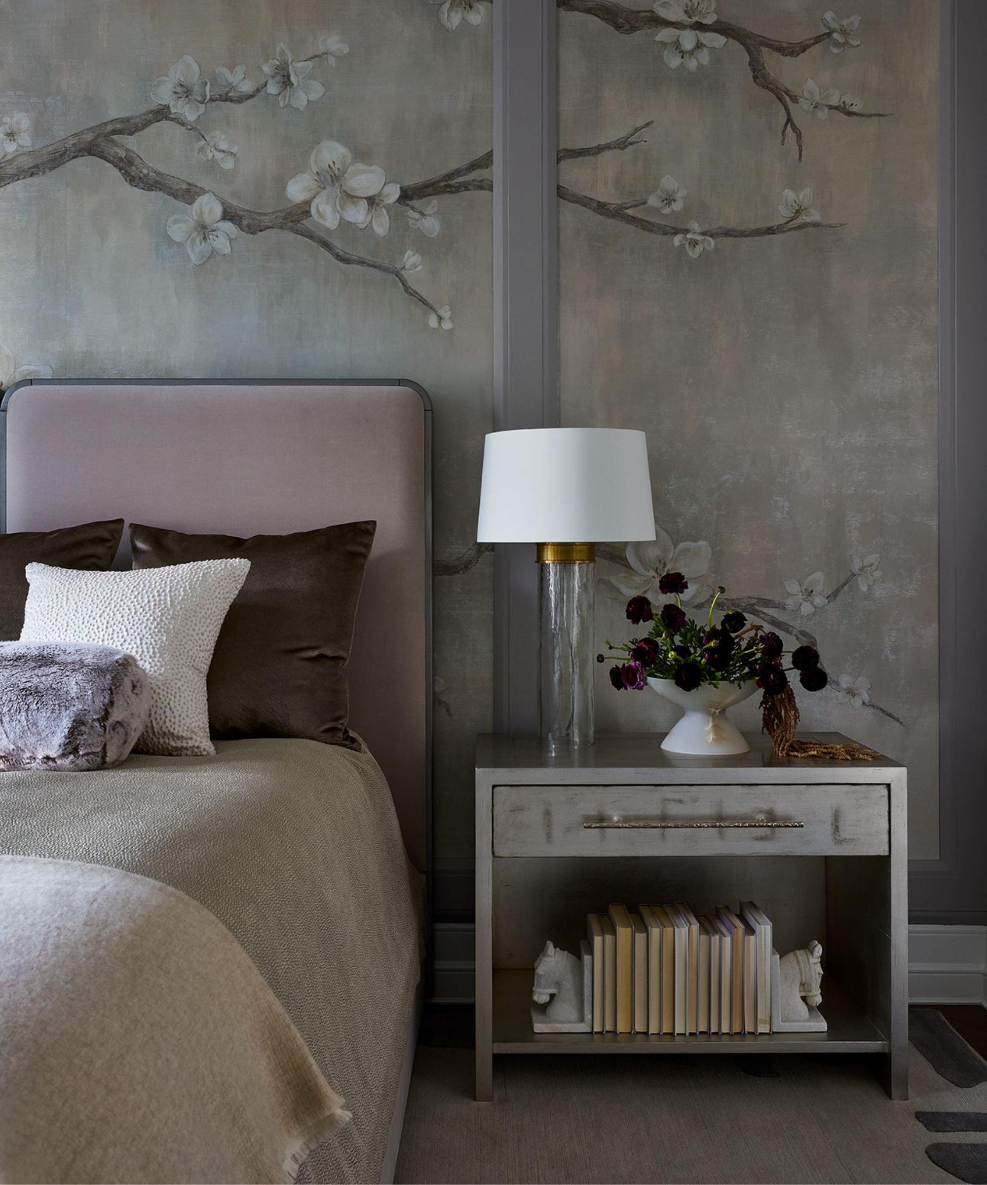
Chocolate brown is another deep color that pairs well with wine shades of purple, evoking a classic, vintage feel suitable for studies or libraries. Philip Gorrivan's sitting room blends tobacco, iris, wine, and rose tones. Hunter green is recommended for a masculine space, with deep eggplant paired with hunter green, brass, and distressed leather, illustrated by PROJECT AZ's wellness room. Pastel pink, especially with lavender, creates a soothing and romantic atmosphere, ideal for bedrooms, as shown in Renvy Graves Pittman's Bel Air home.
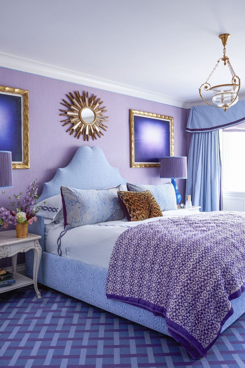
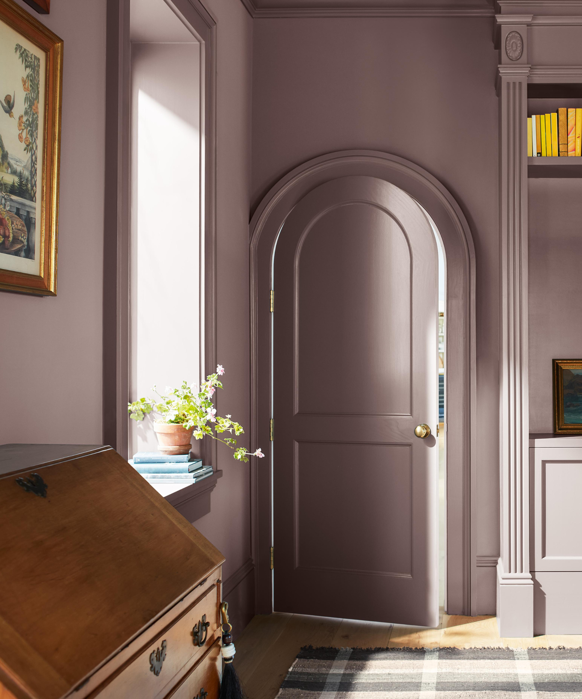
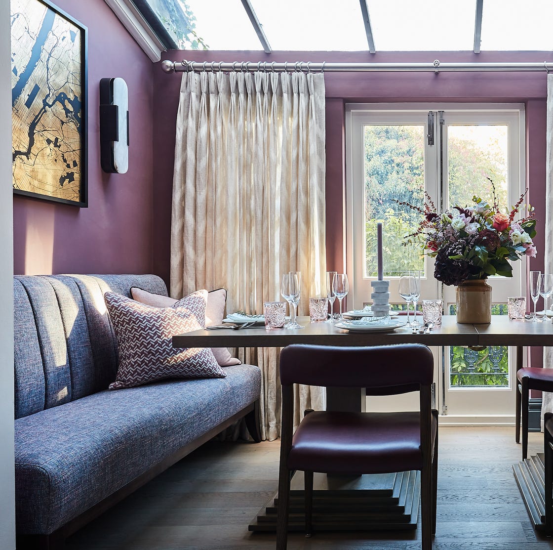
Amber with a deep, dark purple creates an unexpected yet interesting combination, where black-ish purple acts as a stand-in for black, adding depth. Tomato red, despite seemingly unconventional, can be successfully paired with purple, as designer Noz Nozawa showed in a Kips Bay Palm Beach Decorator Show House. She also uses lavender with earthen reds, greens, and browns to balance feminine and masculine shades. Using other shades of purple, such as mauve with pale lilac and pink, creates an elegant, monochromatic scheme, exemplified by Henry Prideaux's London dining room.
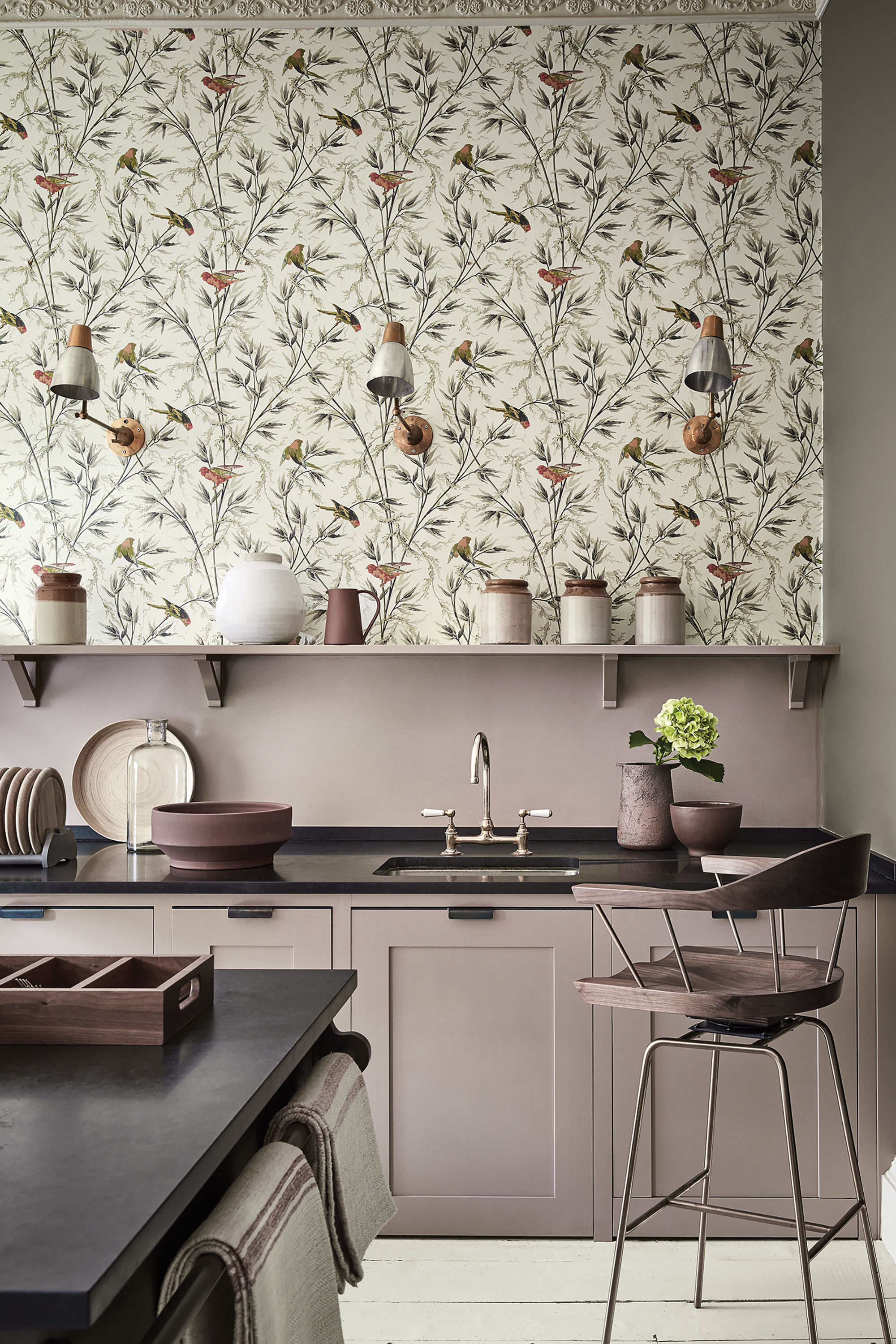
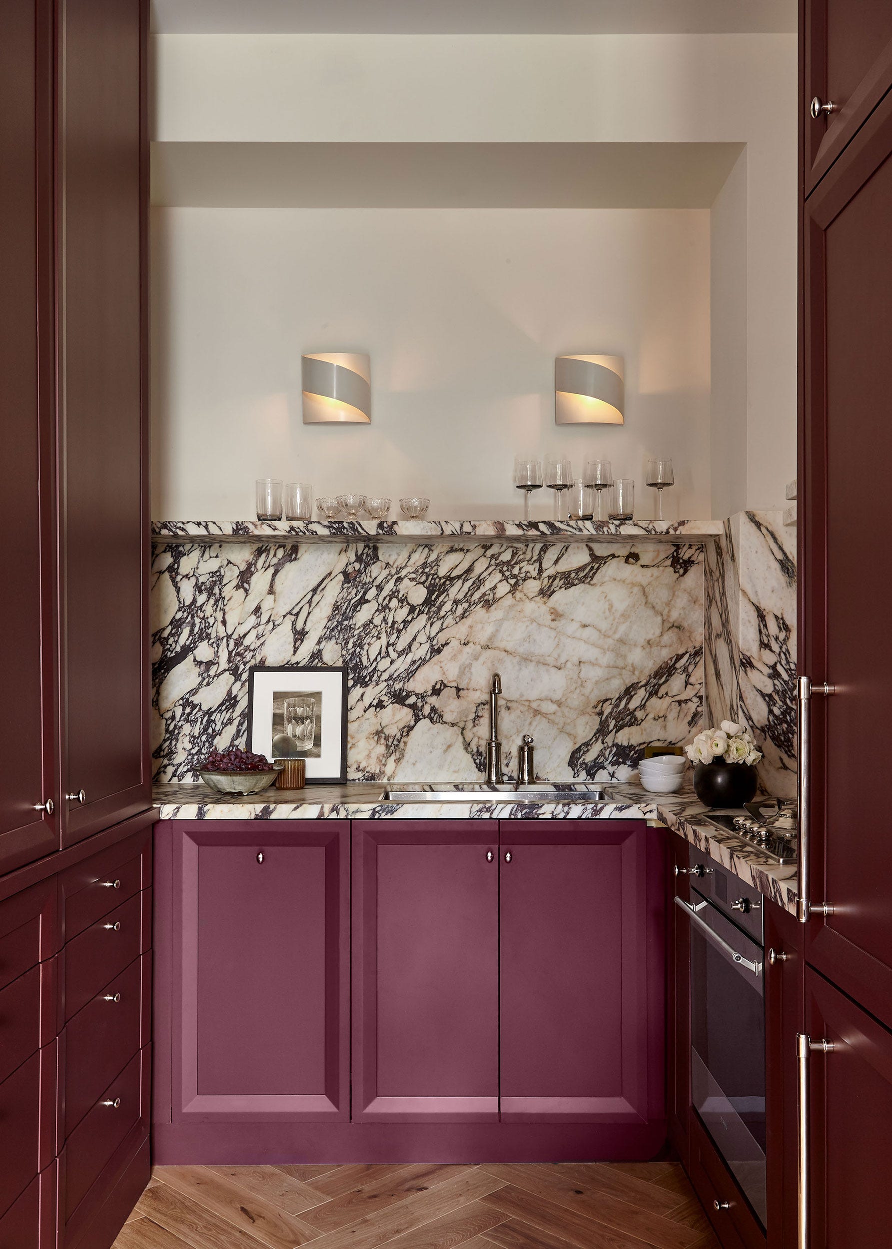
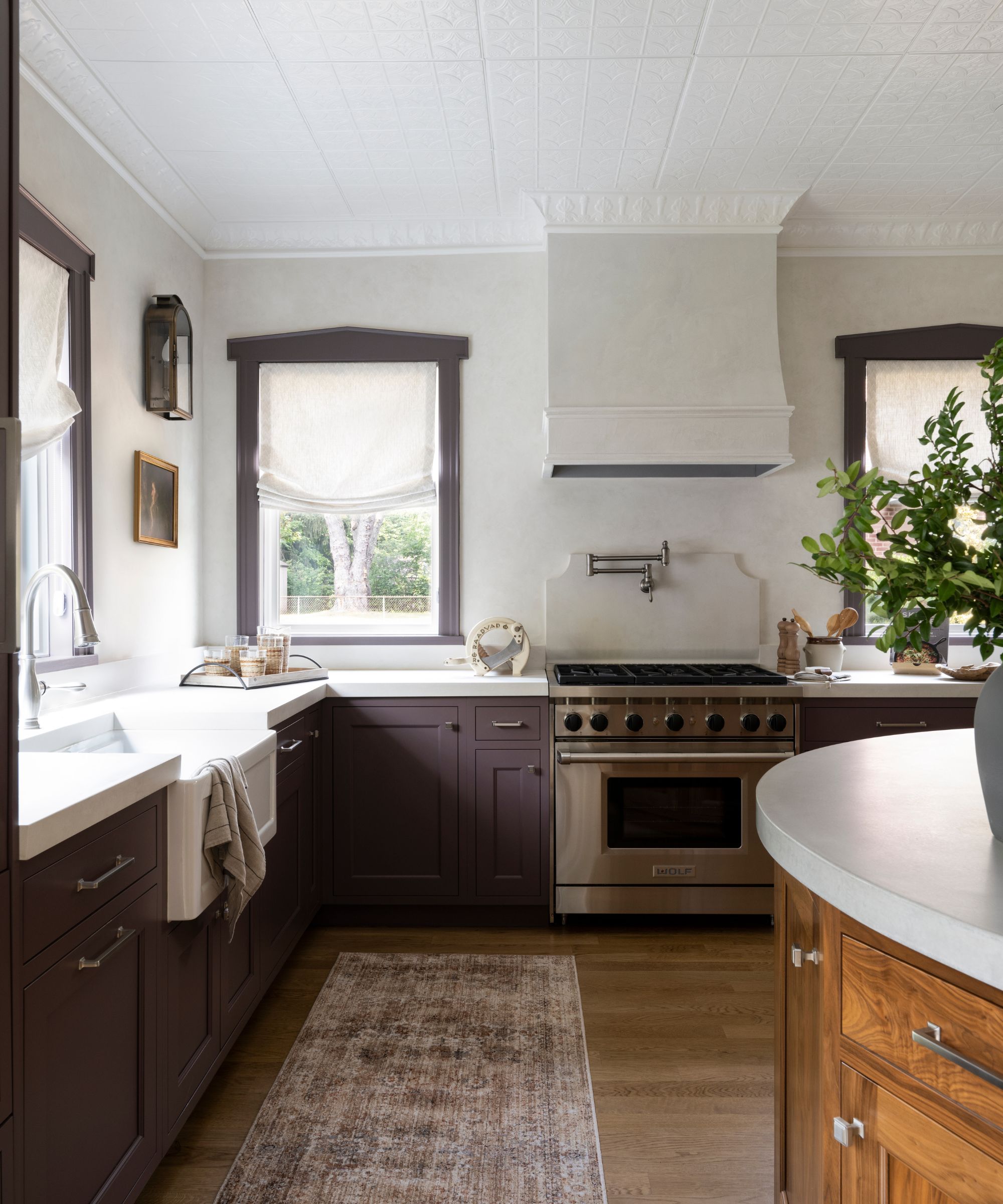
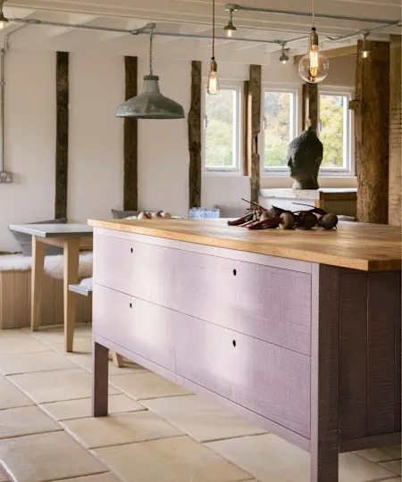
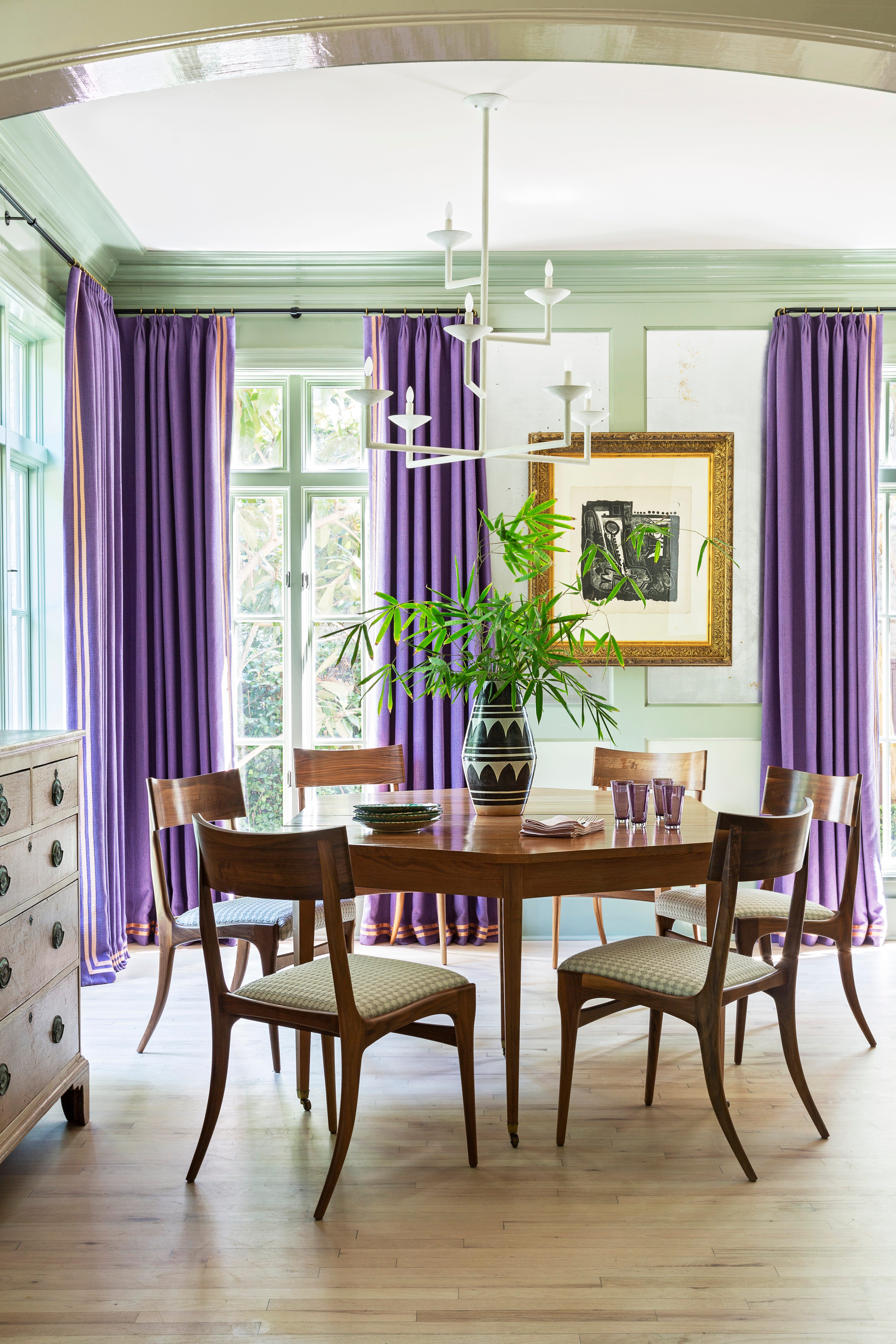
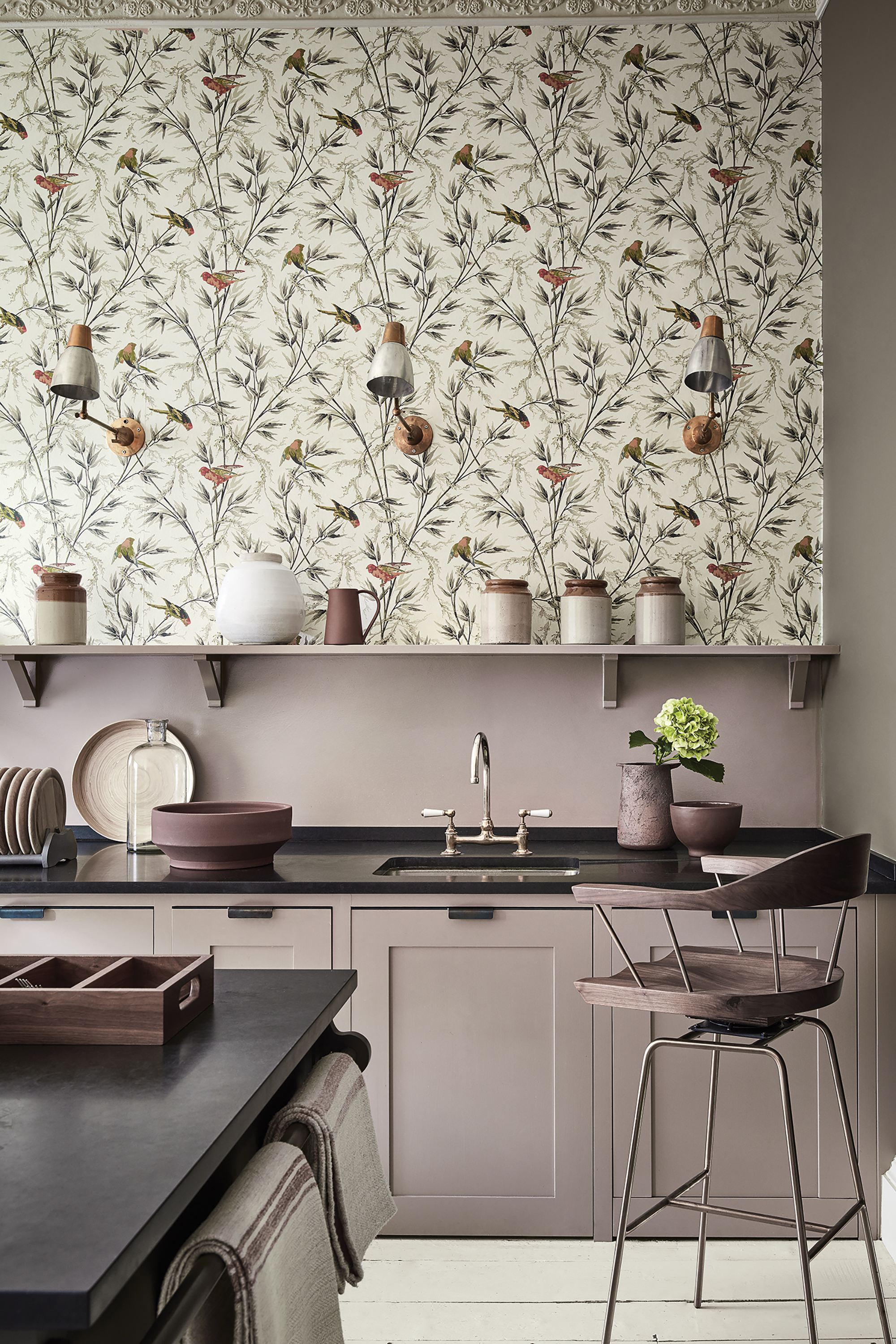
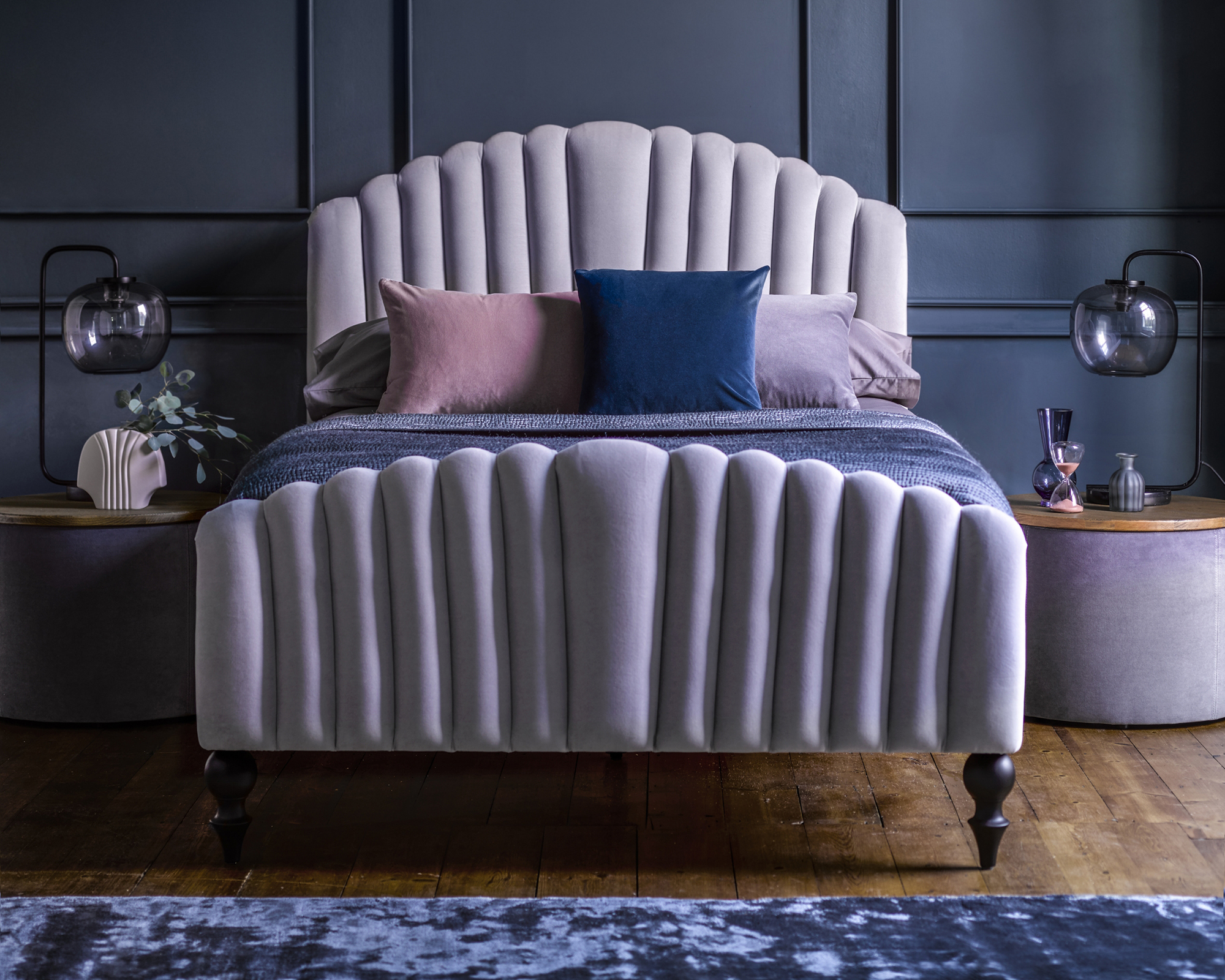
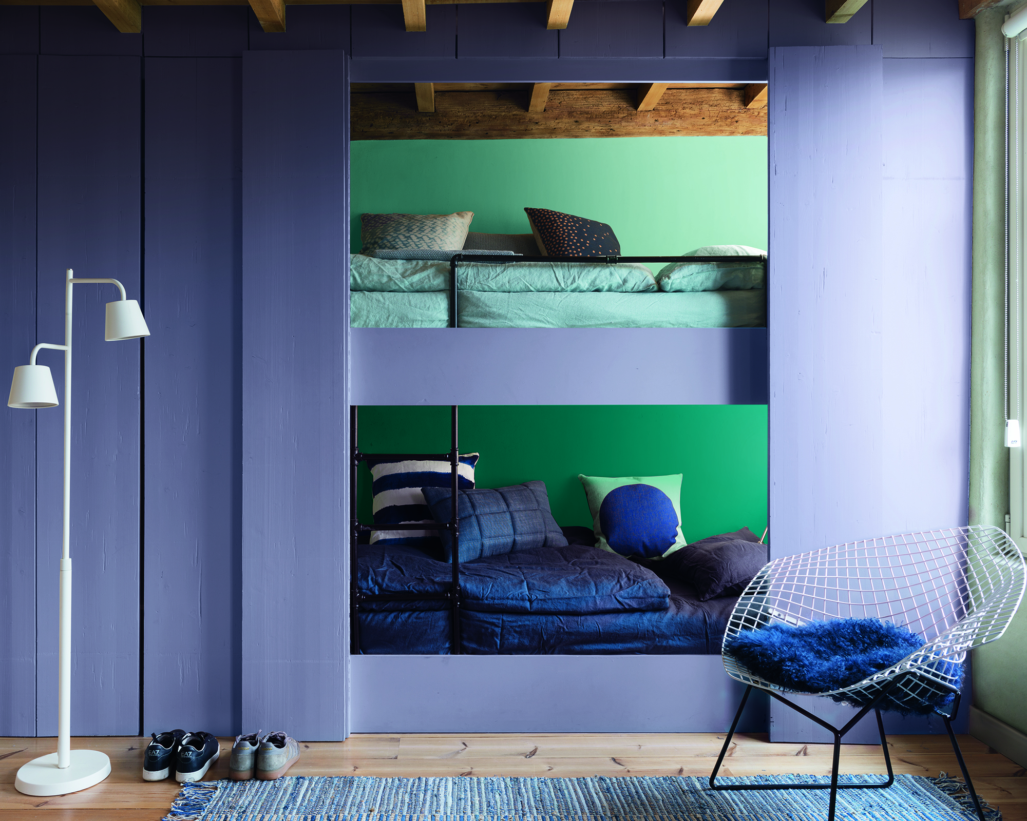
French blue with richer purple shades creates a moody yet relaxing ambiance, as seen in a bedroom by Gray Walker. Mauve, particularly nuanced shades from dusky lilacs to almost-blackened reds, can be energizing, even when used as a neutral for kitchen cabinets, as noted by Patrick O'Donnell. Celadon green, combined with purple, provides a breezy, tropical feel without being overwhelming, as observed in Young Huh's design for the Grace Point Hotel. Finally, gray, especially gray-ivories or gray with lilac notes like Farrow & Ball's Elephant's Breath, balances deep purples with a sense of dramatic sophistication, often paired with blacks and bright whites, as seen in a living room by Noz Nozawa. Champagne ivory, a glossy neutral, pairs well with various shades of purple, grounding deeper tones and blending with lighter ones, as illustrated in a living room by Gray Walker. Mint green with true purple creates a memorable dining room, with neutrals allowing royal purple drapes to shine, as shown in Angie Hranowsky's Austin home.
#InteriorDesign #ColorTheory #PurpleDecor #HomeDecor #DesignerTips #ColorCombinations #LuxuryInteriors #InteriorDesign #ColorTheory #PurpleDecor #HomeDecor #DesignerTips #ColorCombinations #LuxuryInteriors
0 comment in total
 No comments yet
You may also like
What colors go with purple? Perfect pairings, suggested by experts

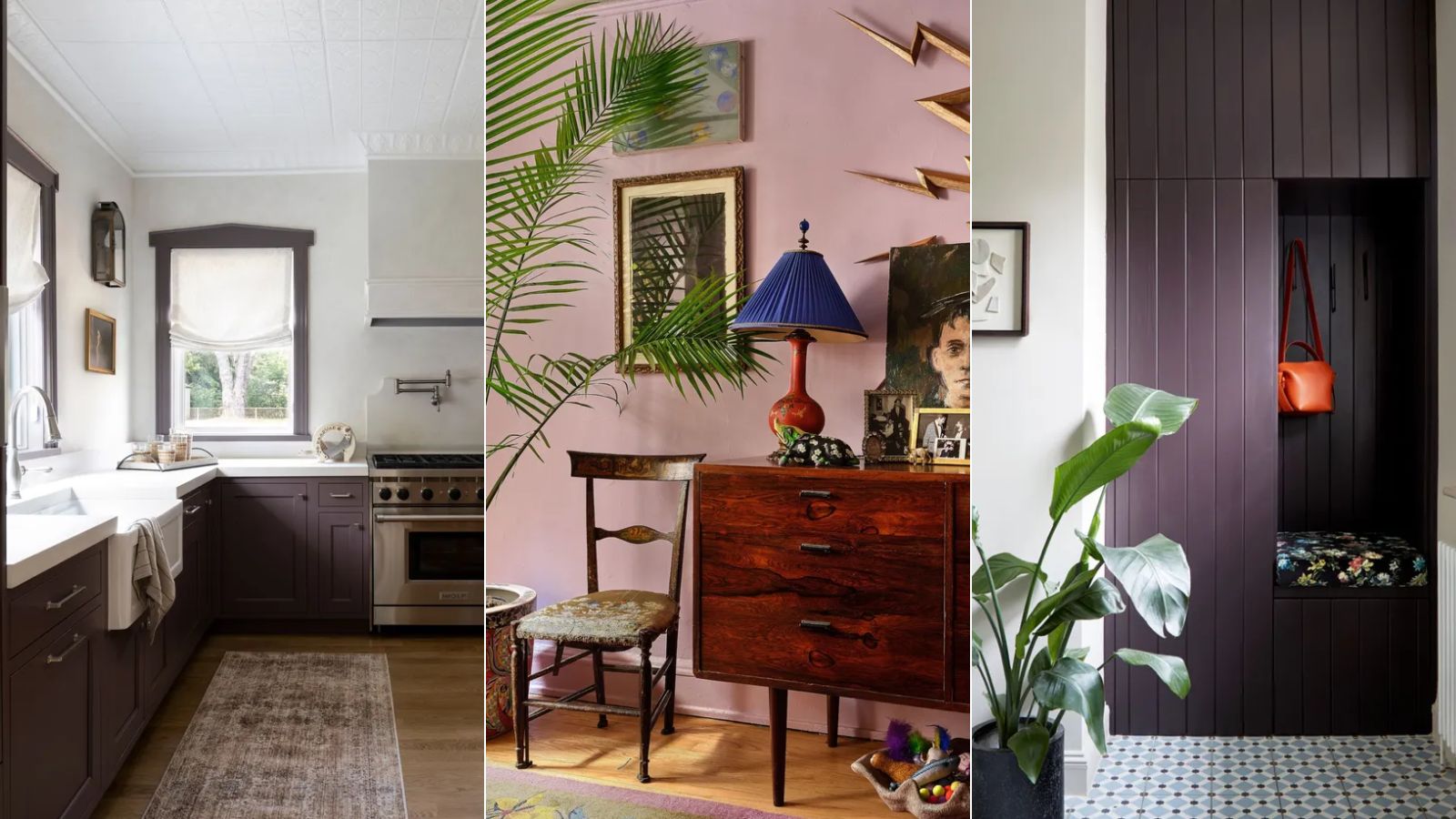
14 on-trend purple paints approved by interiors designers to use in 2025
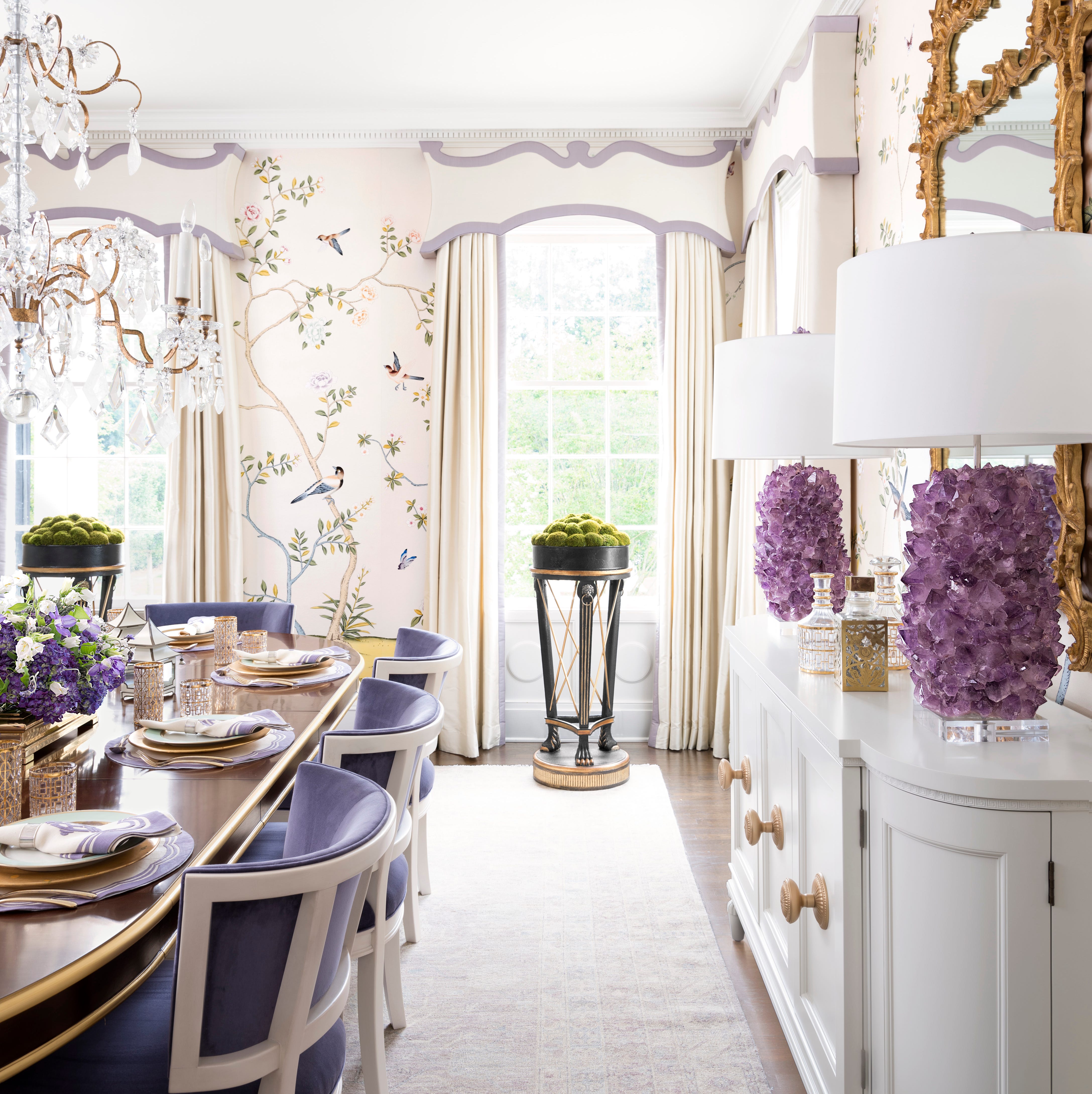
These 12 Elegant Rooms Prove You Can Decorate with Purple Effortlessly

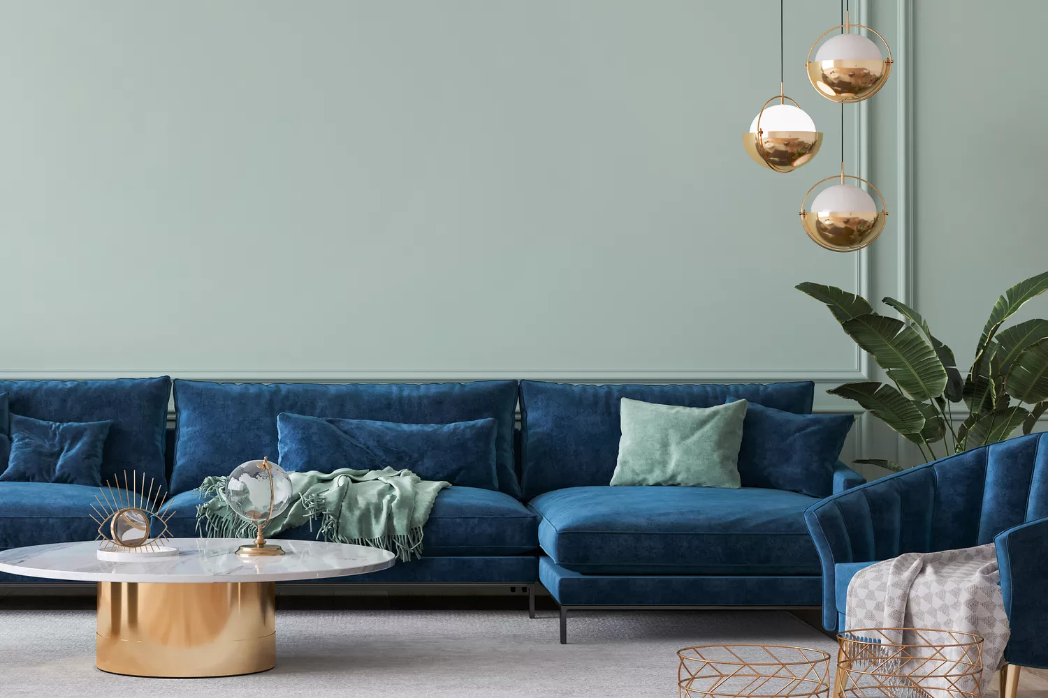
7 Color Combos That ALWAYS Look Good Together, According to Designers

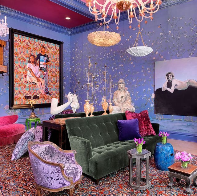
Decorating with Purple? Here Are the Best Colors to Pair with It 💜
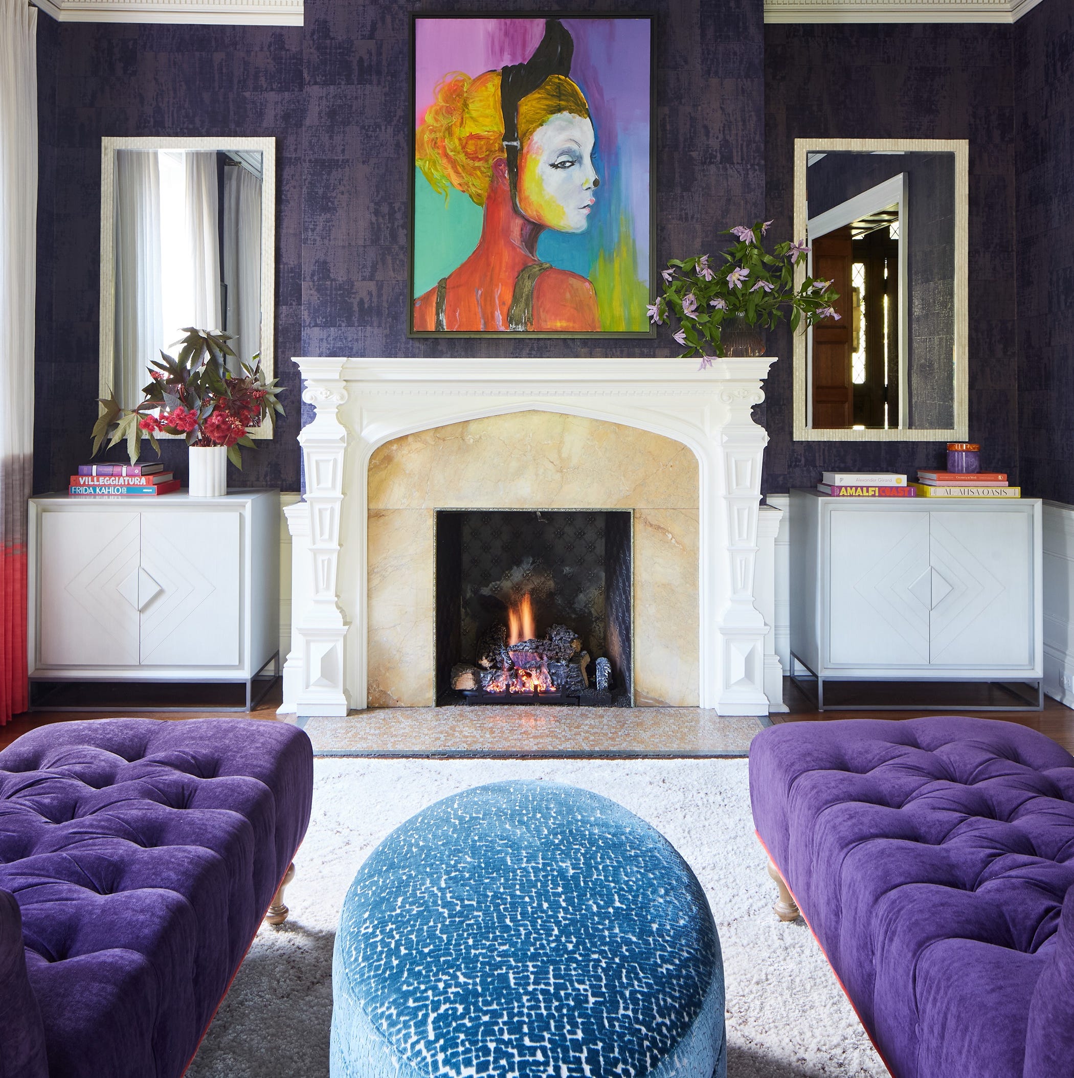
Designers LOVE Pairing These Unexpected Colors With This Sophisticated Hue

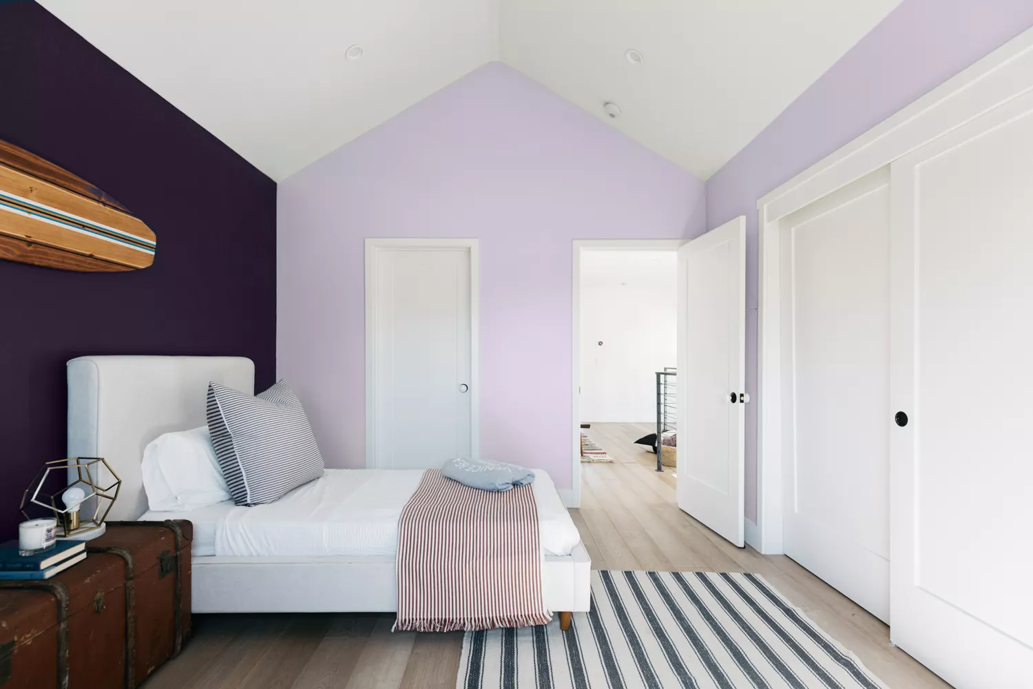
12 Best Purple Paint Colors for Bedrooms

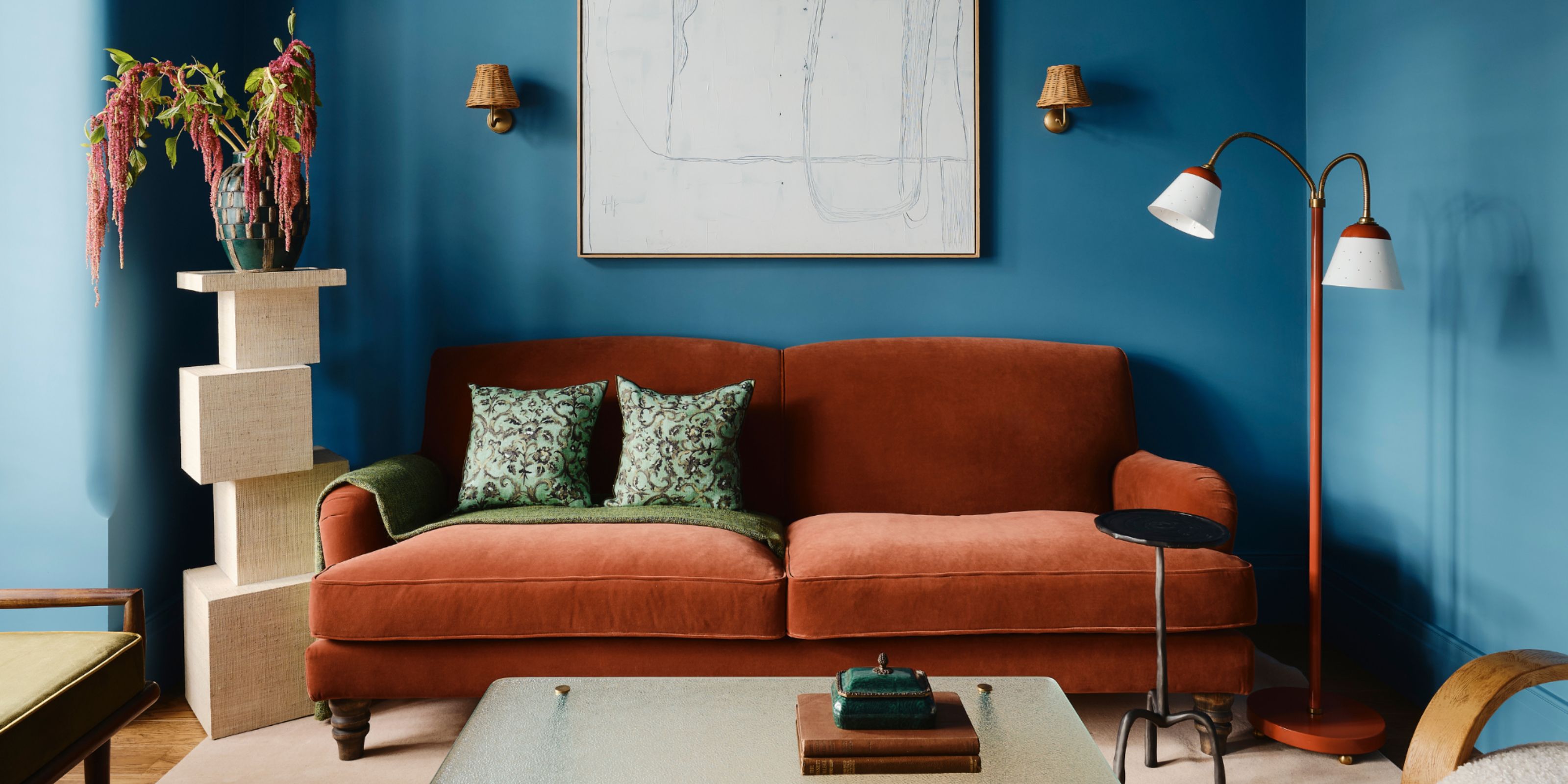
Colors That Go With Blue — 16 Pairings Designers Depend on for Bold, Breezy, and Perfectly Balanced Palettes

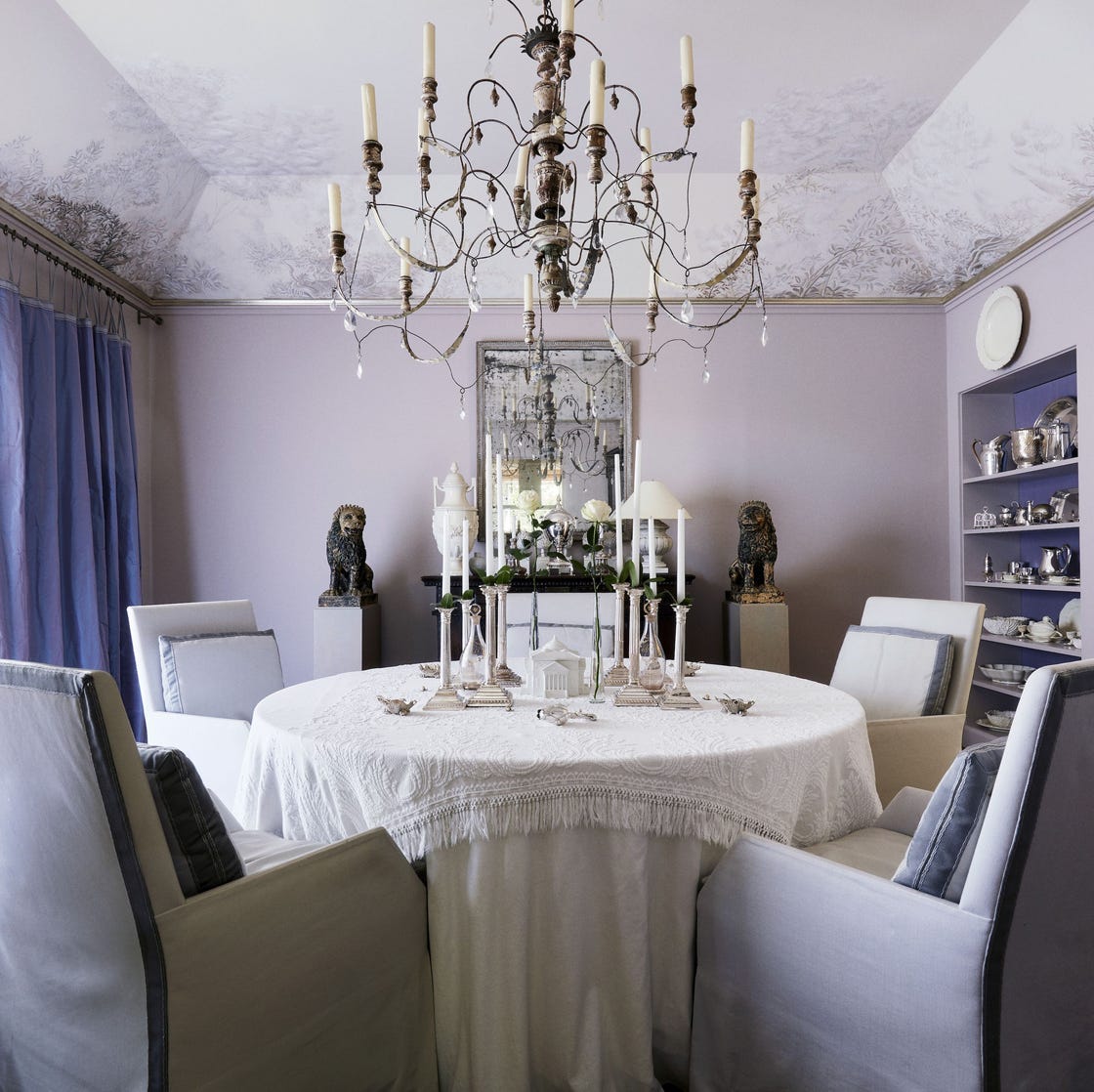
Interior Designers Swear by Pairing These 20 Colors with Purple for a Major Statement
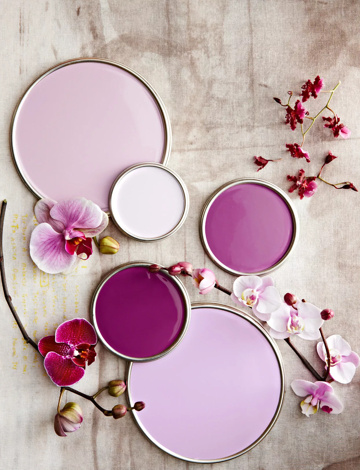
10 of the Prettiest Purple Paint Colors to Upgrade Any Room

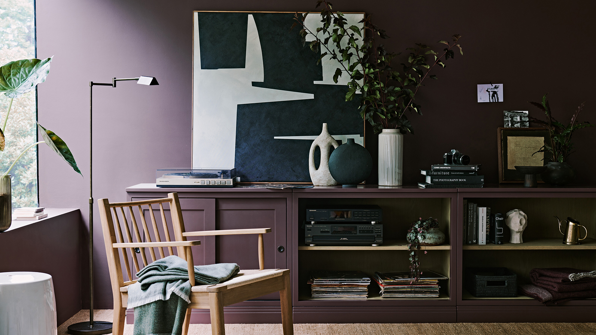
Purple room ideas – 10 ways to use this on-trend color
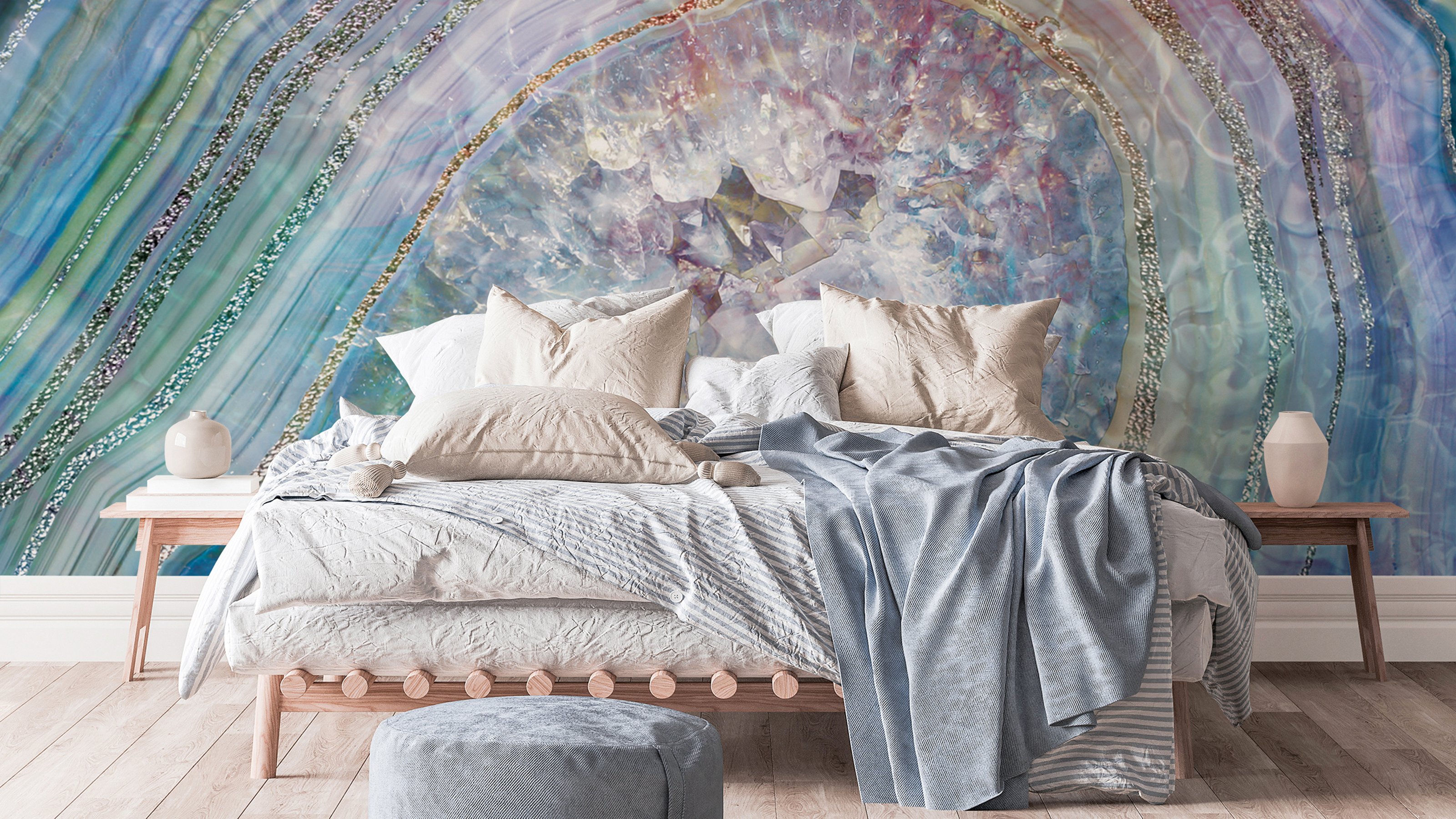
Purple bedroom ideas: 11 designs that prove lilac and plum aren't granny or glum

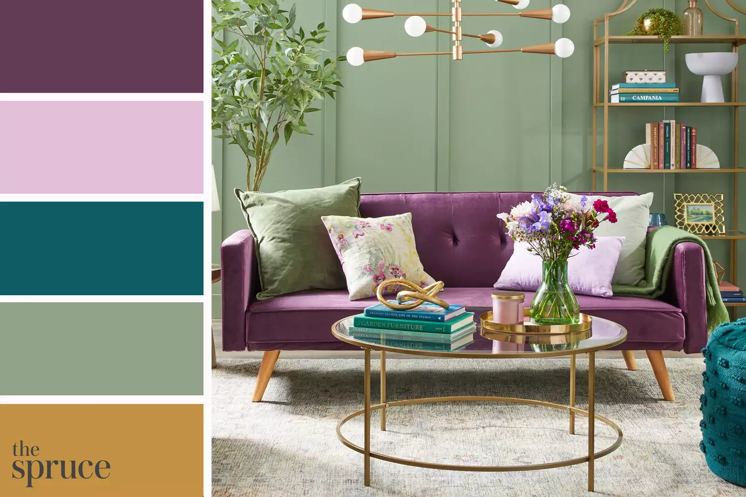
Pair Purple With Any of These Complementary Hues
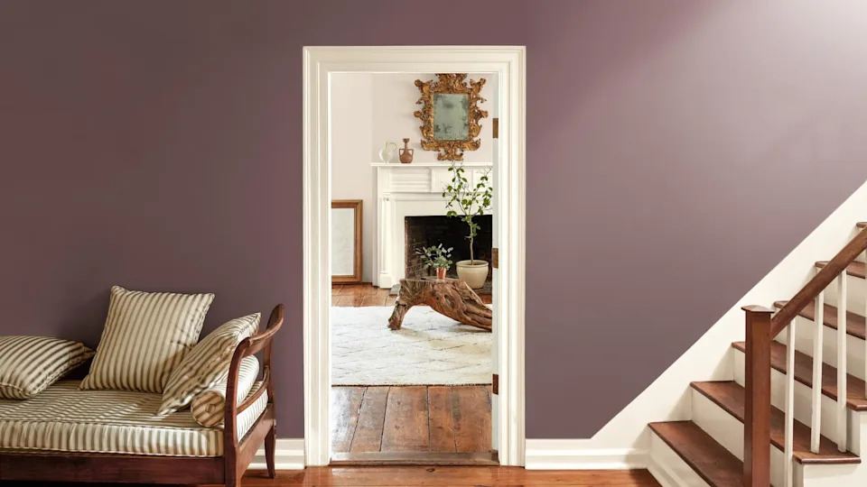
These are the colors that just don't work with purple – 4 shades to sheer clear of if you want to bring this on trend color into your home
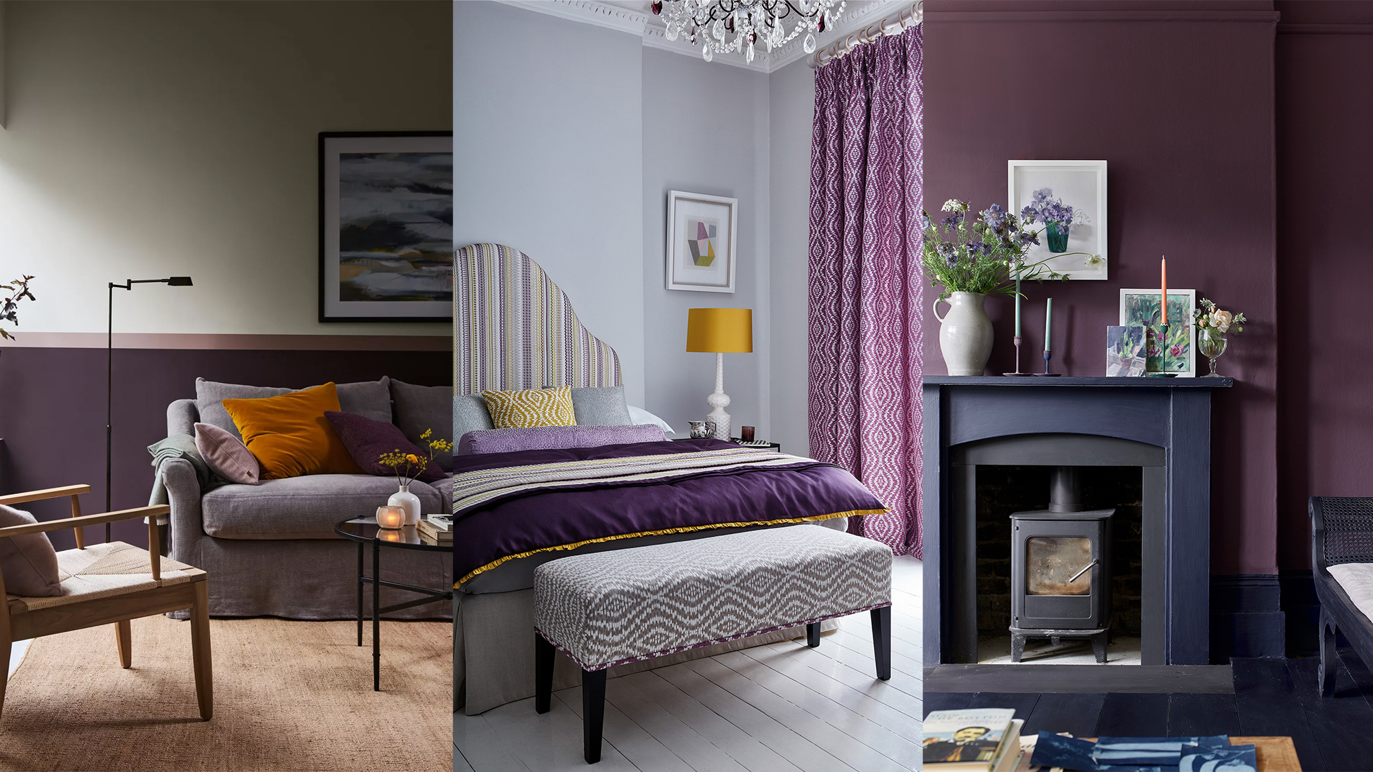
Decorating with purple – 10 ways to use this versatile shade
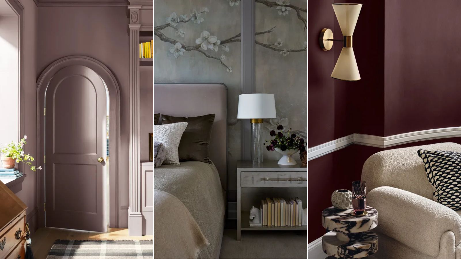
Is purple making a comeback for 2025? Designers and color experts weigh in on this divisive and nostalgic shade
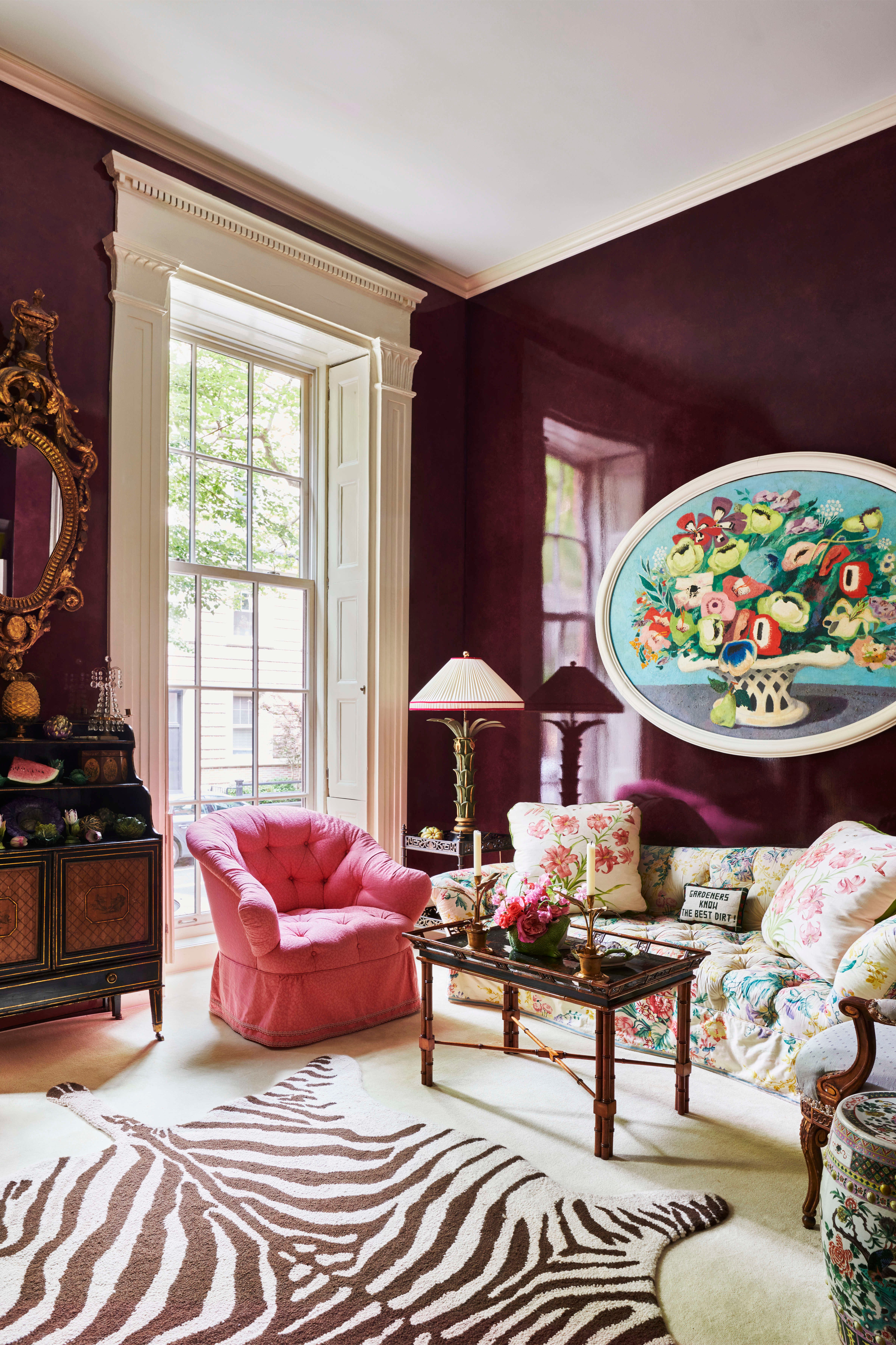
Top Designers Reveal the 16 Best Purple Paint Colors They Absolutely Swear By

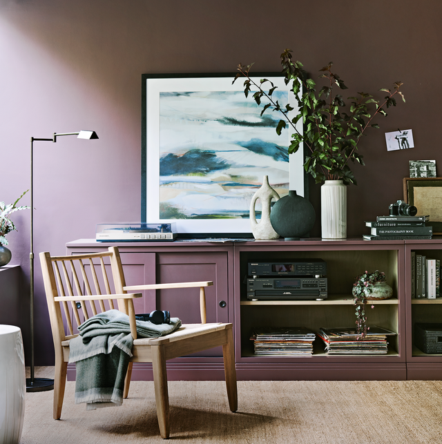
Decorating With Purple: 9 On-Trend Ways To Use This Versatile Shade At Home

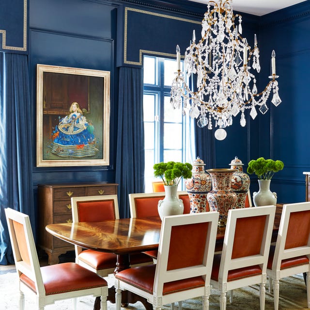
18 Designer-Approved Colors That Go With Navy Blue
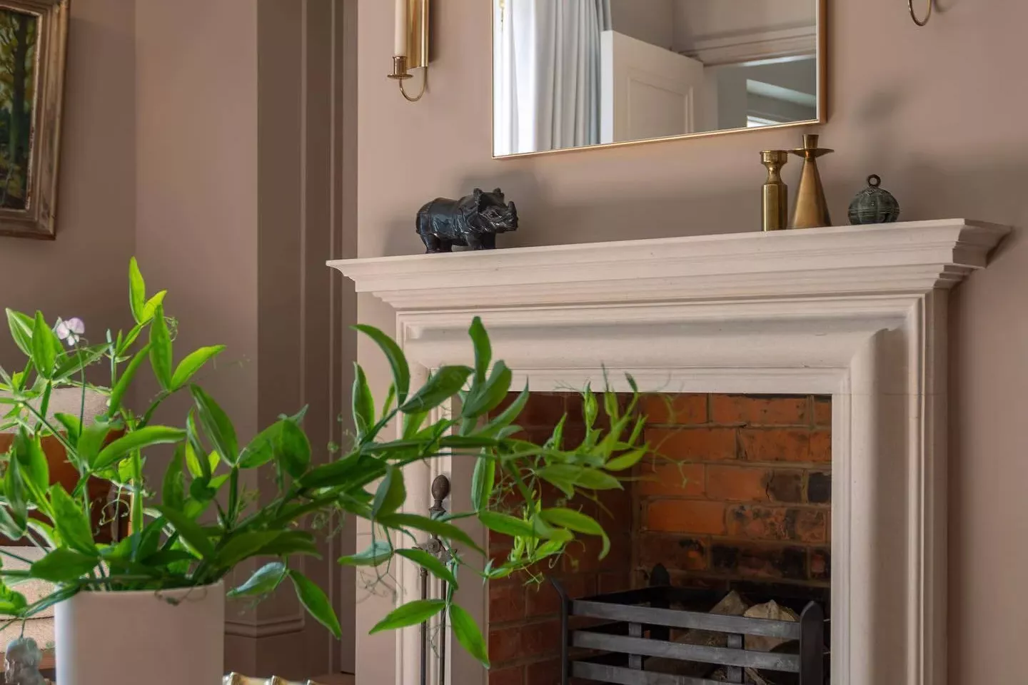
33 Absolutely Perfect Paint Colors Designers Love