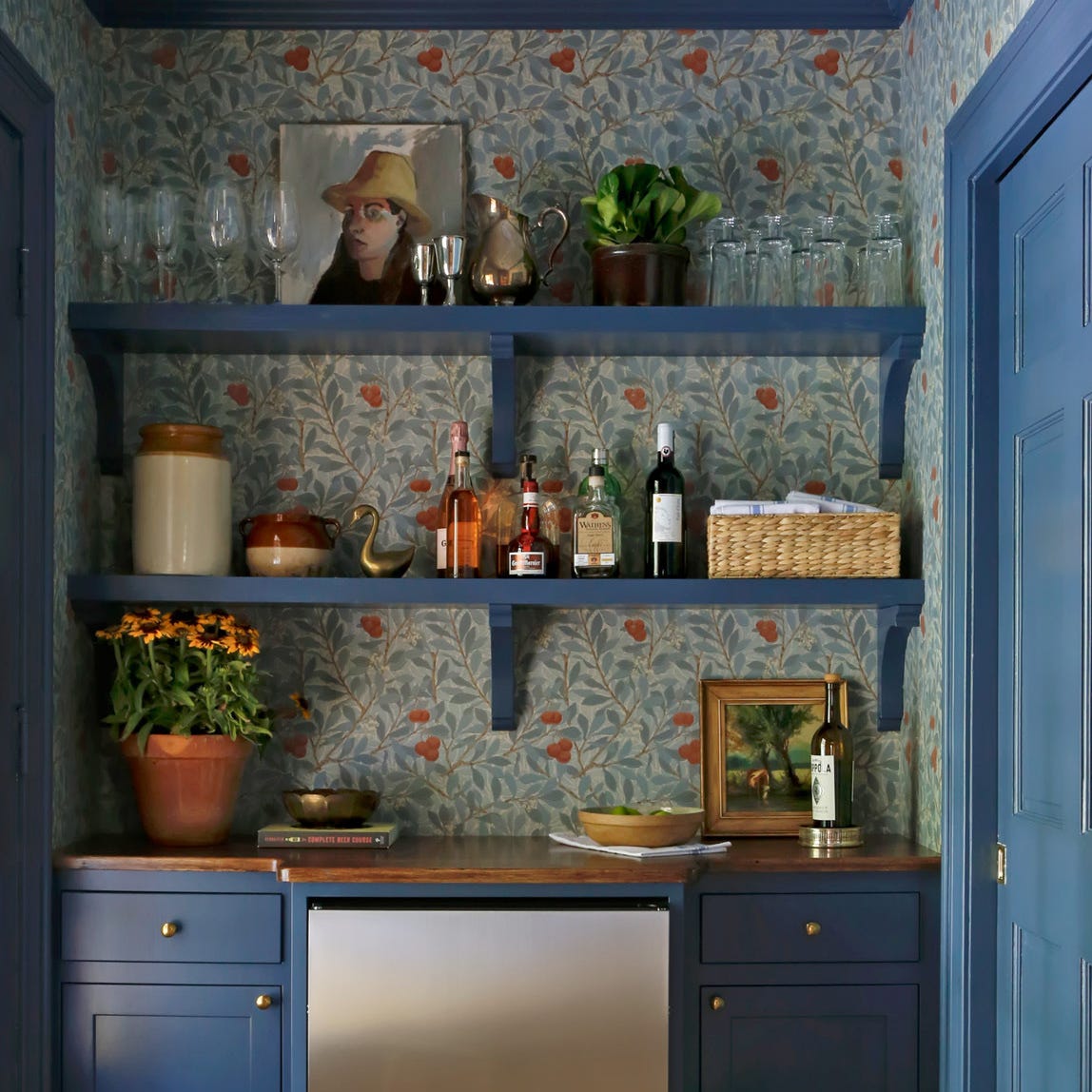
1/15
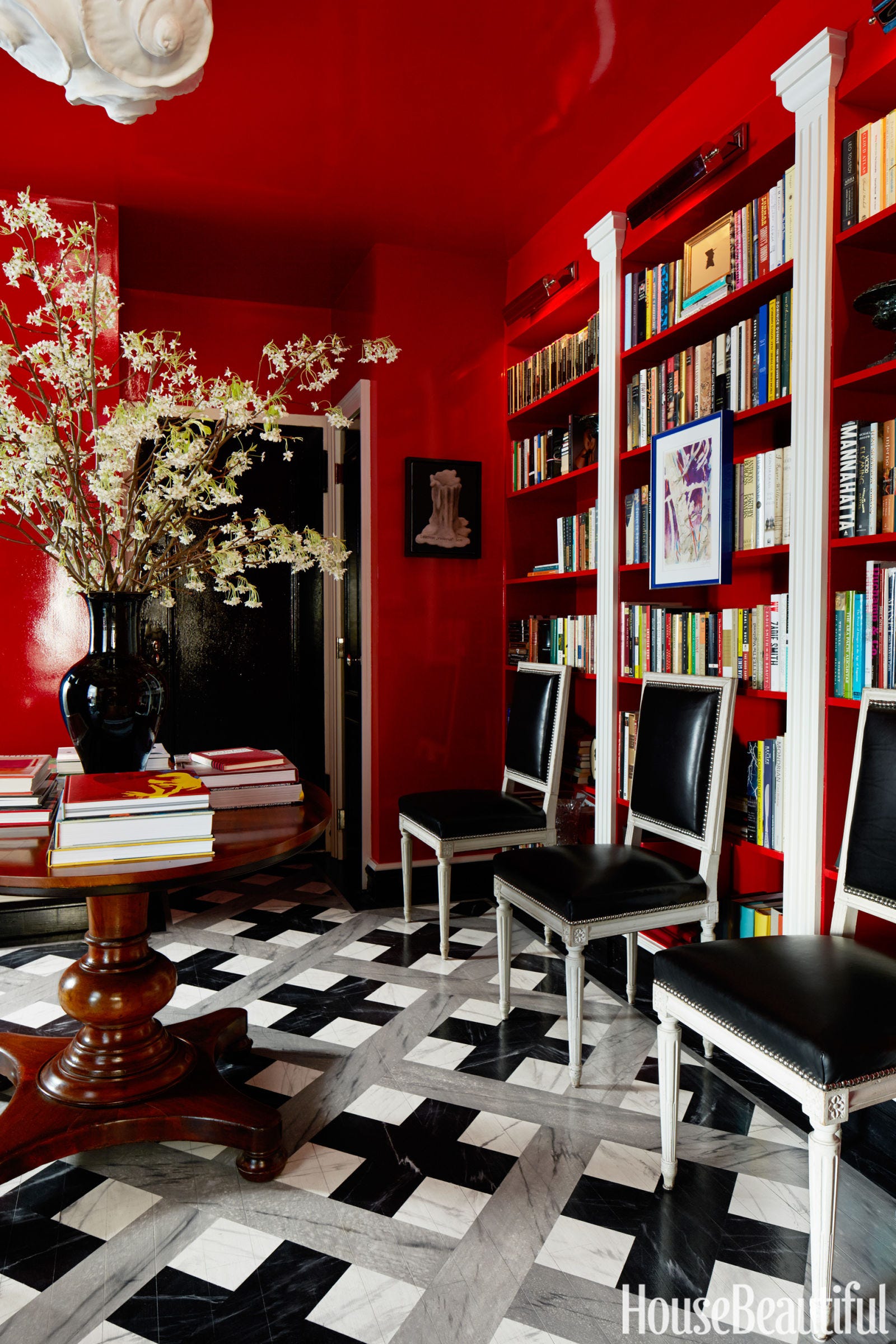
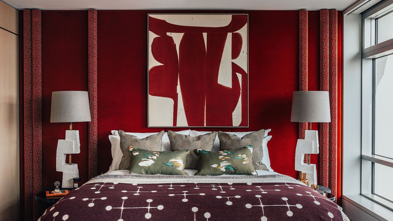
Yes, Your Room Really Does Need a Hit of Red!
This article explores 14 innovative ways to infuse color into a country house aesthetic, moving beyond the prevalent white shiplap and neutral tones that have dominated country interior design for the past decade. It provides practical advice and inspiration for incorporating a richer, more vibrant palette.
The first suggestion involves drawing inspiration from the surrounding landscape. The article highlights how a home's natural environment, such as proximity to water or lush greenery, can guide color choices, creating a "cocoon-like" and immersive feel. An example cited is a family room painted a rich mossy green, complemented by brown velvet furniture and natural fiber rugs, which extends the outdoor landscape indoors.
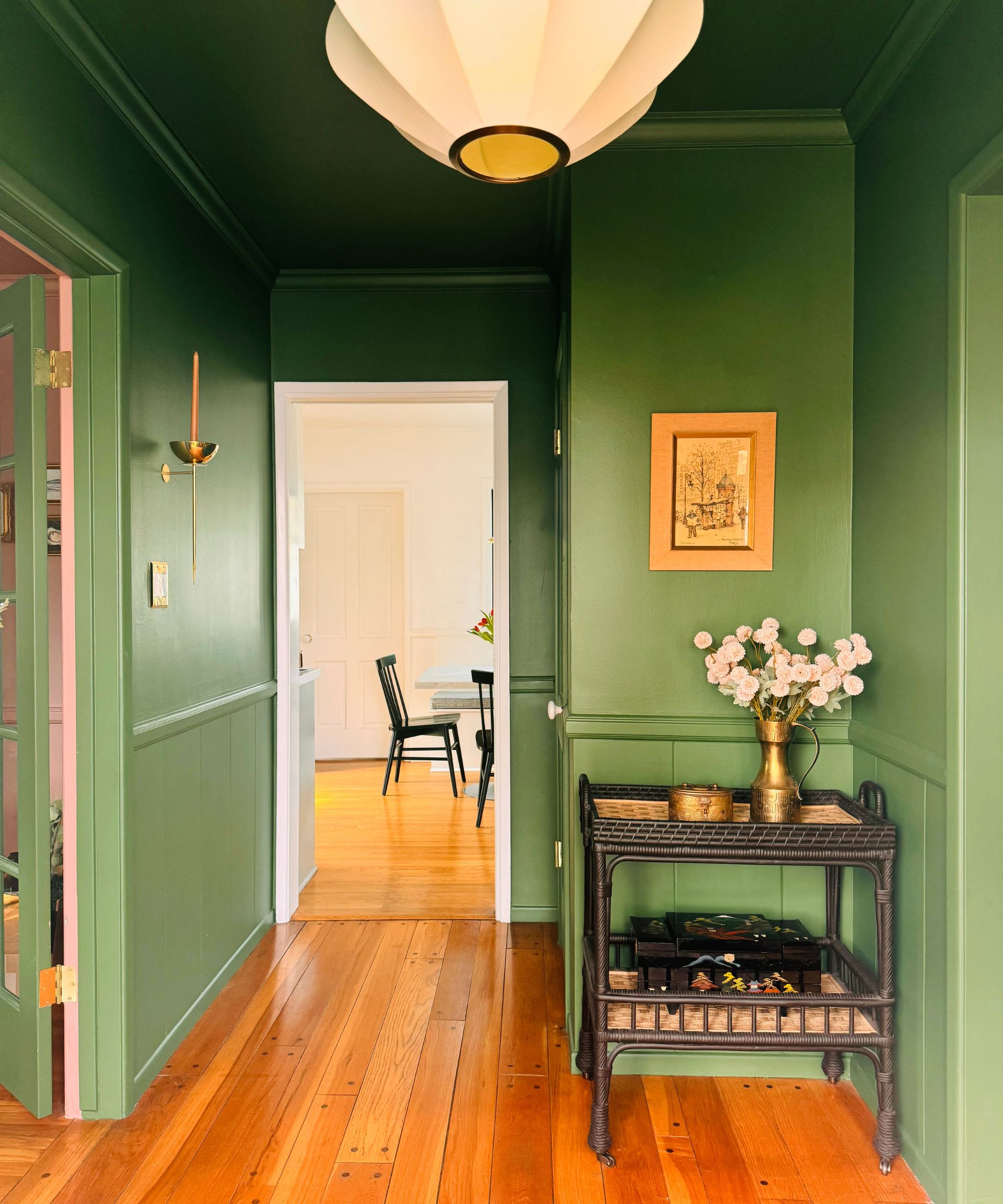
The second tip advocates for the use of "muddy tones," referencing historical paints made from natural pigments like clay and sand. These earthy hues, including olive greens, deep chocolates, and plummy aubergines, are suggested to reflect the countryside and bring a sense of the outdoors inside, making them particularly suitable for older homes. A soft muddy blue laundry room is presented as an illustration of this approach.
The third point emphasizes grounding a space with warm wood elements. It suggests that brown furniture serves as an anchor, providing contrast, clarity, and sturdiness to a room, especially when balanced against more energetic colors or patterns. A pine chest in a bedroom is used to demonstrate how wood can add gravitas.
Adding whimsy with wallcoverings is the fourth method discussed. The article categorizes suitable wallpaper motifs into four "Ps": Pastorals (bucolic scenes), Petals (florals, tempered with monochromatic palettes or leafy designs), Plaids (tartans, preppy plaids, and classic checks), and Patchwork (geometric quilt motifs). It advises that more traditional motifs allow for bolder color choices.
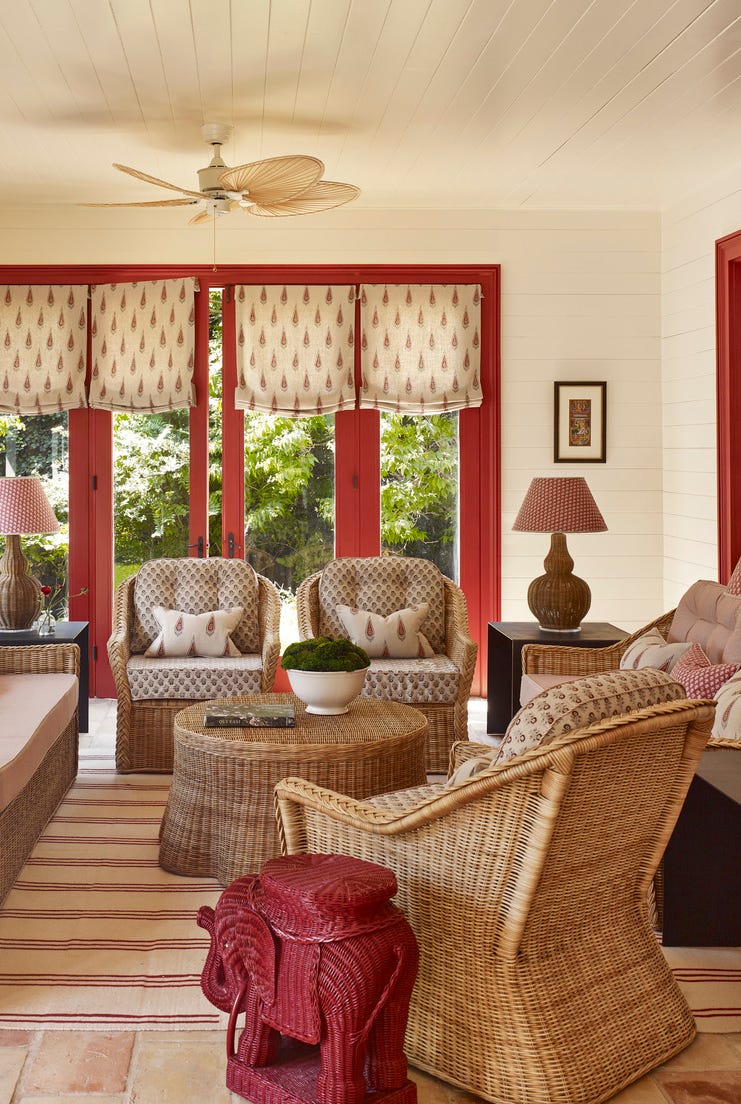
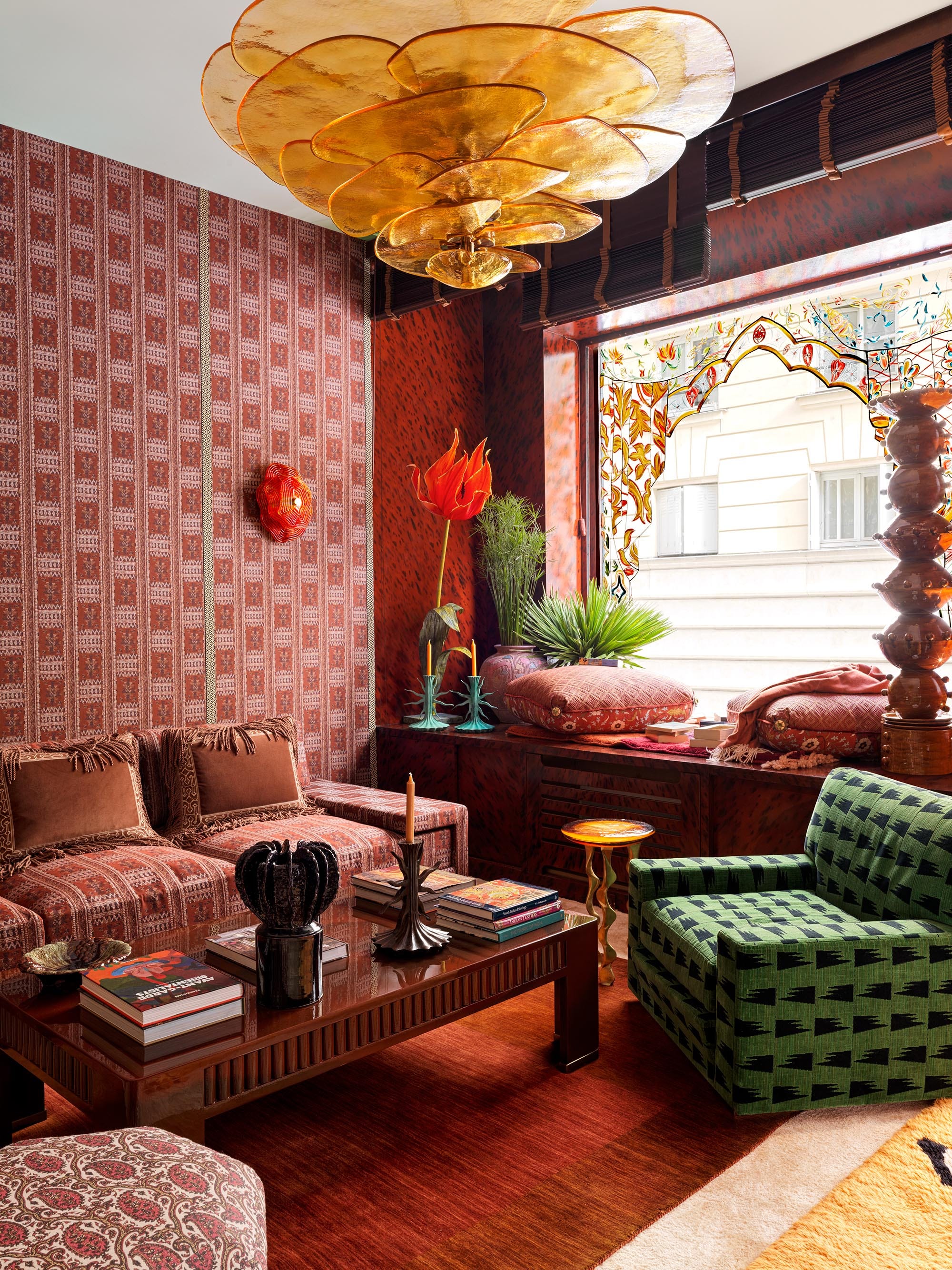
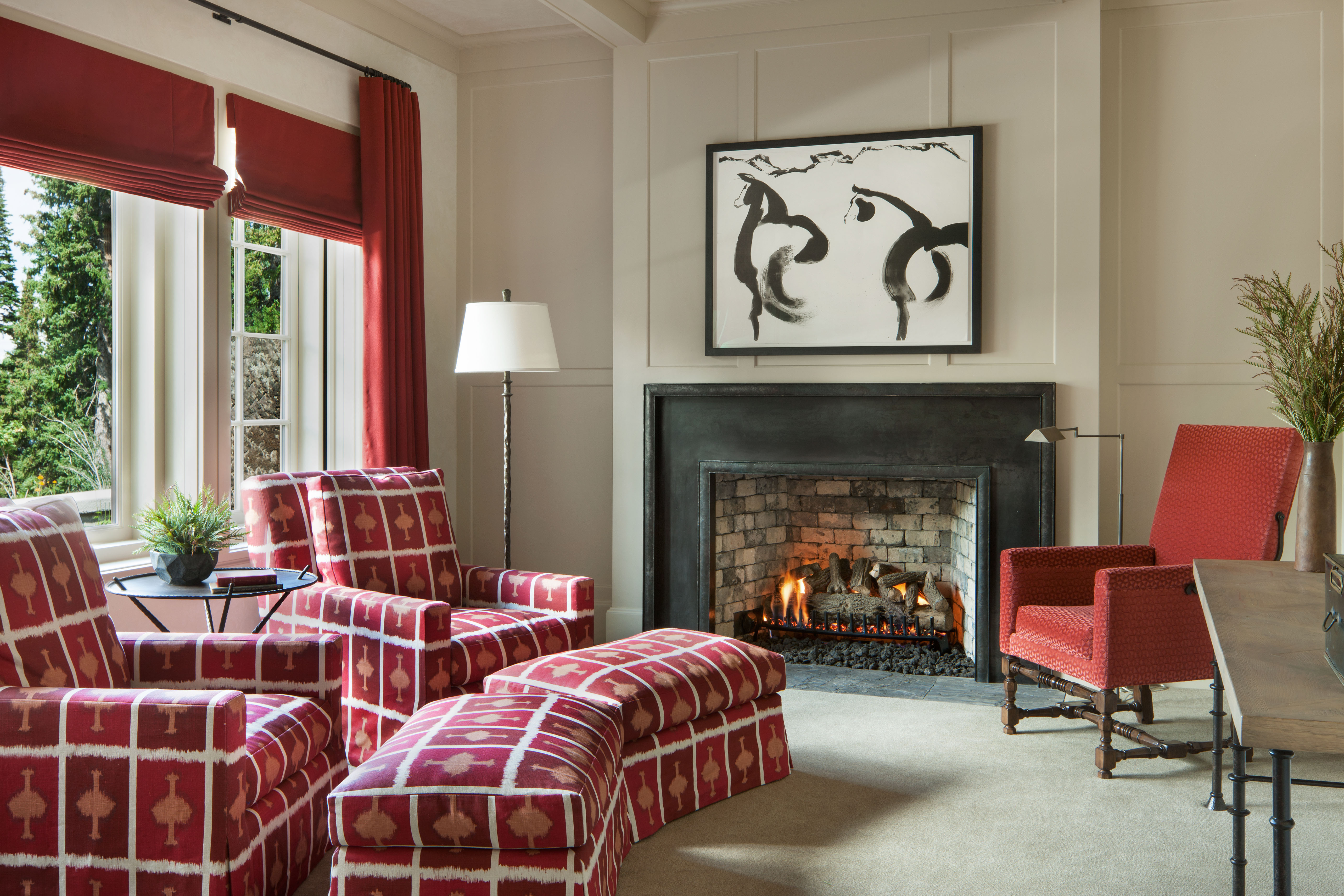
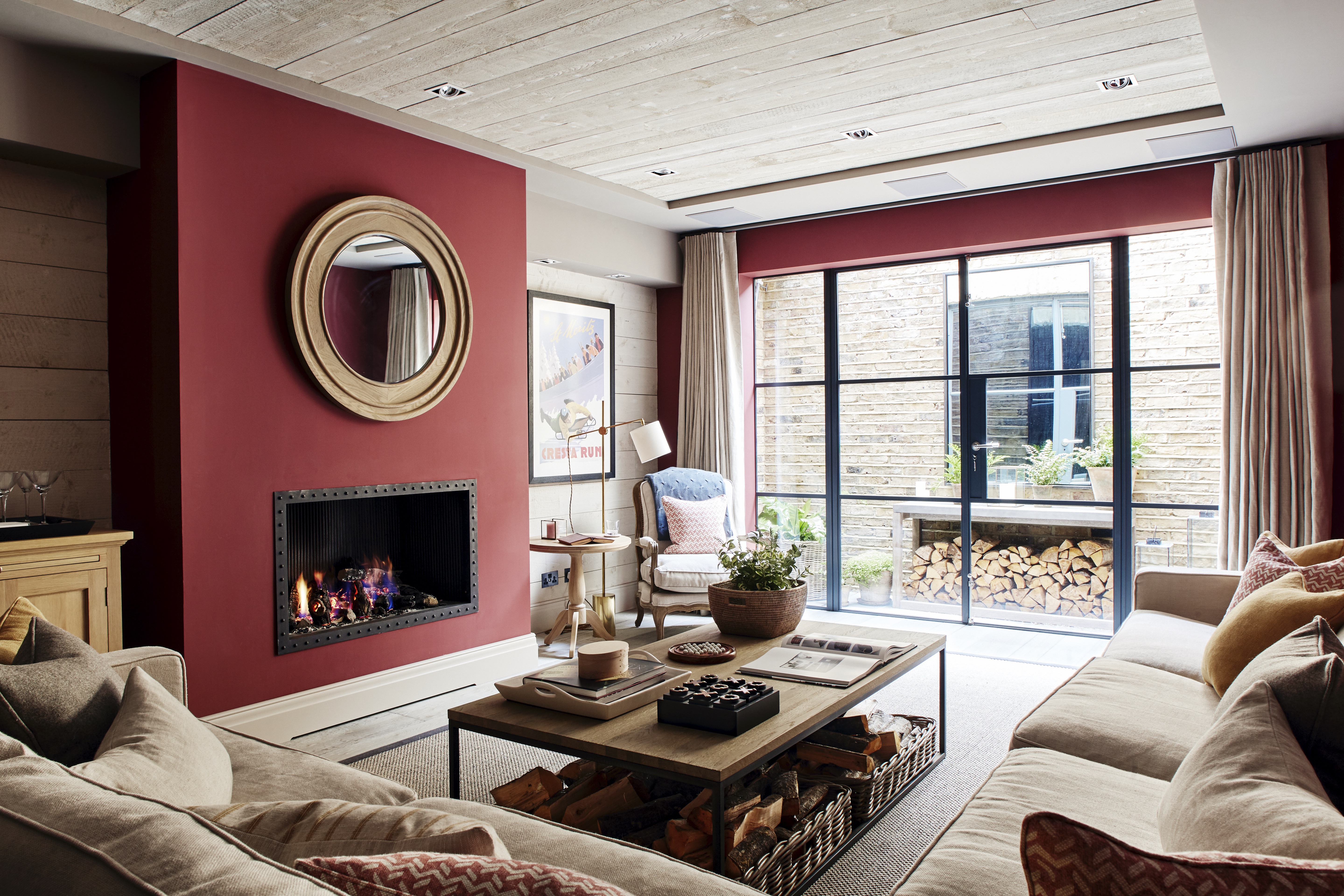
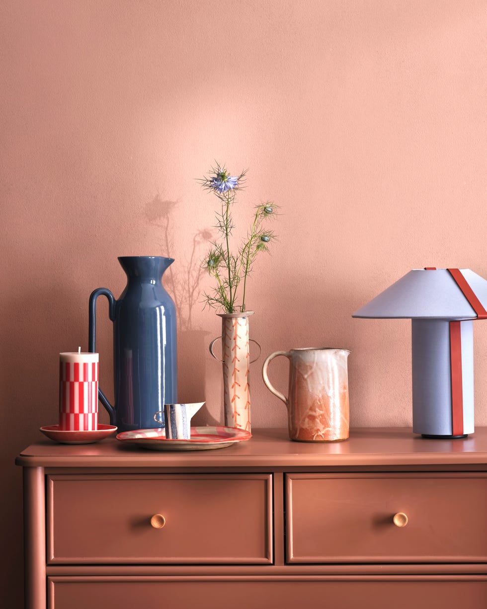
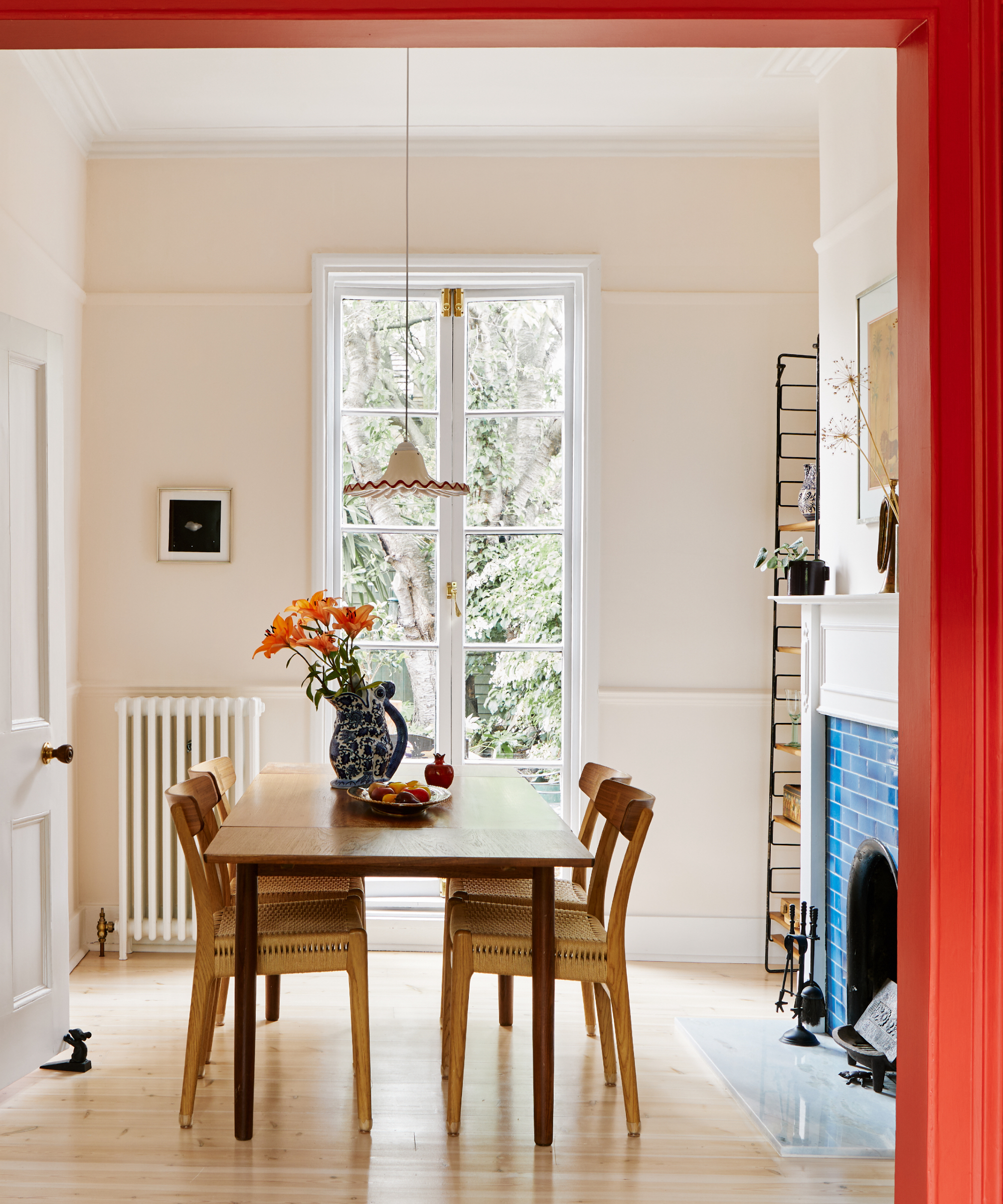
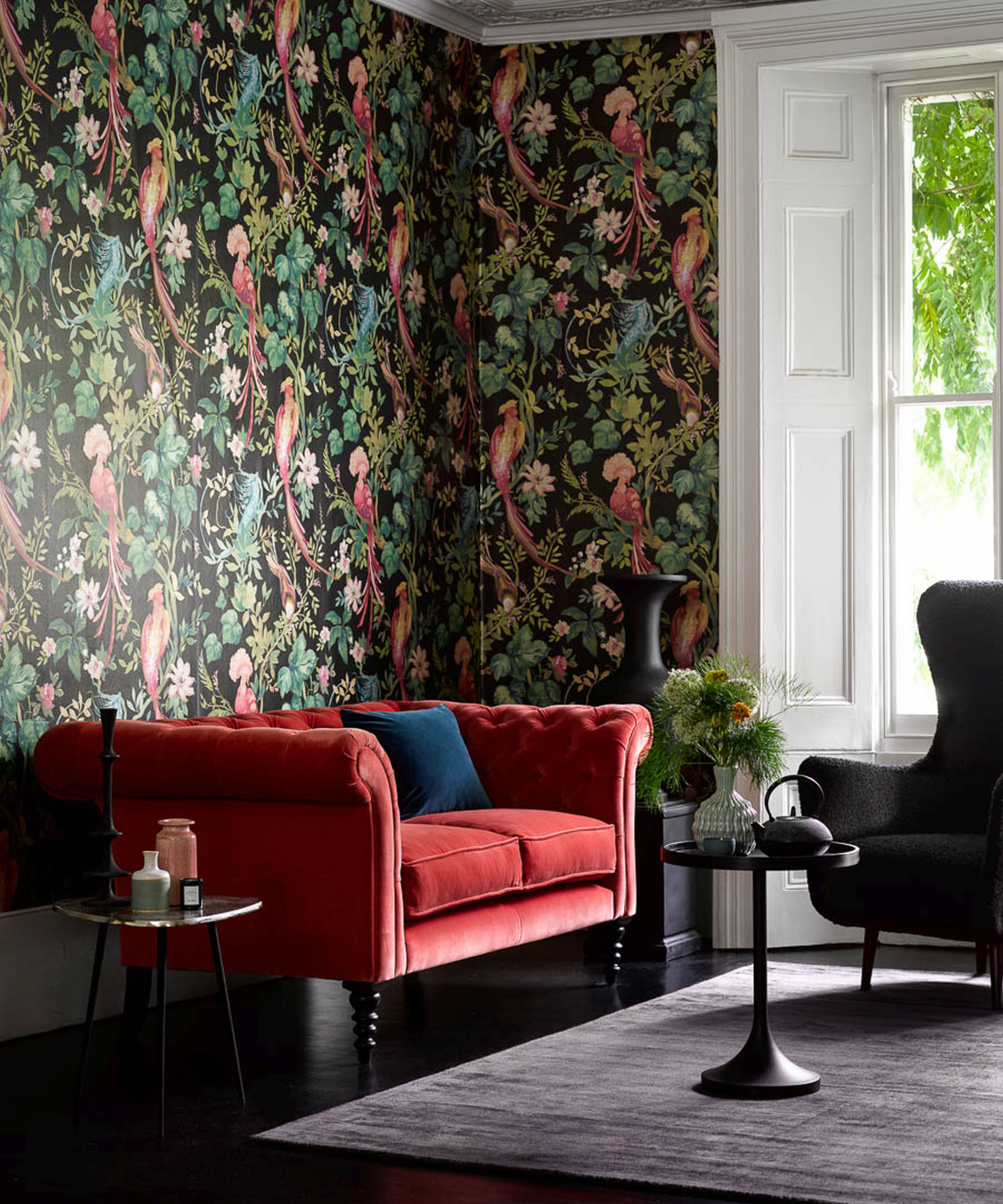
The "Unexpected Red" Theory, a trend from TikTok, is the fifth idea, proposing that a pop of red—whether a lampshade or an object—can add irreverence and confidence to any room by deliberately not matching. A bright red sofa in an airy living room exemplifies this concept.
Sixth, the article suggests incorporating color through painted floors. This is presented as an economical way to add color, especially when walls are kept white. Checkerboard patterns, such as a green-and-white combination, are highlighted for their charm and ability to introduce a burst of color while maintaining airiness. Durable floor-friendly paints and topcoats are recommended.
The seventh strategy is to go vibrant with vintage items. Collectibles like Fiesta, Pyrex, or enamelware are noted for their diverse colorways, allowing a room to feel layered and developed over time through the objects it contains. A kitchen with shelves filled with colorful vintage items illustrates this approach.
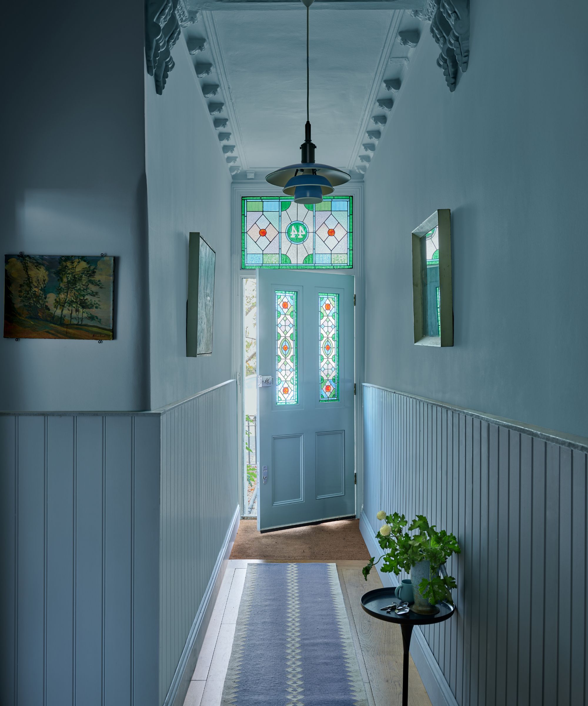
Mind your millwork is the eighth point, stressing the importance of wood elements like wainscoting, beadboard, and V-groove. It explains that wood texture accepts pigment more authentically than drywall, making these architectural features key in adding charm, particularly in new constructions. A robin’s-egg blue V-groove wainscoting in an entryway is provided as an example.
The ninth tip is to display book spines as a colorful element. Vintage book series like Nancy Drew, The Hardy Boys, or _National Geographics_ are mentioned for their visual impact and ability to evoke nostalgia.
Considering Colonial-era colors is the tenth suggestion. The article highlights the beauty and timelessness of colors from this period, citing a rich green from the Williamsburg Color Collection by Benjamin Moore used in a bedroom. It also mentions searching historic paint color collections from brands like Sherwin-Williams.
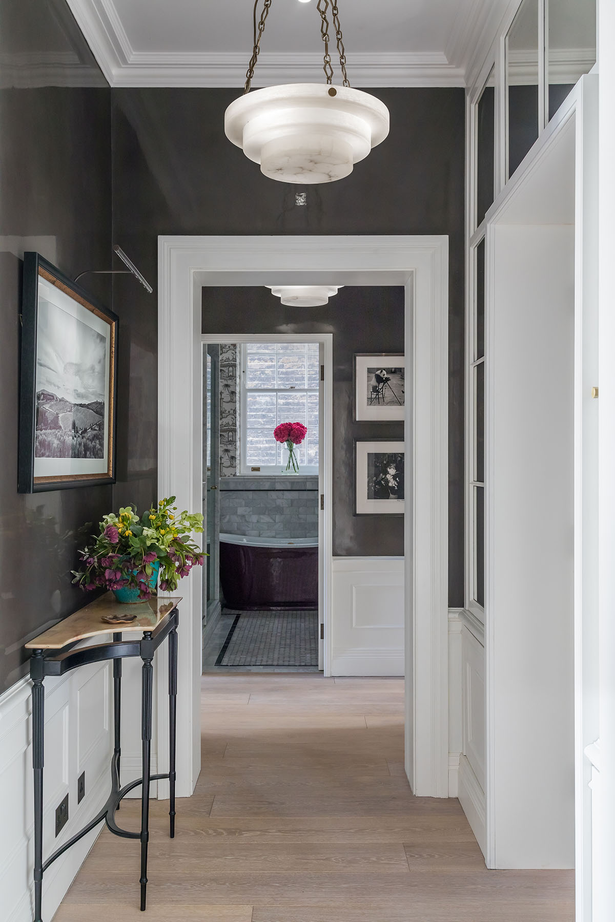
Rethinking neutrals is the eleventh point, suggesting that darker shades, particularly brown, can be as versatile as beige. Brown paint is described as rich and luxurious, noting its increasing popularity. A dark brown entry with a bamboo hallstand illustrates this modern approach to neutrals.
The twelfth tip draws inspiration from the Shakers, who embraced color in their simple, handmade paints. Shaker traditions are cited for their use of brighter shades for trim work—such as red, yellow, green, or blue—to give millwork a dramatic role without distracting from wall colors or furnishings. A dining room with yellow painted floors is presented as an example.
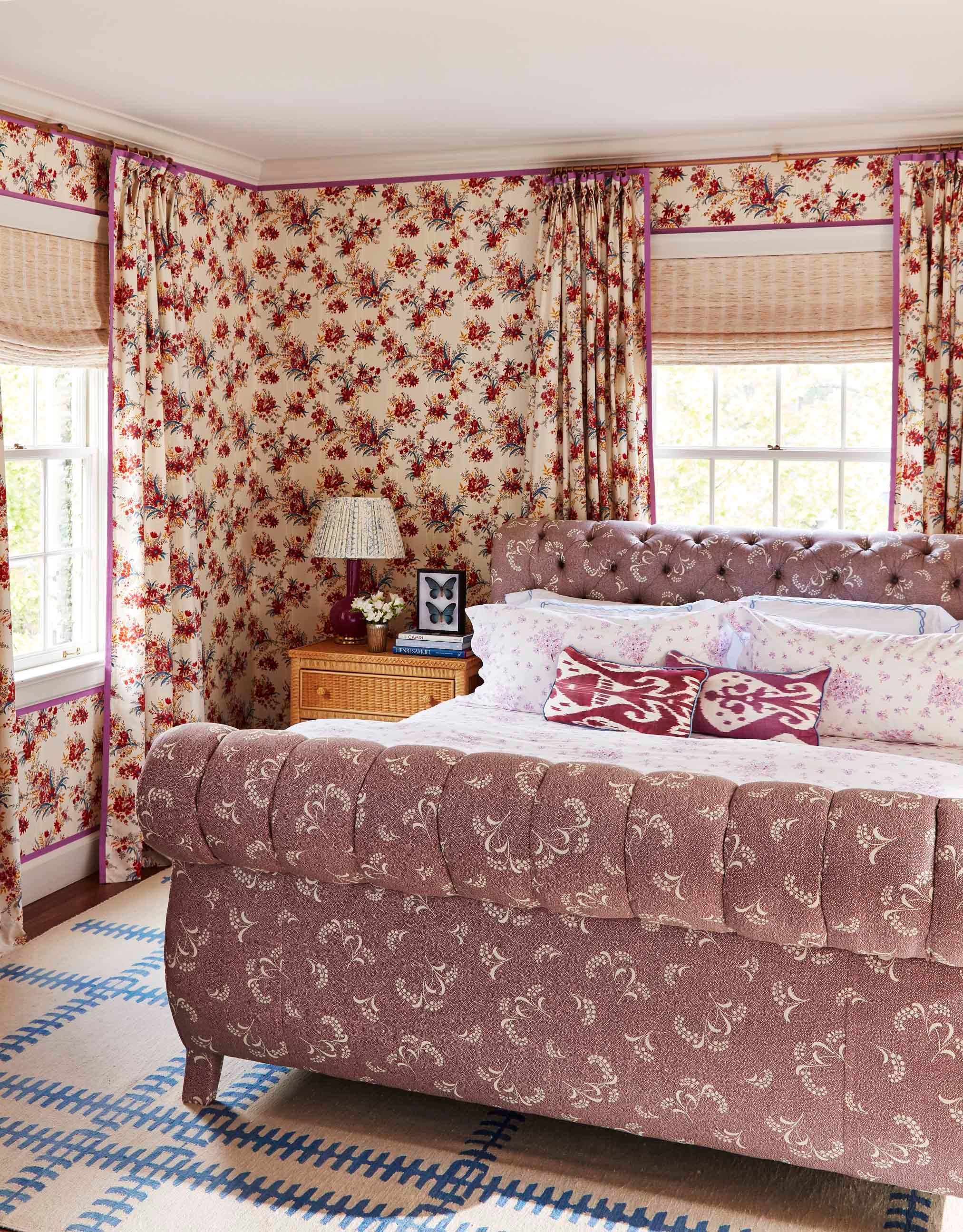
Embracing the “Three Ts”—Toile, Ticking, and Tartan—is the thirteenth strategy. These classic country fabric motifs are said to feel at home even with unexpected color choices. A red toile-covered bedroom is shown to exemplify how these patterns can be both classic and comforting.
Finally, the fourteenth tip advises layering on textiles. Blankets and throws are suggested as low-commitment ways to introduce color. Handmade quilts, Welsh blankets, beacon blankets, and tartan throws are mentioned for their ability to bring deep, saturated colors and patterns that can be easily changed with moods and seasons. A bedroom with a blue and white pieced quilt illustrates the impact of textiles.
#CountryHouseDesign #ColorPalette #InteriorDesign #HomeDecor #PaintColors #VintageDecor #Wallcoverings #TextileLayering #CountryHouseDesign #ColorPalette #InteriorDesign #HomeDecor #PaintColors #VintageDecor #Wallcoverings #TextileLayering
0 comment in total
 No comments yet
You may also like
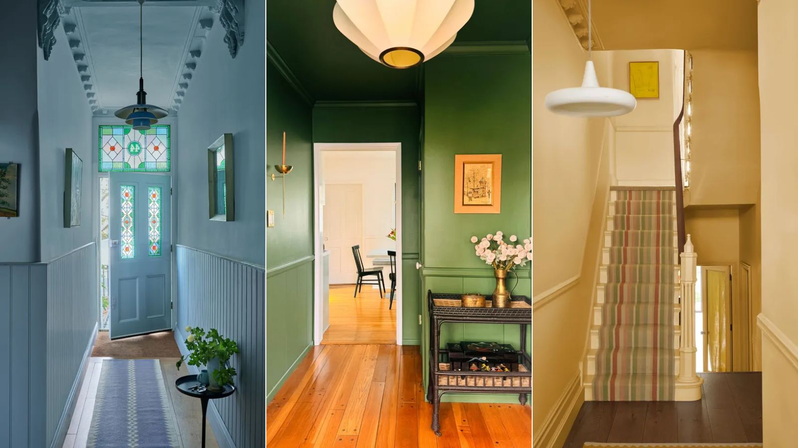
If you color drench any room make it this one

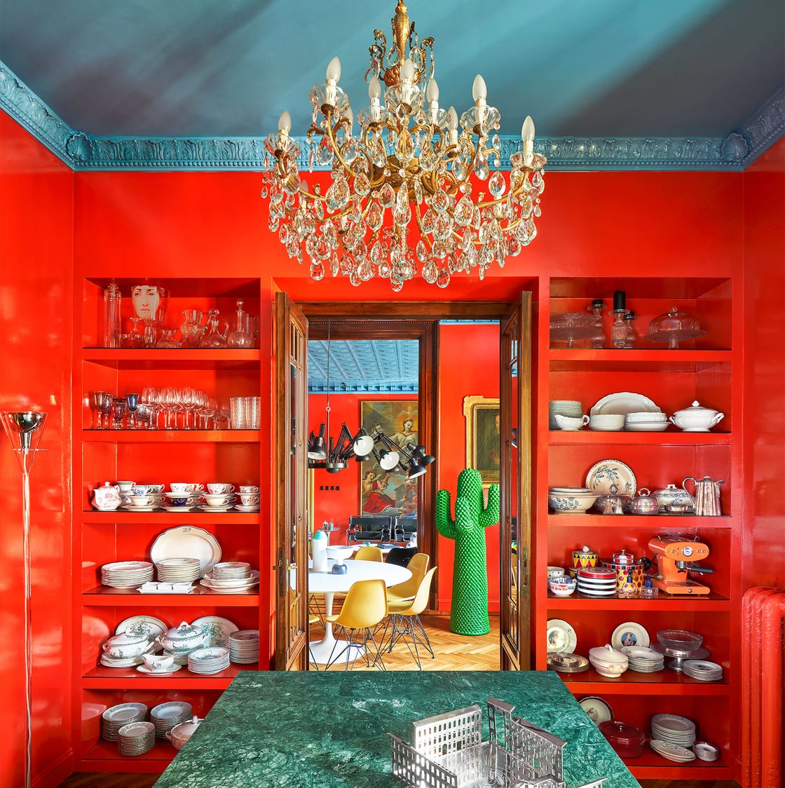
These 20 Rooms Use a Red Color Palette in All the Right Ways

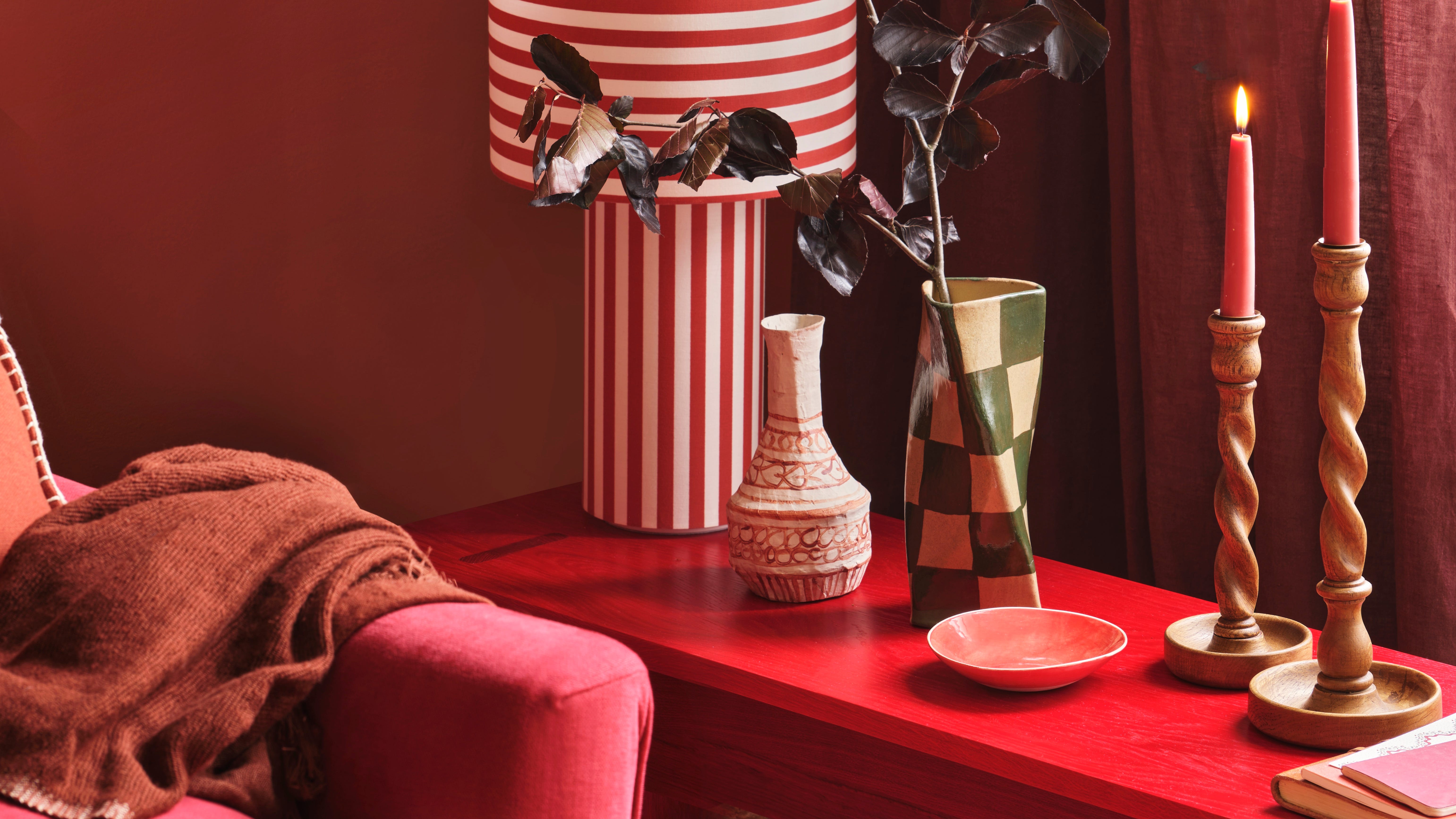
Could this be the most daunting colour to decorate with?

The One Space in Your Home You're Forgetting to Make Colorful

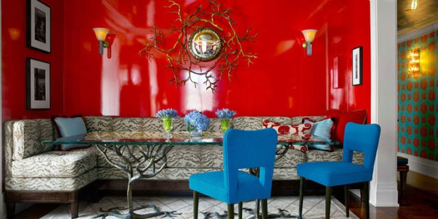
13 Shades of Red That Bring the Drama
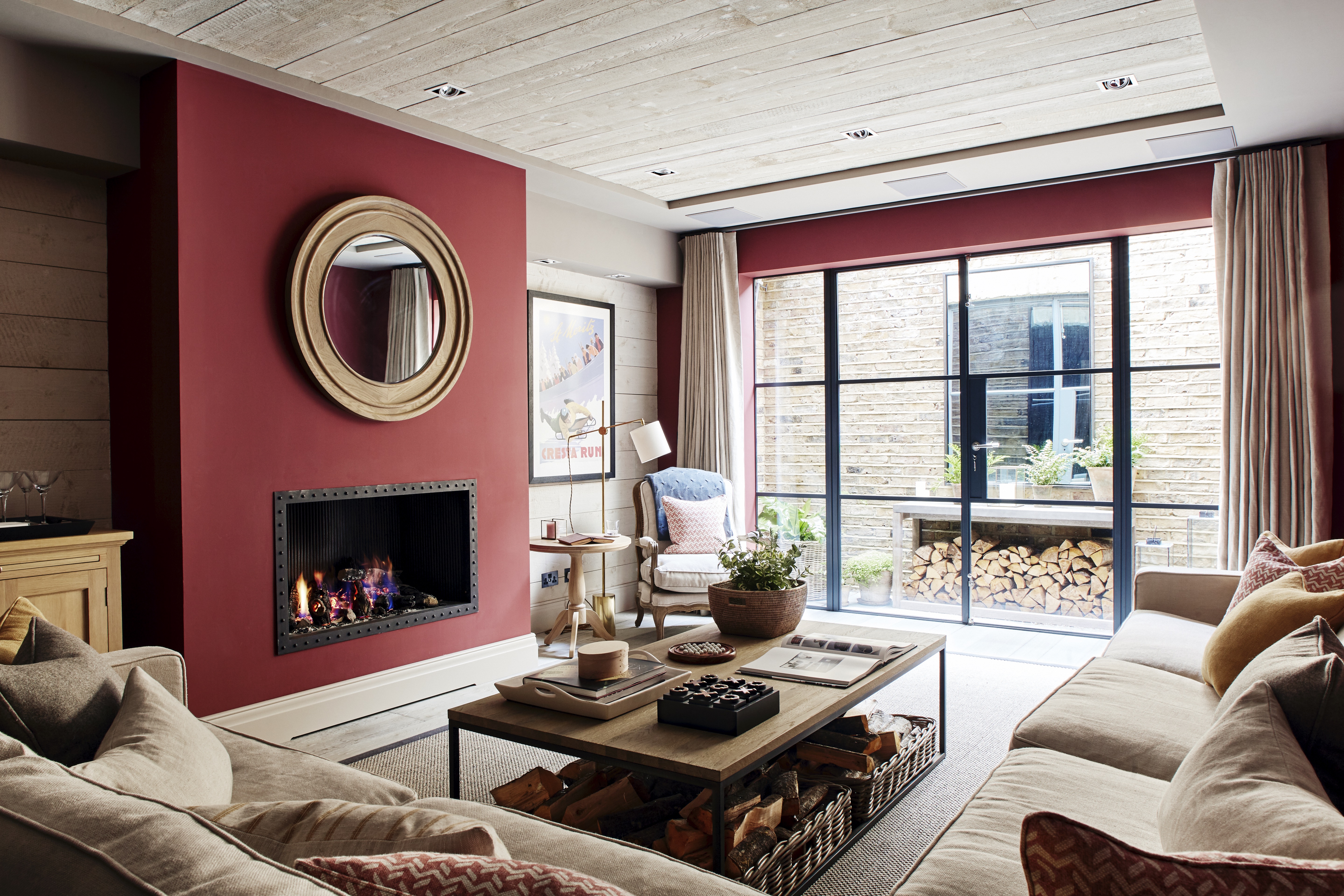
Red living room ideas – 10 atmospheric and elegant designs
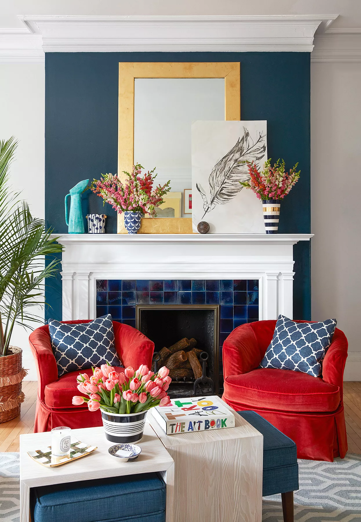
What Colors Go with Red? 21 Knockout Combinations to Consider

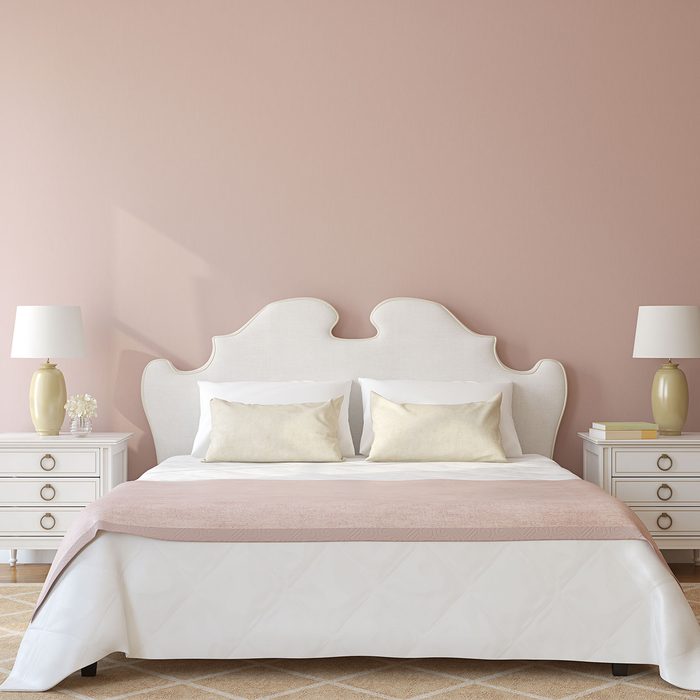
These Are the Top Bedroom Colors of 2024

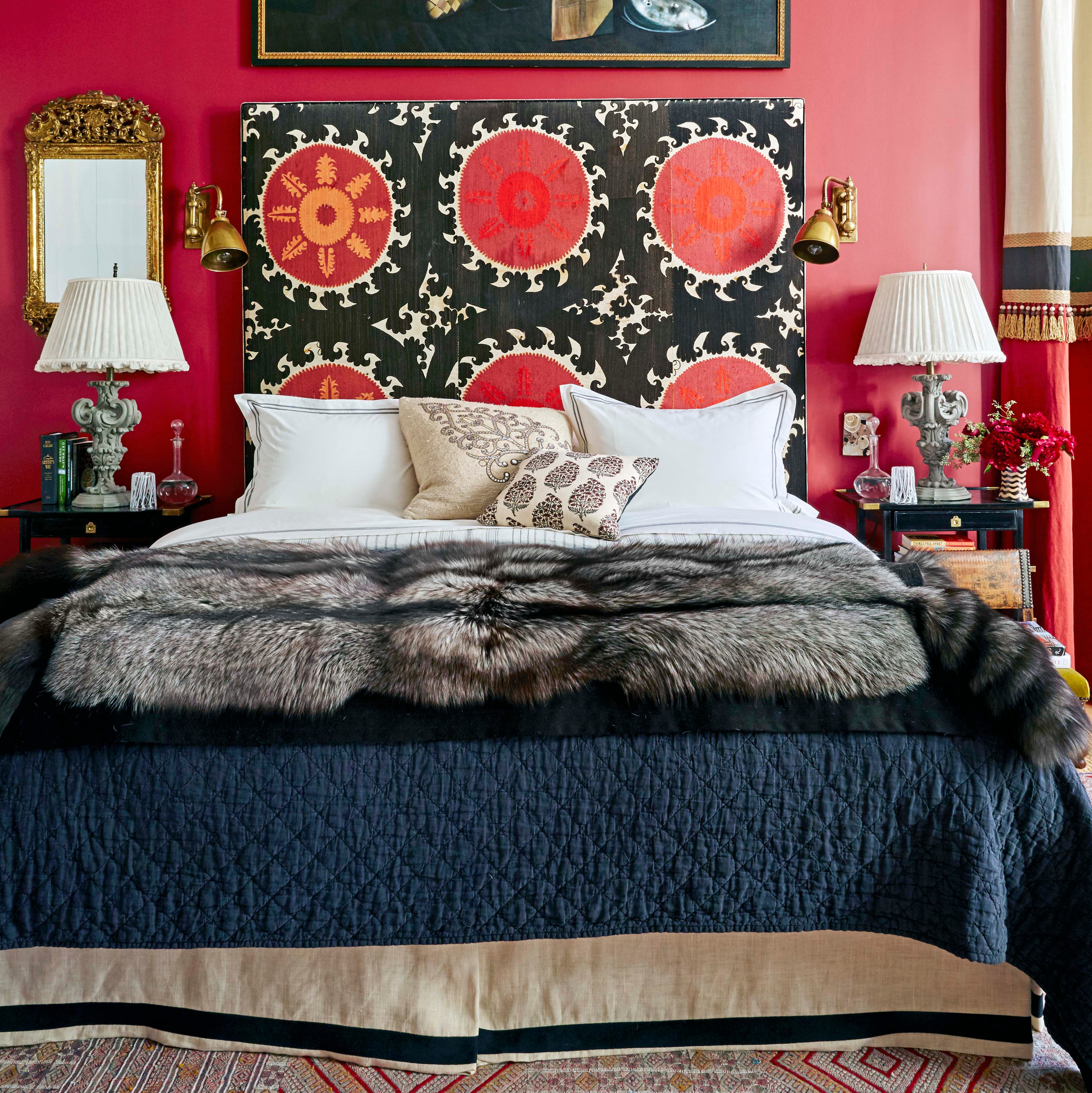
This Polarizing Color is Actually a Designer Favorite for Bedrooms—but ONLY When It's Done Right

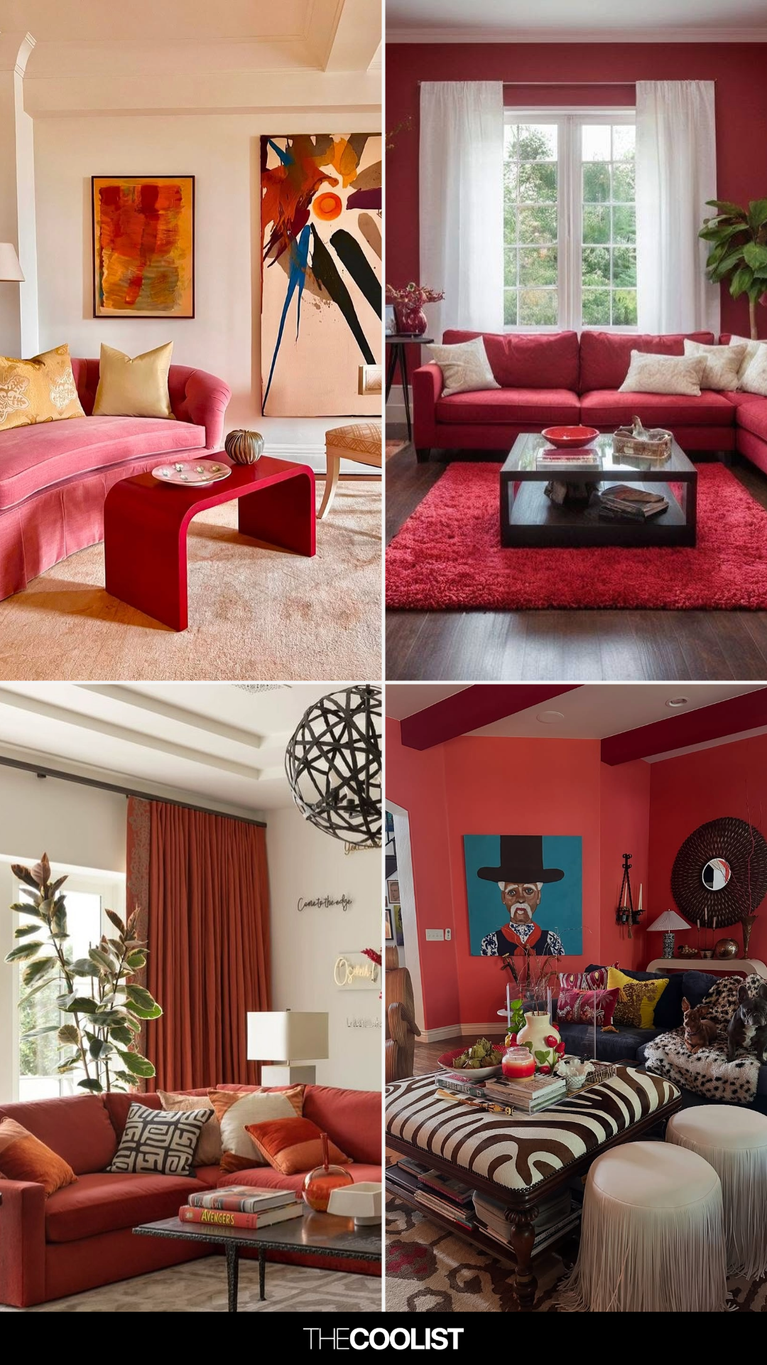
27 Trend-Setting Red Living Room Ideas Defining 2025’s Hottest Homes
Red Rugs Are Taking Over Tasteful Interiors
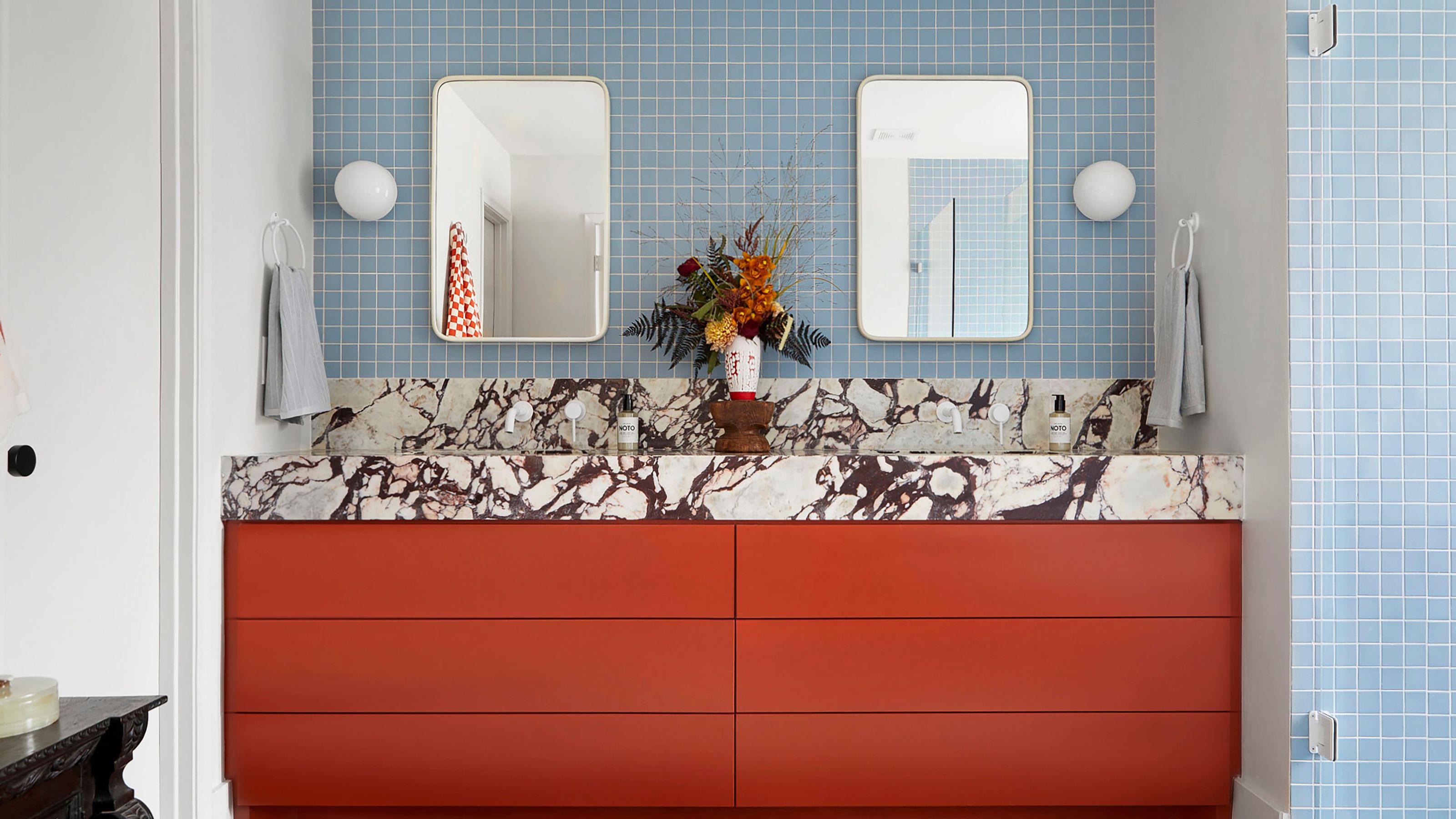
You Should Be Using Red and Blue Together More in Your Home — This Is the Secret to Making This Pairing Work

This Color Will Transform Your Living Room Instantly
Forget painting your walls grey, it’s time to sparkle
Is colour drenching a bedroom a good idea? 7 rooms that prove it is
It's Time to Elevate Your Bedroom Aesthetic

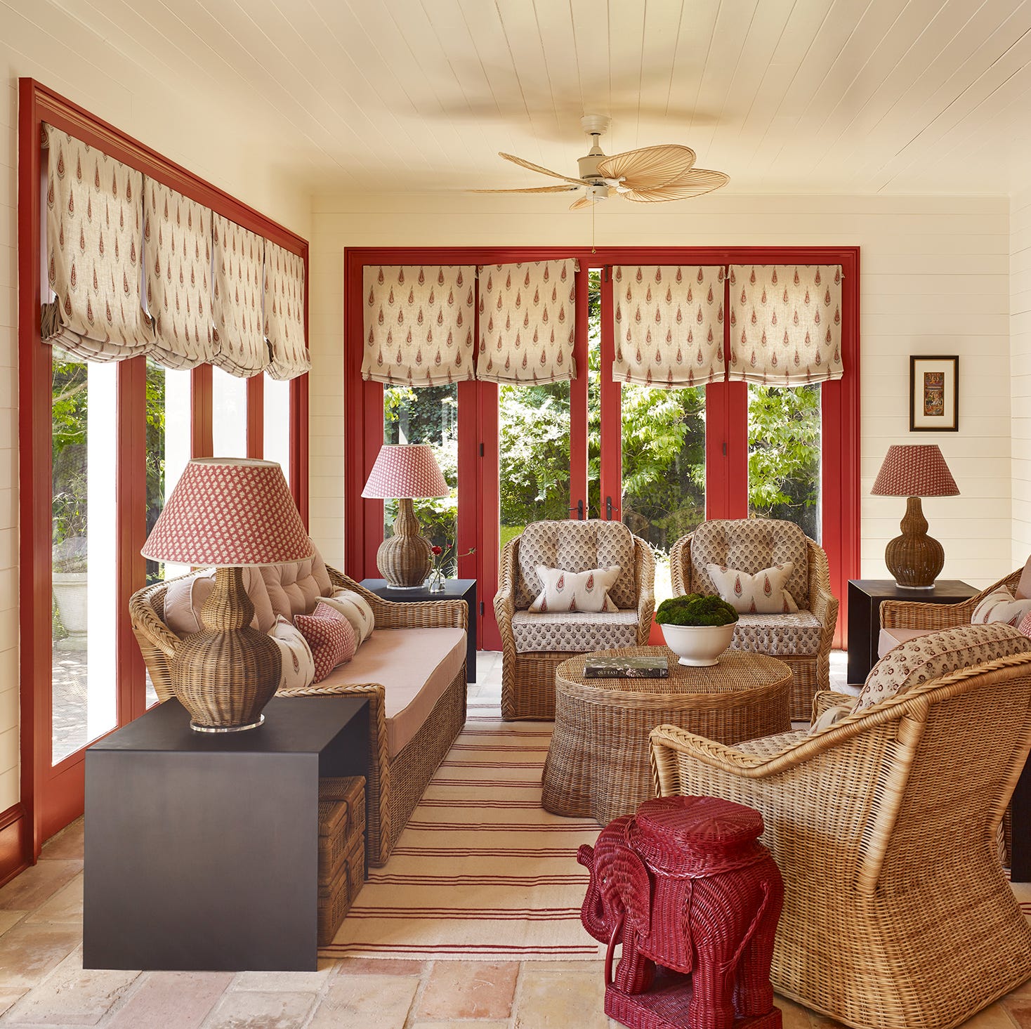
29 Unexpected Colors That Pair Beautifully With Red, According to Designers
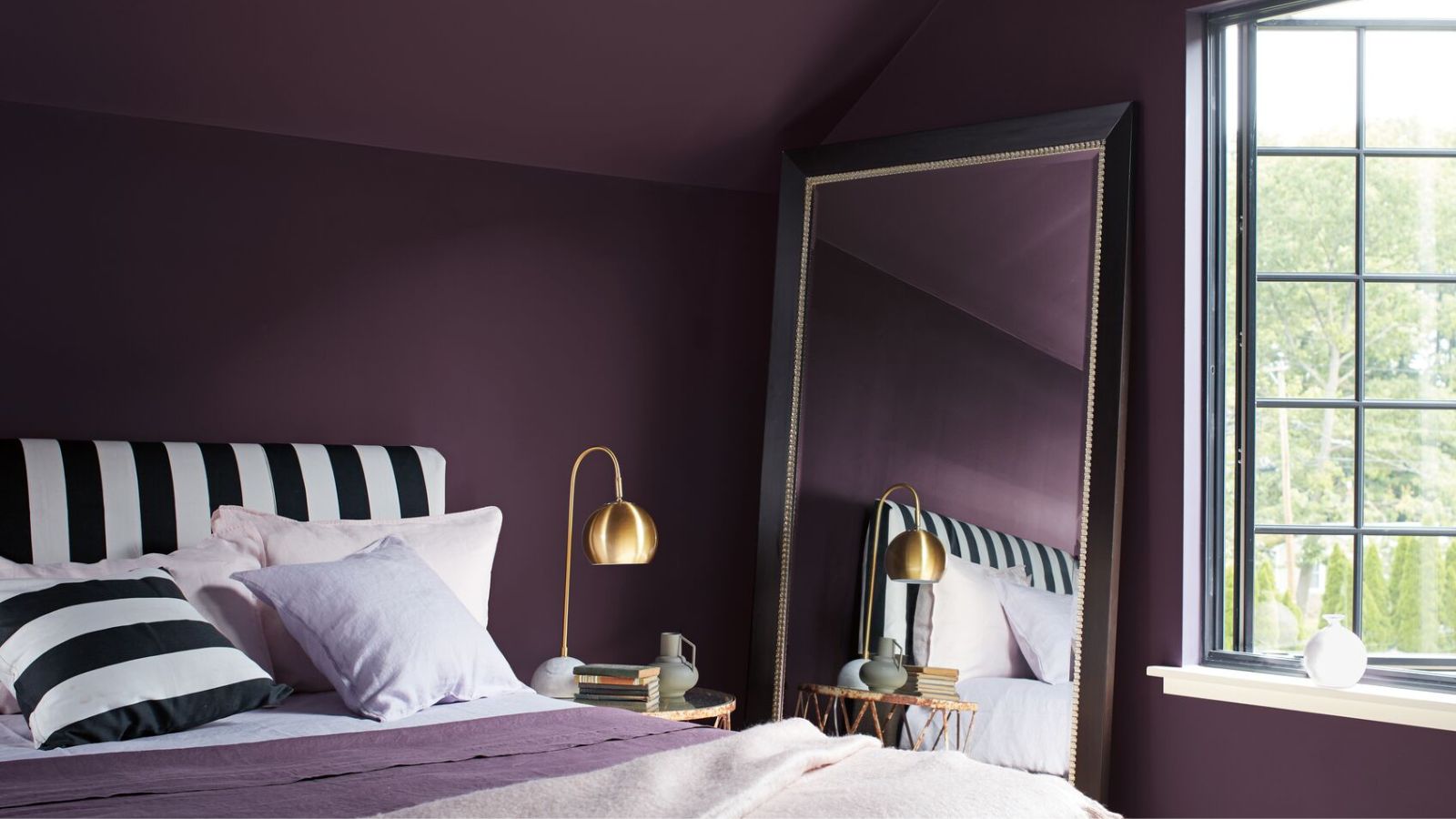
5 rooms that prove color drenching your bedroom is a good idea
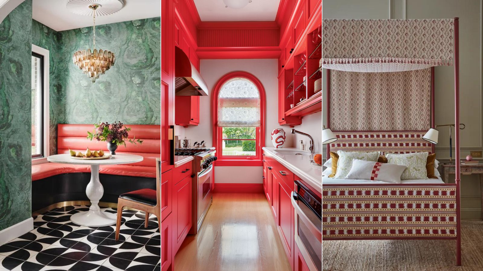
9 colors that go with red – the best pairings for this bold shade
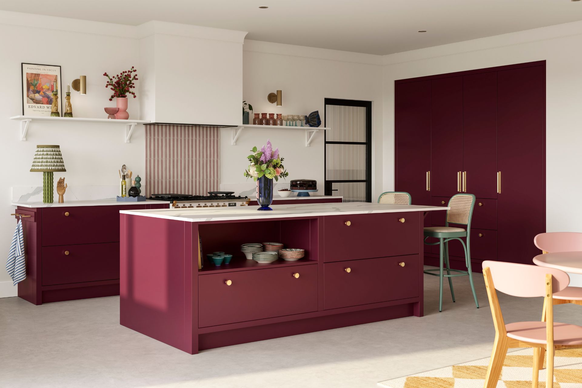
Cherry Red Is Trending – Here’s How To Style It In Your Home