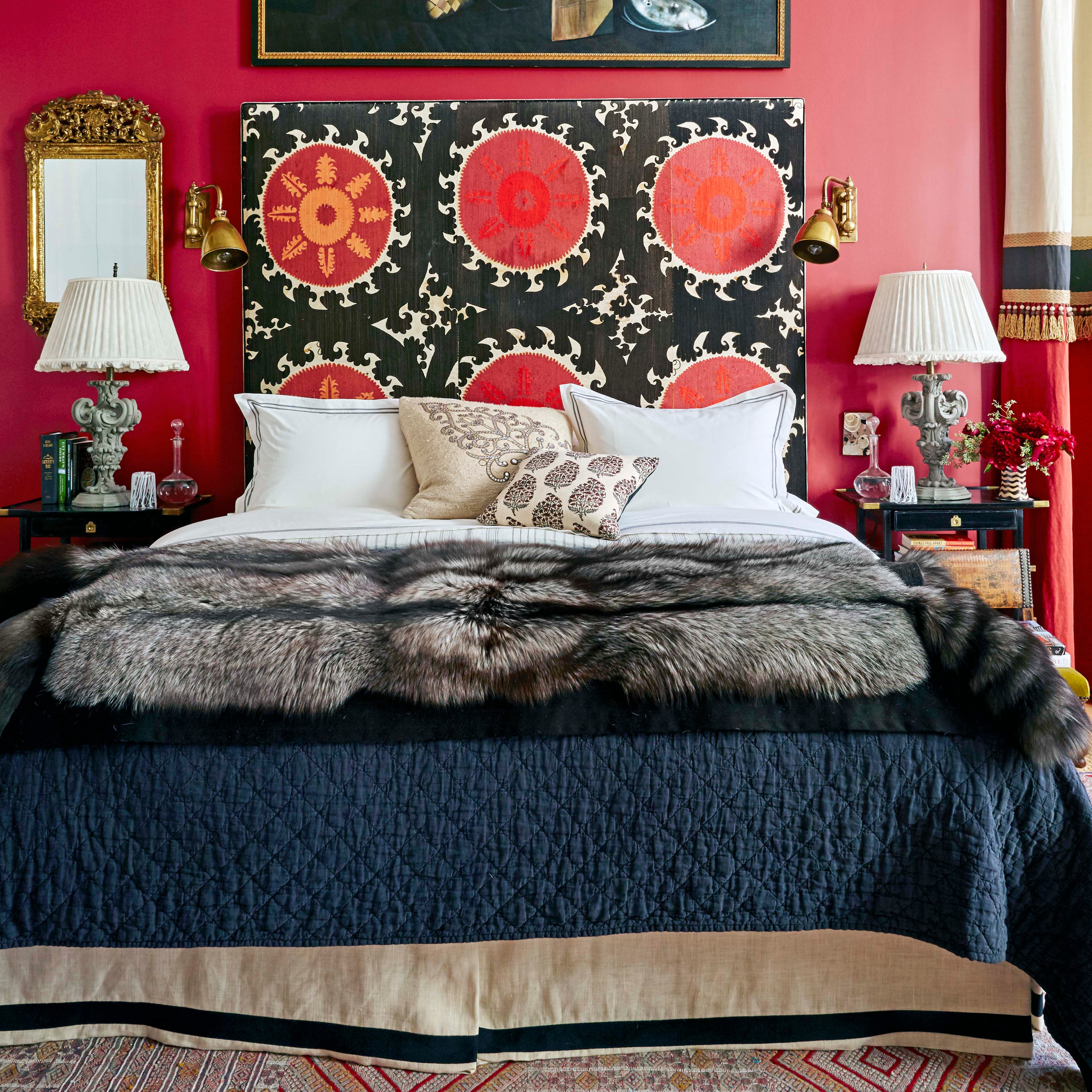
1/5
This Polarizing Color is Actually a Designer Favorite for Bedrooms—but ONLY When It's Done Right
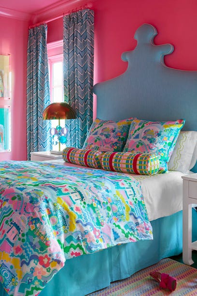
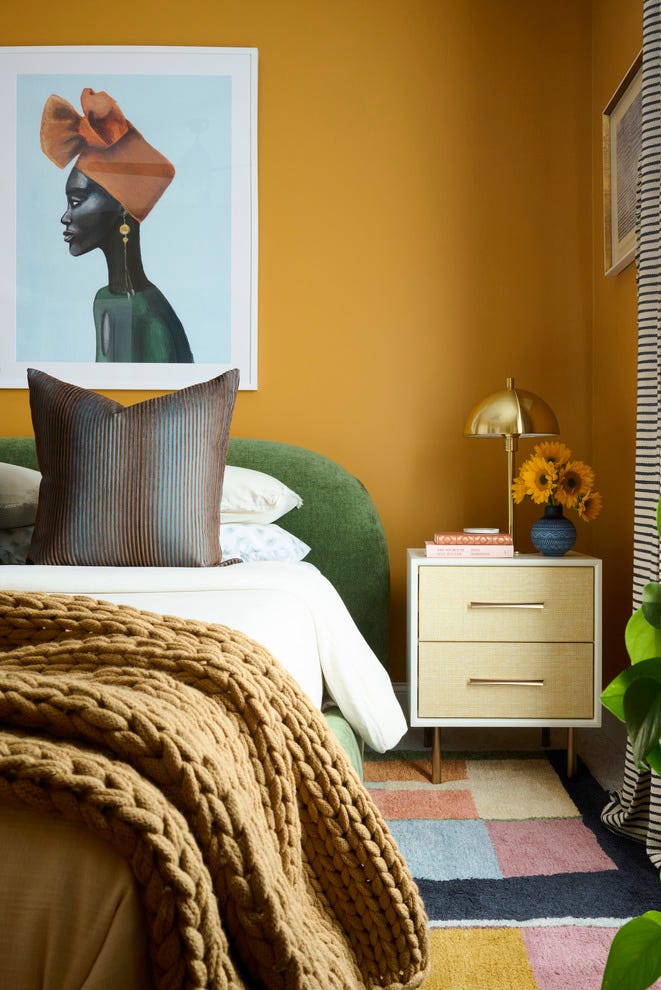
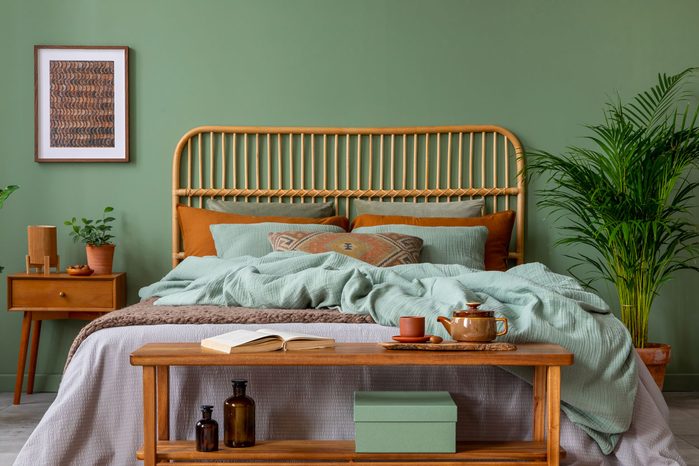
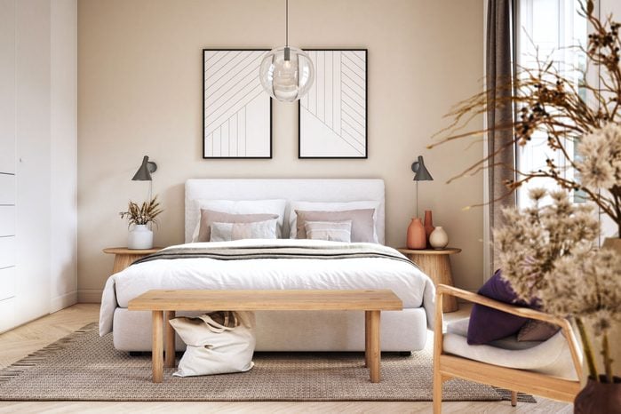
The color red is gaining significant traction in design and decorating, having been named the 2026 Color of the Year. Its warm hue is being incorporated into various elements, from textiles and paint to jewelry and gardens. However, its suitability for a bedroom, a space typically associated with rest and relaxation, raises questions about its intensity. Designers were polled to determine if red can be chic and relaxing in such a setting, with most expressing enthusiasm despite acknowledging its challenging nature due to associations with intense emotions. Only a few designers would completely avoid using red in sleeping areas.
Aimee Buccellato of Buccellato Design and Architecture asserts that no colors are off-limits, emphasizing that red can contribute to a room's story by being warm, inviting, mysterious, or sexy. Designers largely agree that successful incorporation of red in a bedroom relies on thoughtful execution to ensure it appears chic and restful, rather than garish.
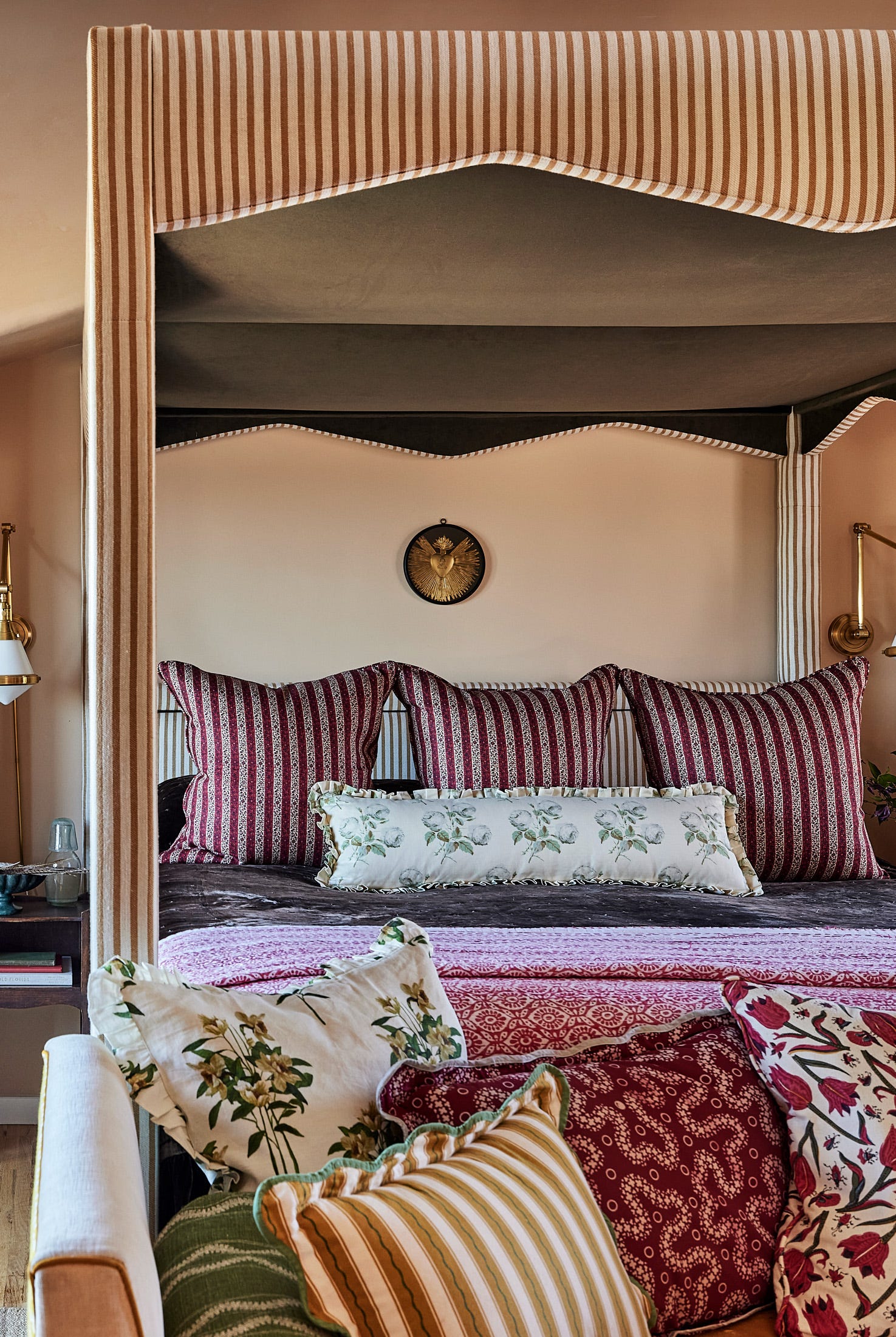
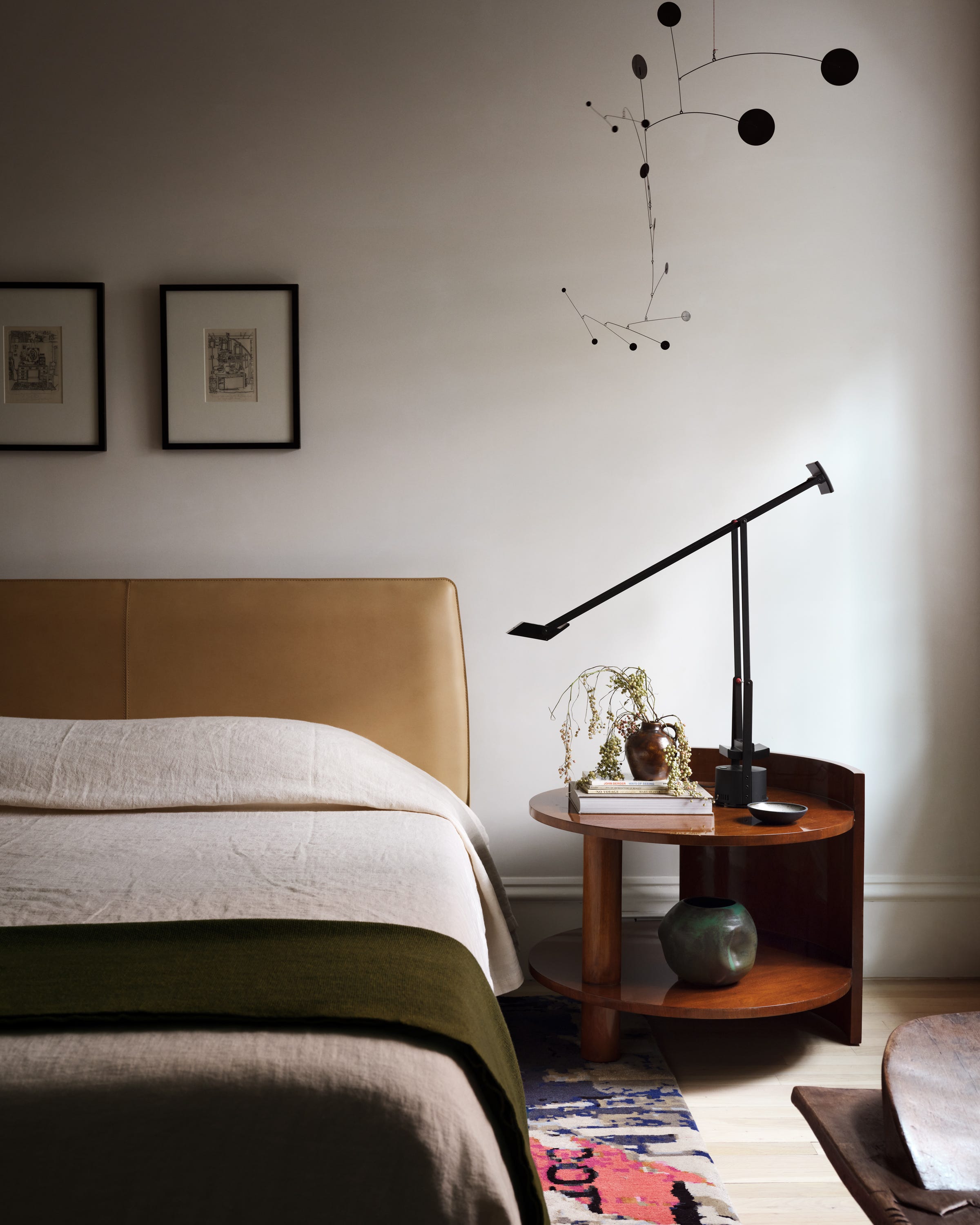
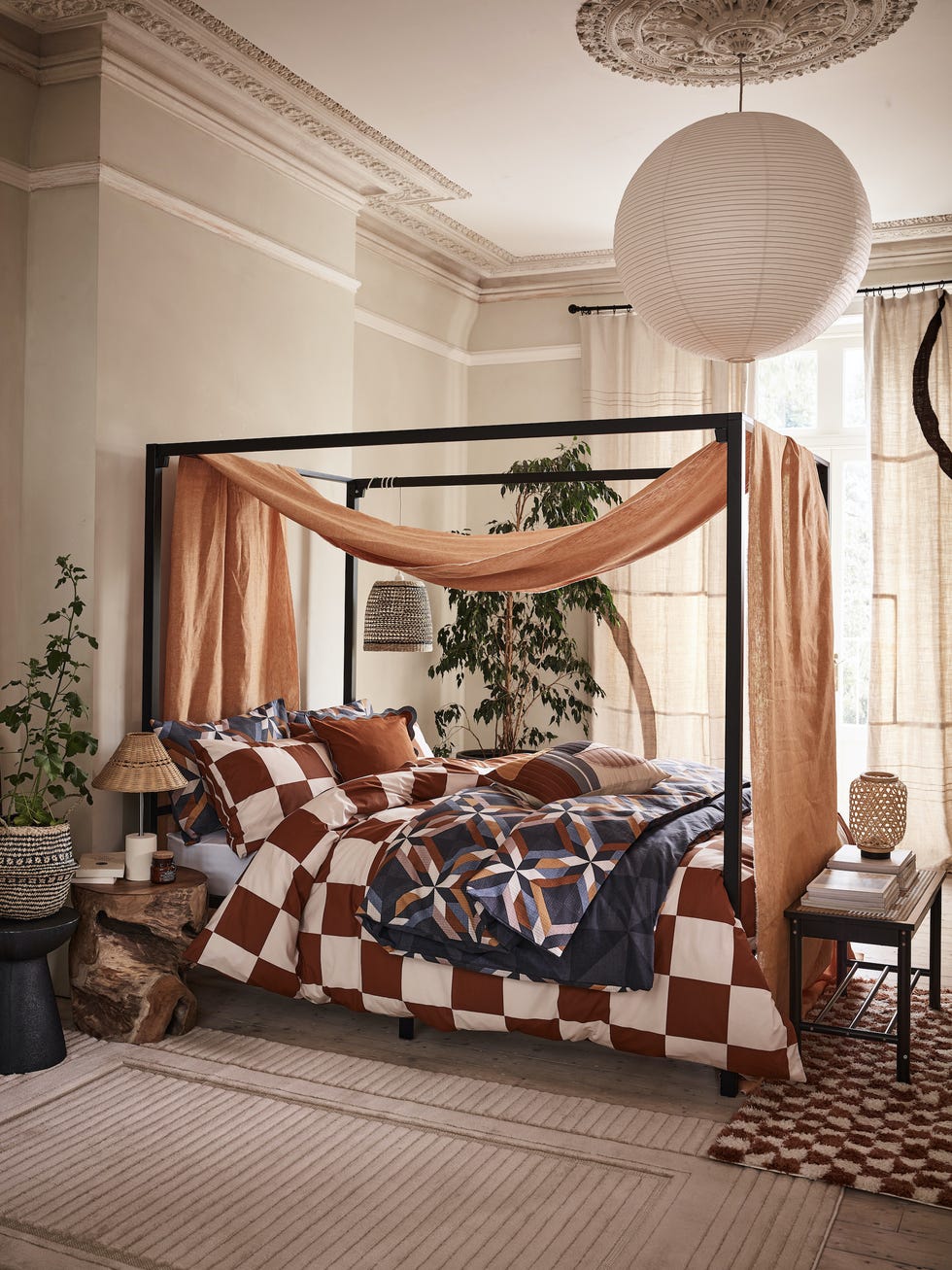
Four key tips are offered for designing a red bedroom. Firstly, designers suggest thinking beyond red-painted walls, using the color as an accent rather than a dominant feature. Meg Lonergan, a Houston-based designer, recommends using red as a 'pop of color,' akin to a red lip. Given that incorrect red wall choices can be a common design pitfall, painting only the trim in a crimson hue is suggested. Molly Torres Portnof of DATE Interiors also advocates for incorporating red through wallpaper, rugs, or painted furniture.
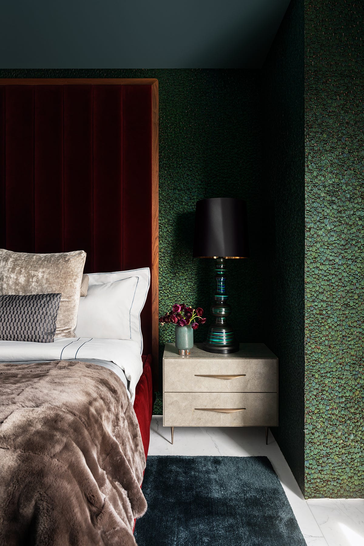
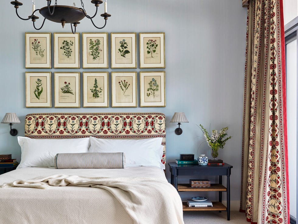
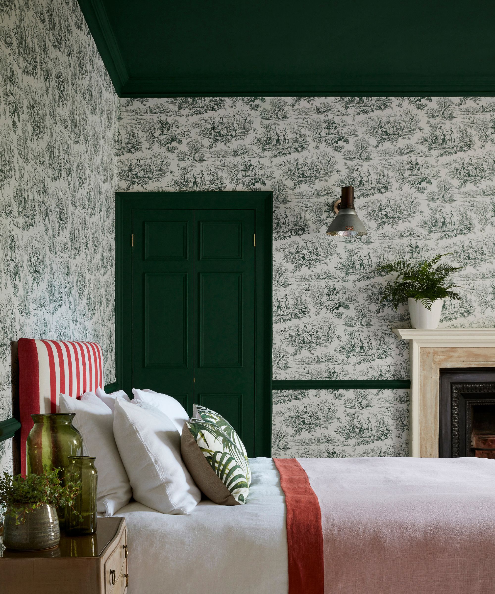
Secondly, to mitigate the intensity of red, especially on walls, designers advise using finishes and materials with softness and texture. Ashton Taylor recommends wallpaper or plaster for clients desiring a full color drench. Wendy Labrum agrees, suggesting muted shades like Portola’s Meritage in Roman Clay. Katie Wolf of Atlanta proposes upholstering bedroom walls in a dusty red hue. Red and white toile is also highlighted as a favored option for its ability to create a cozy and calming atmosphere when used on walls, bedding, and drapery.
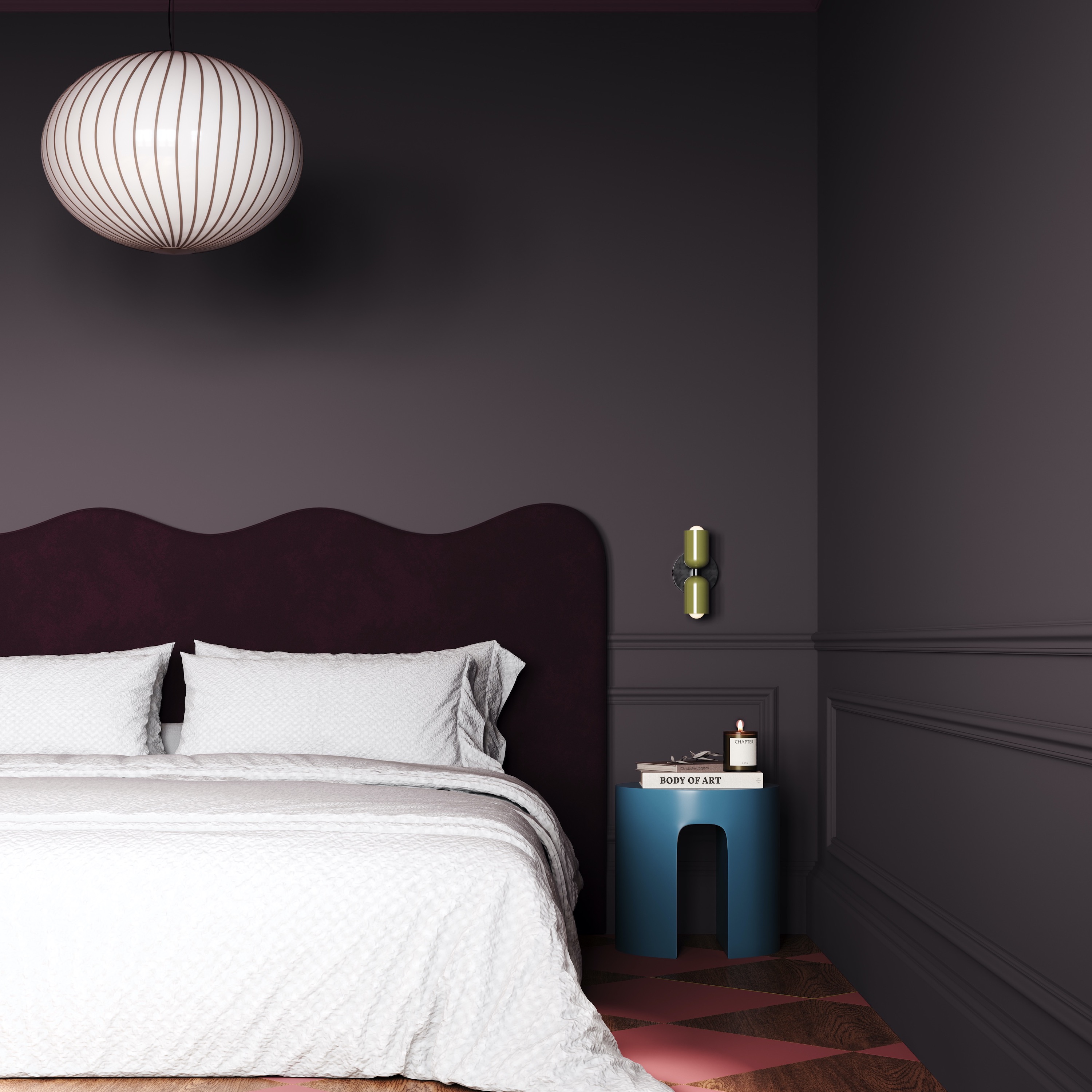
Thirdly, selecting the right hue is crucial to avoid overly saturated reds. Roger Higgins, based in Nashville, suggests deep reds with neutral undertones, such as oxblood red, to prevent the color from feeling too intense or severe. He also supports the use of diverse textures like boucle, velvet, and leather to create a soothing, cocoon-like ambiance.
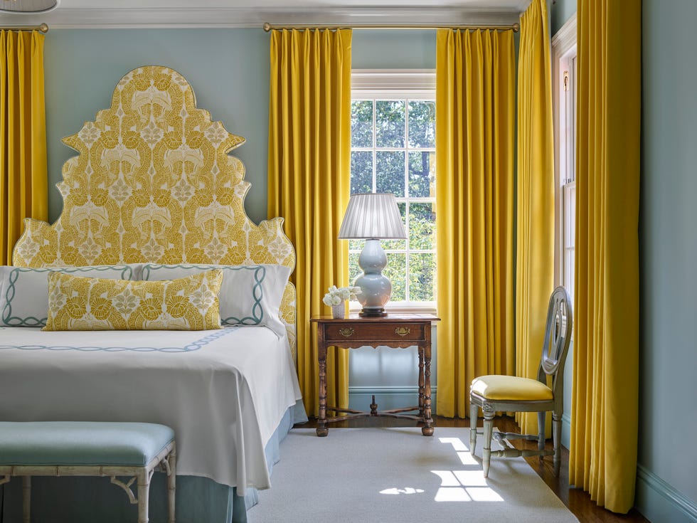
Finally, designers recommend balancing red with complementary colors. Kristina Phillips, who appreciates red's 'Americana feel,' suggests pairing it with a vibrant green-yellow or chartreuse. Katie Wolf adds that red complements spaces with outdoor greenery. For those seeking a less daring alternative, accessorizing red with gold is proposed for a similar complementary effect, adding depth and a collected feel to the room, as noted by Raleigh-based Tula Summerford, who favors framing artwork in warm gold in red rooms.
#BedroomDecor #RedColor #InteriorDesign #ColorTrends #DesignerTips #HomeDecor #DecoratingIdeas #PaintColors #TexturedWalls #BedroomDecor #RedColor #InteriorDesign #ColorTrends #DesignerTips #HomeDecor #DecoratingIdeas #PaintColors #TexturedWalls
0 comment in total
 No comments yet
You may also like
This "Controversial" Bedroom Color Is a Designer Favorite—Here's Why

You Can Wake Up HAPPIER Just by Painting Your Bedroom—Here Are the Colors Designers Love
5 bedroom colors going out of style in 2025 – and what designers are using instead for a stylish sleep space

11 Soothing Bedroom Paint Colors Designers Say Can Help You Sleep

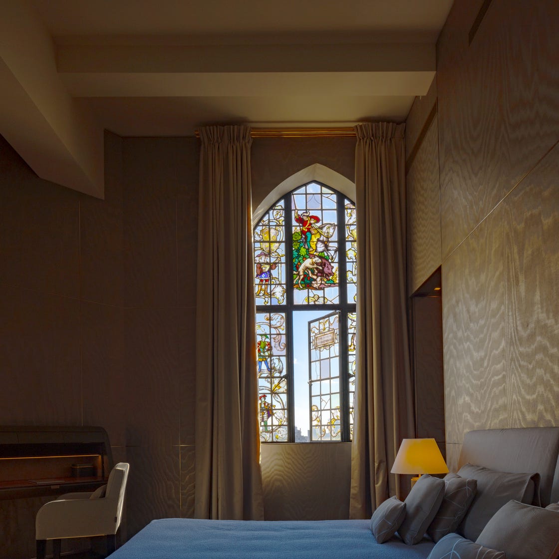
The Best Bedroom Colors to Help You Sleep (And Wake Up Happy)

5 Trending Bedroom Paint Colors for 2024

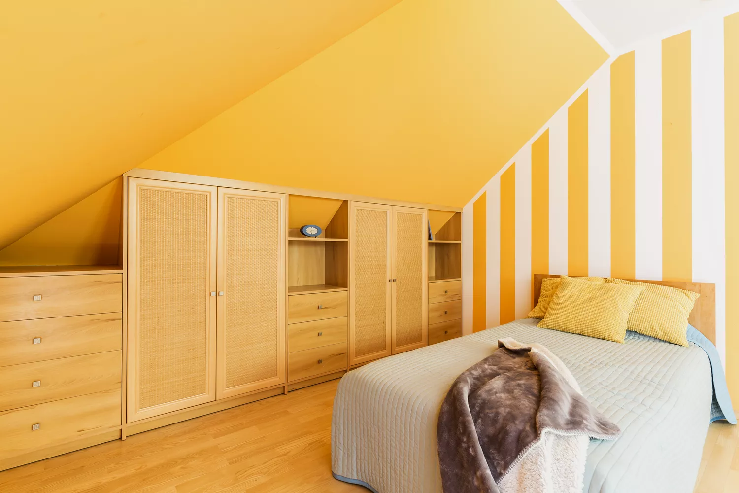
5 Paint Colors You Should Never Use In A Bedroom, According to Designers

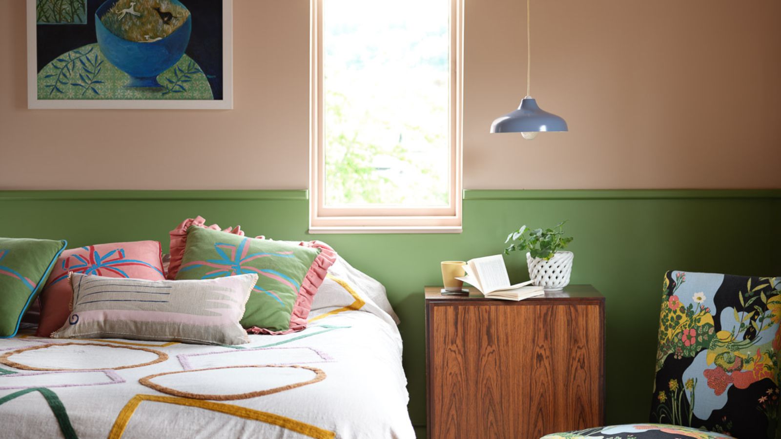
Bedroom color trends 2025 – 10 shades interior designers are using for the most stylish sleep spaces

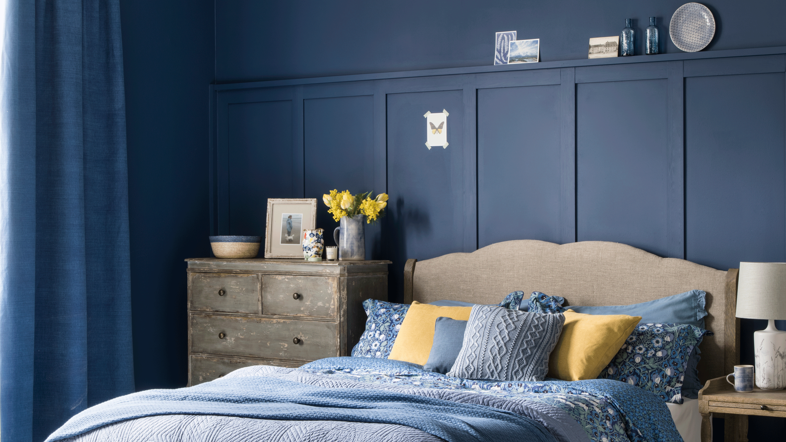
Is colour drenching a bedroom a good idea? 7 rooms that prove it is
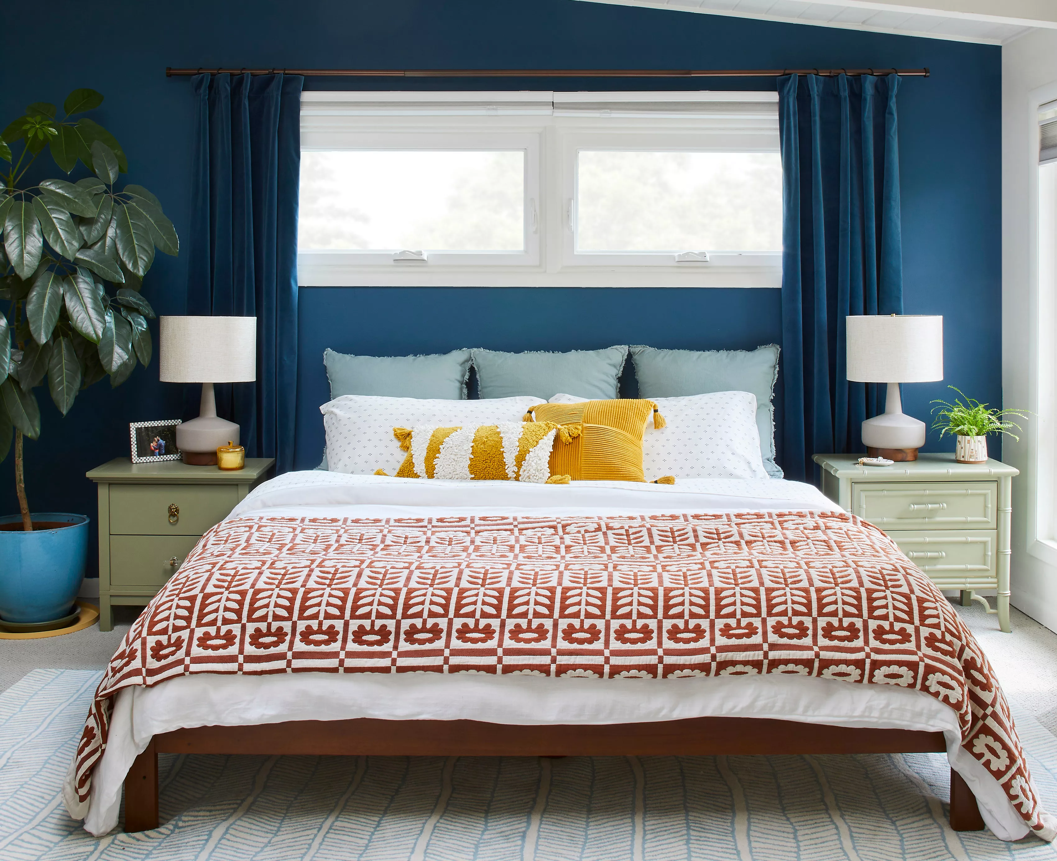
5 Bedroom Paint Colors That Could Be Ruining Your Sleep

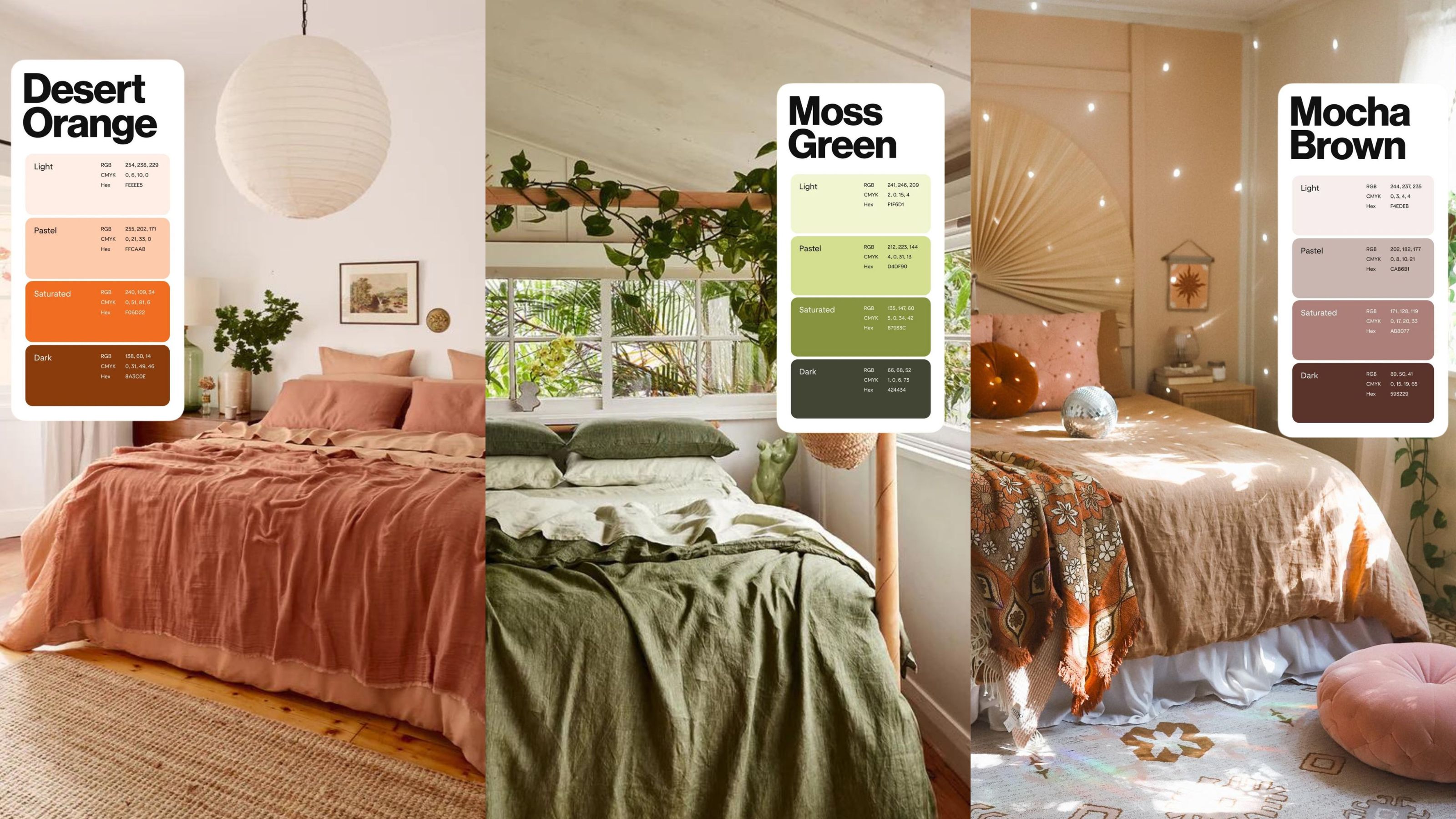
The 2024 Pinterest color palette is what bedroom decor dreams are made of

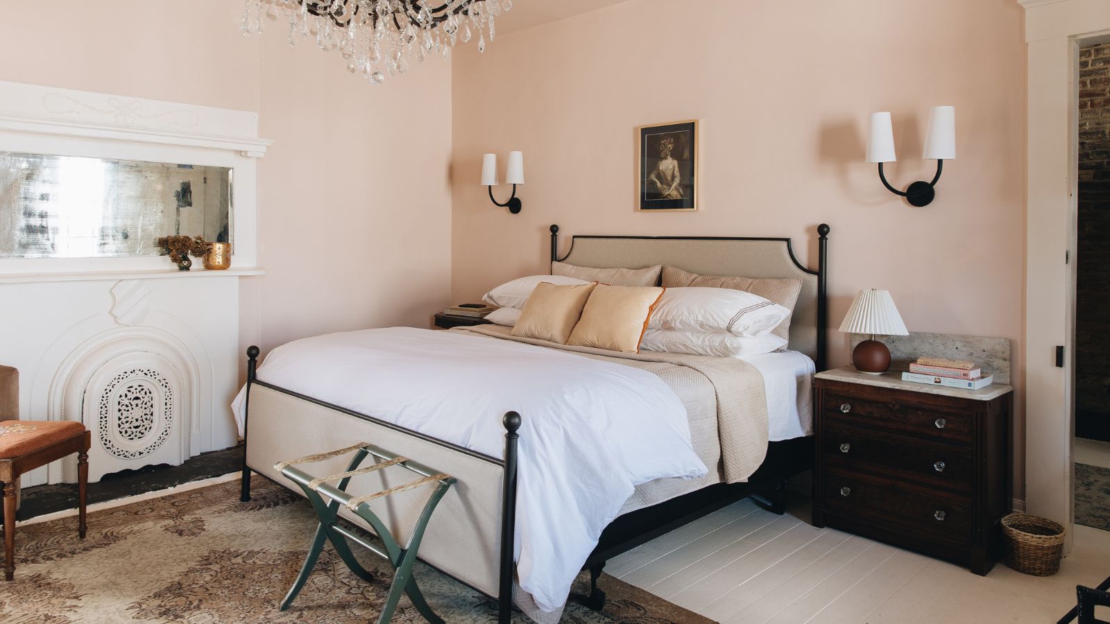
10 designers on the bedroom colors they always recommend
The Most-Googled Bedroom Paint Color Isn’t the Soothing Hue You’d Expect
Best Bedroom Colors for Sleep

These Designer-Approved Bedroom Paint Colors Are the Key to the Best Sleep of Your Life

16 beautiful bedroom colour ideas and how to use them
A Dark Bedroom Color Palette Might Be the Key to a Good Night's Rest

18 dreamy bedroom colour ideas to create a rest-promoting, stylish space
Designers Declare This Color the Ultimate "Chill-Pill" for Your Home
6 Paint Colors You Should Never Use in Your Bedroom, According to Interior Designers